Human-Sized Pokéball Stands At 6 Feet Tall (And Has A Gaming Room Inside)

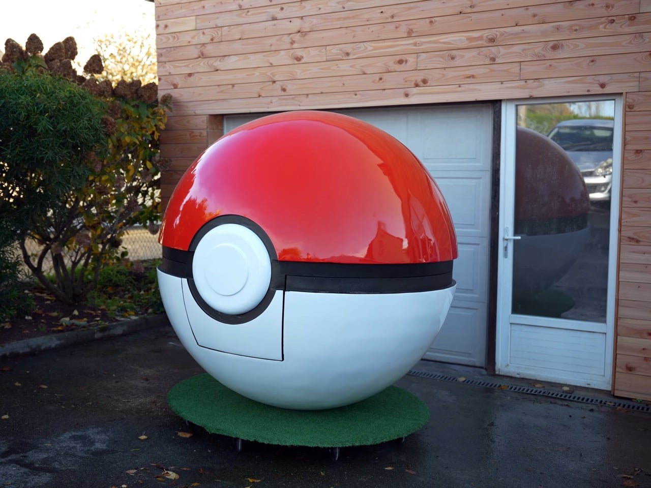
Someone finally built a life-sized Pokéball you can actually climb inside, and honestly, it’s about damn time. For nearly three decades, we’ve been throwing these things at Pidgeys and Rattatas without ever really knowing what happens when that button clicks and the whole thing seals shut. The anime gave us vague red-light-energy-conversion-something explanations, the games treated it like a loading screen, and the trading cards just showed them closed. The mystery has persisted through 1,000+ Pokémon species, countless regional variants, and enough spin-off merchandise to fill a Snorlax’s stomach. Now a maker has gone full obsessive and constructed a 2-meter diameter functional Pokéball with a gaming room inside, and the build process is as chaotic as you’d expect when someone decides to turn childhood curiosity into a construction nightmare.

The project started with a simple question that’s plagued Pokémon fans since 1996: what’s inside a Pokéball? Instead of accepting Nintendo’s hand-wavy “they’re converted to energy” explanation, this builder decided to answer it the only way that makes sense for a ’90s kid: put a Nintendo 64 running Pokémon Stadium inside one. The irony is perfect. You’re sitting inside the device that’s supposed to contain Pokémon while playing a game about battling those same Pokémon on a console from the franchise’s golden era. It’s meta in the best possible way, and it scratches that specific nostalgia itch that only people who spent hours trying to catch Mewtwo with a regular Pokéball can appreciate.

Designer: Carlos 3D World
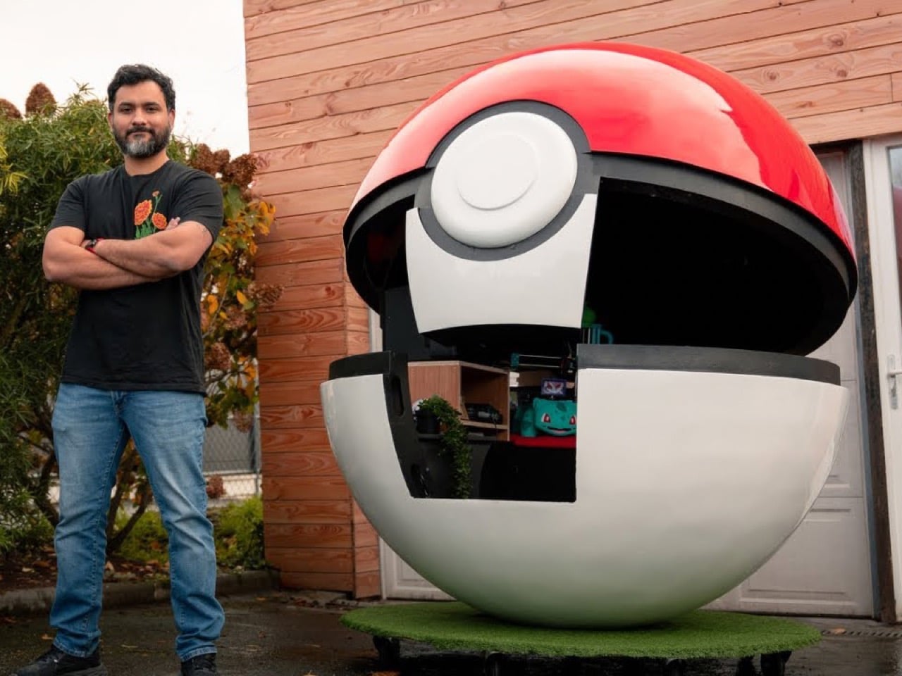
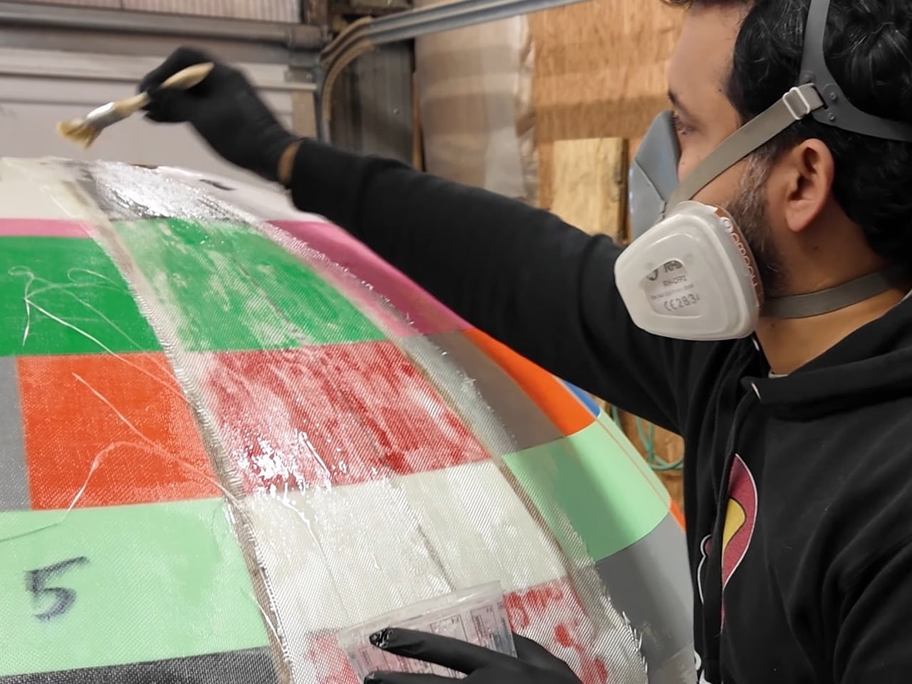
Building a 2-meter sphere that doesn’t look like low-poly trash is harder than you’d think. The structure uses CNC-cut plywood ribs as the skeleton, over 400 individual 3D-printed panels for the shell, then fiberglass and resin for strength. But getting there took multiple spectacular failures. Flexible MDF sheets? Kept breaking. Polystyrene construction material? Dimensional inconsistencies everywhere. The 3D printing solution worked but meant running multiple printers for weeks, upgrading to 0.8mm nozzles just to speed things up, and still ending up with 400+ pieces that needed assembly, alignment, and somehow had to form a smooth sphere. Each piece was 3mm thick, split in half to fit inside the printer beds, then glued back together with hot staples and jigs to maintain the curve. It’s the kind of project where you’re two months in and questioning every life choice that led you here.
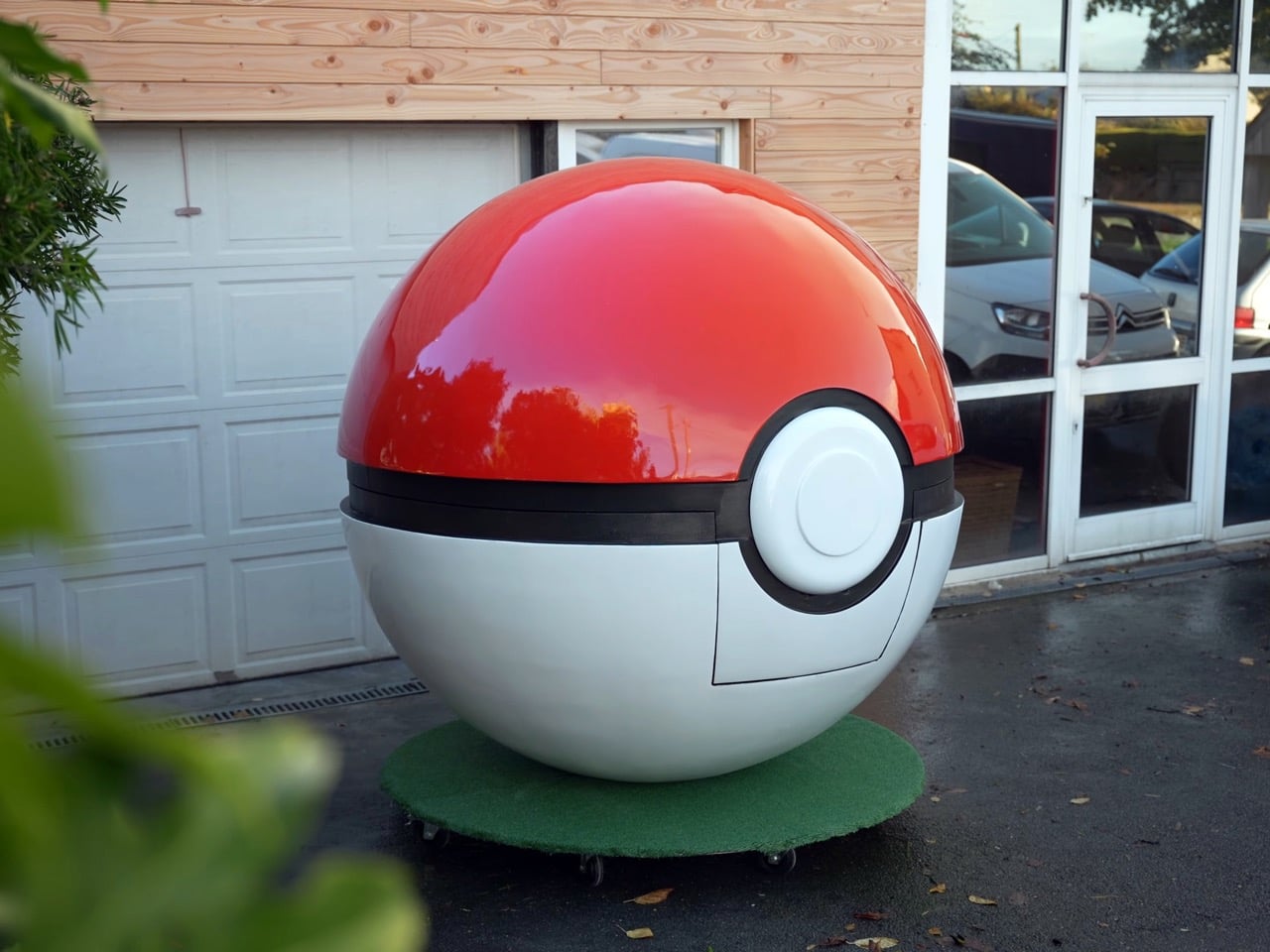
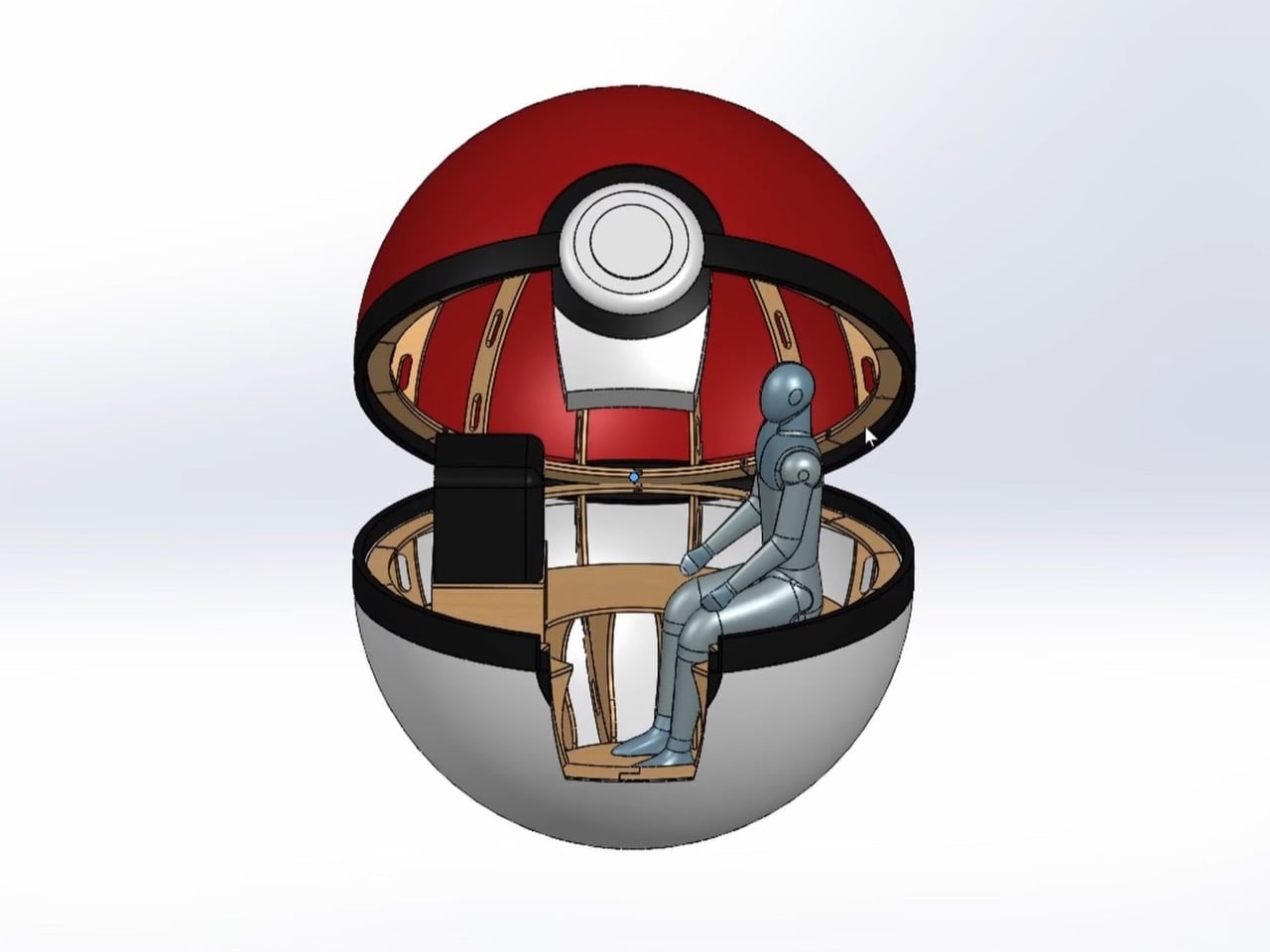
The entry door required a minor compromise, but for a better user experience. Instead of splitting the Pokéball at its natural center line where it actually opens, there’s a cutout near the bottom. A proper equator split would mean climbing over a one-meter ledge every time you wanted to play some Pokémon Snap, which sounds cool in theory until you’re the third person trying to haul yourself up without spilling your drink. The lower door lets you walk in like a normal human while still maintaining that iconic spherical silhouette from the outside. It sits on hidden wheels under a green turf mat, so it looks like it’s chilling in tall grass but can actually roll wherever you need it. Practical design choices matter when your art project weighs several hundred pounds and needs to fit through doorways.
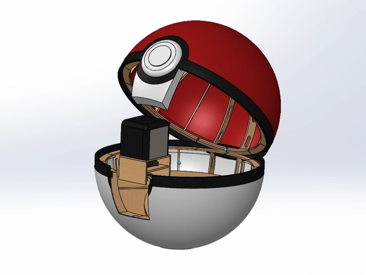
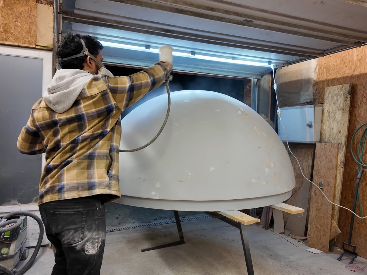
Finishing this thing was apparently hell. You’ve got 400+ 3D-printed segments meeting wood meeting fiberglass meeting resin, and every joint is a seam that needs smoothing. The builder slathered on putty, sanded away 90% of it, repeated that process until their arms fell off, and somehow got the surface smooth enough for that glossy red and white paint job. This is the part that separates people who finish ambitious projects from people who have half-built things decomposing in their garage. Weeks of sanding with respirators, dealing with dust everywhere, trying to make a sphere that’s technically made of hundreds of pieces read as one continuous surface. Nobody posts Instagram stories about the sanding phase, but it’s where most of the actual work happens.
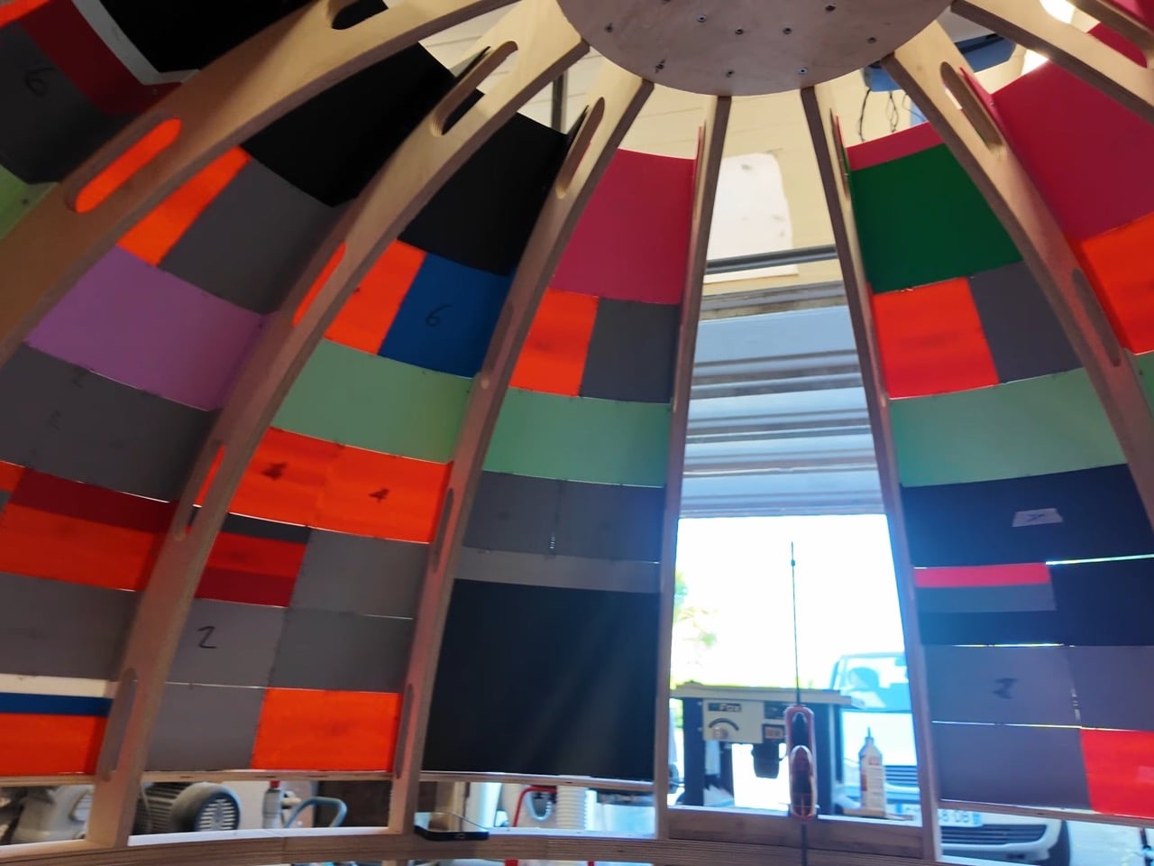
Inside, there’s a Nintendo 64 hooked up to a CRT television, custom curved furniture, framed Pokémon cards, and lighting that makes the whole space feel intentional. The electrical system uses a disconnect plug so you can unplug the whole Pokéball and move it without rewiring, which is the kind of forethought that shows someone actually planned to use this thing beyond the initial build photos. Sitting inside while playing Pokémon Stadium on hardware from 1996 creates this recursive loop of nostalgia that works way better than it should. You’re experiencing the franchise through its original medium while physically occupying the space that defined how we interacted with these creatures. It’s experiential design that actually commits to the bit instead of just looking cool in photos.

Pokémon has always worked because it left gaps for imagination. How does a 32-foot Onix fit in there? What does it feel like inside? The games and anime never really explained it, so millions of kids filled in those blanks themselves (Are all humans vegans? We’ve never seen them eating Pokémon). Building a giant Pokéball with a gaming setup inside doesn’t answer the canonical questions, but it does something better. It takes that childhood wonder about what’s inside and makes it real in the most fitting way possible: by putting the games that started everything right at the center. You climb inside, pick up that three-pronged N64 controller, and suddenly you’re back in 1998 trying to beat the Elite Four while your mom yells that dinner’s ready. Except now you’re doing it from inside the icon that defined the entire franchise, which is exactly the kind of full-circle moment that makes you understand why someone would spend months building this thing in the first place.
The post Human-Sized Pokéball Stands At 6 Feet Tall (And Has A Gaming Room Inside) first appeared on Yanko Design.
This Tiny House Brings Apartment Comfort To Off-Grid Living

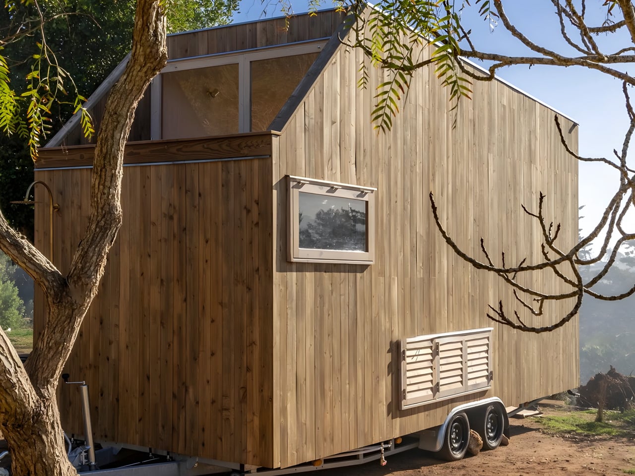
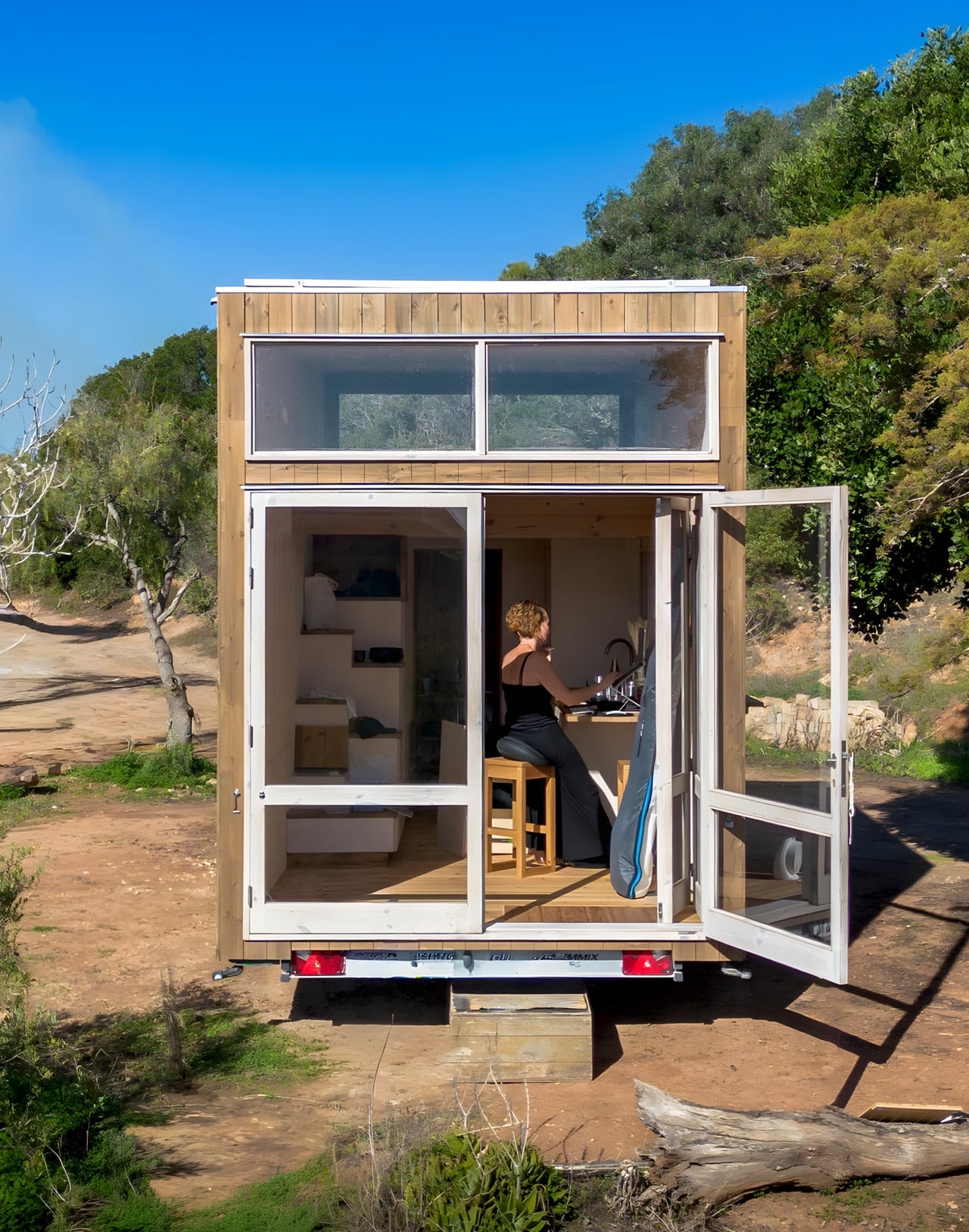
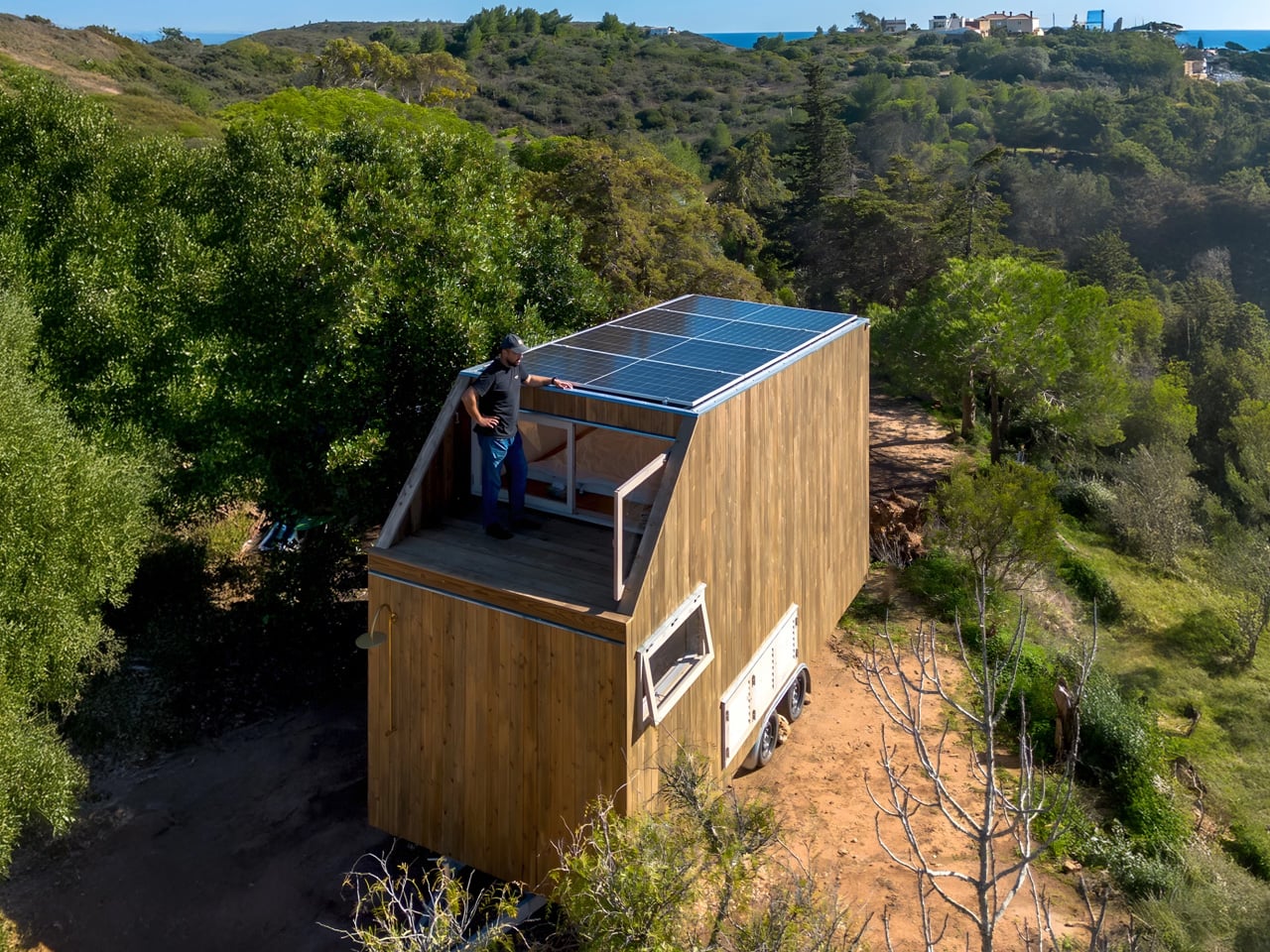
Portuguese woodworking studio Madeiguincho has unveiled its latest masterpiece, a compact dwelling that proves luxury isn’t measured in square footage. The Duna tiny house arrives as a thoughtful response to a client’s desire for something quite specific: the warmth and convenience of city apartment living transplanted into the wilderness, all while staying completely off-grid. Built on a double-axle trailer stretching just six meters in length, the Duna represents a careful balance between mobility and comfort.

The exterior showcases Madeiguincho’s signature timber craftsmanship, with wood cladding that wraps the entire structure in natural warmth. This isn’t just an aesthetic choice. The studio has built its reputation on exceptional woodworking, and every panel, joint, and finish speaks to decades of experience that began in 1990. The home’s roof tells its own story about modern sustainability, with solar panels blanketing the entire surface, capturing enough energy to power the dwelling without any connection to the grid.

Designer: Madeiguincho

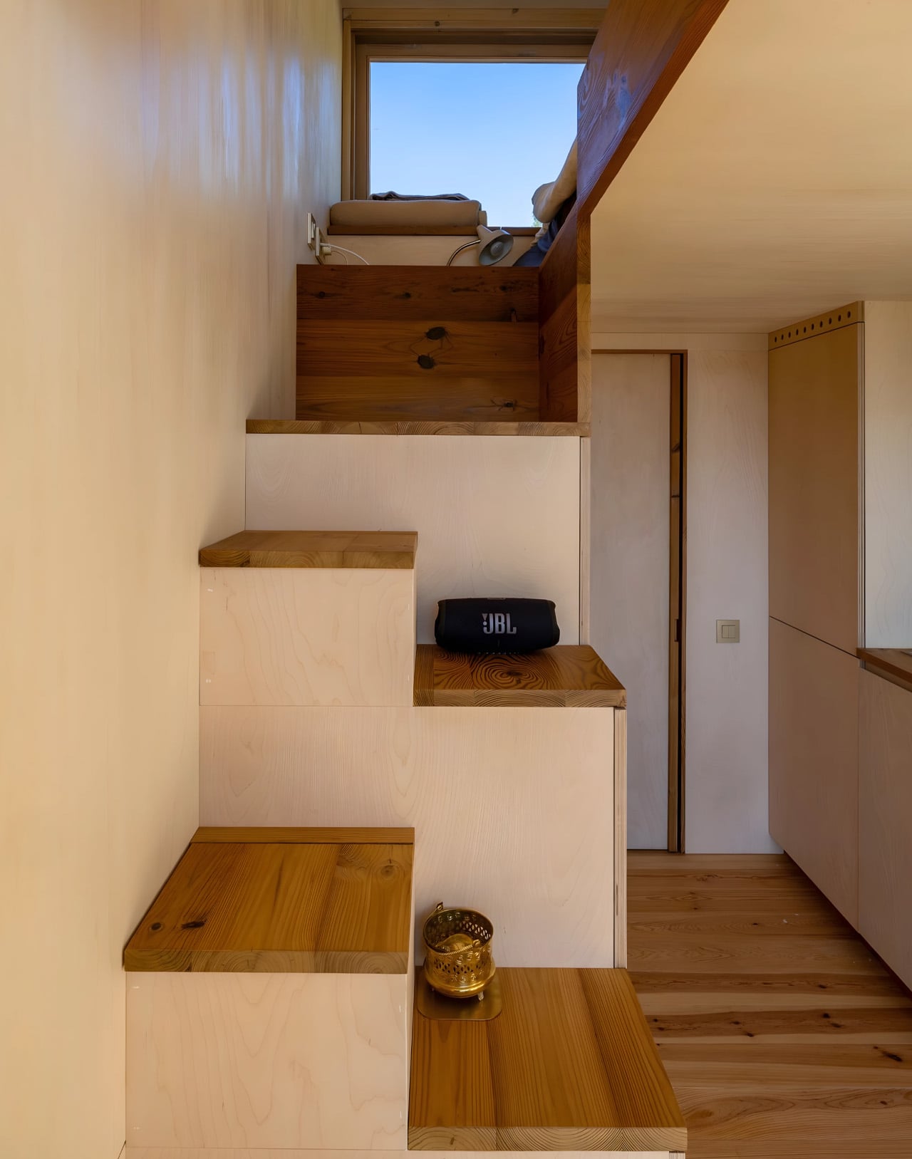
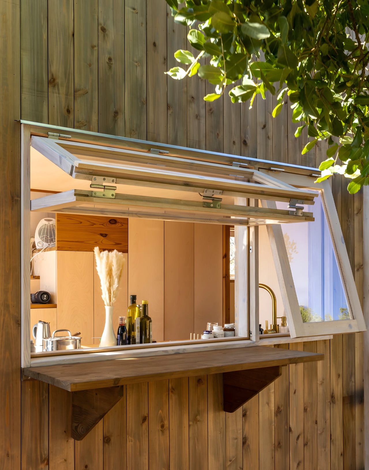
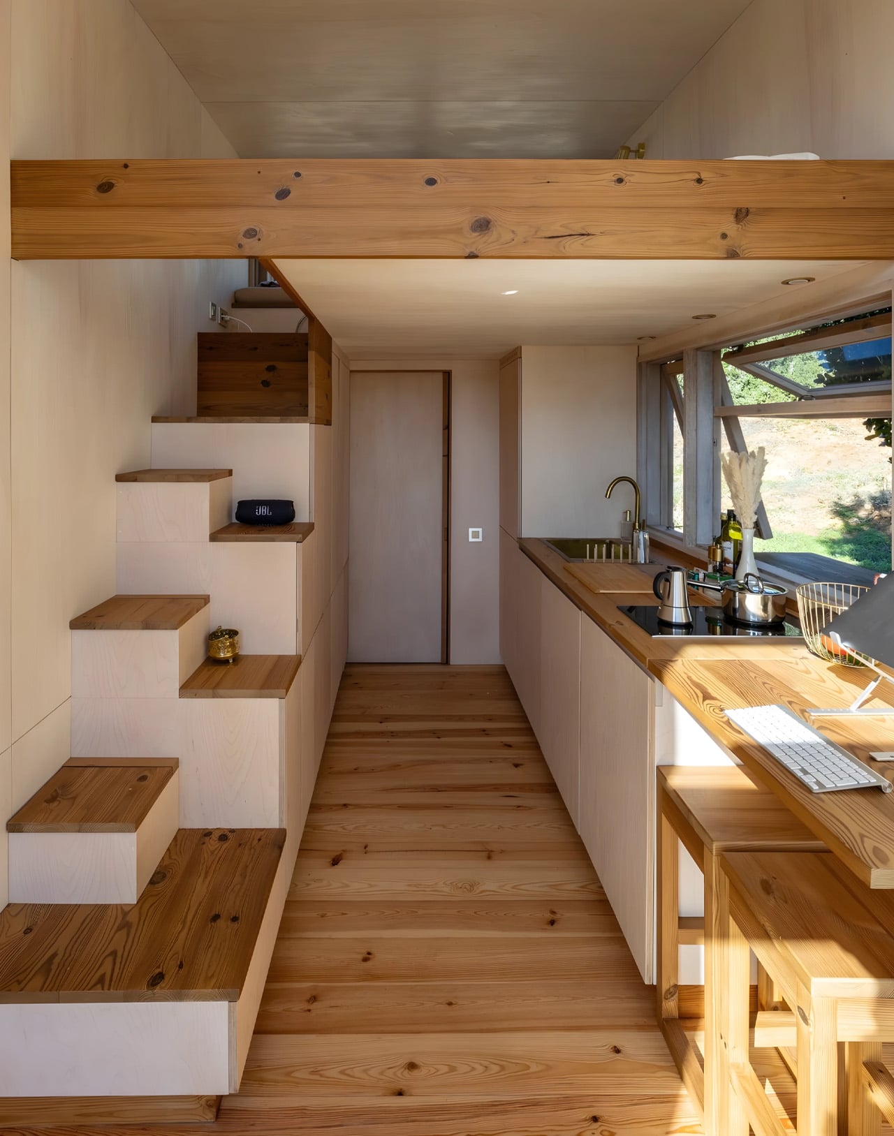
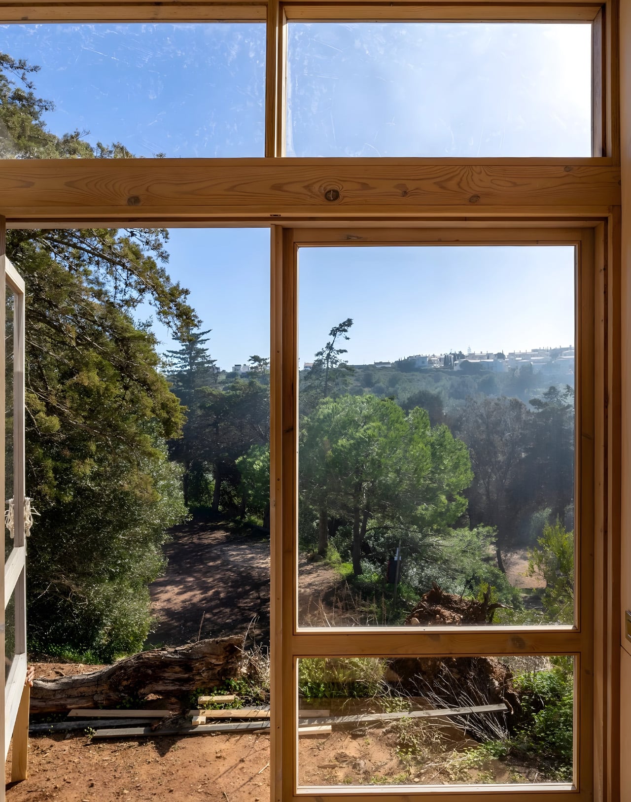
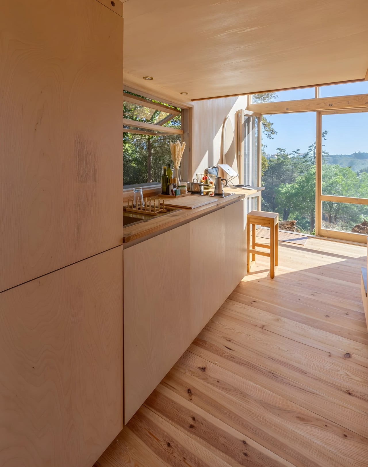
This solar setup allows the Duna to settle into remote Swiss landscapes where its owner wanted to establish roots, far from power lines and municipal services. Step inside, and the timber theme continues with rich wooden surfaces creating a cocoon of natural materials. The space is designed for two people, with every centimeter serving multiple purposes. The layout flows seamlessly from living area to sleeping quarters, all bathed in the warm tones of carefully selected wood.

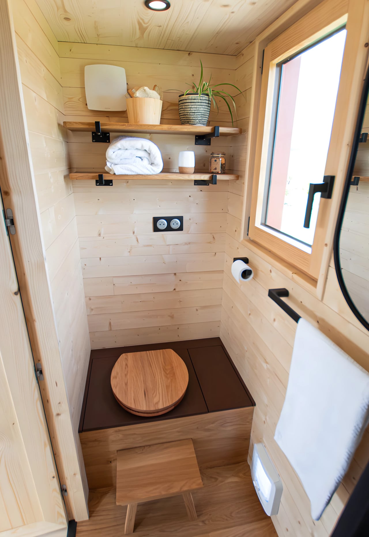
The bathroom stands out as particularly clever. Rather than tucking it away as an afterthought, Madeiguincho gave it a secondary entrance from outside. This transforms the space into a functional mudroom where hiking boots can be shed, wet dogs can be toweled off, and outdoor gear can be stored without dragging dirt through the main living space. Just outside this entrance sits an outdoor shower, perfect for rinsing off after a day spent exploring nature.

What makes the Duna special isn’t any single feature but rather how everything works together. The client didn’t want to rough it or sacrifice modern comforts. They wanted apartment living in the middle of nowhere, and that’s exactly what Madeiguincho delivered. The space feels finished and refined, not like camping but like genuinely living well. The timing of this project feels particularly relevant as more people reconsider what home means and whether bigger truly equals better.

The Duna suggests a different equation entirely: one where quality of materials, thoughtfulness of design, and connection to surroundings matter more than extra bedrooms that rarely get used. Madeiguincho has carved out a distinctive niche in the tiny house world. While others pursue industrial efficiency or ultra-modern aesthetics, this Portuguese studio stays committed to traditional craftsmanship and natural materials. The Duna exemplifies this philosophy, offering a home that feels timeless rather than trendy, handmade rather than manufactured. It’s a dwelling designed for slow living, for paying attention to seasons and sunlight, for remembering that sometimes the smallest spaces hold the strongest possibilities.

The post This Tiny House Brings Apartment Comfort To Off-Grid Living first appeared on Yanko Design.
This 260-Meter Skyscraper Is Dividing Switzerland’s Most Iconic Alpine Village

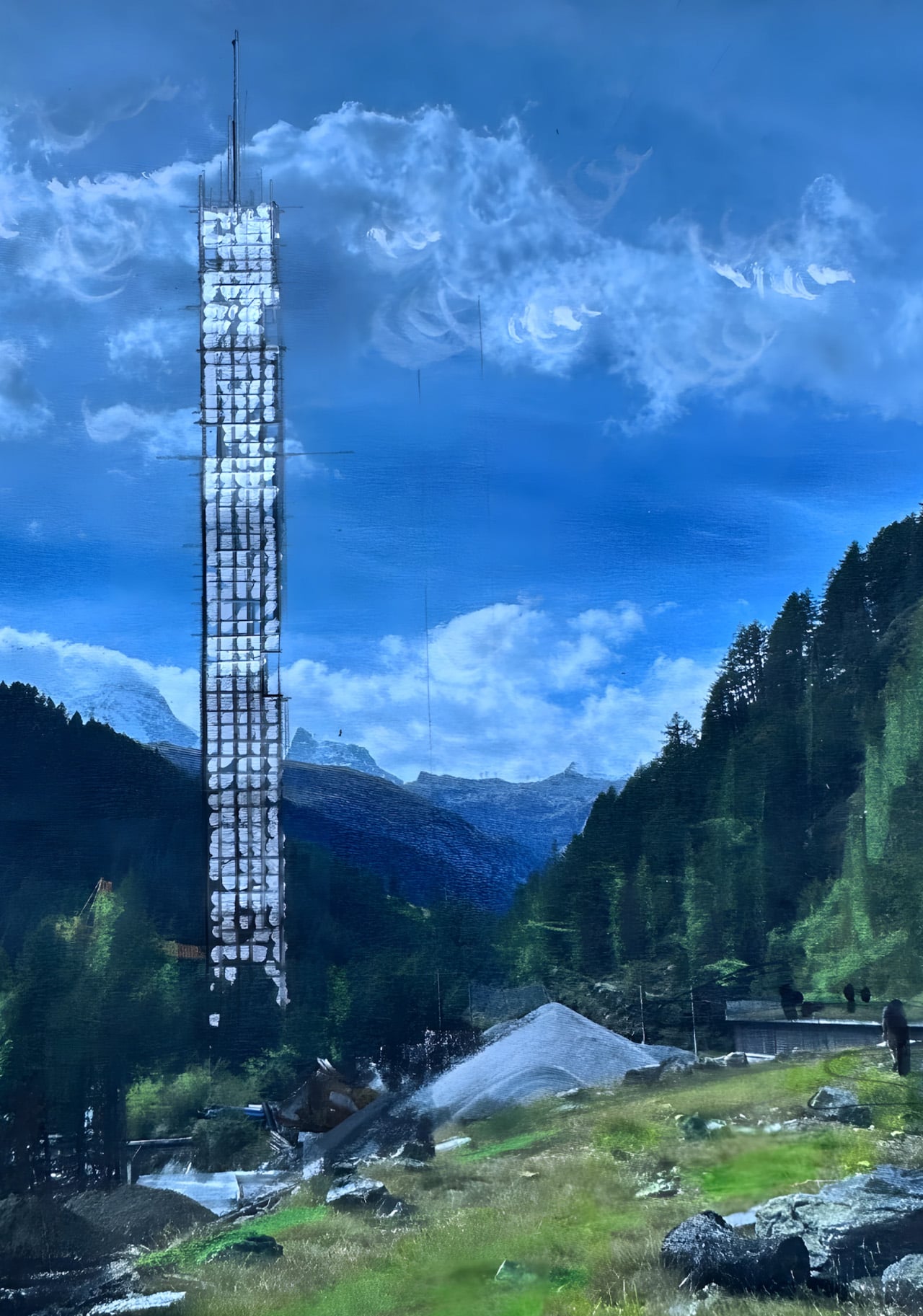
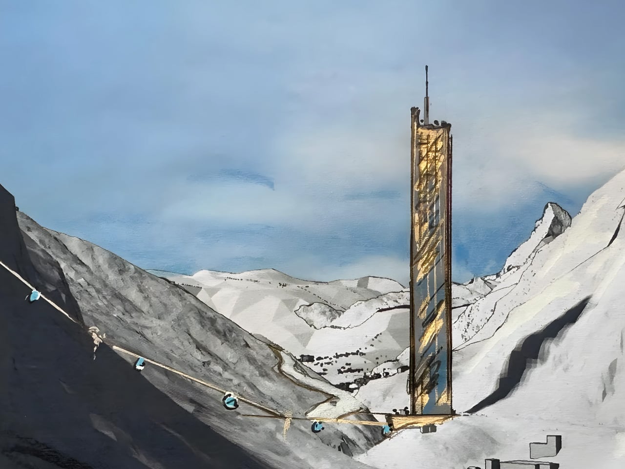
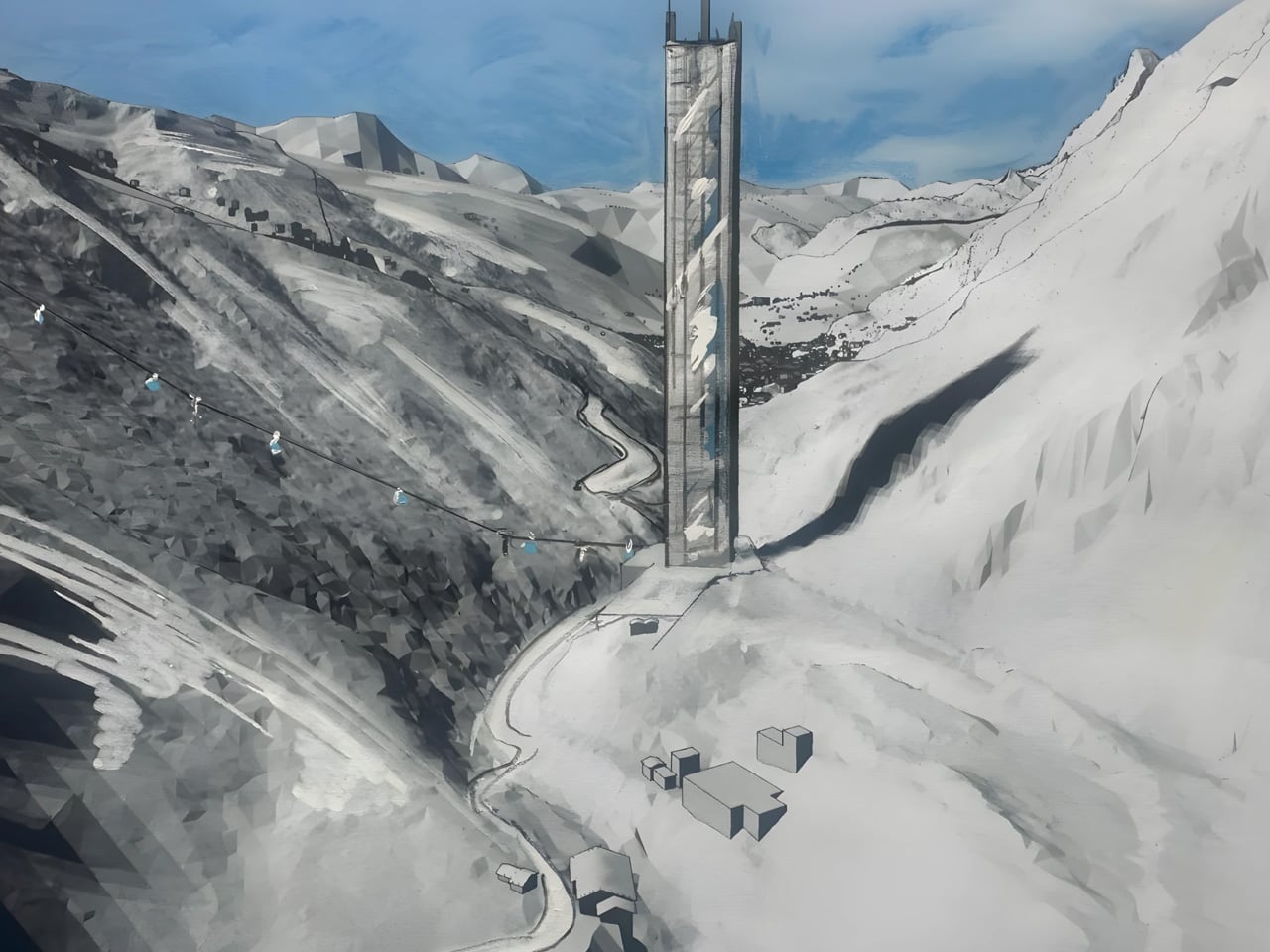
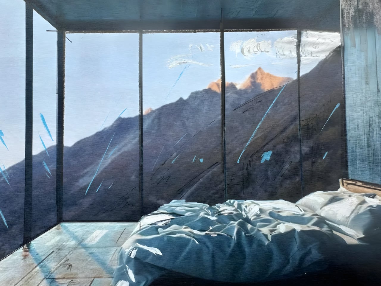
The Swiss alpine village of Zermatt has never seen anything quite like this. Heinz Julen, a local hotelier and designer, has unveiled plans for a 260-meter skyscraper that would pierce the sky just 800 meters from the village entrance. The 65-story tower, called Lina Peak, has sparked fierce debate in a community known for its car-free streets and fiercely protected mountain aesthetic. Julen presented his vision to a packed public meeting in mid-November 2025, revealing a structure that would become Switzerland’s tallest building. The tower would rise from a compact 40-by-40-meter footprint on farmland he already owns, sitting at an elevation of 1,500 meters with uninterrupted views of the iconic Matterhorn.

The project addresses a very real problem. Zermatt’s population swells from 6,000 permanent residents to over 40,000 during peak tourism seasons. Property prices have gone stratospheric, vacancy rates hover near zero, and seasonal workers struggle to find anywhere to live. Julen himself faces this challenge annually as a hotel owner, scrambling to house his staff. Employers in the tourism industry consistently struggle to provide affordable accommodation for seasonal workers, as local real estate is prohibitively expensive and vacancies are almost nonexistent.

Designer: Heinz Julen

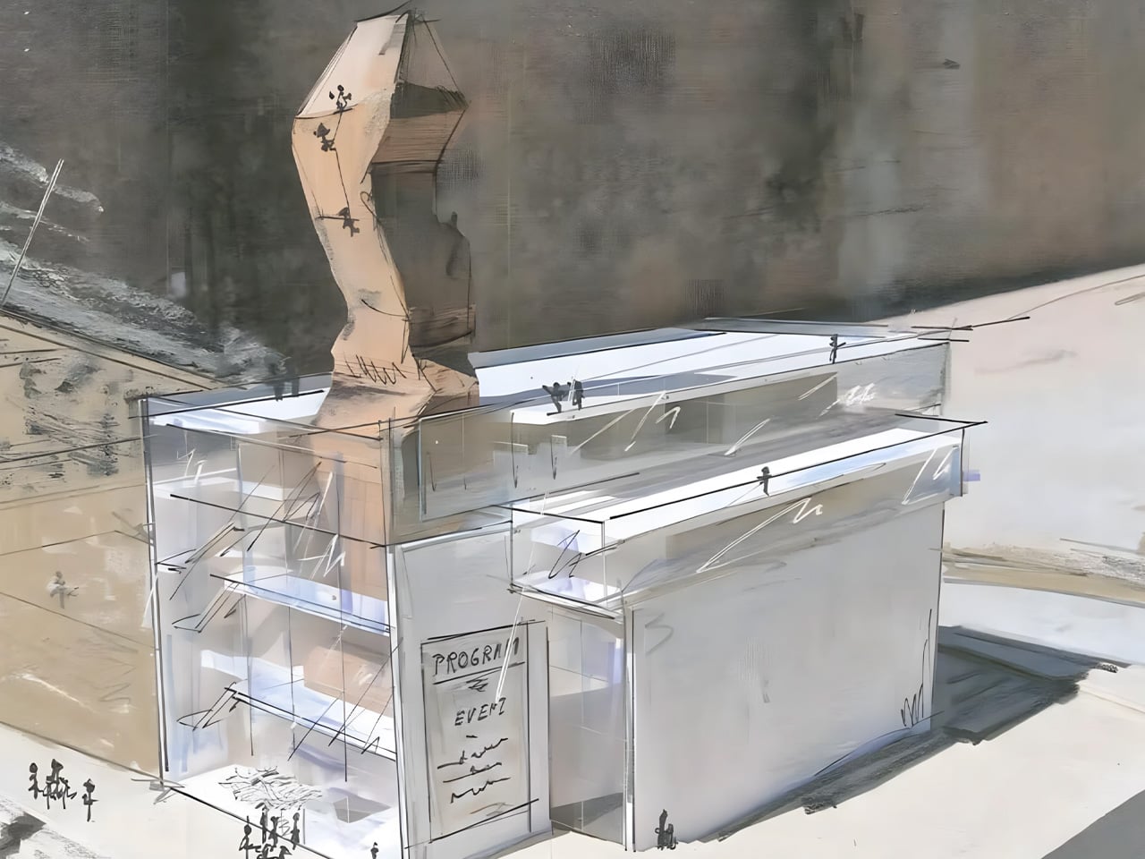
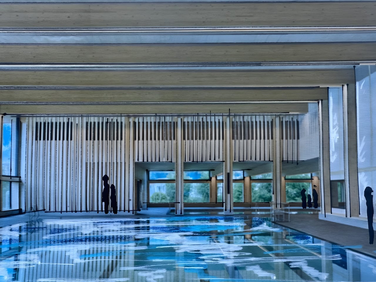
His solution thinks vertically. Floors 2 through 32 would provide affordable housing for locals and seasonal workers, while floors 33 through 62 would contain luxury apartments aimed at wealthy foreign buyers. The ground levels would pack in 1,000 parking spaces, a 2,500-seat concert hall, retail shops, restaurants, a sports center, a swimming pool, and a daycare center. The comprehensive vision transforms what could be a simple residential tower into a multi-functional hub for the entire community.

Julen frames Lina Peak as a “vertical village” that builds up rather than sprawling outward. He argues that compacted construction protects the soil and reduces environmental footprint while giving seasonal workers a fair shot at decent housing. The estimated CHF 500 million project includes price controls designed to prevent speculation, with housing costs expected to rise no faster than two percent annually. From his perspective, concentrating development in one place reduces land occupation and allows better management of local resources.

The controversy centers on whether a towering glass structure belongs in one of Europe’s most picturesque Alpine settings. Zermatt has built its reputation on preserving traditional mountain architecture, and the Matterhorn dominates every postcard. Julen insists the location sits outside direct sightlines from the village or prime viewpoints, claiming it won’t ruin the iconic views. The idea of dropping a skyscraper in the middle of such an open, scenic setting represents a stark departure from everything Zermatt has stood for architecturally.

Critics question whether luxury apartments for foreign buyers truly solve local housing problems or simply fuel further speculation and inflate property values. Past attempts at alpine skyscrapers in Switzerland have failed, including a proposed 381-meter tower at another mountain village that never materialized. Julen has long been known for unconventional designs in the area, and this proposal pushes boundaries further than ever before. Whether Lina Peak will transform Zermatt’s future or remain an ambitious sketch depends on navigating complex planning approvals and winning over a deeply divided community. The vision aims for completion by 2034, though the path forward remains anything but certain.

The post This 260-Meter Skyscraper Is Dividing Switzerland’s Most Iconic Alpine Village first appeared on Yanko Design.
French Tiny House Masters Baluchon Create Light-Filled Sanctuary For Mother & Daughter

Baluchon, the renowned French tiny house builder known for its artisanal craftsmanship, has unveiled its latest creation: a compact dwelling that challenges conventional notions of small-space living. Named “Into the Woods,” this 20-foot home was custom-built for Sandrine and her daughter, who plan to make it their permanent residence. The project represents another successful collaboration between the celebrated French builder and clients seeking a simpler, more intentional way of life in a beautifully designed space.

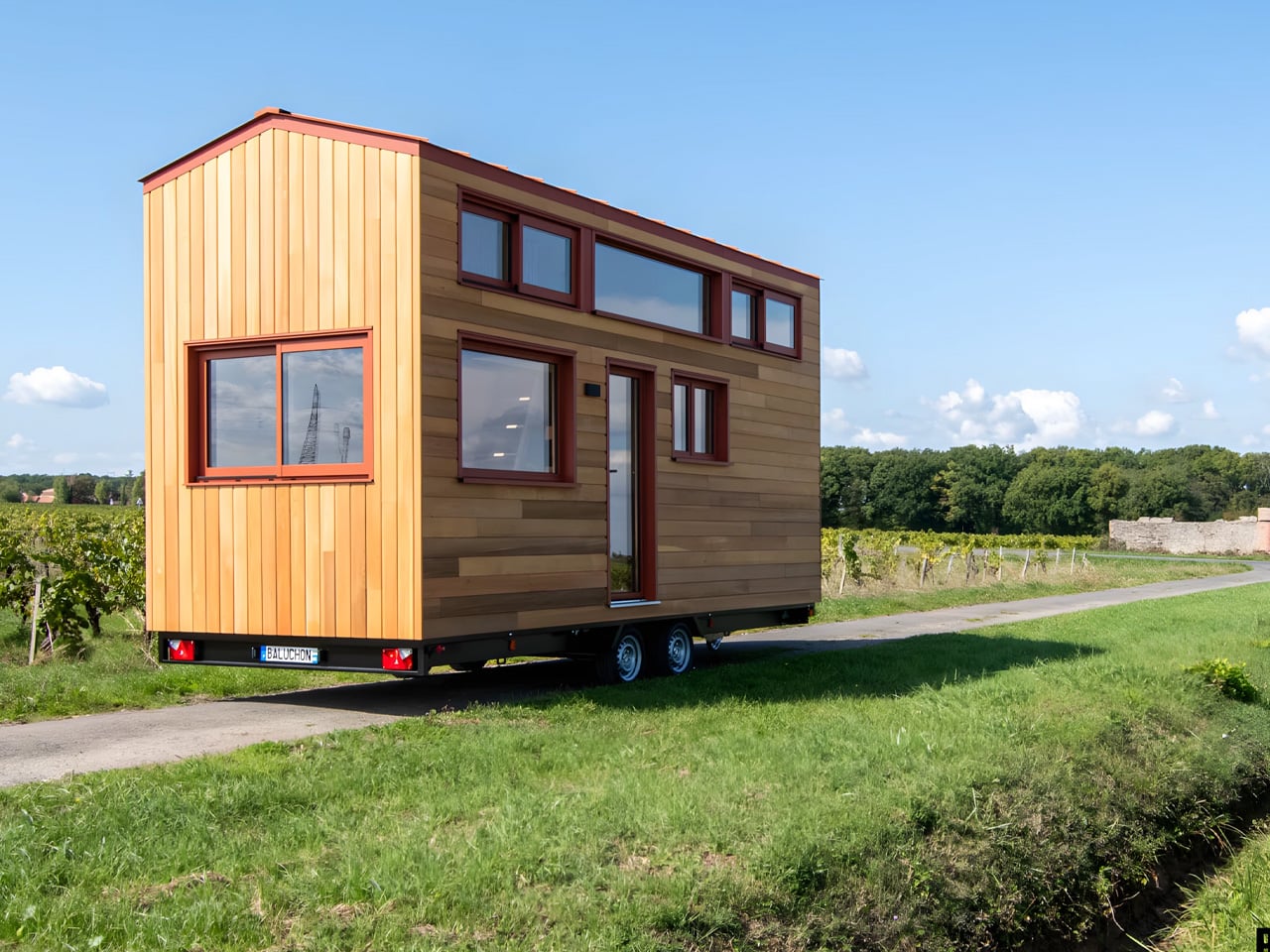
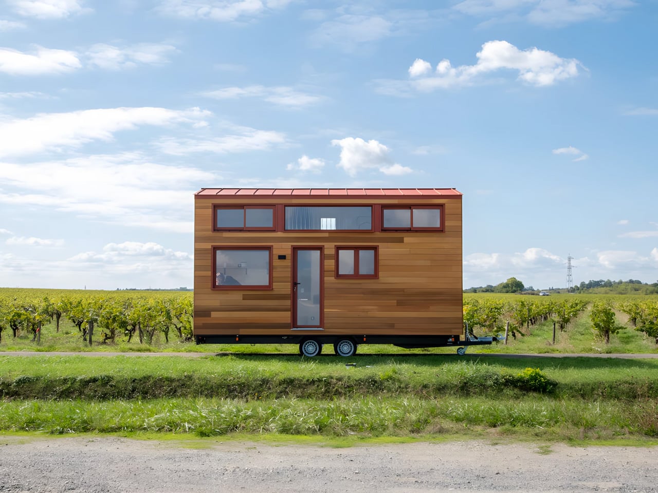
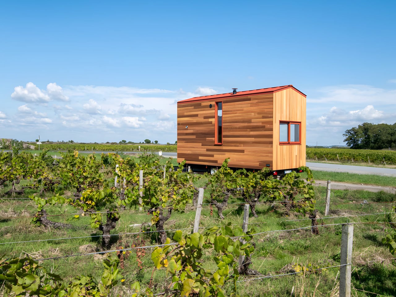
The exterior immediately signals Baluchon’s signature aesthetic that has made them stand out in the tiny house movement. Red cedar cladding wraps the structure, complemented by a metal roof and those distinctive pops of color that set the French builder apart from competitors. At just 6 meters long, the home sits on a double-axle trailer, embodying the typical European tiny house proportions that feel intimate rather than cramped. This artisanal approach to exterior design ensures that while all Baluchon homes feature traditional wood cladding, they never appear dull or repetitive.

Designer: Baluchon

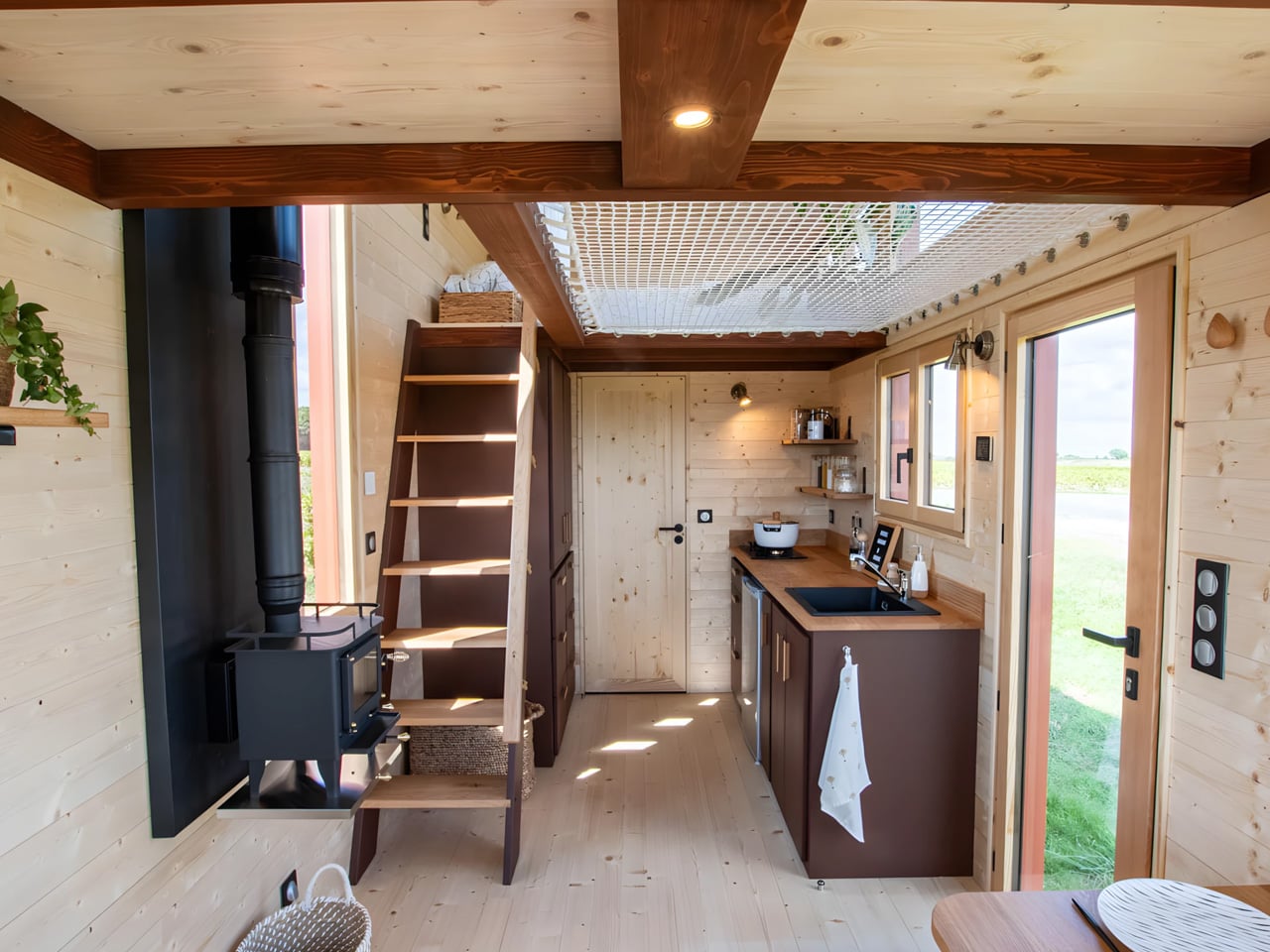
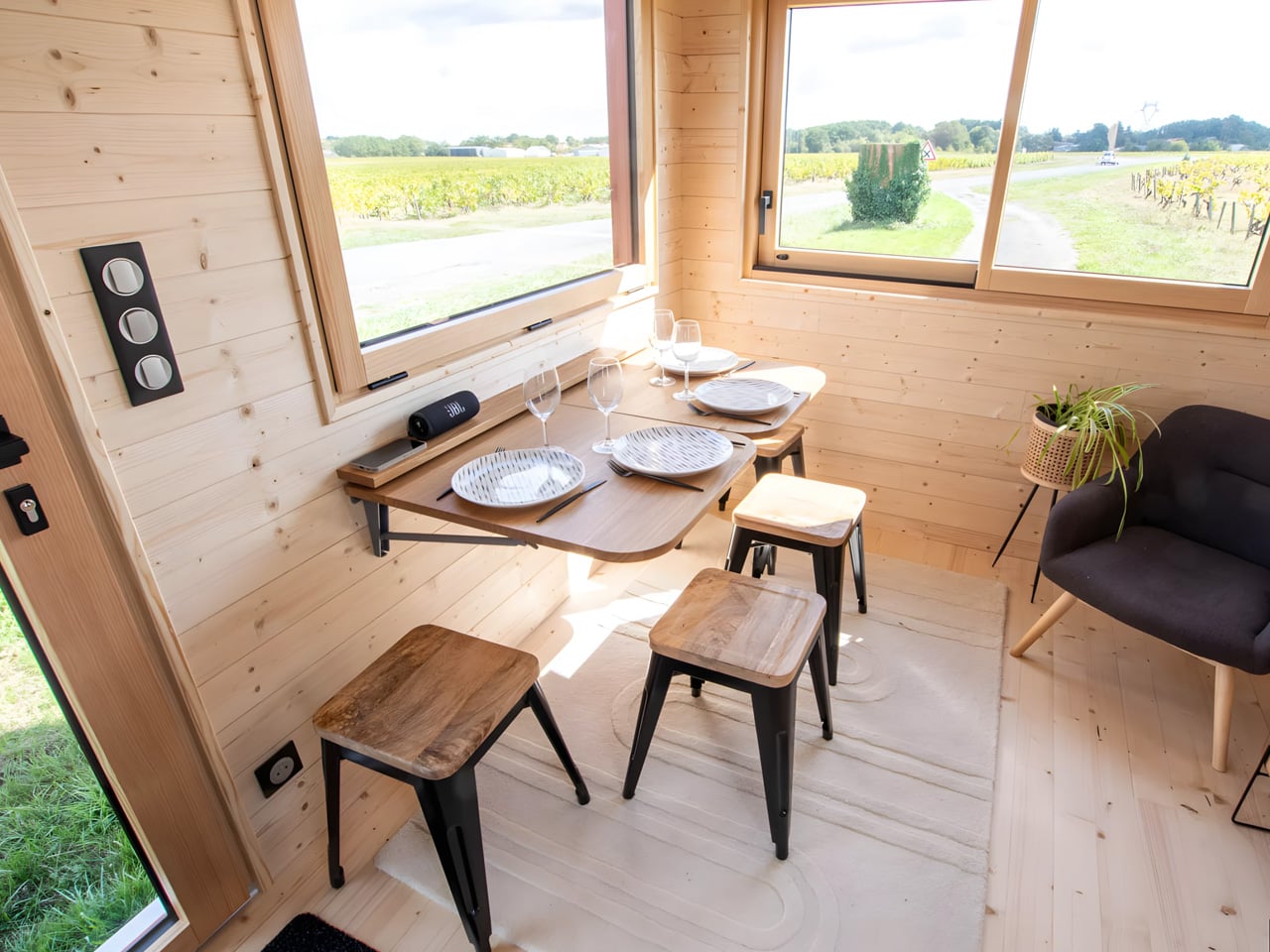
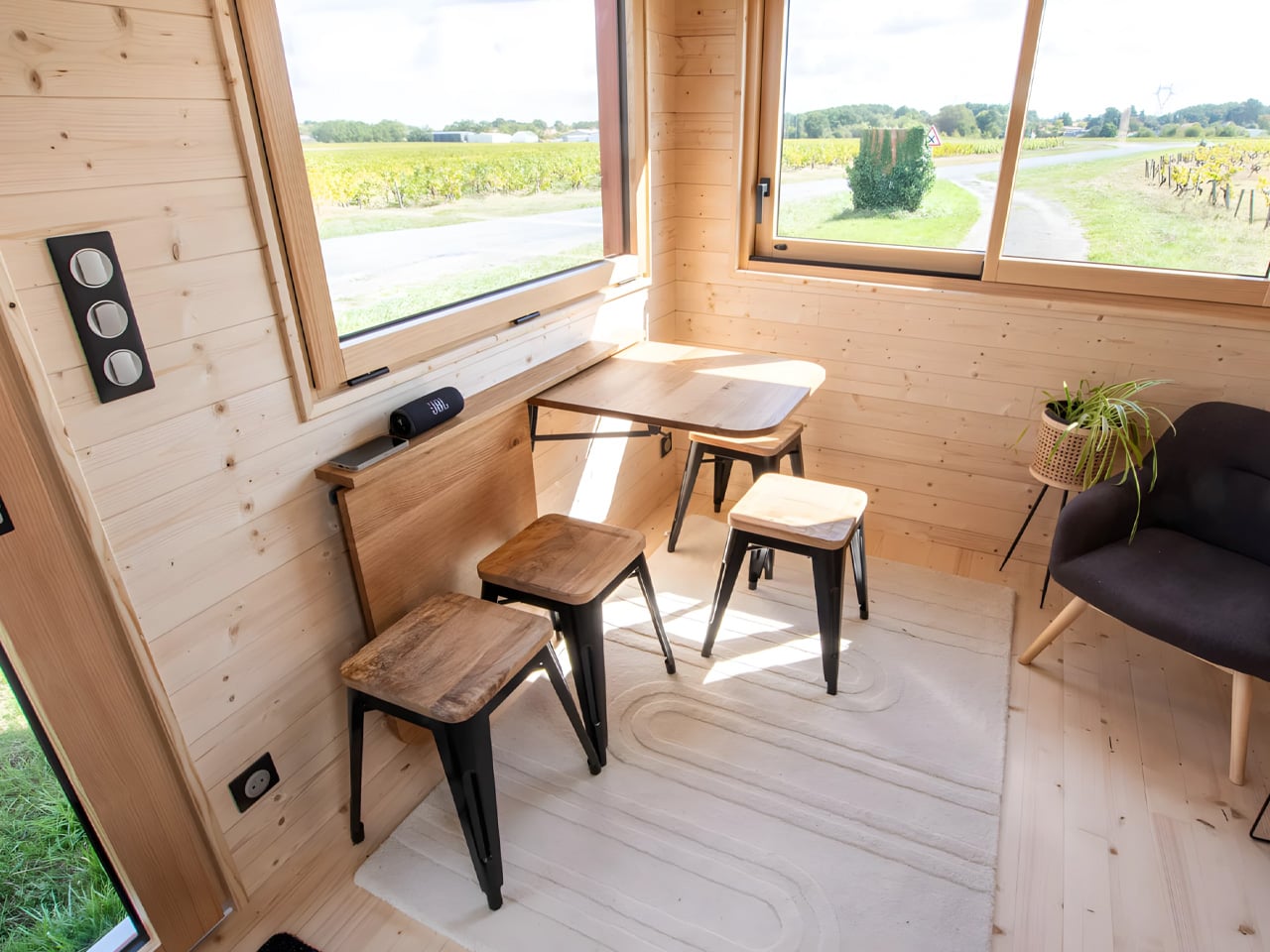
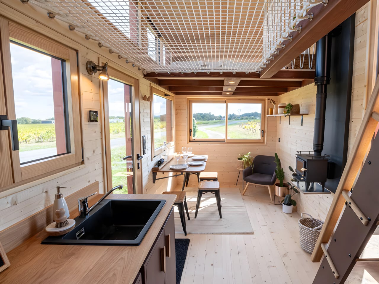
Step inside, and the spatial magic remarkably reveals itself. Despite the modest footprint, the interior feels remarkably open and airy, defying expectations for a home of this size. This isn’t accidental but the result of careful planning. Baluchon deployed extensive glazing throughout the design, flooding every corner with natural light and eliminating the dark, cramped spaces that often plague smaller dwellings. The living and dining area benefits most from this approach, with oversized windows on two sides creating an indoor-outdoor flow that makes the space feel significantly larger than its measurements suggest. This luminous quality transforms the tiny house into a genuine sanctuary.

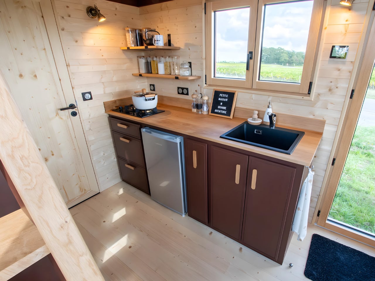
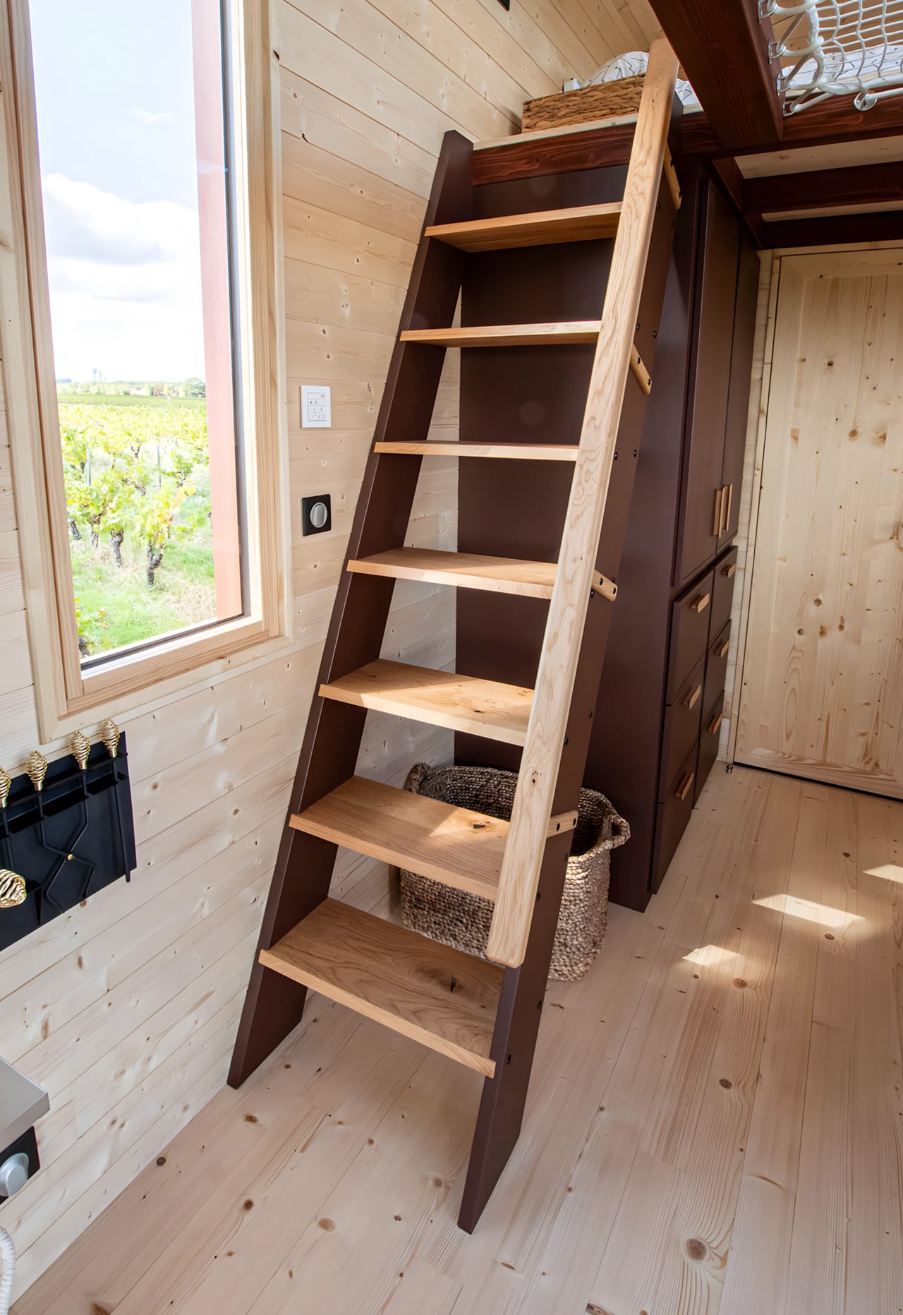
The layout prioritizes functionality without sacrificing comfort, demonstrating Baluchon’s years of experience. A full kitchen lines one wall, while a compact bathroom sits tucked away with a full-size closet positioned strategically next to it. The closet features multiple cabinets, drawers, and hanging space, proving that minimalist living doesn’t mean compromising on storage solutions. Access to the upper level comes via a fixed ladder with wider treads, a design choice that maximizes floor space below while remaining easy to navigate daily. Every element serves a purpose while contributing to the home’s overall aesthetic.

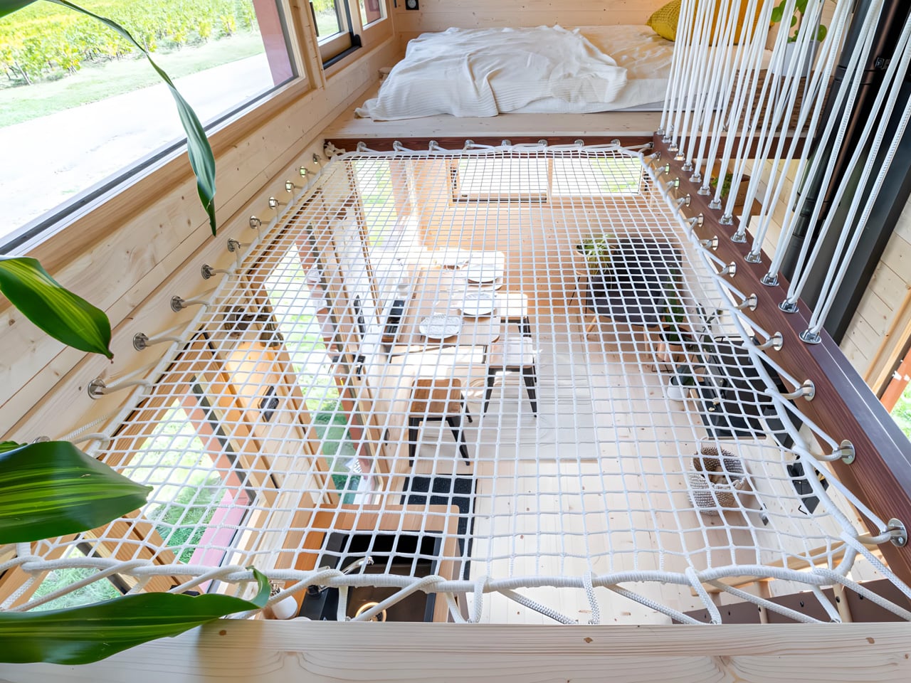
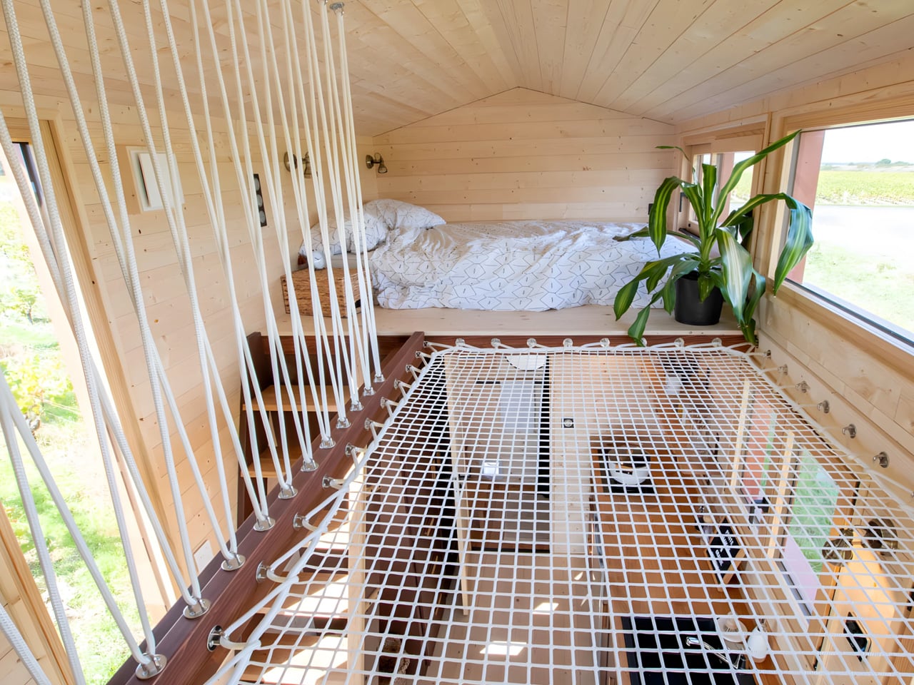
The real innovation happens upstairs, where Baluchon implemented a truly creative solution. Rather than creating two separate, potentially dark sleeping lofts, the builder connected the bedrooms with a stretched net. This clever design serves multiple purposes simultaneously: it maintains visual connectivity between the two spaces, allows light to penetrate throughout the upper level, and adds an element of playfulness to the design. The net transforms what could have been isolated sleeping quarters into a cohesive, light-filled sanctuary that feels both practical and imaginative. This approach perfectly balances the needs of the mother-daughter duo who will call this space home.

The Into the Woods represents more than just another tiny house completion; it embodies a growing movement toward intentional living, where people choose to downsize not out of necessity but as a conscious lifestyle decision. For Sandrine and her daughter, this home offers an opportunity to live in harmony with nature, away from urban density, while maintaining all the essential comforts of modern life. Baluchon continues to prove that small doesn’t mean sacrificing quality or livability. With each new build, they demonstrate how thoughtful design can transform compact spaces into genuine homes where families can thrive long-term. Into the Woods stands as a testament to this philosophy, showing that 20 feet is more than enough space when every inch is carefully considered.

The post French Tiny House Masters Baluchon Create Light-Filled Sanctuary For Mother & Daughter first appeared on Yanko Design.
This Footbridge Has 3 Paths That Rise and Fall Through Steel Waves

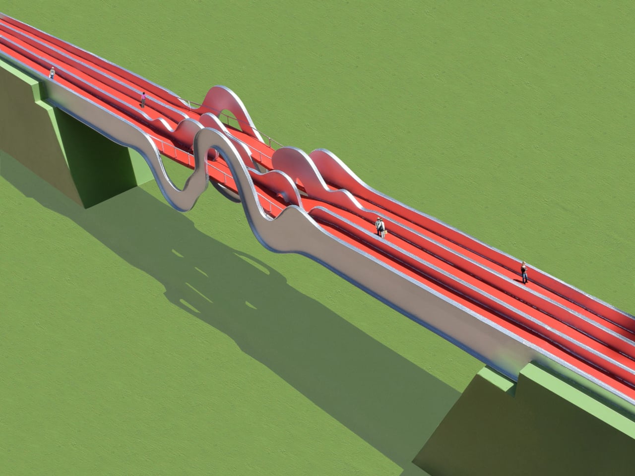
Most pedestrian bridges are neutral pieces of infrastructure, straight spans with railings that get you from one side of a road to the other. A few projects treat bridges as public art, but often as surface decoration rather than structural idea. The Wave Formed Footbridge is a proposal that starts from movement itself, imagining people as waves that literally reshape the bridge as they cross it.

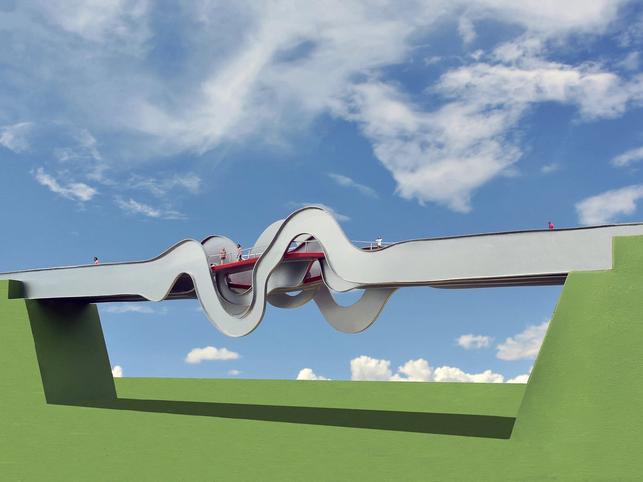
The concept visualizes people walking across the bridge and, in doing so, forming waves of energy that could conceptually deform the structure in space and time. In this case, three people walking on three different paths are imagined as three overlapping waveforms, and those waves are frozen at the center of the span to become the model for the final steel geometry. The bridge becomes a physical record of motion before anyone has even stepped on it.

Designer: Michael Jantzen

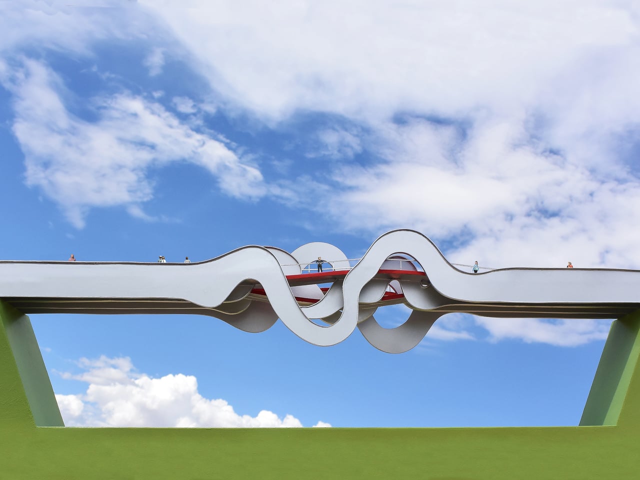
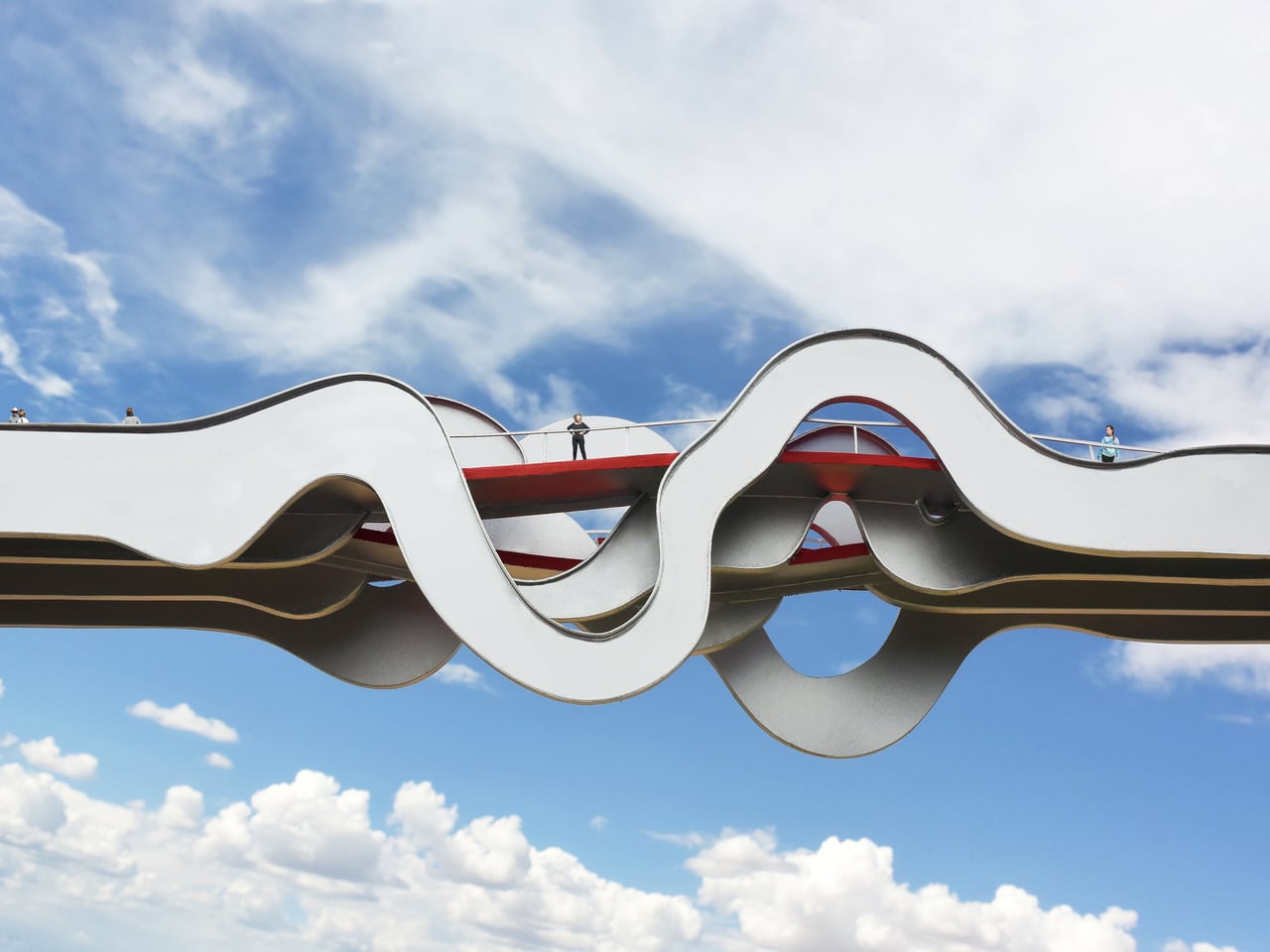
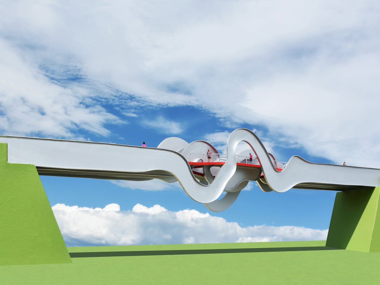
The basic layout uses four primary steel channels running the length of the bridge, each deformed into a different wave shape at mid-span, and three separate red paths weaving through them. The two outer paths curve up where the channels distort into waveforms, while the center path curves down. The result is a multi-level crossing where pedestrians can choose to crest over the waves or dip into them, experiencing the same structure in different ways.

As you reach the middle, the outer paths rise into gentle hills that give you a higher vantage point over the highway, while the center path drops into a kind of canyon formed by the looping steel ribbons. Openings in the waves frame views of sky and landscape, and the red deck threads through peaks and troughs, making the act of crossing feel more like moving through a sculptural field than walking a straight line across a gap.

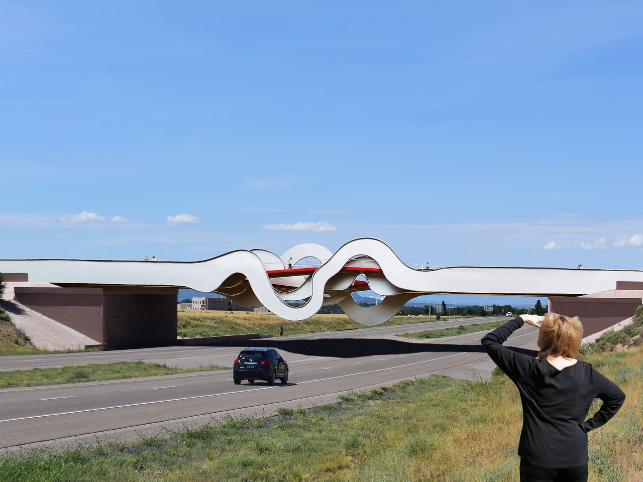
From the driver’s perspective, the underside of the bridge becomes the main event. The four channels loop up and down, casting complex shadows and creating a silhouette that looks like a waveform drawn in steel. As you pass underneath, the bridge acts as a gateway or landmark, not just a slab overhead. It is meant to function as a tourist attraction for the city as much as a safe way to cross a two-lane highway.

The Wave Formed Footbridge proposes that a pedestrian bridge can be a physical record of movement, a wave of steel shaped by the imagined footsteps of those who cross it. Instead of treating people as loads on a diagram, it treats them as the authors of the form. The highway crossing stops being a simple gap to span and starts being a chance to turn everyday movement into something sculptural, visible from both above and below.

The post This Footbridge Has 3 Paths That Rise and Fall Through Steel Waves first appeared on Yanko Design.
The Miami Tiny House Proves Big Design Can Come in Small Packages

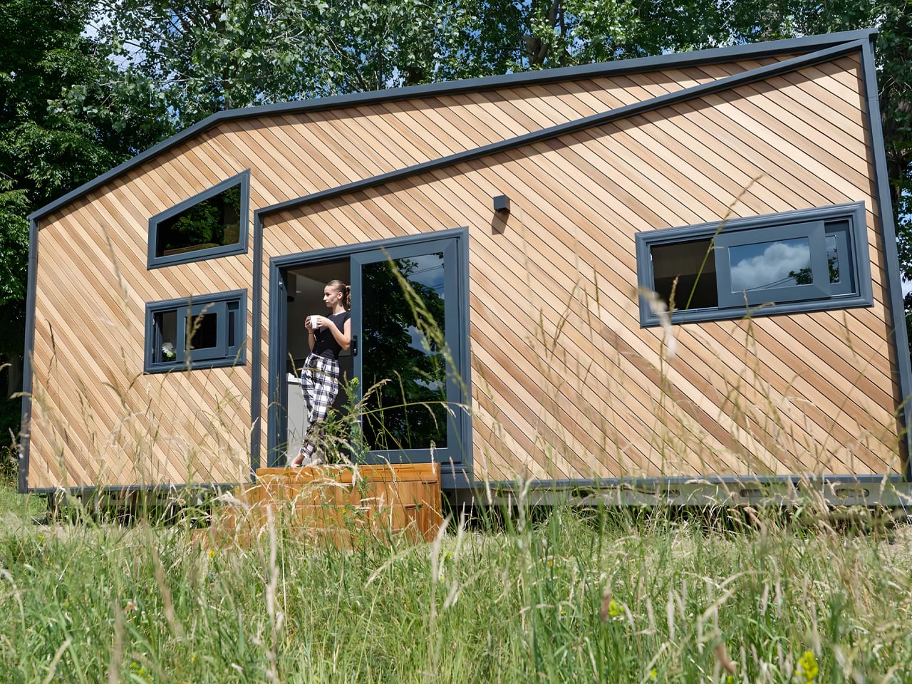
UK-based Tiny House Pro has unveiled their standout model, the Miami, and it’s turning heads across the tiny house community. This two-story dwelling manages to pack six sleeping spots into just 8 meters of road-legal, towable space. The design feels less like a compromise and more like a carefully considered answer to modern living.

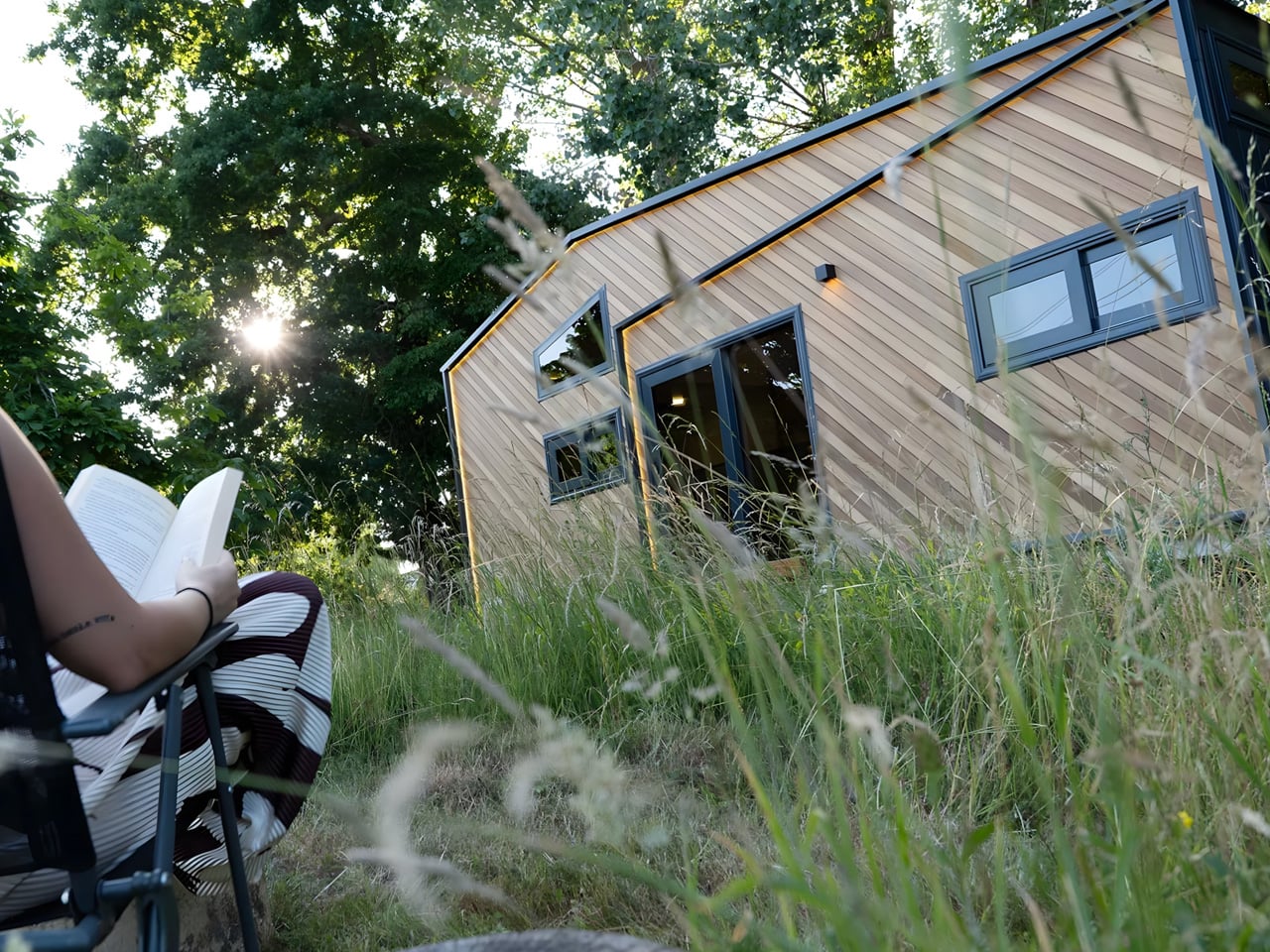
The exterior catches your eye first. Bold geometric angles cut across diagonal timber cladding, while sharp LED lighting traces the roofline. Large windows and glazed doors punctuate the facade, creating visual breaks that make the structure feel open rather than confined. The company describes it as their “showstopper,” wrapped in sleek timber with jaw-dropping angles that challenge what we expect from mobile architecture.

Designer: Tiny House Pro

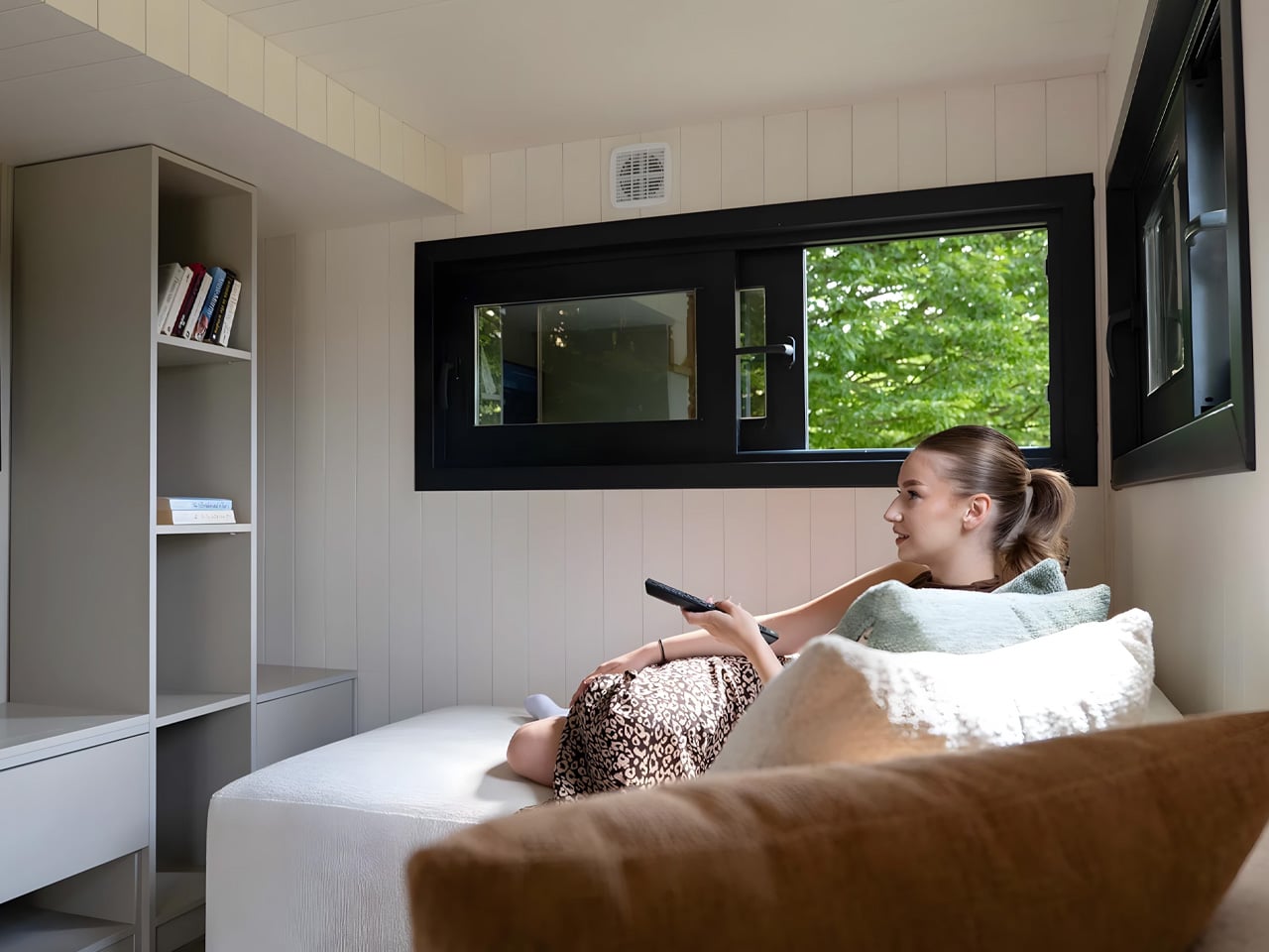
Step inside, and the spatial planning becomes clear. The open-plan layout flows from kitchen to lounge without feeling cramped. Two loft bedrooms sit overhead, each fitted with proper double beds rather than makeshift sleeping nooks. The bathroom doesn’t sacrifice comfort either, offering a walk-in shower, vanity sink, and flushing toilet. These are residential appliances and full-size fixtures, not the scaled-down versions you might expect.

What sets Miami apart is its attention to longevity and sustainability. Marine-grade plywood forms the structural foundation, paired with laminate flooring and solid wood worktops and stair treads. The walls hold 97% recyclable Rockwool insulation, while reversible air conditioning comes standard for year-round comfort. The home arrives pre-wired for solar panels and smart home systems, giving owners room to customize their utility setup.

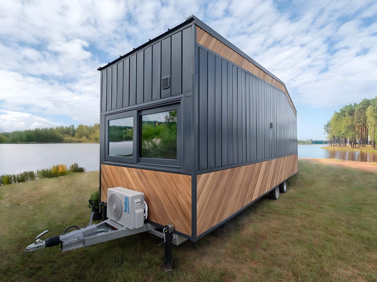
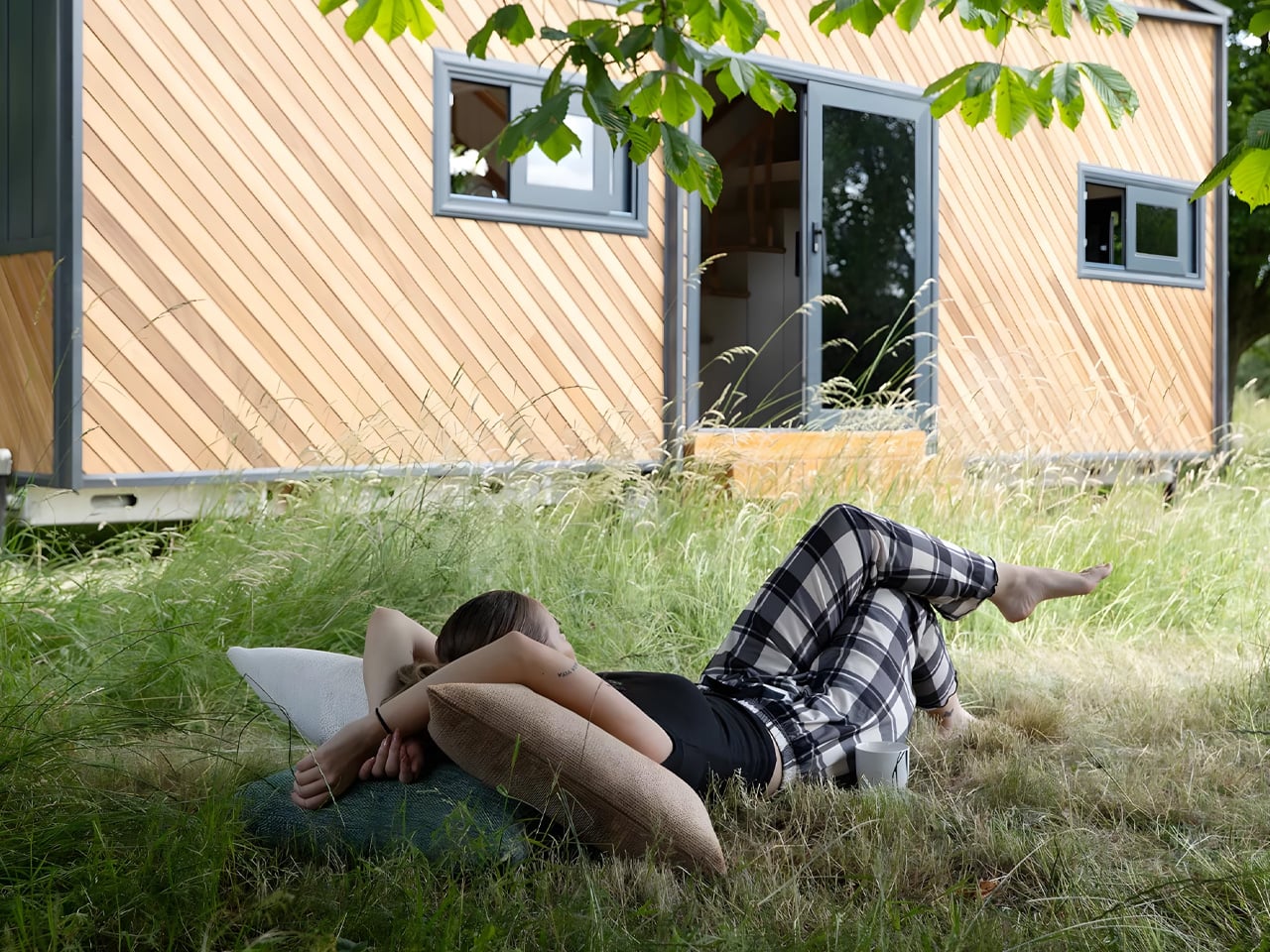
At 2.55 meters wide, the Miami stays within legal transport limits, meaning no special permits are needed to relocate it. The home sits on a heavy-duty galvanized trailer chassis, though Tiny House Pro offers removable drawbars and wheels for those who want to disguise the mobile foundation. Optional decking can extend the living area outdoors, creating a seamless indoor-outdoor flow. The plug-and-play nature means you simply hook up utilities, level the base, and you’re ready to move in.

The target audience spans multiple use cases. Some buyers will use it as their primary residence, drawn to simplified living without sacrificing amenities. Others see it as an Airbnb opportunity, a turnkey rental unit that can generate income from a backyard or rural plot. Tsvetina, Tiny House Pro’s in-house designer, both created the Miami and works directly with buyers to tailor finishes and layouts. This isn’t about making do with less. It’s about making more of what you have.

The post The Miami Tiny House Proves Big Design Can Come in Small Packages first appeared on Yanko Design.
This 20-Foot Tiny Home Brings Authentic Japanese Design to Compact Living

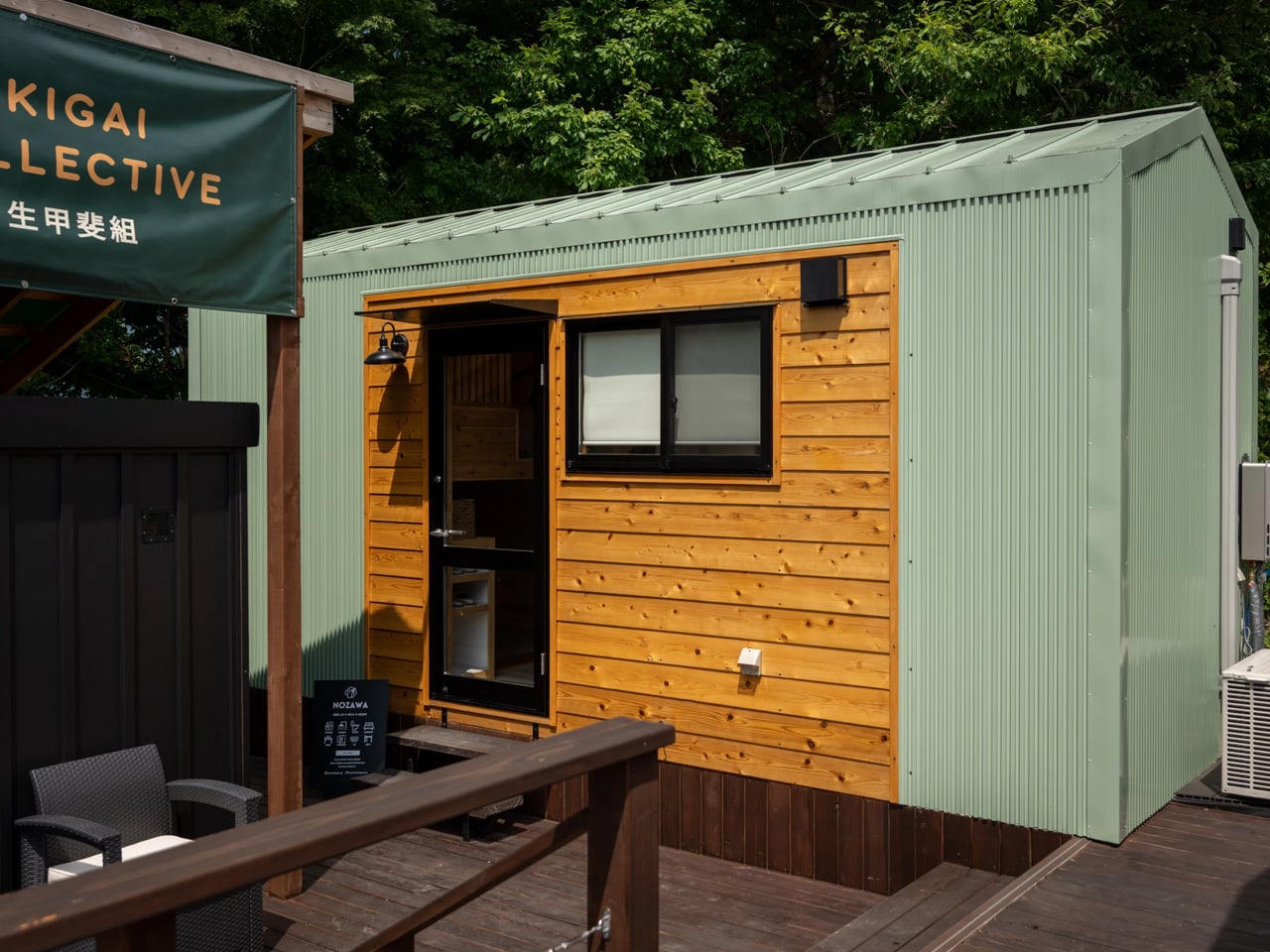
The tiny house movement has found a new voice in Japan, where Ikigai Collective is creating homes that honor traditional aesthetics while embracing modern minimalism. The Nozawa stands out as a stunning expression of Japanese design philosophy, built not as an homage from afar but as an authentic creation rooted in local culture and craftsmanship. Measuring just 20 feet in length, this compact dwelling challenges the North American trend toward ever-larger tiny homes that sometimes stretch beyond 50 feet. The Nozawa aligns more closely with European sensibilities, proving that thoughtful design can create livable spaces without expanding square footage. Its modest dimensions become an asset rather than a limitation when every inch serves a purpose.

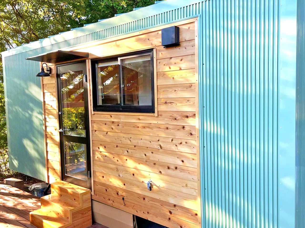
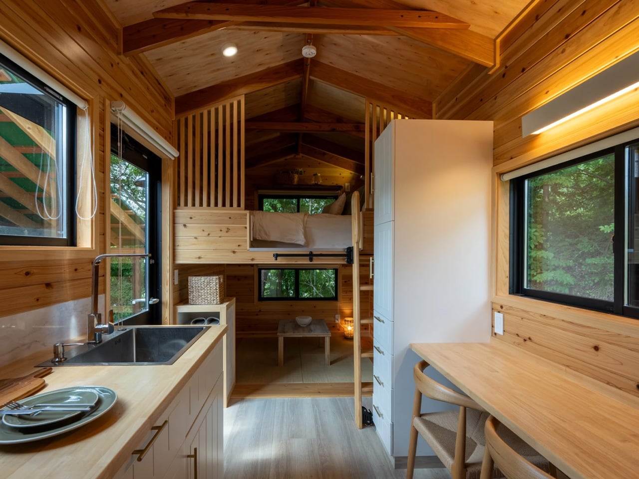
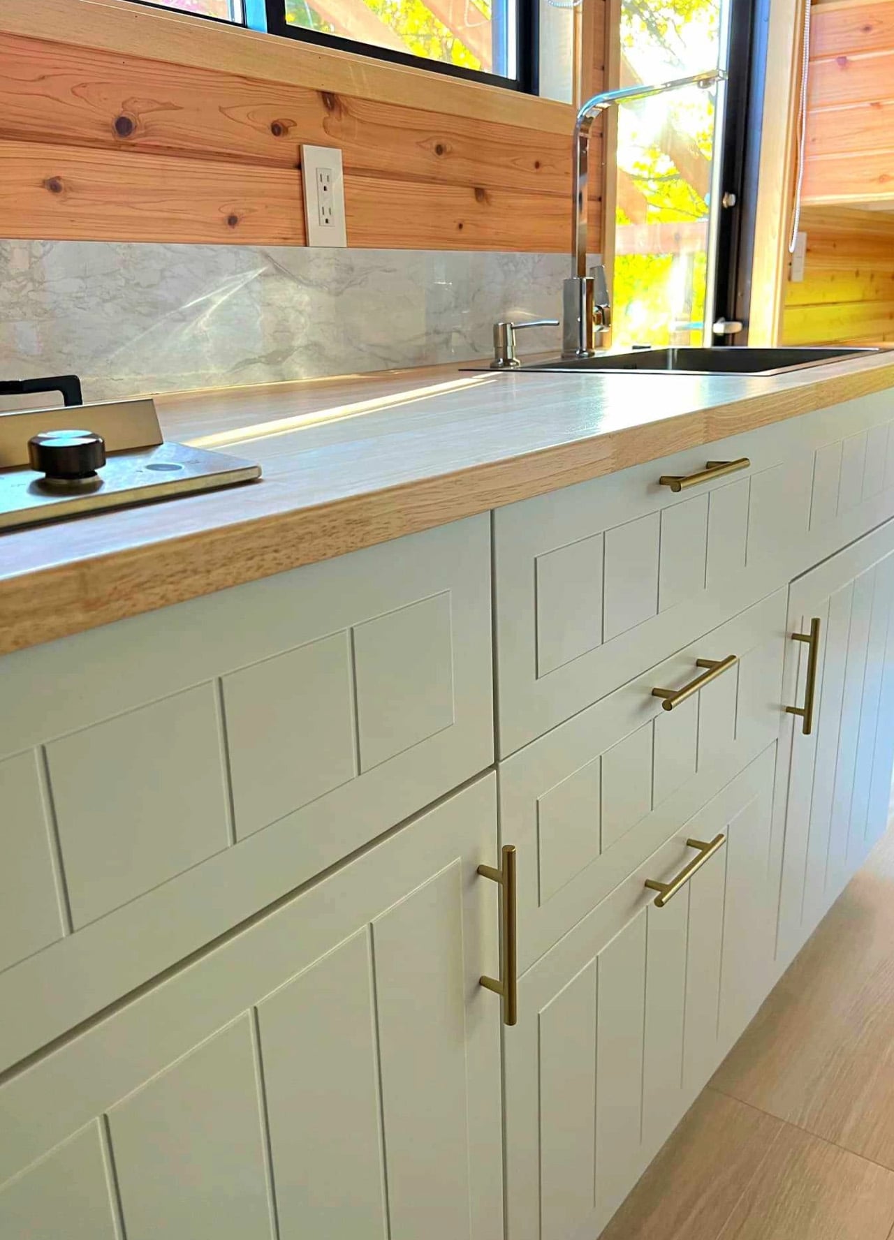
The exterior combines durable steel cladding with wooden accents, creating visual warmth while standing up to varied weather conditions. Inside, wood dominates every surface, enveloping occupants in a cabin-like atmosphere that feels both grounded and inviting. The material choice speaks to Japanese design principles where natural elements bring spaces to life without unnecessary ornamentation. The design acknowledges that wild parties aren’t part of the plan, focusing instead on quiet comfort for two people who value intimate living spaces over expansive floor plans.

Designer: Ikigai Collective

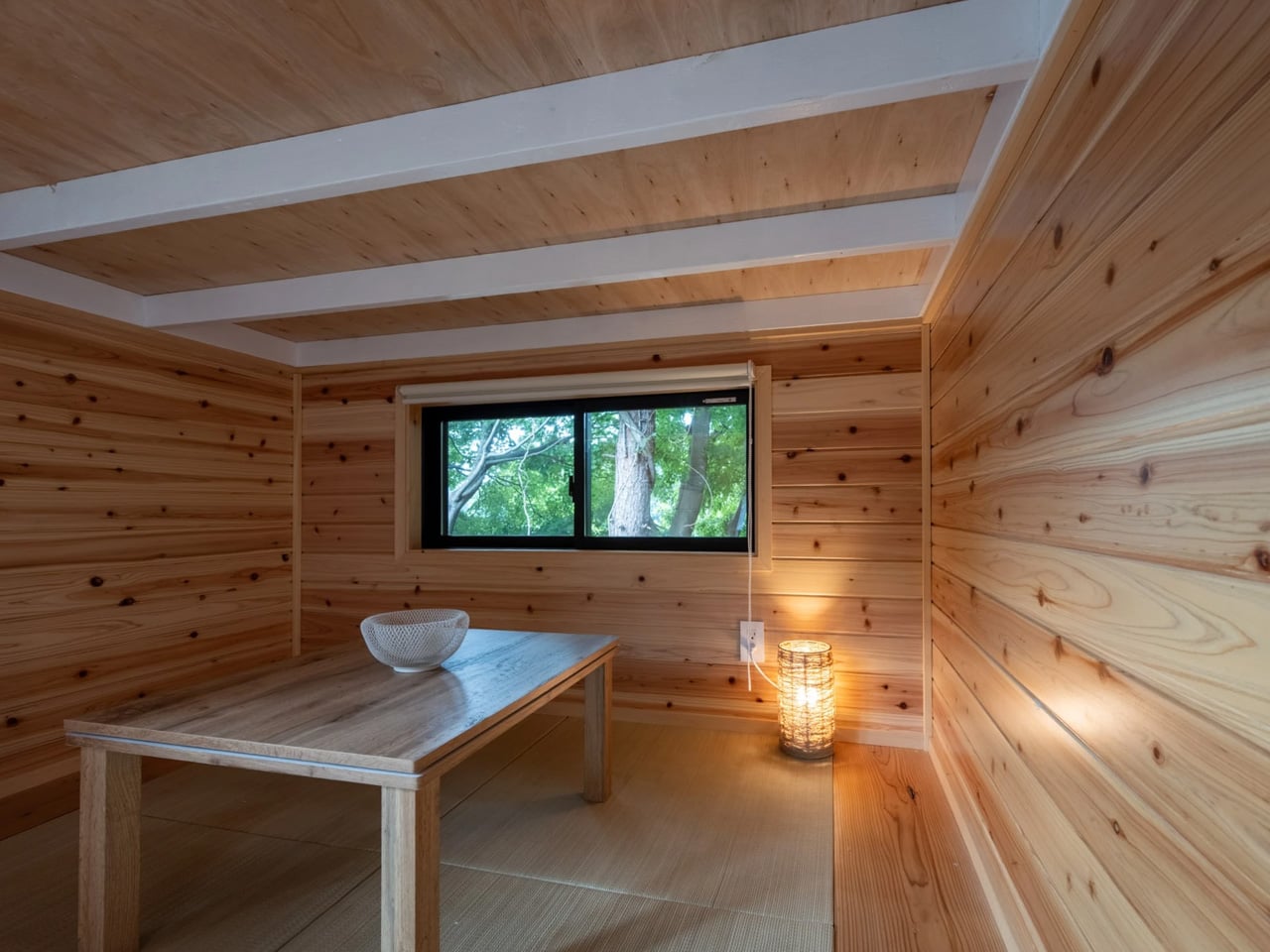
The layout unfolds across two levels, with the ground floor dedicated to a tatami-style living room that requires a slight crouch to enter. This low-ceilinged space embraces the floor-level living tradition found in Japanese homes, where straw mat flooring and minimal furniture create rooms for contemplation and connection. A simple table anchors the space, offering flexibility for dining, working, or hosting intimate gatherings. The tatami concept draws from centuries of Japanese residential design, bringing that cultural heritage into a modern mobile dwelling that can adapt to contemporary lifestyles while maintaining traditional sensibilities.

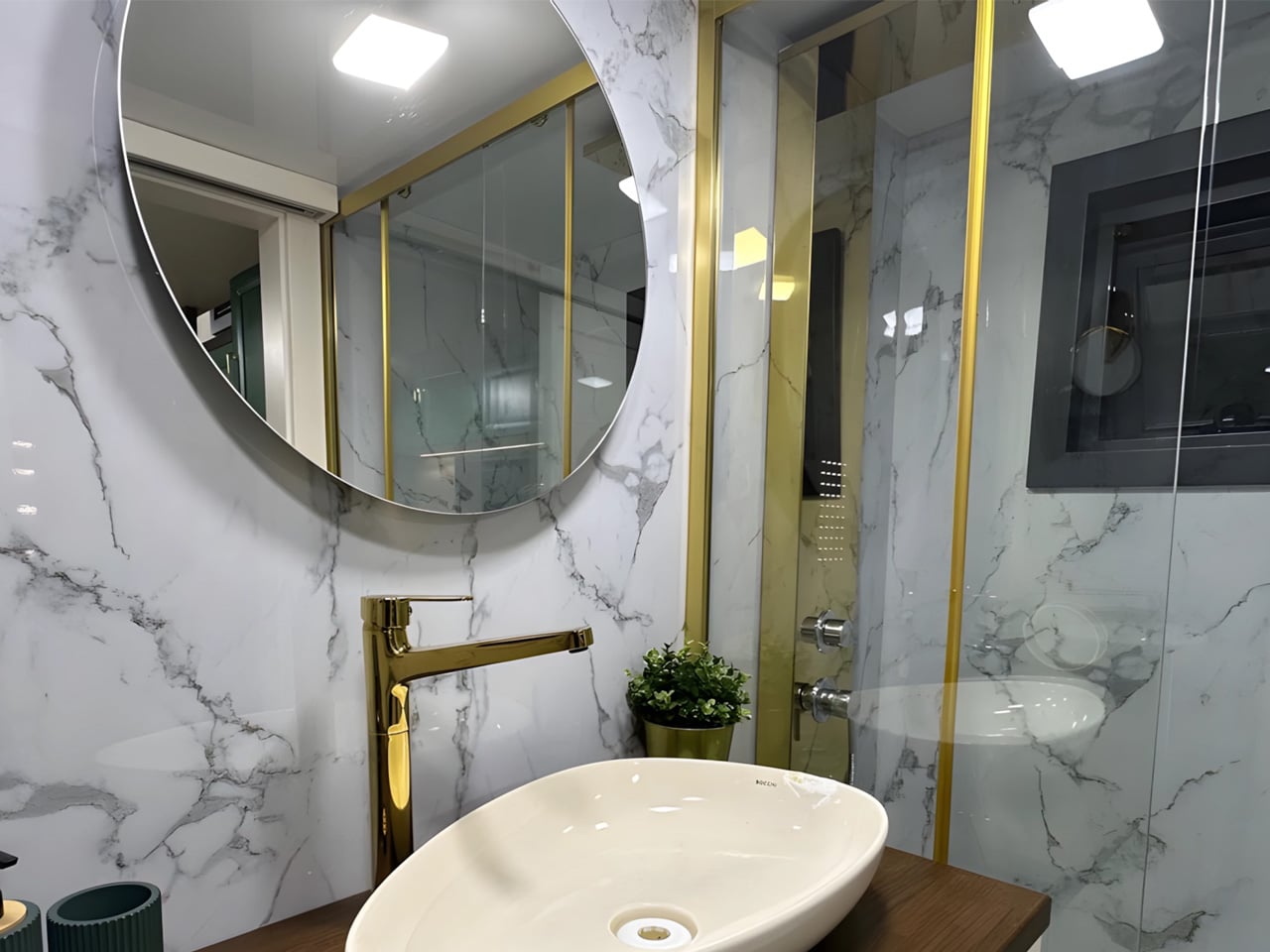
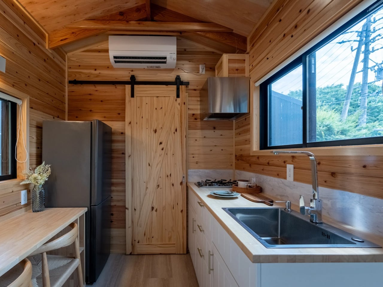
The kitchen occupies its own zone nearby, impressively equipped for such a compact footprint. A large stainless steel sink pairs with a two-burner propane stove, while a full-size fridge and freezer eliminate the compromises often required in tiny living. Ample cabinetry keeps essentials organized, and a dining table extends the kitchen’s functionality as both a meal space and a potential work area. A sliding door reveals the bathroom, where a shower, flushing toilet, and petite sink handle daily needs efficiently within the tight quarters. The thoughtful placement of these essential spaces demonstrates how careful planning transforms limitations into livable solutions.

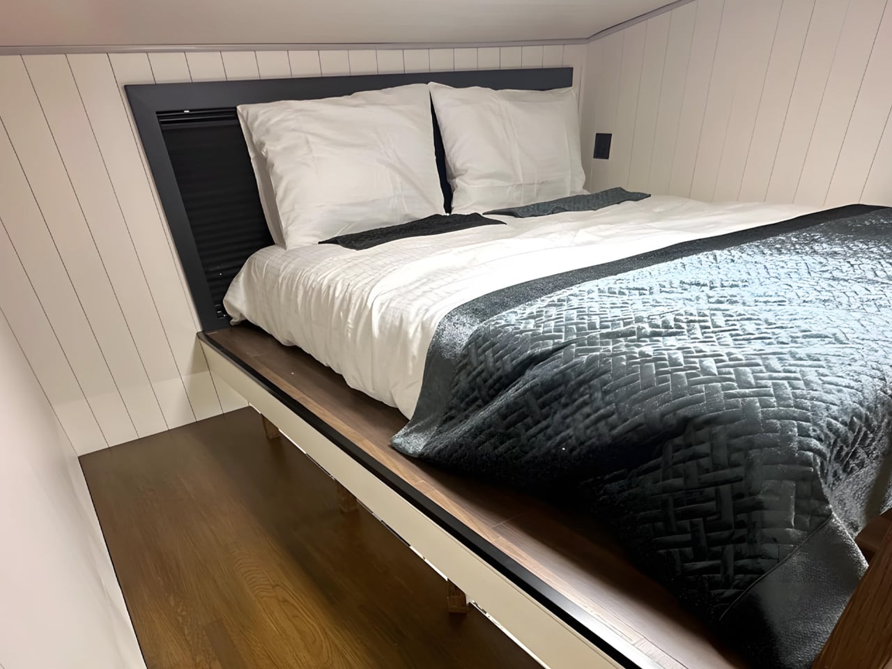
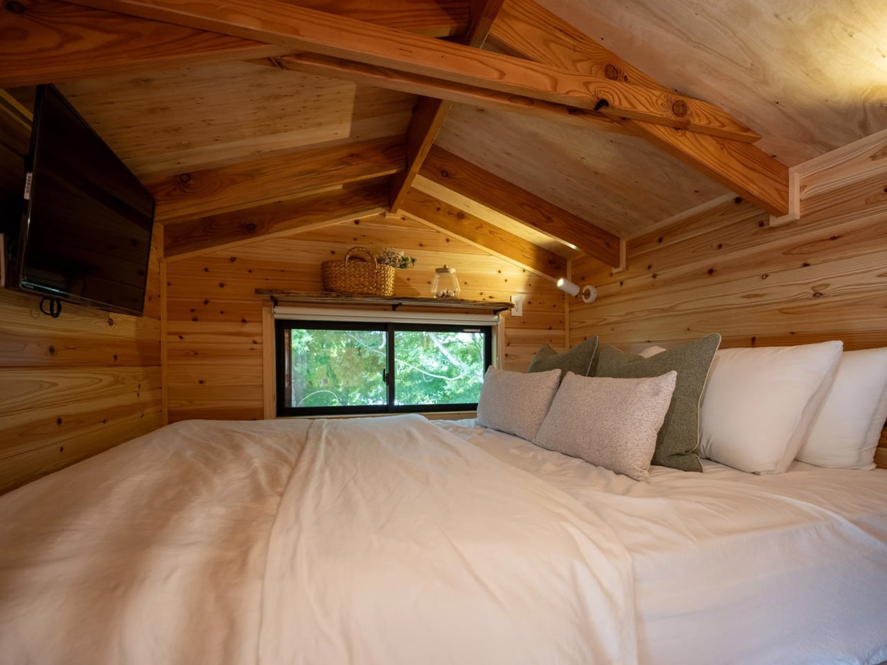
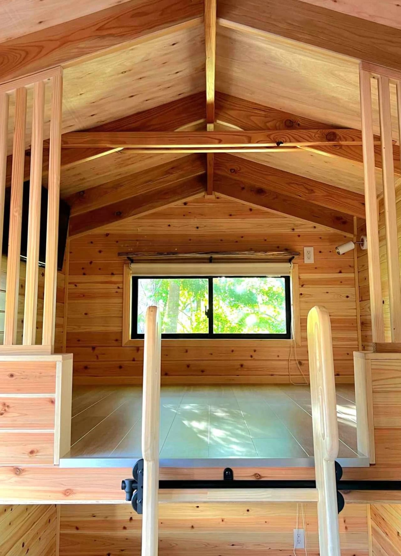
Above the living room, a loft bedroom accessed by a removable ladder provides sleeping quarters fitted with a double bed, storage solutions, and a wall-mounted television. The space maintains the low ceiling typical of loft designs but offers privacy without isolation, separated from the living areas yet connected to the home’s overall flow. The bedroom represents the final piece of the Nozawas’ puzzle, creating a complete home environment where two people can comfortably manage daily routines without feeling cramped or compromising on essential amenities.

Ikigai Collective positions the Nozawa at ¥11,300,000, roughly $72,000, with various customization options available for materials and furnishings. International availability remains unclear, making direct contact with the firm necessary for interested buyers outside Japan. The price reflects both quality construction and the specialized market it serves, targeting buyers who value authentic cultural design over generic tiny house trends. The Nozawa succeeds by staying true to its Japanese roots rather than attempting universal appeal. This focused vision creates a home that works beautifully within its cultural context, offering a template for how regional tiny house movements might develop their own distinct character and aesthetic language that honors local traditions while meeting contemporary needs.

The post This 20-Foot Tiny Home Brings Authentic Japanese Design to Compact Living first appeared on Yanko Design.
A Decade of Camping Led to This 747-Square-Foot Cozy River Retreat

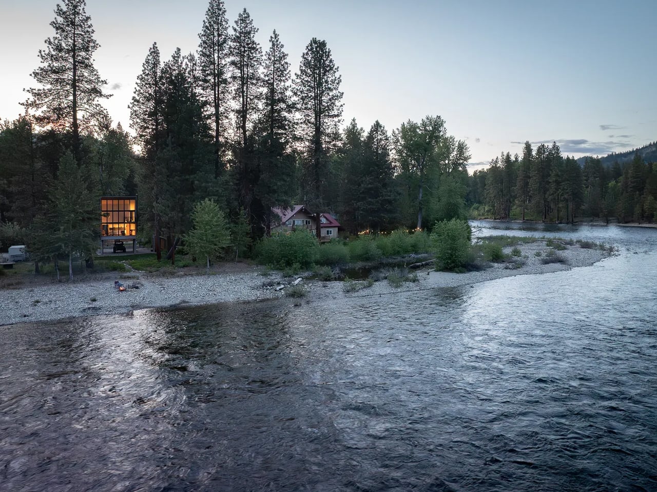
Dan Wheeler spent ten years sleeping in tents on his riverfront property before building anything permanent. The software engineer bought the land along Washington’s Wenatchee River in 2010, drawn by years of rafting trips with friends through the area’s rushing waters. Every camping trip reinforced what he already knew: this spot needed something, but only when the time felt right. Those years weren’t wasted time but rather an extended conversation with the landscape, understanding how light moved through the trees, where water pooled during spring runoff, and which views mattered most when morning broke over the mountains.

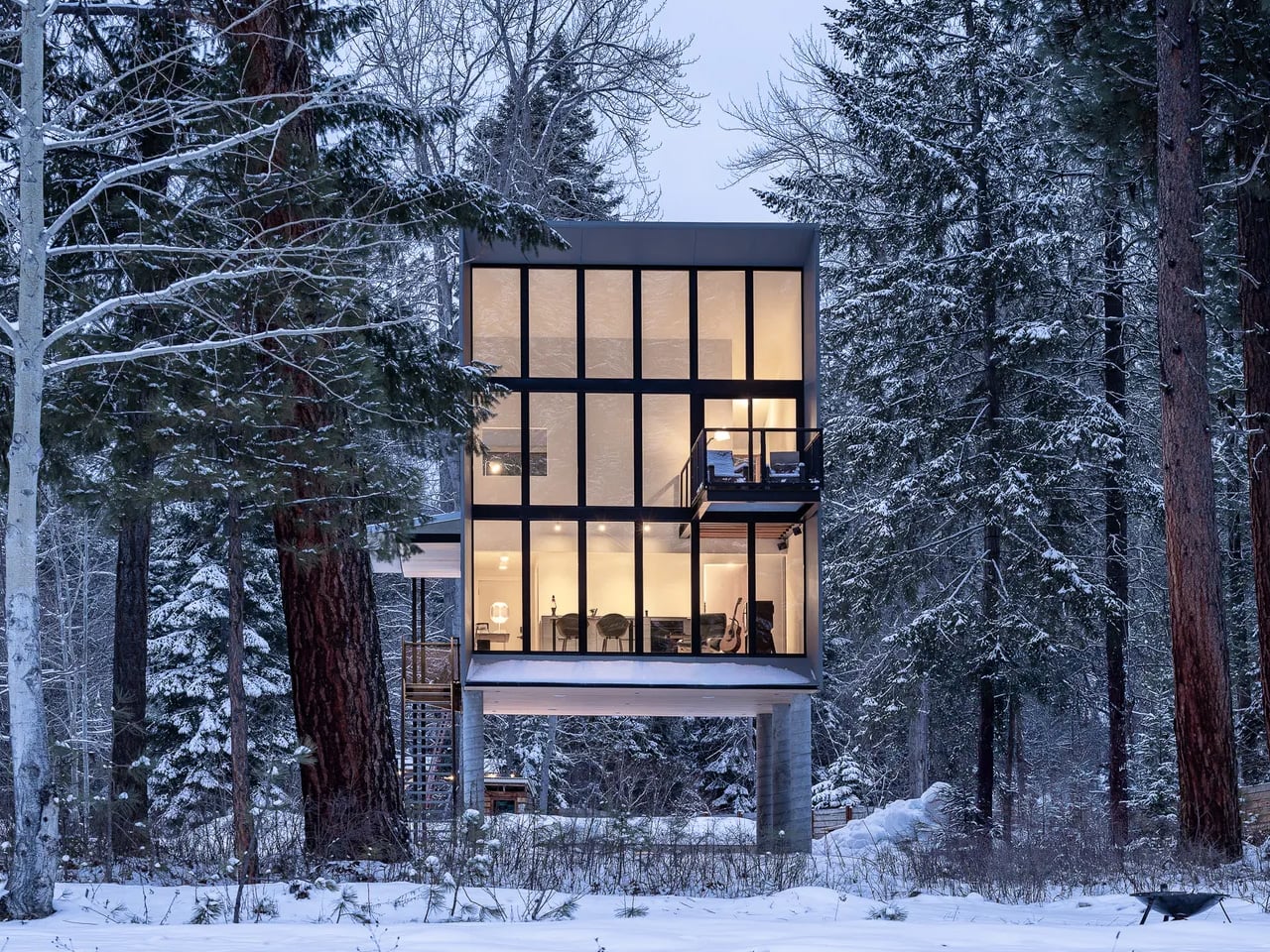
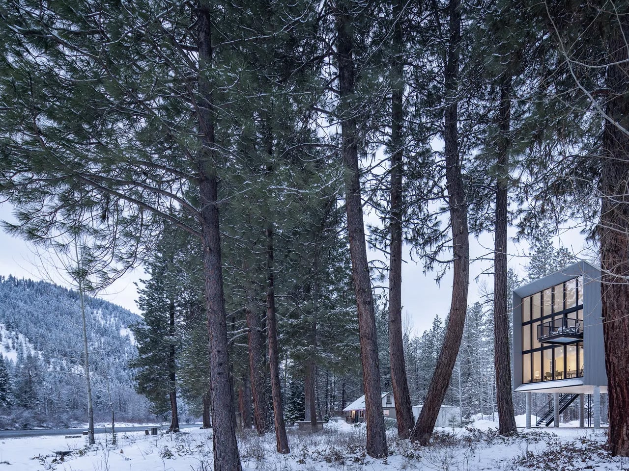
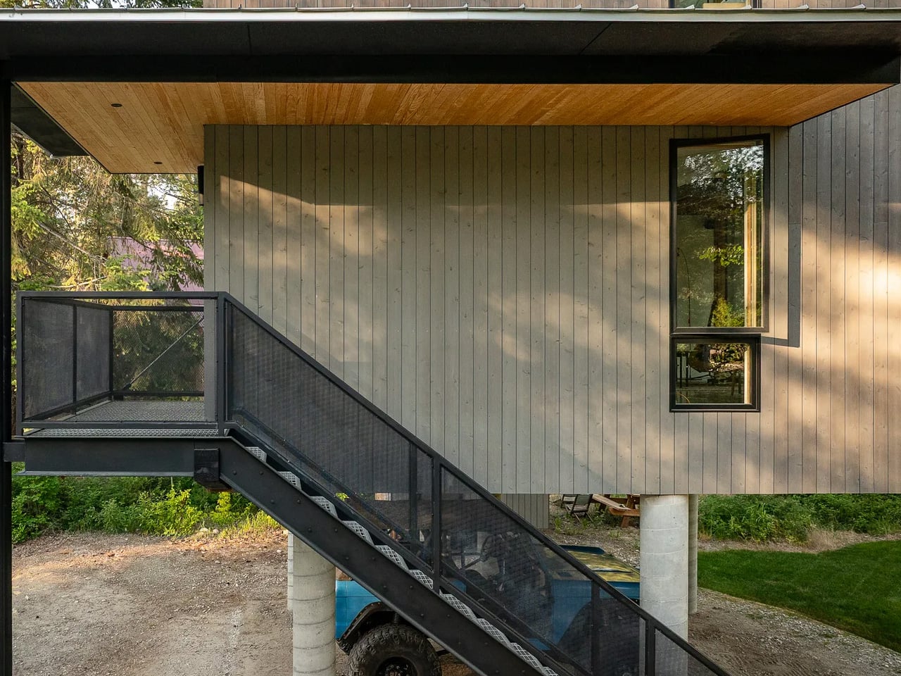
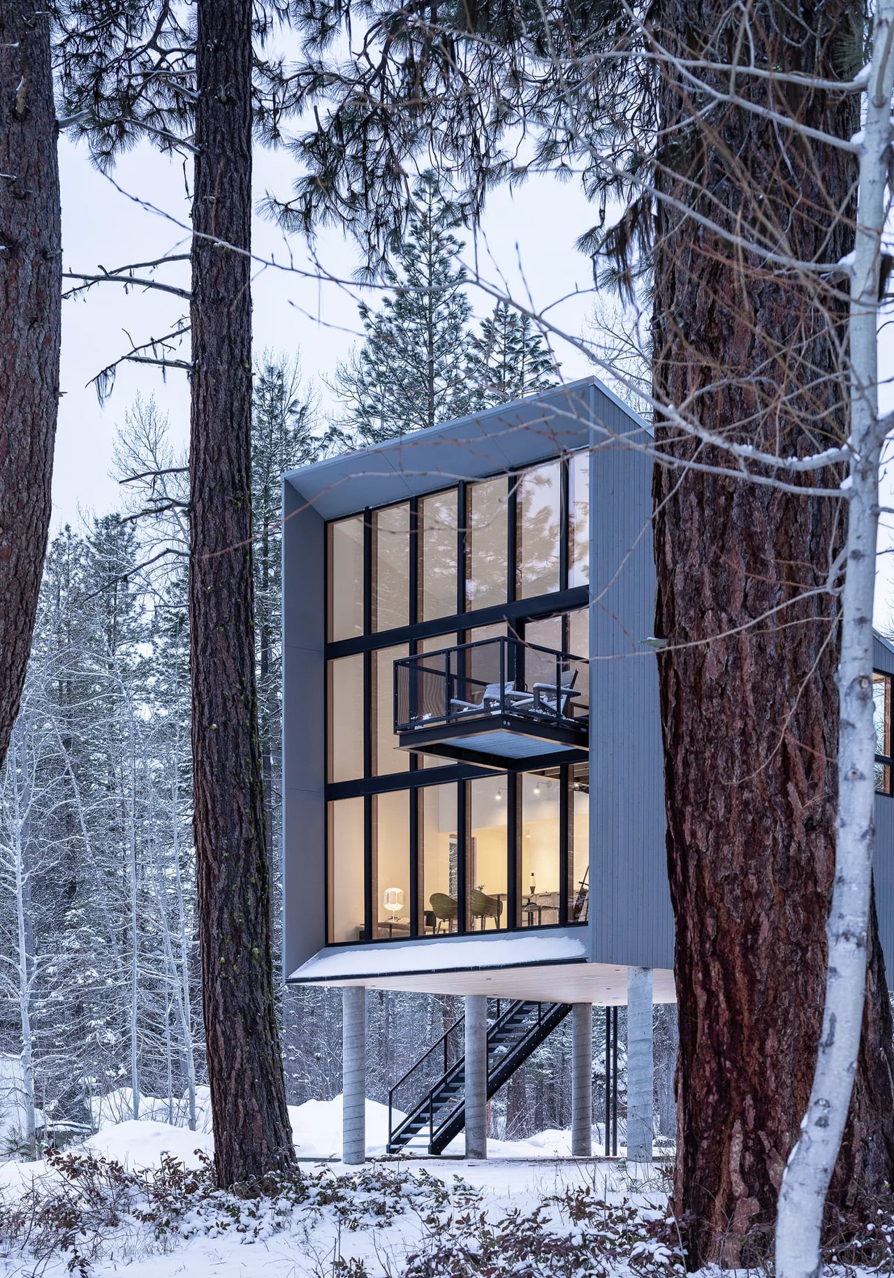
When Wheeler finally decided to build, he approached Seattle-based Wittman Estes with a clear vision. He wanted something modern and sculptural, a structure that would honor the decade he’d spent living simply on the land. What emerged is a 747-square-foot, two-story cabin elevated ten feet above the ground on concrete columns. The metal-clad wedge faces directly toward the river, its form shaped by the surrounding Okanogan Wenatchee National Forest. The angular design creates a striking profile against the forest backdrop while maintaining a compact footprint that respects the wilderness setting.

Designer: Wittman Estes

Architects Matt Wittman and Julia Frost designed the one-bedroom retreat to create what they call “a harmonious relationship between shelter and nature,” seeking interdependence between the ecosystem and the architecture itself. The elevated design serves multiple purposes beyond aesthetics. Lifting the cabin protects it from flooding and snow accumulation while minimizing the footprint on the forest floor. The positioning allows Wheeler to maintain the connection to the landscape he cultivated during those camping years, where cooking happened outdoors and shelter remained temporary.

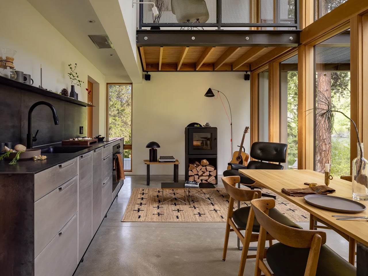
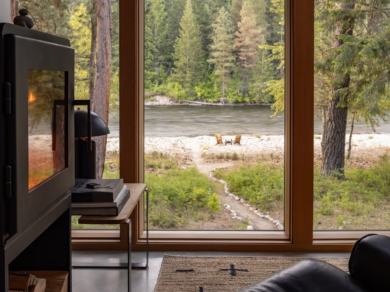
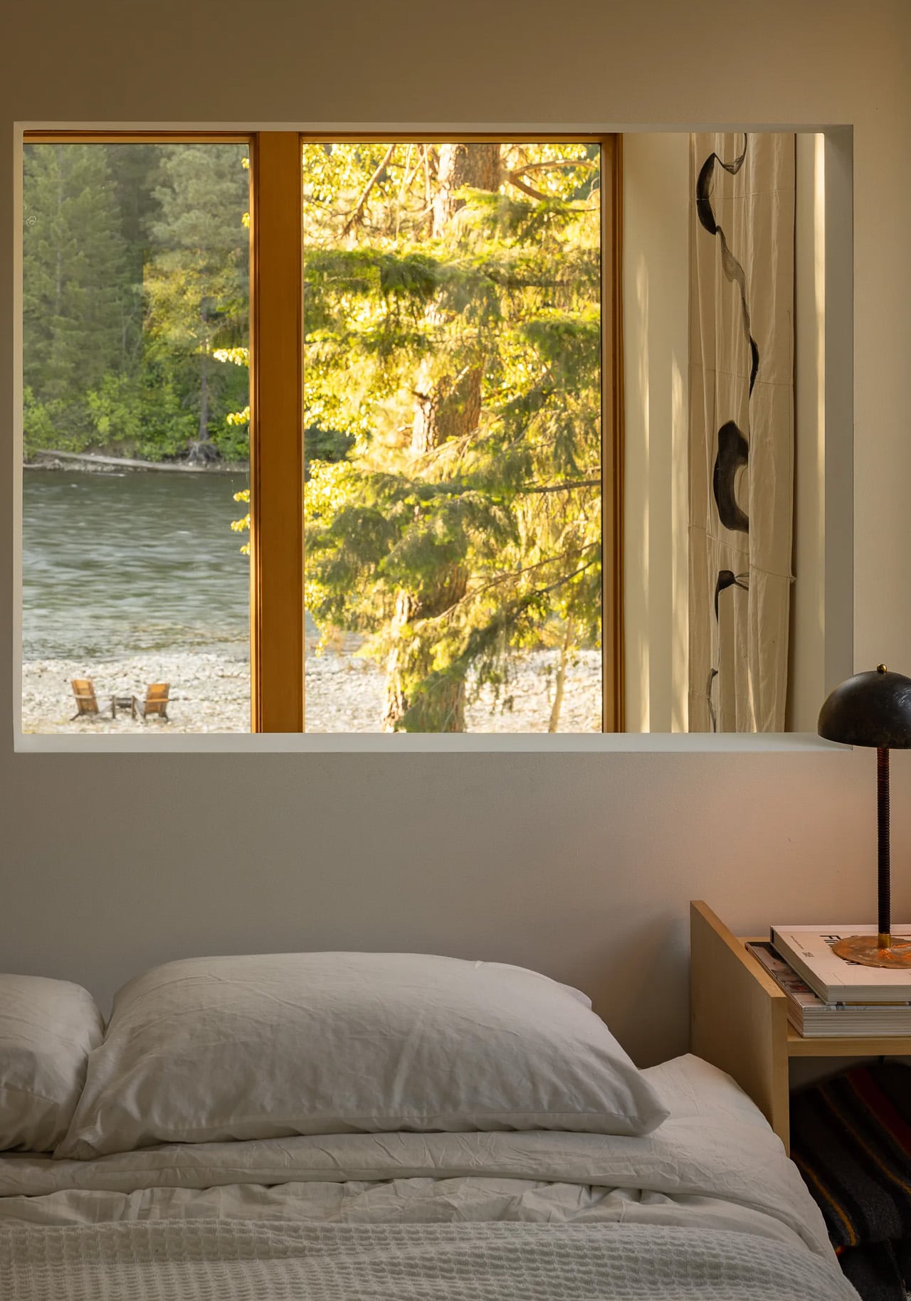
Inside, the compact footprint forces intentionality. At just over 700 square feet, there’s no room for excess. The design reflects Wheeler’s desire to live with “less stuff,” embracing the simplicity he discovered through a decade of tent living before walls and windows entered the equation. The scale might seem small by contemporary standards, but the visual connection to the river and forest expands the perceived space dramatically. Floor-to-ceiling windows blur the boundary between interior and exterior, making the surrounding wilderness feel like additional living area.

What started as a weekend escape transformed into something unexpected. Wheeler now lives in the cabin full time, proving that downsizing doesn’t mean sacrificing quality of life. The transition from occasional retreat to permanent home happened gradually, much like the decade-long deliberation that preceded construction. The move represents a fundamental shift in how Wheeler defines comfort and necessity, stripping away the accumulated possessions that filled his previous life.

The Wenatchee River Cabin stands as proof that restraint can produce better results than expansion. By waiting, observing, and understanding the land first, Wheeler and Wittman Estes created something that feels inevitable rather than imposed. The cabin doesn’t fight its environment or demand attention. It simply exists where it should, elevated above the forest floor, facing the river that made Wheeler fall in love with the place fifteen years ago. The project demonstrates that the best architecture sometimes requires patience, letting years of experience inform design decisions rather than rushing to build.

The post A Decade of Camping Led to This 747-Square-Foot Cozy River Retreat first appeared on Yanko Design.

A Seven-Square-Meter Office on Wheels Redefines Mobile Workspaces in Buenos Aires

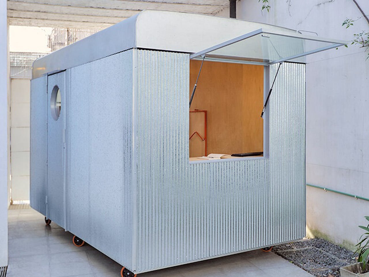
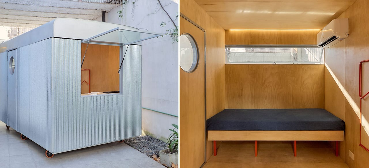
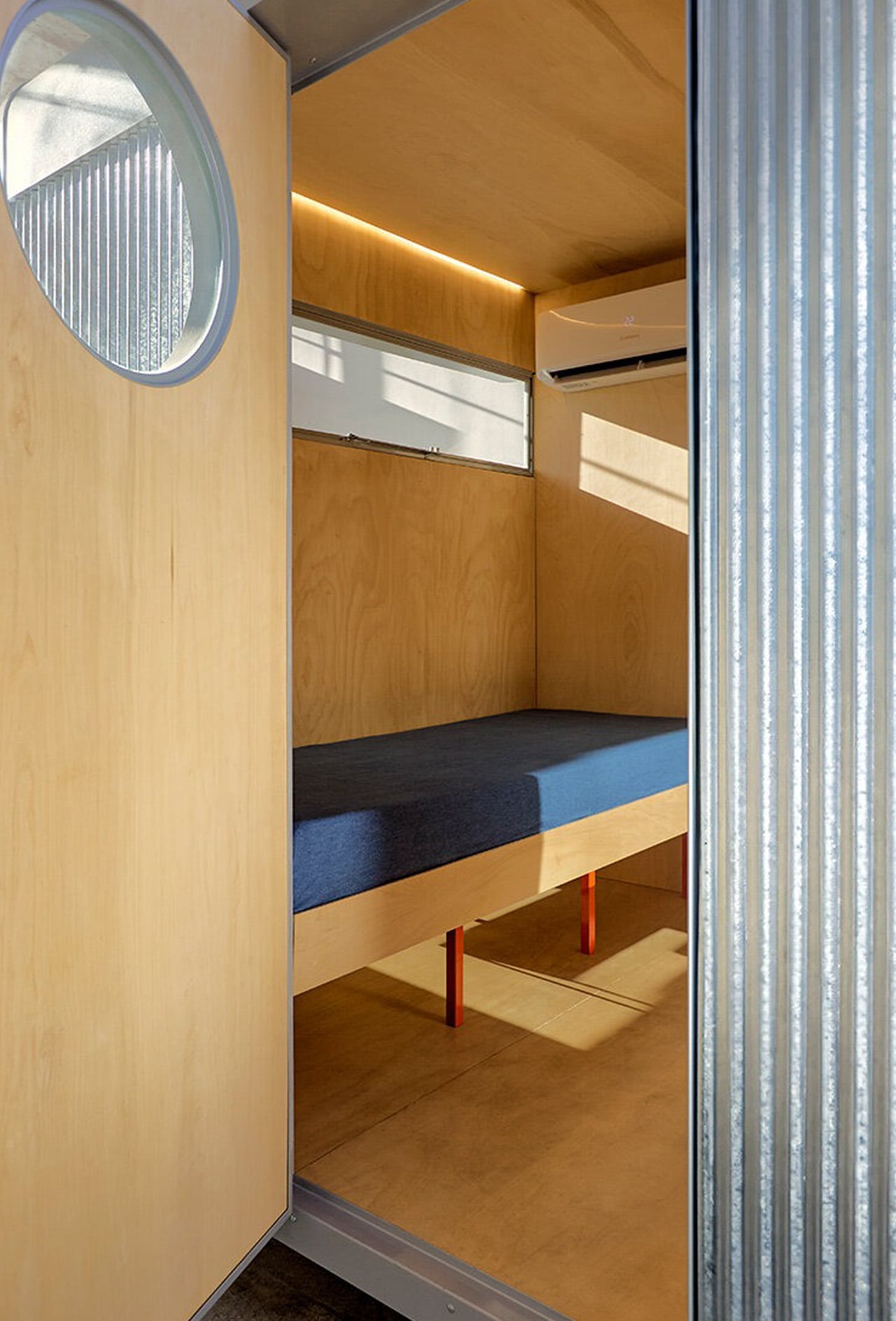
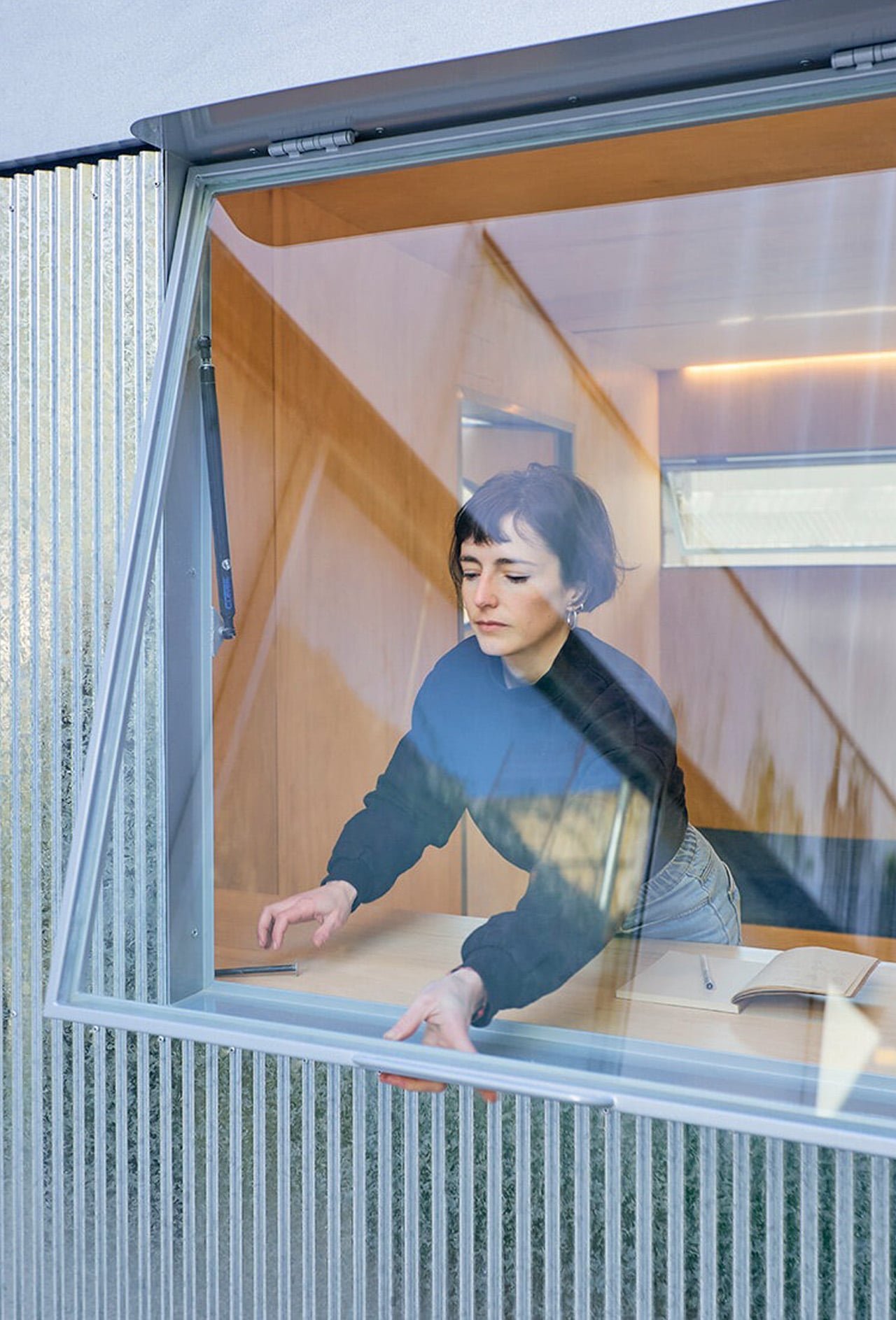
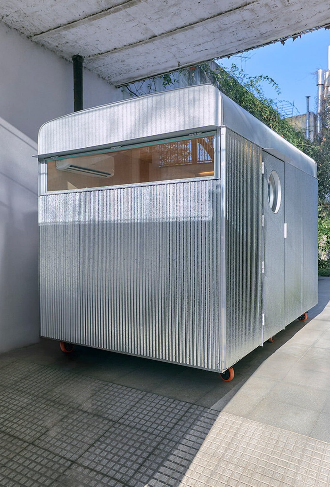
Parked in the courtyard of a private home in Buenos Aires, the Castillo Mobile Office challenges everything we expect from workplace architecture. Morsa Taller has distilled the essence of mobility into seven square meters, creating a structure that moves between sites with the ease of rolling luggage yet operates with the seriousness of a permanent studio.

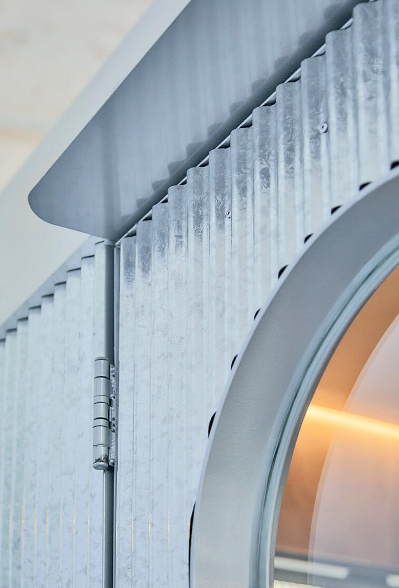
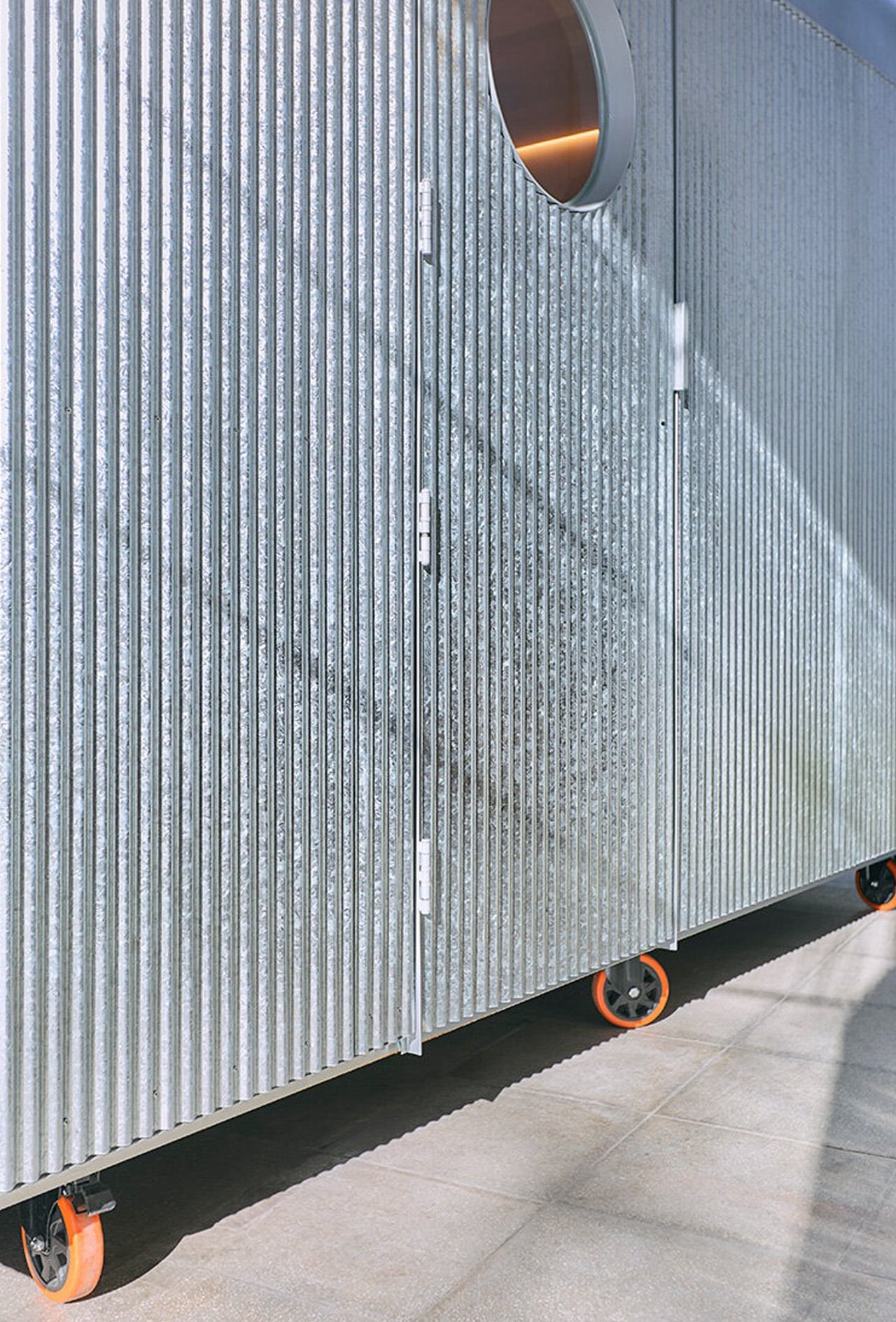
The design reads like architectural origami. Six prefabricated pieces arrive separately, then snap together within a single day using nothing more than a screwdriver and a riveter. Four detachable facade panels frame strategic openings for light and air. A curved roof caps the composition, channeling rainwater while nodding to the rounded profiles of Buenos Aires’ iconic buses. The wheeled base turns the entire volume into a vehicle of sorts, ready to relocate from backyard to rooftop, from residential plot to rural outpost.

Designer: Morsa Taller

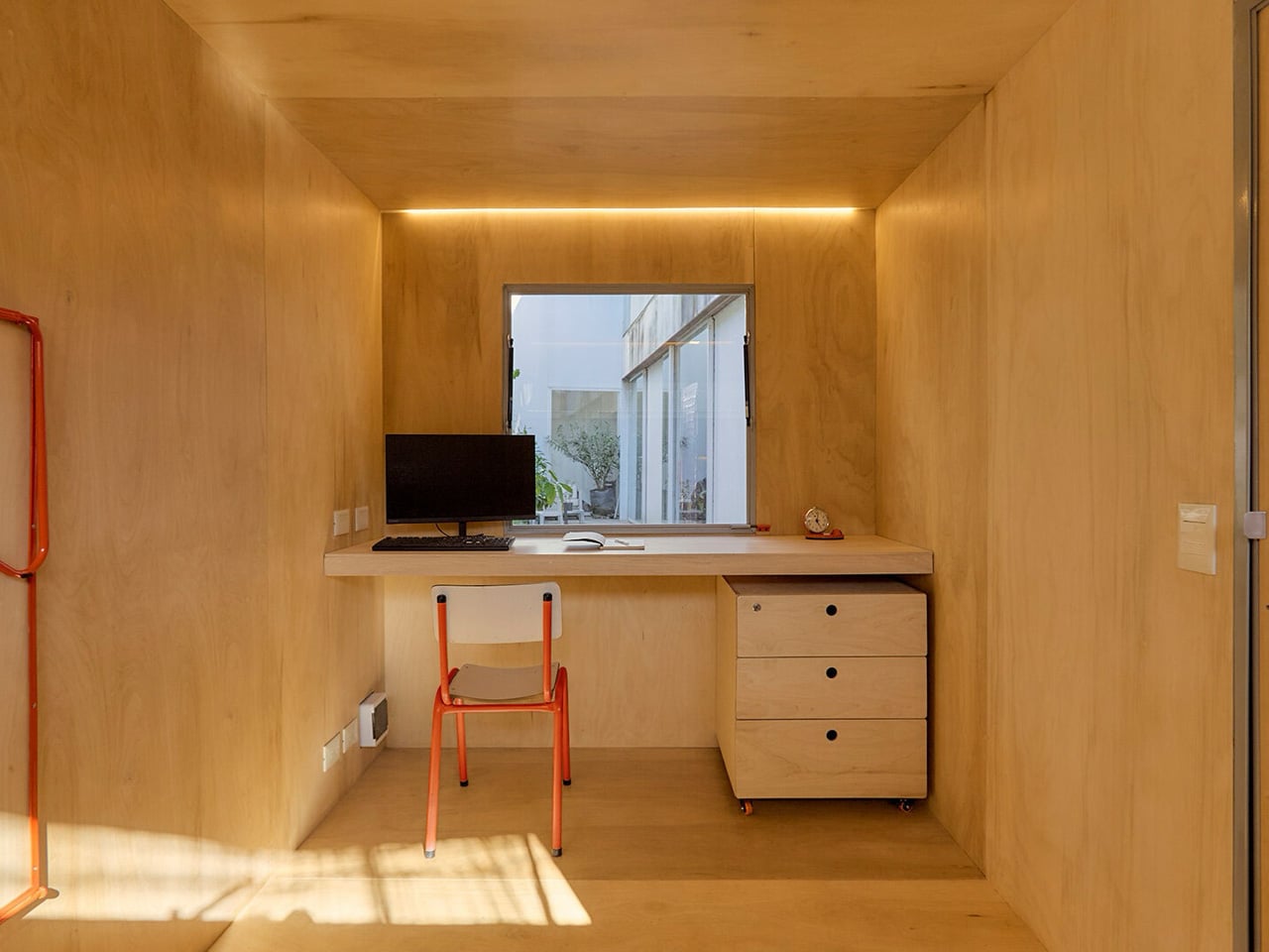
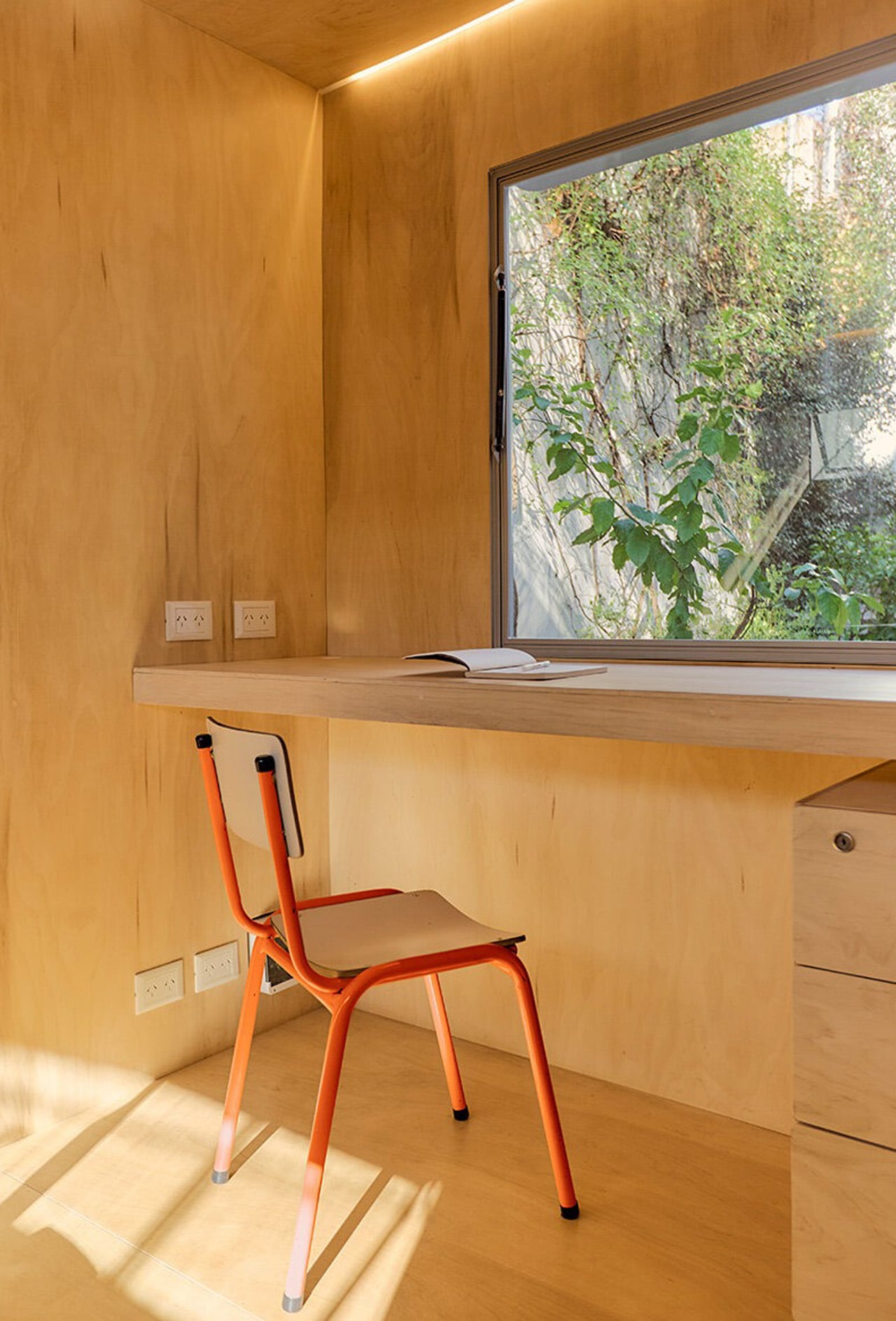
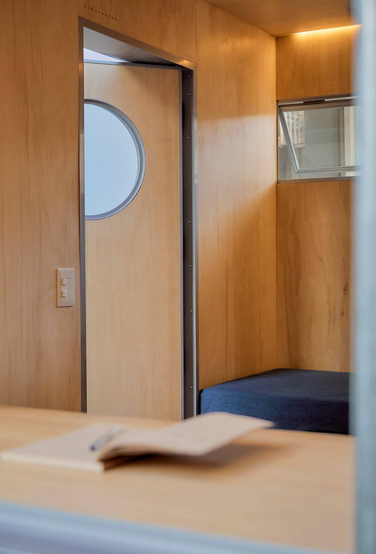
What makes Castillo remarkable is its refusal to compromise on craft despite its temporary nature. Every junction required its own insulation and mechanical connection, transforming the project into an exercise in layered logic. The team at Morsa Taller, working alongside fabricator Santiago Legnini, custom-built each interior element, from carpentry to storage systems to equipment mounts. The result feels less like a portable shed and more like an inhabitable machine, where form follows the internal demands of function rather than external architectural conventions.

The structure draws from Morsa Taller’s broader practice in material investigation and objectual construction, led by architect Alejandra Esteve, who describes herself as both designer and welder. This hands-on approach permeates the Castillo project, where metalworking expertise translates into precise modular connections that allow independence and integration to coexist.

Currently stationed in Buenos Aires, the mobile office represents a shift in how workspace can respond to contemporary work patterns. It doesn’t anchor professionals to fixed addresses but instead follows them, adapting to changing needs without sacrificing quality or comfort. The seven-square-meter footprint proves that small doesn’t mean compromised when design treats constraints as creative fuel. Castillo demonstrates that architecture can be nomadic without being provisional, compact without being cramped, and prefabricated without losing its soul.

The post A Seven-Square-Meter Office on Wheels Redefines Mobile Workspaces in Buenos Aires first appeared on Yanko Design.
A Home That Stays Rooted: This Multigenerational Vietnamese House Preserves What Urbanization Erases

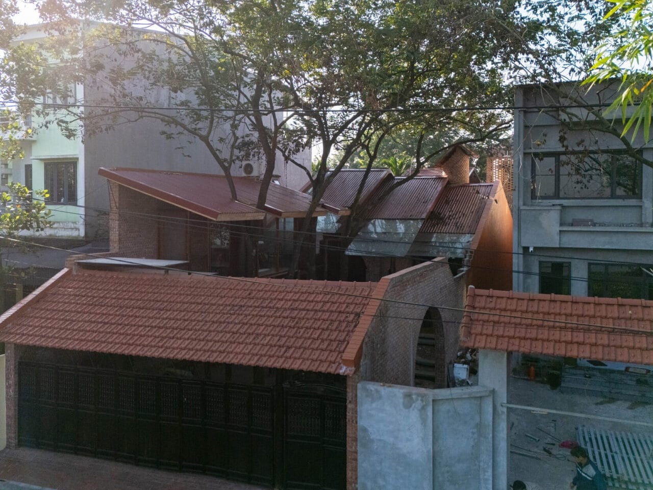
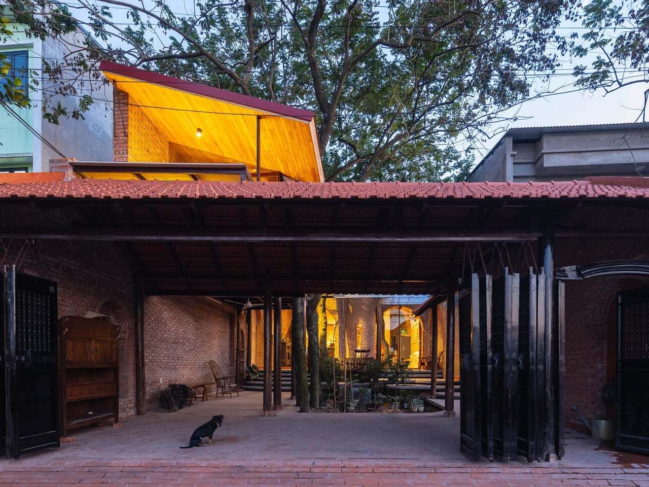
In the outskirts of Hanoi, where sprawling urbanization steadily encroaches on traditional village life, Trung Tran Studio has completed a residence that refuses to erase what came before it. The Nang House, a 270-square-meter dwelling for three generations, sits quietly among established homes and mature trees, each element of the natural landscape carefully preserved rather than cleared away. Completed in 2025, this project emerges at a moment when rapid development threatens to break down the traditional rural structure that has defined these communities for generations.

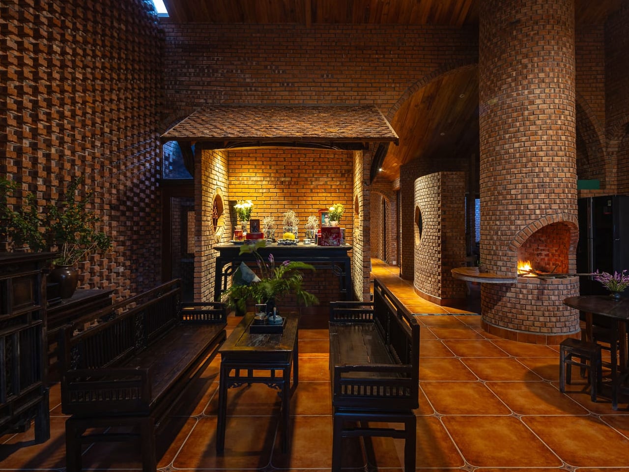
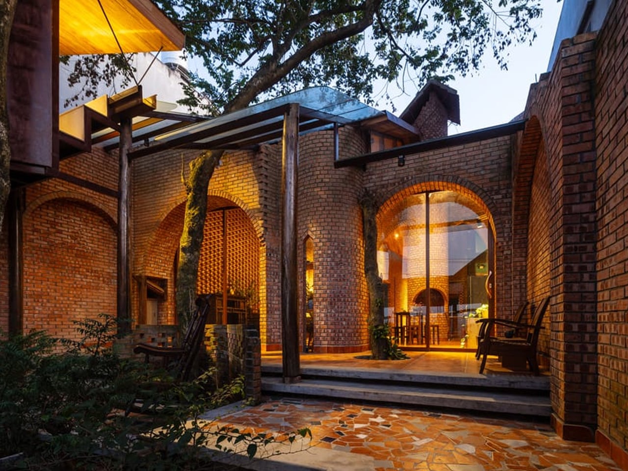
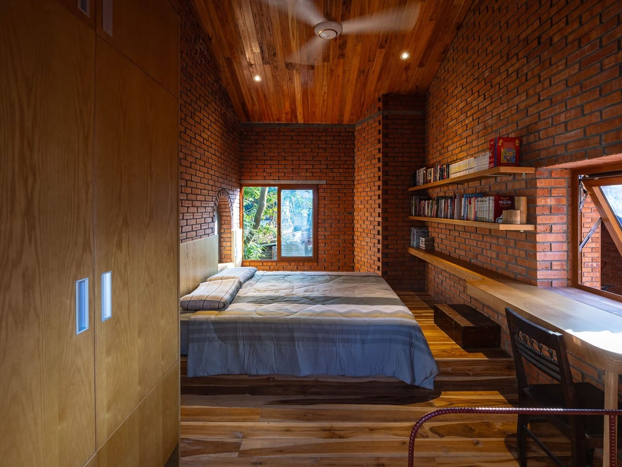
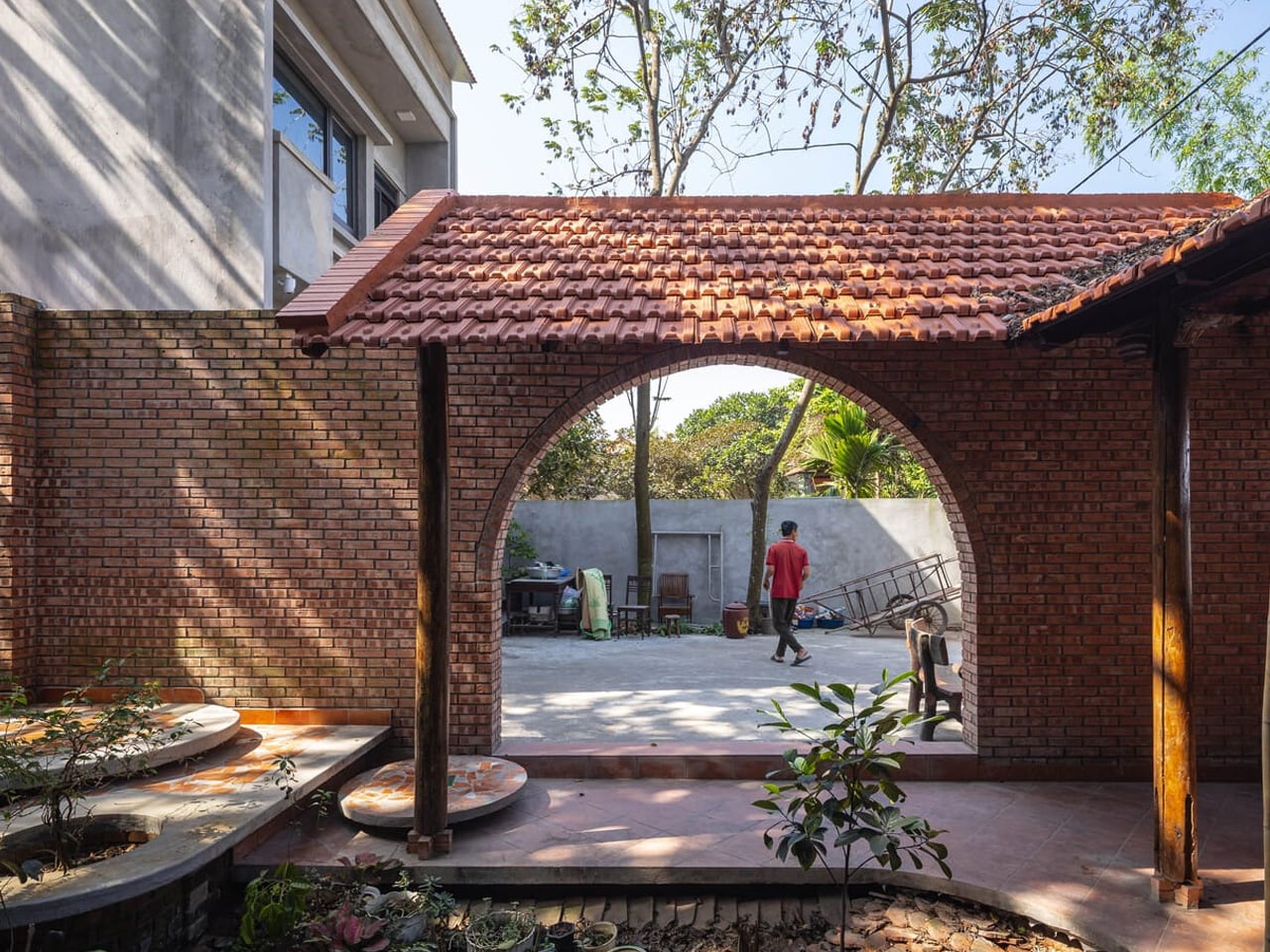
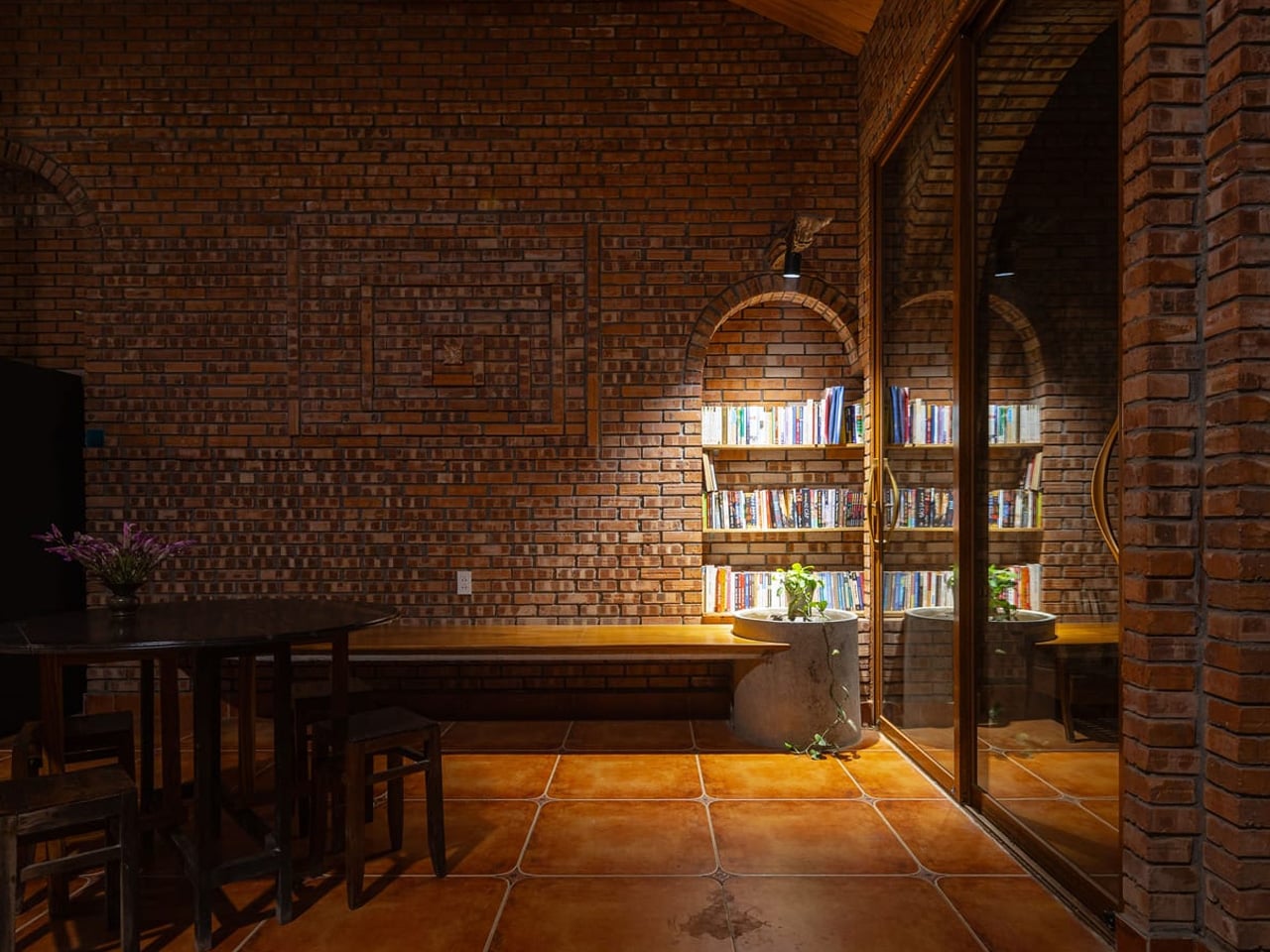
The architecture speaks through brick, that most fundamental of building materials, reimagined through contemporary forms. Textured walls rise in modular patterns, their surfaces catching light at different angles throughout the day. Arches and circular openings punctuate the structure, creating portals that guide movement while framing views of the gardens beyond. The material choice feels both pragmatic and poetic, grounding the home in local building traditions while pushing toward something unmistakably modern. High wooden ceilings and curved details highlight the angularity of the masonry, creating an interplay between rigid geometry and organic warmth.
Designer: Trung Tran Studio

What makes this project remarkable is its relationship with the site. Trees that have stood for years remain rooted in their original positions, their trunks accommodated by deliberate notches carved into rooflines. The canopy spreads over a central courtyard, blurring boundaries between interior and exterior spaces. This garden becomes the heart of the home, a breathing space where sunlight filters through leaves and generations gather. The design creates an airy, earthy dwelling where indoor and outdoor zones converge seamlessly, allowing natural ventilation to flow through the porous brick facade.

The floor plan unfolds as a series of carefully sequenced rooms wrapped around a central void. Living areas, dining spaces, and a worship room occupy the core, treated as a continuous zone for family life. Light enters through narrow clerestory windows set high along pitched ceilings, creating small, shifting patterns across the brick surfaces. The effect is subtle but transformative, making the walls appear alive as the sun moves overhead. This inner zone holds the main living functions, where textured brick walls meet timber elements at concise junctions.

The two-storey structure accommodates five bedrooms total, with four extending toward the rear of the property. Each is modest in size yet warm in character, shaped by timber ceilings and brick surfaces that create intimate, comfortable spaces. Framed views of the garden connect every room to the landscape, maintaining visual continuity throughout the home. The bedrooms are interspersed with three distinct garden spaces that serve different functions for the multigenerational household. This careful zoning allows privacy when needed while encouraging interaction in shared areas, creating a home that expands and contracts according to the rhythms of family life.

Trung Tran Studio’s approach resists the typical pattern of development in rapidly changing rural areas, where new construction often means wholesale clearing and starting fresh. Instead, the Nang House demonstrates how contemporary architecture can work with existing conditions, respecting what’s already there while creating something entirely new. This is architecture that understands context without being constrained by it, honoring tradition while refusing nostalgia. In a landscape where urbanization threatens to flatten everything in its path, the Nang House offers a different model, one where old trees and new walls coexist naturally, proving that progress needn’t come at the cost of erasure.

The post A Home That Stays Rooted: This Multigenerational Vietnamese House Preserves What Urbanization Erases first appeared on Yanko Design.