Vertical farming is redefining how food is grown, distributed, and consumed in an increasingly urban world. As populations rise and arable land becomes scarce, growing food vertically offers a practical, efficient alternative to traditional agriculture. By producing crops closer to where people live, vertical farming reduces dependence on long supply chains, minimizes food waste, and ensures year-round access to fresh produce. It also uses significantly less water and land, making it a more sustainable approach to feeding cities.
Beyond efficiency, vertical farming is reshaping the relationship between people and food. It brings food production back into daily life, increasing awareness of how produce is grown and encouraging healthier eating habits. Advanced systems that combine controlled lighting, irrigation, and monitoring technologies allow consistent yields with minimal environmental impact. Here is how vertical farming is not just a growing method, but a shift toward resilient, localized, and future-ready food systems.
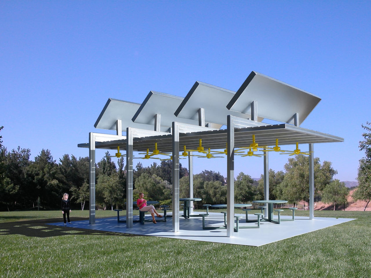
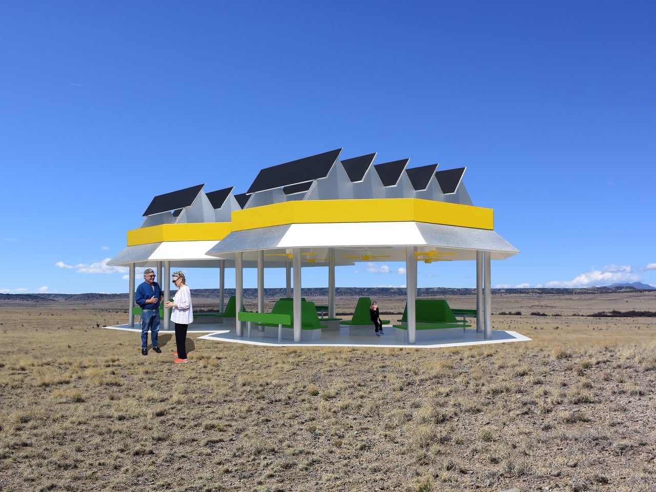
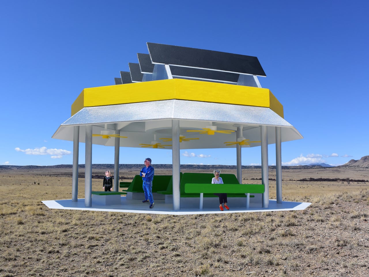
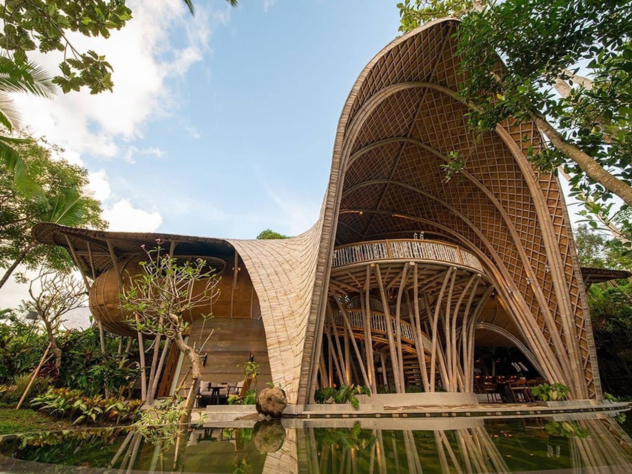
1. High-Rise Agritecture
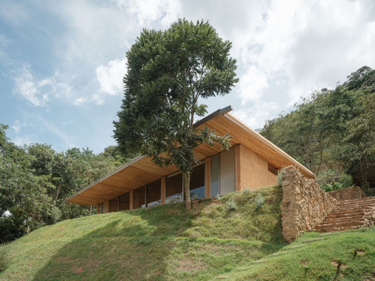
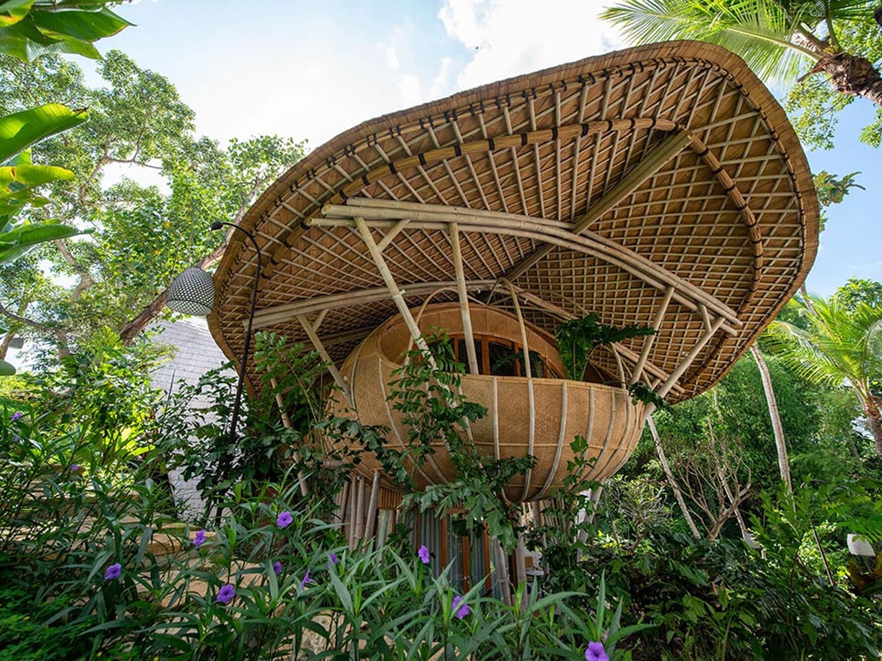
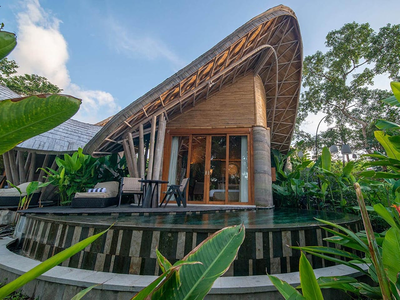
Skyscrapers are transforming into living, productive organisms. Static glass facades are giving way to “living skins” that integrate vertical farming, allowing cities to grow food within minimal footprints. This approach reduces transportation emissions and creates a seamless dialogue between architecture and the surrounding urban landscape.
These vertical farms use double-height glazing tuned for optimal light absorption, maximizing photosynthesis and crop yield. Dense vegetation also provides natural insulation, lowering energy use while diffusing sunlight for residents. By merging agricultural efficiency with architectural elegance, these spires redefine urban living, offering sustainable food production and serene, light-filled interiors.
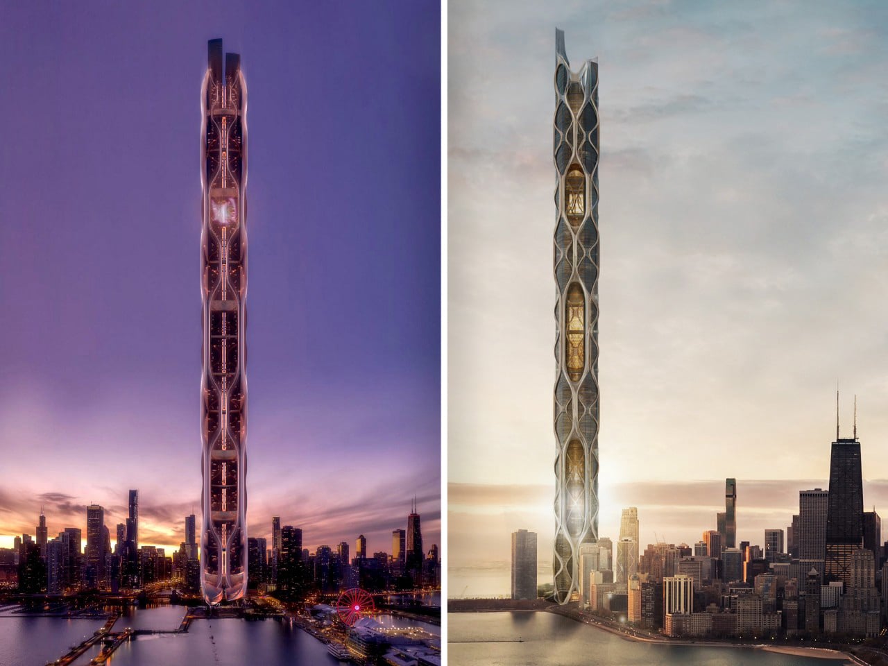
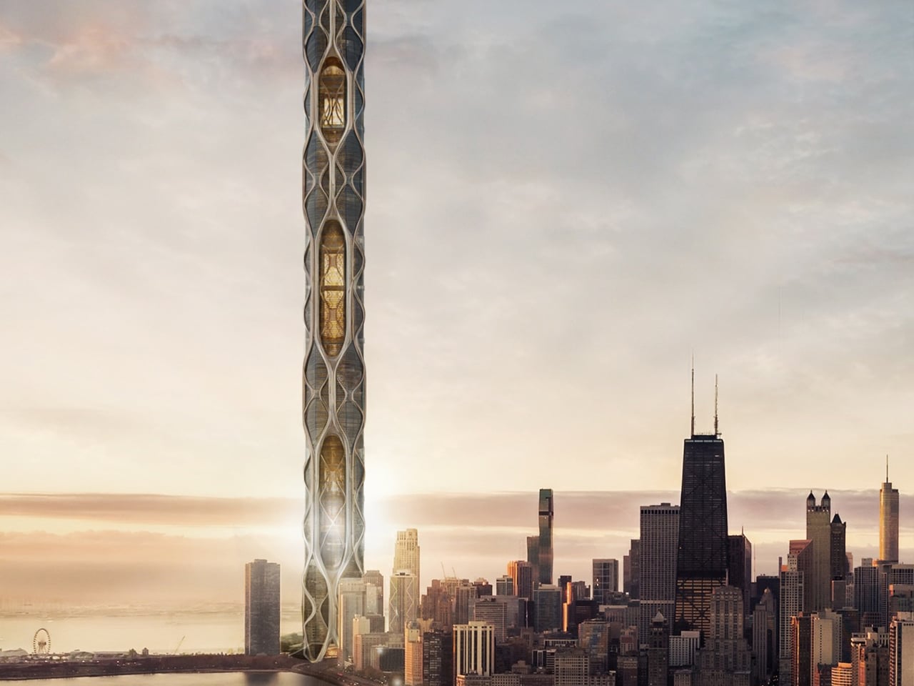
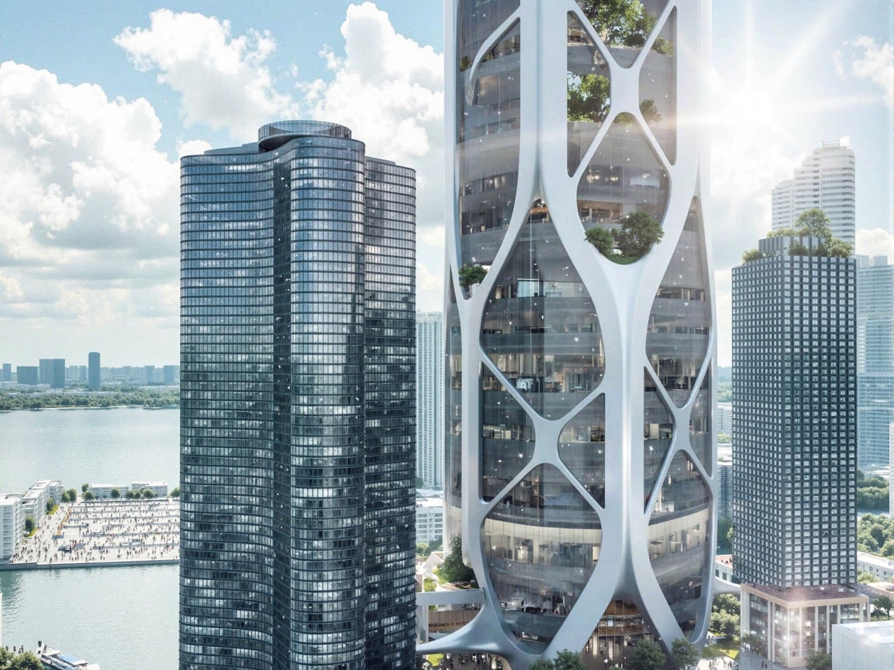
By integrating large-scale vertical agriculture directly into a high-rise typology, the tower addresses food insecurity in Chicago’s underserved neighborhoods, where access to fresh, affordable produce remains limited. Food production is embedded within the building core, allowing crops to be grown, processed, and distributed locally. This approach reduces reliance on long-distance supply chains, lowers carbon emissions, and transforms the skyscraper into a productive, self-sustaining system that supports urban resilience and food equity.
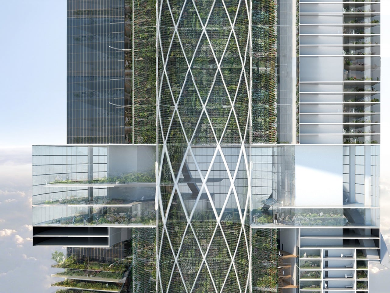
The tower’s form and systems are designed to support continuous agricultural performance. A fluid, water-inspired massing optimizes light penetration, airflow, and water circulation, while cloud harvesting, rainwater reuse, and renewable energy systems sustain year-round cultivation. Residential, educational, and commercial programs are organized around farming zones, reinforcing food production as a shared civic function. Structurally, a diagrid exoskeleton enables large inner voids for light and ventilation, allowing the skyscraper to operate as a vertical landscape where agriculture, architecture, and urban life are fully integrated.
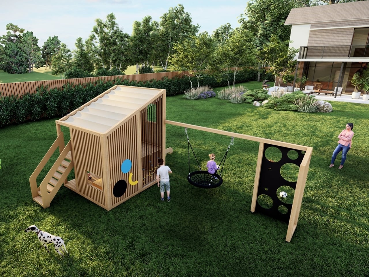
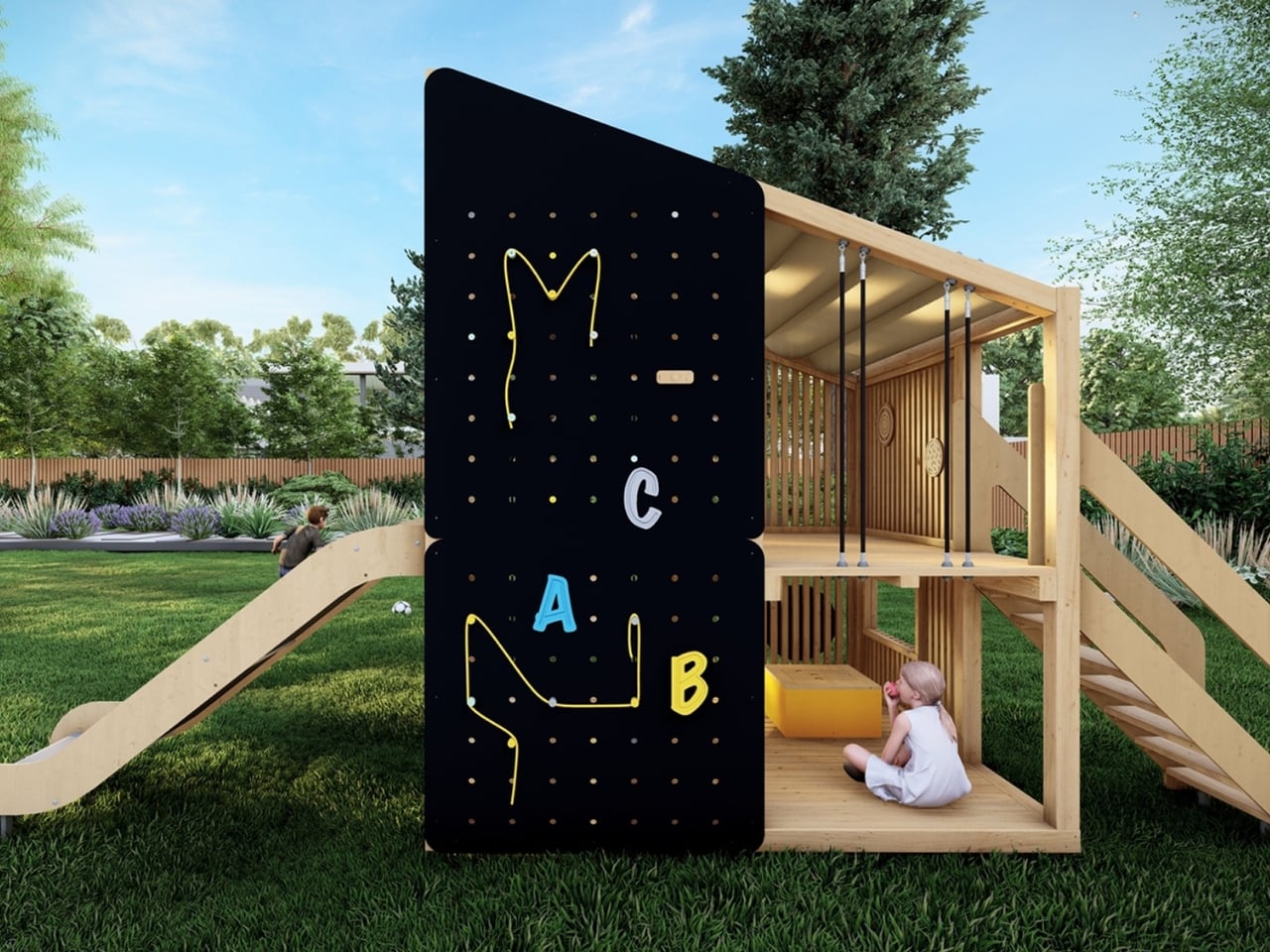
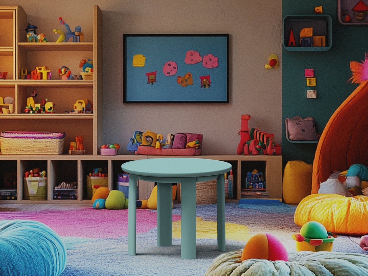
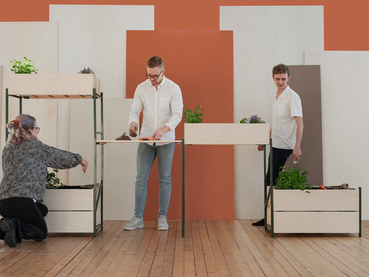
2. Reconfigurable Modular Planter
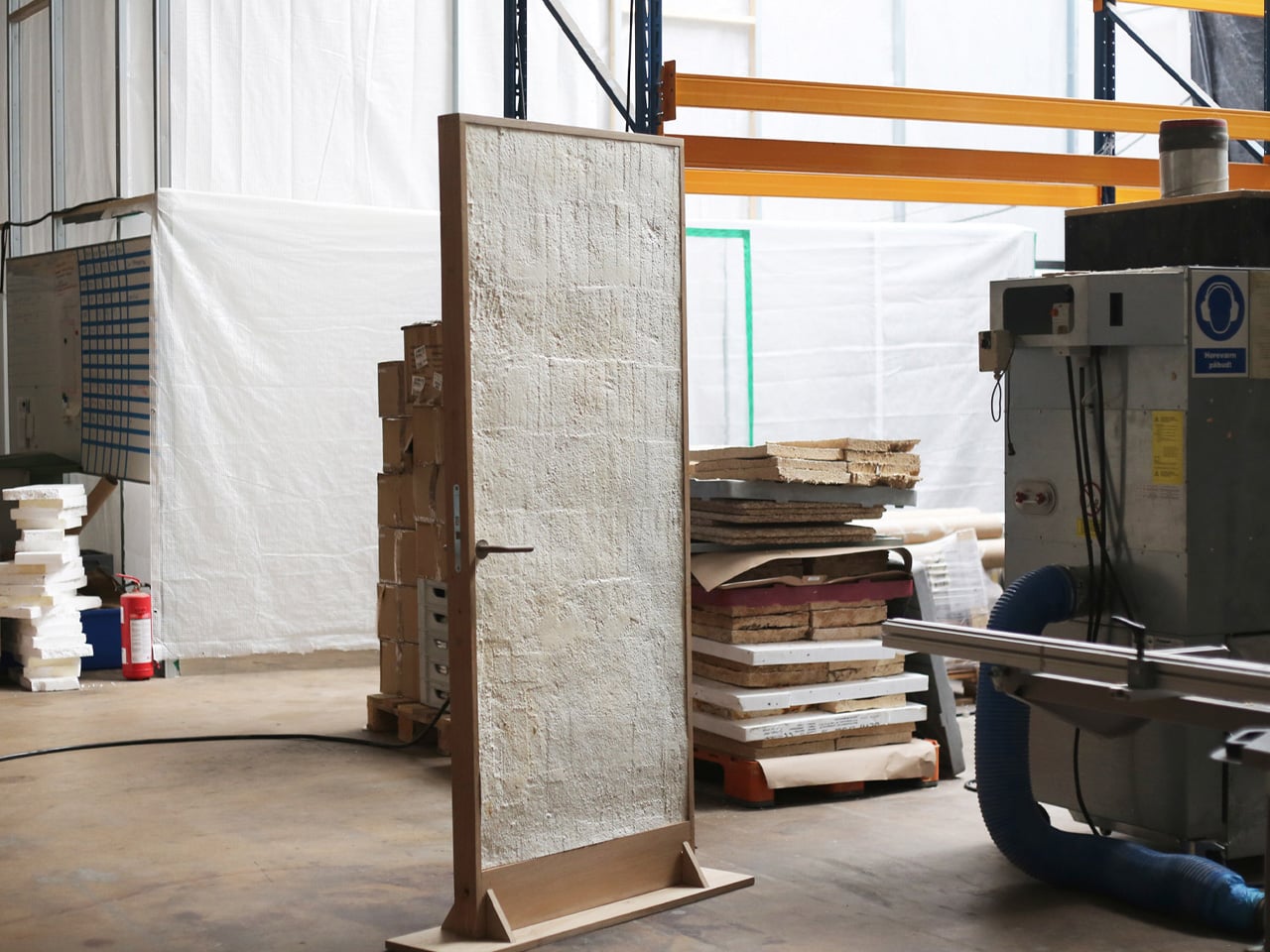
Modular planters introduce a layered spatial rhythm where planting systems evolve alongside everyday living. Designed with architectural precision, these elements use high-performance bio-composites that express material honesty while functioning as adaptable interior features. Acting as spatial dividers and living furniture, they create biophilic zones that improve air quality and soften the hard lines of contemporary interiors.
The long-term value of modular planters lies in flexibility and design longevity. Systems can be rearranged as spatial needs shift, allowing interiors to remain responsive rather than fixed. More than decorative objects, these planters operate as architectural components, seamlessly connecting interior design with agricultural thinking while preserving the coherence and integrity of the home’s-built form.
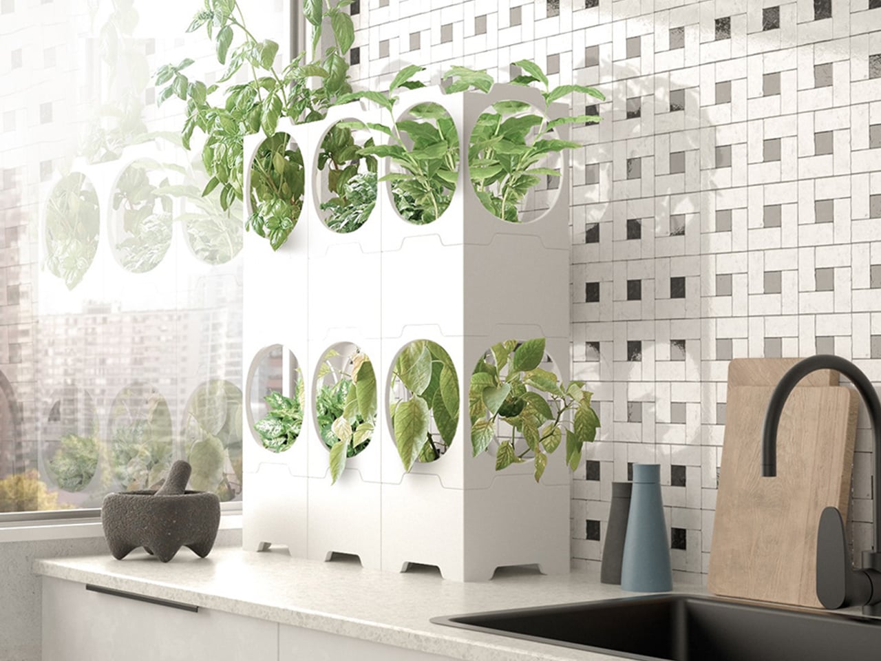
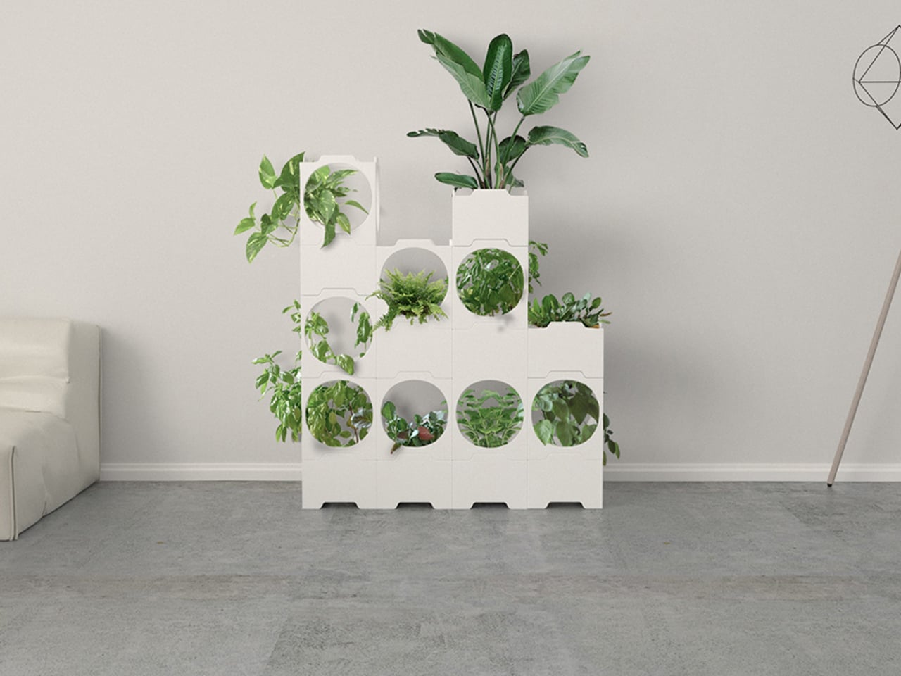
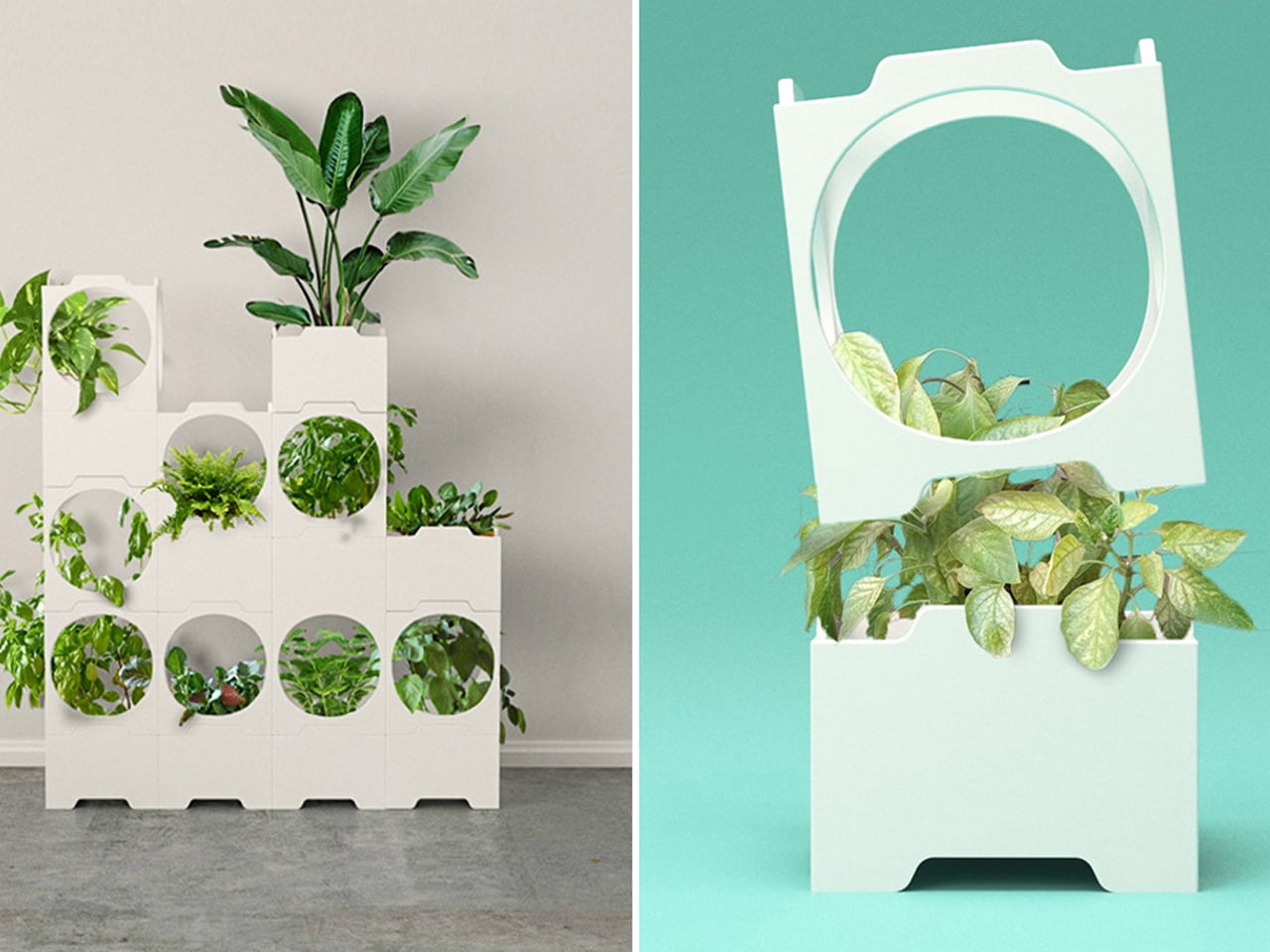
As home gardening gains popularity, the challenge of growing food in compact living spaces has become increasingly apparent. Many planters designed for small homes limit the number of plants they can support, restricting both yield and flexibility. Chilean designer Lorenzo Vega addresses this issue through a modular vertical planter system inspired by LEGO-style construction. Beginning with a single cubic unit, the system allows users to grow vegetables using traditional methods, then expand vertically by stacking additional modules as space permits. This scalable approach enables efficient food cultivation without demanding a larger footprint.
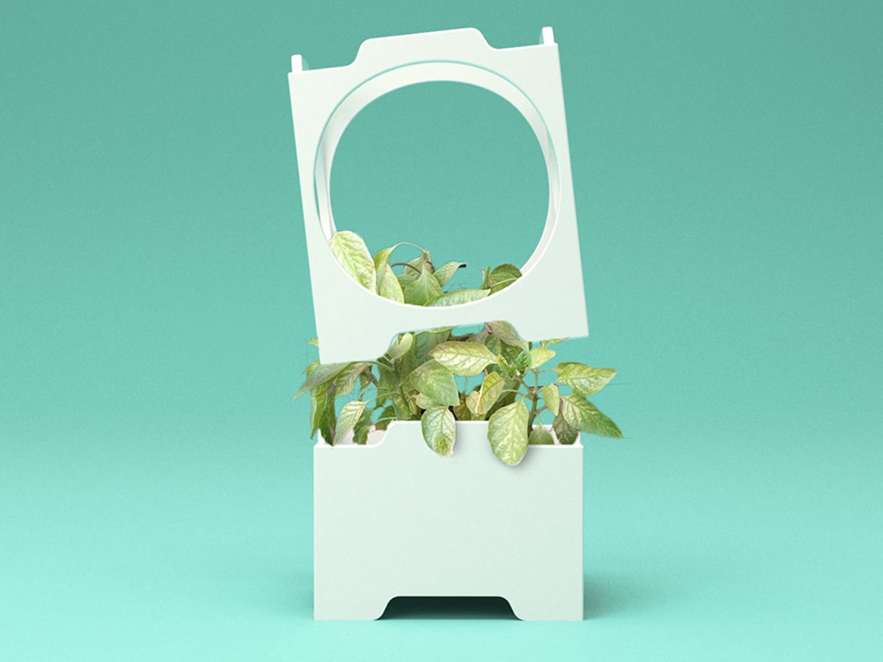
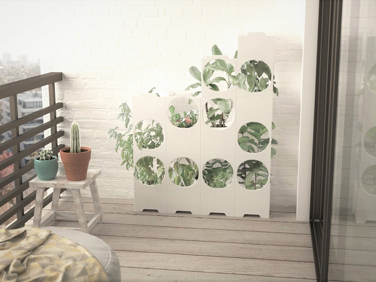
Each module consists of a planting dish encased within a cubic frame that provides sufficient depth for crops to grow to full height. The design draws visual and structural influence from Japanese Metabolism and Social Modernist architecture, resulting in a clean, stripped-back aesthetic. Its stackable form maximizes vertical space, transforming underused areas into productive growing zones.
3. Indoor Vertical Farms
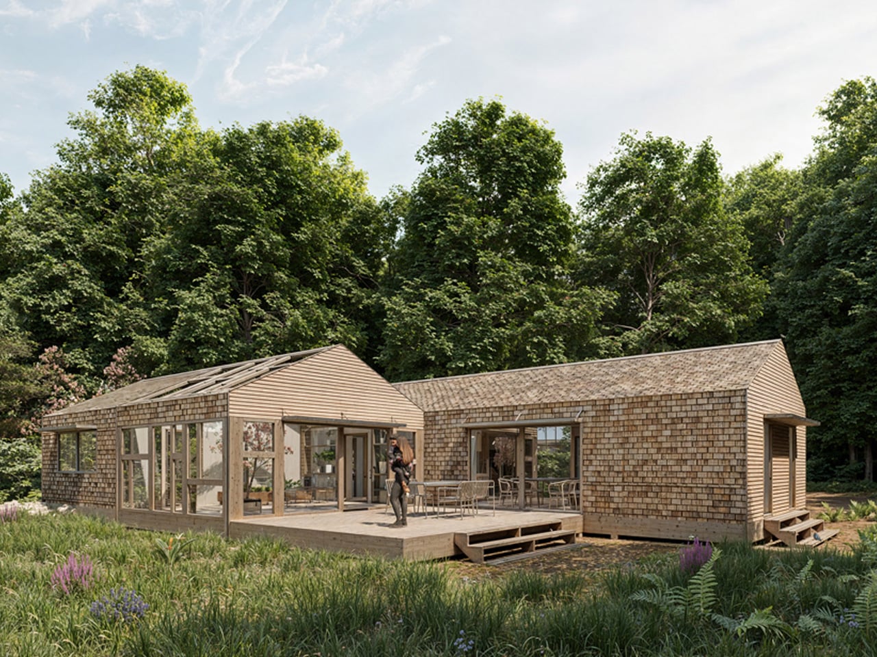
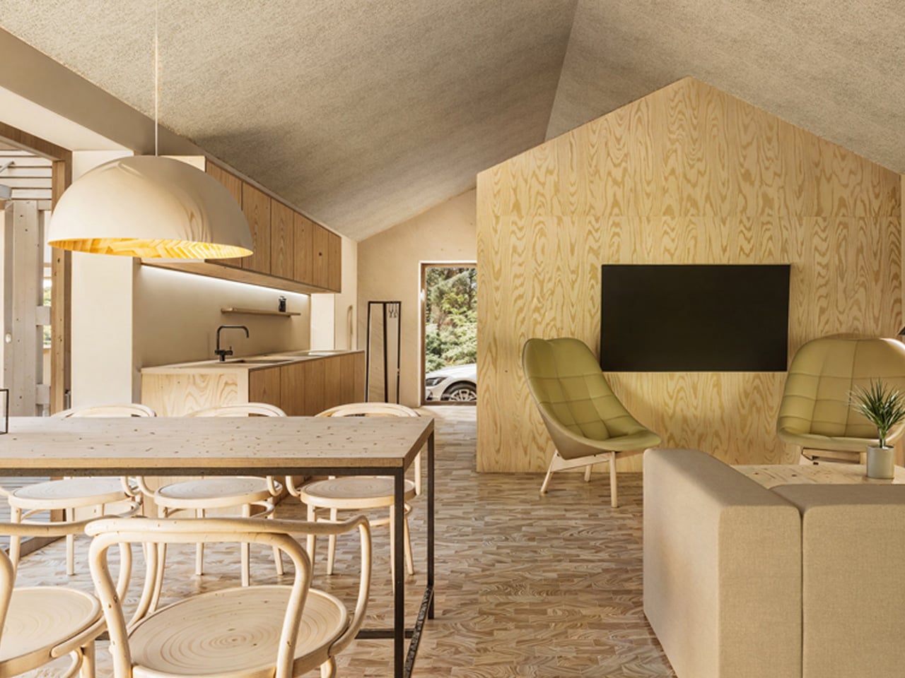
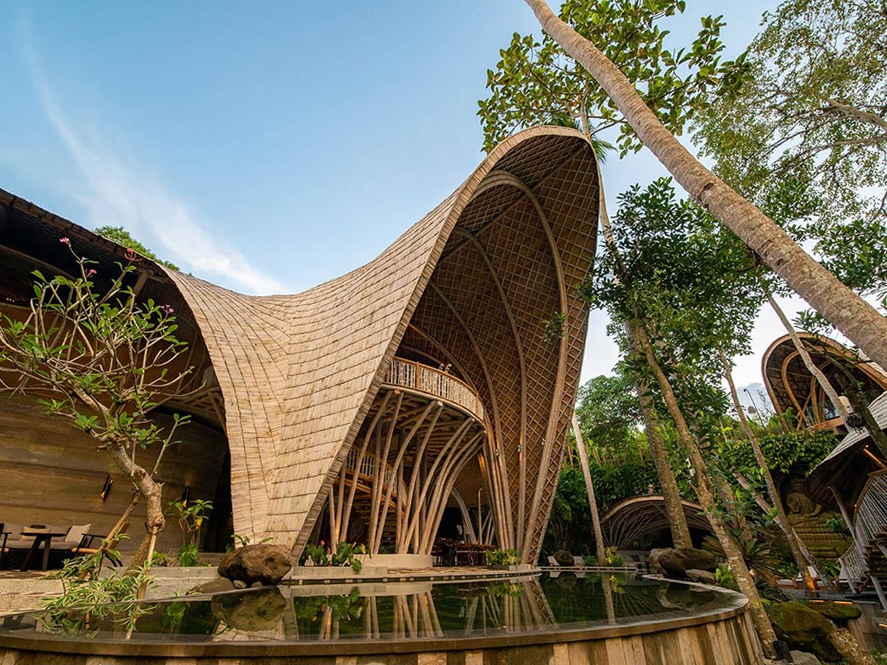
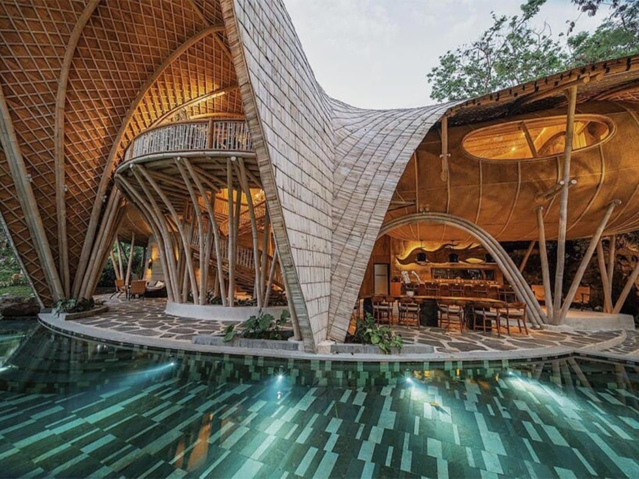
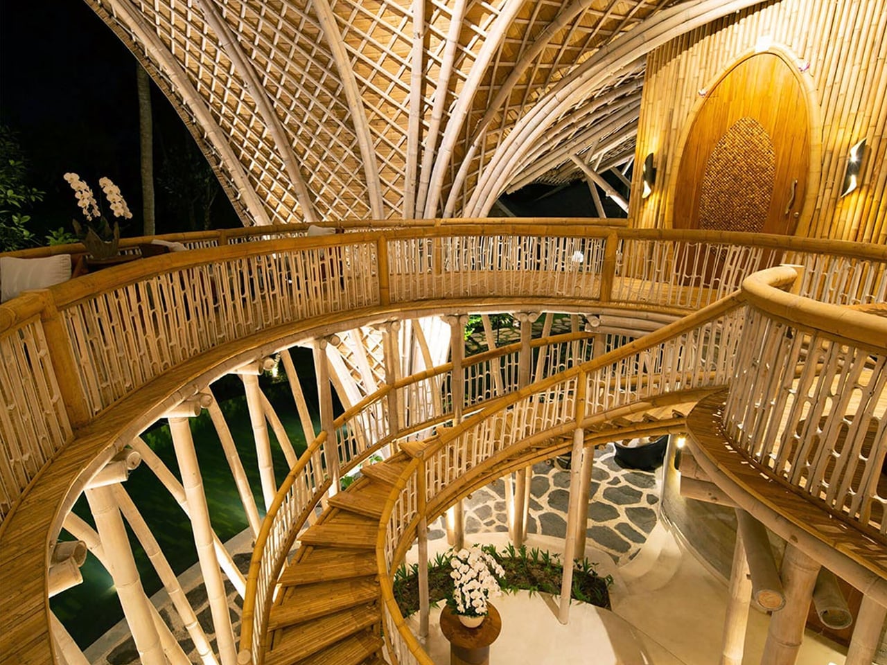
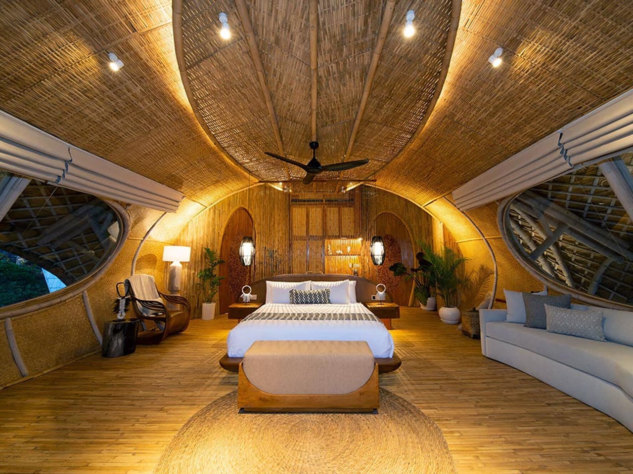
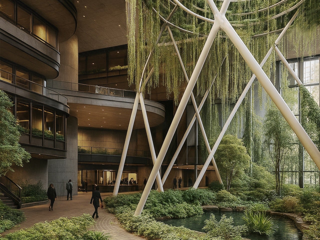
Integrating an indoor vertical farm into the heart of the home has become a defining marker of contemporary luxury. This residential biosphere transforms everyday living into a sensory experience, where the presence of living greens, natural aromas, and visual vitality elevates well-being. Rather than serving as ornamentation, the farm prioritizes nourishment, mindfulness, and a deeper connection between occupants and their environment.
Functioning as an architectural system, these vertical farms actively regulate the home’s internal climate. Layered hydroponic structures support thermal performance, operating as natural heat moderators within the interior. Treated as sanctuaries of softened light, the grow zones conceal advanced technology behind refined joinery, creating a seamless balance between precision engineering and calm, restorative spatial design.
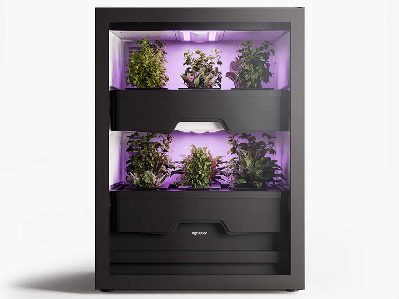
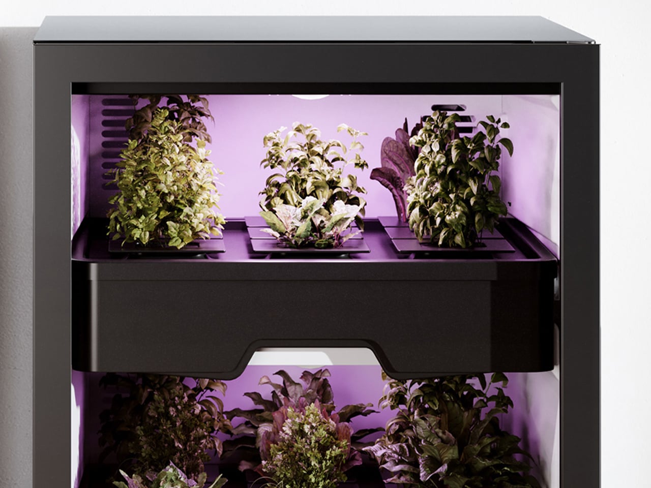
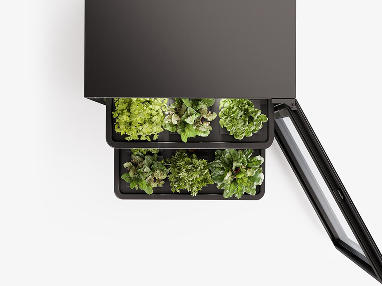
Berlin-based design studio The Subdivision introduced Agrilution as an indoor vertical farming solution that turns sustainable living into an intuitive, everyday experience. Designed with ease of use in mind, the concept focuses on making home-grown food practical for modern lifestyles, particularly for those living in compact urban spaces.
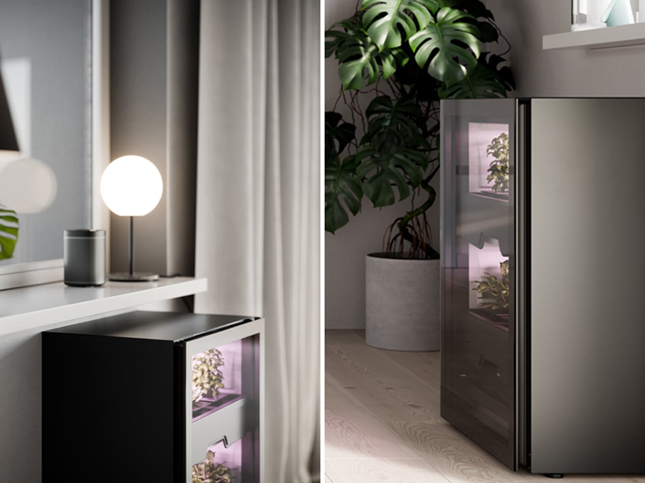
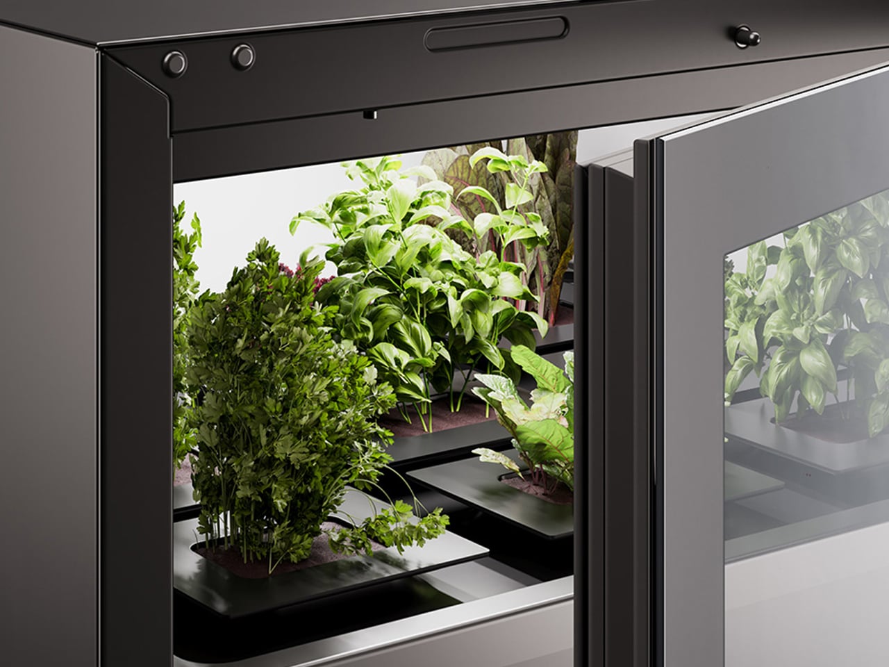
Also known as the Plantcube, Agrilution resembles a small refrigerator and features two sliding shelves for soil planters and crops. Built-in LED grow lights deliver consistent artificial light, supporting plant growth throughout the year. A connected app tracks plant health and alerts users when watering or maintenance is needed. With its clean black-and-white finish, Agrilution integrates effortlessly into contemporary interiors, offering a discreet and efficient way to grow fresh produce at home.
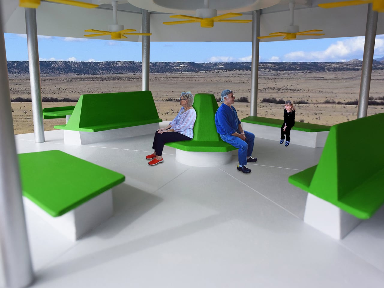
4. Integrating Community Lifestyle
Vertical farming is increasingly understood as a catalyst for social connection within contemporary developments. Shared growing spaces transform food production into a collective ritual, offering a form of psychological value that conventional luxury amenities rarely achieve. These communal agricultural zones function as biophilic environments where residents connect not only with nature but with one another, strengthening the relationship between architecture and social well-being.
Designed as central spatial anchors, these farms are embedded within primary circulation routes to encourage movement, pause, and interaction. Positioning agriculture at the core of daily life reframes it as a cultural act rather than a background utility. In dense urban settings, such spaces counter isolation, fostering shared responsibility and turning the productive landscape into a lived, communal experience.
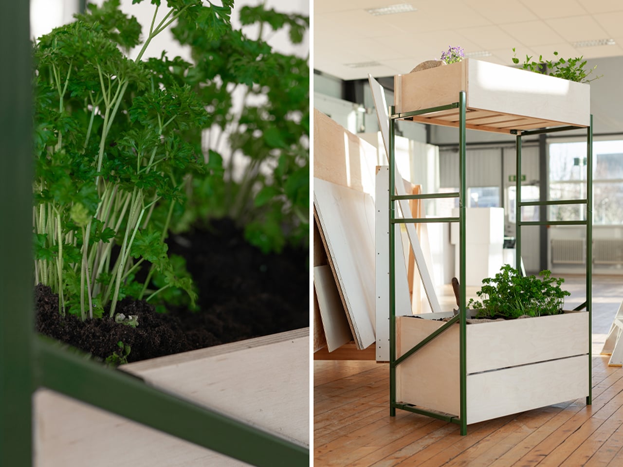
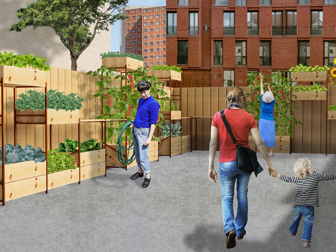
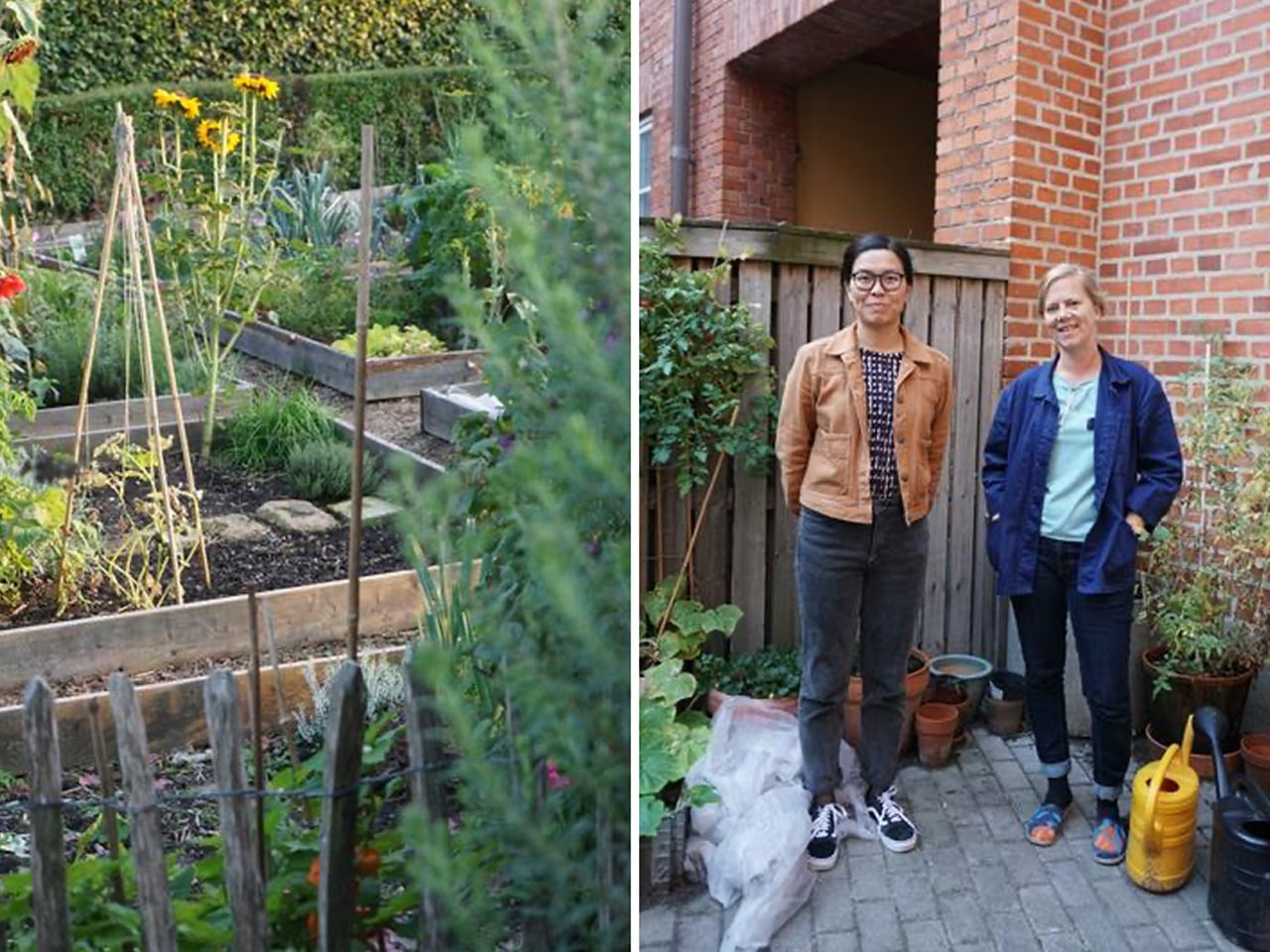
Urban farming adapts to the character and constraints of each city, taking forms that range from backyard gardens to rooftop plots and hydroponic systems. In Malmö, where space is limited, small-scale community farming has become an important part of urban life. Designer Jacob Alm Andersson developed Nivå, a vertical farming system shaped by the practices and shared experiences of local urban farmers. Through interviews, Andersson discovered that many residents began growing food after being inspired by their neighbors, highlighting the role of community exchange in sustaining urban agriculture and encouraging participation across generations.
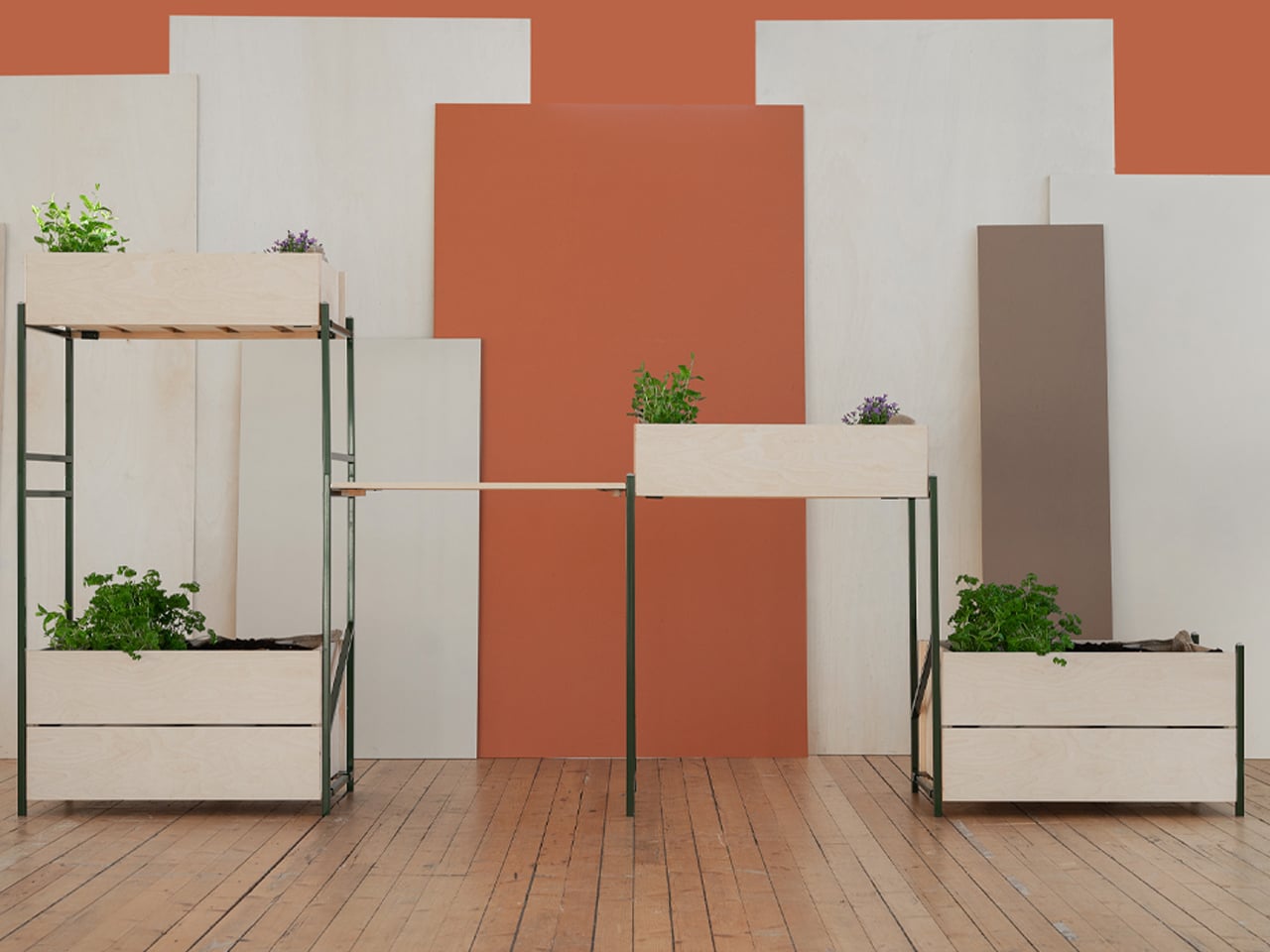
Responding to Malmö’s spatial limitations, Nivå is designed to function efficiently on a vertical plane while remaining adaptable and robust. The system is constructed from stacked steel beams reinforced with wood, creating stable shelving for cultivation. Heat-treated pine planters attach using a hook-and-latch mechanism, eliminating the need for screws. Beyond growing food, Nivå operates as a communal workstation, complete with a central work surface that supports planting, harvesting, and maintenance, reinforcing urban farming as both a productive and social activity.
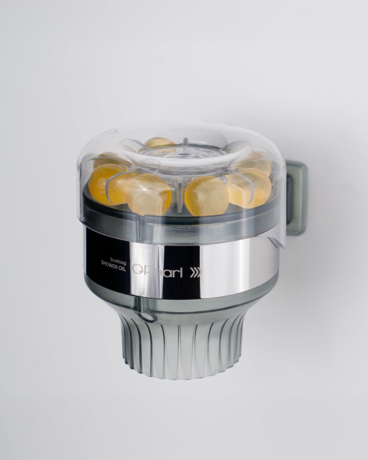
5. Automated Irrigation
Automated irrigation operates as the quiet intelligence behind productive, plant-integrated architecture. IoT-enabled systems regulate water and nutrient delivery with extreme accuracy, supporting healthy growth while drastically reducing waste. This technical layer is carefully concealed within recessed channels and shadow gaps, preserving the visual integrity of stone, timber, and other primary finishes while allowing the architecture to read as calm and resolved.
Beyond performance, automation enhances long-term value and resilience. By controlling moisture precisely, these systems protect the building envelope and ensure consistent yields without constant human intervention. The result is a biophilic environment that feels effortless to inhabit where advanced engineering and natural growth work in harmony to create a self-sustaining, low-impact domestic ecosystem.
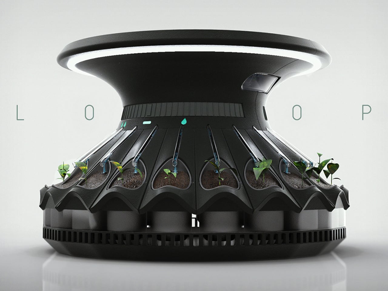
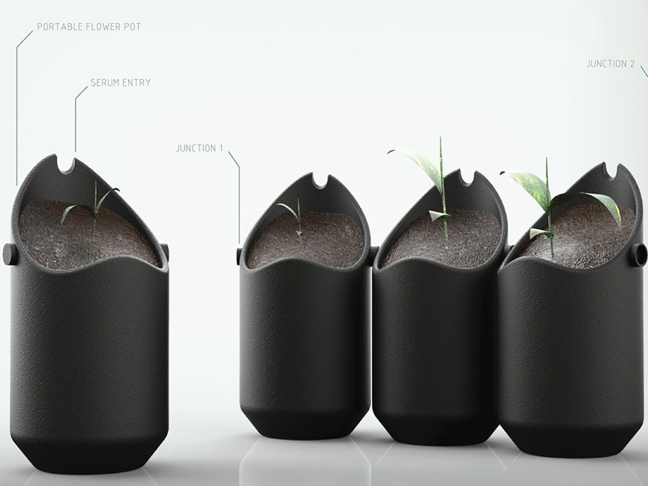
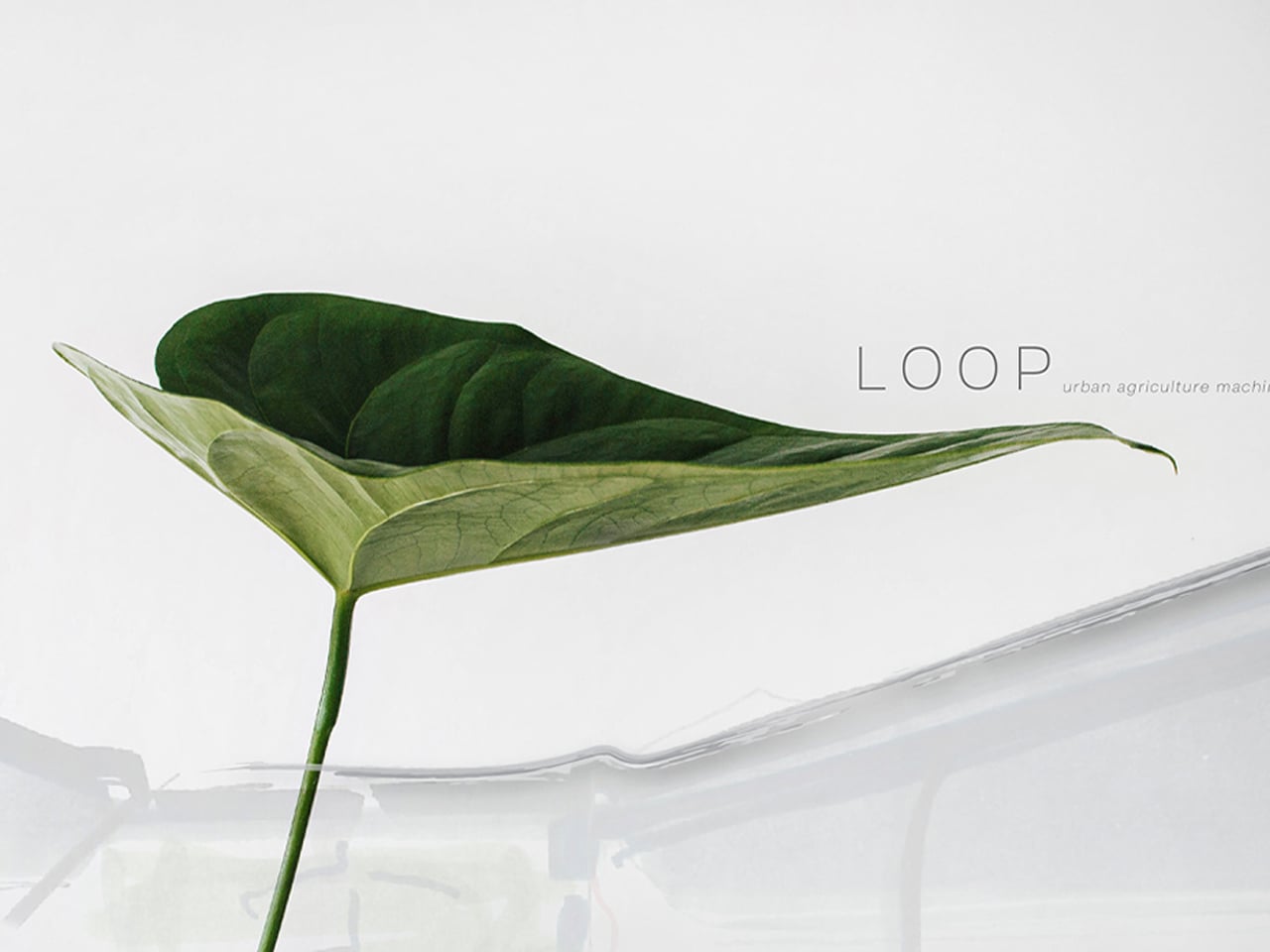
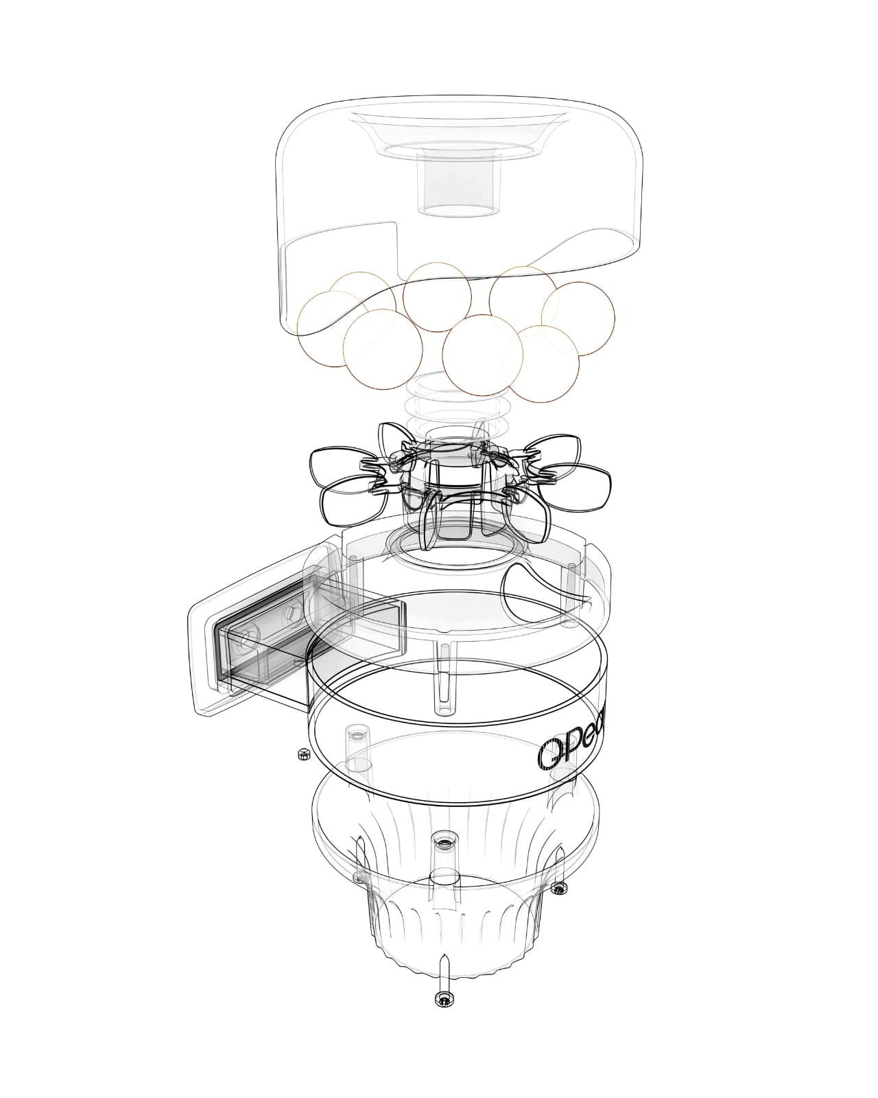
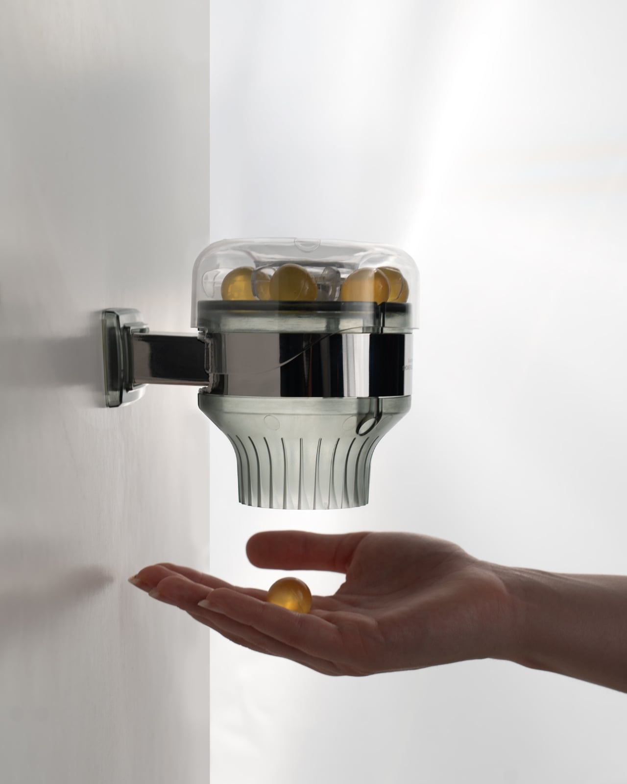
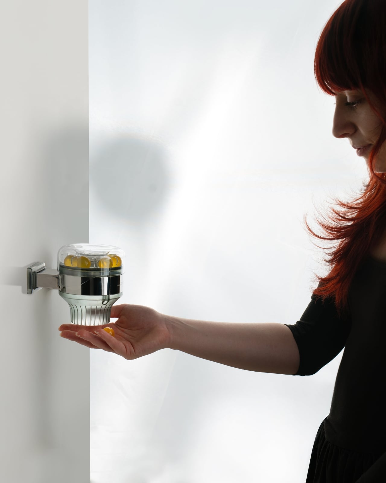
Loop is a smart, modular plant pot designed specifically for compact urban interiors. Created by designer Elif Bulut, the system addresses common challenges of indoor gardening, such as limited space, inconsistent light, and irregular watering. Its sculptural, plume-inspired form allows plants to grow from both the top and bottom, with detachable seed modules arranged in a radial configuration. Each module securely locks into place, enabling easy customization and maintenance while keeping the system compact and visually cohesive.
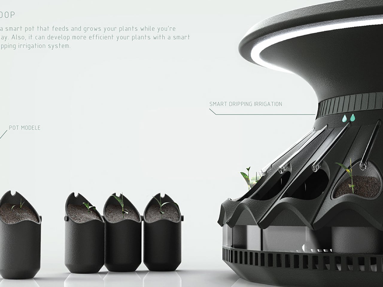
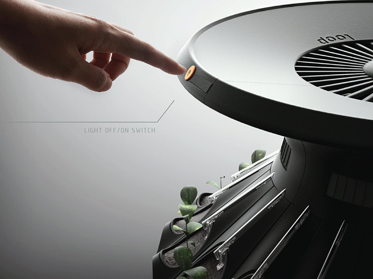
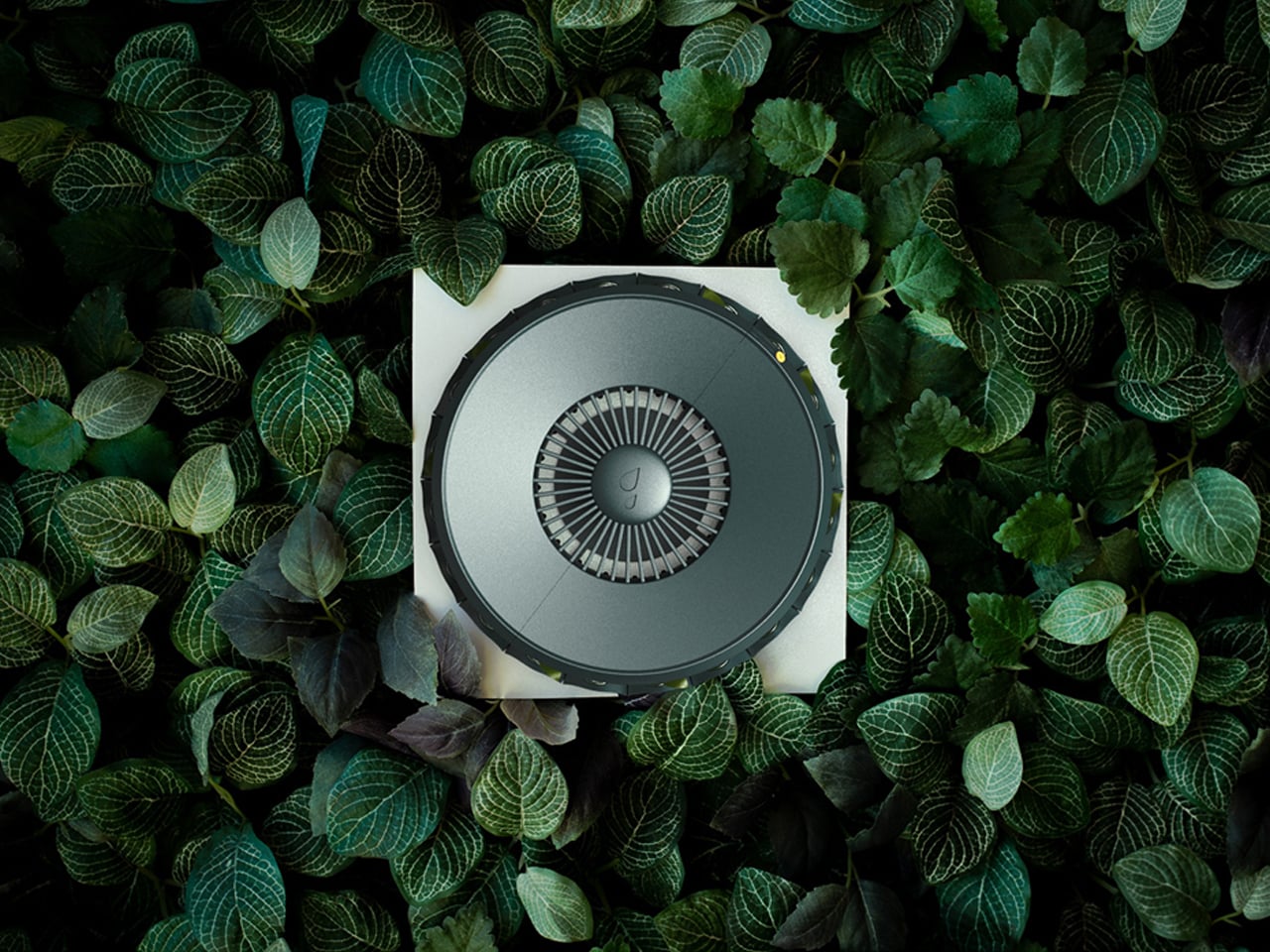
At the core of Loop is an automated irrigation and lighting system that simplifies plant care. An adjustable top-mounted water reservoir controls the flow of water to each module, allowing users to fine-tune irrigation based on plant needs. Integrated LED lights beneath the lid distribute balanced light throughout the day, supporting healthy growth indoors. Once set up, Loop’s smart technology monitors plant conditions and maintains optimal settings, making indoor gardening intuitive, low-maintenance, and well-suited to city living.
Vertical farming is transforming how we inhabit cities and homes, blending architecture, sustainability, and community. From towering agricultural skyscrapers to modular indoor systems, these innovations create resilient, biophilic environments that nourish both people and planet.
The post 5 Vertical Farm Designs That Grow Food Inside Your Home and City first appeared on Yanko Design.