The sticky note has outlasted every productivity trend that was supposed to replace it, and there’s a reason for that. Writing something down by hand, right when it occurs to you, is still the fastest way to keep an idea from slipping away. Digital apps, meanwhile, have the opposite problem: the moment you unlock your phone to jot something down, you’re one notification away from forgetting why you opened it.
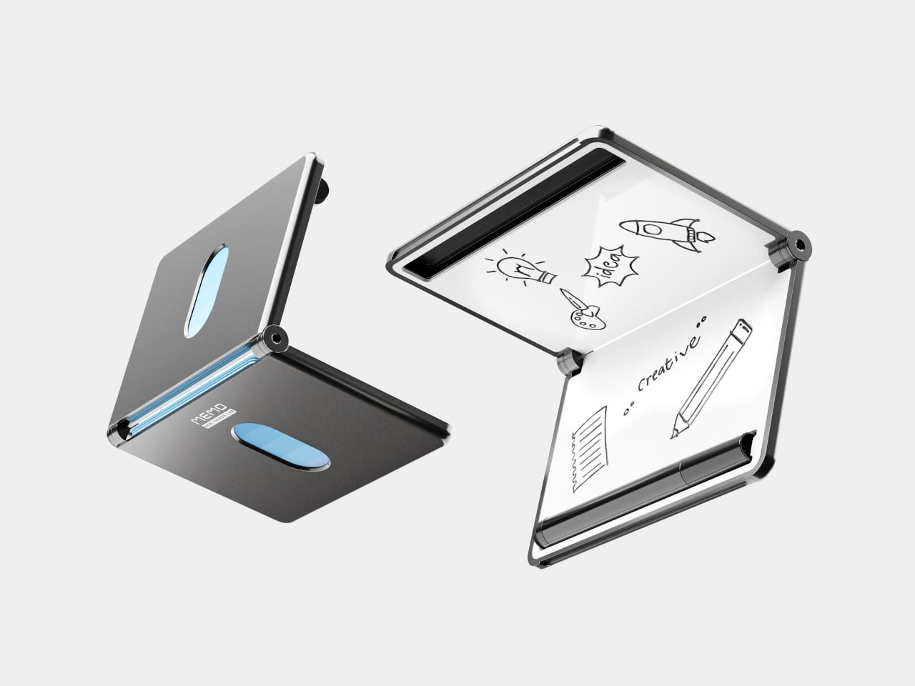
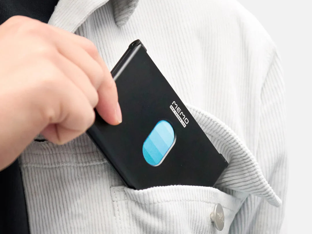
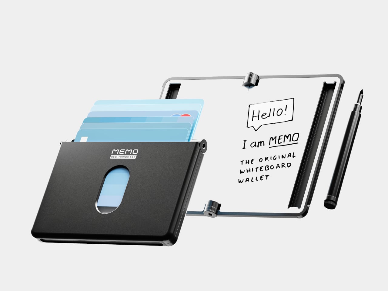
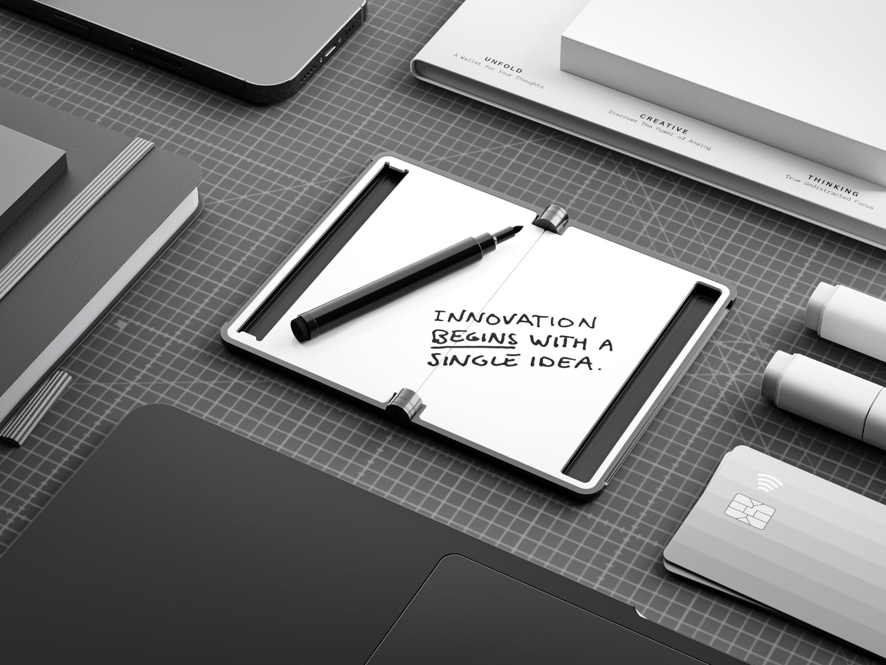
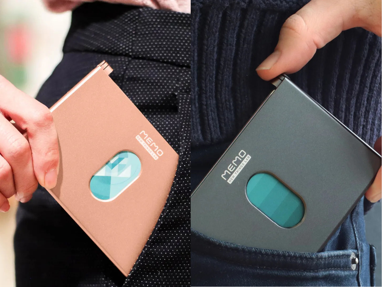
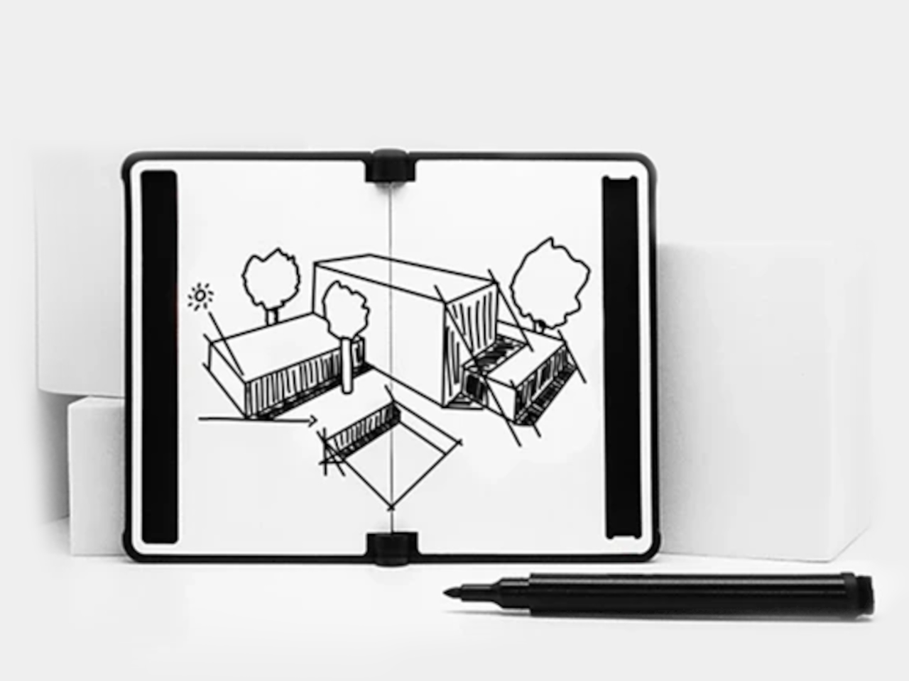
New Things Lab, a design studio from the Netherlands, built a direct answer to that problem. The MEMO Whiteboard Wallet is a precision-machined aluminum card holder with a dry-erase surface built directly into its face, giving you a pocket-sized board that’s always ready when a thought strikes. The concept earned quite a following from people who immediately understood what it was for.
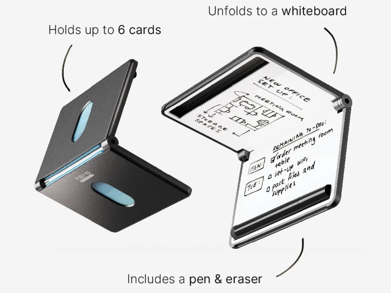
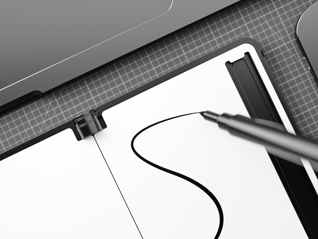
The whiteboard spans 6 inches diagonally, just over A7 in size, and it’s coated with a smooth, heat-cured paint that cleans up without ghosting. It’s large enough to be genuinely useful but slim enough not to add awkward bulk. On a given day, you might use it to jot down a measurement, scribble a password for a guest, or keep a short list of things you’d otherwise forget by lunch.
Writing on the surface is handled by an included 0.8mm fine-point pen that stores in a dedicated slot built right into the wallet’s frame, so it’s always within reach when you need it. Flip the pen around, and there’s an eraser on the other end, making the MEMO genuinely self-contained. You’re not hunting for something to wipe the board with, and there’s no spare piece you’d misplace in a bag.
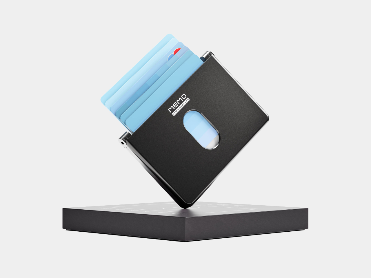
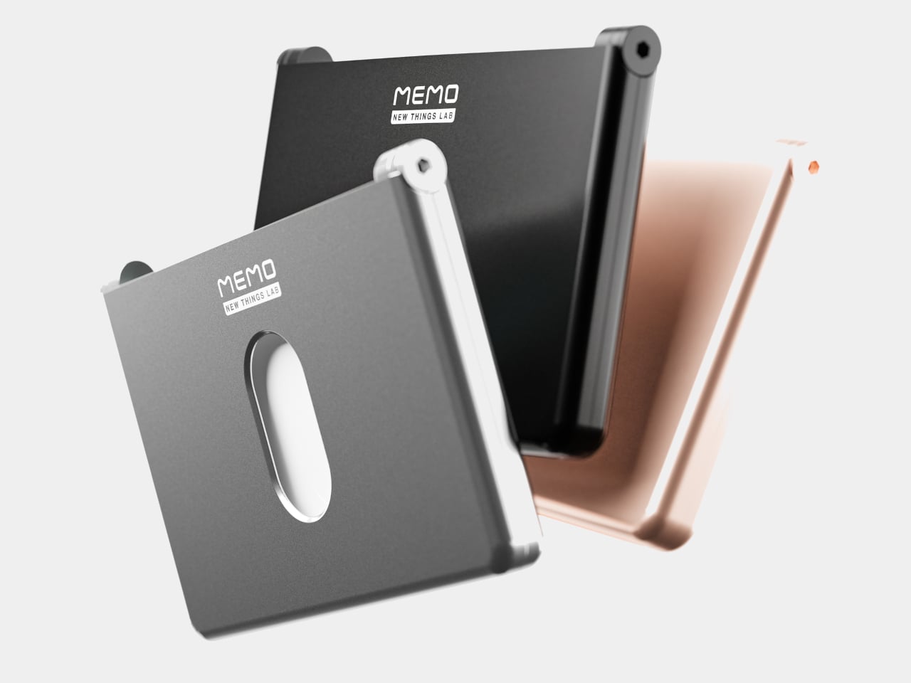
On the other side of the MEMO is the actual card-carrying section, with room for up to six standard cards and a magnetic closure that keeps everything neatly shut. The body is milled from 6063 aluminum, giving it a solid, premium feel without adding unnecessary weight or thickness. That same metal shell also blocks RFID signals, protecting your card data from electronic skimming without needing any additional sleeve or pouch.
The MEMO comes in Charcoal Black, Slate Gray, and Gilded Rose as the standard colorways, with Revision Red and Airmail Blue available as limited editions. All five options lean toward the restrained end of the color spectrum, which suits the product well. There’s also an environmental case to be made here. Every note wiped from the MEMO’s surface is a sticky note that didn’t find its way into the trash, and those savings do compound over time.
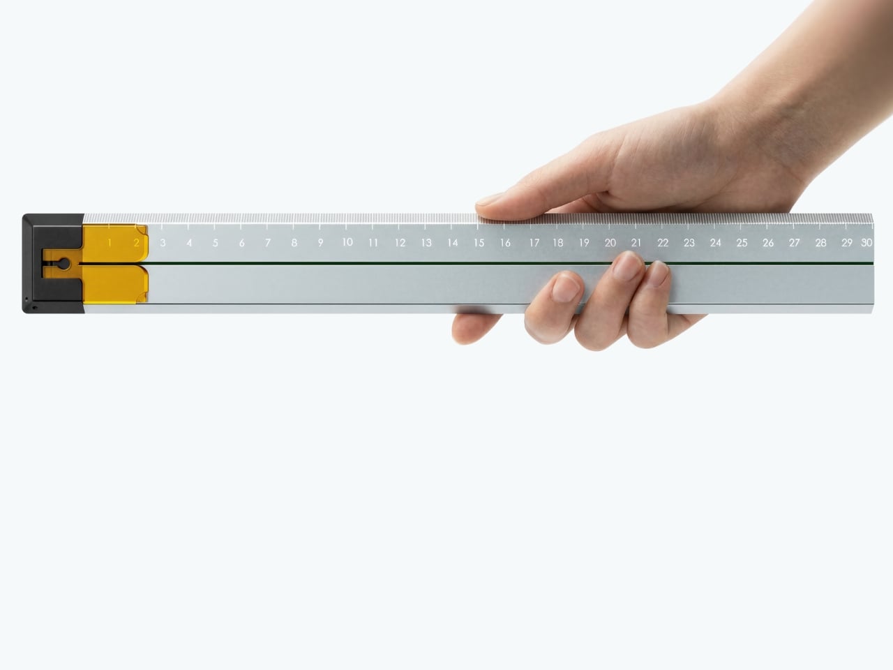
I’ve been staring at these renders for a while now, and I keep coming back to one line from the project page: “A cutting-aid tool designed for the human hand as it actually trembles.” That’s not marketing copy. That’s a design philosophy most product designers never arrive at.
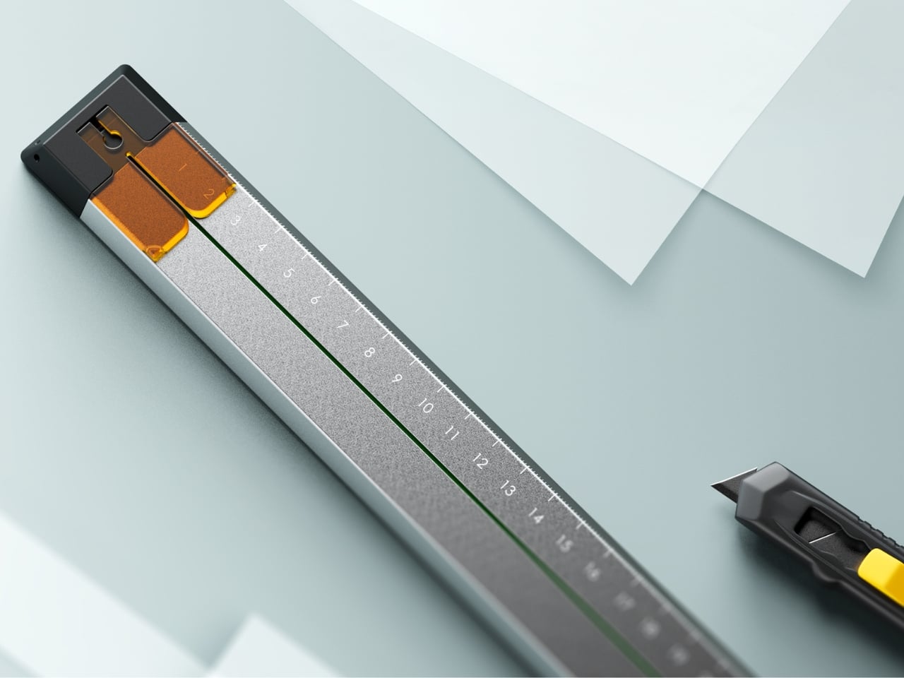
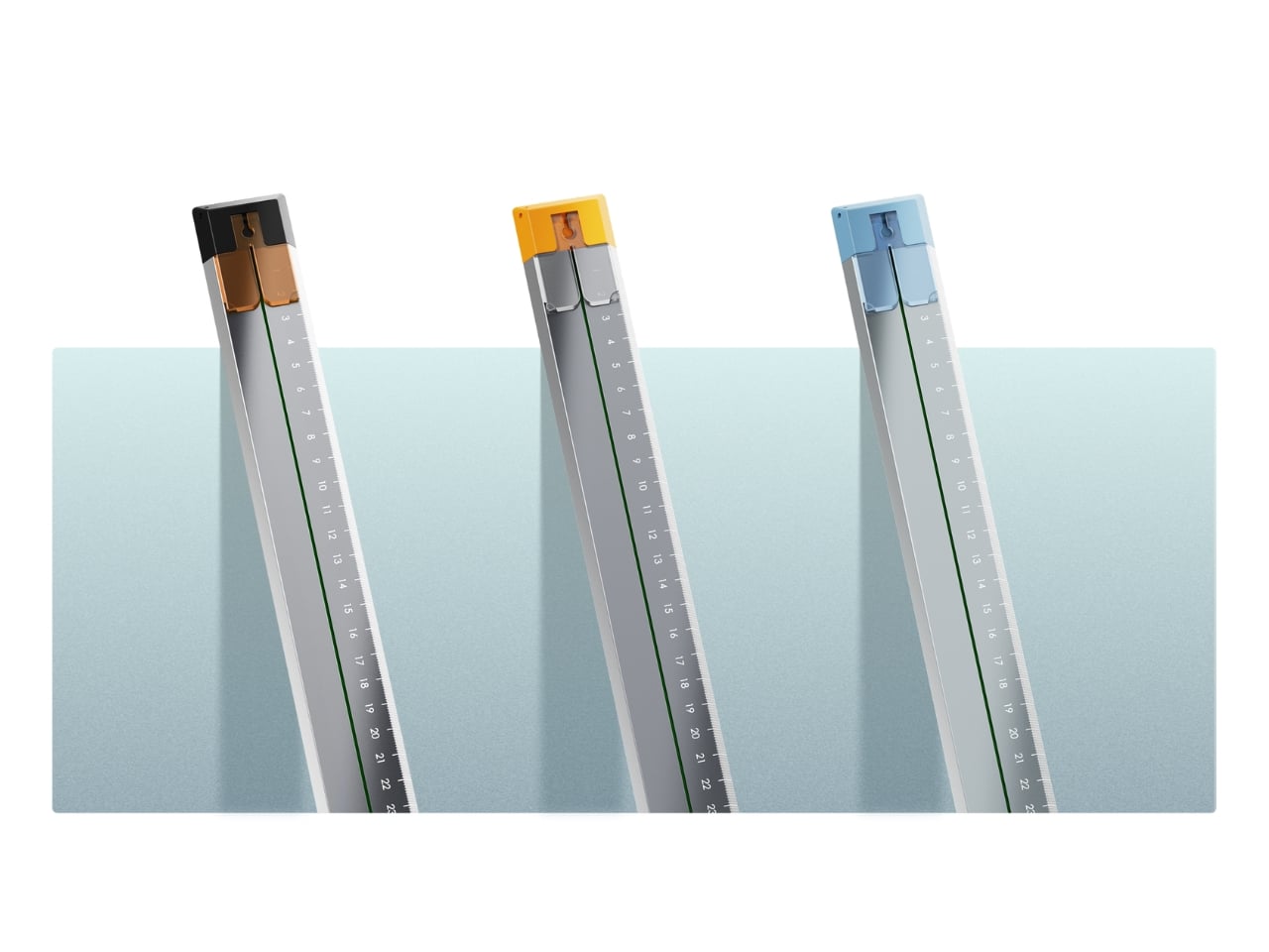
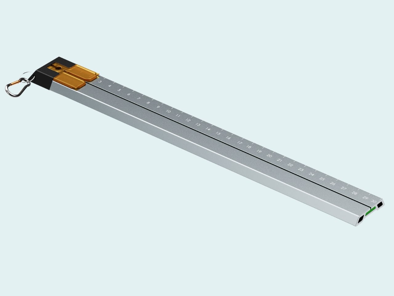
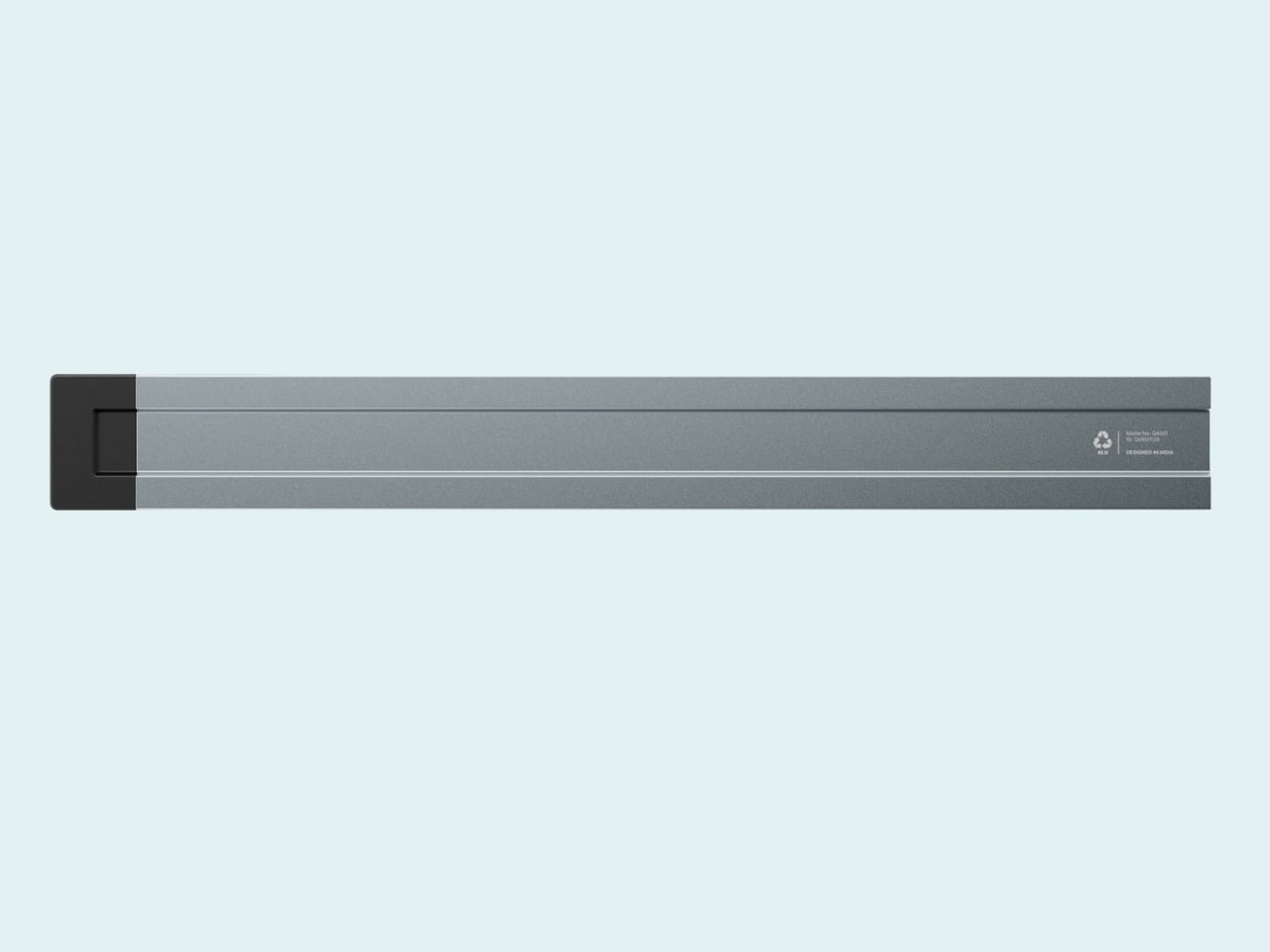
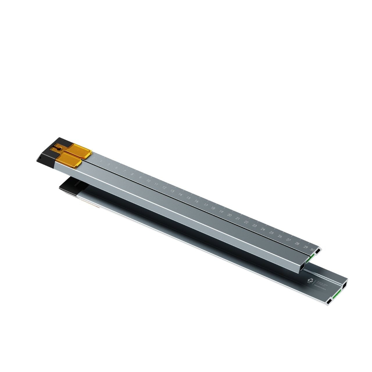
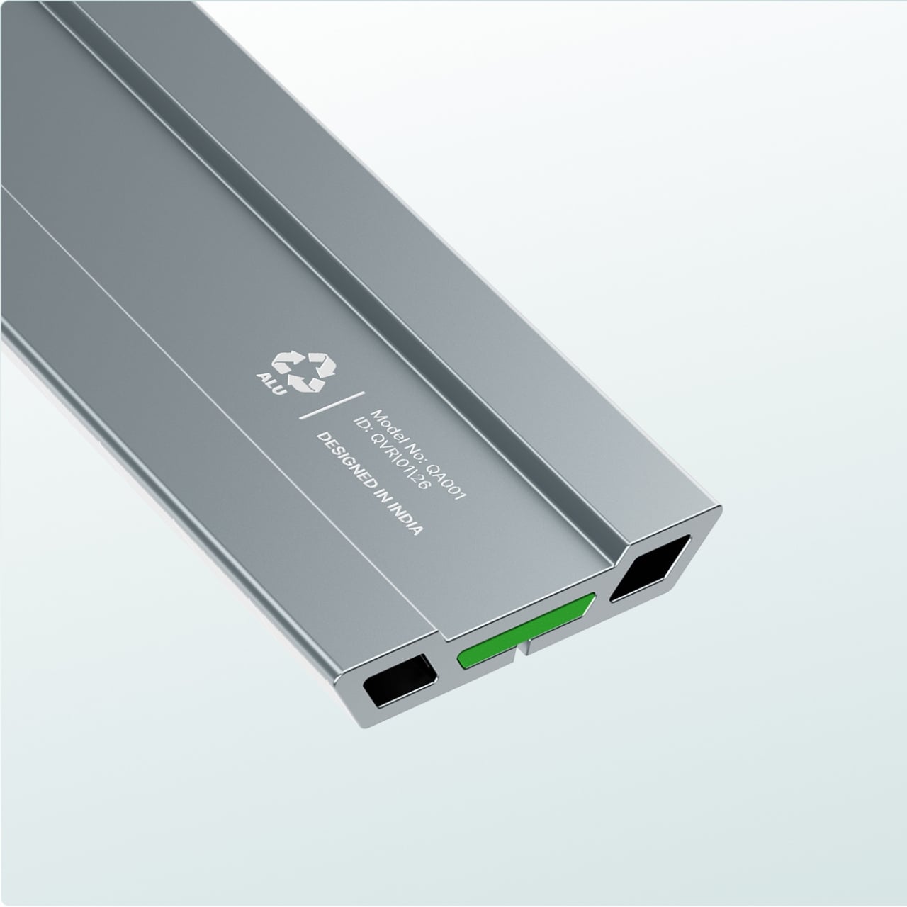
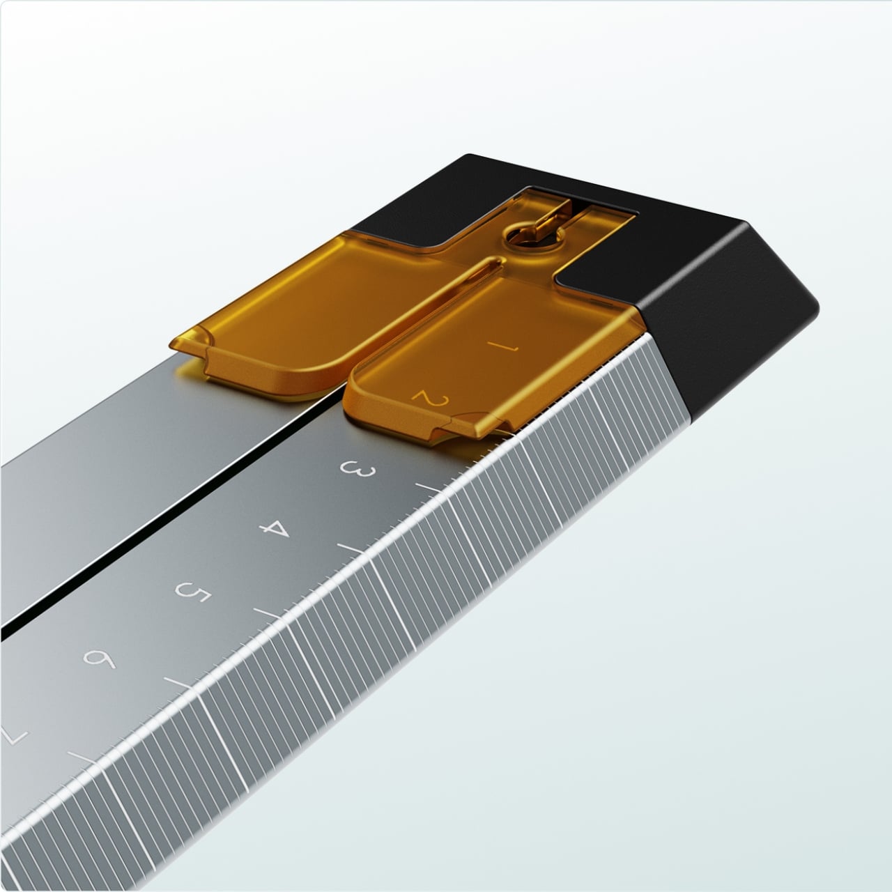
Quiver is a concept by Tunir Maity, a designer based in Noida, India, and it’s one of the most thoughtful pieces of industrial design I’ve come across recently. On the surface, it looks like a premium aluminum ruler with a built-in paper guide and blade channel. Sleek, minimal, the kind of object that would look good on a studio desk. But what makes it interesting isn’t how it looks. It’s what it admits about you.
Most cutting tools are designed as if you’re a surgeon. Steady hands, perfect pressure, ideal lighting, infinite patience. The reality is different. You’re hunched over a desk, eyeballing a line, gripping too hard because you’re afraid of slipping. The paper moves. The blade drifts. You end up with a cut that’s close enough but never quite right. It’s a small failure, the kind you shrug off, but it accumulates into a quiet resentment of a task that should be simple.
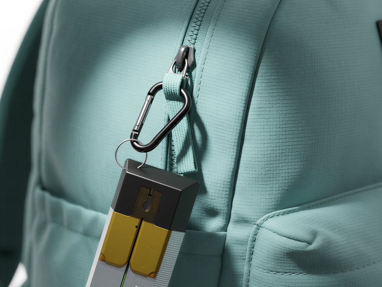
Quiver’s approach is to stop pretending the problem is you. The tool has a clip mechanism that holds paper in place, a slit that guides your blade in a straight line, and a weight distribution that favors the cutting end so you don’t have to press as hard. The whole thing is made from anodized aluminum with recyclable plastic components, designed for over 300 cuts and years of daily use. There’s even a carabiner attachment so you can clip it to a bag, which is a nice touch for anyone who actually uses tools instead of just collecting them.
What I find compelling about this project isn’t any single feature. It’s the framing. The name “Quiver” carries a double meaning that I think is genuinely clever without being precious about it. There’s the archery sense, that moment of readiness before you release, and there’s the literal quiver of a human hand. Most designers would pick one meaning and run with it. Maity holds both, and that tension is where the design lives.
There’s a broader conversation here about inclusive design that I think Quiver speaks to without ever using the term. When you design for trembling hands, you’re not just designing for people with motor difficulties or arthritis. You’re designing for everyone who’s ever been tired, rushed, cold, nervous, or just not that precise. That’s all of us, at different moments. The best accessible design has always worked this way. Curb cuts were designed for wheelchairs and ended up helping everyone with strollers, luggage, or sore knees. OXO Good Grips started as kitchen tools for people with arthritis and became the standard for comfortable design. Quiver fits into that lineage. It’s not a medical device or an accommodation. It’s just a better tool that happens to respect the full range of human capability.
I also appreciate that it comes in multiple colorways. The amber, yellow, and blue clip variants shown in the renders suggest this is meant to be a personal object, not just a utility. That matters. Tools you choose tend to be tools you use.
Is it perfect? It’s a concept, so there are open questions. How does the blade channel handle thicker materials? What’s the learning curve for the clip mechanism? Would the weight feel different after an hour of continuous use? These are manufacturing questions, not design ones, and they don’t diminish what Maity has accomplished here at the conceptual level.
What stays with me is the generosity of the premise. So much of product design starts from a place of optimization, making you faster, more efficient, more precise. Quiver starts from a place of acceptance. Your hands shake. That’s fine. Let’s work with that. In a design landscape obsessed with eliminating human imperfection, there’s something quietly radical about a tool that says your imperfection was the brief all along.
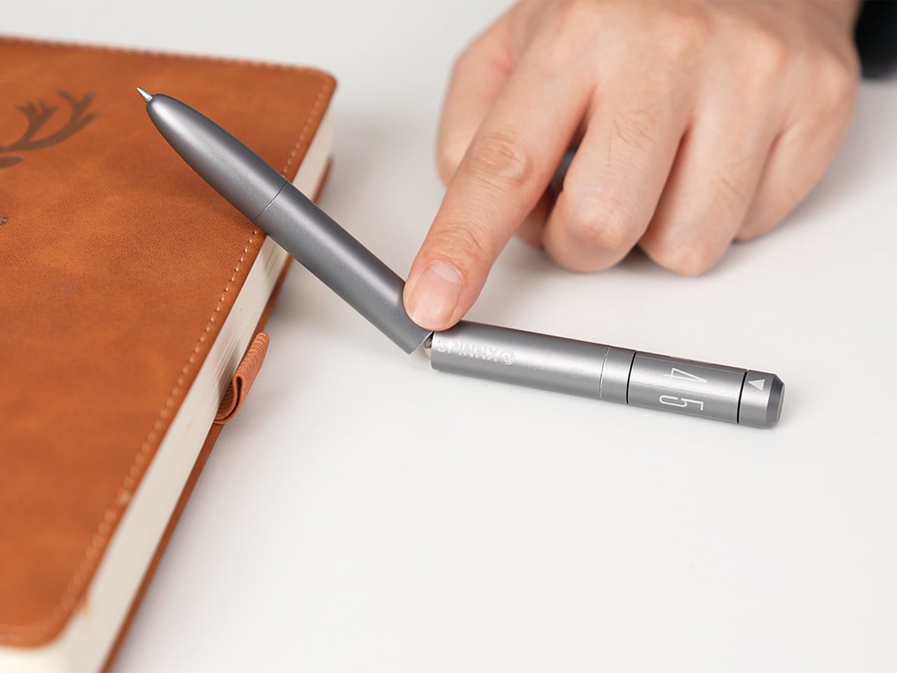
Your hands are restless by design. Even when you’re sitting still and supposedly focused, they want to press something, rotate something, click something into place. This tendency has been pathologized and productized in equal measure, first by disapproving teachers, then by the fidget spinner industry. But before any of that, there was just the pen. The clicking ballpoint. The cap you’d snap and unsnap. The barrel you’d roll between your knuckles during a long phone call. Pens have always had a secondary life as objects of physical preoccupation, and most people who’ve ever worked at a desk know exactly what that feels like.
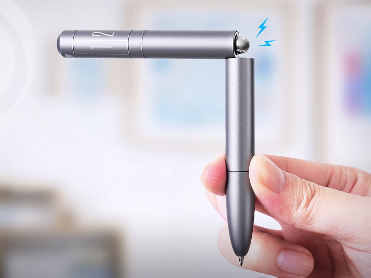
SPINNX takes that secondary life and makes it the whole point. Built by WEIWIN out of aerospace-grade titanium and held together by magnets, the pen separates into three modules that each deliver a distinct tactile sensation. Snap them together and there’s a crisp magnetic click. Press the spring-loaded ball in the middle and it gives you another one. Spin the dice top and it rotates through a series of rhythmic mechanical detents. The pen tip deploys with a twist rather than a click, because even the functional part of the experience has been thought through. Three years of development, ten design revisions, and one very specific goal: a pen that writes and delights.
The three-part system allows you to reconfigure the pen’s entire sensory output. You can flip the middle module to put the spring-loaded ball on top for a different kind of thumb-actuated click. Each combination changes the weight distribution and the way the pen feels in motion, which creates a surprisingly deep rabbit hole of tactile experiences. The team claims over fifty different ways to spin and fidget with the thing, and that number feels plausible once you start playing with it. The design provides a whole palette of physical feedback, letting you find the specific sensation your brain needs at that moment to stay locked in.
The snap of two modules connecting sounds like a well-tuned mechanical keyboard switch, something the designers obsessed over to ensure the end-product has a strong audio-visual-tactile experience. WEIWIN engineered the acoustic and tactile response of each magnetic separation and reconnection as an intentional product feature, treating the sound with the same design attention as the geometry… sort of like how luxury car designers obsess over how the doors sound when they close. Most clicking pens produce their click as a mechanical consequence, with nobody sitting in a room deciding whether it needs to be crisper or more controlled. With SPINNX, somebody clearly did sit in that room, and the result is a snap that feels sound-designed for sheer satisfaction.
The dice module functions like a high-quality EDC spinner, rotating with a series of crisp, audible clicks that feel like running your thumb over the crown of a well-made watch. Its ceramic bearing ensures the rotation is smooth and completely unaffected by the precision-engineered magnets holding the pen together. Choosing a non-metallic bearing is the kind of small, deliberate decision that separates a durable tool from a simple toy. Beyond the satisfying spin, it serves as a simple decision-making device. When you’re stuck between two choices, a quick roll gives you an answer, which is a surprisingly effective way to get past minor mental roadblocks.
Choosing aerospace-grade titanium for the body does more than just add a premium feel. The material provides a specific heft and durability that aluminum or steel can’t quite match, giving the pen a reassuring presence in the hand without being overly heavy. This balance is critical for an object designed for constant manipulation. The pen tip itself deploys with a smooth twist mechanism, which feels more deliberate and controlled than a standard clicker. WEIWIN also engineered its own proprietary “Super Refill,” which they claim has up to six times the writing life of a standard refill. Sure, it won’t work with standard refills, but standard refills only last 1/6th as long as the one that comes with the SPINNX.
There’s an optional Maglev Pen Stand that completes the package for anyone who spends most of their day at a desk. The stand uses magnetic levitation to balance the pen perfectly upright, letting it float and glide with a gentle touch. It turns the pen into a kinetic sculpture when you’re not using it, a piece of interactive art that settles back to its center with precision. This stand isn’t just for storage; it’s an extension of the pen’s core philosophy. It’s another way to engage your hands and mind with a simple, satisfying physical interaction, turning a moment of pause into something quietly delightful.
The standard SPINNX comes in four finishes. The base model is a silver-colored aluminum for $59, while the premium versions are offered in natural titanium, matte black titanium, and a striking brass-colored titanium for $69. For those who want the complete experience, a $99 Professional Kit bundles the pen with a leather pouch and other accessories. There are also several add-ons available separately, including extra refills, a calfskin leather pouch for protection, a spiral module to swap with the dice cap for a different visual flow, and the magnetic fidget sticks for more desk-based play. The Maglev Pen Stand is also available as a standalone $35 purchase. All SPINNX variants ship worldwide starting April 2026.
There’s a certain satisfaction in putting things exactly where they belong. Keys on the hook. Jewelry in a tray. Pens in their place. It sounds mundane, but anyone who’s experienced it knows it’s anything but. I am not the most organized person in the world but whenever I see well-designed stationery or office supplies, I feel the need to get them just to have something interesting looking in my workspace.
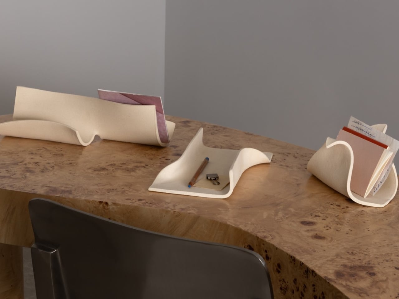
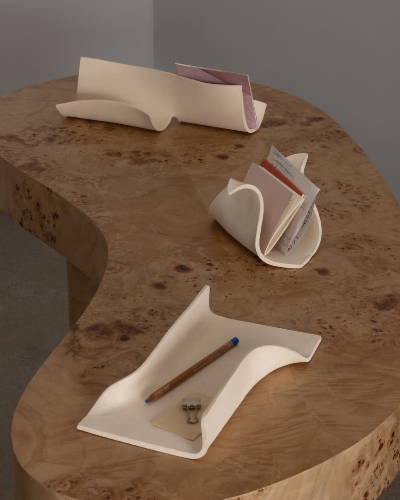
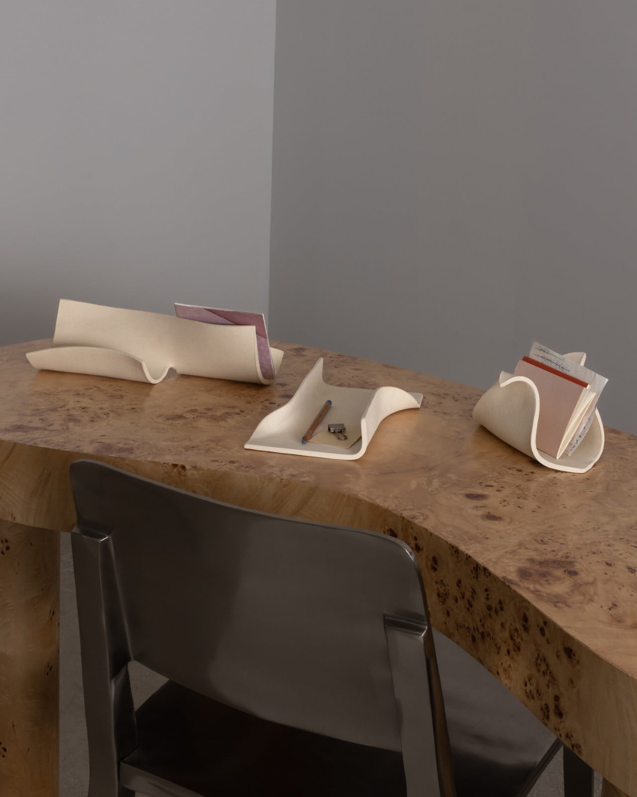
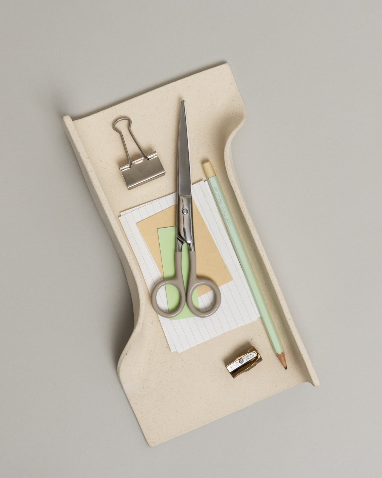
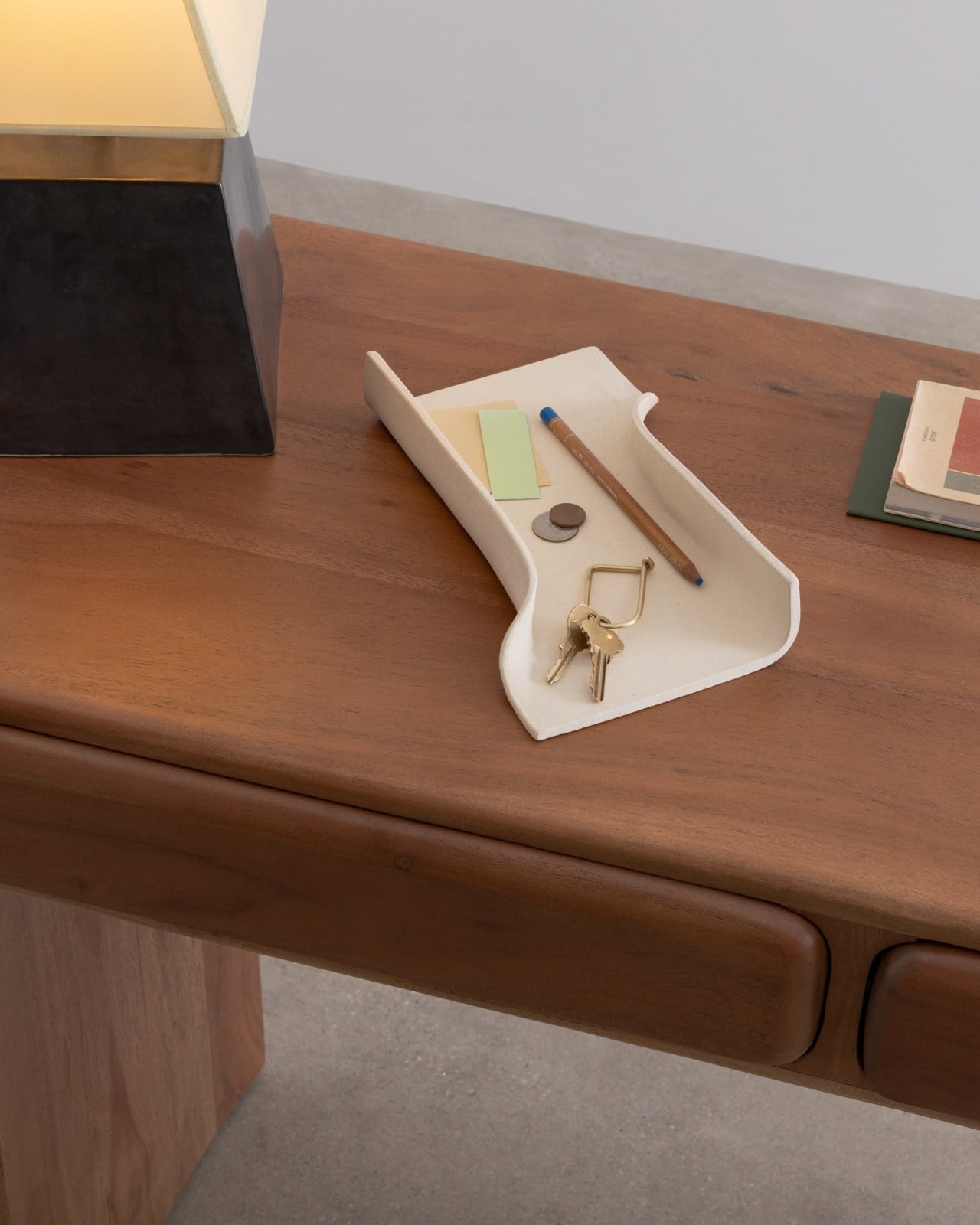
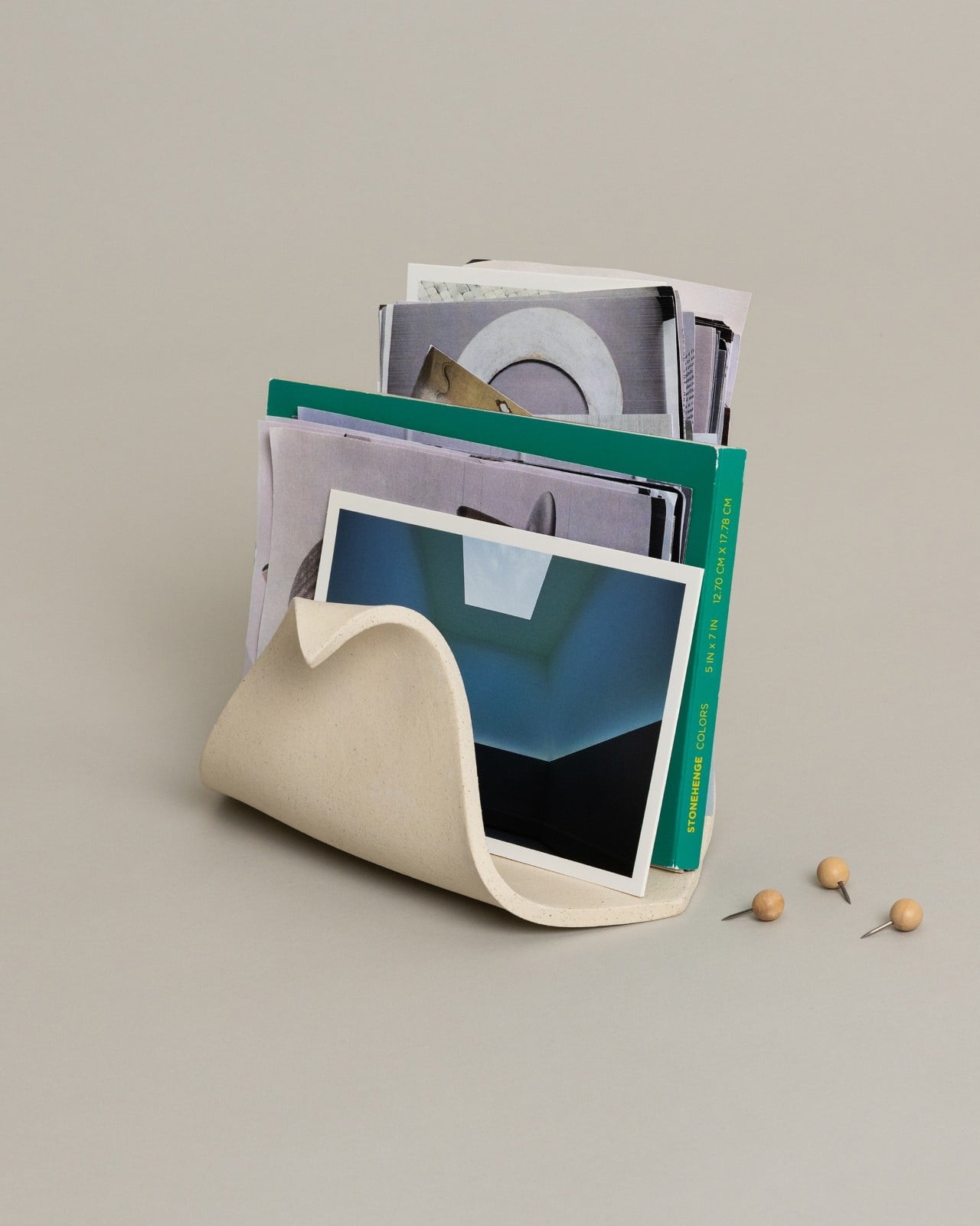
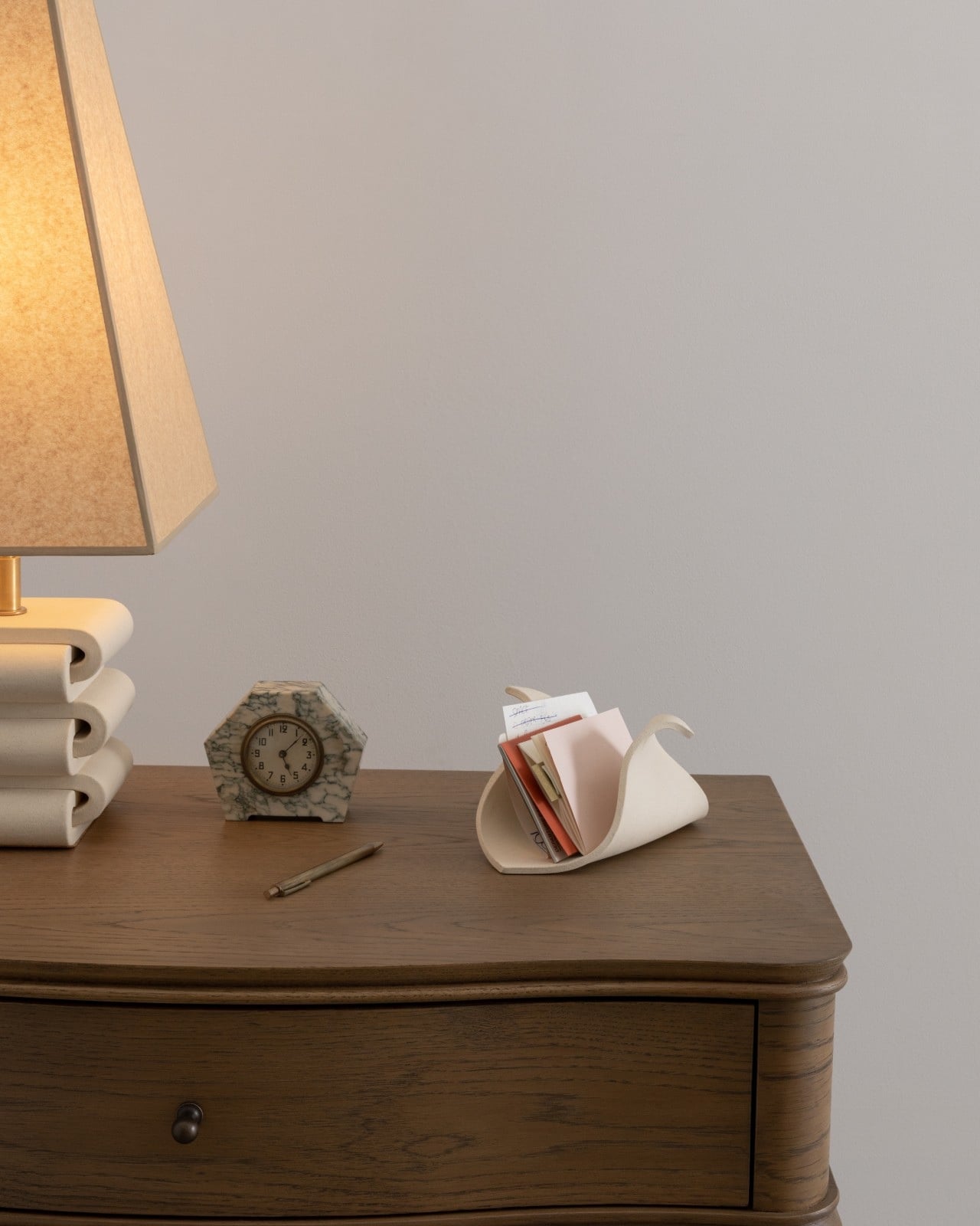
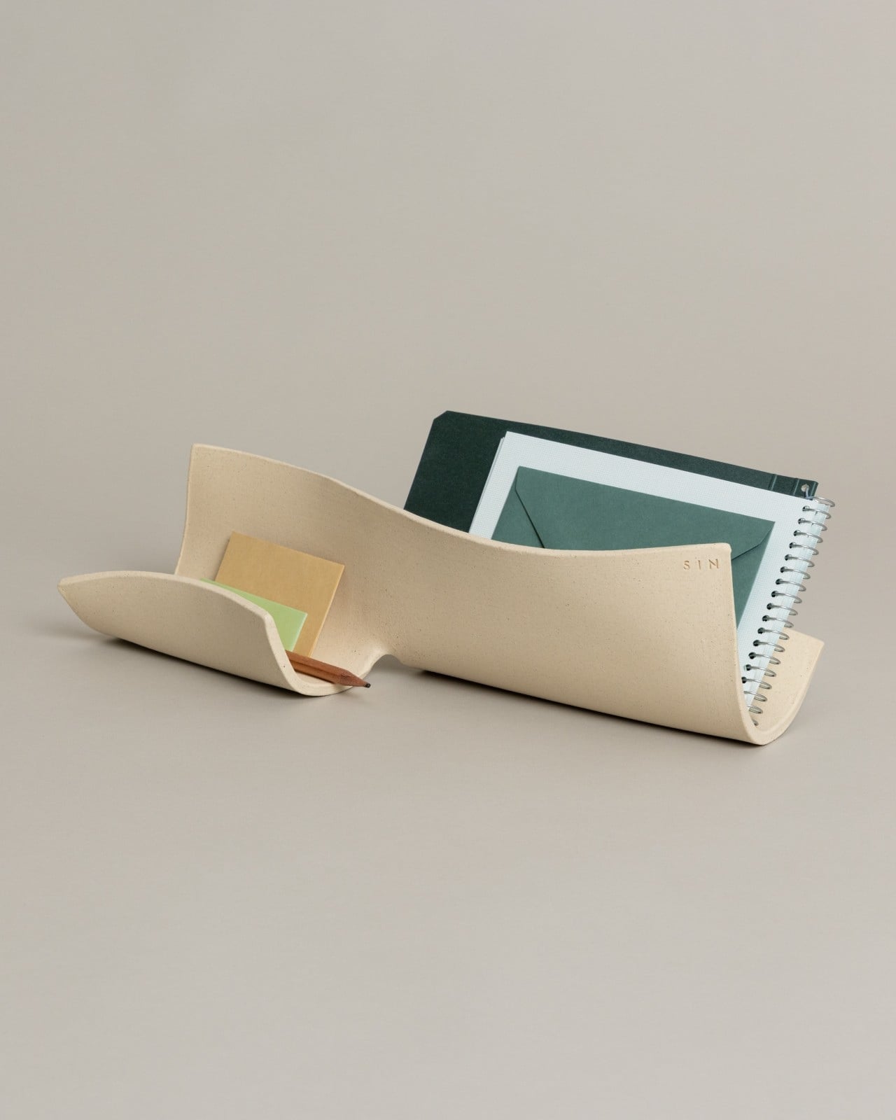
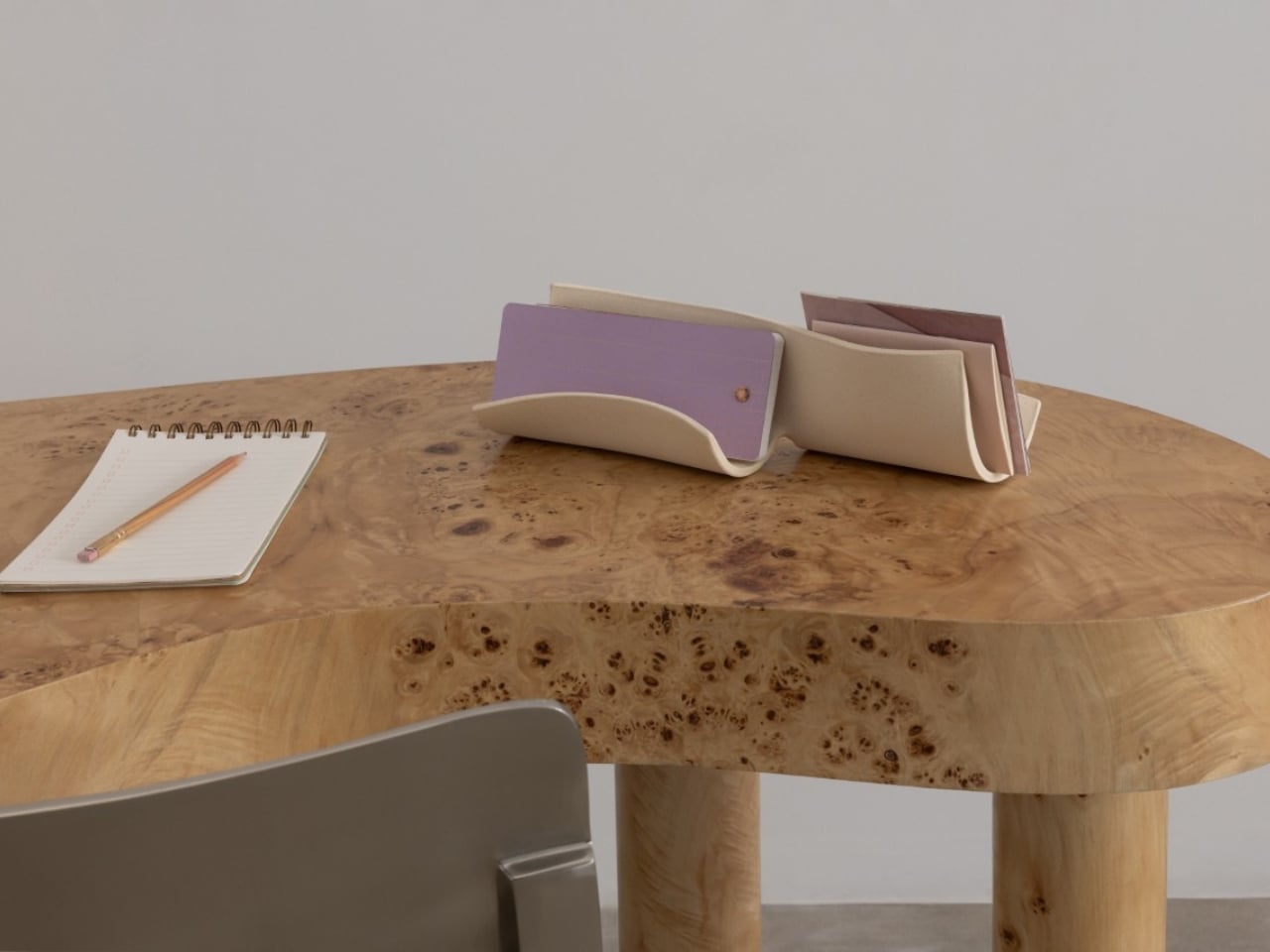
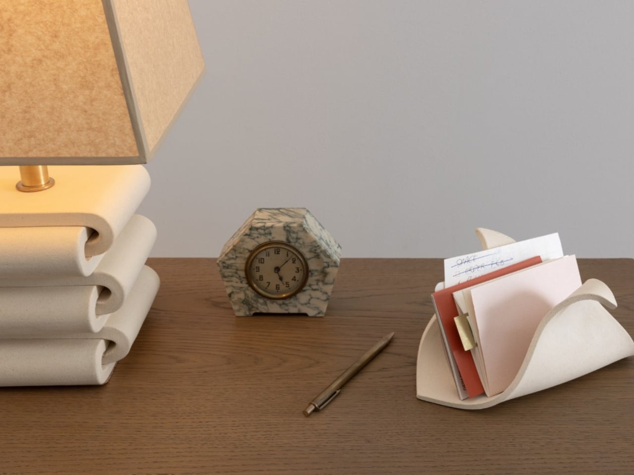
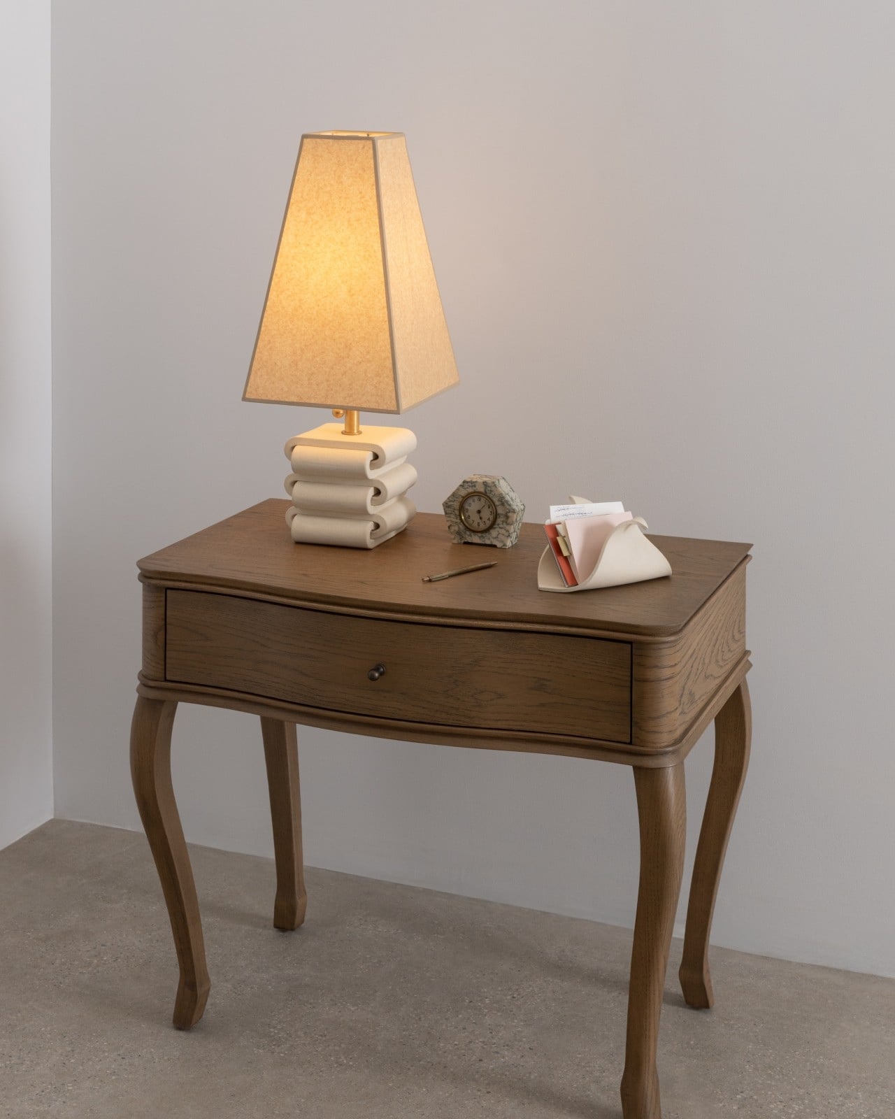
Virginia Sin, the Brooklyn-based ceramics designer and founder of SIN, built her latest collection around that very feeling. The KEEP Collection is three pieces: the FORMARA Organizer, the ARCHIVA Tray, and the CACHE Organizer. That’s it. No sprawling lineup, no unnecessary additions. Just three carefully considered ceramic objects designed to hold the small things that tend to scatter across your desk, dresser, or entryway table.
What makes KEEP different from your average catchall tray is how it treats visibility as a feature, not an oversight. The pieces are shaped to encourage intentional placement rather than concealed storage, so your objects remain visible and accessible at all times. The soft curves and contained volumes aren’t just pretty to look at; they’re doing quiet, practical work. Sin described the collection as “a meditation on how form holds space: for objects, for order.” She’s not just making storage. She’s making something you’d want to look at even when it’s empty.
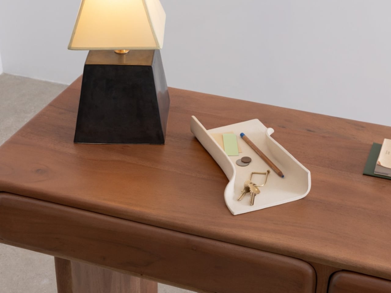
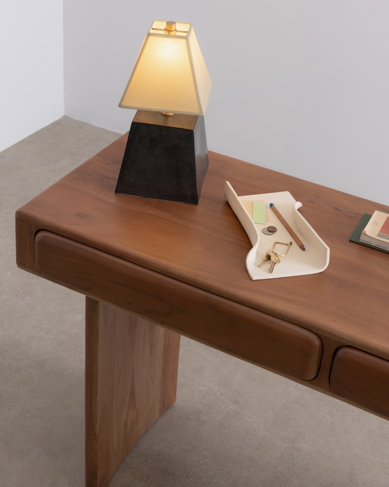
Each piece has its own personality. The FORMARA Organizer ($148) is the most organic of the three. With two gentle compartments flowing side by side, it recalls the shape of a bamboo shoot split open or water running through carved channels. It’s the one you’d reach for when you want your jewelry or hair accessories somewhere beautiful, not just somewhere reachable. It’s perfect to also place some notebooks or paper materials in it since it’s high enough.
The ARCHIVA Tray ($120) takes the opposite approach. Its clean edges and angular planes recall the structure of an architectural model, sharp, balanced, and quietly commanding. At 10.5 inches long, it’s the workhorse of the collection, perfect for corralling pens, notes, or the rotating cast of small objects that always end up on a desk. It looks like something you’d find in a very well-edited design studio, which is exactly the point.
Then there’s the CACHE Organizer ($120), and it might be the most quietly clever of all. Its triangular form transforms what is essentially an everyday fold into something that feels like a gesture. The depth makes it practical for taller items like markers, scissors, or rolled-up sketches, but the shape gives it enough visual presence to hold its own as a sculptural object. At 8.5 inches long and 4 inches tall, it fits comfortably on a nightstand or shelf without demanding attention.
All three pieces are handmade in stoneware at SIN’s Brooklyn studio and finished in a warm bone colorway that sits somewhere between cream and natural clay. The matte finish keeps the focus on form rather than surface, which is the right call. These pieces are about shape doing the heavy lifting.
SIN is no small name in the design world. Virginia Sin’s work has been featured in Architectural Digest, The New York Times, and Goop, and her porcelain paper plates were used at Eleven Madison Park. The KEEP Collection is the latest chapter in a body of work that consistently asks what everyday objects can look like when someone genuinely thinks them through.
The collection lands at exactly the right cultural moment. There’s a growing appetite for owning fewer, better things. Pieces that earn their spot on a shelf. Design that doesn’t shout. KEEP fits that conversation without feeling like it was made for it. The forms feel too considered, too quiet, too genuinely useful to be trend-driven. That’s the mark of design built to last. The KEEP Collection is available now at virginiasin.com.
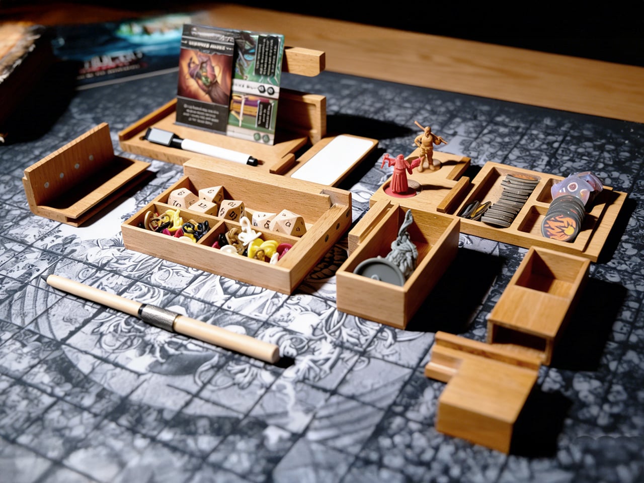
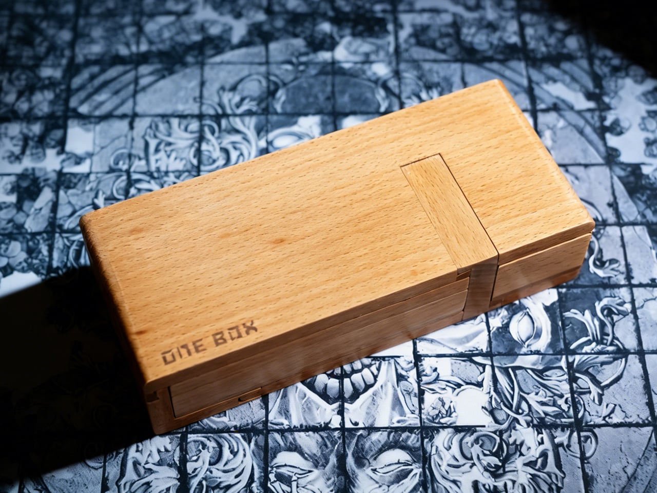
Board game nights typically end the same way: scattered tokens, bent cards sliding across the table, dice that have rolled onto the floor for the third time. The chaos becomes part of the experience, tolerated because storage solutions only address what happens after everyone goes home. ONE BOX 4.0 takes a different approach by treating organization as something that belongs inside the game itself, using modular wooden compartments that stay open and active throughout play. The whole thing behaves less like a box and more like a portable command deck that happens to collapse into something the size of a pencil case. You unfold it, and the table suddenly has lanes, stages, and zones instead of a single flat battlefield where everything fights for the same square inches.
CHENGSHE.design built the system from mortise and tenon joinery, the kind of traditional woodworking that holds furniture together without screws or glue. Each unit comes in beech, teak, or black walnut, and the natural grain variations mean no two boxes look identical. The modules include card display stands, contained dice rolling areas, and phone holders that keep digital rulebooks accessible without crowding the play surface. The parts interlock into a single carryable brick, then fan out into a full tabletop system in a couple of moves. It feels like someone took the logic of a good travel tool roll, mixed it with a GM screen, and then asked an architect to make it beautiful without turning it into furniture cosplay.
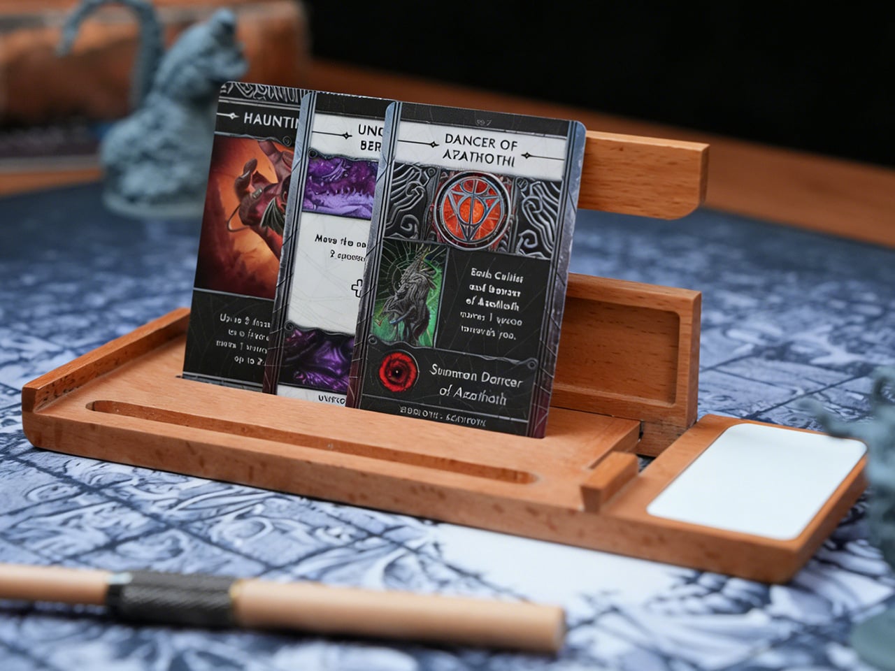
The design addresses three distinct phases of a session: setup, active play, and teardown. Before play, the modules unfold from a single case into multiple zones in a matter of seconds, with dividers and trays already proportioned for cards, dice, tokens, and reference materials. During play, cards sit upright in angled stands, which keeps information visible and reduces edge wear from constant handling. Dice move through a contained rolling lane that prevents table escapes and limits collisions with card stacks or miniatures. After the session, components return to defined compartments, which then recombine into a unified case for transport and shelf storage.
Underneath the pretty wood, the logic is very modular and very modern. One set of modules can handle a deck-heavy Euro game one night and a crunchy TRPG session the next, simply by rearranging dividers and stands. The dividers are adjustable, so you can create narrow lanes for standard 63.5 by 88 mm cards or open wider slots for tarot or oversized character sheets. A lot of “board game accessories” assume a single flagship game and then become useless when your group rotates titles. ONE BOX 4.0 behaves more like a system-level accessory, closer to a camera cage or modular tool chest that expects you to change the loadout constantly. The fact that this is the fourth generation shows in that ecosystem thinking.
The mortise and tenon construction is not a decorative flex either. That joint style is pretty resilient when you are opening and closing something hundreds of times, applying torsion in slightly different directions every session. Screws back out, cheap hinges loosen, glued butt joints fail at the worst moment. Properly cut mortise and tenon joints share load across surfaces and age with the wood rather than against it. Combined with hardwoods like teak and black walnut, you get a product that can take the mild abuse of transport and table slams without turning into a rattling box of regret.
The other design decision that lands beautifully is backward compatibility. If you bought ONE BOX 3.0, you do not have to retire it to adopt 4.0. The new modules plug into the old ecosystem, which is the kind of long horizon thinking you usually only see in camera mounts, bike standards, or pro audio racks. That matters because people build habits around their table setups. If you already have a certain arrangement for card lanes and dice trays, you can add a new TRPG-focused module or that OB Infinite Pen without rethinking everything. This is how you build a niche platform instead of a series of isolated products that age out every two years.
The OB Infinite Pen and erasable whiteboard module signal a clear orientation toward TRPG and scenario driven gameplay. By dedicating space to writing tools and a reusable surface, the system supports initiative tracking, hit points, quick maps, and ad hoc notes without adding disposable paper clutter. The pen shares the same wood material language as the box, which unifies the visual identity and reinforces the idea that note taking is an integrated part of the experience. For groups that run mixed digital and analog setups, the phone and tablet holder aligns with this approach, parking screens at the edge of the system instead of scattering them across the main play field.
Visually, this is the opposite of RGB acrylic chaos. Natural wood, clean chamfers, visible grain, and a restrained color palette of light beech, warm teak, and dark walnut. On a table, it reads more like a compact piece of joinery than a toy, which is exactly what you want if your “game table” is also your work desk or dining surface. There is a subtle psychological trick here: when the tools of play look like serious objects, people tend to treat the whole session with a bit more focus. You are less likely to fling dice across a carefully built wooden lane than across a bare laminate tabletop.
Folded shut, the core ONE BOX 4.0 package is roughly pencil box sized, which means it goes into a backpack alongside a laptop and a rulebook without much negotiation. Unfolded, it spreads to cover a player station or GM area without requiring a dedicated gaming table. That portability is what separates this from the beautiful but immovable wooden tables that dominate the aspirational side of tabletop culture. You can take this to a cafe, a friend’s apartment, or a convention hall, and your setup logic travels with you instead of being rebuilt from scratch every time.
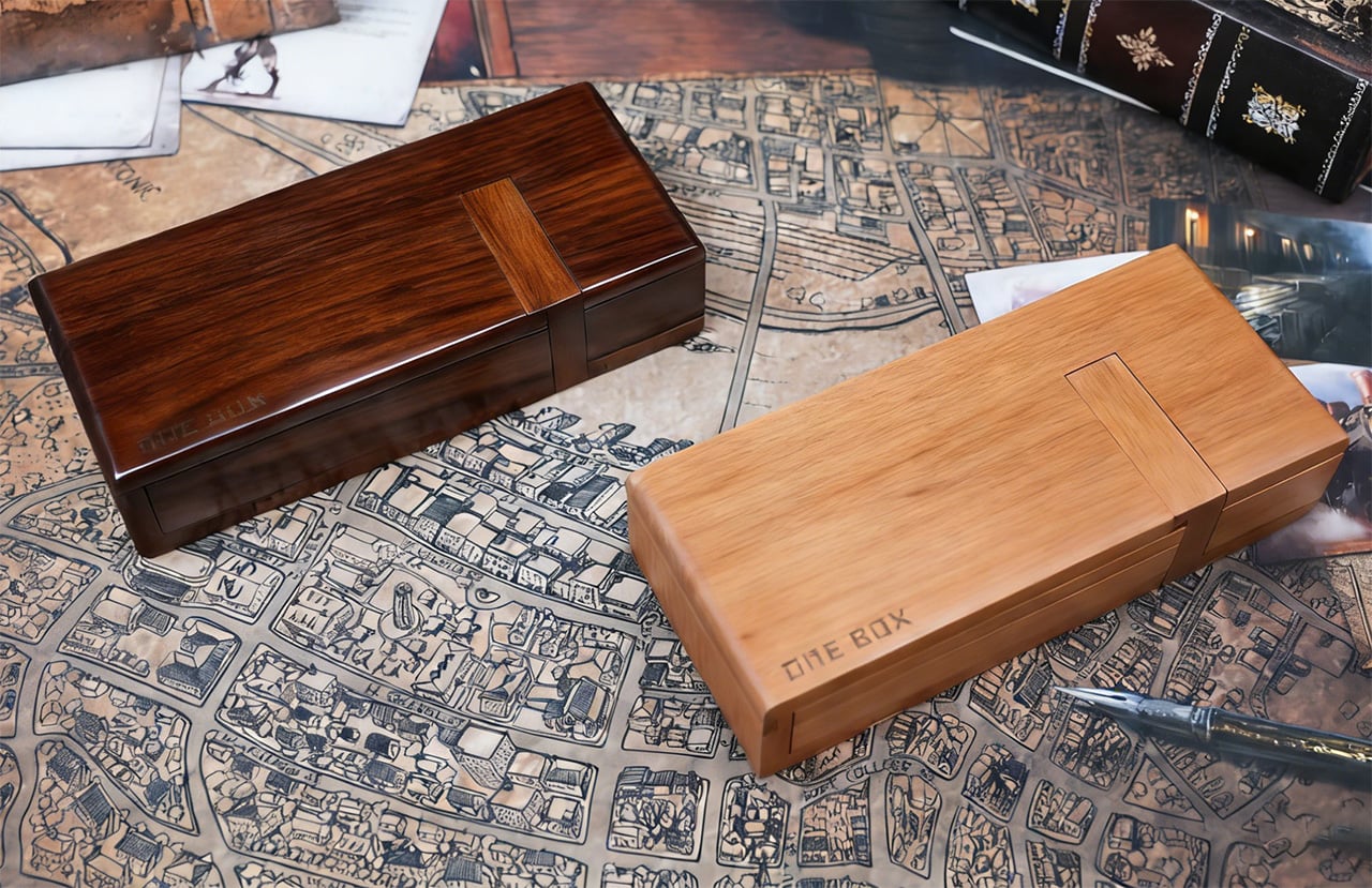
The ONE BOX 4.0 comes in three primary wood options: beech for a pale, almost Scandinavian tone, teak for a warmer mid tone, and black walnut for a darker, more saturated look. Configurations range from a single core box setup to multi box “command station” style bundles that add dedicated dice rollers, erasable whiteboard modules, storage bags, and the OB Infinite Pen in matching wood. Up to 50 early backers can grab the beech variant for as low as $59, while the next tier for all wood versions sits at $79 (which includes the ‘recording kit’ featuring the OB Infinite Pen and erasable whiteboard modules). Throw in an extra twenty, and the $99 tier also gets you a dice roller. The ONE BOX 4.0 is open for preorder and ships globally starting May 2026.
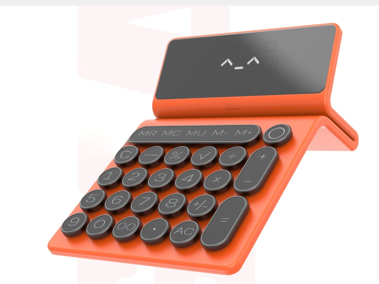
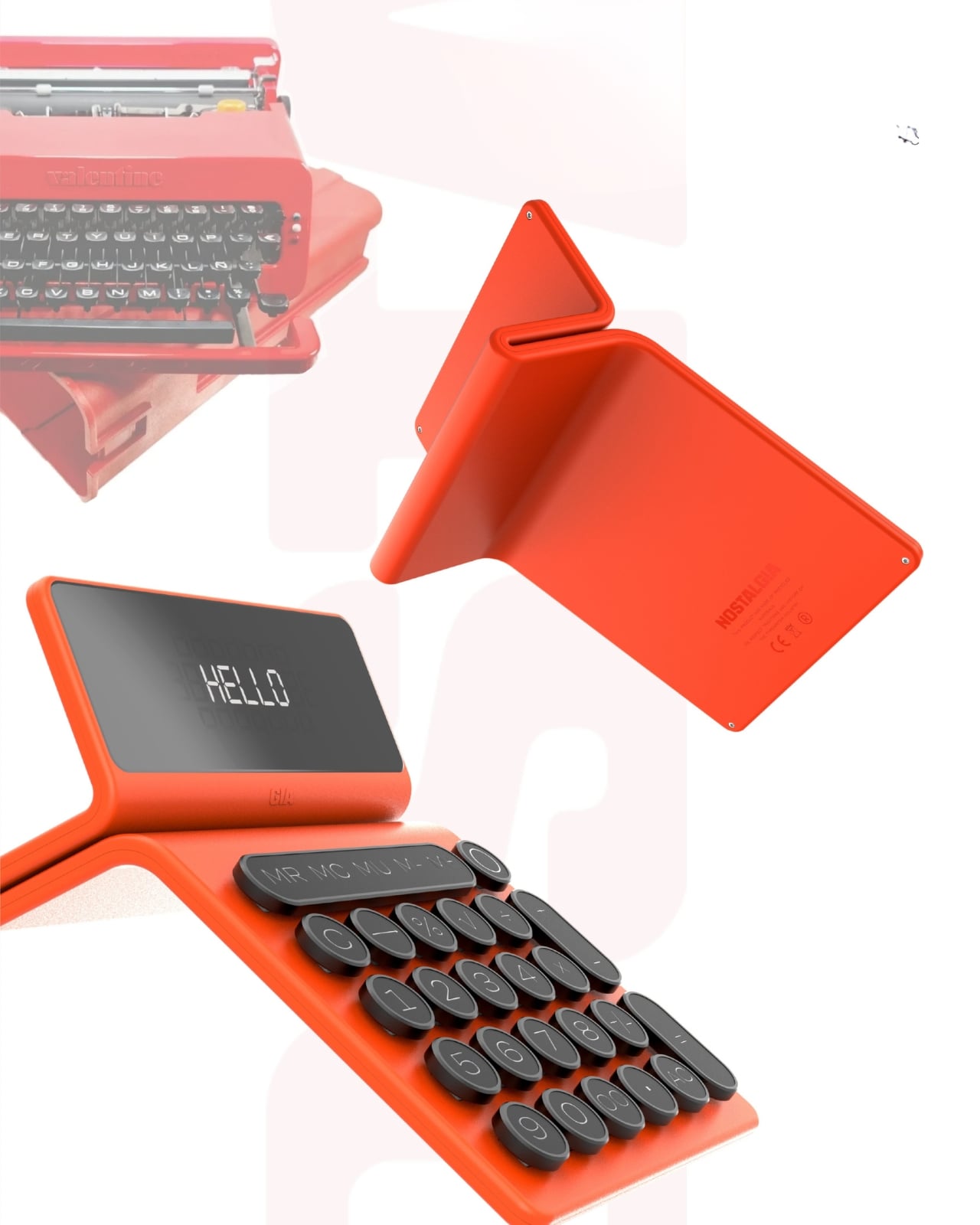
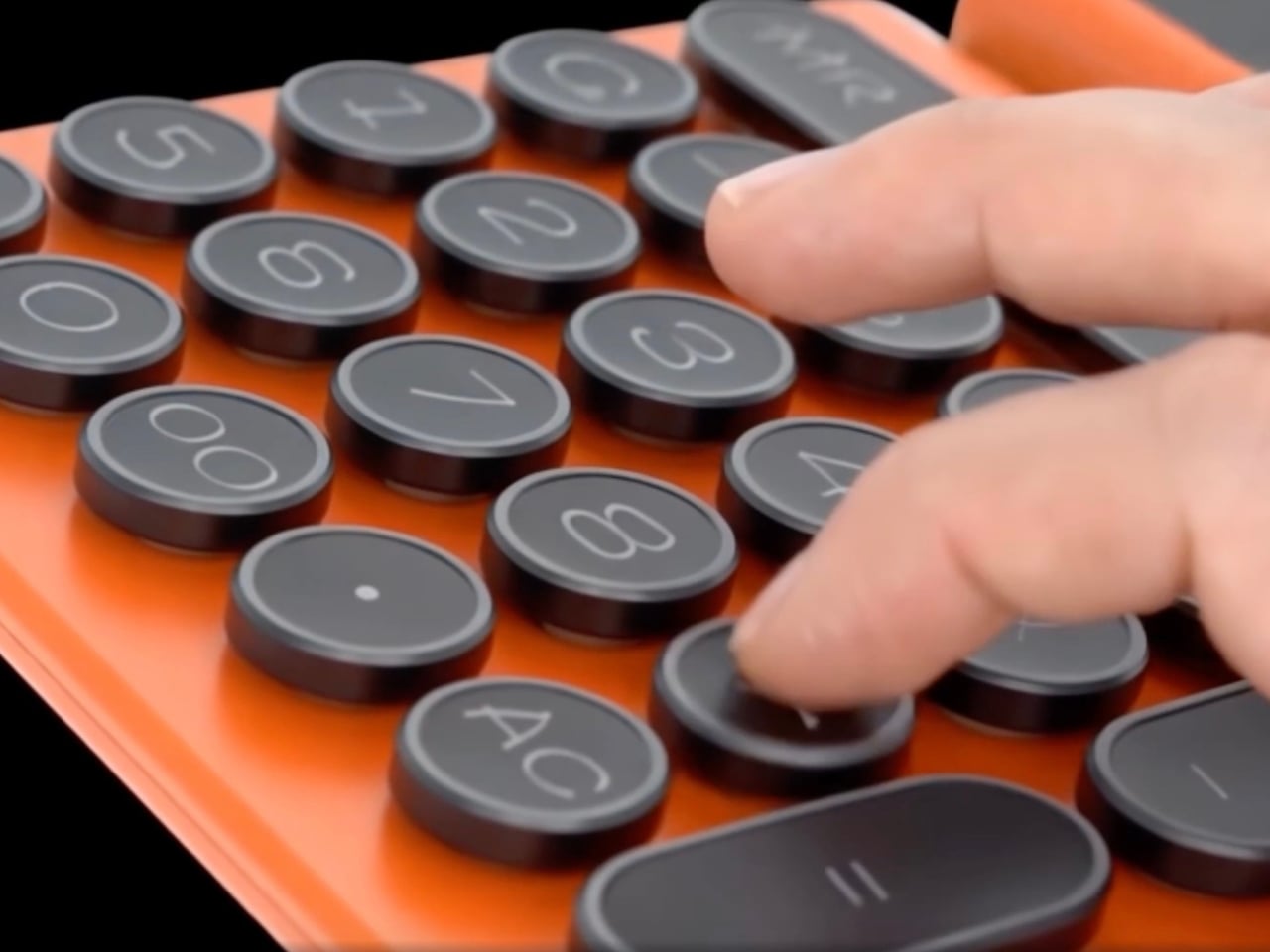
There’s something beautifully ironic about the fact that we carry supercomputers in our pockets, yet the humble calculator refuses to die. And if designer Mariana Bedrina has her way, maybe it shouldn’t. Her GIA calculator concept doesn’t just crunch numbers. It makes you want to crunch numbers.
At first glance, the GIA looks like it time-traveled from a 1960s Italian design studio, stopped briefly in 2026 to pick up some modern tech, and landed on your desk with a personality. The inspiration comes from Olivetti typewriters, those gorgeous mechanical machines that made office work feel like an art form. Remember when tools had character? When objects didn’t just function but made you feel something? That’s what Bedrina is tapping into here.
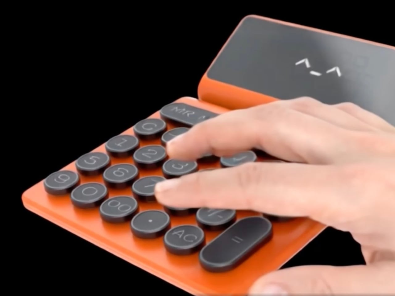
The design plays with contrasts in the most satisfying way. Soft-touch plastic meets metal-edged keys, creating something that looks simultaneously retro and contemporary. The calculator has a folding stand that props up the display at an angle, giving it this almost laptop-like presence on your desk. But what really sells the concept is the attention to tactile pleasure. Each button press promises a rhythmic click, that same satisfying feedback that made typewriters so addictive to use. There’s a reason mechanical keyboard enthusiasts spend hundreds of dollars chasing that perfect keystroke sound.
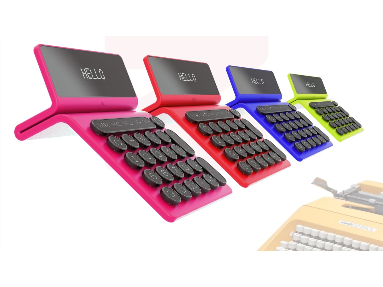
The GIA comes in a color palette that pulls directly from Olivetti’s most vibrant era. We’re talking coral red, electric blue, and that particular shade of lime green that somehow works when it absolutely shouldn’t. These aren’t the muted, “professional” colors we’ve been conditioned to accept in office supplies. They’re joyful. They’re loud. They demand to be noticed. The display even greets you with “HELLO” in a pixelated font that adds to the charm.
But here’s what makes this concept more than just a pretty nostalgic exercise. It recognizes something we’re only now starting to articulate: digital minimalism has left us craving physical objects again. We got so efficient, so streamlined, so invisible in our technology that we forgot how much we enjoy touching things, hearing things, seeing colorful things on our desks that aren’t just glowing rectangles.
The GIA positions itself as both a functional tool and a form of self-expression. Bedrina describes it as fitting equally well in office spaces and home studies, which tracks. This isn’t trying to be invisible professional equipment. It’s trying to be a conversation starter, a mood lifter, something that makes the mundane task of calculating expenses or balancing budgets feel less soul-crushing. There’s also something refreshingly analog about committing to a single-purpose device. Your phone can calculate, sure, but it can also distract you with seventeen notifications while you’re trying to figure out if you can afford that vintage lamp. A dedicated calculator keeps you focused. Add genuine design appeal, and suddenly you have an object that earns its place in your space.
The typewriter-inspired button layout is particularly clever. Those rounded keys with metal frames aren’t just aesthetic choices. They reference a specific era of design when Italian manufacturers proved that office equipment didn’t have to be boring. Olivetti’s typewriters were status symbols, objects people genuinely loved. They appeared in films, in photographs, in the hands of writers who could have afforded anything but chose these specific machines because they were beautiful.
Whether the GIA calculator will ever move beyond concept to production remains to be seen. The market for premium calculators exists but it’s niche. Yet seeing this design reminds us why concepts matter. They push against the current, question assumptions, and suggest possibilities. They ask: what if our tools brought us joy again? What if functional objects could also be emotional ones?
In a landscape dominated by minimalist design and disposable electronics, the GIA feels almost radical in its commitment to personality, color, and tactile pleasure. It suggests that maybe we don’t have to choose between functionality and delight. Maybe our calculators can have character. Maybe math doesn’t have to be boring, even when it’s just math.
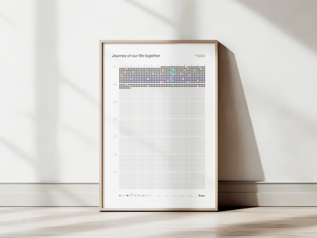
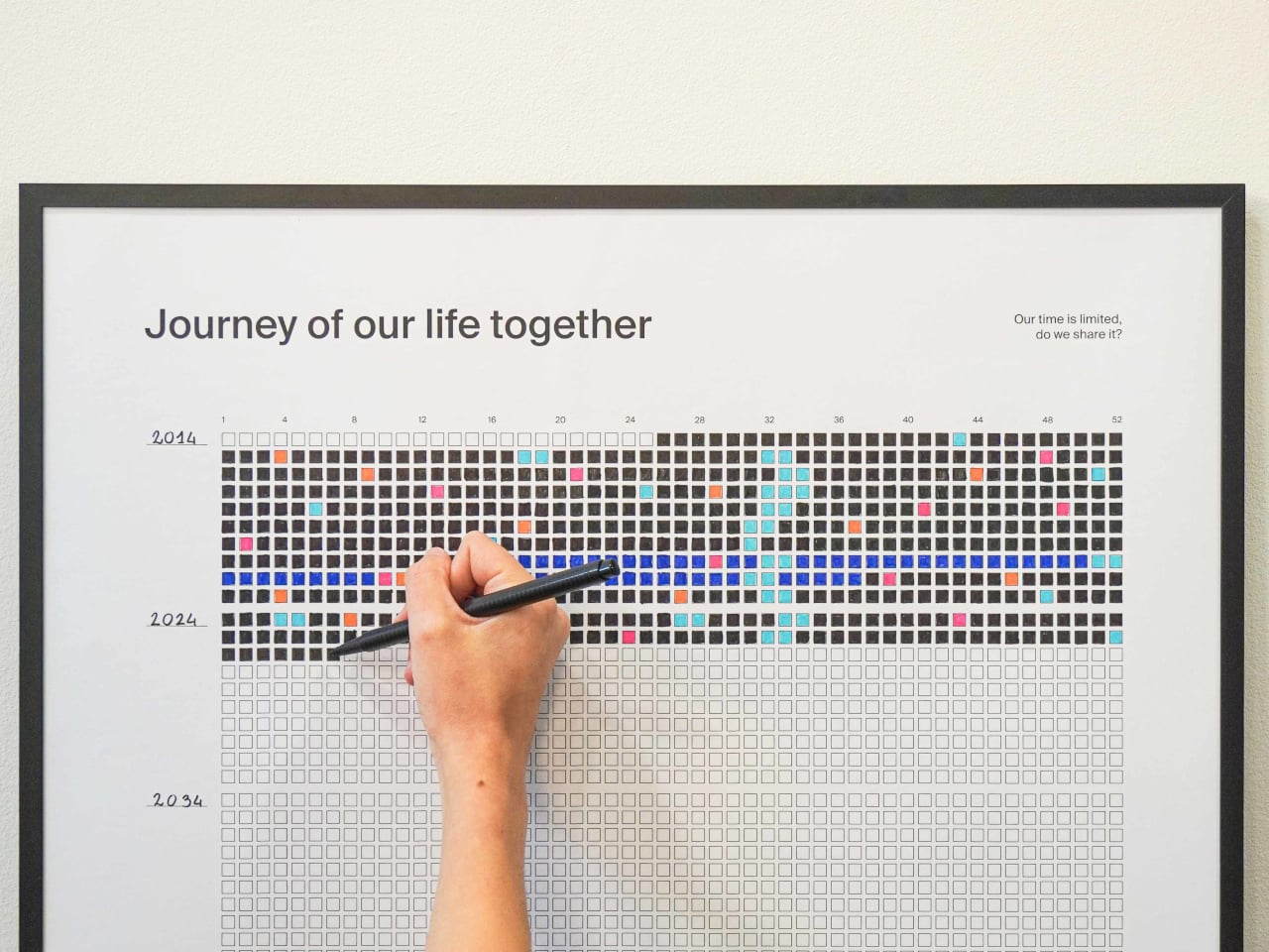
Weeks in a relationship or life blur together. You remember birthdays and trips, but the quiet in‑between time mostly stays invisible. We track deadlines and appointments on digital calendars, but rarely see the whole arc of a shared life at once, the years you’ve already moved through and the ones still sitting empty ahead. There’s something oddly powerful about seeing every week you have, and have had, laid out in one place on a wall.
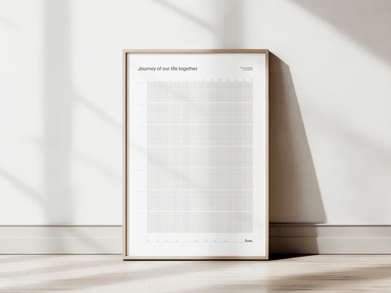
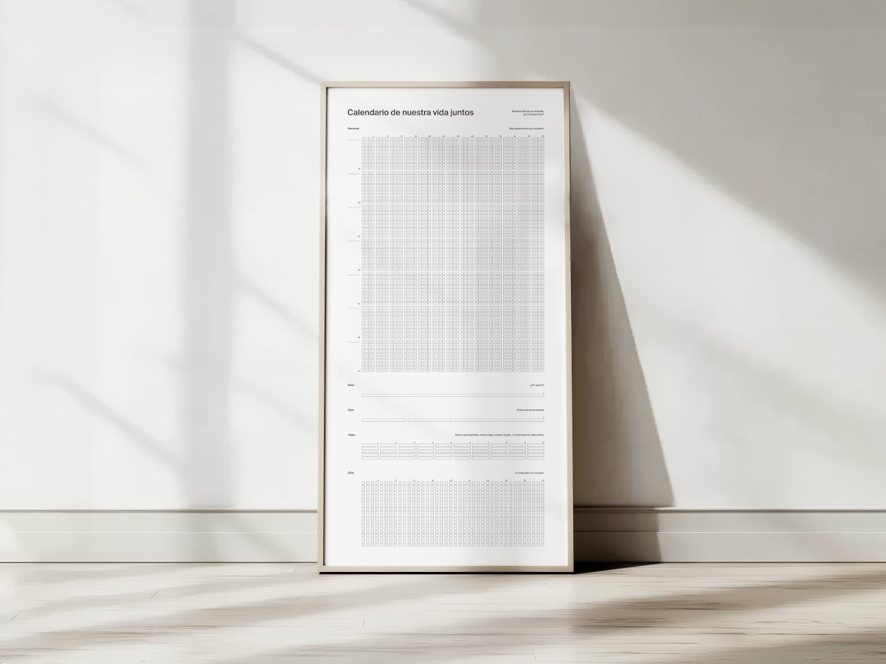
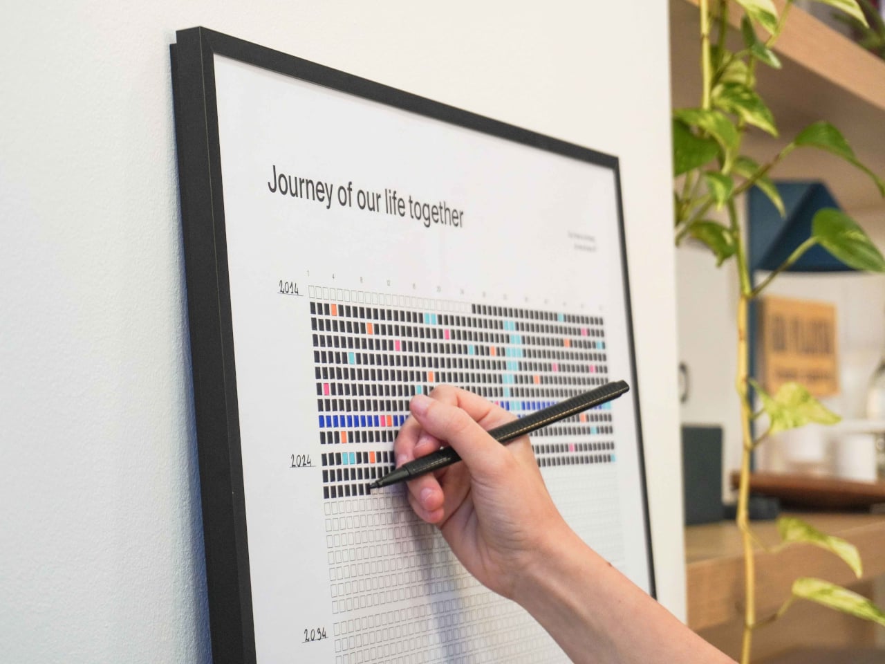
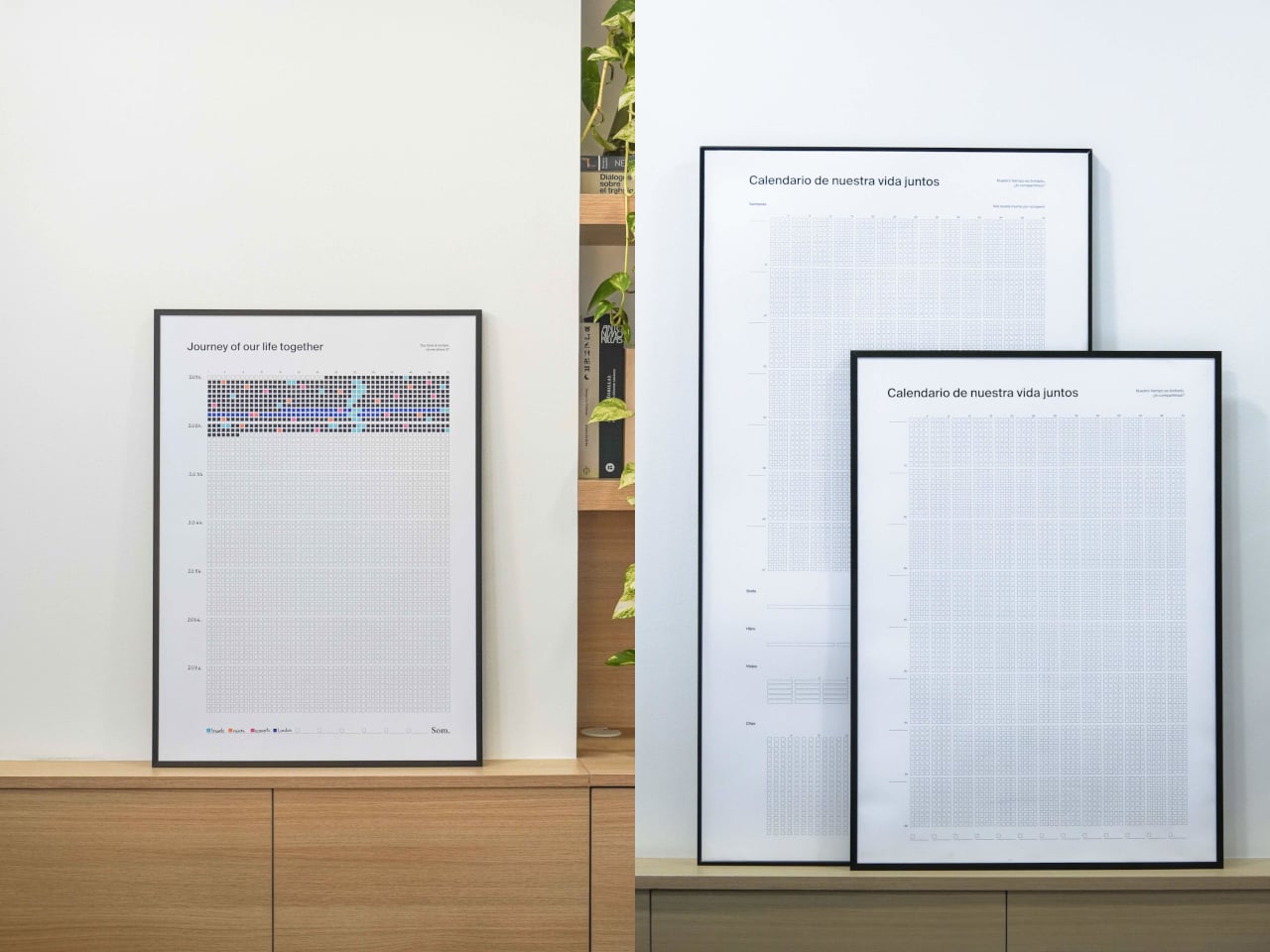
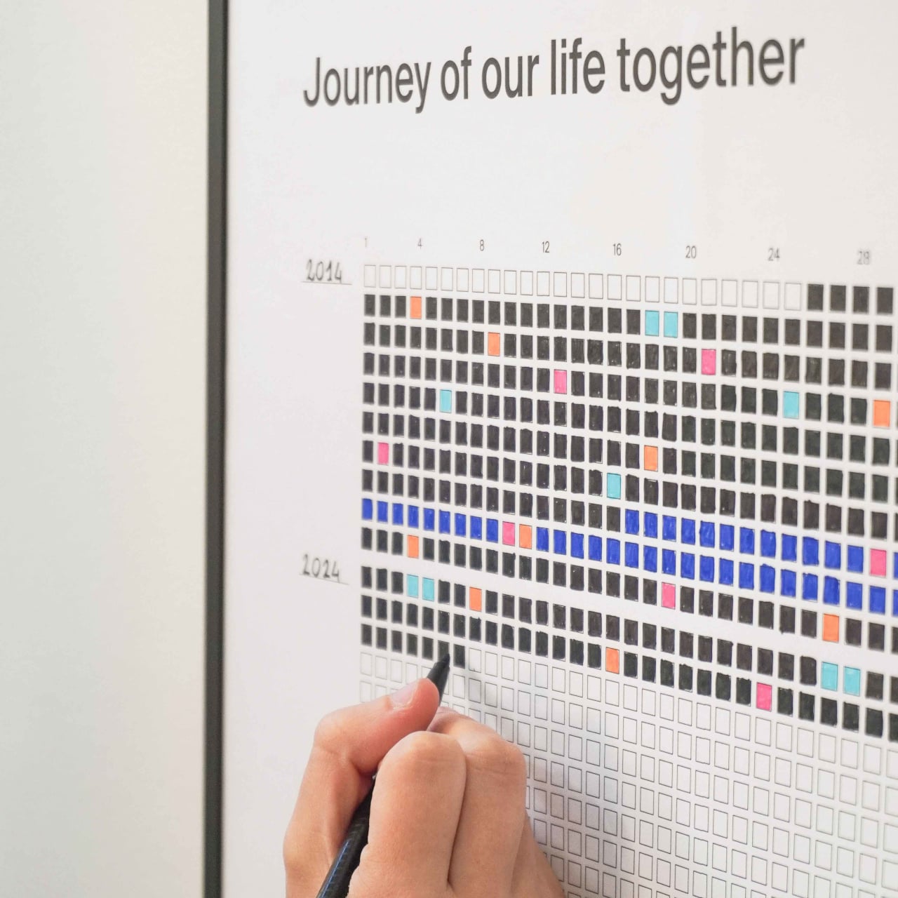
NOS Calendar by Som by Mos is a weekly calendar that celebrates shared life rather than meetings or deadlines. Each square is a week, each row is a year, and each block is a decade, printed on a 50cm x 70cm poster that covers more than 80 years. It’s sold under the tagline “our time is limited, shall we share it?”, which is a very different brief from “get more done” or “optimize your schedule.”
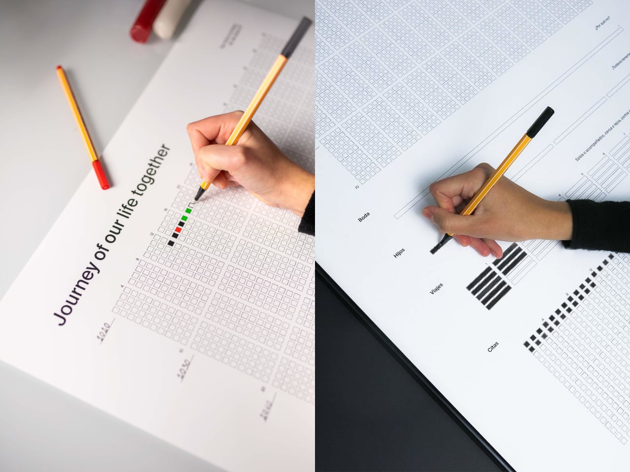
The image of a couple or close friends unrolling a poster, finding the week their story began, and coloring that first square sounds a little romantic. Every week after that, they fill in another box, sometimes with a simple color, sometimes with a shade that matches a key moment like a trip or a move. The act is small, a few seconds with a pen, but it becomes a quiet check‑in on how time is passing together rather than just another task.
The grid works simply enough. You’ve got 52 columns for weeks, rows for years, and decade blocks that make long stretches of time visible. A strip at the bottom acts as a legend, where you assign colors to things that matter: trips, moves, new jobs, losses, whatever you decide. Over time, the poster becomes a code only you understand, a visual index of your shared history that nobody else can read.
Seeing 80 years of weeks on a wall changes your sense of scale. The empty squares make future time feel both generous and finite, while the filled ones remind you that a lot has already happened. It’s less about planning the next week and more about noticing that this one exists, that you’re somewhere in the middle of a grid that’ll eventually be full whether you pay attention to it or not.
Of course, the minimalist design matters. The clean grid, the simple headings like “Journey of our life together” in English, Spanish, or Catalan, and the durable paper meant to last decades in a frame all keep it neutral. Your colors and notes do the talking, which makes it easier to hang in a living room without it screaming “productivity chart” at everyone who walks by.
NOS sits somewhere between art, journal, and commitment device. It doesn’t tell you how to spend your weeks; it just refuses to let them stay invisible. The idea of tracking life without another app or notification, just a poster that slowly fills with color as you move through years together, is a surprisingly gentle way to remember that time is limited, and that you chose to share it with someone worth coloring squares for.
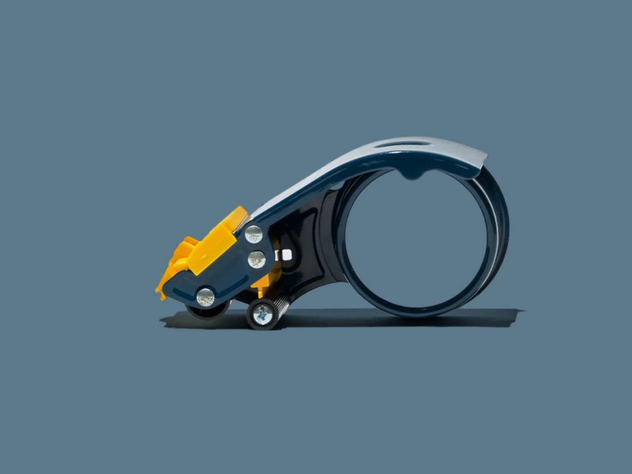
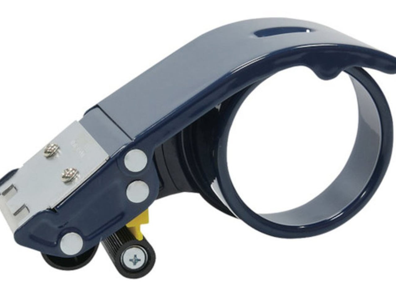
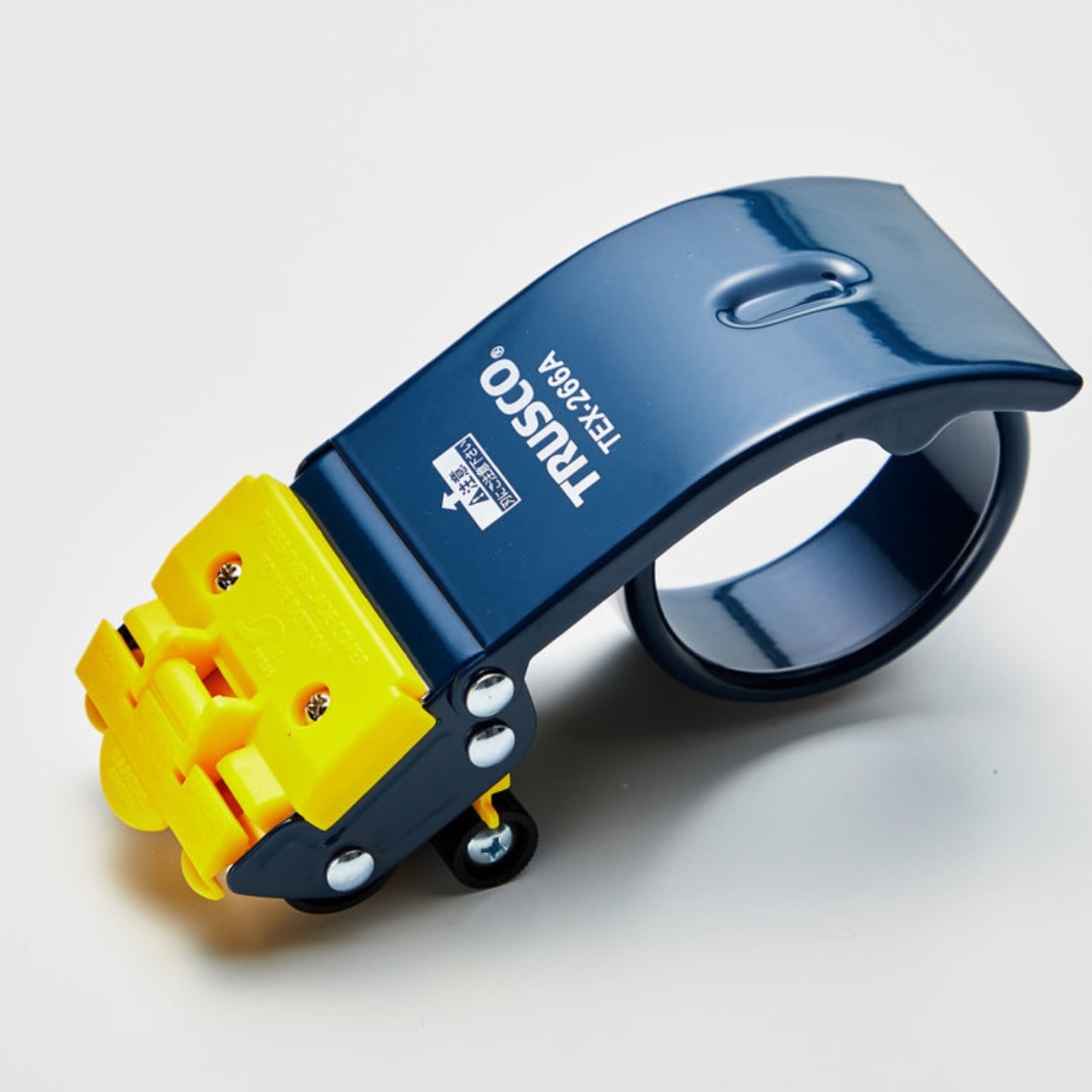
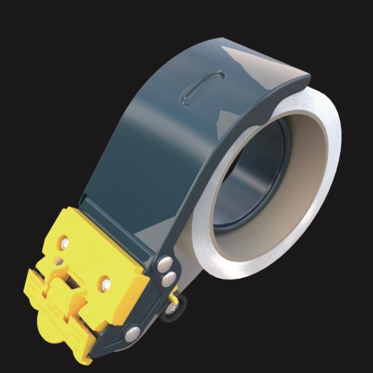
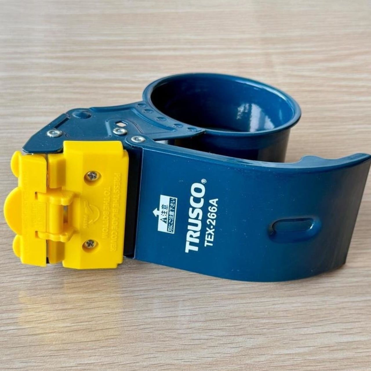
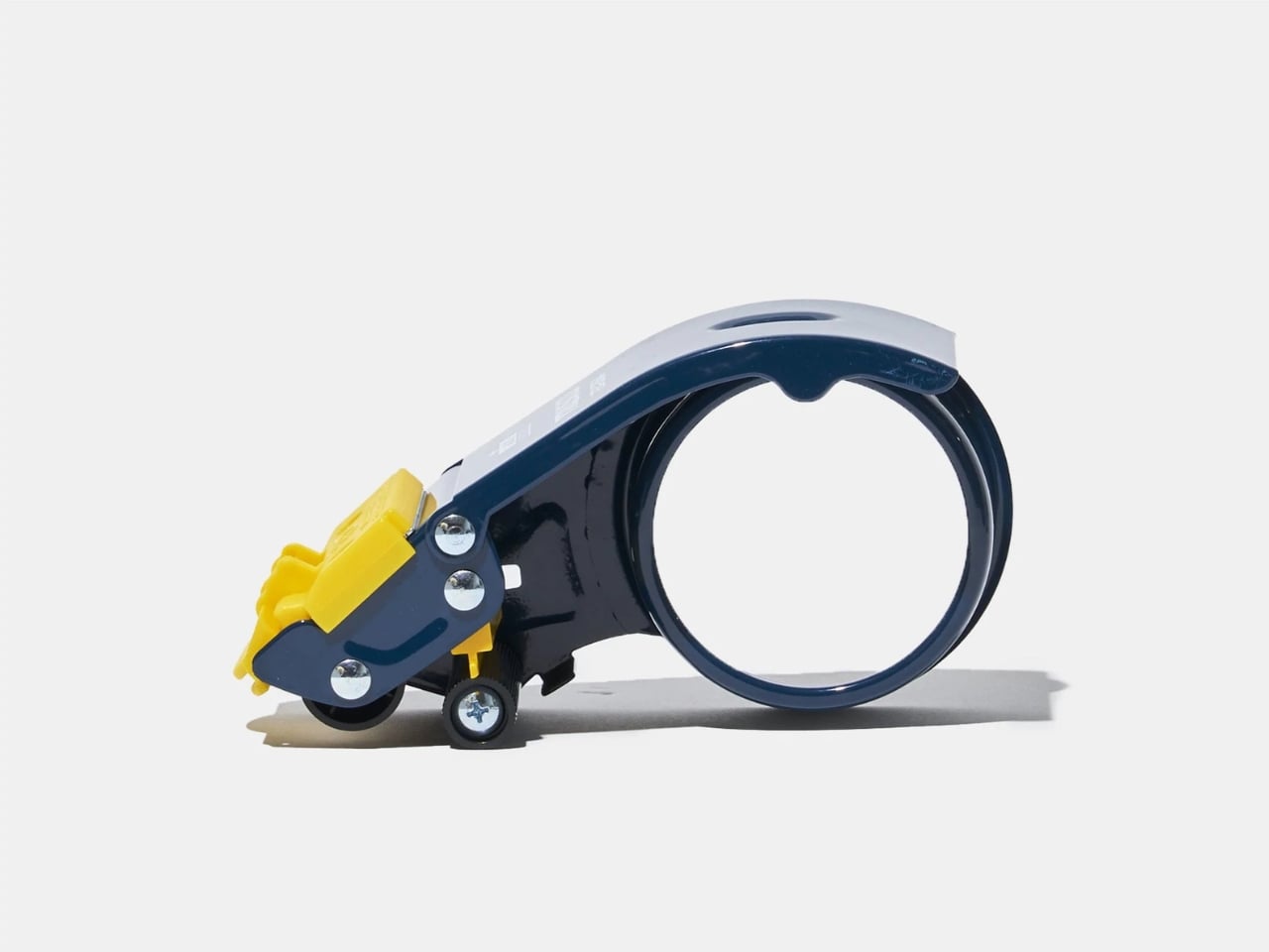
You know that dusty tape dispenser sitting on your desk right now? The one with the wobbly base and serrated blade that’s dull as a butter knife? Yeah, TRUSCO looked at those sad excuses for office supplies and decided there had to be a better way.
The Japanese company’s TEX-266A tape cutter is what happens when someone actually thinks about how people use tape instead of just churning out another plastic widget. It’s one of those products that makes you wonder why nobody figured this stuff out decades ago.
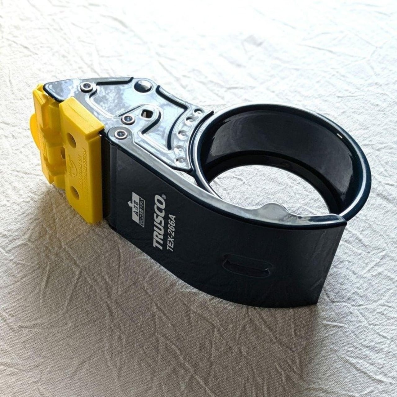
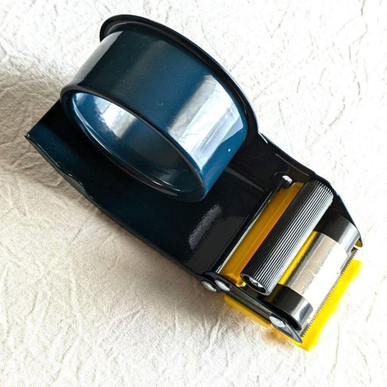
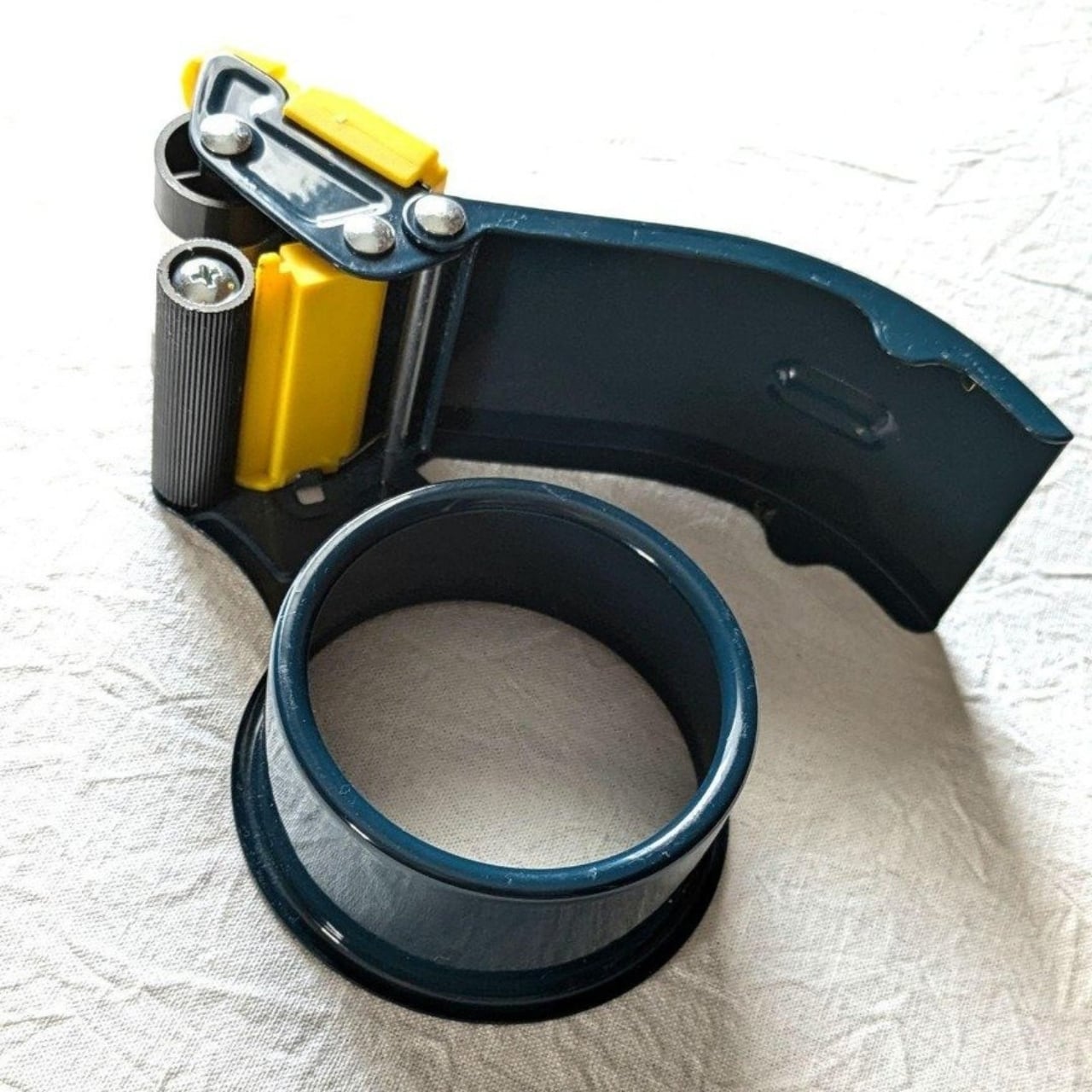
Let’s start with the most frustrating part of using regular tape dispensers: that moment when your tape curls back onto itself and you’re stuck there, desperately picking at the roll with your fingernails like some kind of office goblin. TRUSCO solved this with an anti-backflow stopper. It’s such a basic feature, but try finding it on your average tape dispenser. This thing prevents the tape from rewinding itself back onto the roll, which means you can actually grab the end when you need it.
The design also includes two rollers, and here’s where it gets clever. One of these rollers has a 360-degree static cling strip. This helps guide the tape smoothly and keeps it from twisting or bunching up as you pull. If you’ve ever dealt with cloth tape or craft tape that seems to have a mind of its own, you’ll appreciate this detail. The TEX-266A can handle OPP tape, cloth tape, and craft tape up to 50mm wide.
Now, about that blade. Most tape dispensers have these exposed serrated edges that are genuinely dangerous. You’re basically waving your fingers near a row of tiny teeth every time you tear off a piece of tape. TRUSCO said “absolutely not” and added a safety cover over the stainless steel blade. The blade itself is made from SUS420 stainless steel, which stays sharp enough to cut cleanly through various tape types without requiring you to saw back and forth like you’re trying to escape from prison.
There’s also a side guard on the roll cover, which is one of those features you don’t think about until you realize how annoying it is when tape rolls go sliding off their spindle. It’s these tiny frustrations that TRUSCO seems to have catalogued and systematically eliminated.
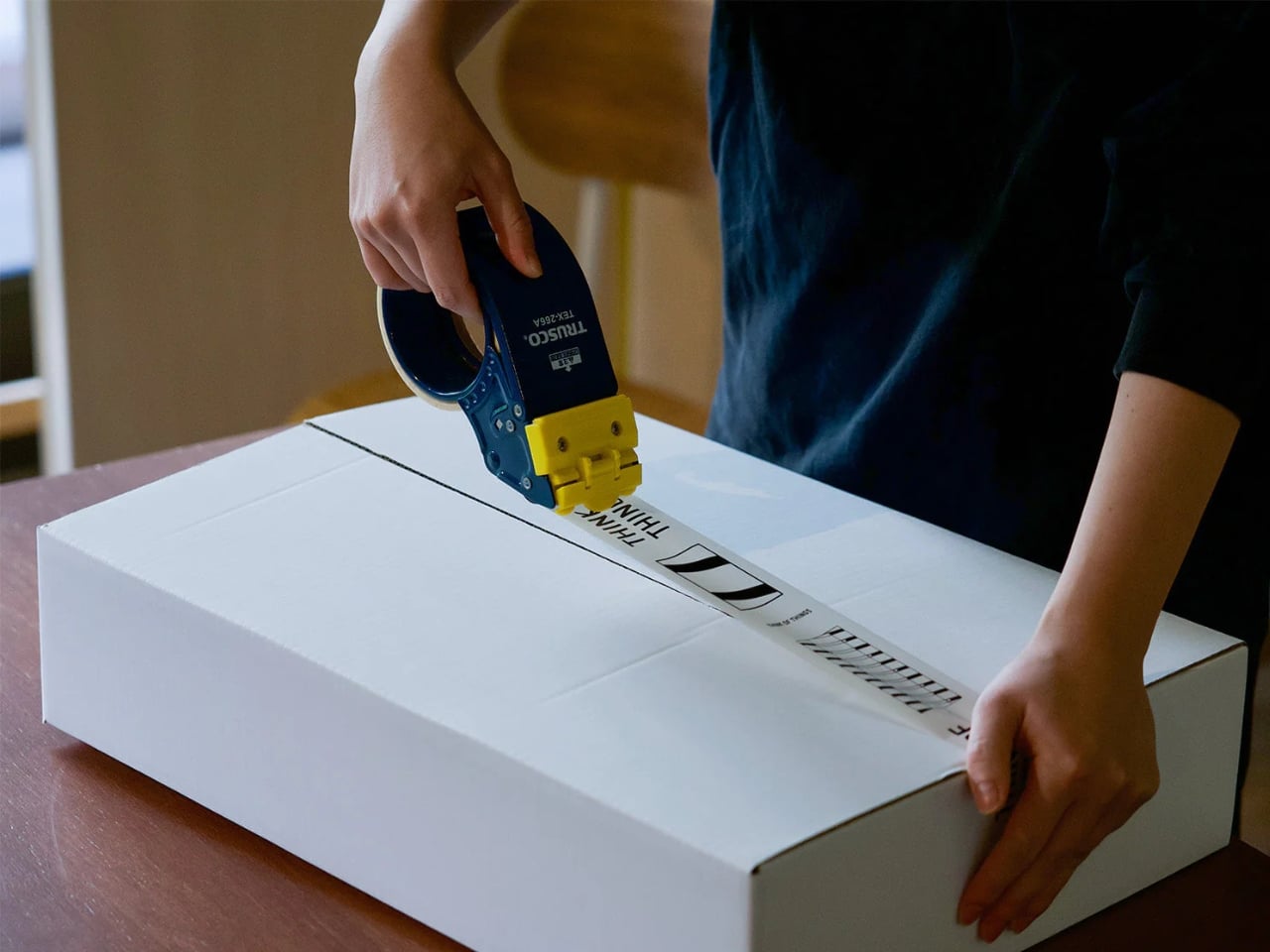
The body is made from steel, not flimsy plastic, which gives it enough heft (about 0.31 kilograms) to stay put on your desk when you’re pulling tape. That might sound heavy compared to those lightweight dispensers, but that weight is actually the point. You want something that doesn’t skitter across your workspace every time you use it. Customer reviews mention that this moderate weight makes it perfect for sealing cardboard boxes without having to hold the dispenser down with your other hand.
TRUSCO NAKAYAMA is a specialized trading company that supports Japan’s manufacturing industry, and you can tell this dispenser was designed for people who actually work with their hands. It’s built for 3-inch paper tubes, which is the standard size for most packing and shipping operations.
The whole thing measures about 10.47 x 0.63 x 2.83 inches, so it’s substantial but not bulky. Users who sell on flea market websites and other e-commerce platforms have called it a game-changer for their packing routines. Once you understand the setup (and yes, there are instructions), it becomes one of those tools you reach for automatically.
What makes the TEX-266A interesting from a design perspective is that it’s not trying to reinvent tape dispensers. It’s not flashy or overly complicated. Instead, it takes all the small annoyances that make tape dispensers frustrating to use and methodically addresses them. The anti-backflow mechanism, the safety cover, the weighted body, the dual rollers with that static cling strip. These are solutions to real problems that people actually experience.
It’s the kind of thoughtful industrial design that doesn’t always get attention because it’s not sexy or trendy. But it’s the difference between a tool that works with you and one that fights you every step of the way. And if you’ve ever been in the middle of packing twenty boxes and your tape dispenser decides to have a meltdown, you know that difference matters.
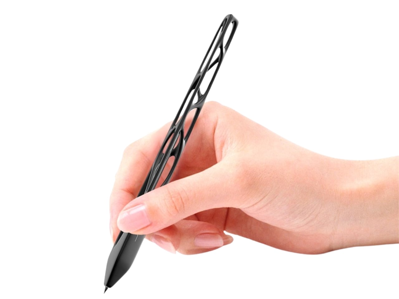
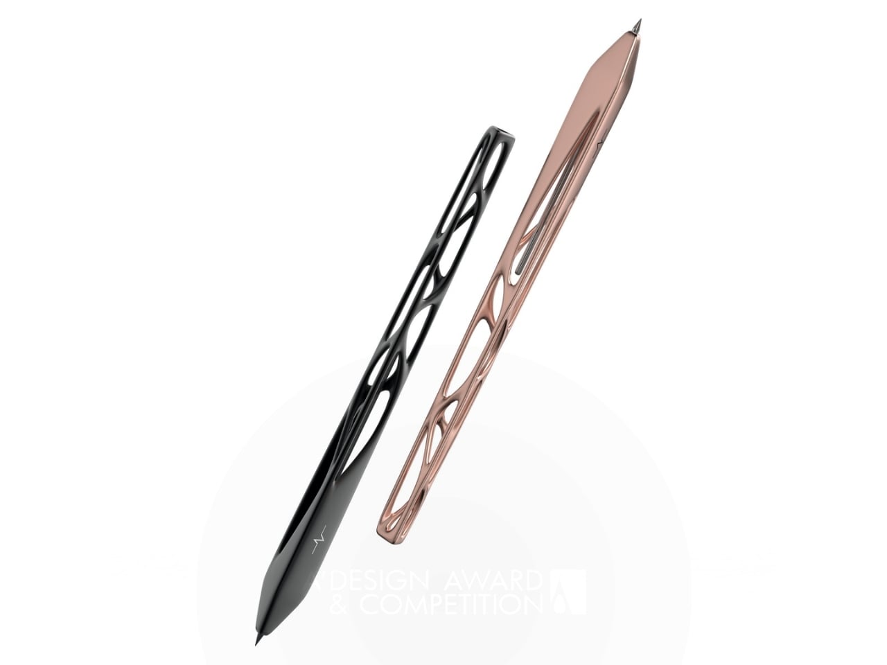
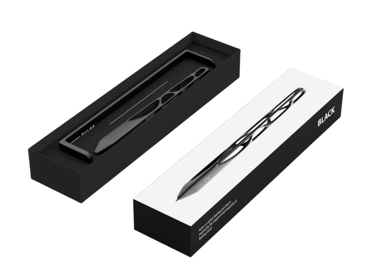
Remember the last time you picked up a pen and actually stopped to look at it? Most of us don’t. We grab whatever’s lying around, scribble a note, and move on with our day. But designer Leila Ensaniat is challenging that autopilot relationship we have with one of our most familiar tools. Her creation, Pulse, recently snagged the Golden A’ Design Award for 3D Printed Forms and Products, and it’s easy to see why this isn’t your average ballpoint.
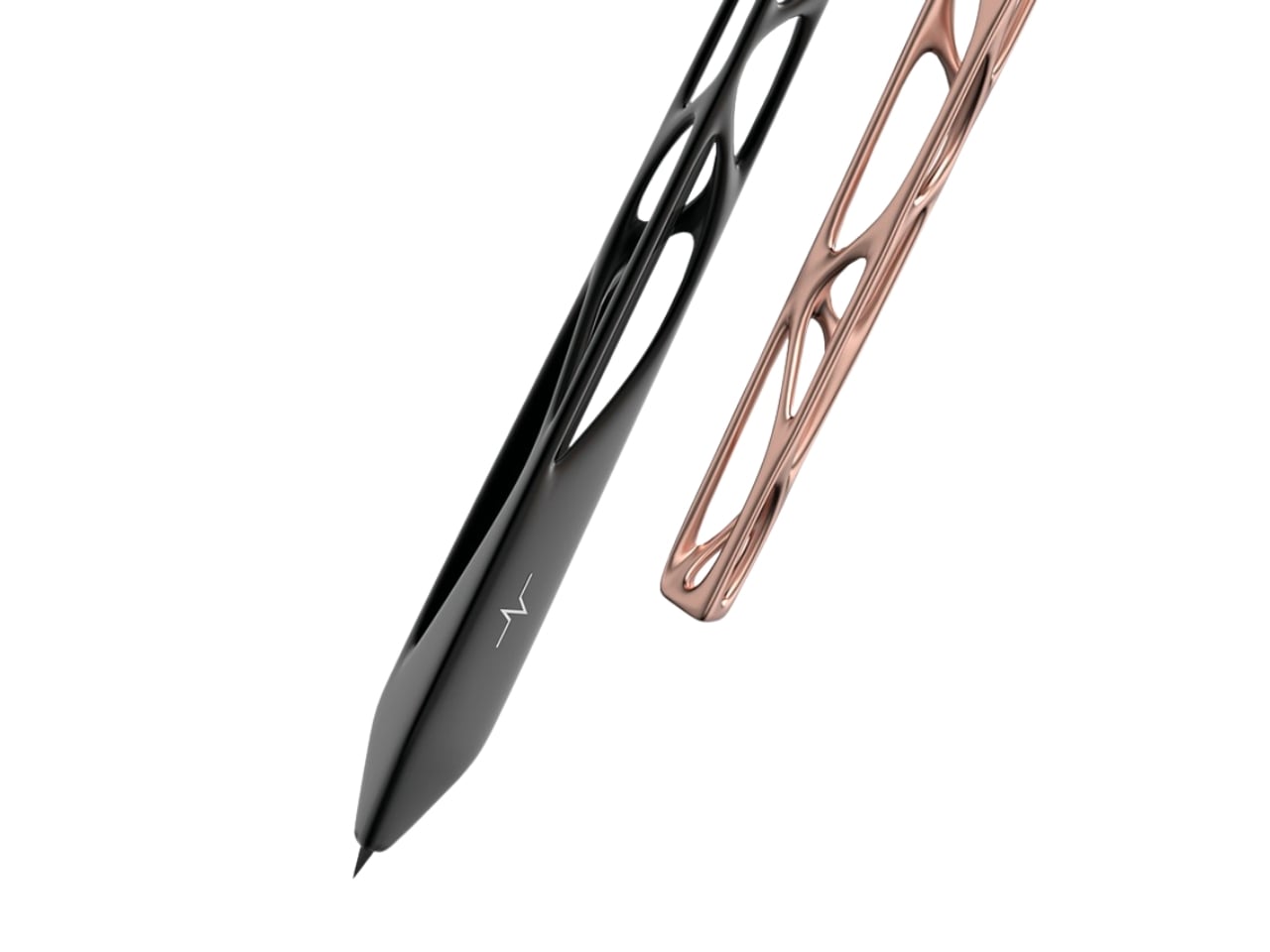
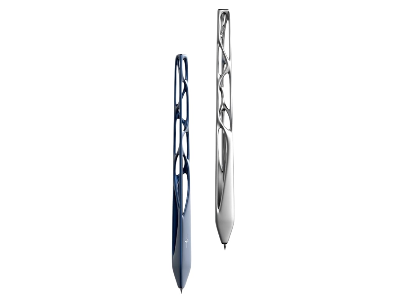
Pulse is what Ensaniat calls a “floating pen,” and that description actually makes sense once you see it. Drawing inspiration from the quiet, effortless drift of clouds, the pen feels less like a writing instrument and more like a small sculptural moment on your desk. It’s the kind of object that makes you pause, which is pretty rare when we’re talking about something as mundane as a pen.
Designer: Leila Ensaniat
What makes this design really interesting is how it blends old-school craftsmanship with cutting-edge technology. The pen features biomorphic patterns that look like they grew organically rather than being designed, and they’re created using lost wax casting in aluminum, silver, bronze, and gold. That’s a centuries-old metalworking technique typically reserved for jewelry and art pieces, not everyday writing tools. But that collision of traditional craft and contemporary design thinking is exactly what gives Pulse its unique character.
Ensaniat, who has a background as an industrial designer at Cisco specializing in consumer electronics, brings a tech-world sensibility to object design. Her approach centers on human-centered design, which basically means she’s thinking hard about how we actually interact with objects rather than just how they look on a shelf. With Pulse, that philosophy translates into something that feels natural in your hand while also making you reconsider what a pen can be.
The surface treatments are particularly thoughtful. Those nature-inspired patterns aren’t just decorative, they enhance both the visual appeal and the tactile experience of holding the pen. It’s a detail that matters more than you’d think. When an object feels good to touch, when it has texture and weight that seems intentional, it changes your relationship with it. You’re more likely to keep it on your desk, to reach for it specifically, to actually care about this tool that usually gets treated as disposable.
What’s fascinating about Pulse is how it sits at the intersection of sculpture and utility. The design explores that balance between being something you want to look at and something you actually need to use. Plenty of designer pens lean too hard into the luxury angle and end up feeling precious and impractical. Others focus purely on function and look forgettable. Pulse seems to nail that middle ground where form and function aren’t competing, they’re collaborating.
The project also gave Ensaniat deeper insight into the metal finishing and plating industry, which might sound technical but is actually important. Understanding how materials behave, how different metals can be worked and finished, how surface treatments hold up to actual use, that knowledge separates decorative design from functional design. A beautiful pen that tarnishes after a week or feels unbalanced when you write isn’t really good design, it’s just good marketing.
Created for her brand N I L A, which focuses on integrating technology seamlessly into everyday life, Pulse represents a broader design philosophy about making thoughtful, human-centered objects that solve real problems while also being distinct and meaningful. It’s an approach that feels increasingly relevant as we’re surrounded by more and more identical mass-produced stuff. Pulse won’t revolutionize how we write, and it’s not trying to. But it does suggest that even the most familiar, seemingly finished objects in our lives still have room for fresh thinking. Sometimes all it takes is a designer willing to ask why something has to be the way it’s always been, then having the skill to actually answer that question with something better.
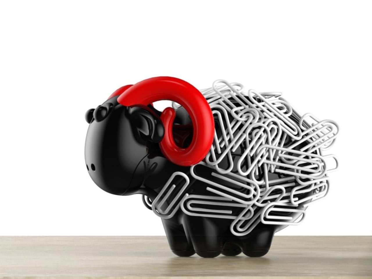
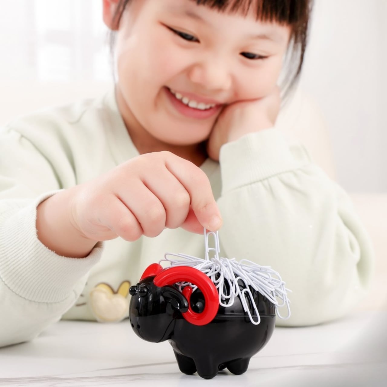
Your desk probably looks like everyone else’s. You’ve got the same black stapler, the same boring paper clip holder, maybe a pen cup that once held something else. There’s nothing wrong with functional, but there’s also nothing memorable about it. That’s precisely what makes Shearing Magnetic Absorption so refreshing.
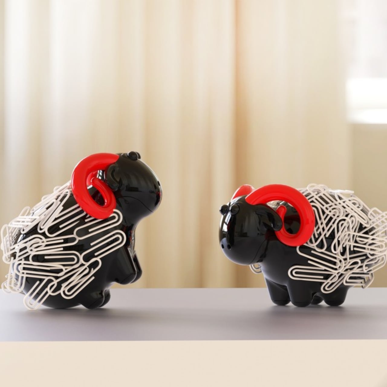
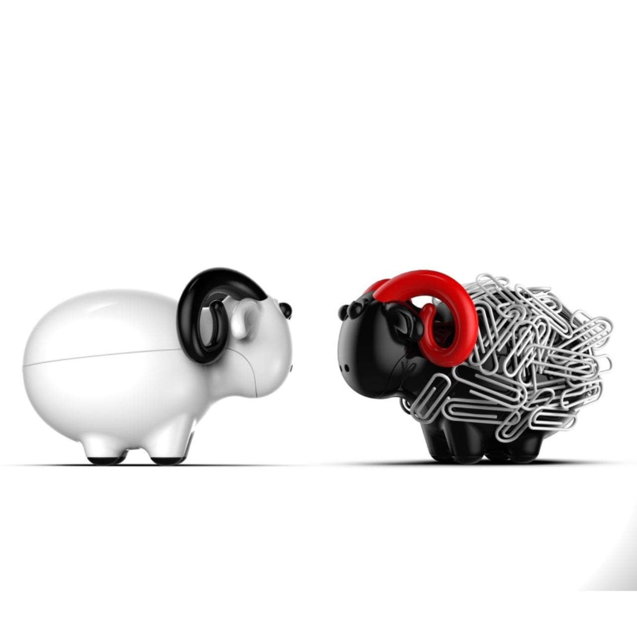
Designed by Xin Se and awarded the Golden A’ Design Award in 2025, this magnetic paper organizer does something most desk accessories fail to accomplish: it makes you smile. The concept is beautifully simple. Picture a small sheep standing on your desk, and those mundane silver paper clips you usually ignore become its fluffy wool. It’s one of those ideas that feels so obvious once you see it, yet nobody thought to do it before.
Designer: Xin Se
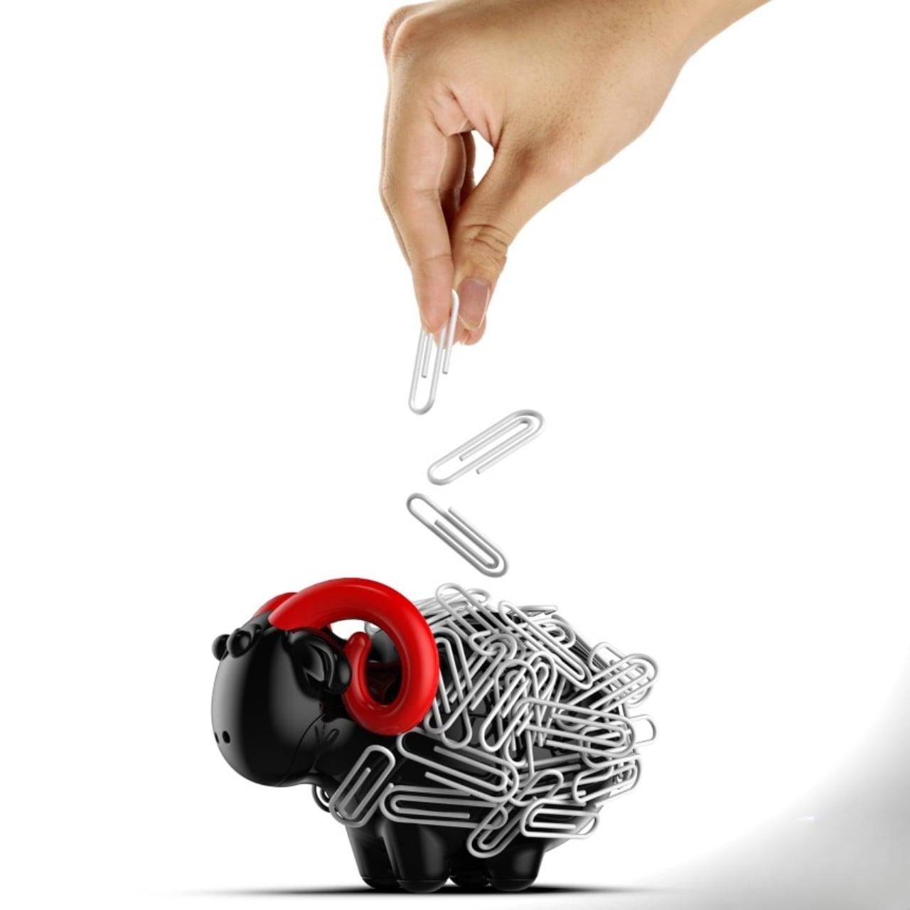
The genius lies in the transformation. Most organizers are just containers, passive objects that hold your stuff. Shearing actively reimagines what paper clips are. When you attach them to the magnetic sheep body, they cluster and create texture that genuinely resembles wool. The visual metaphor isn’t subtle, and it doesn’t need to be. The name itself, Shearing, plays on the dual meaning of sheep shearing and the act of gathering or organizing. It’s clever without trying too hard.
What’s particularly interesting about this design is how it taps into emotional engagement. We spend massive amounts of time at our desks, surrounded by objects that serve purely utilitarian purposes. Keyboards, monitors, staplers, they’re all tools designed to disappear into the background. Shearing takes the opposite approach. It wants your attention. It invites interaction. When you reach for a paper clip, you’re not just grabbing office supplies, you’re “shearing the sheep.” That tiny narrative moment transforms a mundane task into something playful.
The brand behind Shearing is Niceobject, and if you look at their philosophy, it tracks. They focus on small items that contain what they call “a touch of emotion.” It’s not about making big statements or revolutionary products. It’s about finding joy in the details, turning everyday objects into what they describe as “beautiful encounters” and “warm companionship.” That might sound a bit precious, but when you’re staring at spreadsheets for eight hours, having a little sheep companion on your desk actually matters more than you’d think.
From a design perspective, Shearing succeeds because it balances form and function perfectly. It’s not sacrificing practicality for aesthetics. The magnetic mechanism works, paper clips stay organized and accessible, and the footprint is small enough that it won’t clutter your workspace. But it also doesn’t hide what it is. The sheep silhouette is immediately recognizable, giving it personality without becoming cartoonish or juvenile.
This is part of a broader trend we’re seeing in product design where personality and emotion are becoming key differentiators. Technology has made manufacturing more accessible, which means the market is flooded with functional but forgettable products. Standing out requires more than just working well. It requires creating a connection, telling a story, or sparking a feeling. Shearing does all three.
Designer Xin Se has spent over two decades in product design, bringing numerous products to market. That experience shows in Shearing’s execution. It’s not trying to reinvent the wheel or force innovation where it’s not needed. Instead, it takes something familiar and adds a layer of delight. That restraint is harder than it looks. It would be easy to over-design this concept, to add too many features or make the sheep too detailed. The design stays simple, letting the core idea shine.
Shearing represents a philosophy worth paying attention to. Not every design needs to solve massive problems or disrupt entire industries. Sometimes the best design simply makes ordinary moments a little more enjoyable. Next time you’re organizing paper clips or reaching for office supplies, you might think differently about what those objects could be. That’s what good design does. It changes how we see the world, even in the smallest ways. And sometimes, that’s exactly what we need.