Chrome on Android will now let you share your approximate location
The feature is also coming to desktops soon.
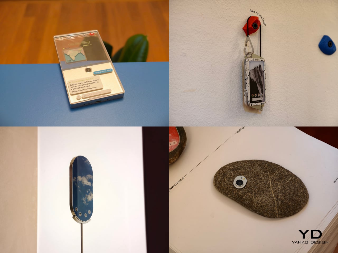
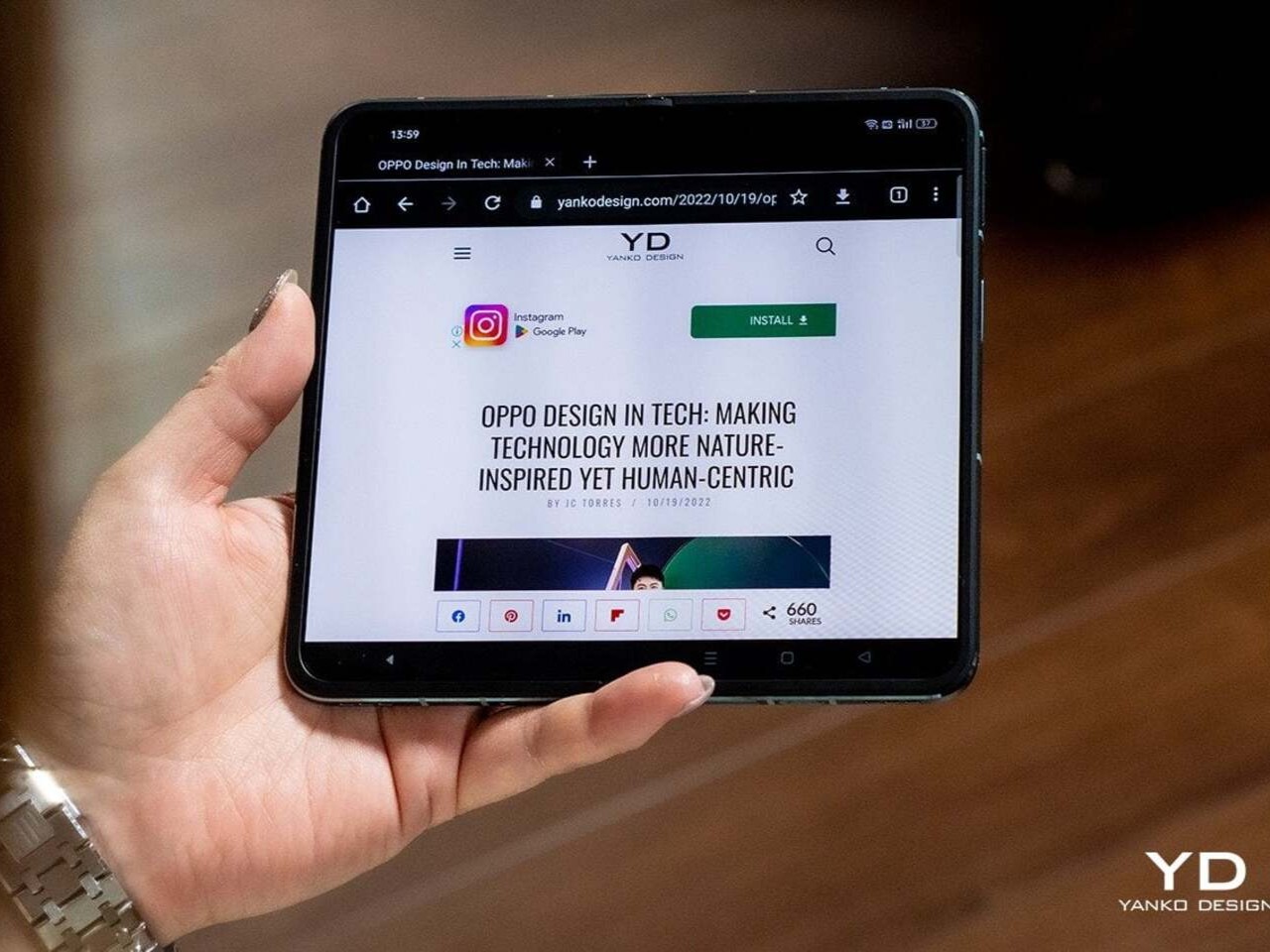
At ECAL’s collaboration with Google’s Industrial Design team, the smartphone is no longer treated as a fixed icon of consumer tech. In A Message from Tomorrow, it becomes something far more fluid, a design question that deserves to be reopened. The brief invited ECAL’s Master Product Design students to develop mobile-focused concepts inspired by daily rituals, with an emphasis on storytelling and the human dimension of technology. That framing gives the exhibition its real energy. Instead of chasing the usual upgrades in speed, resolution, or sleekness, the projects ask how mobile devices might evolve if they were designed around touch, companionship, movement, energy, and the subtle gestures that shape everyday life.
That shift feels especially relevant now. Smartphones have absorbed nearly everything, from cameras and maps to notebooks, music players, and assistants, yet the object itself has become strangely stagnant. For all the complexity hidden inside, the form remains stubbornly familiar, a smooth slab built around endless visual attention. A Message from Tomorrow pushes against that stagnation by imagining mobile hardware as a much broader territory. Here, devices can be expressive, self-sufficient, spatial, tactile, or emotionally responsive. The exhibition does not present one neat answer to the future of the phone. It presents a series of alternate directions, each exposing something our current devices no longer do well.
Deigner: ECAL/University of Art and Design Lausanne x Google ID
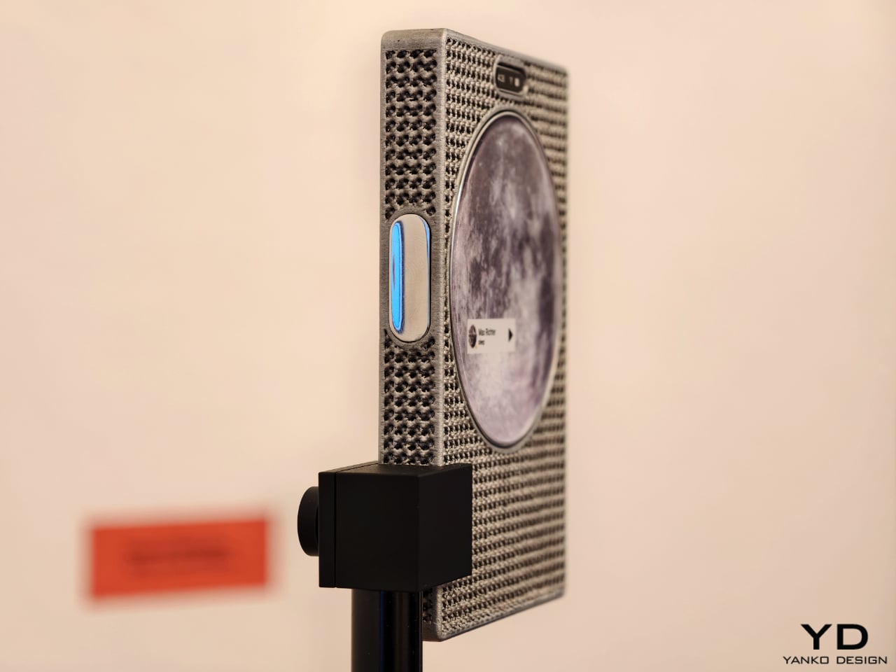
One of the show’s strongest ideas is that the future of mobile technology may not be screen-first at all. Several projects deliberately loosen the screen’s dominance and focus instead on sound, physical presence, or integration with the surrounding world. Sound Machine, by Xose Lois Piñeira, rebuilds the phone around voice. Its 3D-printed aluminum lattice body is acoustically transparent, allowing sound to move through a layered assembly while a contact transducer on the back transmits audio through surfaces or through the body when worn against the sternum. A small circular screen handles only the essentials. It is a compelling proposition because it refuses the idea that a phone must always function as a miniature display first and everything else second.
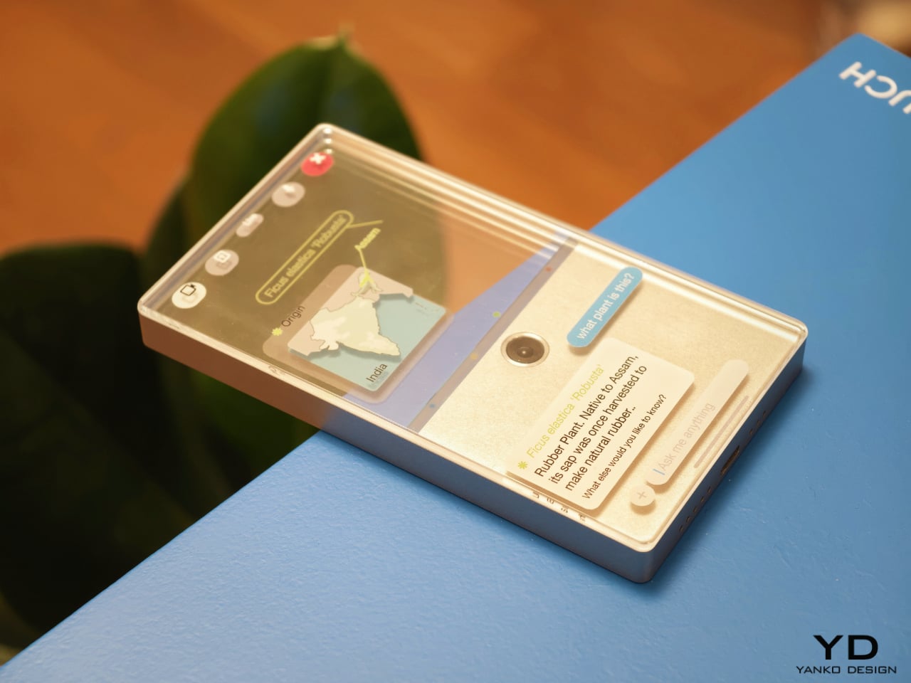
Liminal Frame, by Ehrat Lee, offers another escape from flat-screen logic. Its four-layer display can shift between opaque and transparent states, letting digital content coexist with the physical world rather than replacing it. The device allows users to look through the phone, place information in space, and return to it later without relying on a headset. It turns the phone into a kind of portal rather than a closed surface. In a moment when spatial computing is often imagined through bulky wearables, this project feels especially elegant. It suggests that the phone itself could evolve into a lighter and more natural bridge between digital and physical experience.
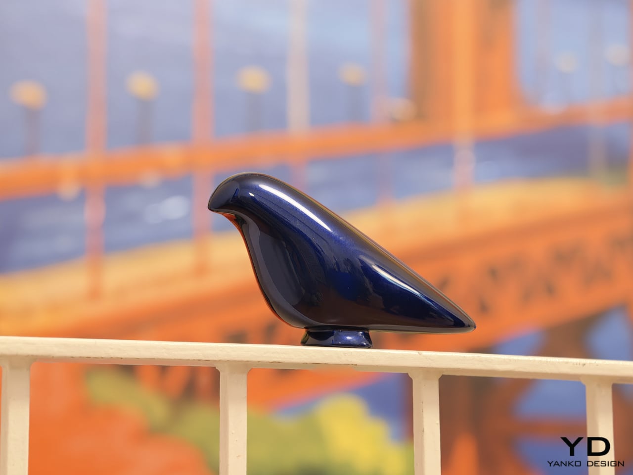
Some of the exhibition’s most memorable concepts explore personality as much as function. Robin, by Gyuhan Park, imagines a mobile device modeled on pet-bird behavior. Cameras become eyes, a beak-like feature acts as sensor and speaker, and the object communicates like a companion rather than a conventional assistant. It can tease, joke, or sulk while also helping with planning, messages, and everyday tasks. The concept is playful, but it also raises a serious question about the future of devices. As AI becomes more embedded in daily life, will our relationship with technology become less transactional and more behavioral.
That same willingness to rethink familiar habits appears in The Finger Phone by Hugo Von Hofsten. Starting from the frustration that phones always need to be held, it introduces an animated finger-like extension carrying a camera, light, and touchpad. The idea is delightfully odd, but also surprisingly practical. It imagines a device that can stand on its own, assist in small moments, and illuminate more than just its own screen. In a market dominated by polished uniformity, The Finger Phone feels refreshingly unconcerned with conventional elegance. It is willing to be useful, strange, and memorable all at once.
The exhibition also includes projects that challenge the smartphone’s dependence on charging infrastructure and standardized use cases. Rove, by Moritz Engel, is designed for off-grid wilderness and uses a pull-cord system to generate power through an axial flux generator. One minute of pulling creates twenty minutes of battery life, while the Dyneema cord doubles as a carrying strap and the spool becomes a tactile control wheel. Dyno, by Julia Siebert Cáceres, tackles the same problem from a more everyday angle, using body movement and electromagnetic induction to generate electricity throughout the day. Its visible rotor and magnet system make the act of charging tangible rather than hidden, giving the device an honesty that most sealed electronics lack.
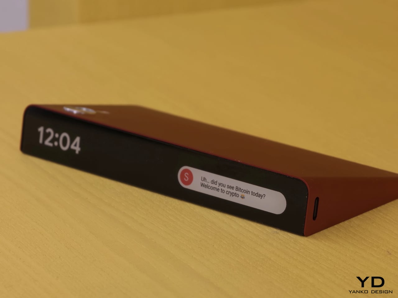
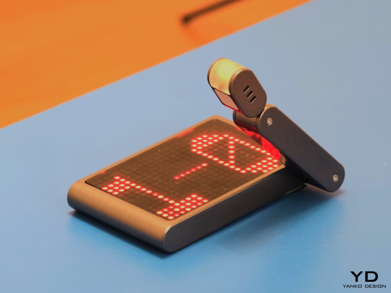
Other projects focus on what the phone means as a physical object in domestic and personal life. Everydaycarry, by Motong Yang, critiques the smartphone as a standardized entity that contains everything yet expresses very little. It proposes a more adaptive device whose character can still reflect the identity of the person carrying it. Totem, by Paul Quentin, reshapes the phone into a wedge so it can function more naturally as a tabletop object for video calls, media viewing, or AI assistance. When laid flat, its edge becomes a subtle notification interface. These projects are not simply formal experiments. They rethink how devices occupy space, signal presence, and fit into routines beyond the hand and pocket.
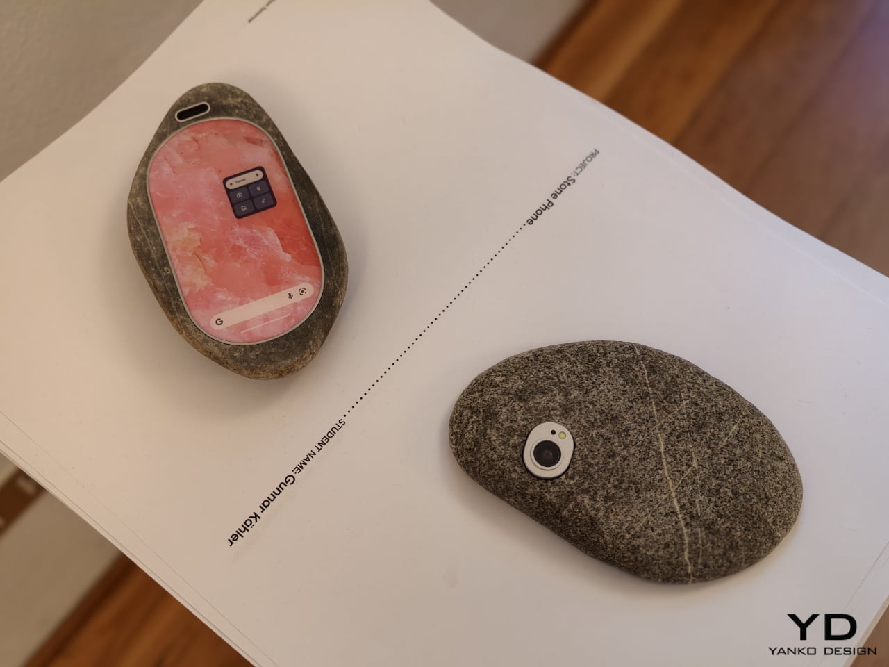
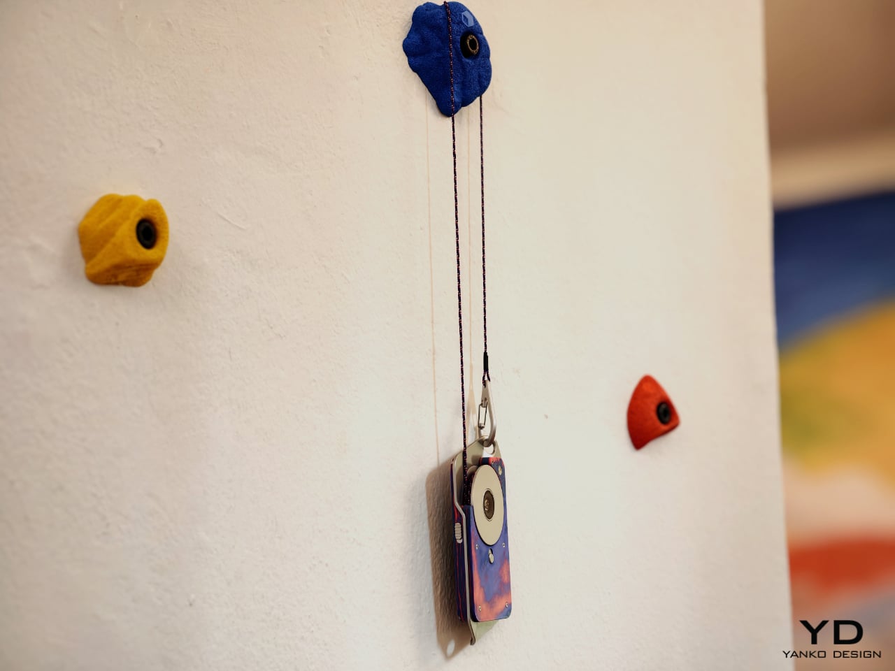
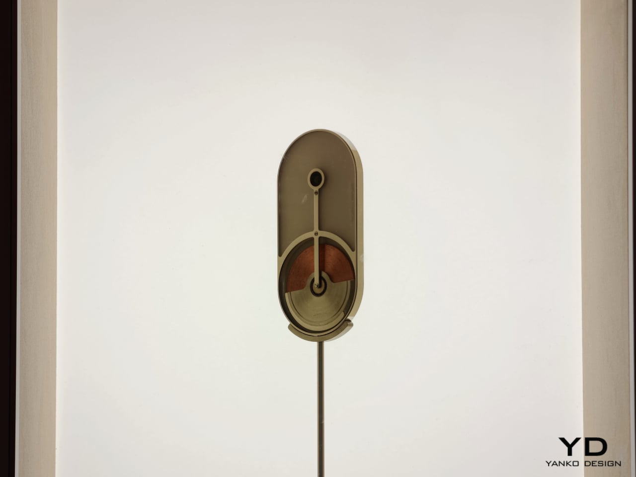
Then there is Stone Phone by Gunnar Kähler, one of the exhibition’s most quietly affecting concepts. Inspired by the instinctive act of picking up a stone from a beach or riverbank and choosing the one that feels right in the hand, the project imagines smartphones in an endlessly varied range of shapes. Instead of accepting industrial uniformity as a given, Stone Phone suggests that users might choose a device based on texture, comfort, and tactile pleasure. It blurs the line between archaic tool and advanced technology, making the smartphone feel less like a mass-produced command and more like a personal object discovered through touch. In a show full of speculative gestures, this one stands out for its simplicity. It reminds us that before a device does anything, it is first something we hold.
What makes A Message from Tomorrow compelling is not that every concept seems ready for mass production. It is that each one identifies a real tension in our relationship with mobile technology and gives it a physical form. Together, the projects reveal how narrow the current smartphone archetype has become. More importantly, they show that industrial design still has the power to meaningfully reshape our technological future. In an era when innovation is often framed as software alone, this exhibition argues that form, material, behavior, and ritual still matter deeply.
The post ecal x Google Just Imagined 10 Phones Beyond the Slab first appeared on Yanko Design.
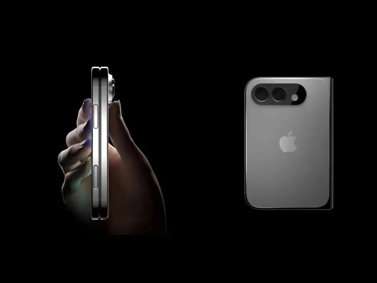
Foldable phones have been around long enough that the novelty has worn off. Samsung pioneered the book-style fold, and the hardware has genuinely matured. Foldables today are thinner, lighter, and far more durable than the early prototypes that worried everyone. But one nagging issue hasn’t gone away after seven years of refinement. The proportions still feel like a compromise, and most buyers can still sense it.
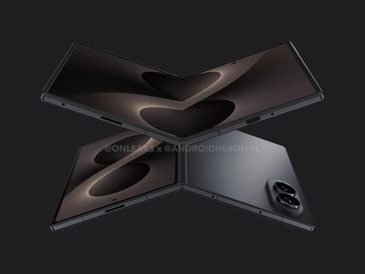
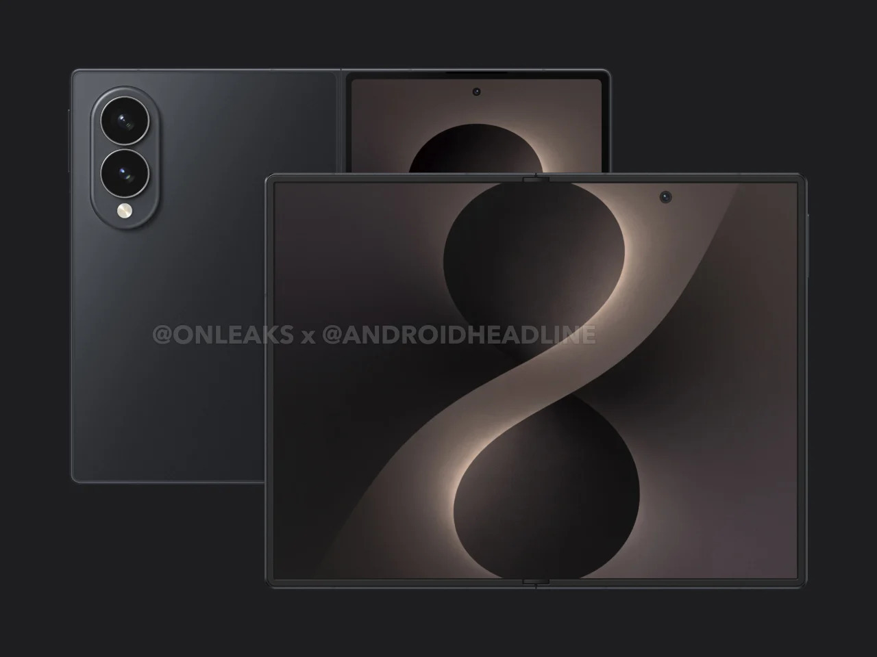
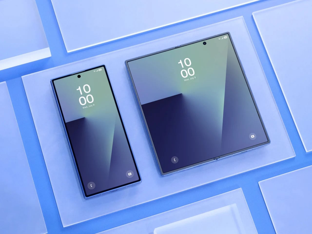
That’s exactly what the Galaxy Z Fold 8 Wide seems designed to address. Rather than continuing the tall, narrow approach that has defined the Fold lineup since the beginning, the Wide version reportedly takes a shorter, broader form factor, with the inner display pushing toward a 4:3 aspect ratio. It’s a subtle-sounding change, but one that could shift how the device feels in every single moment you actually use it.
Designer: Samsung (renders by Steve Hemmerstoffer/OnLeaks via AndroidHeadlines)
Anyone who has used a Galaxy Z Fold for a while knows the friction of the cover screen. It’s tall, narrow, and requires more thumb effort than you’d expect from a daily driver. Reaching the notification shade with one hand usually means repositioning your grip, and typing on that narrow layout takes some getting used to. It works, but it always feels like a device asking you to meet it halfway.
Galaxy Z Fold7
The Galaxy Z Fold 8 Wide reportedly carries a 5.4-inch cover display that is wider and shorter than what the Fold 7 offered. That brings it closer to the feel of an ordinary compact phone, one that sits comfortably in your hand without requiring thumb acrobatics. It sounds like a small win, but if you’ve ever owned a phone from before screens started growing taller every year, you know exactly how much that sense of balance matters.
There’s a quiet awkwardness to watching a video on current book-style foldables. The cover screen’s narrow shape forces letterboxing on most content, and even the inner display’s near-square proportions aren’t ideal for widescreen formats. Games feel slightly cramped, and browsing feeds in landscape doesn’t quite deliver the comfortable experience you’d expect from a screen that size. For a device this premium, that’s a surprisingly persistent design limitation.
A 4:3 inner display changes that dynamic considerably. The Galaxy Z Fold 8 Wide’s 7.6-inch screen reportedly lands in proportions that suit media consumption far better, making landscape video less of a letterboxed compromise and gaming more spatially generous. Rotating to portrait for reading or scrolling also starts to feel intentional, like the device was built to handle those orientations rather than merely tolerating them. That’s a meaningful difference in day-to-day comfort.
Foldables have always carried a bit of an identity crisis. They’re marketed as phone-tablet hybrids, but the tablet side of that pitch has always been shakier than the phone side. Apps designed for tablet layouts don’t always know what to do with a nearly square display, and the result is often stretched content, oversized sidebars, or awkward layouts that remind you this device is still figuring out what it wants to be.
![]()
Google Pixel Fold (2023)
The 4:3 ratio is a well-understood canvas. It’s the same one the iPad has used for years, and developers have been designing for it far longer than they’ve been designing for foldable proportions. Not every app on the Galaxy Z Fold 8 Wide will look perfect, but the number that feel genuinely at home on that inner screen stands to increase considerably. It’s a format the software world already knows how to fill.
There’s a certain appeal to a device that opens up to something resembling a pocket notebook. Not a productivity gimmick, but an actual blank-page-sized surface where you can think out loud. The Galaxy Z Fold 8 Wide, when unfolded, reportedly sits at dimensions close to a small memo book’s proportions. That makes it a surprisingly natural surface for quick thoughts, rough sketches, and anything else worth capturing before it slips away.
OPPO Find N2
The device is also reportedly thicker than the standard Fold 7, measuring around 9.8mm when folded, which gives Samsung more internal room to work with. It’s hard not to wonder whether some of that space is being reserved for S Pen support, which Samsung hasn’t confirmed yet. A stylus-compatible screen at these proportions would make the Galaxy Z Fold 8 Wide feel genuinely notebook-like, less like a big phone you write on and more like something actually worth reaching for.
Foldables still carry a reputational burden. The people who haven’t bought one yet aren’t always hesitating because of price or specs. Often, it’s the lingering sense that this is still experimental hardware, a category that hasn’t quite committed to a definitive form. Even Samsung’s most polished efforts can feel like stepping into an ongoing experiment, and that feeling keeps a large group of potential buyers watching from a distance.
iPhone Fold (Renders)
Apple’s rumored foldable iPhone is expected to sport dimensions strikingly similar to the Galaxy Z Fold 8 Wide, with a wider, shorter profile that closely mirrors what Samsung is building. When Apple commits to a hardware direction, cautious buyers tend to pay attention. It doesn’t guarantee anyone will rush out to buy a Samsung instead, but Apple’s presence in the same design space lends the wider foldable format a credibility that Samsung alone hasn’t quite managed to manufacture on its own.
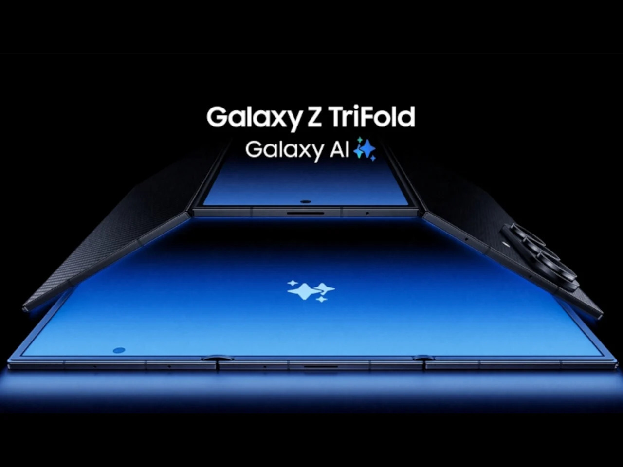
Here’s the part that’s harder to shake. Samsung has a demonstrated pattern of building genuinely interesting experimental devices and then quietly stepping back when the numbers don’t perform. The Galaxy Z TriFold is the most recent example, a compelling piece of hardware whose long-term future already feels uncertain. Buying into the Galaxy Z Fold 8 Wide means betting that Samsung will stay committed long enough to make the second and third generations worth waiting for.
That concern is more meaningful here than it is for a standard phone. Accessories take time to mature. Software optimization accumulates across generations. And the design refinements that make a device feel truly polished rarely arrive on the first attempt. The Galaxy Z Fold 8 Wide might be a genuinely thoughtful piece of hardware, but Samsung’s track record with experimental form factors hasn’t yet inspired the long-term trust that a device like this quietly depends on.
The post 5 Reasons the Galaxy Z Fold 8 Wide Could Win and 1 Reason It Might Not first appeared on Yanko Design.
Smartphone colors have become one of the more formulaic aspects of mobile design. Most brands cycle through the same soft pastels and stone-inspired neutrals, year after year, with names like Moonstone, Fog, and Porcelain doing most of the heavy lifting. It’s a safe approach that generally works, but there’s rarely any real meaning behind these choices. A color is just a color, and that’s often where the story ends.
Google seems to have had the same thought, at least for Japan. The Pixel 10a Isai Blue is a Japan-exclusive model developed in collaboration with Heralbony, a creative company that works with artists with disabilities to produce new forms of cultural expression. It celebrates a decade of Pixel phones, and rather than simply marking the occasion with a new shade, Google made the color itself worth talking about.
![]()
![]()
Japan didn’t get the Pixel 10a when it first launched globally in February, which was a bit of an odd omission given how well the A-series has performed there. The country has quietly grown into one of Google’s stronger Pixel markets, so the wait wasn’t really a sign of indifference. Returning to Japanese fans with something made specifically for them says a lot more than a straight regional rollout would.
![]()
The name alone sets this apart from anything Google has done before. “Isai” translates to unique and unparalleled individuality, and this is actually the first time a Pixel color has been given a Japanese name. Most Pixel colors borrow from the natural world, but Isai Blue is built around something more conceptual: a deep navy shade tied to Heralbony’s own brand identity and its mission to celebrate human difference.
![]()
![]()
That philosophy runs all the way through to the software, too. Three Heralbony-contracted artists, Shigaku Mizukami, Midori Kudo, and Kaoru Iga, each contributed original designs that became exclusive wallpapers on the device. Pick one of the nine available artworks, and Material You automatically reshapes the phone’s icon colors and styling to match. It’s the kind of visual cohesion you don’t usually get with a phone at this price.
![]()
Of course, the collaboration doesn’t stop at the screen. Every unit comes bundled with an exclusive bumper case designed around the Pixel 10a’s completely flat back, which does away with any camera protrusion and makes the phone far easier to set down. Original stickers are also included, and the box sleeve carries artwork by Midori Kudo, so the whole unboxing feels deliberately curated.
The Isai Blue comes in a single 256GB configuration, priced at ¥94,900 (roughly $594) and available for pre-order in Japan ahead of its May 20 sale date. It’s only available while supplies last, which fits for something that was never really meant to be a mass-market offering. Google took the time to make this feel like a genuine gesture rather than a routine launch, and Japan has every reason to feel appreciated.
![]()
The post Pixel 10a Just Proved a Smartphone Color Can Actually Mean Something first appeared on Yanko Design.

Most conversations about Big Tech and sustainability follow a familiar script: a company announces a carbon pledge, releases an environmental report full of impressive-sounding numbers, and everyone moves on. What rarely gets discussed is the messy, unglamorous reality sitting right at the center of it all: the data server room. That’s exactly where two design students decided to start, and the result is one of the most visually striking workplace concepts I’ve seen in years.
Lia Hur and Michell Hur, both from the Savannah College of Art and Design, began with a straightforward question: what do you do with all the heat that data servers constantly produce? The answer they arrived at wasn’t purely mechanical. It was spatial, experiential, and genuinely beautiful. Their Google Sustainable Headquarters concept won two awards at the European Product Design Award 2025, covering both Architectural and Building Design and Interior Design categories, and it’s easy to see why.
Designeres: Lia Hur, Michell Hur
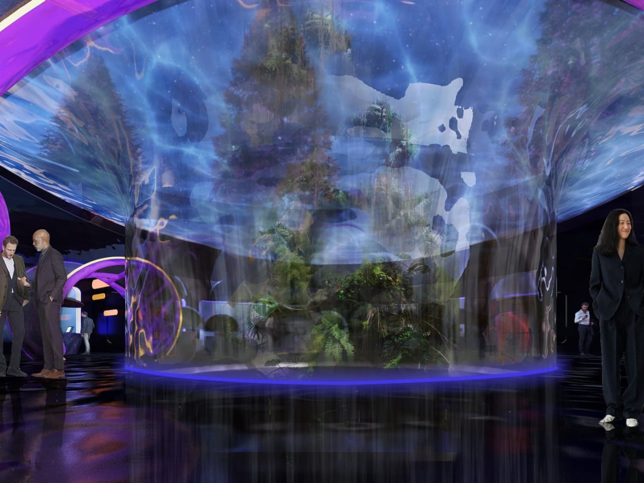
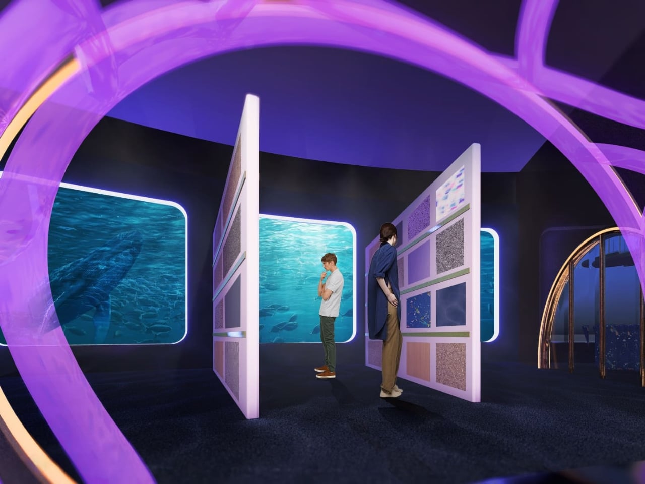
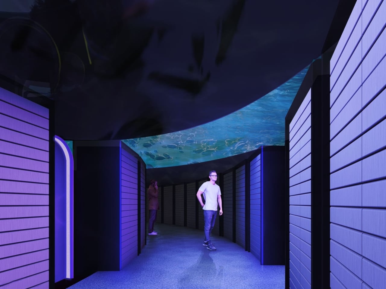
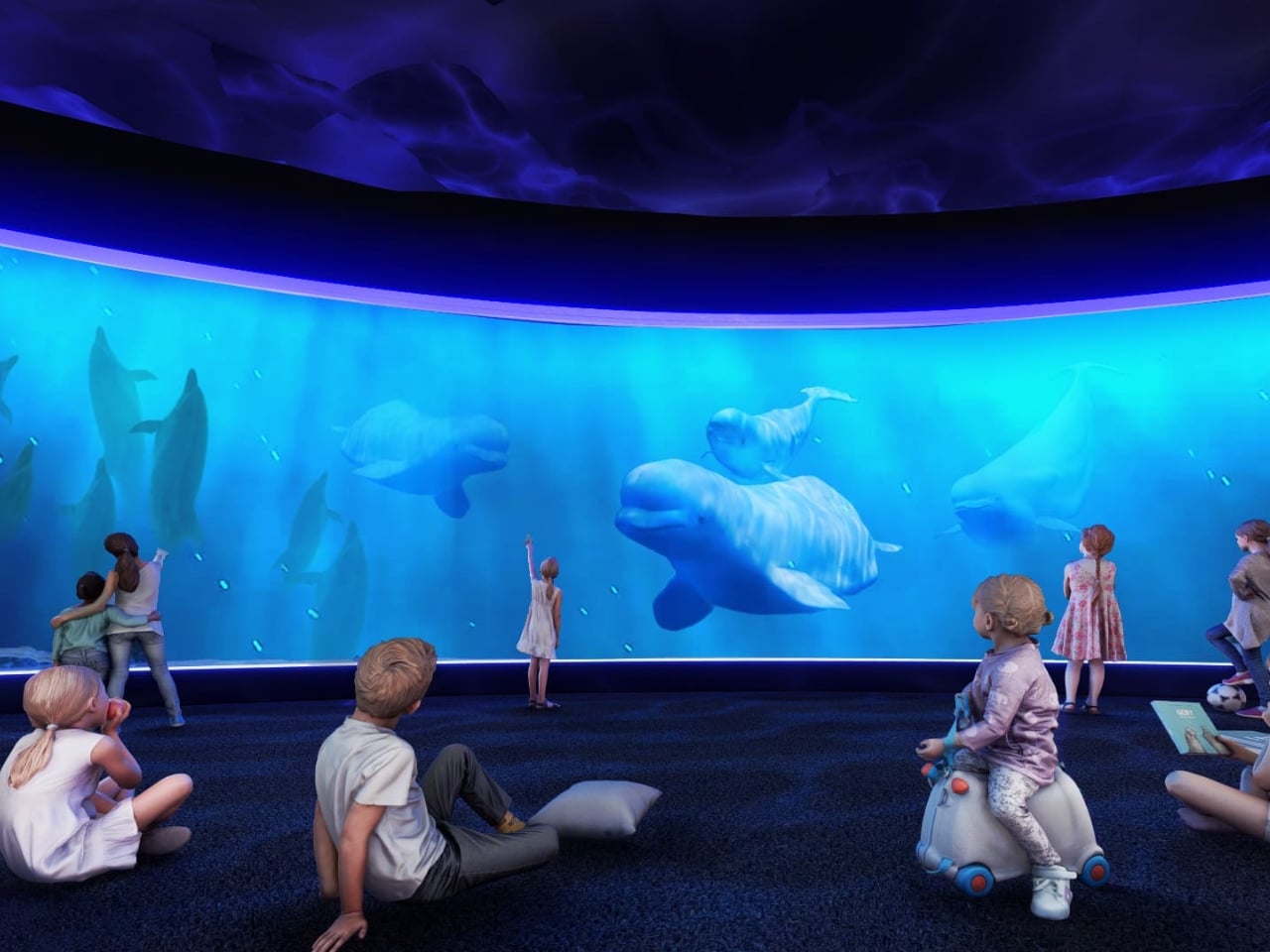
The first thing that strikes you when you look at the concept renderings is the ocean. Not metaphorically. The entire design language of the building is built around the visual world of the deep sea. Curved panoramic screens wrap around rooms showing beluga whales gliding through blue water. Children sit on the floor of an immersive theater-like space, completely surrounded by marine life projected at scale. In the server corridor, where rack upon rack of hardware lines both sides of a narrow hallway, the ceiling opens up into a curved screen of swimming fish, as if the infrastructure beneath the ocean surface and the ocean itself had somehow merged into a single space.
It’s an unexpected choice, and it works precisely because it’s unexpected. Data centers and ocean imagery have no obvious connection, until you start thinking about cooling systems, water usage, and the thermal logic that governs how these buildings function. The Hurs don’t explain the metaphor didactically. They just build the world and let you inhabit it.
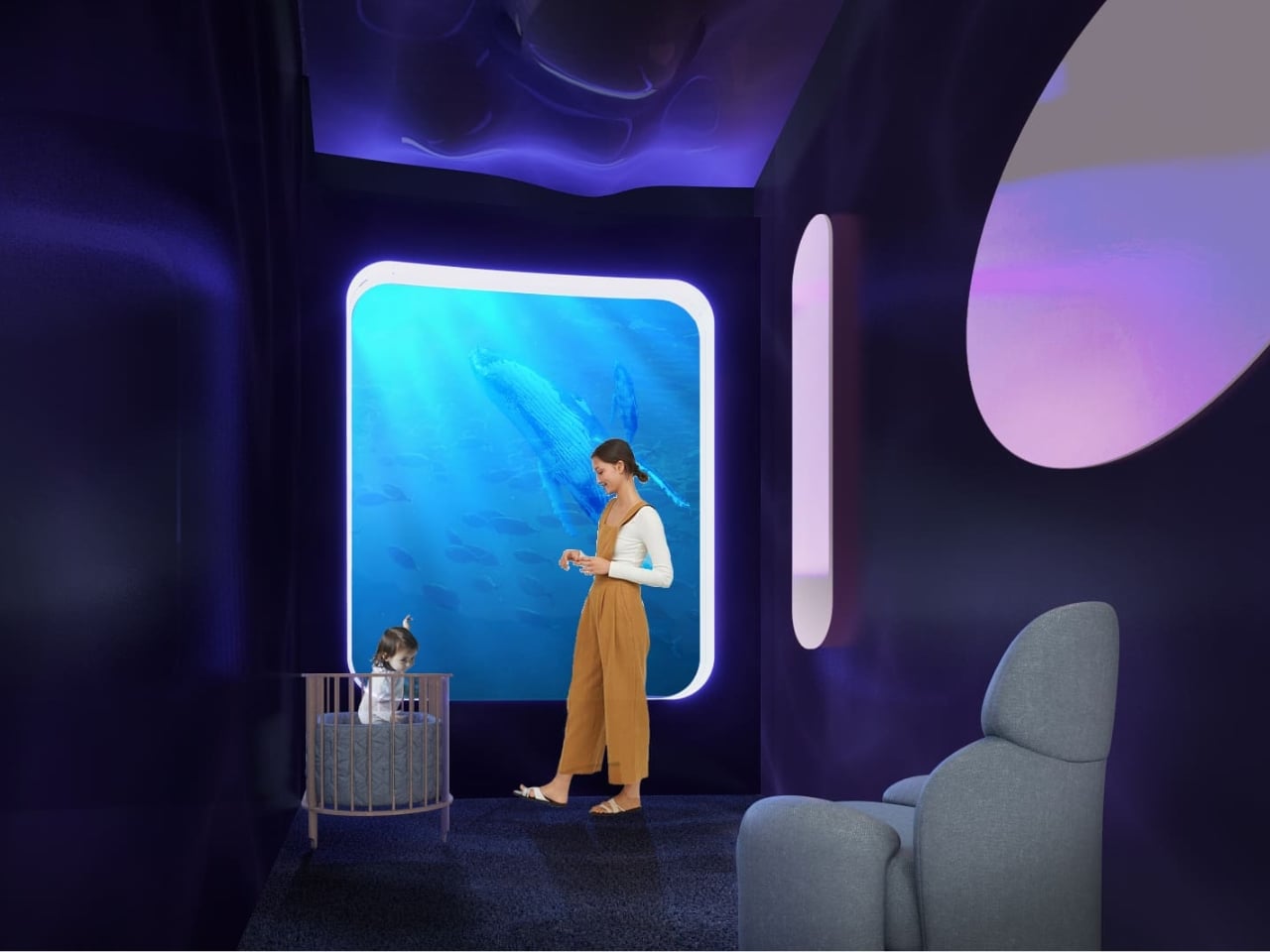
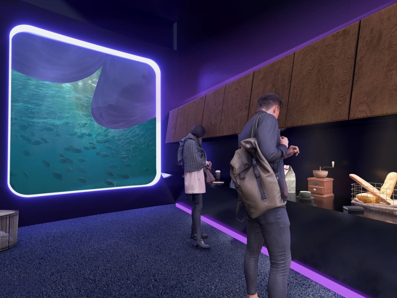
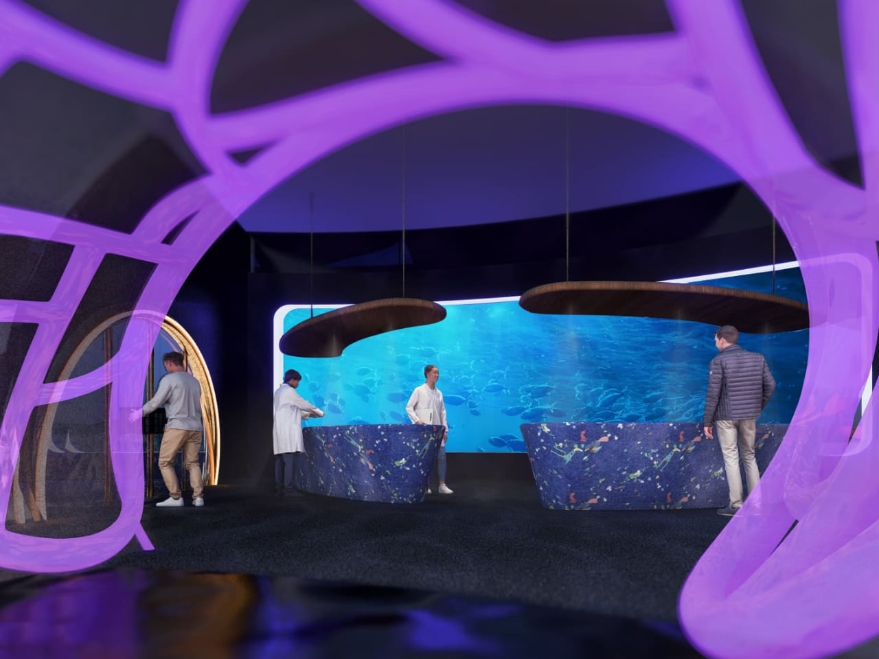
The interior language carries this through every zone of the building. The reception lobby, viewed through an oversized organic lattice structure that reads like coral or a cross-section of a neural network, features terrazzo-style desks in deep ocean blue and warm wooden disc pendants floating overhead. A café break area has a single rounded square window framing an underwater manta ray, glowing white against dark walls. A mother’s room has the same window format, this time showing a humpback whale drifting slowly past, turning what could have been a purely functional space into something quietly meditative.
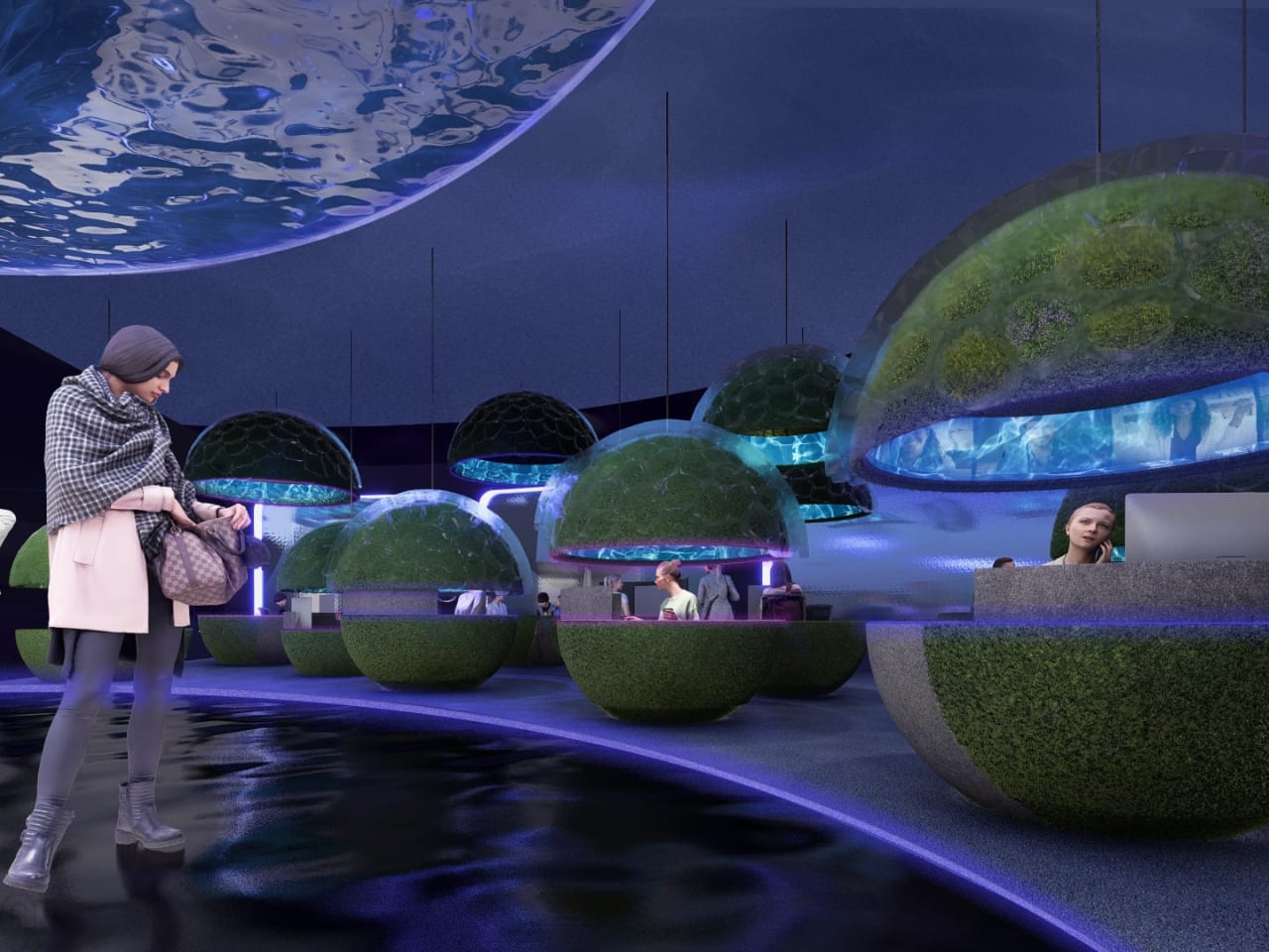
The workspace pods are where the concept gets most sculptural. Spherical forms covered in live moss float through an open floor plan, each one glowing from a lit band around its middle, like a planet seen from space. Workers tuck themselves inside. The ceiling above them ripples with projected water. It feels less like an office and more like an ecosystem you happen to work inside.
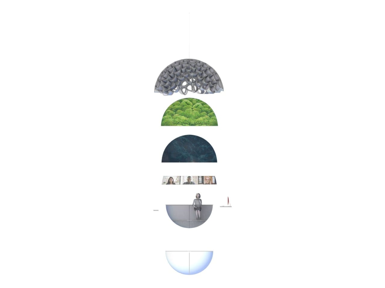
What I find most compelling is the section diagram the designers included. Stripped down to its basic geometry, the building reads as a stacked series of layers: a textured structural dome at the top, a living green layer beneath it, a dark water layer below that, and then human occupation at the base. It’s a quietly radical idea. The building isn’t sustainable because it has a green roof or offsets its emissions. It’s sustainable because it’s organized around natural systems at a structural level, with heat, water, and living material all functioning together as a closed loop.
The exterior pulls all of it together. A large dome structure sits directly on water, its skin formed from interlocking bubble-like cells that glow from within. Smaller spherical pods float on the surface around it. Looking at it under a sky of northern lights, it reads more like a research station on another planet than a corporate headquarters.
That’s not a criticism. It’s a sign that Lia and Michell Hur weren’t trying to design a building that looks sustainable. They were trying to design one that makes you feel what sustainability could actually mean, and that’s a much harder thing to do. They pulled it off.
The post What If Google’s Server Heat Became Its Most Prominent Design Feature? first appeared on Yanko Design.