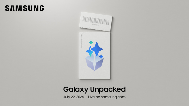
The next Samsung Galaxy Unpacked launch is happening on July 22
The next Samsung Galaxy Unpacked launch is happening on July 22.
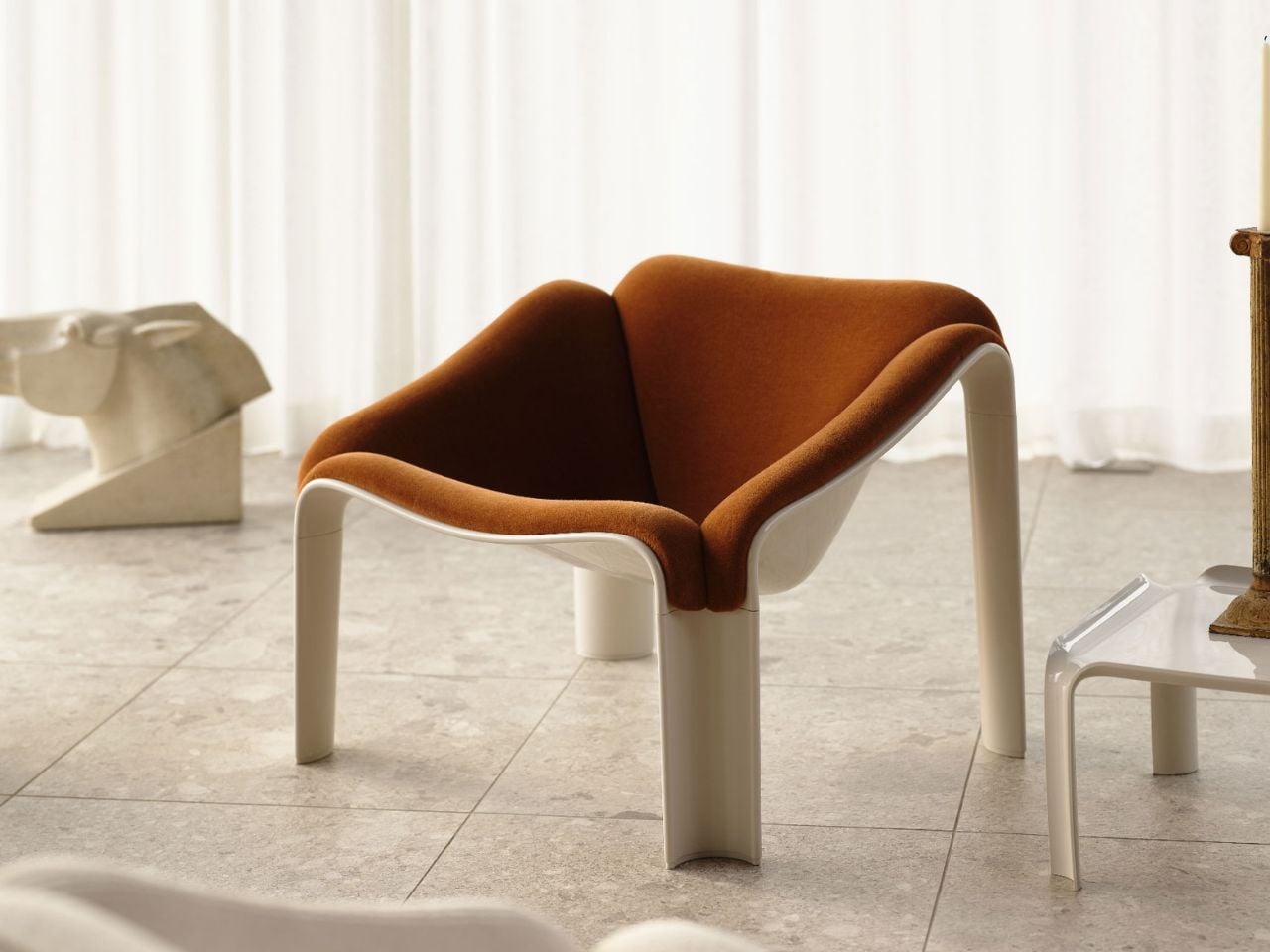
Some pieces of furniture explain themselves immediately. Others ask you to slow down for a second. Pierre Paulin’s F300 Lounge Chair belongs to the second category. Originally designed in the late 1960s and now reissued by GUBI, the chair still has the strange, magnetic presence of an object that refuses to behave like conventional seating.
At first glance, the F300 looks almost poured into existence. Its body is a single, continuous form, low to the ground and generous in width, with no obvious separation between seat, back, or base. There are no legs to visually interrupt the silhouette, no hard frame, no decorative detailing. Just a smooth, sculptural sweep that seems to shift depending on where you stand. From one angle, it feels futuristic. From another, it looks relaxed, almost playful. That tension is where much of its charm lives.
Designer: GUBI
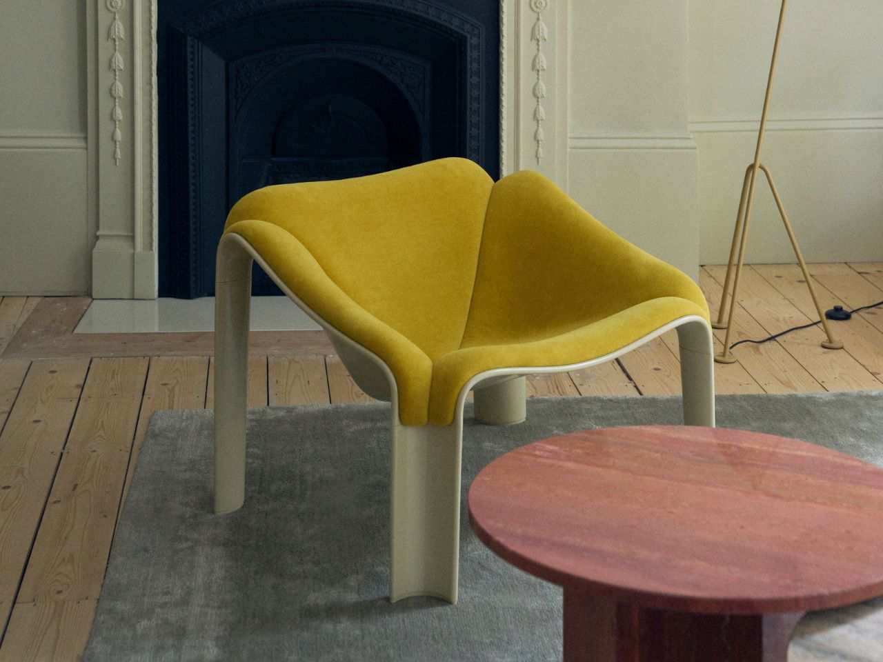
Paulin designed the chair during a period when furniture was beginning to loosen up. Domestic life was changing, and so was the way people wanted to sit, gather, lounge, and move through interiors. The F300 captures that cultural shift beautifully. It does not dictate posture. It does not tell the body to sit upright, stay centered, or behave. Instead, it gives the sitter permission to settle in however they want. You can lean back, turn sideways, curl your legs beneath you, or stretch out with a book nearby. The chair works less like a fixed seat and more like a landscape for the body.
That sense of openness is what makes the F300 feel so current, even decades after its original release. Many lounge chairs are designed around comfort, but comfort often comes with bulk or visual heaviness. Paulin managed to avoid that. The F300 is roomy without feeling clumsy, expressive without being loud, and sculptural without becoming precious. It has the confidence of a design icon, but it still feels approachable enough to be used every day.
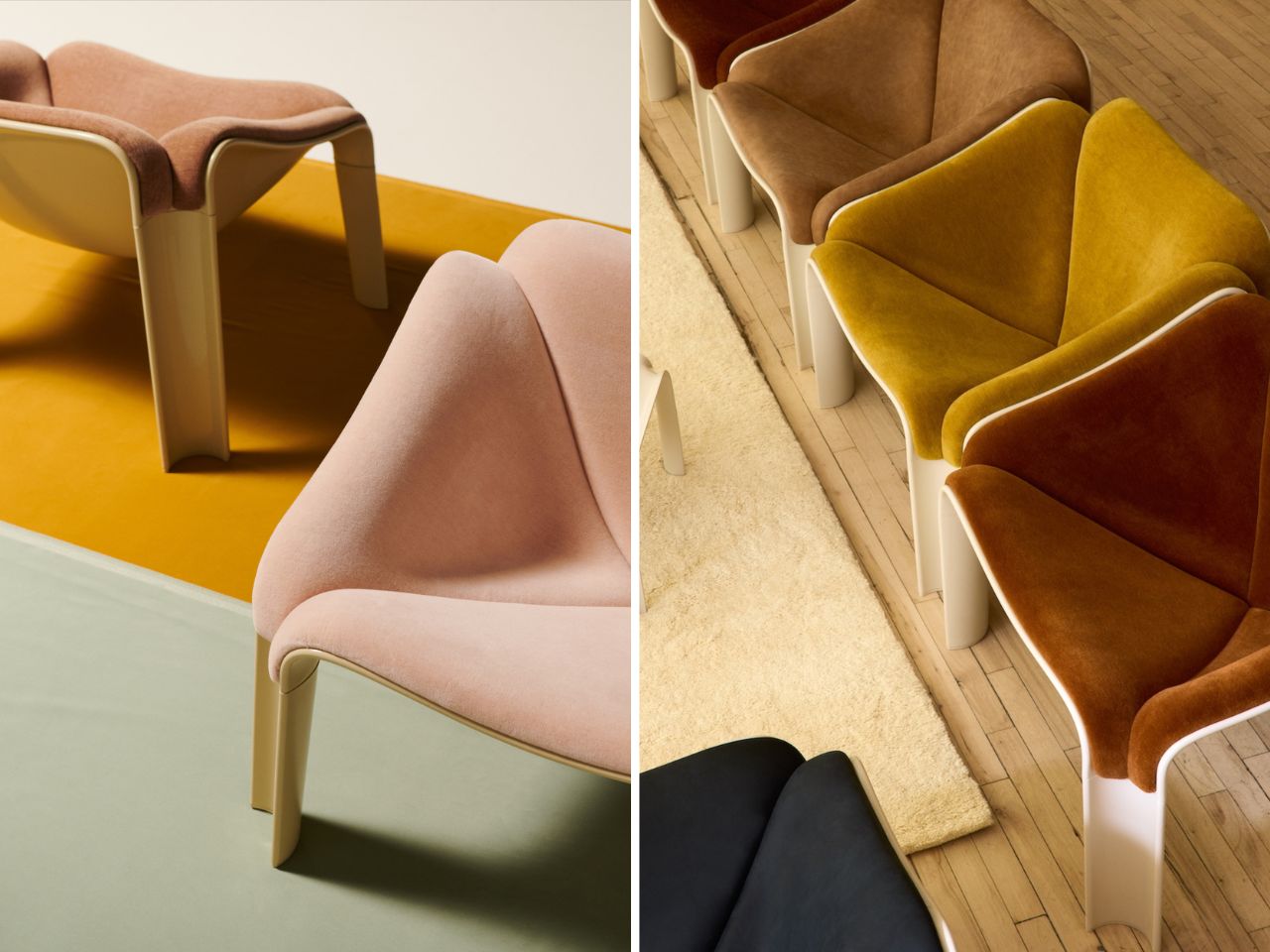
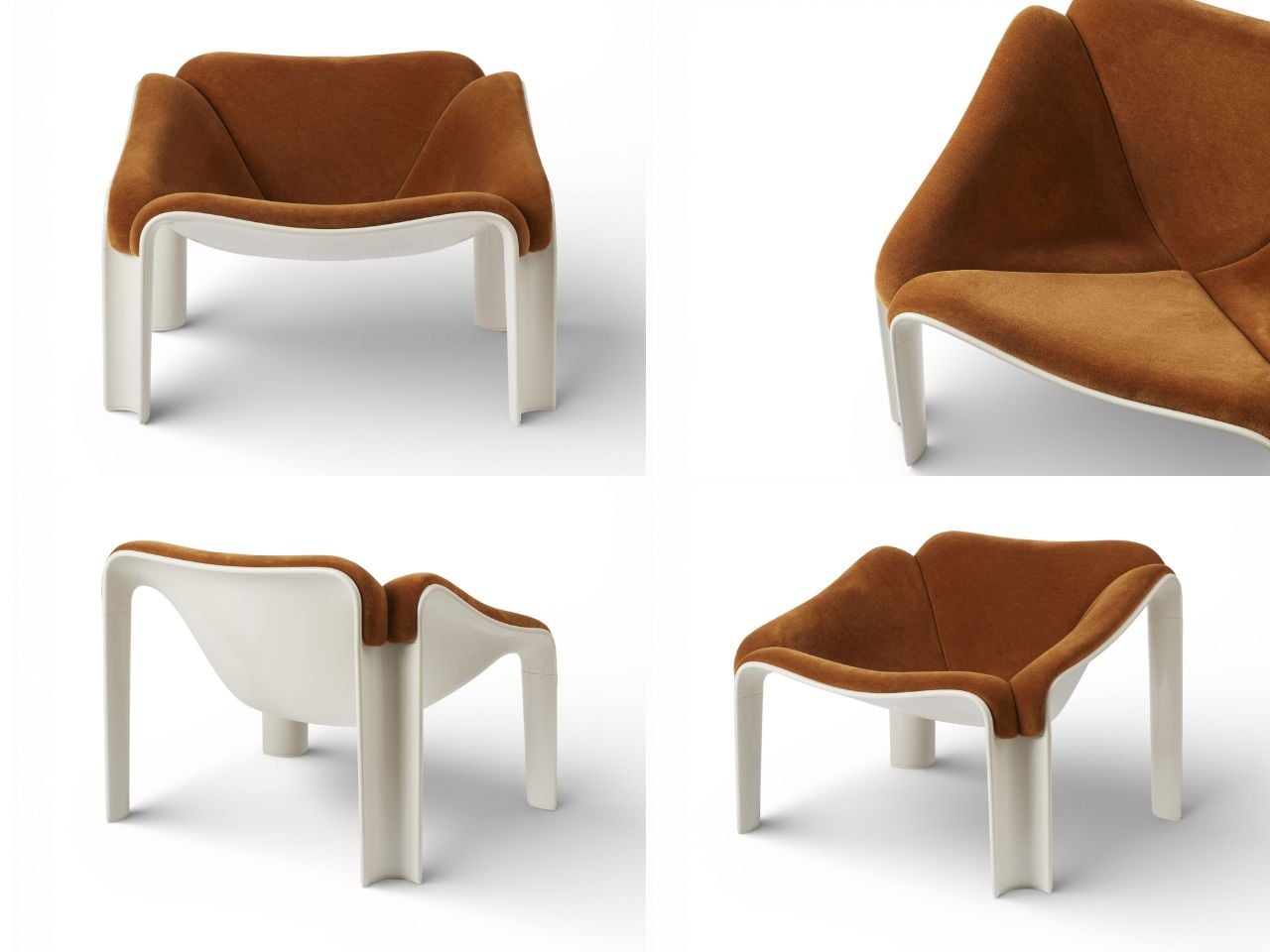
For the reissue, GUBI has preserved the original geometry while updating the chair’s material composition for contemporary use. The new shell is made from HiREK, an engineered polymer that incorporates recycled industrial plastic. This change gives the chair a stronger, more durable body while keeping the uninterrupted surface that defines its character. It also makes the piece more resistant to UV exposure and outdoor conditions, allowing the F300 to move beyond the living room and into terraces, patios, poolside settings, and open-air spaces.
That material update is important because it does not treat the chair as a museum piece. Instead of freezing Paulin’s design in the past, GUBI allows it to continue living. The reissue respects the original idea while making it more useful for how people live now: across indoor and outdoor spaces, in homes that are more fluid, informal, and less bound by traditional room categories.

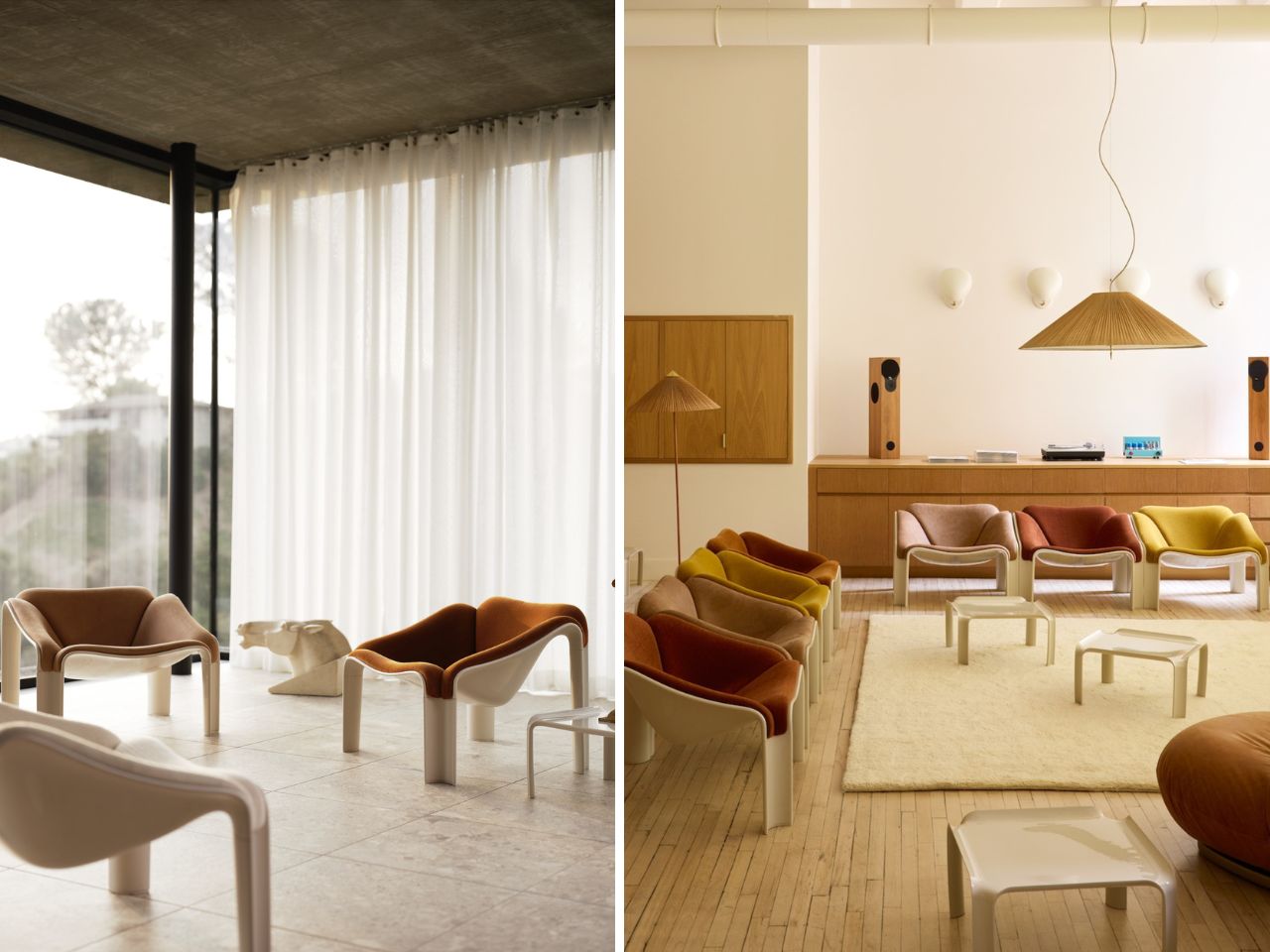
The F300 has also been relaunched alongside Paulin’s matching T877 side table. Together, the two pieces create a shared visual language of curves, openness, and ease. The table feels like a natural companion rather than an accessory, echoing the chair’s soft, sculptural logic without competing with it. Placed together, they form a small island of leisure: a place for a drink, a book, a long conversation, or no agenda at all.
What makes the F300 compelling is not only its shape, but the attitude behind it. It suggests that design can be bold without being uncomfortable, experimental without being alienating, and relaxed without disappearing into the background. More than half a century after Paulin first imagined it, the chair still feels fresh because it was never simply about style. It was about freedom: freedom of posture, freedom of use, and freedom from the rigid expectations of what a lounge chair should be.
The post A 1960s Lounge Chair That Still Feels Like a Future Artifact first appeared on Yanko Design.

Polly Pocket understood something most toys missed. The magic was never the doll, it was the reveal, that little hinged compact snapping open to expose a bedroom, a beach, or a ballroom shrunk down to thumbnail scale. You held an ordinary object in your palm, and then it unfolded into somewhere you wanted to live. Kids in the nineties were obsessed, and the format quietly seeped into everything since, from music boxes to those tiny terrarium necklaces that keep showing up on my feed. The appeal is ancient and reliable. A sealed shell always feels like it might be hiding a whole world, and cracking it open rewards you every time.
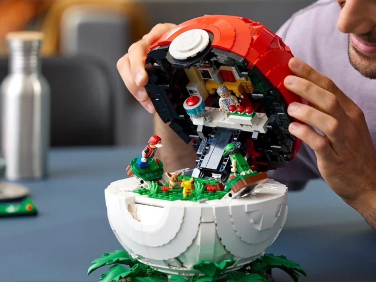
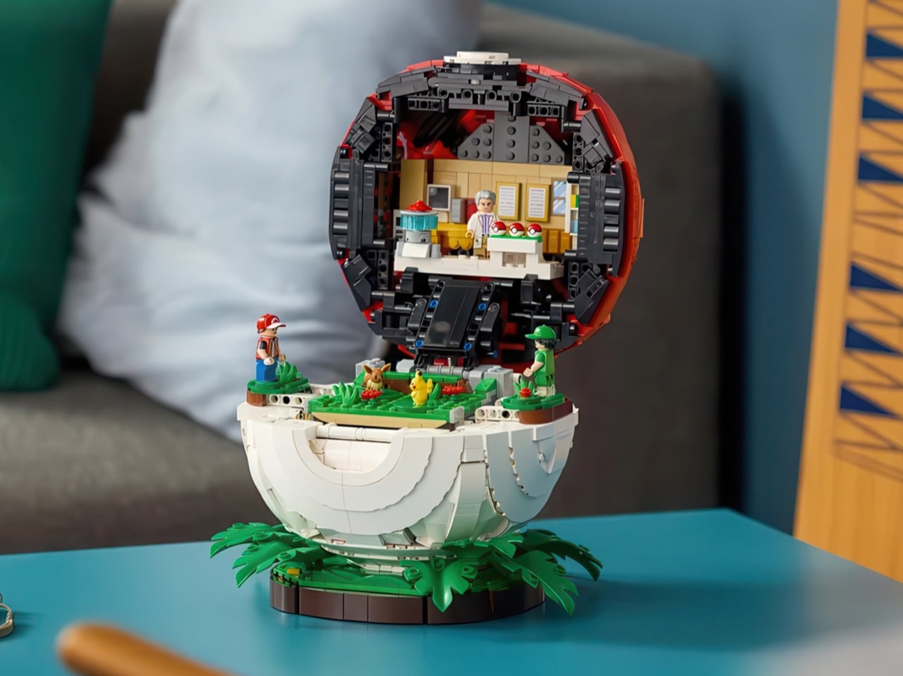
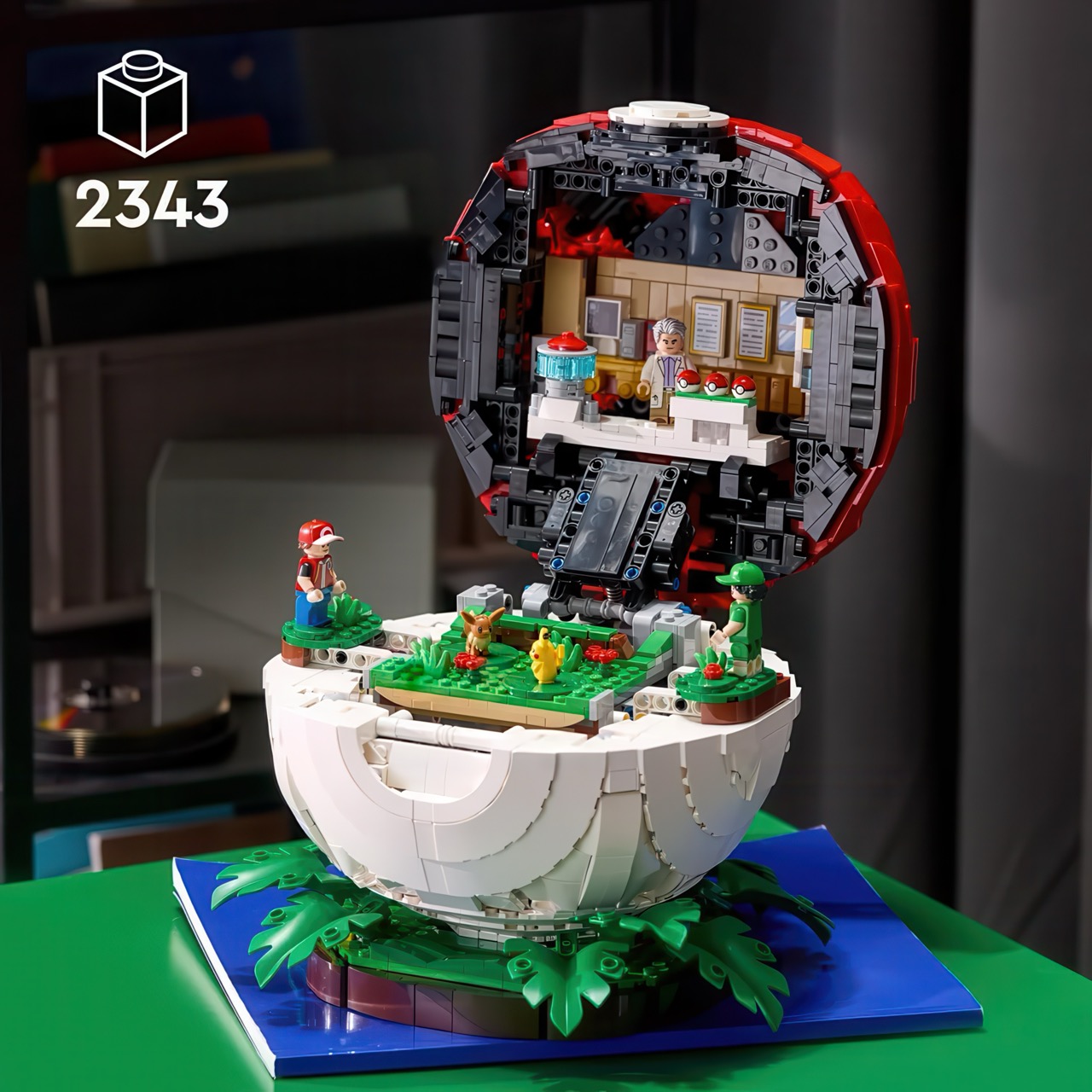
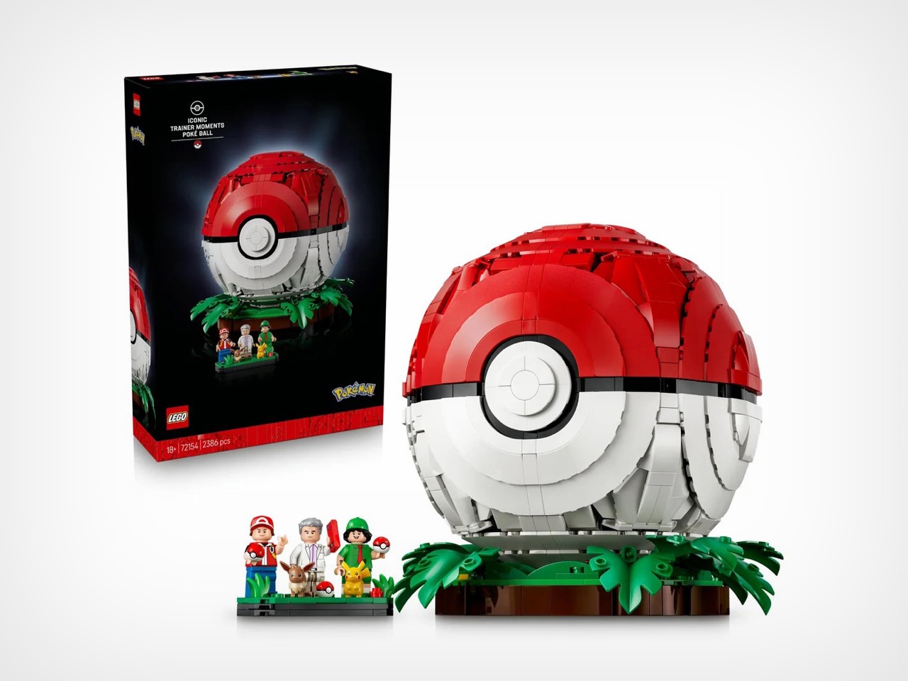
Somebody at LEGO has finally applied that exact logic to a Poké Ball, and the images doing the rounds suggest it was worth the wait. I want to be upfront here, because this one has not been officially announced. It surfaced through leaked imagery via the r/Legoleak community, catalogued as set 72154 and titled “Iconic Trainer Moments: Poké Ball.” What the pictures show is a sealed red-and-white sphere that splits cleanly at its equator, the top dome cradling Professor Oak’s laboratory and the lower bowl opening onto a grassy battle clearing where a Pikachu squares off against an Eevee. One object, two folded worlds, and a build that finally makes the Poké Ball do the thing it always promised.
Designer: LEGO
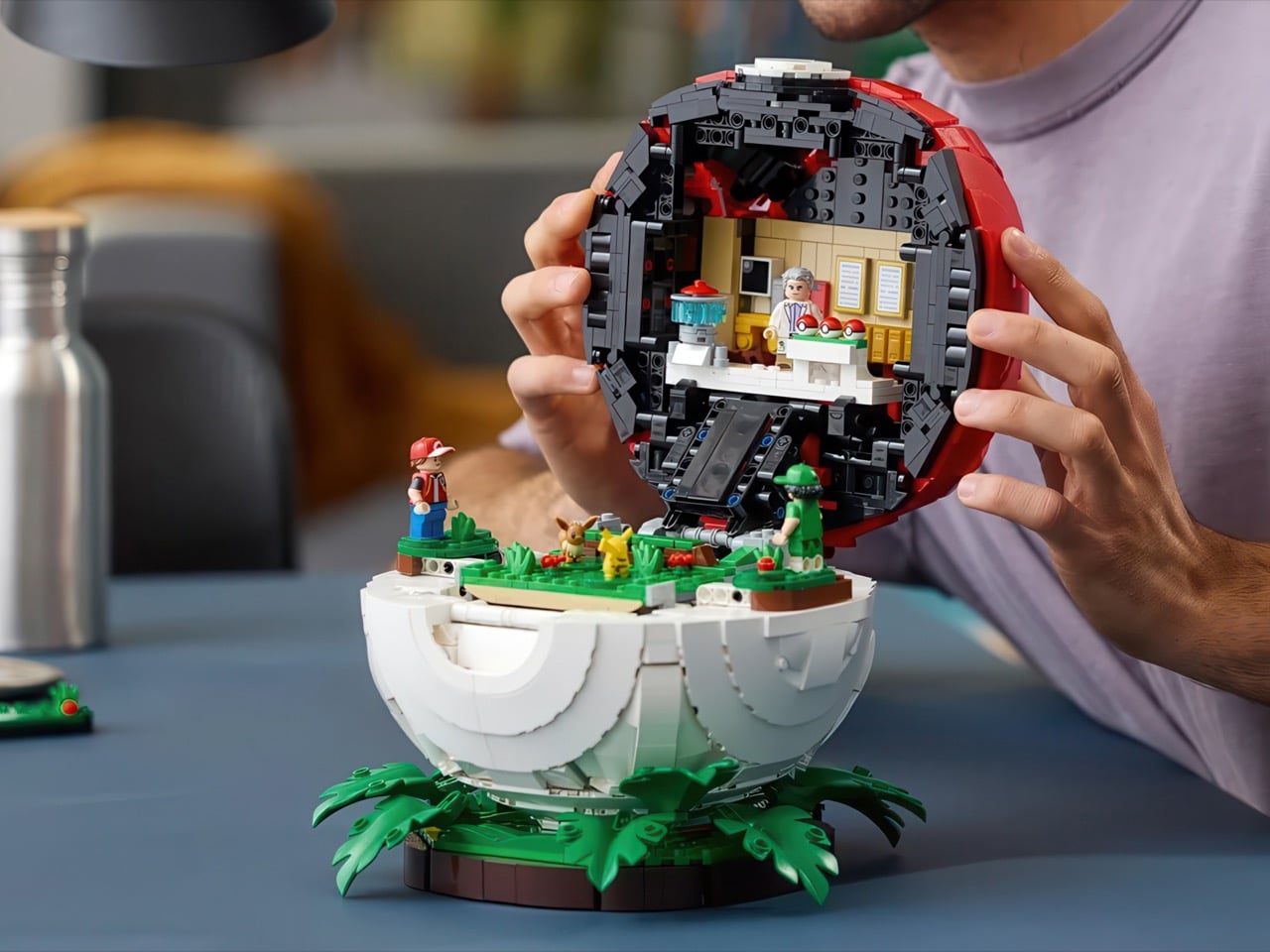
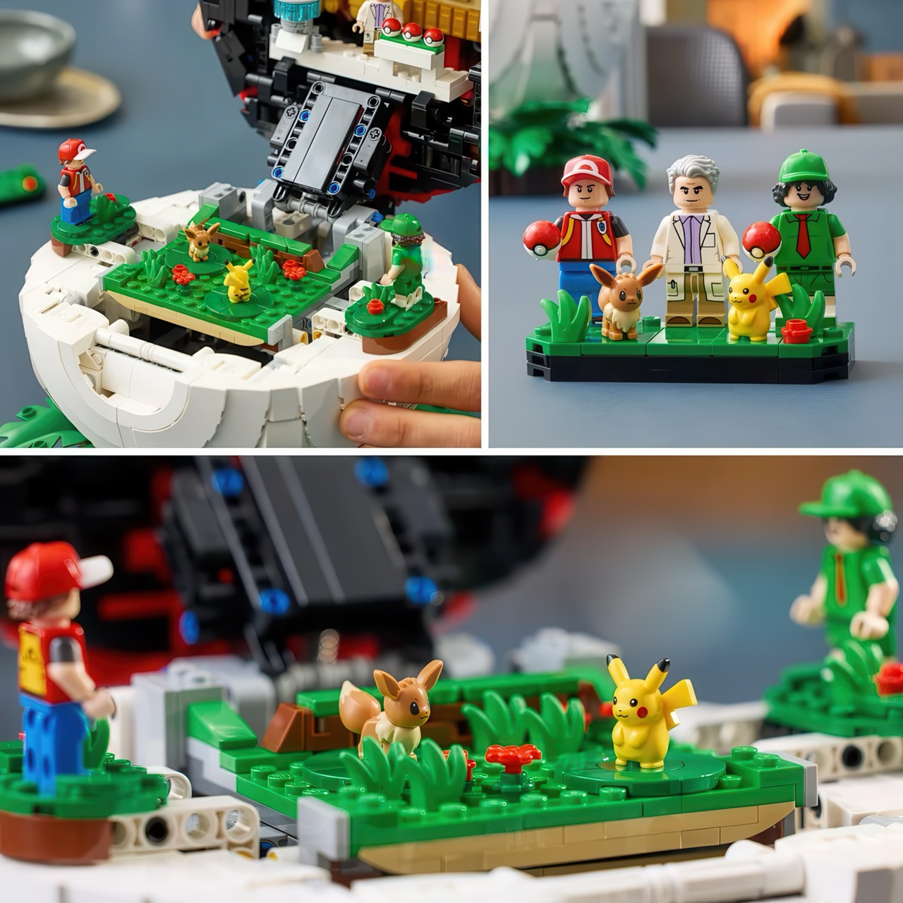
The two halves are arranged with proper storytelling logic, which is my favourite thing about it. The top dome is where every journey starts, Oak’s lab rendered in warm yellow brickwork with three starter Poké Balls lined up on a white counter and the professor himself standing ready to ruin your afternoon with an impossible choice. The lower bowl is the payoff, an actual battle mid-scene on a bed of bright green, with your trainer on one raised platform and a rival in a green cap on the other. Open it top to bottom and you are basically replaying the opening arc of the first game in cross-section.
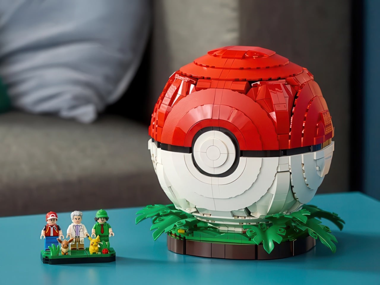
Down in the lower bowl, the battlefield is built on a raised green platform with rounded studs standing in for grass tufts, tiny red flowers dotting the field, and enough negative space around it that the two minifigures genuinely feel like they are facing off across an arena. The first-ever LEGO Pokémon set to feature actual minifigures, this one has Red in his signature cap and red jacket, Professor Oak in his lab coat with a swoop of grey hair, and a Picnicker in green, alongside brick-built Pikachu and Eevee figures that surfaced in earlier leaks.
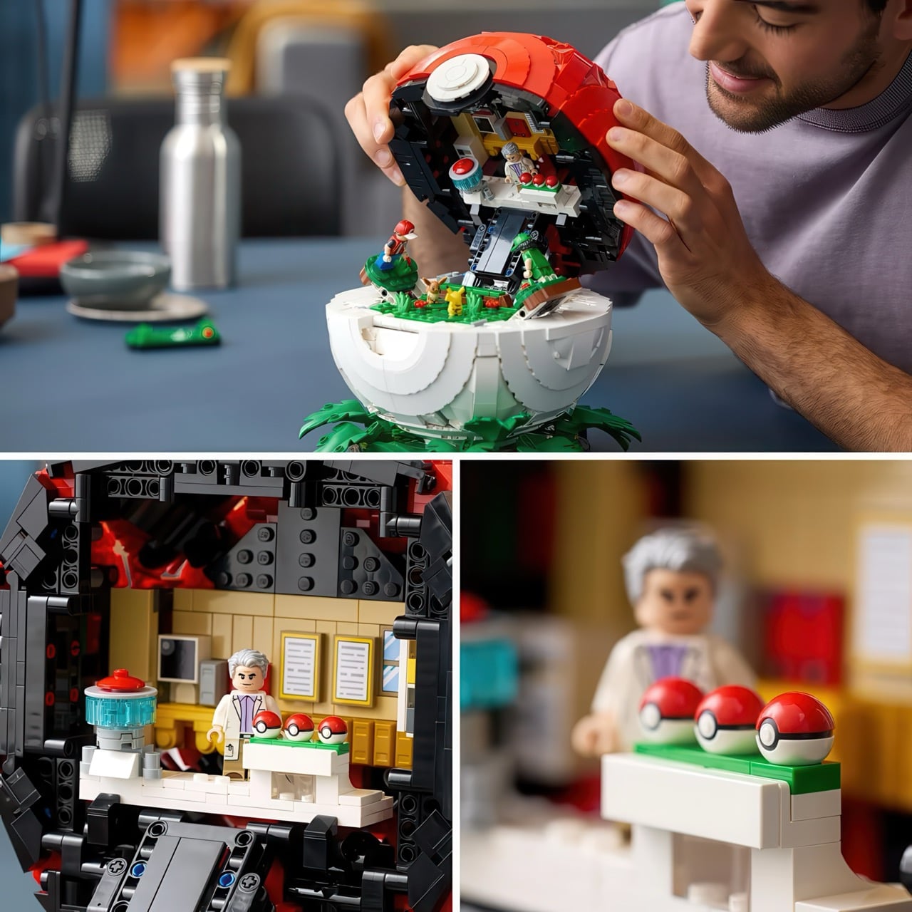
The whole thing reportedly runs to 2,343 pieces, though the leaks quibble between 2,339 and 2,386, the sort of pre-announcement wobble that usually settles by launch. That sphere is clearly doing a lot of the structural lifting, given how much of the count never makes it into the diorama you actually want to stare at.
LEGO has not confirmed any of this yet, so treat the details as pencil rather than ink, but the noise points to a first of October release at a fairly hefty $299.99, which would make it one of the priciest Pokémon sets yet. It was apparently pushed back from an August date over production issues, while the rest of the summer wave held firm. My one wish, assuming the reveal lands as expected, is a satisfying, deliberate hinge on that equator seam, because a build like this lives or dies on how good the open-and-close reveal feels in the hand. Get that right, and it is an easy centrepiece.
The post This Leaked $300 LEGO Poké Ball Is the Most Ambitious Pokémon Set Yet, and It Opens Into an Entire World first appeared on Yanko Design.
Most wireless earbuds are designed to disappear into your daily routine. The Nothing Ear (3a) does the opposite. While the pair of buds brings the expected upgrades in sound quality, active noise cancellation, and battery life, the most compelling feature isn’t about listening at all. Instead, it’s about capturing the moments you want to remember. Whether that’s a brilliant idea during a meeting, an important takeaway from a lecture, or a favorite quote from a podcast.
Priced at $99, the Ear (3a) is sandwiched right between the budget-focused Ear (a) and the flagship Ear (3), bringing several premium features to the affordable segment without losing the transparent design language that has become Nothing’s signature. From improved ANC and Hi-Res audio support to thoughtful software additions, the Ear (3a) feels less like an incremental refresh and more like a pair of earbuds designed to be genuinely useful throughout the day.
Designer: Nothing
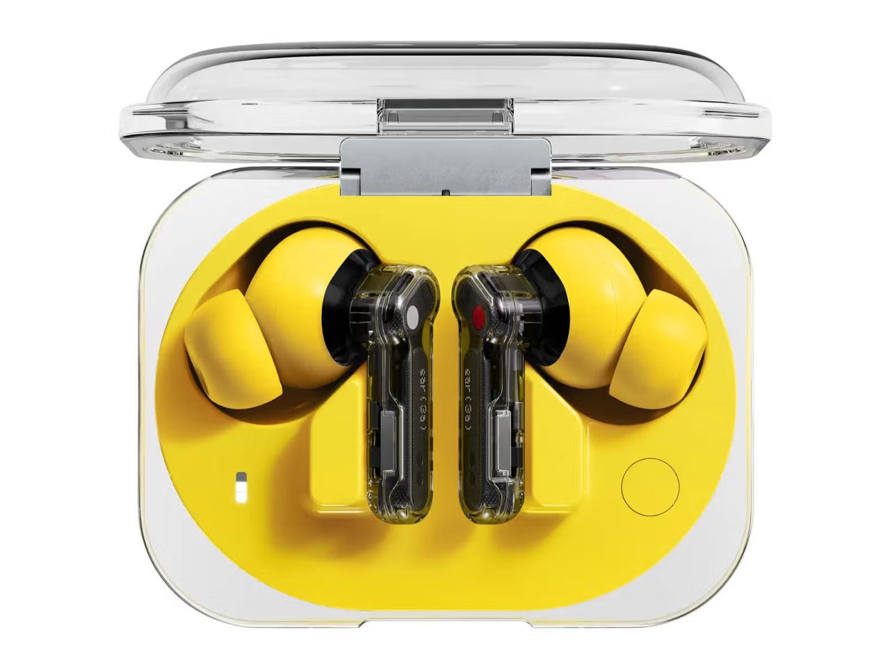
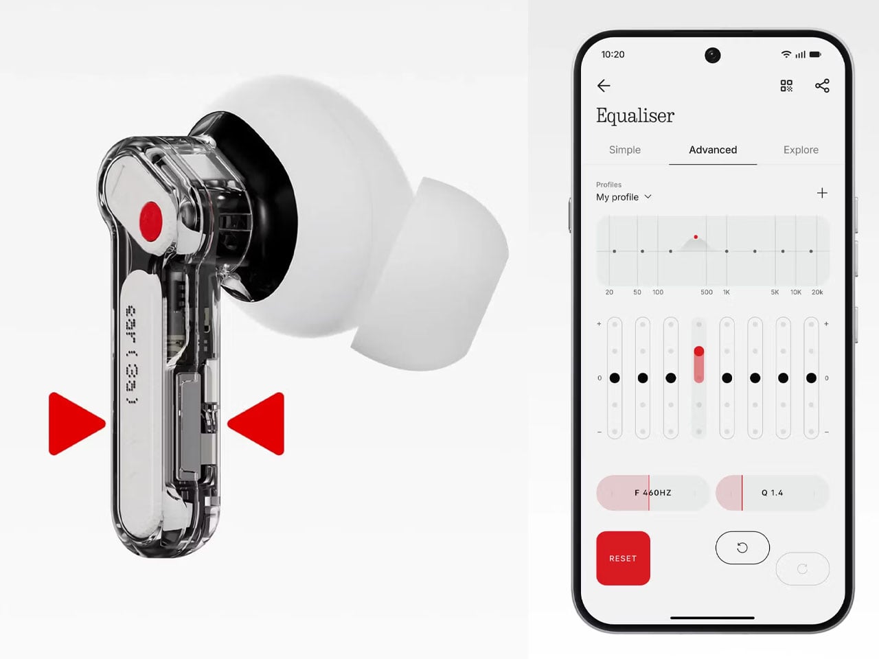
The biggest addition is Audio Snapshot, a feature powered by 32MB of onboard flash storage built into the earbuds. By pinching both earbuds simultaneously, users can instantly save short audio clips. These recordings automatically sync with the Nothing X app, where they can be edited, shared, and transcribed. The earbuds also support up to two hours of native phone calls and meeting recording, complete with audible notifications that let everyone know when recording begins. This is an uncommon capability in this price range and one that extends the earbuds’ usefulness well beyond music playback.
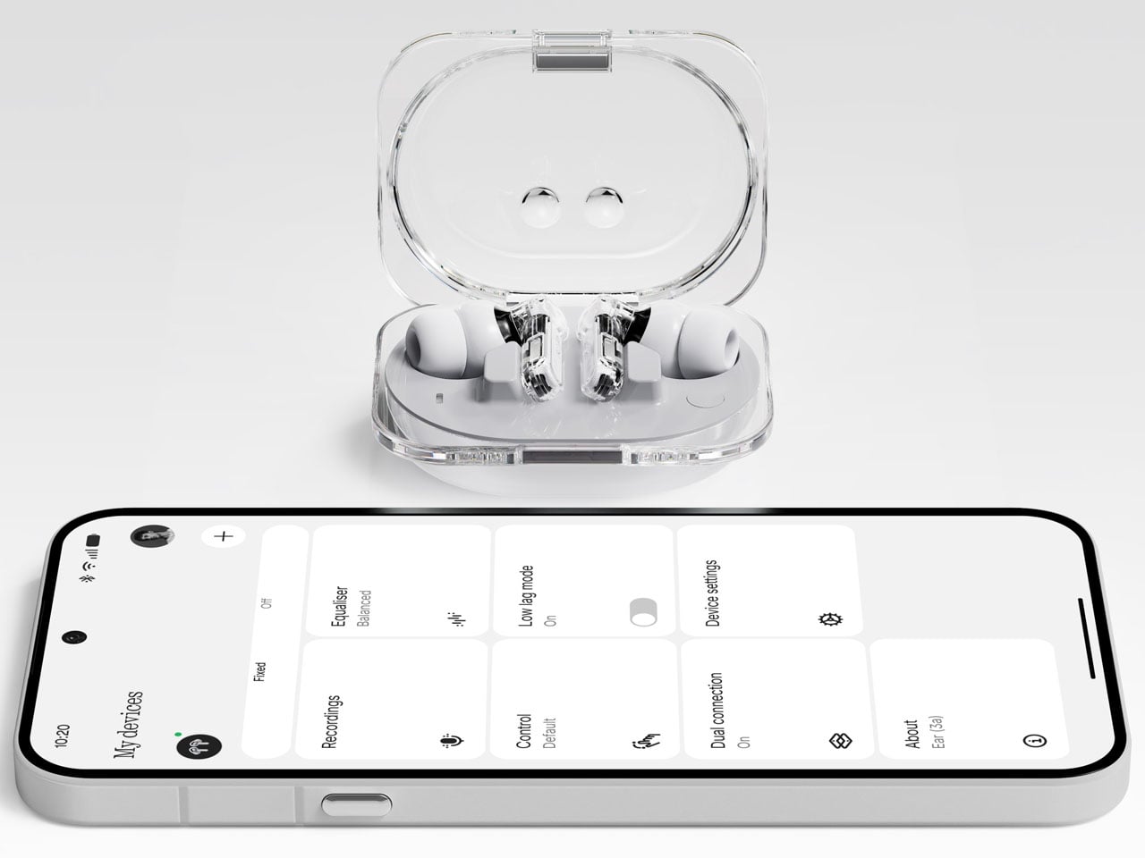
Nothing has also refined the listening experience with new 12mm dynamic drivers that deliver deeper bass while maintaining clarity across the frequency range. Support for Hi-Res Audio Wireless and LDAC allows compatible Android devices to stream higher-quality audio, while an expanded eight-band equalizer offers greater control for users who prefer to fine-tune their sound profile. Whether the preference is bass-heavy tracks or a more balanced signature, the earbuds provide enough flexibility to suit different listening styles.
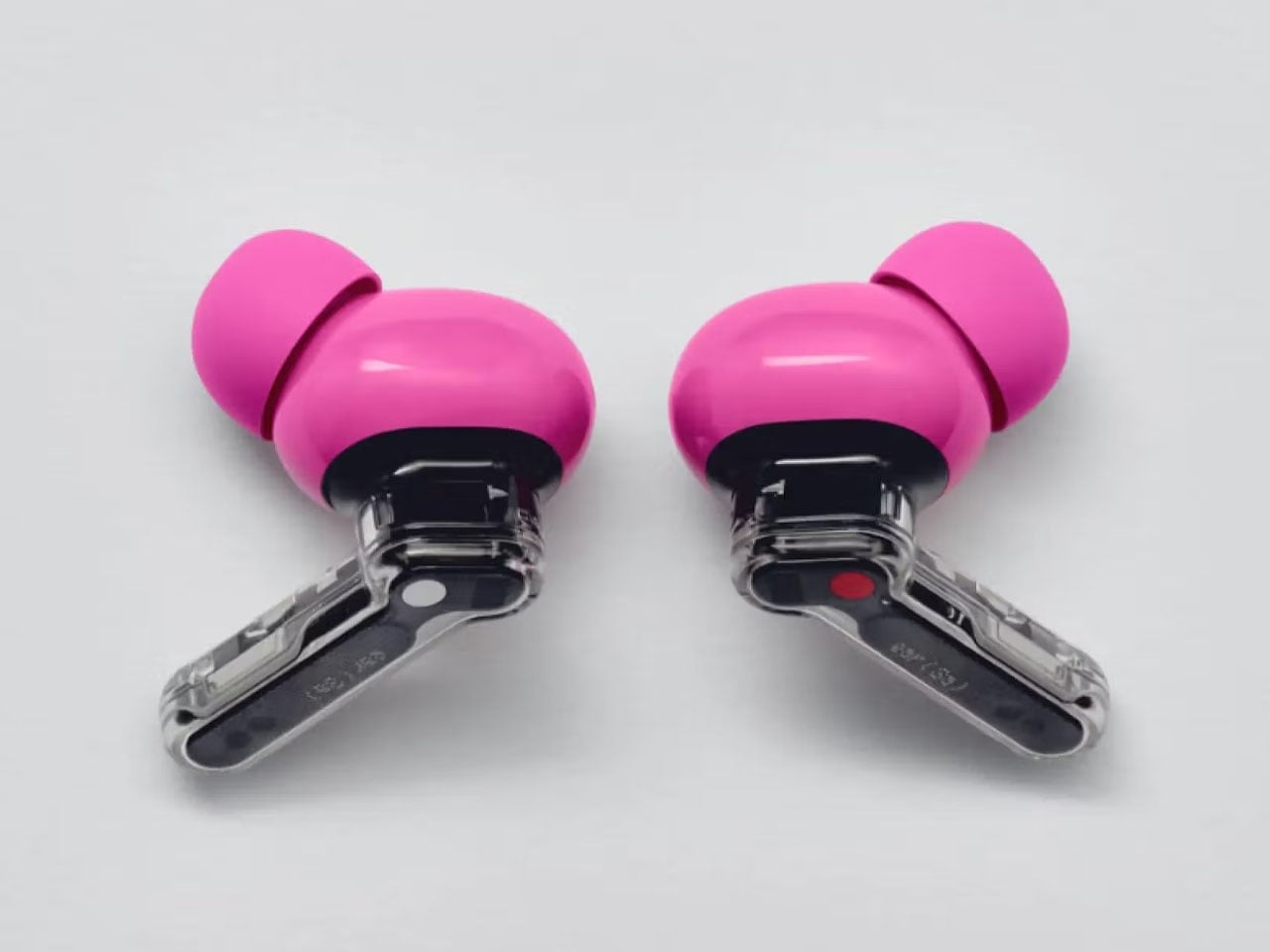
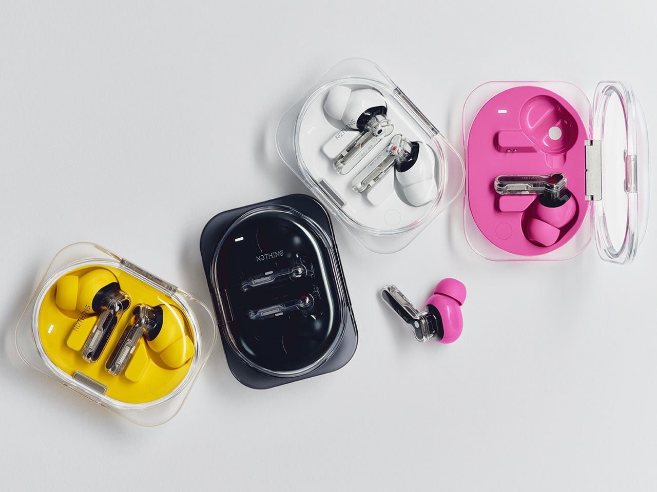
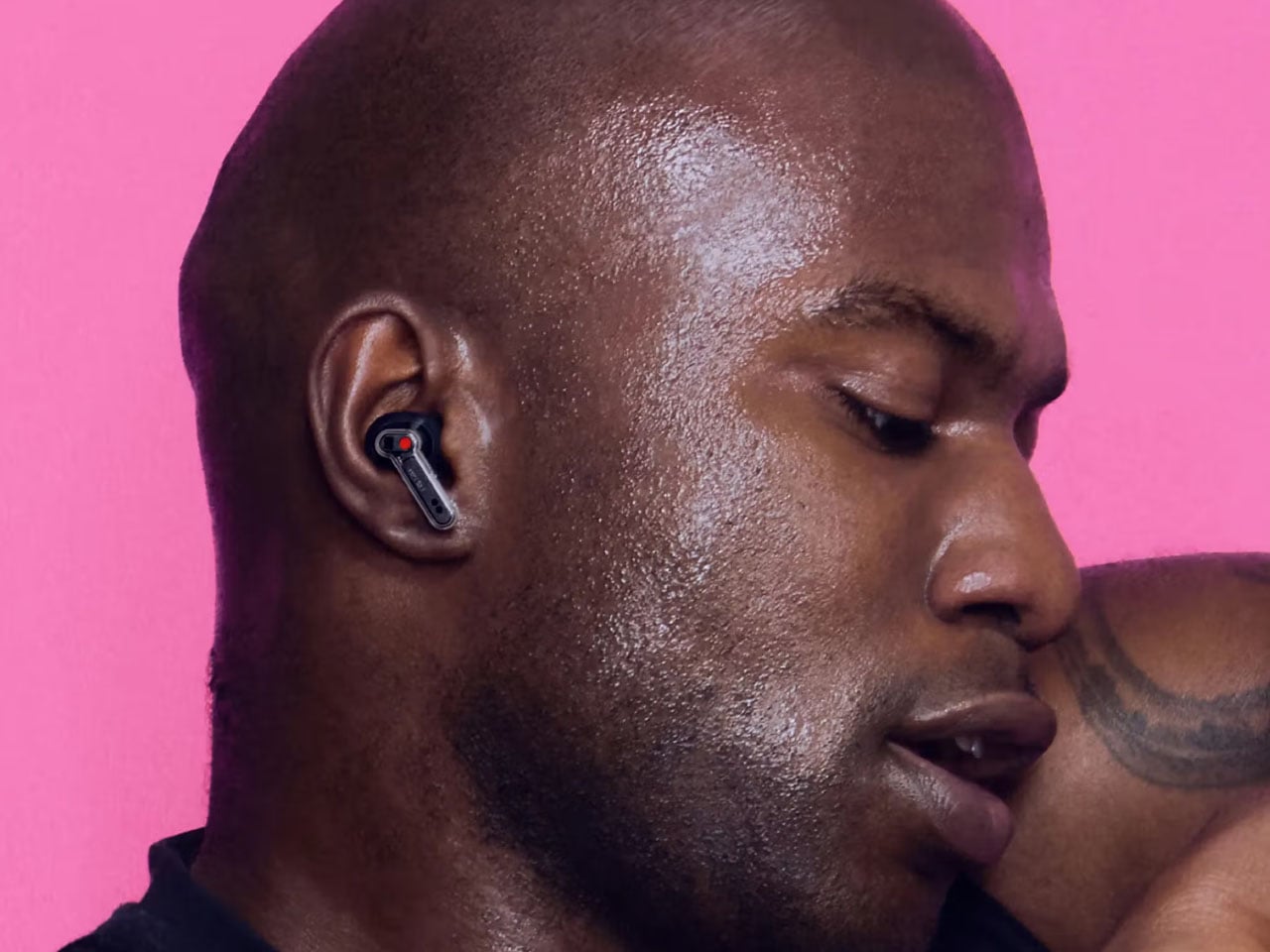
Active noise cancellation has also received a noticeable boost. The Ear (3a) delivers up to 45dB of ANC across a wider frequency range, with Nothing claiming roughly 17 percent better performance than its predecessor. Clear Voice technology improves call quality by making speech easier to understand in noisy surroundings, while the inclusion of an extra-small ear tip size helps accommodate a wider range of users and enhances passive noise isolation. The IP54 rating for dust and splash resistance also makes the earbuds suitable for commuting and workouts.
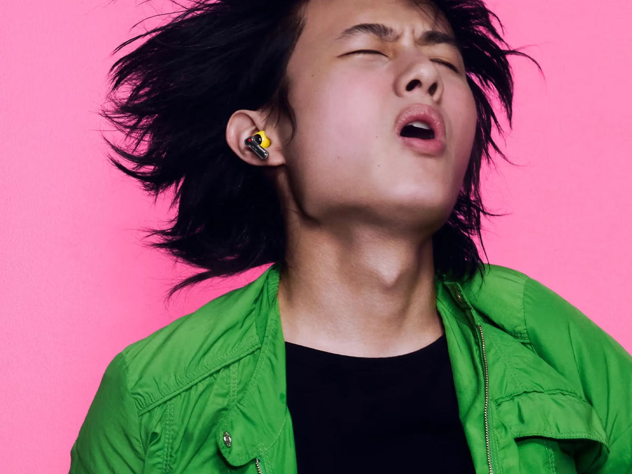
Battery life remains one of the Ear (3a)’s strongest selling points. The earbuds offer up to 10 hours of playback on a single charge with ANC turned off, while the charging case extends total listening time to as much as 42 hours. Even with noise cancellation enabled, users can expect up to 25 hours of combined playback. A quick five-minute charge delivers approximately an hour of listening time, and Bluetooth 6.0 with dual-device connectivity makes switching between a phone, tablet, and laptop effortless.
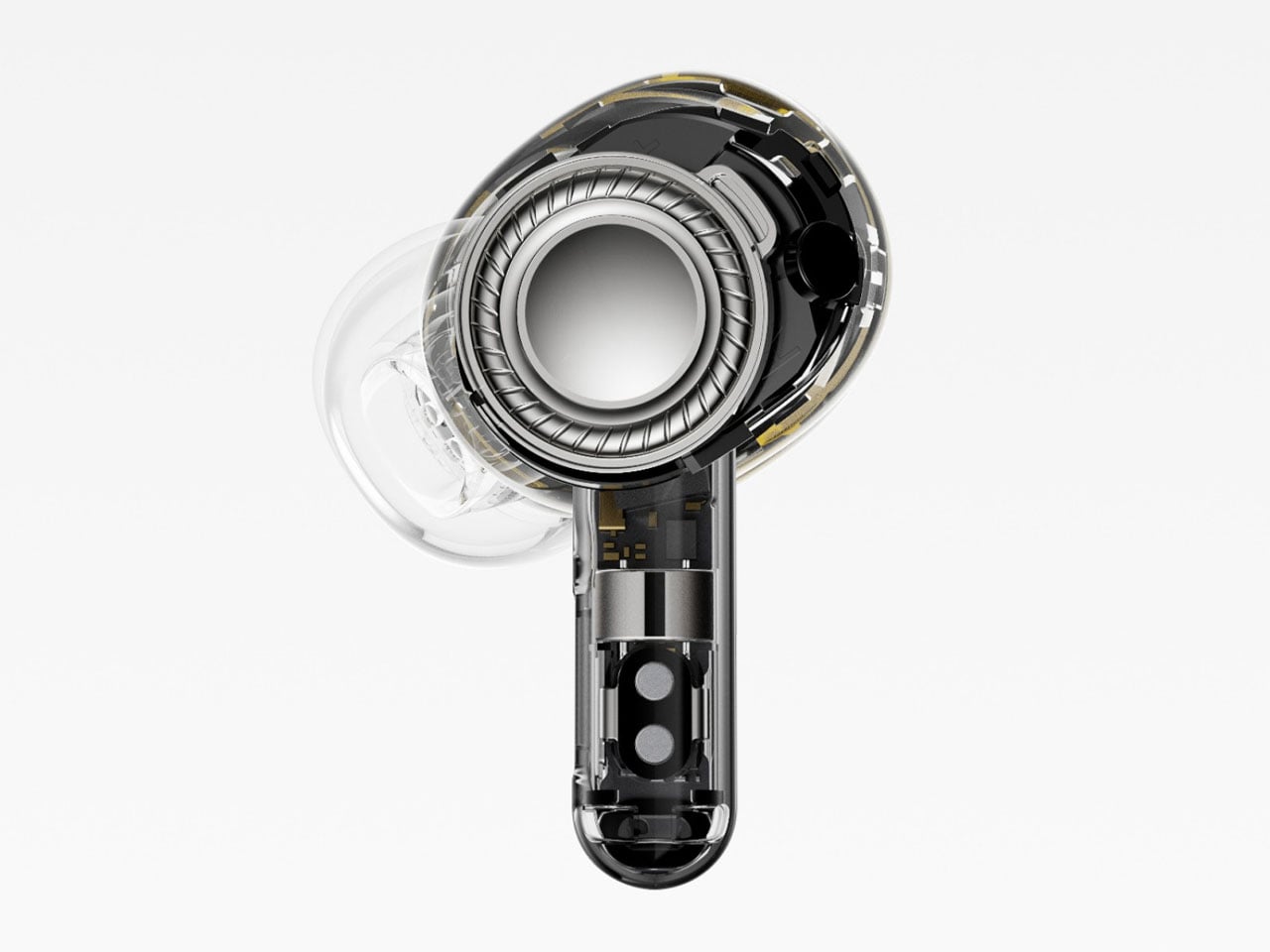
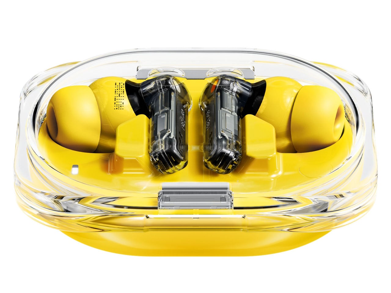
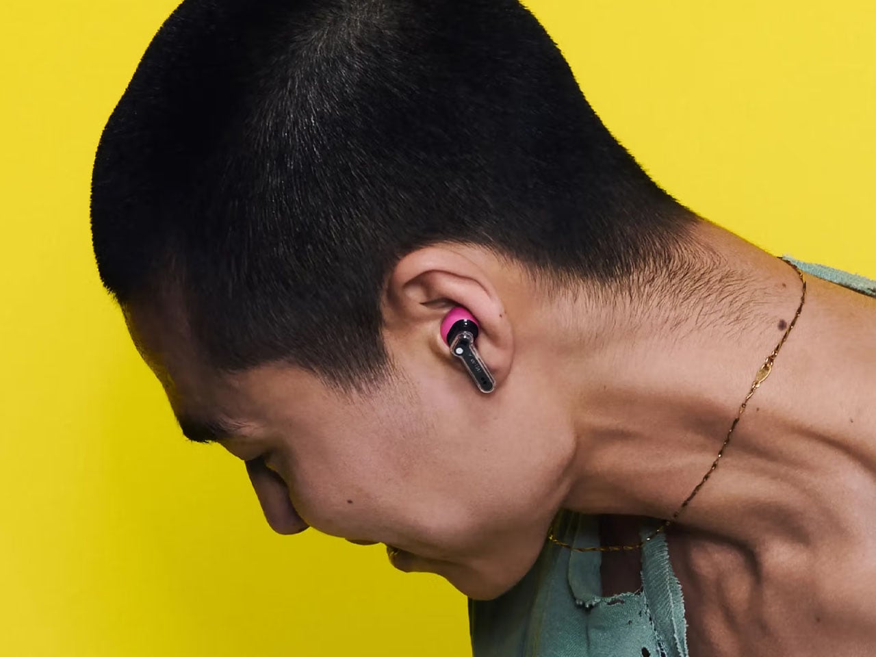
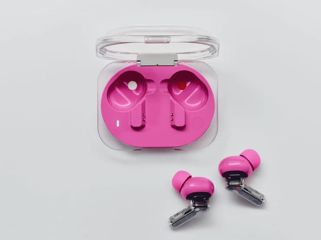
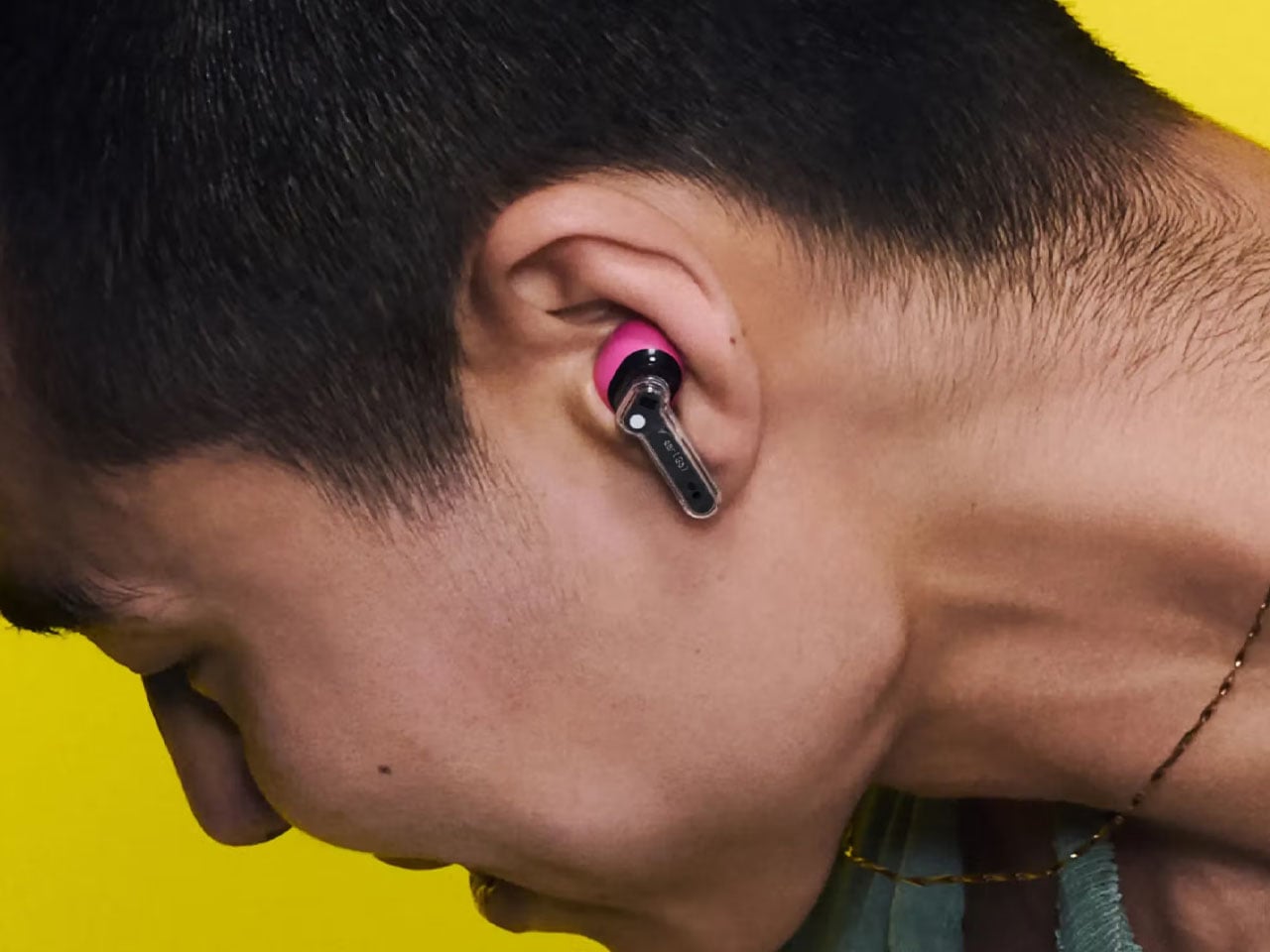
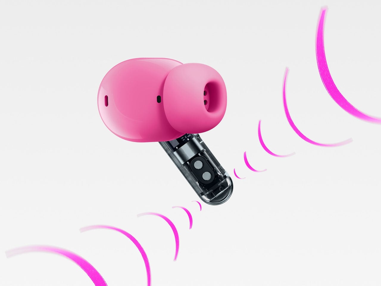
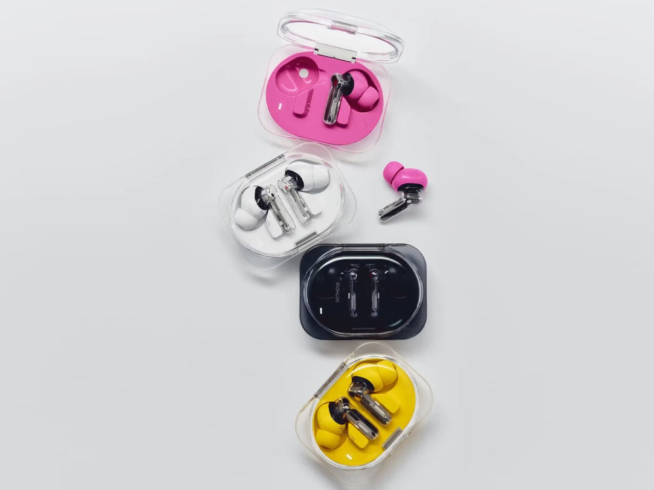
The earbuds arrive in attractive pink and yellow, along with the standard black or white colorway. In the package there’s a new XS ear tip size for users with very small ears. Rather than relying solely on incremental hardware improvements, Nothing Ear (3a) introduces features that make wireless earbuds more practical throughout the day. That’s an undeniable USP at a price tag under $100. Nothing has also released the highly anticipated Phone (4b), which we’ll cover shortly, so stay tuned!

The post Nothing Ear (3a) boasts built-in audio recording, smarter ANC, and 42-hour battery life for just $99 first appeared on Yanko Design.
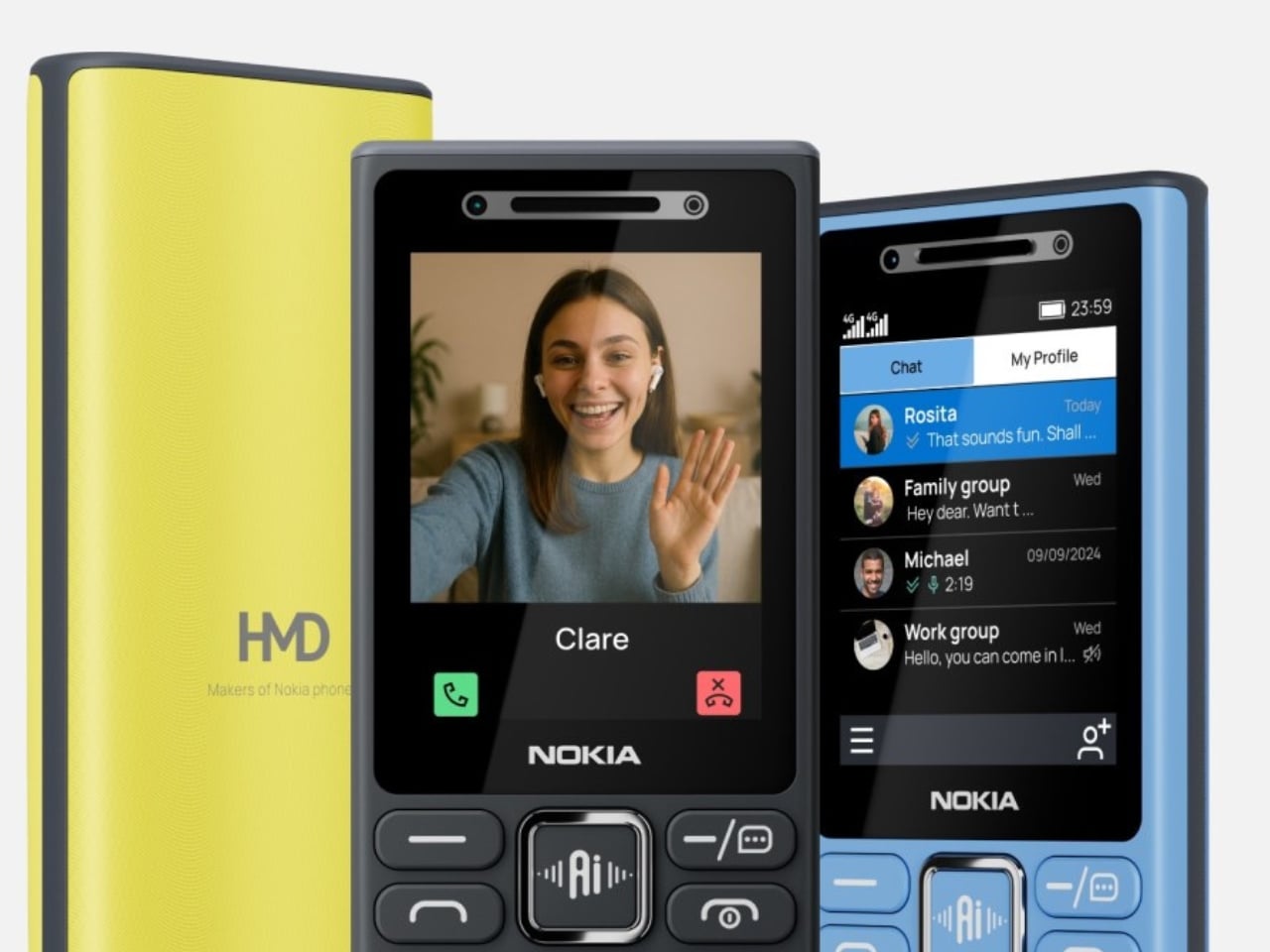
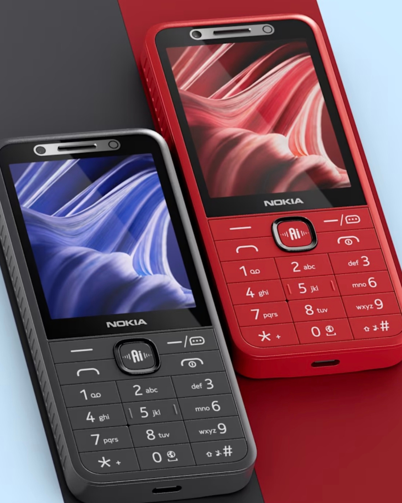
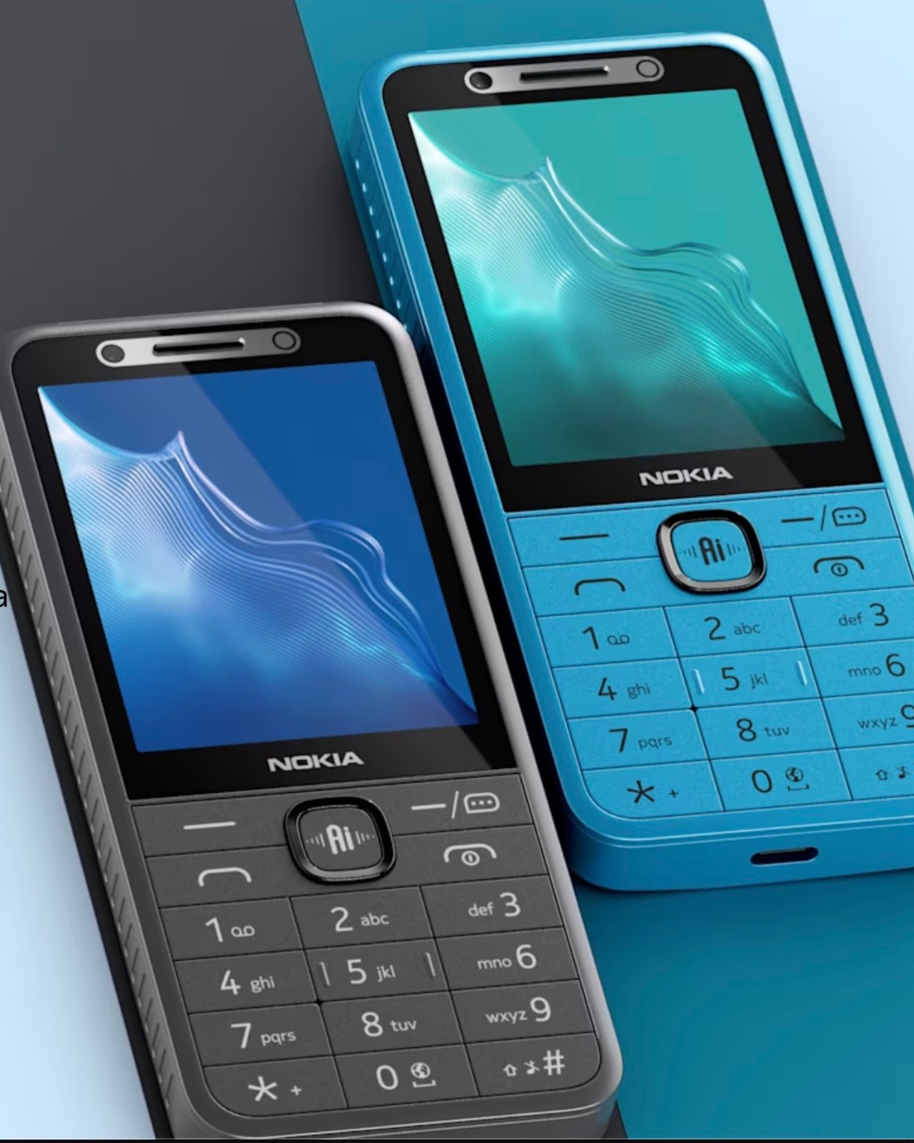
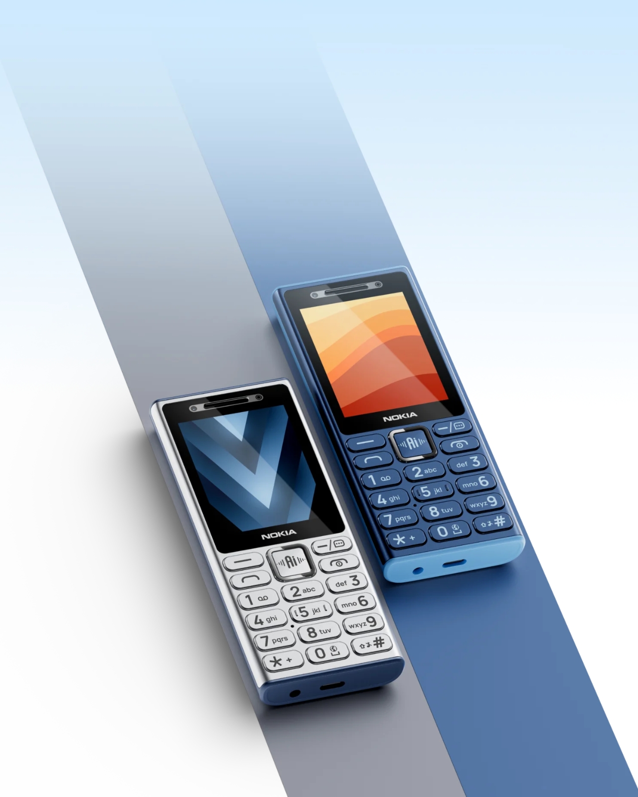
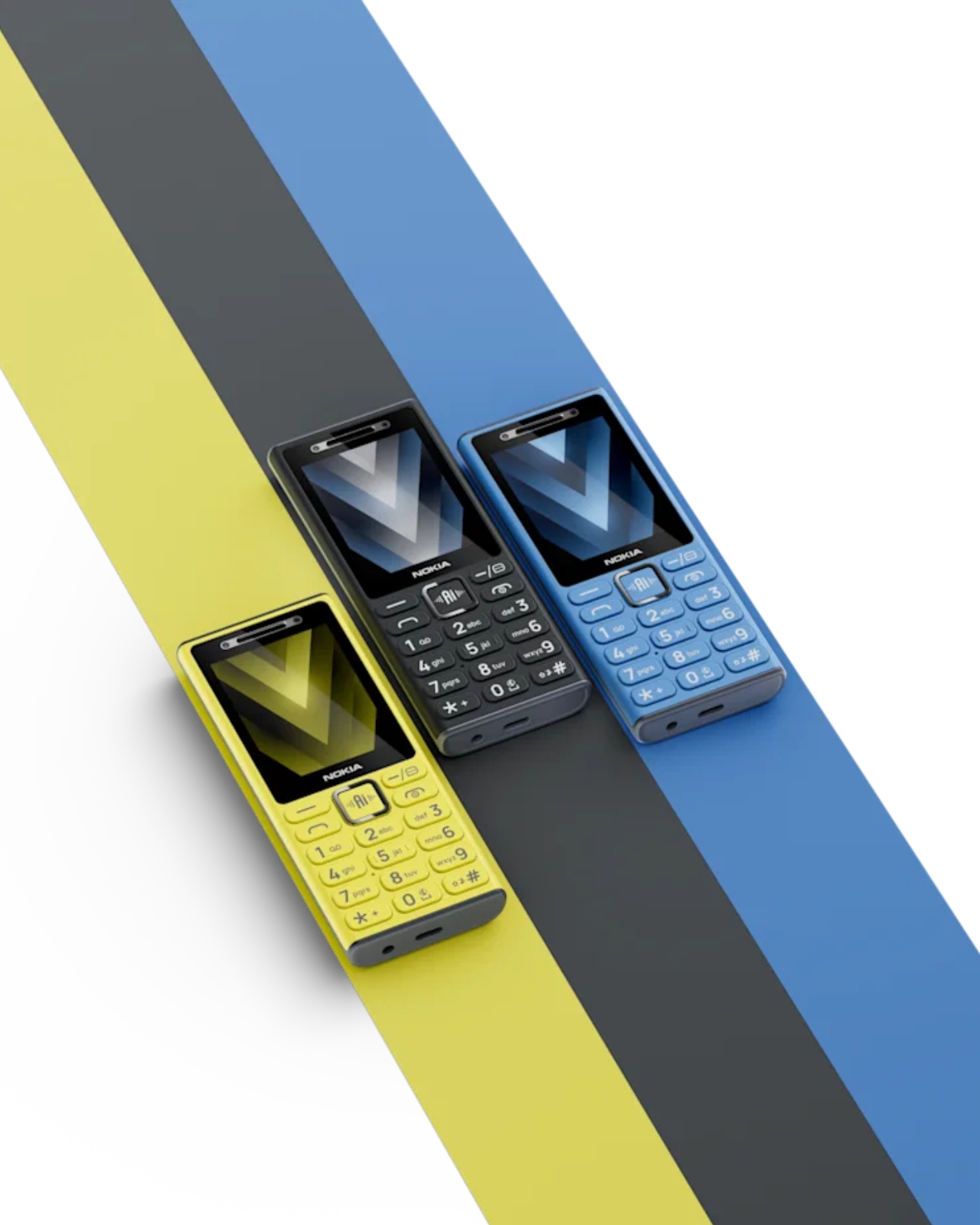
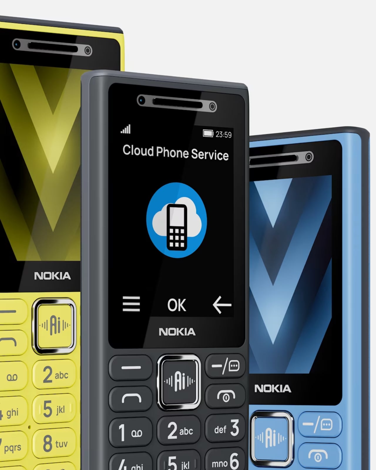
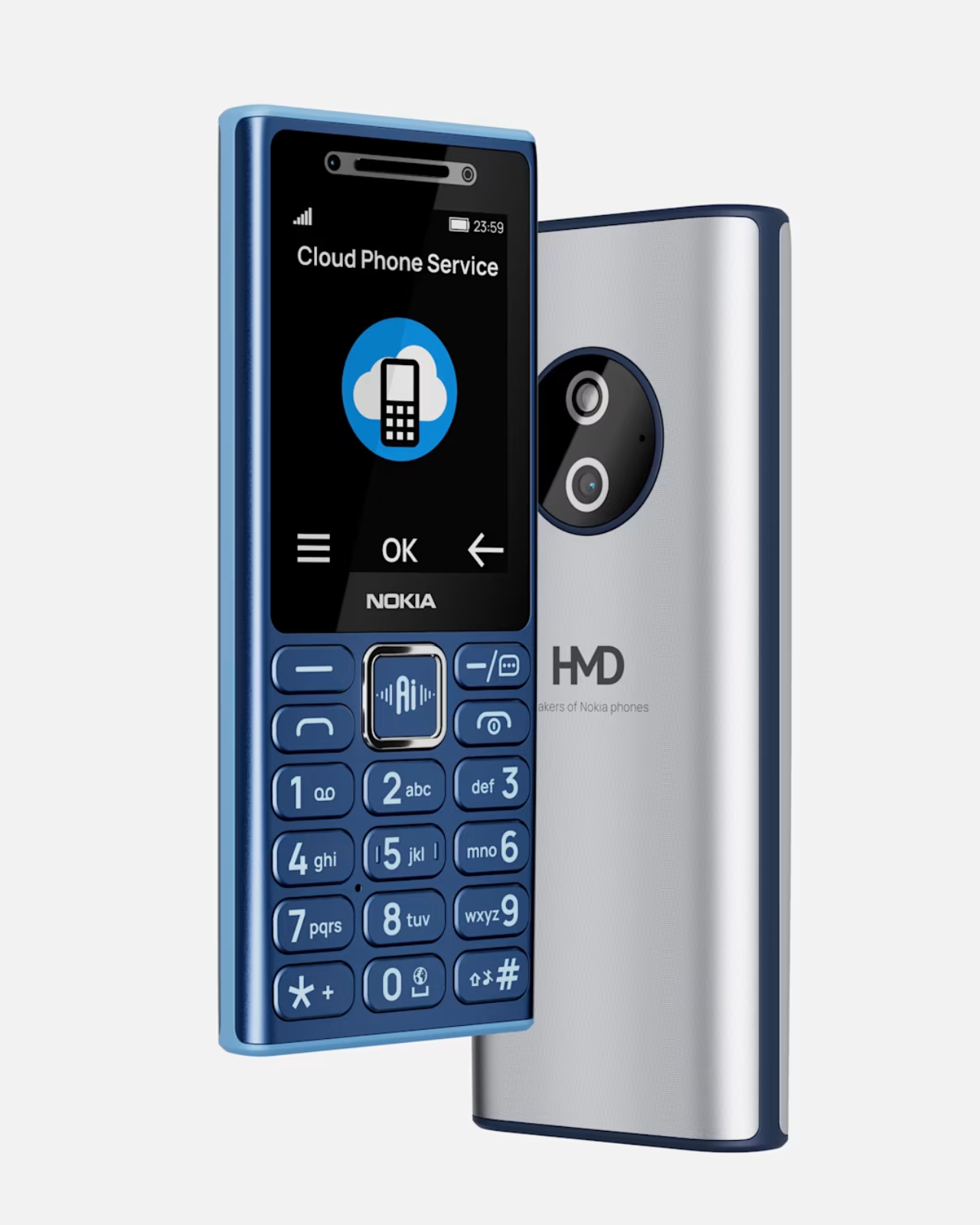
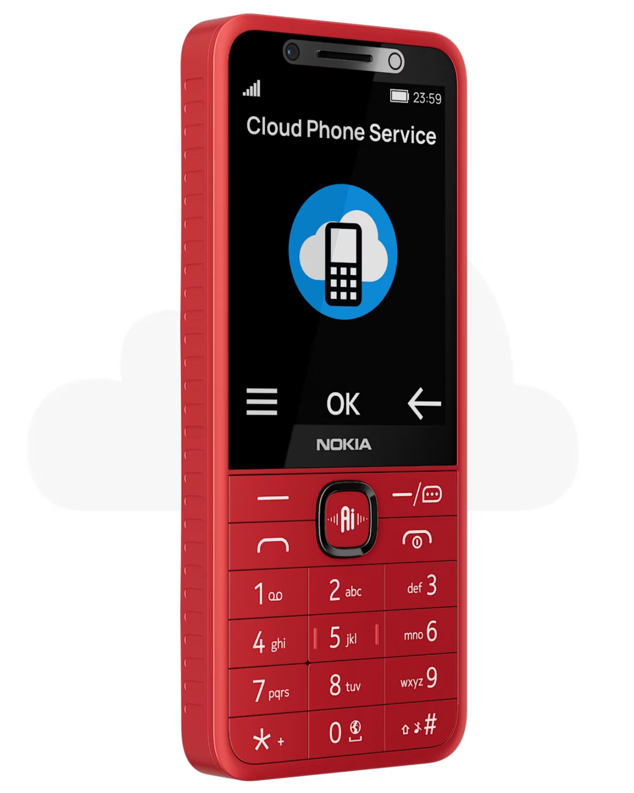
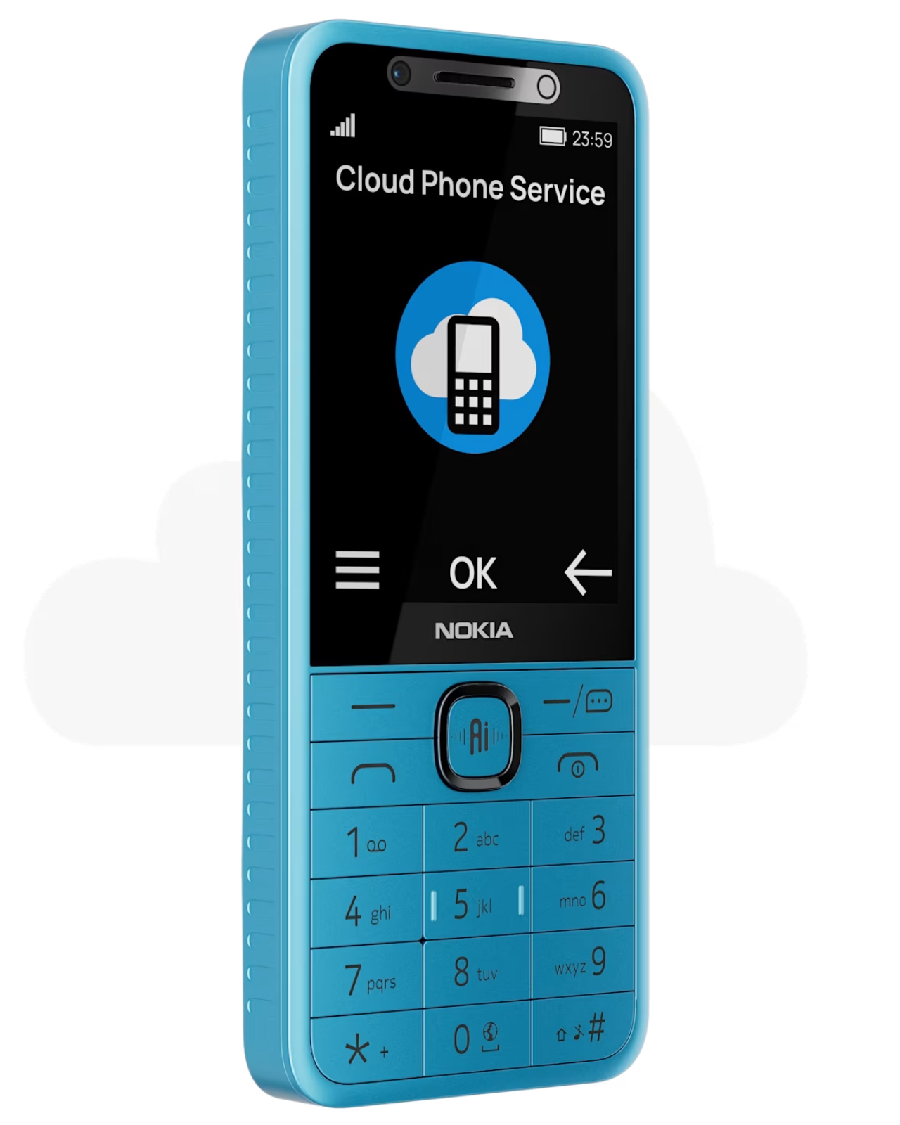
The dumb phone comeback has been one of the more quietly satisfying design stories of the last few years. People are tired. Tired of doom-scrolling, tired of notification overload, tired of carrying a pocket-sized anxiety machine everywhere. So when HMD quietly dropped four new Nokia feature phones — the Nokia 210 4G, Nokia 200 4G, Nokia 215 4G 2nd Edition, and Nokia 235 4G 2nd Edition — it felt like another chapter in that story. Except for one very notable detail sitting right on the side of each device: a dedicated AI button. Yes. An AI button. On a dumb phone.
Let me back up. These phones are, by most definitions, exactly what the dumb phone crowd has been asking for. Compact candy-bar designs. That immediately recognizable Nokia build, now with a metallic frame around the selfie camera and speaker that gives it a slightly more premium feel. A 1,450 mAh battery. A 3.5mm headphone jack, because HMD remembers those exist. FM radio. USB-C charging. The Nokia 215 4G 2nd Edition and Nokia 235 4G 2nd Edition carry 2.8-inch IPS displays, while the Nokia 200 4G and Nokia 210 4G keep things even more minimal with 2.4-inch screens. You can make calls, send texts, set an alarm, and leave your house without dreading a 14-hour screen time report. Classic.
Designer: HMD
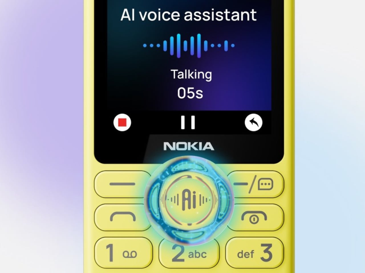
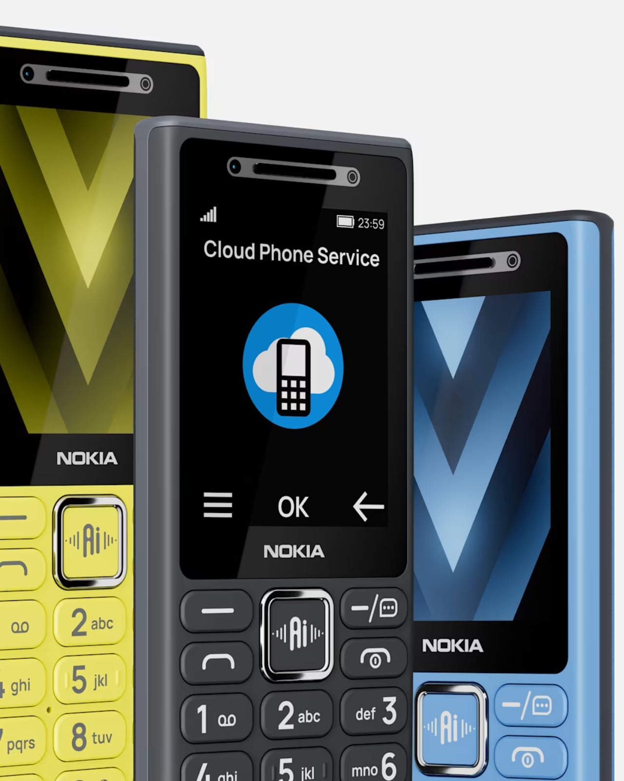
And then there’s the AI. The button accesses an on-device assistant powered by Sikey AI, which lets you do things like turn on the flashlight, set a reminder, open the camera, or place a call using voice commands. It even comes with cloud phone service support, so you can check weather forecasts, sports news, and short-form video without eating up local storage.
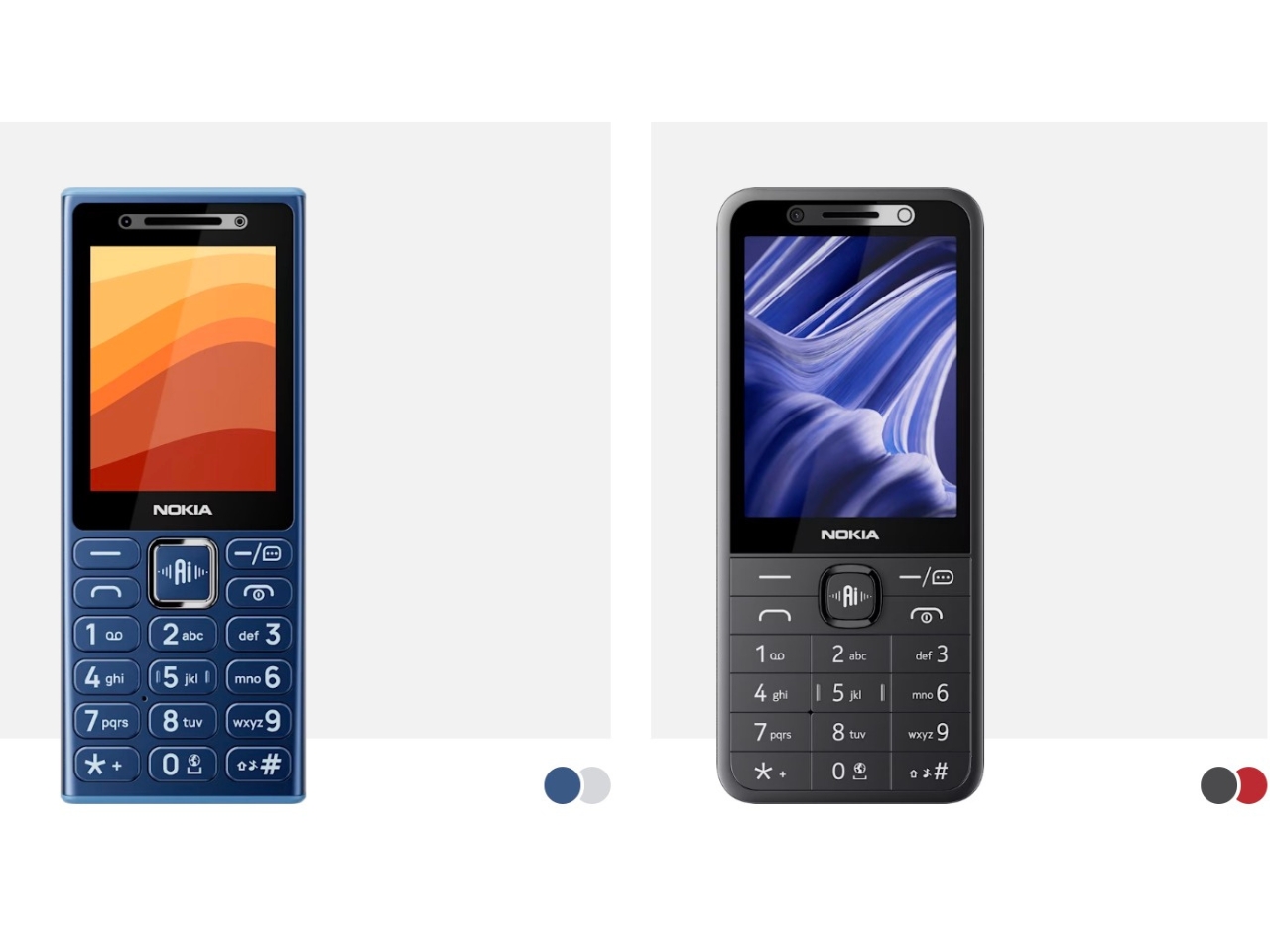
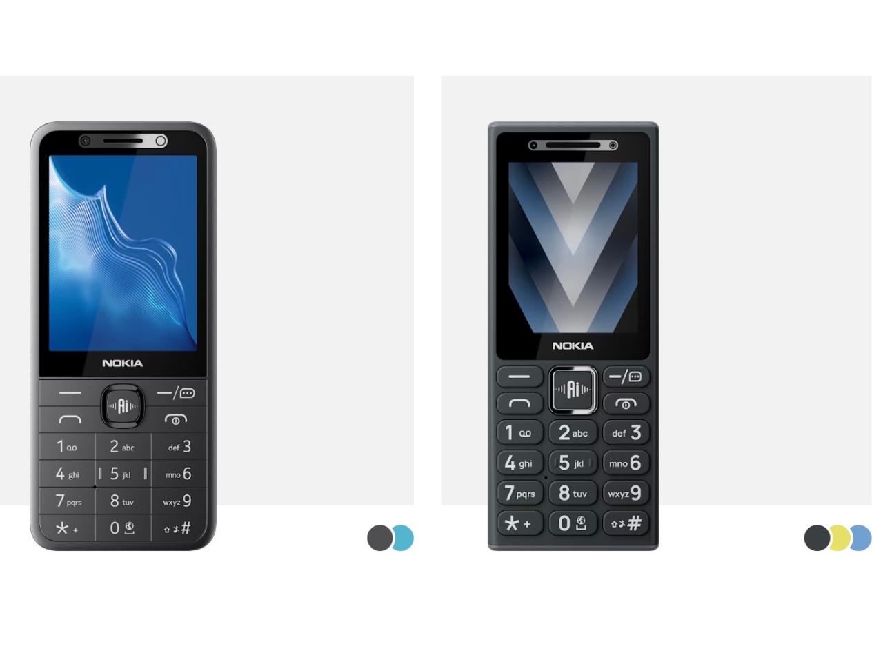
On paper, that sounds almost reasonable. Voice control on a small phone with no touchscreen? Fine, I get it. But the moment you start pulling on that thread, the whole premise of a “digital detox device” starts to unravel a little. A feature phone that checks your weather and streams video content via the cloud is not exactly the quiet, intentional tool that most dumb phone enthusiasts are reaching for. It starts to feel less like a step back and more like a regular phone wearing a disguise.
The subscription element makes it even more interesting. The Sikey AI features come with a free trial period, after which users need to subscribe to a paid plan. HMD notes, somewhat cheekily, that you’ll need an actual smartphone to complete that purchase. So your minimalist phone requires a smartphone to fully unlock its most marketed feature. That’s a sentence.
None of this makes the devices bad. For their actual intended market — likely first-time phone users, older users who want simplicity, or people in markets where smartphone data is still a real cost concern — these phones make a lot of sense. The design language is clean and familiar. The feature set is honest. And HMD has clearly put thought into making them feel more current with the USB-C port and 4G connectivity.
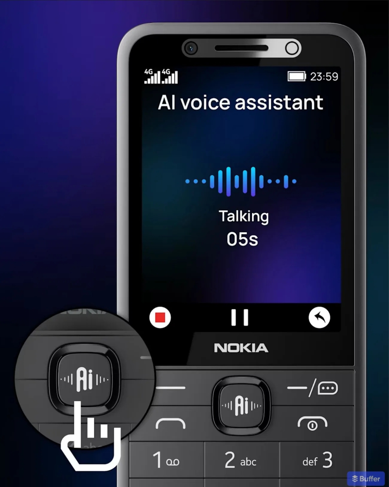
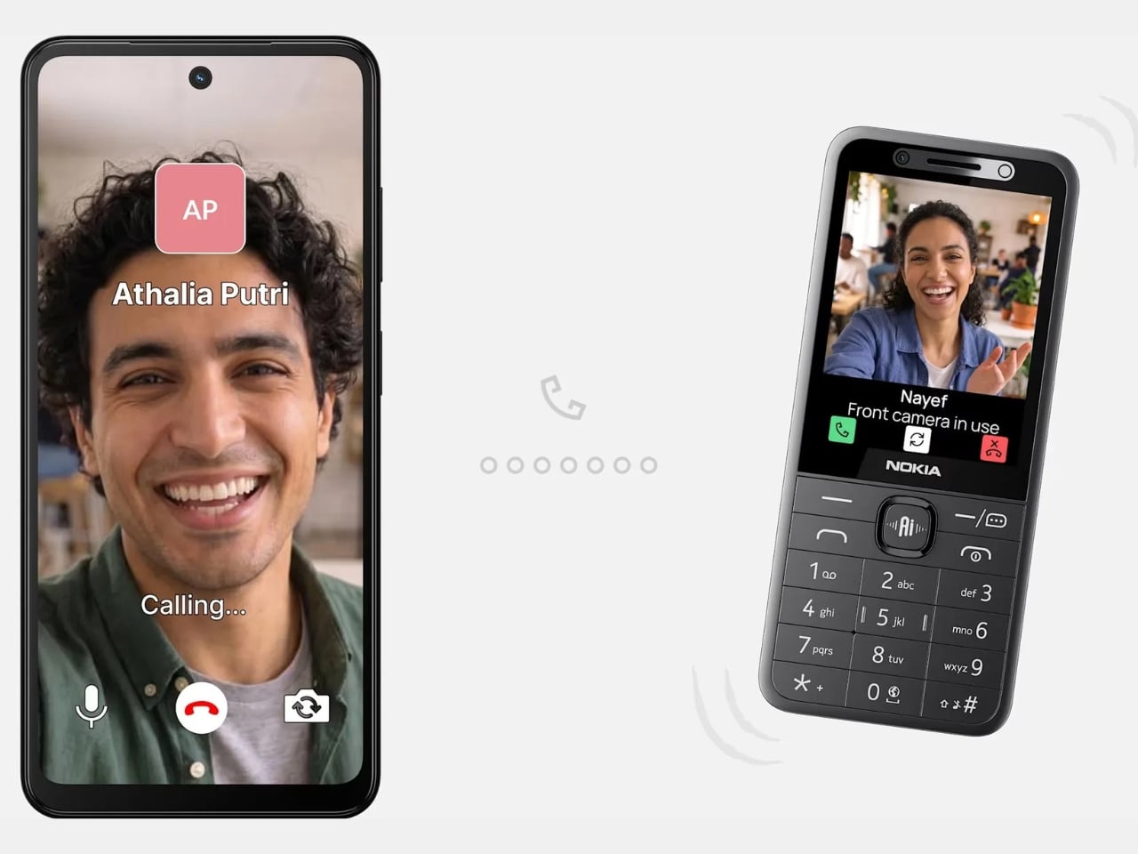
But I keep thinking about what the AI button is really doing here. Is it genuinely useful? For some users, absolutely. Is it a design choice that muddies the identity of a product built around the appeal of doing less? Also yes. The best thing about a dumb phone is the clarity of purpose. You pick it up, you make a call, you put it down. Every added layer of “smart” functionality chips away at that clarity, even if the layer is thin.
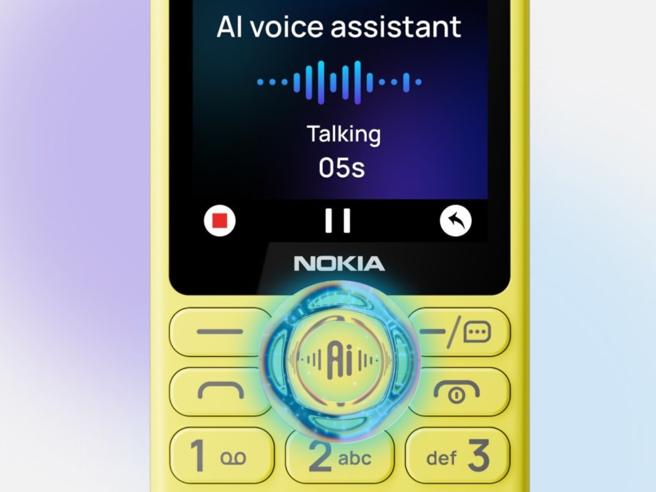
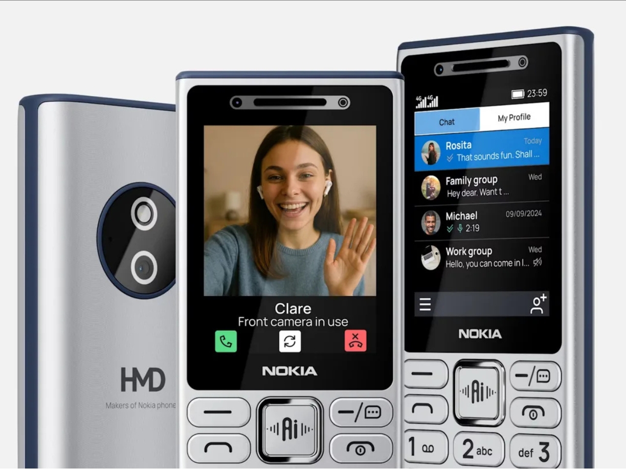
HMD is navigating a strange middle ground, honoring a legacy brand built on simplicity while trying to stay current in a market that rewards anything labeled AI. Whether that balance lands well depends entirely on who’s buying. For the digital detox crowd, these probably won’t scratch that itch. For everyone else, they’re solid little phones with a lot of nostalgic charm and a feature that might come in handy more often than expected.
The post Nokia’s 4 New Dumb Phones Still Come With an AI Button first appeared on Yanko Design.