Japan’s Ice Cream Shop Where the Stools Look Like Melting Ice Cream

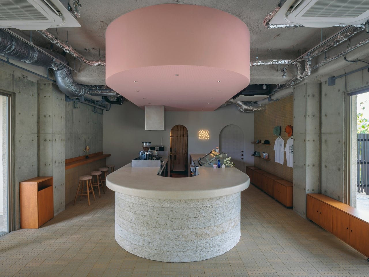
If a space can be designed to feel like a pause, SR Ice Cream Miyakojima might be the best argument for it. Tucked on Miyakojima Island in Japan’s Okinawa prefecture, this small cafe and ice cream shop by architecture studio Kii is the kind of project that makes you stop scrolling and actually look. Not because it’s flashy, but because everything in it seems to belong somewhere between the island and the dessert it serves.

Kii co-founder Satoshi Arai described the brief in beautifully simple terms: create a place where local residents, new arrivals, and tourists can all just show up, sit down, and share a moment. No hierarchy. No specific demographic. Just ice cream and a good atmosphere. That’s a harder brief to pull off than it sounds, and what Kii delivered is quietly remarkable.

Designer: Kii
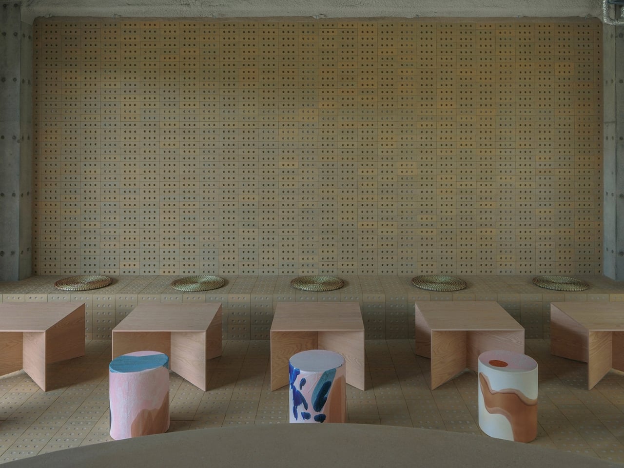
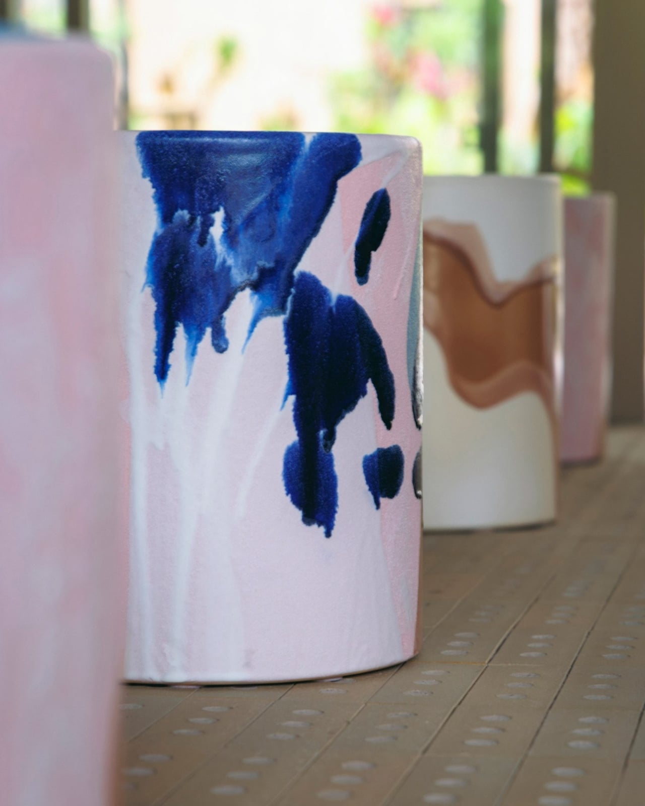
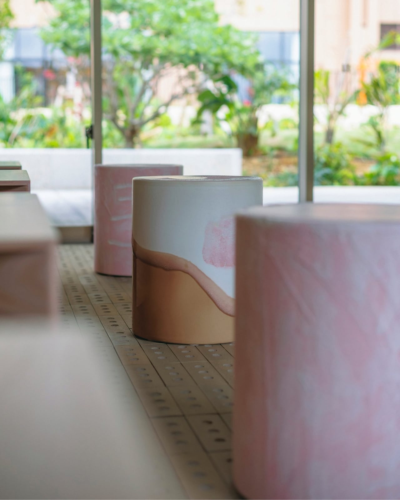
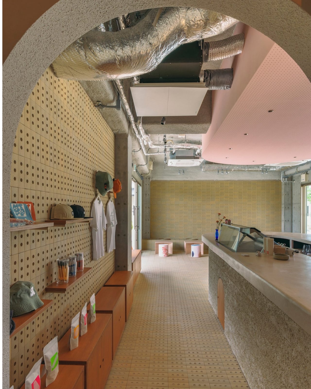
The most talked-about detail is the stools, and they deserve the attention. Kii commissioned pastel-coloured stools from NOTA shop, with a handmade glaze designed to mimic the look of ice cream that’s started to melt. Arai was clear that the studio went through multiple prototypes to get the colour and texture just right, which tells you something about how seriously Kii takes even the smallest gesture. The results are unpredictable by design, each stool slightly different from the last. It’s the kind of thing you don’t notice until you really look, and once you do, you can’t unsee it.
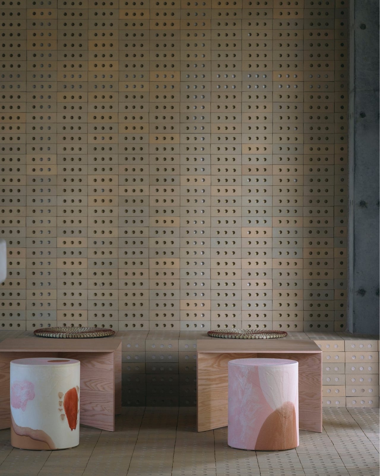
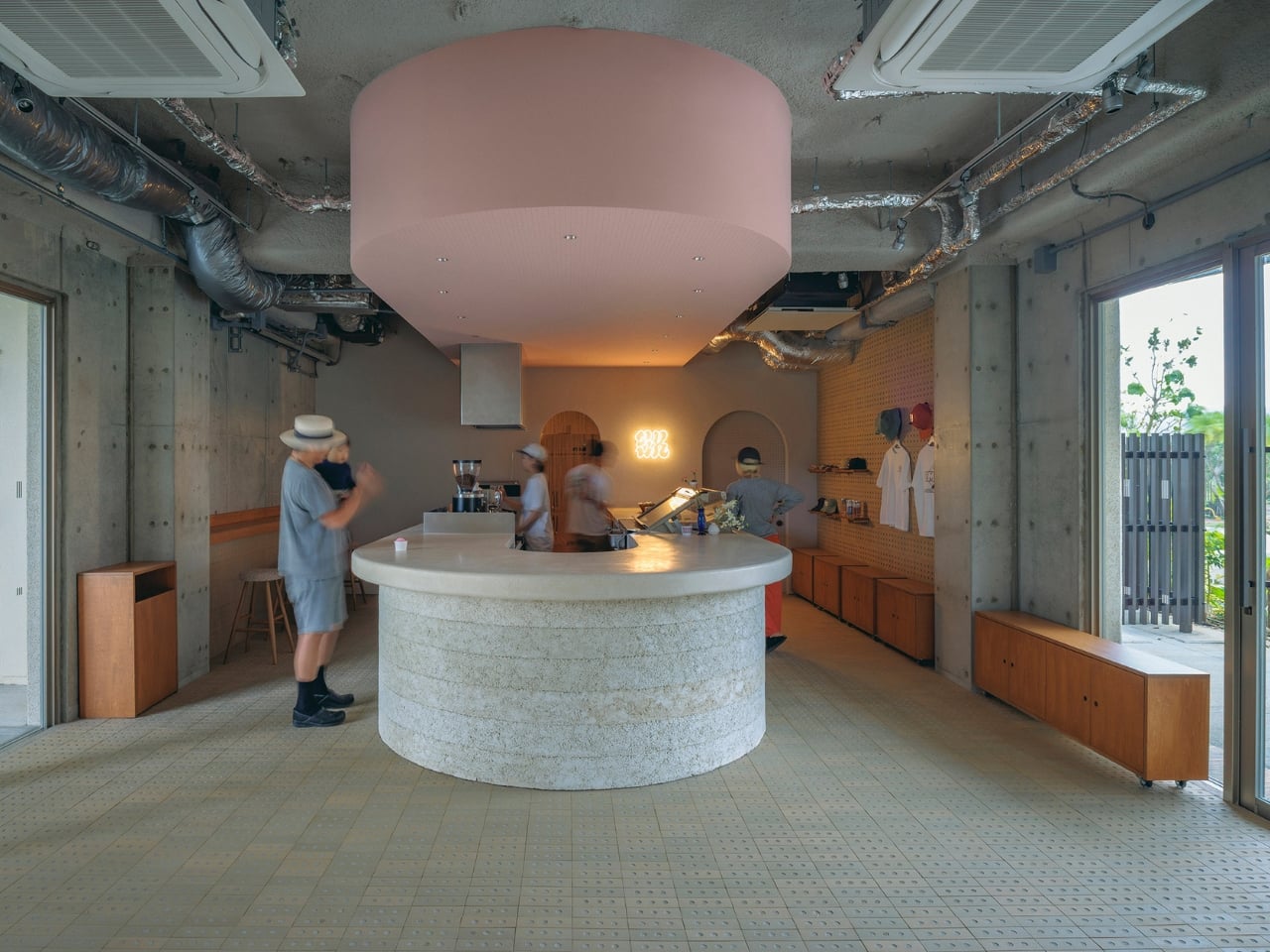
But the stools aren’t the whole story. The counter is clad in local limestone clay, applied in repeated layers to build up a textured, almost geological surface, with the tabletop polished from the same material. When you consider that Miyakojima is a Pacific island that takes regular typhoon hits, the choice of limestone starts to feel less like an aesthetic decision and more like a conversation with the landscape itself. The floor and walls are lined with perforated concrete bricks, a building typology native to typhoon-prone Okinawa, reimagined here as custom interior tiles by Tajimi Tiles. Taking something structural and utilitarian and folding it into the interior language is exactly the kind of move that separates good design from great design.
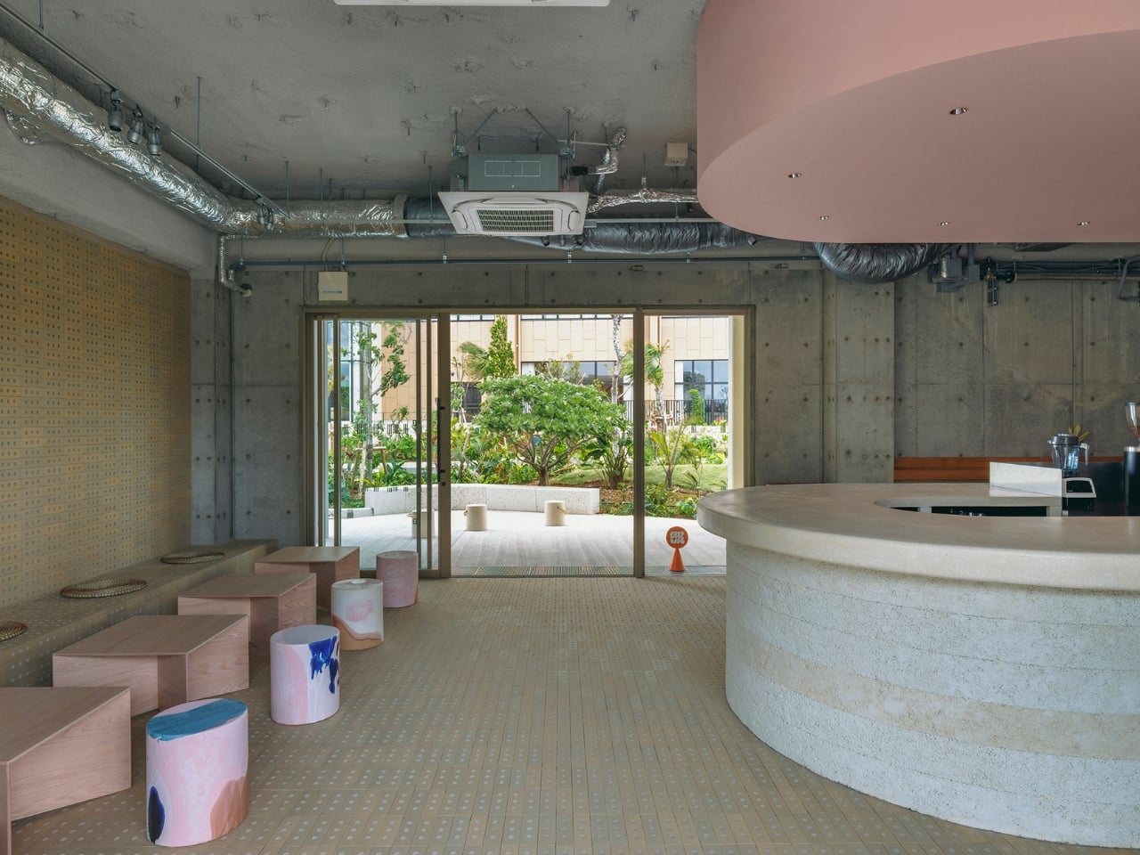
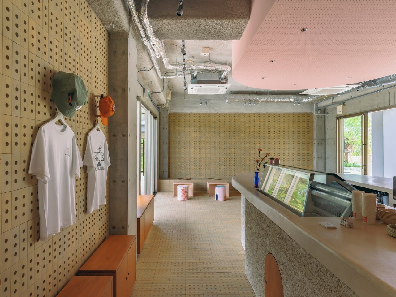
Above the central counter, a curved ceiling finished in pale pink draws the eye upward. The colour was chosen in direct response to the natural light quality of the space, and it works in the way that subtle things tend to work: you might not clock it immediately, but it shifts the mood of the whole room. The counter also has a small arched door built into it for filter maintenance, a pragmatic detail that somehow ends up looking charming. That balance between function and personality runs through the entire project.
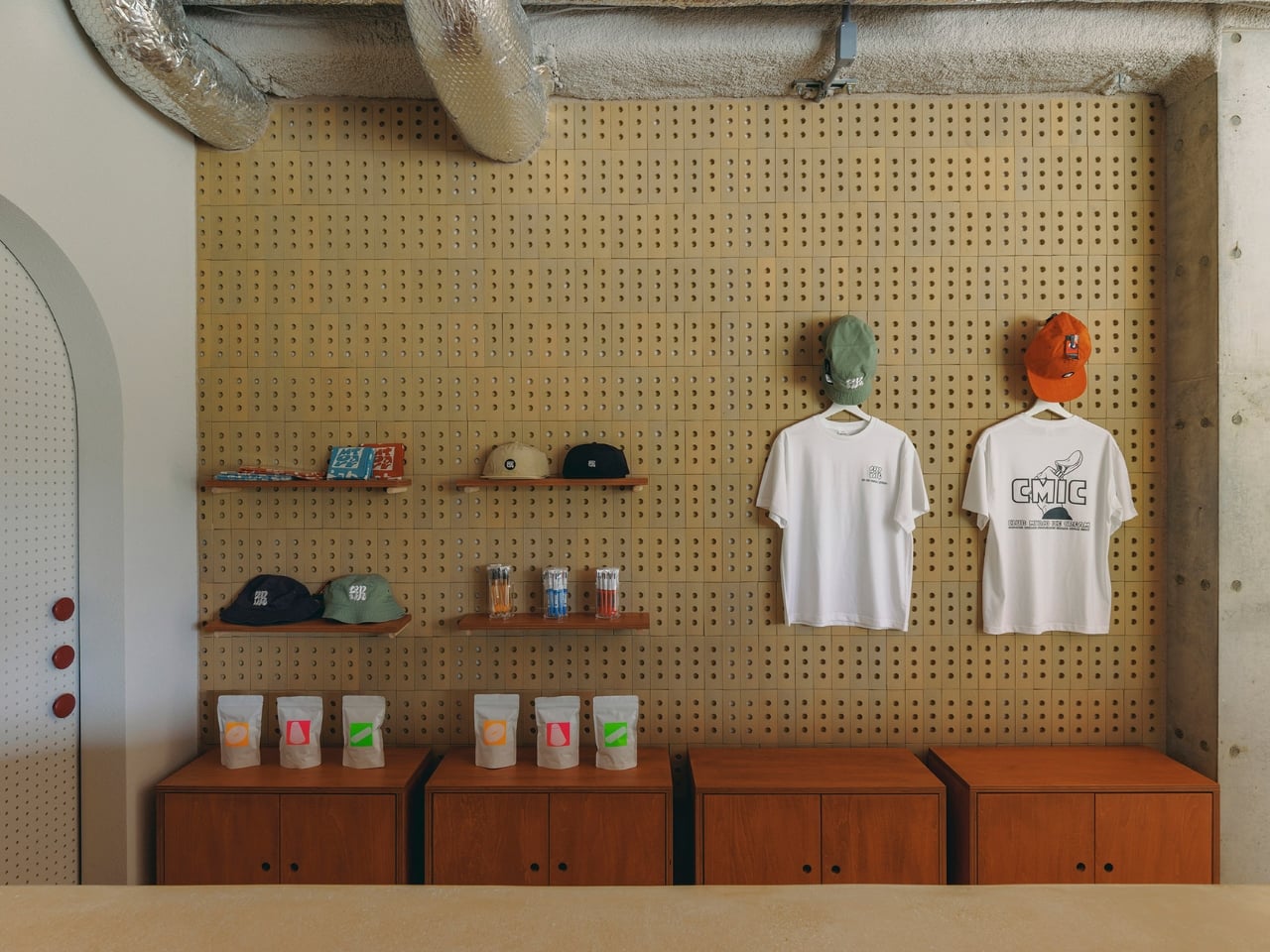
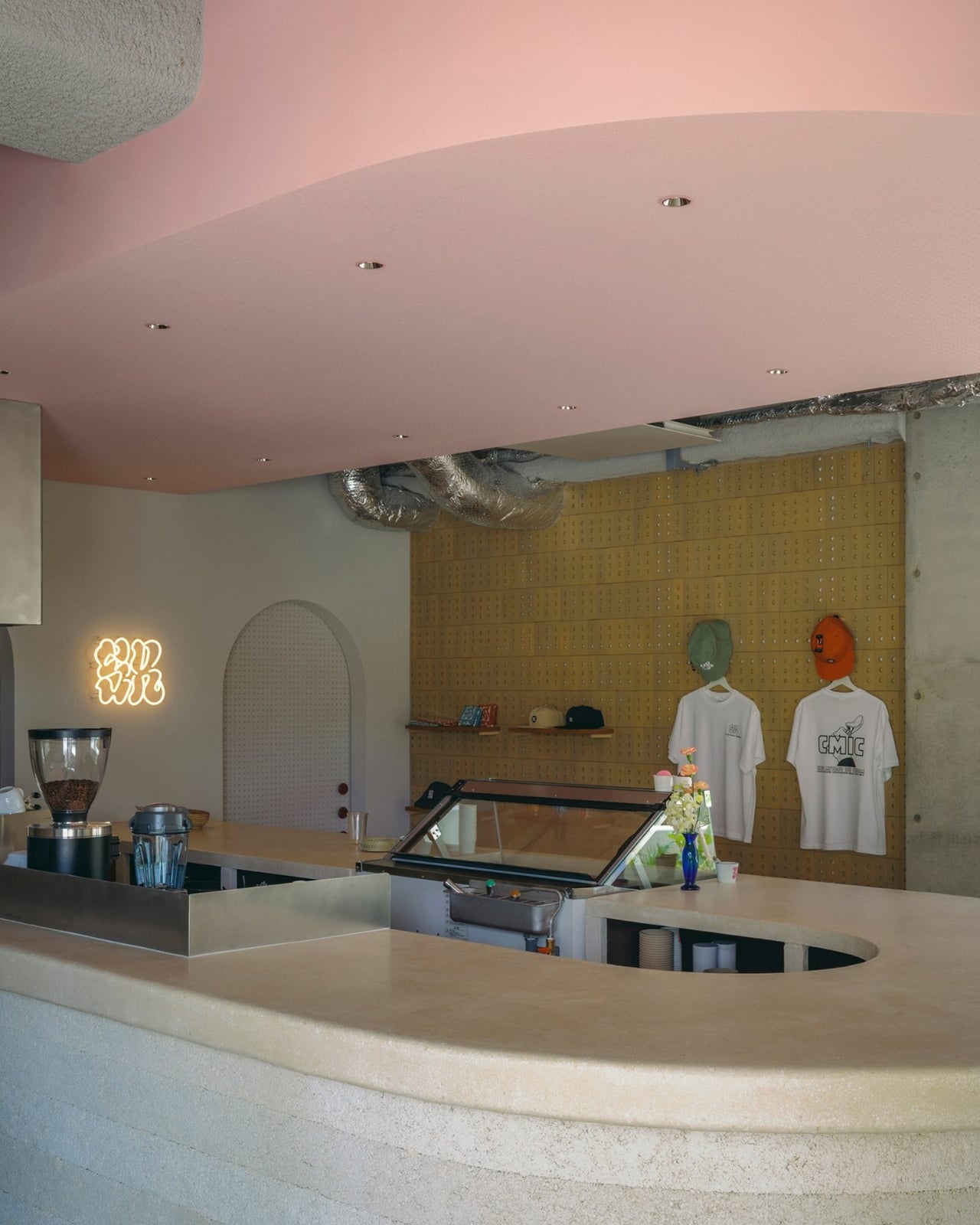
There’s a broader conversation to be had about what we want from food retail design right now, and SR Ice Cream Miyakojima sits squarely in it. We’ve spent years in the era of the Instagrammable space, where interior choices were made to perform on a phone screen rather than to serve the people inside them. Kii seems uninterested in that game. The materials here are regional and weather-worn. The stools are handmade and imperfect. The pink ceiling is gentle, not loud. The whole space is designed to function as a community anchor, not a backdrop.
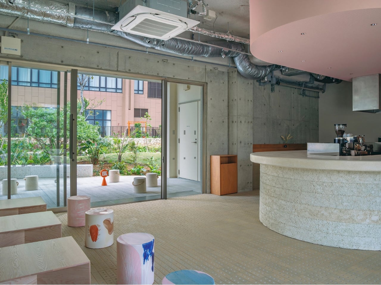
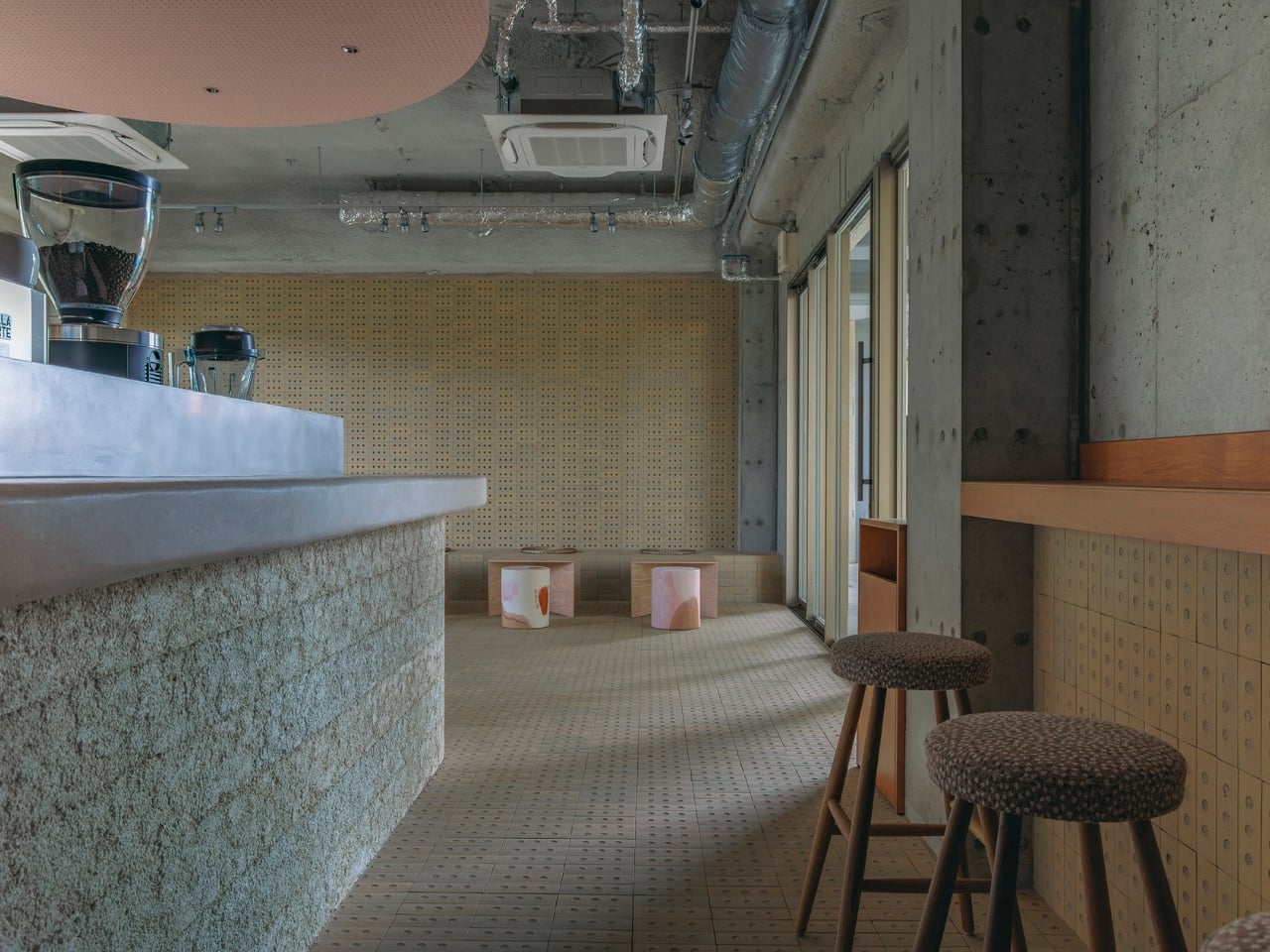
That’s not to say the space isn’t photogenic, because it absolutely is. But the photography feels like a byproduct of good intentions rather than the goal. It’s a distinction that matters, especially on an island where the landscape already does most of the heavy lifting.
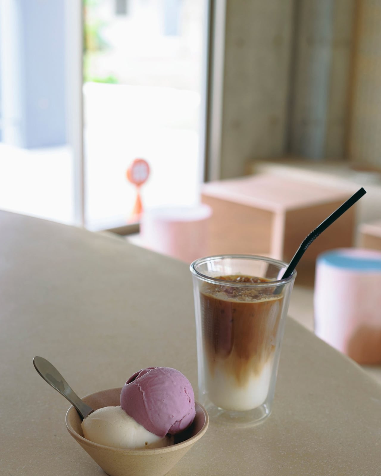
Miyakojima is the kind of place that tends to make people slow down. The fact that Kii designed a space that encourages exactly that feels right. An ice cream shop shouldn’t need to compete with the ocean view outside, and this one doesn’t try to. It just sits there, cool and considered, with its melting stools and layered limestone and quietly pink ceiling, doing what the best spaces do: making you want to stay a little longer.
The post Japan’s Ice Cream Shop Where the Stools Look Like Melting Ice Cream first appeared on Yanko Design.
The $29 Key Ring That Finally Fixed a 130-Year-Old Problem

While I have a lot of keychains, from pop culture to K-pop to travel-themed, I am truly annoyed with keyrings. To be honest, I don’t have any ability to open and close them, so I have to wait for my brother or a friend to attach my keychain of choice. It’s something we use every single day, yet there hasn’t been any improvement to them for the past hundred years or so, and they cause annoyance and sometimes even pain. That oversight, I think, is finally getting corrected.

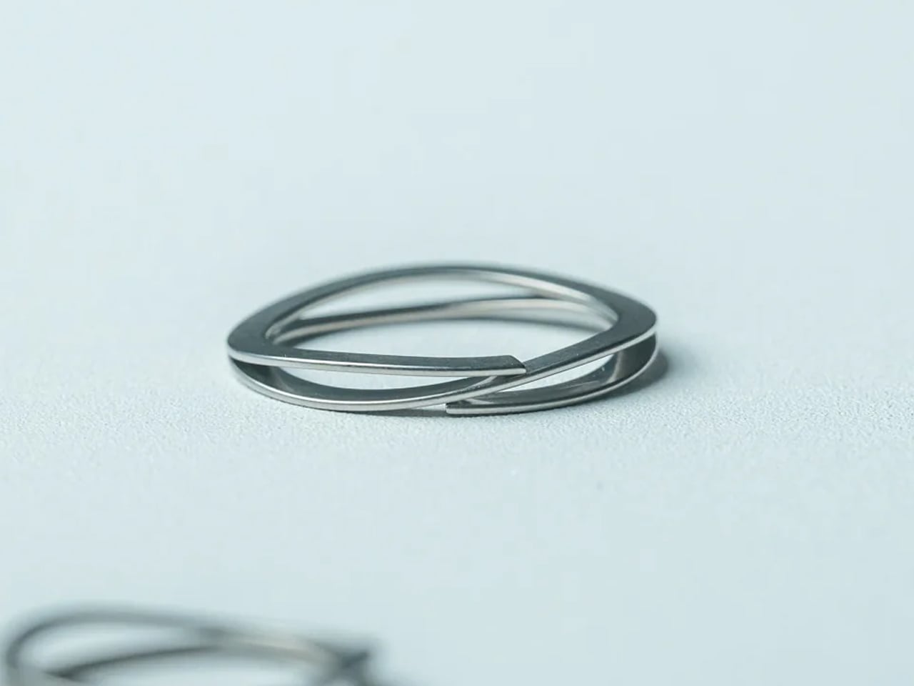
The Painless Key Ring is exactly what its name promises, which is both its greatest strength and possibly why it is not getting the attention it deserves. It sounds almost too simple. A key ring without the pain. But when you consider that the double-coiled split ring design has not meaningfully changed in over 130 years, a product that actually reimagines it from the inside out starts to feel less like a novelty and more like something that was long overdue.

Click Here to Buy Now: $29.00

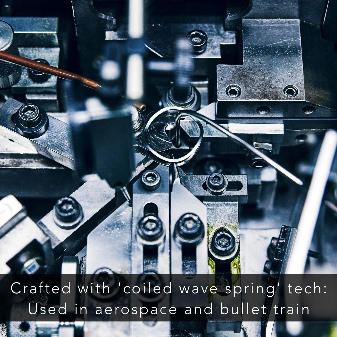
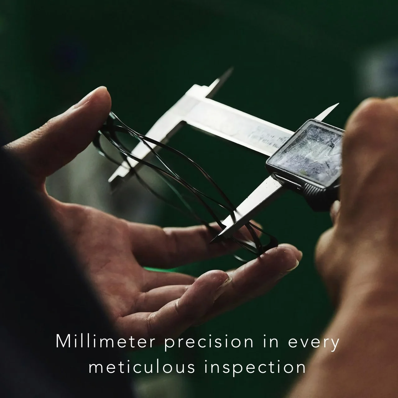
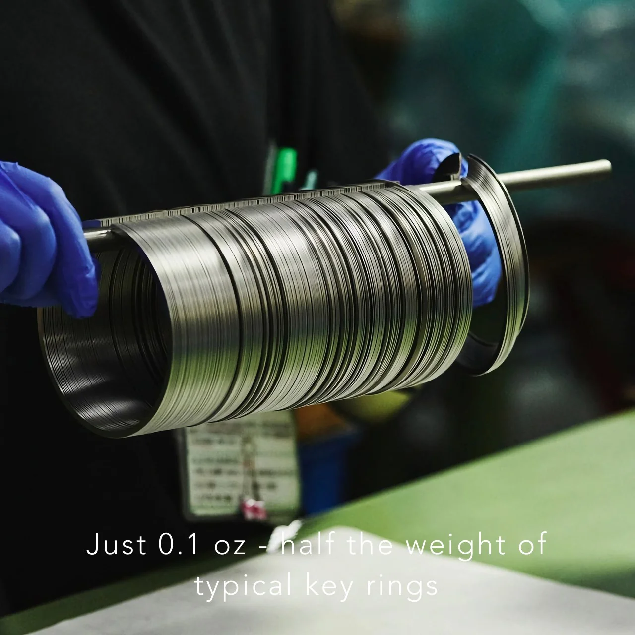
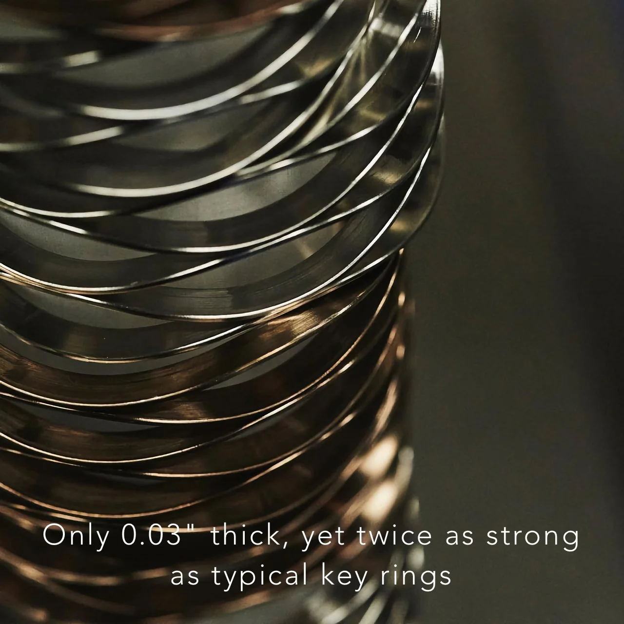
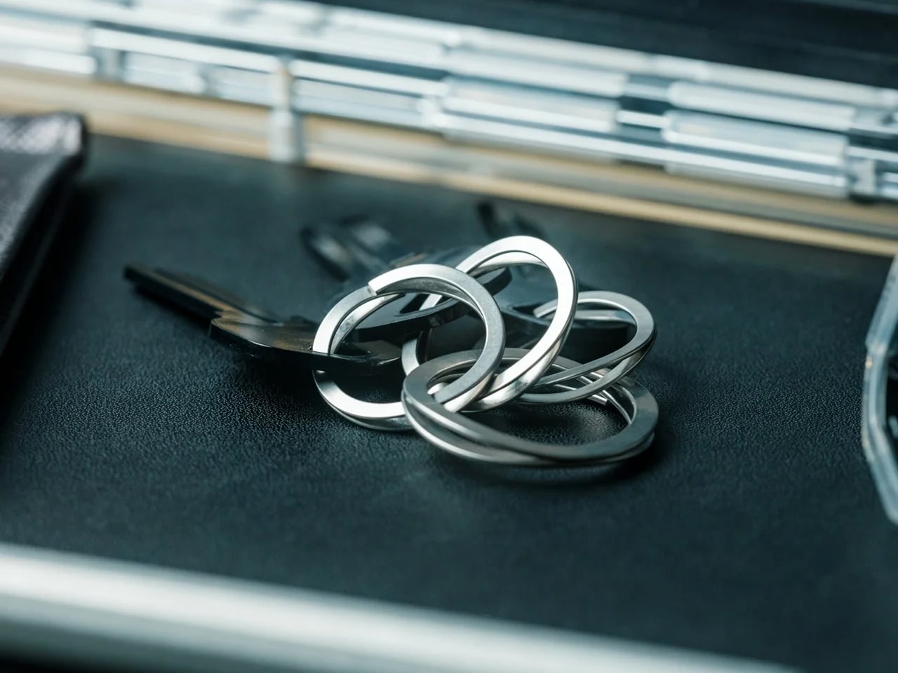
The engineering behind it borrows from places you would not typically associate with your front door key. The coiled wave spring technology used in this ring is the same mechanism found in aerospace equipment and bullet train systems. Japan, where the ring is made, is not exactly known for cutting corners on precision, and that pedigree shows in the numbers. At just 0.1 oz for the large version, it is half the weight of a standard key ring. At 0.03 inches thick, it is noticeably slimmer. And despite being lighter and thinner, it is twice as strong as a conventional ring, thanks to the high-tensile steel used in its construction.

The functional difference comes down to one motion. A traditional split ring makes you hunt for the gap in the coil, wedge a fingernail underneath, and pry it open millimeter by millimeter while the metal digs into your skin. The Painless Key Ring opens when you press the release point. Let go, and it closes. That is the entire operation. No gap hunting, no skin damage, no compromised manicure. The wave spring structure creates what you could describe as a “pre-warped” design, where the natural flex of the ring accommodates keys of any size without warping under stress or losing its shape over time.

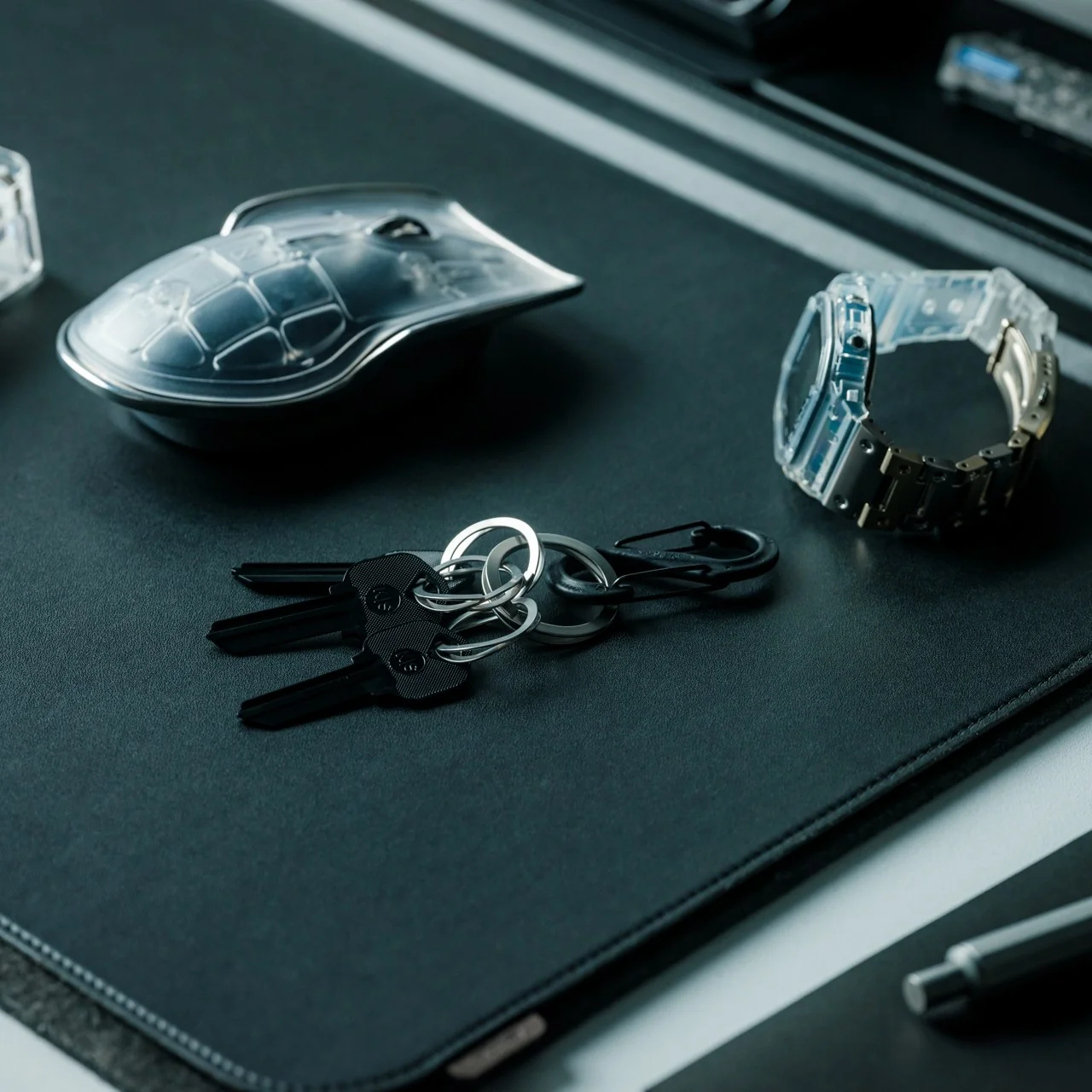
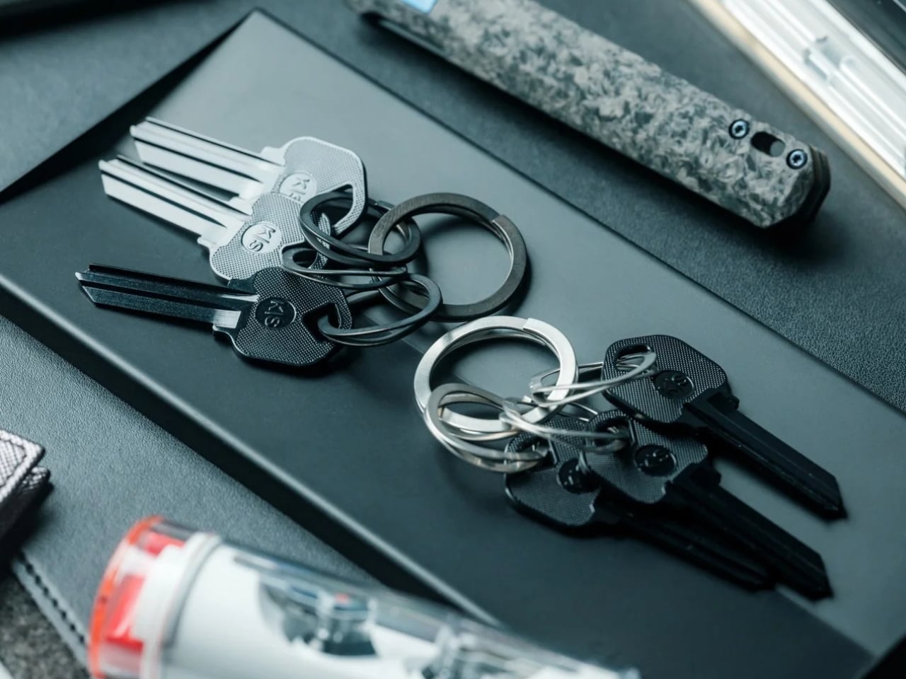
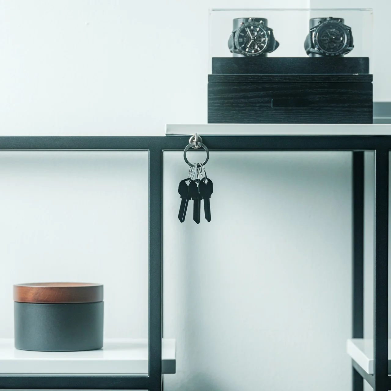
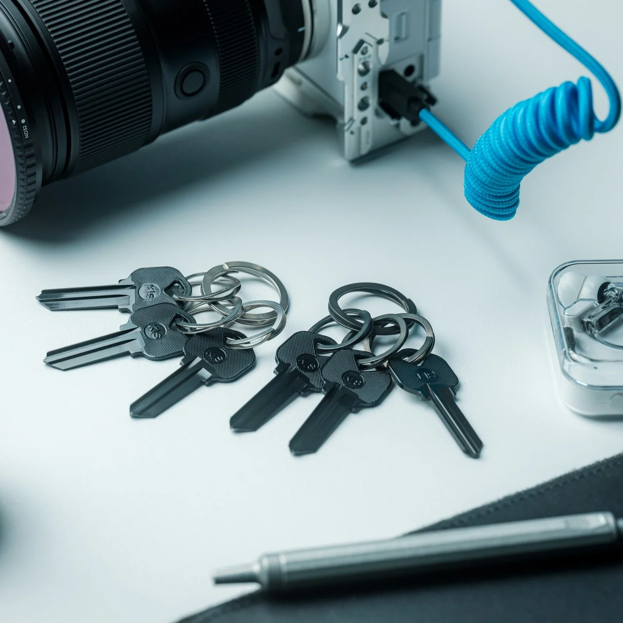
It comes as a set of one large ring and three smaller rings, available in silver and black. The black version is dyed rather than painted, which makes it more resistant to wear and scratches, not just aesthetically different. Both finishes hold up well against the daily context of being thrown into a bag, clipped to a carabiner, or dropped on a desk, which is most of our actual key ring experience.

At $29 for a set, the price sits in a range that feels proportionate to what you are getting. It is not an impulse buy, but it is also not a hard sell when you consider that most people spend more on a single decent pen without much deliberation. The comparison that keeps coming to mind is the razor that replaced the old disposable, or the notebook that made you stop picking up freebies at conferences. Once you use something engineered to actually work, the previous version becomes very difficult to go back to.

The design community talks a lot about objects that deserve more attention than they receive, and the key ring is probably the most obvious example of that gap. We carry our keys every day without any particular feeling about them, which is fine until you realize that feeling nothing about a daily object usually means it is only doing the minimum. The Painless Key Ring sets a different bar, one that takes the smallest, most neglected piece of your everyday carry and applies genuine engineering logic to it. Whether you are someone who obsesses over EDC setups or someone who just wants to stop destroying their nails every time you need a spare key, the upgrade reads the same either way.

The post The $29 Key Ring That Finally Fixed a 130-Year-Old Problem first appeared on Yanko Design.
You Can Now Own a Piece of Verstappen’s Controversial 2021 Championship-Winning F1 Car

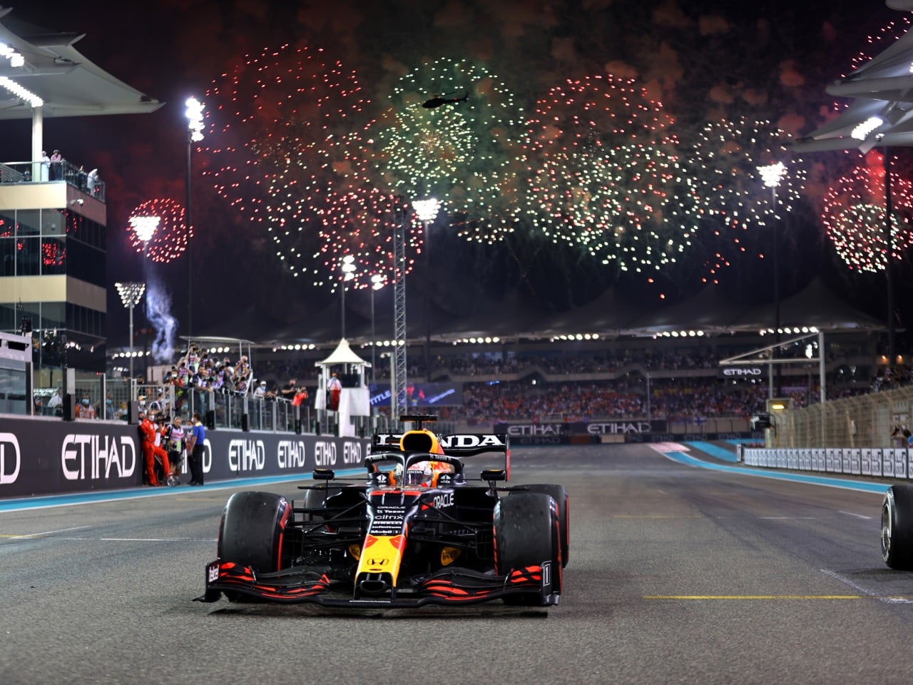
Remember where you were on December 12, 2021? If you’re an F1 fan, chances are you do, because that was the day Max Verstappen snatched his first world title away from Lewis Hamilton on the literal final lap, in the literal final corner, off the back of a safety car restart that stewards are probably still debating in group chats somewhere. I was rooting for Hamilton that day, and honestly, watching it unfold live still ranks as one of the most gutting sports moments I’ve sat through. Verstappen fans got a legend born in real time. The rest of us got years of “what if” conversations that still spark up whenever Abu Dhabi comes up.

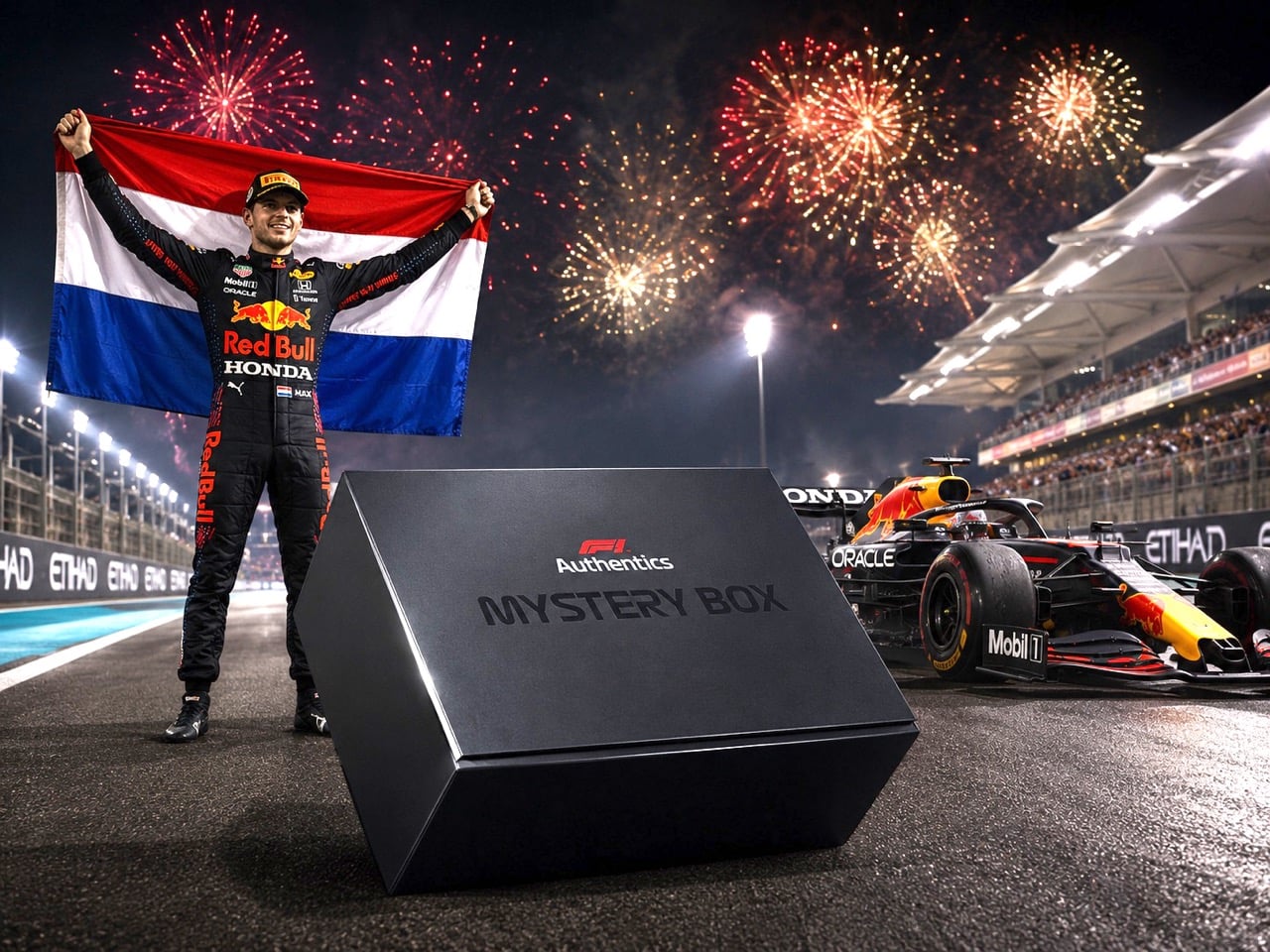
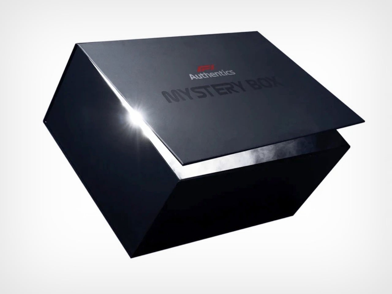
F1 Authentics just gave fans a way to own a literal piece of that chaos. The official F1 memorabilia arm, run by Memento Exclusives, has dropped a new Mystery Box collection where every single box guarantees a genuine piece of bodywork from the RB16B, the Honda powered Red Bull that carried Verstappen to that maiden championship. Only 1,000 boxes exist worldwide, with 500 going up for grabs online, priced around £1,000 GBP ($1,348 USD) a pop, which also happens to be the minimum guaranteed value of everything packed inside.

Designer: F1 Authentics (Memento Exclusives)

That RB16B earned every bit of the spotlight it’s getting now. It was an evolution of the 2020 car, finally sharp enough to go toe to toe with a dominant Mercedes squad, and it carried Verstappen through nine wins across one of the most contentious title fights modern F1 has produced. Hamilton led early, Verstappen clawed the lead back mid-season, and the two arrived at Abu Dhabi dead level on points. We all know how that ended. Owning a fragment of that car means owning a piece of the exact machine that decided, for better or worse depending who you asked, one of the sport’s most argued about championships.

Photo by Batchelor/XPB Images

Somewhere in that run of a thousand boxes sits the real chaos generator, a redeemable ticket for an official F1 replica front wing and nose, pulled from cars across Aston Martin, Cadillac, Racing Bulls, Red Bull, Williams, or Alpine, and valued north of twenty grand. It’s a genuinely wild pull rate, turning what could have been a straightforward memorabilia drop into something closer to a scratch card for grown adults with disposable income and a soft spot for motorsport history.

Photo by Mark Thompson/Getty Images

F1 Authentics has been building toward drops like this all year, following an earlier sold out box tied to Lando Norris’s championship car and a March release that hid an £89,000 racing simulator inside one of just 150 units. F1 memorabilia is getting gamified, and this RB16B drop might be the most emotionally loaded chapter yet, especially if you were the one yelling at your TV that night in Abu Dhabi.

The post You Can Now Own a Piece of Verstappen’s Controversial 2021 Championship-Winning F1 Car first appeared on Yanko Design.
These Contemporary Chairs Turn Sustainability and Stillness Into Design

A chair can be a surprisingly effective storytelling device. Give it a different material, soften a familiar silhouette, or borrow a gesture from somewhere unexpected, and suddenly it becomes more than somewhere to sit. Jaro Kose’s CUT and ZEN chairs approach that idea from two very different directions: one gives discarded material a second life, while the other translates the meditative landscape of a Japanese Zen garden into an upholstered form.

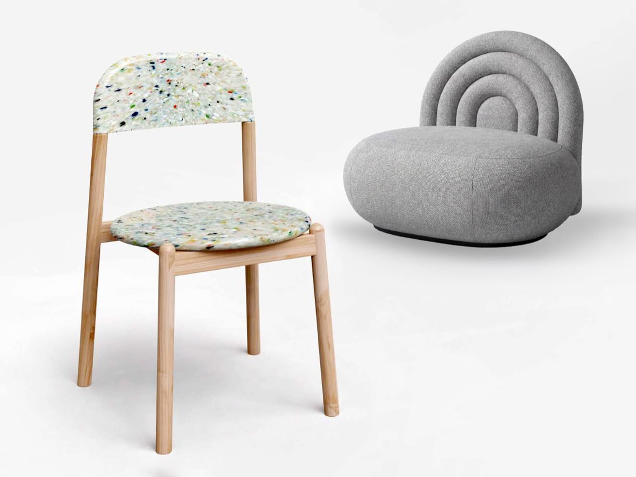
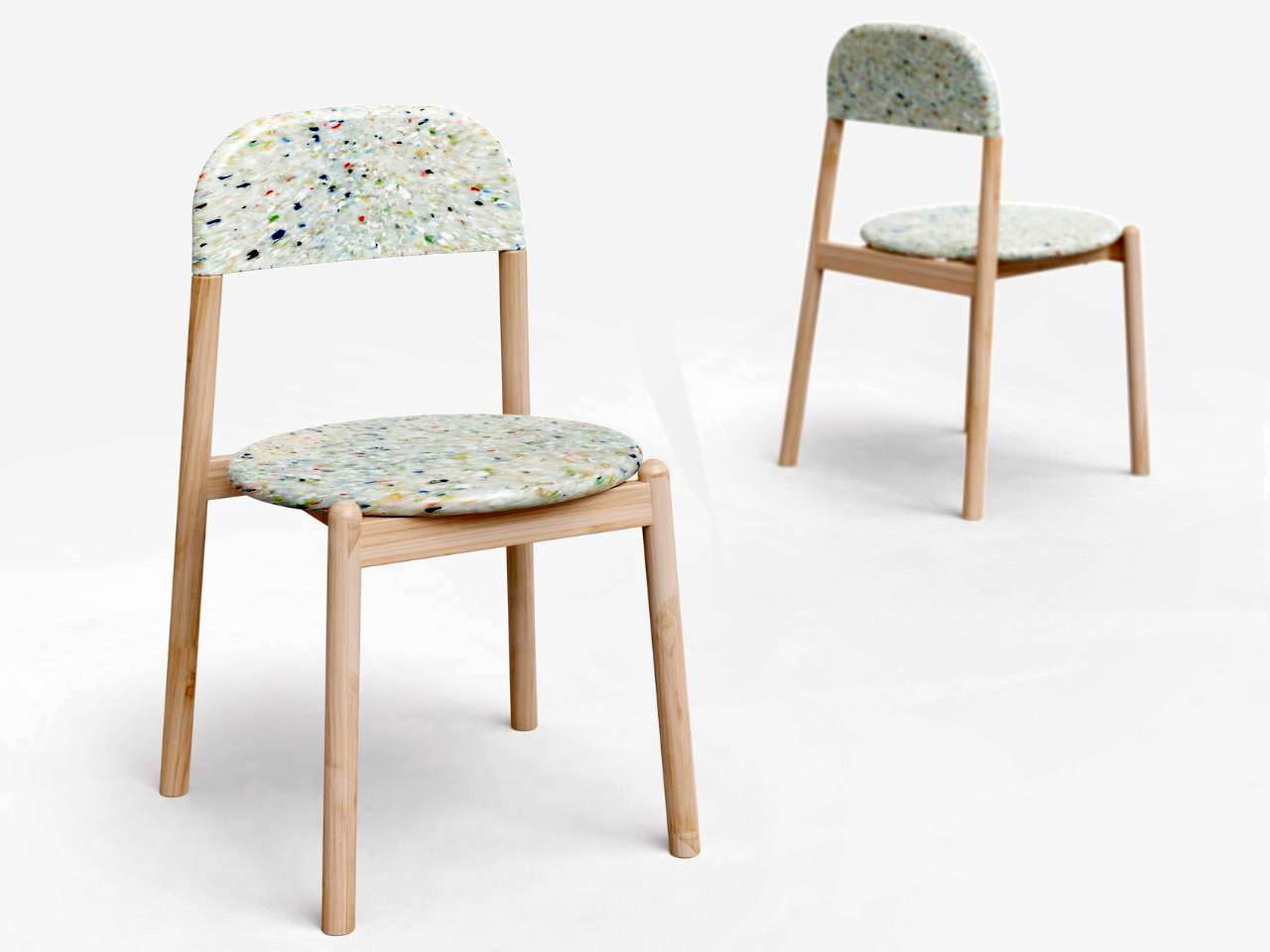
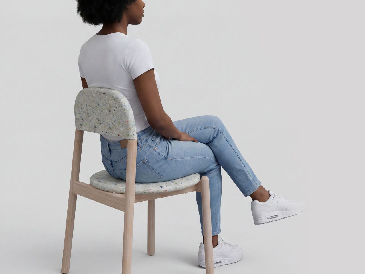
CUT is, at first glance, a fairly restrained wooden chair. Its clean oak frame, gently rounded proportions and broad backrest give it the familiarity of a classic dining chair, while its stackable construction makes it practical enough for both residential and public environments. The design also extends into upholstered and high-chair variations without losing the clarity of the original silhouette. But one version of CUT changes the story through material alone.

Designer: Jaro Kose


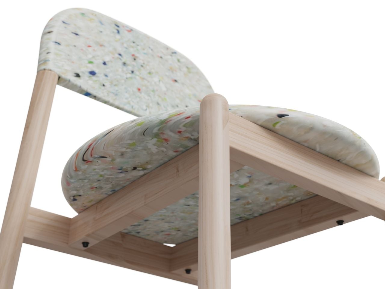
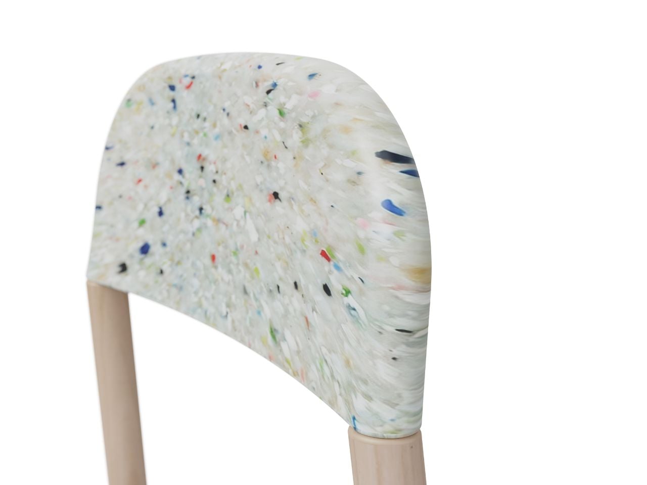
Sustainability plays an important role in Kose’s design approach, particularly in considering how materials are sourced, used and eventually given another life. Reflecting the client’s own commitment to sustainability, a version of CUT replaces the conventional seat and backrest with components made from recycled plastic.

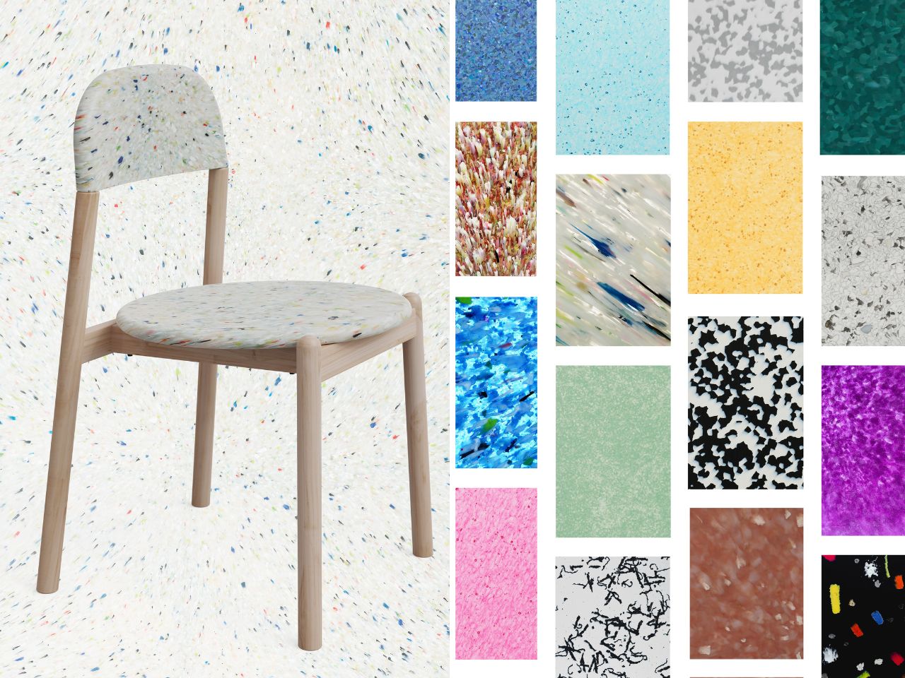
Instead of disguising the material’s previous life, the chair celebrates it. The recycled surface has a visibly speckled texture, almost terrazzo-like from a distance, creating a sharp contrast against the quieter wooden frame. The project explores several possible recycled finishes, turning what could have been treated purely as an environmental choice into part of the chair’s visual character.

There is something appealing about that transformation. A material once categorized as waste returns as the element that gives the chair its personality. Sustainability here is not added as a label after the design is finished; it becomes visible in the object itself. CUT suggests that responsible material choices do not necessarily have to make furniture feel overtly ecological or compromise a refined interior aesthetic. Waste can simply become another raw material to design with.

ZEN moves in almost the opposite direction. Instead of beginning with a material question, the armchair begins with a feeling.

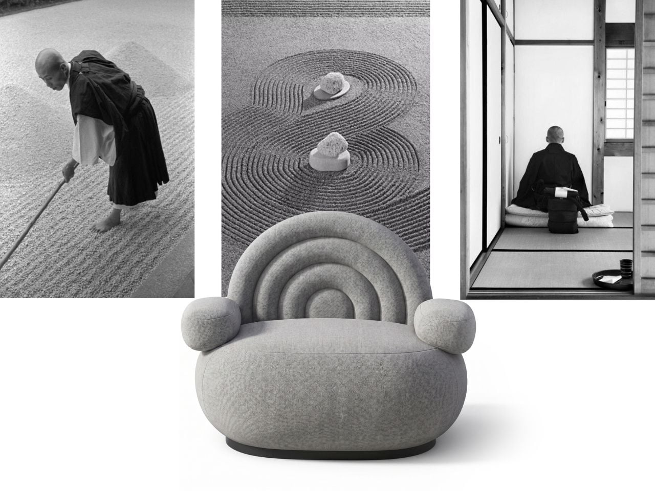
Its inspiration comes from Japanese Zen gardens, spaces historically associated with meditation and contemplation. Their carefully positioned stones and raked gravel create compositions that feel almost motionless while still suggesting movement. Kose translates that relationship into a chair designed around softness, stillness and visual calm.

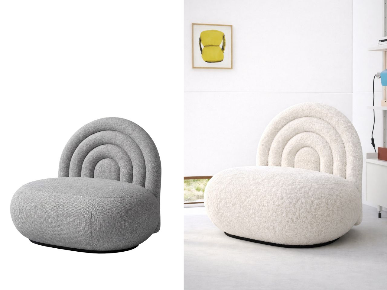
The connection is immediately recognizable. The generous upholstered seat resembles a smooth stone, except here the expected hardness has been replaced with foam and fabric. Behind it, a series of rounded concentric forms creates the backrest, echoing the repetitive lines drawn through gravel around rocks in a Zen garden.

It is a wonderfully literal reference without becoming novelty furniture. The chair still reads clearly as a contemporary lounge piece, but once you understand the inspiration, the relationship between every element becomes obvious. The seat becomes the stone; the backrest becomes the energy radiating around it.

That softness also gives ZEN an interesting presence within an interior. Fully upholstered furniture is already common in contemporary residential spaces, so the material itself allows the chair to blend naturally into its surroundings. Its unusually rounded proportions and graphic backrest, however, make sure it never completely disappears.

CUT and ZEN ultimately tell two stories about contemporary living. CUT asks what happens when designers reconsider the materials we have already used, while ZEN looks at how furniture can encourage a different relationship with our surroundings and ourselves. One gives waste another life. The other turns a meditative landscape into something you can sink into. And both show how a relatively simple chair can carry a surprisingly rich idea.

The post These Contemporary Chairs Turn Sustainability and Stillness Into Design first appeared on Yanko Design.
LEGO x Nike Air Force 1 is set for take-off with a 360° dunking minifig onboard

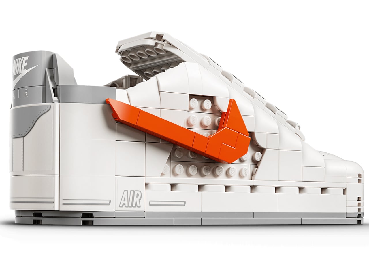
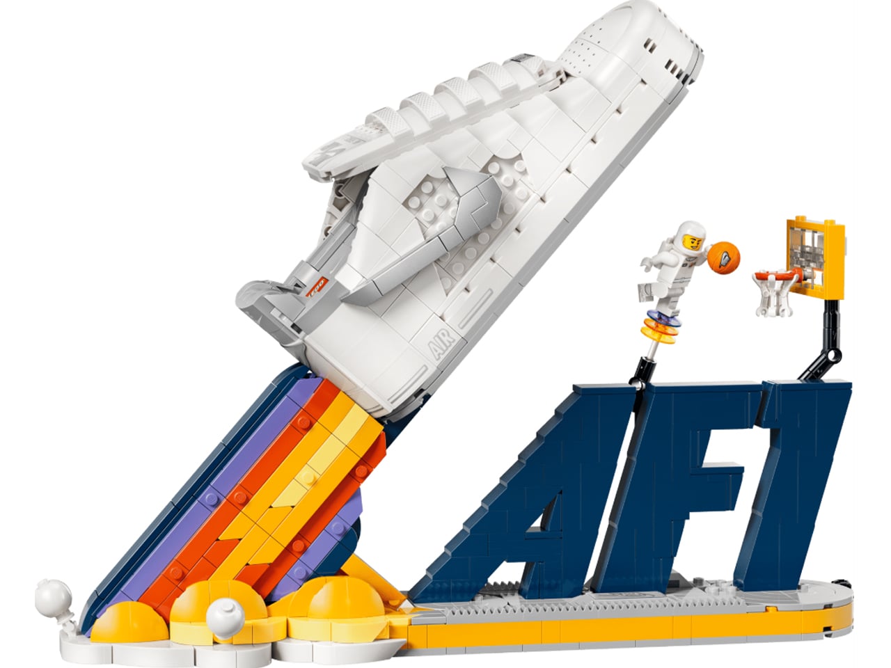
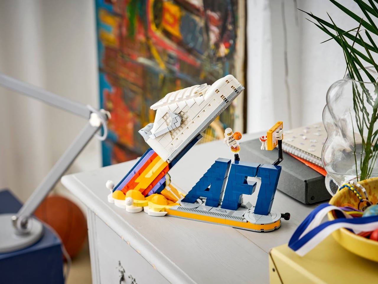
LEGO and Nike are back with their new themed set. This time it’s the Air Force 1 Space-Themed Building Set that seems en route to orbit and beyond, leaving nothing but its exhaust plume behind. If you’ve been following, this is not the first such collaborative model. LEGO x Nike started their collaboration of kicks, bricks, and a whole lot of fan love with the co-branded Nike Dunk x LEGO Set.

Since then, the inspiring duo has not looked back. Giving sneakerheads, builders, and those who live in the spirit of basketball, a new set with playful details almost every year. Ideal for kids aged 9+ and adults alike, over the years, Nike Slam Dunk and the Nike Dunk Trickshot, the bright yellow Air Max Dn, and the iconic Air Max 95 LEGO sets have swayed us big time, and now the AF1 is here with similar intention.

Designer: LEGO x NikeLEGO x Nike

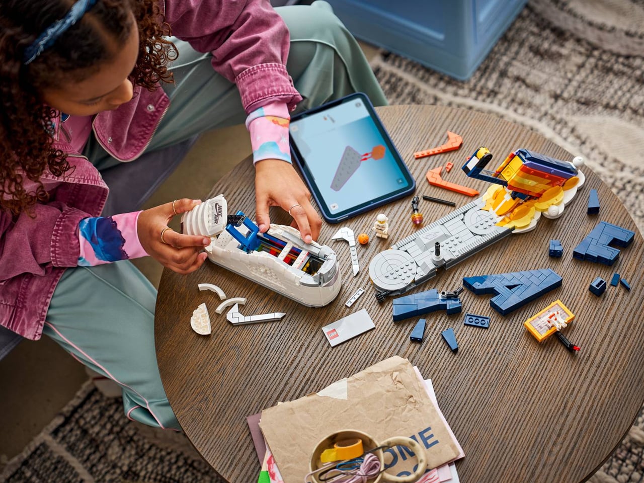
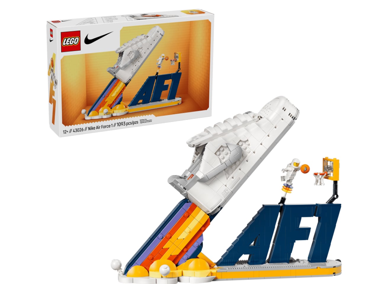
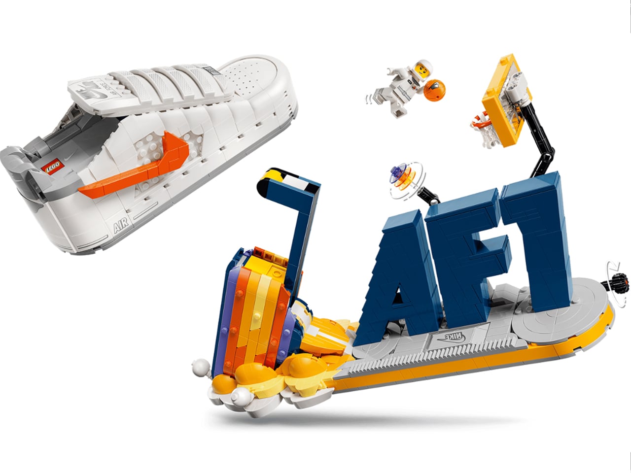
The LEGO x Nike Air Force 1 building set was officially announced with its first look on the LEGO website just recently. A nod to the Nike Air Force 1 sneaker, first launched in 1982, the set comprises 1,093 pieces and measures over 10.5 inches high, 14 inches wide and 4 inches deep. Alongside the sneaker, the interactive set features other antics to make it really interesting to see and fun to build. The space-themed build has the basketball sneaker as the highlight, but it shares base with kinetic display elements that are, of course, an eminent part of the build.

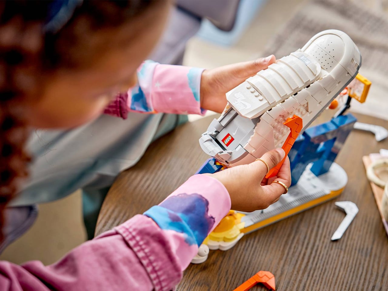
The Air Force 1 itself, ready for launch, comes in a clean white colorway with an orange Swoosh logo. The Swoosh is removable and replaceable with a silver logo, which resembles the heel collar ascent of the sneaker. The set, as mentioned, is not about the sneaker alone. Assembled on a base with traction patterns resembling the Air Force 1 outsole, it is centered around a large blue-colored AF1 sign.
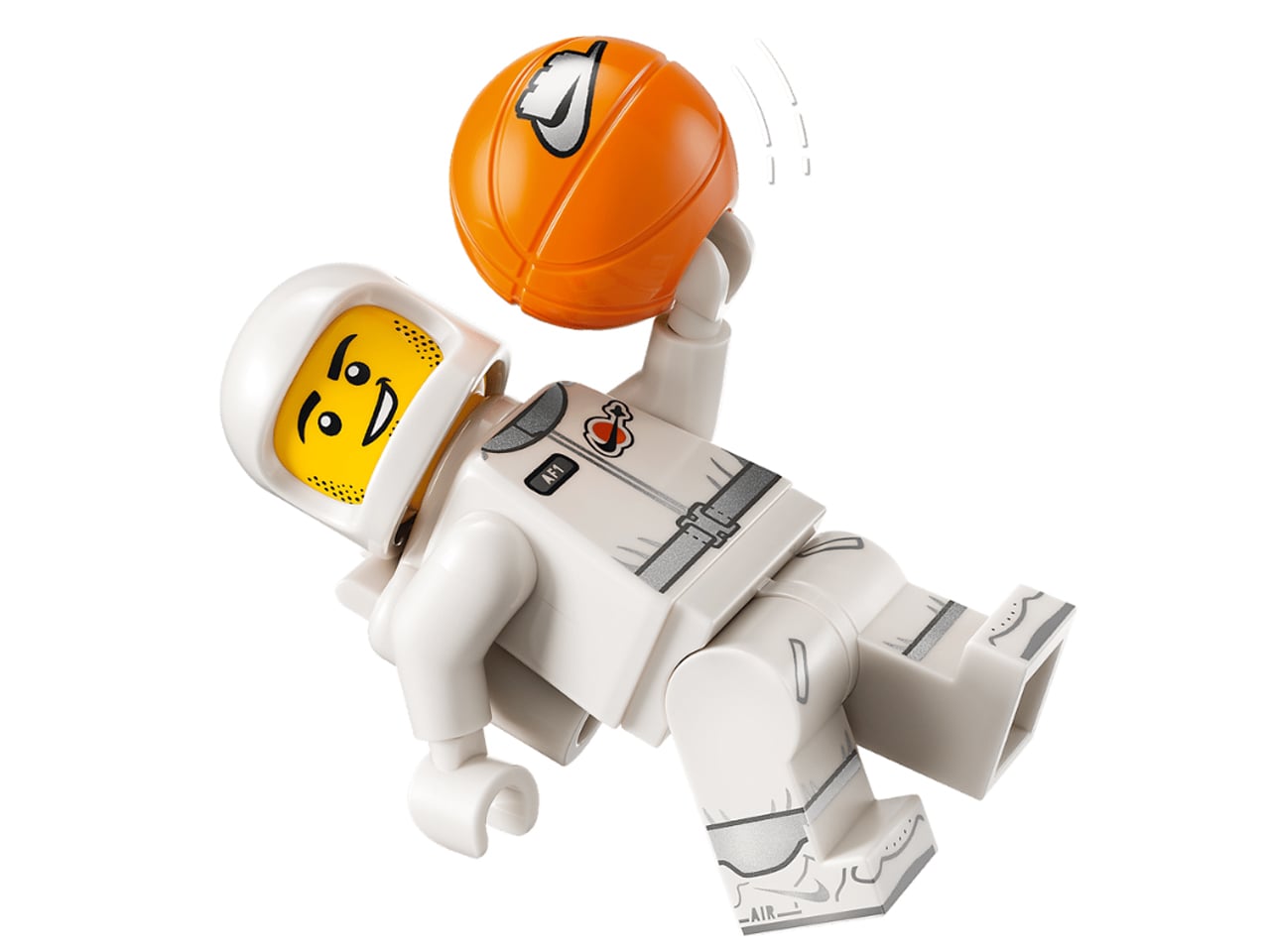
The basketball setting on the base is made interesting with a LEGO spaceman minifigure, with Nike styling, mounted onto a mechanical rig and stationed on the AF1 sign with a basketball hoop just in the front. The minifigure features an interchangeable head and is attached to an integrated dial, which can be turned to let the minifig pull off one of the most difficult basketball moves. It can do a full 360-degree dunk by spinning mid-air before slamming the ball through the hoop.
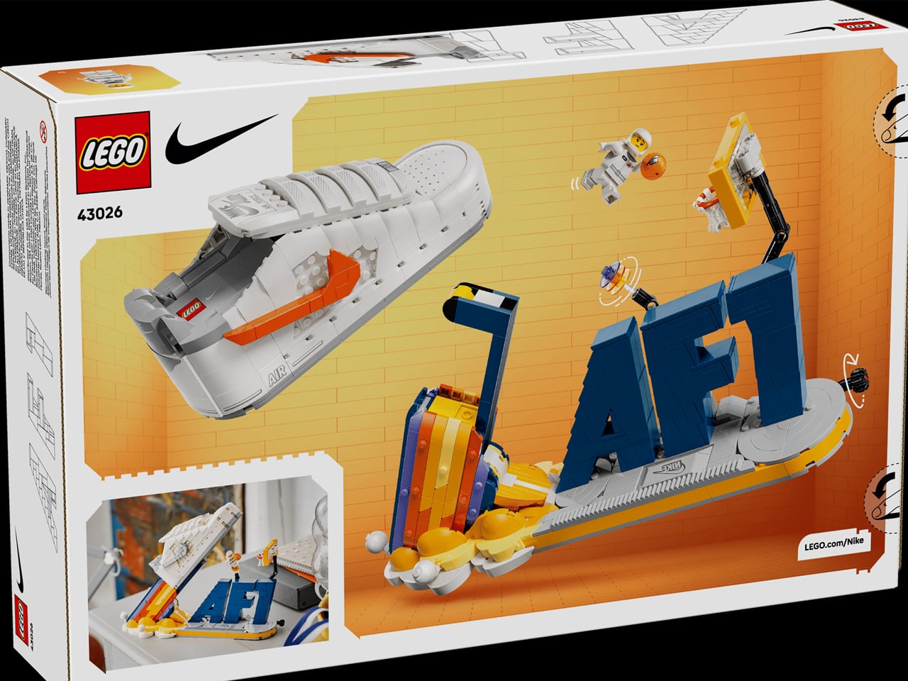
An eye-pleasing conglomeration in white, blue and yellow, this LEGO x Nike Air Force 1 set will begin shipping from September 1, 2026. It will be available through LEGO for $100; a price point that should push you to get this streetwear decor for your desk, shelf, or bedside table.

The post LEGO x Nike Air Force 1 is set for take-off with a 360° dunking minifig onboard first appeared on Yanko Design.