Every great adventure story needs a telescope. Horatio Hornblower snapping his glass open on the quarterdeck. Long John Silver tracking the Hispaniola from a cliff. Jack Sparrow squinting at the horizon for a ship worth plundering. The handheld nautical telescope has been a shorthand for discovery, danger, and romance since the age of sail, and its grander cousin, the brass tripod-mounted observatory scope, carries the same energy at a considerably more impressive scale.
Bricked1980 has tapped directly into that feeling with a LEGO Ideas submission that looks like it belongs on the desk of a Victorian gentleman scientist. The Functional Vintage Telescope clocks in at around 600 pieces, stands 40 centimeters high, and stretches 53 centimeters in length, with a color palette of deep reddish-brown and pearl gold that makes it look genuinely antique from across the room.
Designer: Bricked1980
The build is modeled on a classic brass refractor telescope mounted on a fully articulated tripod, and the attention to period detail is remarkable. The barrel is rendered in warm dark brown with subtle surface texture suggesting wrapped leather or lacquered wood, banded at intervals with pearl gold rings that evoke the ferrules of a real antique instrument. The tripod legs splay convincingly outward in reddish-brown, connected at the apex by a cluster of black Technic hardware that doubles as the azimuth mount, letting the barrel rotate and pivot in all directions. A small gold chain hangs from the objective end, terminating in what appears to be a lens cap, and it is exactly the kind of fussy, historically accurate touch that elevates this from a cool-looking model to something that feels genuinely researched.
The eyepiece assembly is where the build gets interesting. Bricked1980 has positioned a secondary spotting scope above the main barrel, a common feature on serious Victorian-era refractors used for rough alignment before fine adjustment. My favorite detail, though, is the pair of adjustment wheels flanking the mount, their spoked design rendered using LEGO wheel elements that read convincingly as the kind of slow-motion tracking hardware you’d find on an equatorial mount. The overall silhouette is so convincing that you could photograph this against a dark background and genuinely fool someone.
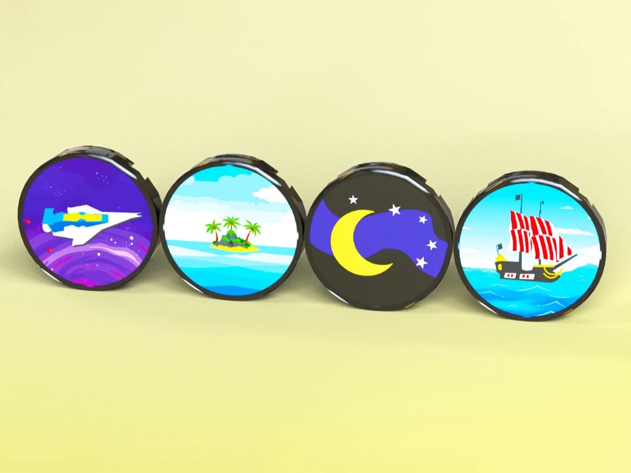
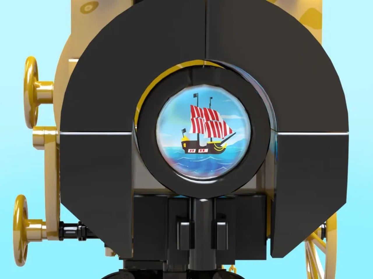
Now, about that “functional” claim. The build includes four bespoke printed scene discs, a spaceship, a tropical island, a crescent moon and stars, and a tall-masted pirate ship, each of which clips behind the objective lens. A hidden light brick, activated by pressing a button on the barrel, illuminates the interior, and you peer through the eyepiece to see the scene glowing inside the tube. It is a charming, theatrical effect, the kind of thing that would delight anyone who picks it up, though don’t go expecting it to resolve Jupiter’s moons. Think of it as a Victorian magic lantern wearing a telescope’s coat, and it is all the more delightful for it. Sharp-eyed LEGO fans will notice that at least two of the scenes appear to contain nods to classic LEGO history, which is a wonderful layer of Easter egg for the community.
The Functional Vintage Telescope has already earned a LEGO Ideas Staff Pick, and currently sits at around 7,500 supporters with 511 days remaining on the clock. It needs 10,000 votes to be submitted for official LEGO review. Click here to cast your vote and help this gorgeous Victorian relic earn its place on a shelf near you.
The hydrogen fuel cell vehicle has been declared dead so many times that the obituary writers have a template saved. Battery EVs won, the infrastructure never materialized, and Toyota’s Mirai became the punchline for a technology that arrived a decade too early and never quite recovered. That was the consensus heading into 2025. Then, in roughly a six-week window, Toyota rolled a hydrogen-electric Tacoma concept onto the SEMA floor, dropped a 2026 Mirai refresh, and unveiled a liquid-hydrogen Le Mans racer, and Hyundai answered with a redesigned NEXO and a striking FCEV concept that previewed an entirely new design language for the brand.
What makes this moment different from previous hydrogen revivals is the context it landed in. A world freshly reminded of oil’s political weight is a world considerably more receptive to the hydrogen pitch, and these announcements, made before any of that, now read as remarkably well-timed. Toyota and Hyundai weren’t reacting to geopolitics. They were already building. The current moment simply handed their work a much larger audience than it might otherwise have found, and the design language pouring out of Toyota City and Seoul tells a story the analyst reports keep missing: hydrogen’s most interesting chapter is being written right now, in metal and carbon fiber and recycled aero panels, on a SEMA show floor and a Le Mans pit lane.
Designer: Toyota
Toyota Tacoma H2-Overlander
The most conceptually ambitious piece in Toyota’s recent hydrogen push is the Tacoma H2-Overlander, built by TRD teams in California and North Carolina for the 2025 SEMA Show in November. Built on the proven TNGA-F truck platform, it replaces internal combustion with a second-generation Mirai fuel cell stack paired with three frame-integrated hydrogen tanks holding 6 kg of fuel. Two electric motors — 301 horsepower up front, 252 at the rear — deliver a combined 547 horsepower, which on paper makes it one of the most powerful Tacomas ever conceived. But horsepower is the least interesting thing about this truck. The fuel cell exhausts a single byproduct from the process it uses to produce electricity: water, and Toyota engineered a patent-pending water recovery system that captures and filters that H2O for camping and outdoor use. Distilled water from a tailpipe, in a truck that can simultaneously charge two EVs through dual NEMA 14-50 outlets via a 15-kW power takeoff. That is a design argument, not just a spec sheet.
Toyota Tacoma H2-Overlander
The argument Toyota is making with the H2-Overlander is the most important one hydrogen advocates have ever attempted: that the infrastructure problem, which has strangled FCEV adoption in urban markets for two decades, simply ceases to matter once you take the vehicle off the grid. A Tacoma disappearing into backcountry terrain where there are no hydrogen stations is not a problem for hydrogen. It is hydrogen’s strongest use case. The concept’s exterior features a custom overlanding camper built from recycled carbon-fiber aero panels, and the whole truck reads as a coherent design thesis rather than a show-floor stunt. Toyota Racing Development built this under an extremely compressed timeline, relying on advanced CAD modeling and multi-site collaboration to retrofit an entirely new powertrain into a platform never designed for it. The pressure showed in the ambition of the result, which is a phrase you rarely get to write about concept vehicles.
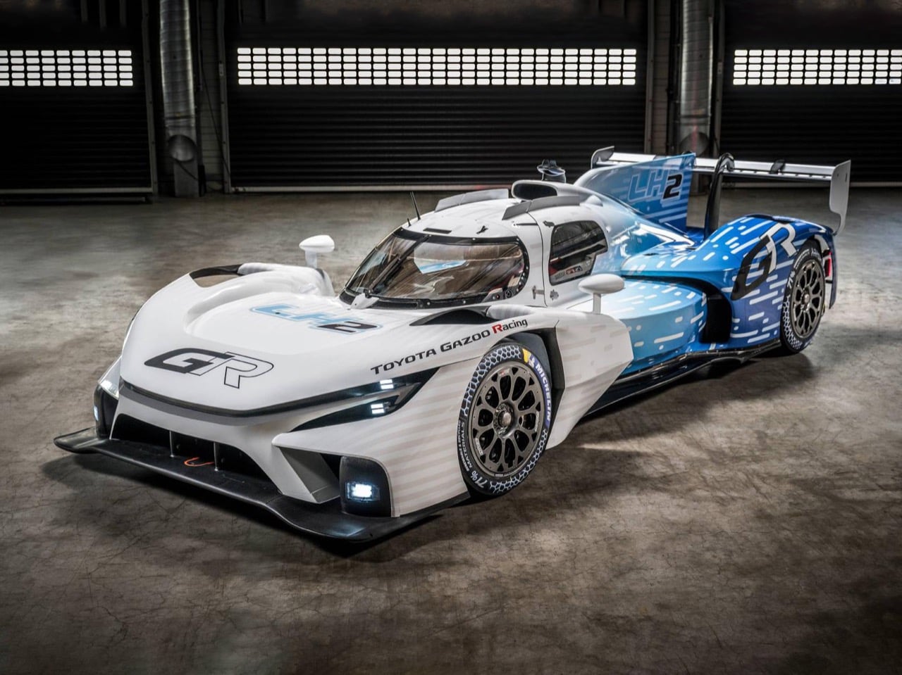
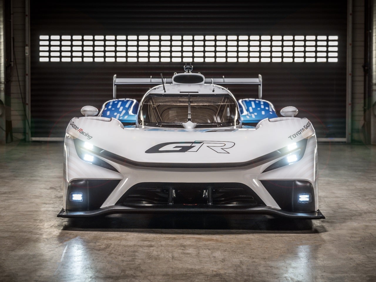
Toyota Gazoo Racing GR LH2 Racing Concept
Toyota did not stop at SEMA. At Le Mans in June 2025, Toyota unveiled the GR LH2 Racing Concept, an evolution of a static design study the marque had presented at the same event in 2023, now underpinned by the chassis from its FIA World Endurance Championship-contending GR010 Hypercars. The GR LH2 runs on liquid hydrogen rather than compressed gaseous hydrogen, which requires storing the fuel at approximately minus 253 degrees Celsius and introduces a completely different set of engineering and packaging challenges. Toyota describes it as a testbed for not just the propulsion system itself but also the infrastructure and refueling requirements it will demand, and team principal Kazuki Nakajima confirmed that a first public on-track test is approaching without committing to a specific date. The Le Mans organizers have tentatively committed to a hydrogen-powered class potentially as early as 2026. Toyota, which has been running hydrogen-combustion Corollas in Japan’s Super Taikyu series since 2021, is the obvious frontrunner for that grid. Motorsport as a hydrogen proving ground is a strategy Toyota has been executing quietly for years, and the GR LH2 is what that strategy looks like when it graduates to the main stage.
Toyota Gazoo Racing GR LH2 Racing Concept
Hyundai’s approach runs in parallel, and deliberately so. Where Toyota has been stress-testing hydrogen across use cases — luxury sedan, off-road truck, endurance racer — Hyundai has been doubling down on hydrogen as a premium SUV proposition with a design language confident enough to treat the powertrain as an asset. Introduced at the Seoul Mobility Show in April 2025, the all-new NEXO is based on the INITIUM concept unveiled in October 2024 and embodies Hyundai’s new “Art of Steel” design language, built around the inherent tension and formability of steel as a material statement rather than a neutral manufacturing choice. That design language will be applied exclusively to hydrogen-powered vehicles within Hyundai’s lineup, which is a meaningful brand decision. Hyundai is not just refreshing a car. It is building a visual identity for hydrogen as a category, separating FCEVs from BEVs at the design language level so that a buyer can read the powertrain from across a parking lot. The HTWO lamp signatures, derived from the molecular formula for hydrogen and Hyundai’s hydrogen brand name, appear front and rear as dedicated FCEV-specific design cues. That kind of systematic visual differentiation takes conviction, and conviction is something hydrogen advocacy has historically lacked.
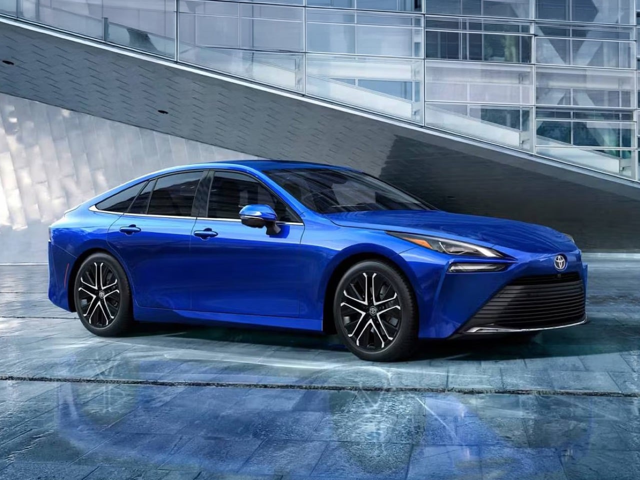
Toyota Mirai 2026
The 2026 NEXO targets a driving range of up to 447 miles on a single fill, refuels in approximately five minutes, and becomes the first FCEV to offer towing capability in European markets, a specification that quietly dismantles one of the lingering criticisms of fuel cell vehicles as impractical luxury objects. A hydrogen SUV that can tow is no longer a commuter car wearing premium clothes. It is a direct competitor to diesel utility vehicles in markets where towing capacity is a purchase decision, not an afterthought. The interior has been reimagined as what Hyundai calls a “Furnished Space,” with Relaxation Seats, a Bang and Olufsen 14-speaker audio system, vehicle-to-load capability up to 3.6 kW, and a curved dual 12.3-inch display system. The cabin ambition is clear: Hyundai wants the NEXO to compete on interior quality with premium German SUVs, and it wants the hydrogen powertrain to feel like a selling point rather than a compromise the buyer tolerates.
Toyota Mirai 2026
BMW and Honda both have hydrogen programs running in parallel, and the commercial truck sector has been deploying hydrogen fuel cells at scale for longer than most passenger car advocates acknowledge. But Toyota and Hyundai are the two companies whose recent design output makes the strongest collective argument for hydrogen as a coherent, multi-use-case technology with real visual language and real engineering ambition behind it. The obituary writers got the timing wrong. Hydrogen in 2025 looks less like a technology in retreat and more like one that has been quietly doing its homework, waiting for the moment when the world would finally pay attention. That moment, for reasons nobody in Toyota City or Seoul planned for, appears to have arrived.
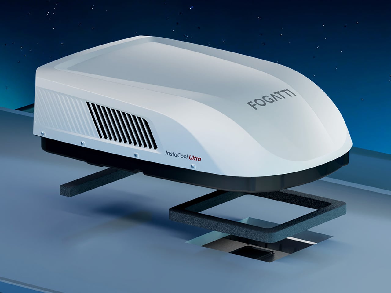
There’s a moment every RV owner knows: you’ve been hiking all day in 95-degree heat, you’re covered in dust and questionable decisions, and you open the door to your trailer expecting relief. Instead, you get a wall of stagnant air that somehow feels hotter than outside. Your rooftop AC has been running for three hours and achieved exactly nothing. The problem isn’t usually the BTU rating on paper. Most 13,500 or 15,000 BTU units can theoretically cool the space. The problem is airflow distribution, compressor efficiency under load, and the reality that your RV is essentially a greenhouse on wheels with minimal insulation and windows everywhere. By the time cooled air reaches the back bedroom, it’s already been defeated by physics.
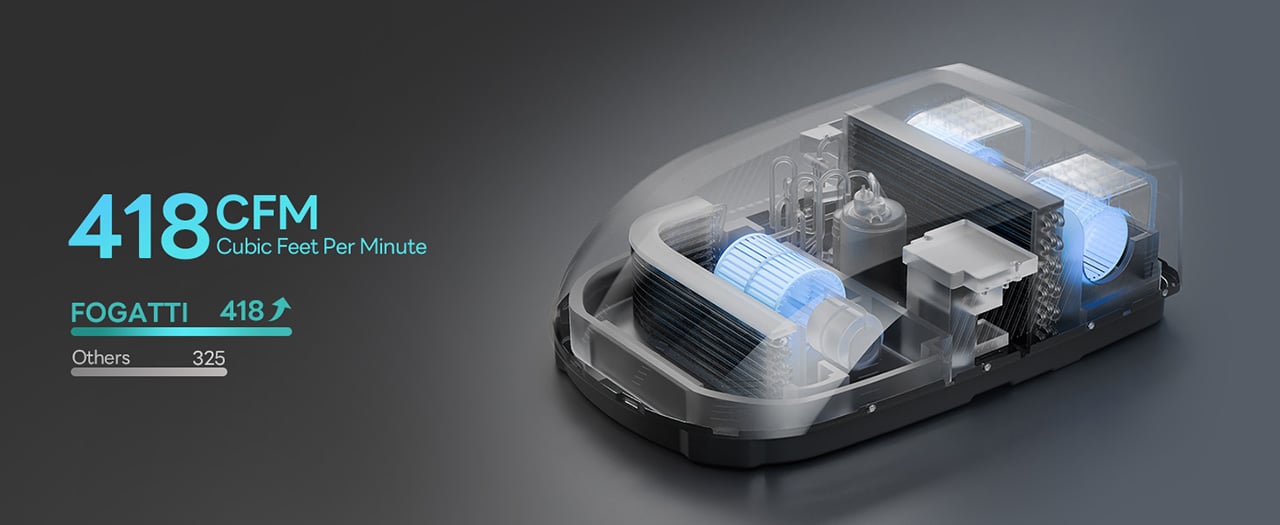
FOGATTI’s InstaCool Ultra approaches this with 418 CFM of airflow pushed through dual synchronous motors that sweep 85 degrees, creating whole-RV coverage in roughly 4 minutes according to the company. The 16,000 BTU cooling capacity targets spaces up to 600 square feet, which translates to RVs up to 36 feet long. The unit doubles as a heat pump delivering 12,500 BTU of warmth, giving it legitimate four-season capability without installing separate heating hardware. Heat pumps move thermal energy rather than creating it, which makes them roughly 3-4 times more efficient than resistance heating. The 9.2cc high-displacement compressor achieves an 11.8 EER rating (the Department of Energy considers anything above 10.7 high efficiency), operates at 43 decibels, and fits standard 14.25-inch roof openings without modification. At $1,399 (down from $1,759), it undercuts premium units while outspeccing budget alternatives.
The heat pump architecture sits at the center of what makes this unit different from the Coleman-Mach and Dometic systems that dominate most RV roofs. Traditional RV climate control treats heating and cooling as separate problems requiring separate solutions. The InstaCool Ultra runs a reversible refrigerant cycle, which means the same compressor and heat exchanger hardware that cools in July also heats in October. The system operates across an ambient temperature range from 23°F to 115°F, covering most of the continental United States outside of genuine Arctic expeditions or desert extremes that would make you question your life choices anyway.
The airflow system uses dual synchronous motors driving three fans to push 418 CFM through the cabin. For context, most 15,000 BTU RV air conditioners move 325-350 CFM. The extra volume comes from the triple-fan configuration rather than just running the motors harder, which keeps noise down while increasing air circulation. The motors drive an 85-degree sweep mechanism that oscillates the airflow rather than blasting it straight down in a single column. You can also lock the vents in place for targeted cooling when you want maximum airflow in one zone.
The reversible heat pump system automatically switches between cooling and heating modes, using compressor-based thermal transfer rather than combustion-based heating. Five segments run during milder conditions or when you’re just maintaining temperature overnight. This variable output prevents the temperature swings you get with single-stage systems that either blast full power or shut off entirely. The heat pump delivers 12,500 BTU of heating capacity, which sounds less impressive than the 16,000 BTU cooling until you account for the efficiency difference. A heat pump operating at a 3.4 coefficient of performance moves 3.4 watts of thermal energy for every watt of electricity consumed. Resistance heaters convert electricity to heat at a 1:1 ratio.
The control ecosystem offers three entry points: a physical remote, a touchscreen ADB panel mounted inside the RV, and a WiFi-connected smartphone app. The app lets you pre-cool or pre-heat the RV before you return from a day hike, which sounds like a luxury feature until you experience stepping into a 72°F trailer after spending six hours in the sun at Arches National Park.
The physical installation targets the standard 14.25-inch by 14.25-inch roof cutout that Coleman, Dometic, and Furrion units use, which means most RVers can swap this in as a direct replacement without modifying the roof structure. The streamlined profile measures 12.2 inches tall, which keeps it in low-profile territory. For comparison, the Dometic Brisk II sits around 14 inches tall, and the Coleman-Mach 15 runs closer to 13.5 inches. Those couple of inches determine whether you clear that 13-foot bridge on the backroad to your favorite dispersed campsite.
The 43-decibel noise rating puts this in the quiet category for RV air conditioners. Coleman-Mach units typically run 65-72 decibels. Dometic’s quieter models hit 50-59 decibels. The InstaCool Ultra’s 43-decibel claim would make it one of the quietest rooftop units available, though that figure likely represents the lowest speed setting rather than full-power operation.
The InstaCool Ultra ships for $1,399, down from the original $1,759 price point. That positions it between budget-tier units from Advent or RecPro (which run $700-900) and premium models from Dometic’s FreshJet or GE’s Profile series (which approach $1,400-1,600). The unit currently ships in white, fitting standard non-ducted installations. What you’re really buying here is year-round climate control without installing two separate systems or draining your battery bank every time the temperature drops. Heat pump, real airflow, quiet operation, and an efficiency rating that lets you boondock longer. For RVers chasing fall colors in the Rockies or spring wildflowers in the desert, that combination finally exists at a price that doesn’t require financing.
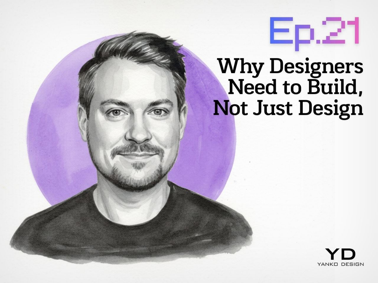
Yanko Design’s Design Mindset, powered by KeyShot, continues to carve out a thoughtful space for conversations around creativity, process, and the way design is evolving in real time. Now at Episode 21, the weekly podcast has become a compelling extension of the publication’s larger design lens, moving beyond products and visuals to focus on the people, principles, and practices shaping the creative world today. Each episode opens up a deeper look at the mindset behind modern design, asking what it really means to create with relevance in a landscape that keeps changing.
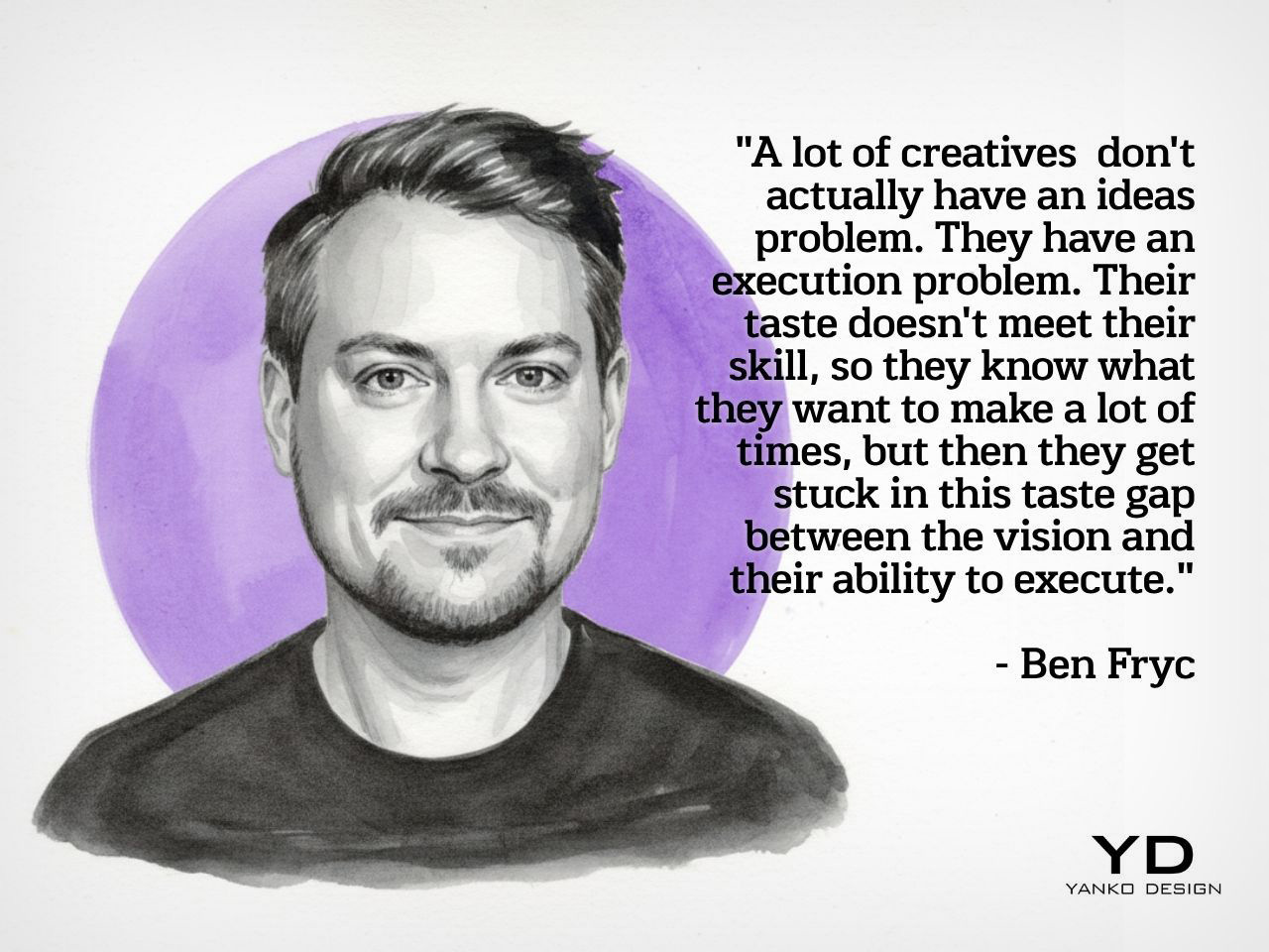
This week’s guest is Ben Fryc of Framer, a creative voice whose work sits at the intersection of storytelling, digital product thinking, and workflow design. In conversation with Radhika Sood, Ben speaks about a shift many designers are already feeling, where the role is expanding from someone who visualizes ideas to someone who can actively bring them to life. The result is a timely discussion about momentum, confidence, tools, and the growing value of designers who know how to build.
Ben’s central argument lands quickly and stays with you through the rest of the episode: most creatives do not struggle with ideas, they struggle with execution. That distinction gives shape to a frustration many designers know well. The vision is there, the taste is there, and the instinct is often sharp, but the path from concept to finished outcome can still feel longer than expected. Ben attributes that gap to experience, or more specifically, the lack of enough repetition to turn instinct into capability. He speaks candidly about the misconception that strong execution should arrive early, especially for young designers stepping out of school and into the profession.
What makes his perspective resonate is the way he strips away the mythology around creative success and replaces it with something more useful. Good ideas matter, but the people who move forward are usually the ones who learn how to carry those ideas through constraints, revisions, and real-world expectations. Experience becomes the bridge between taste and output, and that bridge is built over time. In Ben’s framing, becoming a stronger designer is less about waiting for talent to click and more about putting in enough cycles of making to close the distance between what you imagine and what you can actually produce.
When Designers Start Becoming Builders
A major theme in the episode is the changing role of the designer, especially in a world where tools have made prototyping, publishing, and testing much more accessible. Ben talks about how the shift often begins the moment a designer starts thinking beyond the static mockup and becomes interested in how something actually works in motion. Once that curiosity enters the process, design starts to feel more active and more complete. The act of building no longer belongs exclusively to another team or another discipline. It becomes part of the designer’s own creative vocabulary.
Ben describes this transition almost like unlocking a new layer of ability, where confidence grows because the work can finally move out of presentation mode and into lived experience. That shift changes more than output. It changes the way a designer thinks about learning, problem-solving, and authorship. Coding, prototyping, 3D modeling, and other adjacent skills begin to feel less like optional extras and more like natural extensions of the design process. What emerges is a broader creative identity, one rooted in agency and in the satisfaction of making something real enough for others to use, experience, or respond to.
Workflow as a Creative Force
One of the most interesting parts of the conversation comes when Ben talks about workflow, not as a backstage concern but as a genuine creative advantage. He pushes back on the idea that workflow is simply a matter of optimization and instead frames it as something that shapes the quality of thinking itself. For him, a smooth workflow creates the conditions for ideas to evolve naturally, especially in projects where the final outcome only becomes clear through the act of making. That kind of process depends on iteration, room for discovery, and enough flexibility to let references, instincts, and experimentation inform the direction of the work.
He also makes an important point about communication, especially in collaborative environments where creative momentum can either build quickly or lose energy just as fast. Sharing work early, being clear about process, and inviting feedback before everything is fully polished all become part of a healthier workflow. Ben’s view is that better work often comes from showing progress sooner rather than later, because feedback strengthens the idea while it is still flexible. In that sense, workflow is not just about personal efficiency. It is also about preserving momentum, protecting creative energy, and giving ideas a better chance to grow into something stronger.
The Tools That Shape Ambition
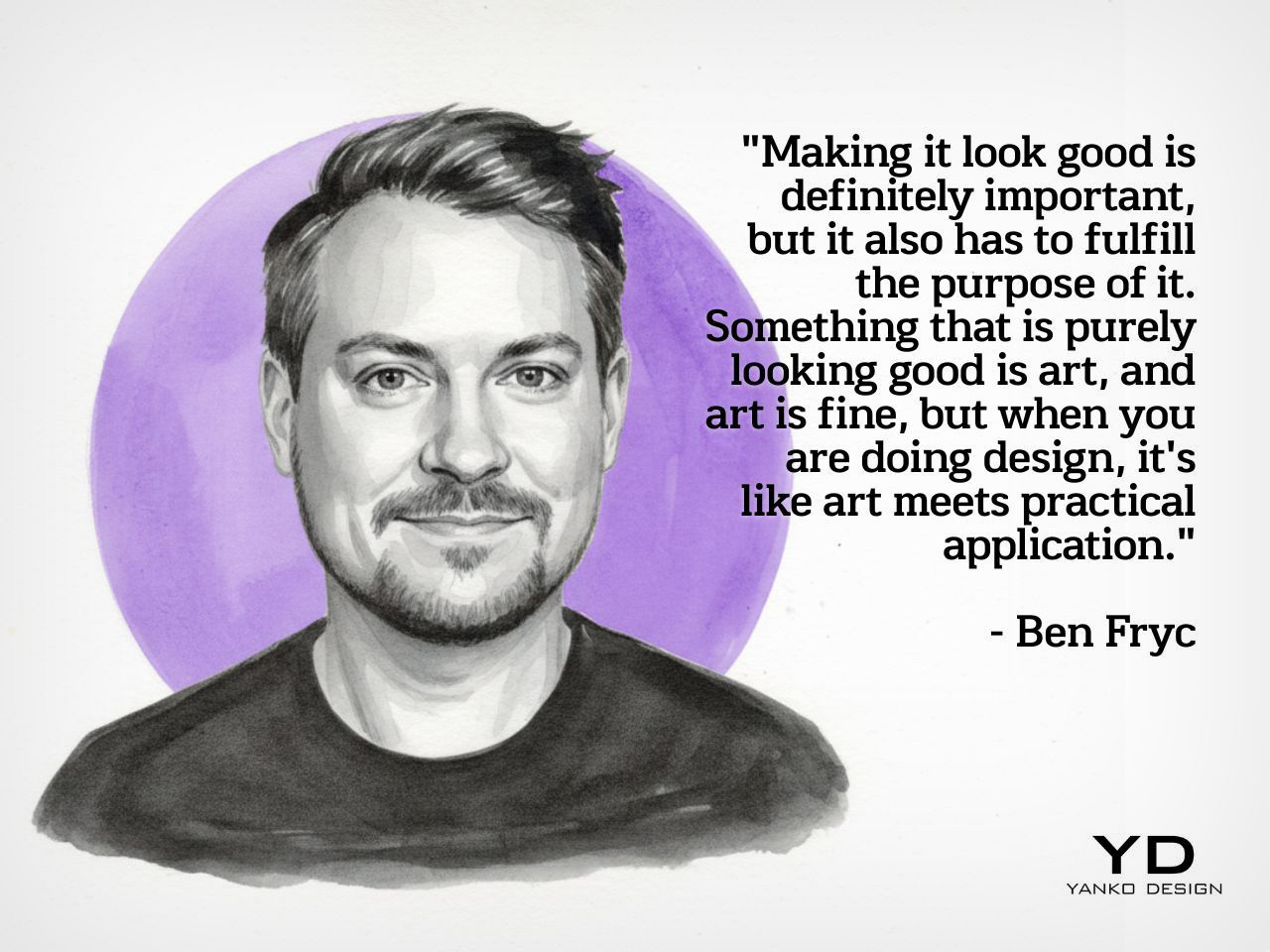
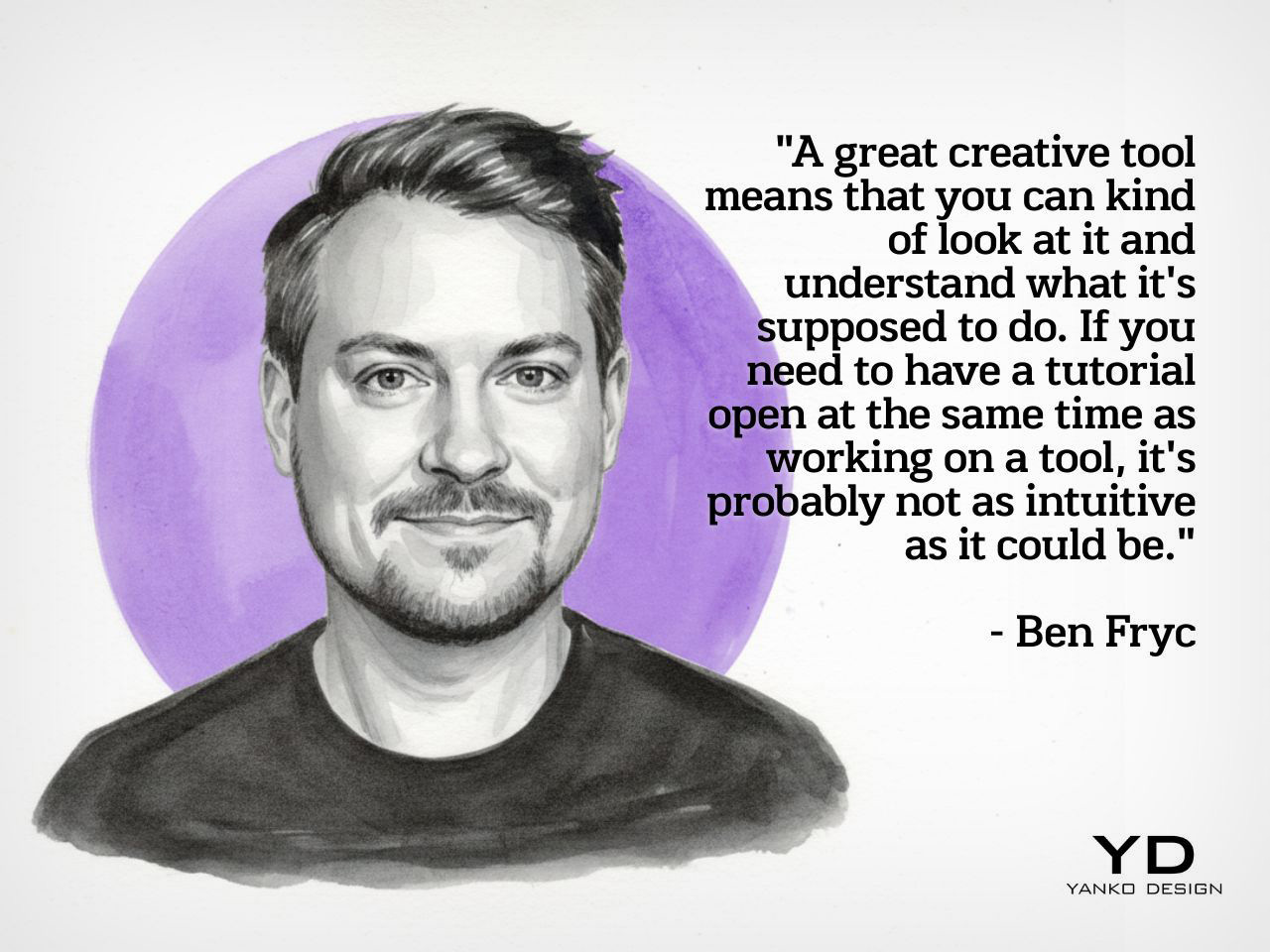
Because Ben works at Framer, the discussion naturally moves into the role of tools, though what makes his take interesting is that he avoids reducing the conversation to features alone. He speaks instead about the feeling of a tool, how quickly it communicates its purpose, how naturally it invites experimentation, and how much friction it introduces between thought and action. In his view, the best creative tools are the ones that feel legible early on, even if they reveal more depth over time. Complexity can have value, but approachability matters because it determines whether someone begins with curiosity or hesitation.
That idea becomes especially relevant in the context of today’s no-code and low-friction creative platforms, which have changed what designers can realistically attempt on their own. Ben notes that when tools lower the barrier to making, people often become more ambitious because the path from idea to execution feels more direct. Instead of getting lost in abstraction, they can start building, testing, and refining with greater immediacy. The result is not just speed for its own sake, but a more intentional creative process where the tool amplifies possibility and supports the designer’s ability to act on instinct while learning along the way.
Why Shipping Changes the Designer
The episode closes on a note that feels especially relevant for creatives who spend too long refining, adjusting, and waiting for the right moment to release something. Ben speaks honestly about perfectionism and how easily it can interrupt momentum, especially when creators become so focused on improving the work that they never let it exist in the world. His answer is not careless speed, but a healthier relationship with progress. Making something real, even in an imperfect form, creates a kind of confidence that reflection alone cannot produce. The act of shipping becomes a turning point because it changes how the creator sees their own role.
That is ultimately what gives this conversation its energy. Ben is not presenting building as a trend layered on top of design, but as a deeper evolution in how designers participate in their own ideas. Once something moves from concept to reality, even on a small scale, it carries a different weight. It becomes proof of capability, proof of momentum, and proof that taste can be translated into action. For a weekly podcast like Design Mindset, that kind of conversation feels exactly on point, because it captures the creative shift defining this moment. Designers today are being asked to do more than imagine. They are being invited to make.
Design Mindset drops every week on Yanko Design. Catch Episode 19 in full wherever you listen to podcasts. For a free trial of KeyShot, visit keyshot.com/mindset.
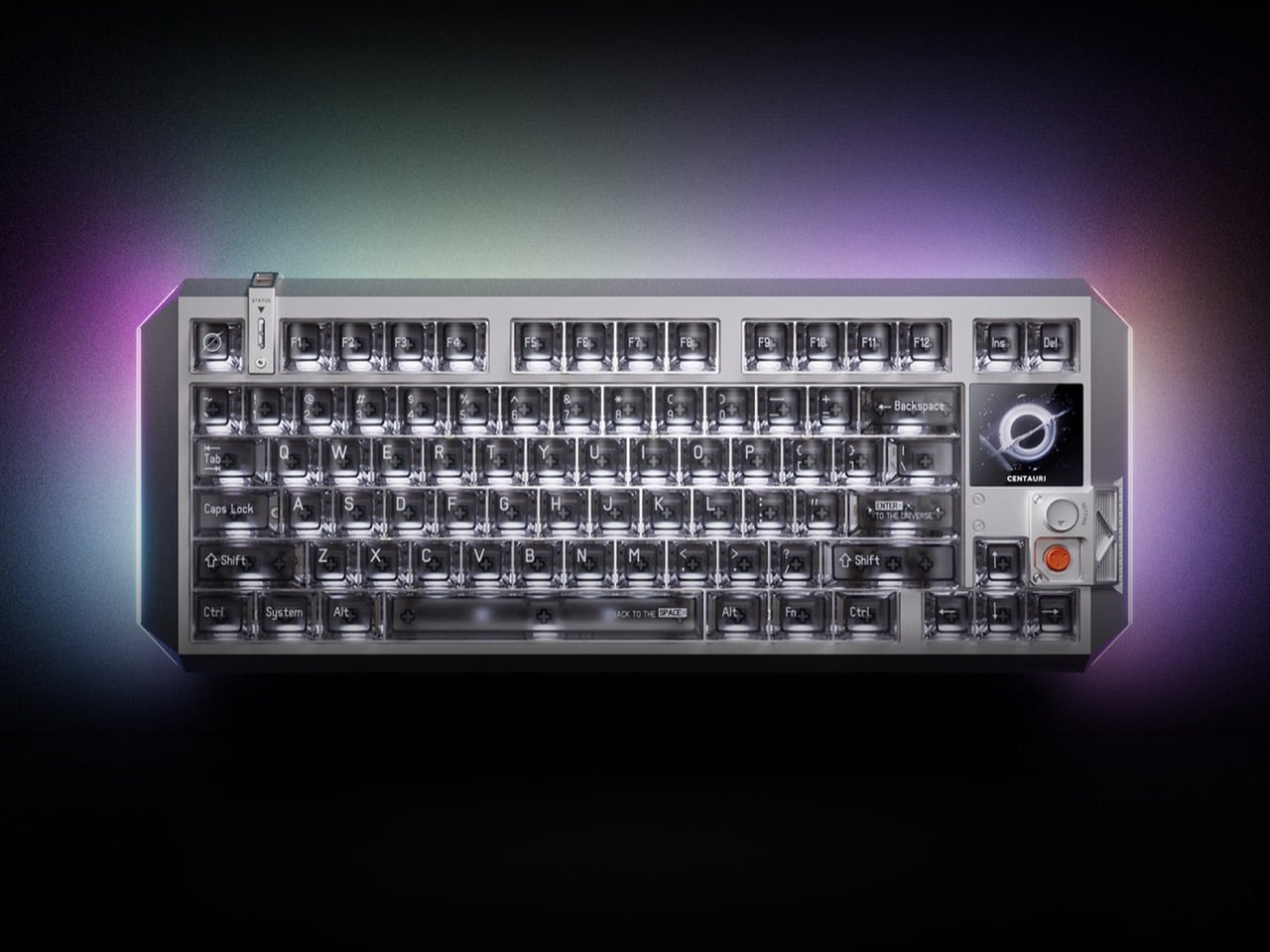
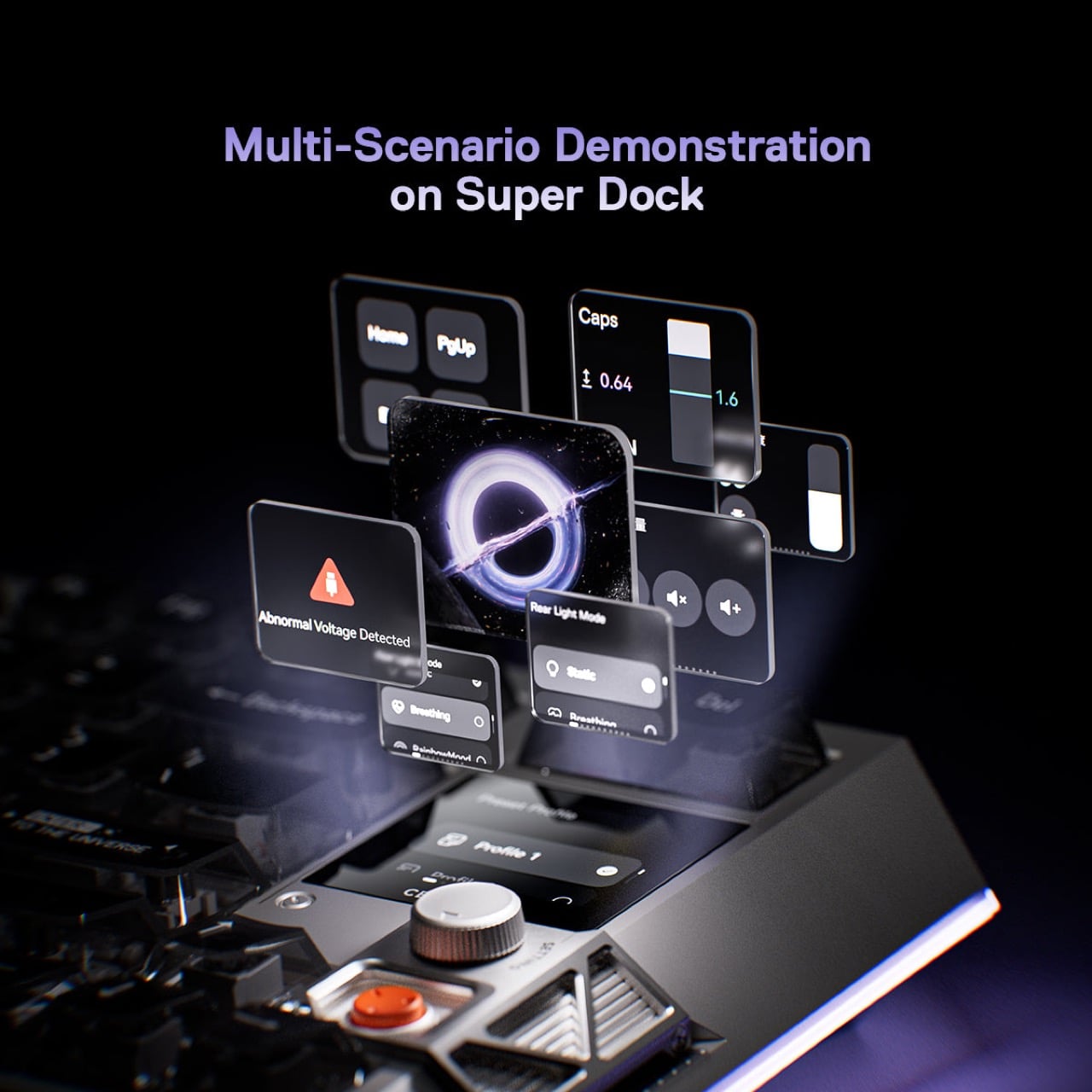
Fifty years of keyboard design, and the basic contract never changed: switches under keycaps, keycaps under fingers, fingers making typos. The mechanical keyboard revival of the 2010s gave us better switches, heavier brass plates, and an entire hobbyist economy built around sound profiles and spring weights, but the object itself remained stubbornly analog in its ambitions. What’s shifted in 2025 and 2026 is the ambition. Boutique builders and hardware engineers are converging on a new idea: the keyboard as a control surface, a designed object with its own interface, its own visual language, its own intelligence. MelGeek, a Beijing-based custom keyboard brand with a decade of crowdfunded hardware behind it, just made that idea concrete with the Centauri80.
The Centauri80 is an 80% Hall Effect keyboard with a 1.78-inch OLED touchscreen embedded directly into the board, running at 325 PPI, which is the same pixel density as an Apple Watch face. A physical rotary encoder called the Super Dock sits beside it, letting you swap live wallpapers, toggle macros, and dial in lighting without alt-tabbing out of whatever you’re working in. Under the aluminum unibody, a distributed architecture of six microcontroller chips drives TTC Flip King magnetic switches to a 0.125ms latency at an 8000Hz polling rate. The whole thing retails at $299 from MelGeek’s own store, which puts it in a genuinely interesting position against the Wooting 60HE and the rest of the Hall Effect field.
Designer: MelGeek
MelGeek opted for a suspended aluminum alloy unibody, which means the internal structure floats within the outer frame rather than bolting directly to it, reducing vibration transfer and keeping the sound profile controlled and intentional. The five-layer gasket-mounted acoustic structure underneath reinforces that choice: every keystroke travels through dampening foam, a silicone layer, and a carefully tuned plate before it reaches your ears as that deep, focused thud that keyboard people spend years and hundreds of dollars chasing. The design language draws openly from cyberpunk aesthetics, with MelGeek describing the Centauri80 internally as “a reimagined starship,” which sounds like marketing until you see the raking lines and deconstructed geometry and realize they actually earn that description. Transparent keycaps ship as default, showing the per-key RGB illumination through the caps themselves rather than just around them, and the three-sided 16 million color lighting system wraps the board in a glow that reads more like a designed accent than a gaming peripheral throwing up on itself.
Traditional mechanical switches use metal contacts: two pieces of metal touch, the circuit closes, the keystroke registers. The problem is that metal contacts wear down, develop inconsistency over time, and can only register a keypress at one fixed point in the key’s travel. Hall Effect switches replace those metal contacts with magnets and sensors, reading the magnet’s position continuously as the key moves, which means the board can register a keypress at any point in the travel down to 0.1mm. That’s what rapid trigger means in practice: the keyboard resets and re-registers with every tiny movement rather than waiting for the key to physically return to a set reset point. For competitive gaming, where re-pressing a movement key a fraction of a second faster translates to a measurable advantage, this is the difference between winning and watching a killcam. MelGeek’s third-generation magnetic switch system adds a distributed architecture of one master chip and five processing chips, delivering what the company claims is 150% faster response than its previous generation, with an EMI shield engineered to cut cross-key interference by 60%.
Embedded into the upper right corner of the 80% layout, the 1.78-inch OLED runs at 325 PPI and 60Hz, handled entirely through the Super Dock rotary encoder beside it. Rotate to cycle through settings pages, press to confirm, keep typing. Live wallpapers, macro profiles, per-key lighting configurations, polling rate adjustments, all accessible on the keyboard itself without opening MelGeek’s Hive software. For someone running multiple macro profiles across different applications, having that switching surface physically on the board rather than buried in a system tray is a real quality-of-life improvement. For someone who sets their keyboard up once and forgets about it, the screen will display a wallpaper and nothing else, which is still a spectacular piece of hardware to stare at while pretending to work.
The Wooting 60HE, which more or less popularized Hall Effect keyboards for a mainstream gaming audience, sits at around $175 and offers rapid trigger without any display hardware. The Centauri80’s $299 asks for a $124 premium, and what you’re buying with that gap is the OLED screen, the rotary encoder, the unibody aluminum chassis, and the aesthetic ambition. The keyboard sits alongside the Wooting the way a beautifully machined mechanical watch sits alongside a Casio: both tell time accurately, one of them is also a statement about what objects are allowed to be. MelGeek has spent a decade building its reputation through crowdfunded custom boards and a community of gamers, coders, and creators who treat keyboards the way audiophiles treat headphones, and the Centauri80 is the clearest articulation yet of what that philosophy looks like at flagship scale.
Cubism was, at its core, an act of radical fragmentation. Picasso and Braque looked at the world and decided that a single perspective was a lie, that the honest way to render a face was to show every angle simultaneously, cheekbone beside profile beside full-frontal stare, all collapsed into one electric, disorienting plane. The result was a new visual language built entirely from geometric shards, bold outlines, and colors that had no interest in behaving themselves.
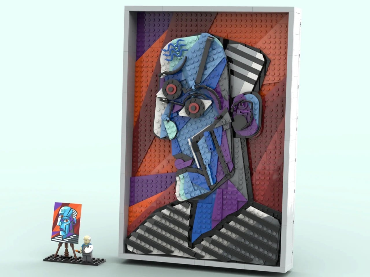
Which makes the literally cube-shaped LEGO brick the perfect medium to translate it. LEGO builder CountVitalCauliflower102 has submitted a 1,117-piece wall-hanging MOC (My Own Creation) to LEGO Ideas that recreates Picasso’s 1953 painting “The Great Painter Face” in brick form, and the moment you see it, something clicks. The angularity, the bold color blocking, the hard-edged geometry, it all lands with the kind of inevitability that makes you wonder why LEGO was focused on Monet and Van Gogh when Picasso’s work translate so perfectly into brick-based art.
Designer: CountVitalCauliflower102
The painting itself is an interesting choice, and a deliberate one. “The Great Painter Face” sits outside Picasso’s most celebrated canon, less famous than Guernica or Les Demoiselles d’Avignon, but it is precisely that underdog status that makes it compelling. The subject is rendered in profile with the full Cubist vocabulary: fractured planes, simultaneous perspectives, a face that is somehow also a diagram of a face. Its bold, high-contrast outlines and vivid color fields translate visually into brick zones with a clarity that a softer, more painterly work simply could not offer. The builder understood exactly what he was choosing, and why.
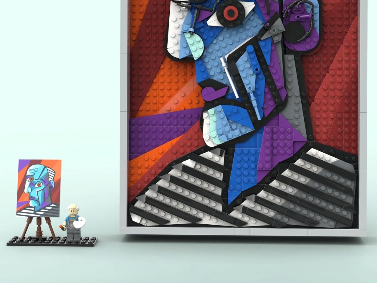
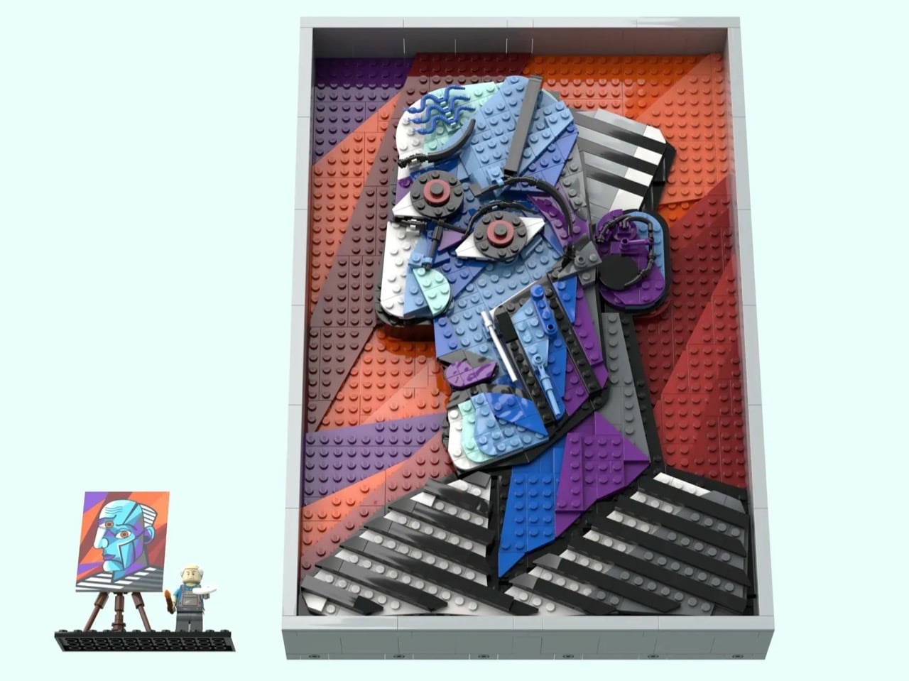
At 34 studs wide and 50 studs tall, roughly 27 by 40 centimeters, the panel is substantial enough to command a wall. The color story is where it immediately grabs you: sweeping diagonal fields of orange, red, and purple form the background, layered at angles that give the composition real energy and depth. Over that, the face emerges in blues, aquas, grey, and white, outlined in black with the bold authority of a stained-glass window. What makes this genuinely impressive from a building standpoint is that CountVitalCauliflower102 avoided the pixel-mosaic approach entirely, opting instead for whole plates and bricks to build continuous color planes, which is absolutely the right call for Cubism’s broad, confident geometry.
My favorite detail, though, is the parts usage in the facial features. The eyes are built around large circular elements with red centers staring out from dark gear-like surrounds, radiating exactly the kind of confrontational intensity Picasso put into his subjects. The wavy blue hair rendered in flexible LEGO tubing is a lovely touch, loose and organic against all that hard geometry. The ear is a cluster of curved and mechanical-looking pieces that somehow reads immediately as an ear while also looking like something you might find in a Technic gearbox. And then there is the nose: a single white bar element, almost dismissively simple, and absolutely perfect. The builder also solved some genuinely tricky structural problems, using Pythagorean geometry to achieve diagonal stud lines at precise integer intervals so that every angled section locks in at two secure endpoints rather than hanging off a single ratchet joint.
The set also includes a minifigure of Picasso himself, wearing paint-splattered overalls and a blue shirt, holding a brush with wet orange paint and a white mixing palette. He stands on a 12×4 black base alongside a brick-built easel displaying a miniature printed canvas of the original painting. It is a lovely piece of editorial wit: the master surveying his own recreation, the tiny figure dwarfed by the monumental panel beside him. The whole build can be displayed either propped on a surface or hung on a wall, with an optional grey frame that gives it that final gallery-ready finish.
LEGO Ideas is the official platform where fan-designed sets earn their shot at becoming real retail products. Any submission that crosses 10,000 supporter votes gets sent to LEGO’s internal review team, which evaluates it for potential production as a boxed set. CountVitalCauliflower102’s Picasso MOC is currently in the early stages of gathering support, with plenty of runway left on the clock. Given that LEGO has released Art sets celebrating Warhol, Hokusai, and even their own brick motif as wall art, a Picasso feels like a genuinely logical next chapter. If you want to help make that happen, you can head to the LEGO Ideas page and cast your vote.
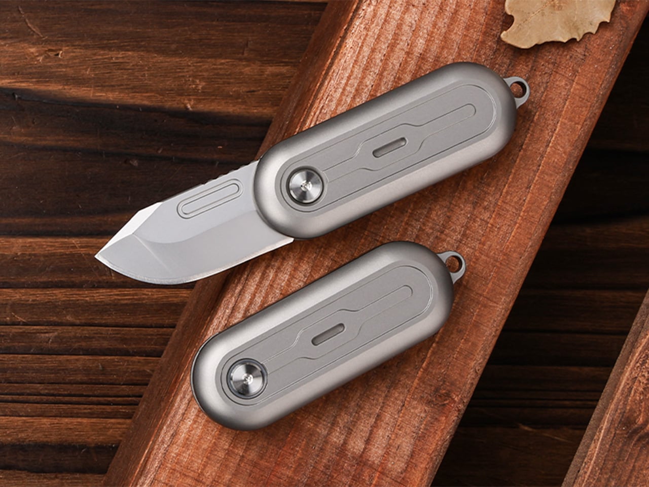
Most pocket knives are designed for the moment you need to cut something. The TiNova II is designed for that moment, but also for the five minutes after, when you find yourself opening and closing it just because the mechanism feels satisfying. That shift in priorities is intentional, and it required Ideaspark to rethink the entire knife after the first version shipped to over 1,300 Kickstarter backers in 2025.
The mechanism itself is straightforward. Two titanium handle scales connect at a single roller bearing pivot point. One scale stays fixed, the other rotates a full 360 degrees around it. Neodymium magnets sit at strategic positions to create resistance, so when the blade swings open or closed, you get a crisp magnetic snap that locks it in place. Flick your wrist and the momentum carries the blade through a smooth rotation with a satisfying ‘click’. Hold it differently and you can coax out a slower, weighted spin. What changed between Gen 1 and Gen 2 is the body shape. The original had flat sides and sharp edges like a traditional folding knife. The TiNova II uses an oval profile that matches the natural curve your hand makes when your fingers relax into a loose fist. That single geometry change makes the knife feel completely different when you’re holding it, which matters when the whole point is creating something you’ll keep picking up. The magnetic resistance is tuned tight enough to keep the blade from accidentally deploying in your pocket, but smooth enough that you can flip it open one-handed without effort.
The handle scales are machined from Grade 5 titanium, the aerospace alloy that shows up in everything from jet engine components to high-end bike frames. The material delivers the strength-to-weight ratio you’d expect (the entire knife weighs 59.3 grams, roughly two U.S. quarters), but the more interesting property is how it wears. Titanium doesn’t corrode, rust, or tarnish the way steel does. Instead, it develops a patina over time, recording scratches and scuffs as a visual history of use. Every mark becomes permanent, which means the knife you carry for a year looks distinctly different from the one that arrived in the mail. Ideaspark leans into this with two finish options: a raw sandblasted titanium that shows wear immediately, and a black PVD coating that creates higher contrast when the underlying metal starts to peek through.
The blade is D2 tool steel, heat-treated to HRC 58-60. D2 sits in an interesting zone within the steel hierarchy. It holds an edge longer than most budget steels (think 8Cr13MoV or AUS-8), and is a go-to choice for premium knives. The choice here makes even more sense for a keychain knife where you’re cutting tape, breaking down cardboard, trimming threads, or slicing through packaging, with practically negligible wear and tear over time compared to a knife that experiences the brunt of rugged outdoor use. The blade profile is a drop-point with a full belly, which gives you a long cutting edge relative to the 40.5mm blade length. The curve naturally guides material into the sharpest part of the edge, making it effective for slicing motions even when you’re working with something as small as this.
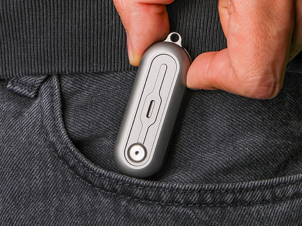
At 64.4mm closed, the TiNova II is shorter than a standard credit card (85.6mm). Opened, the entire knife measures 100mm, just under four inches. The thickness is 12.4mm, slimmer than a stack of three coins. These dimensions put it squarely in the micro-folder category alongside knives like the CRKT Pilar or the Kershaw Chive, but the deployment method sets it apart. Most compact folders use a flipper tab or a thumb stud, mechanisms that require deliberate engagement. The TiNova II uses rotational momentum, which feels closer to spinning a fidget toy than opening a knife. The roller bearing does most of the work. Ideaspark uses what they call a Kugellager bearing (the German term for ball bearing), which is a pretty great way of saying their precision-made bearings boast the kind of well-engineered frictionless movement you’d expect from the Germans. The result is a glide that feels even smoother than air, with no grinding or resistance as the handle rotates.
The magnetic system does several jobs simultaneously. First, it holds the knife closed when it’s in your pocket, preventing accidental deployment. Second, it provides tactile and audible feedback at both the open and closed positions, giving you a satisfying click that confirms the blade is locked. Third, it creates just enough resistance during the spin to make the motion feel controlled rather than loose. The magnets are arranged to pull at the end of each rotation, which is why the knife doesn’t just spin freely like a bearing on a shaft. You feel the mechanism working with you, and that feedback loop is what makes the fidget factor so addictive. The physics here are simple but effective. The magnetic force increases as the scales approach their final position, so the last few degrees of rotation feel like they’re being pulled into place.
An elliptical body shape means there’s no fixed orientation when you’re holding it. You can rotate the knife in your palm, flip it between fingers, or just run your thumb along the curved surface. The absence of sharp edges or defined corners makes it comfortable to manipulate for extended periods, which sounds trivial until you compare it to a traditional rectangular folder that starts digging into your hand after a few minutes. Ideaspark claims this design philosophy came directly from user feedback on the Gen 1 model, where backers loved the mechanism but found the angular body uncomfortable during long fidget sessions. The oval profile solves that problem by removing pressure points entirely.
Two tritium slots run along the length of each handle scale, sized for 1.5mm x 6mm tubes. Tritium is a self-luminous isotope that glows continuously for around 25 years without batteries, charging, or external light. Drop a pair of green, blue, or orange vials into those slots and the knife becomes visible in complete darkness, which is useful for finding it in a bag or on a nightstand. The glow is subtle, not the kind of thing that lights up a room, but enough to catch your eye when you’re fumbling around in the dark. The tritium slots also add a small visual detail that breaks up the otherwise minimal design.
The blade deployment works two ways depending on how you hold it. The long spin involves gripping one handle scale and flicking your wrist, which uses centrifugal force to carry the other scale through a full 360-degree rotation. The motion is slow, weighted, and deliberate. The short flip is faster: a quick wrist snap that sends the blade open with a crisp tick as the magnets engage. Both methods work one-handed, and both feel satisfying in different ways. The long spin has a hypnotic, rolling quality. The short flip is sharp and immediate. You’ll find yourself alternating between them depending on your mood or how much time you’re killing during a meeting.
The knife comes with a keychain hole at one end, sized for a standard split ring. Slip it onto your keys and it disappears into the cluster, weighing less than most car fobs. The compact dimensions mean it works equally well on a wallet chain, a backpack strap, or worn as a necklace pendant if you’re leaning into the EDC-as-jewelry aesthetic. The tritium glow makes it viable as a functional piece of illuminated jewelry, though calling it that probably annoys traditional knife collectors who prefer their folders utilitarian and unadorned.
The TiNova II ships in two finishes: sandblasted (raw titanium) and black coated (PVD). Both finishes come with the same lifetime warranty, which covers manufacturing defects and structural failures. The knife is available now starting at $45 for the launch day special (36% off the $70 MSRP), with free worldwide shipping included. International shipping is scheduled for August 2026.
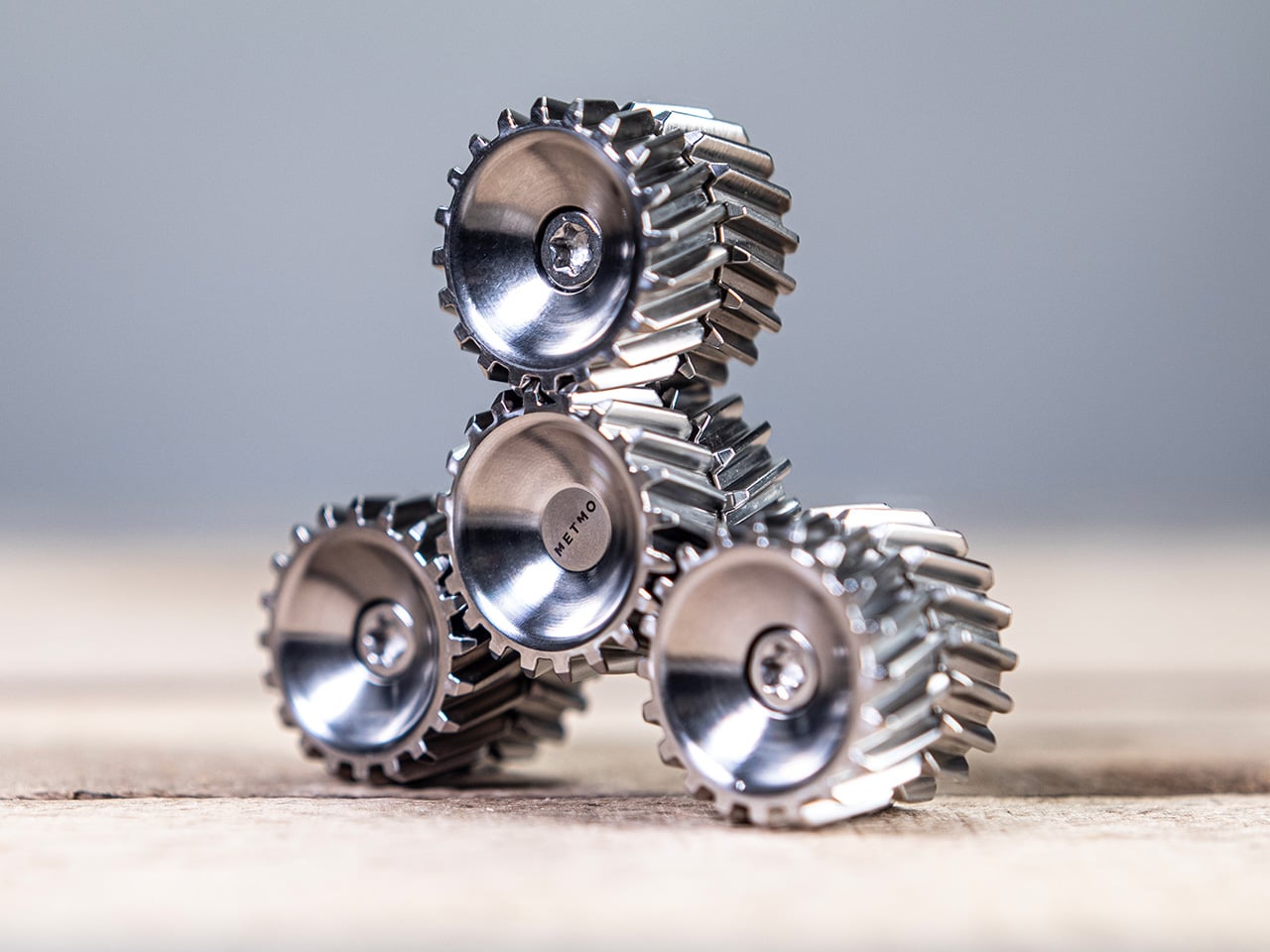
METMO has a talent for taking the visual drama of engineering and translating it into objects people want to touch, turn, and carry. The Grip reimagined the adjustable wrench after nearly 130 years of design stagnation. The Pen turned a dual-thread screw mechanism from 1892 into a fidget object. The Fractal Vise made a complex machinist’s tool into something people keep on their desks purely for the pleasure of operating it. Each time, the Leeds-based team finds a mechanical idea that was ahead of its moment, and rebuilds it with the precision and material quality the original never had.
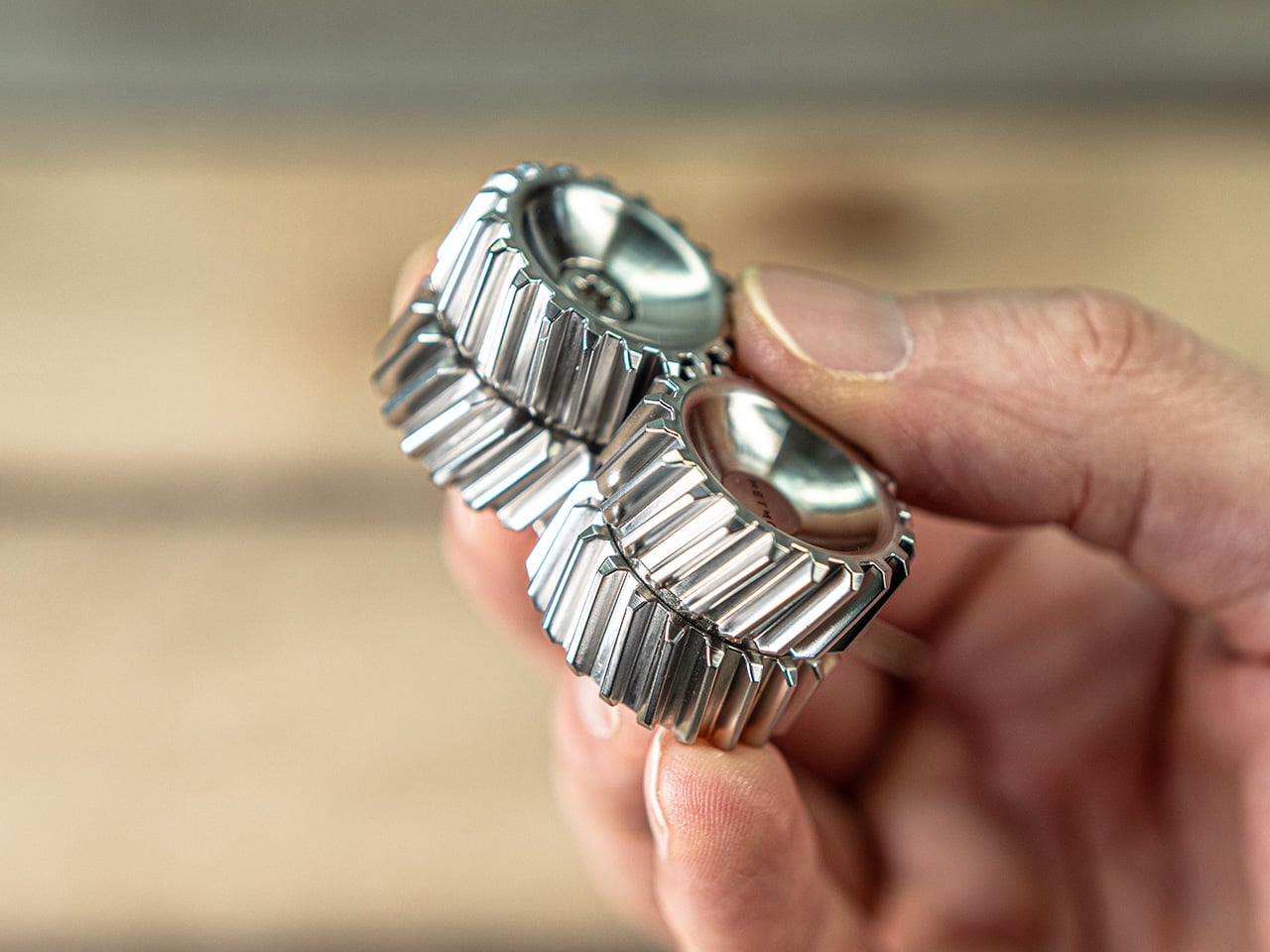
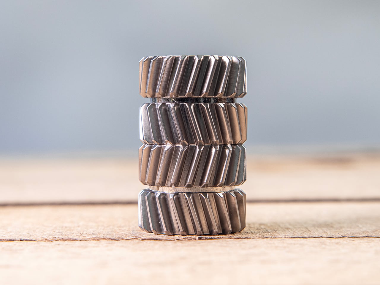
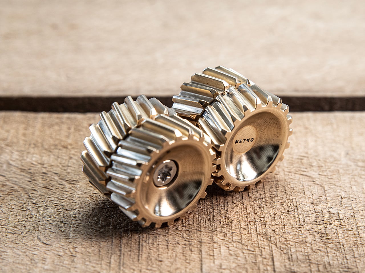
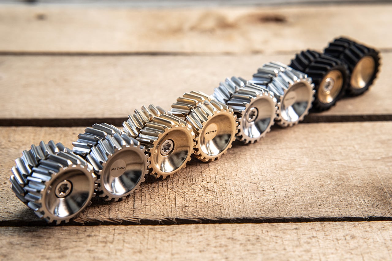
Helico follows that lineage, but takes a noticeably different turn. Where most METMO products carry a clear functional premise, this one leads with pure tactile indulgence, arriving as a compact magnetic form that looks carved from the DNA of helical gears. Every surface seems designed to catch the thumb, reflect light, and reward movement. It comes in four material variants, brass, stainless steel, Grade 5 titanium, and nylon, with each one shifting the personality of the object in a way that feels deliberate rather than cosmetic.
Two cylindrical modules stack vertically, held together by nickel-coated neodymium magnets sandwiched between each section. The magnets are strong enough to keep the stack stable in your hand but calibrated to let you pull sections apart, rotate them, and snap them back together without fighting the object. That separation-and-reconnection loop is where the fidget factor lives, and it turns out to be deeply satisfying in a way that is genuinely hard to articulate. The snap of two sections realigning carries a small but precise reward signal, the kind that makes you do it again immediately. METMO has effectively built a tactile feedback machine disguised as a gear stack.
The angled herringbone grooves channel the thumb naturally while turning every surface into a structure that catches and shifts light as the object rotates. Rolling Helico between your fingers produces a continuous tactile rhythm, a frequency of peaks and valleys that keeps your hands occupied without demanding any conscious attention. The geometry is more considered than it first looks, with the pitch and depth of each tooth calibrated to feel satisfying rather than sharp or aggressive. On the inside of each module, a smooth machined cup creates a deliberate contrast, a quiet surface that makes the exterior texture feel even more intentional by comparison. It is the kind of detail that shows up in product photos but only fully registers when you are holding the thing.
Brass is the version that photographs best and probably sells the story hardest. High tensile HTB1 brass carries real weight, that dense satisfying heft that makes an object feel purposeful rather than precious. It also ages, picking up patina in the spots where your fingers land most often, building a record of use that the steel and titanium versions simply do not. Stainless steel, machined from 316 grade stock, takes the opposite approach: clean, cool to the touch, corrosion-resistant, and visually neutral in a way that lets the geometry do all the talking. Between the two, I would call stainless the everyday carry option and brass the collector’s piece.
Grade 5 titanium is lighter than either brass or stainless, and that shift in weight changes the feel of the object more than you might expect. The same herringbone geometry that feels dense and substantial in brass becomes almost nimble in titanium, sitting in the pocket without any real presence until you reach for it. Titanium also carries those aerospace-adjacent associations that the EDC world never quite gets tired of, and METMO leans into that without apologizing for it. Nylon, specifically PA16, is the outlier of the four, lighter still and matte where everything else is reflective, making Helico feel more casual and approachable. It is the version for people who want the tactile experience on a budget, or who simply prefer their desk objects without the weight class.
Every instinct in the EDC market seems to demand that small objects justify their existence with a list of functions, bottle opener here, hex bit storage there, ruler along the side. Helico skips all of that entirely, and the confidence of that decision is a big part of what makes it interesting. There is no hidden tool, no secondary feature, no apologetic add-on to make the price feel earned. What you are paying for is the machining quality, the material, the magnet calibration, and the sensory experience of an object designed from the ground up to be handled. That kind of object is rare in a product category that too often dresses fidget toys as tools and tools as fidget toys.
The four material variants give Helico a range that most desk objects cannot claim, each one tuned differently enough to appeal to a genuinely different buyer. Brass for the collector who wants something that ages with them, titanium for the EDC enthusiast building a curated pocket, stainless for the person who wants precision without warmth, and nylon for everyone who just wants to fidget without overthinking it. METMO has always been good at making objects that look like they belong in a museum and work like they belong in a toolbox, and Helico sits at an interesting point on that spectrum, leaning harder toward the former than anything the studio has made before. Whether that signals a deliberate pivot or just a smart product line expansion is worth watching. Either way, it would be very easy to put one on your desk and never move it again.
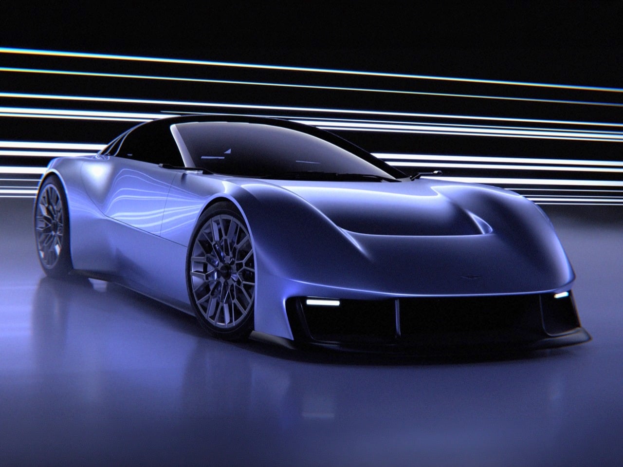
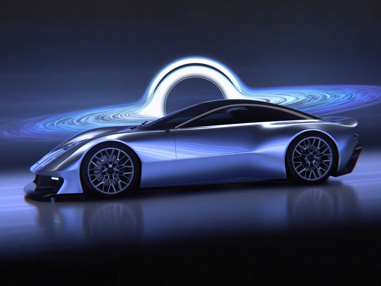
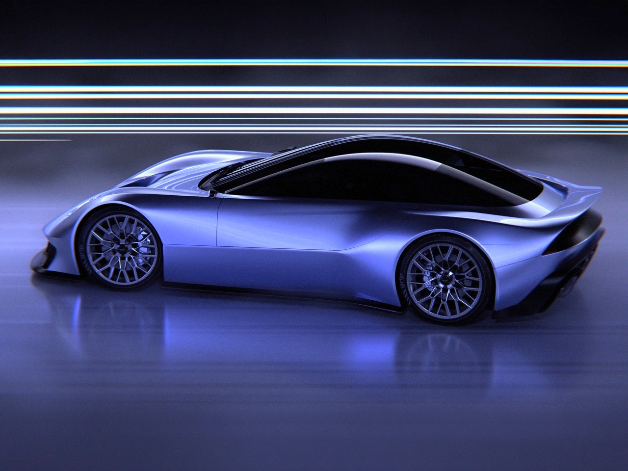
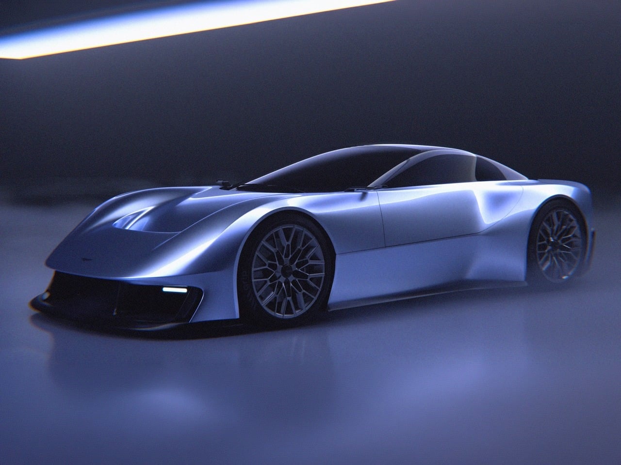
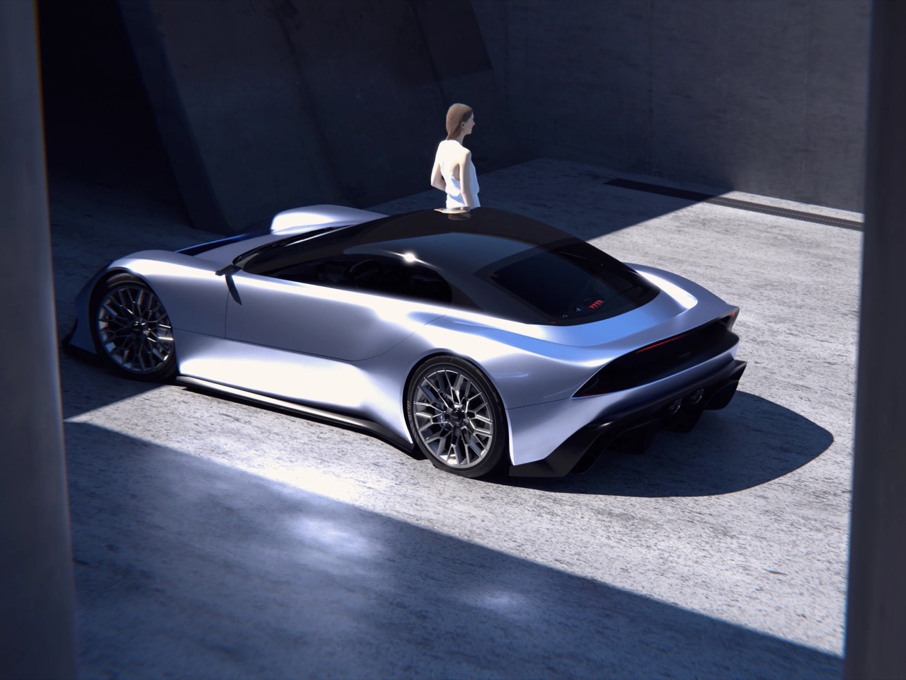
Aston Martin’s design language has evolved remarkably little over the past two decades when you strip away the marketing talk and focus on the actual forms. The grille is always a wide, low trapezoid. The side strakes always bisect the doors. The DRLs always sit in the outer corners of the headlight clusters. The roofline always describes a fastback arc that terminates in a ducktail or integrated spoiler. These aren’t criticisms, they’re observations about a brand that has figured out a formula that works and seen no compelling reason to abandon it. The DB9 introduced this vocabulary in 2004, and every subsequent model (DB11, Vantage, DBS, DBX) has been a variation on that same grammatical structure. It’s a conservative approach that has kept Aston Martin visually coherent across multiple model cycles, but it also means the brand’s design evolution tends to happen in increments rather than leaps.
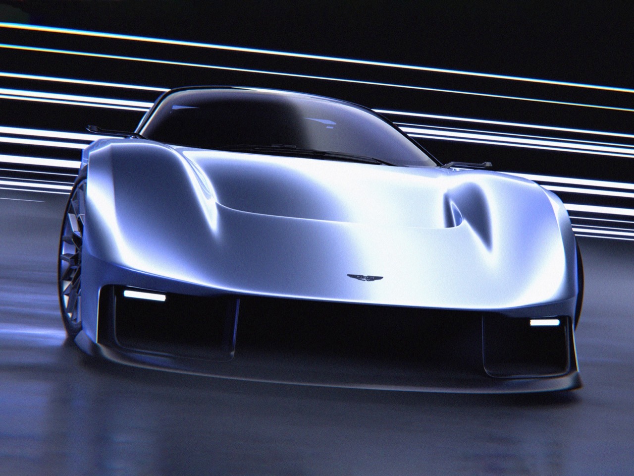
Naoto Kabayashi’s Vanagandr concept asks what happens when you take that established vocabulary and dial the intensity up by about thirty percent. The grille is still recognizably an Aston Martin grille, but it’s more sculptural, more three-dimensional, integrated into the front fascia in a way that makes it feel like part of the car’s structure rather than an applique. The side strakes are still there, but they’ve dissolved into body surfacing that creates similar visual breaks without relying on traditional panel separators. The headlights are still outer-mounted, but they’ve become slim horizontal blades with an internal graphic that references current Aston Martin DRL signatures while pushing the execution further. Every signature element has been reinterpreted through a lens that prioritizes monolithic surfacing and aerodynamic integration over heritage preservation. Whether Aston Martin’s own design team will ever feel bold enough to make these kinds of moves in production is an open question, but Kabayashi’s renders make a compelling case for why they should at least consider it.
Designer: Naoto Kobayashi
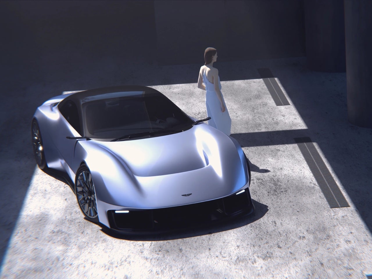
The front fascia is where Kabayashi’s reinterpretation feels most radical. That signature Aston Martin grille, typically a relatively flat panel with a mesh insert, has been transformed into a deeply recessed cavity flanked by aggressive sculpted surfaces that channel air around the nose. The grille opening itself splits into two distinct sections, a lower primary intake and an upper secondary element that sits just below the leading edge of the hood, creating a layered depth that production Aston Martins rarely attempt. Flanking this central structure are vertical air curtain intakes that look like they were carved out of the bodywork with surgical precision, their sharp-edged openings creating visual tension against the organic curves surrounding them. The headlights are razor-thin horizontal elements that extend almost to the wheel arches, with a DRL graphic inside that consists of stacked horizontal bars, a contemporary interpretation of the current Vantage’s lighting signature. It’s aggressive without being cartoonish, purposeful without sacrificing the elegance that defines the brand.
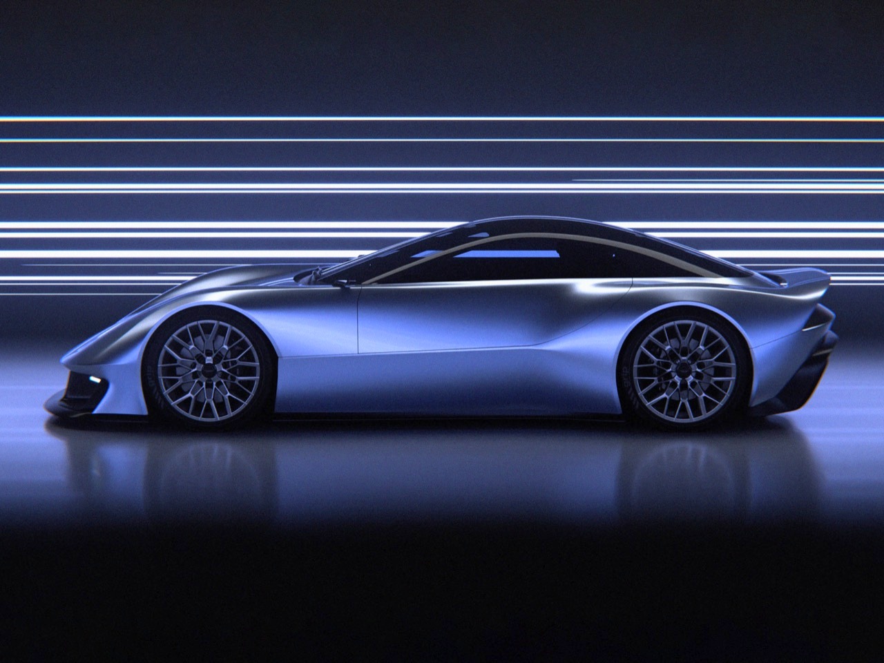
The wheelbase looks stretched, the front wheels pushed far forward to create that classic long-hood silhouette that telegraphs front-engine GT performance from a quarter mile away. The greenhouse is compact and sits low on the body, with a roofline that arcs rearward in a smooth fastback curve before terminating in what appears to be an integrated ducktail spoiler. The side strakes, a design element Aston Martin has carried forward from the DB9 through every subsequent model, have been reimagined as flowing body creases that start just behind the front wheel arch and sweep rearward along the door, creating visual length while also suggesting functional aerodynamic channeling. The rear haunches swell outward dramatically, emphasizing the rear-wheel-drive layout and creating muscular surfaces that catch light in ways that flat panels never could. Multi-spoke wheels in what appears to be gloss black fill the arches completely, and the absence of visible door handles suggests either pop-out units or touch-sensitive entry, both of which have become increasingly common in contemporary supercar design.
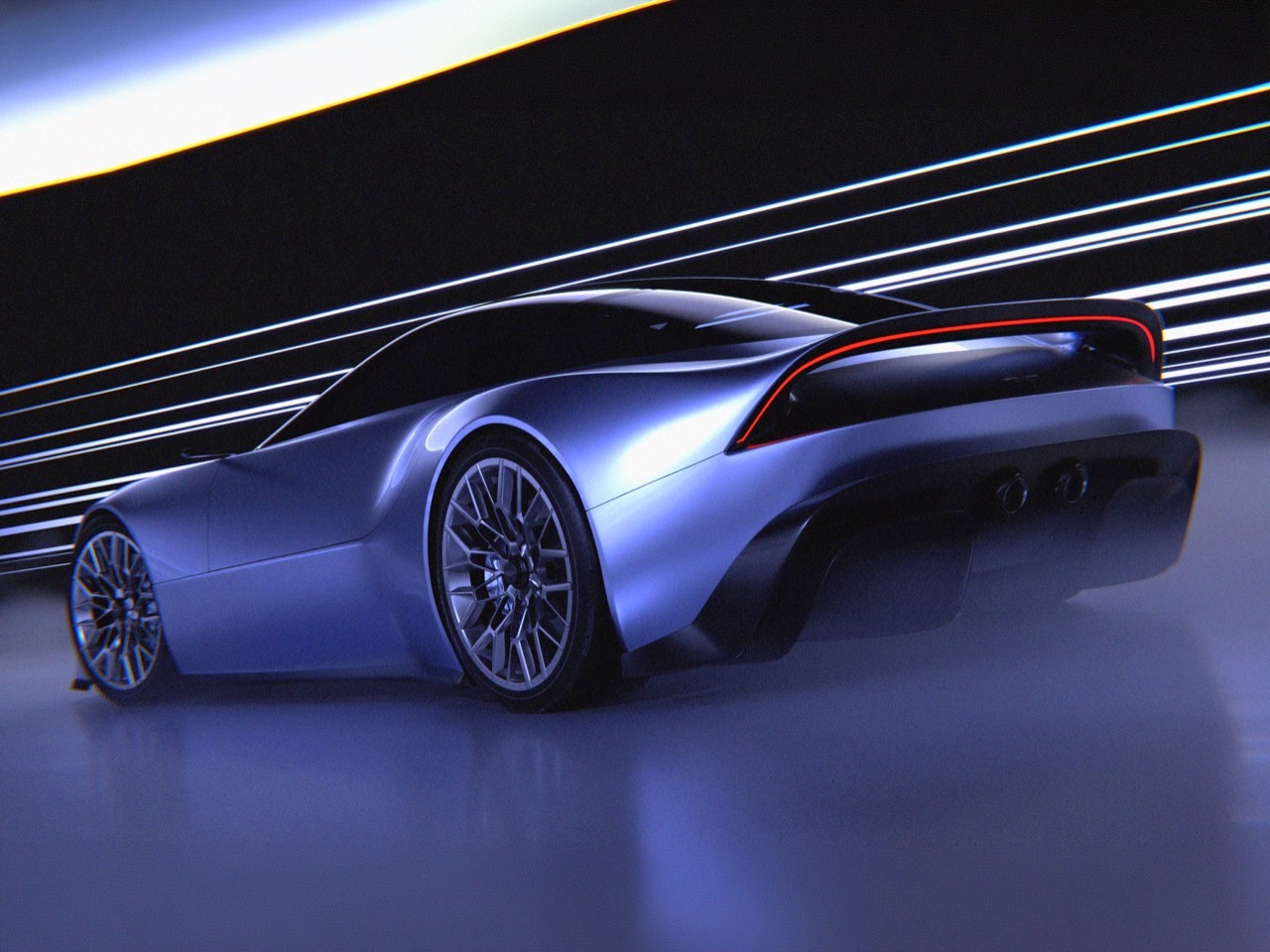
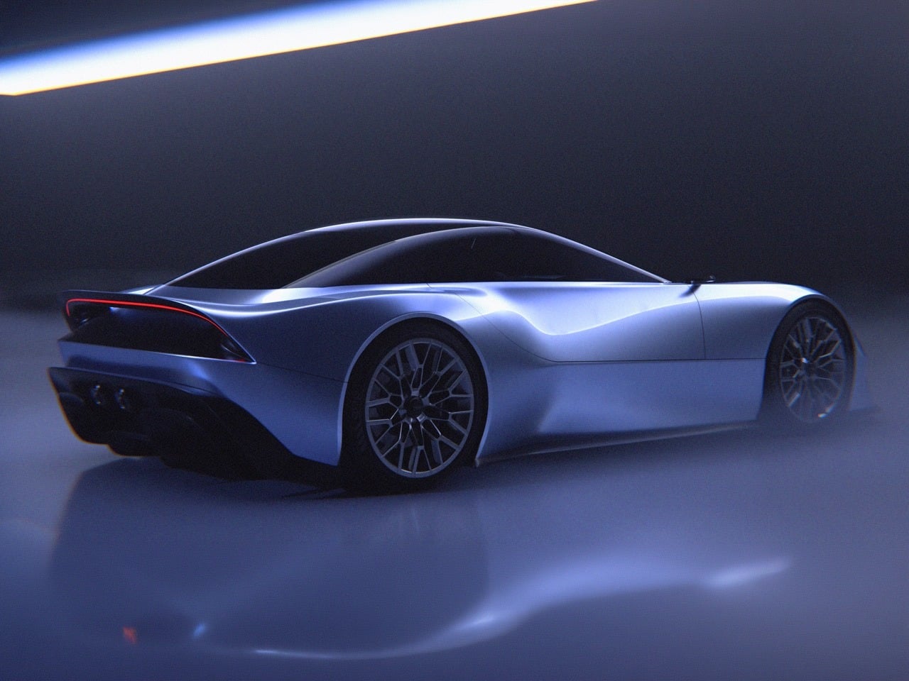
The rear three-quarter view reveals how Kabayashi has handled the challenge of creating a visually interesting tail without resorting to the aggressive aero addenda that defines modern track-focused supercars. The fastback roofline flows into a gently integrated spoiler that rises organically from the rear deck, avoiding the bolt-on appearance of aftermarket wings while still suggesting functional downforce generation. The taillights are slim horizontal elements that wrap slightly around the rear haunches, their internal graphics invisible in these renders but likely consisting of the kind of intricate LED arrays that have become table stakes in the luxury performance segment. Below the taillights sits a rear diffuser treatment that’s more aggressive than anything currently in Aston Martin’s production lineup, with multiple channels and what appear to be dual exhaust outlets integrated into the lower fascia. The overall effect is of a car that’s been shaped by aerodynamics without being dominated by them, maintaining visual elegance while acknowledging the reality of high-speed stability requirements.
The surfacing across the entire body deserves its own discussion because it represents a significant departure from Aston Martin’s current approach. Production Aston Martins tend to use relatively simple, flowing surfaces with minimal interruption, relying on curvature and proportion rather than complex character lines to create visual interest. The Vanagandr maintains that philosophical approach but executes it with far more tension and drama. The hood appears to be a single uninterrupted surface that flows from the grille all the way to the windscreen, but it’s subtly crowned in the center with gentle concave sections flanking the raised spine, creating shadow play that makes the surface read as far more complex than it actually is. The doors similarly avoid hard character lines, instead using compound curves that transition smoothly from the wheel arches to the greenhouse, creating surfaces that look like they’ve been formed by airflow rather than stamped in a press. It’s the kind of surfacing that’s extraordinarily difficult to execute in production because it reveals every imperfection in panel gaps and alignment, which is probably why Aston Martin has historically been more conservative in this area.
The color chosen for these renders, a metallic violet that shifts between silver and blue depending on the lighting, does significant work in revealing the complexity of those surfaces. It’s close to Aston Martin’s Lunar White or Skyfall Silver, colors that prioritize surface revelation over visual pop, allowing the forms themselves to generate interest rather than relying on bold hues. In bright light the car reads as almost pure silver, emphasizing the sculptural quality of the bodywork. In shadow it takes on deeper blue and purple tones that add mystery and visual weight. The name Vanagandr, borrowed from Norse mythology where it refers to a wolf destined to break free during Ragnarok and devour the sun, feels appropriate for a design that seems bound by Aston Martin’s heritage while simultaneously straining against those constraints. Kabayashi has created something that respects the brand’s visual legacy while pushing aggressively toward a future that Gaydon’s own designers may or may not have the courage to pursue.
Aston Martin’s design language has evolved remarkably little over the past two decades when you strip away the marketing talk and focus on the actual forms. The grille is always a wide, low trapezoid. The side strakes always bisect the doors. The DRLs always sit in the outer corners of the headlight clusters. The roofline always describes a fastback arc that terminates in a ducktail or integrated spoiler. These aren’t criticisms, they’re observations about a brand that has figured out a formula that works and seen no compelling reason to abandon it. The DB9 introduced this vocabulary in 2004, and every subsequent model (DB11, Vantage, DBS, DBX) has been a variation on that same grammatical structure. It’s a conservative approach that has kept Aston Martin visually coherent across multiple model cycles, but it also means the brand’s design evolution tends to happen in increments rather than leaps.
Naoto Kabayashi’s Vanagandr concept asks what happens when you take that established vocabulary and dial the intensity up by about thirty percent. The grille is still recognizably an Aston Martin grille, but it’s more sculptural, more three-dimensional, integrated into the front fascia in a way that makes it feel like part of the car’s structure rather than an applique. The side strakes are still there, but they’ve dissolved into body surfacing that creates similar visual breaks without relying on traditional panel separators. The headlights are still outer-mounted, but they’ve become slim horizontal blades with an internal graphic that references current Aston Martin DRL signatures while pushing the execution further. Every signature element has been reinterpreted through a lens that prioritizes monolithic surfacing and aerodynamic integration over heritage preservation. Whether Aston Martin’s own design team will ever feel bold enough to make these kinds of moves in production is an open question, but Kabayashi’s renders make a compelling case for why they should at least consider it.
Designer: Naoto Kobayashi
The front fascia is where Kabayashi’s reinterpretation feels most radical. That signature Aston Martin grille, typically a relatively flat panel with a mesh insert, has been transformed into a deeply recessed cavity flanked by aggressive sculpted surfaces that channel air around the nose. The grille opening itself splits into two distinct sections, a lower primary intake and an upper secondary element that sits just below the leading edge of the hood, creating a layered depth that production Aston Martins rarely attempt. Flanking this central structure are vertical air curtain intakes that look like they were carved out of the bodywork with surgical precision, their sharp-edged openings creating visual tension against the organic curves surrounding them. The headlights are razor-thin horizontal elements that extend almost to the wheel arches, with a DRL graphic inside that consists of stacked horizontal bars, a contemporary interpretation of the current Vantage’s lighting signature. It’s aggressive without being cartoonish, purposeful without sacrificing the elegance that defines the brand.
The wheelbase looks stretched, the front wheels pushed far forward to create that classic long-hood silhouette that telegraphs front-engine GT performance from a quarter mile away. The greenhouse is compact and sits low on the body, with a roofline that arcs rearward in a smooth fastback curve before terminating in what appears to be an integrated ducktail spoiler. The side strakes, a design element Aston Martin has carried forward from the DB9 through every subsequent model, have been reimagined as flowing body creases that start just behind the front wheel arch and sweep rearward along the door, creating visual length while also suggesting functional aerodynamic channeling. The rear haunches swell outward dramatically, emphasizing the rear-wheel-drive layout and creating muscular surfaces that catch light in ways that flat panels never could. Multi-spoke wheels in what appears to be gloss black fill the arches completely, and the absence of visible door handles suggests either pop-out units or touch-sensitive entry, both of which have become increasingly common in contemporary supercar design.
The rear three-quarter view reveals how Kabayashi has handled the challenge of creating a visually interesting tail without resorting to the aggressive aero addenda that defines modern track-focused supercars. The fastback roofline flows into a gently integrated spoiler that rises organically from the rear deck, avoiding the bolt-on appearance of aftermarket wings while still suggesting functional downforce generation. The taillights are slim horizontal elements that wrap slightly around the rear haunches, their internal graphics invisible in these renders but likely consisting of the kind of intricate LED arrays that have become table stakes in the luxury performance segment. Below the taillights sits a rear diffuser treatment that’s more aggressive than anything currently in Aston Martin’s production lineup, with multiple channels and what appear to be dual exhaust outlets integrated into the lower fascia. The overall effect is of a car that’s been shaped by aerodynamics without being dominated by them, maintaining visual elegance while acknowledging the reality of high-speed stability requirements.
The surfacing across the entire body deserves its own discussion because it represents a significant departure from Aston Martin’s current approach. Production Aston Martins tend to use relatively simple, flowing surfaces with minimal interruption, relying on curvature and proportion rather than complex character lines to create visual interest. The Vanagandr maintains that philosophical approach but executes it with far more tension and drama. The hood appears to be a single uninterrupted surface that flows from the grille all the way to the windscreen, but it’s subtly crowned in the center with gentle concave sections flanking the raised spine, creating shadow play that makes the surface read as far more complex than it actually is. The doors similarly avoid hard character lines, instead using compound curves that transition smoothly from the wheel arches to the greenhouse, creating surfaces that look like they’ve been formed by airflow rather than stamped in a press. It’s the kind of surfacing that’s extraordinarily difficult to execute in production because it reveals every imperfection in panel gaps and alignment, which is probably why Aston Martin has historically been more conservative in this area.
The color chosen for these renders, a metallic violet that shifts between silver and blue depending on the lighting, does significant work in revealing the complexity of those surfaces. It’s close to Aston Martin’s Lunar White or Skyfall Silver, colors that prioritize surface revelation over visual pop, allowing the forms themselves to generate interest rather than relying on bold hues. In bright light the car reads as almost pure silver, emphasizing the sculptural quality of the bodywork. In shadow it takes on deeper blue and purple tones that add mystery and visual weight. The name Vanagandr, borrowed from Norse mythology where it refers to a wolf destined to break free during Ragnarok and devour the sun, feels appropriate for a design that seems bound by Aston Martin’s heritage while simultaneously straining against those constraints. Kabayashi has created something that respects the brand’s visual legacy while pushing aggressively toward a future that Gaydon’s own designers may or may not have the courage to pursue.