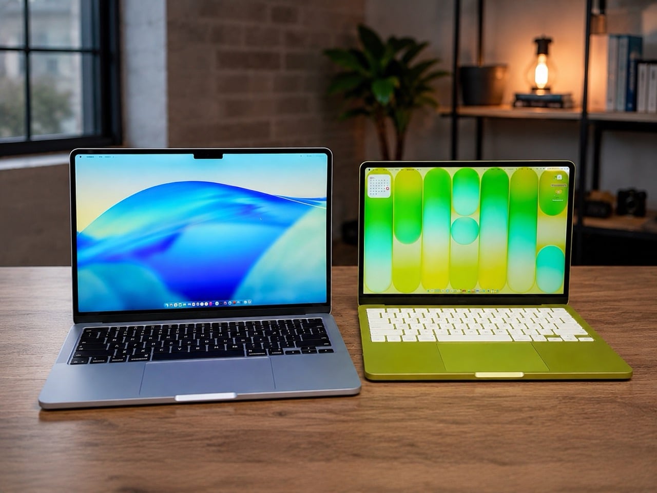
Apple’s 2026 laptop lineup presents a clean, almost philosophical choice. On one side sits the MacBook Neo, a machine built around the powerful idea of access. It lowers the barrier to entry, putting a capable Apple notebook within reach of more people than ever. It is a compelling argument rooted in the present, designed to solve an immediate need for a good, affordable computer. For a few hundred dollars more, the M5 MacBook Air makes a different promise, one that is less about immediate savings and more about long-term value and capability.
For months, that choice felt ambiguous, a simple trade-off between price and power. The arrival of macOS 27, however, brought a new clarity to the decision. Apple’s vision for the next generation of its operating system, with its heavy reliance on sophisticated on-device AI, reframed the entire lineup. The question is no longer just about what you need today, but about which machine is properly equipped for the software you will be using tomorrow. The Neo gets you in the door; the M5 Air gets you a seat at the table.
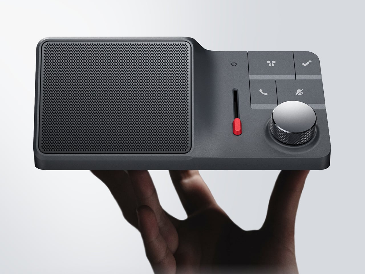
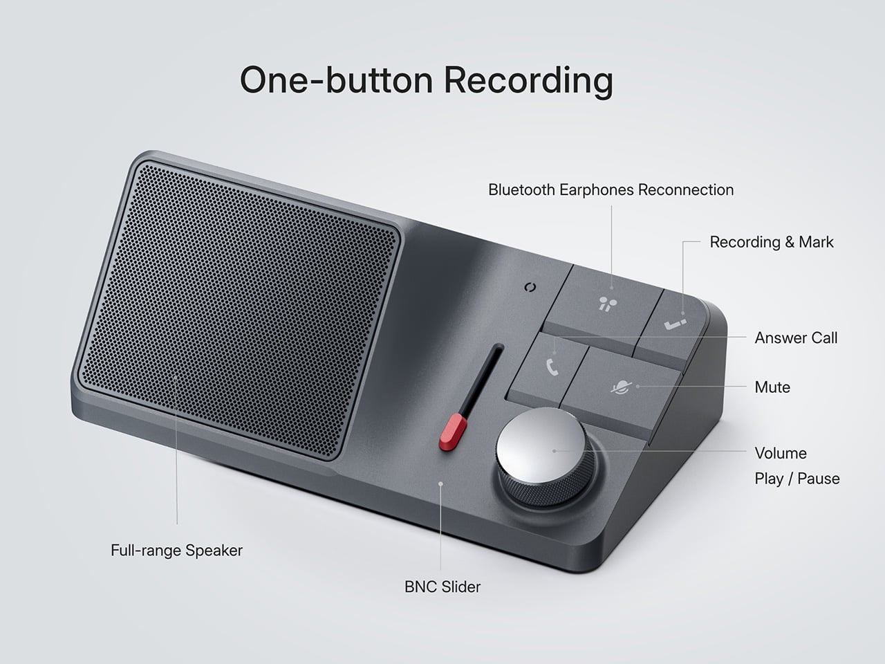
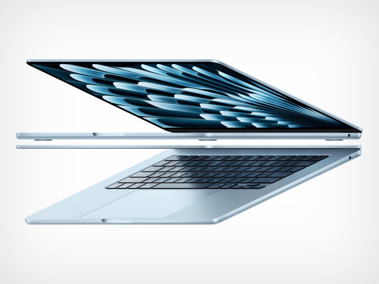
Designer: Apple
The M5 chip is what separates these two machines, and that difference stands out far more now than it did at launch. Apple announced the M5 MacBook Air in March with doubled base storage and modest performance gains, framing it as a solid evolutionary update. The M5 features a 10-core CPU and up to a 10-core GPU, but the real story lives inside those GPU cores. Each one includes a Neural Accelerator, a dedicated AI processing unit that dramatically increases the machine’s ability to handle on-device machine learning tasks. Apple explicitly positioned the M5 Air as capable of delivering up to 4x faster performance for AI tasks than the M4 Air, and up to 9.5x faster than the M1 generation. Those numbers were abstract in March. After WWDC, they became a requirement.
macOS 27 Golden Gate leans heavily on Apple Intelligence, the company’s suite of AI-powered features that process data locally rather than relying on cloud servers. Visual Intelligence, enhanced Spotlight with conversational AI capabilities, and system-wide machine learning workflows all depend on silicon that can handle the computational load without slowing down everyday tasks. The M5’s architecture was designed specifically to support this kind of workload at scale, making it the baseline for an uncompromised experience. Apple described the M5 Air as capable for Apple Intelligence across apps and system experiences, as well as for running large language models on device in enterprise environments. The Neo, with older silicon, may technically run macOS 27, but the gap between eligibility and capability is the entire value argument for spending more.

The storage equation also tilts decisively toward the M5 Air. Apple doubled the base configuration to 512GB, up from the 256GB that previous generations started with. That increase addresses one of the most persistent criticisms of Apple’s entry-level pricing strategy, particularly as on-device AI models require significant local storage to function properly. Larger machine learning models, extensive photo libraries processed with AI features, and the general expectation that a 2026 laptop should have breathing room all make 512GB feel like the real starting point. The $100 price increase over the previous M4 Air generation is easier to justify when half of it is effectively the cost of storage you would have upgraded to anyway. The Neo’s storage configuration was not surfaced in available reporting, but if it follows typical budget laptop patterns, it likely sits closer to the older 256GB baseline, which immediately creates friction for users planning to lean into Apple’s AI-forward software vision.

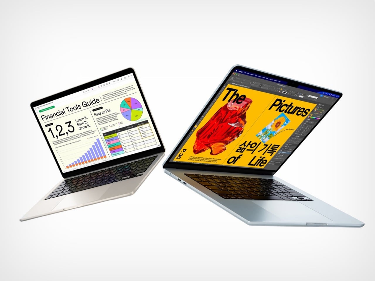
The M5 Air launched in March to a relatively muted reception, with early reviews treating it as a competent, predictable update rather than a transformational product. That framing was accurate at the time, because the machine’s value was not yet fully apparent. WWDC changed the story by revealing what the M5 was actually designed to do. The real product was never just the laptop; it was the laptop as a vessel for a more intelligent operating system. The Neo, by contrast, remains a strong value for users whose needs are defined by today’s software, but it starts to look underpowered the moment you project forward even a year.
The MacBook Air M5 is where Apple’s 2026 Mac story begins to feel aligned with its software ambitions. It is not the cheapest way into the ecosystem, but it may be the cheapest way to avoid compromise as macOS 27 arrives this fall. The Neo has its place, but for anyone planning to live on this machine for the next three to five years, the M5 Air is the safer, smarter, and ultimately more cost-effective choice. You can preorder both machines now through Apple’s website, but only one of them feels like it was built for the operating system Apple just announced.
The post Why the $1,099 MacBook Air M5 beats the MacBook Neo for macOS 27 first appeared on Yanko Design.