Moon-Inspired Japanese Knife Blends Damascus Steel With Gallery-Worthy Material Design

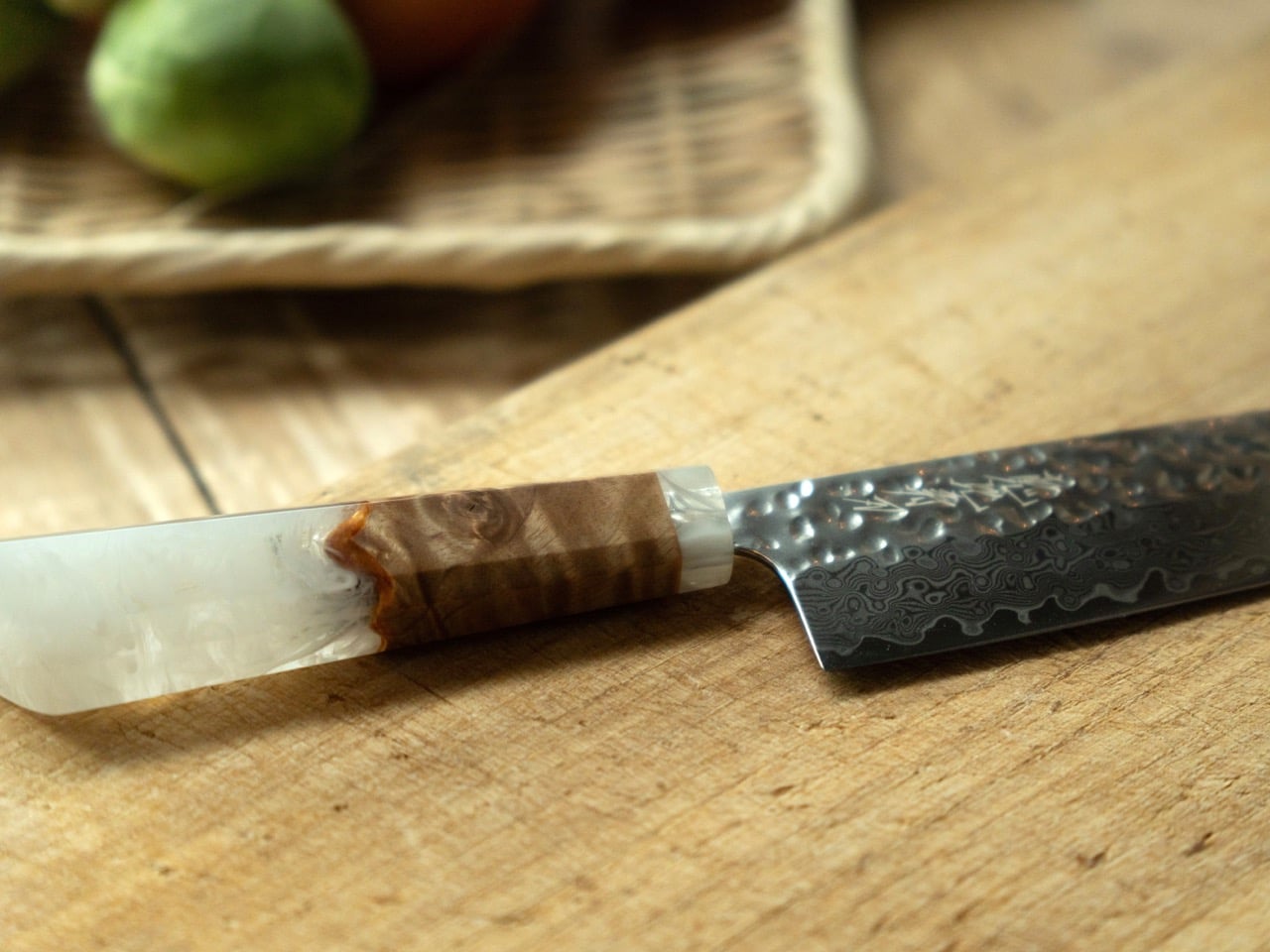
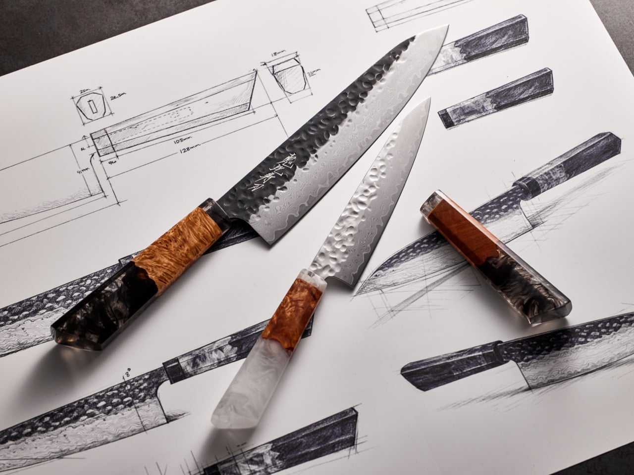
At a glance, TSUKI feels like the kind of knife made for close-ups. The blade has a dark, hammered finish near the spine that transitions into a bright Damascus wave pattern near the cutting edge. The handle shifts from warm Sakura-birch grain into a cloudy, translucent resin block that catches light like polished stone. Together, those details give the knife a strong visual identity shaped around the moon without turning into costume design. The hammered texture recalls lunar craters, the Damascus layers evoke ripples of moonlight on water, and the resin handle is meant to mimic the serene shimmer of a moon’s reflection. It’s a cohesive design language applied across every surface of the knife.

The craftsmanship behind it is just as deliberate as the aesthetic. The blade is built around VG-10 steel from Fukui, a high-hardness material known for edge retention and corrosion resistance, wrapped in 67 layers of Damascus for both strength and visual drama. Sharpening happens in Sakai, Osaka, a city with a 600-year legacy in Japanese cutlery production, which means the edge work benefits from generations of specialized technique. The knife arrives in a custom paulownia wood box from Yamaguchi, secured with a Mizuhiki plum knot tied using traditional Nagano cordwork. Even the interior label uses Echizen washi, a handmade paper with a 1,500-year lineage. What makes TSUKI compelling for a design audience is that it doesn’t just invoke Japanese craft as a branding layer. It assembles contributions from five distinct regional traditions into a single kitchen tool, each one adding material credibility and cultural weight to the final product.

Designer: JP-crafts

Click Here to Buy Now: $142 $219 (35% off) Hurry! Only 14 days left.

The blade profile is a 210mm gyuto, which translates to a versatile all-purpose chef’s knife in Western kitchen terms. At 150 grams and 1.7mm thick, it sits on the lighter, more agile end of the spectrum. The hammered finish does double duty, giving the blade its crater-like visual signature while creating micro air pockets that help food release cleanly during slicing. The Damascus layering wraps the VG-10 core in alternating steel alloys, which gives the blade that flowing, organic pattern and adds structural integrity. The edge is double-beveled, so it works equally well for left- and right-handed users. JP-crafts, the brand behind TSUKI, positions this as a knife built for daily prep work, something that holds up to routine vegetable chopping, protein breakdown, and general kitchen tasks without losing its sharpness or requiring constant maintenance.

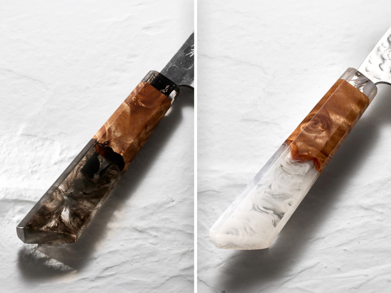
The Sakura-birch section offers a natural, tactile warmth, while the resin component brings a sculptural, almost translucent quality that sets the knife apart from traditional wa-handle designs. The resin comes in black or white variants, and in photos it reads as cloudy, marbled, and faintly luminous. That material transition from wood to resin gives the handle a hybrid identity, part craft object, part industrial design experiment. The shape itself is contoured for grip, with a slight taper that’s meant to feel secure during extended use. It’s a detail that matters because this kind of knife is meant to live on a magnetic strip or in daily rotation, not tucked away in a drawer.

The paulownia box is lightweight and fine-grained, a traditional material used in Japan for storing valuable items because it resists moisture and insect damage. The Mizuhiki plum knot is a small but culturally legible gesture, a symbol of strong bonds often used in ceremonial gift-giving. Opening the box reveals the knife nestled in a custom-fitted interior, with calligraphy labels and thoughtful staging that makes the unboxing experience feel like part of the product itself. For someone buying this as a gift or as a self-purchase with emotional weight attached, that kind of care in presentation elevates the entire interaction.

Early Bird pricing for a single gyuto starts at $142, with the regular MSRP landing at $219. A two-knife set that includes a petty knife is available for $226. The Kickstarter campaign also offers add-ons including a Nakiri vegetable knife, a Sujihiki slicing knife, whetstones, and a leather strop. Estimated delivery is slated for later this year, with shipping available worldwide.

Click Here to Buy Now: $142 $219 (35% off) Hurry! Only 14 days left.
The post Moon-Inspired Japanese Knife Blends Damascus Steel With Gallery-Worthy Material Design first appeared on Yanko Design.
This Pure 3D Relief Map Sees America as Land First, Borders and Politics Later

What is a country? The question usually leads to answers about people, laws, culture, and shared history. We define nations by their political structures and the lines we draw to contain them. These are human constructions, frameworks built to organize society and create a sense of collective identity. A country becomes a set of agreements, a shared story we tell ourselves about who we are. But underneath all of that lies a more fundamental truth, an identity that is millions of years older than any government.

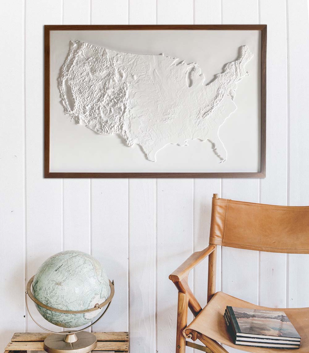
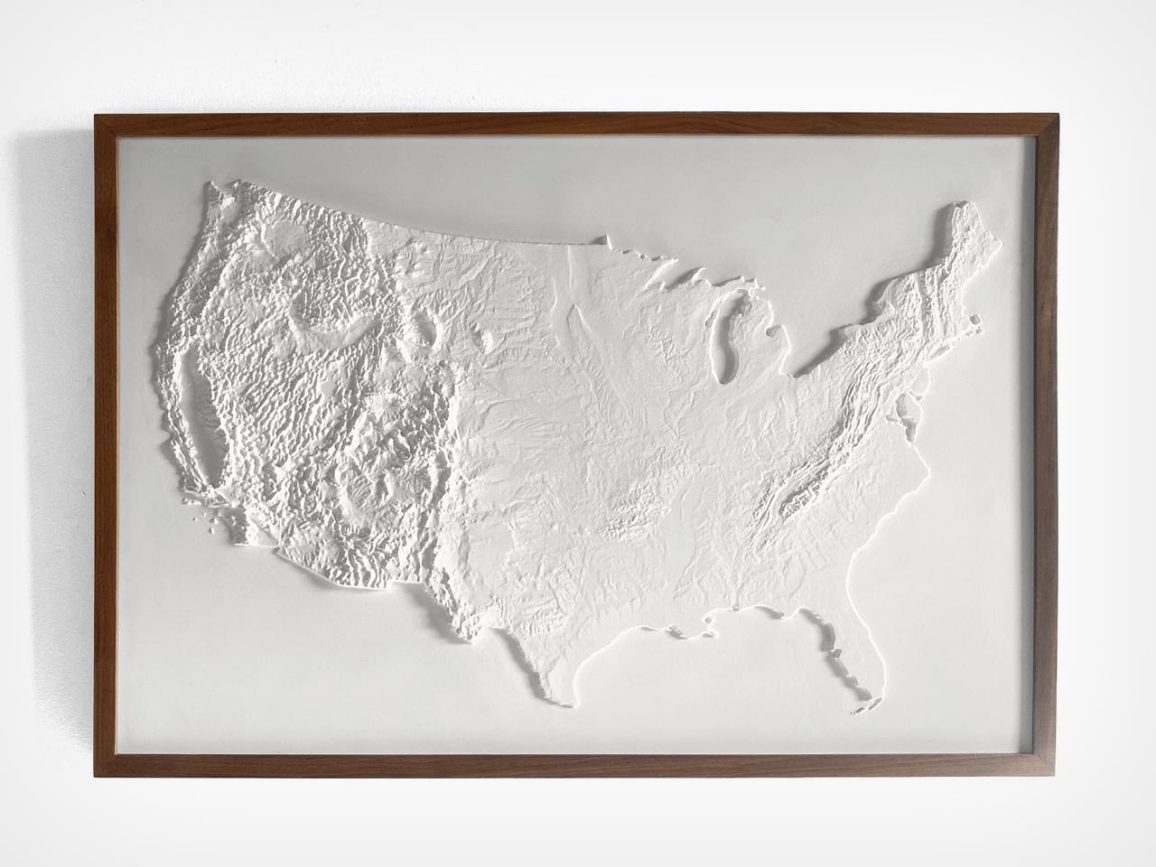
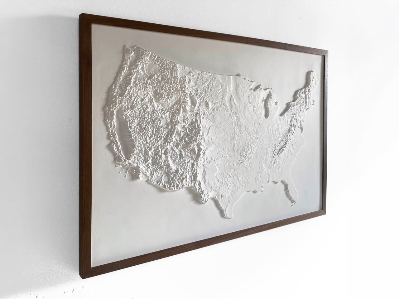
This is the truth captured by Muir Way’s 3D Raised Relief Map. It answers the question by presenting the United States as a physical entity, a vast and intricate piece of the Earth’s crust. The map argues that the country’s primary identity is its terrain. The story of America is inseparable from the formidable barrier of the Rockies, the fertile plains of the Midwest, and the strategic harbors of its coasts. It is a beautiful and potent reminder that a nation is, before anything else, a piece of land.

Designer: Muir Way

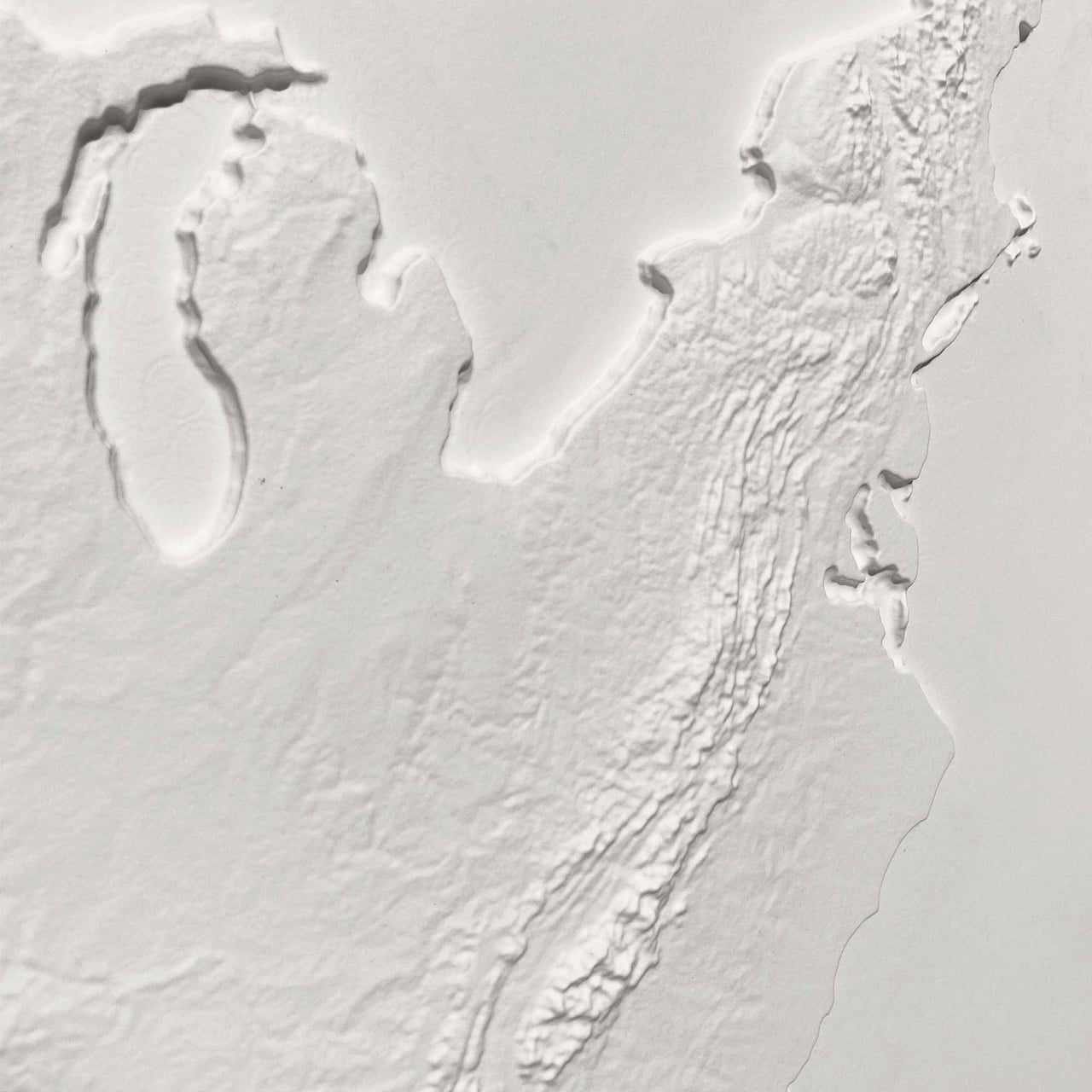
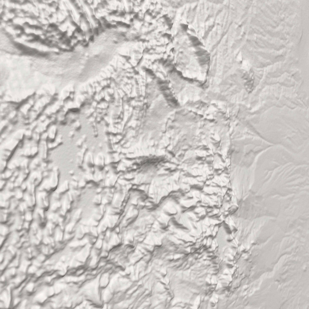
Rendered entirely in white, the piece hangs on the wall more like a sculpture than a conventional map. There are no colors to decode, no labels to parse, and no political borders to trace. Shadow does all the work instead. Light raking across the surface reveals the Rockies as a mass of jagged, compressed ridges, the Appalachians as a quieter but persistent ripple running along the eastern flank, and the Great Plains as a kind of vast, deliberate calm between them. The Great Lakes read as deep, smooth voids, which gives the northeastern quadrant an almost architectural quality. The effect is genuinely striking, the kind of thing that looks like it belongs in a museum dedicated to geography rather than a shop dedicated to maps.

Muir Way, a San Diego-based map studio, builds each piece by digitally scanning and georeferencing source map data, then aligning it with modern elevation data to cut a precise three-dimensional mold. The surface is then printed on durable plastic and vacuum-formed over that mold, a process that translates topographic information into physical depth with real fidelity. The finished piece is mounted to foamboard and hand-finished. NASA elevation data underpins the accuracy of the terrain, which means the relief is cartographically honest rather than decoratively approximated. Muir Way works primarily with materials made in the USA, and a portion of the proceeds from each sale goes to outdoor-related charities including the Sierra Club Foundation, Leave No Trace, and the Waterkeeper Alliance.

The map is priced at $199, with a sale price currently from $169.15 through the Muir Way website. A solid walnut frame, visible in most of the product photography and providing a warm contrast to the stark white surface, is available separately. As a July 4 gift, a housewarming piece, or simply an object for someone who takes their walls seriously, it holds up.

The post This Pure 3D Relief Map Sees America as Land First, Borders and Politics Later first appeared on Yanko Design.
These Ceramics Look Hand-Drawn in Black Ink, but They’re Actually Porcelain Pretending to be Paper

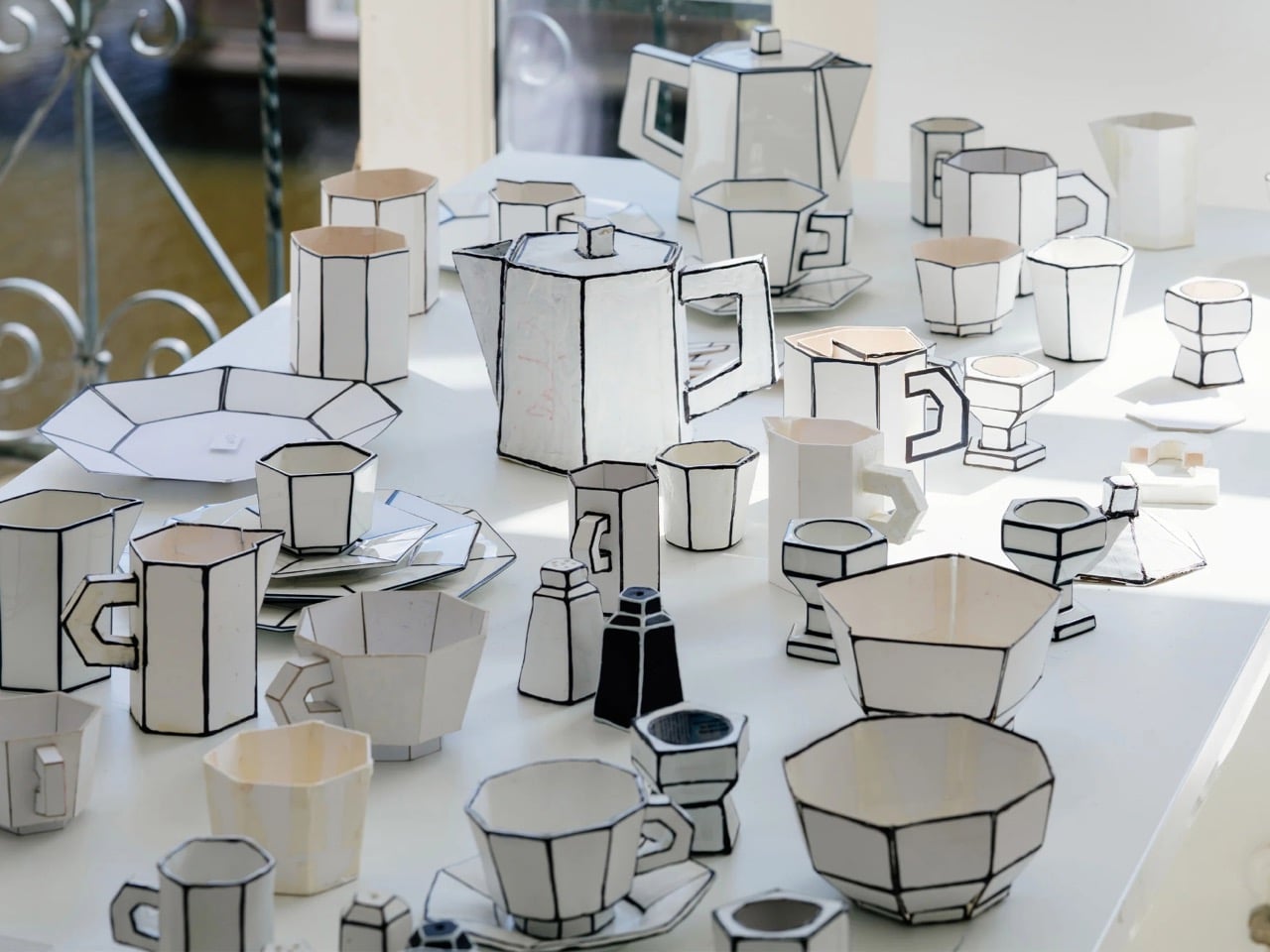
The potter’s wheel is the oldest mass-production machine humanity ever built, a spinning disc that let a single craftsman turn out dozens of near-identical bowls before lunch. That gift arrived with a tax written into physics, because anything formed on a wheel is a profile revolved around a central axis, exactly like a shape cut on a lathe. Bowls, cups, vases, and plates all inherit the same radial DNA, which is why round has quietly ruled tableware across every civilization that ever touched clay. Serax’s Carte Blanche collection abandons the axis completely, swapping revolved curves for faceted, folded geometry that no wheel could ever spin. It then pulls a second trick, flattening the porcelain visually until a solid cup reads as a drawing of one.

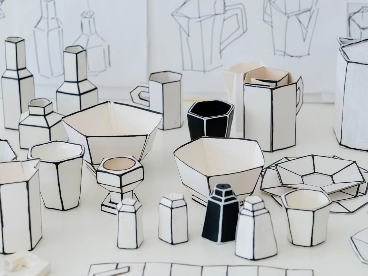
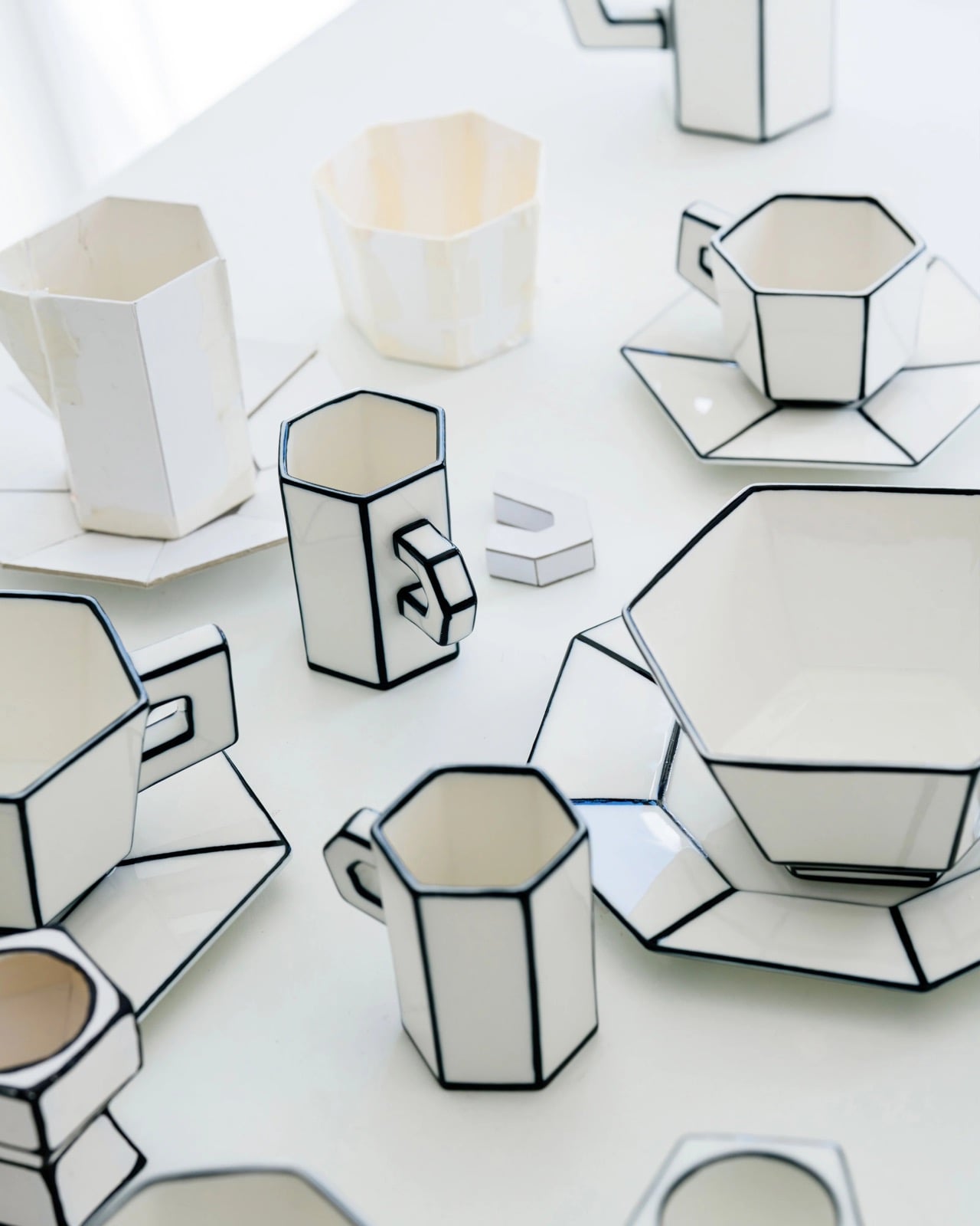
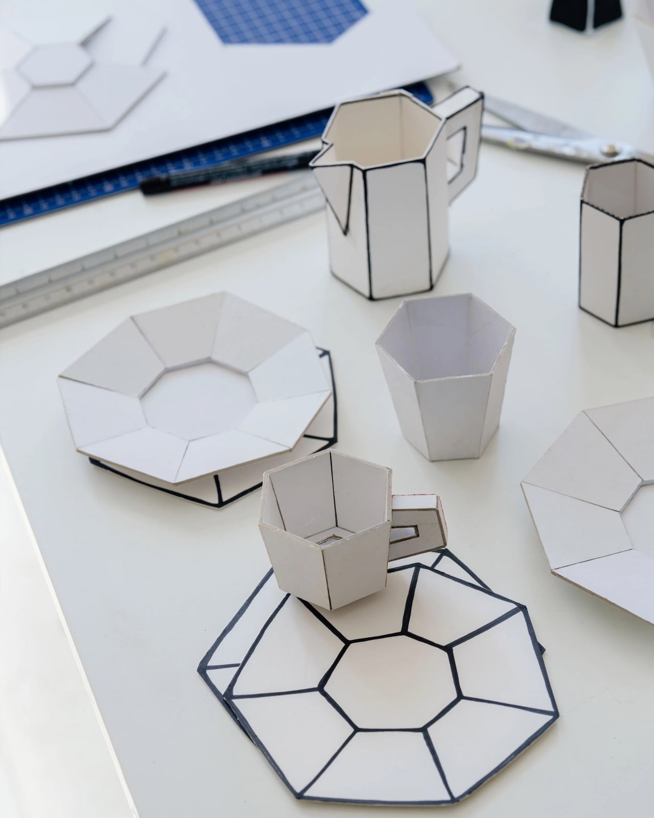
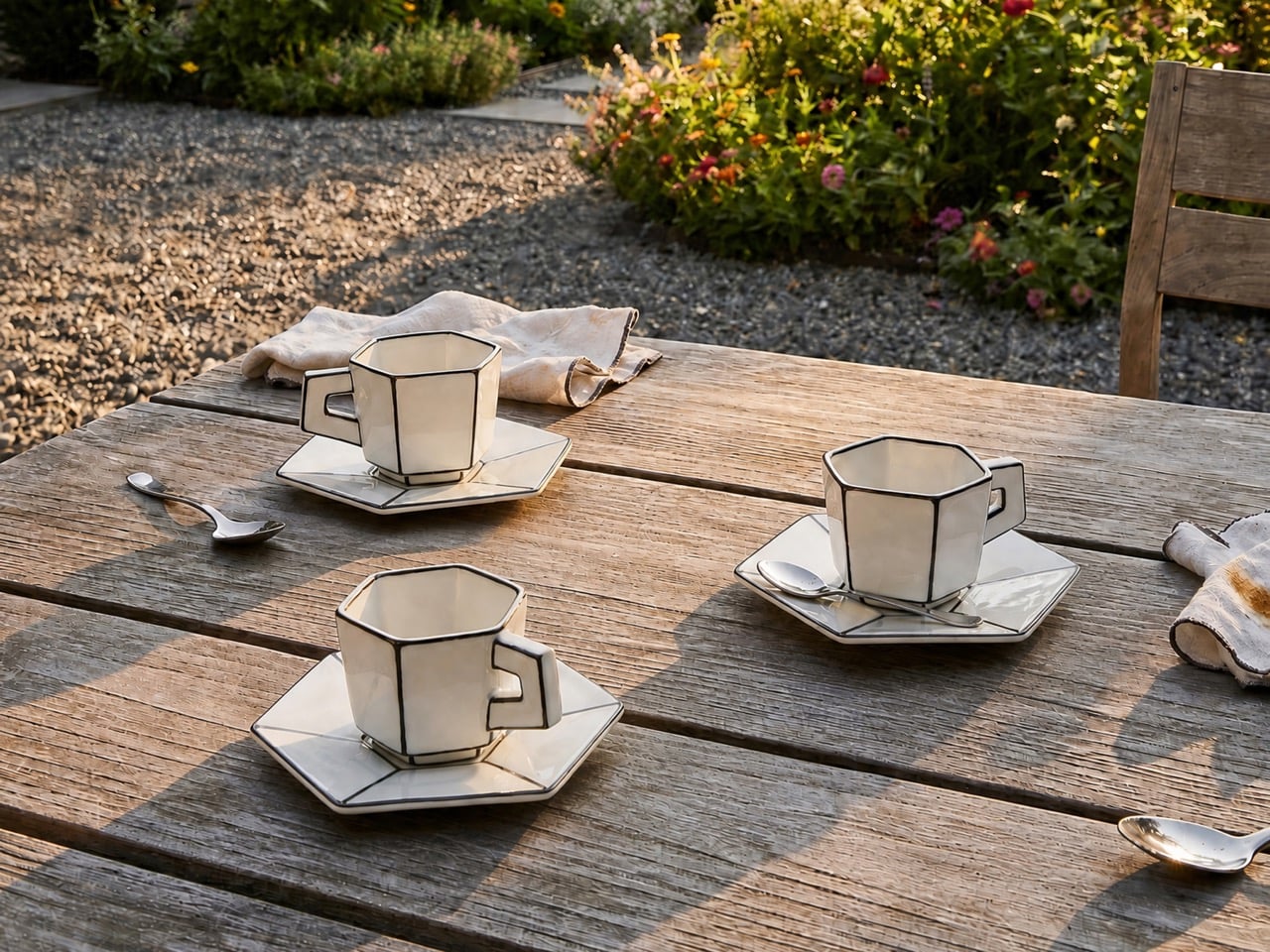
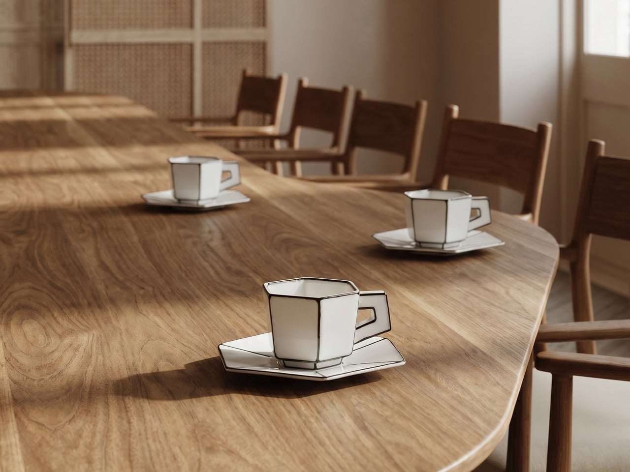
Dutch designer Annebet Philips developed the range with Belgian brand Serax, and she began the whole thing in cardboard rather than clay. She cut childlike shapes with deliberately uneven edges, treating the blank page and the humble cutout as her starting brief, which the name Carte Blanche translates almost literally. Those paper prototypes became the design language itself, their creases and wobble carried into glazed porcelain instead of being sanded into anonymity. Hand-painted black lines trace every fold and seam, lending each cup, saucer, and teapot the flattened quality of ink on paper. The collection opened as a coffee and tea service, espresso through milk jug, before expanding into plates, a breakfast bowl, an egg cup, and a salt and pepper set.

Designers: Annebet Philips and Serax

Ceramics is the most stubbornly three-dimensional of the applied arts, since clay has mass and casts a shadow no matter how thin you throw it. Carte Blanche fights that condition with pure graphic force, using a heavy black outline to convince your eye it is reading a two-dimensional sketch rather than a glazed object with genuine volume. The octagonal facets do half the work, catching light in flat planes that refuse the soft gradient a rounded surface would hand you. Photographed straight on, a cup collapses into what looks like a cartoonist’s line drawing, the handle reading as a doodled loop rather than a fired ceramic ear. Philips is forcing a volumetric craft to impersonate the flat page it was first sketched on.

Trompe-l’œil (or ‘deceives the eye’ in French) ceramics have a rich recent lineage, and French artist Jacques Monneraud has built a following throwing porcelain so convincingly corrugated that studio visitors ask whether he has switched to actual cardboard. Monneraud freezes the material itself, pressing a handmade wooden tool into leather-hard clay to fake corrugation and mixing glaze to imitate strips of packing tape. Philips chases something else, freezing the gesture rather than the substance, the outline and the fold instead of the fibrous grain. Where Monneraud wants you fooled until you lift the piece, Philips wants you to register the drawing instantly and enjoy the contradiction. Both approaches prove that a black line, correctly placed, reshapes how we read an object more than any amount of sculpted volume.

YD watched the same optical idea scale up to 1,578 horsepower a few days ago, when Bugatti unveiled the one-off W16 Mistral “Blanc Éternel” wrapped in hand-painted black linework. That car traces the NURBS surface patches from its own digital model across a porcelain-white body, exposing the CAD wireframe that normally stays hidden inside the software. The effect is identical in spirit to Carte Blanche, a three-dimensional object drawn back down into black lines on white, geometry converted into graphic. One costs somewhere north of five million dollars and eulogizes a dying engine, the other holds your morning espresso and survives a dishwasher cycle. Both understand that a contour line is the fastest way to make a solid thing look like an idea of itself.

The illusion grows directly from how the objects were designed, the paper maquette preserved in glaze rather than discarded once the shape was set. Every line being painted by hand means no two pieces match exactly, so the industrial porcelain underneath still carries a one-off wobble. The pieces stay microwave and dishwasher safe, which keeps the concept from retreating into the vitrine where most trompe-l’œil ceramics eventually go to die. Philips has taken the two assumptions a potter’s wheel hardwired into the craft, that vessels are round and that vessels look solid, and quietly canceled both in a set you can actually eat off. That is a rarer achievement than the cheerful, cartoonish surface first lets on.

The post These Ceramics Look Hand-Drawn in Black Ink, but They’re Actually Porcelain Pretending to be Paper first appeared on Yanko Design.
Police Officers Spent Three Years Redesigning the Lifesaver To Make It As Small As A Hockey Puck

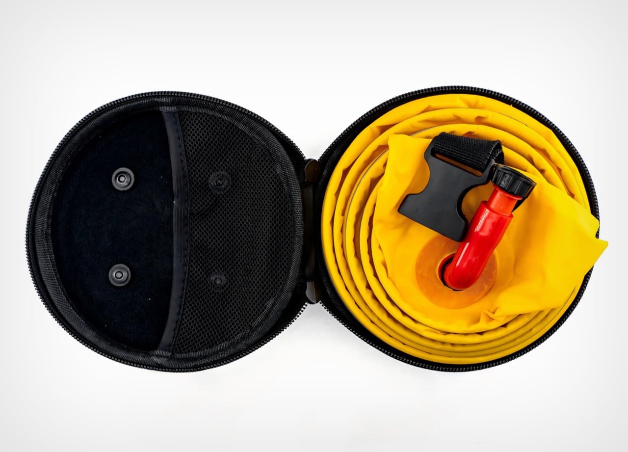
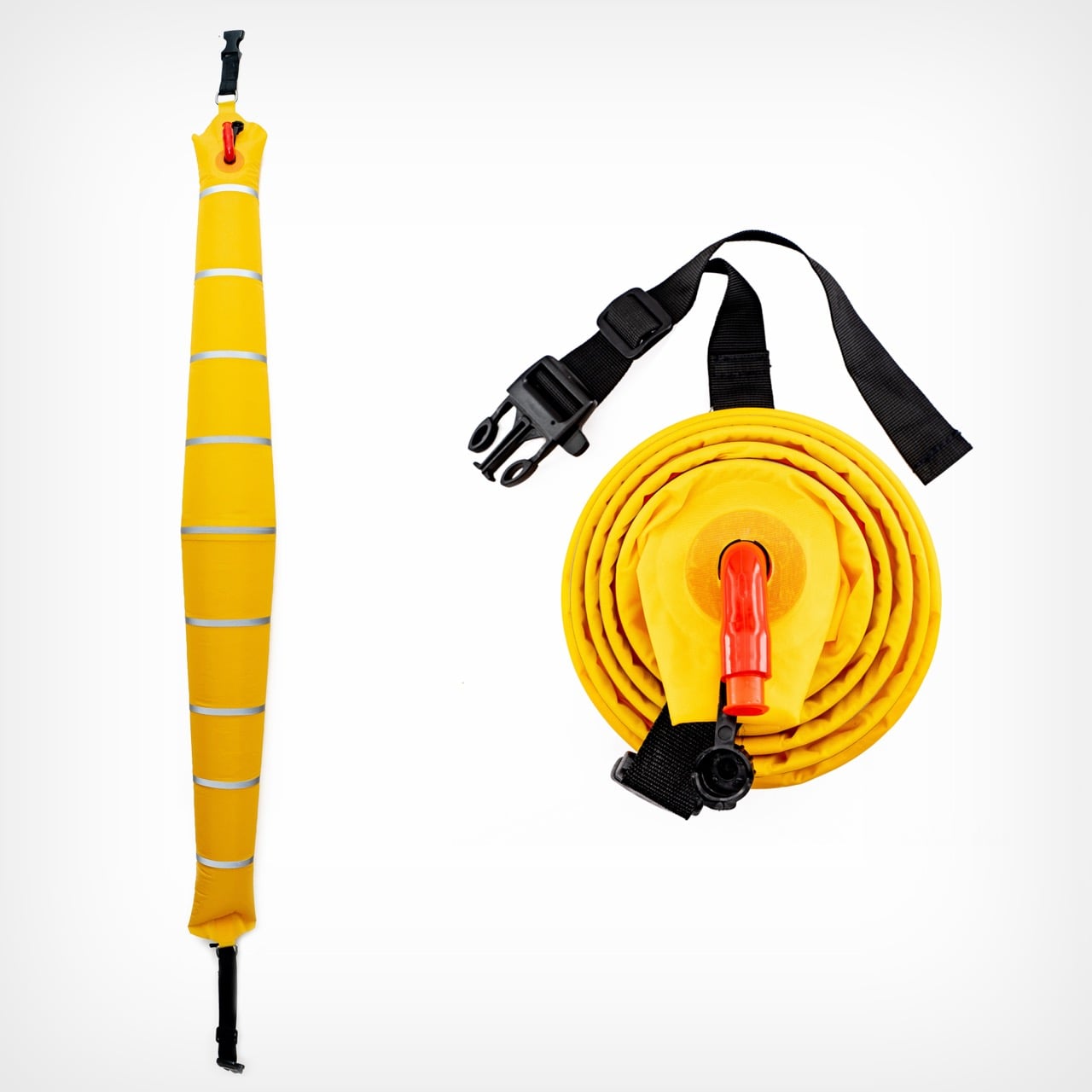
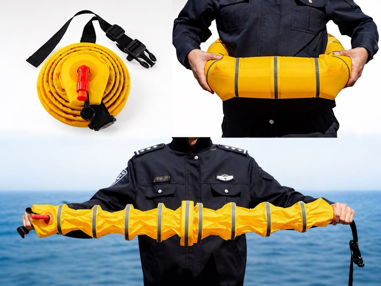
Rolled up, Ark Hero No.1 looks like a hockey puck with a zipper. Nothing about it announces itself as rescue equipment. Pop the shell open and a coiled yellow tube spirals inside, capped by a red hand pump that would look at home on a bicycle. Pump it for a few seconds and the coil stretches into a segmented shaft that spans shoulder to shoulder, jointed like a stalk of bamboo and wrapped in reflective silver bands built to catch headlights at 3 AM. The whole sequence takes about as long as opening a bag of chips.

That transformation, from puck to rescue tool, is the entire pitch. Ark Hero No.1 is a 2025 Design Intelligence Award Future Talents winner developed over three years by frontline police officers who kept watching the same tragedy play out from the same design gap. Traditional life rings live on piers and boat railings, tethered to places where drownings often do not happen. A car that leaves the road at 2 AM lands nowhere near a lifeguard tower. The brief was simple: build the life ring that could have been in the trunk.

Designer: wanglicheng

Losing the CO2 cartridge is the single biggest upgrade, more so than the actual innovative design. High-pressure gas kills casual storage: it expires, complicates air travel, sits inside a regulatory maze at customs, and demands specialist replacement after every deployment. Swap it for the red hand pump poking out of the case and the same ring can live in a squad car or family sedan for years without anyone thinking about it. The trade-off is a few extra seconds of pumping. Given that the alternative is often no life ring at all, that math works out fast.

Ark Hero No.1 spreads its buoyancy across a chain of joined segments instead of pooling all the air in one giant doughnut. A conventional ring holds its air in a single chamber, so one puncture compromises the whole thing. The segmented design lets a tear in one pod leave the rest of the shaft floating, which matters when the tube is scraping metal edges or broken glass after an accident. The jointed geometry also lets the tube flex around a body or drape across a car window frame during rescue. Silver reflective bands wrap every segment, doing their real work in dark water where solid yellow gets lost in glare and chop.

The hard-shell case turns the whole system into something a procurement officer can plan around. Rolled up, the coiled tube snaps into a puck-shaped shell with a full-perimeter zipper and a mesh interior pocket that holds the pump and buckle in place. The form factor standardizes storage footprint, protects the fabric from years of abrasion, and clips easily to duty belts, headrests, and boat racks. An officer can carry one on the hip. A patrol vessel can rack a dozen without eating floor space.

For a project born from three years of frontline police fieldwork, the visual restraint tells its own story. No branding drama, no styling flourish, no lifestyle gadget affectation. The yellow is loud because loud yellow gets seen from a helicopter. The red is loud because red hands find red pumps in a panic. Every element exists because someone once needed it and did not have it, and that tends to end well when the equipment finally reaches the people who kept improvising without it.

The post Police Officers Spent Three Years Redesigning the Lifesaver To Make It As Small As A Hockey Puck first appeared on Yanko Design.

Flipper One Behind The Scenes: “Sharper, Smarter, More Cunning, Brutal” says Flipper CEO

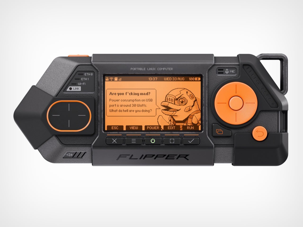
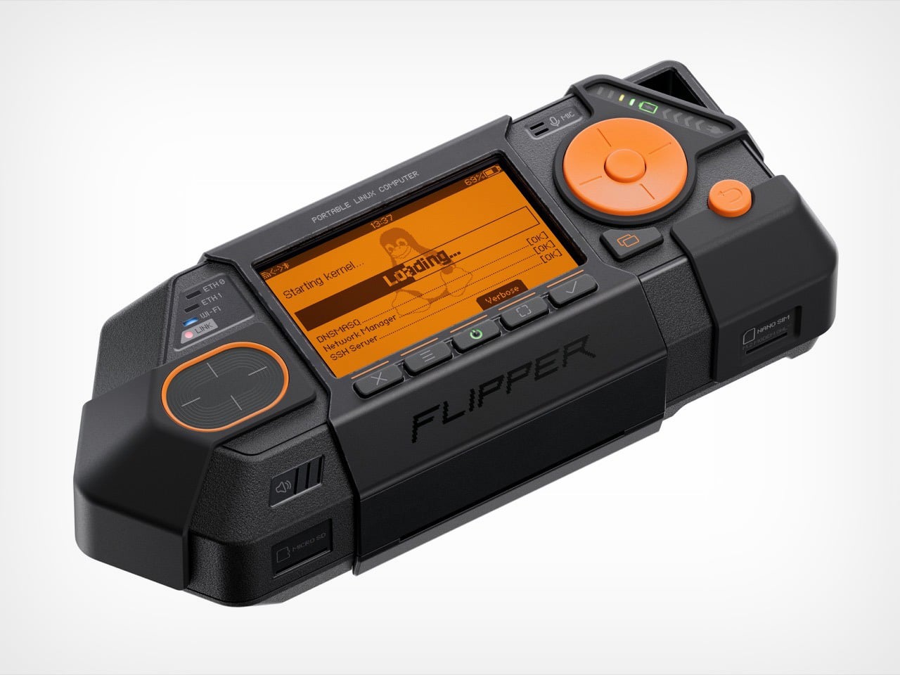
When you first see the Flipper One, it’s clear something has changed. Its predecessor, the Flipper Zero, had the playful, almost toy-like charm of a 90s gadget. It was clever, compact, and just a little bit mischievous. The Flipper One, by contrast, is not playing around. With its exposed metal, ruggedized shell, and dense, purposeful form, it looks less like a hacker’s Tamagotchi and more like something you’d find bolted to the dashboard of a military vehicle. The design language has become, in the words of Flipper’s CEO Pavel Zhovner, “sharper, smarter, more cunning, more brutal.”

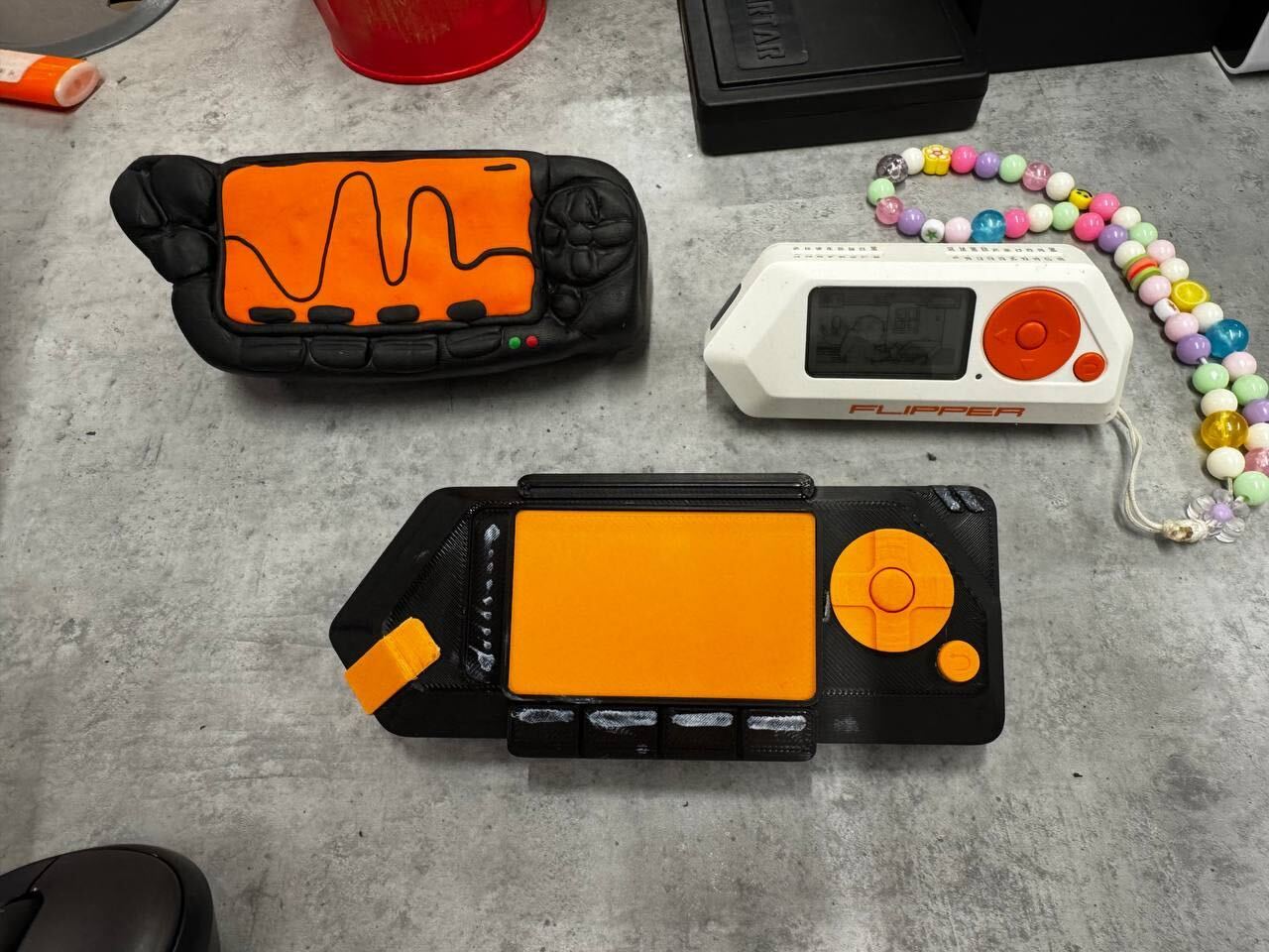
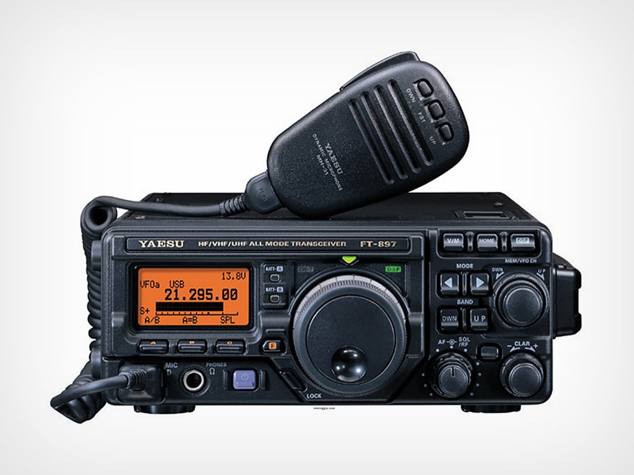
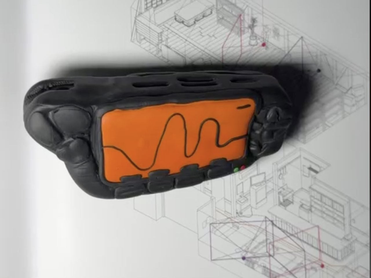
The source of this aesthetic shift isn’t another cyberpunk movie. While the team’s love for William Gibson’s Johnny Mnemonic is still part of the lore, the Flipper One’s design was shaped by a much more tangible artifact. “There was a very tangible, physical reference this time too,” Zhovner explains in an exclusive interview with Yanko Design, “the Yaesu FT-897D radio transceiver. It’s serious field communications equipment.” That single object unlocks the entire story behind the Flipper One’s aggressive new form. The team’s earliest prototypes, he notes, were shaped by hand in polymer clay to mimic the radio’s rugged, function-first ergonomics, and even then, they “looked remarkably close to it.”

Designers: Pavel Zhovner & Flipper Devices

Yaesu FT-897D radio transceiver

This move from fiction to field equipment wasn’t just a stylistic choice; it was a direct response to the device’s new capabilities. The core challenge in creating the Flipper One wasn’t about living up to the Zero’s reputation, but a years-long technical quest. “For years, we were chasing the right balance between performance, battery life, and price,” Zhovner recalls. Every processor they considered “forced a compromise we weren’t willing to make.” The breakthrough finally came with the arrival of the RK3576 chip. “The moment we looked at its performance specs and peripheral support, we knew – this was it.”

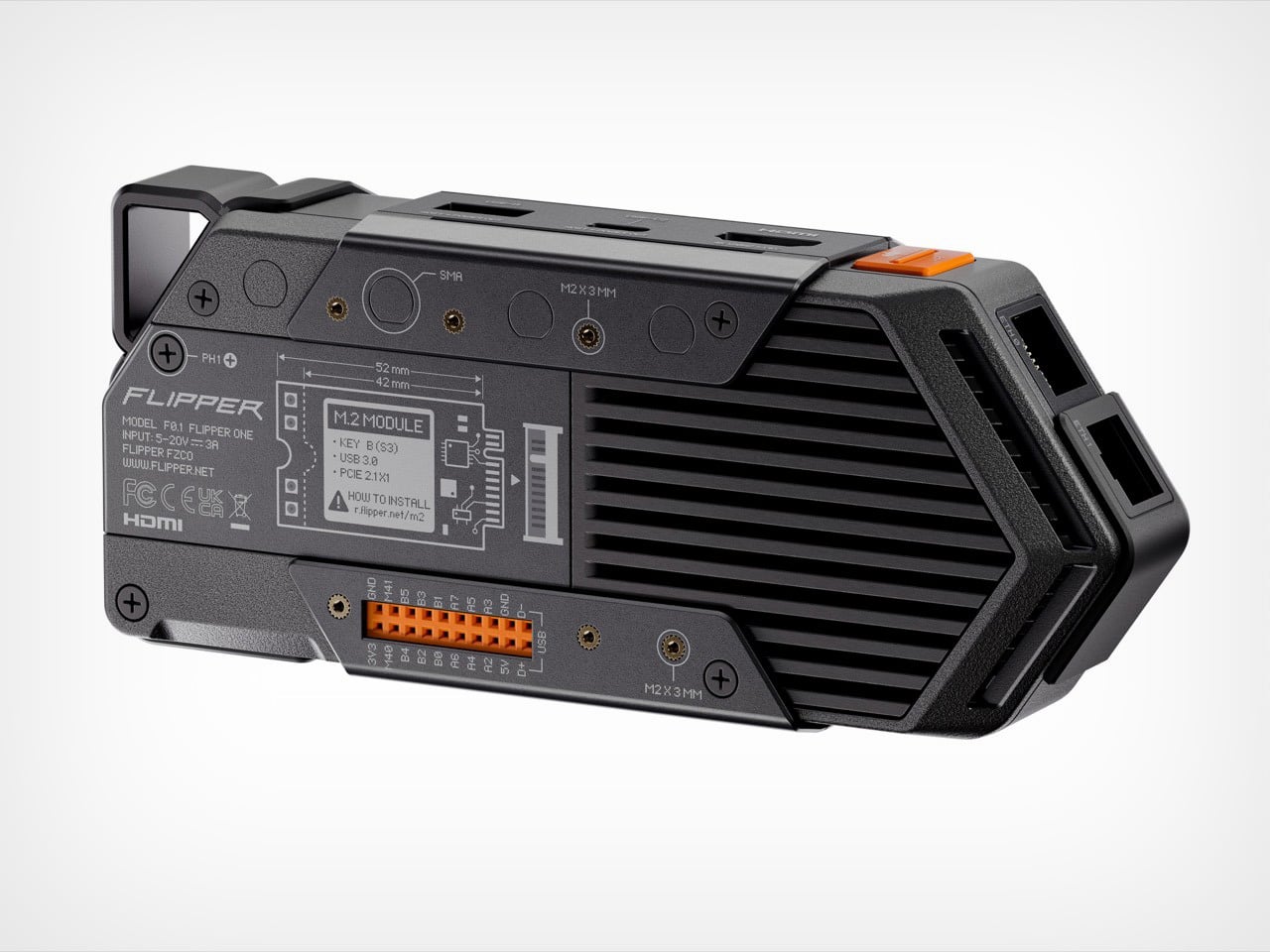
But that power came at a cost: heat. “Unlike Flipper Zero, Flipper One runs hot,” Zhovner says. Suddenly, the housing couldn’t just be a passive shell; it had to become an active part of the thermal solution. This is where the Yaesu’s design influence became critical. The rugged, armored look isn’t just for show. “The metal elements are doing real thermal work, acting as part of the cooling system,” Zhovner points out. The design team decided to lean into this necessity, creating a device that visually communicates its own power and thermal demands. The Flipper One wears its cooling system like armor because, in a very real sense, it is.

This philosophy of brutal honesty extends to the iconic dolphin mascot, which has also evolved. It’s now sharper, more angular, and decidedly less friendly – a reflection of the smarter, more powerful machine it represents. This commitment to a cohesive design language is rooted in the team’s belief in their core visual element. “We’re simply in love with our aggressive triangle,” Zhovner states. “It was never up for debate.” The goal was to preserve that instant recognizability while adapting it to a more demanding set of functional requirements.

Preliminary clay model of the Flipper One

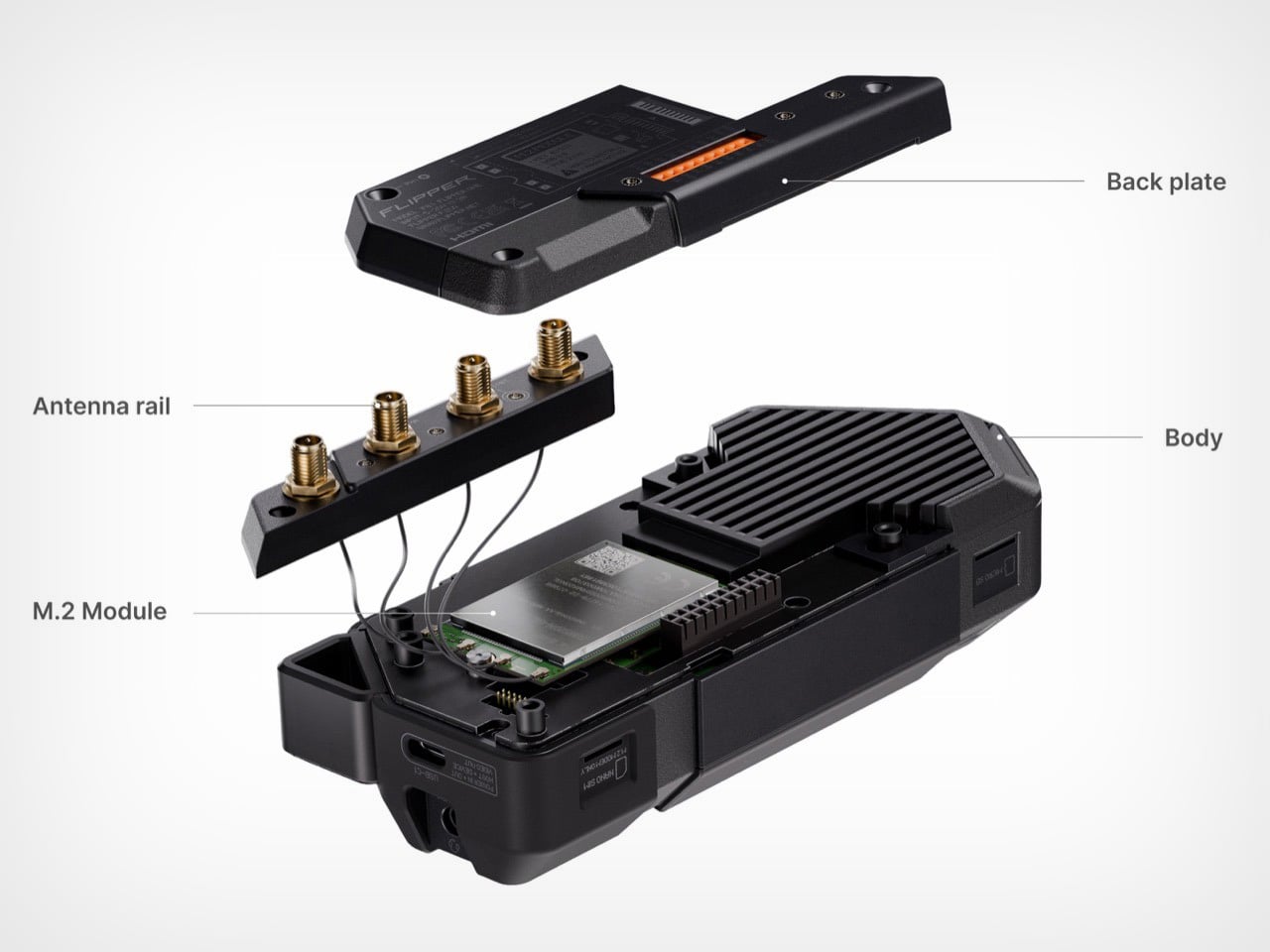
The device’s functionality was also shaped by hard-won lessons from the Flipper Zero. One of the biggest takeaways was that expandability should never come at the expense of usability. “With Flipper Zero, the moment you plug in any module, the whole experience degrades,” Zhovner admits. “It becomes harder to carry and pocket, and the port takes a beating over time.” For Flipper One, this led to a strict design mandate: modules had to integrate seamlessly. The team landed on two types – M.2 and GPIO – both designed to either “disappear completely under the back cover, or they extend flush along the rear surface.” It’s a small detail that reveals a mature approach to product design, focused on the realities of daily use.

Ultimately, the Flipper One’s serious, function-driven design is meant to signal that it’s an entirely different kind of tool. Zhovner is quick to clarify that this isn’t a replacement for the Flipper Zero. Instead, the two devices operate on different technological layers. Flipper Zero is a “Layer 0” offline tool for NFC, RFID, and other low-level interfaces. Flipper One is a “Layer 1” IP/network cyberdeck – a pocket-sized, open Linux computer. It can be a portable gateway, a smart home hub, a media center, or a radio platform for listening to everything from pilot communications to satellites.

By grounding its design in the world of serious hardware, Flipper has created a device that feels less like a controversial gadget and more like a piece of portable infrastructure. It’s a tool that, despite its aggressive looks, is designed to be quietly useful, whether as a travel router in a hotel or a honeypot sensor guarding your home network. The Flipper One’s journey from a clay model inspired by a ham radio to a finished cyberdeck is a story of a company, and a product, that is growing up.

The post Flipper One Behind The Scenes: “Sharper, Smarter, More Cunning, Brutal” says Flipper CEO first appeared on Yanko Design.
Busan’s Tram Concept Ditches Overhead Wires to Become Korea’s First Catenary-Free Public Transit System

Look up at any tram line in the world and you will see the same thing, a cobweb of overhead catenary wires strung between poles, humming with 750 volts and cluttering the sky above every historic square and modern plaza the tram passes through. Bordeaux famously buried its wires underground in 2003 with Alstom’s APS ground-level power system, and cities like Nice, Dubai, Doha, and a handful of Chinese ART deployments have followed with their own variations. Seoul has stayed conspicuously absent from that list, and so has Busan, until now. Citrus Design’s Busan Oryukdo Tram concept is the visible face of Korea’s first commercial catenary-free system, a piece of urban infrastructure that gets to be seen as a sculptural object because nothing is tethering it to the sky. The engineering decision came first, and the design language followed.

The tram wears a jet-canopy front end, with wraparound black panoramic glass sunk into a silvered metallic body and the ORYUKDO wordmark sitting centered on the nose. The body is fully low-floor, multi-articulated across three sections joined by bellows, and finished in a mirror silver meant to catch and throw back the Busan skyline as it moves. Citrus Design has clearly spent multiple design cycles on the surfacing, because the resolution is at a level trams almost never receive in commercial deployment. The whole package is framed under a city-branding brief titled “Eco-Friendly Future City Busan,” which sounds like typical municipal boilerplate until you realize Busan is actively positioning itself as a design-forward global city in Seoul’s shadow. The Oryukdo becomes rolling infrastructure that carries that argument.

Designer: Citrus Design

The canopy rakes back at an angle that has zero aerodynamic justification for a vehicle that peaks around 70 km/h, borrowing its geometry directly from fighter aircraft that need to punch through supersonic air. It looks incredible anyway, because the black-glass-in-silver-body graphic reads at pedestrian scale in a way most trams cannot manage. Citrus Design has treated the exterior surfacing as a continuous flow between sections, with the bellows connections deliberately quiet so the tram reads as one long articulated silver form rather than three carriages stuck together. Thin LED headlight strips flank the canopy in uninterrupted lines that echo the ORYUKDO wordmark centered above them. The mirror finish itself becomes a design element, turning every glass tower Busan puts on its skyline into part of the vehicle’s graphic identity.

Inside, the cabin drops the industrial-transit atmosphere most trams carry by default and swaps in something closer to a modern airport lounge. A white and light-neutral base color, red graphic accents on grab points and wayfinding, and blue seat surfaces make the interior read as intentionally styled rather than functionally endured. Floor-to-ceiling glazing runs the full length of the body, giving passengers the same panoramic character the driver gets from the canopy up front. Overhead digital displays handle wayfinding and journey information, and the low-floor layout accommodates wheelchair users and strollers without the awkward step-up ramps that plague older tram systems. The three articulated sections are joined by wide bellows connections that passengers can walk through mid-journey, turning the interior into one continuous space rather than compartmentalized carriages.

Catenary-free tram systems remain rare enough that Korea joining the club is a genuine transit-infrastructure story, and Busan doing it before Seoul is a subtle but pointed piece of civic one-upmanship. The city has spent years positioning itself as a global player, from its hard-fought and painful 2030 Expo bid to its film festival and port investments, and rolling infrastructure that looks this considered fits that campaign well. Trams almost never receive this level of design attention in the international press, which is strange considering they are among the most visible vehicles in any city that operates them. Citrus Design has treated the Busan Oryukdo Tram as a proper industrial-design commission with a clear brief, a considered CMF strategy, and a design language that will age gracefully. Busan gets a rolling ambassador, and everyone else gets a template for what a modern city tram should actually look like.

The post Busan’s Tram Concept Ditches Overhead Wires to Become Korea’s First Catenary-Free Public Transit System first appeared on Yanko Design.
Smart Glasses Could Transform Sports. But There’s a Trust Deficit.

For centuries, a pair of glasses has been one of the most socially innocent objects a person can wear. They exist in one of two lanes: as a quiet medical tool for correcting vision, or as a deliberate fashion statement, an accessory as personal as a watch. In either role, tool or ornament, they are fundamentally passive. They sit on the face, and in return for their service or their style, society grants them a kind of ambient trust. Smart glasses were designed to borrow that trust. They slip into the familiar silhouette of eyewear, hijacking the social permission we’ve granted them, hoping we won’t notice the difference.

But that’s the thing, isn’t it? The moment that quiet, passive object gains the ability to see, record, and communicate on its own, the social contract shatters. It stops being a corrective lens or a simple accessory and becomes a question mark. And in the high-stakes world of professional sports, that question is no longer theoretical. In the Indian Premier League, one of the most-watched cricket leagues on the planet, it has been answered with a firm ‘no.’ The league’s advisory body recently banned smart eyewear from all restricted match-day areas as reported by Indian Express, not because they might help a player see better, but because their ability to discreetly communicate threatens the very integrity of the game. It’s the first major institutional line drawn in the sand, a clear signal that what makes smart glasses so compelling, their seamless, discreet power, is exactly what makes them so threatening to an environment built on trust.

Which makes the current scoop from the FIFA World Cup all the more interesting. This year, cameras attached to referees have been delivering something genuinely compelling: a first-person view from the center of the match, fast, intimate, and unlike any angle a traditional broadcast camera can offer. FIFA has partnered with Lenovo to stabilize the footage, reportedly reducing blur and shakiness by up to 50%. The result is a piece of wearable camera tech that audiences have embraced without a second thought. And the reason it works has nothing to do with the stabilization algorithm or the resolution. It’s because everyone knows exactly what it is, what it records, and who controls the output. The ref cam is sanctioned intimacy, an invitation behind the official’s gaze with the entire institution of the sport standing behind it.

The problem has never really been head-worn cameras. GoPros have existed for more than twenty years, and nobody writes angry op-eds about them, because a GoPro announces itself the way a tourist in neon shorts announces themselves. Gloriously, almost aggressively obvious about what it is and what it’s doing. The same logic applies to the FIFA ref rig: dedicated broadcast hardware, sanctioned by the league, feeding a known output to a known destination. Smart glasses are slipperier. Their design philosophy actively works against that legibility, optimized to look like ordinary eyewear while quietly carrying camera, microphone, and communication capabilities underneath. That gap between appearance and function is exactly where trust evaporates.

Silicon Valley has spent years selling the idea that the best interface is the one that disappears. Ambient computing, seamless experiences, invisible technology. It’s a seductive design philosophy, and in most consumer contexts, it’s probably the right one. But sports may be quietly proving the opposite. In a high-stakes, heavily monetized environment where betting markets move in real time, the most valuable technology is often the least ambiguous. Leagues don’t just need devices that work; they need devices that can be understood at a glance, audited, regulated, and explained. The IPL’s concern isn’t really about what smart glasses are doing today. It’s about what they could be doing, invisibly, in a dressing room, on a pitch, in a dugout. Seamlessness, in that context, isn’t a feature. It’s a liability.

None of this means smart glasses have no future in sports. They might, just not in their current form. The ref cam points toward a version of wearable vision technology that could genuinely work: purposeful, controlled, institutionally transparent, and designed to communicate its function rather than conceal it. Soccer officials in other leagues are already using similar cameras for post-match performance reviews, a quiet but meaningful step toward something bigger. The path from there to a trusted live-match tool, however, runs directly through a design problem. Smart glasses need to stop borrowing the social invisibility of ordinary eyewear and start building their own visual language, one that tells players, officials, and leagues exactly what the device is, what it records, and who is watching. Until then, the trust deficit isn’t a policy issue. It’s a design failure, wearing a very familiar frame.

The post Smart Glasses Could Transform Sports. But There’s a Trust Deficit. first appeared on Yanko Design.
This $349 cordless car-wash machine was designed for drivers without a driveway

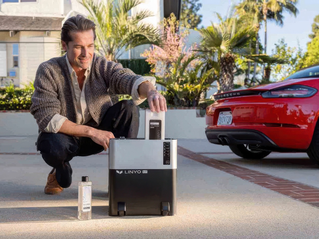
The dream of home ownership once came with a lawn and a two-car garage. That vision included the weekend ritual of washing the car, a deeply ingrained piece of suburban iconography that assumes the existence of a driveway, a garden hose, and the space to make a soapy mess. Today, for many, it’s an apartment or a condo with a parking space that feels disconnected from the home itself. This shift has created a gap in the market, forcing owners into a cycle of inconvenient, costly, and often damaging automated washes because the basic tools for the job are tied to a home they do not have.

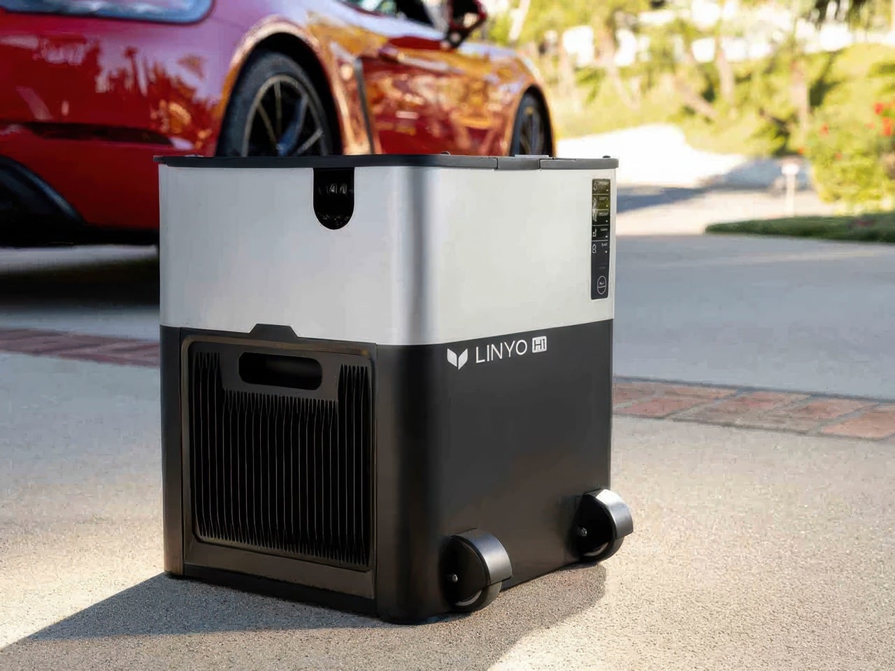
LINYO H1 is engineered to fill that gap, offering a self-sufficient solution that brings the car wash to the car. It is a thoughtful system that re-imagines the process around resource conservation and portability. The machine’s ability to complete a full exterior wash and wax with a tiny amount of water, all while capturing the runoff, makes it a respectful neighbor in a shared parking facility. It’s a product that acknowledges the new realities of housing and empowers owners to reclaim the satisfying ritual of caring for their vehicles, with the pride and precision they deserve.

Designer: Linyo

Click Here to Buy Now: $349 $499 (30% off) Hurry! Only 11 days left.

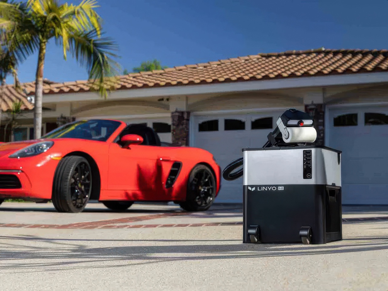
Street parking and subterranean garages expose vehicles to exactly the kind of daily contamination that demands frequent attention. Bird droppings, tree sap, and road grime accumulate faster on a city street than on a private driveway, and the irony is that these owners have the least infrastructure available to do anything about it. The H1’s answer is a reversible rotating roller that lifts grime away from the surface before the roller face makes contact, immediately extracting the dirty slurry into a dedicated wastewater tank. Linyo calls this Lift & Extract Technology, and it separates the H1 from a conventional contact wash, where a loaded mitt drags contaminated water across the paint repeatedly. Every rotation presents a fresh, grit-free surface to the vehicle, and Linyo calibrates the system specifically as a maintenance wash for urban surfaces rather than heavy off-road cleanup.

A fresh-water tank feeds the Smart-Mist pump while a separate waste tank captures dirty runoff before it reaches the ground, forming a closed loop that uses just 0.5 gallons of water per wash cycle. This closed-loop design ensures a spotless clean while using 80 times less water than a standard garden hose. That efficiency is not purely a marketing point. It is the feature that makes the H1 viable in shared parking facilities, indoor garages, and car shows where chemical runoff into storm drains is restricted or outright prohibited. For anyone parking in a dense urban building with strict rules around water and drainage, this closed-loop architecture unlocks the entire product proposition.

A single press of the foam trigger delivers thick, pH-neutral foam that auto-dilutes at 1:50 without any manual measuring or prep work. The base unit is built to bear weight, letting the user step directly onto it to foam down the roof of a tall SUV from above, a small ergonomic detail that quietly solves one of the most awkward parts of washing any large vehicle. In one single pass, the motorized roller washes and coats while a precision smart-mist rinses the finish, with dirty water extracted instantly into the internal waste tank. A built-in Smart Angle Indicator with a green light guidance system shows optimal tool pressure and angle in real time, taking the guesswork out of working around body panels, curves, and trim lines. The entire exterior process completes in 20 minutes, leaving the finish spotless, dry, and showroom-ready.

When the exterior is done, the H1 switches modes and transforms into a compact handheld vacuum with up to 16,000 Pa of suction power. Attaching the included suction head redirects the motor’s output into interior cleaning, pulling dust, crumbs, and debris from seats, floor mats, and tight corners. The transition between wash mode and vacuum mode requires no additional tools or setup, keeping the single-device promise intact across both functions. What the H1 effectively replaces is a foam cannon, a wash mitt, a coating applicator, and a separate handheld vacuum, consolidated into one unit that weighs 21 pounds. For anyone storing gear in a one-bedroom apartment rather than a garage, that consolidation is the whole argument.

At 21 pounds and equipped with a wheeled base, the H1 is compact enough to store in a car trunk and wheel directly to the vehicle. The telescopic extension wand and stable base station mean the unit stays grounded while the user works vertically, reaching an SUV’s roof without stretching or needing a step. Linyo describes it as a car wash in a box, and the architecture earns that framing for anyone who has ever lugged a pressure washer, bucket set, and separate vacuum to a shared parking garage. The swappable 5,000mAh battery supports up to two full exterior washes per charge, and a plug-in power option unlocks continuous use for longer sessions. The body is ABS plastic, a pragmatic material choice for something that lives in trunk wells and takes the daily knocks of portable gear.

The H1 finds its clearest audience at the intersection of paint-conscious ownership and urban logistics, specifically EV drivers, ceramic-coated vehicle owners, and daily commuters who value a clean car but park somewhere that makes traditional washing impossible. The EV community tends to be meticulous about paint maintenance, and the combination of nano-ceramic coating application and contact-safe roller technology speaks directly to that mindset. Powered by a pH-neutral, paint-safe formula, the H1’s cleaning detergent delivers heavy-duty cleaning performance while applying a protective nano-ceramic coating during the wash, whether the vehicle has a gloss finish, a modern matte wrap, or a sensitive EV paint job. The 20-minute wash cycle makes it a realistic weekly habit rather than an occasional event, which is ultimately what paint protection requires to remain effective. Linyo’s own framing covers apartment lots, car shows, and street parking, which maps neatly to the range of urban ownership situations this machine was designed for.

The H1 comes in three configurations: the standard cordless unit at $349 (MSRP $499), the hybrid power version at $399 (MSRP $570), and a cordless unit with an extra battery bundled in at $459 (MSRP $655). Every unit ships with the main base station, motor, battery, charger, telescopic extension wand, neutral-pH detergent, nano-ceramic wax, dust container, vacuum nozzle, microfiber towel, replacement roller sponge, and a blade. Consumable bundles, larger coating kits, and spare batteries are available as separately priced add-ons. Linyo is targeting an August 2026 shipping window, with the unit supporting 100 to 240 volts for worldwide compatibility.

Click Here to Buy Now: $349 $499 (30% off) Hurry! Only 11 days left.

The post This $349 cordless car-wash machine was designed for drivers without a driveway first appeared on Yanko Design.
I did the math on a decade of cloud storage fees. It makes sense to own this $230 1TB SSD instead.

Stop paying rent on your own memories. That’s essentially what cloud storage has become, a recurring fee for access to files you already created, on a server you’ll never see, governed by terms you never read closely. It works fine until you add up what it’s cost you over the years, at which point it stops feeling like convenience and starts feeling like a subscription you can’t cancel without losing everything. Multiply a modest monthly fee by a decade and you’ve effectively paid for several drives outright, except you own none of them. The bill never goes away, and the company holding your photos can raise the price whenever it wants.

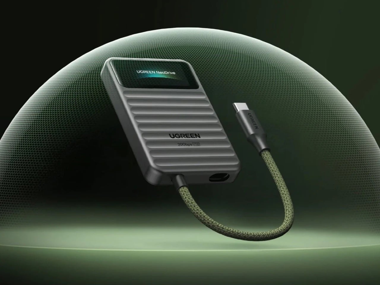
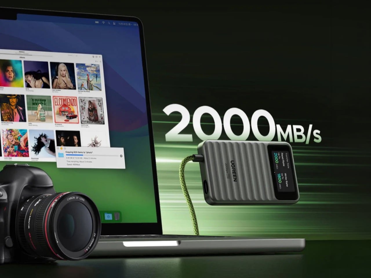
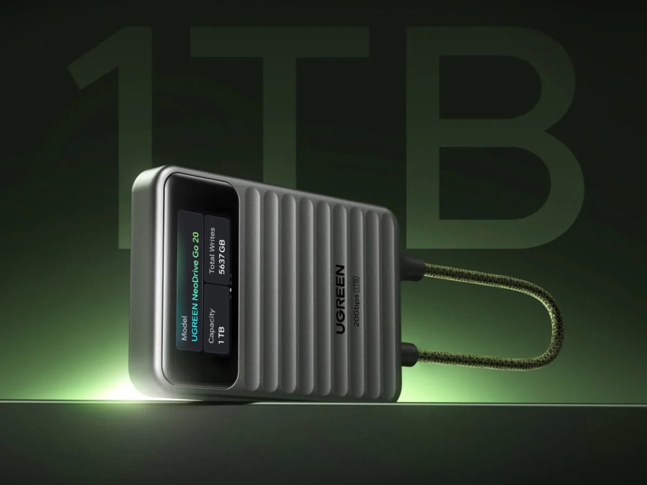
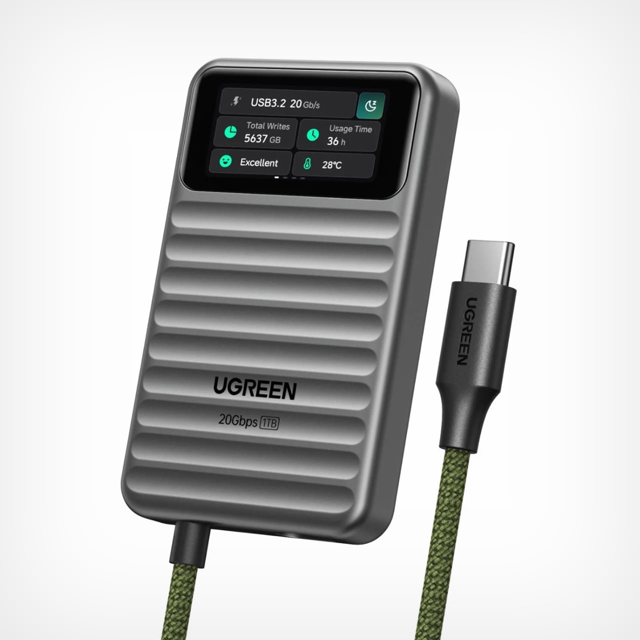
Enter the UGREEN NeoDrive Go, a 1TB portable SSD with a built-in touchscreen that turns ownership into something visible. Transfer speeds, drive health, and temperature are all displayed right on the device, no app required, no recurring charge attached. It connects over USB 3.2 Gen 2×2, hitting read speeds up to 2000 MB/s, fast enough to move a feature length project in the time it takes to make coffee. UGREEN prices it at $229.99 for the 20Gbps model, with a 40Gbps Thunderbolt variant for editors who need even more headroom. It’s the physical, tangible alternative to a system built on monthly extraction, proof that sometimes the smartest upgrade is simply owning the thing you already paid for.

Designer: UGREEN

A 1.45-inch IPS display sits embedded into the wave-patterned aluminum shell, rendering a tiny dashboard of total writes, usage hours, and a health rating that reads “Excellent” the way a hospital monitor reads “stable.” There’s even a night mode toggle tucked into the corner, because apparently a hard drive now has opinions about ambient lighting. Most portable SSDs communicate through a single blinking LED, a design choice that has barely evolved since the era of dial-up modems. UGREEN swapped that blind trust for an actual interface, and it changes how the device feels to use, transforming a transfer from a hopeful guess into something you can watch happen in real time.

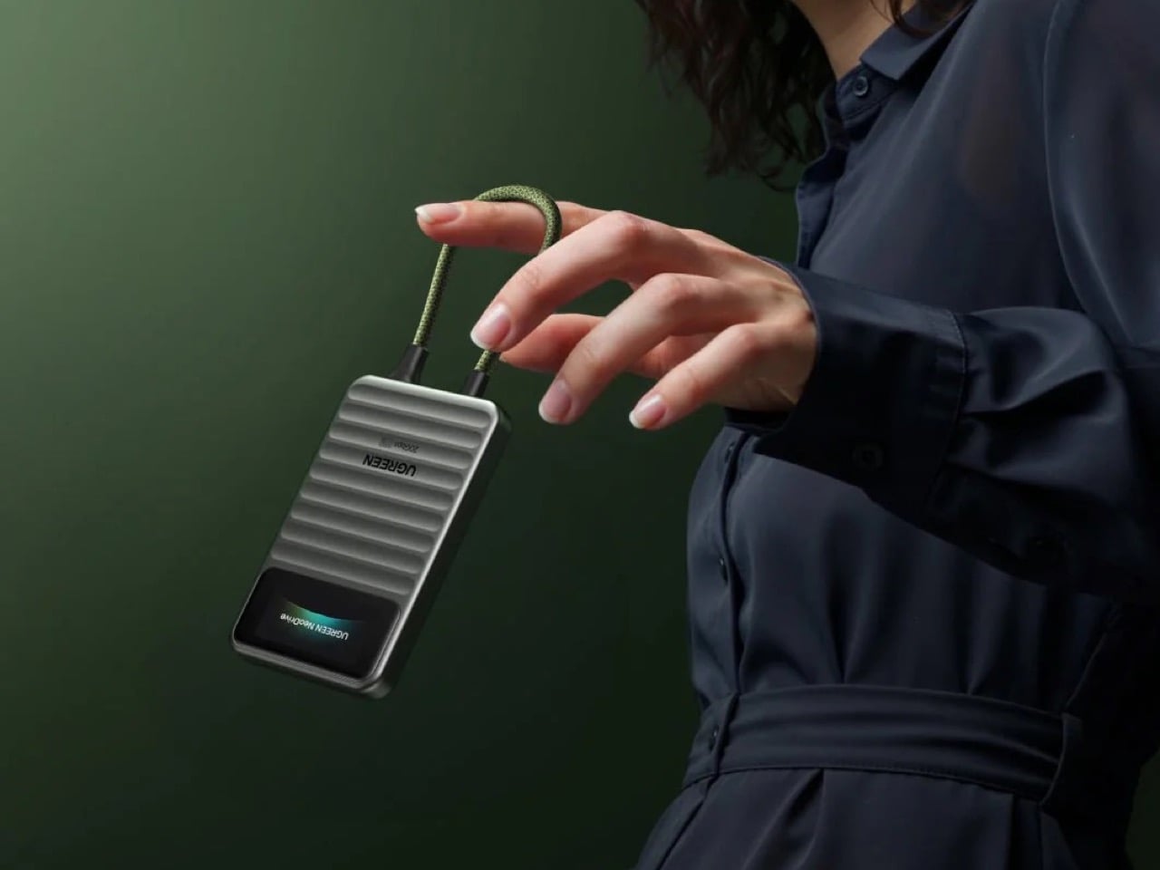
The 1TB capacity stores about 600 hours of 4K video, over 30,000 RAW photos, or more than 15 AAA games, plenty of runway for creators who shoot first and sort later. UGREEN backs that capacity with LDPC ECC smart error correction, electrostatic discharge protection, and surge protection, plus a 2-meter drop rating that lets the drive survive the bag-toss test most external drives quietly fail. It weighs about as much as AirPods and is as small as a bank card, disappearing into a pocket the moment the transfer finishes. Wide compatibility across Thunderbolt, USB4, and legacy USB ports means it works on a MacBook, a gaming PC, or an Android phone.

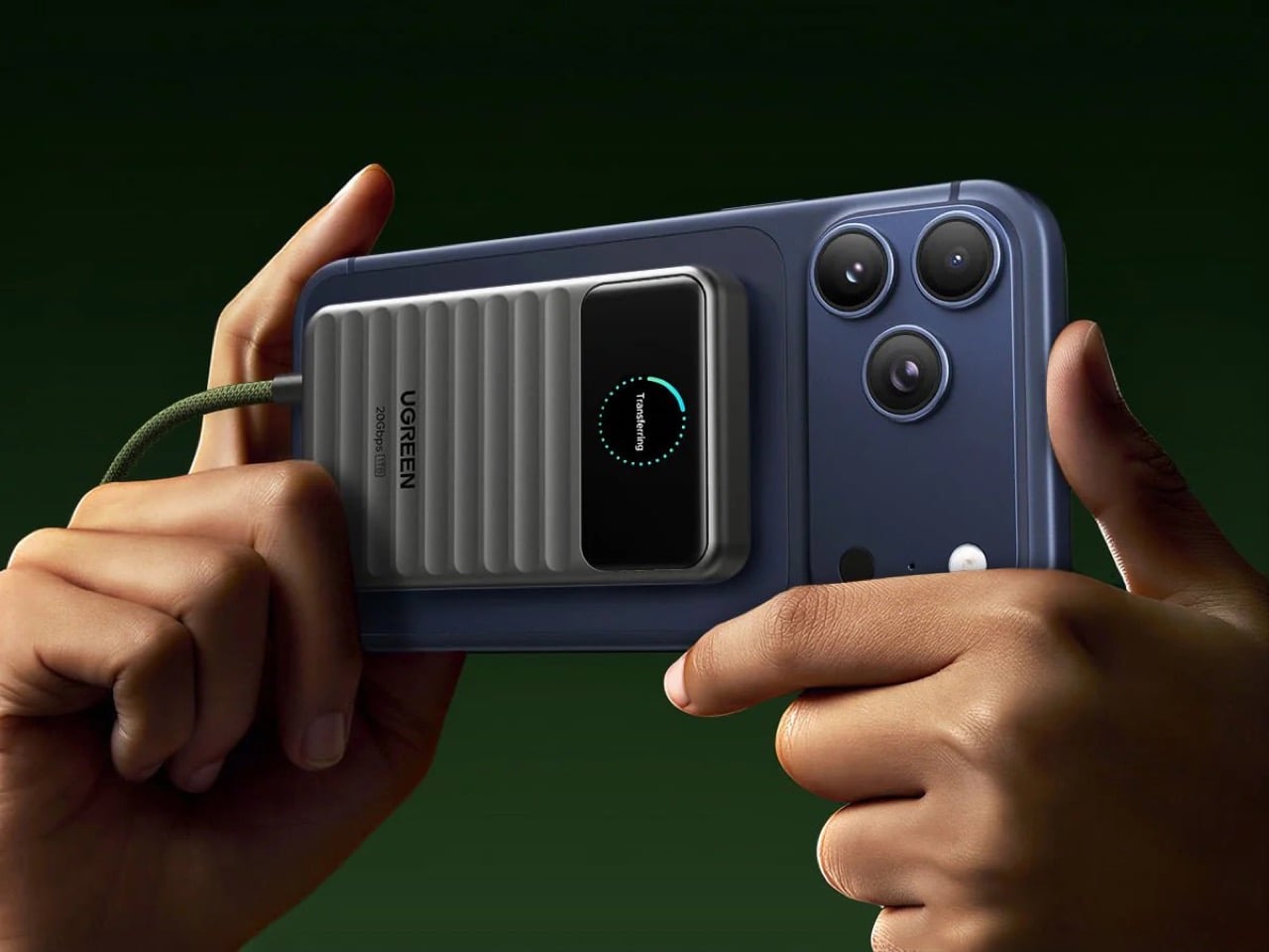
The real party trick is the magnetic plate on the back, built to MagSafe specs for iPhone 15, 16, and 17 Pro and Pro Max models. Snap the NeoDrive Go onto the back of the phone and it becomes a clip-on cinema rig, recording 4K ProRes video directly to the drive instead of relying on the phone’s internal storage. Pair that with the permanently attached braided USB-C cable, and nothing dangles, nothing gets left behind in a camera bag, and nothing requires digging through a drawer of mismatched cords before a shoot. For mobile filmmakers who treat their phone as a primary camera, this single feature could justify the purchase on its own. It is the kind of integration that only makes sense once you’ve actually run out of storage mid-shoot and felt that specific panic.

Timing makes this drive matter more than it would have a year ago. NAND Flash accounts for about 90% of an SSD’s cost and is currently in a global shortage, driven largely by AI data centers absorbing the majority of production, and contract prices have multiplied roughly 4.2 to 4.5 times over the past three quarters alone. Industry consensus now places the first meaningful consumer SSD price relief in 2027, not sooner. Buying physical storage now, before the next wave of price hikes lands, looks less like an indulgence and more like a hedge. The NeoDrive Go won’t end the cloud storage habit overnight, but it offers a real alternative, a drive you own outright, that shows its work, and that nobody can bill you for twice.

The post I did the math on a decade of cloud storage fees. It makes sense to own this $230 1TB SSD instead. first appeared on Yanko Design.
A Spiderweb-Shaped Home in Japan Has No Fixed Rooms and Adapts as the Family Grows

Spiders have been building radial webs for about 100 million years, spinning silk into a geometry that spreads weight around with an efficiency engineers spent centuries trying to copy. The web holds up because every strand pulls toward the center, so stress gets shared across the whole thing instead of piling up in one spot. Architecture has borrowed this trick before, from geodesic domes to tensile fabric roofs, but a regular family home almost never commits to the idea this literally. UID Architects looked at a spiderweb and saw a floor plan. In Fukuyama, Japan, they turned that into a house where a family of four actually lives.

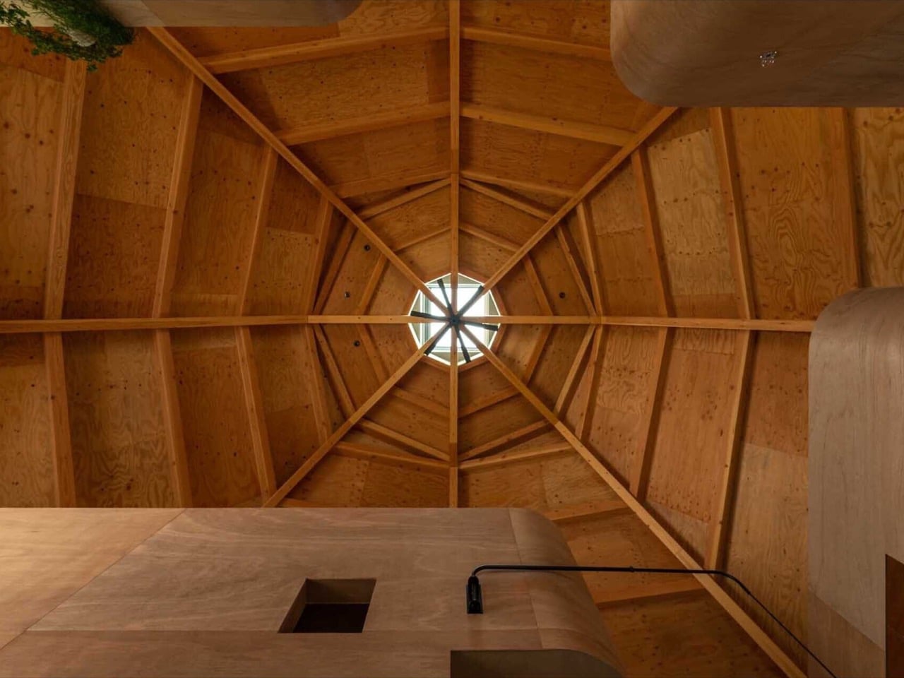
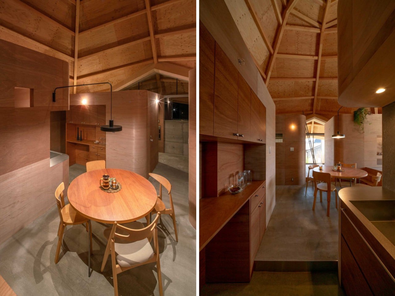
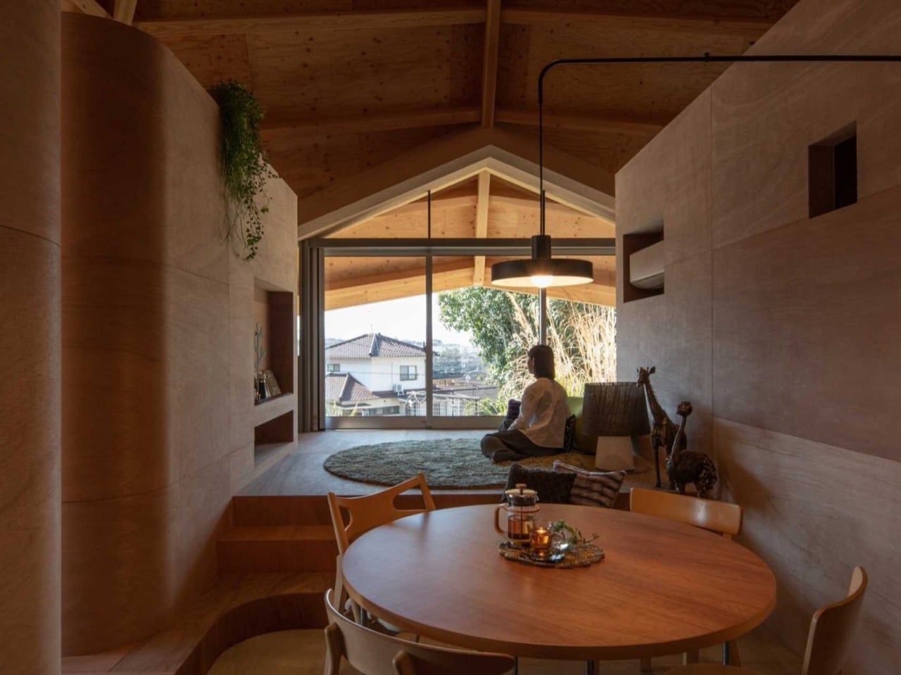
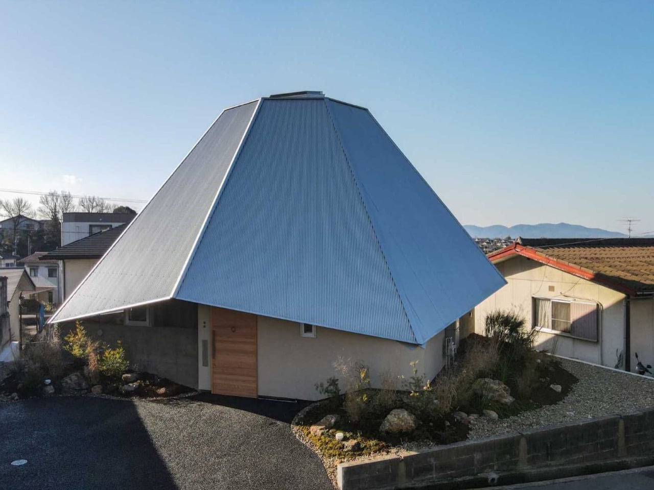
The home is an octagonal timber structure turned 45 degrees across its sloping suburban plot, topped by a roof whose beams all converge on a glazed opening at the center. UID balanced the entire volume on four points and wrapped triangular openings around the edges to pull in light from every direction. Inside, the roughly 828 square feet stays open on purpose, skipping conventional rooms in favor of four rounded plywood boxes that guide you through the space like a corridor. The dining table sits right under the middle of the web, putting the family’s social life at the structural heart of the house. It is a home you read from the ceiling down.

Designer: UID Architects

Eight timber beams run up from the perimeter and meet at a small glazed oculus that drops daylight straight into the middle of the plan. Looking up, the whole thing reads as a literal web frozen in wood, every strand under tension and pulling toward the same hub. From outside it flips into something else entirely, a faceted metal cone that rises over the neighboring rooftops like a spinning top someone left on the street. That shift between the warm wooden interior and the cool metal shell makes the house feel bigger and stranger than its footprint suggests. You read it as a tent from the driveway and a cathedral once you walk in.

A sunken lounge with a round shag rug steps up to the raised dining level, so the open plan never collapses into one undifferentiated room. The four plywood boxes handle the rest of the organizing, standing low enough that the soaring ceiling flows over all of them without interruption. Their corners are rounded rather than sharp, a small move that softens the heavy plywood and keeps the place from feeling like a furniture warehouse. You move between these volumes the way you would wander through a small village, never quite walled in, never fully out in the open. The boxes suggest where to sit, cook, or gather without ever issuing an order.

There are almost no permanent interior walls, which means the family can reassign space as their lives shift instead of calling a contractor. A corner that works as a play area now can quietly become a study, then a home office, all inside the same shell. Most homes get designed for one stage of family life and then fight the people living in them for the next thirty years. UID dodged that trap by building rooms that are really just zones, defined by furniture and habit rather than drywall. It is a smart, patient way to think about a house someone plans to keep for decades.

Plywood usually gets buried under veneer the moment a budget allows, treated as the cheap stuff you hide. UID does the opposite, letting warm plywood climb from the floor all the way up into the ceiling so the wood becomes both the structure and the finish. The one exception is the kitchen, where a darker, redder cabinetry tone marks it as its own little district within the larger space. That single shift in wood gives the cooking zone an identity without breaking the calm consistency holding the rest of the home together. Everywhere else, the material repeats until the house feels carved from a single block.

Building a giant timber web in a neighborhood of beige boxes takes real nerve, and the renderings could easily have collapsed into a gimmick once construction started. They did not, mostly because the geometry earns its keep, handling light, ventilation, privacy, and circulation in one gesture rather than decorating over them. Japan has a long history of small homes that punch far above their square footage, from the metabolist experiments of the sixties to the tight urban houses we cover constantly, and this one sits comfortably in that lineage. UID built a house that should still make sense long after the kids have grown and moved out. I keep thinking about who gets to redraw their own floor plan just by moving the furniture.

The post A Spiderweb-Shaped Home in Japan Has No Fixed Rooms and Adapts as the Family Grows first appeared on Yanko Design.