This 45mm Titanium Keychain Glows for 25 Years Without Batteries Using Pure Material Physics

Tritium is a hydrogen isotope with a half-life of 12.3 years. As it decays, beta particles strike a phosphor coating and produce light. The process requires no electricity, no chemical reaction, and no external energy. It simply happens, continuously, for decades. This is why tritium appears in emergency exit signs, military watches, and aviation instruments. The glow is faint compared to an LED, but the reliability is absolute. Nothing else in the consumer lighting world can claim 25 years of operation with zero maintenance.

NoxTi by Xedge packages that physics in a 45mm titanium cylinder designed for keychain carry. The tritium vial sits inside a precision quartz tube with 92% light transmission, surrounded by a CNC-machined Gr5 titanium body that weighs just 10.7 grams. The construction is fully serviceable. Two silicone O-rings hold the vial in place, and when brightness fades after two decades, you push the old tube out and slide a new one in. The design includes a ceramic-tipped glass breaker at one end, a keychain hole at the other, and a floating core that’s visible from all sides. Xedge ships it in six colors (Ice Blue, Apple Green, Red, Sunset Orange, Violet, Ocean Blue) and two finishes (sandblasted titanium or black coating). Pricing starts at $25 for a luminescent vial version and $45 for tritium.

Designer: Xedge

Click Here to Buy Now: $30 $42 (28% off). Hurry, only 73/350 left! Raised over $253,000.
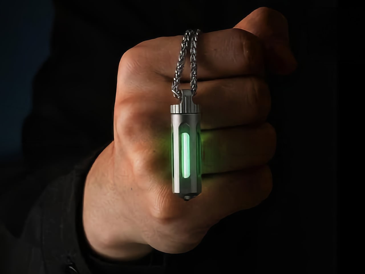
The titanium shell measures 45mm long by 12mm wide, putting it in the same size class as a AA battery but considerably lighter. At 10.7 grams, the weight registers as barely-there on a keychain, roughly equivalent to two US pennies. The Gr5 titanium alloy (also known as Ti-6Al-4V) is the workhorse material of the aerospace industry, chosen for its exceptional strength-to-weight ratio and total resistance to corrosion. This alloy doesn’t rust, doesn’t tarnish, and doesn’t degrade in salt water, sweat, or extreme temperatures. Xedge tested the assembly from -20°C to 50°C, and the glow remained steady throughout. The body is CNC-machined, not stamped or cast, which means tighter tolerances and cleaner geometry.

Quartz glass transmits 92% of visible light, far outperforming acrylic or polycarbonate alternatives that yellow and scratch over time. The tube encasing the tritium vial is hermetically sealed, protecting the vial from moisture, dust, and impact. Beta particles from tritium decay are so weak they cannot penetrate paper, let alone quartz. The radiation stays contained. If the tube somehow shattered, tritium is a gas that dissipates instantly with no lingering hazard. The engineering priority here is longevity. The quartz will still be optically clear in 2050.

Two precision silicone O-rings grip the quartz tube at either end, holding it perfectly centered inside the hollow titanium body. The tube doesn’t shift, doesn’t rattle, and appears suspended in midair when you look through the cutouts in the shell. The effect is clean and technical, like looking into a piece of scientific equipment. More importantly, this mounting method makes the vial user-serviceable. When the tritium dims after 20 or 25 years, you press the tube out from one end and slide a fresh one in from the other. No adhesive. No permanent seals. The titanium body becomes a platform you keep forever, swapping cores as needed.

The six color options let you tailor the glow to preference or function. Apple Green is the brightest to the human eye and the most common choice for visibility. Ice Blue reads as cooler and more modern. Red preserves night vision, a carryover from military and aviation use. Sunset Orange, Violet, and Ocean Blue lean aesthetic. Xedge also offers two finishes. The sandblasted titanium option reveals the raw gray-silver lustre of the alloy and develops a patina of micro-scratches over time, creating a lived-in look. The black-coated finish uses a hard scratch-resistant diamond-like coating (DLC) to cloak the body in matte black, letting the glowing core do all the visual work.

The ceramic-tipped glass breaker at the tail end functions as an emergency tool. It’s designed for car windows and similar tempered glass applications. Xedge cautions that it’s for emergencies only, not casual testing, which is the responsible way to position a feature like this on a keychain-sized tool.
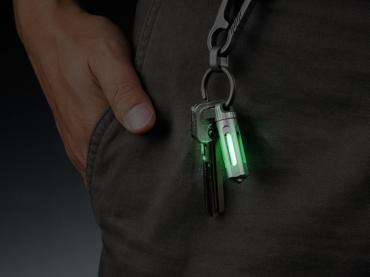
NoxTi ships in two versions. The luminescent vial version uses a glow-in-the-dark tube that absorbs ambient light and re-emits it at night, priced at $25. The tritium model glows continuously for 25 years with no external light needed, starting at $45. Both versions ship worldwide with free shipping included. Add-ons include extra vials (three-packs of luminescent tubes for $20, tritium vials for $60), black coating upgrades, quick-release key rings, and stainless steel necklaces. Delivery is scheduled for August 2026.

Click Here to Buy Now: $30 $42 (28% off). Hurry, only 73/350 left! Raised over $253,000.

The post This 45mm Titanium Keychain Glows for 25 Years Without Batteries Using Pure Material Physics first appeared on Yanko Design.

Why Most AI Productivity Tools Still Fail After the Meeting

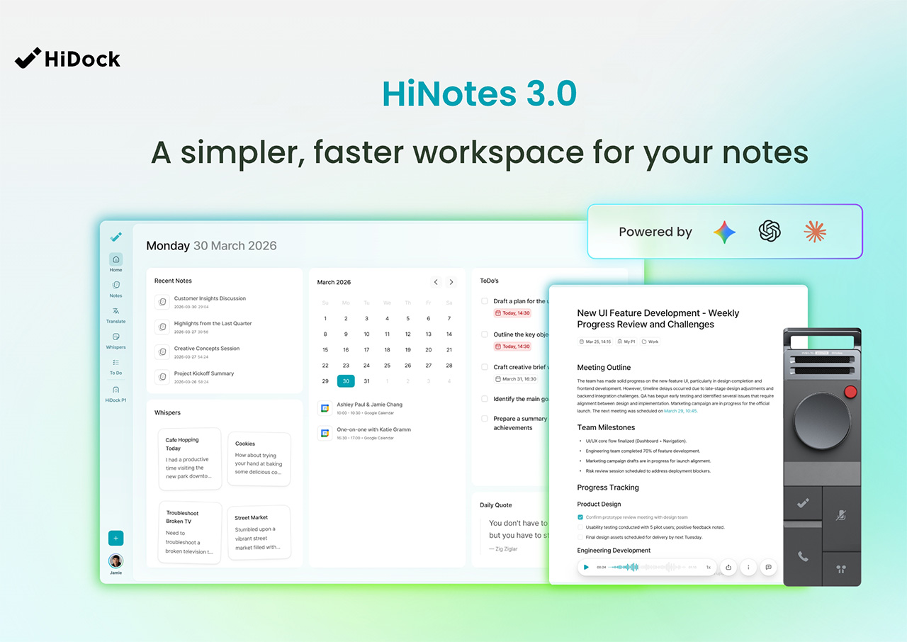
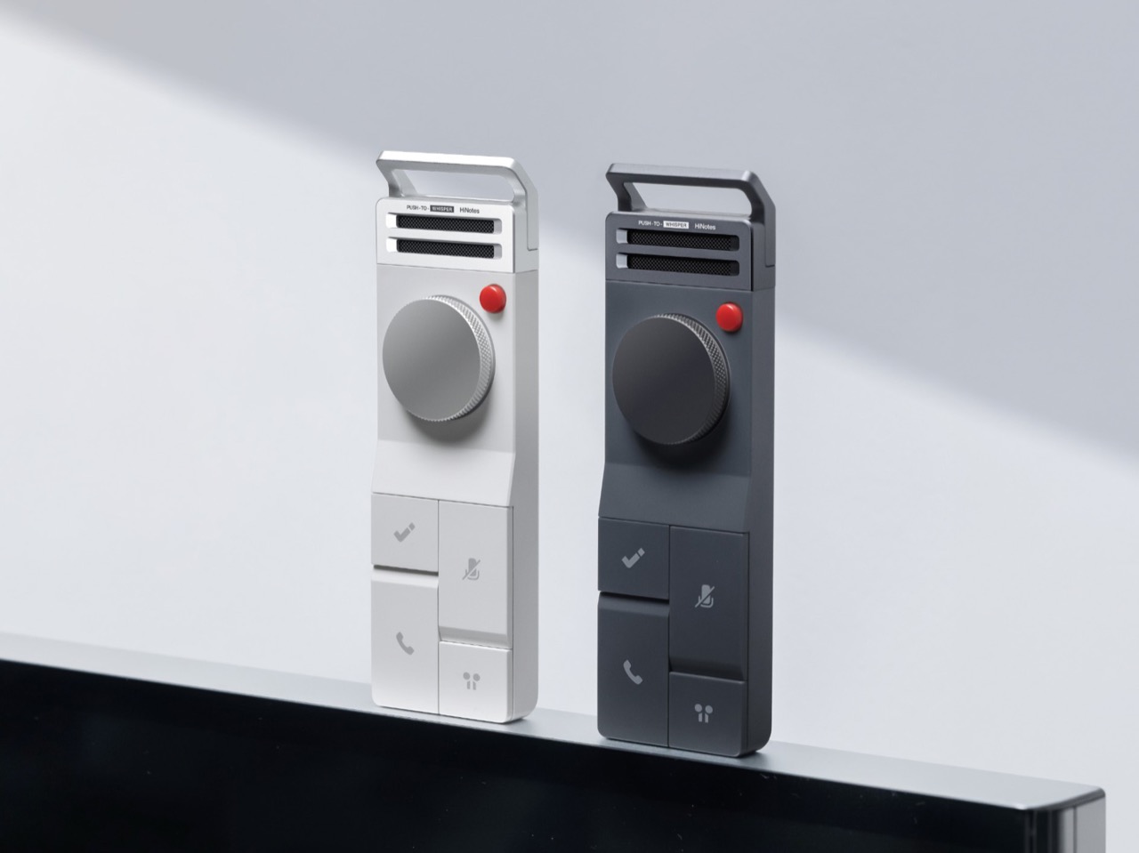
Design Mindset, Yanko Design’s weekly podcast powered by HiDock this week, it is 20 episodes in and showing no signs of slowing down. Hosted by Radhika Seth, the show premieres every week with conversations that dig into the minds behind the products shaping how we work, create, and communicate. This episode brings in a guest who fits that mission precisely.

Sean Song is the founder and product lead of HiDock, a company with deep roots in audio DSP engineering whose technology has powered over 500,000 devices across smart homes, automotive, and enterprise communication systems. Their hardware, the HiDock P1, rethought how professionals capture conversations through their own earbuds, with no bots, no awkward announcements, no friction. With HiNotes 3.0, the team has made a far more ambitious move, tackling the part of the productivity problem the industry has largely left untouched. Sean thinks about productivity the way a designer thinks about systems, as a behavioral architecture challenge, and that’s exactly what this conversation gets into.

Explore HiNotes 3.0 Here

The Productivity Paradox and Cognitive Load

Sean opens the episode with a number that should stop anyone mid-scroll: research suggests that almost 44% of action items are missed after meetings. His argument is that the tools built to fix this have been solving the wrong problem entirely. “We have built some of the most sophisticated recording and transcription technology and products in history, and we are still leaving meetings with a list of things we never act on,” he says. “I come to believe that the real productivity crisis was never about capturing, never about transcription. It is all about what happens in the silence after the meeting.”

What makes this more than a product pitch is the neurological framing Sean brings to it. Meetings, in his view, are among the most computationally heavy tasks the human brain performs, comparable to driving, because vision, hearing, and real-time language generation are all running simultaneously. “It’s duplex, it’s fully duplex. I output, I input, I output, I input and my brain is calculating my next word. It’s just like the large language model predicting the next token.” After a long meeting, your brain is, as he puts it, “out of sugar.” Taking accurate notes under those conditions is genuinely hard, and executing on them afterward, when you’re already depleted, is harder still.

The Evolution of Productivity Tools and Product Philosophy

HiDock spent years building enterprise communication tools, and for a long time the assumption was simple: deliver clear audio, solid recording, and eventually a clean AI-generated summary, and the job is done. Sean’s reckoning with that assumption came from a place that was personal before it was professional. He describes being a devoted “GTD guy” since the late 1990s, carrying the Get Things Done philosophy across every platform from Palm to BlackBerry to iPhone. “After years of being a GTD guy, it helped nothing to my career. I didn’t perform better. I didn’t achieve more.” The tools were fine. The system was the problem.

That realization resurfaced when Sean was using HiNotes and recognized the same pattern playing out again in his own product. “A good transcription is not enough. A good summary is not enough. Taking notes is not enough. We need to extract the pearls inside the notes and help the user to manage after the meeting.” From there, the team’s design focus shifted from delivering beautiful text to understanding what users were actually trying to accomplish, which was getting work done across the full arc of a meeting’s life, including the silence that follows it.

Design Principles for Effective Productivity Tools

One of the most interesting distinctions Sean draws is between consumption apps and productivity apps, and why the design logic that works beautifully for one actively undermines the other. For consumption, he says, “laziness wins. Always, like social apps, Snapchat, picture apps. You just do one click, everything done.” For productivity, his position is the opposite. “Discipline wins. Because this is another belief that guides me to build everything, HiDock and HiNotes, which keeps human in the loop.” The principle runs through every hardware and software decision the team makes. Physical actions like a key push or a long hold are built in deliberately, because that tiny moment of effort is what creates cognitive ownership of the information being captured.

Context sits alongside discipline as a guiding force. The story behind HiNotes 3.0’s timestamp-linked action items came from a dinner at a traditional omakase restaurant in Japan. Months later, what Sean remembered from the experience was a conversation with the chef about his training and his master. The food itself had faded. “So this brought to me that we should not only give the user a to-do, we need to give the user the context.” The visual architecture of the software reflects the same thinking: a consistent three-pane interface, maintained even when only two panels are logically needed, because the stability reduces cognitive load and builds what Sean calls “solid reliability” over time.

HiNotes 3.0

Capturing Creativity and Fragmented Ideas

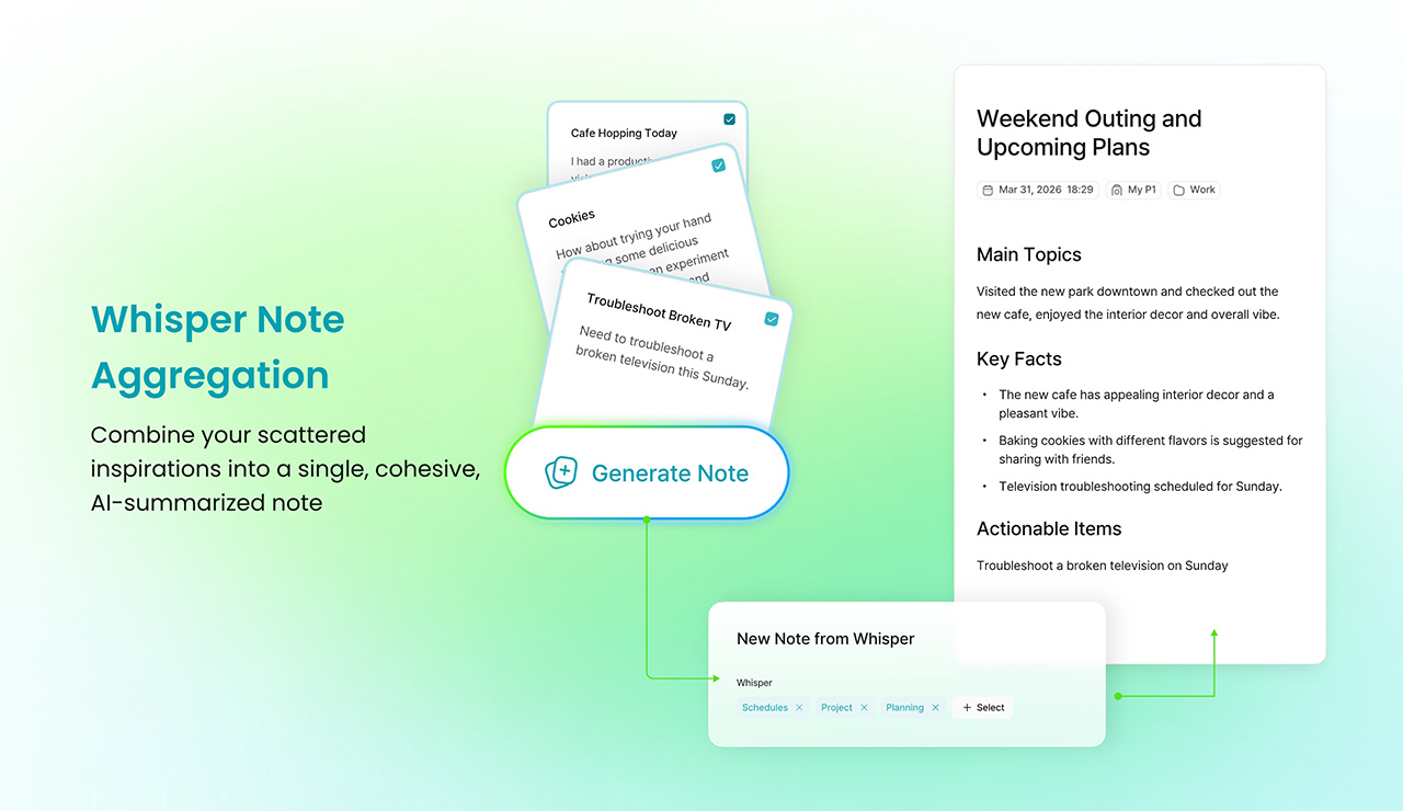
Scheduled brainstorming, Sean argues, is one of the less honest myths in modern work culture. “Many brainstorm meetings do not generate good ideas. Good ideas came from when you walk, when you drive. And when you swim or after you swim, when you’re taking a shower, those are creative moments.” The friction of capturing an idea in those moments, unlocking a large phone, finding the right app, waiting for it to load, is enough to kill the thought entirely. Whisper Notes was built around precisely that gap: an instant, low-friction way to record ideas wherever they arrive, with HiNotes 3.0 handling the synthesis, pulling scattered voice recordings from across the day into a single coherent summary.

The question of which AI model does that synthesizing led HiDock to a decision that runs counter to most of the industry. HiNotes 3.0 gives users access to seven frontier models including GPT, Claude Sonnet, and Gemini Pro, switchable on a per-meeting basis. Most tools make a single model choice and bury it. Sean’s reasoning comes back to the human-in-the-loop philosophy: “Different content may require different summarization, even may require different characteristic values of the large language models.” He describes Claude as “probably more philosophical and decent and pays attention to details,” Gemini as “probably more creative and probably more up to date,” and frames the act of selecting a model as a form of intentional engagement with the content. The effort, for Sean, is always the point.

Whisper Note Aggregation

Rapid Fire Round: Quick Takes

The rapid fire round is where Sean’s worldview comes through in its most concentrated form. His pick for the most overrated productivity tool is AI agent tools, marketed as capable of everything but, in his experience, delivering nothing meaningful for most people in practice. The habit he’d want every professional to adopt is “check alignment,” a ritual he runs after every meeting and town hall: “Do I make myself understood? Are we on the same goal?” His most honest moment in the segment comes when asked about his own biggest follow-through failure. Leading a 50-person startup, he has missed the personal onboarding of roughly 15 new employees despite having promised himself he would handle it himself.

On what hardware design understands that software consistently ignores, his answer is immediate: “Tactile and sensation matters. So you cannot just build a piece of plastic or a piece of metal. Even plastic or metal, there are textures, there are tactile sensation feelings that connect you and your consumers.” The one thing he would strip from modern meetings is social distance, the polite friction that slows down directness and alignment. Asked for the single greatest enemy of execution in one word, his answer lands as a kind of provocation: notes. As he puts it, “as long as you take notes, it helps you execute.” Coming from the founder of a meeting intelligence company, it is both a confession and a design brief rolled into one.

Design Mindset drops every week on Yanko Design. For anyone looking to go deeper into HiNotes 3.0 and the hardware that brings it to life, have a look here.

Explore HiNotes 3.0 Here

The post Why Most AI Productivity Tools Still Fail After the Meeting first appeared on Yanko Design.

Keychron Cut a Keyboard in Half and Accidentally Made the Perfect Gaming Peripheral for $60

Think about the last time you actually used the right half of your keyboard while gaming. Your right hand was on the mouse, your left hand was camped on WASD, and every key to the right of G and T was essentially decorative. The numpad, the arrow keys, the entire right side of your keyboard sat there collecting dust while you were busy fragging opponents or managing cooldowns. Keyboards have been designed for typists since the 1860s, and the gaming world has largely just accepted that and moved on.

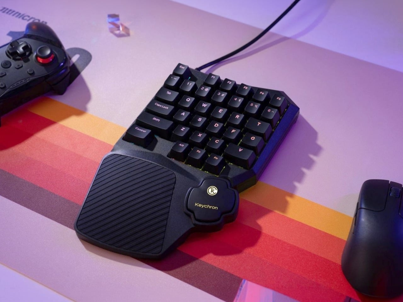
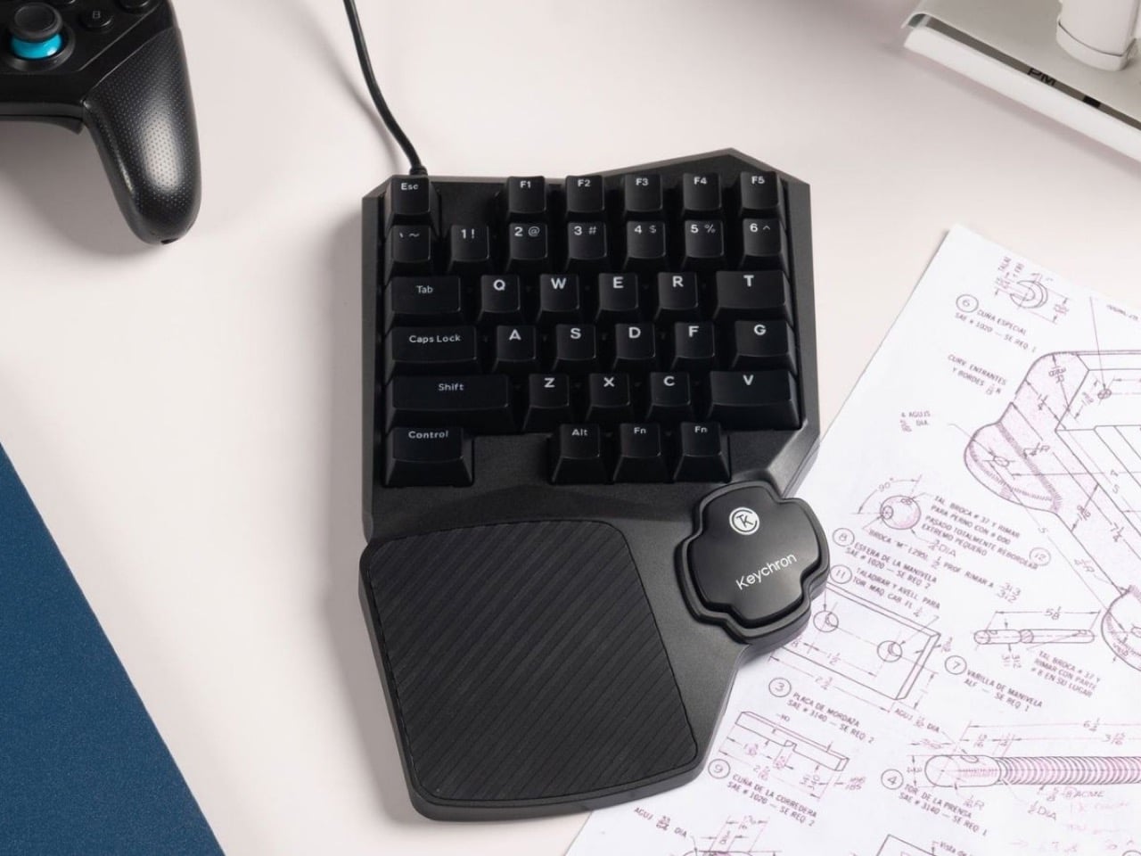
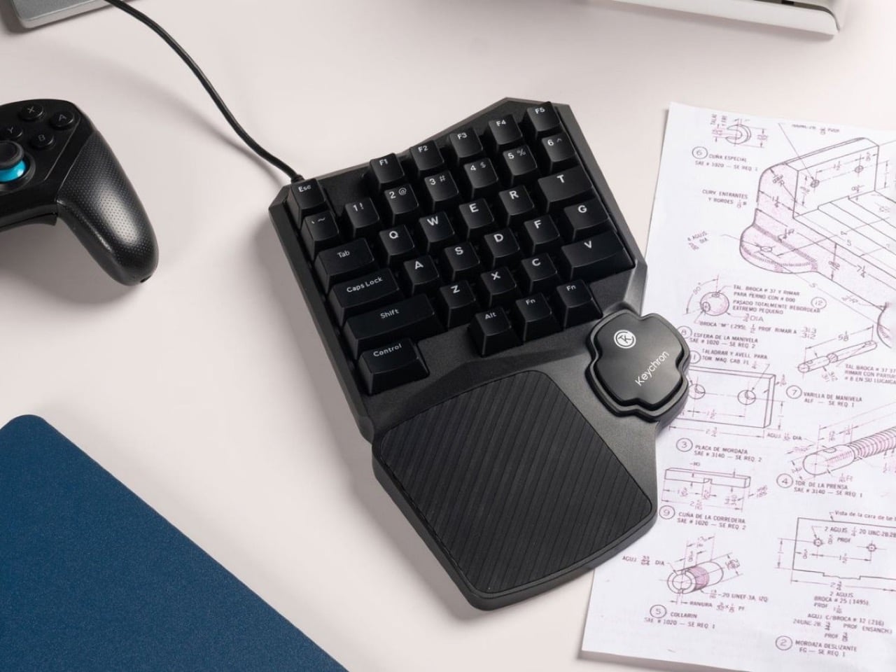
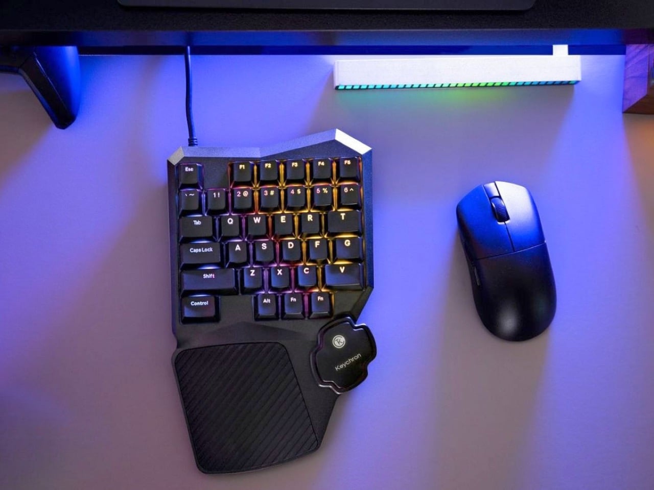
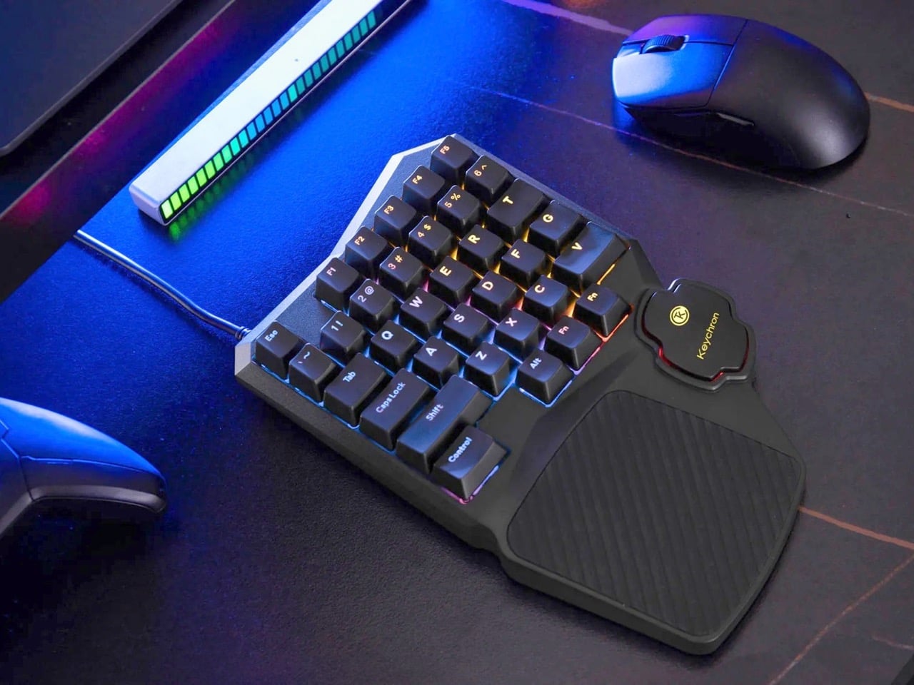
Keychron hasn’t. The C0 HE 8K is a 35-key one-handed gaming keypad that takes the left half of a conventional keyboard, wraps it in an aggressive chassis with a built-in palm rest, and throws Hall Effect magnetic switches and an 8,000 Hz polling rate at it. The result is a peripheral built entirely around how PC gamers actually use their keyboards, rather than how office workers do.

Designer: Keychron

Hall Effect magnetic switches read actuation depth using sensors rather than physical contact between two metal points, which means the switches don’t wear out the same way traditional mechanicals do since there’s no metal-on-metal degradation over time. More practically, you can set exactly how deep each key needs to travel before it registers, right down to fractions of a millimeter, through Keychron’s browser-based Launcher app. Set a shallow actuation for your sprint key, a deeper one for an ability you don’t want to fat-finger, and a rapid trigger profile for keys where you need near-instant re-registration. This level of per-key granularity has historically lived in expensive enthusiast boards, and Keychron is bringing it to a purpose-built gaming pad that fits in half the desk footprint.

At 8,000 Hz, the C0 HE 8K reports its key state to your PC eight times more frequently than the 1,000 Hz ceiling most gaming keyboards hit. You can switch between 1,000, 4,000, and 8,000 Hz in the Launcher app depending on whether you want to conserve USB bandwidth or go full competitive. For most players the difference is nearly imperceptible in casual play, but in titles where frame timing and input consistency matter at the margins, having that headroom available without buying a separate board is a genuinely useful option.

The faceted, angular chassis has beveled edges cutting across the top corners that give the C0 HE 8K a visual identity most gaming peripherals lack entirely. The integrated silicone palm rest flows organically out of the bottom of the unit, wide enough to actually support your wrist rather than just gesture at the concept. North-facing RGB shines through double-shot ABS keycaps in over 22 lighting modes with per-key control, keeping legends readable even in dim setups where the backlighting does most of the work.

Pricing remains under wraps for now. The C0 HE 8K sits in a niche that the Razer Tartarus and Logitech G13 have occupied for years, but neither brought Hall Effect switches or sub-millisecond polling to the category. Keychron has built a reputation on mechanical keyboards that punch above their price point, and if the C0 HE 8K lands anywhere near the $80 to $100 range its feature set suggests, it will be a serious conversation starter for anyone who has ever looked at the right half of their keyboard mid-game and wondered why it exists.

The post Keychron Cut a Keyboard in Half and Accidentally Made the Perfect Gaming Peripheral for $60 first appeared on Yanko Design.

Renault Le Mans Hypercar Concept Swaps Entire Drivers Like F1 Changes Tires

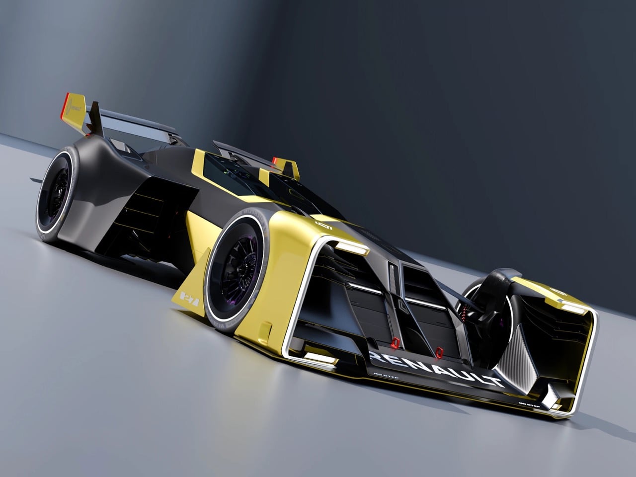
Endurance racing has a violent pit stop problem. Drivers trapped in burning cockpits because harnesses wouldn’t release fast enough. Fuel fires erupting while crews wrestle with high-pressure refueling systems under time pressure. Wheel guns misfiring at exactly the wrong moment. These failures have defined the dark side of Le Mans history since the 1950s, and Taejung Kim’s Renault Double Barrel concept exists to make sure they never happen again. The concept draws its name and its core philosophy from a shotgun’s double barrel mechanism, reimagining the 2040 Le Mans hypercar as something you hot-swap instead of service. The left fuselage contains a complete hydrogen powertrain module. The right fuselage houses the entire driver cockpit as a self-contained pod. When the car screams into the pit lane, the team doesn’t unbuckle a driver or pump fuel into a tank. They eject both entire modules and slot in fresh replacements, sending the car back onto the Circuit de la Sarthe in the time it currently takes just to click a seatbelt harness. The approach transforms pit lane strategy from a dangerous ballet of human coordination into something mechanical, predictable, and inherently safer.

The concept’s inspiration reaches back to the 1955 Nardi Giannini ND750 Bisiluro, an Italian streamliner that split its driver and engine into two separate fuselages connected by a central spine. That car was designed for outright speed on the straights at Monza, accepting terrible handling characteristics in exchange for slicing through the air like a bullet. Kim’s reinterpretation borrows the twin-fuselage architecture but uses it to solve a completely different problem: eliminating the human chaos of endurance racing pit stops. The Nardi needed two separate bodies because mid-century aerodynamics couldn’t integrate a driver and engine into one low-drag form. The Double Barrel uses two bodies because modular replacement demands independent pods, and because splitting mass across two fuselages creates a radically different center of gravity that could fundamentally change how a prototype handles through high-speed sections like the Porsche Curves.

Designer: Taejung Kim

The hydrogen powertrain module on the left carries the entire propulsion system as a single replaceable cartridge. Fuel cell stack, electric motors, power electronics, thermal management, and structural mounting all integrate into one unit that slides into the left fuselage and locks into place through what Kim describes as a shotgun-inspired breach loading mechanism. The driver pod on the right contains the cockpit, safety cell, steering column, pedal box, and all driver interfaces as a second self-contained module. Both pods connect through a central carbon monocoque spine that handles the structural loads and aero surfaces. The concept sketches show mechanical locking points at the front and rear of each fuselage, suggesting the modules slide in from behind and engage positive locks that can be released pneumatically or mechanically under pit lane conditions. The swap mechanism prioritizes speed over tool-free operation, accepting that pit crews will have specialized equipment if it means dropping swap times below ten seconds.

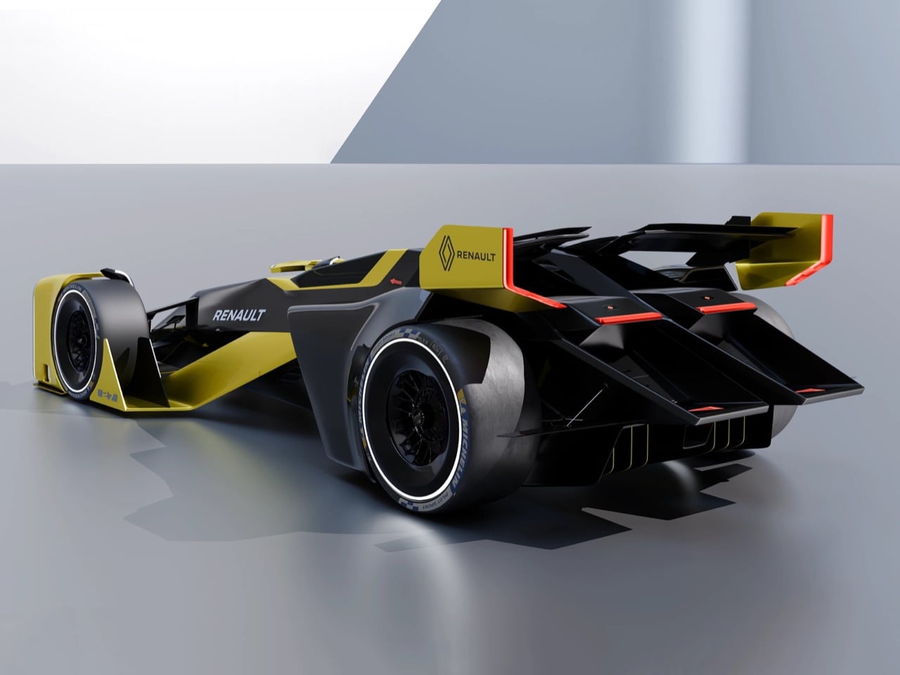
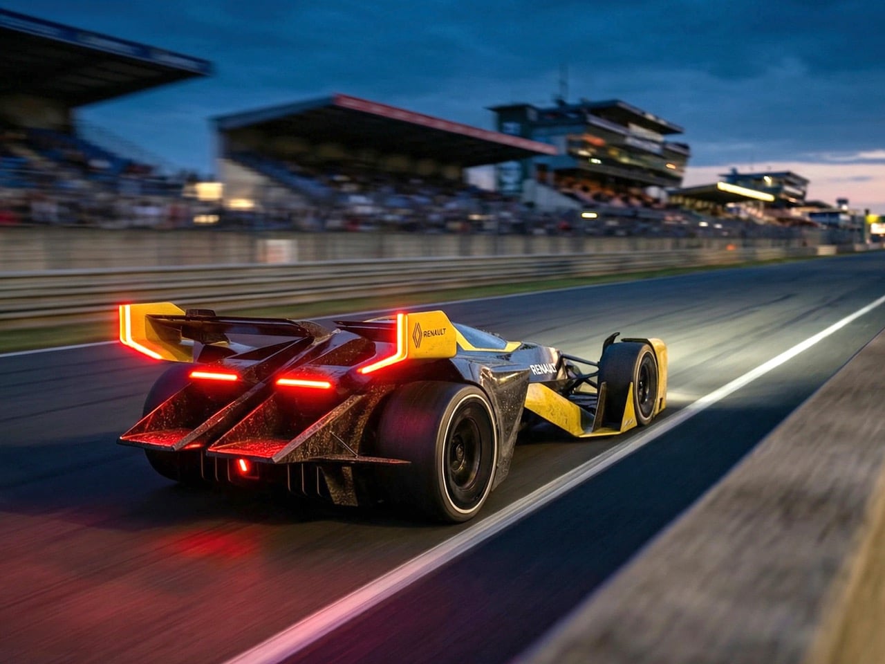
The front fascia is dominated by twin hexagonal air intakes that feed cooling to each fuselage independently. A narrow LED light bar spans the width of the nose, broken into segmented panels that give the car an almost insectoid quality when illuminated. The central spine between the two fuselages rises slightly to create a spine-like ridge that channels airflow over the top of the car, and the bodywork around each pod is heavily sculpted with sharp creases and dramatic undercuts. The rear features a massive integrated wing that spans the full width of both fuselages, with vertical endplates in the same acid yellow as the front dive planes. The diffuser treatment extends deep underneath the rear bodywork, and the taillights are thin horizontal bars integrated into each pod’s trailing edge, outlined in vivid orange-red that pops against the black carbon.

The hot-swap pit stop strategy Kim proposes would require significant changes to current Le Mans regulations, which don’t allow for driver changes mid-stint under normal racing conditions and mandate specific refueling procedures. The FIA and ACO (Automobile Club de l’Ouest) would need to develop entirely new technical regulations governing module interfaces, safety interlocks, and swap procedures. The concept assumes these rules evolve in response to hydrogen adoption and the push toward zero-emission endurance racing. Hydrogen refueling presents unique challenges, current systems require careful pressure management and grounding to prevent static discharge ignition, and a modular cartridge swap eliminates those risks entirely by treating the entire fuel cell stack as a consumable that gets swapped rather than refilled. The driver pod swap solves the harness release problem that has caused fatalities when drivers couldn’t exit burning cars fast enough, and it also allows teams to rotate drivers without the psychological pressure of quick unbuckling under race conditions.

The twin-fuselage layout creates interesting aerodynamic opportunities and problems. Splitting the car’s mass into two distinct bodies allows each fuselage to generate its own downforce independently, potentially creating a system where the left and right sides can be tuned asymmetrically for different corner characteristics. The gap between the fuselages becomes a massive air channel that could feed cooling, create a venturi effect for underbody downforce, or house active aero elements. The downside is drag. Two separate bodies create more frontal area and more turbulent wake than a single unified form, and at Le Mans, where cars spend significant time at full throttle down the Mulsanne Straight, drag is everything. Kim’s concept accepts this compromise, betting that the pit stop time advantage and the safety benefits outweigh the aerodynamic penalty.

The project was developed as a personal exploration in 2026 with mentorship from Dre Ahn of Dvision Studio, rendered in Blender using Cycles for the photoreal lighting, and presented through a comprehensive design development breakdown that shows Kim’s process from initial research through final execution. The concept doesn’t pretend to be production-ready. It’s a provocation, a design exercise that takes a genuine problem in endurance racing and solves it through radical rethinking of what a race car can be. Whether the FIA ever allows modular pod swaps is almost beside the point. The Double Barrel concept demonstrates that the pit stop, which has remained fundamentally unchanged since the 1950s despite massive advances in safety technology, could be completely reimagined if someone is willing to throw out the assumption that a race car has to be a single unified object.

The post Renault Le Mans Hypercar Concept Swaps Entire Drivers Like F1 Changes Tires first appeared on Yanko Design.
Self-Parking Hot Wheels Diecast Display with 14 Spots Is Every Model Car Collector’s Next Desk Obsession

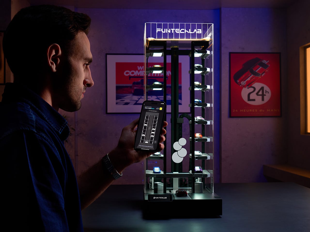
Walk through any serious diecast collector’s room and you’ll find the same creative workarounds repeated everywhere: IKEA glass cabinets with extra shelves shoehorned in, acrylic risers stacked along surfaces, custom wooden racks built from scratch, pizza savers tacked to walls as makeshift holders. The 1:64 community is one of the most dedicated in the collectibles world, and it has spent years engineering its own display solutions because no purpose-built hardware has bothered to meet it there.

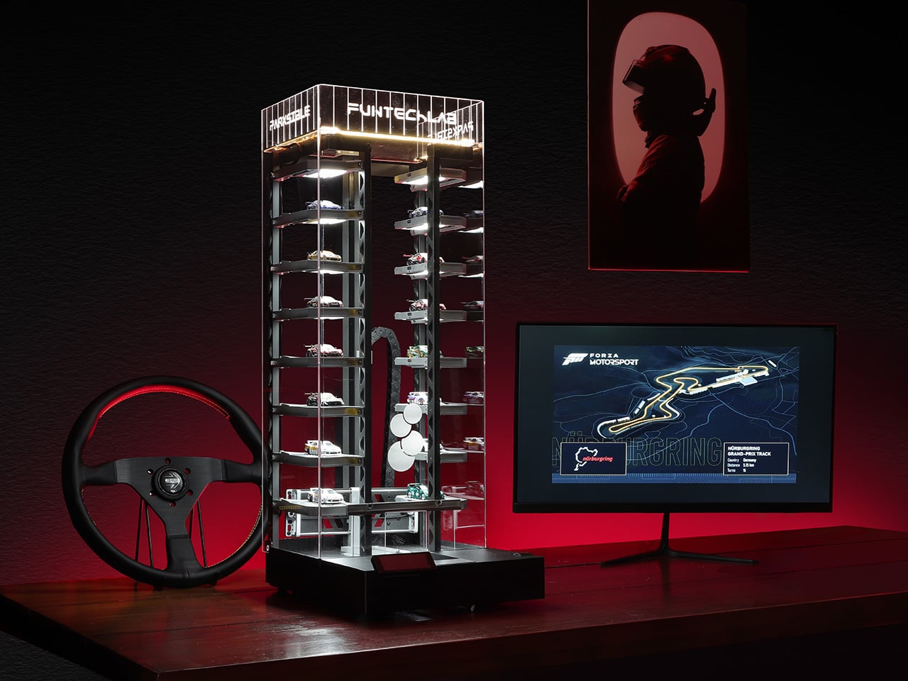
Fun-Tech-Lab, a Hong Kong-based team that already reached over 300 million impressions through its earlier desktop products Windsible and Runsible, is taking a proper engineering swing at that problem with Parksible. The unit holds 14 cars across motorized trays, handles loading and retrieval automatically, monitors temperature and humidity around the clock, and syncs to a companion app for remote control and full collection management. The PRO version adds a built-in camera that scans each model on arrival and builds a digital inventory with 360-degree views inside the app.

Designer: Fun-Tech-Lab

Click Here to Buy Now: $399 $528 (24% off). Hurry, only 398/500 left! Raised over $360,000.

The Parksible stands at 2’4” tall and weighs under 7.5kg, which puts it comfortably on a desk without dominating the entire surface. Each of the 14 trays measures 102 by 45mm, fitting the vast majority of 1:64 scale models from Hot Wheels to Tomica to premium resin manufacturers. The motorized carriage handles loading and retrieval automatically, which sounds like a minor convenience until you’ve manually pulled a specific model from a crowded shelf for the hundredth time. A removable rear panel provides direct manual access to any tray, and it also hides power cable routing so the desk setup stays visually clean. Power-loss protection is built in, which means every model stays locked in place even if the power cuts out mid-cycle.

The PRO version introduces a recognition camera that performs a 360-degree scan of each model as it parks. Every scanned model gets logged into a personal digital garage inside the app, where you can locate any car instantly and view its full 360-degree record without needing to physically retrieve it. That feature effectively automates the cataloguing process that serious collectors used to handle through spreadsheets, manual photography sessions, and handwritten logs. Brand and series metadata syncs automatically in the PRO tier, and the app builds a searchable, visual database of the entire collection over time. For collectors managing hundreds of models across multiple storage solutions, having one system that does the inventory work passively while the cars park is a legitimate workflow upgrade.

The product doesn’t demand app dependency to function, which immediately separates it from the category of smart gadgets that become expensive paperweights when the server dies or the phone isn’t nearby. A 2.79-inch display and a physical rotary knob on the front provide full garage control offline. You can scroll through trays, select a parking spot, trigger retrieval, and adjust lighting brightness without ever opening the app. That offline-first design suggests Fun-Tech-Lab has spent time around collectors who value reliability over novelty, and it shows in the execution. The app exists to enhance the experience, not hold it hostage.

Inside the Parksible app, you assign parking slots to specific models, switch between Standard Mode, Random Mode, and Snake Mode for display choreography, and monitor environmental data in real time. Standard Mode likely presents cars in a predictable sequence, Random Mode cycles through the collection unpredictably, and Snake Mode appears to weave through slots in a serpentine pattern. Smart ambient lighting runs through the entire unit with adjustable brightness, so you can dial it down to a soft glow during the day or crank it up to full exhibition focus when showing off a particular model. The interface is built around remote control and digital oversight, turning what used to be a static shelf into something with actual behavior.

Temperature and humidity sensors monitor conditions around the clock, which matters significantly more than casual observers might assume. Rare Hot Wheels from the Redline era, premium resin limited editions, and vintage Tomica castings can degrade under poor environmental conditions, and collectors sitting on four-figure individual models have genuine reason to care about stable air quality. Parksible logs that data continuously and surfaces it in the app, giving collectors the kind of passive environmental oversight that used to require standalone sensors and manual logging. The unit also earned an iF Design Award in 2026, which signals the industrial design holds up under formal scrutiny.

The standard Parksible is available for $399 (down from a $528 MSRP) and the Parksible PRO stands at $499 (down from $659 MSRP), both at 24% off. Each unit ships with the main Parksible unit, 14 tray inserts with trailer-ramp styling, a power adapter, user manual, and the 2.79-inch interactive display. Add-ons include things like EPP foam packaging for $99, and even access to Fun-Tech-Lab’s earlier products like the 64 Windsible and Runsible set bundled at $259, individual Windsible units ranging from $239 to $669 depending on scale, a 64 Runsible at $39.90, and a series of FTL-exclusive diecast models priced at $32.50 to $89. Fun-Tech-Lab ships items globally, with the US and East Asia paying $75, the EU and UK at $85, Australia at $80, Canada at $95, and the rest of the world at $135, though add-on items ship free to most regions.

Click Here to Buy Now: $399 $528 (24% off). Hurry, only 398/500 left! Raised over $360,000.

The post Self-Parking Hot Wheels Diecast Display with 14 Spots Is Every Model Car Collector’s Next Desk Obsession first appeared on Yanko Design.
The James Brand Just Rebuilt Its Best Keychain Knife from Scratch

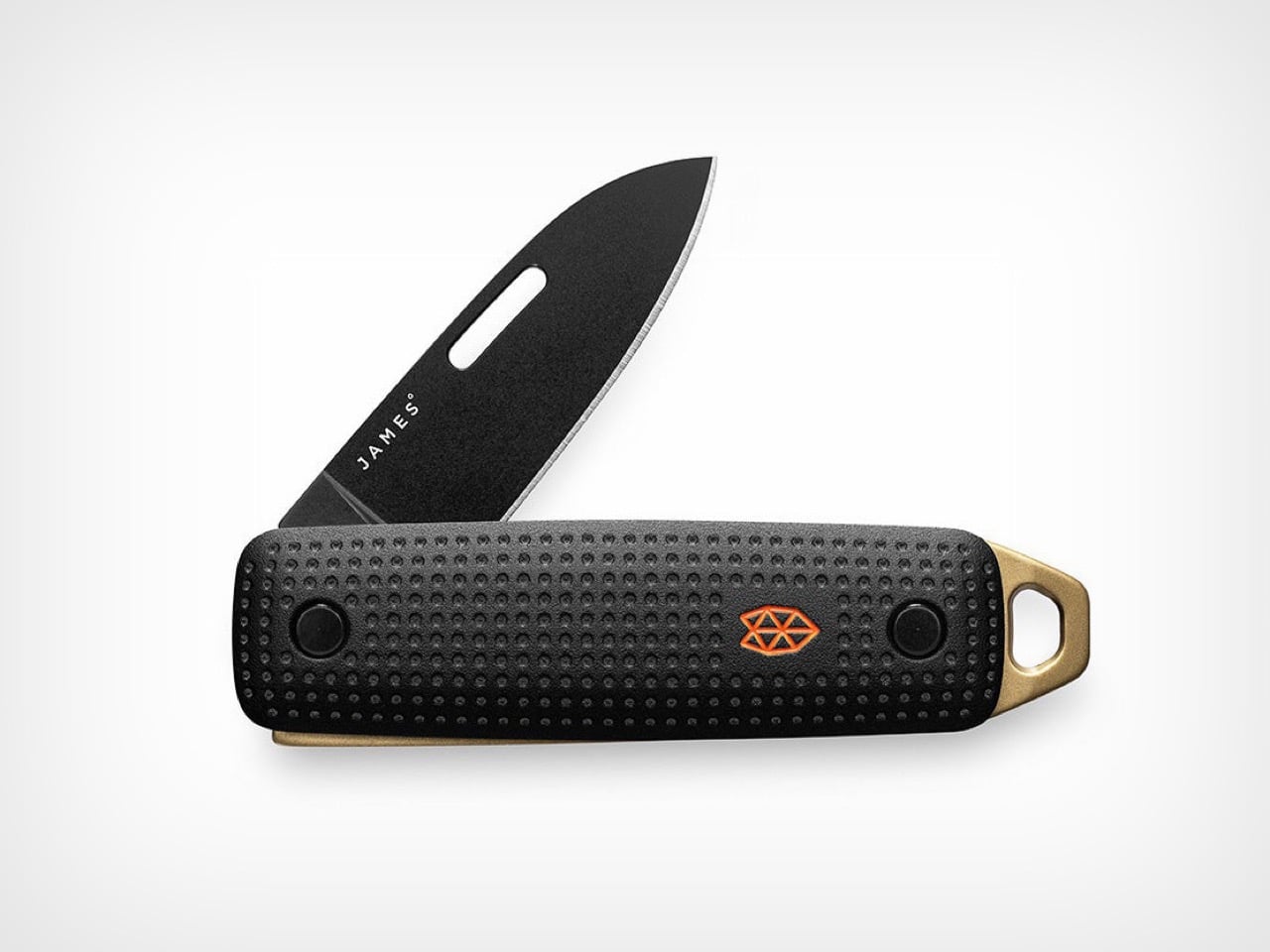
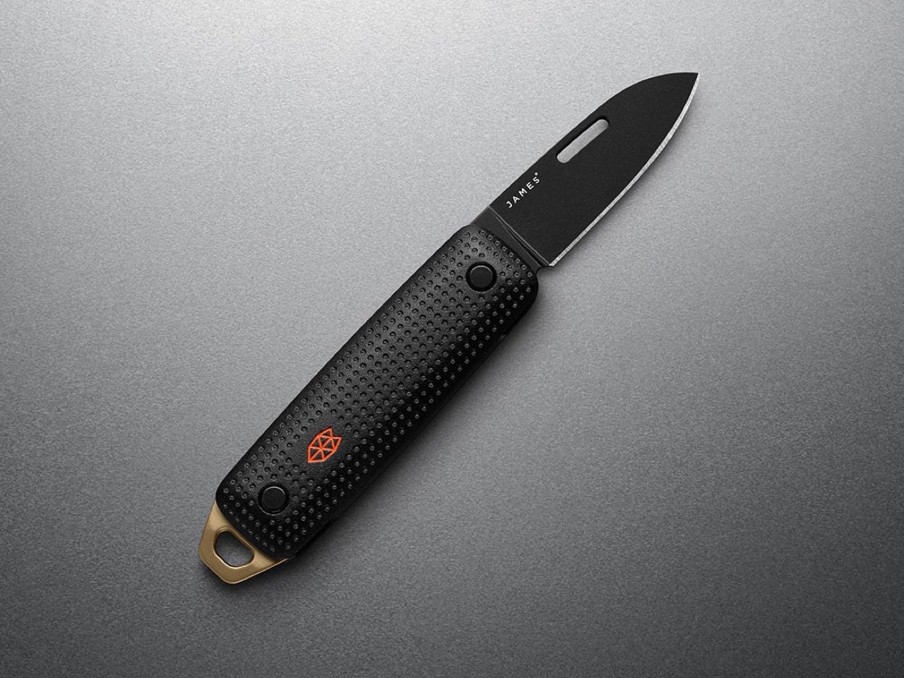
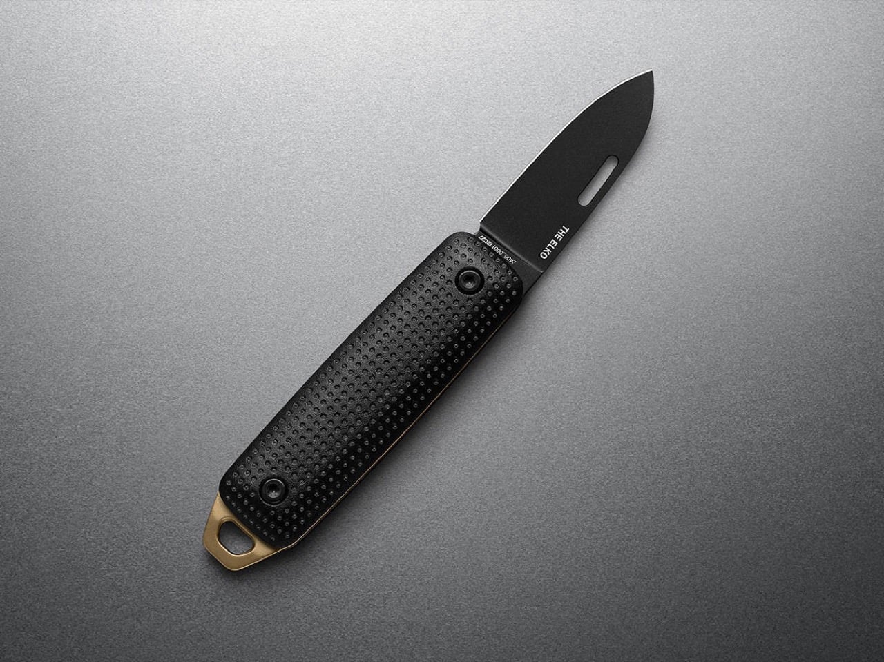
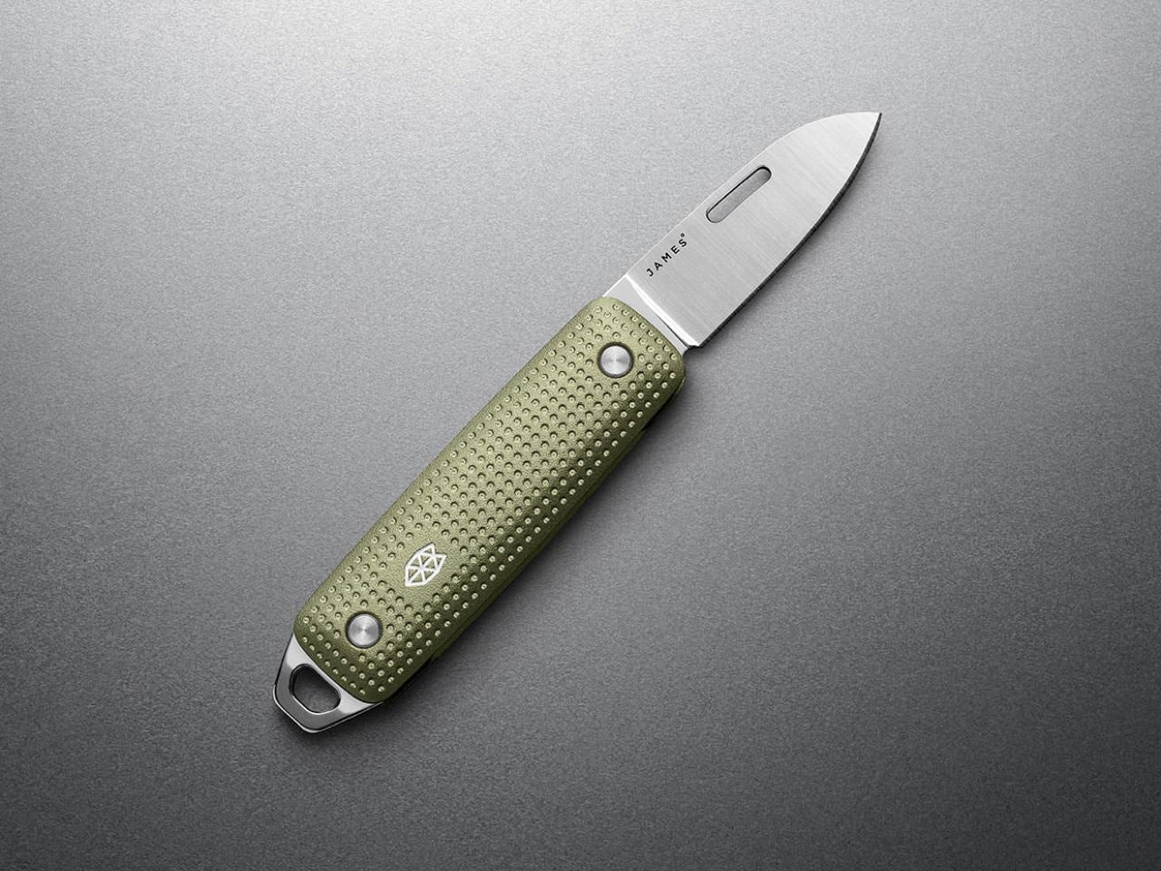
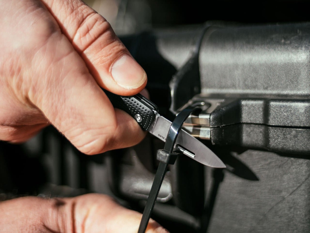
Refinement in knife design can mean two different things. Sometimes it means polishing the details on an already-successful platform, smoothing out the rough edges and tweaking the ergonomics until the product feels 5% better across the board. Other times it means stripping the design down to its founding idea and rebuilding it with better materials, tighter tolerances, and a clearer sense of what the knife is actually supposed to do in someone’s pocket. The James Brand took the second path with the Elko Gen 2, keeping the original’s core identity as a compact, non-threatening, legally unambiguous keychain blade while re-engineering nearly everything else. Machined aluminum handles replace the acetate and titanium options from the first generation, bringing a raised dot-matrix texture that wraps the entire surface. The slip-joint mechanism, nail-nick deployment, and sub-3-inch closed length remain untouched because those were the decisions that made the original Elko work in the first place.

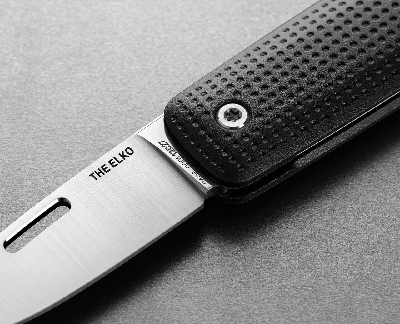
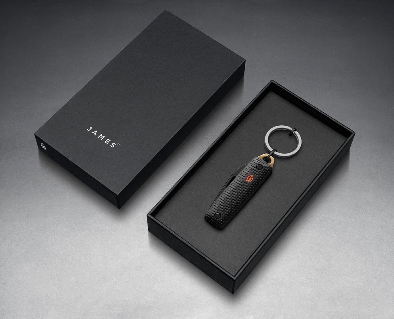
Sandvik 12C27 stainless steel drives the cutting performance, a Swedish alloy that holds an edge well above its price class and resists corrosion in ways that matter when a knife lives on a keychain exposed to sweat, rain, and pocket lint. The blade measures 1.6 inches with a drop-point profile, short enough to avoid intimidating coworkers but long enough to handle the micro-tasks that define daily carry: packages, tags, threads, tape. Four anodized aluminum colorways span the Gen 2 lineup, from the monochrome Black + Black to the warmer Black + Fire variant with its brass-toned scraper accent. That scraper, called the All Things tool, functions as a pry bar, bottle opener, and flathead screwdriver while doubling as the attachment point for the included titanium key ring. The James Brand is pricing the Gen 2 at $65, a number that sits comfortably in the zone where people actually carry and use their knives instead of storing them in a drawer.

Designer: James Brand

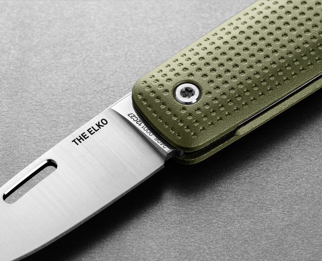
The weight tells you everything about what changed between generations. The original Elko clocked in at 1.3 ounces, light enough to disappear completely on a keychain and occasionally feel insubstantial in hand during actual use. The Gen 2 hits 3.5 ounces, a nearly three-fold increase driven entirely by the shift to CNC-machined aluminum handles. That extra heft registers immediately when you pick it up, transforming the knife from something you forget you’re carrying into something that feels deliberately present without crossing into burdensome. The raised dot-matrix texture across the handle faces amplifies that sense of solidity. Each dimple is uniform and precisely machined, creating a grip surface that works without resorting to aggressive jimping or rubberized inserts. It’s the kind of detail that separates a thoughtfully executed product from one that just checks spec boxes.

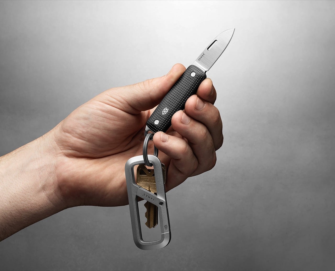
The slip-joint mechanism operates with the kind of snap you’d expect from a knife twice this size. There’s no lock here, which keeps the Elko legal in jurisdictions where locking blades trigger stricter carry laws, but the spring tension holds the blade open firmly enough that it won’t fold during normal cutting tasks. The nail nick is slotted longer than most compact knives bother with, making it easy to catch with a thumbnail even if you’re working quickly or wearing gloves. Opening the blade feels deliberate in a way that thumb studs and flippers sometimes don’t, a tactile ritual that reminds you you’re deploying an edge rather than flicking a fidget toy. Closed, the knife measures 2.6 inches, which makes it shorter than a standard tube of ChapStick and small enough to coexist on a keychain with a car fob, house keys, and a carabiner organizer without turning the whole setup into a pocket brick.

The All Things scraper at the butt end pulls more weight than most integrated tools on keychain knives. The brass-toned version on the Black + Fire colorway is particularly striking, a warm accent that contrasts sharply against the PVD-coated black blade and anodized black aluminum. Functionally, it’s wide enough to catch a bottle cap, thin enough to slot into most flathead screws, and sturdy enough to pry open a paint can lid without bending. The titanium key ring threads directly through the scraper, creating a clean attachment point that doesn’t require a separate lanyard hole or awkward clip orientation. In practice, this means the Elko hangs naturally on a carabiner or split ring without the blade rattling loose or the scales scratching against your keys. The Grove + Stainless colorway leans more understated, pairing an army green anodized finish with a brushed satin blade and stainless scraper that reads almost utilitarian. Black + Stainless offers the most versatile aesthetic, the kind of knife that doesn’t announce itself visually but still looks intentional when you pull it out to open a package in a meeting.

The Elko Gen 2 competes in a category that’s crowded with compromises. Most keychain knives either go too light and feel like toys, or pack in unnecessary features that bloat the form factor beyond what a keychain can reasonably support. The Benchmade Proper series offers superior blade steel and build quality, but at nearly double the price and with a larger closed footprint. Victorinox’s 58mm Swiss Army Knives deliver more tools in a similar package, but sacrifice blade length and lockup in the process. The Elko stakes out the middle ground: a single-purpose blade with one genuinely useful integrated tool, built well enough to last years but priced accessibly enough that you won’t hesitate to actually use it. It’s a knife designed to live on your keys, get deployed daily, and still feel like a deliberate choice five years from now rather than something you’ve been meaning to replace.

The post The James Brand Just Rebuilt Its Best Keychain Knife from Scratch first appeared on Yanko Design.
Someone Made The E-Ink Kindle Smartphone That Amazon Refused To Make

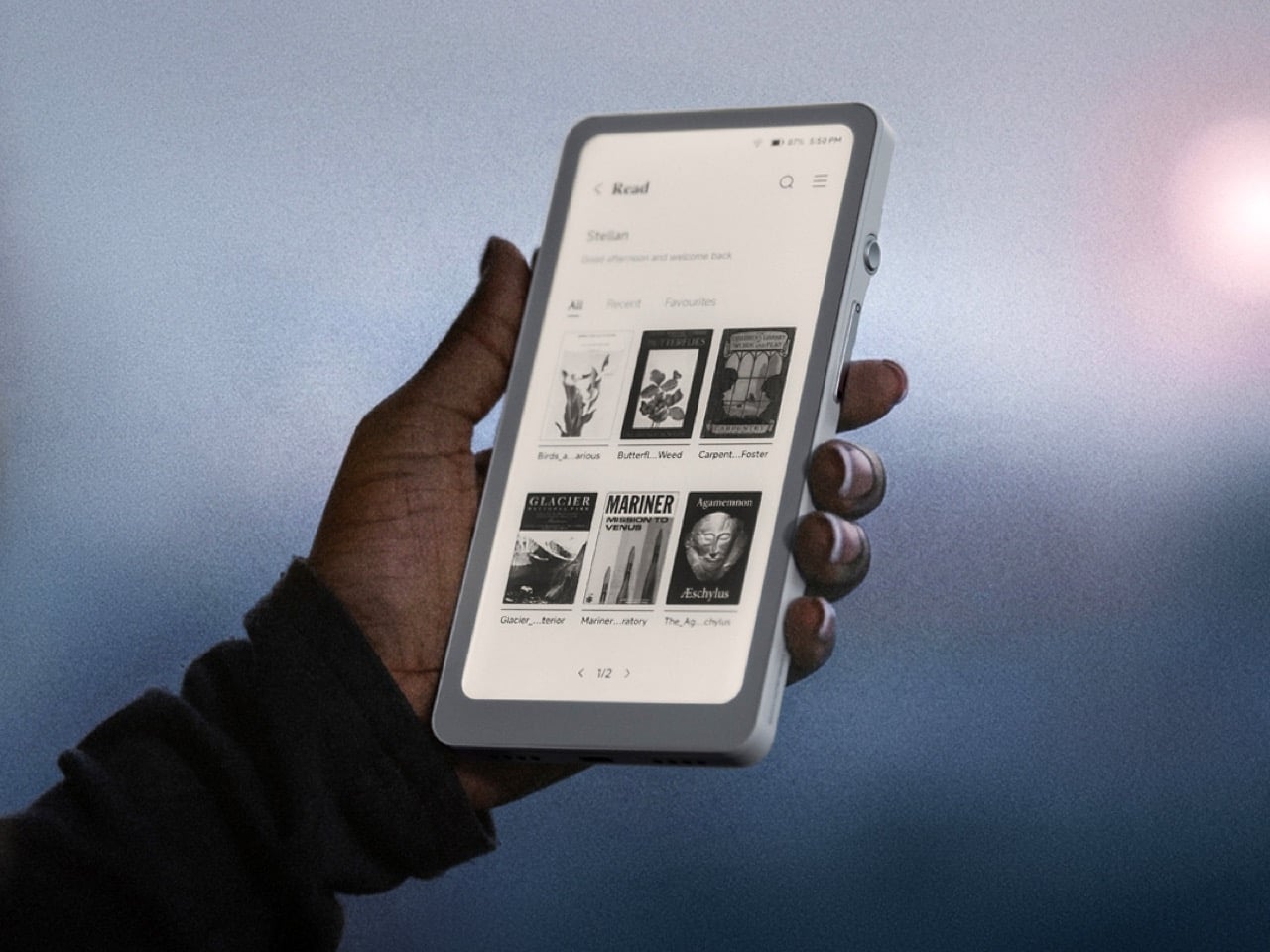
Amazon has spent nearly two decades perfecting the Kindle, turning it into the default eReader for millions of people, and in all that time they’ve steadfastly refused to shrink it down to pocket size or open it up to the broader Android ecosystem. They had every opportunity to merge the best parts of their Kindle line with the form factor of a smartphone, creating a distraction-free reading and productivity device that could actually fit in your jeans pocket and run the apps you already use. Instead, they kept the Kindle locked into its walled garden, kept it at 6 inches or larger, and left a gaping hole in the market for anyone willing to build what they wouldn’t. DuRoBo took that opportunity and ran with it, launching the Krono, a 6.13-inch E Ink tablet running full Android 15 that costs $279.99 and does exactly what Amazon has spent years pretending nobody wants.

The Krono packs an E Ink Carta 1200 display at 300 PPI (matching the sharpness of a Kindle Paperwhite), an octa-core processor, 6GB of RAM, 128GB of storage, a 3,950 mAh battery, and a unique side-mounted Smart Dial that controls screen refresh, frontlight adjustment, voice recording, and web browsing through a single rotary knob. It weighs just 173 grams, measures 154 x 80 x 9 mm, and is available in black or white from DuRoBo’s site or Amazon US. The pitch is straightforward: it’s an eReader, a voice note-taker, a podcast player, and a music device all in one, built on an open platform that lets you install whatever reading app, productivity tool, or communication software you actually want to use. It launched in August 2025 and started shipping in September, quietly carving out space in the niche that BOOX’s Palma lineup has been dominating for the past year.

Designer: DuRoBo

Six gigs of RAM in an E Ink device is borderline excessive in the best possible way, especially when most eReaders ship with 2GB or less and struggle the moment you try to run anything beyond the stock reading app. The 128GB of storage means you can load an absurd library of ebooks, PDFs, audiobooks, and whatever else without ever worrying about running out of room. Running Android 15 (not some ancient fork, but the actual current OS) gives the Krono access to the full Play Store ecosystem, which is exactly what Amazon has been allergic to for years. You want Kindle, Libby, Moon+ Reader, Pocket, Instapaper, Obsidian, and Spotify all on one device? The Krono lets you do that. A Kindle will let you read Kindle books and maybe listen to Audible if you’re lucky. That’s the entire difference.

The Smart Dial highlights DuRoBo’s industrial design philosophy most clearly – instead of burying every interaction behind capacitive touch menus (which E Ink refresh rates make tedious), they mounted a physical rotary dial on the side of the device that you can press and rotate to trigger different actions depending on context. It’s a design choice borrowed more from cameras and audio gear than from tablets, and it gives the Krono a tactile, mechanical quality that most E Ink slabs completely lack. The back of the device features what DuRoBo calls the Axis, a strip housing six small breathing lights that glow softly on a schedule to gently nudge you back toward focused reading or work. It’s a wellness-adjacent UX detail that could easily feel gimmicky, but in the context of a device explicitly marketed as a “focus hub,” it at least makes thematic sense. The whole package is clearly designed to feel intentional and calm, a deliberate counterpoint to the dopamine-optimized chaos of a smartphone.

DuRoBo is positioning the Krono hard into the distraction-free productivity and mindfulness lane, framing it as the device you reach for when you want to read long-form content, capture ideas through voice notes, or listen to podcasts without getting dragged into Instagram or TikTok. The dual-tone frontlight (warm and cool adjustment) and the paper-like texture of the Carta 1200 display are meant to make extended reading sessions comfortable in a way that backlit screens never quite manage. The built-in speaker and Bluetooth support let it double as a surprisingly capable audio player for music, audiobooks, and podcasts, which gives it utility beyond just being a reading slab. The open Android platform means you can customize it to fit whatever workflow you actually need, whether that’s Notion for notes, Pocket for saved articles, or Spotify for background music while you write. Amazon would never build this, because opening the Kindle platform would undermine their entire content ecosystem lock-in strategy.

The Krono is available now for $279.99; with a fitted TPU case is sold separately, designed to accommodate both the Smart Dial and the Axis breathing lights without blocking either. At that price point, it’s competing directly with the BOOX Palma (which runs around $280 depending on configuration) and sits well above Amazon’s Kindle Paperwhite but below their Kindle Scribe. Whether the Smart Dial, the breathing lights, and DuRoBo’s focus-first branding are enough to justify choosing it over a Palma or just installing a launcher on a Kindle will depend entirely on how much you value that design identity over raw software polish.

The post Someone Made The E-Ink Kindle Smartphone That Amazon Refused To Make first appeared on Yanko Design.
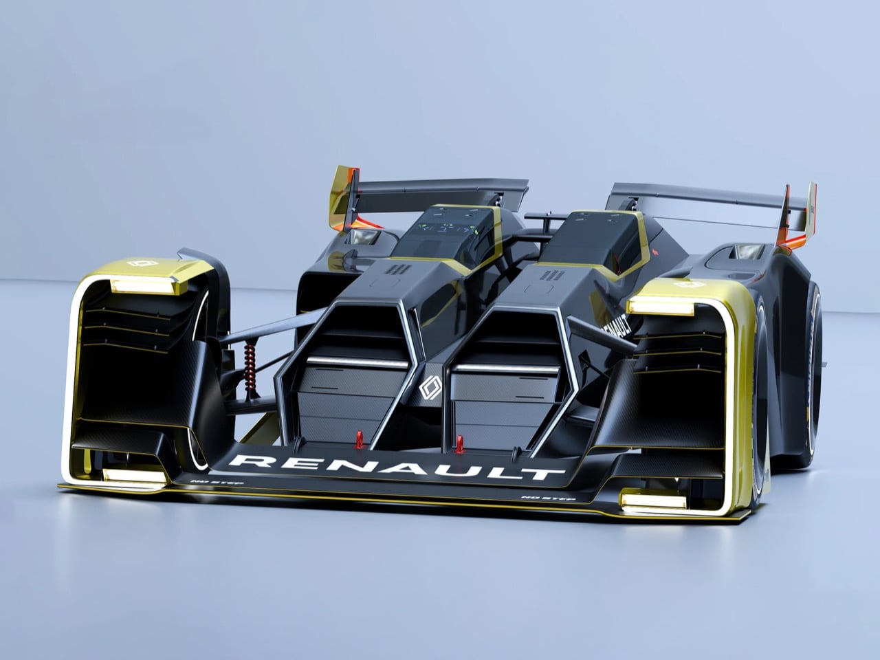
The LEGO Metal Slug Diorama With Adjustable Cannons, POWs, and Mid-Air Grenades Is Here

By 1996, the arcade was dying. Virtua Fighter and Tekken had the crowds. Sega’s racing cabinets had the spectacle. The conventional wisdom was that 2D games were finished, and anyone still making pixel art sidescrollers was simply behind the curve. Then Nazca Corporation released Metal Slug on SNK’s Neo Geo hardware, and the conventional wisdom had to sit quietly in a corner for a while. The game’s hand-animated sprites moved with a fluidity that polygon games couldn’t touch, and the humor, panicking soldiers, grateful POWs tossing rocket launchers, a tank that waddled like a toy, made the whole thing feel alive in a way that pure technical showmanship never quite manages.

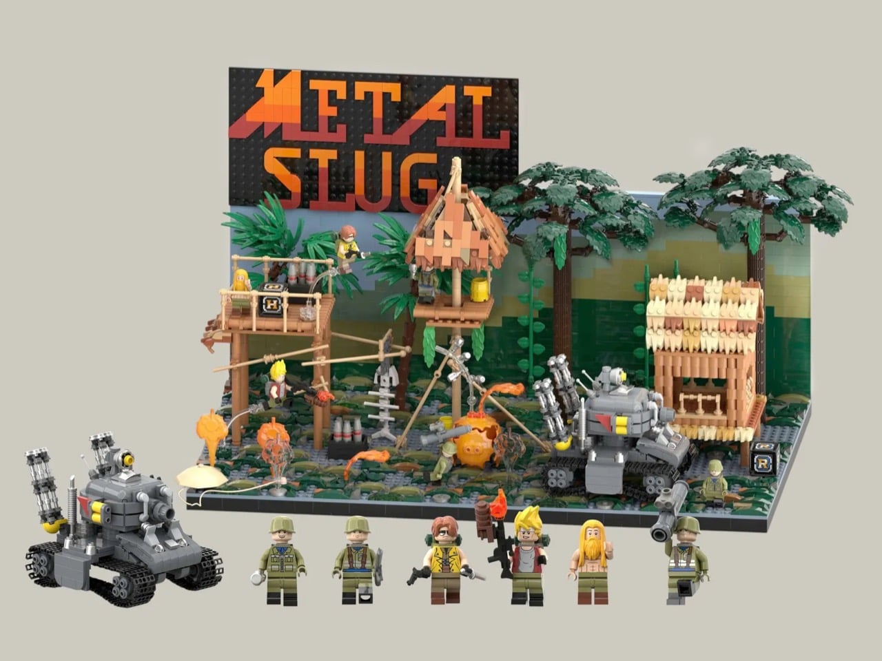
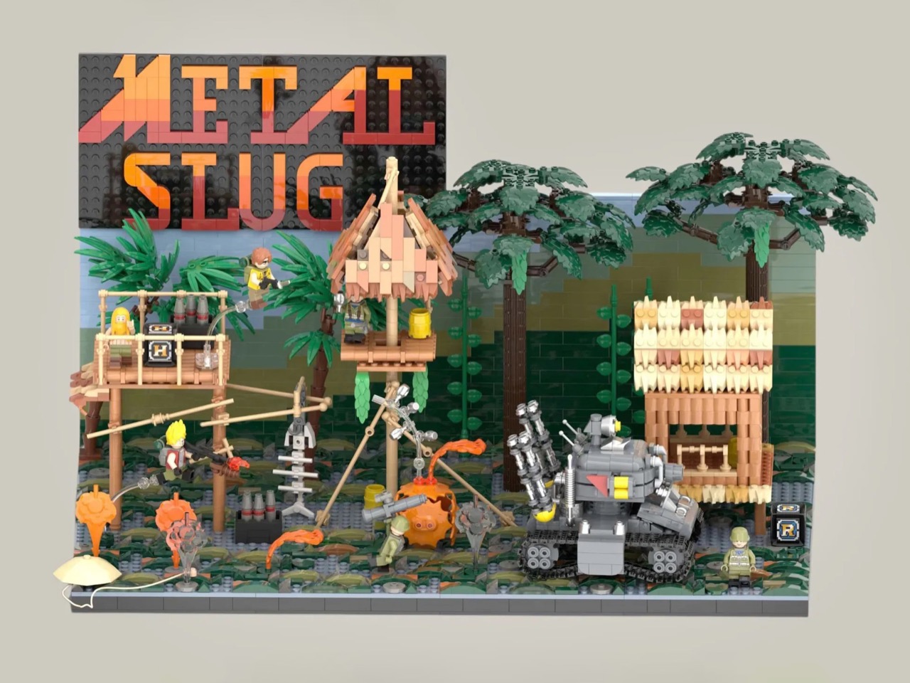
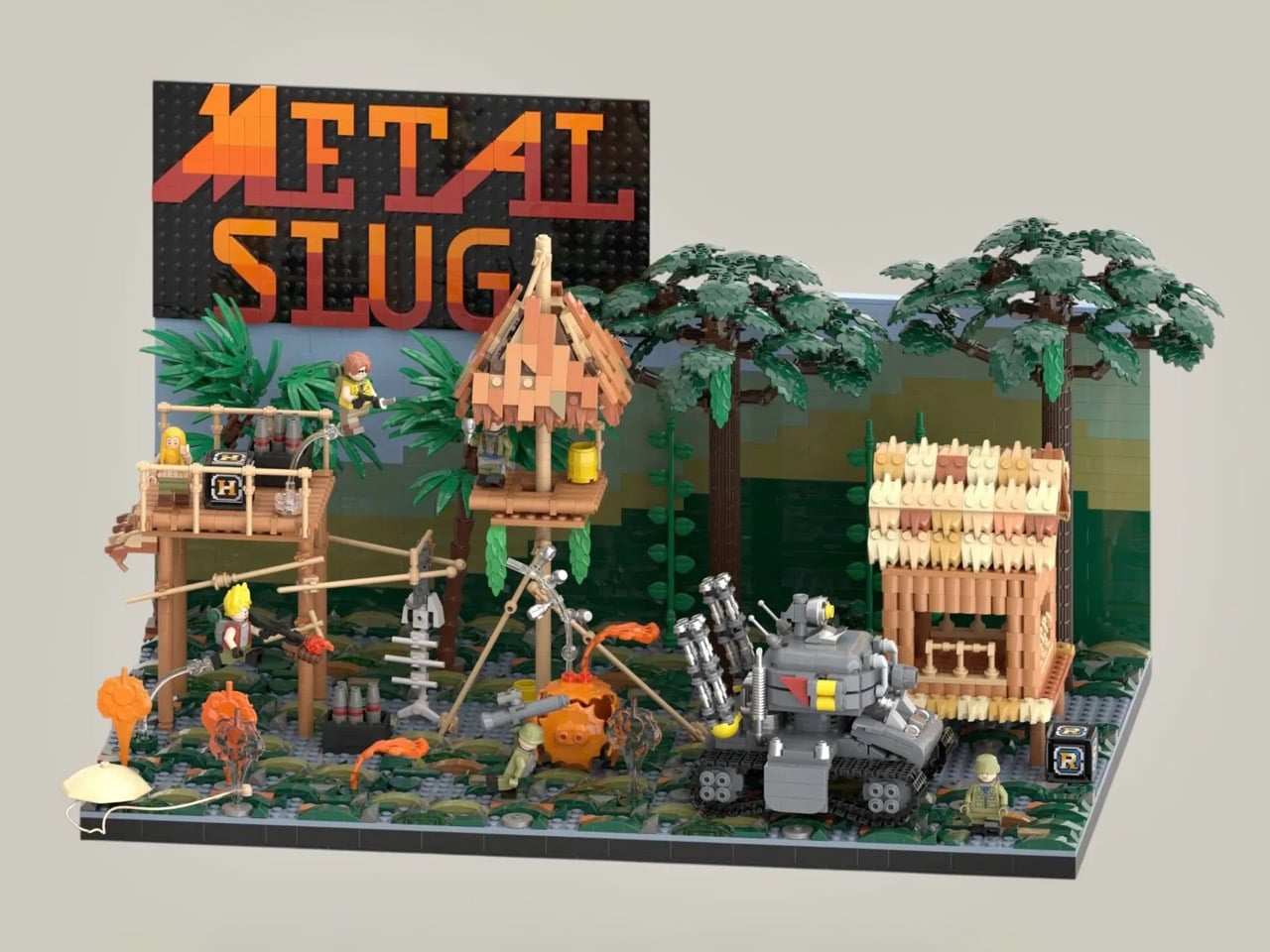
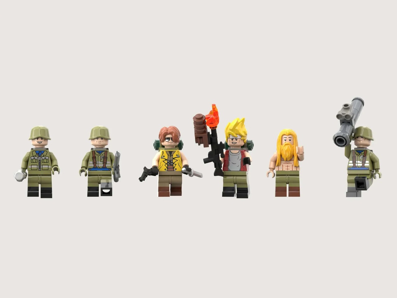
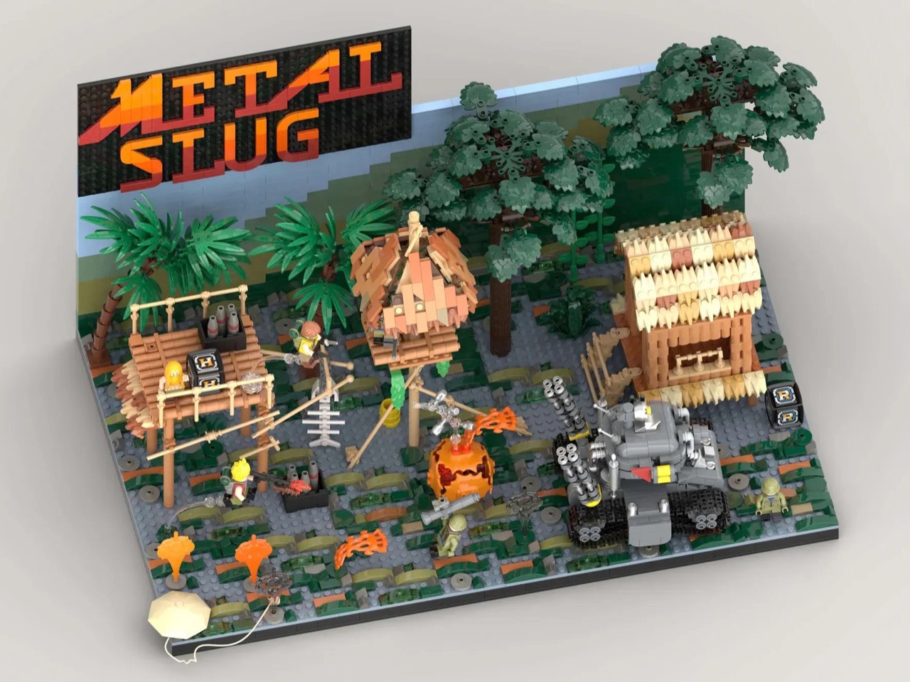
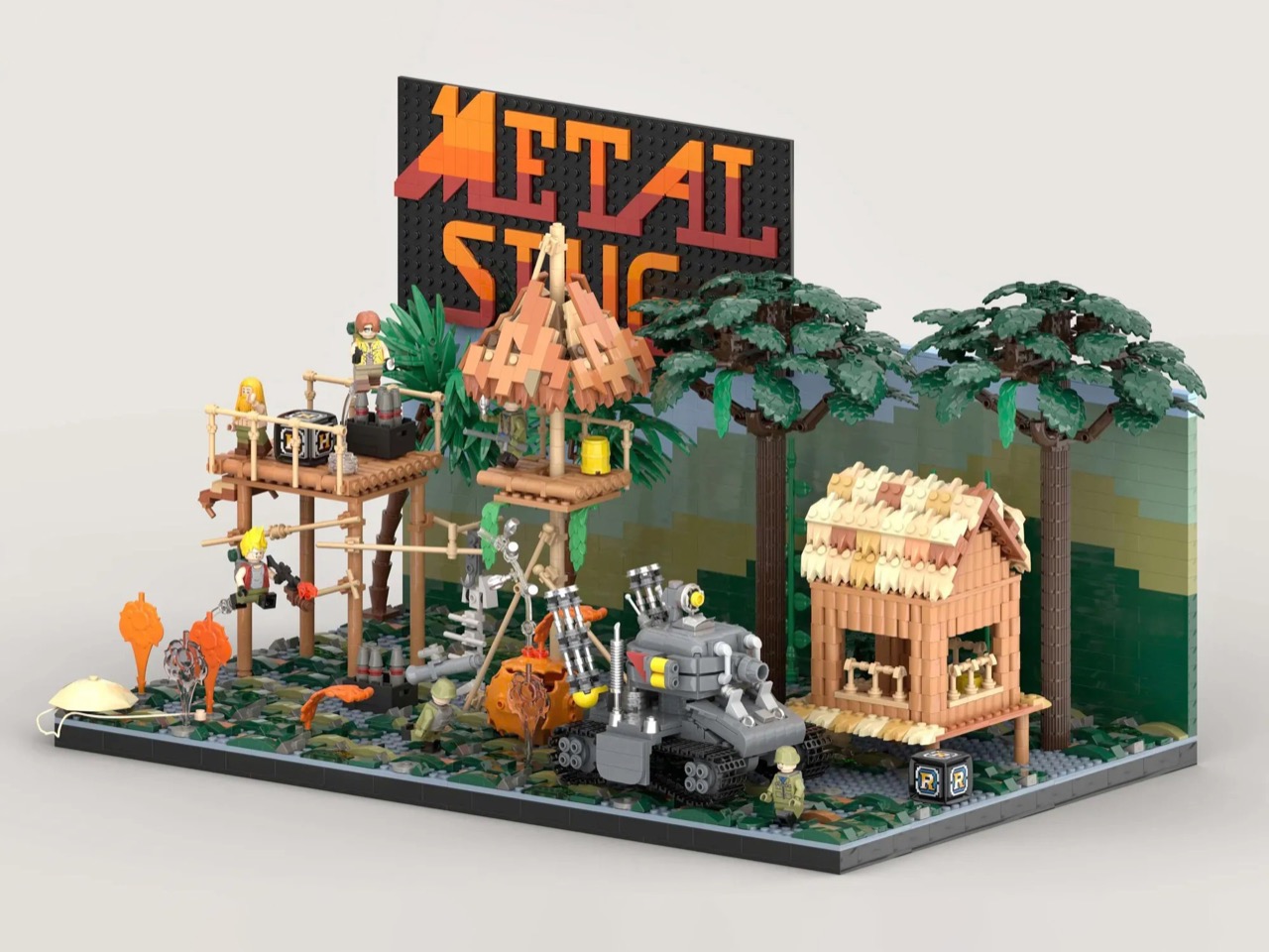
LEGO Ideas builder MagicBrick has captured a freeze-frame of that world in brick form, reconstructing the game’s iconic jungle mission with 2,701 pieces and 6 minifigures locked into a scene of swamp terrain, rebel soldiers, dense jungle vegetation, and the squat, waddling Super Vehicle-001 tank at the center of it all. It’s a dense, affectionate build made by someone who clearly lost many, many credits to this game, and it shows in every deliberately chosen detail, from the mid-jump Marco Rossi clutching a Heavy Machine Gun to the bearded POW standing by with a reward.

Designer: MagicBrick

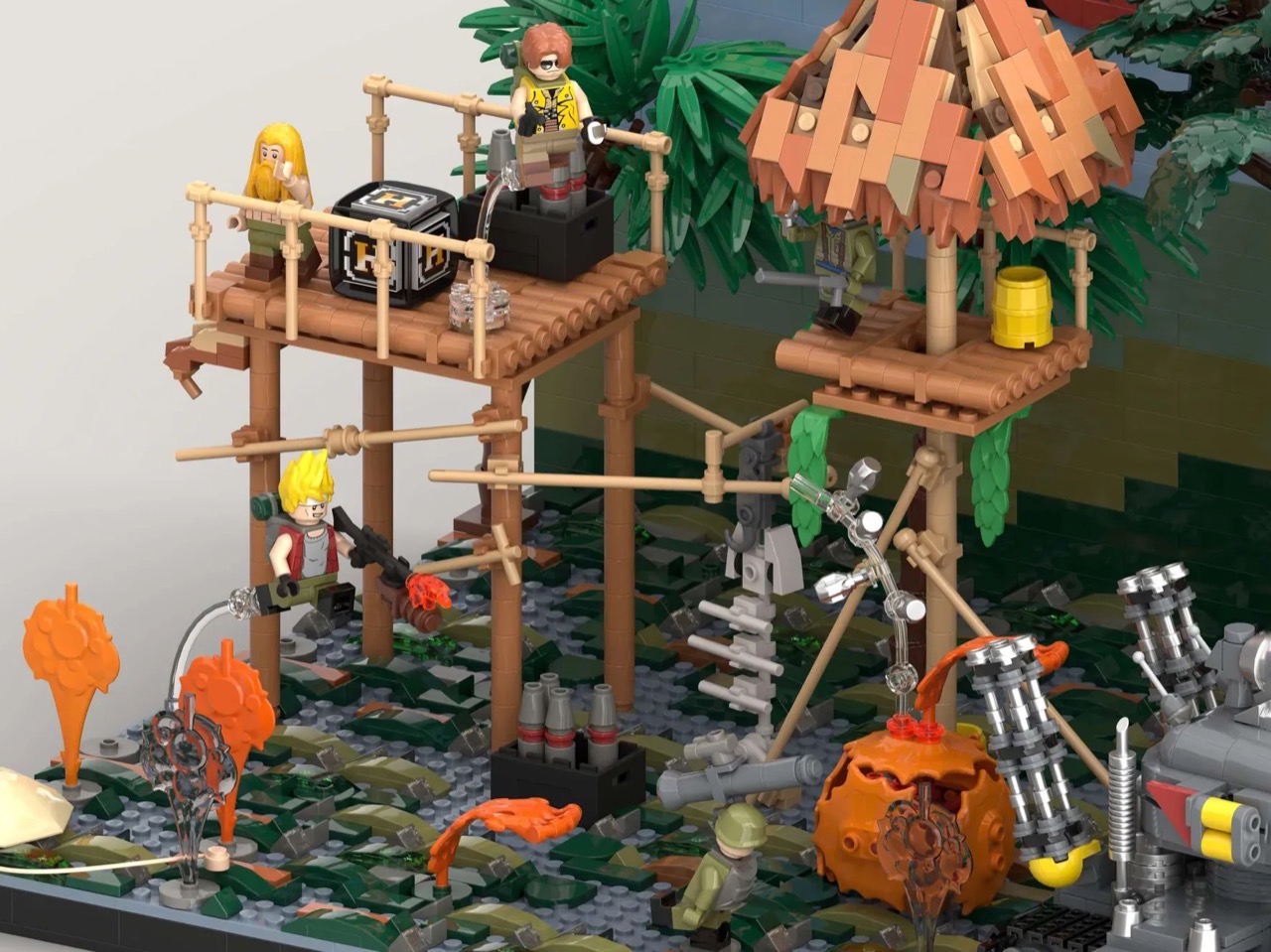
The scene is structured like a freeze-frame from the game itself, which is exactly the right instinct. MagicBrick describes the goal as capturing “a dynamic instant where everything is in motion: jumps, actions, and interactions come together to recreate the fast-paced feeling typical of the game,” and the build delivers on that. Marco Rossi in his red jacket is airborne, Heavy Machine Gun in hand. Tarma Roving, yellow jacket, stands ready with a pistol and knife. Three Rebel Army soldiers in green uniforms and helmets fill out the opposition, armed with bazookas and rifles. The swamp base uses tiles in multiple shades to sell the terrain, jungle trees and palms crowd the background, and the brick-built backdrop reflects the arcade color palette of the original game rather than any attempt at realism. That last decision is a smart one. Metal Slug was never interested in realism, and neither is this.

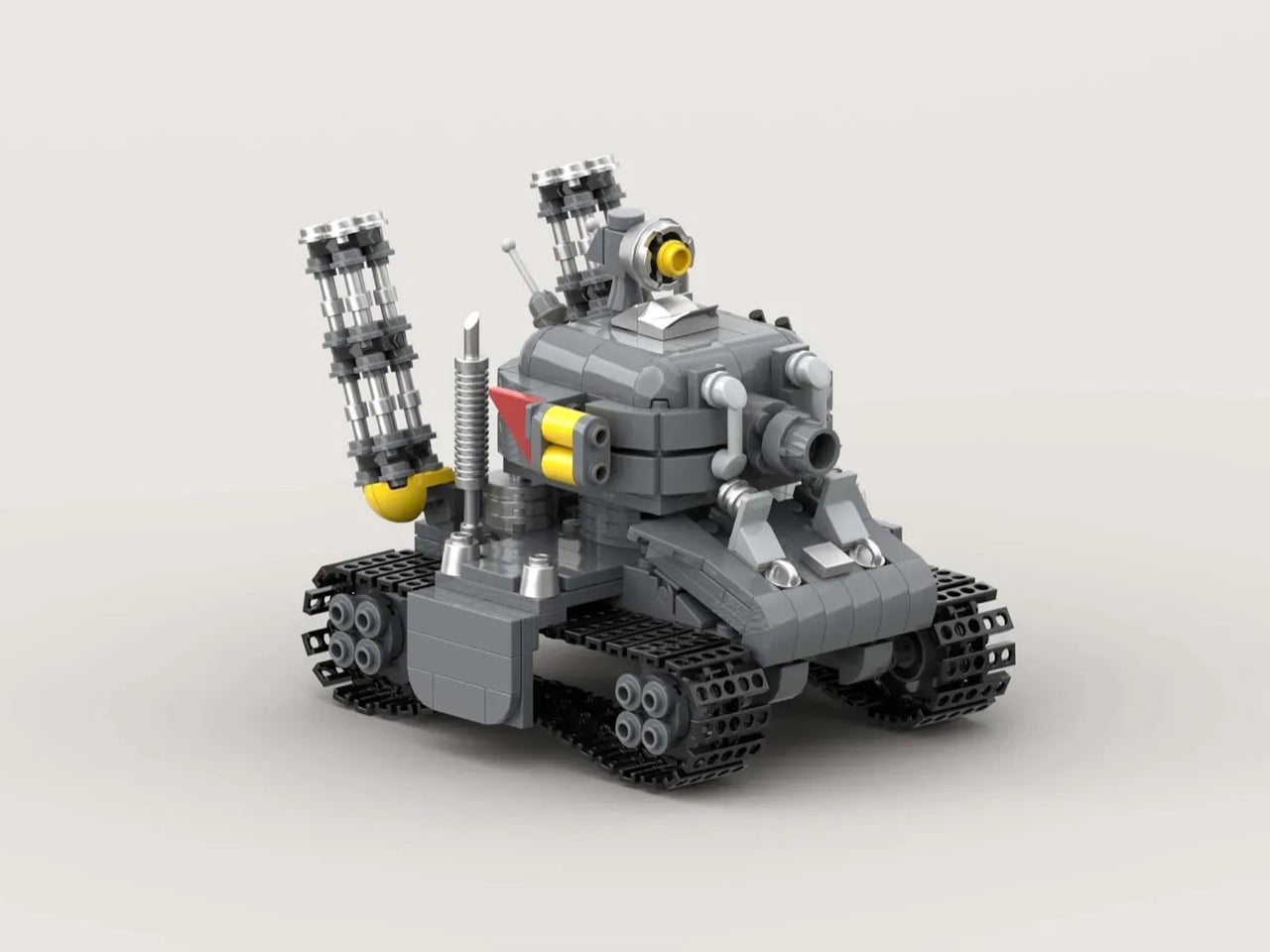
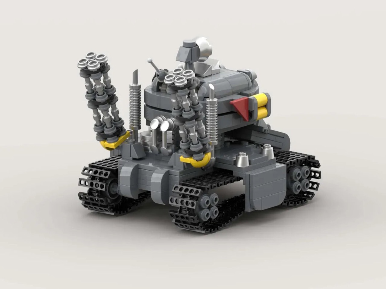
The Super Vehicle-001 is the centerpiece, and MagicBrick has packed a surprising amount of function into a compact footprint. The rear cannons are adjustable, the tracks are functional, and antennas complete the silhouette. Scattered across the scene are the environmental details that will hit Metal Slug veterans like a reflex: ammo crates, yellow barrels, a hanging fish skeleton, a parachute, and both the Heavy Machine Gun and Rocket Launcher power-up pickups rendered in brick. My favorite touch, though, is the grenade sequence, a classic cartoon-logic arc of thrown grenades ending in a mid-air explosion, frozen in plastic at exactly the right moment of absurdity.

Topping the whole structure is the Metal Slug logo itself, rendered in a red-to-orange gradient that makes the build read as a display piece as much as a playset. It’s that combination of environmental storytelling, playable features, and genuine fan knowledge that separates builds like this from generic video game tributes.

LEGO Ideas is the platform where fan-designed MOCs (My Own Creations) gather community votes, with 10,000 supporters needed to trigger an official LEGO review and potential production as a retail set. MagicBrick’s Metal Slug submission hit 100 supporters almost immediately after going live and has been picking up Reddit traction since. If you grew up feeding tokens into a Neo Geo cabinet, head to the LEGO Ideas page and cast your vote here.

The post The LEGO Metal Slug Diorama With Adjustable Cannons, POWs, and Mid-Air Grenades Is Here first appeared on Yanko Design.

MUJI-Meets-Cyberpunk Vinyl Record Player Glows Like an Ambient Light and Charges Wirelessly

Minimalism in product design has gotten boring. We’re swimming in smooth white rectangles, touch controls that offer zero feedback, and devices designed to vanish. Apple spent two decades training the industry to sand away every visible seam, and now we live in a world where a Bluetooth speaker looks like a cylinder because a cylinder offends nobody. Bang & Olufsen understood early that audio equipment could occupy space like sculpture, could earn its place in a room through presence instead of absence. Teenage Engineering proved that mechanical honesty and playful geometry could coexist with premium materials. Both approaches work because they have a point of view.

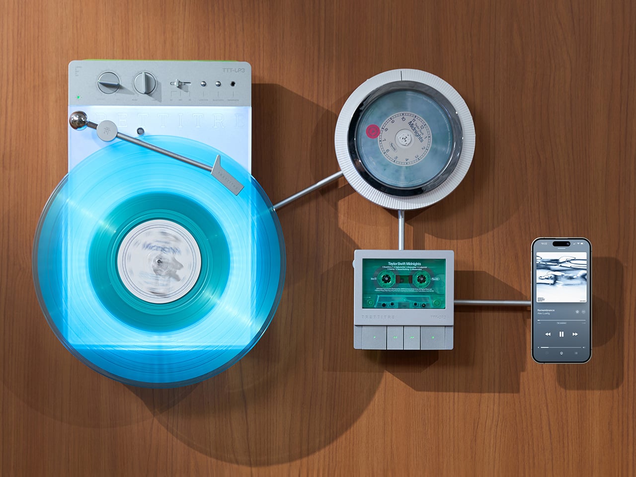
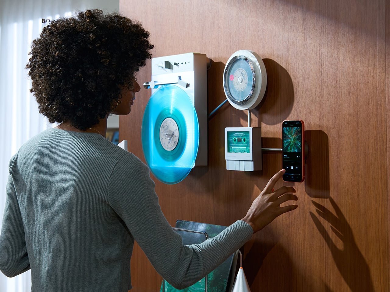
TRETTITRE’s TTT series combines those instincts into something harder to categorize. The TTT-LP3 wireless vinyl player uses CNC-machined aluminum for the main frame and features a diffused lighting panel that spreads light evenly across the surface when music plays. The TTT-DP3 Bluetooth CD player takes inspiration from a UFO-like form with a transparent magnetic cover that rotates open to reveal the spinning disc. The TTT-CP3 cassette player uses a metal housing with sharp geometric lines and mechanical transport keys that deliver clear physical response. All three mount on the TTT-W magnetic modular wall rack, turning physical media playback into a visible, functional part of interior design.

Designers: Noah – Founder & Designer, Trettitre

Click Here to Buy Now: $229 $449 ($220 off). Hurry, only 55/99 left! Raised over $654,000.

TTT-LP3: A Vinyl Player That Doubles as Ambient Light

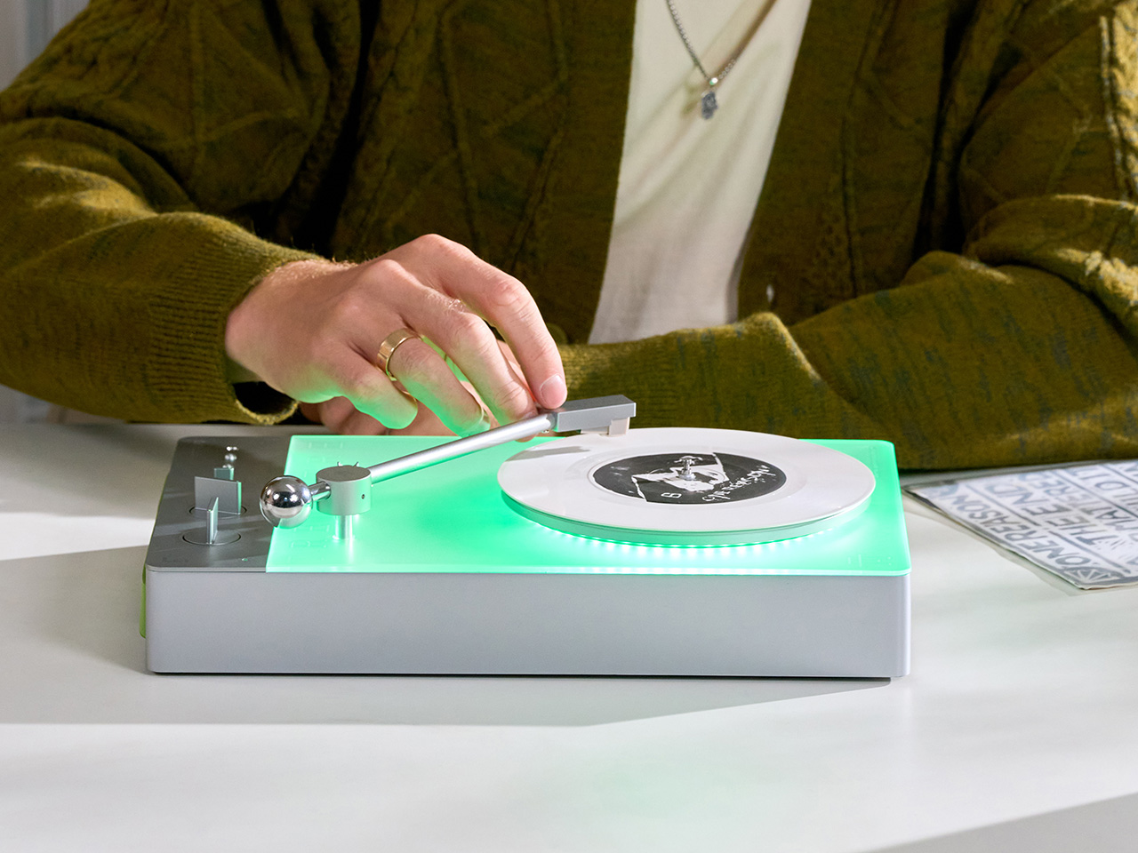
The back of the LP3 includes a hidden mounting structure that allows it to hang directly on a wall. You can mount it vertically so the record becomes part of the visual display, or go for the classic horizontal layout. When you want to move it, you lift the silicone leather handle at the top and take it down. The player detaches easily and gives you the freedom to listen wherever you choose. Traditional turntables usually stay exactly where you put them, limiting your options for when and where you listen. The LP3 works a little differently because of the battery and the wall mount’s wireless charging system, which keeps it powered without a visible cable.

Behind the LP3 sits a diffused lighting panel that spreads light evenly across the surface of the unit. When it’s on, the entire body of the player glows softly, designed to feel closer to ambient lighting than decorative lighting. You can change the lighting effects with the touch of a button. When a record spins, the moving shadows create a quiet visual effect. You can also leave the player mounted on the wall as a soft light source even when no music is playing. That ambient quality pushes the LP3 from well-designed product into something more considered: a slow, breathing light fixture that happens to play records.

The LP3 uses a self-balancing tonearm system that automatically sets the correct pressure when the player powers on. You place the record on the platter and lower the needle, and the system handles the rest. Many turntables require careful calibration before they can be used properly, with tonearm balance, tracking pressure, and counterweight adjustment all part of the process. For experienced collectors that process can be enjoyable, but for beginners it often feels complicated. The LP3 removes that barrier entirely while preserving the tactile experience people enjoy. The player supports both 33 RPM and 45 RPM records, and includes a manual control dial that allows small adjustments to playback speed (roughly ±0.5%), useful for older records that may not spin perfectly at their original speed anymore.

Wireless audio is handled through Qualcomm Bluetooth v5.3 with SBC, aptX, aptX HD, and aptX Adaptive, which allows higher-quality and lower-latency wireless audio than basic Bluetooth streaming. For wired setups, the player also includes a 3.5mm audio output. The built-in battery provides up to 6 hours of vinyl playback or up to 3 hours when used purely as an ambient light source. Full specs: dimensions 342×233×87mm, weight 1430g, Audio-Technica AT3600L moving magnet stereo cartridge, CNC-machined aluminum frame with silicone leather carrying strap. The LP3 arrives in June 2026 for Early Bird backers, May 2026 for Fast Delivery backers.

TTT-DP3: Giving the Compact Disc Its Aura Back

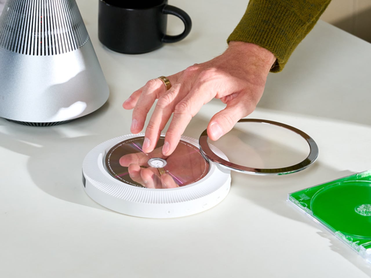
The DP3 keeps the reliability of CDs but gives the player a different visual presence. The design takes inspiration from a UFO-like form with a transparent magnetic cover. When the cover rotates open, the disc is partially visible as it spins, turning something simple into a small visual moment. A CD player shaped like a flying saucer with a rotating transparent lid is an audacious idea, and it works because it doesn’t try to evoke nostalgia. It reframes a CD player as a mechanical object of curiosity, something you watch as much as use.

The control buttons include raised tactile dots combined with a gold-embossed finish, making it easy to identify the buttons by touch alone. You can pause or skip tracks without needing to look down at the player. A small OLED display on the player shows track numbers, playback status, and battery level. The interface is intentionally simple so the information you need is visible immediately. A built-in battery allows the DP3 to run for several hours on its own, so you can move it from room to room, bring it to a small gathering, or take it while traveling. Full specs: Ø170×27mm, 324g, supports CD-DA and HDCD formats, Bluetooth 5.4, SNR >70dB, THD <3%, ABS+PC+Metal construction. The DP3 ships in May 2026.

TTT-CP3: Cassette Hardware for Modern Audio Setups

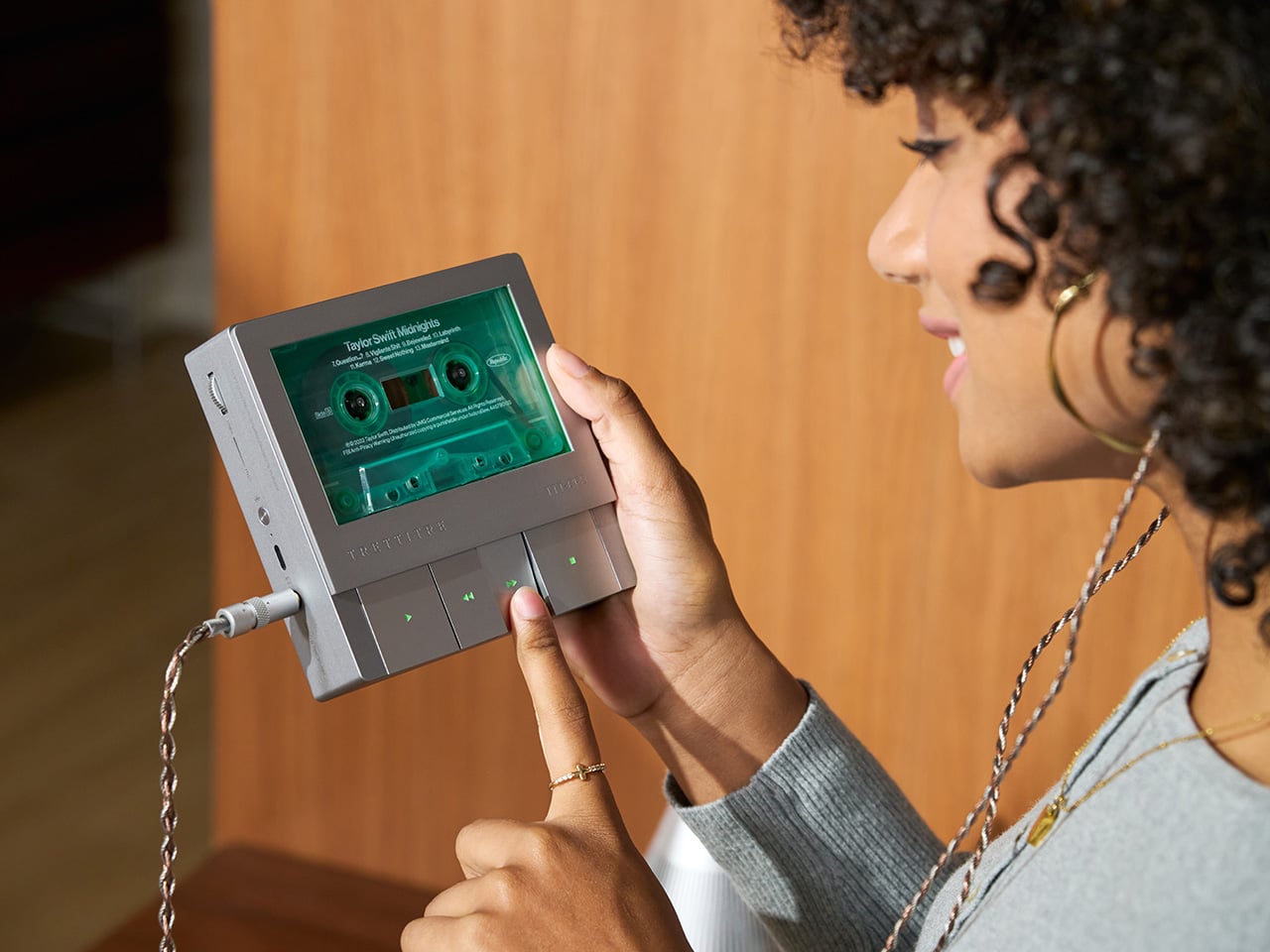
The CP3 keeps the tactile mechanical elements people associate with tapes while updating the electronics inside. The player uses a metal housing with sharp geometric lines that give it a distinctly industrial appearance. Instead of trying to imitate retro plastic designs, the CP3 leans into a more modern interpretation of cassette hardware. The playback controls use independent mechanical keys similar to piano keys. Each press has a clear physical response. Play, rewind, and stop feel deliberate instead of soft or mushy.

Inside the CP3 sits a Bluetooth module that allows cassette audio to stream wirelessly to speakers or headphones. The player decodes analog audio signals with high precision, helping reduce background noise and preserve more detail from the original recording. The result still sounds like cassette tape, but with greater clarity. Full specs: 122×120×32mm, 360g, supports Type I-IV cassette cartridges, Bluetooth 5.4, SNR ≥55dB, THD <3.5%, Metal+PC+ABS construction. The CP3 ships in May 2026.

When Storage Becomes Part of the Spectacle

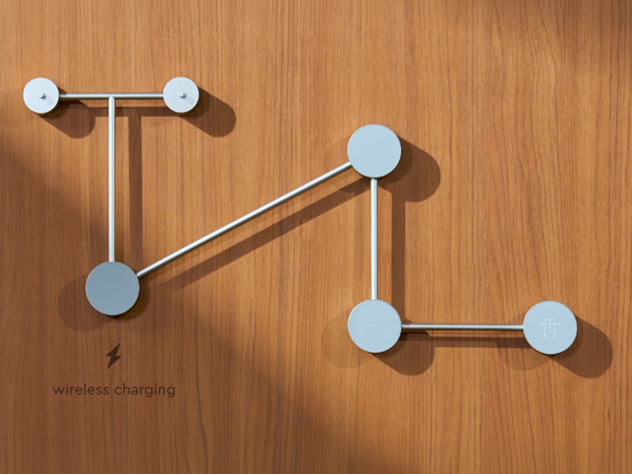
The TTT-W Magnetic Modular Wall Rack uses an all-metal geometric structure that allows multiple TTT players to be arranged into a clean wall display while keeping them organized and ready to use. The rack integrates magnetic alignment and wireless charging for the vinyl player, so the LP3 can stay powered without visible cables while being part of the room’s design. Two configurations are available: a T-shaped rack (263×196×27mm, 300g) and a magnetic modular wall rack (612×302×27mm, 775g, combined style T+3). Both support wireless charging at 5-10W and use USB-C 5V 2A input.

The Supporting Cast, from Sculptural Speakers to Planar IEMs

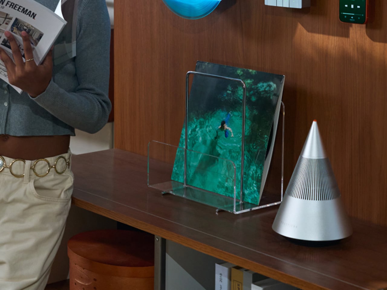
TRETTITRE offers a range of add-ons designed to complement the TTT system. The TreSound1 Speaker arrives in concrete and wooden editions, delivering 2×30W + 1×60W output power with a 1″ tweeter, 2.75″ mid-range, and 5.25″ subwoofer for 30Hz-25KHz frequency response. The conical speaker features 360° surround sound, Bluetooth 5.2 with Qualcomm aptX HD, and a sculptural form that occupies space like a piece of furniture. The TreSound Mini is a portable Bluetooth speaker with a 5200mAh battery, 30W RMS output, and 360° surround sound. The TTT-E3 in-ear headphones use a 13mm planar magnetic driver with a 4-strand silver-copper hybrid conductor, available in 3.5mm and 4.4mm configurations. An aluminum alloy side table (300×300×750mm, 1.75kg, max load 50kg) rounds out the ecosystem.

What It Costs to Build the Setup, and When It Ships

The TTT-LP3 wireless vinyl player is available at $229 for Early Bird backers (June 2026 delivery), down from a planned $449 MSRP. The TTT-DP3 Bluetooth CD player is priced at $79 standalone ($179 MSRP), while the TTT-CP3 cassette player is also $79 standalone ($199 MSRP). If you’re a bonafide audiophile, a $399 bundle gets you all three devices. Optional add-ons include the TreSound Mini Bluetooth Speaker at $169 ($299 MSRP), TreSound1 Wooden Edition at $449 ($659 MSRP), TreSound1 Concrete Edition at $499 ($799 MSRP), TTT-E3 planar IEMs at $139 ($239 MSRP), and the TTT Side Table at $89 ($199 MSRP). The campaign runs through April 9, 2026, with worldwide delivery beginning May 15, 2026.

Click Here to Buy Now: $229 $449 ($220 off). Hurry, only 55/99 left! Raised over $654,000.

The post MUJI-Meets-Cyberpunk Vinyl Record Player Glows Like an Ambient Light and Charges Wirelessly first appeared on Yanko Design.

These Old Bike Frames Upcycled Into Armchairs Are The Coolest Thing You’ll See Today

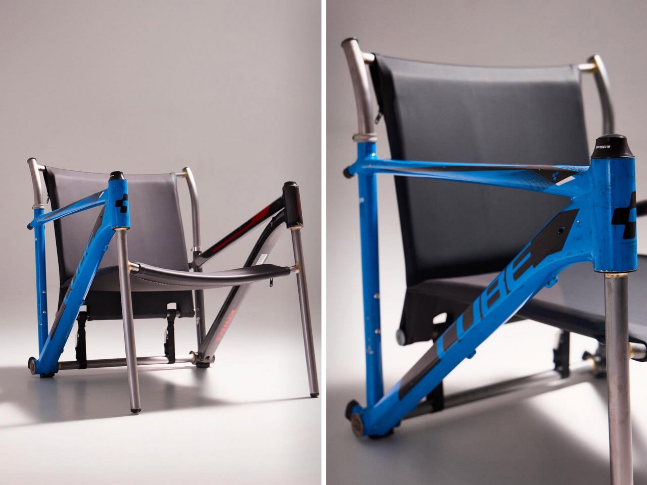
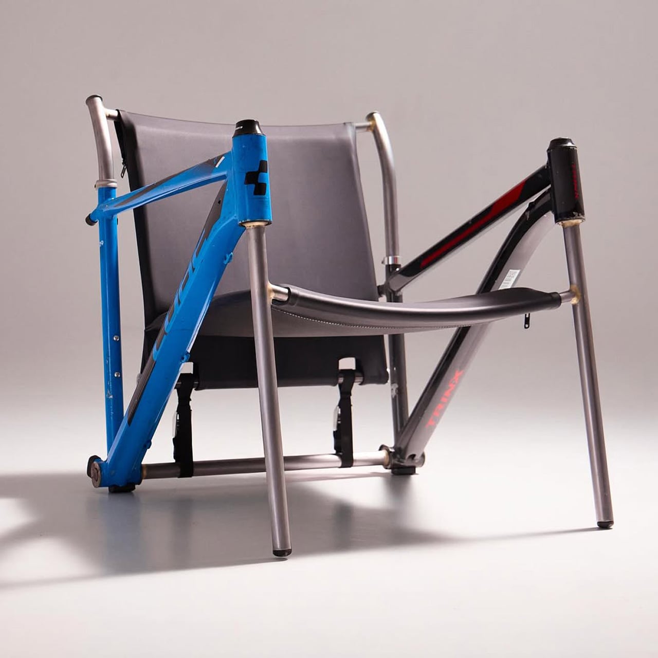
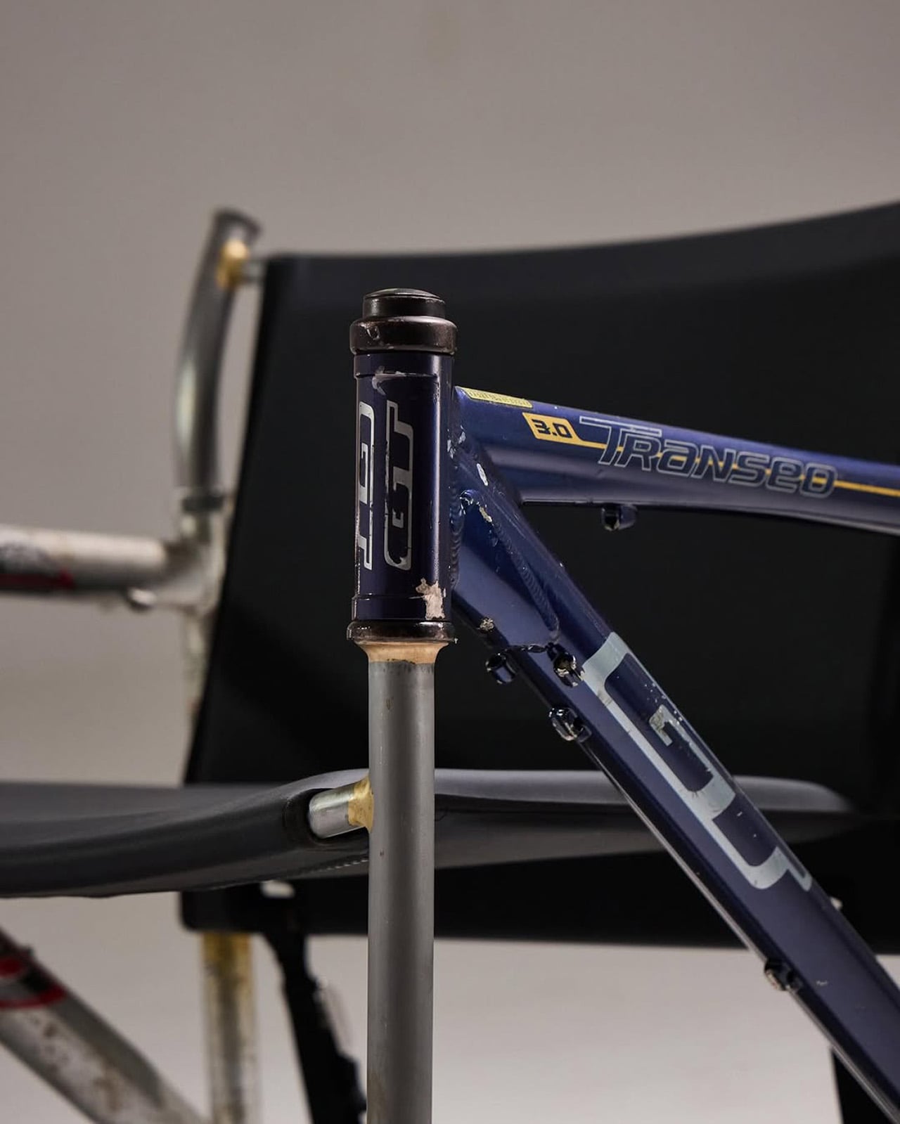
Most upcycling projects ask you to forget what something used to be. Omri Piko Kahan’s bike frame chairs ask the opposite. The geometry is still unmistakably a bicycle frame, the head tube, the top tube, the triangulated rear triangle, all of it present and accounted for, just oriented sideways and asked to hold a person instead of propel one. Kahan, an industrial designer based in Israel, builds lounge chairs from pairs of retired frames, and the whole point is that the donor material remains fully readable, repurposed without being disguised.

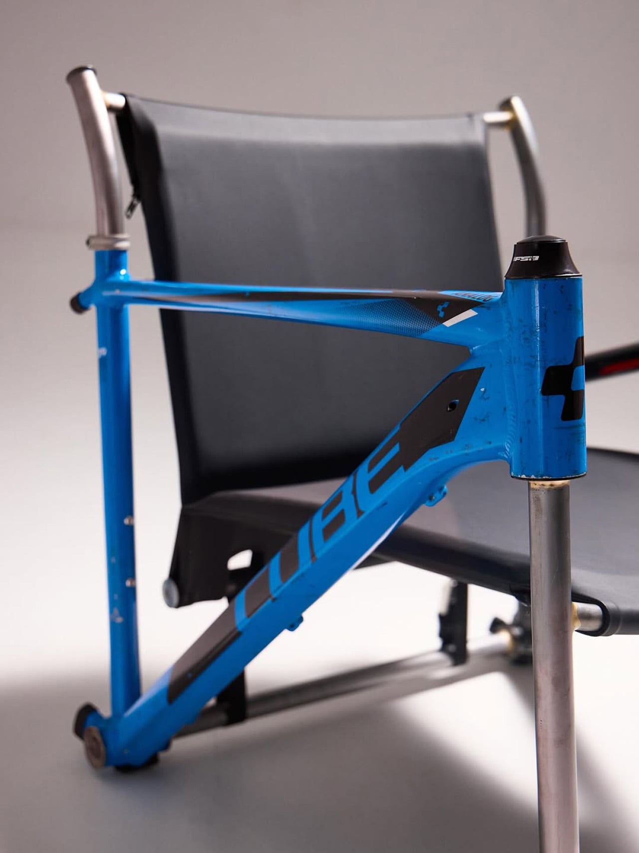
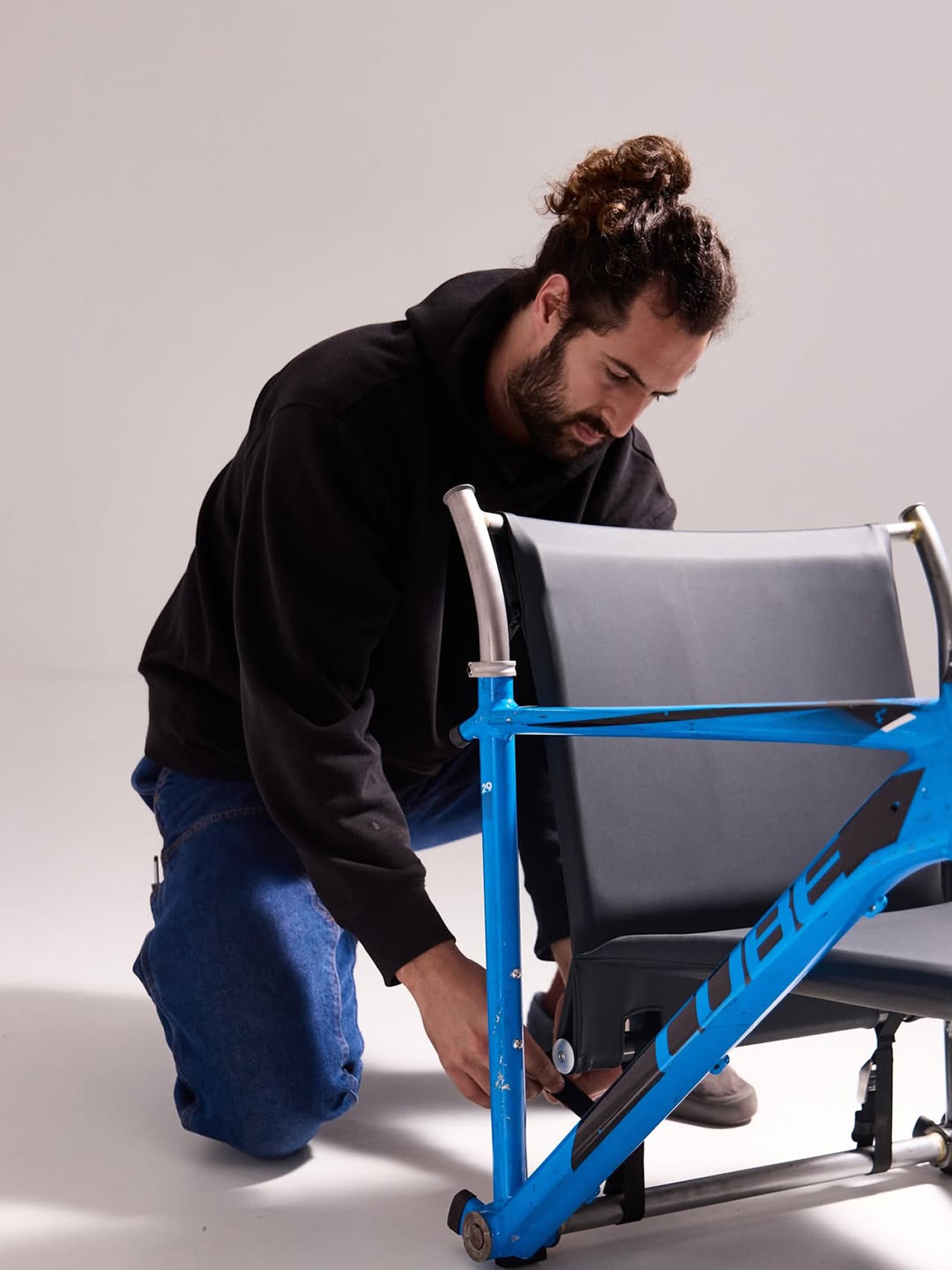
Structurally, the approach is clean and considered. Each frame pair is positioned symmetrically, fork and chainstay ends touching the floor as legs, the top tube running horizontally as an armrest. A slung seat and backrest in leather or canvas complete the form. The result has the relaxed posture of a Barcelona chair and the material honesty of something that was clearly built, not styled.

Designer: Omri Piko Kahan

Bicycle frames are absurdly overbuilt for what Kahan is asking them to do. A modern aluminum road frame is engineered to survive repeated impact loads from a rider pushing 300 watts through rough tarmac, and it does that while weighing somewhere between 1,000 and 1,400 grams. The structural surplus in that kind of engineering is enormous, which is why two of them positioned as a chair frame and asked to support a seated adult is, from a load-bearing standpoint, almost comically within spec. The geometry does the rest. Bicycle frames already resolve forces through triangulated sections, and a lounge chair asks for exactly that kind of lateral and compressive stability.

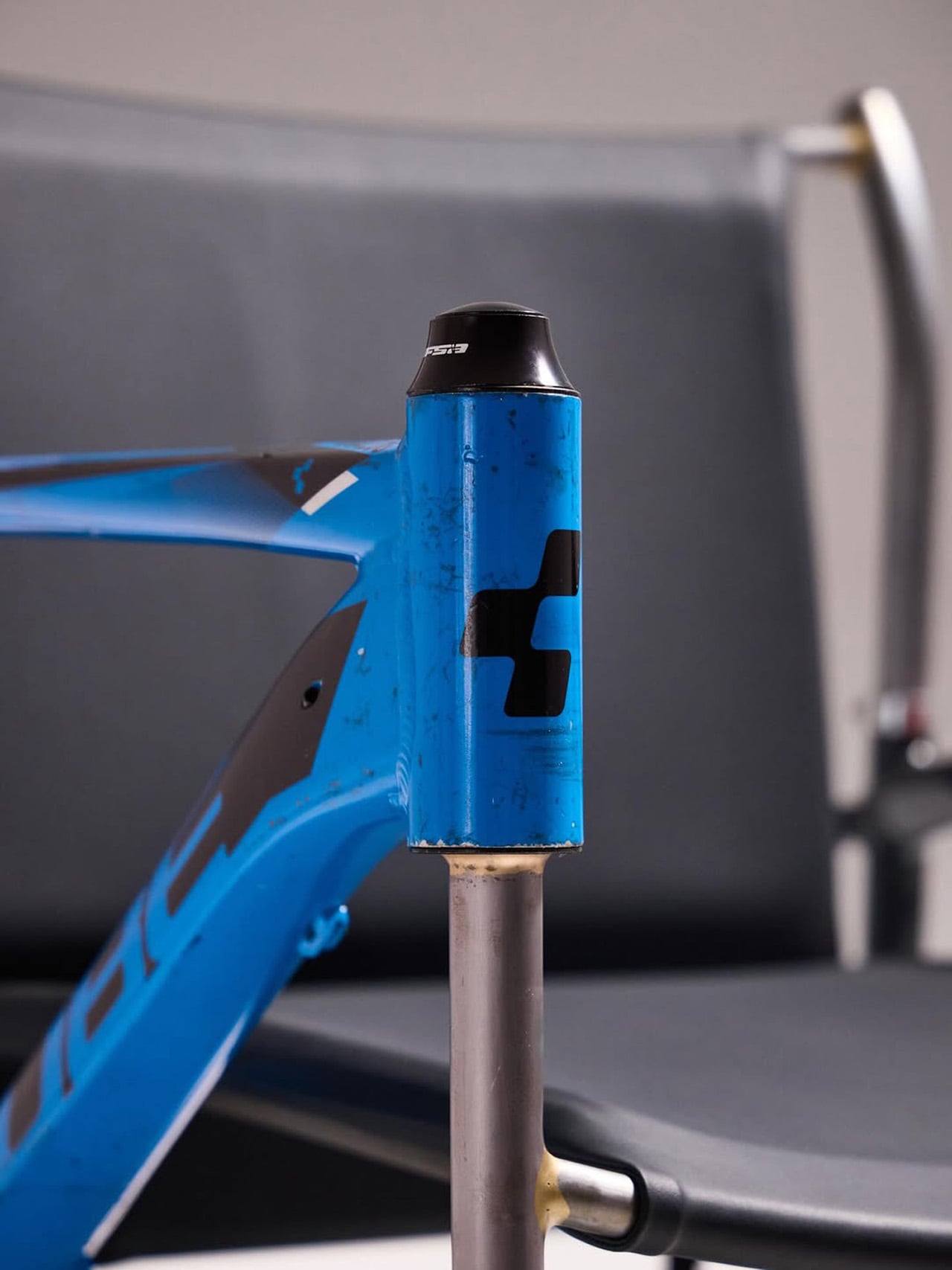
What Kahan has figured out is the orientation problem. Flip a frame on its side and the existing tube angles don’t automatically produce a useful chair geometry. The fork legs and chainstay ends need to hit the floor at the right height relative to each other, the top tube needs to land at armrest height, and the whole thing needs to produce a seat rake that doesn’t pitch you forward or swallow you whole. The matched top tube angles across both frames in the Cube and Trek build suggest this took real iteration, because they align with a precision that reads as deliberate rather than lucky. Filed fillets at the junctions and a custom setback upper support holding the sling confirm someone was paying close attention to finish quality.

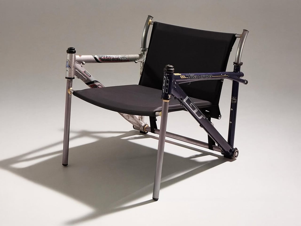
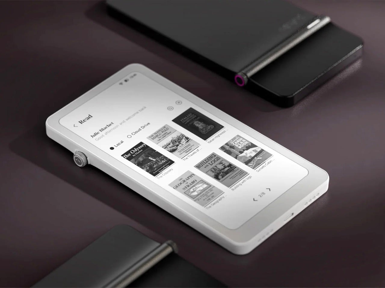
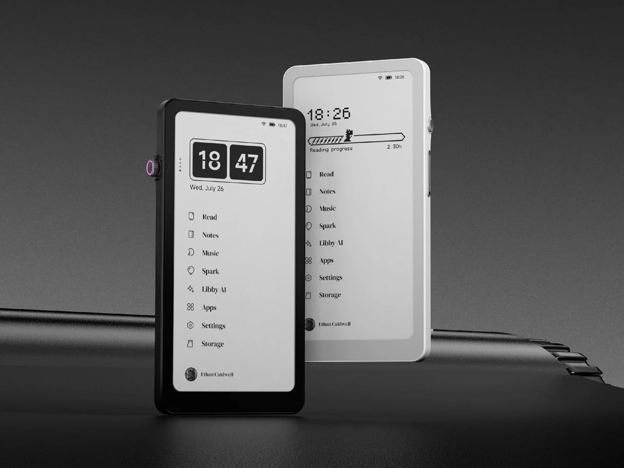
The two builds photographed so far, one pairing a blue Cube road frame with a Trek, another combining a GT Transeo 3.0 with what appears to be a Supreme-branded MTB frame, show how much the donor bikes drive the final character of each piece. The GT build in particular has a longer wheelbase geometry that gives the chair a wider, more reclined stance than the Cube version. Kahan is taking custom orders, with pricing worked out per commission, which makes sense given that no two donor frame combinations will produce the same structural or ergonomic outcome.
The post These Old Bike Frames Upcycled Into Armchairs Are The Coolest Thing You’ll See Today first appeared on Yanko Design.