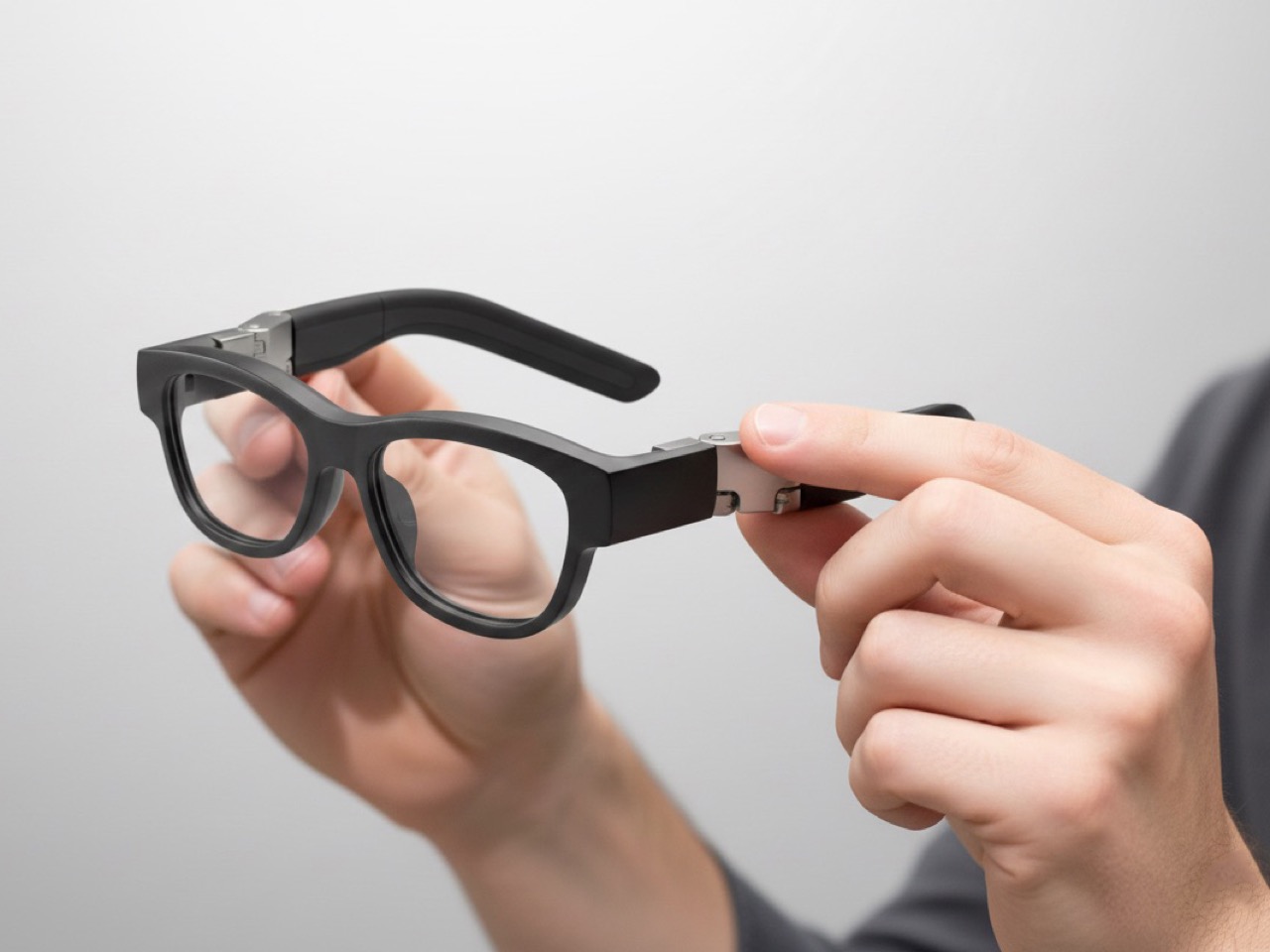
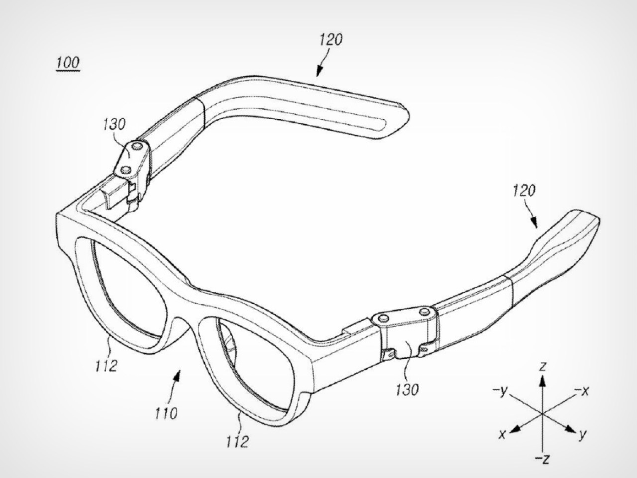
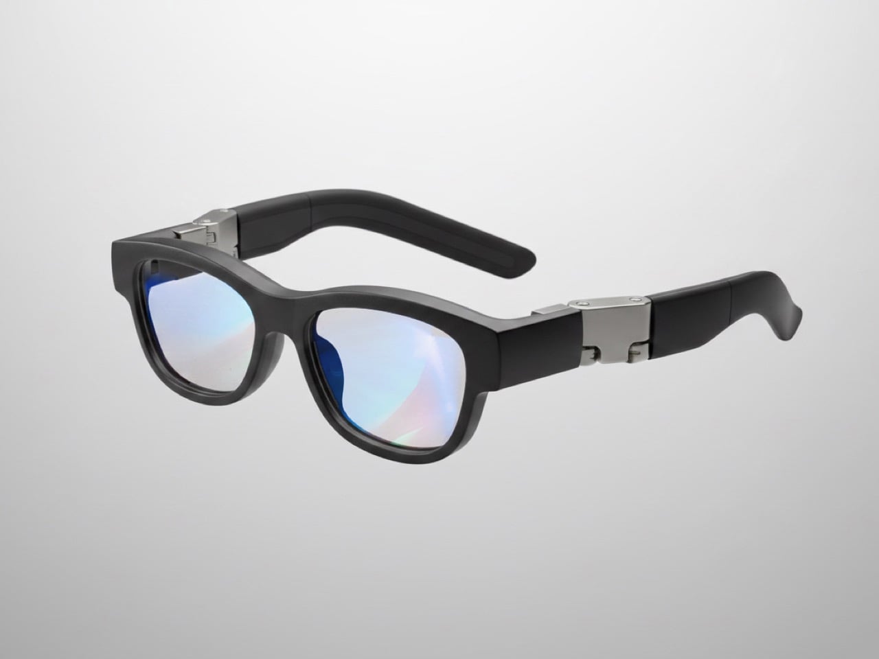
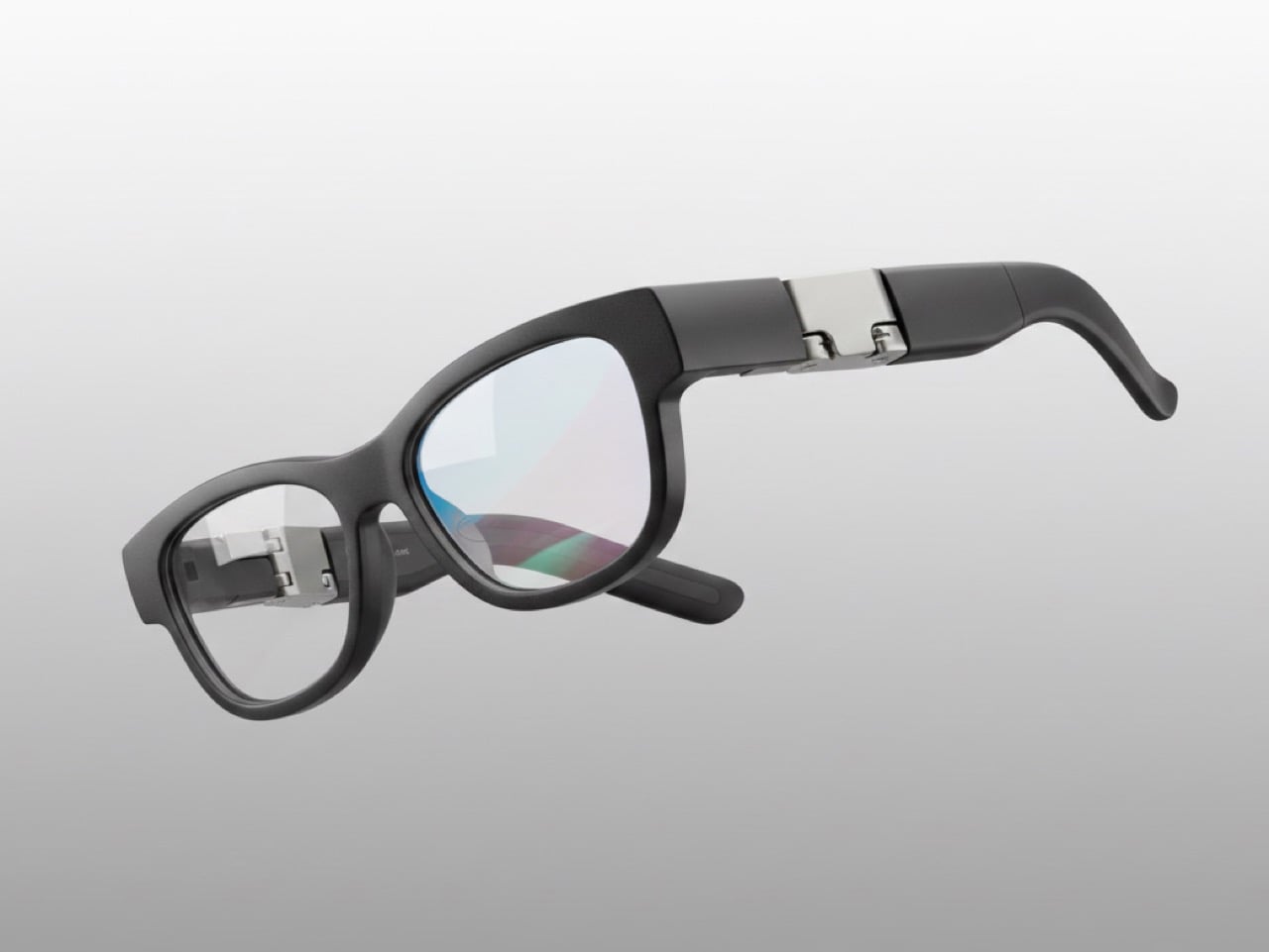
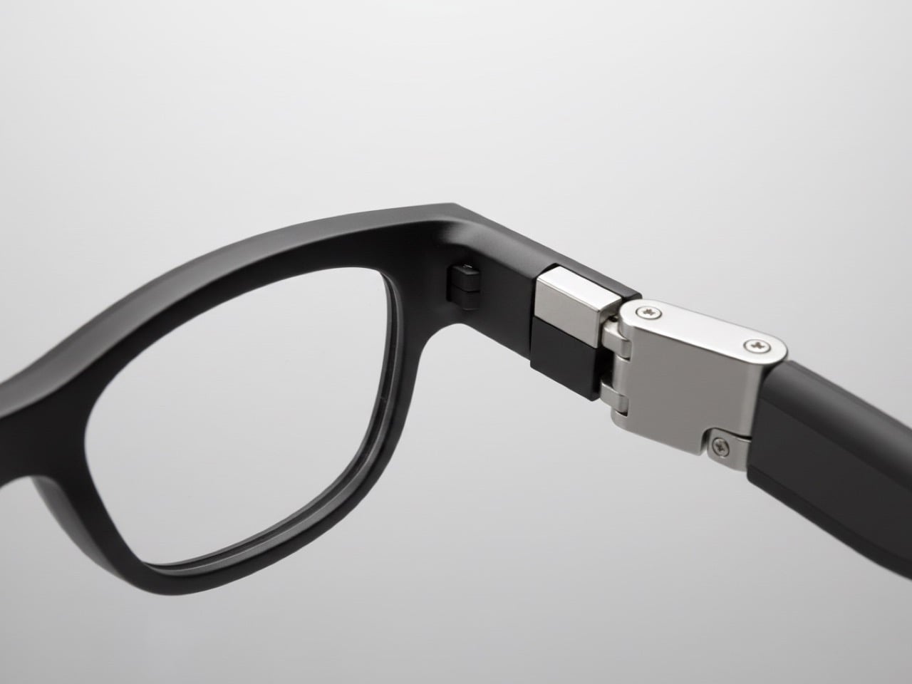
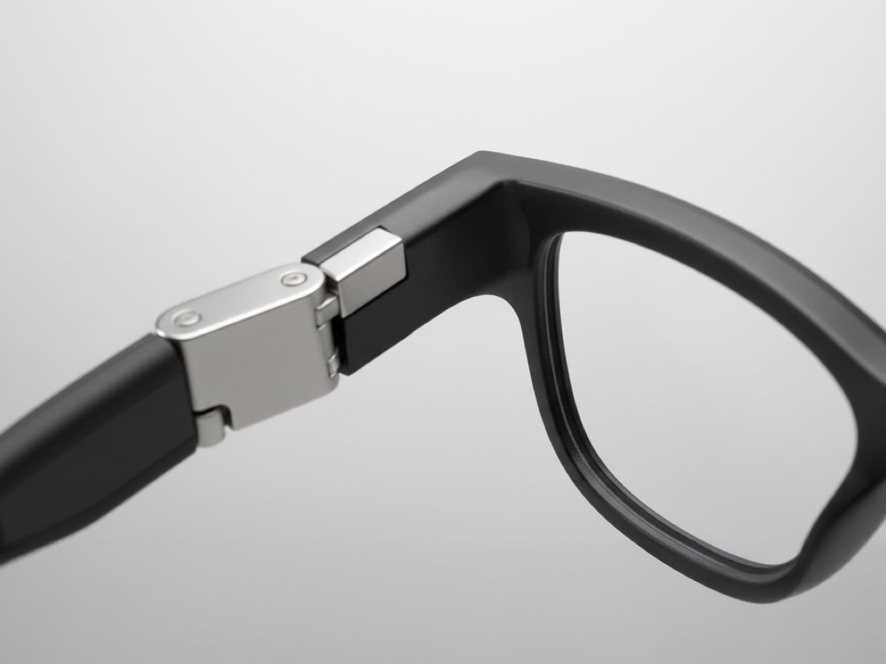
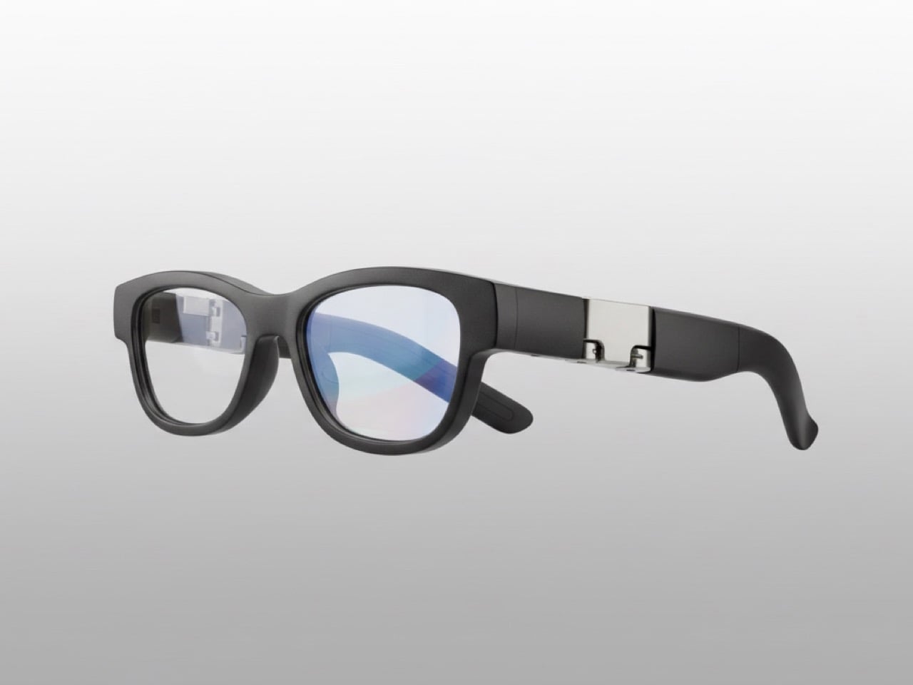
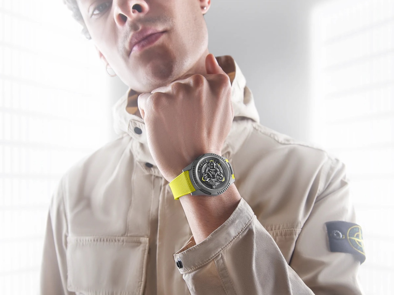
Samsung just published a patent for smart glasses with a pulley-and-cable hinge system, which sounds about as exciting as reading appliance manuals until you realize it’s solving the problem that kills most wearables: they don’t actually stay on your head comfortably. The mechanism synchronizes both temple arms so when one adjusts, the other follows automatically. This matters because smart glasses tend to slide around the moment you tilt your head or start moving, and no amount of fancy AR features can compensate for constantly pushing them back up your nose.
Here’s why this is so interesting. Meta’s Ray-Ban glasses have quietly sold over 2 million pairs, growing 60 percent year over year, which means there’s actually a market for this stuff when done right. Samsung’s apparently aiming for a 2026 launch at around $379 with a 50-gram frame, photochromic lenses, a 12MP camera, and Gemini AI handling translations and notifications. They’re partnering with Gentle Monster and Warby Parker, which suggests someone there finally understood that tech specs don’t matter if people feel ridiculous wearing them in public.
Designer: Samsung
The patent itself (image above) shows Samsung thinking through actual wearing scenarios rather than just cramming in features. The dual-axis hinge distributes pressure evenly and prevents the kind of hotspots that develop after an hour of wear. They’ve also filed separate patents for bone conduction audio, eye-tracking, and clip-on prescription lenses. Taken together, these aren’t random experiments but a systematic approach to the basic problems that have kept smart glasses niche.
This fits into Samsung’s broader XR strategy with Google and Qualcomm. They’ve already launched the $1,799 Project Moohan headset with 3,000 DPI micro-OLED displays, undercutting Apple’s Vision Pro while actually beating it on resolution density. The smart glasses represent the opposite end of that spectrum, trading immersion for something you might actually wear outside. Both products target a market expected to hit $1.7 trillion by 2032, up from $131 billion in 2024, which explains why everyone’s suddenly interested in getting the fundamentals right.
Samsung’s planning a screenless version first, then a display-equipped model in 2027. Starting without a screen is probably smart. Getting people comfortable with the form factor and basic features before adding display complexity gives them room to iterate on fit and battery life without dealing with every problem simultaneously. It’s less exciting than promising the future immediately, but it’s also how you avoid launching something that gets used twice and forgotten.
The hinge patent won’t make headlines, but it represents the unglamorous engineering that actually determines whether such products succeed (we covered another patent on Samsung’s audio tech advancements for smart glasses). Plenty of companies can build a prototype that impresses in a demo. Far fewer can make something comfortable enough that people choose to wear it every day for months. Samsung seems to be betting that solving fit and comfort first, then adding features, beats the alternative of spectacular demos followed by drawer-dwelling devices.
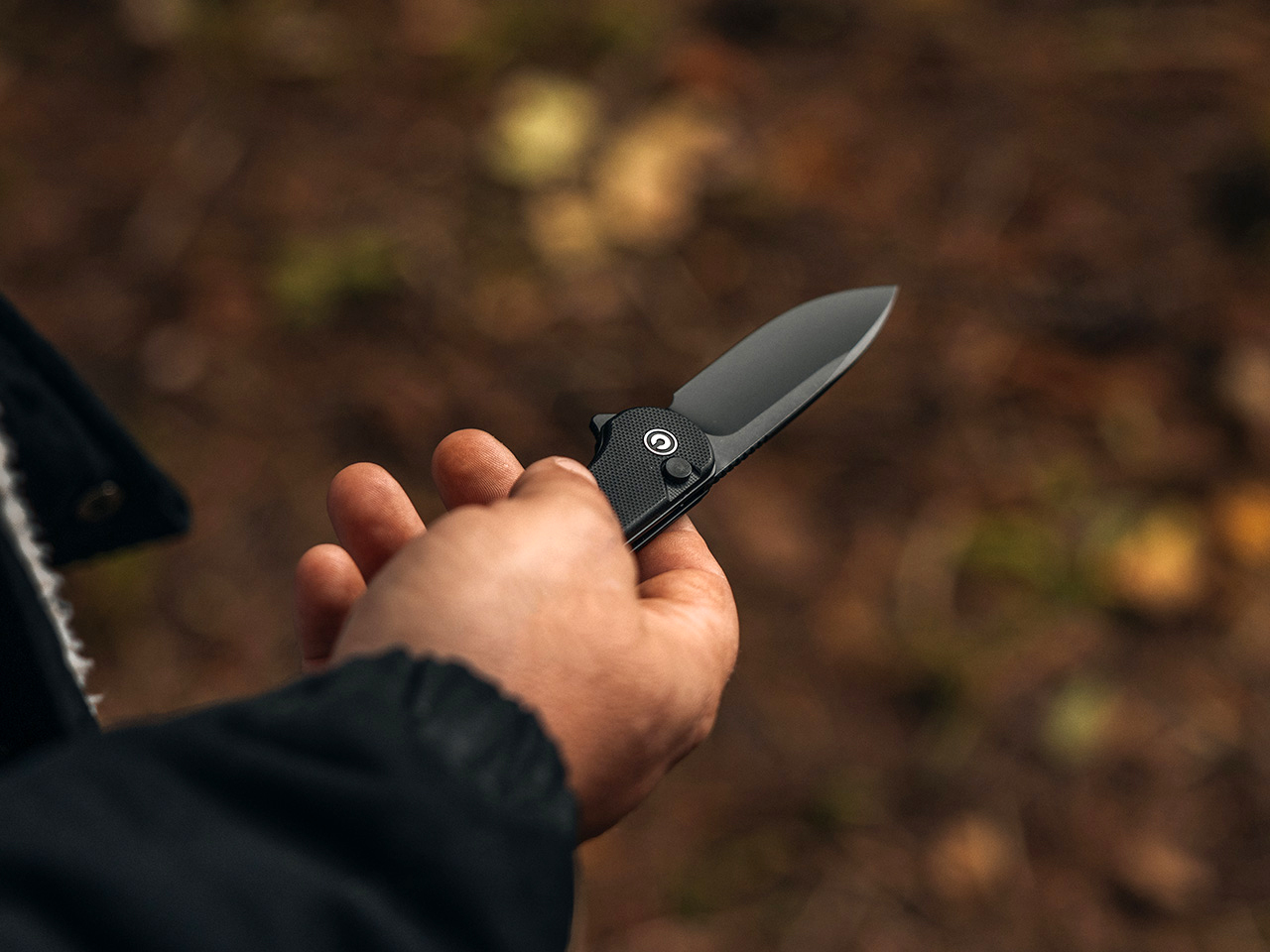
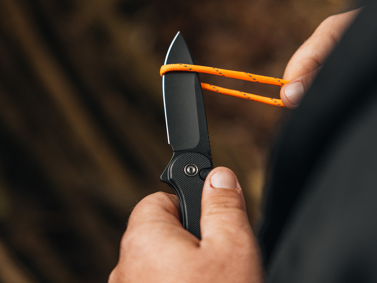
A pocket knife should work hard but carry light, a simple goal that many designs miss. The CIVIVI Button Lock Elementum II is the exception. It’s a compact everyday carry folder built for real work, yet it’s so slim and lightweight you’ll forget it’s in your pocket until you need it.
What makes the Elementum II such a standout is how it delivers on that promise. The design is built around a modern, user-focused experience, with the button lock as its centerpiece. Paired with a pivot running on caged ceramic ball bearings, the action is impressively smooth. A simple press of the button releases the blade, letting it swing shut with a light shake of the wrist for easy one-handed use. It’s a feature that feels premium, elevating the knife beyond a simple cutting tool into something that’s genuinely satisfying to handle.
Designer: CIVIVI
Click Here to Buy Now: $57.38$76.5 (25% off) Hurry! Sale Ends December 18th. Free Christmas Stocking included in orders over $29.
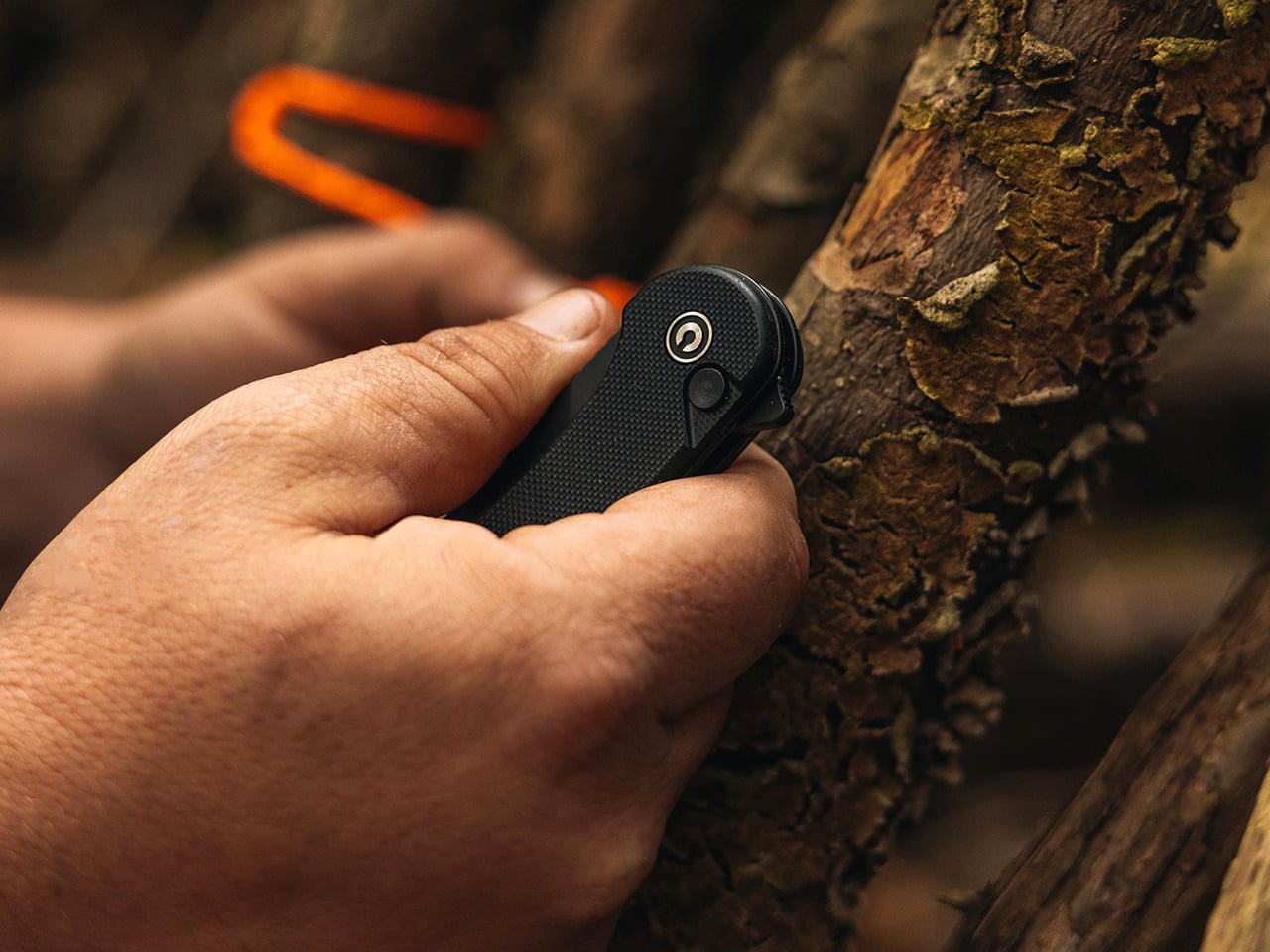
The original CIVIVI Elementum was a massive success because it was simple, clean, and ergonomic. The CIVIVI Button Lock Elementum II isn’t a replacement; it’s a parallel evolution for users who want a more modern, fidget-friendly EDC companion. The core of that experience is the button lock. Paired with a pivot running on caged ceramic ball bearings, the action is impressively smooth. A press of the button releases the blade, letting it swing shut with a light shake of the wrist, making one-handed use genuinely easy. It’s a feature that feels premium, adding a level of refinement that elevates the knife beyond a simple cutting tool into something that’s just satisfying to handle.
What really gives the knife its teeth, though, is the choice of Nitro V for the blade steel. It’s a smart, practical upgrade that makes a real difference in daily use. Nitro V is a nitrogen-enriched stainless steel that offers a fantastic blend of properties for an everyday carry knife. It’s exceptionally tough, meaning it’s less prone to chipping than some harder, more brittle steels if you accidentally hit a staple or drop it. The corrosion resistance is also a standout feature; you can use it to slice an apple or get it wet on a hike without worrying about rust spots forming by the end of the day. Edge retention is solid, holding a sharp, workable edge through plenty of cardboard and rope before needing a touch-up. And when it does, it’s easy to sharpen on a basic stone, a trait that can’t be overstated. CIVIVI runs the steel at a Rockwell hardness of about 58-61 HRC, a sweet spot that balances edge-holding with durability.
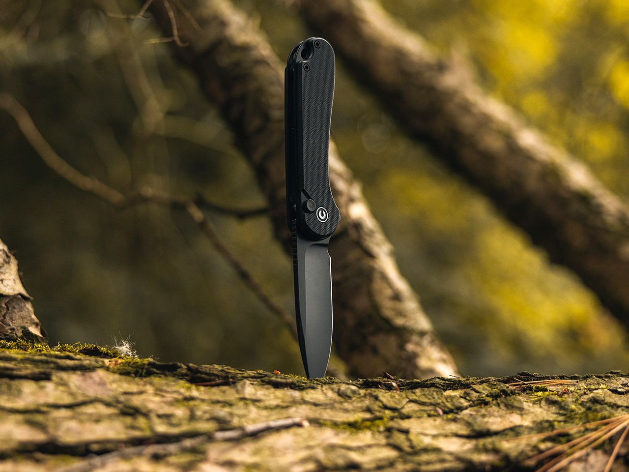
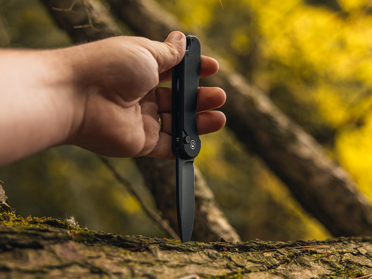
The physical design complements these functional upgrades perfectly. With a blade length just under three inches and an overall length of about seven inches, it’s sized for utility without being cumbersome. The handle is slim, at around half an inch thick, and comes in a few different materials, including lightweight G10 and textured aluminum. This slim profile, combined with a weight of around 2.7 ounces for the aluminum version, means it carries incredibly well. The deep-carry pocket clip lets it sit low in the pocket, making it discreet enough for almost any setting. It’s a knife that’s there when you need it and forgotten when you don’t. The simple drop-point blade shape is versatile, handling everything from fine slicing to piercing tasks with its flat grind.
All these elements circle back to why it works so well as a great pocket knife and EDC gift. The design is clean and unintimidating, the button lock action is intuitive and fun, the Nitro V steel is forgiving and high-performing, and the sub-$60 price point is just *chef’s kiss*. It’s a knife that a seasoned collector can appreciate for its thoughtful material choices, while someone new to knives will find it to be a reliable and easy-to-use tool. It doesn’t require specialized knowledge to maintain, yet it offers a tangible step up in quality from a typical hardware store folder. The Elementum II isn’t just a good knife for the money; it represents a shift where excellent design and practical, modern materials are becoming the new standard for what an everyday knife can be. You can grab the Button Lock Elementum II at a Black Friday-special 25% off using the link below!
Click Here to Buy Now: $57.38$76.5 (25% off) Hurry! Sale Ends December 18th. Free Christmas Stocking included in orders over $29.
Every week, Yanko Design’s podcast Design Mindset powered by KeyShot brings you conversations with design leaders who are shaping how products, brands, and experiences connect with people around the world. Hosted by Radhika, the show explores the intersection of design thinking, strategic communication, and the human stories behind successful brands. Whether you’re a designer, entrepreneur, or simply curious about how intentional design shapes our world, this weekly series offers insights you won’t find anywhere else.
In episode 12, Radhika sits down with Chris Pereira, founder and CEO of iMpact, a China-Western communications and go-to-market firm based in Shenzhen. With nearly two decades in China, fluency in Mandarin, and a notable stint as a Huawei PR leader, Chris brings a rare perspective to the table. Named one of Forbes India’s Top 30 Globalization Innovators, he’s spent his career helping brands navigate the treacherous waters between cultural intention and reception. What emerges from this conversation is a masterclass in how design decisions carry meaning, whether you intend them to or not.
Chris opens with a stark reality check: “Design isn’t neutral, especially across cultures. A font, a color, a slogan that wins in New York can really backfire in Nanshan in Shenzhen, China.” The challenge isn’t just about translation in the linguistic sense, it’s about making intention travel across borders intact. Every design choice tells a story about your values, and Chris emphasizes this with a striking insight: “The question isn’t if your design will tell a story, but what story you’re telling. So it’s whether you’ll own that narrative or let it own you.”
When brands think they’re “on brand” with a global strategy, that’s often exactly when things break down in local markets. Chris shares a personal anecdote that illustrates the stakes: “I had a friend a few years ago in China and he always liked to wear a green hat… But in China, there’s a specific phrase. If you’re wearing a green hat, it means your partner is cheating on you in the relationship.” What’s an innocuous fashion choice elsewhere becomes a cultural faux pas in China. For brands, this translates directly to sales, green hats simply don’t sell in Chinese markets, regardless of how well they perform globally.
Why Respect Can Look Like Disrespect (and Vice Versa)
Cultural landmines extend far beyond color choices. Chris recounts a dinner meeting where cultural respect signals completely misfired: “The Chinese host used chopsticks and before he ate he put food onto my client’s plate… But my business partner, my client, he got very angry all of a sudden. He said, I know how to use chopsticks. I’m not a kid.” The Chinese host was showing respect; the Western guest felt insulted. Both sides wanted to build trust, but the trust was actually eroded by the interaction.
These seemingly small details matter enormously for visual communication too. Sticking chopsticks upright in rice is a cultural taboo in China associated with funeral rites, an advertising image showing this would be deeply inappropriate, yet a Western creative team might not know to avoid it. Chris’s firm uses a systematic 10-item pre-mortem checklist that expands into roughly 100 specific considerations, covering everything from brand names and color schemes to who appears in imagery and what scenarios are shown. The goal should be consistent across markets, Chris explains, but the methods must adapt: “The result or what we want to convey in every country is the same. We care about the local community… How we get there is very different.”
Stop Saying You’re Great (Get Someone Else to Say It)
Perhaps the most critical insight Chris offers is about trust-building through third-party endorsement. “If I sit here and tell you, Radhika, I’m really great. I’m amazing… Honestly, that’s not a good way to convince the other person. The better way is to say, this professor has given me a letter of introduction. I was on TV last week on that media.” From a brand perspective, advertising says “I’m great,” while third-party endorsement says “he’s great” or “she’s really trustworthy.” Chris’s advice is direct: “If you don’t have the third-party endorsement, you shouldn’t do advertising.”
He encourages brands to “stand on the shoulders of giants,” pointing to the “Intel Inside” label on laptops as a perfect example. Industry awards, professional association endorsements (like dental associations for toothpaste), and partnerships with established entities all build the trust foundation necessary before spending on advertising. For product launches, Chris advocates showcasing customer success stories: “Maybe we can donate some of our products while we’re doing our announcement. And they can come and say how much that means to them for their community.” This provides powerful, authentic validation that no amount of paid advertising can replicate.
What Huawei’s Crisis Taught About Winning Together
Chris’s time at Huawei during one of the most challenging periods in the company’s history taught him invaluable lessons about resilience and messaging. When he joined in 2016, the message was all about dominance: “We’re number one in this industry. We’re number two in this industry. We have a huge end to end supply chain.” That message made employees proud but scared competitors. “If you’re in the United States at your Apple or Google, you’re like, oh, crap, this is kind of scary. Right. And they’re going to take our business,” Chris recalls.
The lesson? “The importance of win win or finding ways to work together in a way that’s good for everyone in the community is important.” Huawei eventually shifted its messaging toward building an open ecosystem, helping everyone in the supply chain succeed together. Chris also learned about the long-term mindset necessary for trust-building. When the Meng Wanzhou crisis hit in 2018-2019, many questioned whether Huawei would survive. Yet the company had a record year recently, expanding into new sectors like automotive. This taught Chris the importance of resilience and “thick skin” for both brands and individuals, and that trust requires time and consistency to build properly.
Redefining Speed: Why “Shenzhen Speed” Isn’t What You Think
The concept of “Shenzhen Speed” came up multiple times, but Chris is careful to define it properly. It’s not about rushing business relationships or pushing for quick deals. Rather, “when we say Shenzhen speed, we’re not talking about the speed of your business development… the speed is response. So if you send me a message and I respond quickly, we close the loop quickly.” Trust, conversely, needs time.
As Chris puts it, quoting a German friend: “Going in the wrong direction very quickly is not efficient. So in other words, if you’re going in the right direction slowly, that’s actually maybe better than going super fast and going in circles.” This is especially true for Chinese companies going overseas. Chris identifies cross-cultural communication as the primary challenge: “They all have great products, but they still lack a ability to communicate in a cross-cultural setting.” And crucially, human connection matters more than technology: “Get on an airplane and be on site at a trade event, visit your clients in person, have coffee with them. So none of that can be done by AI, interestingly.”
The Three Non-Negotiables Every Brand Needs
When asked about his non-negotiables, Chris identifies three foundational principles. First, compliance, “You need to follow the law anywhere you go,” he states simply. Second, authenticity: “If you’re not authentic, you will lose the trust of the local market.” Chris shares what he calls the 20-60-20 rule: 20% of people will always love you, 60% don’t really care either way, and 20% will actively dislike you. “When we’re doing our design work and business work, it’s important to bring your true self to the table because then you’ll attract the consumers, your customers, your partners, your friends who are like minded.”
Third, purpose beyond profit. “We’re not just doing business and doing design work and doing PR for money. I think we want to make the world a better place,” Chris reflects. For him, this is personal: “I have a nine year old son who’s half Chinese. So what we’re doing is helping Chinese companies and helping China tell their story in a more effective way overseas and building more trust and friendship.” In the rapid-fire segment, Chris crystallizes several key insights. His quickest litmus test for international success? “The team, the team behind the product.” The most underused asset in cross-border launches? “The actual relationships… in the local market.” And what beats beautiful design every time? “A brand mission. So a mission, a worthwhile cause to do something.”
Making Intention Travel
What emerges from this conversation is a fundamental truth: design is never neutral. Every choice, from fonts to colors to the people you feature in your imagery, communicates values. The challenge is ensuring those values translate as intended across cultural boundaries. Chris’s approach is both systematic and deeply human: use checklists and structured processes, but never forget that trust is built person to person, through authentic relationships and genuine commitment to local communities.
For designers and brand strategists working in an increasingly global marketplace, the message is clear: you can’t afford to be culturally naive. What “works” in your home market may actively harm you elsewhere. But with the right approach, thoughtful localization, authentic partnership, and patience, brands can successfully make their intention travel across borders. Chris Pereira can be found on LinkedIn, and Design Mindset releases new episodes every week, bringing you more conversations with leaders who understand that great design isn’t just beautiful, it’s meaningful.
Listen to the full conversation on Design Mindset (powered by KeyShot), available every week, to hear more insights from one of the industry’s most decorated design leaders.
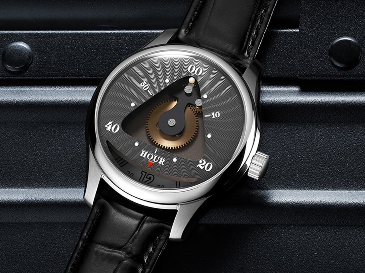
Time is usually measured in straight lines and sweeping hands, but Triarch bends that rule into a triangle. Instead of conventional hands, its custom movement drives a rotating minute dial while a tiny ball traces a precise triangular path. Every glance becomes a small discovery, as the orbiting ball and shifting dial transform timekeeping into a kinetic sculpture on the wrist.
The design leans fully into the symbolism of the triangle, a shape long associated with stability, harmony, and eternity. From ancient pyramids to sacred geometry, the triangle has stood for structure and balance, and Triarch pulls that mythology straight onto the dial. The result is a watch that does not just show the time; it frames time inside a geometric icon that feels both timeless and futuristic.
Reading the Triarch takes a second to learn but makes sense quickly. Hours are tracked on a rotating outer dial marked from 1 to 12, spinning continuously beneath a fixed reference point. Meanwhile, the minutes are indicated by a small ball that travels along a triangular track, moving in sync with the passage of time. At the center sits an exposed golden gear, visible through a triangular window, acting as the mechanical heart that drives the entire system. This gear does not just function; it performs, turning the dial into a stage where mechanics and motion are always on display.
Triarch exists in two distinct variants, each interpreting the core concept differently. Triarch I is the more refined, dress-oriented expression. It features the original mechanical rotating dial with the triangle window prominently framing the golden gear and the hour module. The dial designs lean toward classical watchmaking aesthetics, with radiating guilloché-style patterns that catch light beautifully. Available in three colors, including teal, grey-black, and blue, Triarch I pairs its mechanical theater with a premium Italian leather strap and a polished stainless steel case. It is aimed at collectors who appreciate mechanical artistry wrapped in a quieter, more sophisticated package.
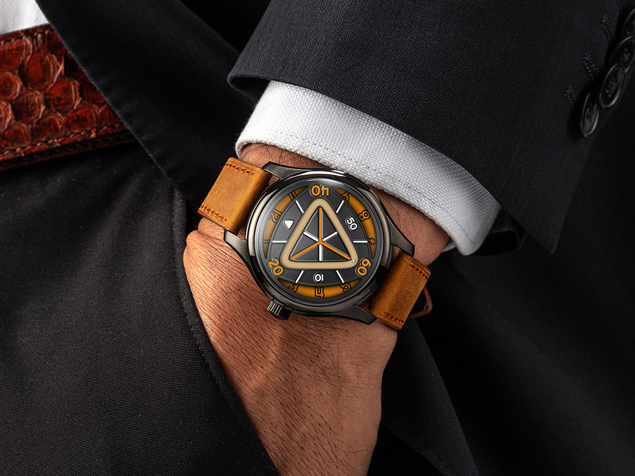
Triarch II takes the same foundation and pushes it into bolder, more experimental territory. This upgraded version adds an extra layer to the dial structure, creating more visual depth and making the internal architecture more visible. The most significant upgrade is the magnetic minute hand innovation. Instead of a traditional pointer, the minute indication on Triarch II jumps with magnetic force, creating a floating, almost sci-fi effect that sets it apart from conventional watches and even from Triarch I. Lume coverage is significantly expanded on Triarch II, with larger areas of Swiss Super-LumiNova applied across the dial, making it far brighter and more legible in the dark. Available in six colorways, including black with orange accents, teal, lime green, and others, Triarch II leans hard into a modern, almost cyberpunk vibe. It ships with a rugged Crazy Horse leather strap, a material known for its matte finish and ability to develop character over time.
Both models share the same mechanical platform and case architecture. The movement is a Miyota 9039 automatic, a 24-jewel Japanese caliber running at 28,800 beats per hour with a 36-hour power reserve and accuracy rated to around plus or minus 10 seconds per day. Mounted on top is the in-house rotating hour module, the complication that makes the entire display possible. The case is 316L stainless steel, measuring 42mm wide and 14.16mm thick, with a double-domed sapphire crystal up front treated with multi-layer anti-reflective coating. The caseback is also sapphire, offering a view of the Miyota movement and parts of the custom module. Water resistance is rated to 5 ATM, or 50 meters, suitable for daily wear but not serious water sports. Both versions use 20mm lugs with quick-release spring bars, making strap swaps effortless.
Triarch positions itself somewhere between horology and wearable art, offering a genuinely different way to interact with time. The $299 Triarch I appeals to those who want mechanical poetry in a relatively subdued form, while the $359 Triarch II targets enthusiasts chasing visual boldness and technical novelty. Either way, the triangle is not just decoration here; it is the entire logic of the watch. Both the Triarch I and Triarch II ship free globally, with an extra strap included in the box.
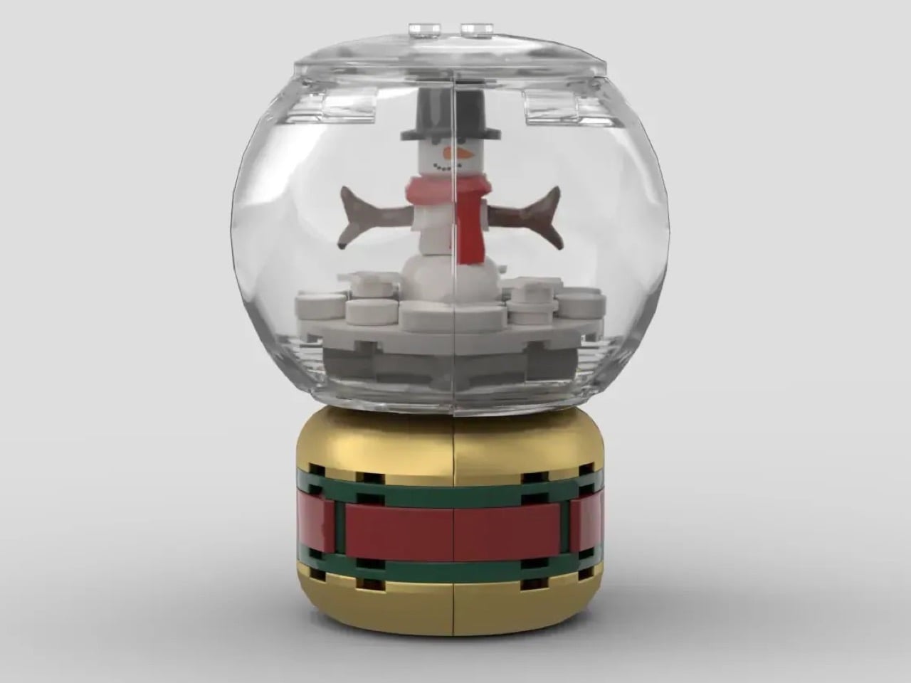
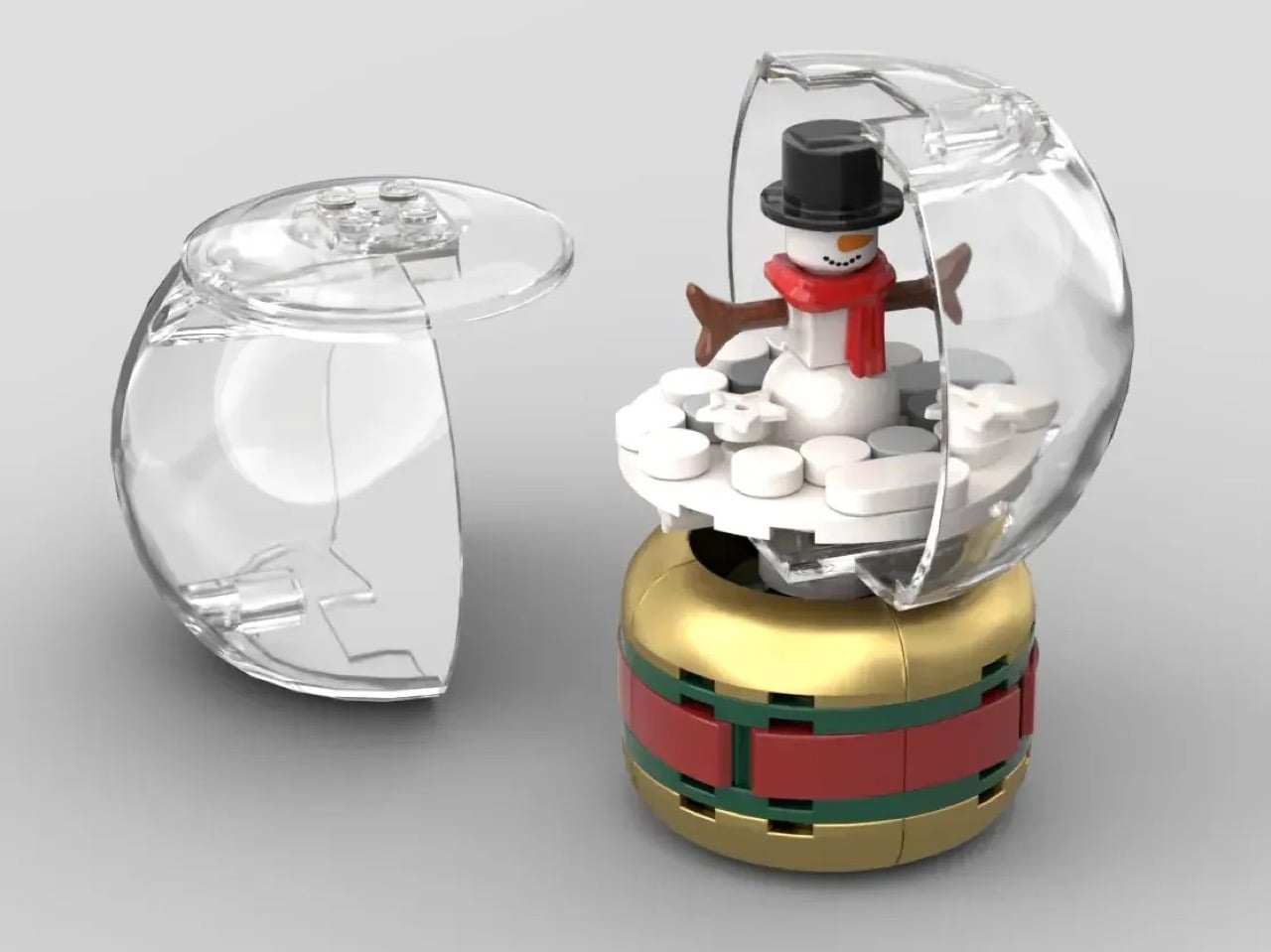
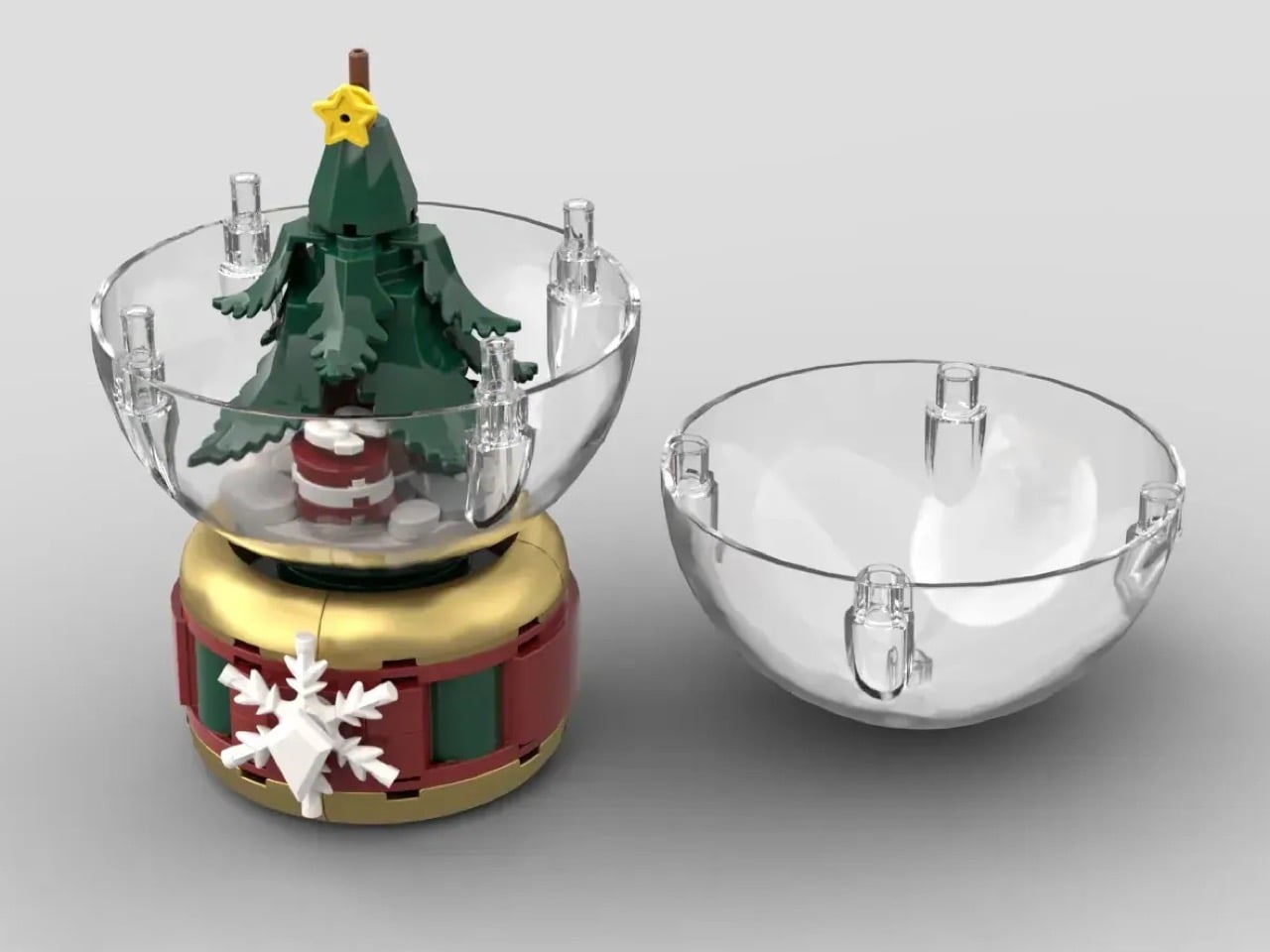
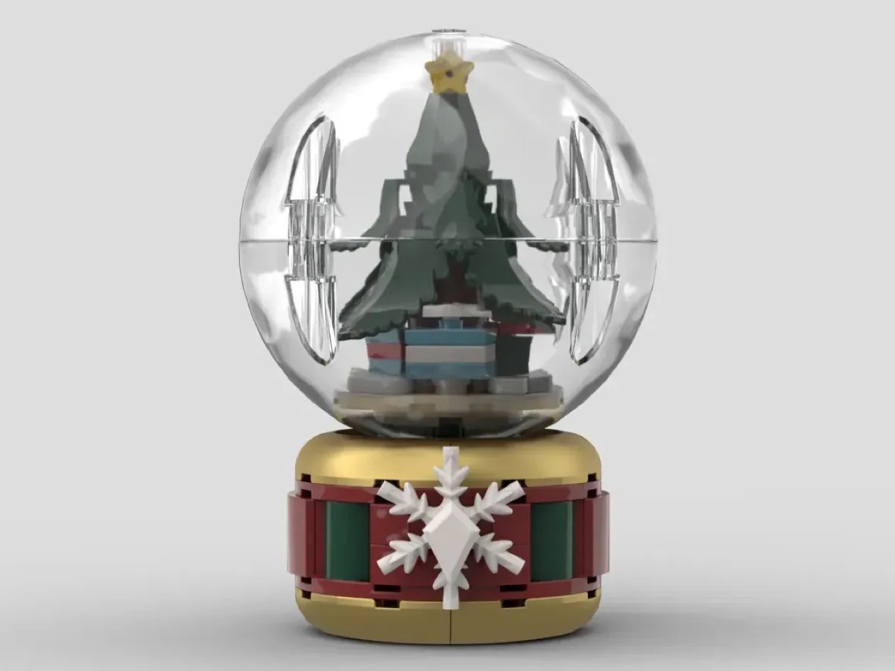
Three globes, three distinct Christmas visuals, three absolute vibes. Made with a total of just 385 pieces, this MOC (My Own Creation) from LEGO builer ItzEthqn captures the holiday spirit perfectly, and for anyone who wants to customize the globes with something of their own, these designs seem absolutely modular, allowing you to replace the inner scene with anything of your choice for a more custom/bespoke snow globe!
“Now I know what you may be thinking, ‘Isn’t it a bit early for Christmas?’ and the answer is absolutely not its never too early for Christmas,” says ItzEthqn (who probably goes by the name Ethan. The globes – two large and one small – are the perfect way to usher in the holiday spirit… especially if you’re a LEGO lover like I am.
Designer: ItzEthqn
The globes come in 3 distinct variants, the smallest of which features a tiny little snowman, top hat, scarf, carrot, branches and all. The snowman sits within a fairly comfy 3-piece ‘glass’ orb. The orb sits on a gold, green, and red banded base, quite like the kind you find in novelty shops and Hallmark outlets.
The other two snow globes are a tad bit larger, featuring slightly more elaborate scenes. The first, a Christmas tree, complete with a star topper as well as gifts at the bottom. The larger glass orb now features a 2-part design, and the slightly larger base also has a snowflake brick embedded on the front for extra holiday flair. The other snow globe features our old friend Nicholas (also known world over as Santa) on his trusty sled, with gifts in the boot. ItzEthqn does mention that he wanted to bejewel the globes with stickers too, but that detail kept crashing his computer as he added stickers to the globe.
That being said, there’s a lot that you can do with this framework. Upgrade it with minifigures of your own, make tiny versions with different designs and themes, or even use it to display your Hot Wheels collection, the cars might be a tight fit but I’m sure you can figure it out! The other tiny caveat here is that these snow globes don’t actually have any snow in them, so feel free to chuck in some tiny confetti to make these globes feel like the real deal!
ItzEthqn’s fan-made snow globe design is currently gathering votes on the LEGO Ideas website, an online forum where LEGO enthusiasts share their own creations and vote for their favorites. With well over 2,600 votes, this MOC is slowly but surely inching towards the coveted 10K vote mark, following which it’ll be reviewed by LEGO’s internal team and ‘hopefully’ turned into a retail kit that all of us can buy. Until then, just head down to the LEGO Ideas website and give this build your vote!
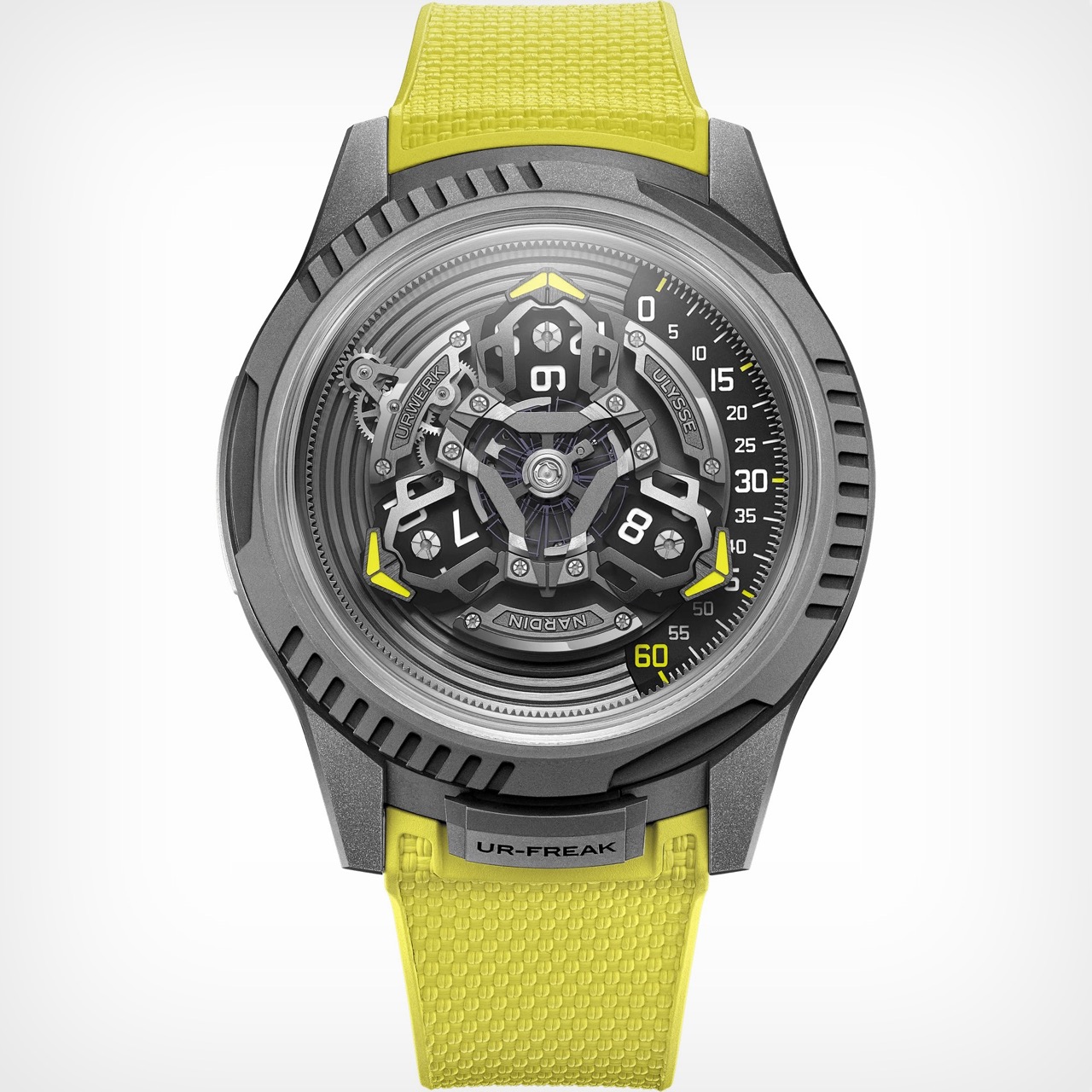
The Ulysse Nardin Freak has always been more of a horological platform than a static model. Since its debut, it has served as a canvas for the brand’s most forward-thinking ideas, from pioneering silicon components to its signature “movement as the hand” display. It was the watch that proved a piece of high watchmaking could look and function like nothing that came before it. Now, for the first time, Ulysse Nardin has opened that platform to an outside collaborator.
It is fitting that the partner is Urwerk, another independent force that has consistently challenged the conventions of time display. Instead of a simple cosmetic update, the two brands co-developed a new caliber that integrates Urwerk’s wandering hour satellites into the Freak’s rotating carousel. The watch is still fundamentally a Freak, using its entire movement to indicate the time, but the language it speaks is now filtered through Urwerk’s sci-fi, dashboard-inspired lens.
Designers: Urwerk & Ulysse Nardin
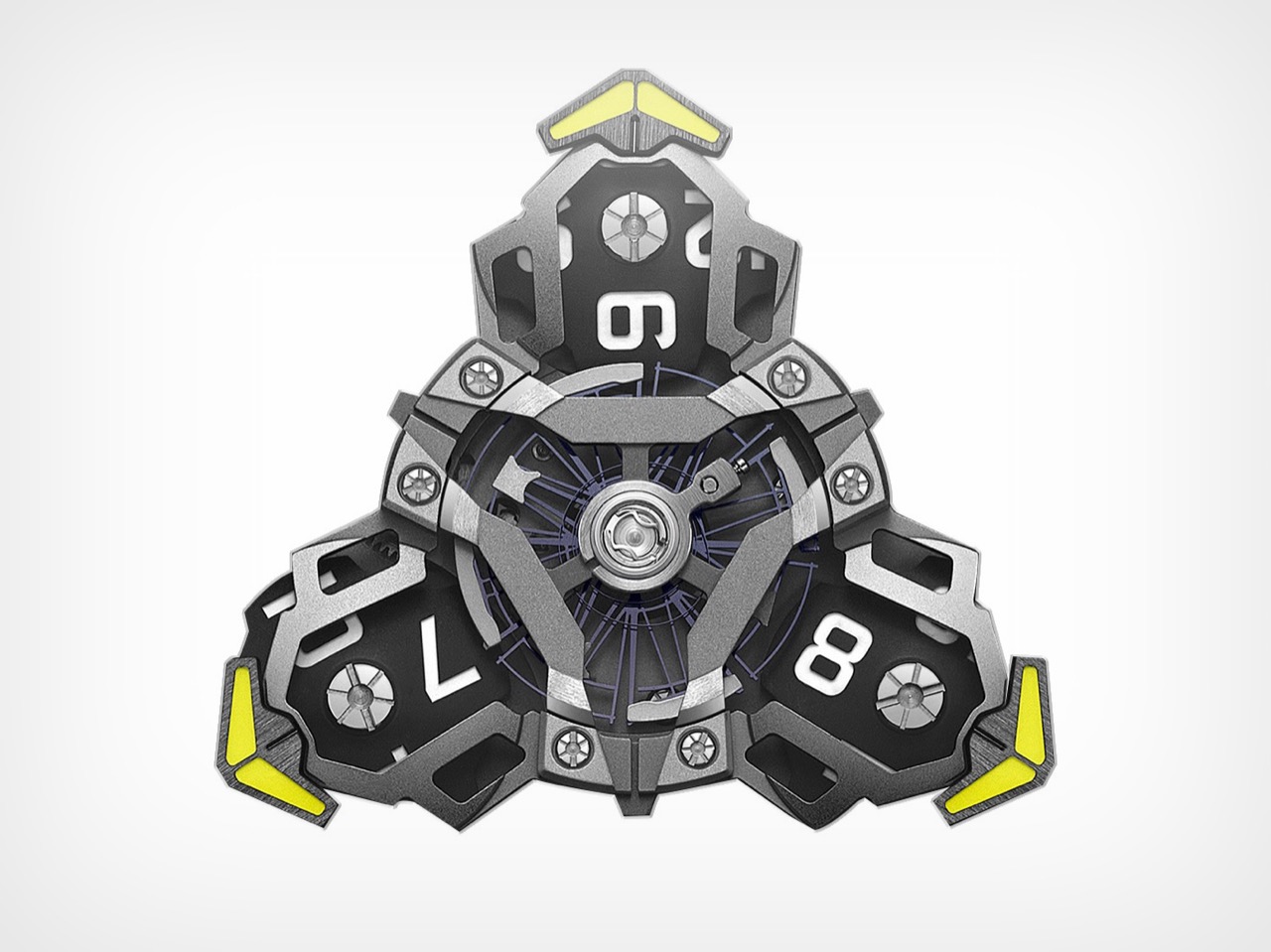
What makes this partnership click is the deep mechanical fusion they achieved. The purpose-built UN-241 caliber is proof of this, a movement born from over 150 new components designed to get these two very different systems to play nice. You can see Ulysse Nardin’s massive silicon oscillator beating right in the middle, the technical heart of the machine. But orbiting around it is an assembly that is pure Urwerk. The three satellite arms, each carrying a rotating hour block, are mounted directly onto the Freak’s carousel, creating a layered, kinetic sculpture. You are looking at a Ulysse Nardin movement carrying an Urwerk complication like a backpack, all rotating as one cohesive unit.
Even with all that movement, reading the time is surprisingly straightforward. Your eye is drawn to the right side of the watch, where a single active satellite points a bright yellow arrow toward a linear minute track. The number on the corresponding hour block gives you the hour. It is an intuitive system, a classic Urwerk touch, but it’s made more dynamic by the constant, slow rotation of the Freak platform underneath. It feels like Urwerk’s dashboard display has been mounted on a revolving space station.
The 44 mm silhouette is clearly from the Freak ONE, with its crownless architecture and smooth, sandblasted titanium. But you can see Urwerk’s influence in the fluted, notched sections of the bezel, which add an industrial texture that feels different from the Freak’s usually sleek profile. You still set the time by rotating this bezel, secured by a locking tab at six o’clock that now reads “UR-FREAK.” It is a clear signal that this is a Freak that has been properly Urwerk-ified. The electric yellow strap, Urwerk’s calling card, drives the point home, a splash of aggressive color against the muted gray case.
Getting one will not be easy, or cheap. The UR-Freak is a limited run of just 100 pieces, and with a price tag of around 122,200 USD, it is aimed squarely at serious collectors in the independent scene. For those looking to acquire one, inquiries will have to be made directly to either brand. The UR-Freak is the kind of watch that makes you wonder why it did not happen sooner, and at the same time, be amazed that it happened at all.
Your laptop can do anything, which increasingly means it’s optimized for nothing. This isn’t a new observation, but the solutions have mostly been software-based: distraction-blocking apps, focus modes, website blockers that you can disable the moment willpower falters. The Typeframe project takes a more permanent approach – build a computer that literally cannot do anything except let you write.
Jeff Merrick’s open-source writerdeck designs come in two flavors. The PX-88 is a desktop-style portable with a full keyboard and integrated screen, styled after the 1985 Epson PX-4 that inspired it. The PS-85 shrinks down to a 40% keyboard layout while maintaining that same retro-futuristic aesthetic. Both use Raspberry Pi boards as their brains, and both are documented with the kind of step-by-step detail that assumes you’ve never touched CAD software or soldered components together.
Designer: Jeff Merrick
For the uninitiated, the Epson PX-4 was a chunky CP/M portable that field engineers actually carried into the field, with swappable keyboards and modular components that could turn it into different tools for different jobs. It ran on batteries and had a tiny 40×8 character display that virtually expanded to 80×25. The appeal wasn’t raw computing power – it was that the thing did exactly what you needed and nothing more. Merrick’s designs capture that purposefulness while swapping in modern components that are actually available and affordable.
The community around writerdecks has been growing quietly alongside the broader cyberdeck movement. Where cyberdecks lean into the hacker aesthetic with exposed electronics and tactical mounting points, writerdecks prioritize the writing experience itself. There’s active discussion on Reddit’s r/cyberDeck forum, open-source software projects like WareWoolf and ZeroWriter built specifically for distraction-free writing, and a thriving market for vintage AlphaSmart Neo devices – basically the original writerdecks from the early 2000s that are still beloved for their springy keyboards and complete lack of internet connectivity.
Merrick freely admits this is his first project at this scale, and he’s documented it with that beginner perspective intact. The full documentation lives at typeframe.net, with all the CAD files and electronics details on GitHub. It’s the kind of project that invites participation rather than demanding expertise, which feels increasingly rare in maker spaces that sometimes forget not everyone solders for fun.
The broader question is whether dedicated writing devices actually help people write more. The answer seems to be yes, but not because of any technical magic. Sitting down at a machine that only does one thing creates a kind of ritual commitment. You’re not just opening a document – you’re physically moving to a different device that exists solely for this purpose. It’s closer to the experience of sitting down at a typewriter or picking up a pen, except what you write is instantly digital, searchable, and portable. The AlphaSmart Neo proved there’s real demand for this experience, and projects like Typeframe are making it accessible to anyone willing to spend a weekend with a soldering iron and some determination.
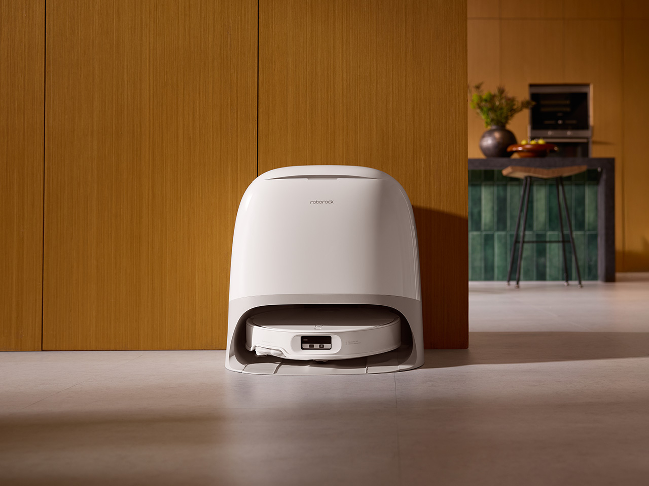
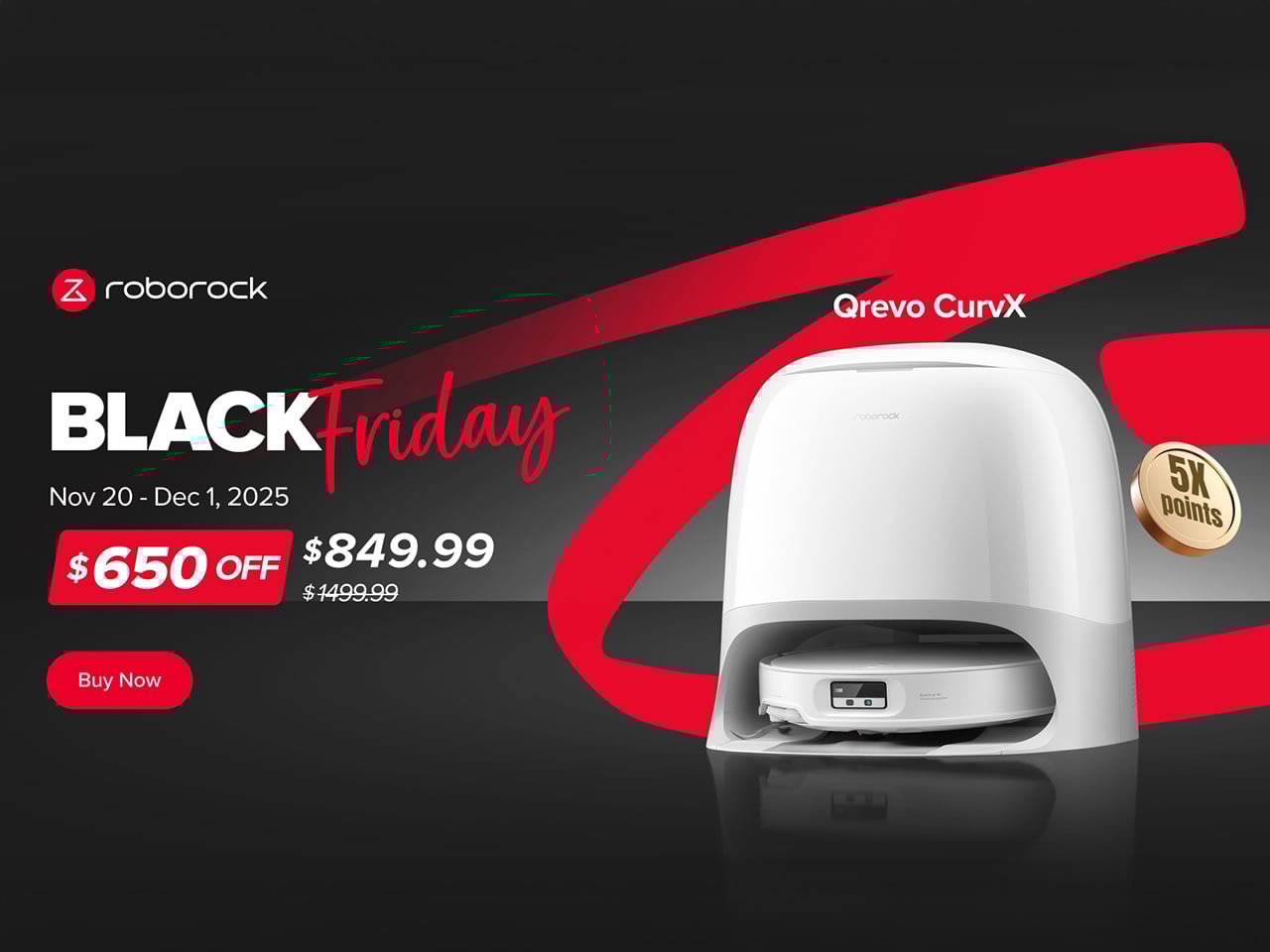
Most robot vacuums ask you to choose between brains and beauty, performance and polish. They either look like something you’d tuck away in a utility closet or they clean with all the conviction of a demo unit at a trade show. Roborock’s Qrevo CurvX has been one of the rare exceptions since launch, which explains why it commanded $1,499.99. That’s flagship territory, the kind of pricing reserved for products that are supposed to solve problems rather than create new ones. The question for Black Friday is what happens when that same robot drops to $849.99, because suddenly you’re not comparing it to other flagship models anymore.
The 43% discount would be noteworthy on any robot vacuum, but this isn’t any average robot vacuum being purposely cleared from stock for Black Friday. The CurvX is genuinely Roborock’s current top offering, complete with 22,000Pa suction that actually makes a difference on carpets, a chassis that physically lifts itself over thresholds up to 4cm high (which sounds gimmicky until you live in a house with transitions between rooms), and a 3.14-inch profile slim enough to navigate under most furniture without getting wedged. For anyone who’s spent the past few years watching robot vacuum tech inch forward while waiting for one that doesn’t require you to compromise on either capability or how it looks sitting in your living room, this is the kind of pricing shift that’s worth paying attention to.
The slim profile is a bigger deal than it sounds. At just under 8cm tall, the CurvX glides under sofas, beds, and cabinets where dust bunnies breed because most vacuums can’t reach. Roborock made this possible with RetractSense navigation, featuring a LiDAR sensor that retracts into the body when it isn’t needed. Most LiDAR robots have a permanent turret on top, an extra bit of height that forces them to avoid low-clearance furniture entirely. This is a thoughtful piece of engineering that addresses a real-world frustration, ensuring a truly comprehensive clean in the spaces that are often missed. It’s a design choice that reflects a deeper understanding of how modern homes are actually furnished.
Even more impressive is the AdaptiLift chassis. This is Roborock’s system for lifting the entire robot body to clear obstacles, and it transforms how autonomous the cleaning actually becomes. Thick rugs, raised thresholds between rooms, or even the slight lip where tile meets hardwood are handled with ease. Lesser robot vacuums will attempt these crossings, fail, and get stuck. The CurvX lifts itself up to 1.57 inches and just drives over the obstacle. In real-world use, this means your robot isn’t getting trapped on a daily basis, which sounds basic but genuinely improves the whole ownership experience.
For pet owners, the holy grail has always been a robot vacuum that doesn’t choke on hair. Roborock built the Dual Anti-Tangle System specifically to address hair wrapping, pairing it with what they call a DuoDivide main brush that splits the roller to prevent tangling at the source. Combined with FlexiArm technology that extends the side brush and mop pad out to reach baseboards and corners, this robot actually handles pet households well. Most robot vacuums leave visible gaps along edges because their circular design can’t physically get close enough. The CurvX extends past those limitations, meaning you’re not manually cleaning baseboards after the robot runs.
The CurvX also packs a pretty advanced mopping system that ties in with the vacuum’s dock. The Multifunctional Dock 3.0 Thermo+ is far more than an auto-empty bin. It washes the robot’s dual spinning mop pads with 80°C (176°F) water, hot enough to dissolve greasy kitchen spills and sanitize floors effectively. After washing, it dries the mops with 45°C warm air, preventing the mildew and sour odors that can plague other robot mops. The dock also refills the robot’s water tank and empties its dustbin into a large 2.5-liter bag that can go for up to 65 days between changes. This level of automation means the robot is always ready for the next job, providing a consistently clean and hygienic experience with minimal human oversight.
Underpinning all of this is the Reactive AI obstacle avoidance, which uses structured light and an RGB camera to see and interpret the world around it. With the ability to recognize 108 different object types, the system is remarkably adept at navigating a lived-in home. This gives you the confidence to run a cleaning cycle without having to tidy up beforehand; it will intelligently steer around charging cables, shoes, and pet toys instead of trying to consume them. It’s a system designed for real-world messiness, which is a refreshing change of pace.
Roborock also clearly understood that for a device to live in your main space, its design matters. The CurvX’s dock is sleek and rounded, with a smooth, dust-resistant top cover. Most of the robot tucks away inside the base when docked, so it maintains a low profile. It’s a functional appliance that doesn’t look like one, actively complementing a modern home’s aesthetic rather than detracting from it. It’s a small touch, but it’s one that speaks to a user-centric design philosophy that considers the entire ownership experience.
At $849.99, the value proposition shifts significantly. You’re getting flagship performance and capability at a price point that suddenly feels accessible. Most robot vacuums in this range offer either strong suction or competent mopping, rarely both with the kind of dock automation that makes daily use genuinely hands-off. The CurvX delivers on all three, and the timing matters because Roborock is extending serious discounts across its lineup. The Saros 10R, another ultra-slim flagship with 22,000Pa suction and industry-first 3D ToF navigation, is getting cut from $1,599.99 to $1,049.99. The Qrevo Edge S5A (18,500Pa suction with DuoDivide brush and FlexiArm technology) drops from $999.99 to $549.99, making it a compelling mid-range option for those who want solid performance without the ultra-premium price. The Q10 S5+ (10,000Pa suction, 70-day auto-empty, VibraRise 2.0 mopping) offers even more accessible pricing with its $249.99 price tag for budget-conscious buyers who still want auto-empty convenience. If you’re someone who prefers cordless cleaning, the Flexi F25GT wet-dry vacuum (20,000Pa suction, self-washing at 194°F, lie-flat design) is dropping from $299.99 to $199.99. The CurvX still represents the apex of what Roborock offers, but having this many capable options discounted simultaneously means there’s genuinely something for different household needs and budgets.
If you’ve got a multi-surface home, pet hair to contend with, or you’ve simply gotten tired of manually maintaining a robot vacuum every week, the CurvX actually solves those problems. The slim design means it cleans spaces other robots miss. The suction power handles both carpet and tile effectively. The dock system means mop maintenance is genuinely hands-off. These aren’t theoretical benefits. They’re practical improvements to how the robot actually functions in real homes. At $849.99 during this Black Friday window, you’re looking at a product that’s genuinely capable of delivering on what robot vacuums have been promising for years. That’s worth paying attention to.
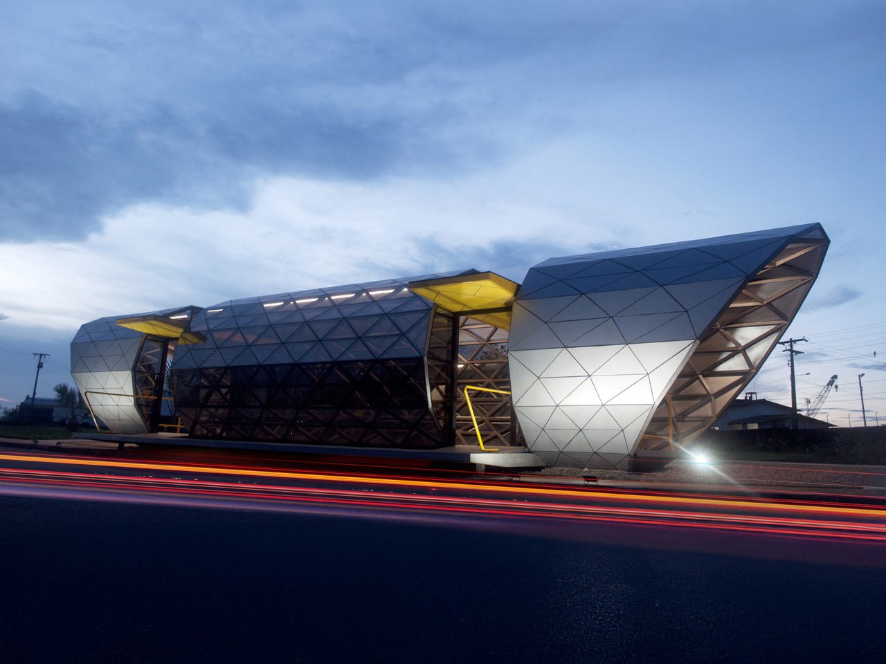
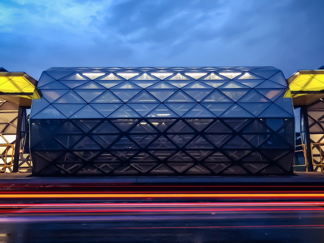
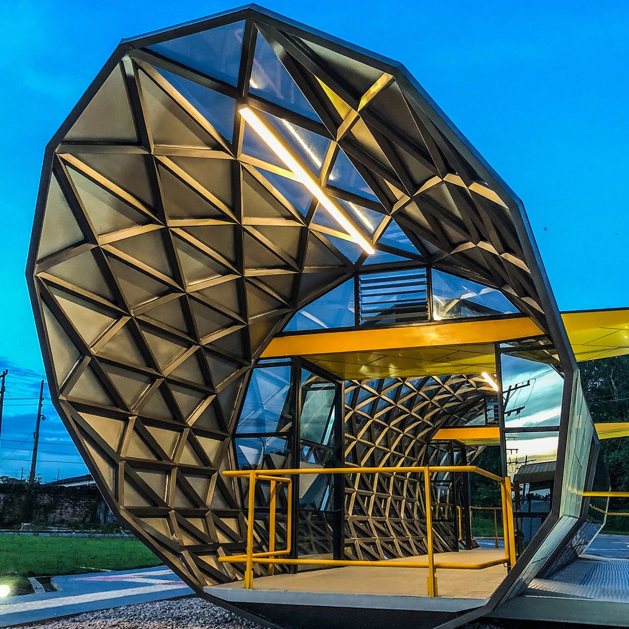
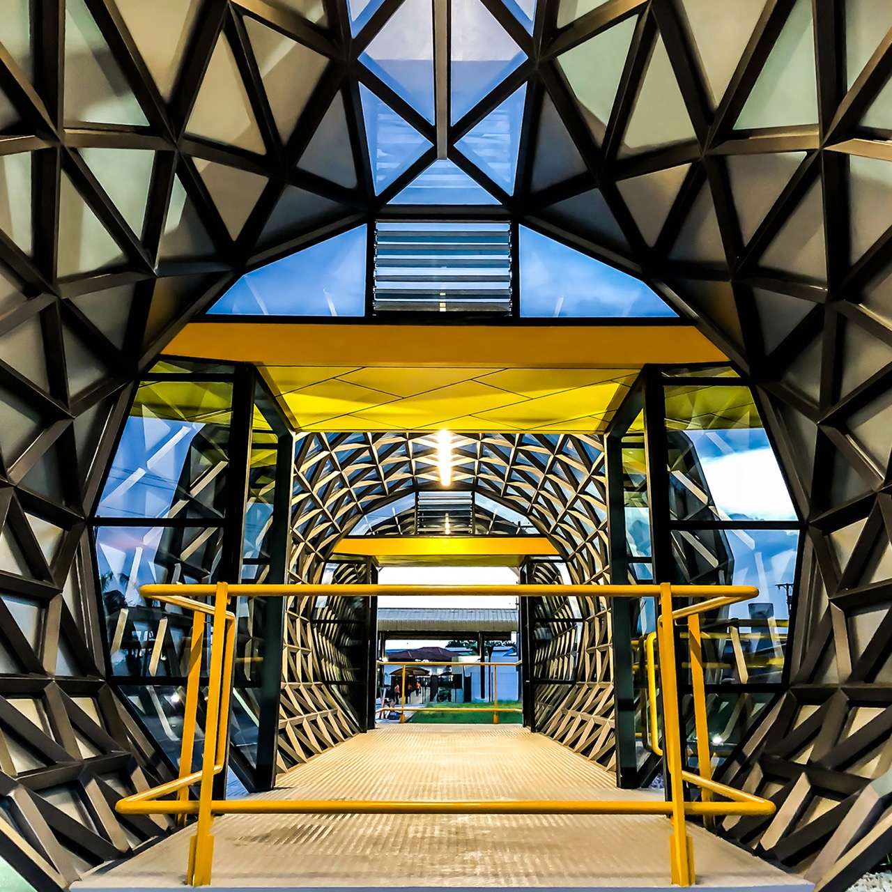
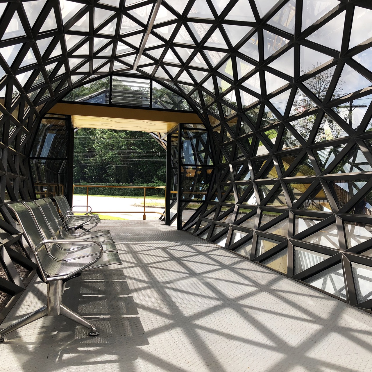
Waiting for a bus shouldn’t feel like purgatory, but in the intense heat and frequent downpours of Brazil’s Amazon region, it often does. Fernando Andrade understood this intimately when he began designing the Amazon Bus Station in Belém, a project born not from architectural ego but from genuine public consultation with the people who would actually use it. They asked for four things: protection from the weather, environmental comfort, durability, and reasonable cost. What they got exceeded every expectation: a soaring, sculptural shelter that treats public transit users as deserving of the same design attention typically reserved for museums and corporate headquarters.
The 16-meter structure, completed in February 2024, wraps passengers in a protective envelope of triangulated steel and reflective glass, its organic curves creating an embracing interior space that feels both sheltering and expansive. Yellow accessibility ramps guide users through a barrier-free environment where natural ventilation, achieved through traditional Amazonian roof fins, keeps air moving without mechanical systems. Shadows from the geometric framework dance across metal benches as daylight filters through the glass skin, creating an ever-changing interior atmosphere that connects occupants to the rhythms of weather and time. The design accommodates everyone, including those with mobility challenges, while pushing what architectural beauty can achieve in public infrastructure.
Designer:
The structural approach here is basically what happens when parametric design actually solves problems instead of just generating Instagram bait. The whole thing is built from 600mm triangular modules, each assembled from 75x3mm quadrangular steel tubes. That triangulation distributes loads efficiently enough that the entire 16-meter span rests on just four support points, which means minimal ground disruption and maximum flexibility for street-level circulation. And they used recycled steel throughout, dropping carbon emissions by 70% compared to conventional construction methods. The numbers matter because this approach could scale. Belém gets this one station, but the fabrication methodology, the material choices, the whole industrial-to-site assembly process translates to other locations dealing with similar climate challenges and budget constraints.
The 8mm laminated glass blocks 99.8% of direct solar radiation, which in equatorial conditions isn’t a nice-to-have feature, it’s the difference between a functional space and a greenhouse. But the clever bit is those ventilation fins at the roof ridge. They’re angled glass louvers that let hot air escape while keeping rain out, basically a stack effect ventilator with zero moving parts and zero maintenance requirements beyond occasional cleaning. No motors failing, no electronics corroding in humidity, no ongoing energy costs. Just heated air rising and escaping through geometry that works with local wind patterns. It’s the kind of solution that feels obvious in hindsight but requires serious environmental modeling to get right.
Nine months from concept to completion, with fabrication happening in a controlled industrial environment using local shipbuilders who know how to work with complex curves and weather-resistant assemblies. They pre-built the structure in three major sections, transported them to site, and only finished the connection joints on location. That level of prefabrication ensures tolerances stay tight and quality control doesn’t depend on field conditions, which matters when you’re dealing with structural silicone joints and precise glass panel alignments. The client, Centro Integrado de Inclusão e Reabilitação, specializes in accessibility infrastructure, so the barrier-free circulation wasn’t an afterthought added to satisfy code. It shaped the entire spatial concept from the beginning.
The real test of any transit infrastructure is whether it changes behavior. A better bus station doesn’t just shelter existing riders, it potentially converts people who currently drive because the bus experience feels too degrading or uncomfortable. Belém’s new station won’t single-handedly transform modal split numbers, but it signals that public transit users deserve environments worth occupying. These details accumulate into an experience that respects users enough to think through their actual needs rather than just checking regulatory boxes. That respect, rendered in recycled steel and high-performance glass, might be the most radical thing about the whole project.