This Stationary Tiny Home Has More Room Than Most City Apartments

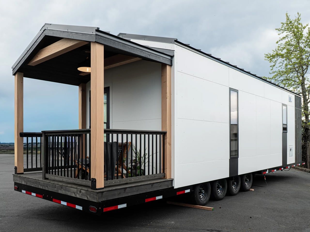
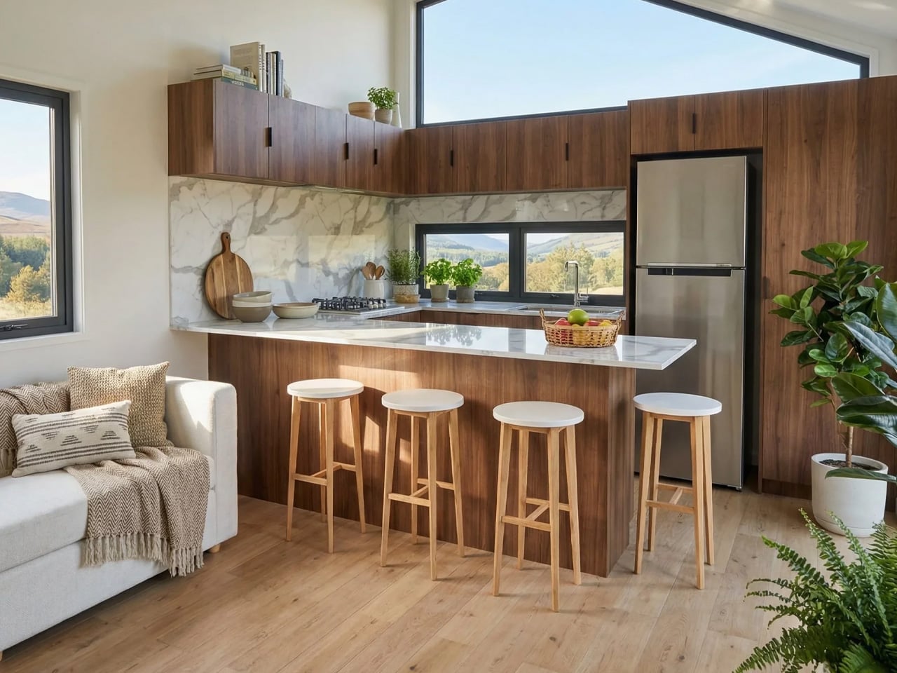
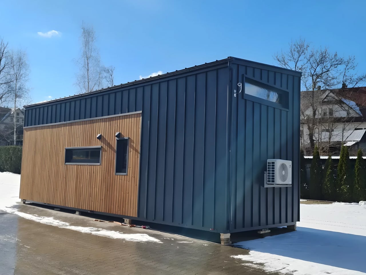
Most tiny houses ask you to make a trade-off. You get the romance of compact living, but sacrifice the one thing that makes a home feel like a home — space. Craft House, a modular builder operating across Poland, Austria, and Ireland, decided to flip that script entirely with the Samuel, a non-towable module house that prioritizes spacious full-time living over the freedom to hitch and go.

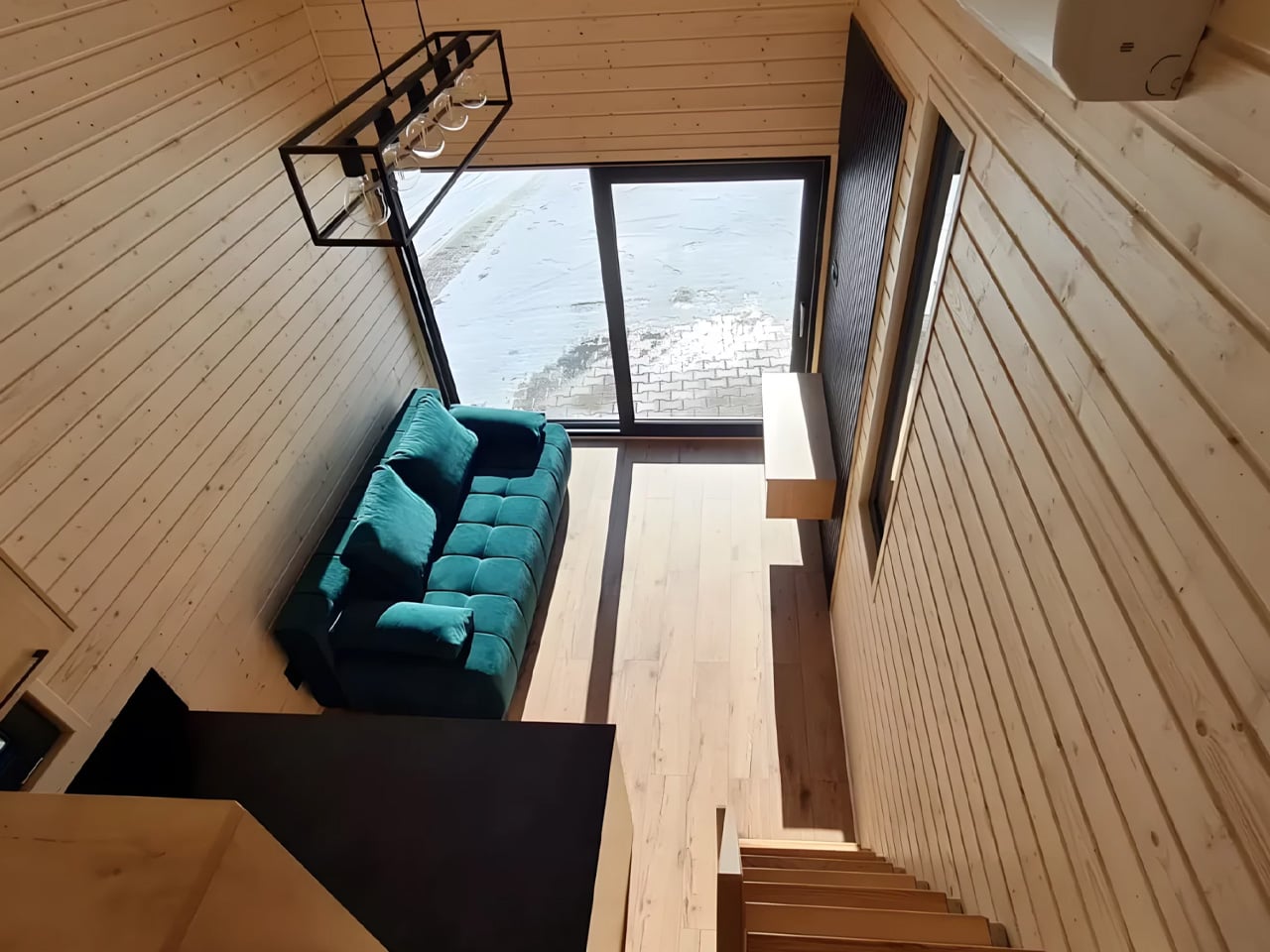
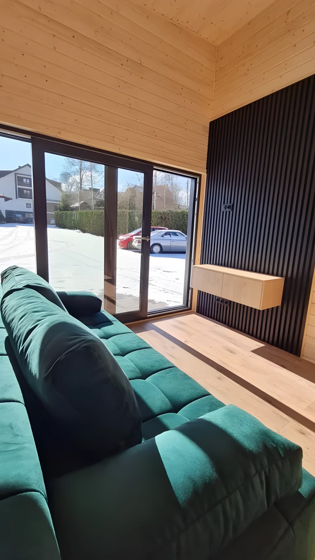
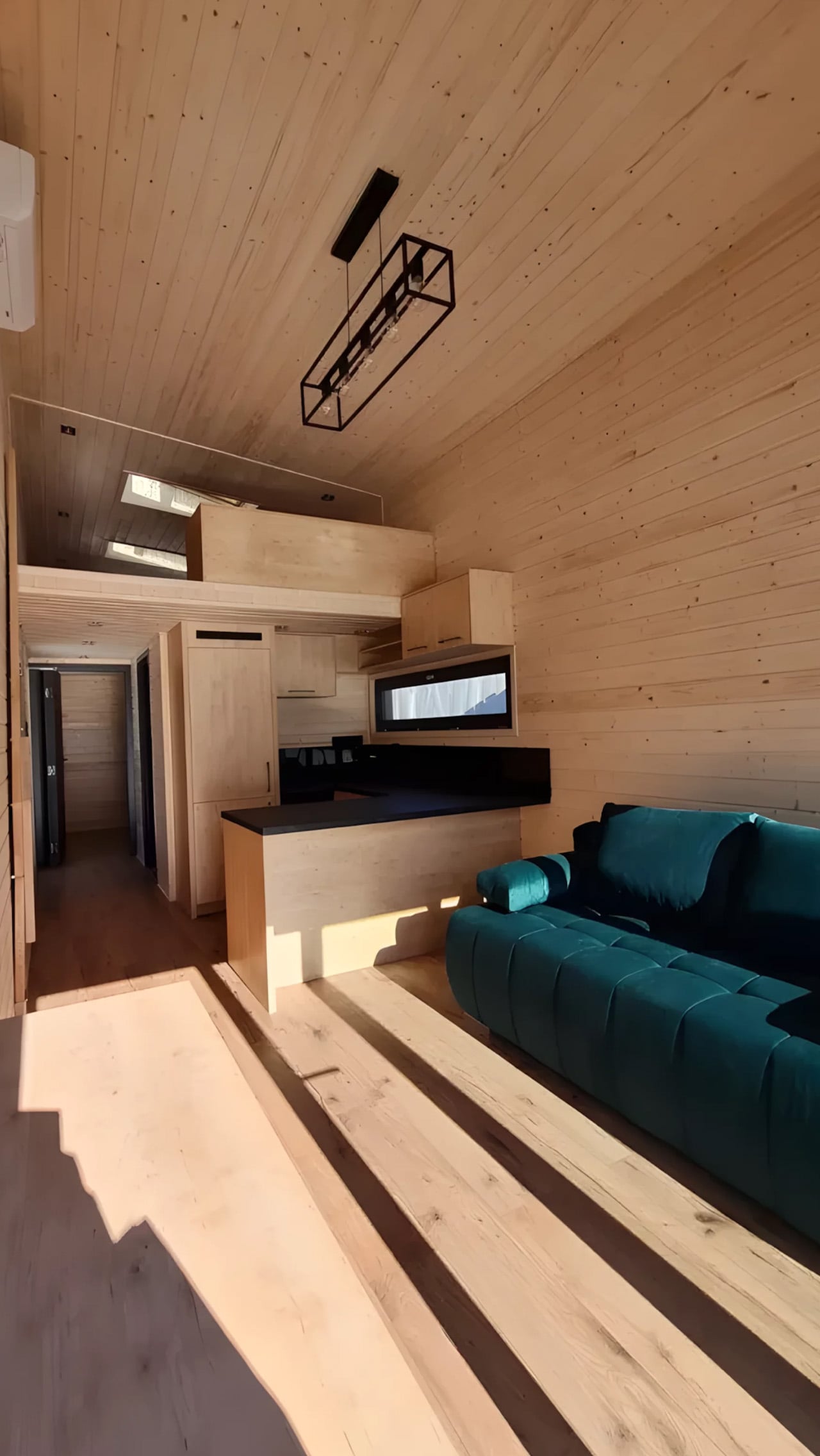
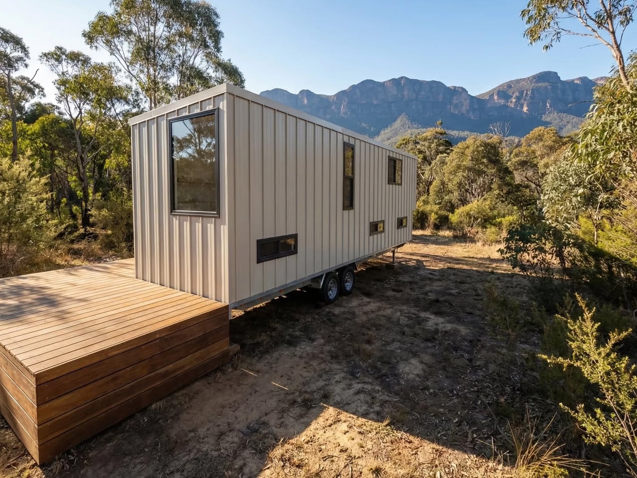
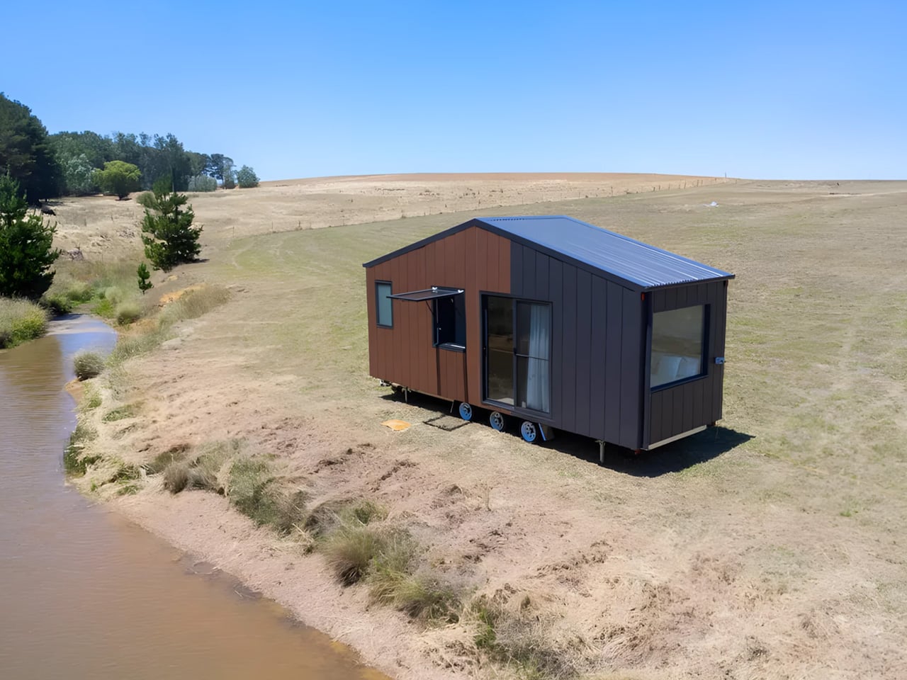
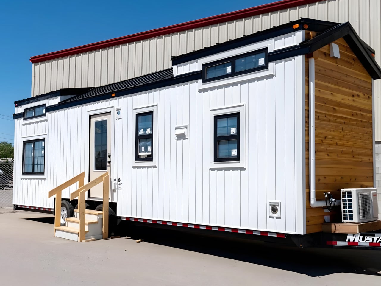
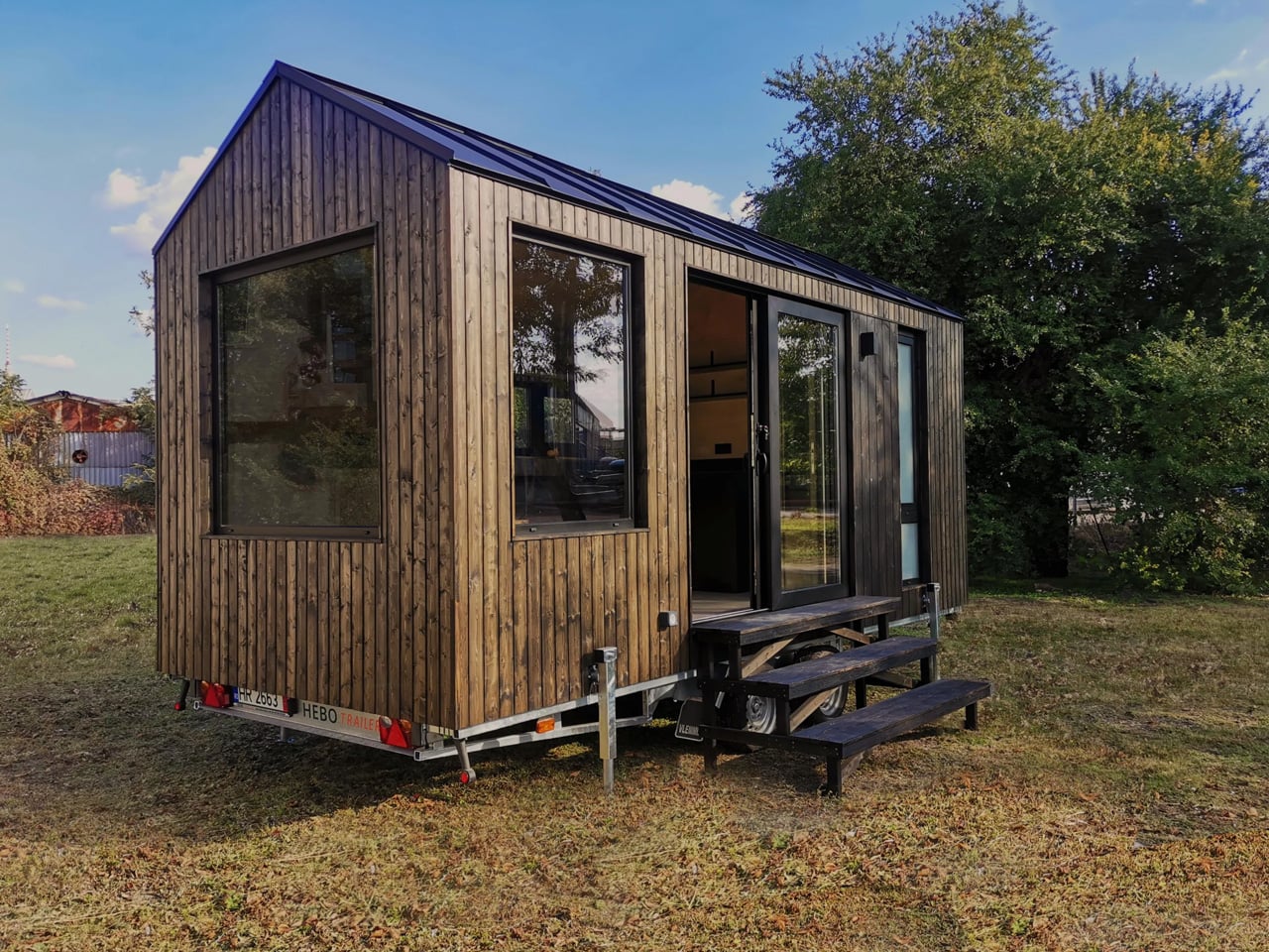
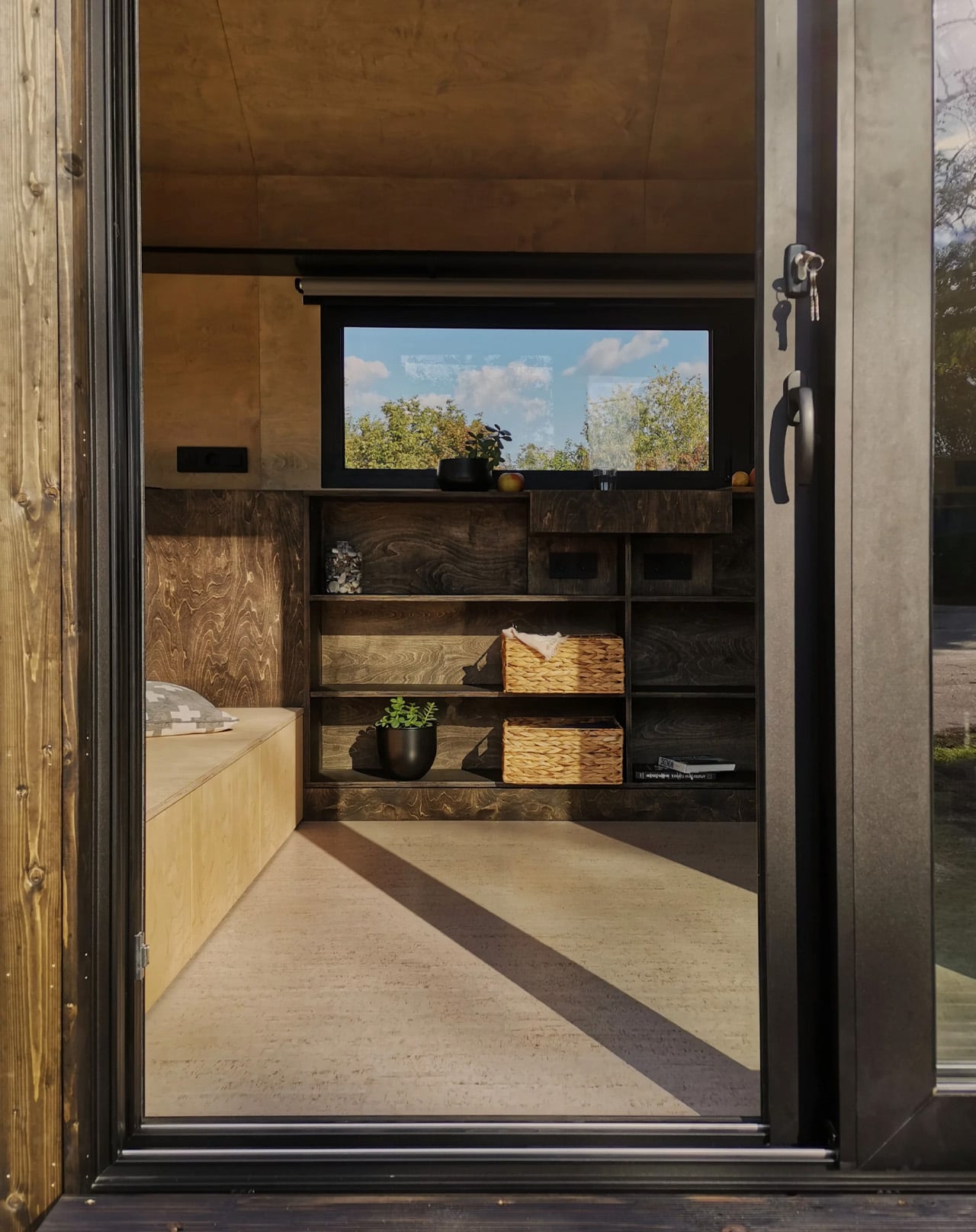
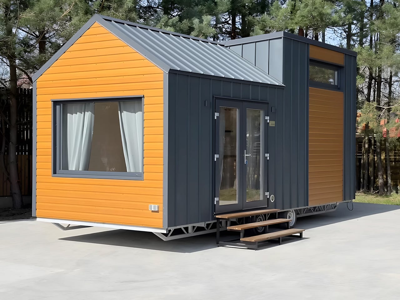
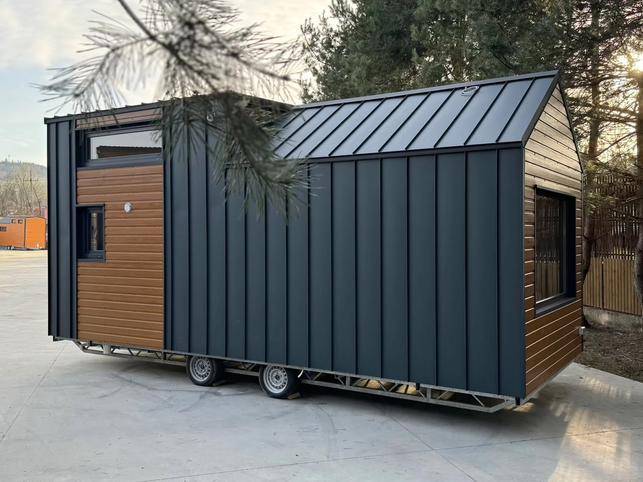
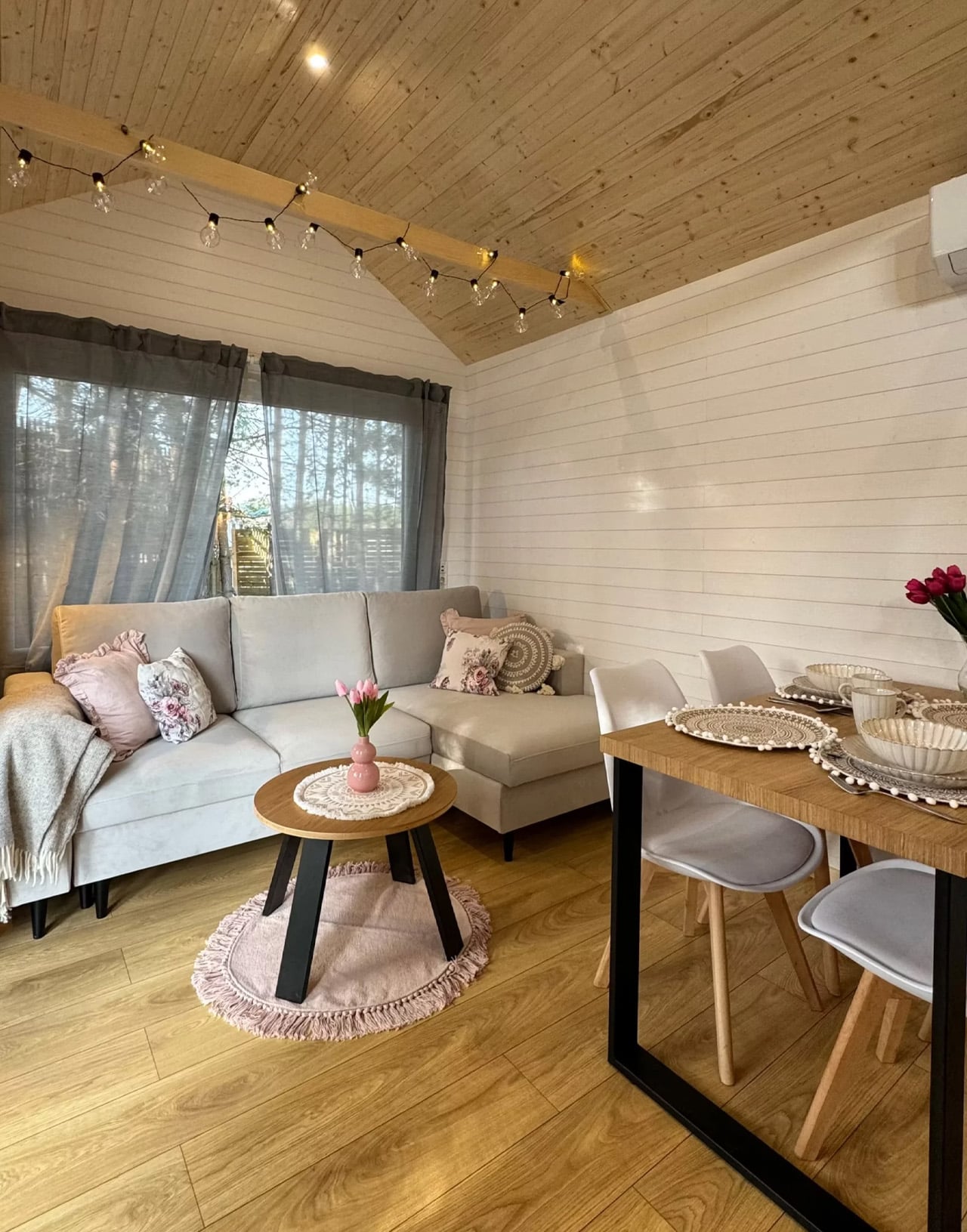
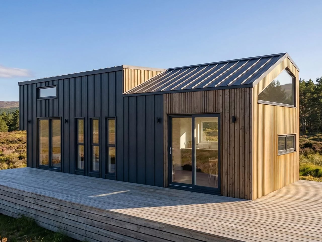
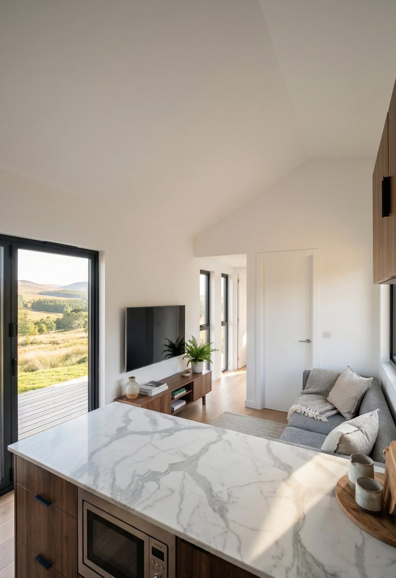
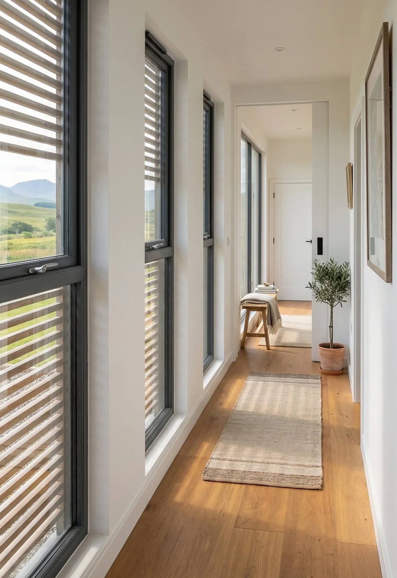
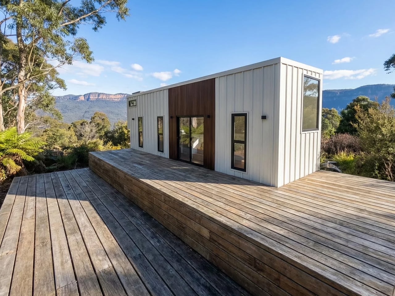
The Samuel sits at 10 meters (32 ft) long and an unusually generous 3.2 meters (10.6 ft) wide, measurements that push well beyond the European tiny home average. That extra width is deliberate. It’s what allows the interior to breathe in a way that most towable models simply can’t, opening up a layout that reads less like a cleverly compressed box and more like a well-considered apartment. The structure wears a single-pitched roof, topping out at 4.1 meters at the ridge, and is finished in engineered wood and metal, a clean pairing that reads industrial without feeling cold.

Designer: Craft House

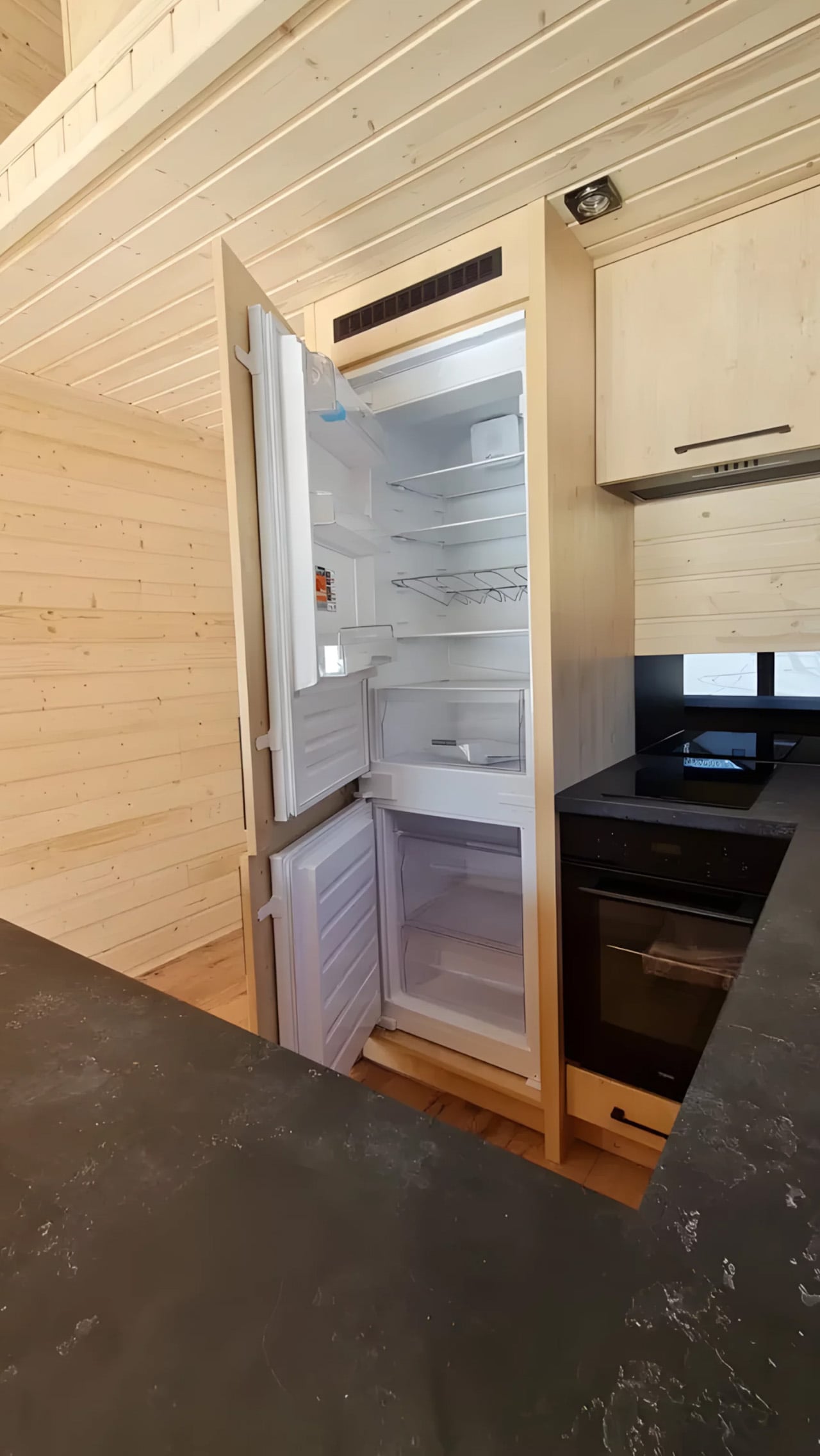
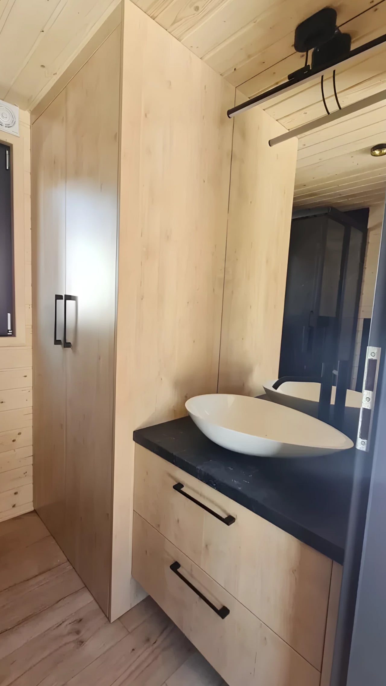
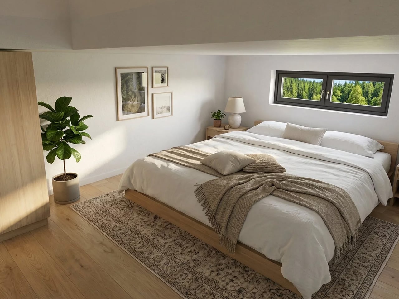
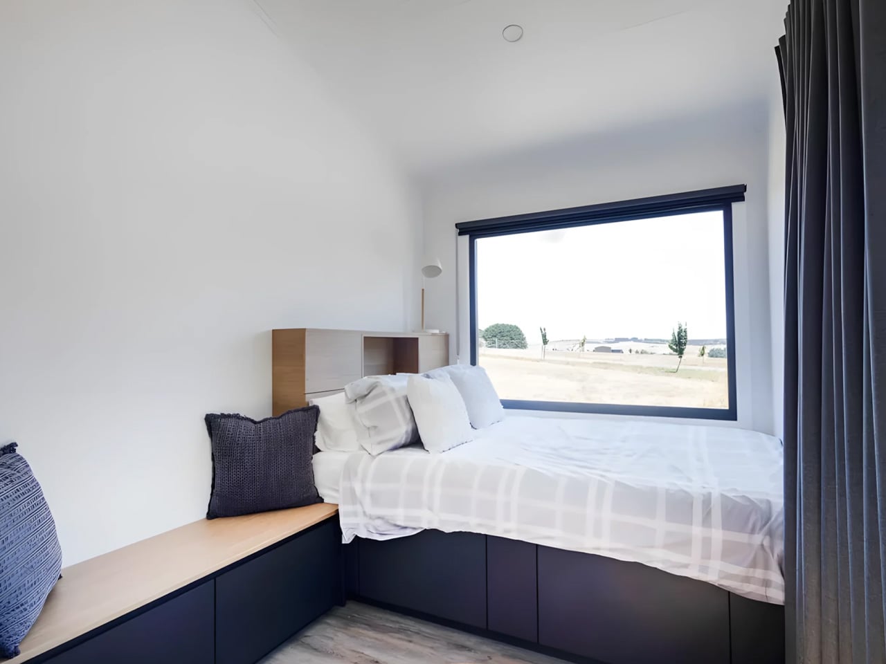
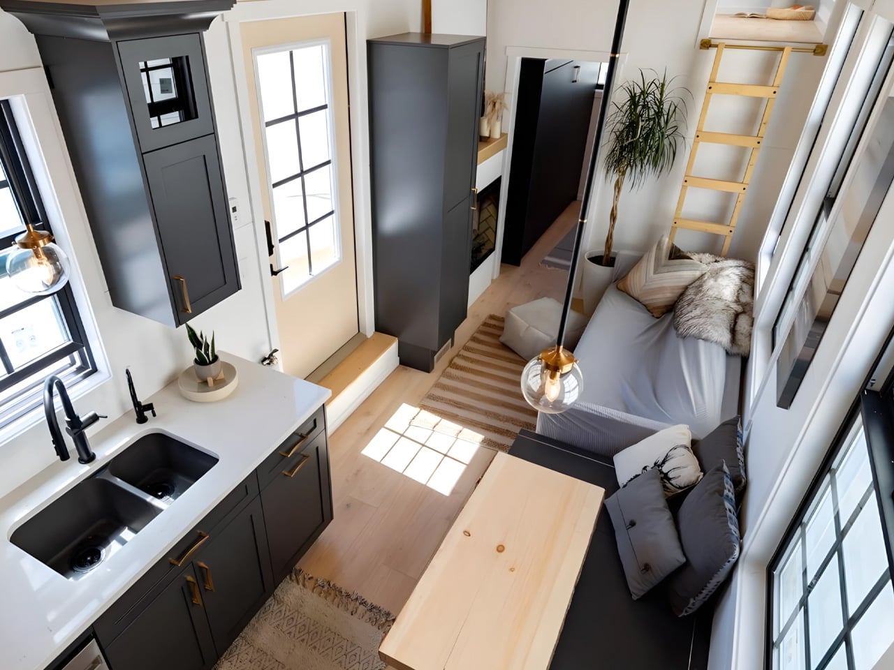
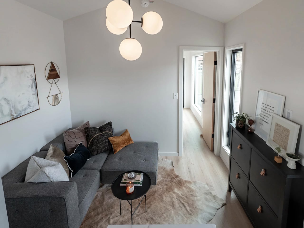
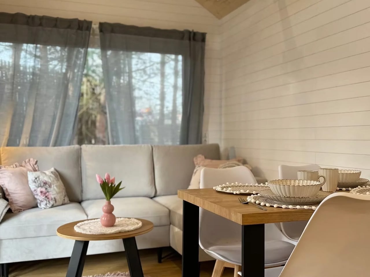
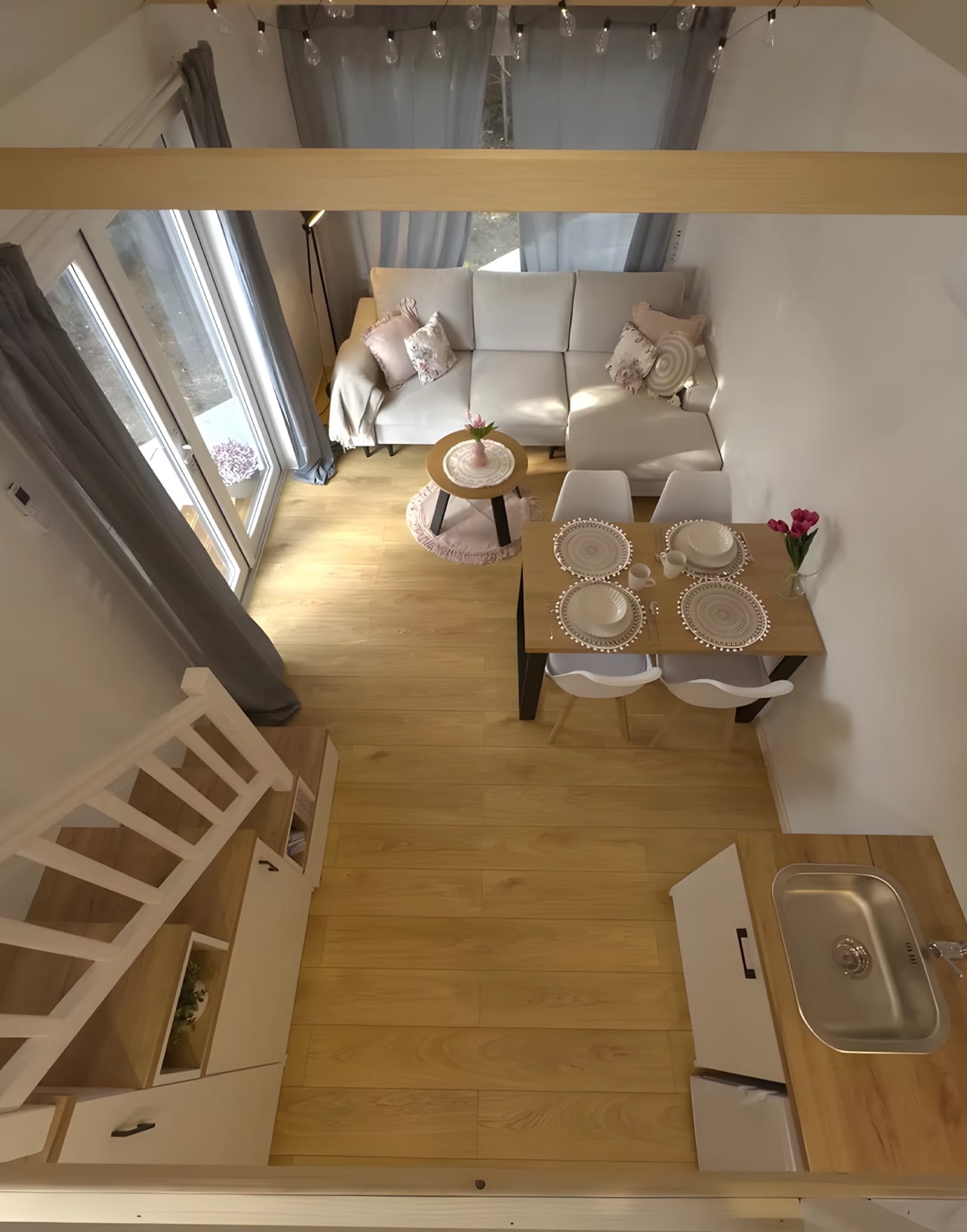
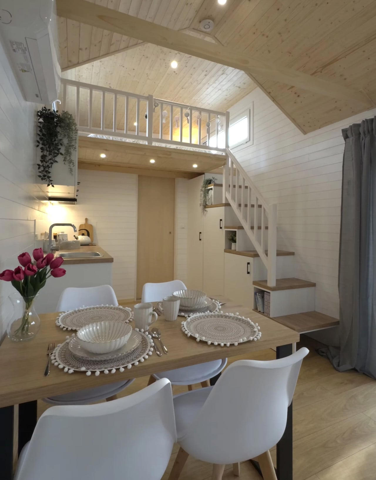
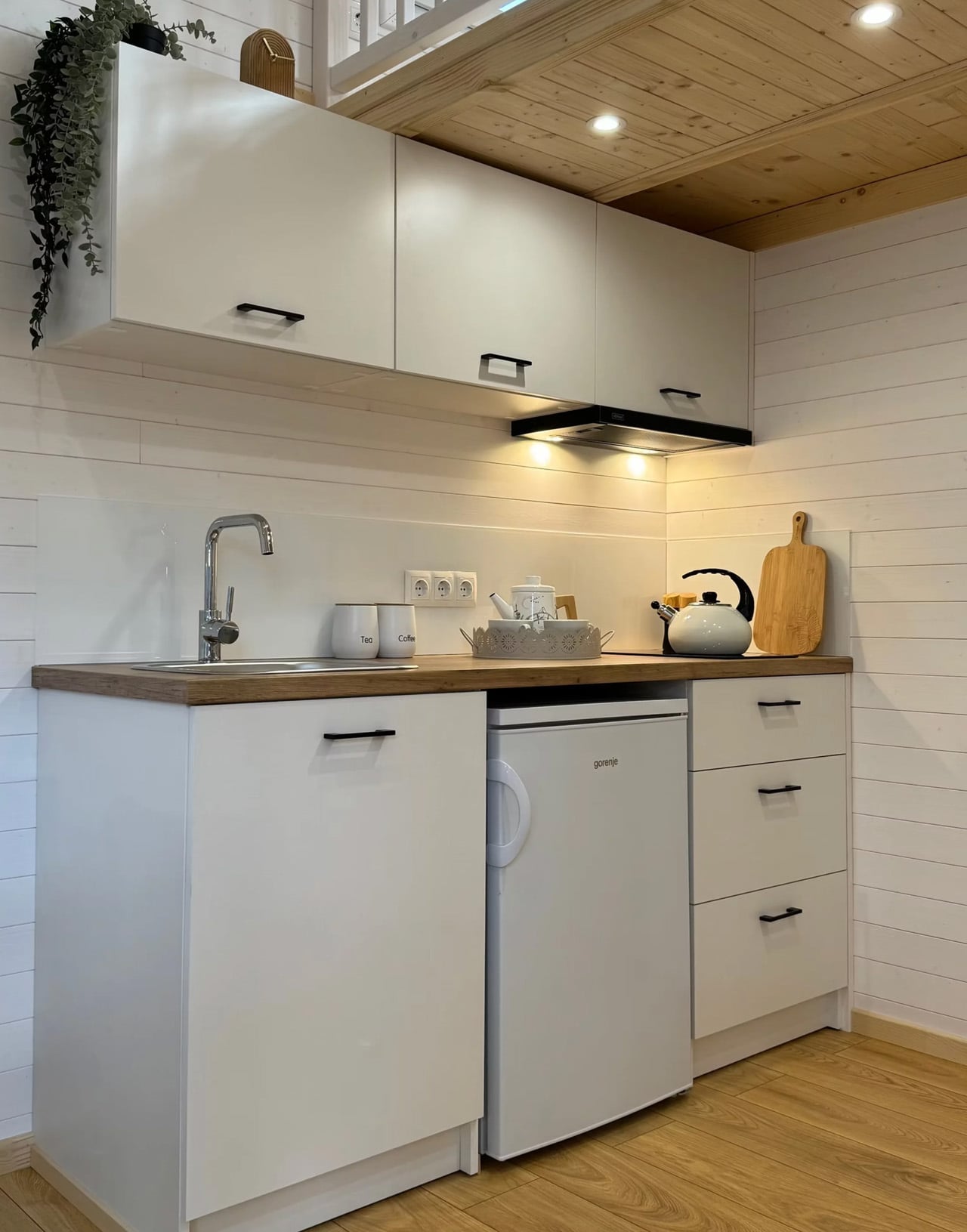
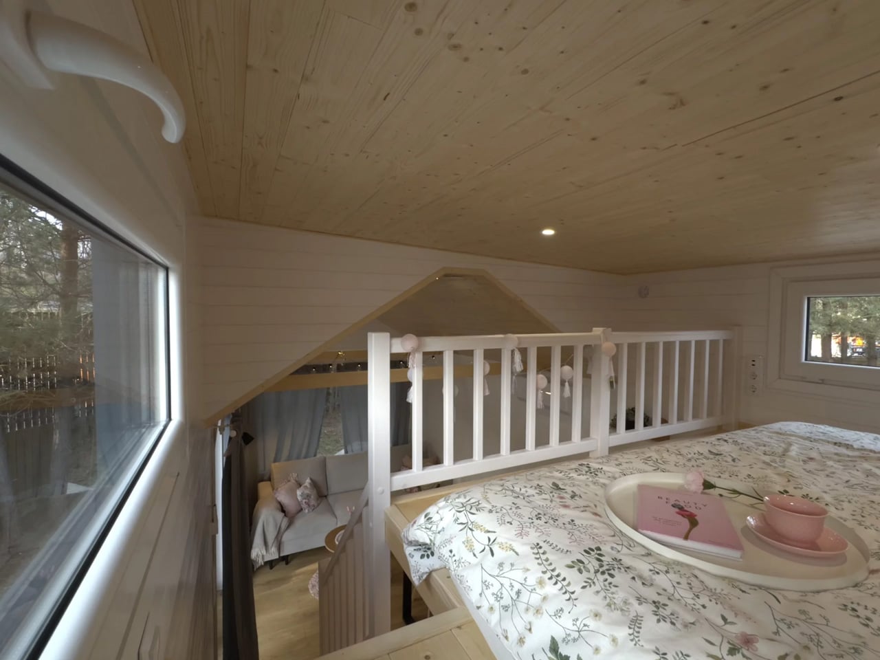
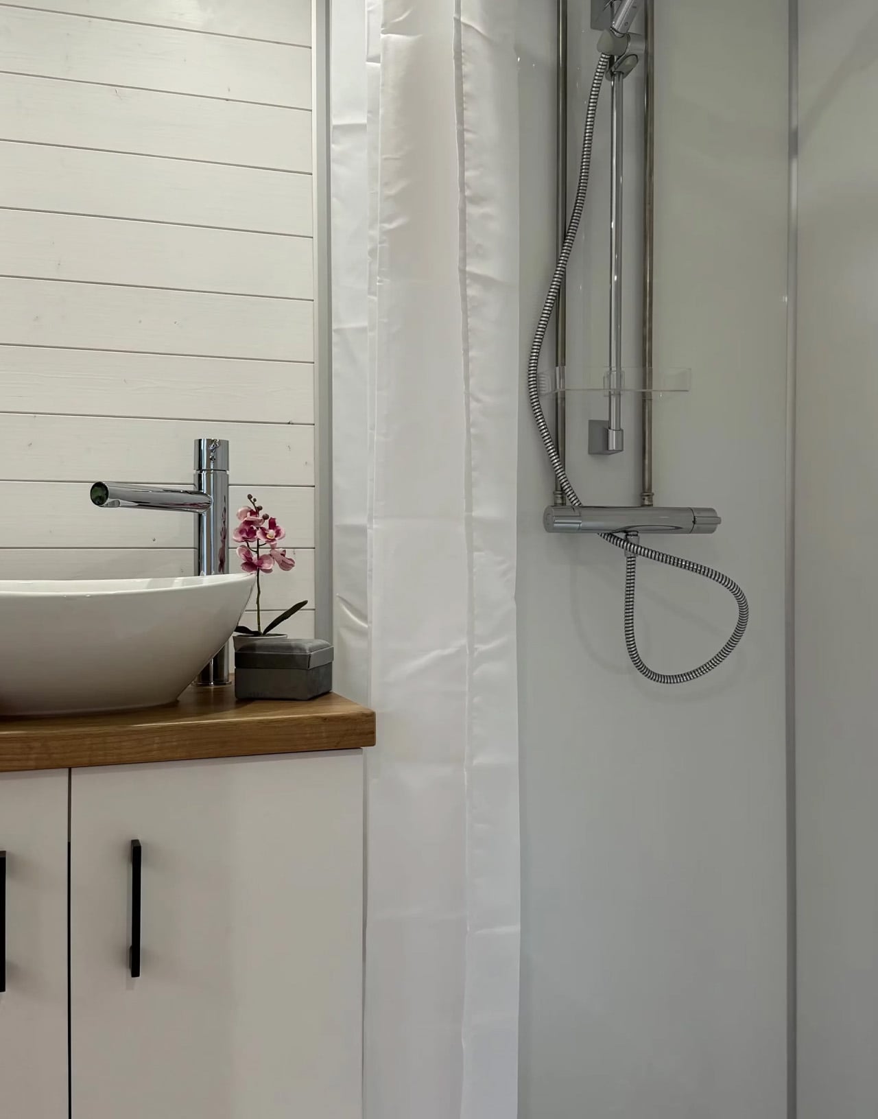
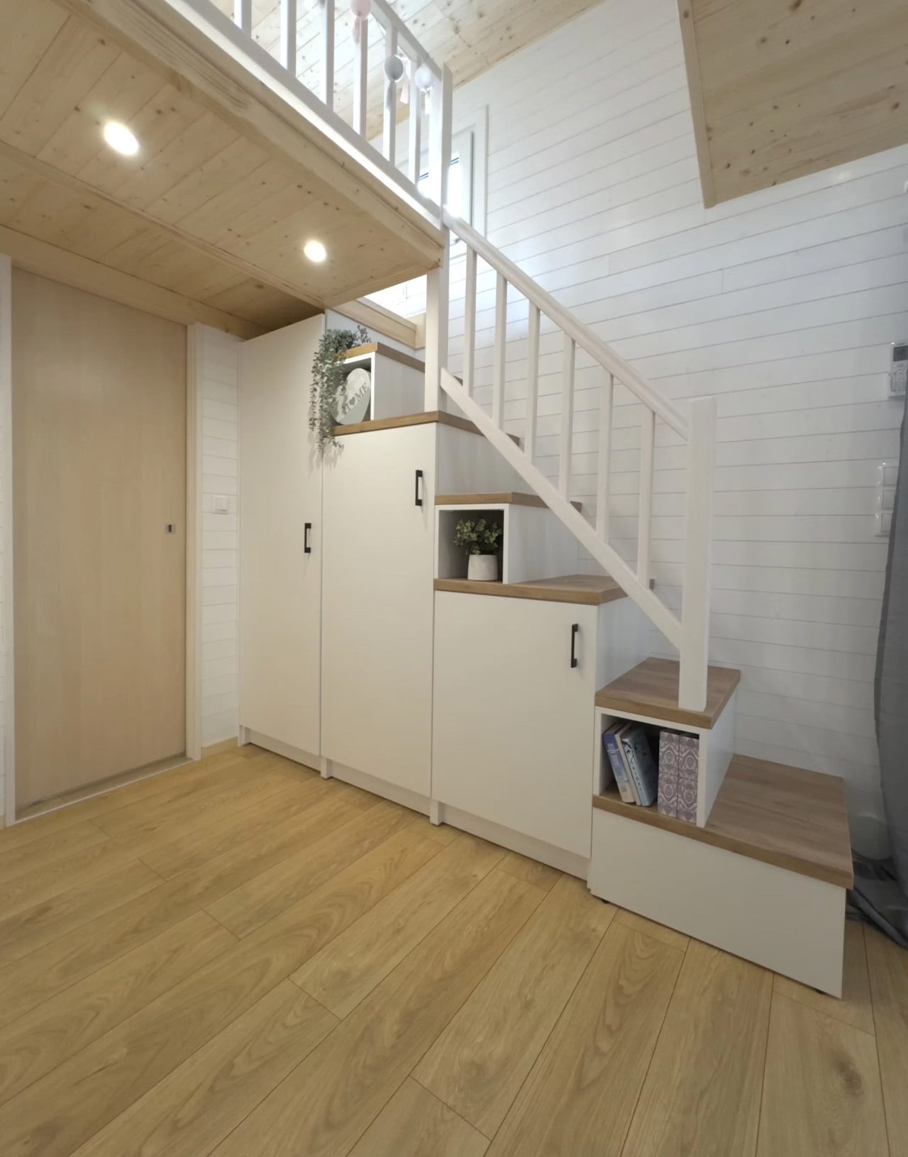
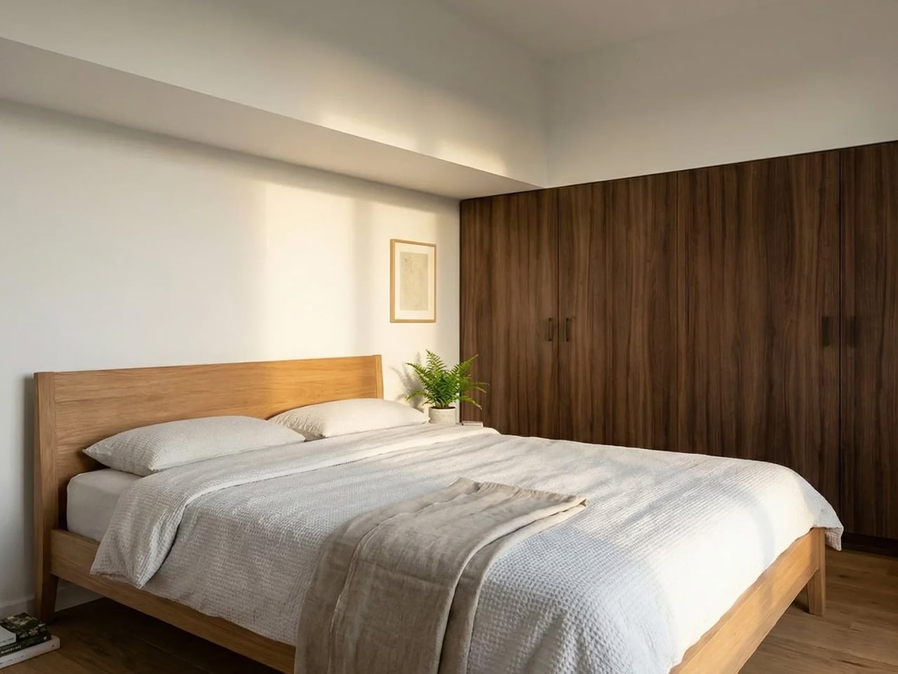
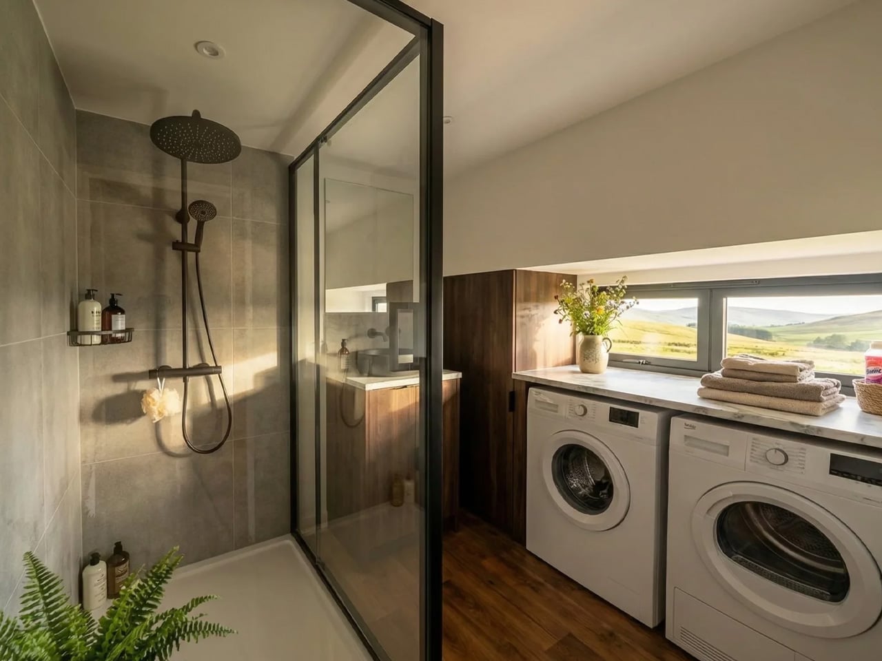
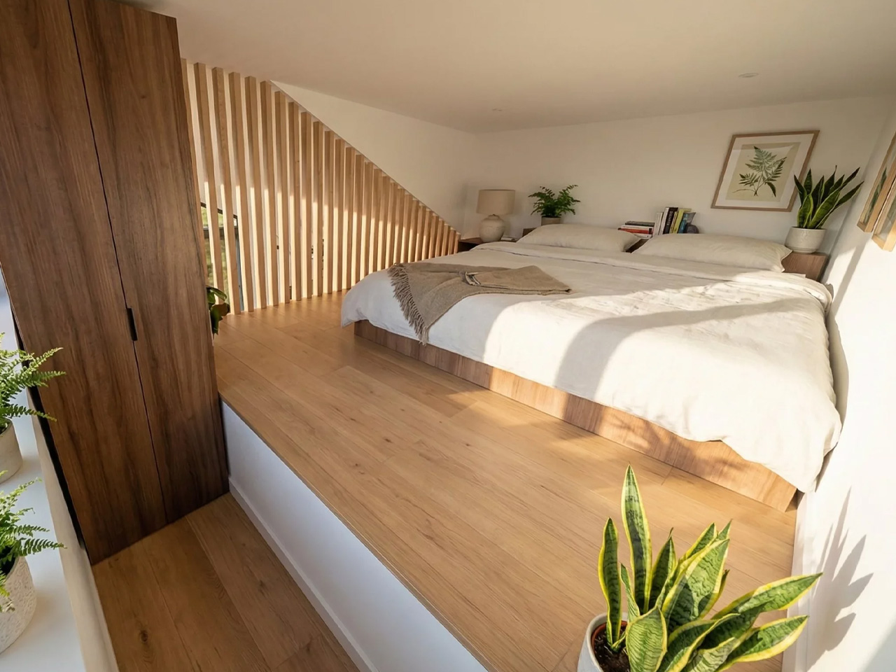
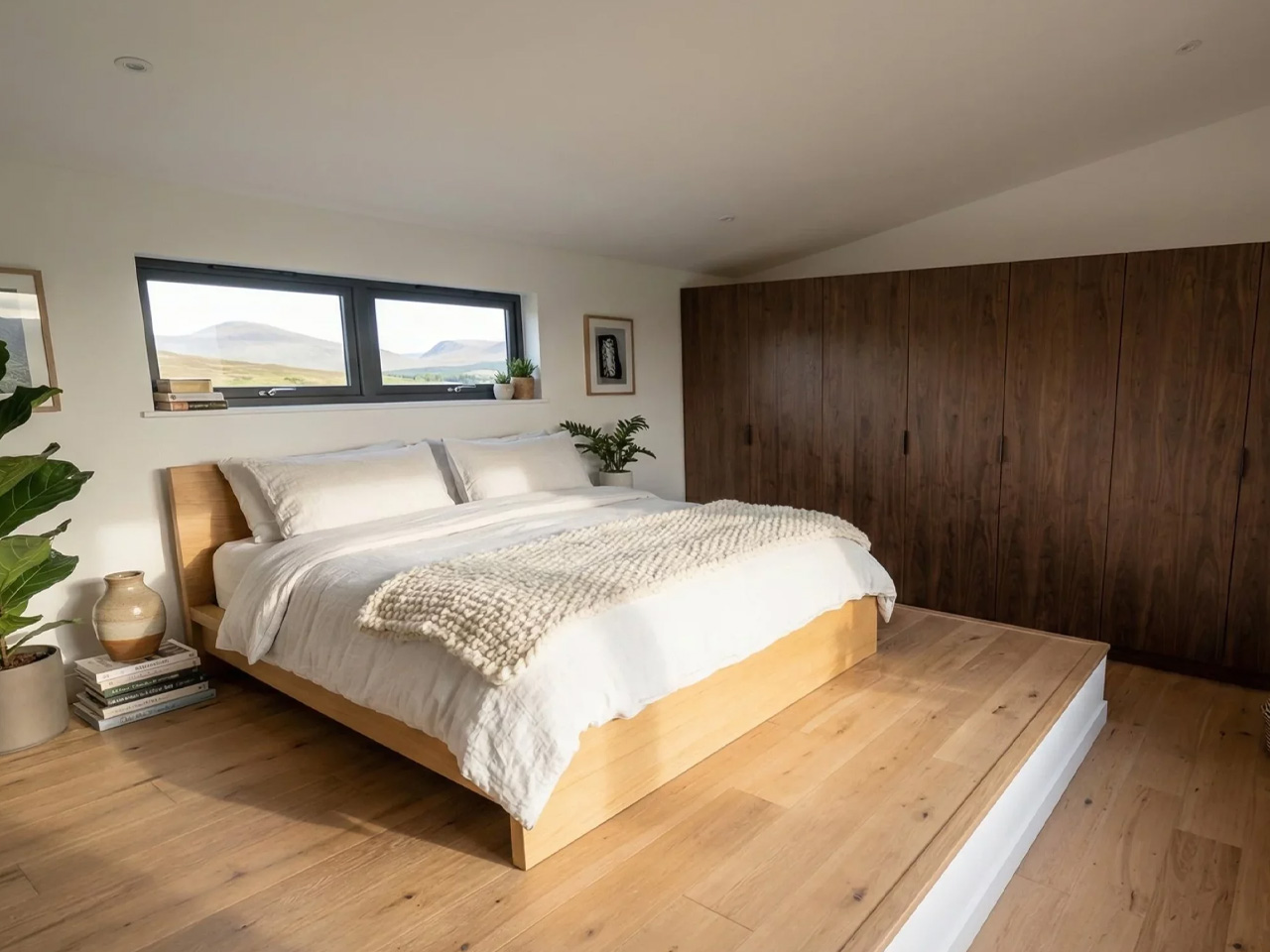
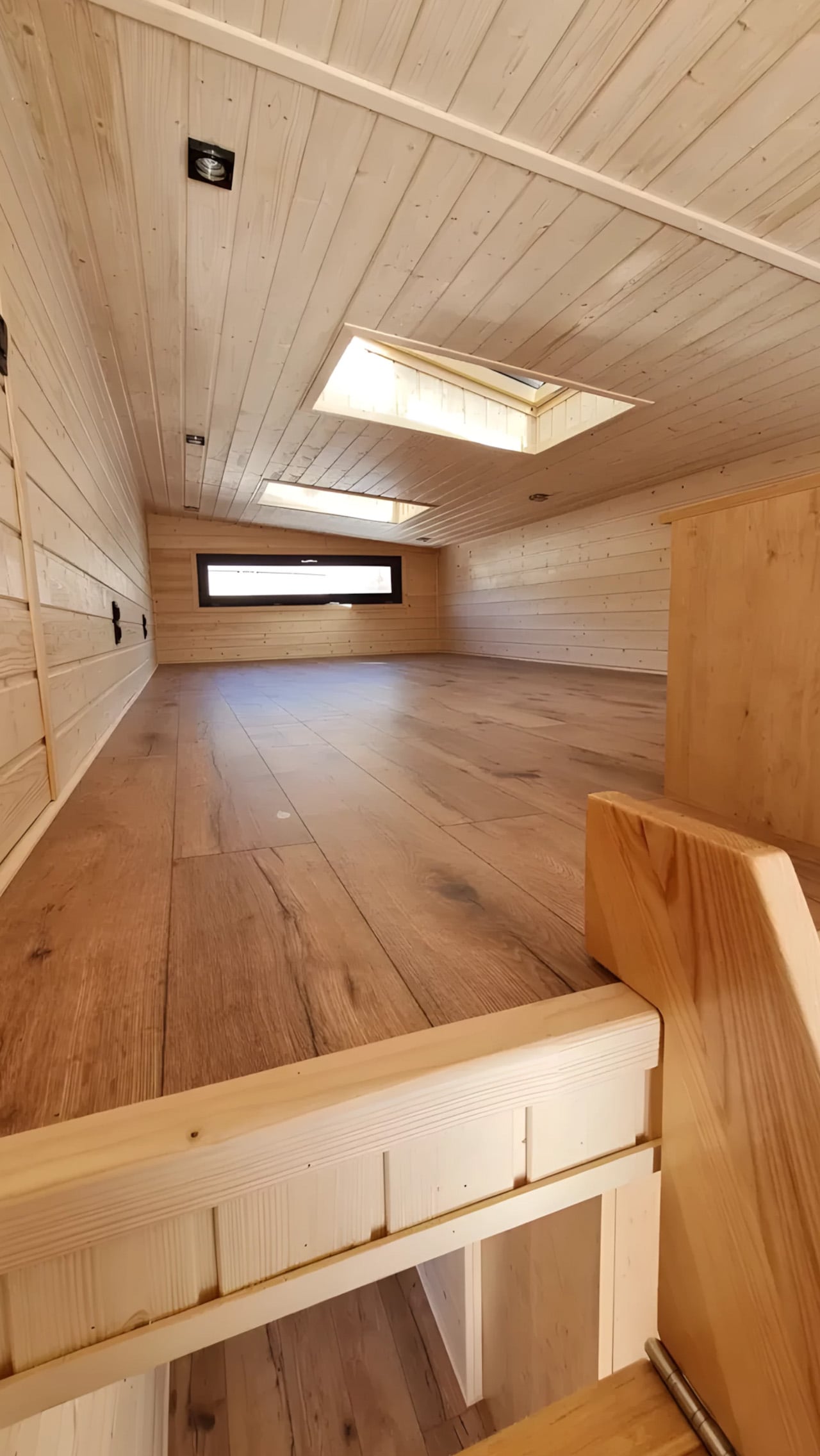
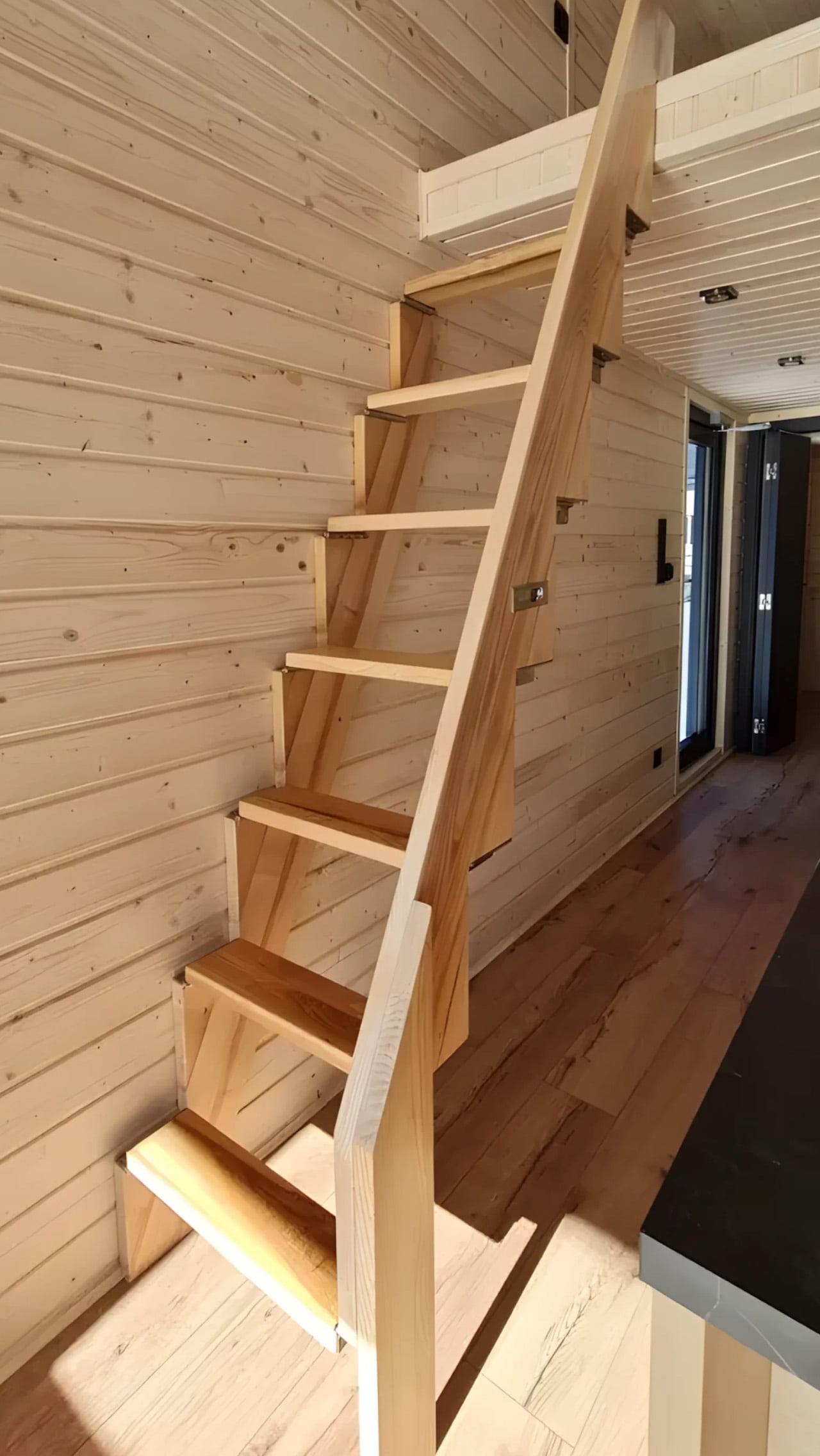
Inside, the ground floor spans 26 square meters, with a 13-square-meter mezzanine sitting above and a 4.3-square-meter bathroom rounding out the floor plan. The layout makes room for two distinct sleeping areas, and the volume created by the sloped ceiling gives the mezzanine level a loft-like quality that larger homes often fail to capture. Optional off-grid upgrades are also on the table, making the Samuel a realistic candidate for plots far beyond urban infrastructure.

What Craft House understood when designing the Samuel is that the tiny home market has two very different buyers. There’s the nomad, always ready to hitch the trailer and head somewhere new. Then there’s the person who simply wants a well-designed, right-sized home that doesn’t carry the financial weight of a conventional build. Samuel is clearly built for the latter. By dropping the wheels and leaning into a fixed footprint, Craft House was able to allocate width and volume in ways that towable structures prohibit by law and logistics.

Priced at around US$72,000, the Samuel lands in a range that makes it a genuinely viable alternative to traditional housing in several European markets. It isn’t trying to be everything. You won’t be parking it in a new location every season. What it offers instead is something arguably more valuable: a permanent, considered space that proves small doesn’t have to mean cramped, and that the best tiny homes aren’t always the ones with the biggest adventures, but the ones that make staying put feel worth it.

The post This Stationary Tiny Home Has More Room Than Most City Apartments first appeared on Yanko Design.

5 Best Tiny Homes of May 2026 Prove Tiny House Design Stopped Being Cute — It Became a Category

Tiny homes had a moment. Then they had another. Then, somewhere between the Instagram hashtags and the weekend specials, they quietly became something more serious. The designs releasing in 2026 aren’t pitching a lifestyle fantasy — they’re solving real problems: family space, year-round comfort, material quality, and genuine mobility. The builders showing up this year aren’t compensating for square footage. They’re rethinking what square footage is even supposed to accomplish.

What’s changed is the thinking behind the build. Reverse floor plans. Apartment-scale dimensions on trailer frames. Japanese material sensibility packed into a 130-square-foot shell. Choices that match what you’d find in a well-funded apartment remodel, not a budget cabin kit. These five tiny homes, all surfacing this spring, represent what the category looks like when builders stop apologizing for the format and start designing with full conviction.

1. Onda

The Tiny Home That Put Bedrooms on the Bottom and Changed the Entire Conversation

The Onda doesn’t tweak the tiny home formula — it inverts it entirely. Australian builder Removed Tiny Homes placed all three bedrooms on the ground floor and pushed the kitchen, living room, and bathroom to the elevated upper level, a reverse loft plan that nobody had executed quite like this before. Built on a double-axle trailer and finished in steel with warm wooden accents, it measures 10 meters long, 3.4 meters wide, and 4.5 meters tall, pushing it firmly into apartment territory.

What the upside-down layout gives you is privacy on your own terms. Bedrooms stay quiet, dark, and grounded — actual breathing room away from the communal noise above. A full-height hallway with 200cm of standing clearance connects each room below, so moving through the home never feels cramped. An optional deck spills the upper-level living space into the open air. For a family that wants to downsize without shrinking their sense of home, this is the most coherent answer currently on the market.

What We Like

  • The reverse loft layout is genuinely original — private spaces below, communal life above — and the spatial logic holds up completely once you see it in practice
  • At 70 square meters across a double-axle trailer, the scale rivals a proper apartment without surrendering mobility or road-legal status

What We Dislike

  • The 4.5-meter height may face clearance restrictions in some regions, limiting where the Onda can realistically be parked or towed permanently

2. Audrey

The Single-Level Build That Makes Efficient Living Look Effortless

There’s a certain confidence in keeping things flat. CozyCo’s Audrey is a single-level build, 7.2 meters long and mounted on a triple-axle trailer, and its restraint is exactly what makes it work. The exterior pairs corrugated aluminium with timber-look panels — a combination that slots into a bush property, a coastal block, or a suburban backyard without missing a beat — while a neatly tucked propane storage box keeps the silhouette clean. It looks like a home that knows precisely what it wants to be.

Inside, the open studio layout does what smart single-level design does best: it makes the space feel larger by refusing to fight itself. Sliding glass doors bring in light and dissolve the boundary between inside and out. R2.5 insulation, double-glazed windows, gas, hot water, and air conditioning mean you can live in the Audrey year-round without a second thought. A storage bed removes the need for bulky furniture. Whether you’re running it as a guest suite, a short-stay rental, or a granny flat, it earns its position effortlessly.

What We Like

  • The combined thermal package — R2.5 insulation, double-glazed windows, and full air conditioning — makes it genuinely livable across every season without requiring expensive upgrades after purchase
  • Single-level circulation eliminates the ladder-and-loft compromise that makes most tiny homes feel like clever camping rather than actual living

What We Dislike

  • Sleeping comfortably up to two people limits the Audrey’s appeal — it isn’t a family home and doesn’t pretend to be, but that’s a real ceiling on its long-term versatility
  • At 7.2 meters, the footprint sits on the smaller end, even for a tiny house, meaning storage and layout flexibility have a defined and non-negotiable limit

3. Harmony

The Family Tiny Home That Proves Four People Don’t Need Four Thousand Square Feet

The Harmony was originally commissioned by a family of four in Southern Alberta who were done with the time and financial weight of conventional living. What emerged from that brief is one of the most thoughtfully designed family tiny homes on the market right now. Built by Alberta-based Teacup Tiny Homes on a triple-axle trailer and clad in metal and wood, it measures 34 feet long and 8.5 feet wide — road-legal across North America, towable without a special permit — with 423 square feet of considered interior space.

That floor plan matters because it holds the things families actually use. A sofa, a fireplace, and a dedicated TV wall mean family evenings don’t have to be compressed into a bench seat. What the Harmony gives you specifically is the freedom to move — across provinces, across states — without putting your life into storage. Mobility and stability, sharing the same triple-axle frame. For a family that wants flexibility without surrendering the feeling of a real home, this is one of the most convincing arguments the tiny home world has produced.

What We Like

  • Standard 8.5-foot road-legal width means the Harmony can be towed anywhere across North America without a special permit — genuine mobility, not just the promise of it
  • 423 square feet with a sofa, fireplace, and dedicated TV wall means family life doesn’t get flattened into efficiency mode the moment you walk through the front door

What We Dislike

  • The metal-and-wood cladding combination, while durable and practical, is familiar territory — the Harmony doesn’t push any aesthetic boundaries and looks exactly like you’d expect it to
  • At 34 feet long, site placement requires real planning, and not every property has the physical footprint to accommodate it without trade-offs

4. Shoji

The 130-Square-Foot Home That Makes the Case for Japanese Minimalism on Wheels

At 130 square feet and just 5.5 meters long, the Shoji is a study in not flinching. Completed in November 2022 and sited in Brittany, France, it was designed by Koleliba alongside architect Hristina Hristova as the brand’s S Tiny model. The name points directly to its influence: clean lines, natural materials, and a deep respect for negative space. Vertical timber siding, a metal roof, and expansive sliding glass doors give it an exterior that reads equally well in a forest clearing or an open countryside field.

Inside, the birch plywood interior does what Koleliba does best — furniture becomes a seamless continuation of the architecture. A U-shaped couch converts into a queen-size bed. There’s a dedicated home office desk, essential kitchen appliances, a washing machine, and a roomy shower, all packed into a footprint that defies logic. Electric floor heating and solid winter insulation make it genuinely year-round livable. What the Shoji gives you is proof that living with intention — rather than abundance — isn’t a lesser version of home. It’s a stronger argument for what home can be.

What We Like

  • The furniture-as-architecture approach means nothing feels crammed in or improvised — every element is a deliberate continuation of the interior, not an afterthought placed inside it
  • Electric floor heating and serious winter insulation make this a genuine four-season home, not a warm-weather retreat built for photography

What We Dislike

  • 130 square feet is a real constraint — there’s no graceful way to accommodate guests, and solitude becomes a structural feature of the design, whether you planned for it or not
  • As a completed, commissioned project, the Shoji isn’t a ready-to-buy model — interested buyers would need to engage Koleliba directly, with no standard production line to order from

5. Urban Gable Park

The Park Model That Stopped Making Compromises and Started Making a Statement

The Urban Gable Park is what happens when a builder decides to stop apologizing for comfort. At 30 feet long and 11 feet wide — significantly beyond the standard 8.5-foot width that most trailer-based homes are constrained to — it’s a single-level park model that gives rooms actual space to breathe. The bedroom has real headroom. The living area fits a proper sofa. That extra width isn’t just a number on a spec sheet; it fundamentally restructures how the interior feels and how you move through it on an ordinary Tuesday.

The material choices confirm the intent. The kitchen comes fitted with maple slab cabinets, an induction cooktop, a full-size fridge, and a dishwasher, all set within a striking limewash alcove. In the bathroom: a concrete vessel sink, terrazzo tile floors, matte black fixtures, a walk-in shower, and a stacked washer/dryer. These aren’t budget finishes dressed up to photograph well — they’re material decisions made by people who know exactly what they’re doing. The Urban Gable Park gives you apartment-grade quality in a format that doesn’t ask you to keep justifying the choice to everyone you meet.

What We Like

  • The 11-foot width fundamentally changes how the interior reads — rooms have breathing room, and daily living stops being an exercise in constant spatial problem-solving
  • Kitchen and bathroom material quality — limewash alcoves, terrazzo tile, maple slab cabinets — matches what you’d find in a thoughtful urban apartment remodel, not a prefab compromise

What We Dislike

  • The 11-foot width requires a road permit for towing on public roads, which meaningfully limits relocation flexibility compared to any standard road-legal tiny home
  • Built as a park model designed to stay in place, the Urban Gable Park won’t suit buyers expecting the full mobility and spontaneity of a traditional tiny home on wheels

The Cute Phase Is Over — What Replaced It Is Far Harder to Dismiss

What these five homes share isn’t a size or a price point — it’s a standard. None of them asks you to romanticize the limitations of small living. They ask whether those limitations are even real. The Onda inverts the entire floor plan. The Shoji strips everything down to what actually matters. The Urban Gable Park adds width and lets the rooms speak for themselves. Each one represents a distinct position on the same argument: that less space is not, by definition, a lesser life.

The category has grown up. The builders who matter right now aren’t chasing aesthetics for a mood board feature — they’re engineering real precision into formats that serve families, couples, remote workers, and anyone tired of paying for rooms they never enter. If May 2026 is a signal of where tiny home design is heading, the message reads clearly: the cute phase is over. What’s replaced it is something far more interesting, and far harder to dismiss.

The post 5 Best Tiny Homes of May 2026 Prove Tiny House Design Stopped Being Cute — It Became a Category first appeared on Yanko Design.

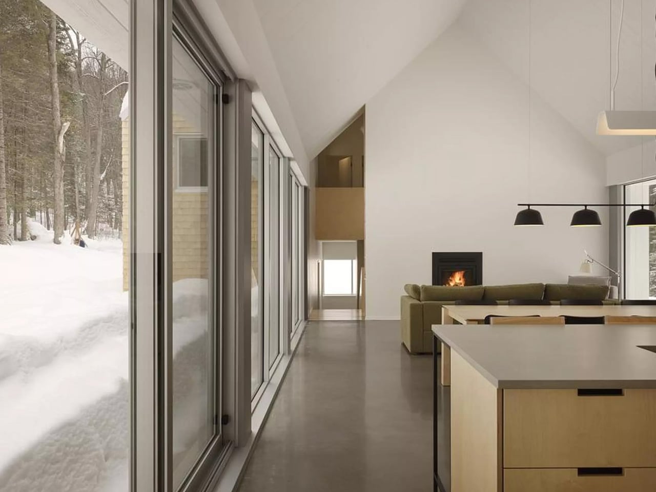
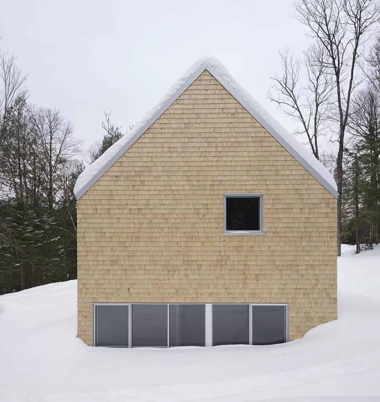
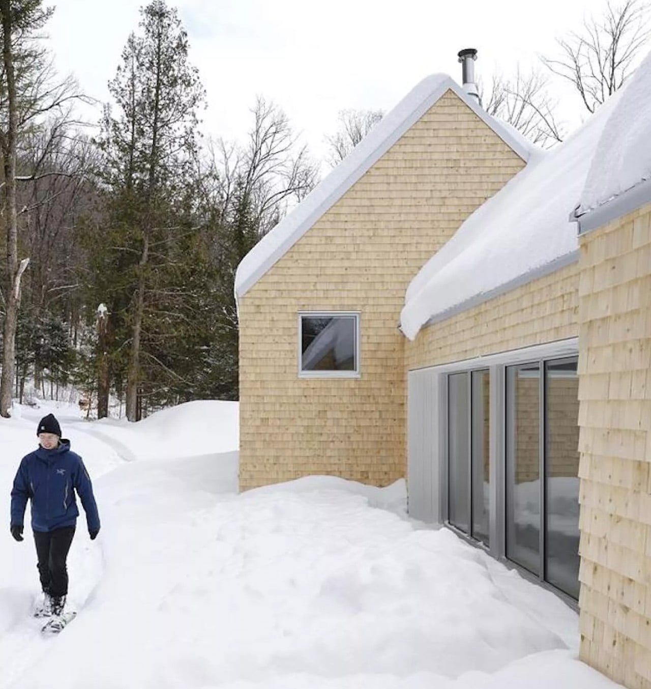
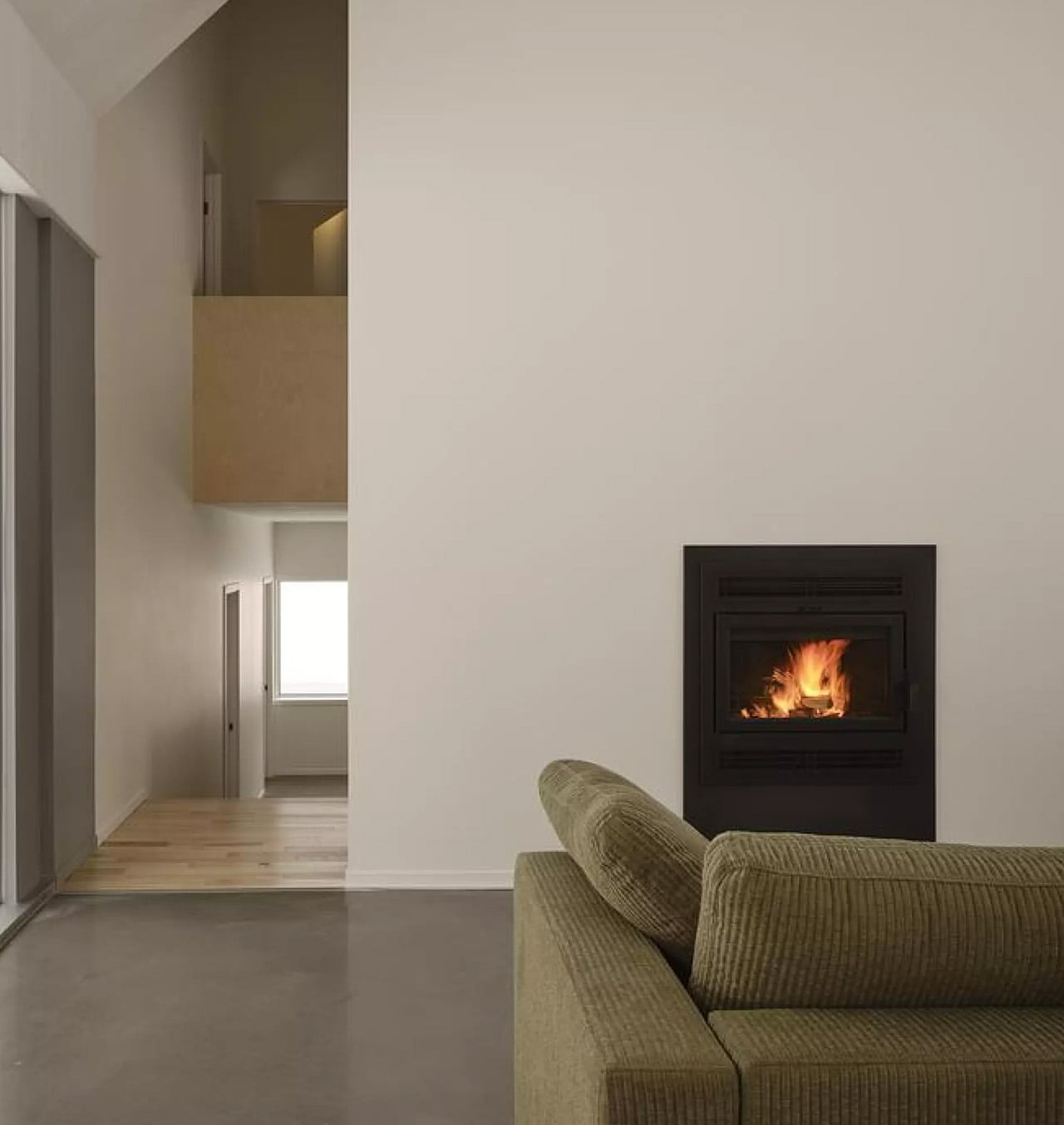
This Quebec Home Doesn’t Fight the Forest – It Disappears Into It

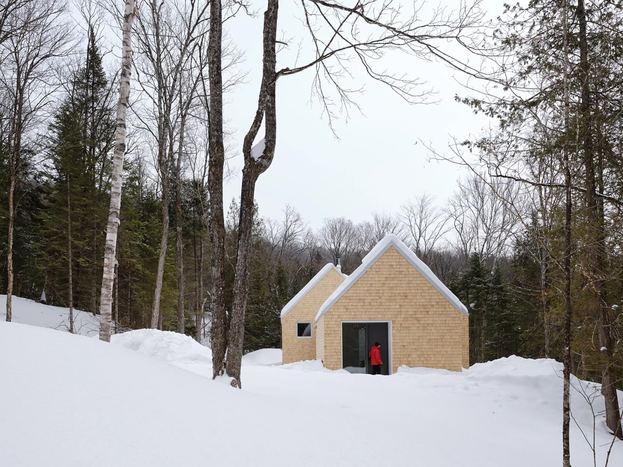
Certain kinds of architecture don’t announce themselves. La Maraude, the latest project by Nathalie Thibodeau Architecte, is exactly that — a compact residential dwelling tucked into the dense woodlands of Boileau, in Quebec’s Outaouais region, that earns its presence through restraint rather than spectacle. Completed in 2024, it’s one of the more quietly compelling houses to come out of Canada in recent memory.

The name itself carries meaning. ‘Maraude’ — to roam, to forage — hints at the relationship the house cultivates with its surroundings. Rather than claiming a dominant position along the river’s edge, the architects deliberately set the home deeper within the treeline, orienting the house’s interior life entirely toward the forest. It’s a gesture that shapes everything else about the project.

Designer: Nathalie Thibodeau Architects

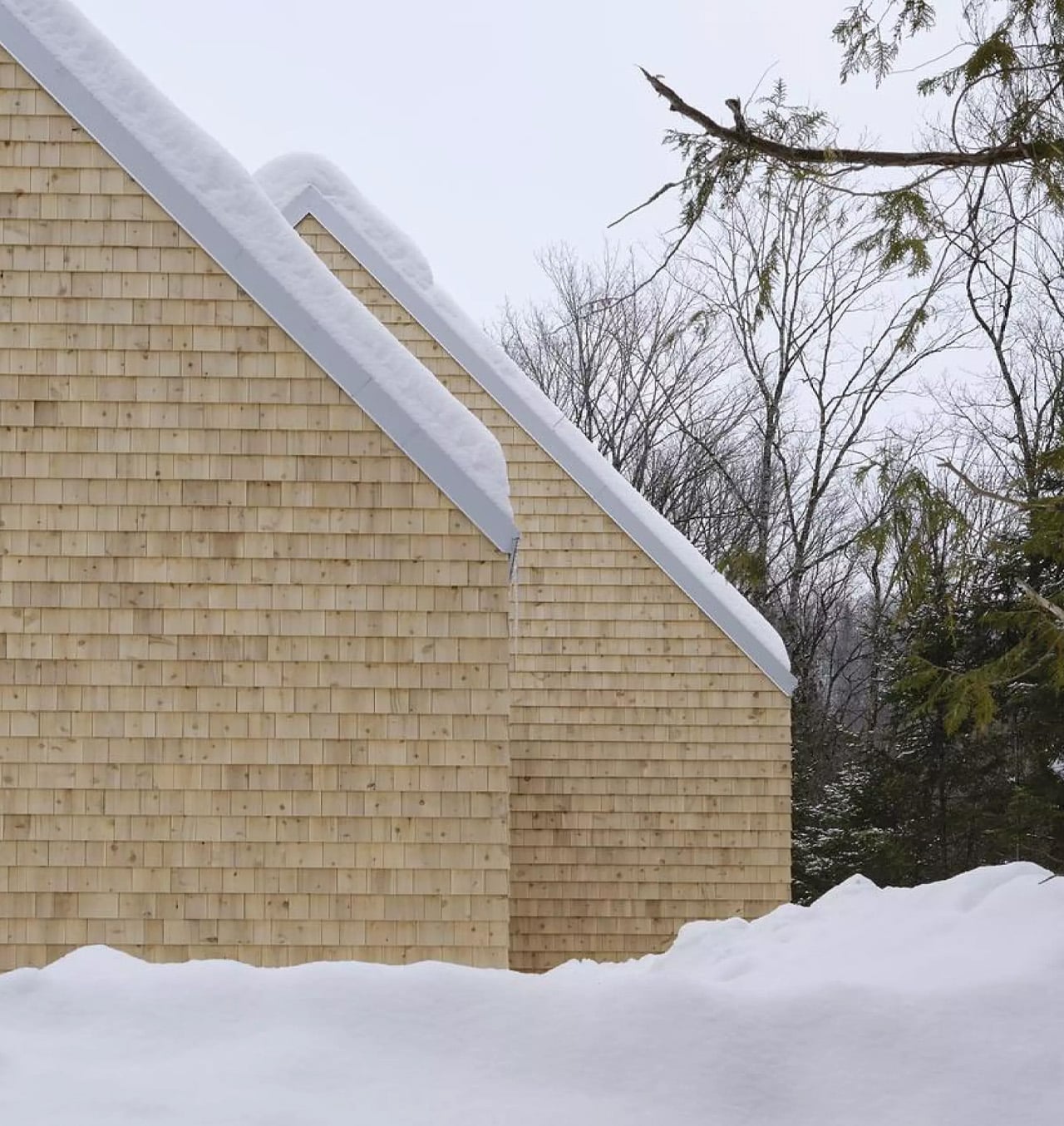
The design draws directly from Quebec’s vernacular architectural tradition — steeply pitched rooflines, grounded proportions, and a material palette that feels native to the region. The exterior is clad in natural cedar shingles and topped with a metal roof, two materials with deep roots in the local building culture. These aren’t nostalgic choices. They’re translated through a contemporary lens, stripped of ornament, reduced to their essential geometry. “Designed with particular attention to simplicity, functionality, and respect for traditional codes, La Maraude embodies a successful dialogue between contemporary architecture and local traditions,” says Nathalie Thibodeau Architecte.

What makes the spatial sequence genuinely interesting is the use of two courtyards as organizing devices. The plan doesn’t simply open to the outdoors — it pulls the forest in, fragmenting the landscape into a series of framed views that shift with the seasons. One courtyard faces north, more sheltered and partly enclosed by the building itself, oriented toward higher ground. The other faces south, brighter and more expansive, drawing the eye down toward the lower terrain. The result is a house that reads differently in every light condition, every month of the year.

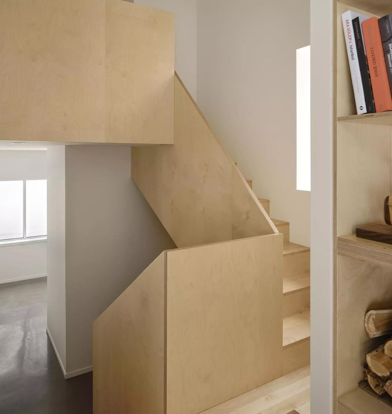
The second volume, arranged over two levels in response to the site’s slope, plays a more introverted role. Openings here are smaller and precisely placed to frame specific moments within the tree canopy — quiet apertures rather than panoramic statements.

Photographed by Maxime Brouillet, La Maraude has the look of a project that will age well, both materially and culturally. It’s already being discussed as a potential anchor for a broader ensemble of small retreats on the site — a first building in what could become a considered, evolving conversation between architecture and landscape.

The post This Quebec Home Doesn’t Fight the Forest – It Disappears Into It first appeared on Yanko Design.

Inside the Log-and-Glass Home Olson Kundig Built for a Builder on Salt Spring Island

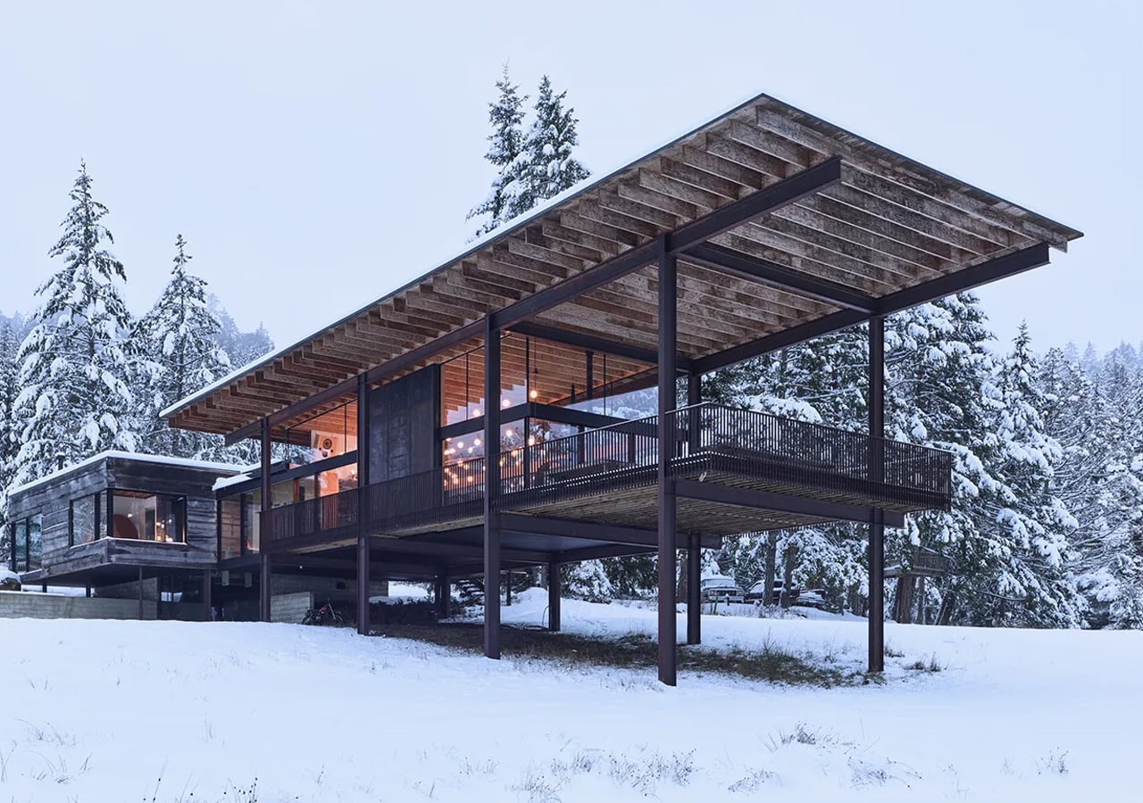
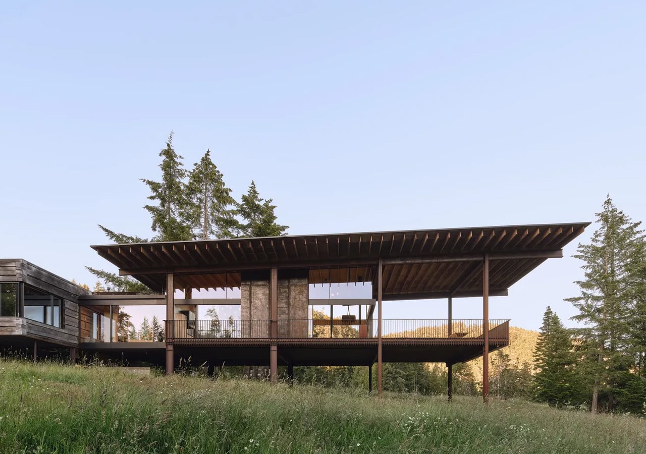
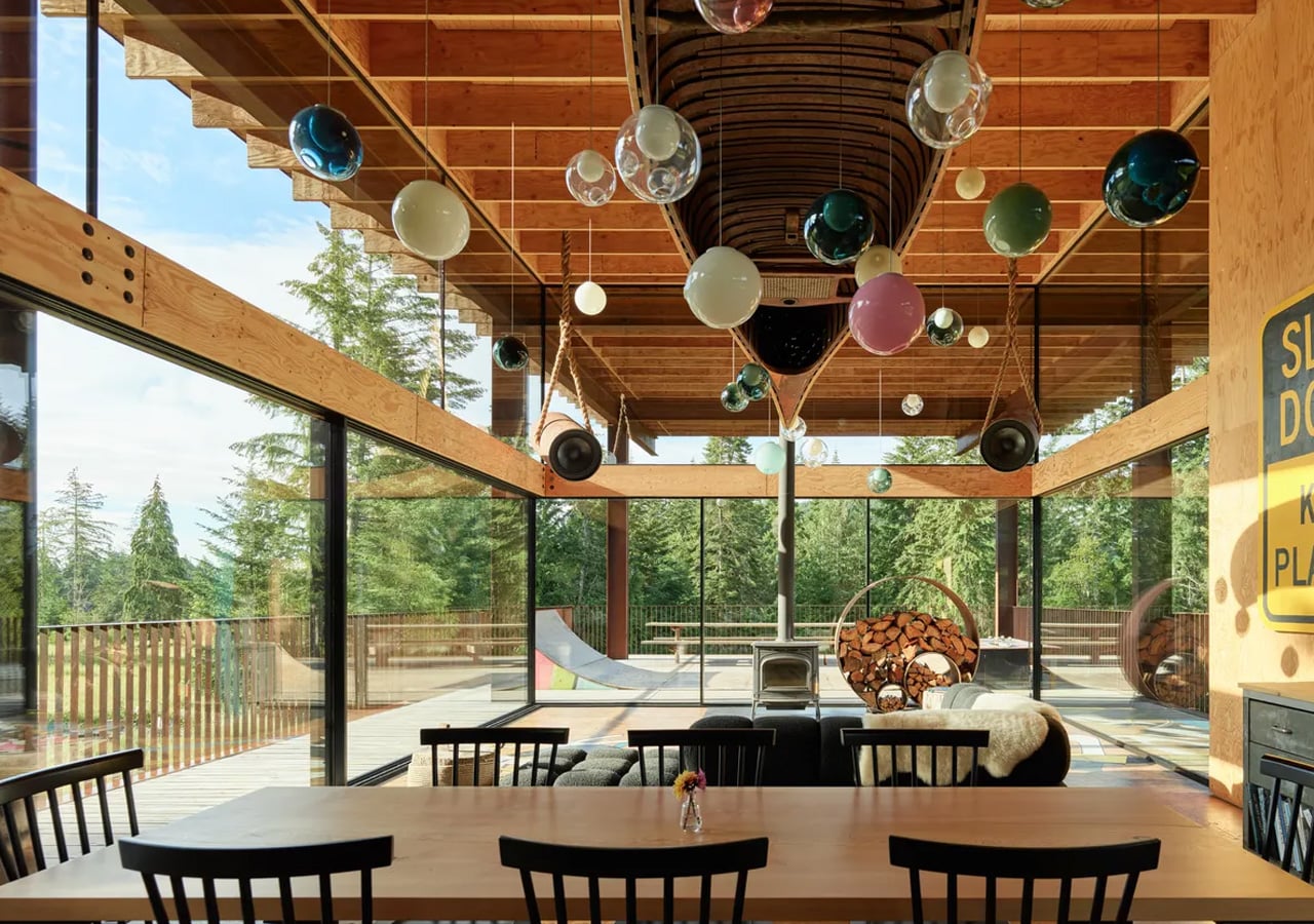
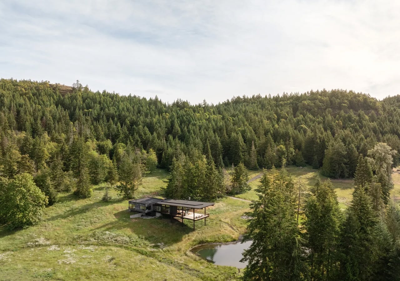
Salt Spring Island doesn’t need much convincing — it already has the cliffs, the meadows, and the trees. The name sounds more like a childhood storybook setting than an architectural statement — and that tension is exactly the point. Nestled amidst the trees and rugged cliffs of Salt Spring Island, BC, the Daisy Ranch is Olson Kundig’s most recent residential project, led by design principal Tom Kundig. It’s casual. It’s rugged. And it’s entirely, unapologetically itself.

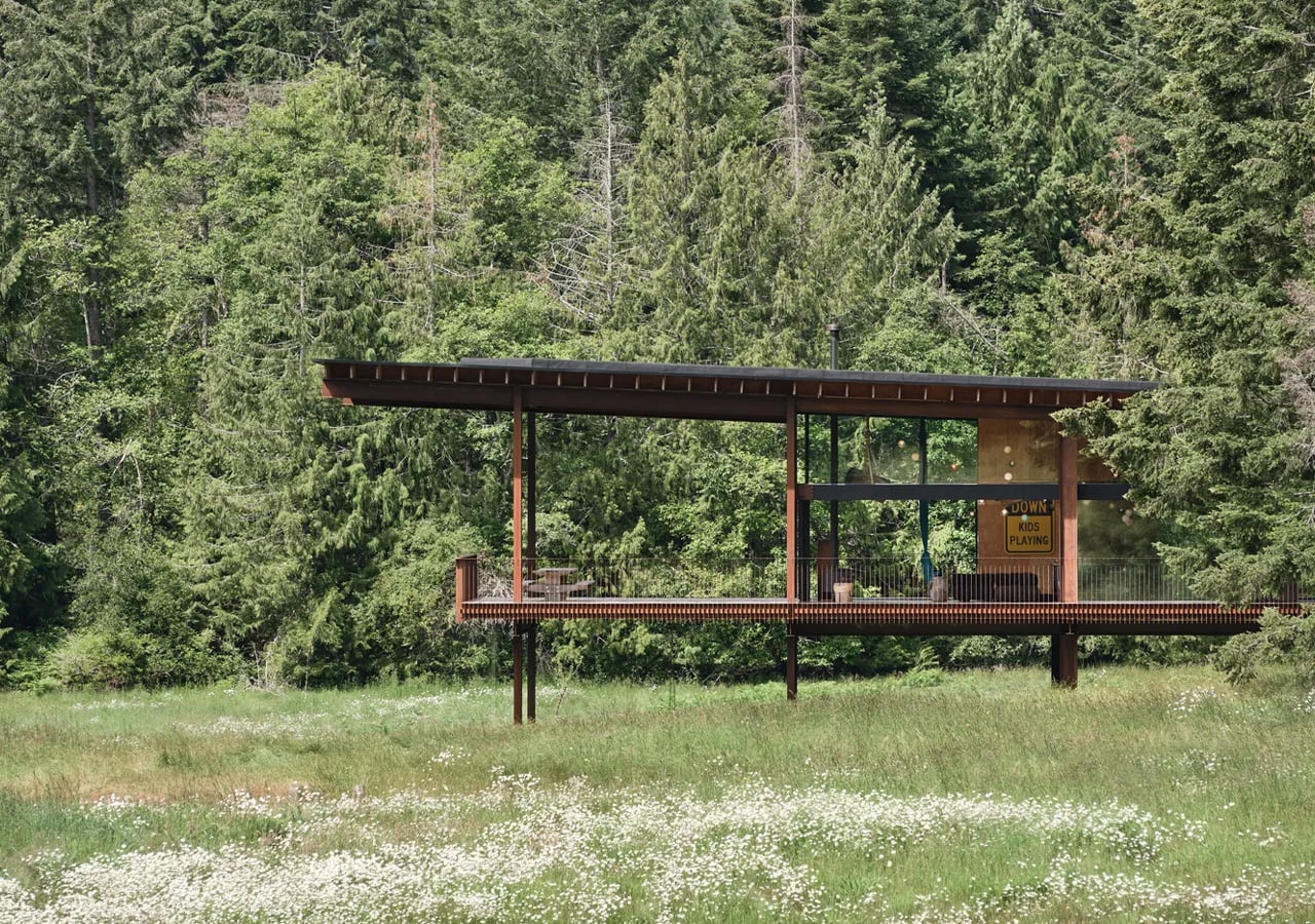
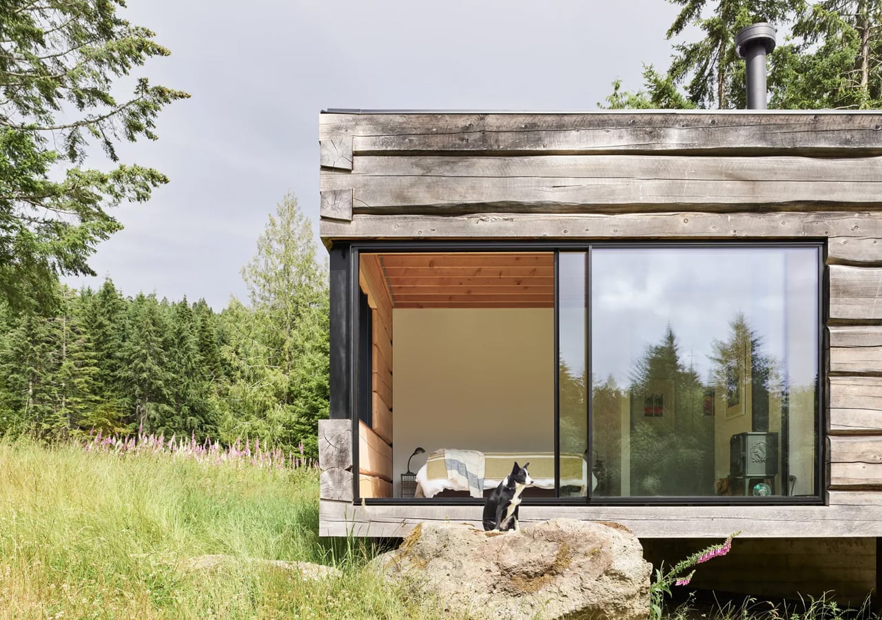
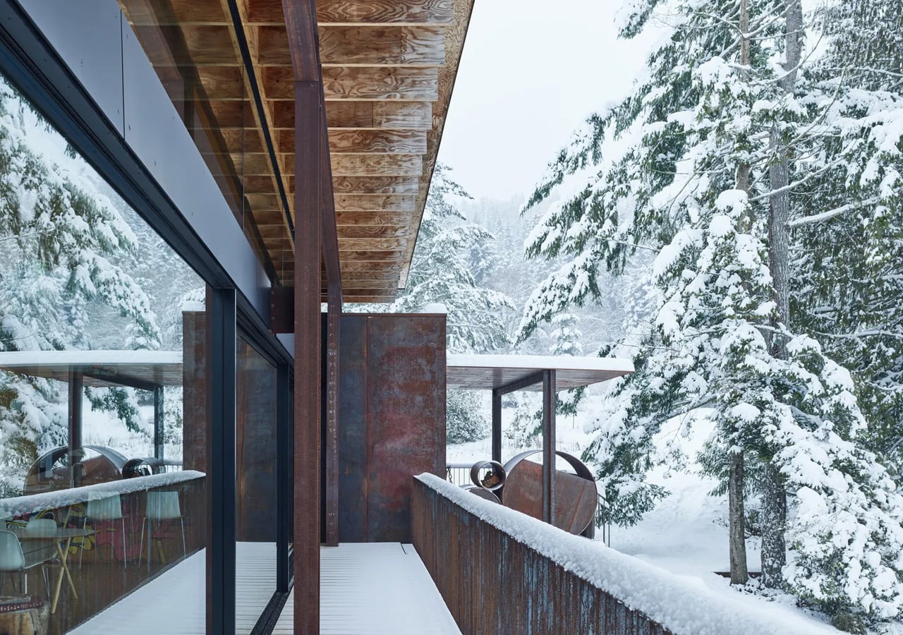
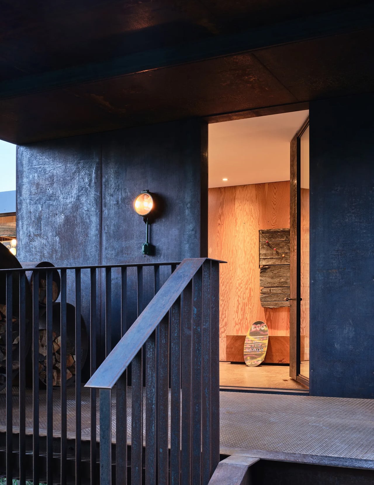
The house sits at the edge of a sweeping meadow, anchored by a log structure that feels like it could have always been there. The primary move is a rugged glass box paired with a long, cantilevered roof that stretches over a generous deck — a roof that earns its keep through BC’s shifting seasons, offering shelter without closing anything off. What makes it work visually is the layering: large square-cut logs and glass soften the rust-colored patina of weathered steel cladding, giving the exterior a palette that feels earned rather than designed.

Designer: Olsun Kundig

The plan is organized along a clean linear axis, with two distinct volumes bisected by an eastern entry stairway. The front door is tucked under a generous overhang — a small but considered gesture that grounds the arrival sequence without dramatizing it. The northern volume, clad in wood and steel, handles the private program: a primary suite and additional bedrooms, with framed view corridors that offer deliberate glimpses of the landscape rather than full exposure. Privacy and connection, calibrated carefully.

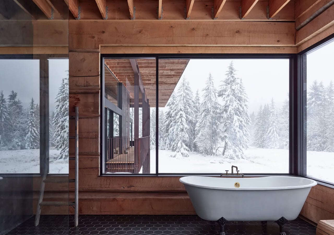
Inside, the bathroom is where the project gets most personal. Widespread use of wood infuses the space with warmth, while a clawfoot tub set before corner windows underscores the home’s persistent connection to the landscape outside. It’s the kind of detail that feels borrowed from an older, more tactile way of building — which is precisely the intention.

The project was designed in close collaboration with the client, Patrick Powers, a builder and fabricator who also served as general contractor. That relationship left its mark. The house doesn’t feel like it was delivered to a site; it feels like it was made with the site, material decision by material decision.

As Kundig put it: “There’s a lineage at play in this project, a quiet innovation that comes from the shared DNA of materials and relationships.” The Daisy Ranch is the kind of project that doesn’t need to announce itself. It sits lightly on its land, opens wide to its meadow, and gets on with the business of being lived in.

The post Inside the Log-and-Glass Home Olson Kundig Built for a Builder on Salt Spring Island first appeared on Yanko Design.

This 25-Square-Metre Tiny House on Wheels Makes Most Apartments Look Like a Waste of Space

Sweden has long understood that good design isn’t about size. The Smile by Vagabond Haven makes that case better than most — a compact, Scandinavian-built tiny house that lives far larger than its footprint suggests.

At 25 square metres, the Smile sits at the top of Vagabond Haven’s lineup, classified under their Extra Large category. It measures 7.2 metres in length and 3 metres in width, riding on a steel frame with wheels that allow it to be transported by truck and placed wherever life takes you. That semi-mobile quality is part of the appeal. It’s not a home you’re locked into — it’s one you can genuinely take with you.

Designer: Vagabond Haven

The interior is where the Smile earns its name. High ceilings give the space an airiness that most tiny homes can’t pull off, and large windows flood the living area with natural light throughout the day. The layout is considered and unhurried: a full living room with a sofa and coffee table, a fully equipped kitchen, a spacious bathroom with a shower, and a sleeping loft overhead. Everything has a place, and nothing feels crammed. It reads less like a tiny house and more like a well-edited apartment.

Vagabond Haven’s Scandinavian roots show up in the material choices and the restraint of the overall aesthetic. The interiors lean warm and clean, with a palette that feels calm rather than clinical. There’s a deliberate softness to the design that makes the space feel settled, even when it’s technically on wheels.

Functionality runs deep. The Smile comes equipped with a solar system, a rainwater harvesting setup, a fresh water tank and pump, and an energy-saving electric or gas water heater. Ventilation covers the living room, kitchen, and bathroom, with a recuperator to maintain air quality year-round. Off-grid living isn’t an afterthought here; it’s built into the DNA of the house.

For buyers, Vagabond Haven offers the Smile as a ready-built model available for delivery across Europe within two to four weeks if in stock, or fully customisable in terms of materials, colours, and finishes. A 3D virtual tour is also available for those who want to walk through the space before committing — a small touch that speaks to how seriously the brand takes the buying experience.

The Smile won’t suit everyone. Those expecting the scale of a conventional home will need to recalibrate. But for the person willing to trade square footage for freedom, thoughtful design, and a lighter way of living, it makes a genuinely compelling case.

The post This 25-Square-Metre Tiny House on Wheels Makes Most Apartments Look Like a Waste of Space first appeared on Yanko Design.

10 Genuis Gadgets That Turn Any Hotel Desk Into a Proper Workstation in 2026

The hotel desk is a fiction. A flat surface with a lamp, a notepad nobody uses, and an ethernet port from 2009. For the digital nomad, making it functional is entirely a gear problem — solved or compounded by what is in the bag. The right tools collapse the gap between a rented surface in a foreign city and a setup that performs as well as anything permanent back home.

Ten products made this list because each one addresses something specific about the mobile workstation problem. Not the flashy kind of specific that reads well in a press release, but the unglamorous kind — the port you ran out of, the cable you excavated for four minutes, the surface that made everything feel temporary. These are the tools that stop you from tolerating the desk you are given and start letting you build the one you need.

1. OrigamiSwift Mouse

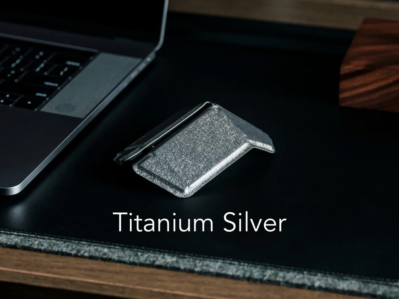
A trackpad handles most things until the work demands precision. Editing photos, building detailed spreadsheets, reviewing design files — these sessions expose the trackpad’s limits inside the first hour. The OrigamiSwift folds completely flat at 4.5mm, weighs 40 grams, and snaps open into a full-sized ergonomic mouse in under half a second via magnetic clips. Bluetooth 5.2 connects without a dongle, the infrared sensor tracks at 4000 DPI, and three months of battery life run on a single USB-C charge.

What makes this a permanent carry item rather than a novelty is the form factor. It slides into a laptop sleeve, drops into a shirt pocket, or sits flat in any corner of a tech pouch without displacing anything else. The fold is not a compromise — the shape is fully ergonomic and properly contoured for extended sessions. For nomads working in applications that reward a real mouse, this removes every excuse for not carrying one.

Click Here to Buy Now: $85.00

What We Like

  • Folds to 4.5mm and weighs 40 grams, pocketable without sacrificing full-size ergonomic comfort
  • Three-month battery life on a single USB-C charge keeps it out of the daily charging rotation entirely

What We Dislike

  • The touch-sensitive scroll area replaces a physical wheel, requiring real adjustment for heavy scrollers
  • Bluetooth-only connectivity means no wired fallback for tasks where minimal latency matters

2. HubKey Gen2

Two USB-C ports on a modern ultrabook sound fine until you are simultaneously charging, running an external display, reading an SD card, and needing ethernet at a co-working desk with unreliable Wi-Fi. HubKey Gen2 resolves the port shortage with 11 connections in one compact cube: dual 4K/60Hz HDMI outputs, USB-A 3.1, USB-C 3.1, SD and TF card readers, 2.5 Gbps ethernet, a 3.5mm audio jack, and 100W USB-C power delivery through a single cable.

The programmable shortcut keys and central control knob on the top panel are what separate this from every other travel hub. Volume, mute, screenshot, and display toggle become physical actions rather than keyboard shortcuts buried in menus. For anyone driving dual monitors from a co-working space or managing video calls across time zones, five tactile keys and a precision knob turn a connectivity device into a proper control surface. At 7 × 7 × 3 centimeters, it fits anywhere without announcing itself.

What We Like

  • Dual 4K/60Hz HDMI outputs let you build a two-monitor workstation from a single compact device
  • Programmable keys and a physical control knob bring hands-on workflow control that no standard hub offers

What We Dislike

  • Tightly packed ports mean thick cables or large drives can crowd each other along the edges
  • The cube form factor, while compact, is less pocketable than flat card-style hub alternatives

3. StillFrame Headphones

Concentration in a café, a co-working lobby, or an airport gate is a skill that requires backup. StillFrame provides it at 103 grams — on-ear headphones with 40mm drivers that produce an open, layered soundstage rather than a compressed signal. Active noise cancellation removes the environment when deep work requires it. Transparency mode pulls it back in with a tap when a gate announcement or colleague’s question needs to land. Both transitions happen cleanly, without drama or lag.

Twenty-four hours of battery life is the figure that justifies carrying these on long international routes. New York to Singapore, including a layover, without reaching for a charging cable. The retro-informed aesthetic references the deliberate listening era of physical media — a design decision that reads quietly and carries well in client-facing environments. For nomads spending serious hours in headphones across work sessions and transit days, the combination of weight, battery life, and sound quality earns the price.

Click Here to Buy Now: $245.00

What We Like

  • 24-hour battery life covers the longest intercontinental travel days without requiring a charge
  • At 103 grams, these stay genuinely comfortable through extended wear across full working days

What We Dislike

  • On-ear design provides less passive isolation than over-ear models in extremely loud transit environments
  • The retro aesthetic is distinctive but polarizing — not everyone wants a conversation piece on their ears

4. ASUS ZenScreen OLED MQ16AH
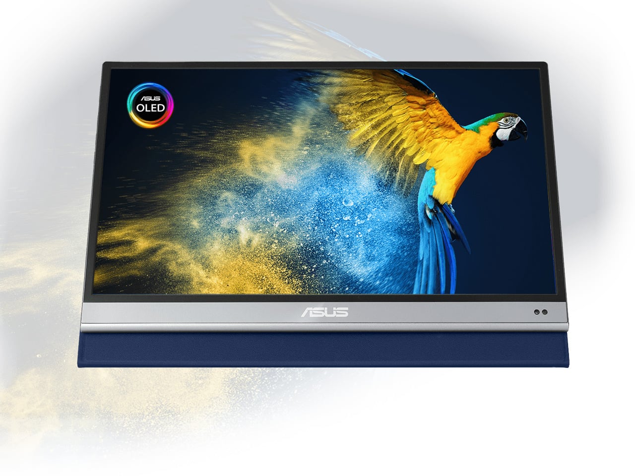
A second screen changes how you work, and the ZenScreen OLED MQ16AH is the portable monitor worth carrying. The 15.6-inch OLED panel delivers 100% DCI-P3 color coverage, matching studio-grade display accuracy at a fraction of the footprint. At 730 grams, it slides into most laptop sleeves alongside a thin ultrabook without requiring its own bag compartment. USB-C handles both video input and power delivery through a single cable, and the adjustable cover doubles as a multi-angle stand.

What makes OLED relevant specifically for nomadic work is panel behavior in variable light. Café windows, outdoor co-working terraces, hotel rooms with inconsistent artificial lighting — OLED handles contrast and legibility in conditions where LCD panels wash out and lose precision. ASUS includes a fabric sleeve so the screen travels protected. For creative professionals editing in temporary locations, this removes the monitor as a point of compromise in the mobile setup.

What We Like

  • 15.6-inch OLED with 100% DCI-P3 delivers studio-quality color accuracy in a 730-gram form that travels cleanly
  • Single USB-C cable handles both video signal and power delivery, keeping the desk free of extra cables

What We Dislike

  • At roughly $399, it sits at the premium end of portable monitors, with capable IPS alternatives at a lower cost
  • OLED panels carry a higher burn-in risk than IPS alternatives when static interface elements stay on screen long-term

5. Peak Design Tech Pouch
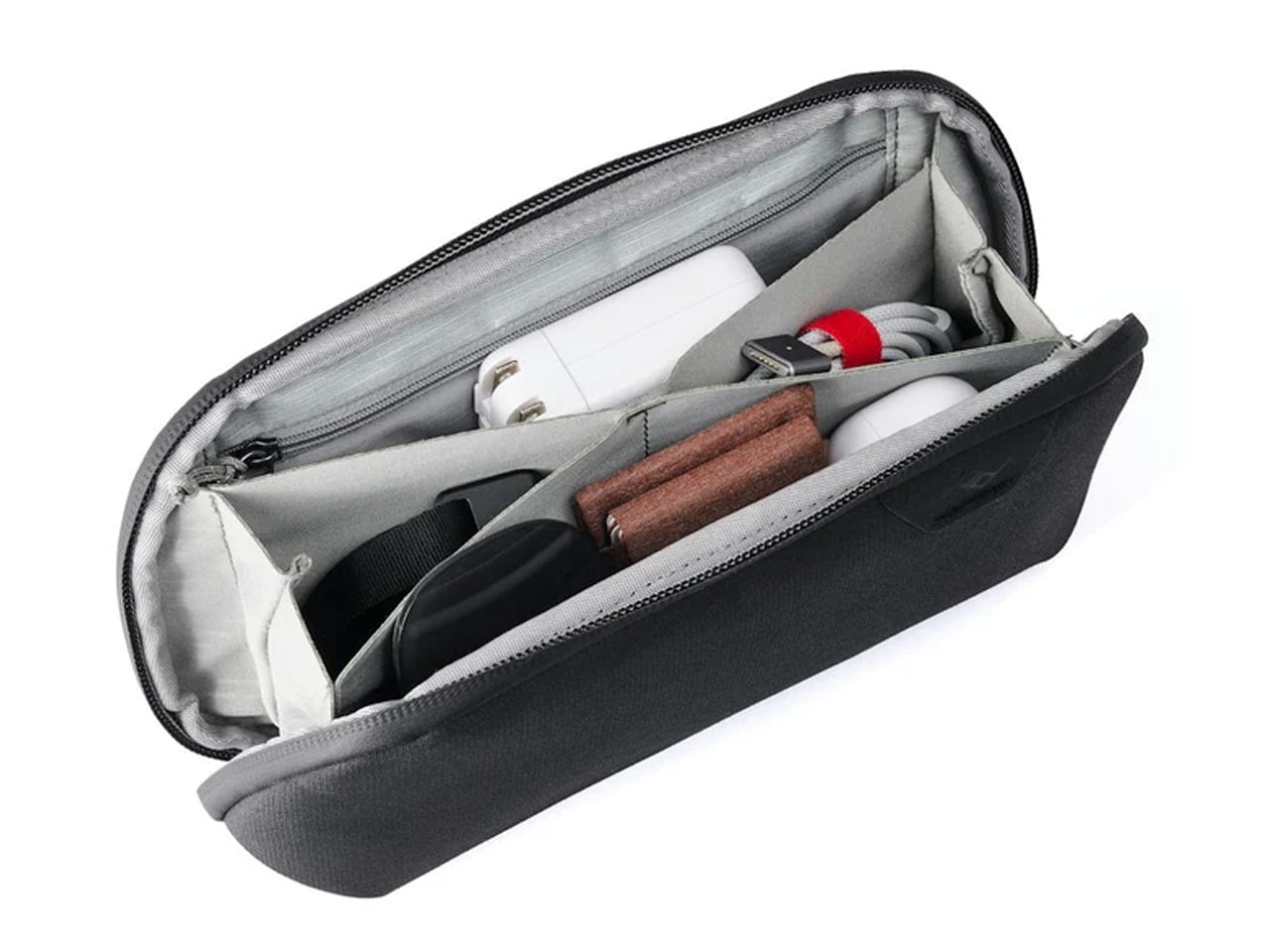
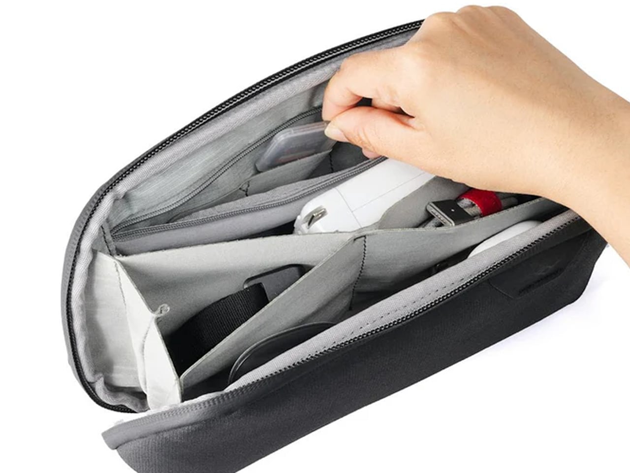
Cable management is the invisible tax on nomadic work. The time spent untangling cords, hunting for the right adapter, and repacking scattered accessories across a year of constant travel accumulates into something genuinely absurd. Peak Design built the Tech Pouch as an accordion-style organizer that opens completely flat, revealing modular loops, elastic pockets, and zippered compartments arranged with the same intentionality the brand applies to its camera gear. Everything has a designated position and stays there across every repacking cycle.

The weatherproof shell handles what transit actually looks like: overhead bins, bag drops, and light rain between a taxi and a terminal. What justifies the premium over a generic cable case is the layout logic. Cables stay separated. Adapters surface when reached for. The daily ritual of setting up at a new desk becomes faster and less irritating. For something touched every single day, the build quality means it survives years of travel without visible wear.

What We Like

  • Accordion design opens fully flat, giving complete visual access to every cable and adapter without excavation
  • Weatherproof construction handles the genuine roughness of daily transit without requiring careful handling

What We Dislike

  • At $59.95, it is a meaningful spend for a cable organizer, though the quality distributes that cost across years of use
  • Structured form takes up more interior bag volume than a soft-sided pouch, even when lightly packed

6. Xiaomi UltraThin Magnetic Power Bank 5000 15W
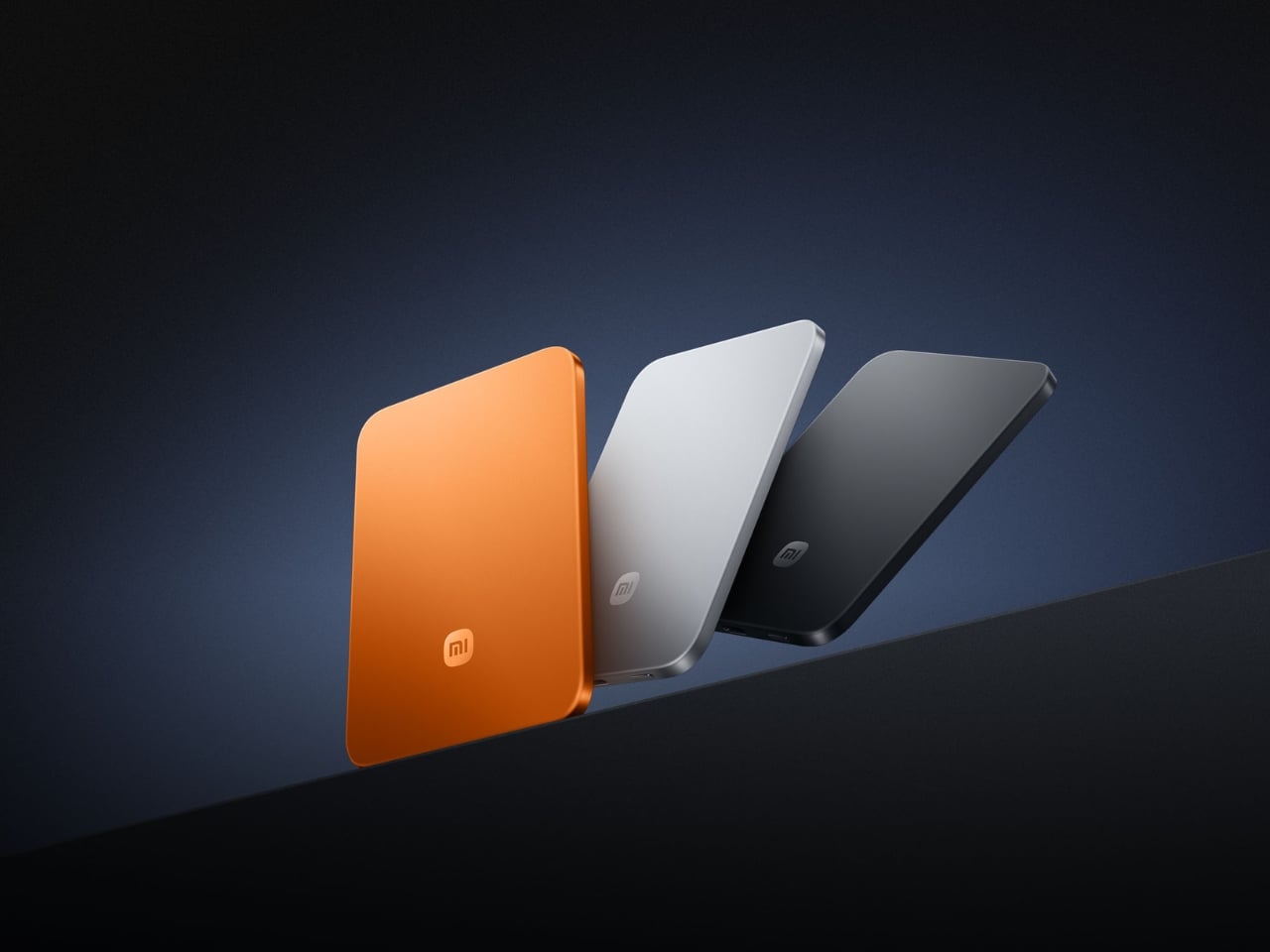
Power banks have had a design problem since the category was invented. They are essential and clunky in equal measure, reliable and bulky in the same breath. Xiaomi’s UltraThin Magnetic Power Bank 5000 starts with an answer at 6mm — thinner than most smartphones currently shipping. The aluminum alloy shell comes in Glacier Silver, Graphite Black, and Radiant Orange, each finished with a photolithographically etched logo. At 98 grams, it weighs less than two eggs and carries like nothing at all.

The engineering behind that form is silicon-carbon battery chemistry with 16% silicon content, enabling the energy density to fit 5,000mAh into a body this slim. It supports 15W wireless charging for compatible Android devices, 7.5W for iPhone, and 22.5W wired via USB-C, with two devices chargeable simultaneously while being recharged itself. Showcased at MWC 2026 in Barcelona, this is the first power bank in the category that genuinely does not feel like a concession made to the carrying requirement.

What We Like

  • At 6mm and 98 grams, it is the most pocket-friendly 5,000mAh power bank available — effectively weightless in daily carry
  • Silicon-carbon battery chemistry delivers the full 5,000mAh capacity without any dimensional sacrifice

What We Dislike

  • Wireless charging for iPhone is capped at 7.5W, noticeably below dedicated MagSafe speeds
  • 5,000mAh suits phones and earbuds well, but will not meaningfully extend a laptop’s runtime in a pinch

7. Side A Cassette Speaker

Music changes a workspace, even when the workspace is a shared lounge in Chiang Mai or a rented desk in a Lisbon co-working building. The Side A Cassette Speaker earns its bag space through character as much as function. Roughly the size of an actual cassette tape, it runs Bluetooth 5.3 with microSD support for offline playback when the Wi-Fi situation is characteristically unreliable. The clear shell and cassette label make it the kind of object people ask about across café tables.

The protective case doubles as a stand, keeping the speaker elevated and projecting properly on any flat surface. The warm, analog-tuned sound suits morning background music in a temporary apartment and wind-down playlists after a long day of client calls in equal measure. It is light enough to forget it is in the bag and distinctive enough to feel worth carrying. Among the ten products on this list, it is the one most likely to start a conversation at the desk next to yours.

Click Here to Buy Now: $49.00

What We Like

  • Palm-sized form with a case that doubles as a stand makes it the most packable speaker in its class
  • microSD support enables offline playback even when connectivity is completely absent

What We Dislike

  • No built-in microphone means it does not support speakerphone calls or group video conferencing
  • Volume ceiling suits personal and small-room listening, but will not carry in outdoor or open-plan group settings

8. Medispace

The ten-minute gap between back-to-back video calls is rarely used well. Most nomads fill it with email or a phone scroll — the cognitive equivalent of eating fast food between meetings. Medispace is a concept designed by Suosi Design, inspired by Himalayan singing bowls. It simulates more than ten types of bowl sound changes through a metal disc on the top surface, and houses noise-canceling earbuds inside its body, stored in what functions as an integrated case. The whole device fits in a palm.

The gesture of using it — tapping and touching the metal disc to trigger sound — mirrors the physical ritual of the Tibetan instruments it references. For nomads managing cognitive load across multiple time zones, the design makes a case for deliberate ten-minute resets between work blocks as a productivity strategy rather than a distraction. Medispace is currently a concept, and not yet in commercial production, but as an object that understands where sustained focus actually comes from, it belongs in this conversation.

What We Like

  • The singing bowl interaction model turns a between-meeting break into a deliberate reset rather than a passive phone scroll
  • Earbuds nested inside the device create a complete self-contained system that functions as both a case and a meditation prompt

What We Dislike

  • Medispace is a concept and is not currently available as a production product
  • Effectiveness as a focus tool depends on the user’s willingness to actually stop and use it during real work sessions

9. Orbitkey Desk Mat Slim

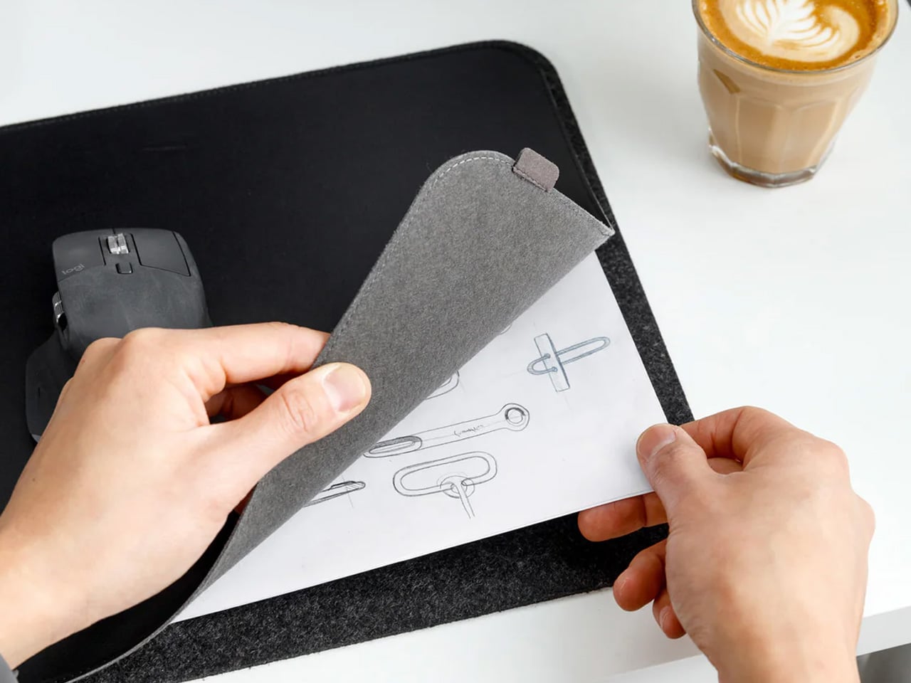
The working surface in a co-working space or hotel room is rarely clean, rarely the right size, and rarely yours. The Orbitkey Desk Mat Slim claims it anyway. Made from premium vegan leather on top and 100% recycled PET felt underneath, it lies flat, stays planted via an anti-slip backing, and turns whatever surface it lands on into a proper workspace. A magnetic cable holder keeps charging cables from drifting to the edge. A slim document pocket along the front holds papers out of sight.

For nomads who set up and break down a working surface daily, this mat compresses the ritual into a single unrolling action. Everything that belongs on the desk goes on the mat. When it is time to move, it rolls tight and fits inside a laptop sleeve or along the flat edge of a backpack. The vegan leather ages without cracking, the recycled PET felt resists compression over time, and the restrained design works equally well in a client-facing meeting room or a hostel common area.

What We Like

  • The document pocket reduces visible surface clutter without adding bulk or requiring a separate organizer
  • Rolls tightly enough to travel inside most laptop sleeves without claiming dedicated bag space

What We Dislike

  • The slim format may feel narrow for users running wide multi-monitor setups who want full horizontal coverage
  • The magnetic cable holder manages a small cable count cleanly, but becomes less effective in heavily wired configurations

10. Timekettle W4 AI Interpreter Earbuds

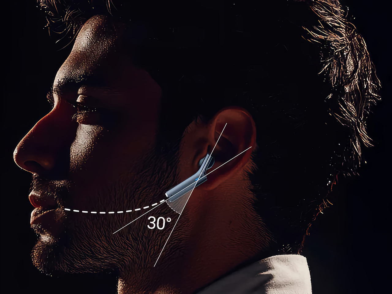
Language is the friction point that no amount of productivity hardware addresses. Client calls in Tokyo, supplier negotiations in Milan, co-working introductions in Mexico City — the moment a conversation requires a translation app, the professional register of the interaction collapses entirely. The Timekettle W4 treats this as a design problem worth solving properly: real-time two-way translation across 43 languages and 96 accents, with 98% accuracy and a 0.2-second lag that keeps conversation moving rather than stopping it between sentences.

The Bone-voiceprint sensor picks up speech through vibrations rather than ambient microphone capture, which means background noise from a conference hall or a busy co-working café stops interfering with the translation input. Share an earbud with a counterpart, speak naturally, and the Babel OS engine handles the rest. Four hours of continuous translation per charge extends to ten with the case. For nomads managing international client relationships from a carry-on, this closes the gap between understanding the meeting and merely attending it.

What We Like

  • Bone-voiceprint sensor isolates speech from background noise in loud environments where microphone-based translation fails
  • A 0.2-second translation lag keeps conversation genuinely natural rather than halting it into a sequence of pauses

What We Dislike

  • At $331.55, this is a professional investment rather than a casual travel accessory — positioned and priced accordingly
  • Four hours of continuous translation per charge requires active battery management across a full day of back-to-back meetings

The Desk You Build Is Better Than the One You’re Given

Every product on this list addresses a different layer of the same problem: making a temporary surface in a foreign city perform as well as a setup you designed yourself. The hub covers ports. The monitor covers screen real estate. The mat claims the surface. The translation earbuds cover language. The mouse, headphones, power bank, speaker, and pouch handle the frictions that accumulate quietly across a hundred working days in rooms that were never designed for serious output.

The nomadic workstation is personal by necessity — built piece by piece through the kind of deliberate editing that only comes from actually doing the work on the road. These ten products survive that edit. None of them announces themselves. Each one earns its bag space through what it changes about the day: fewer compromises, faster setups, cleaner surfaces, and the quiet confidence of arriving somewhere new and knowing the work will get done.

The post 10 Genuis Gadgets That Turn Any Hotel Desk Into a Proper Workstation in 2026 first appeared on Yanko Design.
The SOMA Is the Three-Bedroom Tiny Mansion Families Have Been Waiting For

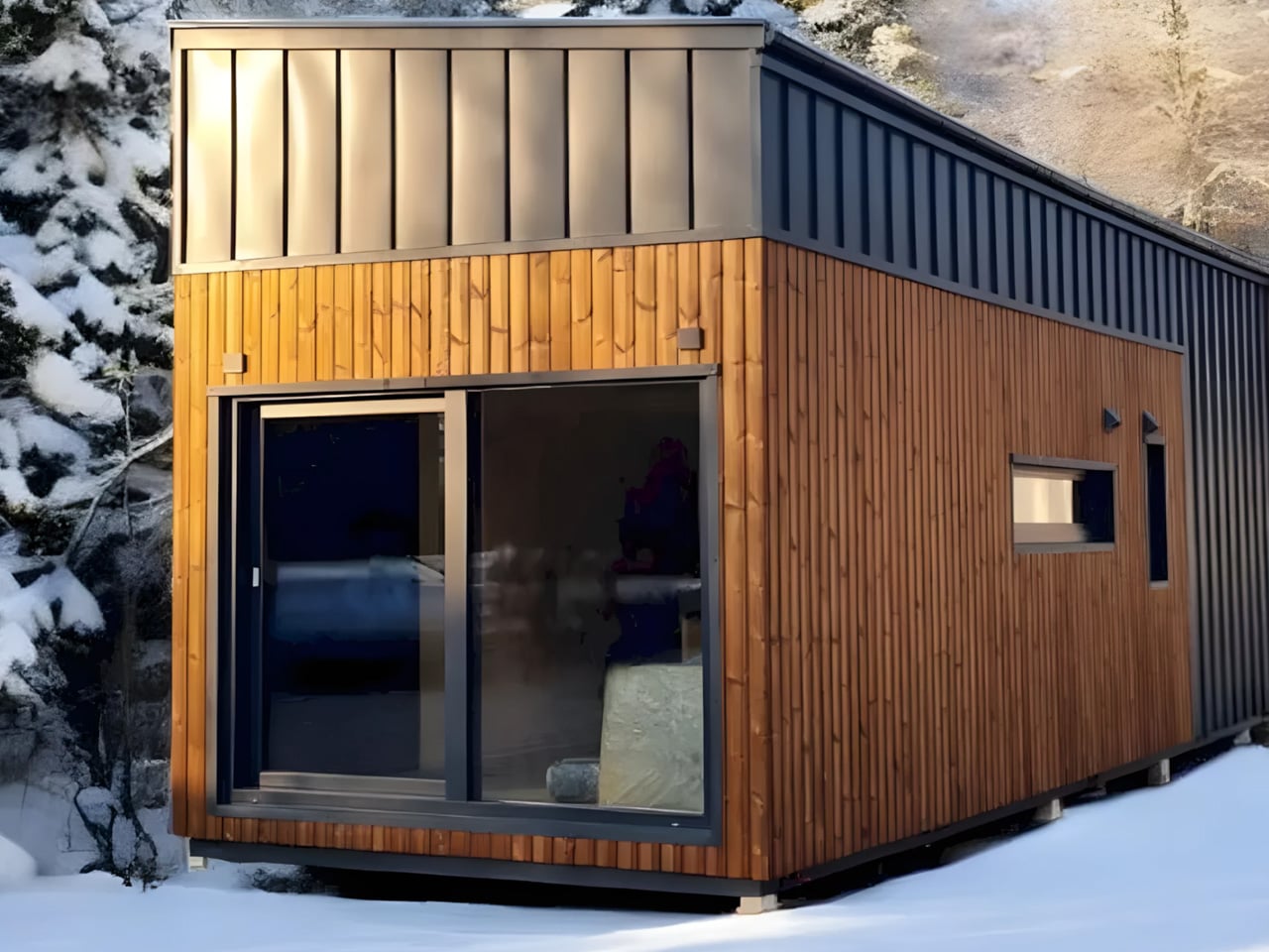
The tiny home movement has never quite figured out what to do with families. Removed Tiny Homes, a Brisbane-based builder specializing in off-grid, sustainable builds, has decided to challenge that assumption head-on. Their latest model, the SOMA, is a towable tiny house designed with families firmly in mind — three bedrooms, a generous open-plan layout, and a level of finish that earns the word “mansion” without irony.

The numbers tell a compelling story. The SOMA measures 10m x 3.4m x 4.5m, with an interior footprint of 52 square meters (560 sq ft). That 3.4-meter width is notably wider than the standard tiny house, and it shows — the interior breathes more like an apartment than a caravan. The bulk of that space is given to a large open-plan kitchen and living area, which anchors the home and keeps the social energy flowing between the kitchen island and the lounge, rather than forcing it through a narrow corridor.

Designer: Removed Tiny Homes

Three bedrooms is the headline, and it’s a legitimate one. One sits on the ground floor, while two loft bedrooms occupy the upper level — a layout that gives adults and children a sense of separated territory without requiring a second building. The bathroom is fully tiled, and early buyers receive a Luxury Living Upgrade Pack that layers in skylights and stone kitchen benchtops, elevating the interiors well beyond what you’d expect at this price point.

Outside, the SOMA arrives with a dual-siding facade — Colorbond metal panels paired with warm-toned composite or wood cladding — alongside a split roof profile and large sliding glass doors that open the interior to the outdoors. The display unit shown on the builder’s website sits on a large wooden deck, which extends the liveable footprint considerably and makes the home feel rooted, even when it isn’t.

Pricing starts at roughly USD $145,200, with further customization available at additional cost. For a three-bedroom, road-legal home of this caliber, that figure sits in a competitive space — especially when the alternative is a conventional build on land you may not be able to afford. The SOMA isn’t trying to squeeze a family into a clever floor plan. It’s making the case that tiny living, done right, doesn’t require compromise — just a smarter conversation about what space actually means.

The post The SOMA Is the Three-Bedroom Tiny Mansion Families Have Been Waiting For first appeared on Yanko Design.
5 Best Automotive Designs From May 2026 That Actually Solved Something

Automotive design in May 2026 is being shaped less by motor show stages and more by individual designers working outside traditional studio systems. The most compelling concepts this month didn’t arrive with manufacturer press releases. They arrived with a point of view, a specific problem to solve, or a visual language worth paying close attention to. That independence is producing some of the most focused design thinking the industry has seen in years.

The five designs below span endurance racing prototypes, road hypercars, a reimagined icon, a utility e-bike, and a resurrected nameplate. What connects them isn’t a shared aesthetic; it’s intentionality. Each one either solves something real or pushes a visual language somewhere it hasn’t traveled before. These aren’t mood board exercises. They’re the kind of design thinking that eventually turns into the vehicles you actually want to own.

1. Renault Double Barrel Le Mans Hypercar Concept

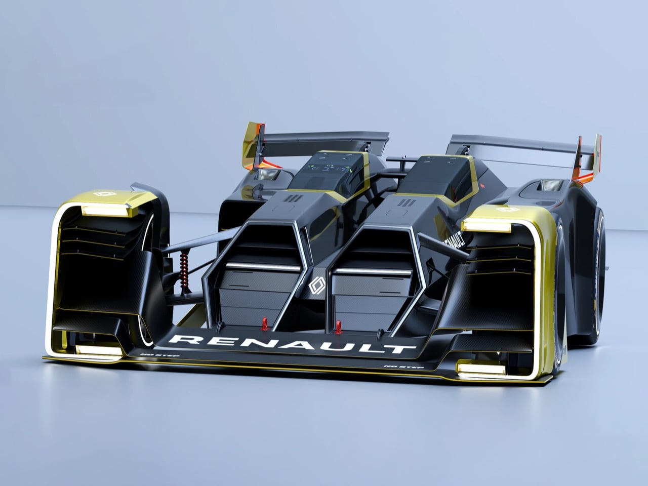
The Double Barrel arrives with a premise so clean it makes most motorsport concepts look timid. Designer Kim reached back to the 1955 Nardi Giannini ND750 Bisiluro, an Italian streamliner that split its driver and engine across two separate fuselages connected by a central spine, and repurposed that architecture entirely. Where the Bisiluro used twin bodies for straight-line speed, the Double Barrel uses them to solve endurance racing’s most persistent safety problem: the pit stop. Two independent pods, one for the driver and one for the hydrogen powertrain, each replaceable in ten seconds.

The engineering logic is tight. The hydrogen module integrates the fuel cell stack, electric motors, power electronics, and thermal management into a single cartridge that loads into the left fuselage through a shotgun-inspired breech mechanism. The driver pod on the right contains the safety cell, steering column, and pedal box as a self-contained unit. A central carbon monocoque spine handles both structural loads and aerodynamic surfaces. For anyone who follows endurance racing and its history of pit lane accidents, this is the concept that makes Le Mans’ darker chapters feel like a problem finally approaching a structural answer.

What we like:

  • The twin-fuselage architecture solves a real safety problem through engineering rather than regulation, making it one of the few motorsport concepts this year that’s genuinely consequential in its thinking rather than purely formal
  • The hydrogen powertrain module treating propulsion as a replaceable cartridge is a significant conceptual shift, with the potential to bring refueling closer to a ten-second operation under pit lane conditions

What we dislike:

  • Splitting mass across two fuselages introduces aerodynamic and structural complexity that existing endurance racing regulations weren’t written to accommodate, which means the concept would require a regulatory framework to be built around it
  • The specialized pit equipment required for module swaps places significant infrastructure demands on teams, essentially asking the entire paddock to standardize around a system that currently exists only as sketches

2. Aston Martin Veil Concept

Hyunwoo Kim’s Veil asks a question Aston Martin’s own studio probably can’t ask while managing current production timelines: what happens to the brand’s visual language when you trade angular carbon fiber aggression for something closer to organic sculpture? The result is a hypercar where every surface transition is so smooth you’d need calipers to find the break points. The teal finish, a near-match for Aston’s current F1 team livery, doesn’t just reference the brand’s motorsport presence; it makes every curve feel like light bending around water.

Kim developed the concept through physical paper mock-ups before committing anything to CAD, and the proportions show it. From above, the Veil reads like a manta ray, with massive rear fender volumes extending from a central spine that bisects the cockpit. The process produced surface relationships that feel discovered rather than designed. The concept was subsequently photographed alongside Aston Martin F1 team members, suggesting Gaydon took notice. For design followers, this is the kind of work that maps where a brand’s visual language might be heading in a decade.

What we like:

  • The paper mock-up development process is rare in an era of pure CAD workflows, and it produced proportions and surface relationships that feel genuinely spatial in a way that screen-first design rarely achieves
  • The teal livery reference creates a coherent visual link between Aston’s motorsport identity and its road car future without resorting to obvious badging or explicit F1 call-outs

What we dislike:

  • The ultra-smooth surface language, while visually striking, raises real questions around cooling and downforce that a functional prototype would need to resolve before the form could survive contact with actual track conditions
  • The concept exists as a personal exploration without confirmed manufacturer involvement, which limits how directly it can influence what Gaydon’s advanced studio is working on right now

3. McLaren F1 Concept

Kevin Andersson’s reimagining of the McLaren F1 operates in the most demanding space in automotive design: the icon reboot. Gordon Murray’s original was shaped by specific constraints, 1990s carbon fiber manufacturing limits, and aerodynamic understanding that three decades of Formula 1 development have since transformed completely. Andersson’s concept strips those constraints away while keeping the design philosophy intact. The long hood, the cab-forward greenhouse, the rear haunches that read as muscle rather than theater. Everything that made the original feel inevitable still does, translated into a contemporary surface language.

The renders, produced in Blender and presented in both glossy white and dark gray, show a car McLaren’s design studio could plausibly release today if the brand decided to revisit its analog past. The naturally aspirated engine placement stays legible in the hood proportions, and the whole form reads as a single cohesive object rather than an assembly of surfaces. For anyone who grew up wanting an F1 and couldn’t get close to owning one, this is the version that proves the original’s proportions remain the most elegant answer to the question of what a driver’s car should look like.

What we like:

  • The long hood and cab-forward stance preserve the original F1’s spatial logic in a completely contemporary surface language, showing that Murray’s proportional decisions were correct beyond their era
  • The Blender workflow produces photoreal renders that communicate design intent with enough clarity to evaluate the concept seriously, rather than treating it as a sketch exercise

What we dislike:

  • As a personal study completed without McLaren’s involvement, there is no direct pathway for the concept to influence actual product direction at Woking, which limits its reach beyond the design community
  • The dark gray render obscures surface detail in areas where the concept’s nuance lives, making certain transitions harder to read and the full quality of the work more difficult to assess

4. Segway Muxi E-Bike

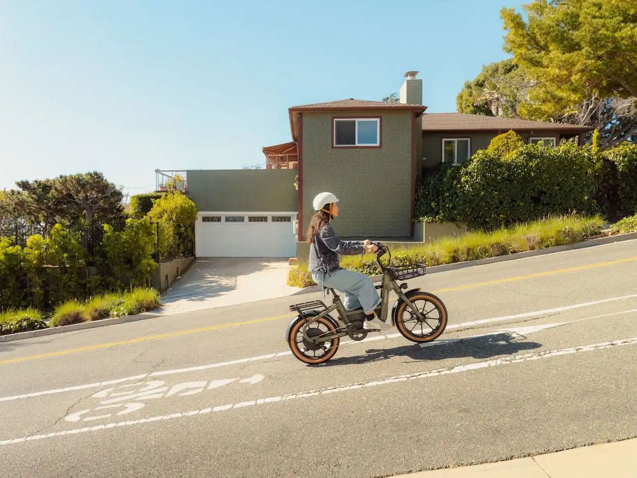
First introduced at CES 2026, the Muxi is Segway’s first short-tail utility e-bike, and it makes its case through restraint rather than specification sheets. It carries a payload of up to 418 pounds and accommodates optional accessories, including a child kit, but it doesn’t look like a cargo barge doing it. The step-through frame keeps access easy, integrated frame storage maintains a clean silhouette, and the whole package reads as a practical daily tool rather than a conspicuous statement about urban mobility values.

The 750W rear hub motor produces 80 Nm of torque, paired with a 48V, 716Wh battery delivering up to 80 miles of range per charge. Riders can toggle between Class 1 and Class 2 modes depending on terrain and local regulations. For urban commuters who need to carry real loads without a car, the Muxi offers something genuinely useful: a vehicle that handles groceries, gear, or a child passenger without requiring a license or a parking permit. The design keeps that utility from reading as a compromise, which is a harder problem to solve than it looks.

What we like:

  • The 80-mile range paired with 418-pound payload capacity makes the Muxi a credible car replacement for short-range urban logistics without the bulk or visual weight of traditional long-tail cargo bikes
  • The step-through frame and integrated storage keep the silhouette honest and uncluttered, which reflects thoughtful design decision-making rather than feature stacking

What we dislike:

  • The short-tail format, while visually leaner, does limit rear cargo platform length compared to long-tail alternatives, which matters for riders carrying larger or less stackable loads regularly
  • Class 1 and Class 2 mode flexibility is useful, but the cap on assisted speed that comes with staying below Class 3 territory will frustrate commuters who need to keep pace with faster urban traffic

5. Freelander Electric SUV

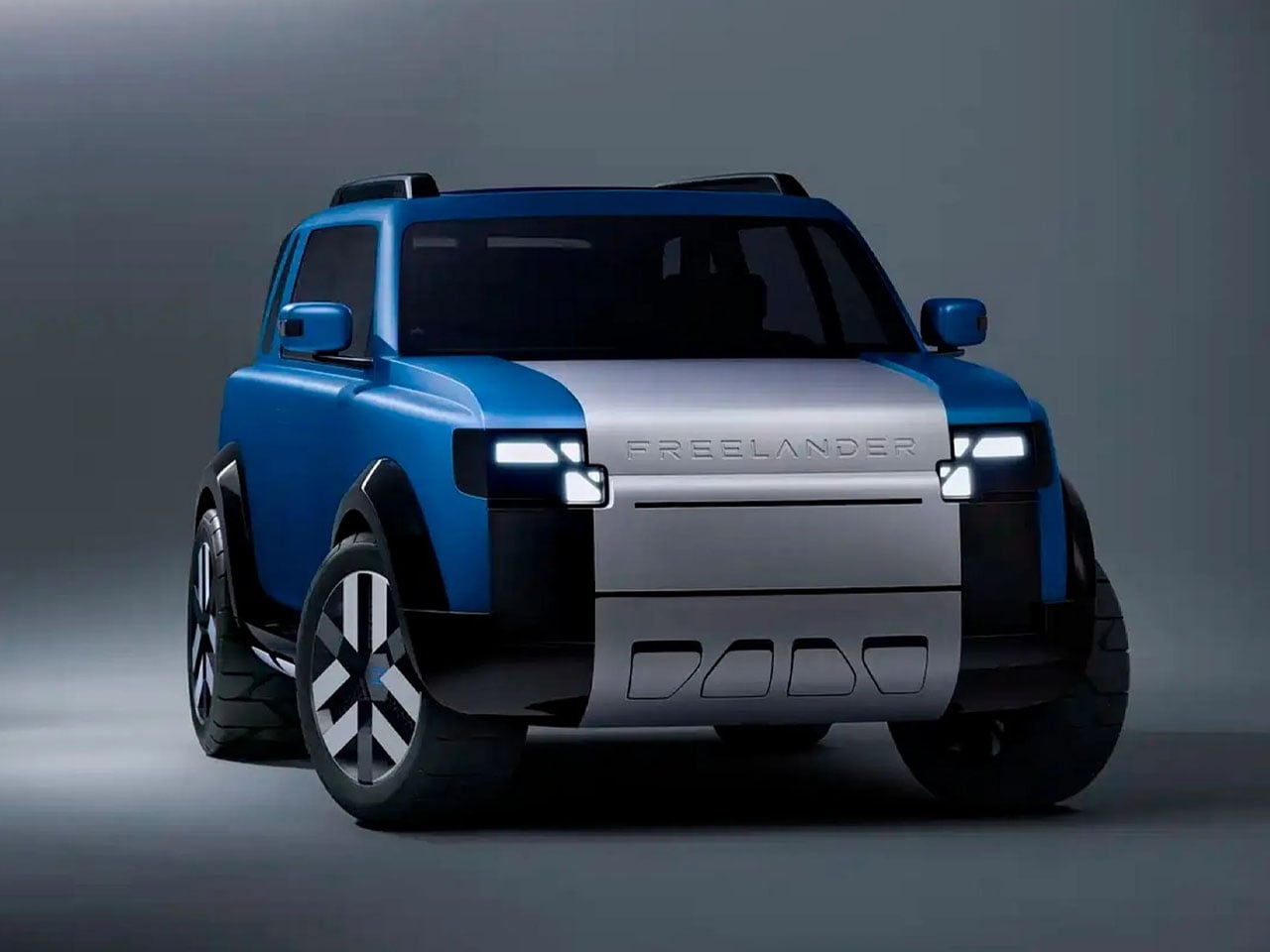
The Freelander nameplate’s return arrives as a JLR and Chery co-development, and the design treats its heritage with more precision than most revivals manage. The boxy silhouette, upright stance, and angled D-pillar all reference the original three-door Freelander from the late 1990s without tipping into pure nostalgia. The rugged proportions stay consistent with classic Land Rover SUV design, while modern lighting elements and a more contemporary design language prevent the whole thing from reading as a tribute act rather than a genuine successor with something new to offer.

The technical foundation centers on an 800-volt platform supporting fully electric, plug-in hybrid, and range-extended electric configurations across a planned lineup of six models. Production takes place at the Chery-Jaguar Land Rover joint-venture facility in Changshu, China, combining British design direction with Chinese EV platform technology. For buyers who want a compact, capable off-roader with genuine electrification credentials and a nameplate that carries weight, the new Freelander’s combination of design heritage and modern platform engineering gives it a strong opening argument before a single production car rolls out.

What we like:

  • The angled D-pillar and upright stance respect the original Freelander’s design DNA without reducing the new car to a retro exercise, striking a balance that most nameplate revivals fail to find
  • The 800-volt platform supporting multiple powertrain configurations gives buyers real flexibility across six planned model variants rather than locking the lineup into a single electrification strategy

What we dislike:

  • The Chery co-development structure raises legitimate questions about how much of JLR’s build quality reputation will translate across a manufacturing partnership, regardless of how strong the design direction is
  • Six models across a freshly relaunched lineup is an ambitious target that risks diluting design consistency before the Freelander brand identity has had time to re-establish itself in a competitive EV market

The Best Design Always Starts With a Problem Worth Solving

What the strongest designs this month share is a willingness to treat constraints as creative material rather than obstacles. Whether that means engineering a Le Mans pit stop into a ten-second module swap, developing a hypercar form from physical paper before touching a computer, or bringing back a beloved nameplate through a cross-continental manufacturing partnership, the best work here didn’t arrive from playing safe.

Design is always a negotiation between ambition and reality. The concepts at the top of this list lean hardest into ambition, and the production-bound entries use real engineering constraints to sharpen rather than limit their vision. If these five designs reflect the direction automotive culture is moving, the next few years should produce some of the most considered vehicles the industry has attempted in a long time.

The post 5 Best Automotive Designs From May 2026 That Actually Solved Something first appeared on Yanko Design.
Casa Pinhal Proves the Best Brazilian Architecture Barely Touches the Ground

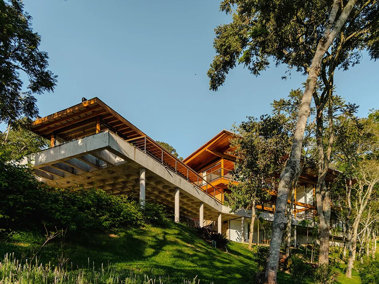
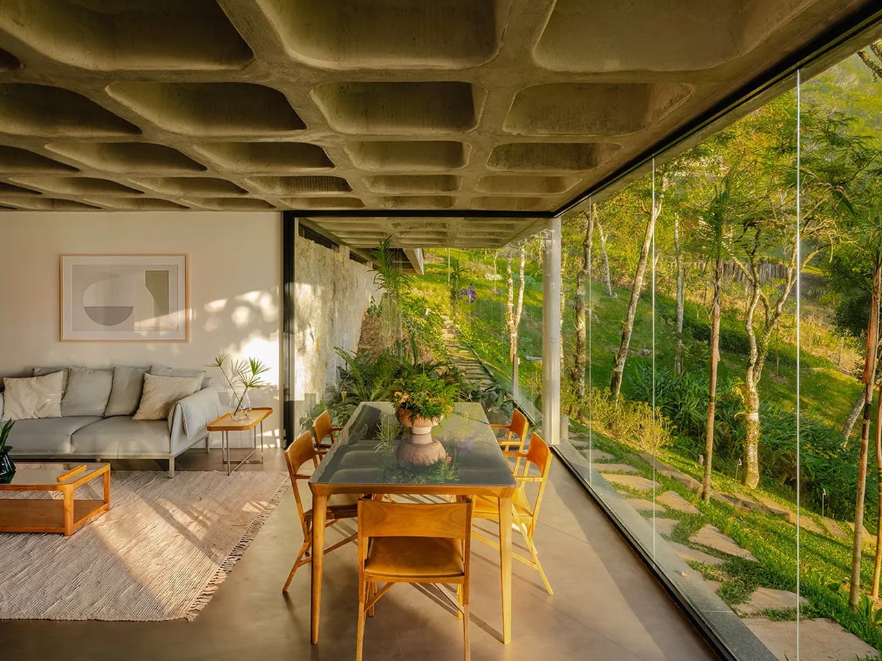
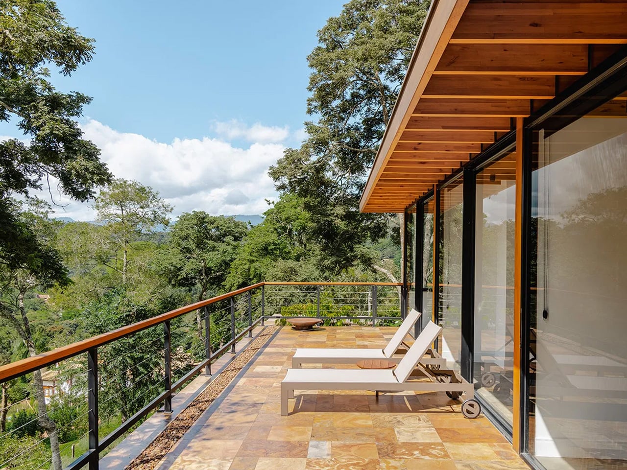
Deep in the Serra da Mantiqueira, where the air is thin and the forest floor barely registers sunlight, Cornetta Arquitetura has completed Casa Pinhal — a 690-square-metre residence in Santo Antônio do Pinhal, São Paulo, that reads less like a building dropped into nature and more like one that grew out of it.

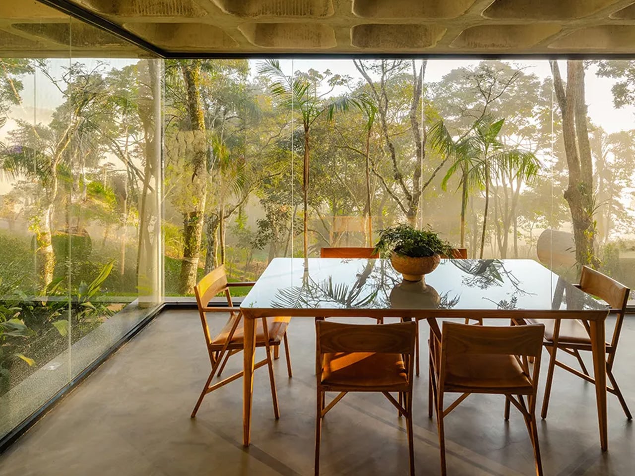
The site is demanding by any measure: a 4,900-square-metre plot with a steep incline and dense native vegetation already well established across it. Rather than fight the terrain, lead architect Pedro Cornetta made the land itself the primary design brief. The project was guided by one clear principle — touch the ground as little as possible. The result is a holiday house that gives its guests the impression of walking among trees rather than beside them.

Designer: Cornetta Arquitectura

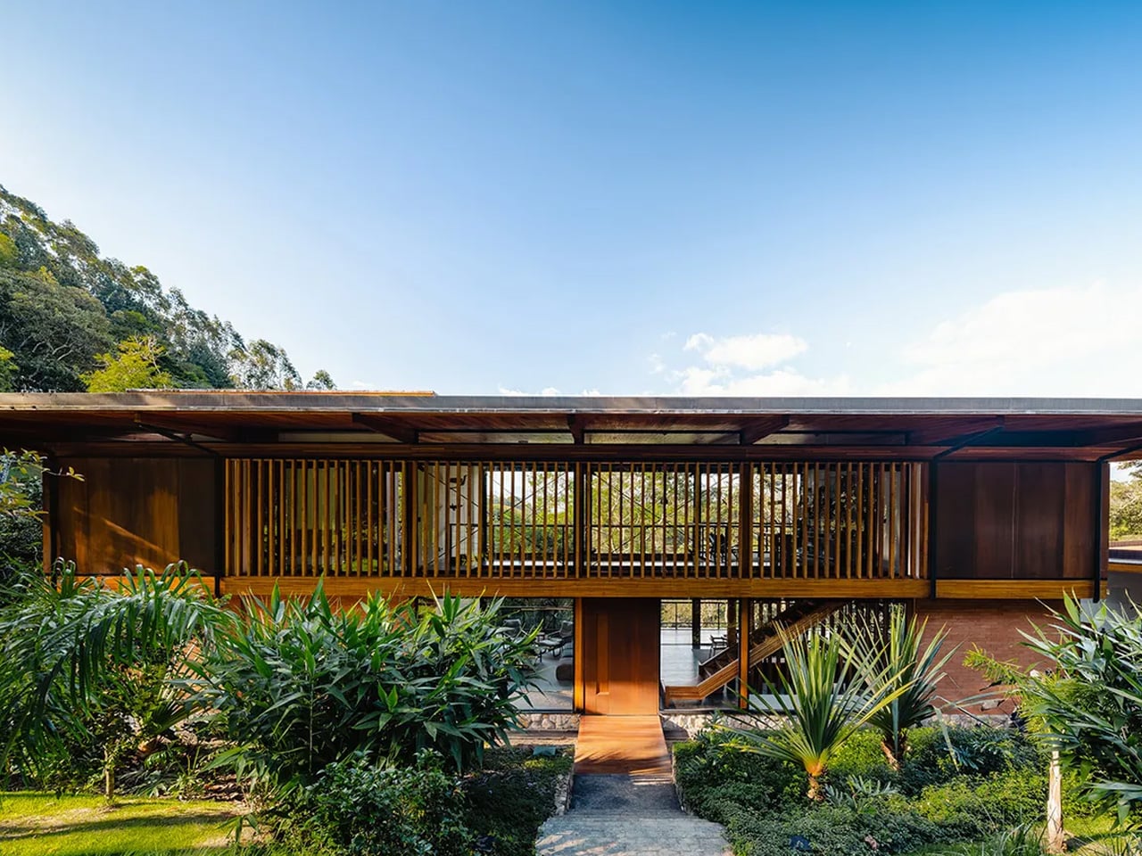
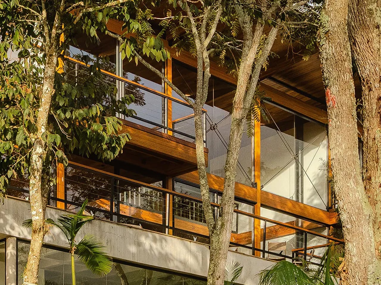
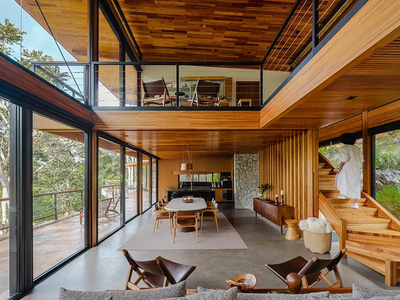
The structural language is built around glued laminated timber (MLC — Madeira Laminada Colada) and wood frame construction, executed in collaboration with Rewood using eucalyptus sourced for the project. Rewood completed the entire timber structure in just 30 days — 40 cubic metres of glulam going up with a pace that conventional concrete construction rarely allows. The system combines a column beam frame, a trapezoidal sandwich roof, dry panel floor slabs, and wood frame walls, all working together as a prefabricated assembly that keeps the site footprint minimal and the build time compressed.

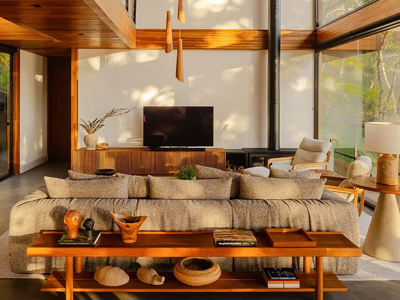
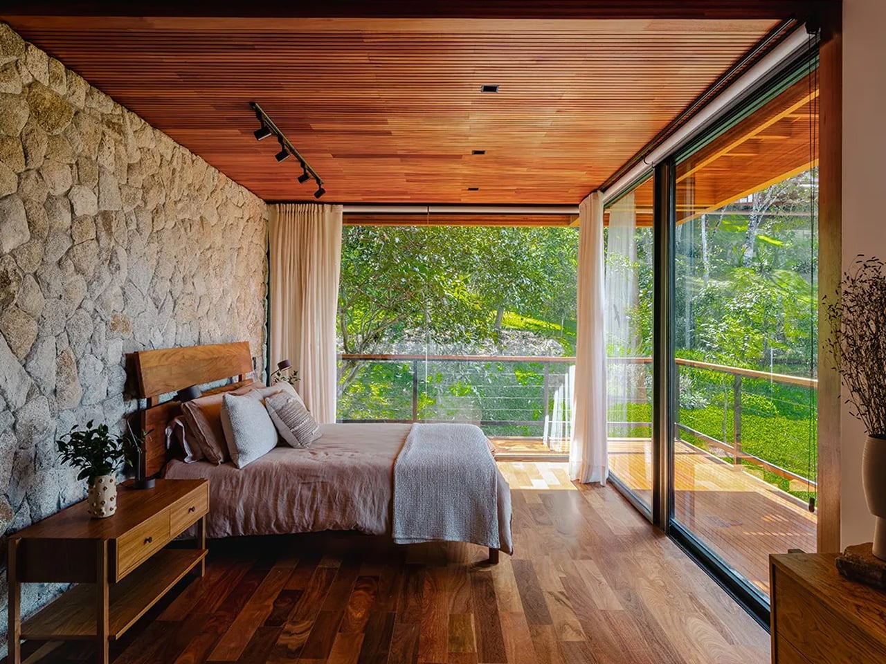
Inside, the material palette is quieter than the engineering behind it. Wood, concrete, and expansive glass panels define the interior volumes — a combination that Cornetta has refined across several projects, but here feels especially deliberate given the forest density outside. At night, the house undergoes a shift: internal lighting catches the grain of the timber, bounces off the concrete, and filters through the glass, turning what is a disciplined structure by day into something closer to a lantern. It’s the kind of detail that separates a house that photographs well from one that actually earns its place on a hillside.

Casa Pinhal sits in a lineage of work from Cornetta Arquitetura that treats sustainability not as an add-on feature but as a structural argument. Like Casa Guapuruvus before it — positioned to avoid disturbing existing flora and elevated off the ground to protect wildlife — Casa Pinhal was placed where native vegetation was already under stress, turning conservation into a site strategy rather than a branding point.

It’s a house built with the kind of restraint that takes real confidence. And in the Mantiqueira mountains, restraint might be the loudest architectural statement you can make.

The post Casa Pinhal Proves the Best Brazilian Architecture Barely Touches the Ground first appeared on Yanko Design.
8 Memorial Day Weekend Gadgets for the Man Who’d Rather Be Outside

The campsite is not a compromise. For a certain kind of person, the space between the trees gets the same deliberate attention as a living room — gear chosen for how it looks before dawn and how it performs after midnight. Memorial Day weekend is the season’s first real test of that instinct. These eight products are for the man who sets up camp with the same consideration he’d give a well-arranged shelf.

None of these are impulse buys. They’re the objects that earn a permanent spot in the pack — things you reach for every trip, not things that get forgotten in the garage. The sequence here runs from what you carry in your pocket, a titanium cylinder that glows for a quarter century without a battery, to what you use to cut the final rope of the night. A full campsite, deliberately assembled.

1. NoxTi

The NoxTi is a 45mm titanium cylinder that glows in the dark for 25 years without a battery, a charge, or any maintenance beyond replacing the tritium vial when it eventually dims two decades from now. The physics are not LED and not phosphorescent. Tritium is a radioactive isotope whose decay generates light continuously — the same principle behind military watch lume and nuclear exit signs. Xedge has machined this process into something that lives on your keychain.
The body is Grade 5 titanium — Ti-6Al-4V, the aerospace alloy — CNC-machined to tight tolerances with two silicone O-rings securing a quartz-protected vial that transmits 92% of available light. A ceramic-tipped glass breaker sits at one end. At 10.7 grams, it registers on the keychain the way a quality key does: present but not intrusive. Six color options run from Ice Blue to Sunset Orange. At camp, it tells you exactly where your keys are without reaching for your phone. That is the entire point.
What We Like:

  • Twenty-five years of continuous glow with zero batteries is a design achievement no other consumer lighting product can match
  • CNC-machined Grade 5 titanium with a field-replaceable vial system makes this effectively a permanent carry object
  • Six colorway options mean it reads as a design choice, not a utility clip

What We Dislike:

  • The glow is intentionally faint — it’s an orientation tool, not a navigation light, and expecting it to illuminate a path is a misreading of what it is

2. RetroWave 7-in-1 Radio

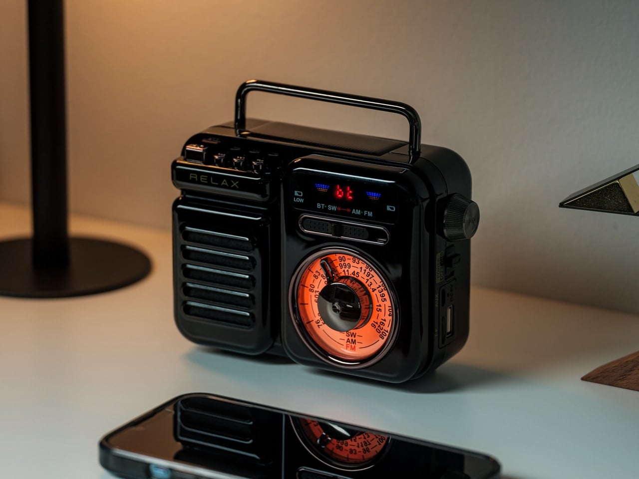
The RetroWave is seven things in one body: AM/FM/NOAA weather radio, Bluetooth speaker, USB charger, flashlight, reading lamp, SOS beacon, and clock. What makes it relevant for this list isn’t the feature count — it’s the form. The body is warm, compact, and tactile in a way that most multi-function gadgets simply aren’t. It looks like something discovered in a well-curated mountain cabin rather than panic-bought before a storm. That quality of looking chosen rather than grabbed is the distinction that matters here.

The hand-crank and solar charging panel mean the RetroWave can generate its own power, shifting it from a convenience item to a genuine piece of off-grid infrastructure. Up to 20 hours of radio playback on a full charge gives you a real entertainment window across the whole weekend. At $89, it sits at exactly the right price for a camp staple — the kind of thing that earns a permanent place in the bag because removing it would feel like forgetting something essential.

Click Here to Buy Now: $89.00

What We Like:

  • Hand-crank and solar charging make this fully self-sufficient — no cables, no wall outlet, no dependency on a power bank that itself needs charging
  • The warm retro form makes it the one piece of gear on the table that reads as a design decision rather than a utility purchase
  • NOAA weather radio is genuinely useful emergency infrastructure, not a gimmick

What We Dislike:

  • The Bluetooth speaker is functional, but won’t satisfy audiophiles

3. Haven Spectre

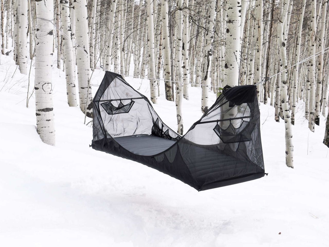
The Haven Spectre solves the problem every hammock sleeper knows: the banana curve. Traditional hammocks fold your body into a shape your lumbar tolerates for an hour and resents for the rest of the trip. The Spectre uses carbon fiber spreader bars and Monolite mesh panels to hold you flat — the same sleep position as a proper bed, suspended between two trees. At 4 pounds 4 ounces for the full kit, it’s lighter than most sleeping bags at a fraction of the pack footprint.

The Spectre includes a Silpoly rainfly, interior mesh pockets, an internal ridgeline for hanging gear, and an external sling for footwear. The mesh walls give you a full 360-degree view of wherever you’ve camped, which is either the point or not — the Spectre doesn’t decide that for you. Haven prices this from $485 with a 285-pound weight capacity and a packed size of 16 by 7 by 5 inches. For the man who considers where he sleeps as carefully as where he sits, this is the right answer to the right question.

What We Like:

  • Carbon fiber spreader bars deliver a genuinely flat sleep position that no conventional hammock can replicate — this is the difference between sleeping in a hammock and sleeping on one
  • The full kit, coming in under 4.5 pounds, is a meaningful spec for anyone packing in on foot
  • 360-degree mesh walls make wherever you camp feel worth waking up inside

What We Dislike:

  • From $485, this is the most expensive item on the list and reflects a very specific solution to a very specific problem — it’s not the entry point for casual hammock camping
  • Setup requires two trees at appropriate spacing, which means the terrain selects you as much as you select it

4. All-in-One Grill

The All-in-One Grill is made in Japan from stainless steel, and it carries that origin in its proportions. This is not a portable grill that apologizes for being portable — the construction is taut, the lines are clean, and the 11.8-inch base feels proportioned rather than compromised. It functions as a grill, a pot, and a smoker through a modular lid system, which means the same object that handles your morning eggs can be doing low-and-slow work by mid-afternoon. That’s a significant range for one piece of equipment.

At $449, this is the investment piece of the list, and it earns that position through longevity rather than novelty. Stainless steel built to Japanese manufacturing standards doesn’t warp, doesn’t corrode, and doesn’t develop the hot spots that ruin cheaper grills after a single season. The thick plate grill net and included pot lid for steaming and smoking mean you’re not returning for accessories down the line. Compact enough for a car boot, deliberate enough for a kitchen shelf once camping season ends.

Click Here to Buy Now: $449

What We Like:

  • Three distinct cooking modes — grilling, pot cooking, and smoking — from a single compact body is the kind of functional intelligence that makes you question why other portable grills are built the way they are
  • Japanese stainless steel construction is built for decades of use, not seasons
  • The proportions are clean enough that this sits on a kitchen counter without embarrassment when camping season ends

What We Dislike:

  • The compact dimensions are ideal for two; feeding a larger group requires patience between rounds and a considered approach to sequencing what cooks when

5. Olight Baton 4

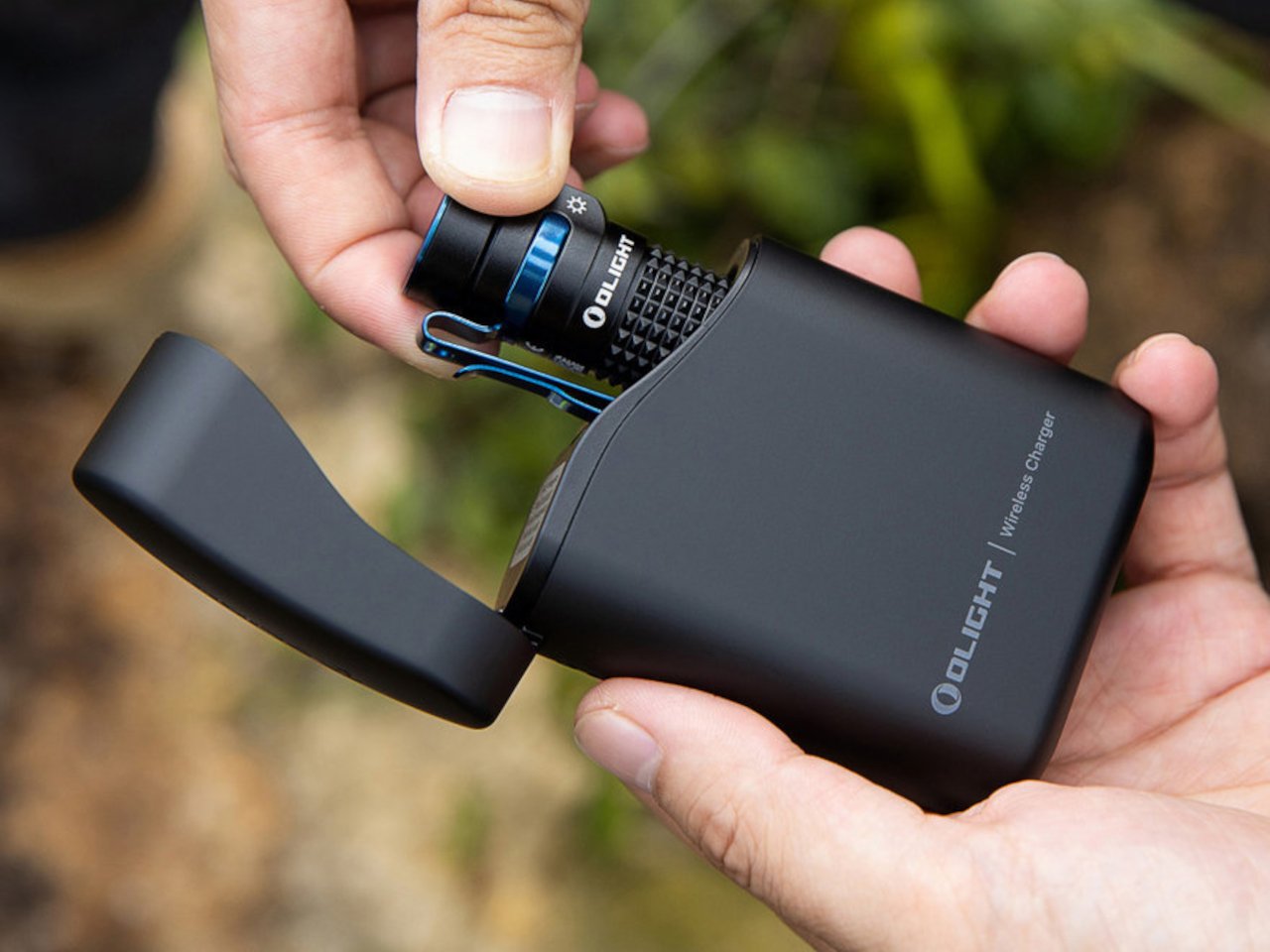
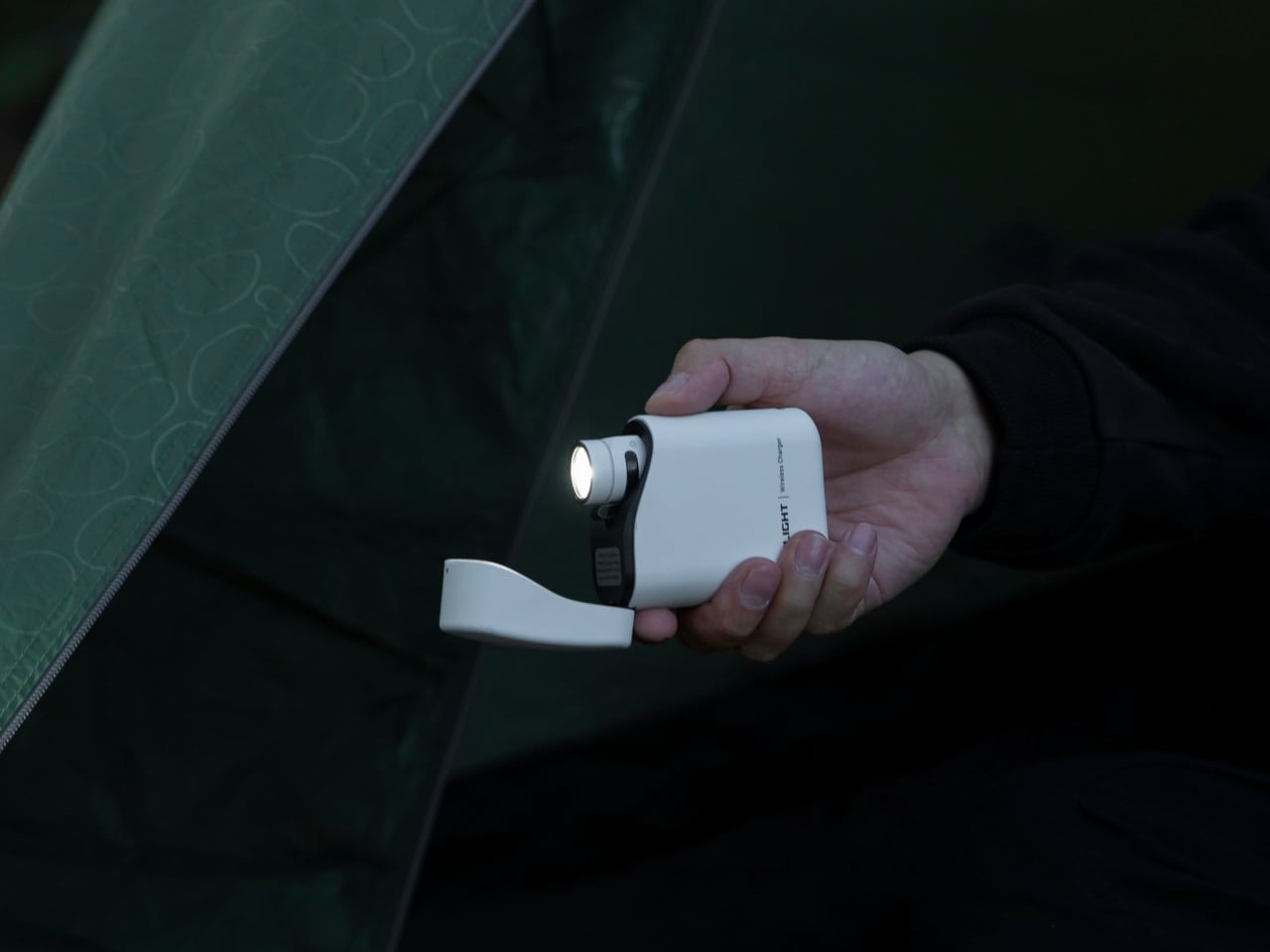
The campsite flashlight is the object most people under-invest in, and the one they most regret the moment the sun drops. The Olight Baton 4 is the correction to that habit. At 1,300 lumens from a body not much larger than a lighter, it puts out more light than most people realize is possible at this price. The magnetic charging case doubles as a 5,000mAh power bank, meaning the Baton arrives at the campsite charged and stays that way across the full weekend without drama.

What earns the Baton 4 its place here over cheaper alternatives is Olight’s attention to the carry experience. The clip sits deep in the pocket, the button has a deliberate texture that works with gloves, and the machined body feels significantly more expensive than $54.99. Five brightness modes cover everything from reading in a tent to lighting a path fifty meters out in total darkness. It disappears into your pocket until the moment it becomes the most important thing at your site.

What We Like:

  • 1,300 lumens from a body small enough to forget about until needed is a remarkable engineering result at this price
  • The charging case solving two problems — storage and backup power — with one purchase is exactly the kind of design thinking that creates long-term loyalty
  • Five brightness modes mean the Baton handles reading light and trail light from the same pocket object

What We Dislike:

  • The charging case adds bulk that doesn’t sit comfortably alongside the light in a single pocket — you carry them separately or leave the case in the bag
  • USB-C charging is reserved for the newer Pro model; the base Baton 4 uses a proprietary magnetic connector

6. Stanley Perfect Pour Over Brew Set

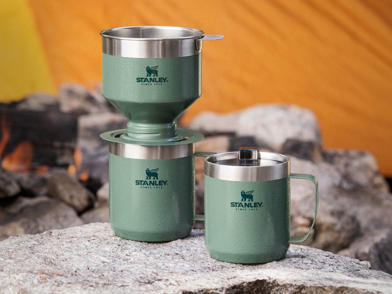
The Pour Over Brew Set strips the morning ritual down to its essentials: a stainless steel cone filter, a cup base that doubles as your vessel, and nothing disposable. No paper filters, no waste, no fragile glass sitting at risk on a folding table. You grind your beans, pour your water, and the coffee lands in a Stanley cup ready for the day. The whole thing stacks into itself, making it one of the most compact brewing systems available for outdoor use.

What separates this from the sea of portable coffee gadgets is Stanley’s refusal to compromise the cup. The base isn’t an afterthought — it’s the same vacuum-insulated construction as the tumblers the brand built its reputation on. Your coffee stays genuinely hot for hours, which matters less at a kitchen counter and considerably more at a campsite at 6 am with the temperature still in the low thirties. At $79.99, it’s one of the most honest objects on this list: built to last, built to be used every single morning.

What We Like:

  • The metal cone filter eliminates disposables — no paper filters, no emergency store runs mid-trip
  • The vacuum-insulated base keeps coffee hot well past the pour, which at altitude and in cold morning air is less a luxury than a necessity
  • The whole system stacks into itself with nothing left over — it’s one of the tidiest pack-and-go brewing solutions available

What We Dislike:

  • This is a single-cup system — group camping requires multiple sequential pours, and the output speed depends heavily on grind size, which takes some practice to dial in correctly
  • It’s a ritual for one, not a breakfast solution for four

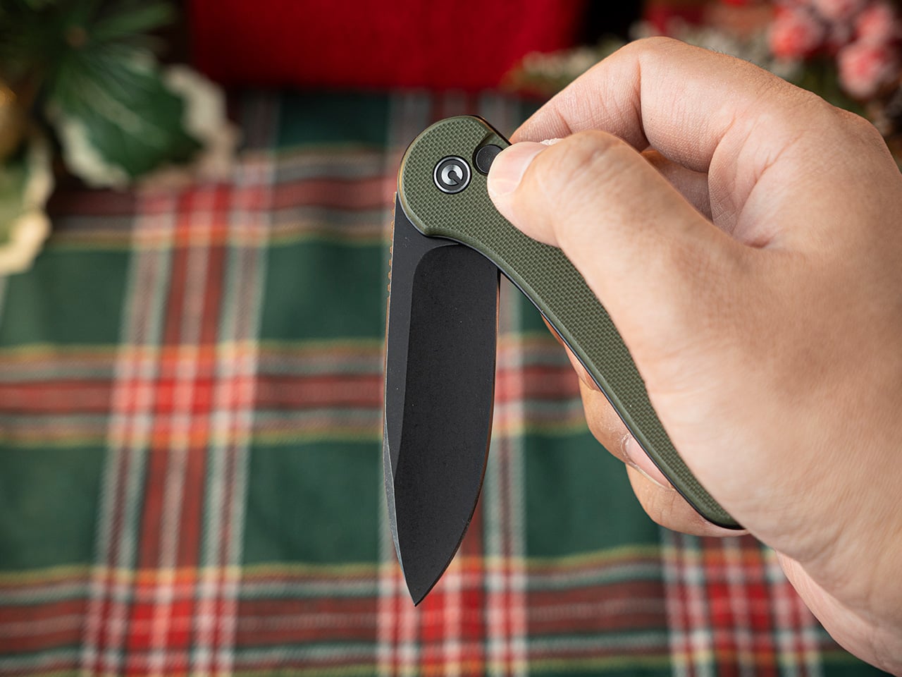
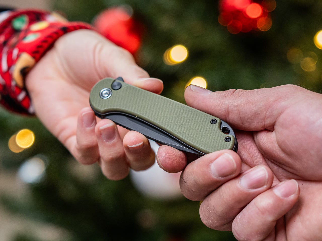
7. CIVIVI Button Lock Elementum II

A camp knife earns its place not through drama but through frequency: the rope that needs cutting, the package that won’t open, the branch that wants trimming. The Elementum II handles all of that without demanding attention. At 3.12 ounces with a 3-inch Nitro-V steel blade, it carries like it isn’t there until the moment you need it. The button lock opens single-handed — a detail that sounds minor until you’re holding something else with the other hand.

CIVIVI’s design language is where this knife punches well above its price point. The G10 handle scales sit flush against titanium-anodized liners, and the overall profile is lean enough to disappear in a front pocket without printing. Nitro-V holds an edge longer than the VG-10 steel found in knives twice the cost.

What We Like:

  • The button lock deploys cleanly one-handed every time, and the deep-carry clip keeps the knife invisible in a pocket without shifting during a full day of activity
  • Nitro-V edge retention is genuinely better than anything in this price bracket has any right to deliver
  • The slim profile and anodized liner finish make this look like a $150 knife in hand

What We Dislike:

  • At 3 inches, the blade sits at the shorter end for heavier camp tasks — batoning or breaking down larger cuts of food will show its limits quickly
  • G10 color options are conservative for a knife that otherwise looks this considered

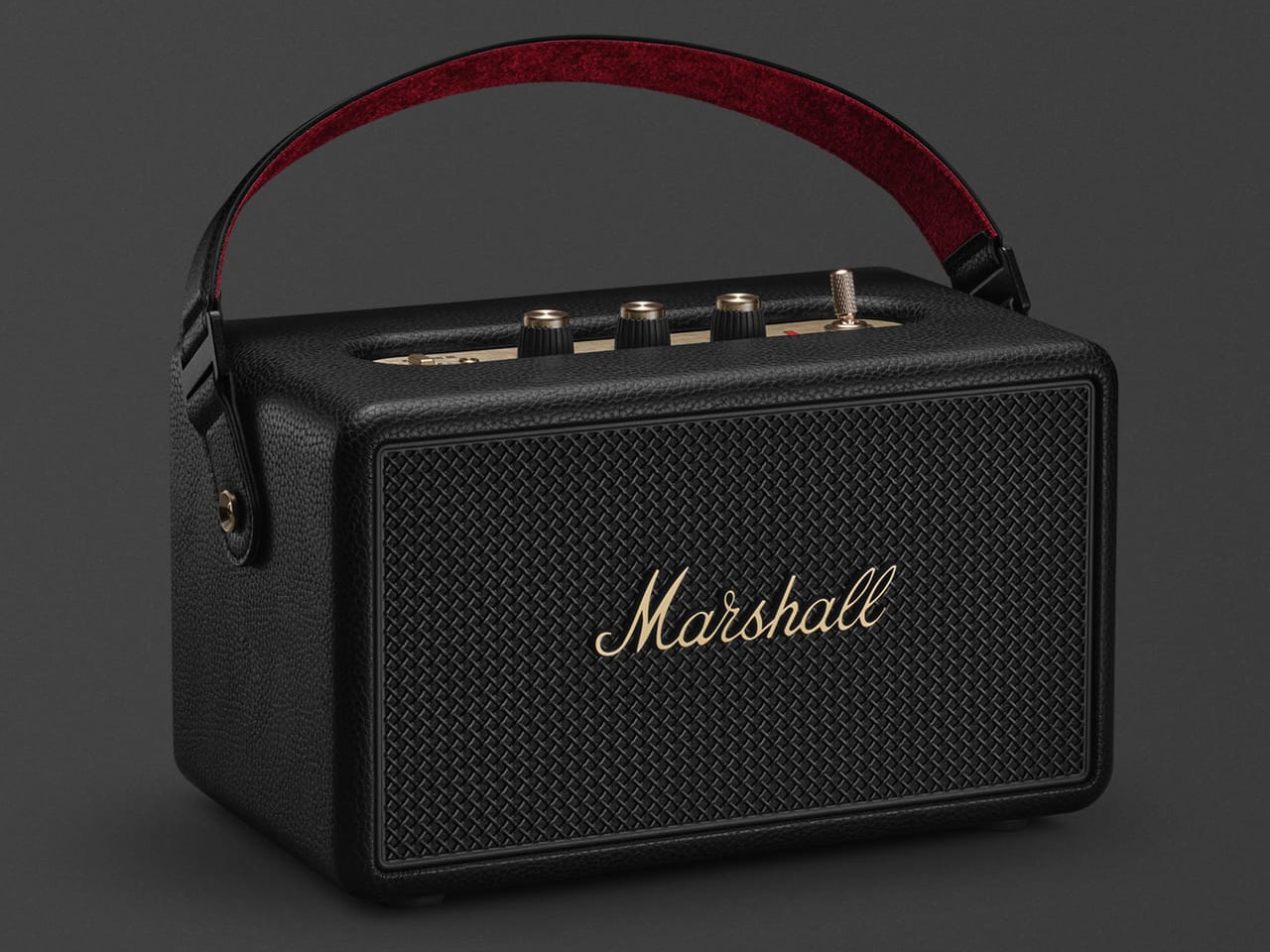
8. Marshall Kilburn III

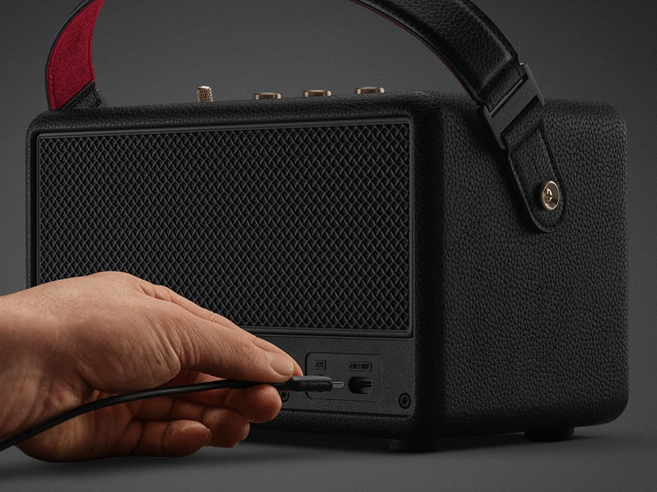
The Kilburn III is what happens when a speaker brand takes outdoor audio seriously without abandoning the aesthetic identity that made it recognizable. The guitar amp proportions, the gold script logo, the herringbone strap — these aren’t cosmetic decisions bolted onto a utility product. They’re what make the Kilburn the speaker people leave sitting on the picnic table rather than packing back into a bag. At 40 hours of battery life, you don’t need to manage it across a long weekend. It simply plays.

Where the RetroWave Radio earns its place through versatility, seven functions, self-sufficient power, and emergency utility, the Kilburn earns its place through one thing done exceptionally well. If music is the reason you’re packing a speaker at all, this is the one that justifies the weight. The Kilburn III adds reverse charging to its feature set, meaning it can top up your phone or flashlight from its own battery, a practical outdoor function that speakers at this price point rarely bother to include. The sound is tuned for open space rather than indoor rooms: the wider the environment, the more the Kilburn opens up and fills it.

What We Like:

  • Forty hours of battery across a weekend means you set it down Friday afternoon and don’t think about charging it until Monday
  • Reverse charging turns the speaker into backup power for other gear — a thoughtful outdoor feature that makes the price easier to justify
  • The design holds up on a picnic table the way it does on a shelf — it looks like it belongs wherever you put it

What We Dislike:

  • At 2.6 kilograms, the Kilburn III is a car-camping speaker — backpackers need not apply
  • The $379.99 price demands a committed relationship with good outdoor audio; this is not the speaker you buy casually

Pack Well, Camp Better

The best campsite doesn’t happen by accident. It’s the result of eight or ten or twenty decisions made before you leave the driveway — what you bring, how it’s designed, and whether the sum of those choices creates something that feels assembled with genuine intention. Every product on this list earns its place through that logic: not because it has the most features or the most impressive spec sheet, but because it’s worth carrying, worth using, and worth looking at.

Memorial Day weekend is three days. That’s enough time for coffee at dawn, a full day over the grill, an evening of music around a fire, and a night spent flat in a hammock looking at whatever sky you drove to find. These objects exist to make those three days feel less like roughing it and more like the kind of life you’d choose if you designed one deliberately. Pack well.

The post 8 Memorial Day Weekend Gadgets for the Man Who’d Rather Be Outside first appeared on Yanko Design.