LG’s World-First 1Hz Panel Gives the Dell XPS 48% More Battery

Battery life has been one of the laptop industry’s most persistent design headaches, especially among Windows notebooks. Despite significant gains in chip efficiency, the display consistently ranks among the biggest power consumers in any portable computer. Most laptop screens refresh at a fixed rate regardless of what’s actually on them, which means the panel keeps drawing full power even when you’re sitting completely still, reading a document with nothing on screen changing at all.

LG Display’s new Oxide 1Hz panel is the first mass-produced LCD laptop screen that doesn’t work that way. Rather than holding a fixed rate, it reads what’s on screen and drops to 1 Hz when the content is static, then scales back up to 120 Hz for video or gaming. LG began mass production on March 22, 2026, claiming the first-ever achievement of this at scale.

Designer: LG, Dell

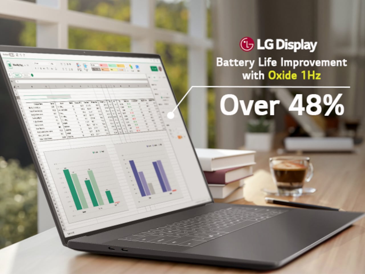
The technology relies on custom circuit algorithms and a new oxide material applied to the panel’s thin-film transistor. That oxide holds an electric charge longer than conventional LCD materials, letting the screen maintain a still image without continuously refreshing it. LG claims the result is up to 48% more use on a single charge versus existing solutions, which is a significant number if it holds up in everyday use.

In practice, this matters most during the parts of a workday you spend the bulk of your time in. Checking emails, reading through documents, and sitting on a static slide during a meeting are all moments where a 60 Hz or 120 Hz screen burns power for no real benefit. The Oxide 1Hz panel handles those scenarios at a fraction of the usual draw without any visible difference.

When you do pull up a video or launch something that demands smooth motion, the panel doesn’t hesitate. It detects the change and jumps back up to 120 Hz automatically. There’s no mode to switch into, no setting to toggle, and no trade-off to manage. It just adjusts based on what’s happening on screen, which is how this kind of feature should work in the first place.

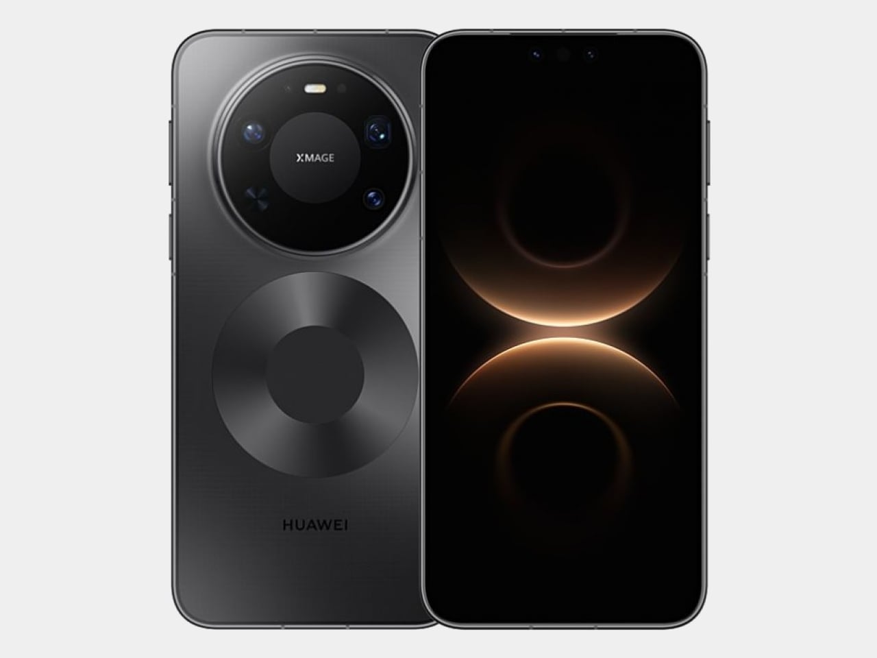
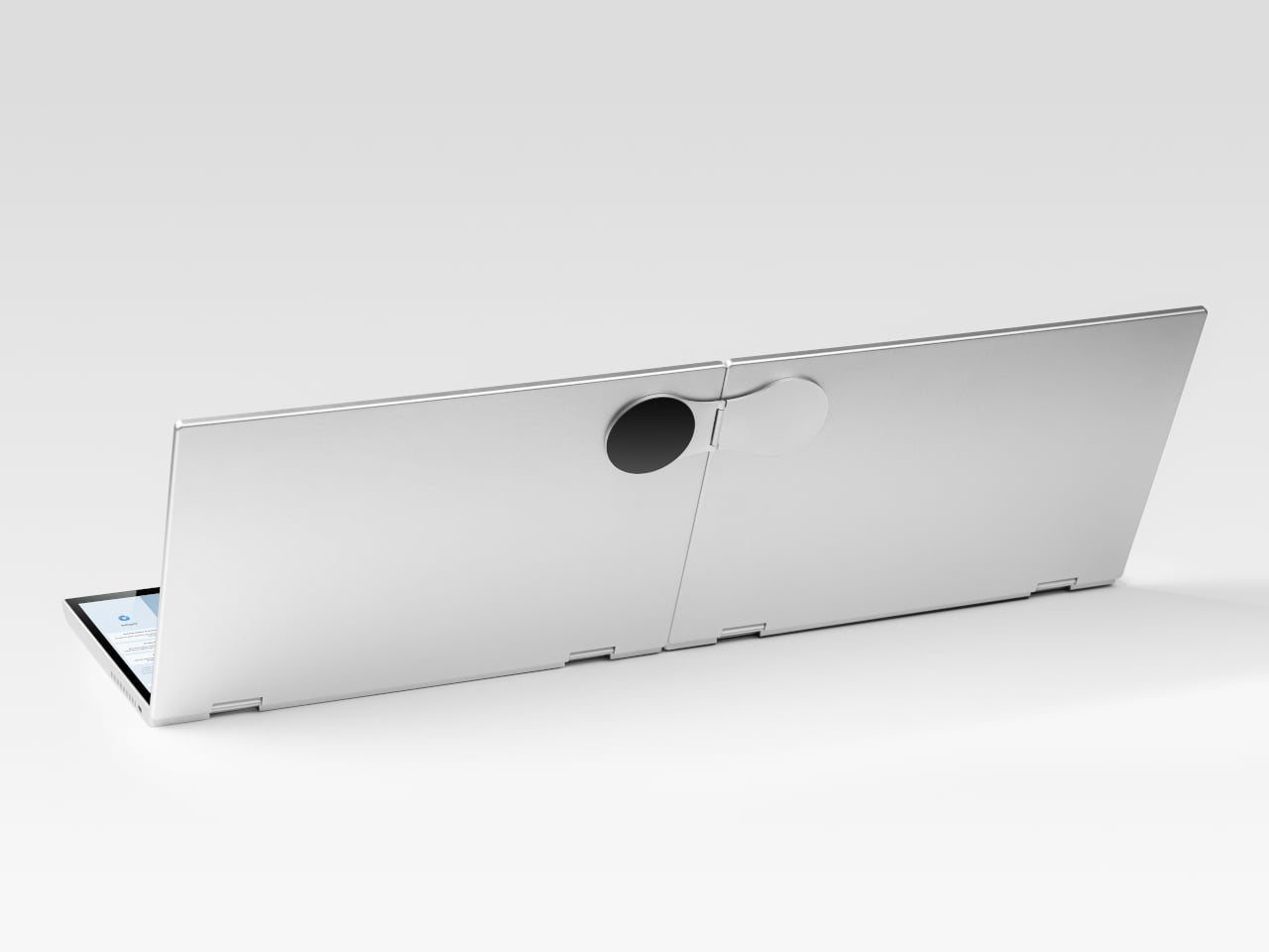
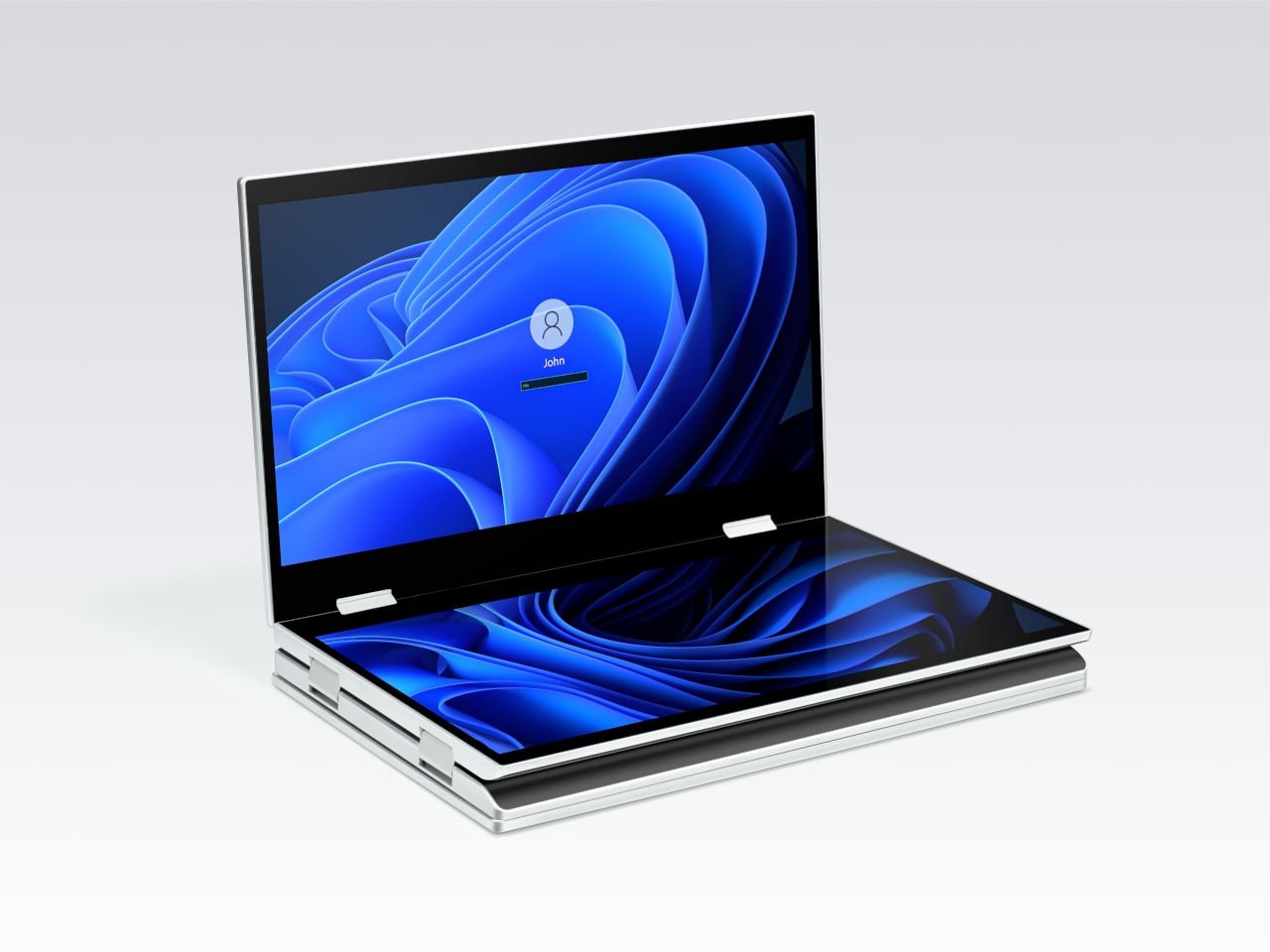
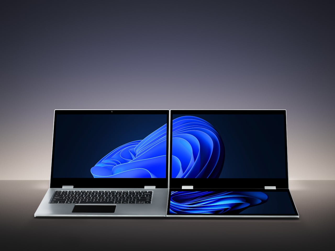
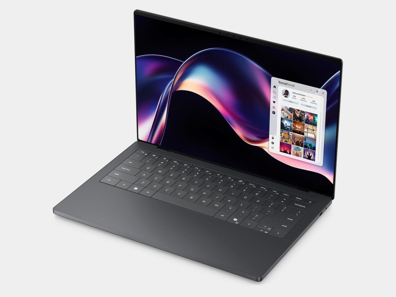
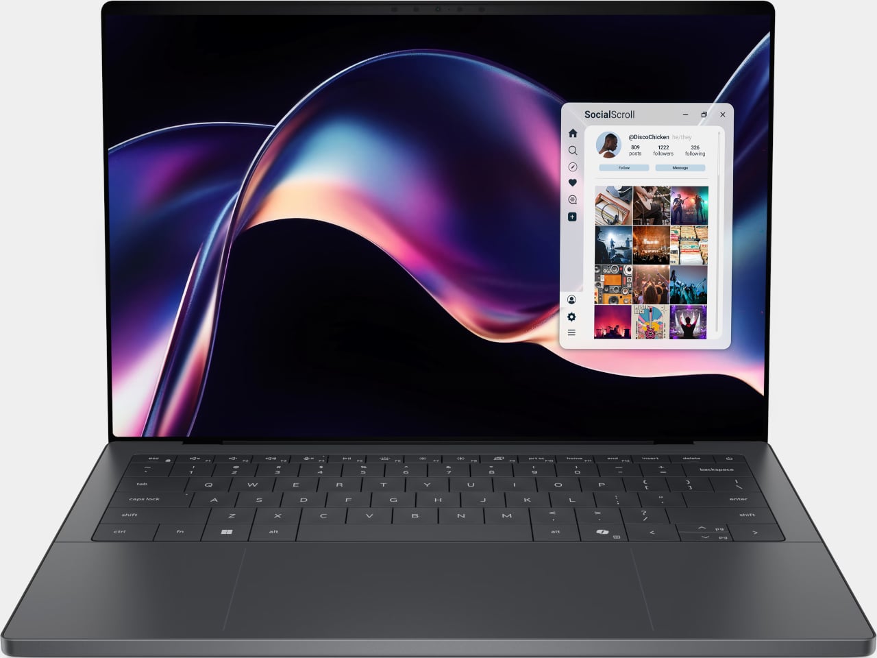
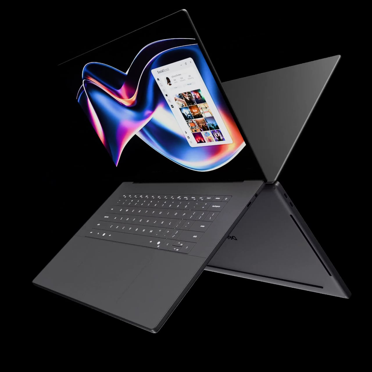
The first laptops to ship with this panel are the Dell XPS 14 and Dell XPS 16 for 2026, both unveiled at CES 2026 in January. The LCD option on both models runs at 1920 x 1200 pixels and 500 nits of brightness. Dell’s OLED option only drops as low as 20 Hz, which means the more affordable LCD configuration actually wins on low-power behavior.

Here’s where it gets interesting from a design standpoint. The display is one of the biggest power consumers in any laptop, so a screen drawing significantly less power during typical use creates real headroom for designers. They can use that headroom to maintain battery size and gain extra runtime, or to trim the battery slightly for a lighter, thinner chassis without giving up the battery life buyers already expect.

Of course, LG is already planning a 1 Hz OLED version of this technology for 2027, which is when things could get more interesting. OLED handles contrast and color in ways LCD can’t match, and pairing that quality with proper low-refresh-rate behavior could push portable laptop design further than it’s been able to go. For now, the Oxide 1Hz LCD is in something you can actually go out and buy.

The post LG’s World-First 1Hz Panel Gives the Dell XPS 48% More Battery first appeared on Yanko Design.

This E Ink Flip Case Shows the Time Without Ever Waking Your Phone

Smartphone cases have become one of the more predictable corners of the mobile accessory market. Most of them do exactly what you’d expect: wrap around the phone, absorb some impact, and stay out of the way. A few go further with card slots or battery packs, but the core idea hasn’t changed much in years. You’re still waking the screen every time you want a quick glance at the time.

Pixel Dynamics’s E Ink Flip Cover concept takes a simpler approach. It’s a flip-style case with an E Ink screen on the outer panel, so even when the cover is shut, and the phone is locked, you can still check the time, date, battery level, and signal without waking the main display. E Ink only draws power when the image changes, making it a natural fit for an always-on panel.

Designer: Pixel Dynamics

There’s more to the display than status data, though. Beyond the time, date, and connectivity readouts, you can set it to show ambient illustrations that make the cover feel more personal, less like a utility panel, and more like something worth looking at. An E Ink screen isn’t going to win awards for visual richness, but for something that stays visible all day without demanding attention, that’s a reasonable ask.

The case attaches to the phone through a MagSafe-style magnetic system, snapping into place without any physical ports. Power is handled through contact pins that draw directly from the phone’s battery, so there’s nothing to charge separately and no second battery bloating the profile. That’s a smart call; one of the quickest ways to kill an otherwise good accessory concept is to make the user manage another charging cable.

Data between the case and the phone travels through what the concept calls Laser-Link, pitched as a higher-efficiency alternative to Bluetooth or NFC. The idea is that replacing radio-based communication with a laser signal gets you faster data transfer with less power overhead and no interference issues. It’s still concept-level technology, of course, so there aren’t any real specs to evaluate, but the thinking behind it is sound.

Put it together, and the pitch is easy to follow. You keep the phone in your pocket or face-down on a desk, and the E Ink panel handles quick glances that don’t need the main screen, saving the battery drain of waking an OLED display dozens of times a day. When you do need the full phone, flipping the cover open gets you there just as fast as any other case.

That said, a few things here are easier to propose than to build. Laser-Link doesn’t have a clear path to production yet, and it raises obvious questions about reliability when the phone and case aren’t perfectly aligned. The E Ink display part is more grounded, since that technology already exists in other accessories.

The phone case hasn’t had a genuine design moment in quite a while, and a concept that starts asking what the outer panel can actively do for you is a reasonable place to start that conversation. It still has a long road before reaching any shelf, but for a category that’s mostly been stuck recycling the same rigid shells, that’s actually not a bad place to be.

The post This E Ink Flip Case Shows the Time Without Ever Waking Your Phone first appeared on Yanko Design.

These Wood and Leather Wall Holders Swap Hooks for Hidden Magnets

The entryway tends to be the most neglected spot in any home when it comes to design. Things pile up at the door, and most of the solutions people reach for, plastic key hooks, adhesive strips, wire baskets, tend to prioritize function so heavily that they end up looking like afterthoughts. It’s a corner of the home that rarely gets the same design attention as the living room or kitchen.

Ukrainian design brand dodomoom takes a different approach with its Magnetic Holders & Hooks collection. Designed by Andrii Burzi, the pieces combine natural wood and smooth leather to make something that looks far more like wall decor than a key holder. That impression, though, isn’t the whole story. Beneath the leather surface, a precision magnetic system does the actual work of holding keys and other small metal objects.

Designer: Andrii Burzi

That hidden mechanism is part of what makes the collection so satisfying to use. There’s no hook to loop your keys onto, no notch to fumble with when your hands are full. You just bring your keys close to the surface, and the magnets hold them flat against the leather face. Burzi described the reaction from people who try it: “It isn’t magic. It’s precision.”

The collection has six pieces in total, ranging from the compact Nordic Little Magnetic Holder to the larger Nordic Family Magnetic Holder, which can hold up to four sets of keys at once and measures roughly 8 inches square. You can mount any of them with 3M adhesive tape or standard screws, giving you the option to hang them without committing to permanent hardware on the wall.

Each piece is available in walnut, ash, or maple, with a Night Black option in painted ash for spaces with a darker palette. The leather inlay sits against the wood base, and the combination reads as considered rather than decorative for its own sake. These aren’t objects that need to be explained; you’d be happy having them on the wall even if they didn’t hold a single key.

The collection also includes the Nordic Little Coat Hook, which follows the same material language as the rest of the holders. That consistency matters if you’re planning to use more than one piece on the same wall, and dodomoom clearly anticipated that. The Nordic Line is designed with modularity in mind, so pairing a key holder with a coat hook feels more like a deliberate arrangement than an accidental one.

The Nordic Family Magnetic Holder is priced at $98, which puts it closer to a considered purchase than an impulse buy. That’s a fair trade-off for something that pulls double duty as a decorative object and doesn’t make you stare at an ugly key rack every time you come home. Most entryway solutions make you pick between looking good and working well, and dodomoom doesn’t put you in that spot.

The post These Wood and Leather Wall Holders Swap Hooks for Hidden Magnets first appeared on Yanko Design.

This Moon-Inspired Lamp Has No App, No Cord, 100% Recycled Aluminum

The lamp has gotten interesting again. What was once a fixture relegated to task lighting and matching living room sets has turned into something more intentional, especially among people who care about how their spaces feel at different times of day. Cordless, portable table lamps have become a genuine category of their own, offering the kind of flexibility that hard-wired fixtures simply can’t.

Designer Rahi Seyedi’s Monir, developed for Rey Studio, slots right into that world while carrying a concept that goes a bit further than most. The 29cm cordless lamp is inspired by the way moonlight sits between the sky and the earth, and that idea drives every decision in the design, from the shape of its dome to the materials holding it all together.

Designer: Rahi Seyedi

The form reads pretty clearly once you know what it’s referencing. A dark, grounded base anchors the lamp below, standing in for the weight of the earth, while the translucent dome above lets the LED ring scatter light in a way that mimics the gentle diffusion of moonlight. Nothing about the design is there for decoration alone. Every detail serves the concept, and you can tell.

Using it is about as frictionless as a lamp can get. A tap switches it on, and gently rotating the upper section moves through three brightness levels. That’s it. There’s no app, no remote, and nothing to configure before you can actually use it. You just pick it up, place it where you want it, and adjust the brightness until the light feels right.

On a desk, Monir keeps things steady without being intrusive. The diffused glow is warm enough to take the edge off the contrast between a bright screen and a dark room, which is exactly what you want during a long stretch of work or reading. It doesn’t replace proper task lighting, of course, but it makes the hours you spend at a desk noticeably more comfortable.

Move it to a side table when the day winds down, and the lamp takes on a different role entirely. At its lowest settings, the warmth it puts out is the kind that encourages you to put your phone down and actually be in the room. Overhead lights off, Monir on, and the space feels genuinely different in a way that’s hard to explain but pretty easy to appreciate.

Sustainability was factored into Monir well before the final form was settled, and it shows. The base and dome are both made from 100% recycled aluminum, while the diffuser uses bio-based polycarbonate, a plant-derived material that doesn’t end up in a landfill. For something that asks so little of you visually and physically, that’s not a small thing, and as lighting objects go, Monir keeps its intentions quiet and its results remarkably clear.

The post This Moon-Inspired Lamp Has No App, No Cord, 100% Recycled Aluminum first appeared on Yanko Design.

Rokform Built a $100 Charger That Replaces Your Entire Nightstand Pile

At some point, the nightstand became a charging station. What started as a place for a glass of water and a book has evolved into a tangle of cables, pucks, and adapters competing for the same two outlets. The watch charger is somewhere near the back. The earbuds case is balanced on top of something it shouldn’t be on. And the phone is either plugged in or forgotten, depending on how tired you were when you got into bed.

Rokform’s 3-in-1 Foldable Wireless Charging Stand addresses that specific kind of chaos with a single compact unit that charges a phone, an Apple Watch, and wireless earbuds all at once, without any cables beyond the single USB-C feeding the stand itself. The phone pad delivers up to 15W, the earbud pad handles 5W, and the Apple Watch arm tucks out when needed and folds back flat when not. One cable, three devices, done.

Designer: Rokform

The build is zinc alloy and glass, which puts it in different company than the plastic pads that flex slightly when you press on them. That combination reads as dense and grounded, designed to stay in place rather than slide around while you fumble for your phone at midnight. The phone pad adjusts between portrait and landscape, which matters if you use a nighttime clock display or want to follow a recipe without picking the phone up.

The travel argument is where the design earns its $99.99 most directly. The whole unit collapses to just over 15 mm flat, thin enough to slide into a bag without dedicated padding. Anyone who has hunted down enough hotel outlets to charge three separate devices before a morning flight will understand the appeal immediately. One folded stand and one cable replace the whole pile, though a 30W USB-C adapter is required and not included.

That last detail is worth pausing on, because the absence of a power adapter is a legitimate inconvenience. Rokform specifies a minimum 30W USB-C adapter and recommends their own PowerTrip 65W GaN Fast Charger for full performance. That is a reasonable recommendation, but it also means the stand does not actually replace your charging setup on day one without an additional purchase, unless you already own a high-wattage USB-C adapter.

The Watch pad compatibility is Apple Watch only, which Android-primary users will notice immediately. The phone and earbud pads both support Android devices with Qi wireless charging, so the stand is not completely Apple-exclusive. It does, however, skew toward households already invested in the Apple ecosystem, where the combination of iPhone, AirPods, and Apple Watch is common enough that a dedicated three-device stand makes immediate sense.

At that price tag, Rokform is competing against a field of 3-in-1 charging stands from Belkin, Anker, and others at comparable or lower price points. The zinc alloy and glass construction and the sub-16mm folded profile are the real differentiators, neither of which is trivial if you travel frequently or care about what sits on your desk. The premium over a $60 alternative is harder to justify for someone who mostly keeps it plugged in on the nightstand than for someone who packs it every week.

The post Rokform Built a $100 Charger That Replaces Your Entire Nightstand Pile first appeared on Yanko Design.

This walkable steel sculpture turns geometric chaos into an experience

Most public sculptures are meant to be looked at from the outside. You walk past, glance up, maybe take a photo, and move on. The relationship between the object and the person stops at the surface. Five Fragmented Cubes, a large-scale interactive sculpture made of painted steel, refuses that arrangement entirely: it was built specifically to be entered, climbed, and walked through, so that the thing you came to look at ends up surrounding you on all sides.

The structure consists of 10 cube frames arranged in two stacked tiers on a concrete base, with five cubes forming the lower support grid and five more sitting on top. The upper tier is where the visual action happens. Each face of those top cubes is clad with painted steel panels, and each panel face is divided into two triangles. One of those triangles is subdivided again and folded inward, while both are folded outward from the face of the cube frame and locked in place, projecting into space at fixed angles.

Designer: Michael Jantzen

What keeps the whole thing from feeling mechanical or predictable is one deliberate decision: the orientation of every triangle has been rotated randomly relative to its cube face. There is no repeating pattern, no symmetrical rhythm across the surface. Up close, the geometry is legible; from a distance, the cumulative effect reads as dense, spiky, and almost organic. The same steel panels and the same folding logic appear across every face, yet the result looks nothing like a system built from identical parts.

That tension between the simple and the complex is the actual subject of the sculpture. The designer frames it as an exploration of how identical, interconnecting, repeating parts can generate extreme perceived complexity, drawing a comparison to objects in nature, where elaborate forms frequently emerge from a limited set of rules applied at scale. Whether the built result actually produces that sense of discovery depends entirely on where you are standing.

Two red staircases, one at each end of the structure, lead up to a mid-level catwalk with red perforated steel grating underfoot and tubular red railings. The red is not subtle. Against the all-white panels and columns, it functions less as a safety feature and more as a graphic element, separating the structure’s circulation path from its expressive surface. Inside, the folded panels create a partially enclosed space, with light cutting through the gaps between triangles at angles that shift as you move.

The pastoral setting, open green hills, and clear sky make the white-and-red contrast sharper still. A sculpture this geometrically dense, placed in an undisturbed landscape, is a deliberate provocation, and it earns visual authority because of it. The mesmerizing structure does make one wonder whether the interior experience, walking the catwalk surrounded by folded steel at close range, delivers the complexity it promises from a distance, or does the chaos quietly resolve once you are standing inside it?

The post This walkable steel sculpture turns geometric chaos into an experience first appeared on Yanko Design.

Lenovo’s $60 Snap-On Turns the Legion Tab Into a Bartop Arcade

Gaming on a tablet is a strange kind of compromise. The screen is great, the hardware is often genuinely powerful, and the library is enormous, but you’re still holding a slab of glass with your thumbs smudging across virtual buttons. Controllers help, and dedicated gaming tablets like Lenovo’s Legion Tab have attracted a healthy ecosystem of accessories. None of them, though, looks quite like this.

Lenovo has quietly released the Legion Y700 Tablet Arcade Dock in China, a snap-on peripheral that turns the 8.8-inch Legion Tab into a miniature arcade cabinet. The tablet slots into the dock and connects through USB-C, at which point you have a joystick, eight colored action buttons, and five additional buttons along the top edge. That’s 14 physical inputs total, which covers most of what classic arcade games and retro emulators would ever demand from a player.

Designer: Lenovo

The concept is straightforward, and the appeal is immediate. Retro gaming on Android has quietly matured into one of the more compelling reasons to own a powerful compact tablet, and a joystick changes the feel of that experience in a way no gamepad quite replicates. Fighting games, run-and-gun titles, and classic beat-em-ups were built around a stick and a row of buttons, and playing them with a thumbstick always involves a small but nagging sense of compromise that this dock resolves without much ceremony.

The dock is listed on Lenovo’s Chinese store for ¥399, which converts to roughly $60 stateside. For an accessory with this level of novelty, that pricing is surprisingly restrained. The Legion Tab itself carries real gaming hardware, and the dock is essentially asking whether you’d like to occasionally use it standing upright like a bartop cabinet. At $60, the answer doesn’t require much deliberation.

The more practical question is whether the controls hold up to repeated use. Arcade joysticks and buttons sit on a spectrum from satisfying to mushy, depending almost entirely on the microswitches underneath, and Lenovo hasn’t published specifications on what’s inside this one. The snap-lock installation is designed for quick assembly, which is convenient, but a docking mechanism that flexes during aggressive joystick inputs would undermine the whole point.

There’s also the matter of availability. This is currently a China-only product, compatible with the Legion Y700 Gen 4 and Gen 5 tablets. The Legion Tab Gen 5 is heading to the US and global markets at $849, but the dock has no confirmed international release alongside it. Lenovo launched a gamepad accessory for the same tablet at roughly the same time, and neither has been officially announced outside China.

For a tablet that positions itself as a serious portable gaming device, the arcade dock is either a genuinely clever extension of that identity or a fun novelty that will live mostly in social media posts and Chinese gaming cafes. The form factor has obvious charm, and the $60 price removes most of the financial hesitation. What’s less clear is whether the controls are built to survive a few hundred rounds of Street Fighter or just look great in product photos.

The post Lenovo’s $60 Snap-On Turns the Legion Tab Into a Bartop Arcade first appeared on Yanko Design.

Huawei Put a Fan Inside the Mate 80 Pro Max, But It Cost a Camera

Gaming phones have had active cooling for years, strapping fans and heat pipes to the back like little mechanical tumors. They work, mostly, but they also make your phone look like it needs a pit crew. The Huawei Mate 80 Pro Max Wind Edition takes a different approach, tucking a cooling fan directly inside the phone itself. It is, quite literally, a Fan Edition, and not just in the collector’s edition sense of the word.

The Wind Edition is a variant of the standard Mate 80 Pro Max, currently listed for pre-order in China through Huawei’s Vmall store. It comes in Polar Night Black and Polar Day Gold, with 16GB of RAM paired with either 512 GB or 1 TB of storage. No pricing has been confirmed yet, and Huawei has yet to formally announce the device, but the listing and early images already make clear what the phone is doing and what it sacrificed to do it.

Designer: Huawei

The most obvious change is in the rear camera module. The standard Mate 80 Pro Max has a quad-camera setup; the Wind Edition trims that to three sensors. The space that the fourth camera occupied now goes to the fan mechanism, and the camera ring is noticeably wider to accommodate the ventilation. The perforated ring around the module is not decorative, but it is where the air moves. That trade-off deserves a moment: a flagship phone deleting a camera to make room for a fan.

The rest of the hardware appears to carry over from the standard model, including the 6.9-inch AMOLED LTPO display, the Kirin 9030 Pro chipset, and the 6,000 mAh battery with 100W wired and 80W wireless charging. The fan is intended to help the Kirin 9030 Pro maintain performance during extended gaming or long video recording sessions, where heat buildup would otherwise force the chip to throttle and degrade output.

Active cooling in smartphones is a reasonable engineering response to a real thermal problem, but integrating a moving mechanical part into a device designed to survive drops and dust introduces variables that passive thermal systems simply do not have. Fans collect debris. They wear out. There is a potential failure mode here that no amount of vapor chamber engineering would ever introduce, and that is worth factoring in before committing.

Huawei Mate 80 Pro Max

Huawei Mate 80 Pro Max

Early reports suggest the Wind Edition will initially be sold in limited quantities through select Huawei lifestyle stores rather than the broader retail channel, which positions this less as a mass-market launch and more as a demand test. It is a cautious approach, and probably a sensible one given how different this phone is from anything Huawei has shipped before. Most people curious about it will be watching from the sidelines for now.

The Huawei Mate 80 Pro Max Wind Edition raises a question that no spec sheet can resolve: how much camera versatility is a meaningfully cooler phone actually worth? The downgrade from four sensors to three is a concrete loss, not a rounding error. For someone who pushes the chip through long gaming sessions and has watched their device thermal-throttle under load, the trade-off might make perfect sense. For a photographer who chose the Mate 80 Pro Max for its imaging range, it probably does not.

Huawei Mate 80 Pro Max

The post Huawei Put a Fan Inside the Mate 80 Pro Max, But It Cost a Camera first appeared on Yanko Design.

This E Ink Foldable Phone Concept Punishes Doomscrolling by Design

Most smartphones are designed to be impossible to put down. The screen faces up on every table, the display lights up for every notification, and the cost of checking it one more time is exactly zero. That’s not an accident. The hardware removes friction from compulsive use because removing friction is what makes these devices feel indispensable. The tinyBook Flip concept asks a different question entirely: what if the phone were designed to get out of the way?

The tinyBook Flip is a vertical foldable phone concept built around a 6.1-inch E Ink display. Closed, it collapses into a compact, near-square form with rounded corners and a matte white finish, something closer in proportion to a folded notecard than a smartphone. The screen disappears entirely when the device is closed shut. No glowing rectangle sitting face-up on the desk, no ambient reminder that there are things to check. Just a small, quiet object.

Designer: Pixel Dynamics

That folded form is doing more work than it might seem. Opening the phone requires a deliberate physical action, and that small added step changes the behavioral math. A reflexive grab becomes a conscious decision. The friction is minimal in absolute terms, maybe two seconds, but two seconds of resistance is often enough to interrupt the loop. The concept treats that interruption as a design feature, which puts it in genuinely different territory from most phones.

The E Ink display adds a second layer of resistance, and this one is less subtle. E ink refreshes slowly, renders in grayscale or muted colors, and handles fast-moving content poorly. Social media feeds become tedious. Short-form video becomes unwatchable. Anything built around color, motion, and rapid visual feedback stops working the way it was designed to. This is precisely the point. The screen’s limitations aren’t engineering compromises left over from an earlier era of display technology; they’re structural properties that make certain behaviors genuinely unpleasant to sustain.

What E Ink handles well is a shorter list, but a coherent one. Text reading, messaging, calendars, and static interfaces are all comfortable at E Ink’s native pace. The renders of the tinyBook Flip show a UI built around exactly these strengths: a large clock face, a calendar widget, and a grayscale illustrated wallpaper. The interface doesn’t reach for capabilities the display can’t support. The phone isn’t trying to do everything; it’s trying to do a narrower set of things without apology.

Foldable E Ink panels aren’t a speculative technology. The hardware exists at the component level and has already appeared in experimental e-readers, though no consumer phone has shipped with one in any meaningful volume. The tinyBook Flip isn’t imagining impossible components; it’s proposing a form factor that manufacturers haven’t yet committed to producing. The distance between those two things is largely commercial, not technical.

There’s also something worth noticing about how the device reads as a physical object in social space. Closed, the tinyBook Flip looks like almost nothing. No visible screen, no status indicators, no glow. A phone that carries no visual weight when it’s not in use sends a different signal than one that’s always broadcasting its presence. Putting it down means it actually disappears from the environment, not just from your hand.

That said, the concept leaves some real friction points unaddressed, and not the intentional kind. E Ink handles camera use, live navigation, video calls, and authentication apps poorly. A foldable hinge adds mechanical complexity and thickness that clean renders tend to obscure. The tinyBook Flip looks resolved in this form, but a production version would have to make tradeoffs that these images don’t show and the concept doesn’t acknowledge.

Still, the more interesting question isn’t whether this specific device could ship. It’s whether a phone that makes itself harder to misuse is a reasonable design goal at all, or whether that’s just a way of describing a phone that most people wouldn’t actually want. The tinyBook Flip lands firmly on one side of that question. Whether the market agrees is a different problem entirely.

The post This E Ink Foldable Phone Concept Punishes Doomscrolling by Design first appeared on Yanko Design.

XbooK’s $1,999 Triple-Screen Laptop Is One Bag Instead of Three Monitors

Anyone who has worked remotely long enough knows the moment a single laptop screen stops being enough. It’s usually the day you’re cross-referencing three documents at once, or the morning you realize your financial model needs a live chart in one window while you edit formulas in another. The standard fix is an external monitor or a portable screen extender, which works fine until you’re hauling a bag that feels like it’s punishing you for being productive.

The XbooK takes a different approach by folding three full 14-inch touchscreens into a single aluminum laptop body that closes to just 1.5 inches thick. At 7.5 lbs, it’s heavier than a typical ultrabook. The tradeoff, though, is straightforward: you’re not carrying a laptop plus accessories. You’re carrying the whole setup in one piece.

Designer: XbooK

All three screens run at 1920×1080 with 400 nits of brightness each. The machine is powered by an Intel Core Ultra 7 with 32GB of DDR5 RAM and a 1TB SSD, with Wi-Fi 7 and Bluetooth 5.0 onboard. That’s capable hardware, though nothing unusual for a mid-to-high-range laptop in 2025. What makes those specs interesting here is what they’re pushing: 42 inches of combined touchscreen that unfolds in seconds without a single cable involved.

In full Workstation Mode, all three screens run simultaneously alongside an embedded mechanical keyboard and a 10-point touchpad. Connectivity covers Thunderbolt 4, two USB-C ports, and an AUX jack, with a 1,600×1,200 front camera that’s sharper than most built-in laptop cameras. The 70Wh battery has to power all of that, and battery life under a three-screen load is something any serious buyer should push the company on before committing.

For days when the full spread is overkill, the XbooK also works in a two-screen mode or as a conventional single-screen laptop. The latter folds everything up and makes the device look surprisingly ordinary from the outside, except for the two thick slabs sitting underneath the keyboard. That adaptability is one of the more genuinely practical aspects of the design: you’re not locked into the workstation configuration every time you open the lid.

At $1,999 (down from a listed $2,999), it’s priced for professionals who already spend that much on monitors and docking stations. XbooK ships from the US with orders promised to be processed within 3 to 5 business days. The refund-before-shipping policy and fulfillment language have the texture of a startup still scaling up. Spending that much on a device from a company with no established hardware track record is a different kind of commitment than buying from a brand with a decade of products behind it.

Screen real estate is one of the last things portable computing has consistently failed to solve, and most multi-screen laptop concepts have been either too fragile or too awkward for daily travel. The XbooK has a cleaner physical premise than anything built around magnets or external rails. How the hinges and chassis hold up after a year on the road, though, is still an open question that no amount of spec-sheet confidence can close.

The post XbooK’s $1,999 Triple-Screen Laptop Is One Bag Instead of Three Monitors first appeared on Yanko Design.