Mobile power bank concept can be used horizontally or vertically to maximize space

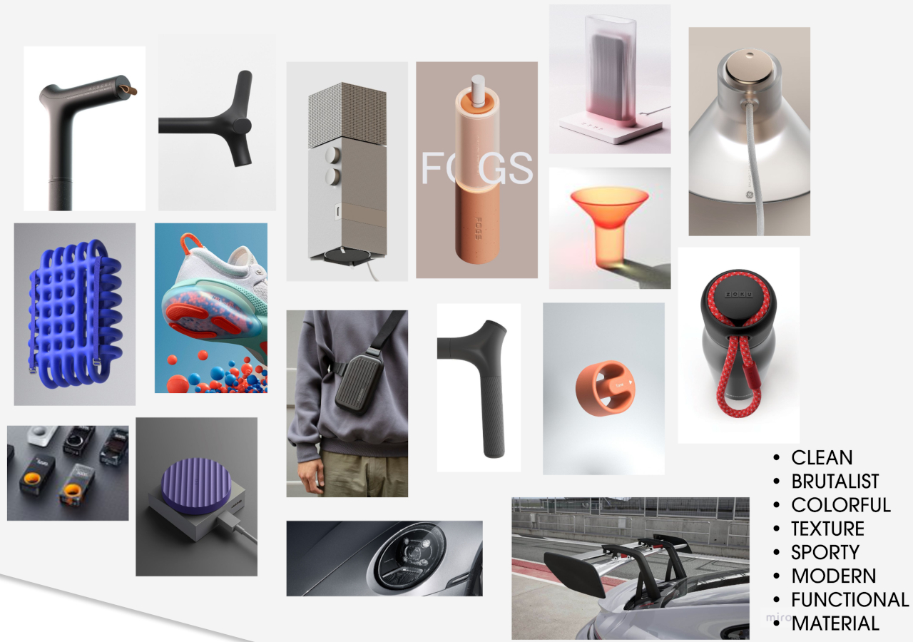
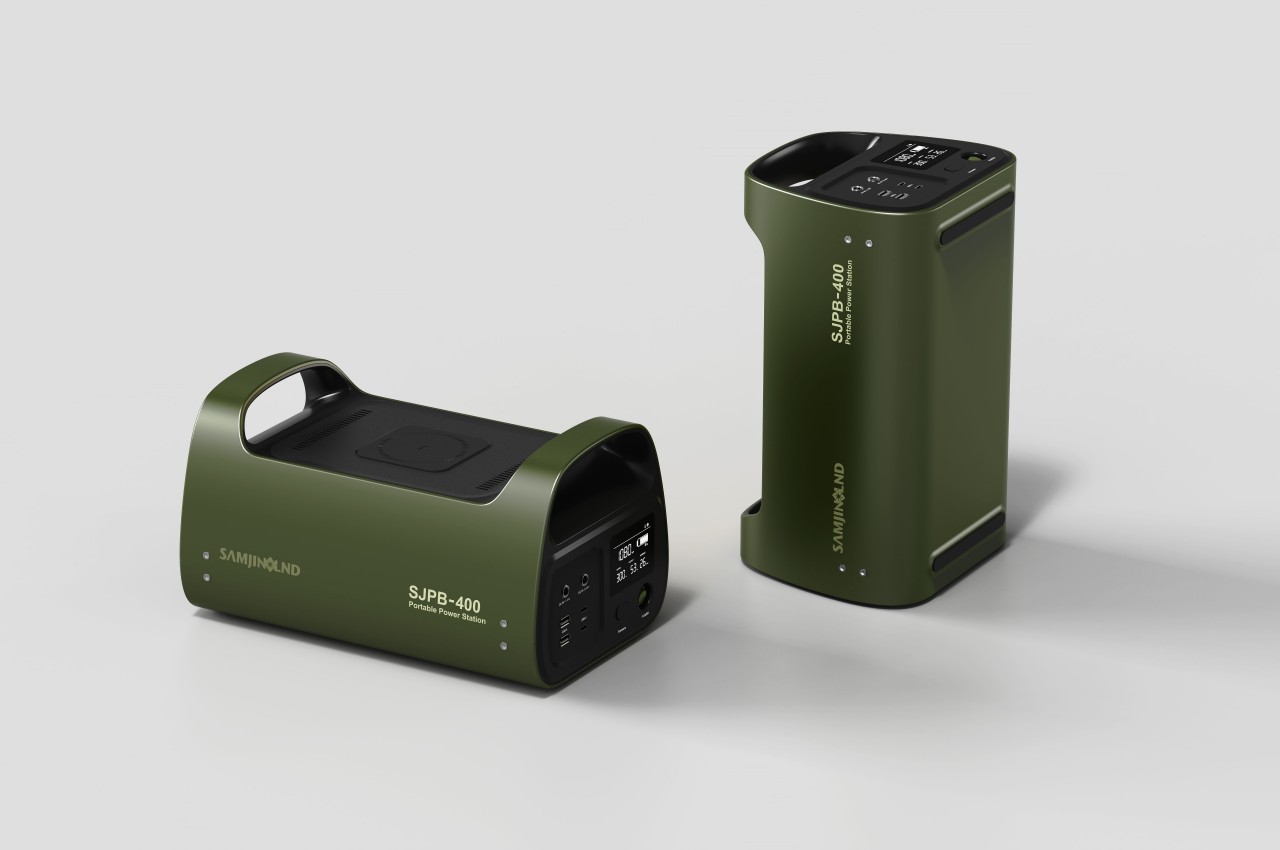
It’s almost comical how we’ve become so attached to our electronic devices that we start to panic whenever our batteries go red. That’s why there’s a large and thriving market for all kinds of portable battery solutions, ranging from pocket-sized blocks just for your smartphone to hulking boxes for a few night’s stay outdoors. The latter, while portable, aren’t exactly space-efficient, especially when it comes to the horizontal space you need to use them. This concept for a portable power station literally turns the design on its head by letting you use the large battery standing up, except for one or two cases where you’ll need it to lie down anyway.

Designer: Real Design

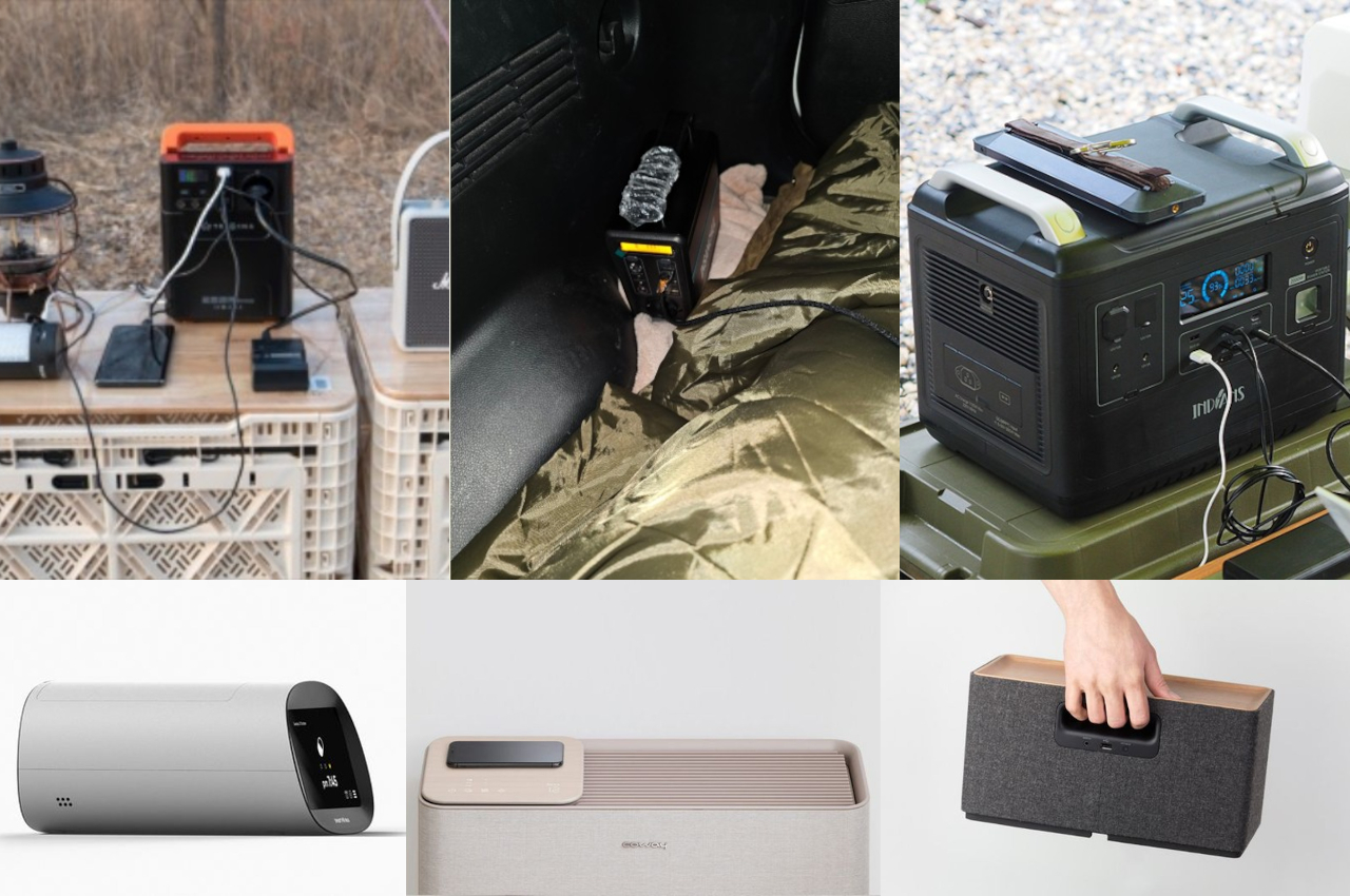
The design convention for large power stations is horizontal boxes as these are definitely the most space-efficient shapes. You can easily stow them in cabinets, trunks, and other storage solutions while allowing you to pack other objects beside or even on top of them. When in use, however, that horizontal orientation can actually be wasteful, especially if you don’t have much space on the ground or on the table in the first place.

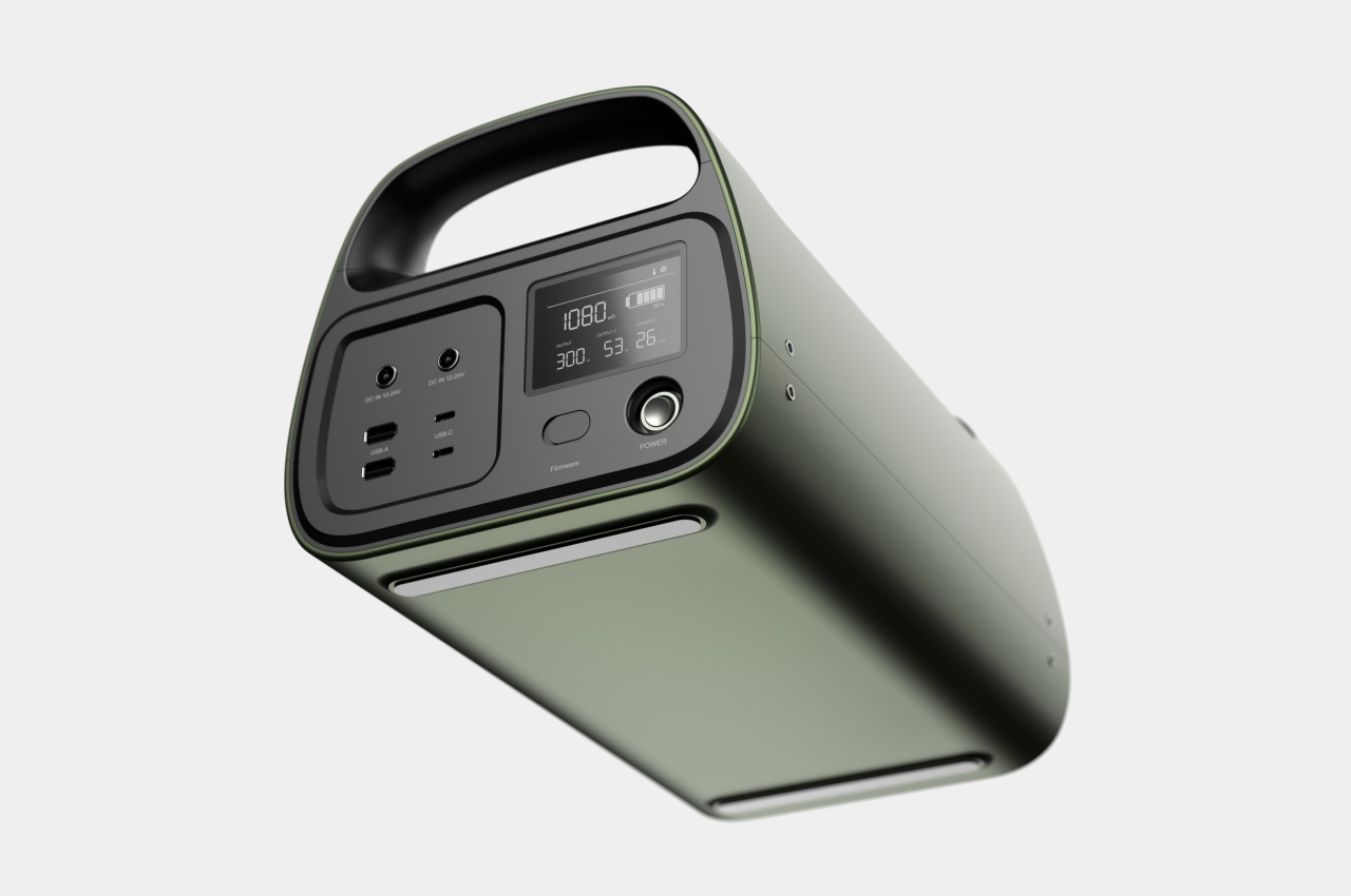
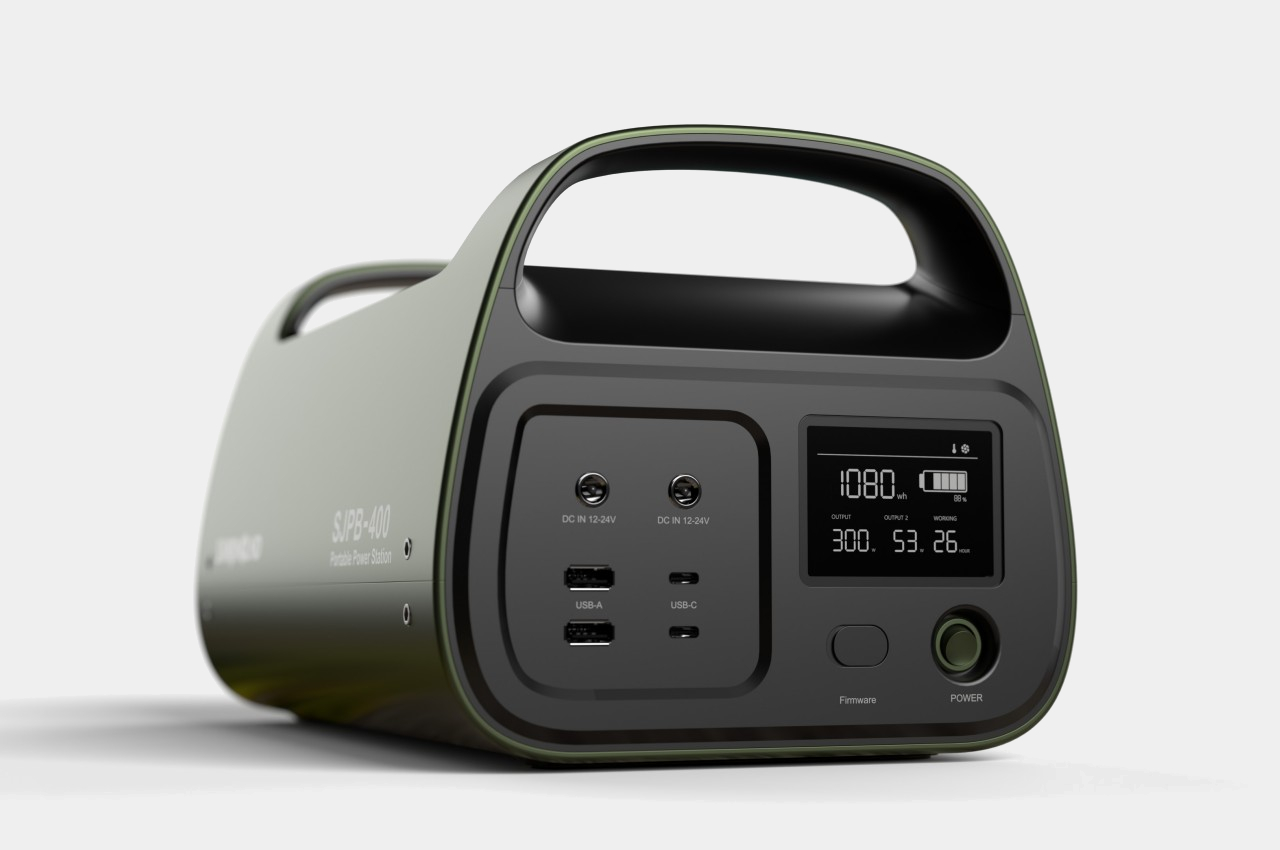
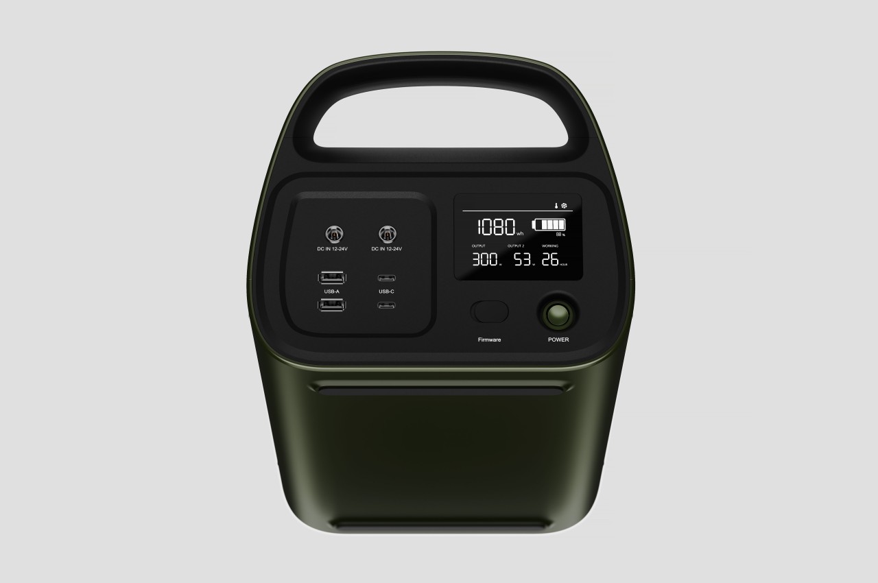
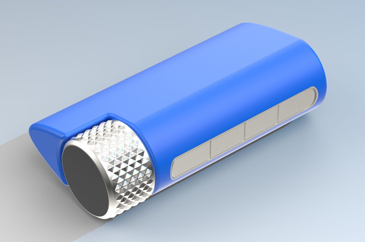
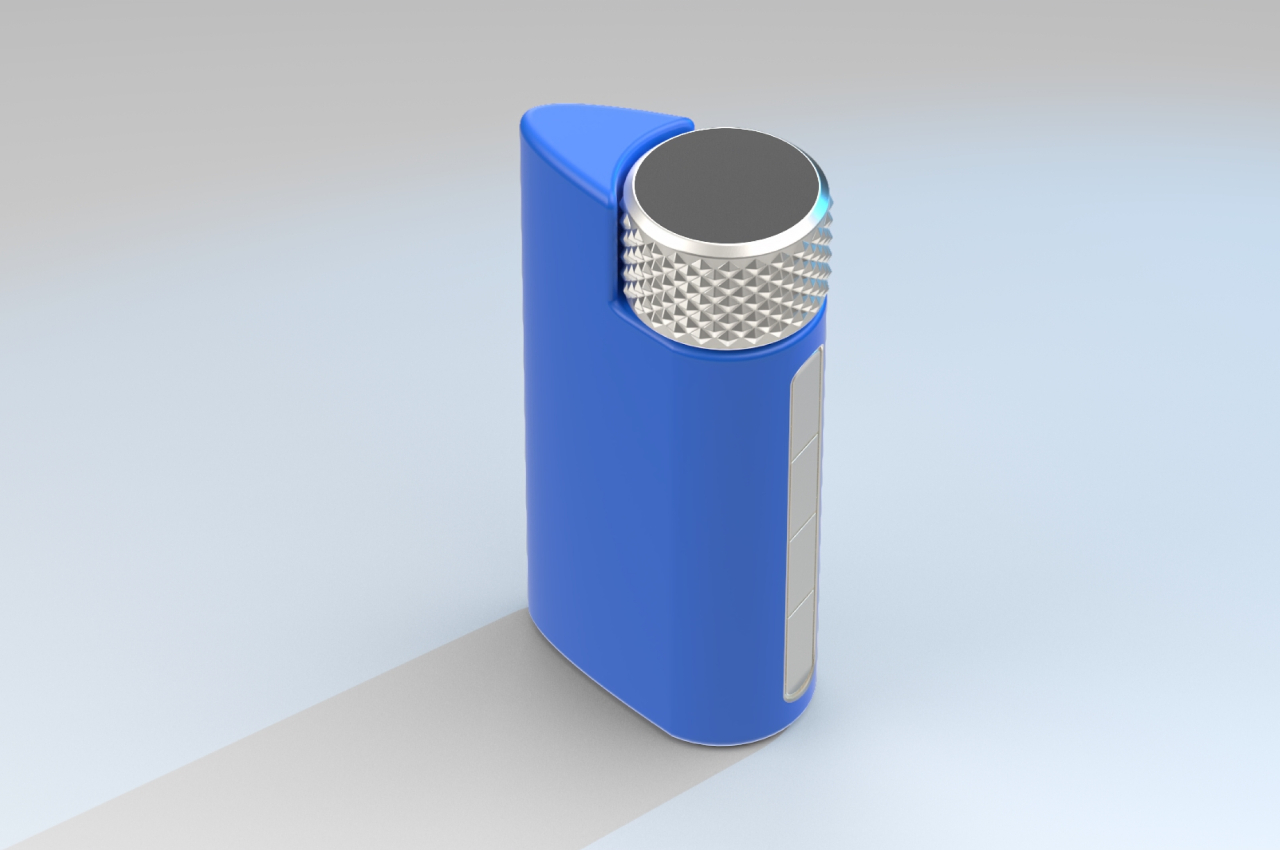
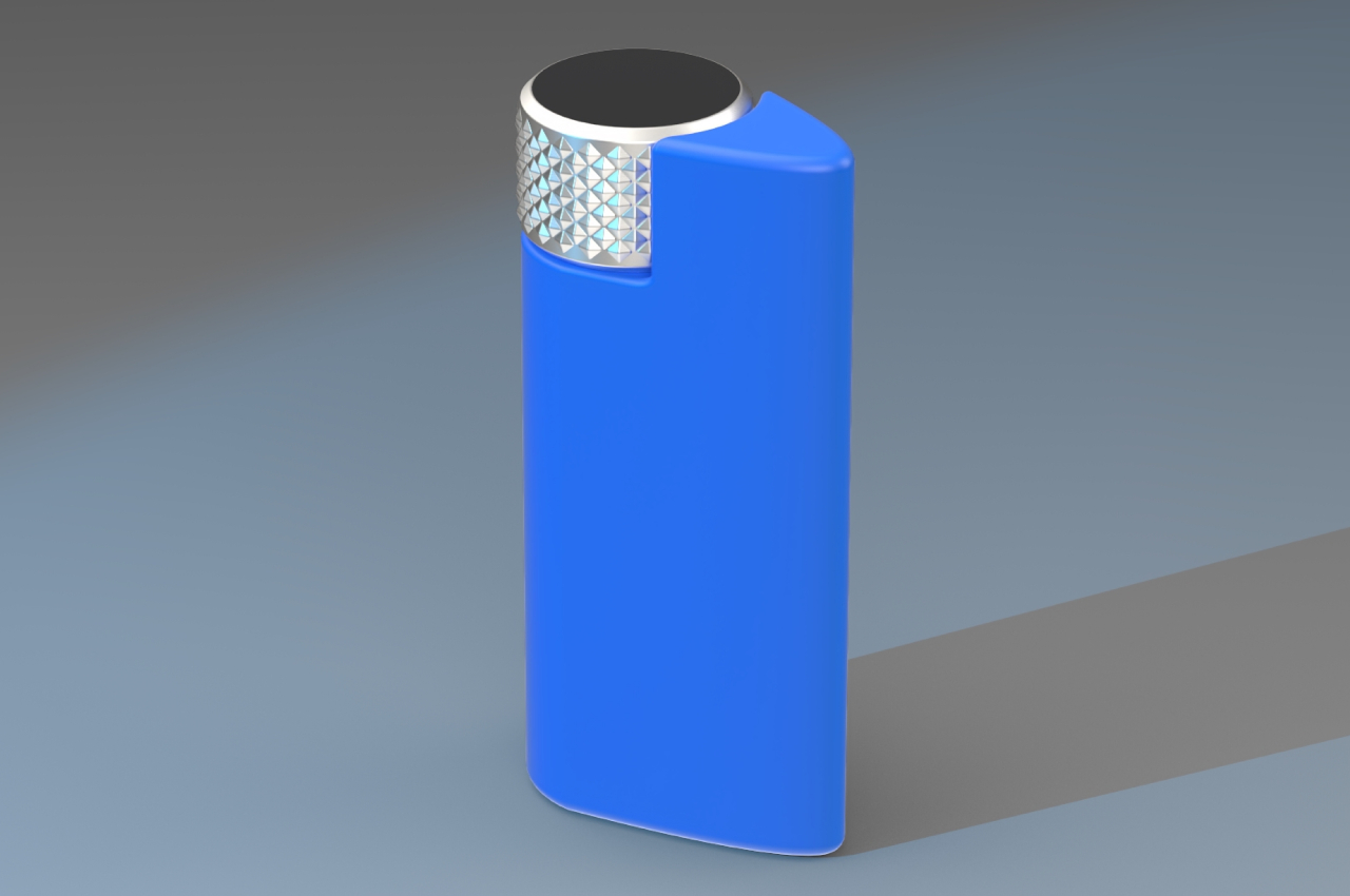
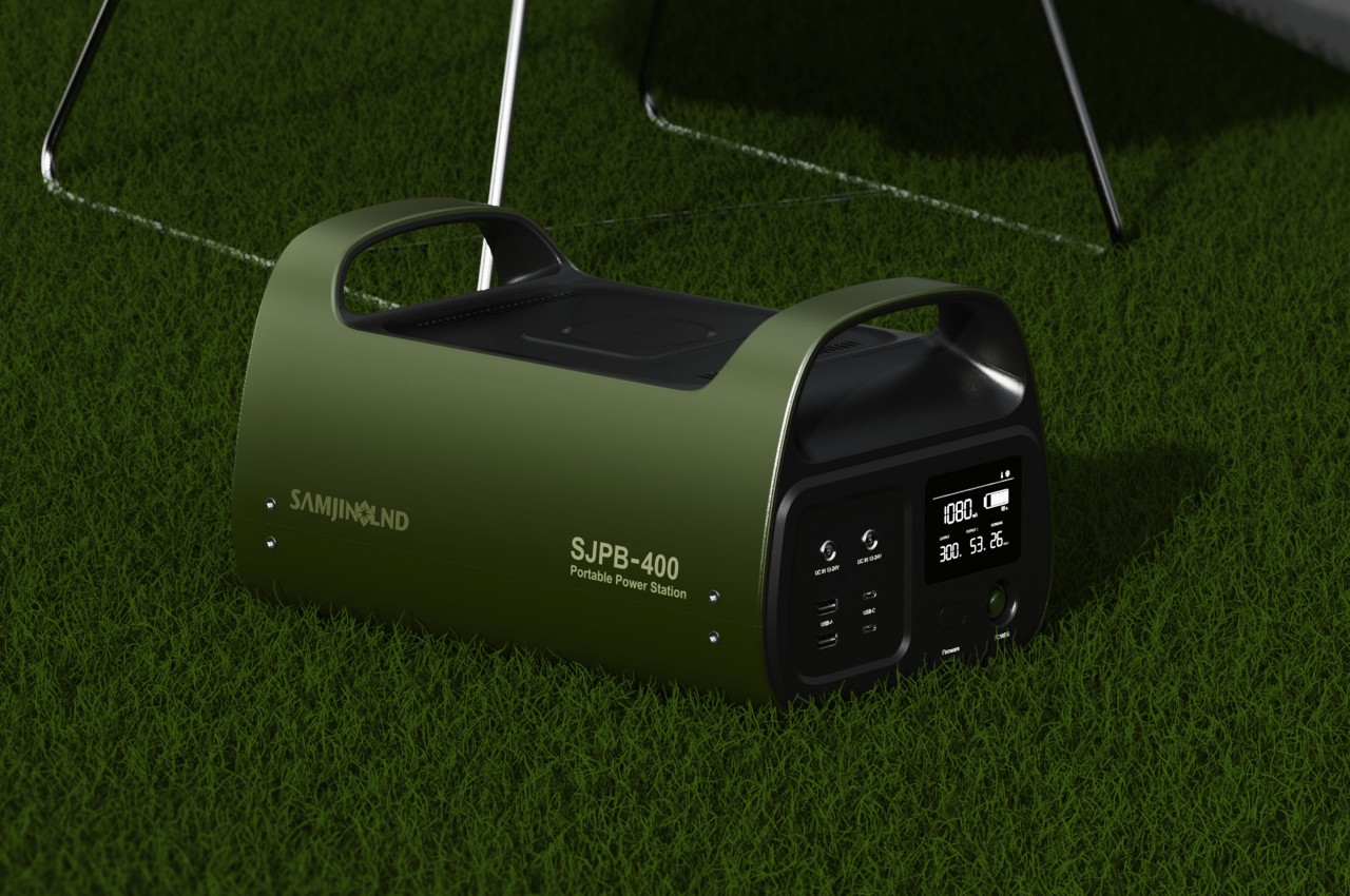
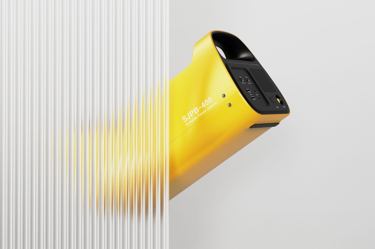
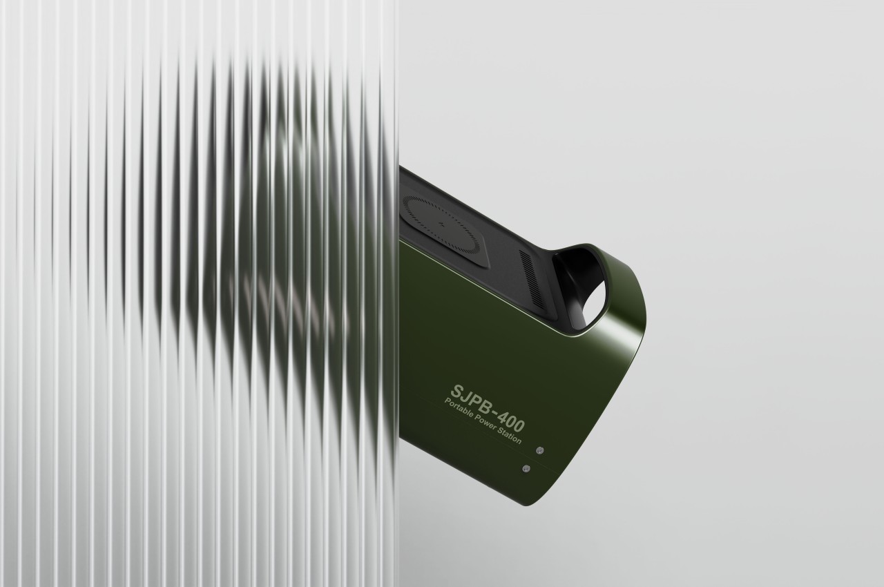
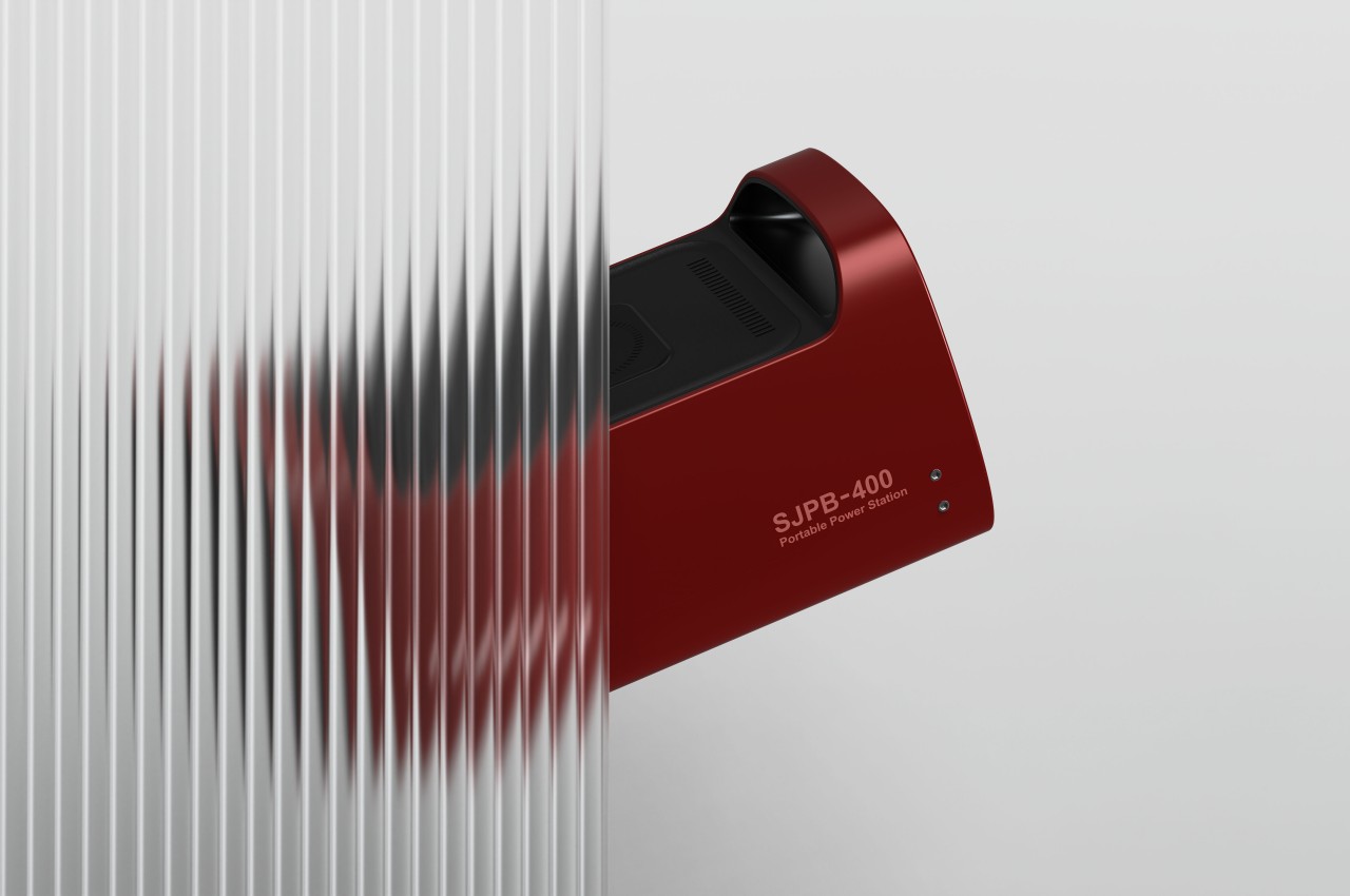
The SJPB-400 Mobile Power Bank is designed with a dual orientation in mind, allowing you to stand it up and put it down on the ground beside your table. You can still have easy access to its most important ports since they’re located not in the “front” of the box but off to one side, which becomes the “top” of the power bank in that position. Other boxy power stations can probably be put up like that as well, but not only are their vents blocked, the ports become harder to use as well.

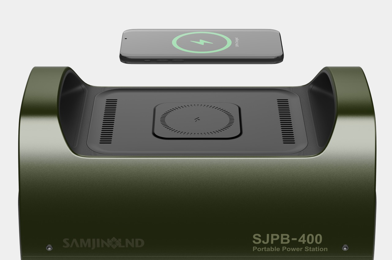
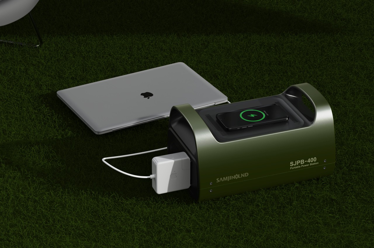
Admittedly, this flexible design does have its disadvantages, even in the case of the SJPB-400 concept. This mobile power bank has a wireless charger on its longer side, so you can’t use it while it’s standing up and vertical, not unless it uses MagSafe or similar technologies that will keep the phone from falling. Regardless, the lone AC outlet on the opposite side of the USB ports will remain inaccessible, so it’s something the user will have to consider on a case-to-case basis.

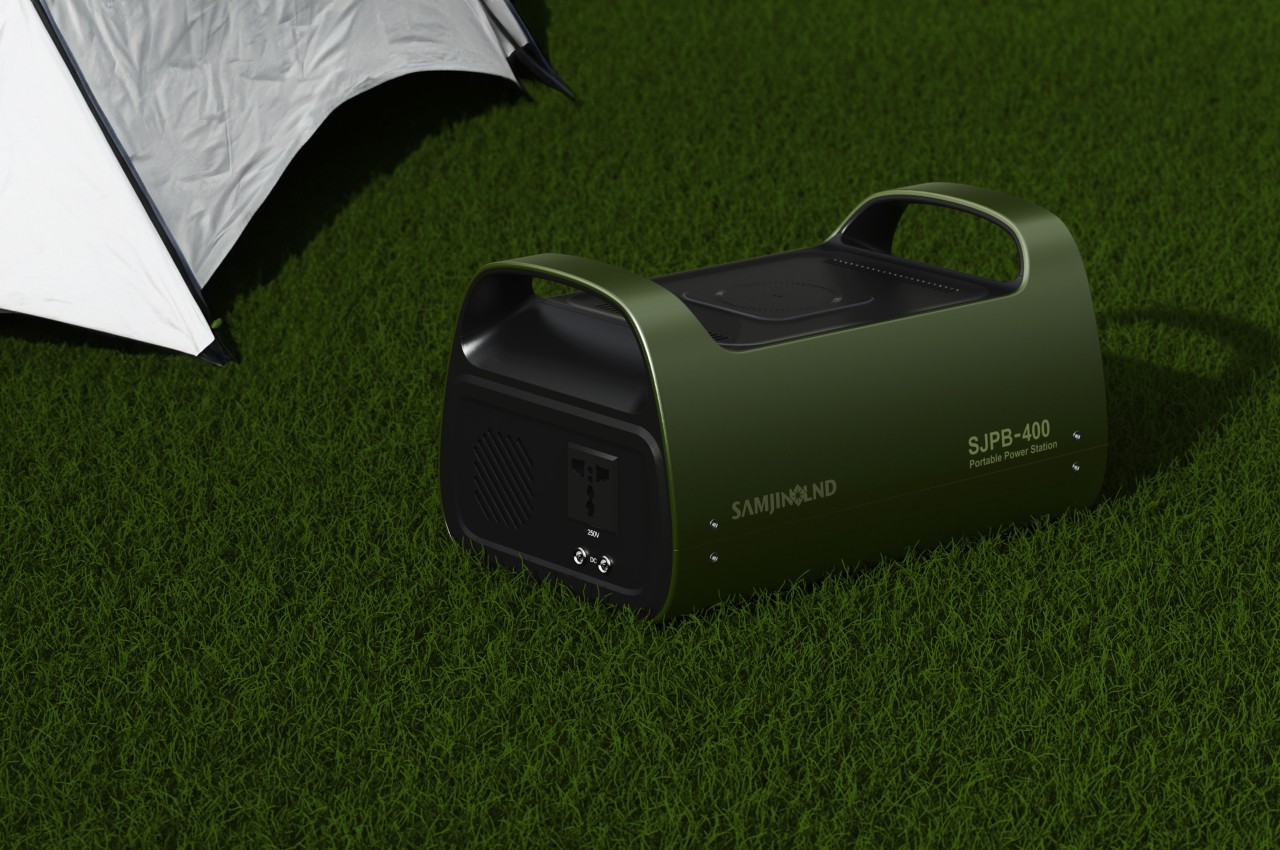
One design feature of this concept that goes against its space efficiency is the handles on each side. They do improve the power bank’s portability and ergonomics when carrying it, but it comes at the expense of compactness and simplicity. You won’t be able to put anything on top that doesn’t fit between those handles, so packing will become a puzzle game of trying to fit pieces together.

The post Mobile power bank concept can be used horizontally or vertically to maximize space first appeared on Yanko Design.

Flat-packed accordion-style house can be easily deployed in emergencies

While a permanent mode of residence is always ideal for most people, there are times when that is a luxury that they can’t afford. This can happen in times of natural disasters like floods or earthquakes, military deployment in remote locations, or even shelter in a tourist or pilgrimage spot. Temporary housing, on the other hand, feels nothing like a house at all, especially since they’re often made with low-quality designs to make it cost-effective and easy to tear down when no longer needed. A better and longer-lasting solution would be a portable home that can be extended, set aside, and reused as needed, such as this housing concept design that takes inspiration from flat-packed furniture that can easily be set up even by just a handful of people.

Designer: Komal Panda, Suyash Chavan

There has always been a need for portable or easy-to-assemble housing, even outside emergencies and disasters. Being able to put up a roof over people’s heads in a quick and efficient manner never goes out of fashion, and there is an almost never-ending number of attempts to make that practical and cost-effective. Prefabricated housing is one such possible solution, but it still takes a lot of time and effort to put the house together. These types of houses can’t be easily moved once they’ve been built either, which makes them less ideal for less permanent abodes.

1

Baadi is a concept that takes the popular flat-pack furniture design to houses, though you don’t exactly assemble one from disparate parts. Instead, you pull out one side of the house, and the rest of the walls expand and unfold like an accordion. This mechanism allows a house that’s big enough for two to four people to be collapsed down to a very flat structure and moved around as needed. The design also makes it possible to deploy multiple houses quickly with only a few people involved, which is a key element when the houses are indeed needed for emergencies.

1

Just like flat-packed furniture, however, there is a connotation of such designs being soulless and dry, especially from lack of customization options. Baadi, however, is designed to be modular and flexible, such as in how many panels can be used to extend the size of the housing, as well as colors for the panels. The latter aspect is actually critical when the houses need to be very visible even from a distance, in case identification and location are needed during natural disasters.

Admittedly, the concept doesn’t leave much room for using different materials, though it’s not that hard to imagine how the design can be extended to support a wider variety, as long as they meet the requirements of durability and resilience. After all, such a housing system places greater emphasis on portability and flexibility, while still providing the necessary protection and comfort when regular houses are near impossible to have.

The post Flat-packed accordion-style house can be easily deployed in emergencies first appeared on Yanko Design.

Wing-like car key fob concept promises a more ergonomic design for future drivers

The vast majority of design concepts for future cars unsurprisingly revolve around the more exciting parts of the experience, from hands-free autonomous driving to hotel-like cabins to quiet, efficient, and eco-friendly engines. Of course, those aren’t the only parts of the driving experience, which starts and ends with drivers getting in and out of the car. Oftentimes, that part is presented as a keyless activity that either relies simply on the touch of a finger or the tap of a smartphone screen. It might be quick and efficient, but not exactly satisfying or meaningful. This concept tries to attack the problem from a different angle, retaining the tactile joy of a physical key fob while improving not only the features but even the comfort of using one.

Designer: Zander De Beer

A dedicated car key fob might sound unnecessary today in an age of smartphone apps, but having a distinct and direct device you can easily use is still far more convenient, not to mention faster, than fumbling around with a smartphone and its dozens of apps. It gets the job done without fuss, but it’s not exactly a memorable or even pleasant experience. Neither is its design the most inspiring accessory for a car, especially the sleek and sophisticated vehicles of the future.

This concept for a new kind of car key fob thinks outside the box and adopts a shape unlike any other fob. Instead of a small disc or teardrop-shaped piece of plastic, it looks to the aerodynamic form of an airplane wing or car spoiler for inspiration, promising a more ergonomic design that you can comfortably hold in your hand. It almost looks like a lighter, with one side tapering sharply to a single edge.

More than just a change in shape, however, this car key fob concept also offers a slight change in functionality. There are still buttons for typical actions like remotely locking and unlocking the car, starting or killing the engine, and even blowing the horn. What’s new is a large dial on top that you turn to set the temperature inside so that it will be as toasty or as cold as you want by the time you enter. This dial has a large display on its top surface to clearly show the current temperature so that you can adjust it accordingly.

The design tries to comply with Deiter Ram’s famous principles of design, though there are still some details that it leaves out in this current iteration. Knowing which buttons map to which actions, for example, could be a matter of guesswork and muscle memory as there are no clear indicators on them, not even embossed symbols that let you blindly press them. There’s also the question of whether the design, ergonomic as it might claim to be, is actually convenient to carry around due to its size and unique shape. Either way, it’s an interesting thought experiment that challenges the presumption that car owners of the future won’t even want physical key fobs like this.

The post Wing-like car key fob concept promises a more ergonomic design for future drivers first appeared on Yanko Design.

realme 13 Pro is coming with ultra clear camera powered by HYPERIMAGE+ AI

Smartphone cameras have gotten quite powerful, that they might have hit a wall when it comes to hardware. Although they have reached mind-blowing 100 megapixels, sensors have also gotten a little too large for the ever-thinning smartphones. To make up for that slump in optical solutions, manufacturers are turning to software, specifically everyone’s favorite AI special sauce, to produce astounding images and experiences that wouldn’t have been possible with hardware alone. That said, AI alone won’t be enough either, so at its AI Imaging Media Preview Event in Bangkok, realme unveiled a new AI photography architecture that harnesses both powerful optics and powerful algorithms to bring mobile photography to the next level.

Designer: realme

realme’s new HYPERIMAGE+ AI photography architecture, which it claims is a first for the industry, leverages three layers to create its seemingly magical imaging feats. It stands on a solid foundation of powerful hardware, delivered by a new Sony LYT-701, a 50MP sensor with OIS, and a 50MP Sony LYT-600 paired with a periscope-style telephoto lens that lets it zoom in up to 3x without any loss in detail. The hardware alone would have been enough to handle any photography task even in challenging lighting situations, so you can imagine how much more impressive the results would be with help from AI.

HYPERIMAGE+ also utilizes both on-device AI imaging algorithms as well as cloud-based AI image editing to go beyond what the hardware is capable of. HyperRAW, for example, brings image processing capabilities to the high-quality RAW domain, boosting image quality and dynamic range to faithfully recreate light and shadows. AI Pure Bokeh helps in the separation of foreground, midground, and background elements, applying pixel-level segmentation and targeted optimization to create realistic portrait photos, all within seconds. An in the event that the cameras weren’t able to capture enough resolution for rich details, AI Ultra Clarity enhances the image to still produce crystal clear and stunning images.

Oplus_131072

Of course, all these benefits of AI would be meaningless if it doesn’t get into the hands of those who need it the most. Young users, in particular, are always craving stunning photos, striking videos, and unforgettable memories, pushing the boundaries of what their smartphones are capable of. They are, therefore, the perfect audience for this ultra clear camera with AI, and are exactly who the upcoming realme 13 Pro+ will be aiming for. realme’s AI-empowered flagship is set to launch soon, though details are still scant and will be provided closer to the launch date.

The post realme 13 Pro is coming with ultra clear camera powered by HYPERIMAGE+ AI first appeared on Yanko Design.

Accordion paper cup concept makes carrying coffee easier and more sustainable

The number of coffee chains spread around the world is undeniable proof of how much people desire or even thrive on the beverage. Unfortunately, that number is also an indirect testament to the waste that the industry produces, especially when it comes to to-go cups. The majority of these cups are made of plastic, though some brands and consumers are becoming wiser and opting for more sustainable drinkware. The problem, however, is when you need to carry more than one of these cups, usually in precarious trays or bags. A paper cup design concept tries to hit two birds with one stone, offering not only a more sustainable cup but a better way to hold and carry them.

Designer: Shenzhen Samore Design & Research

Although iced coffee to go is still usually served in plastic containers, unless you bring your own reusable cup, the more common hot beverage is thankfully put in paper cups with cardboard sleeves. Their designs are simple and handy for holding in one hand, but some people have the unfortunate task of buying for a group. Some stores offer cardboard trays or boxes for carrying two or four drinks at once, though some have to resort to bags that could let the coffee spill as you swing it while walking.

Neither are ideal solutions, especially for long-term use or reusable cups, so someone thankfully thought of a better and admittedly more aesthetic solution to this common problem. It doesn’t have a formal name yet, but the Accordion Paper Cup design offers a simple yet ingenious way not just to carry coffee paper cups but also to hold one in your hand. In a nutshell, the paper cup has a sleeve that expands upward, turning it into a bag of sorts.

The trick to this sleeve design is the accordion-like structure can easily expand and contract without changing its total mass. This same structure happens to also be a good insulator against heat, allowing you to wrap your hand around a hot cup. It might not be an intentional part of the design, but the alternating pattern of holes and divisions also makes it easier to grip an otherwise smooth and slippery cup.

The paper cup and its innovative sleeve are allegedly made of recyclable, renewable, and biodegradable materials, further driving home the idea of an all-in-one sustainable solution for to-go cups. But while the cup itself seems to have that brown hue typically associated with recycled paper products, the sleeve has a gradient that softly shifts from blue to brown, though other colors are also possible. Unfortunately, there is no word on whether this concept has any chance of becoming an actual product, but it’s definitely an interesting avenue to consider for large coffee chains.

The post Accordion paper cup concept makes carrying coffee easier and more sustainable first appeared on Yanko Design.

Toy-like air purifier doubles as a baby monitor to help give parents some peace of mind

We’ve become more aware of the quality of the air we breathe indoors, which has led to an uptick in air purifier products and purchases. While that mostly works for the general population, the appliance isn’t always a good fit for all kinds of people, especially the most sensitive and at-risk members of our families: babies and toddlers. They also need to breathe clean air, perhaps even more than adults do, but most air purifier designs are clearly made for grownups. This product concept envisions one that is intended for the little ones, not only in the way it looks but in how it can keep watch over them when parents aren’t in the room or at home.

Designer: Swarali Satpute

Until recently, the majority of air purifying machines looked simply like large cans or boxes that shouted their presence to everyone in the room, both visually and sometimes even audibly. The growing demand for these appliances, however, also meant that they needed to start catering to the aesthetic needs of customers. Fortunately, this has given rise to better-designed air purifiers that blend well with the rest of your home decor or, at the very least, look like a design object rather than an out-of-place appliance.

Airo is a concept air purifier that takes that trend in a slightly different direction, designing for the youngest members of the family rather than a general audience. It has a fun appearance, with a dome-like body and head topped by two ears, clad in soft pastel colors that are easier on the eyes, especially for babies whose eyes can easily latch onto bright colors and sharp shapes. But despite appearances, Airo is still meant to function as a proper air purifier, albeit one that is specifically tuned for the needs of babes and tots.

That isn’t the only function it serves, however. Since the appliance will be staying in the child’s room 24/7, it is also in the perfect position to monitor the baby remotely. To that end, it has a built-in camera, exactly where the face is, and comes with an app that has the expected bells and whistles for remote camera control. Thus, Airo offers a multifunctional package that offers parents some assurance that their babies are breathing clean air and are safe from harm.

The concept design admittedly focuses on the form of the device as well as the user experience, so it leaves plenty of room for the actual implementation of the features. An air purifier for kids, for example, will need to be extra quiet, especially at night, and should be childproof from accidents. The latter might be a bit more difficult to ensure given how the toy-like design of the product could make kids actually want to play with it.

The post Toy-like air purifier doubles as a baby monitor to help give parents some peace of mind first appeared on Yanko Design.

2024 LG Gram SuperSlim laptop is finally worthy of the name again

Laptops have come a long way from the earliest days when they were pretty much the size of attache cases, trying to cram hardware meant for desktops inside a more portable form. Even gaming laptops have started to become less burdensome, thanks to advancements in technology, and more notebooks are embracing increasingly thin designs for the sake of convenience and portability. Long ago, LG launched a line of laptops that boasted weights of less than a kilogram, hence the “Gram” branding, but it sort of lost that meaning in later models. It seems, however, that LG is back in business with its latest Gram SuperSlim design which finally hits that sub-kilogram mark yet again.

Designer: LG

To be fair, it’s not that hard to design a lightweight laptop, but making one that is both lightweight and powerful requires some juggling and compromises. Battery life is one of the first to suffer if you need to squeeze out both weight and thickness, with cooling solutions next in line due to the size of decent fans. But with components now getting thinner and smaller even as they get more powerful, manufacturers need to make fewer sacrifices for the sake of a sleek and slim design that still delivers the power that users need from a portable computer.

The newest LG Gram SuperSlim is a testament to that achievement, weighing only 2.18 lbs, barely hitting the kilogram mark, and is less than half an inch thick. That makes it thinner than an AA battery, not that such batteries are used as a standard for thinness. When opened, the 15.6-inch FHD screen looks incredibly and precariously thin, almost as if it could easily snap in half at the slightest force. Fortunately, the laptop does pass the MIL-STD-810H test for durability despite its fragile-looking body.

The laptop also packs quite the hardware, starting with an Intel Core Ultra 5 125H processor and 16GB of RAM. It also has a 60Wh battery rated for around 20 hours of video playback, though mileage will definitely vary. Sadly, it does rely solely on Intel’s integrated GPU, so graphics capabilities won’t be as expansive as having an NVIDIA or AMD chip. Of course, there is plenty of AI to go around, even if Windows Copilot wasn’t explicitly named.

The 2024 LG Gram SuperSlim does make one compromise that Apple also made back in 2016, which earned it a lot of flak. The laptop only has three USB-C type ports and a headphone jack, ditching the full-sized USB and HDMI ports you’d typically find on most laptops. This is a necessary design decision to keep the laptop’s extra slim profile, but it won’t sit well with everyone. Another pain point might be the $1,399.99 price tag, though it’s currently on a $600 discount at the moment.

The post 2024 LG Gram SuperSlim laptop is finally worthy of the name again first appeared on Yanko Design.

Posted in Uncategorized | Tagged ,

Smartphone enclosure concept helps develop good relaxation habits

As powerful and as useful as our smartphones might be, they can also be stumbling blocks not only for productivity but also for mental health. Incessant notifications and the fear of missing out (FOMO) add to the stress and anxiety of the modern world. Of course, ditching your smartphone is no longer an option these days, which is why several designs try to meet the problem halfway, many utilizing minimalist interfaces or drab gray screens to limit our smartphone interaction. Those, however, only solve one part of the problem, leaving many people still unused to taking breaks or relaxing. This concept design for a smartphone accessory tries to do exactly that, keeping your phone safely away from your reach while also helping you get into the habit of taking good breaks from time to time.

Designer: Jeongmin Ham

The most basic strategy people use to avoid distractions from their phones is to put it away, either at a distance or inside a drawer, creating some friction or obstacle to getting the phone instantly. While it can be an effective strategy for some, it’s also a missed opportunity for the smartphone to do something, well, smart. Short of using it as a timer, which can also lead to temptations, it can perhaps be utilized for some other function while keeping its normal distracting features at bay.

FIKA is a concept design for an accessory that does exactly that, keeping your smartphone from distracting you but also putting it to good use in training you to take breaks and use those breaks wisely. It is pretty much a cage or enclosure where you put the phone in, blocking complete use of the device except for a small circular window to a part of the screen. This is the only place where you’ll be able to see the phone’s guidance on how to take a break properly, somewhat like guided meditation apps that have become quite popular these days.

The idea for FIKA is to not just simply put your phone away to avoid distractions but also to develop good habits of taking breaks. And while different people take breaks differently, not everyone has an idea of how to do so properly, so FIKA can suggest certain actions like breathing exercises. Over time, the reminders and the case might not even be needed anymore, as you would have developed the habit and willpower to do it on your own.

The concept design sadly leaves a lot of questions unanswered, like how one will be prevented from just fishing out the phone without some locking mechanism. It also doesn’t mention how the circular window actually works, whether it is just a hole that leaves a part of the phone’s screen exposed or if it’s a touch-sensitive surface that “passes” touches through to the phone inside. Still, the core idea is interesting enough to warrant further thought, especially in an age where people’s mental and physical health has been in decline due to smartphones and overworking.

The post Smartphone enclosure concept helps develop good relaxation habits first appeared on Yanko Design.

Algae-based material and traditional Korean braiding turn into striking lights, vases

The world is filled with many things that have the potential to become materials for creating products, and yet we still prefer typical materials like plastics, metal, or wood. Not all of these are sustainable, and those that are sustainable aren’t always easily renewable or require a lot of energy to process or recycle. Admittedly, looking for alternative sources of materials isn’t an easy task, but once in a while, we come across a promising solution both in terms of sustainability and beauty. This rope light and Ikebana vase, for example, are already quite striking in their unique shapes, but they are made even more significant by the fact that they are made using a biodegradable material based on one of the most common and simplest kind of plant on the planet: algae.

Designer: Su Yang Choi

One of the problems with supposedly more sustainable or recyclable materials is that the process of making or treating them isn’t always sustainable, requiring more energy and water than usual. In contrast, this algae-based material isn’t treated with harmful chemicals, has reduced energy consumption during manufacturing, and can easily be shaped using heat. Even better, leftover scraps from the production process can be collected and recycled to reduce material waste at every step.

While the material itself is quite impressive, putting it to good use is the real test. For this purpose, a pair of everyday objects were made not just to demonstrate the usability of this algae-based material but also to show off the complicated designs that can be made with it. And nothing can perhaps be more complicated than knots, especially the beautiful traditional Korean knots known as Maedeup.

This knotting is best exemplified in this Ikebana vase that loops around itself a couple of times in an almost random fashion, symbolizing the unpredictability and cyclical nature of life. In addition to this rather intriguing structure, the biodegradable material used here is mixed with coffee grounds, another sustainable material, to give it that earthy brown color.

On the opposite end of the color spectrum is a long string lamp that uses the algae-based material in a four-faced linear braid that wraps around a flexible LED strip. This segmented structure was inspired by Korean stone pagodas that rise in majesty and grandeur, characteristics carried by this string lamp. These two objects, part of the Slow series of artworks, embody the ingenuity and creativity that spring from combining modern material science and traditional craftsmanship to produce breathtaking designs that do no harm to the planet in return.

The post Algae-based material and traditional Korean braiding turn into striking lights, vases first appeared on Yanko Design.