The aesthetics of modern and futuristic technologies often revolve around hard metallic surfaces, straight lines and edges, and an almost inorganic characteristic, as if all the opposite qualities are considered antiquated or even medieval. Of course, design trends come and go and sometimes even come back, as proven by the retro craze that has gripped many industries, especially consumer electronics. Duality has always existed in many facets of human existence, but that doesn’t mean those seemingly contrary elements cannot work together. In fact, contrast is an important factor in creating a beautiful composition, and this combination of a desktop computer and natural wood offers one such expression that creates a unique atmosphere around what would normally be a nondescript machine, combining past and present, natural and artificial in a harmonious blend.
They may be called “personal computers,” but the desktops and laptops of today sometimes feel more impersonal than paper notebooks and stationery. Part of it is due to the very design of these products, adhering to a language often considered sharp, harsh, cold, and distant. There is no shortage of attempts to soften that image, either with customization options or skins that give the semblance of more natural and organic materials like wood.
The Limited Edition Apollo Collection, however, is no faux wood. Utilizing genuine Walnut, Cherry, or Maple, these bespoke computers enclose three important parts of the device to create a striking visual that beautifully contrasts the straight-edged aesthetic of modern technology with the more organic shapes found in nature. It makes the PC not only truly personal but also personable, making it an art object as much as it is an electrical appliance.
The Apollo Collection computers come in three parts, with the keyboard housing the computer itself. A portable screen connects to the keyboard via a cable, while the third part, a magnetic screen stand, completes the configuration for a more typical desktop computer. If typical desktop computers came housed in wood, that is. Each part is made to order by hand, and it utilizes custom circuitry and a bespoke operating system to truly give the computer a unique feel.
Beyond the wooden materials, the design also adds details that not only enhance the computing experience but also add a bit of humanity to the use of the computer via more tactile feedback. Unsurprisingly, the keyboard utilizes mechanical switches, but there are also physical dials for adjusting the volume and brightness of the computer. The exact specs of the computer are, at the moment, not completely known, but the limited edition bespoke design’s true appeal won’t be in its computing power but in its ability to create a new kind of relationship between man and machine.
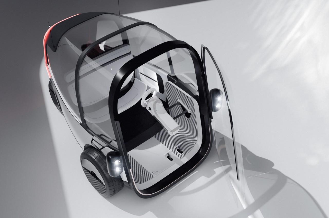
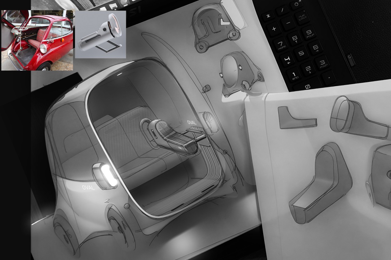
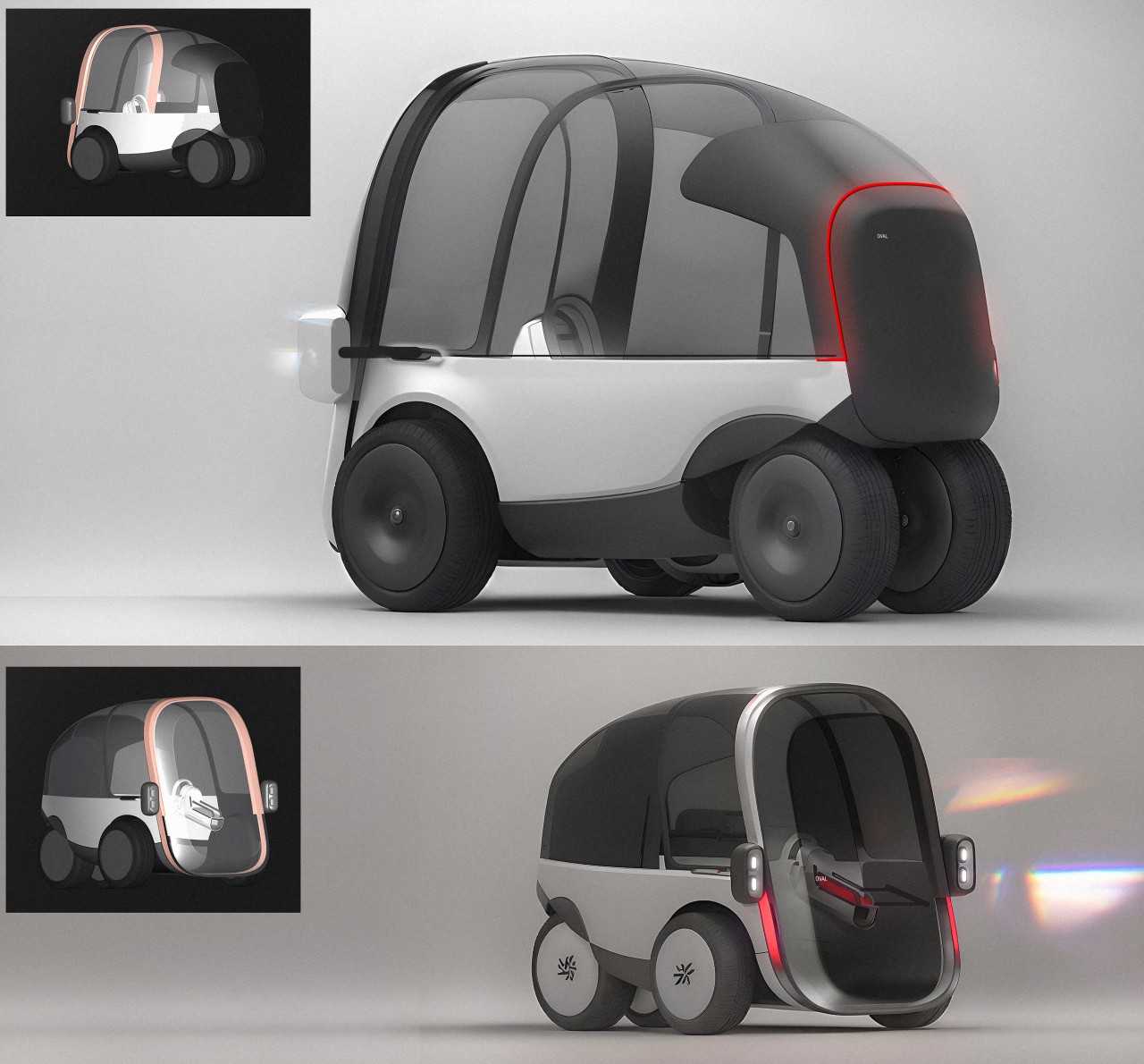
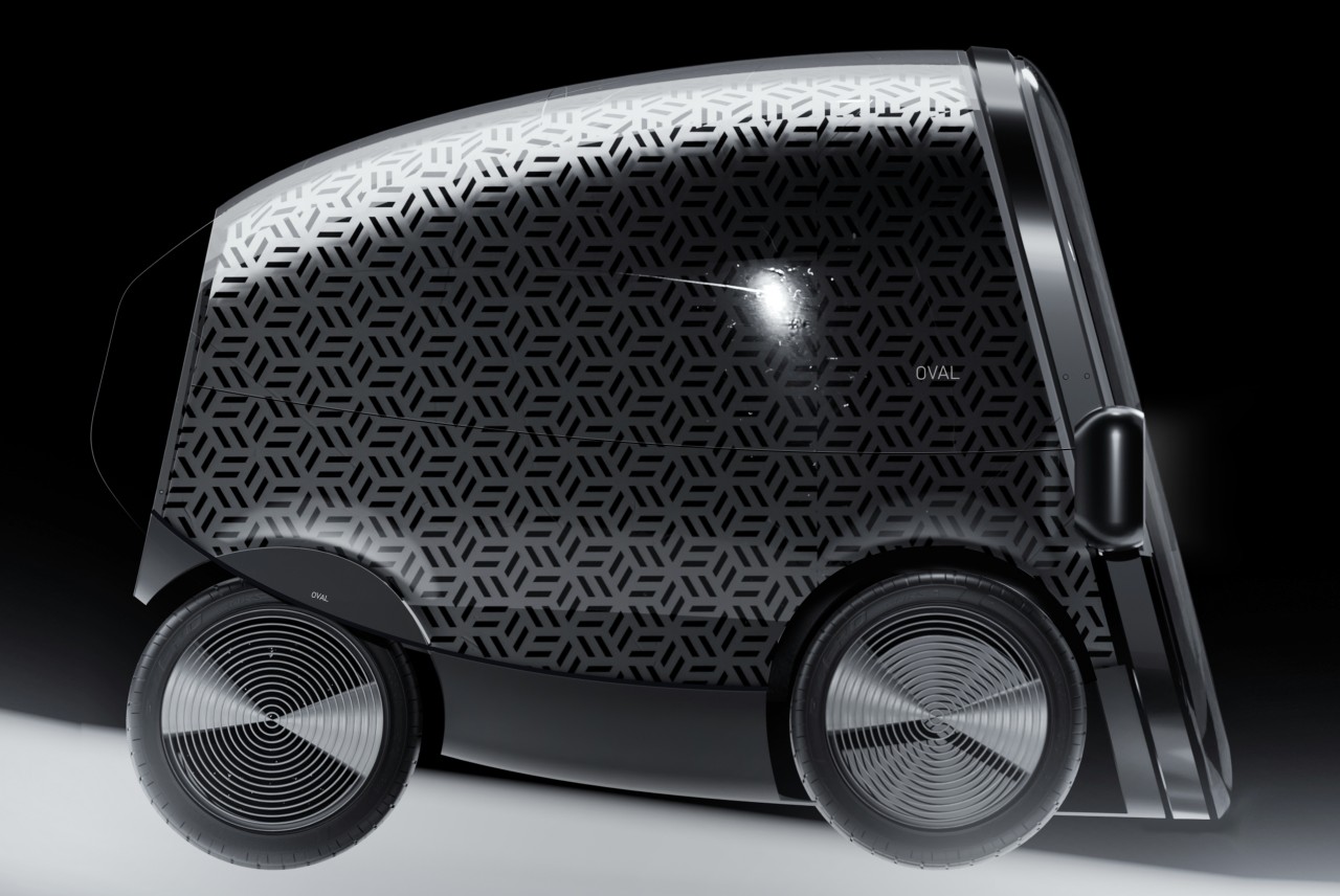
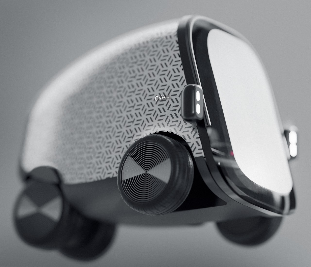
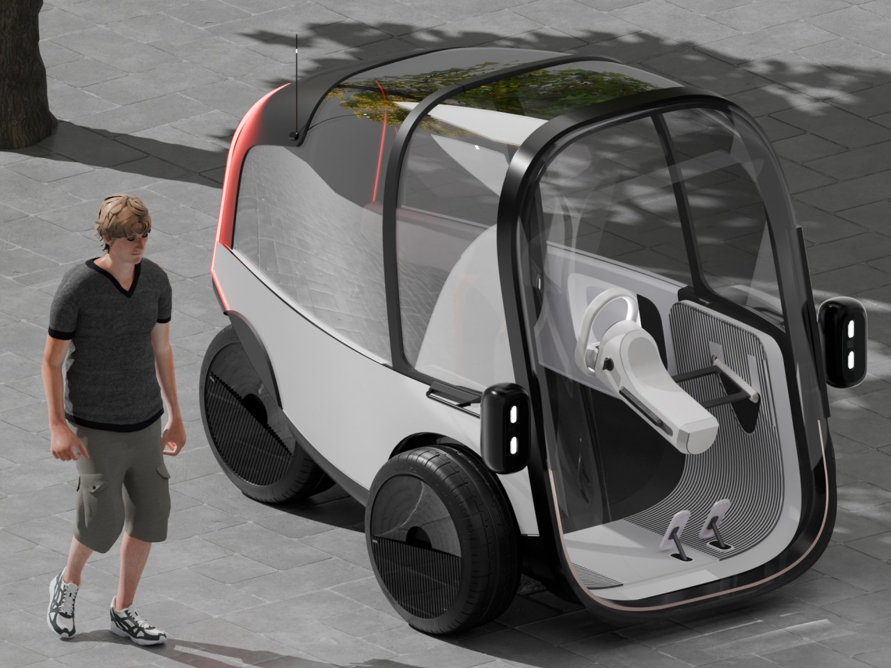
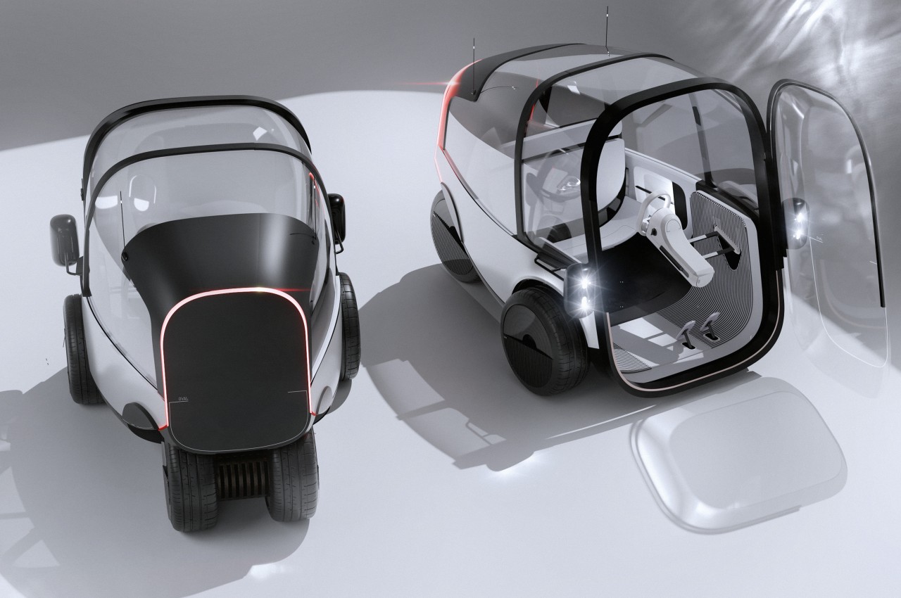
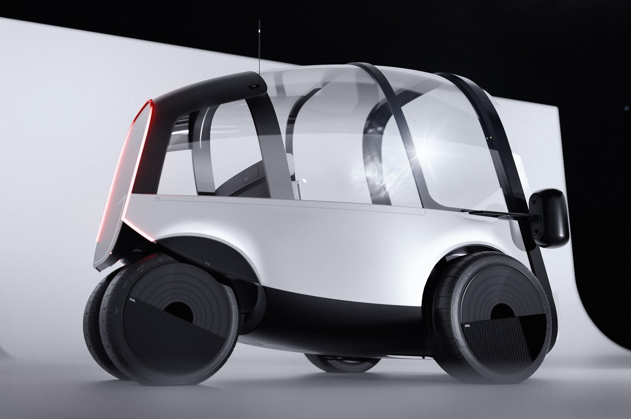
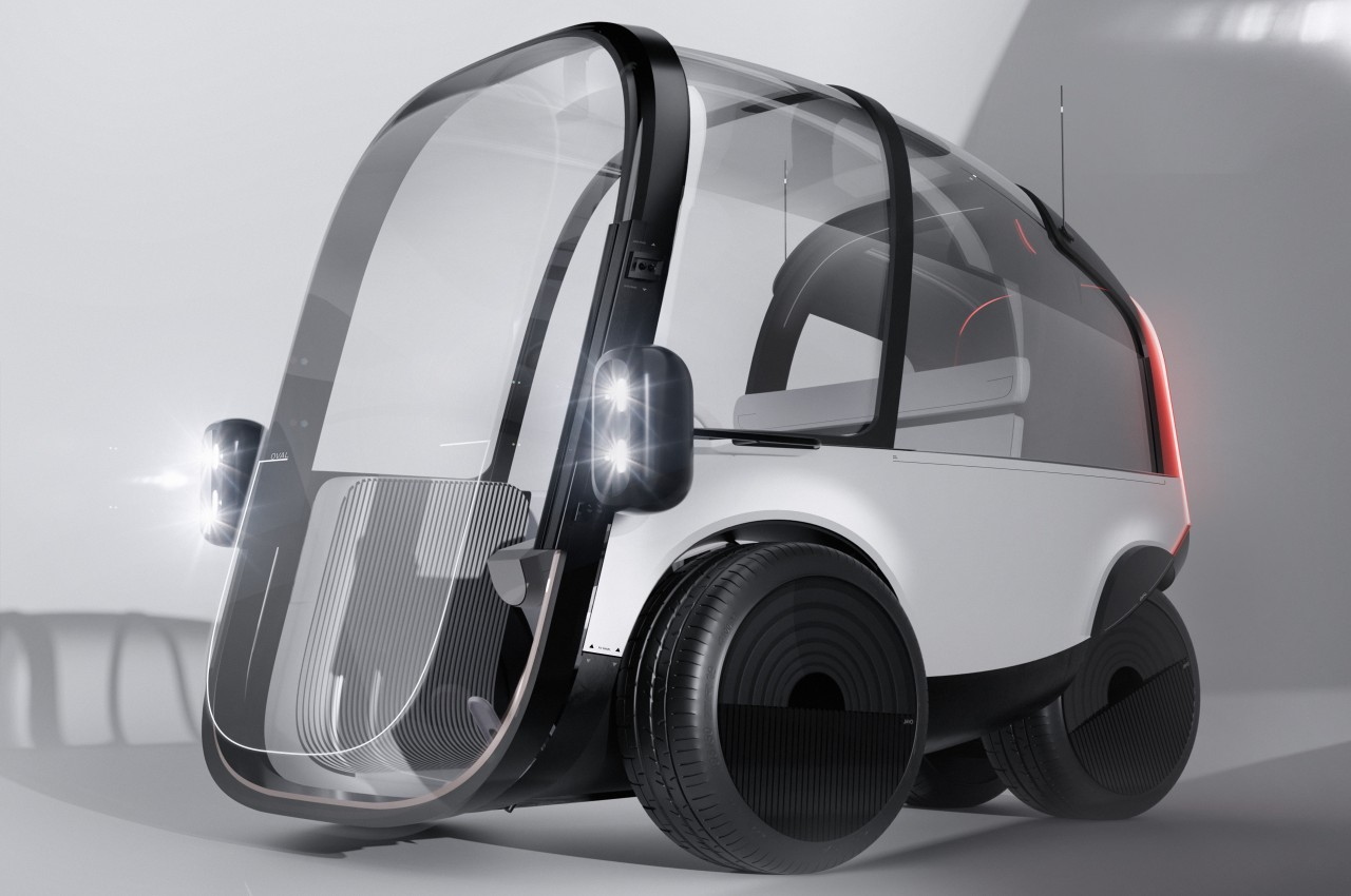
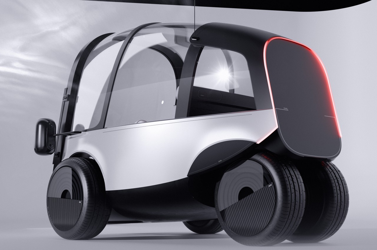
The majority of concept designs that we see for future automobiles seem to revolve around self-driving vehicles cruising along wide and nearly empty highways. Given our present reality, however, the future might not be as idyllic as those images try to conjure up, at least in terms of traffic volume. There is a higher probability that there will be even more cars in the future, self-driving or otherwise, and people will be competing for even less space on roads. This concept, in contrast, bucks the trend and imagines a car that not only has to be driven manually, it is also tall and narrow enough that clearance doesn’t become a problem, allowing it to deftly navigate through traffic and tight spaces, today and tomorrow.
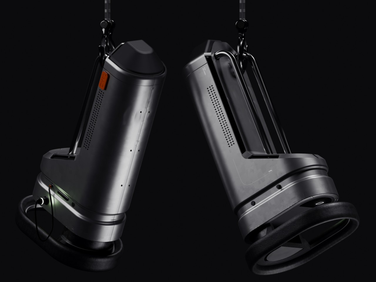
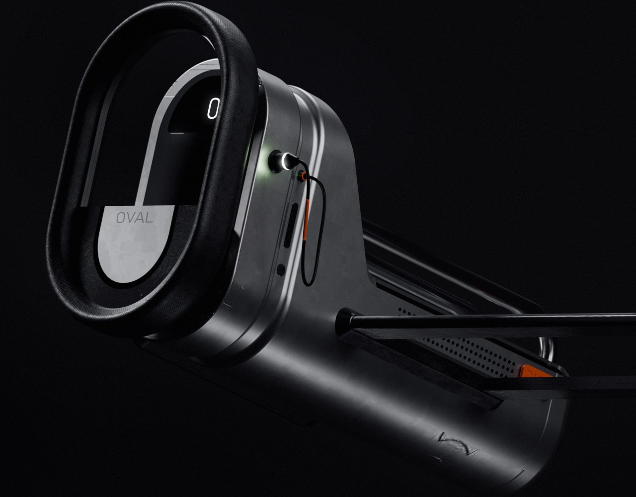
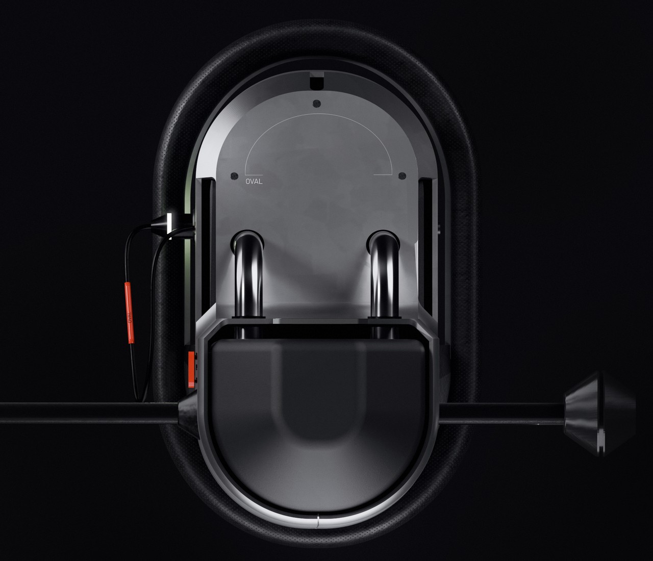
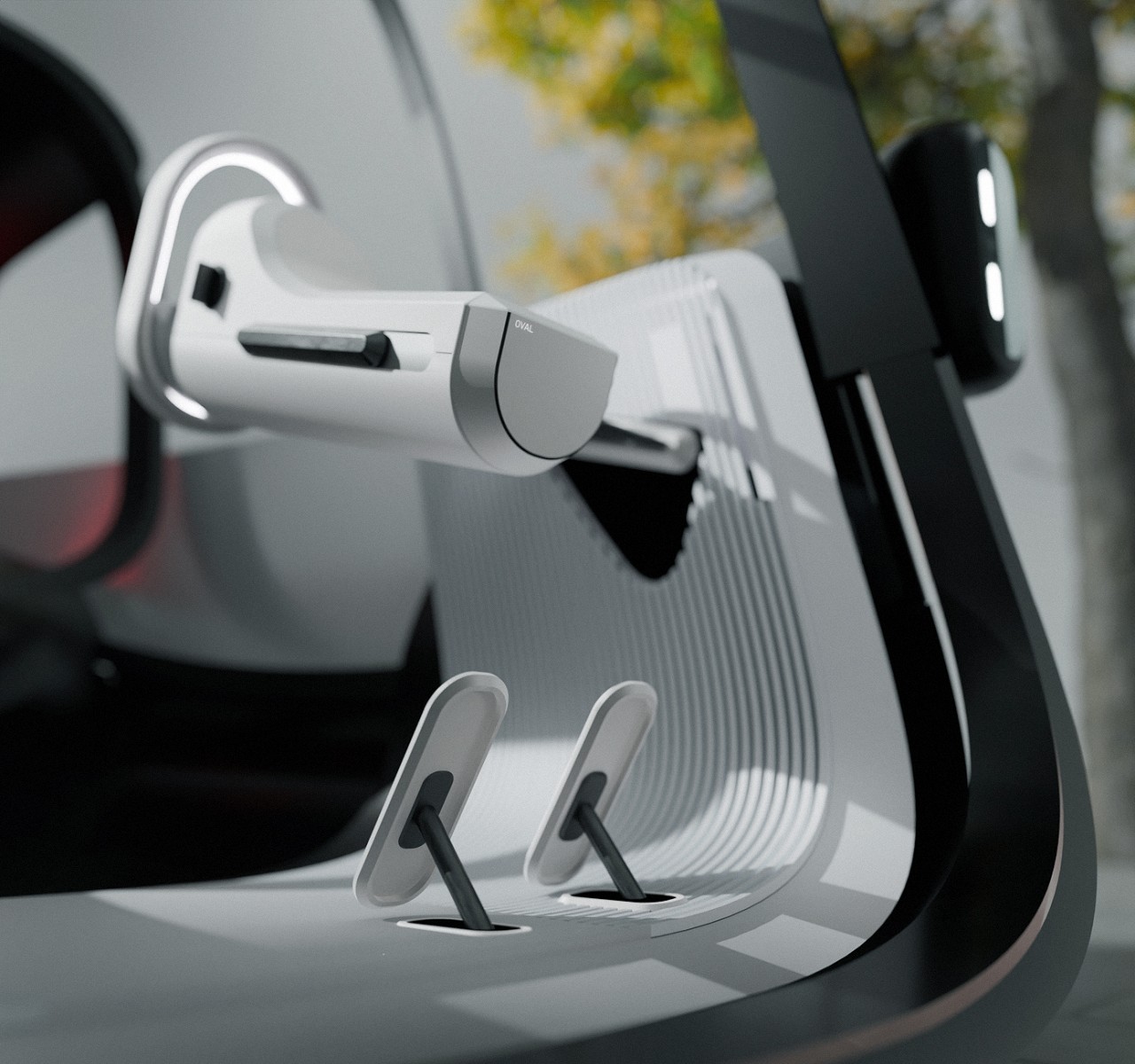
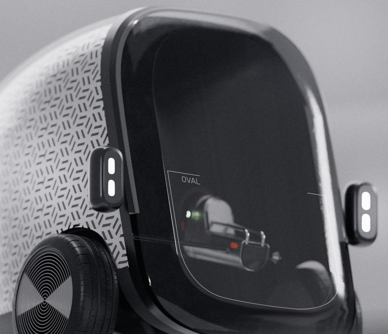
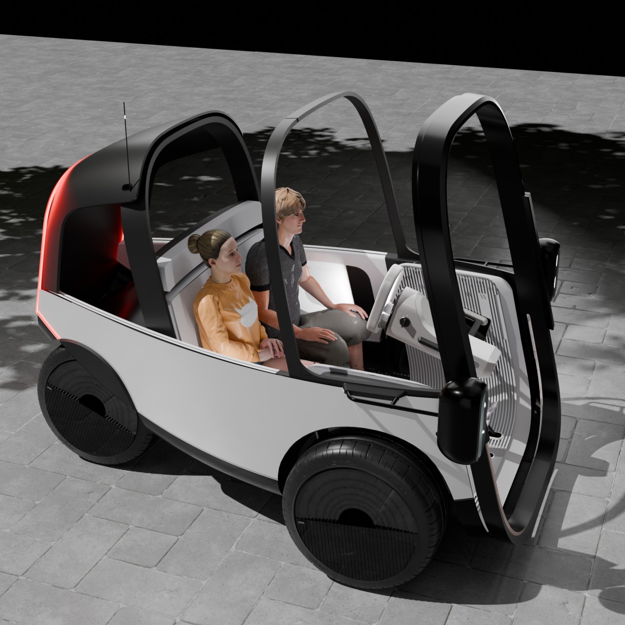
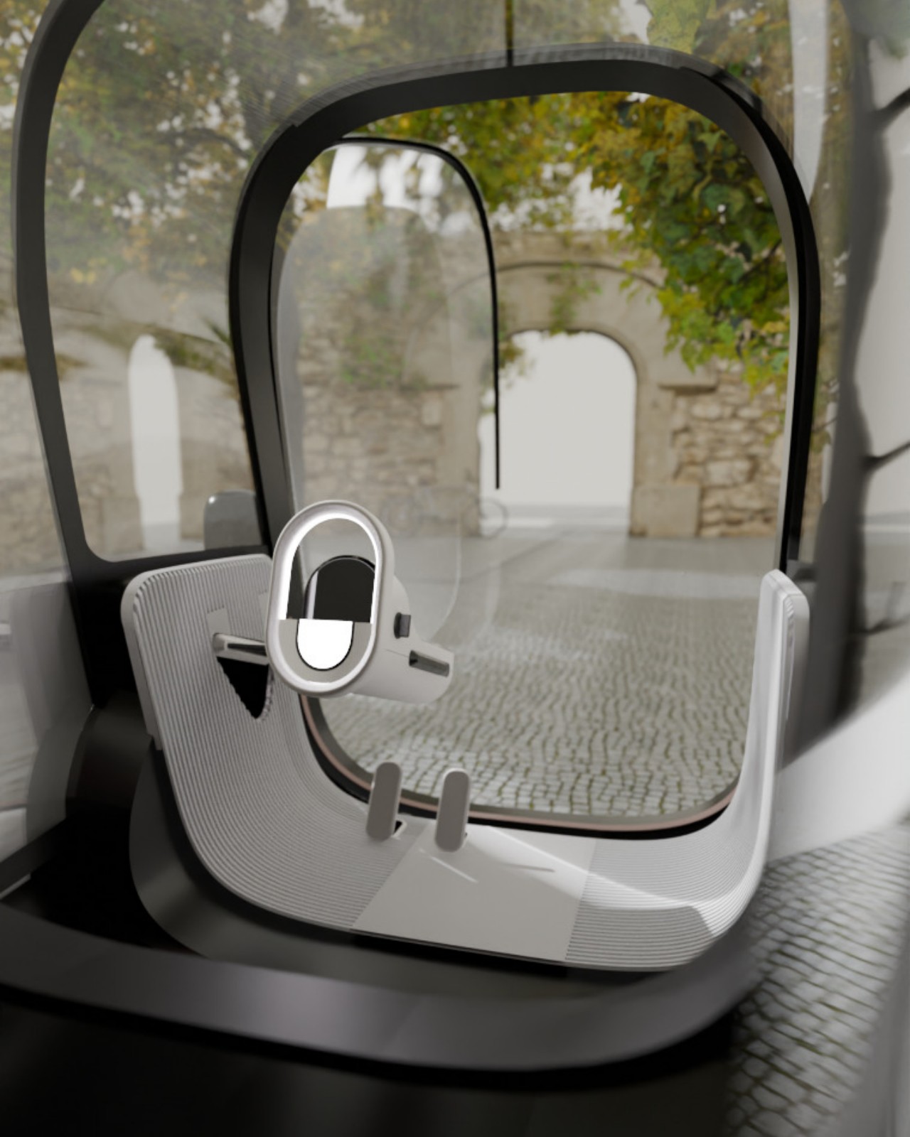
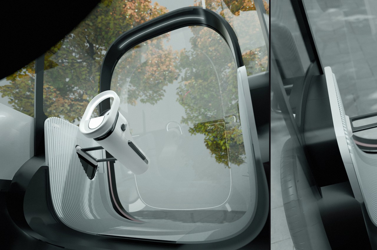
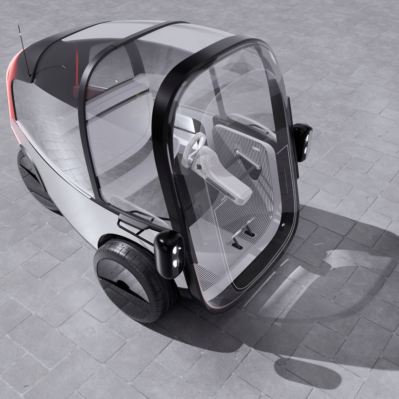
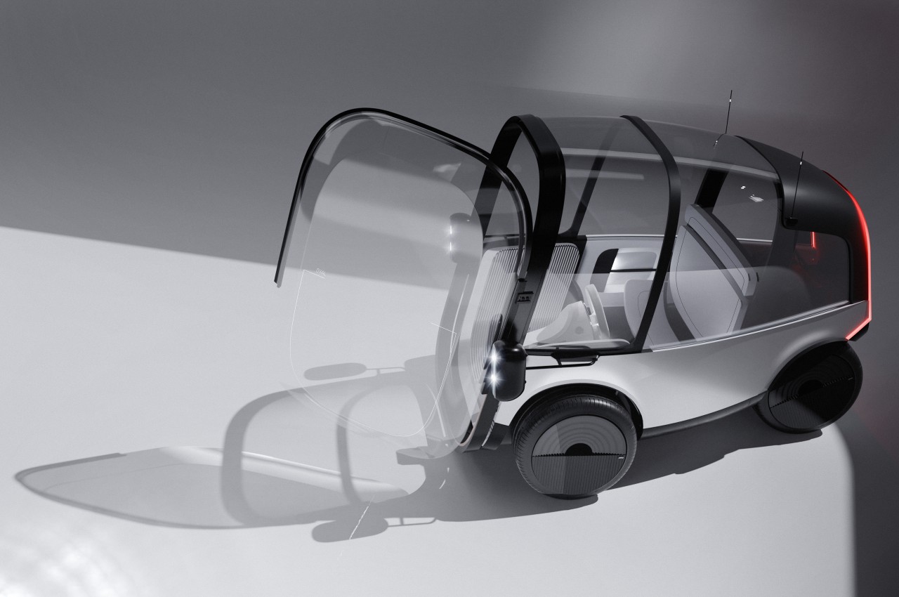
The Project OVAL concept is actually made of two parts, both embracing the idea of a more vertically oriented design. On the one hand, there is a vertical oval for the steering wheel which, along with matching the general shape of the vehicle itself, also saves space inside the cabin. The steering mechanism is attached to the side of the car, almost as if it’s floating, since the vehicle practically has no front, let alone a dashboard for the steering wheel to connect to.
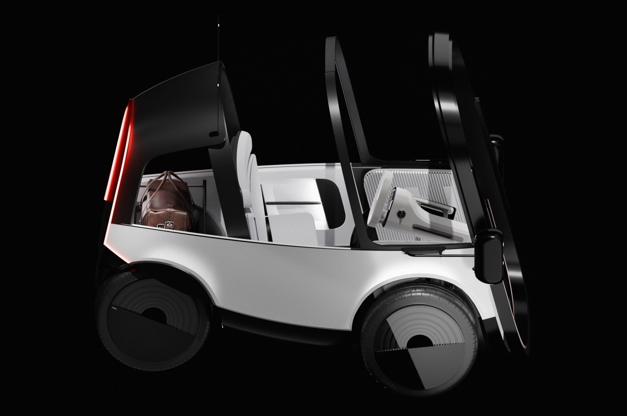
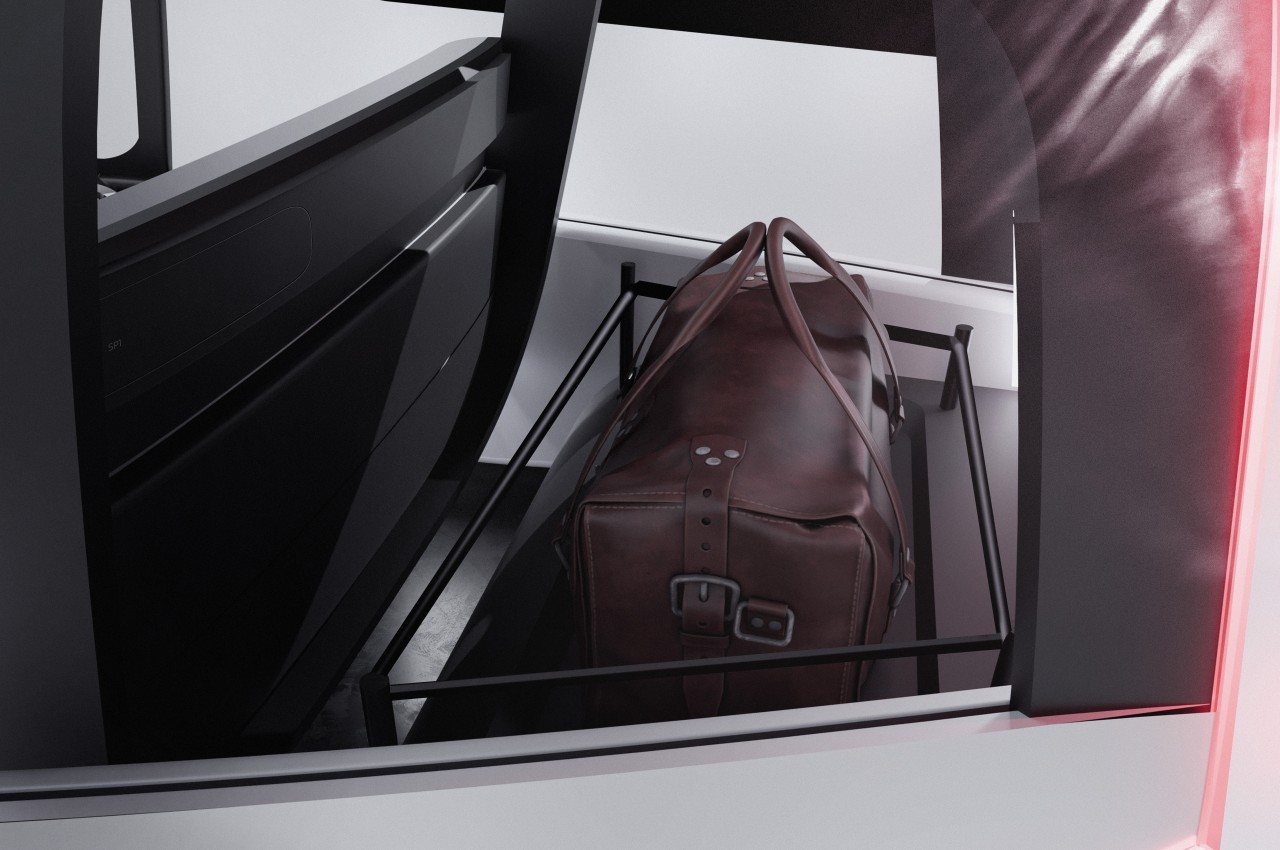
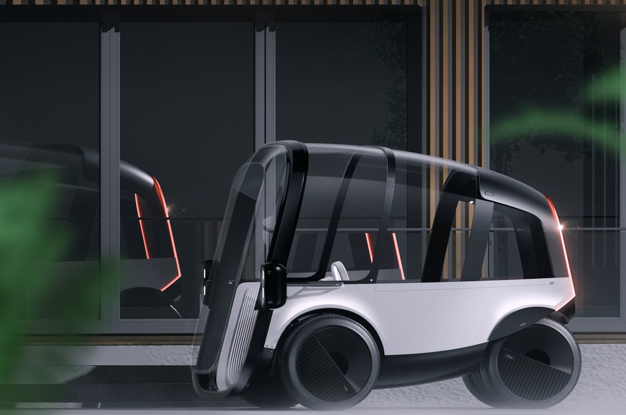
The car, on the other hand, is a rather unique spin on a two-person vehicle that prioritizes the economy of space over anything else. There is practically nothing in front of the driver and side passenger save for that oval steering wheel and two pedals. There is space behind the seats for baggage and, presumably everything else that makes the car run. Save for the pillars, the sides and roof of the vehicle are transparent, as is the front, giving passengers a panoramic view of the world around them.
This ultra-minimalist car is designed to easily navigate narrow city roads which will presumably be even more packed in the future. The slim and narrow body is also a boon for parking spaces which are already a rare commodity today. By also removing everything in front of the passengers, the car also gives more freedom of movement and comfort, even though it might feel a bit cramped as far as the width goes.
Project OVAL doesn’t preclude some self-driving mechanism, especially given how there’s no instrumentation panel to inform drivers of the car’s current state. It is entirely possible that the front glass will have a transparent display that makes all that visible as well, creating a rather dramatic futuristic visual. An autonomous system will definitely help save even more space if you remove the steering wheel and pedals, but such manual controls might be even more necessary if highways become even more congested in the future.
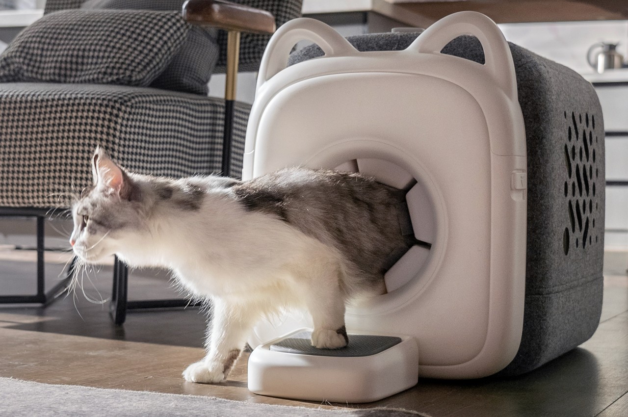
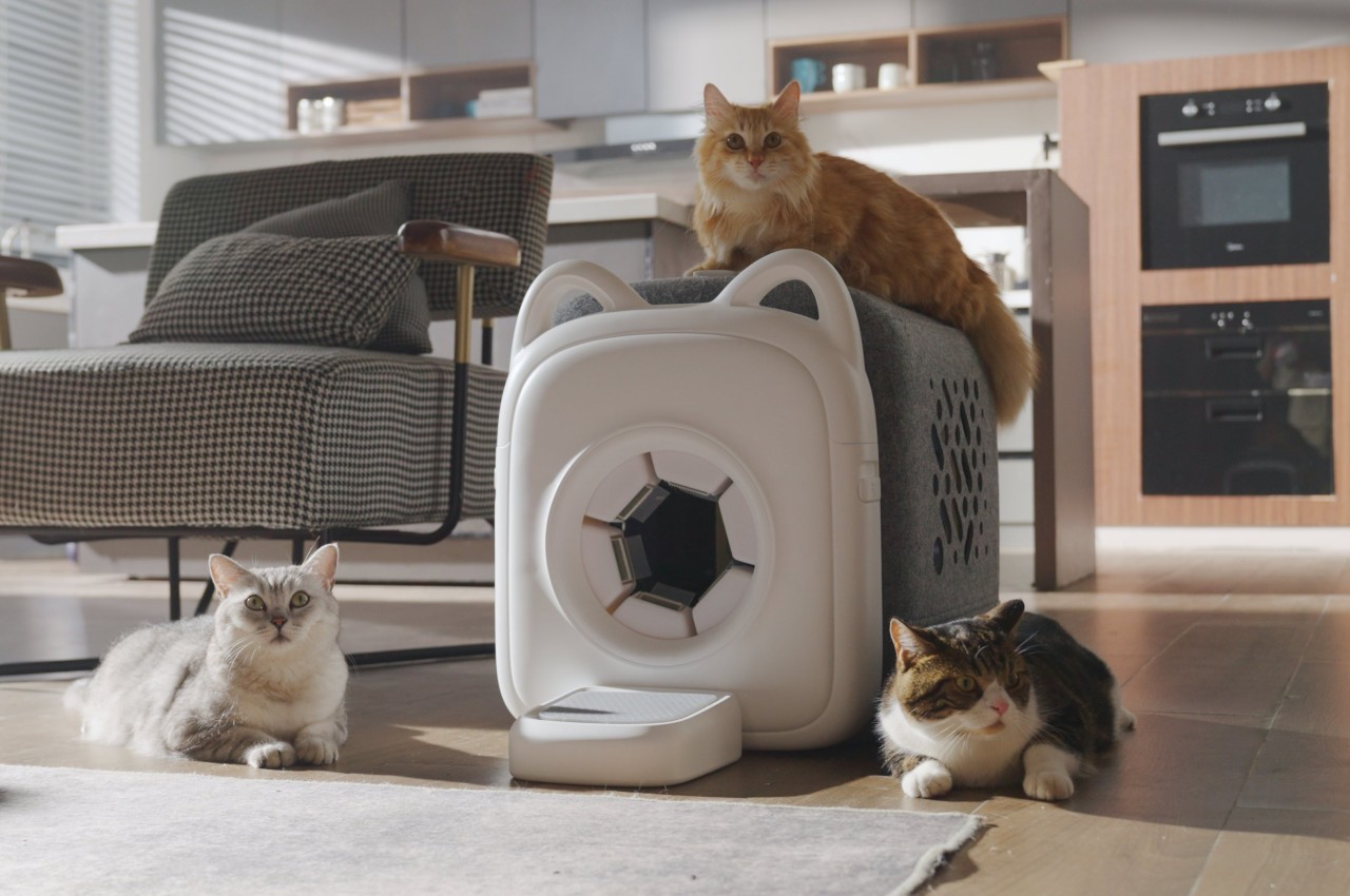
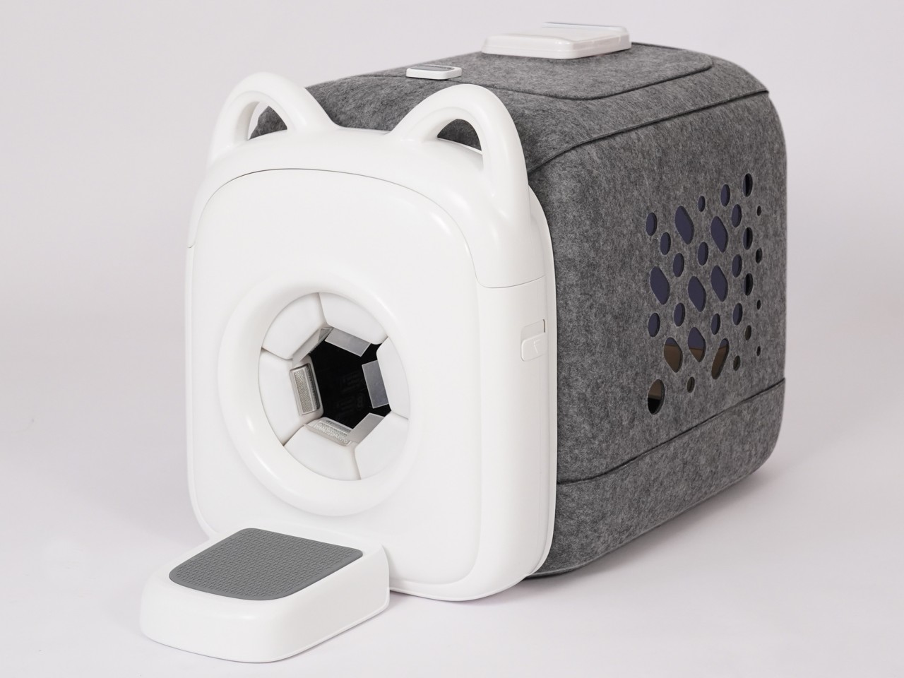
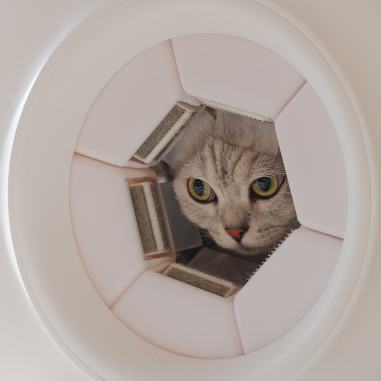
Furry friends are full of fun, at least until it’s time to actually keep them healthy and well-maintained. Both dogs and cats have a never-ending fur problem, but felines are more notorious for not being as enthusiastic about being brushed and combed, unlike their canine counterparts. That said, cats are also sticklers for cleanliness, but all their licking unfortunately results in unsightly hairballs in the end. This rather ingenious contraption offers a solution that makes that brushing feel almost natural to the cat, and it does so by taking advantage of the most cat-like behavior of all: squeezing into very tight spaces.
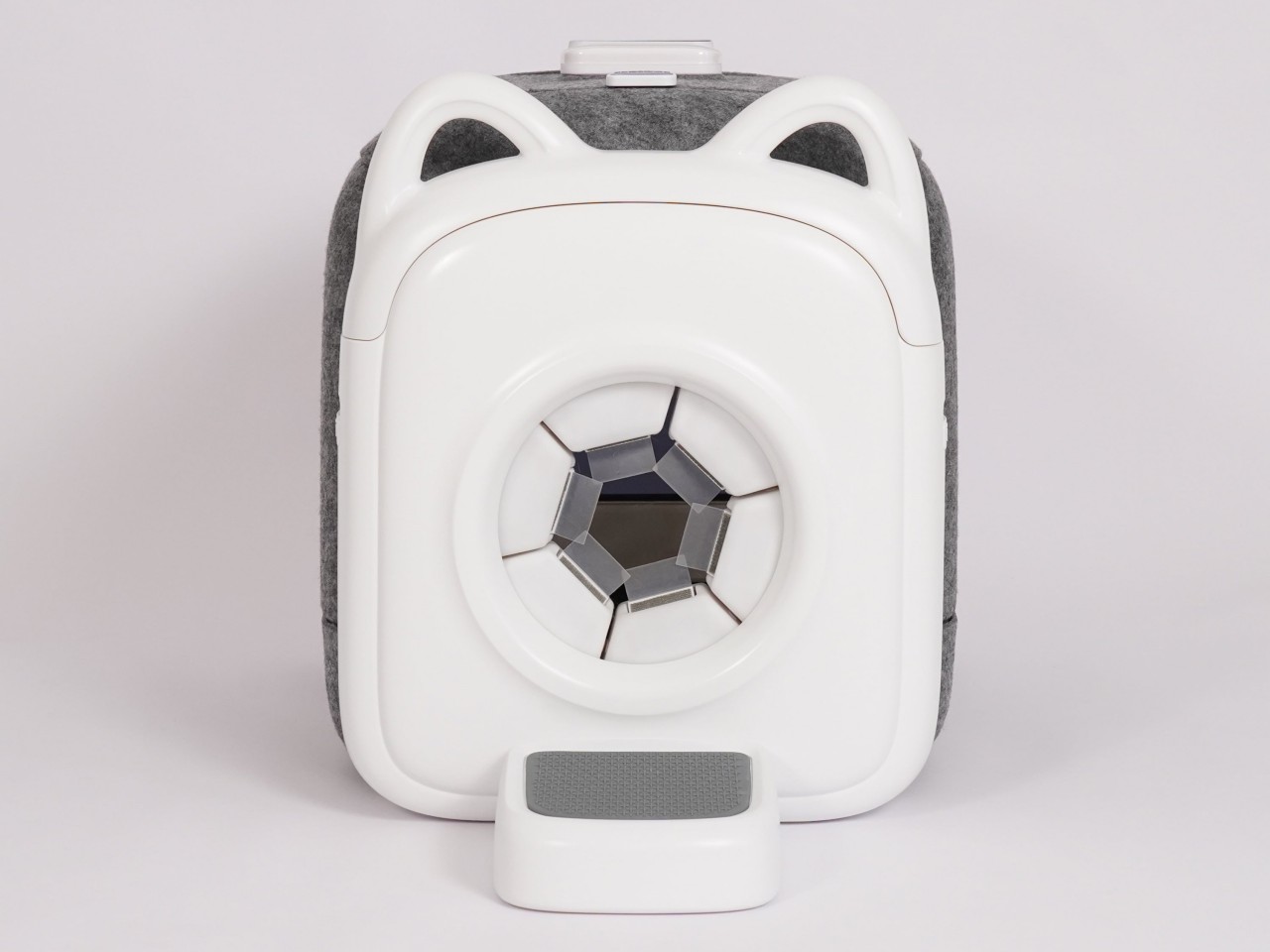
At first glance, the Paw-Swing Purrring (yes, that’s how it’s spelled) Cat Self-Grooming House looks nothing more than a felt-covered box with a rather small circular opening in front. This combination is, of course, irresistible to cats who’ll want to explore and try to fit into that tight space, which is exactly why it’s designed this way. And as soon as it passes through that hole, its loose fur gets brushed away in a manner that makes the cat feel like it’s being licked by its mother instead.
The secret is the six cylindrical brushes around the circular entrance of the house, each with a surface designed to mimic the papillae on a cat’s tongue. To the cat, this feels like a more natural grooming method, which is normally employed by mother cats licking their young. Of course, the fur isn’t ingested and is simply stored in a separate compartment for easy cleaning later. This process happens each and every time the cat passes through the entrance, making manual grooming a thing of the past.
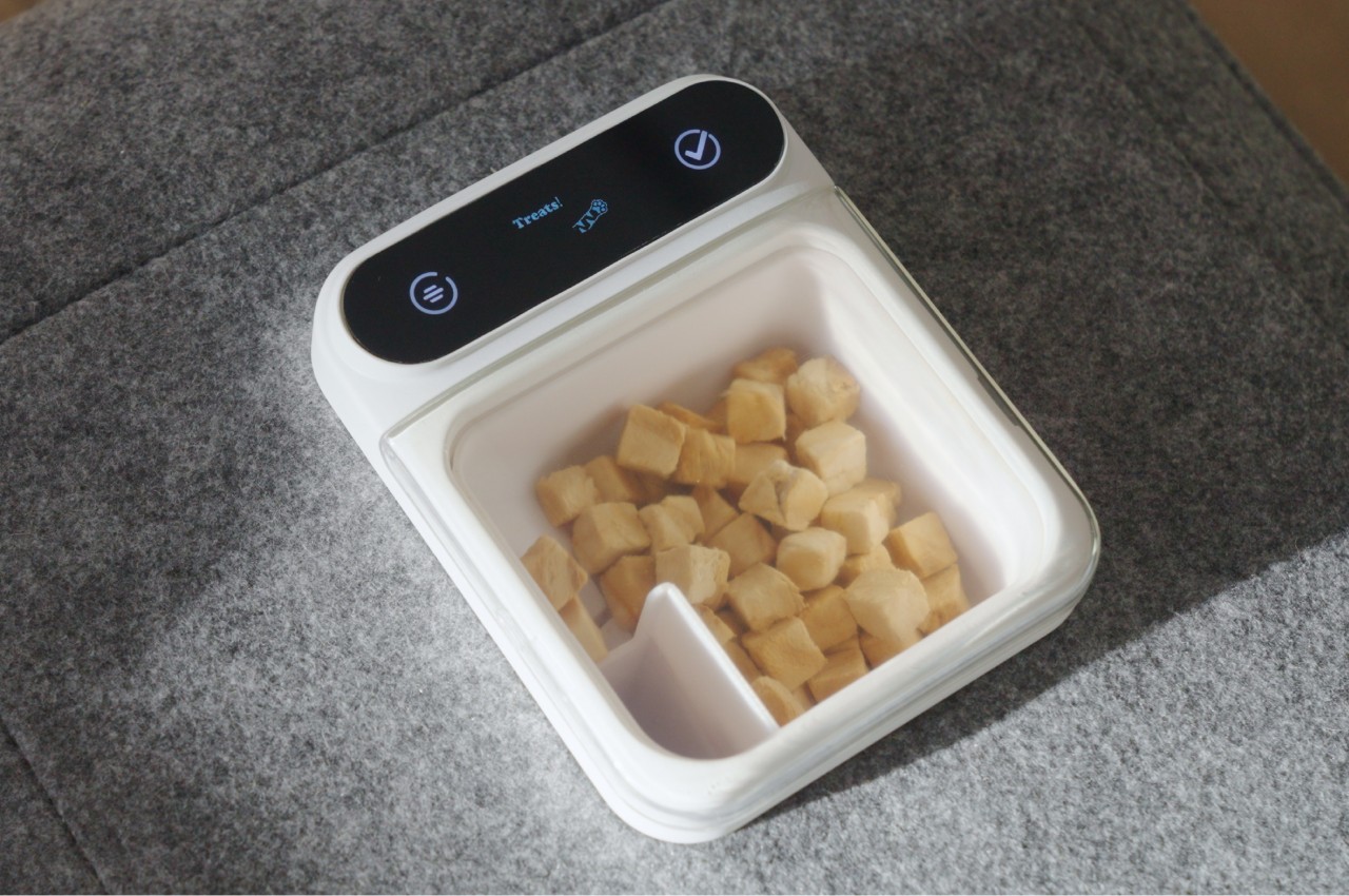
While the self-grooming cat house requires no electricity or motors to implement the grooming part, it does have a tech component to its design. There is an automated treat dispenser installed at the top to entice your cats to come closer to the box, and when it does go in, it records how many times the cat comes in and leaves. This data is made available to owners to help them monitor the habits and health of their feline family.
Beyond the grooming and the feeding, the Purrring cat house is also, well, a house for cats. Its felt material makes the box comfortable and safe for cats, not to mention environment-friendly and recyclable as well. The Self-Grooming Cat House thus offers a safe haven for cats that also take a load off their humans’ minds, at least until it’s time to take out the collected fur.
It seems that some companies are moving up their schedules this year. Samsung has officially confirmed that its Galaxy Unpacked Summer edition will happen a few weeks earlier compared to last year’s event, setting the date for the 10th of July. Google, however, isn’t going to be outdone and is actually taking an even earlier date, more than two months in advance, in fact. Although details are still a bit scant at the moment, Google has more or less announced that its next product launch is being held in August instead of October, enough reason for fans to be excited and, at the same time, perhaps a bit perplexed at the sudden change in cadence.
Designer: Google
Pixel 9 Pro XL render
Picking a launch window for a product is actually a very complicated process. Companies have to take into consideration multiple factors, including the timeline of component manufacturers, their own previous products, as well as the movements of their rivals. For a few years now, Google has traditionally made October its stronghold while Samsung picked late July or early August and Apple has consistently used September for its own purposes.
Pixel 9 renders
Now Google is seemingly throwing caution to the wind and will launch its next new products on August 13th, two months earlier than usual. There are a few theories being pushed forward as to why the tech giant decided on such a drastic change, including how there won’t be significant hardware upgrades that would require waiting for components to arrive first. The favorite speculation, however, is that Google wants to put a heavy focus on AI just as it did at I/O 2024 last May. Not only will it need to get the word out early, it also needs to do it before Apple’s own “Apple Intelligence” iPhone debut in September.
Pixel Fold 2/Pixel 9 Pro Fold renders
Regardless of the reason, Google’s product lineup is expected to be packed this year with no less than three Pixel 9 models, four if you include the Pixel 9 Pro Fold, formerly known as the Pixel Fold 2. Google’s own teaser pretty much confirms the big design change that will happen this year, with the iconic visor giving way to a rounded rectangle bar across the width of the phone’s back. It will definitely be a divisive change, just as the visor design itself proved to be controversial despite being quite distinctive.
Also expected to land next month are new Pixel wearables, including the Pixel Watch 3 and a long overdue Pixel Buds Pro successor. Based on rumors, the Pixel Watch 3 will not have any big design changes compared to its previous two predecessors, while details on the design of the Pixel Buds Pro 2 are almost non-existent. Either way, it seems that these two device lines haven’t made inroads in the design department, leaving a few Pixel fans probably a bit less enthusiastic about upgrading to them.
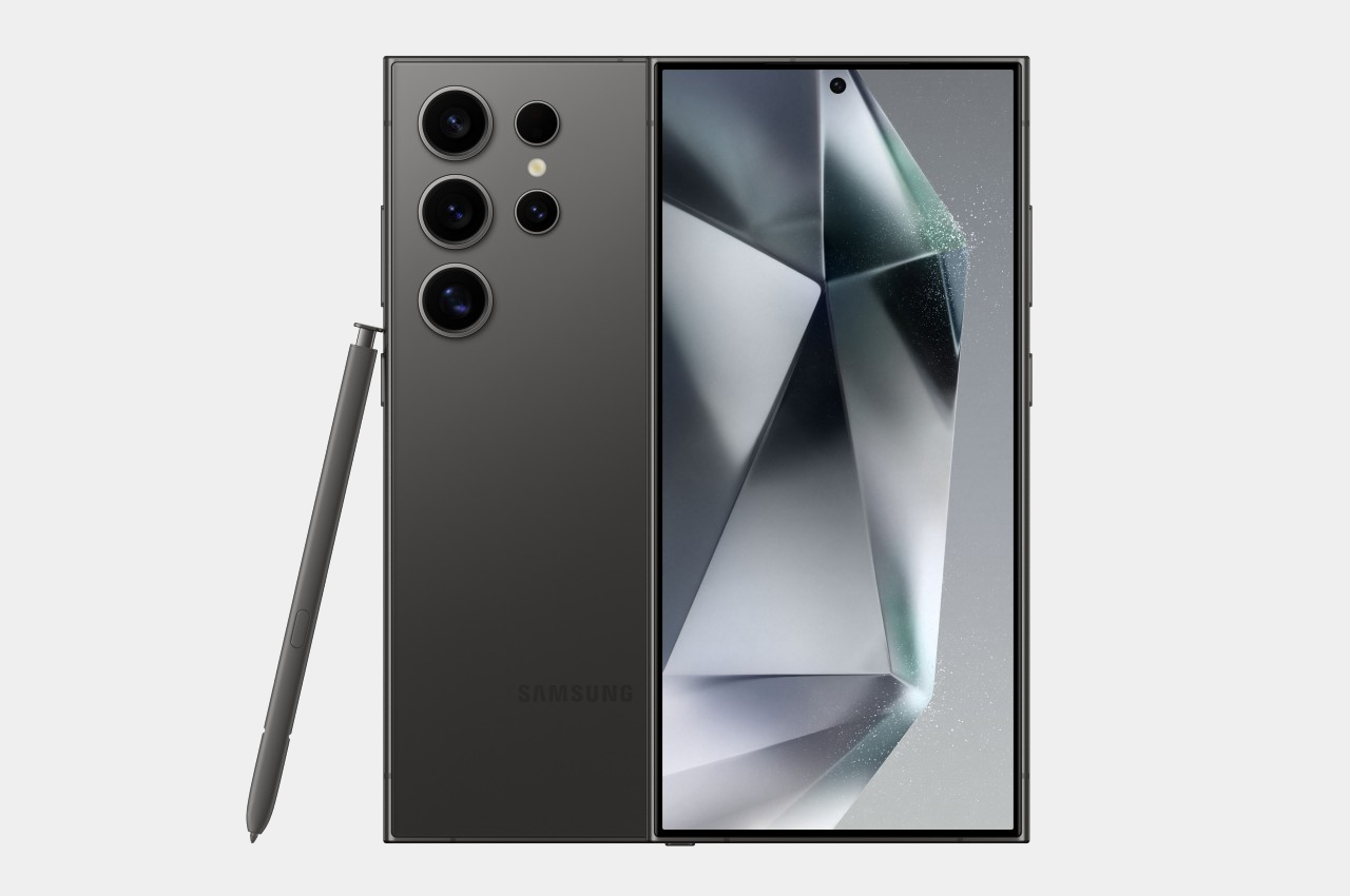
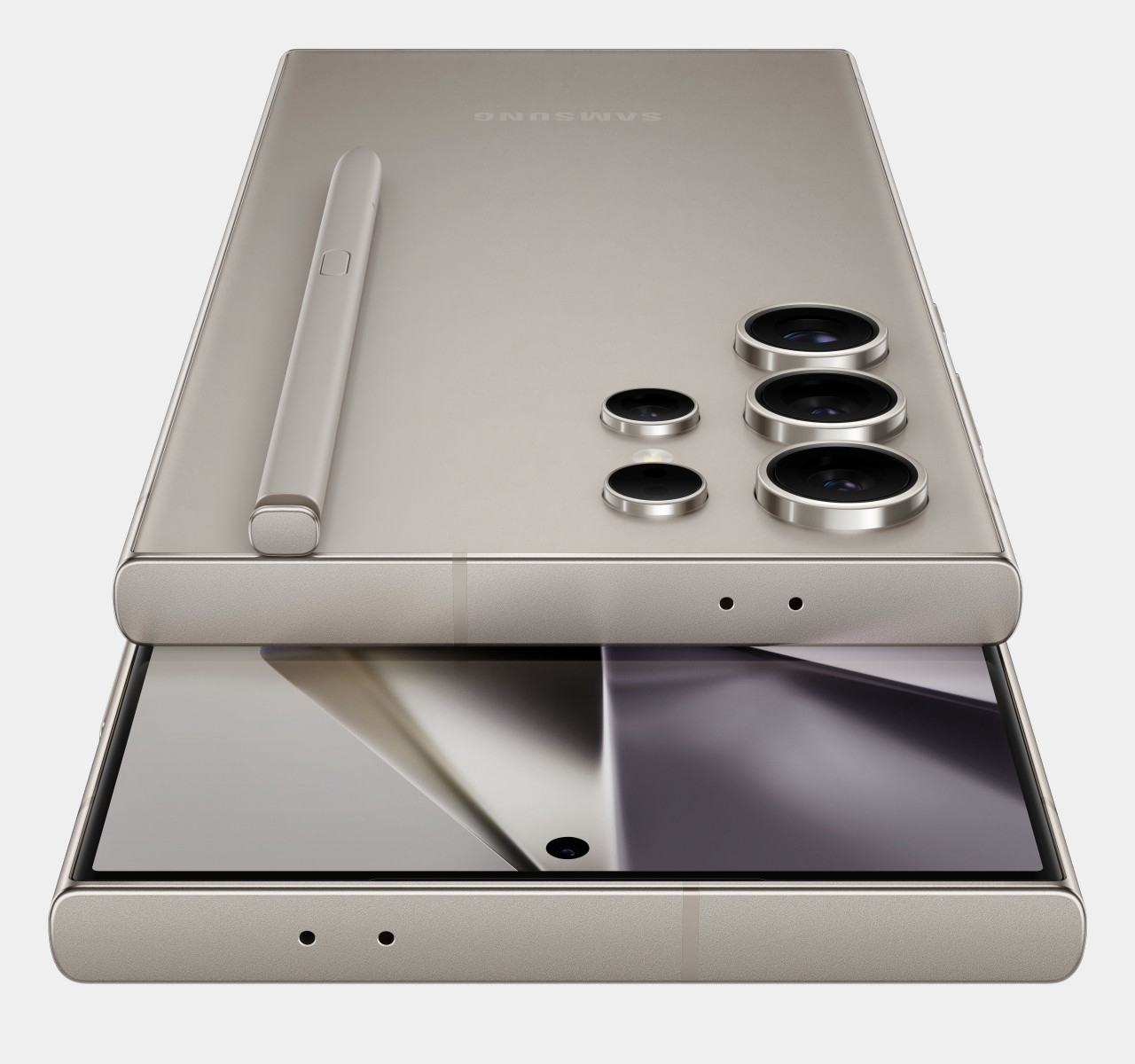
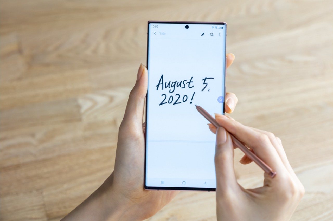
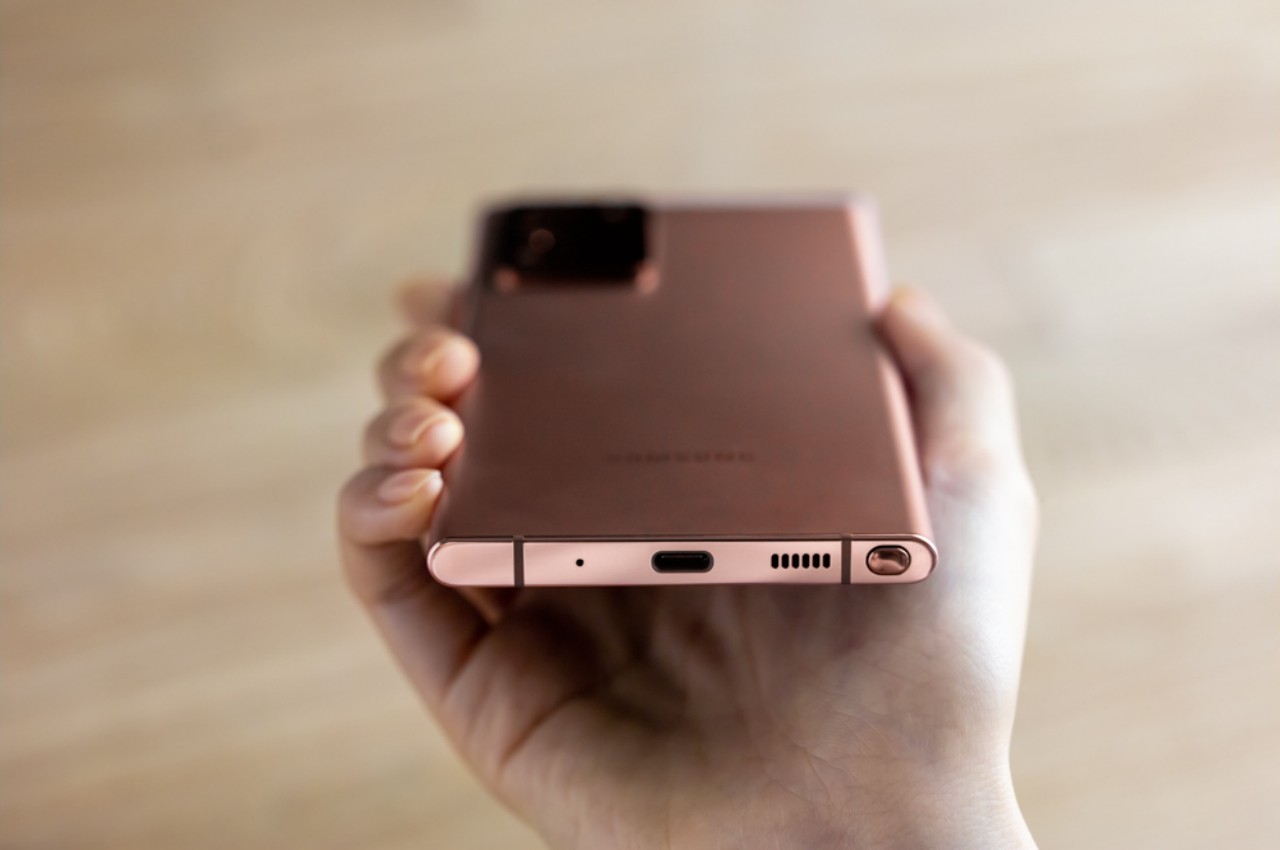
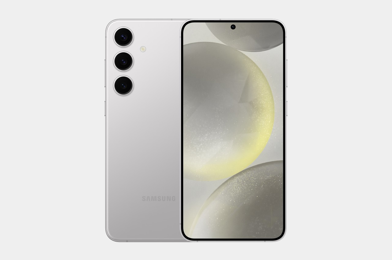
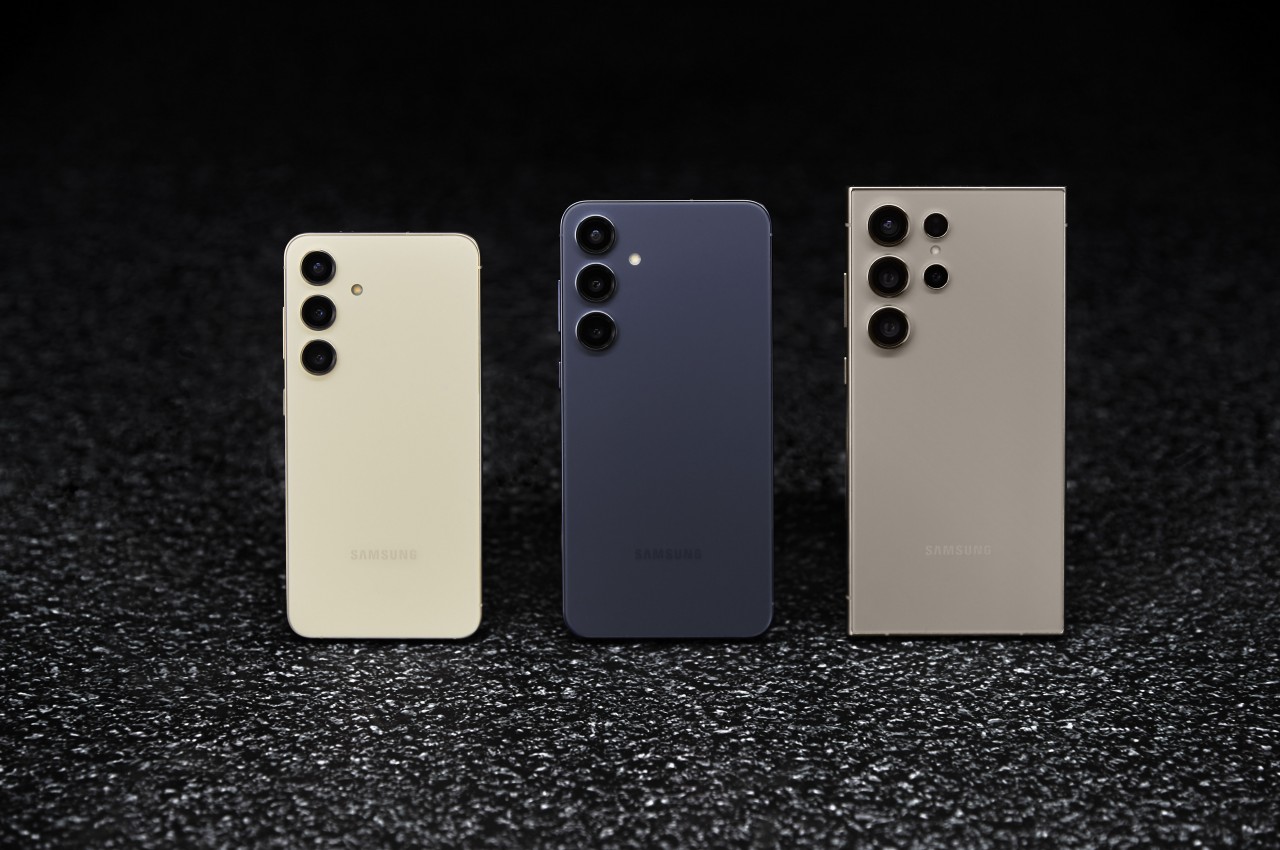
Since 2011, Samsung has been launching two flagships a year, one under its premium Galaxy S brand and another with the Galaxy Note name. The latter has mostly been defined by its large screen and S Pen stylus, though now large screens or phablets are the norm rather than the exception. By now, the Galaxy Note is pretty much history, but it seems that it might be making a comeback in an unexpected and perhaps unwelcome way. We’re still half a year away, but rumors about the Galaxy S25 Ultra have already started to attract attention, both good and bad, especially on how its design will be throwing away what has made it look unique in exchange for what is both a throwback to the past and a nod to its stylus-less siblings.
Designer: Samsung (via @Wvisioncreation)
Galaxy S24 Ultra
Although Samsung retired the Galaxy Note name, its legacy lived on in the Galaxy S Ultra series. Not only does it have an S Pen stowed inside its body, it also retains the design that set the previous Galaxy Notes apart from the Galaxy S phones. Specifically, it had a rather boxy design, especially when viewed from the front. Not only are the top and bottom edges flat, the corners are also sharp and angular, a design that you’ll rarely see on other phones these days.
Galaxy Note 20 Ultra
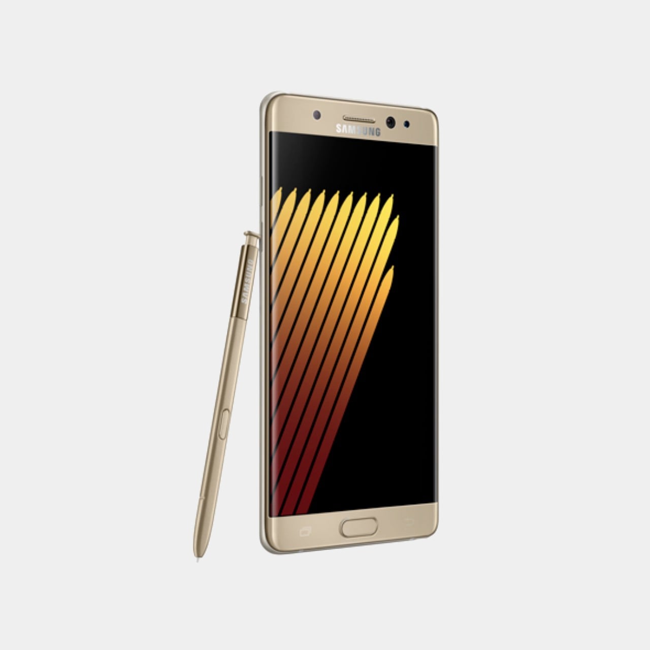
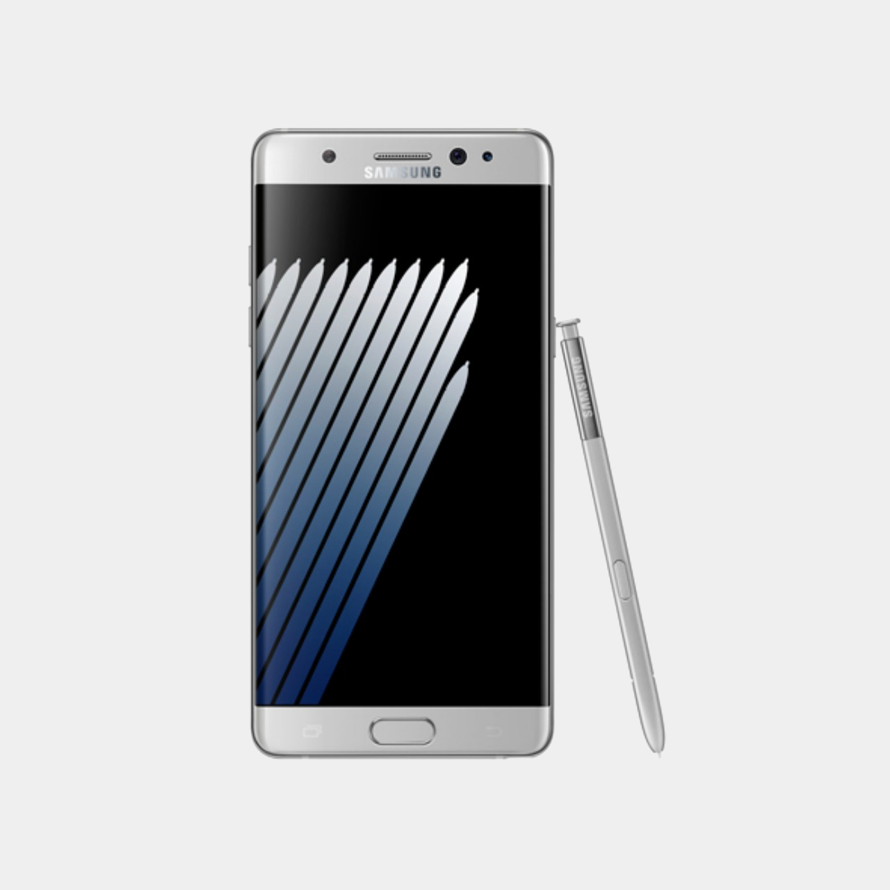
According to the first rumors to come out for Samsung’s 2025 flagship, the Galaxy S25 Ultra will be losing that design DNA. The design is described as having more rounded corners, similar to the Galaxy Note 7 from 2016 with one important exception. The screen is still flat, something that Samsung did for the first time in this year’s Galaxy S24 Ultra, rather than the heavily curved display of yesteryear’s Galaxy Notes. In not so many words, it’s going to look like the Galaxy S24 and Galaxy S24+, and presumably the Galaxy S25 and Galaxy S25+.
Galaxy Note 7
On one hand, this change makes sense from a branding perspective, especially if you consider how the Galaxy Z Fold and Galaxy Z Flip are also transforming. Samsung’s foldables are becoming edgier, so to speak, taking on an appearance similar to the Galaxy S24 Ultra. The company, therefore, needs to differentiate the two product lines, and making the Galaxy S25 Ultra look like its siblings from the same Galaxy S line makes the integration of the Galaxy Note complete.
Galaxy S24+
On the other hand, response to the rumored change has been generally negative so far. That boxy and squarish design has become the visual identity of the Galaxy S Ultra, especially for fans of the Galaxy Note. In fact, they probably wish the Galaxy S to adopt the design rather than the other way around, if only to set Samsung’s flagship apart from the sea of phones with flat edges, flat screens, and rounded corners.
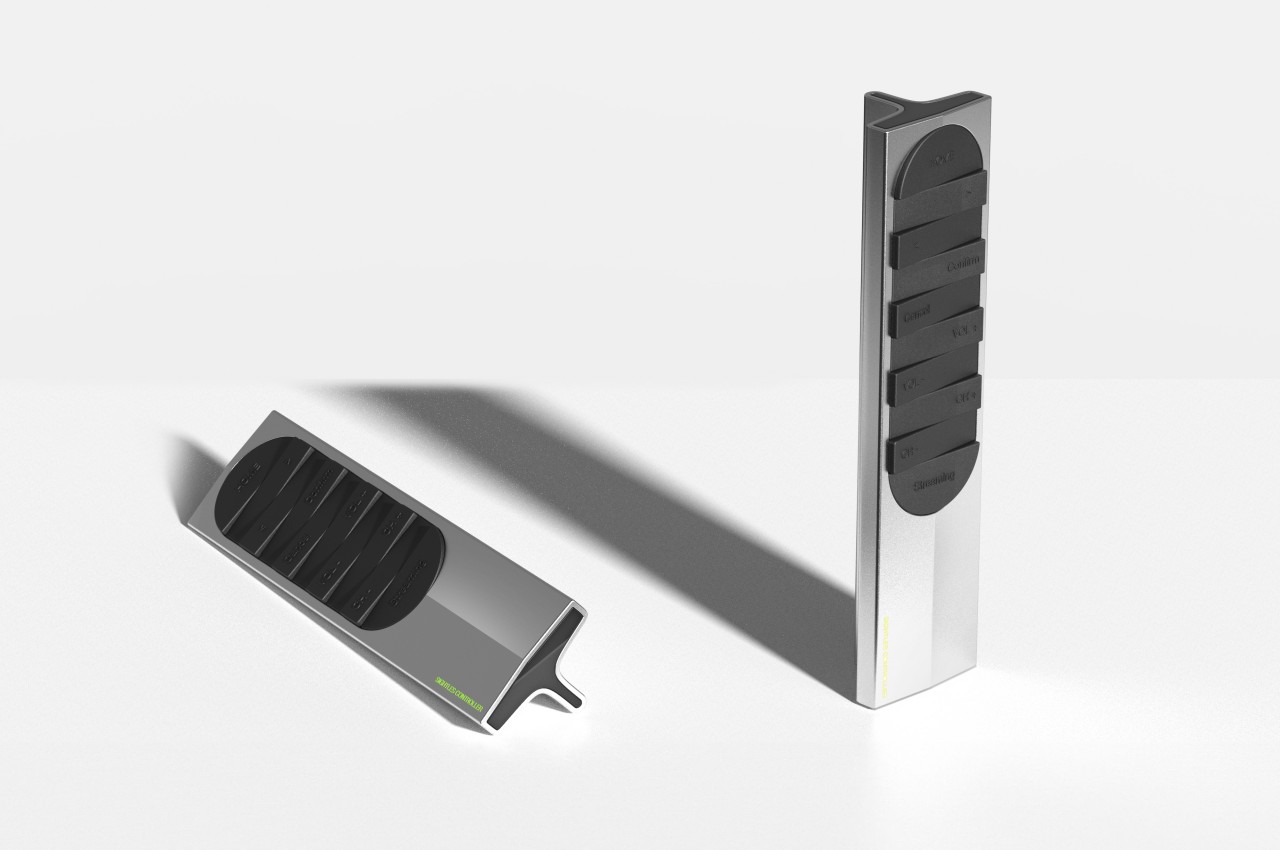
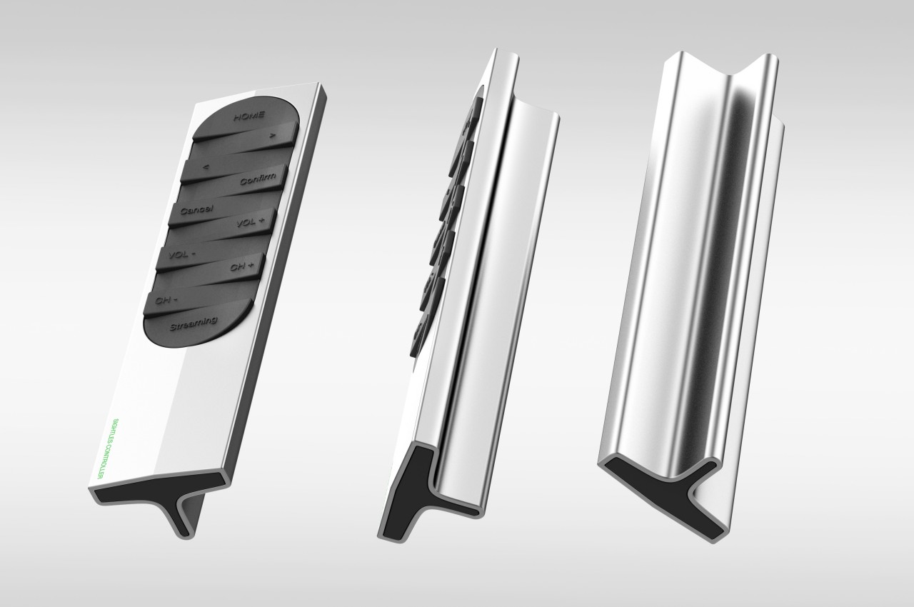
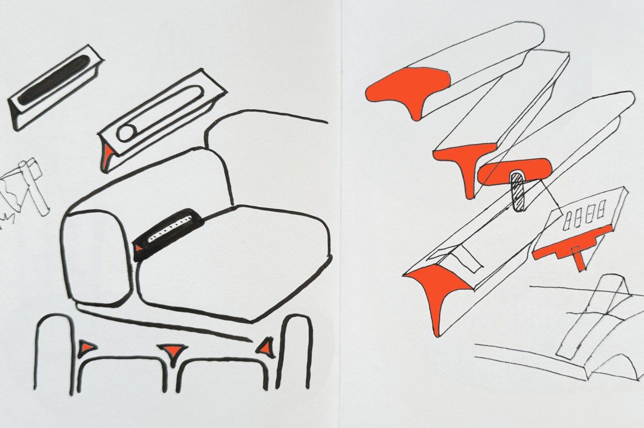
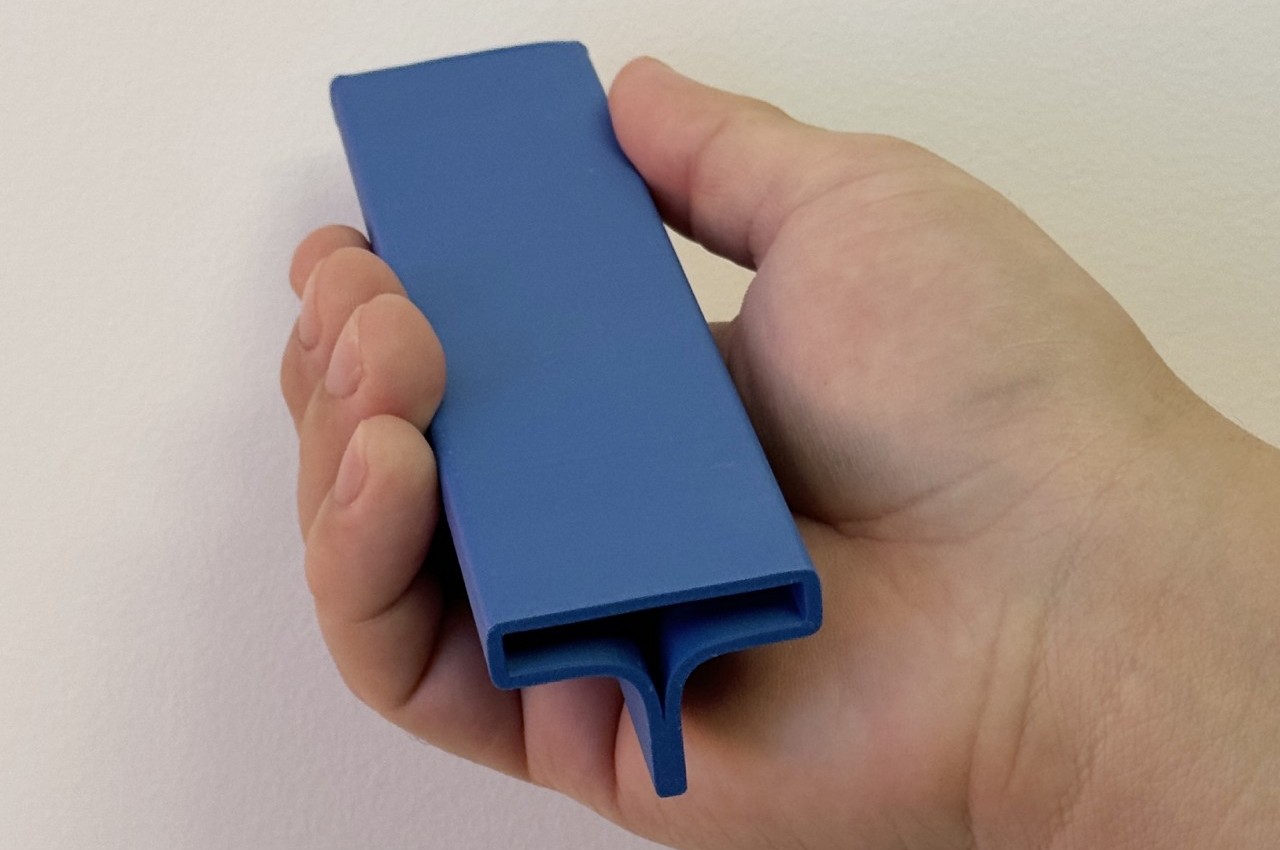
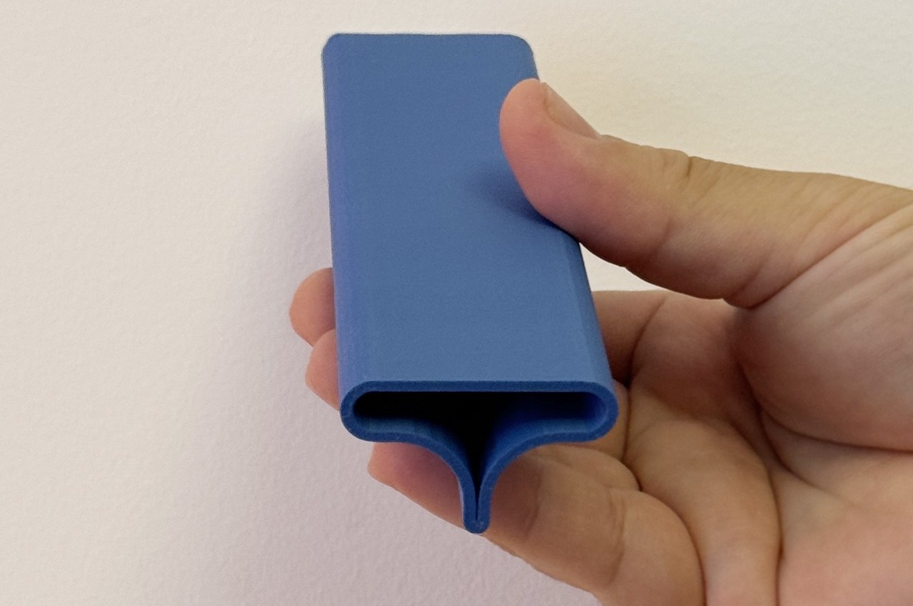
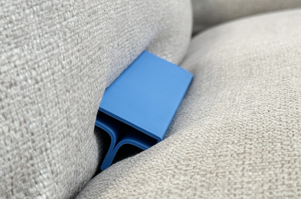
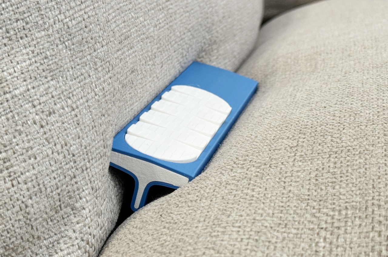
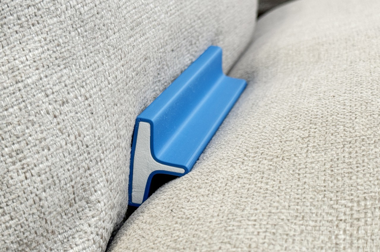
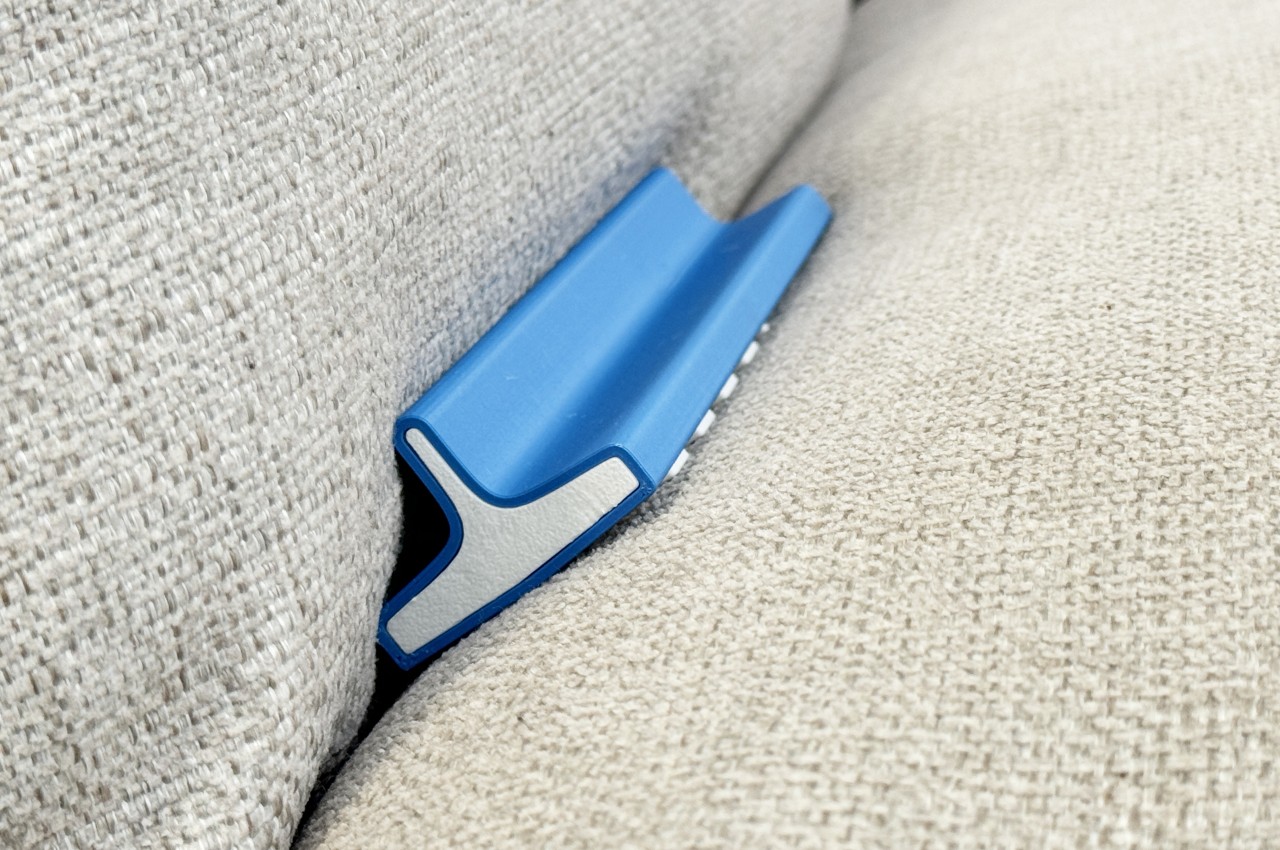
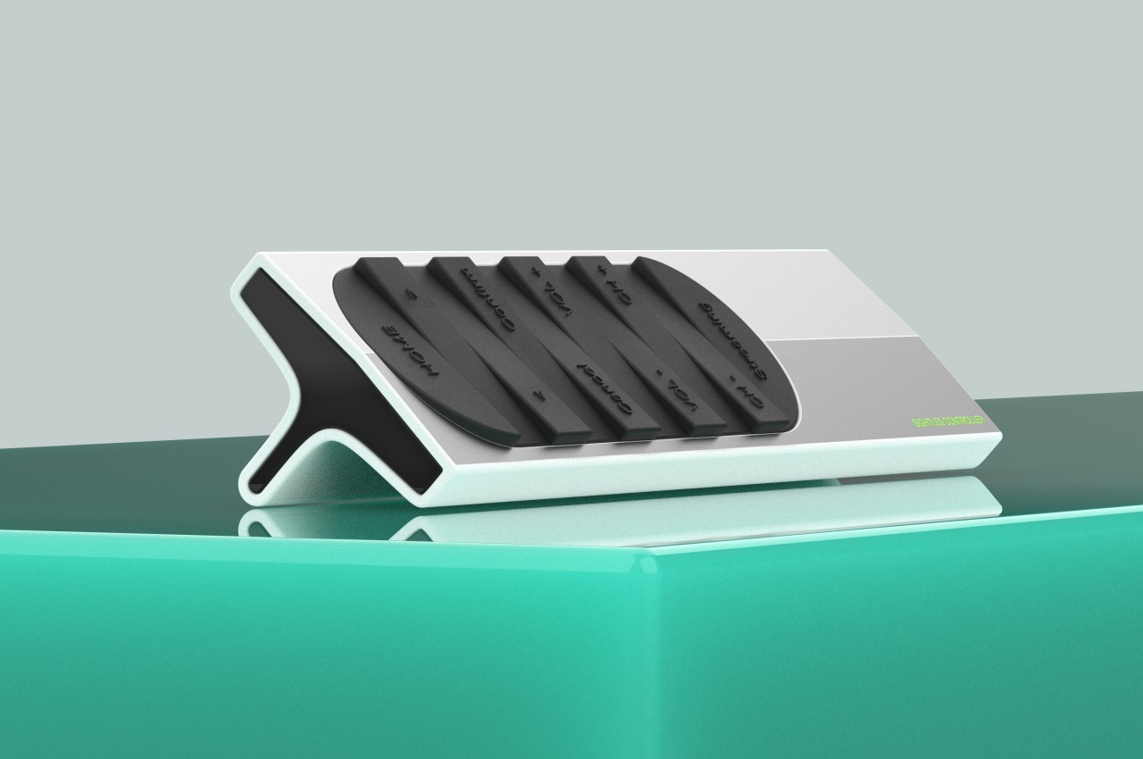
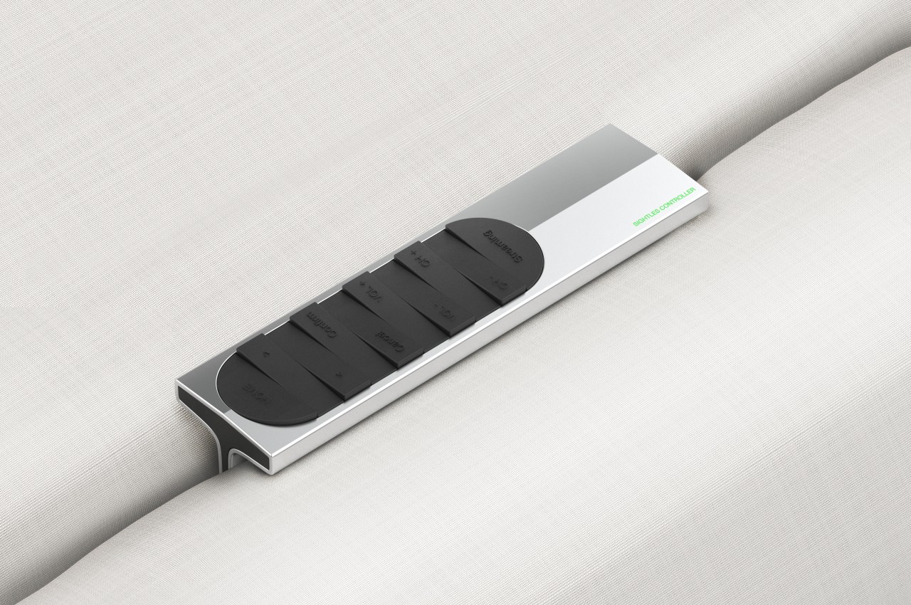
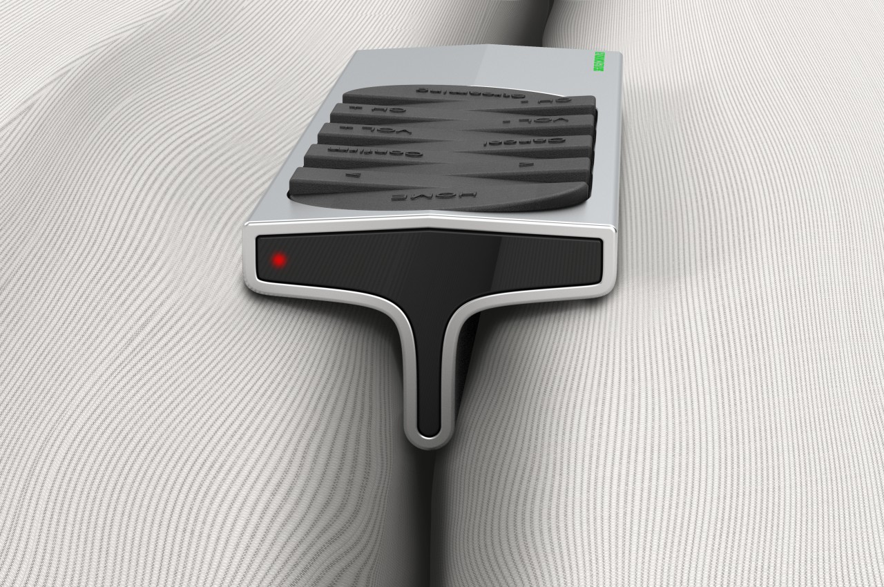
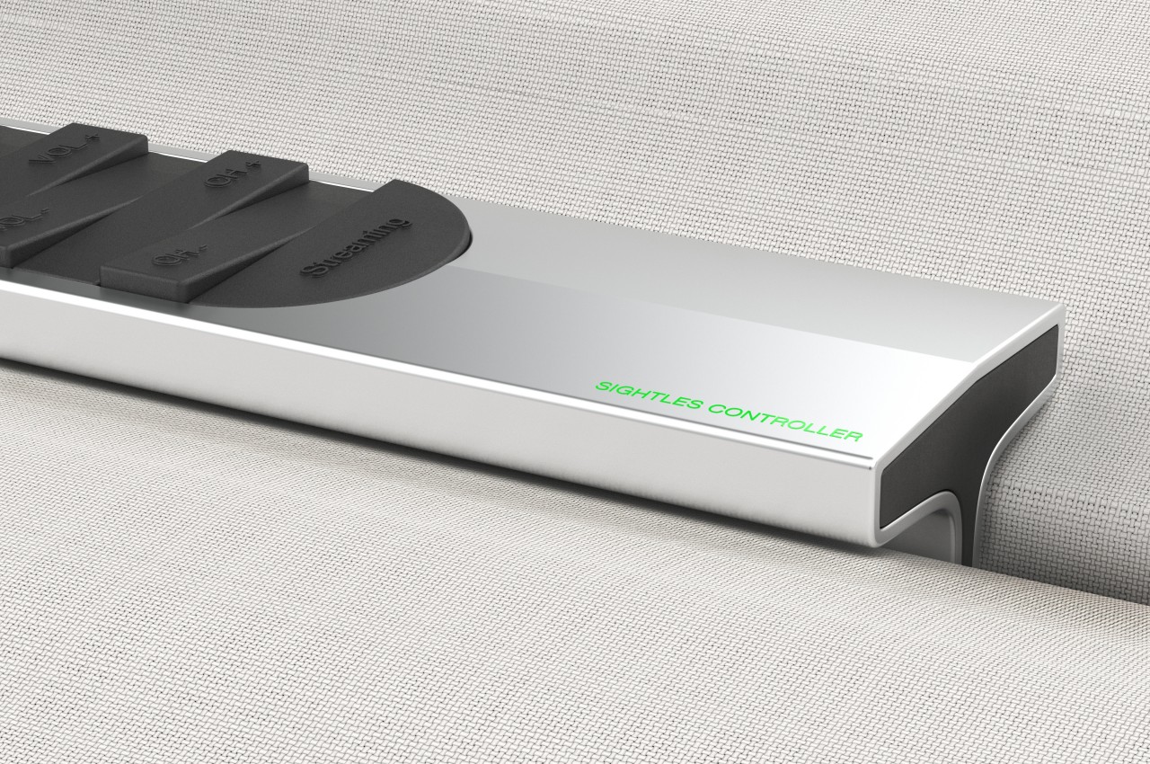
Even with the advent of smart TVs and streaming, remote controls are still an indispensable part of that user experience, imperfect as it may be. The basic design of remote controls has changed very little, save for the extra minimalist variants that, in exchange for simplicity, sometimes make you crawl through menus and options just to get to the function you need. More importantly, however, the complexity of these electronic accessories has made them too stressful to use, and their tendency to get stuck in the corners of couches was a meme even before there were memes. This concept tries to revolutionize the remote control design to deliver a more tactile experience that lets you operate or even pick it up without looking at it at all.
The traditional remote control design has always been one of practical convenience rather than comfort or enjoyment. It’s meant to let you quickly change channels or the volume, but the irony is that it often takes more time to look for the right button or, worse, look for the remote itself. Even with more minimal designs that reduce the buttons to half a dozen or so, the rectangular shape of the device itself lends it to being lost too easily.
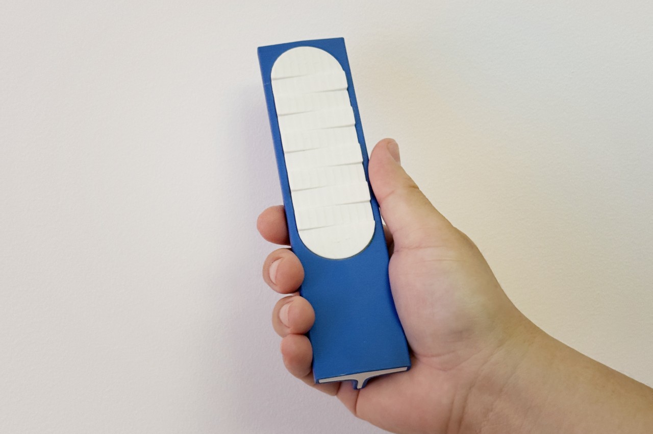
The Sightless Remote Control proposes a rather drastic change to the standard design in order to address these issues. Instead of a flat rectangle, the remote has a T-shaped form that ensures it won’t slip through the gaps in couches and chairs. It also makes it easy to pick up the remote, whether from those corners or from the top of a table, all without even looking at the remote and just using our sense of touch instead.
The same is true for the buttons themselves, which are no longer distinct circles or ovals. Instead, there’s a single column in the middle of the remote’s top surface with wedge-like shapes rising on opposite sides almost like waves in the ocean. Instead of using printed icons, text representing the functions are instead embossed, again allowing for “blind” use by letting your fingers do the seeing. It will still require a bit of muscle memory to help place that finger in the right area, but it won’t be as tedious as on a typical remote with very smooth buttons.
More than just enabling sightless use of the device, this design tries to bring back the joy of using an analog device in an age of smartphones and touchscreens. It makes entertainment not just a pleasure for our eyes and ears but also for our sense of touch, all while helping reduce the cognitive overload that multi-functional screens and phone apps bring to our brains.
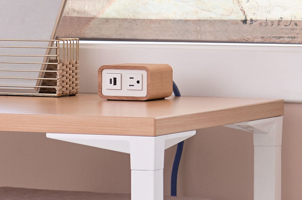
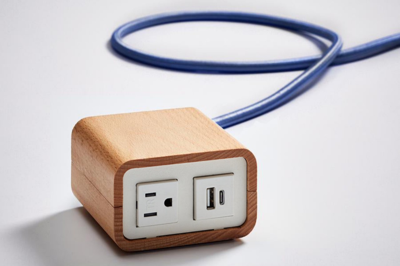
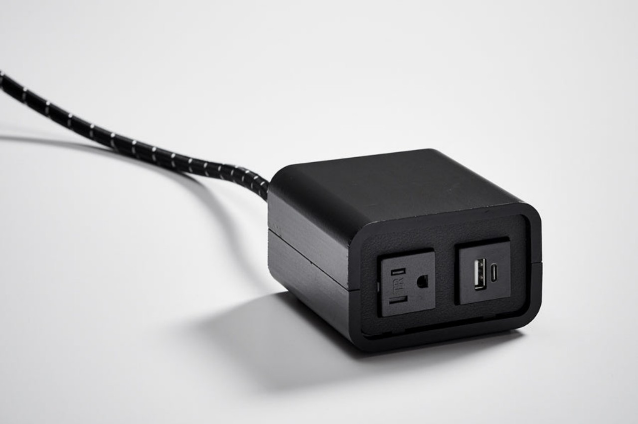
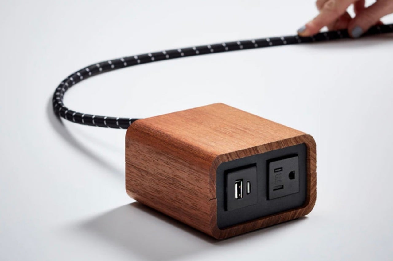
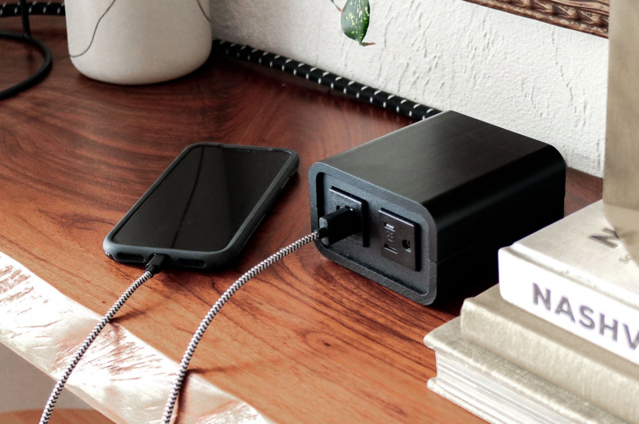
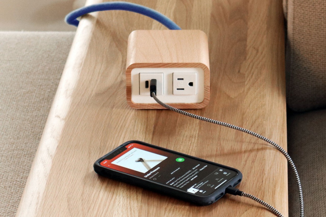
Power strips and extension cords are now an unavoidable part of modern life. Unless you have custom-designed furniture, there will always be cases when you have too few power outlets or ones that are too far from your desk to matter. Unfortunately, these power supply accessories haven’t exactly evolved in terms of design, or at least most of them still look like appliances from the 90s rather than anything that fits modern aesthetics. Hiding these power sources has become an important part of the so-called cable management problem, which is often a source of tension and headache for some people. There are, thankfully, a few that try to embrace more pleasing designs, like this power supply box that thinks outside the box, pun intended, so that you don’t have stress over hiding it and instead proudly show it off on your desk or shelf.
Genuine wood isn’t often used as a material in many electronics, mostly because of its poor thermal handling, making it warp and deform over time due to heat. That and it’s a potential fire hazard, making it unsuitable for many devices. That doesn’t mean, however, that it can’t be used as a chassis or covering in a safe manner, especially if it can significantly change the character of a product from utilitarian to humane.
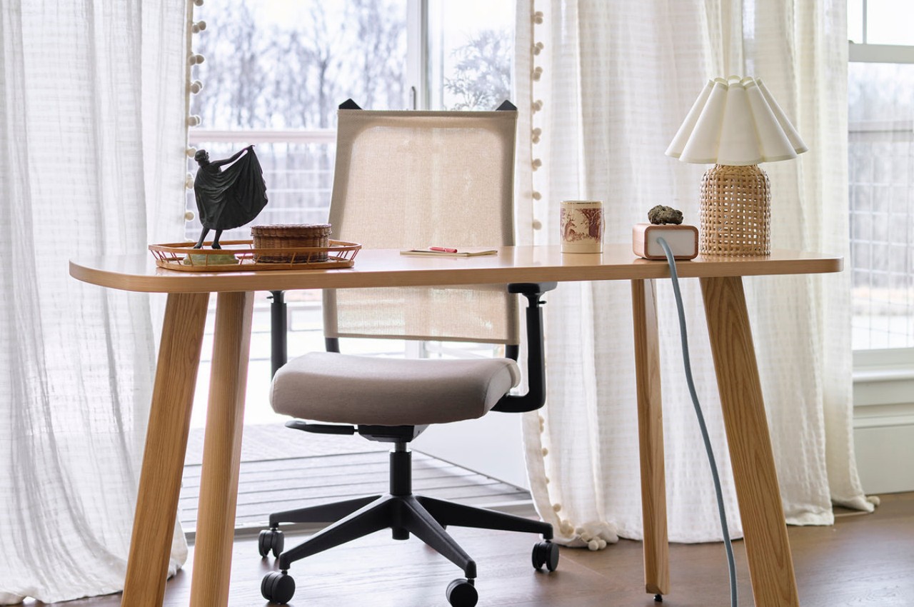
The Willow Power Supply is one such design that employs the warmth and natural beauty of wood to uplift the image of an ordinary extension cord from a tool to a decorative object. While most power strips and extension cords are painfully hidden behind or even under desks, Willow stands proudly on top. More than just boasting rights, however, this also means quick and easy access to those essential ports for your computer and devices.
Willow is available in a combination of beech or walnut shells and clear or black power boxes, though the best combination is the beech and clear or white box since it clearly brings out the beauty of the wood complimented by the minimalism of the power supply. The box itself has very little detail save for the outlet and ports in front and the braided cord coming out of its back.
While the Willow Power Supply might delight as an aesthetic product, it might disappoint as an actual power supply. There is only one power outlet, one USB-A port, and a lone USB-C port, a very basic and perhaps inadequate number for today’s needs. At $250, it does give off a feeling of being more like a designer product than one that’s made for power users, more for casual use than heavy-duty workstations. Either way, there is little doubt it adds a bit of accent to any workspace, especially matching minimalist designs with wooden furniture.
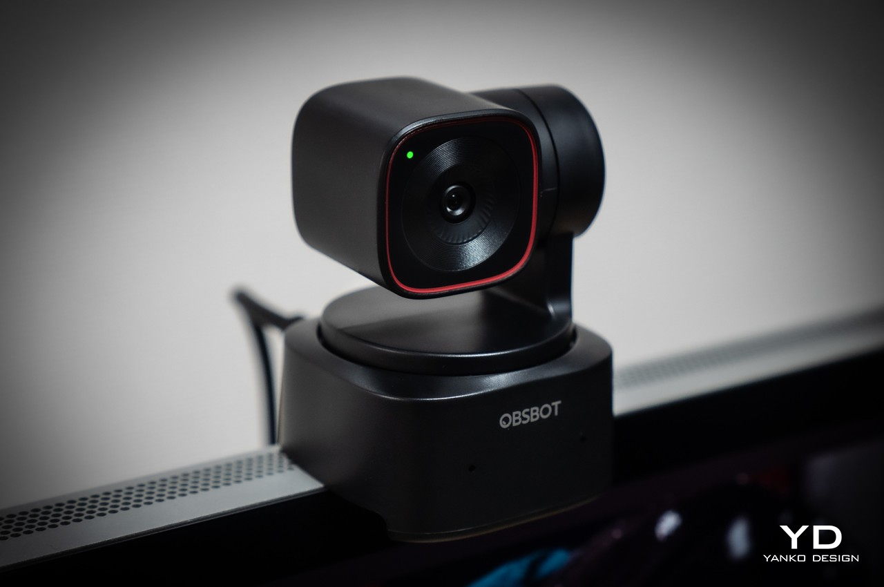
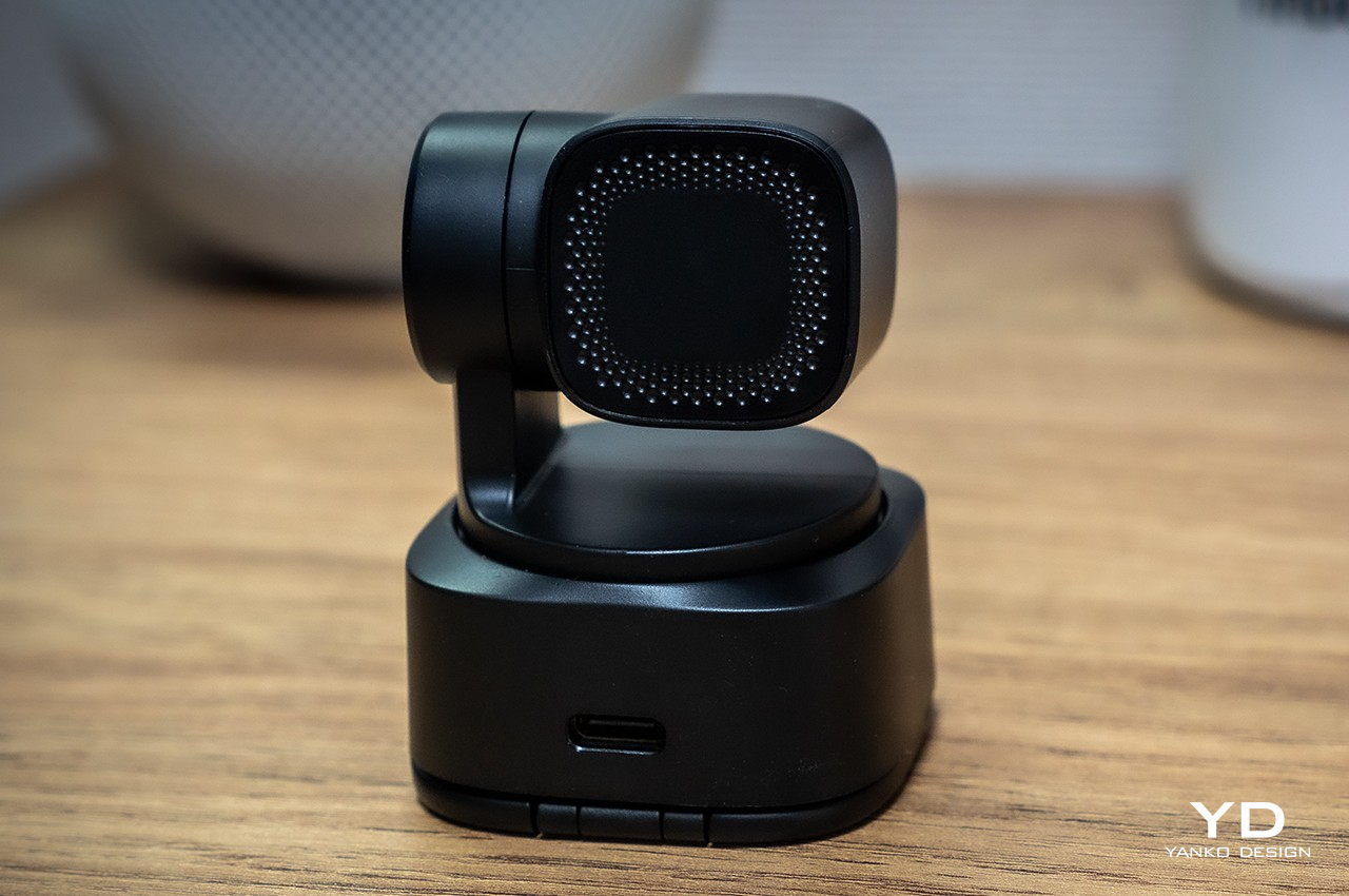
The OBSBOT Tiny 2 Lite distills the essential features you need for more engaging videos, presentations, and meetings.
Video streaming has become its own entertainment category and industry, allowing almost anyone to reach out to millions across the world and maybe even make some money while doing so. The barrier to entry is quite low, at least when it comes to equipment, as long as you have a smartphone or even a computer with a webcam. As you grow your content and your audience, however, you will eventually find yourself looking for tools that are made to support such activities, like a webcam that can help bring out the best in your video content and presentations. Of course, webcams are a dime a dozen, especially if you consider the cheap and unsurprisingly basic options out there. You might think you need to spend big bucks for a really good webcam, but the new OBSBOT Tiny 2 Lite says otherwise. Compact yet packing quite a punch, the 4K PTZ webcam promises AI-powered features at an affordable price, and that naturally piqued our curiosity to see if it’s really good as it sounds.
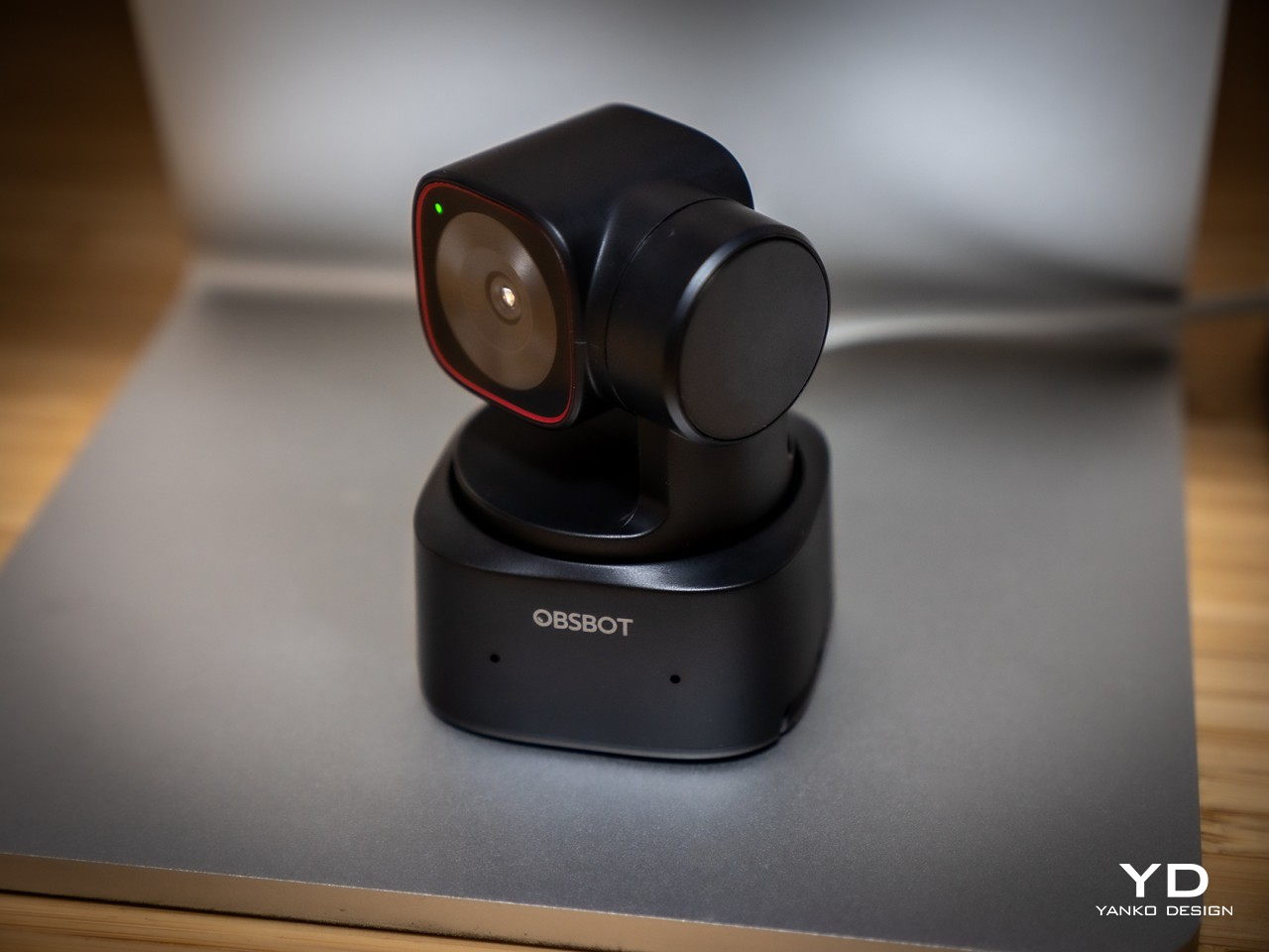
Webcam designs are myriad and varied, and most of them are meant to sit on top of computer monitors or laptop lids for use in video chats. That often means using clips or, worse, adhesives, and they take on shapes that are designed to blend in with the monitor, leading to rather uninspiring designs. It might be called a webcam, but the OBSBOT Tiny 2 Lite is really a versatile gimbal camera that can be used for almost any purpose and in almost any setting as long as you’re connected to a computer, of course.
As such, it’s no surprise that the OBSBOT Tiny 2 Lite looks more like one of those gimbal cameras than a webcam, and for good reason. It’s a PTZ or “pan, tilt, zoom” camera, after all, and its base and arm work to move the camera as needed. Yes, you don’t have to position the camera yourself, but more on that later. What this means is that this webcam hardly looks like a webcam at all. Its rounded square base and the square camera hanging from its arm make it resemble a miniature professional video camera, and that’s a comparison that’s more than just skin deep.
All in all, the OBSBOT Tiny 2 Lite has a compact and minimalist design that is distinctive but not distracting. It’s small enough to take with you anywhere your laptop and your work need to go, while still packing quite a collection of powerful features. The camera itself barely has any physical controls, creating a clean and professional-looking aesthetic. That means you’ll have to rely on indirect methods of control, like the OBSBOT App, hand gestures, or the optional remote control.
Ergonomics
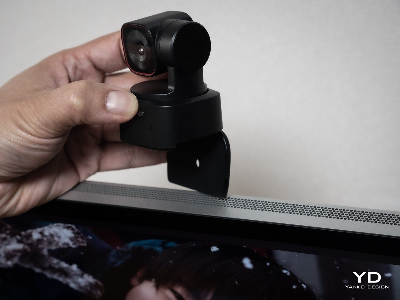
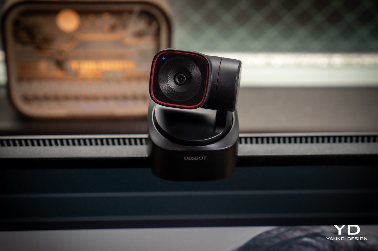
You won’t be holding the OBSBOT Tiny 2 Lite in your hand, not unless you put it on a selfie stick or handle. It’s meant to either mount on top of you a monitor, stand on a desk, or attach to a tripod, and the camera’s design supports all three. Rather than relying on a separate clip that you might lose, the Tiny 2 Lite features a built-in stand that unfolds from the bottom, forming a simple cantilever-like mechanism that uses gravity and physics to stick to the top of a computer screen. It is, however, a very simple mechanism, and it might struggle to support older, thicker monitors as well as very slim laptop lids.
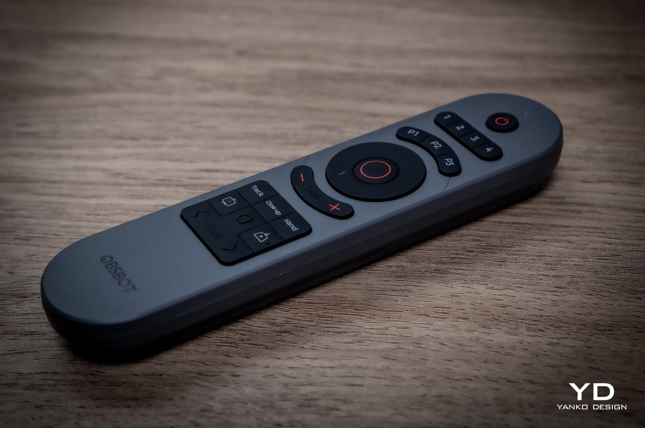
When in use, you won’t be touching the camera directly either, since there are no buttons in the first place, other than turning the camera down to activate its privacy mode. Your primary control method will be through the computer app that configures the camera’s settings, but OBSBOT really wants you to rely on automatic operations powered by its AI. For more precise control from a distance, however, you might prefer to spend an extra $49 for the optional remote control slash presentation clicker. Depending on your workflow, you might find this absence of direct control liberating or extra work.
Performance
OBSBOT made a name for itself with 4K webcams packed in tiny designs, and the Tiny 2 Lite is no different. What is different, however, is that it selects only the hardware and features that deliver the best possible experience without asking too much from the consumer’s finances. For example, the 1/2-inch CMOS sensor is quite capable, enabling 4K 30fps as well as 1080p 60fps video recording with crisp and clear details. It supports HDR, though not the PixGain HDR that the more expensive non-Lite OBSBOT Tiny 2 boasts of, and it only has a single ISO for all kinds of lighting conditions.
While the video quality that the Tiny 2 Lite produces is already good, the camera’s real selling point is its intelligent hands-free controls. Of course, this newer model leverages plenty of AI so that you can leave it to decide what it thinks is the best shot, whether it’s zooming up close or using a more panoramic shot. The camera tracks you as you go around, making presentations and demonstrations look more dynamic and natural. It also supports auto framing, where it pans or zooms to adjust to the number of people going in and out of view. If you need more direct control, you don’t have to reach for the remote and just use hand gestures to adjust the camera to your liking. As for that movement, it’s pretty smooth and quick, easily adjusting to your own movement as if you have a human behind the camera.
As many AI features that OBSBOT crammed in such a small and accessible device, it also had to leave out quite a number of them that you’d see on the OBSBOT Tiny 2. It doesn’t have voice control, for example, which might actually be a good thing for more privacy-concerned users, but neither does it have a desktop mode where the camera swings down to capture, rotate, and frame what you’re doing on the desk, which could be your notes or instructions for some process. The biggest “downgrade,” however, is using a slower USB 2.0 connection only, a decision that’s sure to become a bottleneck when you need fast video transfers from camera to computer. Fortunately, most of these features can be considered “extras” from a content creator’s point of view, allowing the OBSBOT Tiny 2 Lite to still deliver a solid performance at almost half the price of its older sibling.
Sustainability
One of the reasons why webcams are so ubiquitous is because of how easy and cheap it is to get the materials needed to make them. That means a load of plastic, which is admittedly lighter and more resilient than a premium but hefty aluminum chassis. Unfortunately, that doesn’t bode well for the sustainability of these products, especially the ones that feel and look cheap and are more likely to be thrown out the moment they start malfunctioning.
The OBSBOT Tiny 2 Lite thankfully doesn’t look cheap nor feel like a throwaway product, but it’s still not something that will last you a long time if you aren’t careful. You won’t want to take it on daring adventures, especially in extreme conditions. This isn’t an action cam anyway, but it could still let you do some outdoor streaming if the weather allows it.
Value
OBSBOT launched the Tiny 2 last year to much applause for the wide array of smart features packed in a compact and stylish design. The one complaint has been its rather steep price tag, and the new Tiny 2 Lite finally addresses that. For only $179, it crams many of those AI features, particularly the core functions that truly define the Tiny 2. Naturally, it had to leave some out, but did OBSBOT cut off too much?
That’s hardly the case, as the Tiny 2 Lite delivers a solid PTZ webcam experience. Admittedly, that price tag might still look a bit too high, and not all features will appeal to everyone who needs a webcam. Those who mainly use webcams for meetings will find little reason to spend more on such a camera, though there are options like sleep mode made for those times when you need to briefly step away from a meeting.
Verdict
Being stuck at home doing video meetings and chats has made us realize how webcams seem to have been stuck in the early 2000s. A whole new crop of more powerful cameras has grown from this need, some going beyond just making you look presentable for a meeting. The OBSBOT Tiny 2 Lite is designed for budding creators who need to focus on the content they’re recording instead of having to fiddle with camera controls. More than just high-quality 4K video, this small yet powerful PTZ webcam leverages AI to do the heavy lifting of framing the perfect shot to captivate your audience, clearly get your point across, or simply have fun. Best of all, you won’t have to break the bank just to get your hands on a tool that looks so simple yet packs quite a punch, helping you look professional in any video.
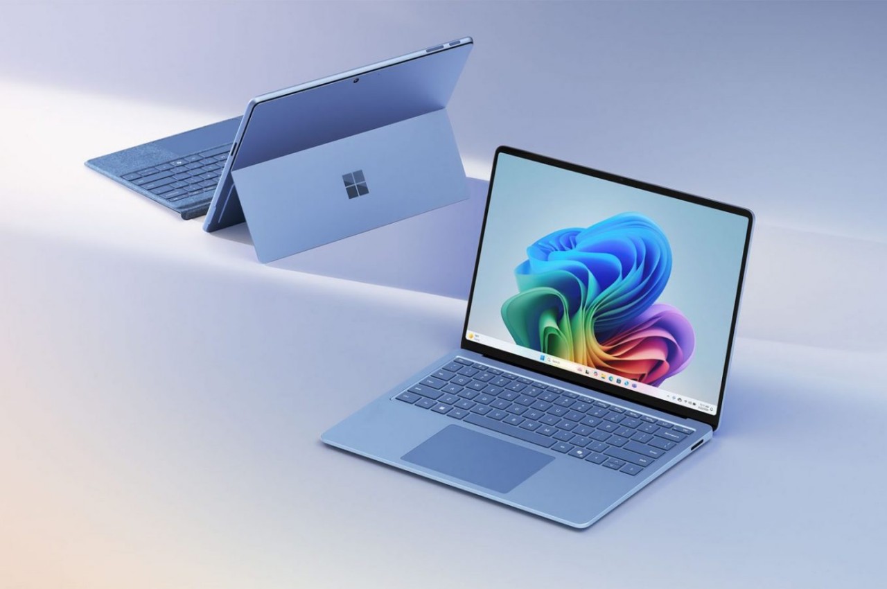
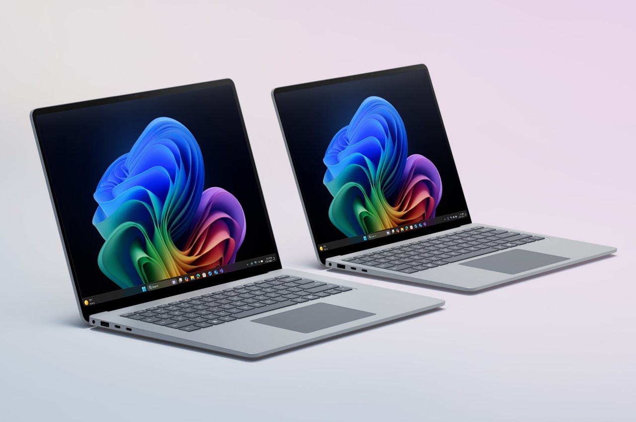
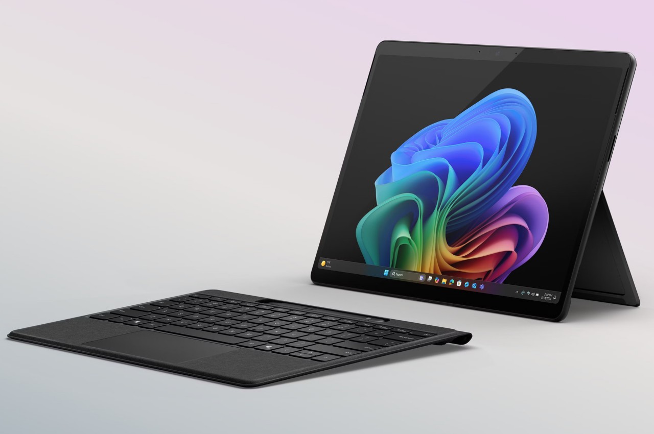
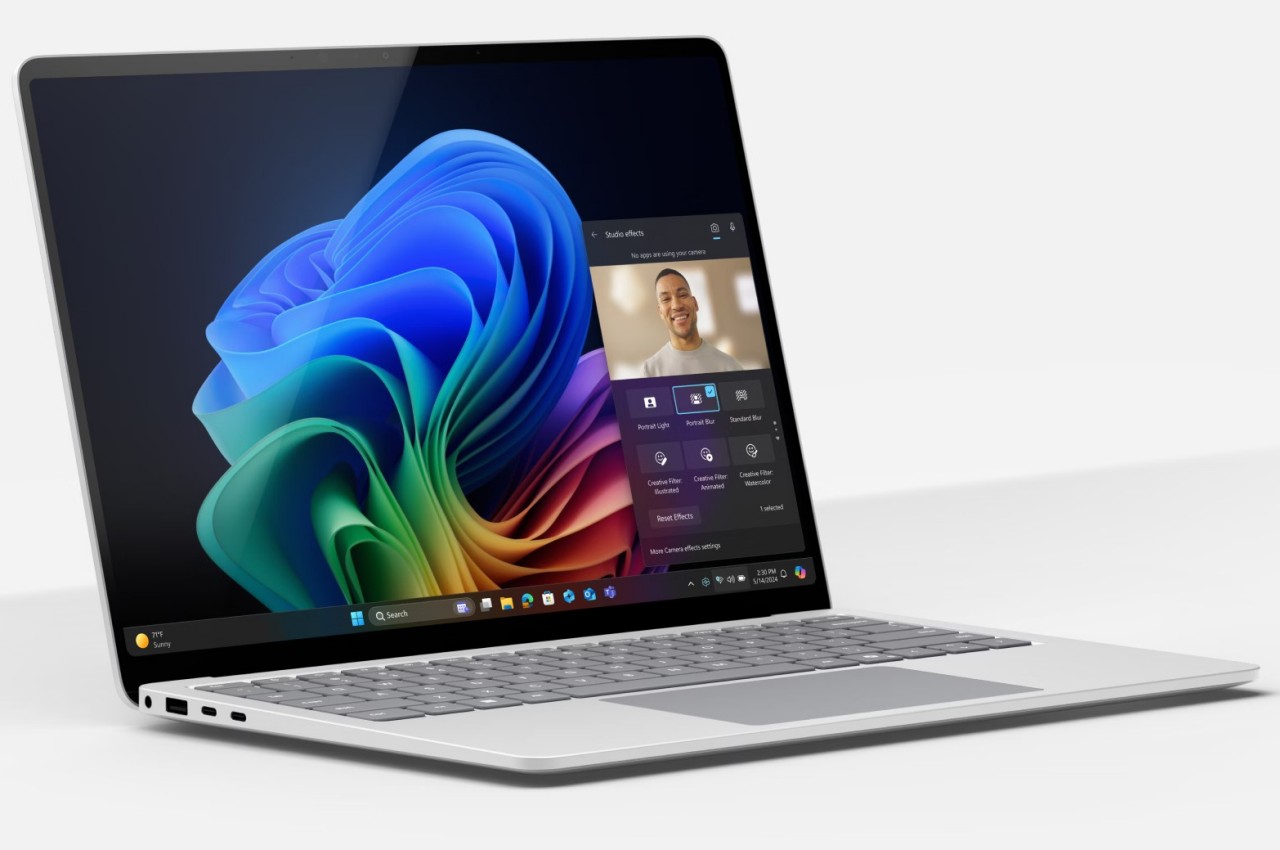
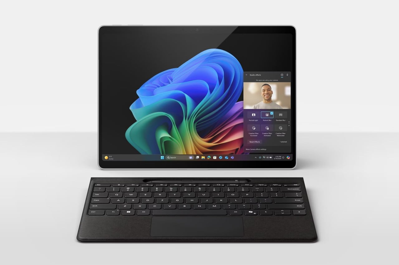
It has only been a month since Microsoft unveiled its latest Surface-branded computers, and while the tech industry was awash with discussions on the company’s aggressive Copilot AI push and ARM-based Snapdragon X silicon, the products’ design may have left some people less than impressed. The Surface Pro 11 and Surface Laptop, for all intents and purposes, look exactly like their forebears, making one wonder if Microsoft has run out of creative juice or is desperate to milk its current design until it runs dry. Fortunately, that isn’t the end of the new Microsoft Story, as it turns out that the latest Surface Pro and Surface Laptop computers have one “invisible” upgrade it didn’t really talk about much: an easier repair process that has even the meticulous and stingy iFixit impressed.
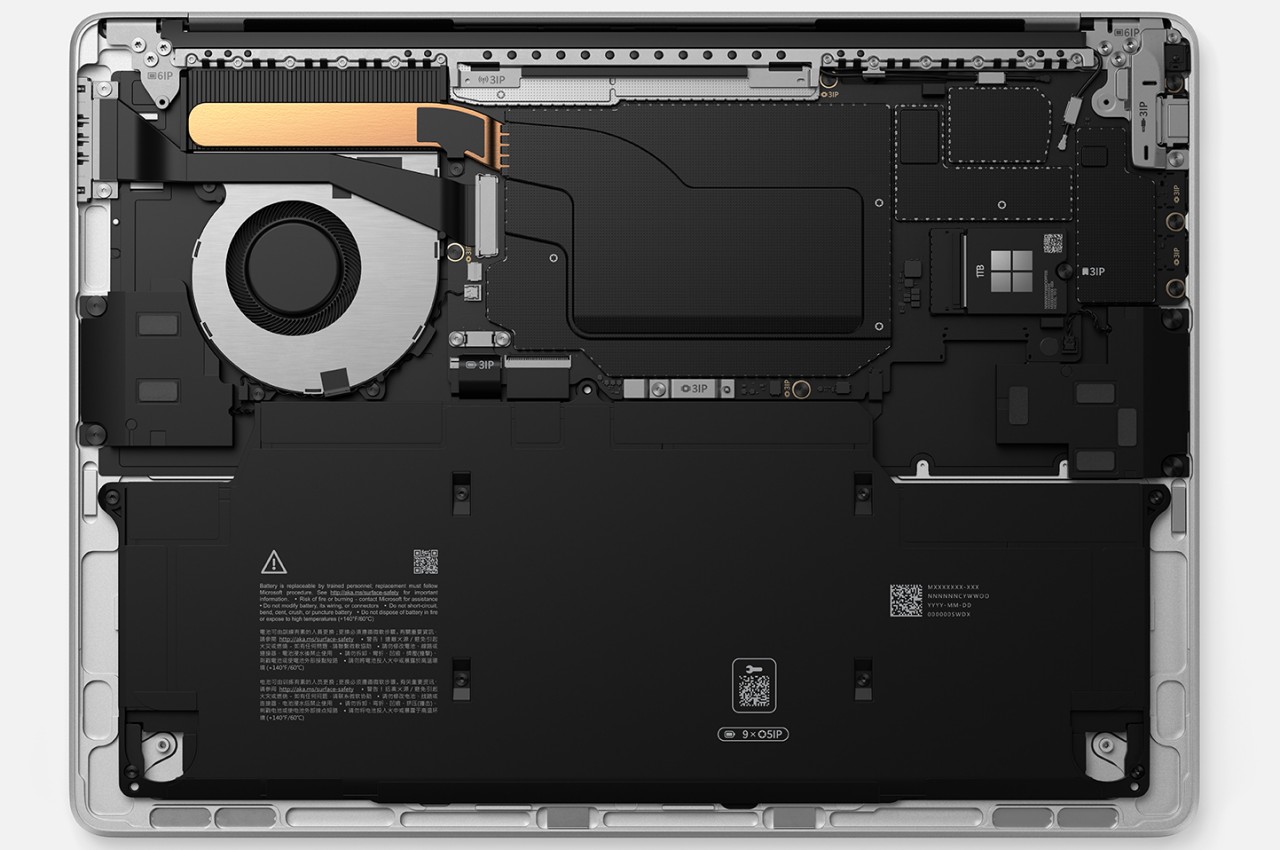
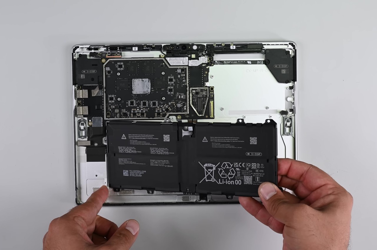
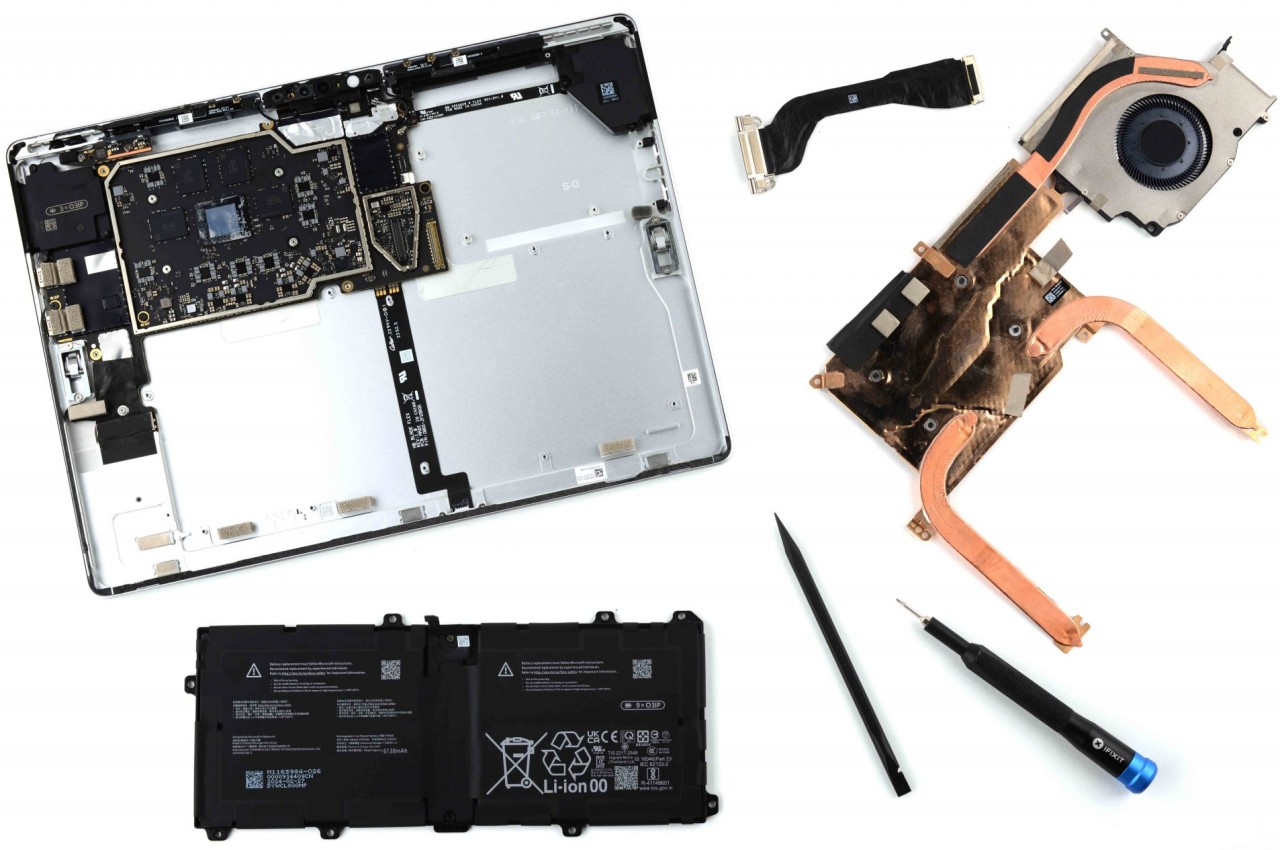
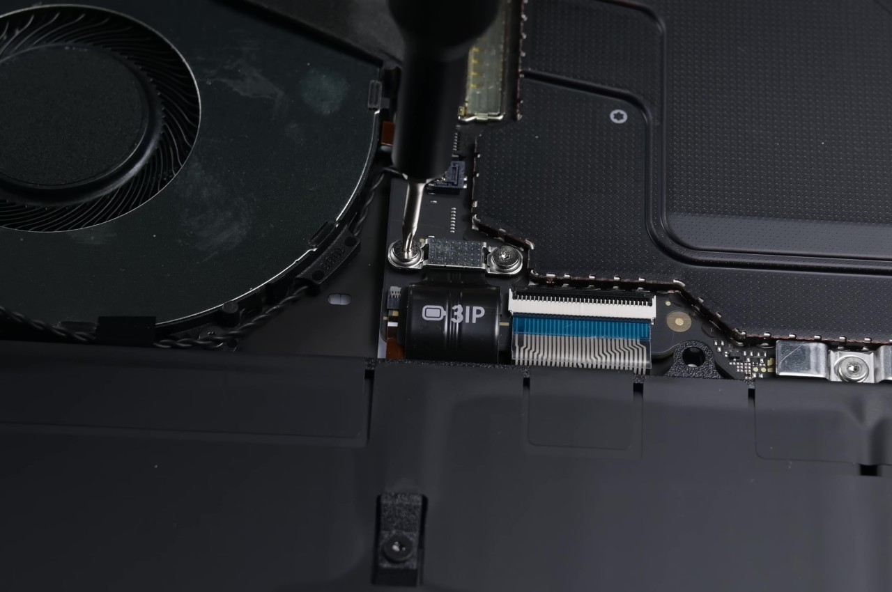
Laptops have come a long way from being impregnable fortresses that made even the smallest repairs or upgrades a hellish experience, though there are still some companies living the past in the present. Initially, the Surface Laptop was part of that group, requiring cutting through fancy Alcantara fabric just to open the laptop to replace a battery or upgrade the storage. This year’s design almost makes a complete U-turn with a bottom plate that’s only held down by four screws and magnets; no adhesive in sight. Even the battery can be easily removed by just removing screws and a few layers of parts blocking those.
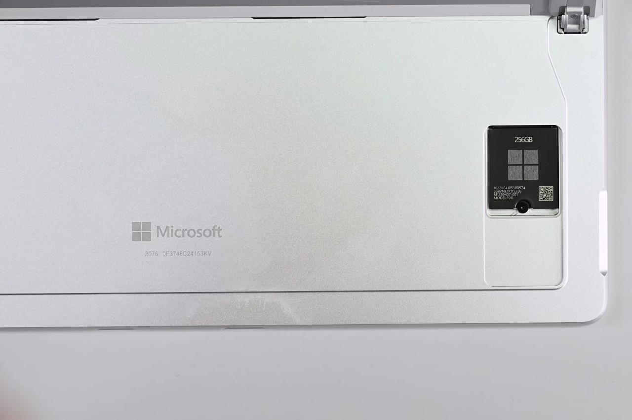
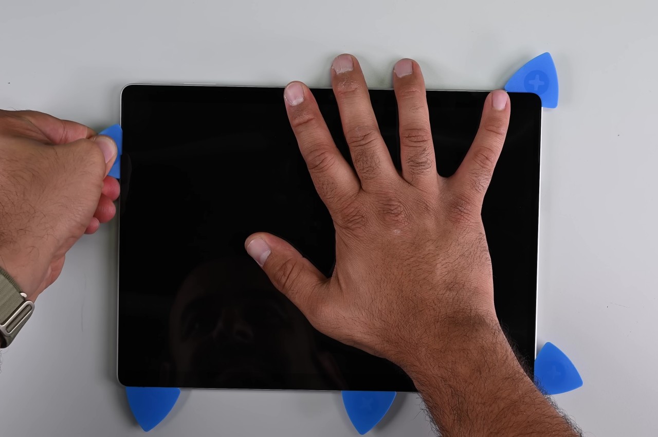
Tablets are even worse news for repairs, especially with displays that are glued on top of the frame. To its credit, Microsoft has at least made changing the Surface Pro M.2 SSD painless by having an accessible magnet-locked panel to get to that storage instantly. The 11th-gen model takes things further by employing as little adhesive as possible, though you still have to go through the risky process of removing the screen first. Fortunately, getting to important parts like the battery is less of a grueling task, especially since it’s only held down by screws as well.
Even more impressive, however, is the fact that Microsoft officially supports such self-repair processes. It has made repair guides publicly available since day one and has even clearly marked out the number and types of screws that hold certain components in place. It’s far from perfect and definitely not on the same level as a Framework laptop, but it’s still an unexpected yet pleasant surprise, especially considering it’s Microsoft we’re talking about.
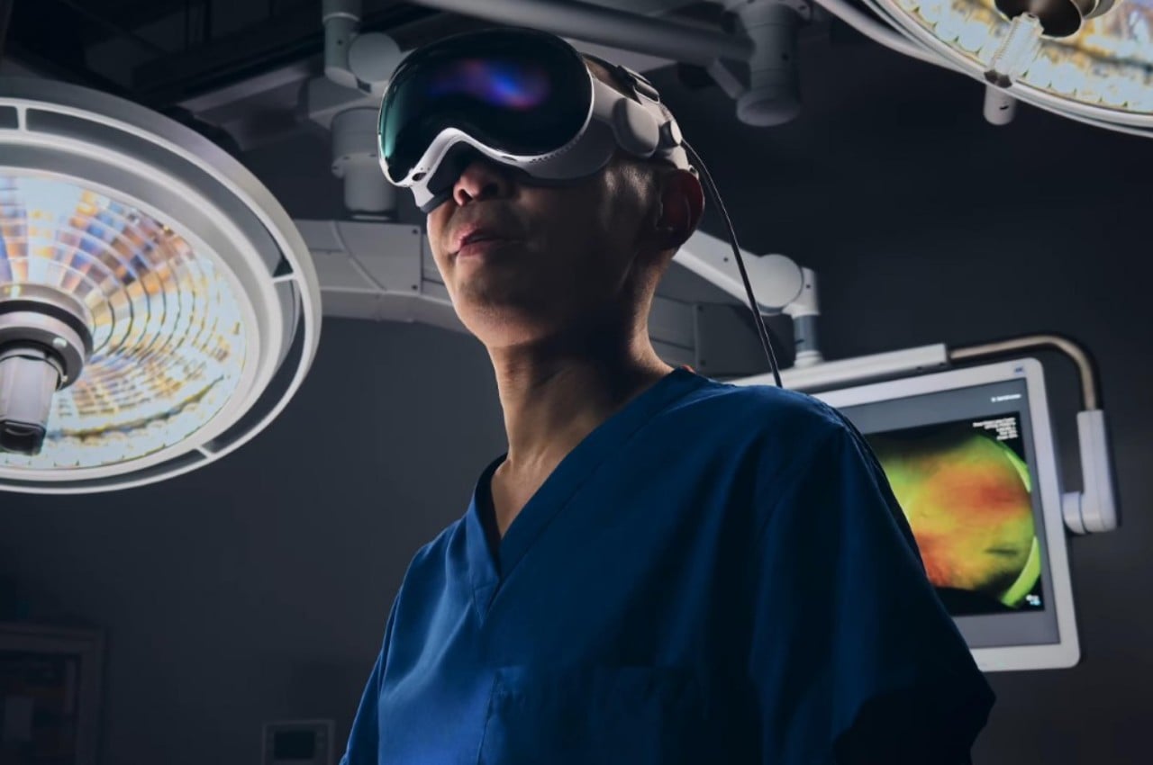
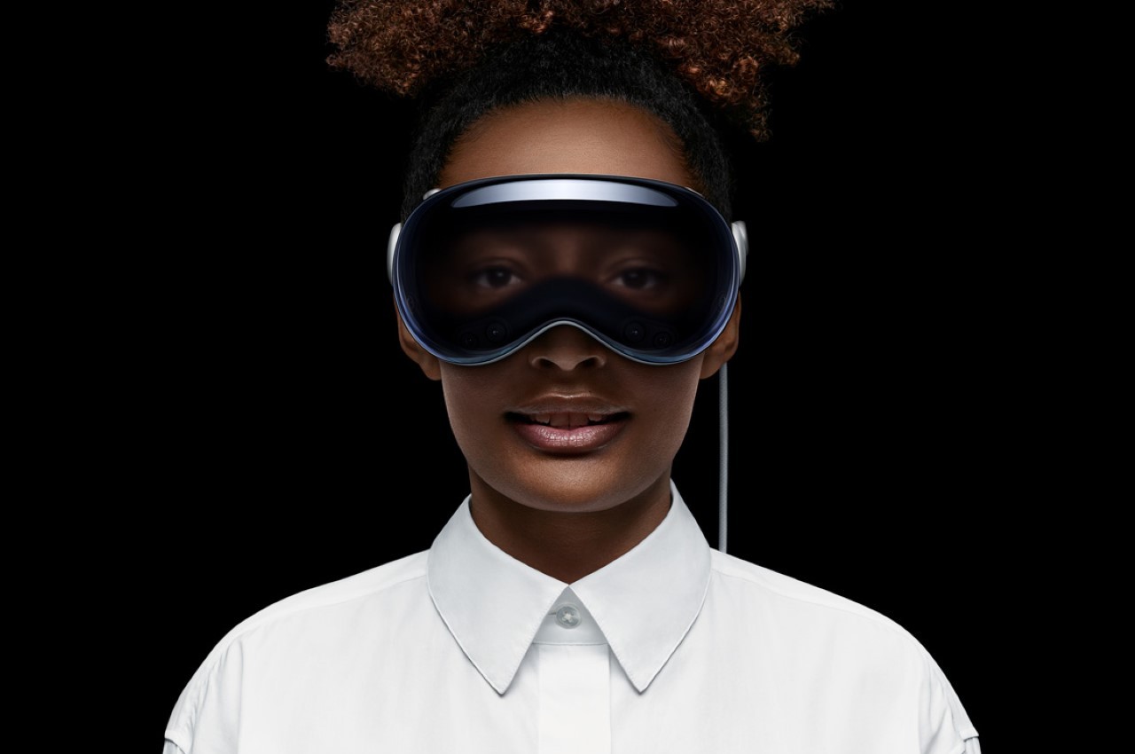
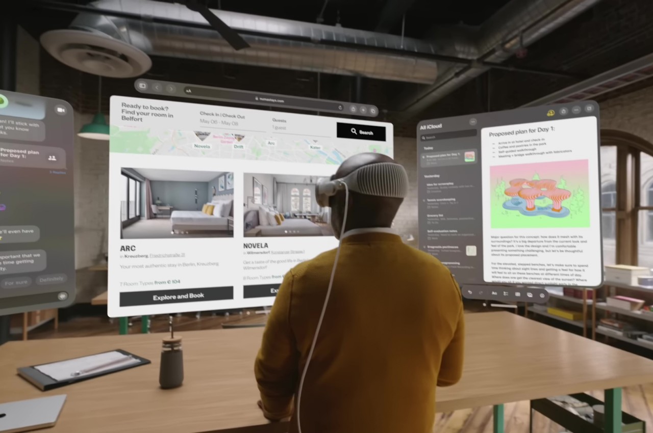
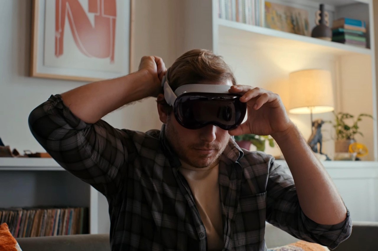
It hasn’t even been a year since it launched, but there are already talks of Apple’s next headset after the Vision Pro. No, it won’t be an upgrade that will make the $3,500 device obsolete but, instead, might even be considered a downgrade of sorts. In a way, this more affordable Apple Vision will be its own class, one that might have to make quite a few compromises to reach a desired price point. What those cuts will be is still unknown, but some insider insight suggests that the non-Pro Vision headset might offload its processing and software to an external device, requiring you to tether it to an iPhone or even a Mac or MacBook.
Impressive as the Vision Pro and visionOS might be, Apple’s spatial computing platform hasn’t yet taken the tech world by storm for one critical reason. The headset costs a whopping $3,500, far beyond the reach of developers without deep pockets or backing, let alone regular consumers. Apple has always planned on launching a more accessible Vision headset after the Pro model has taken root, but the big puzzle is how it would make it significantly cheaper without compromising on the experience too much.
The immediate answer would be to take the features down a few notches, throwing out EyeSight that shows your eyes to people on the opposite side of the glass, reducing image quality of passthrough visuals, or using less powerful processors. These, however, are the features that would differentiate the Vision from other mixed reality headsets, and a price tag of $1,500 would make it look even more expensive than the competition without these “killer features.” One alternative would be to have the headset connect to a device, either the iPhone or the Mac, making the Apple Vision focus solely on the optics and display.
This wouldn’t be the first phone-powered headset, and history has given us the advantages and disadvantages of that design. An iPhone would actually offer a bit more mobility and flexibility, especially if it will also power the Vision headset. It could, however, be the bottleneck considering the apps and experiences that visionOS supports. A MacBook, on the other hand, would deliver that much-needed power at the expense of freedom of movement and comfort.
This is definitely a conundrum for Apple, which isn’t always keen on degrading product quality in the name of price cuts. At the same time, however, it really has no choice but to make some concessions if it wants its spatial computing vision to be embraced by more people. It still hasn’t given up on the Vision Pro, whose successor is expected to arrive in 2026, but it will be pouring resources over the more accessible Vision for a 2025 launch, and hopefully, it will be able to hit the nail on the head in the end.