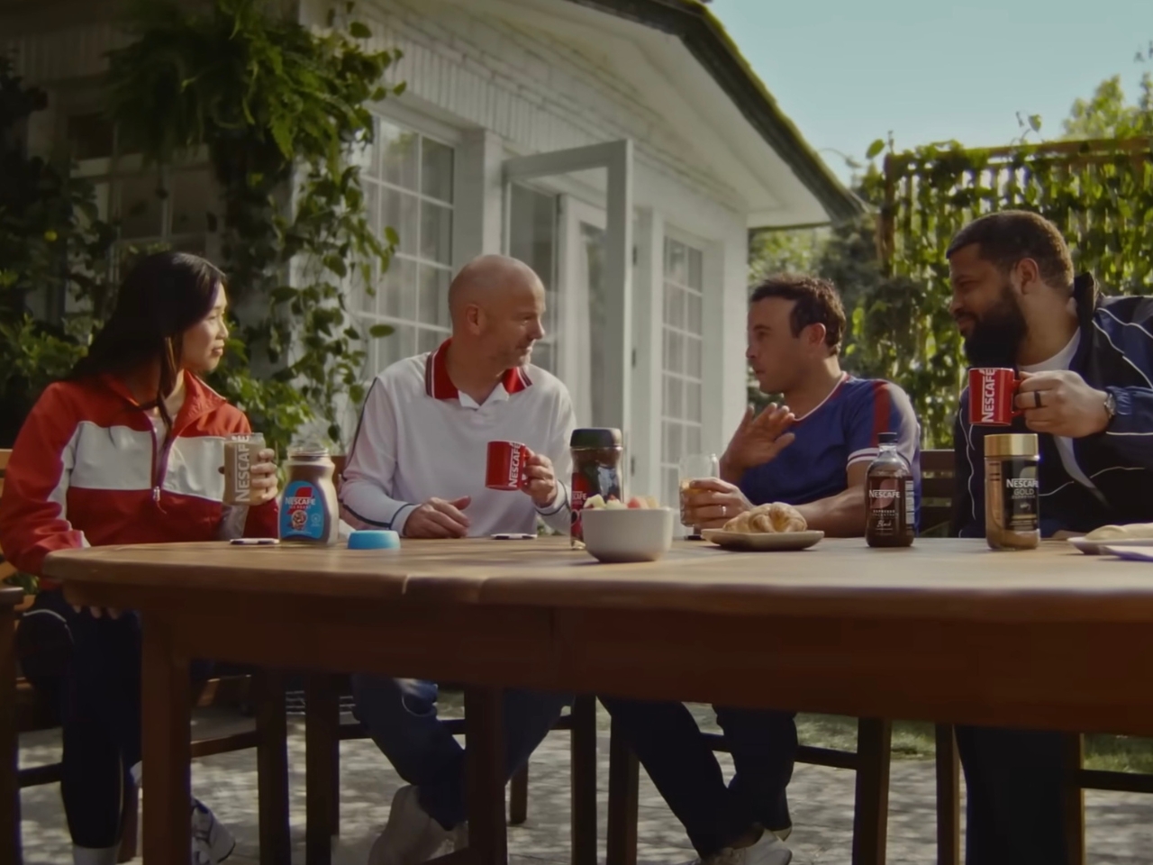
The world’s most-watched sporting event is about to kick off in less than a month. This means that World Cup watch parties are probably being set up in various households for football fans who won’t actually be able to make it to the stadiums in the U.S., Canada, or Mexico. While beer is probably the drink of choice for most of these events, NESCAFÉ wants to begin a new tradition for those who want to have a livelier, but probably safer, discussion amongst family and friends.
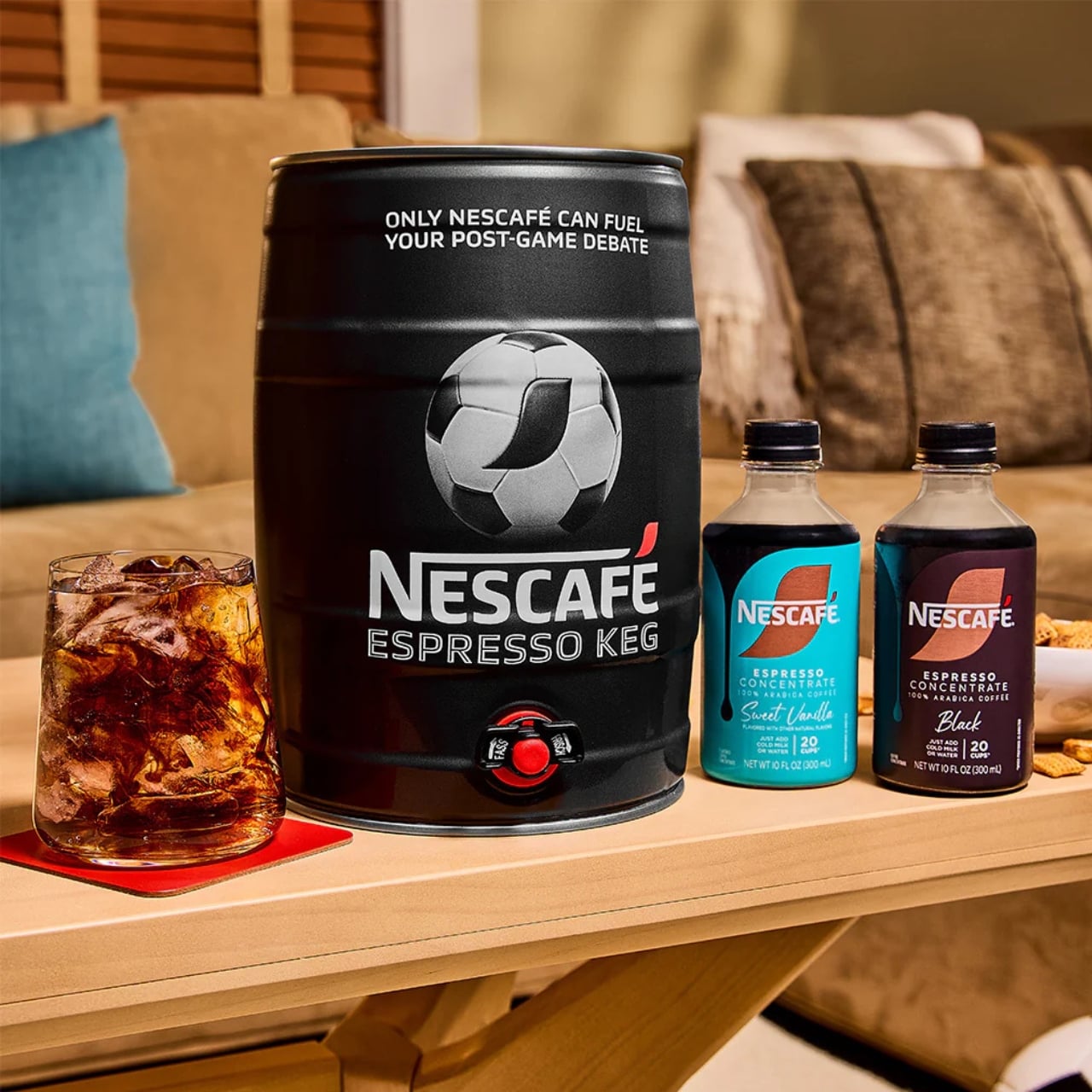
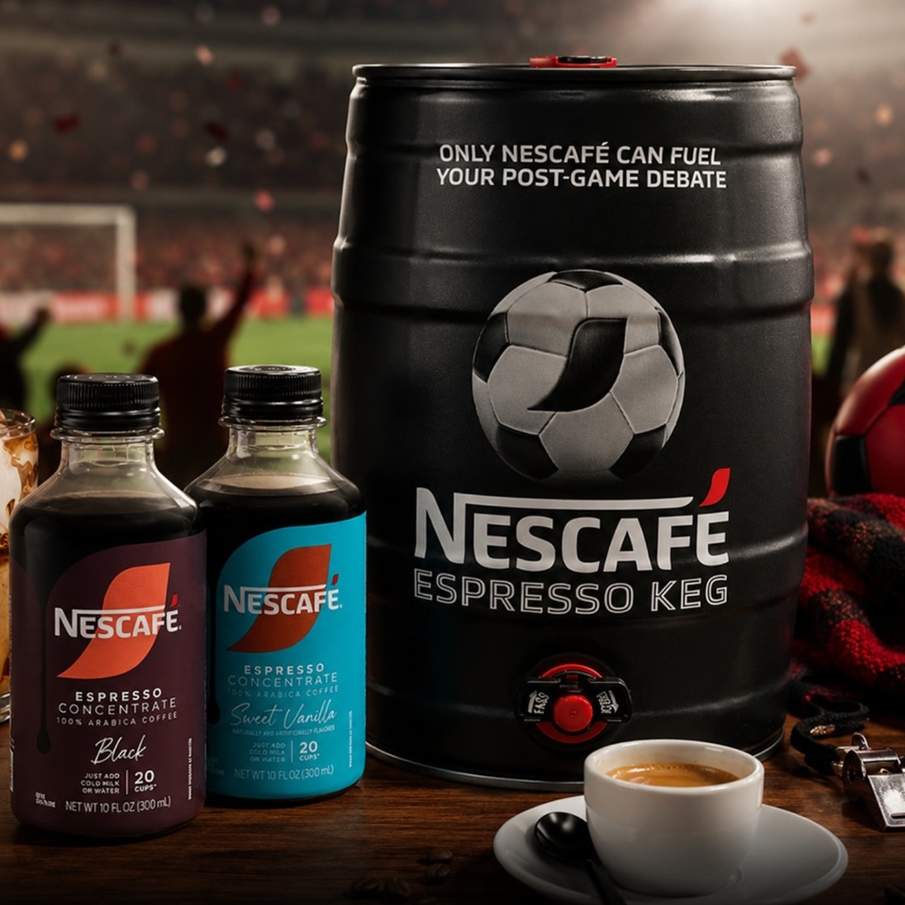
The coffee brand is introducing the NESCAFÉ Espresso Keg, a limited-edition World Cup special designed to help you get into the “Third Half.” This is a ritual they want to start, and caffeine may be the perfect companion as you get talking about the 90-minute-and-change match you just finished watching. They believe that “the conversation doesn’t end after the game,” and it should be helped along over a cup of coffee.
Designer: NESCAFÉ
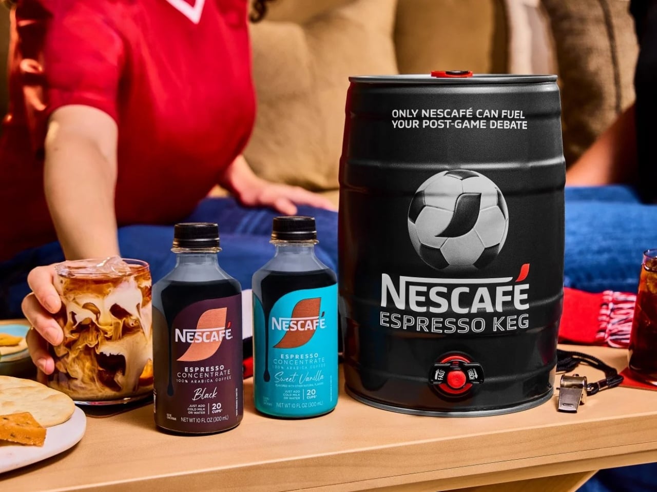
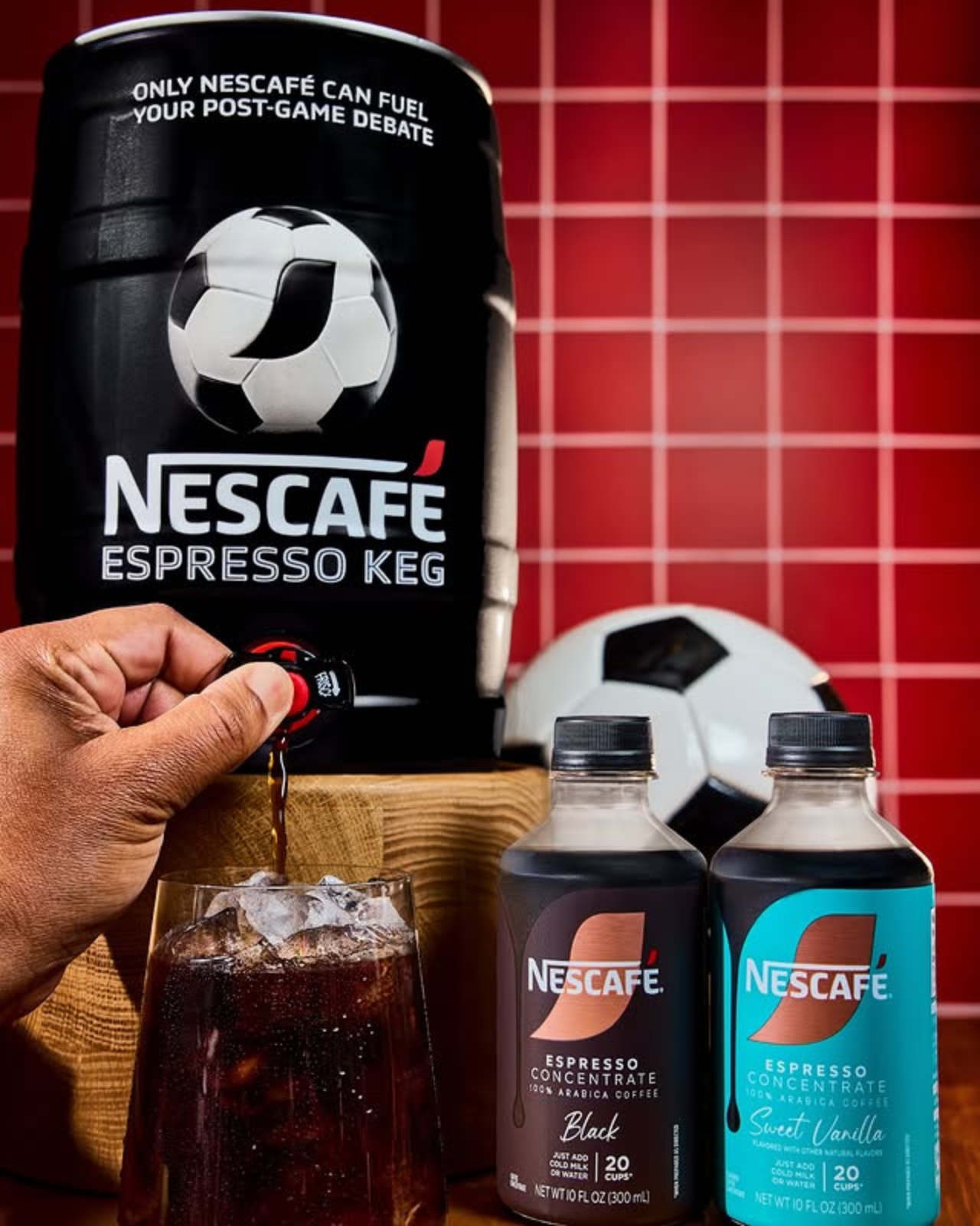
The keg actually looks like your usual beer keg, but instead of dispensing beer, you’ll have coffee pouring out of it as you discuss every goal, call (or non-call), and every exciting and controversial thing that happened during the match. Each package comes with a 5L keg and two 10oz bottles of NESCAFÉ Espresso Concentrate in Black and Sweet Vanilla flavors. In case you don’t know how to mix it up, it also comes with instructions and recipes so you can “brew” the perfect cup for your Third Half. You’ll be able to serve around 20 cups with the package, so you may need to stock up on more concentrate if you have a larger crowd attending your watch party.
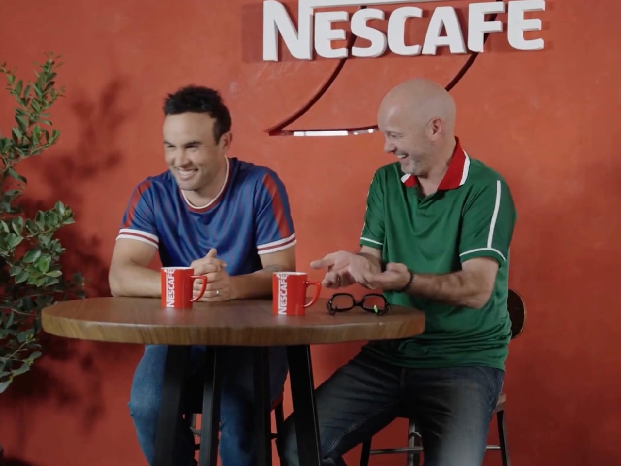
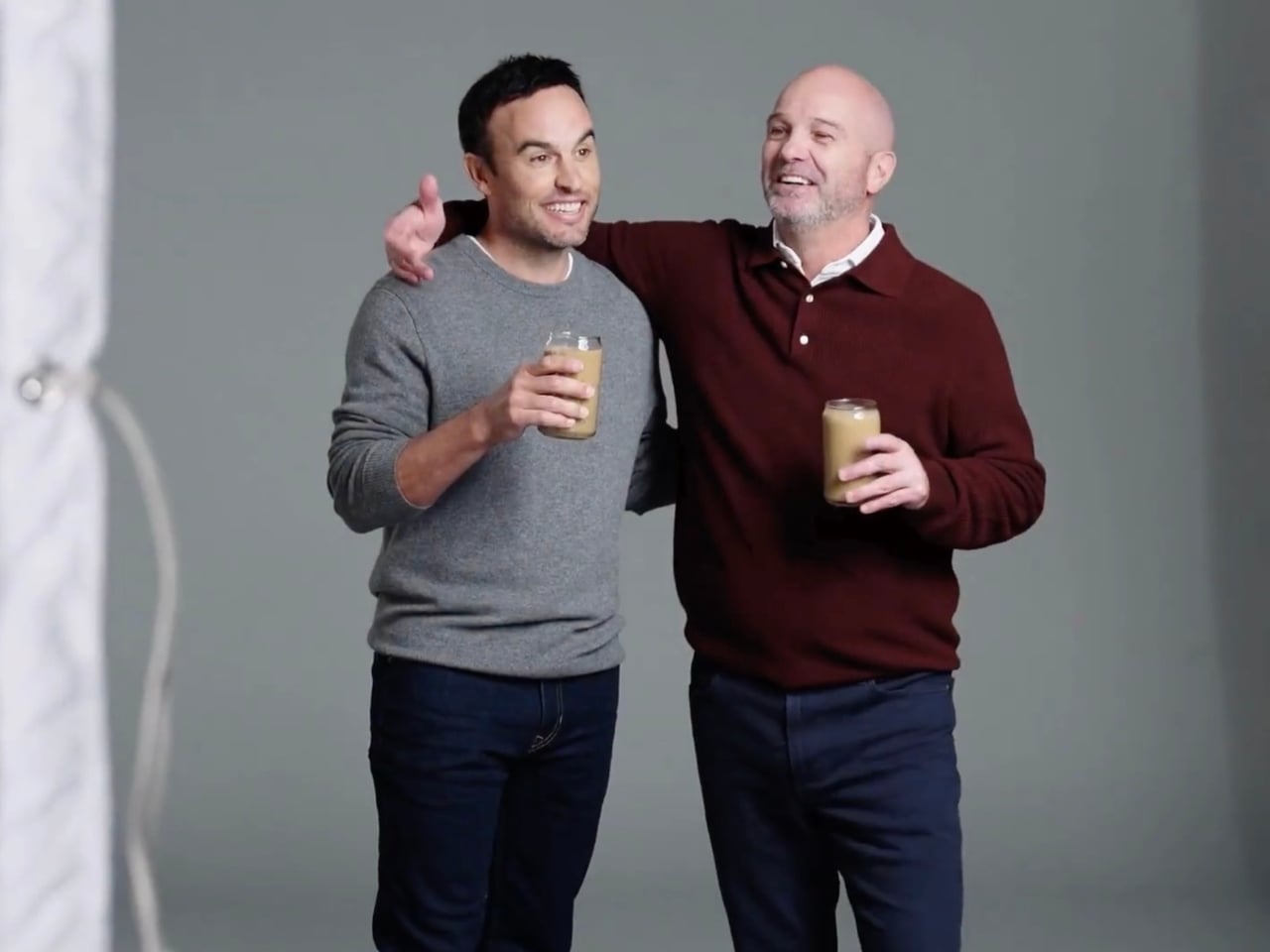
There is a special bi-cultural campaign to promote this limited-edition keg. We’re not sure why Canada was left out of the equation, but U.S. soccer legend Landon Donovan and Mexican fútbol icon Luis García are the faces of the campaign, representing their two countries. It’s priced at $10 as a tribute to Donovan’s jersey number, the iconic number 10 he wore while bringing glory to the U.S. Men’s National Team. To make it even more of a must-have item, there will be three separate drops, and the last one is this coming June 10, just a few days before the start of the World Cup.
And it turns out the concept isn’t just a clever marketing angle, as the numbers actually back it up. According to NESCAFÉ, 73% of soccer fans already drink coffee during game time, making it a surprisingly natural fit at any watch party table. Rob Marsh, NESCAFÉ’s Marketing Director, summed it up well: “We’ve coined a new half, ‘The Third Half,’ to represent the moments after and in-between games when passionate debates peak. Like any good conversation, these often take place over a beverage, making our coffee and the Nescafé Espresso Keg the perfect fuel to keep things flowing.”
It’s a fun and genuinely refreshing idea, especially for watch parties where not everyone is reaching for a beer, particularly during those early-morning kick-offs that come with a global tournament spanning multiple time zones. The Espresso Keg gives you that same communal, tap-style energy of a classic keg party, just with a serious caffeine boost instead of a headache waiting to happen. Whether you’re a black coffee purist or someone who loves a touch of Sweet Vanilla in their cup, there’s a flavor to match every personality and every strongly-held opinion about the offside rule.
The limited-edition nature of this release makes it all the more exciting. With earlier drops reportedly selling out quickly, demand has clearly been there. If you missed the first rounds, don’t sleep on that final June 10 drop. It’s the kind of collectible that doubles as a genuinely useful party accessory, a rare combination at any price point, let alone $10.
If you’re serious about hosting the ultimate World Cup watch party this summer, the NESCAFÉ Espresso Keg might just be the most unexpected and delightful centerpiece you didn’t know you needed. So mark the date, set up those fold-out chairs, hang your team’s flag, and get ready to debate every single moment of the beautiful game, one perfectly poured cup at a time.
The post NESCAFÉ Just Replaced Beer at Your World Cup Party for $10 first appeared on Yanko Design.