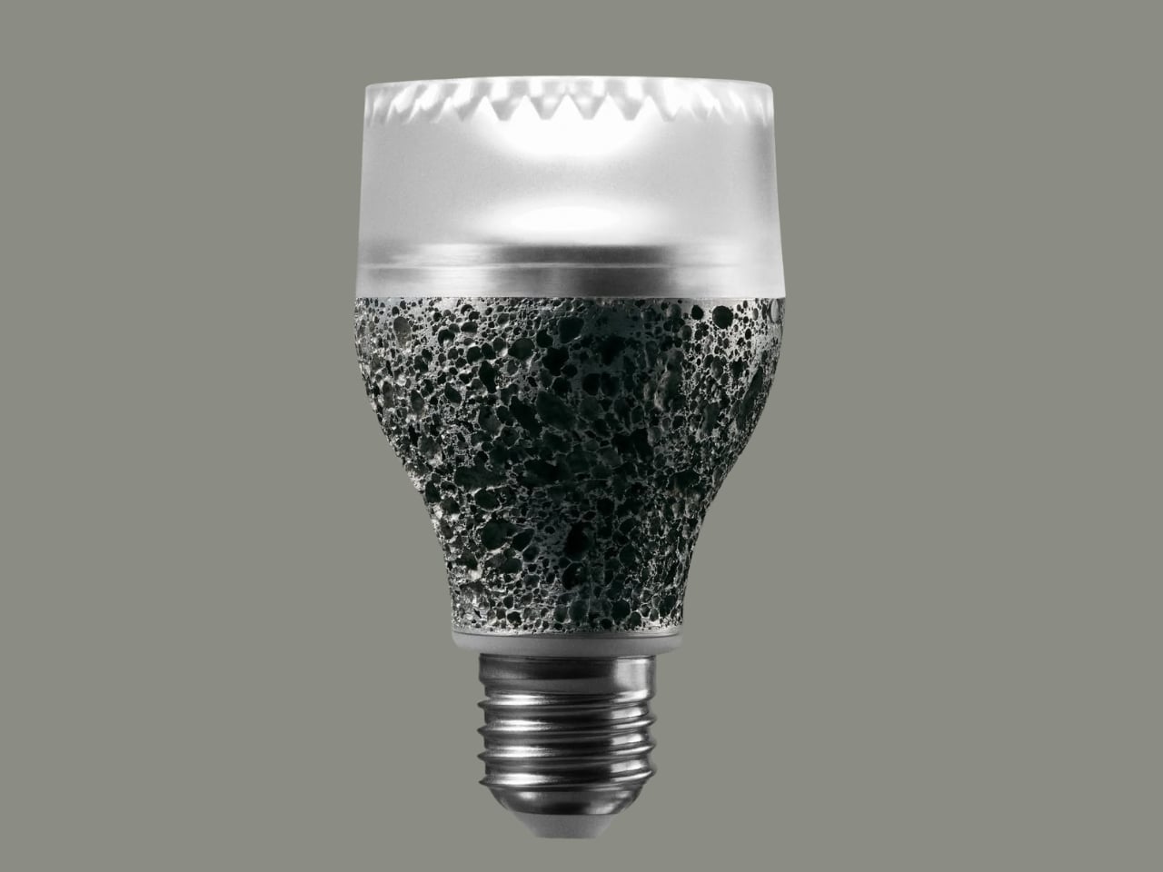
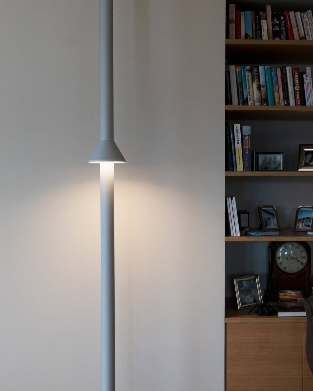
We have been screwing the same shape of light bulb into our lamps for over a century. Think about that for a second. The smartphone in your pocket has been redesigned thousands of times since it launched. Your running shoes have gone through countless iterations. But the humble light bulb? More or less, the same. Which is exactly why iiode’s Re27 feels so refreshing, and so overdue.
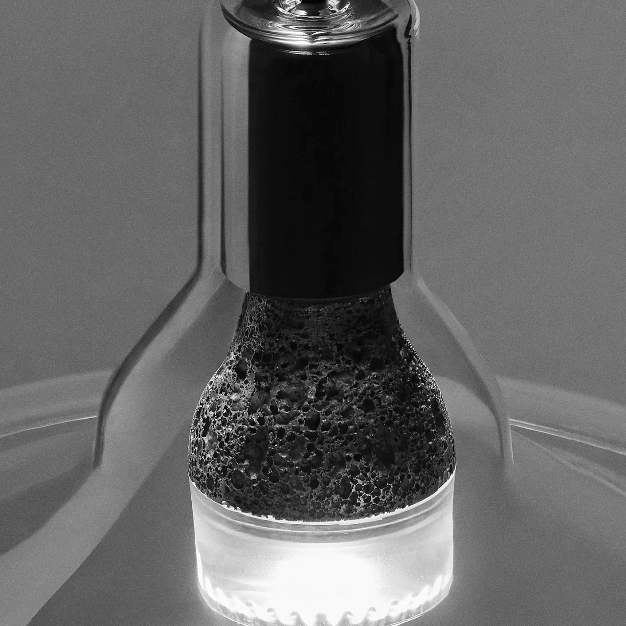
iiode is a Swiss studio that specializes in sustainable electronics, and the Re27 is their first product. It’s a retrofit E27 LED bulb, meaning it fits into the same socket your current bulb uses right now. But the similarities to your average LED stop there pretty quickly.
Designer: iiode
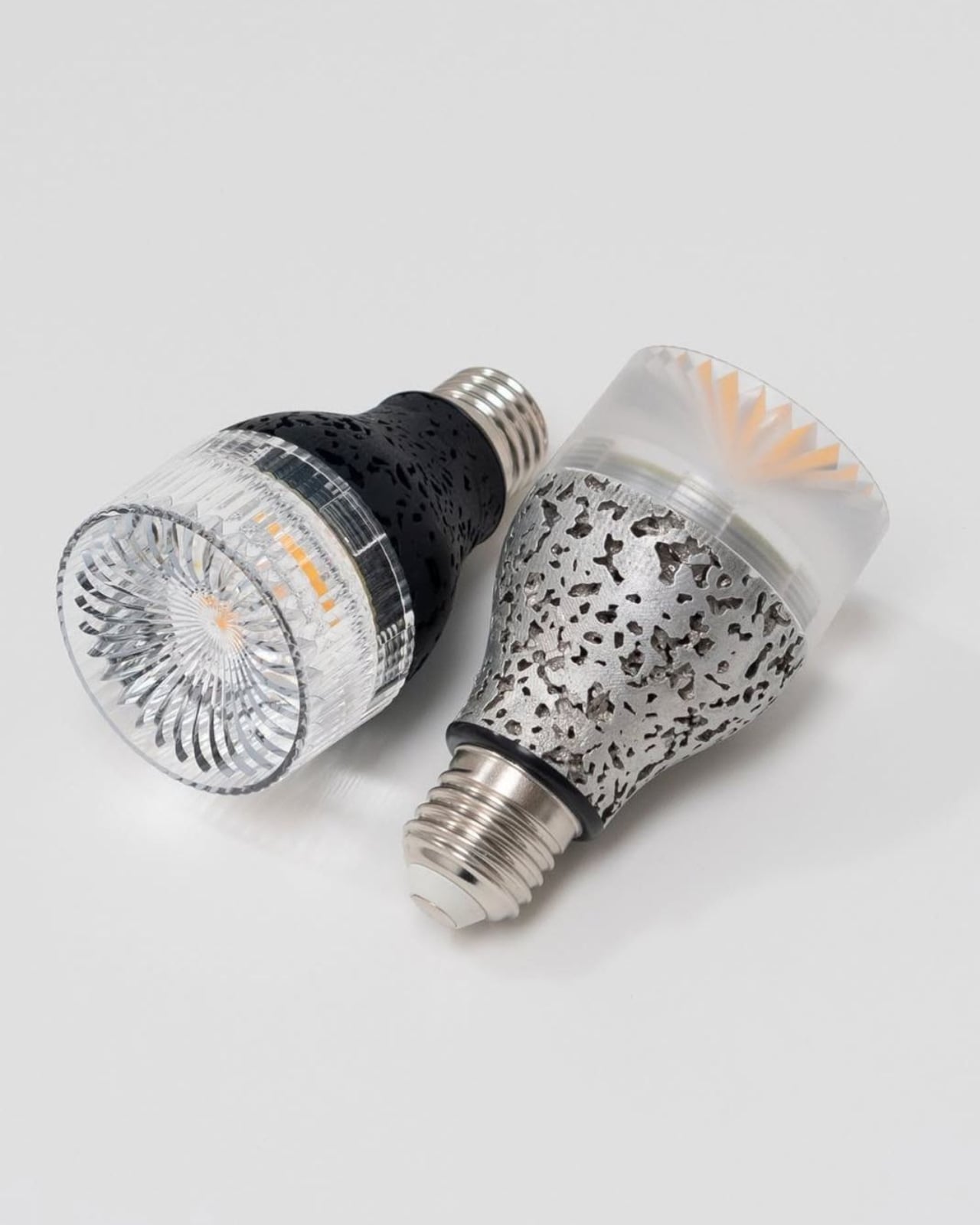
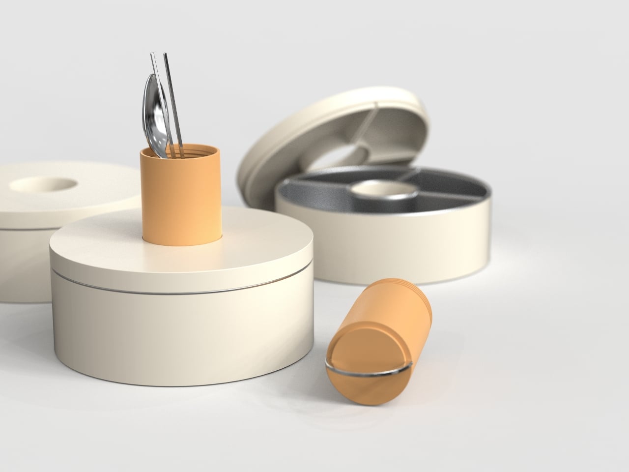
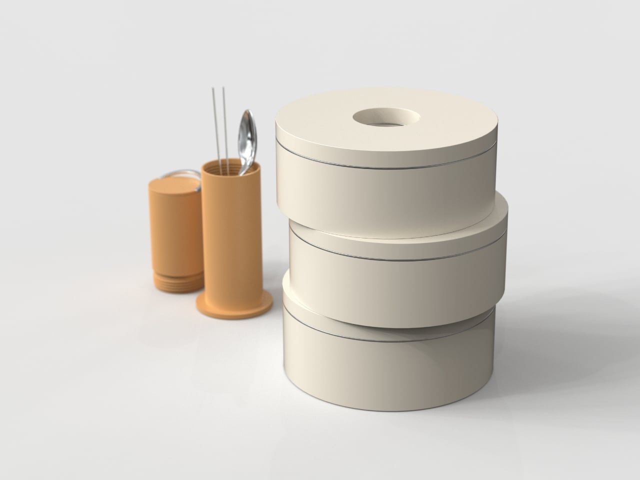
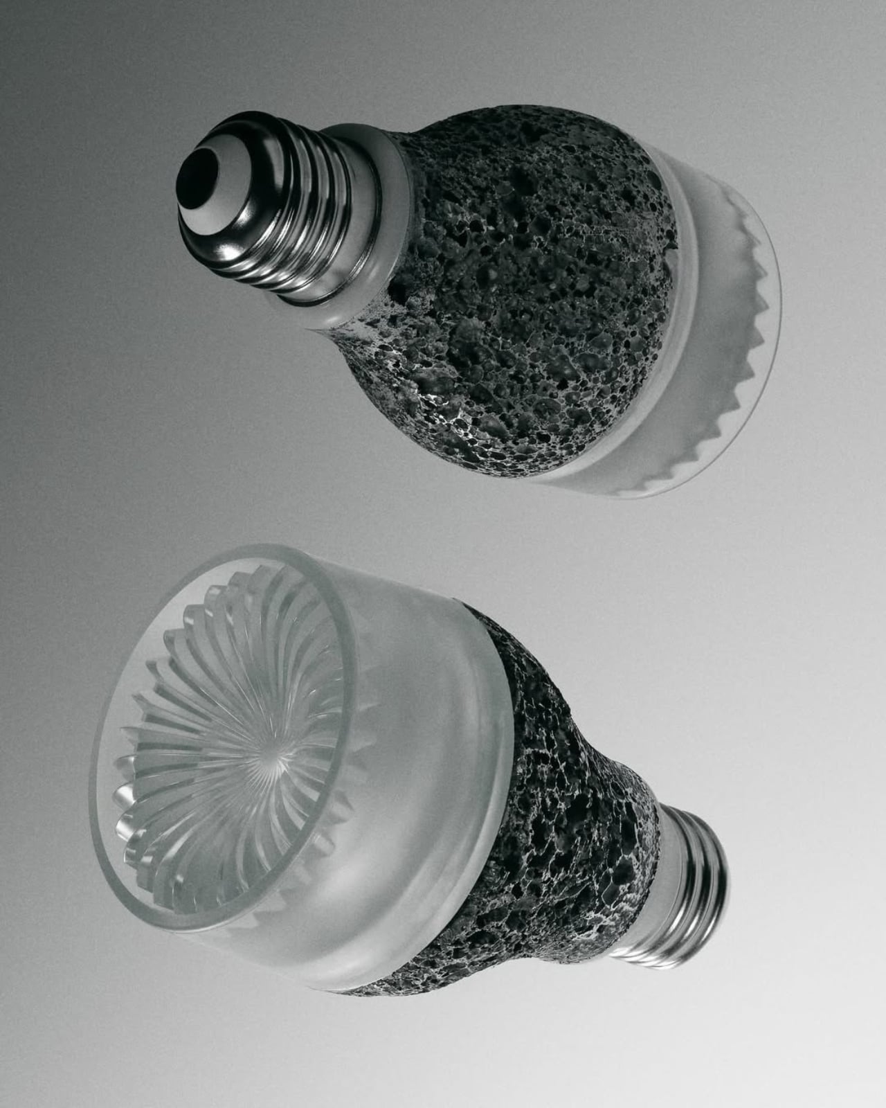
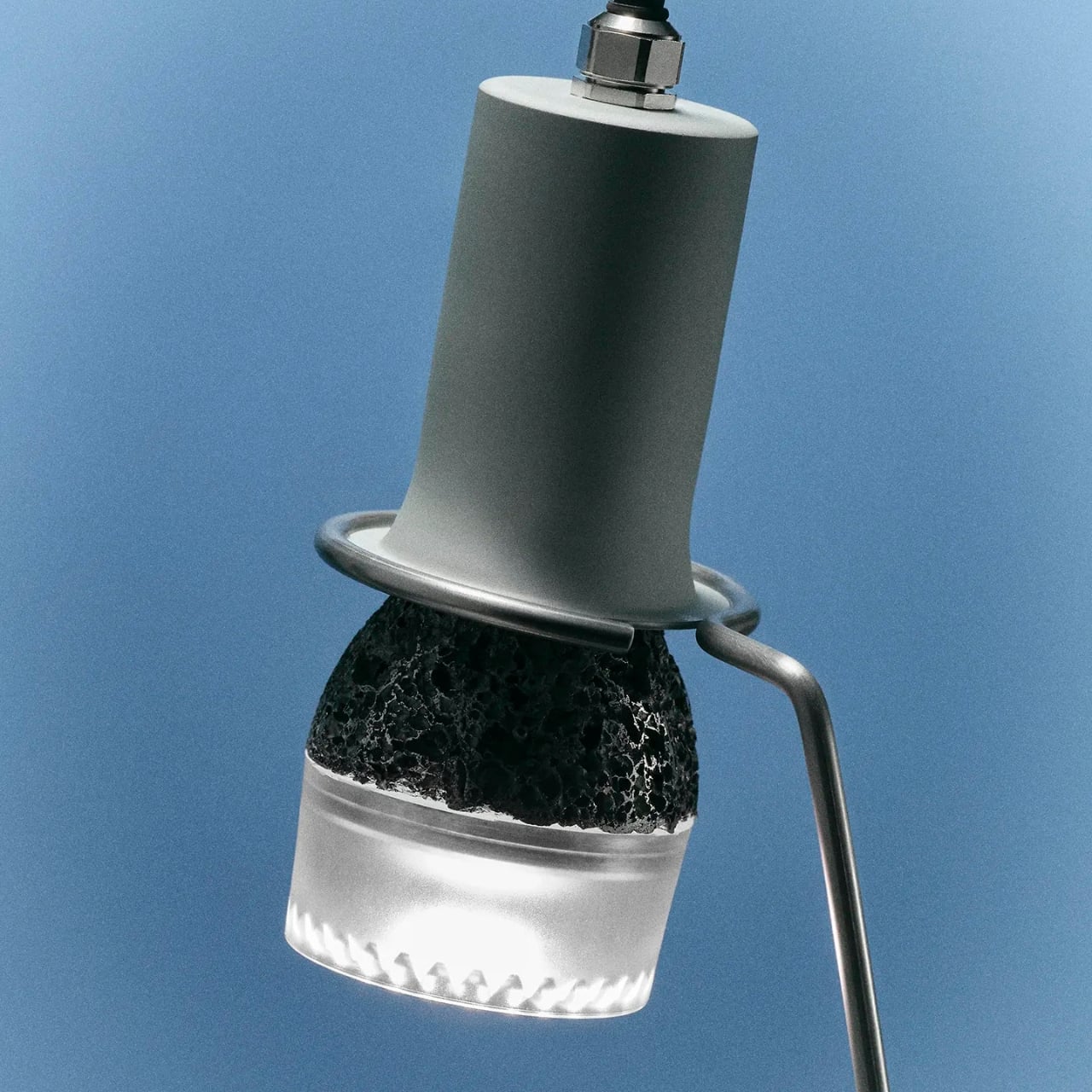
The Re27 is built around an idea that the lighting industry has, for the most part, chosen to ignore: that a light bulb should be something you repair, not just replace. The bulb is modular, with clip-in components that can be swapped out when one part fails. You don’t have to toss the whole thing. You don’t have to buy a new one if one section gives out. The design actually encourages you to keep it going, which is a genuinely rare thing in consumer electronics of any kind.
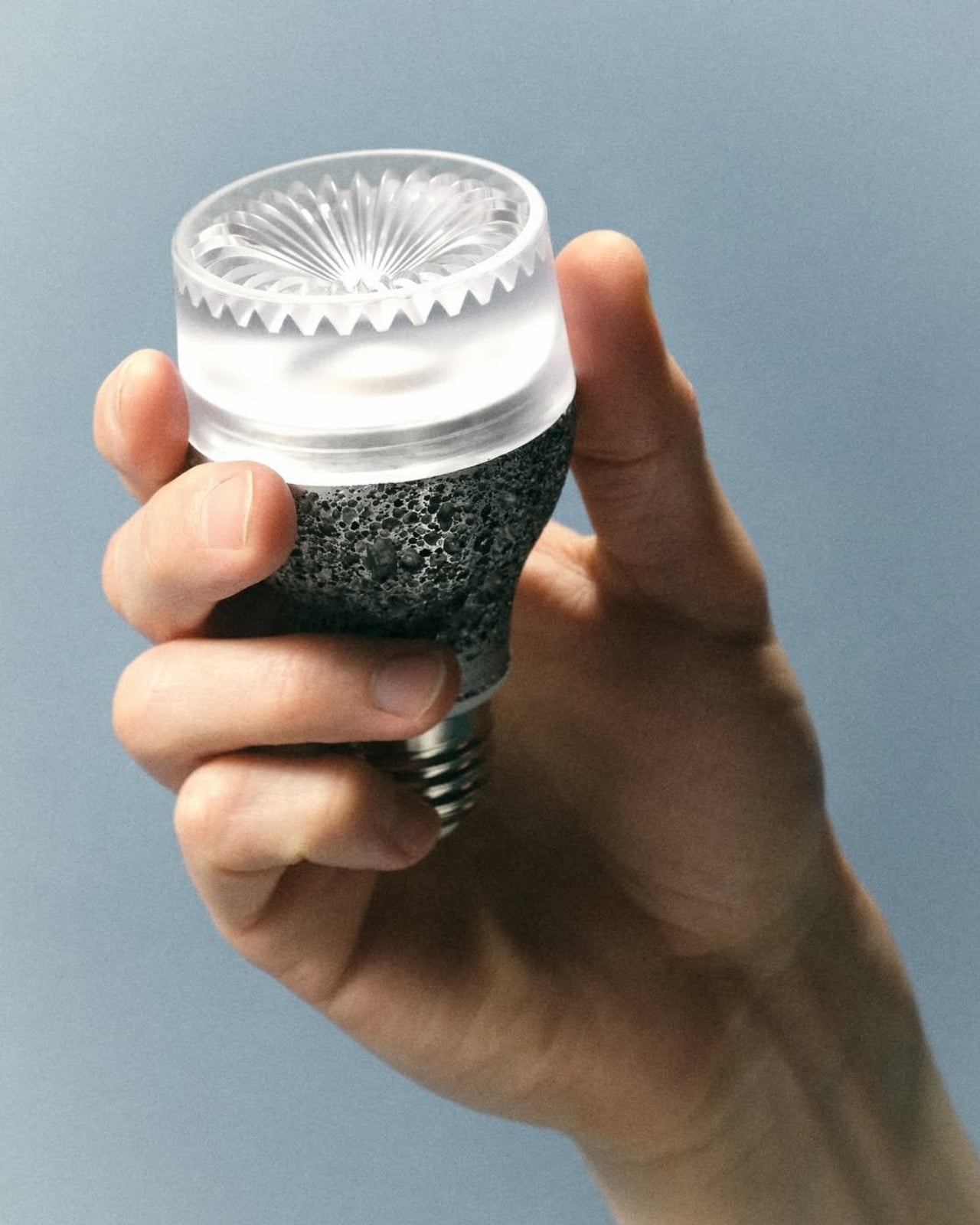
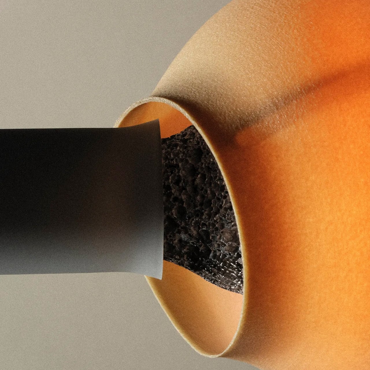
The body is die-cast aluminum, and not the smooth, polished kind you might expect. The porosity of the casting creates a natural texture that helps dissipate heat while also giving the bulb a physical presence that’s hard to describe without actually seeing it. Domus called it a texture that “overturns expectations regarding the materiality and aesthetic presence of this everyday object,” and I think that’s a fair read. It’s a bulb you actually want to look at, which sounds like a strange thing to say about something that usually lives inside a shade.
Almost all of the materials are recycled, and the whole thing is assembled in Switzerland using mostly EU-made parts. For anyone who has started paying attention to where their products actually come from, that matters. The Re27 doesn’t just gesture at sustainability the way so many products do now, folding it into their marketing as an afterthought. It builds it into the structure of the object itself.
The light quality is where iiode earns serious points. The Re27 delivers a high CRI output, which means colours under its light look the way they’re supposed to, the way they’d look in natural daylight. It’s flicker-free, which is one of those things you don’t notice until you’ve been sitting under bad lighting for three hours and your eyes are tired for no apparent reason. The colour temperature and intensity are tunable, and the smart control is integrated directly into the bulb, so you don’t need a separate hub or app ecosystem to make it work.
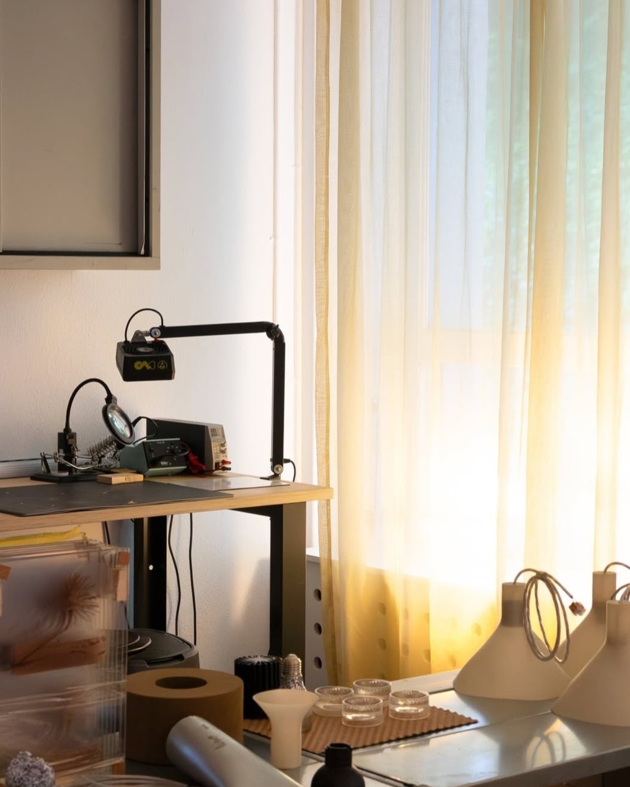
To celebrate the launch, iiode invited eight design studios to create lampshades specifically for the Re27. It’s the kind of move that tells you a lot about how a brand sees its own product. They’re not treating it as a commodity. They’re treating it as an object worth designing around, worth collaborating over, worth dressing up. That creative confidence comes through in every aspect of what they’ve built.
The Re27 is currently available for pre-order, and iiode is presenting it during Milan Design Week 2026 as part of the House of Switzerland Milano showcase. Seeing it make its way into that conversation, alongside furniture, installations, and collectible pieces, makes complete sense. The Re27 belongs there not because it’s trying to be art, but because it’s genuinely well-considered design applied to something we use every single day.
Lighting is one of those things most of us don’t think about until it’s wrong. The Re27 is a bulb made by people who clearly think about it all the time, and the result is something that makes you want to pay attention too. Sometimes the most interesting design isn’t the flashiest object in the room. Sometimes it’s just the light that makes the room worth being in.
The post The 100-Year-Old Light Bulb Design Just Got Its First Real Fix first appeared on Yanko Design.
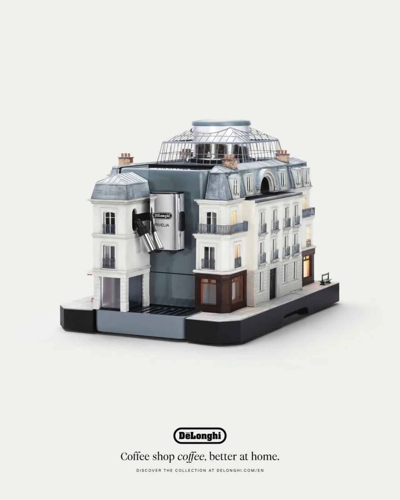
 Paris mounted on the Rivelia
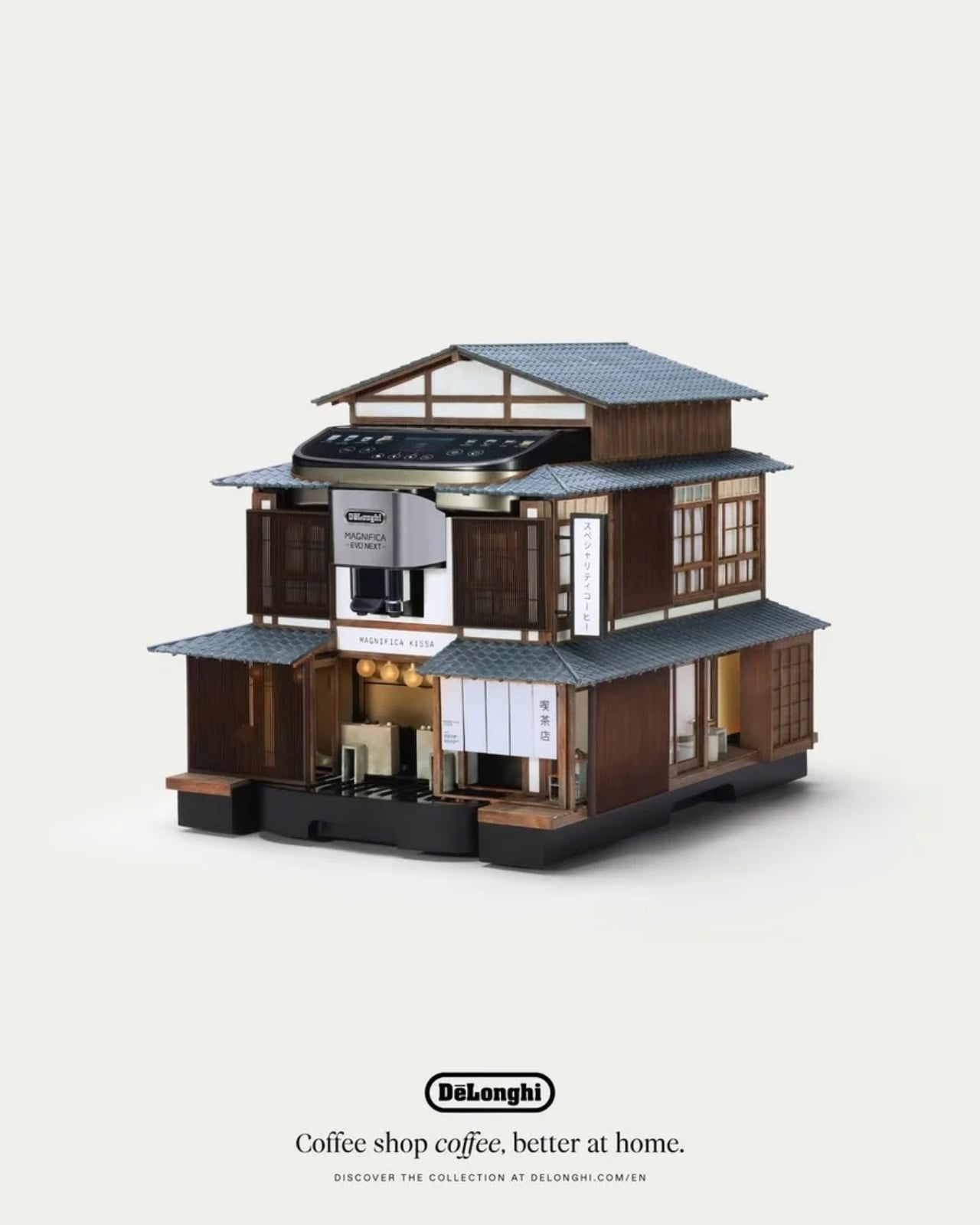
 Tokyo mounted on the Magnifica Evo Next
 Milan mounted on the Eletta Ultra
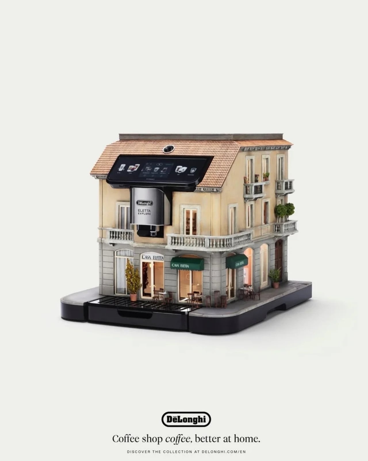
 Copenhagen mounted on the Eletta Explore
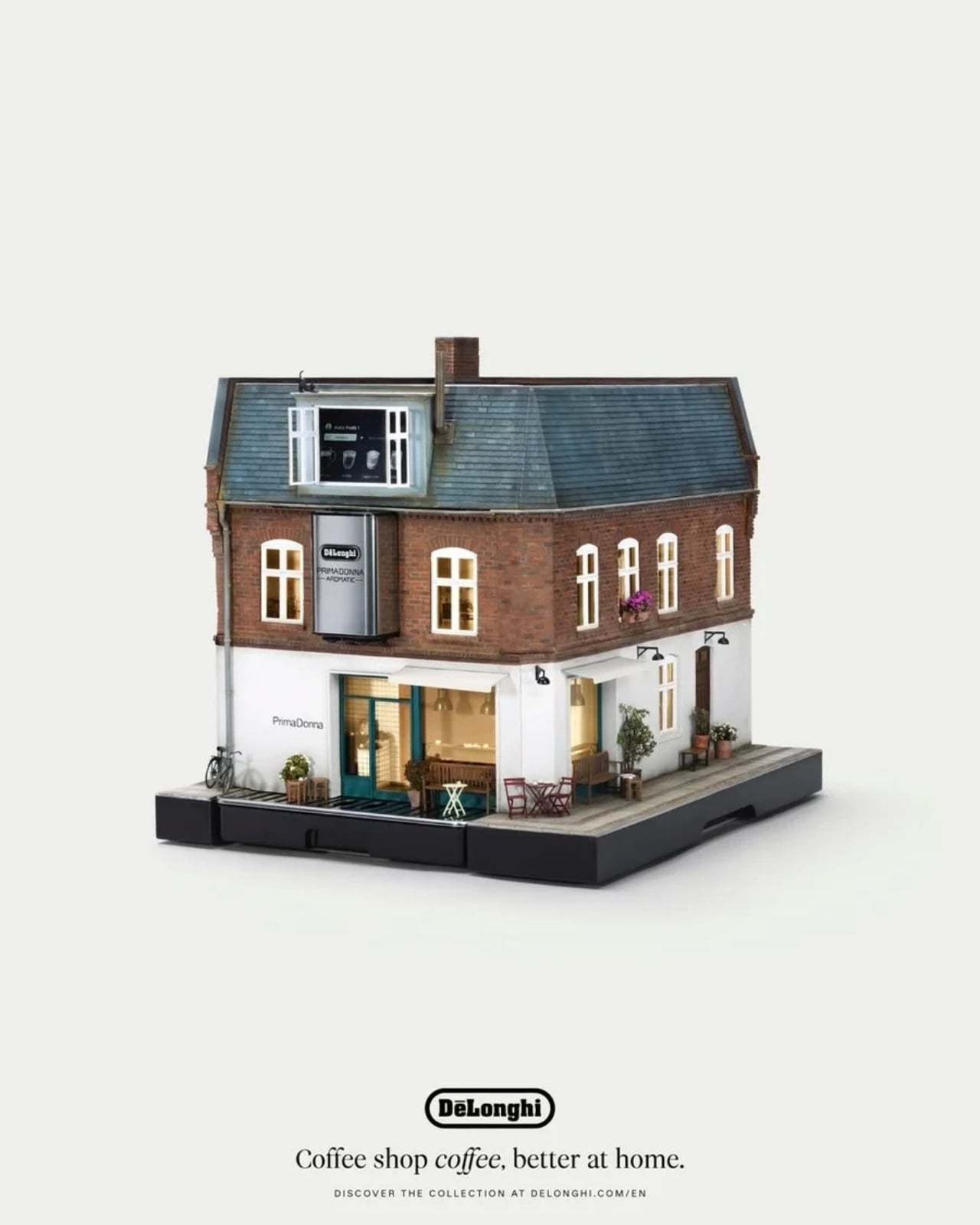
 Berlin mounted on the Primadonna Aromatic