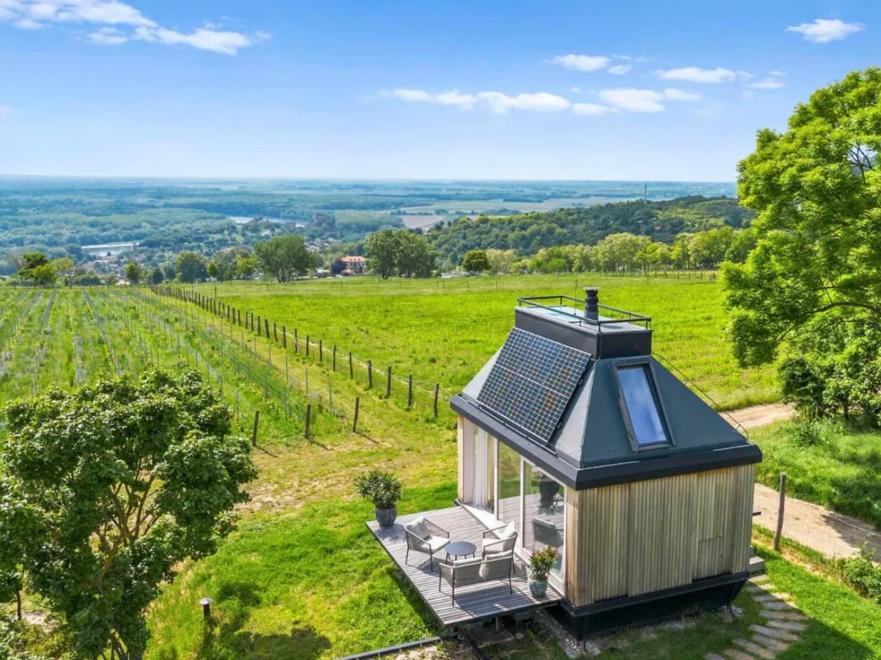
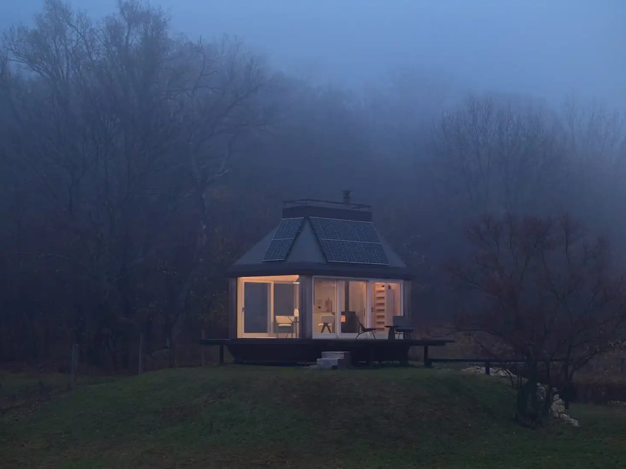
Twenty square meters. That’s roughly the size of a large walk-in closet, or a single car garage. It isn’t a lot of space, and yet Cabin Devín, a compact off-grid retreat perched above the historic Devín Castle near Bratislava, Slovakia, manages to feel like one of the most considered living spaces in recent memory. Architecture studios Ark-Shelter and Archekta designed it together, and the result is exactly the kind of project that makes you quietly reconsider what you actually need out of a home.
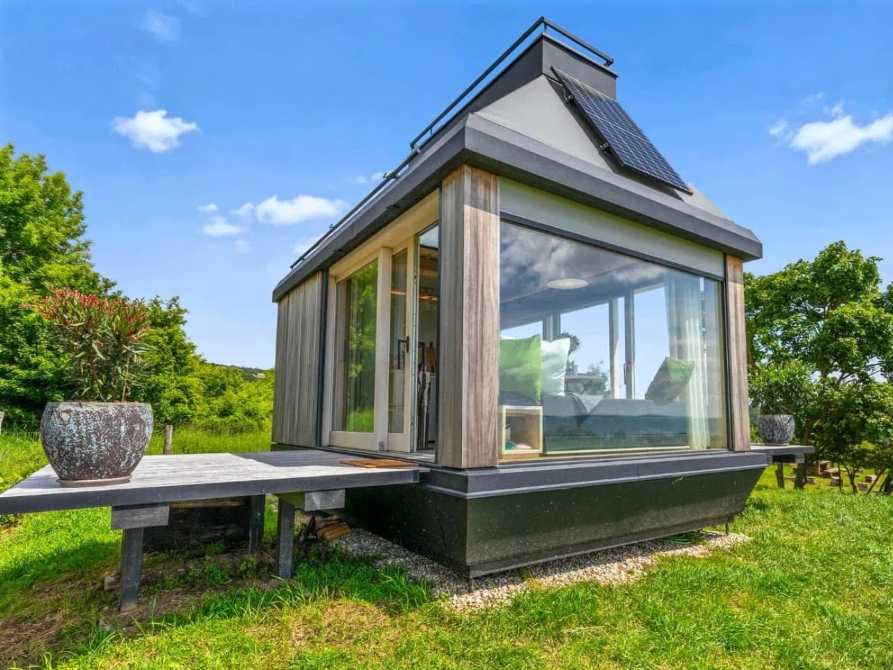
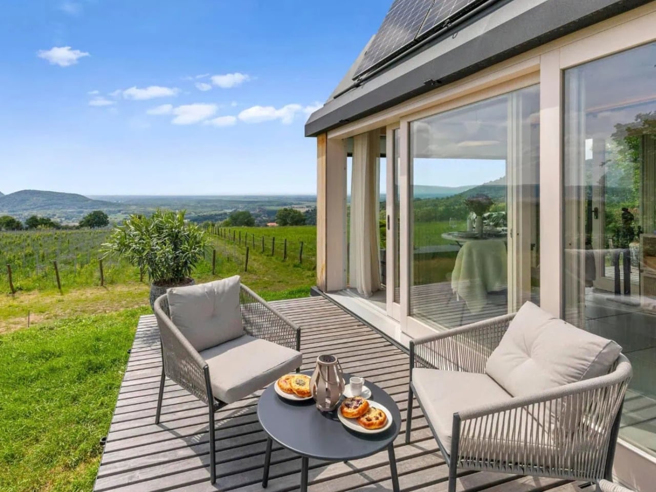
The cabin sits at the edge of the Zlatý Roh vineyards, elevated with views stretching all the way toward the Austrian Alps. The location alone is a statement. This isn’t a structure placed arbitrarily on a hillside. It was set with intention, positioning the horizon as the primary living room. The landscape isn’t the backdrop here; it’s essentially the whole point.
Designers: Ark-Shelter and Archekta

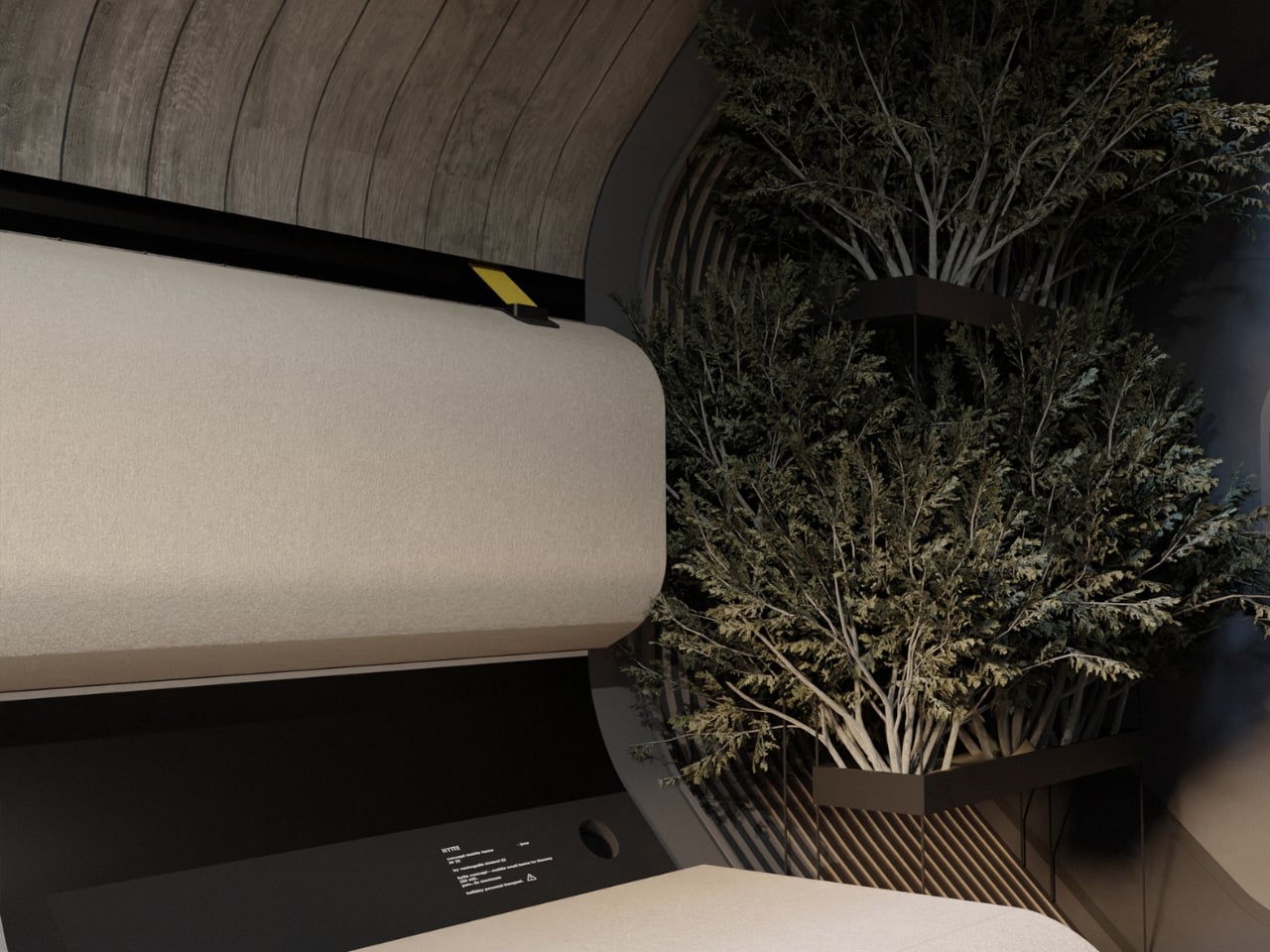
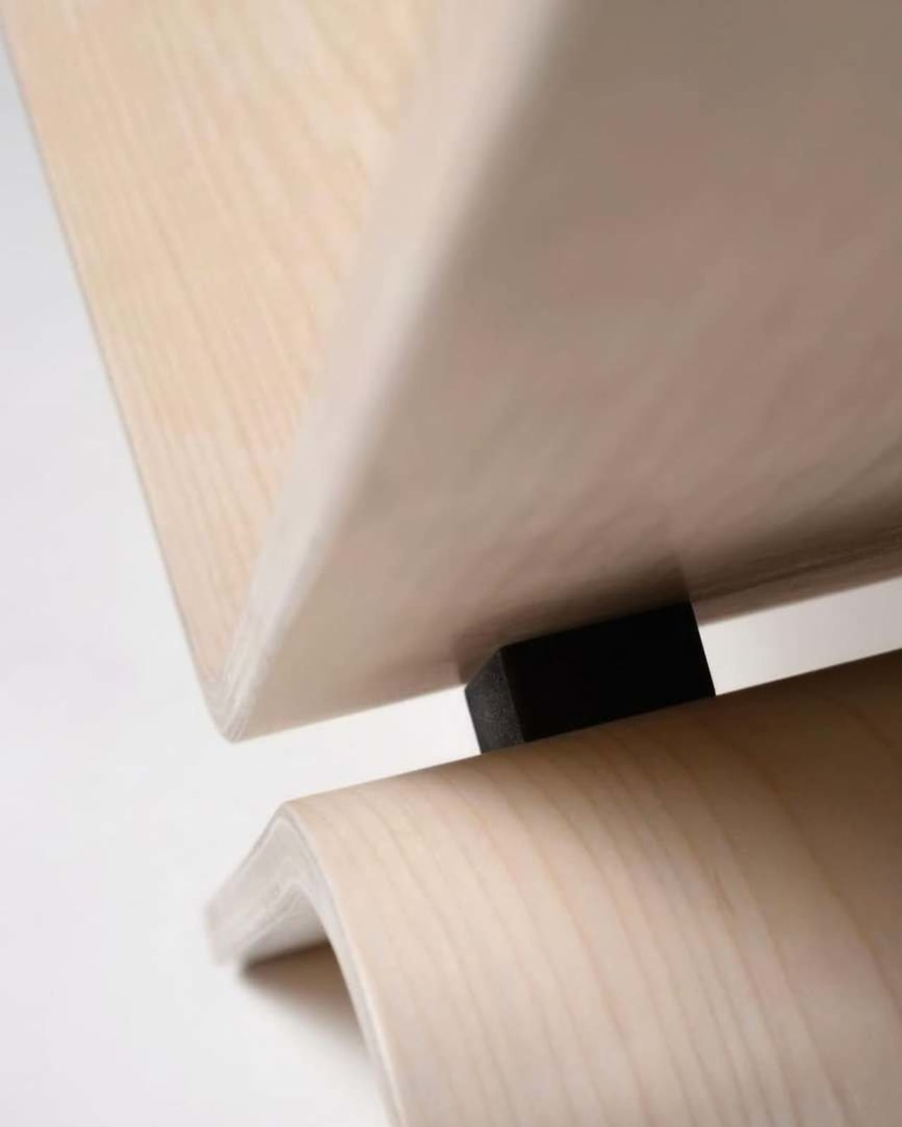
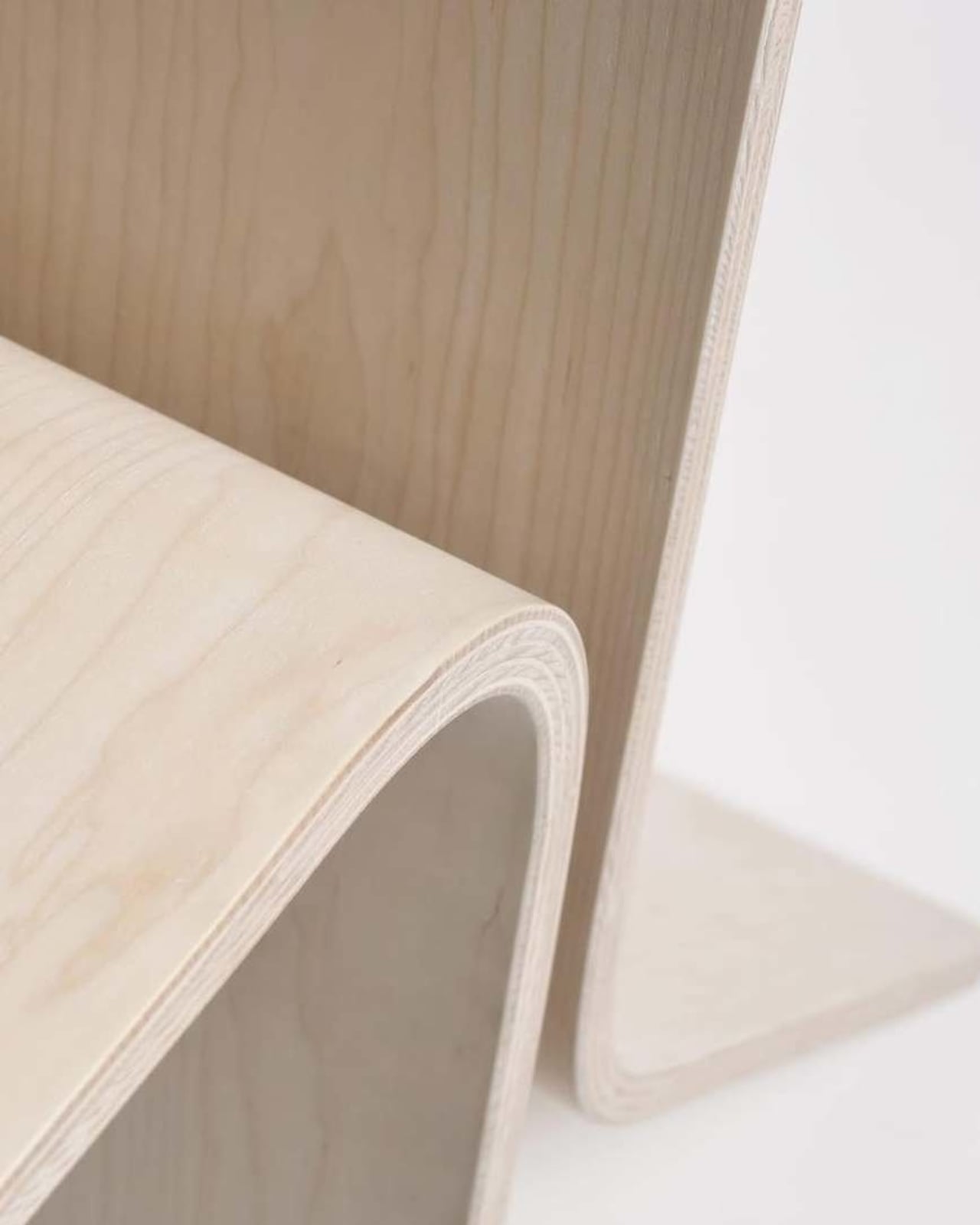
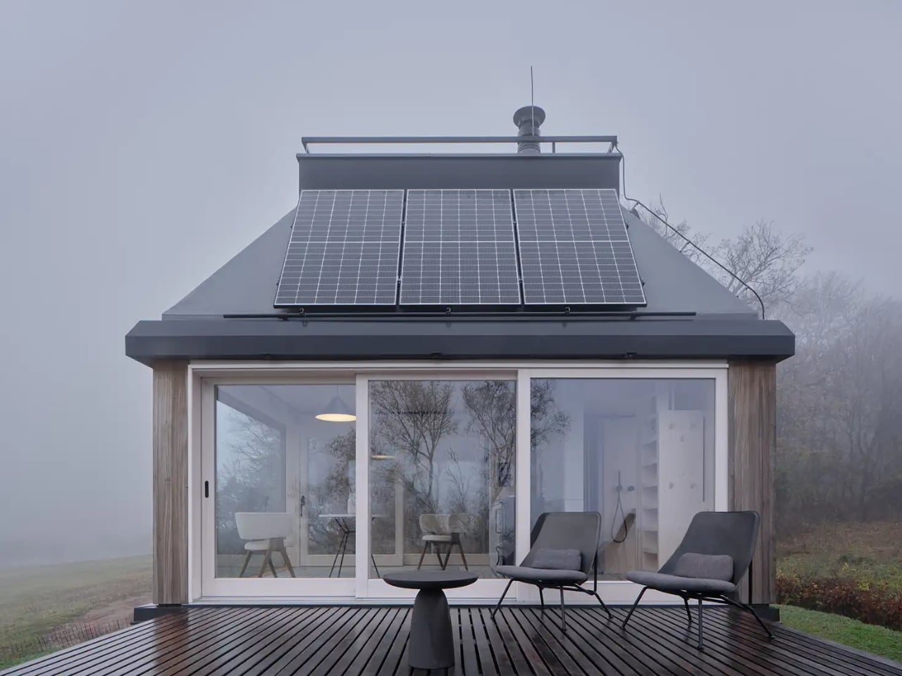
What makes the design so compelling is how the architects dealt with the size constraint. Rather than fighting the smallness, they leaned into it, and then cleverly expanded it. Two fold-down terraces open the cabin outward, effectively doubling the usable floor area when deployed. Sliding glass walls replace what would traditionally be fixed boundaries, letting the scent of the vines and the cool air from the slopes drift freely through the interior. The line between inside and outside becomes almost theoretical, which is exactly the kind of design thinking that makes a small space feel generous rather than cramped.
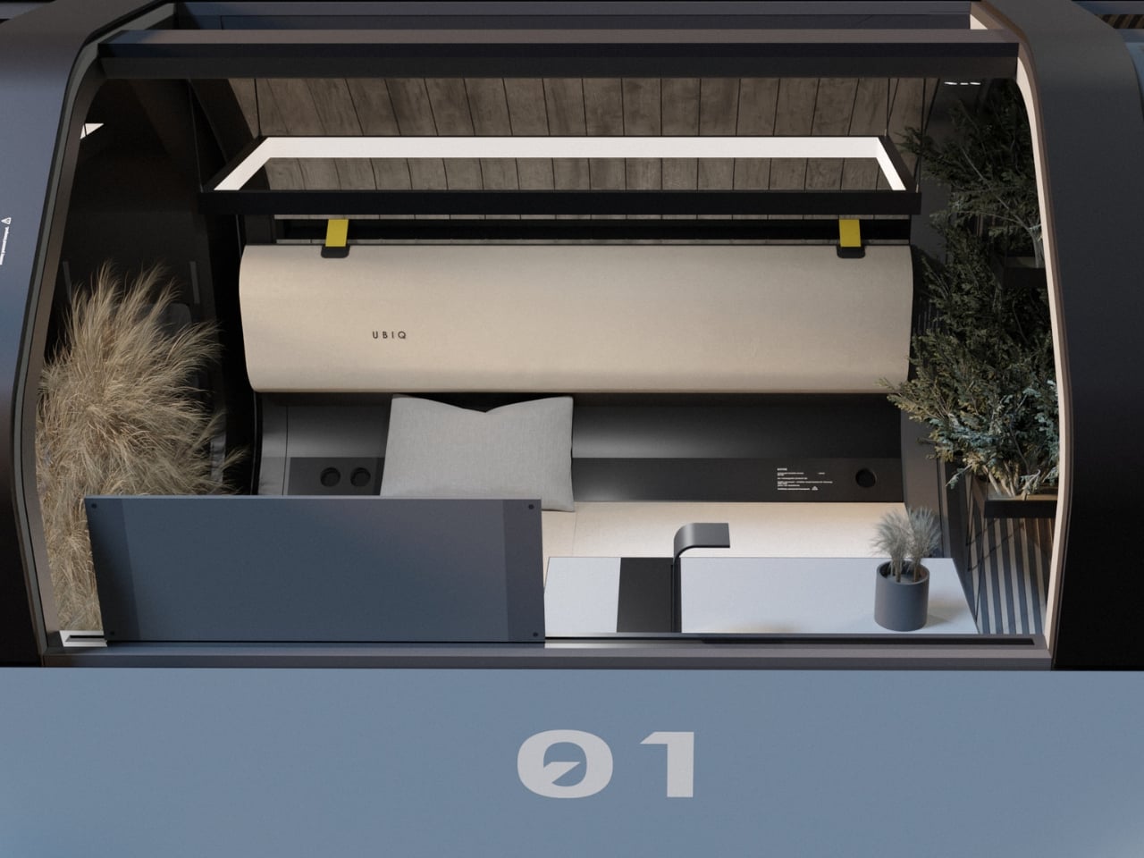
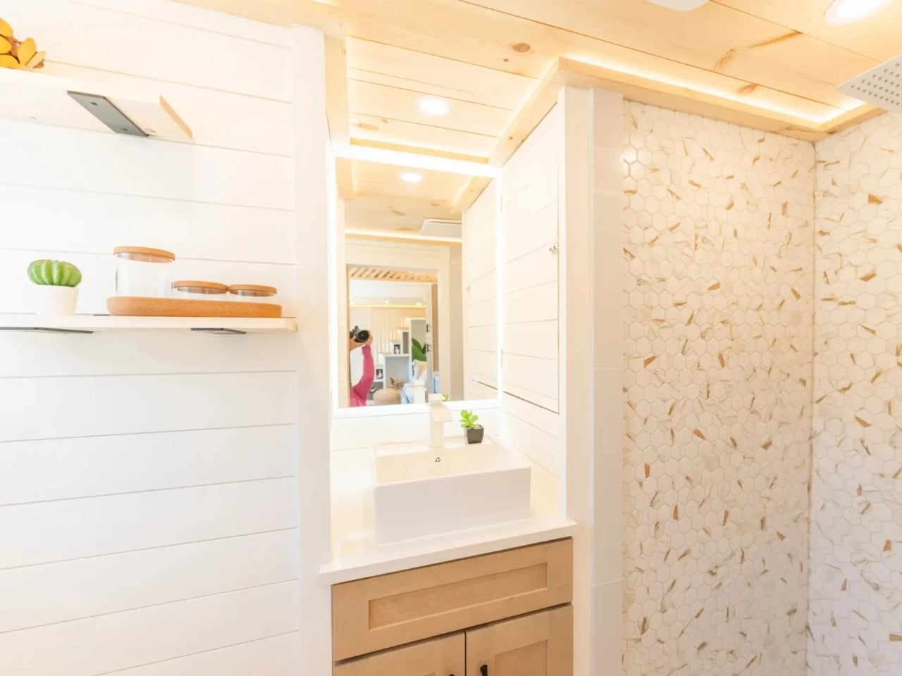
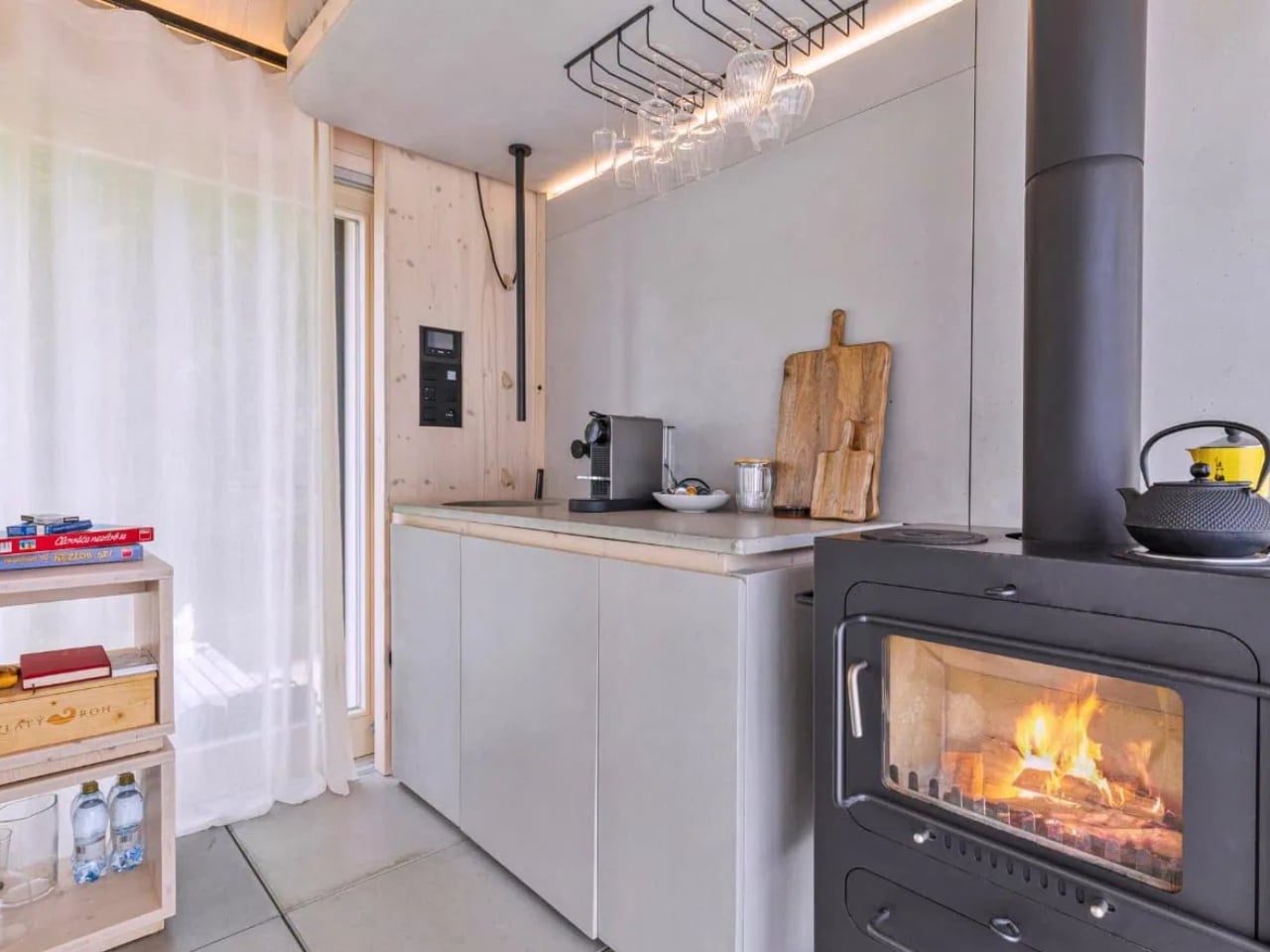
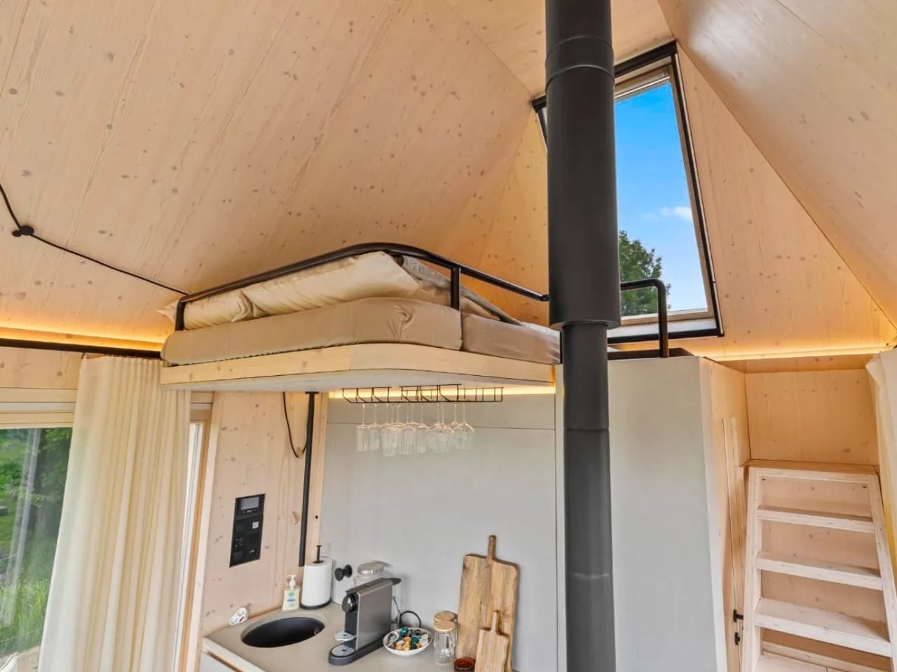
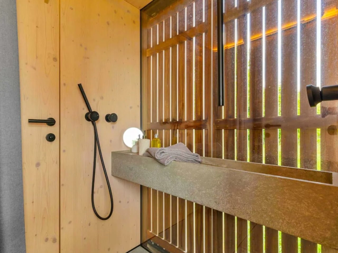
Inside, everything earns its keep. There’s a compact living area, a kitchenette, and a bathroom, and then a detail that I keep coming back to: a bespoke concrete sink set directly within a window frame, oriented toward the forest, designed to slow the morning ritual and reconnect everyday routines with nature. It’s a simple idea, but it’s designed to slow you down, to make washing your face in the morning feel like a small communion with the outside. That’s the kind of quiet thoughtfulness that separates good architecture from great architecture.

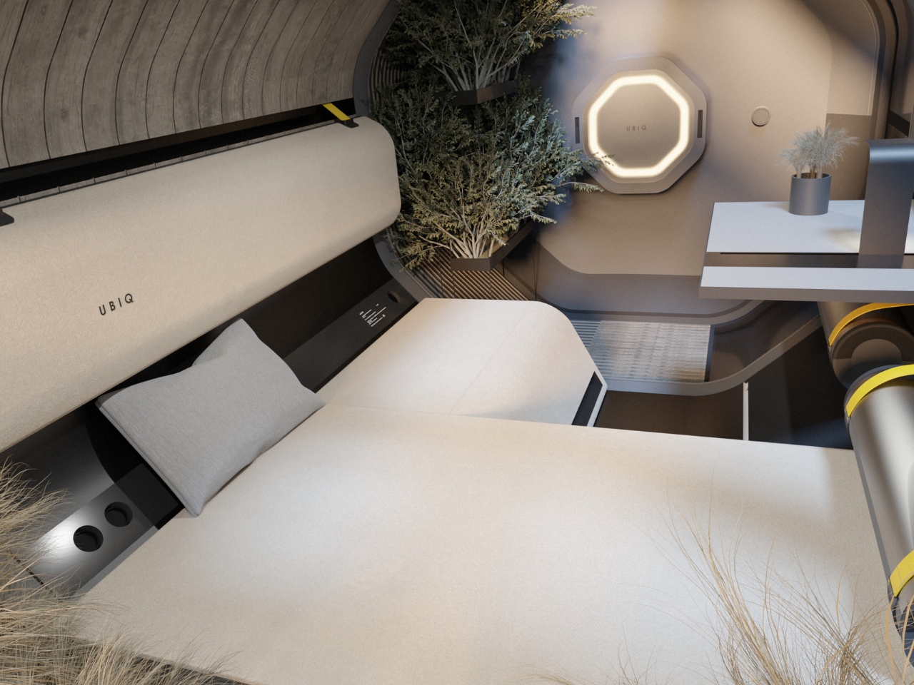
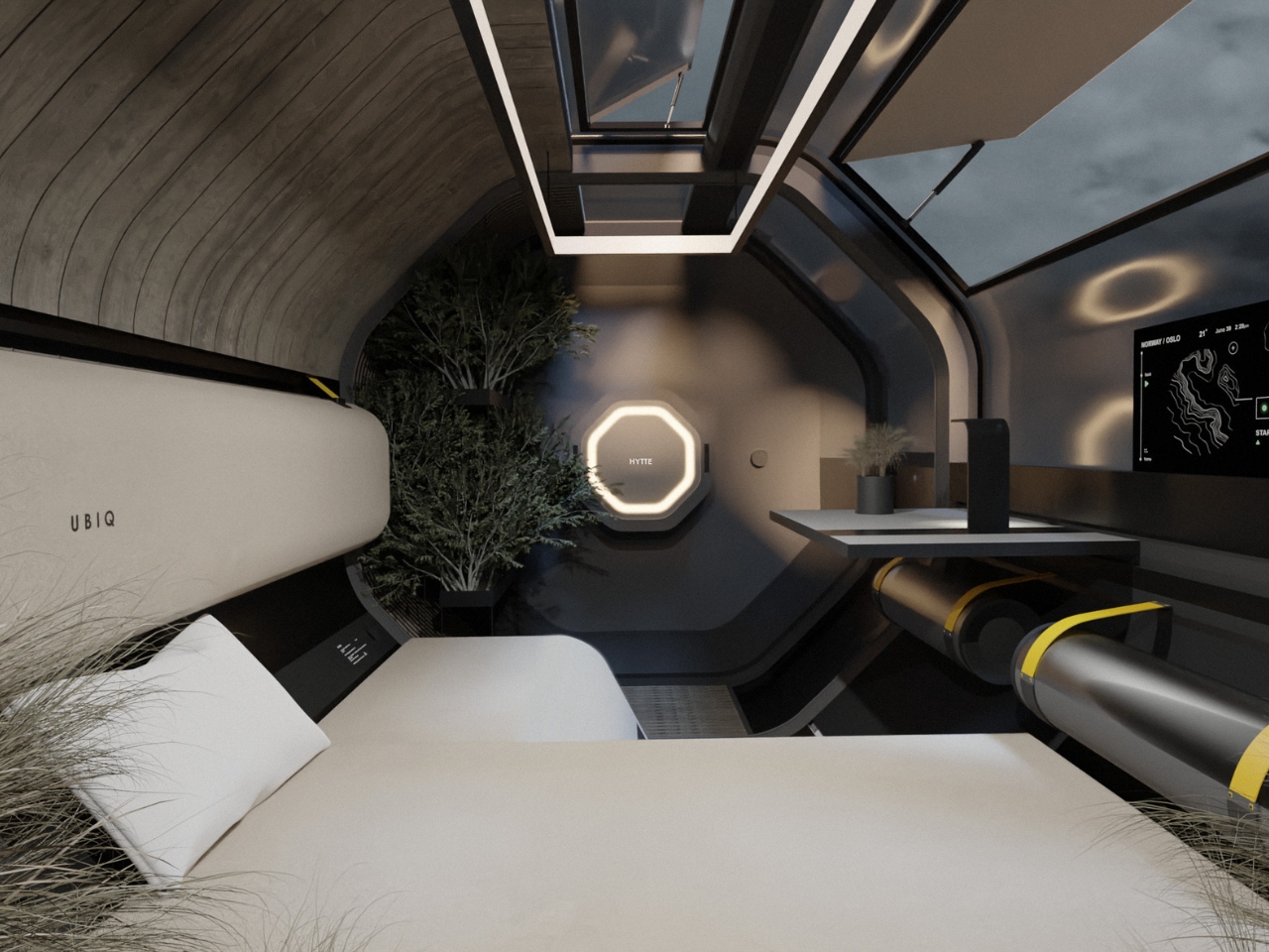
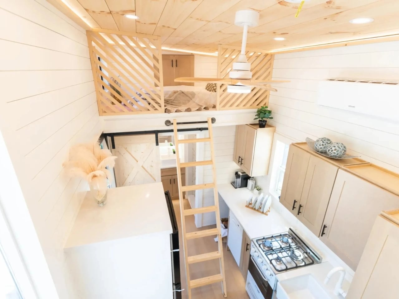
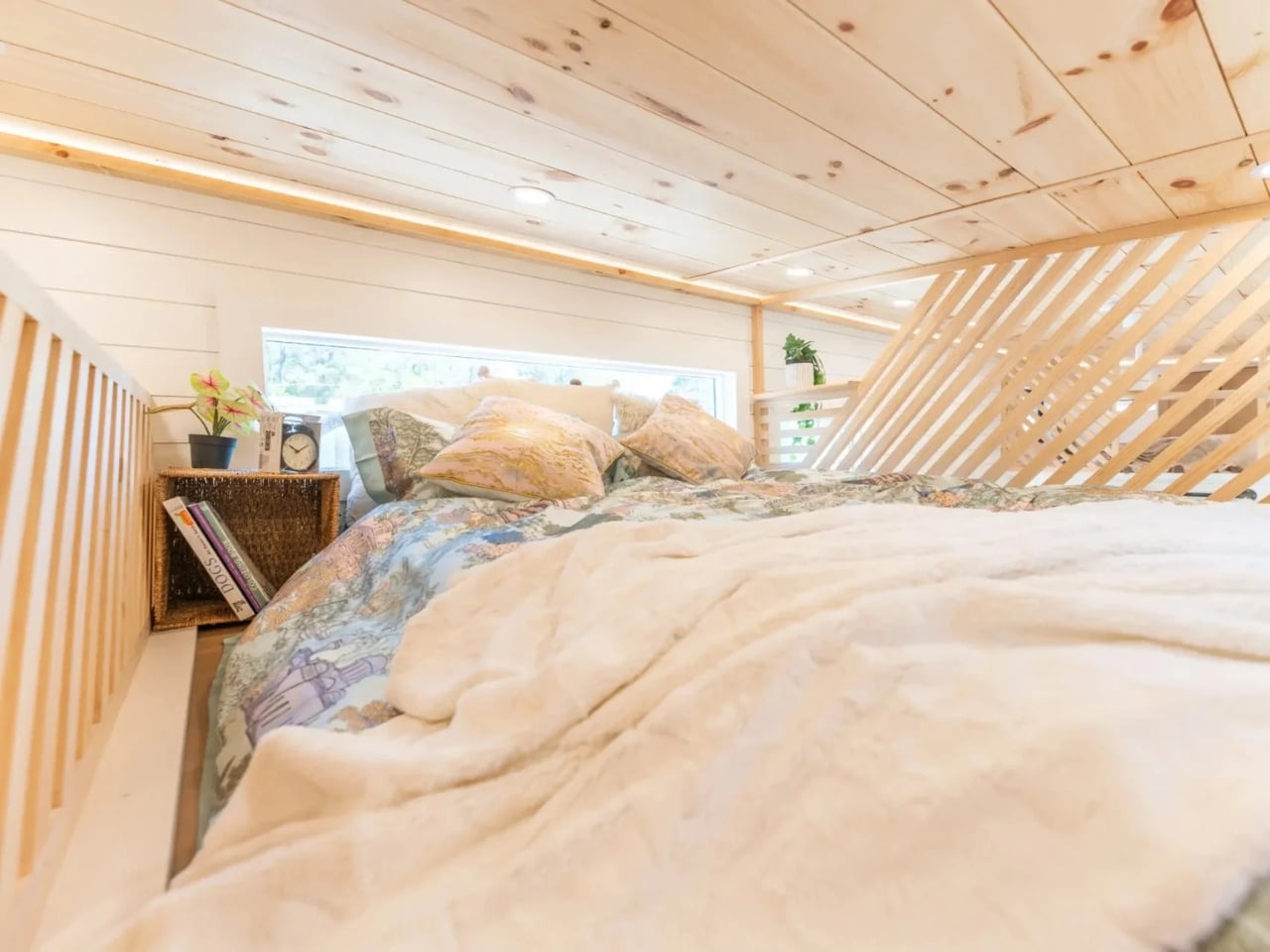
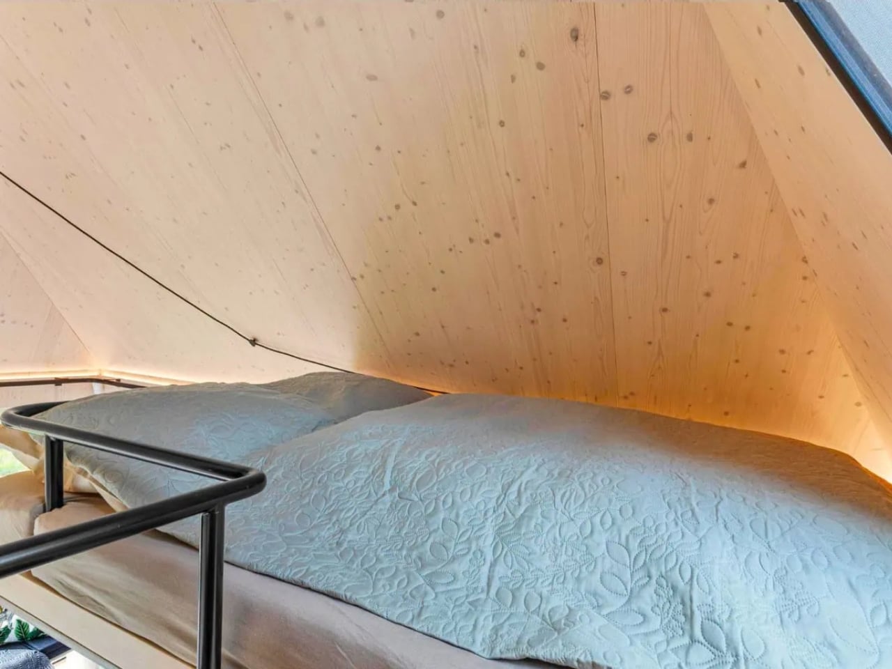
Above the main floor, a lofted sleeping area is reached by a retractable ladder that tucks neatly into the cabinetry when not in use. The loft trades glass walls for a solid enclosure with a skylight overhead, giving you stars at night and a kind of cocooned privacy that the open main floor doesn’t offer. I think that contrast is the smartest design move in the whole project.
The technology running beneath all of this is equally well executed. Cabin Devín operates completely off-grid, year-round, which is no small thing given the Slovak climate. Solar panels and battery storage cover most of the power demand, with a gas-powered backup system that kicks in automatically when battery levels drop below a set threshold. In summer, the cooling strategy draws cooler air from beneath the northern side of the raised floor and pushes warm air out through a heat recovery unit installed near the skylight. Service water is stored in a concealed reservoir beneath the floor, alongside a separate wastewater tank. A Loxone smart home system manages everything, and the design intelligently prioritizes electricity for lighting and smaller devices, letting energy-intensive systems like heating and cooling flex based on what’s available.

It reads like a building that was engineered with the same care as a well-designed product, where every component has been considered not just in isolation but as part of a larger system. Ark-Shelter has spent years refining modular architecture, and this collaboration with Archekta pushed both studios to think about the experience of space in a more sensory way. Their shared goal was to present modular architecture as a tool capable of respecting the genius loci of a place, as well as the biological and sensory experience of space by its users. That level of intention is rarer than it should be.
Cabin Devín isn’t the first tiny cabin to capture attention, and it certainly won’t be the last. But most small-space projects earn their coverage through aesthetics alone. What sets this one apart is the depth of thinking behind every decision. Nothing here is accidental. It’s small, yes, but it’s small in the way that a really well-written sentence is short: every word counts, nothing is wasted, and the effect lingers longer than you’d expect.
The post Cabin Devín Might Be the Most Thoughtful 20m² Ever Built first appeared on Yanko Design.