Erwan Bouroullec’s Lamps Leave the Last Design Decision to You

Most lighting products arrive complete. You unbox them, install them, and that’s basically the end of the story. Maap, the new wall lamp by Erwan Bouroullec for Flos, works a little differently. Before you can hang it on your wall, you have to crumple it. Not metaphorically. Actually crumple it, by hand.

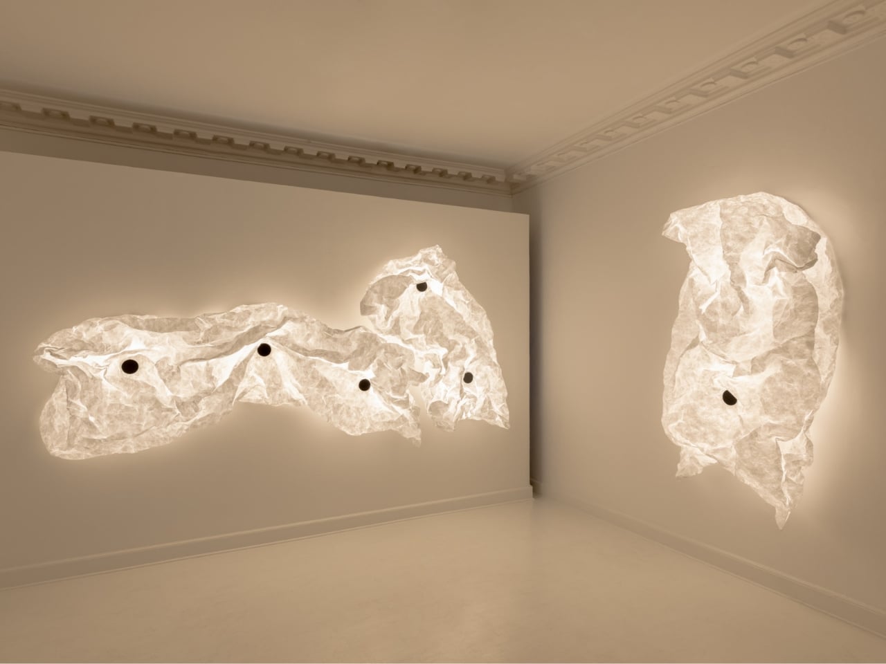
The diffuser at the heart of Maap is made from Tyvek, the ultra-thin synthetic material most commonly associated with shipping envelopes and construction wrap. Bouroullec chose it specifically for its behavior: when crumpled, it holds its shape, forming a microstructure of ridges and folds that stabilizes the lamp’s form and scatters light in a way no factory process could replicate. Two people installing the same model will end up with two completely different objects. That’s not a design flaw. That’s the entire point.

Designer: Erwan Bouroullec
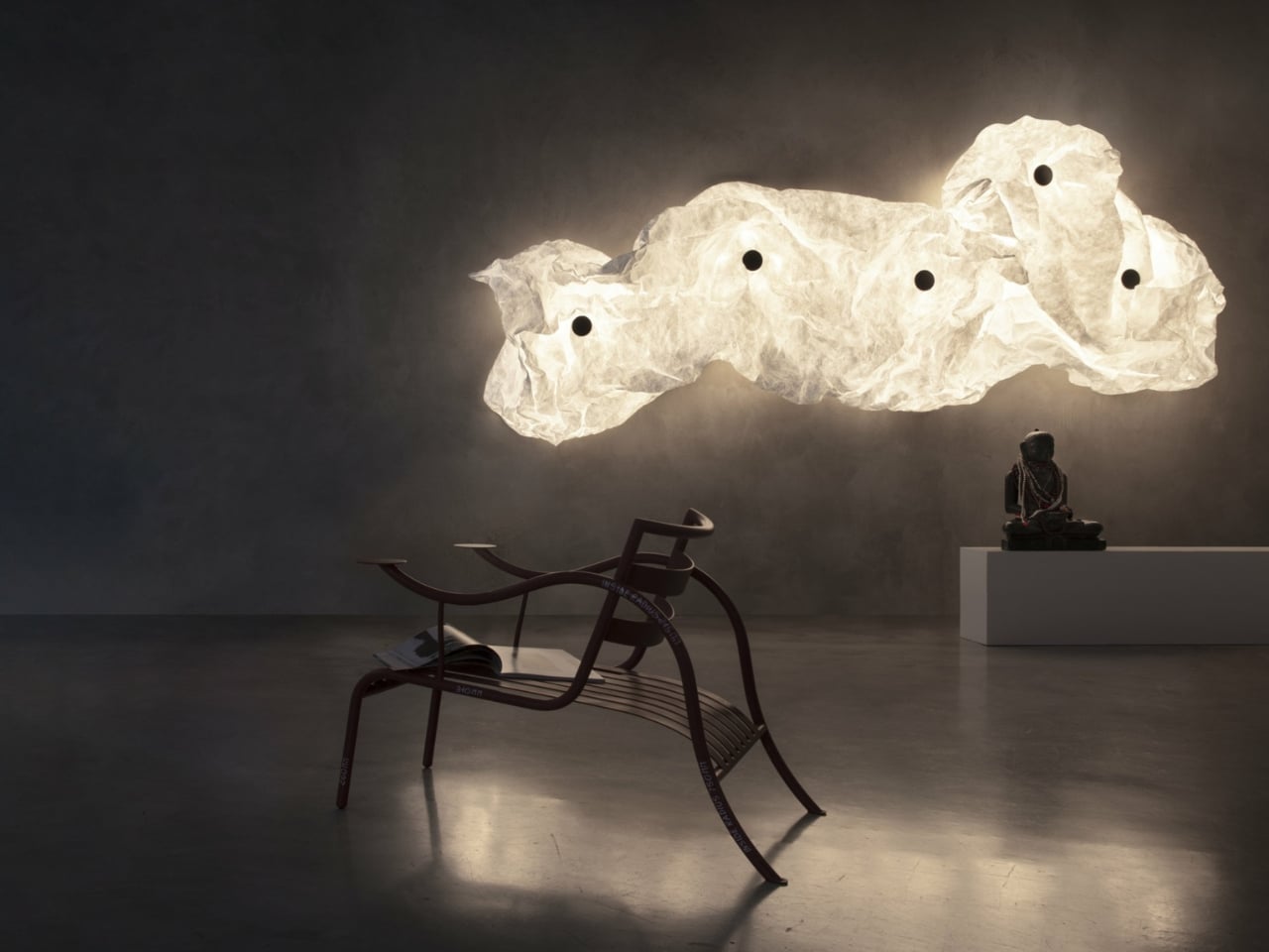
Bouroullec has been thinking about expansive light for a long time. “Maap is the realization of a long-held desire to create expansive light sources that diffuse illumination across a broad surface,” he says. “This results in a subtle, immersive glow that surrounds you, spreading softly and evenly.” The lamp reportedly took years to develop and, at one point, resisted being drawn in traditional technical schematics because its final form simply couldn’t be predetermined. How do you draft a blueprint for something that depends on a human gesture?
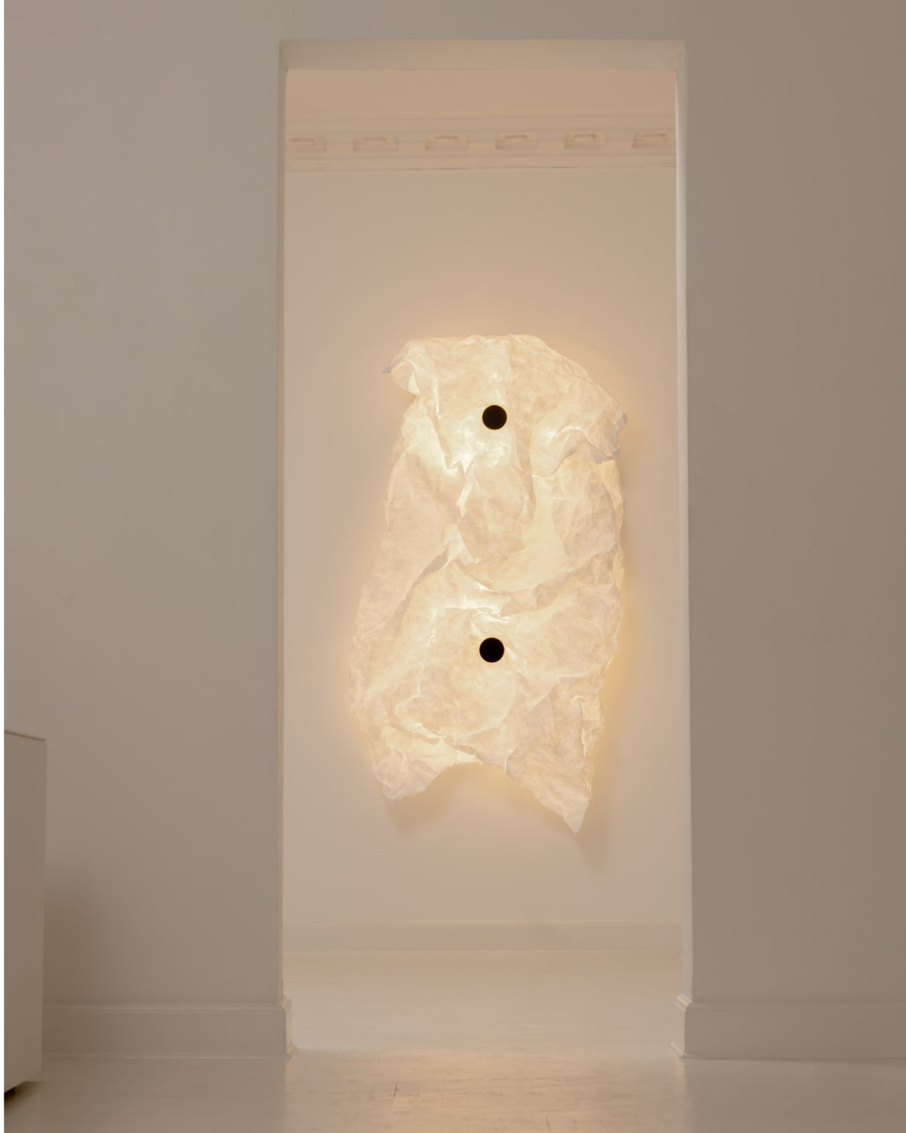
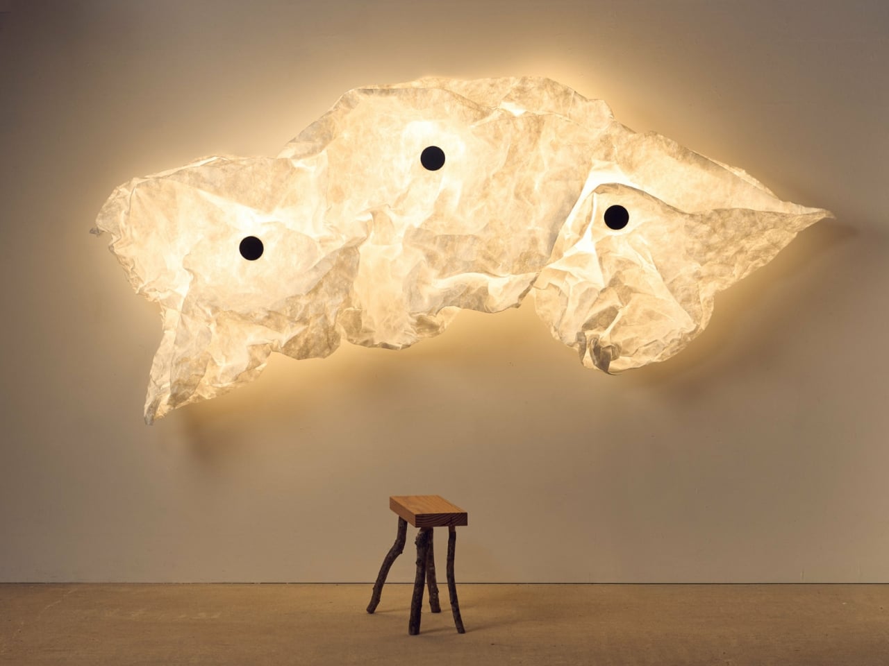
The structure underneath the crumpled Tyvek is precise and deliberate. A cross-shaped mount attaches to the wall, and the diffuser shell clips on magnetically. Each unit runs four LED bulbs, and multiple units can be combined to scale the piece up. The smallest configuration is a single panel. At its largest, Maap can stretch over three metres across a wall, which at that scale stops being a lamp and starts becoming an installation. Flos describes it as an “alchemical wall installation,” and while that kind of language gets applied liberally by lighting brands, here it actually feels earned.
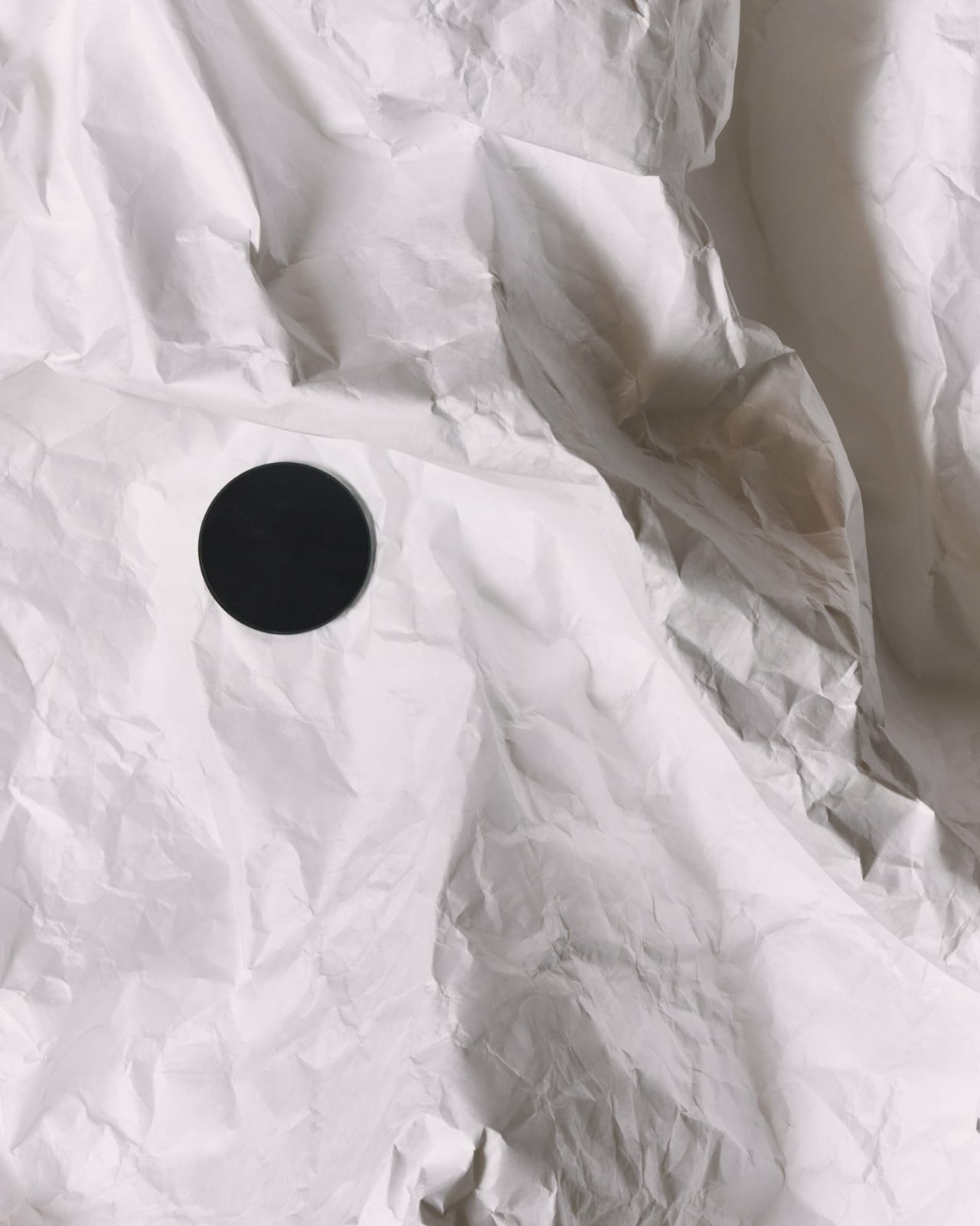
What I keep thinking about is how Maap challenges the standard relationship between designer and buyer. Usually, a piece of furniture or lighting arrives as a closed system. The designer made every call, and your only role is placement. Maap breaks that contract in the most tactile, satisfying way. Bouroullec built the architecture; you determine the texture. It reframes ownership not as possession but as participation.
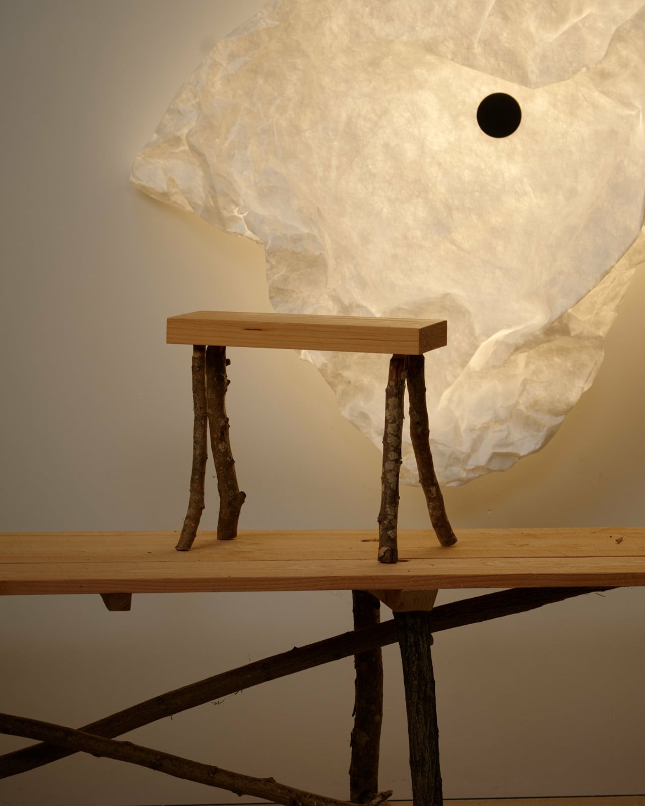
That’s also a slightly risky ask. Not everyone wants to be handed creative responsibility over something they just spent serious money on. For people who need a predictable aesthetic outcome, Maap might feel genuinely unsettling. But for the person who already treats their home as a living, evolving thing rather than a finished project, it’s a quietly compelling offer. You can reshape it. You can start over. If you move, you can detach the diffuser from the wall, re-crumple it, and begin again in a new space. The lamp is designed to be shaped, reshaped, and interpreted by the person living with it.
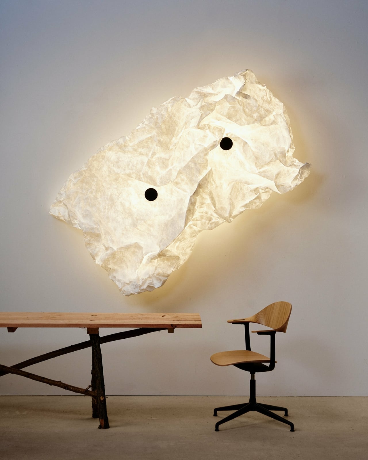
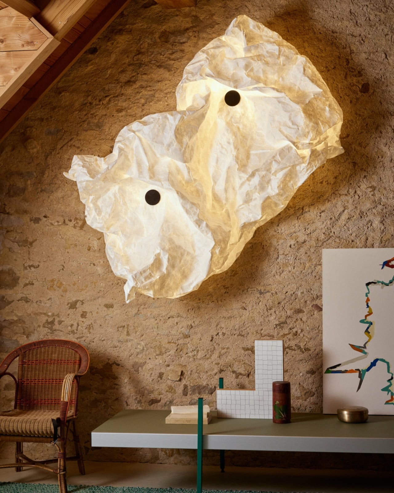
Bouroullec has long approached design as something environmental rather than decorative. “I see design as part of a whole. Designs need to cooperate with a given environment and somehow enhance it.” Maap feels like one of the clearest expressions of that belief. It doesn’t arrive with a fixed visual identity or a demand that you style your room around it. It adapts, which turns out to be a fairly rare quality in a market that often values visual consistency above everything else.
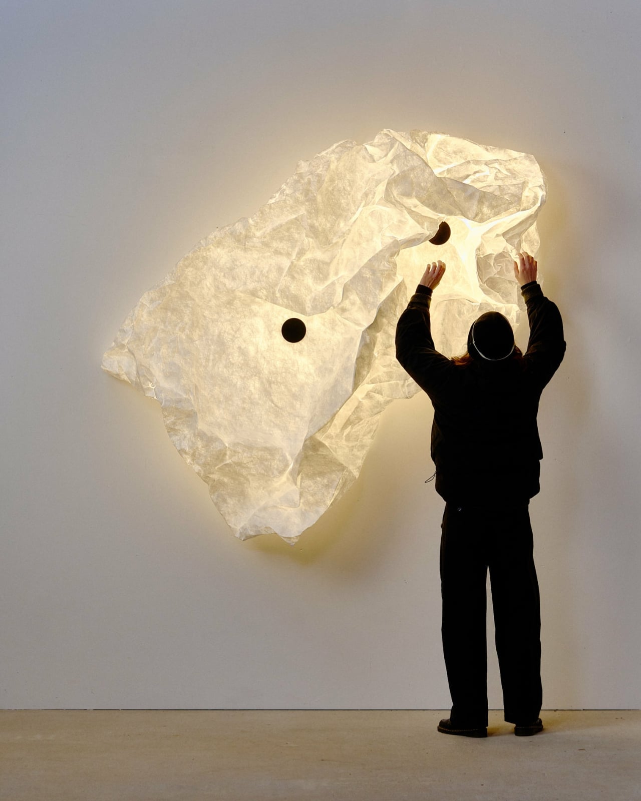
Maap is available now through Flos flagship stores and Design Within Reach, its exclusive U.S. launch partner. It comes in three sizes, Wall 1, Wall 2, and Wall 3. The material is white, the glow is soft, and the rest is entirely up to you.
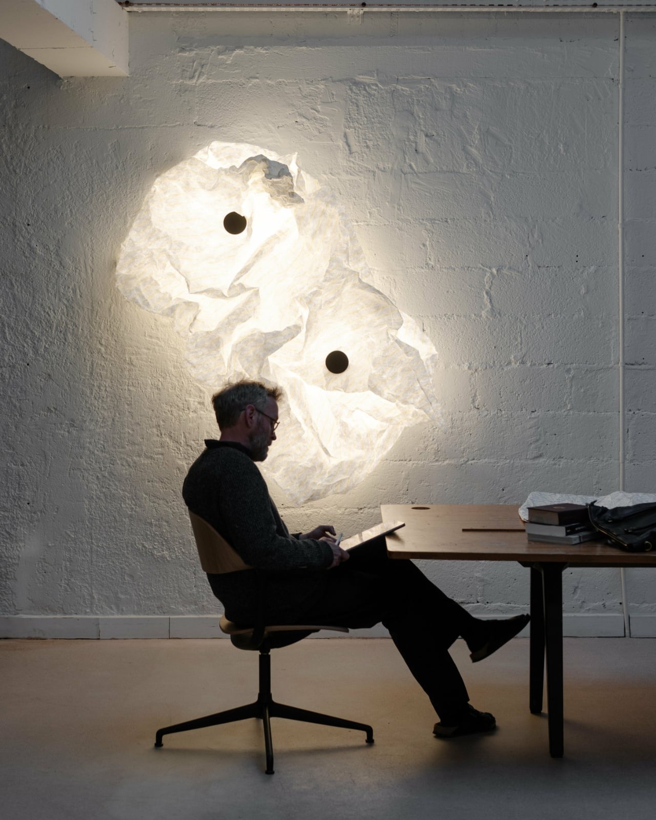
Whether this becomes a reference point in lighting design or stays a beautiful one-off experiment, it’s hard to look at Maap without feeling like something genuinely fresh is being proposed. At a time when design often cycles through familiar references, that still counts for something.
The post Erwan Bouroullec’s Lamps Leave the Last Design Decision to You first appeared on Yanko Design.

Hallmark Just Turned the Original PlayStation Into a $29 Tree Ornament

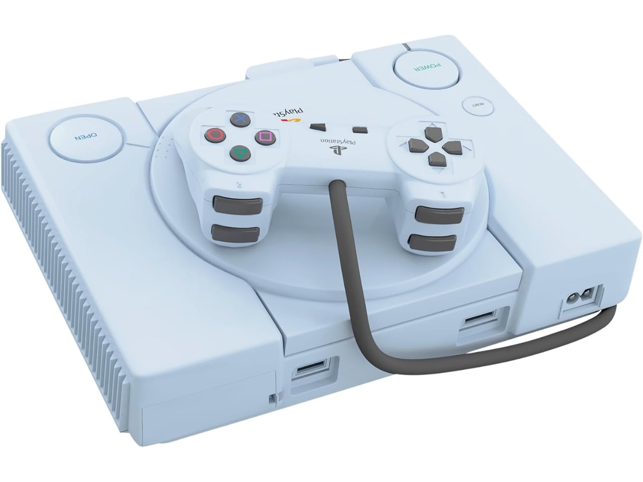
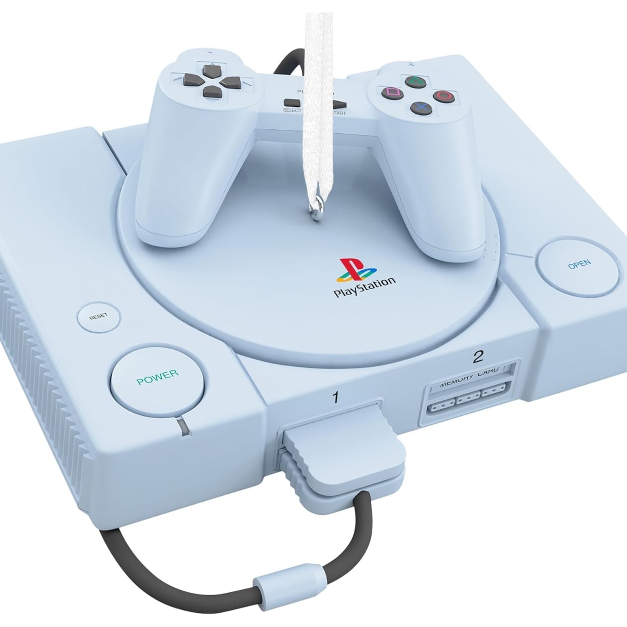
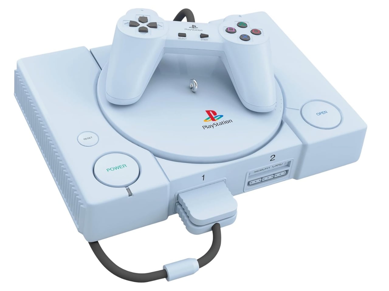
I didn’t expect to feel anything about a $28.99 plastic ornament. Yet here we are. Hallmark’s 2026 Keepsake collection just introduced its PlayStation Console Ornament With Light and Sound, and it is exactly what it sounds like: a miniature replica of the original PlayStation, complete with a tiny matching controller sitting beside it, designed to hang on your holiday tree. Press the power button, and it lights up and plays the iconic startup sound. That sound. The one that pulled you away from Saturday morning cartoons, the one that meant you had about forty seconds before the game loaded and your whole afternoon was officially spoken for. If you were a 90s kid, your whole body might just recognize it before your brain even has a chance to catch up.

The ornament measures four inches wide by three and three-quarter inches tall. It is battery-operated, made from plastic, and priced at $28.99, which puts it comfortably in impulse-purchase territory. The detail work is genuinely impressive at this scale. Hallmark managed to capture the boxy silhouette of the original console, the disc lid, the familiar button layout, and the exact proportions of that chunky, well-loved controller. It doesn’t feel like a vague approximation. It feels like a tiny version of the real thing, and that distinction is worth paying attention to.

Designer: Hallmark Keepsake

That specificity is the whole argument. I’ve seen plenty of retro gaming merchandise move through the design and collectibles space over the years, from glossy art prints to enamel pins to limited-edition pieces with ambitious price tags. Most of it leans hard on the aesthetic without capturing the emotional core. The Hallmark ornament does something different. It doesn’t just reference the PlayStation; it recreates the moment. That startup sequence is not decoration. It is the sensory detail that pushes this object from ornament into something closer to a time capsule.

Nostalgia as a design strategy is everywhere right now, and I will be honest, I have grown a little skeptical of it. Brands lean on it often enough that it can start to feel calculated and hollow. But the PlayStation ornament earns its emotional weight. The original console launched in North America in 1995, which means it has been more than thirty years. A generation of gamers who grew up with it are now fully grown adults with homes to decorate, traditions to build, and a well-documented weakness for miniature versions of things they once loved. Hallmark, to its credit, knows exactly who it is speaking to.

The audience for this is also broader than it first appears. The obvious buyers are millennials putting up their own trees and trying to make the holidays feel personal and specific to them. But it also works as a gift between old friends, a knowing nod between siblings, or something a thoughtful parent picks up for a kid who spent half their childhood with a controller in hand. The PlayStation crosses enough generational lines that this ornament doesn’t land as niche. It lands as genuinely familiar, and that’s harder to pull off than it looks.

The Keepsake line has always operated somewhere in this territory, pairing pop culture touchstones with holiday tradition in a way that feels less cheesy than it probably should. Part of that is the quality of the execution, and part of it is the simple, almost elegant logic of placing a beloved object on a Christmas tree. A tree is already a collection of meaningful things, layered and personal and charged with memory. Adding a tiny PlayStation to it is not a departure from the spirit of the tradition. It might actually be exactly the point.

You can find the PlayStation Console Ornament at Hallmark Gold Crown stores and on Hallmark.com for $28.99. It began shipping in July as part of the brand’s annual Keepsake Premiere event, and given how quickly nostalgia-driven pieces like this tend to move, waiting is probably not the strategy here.

The post Hallmark Just Turned the Original PlayStation Into a $29 Tree Ornament first appeared on Yanko Design.
Half Pixel, Half Mirror: The Ghost Collection That Blurs Both Worlds

If you’ve ever looked at an old video game screenshot next to a 4K render and felt strangely moved by both, Alberto Essesi’s Ghost Collection might be the furniture version of that feeling. It’s a collection that sits right at the edge of two visual languages, digital and analog, raw and refined, and somehow makes that tension feel completely intentional.

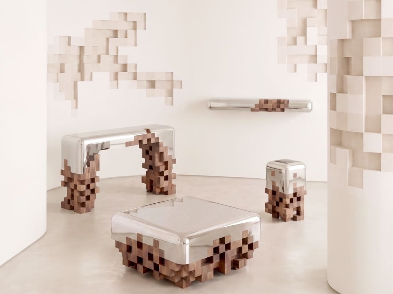
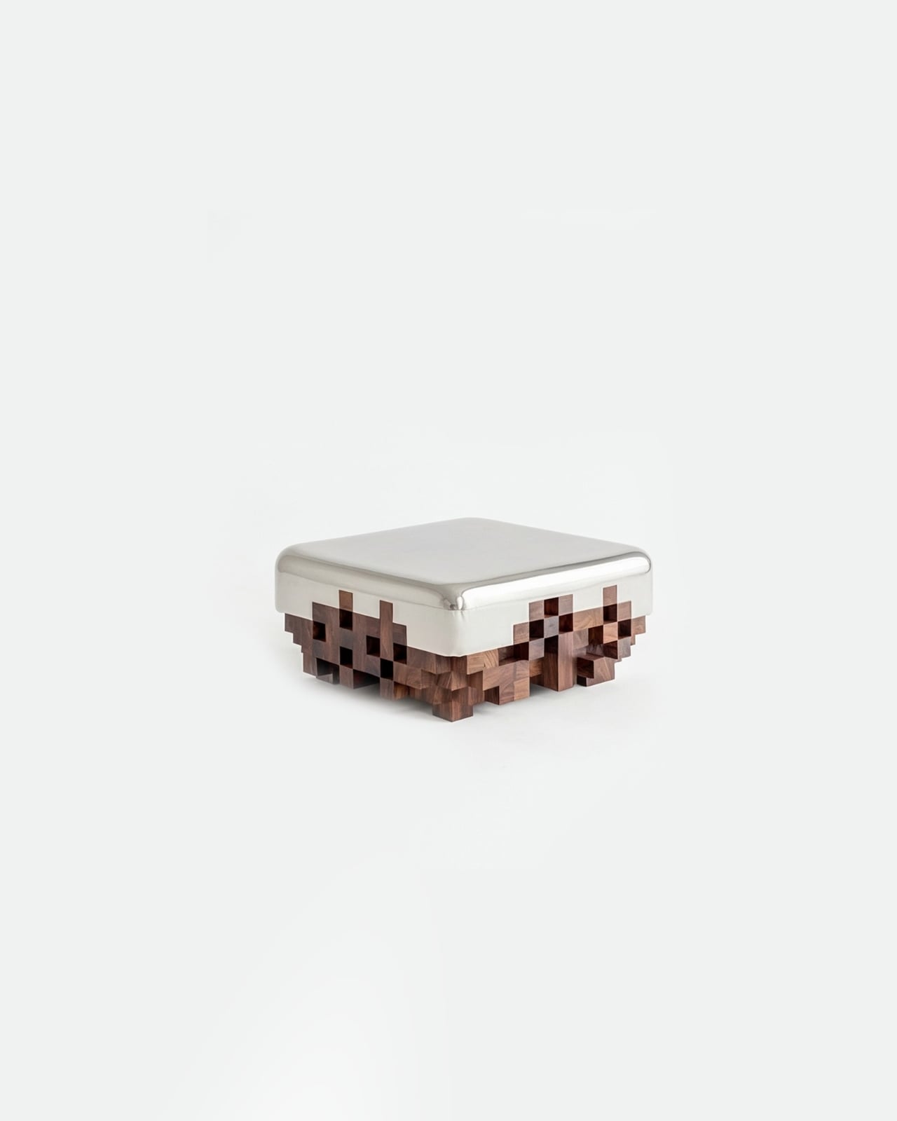
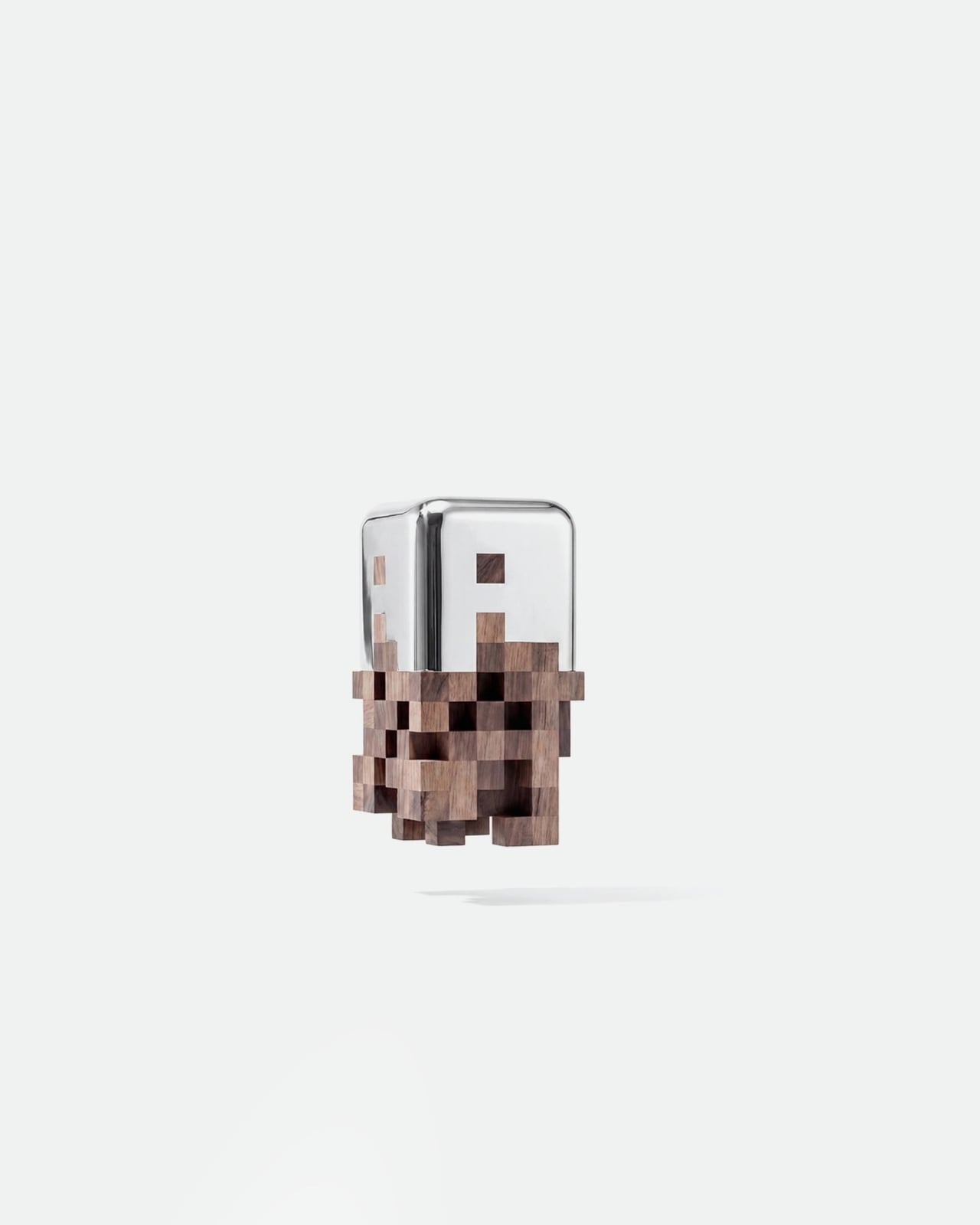
Essesi, a designer whose portfolio spans robotics, vehicles, and collectible objects, built the Ghost Collection around a single, surprisingly poetic idea: the contrast between high resolution and low resolution. The pieces merge smooth, mirror-polished aluminum with solid walnut wood crafted into staggered, blocky forms that look unmistakably pixelated. Not as a gimmick. Not as nostalgia. But as a genuine material conversation about how two entirely different visual languages can share the same physical object.

Designer: Alberto Essesi

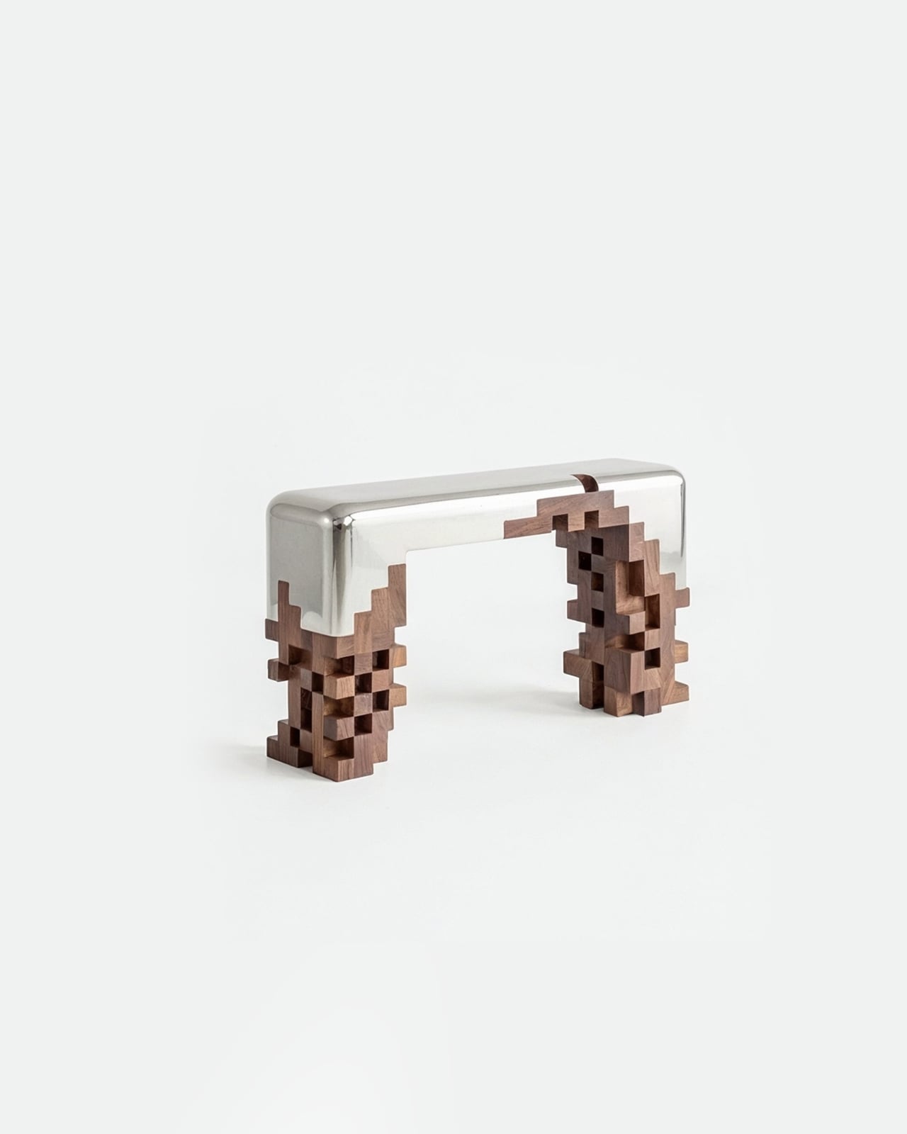
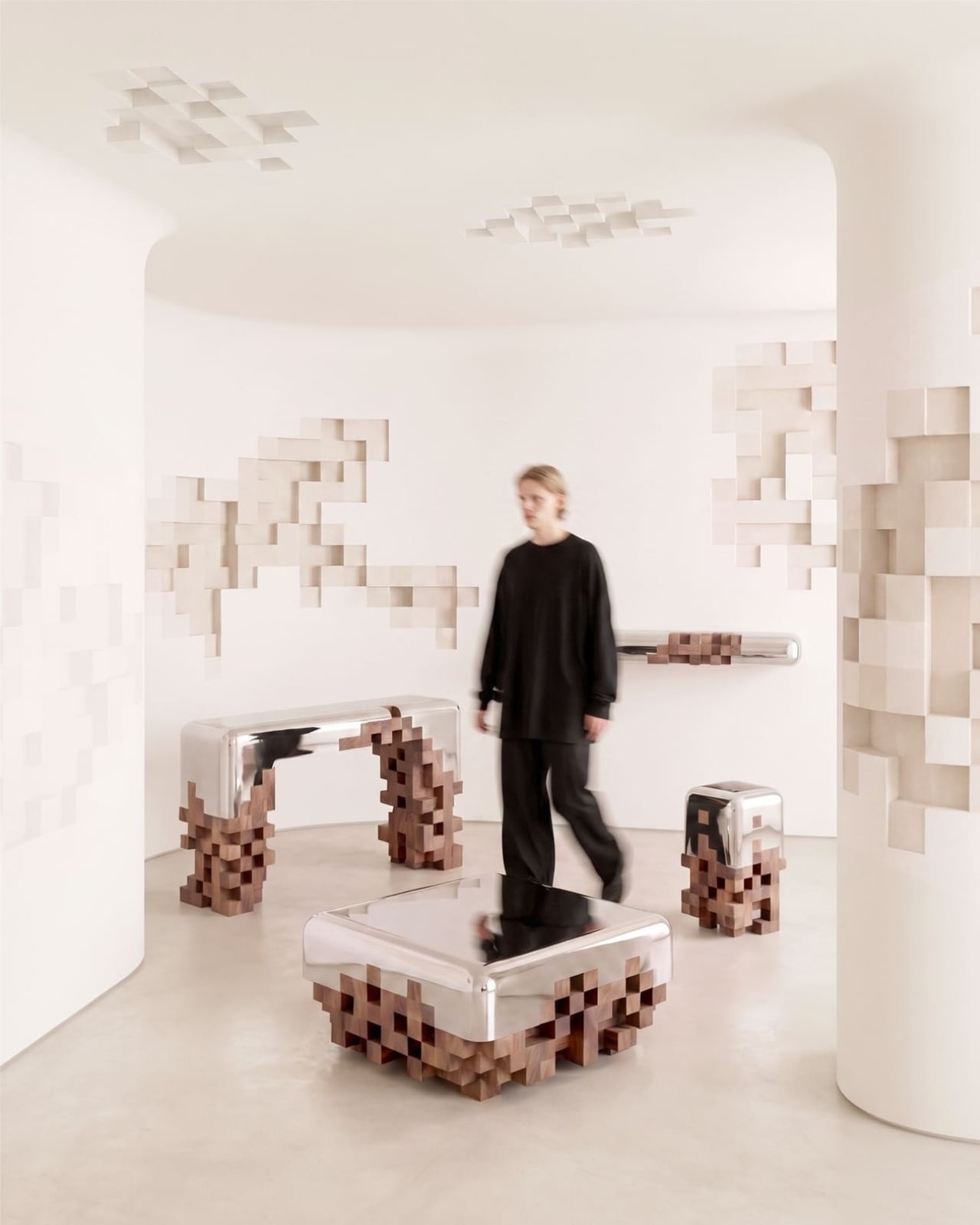
Looking at the console table, the aluminum top is sleek and almost liquid in its finish, all rounded edges and reflective calm. Then it simply dissolves downward into what looks like a freeze-frame of a video game rendering, where geometry hasn’t fully loaded yet. The legs don’t look broken. They look deliberate. Like the pixel isn’t an error in the process but the process itself.

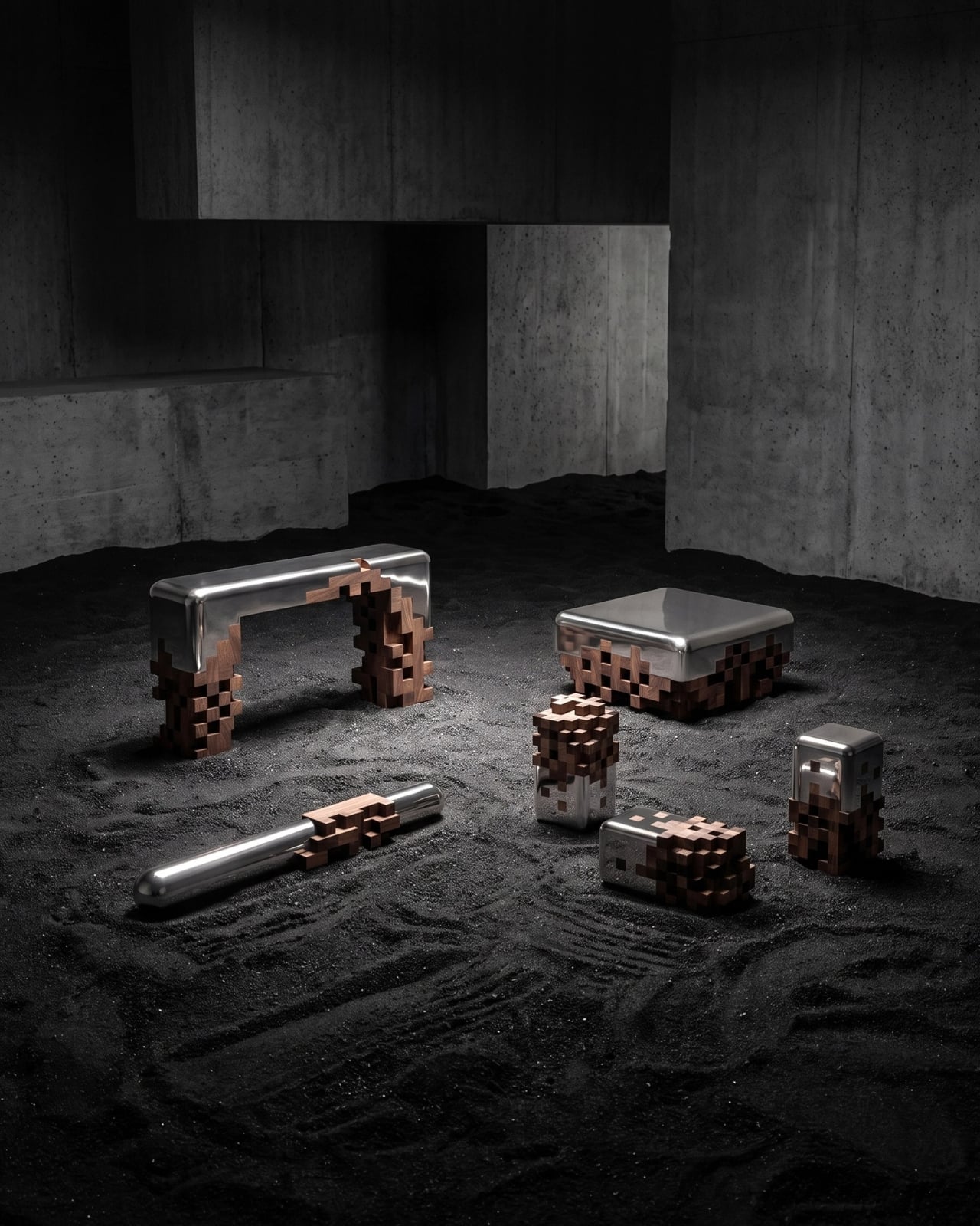
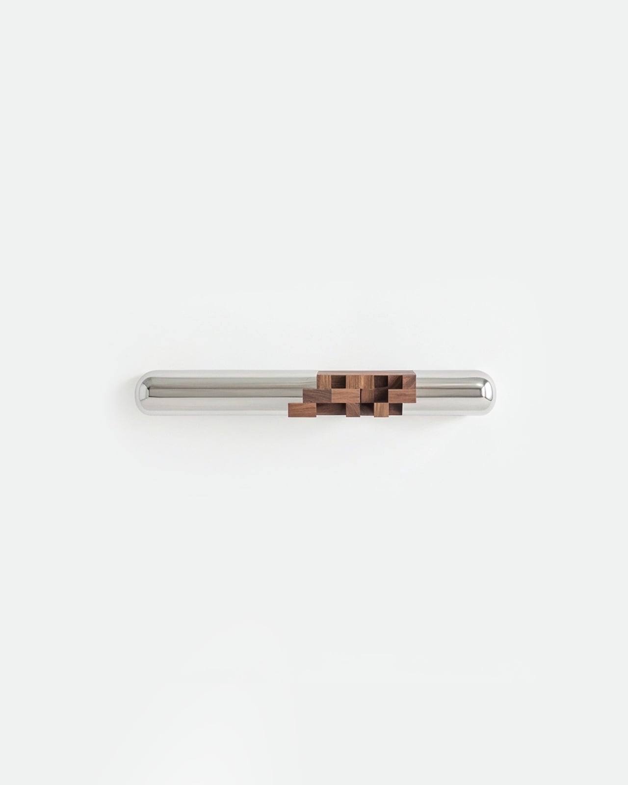
The same logic runs through every piece: the low-slung ottoman with its chrome top sitting above a pixelated walnut base, the wall bar with a single cluster of wood blocks anchoring an otherwise minimal steel rod, and the small sculptural objects that look, at certain angles, like characters from an early Minecraft world given physical weight and material warmth. That last detail is where the collection takes an unexpected turn into genuinely playful territory. The figurines don’t feel decorative in the traditional sense. They feel like they belong to a mythology the designer invented for this collection, artifacts from a world caught mid-render.

I’ll admit, my first instinct when I saw these pieces was to file them under “concept furniture,” the kind that photographs beautifully but lives permanently in a gallery or a mood board. The closer I looked, the less sure I was about that assessment. The craftsmanship is real. The walnut is solid and hand-detailed, each wooden block precisely cut and stacked into forms that read as chaotic but are actually quite controlled. The aluminum isn’t cold or clinical. It has a warmth to it in the way it curves, more like a well-worn chrome object than a surgical instrument.

The installation photography helps tell the story in two directions. Shot in a white gallery space, the pieces feel architectural, calm, almost meditative. Shot against dark, raked sand, they look like relics from some near-future archaeology, objects left behind when a digital civilization met a physical one. Both readings are valid, and I suspect Essesi wanted both.

There’s a question that lingers with this kind of work: who is it actually for? Collectible design at this level lives in a narrow category, somewhere between fine art and functional furniture, and it tends to attract a specific kind of buyer. But I’d argue that the Ghost Collection has a wider cultural reach than its price point might suggest. The pixel, as a visual symbol, has never been more loaded. A generation that grew up toggling between 8-bit games and ultra-HD screens carries a real emotional relationship with the idea of resolution. Essesi is tapping into that, not cynically, but with a genuine design point to make about what we find beautiful and why.

Whether or not you’d actually put a pixelated walnut ottoman in your living room, the Ghost Collection earns its name. These objects feel like furniture passing between states, fully formed and slightly out of phase at the same time. That’s a hard thing to design. Most pieces end up fully in one world or the other. These ones don’t, and that’s exactly what makes them worth paying attention to.

The post Half Pixel, Half Mirror: The Ghost Collection That Blurs Both Worlds first appeared on Yanko Design.
Morocco’s 115,000-Seat Stadium Is 30% Built and Ahead of Schedule

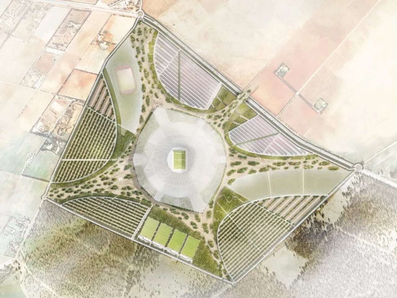
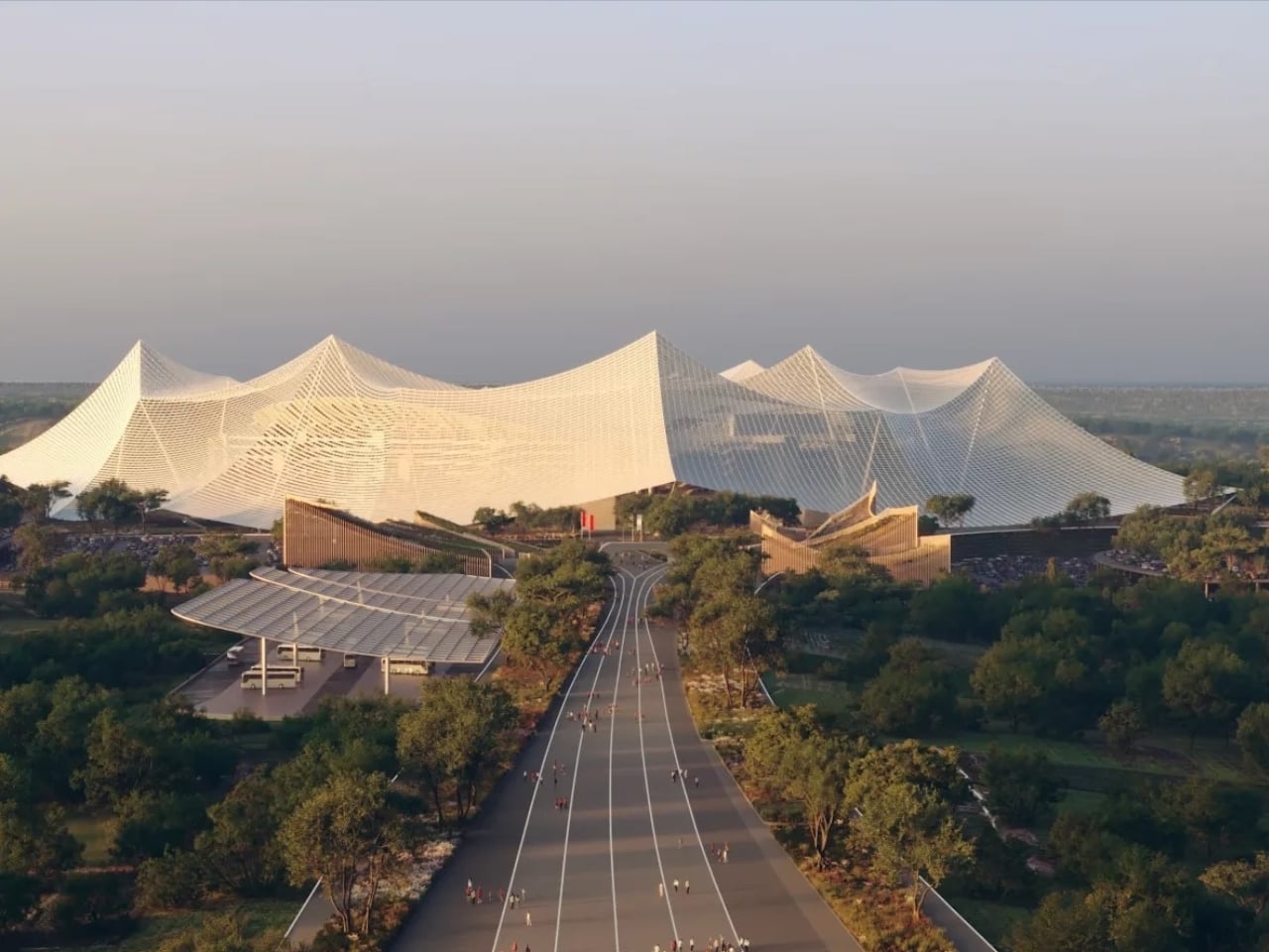
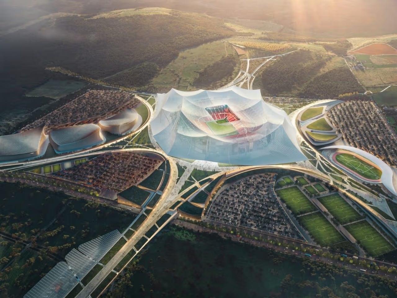
When Morocco and Spain co-hosted the 2030 World Cup bid announcement back in 2022, Grand Stade Hassan II was the kind of promise that sounded almost too big to keep. A 115,000-seat stadium shaped like a tent, rising from a forested site 38 kilometers north of Casablanca, designed to become the largest purpose-built football venue on the planet. You could have been forgiven for filing it under “ambitious concept” and moving on.

That filing cabinet is looking a little embarrassed right now. Nine months into active construction, Grand Stade Hassan II is approximately 30% complete, with around 40% of its tribunes already built. The team is operating across three continuous shifts a day, seven days a week, targeting full completion by the end of 2027. For a stadium of this scale, that is not a slow-burn project. That is a sprint, and by all accounts, it is on pace.

Designers: Oualalou + Choi and Populous

Morocco has committed roughly €1 billion in public funding to the project, with Phase 2 construction carrying a budget of $320 million alone. A $35.6 million earthworks package was awarded to local firm SGTM and is near completion. New highways and rail links are being built alongside the stadium to handle the infrastructure demands of 115,000 people arriving for a match. When you commit at that level, you are not hedging. You are building for a legacy.

The design itself was covered here when it was first announced, but seeing it move from render to reality changes what you’re looking at. Populous and Oualalou + Choi built the concept around the idea of arrival over access, where the experience begins well before anyone finds their seat. Gardens, shaded walkways, and vast public concourses sit beneath a continuous aluminium canopy, elevated platforms bring greenery 28 metres above ground, and the whole structure feels more like a destination than a stadium. Renders only go so far. Construction footage is different.

What’s changed since the announcement is the stakes. For a long time, the 2030 World Cup Final looked like a formality for Real Madrid’s Estadio Bernabeu. Spain co-hosting the tournament made that assumption feel almost automatic. But as Grand Stade Hassan II has moved from concept to construction with speed and seriousness, the conversation around the final has quietly shifted. Sources cited by The Athletic have noted that Casablanca is now a genuine challenger, with Morocco’s investment and its growing influence within global football making what once looked like a straightforward decision into something far more competitive.

I’ll be upfront: I want Morocco to host the final. Not because of any particular rivalry with Spain, but because the moment Grand Stade Hassan II opens, it will be unlike any stadium that has ever hosted a World Cup final. The Bernabeu is iconic. Camp Nou is historic. Grand Stade Hassan II would be something with no real comparison, a stadium built from cultural memory, designed as a gathering place rather than just an arena, and carrying with it the full weight of a country’s decades-long pursuit of this exact moment.

Morocco first proposed a major Casablanca stadium in its bid for the 2010 World Cup. Then again for 2026. Both times, the bid fell short and the stadium remained a drawing. This is the third attempt, and unlike the previous two, the cranes are actually there.

After the 2030 tournament, the stadium will become home to Raja Club Athletic, Wydad Athletic Club, and the Moroccan national team. The €1 billion investment doesn’t disappear after the closing ceremony. It stays, and it becomes the foundation for football in a country that has spent a generation proving it belongs at the top table. Whether FIFA ultimately awards Morocco the final or not, Grand Stade Hassan II is real, it is rising, and it is moving faster than almost anyone expected. Some big promises actually get kept.

The post Morocco’s 115,000-Seat Stadium Is 30% Built and Ahead of Schedule first appeared on Yanko Design.
When Paper Does the Heavy Lifting: Sunology’s Storey Packaging

Most of us don’t give packaging a second thought. It arrives, we tear it open, and it goes straight into the recycling bin or, less nobly, the bin under the sink we keep telling ourselves we’ll sort through on a weekend. But every once in a while, a piece of packaging stops you mid-unbox and makes you think: someone really cared about this.

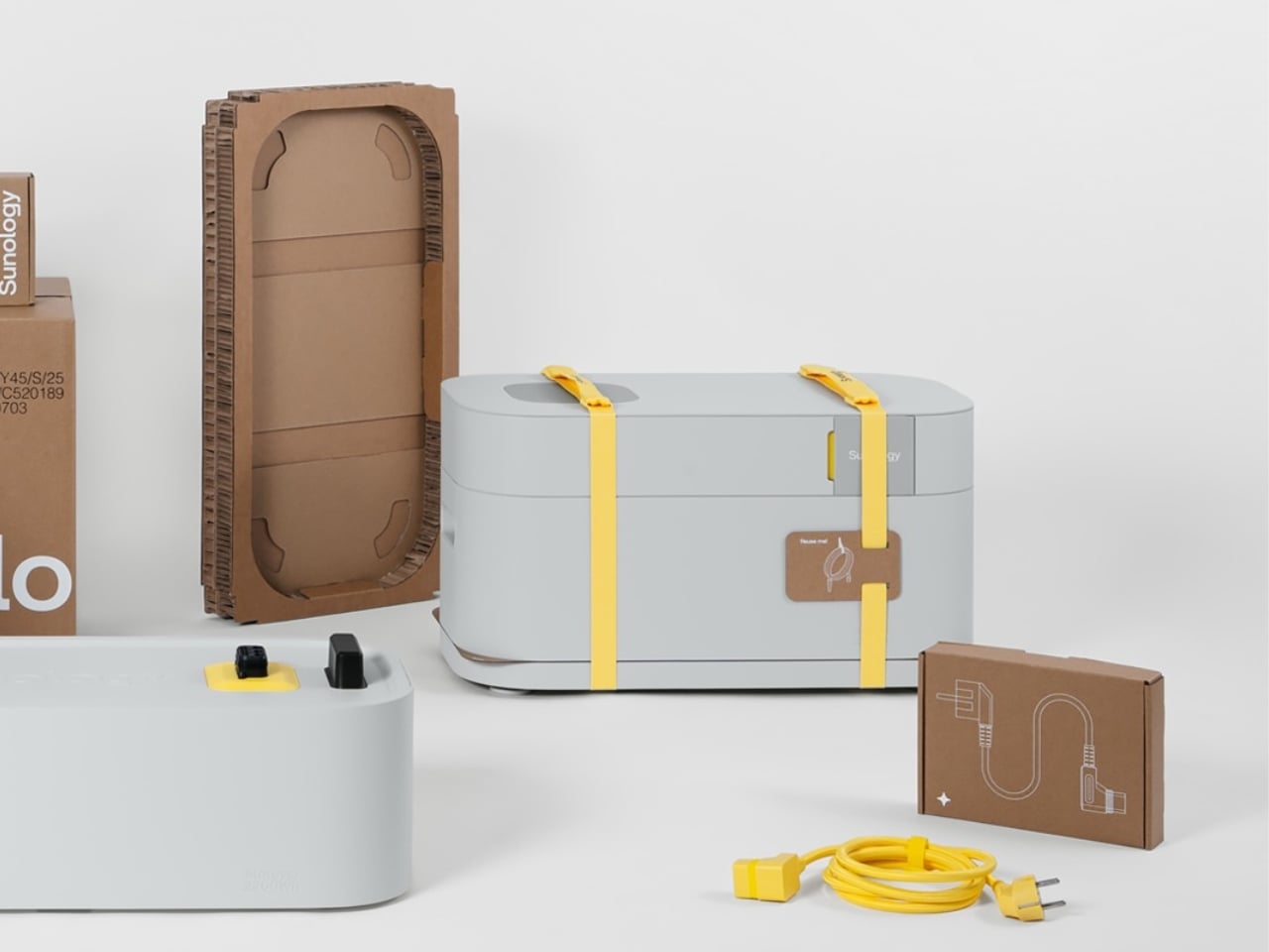
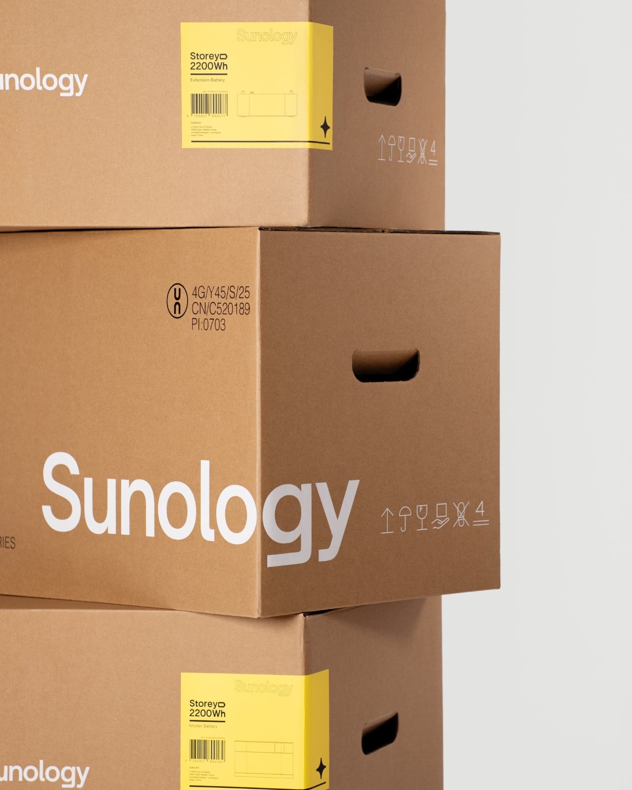
The Storey Battery by French solar tech company Sunology is a compact home energy storage unit, the kind that quietly stores power from your solar panels or the grid and releases it back when you need it most. It can run household appliances through an outage, reduce your electricity costs, and help you step a little further away from grid dependency. Plug-and-play clean energy, designed for the person who cares about both good design and their electricity bill. Swedish industrial design firm Propeller Design handled both the product and its packaging, and if you’ve seen the Storey itself, you already know this is a studio that doesn’t phone things in. The battery has soft, clean forms and an aluminum housing that belongs in a living room, not buried in a utility closet. It also won the BIG SEE Grand Prix 2026 Design Award, which feels entirely deserved.

Designer: Propeller Design

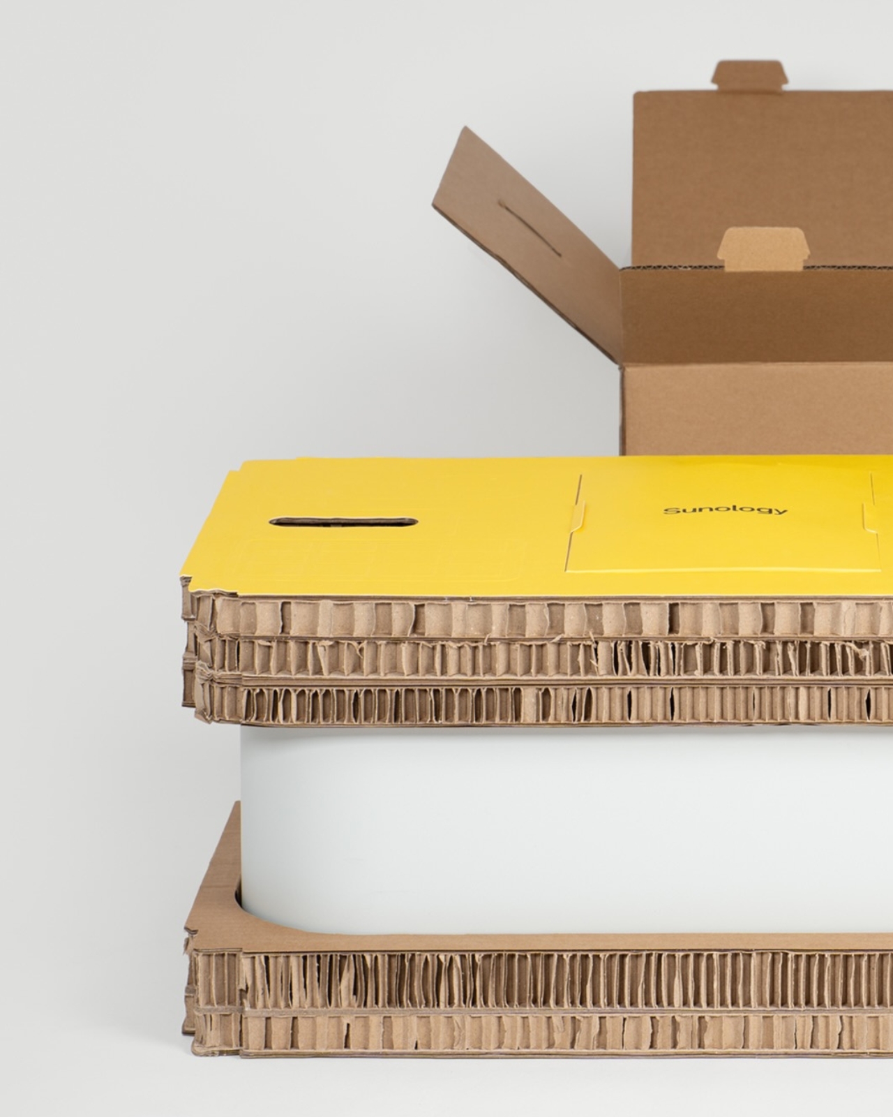
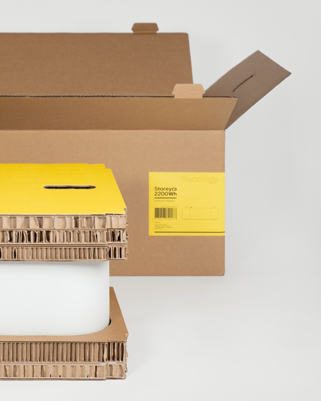
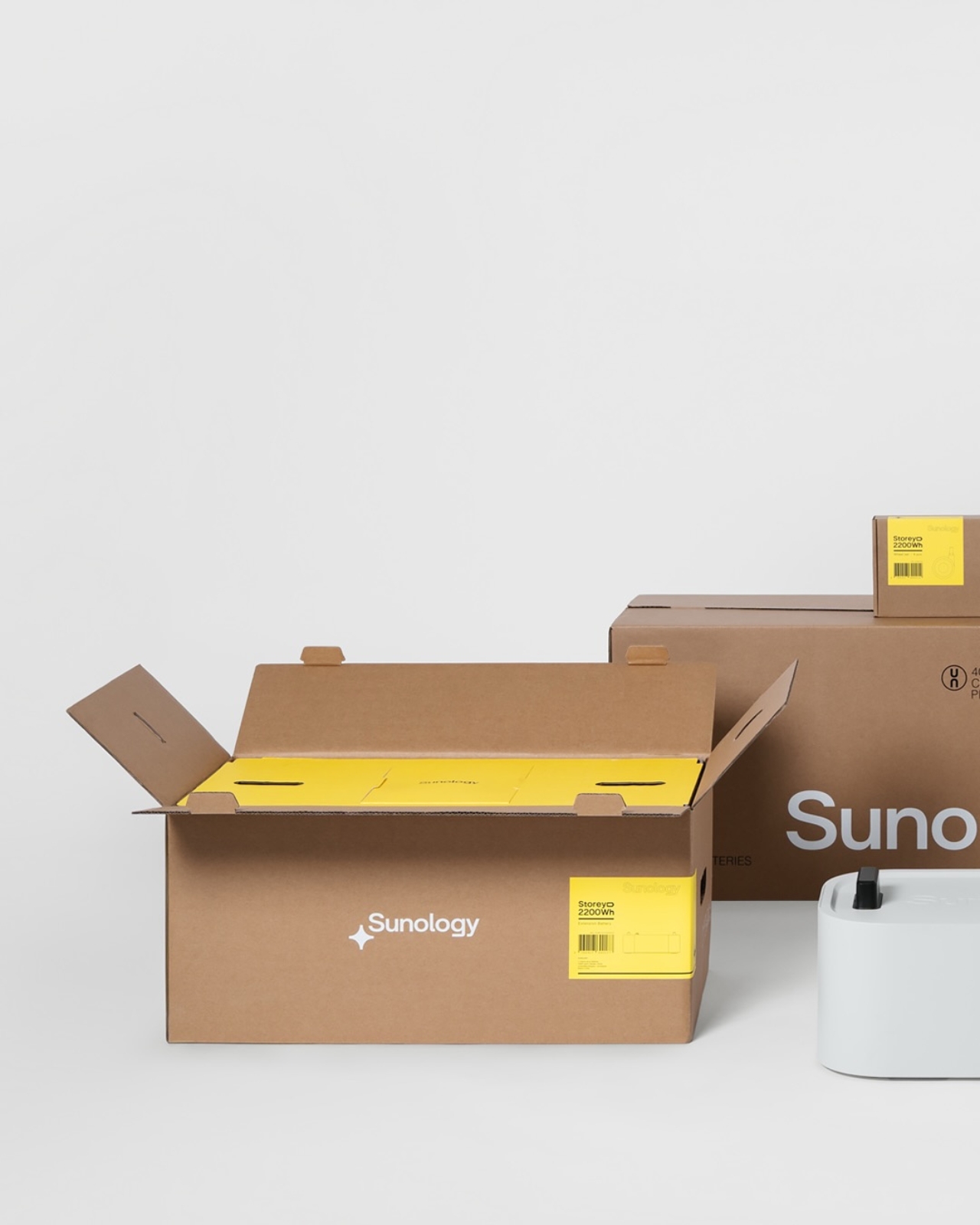
But the packaging is what I want to talk about, because the packaging is quietly extraordinary. The Storey weighs 30.5 kilograms. That’s serious weight for anything to withstand during shipping and freight, and for decades the default answer to that kind of engineering challenge has been foam, plastic, more foam, and maybe some more plastic just to be safe. Propeller went a completely different direction. The entire solution is fiber-based. No plastic. Not even a little bit.

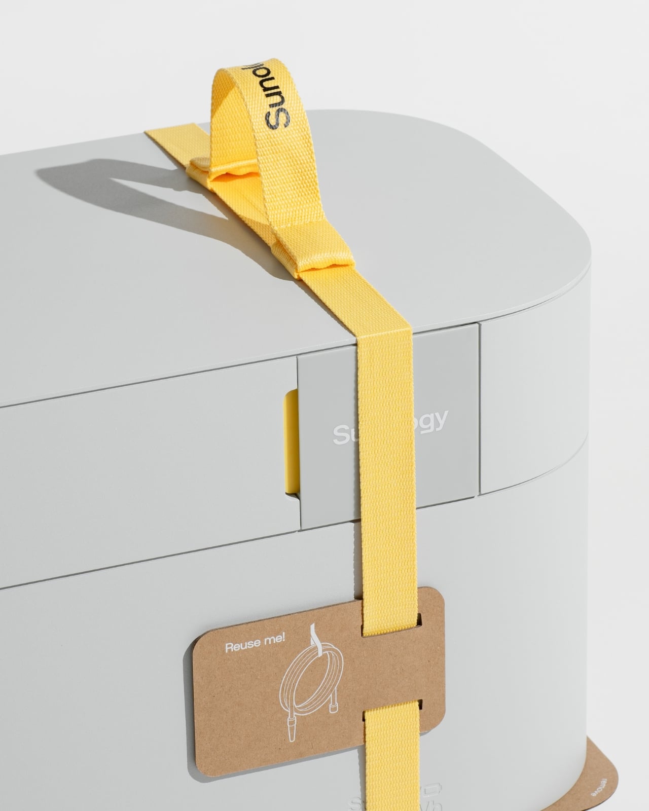
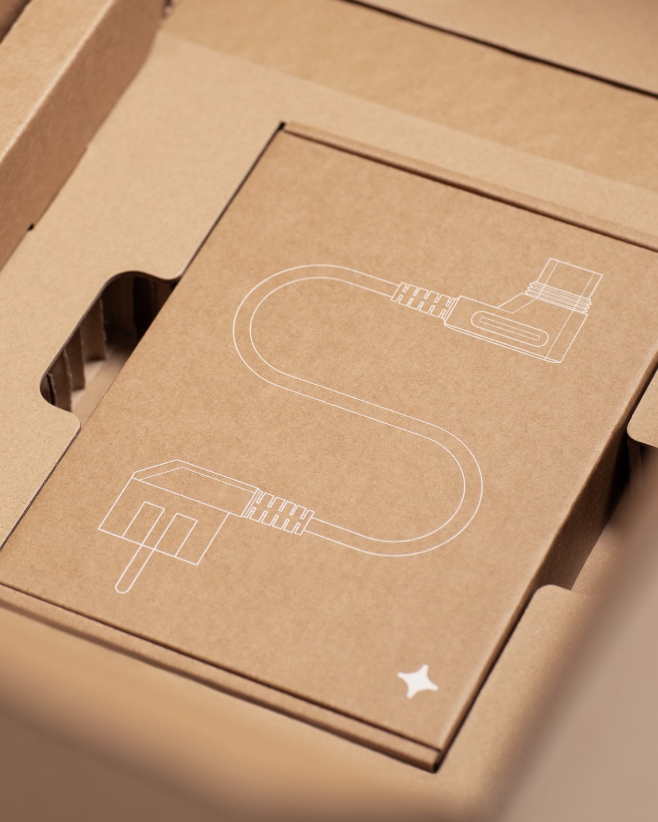
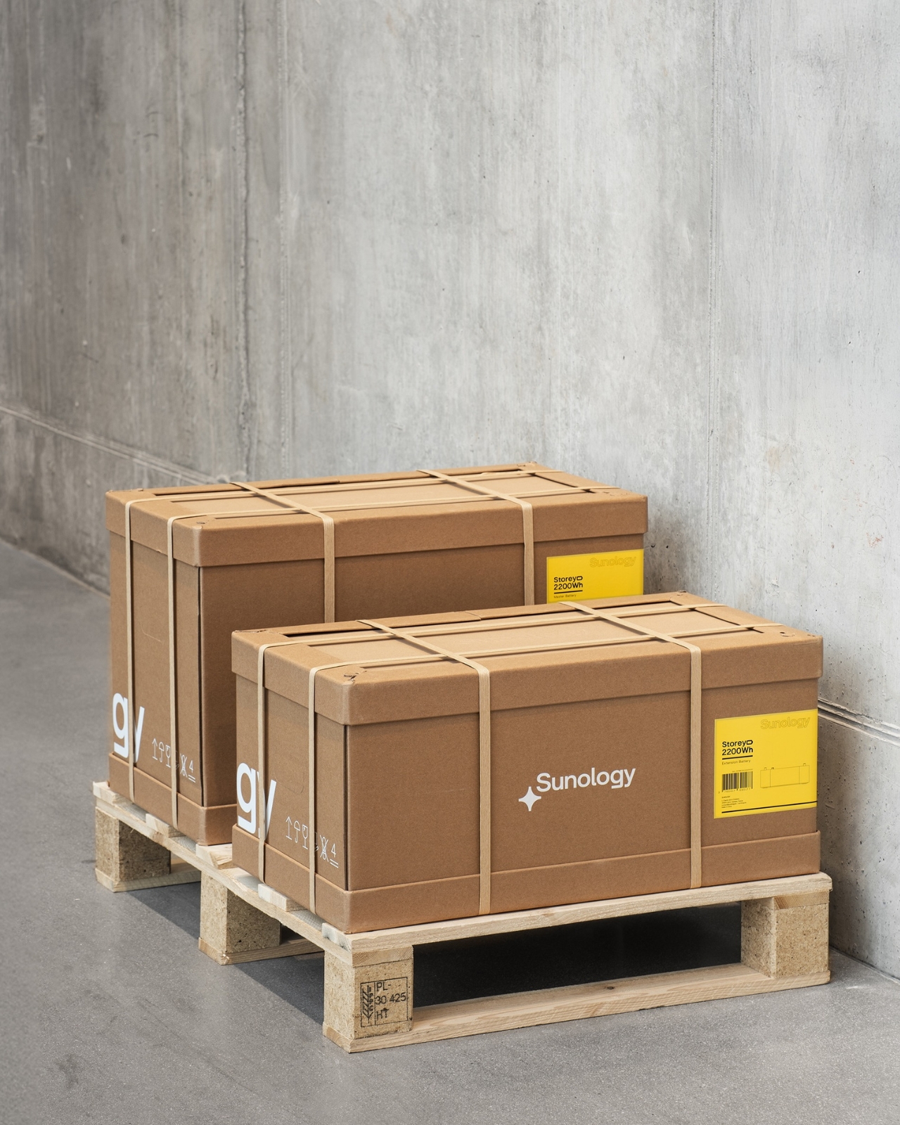
They built the structure around strong honeycomb board, paperboard corner reinforcements, and paper straps. If you’ve ever seen honeycomb board in cross-section, you’ll know it’s deceptively capable. The cellular geometry distributes weight in a way that makes it genuinely strong, the kind of structural work that plastic foam has been quietly getting credit for all this time. The paper straps wrap around the battery unit like a considered branding detail rather than an afterthought, and one of them comes tagged with a small kraft card that reads “Reuse me!” alongside a clean line illustration of a cable. It’s a small gesture, but it signals the right values without making a speech about it.

I think what Propeller understood here, and what a lot of packaging designers still miss, is that sustainable materials don’t have to mean a downgraded experience. There’s a quiet assumption embedded in a lot of eco-friendly packaging that you’re trading aesthetics for ethics, that paper means compromise. This design challenges that directly. The unboxing feels deliberate and considered. The honeycomb cradles the Storey like it was made for it, because it was. The yellow straps against the pale, soft form of the battery are almost gift-like in appearance. It’s the kind of opening experience that justifies being filmed, which, in 2026, is not a small thing to say about any piece of industrial packaging.

The industry conversation around plastic-free packaging has been going strong for years, but execution still tends to lag behind intention. Companies announce pledges and deliver on them for products where plastic-free engineering is relatively manageable. Designing out plastic on a 30.5-kilogram product that needs to survive freight conditions across a global supply chain is an entirely different engineering problem, and Propeller actually solved it rather than simply worked around it.

The Storey battery is built for a future where home energy storage becomes a normal part of domestic life. It follows that its packaging should feel like it belongs in that same forward-thinking vision. Paper strong enough to carry 30 kilograms of clean energy technology is not a small design win. It’s a proof of concept, and one that the rest of the industry probably needs to study closely.

The post When Paper Does the Heavy Lifting: Sunology’s Storey Packaging first appeared on Yanko Design.
The Plywood Chair That Becomes a Castle in 2 Moves

Plywood chairs are everywhere. You’ve seen them stacked in cafes, pulled up to dining tables, photographed on every other design account you follow. They’re functional, they’re affordable, and they’re largely forgettable. So when Irish furniture designer James Murphy sat down to create one for his university final project, the logical thing would have been to make something clean and well-proportioned and move on. Instead, he made a chair that unfolds into a castle, and now I can’t stop thinking about it.

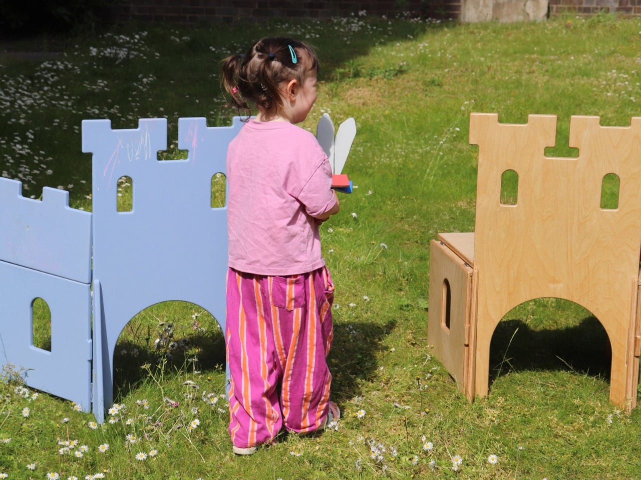
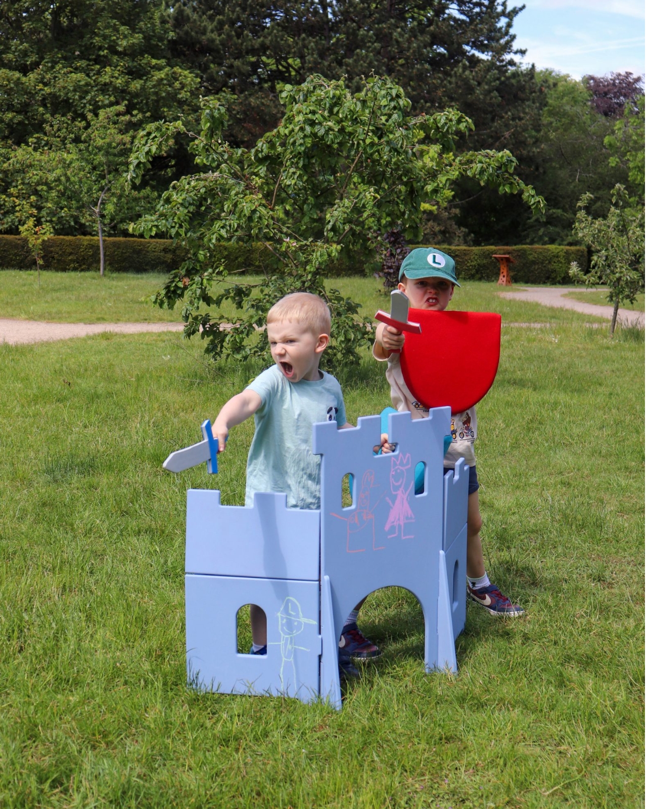
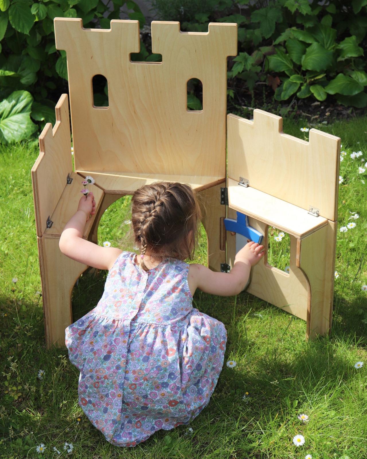
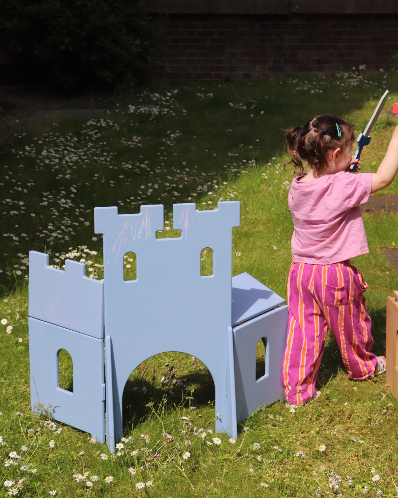
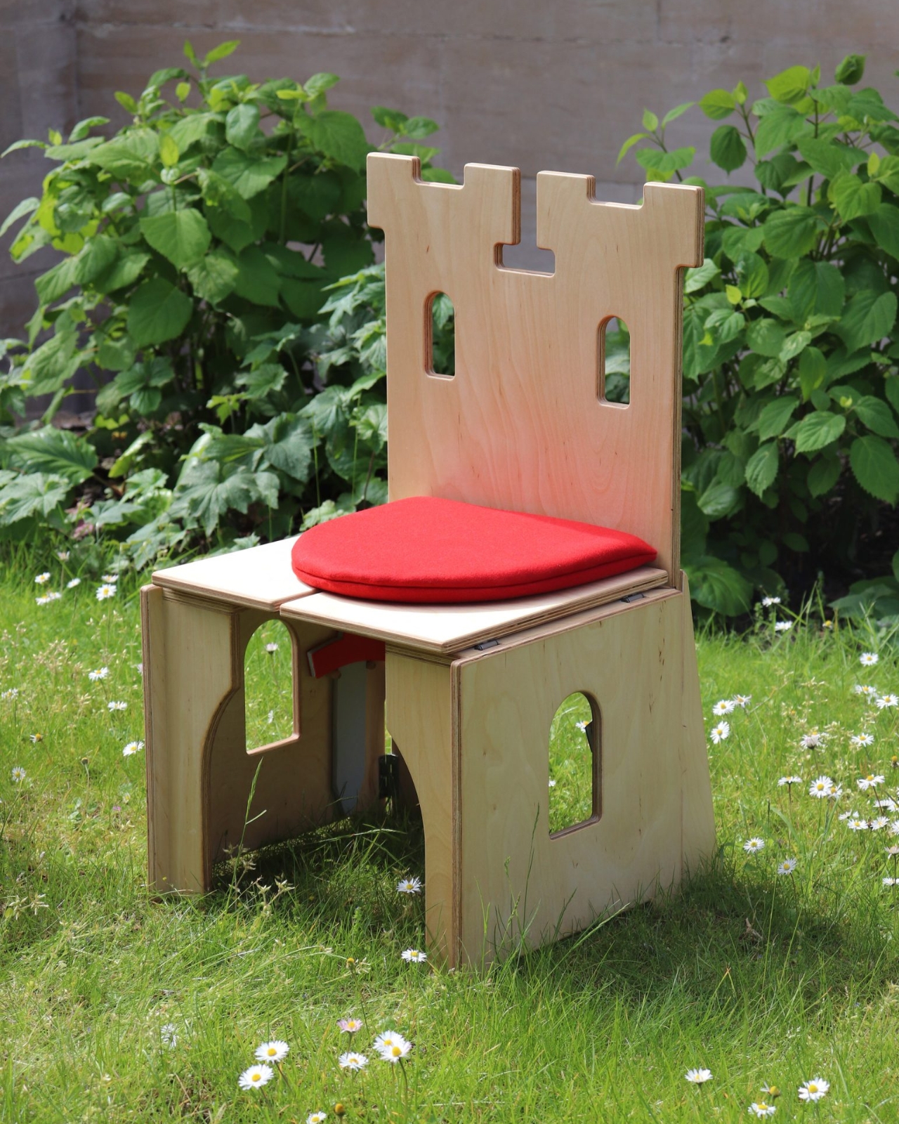
The Casul chair is a children’s seat that, in just two moves, transforms into an abstract plywood castle with battlements, shelves, and enough narrative potential to fuel an entire afternoon. In its closed form, it has the neat, compact profile of a small throne. Flip the seat panels open, fold the legs out to the sides, and suddenly you have something that looks like a doll’s house crossed with a medieval fort. The panels that held the seat become shelves. The window cutouts in the backrest align with the fortifications. The whole thing opens up the way good architecture does: logically, inevitably, like it couldn’t have been designed any other way.

Designer: James Murphy

Murphy’s path to this project is worth noting. He began as a furniture designer, then did a work placement at Lego during university and came back with a new obsession. “Designing products for children is just really fun and rewarding,” he said. His final-year brief became a mission to marry both interests, and also to address something a lot of parents quietly worry about: how to pull kids away from screens without making it feel like a punishment.

The design references he leaned on are genuinely interesting. He looked back at post-war transformable children’s furniture, particularly Hans Brockhage’s Schaukelwagen from the 1950s, a rocking chair that flips into a toy car. That piece had a real ingenuity to it, born from an era when materials were scarce and cleverness was a necessity. Murphy borrowed the spirit of it but updated the logic entirely. The castle setting was a deliberate choice: gender-neutral enough for any child, open-ended enough for any game.

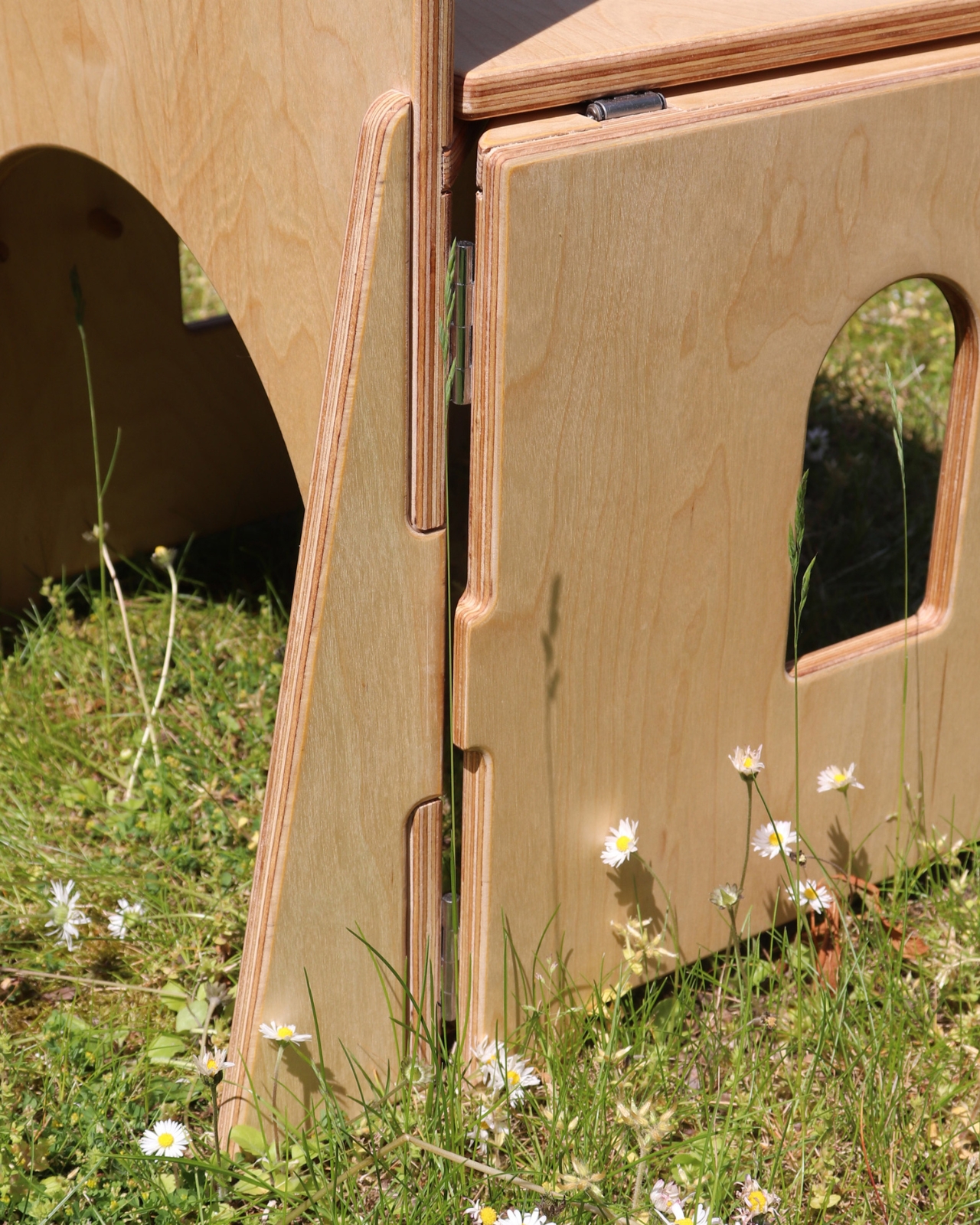
The engineering behind it is more nuanced than it looks. The jigsaw joints cut into the wooden seat panel interlock to keep the chair stable during use, but release easily to form the castle’s outer walls. Specialized friction hinges hold the opened panels at whatever angle the child wants, while also preventing fingers from getting caught. Triangular buttresses at the back keep the whole structure from tipping, and the combined weight of the piece means younger kids can’t accidentally knock it over. Murphy tested a remarkable number of hinge types to get the movement right. “I didn’t even know there were that many types of hinges,” he admitted, which tells you more about the obsessive detail of the process than any portfolio description could.

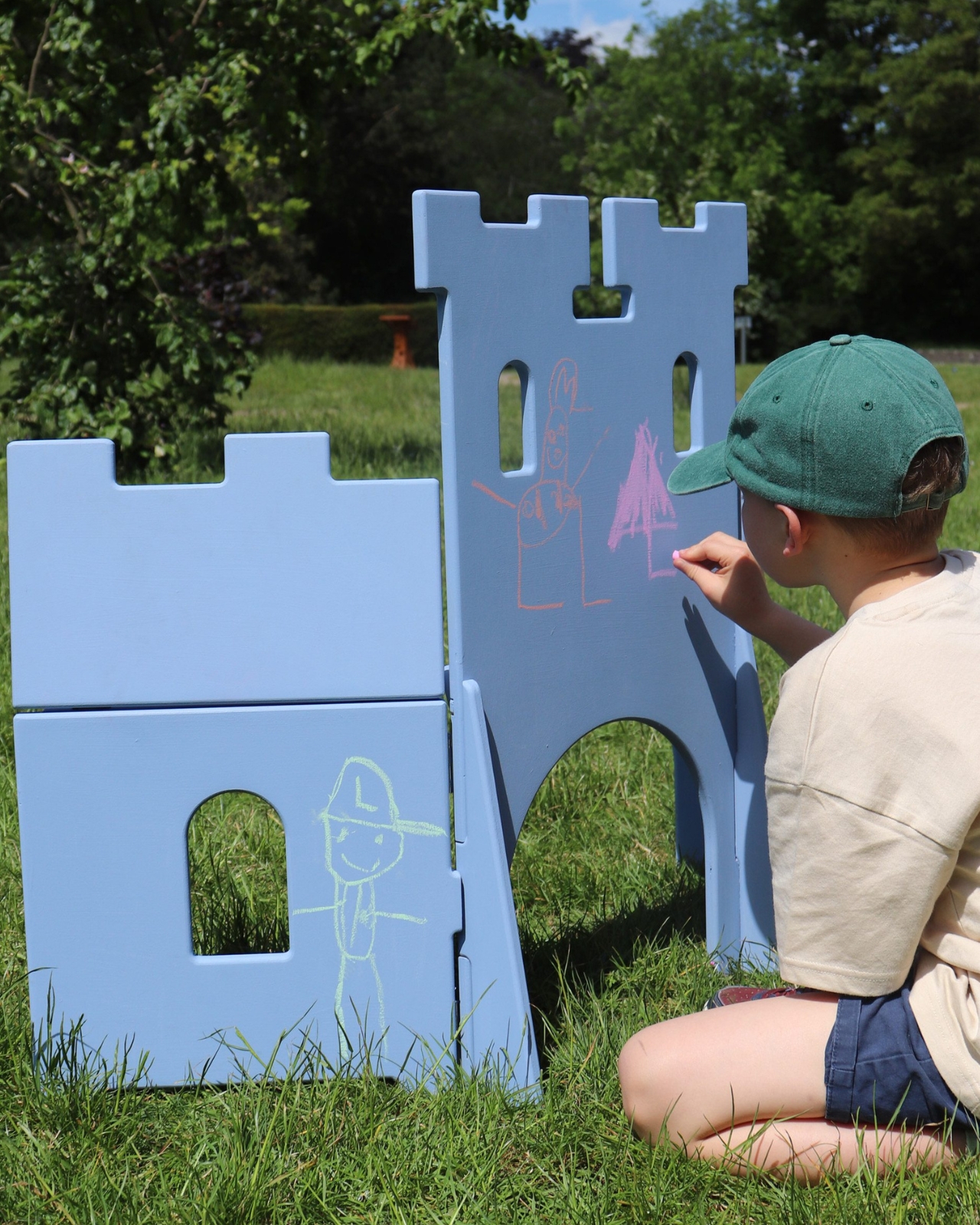
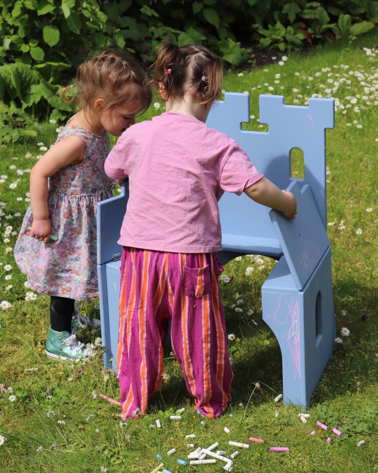
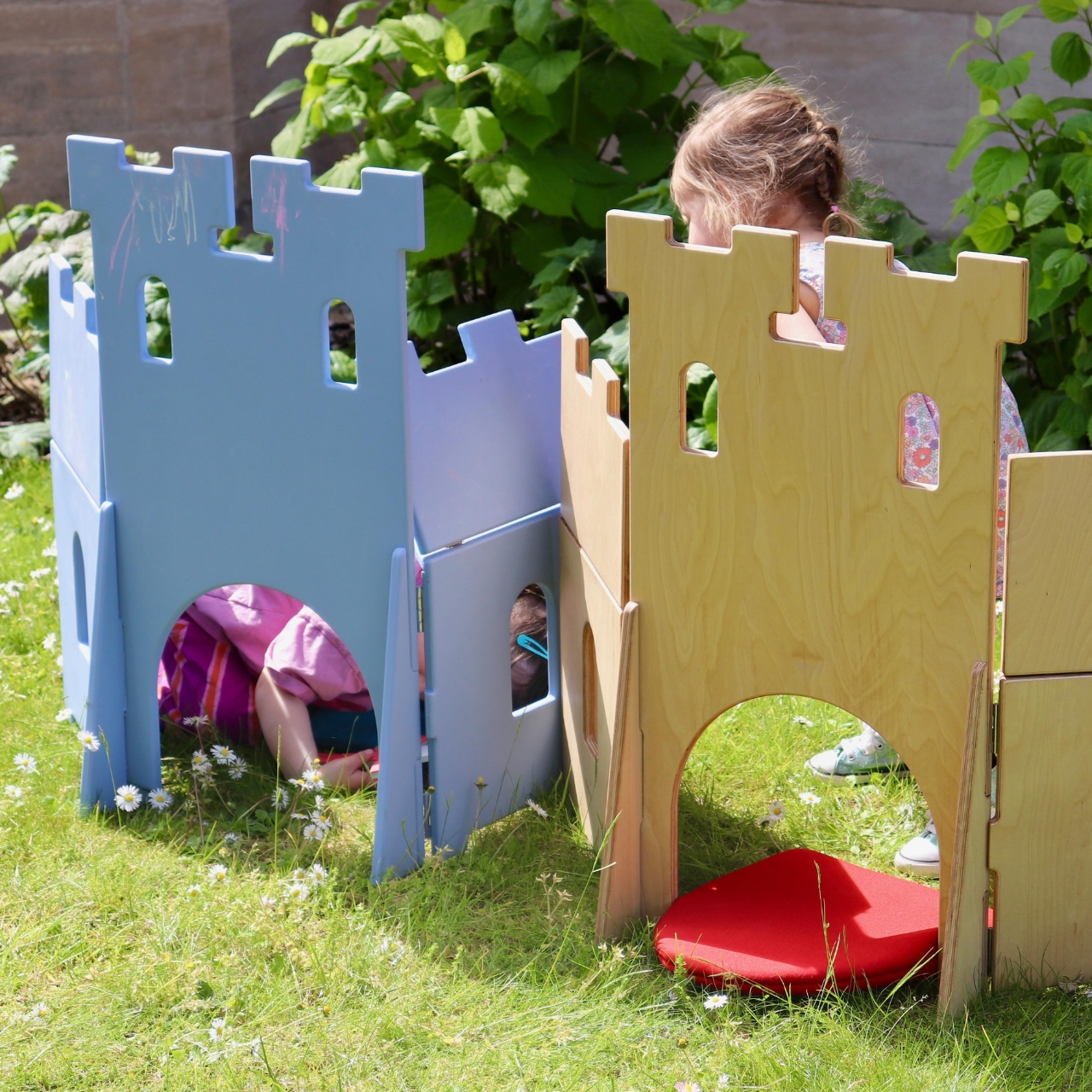
Two versions exist. One is finished in chalkboard paint, so children can redecorate the castle walls as often as they like. The other hides foam swords under the seat and cushions that convert into shields, the kind of detail that makes you realize this was genuinely designed with play behavior in mind, not just aesthetics. Both discoveries came partly from play-testing with real children. A girl who kept wanting to draw all over the clean plywood prototype was the reason the chalkboard version exists. The same test sessions turned the castle into a unicorn cafe, a besieged fort, and Bowser’s Castle from Super Mario, which is probably the most useful design feedback any furniture designer has ever received.

The Casul chair has since won one of the top prizes at London’s New Designers showcase, and it deserves the recognition. Good children’s design is harder than it looks, because the standards are unforgiving. Kids don’t pretend to like things. If a toy doesn’t hold their attention, it’s on the floor in ten minutes. The fact that Murphy’s chair passed that test, across multiple children and multiple imaginary worlds, tells you everything about how well he understood the brief.

The post The Plywood Chair That Becomes a Castle in 2 Moves first appeared on Yanko Design.
adidas Hyperboost Euphoria: The Foam That Outgrew the Track

Performance sneakers have a habit of making promises they can’t quite keep outside of the gym. They arrive looking like they were engineered on a space station, and the moment you wear them to brunch, you realize the rocker sole is pushing you forward like you’re perpetually late for a sprint. adidas knows this tension well, which is probably why the Hyperboost Euphoria exists.

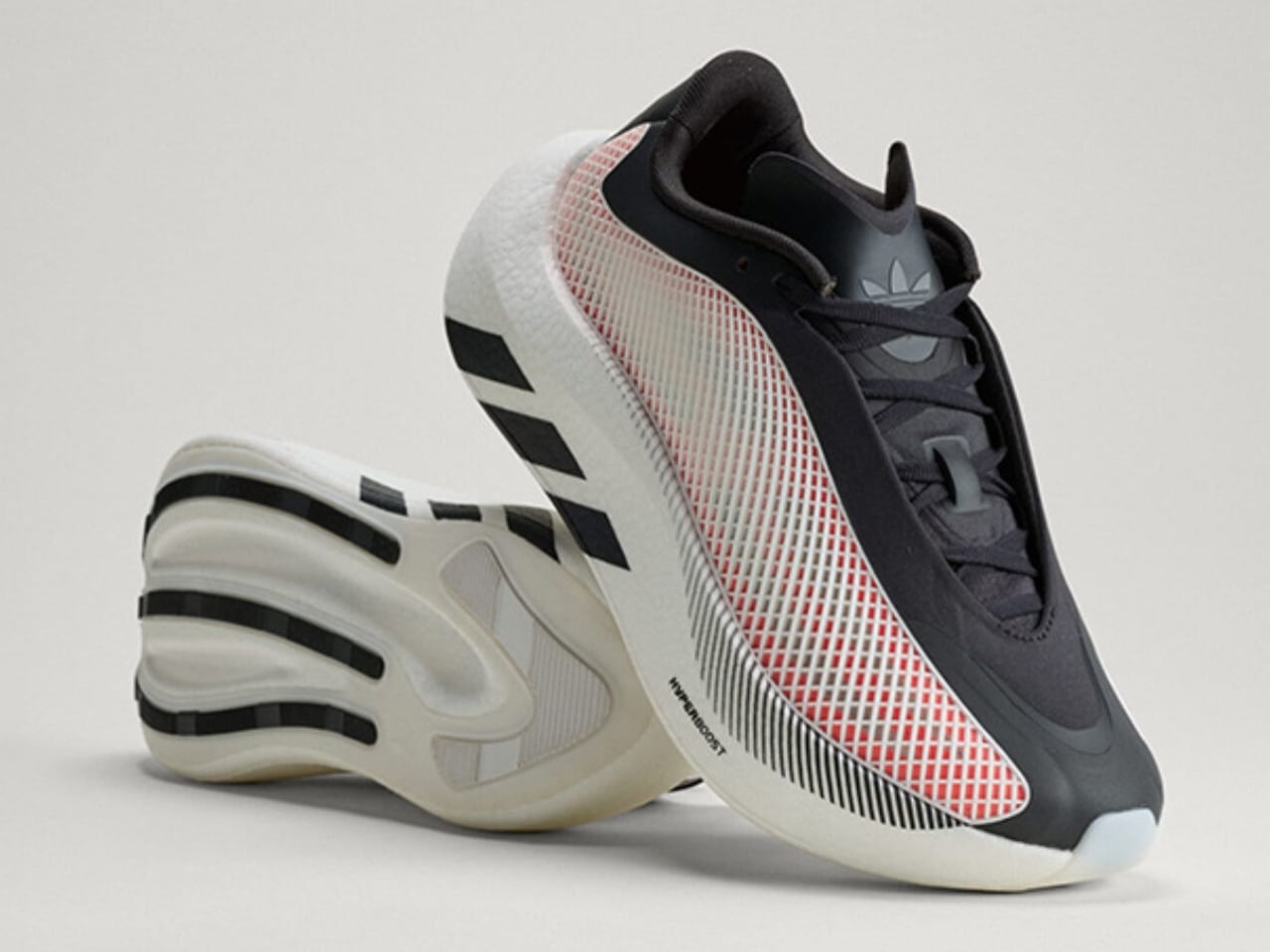
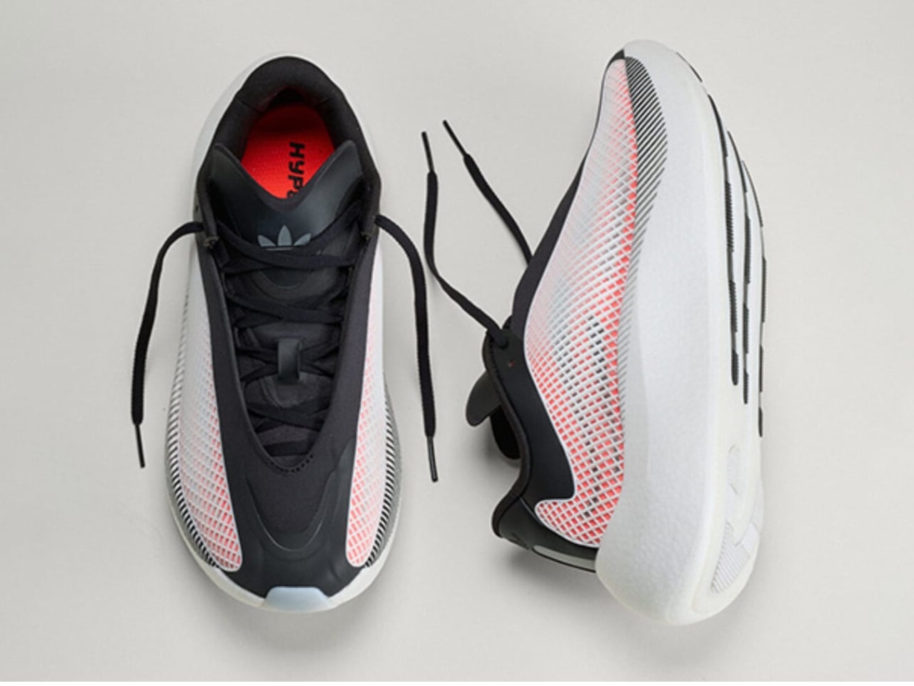
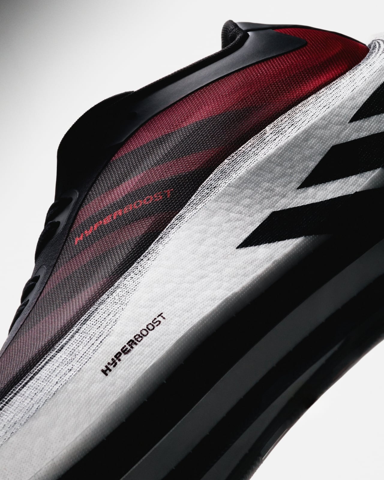
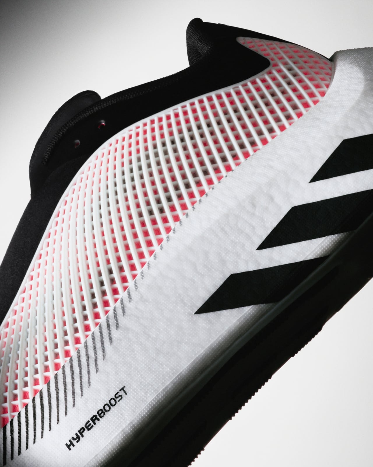
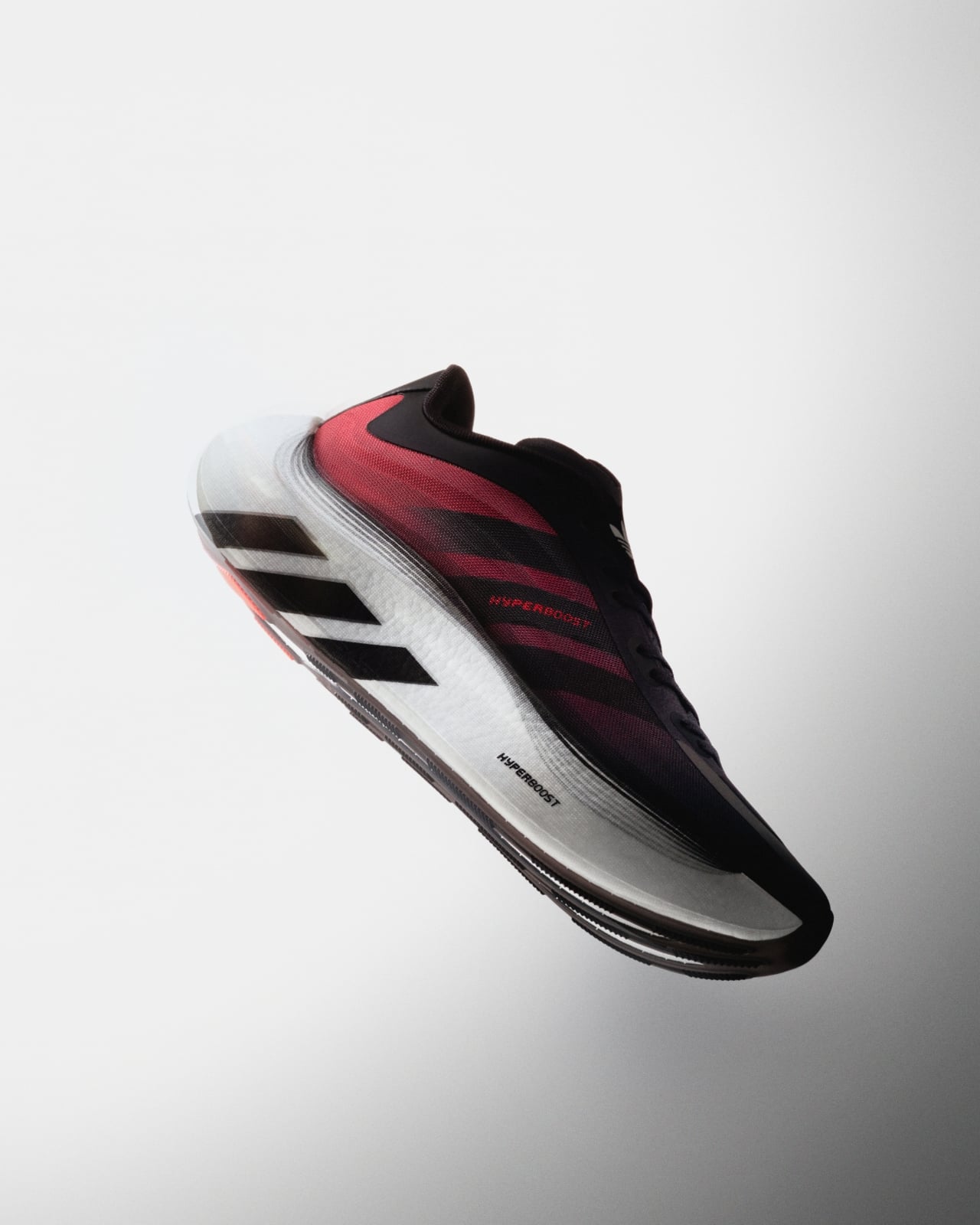
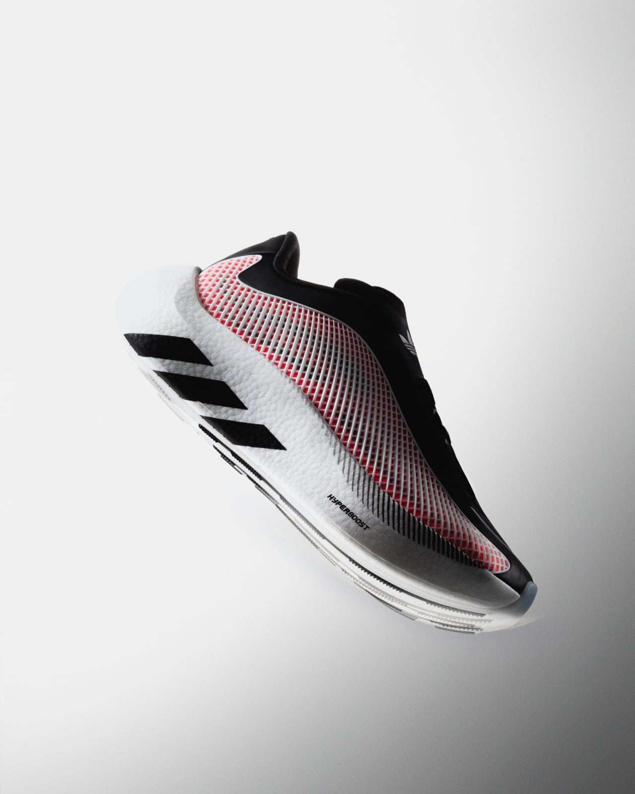
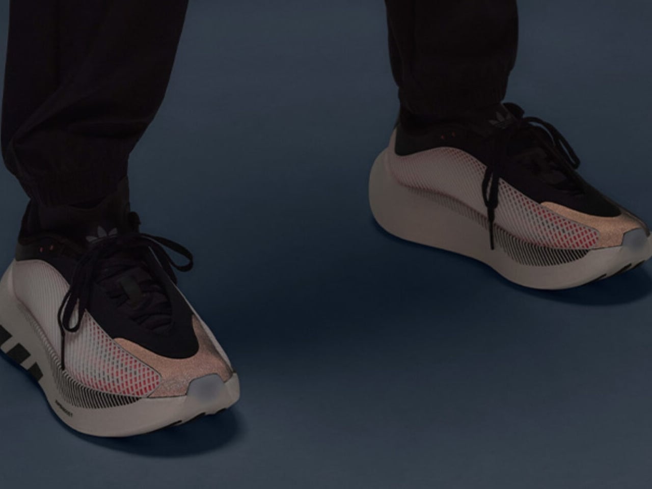
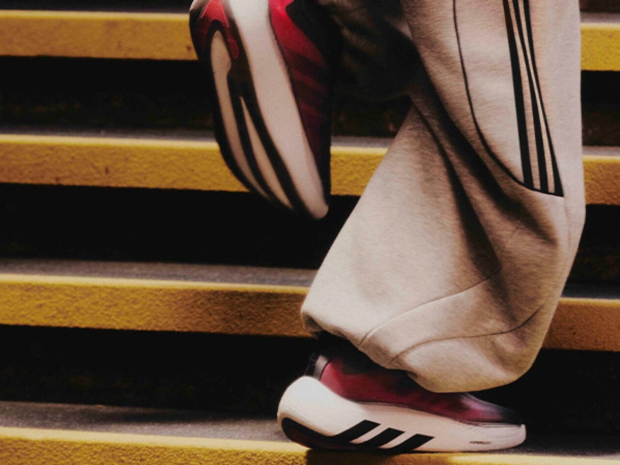
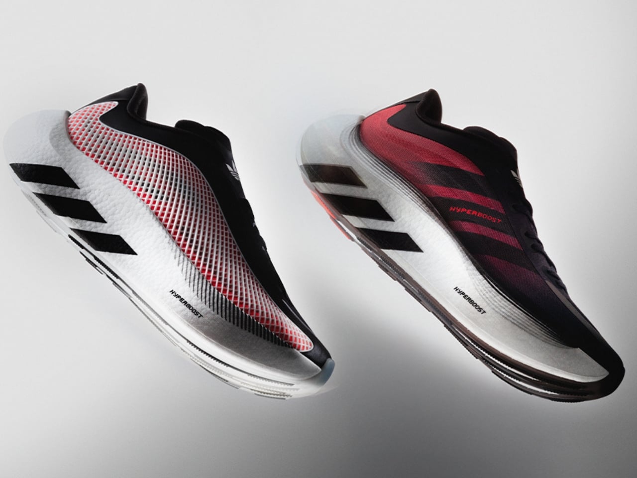
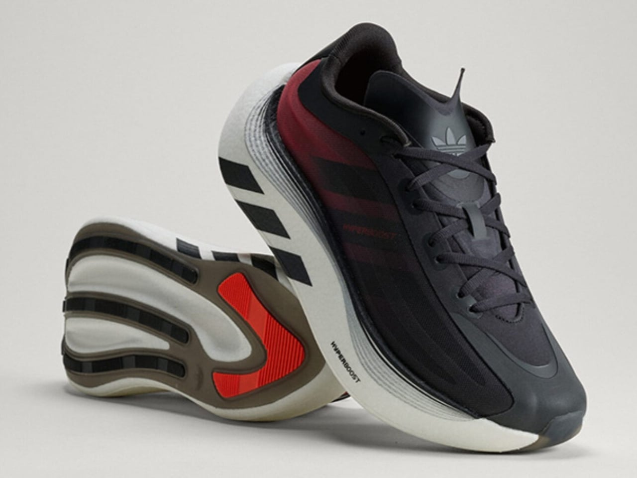
The Euphoria is the lifestyle sibling of the Hyperboost Edge, the performance running shoe adidas dropped in March. Where the Edge was built for the track, the Euphoria is built for the life you actually live, the one that involves a lot of walking, standing, sitting in cafés, and occasionally jogging for a bus. adidas pulled the same Hyperboost cushioning technology, the pebbled supercritical foam that made the Edge genuinely exciting, and reworked everything else around it. The midsole is carved out to save weight. The stance is wider. The heel extends out. The rocker is intentionally dialed back so the shoe doesn’t feel like it’s trying to propel you somewhere you didn’t ask to go. The result is a platform that is stable and grounded in a way that actually makes sense for daily wear.

Designer: adidas

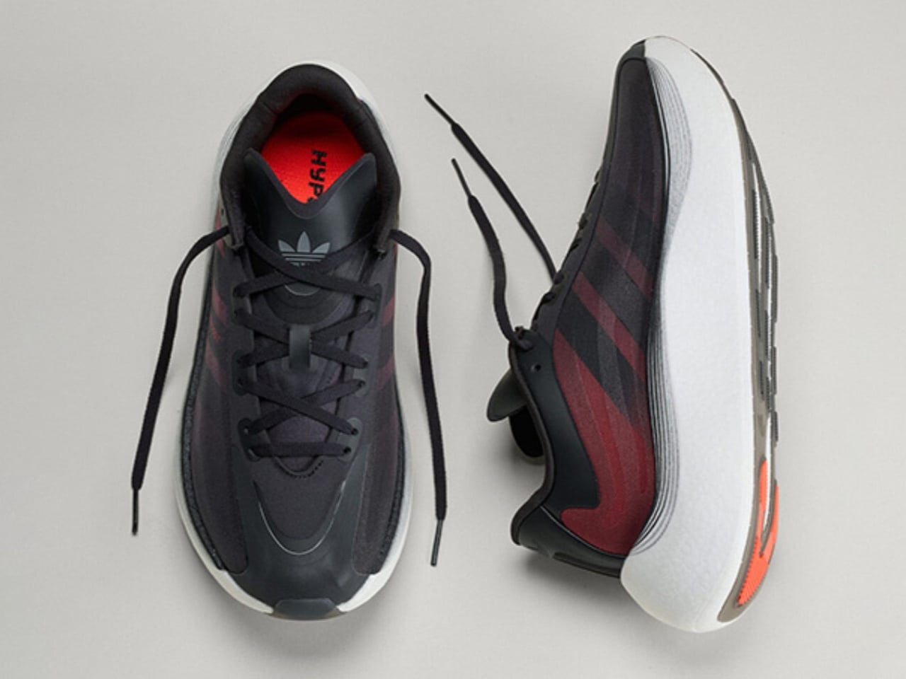
The upper is where things get interesting from a pure design standpoint. A large TPU net structure wraps the sidewalls, giving the silhouette a kind of exoskeleton quality that reads as technical without being loud about it. The semi-transparent nylon material plays against the structured cage nicely, hinting at the construction underneath. adidas also swapped out the mountain logo on the tongue for the Trefoil, a small but deliberate move that signals exactly what this shoe is: an Originals product, not a performance one. It is the kind of detail that only obsessives notice, and yet it matters.

There is an argument to be made that adidas is exceptionally good at this particular move, taking foam technology born in performance and migrating it into lifestyle. The Boost lineage did it. The 4D midsole has done it. The Hyperboost is following that same arc, and it makes sense commercially and creatively. If you develop something genuinely good, you eventually want it to live in more places.

The Euphoria has also already been spotted off the pitch on Jude Bellingham, Lionel Messi, and Pedri during the FIFA World Cup. That kind of high-profile visibility is not accidental, and it reinforces the positioning. adidas is clearly not treating this as a minor side release.

Colorway-wise, the launch lineup covers blue, black, and white, an all-black option, white and black, and a red that carries the same energy as the more expressive iterations. Bold but not chaotic, which tracks with the overall aesthetic of the shoe.

What I keep thinking about is how the sneaker market has recalibrated around comfort in a way that would have seemed overcorrected a decade ago. The chunky foam wave came, peaked, and landed somewhere permanent. Consumers who once wanted flat, minimal silhouettes are now completely comfortable in a stacked platform, and brands like adidas have gotten very good at making that stack feel intentional rather than excessive. The Hyperboost Euphoria does not feel like a compromise between performance and lifestyle. It feels like a shoe that was designed for exactly where it ended up.

Ilka Liebmann, VP of Design Footwear at adidas Originals, described it best: the shoe was created for those who embrace a sport-inspired lifestyle, people who prioritize spontaneity, comfort, and energy, and let movement lead them. That framing is a little aspirational by nature, but it is also accurate to the product. The Euphoria wears confidently. It does not demand context. You could pair it with technical trousers or track pants or denim and the shoe holds its own across all three.

adidas has made a genuinely considered thing here, and it lands at a moment when the performance-to-lifestyle pipeline feels more refined than ever.

The post adidas Hyperboost Euphoria: The Foam That Outgrew the Track first appeared on Yanko Design.
LEGO Just Built the X-Files Set Every ’90s Fan Always Wanted

During the mid-’90s to the early 2000s, all my friends knew that you couldn’t disturb me on Thursday nights because I was glued to my television set, watching The X-Files. I was so absorbed in the series’ mythology, the strange cases of the week, and all things alien during those years, even though I lived in a country where those monsters didn’t really exist (we had our own monsters, of course). Thinking about that era brings a certain sense of nostalgia and a longing for those kinds of TV series in this age of streaming.

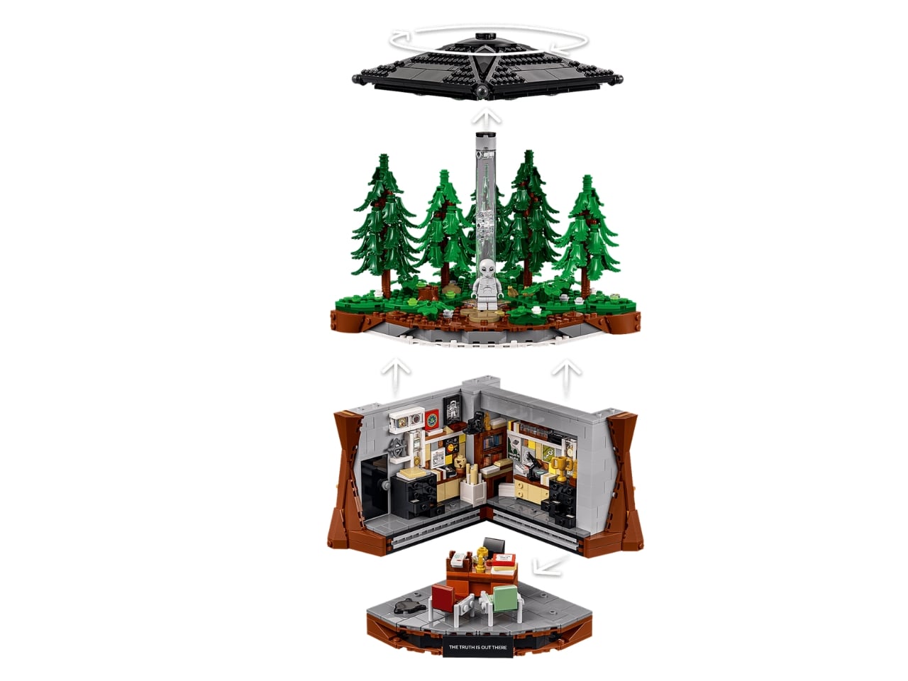
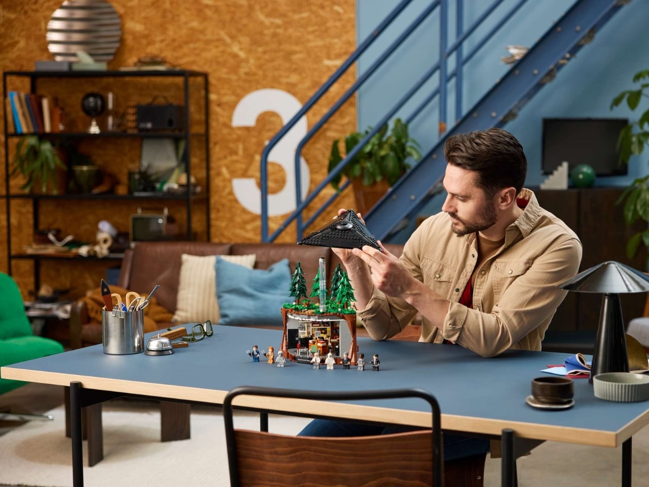
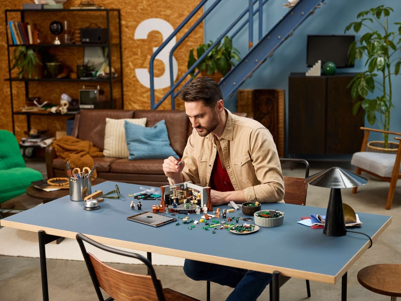
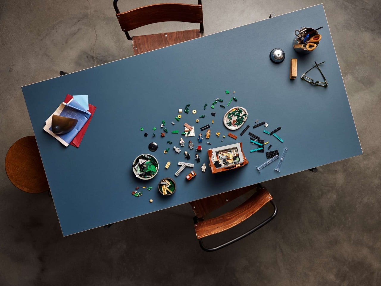
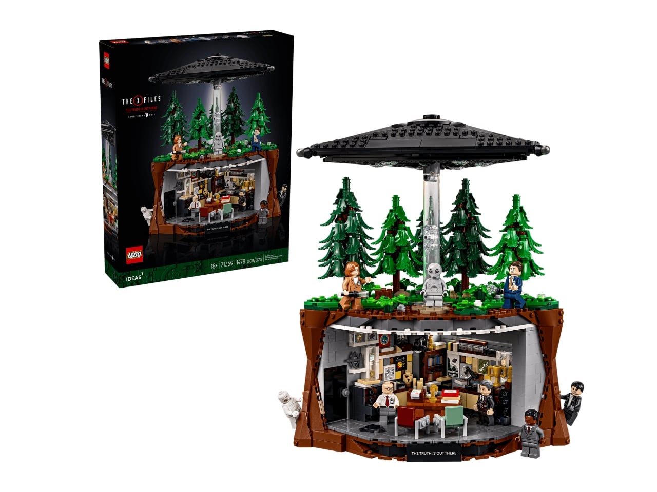
If you’re of that certain generation, then this newest LEGO build birthed from the Ideas factory would make you absolutely delirious. For those unfamiliar, LEGO Ideas is a fan-first initiative where enthusiasts submit concepts that, once they gain enough votes and approval, become officially produced sets, and The X-Files Set #21369 is one that clearly earned its place. This almost 1,500-piece set lets you relive those days when we went on vicarious adventures with the unconventional FBI Agent Fox Mulder and the smart but skeptical Dr. Dana Scully, and all the aliens and monsters they encountered along the way.

Designer: LEGO

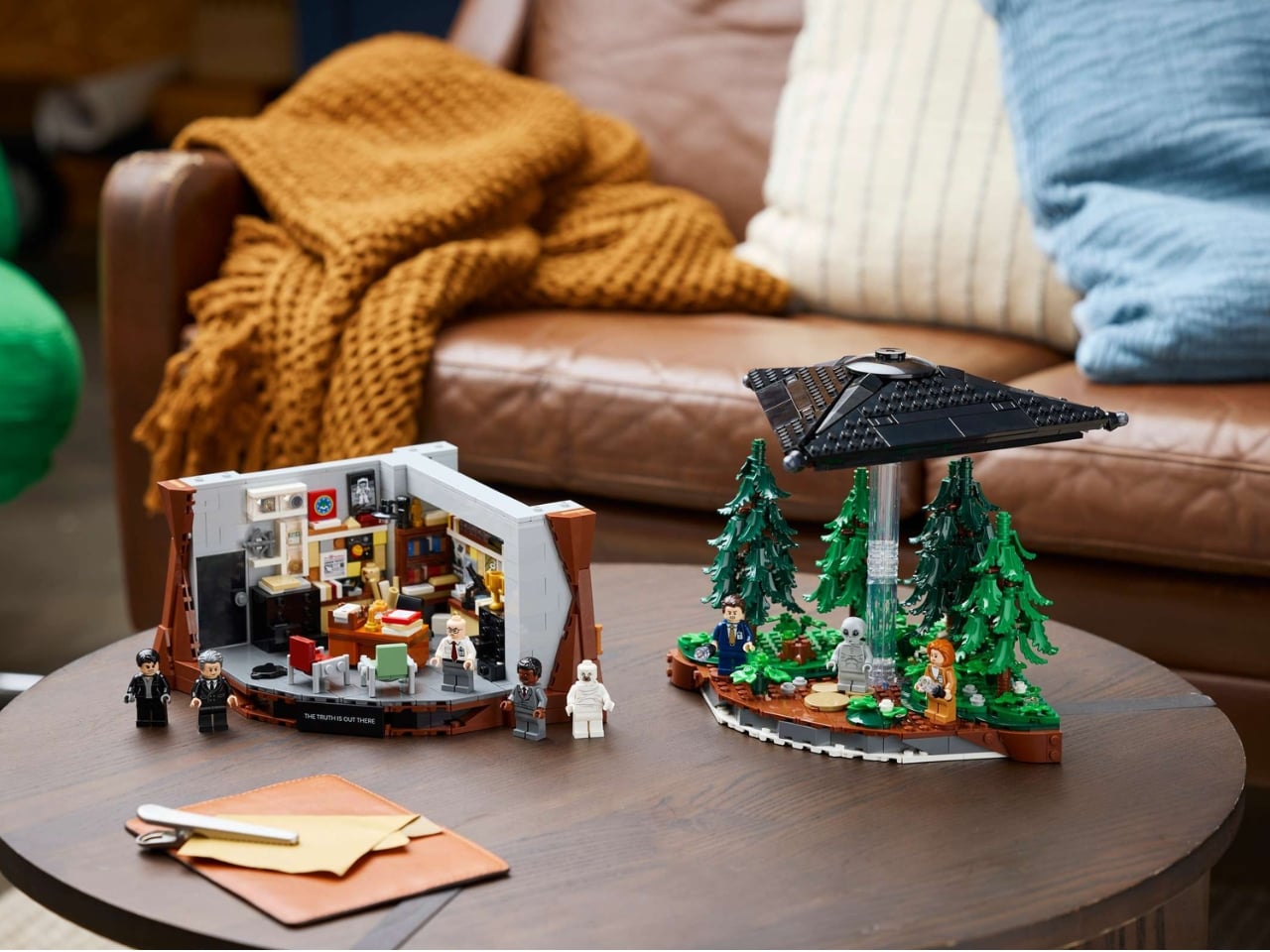
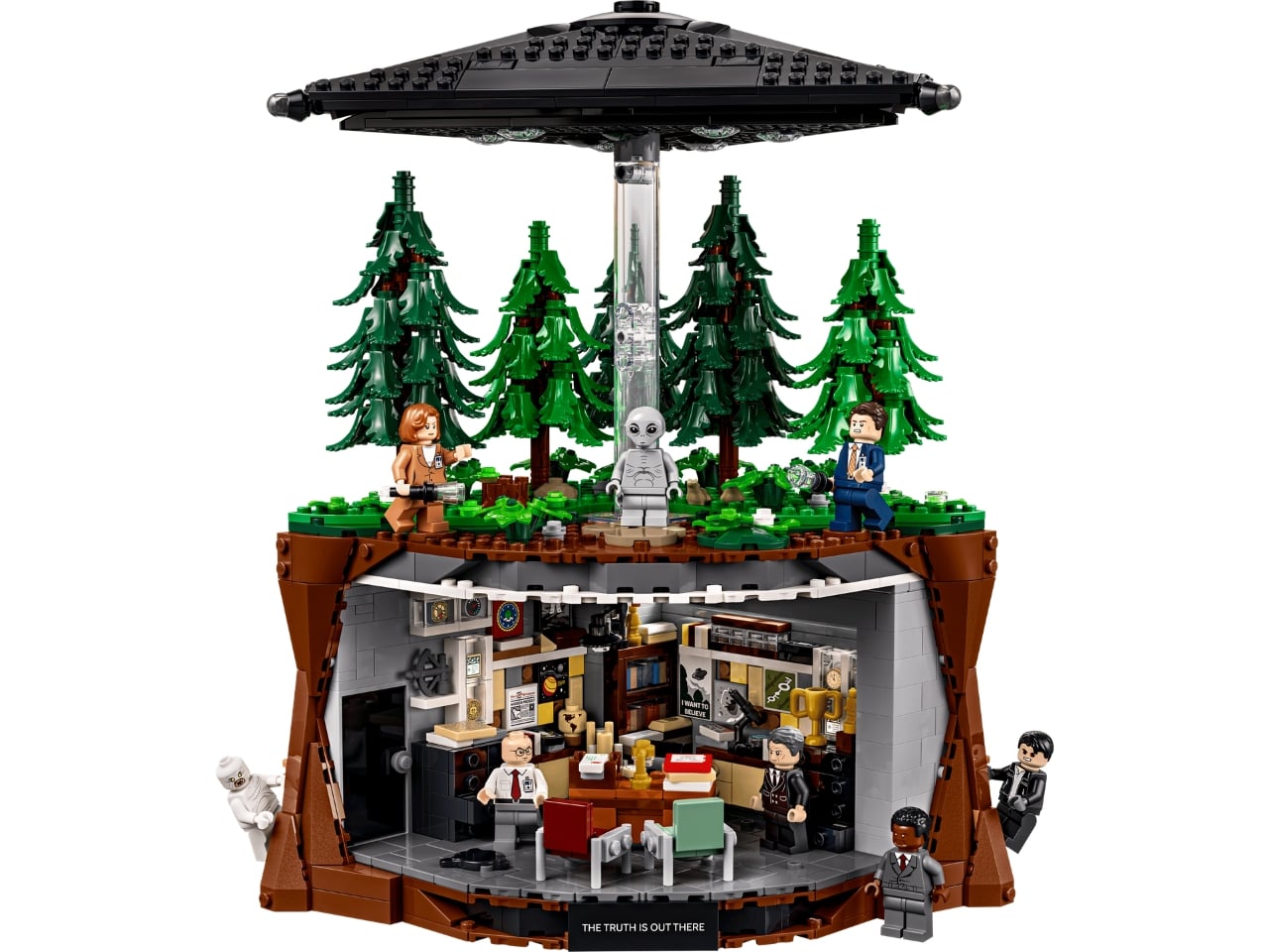
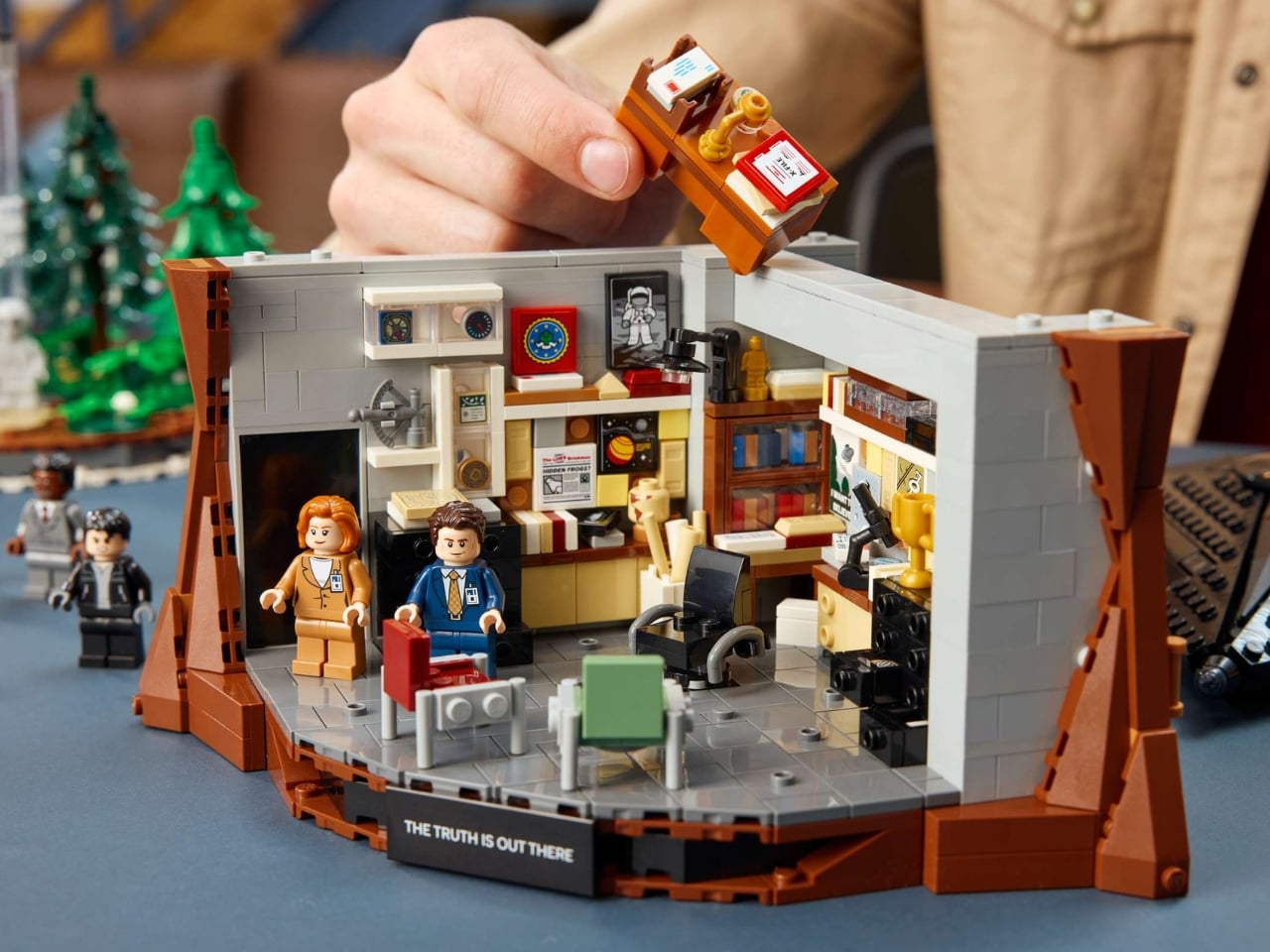
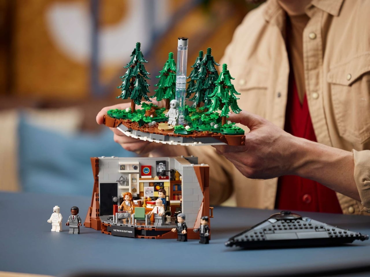
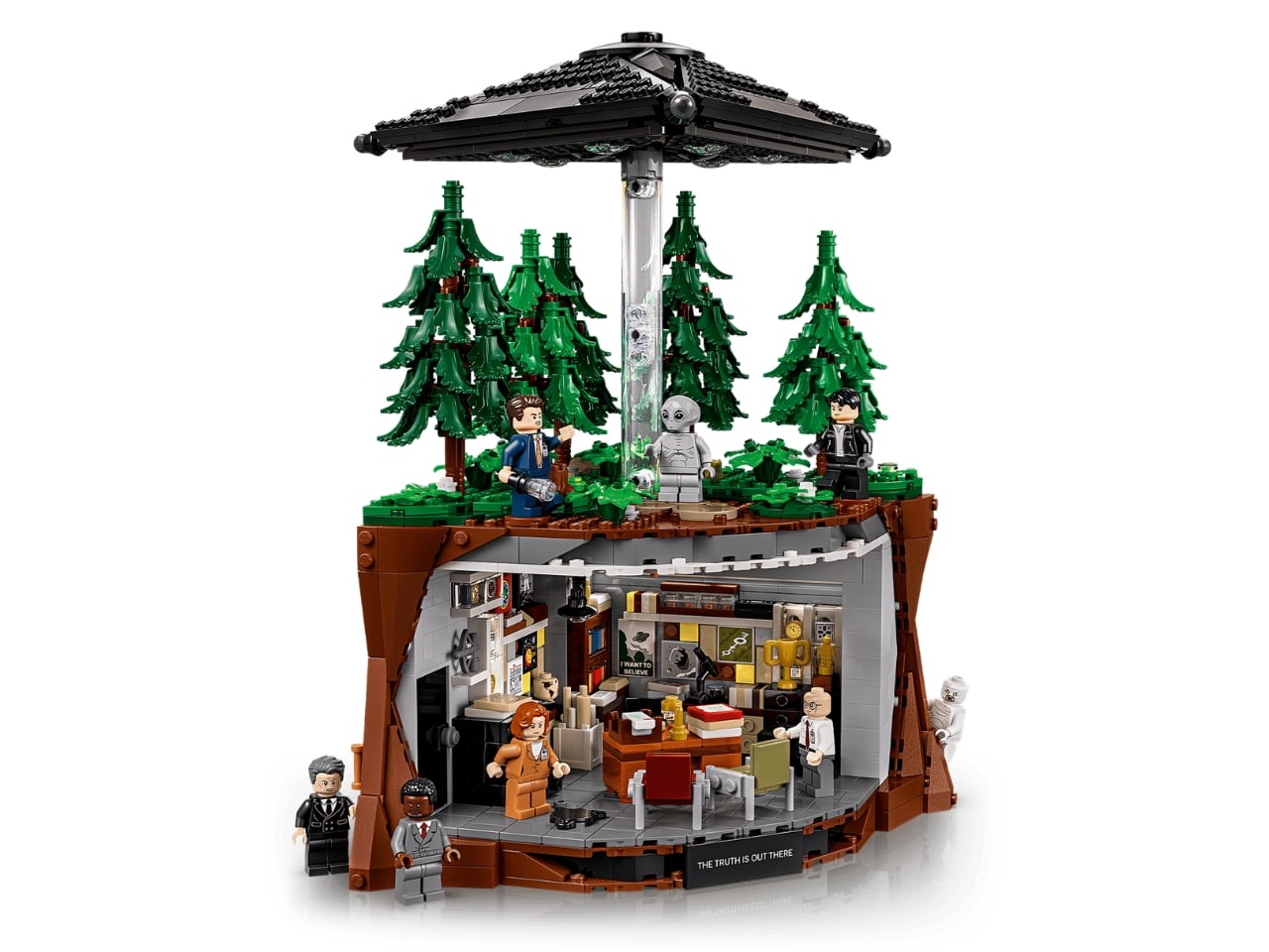
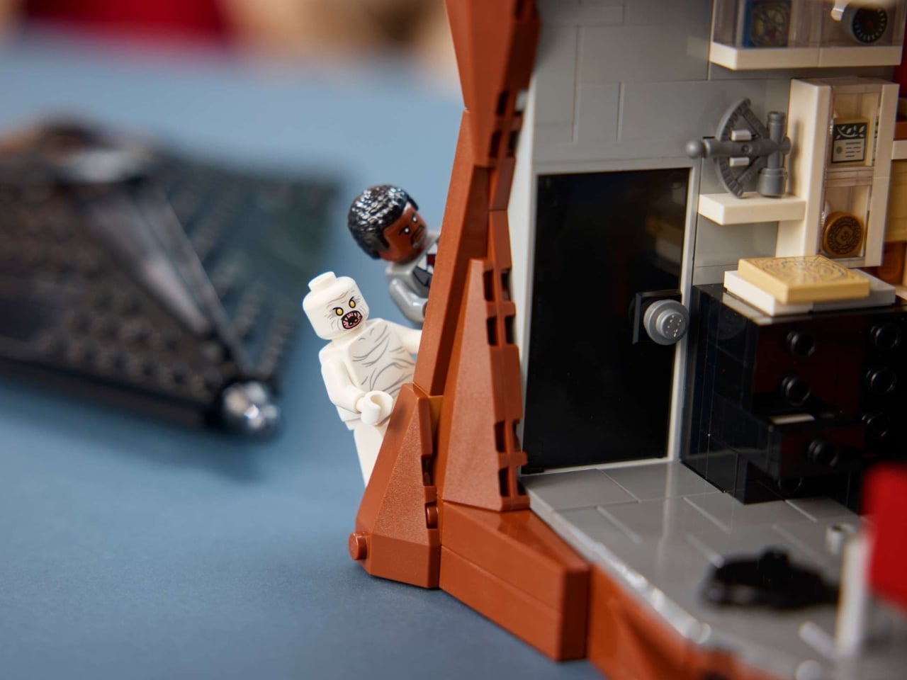
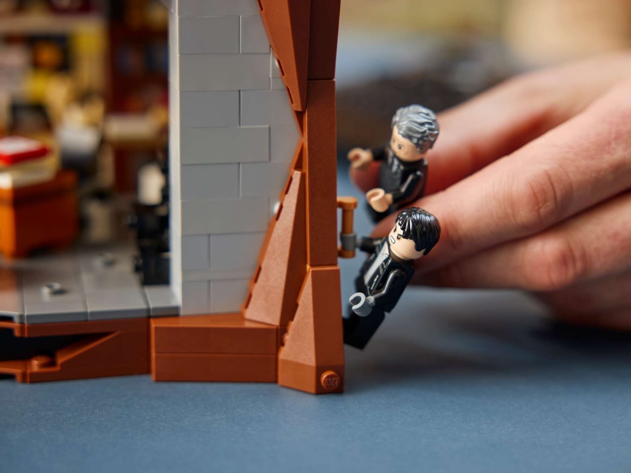
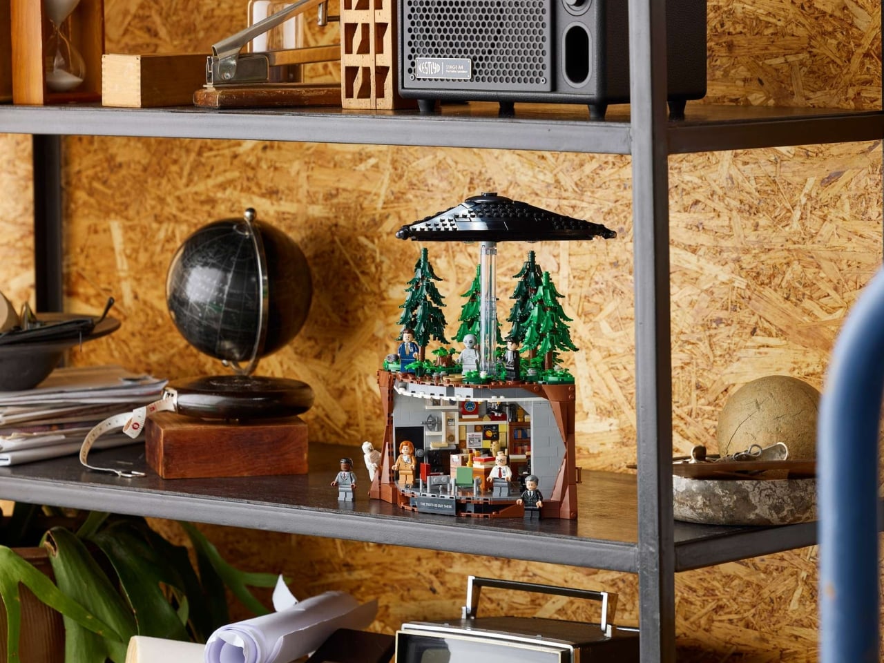
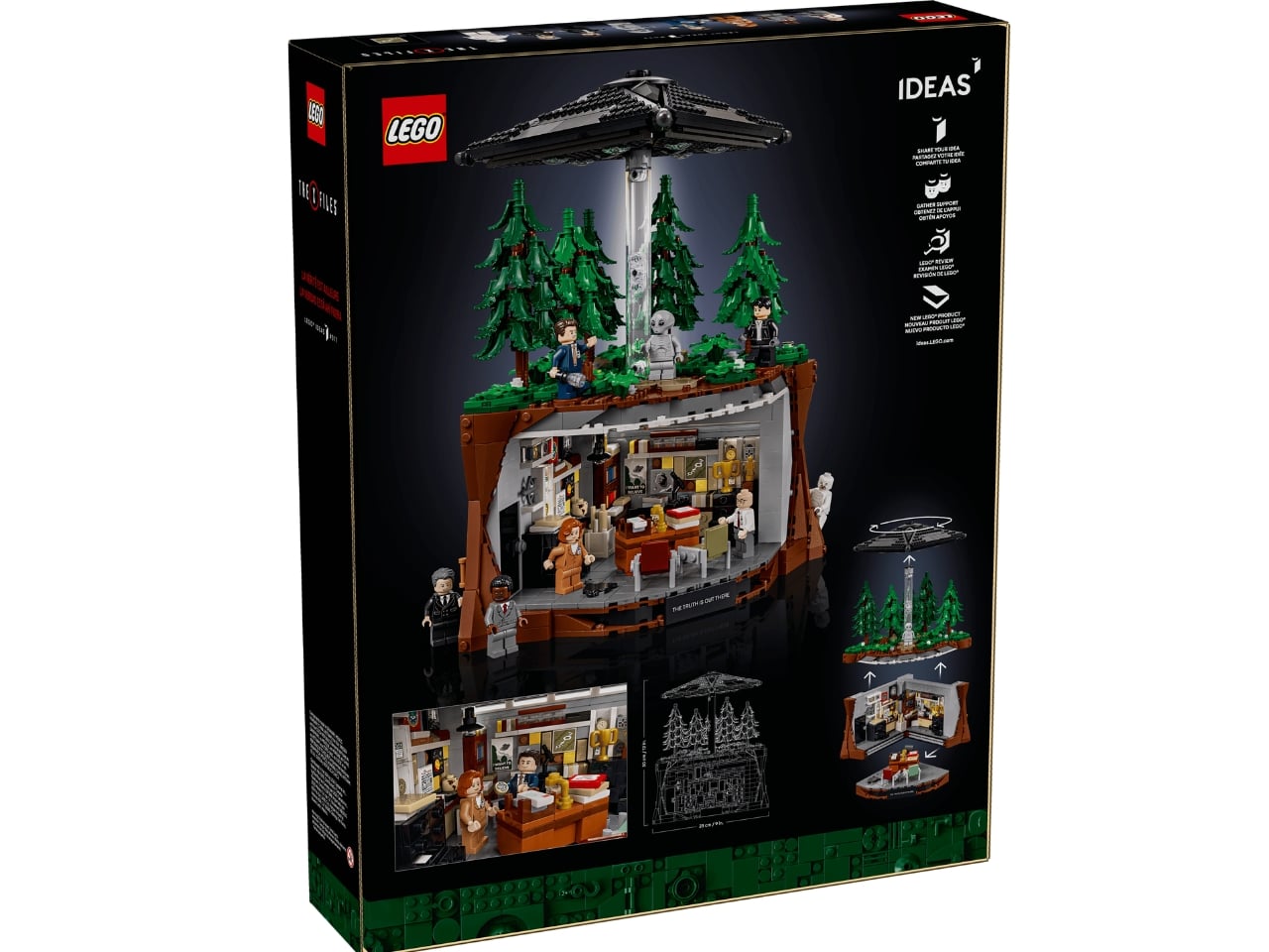
This set, which is obviously meant for grown-ups given its scale and subject matter, features three distinct scenes. You have a detailed replica of Mulder’s iconic basement office, a forest clearing scene straight out of one of their paranormal investigations, and a hovering UFO to complete the eerie atmosphere of the build. You can display the office and the forest separately, or put all of them together as one grand set. And if you act quickly, purchasing the set between August 1–10, 2026 will also net you a bonus Scully’s Lab set, a recreation of the classroom lab at the FBI National Academy, complete with a Scully minifigure in her lab coat and scrubs.

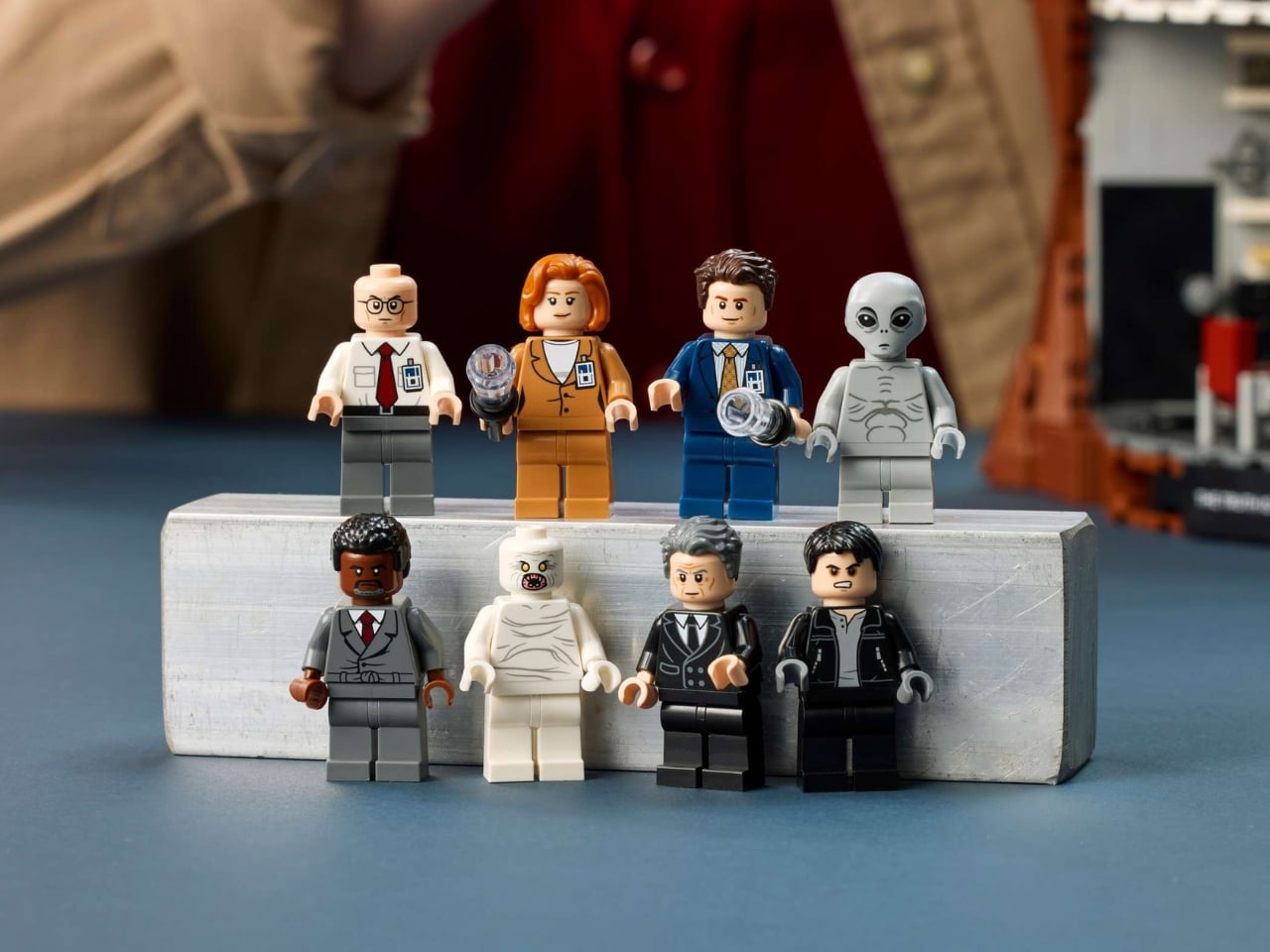
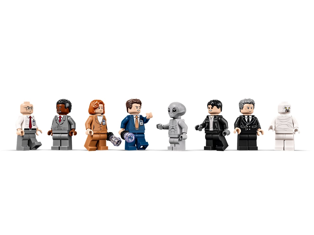
The set includes eight minifigures that will be instantly familiar to faithful viewers of The X-Files. Aside from Mulder and Scully, of course, you have their beleaguered boss Assistant Director Walter Skinner, the infamous Cigarette-Smoking Man, the mysterious informant Mr. X, villainous henchman Alex Krycek, one of their classic monsters-of-the-week The Flukeman, and a grey alien. There are also several Easter eggs and authentic details packed into the build, including the “I Want to Believe” poster, a “The Truth Is Out There” tile, pencils stuck in the ceiling and sunflower seeds (two of Mulder’s most iconic habits), and an X-Files dossier.

What makes this set even more special is its origin story. The X-Files (21369) was chosen as the winner of LEGO’s “Build Your Nostalgia – 90s Throwback!” fan design challenge, meaning this build began as a dream submitted by a devoted fan before making its way to store shelves. It’s a love letter from one generation of fans to another, and that passion clearly shows in every carefully crafted detail. Even Gillian Anderson herself got in on the fun, starring in a cinematic mini-film reveal where she essentially steps into Scully’s shoes one more time, uncovering the LEGO set brick by brick.

Just thinking about building such a set brings me back to the days when I would eagerly devour everything I could about The X-Files universe, the fan sites, the collectibles, the episode guides dog-eared from obsessive rereading. This LEGO Ideas build would definitely appeal to big nerds (and I mean that lovingly) and anyone who appreciates the insane attention to detail given to this trip down nostalgia lane. At $199.99, it’s an investment, but for a set of this caliber, packed with character, memory, and the kind of Easter eggs only true fans will catch, it feels absolutely worth every cent. Whether you’re building it solo on a quiet weekend or proudly displaying it on a shelf, The X-Files LEGO set is a beautiful reminder that the best stories never really leave us. The truth is out there, and apparently, so are the bricks.

The post LEGO Just Built the X-Files Set Every ’90s Fan Always Wanted first appeared on Yanko Design.
Pittsburgh Just Built the Most Beautiful Pickleball Courts in America

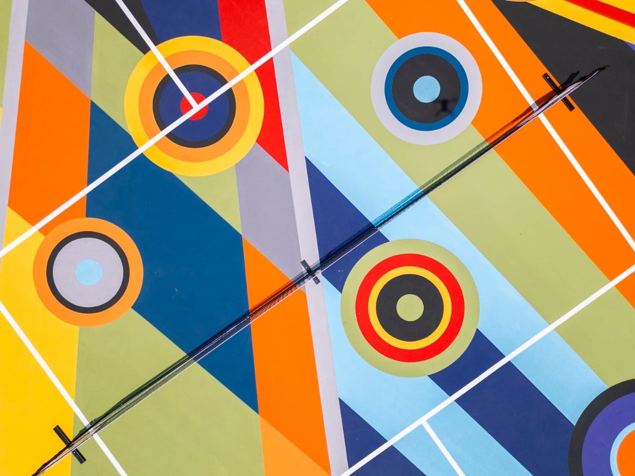
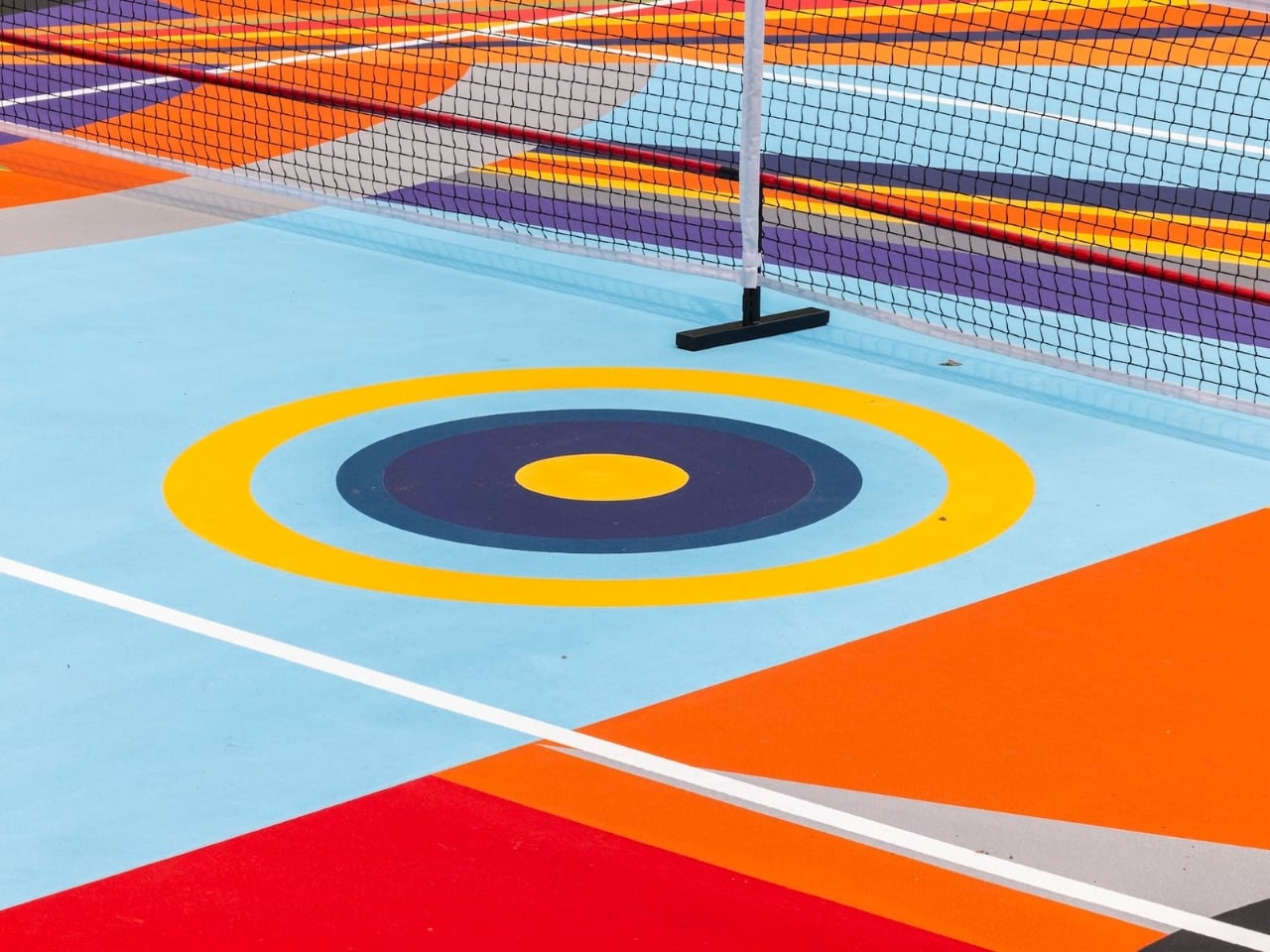
The floor is the canvas. That’s the premise behind Geometry of Play, Sharmistha Ray’s new public art installation at Arts Landing in downtown Pittsburgh, and it might just be the most quietly radical thing to happen to both art and sport this year.

Ray, an artist, writer, and educator born in Kolkata and raised in Kuwait before settling in the United States, has always worked in the language of vibrant geometric abstraction. Their paintings draw from South Asian visual traditions, including kaleidoscopic mandalas and architectural ornamentation, filtered through a lens of queerness, migration, and belonging. It’s rich, layered work. So when the Pittsburgh Cultural Trust commissioned Ray to create a mural across three pickleball courts for their inaugural public art program at Arts Landing, the choice wasn’t arbitrary. They needed someone who understood that abstraction isn’t just decoration. It’s meaning.

Designer: Sharmistha Ray

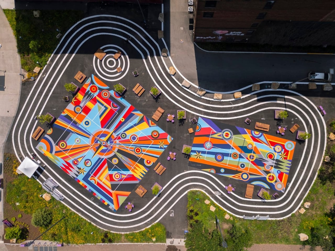
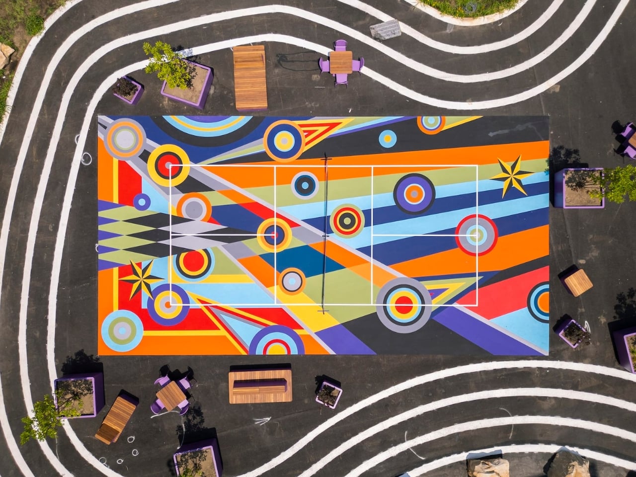
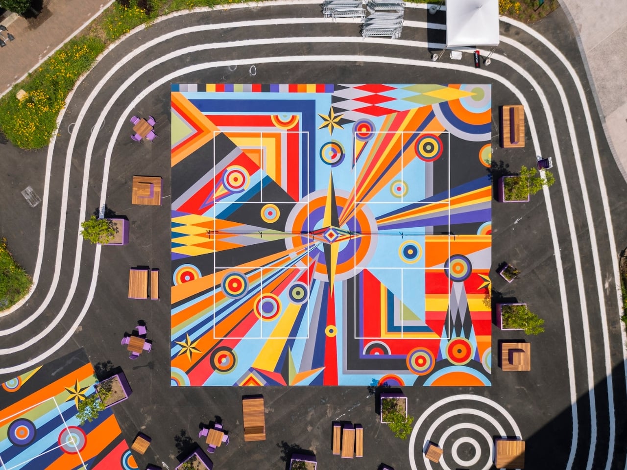
Geometry of Play is made up of large-scale murals painted directly onto the playing surfaces of three 22-by-40-foot pickleball courts, making them the first artist-designed pickleball courts in the entire country. Interlocking circles, triangles, and grids move across the pavement in bold, saturated color. Up close, it reads like a painting you’d frame and hang in a gallery. From a drone view, it’s something closer to architecture, or maybe a quilt, or a mandala. All of those things at once.

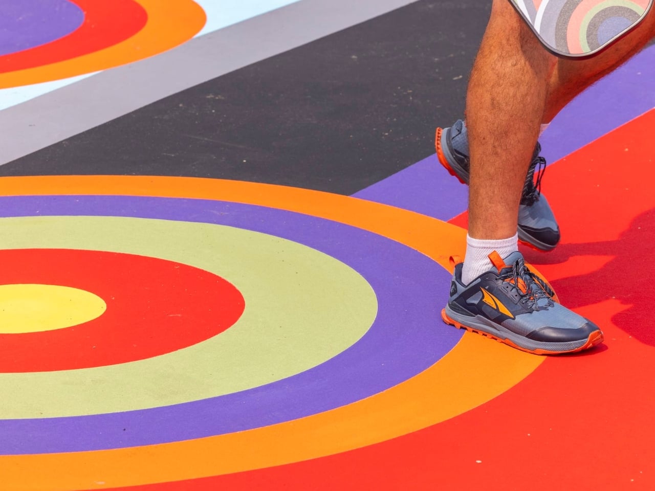
What strikes me about this project is how well it understands its context. Pickleball is famously communal. It’s not a solitary sport of stoic concentration. It’s loud and social and a little chaotic, and the people who love it tend to love it deeply. Ray’s work doesn’t ignore that energy; it amplifies it. The mural creates a constantly shifting visual and physical experience as players move across the court. The geometry doesn’t sit still. It responds to motion, to foot traffic, to the unpredictable choreography of the game itself.

That’s a pretty smart relationship between art and function, and I’ll be honest: I think it puts a lot of conventional public art to shame. So much public art, especially the kind installed on flat, horizontal surfaces, tends to feel like an afterthought. A logo. A pattern that exists to fill space without challenging it. Geometry of Play actually does the opposite. It treats the court not as a site that needs decorating but as a site that can carry meaning, even while a game is being played on top of it.

Ray is also a founding member of Hilma’s Ghost, a feminist artist collective, and currently teaches at Carnegie Mellon University. That connection to Pittsburgh runs deeper than a single commission, and you can feel it in the work. This isn’t a project that was parachuted in from another city. Geometry of Play is part of a larger program featuring 23 works by 10 artists, all commissioned for Arts Landing. It’s part of something being built slowly, intentionally, in one place.

The installation debuted during Picklesburgh, Pittsburgh’s beloved annual festival, in July 2026. But the courts aren’t going anywhere. They remain open for public use, which means people will be playing pickleball on top of a painting for years. I find that genuinely exciting. Art in a museum demands a certain mode of attention: quiet, reverential, scheduled. Art on a pickleball court demands nothing. It just shows up where life already is.

Ray has said that they treat abstraction as “a spatial and cultural gesture of joy, inclusion, and shared encounters across identities, generations, and modes of seeing.” That framing matters. Geometry of Play isn’t trying to be monumental. It’s trying to be present, in the middle of things, where people are actually gathering and moving and having fun. We talk a lot about making art more accessible. Most of the time, that conversation stays theoretical. Sharmistha Ray just painted it onto the ground and said: here. Come play.

The post Pittsburgh Just Built the Most Beautiful Pickleball Courts in America first appeared on Yanko Design.
This $13,130 Samsung Galaxy Z Fold 8 Ultra Has Messi in 24K Gold

The World Cup is officially over and some people are still having a well-documented hangover from the 39-day football tournament. While Argentina failed to win their fourth star, the GOAT Lionel Messi did manage to break several records in the 2026 edition after winning the 2022 crown. What makes this all the more memorable is that it is probably the 39-year-old’s swan song from representing his country after a tumultuous and memorable stint for the national team.
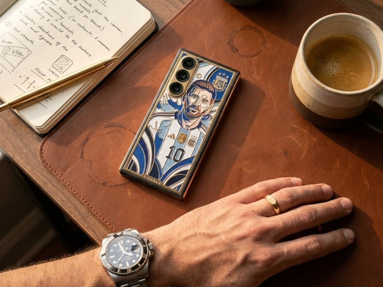
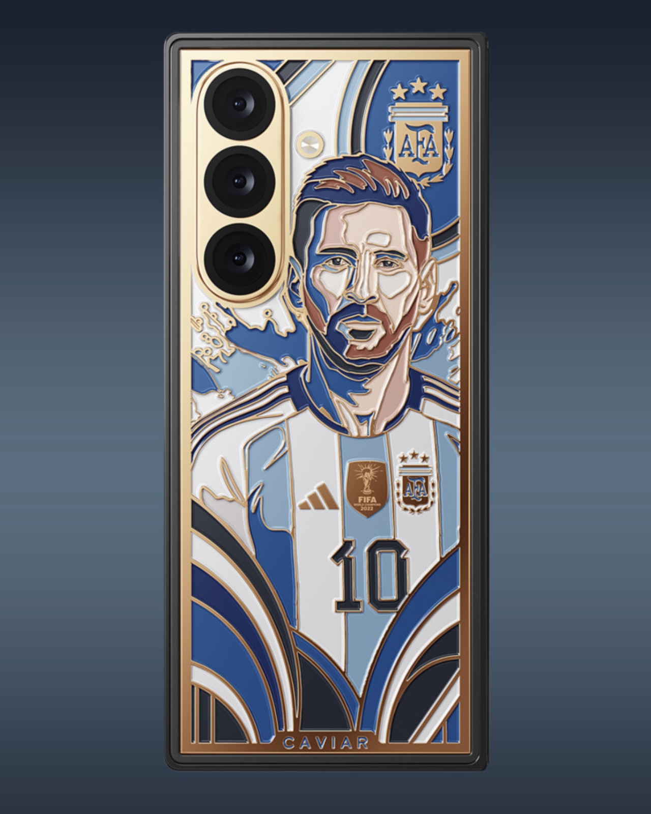
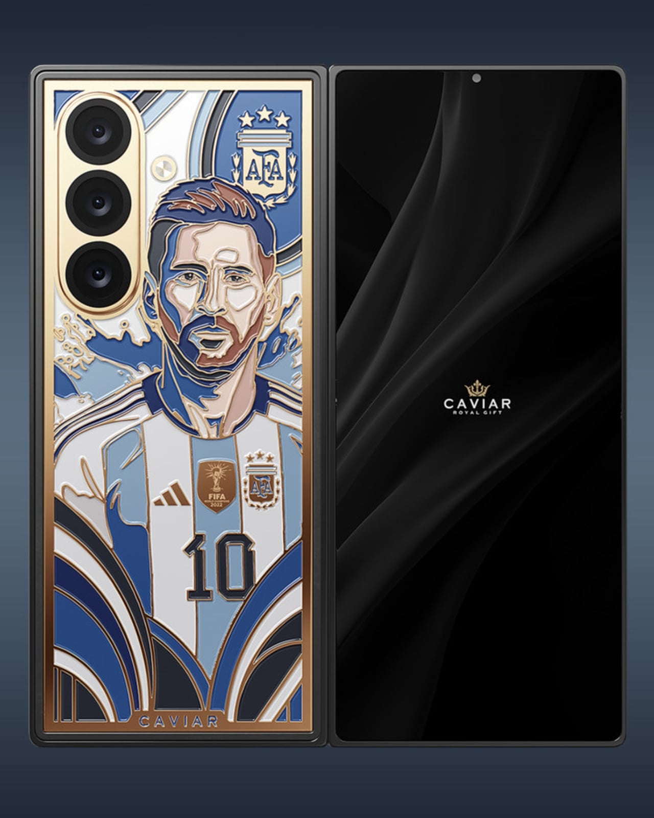
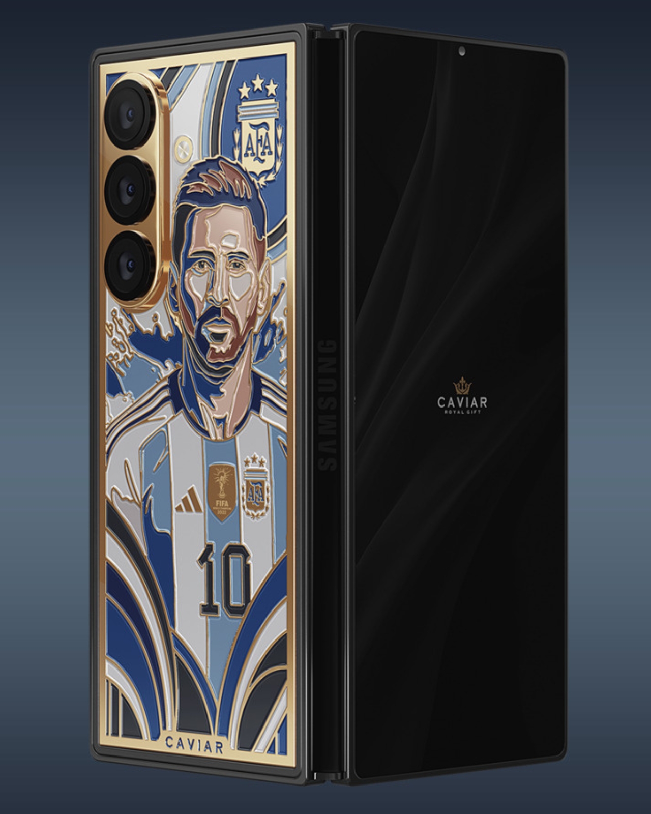
If you want to have something to keep your memories of Messi in an Argentina jersey alive and you have $13k lying around, this special edition Samsung Galaxy Z Fold 8 Ultra from Caviar is something for you. Aside from the exquisite design that comes with the phone, the device was listed and shown on the Caviar website nearly a week before Samsung officially unveiled their new device, so that means some of the features were “accidentally” leaked through the images on the product page.

Designer: Caviar

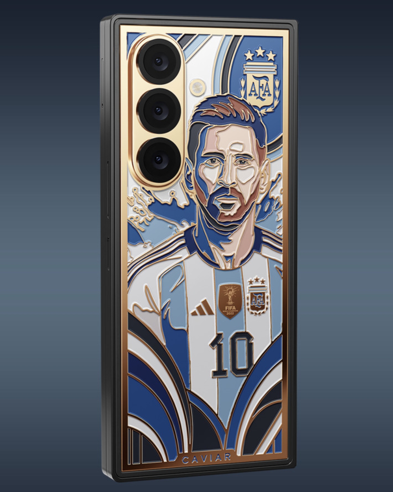
Leaks aside, if you’re a true football and Messi fan, you probably wouldn’t notice that, as you’ll be focused on how beautiful the luxury custom phone looks. Messi’s likeness in an Argentina jersey is handcrafted onto the phone using the intricate, centuries-old technique of cloisonné enamel, rendered in the traditional blue-and-white colors of the Albiceleste. Elements like the frame, key contours, Messi’s iconic number 10 jersey, national symbols, and framing details are highlighted with 24k gold.

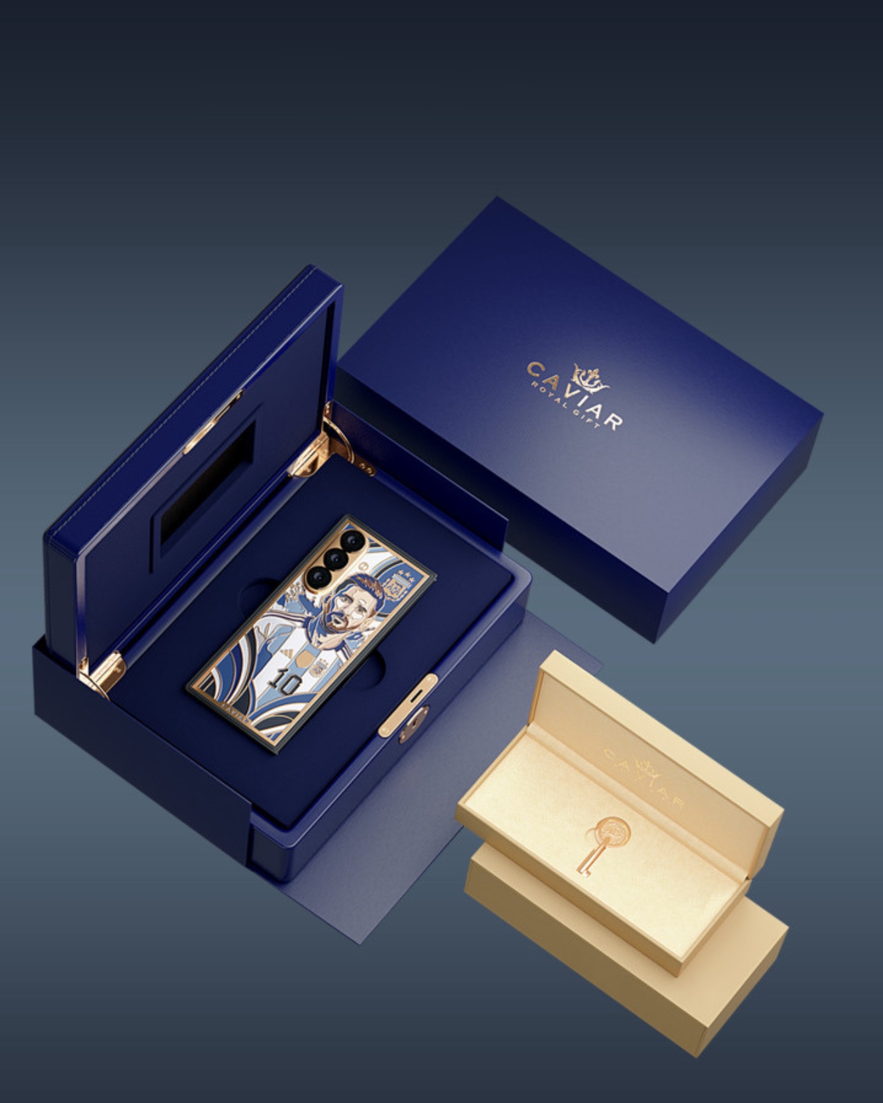
To make it even more official looking, you get official badges like the FIFA badge for Argentina’s 2022 World Cup-winning run, the Adidas logo, and the official national crest. It also comes with custom packaging, as it is encased in a royal blue custom box with 24-karat gold plating and a signature Caviar Key. Of course, with all these details, you can’t expect this to be cheap. The $13,130 price tag is 5x the expected price tag of the yet-to-be-officially-announced Galaxy Z Fold 8 Ultra. And even if you have $13k to spend, there will only be 19 pieces available, so you’ll have to be early to shell out that money.

What’s particularly impressive is that Caviar didn’t just slap Messi’s face on a phone and call it a day. The luxury atelier has built a reputation for transforming high-end devices into genuine works of art, and this piece is no exception. The cloisonné enamel technique used here is the same method found in fine jewelry and ancient decorative arts. It involves painstakingly separating colored enamels using thin metal wires before firing them at high temperatures. The result is a vivid, jewel-like finish that no digital print or laser engraving could ever replicate. Holding this phone feels less like holding a gadget and more like cradling a piece of history in the palm of your hand.

That sense of history is exactly what makes this edition so compelling. Messi’s journey with the Argentine national team has been nothing short of a rollercoaster, from heartbreaking World Cup final losses to the ultimate redemption in Qatar in 2022. Watching him grace the global stage one final time in 2026 was an emotional farewell that millions felt deeply. This phone captures that entire arc: the number 10, the Albiceleste colors, the World Cup crest, all immortalized in gold and enamel.

For collectors, the rarity factor alone is enough to justify the price. Only 19 units will ever be made, which means this phone will likely appreciate in value over time. Think of it less as buying a smartphone and more as acquiring a limited-edition sculpture that also happens to fold in half. And with storage options ranging from 256GB up to 1TB, the Samsung Z Fold 8 Ultra underneath the artistry is still a powerhouse device worth using, if you can bring yourself to take it out of the box.

Whether you’re a die-hard Messi fan, a tech enthusiast with a taste for the extraordinary, or a collector hunting for the next great statement piece, the Caviar Lionel Messi Samsung Z-Fold8 Ultra checks every box. It is, quite literally, 24-karat iconic.

The post This $13,130 Samsung Galaxy Z Fold 8 Ultra Has Messi in 24K Gold first appeared on Yanko Design.