We’ve all been there. You sit down at your desk, ready to tackle that project, and suddenly you’re drowning in cables, hunting for your phone charger, and watching your battery percentage drop to single digits. Your workspace looks like a tech graveyard, and your creative energy? Well, that died somewhere between untangling the third cable and knocking over your coffee while reaching for your headphones.
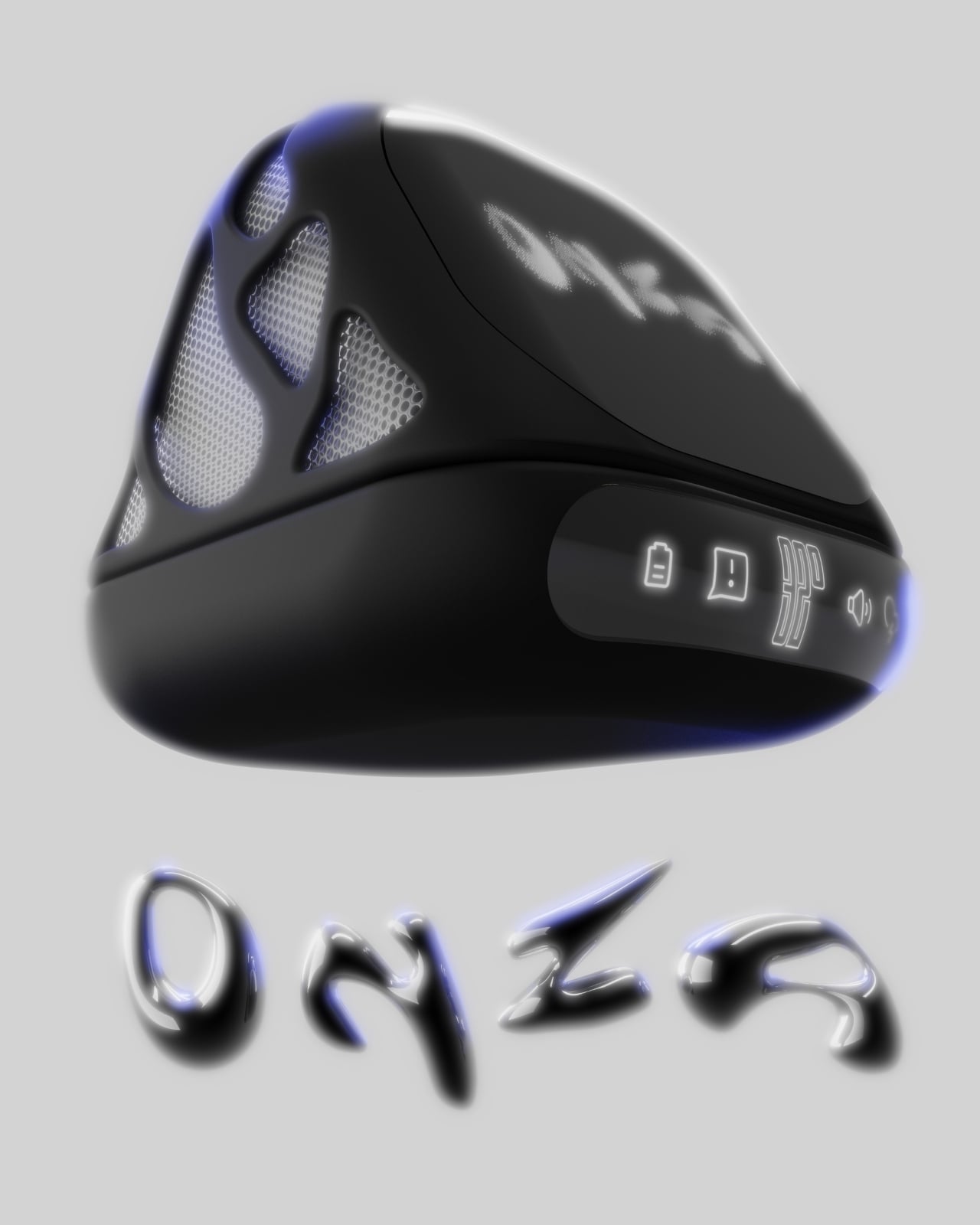
Enter the ONZA Desktop Dock, a concept design by Vedanta Maheshwari that’s making me seriously reconsider what a desk accessory can actually do. This isn’t just another “put your phone here” kind of solution. It’s a complete rethinking of how we interact with our workspace, and honestly, it’s about time someone figured this out.
Designer: Vedanta Maheshwari
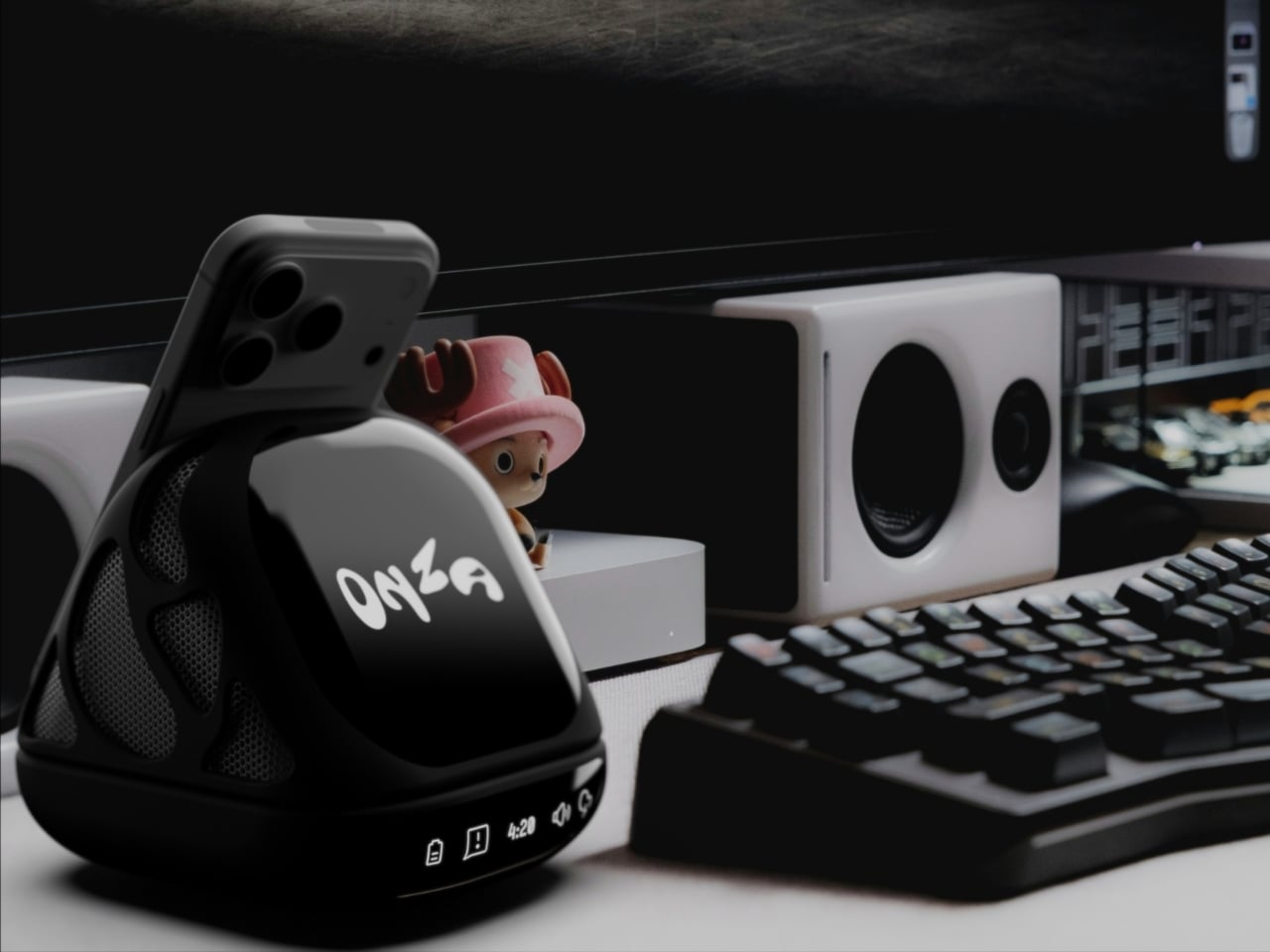
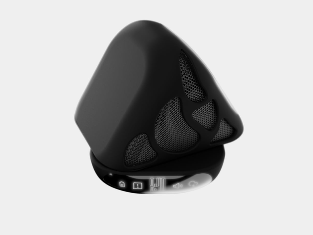
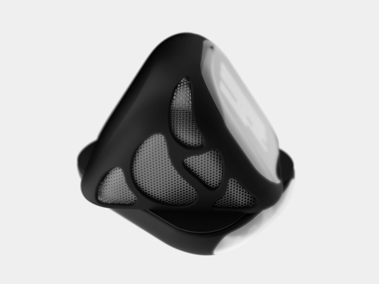
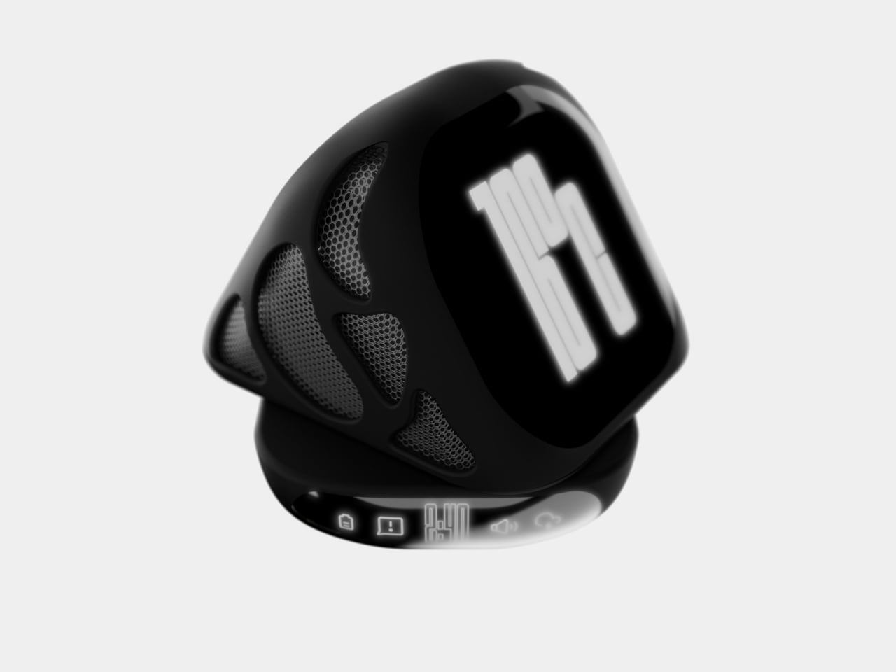
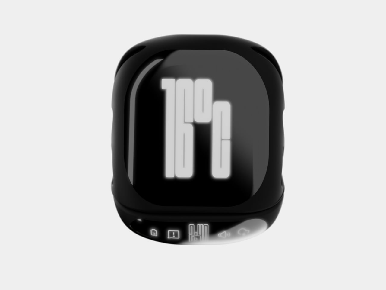
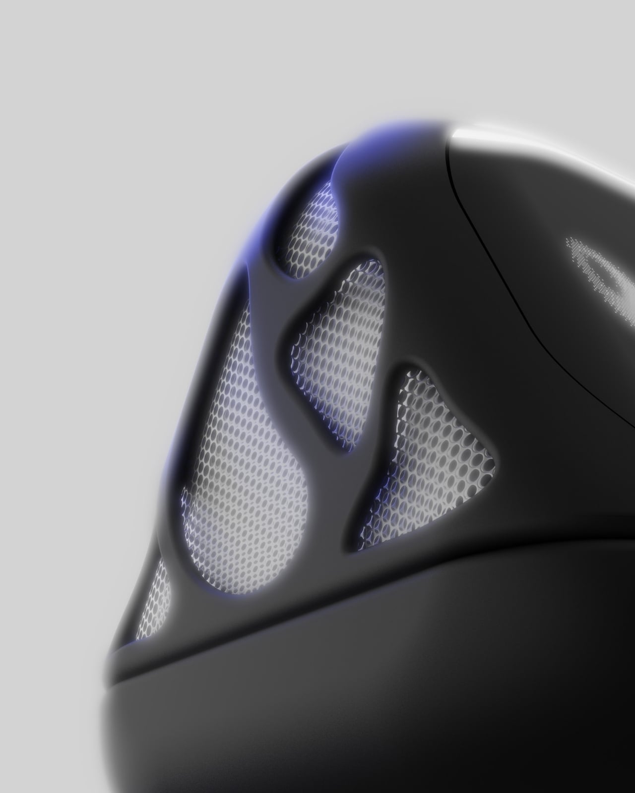
At first glance, the ONZA system looks like something that beamed in from a more aesthetically pleasing future. The design features a sleek, geometric form that immediately catches your eye without screaming for attention. Think angular, almost sculptural, with a glossy black finish that somehow manages to look sophisticated rather than trying too hard. The body has these organic, flowing mesh panels that aren’t just there to look cool (though they definitely do). They’re functional speaker grills that transform this little powerhouse into an audio solution too.
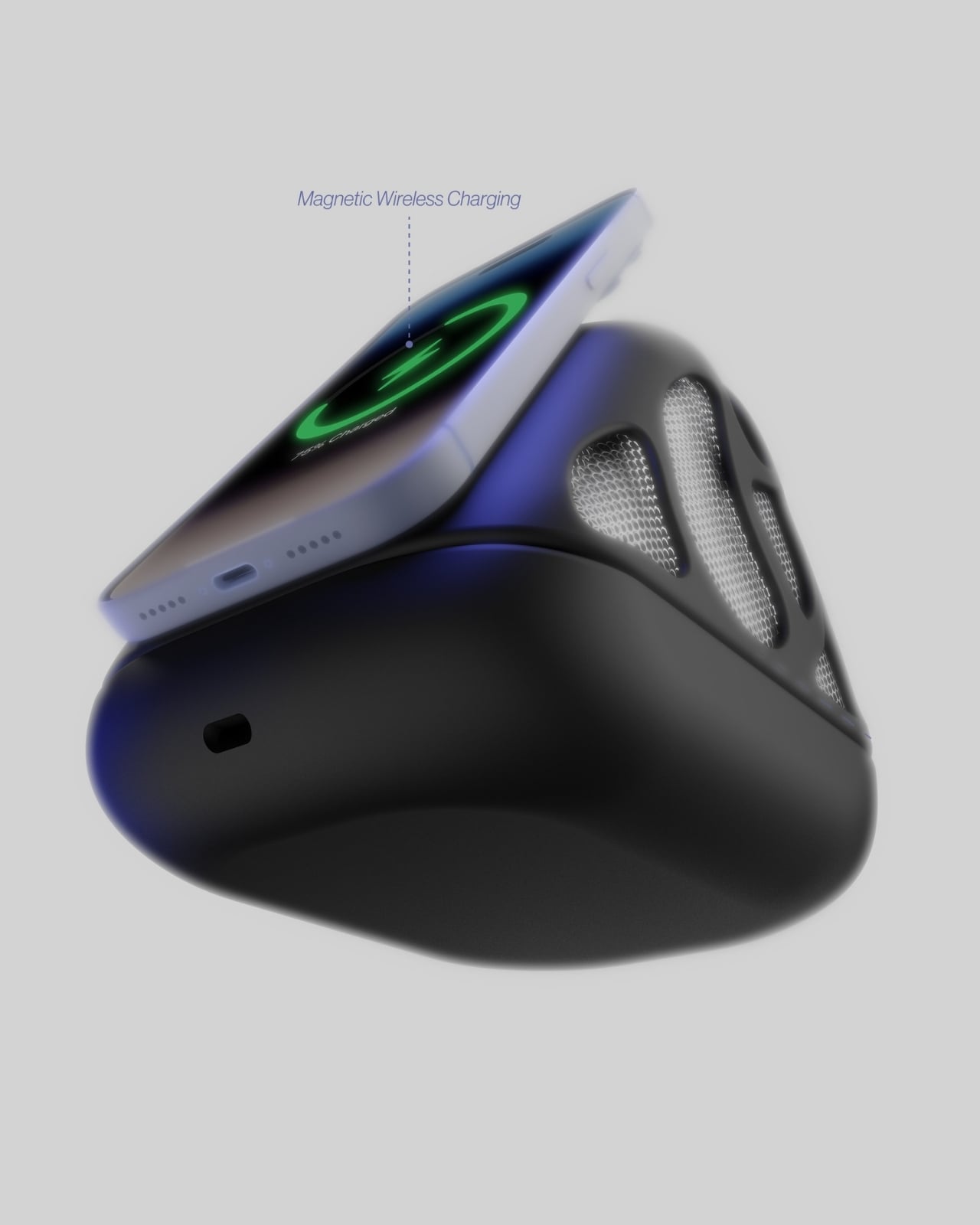
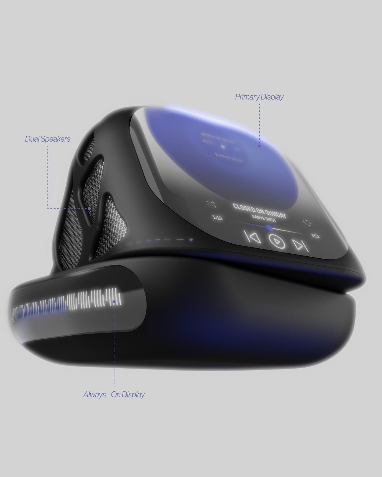
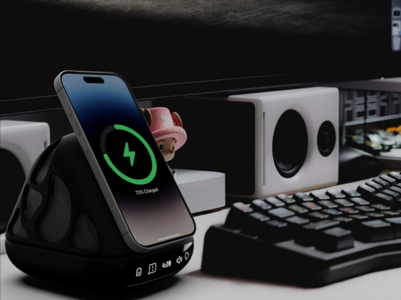
But here’s where it gets interesting. The ONZA isn’t trying to be everything at once while doing nothing particularly well. Instead, it focuses on solving the actual problems creative professionals face every day. The integrated wireless charging pad means your phone gets juice while staying visible and accessible. No more digging through desk drawer chaos or having your device face-down on some random charging pad where you can’t see notifications. The angled design props your phone up at the perfect viewing angle, so it becomes part of your workflow rather than a distraction you have to pick up every five minutes.
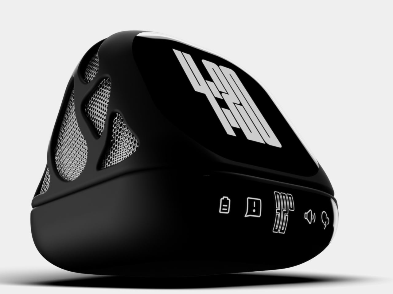
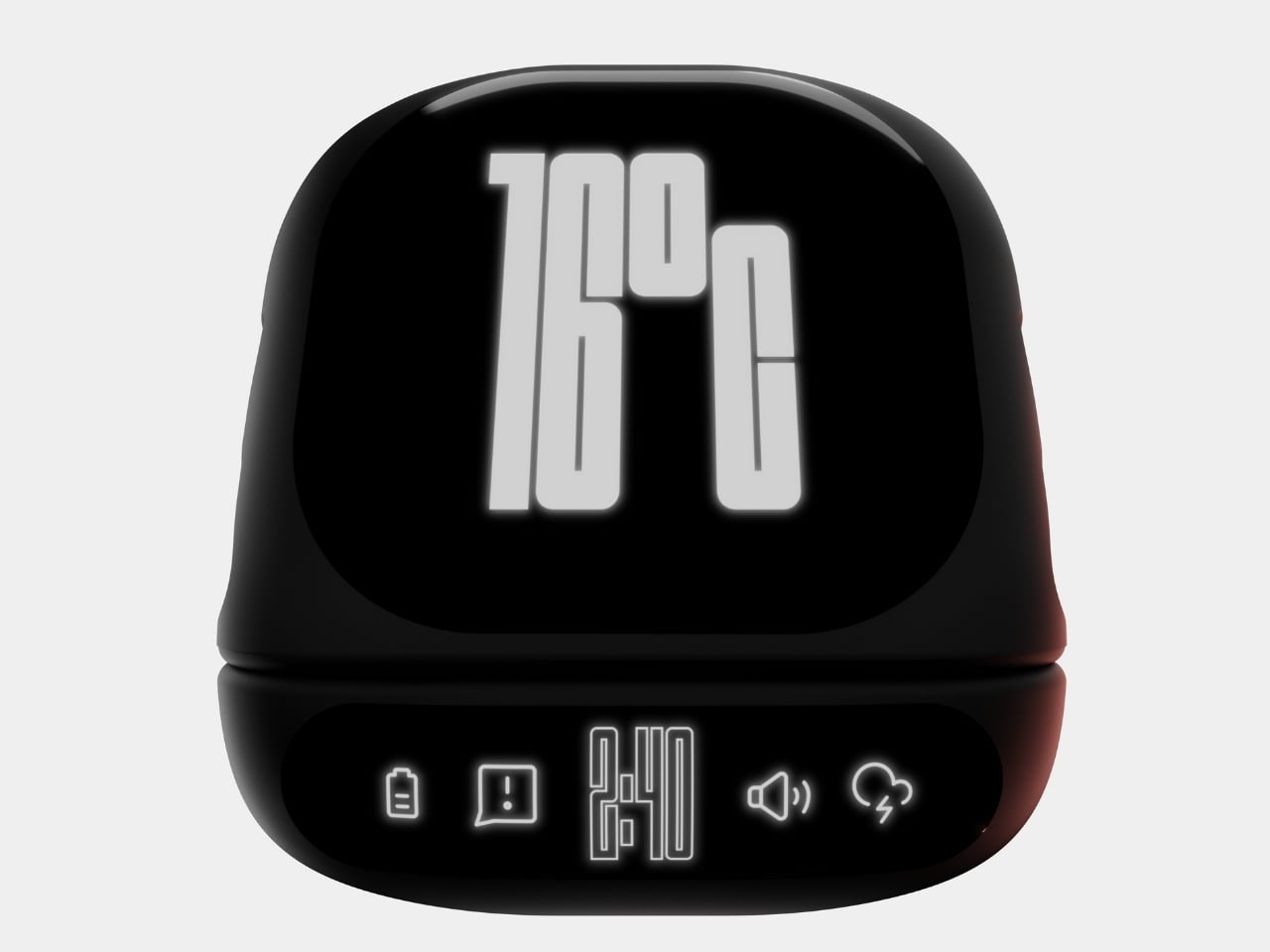
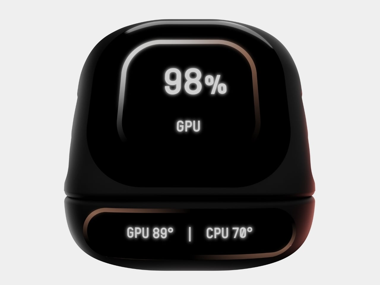
Those subtle icons along the base? They’re not just decorative. They indicate battery status, storage connectivity, wireless capabilities, and audio functions. Everything you need to know at a glance, without any notification overload or annoying lights blinking at you while you’re trying to focus. It’s the kind of thoughtful detail that separates concept art from actual design thinking.
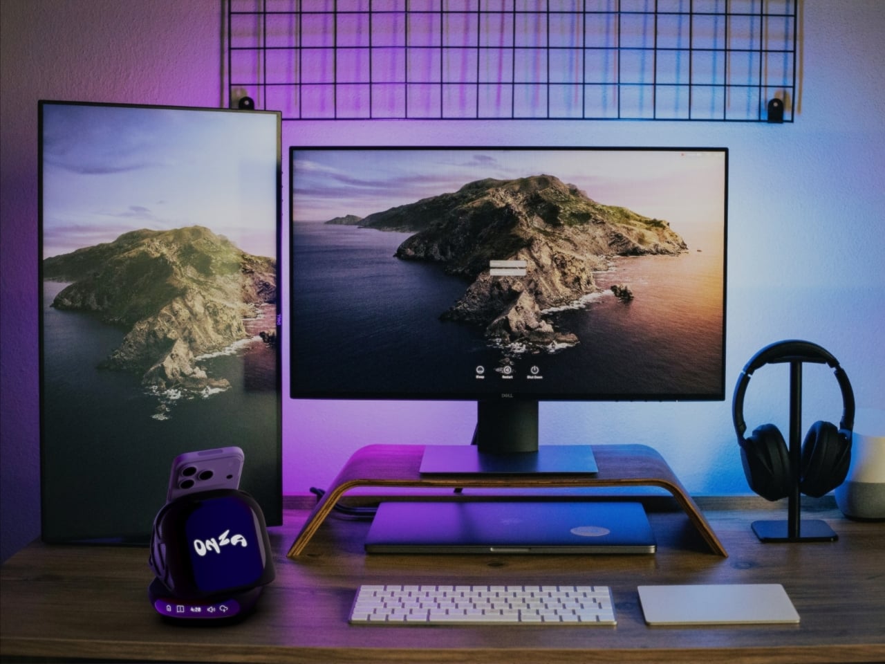
What really sells the ONZA concept, though, is how it plays with the entire desk ecosystem. Maheshwari’s renders show this thing in context, and it’s clear he understands that great design isn’t about creating isolated objects. It’s about creating harmony. The dock sits comfortably alongside mechanical keyboards, designer headphone stands, and dual monitor setups without fighting for visual dominance. It complements rather than competes, which is surprisingly rare in a market full of RGB-everything and aggressive gamer aesthetics.
The speaker integration is particularly clever. Most of us have dealt with the disappointing tinny sound of phone speakers or the hassle of connecting Bluetooth devices every single time we sit down. Having quality audio built into something that’s already anchoring your workspace? That’s the kind of convenience that actually changes how you work. Take a call without fumbling for earbuds. Play music while you design. Listen to a podcast while you’re organizing files. It’s all just there, ready to go.
Now, let’s be real for a second. This is a concept design, which means we can’t exactly run out and buy one tomorrow (trust me, I checked). But that’s also what makes it so exciting. Maheshwari is showing us what’s possible when designers really think about the creative workspace as a holistic environment rather than just a place to dump tech. The ONZA asks better questions: What if your charging solution also managed audio? What if your phone dock could integrate with your entire desktop ecosystem? What if workspace accessories could be genuinely beautiful without sacrificing functionality?
The creative workspace has evolved dramatically over the past few years, but our accessories haven’t always kept pace. We’re still dealing with solutions designed for problems from a decade ago. The ONZA Desktop Dock concept suggests a different path forward, one where form and function aren’t competing priorities but complementary goals. And honestly? That future looks pretty good from here.
The post ONZA Just Designed a Dock That Replaces 3 Desk Accessories first appeared on Yanko Design.


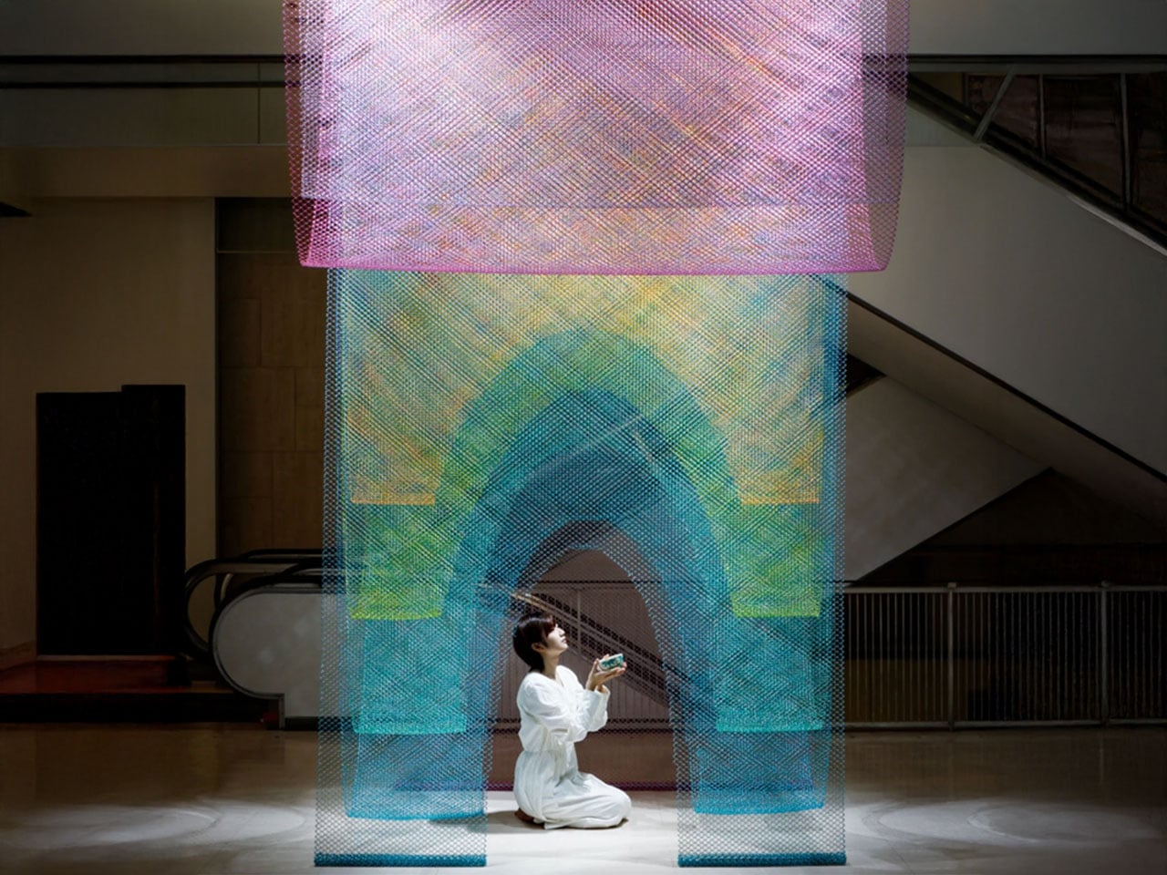

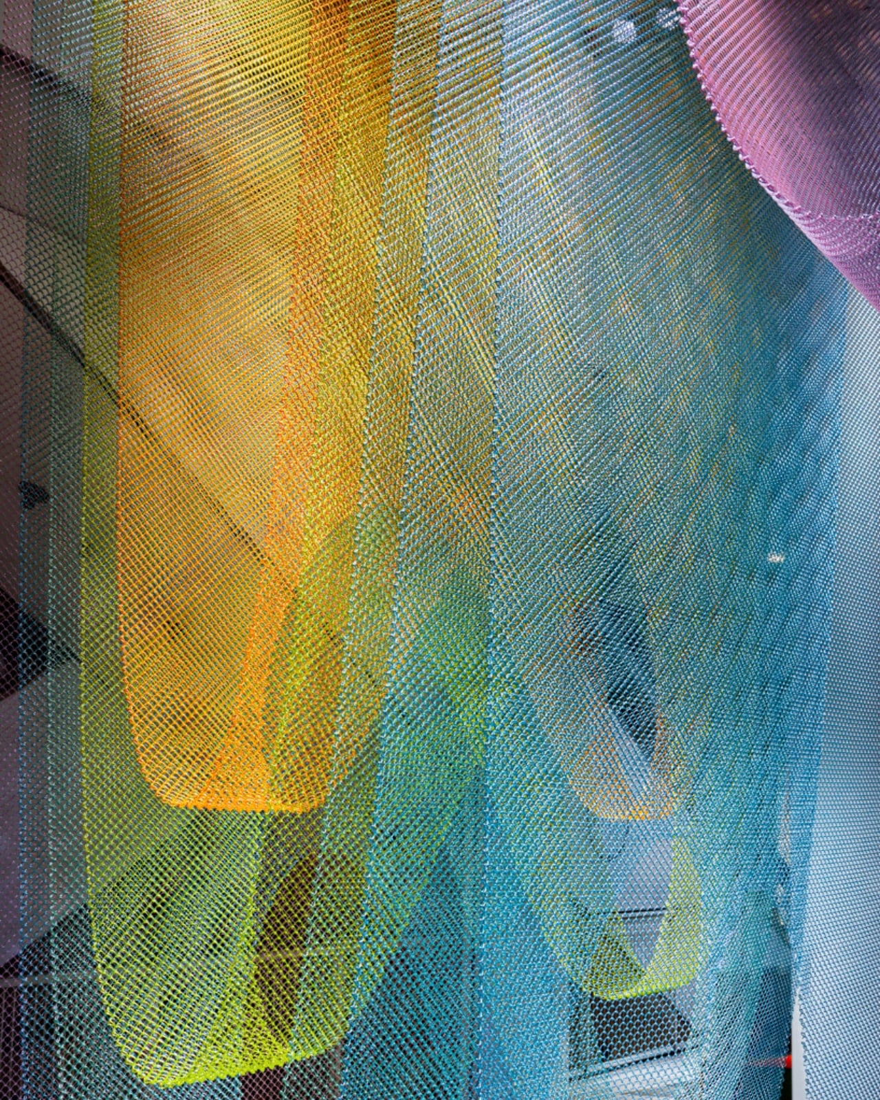


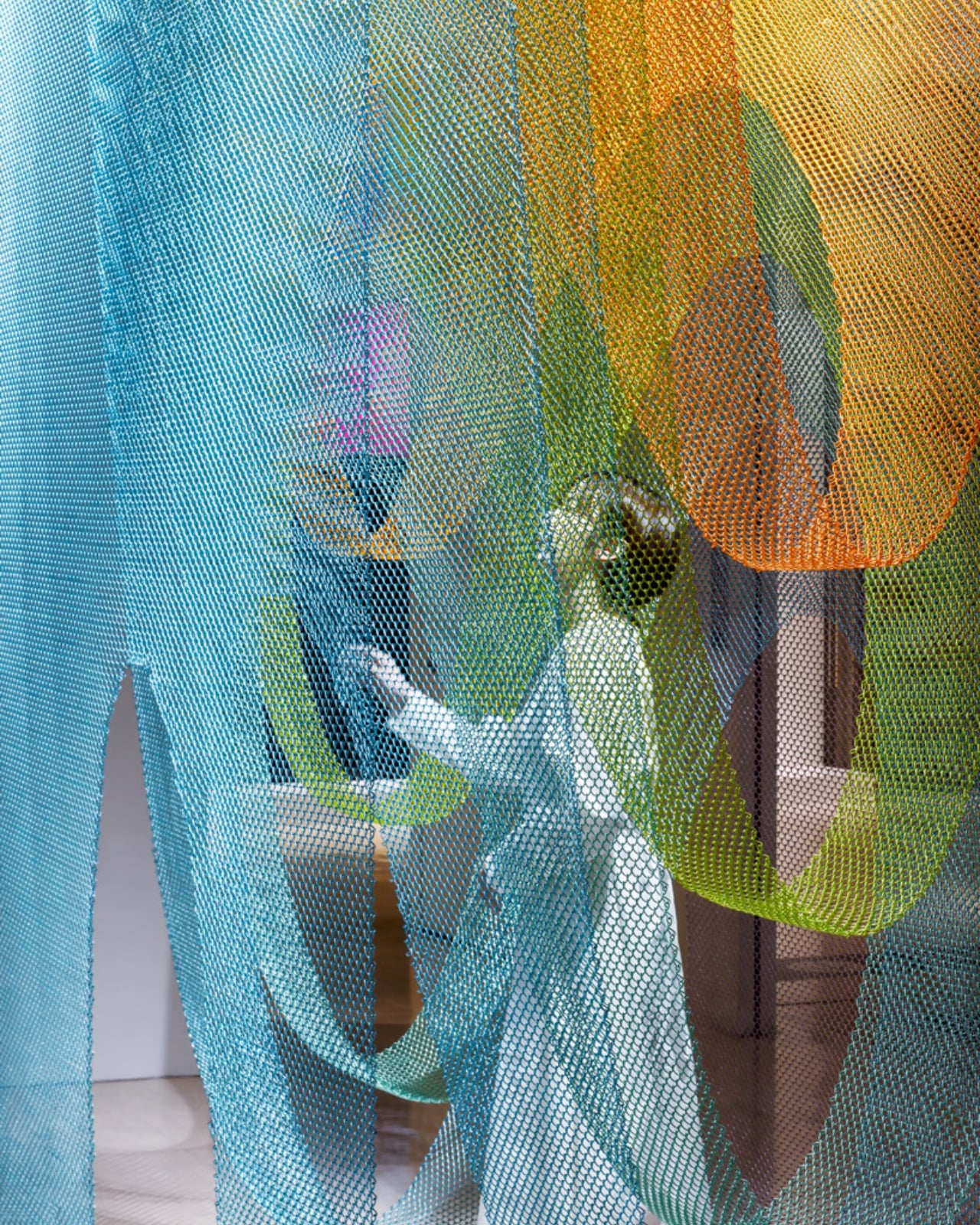


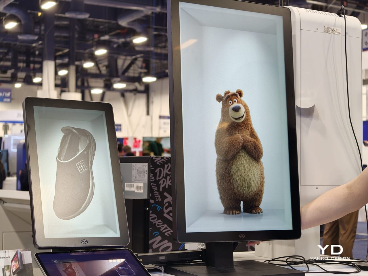
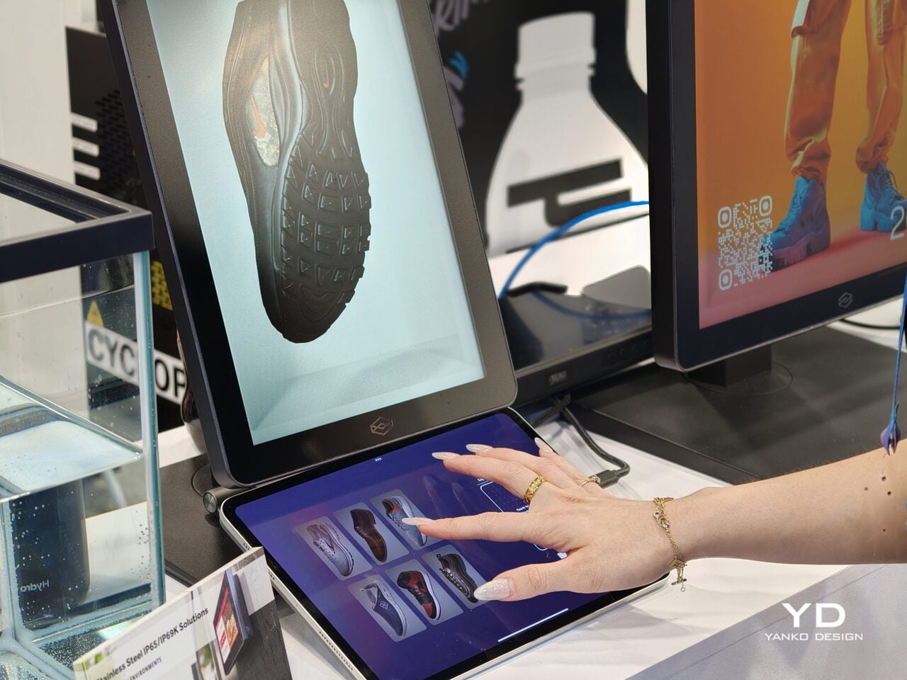
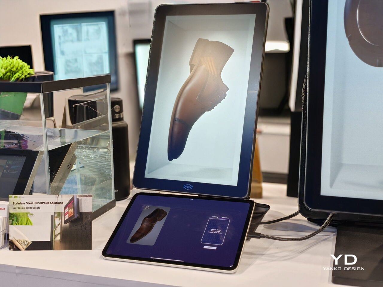
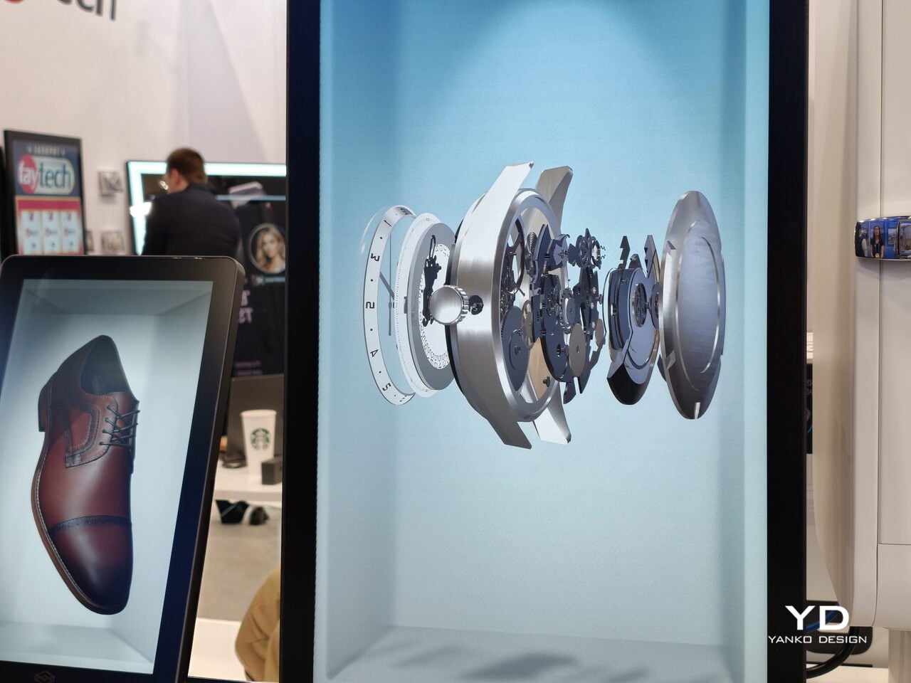
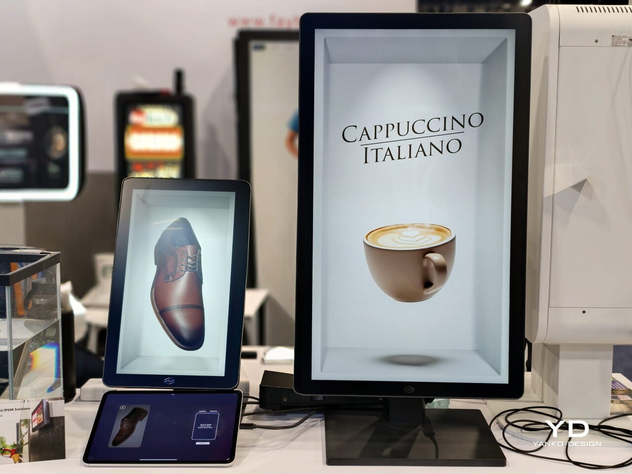
 Display (HLD) is a revolutionary razor-thin holographic display that transforms standard 2D video content into three-dimensional, spatial experiences. Basically, it can display virtual space from your ordinary videos to make it seem like the people, products, and characters in them are floating in mid-air on the display screen. So those scenes from sci-fi movies with hologram videos in public spaces won’t be sci-fi anymore in the very near future.
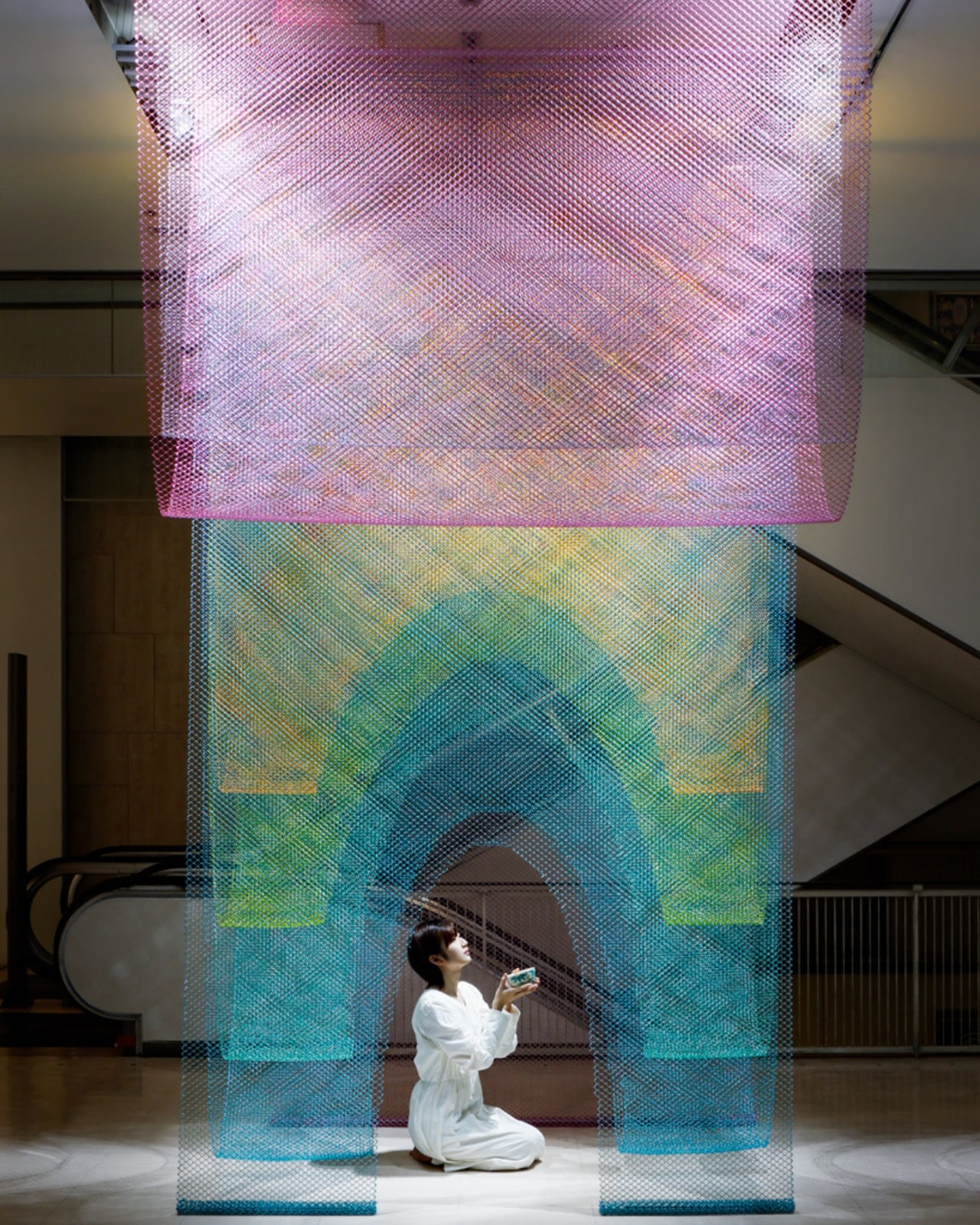