Monthly Archives: November 2025
Top 5 iPhone 17 Pro Setup Essentials for 2025
Setting up your iPhone 17 Pro isn’t just about unboxing and turning it on anymore. With features like ProRes video recording, advanced computational photography, and desktop-class performance, your new device deserves accessories that match its capabilities. The right setup can transform your iPhone from an impressive smartphone into a complete productivity and creative powerhouse. Black Friday is approaching fast, and we’ve discovered some incredible deals that make building the perfect iPhone 17 Pro setup more affordable than ever. These aren’t just random discounts – we’re talking about genuine value on accessories that solve real problems and enhance your daily workflow. From ultra-tough protection to professional camera controls, these five essentials represent the best of what’s available right now.
What makes 2025 different is how accessory manufacturers have finally caught up to Apple’s innovation pace. Gone are the days of choosing between protection and functionality, or settling for cheap alternatives that break after a few months. Today’s premium accessories are engineered to work seamlessly with your iPhone’s advanced features while adding capabilities you didn’t know you needed. We’ve tested dozens of products over the past few months, focusing on accessories that genuinely improve the iPhone 17 Pro experience rather than just looking good in marketing photos. These five essentials earned their spot through real-world testing, and the Black Friday pricing makes them absolute no-brainers for anyone serious about maximizing their iPhone investment.
1. TORRAS OrigArmor Screen Protector
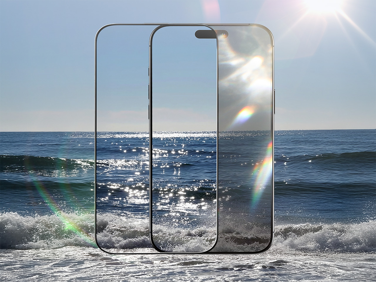
Let’s talk about what makes a screen protector truly exceptional…because let’s be honest, most of them are terrible. The TORRAS OrigArmor isn’t just the world’s first anti-reflective screen protector with 3D full-coverage curved edges; it’s a complete rethinking of what screen protection should accomplish. What drives everyone crazy is that most protectors make your gorgeous display look duller and mess with color accuracy. OrigArmor flips that script entirely. The magic happens through its 7-layer anti-reflective coating created through magnetron sputtering and a dual ion-exchange process. This keeps reflectivity under 0.8%, while regular tempered glass protectors reflect over 4.5% of light, which is more than five times the glare.
So, how does this actually elevate your daily life? Your screen remains remarkably bright, clear, and easy on the eyes, even in direct sunlight. You won’t need to awkwardly shield your phone or squint like you forgot your sunglasses. You’ll finally stop cranking your brightness to maximum, which doesn’t just save battery life, it actually helps preserve your phone’s long-term performance. It also restores the iPhone 17’s native anti-reflective display function, which regular protectors completely disable. The 95% light transmittance (compared to an average 91% on standard protectors) means your front camera captures sharp, detailed, true-to-color selfies without that blurry, washed-out disaster look that makes other screen protectors so frustrating.
The engineering behind OrigArmor is also pretty darn impressive. Using their proprietary Tora-Curve 3D curving technology instead of traditional hot-bending methods (The core difference between the two technologies is that Tora-Curve
 does not make the glass more brittle, while hot-bending does), TORRAS created incredibly durable glass with absolutely flawless edge alignment and zero bubbles. The 99.8% screen coverage eliminates those annoying light leaks and dust traps, creating a seamless fit that genuinely looks and feels like it’s part of your phone from the factory.
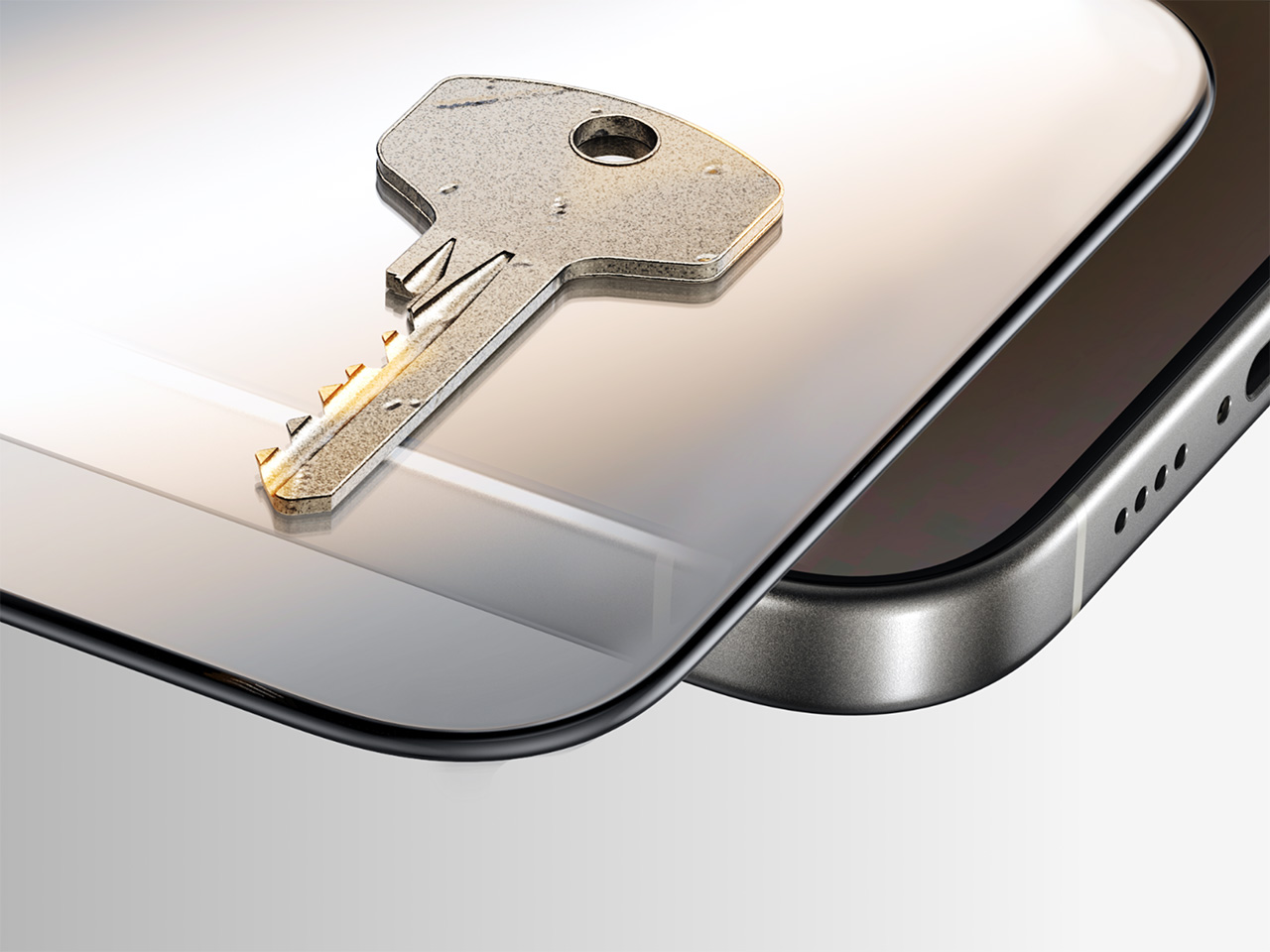
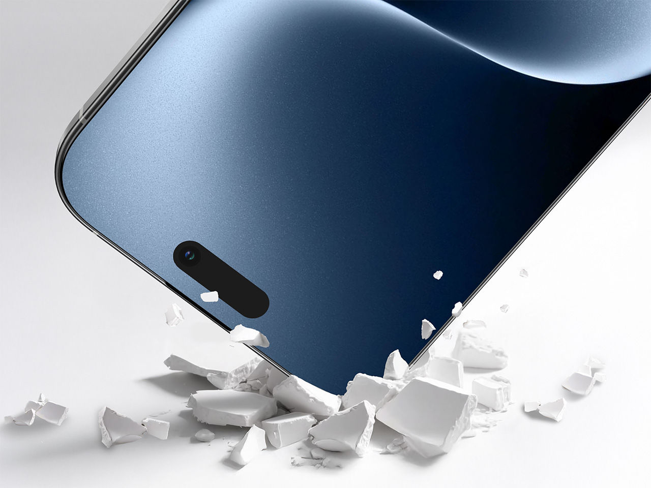
Installation is foolproof with Tora-Airfree molecular adhesive that naturally disperses air for a clean, precise seal every single time. So essentially, there are no do-overs, no frustration, no regrets. The surface features premium Shin-Etsu fingerprint-resistant oil applied through magnetron sputtering, creating that incredibly buttery-smooth touch experience without gross smudges building up. With a beastly 9H+ hardness rating and surviving over 25,000 scratch tests plus 8,000 drop tests in TORRAS labs, this protector delivers scratch and drop resistance that absolutely demolishes traditional matte films. The 3D curved edges mean no sharp corners or weird discomfort, just ultimate grip and that premium feel that actually enhances your iPhone experience instead of ruining it.
Click Here to But Now: $34.99 $41.99 (17% off). Hurry, deal ends in 48-hours! Website Here.
Why You Should Buy It
The OrigArmor, of course, protects your screen, but also actively improves your iPhone 17 Pro experience. The revolutionary anti-reflective coating cuts glare by 5×, saves battery life, and restores native display functions that other protectors disable. Your selfies stay crystal-clear thanks to 95% light transmittance, while the 3D curved edges provide seamless coverage with zero light leaks or dust traps. Beyond the superior protection, TORRAS is offering excellent Black Friday value: spend $135 or more and get a free MagSafe Card Wallet, spend $149 for a free MiniMag Power Bank (5,000mAh), or spend $199 to receive a free Flexline Pebble Power Bank (10,000mAh). Plus, their Blind Box Surprise offers up to 50% off mystery TORRAS products, adding the thrill of unboxing premium accessories at half price.
2. KUULAA Magnetic Power Bank 5000mAh

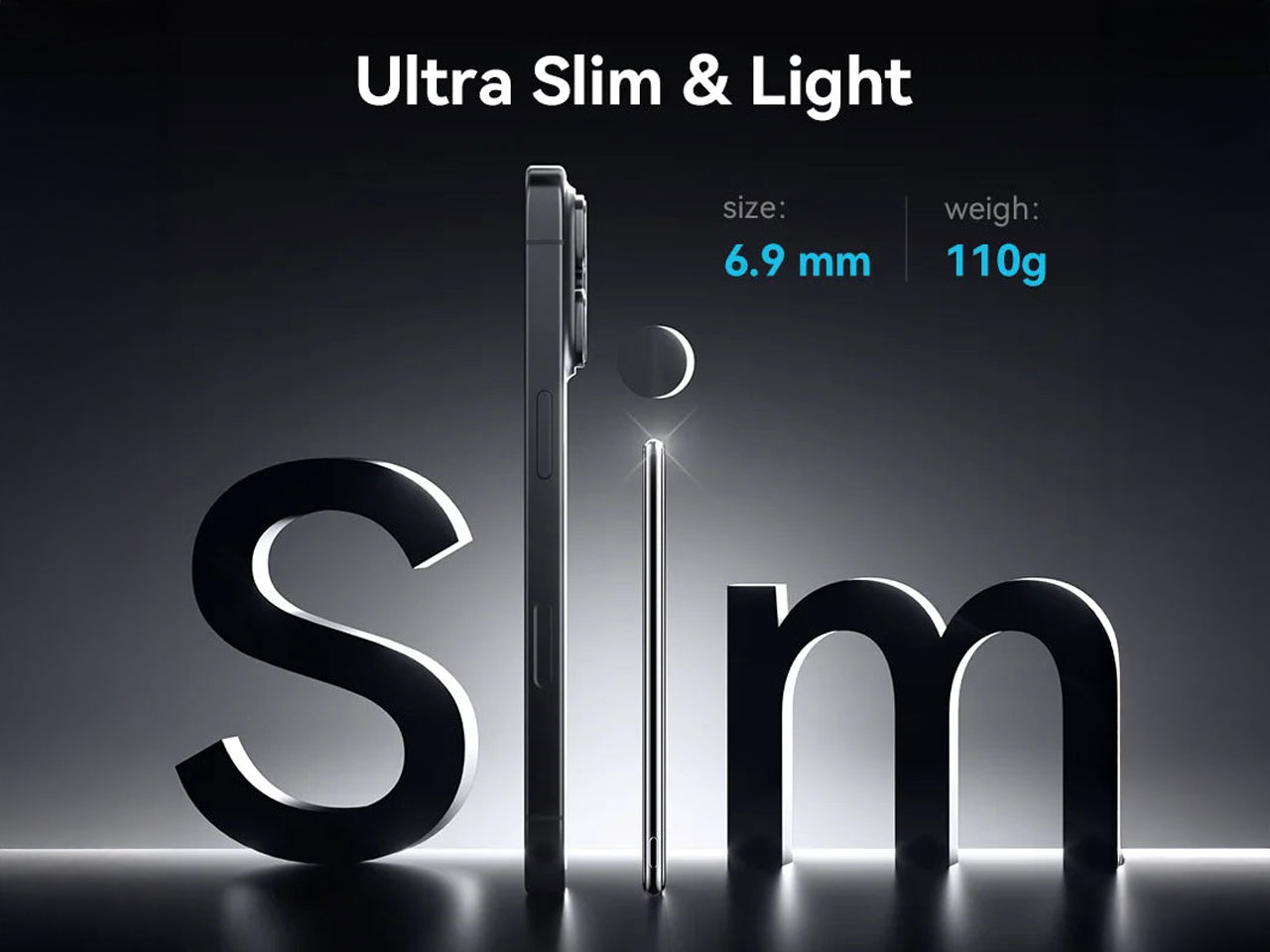
At just 6.9mm thick, the KUULAA power bank is impossibly slim while packing serious power. This 5,000mAh battery can charge most iPhones from 0-100% completely, yet it’s lighter than Apple’s own MagSafe battery pack at only 110 grams. The glass back perfectly matches your iPhone’s premium aesthetic, creating a seamless look when attached magnetically.
The charging capabilities impress with 7.5W standard MagSafe wireless charging and 20W wired charging through the USB-C port. Super-strong N52 magnets ensure secure attachment, while dual-charging functionality lets it work as both a wireless and a wired charger simultaneously. Available in black, white, purple, and pink, it offers style options for every preference.
Why You Should Buy It
This power bank solves the eternal battery anxiety problem without adding bulk to your iPhone 17 Pro. At $20 less than Apple’s official option while offering nearly 2,000mAh more capacity, it’s an exceptional value. The ultra-slim profile means you’ll actually carry it daily, and the glass construction maintains your phone’s premium feel. The dual-charging capability and strong magnetic grip make it reliable for both emergency power and extended use scenarios.
3. Fjorden Basic


The Fjorden grip transforms your iPhone into a DSLR-like camera experience, providing the tactile control that touchscreen photography lacks. This pocketable accessory attaches via reusable adhesive, making it compatible with any iPhone model while offering genuine camera-style handling that improves stability and comfort during extended shooting sessions.
Professional photographers and content creators appreciate how the grip reduces hand fatigue and camera shake during long shoots. The ergonomic design provides a secure hold for one-handed operation, while the compact form factor maintains portability. With a 30-day money-back guarantee and 2-year warranty, Fjorden stands behind their build quality and user satisfaction.
Why You Should Buy It
If you use your iPhone 17 Pro for serious photography or video work, the Fjorden grip dramatically improves handling and reduces fatigue during extended shoots. The DSLR-like controls provide better stability for sharp images and smooth video, while the reusable adhesive means you can switch between devices easily. The investment pays off immediately in improved photo quality and shooting comfort, making it essential for anyone who considers their iPhone a primary camera.
4. Aeroloop Tango Grip Stand
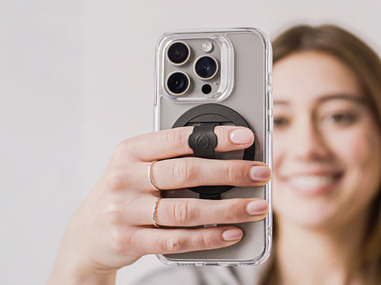

The Aeroloop achieves something remarkable – a grip and stand that completely disappears when not in use. Collapsing to just 2.4mm, it’s virtually invisible on your phone until you need it. The hyperlight composite construction maintains MagSafe compatibility while providing both comfortable finger loop functionality and landscape kickstand capability for hands-free viewing.
One-handed expandability works smoothly on hard cases, and the magnetic attachment is strong enough for secure hold yet easy to remove when needed. The included MagSafe adapter makes any hard smooth case compatible, while MagSafe spacers let you adjust magnetic strength if needed. The dual-sided magnetic design requires care around sensitive surfaces but provides incredible versatility.
Why You Should Buy It
The Aeroloop eliminates the bulk and awkwardness of traditional grips while providing superior functionality. The ultra-thin collapsed profile means it never interferes with pockets or wireless charging, yet expands instantly when needed for a secure grip or hands-free viewing. MagSafe compatibility ensures it works perfectly with your iPhone 17 Pro’s magnetic ecosystem, making it the most elegant grip solution available.
5. MagBeat MagSafe Speaker


The MagBeat redefines portable audio by combining aerospace aluminum construction with MagSafe convenience. This isn’t just another Bluetooth speaker – it’s a luxury audio experience that magnetically attaches to your iPhone 17 Pro while maintaining full wireless charging capability. The IP-67 rating ensures it handles dust and water without missing a beat.
With 10+ hours of battery life, the MagBeat provides all-day audio for work, travel, or entertainment. TWS capability lets you pair two units for stereo sound, while the upcoming Auracast feature will enable the connection of multiple MagBeats for room-filling audio. The spacecraft-grade build quality matches your iPhone’s premium construction while delivering audio performance that rivals much larger speakers.
Why You Should Buy It
The MagBeat transforms your iPhone 17 Pro into a premium audio system without sacrificing portability or charging functionality. The magnetic attachment creates a seamless experience – just snap it on and enjoy superior sound quality anywhere. The rugged construction and long battery life make it reliable for daily use, while the luxury materials and engineering justify the investment for anyone who values both audio quality and design excellence.
Complete Your Ultimate iPhone 17 Pro Setup
These five essentials work together to create an iPhone 17 Pro experience that goes far beyond what Apple provides out of the box. The screen protector preserves your investment while enhancing usability. The power bank eliminates battery anxiety without adding bulk. The camera grip unlocks professional photography capabilities. The Aeroloop provides ergonomic comfort and hands-free convenience. The MagBeat delivers premium audio that matches your phone’s quality.
What makes this setup special isn’t just individual product quality – it’s how they complement each other to solve real problems. You’re not just buying accessories; you’re investing in a complete ecosystem that enhances every aspect of iPhone ownership. From protection and power to creativity and entertainment, these products ensure your iPhone 17 Pro reaches its full potential in every situation.
The post Top 5 iPhone 17 Pro Setup Essentials for 2025 first appeared on Yanko Design.
No Hour Hand, No Minute Hand: The $299 Triarch Watch Tells Time With Magnets
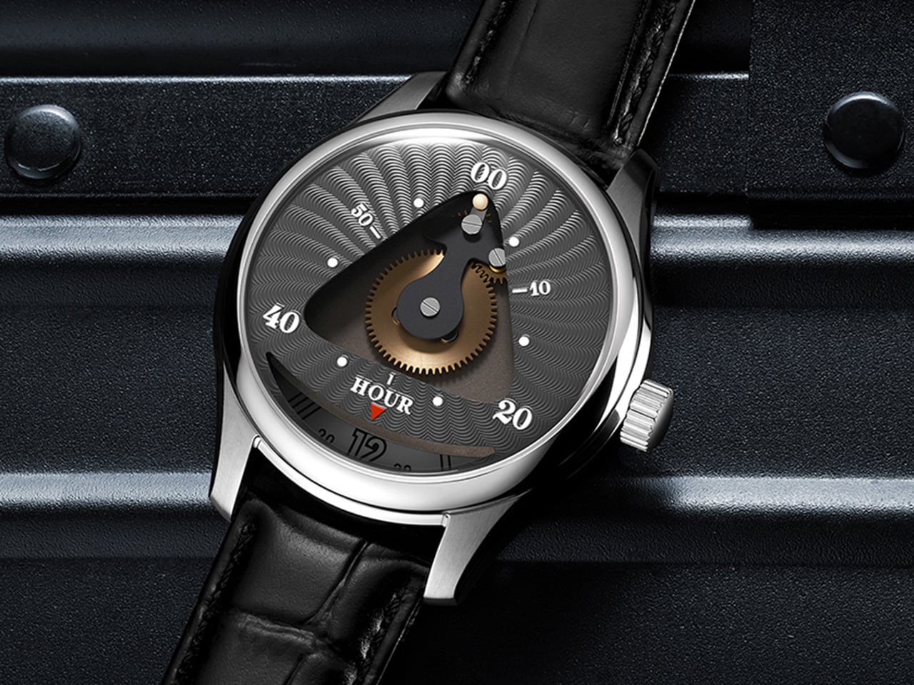
Time is usually measured in straight lines and sweeping hands, but Triarch bends that rule into a triangle. Instead of conventional hands, its custom movement drives a rotating minute dial while a tiny ball traces a precise triangular path. Every glance becomes a small discovery, as the orbiting ball and shifting dial transform timekeeping into a kinetic sculpture on the wrist.
The design leans fully into the symbolism of the triangle, a shape long associated with stability, harmony, and eternity. From ancient pyramids to sacred geometry, the triangle has stood for structure and balance, and Triarch pulls that mythology straight onto the dial. The result is a watch that does not just show the time; it frames time inside a geometric icon that feels both timeless and futuristic.
Designer: Ken
Click Here to Buy Now: $299 Hurry! Only limited units left.
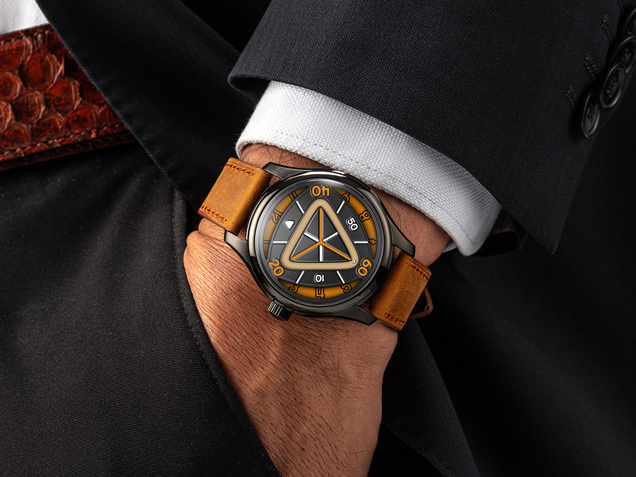
Reading the Triarch takes a second to learn but makes sense quickly. Hours are tracked on a rotating outer dial marked from 1 to 12, spinning continuously beneath a fixed reference point. Meanwhile, the minutes are indicated by a small ball that travels along a triangular track, moving in sync with the passage of time. At the center sits an exposed golden gear, visible through a triangular window, acting as the mechanical heart that drives the entire system. This gear does not just function; it performs, turning the dial into a stage where mechanics and motion are always on display.
Triarch exists in two distinct variants, each interpreting the core concept differently. Triarch I is the more refined, dress-oriented expression. It features the original mechanical rotating dial with the triangle window prominently framing the golden gear and the hour module. The dial designs lean toward classical watchmaking aesthetics, with radiating guilloché-style patterns that catch light beautifully. Available in three colors, including teal, grey-black, and blue, Triarch I pairs its mechanical theater with a premium Italian leather strap and a polished stainless steel case. It is aimed at collectors who appreciate mechanical artistry wrapped in a quieter, more sophisticated package.
Triarch II takes the same foundation and pushes it into bolder, more experimental territory. This upgraded version adds an extra layer to the dial structure, creating more visual depth and making the internal architecture more visible. The most significant upgrade is the magnetic minute hand innovation. Instead of a traditional pointer, the minute indication on Triarch II jumps with magnetic force, creating a floating, almost sci-fi effect that sets it apart from conventional watches and even from Triarch I. Lume coverage is significantly expanded on Triarch II, with larger areas of Swiss Super-LumiNova applied across the dial, making it far brighter and more legible in the dark. Available in six colorways, including black with orange accents, teal, lime green, and others, Triarch II leans hard into a modern, almost cyberpunk vibe. It ships with a rugged Crazy Horse leather strap, a material known for its matte finish and ability to develop character over time.
Both models share the same mechanical platform and case architecture. The movement is a Miyota 9039 automatic, a 24-jewel Japanese caliber running at 28,800 beats per hour with a 36-hour power reserve and accuracy rated to around plus or minus 10 seconds per day. Mounted on top is the in-house rotating hour module, the complication that makes the entire display possible. The case is 316L stainless steel, measuring 42mm wide and 14.16mm thick, with a double-domed sapphire crystal up front treated with multi-layer anti-reflective coating. The caseback is also sapphire, offering a view of the Miyota movement and parts of the custom module. Water resistance is rated to 5 ATM, or 50 meters, suitable for daily wear but not serious water sports. Both versions use 20mm lugs with quick-release spring bars, making strap swaps effortless.
Triarch positions itself somewhere between horology and wearable art, offering a genuinely different way to interact with time. The $299 Triarch I appeals to those who want mechanical poetry in a relatively subdued form, while the $359 Triarch II targets enthusiasts chasing visual boldness and technical novelty. Either way, the triangle is not just decoration here; it is the entire logic of the watch. Both the Triarch I and Triarch II ship free globally, with an extra strap included in the box.
Click Here to Buy Now: $299 Hurry! Only limited units left.
The post No Hour Hand, No Minute Hand: The $299 Triarch Watch Tells Time With Magnets first appeared on Yanko Design.
This School Chair Concept Has 3D-Printable Replacement Parts
Old school chairs like the Mullca were built to survive decades of abuse, with welded steel frames and bolted parts that could outlast the building itself. That durability was impressive, but it also meant the chairs were impossible to take apart or repair at home if something did eventually break. Contemporary designers are questioning whether indestructibility is the only way to think about longevity, with design for disassembly and repair becoming just as important as raw toughness.
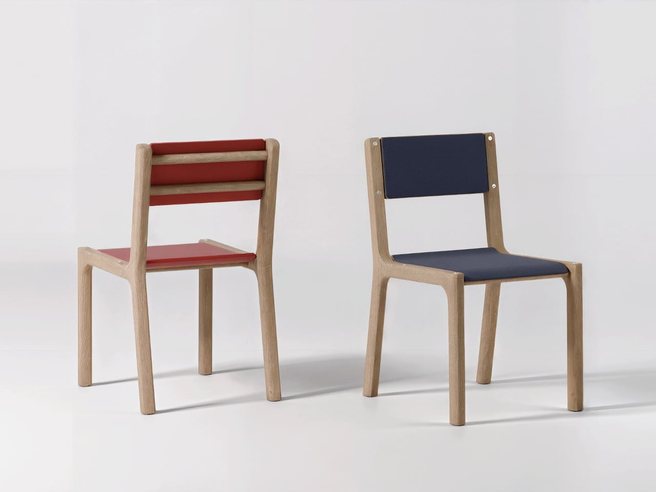
Carrousel is a chair concept by Thibaud Rollet that starts from the familiar silhouette of nostalgic school chairs but shifts the focus to how it is assembled and maintained. Instead of chasing the legendary durability of a Mullca, Carrousel is designed to be easy to produce, disassemble, and repair, with individual elements that can be replaced or even 3D printed by the user at home when parts wear out or need refreshing.
Designer: Thibaud Rollet
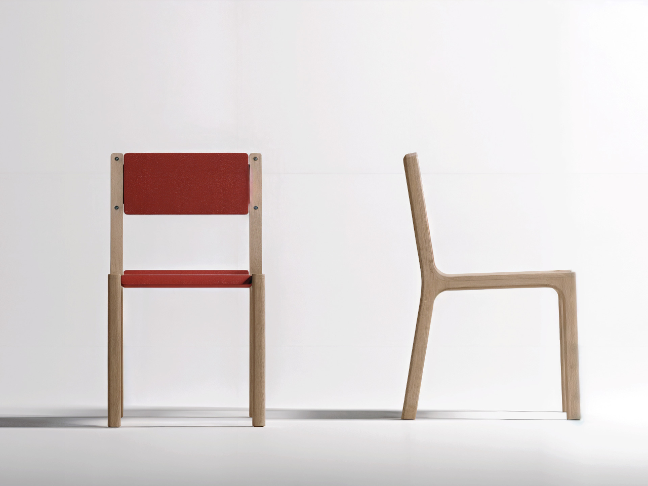
The basic construction is straightforward. A bent or laminated wooden frame forms the legs and backrest supports, while horizontal traverse pieces carry the structural load. The seat and backrest are separate panels fixed with four screws each, visible on the surface. Those screws bite into metal threaded inserts embedded in the wood, so panels can be removed and reattached repeatedly without damaging the material or stripping the threads.
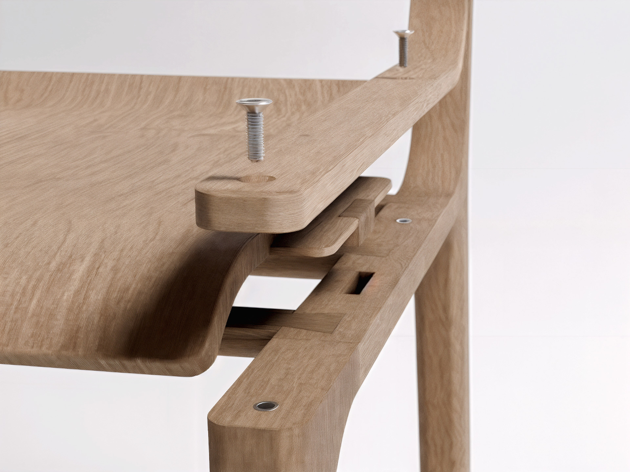
The covering L-shaped pieces sit over the joints between the frame and the seat or backrest. These parts are held in place by the screws and inserts, and they are the most likely candidates for 3D printing. Users could swap them out to change colors, textures, or even shapes, turning a functional joint into a place for customization and personal expression without needing professional tools.
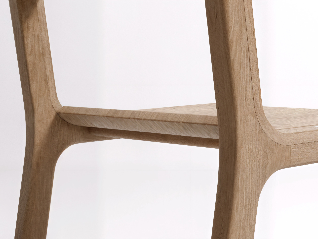
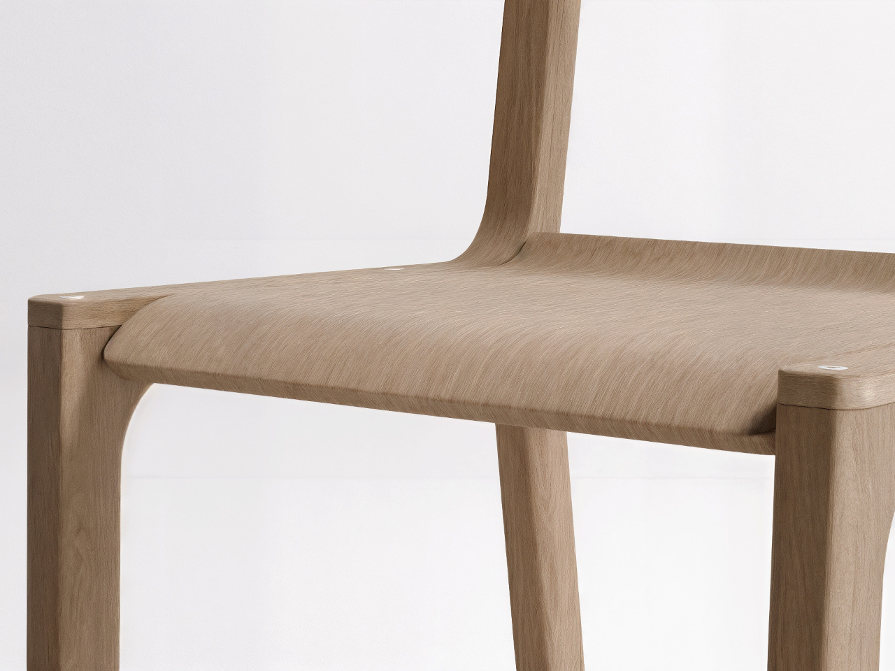
The visible screws and simple joinery send a clear message that the chair is meant to be taken apart, not treated as a sealed object. Instead of hiding the assembly, Carrousel uses it as part of the aesthetic language. That openness encourages people to replace worn panels, refresh the look, or tinker with new parts, extending the chair’s life in a way that feels approachable rather than intimidating.
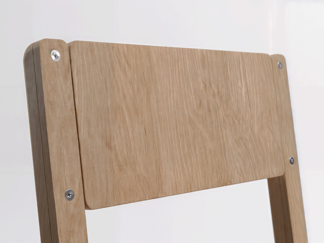
Of course, swapping a backrest or changing the covering pieces can refresh the chair without replacing the whole thing, and the act of playing with those options adds emotional value. When you’ve customized or repaired something yourself, you are more likely to keep it around rather than send it to the curb when a screw loosens or a panel gets scratched.
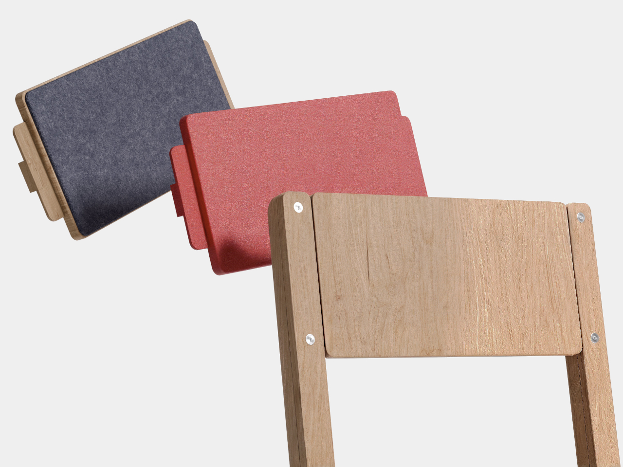
Carrousel borrows the reassuring outline of a school chair but rewires the logic underneath, making it easy to disassemble, repair, and personalize. It suggests that the next generation of everyday chairs might be less about lasting untouched forever and more about being easy to live with, update, and care for. That shift from indestructible to repairable might end up keeping more furniture out of landfills than any amount of added steel ever could.
The post This School Chair Concept Has 3D-Printable Replacement Parts first appeared on Yanko Design.
This Finger Toothbrush Makes Oral Care Fun for Tiny Humans
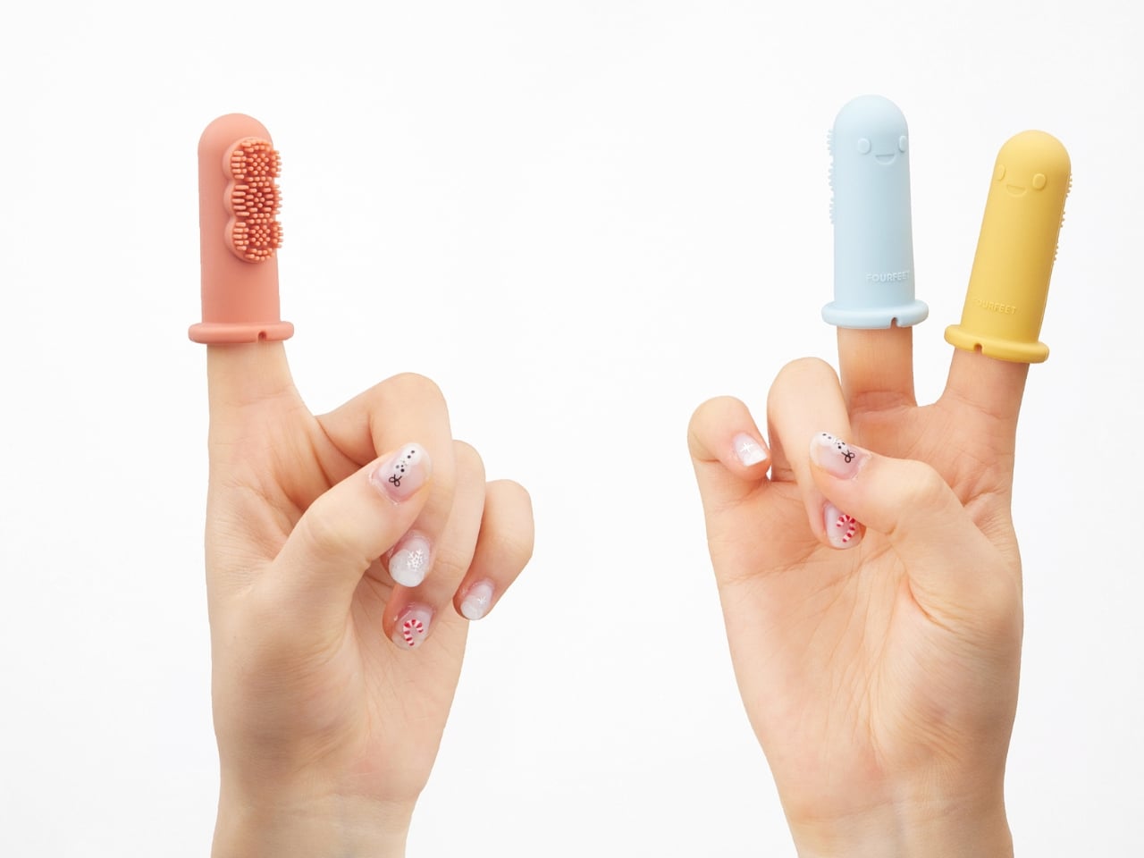
Getting a baby to brush their teeth is basically an Olympic sport. You’ve got squirming, crying, and a tiny human who thinks the toothbrush is an enemy. But what if brushing teeth didn’t have to feel like dental warfare? That’s exactly what mmmdesign studio set out to solve with their Dino brush, a finger toothbrush that transforms tooth-brushing time from scary to playful.
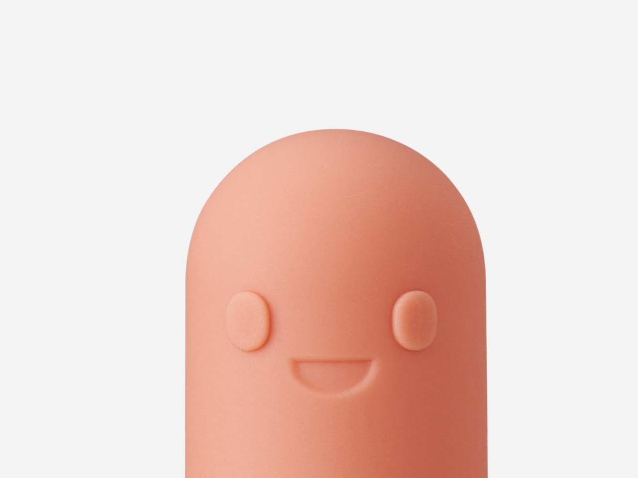
At first glance, the Dino brush looks more like a toy than a hygiene product, and that’s completely intentional. The design features an adorable dinosaur character that fits right over a parent’s finger, turning mom or dad into a friendly puppet that happens to clean teeth. It’s clever emotional engineering. Instead of approaching a baby with what looks like a clinical tool, you’re introducing them to a cute little dino friend. The psychology here is brilliant: babies are naturally curious and responsive to characters and faces, so this design taps right into that developmental sweet spot.
Designer: mmmdesign studio
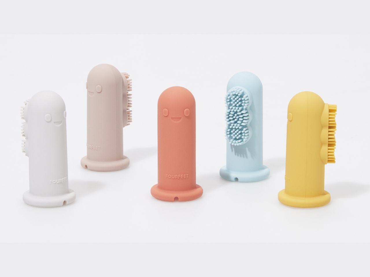
The product addresses a genuine pain point for new parents trying to establish healthy oral care habits. That first introduction to tooth brushing often sets the tone for years to come, and if it’s traumatic, you’re in for battles at bedtime for the foreseeable future. By designing something that reduces fear and discomfort, the Dino brush isn’t just solving a functional problem but an emotional one too.

From a design perspective, what stands out is the thoughtfulness behind every curve and color choice. The soft, rounded forms feel non-threatening, while the bright, cheerful colors appeal to infant visual development. The dinosaur character has big, friendly eyes and a welcoming expression. There’s no sharp edges or intimidating features, just pure approachability. This kind of attention to psychological design shows that mmmdesign studio understands their end users on multiple levels: not just the babies using the brush, but also the stressed-out parents wielding it.

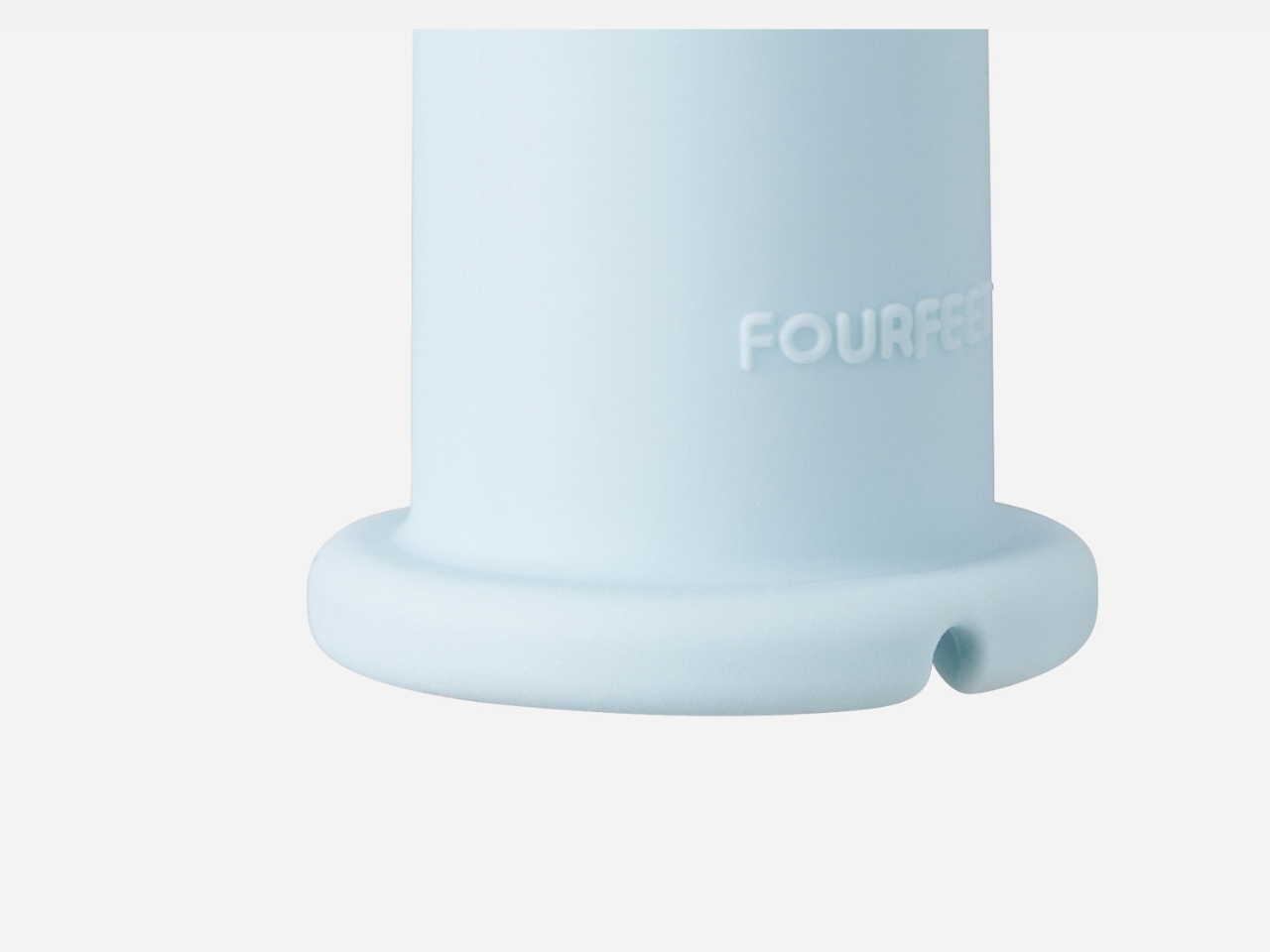
The finger-worn format is also genius from a practical standpoint. Parents get complete control and sensitivity, feeling exactly how much pressure they’re applying and being able to reach every corner of those tiny mouths. Traditional baby toothbrushes with handles can be awkward and imprecise, but with the Dino brush, you’re using your most dexterous tool (your finger) enhanced with gentle bristles. It’s intuitive in a way that makes the learning curve practically nonexistent.
What’s particularly interesting is how this design fits into a larger trend of “design for delight” in everyday objects. We’re seeing more and more products that don’t just fulfill a function but actively make mundane tasks more enjoyable. From gamified apps to character-based products, designers are realizing that emotional engagement isn’t frivolous but it’s actually essential to adoption and consistent use. A toothbrush that makes a baby smile is a toothbrush that actually gets used.

The Dino brush also reflects thoughtful consideration of the entire experience ecosystem. It’s not just about the moment of brushing but about building positive associations with oral care from the very beginning. That’s the kind of long-term thinking that separates good design from great design. You’re not just creating a product; you’re shaping behavior and attitudes.
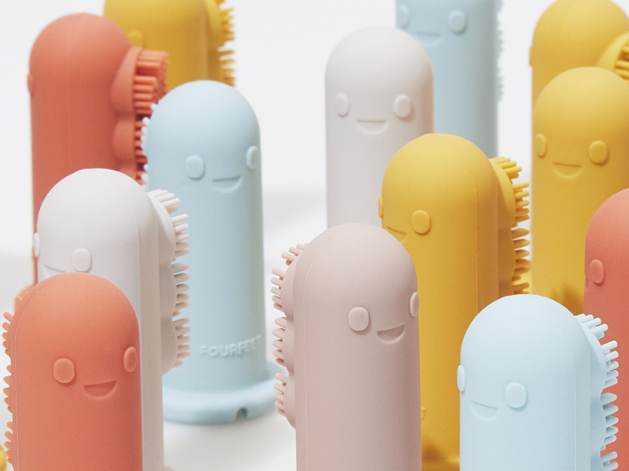
For design enthusiasts, this project is a masterclass in empathy-driven design. mmmdesign studio clearly spent time understanding the real challenges of their target users and created something that addresses both practical and emotional needs. It’s product design that remembers people (even tiny people) are emotional beings first and functional ones second.

We’re constantly bombarded with overcomplicated gadgets and unnecessarily techy solutions but the Dino brush is refreshingly simple. It takes an age-old problem and solves it with charm, thoughtfulness, and a deep understanding of human (and tiny human) psychology. Sometimes the best innovations aren’t about adding more features but about making something fundamentally more human. Or in this case, more dino.

The post This Finger Toothbrush Makes Oral Care Fun for Tiny Humans first appeared on Yanko Design.
3 Seoul Gadget Concepts That Transform When You Need Them Most
Here’s the thing about living in a city. You’re always caught between two opposing needs. You want to tune out the world on your commute, but also crave those spontaneous outdoor moments with friends. You need to look professional on video calls, but sometimes you just want to capture a memory for yourself. Your laptop runs hot, and honestly, so do you after a long day. It’s exhausting, this constant push and pull.
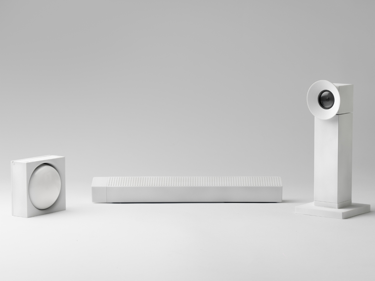
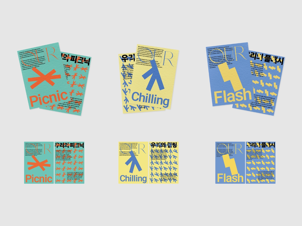
Designer Junwoo Lim has been paying attention to these contradictions. His “Our Seoul” project isn’t about creating more gadgets we don’t need. It’s about recognizing that our daily desires are complicated, and maybe our objects should be too. The series includes three products, each designed around a specific urban tension: Our Picnic, Our Flash, and Our Chilling. Together, they explore how reality and personal longing can coexist in the same space, the same device, the same moment.
Designer: Junwoo Lim
Create your own Aesthetic Render: Download KeyShot Studio Right Now!
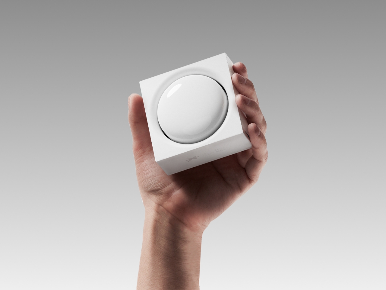
Let’s start with Our Picnic, because it perfectly captures something we all experience. Most mornings, you’re plugging in earbuds to create a bubble of privacy during your commute, shutting out surrounding sounds to protect your sanity. But then the weekend arrives, and suddenly you want the opposite. You want to be outside, sharing music, letting sound fill the space around you. Picnic bridges these two modes by transforming from earbuds into a speaker. Rotate the inner body 180 degrees, and what was personal becomes communal. When you’re outdoors, you can even rotate the back section 45 degrees to prop the device on the ground. The main body holds a 600 mAh battery while each earbud contains about 50 mAh, giving you flexibility for both modes. It’s a simple mechanical solution to an emotional need.
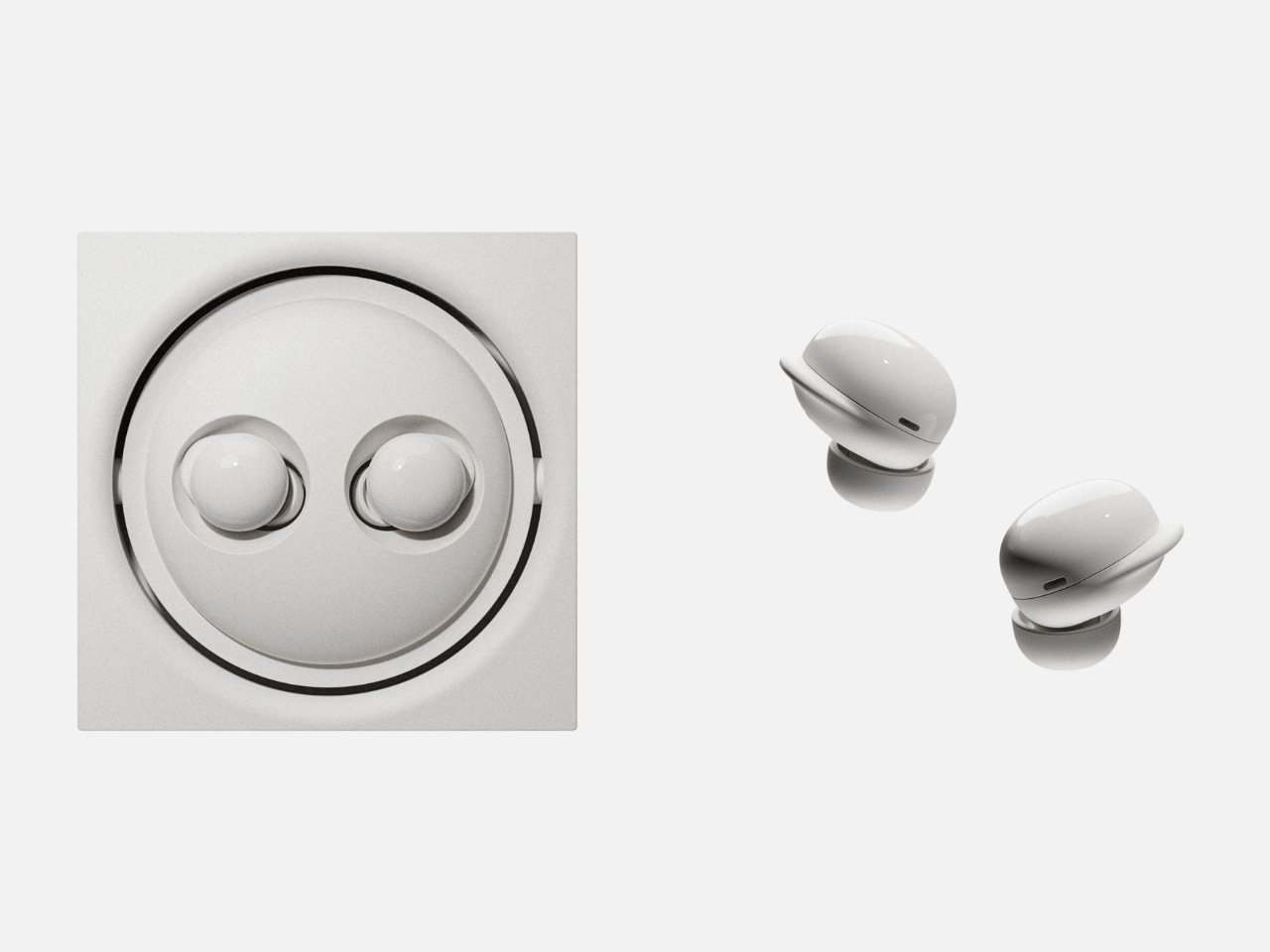
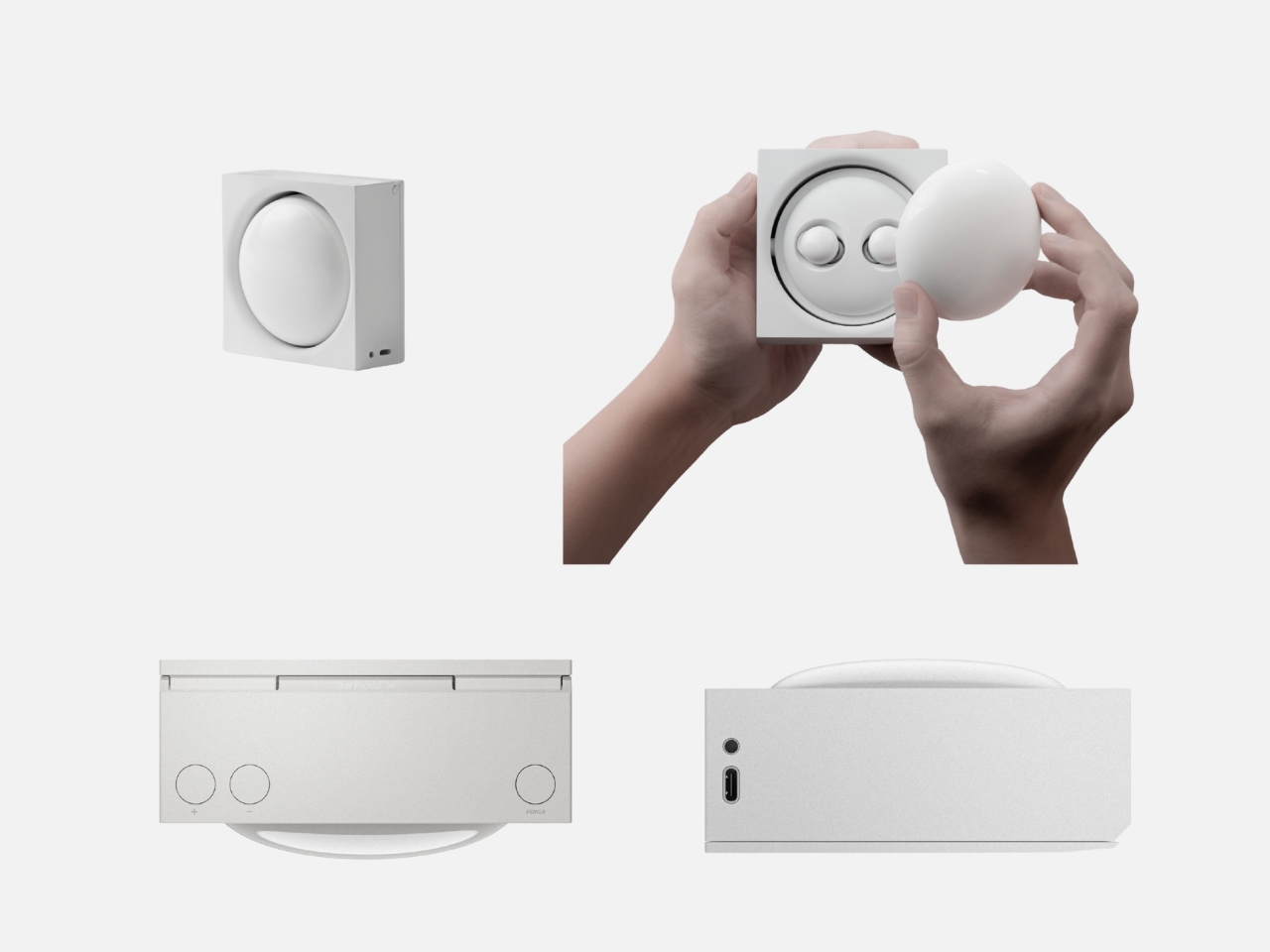
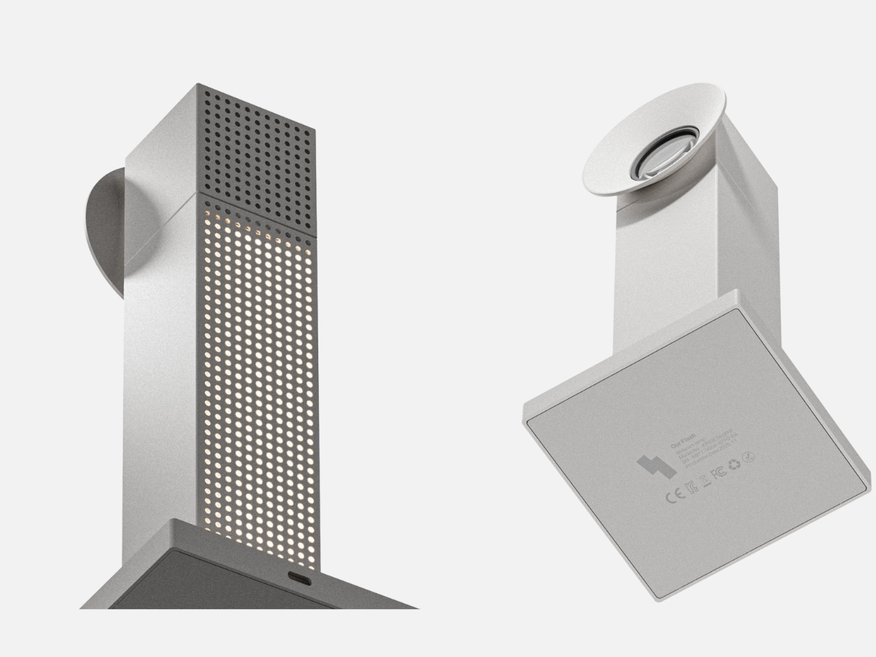
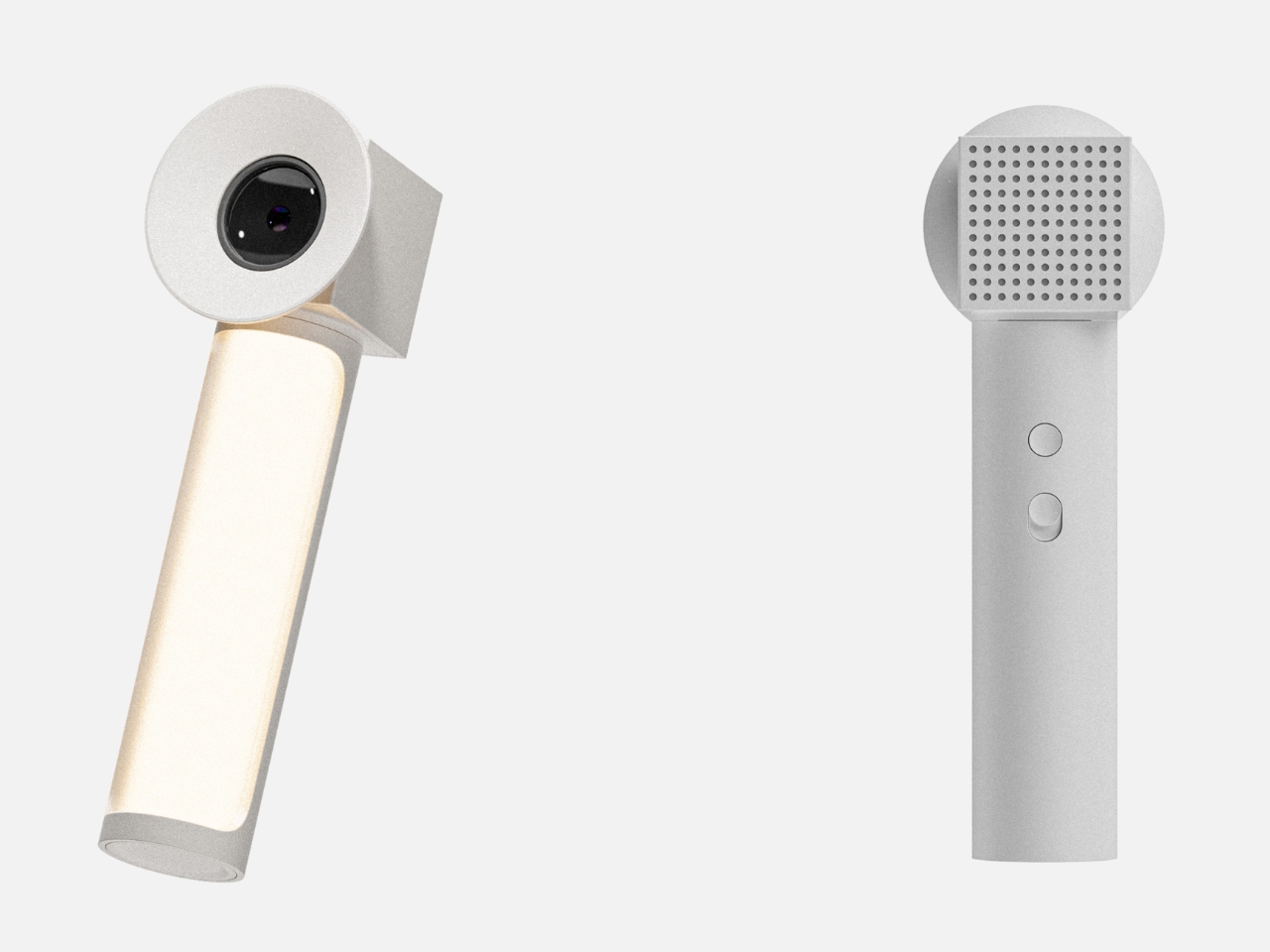
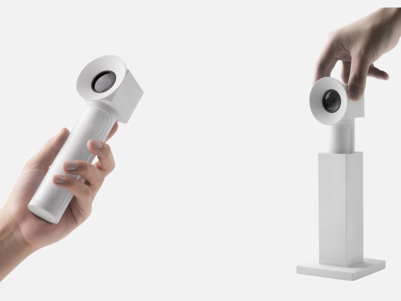
Our Flash tackles a different kind of duality, one that’s become painfully familiar in our video call era. Cameras are constant observers now. We exist within someone’s field of vision during meetings, always aware of being watched. But we’re also the ones doing the watching and recording, capturing moments we want to preserve and control. Flash merges these experiences into a hybrid camera unit that functions as both webcam and selfie camera, positioned somewhere between “the me that is seen” and “the me I want to show.” As a desk webcam, it handles your professional presence. But lift the head section, and the internal selfie camera detaches, ready for personal documentation. The clever part? That perforated central section that normally serves as a vent becomes a 360-degree rotating desk lamp when the internal light activates. It’s surveillance and self-expression and ambient lighting, all depending on what you need in that moment.
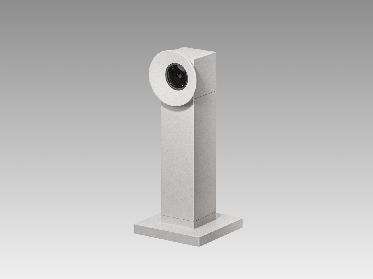
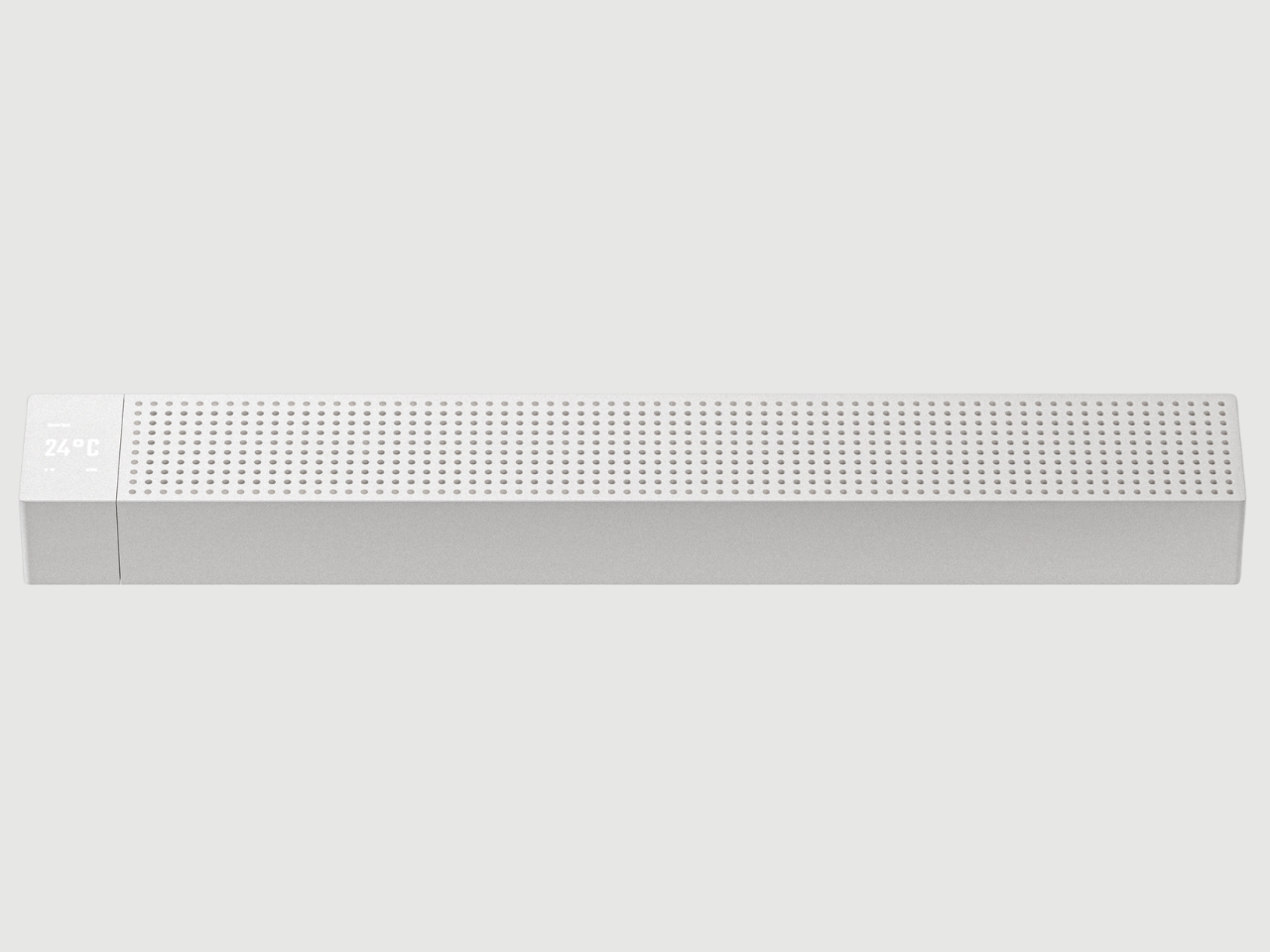
Then there’s Our Chilling, which might be the most relatable concept of all. We spend our lives surrounded by devices that need cooling. Laptops, desktops, gaming rigs. We’re constantly monitoring temperatures, adjusting fan speeds, making sure our machines don’t overheat. But who’s taking care of us? Chilling functions primarily as a laptop cooler with Bluetooth connectivity, letting you monitor CPU and GPU temperatures in real time and adjust cooling intensity through your laptop’s software. The bottom stand even adjusts the tilt angle for ergonomic positioning. But here’s the twist: flip it over, and those tower fan blades inside suddenly serve a different purpose. It becomes a desktop fan, one that can monitor room temperature just like it monitors your laptop’s heat. The same stand that adjusts your laptop angle now controls the fan’s direction. It’s a reminder that in a life where work and rest blur together, maybe we deserve the same attention we give our machines.
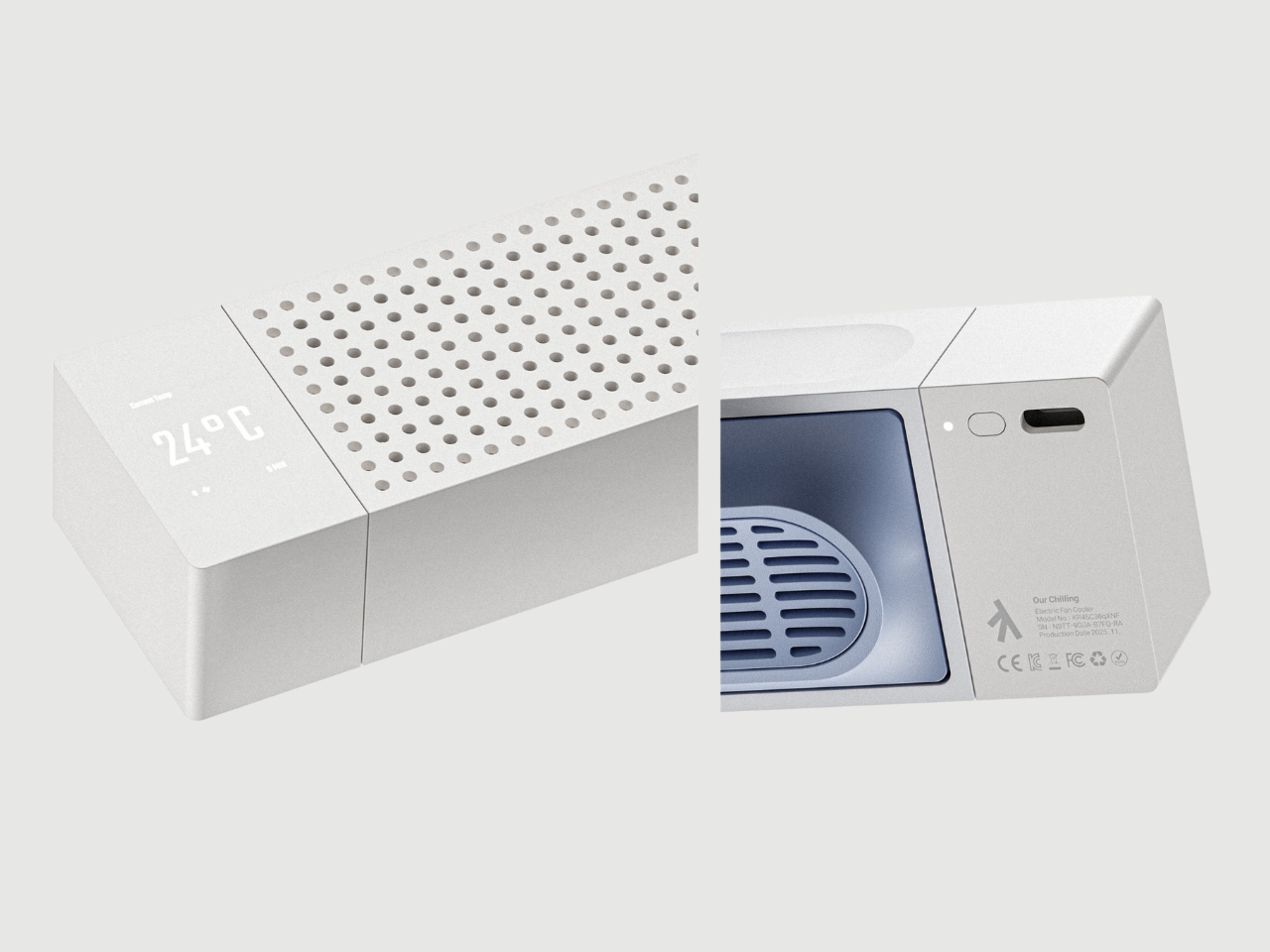
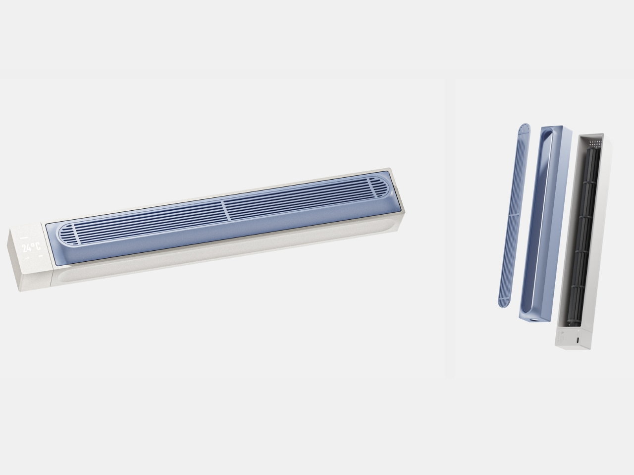
What makes this project compelling isn’t the technical specs or the minimalist aesthetic, though both are thoughtfully executed. It’s the underlying philosophy. Lim isn’t trying to simplify urban life or pretend we can eliminate its contradictions. Instead, he’s designing objects that acknowledge the messiness, the constant switching between modes, the way we’re always negotiating between competing needs. The “Our Seoul” series suggests that good design doesn’t resolve tension. It accommodates it.
These are concepts rather than products you can order today, but that’s exactly what makes them valuable. They capture something true about how we’re living right now, in cities that demand constant adaptation, surrounded by technology that often feels like it’s designed for a simpler, more consistent version of ourselves. We’re not that simple. Maybe our objects shouldn’t be either.
The post 3 Seoul Gadget Concepts That Transform When You Need Them Most first appeared on Yanko Design.
A decision about breaking up Google’s adtech monopoly is on the horizon
Google made its final arguments in a longstanding case against the US Department of Justice on whether it has to split up its ad tech practices. However, the judge presiding over the case may be looking to wrap up the case before Google has a chance to appeal, according to a report from Reuters.
On Friday, both sides made their closing statements in the lawsuit where the Justice Department accused the tech giant of illegally monopolizing the ad tech market. While the US District Court Judge Leonie Brinkema ruled in April that Google held a monopoly in the online adtech space, the judge recently asked the Justice Department how quickly an anticompetitive measure could go into effect, adding that "time is of the essence."
Google's attorney, Karen Dunn, argued that forcing Google to sell its advertising tech subsidiary would be extreme and hurt customers in the process, according to the report. Google is also reportedly planning to appeal the latest decision. According to Reuters, Brinkema noted that any sort of remedy "most likely would not be as easily enforceable while an appeal is pending," meaning that Google could delay the forced sale until the appeal is concluded. At the same time, Google is facing a $3.5 billion fine for violating the European Union's antitrust laws within the adtech industry.
This article originally appeared on Engadget at https://www.engadget.com/big-tech/a-decision-about-breaking-up-googles-adtech-monopoly-is-on-the-horizon-184409011.html?src=rssSabreSat Air-Breathing Satellite Treats the Upper Atmosphere Like Fuel
Most satellites avoid very low Earth orbit because the atmosphere is still thick enough to drag them down in days or weeks without constant propulsion. That said, Very Low Earth Orbit (VLEO) satellites offer sharper imagery with smaller optics and lower latency for communications if you can survive there. Redwire’s SabreSat is a satellite designed to live in that zone on purpose, using the air that normally kills spacecraft as part of its propulsion strategy.
SabreSat is Redwire’s VLEO-optimized satellite bus, chosen by DARPA for its OTTER program to demonstrate sustained operations in very low orbit. The platform is modular and built for Earth observation and atmospheric sensing, but its most interesting option is an air-breathing propulsion system that literally inhales thin air, ionizes it, and throws it out the back as thrust instead of relying on stored propellant alone.
Designer: Redwire
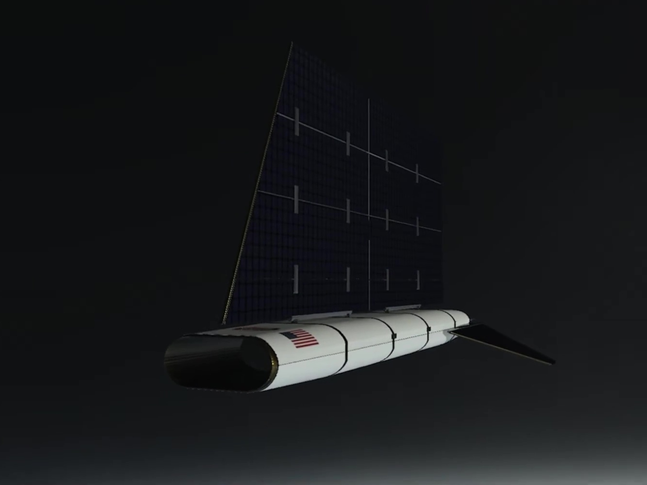
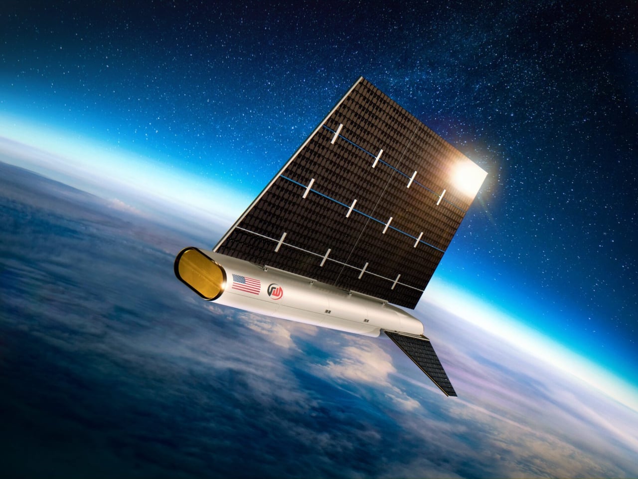
The overall shape from the renders looks more like a glider or flying wing than a cube with panels. A long, rounded fuselage with an oval nose, a huge vertical solar sail rising from the top, and two canted tail fins on each side. It has a clear nose, body, and tail rather than a generic bus, which makes sense for a spacecraft that has to fly through fluid instead of coasting in a vacuum.

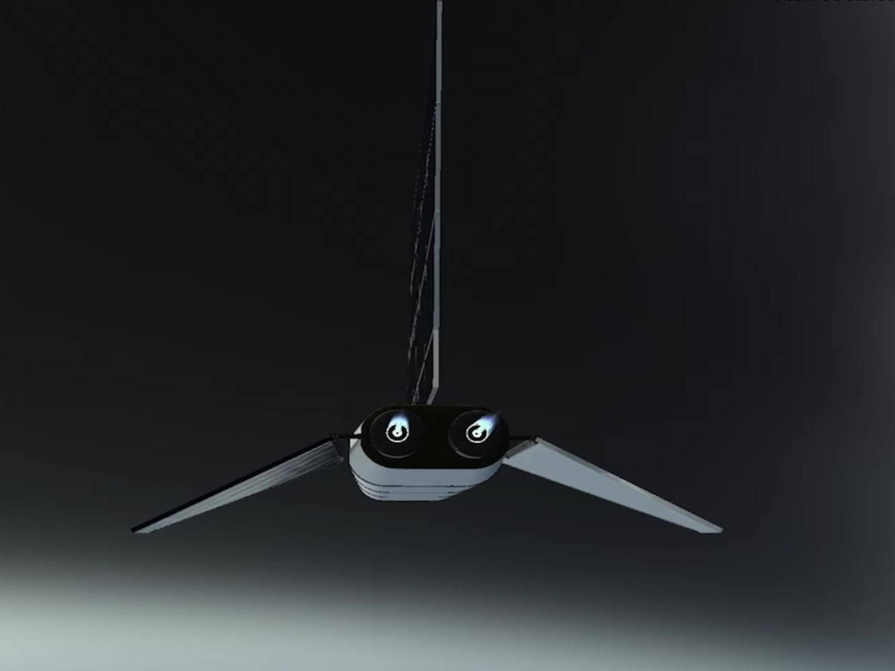
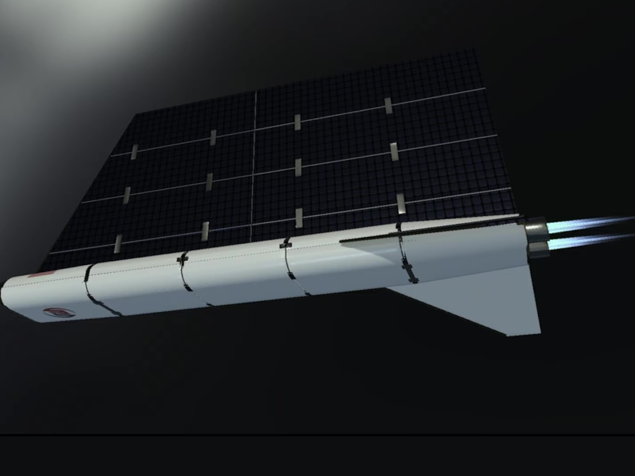
The large vertical surface is clearly a solar array, covered in a dense grid of cells and framed in gold. Its size and placement suggest an aerodynamic role as well. In VLEO, that panel can act like a sail or stabilizer, helping align the spacecraft with the flow and giving attitude control systems something to work with. It’s a power source and an aerodynamic surface wrapped into one.
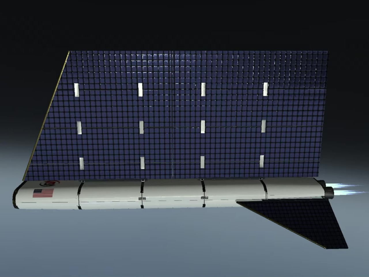
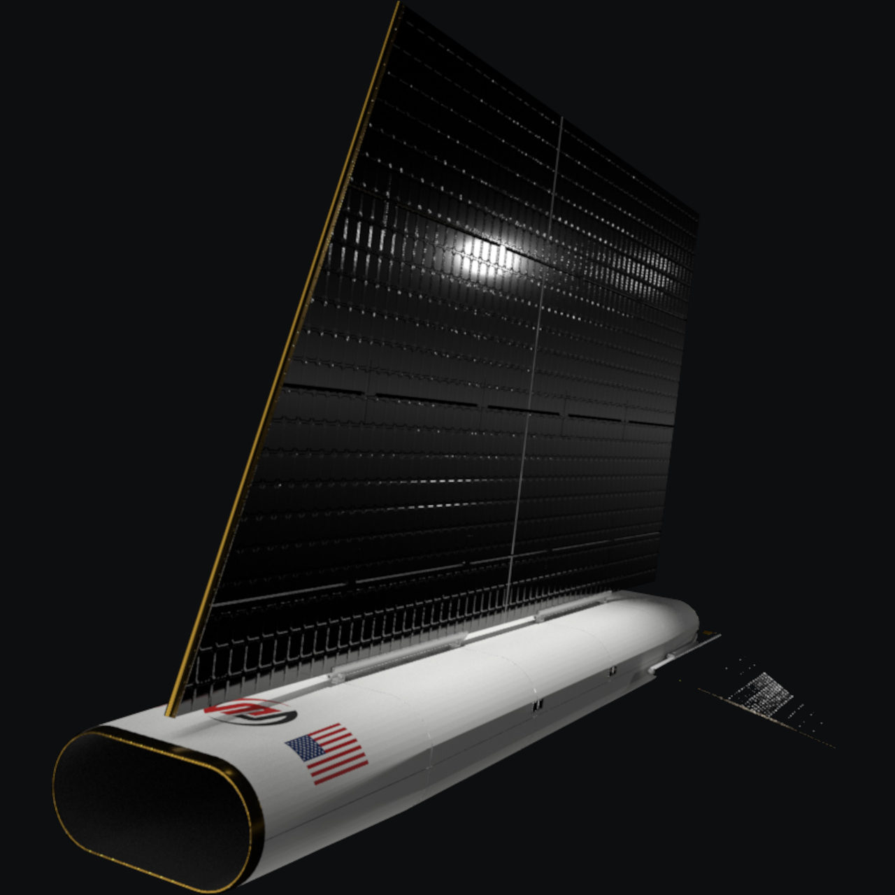
The fuselage and tail support the air-breathing concept. The smooth, rounded nose and long body are consistent with reducing drag and possibly funneling air toward an intake region inside. At the back, renders show twin exhaust plumes emerging from the aft end, hinting at an electric thruster fed by harvested air. The canted tail fin adds stability and helps manage the angle of attack in the thin atmosphere.
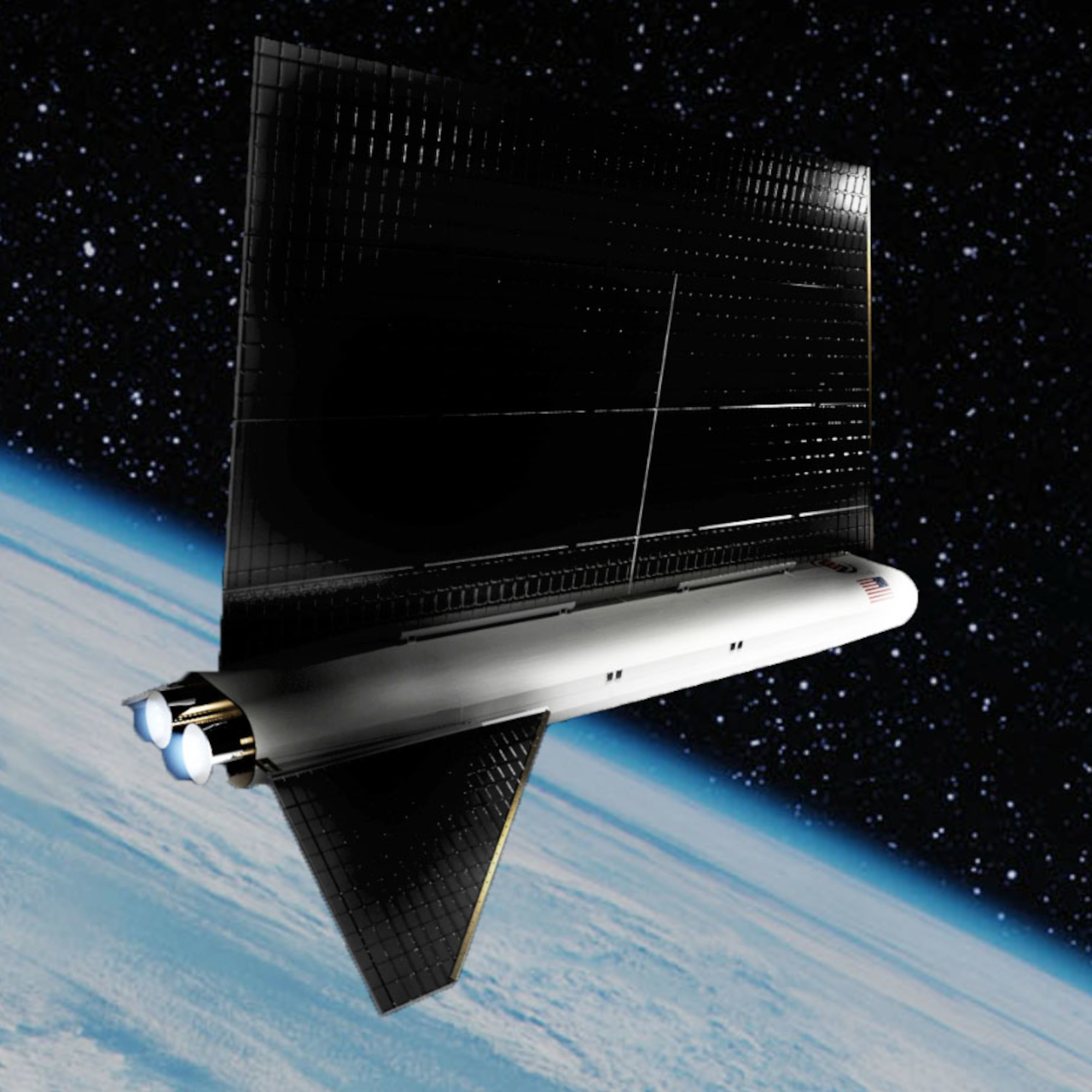
The air-breathing system is optional. SabreSat can fly as a more conventional VLEO satellite using stored propellant, or as an air-breathing craft that uses the atmosphere as reaction mass. That flexibility lets operators choose between shorter, simpler missions and long-duration, highly maneuverable flights that treat VLEO more like an operating layer than a decay zone where satellites eventually burn up.

SabreSat is a glimpse of what satellites might look like when we stop pretending space is always empty. Its flying-wing silhouette, solar sail, and air-breathing option suggest a future where spacecraft skim the upper atmosphere, sensing it and using it as fuel at the same time. It’s a reminder that the most interesting design work often happens where two environments overlap.

The post SabreSat Air-Breathing Satellite Treats the Upper Atmosphere Like Fuel first appeared on Yanko Design.
Microsoft isn’t releasing a diversity report for 2025
Microsoft will not release a diversity and inclusion report for 2025 like it has been doing every year since 2019, Stephen Totilo from Game File has reported. Totilo asked the company if it was skipping this year after it failed to publish a report from October to early November like it had done so the previous years. “We are not doing a traditional report this year as we’ve evolved beyond that to formats that are more dynamic and accessible — stories, videos, and insights that show inclusion in action,” said Microsoft’s chief communications officer, Frank Shaw, in a statement. “Our mission and commitment to our culture and values remain unchanged: empowering every person and organization to achieve more.”
As Totilo notes, the Trump administration made it very clear early on that it was against government and corporate diversity, equality and inclusion programs. Trump signed executive orders directing government agencies to roll back DEI initiatives and encouraged the private sector to do the same. Meta reportedly ended its DEI programs earlier this year, while Google reportedly announced that it will “no longer set hiring targets to improve representation in its workforce.”
Totilo previously reported that Microsoft didn’t mention anything about its diversity programs in two shareholder reports for 2025, signifying that the company wasn’t highlighting its DEI initiatives anymore like it did the previous years. Based on its statement, Microsoft isn’t completely dropping its DEI efforts. Without a report, however, we can’t keep an eye on its progress when it comes to things like pay equality and workforce diversity.
This article originally appeared on Engadget at https://www.engadget.com/big-tech/microsoft-isnt-releasing-a-diversity-report-for-2025-180000401.html?src=rssWaymo gets California DMV’s approval to test robotaxis in more areas
The California DMV has approved Waymo’s request to conduct driverless testing and to deploy its robotaxis in more locations in the state. As CBS News reports, Waymo now has the permission to operate across the whole Bay Area, Sacramento and most of Southern California up to the border of Mexico. It’s a huge expansion, based on the maps the state DMV has provided. In the images below, you’ll see Waymo’s old areas shaded in a darker color, while the locations with a lighter shade indicate areas added in the expansion.

“We're officially authorized to drive fully autonomously across more of the Golden State,” Waymo said in an announcement on X. It didn’t say when it’ll start testing and offering rides to the public in the new areas, but it said the company’s “next stop” in California after this is San Diego. Waymo will start offering rides in the city sometime in mid-2026. It will also deploy robotaxis in Las Vegas, including the Strip with plans to expand to the airport, and Detroit next year. In addition, it recently announced that it’s coming to Miami, Dallas, Houston, San Antonio and Orlando in 2026.
On the Waymo and San Francisco subreddits, people pointed out that Waymo robotaxis could become a hit in Wine Country. People could call them for transportation, for instance, if they’re doing wine tasting.
This article originally appeared on Engadget at https://www.engadget.com/transportation/waymo-gets-california-dmvs-approval-to-test-robotaxis-in-more-areas-170000104.html?src=rss