Forget Smart Pens. This Titanium Fidget Pen Writes, Clicks, Spins, and Delights.

Your hands are restless by design. Even when you’re sitting still and supposedly focused, they want to press something, rotate something, click something into place. This tendency has been pathologized and productized in equal measure, first by disapproving teachers, then by the fidget spinner industry. But before any of that, there was just the pen. The clicking ballpoint. The cap you’d snap and unsnap. The barrel you’d roll between your knuckles during a long phone call. Pens have always had a secondary life as objects of physical preoccupation, and most people who’ve ever worked at a desk know exactly what that feels like.

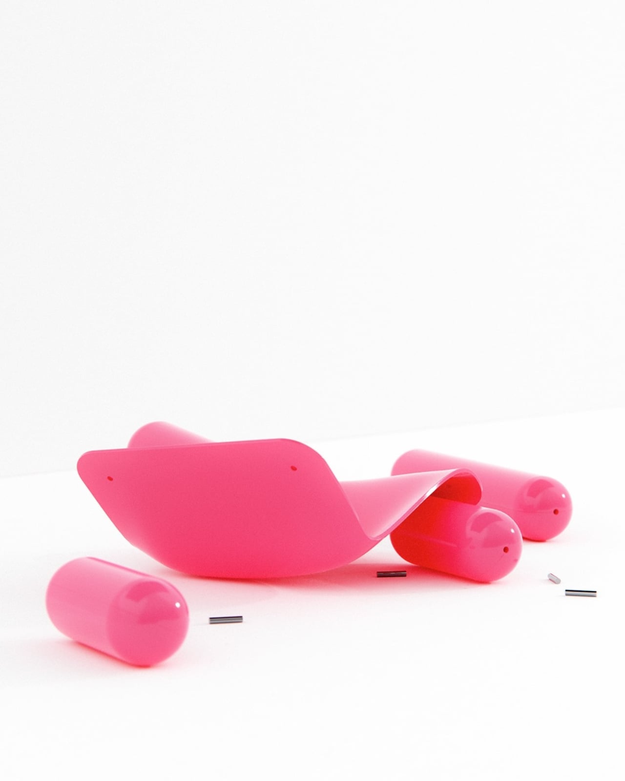
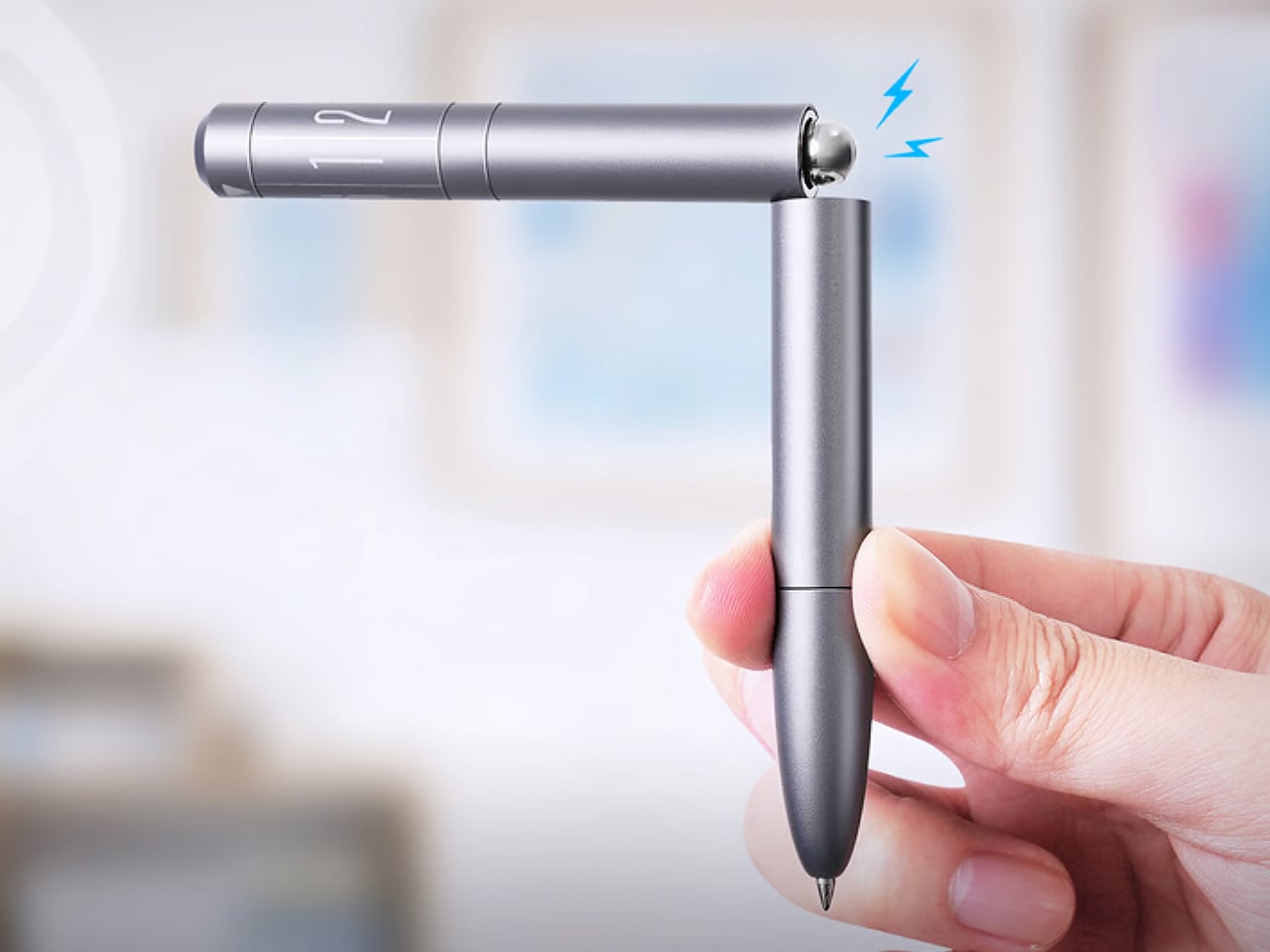
SPINNX takes that secondary life and makes it the whole point. Built by WEIWIN out of aerospace-grade titanium and held together by magnets, the pen separates into three modules that each deliver a distinct tactile sensation. Snap them together and there’s a crisp magnetic click. Press the spring-loaded ball in the middle and it gives you another one. Spin the dice top and it rotates through a series of rhythmic mechanical detents. The pen tip deploys with a twist rather than a click, because even the functional part of the experience has been thought through. Three years of development, ten design revisions, and one very specific goal: a pen that writes and delights.

Designer: WEIWIN

Click Here to Buy Now: $59 $102 (42% off). Hurry, only 168/200! Raised over $46,000.

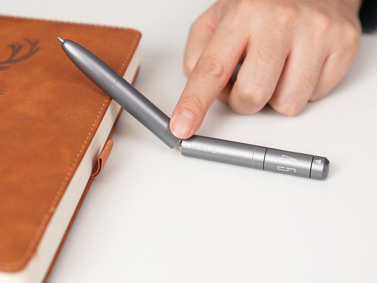
The three-part system allows you to reconfigure the pen’s entire sensory output. You can flip the middle module to put the spring-loaded ball on top for a different kind of thumb-actuated click. Each combination changes the weight distribution and the way the pen feels in motion, which creates a surprisingly deep rabbit hole of tactile experiences. The team claims over fifty different ways to spin and fidget with the thing, and that number feels plausible once you start playing with it. The design provides a whole palette of physical feedback, letting you find the specific sensation your brain needs at that moment to stay locked in.

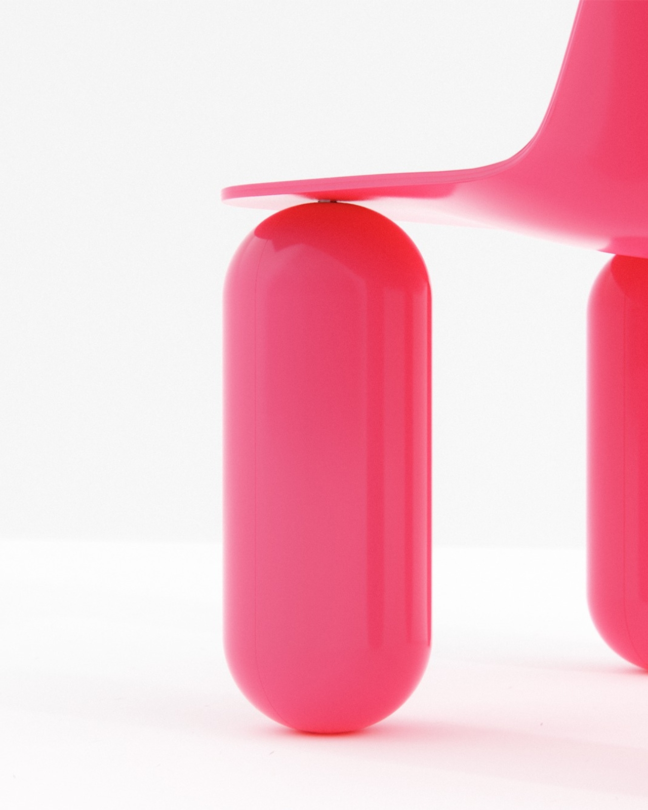
The snap of two modules connecting sounds like a well-tuned mechanical keyboard switch, something the designers obsessed over to ensure the end-product has a strong audio-visual-tactile experience. WEIWIN engineered the acoustic and tactile response of each magnetic separation and reconnection as an intentional product feature, treating the sound with the same design attention as the geometry… sort of like how luxury car designers obsess over how the doors sound when they close. Most clicking pens produce their click as a mechanical consequence, with nobody sitting in a room deciding whether it needs to be crisper or more controlled. With SPINNX, somebody clearly did sit in that room, and the result is a snap that feels sound-designed for sheer satisfaction.

The dice module functions like a high-quality EDC spinner, rotating with a series of crisp, audible clicks that feel like running your thumb over the crown of a well-made watch. Its ceramic bearing ensures the rotation is smooth and completely unaffected by the precision-engineered magnets holding the pen together. Choosing a non-metallic bearing is the kind of small, deliberate decision that separates a durable tool from a simple toy. Beyond the satisfying spin, it serves as a simple decision-making device. When you’re stuck between two choices, a quick roll gives you an answer, which is a surprisingly effective way to get past minor mental roadblocks.

Choosing aerospace-grade titanium for the body does more than just add a premium feel. The material provides a specific heft and durability that aluminum or steel can’t quite match, giving the pen a reassuring presence in the hand without being overly heavy. This balance is critical for an object designed for constant manipulation. The pen tip itself deploys with a smooth twist mechanism, which feels more deliberate and controlled than a standard clicker. WEIWIN also engineered its own proprietary “Super Refill,” which they claim has up to six times the writing life of a standard refill. Sure, it won’t work with standard refills, but standard refills only last 1/6th as long as the one that comes with the SPINNX.

There’s an optional Maglev Pen Stand that completes the package for anyone who spends most of their day at a desk. The stand uses magnetic levitation to balance the pen perfectly upright, letting it float and glide with a gentle touch. It turns the pen into a kinetic sculpture when you’re not using it, a piece of interactive art that settles back to its center with precision. This stand isn’t just for storage; it’s an extension of the pen’s core philosophy. It’s another way to engage your hands and mind with a simple, satisfying physical interaction, turning a moment of pause into something quietly delightful.

The standard SPINNX comes in four finishes. The base model is a silver-colored aluminum for $59, while the premium versions are offered in natural titanium, matte black titanium, and a striking brass-colored titanium for $69. For those who want the complete experience, a $99 Professional Kit bundles the pen with a leather pouch and other accessories. There are also several add-ons available separately, including extra refills, a calfskin leather pouch for protection, a spiral module to swap with the dice cap for a different visual flow, and the magnetic fidget sticks for more desk-based play. The Maglev Pen Stand is also available as a standalone $35 purchase. All SPINNX variants ship worldwide starting April 2026.

Click Here to Buy Now: $59 $102 (42% off). Hurry, only 168/200! Raised over $46,000.

The post Forget Smart Pens. This Titanium Fidget Pen Writes, Clicks, Spins, and Delights. first appeared on Yanko Design.

This Resin Chair Has a Real iMac, Magic Keyboard, and Mouse Sealed Inside It… Because ‘Art’

There’s a common saying that beauty hurts. Pretty shoes that blister your heels by noon. A dress cut so perfectly that breathing becomes a optional. The needle of a tattoo tracing something meaningful into your skin. Or even a surgical knife, for the dream of a better face or physique. People have always been willing to trade comfort for something that looks or feels transcendent, and the logic has always made a strange kind of sense. What I never anticipated was applying that same sentiment to sitting on an iMac.

Dip1, a chair by Korean designer Lim Wootek, takes that idea literally. The backrest is a real iMac monitor, its slim aluminum frame pressed against your spine as you settle in. It sounds wrong. It feels wrong. And somehow, that wrongness is exactly what makes it so addictive to look at. The keyboard, mouse, and storage bins are encased beneath the seat in a glowing block of cyan resin, visible through the haze like memories you recognize but can no longer touch. I guarantee you, you’ll grimace at the thought of sitting on the chair, as you lean back against what might be the most expensive and engineered backrest known to mankind.

Designer: Lim Wootek

The resin block is where the craft gets interesting. Lim sealed a full Apple Magic Keyboard, a Magic Mouse, and a set of colored desktop storage bins inside the body of the chair. The bins are the kind that live on studio shelves holding batteries, USB cables, and every small object that never quite found a permanent home. Through the semi-translucent resin, their shapes read clearly near the seat surface and dissolve into soft blur toward the base. That gradient from legible to ghosted is the whole thesis of the piece made physical, and it required real material control to pull off at this scale.

The iMac is a 27-inch model, the flat-chinned aluminum design that Apple ran from 2012 through 2022, with the display sitting at 68.6cm diagonally and the full unit standing around 65cm tall. These are not small numbers, and the chair has the presence to match. The monitor backrest positions the screen at exactly the height you would have once made eye contact with it, which means the sitter has literally turned their back on it. The screen now faces outward, away from the person in the chair, and that single spatial decision carries more conceptual weight than most designers manage in an entire project.

Standard seat height on the resin block sits at around 45cm, which is ergonomically normal, and that normality is part of what makes the piece so disorienting. You could actually sit in this. People do sit in this, as the campaign photos show. A figure in all black, hooded, leaning back against the aluminum monitor stand with the posture of someone who has fully accepted the situation. The chair functions, and that functionality makes the statement sharper rather than softer.

Lim Wootek’s studio works across industrial design, digital design, mold design, and CMF, and Dip1 has all four disciplines firing together. The resin body has soft radii on the seat edges and a gently tapered base that stops it from reading as a plain block. The cyan is specific, close to shallow tropical water, which is why the submerged objects feel genuinely drowned rather than just encased. Getting optical clarity, structural load capacity, and color depth to coexist in a resin cast this large is a serious material engineering problem, and the fact that it reads as effortless is the tell of someone who actually knows what they’re doing.

The post This Resin Chair Has a Real iMac, Magic Keyboard, and Mouse Sealed Inside It… Because ‘Art’ first appeared on Yanko Design.

This $98,900 Tiny House Is How Australians Are Ditching Rent and Finally Owning Something

The housing crisis is not a headline anymore; it is a lived reality. Soaring property prices, relentless rent increases, and the quiet exhaustion of never quite owning anything have pushed a whole generation to question what a home genuinely needs to be. The answer, for many, is less. Less debt, less space, less compromise on quality of life. The Artista by Australian tiny house builder Tiny Tect is exactly that kind of answer — compact in footprint, but completely uncompromising in how it lives.

Sitting at 7 metres long, 2.4 metres wide, and 4.25 metres tall, the Artista is built on a certified triple-axle trailer with a 4.5-tonne weight capacity and full road registration capability. On paper, those numbers sound modest. In person, the experience is entirely different. The layout is deliberate from the moment you walk in; a storage-integrated staircase sits at the entrance, turning what is usually dead space into something useful before you have even settled in.

Designer: Tiny Tect Tiny Houses

The loft bedroom is where the Artista earns its name. Positioned centrally rather than pushed to one end, it opens up views from both sides of the home — a move that feels more architectural than practical, and intentionally so. The space fits a double bed and a walk-in wardrobe, and for those who need the ground floor to work harder, a flexible lower-level room can serve as a second sleeping area, a home office, or a guest space. For a home this size, sleeping up to four adults is not a workaround…it is part of the plan.

The kitchen does not shrink away from the challenge either. A four-burner cooktop, full oven, sink, and fridge-freezer sit together in a layout that functions like a proper kitchen should. Besides it, the living area holds a sofa and a compact work desk — a quiet acknowledgment that home now means office too, for a lot of people. The ensuite bathroom and a built-in planter box round out the interior with the kind of details that make a small space feel considered rather than crammed.

What the Artista ultimately solves is bigger than square footage. It hands people back financial breathing room. Starting from $98,900 and available from roughly $243 per week in repayments, it sits well below the cost of traditional homeownership in most Australian cities. Optional solar panels, battery storage, and water tanks take it further toward genuine off-grid independence — lowering ongoing costs and loosening the ties to utility bills and landlords alike. The Artista is not a consolation prize for people who cannot afford a real home. It is a deliberate choice for people who have decided that freedom, quality, and intention matter more than floor area. Small in size, yes, but not in any way that actually counts.

The post This $98,900 Tiny House Is How Australians Are Ditching Rent and Finally Owning Something first appeared on Yanko Design.

The Boop Chair Looks Inflated But It’s Completely Solid

There’s something about a really good design idea that makes you wonder why nobody thought of it sooner. The Boop Chair by Bored Eye Design is one of those things. It’s hot pink, it looks like it was inflated rather than built, and the entire concept was born at a child’s birthday party. Of all the places great furniture design could originate, that might be my favorite origin story yet.

The designer describes Boop as a chair “inspired by the balloons at my daughter’s birthday party, exploring ideas of inflation and softness through a solid design form.” That one sentence is doing a lot of heavy lifting, because what it really describes is a fundamental design paradox: something that looks soft but is rigid, something that evokes weightlessness but is undeniably structural. That contradiction is exactly where the Boop Chair earns its place in a conversation about serious design.

Designer: Bored Eye Design

Looking at the photos, the first thing that hits you is the color. That specific shade of hot pink, somewhere between magenta and neon, has a glossy finish that reads almost wet. It’s the kind of color that demands attention and refuses to apologize for it. But once you get past the color, the form starts to do its own talking. The legs are thick, rounded cylinders with perfectly domed ends, like oversized capsule pills or, yes, tied-off latex balloons. The seat and backrest are thin, curved planes that flow into each other, creating that familiar seat-to-back transition in a way that looks draped rather than engineered. The contrast between the chunky, inflated legs and the almost paper-thin seat is where this chair gets genuinely interesting.

What Bored Eye Design is tapping into here is a visual language that our brains have spent decades associating with joy, celebration, and the unself-conscious fun of childhood. Balloons don’t carry weight, at least not literally. They float, they bounce, they squeak under your fingers. Translating that feeling into something you can actually sit on takes a certain kind of design confidence. The chair doesn’t just reference balloons aesthetically. It commits to the bit entirely, and because of that commitment, it actually works.

It also fits into a broader cultural moment that design has been circling for a few years now. The puffy, inflated aesthetic has been showing up everywhere from high fashion to tech product design, a pushback against the years of ultra-minimal, razor-edged everything. There’s something genuinely appealing about rounded forms right now, forms that feel approachable and almost tactile even before you touch them. Boop lands squarely in that conversation, but with a personal story underneath it that gives the piece more grounding than a trend exercise would.

The disassembled shot is worth mentioning too. Seeing the chair broken down into its parts, the curved body laid flat and the capsule legs scattered around it alongside small metal pins, makes the whole thing feel even more considered. Those legs could be balloon animals. That seat could be a folded ribbon. It’s playful but precise, which is a genuinely hard combination to pull off.

I’ll admit my first reaction was something close to delight, which isn’t always my first reaction to furniture. Usually there’s more evaluation, more asking whether I’d actually want it in my home. With Boop, I found myself skipping past that entirely and just enjoying the thing. Whether or not it’s comfortable (and given the rigid seat, that’s a reasonable question), it functions as a piece of design that communicates something specific and does it with total conviction. Not every chair needs to be practical. Sometimes a chair just needs to make you feel something.

That this started because someone was watching balloons at a kid’s birthday party and let that moment become a full design concept is the part that sticks with me most. The best creative ideas often come from paying attention to ordinary moments. Bored Eye Design clearly paid attention.

The post The Boop Chair Looks Inflated But It’s Completely Solid first appeared on Yanko Design.

LG’s massive 52-inch ultra-wide gaming monitor costs $2,000

LG kicked off the year by unveiling a new lineup of gaming monitors, and today the company has priced out the biggest of the bunch. The UltraGear evo G9 (52G930B) is now available for pre-order, and the massive screen will cost just $2,000. 

Yes, you can buy a perfectly excellent gaming monitor for much less, but $2,000 is a surprisingly low price tag for this 52-inch ultrawide monitor with a 1000R curve, which LG is billing as "the world's largest 5K2K gaming monitor." In addition to its huge size, the G9 can run at a 240Hz refresh rate and offers a 1 millisecond gray-to-gray response rate. Visuals are supported by VESA DisplayHDR 600 and up to 95% DCI-P3 color gamut coverage. 

LG has long done solid work on gaming monitors, and the G9 seems like a good choice for anyone who wants to be seriously immersed in their gameplay. Whether that's for a high-fidelity experience like Microsoft Flight Simulator or for having the maximum coziness in Stardew Valley is up to you.

This article originally appeared on Engadget at https://www.engadget.com/computing/accessories/lgs-massive-52-inch-ultra-wide-gaming-monitor-costs-2000-232937759.html?src=rss

Apple’s touchscreen MacBook will reportedly have a dynamic interface

Apple's plan to add touchscreens to its premium MacBook Pros is coming into focus. Bloomberg reports that when the new laptops launch this fall, they'll feature a Dynamic Island, not unlike Apple's iPhones, and an interface that changes depending on where you touch your Macbook's screen.

This "dynamic interface" is reportedly designed to make the transition between mouse input and touch input smoother on Apple's new laptops. Bloomberg says that if users touch an onscreen button, the version of macOS running on these new MacBook Pros will be able to pull up a contextual menu "that provides more relevant options for touch commands." Parts of the interface, like macOS' menu bar, will also be able to enlarge to make menu items easier to select with a finger. Those tweaks are on top of the expected features from touchscreen Apple products, like smooth scrolling and the ability to pinch and zoom into and out of images, files and web pages. The only thing missing from these increasingly iPad-like laptops, per Bloomberg, will be a touchscreen keyboard, because they'll already have a more comfortable physical keyboard attached.

To make these new laptops extra enticing, both the 14-inch and 16-inch touchscreen MacBook Pros will feature OLED screens for the first time, likely the reason Apple will be able to include a Dynamic Island-style webcam in the first place. Up until now, the company has offered OLED screens on its iPhones, Apple Watches and more recently the iPad Pro, but it hasn't brought the display technology to laptops. That could reportedly change with these new MacBook Pros.

Plenty of Windows laptops include touchscreens, and Microsoft and its partners have incorporated dynamic interface elements in the past to make these touchscreens more natural to use with Windows. Apple is late to the party in this respect, but it's also potentially set up to succeed. Much of modern macOS already looks touch-friendly, and Apple's has expended significant effort making it possible to port touch-based iPad apps to macOS and develop applications across platforms. That, paired with the right interface, could make the experience of using a touchscreen MacBook nicer out of the box, even if it doesn't get rid of the awkwardness of reaching over your keyboard to touch a screen.

This article originally appeared on Engadget at https://www.engadget.com/computing/laptops/apples-touchscreen-macbook-will-reportedly-have-a-dynamic-interface-231929456.html?src=rss

Functional LEGO Sewing Machine actually moves a needle up and down when cranked

There’s nothing from stopping this LEGO machine from actually sewing clothes, apart from the fact that attaching a real needle to it would make it an ‘illegal’ build. Illegal builds in LEGO are when you use bricks in unauthorized ways (wedging them, gluing them, using them upside down), or using non-brick parts in a LEGO build. Sadly, this rather outdated law is the only thing preventing BrickStability’s Sewing Machine from letting you stitch clothes, kerchiefs, and quilts together.

What I love about LEGO MOCs (My Own Creations) is that some people try to achieve aesthetic perfection, while others try to actually make LEGO builds functional. There’s a LEGO lawnmower that cuts grass, a LEGO Typewriter that types, and even a functional LEGO Turing Machine that ‘computes’. Add this sewing machine to that list because it isn’t just a visual masterpiece, it’s complicated, intricate, and to a great extent, functional.

Designer: BrickStability

It’s true that nobody can agree who first invented the ‘sewing machine’. Elias Howe is credited with the version we popularly use today, although Thomas Saint, Barthelemy Thimonnier, and Isaac Singer are all also attributed as key figures in helping create some version of the modern-day sewing machine. This particular version, the lockstitch sewing machine, was patented in 1846 by Elias Howe, and while the LEGO MOC isn’t exactly Howe’s patented design, it’s an antique machine that takes that lockstitch technology and packages it into a form factor a lot of us recognize even today.

There are multiple YouTube shorts and GIFs on how these machines actually ‘stitch’ clothes, but the simple explanation is that a rotating element (powered by a crank on the side or a foot-pedal at the bottom) moves a special needle up and down, while a spool feeds continuous thread directly to the needle. As you stitch, the machine creates that rhythmic noise associated with tailoring shops, while the spool gradually rotates too, feeding thread into the ever-hungry machine.

BrickStability’s version is gorgeously accurate. Not only is it functional (the crank rotates and the needle element moves up and down), it also comes with LEGO spools of colored thread, along with a tailoring scissor made from LEGO bricks too. The machine is black, just like almost every machine in that time (funnily enough I only remember the motorized ones as being white in color), and comes with some ornate gold brickwork, reminiscent of the detailing seen on vintage machines.

This MOC is different from the usual ones we feature on the website. It wasn’t created for LEGO Ideas the way we know it, but rather, was designed as a submission for a challenge hosted by LEGO on its Ideas website. Needless to say, it took home the grand prize, and one can only hope LEGO actually turns this build into a real retail box set!

The post Functional LEGO Sewing Machine actually moves a needle up and down when cranked first appeared on Yanko Design.

1Password plans are getting more expensive soon

1Password is increasing prices for its individual and family plans. The individual rate is increasing from nearly $36 a year to $48, while the family option will cost $72 instead of $60. In emails sent to users, the business announced that the new rates will take effect for users at their next subscription renewal after March 27. 

It's a sizable price hike, but 1Password hasn't been incrementally inching its fees higher every couple years like we see so often for streaming subscriptions. This is the biggest bump we've seen to its rates in several years, even though the company has been adding ever-more tools for cybersecurity, such as new phishing protections that rolled out last month. Even at the higher cost, it's still one of the best options out there for password management.

Fortunately for those on a budget, we have seen 1Password offer pretty substantial discounts on its plans at times, often cutting the rates by as much as half. The company usually participates in the big deal sprees like Black Friday, but keep an eye out for standalone sales that might pop up year-round.

This article originally appeared on Engadget at https://www.engadget.com/cybersecurity/1password-plans-are-getting-more-expensive-soon-213236400.html?src=rss

This wristwatch lets blind people tell time by touch, looks like any other timepiece

Around 285 million people worldwide live with visual impairment, according to the World Health Organization, and something as routine as checking the time can become a daily negotiation between independence and assistance. How do blind people tell time without relying on someone else? The traditional watch for the visually impaired has long answered that question through sound or exaggerated tactile cues. Yet many of these solutions, while functional, visibly signal that they are assistive devices. The lingering design question is simple: why can’t a watch for the visually impaired look like any other watch?

The current landscape offers a mix of approaches. Talking watches announce the time aloud at the press of a button, prioritizing clarity over discretion. The classic braille watch uses raised numerals beneath a hinged crystal cover that flips open, allowing users to feel the dial directly. Brands like Citizen have explored tactile adaptations within more mainstream aesthetics, but even these models often compromise on visual subtlety or require noticeable interaction. The tactile watch concept has existed for decades, yet many designs still feel engineered first for utility and second for style. For a wristwatch for blind people, that trade-off can unintentionally reinforce differences.

Designer: Jinkyo Han

A new concept christened “Wristwatch for the Blind,” rethinks the tactile watch for the visually impaired through restraint rather than amplification. Instead of adding bulky covers, voice modules, or overt braille markers, the designer retains a conventional analog form. At first glance, it resembles a standard minimalist timepiece with a clean dial and classic proportions. The innovation lies in the details: raised numerals and subtly ridged hands that can be read by touch. By tracing a fingertip along the dial, the wearer can feel the position of the hour and minute hands in a natural circular motion. The tactile elements are integrated into the geometry of the watch itself, allowing it to function as an accessible timepiece without announcing its purpose. It is an inclusive watch design that communicates through texture rather than technology.

That discretion is what makes the concept compelling. Inclusive design succeeds when it removes stigma instead of adding layers of accommodation. The most effective accessible products often become invisible in the best way, serving everyone without labeling anyone. An accessible watch design that mirrors mainstream aesthetics follows the same philosophy. It supports independence for users who are blind or visually impaired while preserving personal style and social ease. In doing so, it reframes assistive technology as simply good design.

The concept remains a proposal rather than a commercial product, but it points toward a future where adaptive wearables blend effortlessly into everyday life. As interest in tactile watch solutions continues to grow, there is clear room for designs that balance dignity with functionality.


The post This wristwatch lets blind people tell time by touch, looks like any other timepiece first appeared on Yanko Design.

Discord delays age verification to address user concerns

Earlier this month, Discord said it would be enacting an age verification policy. The platform faced some initial concerns from users about turning over their IDs and personal information, particularly given how poorly similar policies have been going elsewhere. Discord announced today it will delay and make some changes to its plans in response to the ongoing backlash.

The first change is that Discord is postponing the global rollout of its age verification plans until the second half of 2026. The company noted that it would meet its legal obligations in places where they exist, likely in those countries that have national laws requiring protections for younger users. But it will not begin the global rollout until it makes some amendments to the offerings.

Discord will offer more alternatives to how users can confirm their ages, including verification by credit card. That should allow people to access age-gated content without sharing an ID or performing a face scan. "If you're among the less than 10 percent of users who do need to verify, we'll give you options, designed to tell us only your age and never your identity," according to a blog post credited to co-founder and CTO Stanislav Vishnevskiy.

The company is also promising more transparency about its vendors for these verification services and their practices. Discord said that it will not work with any partners for face scans unless the tests are performed completely on-device. The blog post noted that Persona, one of the common vendors for facial age estimation services, does not meet that standard and Discord has opted not to work with the brand. 

Finally, Discord is also building a new spoiler channel option so that servers with select age-restricted channels won't have to require all members to verify their ages. It will also publish a technical explainer on its own automatic age determination systems.

We at Engadget have own worries about the wave of age verification laws happening both within the US and globally, but it's somewhat encouraging to see a digital platform at least trying to continue to deliver anonymity while still creating effective protections for teens.

This article originally appeared on Engadget at https://www.engadget.com/social-media/discord-delays-age-verification-to-address-user-concerns-205500482.html?src=rss