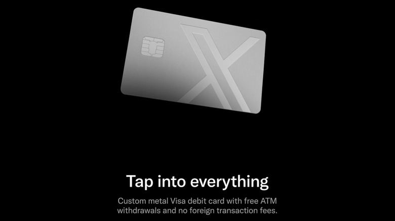
X Money begins limited US rollout
Only Premium and Premium X subscribers get the privilege of banking with Elon for now.
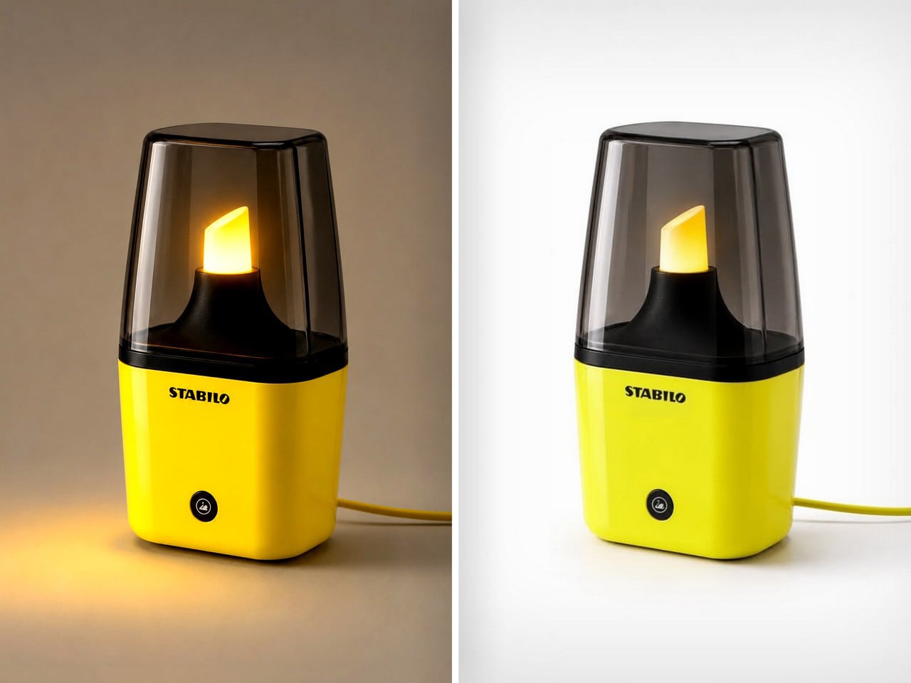
Creatives see the world very differently from how the rest of us do. Someone sees a binder clip, a creative sees a miniature handbag, someone sees a fork, a creative holds the fork close to their eyes to simulate being in a prison cell. Someone sees a highlighter as a piece of stationery used to make text prominent, Jane Morelli saw the ‘light’ in highlighter, turning it into a tabletop lamp every stationery nerd will absolutely love.
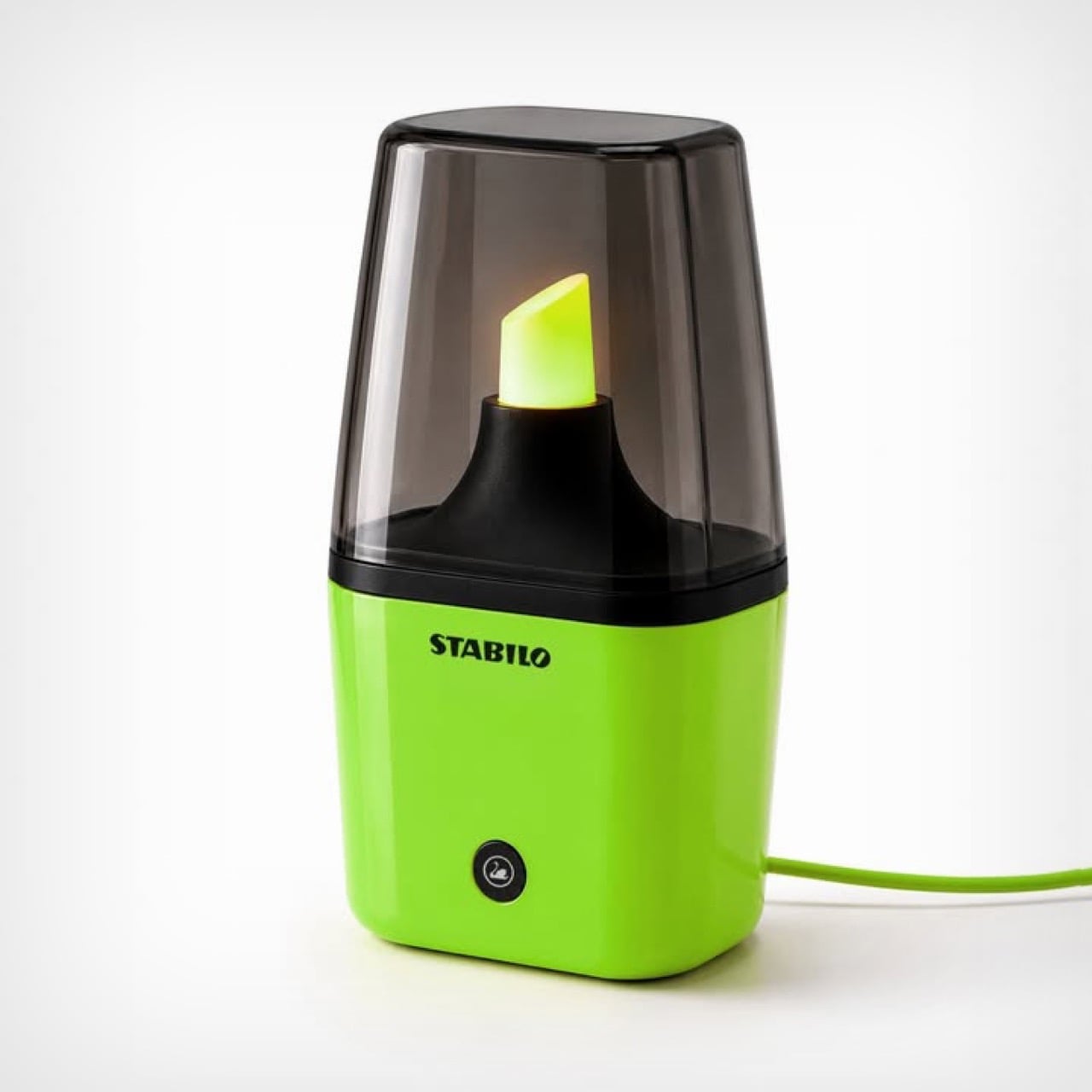
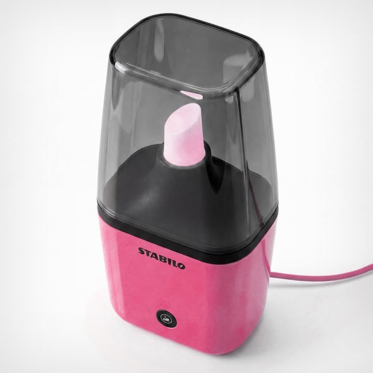
Modeled on the iconic Stabilo highlighter, Morelli’s Stabilo Lamp is an unofficial tabletop lamp that turns the fluorescent tip of a highlighter into a literal light source. Designed to be roughly a foot tall, the lamp comes with a cord – plug it in, switch it on, and the tip glows in its signature color. Morelli’s designed the lamp in 3 common colors for now, neon yellow, pink, and green. I say unofficial because this is purely fan-made visual punnery – but Stabilo did comment on Morelli’s post, marveling at her idea.
Designer: Emanuele Jane Morelli
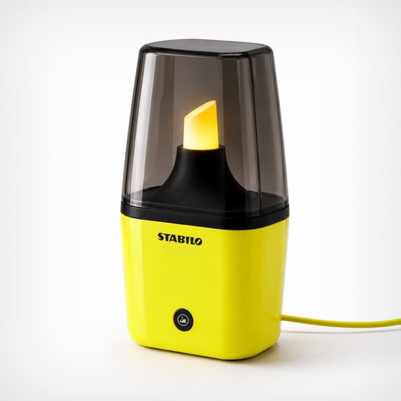
The lamp is witty, fun, and caters to a highly specific niche. Not everyone wants to celebrate stationery in such a literal way, but for the people who do, this is an absolute win. The lamp is modeled on the short Stabilo highlighters, the proportions have been adjusted to ensure the base doesn’t overpower the actual light source – something that bright is sure to command one’s attention, but it mustn’t steal it. The showstopper is the nib, a cloudy, translucent element with a powerful light source underneath that causes it to glow once switched on. A tinted ‘lampshade’ in the form of a highlighter cover sits on top, acting as a visual and physical barrier from the light source.
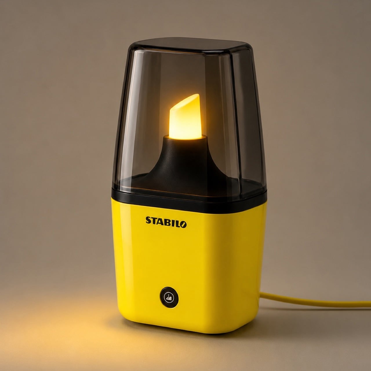
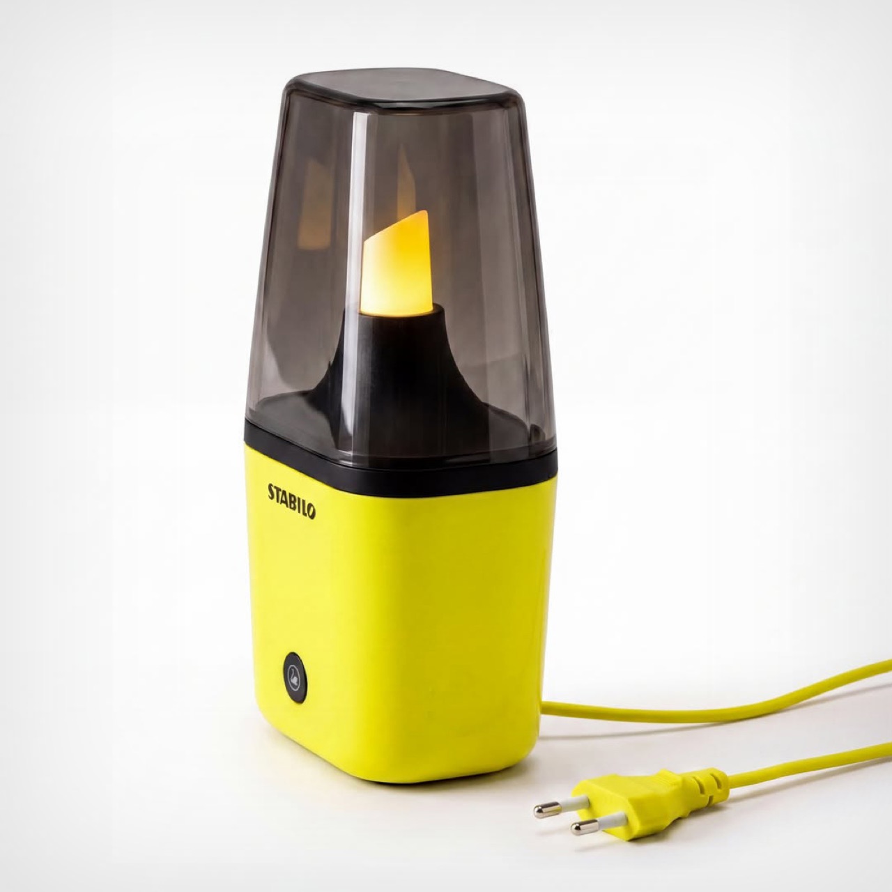
The lamp’s pretty tiny, as is its light source. Don’t expect it to produce enough light to let you read a book. Its sole job is to emit a warm, diffused glow akin to a lava lamp, setting the mood with a nerdy panache that only will appeal to stationery lovers and people with a quirky personality. You won’t see this in an edition of Architecture Digest, or an eclectic Airbnb. Then again, to be honest, you won’t see this anywhere because Morelli’s work is currently just a concept.
However, with enough attention, Morelli could totally build a working prototype and take this to production. Stabilo definitely loved the idea, and this isn’t the first time we’ve seen designers garner attention on their work on social media and get enough validation to turn them into real products. David Delahunty’s work is a brilliant example of how creative thinking and visual puns can turn into real merch and a genuine business. Morelli, if you’re reading this, I’d suggest busting out your 3D printer, heading down to Home Depot or the like, and putting together a prototype!
The post This Stabilo Table Lamp puts the ‘Light’ in Highlighter! first appeared on Yanko Design.
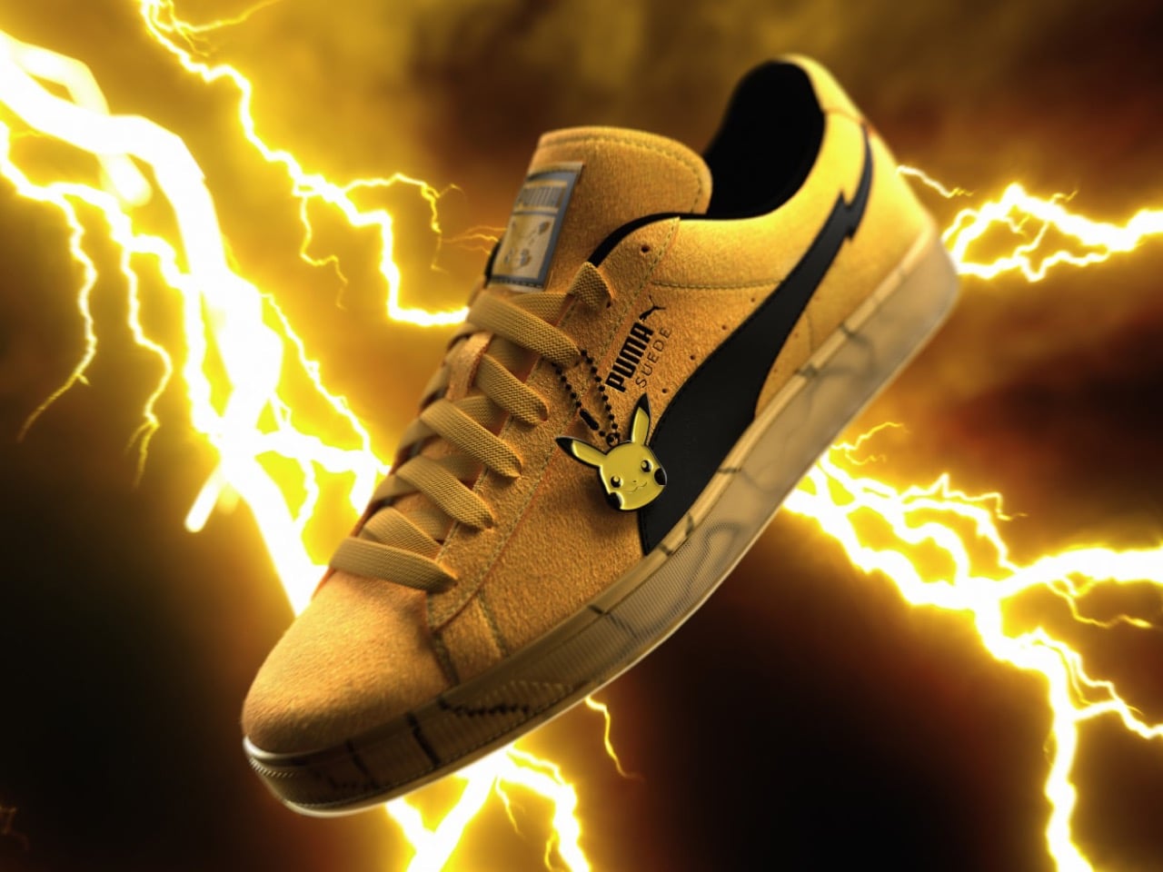
Three hundred dollars for a suede sneaker usually comes with some kind of hook, a designer moniker, a tiny production run, something to point at. PUMA skipped all of that here and just leaned on the Pikachu name, which honestly might be enough on its own. There’s no giant character graphic screaming for attention on this shoe either, which is a little unusual for a collab at this price. Instead the whole thing is built on a few small, well placed details, and that choice tells you a lot about who this release is really for.
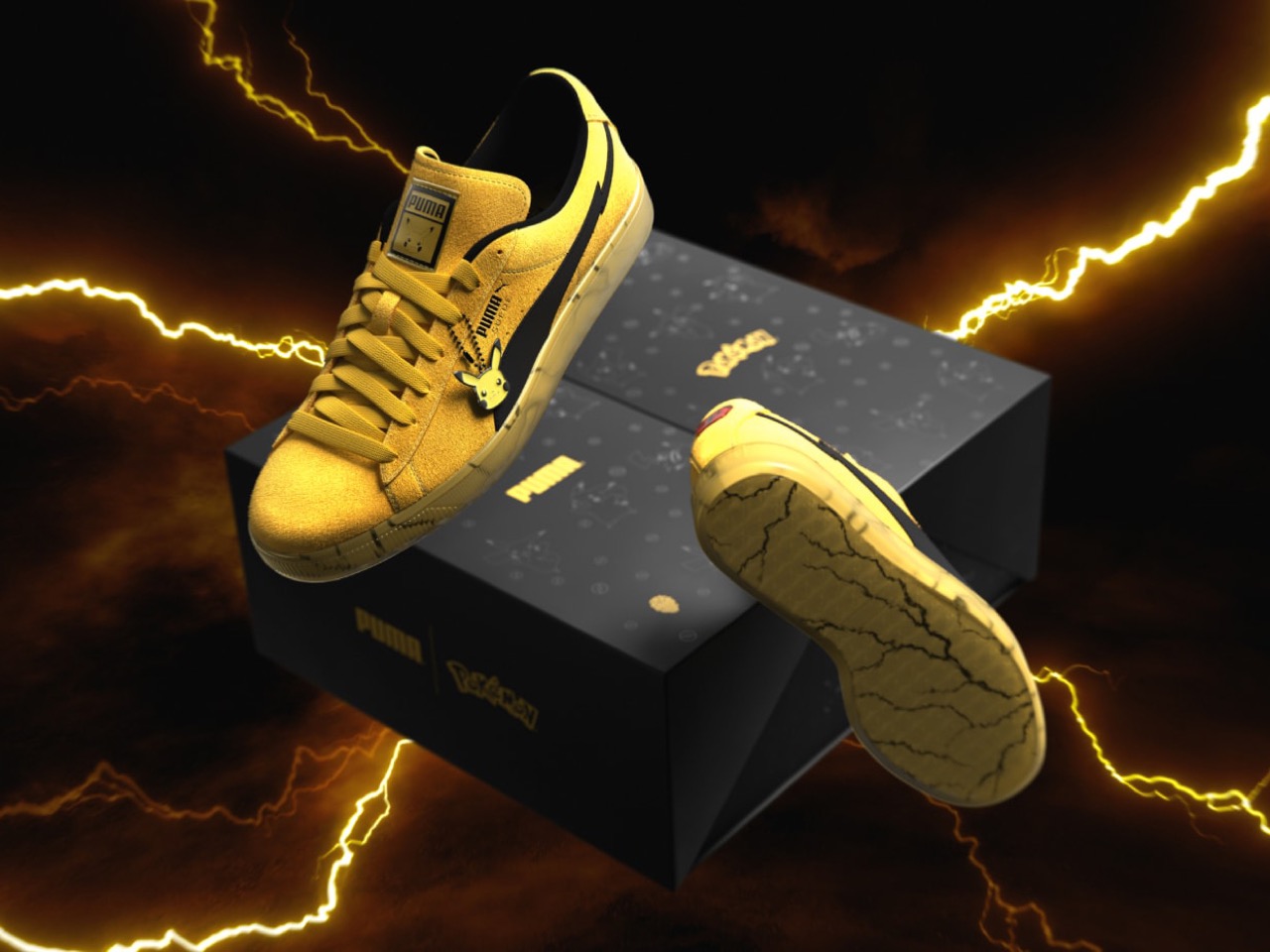
That shoe is the PUMA Suede Pikachu, a reworking of the brand’s 1968 silhouette in electric yellow suede for Pokemon’s 30th anniversary. A two tone lightning bolt runs through the Formstrip, a glossy red heel patch nods to Pikachu’s cheeks, and a small enamel charm hangs from the laces instead of some oversized keychain. The outsole is translucent and honey colored, veined with cracked lightning lines like it’s mid charge. It releases July 25 at a pop up in Brooklyn, following a Mewtwo Suede last winter and an Espeon and Umbreon collection back in April. Whether $300 feels fair probably depends on how deep your Pokemon nostalgia runs, and I’ve got more to say on that below.
Designer: PUMA x The Pokemon Company
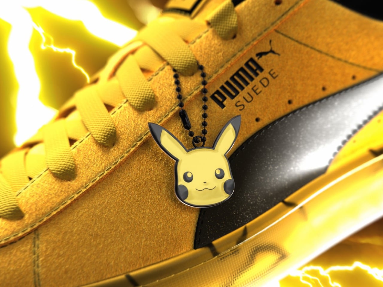
PUMA ditched the usual flat suede nap for something with a slightly raised, almost fuzzy texture on the upper, and it works better than it has any right to. It doesn’t look like yellow suede pretending to be Pikachu, it looks like the material itself got the memo. That’s a small manufacturing decision most people will never think twice about, but it’s exactly the kind of restraint that separates a thoughtful collab from a licensing cash grab. I’ve seen plenty of character sneakers that just print a face somewhere and call it a day. This one clearly wasn’t approved by someone in a hurry.
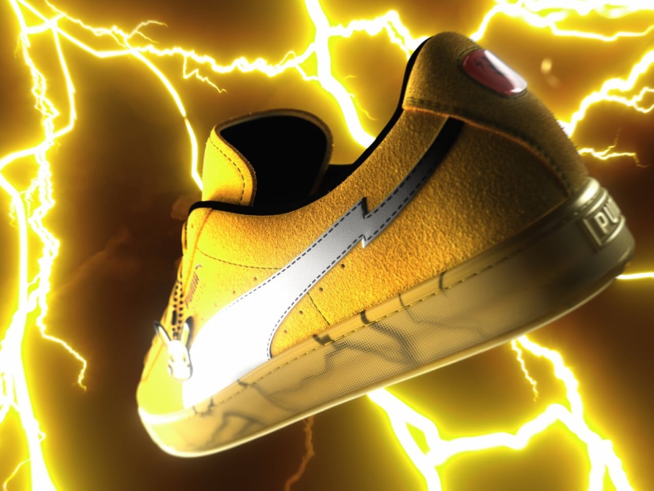
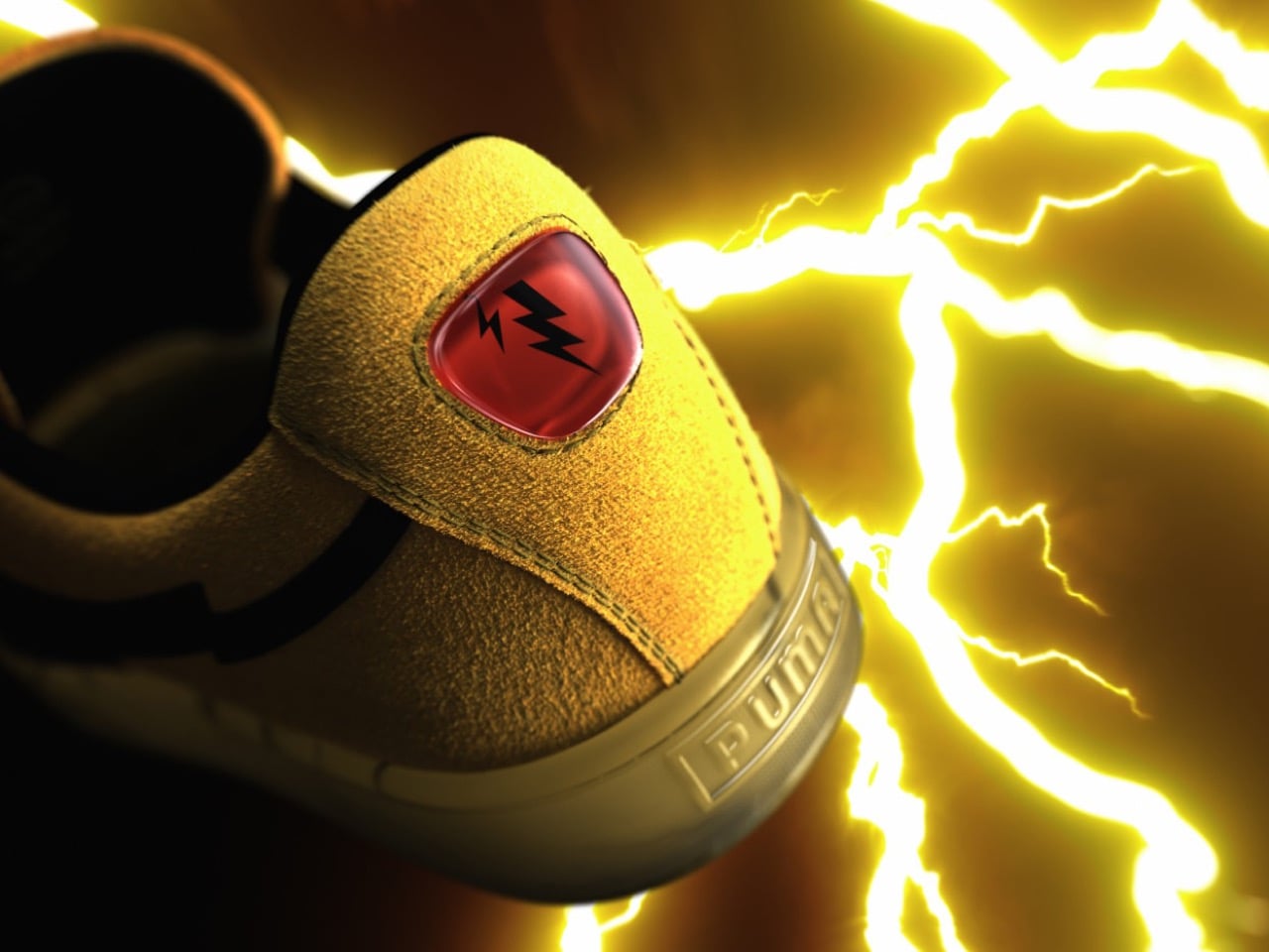
The suede shoe’s side stripe has been the same shape for decades, so bending it into a lightning bolt without losing the silhouette’s identity is a genuinely tricky bit of design math, and it’s the real flex of this shoe. They pulled it off by layering a mirrored silver bolt over the classic black stripe, so it catches light instead of just sitting there as a flat graphic. Then there’s the heel patch, a glossy red oval with a small bolt etched into it, which is easily the smartest detail on the whole shoe. It reads as Pikachu’s cheek without anyone having to spell it out, and that kind of subtlety is rare in character collabs that usually default to shouting. Most brands would have put Pikachu’s whole face there instead, and the shoe would have been worse for it.
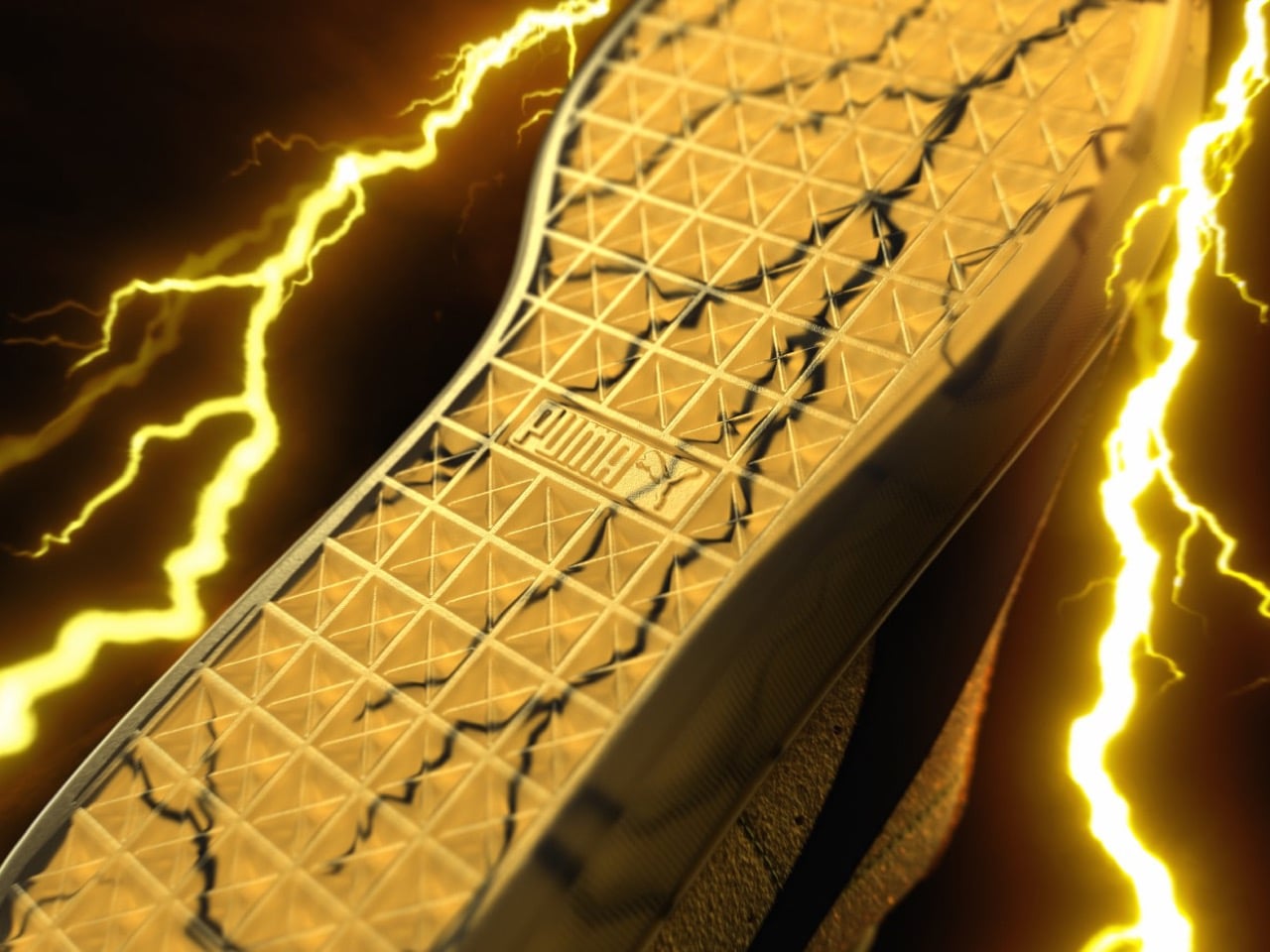
The outsole is a translucent, honey toned rubber with cracked lightning veining running through it, like the sole itself is holding a charge. Paired with the enamel Pikachu charm hanging off the laces, small and flat rather than the bulky keychain treatment most collabs default to, the whole shoe reads as considered rather than merchandised. Even the packaging plays along, landing in a matte black box with a faint constellation print and gold foil branding, understated in a way that actually matches the shoe instead of overselling it. Nothing here needed to be loud to prove the license was real. That restraint is consistent from the box straight down to the sole.
PUMA opened its 30th anniversary campaign with a family sized Espeon and Umbreon collection in April, followed it with a Pikachu colored All-Pro Nitro 2 for the court, and is now closing out summer with what’s clearly the premium centerpiece of the whole run. Whether $300 sneakers with no performance tech attached are worth the price is a conversation that predates this shoe by years. But if PUMA is going to keep charging collector prices for nostalgia, this is the version of that trade that actually feels earned. The Suede has always been the brand’s most storied silhouette, and saving it for last was the right call. Whether Pokemon fans agree probably depends on how much shelf space they have left for sneakers they’ll never actually wear.
The post PUMA Turns Its Legendary Suede Into a $300 Pikachu Tribute for Pokemon’s 30th Anniversary first appeared on Yanko Design.


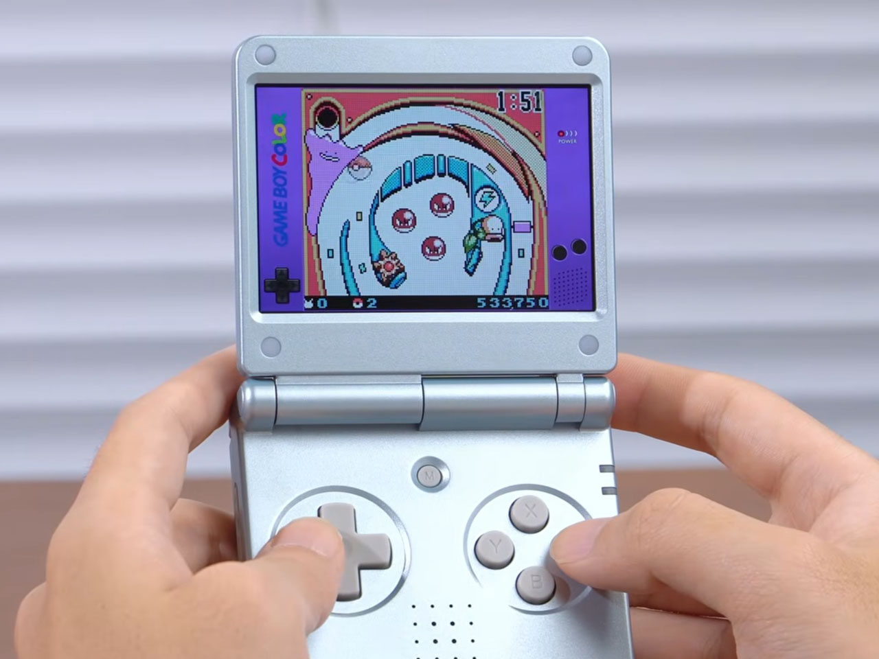
Game Boy SP Advance, released way back in 2003, captured the imagination of portable gaming fanatics for all the good reasons. The retro handheld still has an unquenched appeal for its nostalgic design and folding form factor. Anbernic has a profound affinity for the GBA SP, as we saw the Linux-based Anbernic RG35XXSP bring back old memories.
The gaming accessories maker is back again with a GBA SP-inspired emulation handheld that looks and feels more refined than the earlier interpretation. This ultra-slim clamshell gadget dubbed Anbernic RG SP is designed “to relive the pure joy of the 2D golden era.” The handheld instantly takes you back to the era with its premium metallic finish and the acrylic logo badge.
Designer: Anbernic
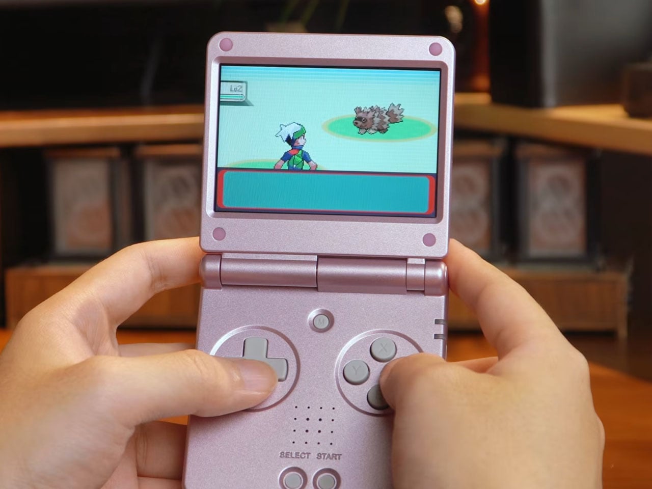
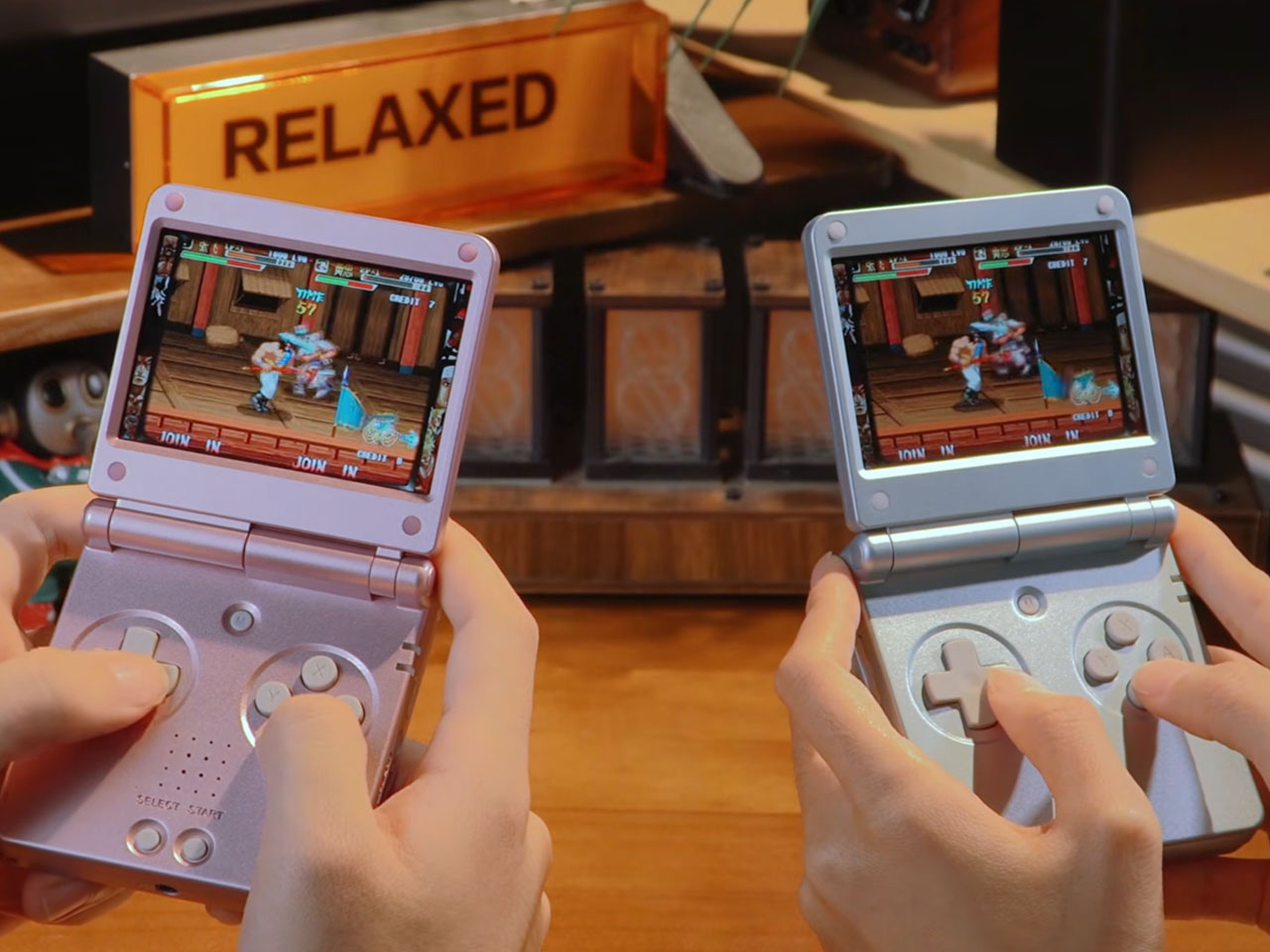
In a world where we have graduated to the modern design of the RG Rotate, the RG SP handheld has a distinct place in the hearts of millennial-era gamers like me. Playing 2D games on this gadget is going to be a focused affair as Anbernic understandably drops the idea of adding a joystick on this one. Instead, there is a classic D-pad and button layout with refined tactile input. The handheld has narrow screen bezels, making the 3.4-inch IPS display (720 × 480 resolution) – which is three times the resolution of the original GBA SP stand out. Retro games can be scaled to perfection courtesy of the 3 times scaling, making emulation an easy affair.
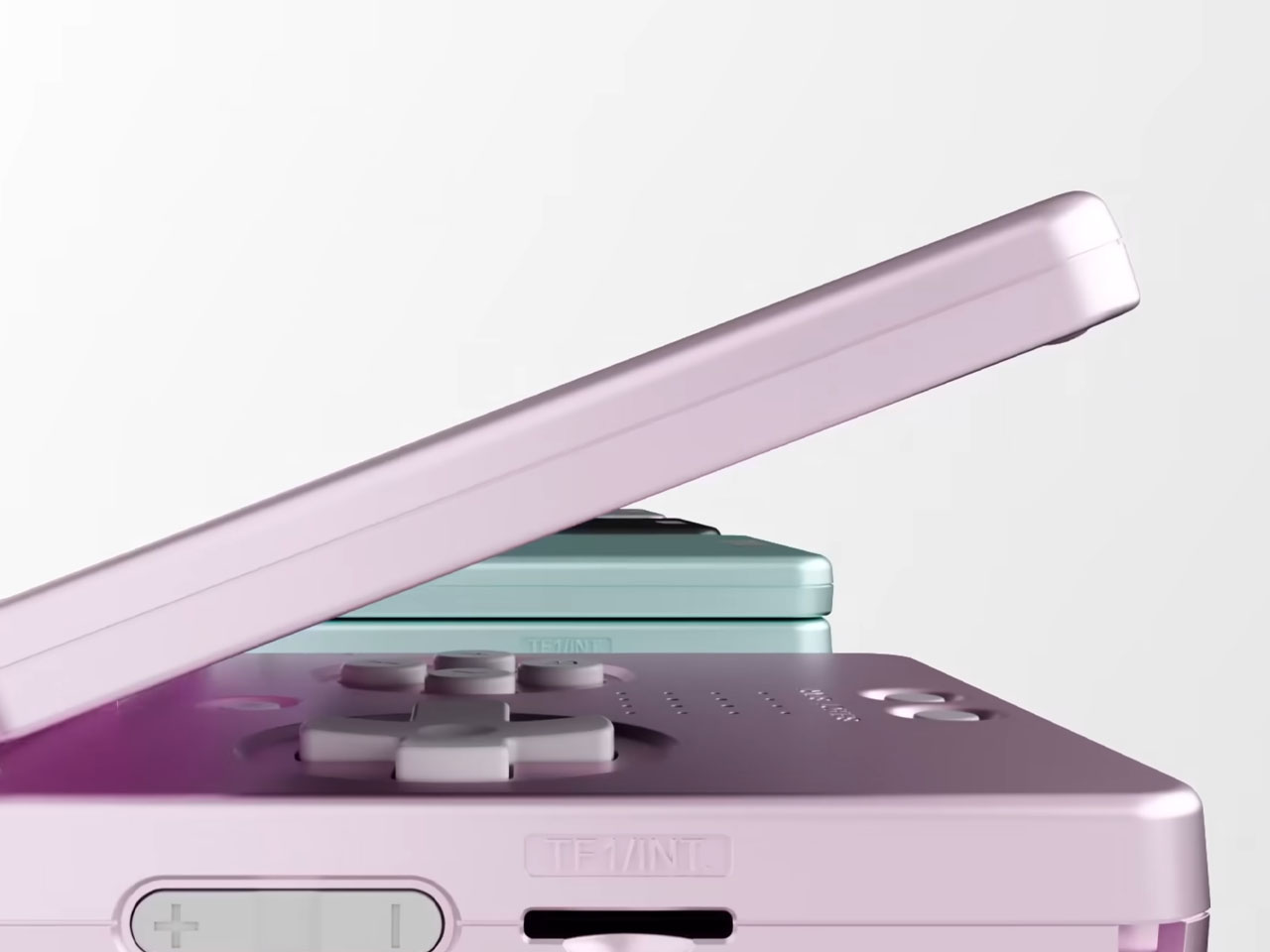
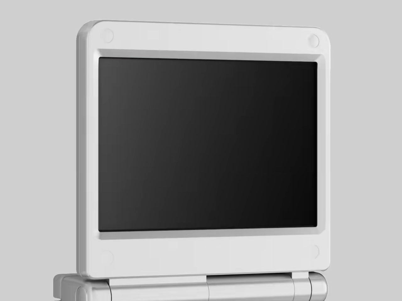
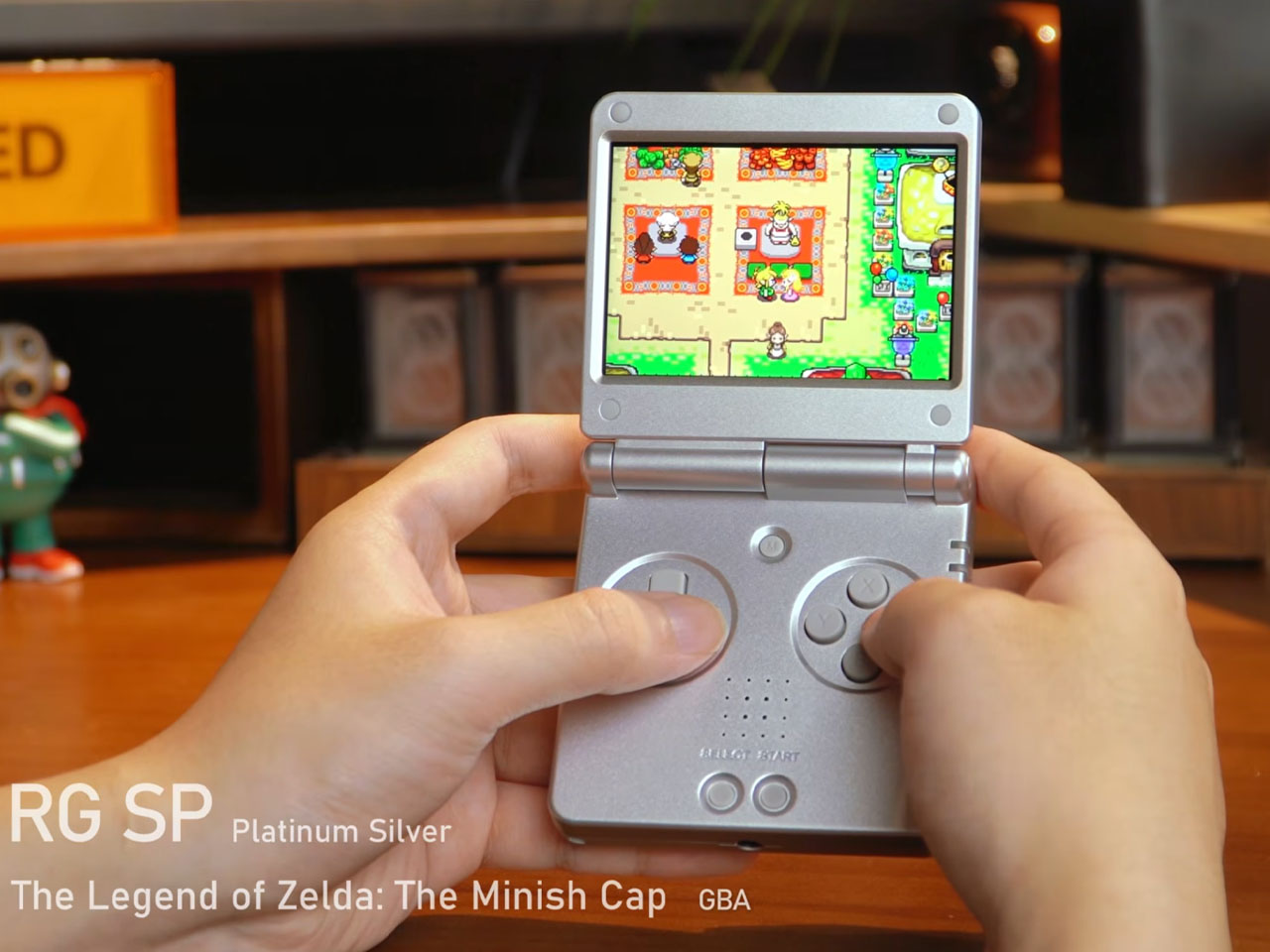
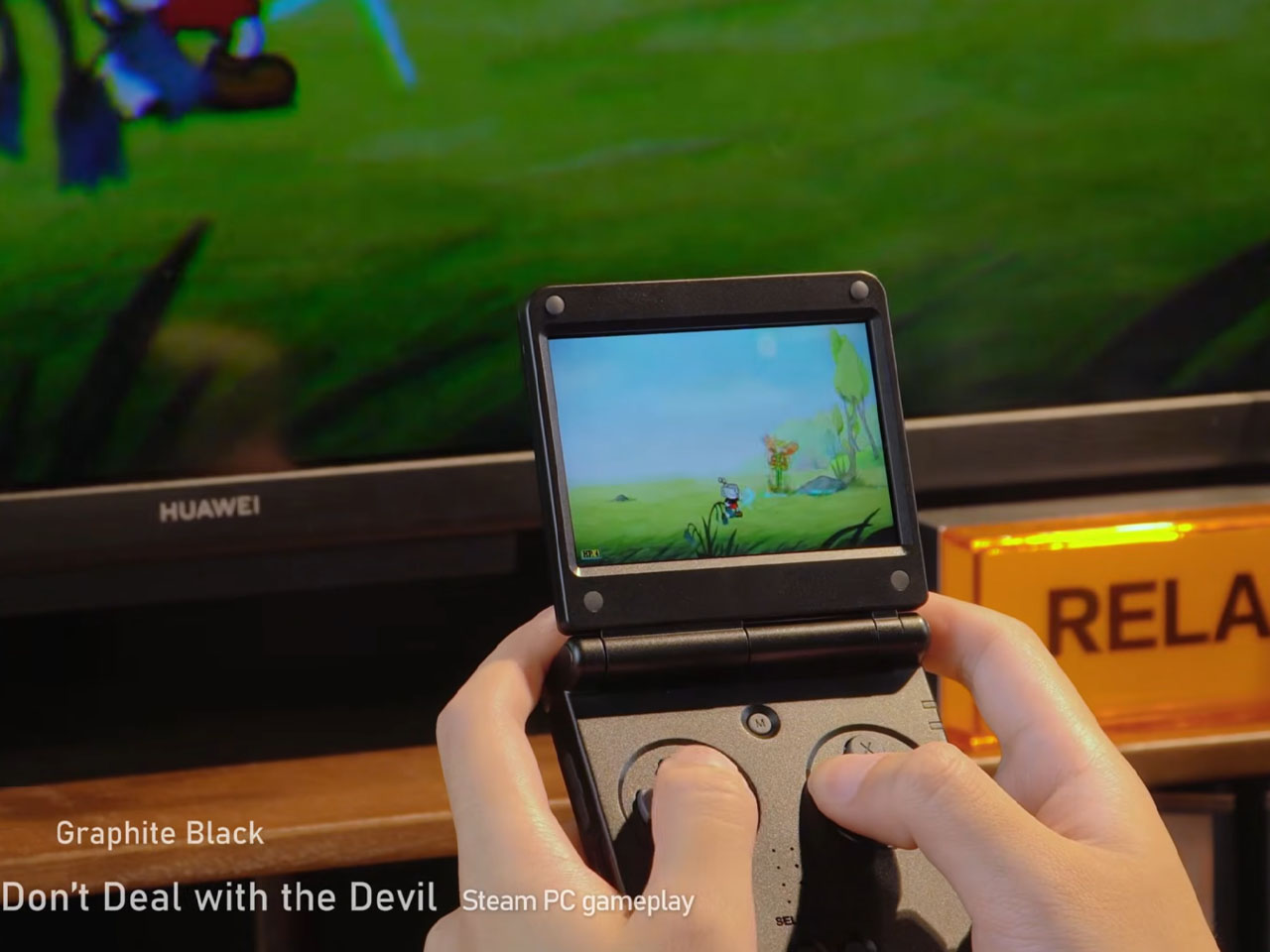
Also, the body is 10 percent thinner than the original GBA SP. On the inside, there is the H700 chipset to play any 2D retro game without any lag. In the gameplay video, Anbernic demos the device playing Game Boy Advance titles including Golden Sun: The Lost Age, Fire Emblem, The Legend of Zelda: The Minish Cap, and Pokémon Emerald. Running games made for PSP, PlayStation 1, and SEGA Dreamcast should also be no problem. What’s interesting is the gadget running Stardew Valley port and PC version of Cuphead: Don’t Deal with the Devil from Steam.
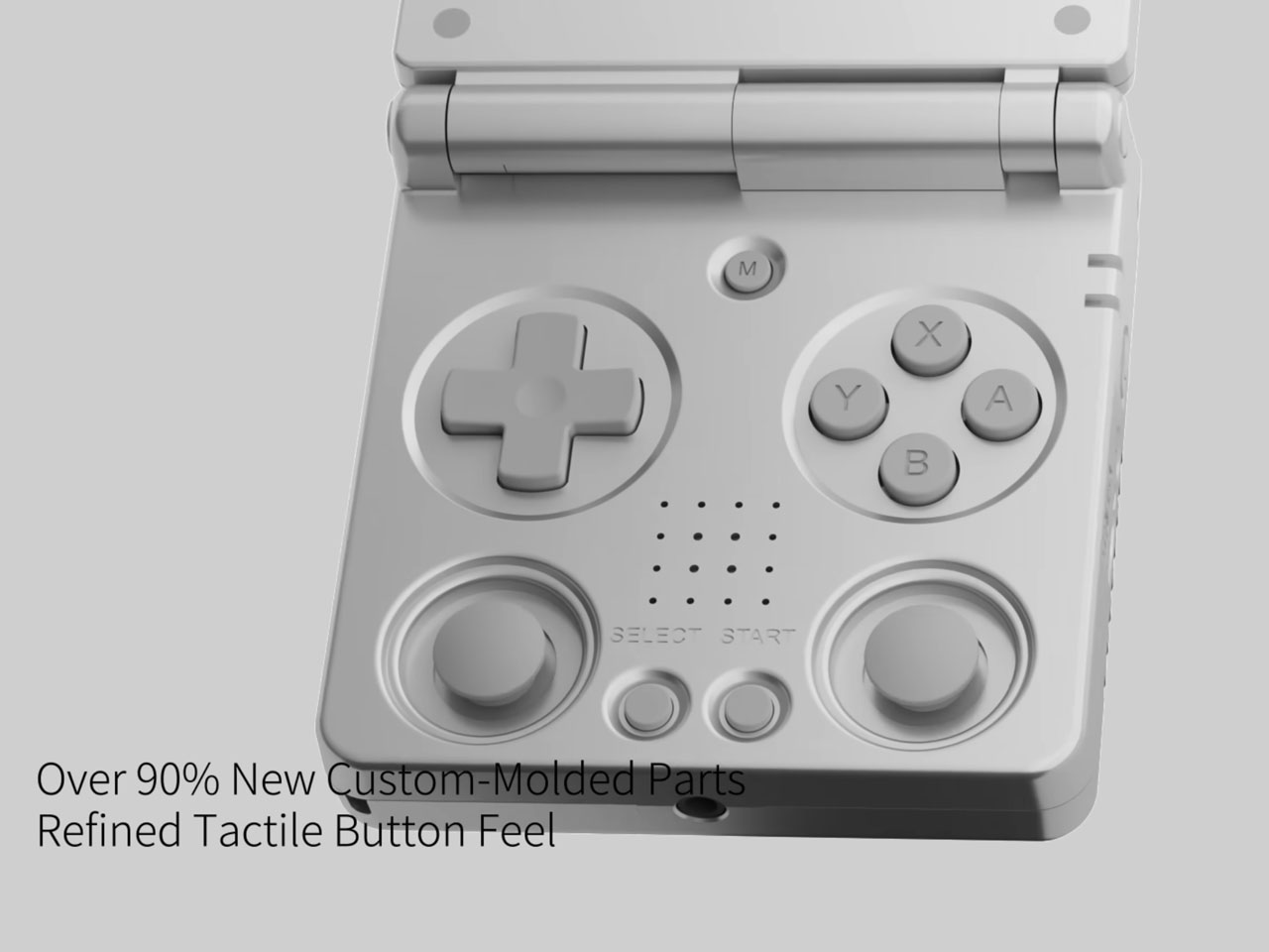
The sleek handheld can be connected wirelessly to your TV with the casting option, and paired to a Bluetooth controller like the Gamesir G8 Plus for an enhanced level of gameplay. Dual alloy hinges on the gadget make it easy to place the handheld in any desired orientation, or have multi-angle positioning. The gadget also gets a microSD card slot and 3.5mm audio jack to keep the nostalgia flowing.
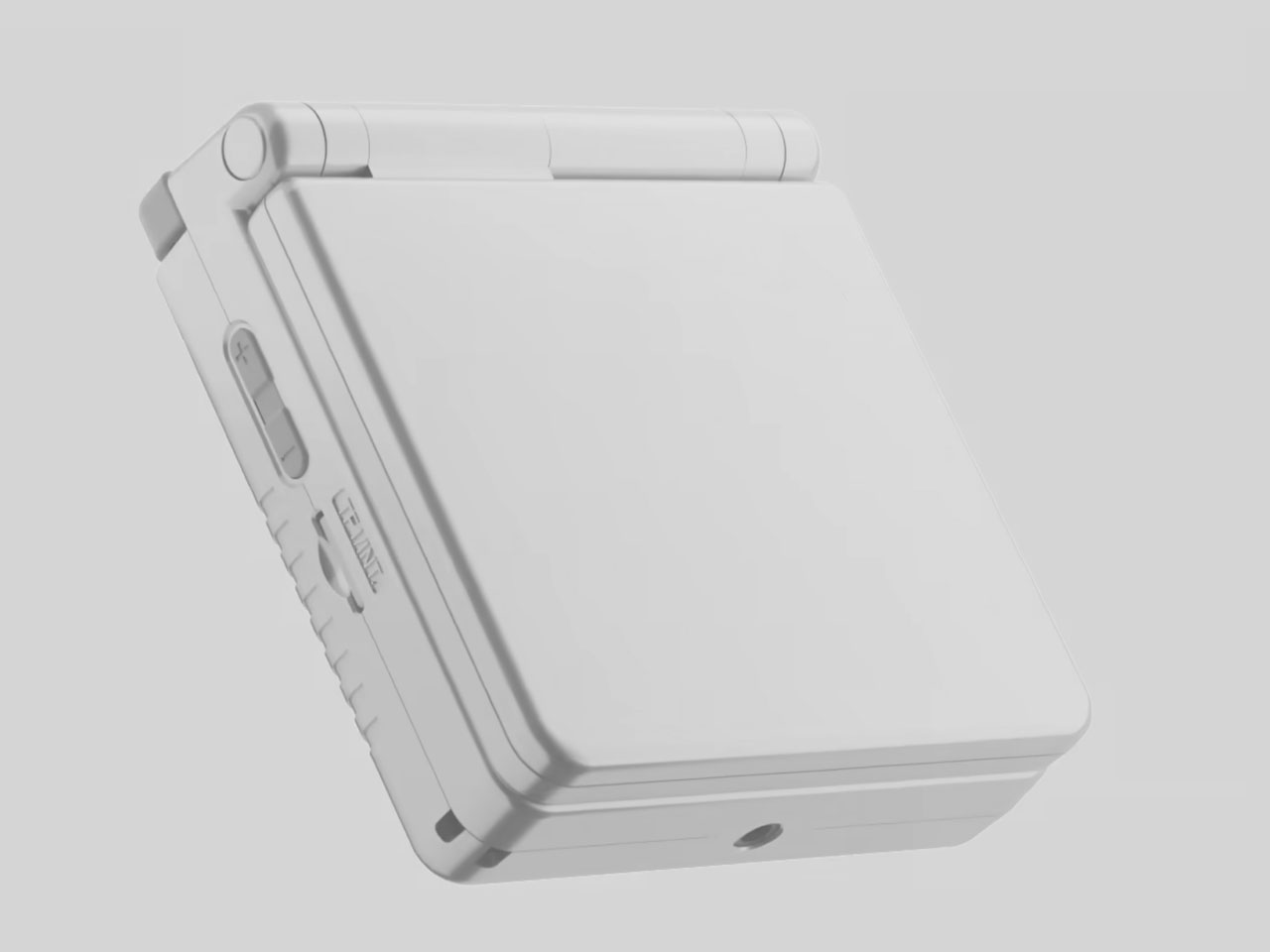
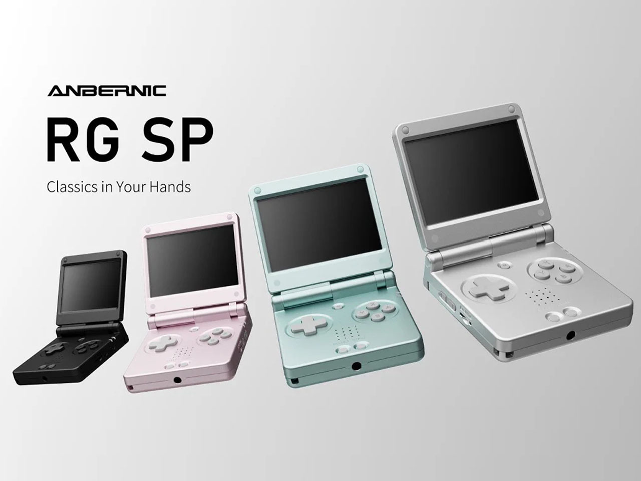
Anbernic RG SP will be available in premium metallic finishes including Platinum, Graphite, Black, Teal and Pearl Pink. The only color I would have loved to see is the Metallic Blue, which defined the GBA SP for me. That said, there is no word yet on the pricing or the availability of the ultra-slim retro gaming handheld, but we’ll keep our eyes and ears open.
The post Anbernic RG SP is an ultra-slim, modern reinterpretation of the Game Boy Advance SP first appeared on Yanko Design.
Smart rings have quietly become one of the more compelling wearable categories, but they’ve also settled into a familiar pattern. Almost every new model competes on the same promises: better sleep tracking, a more refined readiness score, and slightly longer battery life. The hardware keeps improving, but the relationship between the wearer and the device hasn’t shifted much. It still mostly communicates through morning reports and app dashboards.
RingConn Gen 3, which launched on July 25, 2026, is making a case for something different. Beyond the usual cardiovascular basics, it introduces vascular trend tracking, giving wearers a longer-view picture of their health over time. It also adds haptic vibration alerts, a feature no other smart ring currently offers. The whole package comes in at $349 with no subscription fees, which keeps the ownership model refreshingly straightforward.
Designer: RingConn


Most attention will drift toward the vascular tracking angle, but the haptic motor deserves a closer look. A smart ring that vibrates on your finger isn’t the same experience as a watch tapping your wrist. The finger is one of the body’s most tactile zones, so a buzz there lands differently, more directly, and in a way that’s harder to tune out or dismiss as background noise.
That difference matters most in the moments when you’d least want to pull out your phone. A quiet nudge during a meeting, a gentle prompt after sitting still for too long, or a discreet alert in the early hours when something shifts overnight, none of those need a screen. They just need a ring that knows when to say something and how to say it without disturbing everyone around you.
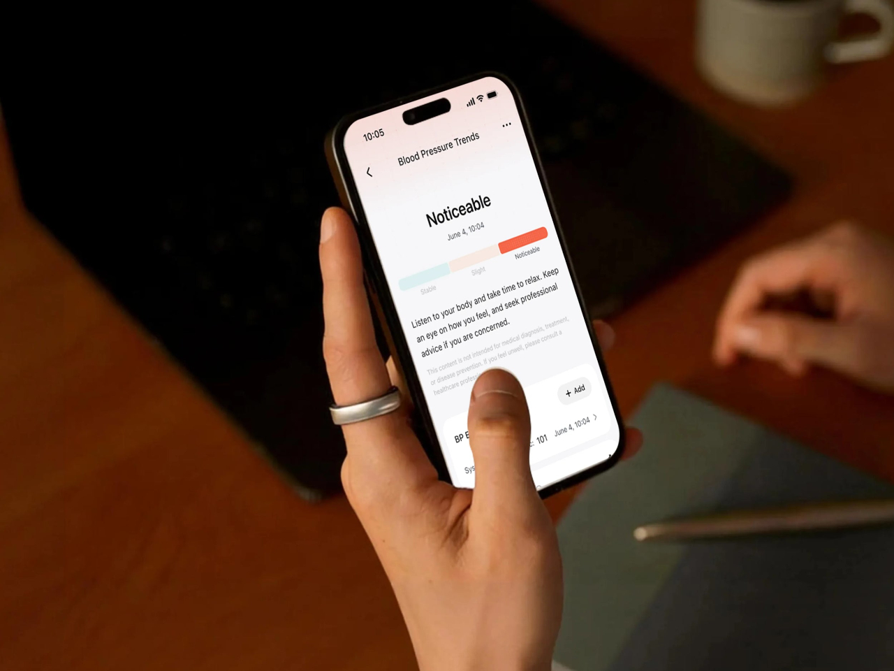
The vascular trend tracking feature is the bigger headline in category terms. Rather than adding another single-moment metric to the app dashboard, it monitors patterns over time, giving wearers a broader sense of how their body is trending across days and weeks. It’s framed as a wellness insight rather than a clinical reading, which keeps the expectations grounded and the interpretation squarely in the wearer’s hands.
What makes this interesting from a design standpoint is that RingConn managed to fit optical sensors, a vibration motor, and up to 14 days of battery life into a 2.3mm titanium body. The inner surface uses medical-grade resin for comfort, and the ring itself weighs between 2.3 and 3.5 grams depending on the size. That’s a serious hardware challenge for something designed to sit on your finger all day.
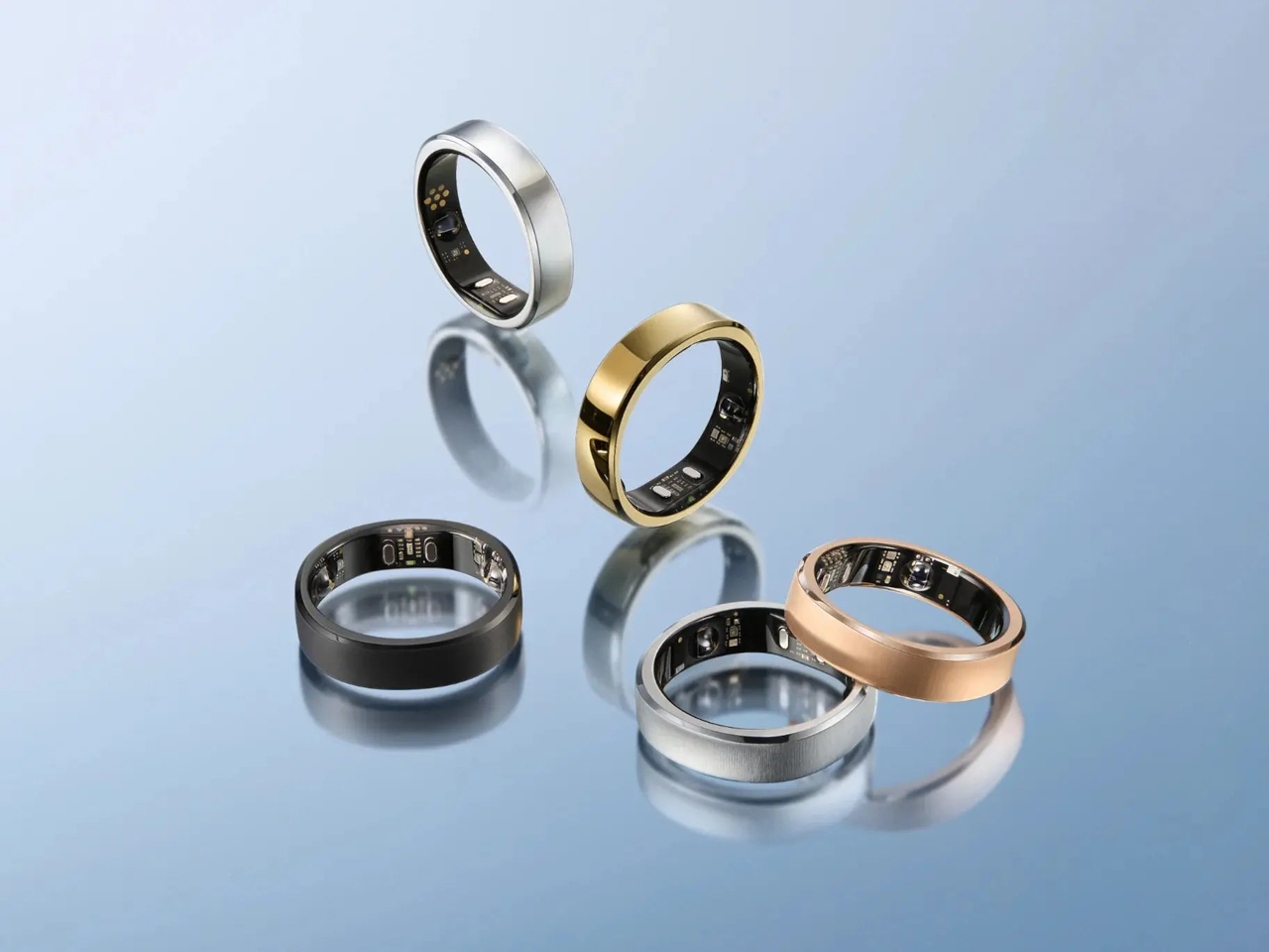
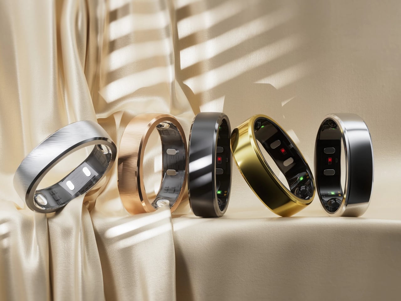
The Gen 3 comes in five finishes: Future Silver, Royal Gold, Matte Black, Brushed Silver, and Brushed Rose Gold. At $349, it’s firmly in premium smart ring territory, but the lack of a subscription fee makes that price easier to justify over time. Rivals that tack on monthly charges for full app access end up costing noticeably more in the long run, which makes RingConn’s flat-fee model considerably more appealing.
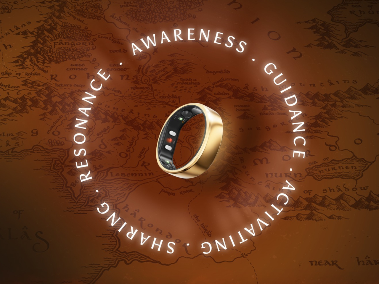
Then there’s the Warner Bros. Lord of the Rings collaboration, a limited-edition partnership that RingConn isn’t shy about mentioning. It’s a smart piece of brand alignment, a ring company partnering with the most famous, or infamous, ring in pop culture. Whether the tie-in feels like genuine collector appeal or calculated marketing depends on the buyer, but it does add some character to a category that tends to take itself rather seriously.
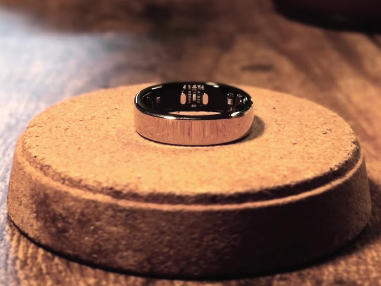
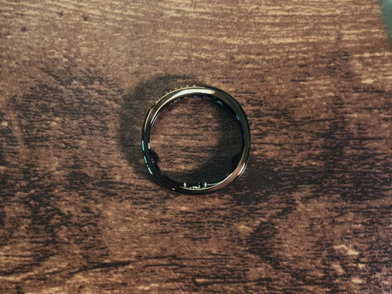
What RingConn Gen 3 really proposes is that a smart ring doesn’t have to stay quiet. The category has spent years refining how it listens to the body, and Gen 3 asks what happens when it starts talking back. Whether that’s a light nudge during a sedentary afternoon or a vascular trend surfacing across a few weeks, there’s something worth considering in a ring that finally has something to say.
The post Get Ready for the $349 Smart Ring That Vibrates on Your Finger first appeared on Yanko Design.