Pick up a used tennis ball and you’re holding an object that had a lifespan shorter than most houseplants. In professional matches, tennis balls get swapped out every seven to nine games, roughly thirty minutes of play, then they’re gone. For the recreational player, they last a few sessions before losing pressure, turning soft, and finding their way to a bin. From there, it’s a one-way trip to a landfill, where they’ll spend the next 400 years doing nothing useful except releasing methane. Around 400 million of them are produced every year, and only about 1% ever get recycled. That number sits with you after a while.
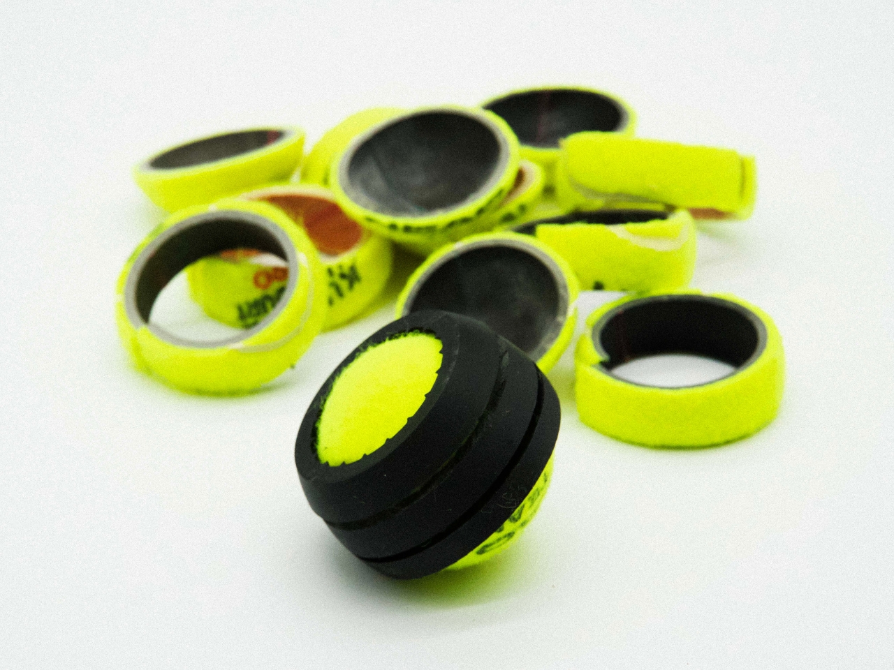
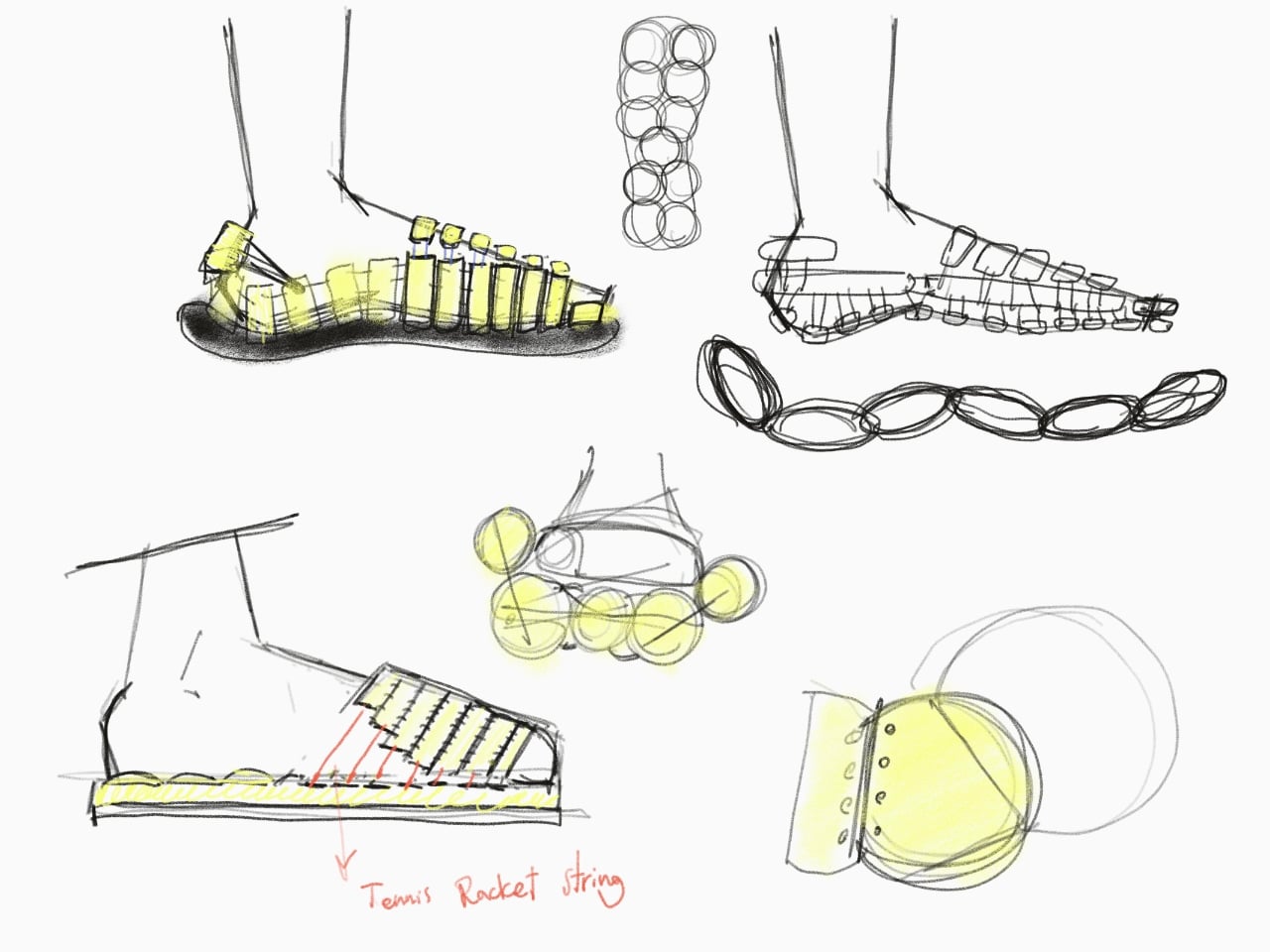
Soroosh Riazi Isfahani, a designer from the Royal College of Art and Imperial College London, has been sitting with it too, and his response is SLICE, a project currently entered into the James Dyson Award 2026. The concept: take used tennis balls and turn them into footwear. Not by grinding them down or melting them into something unrecognizable, but by actually cutting the ball into sections, using a custom guide to ensure precision, and then working those pieces into a shoe. The rubber and the felt stay intact. The material keeps its identity.
Designer: Soroosh Riazi Isfahani
That distinction matters more than it might seem. Most sustainable design approaches rely on breaking materials down into raw components before rebuilding them. It works, but it also requires energy, processing, and usually some loss of material quality along the way. SLICE skips that step entirely. The ball is sliced, shaped, and reassembled into something wearable. It’s a different kind of thinking, one that asks not “how do we recycle this?” but “what is this material already capable of being?”
Isfahani actually started in the more conventional place. His early process involved shredding used tennis balls and blending the material with natural rubber to create an outsole. It’s a reasonable approach and one plenty of designers have explored in the sustainability space. But he moved away from it, and understanding why he moved away from it is the more interesting part of the project. Shredding destroys what makes the ball structurally interesting: the layers, the bounce, the felt surface that has its own tactile quality. Cutting preserves all of that. The final shoe doesn’t just use the material; it respects it.
I’ll be honest that upcycling in fashion and footwear can sometimes feel performative. The “made from recycled materials” label has become so ubiquitous that it barely registers anymore. Brands slap it on shoes made from shredded ocean plastic and call it a day, and most of us accept it without looking too hard at what that actually means or whether the product will last. SLICE feels different because the sustainability logic is baked into the design method itself. You can’t separate the concept from the material. The tennis ball isn’t a marketing footnote; it’s the whole point.
The James Dyson Award has a history of surfacing ideas that sit at the intersection of elegant problem-solving and real-world urgency. What makes SLICE a compelling entry isn’t just that it finds a use for waste, it’s that it finds a use that genuinely fits. Tennis ball rubber is durable. The felt is grippy. These are properties that belong in a shoe, and yet for decades we’ve been throwing them into the ground and waiting four centuries for them to disappear.
The footwear industry is one of the more difficult spaces to make sustainable at scale, partly because shoes are complex objects and partly because the systems for recovering and reprocessing them are still underdeveloped. A project like SLICE doesn’t solve all of that. But it demonstrates a design logic that could scale if the right people decide to take it seriously. One custom cutting guide, one used tennis ball, one pair of shoes that didn’t have to extract anything new from the planet. For a ball that gets thirty minutes of professional play, that feels like a more fitting ending.
The best home products earn their place through specificity, not by doing everything, but by doing one thing with enough precision that every cheaper alternative starts to look like a guess. This month’s list spans five categories and five very different problems, and what ties them together isn’t a theme. It’s a standard: each product here has a specific reason to exist that a more general one cannot replicate.
Cleaning, listening, making coffee. Three of those sound like categories where the object barely matters. They’re not. The right tool changes a daily routine in a way that accumulates quietly over time. The five picks below make that case across the full breadth of a home, from the floor to the entryway, from the kitchen counter to the shelf where the music lives.
1. Dyson V16 Piston Animal
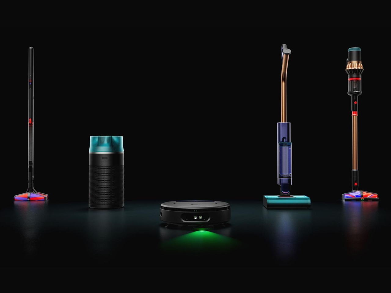
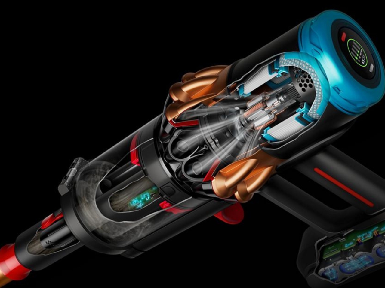
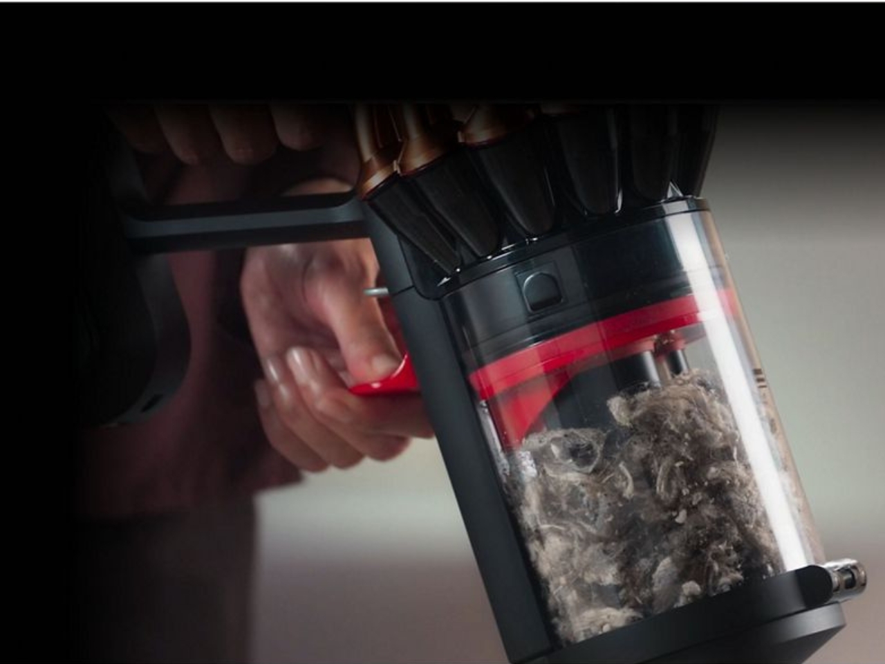
The Dyson V16 Piston Animal is what happens when a vacuum brand stops chasing raw suction numbers and starts solving the problems that live just beneath them. Smart suction adapts automatically to different floor types without any manual input from you. A green dust-revealing light makes the invisible visible, showing exactly where debris has been missed rather than asking you to trust the pass. The result is a machine that changes how you verify the work is actually done.
The dual conical brush bar addresses the problem that has quietly frustrated cordless vacuum users for years: hair. Rather than letting it wind around the bar until it needs manual removal, the system directs long hair outward to the ends for easy disposal. A compression mechanism lets you compact collected debris and empty the bin with considerably less mess than the standard push-and-hope approach. Compatibility with the Submarine 2.0 wet roller extends the V16 into wet floor cleaning without the need for a second machine.
What We Like
Smart suction adapts across floor types without switching modes or interrupting the clean
Green dust-revealing light gives you actual evidence of a clean floor, not just faith in the pass
What We Dislike
As a premium cordless machine, it represents a significant investment before attachments are even considered
The compression emptying system, while genuinely clever, still places your hand near the bin in a way some users will want to work around
2. Narwal Flow 2 White
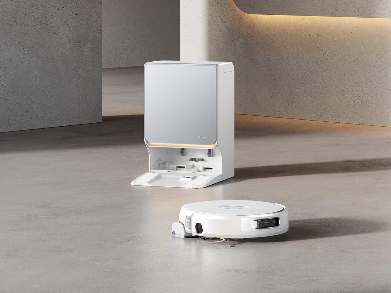
Most robot vacuums know how to read a floor. The Narwal Flow 2 White is one of the first that has started to read the room. Baby Care Mode runs quieter near nursery zones and uses the machine’s mapping intelligence to log displaced toys after each clean. Pet Mode directs deeper attention to high-traffic pet areas and includes a Find My Pet function through the app. These aren’t novelties. They’re evidence of a product designed around how a home actually operates, not just how it’s laid out on a map.
The white colorway carries a frosted glass-textured dock panel and a slim ambient status light bar that communicates the robot’s state without demanding attention. Together they give the system a composed, architectural presence in pale-toned interiors where most cleaning robots still look like they arrived from a utility room. The FlowWash system heats water to 140 degrees Fahrenheit to keep the mop clean throughout each cycle. 31,000 Pa suction and a 120-day self-emptying station sit underneath the considered exterior, fully intact.
What We Like
Baby Care Mode and Pet Mode reflect genuine design thinking about how domestic life actually works, not just how floors are laid out
The frosted glass dock and ambient light bar make this the first robot vacuum that earns a visible place in the room
What We Dislike
At over a thousand dollars, the value argument is strongest for households actively managing pets, young children, or both
The full feature set rewards regular app engagement to get the most from the AI-driven mapping intelligence
3. Portable CD Cover Player
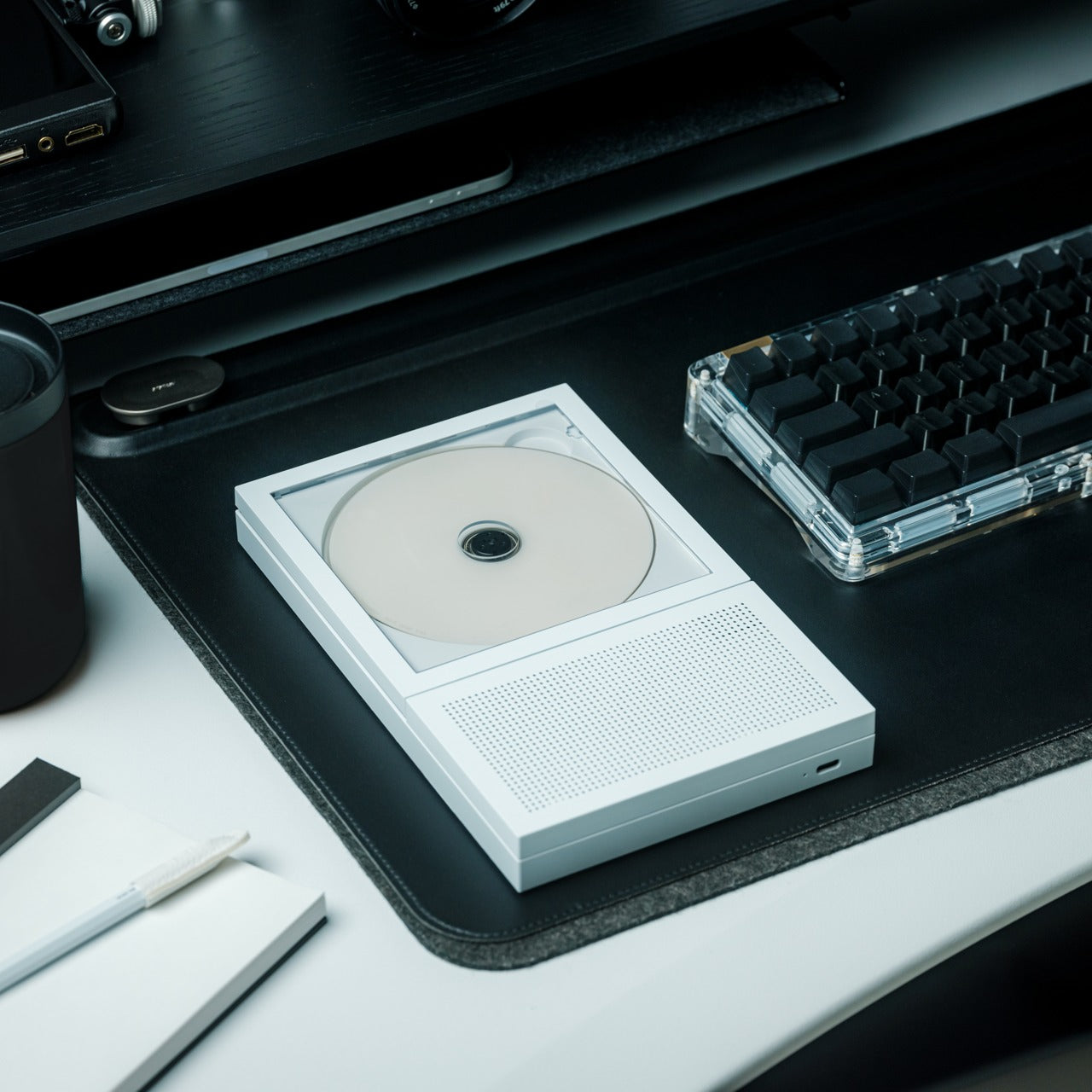
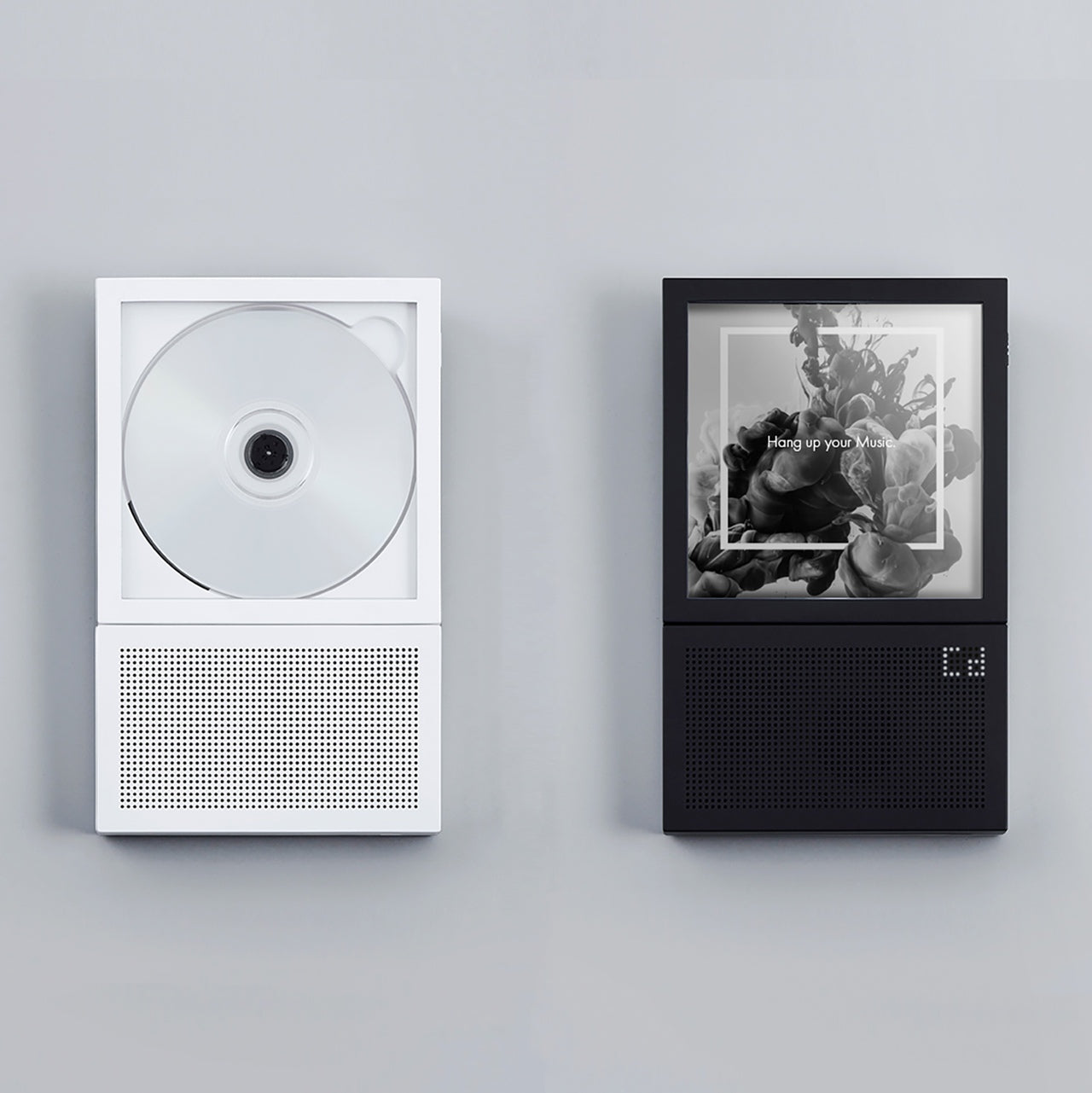
The album cover was never just packaging. For a generation of listeners, it was the first thing you saw before the music started, and it became inseparable from the sound in a way a two-inch streaming thumbnail never replicates. The Portable CD Cover Player treats that relationship as a design brief. Whichever disc you load, the jacket displays as part of the listening experience, giving the art around the music a reason to exist in the room again rather than a reason to be forgotten behind a queue.
Built-in speakers and a rechargeable battery make it a standalone object, not a peripheral waiting for something else to do the heavy lifting. A wall-mount bracket option takes it from desk accessory to room feature, turning the player into a rotating display of covers you’ve owned and music you still reach for. Starting at $199, it operates at the intersection of audio hardware and interior design in a space that streaming has spent fifteen years quietly dismantling, and this single object quietly rebuilds.
Album art displayed at real scale returns an emotional context to listening that streaming platforms removed by default
Wall-mount capability turns a CD player into a considered room object without any modification required
What We Dislike
At $199, the price asks you to weigh genuine affection for the format against the convenience of software that costs nothing
Audiophiles wanting precise control over output quality may find the built-in speaker setup limiting
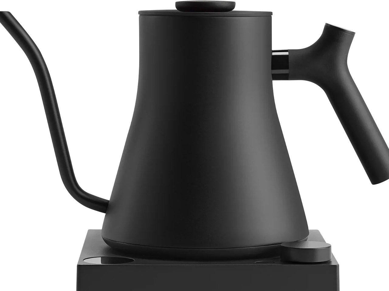
4. Fellow Stagg EKG Pro
Most kettles are designed to boil water and stay out of the way. The Fellow Stagg EKG Pro starts from the position that the kettle is the wrong object to make invisible. It lives on the counter every morning. It is involved in the first deliberate thing most people do each day. A counterbalanced gooseneck handle, a precision spout, and variable temperature accurate to a single degree reflect the argument that if something earns daily use, it should earn daily consideration too.
A hold function keeps the target temperature stable for up to 60 minutes between pours, which matters for pour-over coffee and temperature-sensitive teas where a few degrees of cooling changes the result noticeably. Bluetooth connectivity links to the Fellow app for programmable presets, and a memory feature recalls the last-used temperature at startup. The 0.9L matte-finish body belongs on the counter rather than in a cabinet, which is a quieter but more durable argument than anything a spec sheet can make for a product in a category that rarely makes it.
What We Like
Variable temperature to one degree produces a measurably different result for specialty coffee and delicate teas
The counterbalanced handle makes a controlled slow pour feel entirely natural rather than effortful
What We Dislike
The 0.9L capacity limits households that regularly need to boil larger quantities in a single fill
Bluetooth and app connectivity are secondary to the hardware quality, and most users will likely never configure them
5. 3-in-1 Luminous Mirror Diffuser
Most bedside setups are a quiet negotiation. The lamp is tolerable but too directional. The mirror is functional but positioned wrong. The diffuser is somewhere on a shelf, half-forgotten after the first week. The Luminous Mirror Diffuser collapses all three into a single oval object crafted from anodized aluminum, and the result looks better than any of the items it replaces. Shadow-free reflected light technology eliminates the harsh contrast a single source creates, while the 360-degree rotatable mirror adjusts to any angle for grooming, makeup, or simply getting the reflection where it needs to be.
Three color temperatures do the work a fixed lamp never can. The 2400K warm setting creates the kind of amber glow most bulbs can’t reach without a separate swap. A neutral mid-range handles focused tasks without visual fatigue. The 6000K daylight mode delivers precision clarity where color accuracy matters. Four brightness levels sit beneath each temperature, and the patented aroma plate uses an aluminum matrix to diffuse fragrance from a few drops of essential oil. Wireless charging keeps the surface clean. At $800, it is one object doing the work of three, and doing it more elegantly than any of them managed alone.
Three color temperatures with four brightness levels each means the same object serves a 6 am routine and an evening wind-down without compromise
Anodized aluminum with a matte scratch-resistant finish feels premium at every point of contact
What We Dislike
At $800, it rewards people who use all three functions regularly and will underserve those who only need one
A dedicated studio mirror or a standalone high-end diffuser will outperform it in those individual categories
The Difference Is Always Specific
What this month’s list resists is the idea that a home product earns its place through specification alone. The Dyson V16 finds dust you missed. The Narwal adapts to the people living in the room. The CD player returns something streaming quietly removed. Each object here is defined by what it decided to care about most, and the best ones communicate that decision before you’ve read a single line of copy.
A well-chosen tool doesn’t announce itself. It changes a routine in a way that takes a few weeks to fully notice, and then becomes the thing you miss immediately when it’s gone. These five earn that standard across five very different moments in a home, from the floor on the way out the door to the kettle on the counter at six in the morning. The difference is specific, and specific is always worth it.
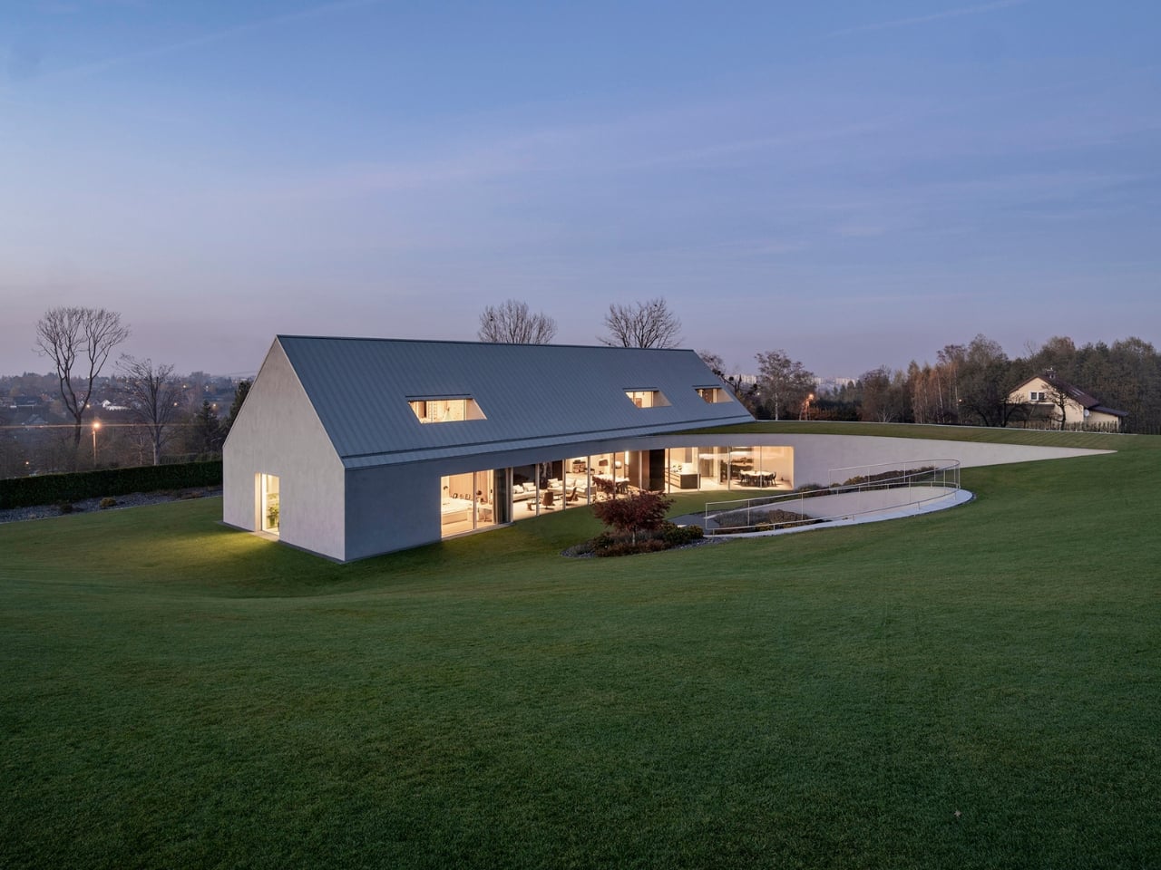
Most house designs start with a shape and then find a place for it. What KWK Promes did with the Yaw House, completed in 2025 and nestled in Poland’s Beskid Mountains, is almost the reverse. They let the land tell the building what to do, and the building listened.
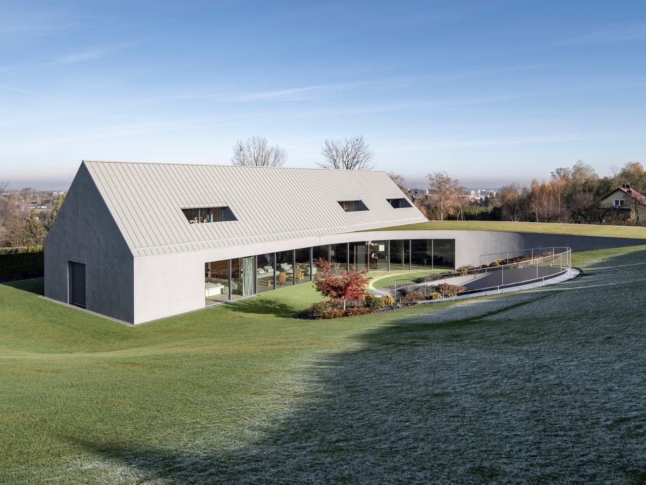
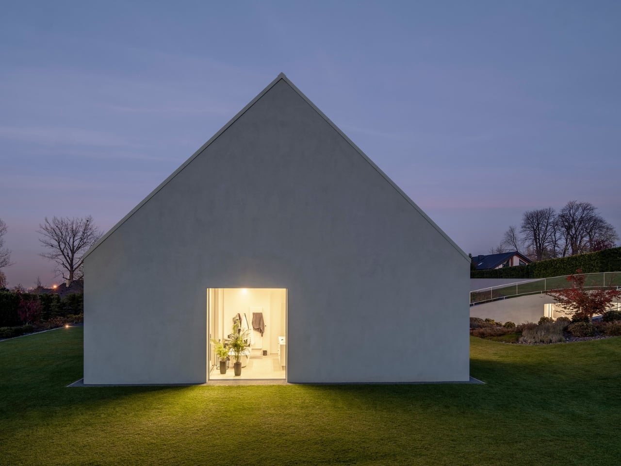
The project began conventionally enough. The original concept was a classic gabled form, set parallel to neighboring structures, the kind of thing that blends politely into a mountain village. Respectable. Contextual. Probably a little forgettable. But the terrain wasn’t playing along. The plot has a pronounced slope, and rather than flattening it or working around it, architect Robert Konieczny rotated the entire structure. He literally yawed it, which is where the name comes from: yaw, the aeronautical term for rotation along a vertical axis. The gabled roof pivoted, the building reoriented toward sun and valley views, and something altogether different emerged.
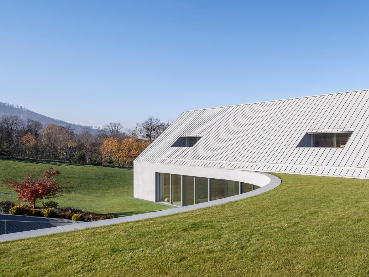
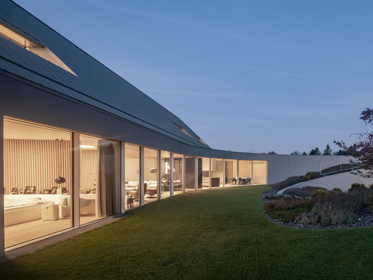
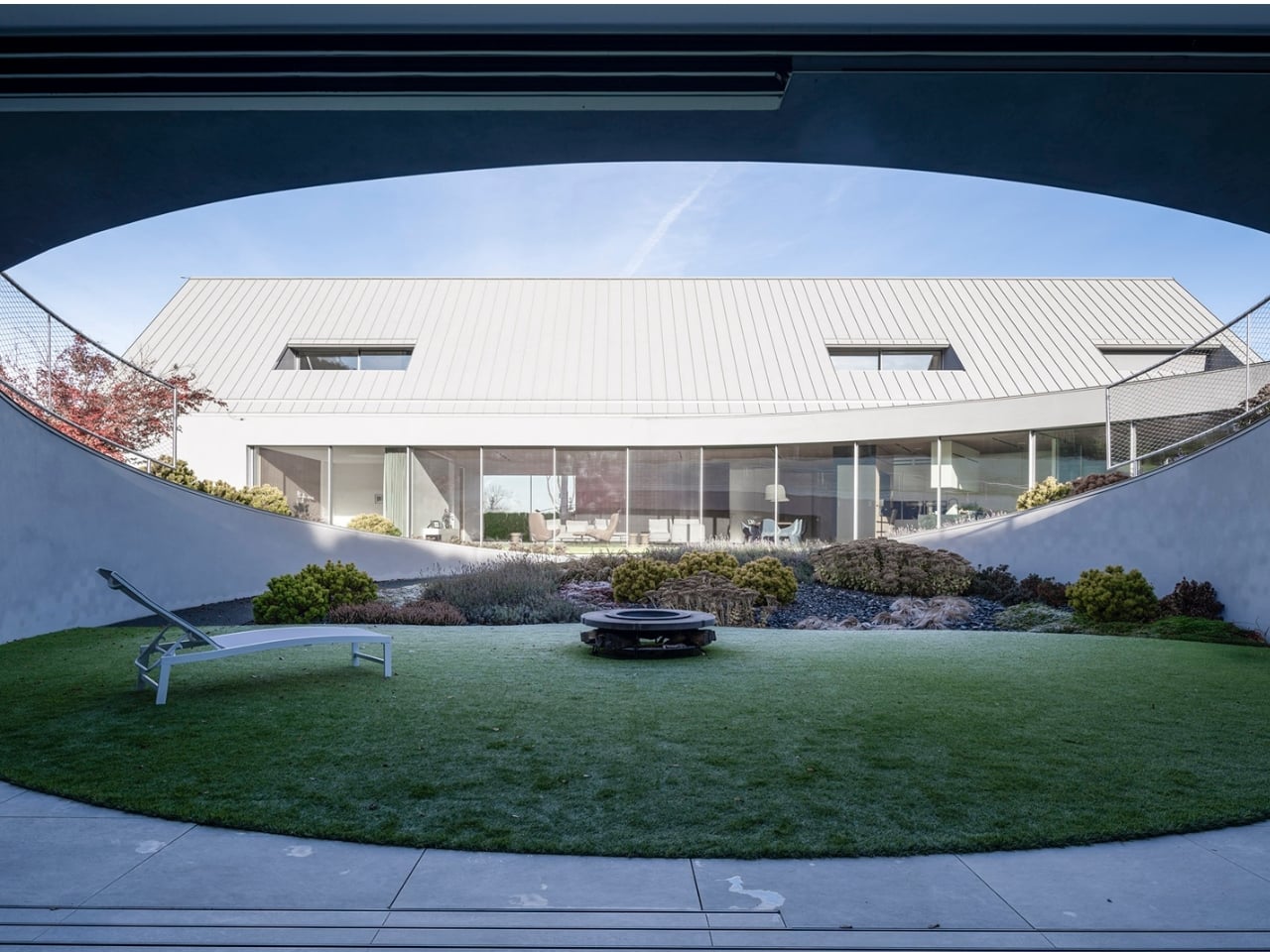
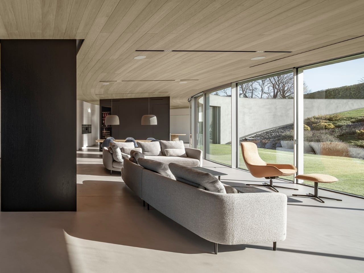
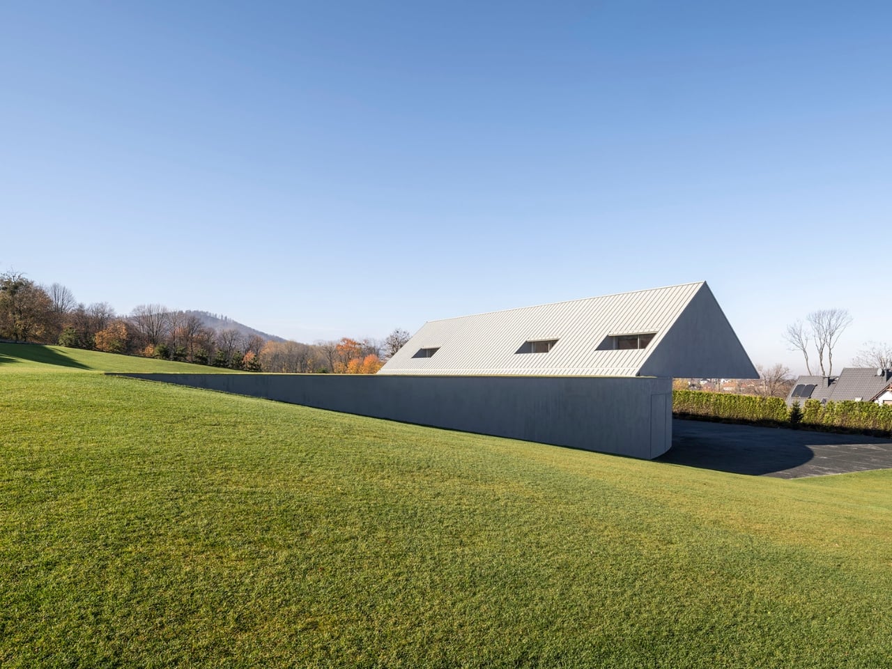
The result is a C-shaped house that embeds itself into the hillside rather than sitting on top of it. One corner barely makes contact with the ground. The rest of the structure hovers, tucks, leans in, to the point where the roofline peels away from the hill and dissolves into the surrounding lawn. Grass grows over it. The house doesn’t end where the mountain begins; they merge. From certain angles, you might not even register it as a building at first. That reads as a loss for anyone who wants their home to make a statement, but a quiet kind of brilliance if you’re more interested in belonging to a place than dominating it.
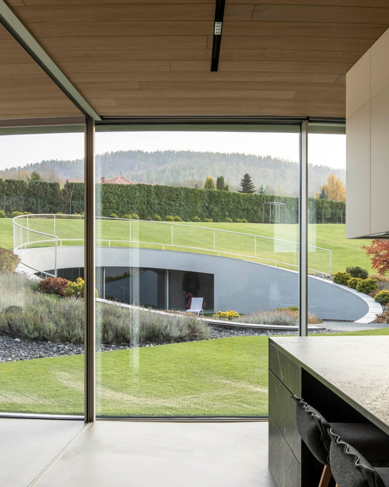
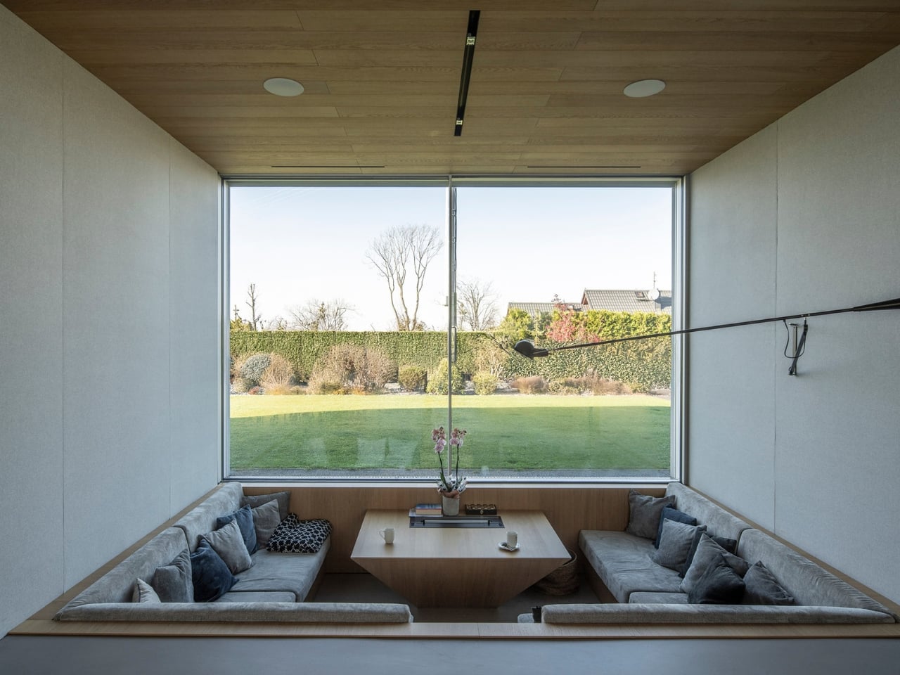
Interiors follow the geometry of the rotation, which gives the spaces a curved, almost circular quality that feels unusual for a residential home. On the ground floor, the orientation prioritizes what actually matters: greenery, natural sunlight, and wide views of the valley below. Private areas sit elsewhere in the plan, separated naturally by the structure’s layering into the slope. It doesn’t feel like a floor plan that was drawn and then decorated; it feels like one that was discovered.
The material choices reinforce all of this. Pine wood runs throughout, with plywood panels used for both the facade and interior walls. It’s warm, honest, and completely in line with the mountain setting. No marble-and-steel contrast trying to signal luxury, no jarring material moments designed to photograph well for social media. The palette is consistent because the thinking behind it is consistent.
I’ve been some residential architecture lately that feels performative, houses where the drama is the point and the living comes second. Yaw House is a useful counterargument. It makes bold moves, and rotating an entire structure to negotiate a difficult slope is not a timid decision, but it does so entirely in service of something real. The circular interior spaces aren’t there to be interesting in a magazine spread; they exist because the geometry demanded them. The green roof isn’t a lifestyle statement; it’s the terrain reclaiming its surface.
KWK Promes has a track record of this kind of thinking. Robert Konieczny’s firm has long been drawn to the challenge of how a building should respond to its specific conditions rather than impose a predetermined vision onto them. The Yaw House feels like a mature expression of that philosophy, one that is both technically ambitious and architecturally generous.
What stays with me, after reading more about this project, is how much restraint it takes to make something that disappears. Our instinct with ambitious architecture is to look for the spectacle. And yes, the Yaw House is spectacular if you know where to look. But it earns that quality quietly, through proportion, orientation, and a refusal to treat the landscape as a backdrop. The mountain isn’t framed in a window here. It’s invited in through the floor plan. That might be the most interesting thing a house can do.
Some things in design need no justification. They exist purely to be beautiful, and you either feel it or you don’t. Moser’s new Aura collection is one of those things, and I’ve been thinking about it since I first came across it.
If you’re not familiar with Moser, let me fix that. Founded in 1857 in Karlovy Vary, Czech Republic, this is one of the most quietly prestigious names in the world of luxury glassmaking. The brand has been handcrafting lead-free crystal for 169 years, and that’s not a marketing angle; it’s a genuine legacy. Their work has graced the tables of royalty, filled the shelves of serious collectors, and caught the eye of names you’d recognize. The Kardashians are fans. Dan Brown, while promoting his Prague-set novel in the city itself, received his own engraved Magnus vase. It’s that kind of brand.
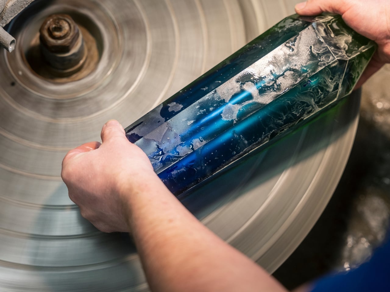
Moser occupies a specific and fascinating space in design. It’s neither ostentatious nor understated. It has weight to it, not just physically, but culturally. When you hold a piece of Moser crystal, you’re holding something shaped entirely by human hands, and that distinction matters more than ever in a market flooded with mass production.
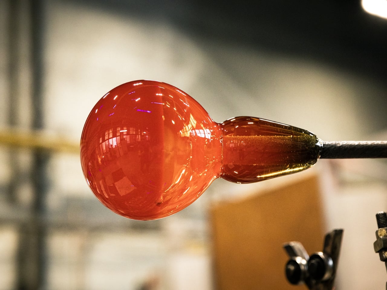
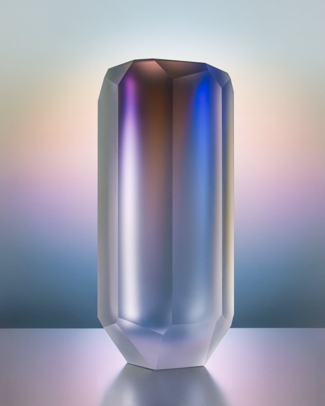
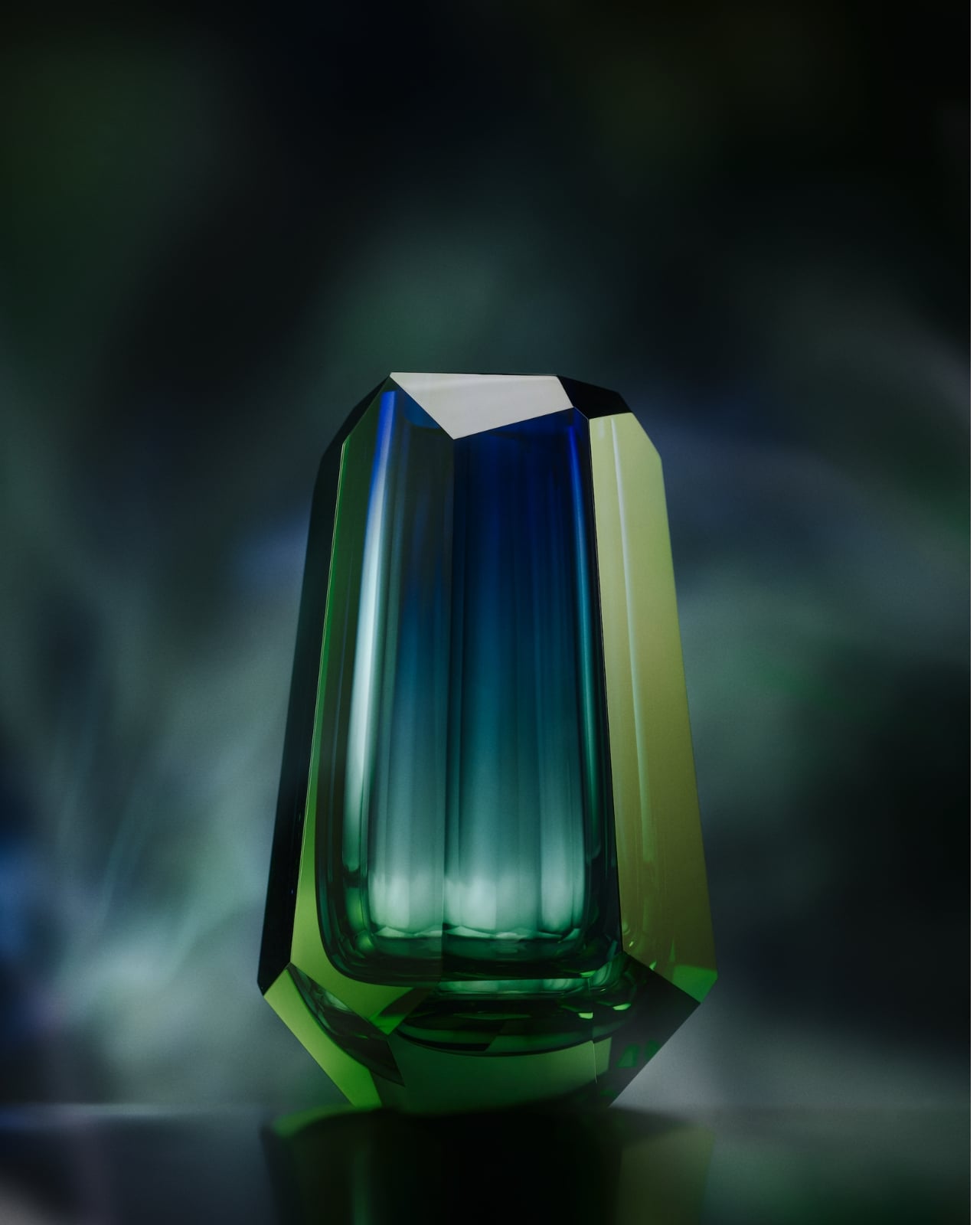
The Aura collection, their newest release, is inspired by the north. Not the idea of Scandinavia as an aesthetic trend, because we’ve all seen enough of that, but the raw, atmospheric reality of it. The icy cold. The depth of a darkened sky. The specific, almost spiritual moment when the aurora borealis ignites across the horizon. It’s an ephemeral experience most of us will only ever see in photographs, and somehow Moser has managed to capture it in glass.
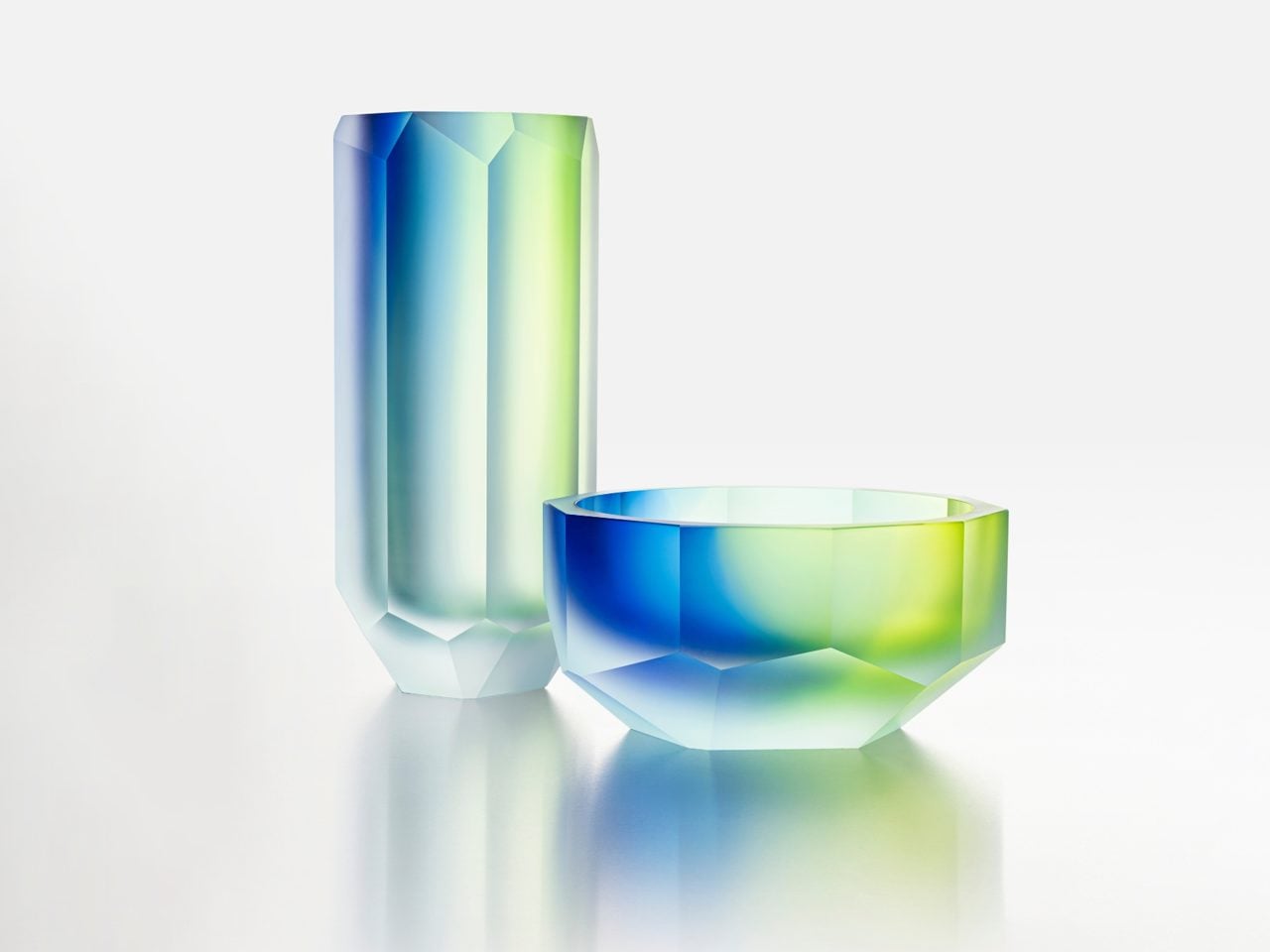
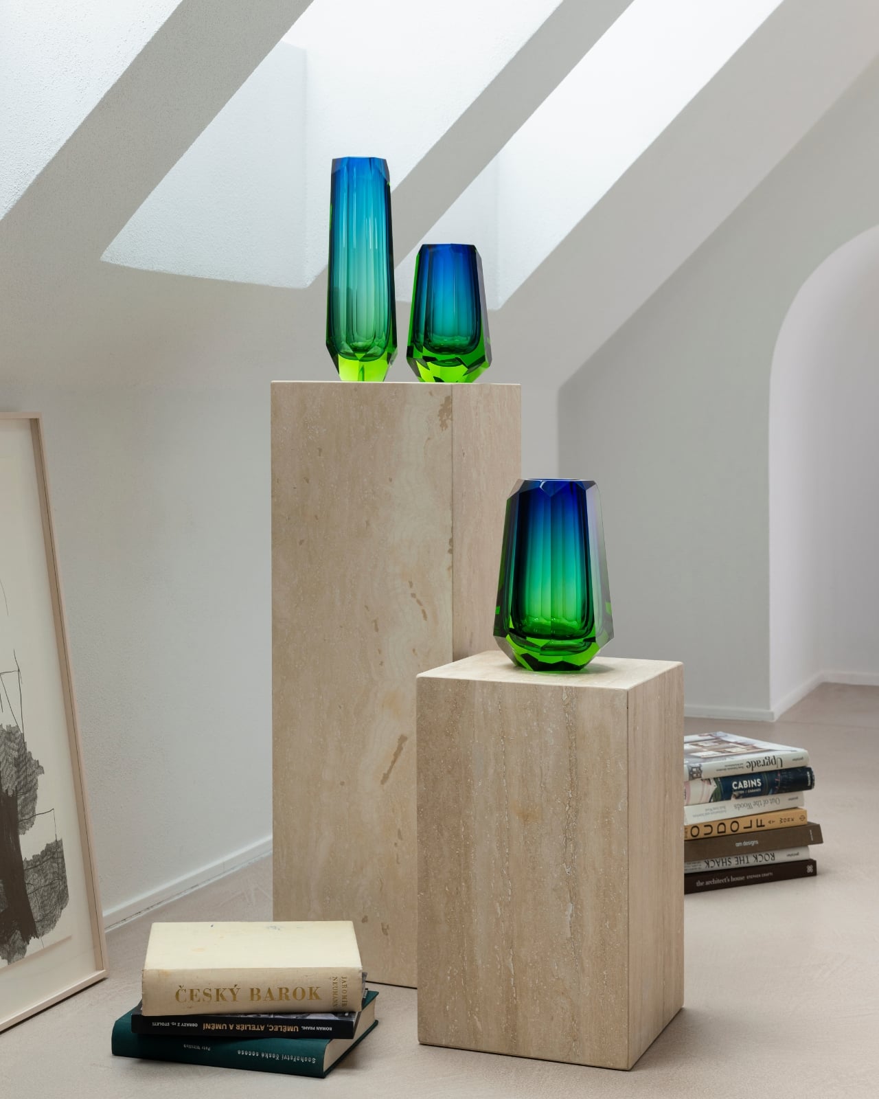
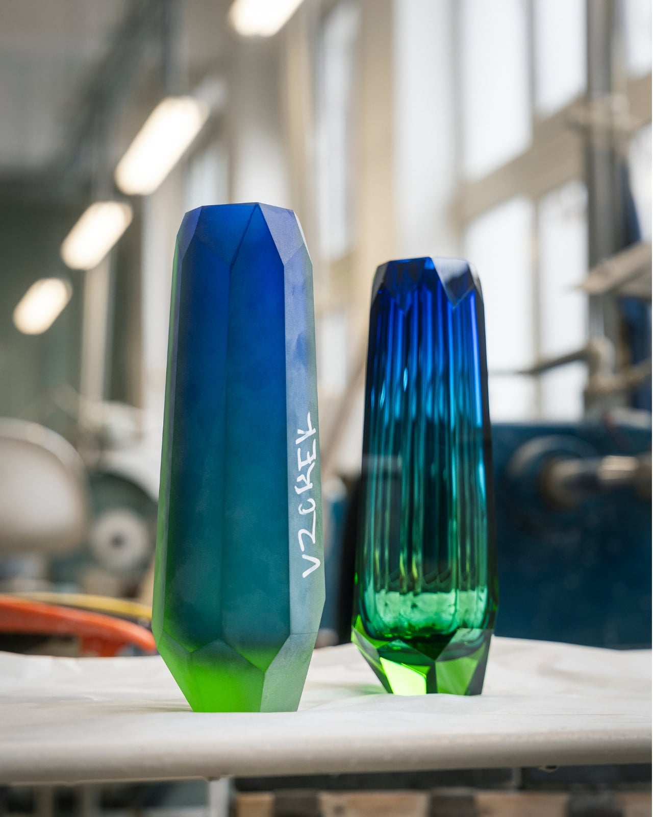
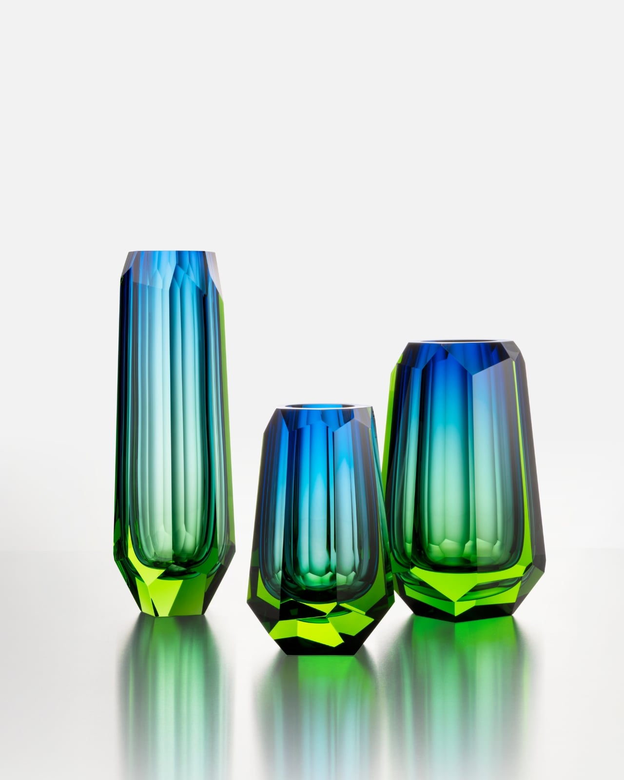
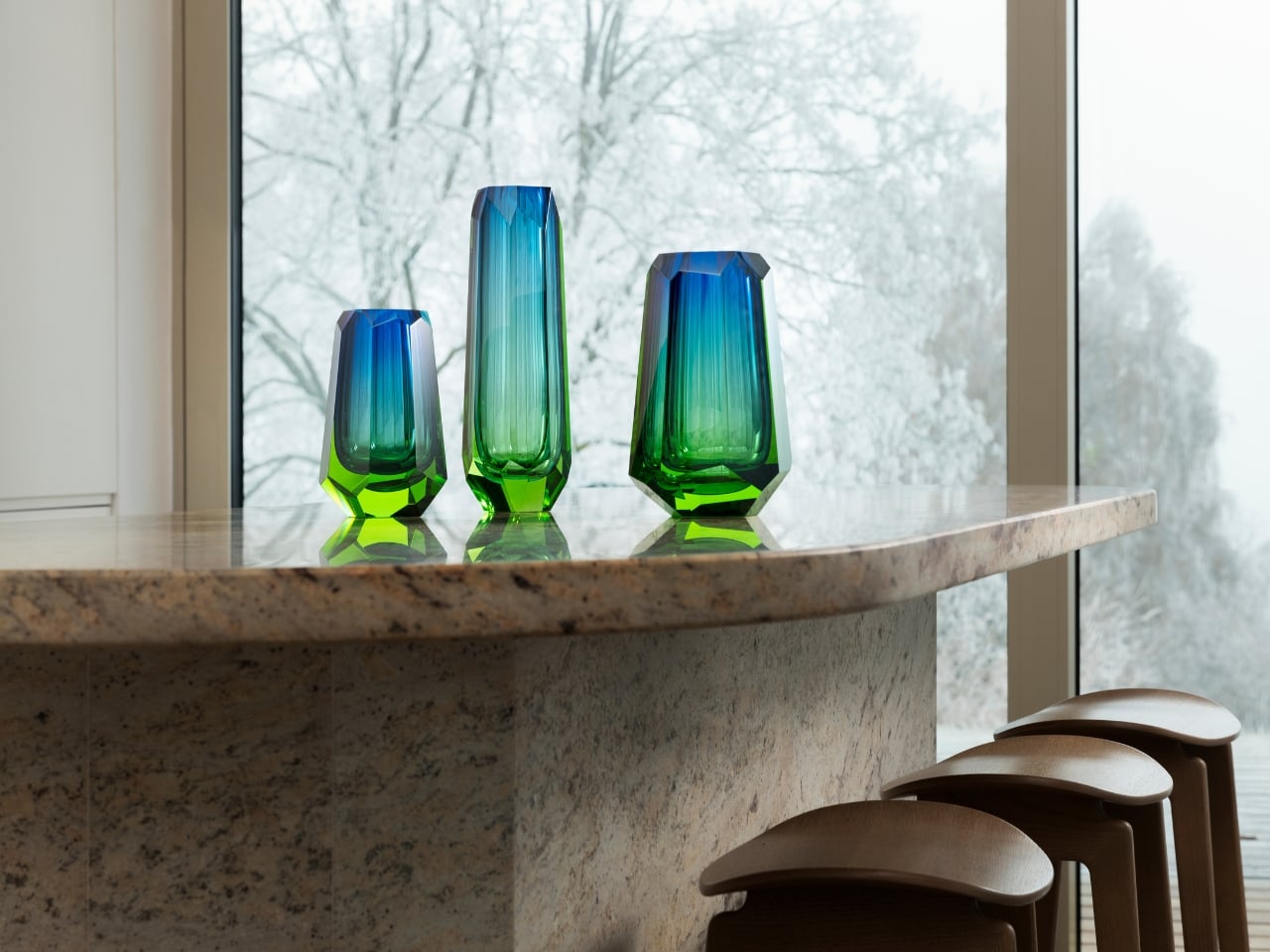
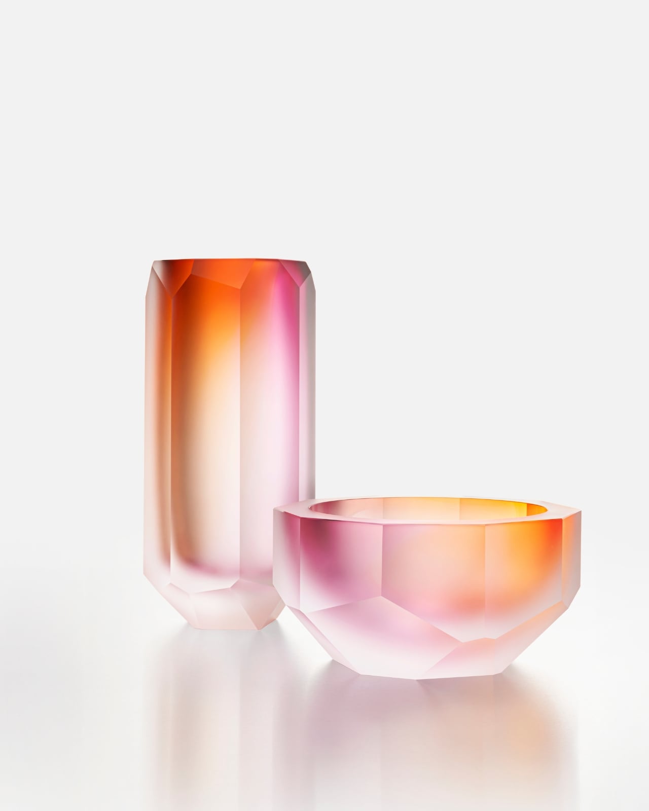
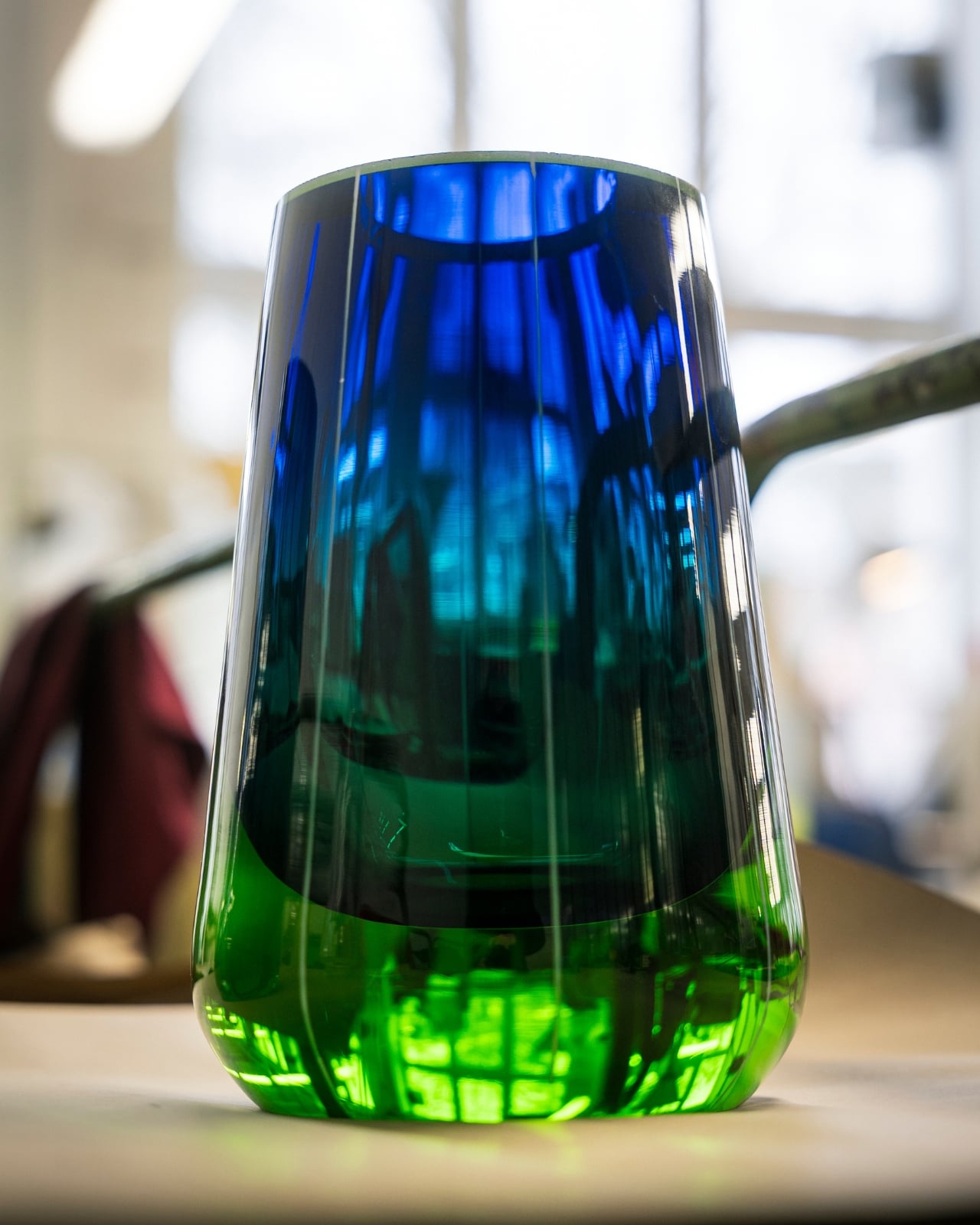
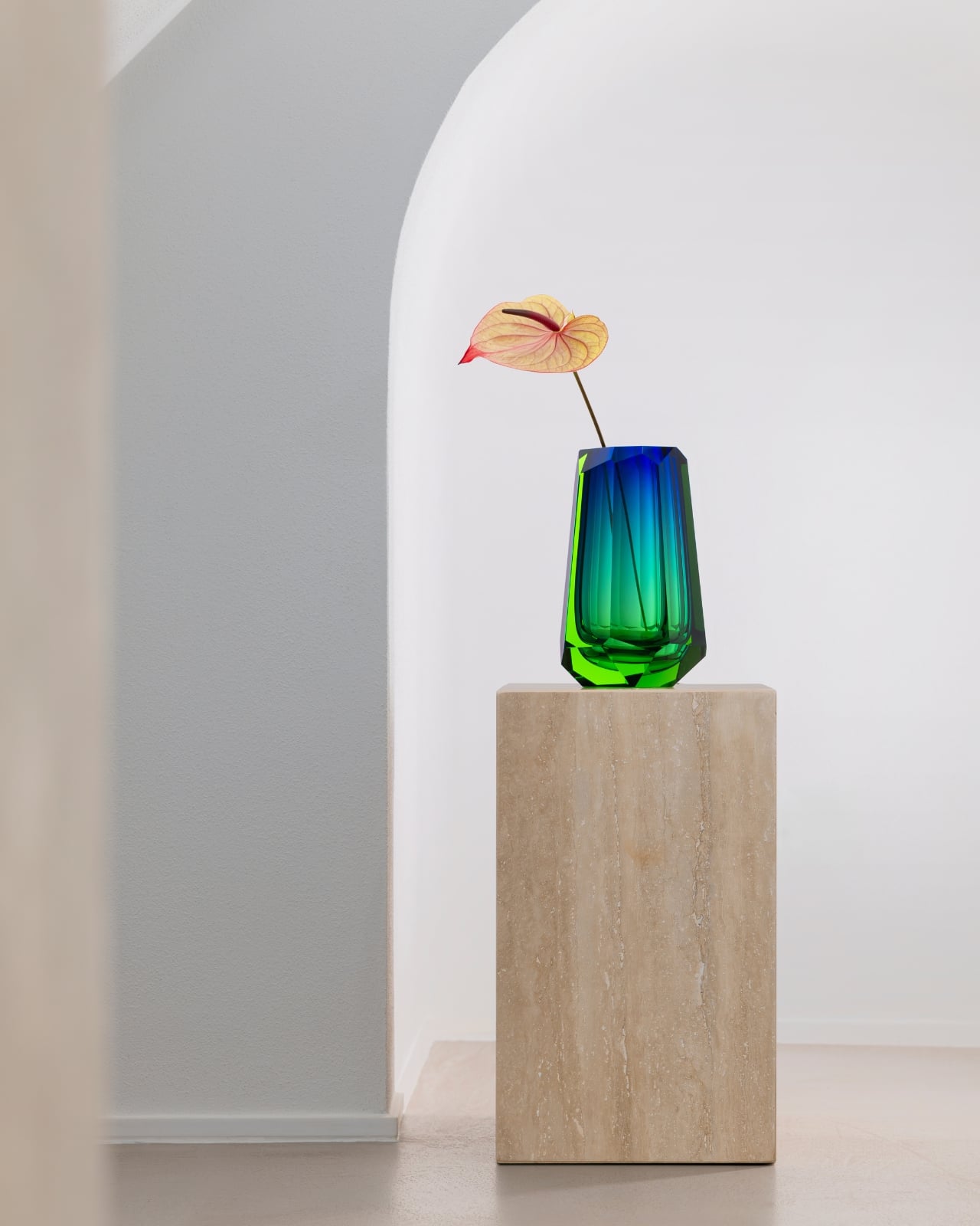
The collection’s standout pieces are the crystal vases, available in three heights: 21 cm, 26 cm, and 35 cm. Each captures the shifting color palette of the Northern Lights, that slow bleed from icy white into deep, oceanic blue, with striking cut edges that echo the geometry of the landscape itself. They’re atmospheric without being theatrical, and they carry the kind of quiet confidence that only comes from serious craftsmanship. These are objects you place in a room and simply let do the talking.
It’s rare to encounter a design that genuinely earns its inspiration. The aurora borealis is one of the most over-referenced phenomena in the aesthetics world. It shows up on wallpaper, yoga mats, screensavers. Moser’s version feels different because the glass actually does what the inspiration promises. The light moves through it. It shifts depending on the angle, the time of day, the room. It behaves like something alive, which is a strange thing to say about crystal, but it’s accurate.
The matte vases and bowls in the collection deserve their own moment. These pieces feature a frosted surface that softens the drama and brings the aurora-inspired hues into something more intimate, like watching the lights through a quiet fog. The catch is that Moser’s masters can only produce 12 pieces of each type per year. Not 12 per collection. 12 total. That’s not scarcity as a marketing strategy. That’s simply the honest ceiling of human skill and time, and there’s a kind of integrity in that.
I’ve covered a lot of design collections, and “limited edition” has largely become white noise at this point. But this is genuinely different. These pieces take what they take to make, and no amount of consumer demand changes that. It’s a refreshing constraint in an industry that too often prioritizes volume over meaning. For anyone building a home with intention, collecting pieces that actually hold value, or just looking for something beautiful that won’t feel dated in five years, the Aura collection deserves your attention. It sits at the intersection of art, craft, and a deep reverence for the natural world, and it earns every bit of that description. Moser has been doing this for 169 years. At this point, they clearly know something the rest of us are still working out.
Mercedes-Benz fans last got a factory-built convertible G-Class in 2013, and after years without an open-top option, the German automaker appears ready to bring it back. The upcoming G-Class Cabriolet retains the SUV’s unmistakable boxy silhouette while introducing a folding fabric roof that gives the iconic off-roader a fresh sense of openness.
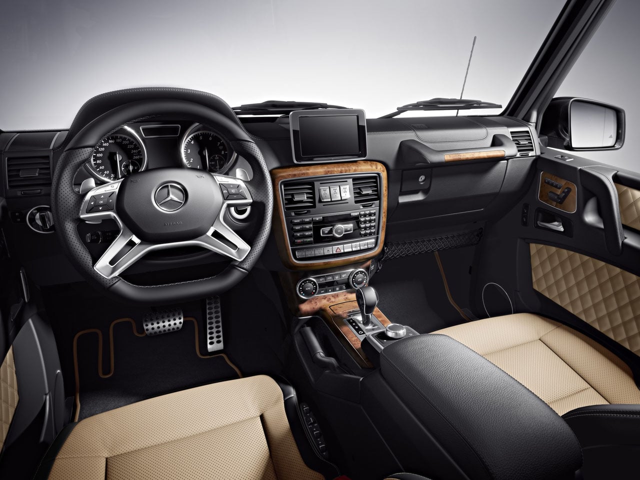
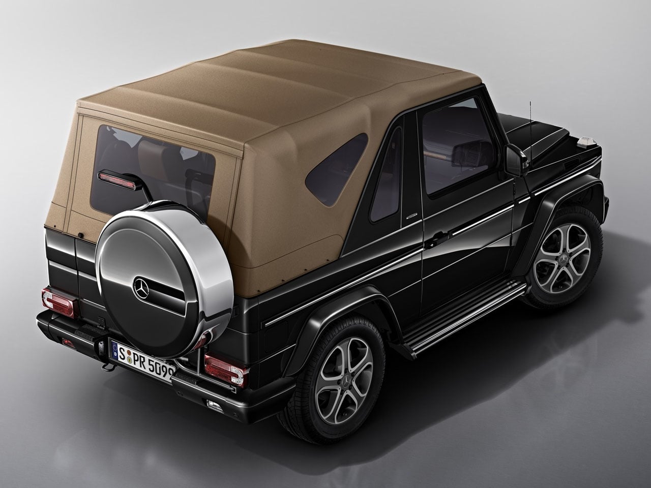
Based on the Mercedes-AMG G63, the four-door convertible preserves the rugged character of the standard SUV while adding a more lifestyle-oriented driving experience. The powered soft top folds away at the push of a button, stacking neatly behind the rear seats at roughly the height of the rear wheel arches. Unlike the earlier G-Class Convertible, which required owners to manually release roof latches before operating the top, the new system is fully automated for greater convenience.
Although Mercedes-Benz has yet to reveal complete specifications or an official launch timeline, prototype sightings and teaser footage offer a closer look at the engineering behind the transformation. Converting the G-Class into a cabriolet required substantial structural modifications, including a redesigned rear section and reinforced body to compensate for the removal of the fixed roof. Reports suggest the retractable roof mechanism alone consists of around 500 specially developed components.
The rear of the SUV also receives thoughtful revisions to accommodate the convertible layout. The signature spare wheel carrier remains, but its cover has been redesigned with an integrated high-mounted brake light. The rear pillars have a more angular profile than previous convertible G-Class models, giving the SUV a cleaner and more contemporary appearance while maintaining its instantly recognizable design language.
Performance is expected to remain unchanged from the AMG G63. The convertible is likely to be powered by the familiar 4.0-liter twin-turbocharged V8 engine producing 577 horsepower, paired with Mercedes-AMG’s all-wheel-drive system. That means buyers should still get the same blend of high-performance road manners and formidable off-road capability that has defined the modern G-Class.
The return of the G-Class Cabriolet is significant because Mercedes-Benz has largely focused on expanding its SUV lineup through new powertrains and special editions rather than introducing entirely new body styles. By reviving the open-top G-Wagon, the company is revisiting one of the model’s most distinctive variants while combining classic styling with modern engineering and convenience.
Whether cruising coastal roads or tackling rough terrain, the G-Class Cabriolet promises to deliver the unmistakable presence of the G-Wagon with the added appeal of open-air driving. More details, including pricing, production numbers, and availability, are expected to be announced closer to its official debut.