It’s that time in human history again when the world turns its attention to a country whose political outcome could also affect the rest of the world, one way or another. Presidential debates are pivotal moments during this period, offering candidates a highly publicized platform to present their policies, challenge their opponents, and connect with voters. These events have become quite sensational shows even, and just like any other show, there is one unsung hero: stage design. The layout and design of the debate stage are fundamental in shaping how these encounters are perceived by both the live audience and viewers at home. So we take a closer look at the role stage design plays in presidential or any other debate, and how various elements such as visual hierarchy, backdrop aesthetics, and camera angles can influence the overall dynamics.
Designer: Clickspring Design
Visual Hierarchy and Focal Points
Just like in any stage design, the placement and interaction of various elements play a critical role in guiding people’s attention, especially for those watching at home whose views are largely determined by the camera. Here are some of those elements that establish a visual flow that could very well change the narrative or impact the audience.
The Central Placement of Podiums
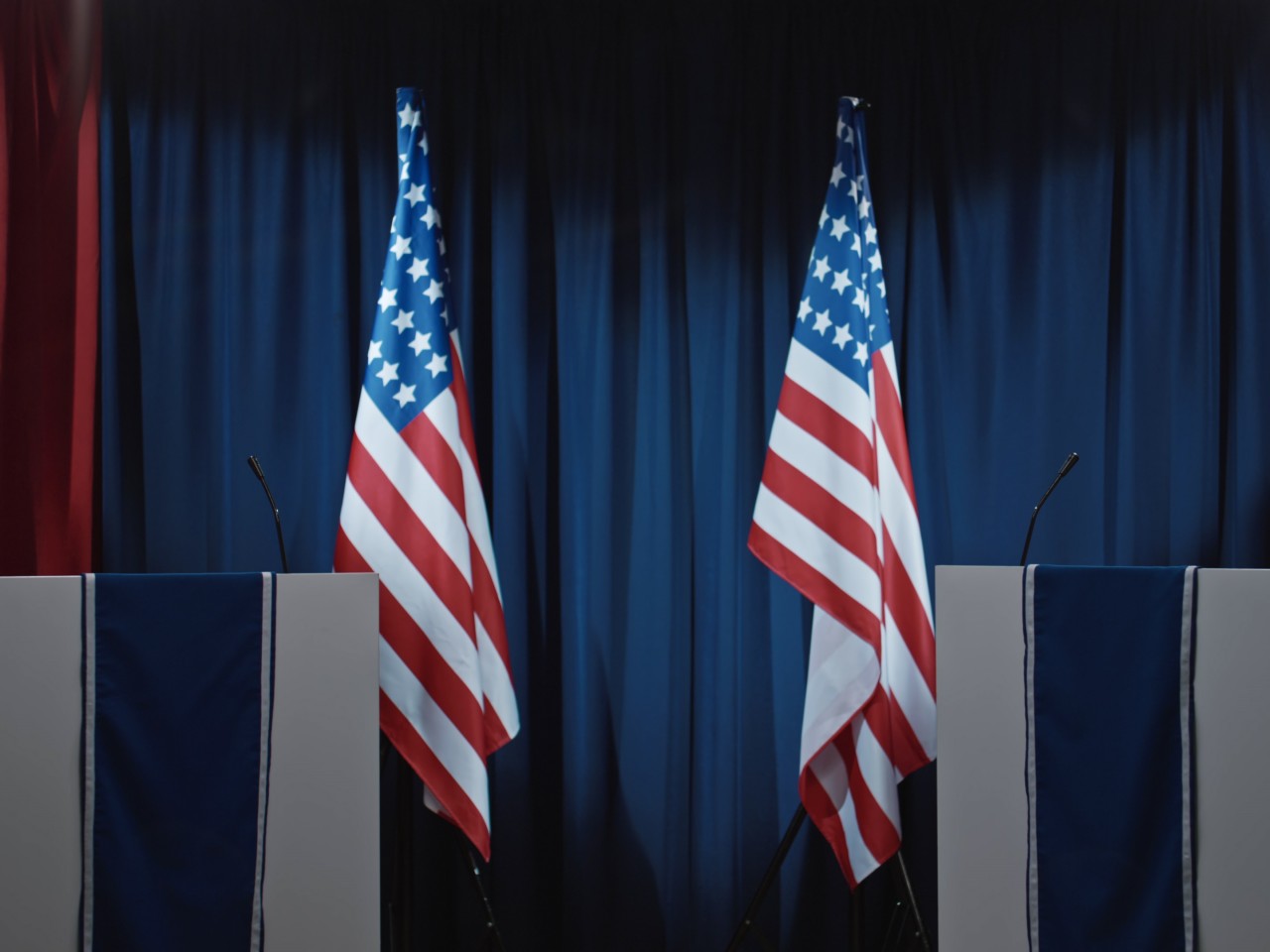
Image courtesy of: Pressmaster
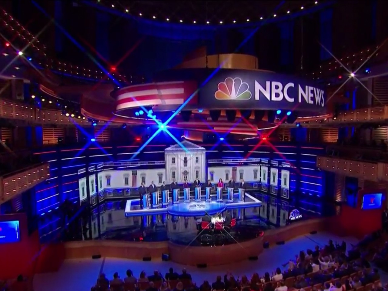
The podiums where debaters stand are naturally the center of attention on stage and have a direct impact on its design. Typically, podiums are positioned centrally on the stage to ensure that candidates are the main visual focus. They are also distributed evenly across the center to maintain an equal visual weight between candidates, promoting an unbiased viewing experience. It is also a strategic arrangement as it facilitates a smoother debate flow, allowing candidates to engage directly with each other and the moderators, regardless of their position on the stage.
Backdrop Design
Although treated as a decorative element, the backdrop plays a more important role in setting the atmosphere and even diverting focus toward or away from the speakers. In political debates, it’s a canvas that can incorporate national symbols such as flags or seals, as well as national landmarks that paint a larger picture of what the event is about. The choice of color scheme is an important matter to consider, as too many hues can end up distracting or even straining the eyes. Neutral and muted tones are generally best to keep the emphasis on the candidates rather than the design.
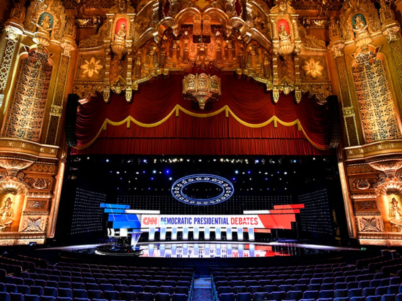
Image courtesy of: Live Design Online
Camera Angles and Lighting
Considering presidential debates have always been televised or, more recently, projected on large screens in the venue, camera angles and lighting have become even more essential and can either enhance or detract from the debate experience. Wide-angle shots capture the entire stage, providing context and showing the physical dynamics between candidates. Close-ups, on the other hand, capture facial expressions and gestures, adding an emotional dimension to the proceedings. Lighting isn’t just a matter of putting a spotlight on people, especially since it has to be done in a way that doesn’t look biased, like casting shadows on some candidates but not others. Balanced and soft lighting helps to create a polished and professional visual atmosphere, keeping the focus squarely on the candidates, while extravagant and showy lighting effects tend to make the event and the stage look cheap and superficial.
Ensuring Equality and Focus
The layout and design of a presidential debate stage isn’t something that is planned haphazardly. Visual elements like the central placement of podiums, backdrop aesthetics incorporating national symbols, and strategic lighting all work together to highlight the candidates. The visual hierarchy created by these elements helps direct the viewers’ attention to the key players and enhances the overall impact of their messages. The most important point to remember is that the design should ensure that candidates are given equal visual weight, reducing any implicit bias. Stage design should also keep the audience focused on the content of the debate rather than the setting, though some more recent stages seem to go in the opposite direction and become spectacles themselves.
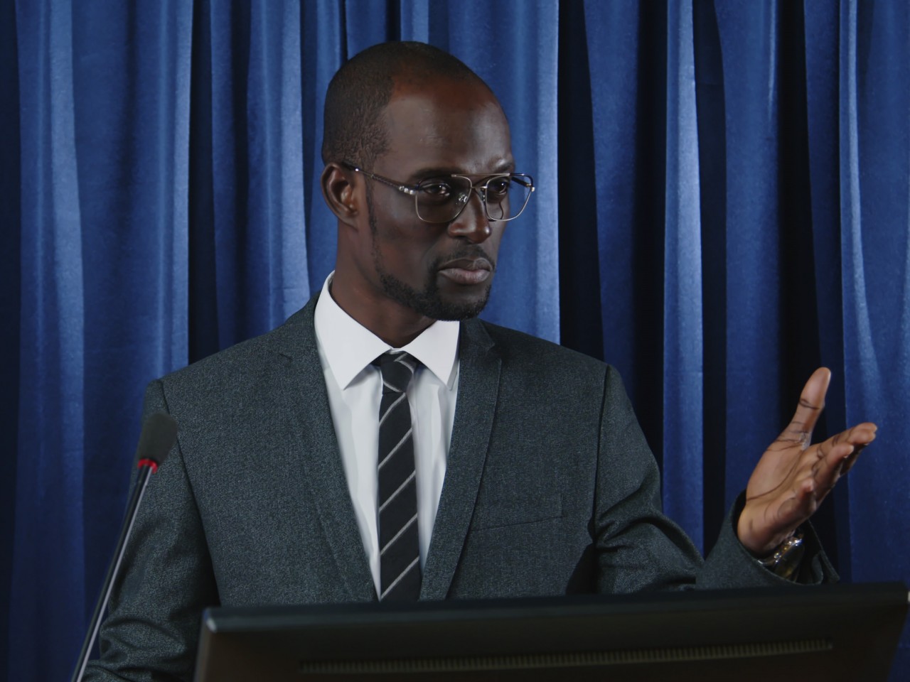
Image courtesy of: AnnaStills
The Evolution of Stage Design in Presidential Debates
While debates have been around since the time of the ancient Greeks, televised presidential debates are a more recent phenomenon that only started in the US in the 60s. Thanks to technology, this integral part of the US election system went beyond geographical borders and became something that other countries have come to follow. Of course, the design of the stages in these debates has also evolved along with human history and trends, reflecting not only the aesthetic tastes of the generation but also their concerns.
Historical Context
The first televised debate between John F. Kennedy and Richard Nixon in 1960 already highlighted the importance of visual elements. Kennedy’s youthful and composed appearance contrasted with Nixon’s pale, sweaty demeanor and the poor stage lighting and camera angles that didn’t do the latter any favors. This debate marked the beginning of an era where stage design would become an integral part of political strategy. The design of presidential debate stages has evolved significantly over the years as technologies improved and audiences have become more sophisticated.
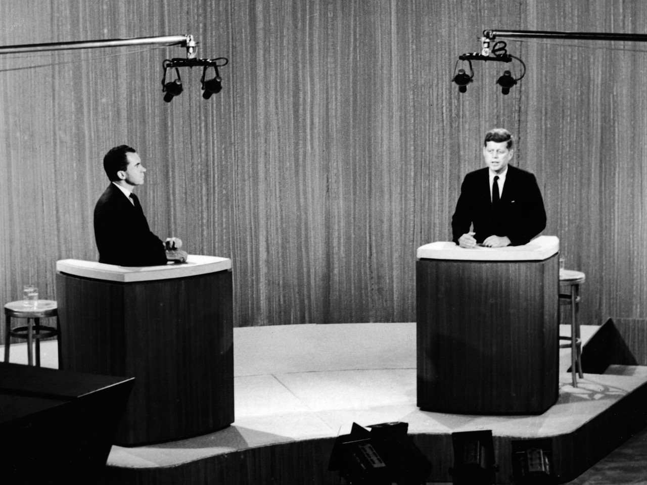
Image courtesy of: Getty Images
Modern Innovations
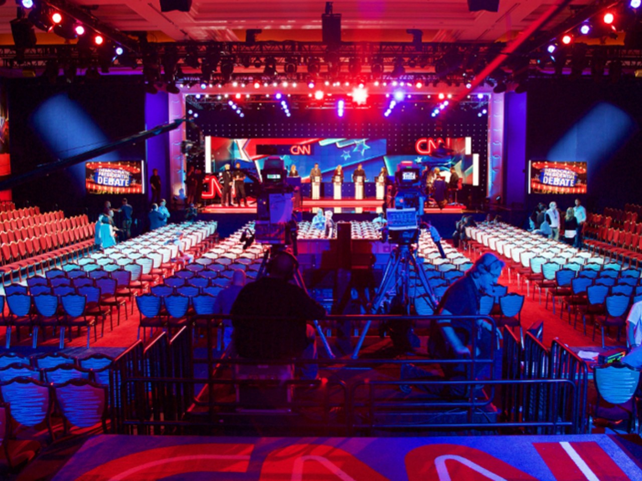
Recent technological advancements have allowed for more complicated stage designs that go beyond simple podiums and plain backgrounds. High-definition screens, 3D projections, and even augmented reality have been integrated to create more engaging and dynamic environments. These innovations not only enhance the aesthetic appeal but also offer new ways to present data and statistics, making complex topics more accessible to the audience. That said, there is also a tendency to go overboard with these innovations, resulting in stages with distracting elements and presentations that turn the debates into entertainment shows.
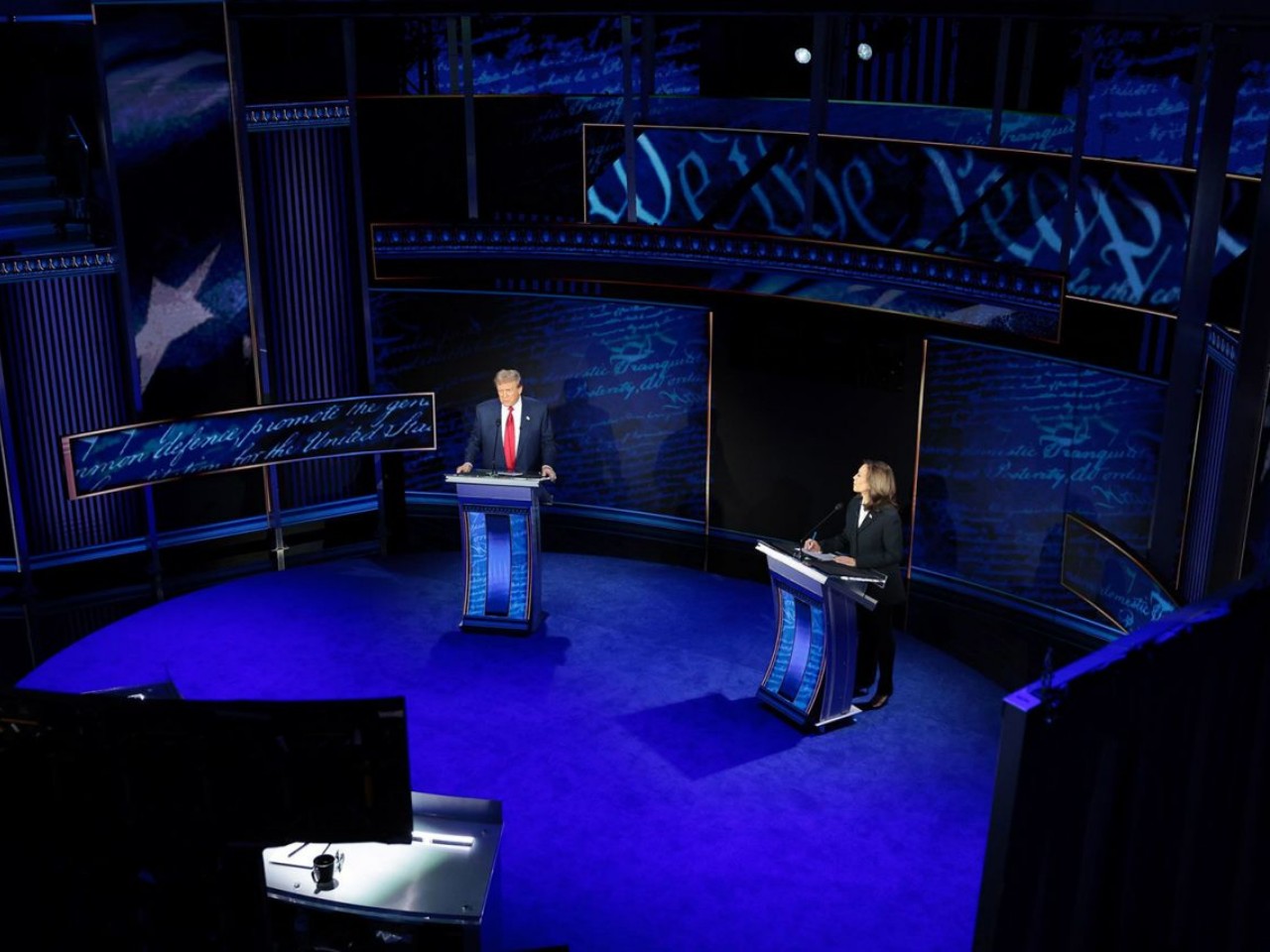
Image courtesy of: CNN
The Psychological Impact of Stage Design
Stage design might seem like more of an audiovisual matter, but like any kind of design, they have underlying and sometimes subtle psychological effects as well, intended or otherwise. Even the mere placement of elements or choice of colors can have an impact on viewer perception, often subconsciously even.
Perception of Authority
Stage design can subtly influence the perception of a candidate’s authority and competence. For instance, elevated podiums can give candidates a commanding presence, while their placement on the stage can make them feel emotionally distant or close. Symmetrical designs and balanced lighting contribute to a perception of fairness and impartiality, indirectly boosting the candidates’ credibility. Lighting and camera focus can literally change how a candidate looks, making them seem gloomy, happy, suspicious, or trustworthy.
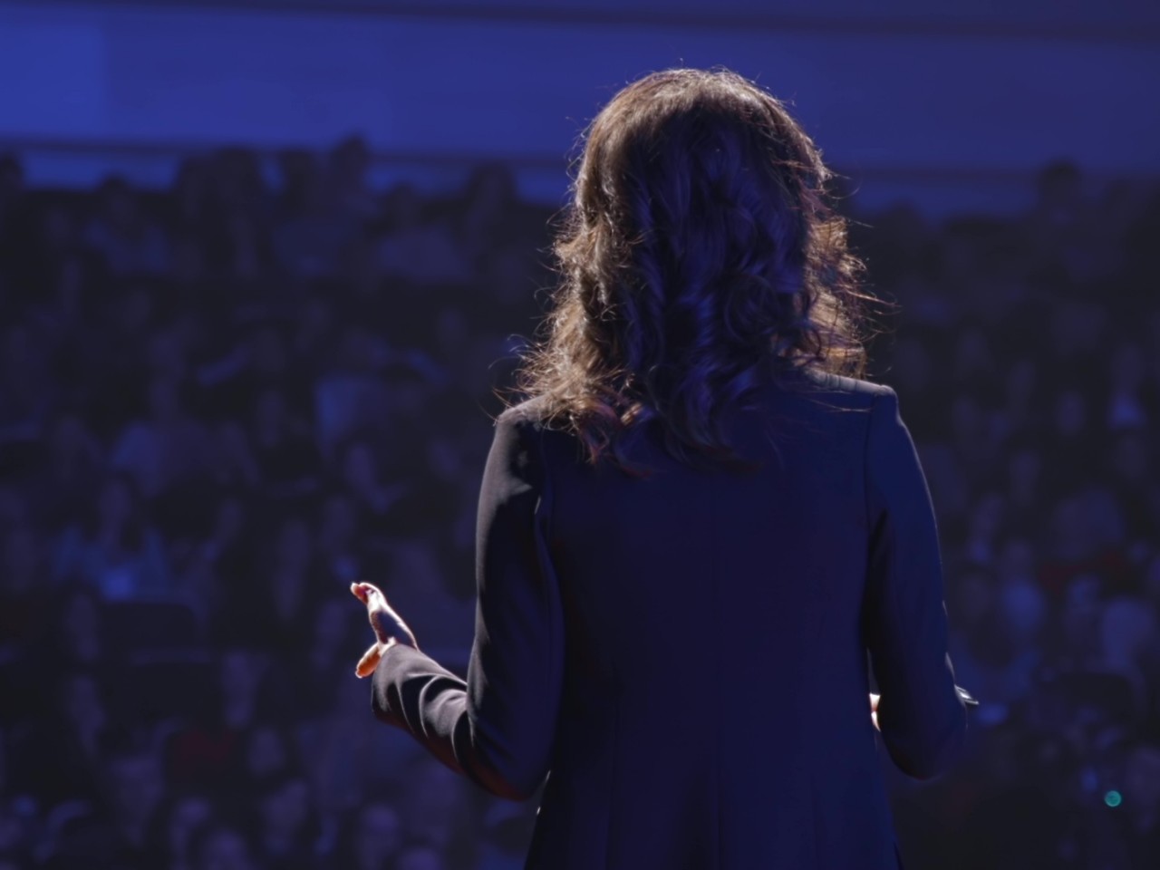
Image courtesy of: adme
Audience Engagement
The stage itself captures and retains the audience’s attention, and a well-designed one has stronger holding power. Strategically placing elements and tasteful use of visuals Engaging visuals ensure that viewers are not distracted and remain focused on the candidates’ messages. Elements such as movement on stage, transitions between camera angles, and interactive elements like audience reactions contribute to a dynamic viewing experience and can be potent tools to create a more meaningful connection with the audience, especially with the Internet that can include the participation of home viewers as well.
The Role of Technology in Enhancing Stage Design
While the first televised presidential debates relied solely on studio cameras and terrestrial TV networks, we have a broader range of technologies today to add flavor to the debate or, conversely, spin a different narrative. Just like any other tool or design element, these have to be used wisely and judiciously to put the focus on the most important part of the event: the candidates’ messages.
High-Definition Screens and Projections
High-definition screens and projections are now standard in modern debate stages as they can let live audiences see a closer look even when they’re at the bleachers. These can also display real-time data, enhance visual graphics, and even simulate different environments. This technology allows for a more comprehensive presentation of complex issues, making it easier for the audience to grasp the nuances of each candidate’s argument.
Image courtesy of: MUS_GRAPHIC_
Augmented Reality
Augmented reality (AR) has started to make its way into stage design, adding an immersive layer to the debate experience. Just like screens, AR can be used to visualize data, project interactive maps, or even recreate significant historical moments, except at a more personal distance. It can make viewers feel like they’re really “on the scene,” but like any other AR experience, it needs to be used in moderation so as not to exclude the majority of people who don’t have AR equipment to use.
Lighting and Sound Design
Advanced lighting and sound systems are crucial in creating the desired ambiance and ensuring clear communication. Programmable LED lights can highlight specific moments or shift focus between speakers, while high-quality sound systems ensure that every word is heard clearly. Conversely, they can also be sources of distraction or even physical discomfort when overused.
Designer: Clickspring Design
Challenges and Considerations in Stage Design
Stage design for presidential or any debate has the same elements as most stage designs, but they carry even more weight in ensuring an impression of impartiality and fairness. To some extent, this kind of stage design has a more serious overtone, presenting unique challenges to designers and architects.
Balancing Aesthetics and Functionality
Like with any kind of design, balancing aesthetics with functionality is one of the most important hurdles to overcome. While it’s essential to create a visually appealing environment, it’s equally important to ensure that the design does not interfere with the debate’s primary purpose: to provide a platform for meaningful discourse. Overly elaborate designs can be distracting, while overly simplistic designs might actually be counterproductive and bore viewers to the point of losing interest.
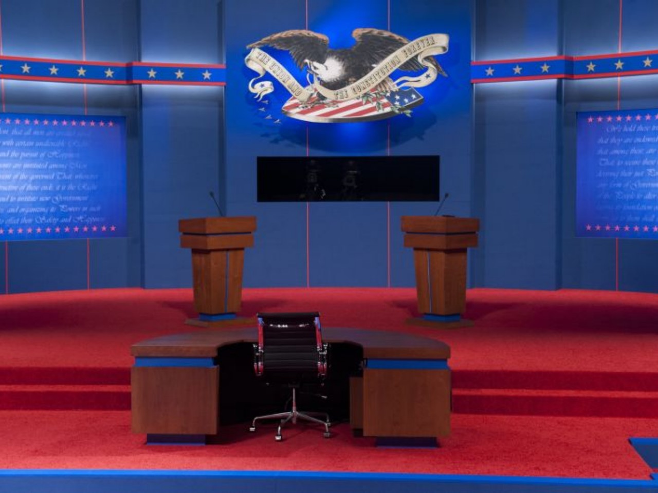
Image courtesy of: CNN
Ensuring Impartiality
To some extent, ensuring impartiality is probably the most critical consideration that guides the overall design. Every element of the stage must be scrutinized to avoid any potential bias, visual or otherwise. This includes equal lighting, symmetrical podium placement, and unbiased camera angles. Even subtle elements, such as the candidates’ color schemes, must be carefully managed to maintain a neutral environment.
Final Thoughts
Stage design for presidential debates is a complex interplay of art and science. It requires a deep understanding of visual hierarchy, psychology, and technology to create a setting that enhances the candidates’ messages and engages the audience. As technology continues to evolve, so too will the possibilities for innovative and impactful stage designs, further elevating the importance of this often-overlooked aspect of presidential debates. It shapes perceptions, influences engagement, and ultimately contributes to the political process by providing a fair and engaging platform for candidates to present their visions for the future. After all, the role of stage design in presidential debates cannot be overstated, for it is indeed a silent yet powerful player in the theater of politics.
Pasant Theatre, Wharton Centre
The post Setting the Stage: How Design Shapes the Dynamics of Presidential Debates first appeared on Yanko Design.