The Tiny Home Design That Has Americans Rethinking Where the Bedroom Should Go

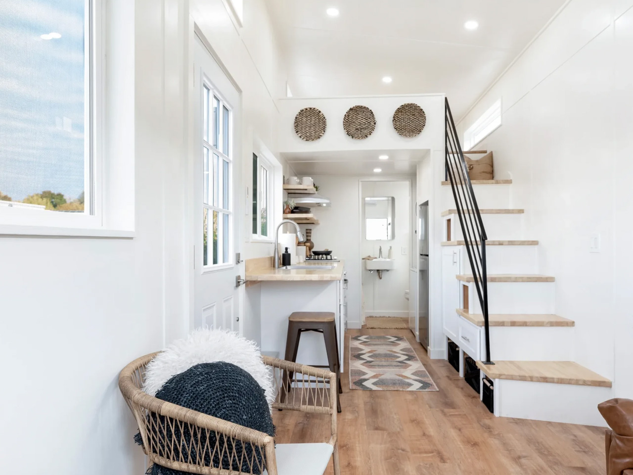
The floor plan question in a tiny house almost always comes down to one thing: where does the bedroom go? JT Collective answered it by pushing sleep upstairs in the Magnolia, a 26-foot tiny home on wheels, and using every square foot freed on the ground level to build a kitchen worth actually cooking in. It’s a trade-off that’s easier to admire in photographs than to live with at 2 a.m., but the layout logic holds.

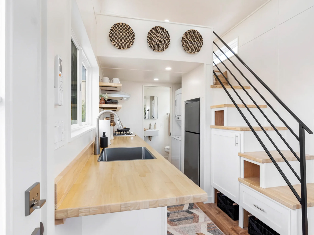
With the bedroom removed from the ground-floor circulation, the Magnolia opens into a continuous zone shared by the kitchen and living area. The service core runs along one side: a drawer dishwasher fits within the kitchen run, a compact appliance choice that preserves counter height without reducing the layout to a series of workarounds. Stacked laundry is folded into the plan nearby, present but not announcing itself across the room. For anyone who cooks regularly, that kind of clarity matters. Prep, clean-up, and laundry become a legible daily routine rather than a negotiation with the footprint.

Designer: JT Collective

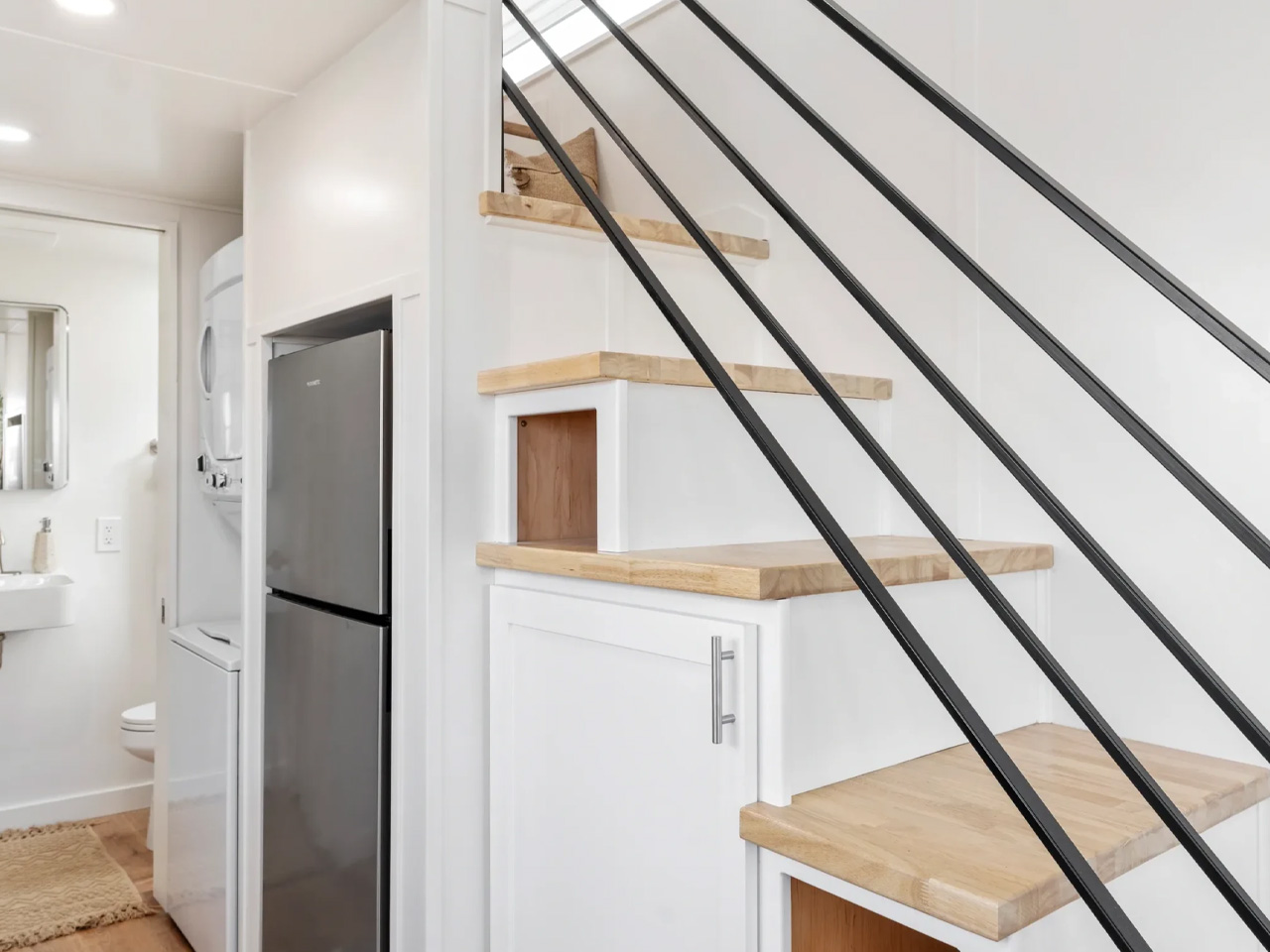
The staircase handles more than circulation. Drawers and compartments are built into each step, holding items that would otherwise migrate to the counter edge, the arm of the sofa, and every available flat surface in between. A stair that only moves you between floors is a missed opportunity in 26 feet of length. This one earns its place in the plan, and the living area reads better for it.

What the loft configuration can’t resolve is access. A storage stair climbed nightly works well for a solo occupant or a couple without mobility concerns. It asks significantly more of anyone with a knee issue, a young child in the house, or a need to move at night without thinking through the steps. That isn’t a design flaw. It’s a design position with a defined audience, and it’s worth naming honestly before a build deposit changes hands.

JT Collective describes the Magnolia as its most popular loft model. Prospective buyers should contact the builder directly for the build weight, loft headroom clearance, egress specifications, utility connection requirements, regional approval documentation, and a full itemised quote covering delivery and site preparation. The listed base price is not a delivered or installed cost.

Towing regulations and permanent occupancy conditions vary by jurisdiction and site. The Magnolia makes one clear call: sleeping moves up so the kitchen can breathe. Whether that trade holds over months of full-time living depends entirely on who’s doing the climbing.

The post The Tiny Home Design That Has Americans Rethinking Where the Bedroom Should Go first appeared on Yanko Design.

Nobody Will Guess This Stool Actually Has Wheels

Walk into any modern office, studio, or collaborative classroom and you’ll spot the same compromise everywhere. Furniture either sits still and looks good, or it moves and looks like it rolled out of a hospital waiting room. Task chairs with exposed casters get the job done, but they broadcast “corporate cubicle” the second you glance at them. Anyone trying to build a space that feels warm, creative, or design-forward has had to choose between mobility and mood.

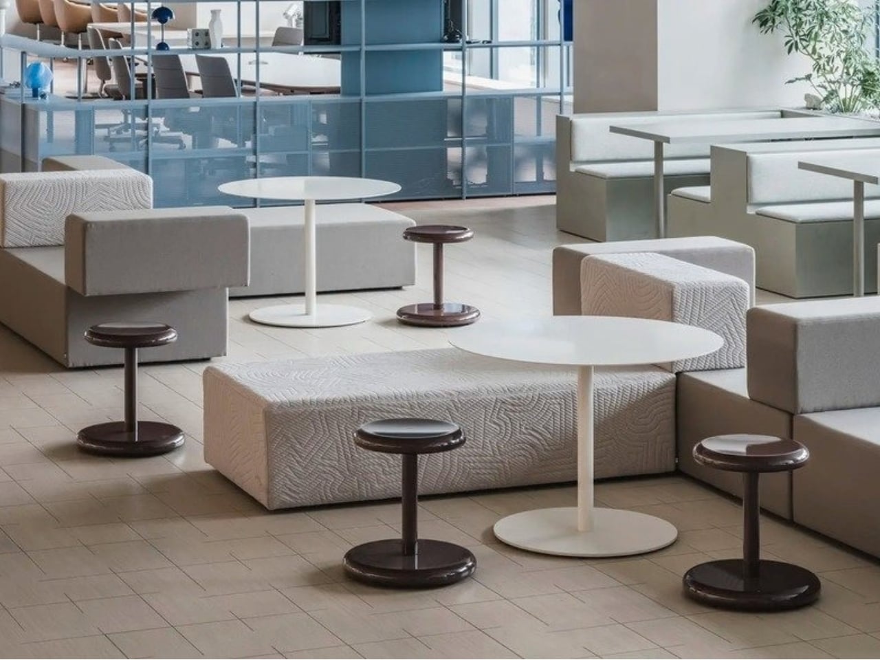
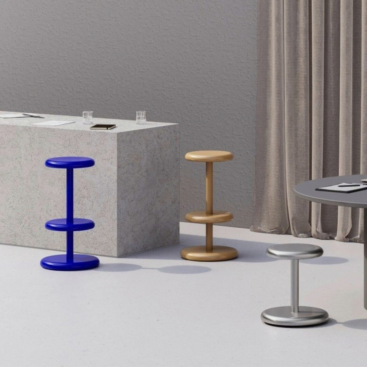
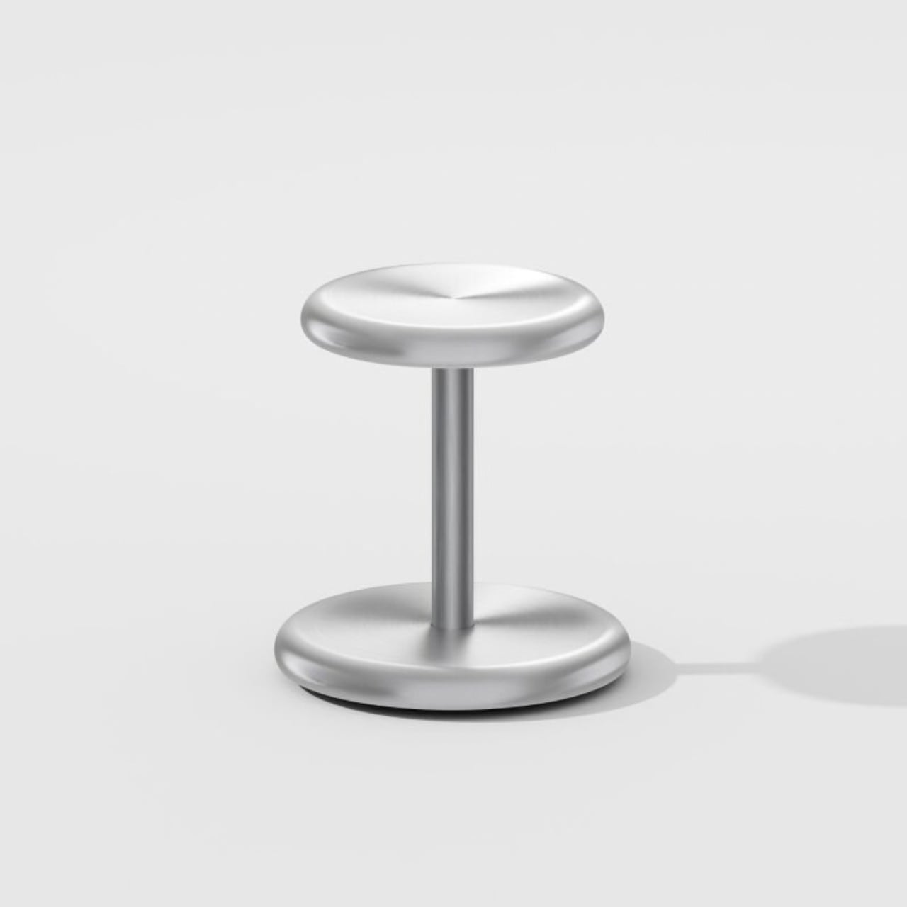
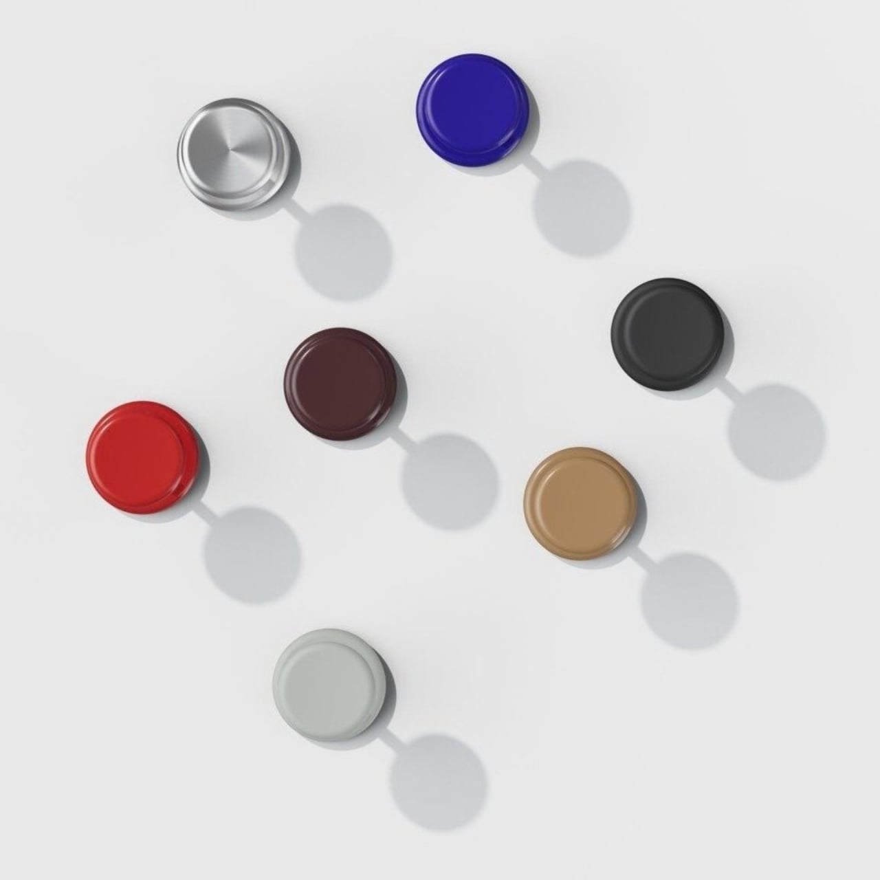
That tension is exactly what Hirotaka Tako set out to dissolve with Allround, a stool for the Japanese furniture brand NII, where he serves as creative director. The wheels are there, tucked completely beneath the base, so the stool reads as a clean, sculptural object first and a mobile one second. Nobody glances at it and thinks “conference room reject.” It just looks like a good stool that happens to glide when you nudge it.

Designer: Hirotaka Tako

I’ve always had a soft spot for furniture that solves a problem without announcing that it’s solving anything. Allround does that well. The whole piece is built around a single design idea, the full-round fillet, which is engineering language for a curved edge treatment, but it also doubles as wordplay for “all-rounder,” a piece meant to adapt to whatever room it lands in. That kind of double meaning in a name usually feels like a stretch. Here it actually tracks, because the stool genuinely looks built for anywhere: a design studio, a retail floor, a kitchen island, a hallway that needs the occasional extra seat.

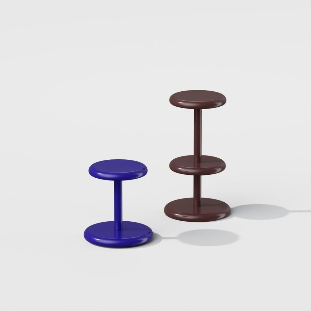
The construction is aluminum and steel, standing 750mm tall with a 415mm by 415mm footprint, small enough to tuck away without feeling flimsy. There’s a taller barstool version too, with a swiveling top and a third disc built in as a footrest, which is a smart touch for anyone who’s ever perched on a bar stool with nowhere to rest their feet. Both versions ship flat-pack, which matters more than it sounds like it should. Furniture that disassembles for shipping and storage tends to age better in real use, since offices and studios rearrange constantly and nobody wants to haul a fully welded stool across a building.

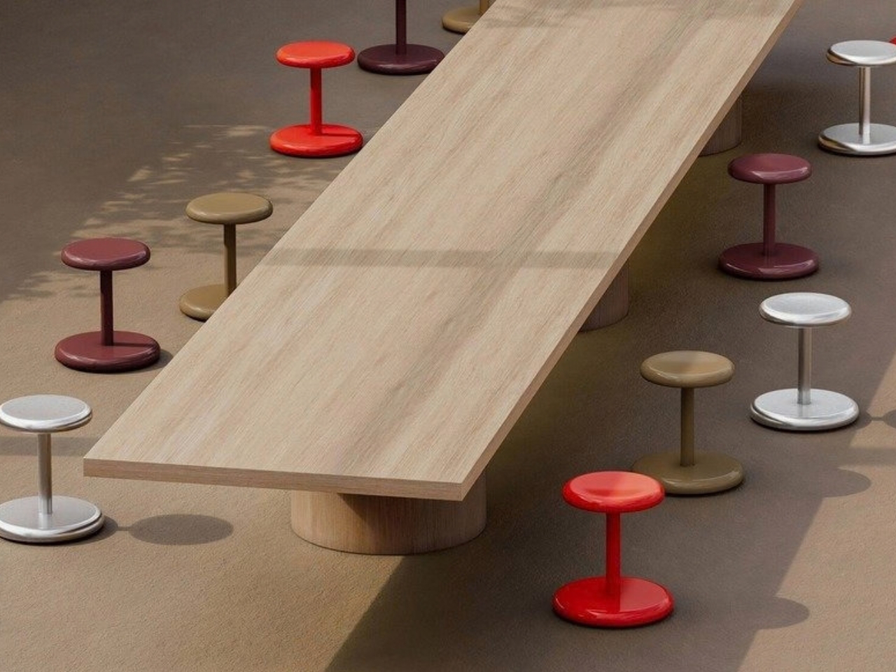
Color is where Tako lets the design breathe a little. Alongside a brushed hairline aluminum finish, Allround comes in six finishes with names like Gloss Ultramarine, Gloss Vermilion, and Satin Pale Olive. That range signals something about who this stool is for. It’s not trying to disappear into beige office neutrality, and it’s not cosplaying as a designer showpiece either. It sits in a middle lane, confident enough in color to hold its own in a photographed interior, restrained enough not to fight with the rest of a room.

What strikes me most is how the hidden casters change the emotional register of the object. A visible wheel base tells your body “this is temporary, this is a workstation, don’t get comfortable.” A hidden one lets a stool feel permanent and considered, even while it’s doing something mechanically clever underneath. Tako himself put it simply, saying the stool’s rounded form and finishes create a “delicate, melting impression” despite the robust metal frame. That contrast between softness and sturdiness is doing a lot of the emotional work here.

None of this reinvents seating. It’s a stool with wheels, dressed up smart. But there’s real value in a piece of furniture that quietly expands what a shared space can do without making anyone stop and think about ergonomics or floor plans. Design like this tends to get labeled minimalist, and sure, the silhouette earns that word. What it actually offers is flexibility that refuses to look like flexibility, which is a much harder trick to pull off than it sounds.

Whether Allround shows up in American offices and studios the way it clearly will in Japanese ones remains to be seen, but the appetite for furniture that moves without looking like it’s built to move isn’t going anywhere. NII has a stool ready for the moment more people start asking their furniture to do two jobs at once.

The post Nobody Will Guess This Stool Actually Has Wheels first appeared on Yanko Design.

Old Nike sneakers are getting shredded and recycled into sustainable gym flooring

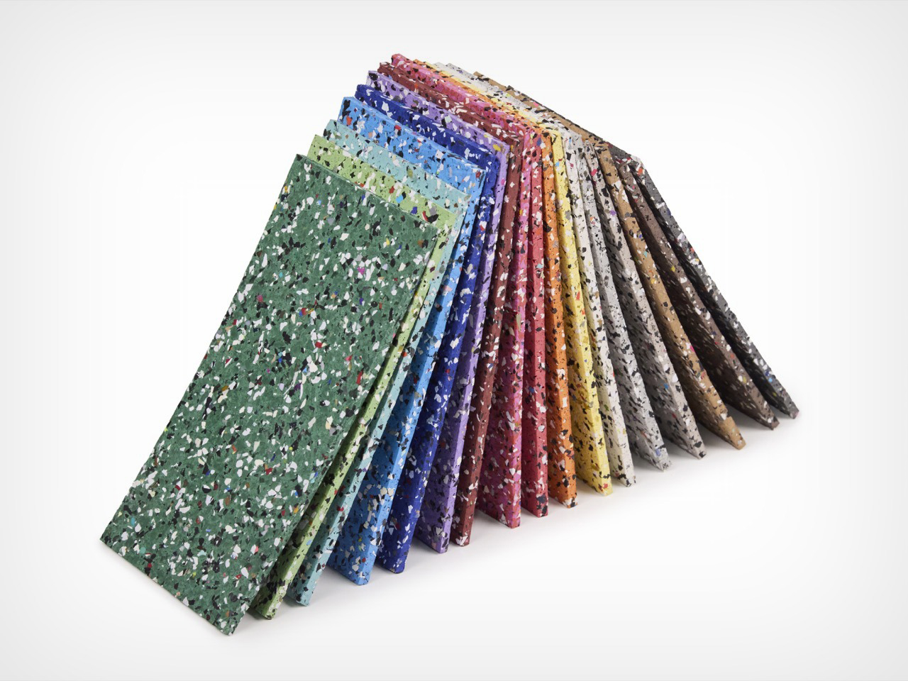
Every sneaker eventually dies, and most of them die badly, tossed into a landfill where the rubber outsole will outlive everyone who ever wore it. Nike has spent over three decades trying to intercept that fate with Reuse-A-Shoe, a program that grinds old kicks and factory scraps into a material called Nike Grind. What started as a scrappy basketball court test at a Nike facility in Oregon has since gone into more than a billion square feet of sport surfaces worldwide. Now it has landed somewhere I did not expect, as commercial flooring backed by the largest flooring manufacturer on the planet. Mohawk Group just folded a small Nike Grind partner called Hero Flooring into its lineup, and the headline product is called Hero Rubber made with Nike Grind.

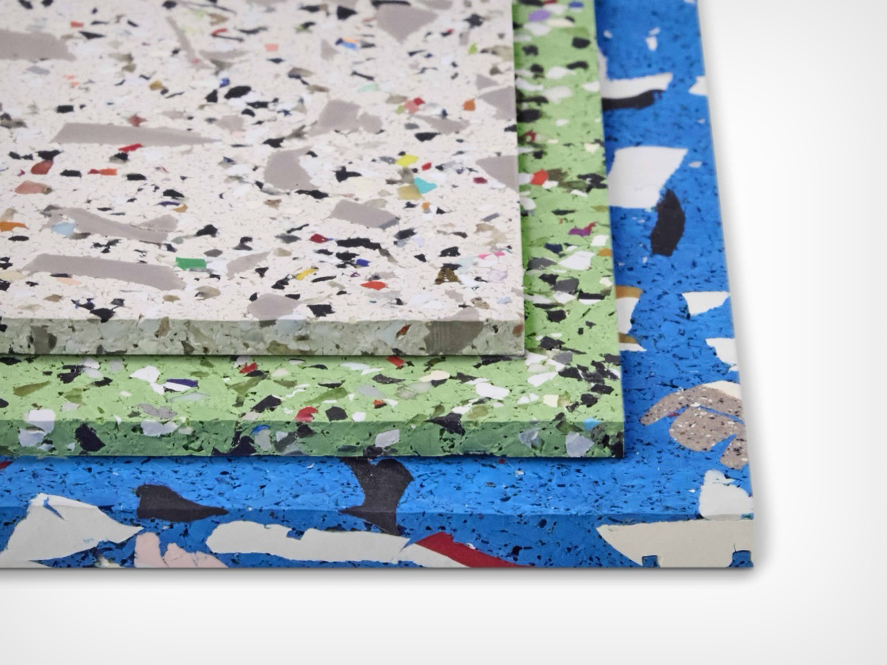
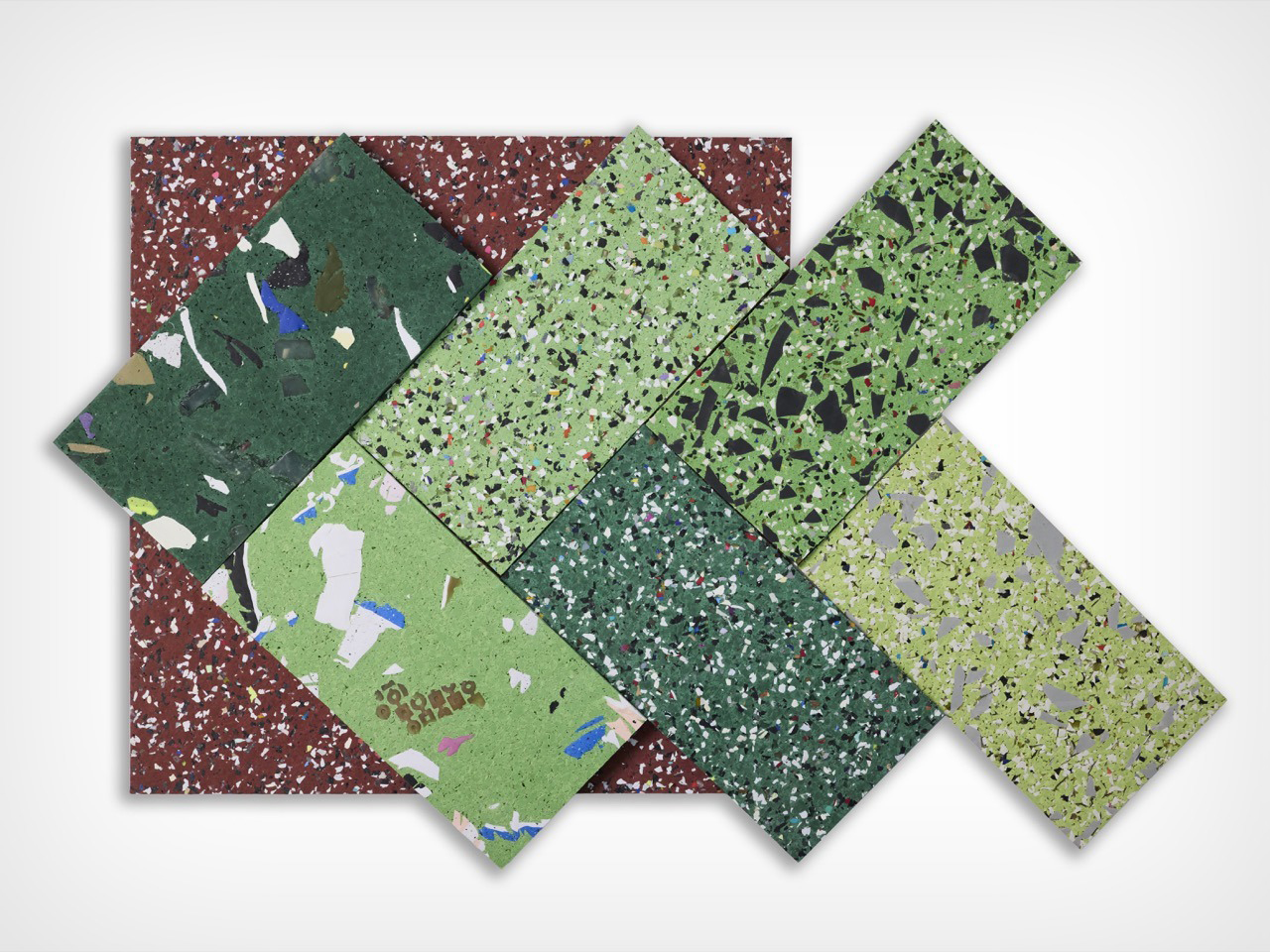
Reade Palmer, a former rower, founded Hero Flooring (now part of Mohawk Group) in 2014 and spent years pitching Nike before landing an official partnership in 2020. The result is a rubber flooring program built entirely around the size of the recycled granule, with three current styles called Original, Vitality, and Axis. Original uses the finest Nike Grind for a tight uniform speckle, Vitality blends two granule sizes for a terrazzo effect, and Axis goes bold with visible sneaker outsole chunks. All three ship in 17 colorways, skip recycled tires (so no tire odor, a real complaint with rival rubber floors), and carry FloorScore and Declare Red List Free certification. It has already won recognition from the AZ Awards, HiP Awards, and Best of NeoCon, and now rides Mohawk’s distribution into design firms nationwide.

Designer: Reade Palmer (Mohawk Group)

A big chunk of the shoes feeding Nike Grind come from drop bins sitting inside actual Nike stores, which means this floor started life as somebody’s actual Nikes. Grind them up, press them flat, install them in a gym, and now you have got people in fresh Nikes squatting and sprinting on top of dead Nikes. Old shoe, new shoe, same brand, same square footage, closing the loop in the most on-the-nose way possible. I keep picturing some guy doing burpees completely unaware he is standing on last year’s Pegasus.

The three styles are basically the same trick shot at three different zoom levels. Original is the tightest and calmest of the bunch, a fine confetti speckle that would not look out of place in an office lobby that does not want to shout about being made from garbage. Vitality loosens the grain up, mixing two granule sizes so it starts looking like actual stone terrazzo instead of a printed knockoff of it. Axis is the one that goes for broke, with chunks big enough that you can actually clock they used to be a shoe sole. It is basically the difference between whispering “recycled” and yelling it, and I respect that all three options exist under one roof.

Axis is rated for actual athletic use under ASTM F2772, with an energy restitution score of 87.3 percent, meaning it eats a chunk of the impact when you drop a barbell instead of letting your knees eat it instead. Every style skips crumb rubber entirely, which matters more than it sounds like it should, because regular rubber gym flooring made from old tires smells like, well, old tires. Add FloorScore certification, a Declare Red List Free label, and a verified environmental report card, and you have got a floor that is doing its homework. The one thing I could not dig up anywhere, not on Mohawk’s site and not on Architizer, is a price. So budget for a phone call to a rep before you fall in love.

What I like most here is that this floor is not embarrassed about where it came from. Most recycled flooring tries to hide the recycled part, smoothing everything into a boring gray so nobody clocks the backstory. Hero Rubber does the opposite, letting actual shoe chunks sit right there on the surface for anyone paying attention. You show up to lift, you are standing on somebody else’s old kicks, wearing your own current pair, and the floor does not let you forget it. That is a better sustainability pitch than most brands manage with an entire ad campaign.

The post Old Nike sneakers are getting shredded and recycled into sustainable gym flooring first appeared on Yanko Design.

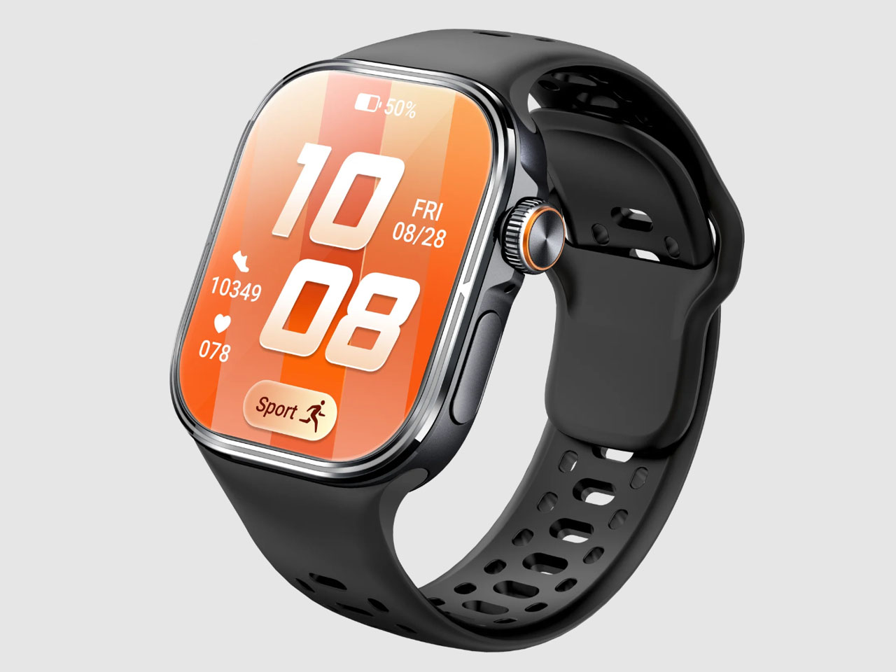
Rollme Matrix is $89 4G smartwatch with a crown-mounted pop-up camera

There are only a handful of names developing affordable rugged GPS smartwatches, and Rollme – don’t confuse with Realme – is one of them. After recently launching the Hero D6 rugged outdoor smartwatch with offline maps, compass, dual-band GPS, 24/7 health monitoring, and an 850mAh battery promising up to a fortnight of battery life, Rollme is now selling its first standalone 4G smartwatch with a camera to impress.

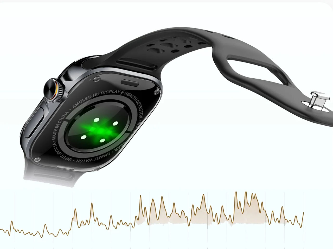
The watch is called the Matrix, and it comes with a side-mounted camera, which is easily its best-selling proposition. Being the most unusual aspect of the Matrix, the pop-up camera sits on the rotating crown on the right side and can pop out when you need it for a video call or to click a picture from the watch itself.

Designer: Rollme

The side-mounted position gives the camera a natural angle to facilitate your calls or clicks. Rollme has not mentioned how the camera pops up (whether on a click or on a voice command), or has shared anything about its specifications. In fact, there is just one graphic on the smartwatch’s listing page on the Rollme website, where you can see the camera showing up from the watch crown.

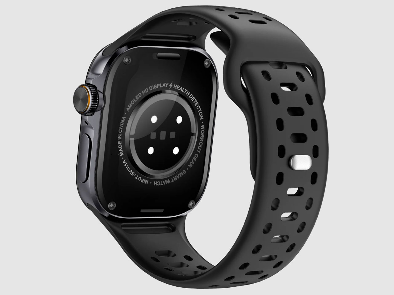
Besides the resolution details of the Matrix, pretty much all the other details of the watch are out. The watch comes with its own 4G SIM card slot and functions both without the phone and over Bluetooth to take calls when paired with a phone. Working independently of the smartphone, the 4G-enabled smartwatch can be used to make calls, send messages, and access all the installed applications.

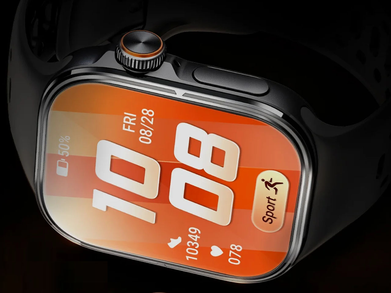
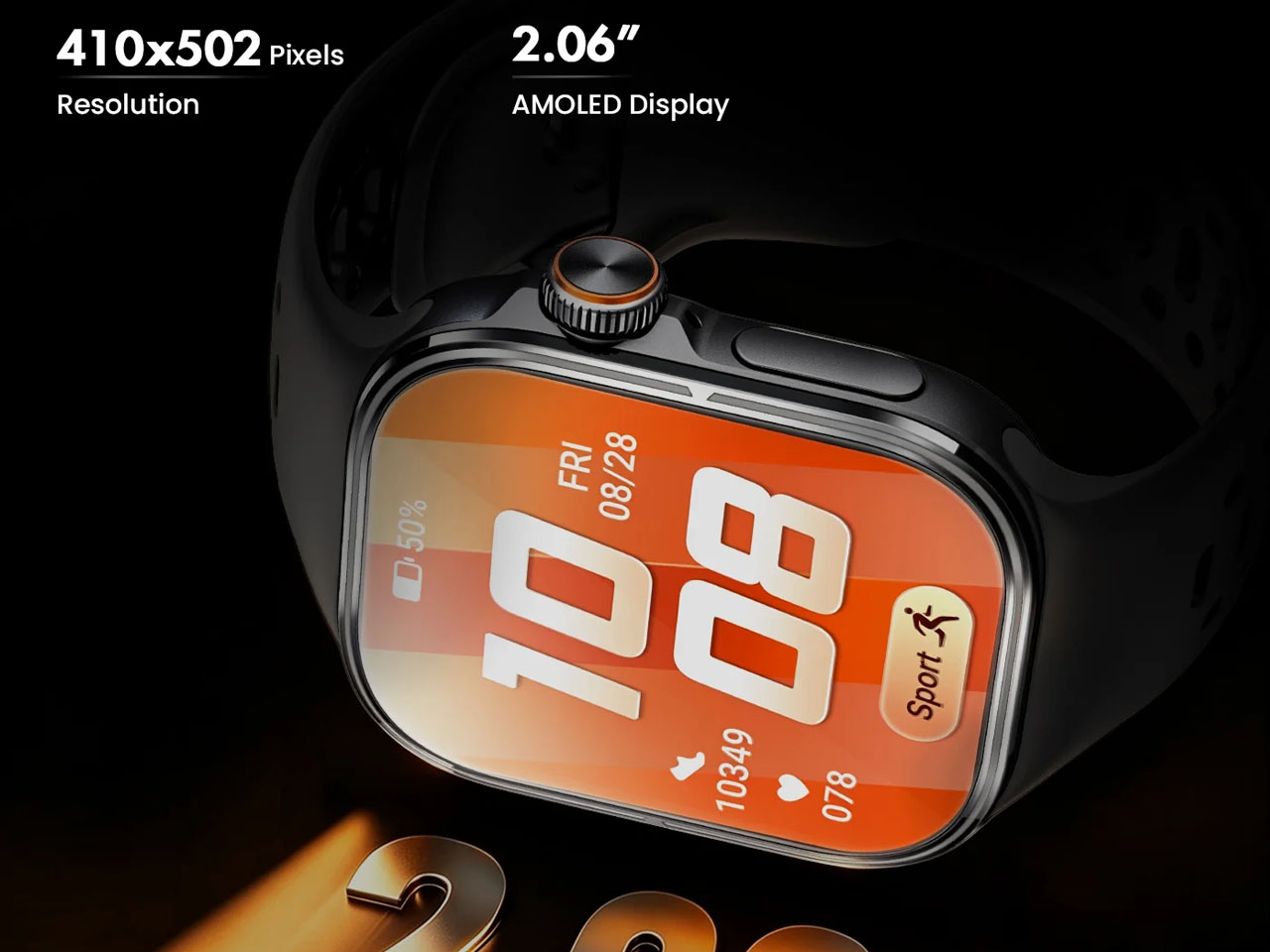
Besides, the Matrix comes with built-in GPS and features a large 2.06-inch AMOLED display. The display touts a 410 x 502 resolution. The watch is powered by the SL8541E processor paired with 16GB of internal storage and 2GB of RAM. What is more fascinating about the Matrix is its ability to function as a health and fitness tracker. To that end, the Rollme smartwatch comes with 24/7 heart rate monitoring so that the wearer can keep tabs on heart rate, blood oxygen (SpO2) measurements, and sleep tracking. In sleep monitoring, the watch can break down REM, deep, and light sleep patterns to help you know your sleep better.

According to released information, the Rollme Matrix is equipped with a 1,100 mAh battery, which should run for over 20 days without much of a hiccup. And when the battery does die on you, it can be juiced back up in fully in 80 minutes using an accompanying magnetic cable.

The Matrix is not just designed for the street walkers; for the more outdoorsy, the watch has GPS and a compass, and the sporty can use the multiple workout modes on it. Offered with a rugged-worthy IP67 rating against dust and water, the Matrix is selling through the company’s online website in Midnight Black and Dawn Gold colors for $89.99.


The post Rollme Matrix is $89 4G smartwatch with a crown-mounted pop-up camera first appeared on Yanko Design.

5 Things Samsung’s Galaxy Z Fold8 Does Better Than Apple’s iPhone Duo

Samsung Galaxy Z Fold8 vs. Apple iPhone Duo

Apple’s first foldable was always going to be a spectacle, and the iPhone Duo delivered. Titanium frame, a hinge built from over 100 components, a 7.6-inch inner display Apple calls the largest and sharpest they’ve ever shipped, and an IP68 rating that no current Samsung foldable can match. The debut made a strong case, and we laid out five specific things it got right in our companion piece last week, which predictably sent a portion of the comments section into a very productive Saturday. Every honest design audit has a flip side, though. The iPhone Duo, for all its first-generation confidence, left a meaningful number of things unresolved, and some of those gaps are more significant than launch-week coverage has made them seem.

Samsung has been folding phones since 2019, and the Galaxy Z Fold8 is what that long runway looks like after years of hinge tweaks, crease complaints, software refinements, and repeated attempts to make a folding phone feel normal. It does not win every category, and Apple absolutely deserves credit for solving a few long-standing foldable annoyances on its first try. Even so, there are still several places where Samsung’s latest Fold feels more complete, more practical, or simply better thought through as an everyday device. Some are obvious the moment you compare the two side by side. Others only start to matter after the honeymoon phase wears off.

Keeps the SIM Tray, Despite What Anyone Says

Samsung Galaxy Z Fold8 SIM Tray

When we covered the iPhone Duo’s announcement, one of the hardware elements Apple dropped was the physical SIM tray, a decision the company framed as part of a broader design simplification agenda. Apple went full eSIM, keeping the chassis cleaner, eliminating a cut line in the frame, and folding the decision into the same purity narrative behind the iPhone Air’s extreme thinness. For users in markets where eSIM support is solid and carrier switching is painless, this is genuinely fine and probably the right long-term direction. The problem is that a $1,999 foldable probably should not be making hardware convenience trade-offs that actively complicate life for international travelers, anyone running two numbers, or users whose carriers still make eSIM provisioning feel like homework.

Traveling internationally and swapping to a local carrier SIM is a very different experience when you are not navigating eSIM setup through a foreign carrier’s app on spotty airport WiFi. The Z Fold8 keeps the physical SIM tray, and that decision is more forgiving than it is glamorous. Moving a number between devices is faster with a tray, carrier flexibility requires fewer account management steps, and the hardware workaround for eSIM friction simply does not exist. Samsung is not winning any design philosophy debates by pointing at a metal drawer. But the Fold 8’s willingness to keep that hardware in place reflects a different set of priorities than Apple’s, one that bets user convenience should edge out aesthetic reduction, and across a wider range of real-world situations, that bet holds up.

Weighs Noticeably Less Over a Full Day (53 Grams Less, to be precise)

The Galaxy Z Fold8 weighs 201 grams, which is the figure Samsung’s product page leads with, and it earns the emphasis because it makes the Fold 8 the lightest book-style foldable currently on the market. The iPhone Duo comes in at 254 grams. At a 53-gram gap, the difference sits closer to a full AA battery than a rounding error, and the foldable category is already asking more of you than a standard slab phone before the weight conversation even starts. Foldables are physically larger, structurally more complex, and thicker in the pocket by default. Stacking substantial extra mass on top of all that is a real ask, and the Duo makes it.

Apple’s grade 5 titanium frame and hinge housing are premium materials decisions that contribute directly to the device’s rigidity and structural confidence, and directly to its number on the scale as well. Samsung came in lighter, and that shows up in the most boring and most honest way possible, in how aware you are of the phone in your pocket across a full day. A lighter foldable is a foldable that has had more generations of mass reduction applied to it, and the Fold 8’s 201 grams is the current best result of that sustained process. The Duo’s weight is a first-generation structural reality, and Samsung simply has more iterations of solving those demands behind it.

Folds Thinner for Better Pocket-ability
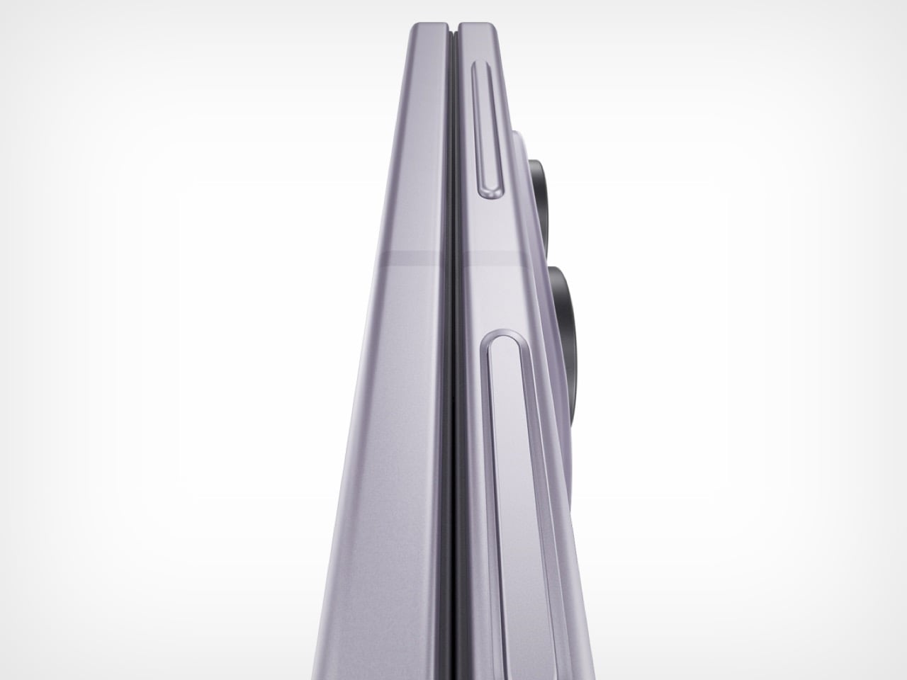
The Galaxy Z Fold8 closes to 9.7mm. The iPhone Duo closes to 11.3mm. The 1.6mm gap sounds mild, and it lands less mildly in a pocket, because the book-style form factor makes closed thickness something you register physically every time the phone goes in or out of a pocket, gets set on a desk, or is gripped shut in one hand. Small dimensional differences accumulate across hundreds of daily interactions in a way that flat spec comparisons do not fully communicate. 9.7mm versus 11.3mm is a material gap in this context, not a footnote.

Opened flat, the Fold 8 measures 4.5mm against the Duo’s 5.2mm. Apple tried hard on the thinness front, and for a first-generation foldable carrying a dual-battery system and a 100-plus component hinge, 5.2mm open is legitimately impressive engineering. Samsung just has more attempts behind it. Years of shaving fractions of a millimeter off the Fold form factor across successive generations produce gains that compound, and the Fold 8’s dimensional figures are the accumulated result of that process. The Duo is not there yet, and that is a first-generation reality rather than a permanent condition.

A More Refined, Battle-tested Multitasking Software

The Taskbar on the Z Fold8 holds eight app slots, and dragging any one of them into a running screen split takes a single gesture rather than a full trip back to the home screen. App Pairs let users save specific two-app workflows and relaunch them together in a single tap. Three-way split-screen and floating pop-up windows give the inner display real workspace flexibility, while AI Results View places AI output in a separate panel so source content stays visible alongside it rather than disappearing behind the response. These features are specific because the problems they solve are specific, and that specificity usually means someone already ran into that friction point on an earlier Fold and the feedback made it into the next build.

Apple’s Duo software looks like a genuinely strong first draft, and side-by-side multitasking on a 7.6-inch inner display is a compelling foundation for what iOS on a foldable can eventually become. What it does not yet carry is the institutional knowledge that comes from shipping foldable hardware in volume for years and learning where real users find the edges of the experience. Samsung knows, from behavioral patterns observed across the Fold 3 through Fold 7, that people using a foldable for actual work want to move windows around without returning to the launcher constantly. Apple will develop that understanding across future software generations. Samsung already developed it, and the current One UI reflects that directly.

The Hinge Comes From Eight Generations of Experimenting
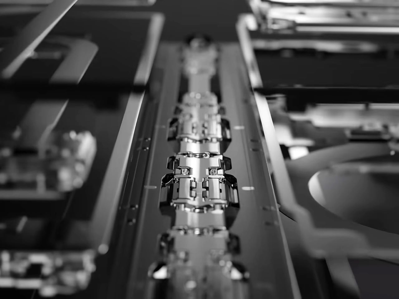
Samsung Galaxy Z Fold8 Hinge Close-up

The Z Fold8 moves to a dual-rail hinge design, where two parallel contact rails distribute fold stress more evenly across the display than the single-rail approach used through the Fold 7. The practical payoffs are reduced delamination risk over long-term use and a 0.6mm reduction in folded thickness compared to last year’s model. The dual-rail architecture exists because the single-rail design produced failure patterns in field data, and Samsung engineered the fix after watching those problems accumulate at scale. Samsung rates the updated hinge at 200,000 fold cycles, which works out to roughly 7 to 10 years of daily use at realistic fold rates, a number that carries credibility specifically because Samsung has the service history to know what foldable hinge failure actually looks like.

Apple’s hinge uses over 100 components including carbon fiber support plates, a grade 5 titanium housing, and an integrated magnet array for closure, and for a first-generation attempt from a company with no prior foldable track record, it is a serious piece of engineering. What it does not have is field history, and in a category where the hinge is the single most consequential mechanical component, field history is what separates a confident launch spec from a genuinely proven design. Samsung’s dual-rail approach did not emerge from a thought experiment. It came from hinge failures, teardown data, warranty claims, and years of iterative engineering against failure modes that only reveal themselves after real-world shipping at volume. Apple’s Duo hinge may age beautifully. Samsung’s already has.
The post 5 Things Samsung’s Galaxy Z Fold8 Does Better Than Apple’s iPhone Duo first appeared on Yanko Design.