Branch Paper Holder Clips onto Your Screen to Make Notes Easier to Read

Most laptop workflows still involve paper, even in 2026. Printed briefs, handwritten notes, and reference sheets end up flat on the desk, which means you spend half your day bobbing your head between the screen and the table. That constant neck crane breaks focus and feels ridiculous when you are just trying to check a few lines of code or compare a contract clause, but there is nowhere else for the paper to go.

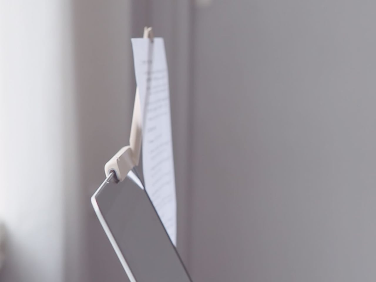
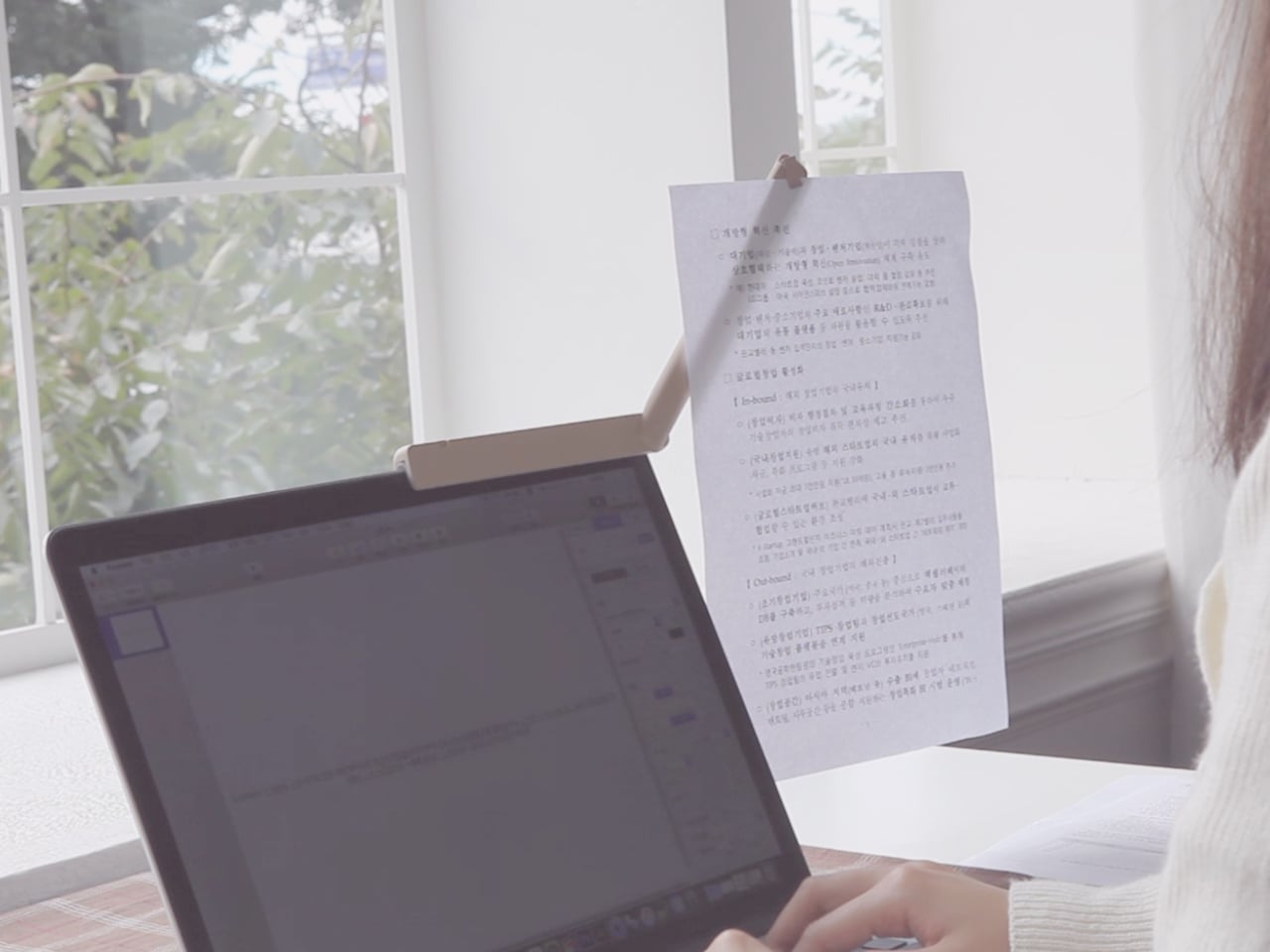
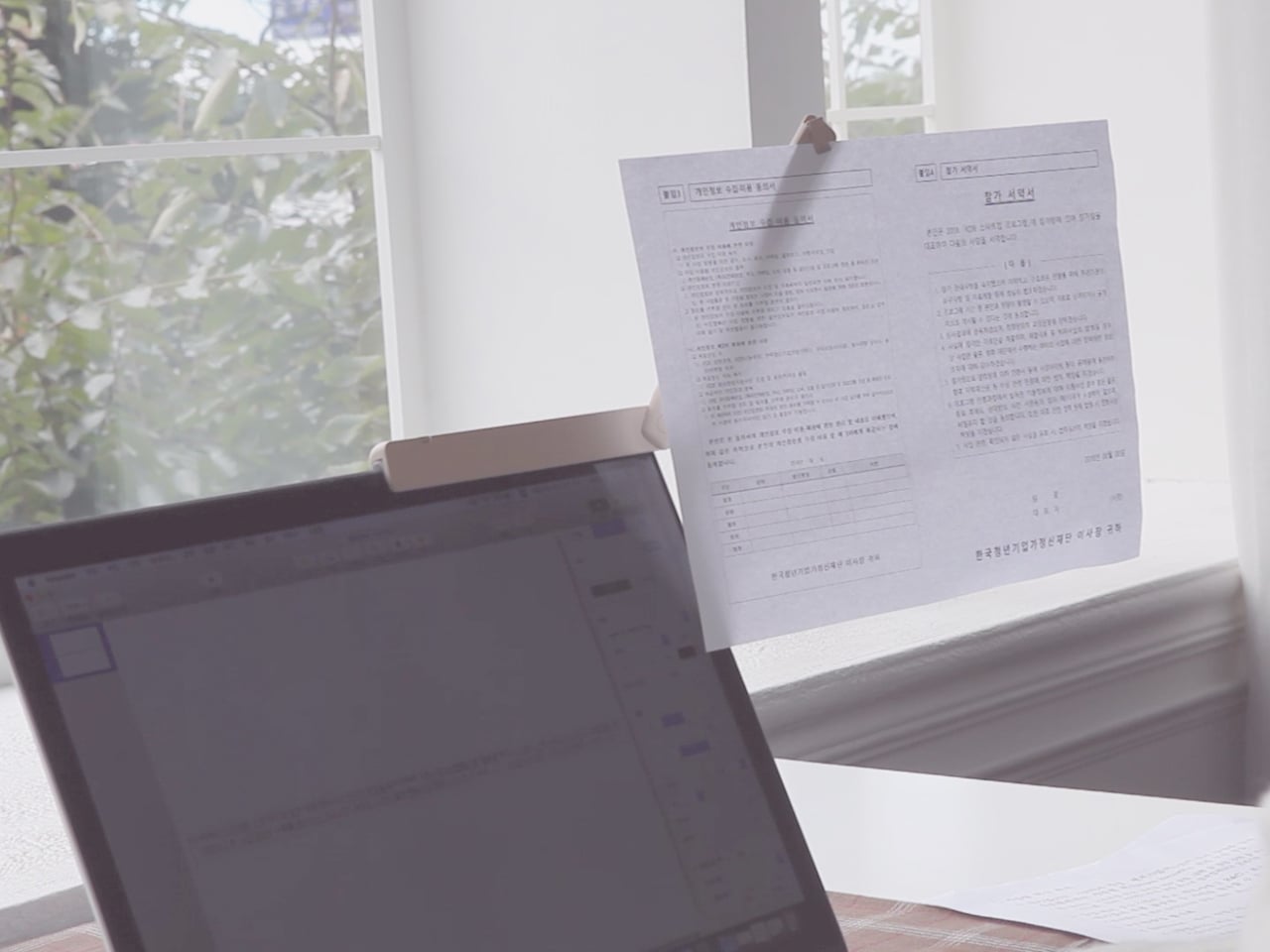
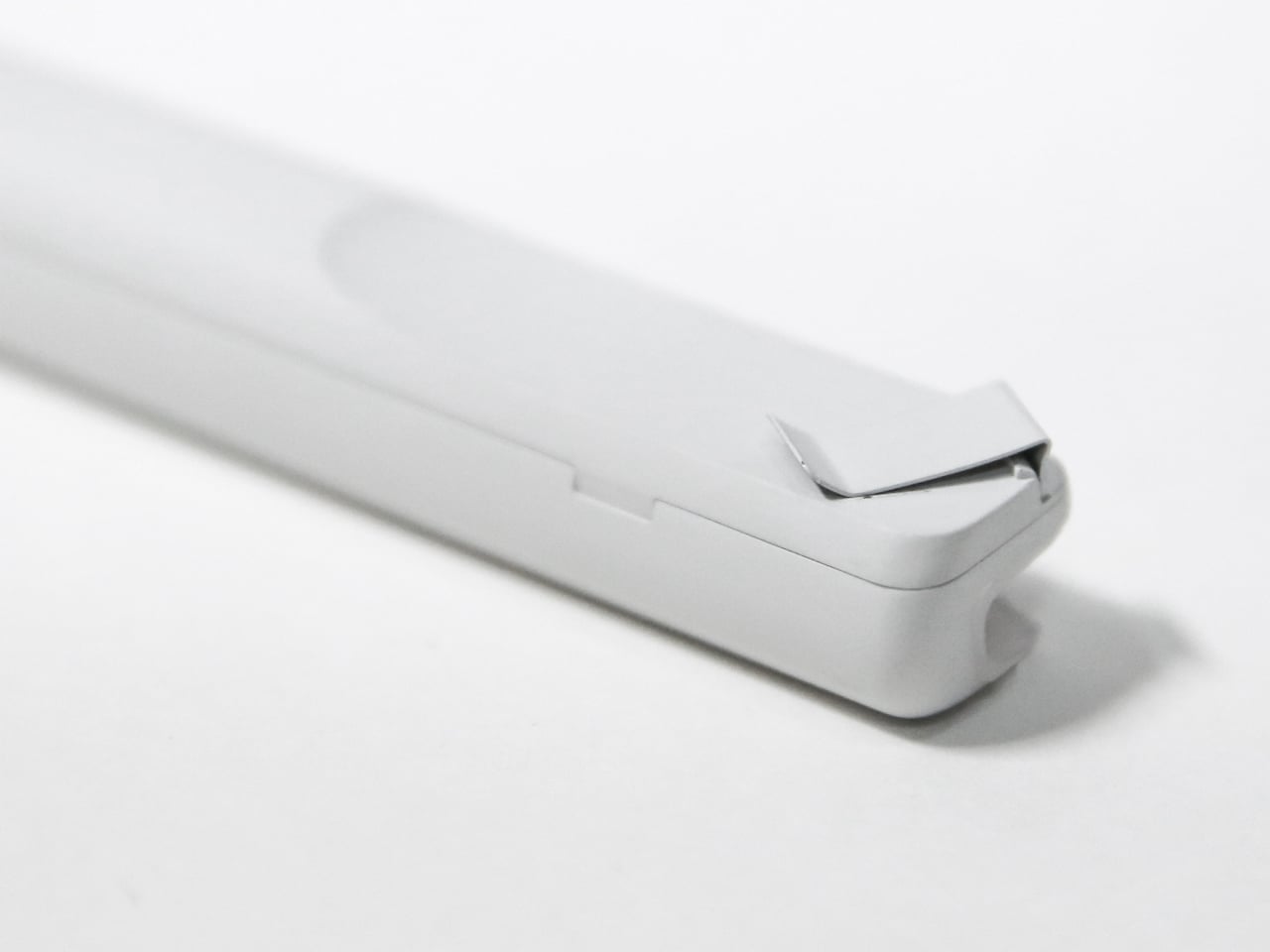
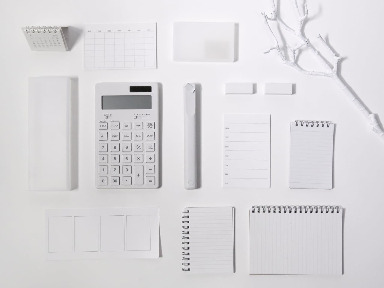
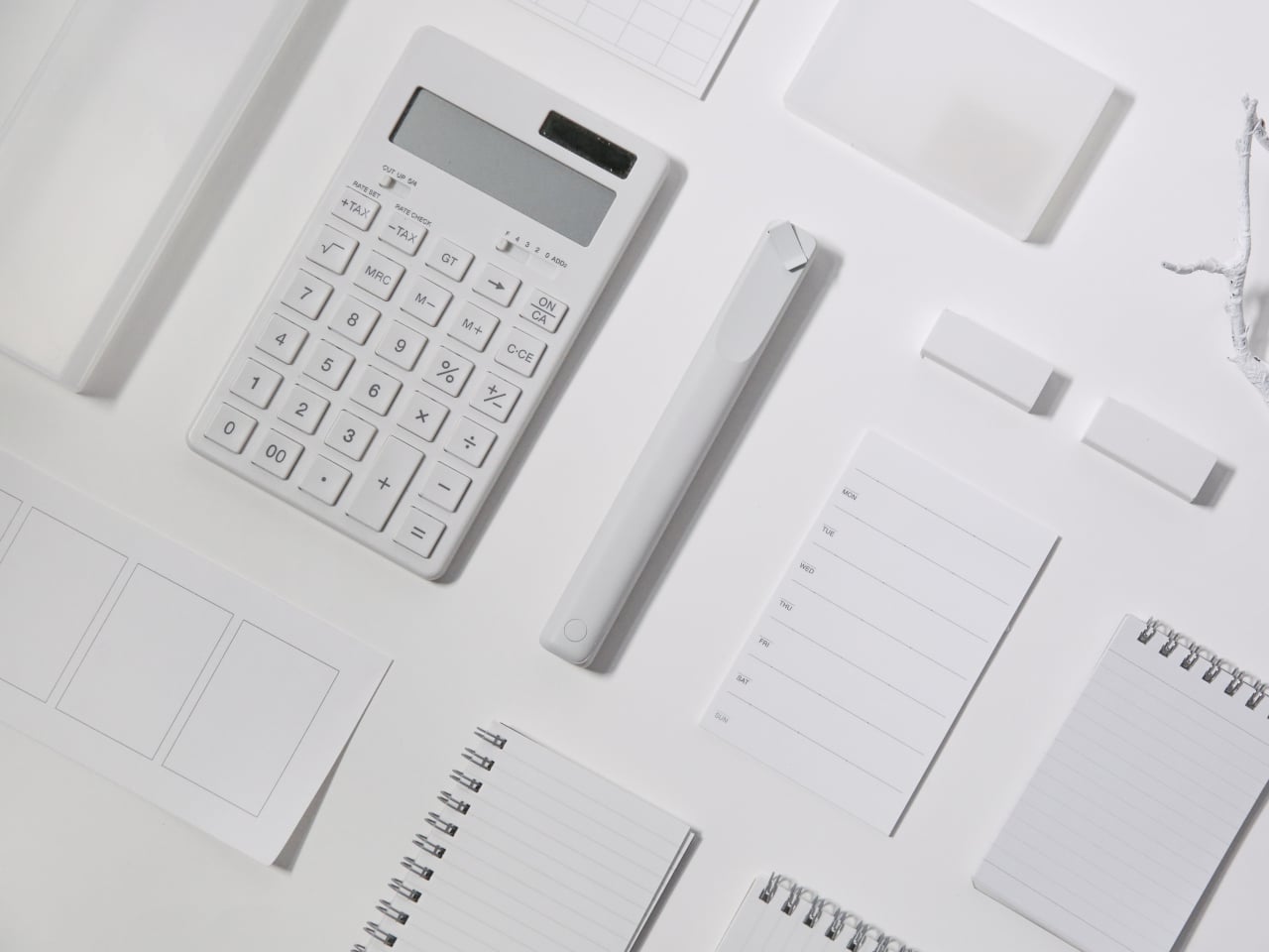
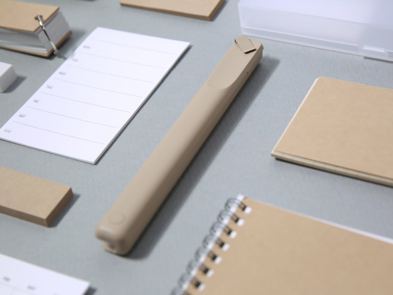
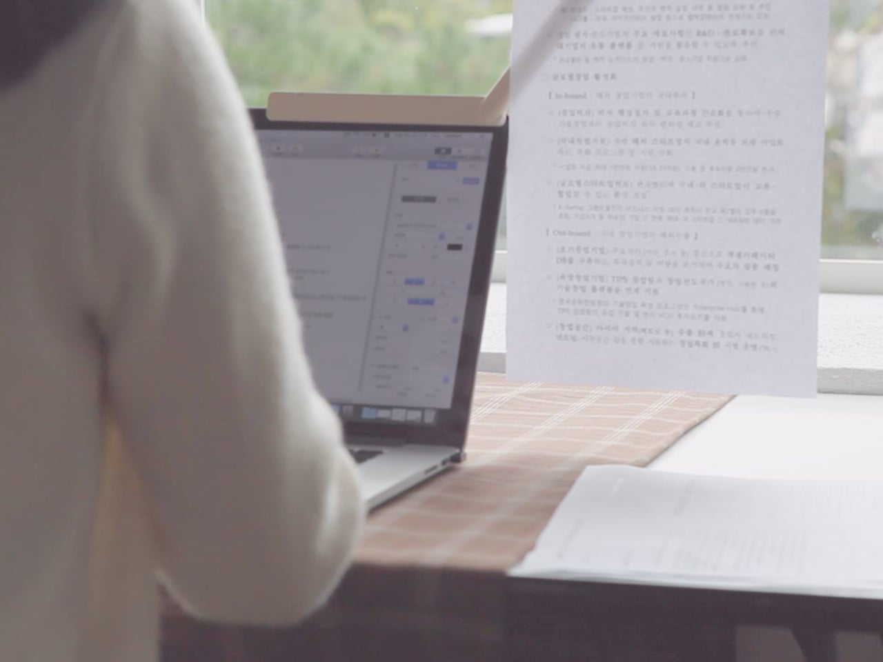
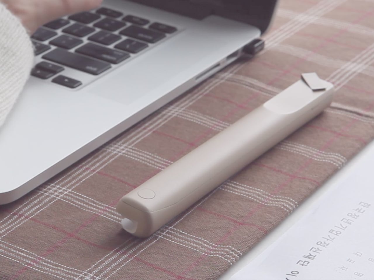
Branch is a slim paper holder designed specifically for laptops. It clips onto the edge of your screen and swings out like a branch growing from a trunk, lifting notes, photos, or documents into the same visual plane as your display. The designers wanted something that not only holds documents for easy viewing but also feels more considered and minimal than the generic office-supply stands that usually sit on desks, taking up space.

Designer: IAN BOK

Sitting down with a laptop and a printed document, you mount Branch to the screen, rotate it until it sits roughly horizontal with the display, and slide your sheets into the clip at the end. It can hold up to ten A4 pages, so multi-page contracts, code printouts, or study notes stay visible and aligned with your main workspace. The arm rotates both horizontally and vertically, bringing paper into your line of sight instead of leaving it flat below.

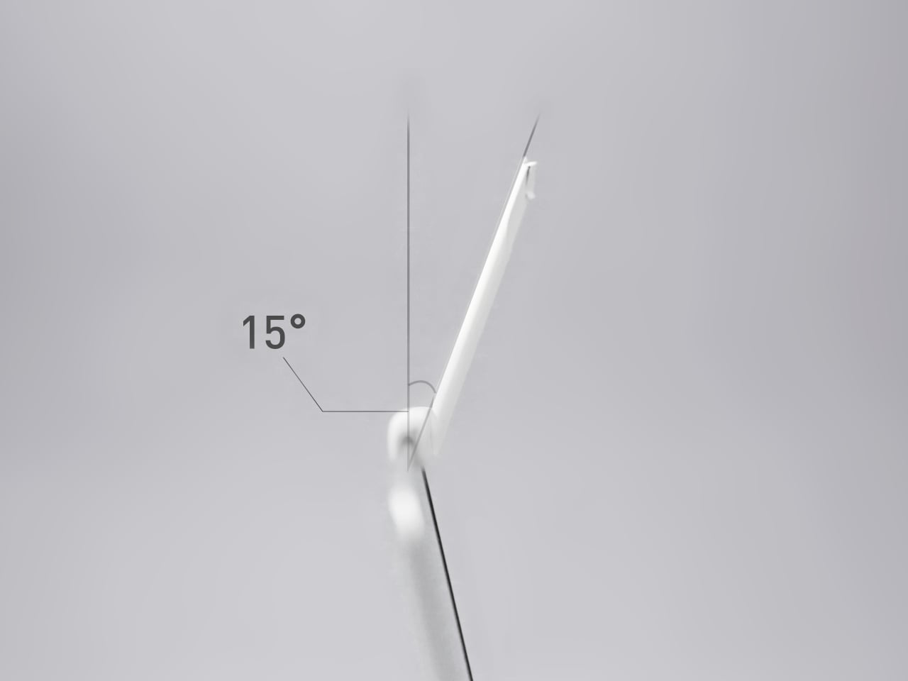
By raising paper this way, Branch reduces the amount of head and eye travel needed to reference it. The arm is angled at about 15 degrees so that notes do not slide off, and the clip lets you display pages in portrait or landscape, useful for everything from long text columns to wide spreadsheets. It is a small adjustment, but one that can make long laptop sessions feel less like a neck workout.

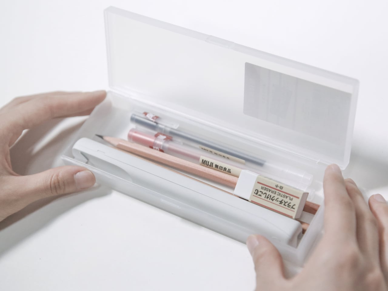
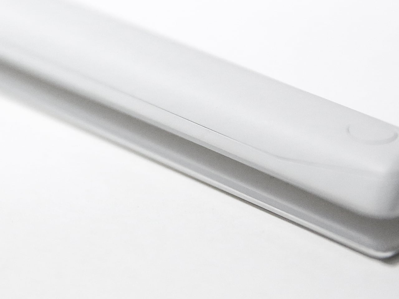
Branch is only 17cm long and weighs 130g, light enough to live in the same bag or sleeve as your laptop without feeling like extra gear. It fits screens between 3mm and 6mm thick and is recommended for 13-inch to 15.6-inch laptops, which quietly covers most modern notebooks. The ABS structure is shaped to protect the mounting surface, so it grips without chewing through bezels or leaving marks.

The name is not just a visual metaphor. Tree branches do more than connect trunks and leaves. They gather light and store nutrients so the tree can grow. The designers chose “Branch” because they see this little arm as playing a similar role, quietly supporting work by making analog and digital tools feel more connected. It is not a productivity app trying to replace paper but a physical bridge between notes and pixels.

Branch does not try to scan your printouts or digitize your sketches. It simply gives your notes a better seat next to your laptop, reducing strain and clutter in the process. Many people still think better with a pen in hand and a reference sheet by their side, so a minimal paper holder that clips on, swings out, and disappears into the workflow feels like the right kind of quiet upgrade.

The post Branch Paper Holder Clips onto Your Screen to Make Notes Easier to Read first appeared on Yanko Design.

Bird.zzz Turns Sleep Tracking into a Calm Earbud and Bedside Lamp Ritual

Most sleep gadgets feel like they belong in a gym or a lab: chunky watches, bright screens, and apps that want you to stare at charts before bed. There is a disconnect between wanting a soft, quiet bedroom and plugging in devices that blink, buzz, and look like mini computers parked on your nightstand. Sleep tech rarely starts from the mood of the room it lives in, focusing instead on metrics and dashboards that feel clinical.

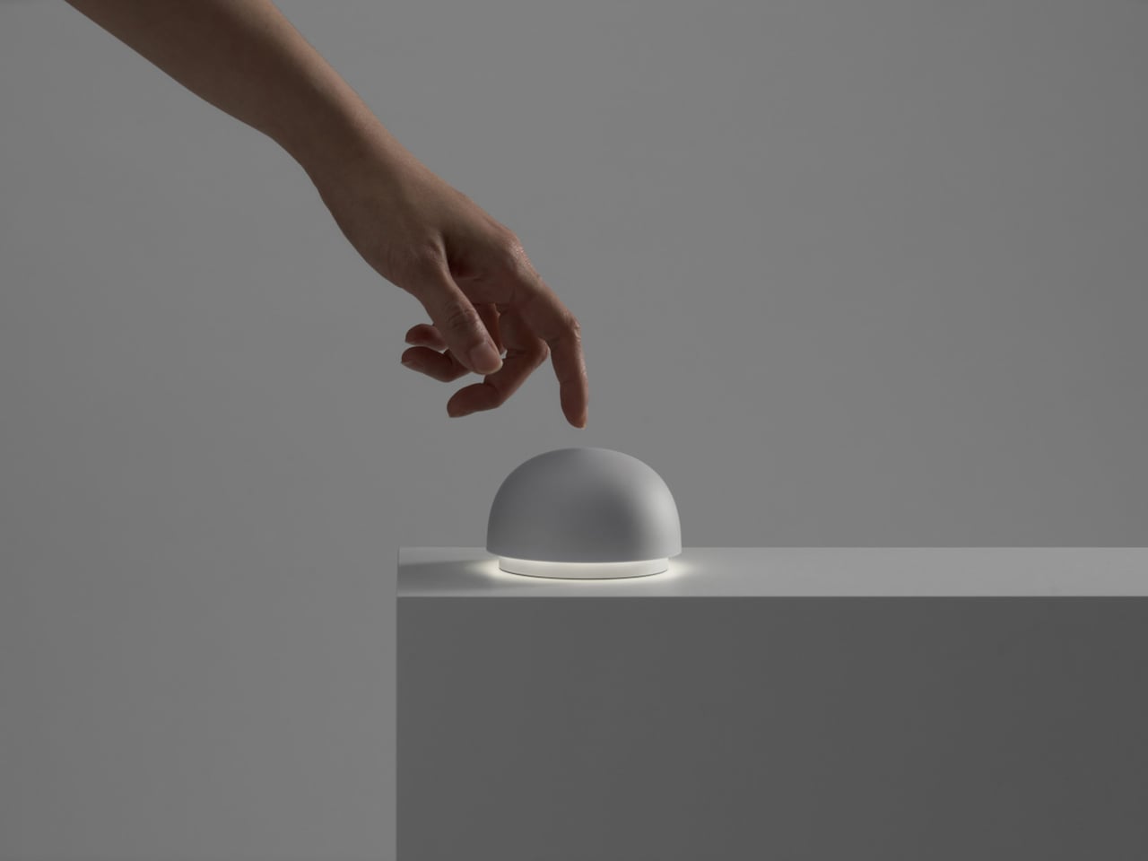
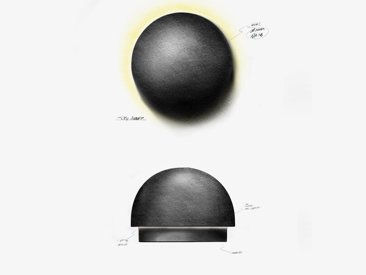
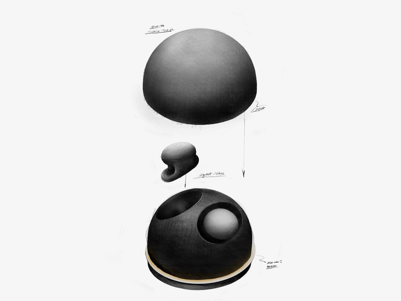
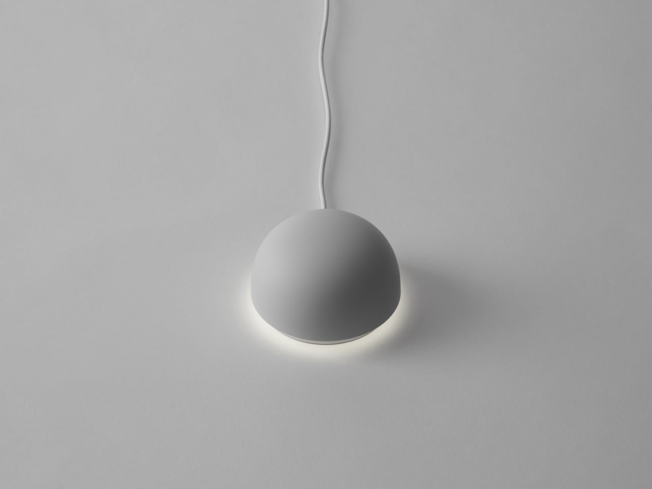
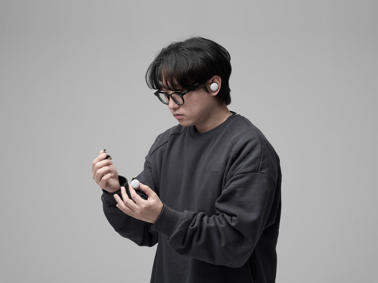
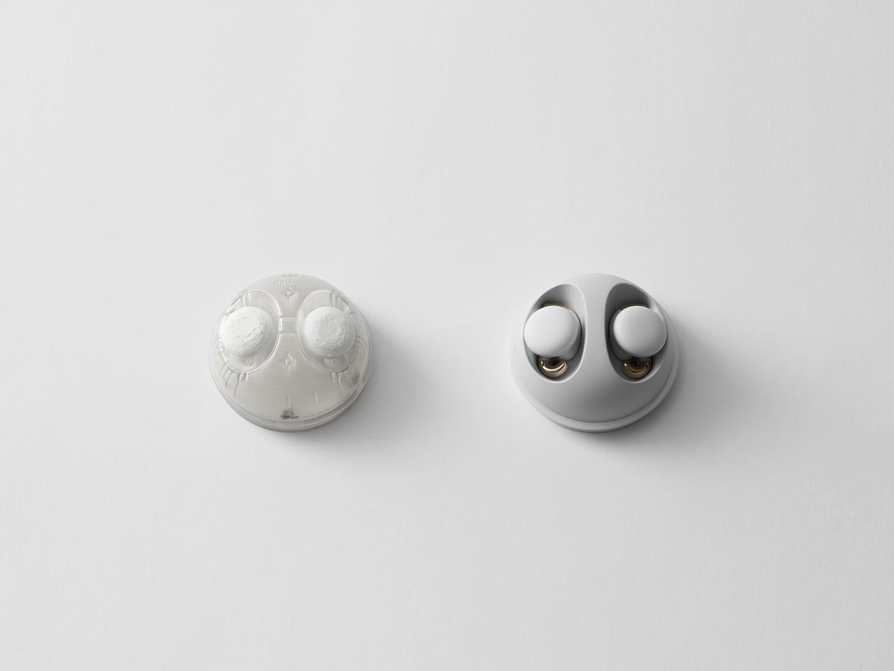
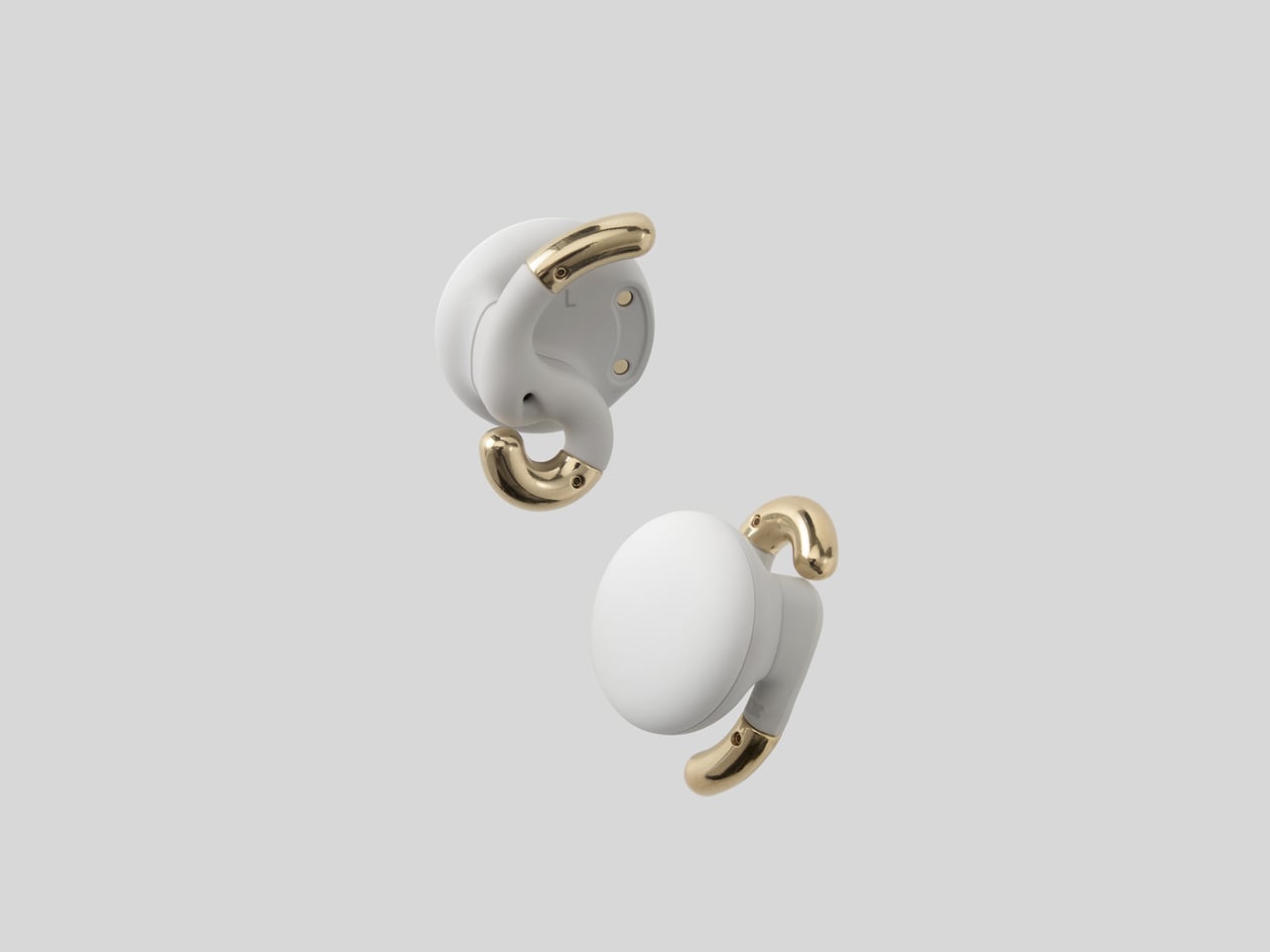
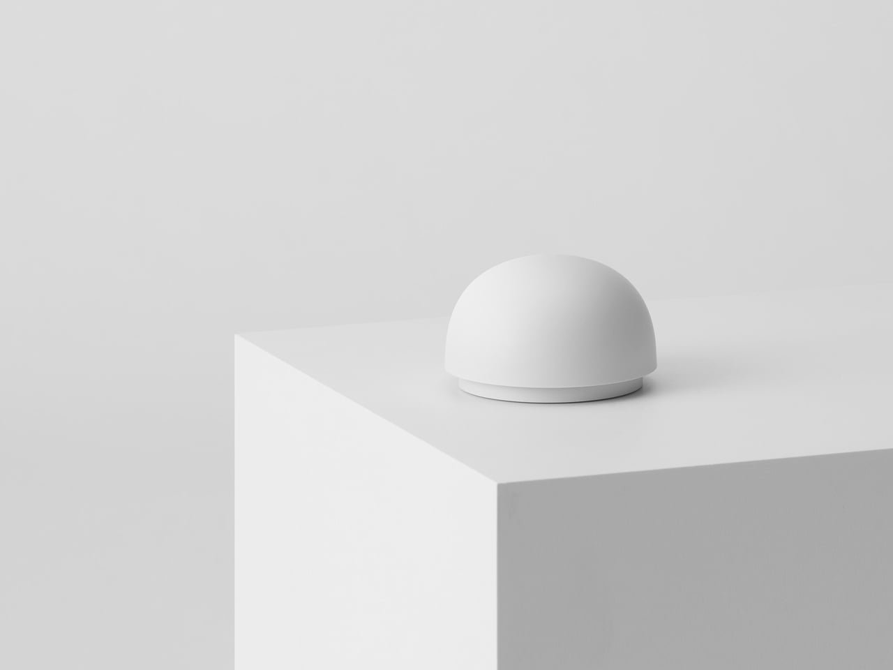
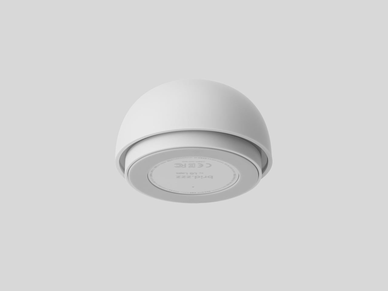
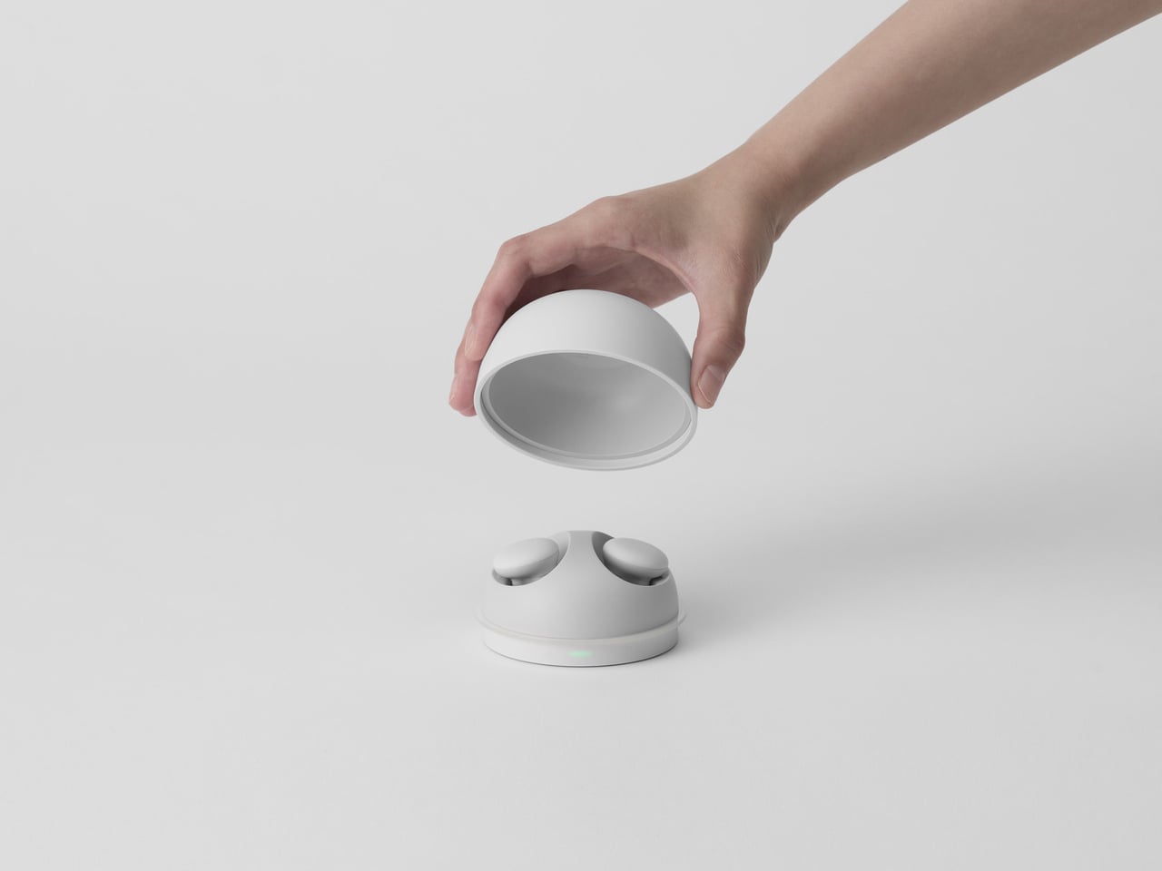
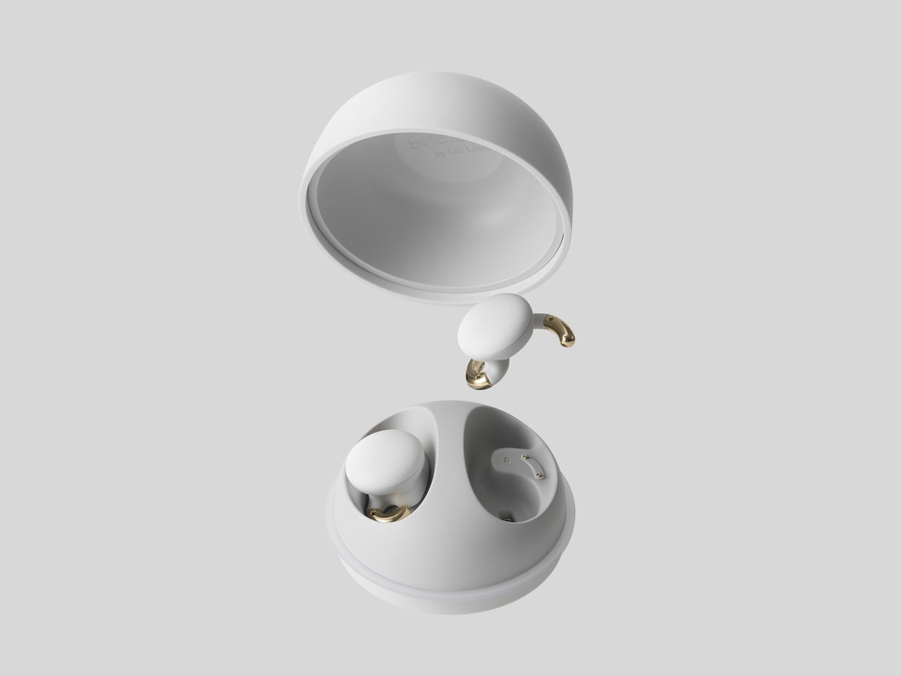
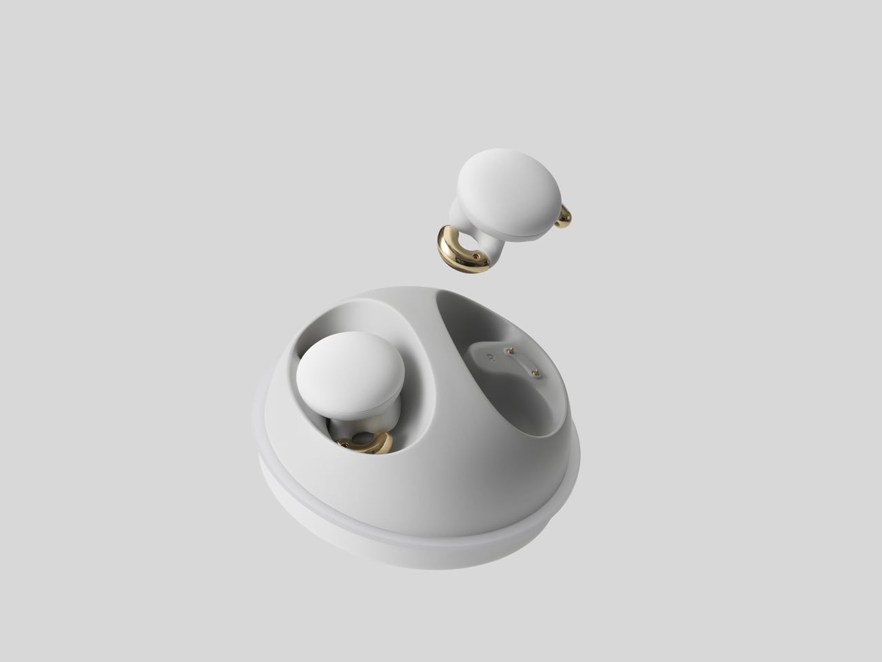
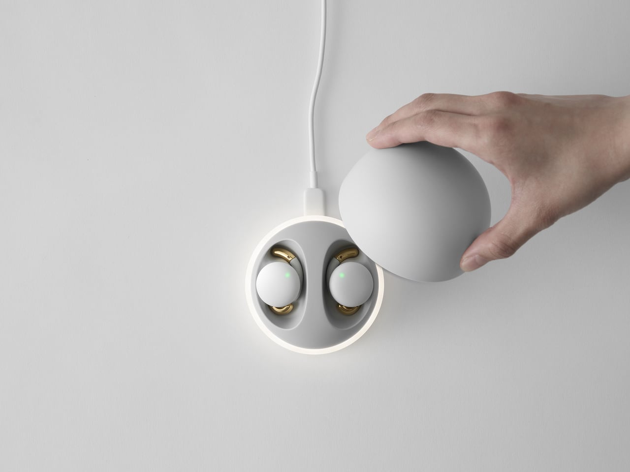
Bird.zzz is a project from Jiyoun Kim Studio and LG Labs that begins with a softly lit, cozy bedroom. It is a sleep wellness earbud paired with a dome-shaped bedside cradle that doubles as a knock-on lamp. The earbuds measure sleep via EEG and physical data, then use that analysis to deliver sound designed to improve sleep quality, all while sitting on your nightstand like a small sculpture rather than a charging puck.

Designer: Jiyoun Kim

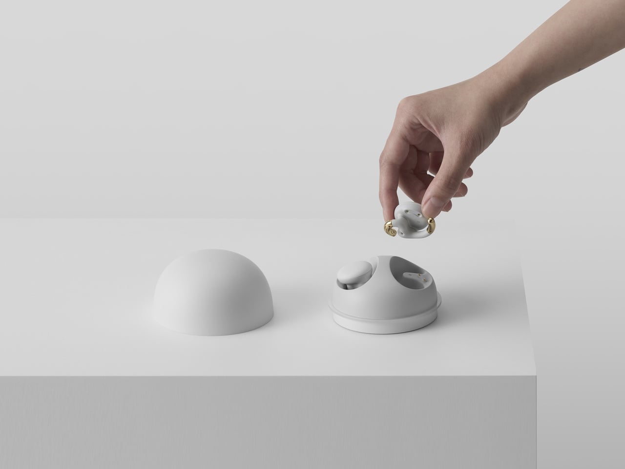
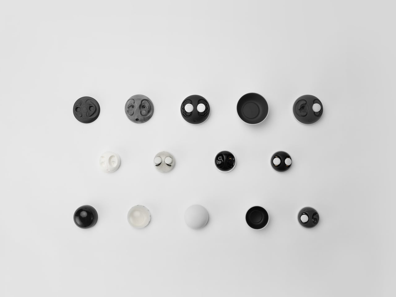
The design started from the cradle, imagined as a small object on a nightstand rather than a tech dock. It works as a bedside lamp using LG’s knock-on technology; a tap on the cover turns a warm, indirect LED halo on or off. The magnet-fixed top lifts to reveal the earbuds, and the weight is tuned so it feels stable and reassuring when you reach for it half-awake in the dark.

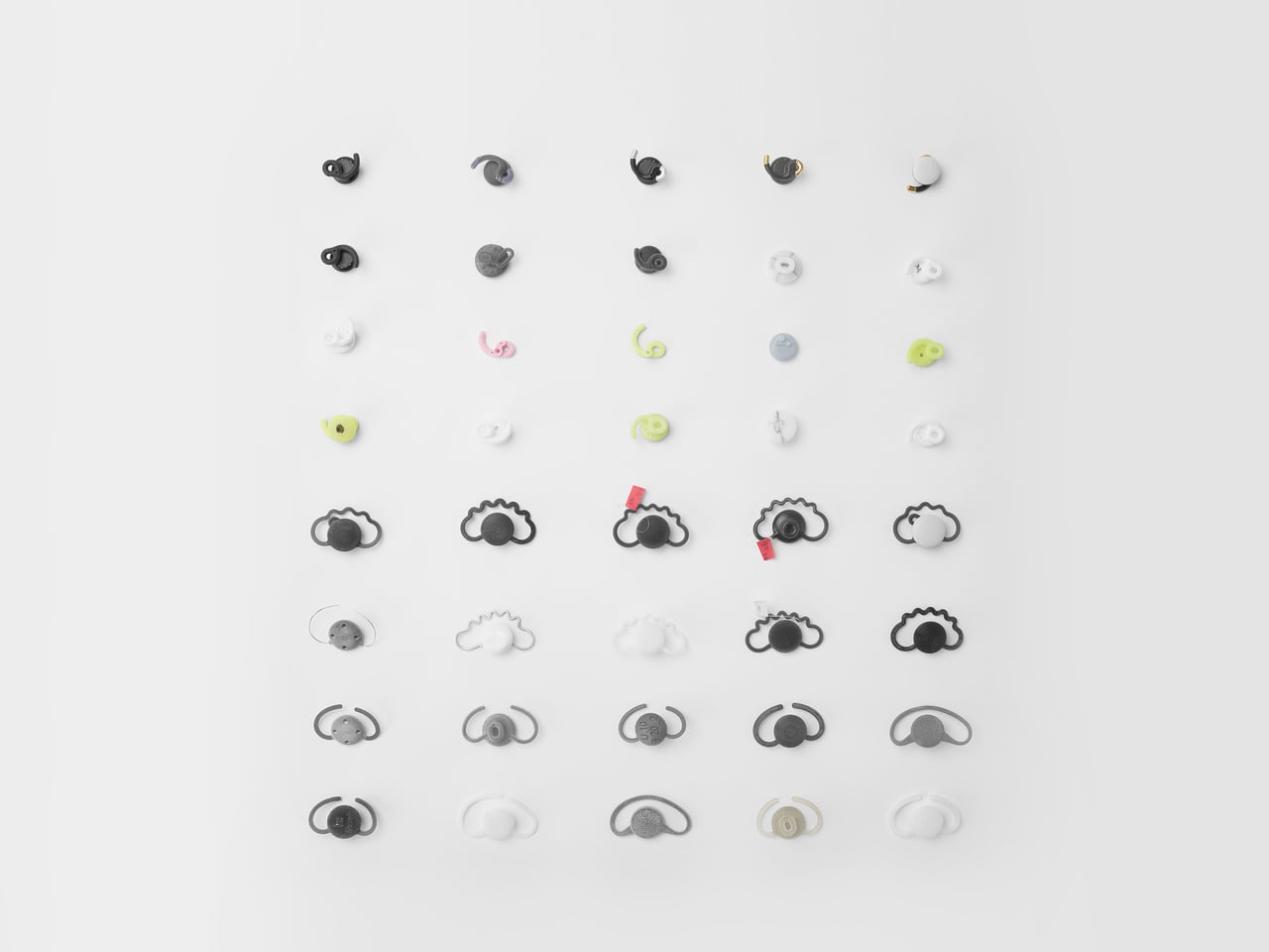
The earbuds had a specific challenge, needing skin contact for EEG sensing while staying loose enough for comfortable sleep. The team explored numerous forms and landed on a novel S-shaped ear tip, a hybrid of open and closed designs that keeps sensors in place without pressing hard into the ear canal. It borrows benefits from both types while avoiding the pressure points that make most in-ear devices unbearable after 20 minutes.

A typical evening means placing the earbuds in the cradle, tapping the dome to turn on a soft light, then lifting the lid to put the earbuds in as you settle into bed. As you fall asleep, the system reads brain activity and physical signals, adjusting soundscapes or audio cues based on your patterns. In the morning, the earbuds go back into their dome, and the object returns to being a quiet lamp.

The project covered product, packaging, and manual design, so the experience runs from unboxing to nightly use with consistent, minimal language. The warm white LED, indirect lighting, and knock-on interaction follow calm technology principles, asking for as little attention as possible. Bird.zzz launched after CES 2023, but it looks more like a small piece of bedroom architecture than a trade show gadget you plug in reluctantly.

Bird.zzz treats sleep as an environment to design for, not just a graph to optimize. The dome cradle, the S-shaped ear tip, and the soft interactions all point toward tech that respects the bedroom as a place to wind down. For anyone wary of strapping more screens to their body at night, an earbud and lamp combo that tries to disappear into the ritual of going to bed feels like a more thoughtful direction.

The post Bird.zzz Turns Sleep Tracking into a Calm Earbud and Bedside Lamp Ritual first appeared on Yanko Design.

5 Interior Design Trends That Just Made Minimalism Obsolete in 2026

Architects today see the home as more than just a place to live. It is now understood as a space that affects how people think, feel, and live each day. By 2026, the field has clearly moved away from cold, uniform minimalism. Instead, design choices such as color, shape, and proportion are made with clear intent, helping to create spaces that support everyday life.

Many leading firms now describe the human-centered home as a biophilic cocoon. This means using honest materials along with natural light, balanced proportions, and thoughtful forms. Let’s decode how the goal is to create homes that do not just look well-designed but feel comfortable and meaningful, supporting emotional well-being rather than focusing only on appearance.

1. Bold Color Authority

In 2026, color is no longer decorative; it is treated as a structural design tool. Designers are increasingly using deep, confident shades such as rich pinks and earthy ochres to give spaces character and visual weight. These strong palettes help anchor interiors, making homes feel intentional, expressive, and memorable rather than neutral or generic.

Such colors also offer clear psychological value. They create a sense of stability, warmth, and emotional comfort, adding long-term value to a space. When applied to key architectural elements—like columns, niches, or feature walls—bold colors guide movement and define zones within the home, bringing clarity and purpose to the overall spatial experience.
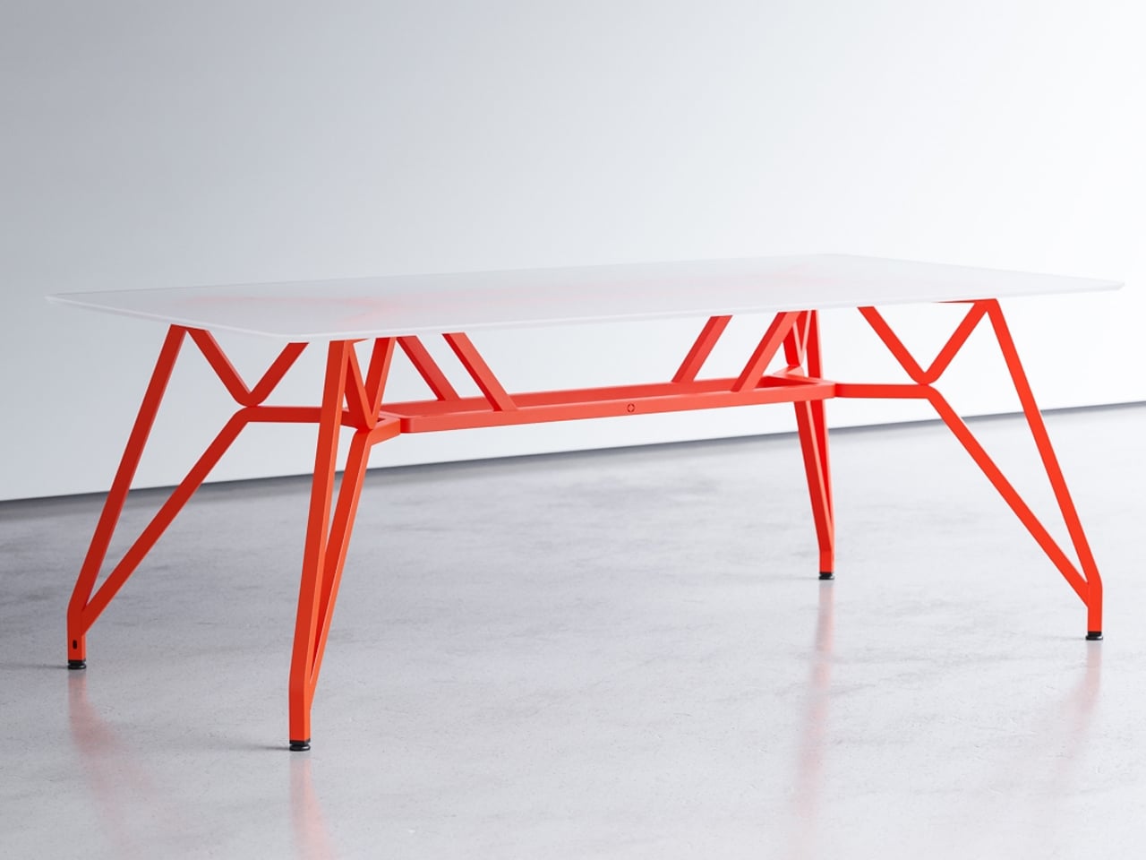
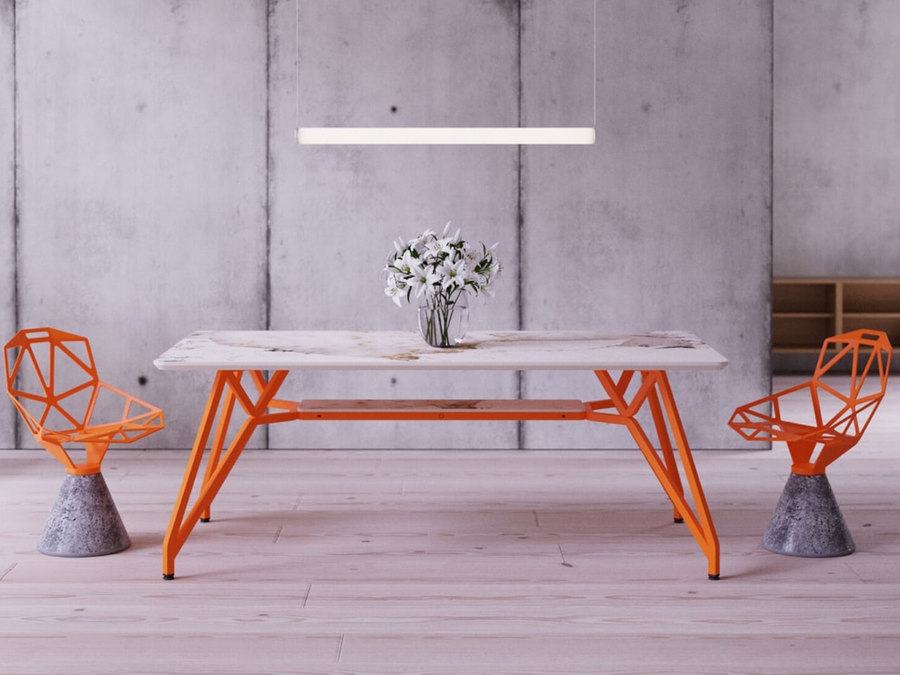
The Landr dining and conference table is engineered with a singular focus on strength, stability, and visual clarity. Designed to eliminate wobble, it offers a firm, unmoving surface suited for everyday use as well as more demanding tasks. Its modular construction is precise and robust, ensuring easy assembly without compromising structural integrity. The steel frame and intelligently engineered leg geometry distribute weight evenly, allowing the table to remain steady under pressure while maintaining a clean, confident presence in any setting.
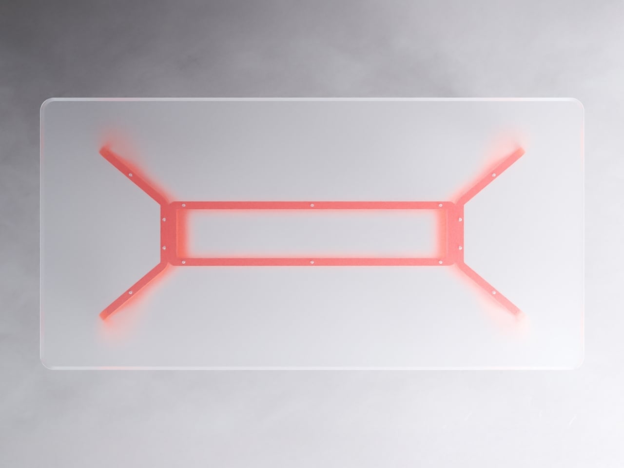
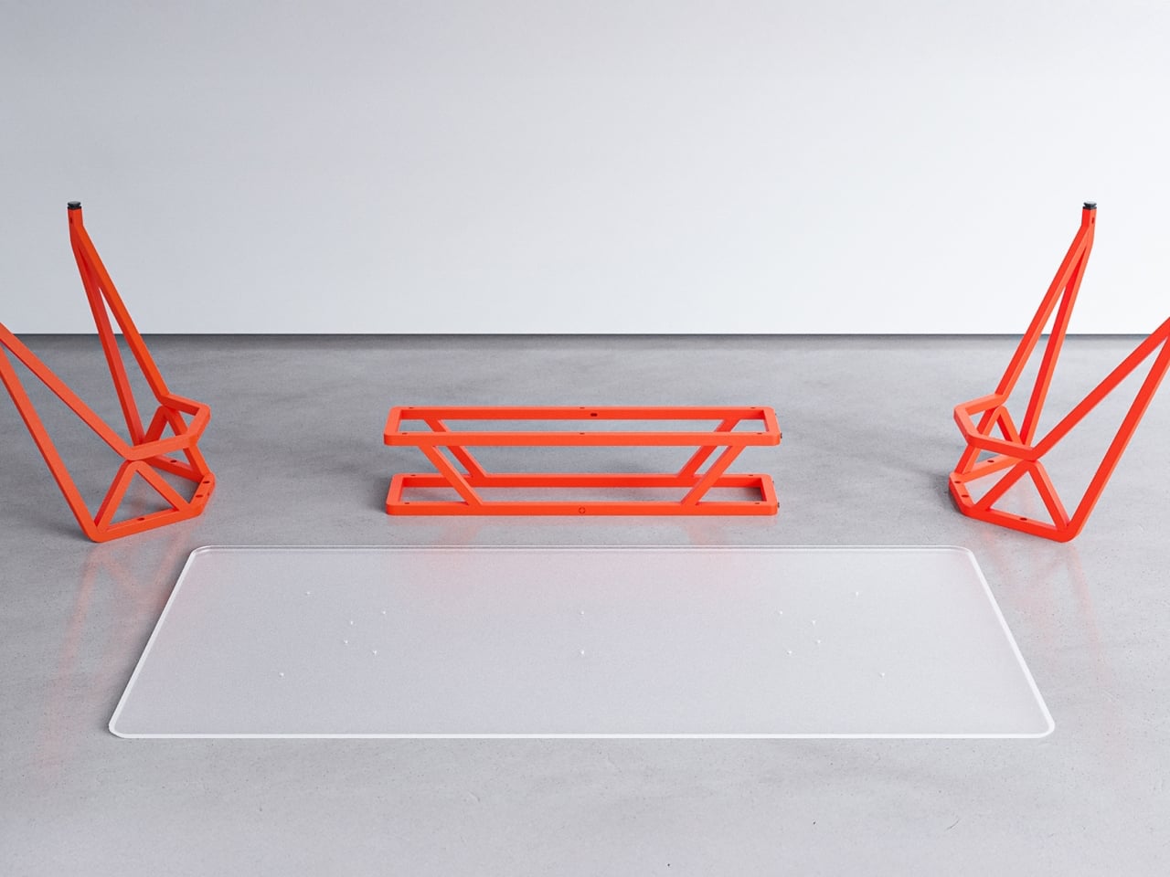
What sets Landr apart visually is its bold use of bright, contemporary color finishes applied through durable powder coating. These vivid tones enhance the table’s architectural form while adding energy and character to interiors that favor modern expression. Paired with tabletop options in ceramic, wood, or glass, the bright steel frame becomes a statement feature rather than a background element. Functional, expressive, and long-lasting, the Landr table balances performance with color-forward design.

2. Softened Minimal Geometry

Design has clearly shifted away from dramatic, exaggerated curves toward calm and disciplined forms. Instead of flamboyant sculptural shapes, architects now employ gentle arcs and controlled radii to soften the rigid edges of contemporary construction. Curved thresholds, joinery, and soffits introduce refinement while maintaining visual restraint.

At the center of this 2026 approach is improved spatial flow and comfort. Features such as double-height glazing framed by softly curved soffits guide the eye smoothly through the interior. This reduces the visual tension of strict rectilinear layouts, enhances the movement of diffused light, and creates spaces that feel balanced, composed, and naturally welcoming.

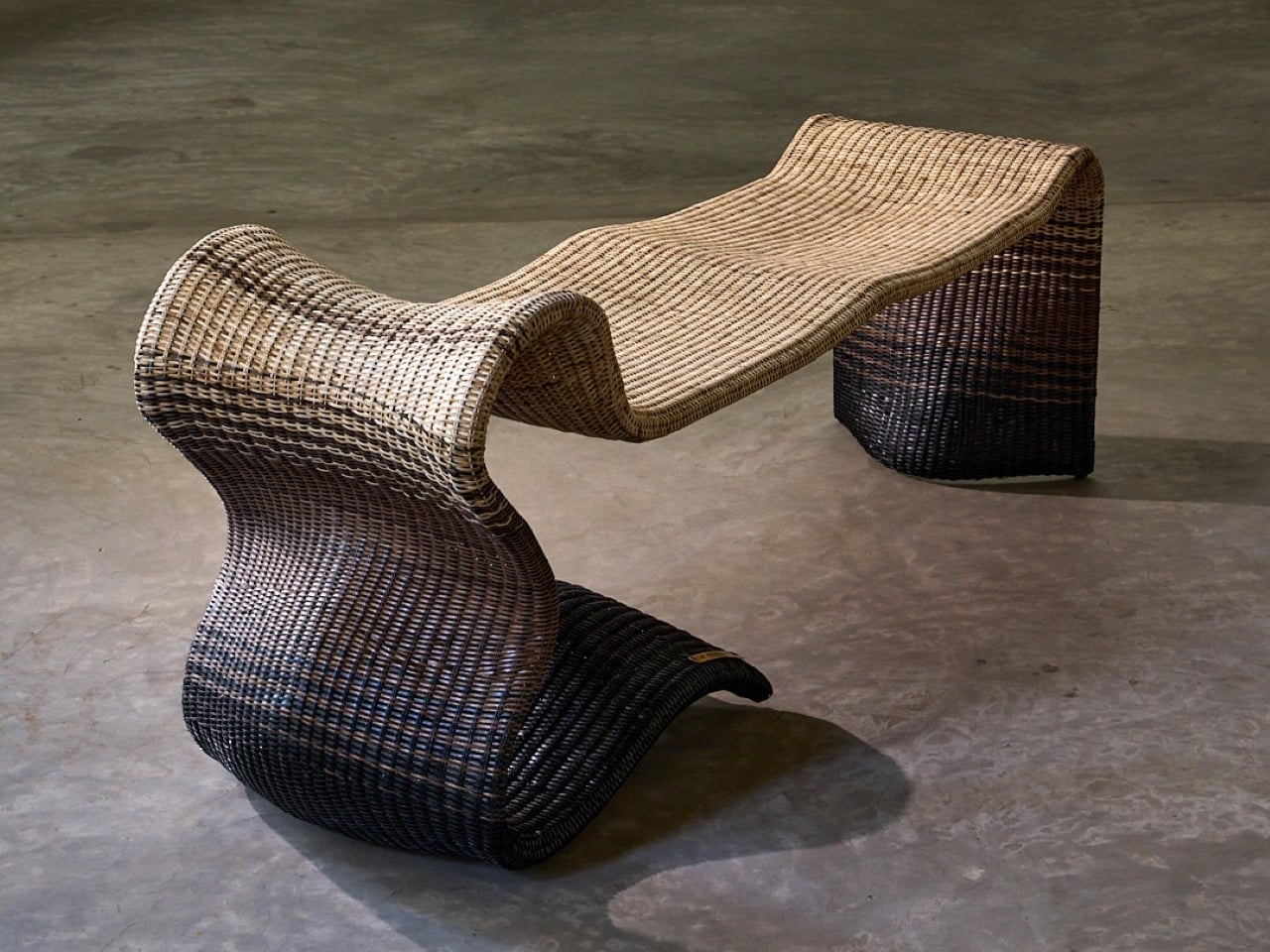
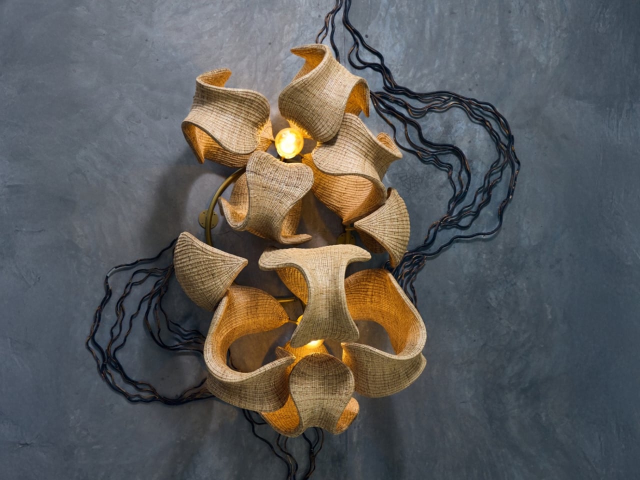
Whispers of the Wildwood is a contemporary wicker collection by Hyderabad-based design studio The Wicker Story, led by designer Priyanka Narula. Rooted in traditional Indian weaving techniques, the collection reinterprets wicker through a modern, sculptural lens. Drawing inspiration from natural landscapes such as forest canopies, flowing paths, and organic growth patterns, the pieces move beyond conventional furniture typologies to become refined design objects that balance function with artistic expression.
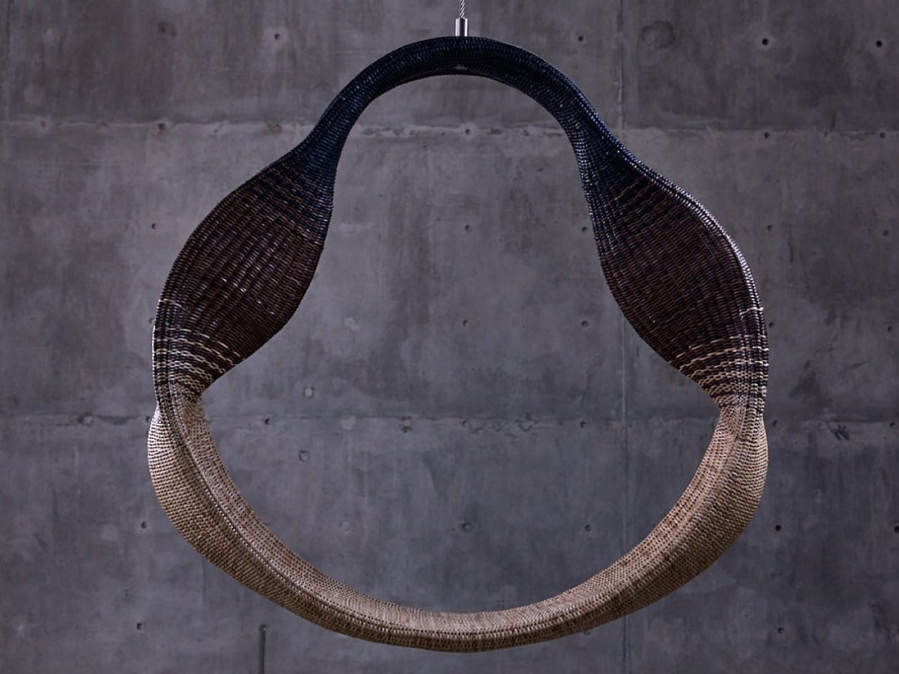
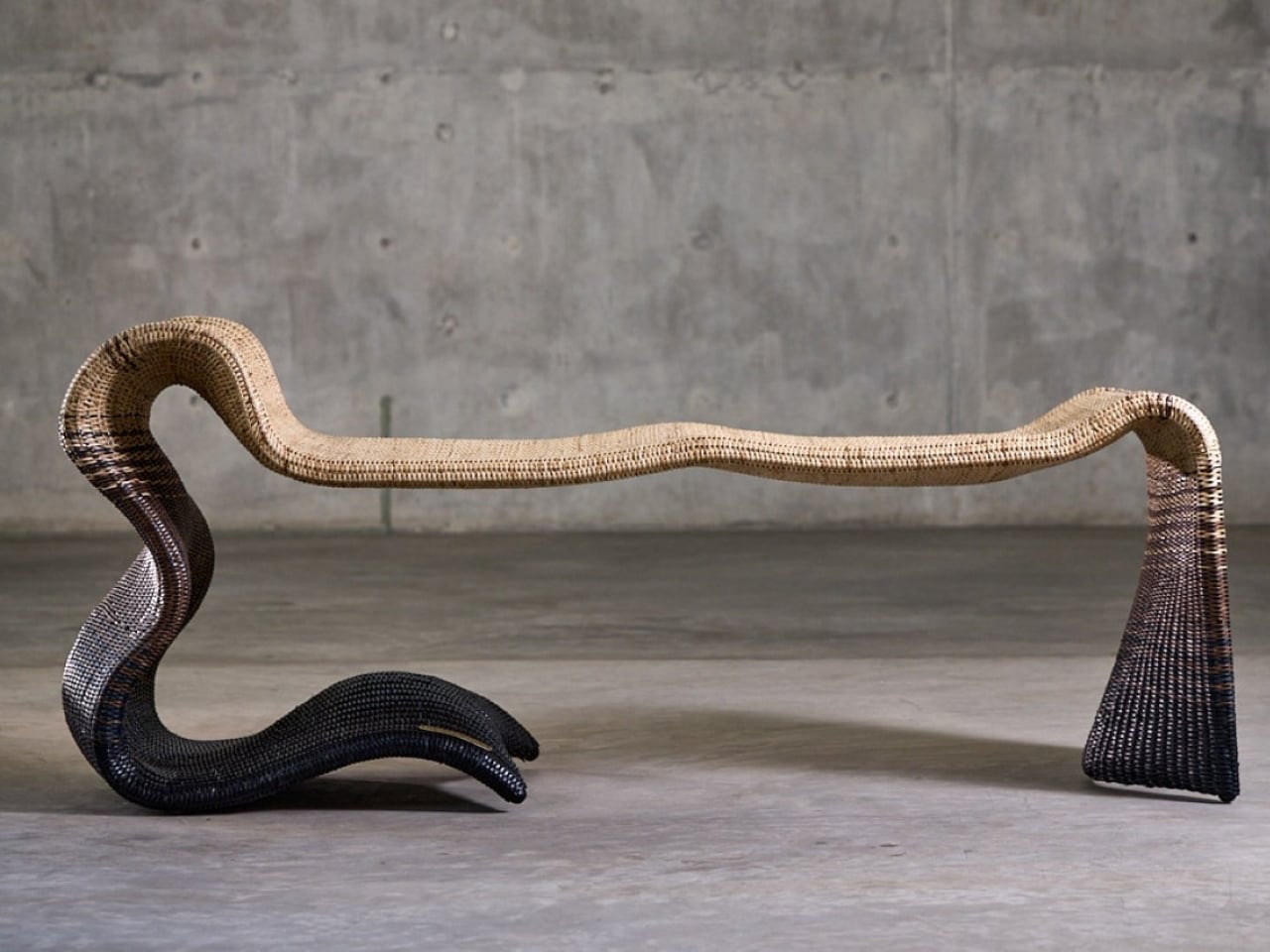
The collection is defined by fluid forms, intricate textures, and a restrained material palette that allows the natural warmth of wicker to take center stage. Designs such as the Pagdandi wall unit exemplify this approach, translating the irregular rhythm of nature into woven structures with visual lightness and depth. Research-driven and craft-focused, Whispers of the Wildwood demonstrates how traditional materials can evolve into sophisticated, contemporary forms while retaining their tactile and cultural authenticity.

3. Human-Centered Spatial Core

Spatial planning is being redefined to place human experience above rigid, formal layouts. At the center of this approach is performance-driven comfort. Successful floor plans now prioritize acoustic privacy and thermal efficiency, recognizing that true luxury lies in how well a space responds to the human body.

Homes are designed to adapt to daily rhythms, offering quiet, comfort, and environmental balance rather than relying solely on visual order.
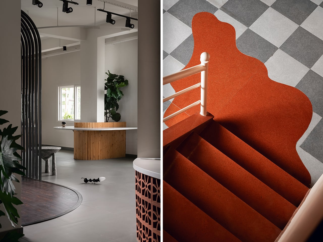
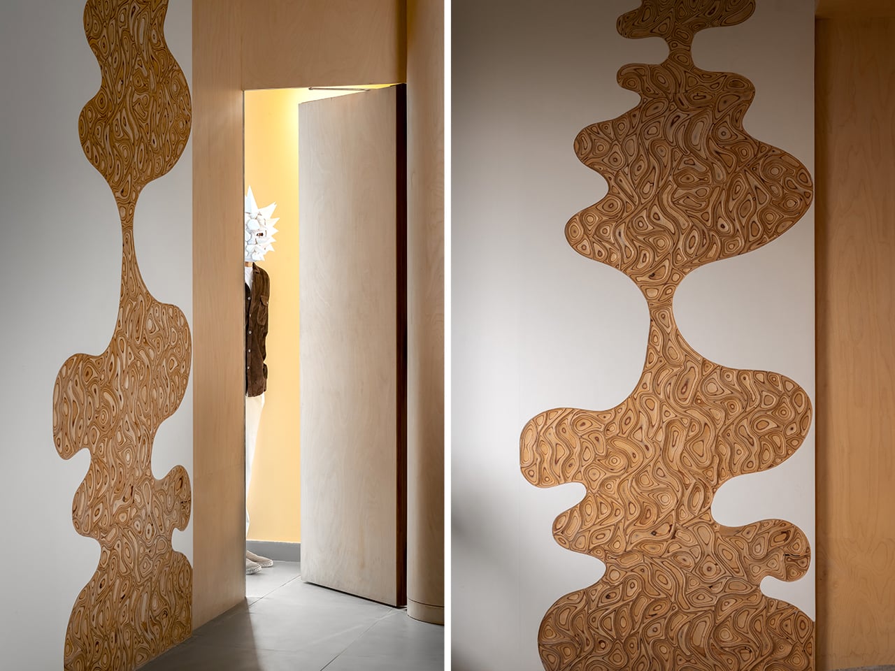
The planning strategy showed in this Warehouse Space transforms a conventional 2,500-square-foot warehouse into a carefully choreographed spatial sequence. Rather than relying on fixed walls, the layout is organized through visual cues, circulation paths, and deliberate zoning. Each area unfolds gradually, encouraging movement and discovery while maintaining spatial continuity. Color transitions, curved architectural elements, and material changes are used as planning tools to define functions without fragmenting the open volume.
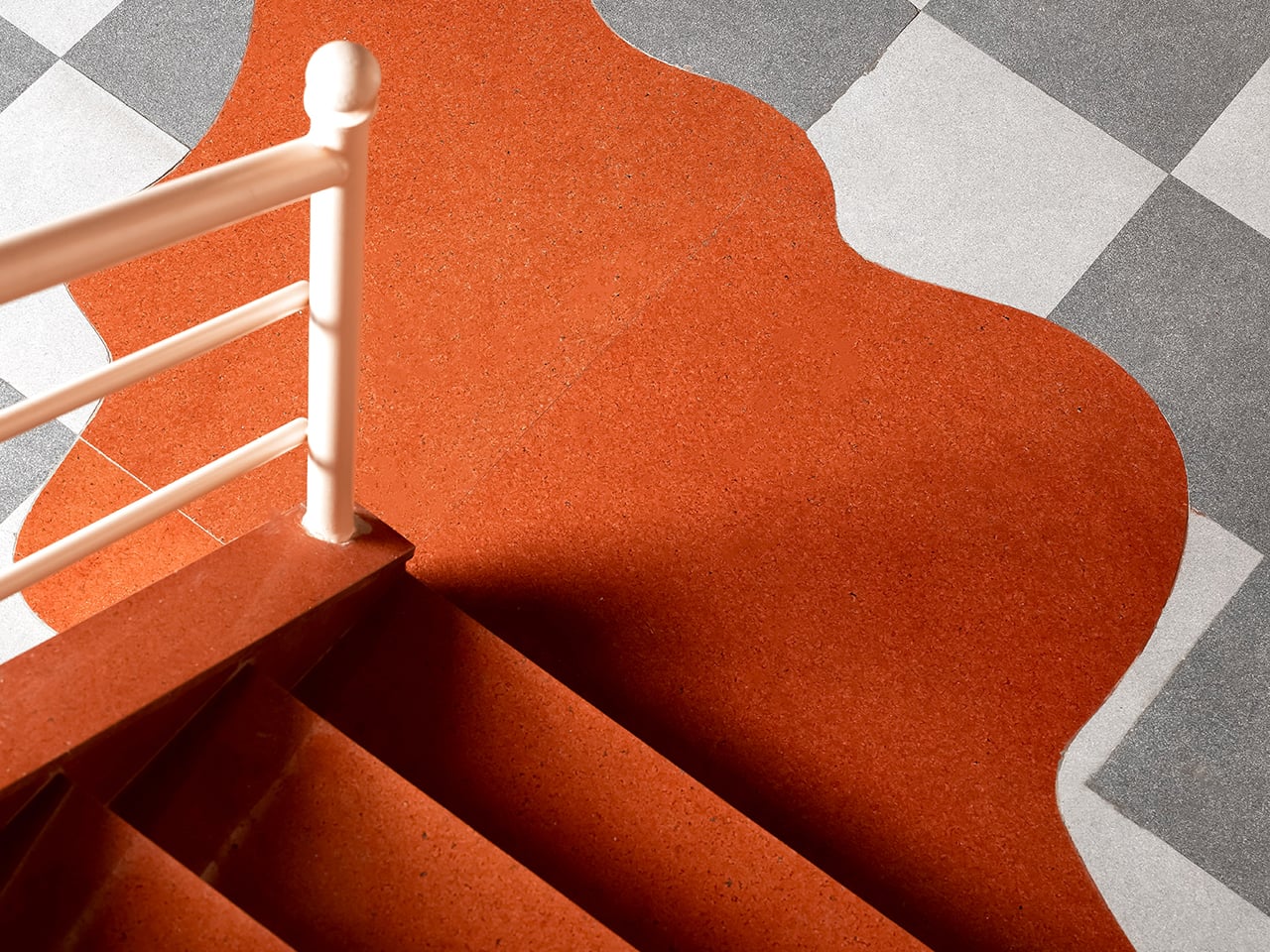
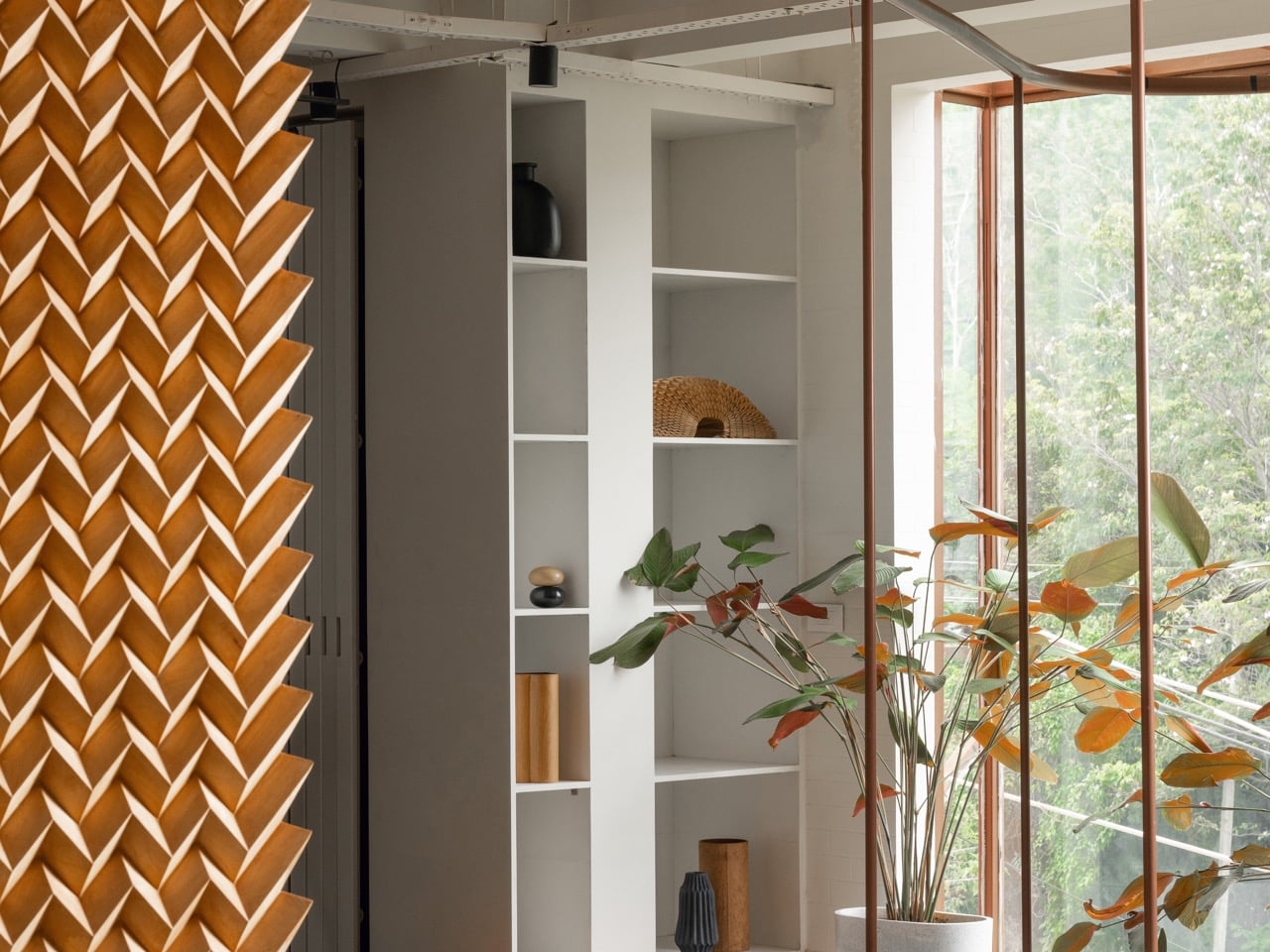
This approach allows the space to function as a cohesive whole while accommodating varied uses. Active zones are positioned to feel dynamic and engaging, while quieter areas are subtly set apart through restrained finishes and controlled visual breaks. Repeating motifs and aligned sightlines guide users intuitively, reinforcing orientation and flow. The planning balances structure with flexibility, ensuring clarity without rigidity. Through thoughtful sequencing and layered spatial relationships, the design demonstrates how strategic planning can redefine an industrial shell into an immersive, purpose-driven environment.

4. Raw Material Honesty

Design is witnessing a clear return to materials that express their true nature, moving away from artificial and imitation finishes. Elements such as hand-worked metal, lime-wash plaster, and natural stone are valued for the stories they carry and the sensory richness they offer. These materials bring depth, texture, and authenticity to interior spaces.

This approach also supports sustainability and longevity. Using materials in their natural or minimally processed state reduces manufacturing impact and improves durability over time. The tactile experience such as the feel of a raw timber handrail, adds a layer of quiet luxury, reflecting a growing preference for honest, lasting materials over polished superficiality.

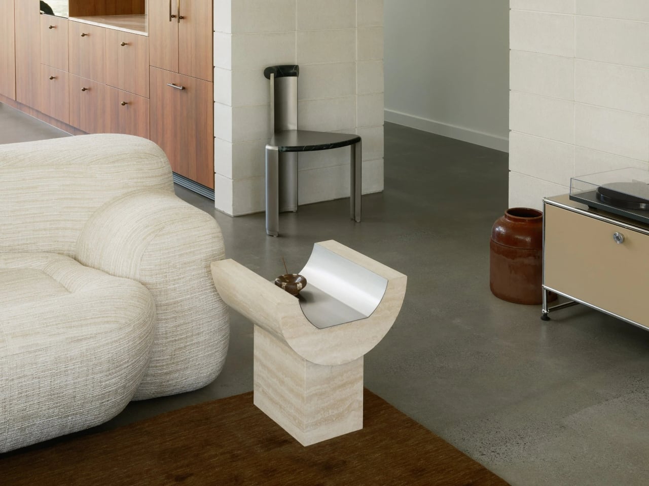
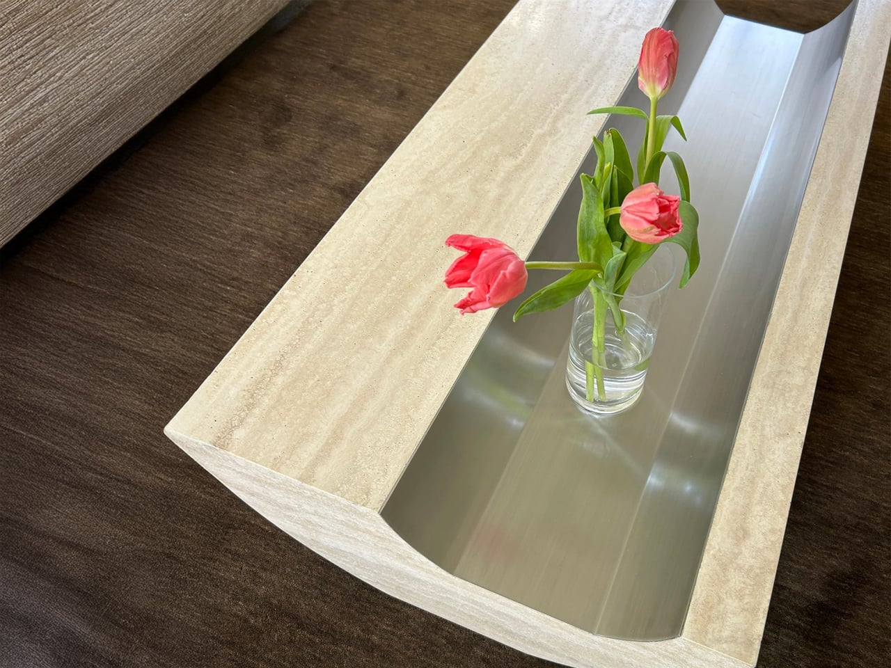
Stone coffee tables are often conceived as heavy, monolithic objects defined by mass rather than refinement. The Coffee Table and Side Table by Tom Black adopt a more considered approach, treating Italian travertine as a material to be carved, balanced, and visually lightened. A single curved gesture defines both pieces, creating an impression of elevation, while a contrasting brushed metal inlay introduces intentional voids within the stone. This dialogue between solid and negative space reframes stone as something sculptural rather than purely structural.
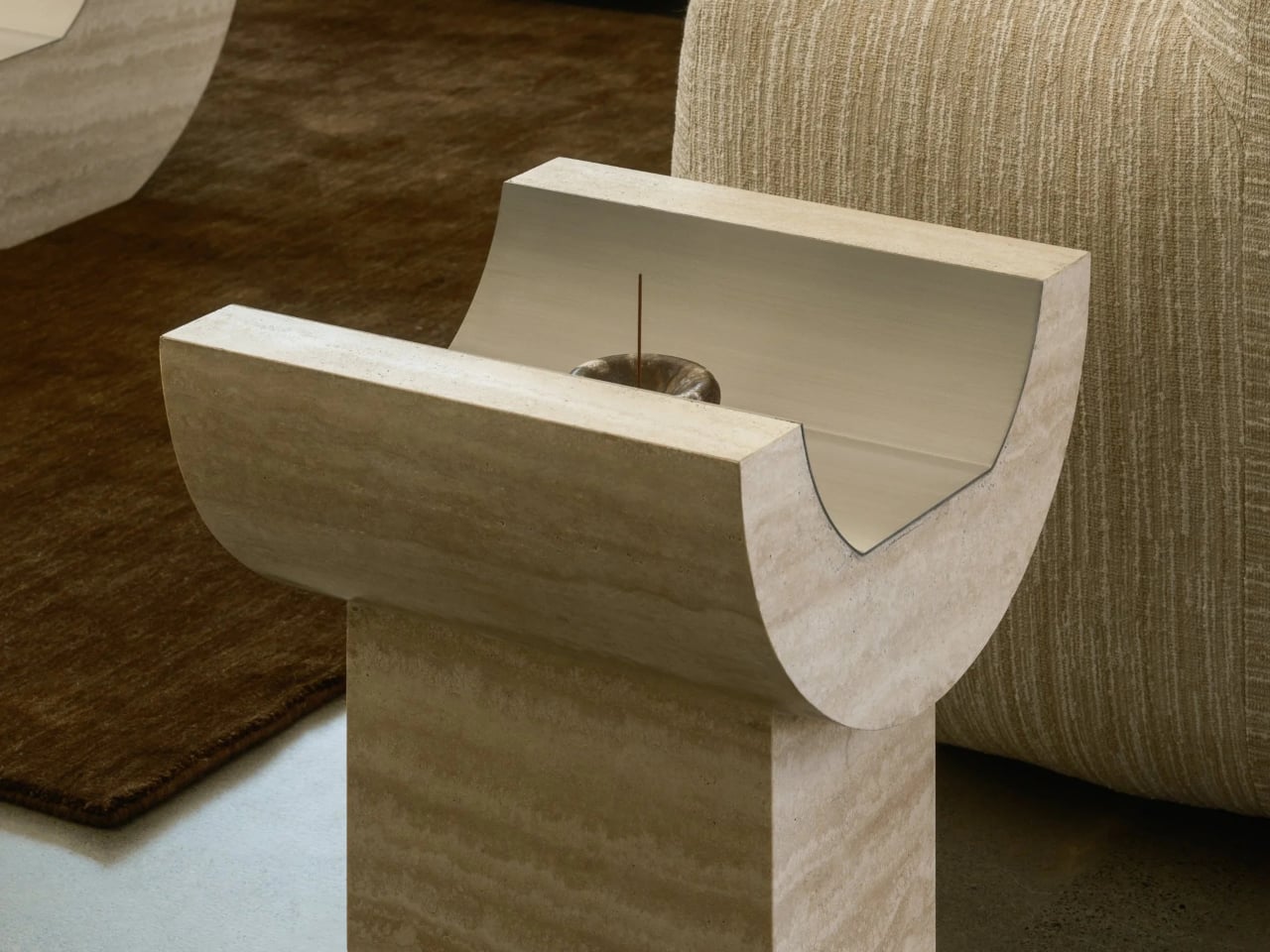
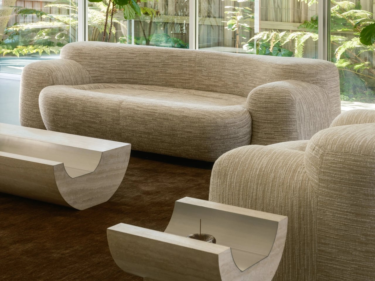
The Coffee Table features a softly curved underside that lifts the form from the floor, paired with a recessed metal-lined trough on the surface that mirrors this curvature. The Side Table translates the same language into a more vertical composition, combining a curved travertine element with a rectilinear base. Together, the two pieces function as architectural furniture, unified by material, proportion, and a restrained yet expressive formal clarity.

5. Built – Landscape Dialogue

Design is increasingly dissolving the boundary between inside and outside. Architects are creating transitional spaces such as semi-covered verandas, internal courtyards, glass walls and shaded thresholds that allow the landscape to flow into the heart of the home. These zones soften the built form and create a natural connection with light, air, and greenery.

Beyond aesthetics, design now focuses on lived experience—how materials, light, and climate affect comfort and emotion. The emphasis has shifted from glossy surfaces to meaningful, biophilic spaces that reduce environmental impact while supporting mental, emotional, and spiritual well-being.


Waterbridge House is conceived as a seamless extension of its natural setting, balancing architectural clarity with a strong indoor–outdoor connection. Set among the pine trees of Pebble Beach, the glass-dominated structure appears to hover above the landscape, defined by clean lines and a restrained material palette. Influenced by Japandi principles, the design blends Japanese serenity with Scandinavian simplicity, resulting in spaces that feel calm, light-filled, and closely attuned to their surroundings.


A defining planning element is the glass corridor that bridges a reflective pool, acting as both an entry sequence and a spatial pause. This transparent link connects two distinct wings: one dedicated to open-plan living and social interaction, the other organized around privacy with bedrooms and quiet retreats. Expansive glazing, sliding walls, and layered decks dissolve boundaries between interior and exterior, allowing light, water, and forest views to shape everyday experience.

Interior design now reflects a deeper focus on authenticity and human connection. Through confident color, softened geometry, and people-first planning, spaces move beyond decoration toward meaning. The true measure of architecture lies in its ability to create calm, light-filled sanctuaries that support emotional well-being while remaining visually refined and environmentally responsible.

The post 5 Interior Design Trends That Just Made Minimalism Obsolete in 2026 first appeared on Yanko Design.
MG Raiser Doubles Up Your Manga Shelf Without Hiding the Back Row

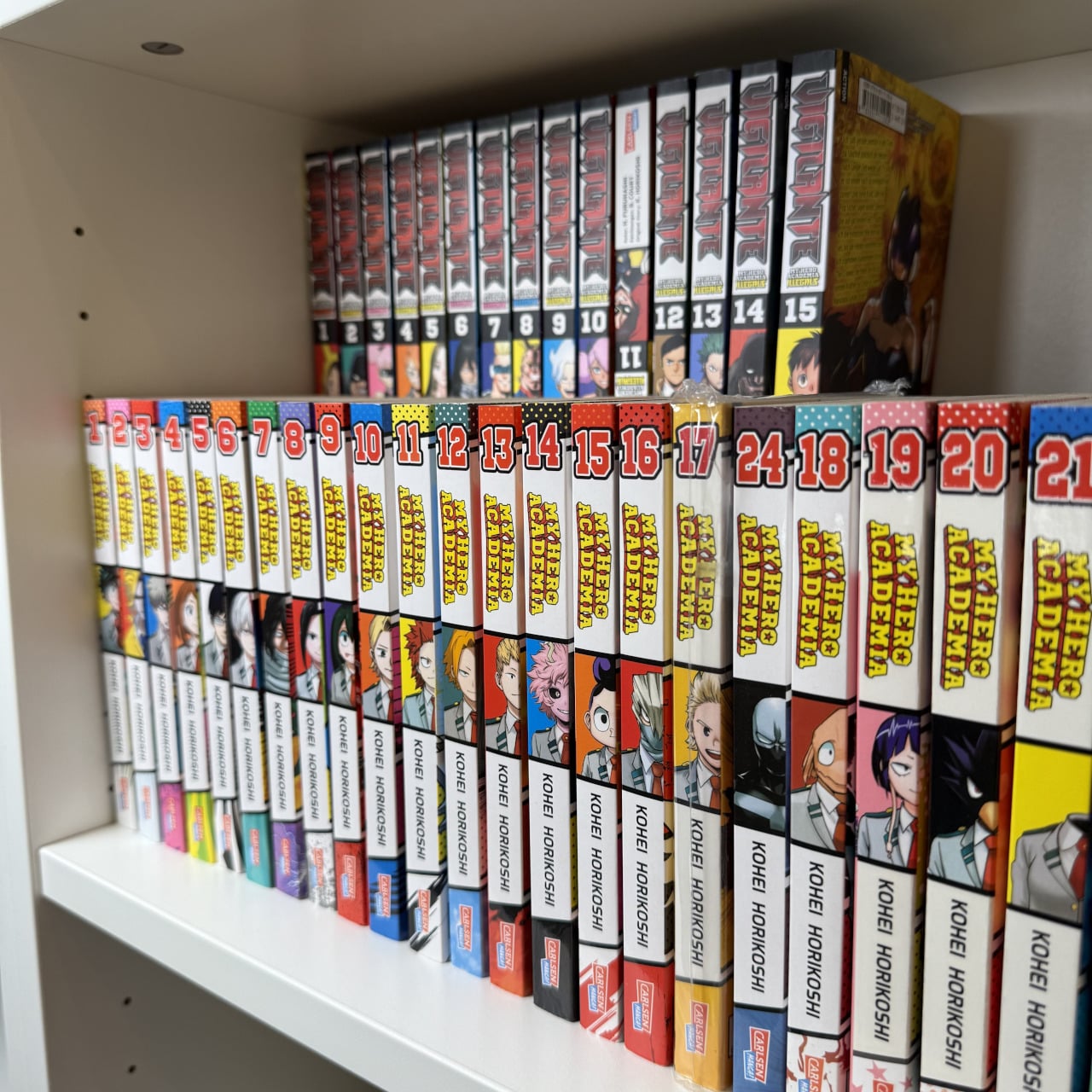
Bookshelves quietly go from single row to double row, especially for manga where volumes multiply quickly. The front row looks great, the back row disappears behind it, and you end up playing memory games to remember which volume is hiding behind which spine. Collectors accept this as the price of a growing library, even though it makes browsing and rearranging annoying and means half your collection is essentially invisible unless you pull out the front row.

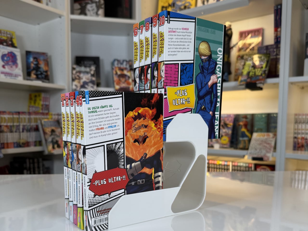
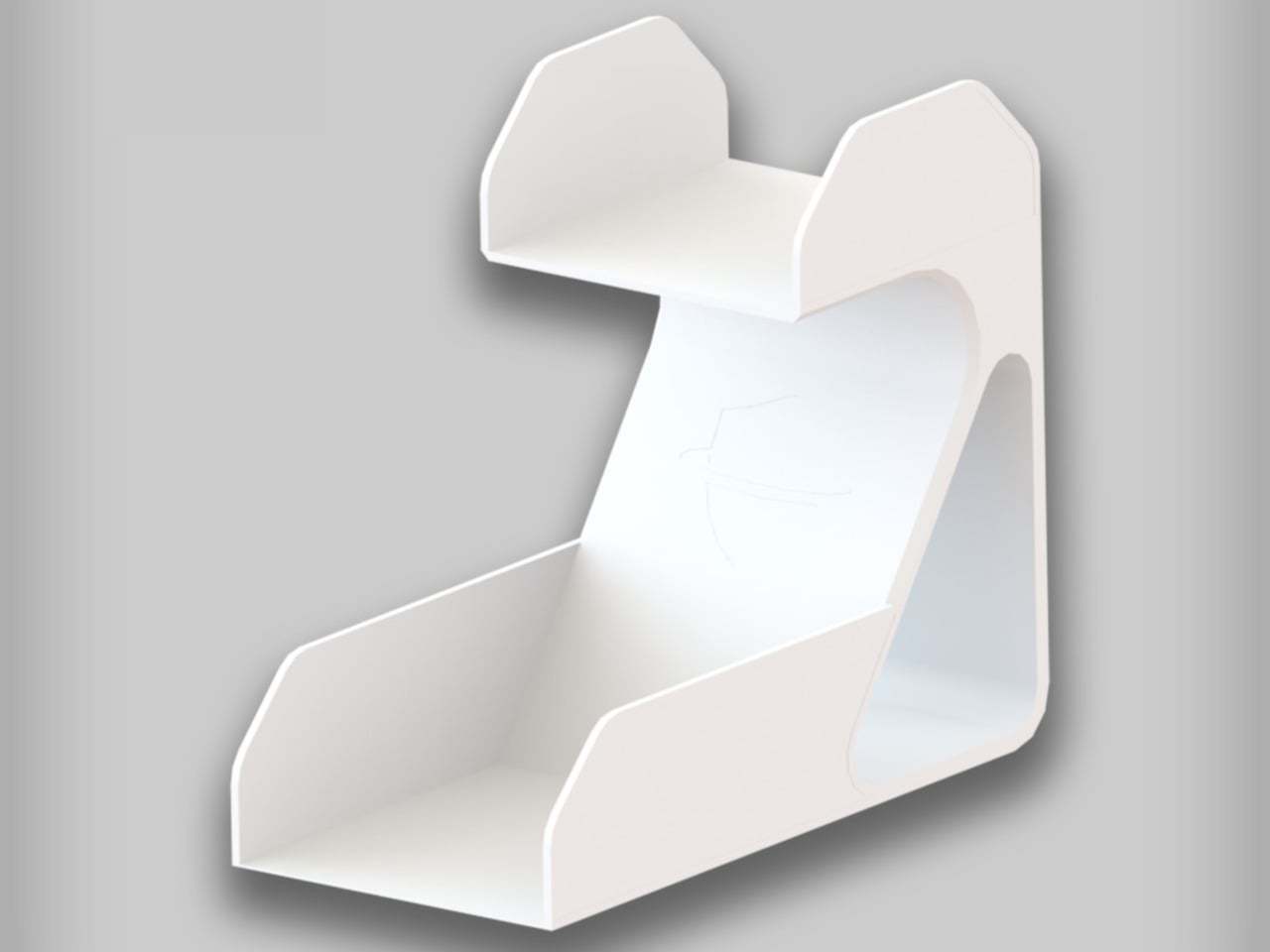
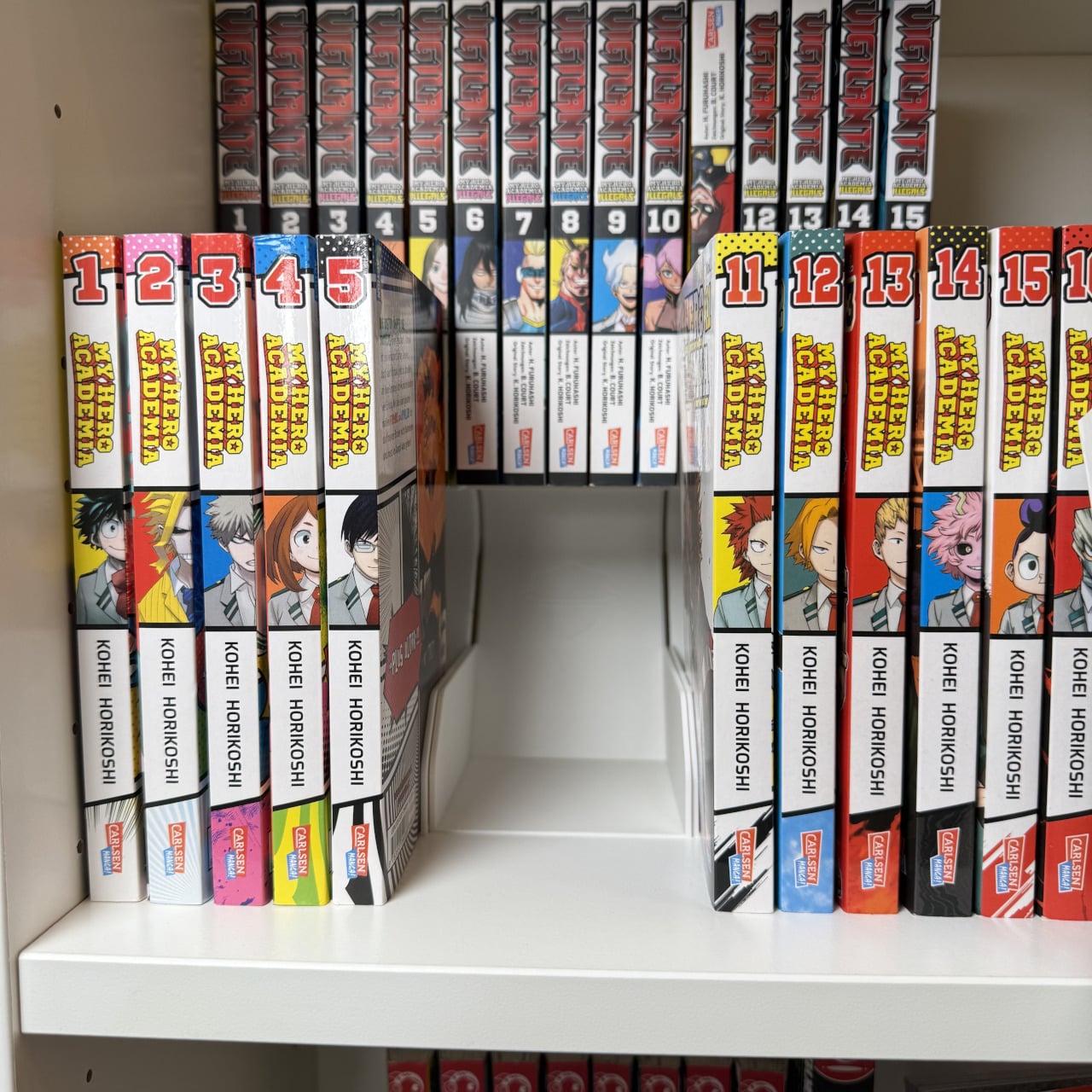
MG Raiser from MangaGuardian is a tiny shelf adapter that takes that double-row habit and makes it less painful. It is a compact L-shaped stand that lets you display two rows of manga in the same footprint, with the back row raised just enough to stay visible. Simple plastic geometry aimed squarely at overcrowded shelves, it solves a niche problem that anyone with more than 20 volumes has quietly dealt with at some point.

Designer: MangaGuardian

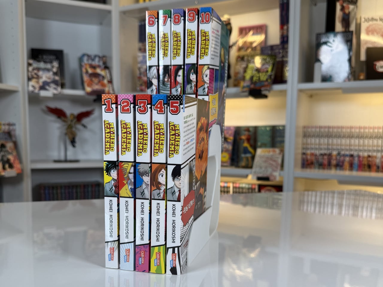
Sliding a few MG Raisers onto a shelf and lining up volumes, the front row sits where it always has, but the back row now rides on a small platform. You can still read every spine, which makes it easier to grab the next volume or rediscover something you forgot you owned. You get roughly twice the capacity in that section without turning the back row into a black hole where titles go to be forgotten.

The block-lift function is where the design gets a bit more clever. The back row and the Raiser act as a single movable unit, so when you want to reorganize you can pull out the entire raised row at once and drop it somewhere else on the shelf. For people who like to re-theme shelves, group arcs, or rotate what is on display, that small interaction saves time and keeps stacks from collapsing mid-move.

Each MG Raiser holds up to 10 items, typically five in front and five in back, with 84 mm width, 170 mm depth, and 150 mm height tuned for standard tankōbon-sized manga. The same proportions work for other similarly sized things, small paperbacks, light novels, or even game cases, so the design quietly extends beyond its original niche and could help anyone trying to squeeze more out of limited shelf space.

MangaGuardian sells other components like MG Tana and MG Sora for more elaborate setups, but MG Raiser stands on its own as a drop-in upgrade. You can use a couple in a single cube, line up several across a long shelf, or mix them with plain rows. It respects whatever furniture you already have, which is important when your shelves are already full of things you care about.

MG Raiser is unapologetically aimed at manga fans, yet the underlying idea, a raised second row that moves as a block, could help anyone trying to squeeze more out of a bookshelf without turning it into chaos. It is the kind of small, almost remedial design move that feels obvious once you see it, and that is usually a sign the designers were paying attention to how people actually live with their stuff instead of just offering another decorative shelf cube.

The post MG Raiser Doubles Up Your Manga Shelf Without Hiding the Back Row first appeared on Yanko Design.

This $129 Titanium EDC Knife Has The Most Addictive Tiger-Claw Opening Mechanism

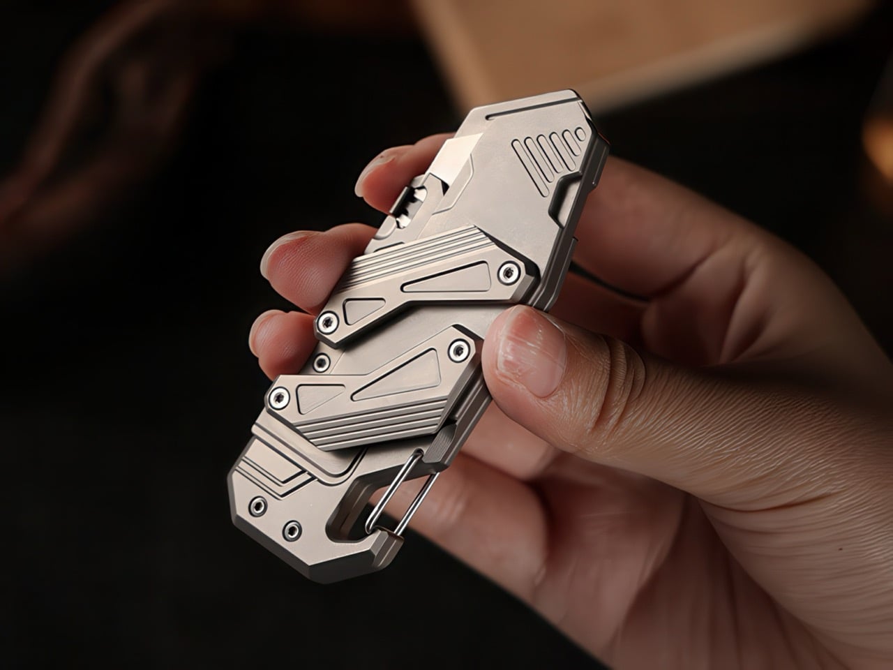
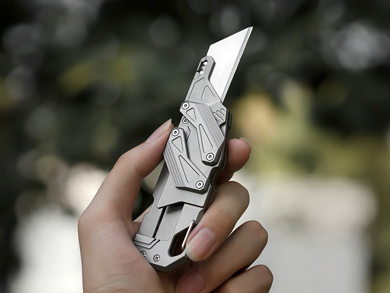
When the CRKT Provoke first appeared, its morphing mechanism felt like a revelation. The design, which borrowed its kinematics from the way a jungle cat’s claws extend from its paws, was a jolt of fresh energy for an EDC world growing tired of endless flippers and predictable OTF switchblades. TiGo’s SyncraBlade now takes that same philosophy of complex, purposeful motion and applies it to the humble utility knife, creating something that feels just as revolutionary. The parallel linkage system that deploys the blade isn’t just visual theater, though it certainly delivers on that front. It is a direct solution to the finger-in-the-way problem that every traditional folder presents.

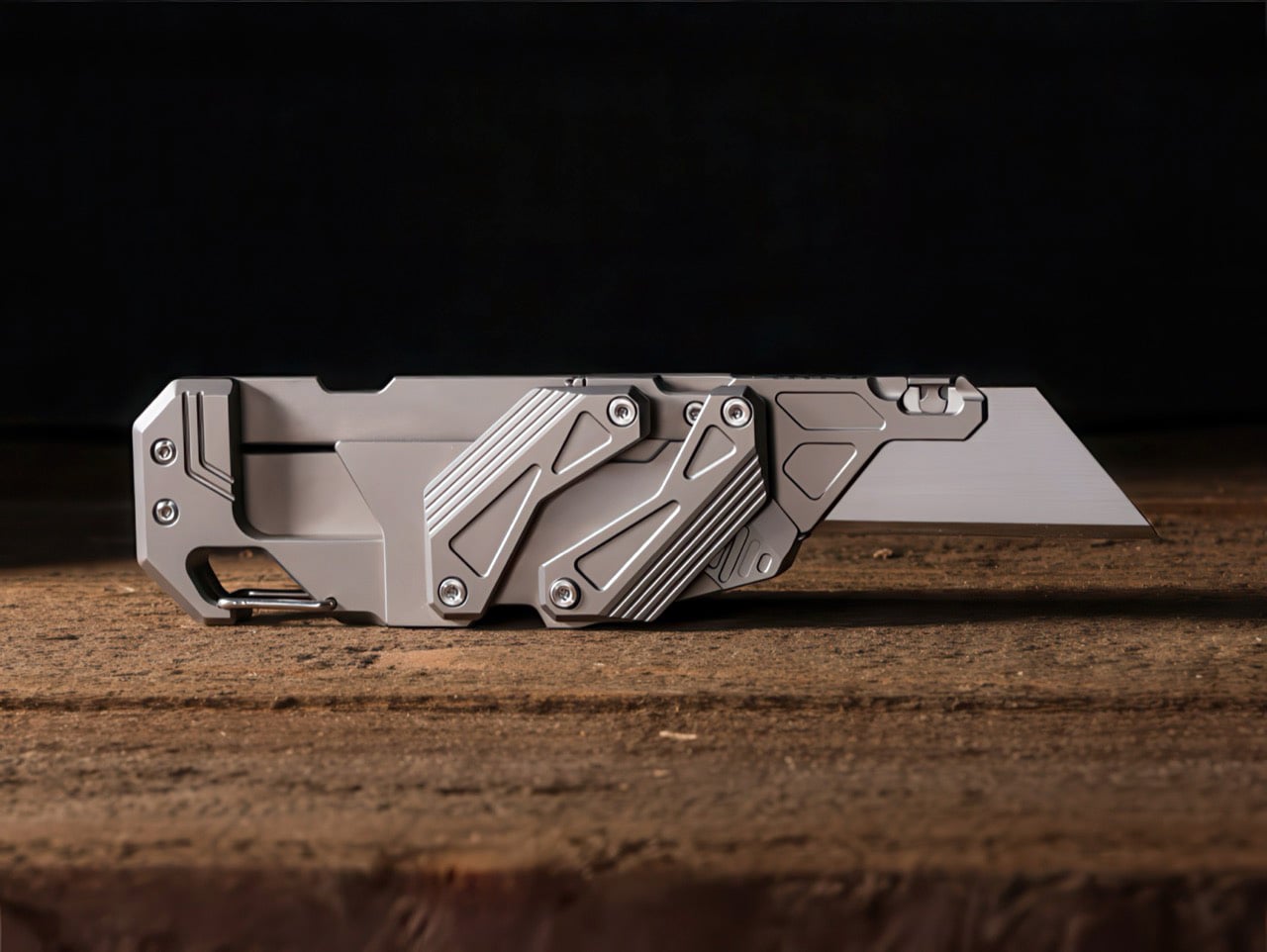
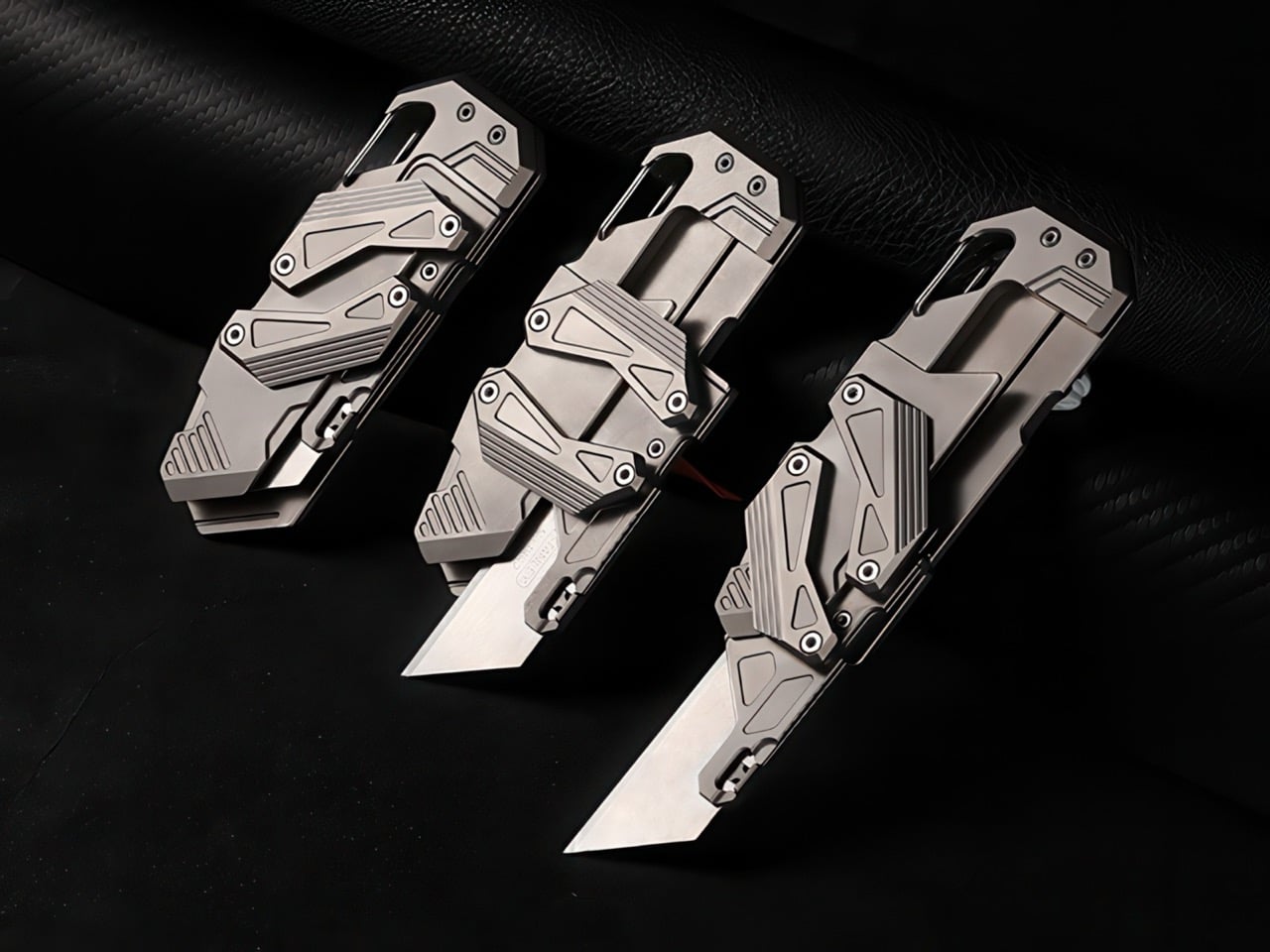
Watching the SyncraBlade extend is like observing a miniature precision machine at work. Two articulated arms move in perfect synchronization, carrying the blade forward along dual rails while maintaining its orientation. The entire assembly is milled from titanium, with every pivot point and linkage visible through strategic cutouts in the handle. This transparency isn’t accidental; TiGo designed a tool that wears its mechanical complexity proudly, appealing to anyone who appreciates clever engineering as much as practical function. The fact that it uses standard replaceable razor blades only reinforces its credentials as a tool meant for serious, everyday use.

Designer: TiGo

Click Here to Buy Now: $129 $201 (36% off) Hurry! Only 70 of 100 left.

The mechanism itself is a classic four-bar parallel linkage, a system engineers have used for centuries in industrial machinery (although maker TiGo likes to call it their ‘SyncraSlide’ mechanism). The blade carrier slides forward on a set of internal rails, but its motion is driven by those two external articulating arms. This setup ensures the blade extends in a perfectly linear path, keeping the cutting edge safely away from your hand throughout the entire deployment. Single-handed operation is effortless, and because the blade never folds, there’s zero risk of it accidentally closing on your fingers. Basically, clever engineering that solves a safety issue while looking gorgeous and feeling absolutely addictive. Looking at it will remind you of how a cat’s claws deploy from within their paws. At this scale, the SyncraBlade is roughly the same size (and probably even caliber) as a tiger’s claws – which sounds about as badass as the knife is designed to be.

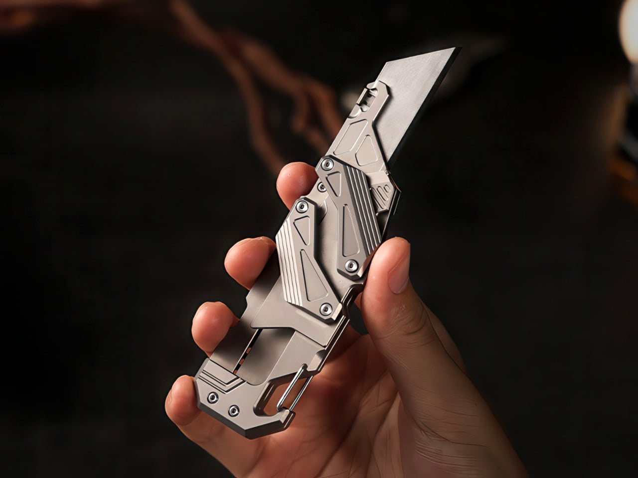
That entire intricate assembly is machined from Grade 5 titanium, which explains the sharp, angular lines and confident feel. This isn’t your standard stamped-metal utility cutter. The choice of Ti-6Al-4V gives it an incredible strength-to-weight ratio, so while it feels substantial, it won’t weigh down your pocket. Closed, it measures a compact 115mm long and weighs in at 118 grams, putting it right in the sweet spot for everyday carry. The bead-blasted finish gives it a subtle, non-reflective quality that highlights the milled textures on the handle and linkage arms. Every surface feels deliberate, designed for both aesthetic appeal and functional grip.

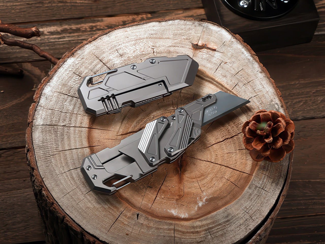
The titanium handle encases a cleverly integrated standard user-replaceable utility blade that’s both sharp and interchangeable, making it a perfect choice for brutal functionalists who hate the idea of ‘blade maintenance’. This completely sidesteps the hassle of sharpening and lets you maintain a factory-sharp edge with a simple swap. A fresh blade is always sharper and more precise than a hand-sharpened one, which is exactly what you want for delicate tasks like opening packages or trimming materials. The blade change mechanism appears straightforward, secured by a single screw, so you can pop in a new one in seconds without any specialized tools. It’s a practical decision that grounds the futuristic design in real-world usability.

The way the blade ejects is visually addictive, sure. But it’s also safer than your average flipper. A flipper blade often uses a torsion spring, which causes the blade to arc out and stop in its open position. If there’s no spring-loaded action, the blade almost always requires two hands to open and close – or at best, one hand with a bit of a struggle. If you’ve ever pulled out a sofa-bed, you know that a well-made parallel linkage can be activated with just a single hand. The SyncraBlade encourages that level of ease, allowing you to both deploy as well as shut the blade with a single thumb-motion. This is also safer because the blade’s edge never really comes in the path of your hands. A folding blade’s curved path means you need to move your fingers out of the way while opening and closing the blade – the SyncraBlade’s parallel linkage eliminates that need entirely. Grip the knife exactly how you used to, the blade never comes in contact with your skin – making it reliable to deploy in the dark, or even in any situation without having to look down at your knife.

The functionality doesn’t stop with the blade. Tucked into the tail end of the handle is an integrated pry bar and a wire-gate carabiner clip. These aren’t afterthoughts; they’re seamlessly incorporated into the titanium body. The pry bar is robust enough for light-duty tasks that would destroy a knife tip, like scraping or opening paint cans. The carabiner provides a secure attachment point for a keychain or belt loop, making it easy to keep accessible. There’s even a hidden bottle opener integrated into the frame, making this tiny beast perfect for the outdoors, whether you’re camping, hunting, or dare I say, on a tactical mission.

All these features are packed into a frame that is surprisingly ergonomic. When closed, it’s a dense, fidget-friendly rectangle of titanium. Once the blade is deployed, the articulated linkage arms naturally form a finger guard, creating a secure and comfortable grip. The milled texturing on the handle provides excellent traction, ensuring the tool won’t slip even when you’re applying significant force. The entire design feels balanced and intuitive in the hand, a testament to how much thought went into the relationship between the mechanism and the user experience.

And the knife is designed for everyday use with quite literally zero compromise. The titanium build makes it devilishly durable. It’s corrosion-proof by default, doesn’t rust or oxidize, can be dropped from a hundred feet or be run over by a car without any sign of wear and tear. It’s water-resistant, and if you’re a part of a small section of people who are sensitive to certain materials, titanium is hypoallergenic by nature. The blade is the only replaceable part, which means you can simply ditch it for a sharper one if the old one dulls or breaks. And if you’re traveling, just pack the blade separately and you’ve got a TSA-friendly EDC that can attach to your backpack, belt loop, or sit in your pocket.

The SyncraBlade doesn’t entertain any fluff – it comes in a single natural color (none of that anodized or PVD coated nonsense), and the most you can do to personalize your knife is have it custom-engraved. I’d have appreciated a tritium slot on the sides, but that’s me being pedantic – especially considering the knife costs a mere $129 (discounted from its $201 price tag), and ships free globally starting May this year.

Click Here to Buy Now: $129 $201 (36% off) Hurry! Only 70 of 100 left.

The post This $129 Titanium EDC Knife Has The Most Addictive Tiger-Claw Opening Mechanism first appeared on Yanko Design.

UGREEN built an AI Recorder into its 10,000mAh Power Bank and I don’t know if that’s genius or crazy…

Representational Image

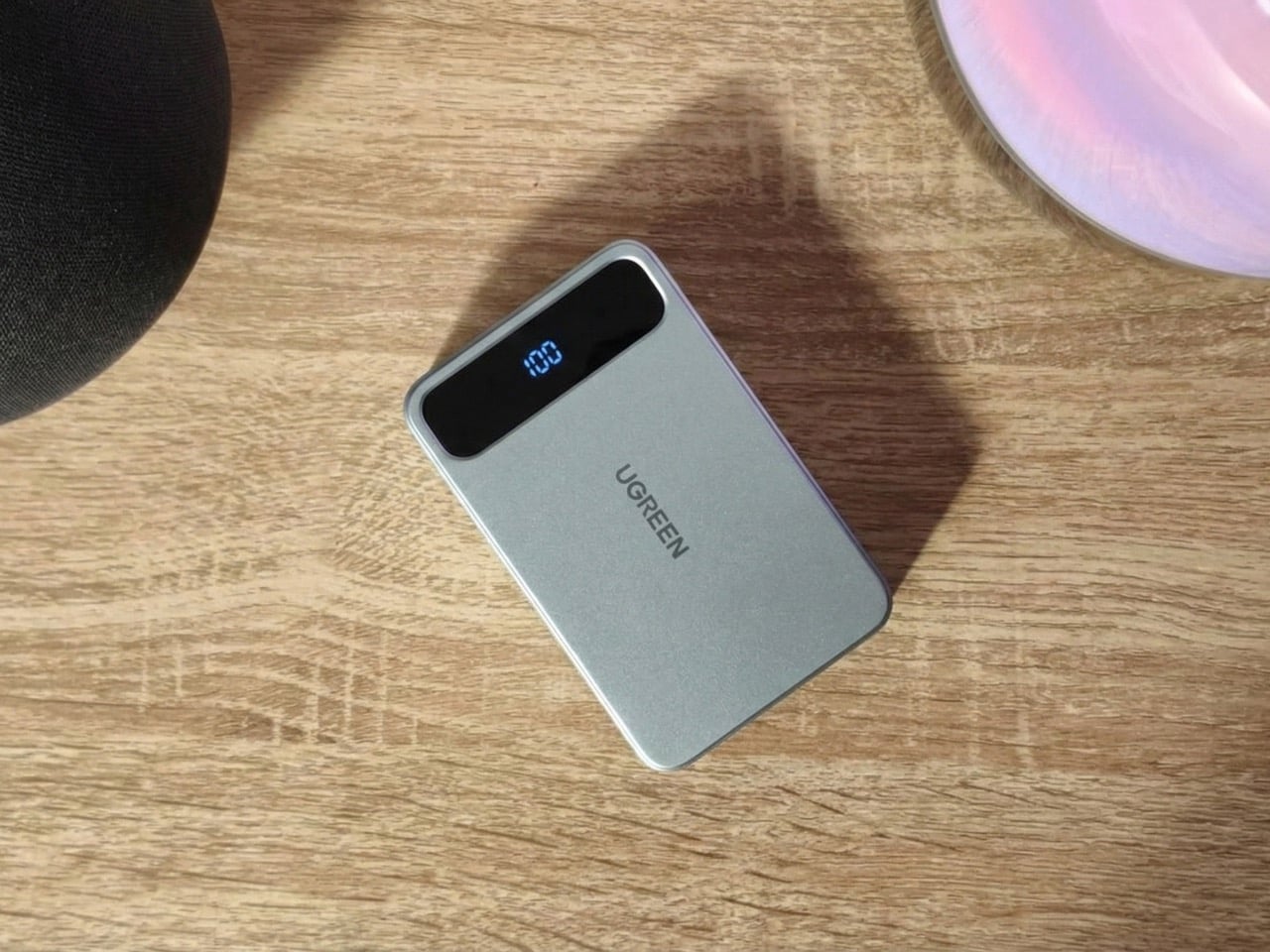
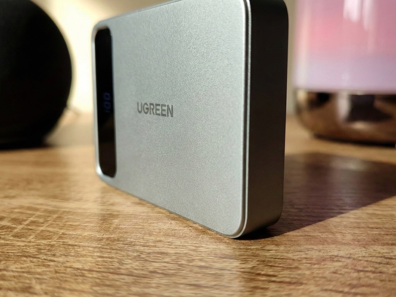
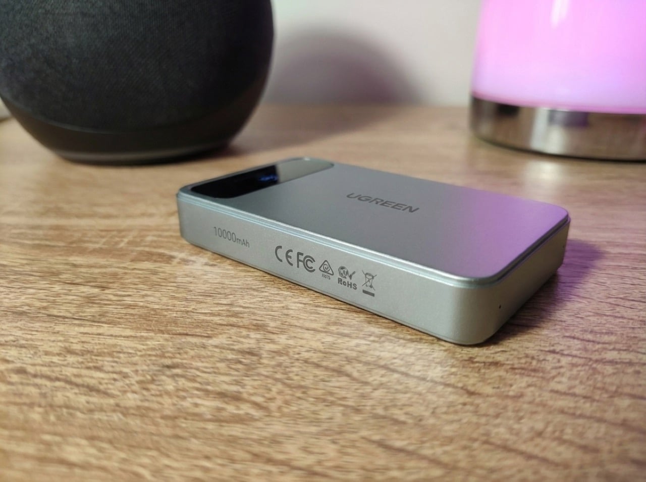
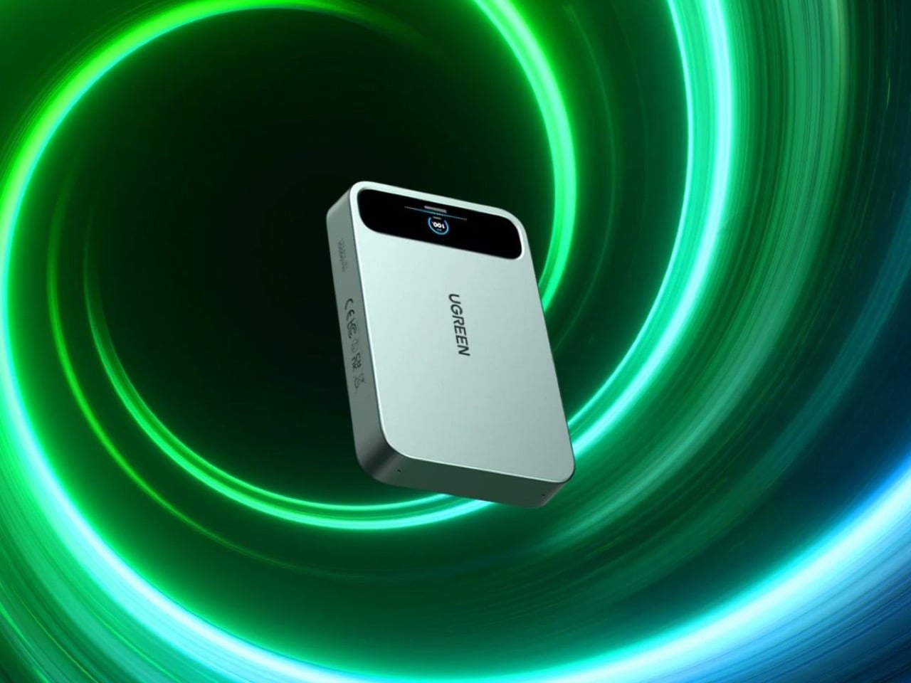
At CES 2026, where every tech company seemed legally obligated to add AI to something, Ugreen announced a power bank with voice recording. The MagFlow AI Voice Recording Magnetic Power Bank packs 10,000 mAh, wireless charging, and AI-powered note-taking into one device. It’s either brilliantly practical or completely unnecessary, depending on how often you find yourself needing both a dead phone and a voice memo at the exact same moment.

The real question is what market Ugreen’s actually targeting. Dedicated AI recorders like Plaud and Limitless offer superior transcription and integration with productivity tools. Meanwhile, power bank buyers are mostly obsessed with capacity, charging speed, and MagSafe compatibility. Ugreen’s product sits awkwardly between these worlds, somehow simultaneously targeting both the serious note-taker as well as the charging purist. Maybe that’s the genius: creating a category where none existed, or maybe it’s just feature creep with good intentions.

Designer: Ugreen

Representational Image

You’ve got 10,000 mAh, which is respectable but standard for MagSafe-compatible power banks in 2026. Wireless charging is included, though the company hasn’t confirmed whether there’s a USB-C port for wired fast charging. A digital display shows battery level and presumably real-time charging stats. Then there’s the voice recording hardware with built-in AI for translation and summarization, which sounds impressive until you realize Ugreen hasn’t explained how you’ll actually access these recordings. Is there an app? Does it sync to your phone? Do you have to plug it into a computer and dig through files like it’s 2015?

Representational Image

Compare this to something like the Plaud NotePin, which costs around $169 and is purpose-built for recording. It connects seamlessly to your phone, transcribes in real time, integrates with LLMs like ChatGPT for summaries, and weighs practically nothing. Or look at the power bank side of things. Ugreen’s own Qi2 25W MagFlow Power Bank retails for $89.99 (currently $69.99 on Amazon) and does one thing exceptionally well: charges your devices fast. This new AI version will almost certainly cost more, probably around $120 to $150 if I had to guess, which puts it in direct competition with premium power banks that offer higher capacity or faster charging speeds. Not to mention most AI services do come with the looming threat of a subscription fee at some point. Imagine subscribing to a power bank…

Jokes aside, the bundling makes sense if you’re the kind of person who carries too much stuff and wants to consolidate. A journalist running between interviews could theoretically use this to charge their phone while recording background audio for articles. Students might appreciate having one device that keeps their laptop alive during lectures while capturing notes they can summarize later. But these use cases feel niche, and niche products need exceptional execution to justify their existence. Ugreen hasn’t shown us that yet. The company has a solid track record with GaN charging technology and their NASync NAS series crushed it on Kickstarter with $6.6 million raised. They know how to build hardware. Whether they can build software that makes voice recording feel natural on a battery pack is the real test.

The post UGREEN built an AI Recorder into its 10,000mAh Power Bank and I don’t know if that’s genius or crazy… first appeared on Yanko Design.

Stop Saying ‘Hey Siri’ in Public: This Finger Ring Concept Responds to Taps

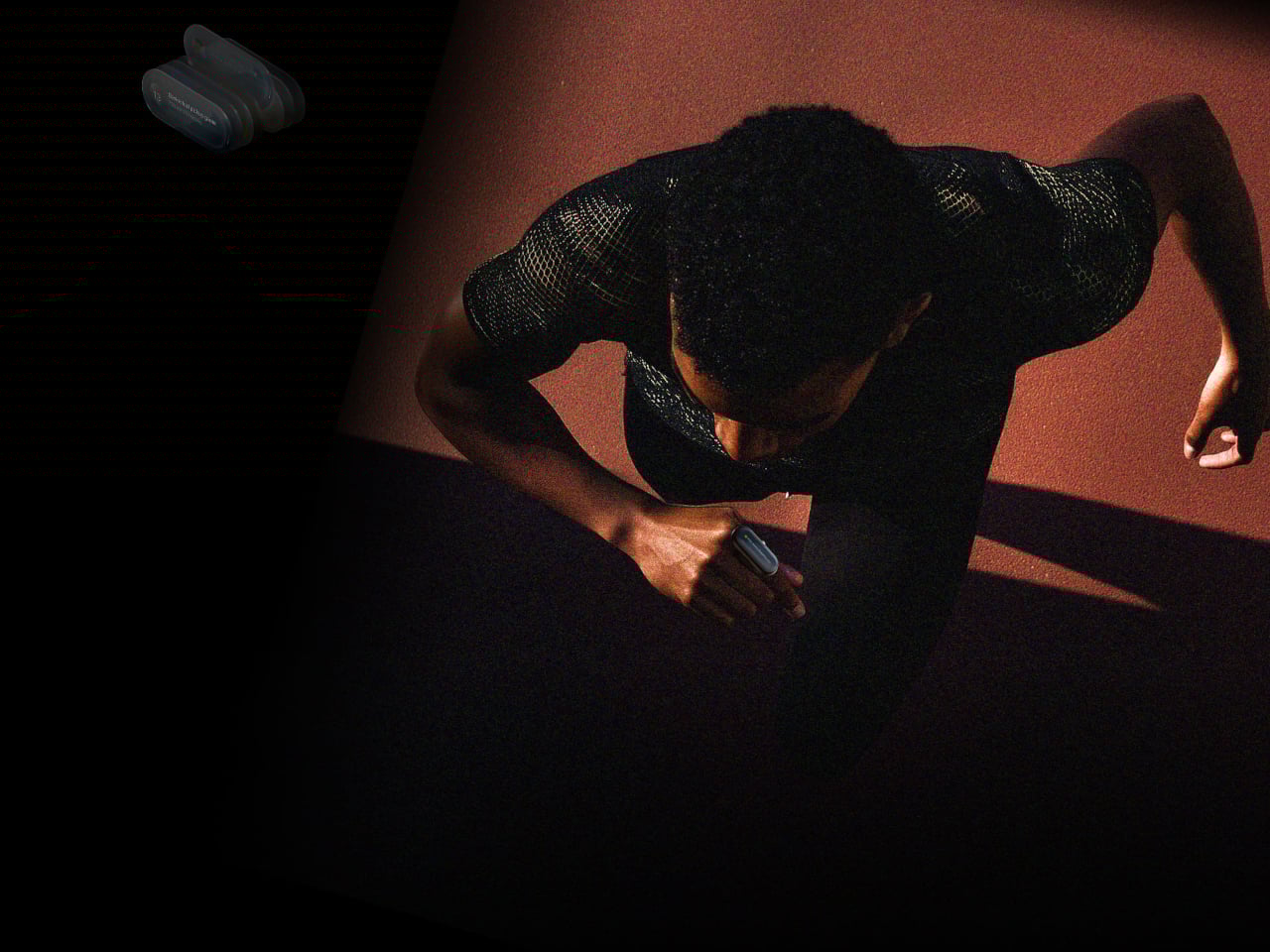
Talking to phones and smart speakers in public still feels awkward. You either whisper to your wrist or say “Hey Siri” out loud on a crowded train, and everyone turns to look. Pulling out a phone just to check a notification breaks whatever you were doing, and making big hand gestures to control earbuds turns you into the person air-conducting an invisible orchestra on the sidewalk.

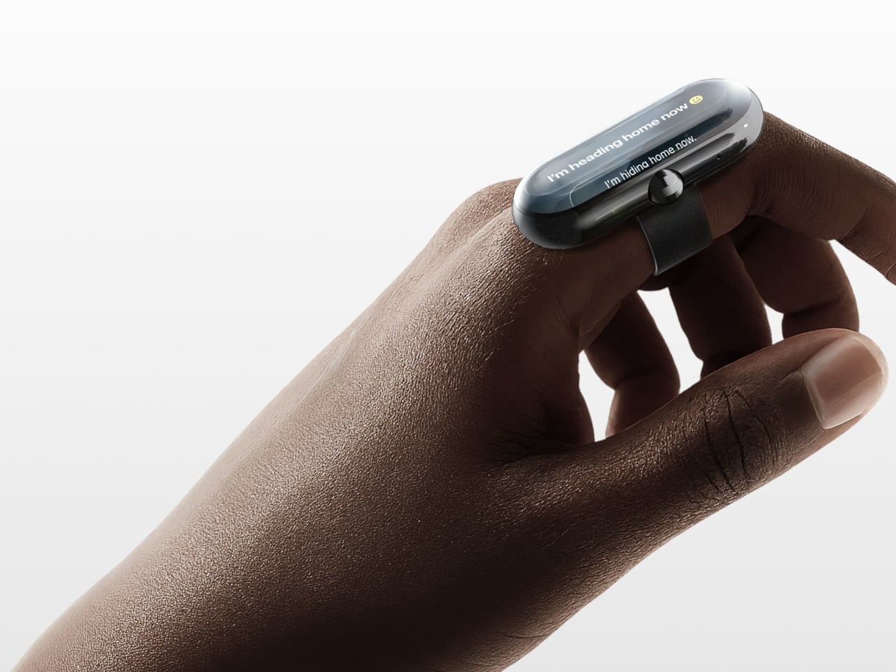
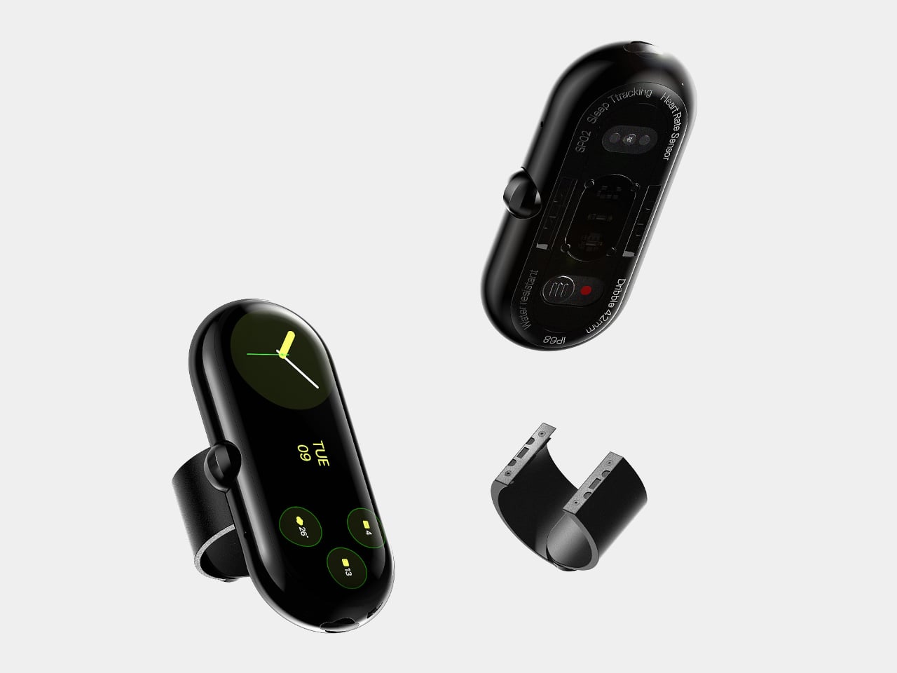
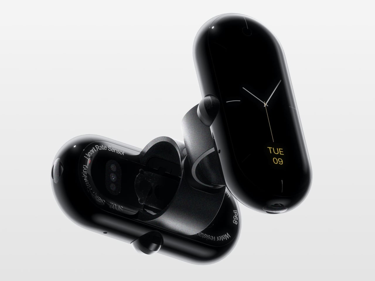
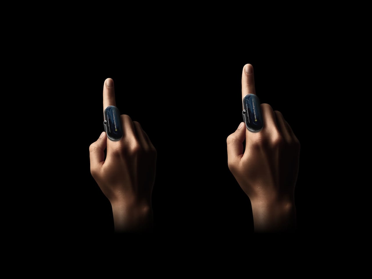
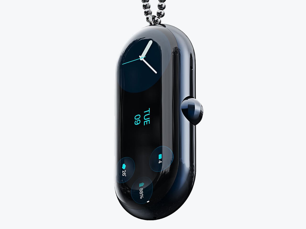
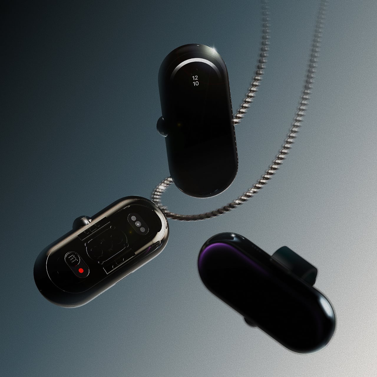
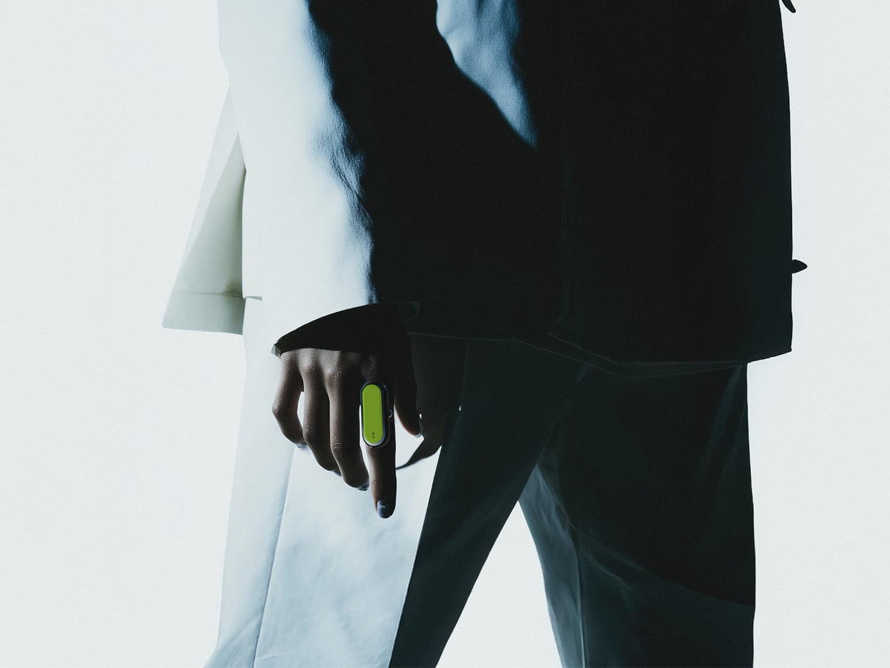
Dribble is a concept device that tries to move those interactions onto your index finger. Designed by Kangmin Park, it is a tiny pill-shaped module that clips onto a ring-like band, turning your finger into a discreet remote for messaging, AI, health, and payments. Instead of wake words or screens, it relies on small taps and glances, handling quick tasks without broadcasting that you are using tech.

Designer: Kangmin Park

The interaction model is straightforward. One tap triggers a core action, two taps go back, and a long press activates multi-step tasks or Dribble AI. A hidden under-display camera and motion tracking help the device understand context without sticking a visible lens on your hand. The idea is that you can reply to a message or jot a note with a tiny movement that barely anyone notices.

Picture hanging onto a subway pole while tapping your finger to send a “running late” reply, or cycling with your phone zipped away while a double-tap starts navigation. In a meeting, you could long-press to capture a thought without opening a laptop. These are short interactions that keep you from constantly pulling out your phone for every notification or small task that pops up.

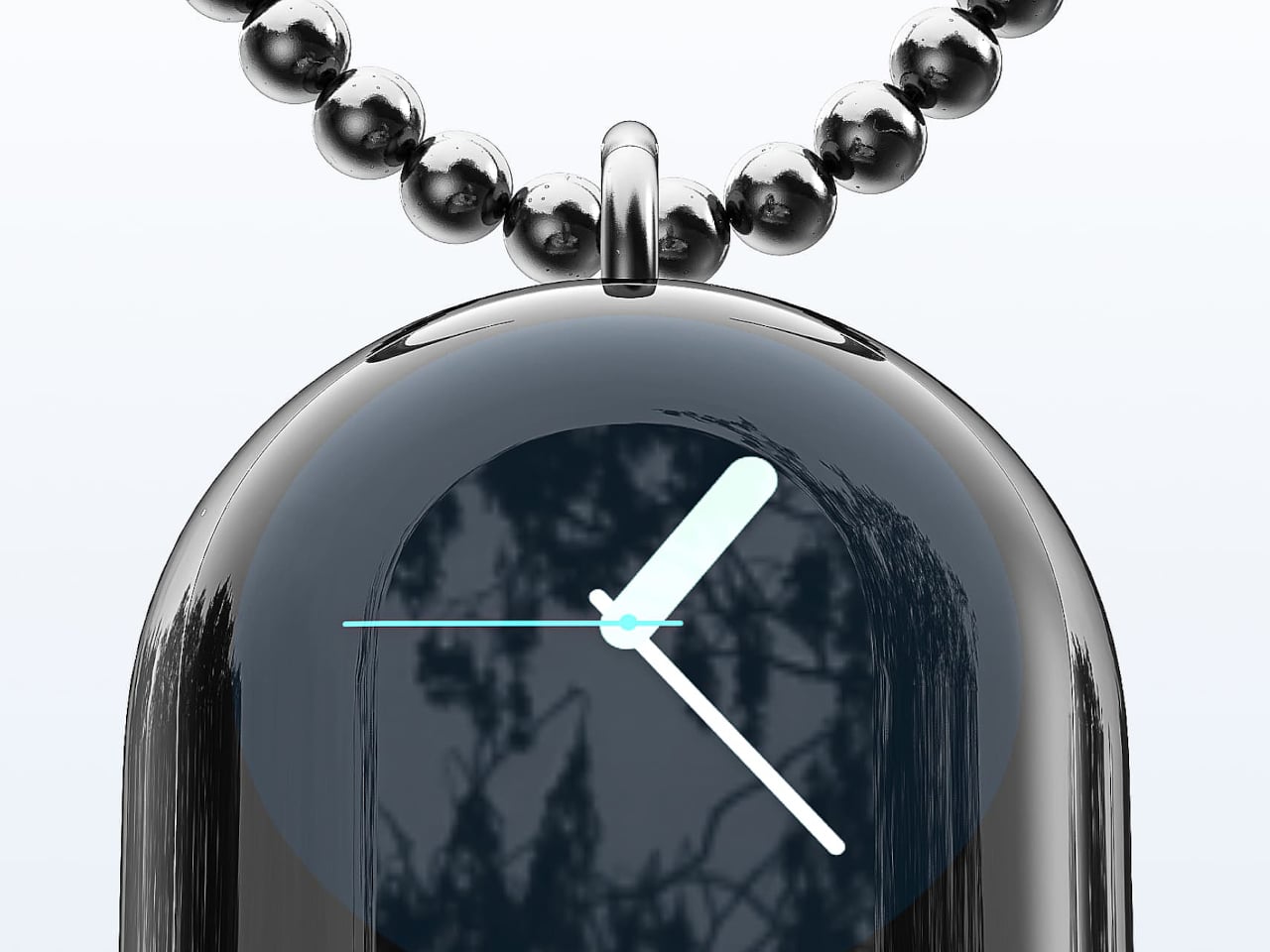
The narrow display wraps over the top edge, showing just enough information, a line of text, a heart rate, or a small card from Dribble AI. The concept includes AI cards for notes, search, work assistance, health, and small payments, all designed to be read in a second or two. It feels closer to a whisper from your devices than a full conversation, which suits the tiny form factor.

Dribble is meant to be worn as a ring most of the time, but it can also hang from a necklace when you do not want anything on your hands. The pill shape and muted colours push it toward jewelry territory rather than gadget territory, which matters if you are going to wear it all day. It shows the designer is thinking about how it fits into outfits and habits, not just operating systems.

Dribble hints at a future where we talk less to our devices and tap them more quietly instead. It does not try to replace phones or watches. It just imagines a different layer of control that lives on your finger, somewhere between jewelry and interface. Whether or not this exact product ever ships, the idea of invisible input riding on tiny gestures feels worth paying attention to.

The post Stop Saying ‘Hey Siri’ in Public: This Finger Ring Concept Responds to Taps first appeared on Yanko Design.

Pareto Pot Uses the 80/20 Rule to Give Your Favorite Pens a Better Home

Most creative desks have a cup overflowing with pens, markers, and tools, even though you reach for the same few every day. There is the Muji gel pen for sketches, a couple of render markers you trust, and then about 15 other things you keep just in case. The Pareto Principle says 80 percent of your output comes from 20 percent of your stationery, which feels accurate once you notice how often you dig past everything else.

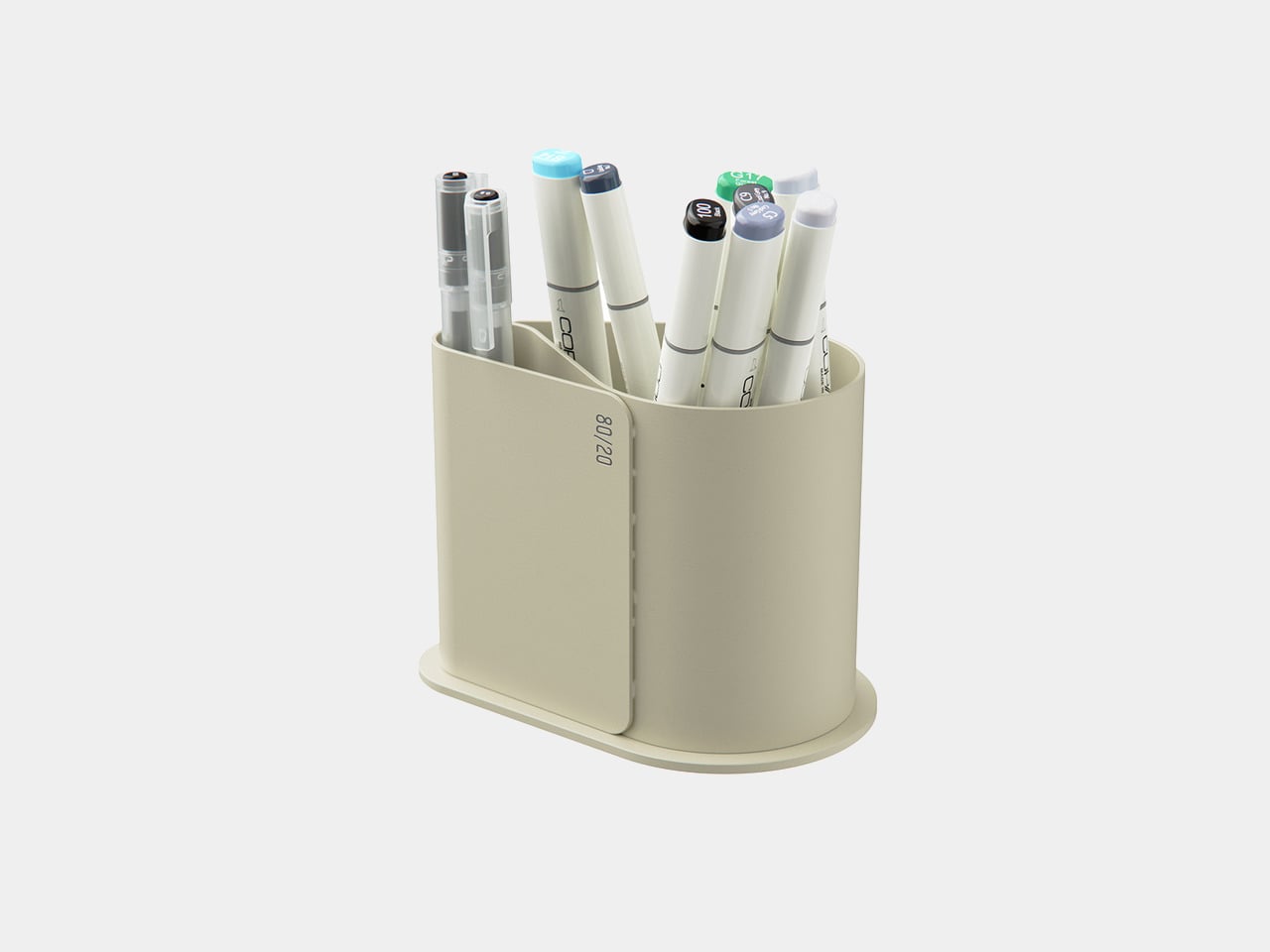
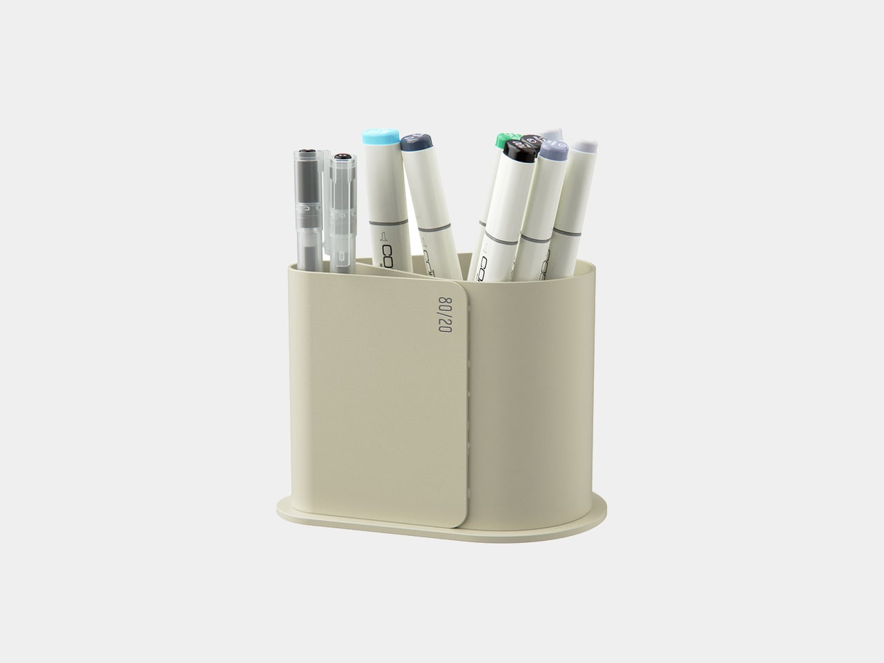
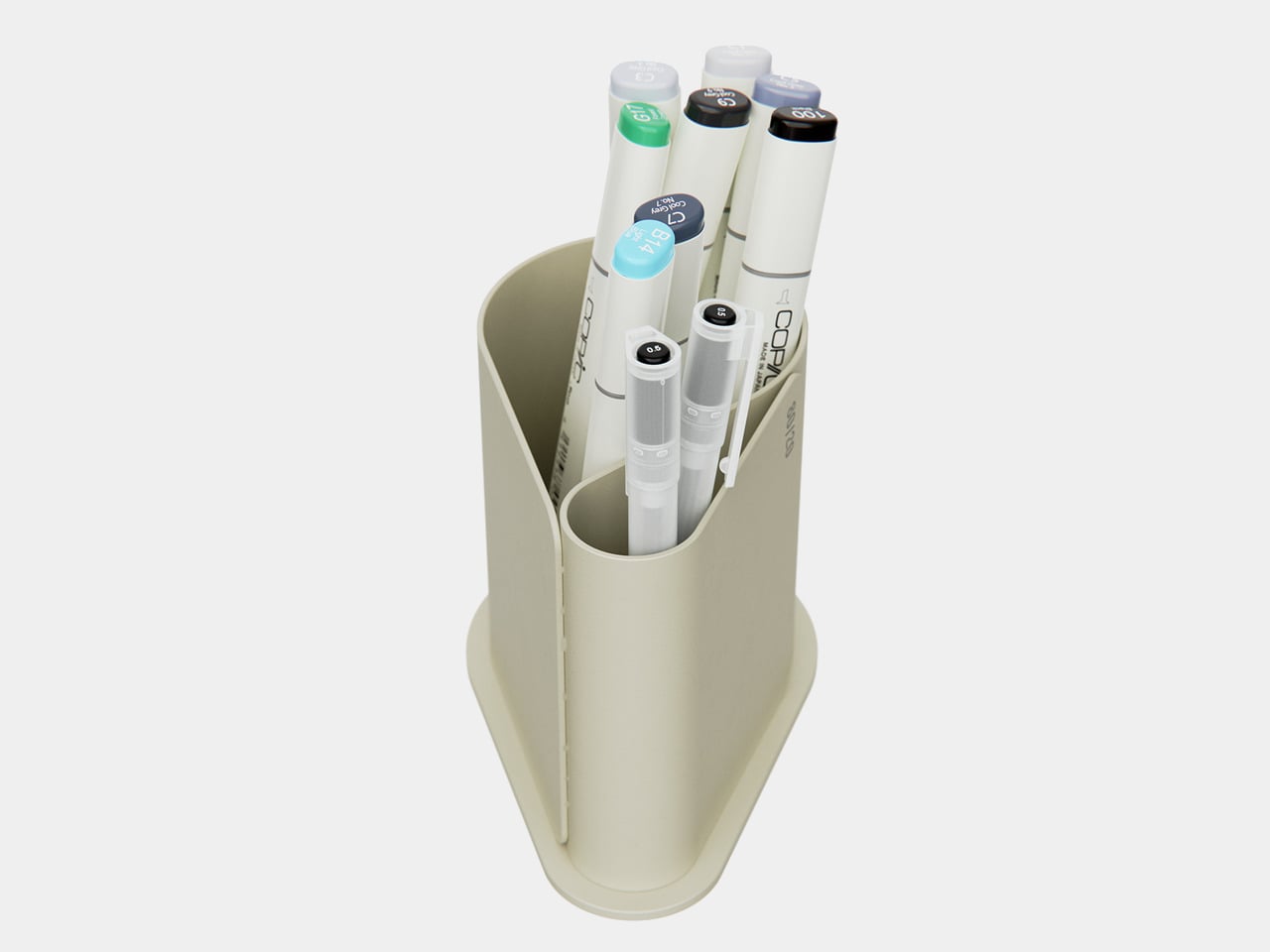
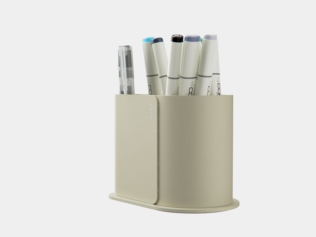
Pareto Pot is a stationery holder designed around that rule. Designer Liam de la Bedoyere noticed his own reliance on a handful of hero tools and built a pot that prioritizes those while still keeping essential counterparts within reach. It is a small desk object that treats hierarchy as a feature rather than pretending every pen deserves equal billing, using form and compartment size to make your most-used tools easier to grab.

Designer: Liam de la Bedoyere

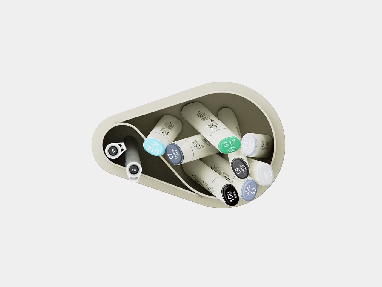
Sitting down to sketch or render, your main pen and key markers naturally drop into the larger front compartment, while backup colours, fineliners, or highlighters slide into the smaller rear section. Without thinking about it, you end up with a front row of tools you use constantly and a supporting cast that is still close but not fighting for attention every time you reach for something.

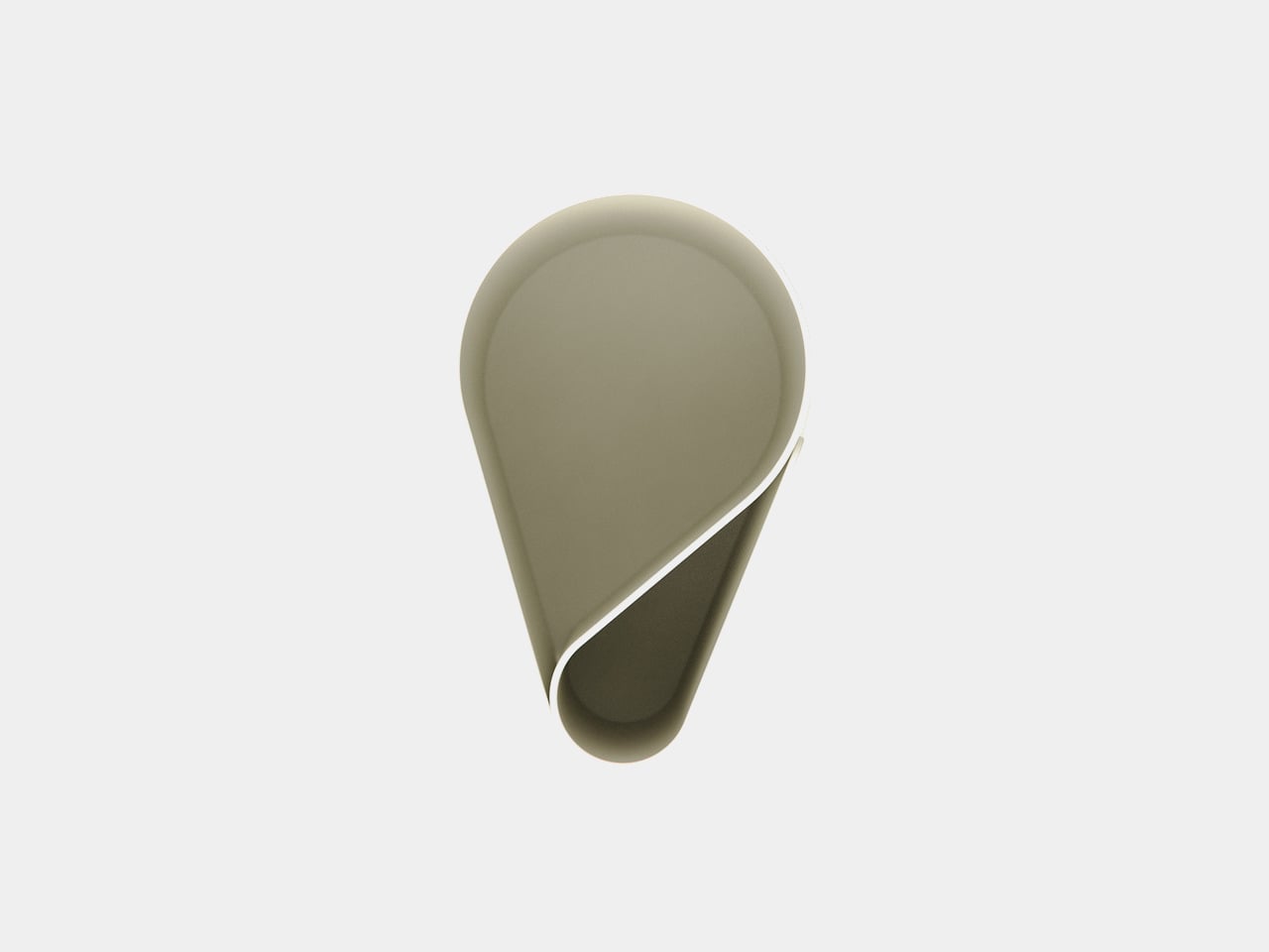
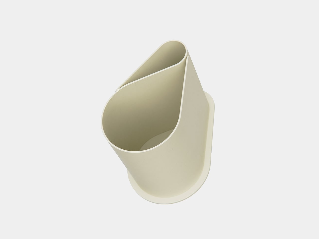
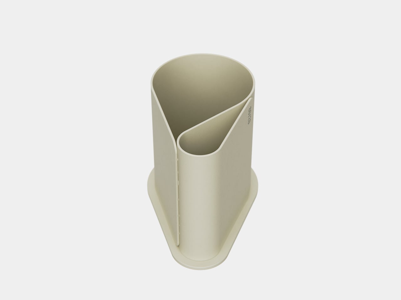
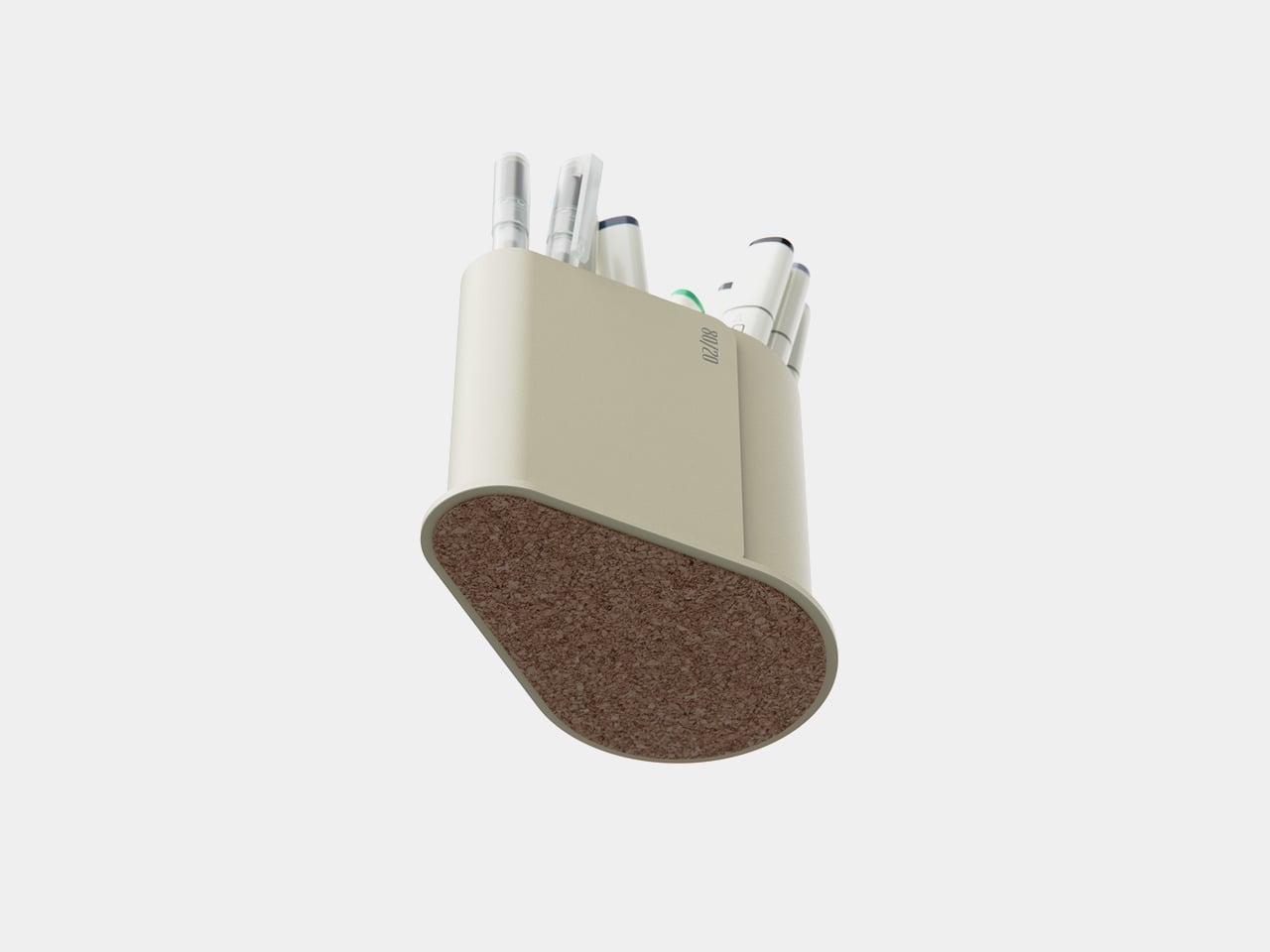
The object is made from bent and welded sheet metal, forming a nested, teardrop-like footprint that balances minimalism with clear function. The outer shell wraps around an inner wall to create two compartments in one continuous gesture, so it reads as a single form rather than a cluster of tubes. The result feels industrial and precise but not cold or overdesigned, more like a small sculpture that happens to organize your pens.

The base is wide enough to stay put when you grab a handful of markers, and a cork underside protects the desk and adds grip. The height keeps pens upright and visible without making them wobble or tip when you pull one out in a hurry. It is the kind of object you can slide around a crowded workspace without worrying about tipping or scratching the surface underneath.

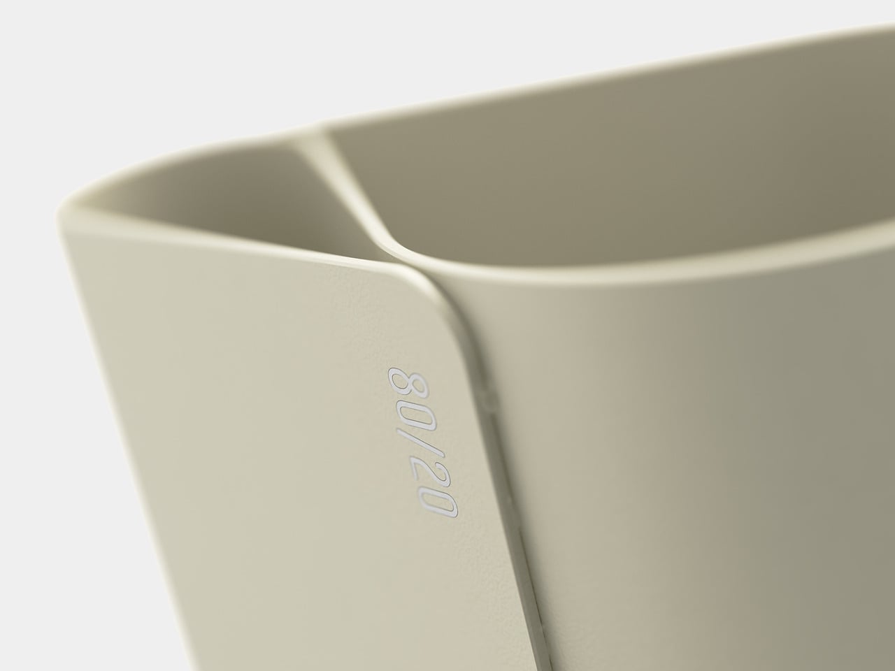
A small “80/20” mark on the side acts as a quiet nod to the idea driving the form, not a loud logo. It is a reminder that the pot is not just another cylinder; it is a physical diagram of how most of us actually work, a big space for the few tools that matter most, and a smaller one for everything else.

Pareto Pot is less about storing as many pens as possible and more about making it easier to focus on the ones that pull most of the weight. It does not tell you which tools to love; it just gives them a better spot to live in. For anyone trying to tame a chaotic pen cup without giving up their favourite analog tools, that feels like a quietly smart upgrade.

The post Pareto Pot Uses the 80/20 Rule to Give Your Favorite Pens a Better Home first appeared on Yanko Design.

90s Are Back: 7 Products Every Millennial Needs in 2026

Remember when technology felt magical instead of invisible? When gadgets had personality, and your favorite album came with artwork you could actually hold? The ’90s gave us tactile experiences that today’s sleek minimalism often forgets. Now, designers are bringing back the spirit of that era with products that blend nostalgic forms with modern capabilities. These aren’t dusty relics pulled from storage bins. They’re reimagined essentials that capture what made the ’90s special while delivering the performance we expect in 2026.

Millennials grew up straddling two worlds: an analog childhood and a digital adulthood. These seven products speak directly to that experience, offering familiar shapes and rituals wrapped in contemporary functionality. From music players that look like mixtapes to flame lamps crafted with instrument-making techniques, each piece proves that nostalgia and innovation make better partners than we realized. Whether you’re rebuilding your retro haven or just want technology that sparks joy instead of anxiety, these designs deliver that perfect balance.

1. Samsung AI OLED Cassette and Turntable

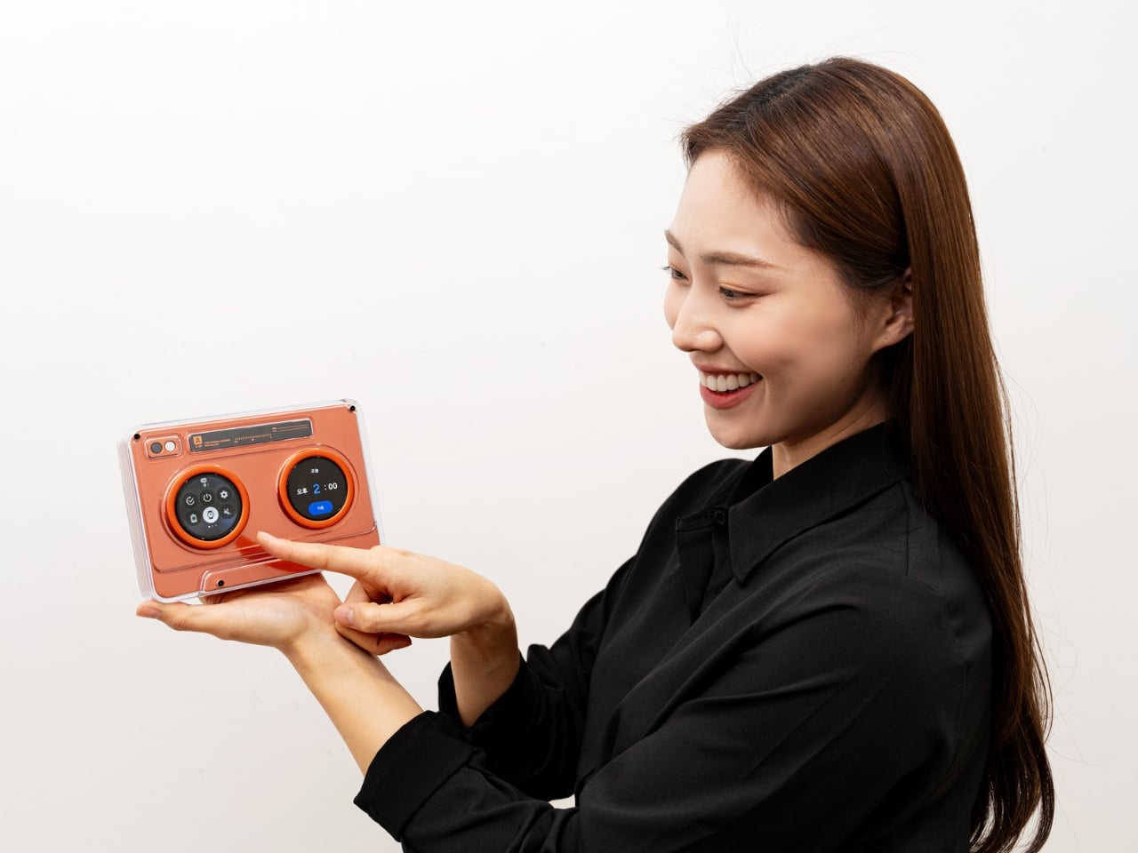
Samsung Display dropped two conversation starters at CES 2026 that blur the line between tech demo and actual product you’d want in your living room. The AI OLED Cassette takes the classic tape deck silhouette and transforms it into a smart speaker with two tiny 1.5-inch circular OLED displays sitting exactly where those spinning reels used to hypnotize you. The left screen handles playback controls while the right displays a digital waveform that dances with your music. Both screens respond to touch, so you can skip tracks or adjust settings without fumbling for your phone.

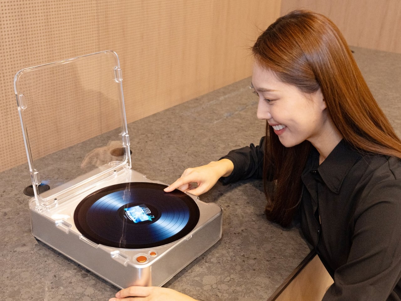
The Turntable goes bigger with a 13.4-inch circular OLED touchscreen that mimics an actual vinyl record player. This isn’t just about displaying album art. The screen becomes an ambient art piece, showing visuals that match your playlist’s mood. Picture hosting friends while your turntable displays swirling colors that sync with jazz or geometric patterns that pulse with electronic beats. The AI integration suggests new music based on what you play, learning your taste over time. These aren’t production models yet, but they showcase where display technology could take us when designers stop making everything a black rectangle.

What We Like

  • The cassette’s standalone functionality means you can discover and control music without an external device.
  • The touch-sensitive displays offer direct interaction that feels intuitive despite the retro packaging.
  • AI-powered recommendations built into the device eliminate the need for phone connectivity.
  • The turntable’s 13.4-inch display transforms any room into a visual experience.
  • Ambient visuals that match your music create an atmosphere impossible with traditional speakers.
  • The circular OLED technology opens creative possibilities beyond typical flat screens.

What We Dislike

  • These remain concept devices without confirmed production plans.
  • Pricing would likely put them in premium territory beyond typical smart speakers.
  • The cassette’s small 1.5-inch display might prove difficult for detailed control.
  • Relying on AI recommendations could frustrate users who prefer manual curation.
  • The turntable’s large circular display demands significant surface space.
  • Without physical media playback, purists might question calling it a turntable.

2. Harmony Flame Fireplace

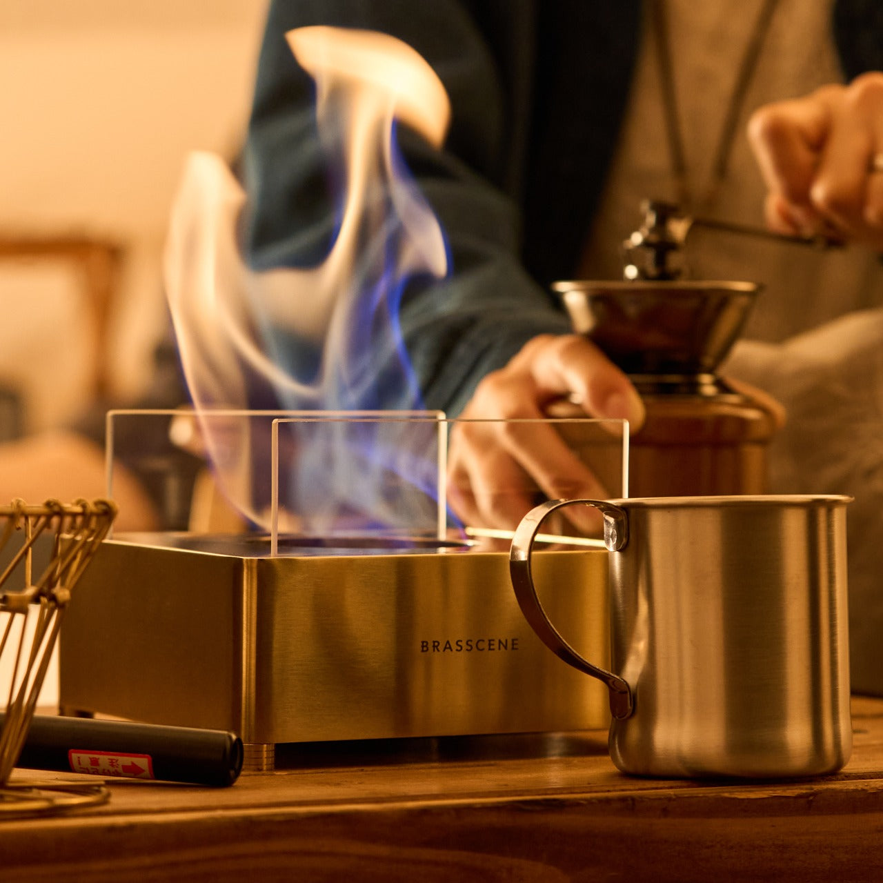
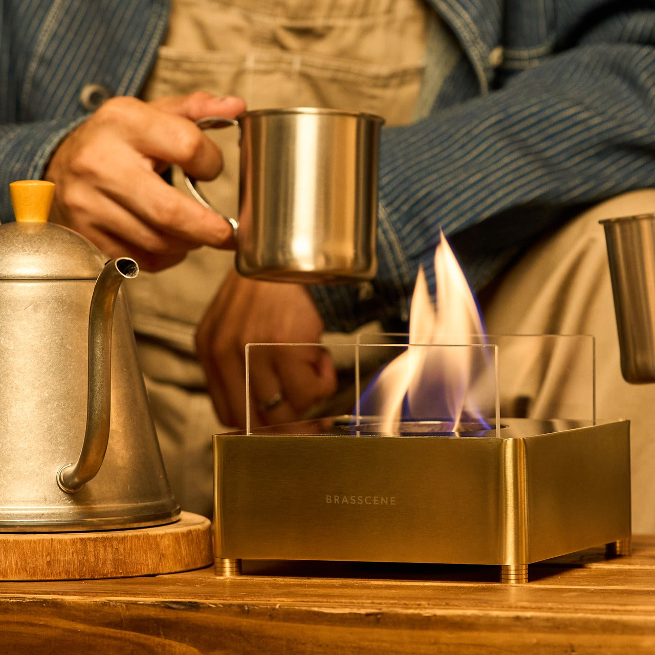
Real fire indoors sounds risky until you see how this brass lamp handles it. Craftsmen who typically make musical instruments apply those same meticulous techniques to create a safe fireplace that fits on your dining table or patio. The brass box burns bioethanol, an eco-friendly fuel that produces actual flames without smoke, odor, or the mess of traditional fireplaces. Light reflects off the polished brass surface, creating shifting patterns as the flames dance. This turns functional lighting into moving art that changes throughout the evening.

The connection to musical instrument craftsmanship shows in the details. Each lamp gets hand-finished, ensuring the brass develops its signature warm glow. Bioethanol burns clean enough for indoor use while providing the psychological comfort of genuine fire. No installation means you can move it wherever the mood takes you. The flame’s unpredictable movement offers something screens can’t replicate: organic beauty that never repeats itself. This addresses a specific ’90s memory: when gathering around fire pits or candles created natural gathering spots before everyone retreated to separate screens.

Click Here to Buy Now: $239.00

What We Like

  • Handcrafted by musical instrument makers ensures premium build quality.
  • Bioethanol fuel burns clean without smoke or unpleasant odors.
  • Safe for indoor use brings real fire into spaces traditional fireplaces can’t reach.
  • No installation required means portable ambiance anywhere you want it.
  • The brass surface creates mesmerizing light reflections as flames move.
  • Eco-friendly fuel choice aligns with modern environmental consciousness.

What We Dislike

  • Bioethanol fuel requires ongoing purchases, unlike electric alternatives.
  • Open flames still demand attention and caution around children or pets.
  • The brass construction places it in a higher price bracket.
  • Fuel consumption costs add up with regular use.
  • Limited heat output makes it more about ambiance than warmth.
  • Brass requires occasional polishing to maintain its signature shine.

3. RetroWave 7-in-1 Radio

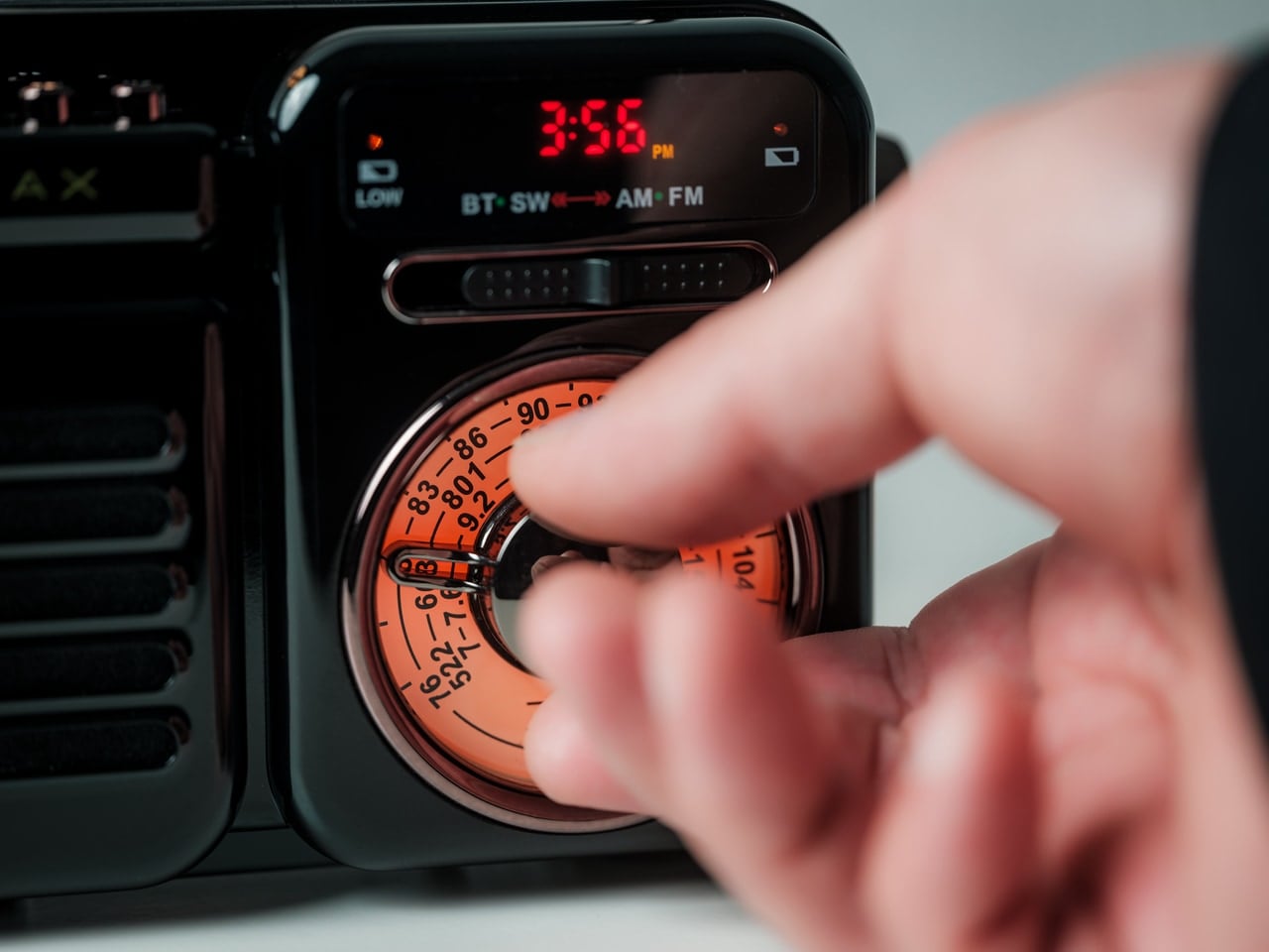
This radio looks like something you’d find in a ’90s camping supply catalog, but its capabilities extend far beyond FM stations. Seven functions pack into one device: Bluetooth speaker, MP3 player, AM/FM/shortwave radio, flashlight, clock, power bank, and SOS alarm. That combination addresses both daily listening and emergency preparedness, making it relevant whether you’re hosting a backyard party or riding out a power outage. The retro aesthetics make it attractive enough to keep visible instead of buried in an emergency kit.

Bluetooth connectivity lets you stream modern playlists while the USB and microSD slots enable offline playback. The shortwave radio capability feels especially ’90s, when scanning international stations offered a window into distant cultures. Hand-crank and solar charging mean it works when the grid doesn’t. The built-in flashlight and SOS alarm complete the emergency features. This versatility reflects the ’90s ethos of multipurpose tools before planned obsolescence became standard. One device replacing seven separate gadgets creates less clutter while ensuring you’re covered for various scenarios.

Click Here to Buy Now: $89.00

What We Like

  • Seven functions in one device reduce clutter and redundancy.
  • Hand-crank and solar charging provide power independence.
  • Shortwave radio access connects you to international broadcasts without the internet.
  • Bluetooth and MP3 playback bridge nostalgic form with modern features.
  • Emergency SOS alarm and flashlight add genuine safety value.
  • The nostalgic design makes it attractive for daily display.

What We Dislike

  • Multiple functions mean compromises compared to specialized devices.
  • Hand-crank charging requires significant effort for limited power.
  • Solar charging depends on the weather and sunlight exposure.
  • The retro aesthetic might feel too utilitarian for some home styles.
  • Shortwave reception quality varies dramatically by location.
  • Seven functions create a learning curve for optimal use.

4. Perpetual Orrery Kinetic Art

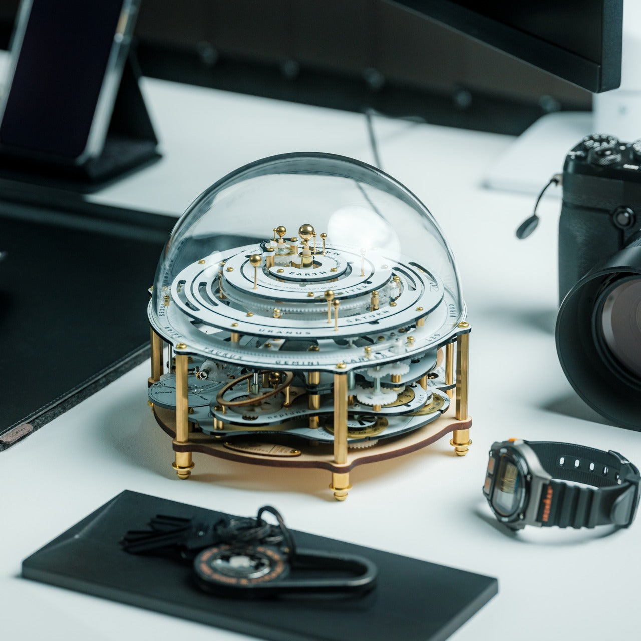
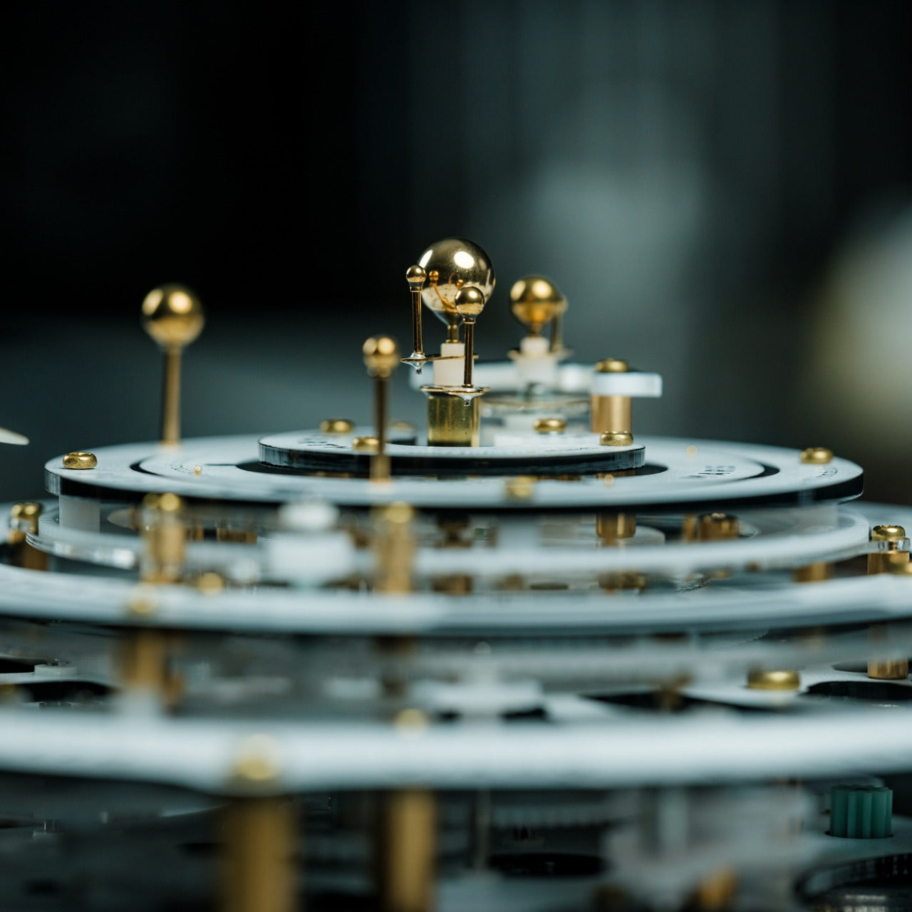
This mechanical solar system model channels the elegance of 18th-century European craftsmanship into a desktop sculpture that never stops moving. Inspired by grand orreries that once graced aristocratic libraries, this version uses intricate mechanisms similar to sophisticated wristwatches to recreate planetary orbits. Planets circle the sun at their relative speeds while the moon goes through visible phases. Even the Tempel-Tuttle comet makes its elliptical journey, appearing periodically like its celestial counterpart.

The kinetic aspect transforms this from static decoration into living art. Watching planets trace their paths provides the same meditative quality as observing aquarium fish, but with educational value built in. The mechanical movement connects to ’90s educational toys that made learning tangible rather than screen-based. Every gear and orbit gets carefully calibrated, turning astronomy into something you can observe daily at arm’s reach. The brass and metal construction gives it substantial weight and permanence, qualities often missing from modern tech gadgets designed for planned replacement.

Click Here to Buy Now: $449.00

What We Like

  • Perpetual motion creates ever-changing visual interest, unlike static art.
  • Mechanical movement provides educational value about celestial mechanics.
  • The 18th-century-inspired design brings historical elegance to modern spaces.
  • Intricate gearing mirrors sophisticated wristwatch craftsmanship.
  • No batteries or power required for operation.
  • Watching planetary orbits offers meditative, calming effects.

What We Dislike

  • The premium craftsmanship commands a significant investment.
  • Delicate mechanisms require careful handling and placement.
  • Dust accumulation on moving parts needs occasional attention.
  • The large footprint demands dedicated display space.
  • Mechanical complexity means difficult repairs if something breaks.
  • Some might find it too ornate for minimalist aesthetics.

5. Side A Cassette Speaker

This Bluetooth speaker disguises itself as a transparent mixtape, complete with Side A labeling and visible “reels” inside the clear shell. The cassette shape isn’t just cosmetic nostalgia. It comes with a clear case that doubles as a display stand, letting you prop it up like you once displayed your most treasured mix. Bluetooth 5.3 handles wireless connectivity while a microSD slot allows offline playback of MP3 files. The sound tuning deliberately evokes the warm, slightly compressed character of actual tape playback rather than clinical digital precision.

At under fifty dollars, this hits the sweet spot between genuine functionality and affordable nostalgia. The transparent shell reveals internal components, mimicking see-through electronics that defined ’90s youth culture. You can actually read the Side A label, adding to the mixtape illusion. The compact size fits easily in bags or pockets, making it practical for travel or outdoor use. This succeeds because it doesn’t try to be an audiophile device. It embraces the cassette’s original purpose: sharing music you love in a format that carries emotional weight beyond pure fidelity.

Click Here to Buy Now: $45.00

What We Like

  • The transparent shell and Side A label nail the mixtape aesthetic.
  • Bluetooth 5.3 provides reliable wireless connectivity.
  • microSD playback works offline without phone dependency.
  • Warm sound tuning captures cassette character instead of sterile precision.
  • The clear case converts into a functional display stand.
  • Under fifty dollars makes it an impulse purchase or an easy gift.

What We Dislike

  • The small size limits bass response and overall volume.
  • Tuned warmth might frustrate those wanting a flat frequency response.
  • The microSD slot only accepts MP3 format, not lossless files.
  • Battery life likely won’t match larger speakers.
  • The novelty factor might wear off after initial excitement.
  • Compact dimensions mean less impressive sound than larger alternatives.

6. Portable CD Cover Player

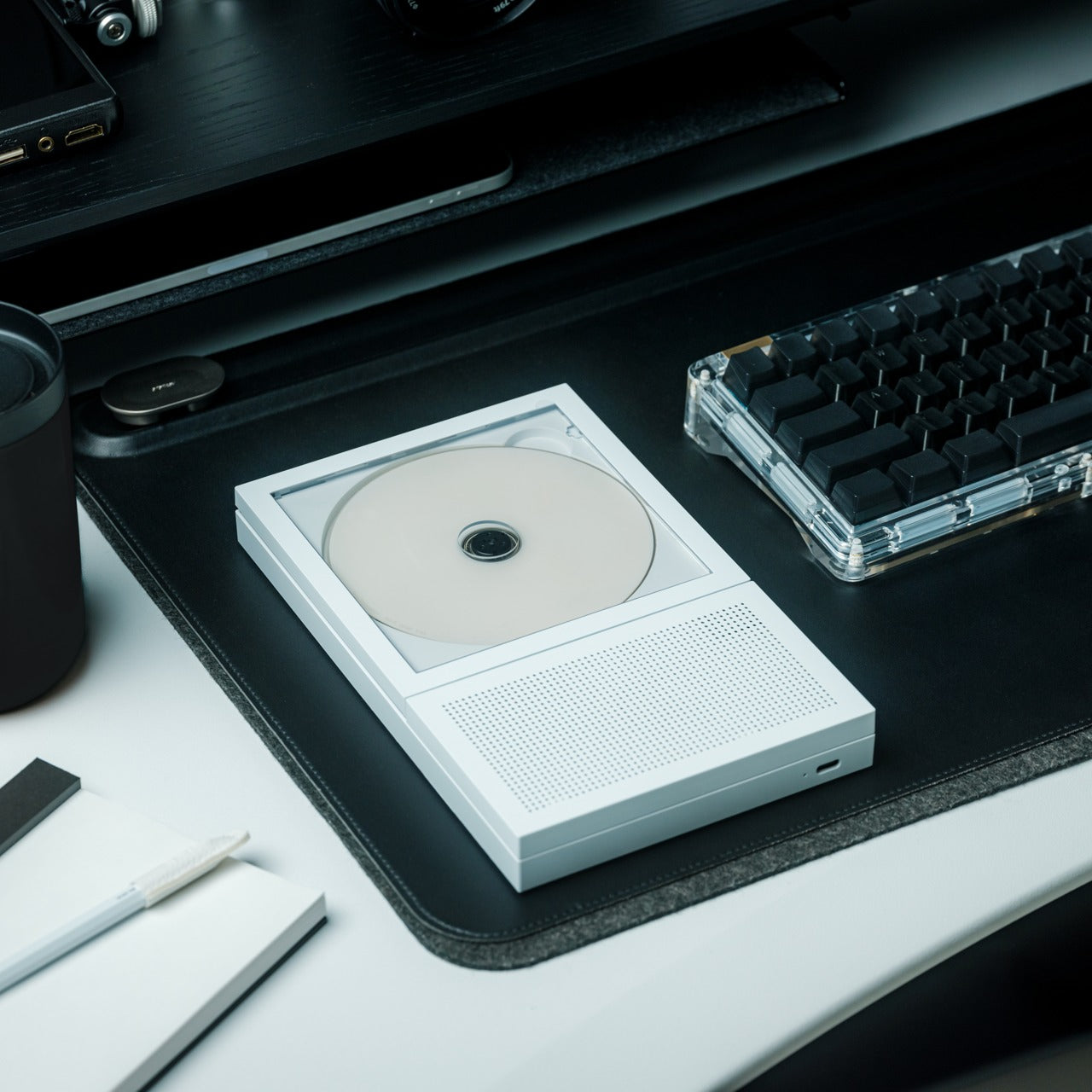
This device solves a problem streaming services created: what do you look at while listening to music? It plays audio CDs while displaying the album artwork in a dedicated pocket, reuniting the visual and auditory experience that made physical media special. The built-in speaker and rechargeable battery mean it goes anywhere, but the minimalist design also makes it worthy of permanent display. You can even mount it on the wall, turning it into a rotating art gallery that changes with your listening mood.

The combination of portability and display functionality sets this apart from typical CD players. Album artwork wasn’t just decoration in the ’90s. It provided context, told stories, and often became iconic imagery tied to the music itself. This player acknowledges that streaming thumbnails can’t replace holding a jewel case while listening to a new album for the first time. The built-in speaker eliminates setup complexity. Just insert a CD, position the artwork, and press play. That simplicity reflects the ’90s plug-and-play mentality before every device demanded app downloads and account creation.

Click Here to Buy Now: $199.00

What We Like

  • Dedicated artwork display reunites visual and audio elements of albums.
  • Built-in speaker provides true portability without additional equipment.
  • A rechargeable battery eliminates cord clutter for placement flexibility.
  • Wall mounting capability transforms it into a rotating art display.
  • Minimalist design works as decoration even when not playing.
  • Playing physical CDs forces intentional listening instead of endless skipping.

What We Dislike

  • CD collections take up storage space; streaming eliminates.
  • Built-in speaker quality likely can’t match dedicated audio systems.
  • The format limits you to CDs you actually own or purchase.
  • Wall mounting requires an additional bracket sold separately.
  • Physical media scratches and degrades over time.
  • Younger users might not own any CDs to play.

7. Invisible Shoehorn

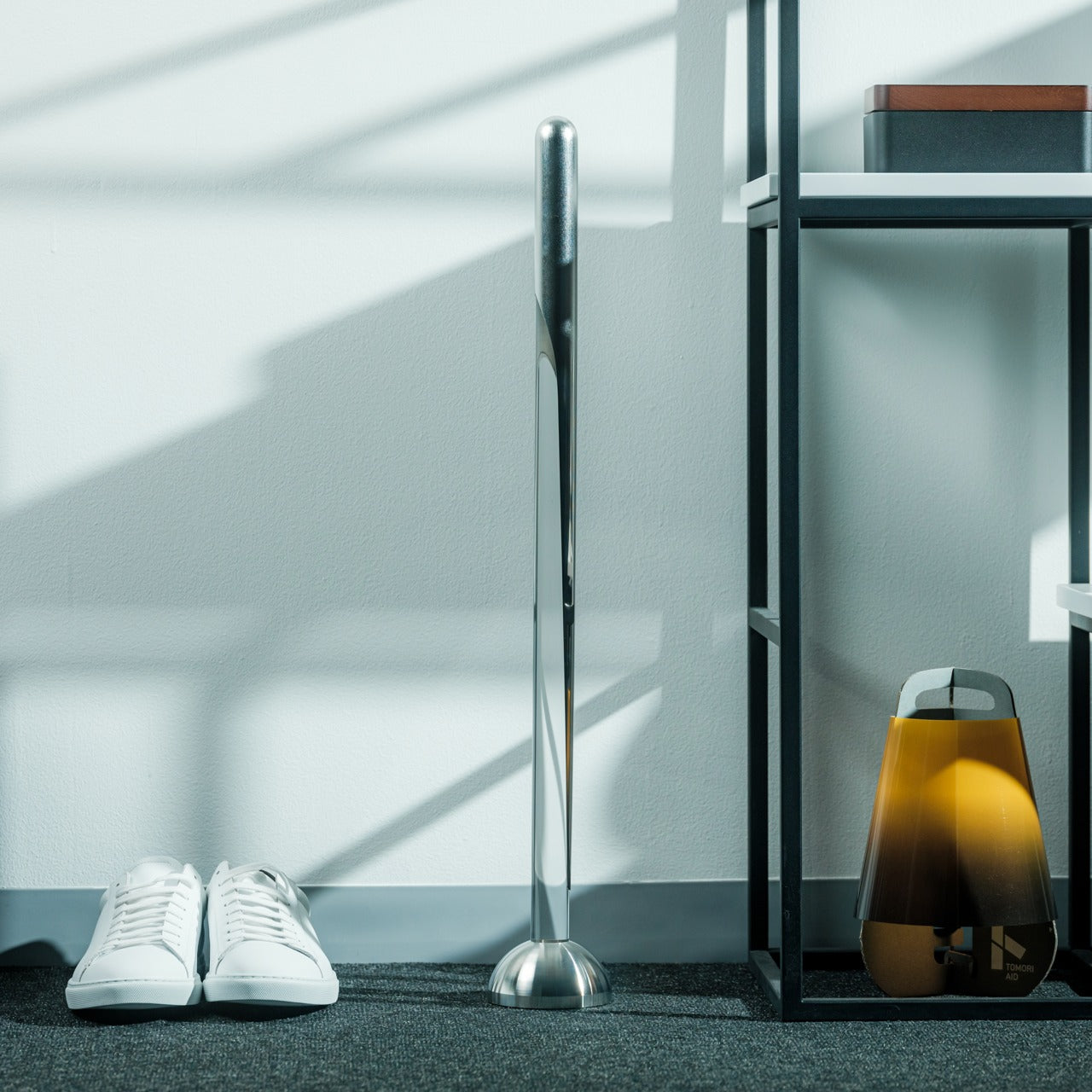
This stainless steel shoehorn with transparent stand brings utilitarian elegance to something usually hidden in closets. The long handle eliminates back strain when putting on shoes, a small relief that compounds over the years of daily use. The polished steel surface glides smoothly without snagging socks or stockings. When placed in its clear acrylic stand, the shoehorn becomes sculptural, looking nothing like its typical function. It hides in plain sight as an attractive decoration rather than an obvious utility.

The transparent stand concept reflects ’90s fascination with revealing function through form. See-through electronics, skeleton watches, and visible mechanics all shared this philosophy: showing how things work makes them more interesting. A shoehorn seems mundane until you consider how many people strain their backs daily because they don’t have one handy. The long stainless steel construction ensures durability measured in decades rather than years. This represents the opposite of disposable culture: buying something once and using it daily for life.

Click Here to Buy Now: $299.00

What We Like

  • The long handle protects lower backs from repeated strain.
  • Polished stainless steel prevents sock snags and tears.
  • The transparent stand creates a sculptural display from mundane objects.
  • Durable construction ensures decades of reliable use.
  • Unique aesthetic makes it acceptable for visible placement.
  • The smooth surface glides effortlessly for easy shoe wearing.

What We Dislike

  • The minimalist aesthetic might be too subtle for those wanting obvious function.
  • Stainless steel shows fingerprints and requires occasional cleaning.
  • The transparent stand adds bulk compared to wall-mounted options.
  • Higher price point than basic plastic alternatives.
  • The long design requires dedicated storage or display space.
  • Some might find the “invisible” concept pretentious for a shoehorn.

Bringing It All Together

These seven products share a common thread beyond ’90s aesthetics: they make technology feel approachable again. Each one prioritizes tactile interaction and visible personality over disappearing into seamless ecosystems. You can actually touch controls, see mechanisms working, and display these devices proudly instead of hiding them. That philosophy defined ’90s product design before everything became black glass rectangles designed to vanish into backgrounds.

Millennials bridge generations that experienced distinct technology eras. These products honor that position by combining familiar forms with modern capabilities. Whether you’re streaming through a cassette speaker or watching planets orbit on your desk, you’re participating in design that values presence over absence. The ’90s taught us that objects could spark joy and conversation. These seven products prove that the lesson still resonates in 2026, offering alternatives to invisible technology that serves function while sacrificing soul.

The post 90s Are Back: 7 Products Every Millennial Needs in 2026 first appeared on Yanko Design.

Someone Built a Tamagotchi-like Desk Toy That Gets Sad When You Ignore It

Modern desks overflow with timers, focus apps, and smart assistants that promise more productivity but mostly add more things to manage. There’s a calendar nudging you about meetings, a watch tracking movement, and browser tabs reminding you to hydrate. Not every object on your desk needs to optimize you, though, and sometimes you just want a small, harmless distraction that keeps you company without demanding anything serious in return.
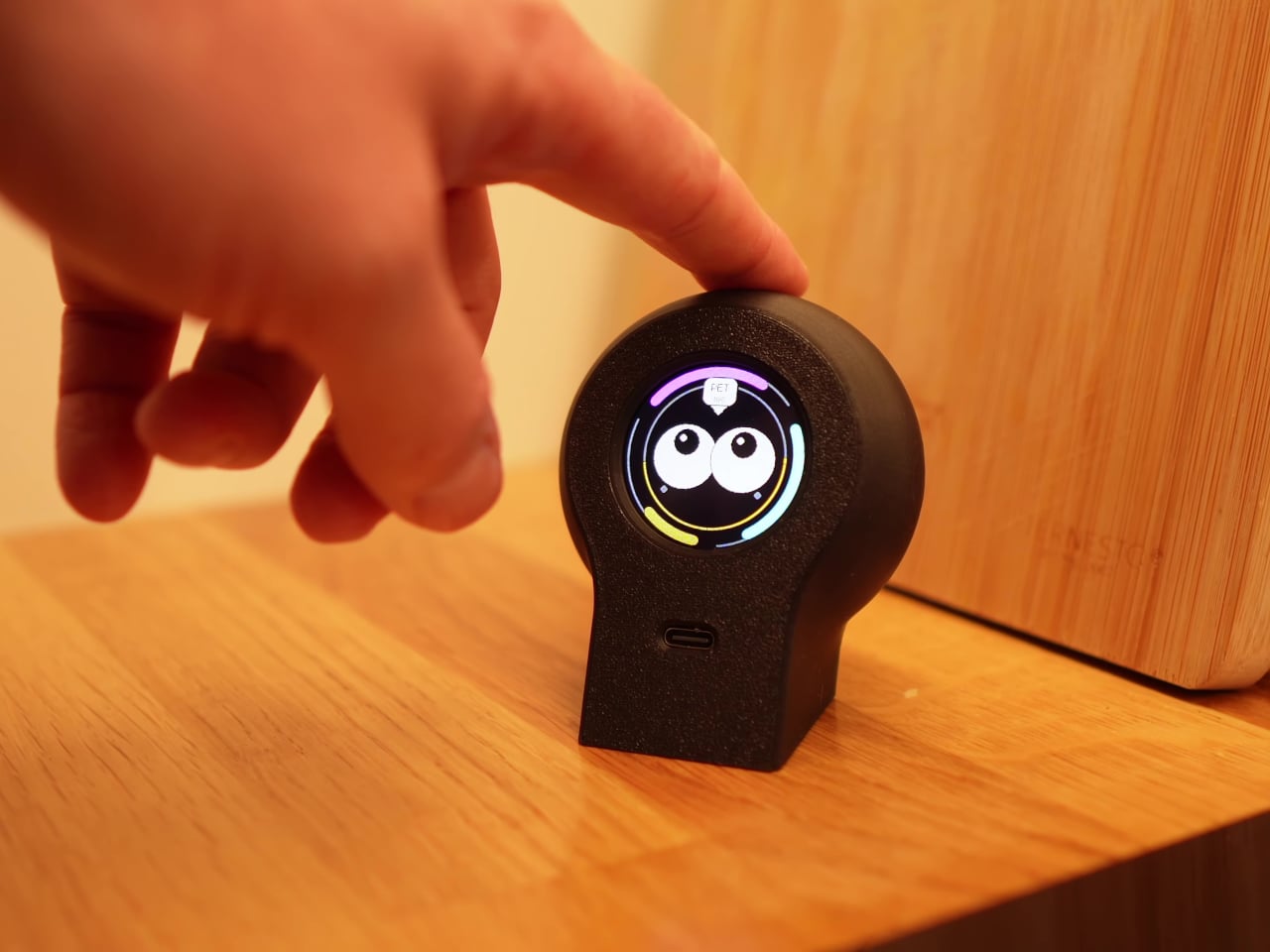
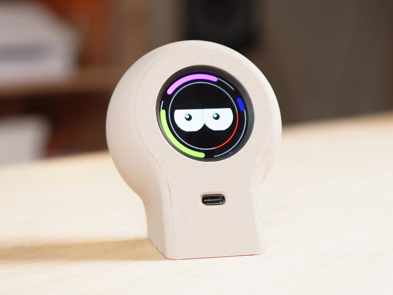
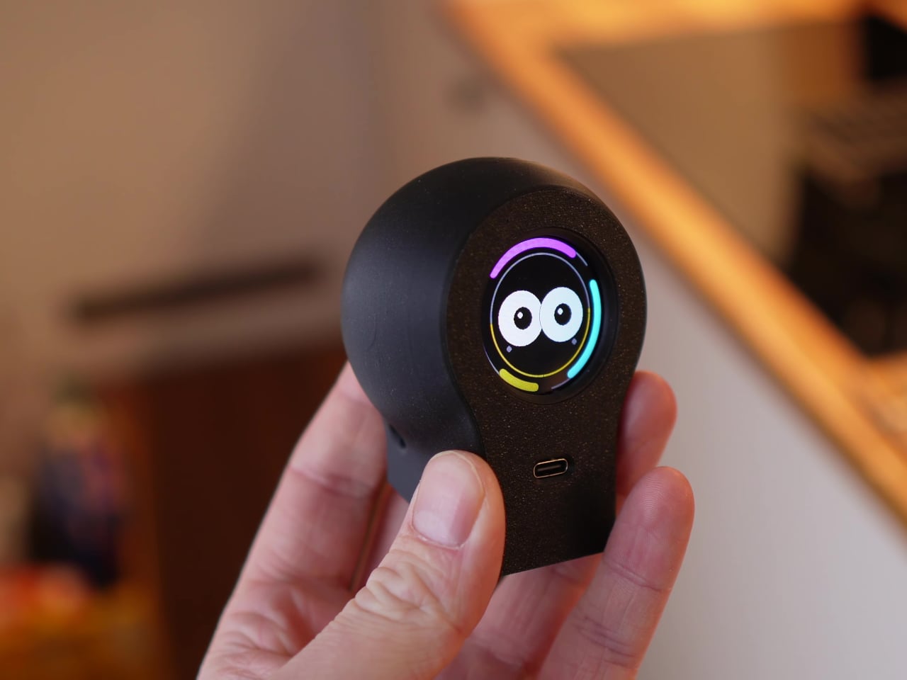
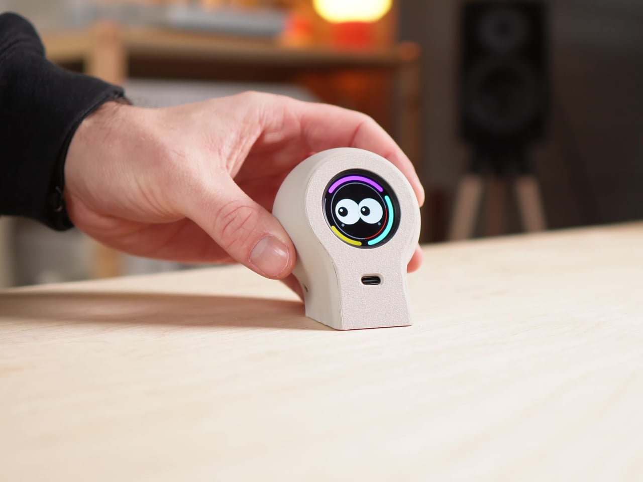
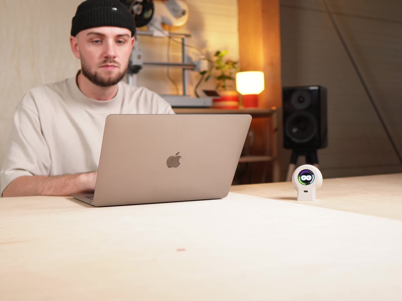
Paul Lagier’s DIY Desk Companion sits next to your laptop as a little creature that lives completely offline. It is not connected to Wi‑Fi, has no app, and never sends notifications. Instead, it runs its own tiny world on a circular screen, reacting to touch, light, and time with shifting eyes and moods. The whole thing exists as a playful break, closer to a desk toy than a productivity gadget.

Designer: Paul Lagier

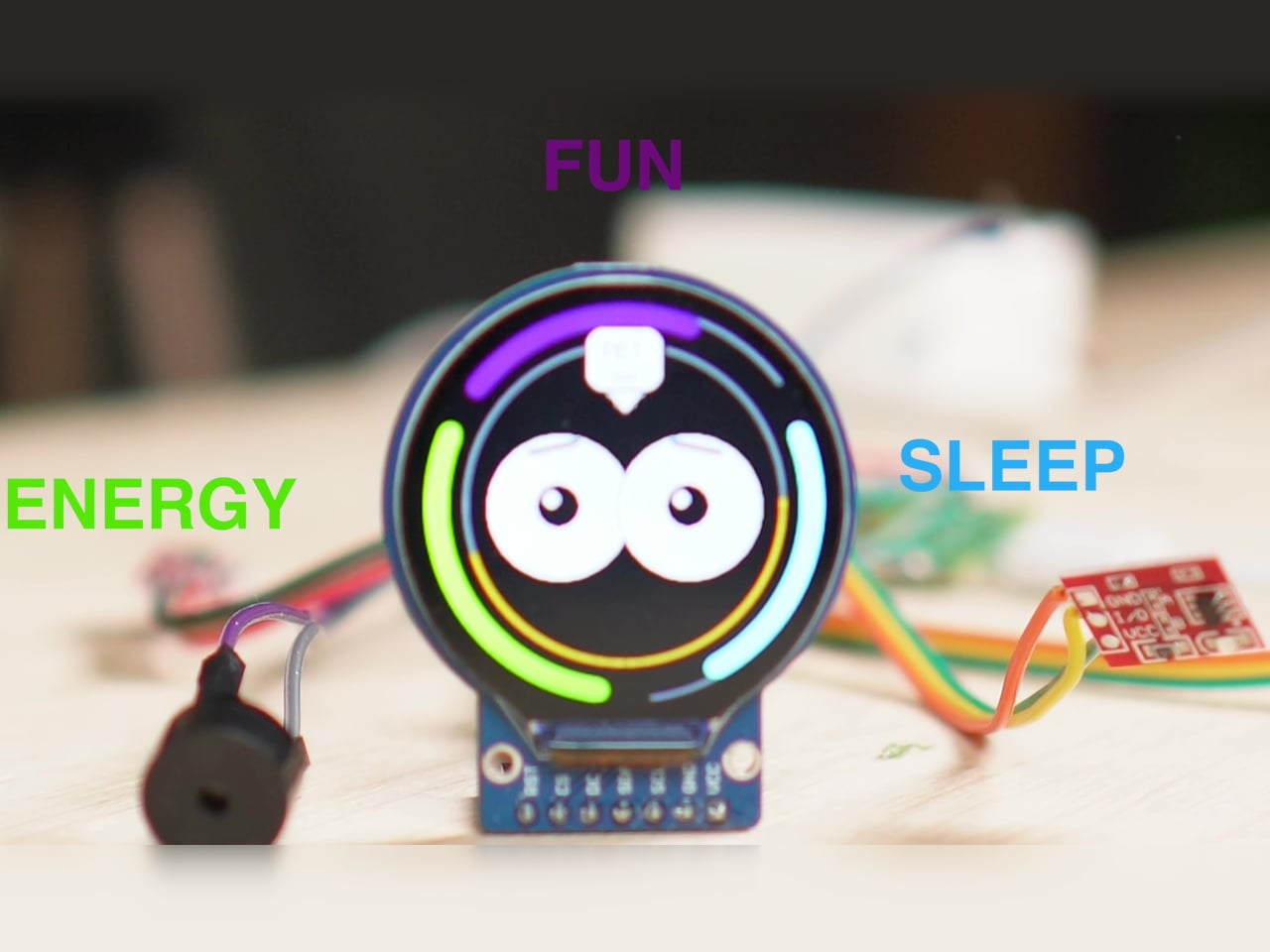
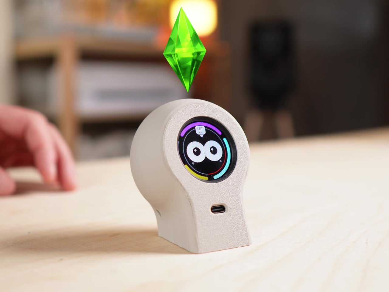
The companion’s life revolves around three needs, Energy, Fun, and Sleep, visualized as colored arcs around its animated eyes. Energy maps to battery and charging, Fun rises when you interact and falls when ignored, and Sleep depends on light levels, getting drowsy when the room gets dark. These simple meters quietly drive its moods, making it curious, bored, or sleepy depending on how you treat it over the day.

The moods shift over longer stretches, too. Regular interaction makes it age, becoming calmer and more expressive, while neglect can make it sulky or withdrawn. There’s no scoreboard or streak counter, just a sense that this tiny character remembers how you have been treating it. After a while, you catch yourself tapping it to cheer it up during a slump, which is the whole point of having a little desk creature.

A typical day means a few small moments. You tap it during a break, and it perks up, eyes widening. Late at night, when the room gets dark, it slowly drifts off to sleep without you doing anything. When you plug it in the next morning, its Energy bar fills, and its mood lifts. These are quick interactions, a tap or a glance, not mini-games that hijack your break.

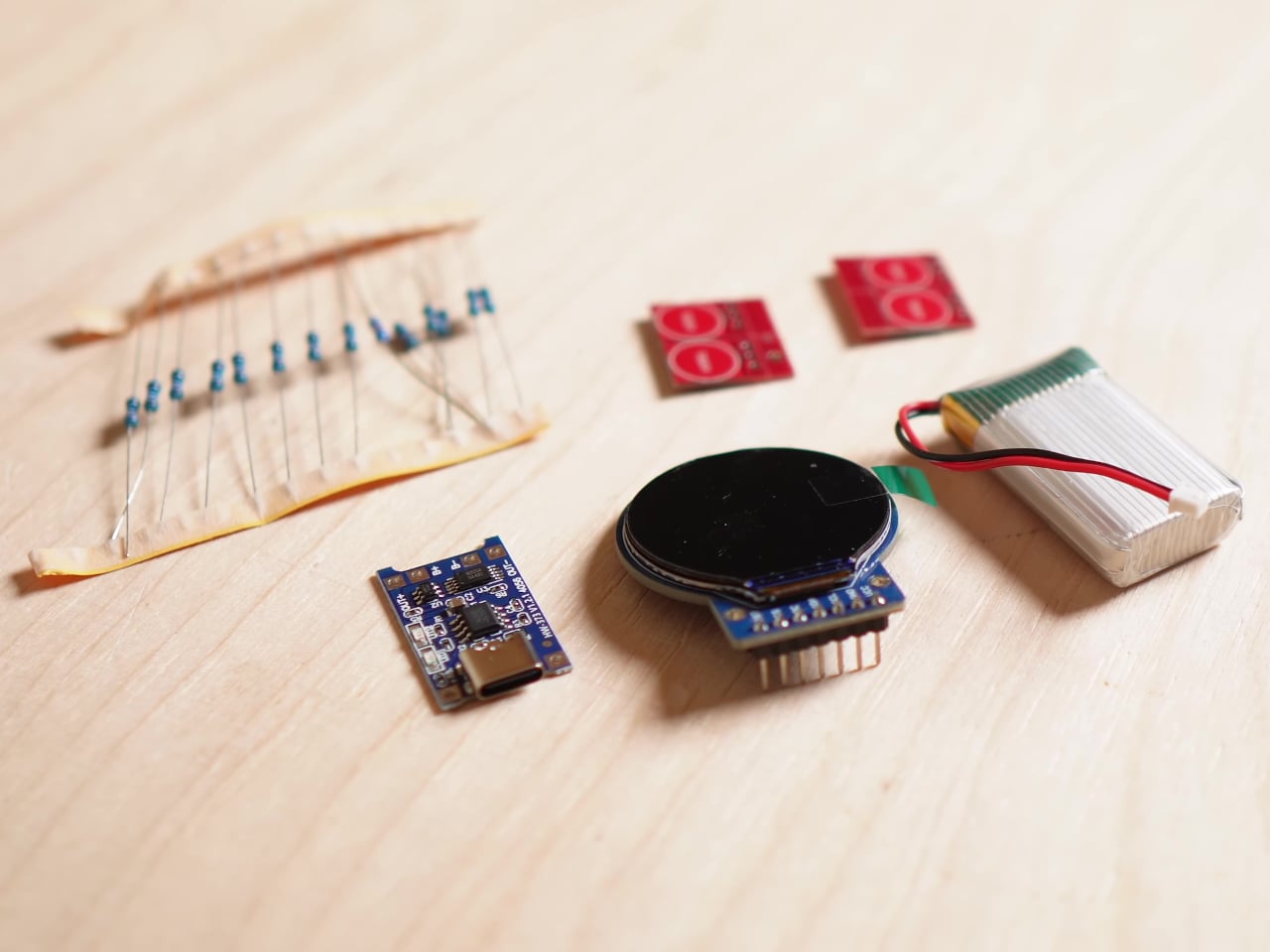
Under the shell is a tangle of wires, a microcontroller board, a round color display, touch sensors, a light sensor, and a small battery. Lagier calls it a working prototype rather than a polished product, which feels fitting. The design is simple and neutral, letting the animated face carry the personality while the hardware quietly does its job without needing custom circuitry to make the interaction feel real.

The DIY Desk Companion is proudly unnecessary in the best way. It does not track tasks or nag you about hydration. It just gives you a tiny, responsive presence that makes the space feel less mechanical. Devices around us keep trying to squeeze more output from every minute, so a little offline creature that only wants a tap now and then feels surprisingly refreshing.

The post Someone Built a Tamagotchi-like Desk Toy That Gets Sad When You Ignore It first appeared on Yanko Design.