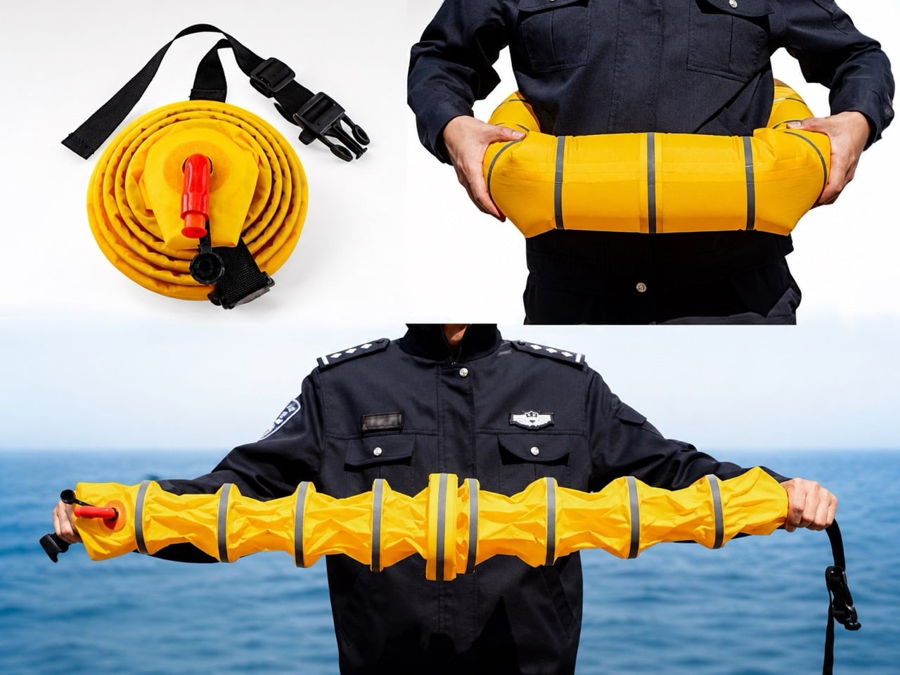
Police Officers Spent Three Years Redesigning the Lifesaver To Make It As Small As A Hockey Puck

Rolled up, Ark Hero No.1 looks like a hockey puck with a zipper. Nothing about it announces itself as rescue equipment. Pop the shell open and a coiled yellow tube spirals inside, capped by a red hand pump that would look at home on a bicycle. Pump it for a few seconds and the coil stretches into a segmented shaft that spans shoulder to shoulder, jointed like a stalk of bamboo and wrapped in reflective silver bands built to catch headlights at 3 AM. The whole sequence takes about as long as opening a bag of chips.

That transformation, from puck to rescue tool, is the entire pitch. Ark Hero No.1 is a 2025 Design Intelligence Award Future Talents winner developed over three years by frontline police officers who kept watching the same tragedy play out from the same design gap. Traditional life rings live on piers and boat railings, tethered to places where drownings often do not happen. A car that leaves the road at 2 AM lands nowhere near a lifeguard tower. The brief was simple: build the life ring that could have been in the trunk.

Designer: wanglicheng
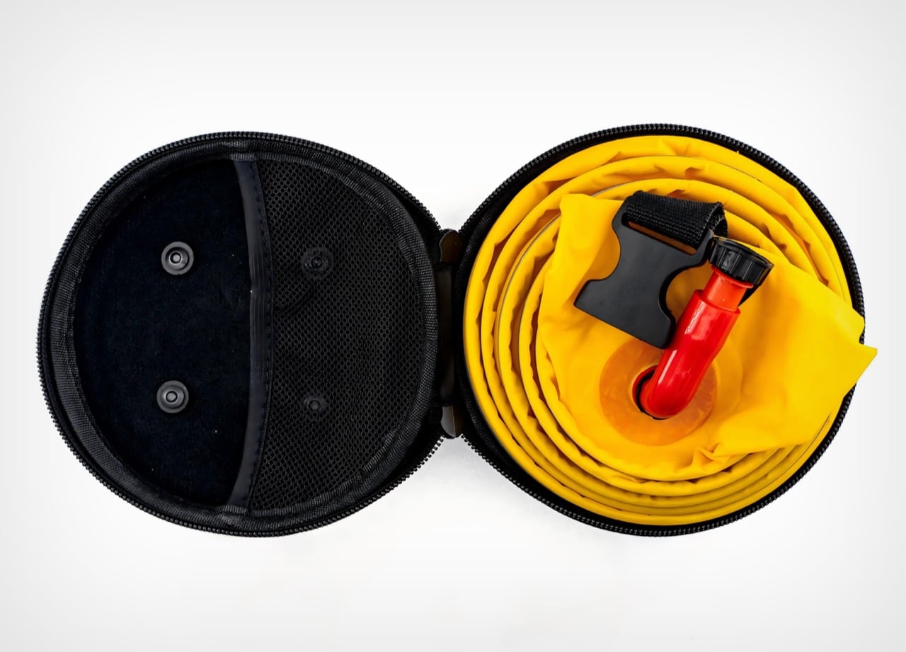
Losing the CO2 cartridge is the single biggest upgrade, more so than the actual innovative design. High-pressure gas kills casual storage: it expires, complicates air travel, sits inside a regulatory maze at customs, and demands specialist replacement after every deployment. Swap it for the red hand pump poking out of the case and the same ring can live in a squad car or family sedan for years without anyone thinking about it. The trade-off is a few extra seconds of pumping. Given that the alternative is often no life ring at all, that math works out fast.
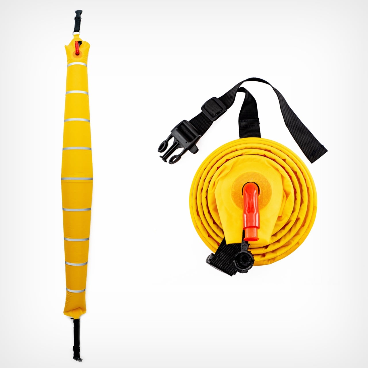
Ark Hero No.1 spreads its buoyancy across a chain of joined segments instead of pooling all the air in one giant doughnut. A conventional ring holds its air in a single chamber, so one puncture compromises the whole thing. The segmented design lets a tear in one pod leave the rest of the shaft floating, which matters when the tube is scraping metal edges or broken glass after an accident. The jointed geometry also lets the tube flex around a body or drape across a car window frame during rescue. Silver reflective bands wrap every segment, doing their real work in dark water where solid yellow gets lost in glare and chop.
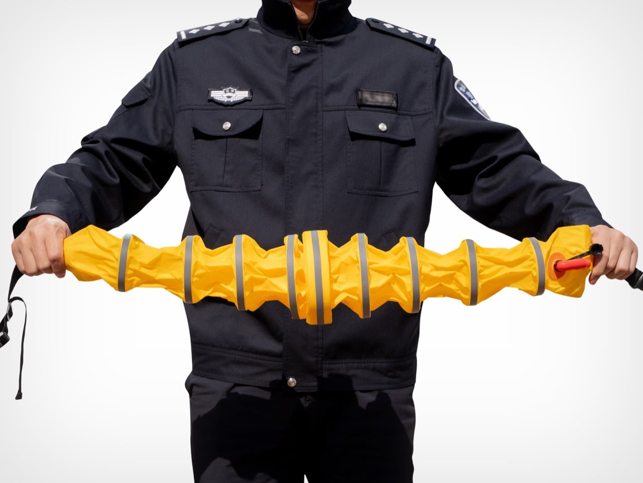
The hard-shell case turns the whole system into something a procurement officer can plan around. Rolled up, the coiled tube snaps into a puck-shaped shell with a full-perimeter zipper and a mesh interior pocket that holds the pump and buckle in place. The form factor standardizes storage footprint, protects the fabric from years of abrasion, and clips easily to duty belts, headrests, and boat racks. An officer can carry one on the hip. A patrol vessel can rack a dozen without eating floor space.
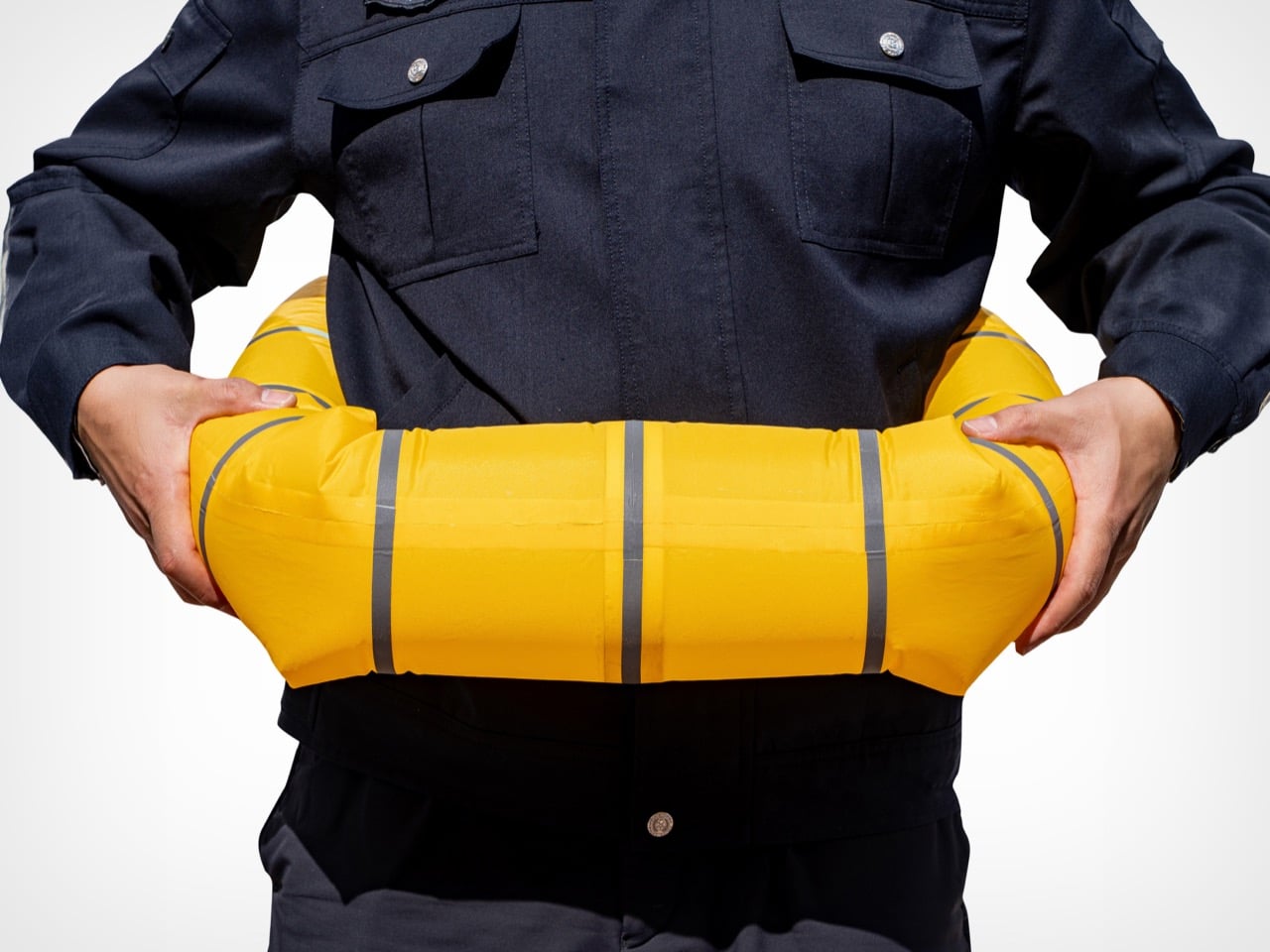
For a project born from three years of frontline police fieldwork, the visual restraint tells its own story. No branding drama, no styling flourish, no lifestyle gadget affectation. The yellow is loud because loud yellow gets seen from a helicopter. The red is loud because red hands find red pumps in a panic. Every element exists because someone once needed it and did not have it, and that tends to end well when the equipment finally reaches the people who kept improvising without it.

The post Police Officers Spent Three Years Redesigning the Lifesaver To Make It As Small As A Hockey Puck first appeared on Yanko Design.
Smart Glasses Could Transform Sports. But There’s a Trust Deficit.

For centuries, a pair of glasses has been one of the most socially innocent objects a person can wear. They exist in one of two lanes: as a quiet medical tool for correcting vision, or as a deliberate fashion statement, an accessory as personal as a watch. In either role, tool or ornament, they are fundamentally passive. They sit on the face, and in return for their service or their style, society grants them a kind of ambient trust. Smart glasses were designed to borrow that trust. They slip into the familiar silhouette of eyewear, hijacking the social permission we’ve granted them, hoping we won’t notice the difference.

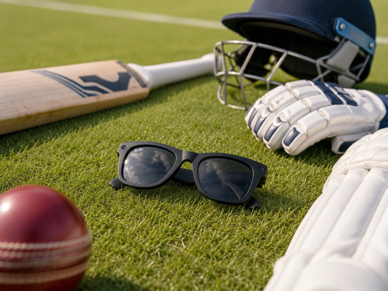
But that’s the thing, isn’t it? The moment that quiet, passive object gains the ability to see, record, and communicate on its own, the social contract shatters. It stops being a corrective lens or a simple accessory and becomes a question mark. And in the high-stakes world of professional sports, that question is no longer theoretical. In the Indian Premier League, one of the most-watched cricket leagues on the planet, it has been answered with a firm ‘no.’ The league’s advisory body recently banned smart eyewear from all restricted match-day areas as reported by Indian Express, not because they might help a player see better, but because their ability to discreetly communicate threatens the very integrity of the game. It’s the first major institutional line drawn in the sand, a clear signal that what makes smart glasses so compelling, their seamless, discreet power, is exactly what makes them so threatening to an environment built on trust.

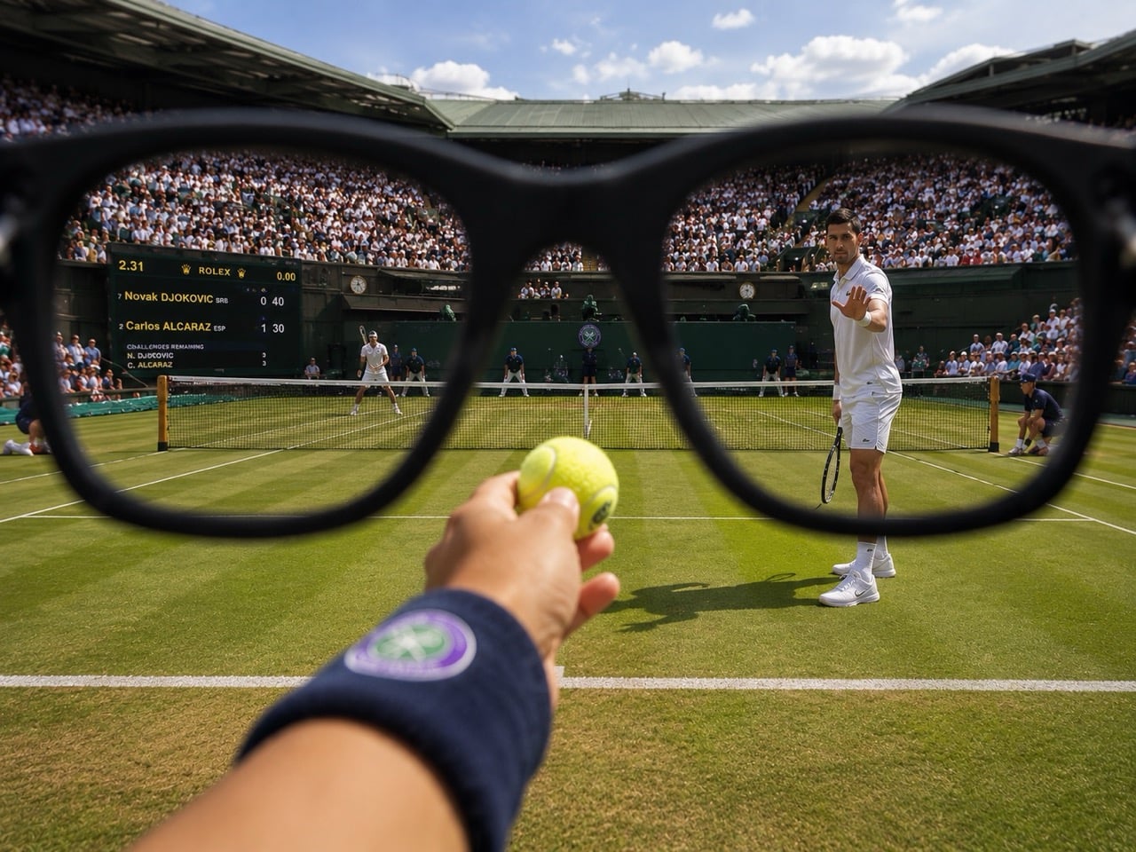
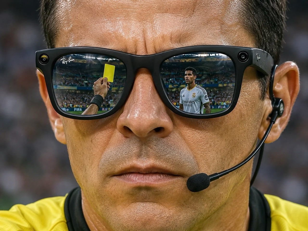
Which makes the current scoop from the FIFA World Cup all the more interesting. This year, cameras attached to referees have been delivering something genuinely compelling: a first-person view from the center of the match, fast, intimate, and unlike any angle a traditional broadcast camera can offer. FIFA has partnered with Lenovo to stabilize the footage, reportedly reducing blur and shakiness by up to 50%. The result is a piece of wearable camera tech that audiences have embraced without a second thought. And the reason it works has nothing to do with the stabilization algorithm or the resolution. It’s because everyone knows exactly what it is, what it records, and who controls the output. The ref cam is sanctioned intimacy, an invitation behind the official’s gaze with the entire institution of the sport standing behind it.

The problem has never really been head-worn cameras. GoPros have existed for more than twenty years, and nobody writes angry op-eds about them, because a GoPro announces itself the way a tourist in neon shorts announces themselves. Gloriously, almost aggressively obvious about what it is and what it’s doing. The same logic applies to the FIFA ref rig: dedicated broadcast hardware, sanctioned by the league, feeding a known output to a known destination. Smart glasses are slipperier. Their design philosophy actively works against that legibility, optimized to look like ordinary eyewear while quietly carrying camera, microphone, and communication capabilities underneath. That gap between appearance and function is exactly where trust evaporates.

Silicon Valley has spent years selling the idea that the best interface is the one that disappears. Ambient computing, seamless experiences, invisible technology. It’s a seductive design philosophy, and in most consumer contexts, it’s probably the right one. But sports may be quietly proving the opposite. In a high-stakes, heavily monetized environment where betting markets move in real time, the most valuable technology is often the least ambiguous. Leagues don’t just need devices that work; they need devices that can be understood at a glance, audited, regulated, and explained. The IPL’s concern isn’t really about what smart glasses are doing today. It’s about what they could be doing, invisibly, in a dressing room, on a pitch, in a dugout. Seamlessness, in that context, isn’t a feature. It’s a liability.

None of this means smart glasses have no future in sports. They might, just not in their current form. The ref cam points toward a version of wearable vision technology that could genuinely work: purposeful, controlled, institutionally transparent, and designed to communicate its function rather than conceal it. Soccer officials in other leagues are already using similar cameras for post-match performance reviews, a quiet but meaningful step toward something bigger. The path from there to a trusted live-match tool, however, runs directly through a design problem. Smart glasses need to stop borrowing the social invisibility of ordinary eyewear and start building their own visual language, one that tells players, officials, and leagues exactly what the device is, what it records, and who is watching. Until then, the trust deficit isn’t a policy issue. It’s a design failure, wearing a very familiar frame.

The post Smart Glasses Could Transform Sports. But There’s a Trust Deficit. first appeared on Yanko Design.
IKEA Just Built 18 World Cup Flags Out of Furniture

Every few years, the FIFA World Cup does what few things can: it makes the whole planet pay attention to the same thing at the same time. Brands, naturally, line up to be part of that moment. Most of them shouldn’t bother. The average World Cup campaign is either a celebrity-filled spectacle that forgets to say anything, or a half-hearted logo slap on a football kit. And then IKEA Canada goes and does something genuinely clever.

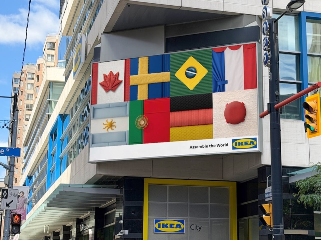
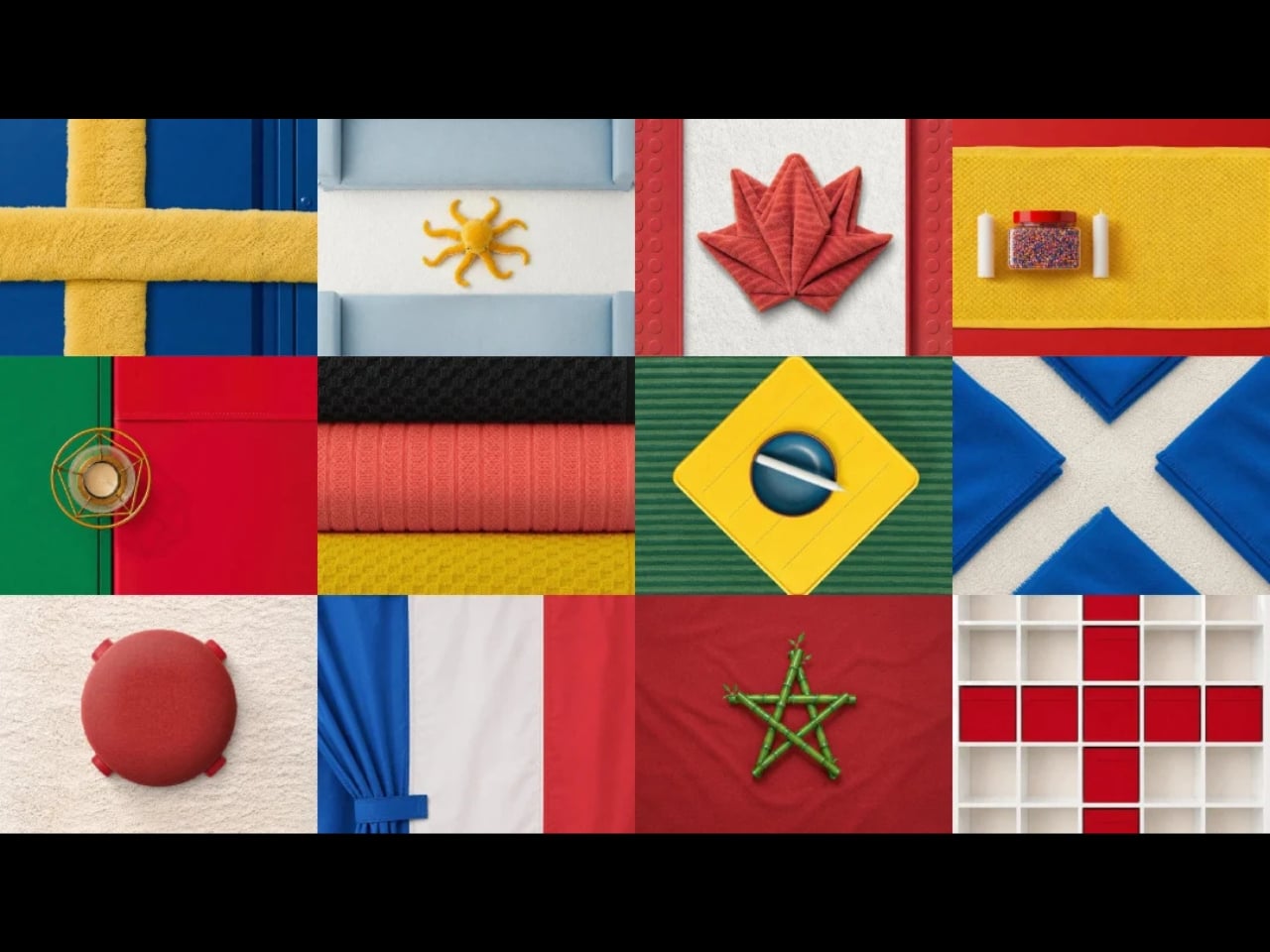
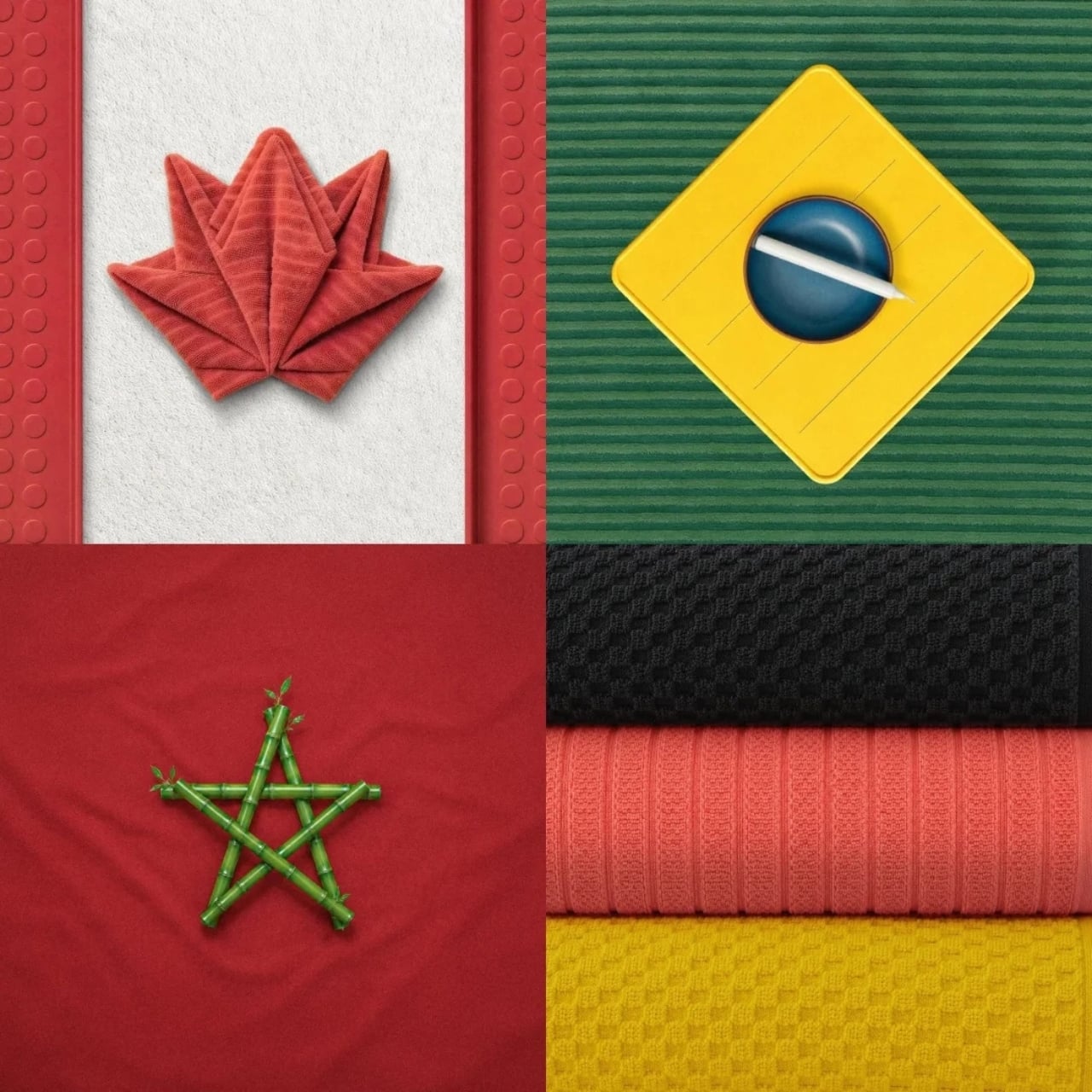
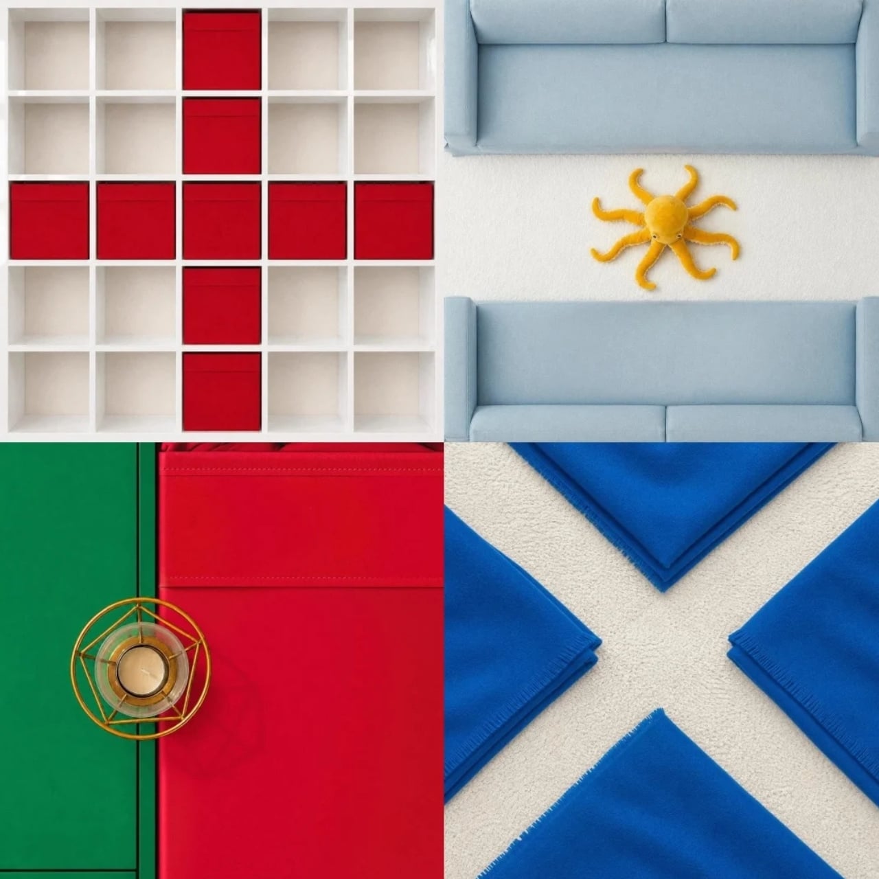
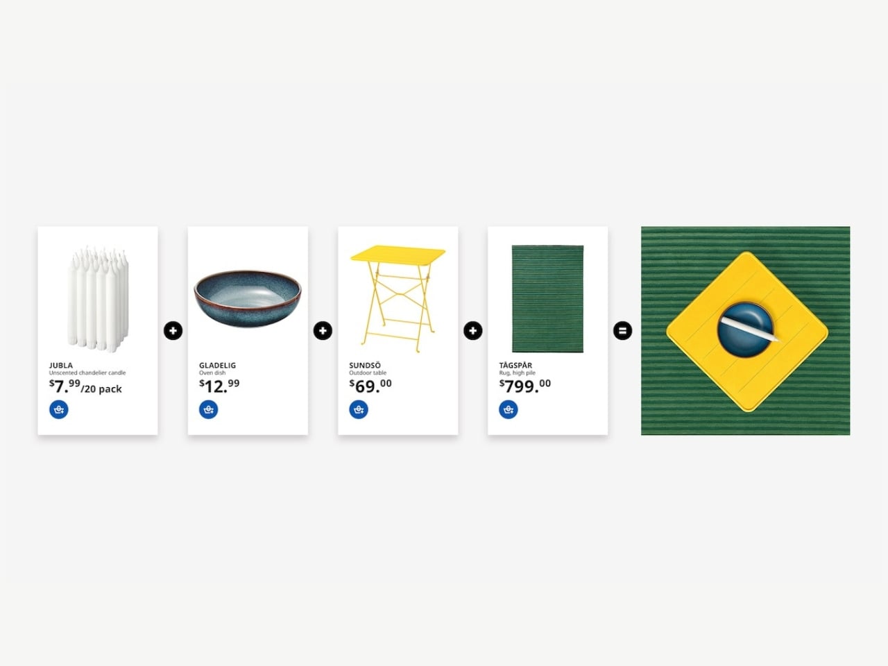
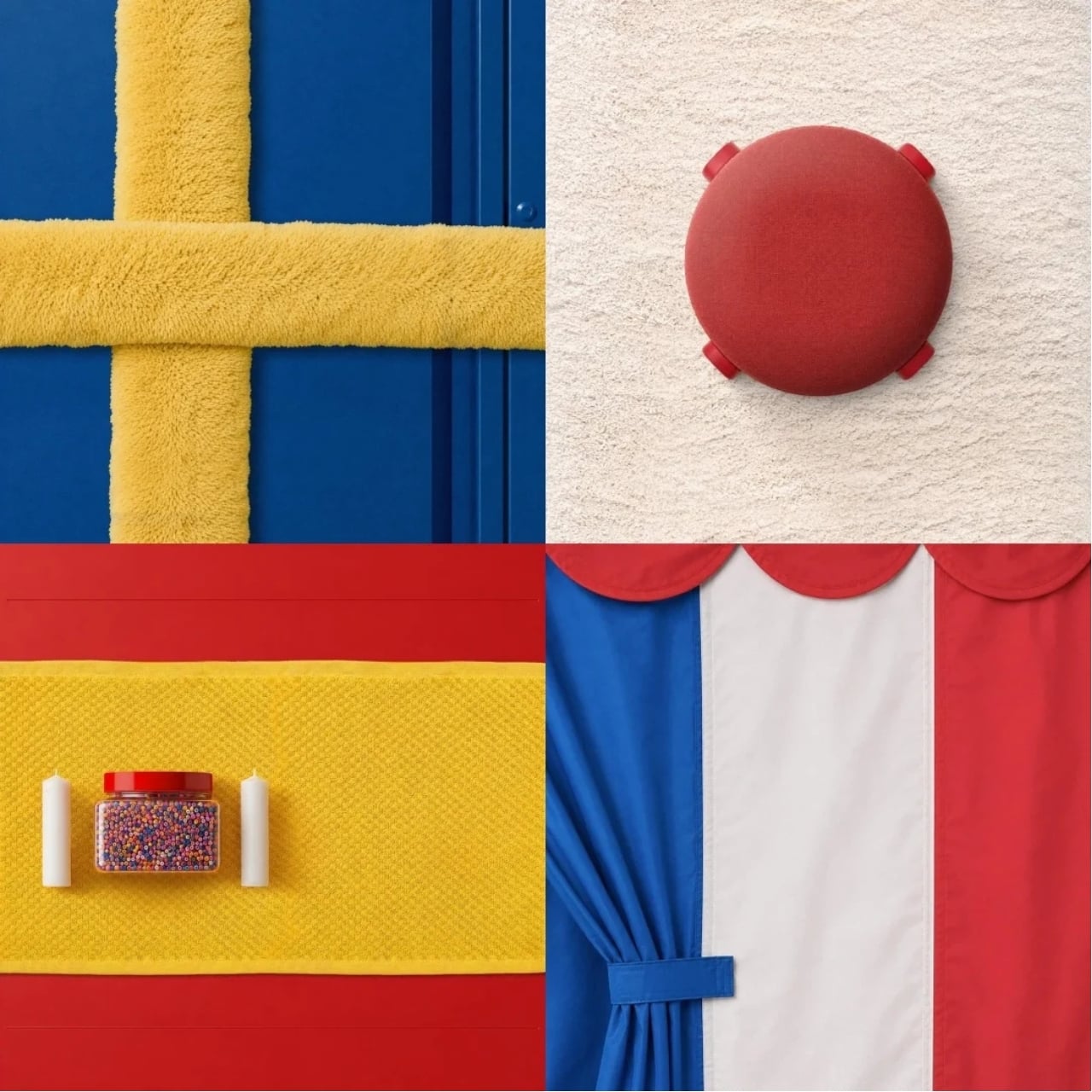
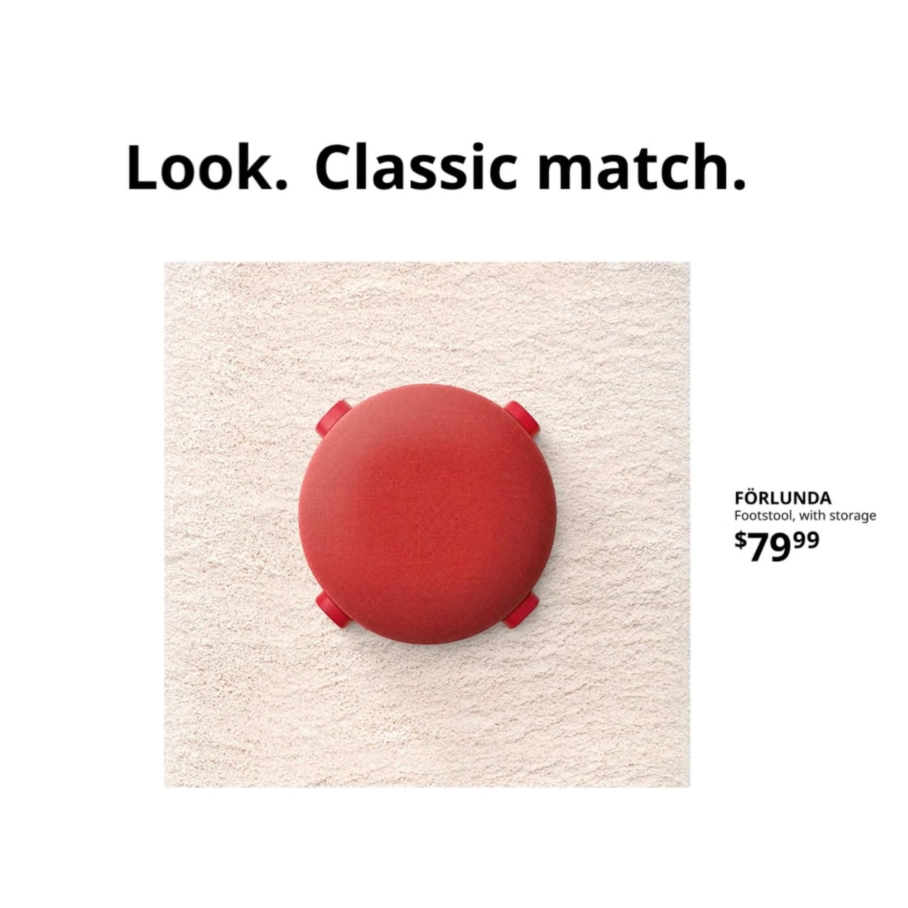
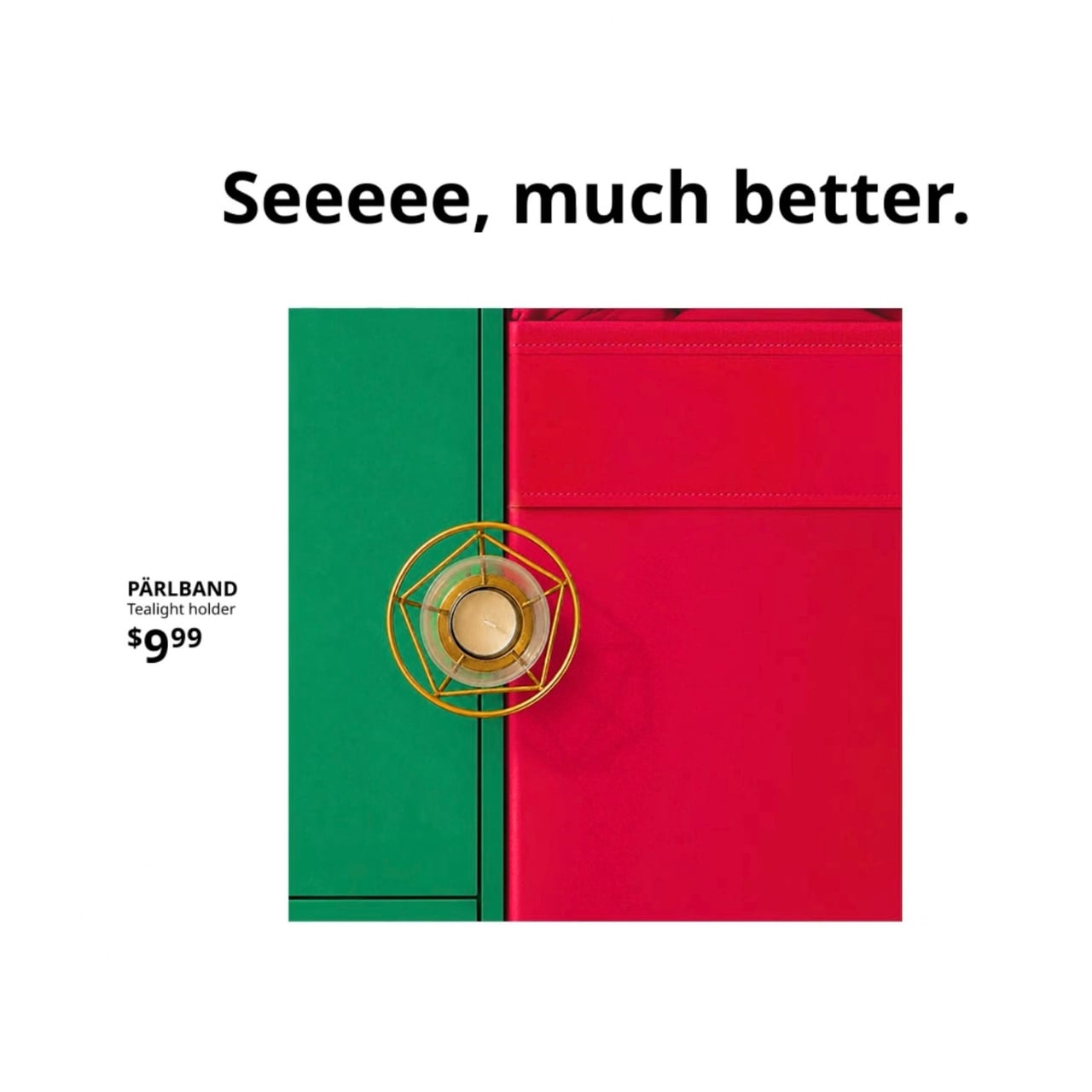
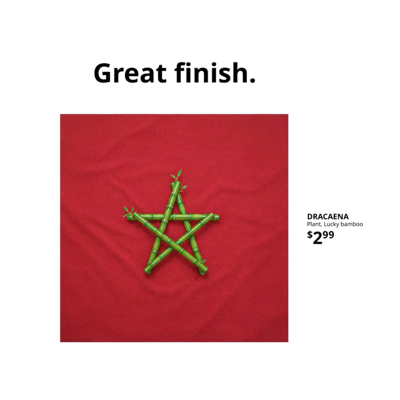
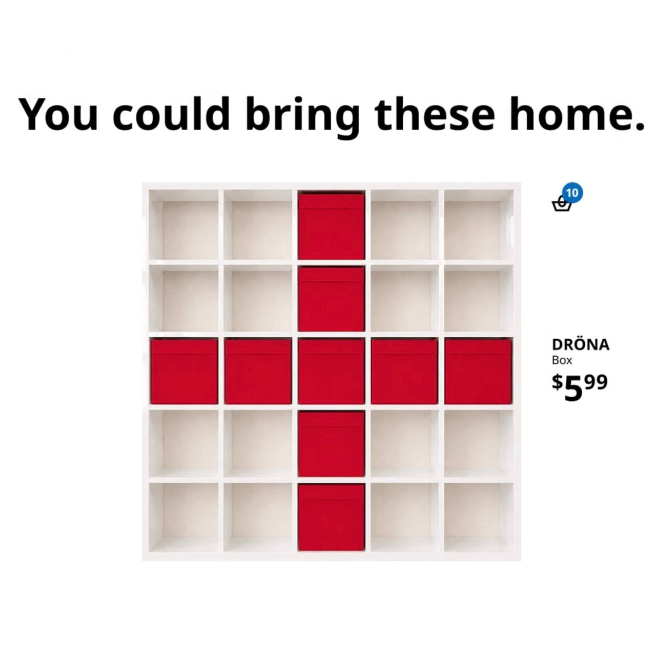
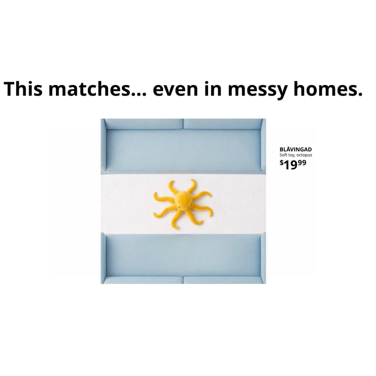
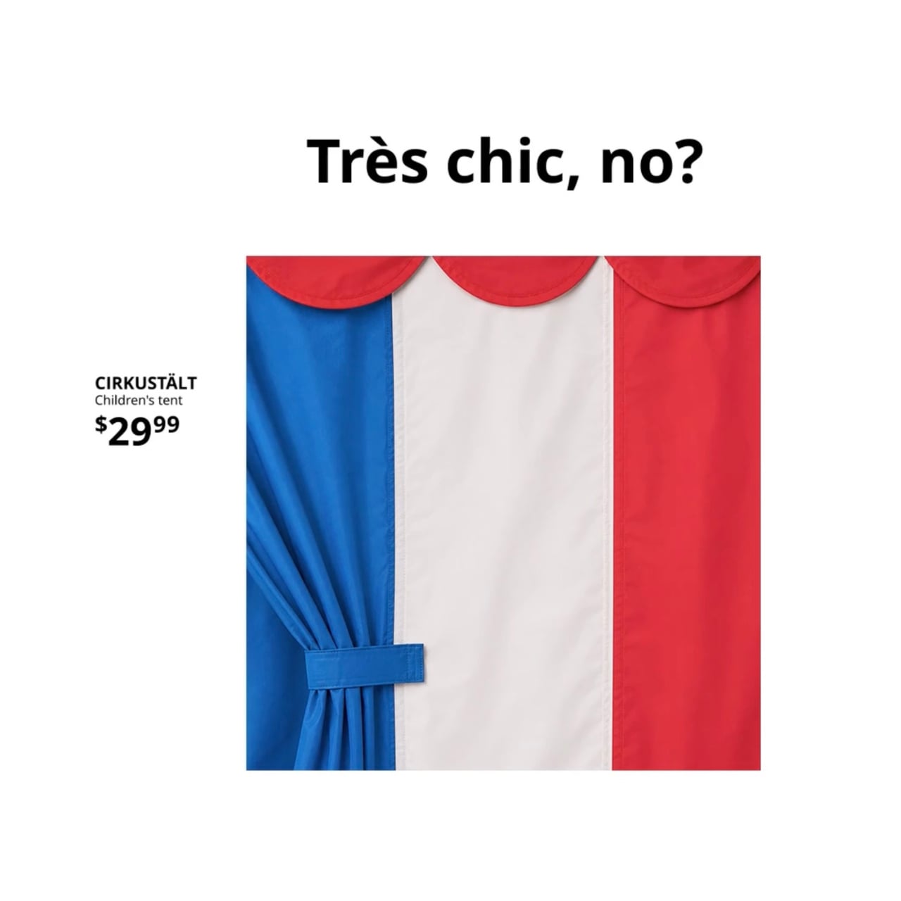
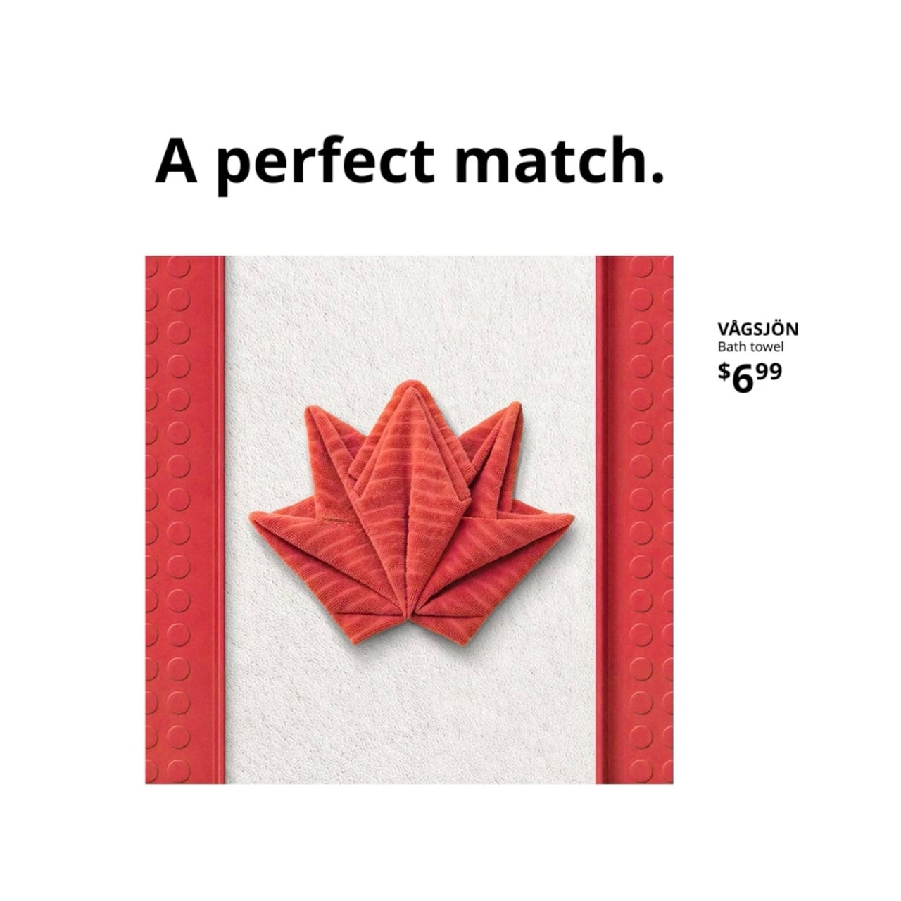
Assemble the World is a social-first campaign created with Dentsu Creative, and the premise is almost embarrassingly simple: take IKEA products and arrange them to look like national flags from competing World Cup nations. Cushions, rugs, lamps, candles, cabinets, plush toys, outdoor tables. All laid out, stacked, and styled until they read as the flag of Brazil, or Japan, or Morocco. Eighteen flags in total, each one built entirely from items you could actually buy.

Designer: IKEA Canada

The execution matters here. These aren’t mood board collages or loosely themed flat lays. The compositions are precise enough to be immediately recognizable, and playful enough to make you smile. Part of the campaign’s appeal is that you have to look closely. Each image invites you to spot the products before clicking through to shop them. It’s a scavenger hunt, a flag quiz, and a product catalogue all at once.

That last part is worth sitting with for a moment. The campaign has a shoppable component baked directly into every piece of content, which means the fun and the commerce aren’t separate experiences. They’re the same experience. That’s a much harder thing to pull off than it sounds. Most branded content either prioritizes entertainment at the expense of the product, or prioritizes the product so heavily that the entertainment evaporates. Assemble the World manages to keep both plates spinning.

What makes it land, I think, is that it doesn’t pretend to be something it’s not. It doesn’t position IKEA as a football brand or manufacture a deep emotional connection to the beautiful game. It just borrows the World Cup’s energy and applies IKEA’s own visual language to it. The result feels authentically IKEA, which is a genuinely difficult thing to achieve during a moment when every brand is trying to sound like it belongs at the stadium.

Canada is also a meaningful backdrop for this, as one of the three host country’s for this year’s edition of the World Cup. The country’s multicultural makeup is part of what the campaign quietly gestures toward, giving the flag concept a layer of relevance that goes beyond the tournament. For a lot of Canadians watching the World Cup, those flags represent personal histories, not just national teams. IKEA leaning into that feels less like a marketing angle and more like an honest observation about who their customers actually are.

The campaign runs across social media, digital channels, and outdoor advertising near IKEA store locations throughout the summer. The call to action, “Click, Buy, Wave,” is a bit cheeky, maybe a little too tidy, but it doesn’t take away from what the campaign does well overall.

Not every brand moment during a major sporting event needs to be profound. Sometimes the best thing a brand can do is show up with something that’s visually satisfying, conceptually tight, and worth two minutes of your time. Assemble the World is exactly that. It doesn’t overstay its welcome, it doesn’t overclaim, and it makes a catalogue of household items feel genuinely festive. In a summer already crowded with World Cup content, that’s no small thing. IKEA found the version of this campaign that only IKEA could do, which is the goal every brand chases and very few actually reach.

The post IKEA Just Built 18 World Cup Flags Out of Furniture first appeared on Yanko Design.
A Design Student Just Fixed the Way Runners Hydrate

Most runners know the feeling. You’re a few miles in, the sun is beating down, and somewhere between the last water stop and the next one, you’re already behind. You’ve read the articles. You know hydration matters. And yet, you still have no real idea if you’re actually drinking enough, or too much, or the right thing at all. You’re just guessing, like almost everyone else out there pounding the pavement.

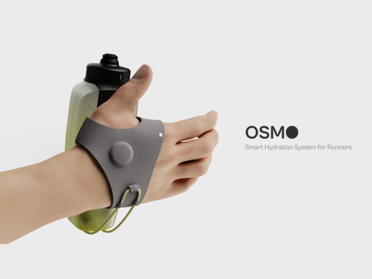
That gap between knowing and doing is exactly what Yash Ghule, a student at ArtCenter College of Design, set out to close with Osmo, an adaptive hydration system built specifically for runners. It’s a student design project, but the thinking behind it is sophisticated enough to deserve a proper look well beyond the design community.

Designer: Yash Ghule

The problem Ghule identified isn’t lack of information. It’s that current hydration tools don’t fit how running actually feels. When you’re in the middle of a run, your cognitive bandwidth is largely committed to the act of running itself. Checking an app, reading a label, or doing mental math about electrolytes isn’t something most people can or will do mid-stride. Hydration fails not because runners don’t care, but because the tools available demand too much attention at exactly the wrong moment. That insight alone is sharp.

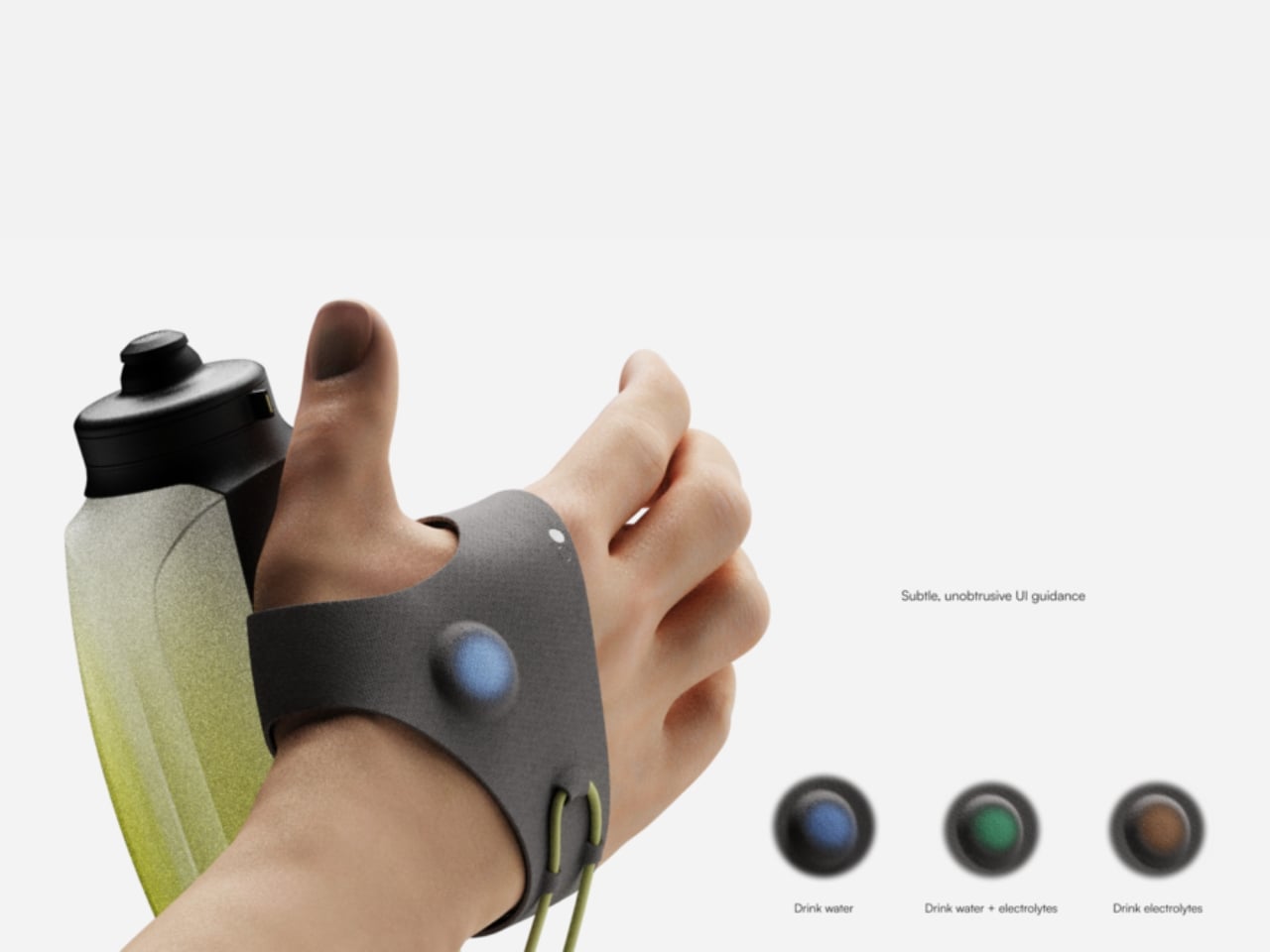
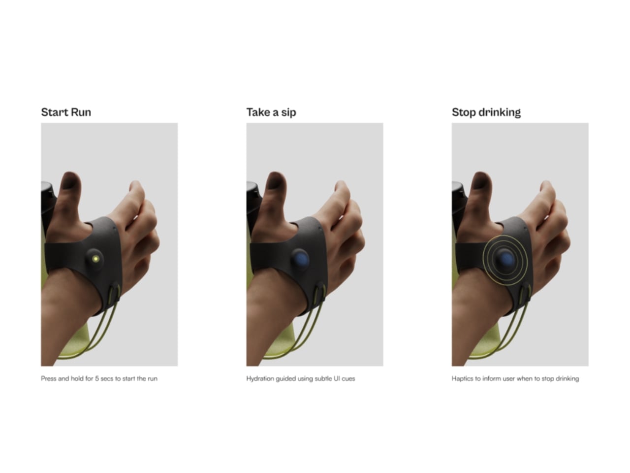
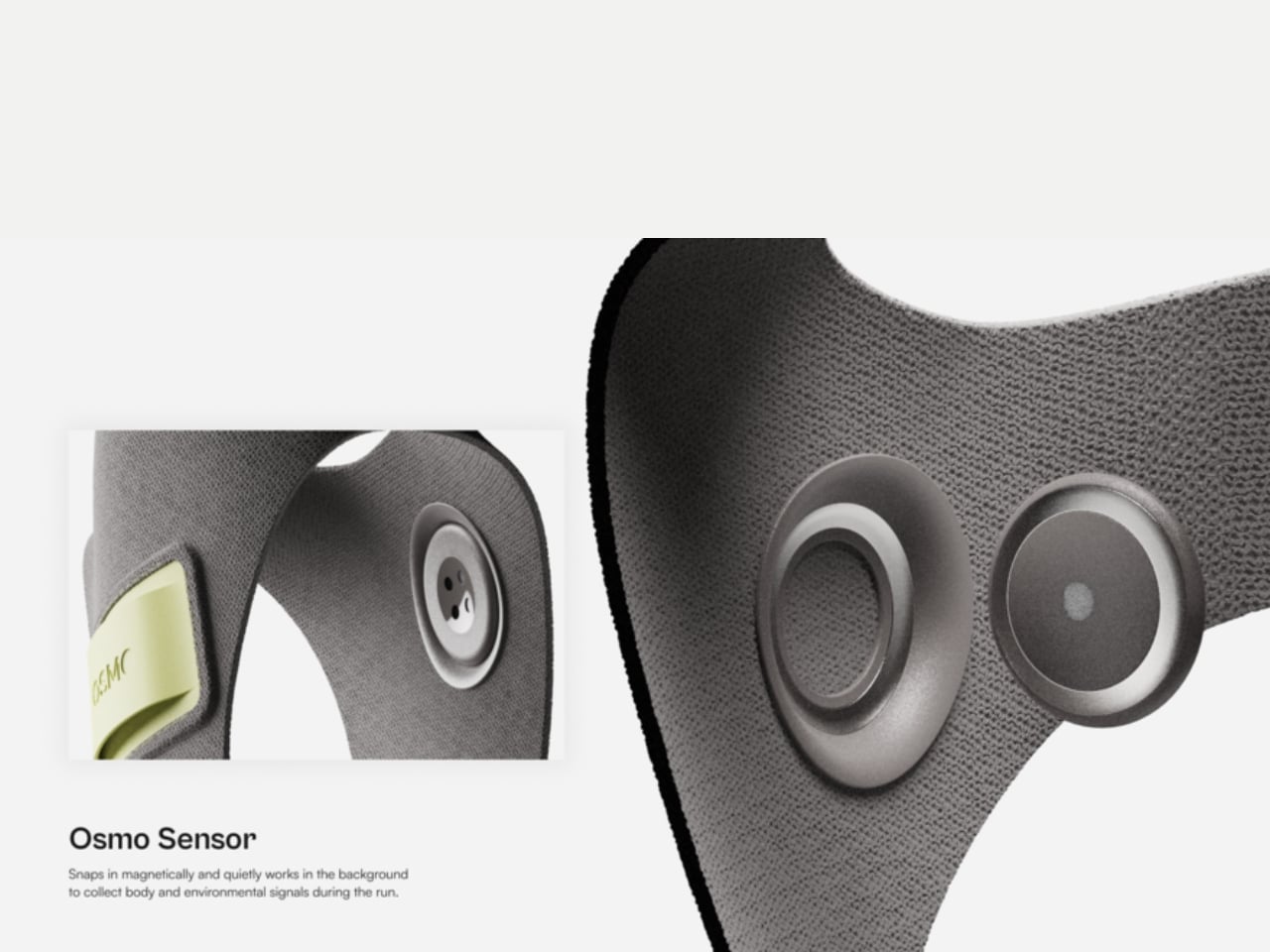
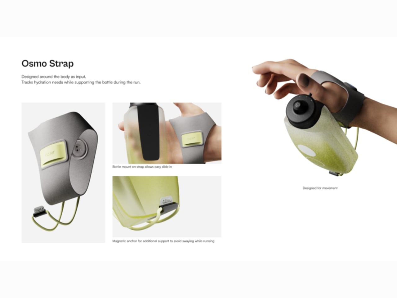
Osmo solves this with three connected components working as a single system. The wearable, worn on the wrist, continuously tracks sweat rate, temperature, humidity, and intake behavior. It then translates that data into cues delivered through haptic vibration and light feedback, nudging the runner without pulling them out of their flow. No screen to look at. No notification to parse. Just a quiet signal saying, drink something now.

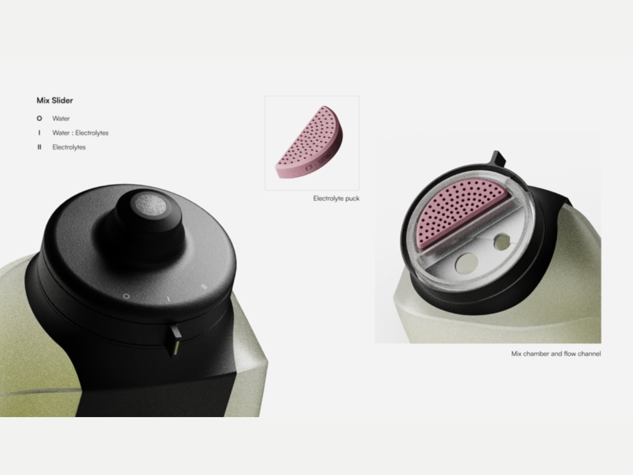
The bottle is where it gets particularly elegant. Rather than requiring you to pre-plan your hydration strategy before lacing up, Osmo’s bottle includes a built-in mixing mechanism that lets you shift between water and electrolytes on the fly. A simple slider adjusts the ratio as your needs change. This is the kind of thinking that solves a real problem rather than adding a layer of complexity dressed up as innovation. No extra pouches, no separate drink mixes to remember, no mid-run compromise where you reach for the wrong option because you didn’t prepare for the conditions.

The companion app rounds out the system, handling setup before a run and offering digestible insights afterwards. That structure matters. It keeps the app out of the experience when you need to focus, and puts it to work when you finally have the headspace to reflect. I find this concept genuinely compelling, partly because so many “smart” fitness products get this backwards. They front-load the technology in ways that interrupt the activity itself, demanding interaction at moments when you just want to move. Osmo flips that. The intelligence runs quietly in the background, and the interface shows up only when it’s actually useful.

It’s also worth acknowledging the quality of thinking behind the design approach. Ghule didn’t just design a cool bottle or a slick wearable. He mapped out a friction problem, traced it back to its actual root, and then built a system around it. The research behind Osmo surfaced a key insight: runners know they should be hydrating better, but the physical and cognitive demands of running make it genuinely difficult to act on that knowledge in real time. That’s a design challenge with real nuance, and the response reflects it.

Osmo won’t be on store shelves tomorrow. It’s a student concept, and concept-to-market is always a long road. But the fact that it exists as a fully realized, integrated system rather than a single clever gadget suggests Ghule has a clear understanding of what it actually takes to change behavior. That’s not a minor thing. Running keeps growing as a sport, and the industry has largely kept pace. The gear has evolved, the shoes have evolved, the tracking technology has evolved. It’s about time hydration caught up.

The post A Design Student Just Fixed the Way Runners Hydrate first appeared on Yanko Design.
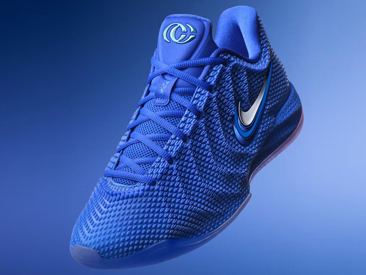
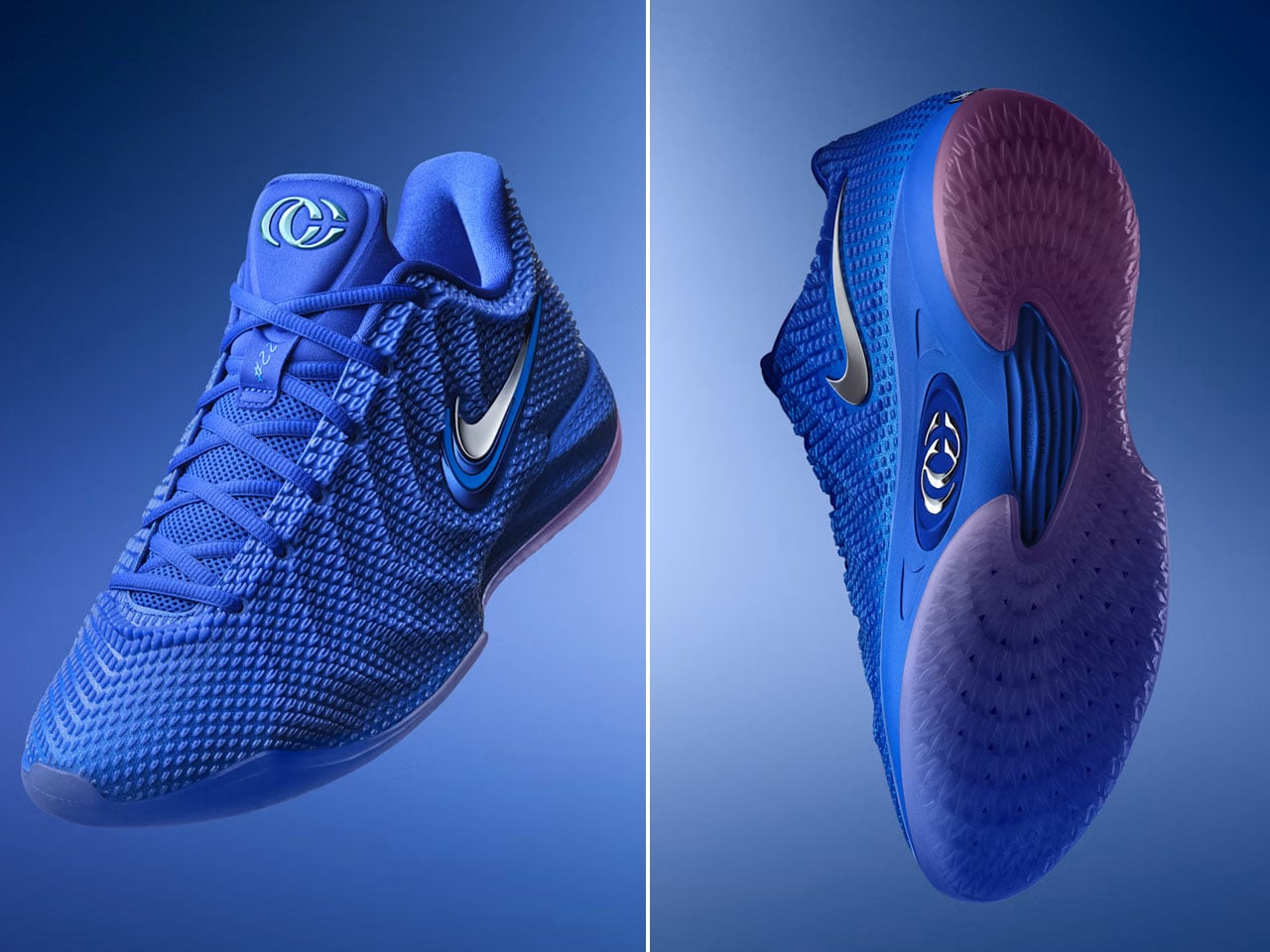
Nike Caitlin 1, Caitlin Clark’s debut signature shoe launched in Racer Blue colorway

Women’s National Basketball Association (WNBA) players with their own signature shoes are growing in numbers. The latest to join the ranks is Caitlin Clark, the Indiana Fever player who debuts her first Nike-branded collaboration footwear, designed especially for the hardwood court.

Caitlin Clark’s signature Nike shoe has been a long time coming. The two have spent almost the last two years working on the footwear that will now finally start shipping from October 1, 2026. Nike announced on its social media account.

Designer: Nike

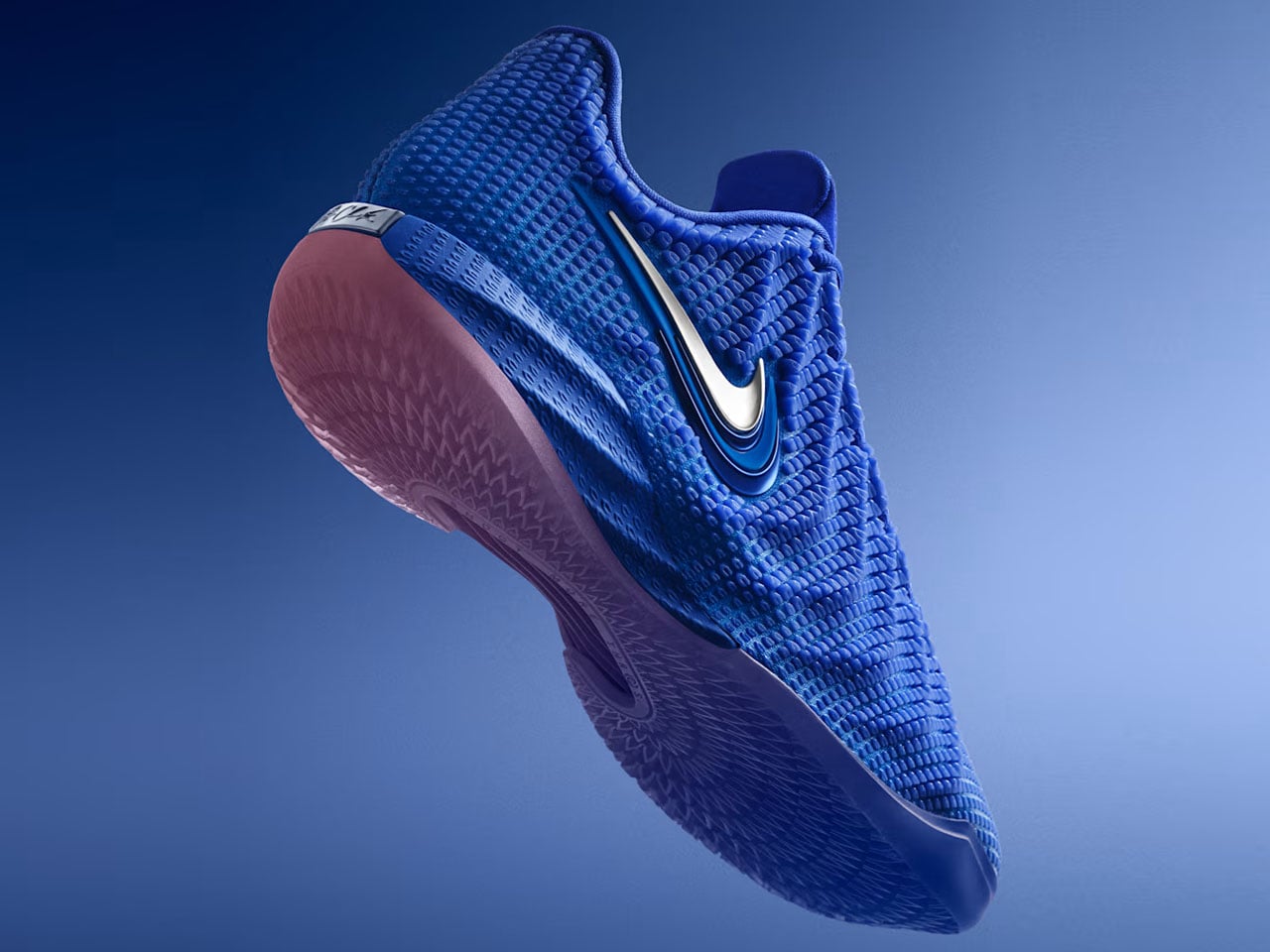
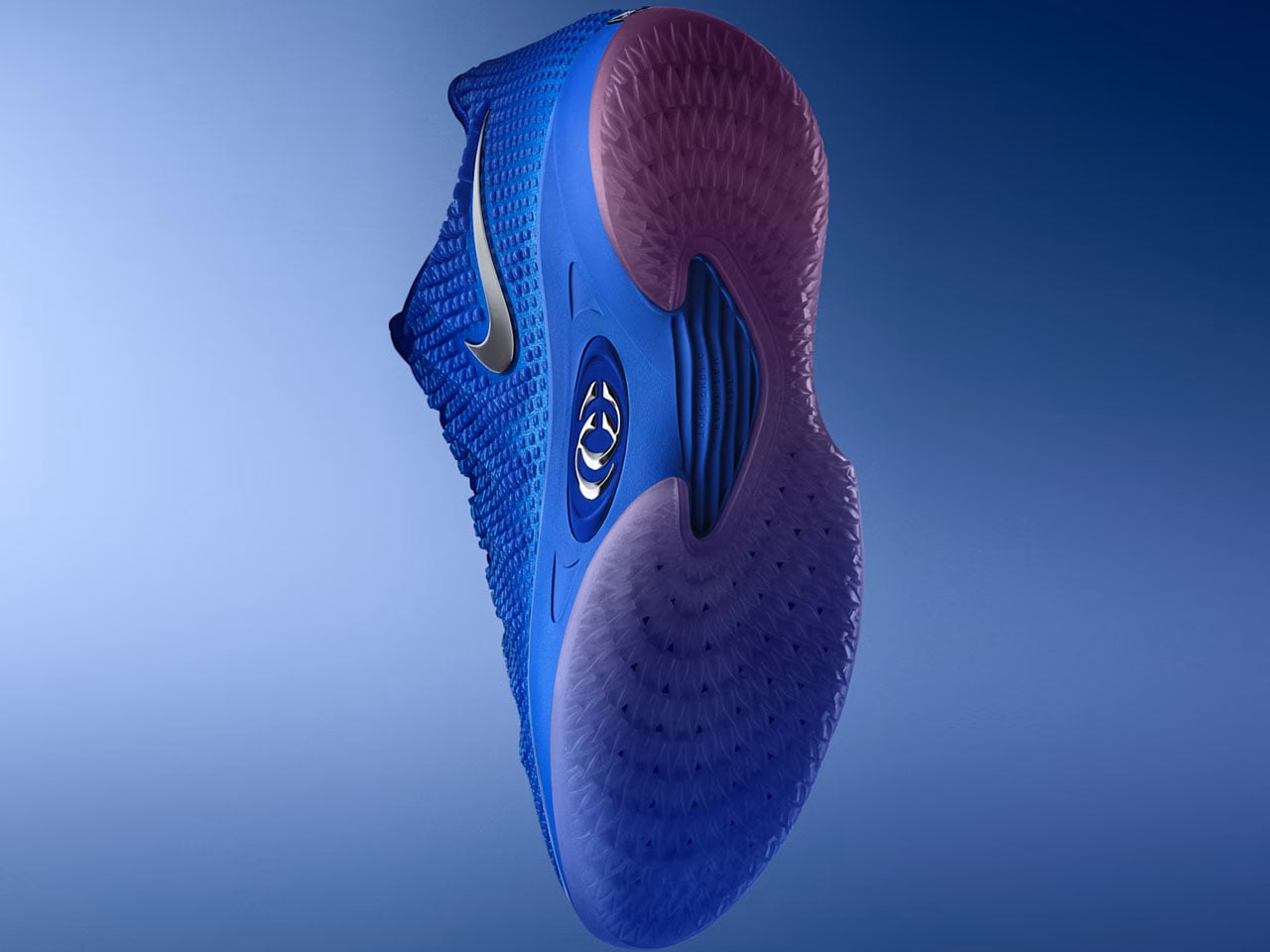
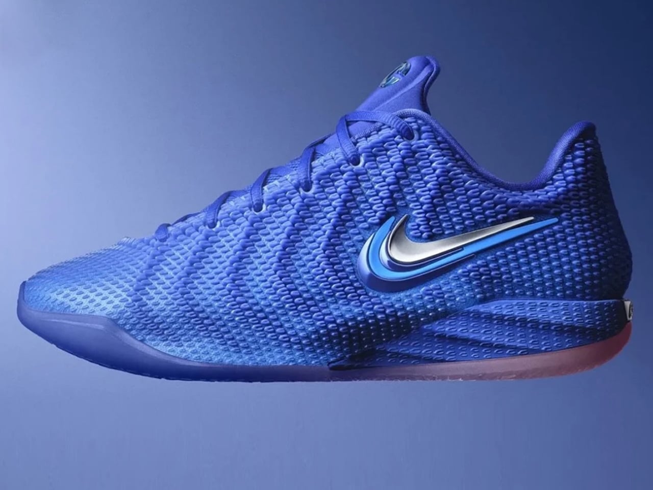
Called the Caitlin 1, it will be available in a solitary “Racer Blue” colorway. Nike has officially shared the picture highlighting the immensely detailed architecture of the shoe. The wavy design has a multi-layered cushioning and is, the company says, optimized for on-court use. The signature silhouette, personalized for hardwood, touts an athletic body that’s distinct from previous Nike signature iterations.

In addition to its conformity with the court, the Caitlin 1 has a low-cut design, which is also stylized to complement Indian Fever guard’s explosive style of play involving quick cuts and fast breaks. The silhouette features a specially made Opticast upper and has angular notes changing height along the various surfaces of the basketball shoe. However, it has a smooth transition from the heel to the toe. The midsole features Nike’s Cushlon cushioning along with the Zoom Turbo unit in the forefoot.

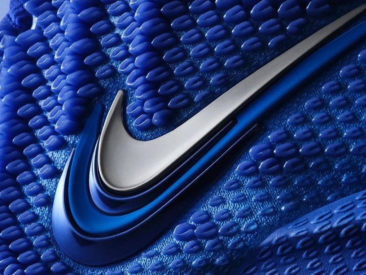
Remarkable addition on the footwear, designed to deliver support and secure lockdown during the intense movements on the court, is the repeated “CC” and “22” details on its exterior. This is a nod to Caitlin’s personal branding and jersey number. “Caitlin was hands-on with our designers, obsessed with getting every detail right. See it in the double Swoosh logo that nods to her initials and the three-point arc,” Nike details on the product page.

For all the Caitlin fans or otherwise, the Nike Caitlin 1 is slated to officially drop on October 1. It will be available in all sizes starting at $140 for adults. Kids’ and youth sizes will be priced at $115 and $105, respectively. Alongside the shoe, Nike will also be shipping an 18-piece collection dedicated to the guard, Caitlin Clark.

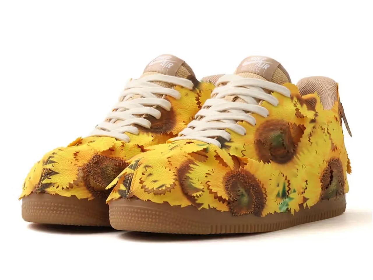
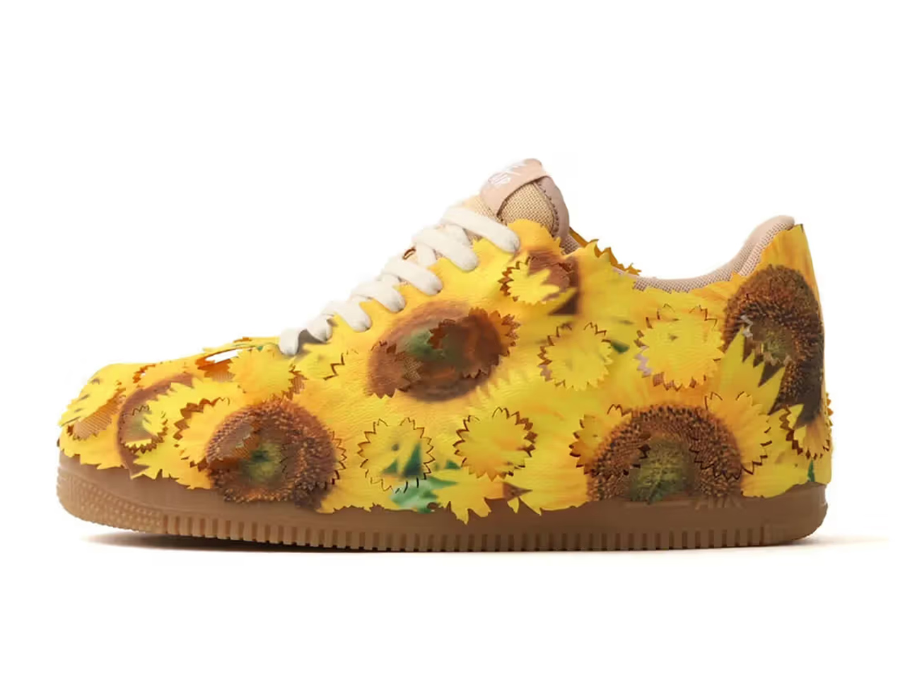
In other news, Nike has also officially announced the Air Force 1 Low “Sunflower.” Released as part of the company’s experimental lifestyle catalog, following the “Leaf Camo” and “Cherry Blossom” editions, it gives a new meaning to the classic low styling of the AF1. The sneaker features a removable yellow shroud featuring graphic sunflower petals placed one over the other to achieve a ruffled texture on the shoe exterior. This experimental Nike Air Force 1 Low “Sunflower” will ship in Fall 2026 for a retail price of $125.

The post Nike Caitlin 1, Caitlin Clark’s debut signature shoe launched in Racer Blue colorway first appeared on Yanko Design.
adidas Trionda Pro brings connected-ball technology to the FIFA World Cup 2026

The much-awaited FIFA World Cup kicks off with an opener between co-hosts Mexico and South Africa at Mexico City Stadium on 12 June. While the fandom and the love for the most popular sport on earth remain constant off the field, there is a lot that’s changing on the field. The Virtual Assistant Referee (VAR) is getting more control of the game, with the power to intervene in spotting fouls and also identify real-time data from the specially designed football to make faster offside decisions, or pick out individual ball touches in a crowded set piece.

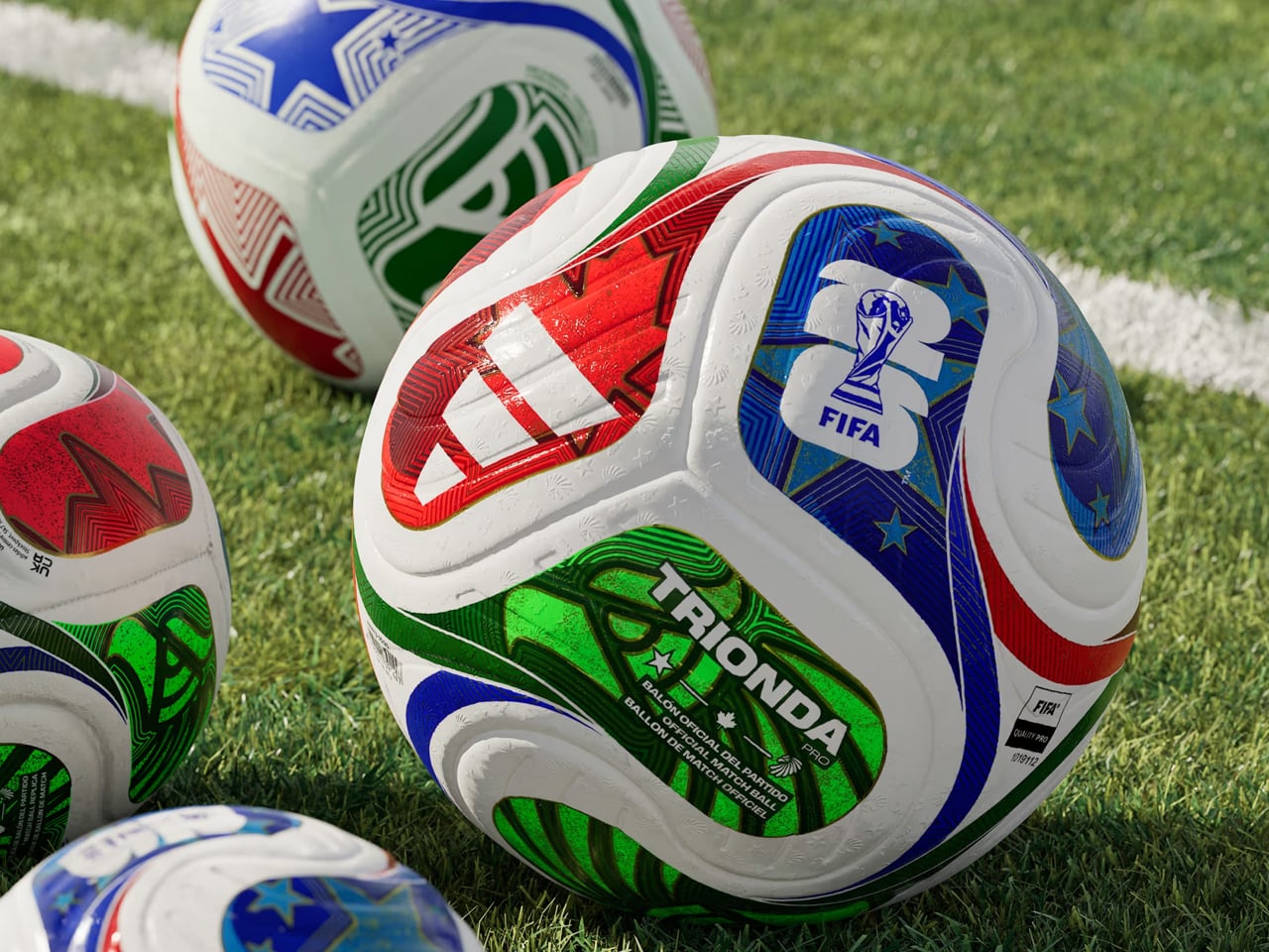
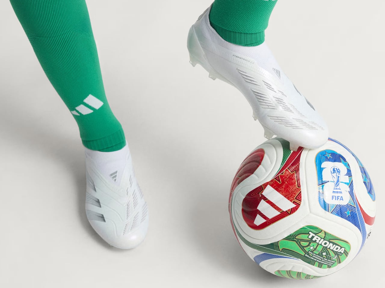
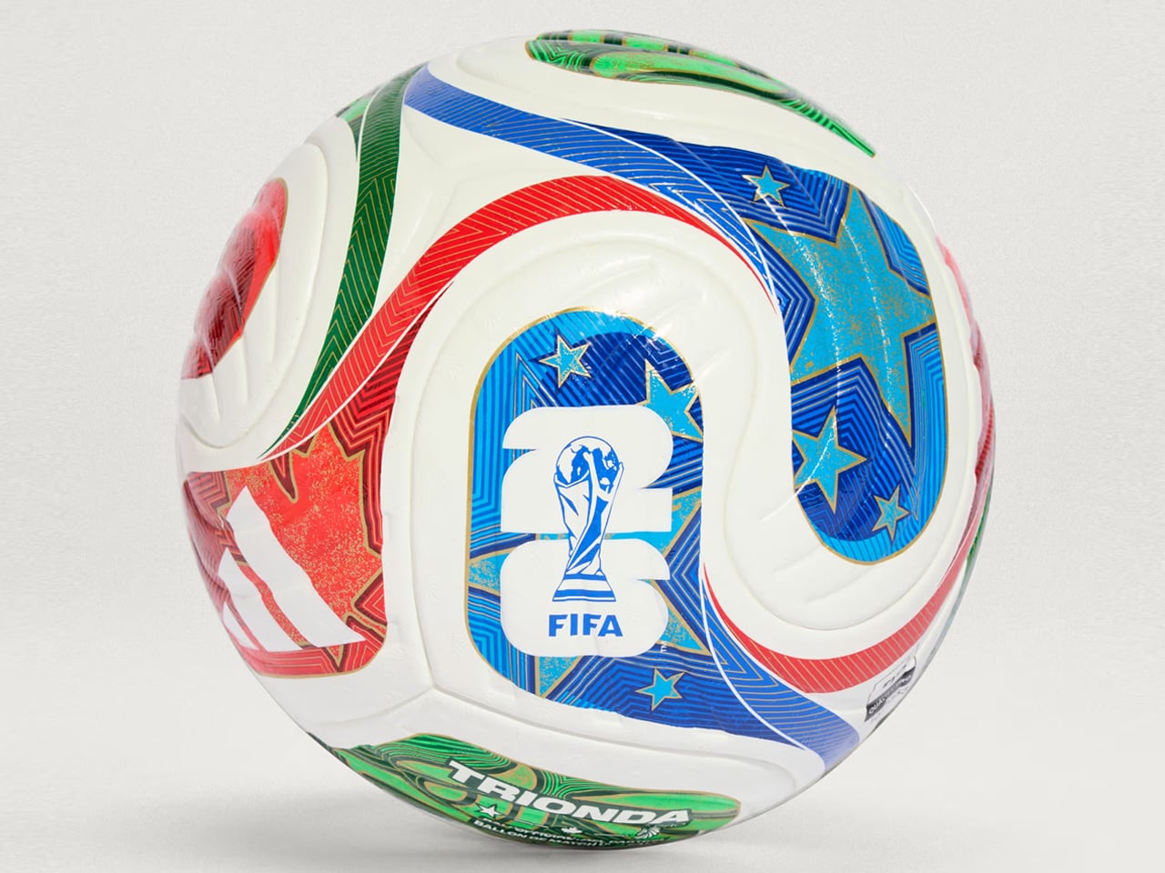
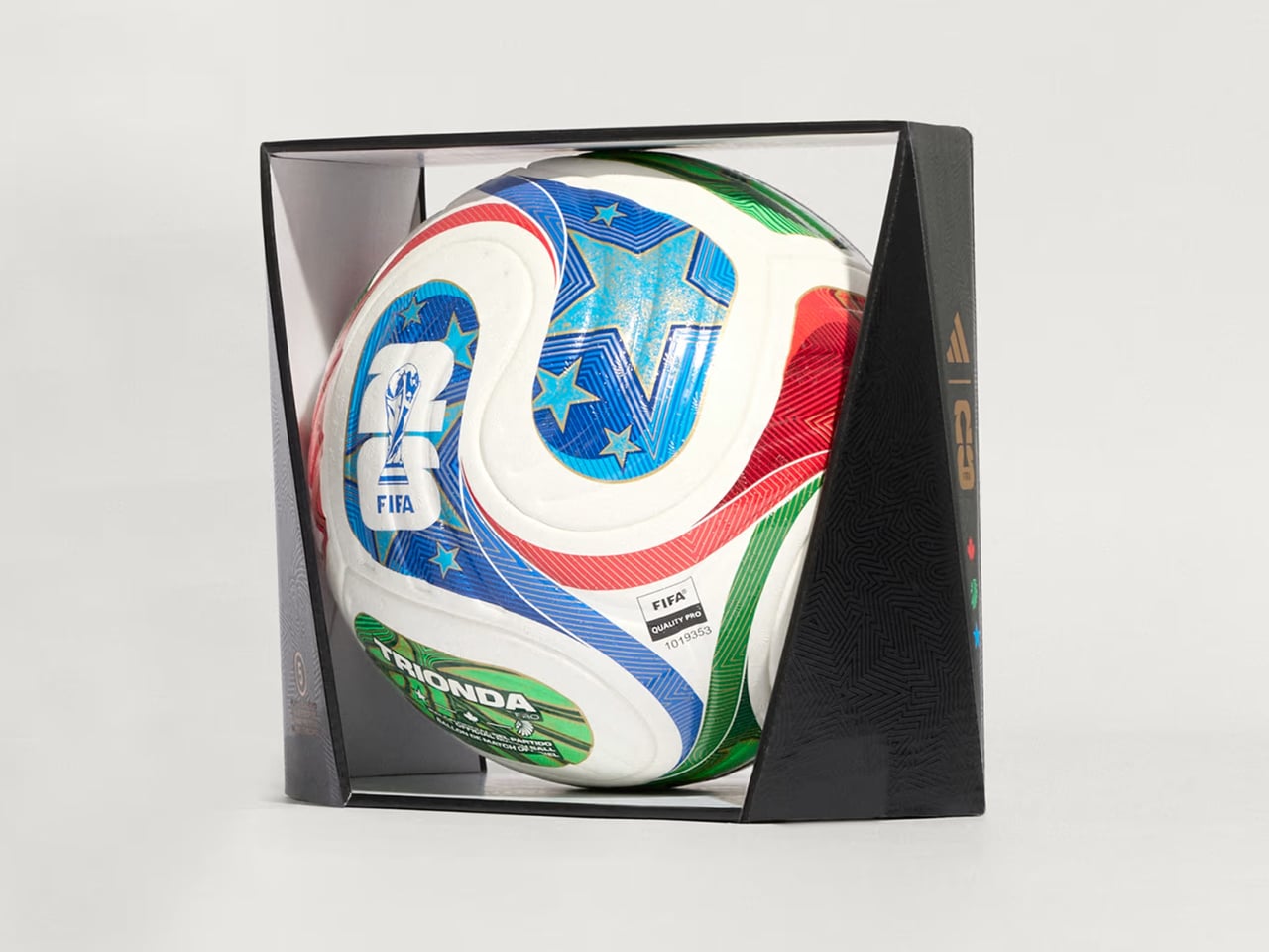
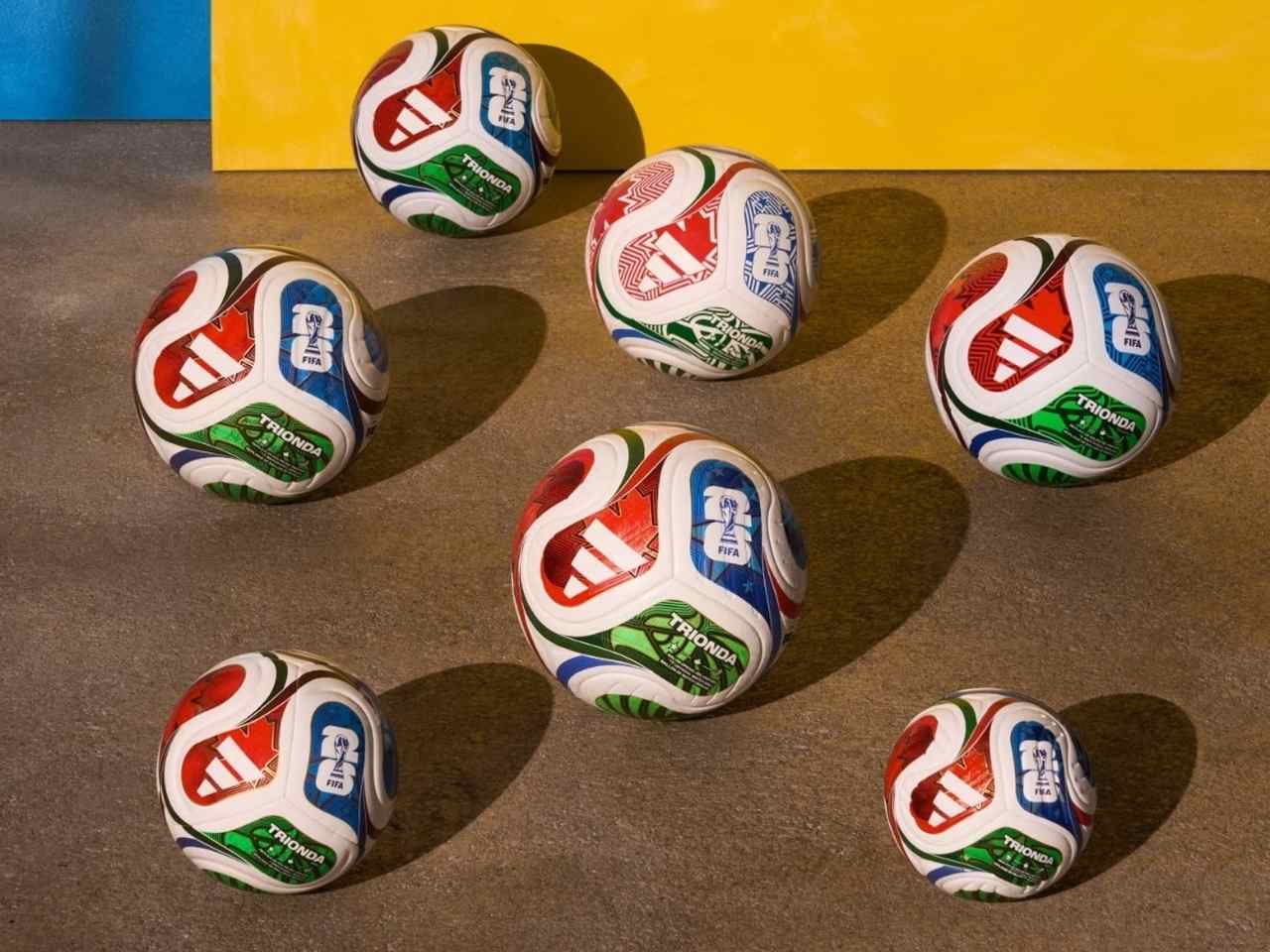
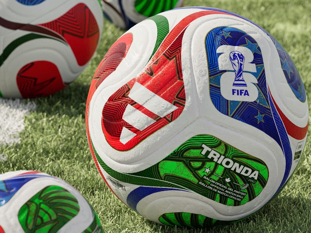
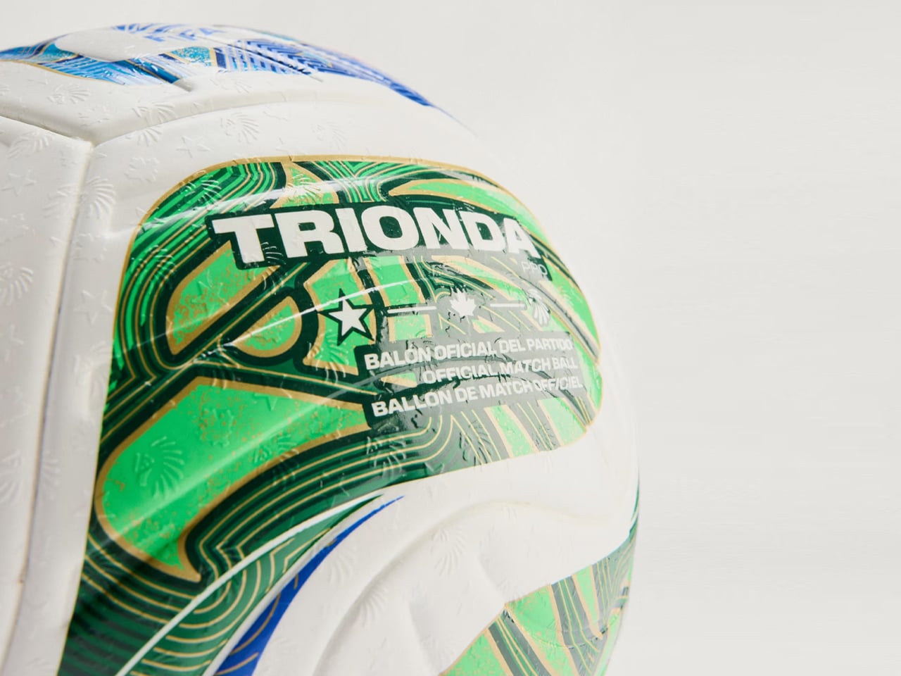
The football designed especially for match day is called Trionda Pro, which means “three waves.” It is styled in the colors and motifs of the three co-hosting nations, Mexico, Canada and the United States of America, and is said to arrive with a built-in motion sensor, which would send real-time ball data to VAR. The ball is now available for $170.

Designer: adidas

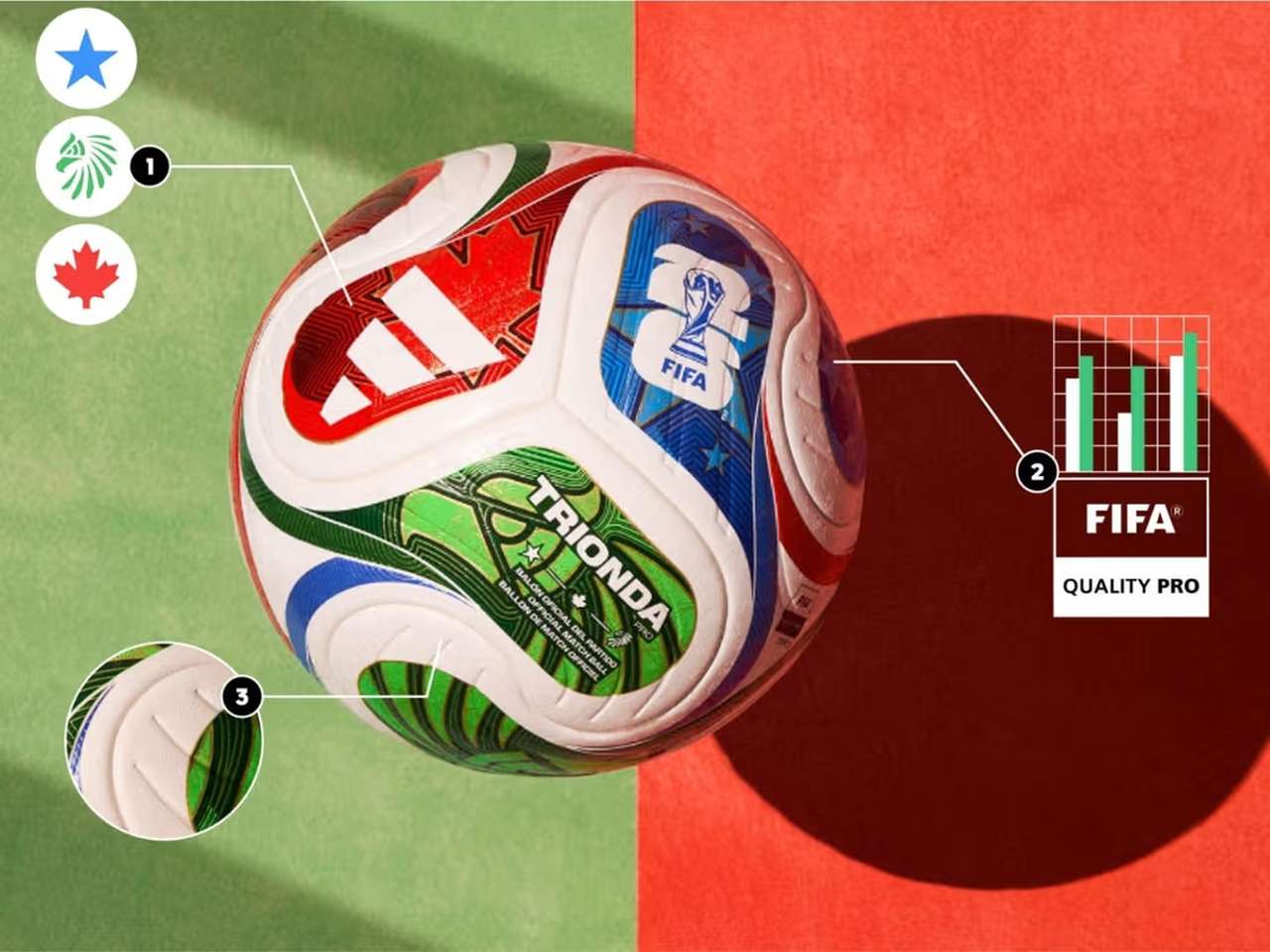
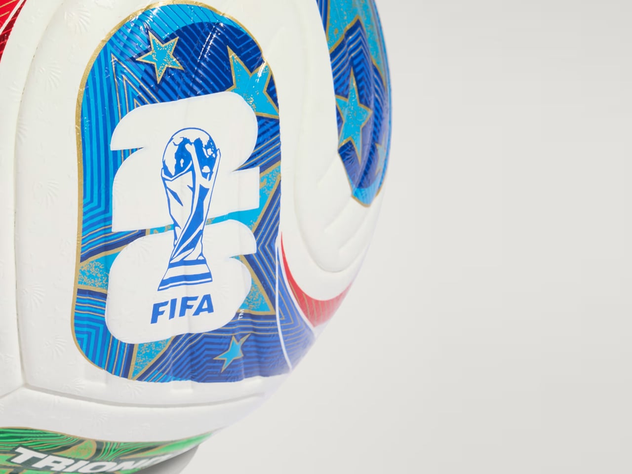
Created by adidas for the FIFA World Cup 2026, Trionda Pro is the official match ball of the tournament. It will arrive in a tricolor wave panel design with red, green, and blue graphics, which pays tribute to Canada, Mexico and the USA. The ball also features maple leaf, eagle, and star – again representing the nations – visible across the four-panel construction of the ball.

“The Trionda Pro has a textured surface for a more predictable trajectory, better touch and lower water uptake, combined with a thermally bonded seamless construction for added performance and design benefits,” adidas notes on its webpage dedicated to the match ball.

Even though the impactful silhouette makes the ball pretty identifiable on the ground, adidas and FIFA wanted more from it. To that accord, Trionda Pro features a 500Hz motion sensor installed inside of its specially created layer in one of the four panels. The other three panels are provided with counterbalances ensuring flight stability in all playing conditions. The sensor is part of adidas’ in-house Connected Ball Technology and used in the match ball. It sends accurate ball movement analytics to the VAR in real time and also helps identify individual touches precisely.

The data of the ball movement, then combined with AI and player-positioning data, can allow the virtual referee to assist with correct offside calls and also identify a handball from headers in a crowded space on the field. Accurate and fast decisions regarding off-sides and fouls can make a big difference in high-octane games, especially on the world stage. So, Trionda Pro is a viable tech upgrade to the sport, which is going into a mega tournament for a period of 39 days starting 11 June through 19 July, 2026.

The post adidas Trionda Pro brings connected-ball technology to the FIFA World Cup 2026 first appeared on Yanko Design.
Louis Vuitton Just Made a One-of-a-Kind Clock for UNICEF

Not every luxury piece earns the word “meaningful.” Beautiful, yes. Covetable, absolutely. But meaningful is a harder category to land in, and the Louis Vuitton Unity Time Object lands there without trying too hard about it.

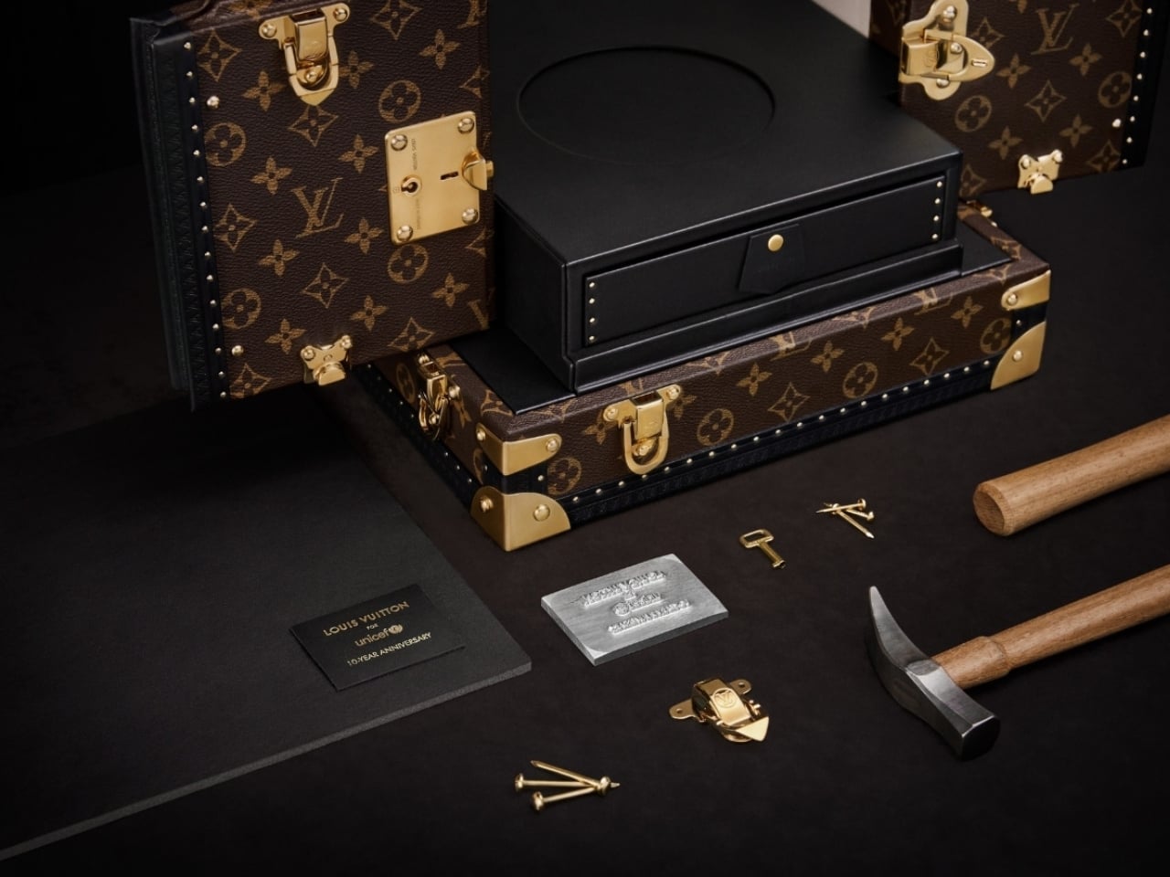
Unveiled at the Fall-Winter 2026 Men’s Fashion Show in Paris, the piece was created to mark ten years of the Louis Vuitton for UNICEF partnership. A decade of fundraising, direct action, and advocacy for vulnerable children around the world. That’s the kind of milestone that deserves more than a press release, and Louis Vuitton clearly agreed.

Designer: Louis Vuitton

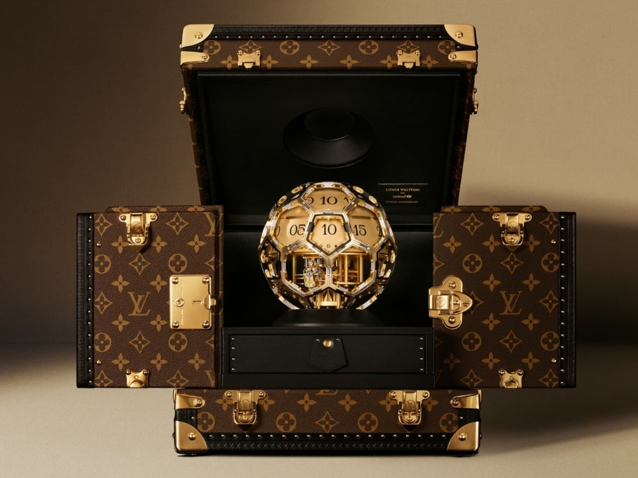
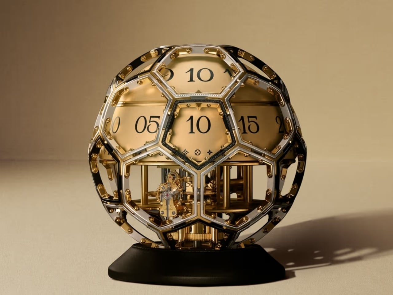
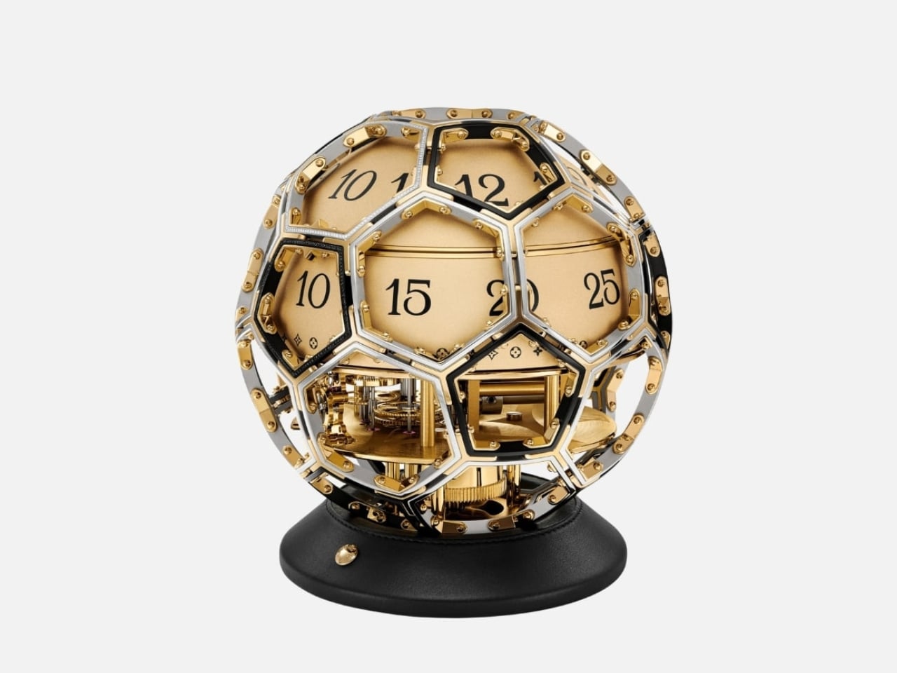
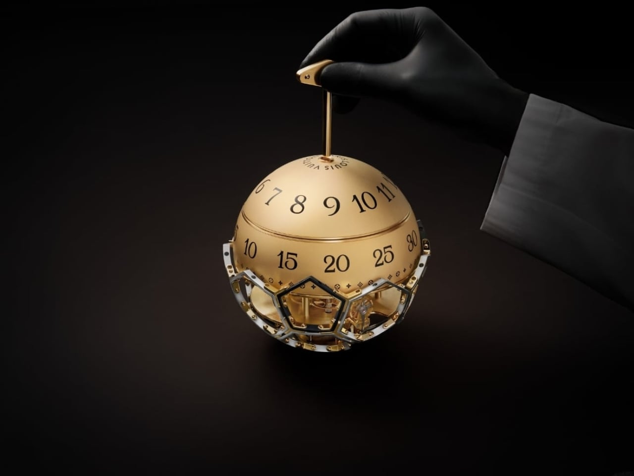
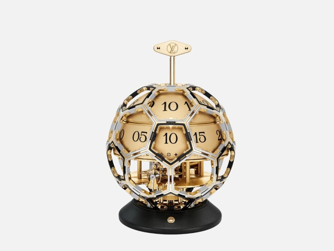
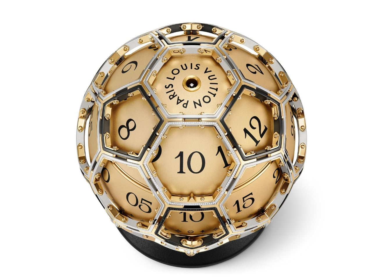
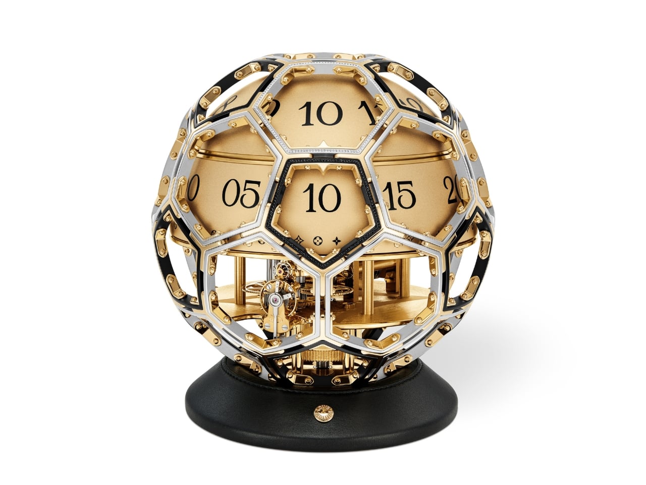
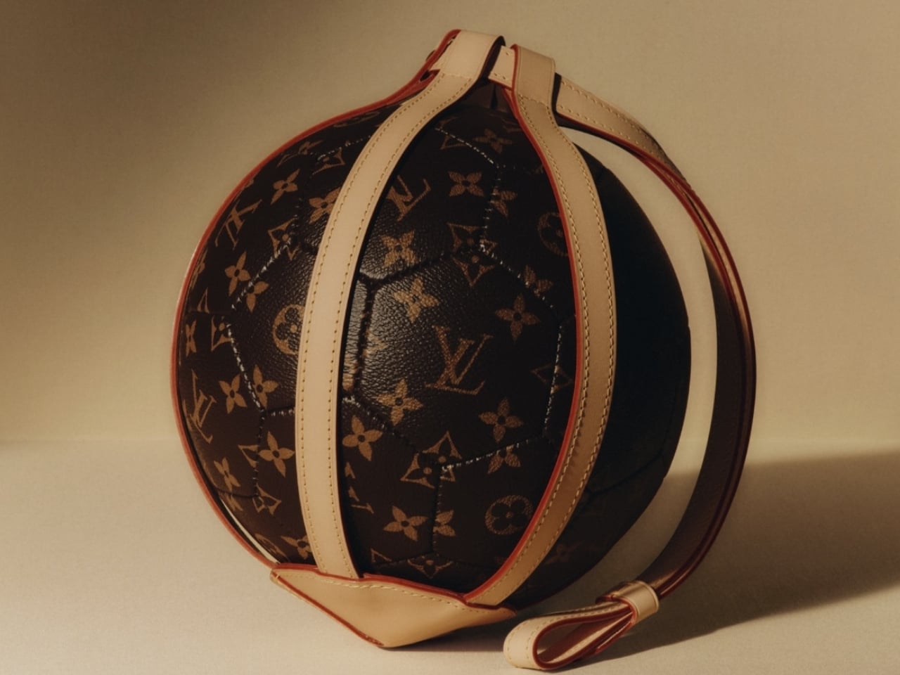
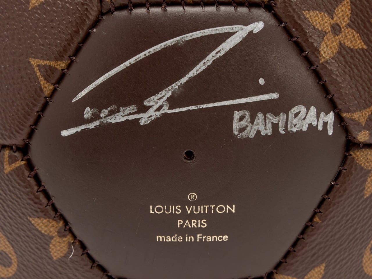
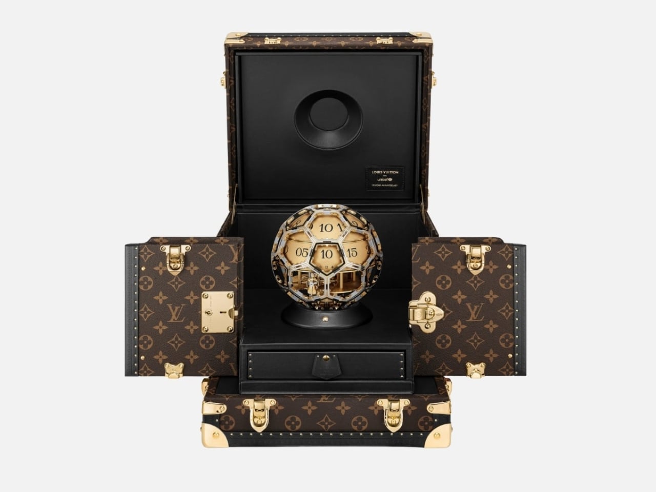
The form alone is worth sitting with for a moment. The clock takes its shape from the LV Soccer Ball, one of the house’s most recognized sporting objects, now reimagined as a sculptural timepiece that functions equally as objet d’art and design statement. A sphere has no front or back, no implied hierarchy, no right way to face. It looks the same from every corner of the room, every corner of the world. For a partnership rooted in the idea that every child deserves access and dignity regardless of where they were born, the shape isn’t just aesthetic. It’s a quiet argument made in steel and gold.

Time on the Unity Time Object is told through two rotating cylinders rather than conventional hands. A sculpted golden steel dome forms the upper half of the clock, and beneath it, one cylinder tracks the hours while the other handles the minutes. The minute cylinder is engraved with Louis Vuitton’s Monogram motif and flowers, with “Louis Vuitton Paris” running along its top. You wind it with a key inserted at the side or top, and the act carries an almost ceremonial quality. It asks you to slow down, to pay attention. In a product era built on digital convenience, that small ritual feels genuinely countercultural.

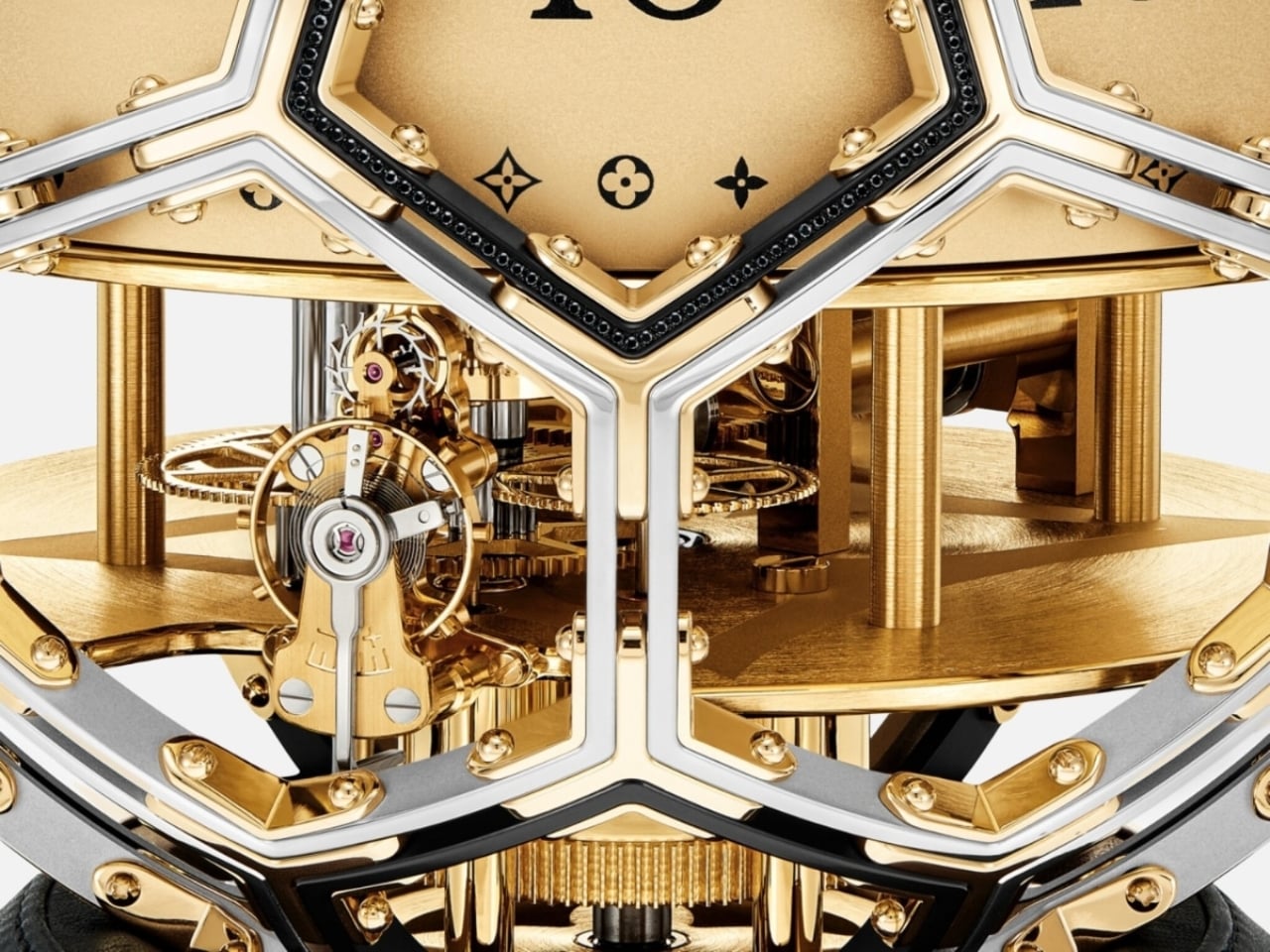
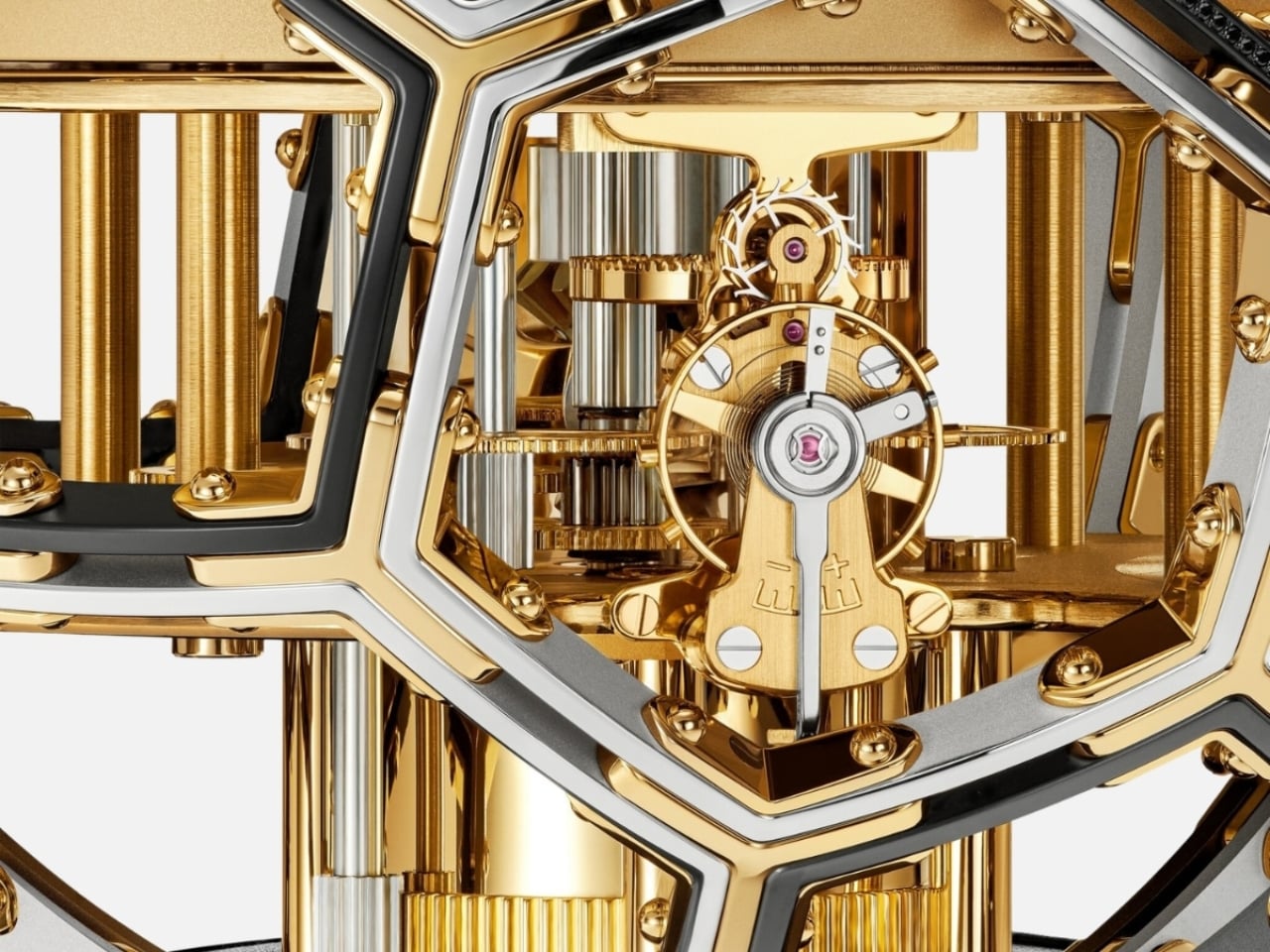
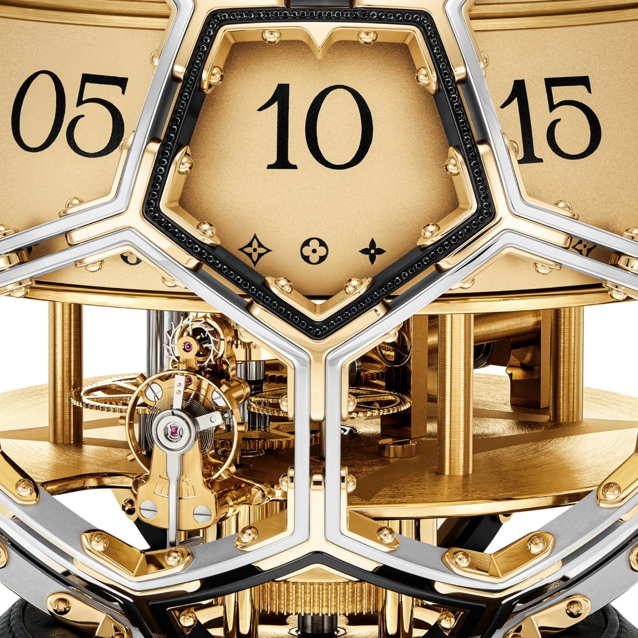
The movement was developed in collaboration with L’Épée 1839, the Swiss clockmaker with nearly two centuries of history behind it. It’s entirely visible through the skeletonized structure, with every screw and movement plate worked with the Monogram flower. Diamond-set details add richness without overwhelming the mechanical poetry underneath. The whole piece reads like a conversation between decoration and precision, and neither side loses.

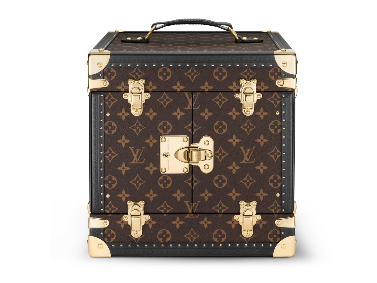
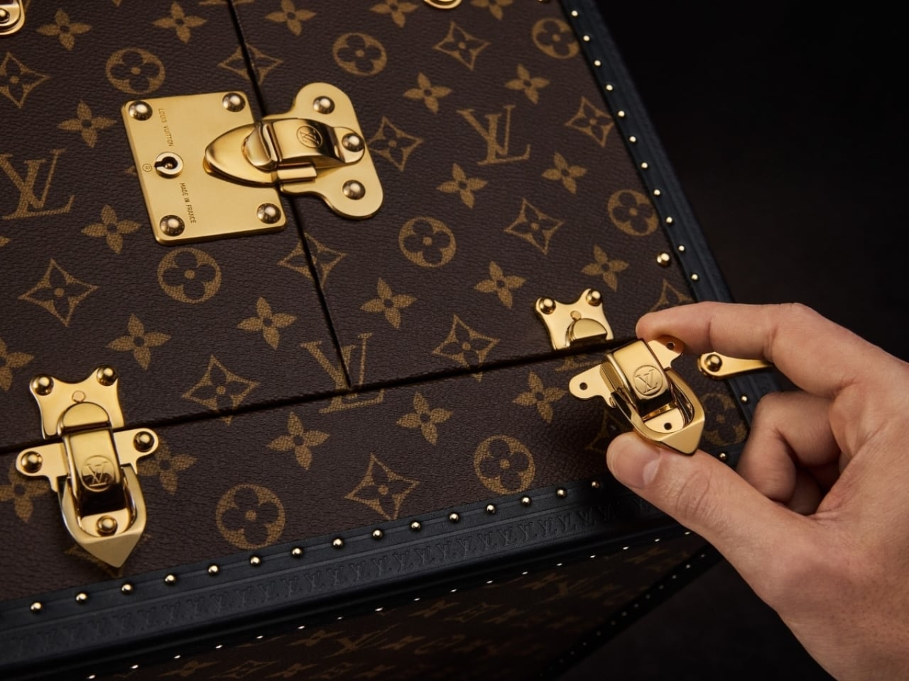
The clock arrives in a trophy-style trunk made from Louis Vuitton’s Monogram canvas, handcrafted at the house’s historic Asnières workshop. The brass corner protectors, lock, and clasps are the same ones found on Louis Vuitton trunks going back to the 1860s. A display case built with 160 years of muscle memory, housing an object shaped like a ball. It shouldn’t cohere as well as it does, and yet here we are.

The Unity Time Object is classified as a pièce unique at Sotheby’s, meaning one exists in the world, full stop. It goes to auction on June 9, 2026, with the sale closing June 18, and all proceeds going directly to UNICEF and its work supporting children globally. The estimate is available upon request, which is auction-house language for a number most of us should simply appreciate from a respectful distance.

What I keep returning to is the simplicity of the choice. Louis Vuitton could have marked a ten-year UNICEF partnership with a capsule line or a limited-edition accessory. Something accessible, something scalable. Instead, they made a single, unrepeatable object with no commercial return for the house. Every dollar from the sale goes to the cause. That kind of gesture is rare in luxury, where even the most philanthropic moves tend to benefit the brand as much as the cause.

Good design holds meaning without over-explaining it. The Unity Time Object doesn’t need paragraphs of context to communicate its weight. A sphere. A clock. A trunk built by the same craftspeople who have been making trunks for generations. Whether you’re drawn to the horology, the design, or just the idea of what luxury could stand for at its very best, the Unity Time Object makes a compelling case that beauty and purpose don’t have to be separate conversations.

The post Louis Vuitton Just Made a One-of-a-Kind Clock for UNICEF first appeared on Yanko Design.
NESCAFÉ Just Replaced Beer at Your World Cup Party for $10

The world’s most-watched sporting event is about to kick off in less than a month. This means that World Cup watch parties are probably being set up in various households for football fans who won’t actually be able to make it to the stadiums in the U.S., Canada, or Mexico. While beer is probably the drink of choice for most of these events, NESCAFÉ wants to begin a new tradition for those who want to have a livelier, but probably safer, discussion amongst family and friends.

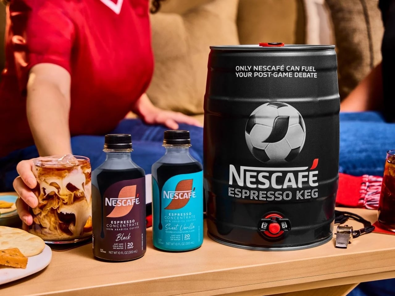
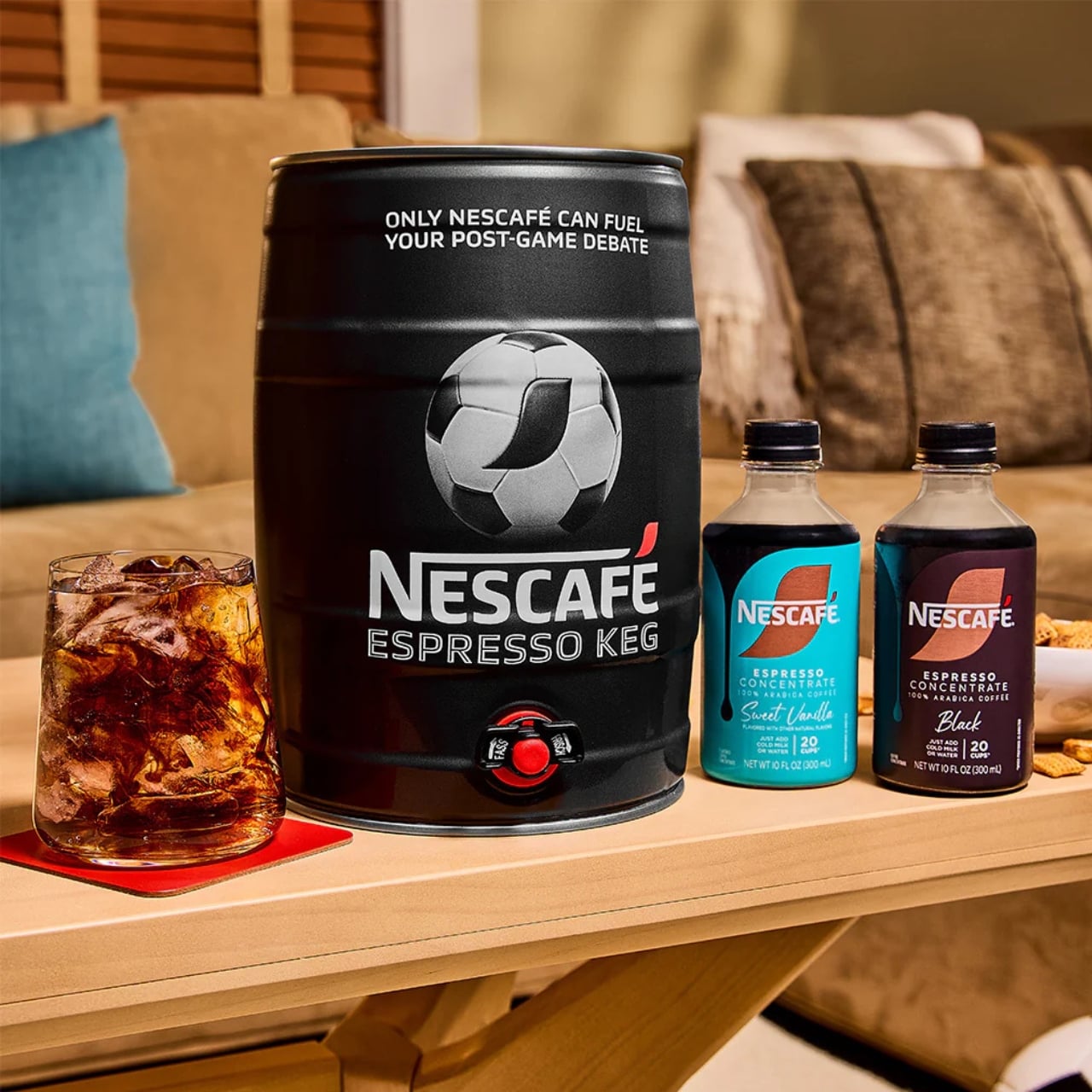
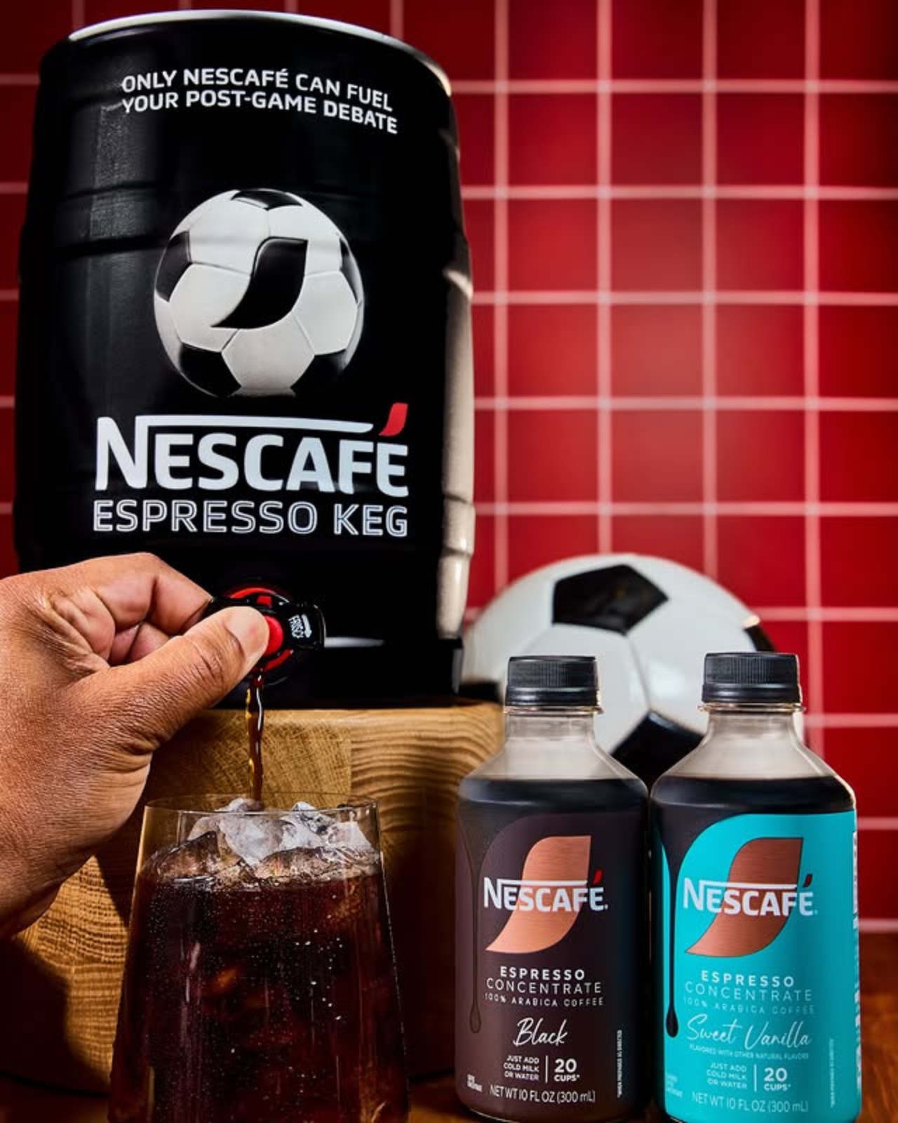
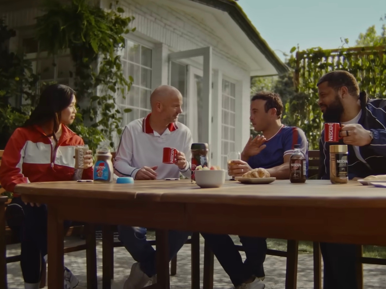
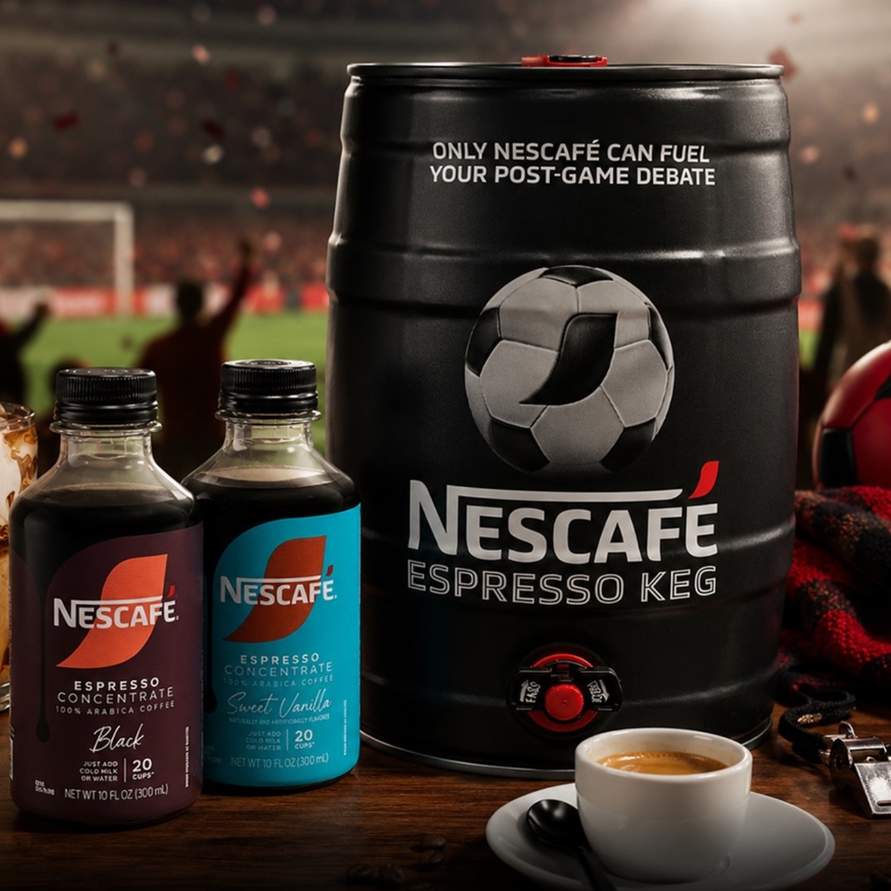
The coffee brand is introducing the NESCAFÉ Espresso Keg, a limited-edition World Cup special designed to help you get into the “Third Half.” This is a ritual they want to start, and caffeine may be the perfect companion as you get talking about the 90-minute-and-change match you just finished watching. They believe that “the conversation doesn’t end after the game,” and it should be helped along over a cup of coffee.

Designer: NESCAFÉ

The keg actually looks like your usual beer keg, but instead of dispensing beer, you’ll have coffee pouring out of it as you discuss every goal, call (or non-call), and every exciting and controversial thing that happened during the match. Each package comes with a 5L keg and two 10oz bottles of NESCAFÉ Espresso Concentrate in Black and Sweet Vanilla flavors. In case you don’t know how to mix it up, it also comes with instructions and recipes so you can “brew” the perfect cup for your Third Half. You’ll be able to serve around 20 cups with the package, so you may need to stock up on more concentrate if you have a larger crowd attending your watch party.

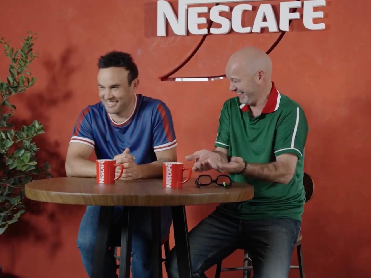
There is a special bi-cultural campaign to promote this limited-edition keg. We’re not sure why Canada was left out of the equation, but U.S. soccer legend Landon Donovan and Mexican fútbol icon Luis García are the faces of the campaign, representing their two countries. It’s priced at $10 as a tribute to Donovan’s jersey number, the iconic number 10 he wore while bringing glory to the U.S. Men’s National Team. To make it even more of a must-have item, there will be three separate drops, and the last one is this coming June 10, just a few days before the start of the World Cup.

And it turns out the concept isn’t just a clever marketing angle, as the numbers actually back it up. According to NESCAFÉ, 73% of soccer fans already drink coffee during game time, making it a surprisingly natural fit at any watch party table. Rob Marsh, NESCAFÉ’s Marketing Director, summed it up well: “We’ve coined a new half, ‘The Third Half,’ to represent the moments after and in-between games when passionate debates peak. Like any good conversation, these often take place over a beverage, making our coffee and the Nescafé Espresso Keg the perfect fuel to keep things flowing.”

It’s a fun and genuinely refreshing idea, especially for watch parties where not everyone is reaching for a beer, particularly during those early-morning kick-offs that come with a global tournament spanning multiple time zones. The Espresso Keg gives you that same communal, tap-style energy of a classic keg party, just with a serious caffeine boost instead of a headache waiting to happen. Whether you’re a black coffee purist or someone who loves a touch of Sweet Vanilla in their cup, there’s a flavor to match every personality and every strongly-held opinion about the offside rule.

The limited-edition nature of this release makes it all the more exciting. With earlier drops reportedly selling out quickly, demand has clearly been there. If you missed the first rounds, don’t sleep on that final June 10 drop. It’s the kind of collectible that doubles as a genuinely useful party accessory, a rare combination at any price point, let alone $10.

If you’re serious about hosting the ultimate World Cup watch party this summer, the NESCAFÉ Espresso Keg might just be the most unexpected and delightful centerpiece you didn’t know you needed. So mark the date, set up those fold-out chairs, hang your team’s flag, and get ready to debate every single moment of the beautiful game, one perfectly poured cup at a time.

The post NESCAFÉ Just Replaced Beer at Your World Cup Party for $10 first appeared on Yanko Design.
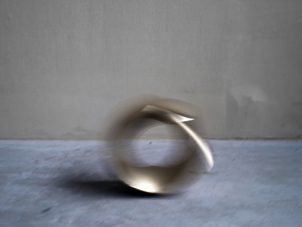
The Designer Who Hid His Dumbbells Built Bronze Ones Worth Displaying

Home fitness equipment has quietly moved into the living room, but most of it hasn’t earned its place there. Dumbbells in particular are purely functional objects, usually made with rubber-coated iron and sold on practical merits alone. They get used, then tucked away or left on the floor because nobody really wants them on display. For most people, what’s out of sight tends to be out of mind.

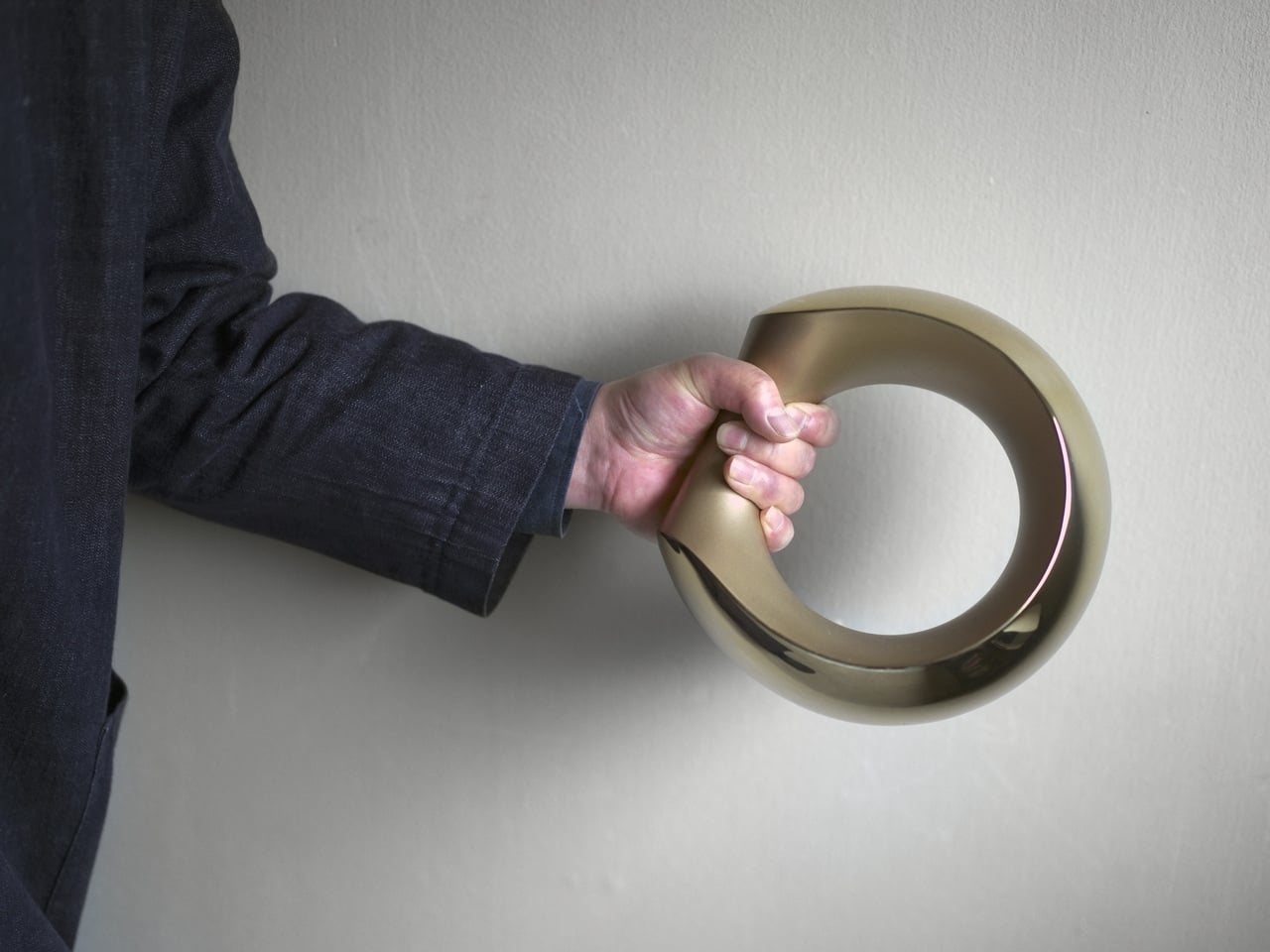
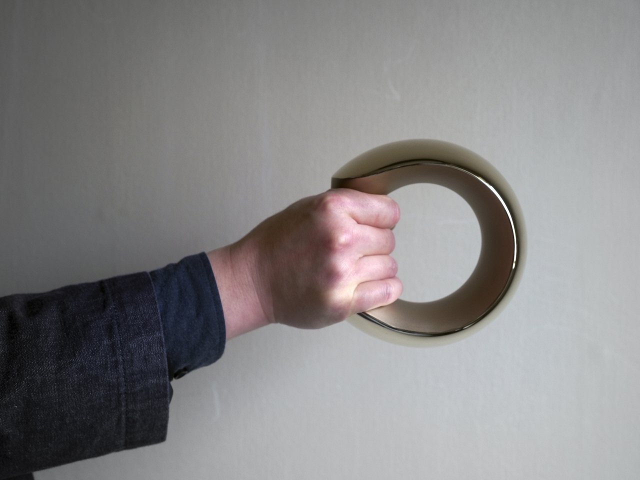
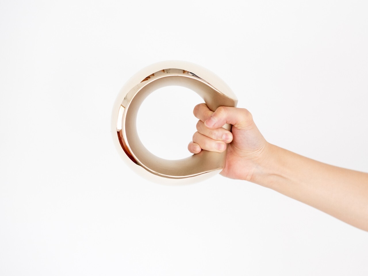
Tokyo-based designer Kenji Abe knows this from personal experience. He would put his own dumbbells in a drawer when friends came over, and then forget about them entirely. That specific frustration became the brief for MANTLE, a pair of bronze dumbbells produced under the ifuki brand in Takaoka City, Japan. The goal was a dumbbell you’d actually want to leave out, all day, even on a good shelf.

Designer: Kenji Abe

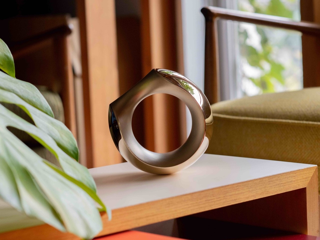
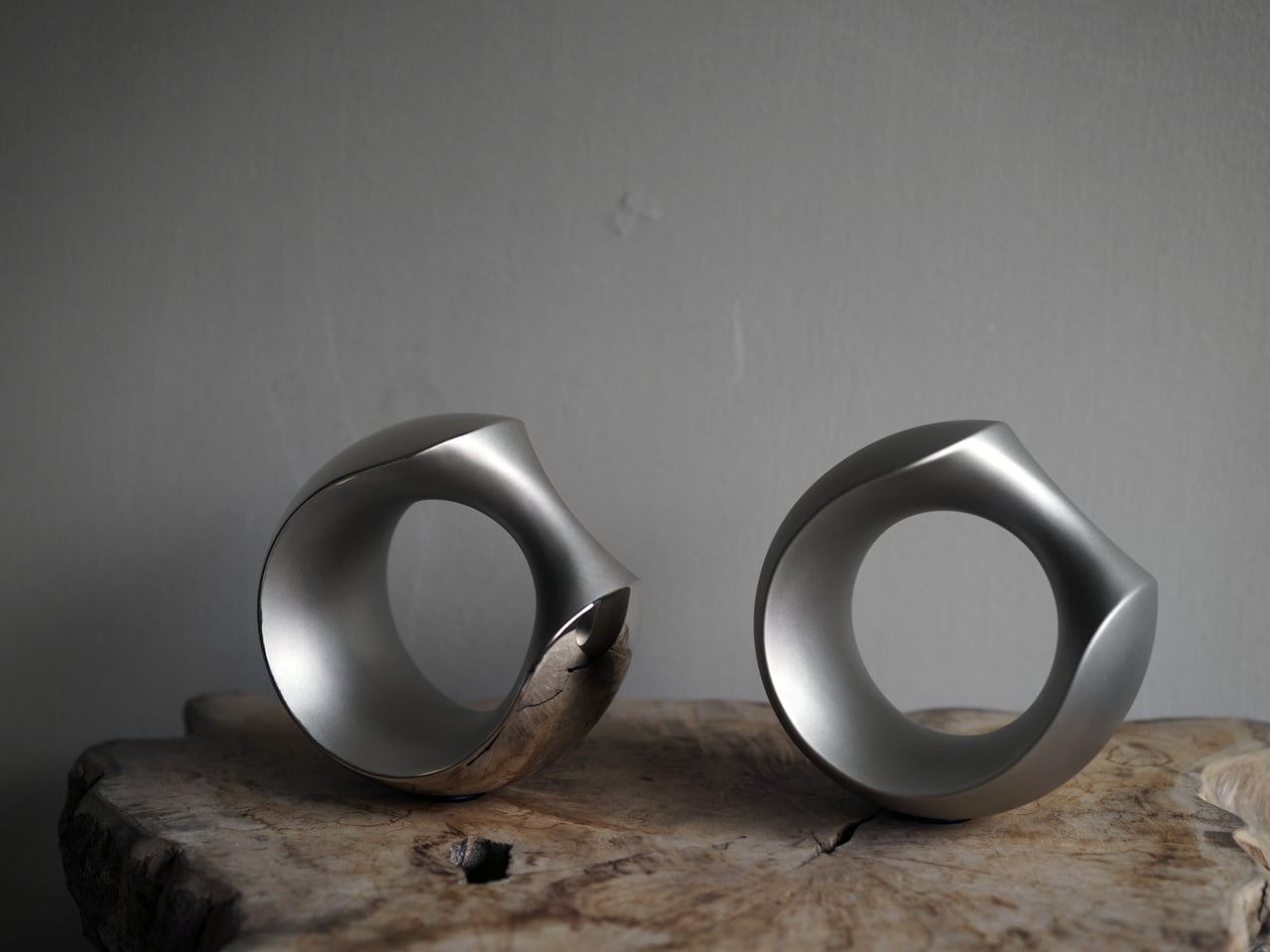
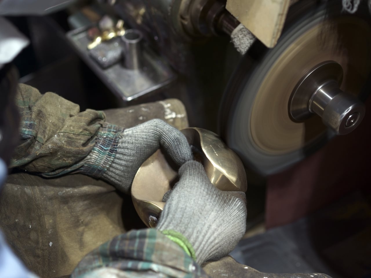
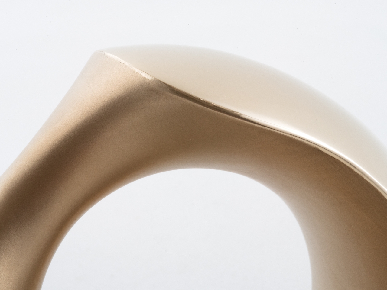
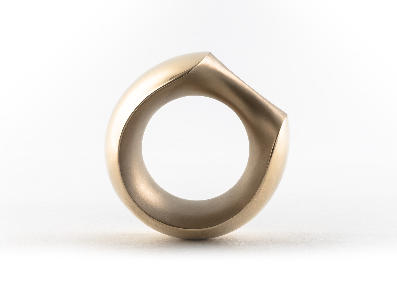
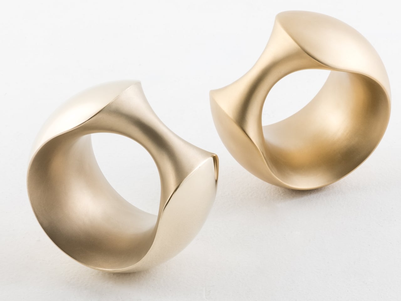
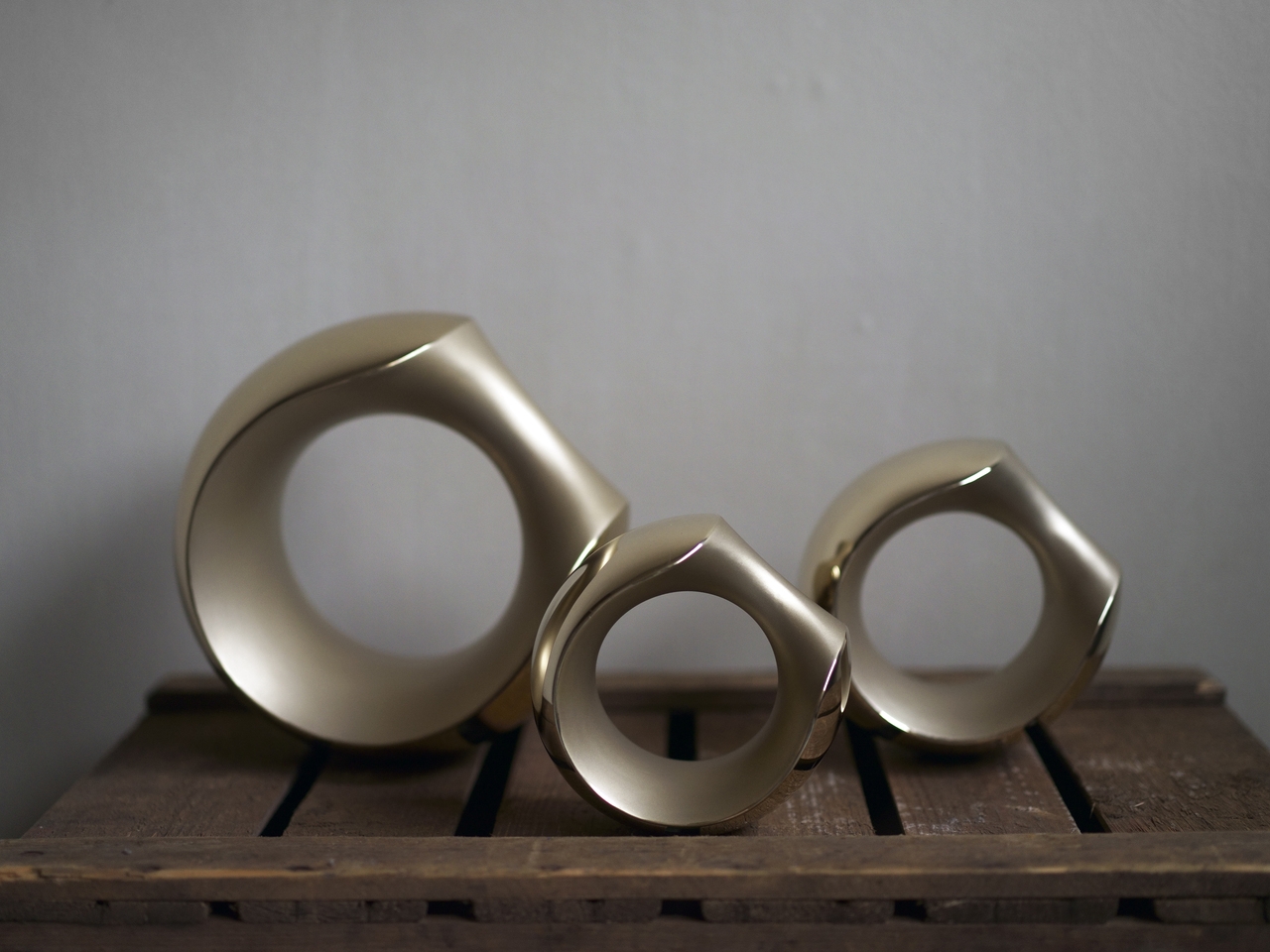
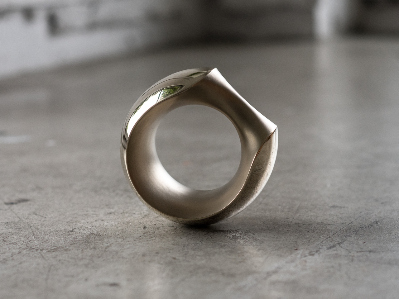
That required rethinking the object from the start. MANTLE combines several surface treatments on a single cast form, with sandblasted sections contrasting against mirror-polished areas. The result carries the visual weight of a sculpture or a piece of jewelry rather than exercise equipment. Set on a side table, it reads as an intentional object, not something that ended up there because there was nowhere else to put it.

The form is just as deliberate. Inspired loosely by the armadillo, the sculptural shape is perfectly balanced, which means the dumbbell stands upright on its own without tipping. A grip tilted at 45 degrees makes it easy to pick up from any angle, and the smooth bronze surface was selected specifically to feel comfortable against skin rather than abrasive during a workout.

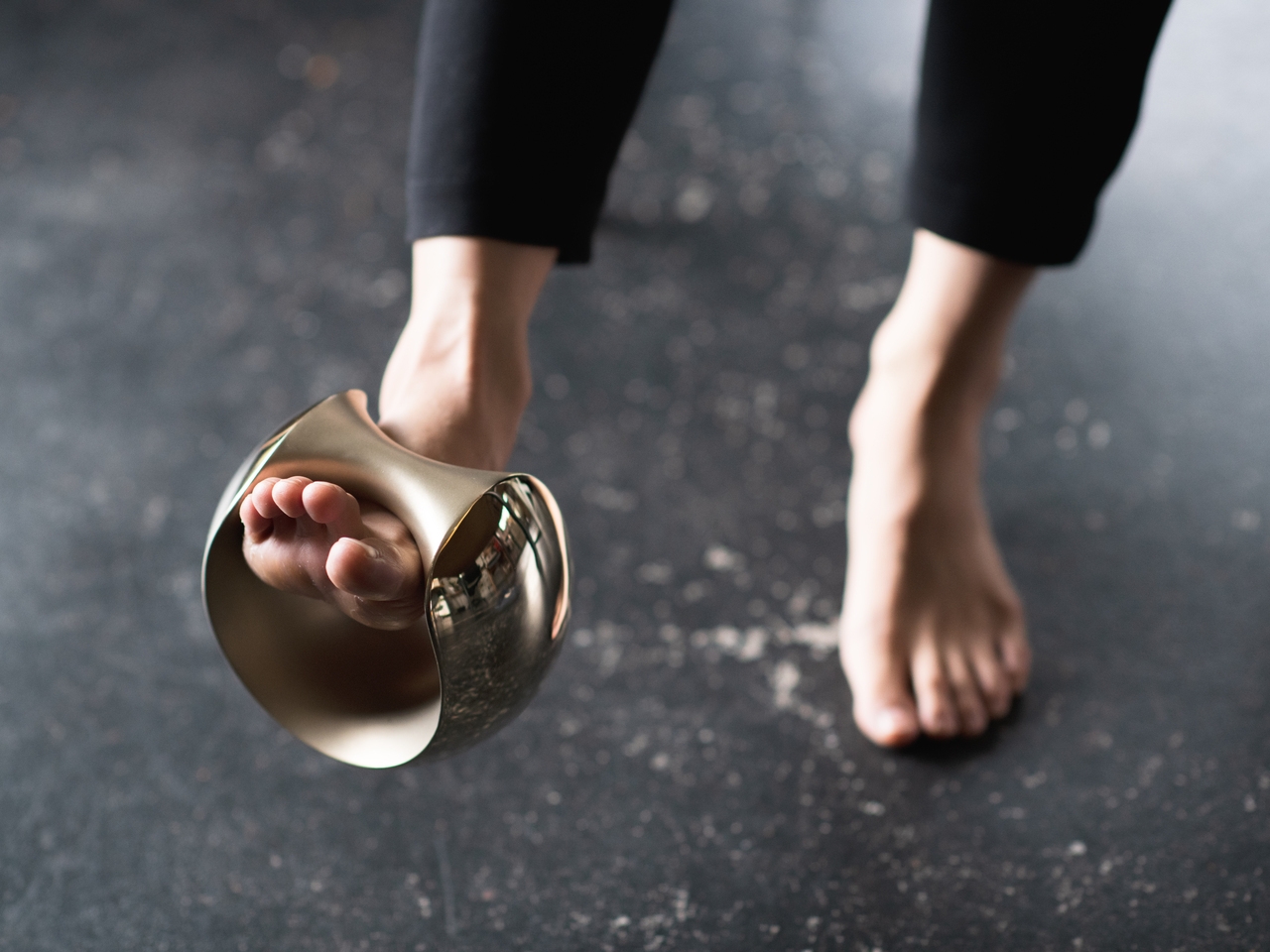
The versatility goes further than the grip. You can hold it conventionally for curls or presses, slide it over a wrist to add resistance to arm movements, or hook it around a foot for leg raises. The same object adapts across different exercises without needing adjustments, and the balanced form means it doesn’t fight you regardless of how you’re holding it or what you’re doing.

MANTLE also ages gracefully. Bronze develops character over time, and the combination of matte sandblasting and mirror polishing makes that aging process something worth watching. The material catches light differently across its surfaces, and the contrast in textures gives it a depth that most gym equipment doesn’t have the ambition to pursue.

MANTLE won the Grand Prize at the Toyama Design Competition in 2018 before being developed into a commercial product through ifuki. Abe’s reasoning has always been straightforward: a well-designed dumbbell doesn’t get hidden away, and one that doesn’t get hidden away is one that actually gets used. The drawer stays empty, and the habit becomes a little harder to abandon.

The post The Designer Who Hid His Dumbbells Built Bronze Ones Worth Displaying first appeared on Yanko Design.
Nike Just Turned Air Into a Fabric, and It Actually Works

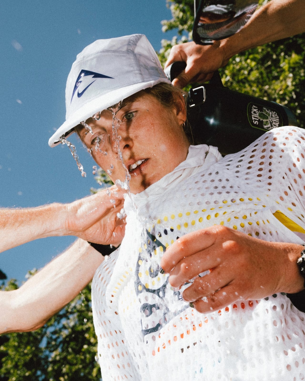
There are moments in design when a product looks so strange that you can’t stop staring at it, and then you find out how it works and it suddenly makes perfect sense. That’s exactly what happened when trail runner Caleb Olson crossed the finish line at the 2025 Western States Endurance Run in the second fastest time in the race’s history. People clapped. Then they immediately started asking: what is he wearing?

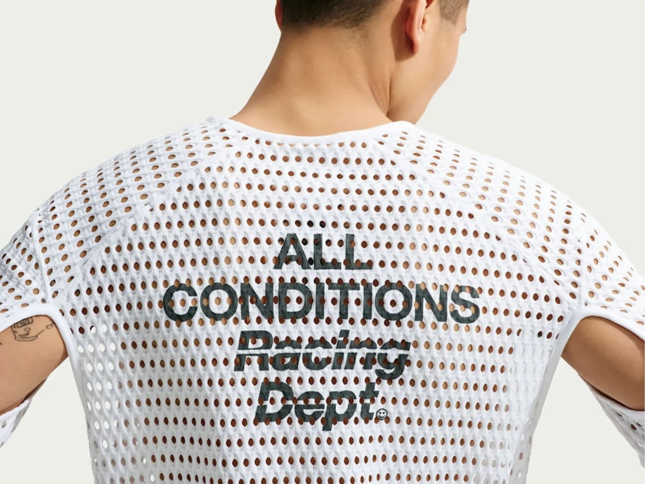
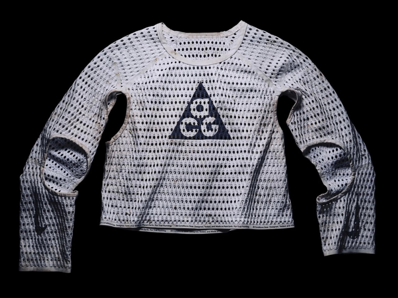
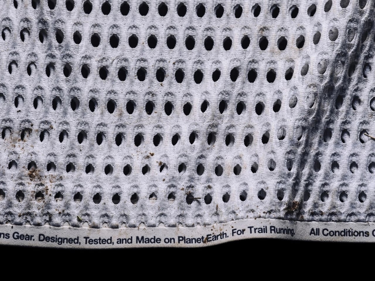
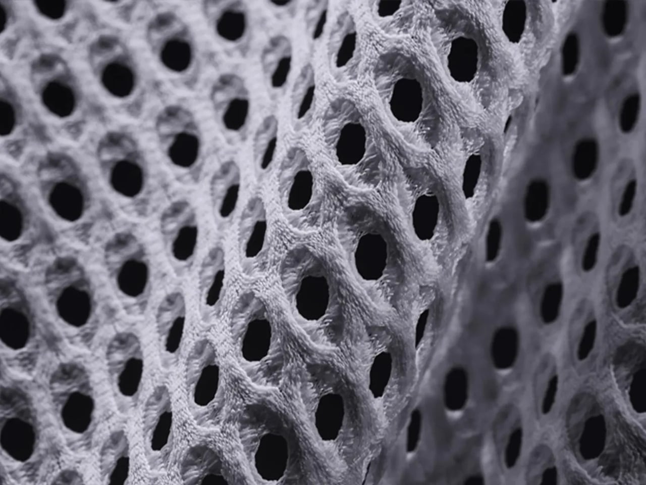
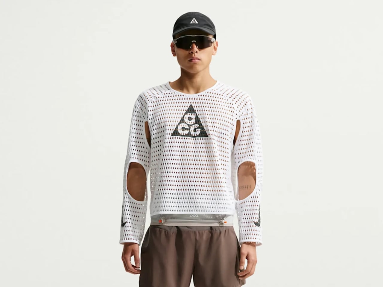
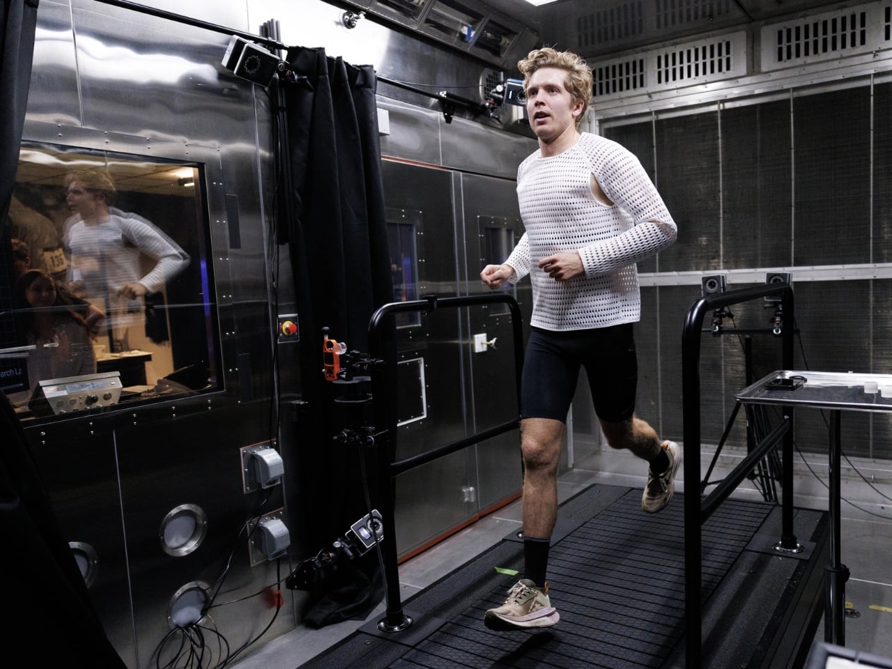
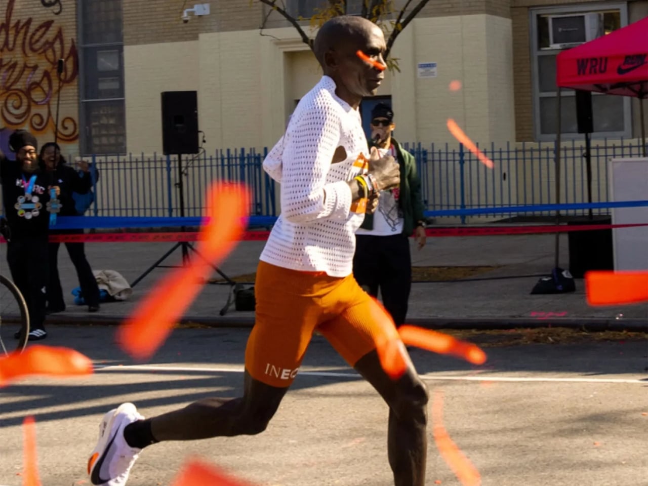
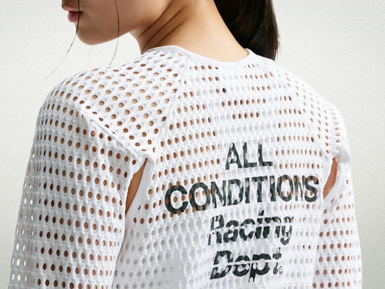
The shirt is the Nike ACG Radical AirFlow, and calling it a “shirt” feels generous. It looks more like a sweater that had an encounter with a drill press. Cone-shaped holes punctuate the fabric in deliberate patterns, creating what Nike calls airducts. They’re not just decorative (though they definitely are that, too). They’re functional in a very specific, physics-driven way. The design harnesses the Bernoulli principle and the Venturi effect, two concepts most of us haven’t thought about since a physics class we may or may not have paid attention to. The short version: as air moves through a narrowed opening, it speeds up and pressure drops. Nike essentially engineered that phenomenon into a fabric layer sitting on your body while you run.

Designer: Nike

The result, according to Nike’s own testing, is a top that absorbs and retains 50% less sweat than DriFit, the brand’s long-trusted performance fabric. It’s also 25% less resistant to the evaporation of sweat. For those of us not running ultramarathons in the California mountains, those numbers might sound abstract, but the principle holds whether you’re hiking a trail in August or doing anything remotely active in heat. The body cools itself through sweat, and anything that helps that process happen faster is worth paying attention to.

What makes this interesting beyond the performance specs is how it got here. The Radical AirFlow came out of Nike’s All Conditions Gear line, a sub-brand with a very specific purpose: designing for the outdoors, not the gym. ACG lives by the motto “Designed, Tested, and Made on Planet Earth,” which sounds like a marketing line until you realize the top was debuted mid-race at one of trail running’s most grueling events. The testing wasn’t a controlled brand activation. It was a competitive ultra-marathon.

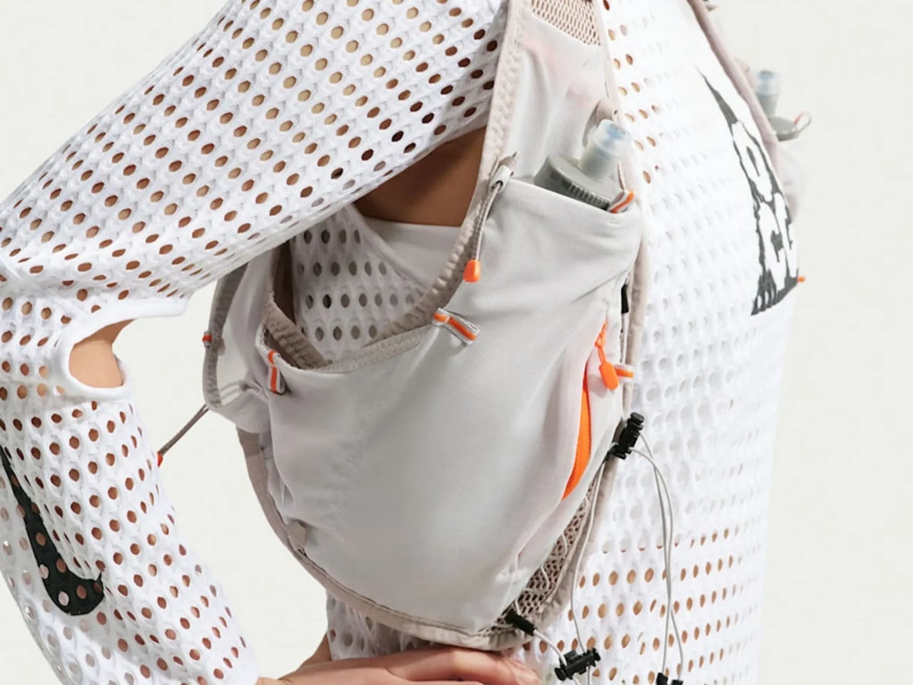
The design itself doesn’t pretend to be subtle. It’s a cropped silhouette, worn long-sleeved, with large cutouts under the arms and at the elbows for mobility. The airducts are visible and intentional. It reads more like a prototype from a materials science lab than a rack piece at your local athletic retailer. And I think that’s the point. Nike ACG has always occupied that niche space between gear and fashion, performance and provocation. The Radical AirFlow leans all the way into that tension.

It also went viral in a way that athletic apparel rarely does, because the response was split. Some people immediately understood it. Others were convinced it was a joke. Trail runner Drew Holmen, an ACG athlete who tested the garment, said it plainly: “When I first saw the product, it was like nothing I had ever seen before.” That reaction, repeated by thousands of people online, is actually a good sign in design. If no one’s confused, nothing is new.
The broader conversation Radical AirFlow opens up is one about where performance apparel is headed. For a long time, innovation in this space meant better synthetic blends, tighter weaves, smarter seam placement. The Radical AirFlow goes in the opposite direction. It removes material entirely, then structures the absence of it. The holes aren’t a compromise or a cost-cutting measure. They’re the technology.
Whether you’d actually wear it outside of a race context is a fair question, and a cap version built on the same technology is already on the way, which might make the concept more accessible. But the full racing top is a genuine design statement, one that prioritizes function in a way that can’t be hidden. You can see it working. That kind of transparency, in design, is rarer than it should be.

The post Nike Just Turned Air Into a Fabric, and It Actually Works first appeared on Yanko Design.