As awareness of our environmental impact grows, every choice we make matters, from the food we eat to the things we buy. Yet, we often overlook the toys our children play with. Many traditional toys made from plastic and mass-produced leave a lasting footprint on the planet.
Choosing eco-friendly toys is more than a passing trend, as it is a conscious step toward a healthier future. Made from sustainable, non-toxic materials, these toys are safer for kids and built to last, reducing waste. Each thoughtful purchase makes playtime joyful while caring for the world your children will grow up in.
The following points explore why shifting to sustainable toys matters and should be considered for children.
1. Hidden Hazards of Conventional Toys
Many traditional toys come with risks that aren’t obvious. Made from cheap plastics like PVC, they often contain harmful chemicals such as phthalates and BPA. These substances are linked to various health problems and can leach out, especially when children put toys in their mouths, something every parent knows happens frequently.
The impact goes beyond health concerns as plastic toys don’t break down naturally, piling up in landfills or turning into microplastics that pollute oceans and harm wildlife. Choosing eco-friendly toys helps protect your child while also supporting a cleaner, safer planet for future generations.
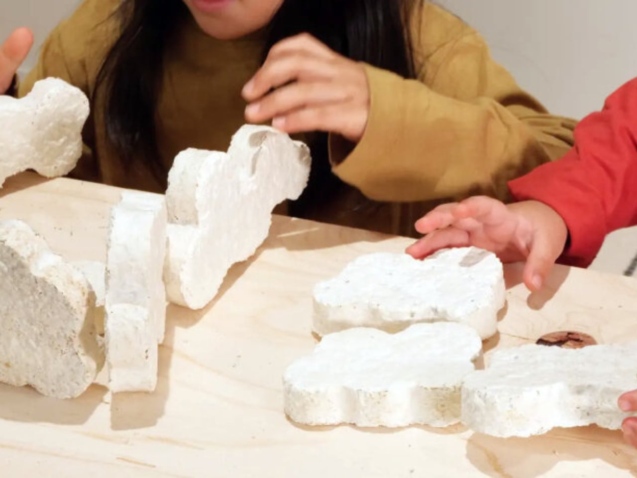
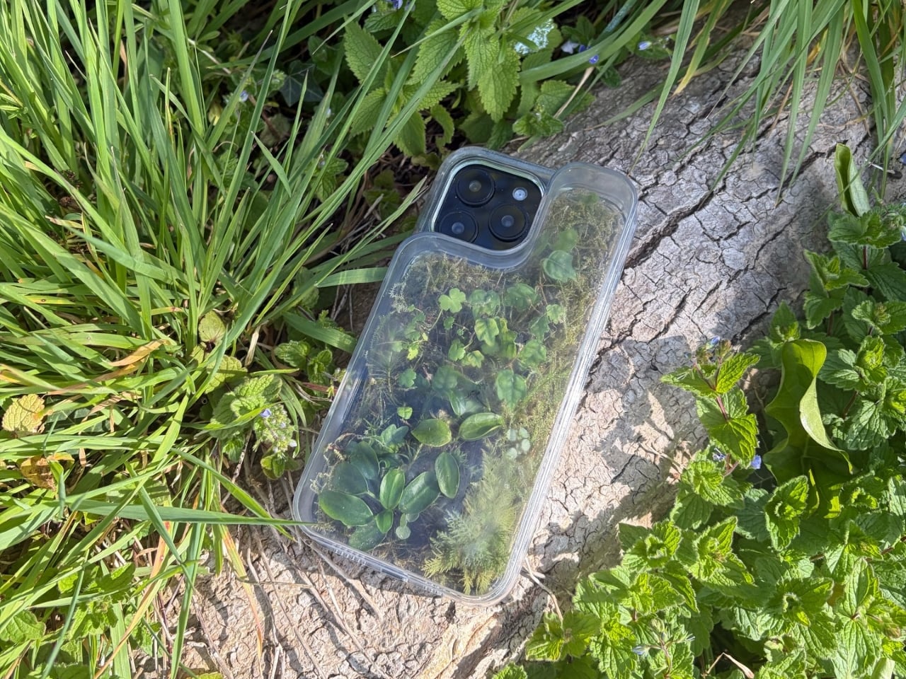
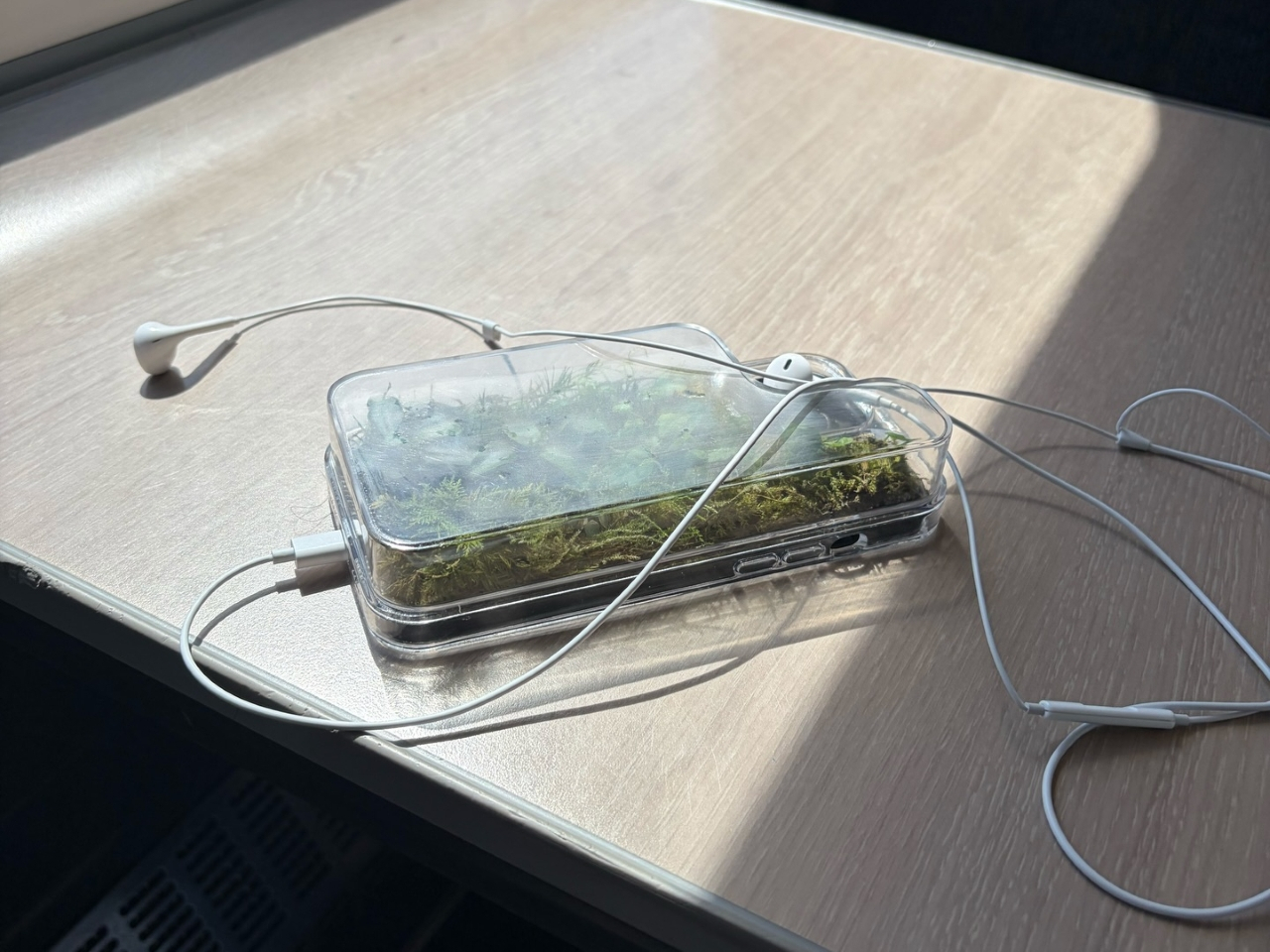
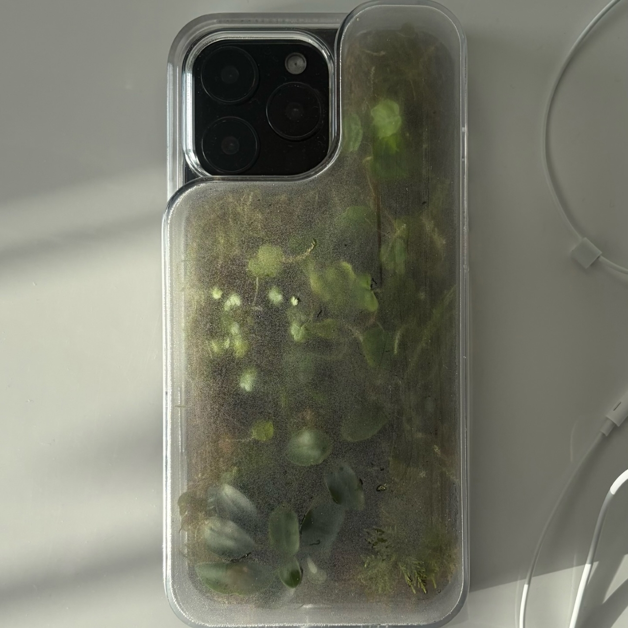
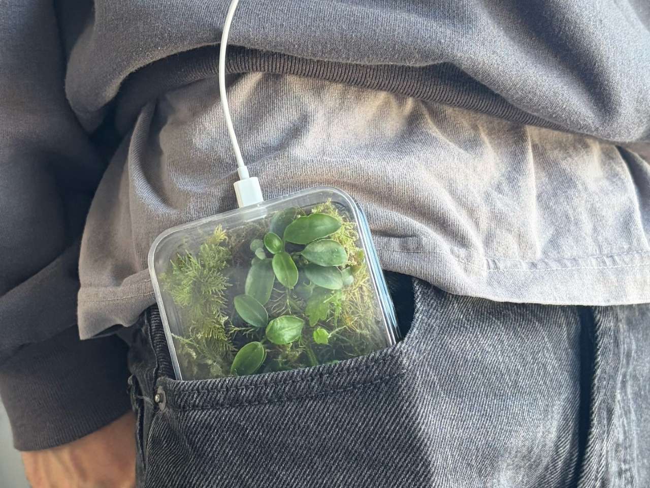
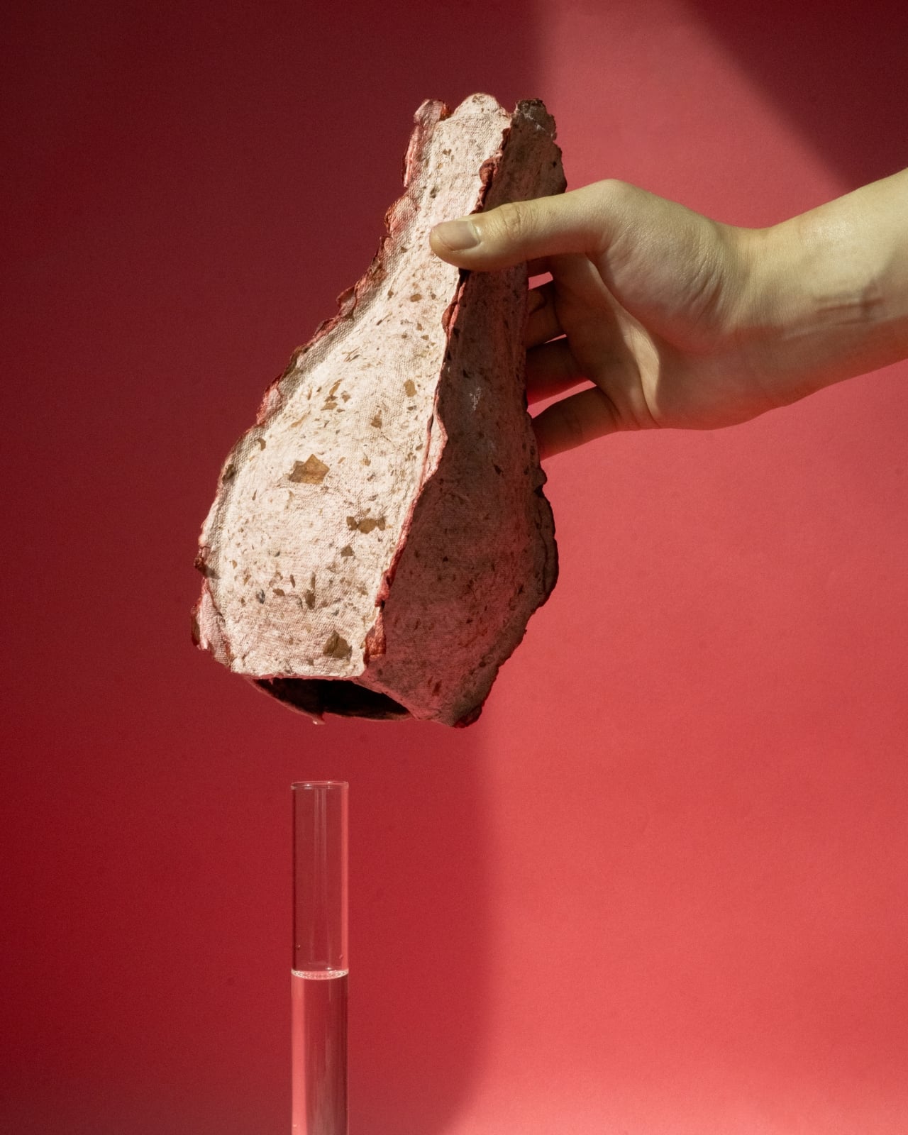
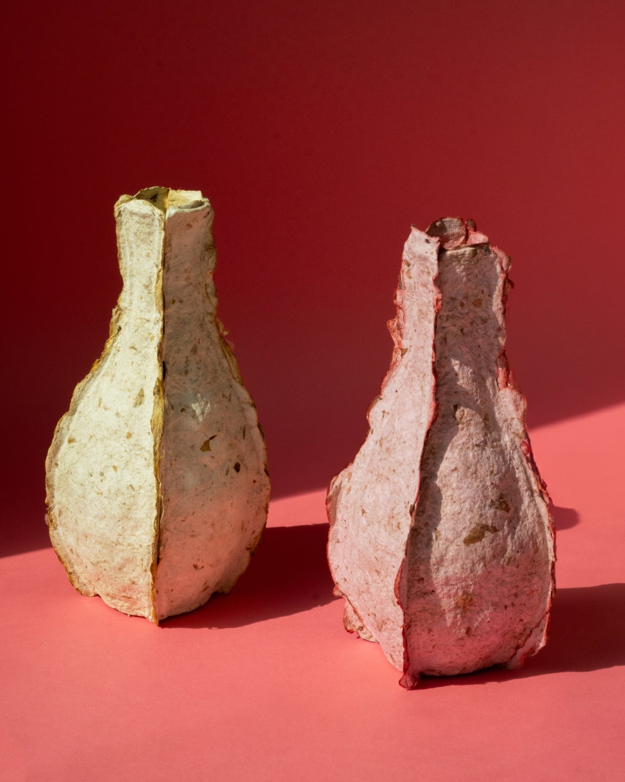
MYMORI’s Mushroom Mycelium Toy Kit allows families to grow building blocks from mushroom mycelium, providing a sustainable alternative to plastic toys. The kit contains mycelium material, reusable PETG molds, flour, gloves, alcohol wipes, and clear instructions. Users simply mix the ingredients, fill the molds, and keep them moist as the mycelium develops into solid, lightweight blocks suitable for stacking and imaginative play.
The growth molds are washable and reusable, and the blocks can be composted when no longer needed, making the kit fully eco-friendly. It offers a hands-on introduction to biomaterials, producing unique, durable blocks. MYMORI’s kit combines creativity, science, and sustainability, giving families an innovative way to enjoy safe, reusable toys that are environmentally responsible.
2. Natural Beauty, Sustainable Play Choices
Eco-friendly toys feel different the moment you hold them. Made from natural materials like FSC-certified wood, organic cotton, and bamboo, they are safe and free from the harsh chemicals found in many plastic toys. This return to natural elements reflects simplicity, quality, and mindful craftsmanship, offering a safer play experience for children.
These materials are also sourced with care, keeping the environment in mind. Wooden toys, for example, often come from sustainably managed forests and are built to last, making them perfect to pass down through generations. Choosing them supports ethical, planet-friendly production while reducing waste.
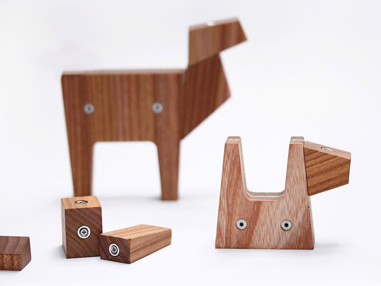
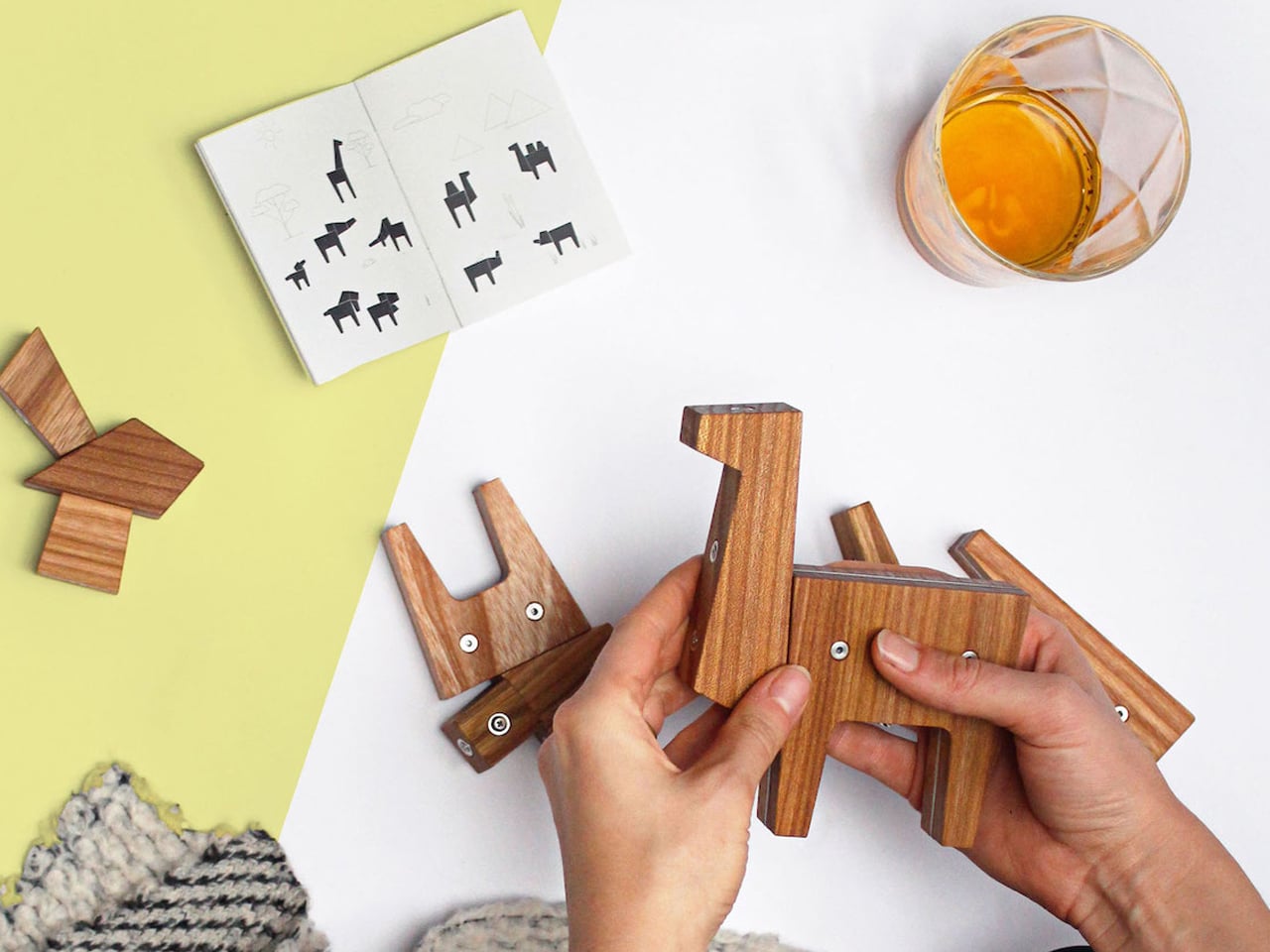
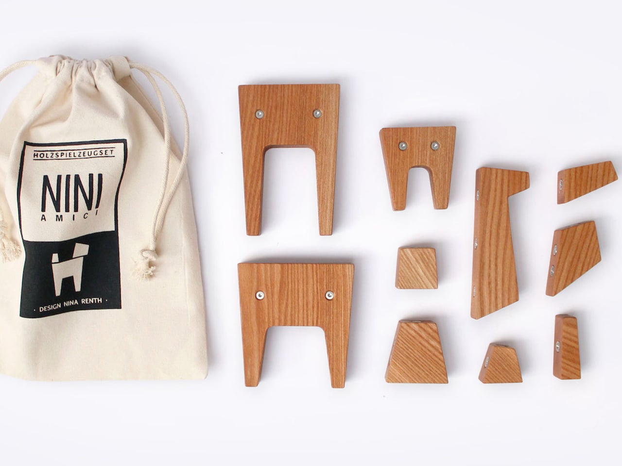
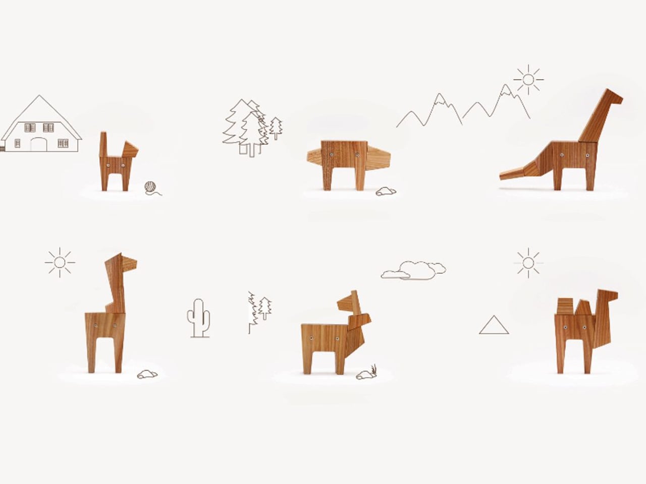
Wooden toys offer a distinct advantage over typical plastic ones. Their timeless design, tactile feel, and minimalist aesthetic make them visually appealing, while their durability and eco-friendliness add lasting value. High-quality wooden toys are rare, and NINI AMICI stands out by combining craftsmanship, sustainability, and modular design. Made from elmwood, the ten-piece set uses magnetic connectors, allowing children to create a wide range of animals. Three base bodies can serve as heads, tails, or humps, giving kids the freedom to explore imaginative play beyond the examples provided.
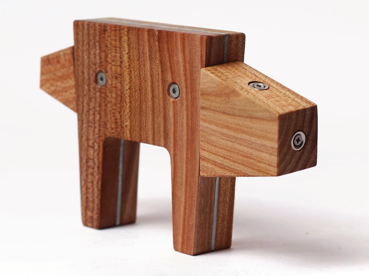
The NINI AMICI toys are handcrafted in Upper Franconia, Germany, in a workshop supporting people with mental and physical disabilities, adding social and ethical value to the set. Suitable for ages three and up, the set includes three basic bodies, seven magnetic parts, a storage bag, and a booklet of animal ideas.
3. Durable Toys That Stand the Test of Time
Plastic toys often break or wear out quickly, adding to waste and frustration. Eco-friendly toys are different as they are built to last. A sturdy wooden train set or a soft toy made from organic cotton can provide years of play, becoming a cherished favorite rather than a short-lived distraction.
While these toys may cost more upfront, they save money over time and reduce landfill waste. They can even be passed down to future generations, teaching children to value well-made items. This shift from disposable to lasting toys supports sustainable living and mindful consumption.
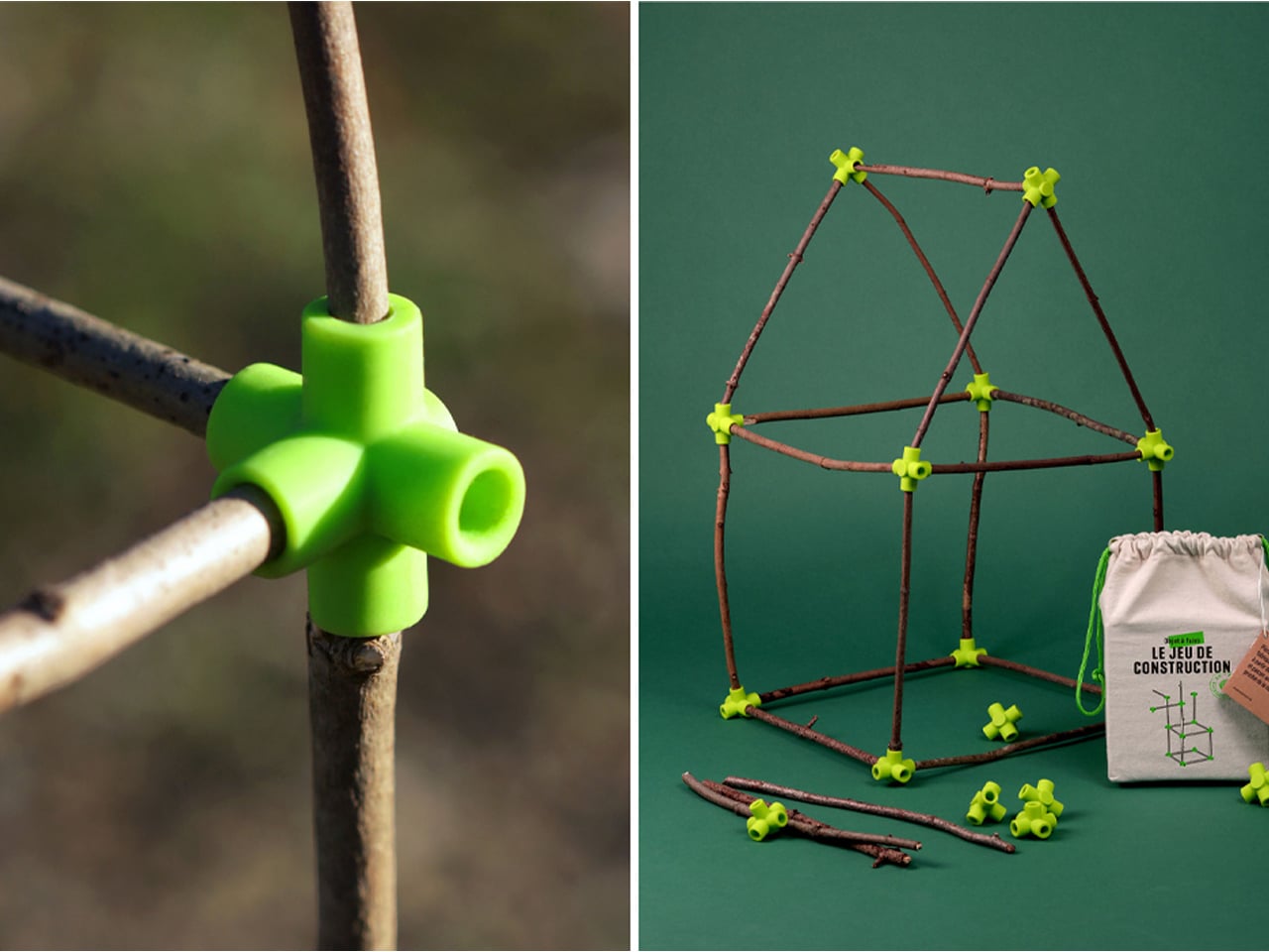
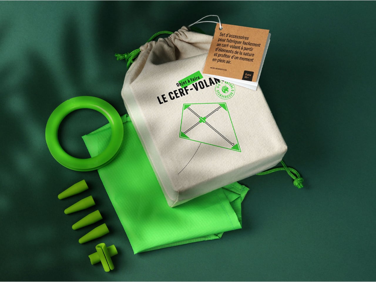
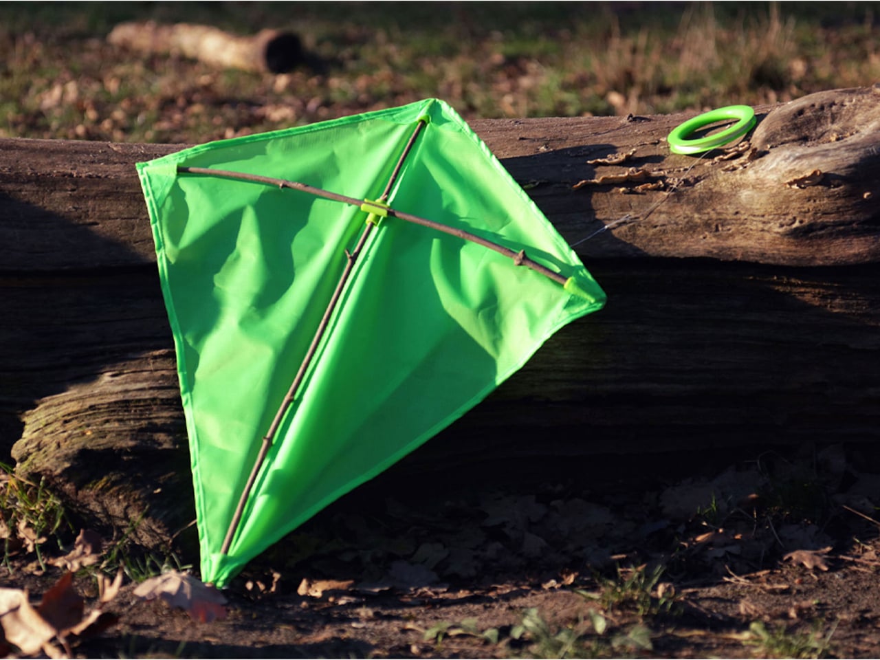
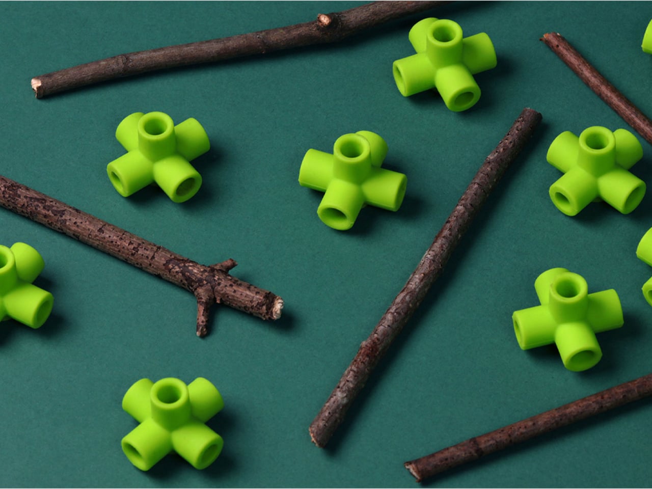
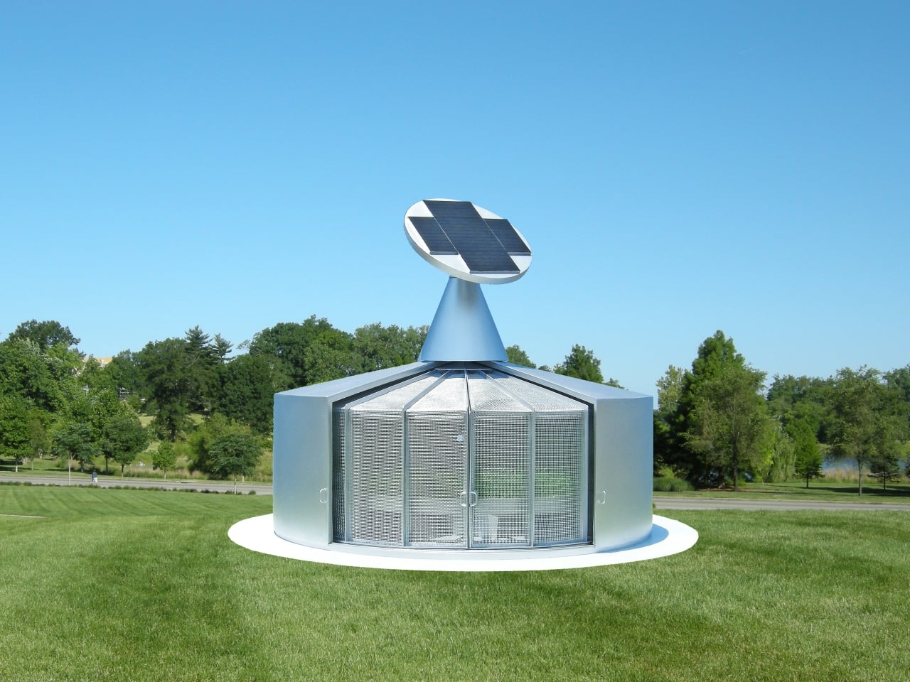
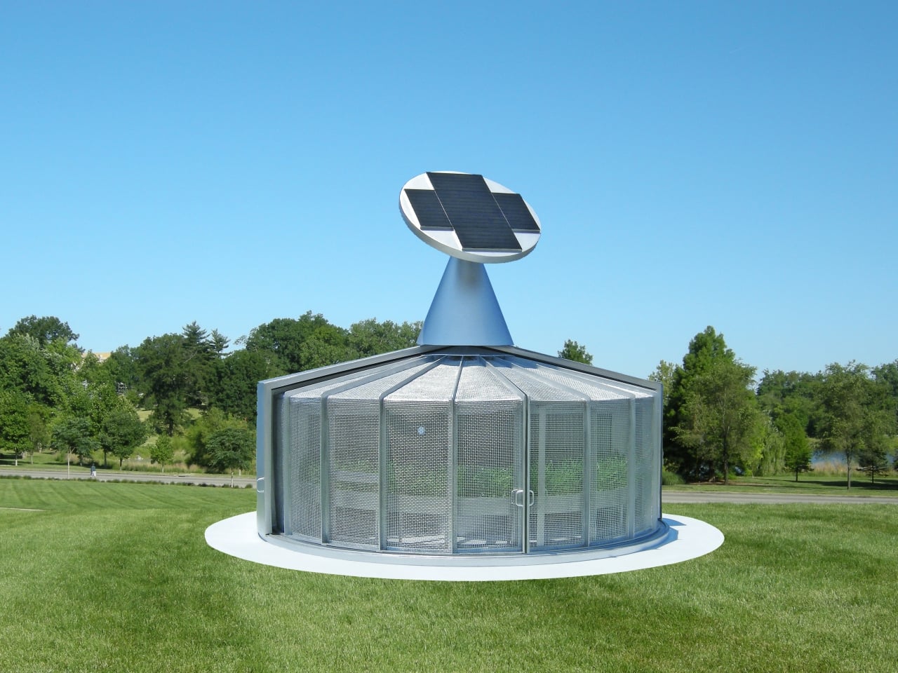
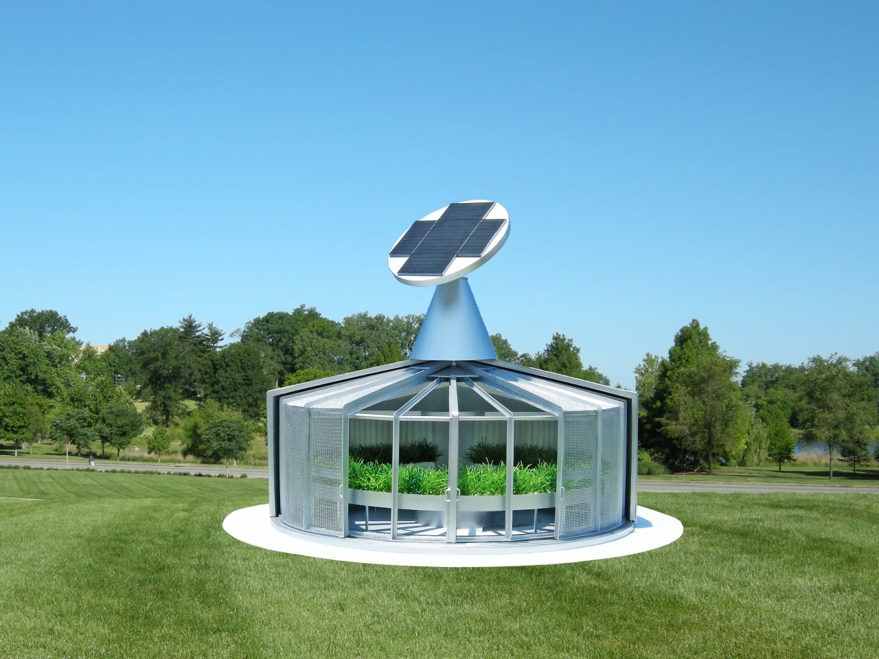
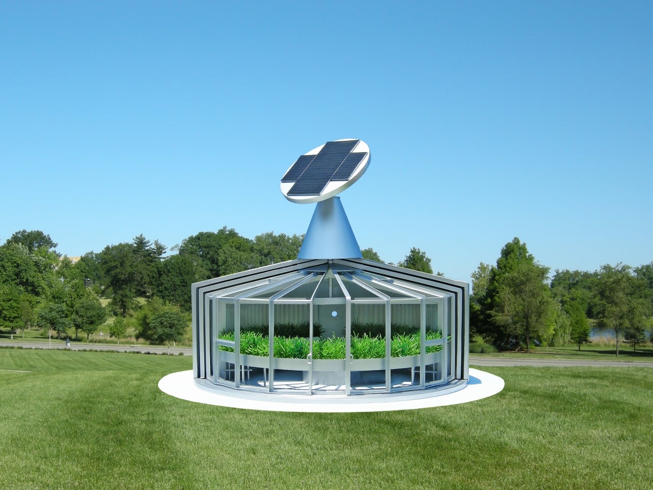
Experiencing nature as a child sparks some of the most imaginative and tactile moments – running through forested backyards, exploring beaches at dawn, or observing the world around us. Studio 5.5 builds on this sense of wonder with The Things To Make, a collection designed to turn ordinary afternoons into hands-on creative adventures. The collection encourages kids to explore, build, and experiment, fostering both imagination and a deeper connection to the natural world.

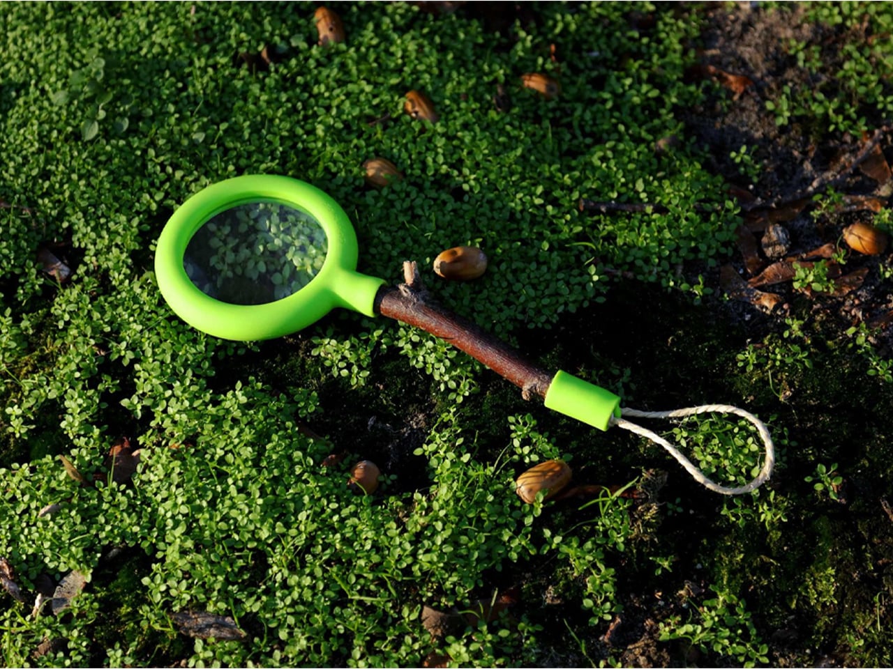
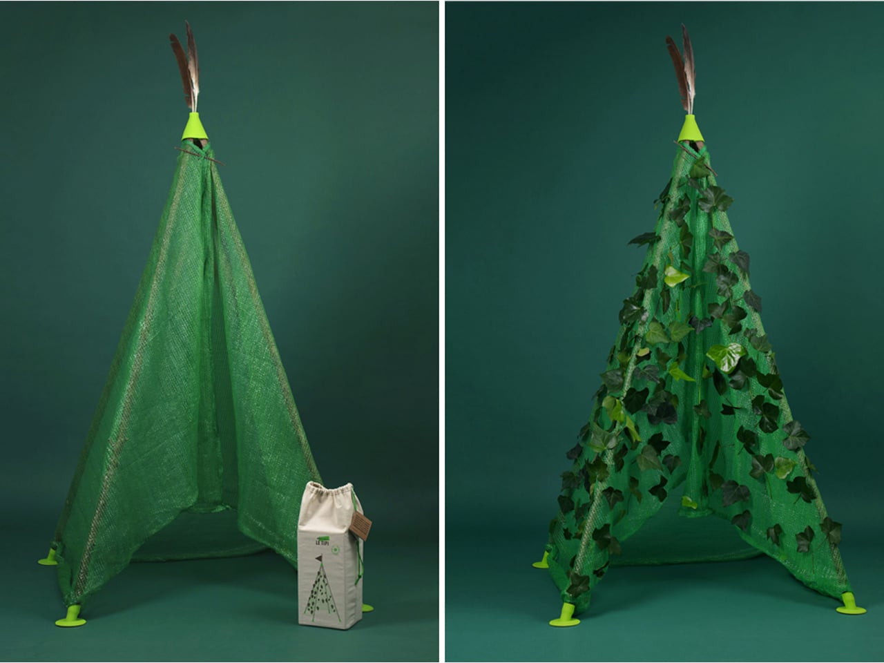
The kits provide modular components like end sockets, fabric, and string, which children combine with found materials such as twigs, branches, and leaves. Kids can construct kites by connecting branches, assemble 3D geometric structures like cubes or pyramids, or even build a magnifying glass using sticks for handles. The collection also includes a tent-building kit with a camouflage tarp for a nature-made hideout. By blending supplied parts with natural elements, children learn design, engineering, and creativity while enjoying playful, eco-conscious experiences outdoors.
4. A Lesson in Eco-Conscious Living
Choosing eco-friendly toys is a simple and effective way to introduce children to sustainability from an early age. They learn, often without realizing it, that even small choices can have a positive impact on the world. Seeing you prioritize products that are kind to the planet helps them internalize these values naturally and encourages thoughtful decision-making.
This hands-on approach also teaches responsibility and environmental care. Explaining that their wooden car comes from a replanted tree or their cotton doll is made without harmful dyes fosters awareness. It empowers children to become mindful consumers and nurtures a generation that values the planet.
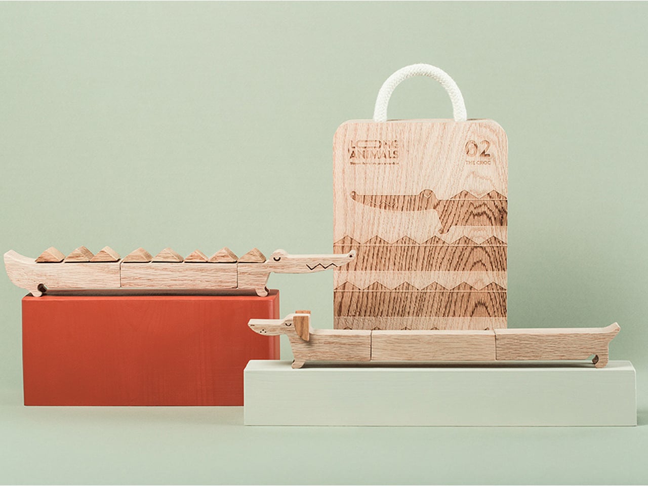
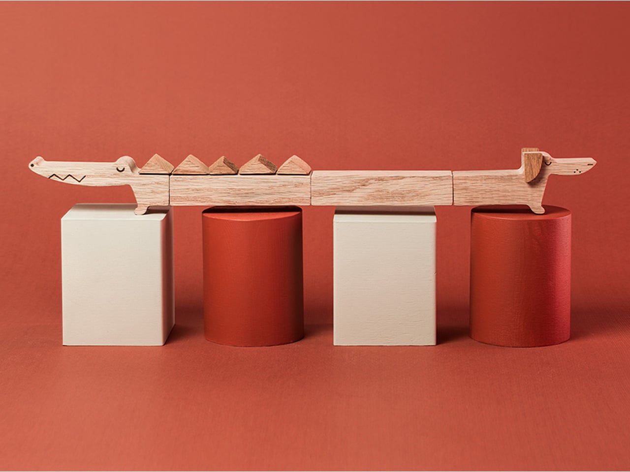
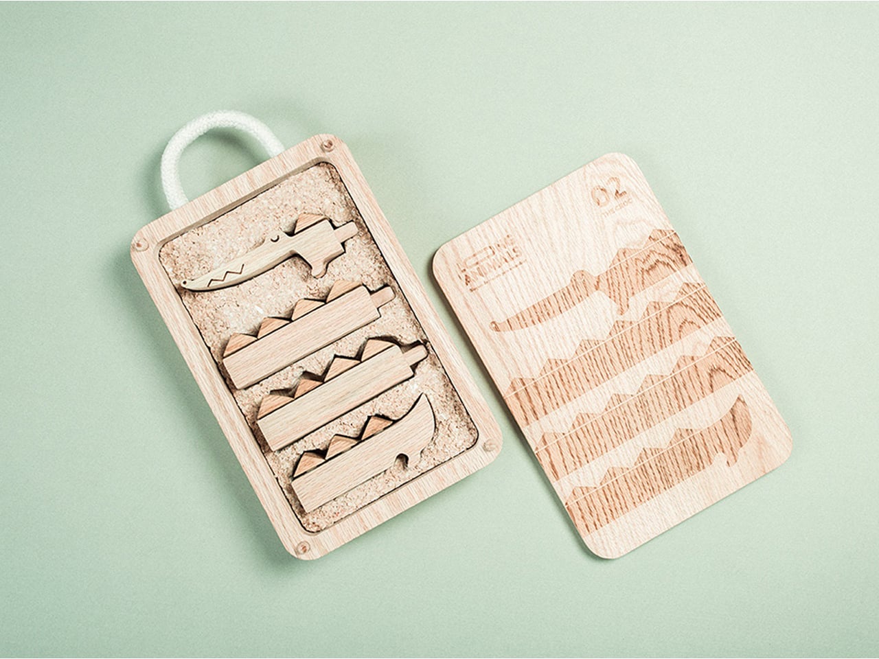
Additionally, plastic waste is a growing threat to our planet, and short-lived products like toys contribute heavily to this problem. Designers Cristina Regidor and Arturo Moreno tackled this challenge with ‘Long Animals’, a line of wooden toys designed for longevity. The toys are literally long, crafted from wood, and packaged in wooden boxes – completely free of plastic and glue. This thoughtful design ensures that both the toy and its packaging are environmentally friendly, offering a playful yet sustainable alternative.
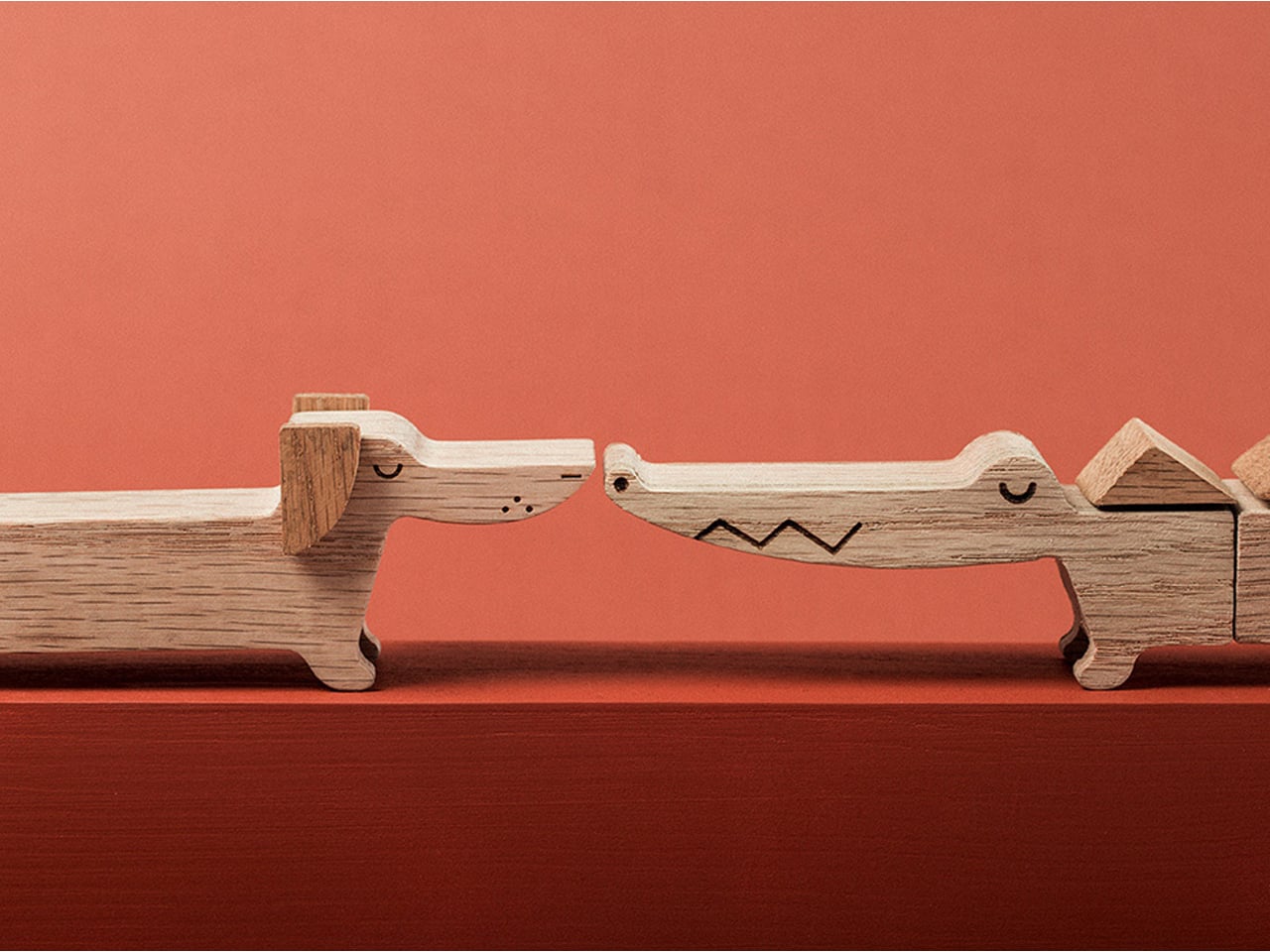
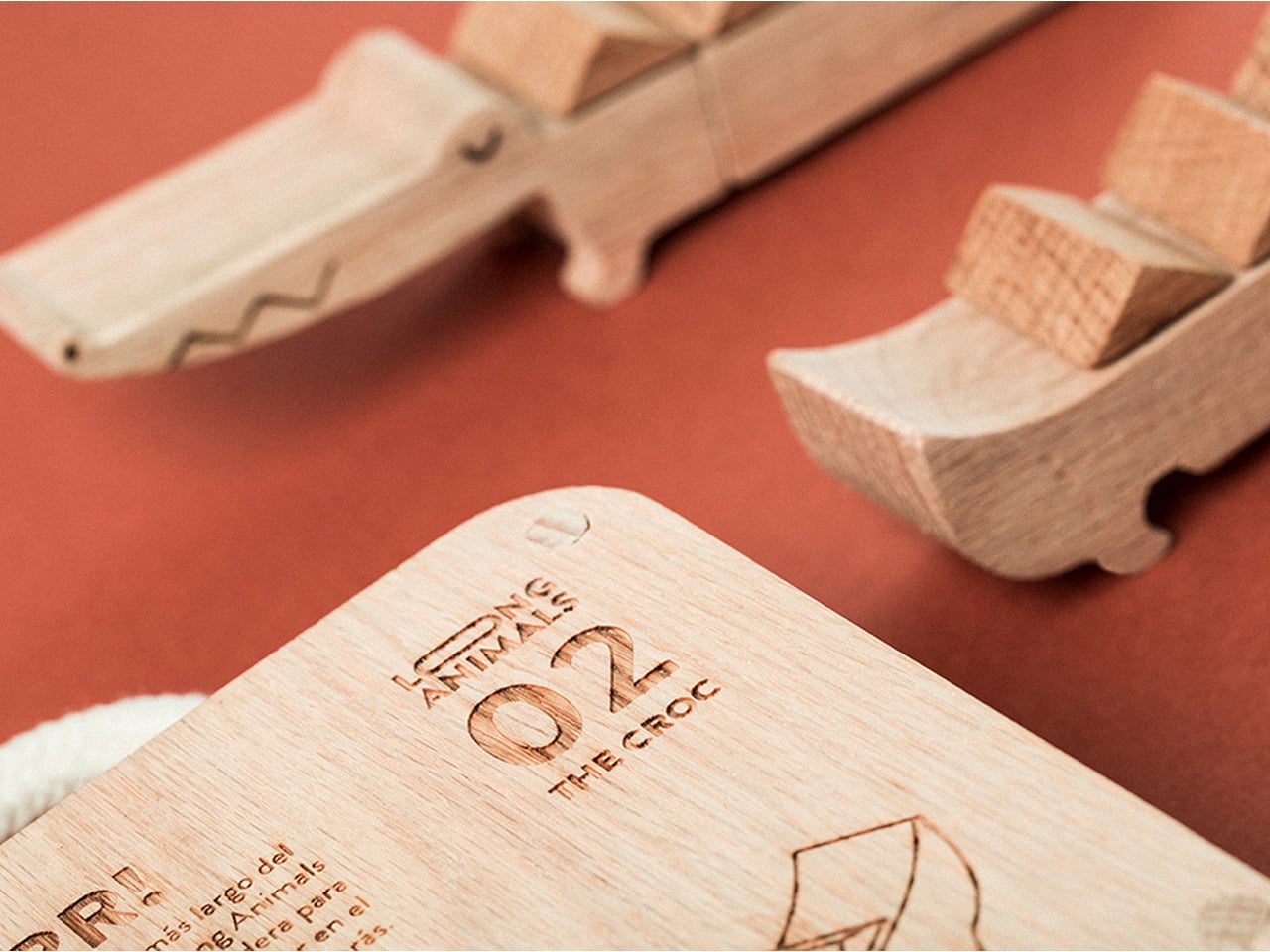
The set includes a dog and a crocodile, assembled with wooden dowel pins that are also used for the packaging. Instructions are engraved on the outer panel for clarity. To minimize waste further, the inner protective packaging is made from wood residues combined with the fungus Pleurotus ostreatus, grown into a light, eco-friendly mycelium structure. With Long Animals, children can enjoy creative play while supporting a greener planet.
5. Supports Ethical and Small-Scale Production
Buying an eco-friendly toy often means supporting small businesses or artisans who care deeply about their craft and the environment. Unlike large corporations focused on profit, these creators follow ethical labor practices and maintain transparent supply chains. Your purchase encourages more businesses to adopt sustainable and responsible approaches, creating a positive ripple effect in the market.
Choosing these toys is about more than the product itself; it’s about the values and effort behind it. From the hands that crafted it to the principles of the brand, every purchase promotes ethical practices and environmental responsibility, helping shape a better, more conscious world.
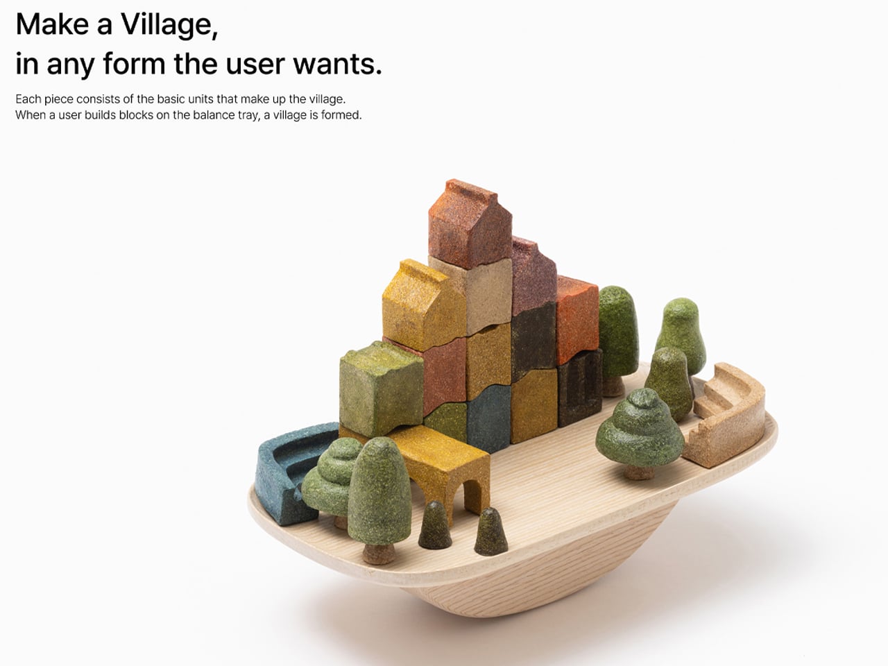

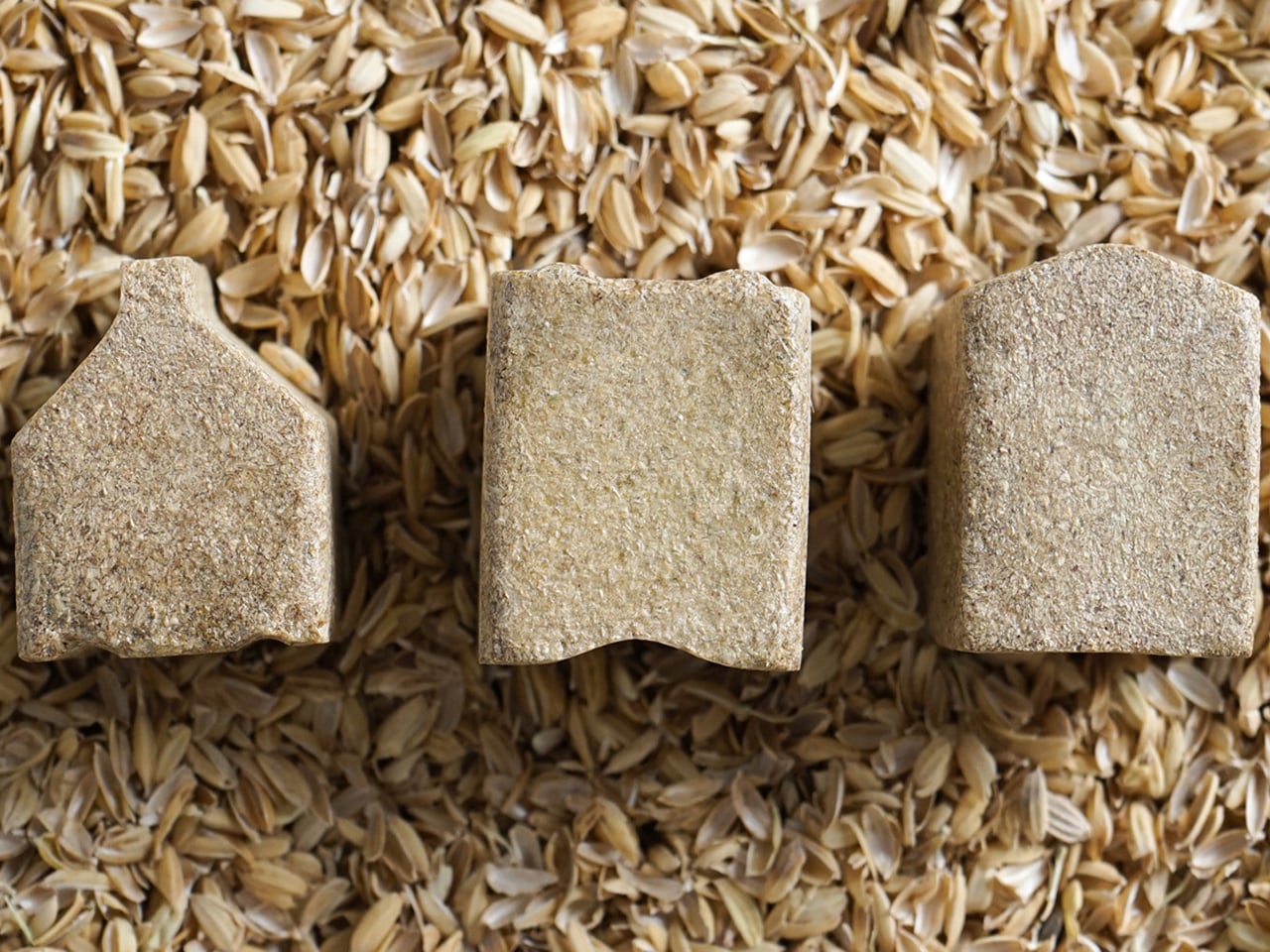
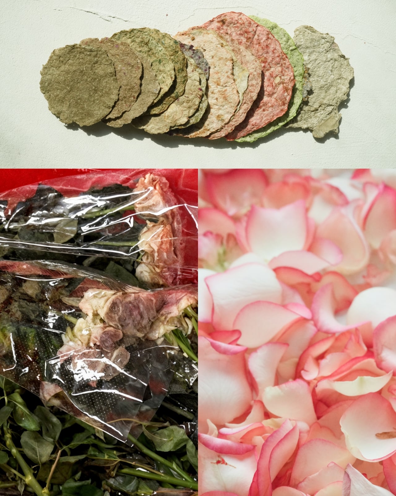
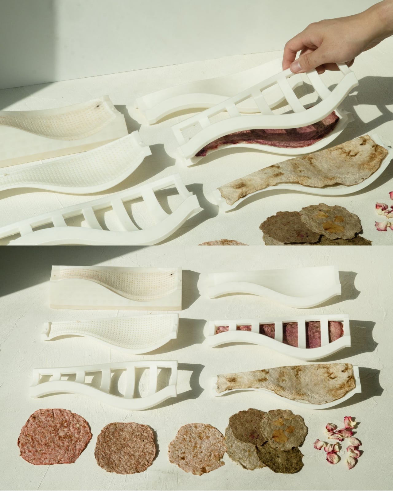
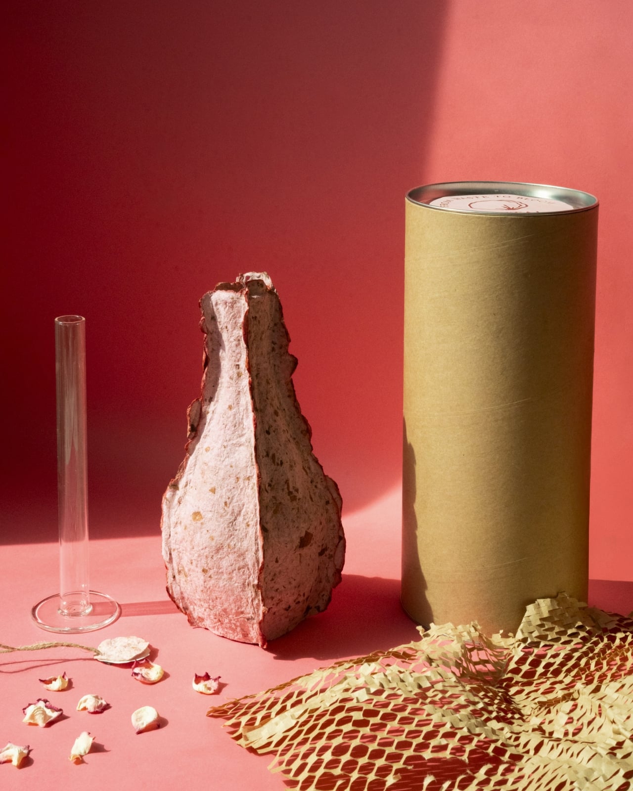
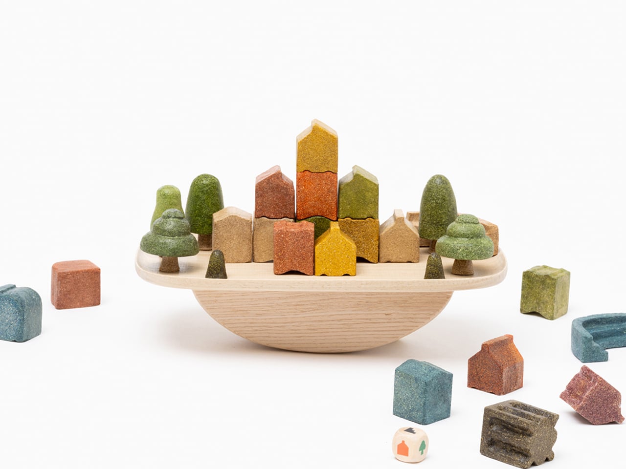
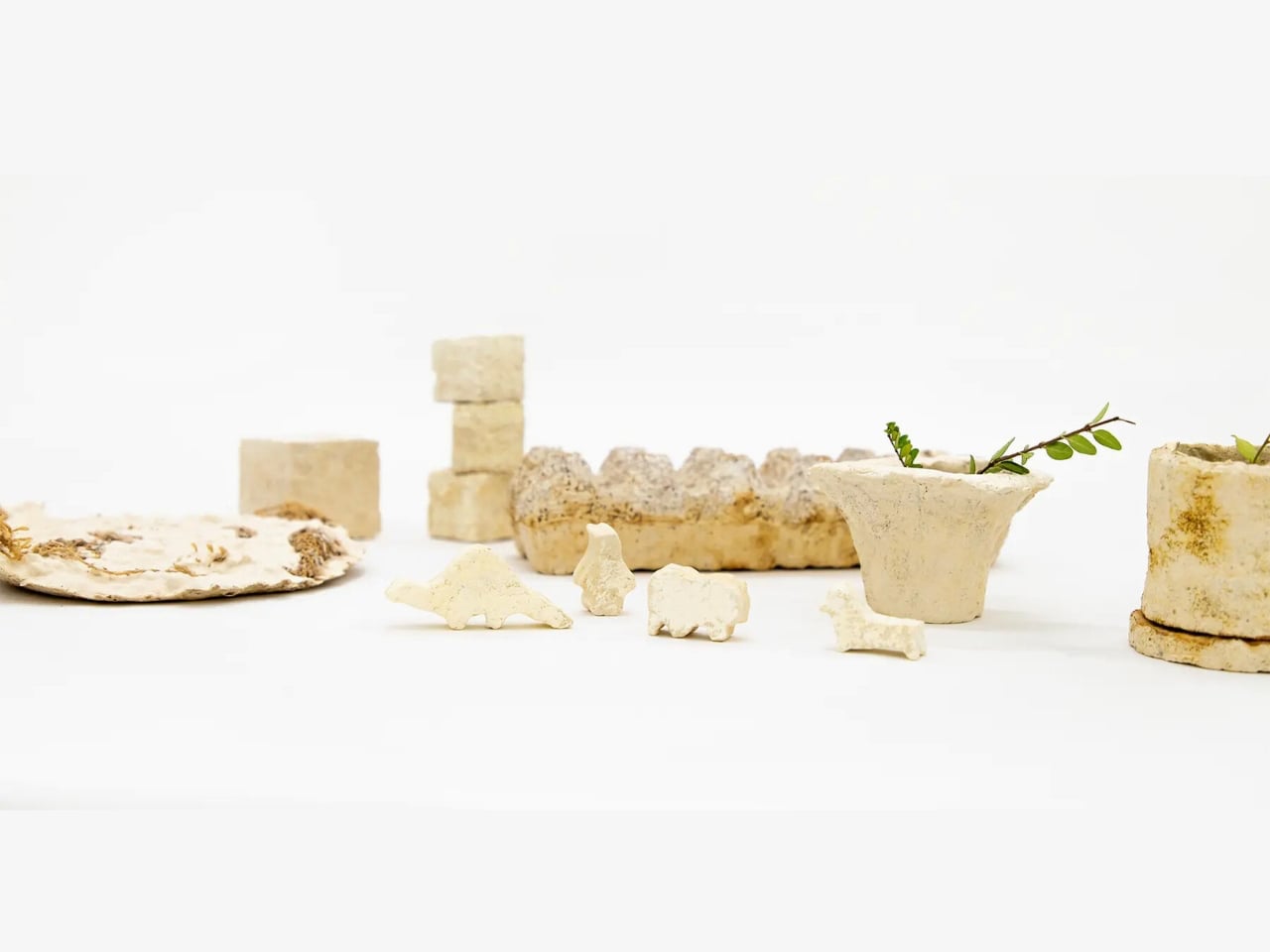
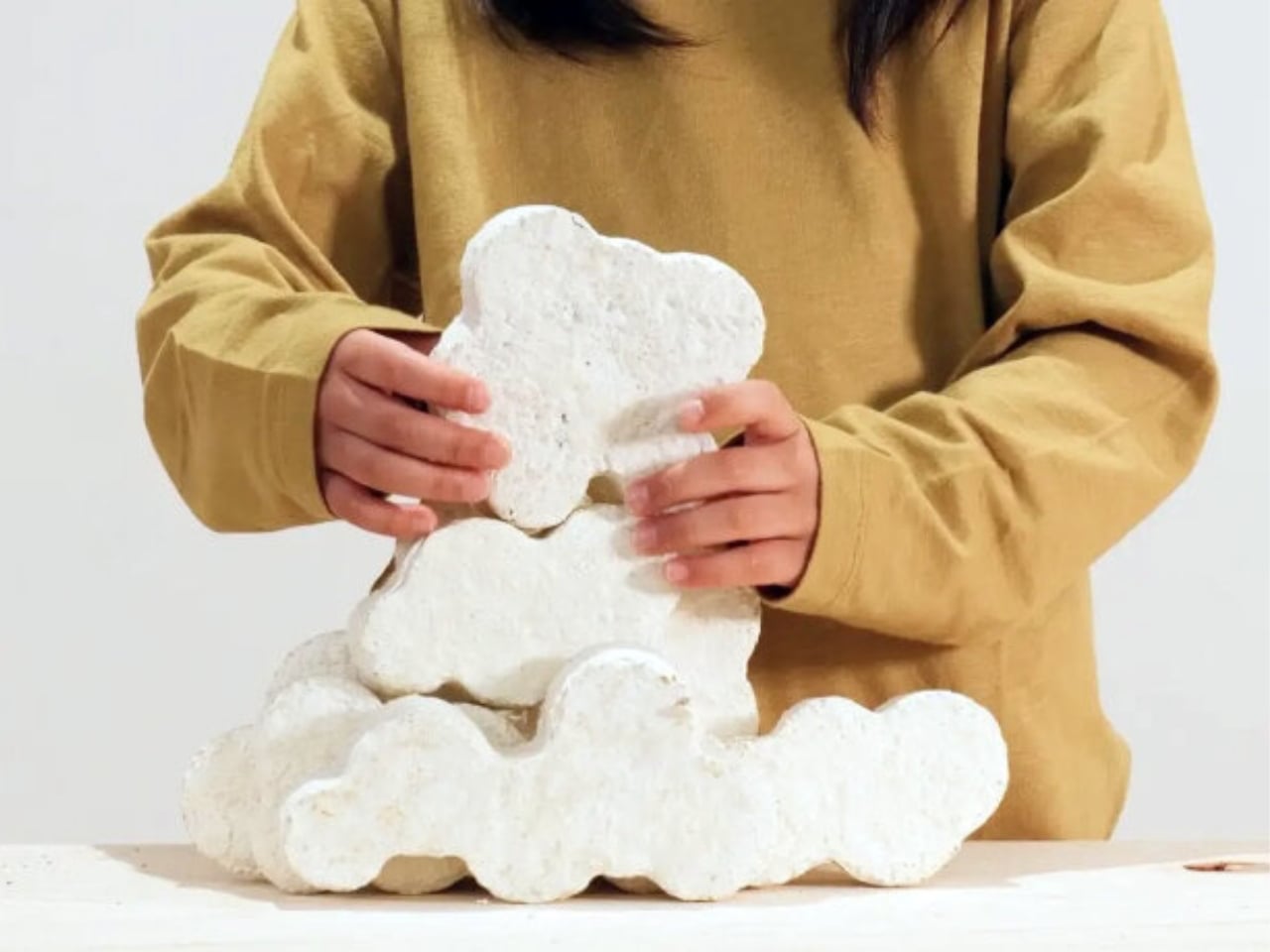
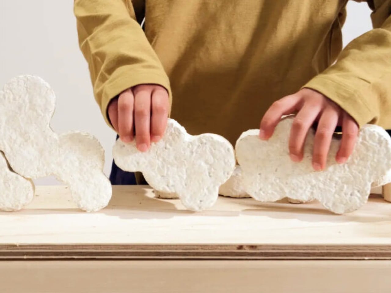
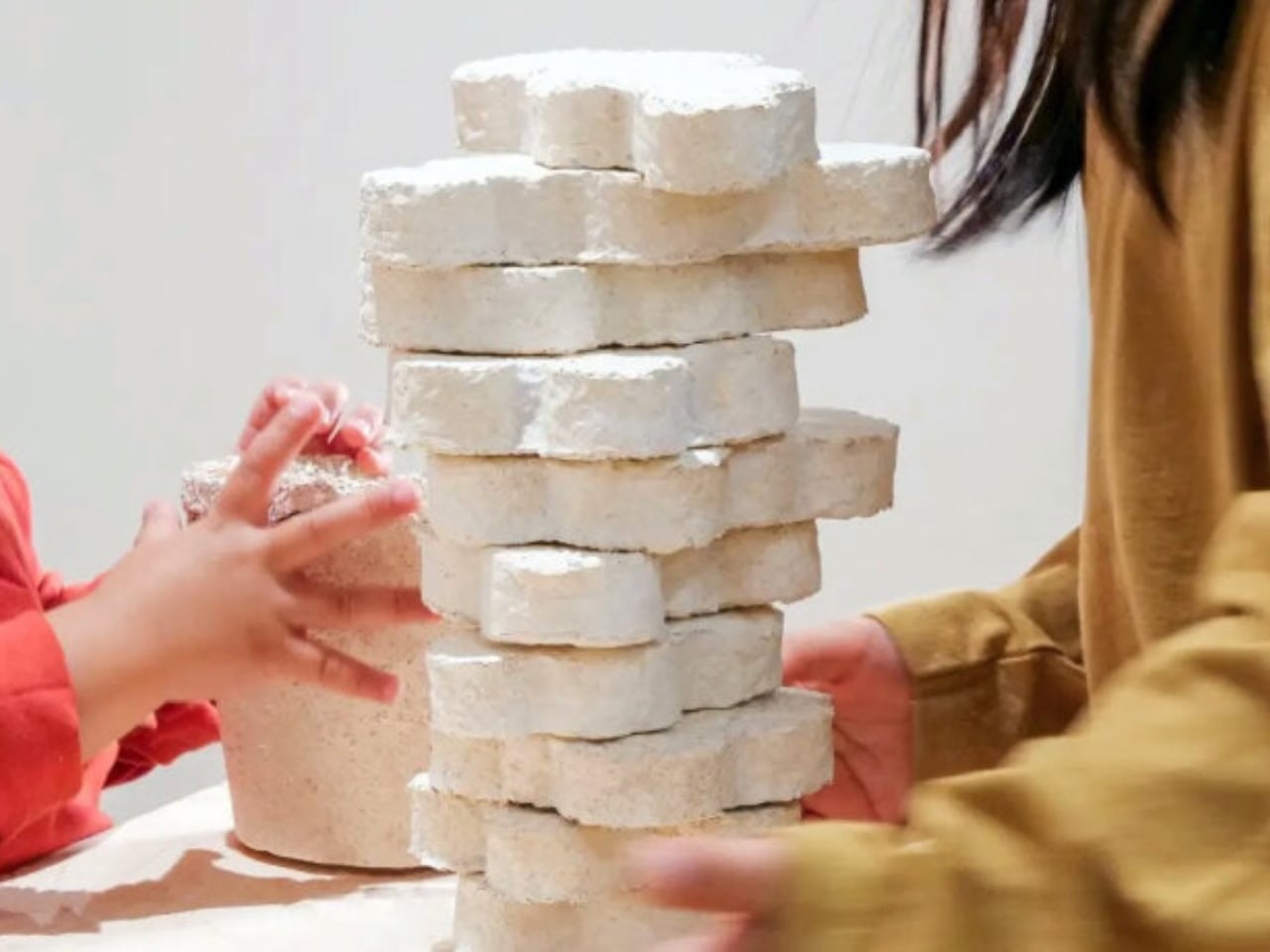
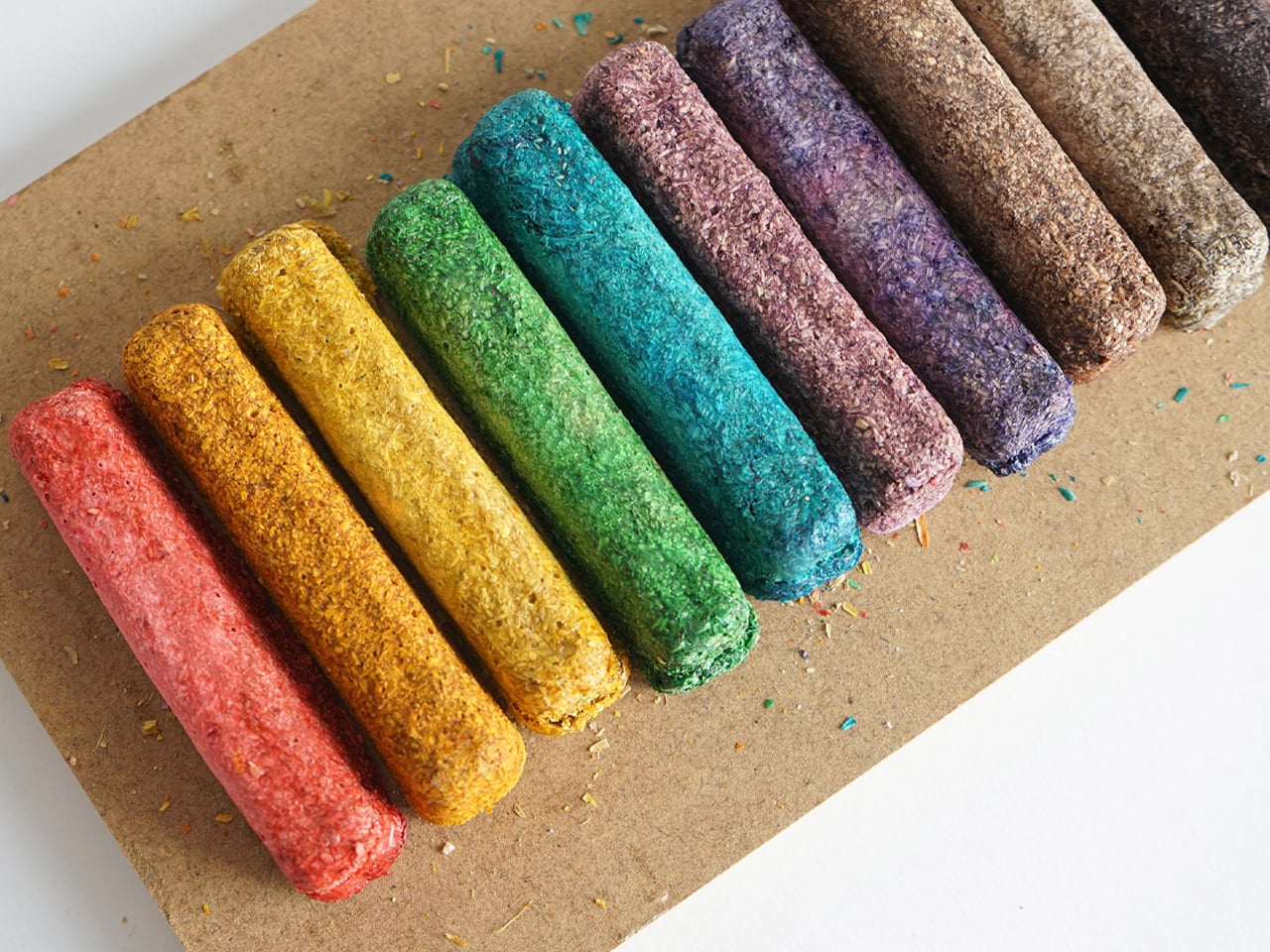
Rice Husk Village is a modular toy game created entirely from discarded rice husks, transforming agricultural waste into a creative and sustainable play experience. Each year, roughly 120 million tons of rice husks, the protective covering of rice grains, are discarded. Resistant to natural degradation and low in bulk density, rice husks are difficult to dispose of. Designer Subin Cho recognized their potential as a biodegradable material for toys. The Rice Husk Village is molded from these husks, producing safe, eco-friendly blocks that can eventually be composted, giving new life to what would otherwise be waste.
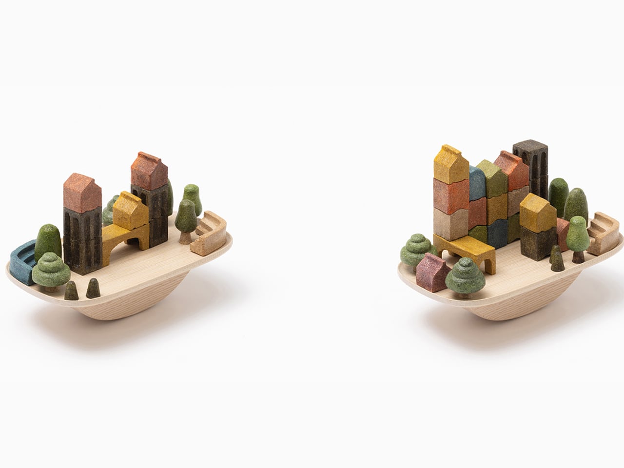
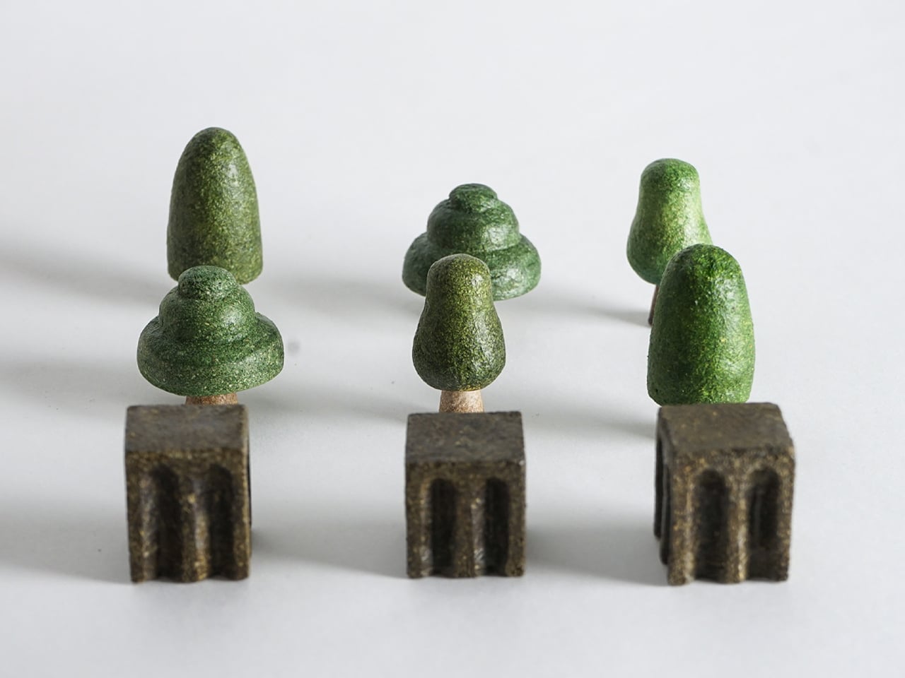
The toy set features shaped modules that stack to form villages, with three building types allowing for city skylines or small rural layouts. Additional elements such as bridges, trees, and stairs expand creative possibilities. A balance tray adds a game element, challenging players to construct a stable village like Jenga. Rice Husk Village promotes imaginative, sustainable, and environmentally conscious play for children.
Switching to eco-friendly toys is more than a product choice as it is a shift in mindset. By prioritizing natural materials, durability, and ethical production, we protect children’s health and nurture responsible global citizens. Each mindful choice turns playtime into a meaningful experience, teaching kids to care for the planet while building a greener, more sustainable future.
The post 5 Toys Made From Mushrooms, Rice Husks, and Wood That Replace Plastic first appeared on Yanko Design.