PROS:
- Distinctive and appealing two-tone design
- Great daytime and nighttime photos
- Bright and vibrant screen
- Massive 5,500mAh battery
CONS:
- No wireless charging support
- Metal mirror finish is a fingerprint and dust magnet
realme unveiled its latest GT series smartphone, the realme GT 6, at a global product launch event in Milan today. After a two-year hiatus from the global market, the company is poised to make a significant impact with its latest flagship. The recent appearance of realme’s founder and CEO, Sky Li, on the cover of Forbes magazine underscores the company’s intention to assert its presence more forcefully than ever. Earlier this year, realme announced a rebranding initiative, reaffirming its commitment to delivering value-packed devices for the youth. With the realme GT 6, the brand makes a bold claim, positioning it as the only “flagship killer” of 2024. It’s definitely packed with features, but is it truly deserving of the flagship killer title? We put it to the test to find out.
Designer: realme
Aesthetics
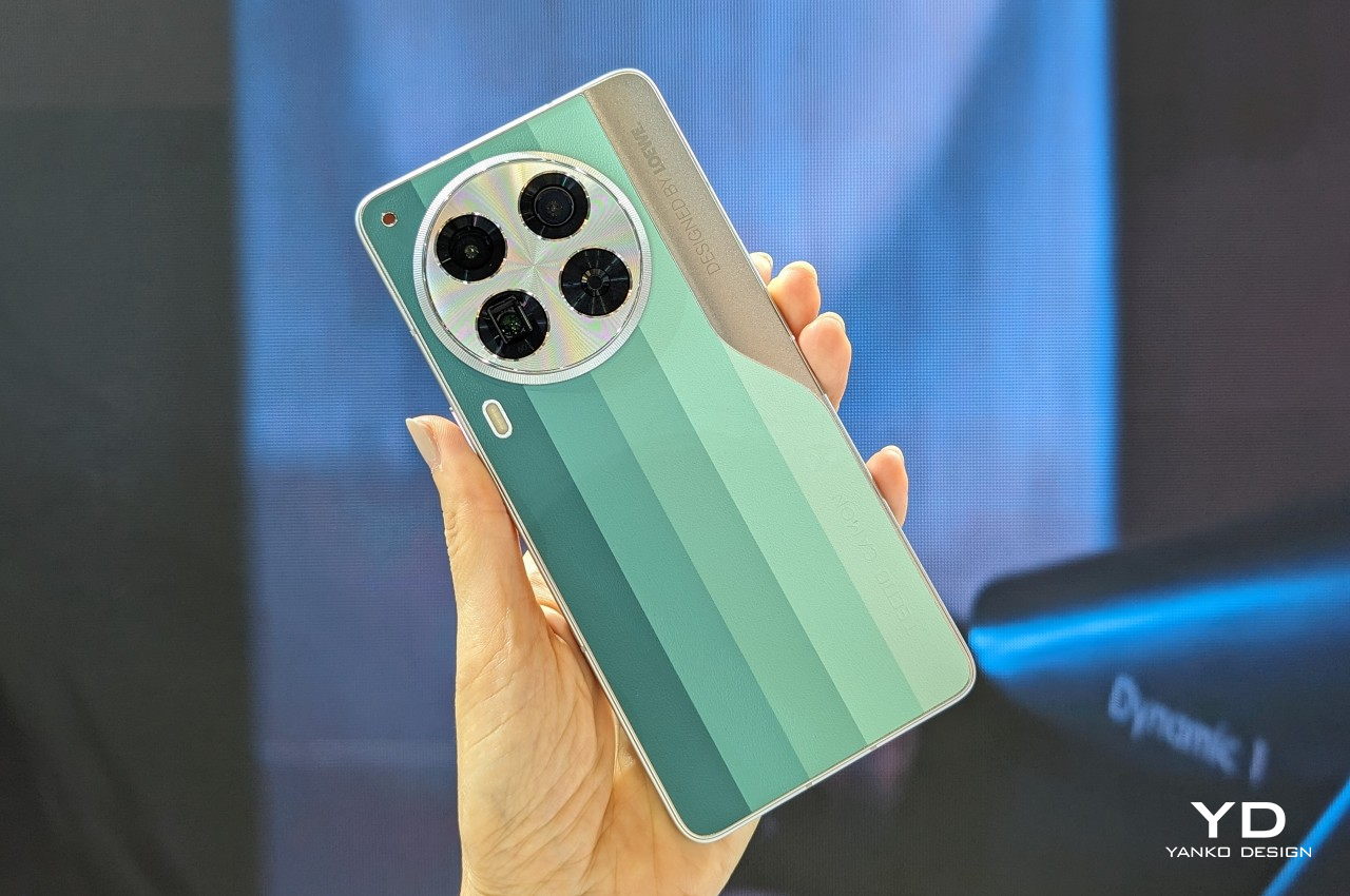
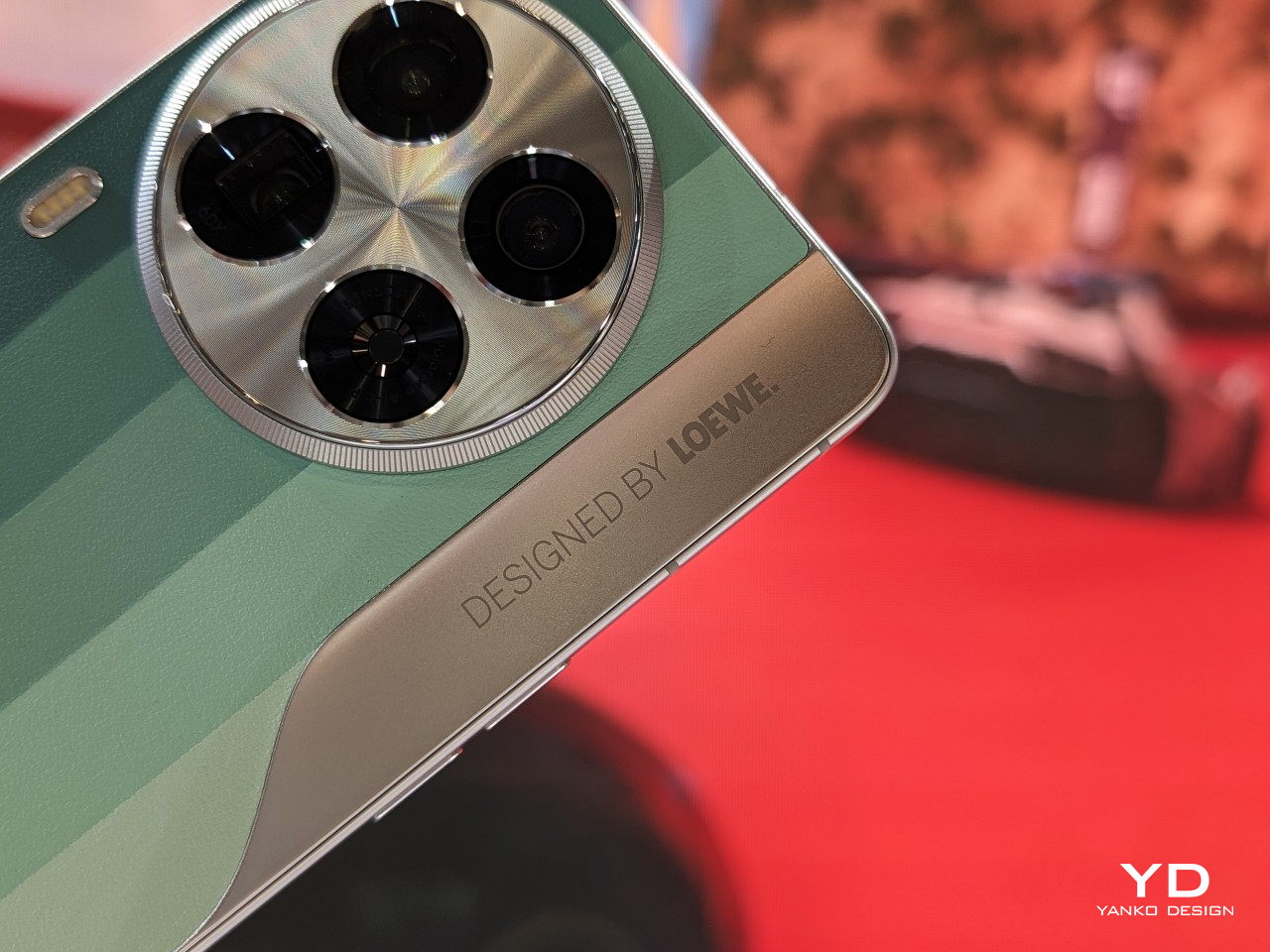
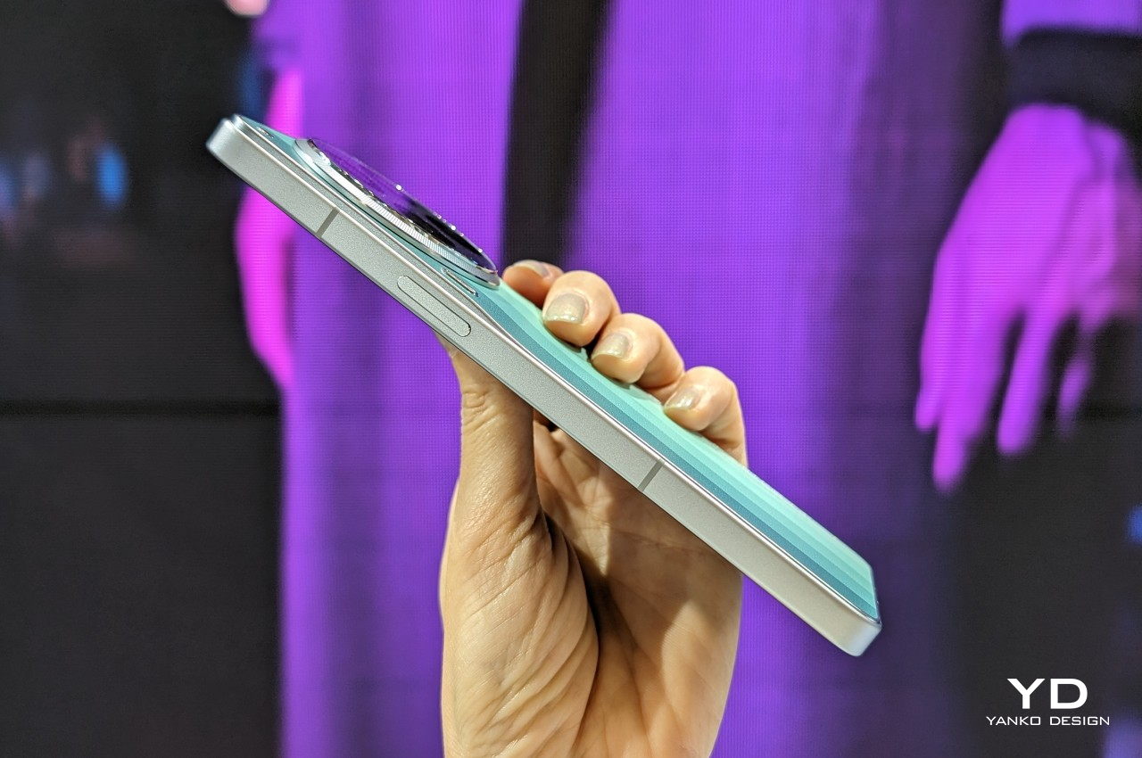
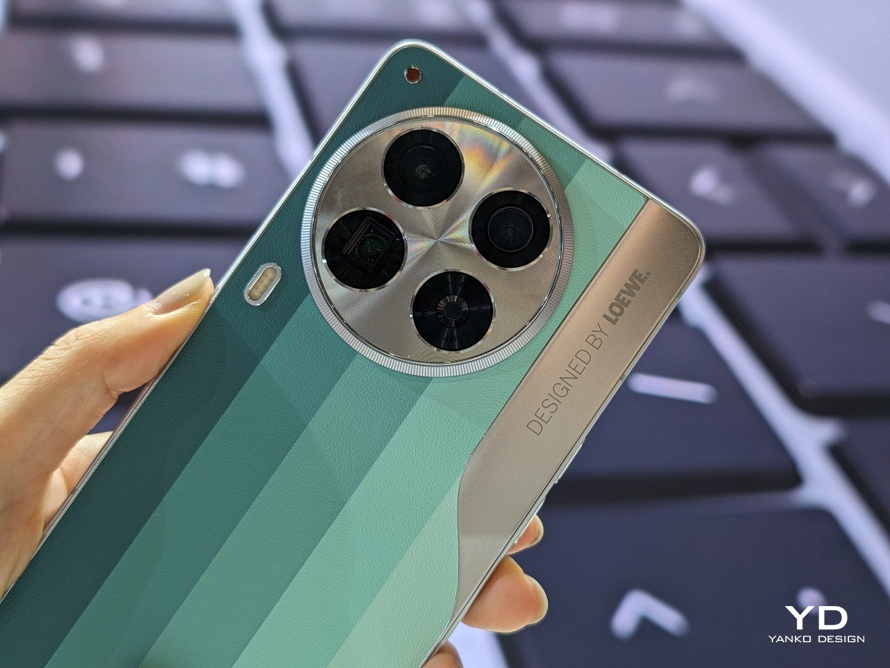
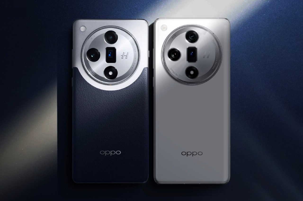
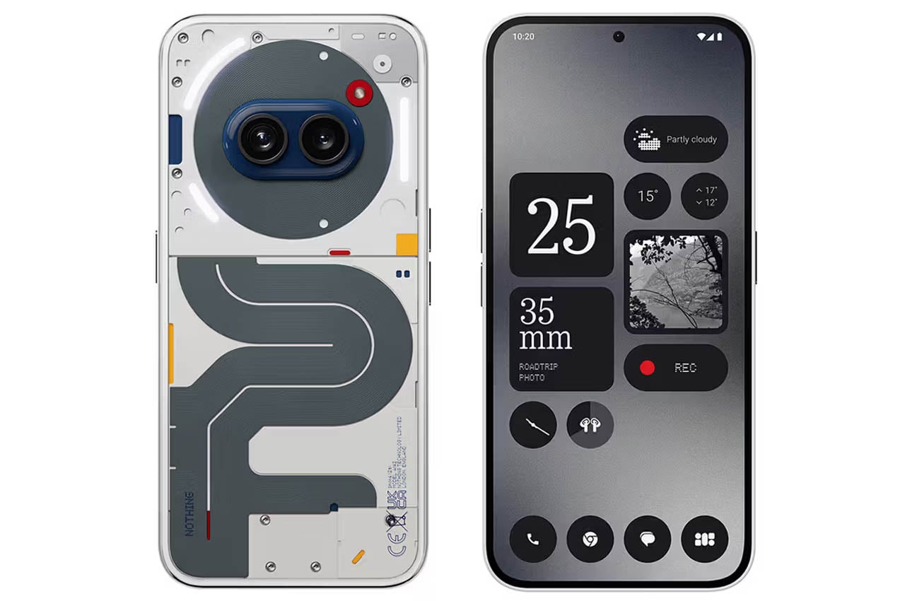
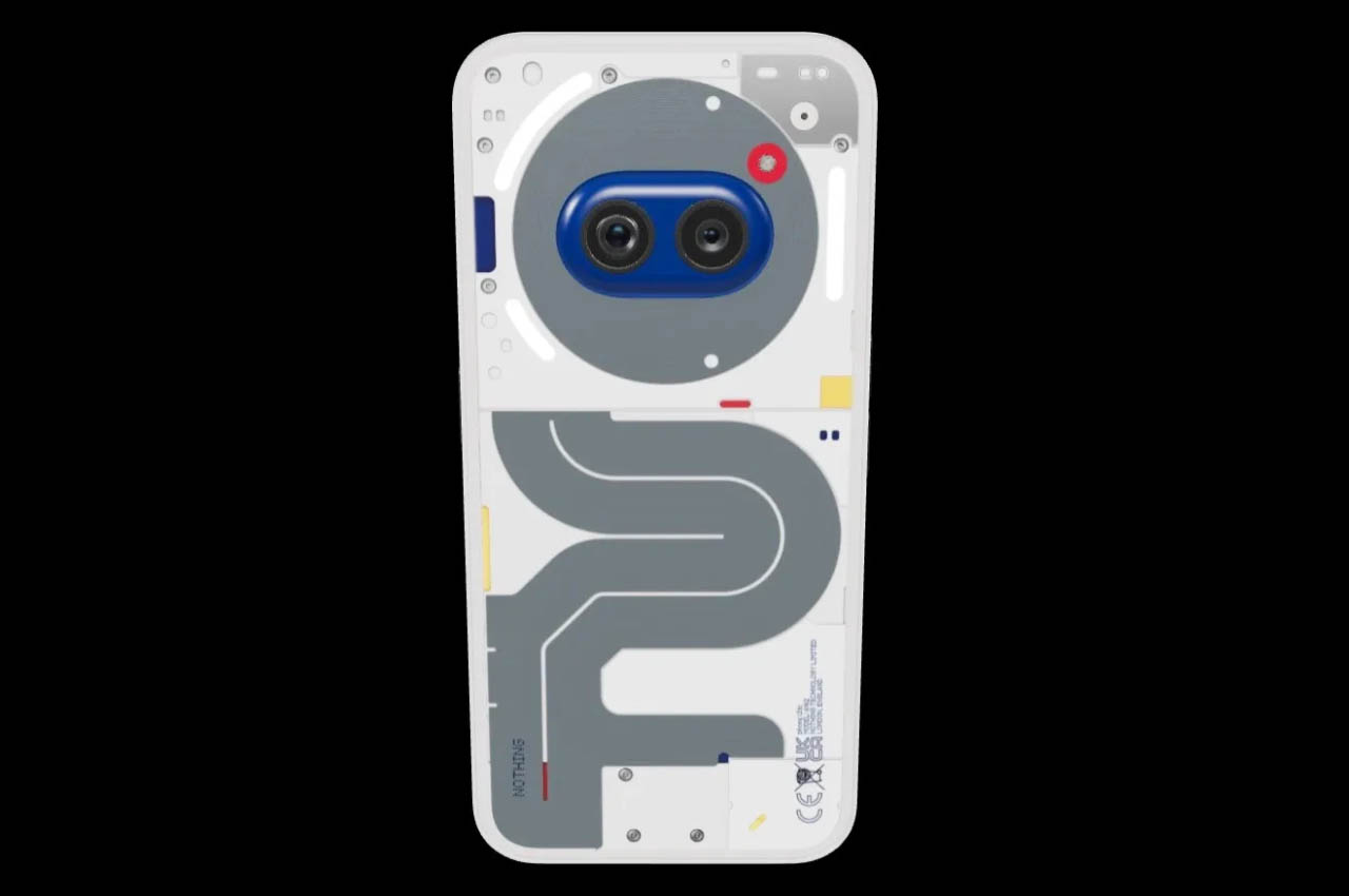
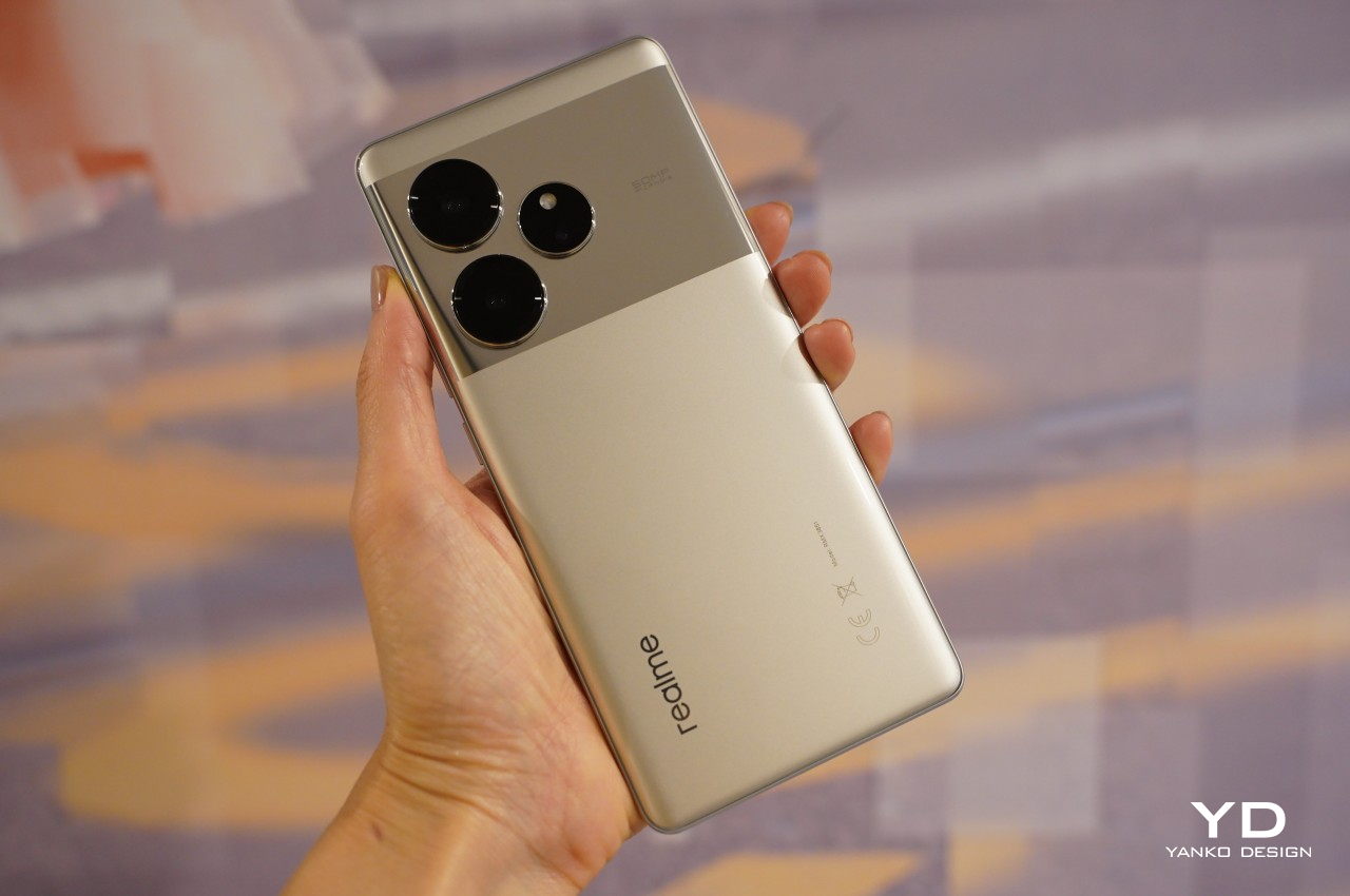
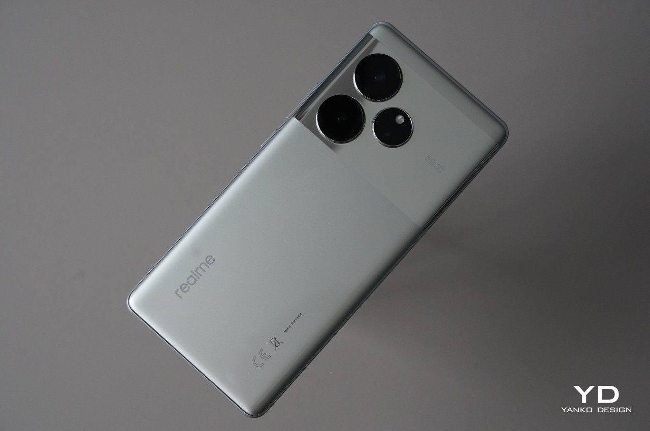
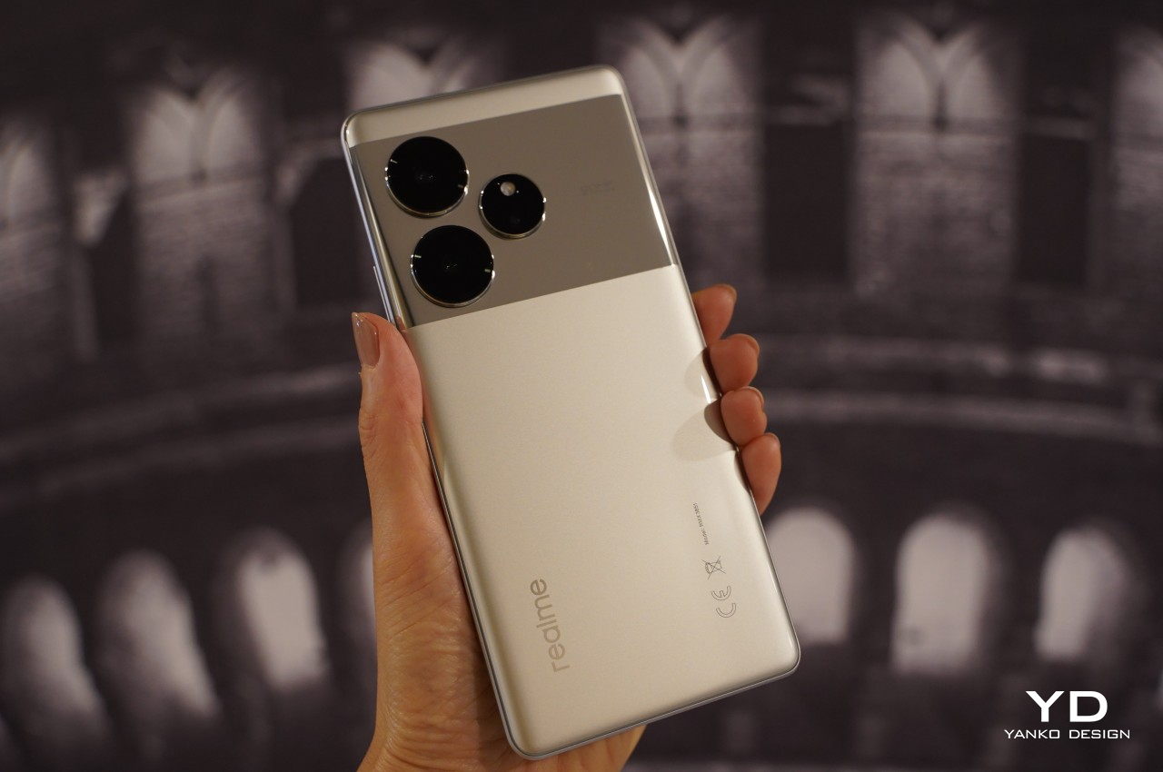
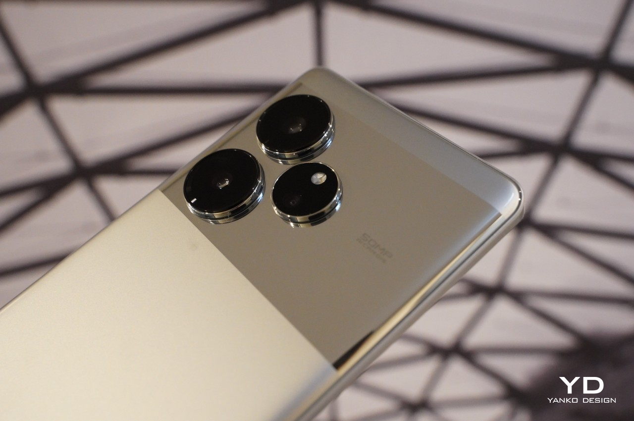
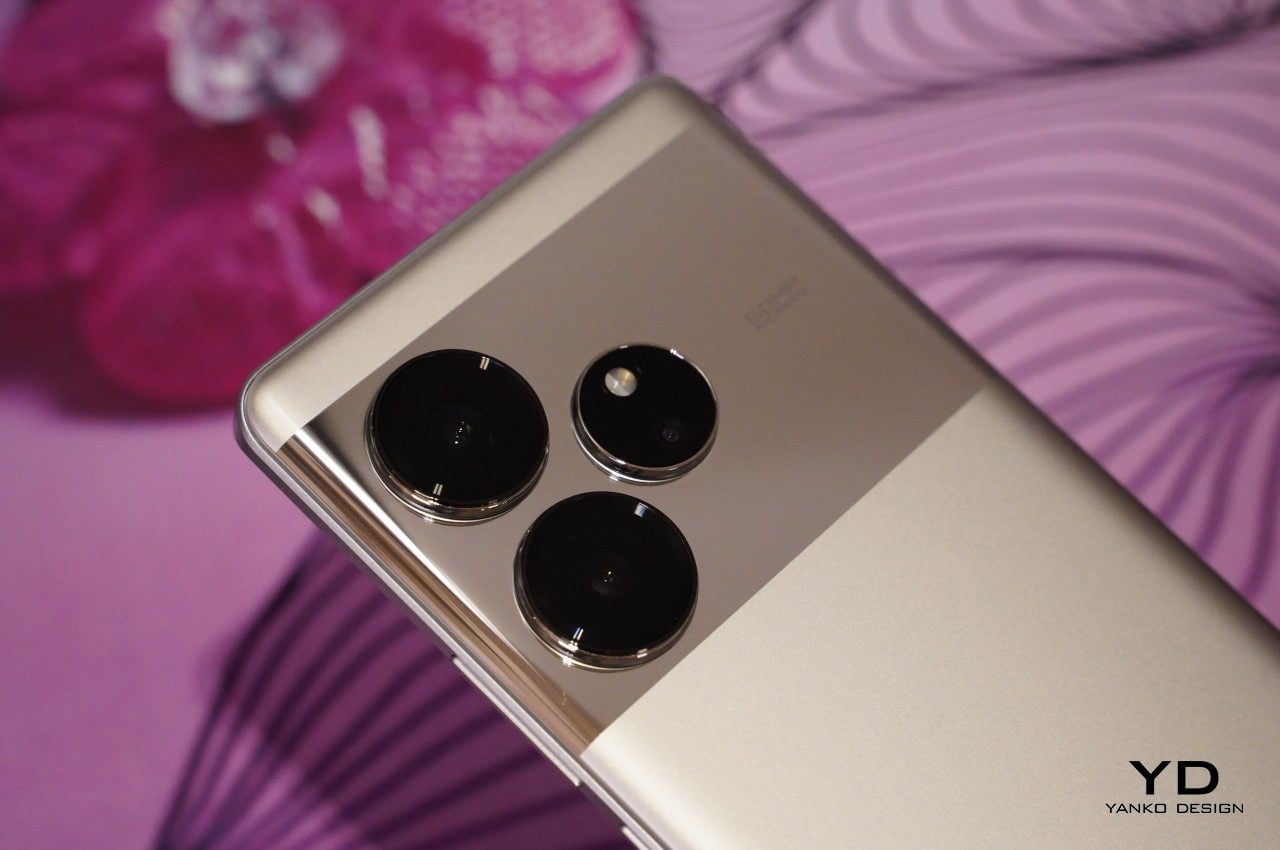
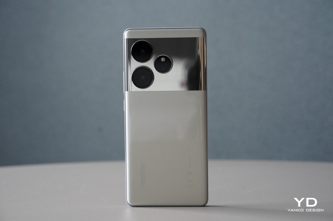
The realme GT 6 is a device that commands attention. Instantly captivating, your eyes are drawn to the gleaming shiny mirror texture which fills out the upper third of the back panel, where the camera modules reside. According to realme, this texture is achieved using the industry’s first nano-level mirror coating technology which requires over 30 fine processes. Contrasting with this reflective texture, the lower two-thirds of the back panel features a matte metal texture.
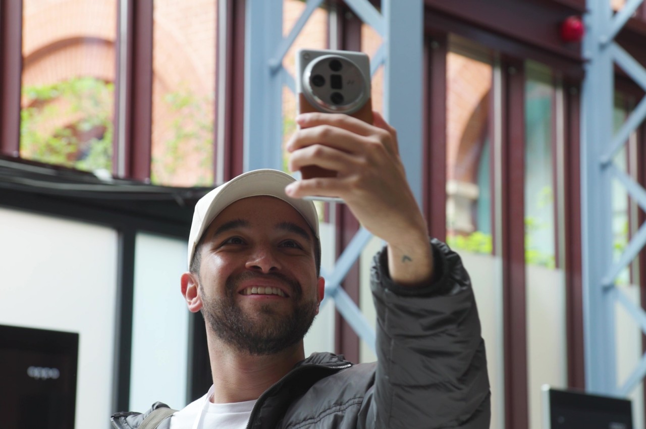
The realme GT 6 is available in Fluid Silver or Razor Green, with our review unit coming in the former finish. The mirror texture first appeared to be a brilliant idea for taking selfies. However, the off-center positioning of the camera module and the limited size of the mirrored area compromise practicality. Another drawback of the material is that it attracts fingerprints and dust, detracting somewhat from its otherwise sleek appearance. Putting the complimentary case that comes in a box does not help as it does not cover the portion with the mirror finish. It’s still useful to quickly check oneself before snapping photos, though. Overall, the realme GT 6 is a phone that offers a unique and clean design, distinctive but not loud.
Ergonomics
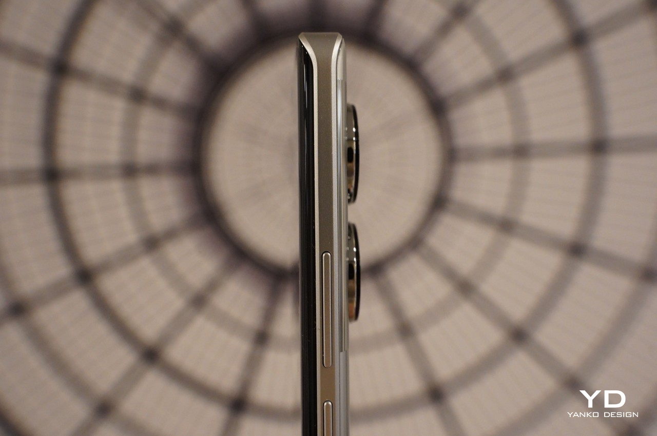
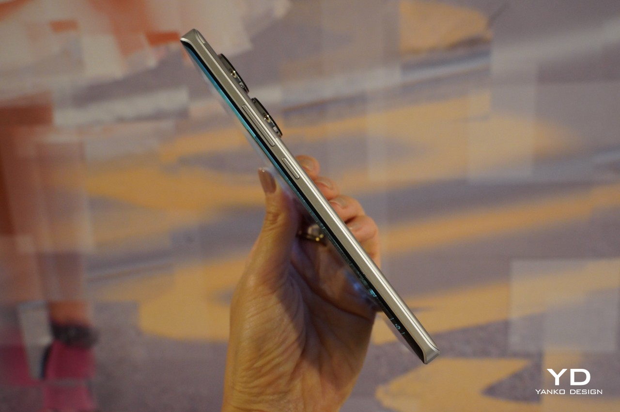
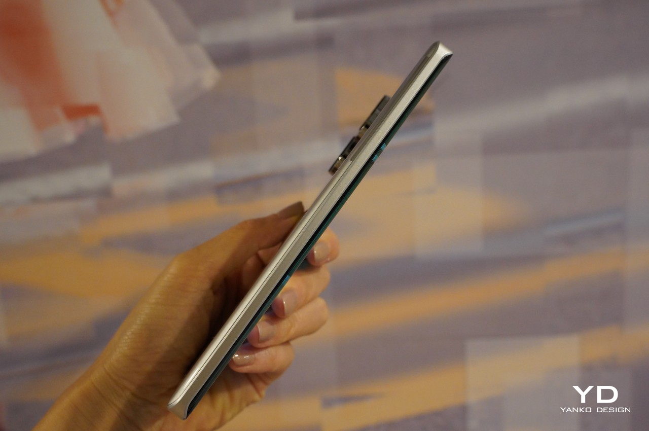
The dimensions of the phone measure 162mm x 75mm x 8.6mm, with a weight of under 200g, just 199g, to be precise. The phone feels pleasantly lightweight and is easy to handle with one hand. The display features subtle curves on the side edges, complemented by a slightly tapered back panel. A curved side frame usually enhances grip without causing the edges to dig into the palm, but despite its absence here, holding the phone feels secure and comfortable.
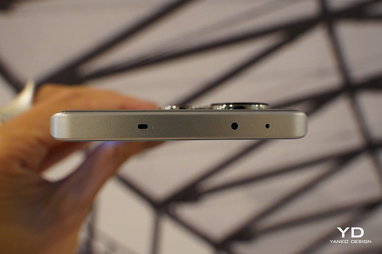
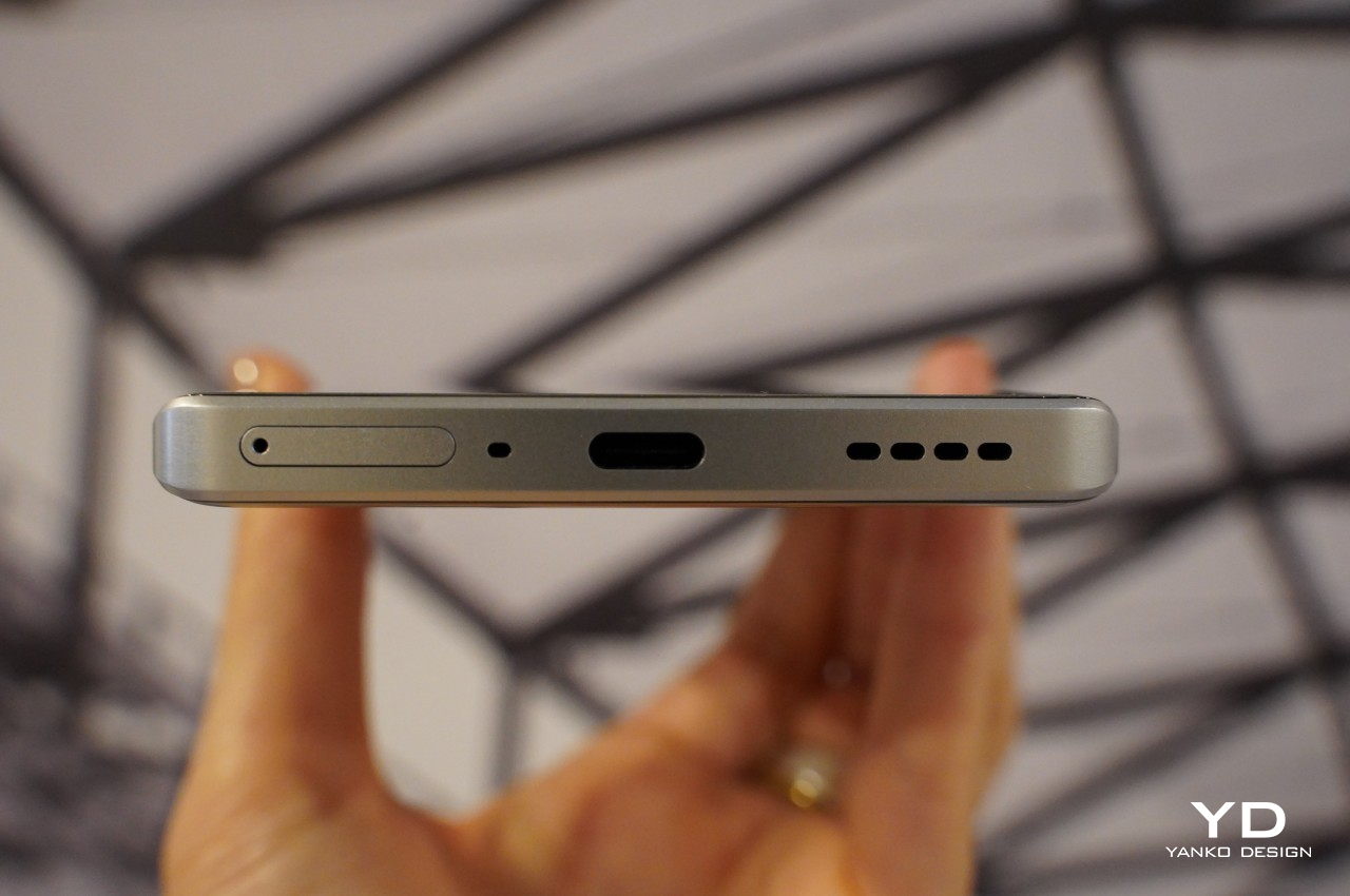
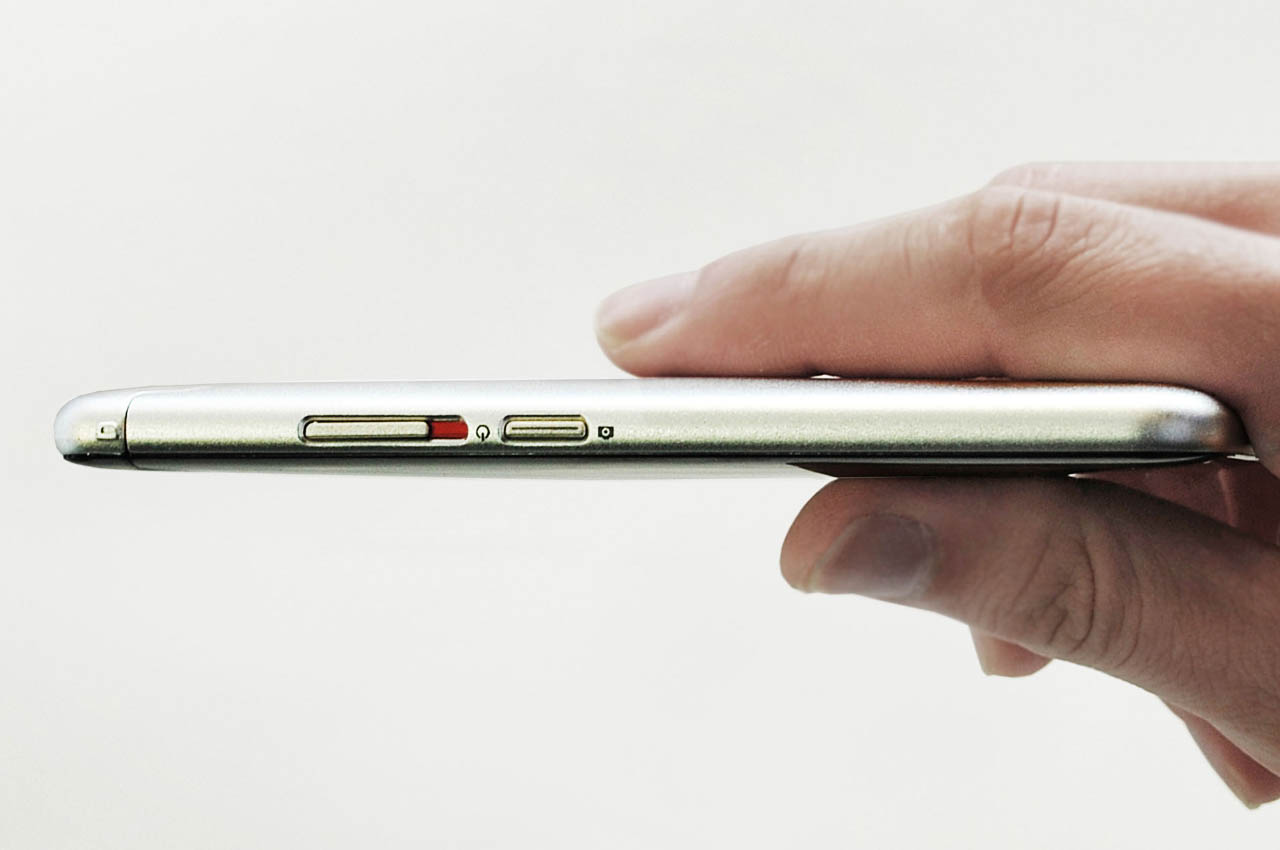
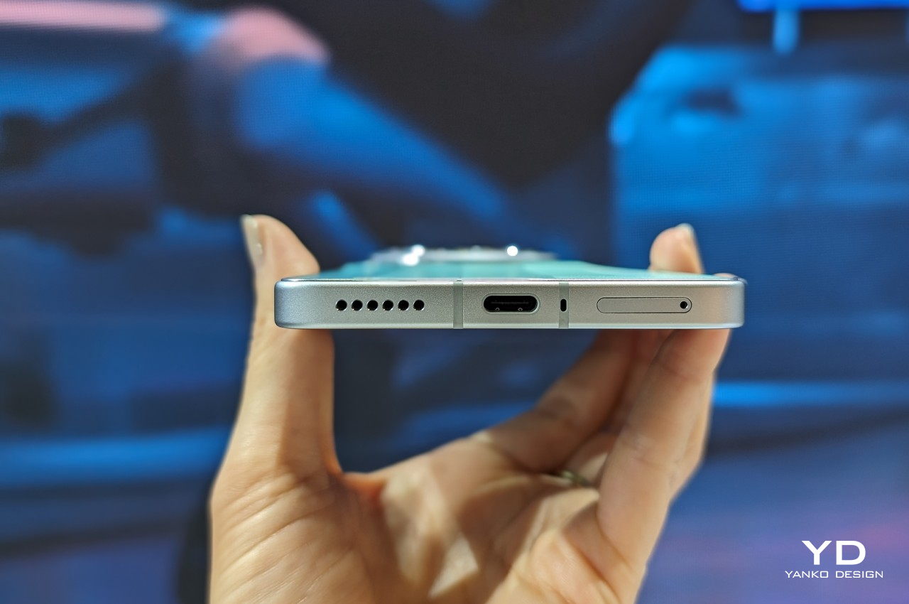
On the right side of the phone are the volume locker and the power button, leaving nothing on the left side of the device. The IR blaster and stereo speaker are located on the top while the dual-nano SIM card slot, second stereo speaker, and USB port are located on the bottom.
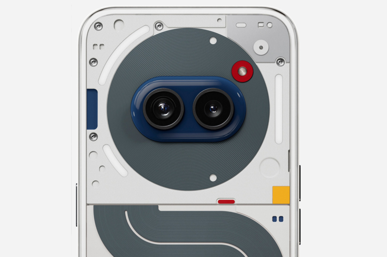
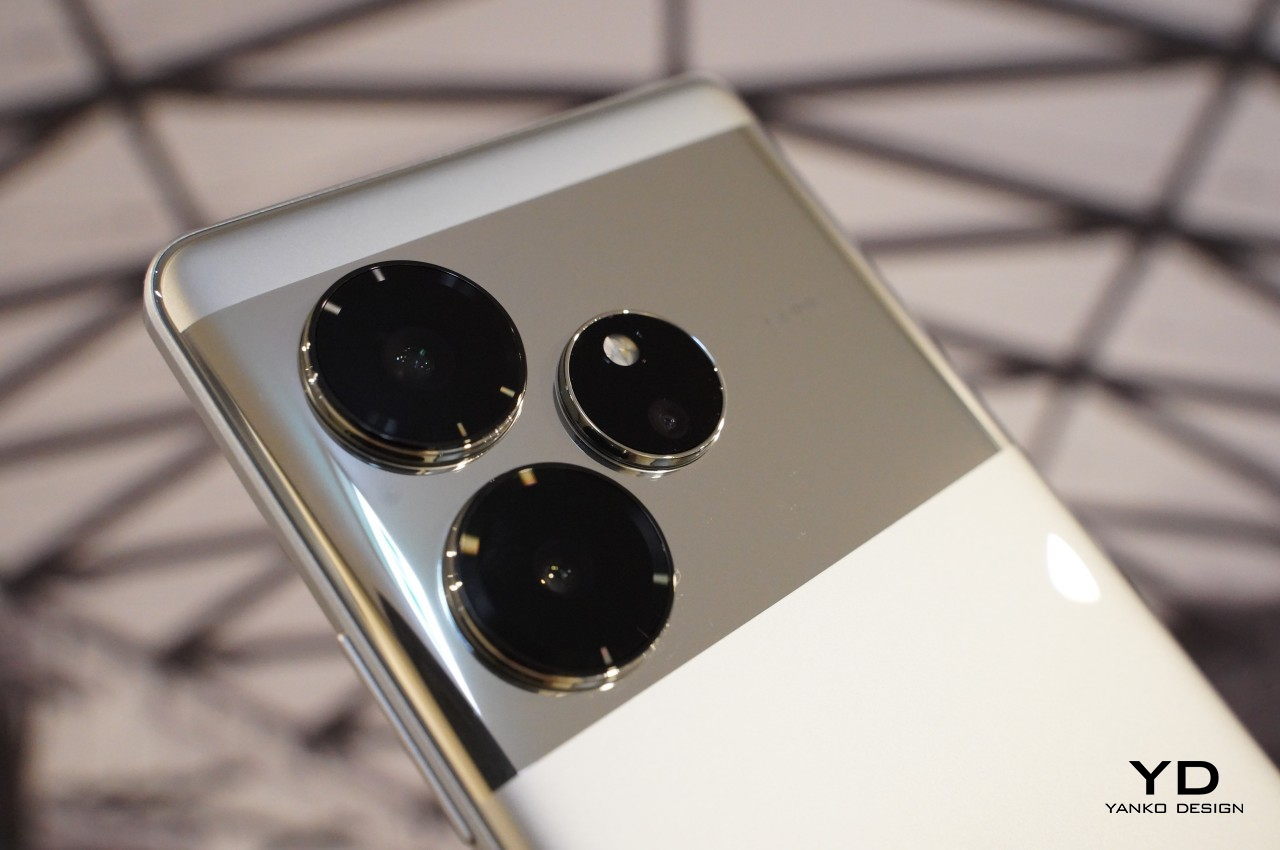
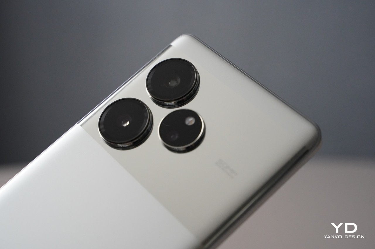
The camera modules are not horizontally symmetrical, causing the phone to wobble slightly when placed on its back, though this issue is easily resolved by using a case. On the front, there is a centrally positioned cutout on the display for the front-facing camera, while the in-display fingerprint scanner is located near the bottom. The three camera lenses are positioned on the top left side of the device, arranged in a triangular pattern. The realme brand name embellishes the lower left corner of the back panel, which will often be covered by your hand and, therefore, almsot always out of sight. In summary, the realme GT 6 exudes a premium and sturdy feel that inspires confidence whenever you use it.
Performance
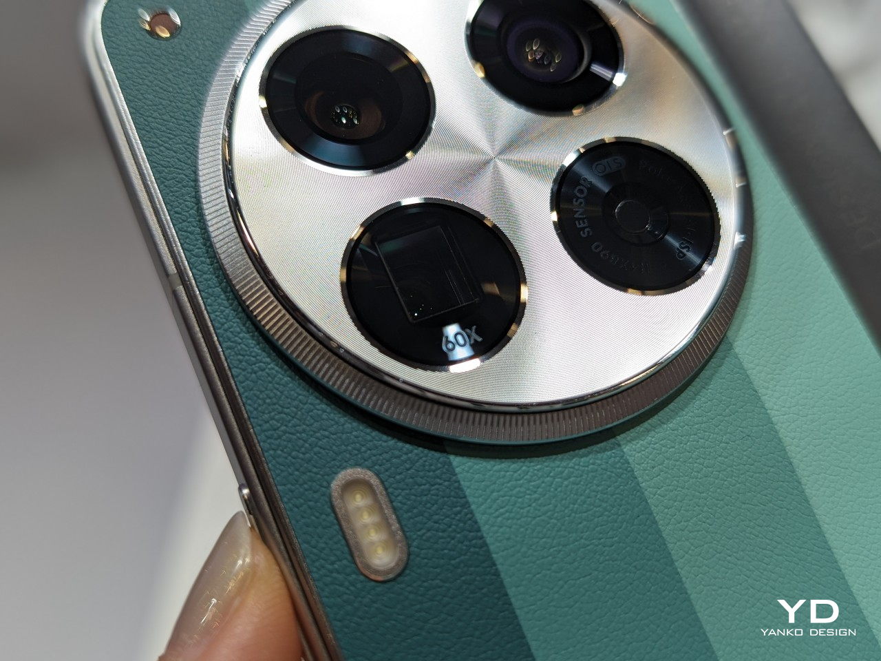
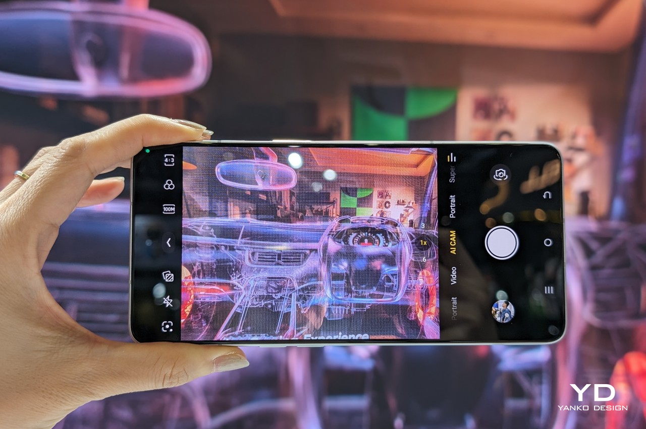
The realme GT 6 sports a triple camera setup. The 50MP main camera uses Sony LYT808, a 1/1.4” sensor with OIS, topped with a f/1.68 aperture lens. Accompanying it is a 50 MP telephoto camera with a 1/2.8” sensor and an f/2.0 aperture, together with an 8MP ultra-wide-angle camera that utilizes a 1/4” Sony IMX355 sensor.
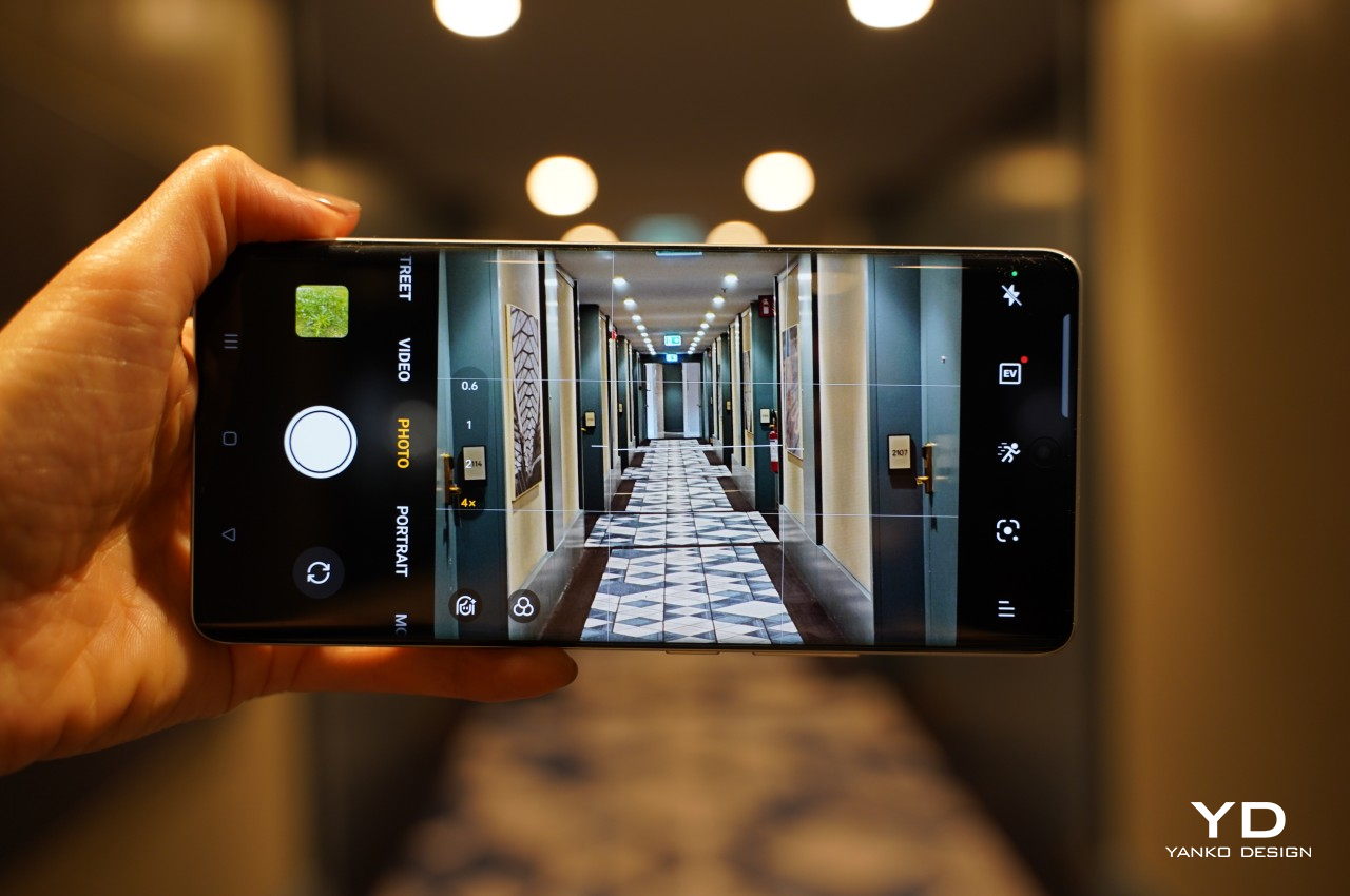
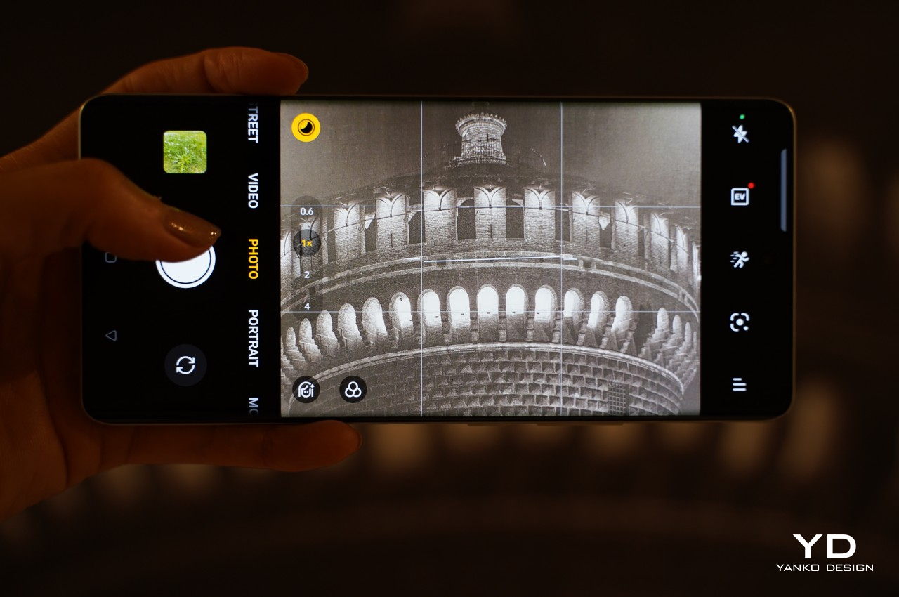
What all these specs mean in practice is that the realme GT 6 captures great photos in daylight. Images exhibit a good dynamic range, natural colors, and rich details. It also performs admirably in low-light conditions, producing well-balanced exposures, with plenty of details preserved and minimal noise.


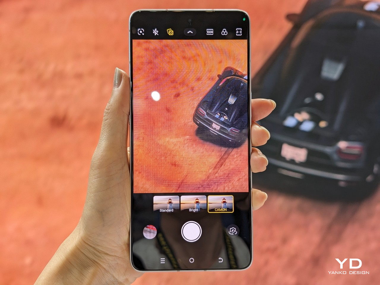
Photos taken with the telephoto lens, while slightly less impressive, still offer very good quality. The ultrawide-angle camera delivers solid images as well, surprisingly despite its very modest sensor. realme has done an excellent job in harmonizing the rendering and post-processing across all three cameras, ensuring a consistent look and feel in the outputs. Activating night mode across all three cameras does not significantly alter the quality of the photos. In addition, the 32MP front-facing camera captures pleasant selfies with natural colors.


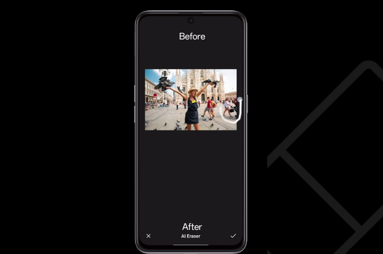
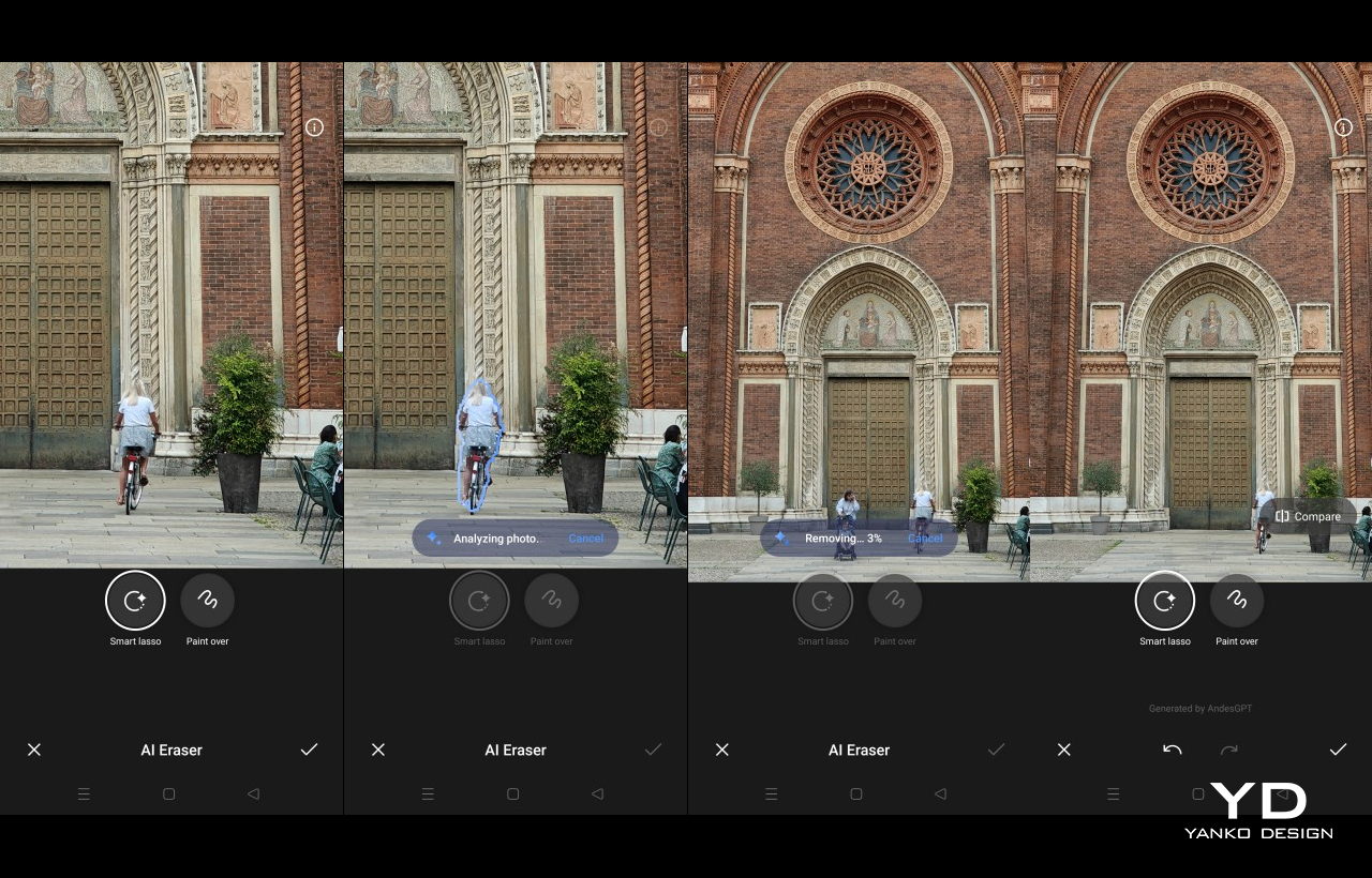
The realme GT 6 is equipped with AI Smart Removal, which relies on AndesGPT, a generative AI model developed by OPPO. There are two AI Smart Removal tools: Smart Lasso and Paint Over. With Smart Lasso, you circle around the unwanted objects in the photo to be removed. On the other hand, the Paint Over feature replaces the selected object in the photo with another object. With Pain Over, you can adjust the brush size. Both features require an internet connection. Removing unwanted objects with Smart Lasso is fast and results are impressive in most cases, whether in bright daytime photos or poorly lit nighttime photos.

oplus_262144

Oplus_262144
Moving on to the video, the main and telephoto cameras can capture videos up to 4K at 60fps while the ultra-wide-angle camera is limited up to 1080p at 30fps. The front-facing camera let you record video up to 4K at 30fps. Only the 8MP ultra-wide shooter isn’t able to support 4K video recording, which is pretty disappointing for a phone that bills itself as a “flagship killer.” The videos captured with main and telephoto cameras are great offering a good level of sharpness and dynamic range, even in low-light footage. Although the ultrawide camera’s footage may display some noise, it still offers good color saturation. The Ultra Steady mode is exclusive to the main camera, providing excellent stabilization for both daytime and nighttime video recording.


When recording video in a dark environment under 6 lux, the night mode icon appears. Tapping it activates AI Night Vision, significantly enhancing video quality in poorly lit conditions. This footage captured is basically cranked up ISO and applies heavy smoothing, allowing you to capture somewhat usable footage even in near-total darkness. The difference is quite noticeable, making previously unwatchable videos much clearer.


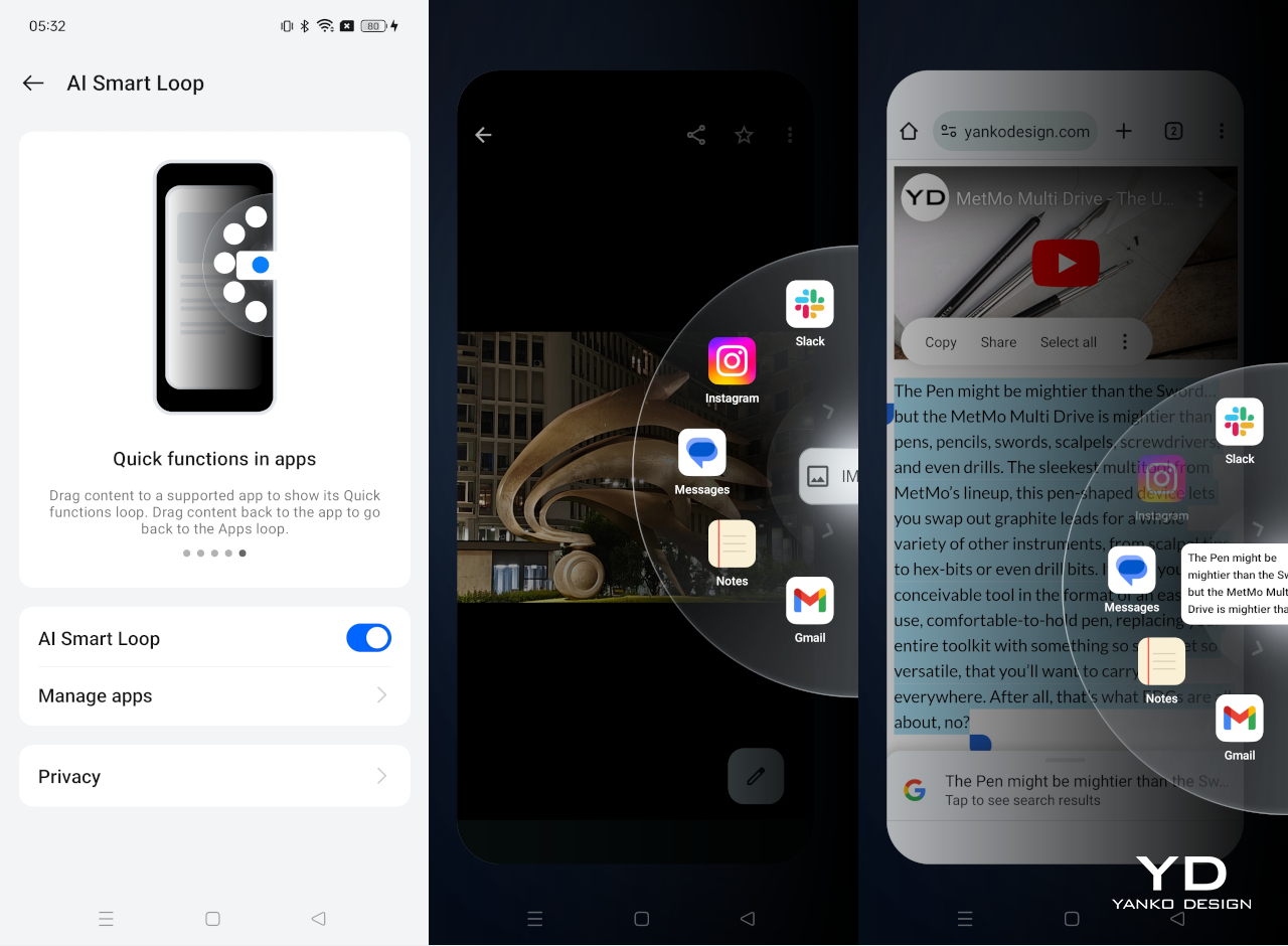
Running Android 14 out of the box with a layer of realme UI 5.0, the realme GT 6’s AI features extend beyond image capturing and editing. For instance, AI Smart Loop provides an efficient and quick way to share content with third-party apps. You can select text, photos, or screenshots, then long-press and drag them to the right side of the screen. This action activates the space wheel, which displays a selection of pre-selected third-party apps or AI-suggested apps in a wheel format. You simply drop the selected content onto the desired app to share it.
Underneath the hood, the phone is powered by a Snapdragon 8s Gen3. It’s a less powerful version of Snapdragon 8 Gen3, yet it’s still one of the Snapdragons’s flagship SoC. The device sports 512GB of storage and 16GB of LDPDDR5X RAM which can be expanded by an additional 4GB. With this much power, it’s no surprise that the realme GT 6 offers great performance and smooth operation.
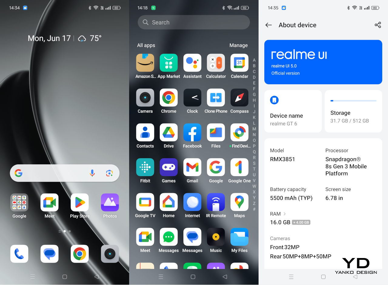
GT 6 features a 6.78-inch AMOLED display with 2,780 x 1,264 resolution and 10-bit color depth. The display can reach a whooping peak brightness of 6,000 nits. realme also provides a more practical number; the display can reach 1,600 nits with High Brightness Mode. The display is amply bright even outdoors under the sunlight and colors are vibrant.
The display supports a 120Hz refresh rate with 8T LTPO which helps save power by dynamically adjusting the refresh rate ranging from 1Hz to 120Hz according to the content displayed. The phone also incorporates numerous eye protection features. For example, AI Eye Comfort detects eye fatigue, such as blinking and yawning frequency, and adjusts the screen color temperature to alleviate strain.

The device is equipped with a massive 5,500 mAh battery, ensuring you can easily go a day without needing to recharge. When you do need to charge, the 120W SUPERVOOC technology allows for rapid charging. Unfortunately, it does not support wireless charging, a feature that is becoming more common even on mid-range smartphones, much less flagship models.
Sustainability
realme is a company with strong sustainability initiatives. For instance, the company has committed to reducing the carbon emissions of its GT series by 30% and achieving “Double Zero” emissions by 2025. Unfortunately, when it comes to the GT 6 specifically, there is no apparent mention of sustainability efforts.
The phone feels solid in build quality, and the display is protected by Corning Gorilla Glass Victus 2, ensuring durability. It has an IP56 rating, which ensures that it’s protected against most common accidents, though you should naturally still exercise caution. Additionally, there was no information available regarding support for security updates at the time of this review. realme promises 4 years of Android updates and 4 years of security patches, which should last you quite a bit during the lifetime of this phone.
Value
The realme GT 6 definitely has a laundry list of buzzword-worthy features, from dual 50MP cameras to, of course, AI. Its specs on paper are no joke, and its actual performance delivers much of its promises as well. Nothing surprising for what is supposed to be a flagship killer, a title that has been thrown around a lot to challenge the giants of the market. Of course, it will take more than killer features to stand up to smartphone Goliaths, and realme has one more trick up its sleeve.
Starting at only 599.99 EUR (roughly $645) for the base 8GB RAM/256GB storage model, all the way up to 799.99 EUR ($860) for the top-of-the-line 16GB/512GB configuration, the realme GT 6 definitely beats other flagships in terms of accessibility. Sure, it’s not perfect and might be missing a few flagship features like wireless charging, but you’re still getting the juicy meat of what makes a flagship a flagship without burning a hole through your wallet. It’s definitely an option worth considering, presuming it’s even available within your vicinity.
Verdict
It’s getting harder to stand out in the smartphone market these days, at least not without some groundbreaking feature or head-turning design. At the same time, however, many brands try too hard to set themselves apart, producing designs that are, to some extent, too distracting and too noisy. Fortunately, the realme GT 6 is not one of those, making it a flagship killer in more ways than one.
Yes, it has quite the repertoire of high-end features, and rarely does it disappoint except in a few small details. It also has a price tag that belies all that power, making the product accessible to more people. Last but not the least, it also goes against the flow and delivers a design that is elegant without being overbearing. The realme GT 6 bucks the trend and appeals to a new generation of the youth that’s getting wiser and more discerning, valuing essential experiences over superficial embellishments.
The post realme GT 6 Review: Is This the True Flagship Killer of 2024? first appeared on Yanko Design.


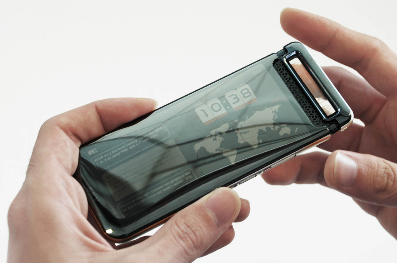

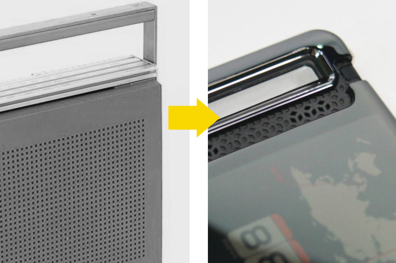
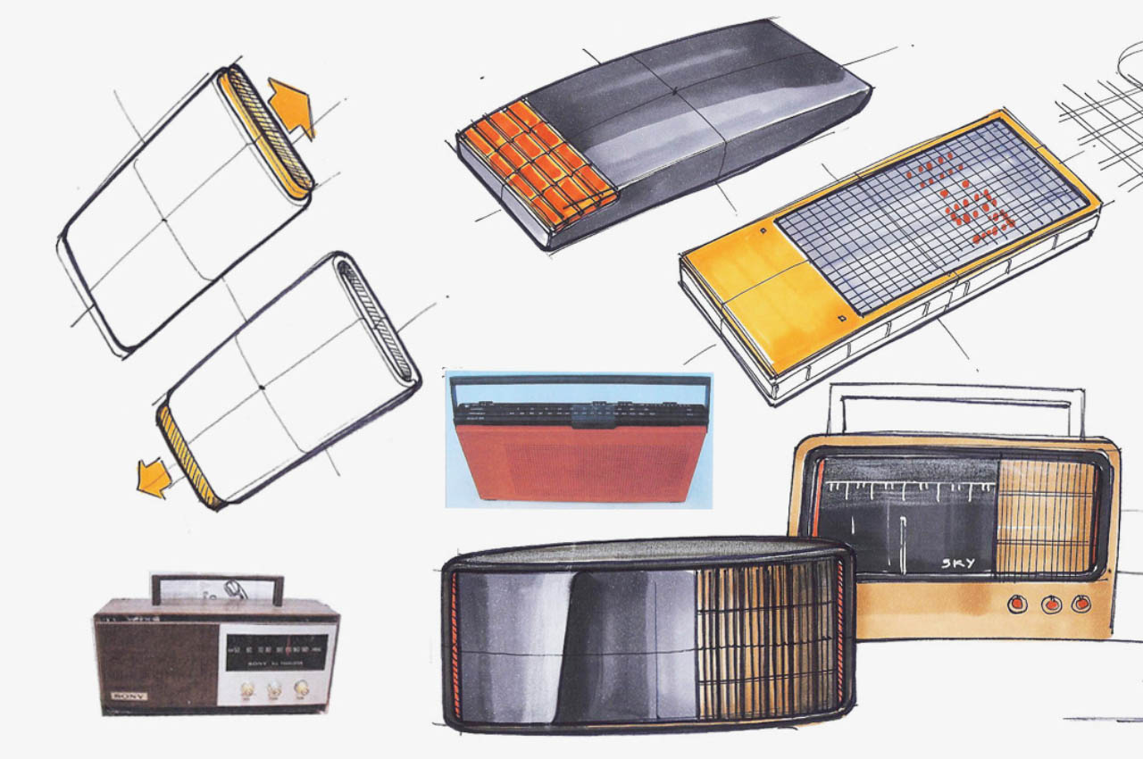
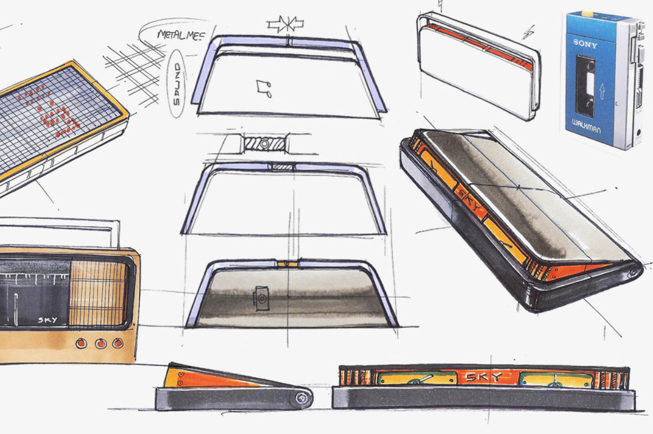
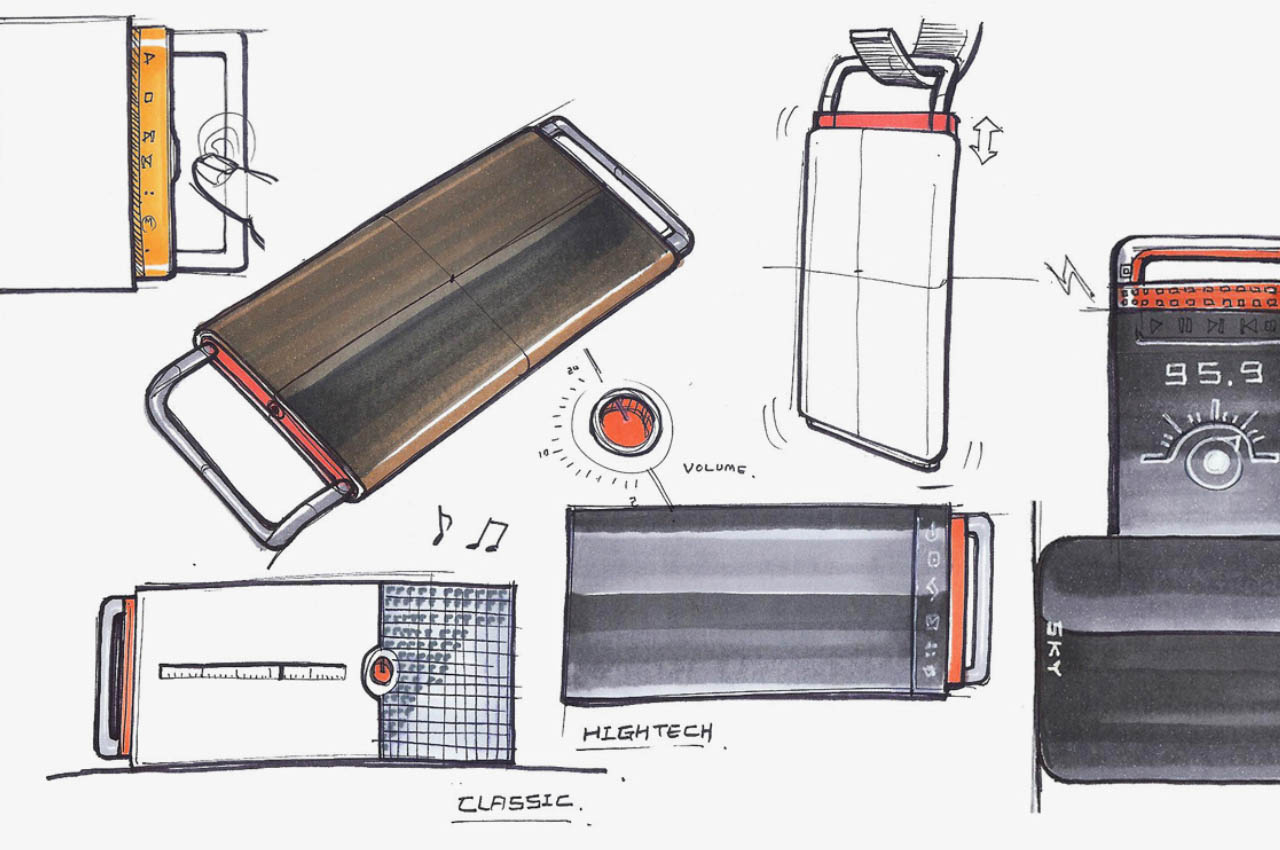
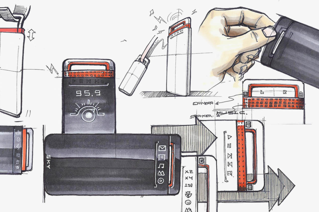
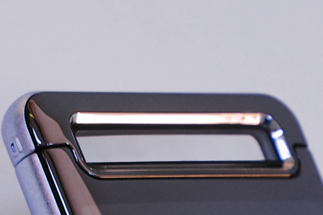
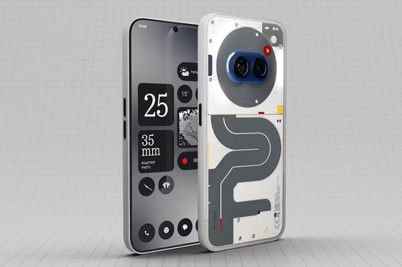
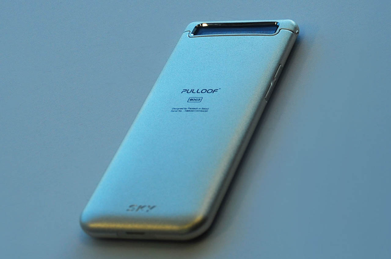 Pulloof thus has a different design approach than a usual smartphone. It is a combination of pull and loop, a phone that features a hidden speaker accessible by pulling out from a round surface using a loop on the phone. With its properties and design, the designer believes, “Even if other phones are thrown away, ‘Pulloof’ will not be thrown away.” This phone will survive anywhere as a hanging speaker (from the loop), so it is usable in the bathroom or in the outdoors to keep you entertained.