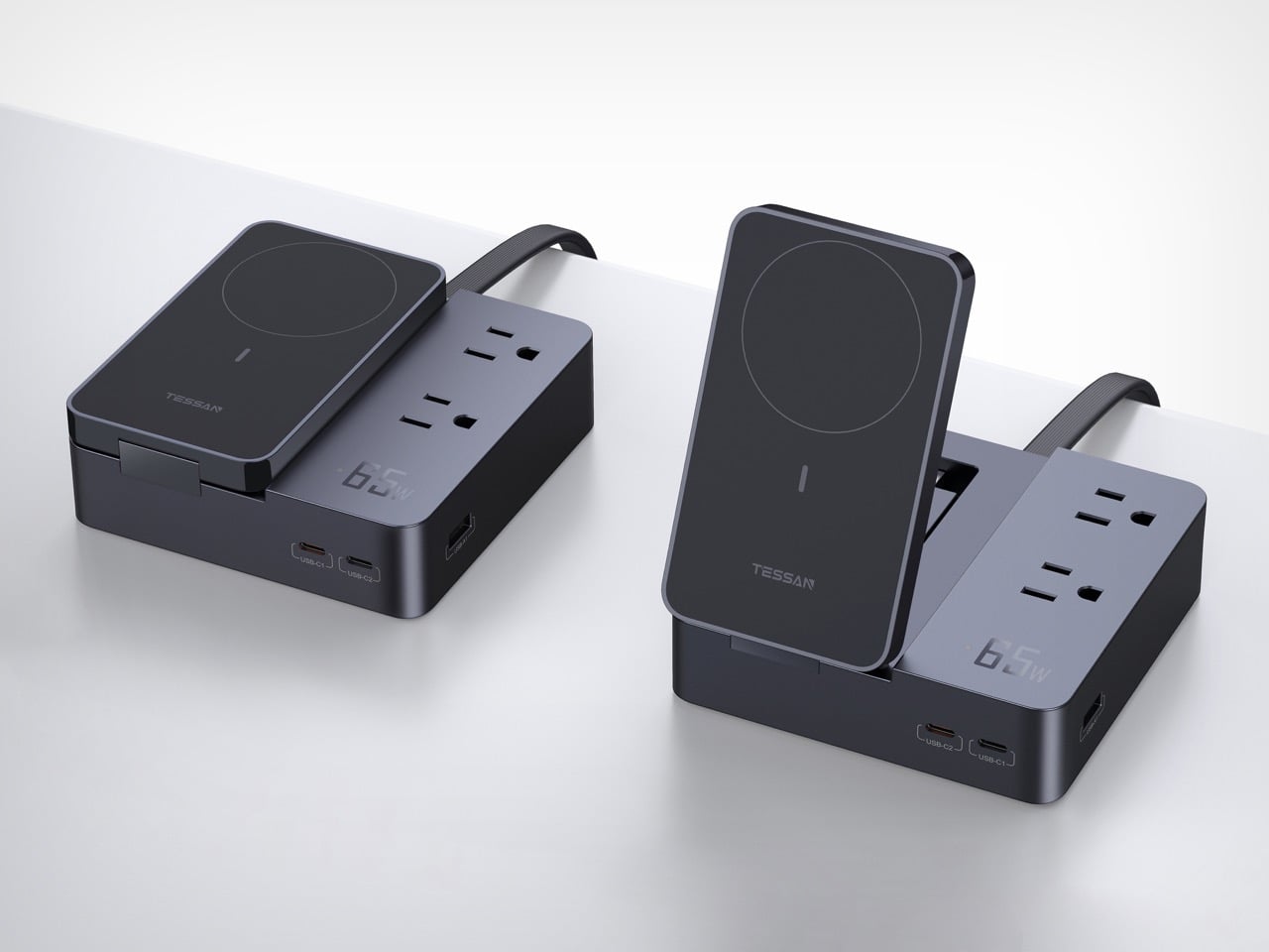
The Power Elf I from TESSAN starts its life looking like a modest bedside box. Then the magnetic wireless panel hinges upward, your iPhone snaps into place on the MagSafe pad, and the whole unit transforms into a proper charging station with a phone stand, two AC outlets, and three USB ports all sharing the same compact base. The hinge is the design’s central idea, a single mechanical move that changes the object’s identity entirely depending on how far you open it.
TESSAN designed the Power Elf I with two distinct use contexts in mind: the desk, where the upright position turns it into a functional workstation accessory, and the nightstand, where it folds flat and keeps every device topped up through the night without consuming half the surface. Both modes feel deliberate rather than incidental, which is the difference between a product that was designed and one that was just assembled.
Designer: Zhuhai Tessan Power Technology Co., Ltd.

Six devices charge simultaneously on the Power Elf I, a number that sounds ambitious until you look at the port layout and realize TESSAN actually planned for it. Two Type-B AC outlets handle anything that still demands a full plug. Two USB-C ports and one USB-A port cover the wired cable ecosystem. The wireless phone pad sits on the hinged module, and the detachable wireless watch charger extends outward on a side cradle, handling Apple Watch independently. Every slot has a designated device in mind, and none of them compete for the same surface area.

Stepless angle adjustment lets it tilt anywhere up to 65 degrees, which TESSAN identifies as the optimal hands-free viewing angle, and the system holds position without clicking between fixed stops. That kind of continuous adjustment is more expensive to engineer than a two-position hinge, and its presence here signals that the design team was thinking about actual use rather than spec-sheet bullet points. The watch charger is detachable and can operate independently once the main unit is powered, meaning it functions as a standalone puck when you need it away from the base.
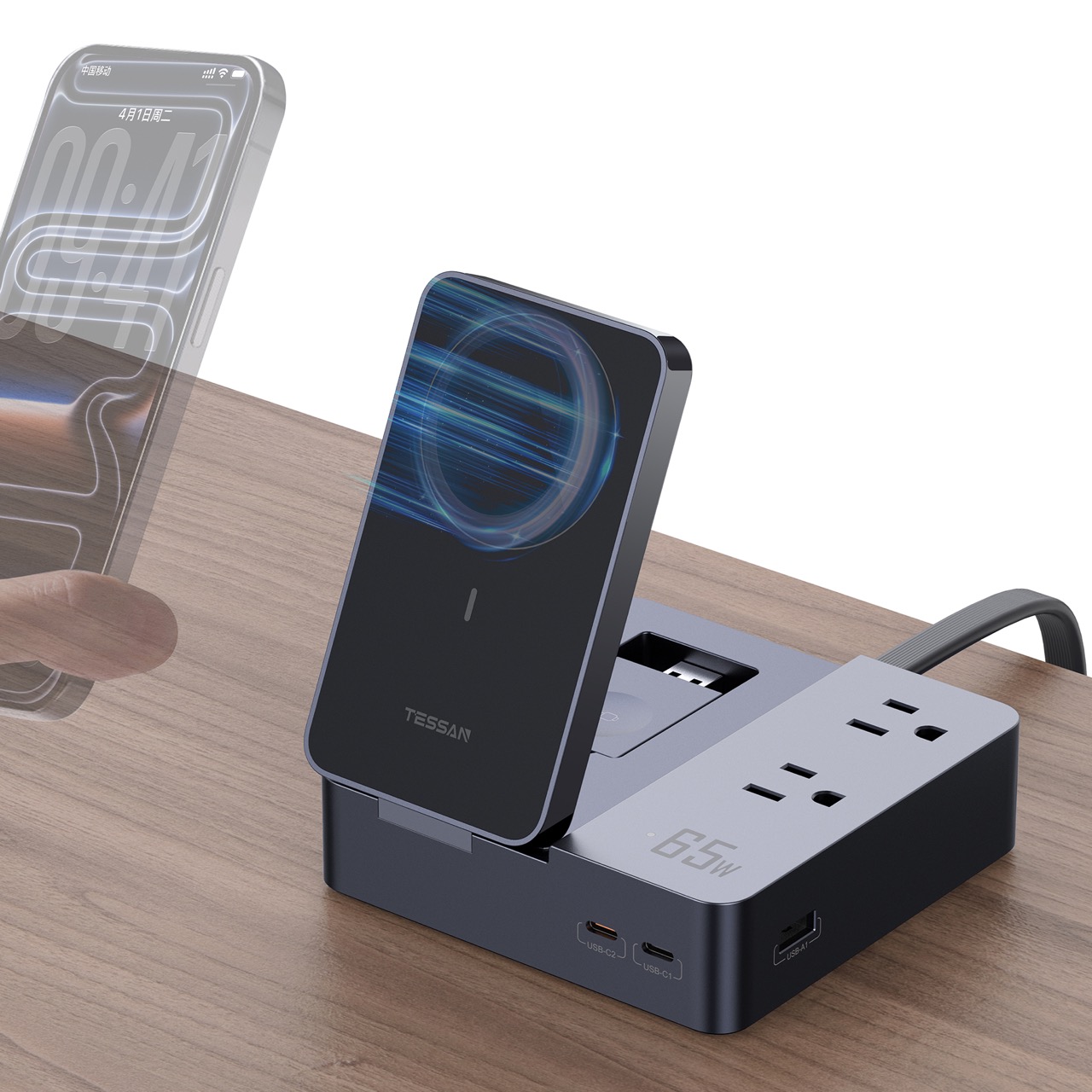
The entire unit is built from V0-rated fire retardant engineering plastics, the highest flammability resistance classification for plastics used in electronic enclosures, with a metal spray coating applied over the surface for tactile and visual quality. At 130mm by 130mm by 40mm when folded flat, the footprint is genuinely compact for everything it contains. The slate and charcoal finish, visible across all four product images, reads as intentionally neutral, designed to disappear into a desk or nightstand setup rather than announce itself. The 65W fast charging output covers a laptop at full speed as the primary device, with intelligent power distribution across the remaining ports when the full ecosystem is connected simultaneously.
The post The Folding Charging Hub That Charges Your Phone, Watch, and Laptop Without Taking Over Your Desk first appeared on Yanko Design.