Xiaomi Built a Tracker That Works on Apple Find My and Google

Losing your keys right before you have to leave is one of those small disasters that feels disproportionately catastrophic. Bluetooth trackers were supposed to fix that, and they mostly have, except for one nagging issue: the good ones tend to work best inside a single ecosystem. Apple’s AirTag is excellent if everyone around you has an iPhone. Most of the world, however, does not. That’s the gap Xiaomi is aiming at with its new Tag, unveiled at MWC 2026.

The Xiaomi Tag supports both Apple Find My and Google Find Hub, which matters more than it might sound. Bluetooth trackers don’t locate your lost bag on their own. They rely on other people’s phones nearby to silently ping the tag’s location back to you. The larger the network of phones, the better your odds of actually finding something. Android outnumbers iPhone significantly across most of the world, so a tracker that taps both networks has a meaningful practical advantage over one that doesn’t.

Designer: Xiaomi

The two networks don’t run at the same time, so the Tag operates on one or the other depending on your setup. Still, the flexibility alone puts it ahead of most alternatives. Connectivity runs on Bluetooth BLE 5.4, and for Lost mode, Apple Find My users can tap any NFC-enabled phone to pull up the owner’s contact details without downloading a single app. That last part is a small but genuinely thoughtful detail.

Physically, the Tag weighs 10g and measures 46.5 x 31 x 7.2 mm, compact enough to slide into a wallet without creating a noticeable lump. IP67 dust and water resistance means rain and accidental puddle encounters are not going to be a problem. The battery is a removable CR2032 button cell, rated for over a year of life based on four sound searches per day, and the app sends a low-battery alert before it dies on you.

There’s an accelerometer inside, and the app can send left-behind alerts when the Tag separates from a location you frequent, though that feature currently works only on Apple Find My. Lost mode lets you attach your contact details and a message, so a stranger who finds your luggage can get that information either through an Android pop-up or an NFC tap on an iPhone, no app required on their end. It’s the kind of friction-reduction that makes the difference between someone actually returning your bag and just walking past it.

An anti-tracking alert is also built in, notifying you if an unknown Tag appears to be following your movements. Xiaomi notes that coverage depends on the Find network’s own implementation, which is an honest caveat that most trackers quietly bury. The Tag is available as a single unit or a four-pack, which is useful if your wallet, keys, backpack, and luggage all feel equally likely to disappear at any given moment.

The post Xiaomi Built a Tracker That Works on Apple Find My and Google first appeared on Yanko Design.

Lenovo Built a Laptop Whose Keyboard, Screen, and Ports Come Apart

Business laptops have spent years getting thinner without getting more useful. The result is a category of machines that travel well and perform adequately, but ask them to flex beyond their fixed configuration, and they politely refuse. A second screen means a separate bag. Different ports mean a separate adapter. Lenovo’s ThinkBook Modular AI PC Concept, announced at MWC 2026, starts from the premise that the laptop’s form factor itself is the problem worth solving.

The concept is built around a 14-inch base unit in dark navy aluminum, conventional enough in isolation. The keyboard detaches completely over Bluetooth, and a secondary display module connects via pogo pins, the same spring-contact system that keeps the pieces in reliable communication without cables between them. That secondary display is the part that does the most work.

Designer: Lenovo

Positioned alongside the base on its own kickstand, it functions as a portable travel monitor in portrait or landscape orientation. Swapped with the keyboard instead, it turns the system into a dual horizontal screen setup with a combined viewing area of roughly 19 inches. Mounted on the top cover, it faces outward, which makes sharing content across a table a matter of flipping a panel rather than rotating an entire laptop.

The IO port modules are a smaller but equally considered detail. Each is a compact cube carrying a single connector, USB-A, USB-C, or HDMI, that slots into a shared housing on the base. Rather than committing to a fixed port arrangement, the base accepts whichever combination a given situation calls for, swapped out as needed, and stored in a small clamshell case that travels with the system.

The honest tension in all of this is that modularity trades one kind of inconvenience for another. A fixed laptop is limiting but uncomplicated. A modular one is flexible but requires keeping track of several small components that each have their own way of going missing. The pogo-pin connection is a good answer to the cable problem, and the accessories shown are compact enough to fit in a jacket pocket, but the system only works as promised if all its pieces arrive together.

What the concept gets right is identifying that most professionals don’t use their laptops the same way twice in a single day. The morning commute, the desk setup, the client meeting, and the hotel room at the end of it all make different demands, and a device that can reconfigure itself for each of them without requiring a separate piece of hardware for every scenario is a reasonable thing to want.

Whether the modularity holds up to daily handling, with real wear on the pogo pins and real risk of leaving the keyboard module in a conference room, is a question that only a shipping product could answer. For now, the ThinkBook Modular AI PC Concept is an argument that the laptop doesn’t have to be a fixed object, but one that can adapt to your needs and lifestyle.

The post Lenovo Built a Laptop Whose Keyboard, Screen, and Ports Come Apart first appeared on Yanko Design.

Lenovo Just Turned the Ugly Desk Hub Into an AI Assistant

Most desks already have too much on them. A laptop, an external monitor, a charging cable snaking toward a phone, maybe a cold cup of coffee that started the morning with good intentions. And somewhere behind all of it is a hub that ties all of it together, which is usually a graceless plastic brick shoved behind something else, forgotten until a port stops working. It’s the least glamorous object in the room, and it knows it.

Lenovo’s AI Work Companion Concept, announced at MWC 2026, makes a case that the hub doesn’t have to apologize for existing. It sits at the front of the desk as a matte black wedge, display angled toward the person working, looking more like a clock than a piece of connectivity hardware. It takes a different position on that problem, literally and figuratively.

Designer: Lenovo

The front display cycles through six clockface styles, from a clean flip-clock layout to an abstract trio of pie-shaped circles, each one designed to read comfortably at a glance without demanding attention. Alongside the time, it surfaces calendar events, port charging status, and a grid of quick-action shortcuts from a single compact footprint.

The hardware underneath that display is a full docking station. One USB-C port delivers 100W to a laptop, another handles 20W phone charging, and two HDMI outputs drive a pair of 4K displays at 60Hz simultaneously. For anyone running a multi-monitor setup, that covers the entire back of the desk without a separate hub involved.

The more unusual part is a cartoon mascot Lenovo calls the Thought Bubble, a bespectacled cloud that lives on the display and manages the AI layer. Tap the large red knob on top, and it pulls tasks and calendar events from across connected devices, then proposes a structured daily plan. It also schedules breaks and monitors screen time, with a weekly “celebration report” summarizing what got done.

The obvious tension is that a device designed to reduce screen fatigue adds another screen to the desk. Whether offloading schedule decisions to a cartoon cloud actually clears mental space, or just relocates the same decisions to a different surface, is a question the concept doesn’t fully answer yet. That’s not a criticism so much as an observation that the idea is still at the stage where it sounds better than it can be proven to work.

What’s harder to argue with is the physical logic. A docking station that also tells the time, tracks the day, and has a programmable knob for whatever shortcut matters most is a more considered object than the plastic brick it replaces. Whether the AI earns its place on the desk is something only daily use can settle.

The post Lenovo Just Turned the Ugly Desk Hub Into an AI Assistant first appeared on Yanko Design.

Lenovo’s AI Desk Robot Has Eyes, Moves, and Watches You Work

There’s a specific kind of loneliness that comes with working alone all day. Not the dramatic kind, just the low-grade awareness that every question you have goes into a chat window, every instruction gets typed into a box, and the thing supposedly helping you has no idea where you’re sitting or what’s on your desk.

Lenovo’s AI Workmate Concept, shown at MWC 2026, takes that gap seriously enough to build a physical object around it. The device is a desk companion in the most literal sense, a spherical head on an articulated arm, rising from a circular base, with animated eyes on its front display that shift and orient as it responds.

Designer: Lenovo

The arm is the most telling design decision, though it isn’t just decorative. Because it moves, the Workmate can orient itself toward whatever is in front of it, a document laid flat, a person leaning back, a wall nearby. That range of motion is what separates it from a smart speaker with a face. It has spatial awareness built into its posture, not just its software.

On the practical side, it handles the kind of work that accumulates quietly throughout a day. Place a document in front of it, and it can scan and summarize the contents. Talk through a rough set of notes, and it can help organize them into something usable. Working on a presentation means the Workmate can assist in structuring the content, pulling from what it already knows about the task at hand through on-device AI processing rather than a cloud connection.

The projection feature is the most speculative part of the concept. Rather than keeping information on a screen, the Workmate can cast content onto a desk surface or wall, which, on paper, turns any flat surface nearby into a secondary display. Whether that’s genuinely more useful than glancing at a monitor, or just a more theatrical way to display the same information, is a fair question that a proof of concept can’t fully answer.

What’s harder to dismiss is the physical language the design uses. The animated eyes aren’t a gimmick in the way that most product “personalities” are. They borrow from the same visual shorthand that makes robots in film immediately readable as attentive or distracted, curious or idle. A status light ring on the base shifts color depending on what the device is doing, adding a peripheral layer of feedback that doesn’t require looking directly at the display. Together, those two elements mean the Workmate communicates state without demanding attention, which is actually a more considered interaction model than most desktop AI tools currently offer.

The deeper question isn’t whether the Workmate works. It’s whether having a robot with eyes watching from the corner of the desk makes the day feel more manageable, or just more observed. That’s not a problem Lenovo can solve with a better arm joint. It’s the kind of thing that only becomes clear once the novelty of the eyes wears off.

The post Lenovo’s AI Desk Robot Has Eyes, Moves, and Watches You Work first appeared on Yanko Design.

Lenovo Unveils a Foldable Gaming Handheld That Replaces Your Laptop

Gaming handhelds have quietly become the most interesting category in consumer electronics, and also the most awkward one to travel with. They’re too big to ignore in a bag and too small to replace a laptop, which means plenty of people end up carrying both anyway, one for the flight, one for the hotel desk, each doing half a job. The Legion Go Fold Concept, unveiled by Lenovo at MWC 2026, is a direct argument against that arrangement.

The device is a foldable handheld with a POLED display that opens from 7.7 inches to 11.6 inches, with detachable controllers that clip onto either side via a rail system. Folded with the controllers on, it functions as a conventional handheld for tighter spaces. Open it flat, reattach the controllers in landscape orientation, and the full screen takes over for a more immersive session.

Designer: Lenovo

For longer stints that call for a keyboard, the included wireless accessory with an integrated touchpad turns the whole system into something closer to a compact laptop. The right controller doubles as a vertical mouse for FPS games, carrying over a feature from the Legion Go Gen 2. That same controller has a small circular secondary display on its face, handling performance metrics, touchpad input, and customizable hotkeys without requiring a trip into any menu.

An Intel Core Ultra 7 258V processor and 32GB of RAM handle the performance side, paired with a 48Whr battery. For a device expected to run demanding titles across multiple screen configurations, that battery figure is the one that will matter most in practice, and it’s also the one hardest to evaluate from a spec sheet alone.

The fold crease is the honest question the concept doesn’t answer. Running horizontally through the center of the display, it’s a non-issue in split configurations where the fold becomes a natural border. In full 11.6-inch mode, with a single uninterrupted game filling both panels, its visibility depends entirely on how well Lenovo has managed the panel gap and hinge tension, two things that vary considerably between announcement renders and finished hardware.

What the Legion Go Fold Concept gets right is identifying that the handheld’s biggest limitation isn’t processing power or battery: it’s the fixed screen. A device that can be a pocket-sized handheld on a commute and a proper gaming surface at a desk is genuinely more useful than two separate devices doing those jobs independently. Whether the folding display holds up to the kind of use that makes it worthwhile is the part that a concept can only promise, not prove.

The post Lenovo Unveils a Foldable Gaming Handheld That Replaces Your Laptop first appeared on Yanko Design.

Lenovo’s Yoga Book Concept Makes 3D Models Float Above the Screen

Working in 3D on a flat screen requires a specific kind of mental gymnastics. The model on the monitor is technically three-dimensional, but the screen keeps insisting it’s not, and somewhere between rotating the viewport and second-guessing the depth, the actual creative work slows to a halt. Lenovo’s Yoga Book Pro 3D Concept, revealed at MWC 2026, takes a direct position on that friction.

The upper display renders 3D content without glasses, using Lenovo’s PureSight Pro Tandem OLED technology to show depth and spatial volume directly on screen. A spacecraft that’s been modeled in three dimensions appears to float, with genuine perceived distance between its front and rear planes, rather than sitting flat behind glass.

Designer: Lenovo

The lower half of the device is a full touch display running the editing environment, with the traditional keyboard removed entirely. Snap-on physical accessories sit on that lower surface: a circular dial and a slider for adjusting lighting, tone, and viewing angle without diving into menus. The idea is that the physical controls stay contextual, appearing wherever they’re placed on the touch surface rather than in a fixed location.

An RGB camera above the upper display handles gesture recognition. Pinching, rotating, and zooming a 3D object happens in the air in front of the screen, which removes at least some of the back-and-forth between input device and viewport that slows down spatial editing. An Intel Core Ultra 7 paired with an NVIDIA GeForce RTX 5070 handles the rendering load underneath all of this.

The AI layer converts 2D reference images into editable 3D assets and can generate a surrounding environment for the converted object on prompt. For a creator pulling reference photography into a modeling workflow, that shortens a step that currently involves a separate pipeline or a lot of manual reconstruction.

What the Yoga Book Pro 3D does differently from other glasses-free 3D solutions is how it treats the display as the primary tool rather than the output. Most 3D workstation design stops at raw performance and screen size. This one asks whether the screen itself can close the gap between what the creator imagines and what the software shows them.

The post Lenovo’s Yoga Book Concept Makes 3D Models Float Above the Screen first appeared on Yanko Design.

Lenovo and AngryMiao Built a Keyboard With a Studio-Grade Knob

Most keyboards disappear into the desk. That’s by design, usually, since the keyboard’s job is to get out of the way and let the work happen. The trouble is that creative workflows don’t always work that way. Editing a podcast or cutting a video involves a lot of scrubbing, a lot of precise back-and-forth through a timeline that a mouse handles clumsily and a keyboard typically doesn’t handle at all.

The Lenovo Yoga Creative Keyboard AngryMiao Edition, announced at MWC 2026, takes a position on that gap. Developed with peripheral maker AngryMiao, it’s a full 98-key mechanical keyboard with a numpad, built around a 2.6kg aluminum base under a frosted polycarbonate top plate. The weight isn’t incidental. It keeps the board planted during longer sessions and damps the vibration that makes cheaper keyboards sound hollow, which matters more than it sounds when you’re spending hours at a stretch on a project.

Designer: Lenovo x AngryMiao

The knob is the detail that does the most explaining. Sitting at the top right of the chassis, it’s an oversized machined cylinder with concentric ridging and a recessed lens cap on top, sized and weighted to feel like something from a piece of studio equipment rather than a computer peripheral. For video editors, it controls the playhead directly, letting a thumb roll through footage frame by frame with tactile feedback that a mouse scroll wheel doesn’t come close to matching. It’s a simple addition that addresses a specific friction point, which is usually the best kind.

For users running the full Yoga setup with a Yoga Pro 9i Aura Edition laptop and a Yoga Pro 27UD-10 Monitor, there’s a dedicated YOGA key that cycles audio between the laptop’s speakers, the monitor’s speakers, or all twelve across both devices combined. That last option, spreading audio across the full speaker array, is a genuinely useful thing for anyone mixing or reviewing audio without headphones and wanting to hear how it sounds in a room rather than a pair of earbuds.

Per-key RGB lights diffuse through the translucent top plate rather than projecting harshly upward, giving the board a softer ambient glow that doesn’t compete with the screen. Two USB-C ports on the rear spine expand connectivity without requiring a separate hub on the desk. The pricing sits at $299 when it goes on sale in May 2026.

The AngryMiao collaboration brings credibility that the keyboard market takes seriously. AngryMiao’s builds are known in enthusiast circles for their material quality and acoustic tuning, and the ATM 98 platform this borrows from has a track record that Lenovo’s branding alone wouldn’t have provided. With the right setup, it ties everything together, pairing a well-built mechanical keyboard with a very good knob.

The post Lenovo and AngryMiao Built a Keyboard With a Studio-Grade Knob first appeared on Yanko Design.

Honor MagicPad4 Review: The World’s Thinnest Tablet Nails Portability and Performance

PROS:


  • Excellent portability

  • Immersive content-consuming experience

  • Great battery life

  • Powerful performance

CONS:


  • No microSD card slot

  • No IP rating

  • Underwhelming software support period

RATINGS:

AESTHETICS
ERGONOMICS
PERFORMANCE
SUSTAINABILITY / REPAIRABILITY
VALUE FOR MONEY

EDITOR'S QUOTE:

The Honor MagicPad4 nails extreme portability with a gorgeous OLED screen, strong performance, and a surprisingly complete productivity toolkit that makes it feel like a real work-capable tablet.

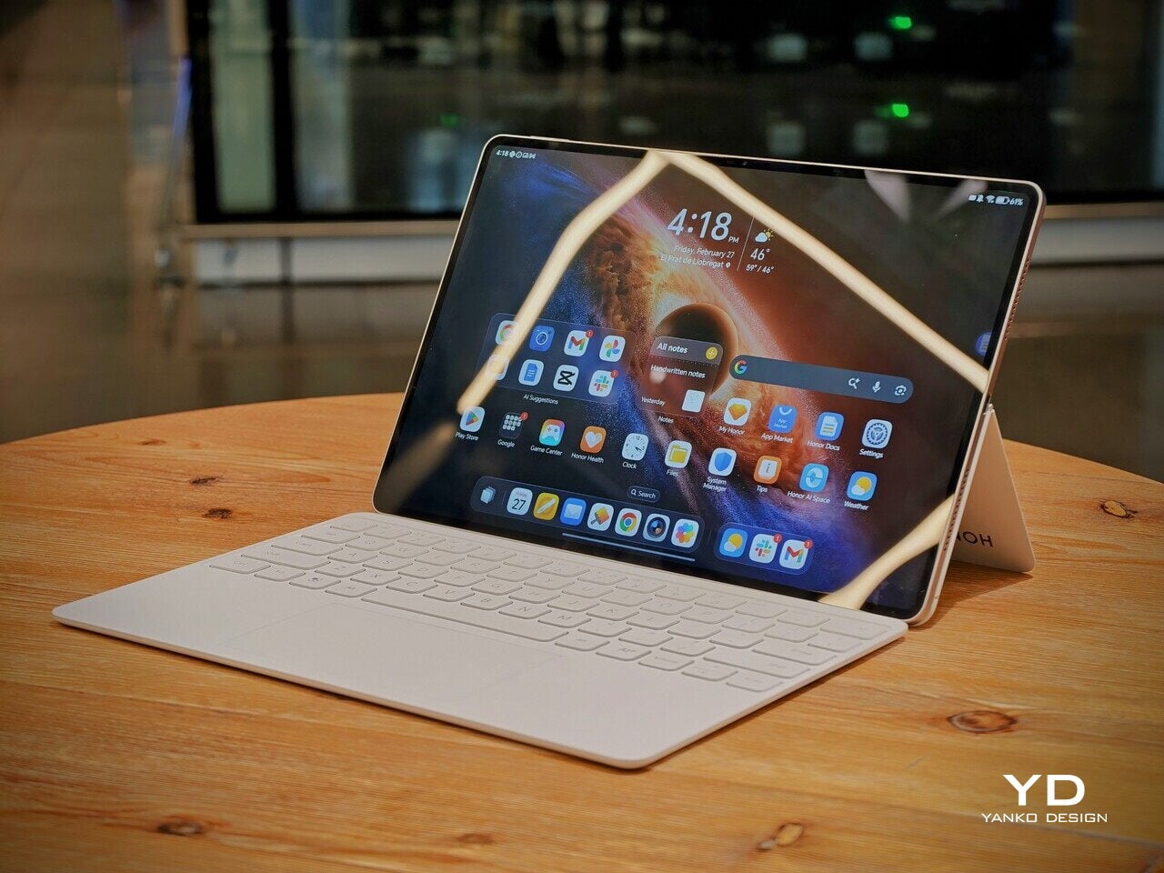
Honor is pitching the MagicPad4 as a tablet that can travel like a notebook and work like a small laptop, without dragging you into the usual compromises. The headline numbers are bold. 4.8mm thin and about 450g, paired with a 12.3-inch OLED panel that runs up to 165Hz and hits a claimed 2400 nits peak brightness in HDR. 

Under that sleek shell, HONOR is also treating this as a proper flagship. You get Snapdragon 8 Gen 5, Wi-Fi 7, a 10,100mAh typical battery with 66W wired charging, and a cooling system designed to keep performance consistent under load. With the headline specs out of the way, let’s get into what the MagicPad4 is actually like to live with.

Designer: Honor

Aesthetics

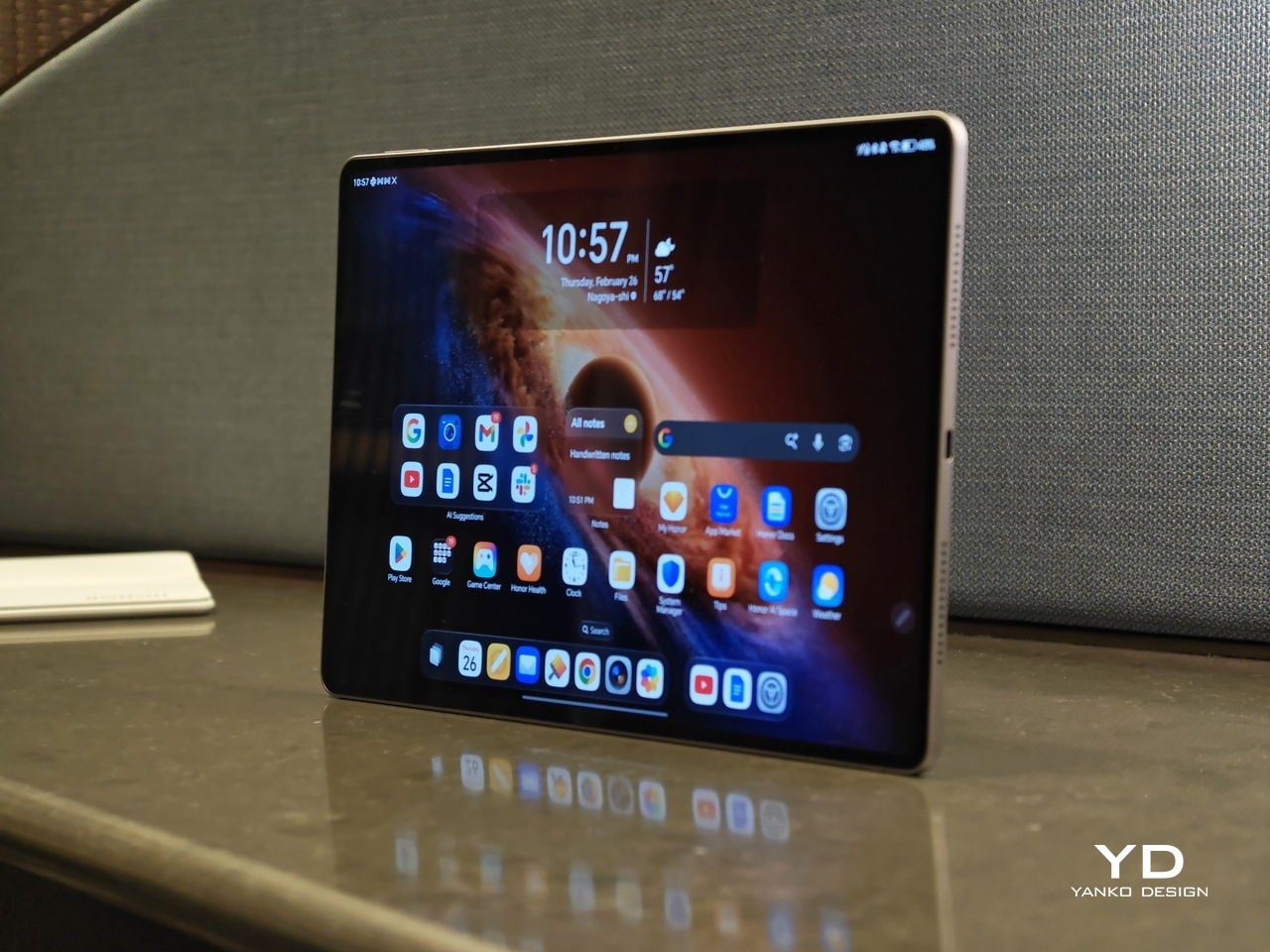
The MagicPad 4 looks like it was designed with a single obsession. Make the body feel impossibly slim, then let the display do the talking. Its design language is clean, modern, and very display-forward, and it feels intentionally restrained in the best way. Instead of chasing flashy accents, the tablet leans into a minimalist, yet elegant look that quietly simmers.

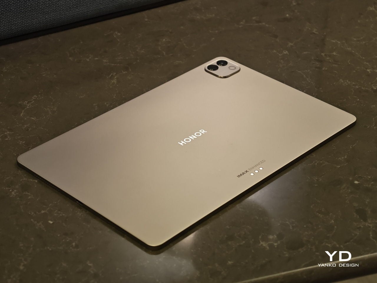
Flip it over, and the styling stays just as composed. On the back, the MagicPad 4 features a square camera bump in the upper left corner, while the HONOR logo sits centered for a balanced, gallery-like finish. Color options are simple and confident, with Gray and White both pairing naturally with the tablet’s understated aesthetic.

Ergonomics

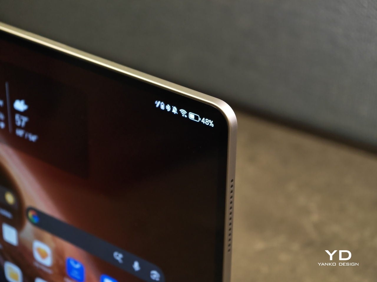
In hand, the MagicPad4’s defining ergonomic feature is slimness and weight, or the lack of it. The MagicPad 3 was already ahead of the pack on portability, listed at 5.79mm and about 595g, but the MagicPad4 still makes a meaningful leap at just 4.8mm thin and about 450g. The screen is slightly smaller this time around, dropping from 13.3 inches on the MagicPad 3 to 12.3 inches here, yet the reduction in thickness and weight is still impressive, even with that display size change in mind.

On paper, those numbers can sound like a modest revision. In use, they show up as less hand fatigue and less hesitation to pick it up for quick reading, quick edits, or a short sketching session. To underline how light it is for its size, HONOR even notes that the 12.3-inch MagicPad4 is lighter than an 11-inch iPad Air at around 462g, which is a helpful reality check for just how portable it feels.

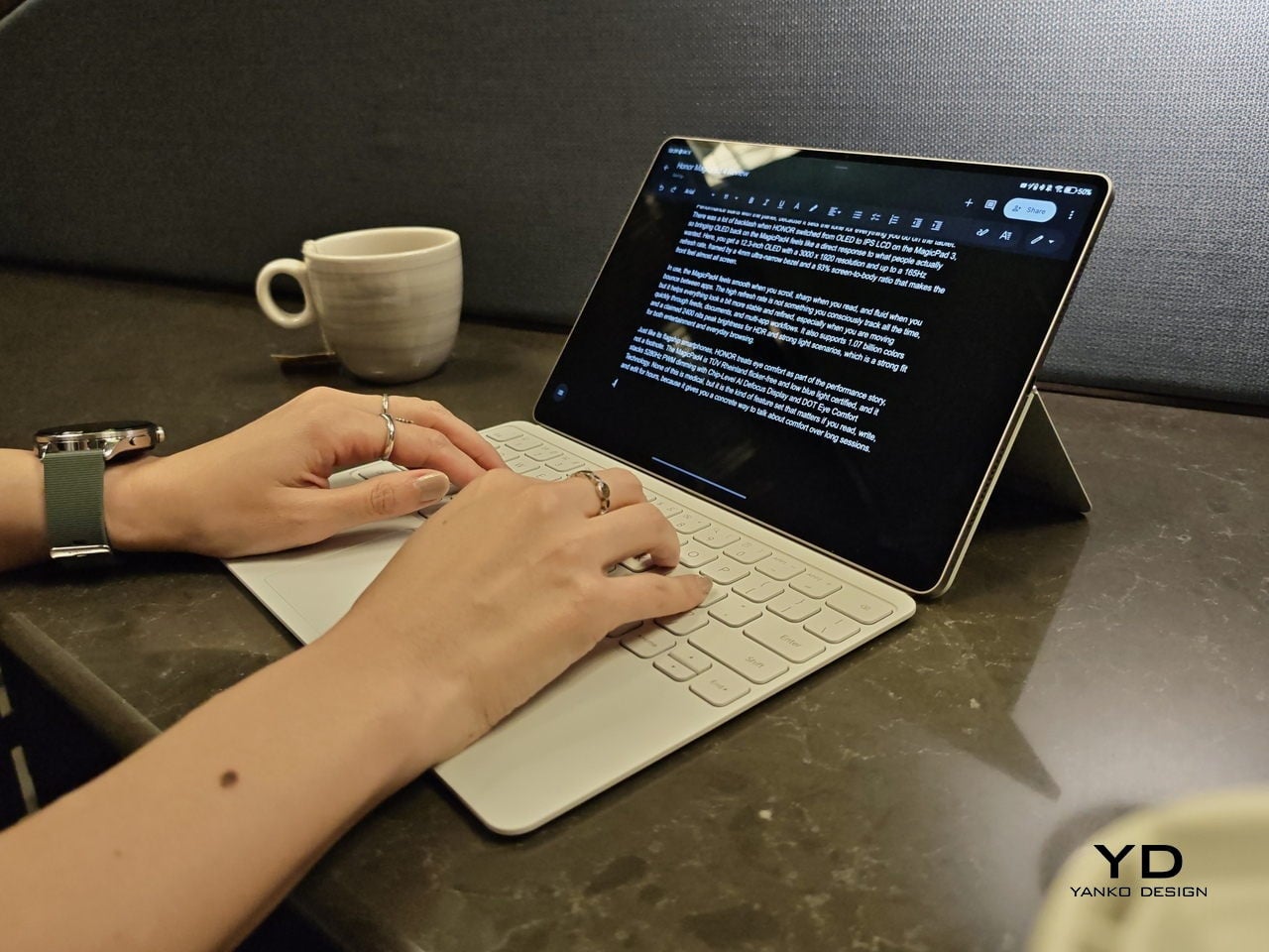
Attach the optional keyboard, and that light, sheet-like feeling largely stays intact. That is when it becomes obvious the MagicPad4 is meant to be used as a full kit. HONOR’s three-piece mobile office set, meaning tablet plus keyboard plus stylus, comes in at about 852g, which is still easy to treat as a grab-and-go setup.

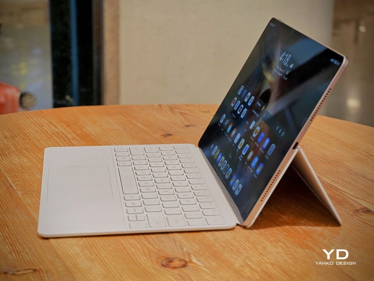
Typing feels surprisingly firm, but the slim keyboard has shallower key travel, so long sessions are a bit less comfortable than on a thicker, more laptop-like keyboard. Still, it is a tradeoff I am willing to take for how portable the whole setup is. Typing on your lap is doable, but the keyboard does not feel as planted as a laptop or a more rigid keyboard setup, so it can wobble a bit when you shift around.

Where the keyboard design really helps is flexibility. You fold the top half of the back cover to prop the tablet up, and it gives you a wide range of display tilt angles. It is the kind of flexibility you end up using constantly, especially on the go, when you are stuck working with whatever table and chair height you find.

Performance

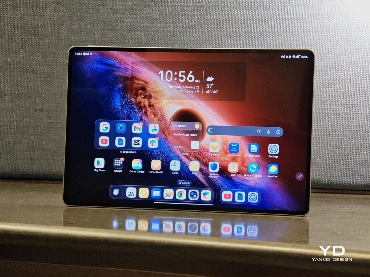
Performance starts with the panel, because it sets the tone for everything you do on the tablet. There was a lot of backlash when HONOR switched from OLED to IPS LCD on the MagicPad 3, so bringing OLED back on the MagicPad4 feels like a direct response to what people actually wanted. Here, you get a 12.3-inch OLED with a 3000 x 1920 resolution and up to a 165Hz refresh rate, framed by a 4mm ultra-narrow bezel and a 93% screen-to-body ratio that makes the front feel almost all screen.

In use, the MagicPad4 feels smooth when you scroll, sharp when you read, and fluid when you bounce between apps. The high refresh rate is not something you consciously track all the time, but it helps everything look a bit more stable and refined, especially when you are moving quickly through feeds, documents, and multi-app workflows. It also supports 1.07 billion colors and a claimed 2400 nits peak brightness for HDR and strong light scenarios, which is a strong fit for both entertainment and everyday browsing.

Just like its flagship smartphones, HONOR treats eye comfort as part of the performance story, not a footnote. The MagicPad4 is TÜV Rheinland flicker-free and low blue light certified, and it stacks 5280Hz PWM dimming with Chip-Level AI Defocus Display and DOT Eye Comfort Technology. None of this is medical, but it is the kind of feature set that matters if you read, write, and edit for hours, because it gives you a concrete way to talk about comfort over long sessions.

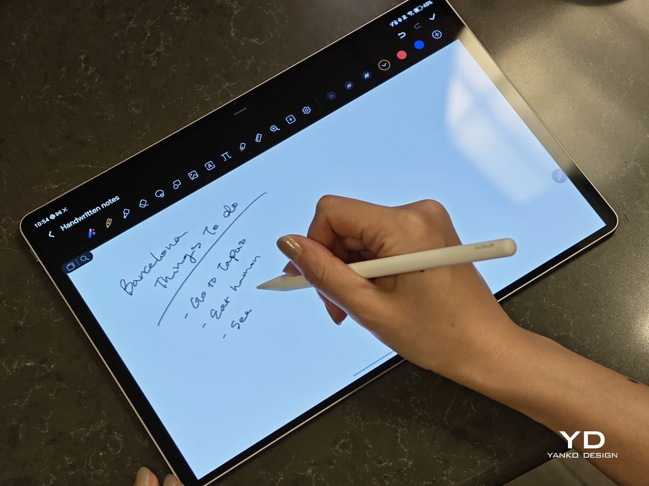
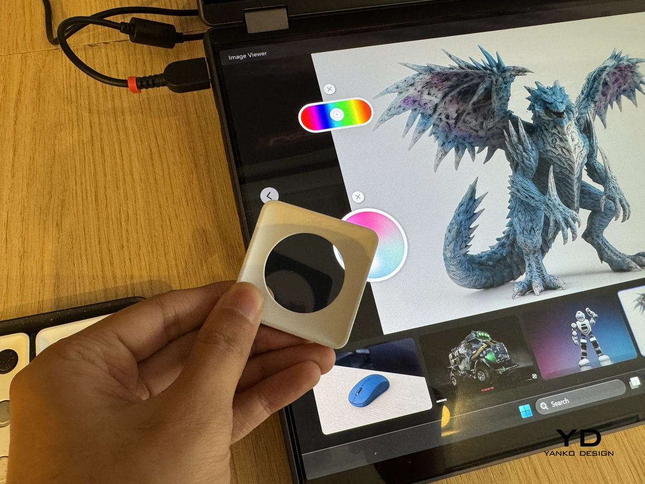
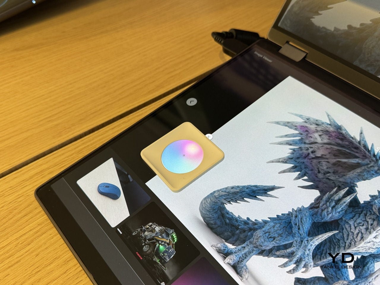
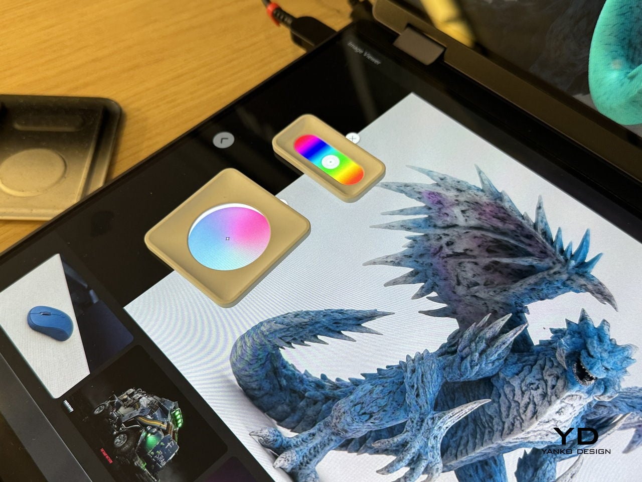
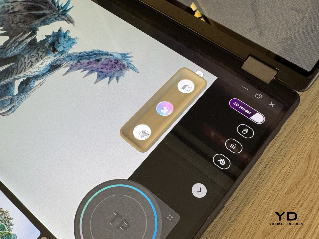
The display performance also matters for pen input, and the MagicPad4 is compatible with the HONOR Magic-Pencil 3. For note-taking and sketching, it makes the tablet feel more like a digital notebook than just a consumption screen, and it is the accessory that turns that big OLED into something you can actually work on, not just look at.

HONOR pairs the display with an eight-speaker setup featuring HONOR Spatial Audio. It sounds excellent overall, with a wide soundstage and solid clarity. Dialogue comes through cleanly, and music has enough separation that it does not blur into a flat wall of sound, though bass is a bit limited, as you would expect from a tablet this slim.

Combined with the 93% screen-to-body ratio and those slim bezels, the MagicPad4 can feel genuinely immersive for movies and video. It is the kind of tablet that makes you want to watch one more episode, because the screen and speakers work together in a way that feels closer to a tiny home theater than a typical mobile device.

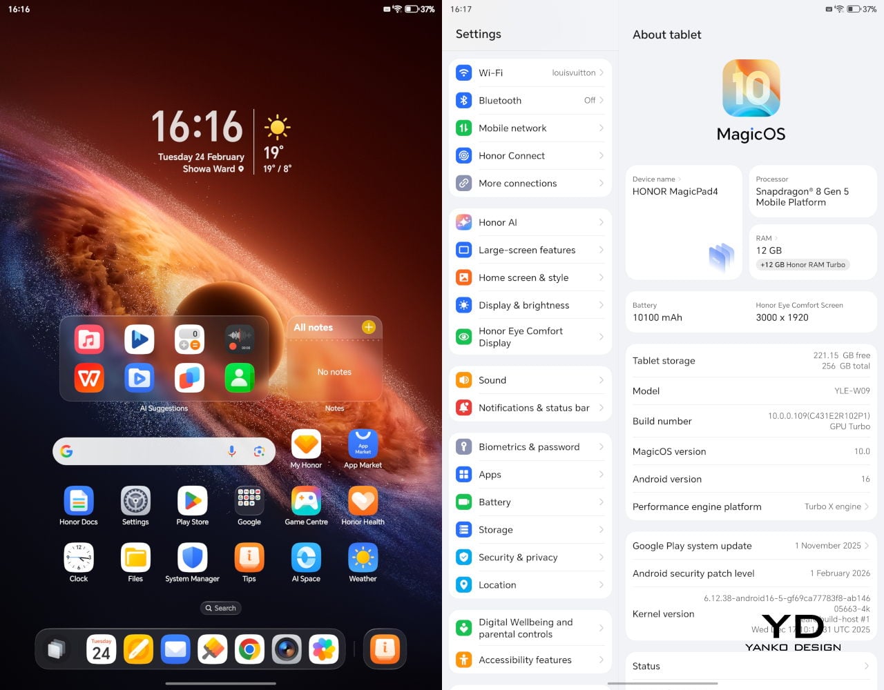
Under the hood, it runs on Snapdragon 8 Gen 5, which gives it the headroom to stay responsive when you start stacking tasks, juggling multiple apps, or pushing more demanding games and creative workloads. Configurations include 12GB RAM with 256GB storage, or 16GB RAM with 512GB storage.

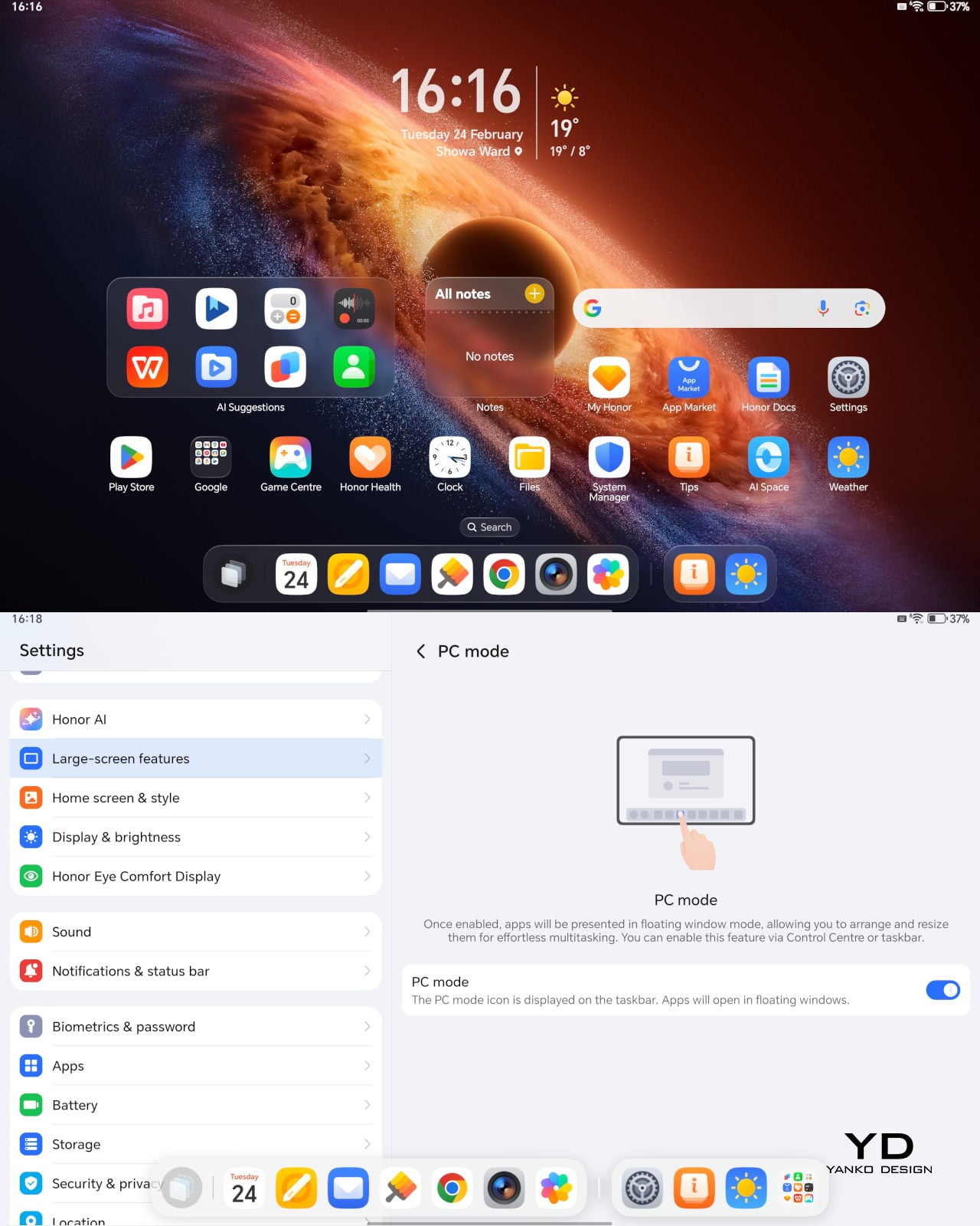
The MagicPad4 runs MagicOS 10 based on Android 16, and a lot of its performance feel comes from the PC-style features and multitasking tools built into the software. For instance, the moment you attach the keyboard, the system prompts you to switch into PC Mode, which immediately reframes the tablet as more of a small desktop than a giant phone.

With PC Mode on, you can open up to four floating windows at once. You can resize them, move them around freely, and set up your own layout depending on what you are doing, like notes on one side, a browser on the other, and a couple of smaller apps layered in. It is a simple feature, but it makes multitasking feel natural on a 12.3-inch screen. On top of that, HONOR bundles a full suite of AI features, so the tablet is not just fast, it is clearly designed to help you get through work faster too.

The cameras are not the reason you buy the MagicPad 4, but they are perfectly fine for what a tablet usually gets used for. You get a 13MP autofocus rear camera for quick document scans and occasional shots, plus a 9MP fixed-focus front camera that is mainly for video calls, and both are serviceable without being a main selling point.

Sustainability

HONOR does not lean heavily on sustainability messaging for the MagicPad4. What it emphasizes instead is structural durability. The MagicPad4 uses aerospace-grade special fiber as part of its body, which HONOR says reduces weight while increasing stiffness by 30%.

There is also a practical durability caveat. There is no IP rating mentioned, so I would be careful around water and treat it like a device that is not meant to handle spills. Software support matters for longevity, too, and HONOR’s promise of three years of major OS updates and three years of security updates is far from class-leading, so it is worth factoring in if you plan to keep the tablet for the long haul.

Value

Value is where the MagicPad4 starts to make a lot of sense, because HONOR is not pricing it like a niche luxury tablet. In the U.K., the 12GB plus 256GB model is £599.99 (about $760 USD), and the 16GB plus 512GB version is £699.99 (about $890 USD). Accessories are priced separately, with the HONOR MagicPad4 Smart Keyboard listed at £140.98 and the Magic-Pencil 3 at £30, which is worth factoring in if you plan to use it as more than a media tablet.

What makes this feel like great value is the overall hardware and feature mix. You are getting a flagship Snapdragon chip, a 12.3-inch 165Hz OLED, a sleek form factor, and a software experience that leans into PC-style multitasking. At these prices, the MagicPad4 makes the most sense for people who will actually use that work-capable tablet angle, not just the big-screen entertainment side.

Verdict

The HONOR MagicPad4 nails the parts of tablet life that actually matter day to day. It is exceptionally portable, the 12.3-inch 165Hz OLED is excellent for reading and media, and the eight-speaker setup helps it feel more immersive than most thin tablets. With the keyboard attached, PC Mode and floating windows make it feel closer to a small laptop than a typical Android tablet.

The compromises are more about the physical keyboard experience and long-term ownership than the software itself. The keyboard is convenient and flexible, but the shallow key travel and slightly wobbly lap use remind you that it is still a tablet-first setup. Honor also does not say much about sustainability, and the promised two major OS updates and four years of security patches are not class-leading, so it is worth weighing if you plan to keep the tablet for many years.

The post Honor MagicPad4 Review: The World’s Thinnest Tablet Nails Portability and Performance first appeared on Yanko Design.

Redmi Buds 8 Pro Review: This €69.90 Earbud Punches Way Above Its Weight

PROS:


  • Clear and balanced sound with rich bass

  • Strong ANC performance for the price

  • Comfortable, stable fit in the ears

  • Responsive touch controls with the slide for volume

CONS:


  • Not integrated with Google Find My Device

RATINGS:

AESTHETICS
ERGONOMICS
PERFORMANCE
SUSTAINABILITY / REPAIRABILITY
VALUE FOR MONEY

EDITOR'S QUOTE:

At this price, the combination of triple drivers, solid ANC, and excellent fit makes the Redmi Buds 8 Pro hard to beat.

Redmi Buds 8 Pro arrives as Redmi’s more ambitious take on everyday wireless earbuds. They aim to combine punchy sound, serious noise cancellation, and gaming-friendly latency in a package that still feels relatively affordable. This is not a basic budget pair built only for casual background listening, and it clearly wants to feel like a step up the moment you start using it.

What makes them interesting is how they chase premium style features without making the experience feel intimidating. The triple driver setup is the headline, but the real promise is a well-rounded daily companion that can handle commuting, workouts, and long listening sessions with minimal fuss. At 399 CNY in China, the value story is hard to ignore, and the key question is whether the real-world experience matches that strong first impression.

Designer: Xiaomi

Aesthetics

Redmi Buds 8 Pro follows a familiar stem style layout, but the visual language leans clean and modern rather than flashy. The earbuds have smooth, flowing lines, with a compact in-ear body that blends into a slim, rounded stem. Most of the earbud surface is finished in a soft matte texture that hides fingerprints and keeps the look understated. On the outside-facing side of each stem, Redmi adds a shiny strip that catches the light, with a small Redmi logo at the bottom as a neat visual anchor. This contrast between matte and gloss gives the buds a touch of sophistication while still keeping them low-key.

The charging case continues that restrained approach with a compact, pebble-like shape that slips easily into a pocket or bag. Its semi-matte shell feels smooth and resists smudges, while a subtle Redmi logo and “triple driver sound” text on the back quietly nod to the hardware inside. On the front, a slim bar of LEDs offers at a glance battery and pairing information but remains discreet when off, so the case still looks clean.

Color options and small accents may vary by region, yet the overall design clearly targets a wide audience. These are earbuds you can wear at the office, on public transport, or at the gym without drawing much attention. If you like bold, statement-making designs, they may feel a bit too reserved, but if you prefer tech that looks tidy and well finished, Redmi Buds 8 Pro sit in a very comfortable sweet spot.

Ergonomics

While the design focuses on clean lines and visual calm, the build of Redmi Buds 8 Pro focuses on comfort and practicality. Each earbud weighs about five point three grams, which helps them feel light enough for long listening sessions without that dragging sensation some heavier buds can cause. Of course, fit and comfort are different from person to person, but Redmi Buds 8 Pro fit my ears very well and never felt like they were about to fall out.

The medium-sized silicone tips come preinstalled, and Redmi also includes small and large tips in the box so you can fine-tune the seal. I usually go with medium-sized tips and sometimes switch to small tips on certain earbuds, but with Redmi Buds 8 Pro, the medium size worked best for me. Some earbuds struggle to stay put even when I am not moving or talking, yet here I had no problem with fit or comfort, even when I talked, ate, did yoga, or went for a jog with the earbuds in.

The charging case weighs about 47 grams, which keeps the full kit small and light enough to disappear into a jeans pocket or a slim sling bag. The rounded shape and smooth finish make it easy to grip and open, and the lid snaps shut with a reassuring click. Magnets inside guide the earbuds into place so they line up with the charging contacts without much effort. In everyday use, that means you can carry the case all day and quickly pop the buds in or out whenever you need them, without really noticing the extra bulk.

Performance

Redmi Buds 8 Pro pack impressive specifications for their price range, and the audio hardware is the main reason why. They use a coaxial triple driver configuration that combines an 11 mm driver with a titanium diaphragm and twin 6.7 mm PZT ceramic tweeters. In listening, the sound comes across as clear and nicely balanced, with bass that feels full and satisfying without overpowering vocals or detail.

Redmi Buds 8 Pro carry Hi-Res Audio Wireless certification and support codecs such as LDAC, but in day-to-day use, the bigger story is simply that the tuning feels well judged. Dolby Audio and Xiaomi Dimensional Audio are also supported, giving you extra options to change the sense of space and presentation, especially for movies and shows.

Active Noise Cancellation works great overall, especially considering the price. It does not completely block out train noise or airplane engine rumble, but it comes close, which makes music and podcasts easier to enjoy at lower volumes. With higher-pitched sounds like a baby crying, it still does not fully cancel everything out, yet it reduces the sharpness enough that you are less likely to get distracted from what you are doing.

One comfort note is heat. I felt the earbuds get slightly warm at first when ANC was on, but it did not seem to build up over time. It is also possible I simply got used to the sensation after wearing them for a while, so I would not call it a major issue, but it is worth mentioning if you are sensitive to heat on hot days.

Battery life is solid on paper and practical in daily use. Each earbud houses a 54 mAh battery, with rated playback of up to about eight hours on a single charge when ANC is off. Turn ANC on and use higher volumes, and actual listening time will drop somewhat, which is typical for this type of product, while the 480 mAh charging case extends total listening time up to roughly 33 hours across multiple top-ups.  

Touch controls on the stems worked great in my use, and the biggest usability upgrade is that volume control is supported via sliding on the stem. The controls support single tap, double tap, triple tap, press and hold, and swipe, which gives you a lot of flexibility without needing to reach for your phone. You can customize these gestures in the Xiaomi Earbuds app, so the controls can match your habits instead of forcing you into a fixed layout.

The app also gives you practical sound tuning options without making things feel overly technical. You can pick from preset audio profiles like Balanced sound, Enhanced bass, Enhanced treble, and Enhanced voice, depending on what you are listening to. If you want more control, there is also a custom EQ option that lets you adjust eight separate bands, with each slider running from plus six to minus six, so you can fine-tune the sound without guessing too much.

Sustainability

For a product category like true wireless earbuds, sustainability is rarely a strong point, and Redmi Buds 8 Pro are no exception. The compact, sealed design means the internal batteries are not user-replaceable, so once overall battery health drops, most people will end up replacing the whole set rather than repairing it. That pattern is common across almost all TWS earbuds today, but it still makes this a product that is easier to discard than to keep alive for many years.

The IP54 rating does offer a small positive by protecting against dust and splashes, which can reduce early failures from sweat, light rain, or accidental spills. One small feature that nudges in a better direction is the “find your earphones” function, which lets you play a tone from the left, right, or both earbuds via the app to help you track them down when they go missing. It is not a full integration with Google Find My Device, yet anything that helps you avoid losing a bud and replacing the whole set still counts as a quiet step toward better longevity.

Value

Redmi Buds 8 Pro is priced at 69.90 Euros, which works out to roughly $83. That puts them in the affordable end of the true wireless market. They still cost more than the absolute cheapest buds, but remain very accessible for anyone looking to step up from basic or bundled earphones.

From a value perspective, they make the most sense if you care about sound quality and noise cancellation more than simply paying the lowest possible price. Cheaper options can handle calls and casual listening, but usually lack the triple driver setup, stronger ANC, and more polished overall experience you get here. For many buyers, Redmi Buds 8 Pro will feel like a worthwhile upgrade that adds clear benefits without demanding a luxury-level budget.

Verdict

Redmi Buds 8 Pro is an easy recommendation if you want strong everyday performance without paying flagship prices. The triple driver setup delivers clear, balanced sound with bass that feels full but controlled, and the ANC is effective enough to make commutes and busy spaces noticeably calmer. Touch controls are reliable, and the volume slide gesture is a genuinely useful upgrade that makes daily listening feel smoother.

They are not perfect, with ANC that cannot fully erase the loudest train or plane noise and weaker results on some high-pitched sounds, plus the usual sealed battery limitations for sustainability. Still, the fit was excellent in my ears, the case is easy to carry, and the “find your earphones” tone feature helps prevent frustrating losses. If you care most about sound quality, noise cancelling, and a polished experience at a very competitive price, Redmi Buds 8 Pro hit a sweet spot.

The post Redmi Buds 8 Pro Review: This €69.90 Earbud Punches Way Above Its Weight first appeared on Yanko Design.

Xiaomi 17 Ultra Review: Lighter, Flatter, and Sharper Than Ever

PROS:


  • Excellent main and telephoto photo quality

  • Big and bright 6.9-inch LTPO AMOLED display

  • Strong performance

  • Improved ergonomic and stylish design

CONS:


  • Limiting macro use with a minimum focus distance of 30 cm

  • Noticeable warmth during camera use

RATINGS:

AESTHETICS
ERGONOMICS
PERFORMANCE
SUSTAINABILITY / REPAIRABILITY
VALUE FOR MONEY

EDITOR'S QUOTE:

The Xiaomi 17 Ultra is a camera-first flagship that finally feels balanced in the hand, and even more balanced in its image processing.

Within the renamed family, the Xiaomi 17 Ultra is the boldest expression of what Xiaomi thinks a 2026 flagship should be. It arrives globally as a big, confident phone that refuses to blend into the background. It is unapologetically camera-centric, and it is packed with specs that read like a wish list.  

On paper, Xiaomi has the ingredients to back that up. You get a 6.9-inch LTPO AMOLED display, a Leica-tuned triple camera system with a 200 MP periscope telephoto, and Qualcomm’s Snapdragon 8 Elite Gen 5. The global model carries a 6,000 mAh battery with 90W wired and 50W wireless charging, which is still a serious setup even before real-world testing.

Designer: Xiaomi

The camera hardware also shifts in meaningful ways, with the main sensor switching from Sony to OmniVision, and the zoom strategy changing from two telephoto cameras to one lens with continuous 75 mm to 100 mm optical zoom. So does the Xiaomi 17 Ultra deliver ultra-level performance where it counts. After two weeks with it, here is what I found.

Aesthetics

The Xiaomi 17 Ultra is not a phone that tries to disappear in your hand or your pocket. The gigantic circular Leica camera island still dominates the rear panel, just like on the previous model, but there is a subtle shift in design language. With a flatter back panel and flat side frame, the 17 Ultra leans into a cleaner, more minimal look than the Xiaomi 15 Ultra. The small Ultra logo with its red underline sitting above the camera bump adds a bit of character without turning the phone into a billboard.

The color palette for the global model leans into classic tones. Xiaomi focuses on black, white, and green for most markets, skipping the violet shade that appears in China. The Starlit Green unit I received is the standout, with a deep moss green base and speckling that catches the light like a dusting of stars, which makes the name feel earned. The black option looks stealthy, but the red accent on the camera ring keeps it from feeling flat, while the white version goes for a high contrast look with the black camera bump and a silver ring and side frame to tie it all together. If you are coming from the Xiaomi 15 Ultra, the evolution feels more like refinement than reinvention, yet the 17 Ultra looks more cohesive and more modern from the rear.

Ergonomics

The first thing I expected to notice when I pick up the Xiaomi 17 Ultra is the weight and thickness. The phone uses a large battery, a complex camera stack, and a sturdy frame, and all of that adds up in the hand. That said, I was pleasantly surprised. At 8.29mm thickness and about 219g, Xiaomi managed to make the 17 Ultra the slimmest and lightest among its Ultra series. The device is still big and not exactly a lightweight phone, but it feels a lot more comfortable to hold than your eyes perceive.

Ergonomically, the device feels well-balanced in the hand, which is a welcoming improvement from the top-heavy feel you get from holding the Xiaomi 15 Ultra. Xiaomi 17 Ultra adapts a flat display, for the first time for its Ultra line, and helps with the grip. Because it’s well-balanced, the camera bump becomes a natural resting point on the back, which can actually improve grip. At the same time, this is not a one-handed phone in any universe, and if you are coming from something smaller, you will need to adjust how you hold it, how you pocket it, and even how you reach for the top corners of the screen.

The global Xiaomi 17 Ultra uses a 6,000 mAh silicon-carbon battery instead of the 6,800 mAh cell in the China model. Even with the smaller capacity, it should still be enough for a full heavy day for most people. Charging is excellent with 90 W wired and 50 W wireless, and the 90 W wired mode supports PPS or Programmable Power Supply, so you can get true fast charging with any PPS-compatible USB-C charger, not only Xiaomi’s own adapter.

Performance

The display on the Xiaomi 17 Ultra is built to impress at first sight. It is a 6.9-inch LTPO AMOLED panel with 120 Hz refresh, a 1.5K class resolution at around 1200 x 2608 pixels, and a claimed 3500 nits peak brightness. It looks sharp and vibrant, and the huge screen makes movies, games, and photo editing feel more immersive. Xiaomi also adds TUV Rheinland certifications for low blue light, flicker-free performance, and circadian-friendly tuning, which are designed to reduce eye fatigue during long viewing sessions.

The Xiaomi 17 Ultra is powered by Qualcomm’s Snapdragon 8 Elite Gen 5 chipset, and the global configurations come with 16GB of RAM paired with either 512GB or 1TB of storage. It is genuinely nice to see a 1TB option offered globally, since that is still not something every flagship brings outside China. The phone flies through heavy multitasking, high refresh rate gaming, and demanding camera workloads without stutter. On the software side, it runs Android 16 with Xiaomi’s HyperOS 3, which is Xiaomi’s unified platform designed to feel lighter and more connected across phones, tablets, and other devices.

The camera system is where the Xiaomi 17 Ultra really tries to separate itself. Xiaomi drops the older quad camera approach and commits to a triple setup. The main camera is a 23-mm equivalent 50 MP unit with an f/1.67 aperture, OIS, and OmniVision’s Light Fusion 1050L sensor. The 75-100mm equivalent telephoto is a 200 MP periscope with OIS using Samsung’s HPE sensor, with a f/2.39-2.96 aperture. Rounding it out is a 50 MP 14-mm equivalent ultra-wide with an f/2.2 aperture using Samsung’s JN5 sensor.

23mm, Leica Authentic

75mm, Leica Vibrant

100mm, Leica Vibrant

On the main camera, Xiaomi pairs the Light Fusion 1050L sensor with LOFIC technology. LOFIC stands for Lateral Overflow Integration Capacitor, and it is designed to reduce highlight clipping by giving each pixel extra headroom before bright areas turn into flat white. In practice, it helps keep texture in skies and reflections while still holding onto shadow detail in high contrast scenes.

23mm, Leica Vibrant

200mm, Leica Authentic

Zoom is the other headline change. Instead of dual telephoto cameras, Xiaomi uses a floating lens structure to deliver continuous optical zoom from 75 mm to 100 mm, which makes it easy to pick between framing without obvious digital cropping. The limitation is that the range is fairly tight, so it is more about fine-tuning perspective than dramatically pulling faraway subjects closer. There is also a close-up trade-off, since the telephoto now focuses down to about 30 cm rather than the 10 cm I could get on the Xiaomi 15 Ultra, so it is less useful as a pseudo macro lens.

45mm, Leica Vibrant

100mm, Leica Vibrant

In real use, both the main camera and the telephoto produce excellent images with wide dynamic range, natural color, and strong detail in various lighting conditions. The images look clean rather than overprocessed or oversharpened. Portrait mode is especially flexible, offering eight focal lengths from 23 mm through 100 mm equivalents, with pleasant bokeh and strong separation, even if it can occasionally miss a fine strand of hair when I pixel peep. I also noticed the phone can get warm even after relatively short camera use, and hopefully Xiaomi can improve this with future updates.

75mm, Leica Vibrant

75mm, Leica Vibrant

100mm, Leica Vibrant

The ultrawide is solid but a step behind the main and telephoto in refinement. The upgraded 50 megapixel front camera with autofocus is a nice quality of life improvement, and it looks great in good light. In backlight or low light, selfies can come out a bit soft as the processing works harder to control noise.

The Xiaomi 17 Ultra’s triple camera system can shoot video up to 8K at 30 fps, and it also offers 4K at up to 120 fps, although the ultrawide tops out at 4K at 60 fps. The front camera can record up to 4K at 60 fps, which is plenty for vlogs and high-quality selfies. Dolby Vision is supported across the cameras, and Xiaomi also includes creator-friendly tools like LOG recording up to 4K at 120 fps with stabilization on, plus LUT import for quicker grading and a more consistent look.

100m, Leica Portrait

100mm, Leica Portrait,

100mm, Leica Portrait, B&W Hig Contrast Filter

In performance, the 17 Ultra generally produces sharp, well-exposed footage with a fairly wide dynamic range, and stabilization stays strong when I am walking or panning. Low-light video also holds up well, with impressive detail for a phone, thanks in part to the large main sensor. Autofocus is usually smooth, but it can struggle in tricky conditions like backlit scenes or low light, where it may hesitate or hunt before it locks.

The Xiaomi 17 Ultra China version gets a 6,800mAh battery, but globally, it comes with a 6,000mAh battery. It should last you a full day, even with heavy use. It supports 90W wired charge and 50W wireless charge. 90W wired charge is PPS, so you can take full advantage of fast charging with a PPS compatible charger, not just with Xiaomi’s proprietary brick.

Sustainability

Xiaomi’s sustainability story for the 17 Ultra is mostly about longevity rather than eco materials. The phone uses Xiaomi Shield Glass 3.0 on the front, and it carries an IP68 rating, which should help it survive years of drops, rain, and daily wear without needing an early replacement. That kind of durability matters because the most sustainable phone is often the one you do not have to replace early.

Software support strengthens that long-life angle. Xiaomi promises five major OS updates and six years of security updates, which is not class-leading, but it is enough to make long-term ownership feel realistic at this price. It also makes the phone a safer buy if you plan to keep it for several years or pass it on later. What Xiaomi does not really emphasize, at least from what I can find, is the use of recycled or more sustainable materials in the phone itself.

Value

For global buyers, the Xiaomi 17 Ultra starts at EUR 1,499, which is roughly $1,620 USD, for 16GB/512GB, with the 16GB plus 1TB configuration expected around EUR 1,699, roughly $1,840 USD. That puts it directly in the same bracket as the most expensive Samsung Galaxy and iPhone models. If you look at what the Xiaomi 17 Ultra offers, it is easy to see the value in hardware alone, especially in cameras, battery, and storage.

The challenge is that Xiaomi is not only competing with Samsung and Apple, but also with other camera-focused Android flagships that are expected to land this year. That means the 17 Ultra has to win on the full experience, not just its spec sheet, especially when buyers are cross-shopping within the same premium price tier. Even so, the 17 Ultra can justify its price if you care most about its Leica-tuned imaging, huge display, and fast charging rather than ecosystem lock-in.

Verdict

The Xiaomi 17 Ultra is one of the most complete camera-first flagships Xiaomi has shipped for the global market. It nails the fundamentals with a huge, bright display, top-tier performance, and charging that makes most rivals feel slow and old-fashioned. The bigger story is how coherent the imaging experience feels, since the main and telephoto cameras deliver natural color, wide dynamic range, and consistent results across lenses.

Of course, there are real trade-offs, too. The new 75 mm to 100 mm continuous zoom is great for framing, but it is not a massive jump in reach, and the longer minimum focus distance makes the telephoto less useful for pseudo macro shots than the Xiaomi 15 Ultra. The global price also puts it in direct competition with the biggest names, so this is no longer a value flagship by default.  Still, there is no doubt the 17 Ultra earns its Ultra name. It delivers a huge, gorgeous screen, genuinely fast charging, and one of the most enjoyable still photo experiences you can get on a phone, with Leica-tuned color that looks natural rather than overcooked. If those are your priorities, the Xiaomi 17 Ultra is an easy flagship to love.

The post Xiaomi 17 Ultra Review: Lighter, Flatter, and Sharper Than Ever first appeared on Yanko Design.