GoPro x ASUS ProArt PX13 Goes Global
GoPro and ASUS launch the ProArt GoPro Edition PX13 globally, featuring Ryzen AI Max+ 395 and 128GB memory for pro 8K workflows.
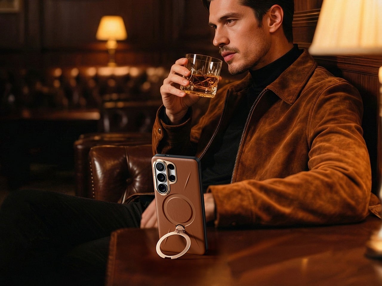
Galaxy S26 Ultra users tend to fall into a specific category. They’re the people who picked the Ultra not because they needed the absolute maximum specs, but because they actually use those specs. The 200MP camera system gets put to work, the S Pen stays in regular rotation, and the phone handles everything from spreadsheet edits to client presentations. Cases for these users need to solve real problems, which makes the TORRAS Ostand Q3 Vegskin feel purpose-built rather than mass-marketed.
Vegskin covers the back panel with organic silicone fabric that mimics the texture of quality calfskin leather, complete with Italian-inspired embossing that delivers a matte, slightly velvety surface. The material resists oil and water stains while offering antibacterial and anti-mold protection, staying clean through daily handling without constant maintenance. Inside, a beige microfiber lining guards the S26’s glass back from scratches and scuffs. The combination of materials creates a case that works in business settings without looking sterile, pairs well with casual use without feeling too relaxed, and handles outdoor situations without compromise.
Designer: TORRAS
Click Here to Buy Now: $51.30 $56.99 (10% off, use coupon code “YANKO111”). Hurry, deal ends in 48-hours! Amazon Link Here.
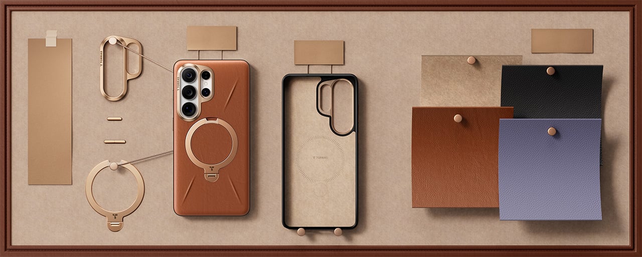
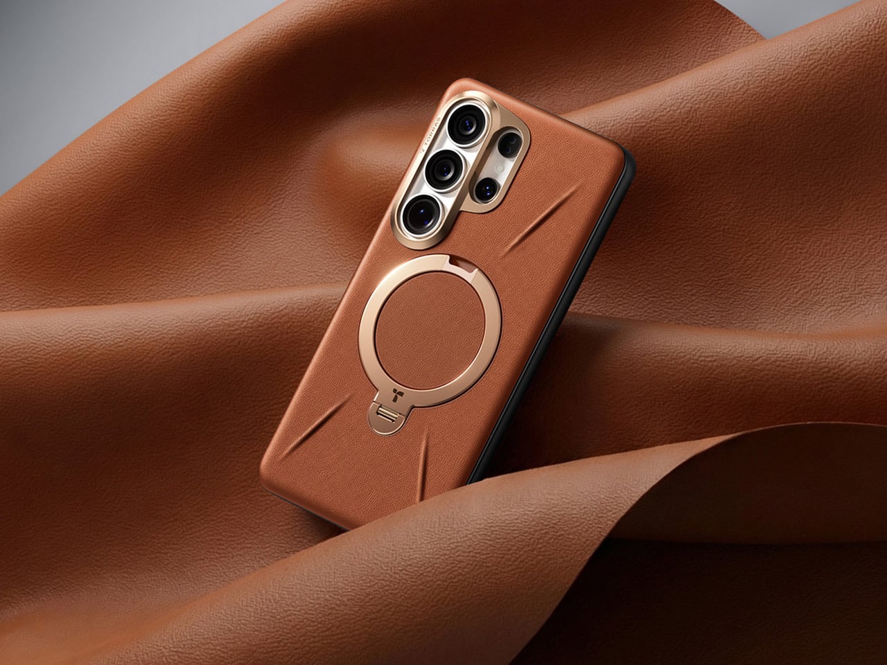
The Ostand has been arguably TORRAS’ most clever invention, providing an ultra-slim yet robust O-shaped ring/stand that rotates on a 360° pivot point for flexible gripping as well as docking (while sitting flush against the case when shut). The Tora-Hold perfects on that technology by packing components that are slimmer, stronger, and somehow smoother in their motion and use too. Eight layers of intricate components (down to micrometers in thickness) deliver the 360-degree rotation with stable angle-locking at any position you choose. The stand measures 2.7mm thick, integrating seamlessly into the backplate when closed, which matters because most kickstand cases add noticeable bulk that ruins the phone’s profile. Flip it open and the hinge operates silently, tuned for smooth reliable motion through over 30,000 rotations according to durability testing. The aerospace-grade aluminum construction went through more than 400 trials refining texture, tone, and color, which explains why the champagne gold finish feels considered rather than flashy.
Four quick-stop positions at 90°, 180°, 270°, and 360° let you snap the stand into place for fast setup, but the mechanism also locks smoothly at any angle between those points – a feature I’ve come to absolutely fall in love with on TORRAS’ Ostand cases. The magnetic ring doubles as a stand and a mounting solution, delivering 15N of magnetic force that holds firmly to car mounts, refrigerators, whiteboards, or any magnetic surface you encounter. That force rating means the phone stays put during workouts or bumpy commutes, which makes the stand viable for actual use rather than occasional convenience. The one-click locking and hidden hinge design keeps the mechanism from feeling like an afterthought bolted onto the case. And, your S26 Ultra will be wireless charging capable with this case on.

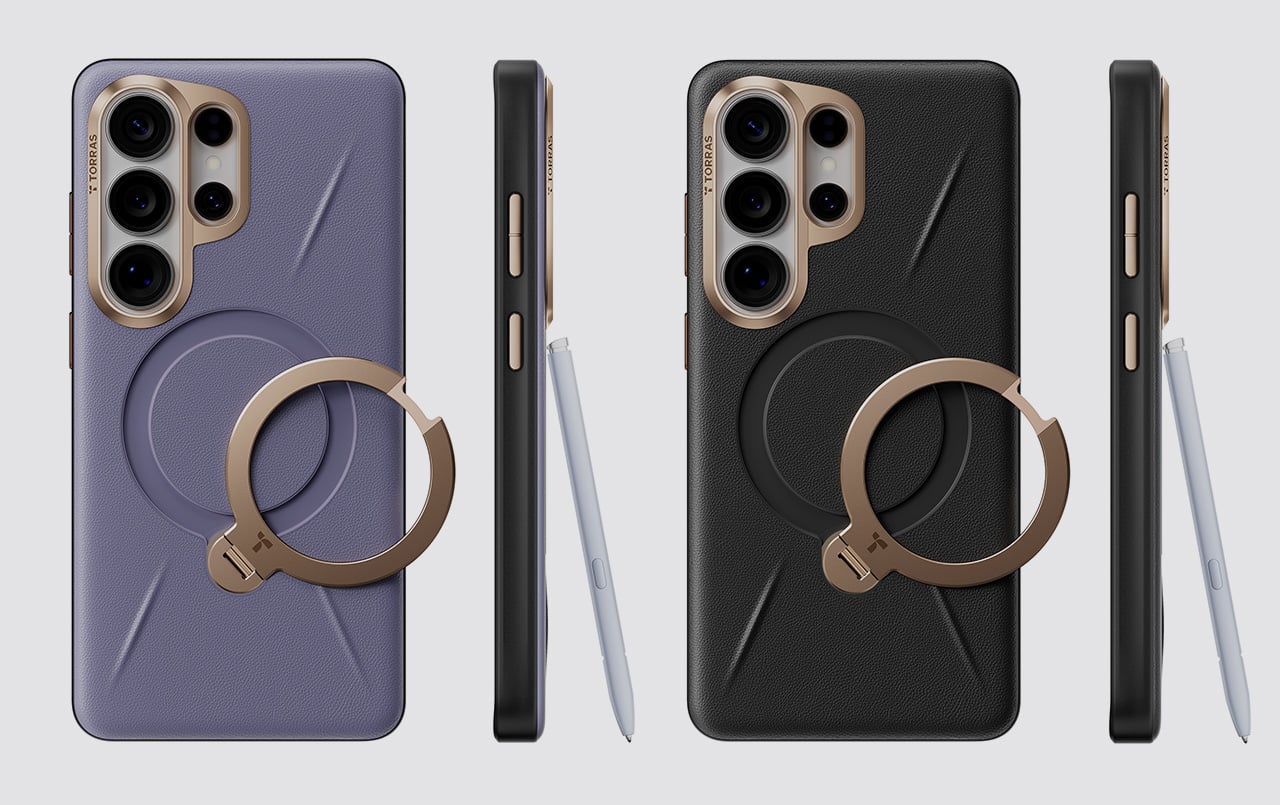
The lens guard deserves its own mention because TORRAS designed it specifically for the S26’s camera layout. A precision raised frame wraps around the camera module, following Samsung’s left-high, right-low runway-and-pillar design that keeps the lenses elevated above flat surfaces. The protection works without blocking the flash, the 10MP telephoto cameras, or the radar sensors Samsung packed into that corner, so every shooting function stays fully operational. Camera bump designs change with every phone generation, and cases that ignore those specifics end up causing problems with focus or flash washout. TORRAS clearly mapped the S26’s exact sensor placement, which matters when you’re spending flagship money on computational photography.
The sides use concave TPU that curves to fit your hand naturally, creating a secure hold without adding aggressive texture or rubber grips that collect lint. Soft-touch TPU increases friction just enough to prevent slips while keeping the case comfortable during extended handling, which matters when you’re scrolling through long documents or editing photos. The metal buttons deliver precise tactile feedback with every press, maintaining the satisfying click of the S26’s physical controls instead of mushing them into spongy approximations. Samsung brought back the S Pen slot for the Ultra, and TORRAS built an ergonomic cutout that makes removal effortless with one press for smooth extraction. Little details like that separate cases designed around a specific phone from universal designs adapted to fit whatever Samsung releases.
TORRAS prices the Ostand Q3 Vegskin at $54.99, positioning it in premium territory alongside first-party Samsung cases and established accessory brands. Three colors cover different aesthetic preferences: Amber Brown for warmth and character, Obsidian Black for understated professionalism, and Amethyst Purple for users who want their tech to show some personality. The case works exclusively with the S26 Ultra, designed around that specific body and camera configuration. If you’re investing in the Vegskin, might as well grab one of TORRAS’s 9H hardness screen protectors too, since a premium phone with a scratched display isn’t particularly pleasing to the eye or the pocket.
Click Here to Buy Now: $51.30 $56.99 (10% off, use coupon code “YANKO111”). Hurry, deal ends in 48-hours! Amazon Link Here.
The post TORRAS’ Galaxy S26 Ultra Case Has a 360° Rotating Magnetic Stand, Leather-Like Skin, and a Design Award first appeared on Yanko Design.

During the pandemic, the rise of the Stanley Cup moms was splashed all over social media. Most influencers and content creators were either sipping from their tumbler or had one sitting proudly in the background. There are other brands of reusable mugs and tumblers, of course, but Stanley was the go-to for a lot of people, particularly women. It wasn’t just about staying hydrated. It became a lifestyle statement, a collector’s obsession, and for many, a whole personality.
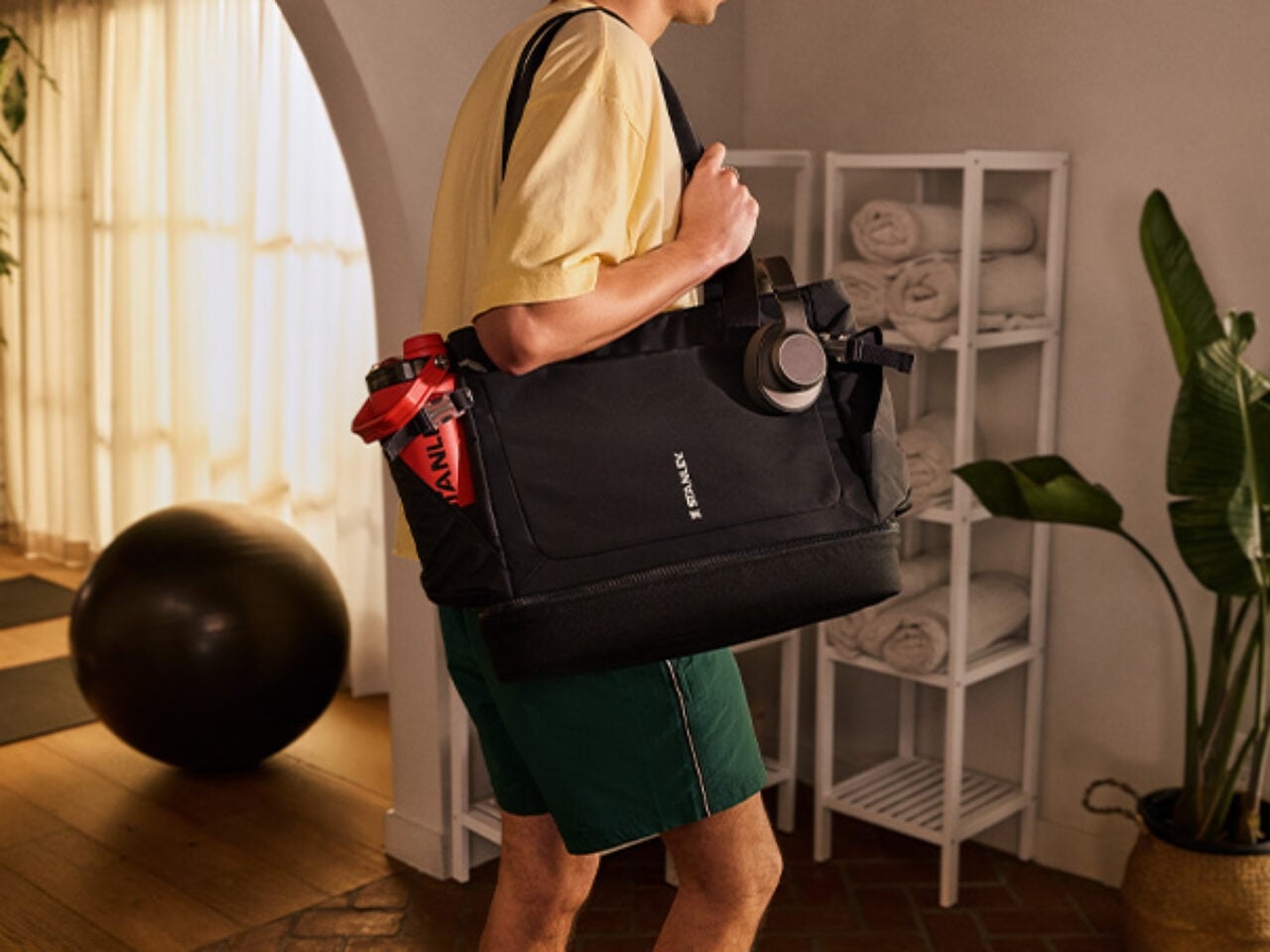
Now the brand is looking to expand its market with its first-ever bag, the Stanley 1913 Vitalize Macro Method Tote. While the main selling point of this bag is that it can carry your tumbler, it’s built to carry much more than just a water container. Think of it as a home for pretty much everything else you need to get through your day. The way it’s designed means it can match any lifestyle, whether you’re heading to the office, the gym, or just running your errands.
Designer: Stanley
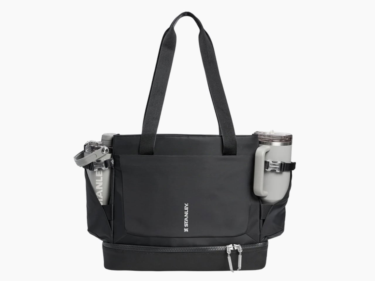
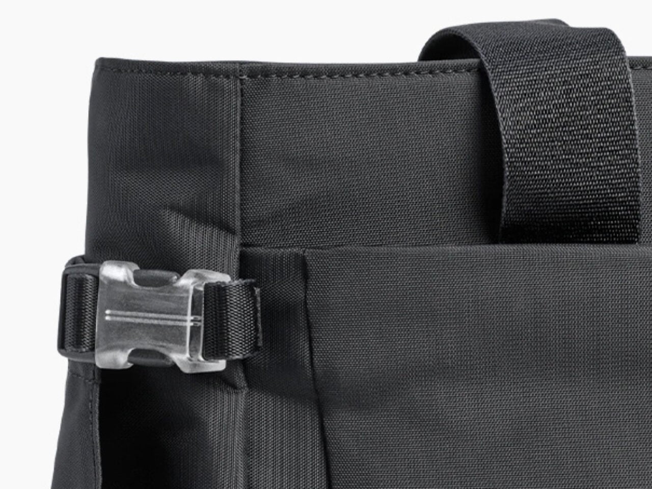
The whole idea behind reusable tumblers is to always have water (or your favorite beverage) with you wherever you go. But sometimes, the bags we use aren’t sturdy enough to carry them around, so we just leave them at home. This bag from Stanley solves that particular problem with a tumbler securing belt and pocket, which is compatible with the 40-ounce Quencher® ProTour or Vitalize Shaker and gives you easy access to them whenever you need a sip. You could probably use other brands or models as well, but if you’re buying the Stanley bag, chances are you’re already a Stanley person anyway.
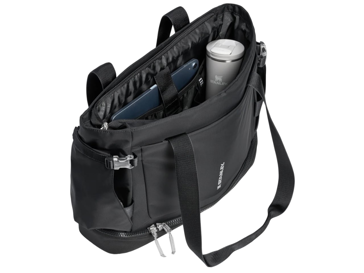
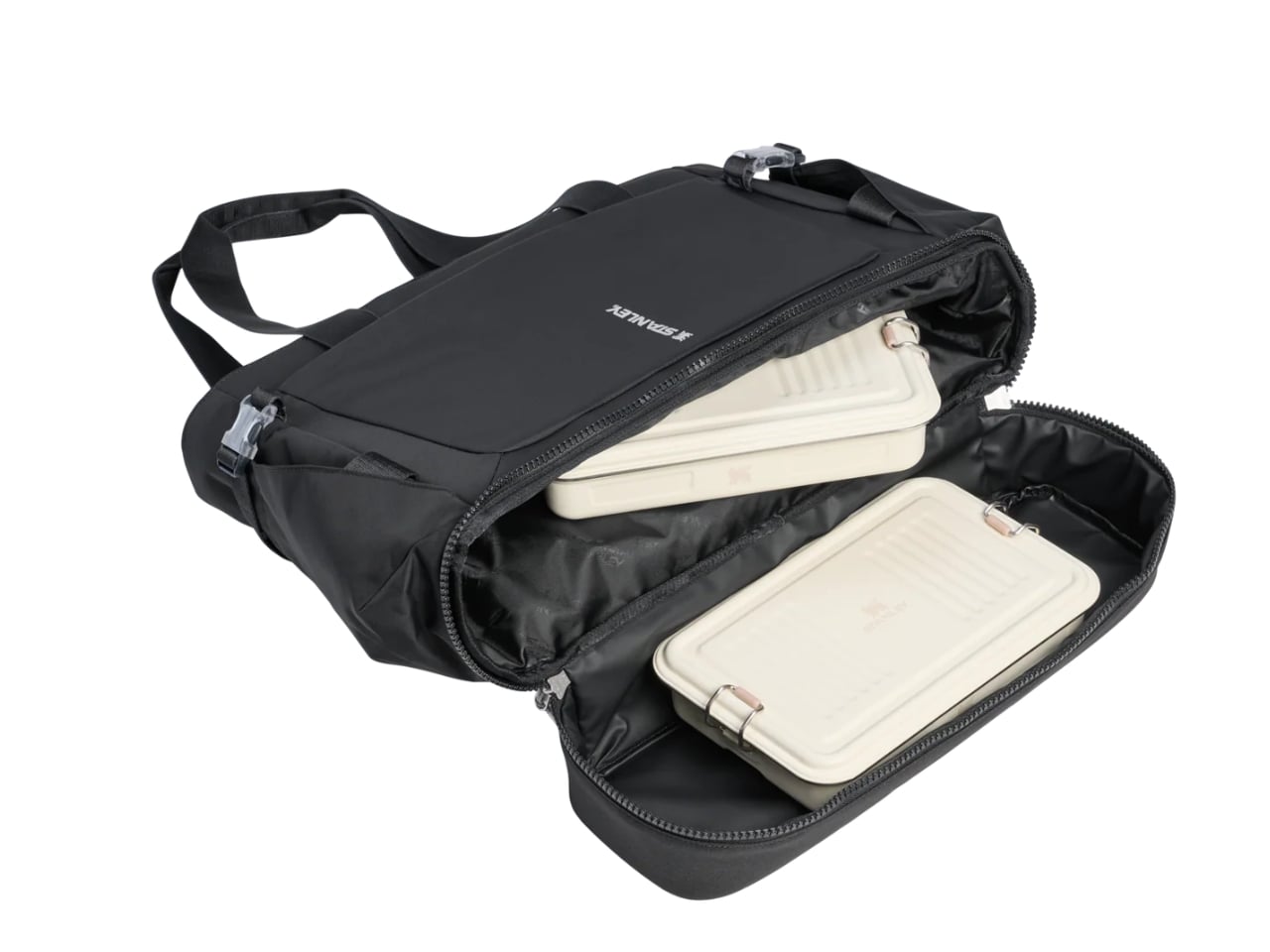

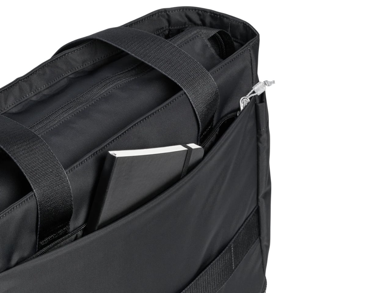
Other than that, there’s plenty to like about this bag, especially if you’re the type who prefers just one carrier for all your essentials. It has a zippered main compartment that provides secure and spacious storage for all the bigger items you need to haul around. There’s also an interior laptop sleeve to keep your laptop and other gadgets safe and scratch-free. You’ll also find an easy-access zippered front pocket for things you may need to grab on the go, like your keys, lip balm, or earbuds. And if that’s still not enough, there’s a foldaway interior Vitalize Macro Container pocket for when you need even more organization.


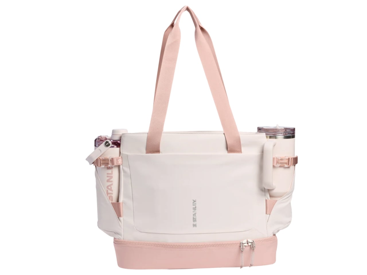
For something that’s meant to carry a hefty 40-ounce tumbler, the bag is naturally made from durable materials. Even better, it uses 100% recycled fabrics, so you can keep your carbon footprint low without compromising on style or durability. You can carry it as a handbag or a shoulder bag since it comes with both hand and shoulder carry straps. It holds nearly 28 quarts of capacity but sits at a slim 5.12″ depth, so it won’t get too bulky or cumbersome which is a nice balance for everyday use.
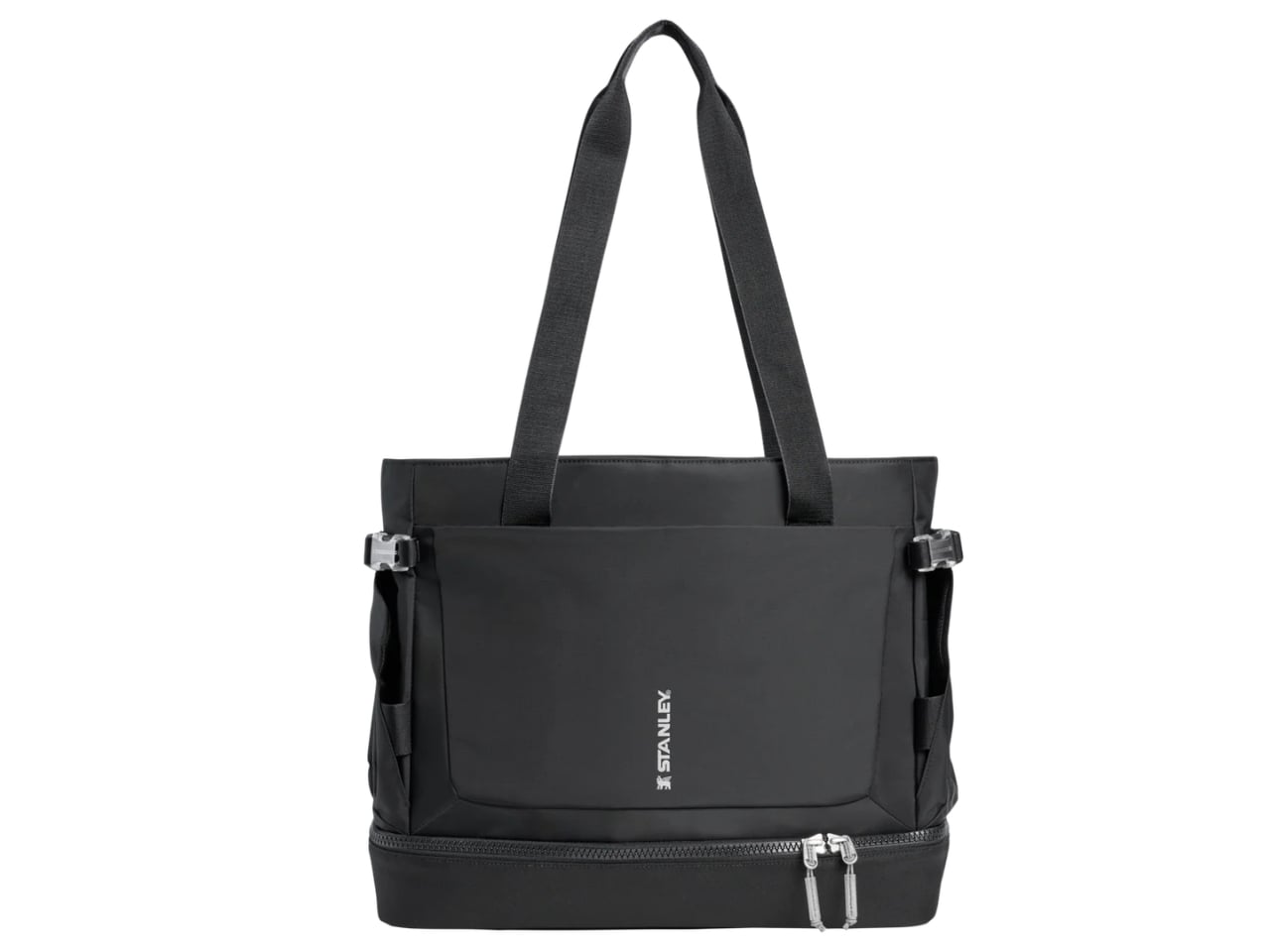
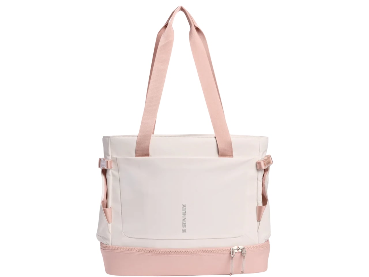
There are, of course, plenty of other bags on the market that offer similar features, but if you’re already a Stanley loyalist, this feels like a pretty natural next purchase. The minimalist design will also appeal to those who prefer their bags to be clean and unfussy. It comes in three colors: Black, Rose Quartz, and Sage Grey. This keeps things simple and versatile, easy to pair with just about anything in your wardrobe. It’s not trying to be flashy, and honestly, it doesn’t need to be.

At $110, the Stanley 1913 Vitalize Macro Method Tote is more than just a bag. It’s the natural next step in the Stanley lifestyle. Whether you’re a long-time collector who’s been following the brand since the tumbler craze first took over your feed, or someone who’s just discovering what all the fuss is about, this tote feels like a thoughtful extension of everything Stanley stands for: durability, functionality, and just the right amount of style. It’s the kind of bag you’ll reach for every single day, and if you’re anything like us, you’ll probably want one in every color.
The post Stanley’s First-Ever Bag Has a Pocket Just for Your Tumbler first appeared on Yanko Design.

Twenty feet doesn’t sound like much until you step inside the Kinnakeet. Built by Ohio-based custom tiny home builder Modern Tiny Living, this road-ready dwelling packs a surprising amount of life into a footprint most people would walk past without a second thought.
The Kinnakeet is rooted in one of Modern Tiny Living’s most celebrated designs: the Mohican model, which earned a spot on HGTV’s Journey to the Tiny House Jamboree. While it inherits the Mohican’s clever bones, the Kinnakeet carves out its own identity with a crisp white interior, broad green accents, and dark floors that ground the whole aesthetic. The exterior is wrapped in engineered wood and capped with a metal roof, making it understated, durable, and sharp.
Designer: Modern Tiny Living

Step inside, and the first thing you notice is the light. The living area is anchored by two large windows that flood the space, paired with a sofa that doubles as a bed for two, with three storage drawers tucked underneath. A folding table doubles as a workspace or dining surface, and a large custom bookcase makes the room feel intentional rather than improvised. The staircase leading up to the loft doesn’t waste a single riser — each step hides a cubbyhole of varying sizes for shoes, books, or whatever you need within reach.
The kitchen is compact but thoughtful, featuring a sink, custom cabinetry, and open space that accommodates additional appliances depending on the owner’s needs. Since the Kinnakeet was originally designed for use as a vacation rental on Airbnb, it skips the full-size appliances found in Modern Tiny Living’s permanent residences — a deliberate choice that keeps the build flexible and the cost accessible.


The bathroom is accessed through a sliding barn-style door off the kitchen and manages to fit in a walk-in shower and a flushing toilet without feeling squeezed. Up the storage staircase, the lofted bedroom fits a double bed with enough room to feel like a proper retreat, even if the ceiling keeps things cozy.
Priced at $79,000 as a starting point, the Kinnakeet is customizable, more or less depending on finishes, appliances, and personal priorities. Whether you’re looking for a full-time downsized lifestyle or a smart vacation rental investment, the Kinnakeet makes a compelling case that 20 feet is more than enough.


The post At Just 20 Feet Long, the Kinnakeet Tiny Home Has Everything, Including an Airbnb Income first appeared on Yanko Design.
It's always a fun day for the space nerds when a NASA team has new images to share from the James Webb Space Telescope. Today's pair has brains on the brain, with a look at the fittingly named Exposed Cranium Nebula. More officially, this cloud of space dust and debris is known as Nebula PMR 1. The images shared today may capture a moment in the final stages of a star, as well as giving hints as to how the nebula got its brain-like shape.
"The nebula appears to have distinct regions that capture different phases of its evolution — an outer shell of gas that was blown off first and consists mostly of hydrogen, and an inner cloud with more structure that contains a mix of different gases," NASA's blog post reads. The dark line that runs vertically through the nebula, giving it the cranial appearance, could be the result of "an outburst or outflow from the central star, which typically occurs as twin jets burst out in opposite directions." Both Webb's Near-Infrared Camera (NIRCam) and its Mid-Infrared Instrument (MIRI) were used to document the nebula.
This article originally appeared on Engadget at https://www.engadget.com/science/space/new-webb-telescope-photos-show-off-the-exposed-cranium-nebula-235609619.html?src=rss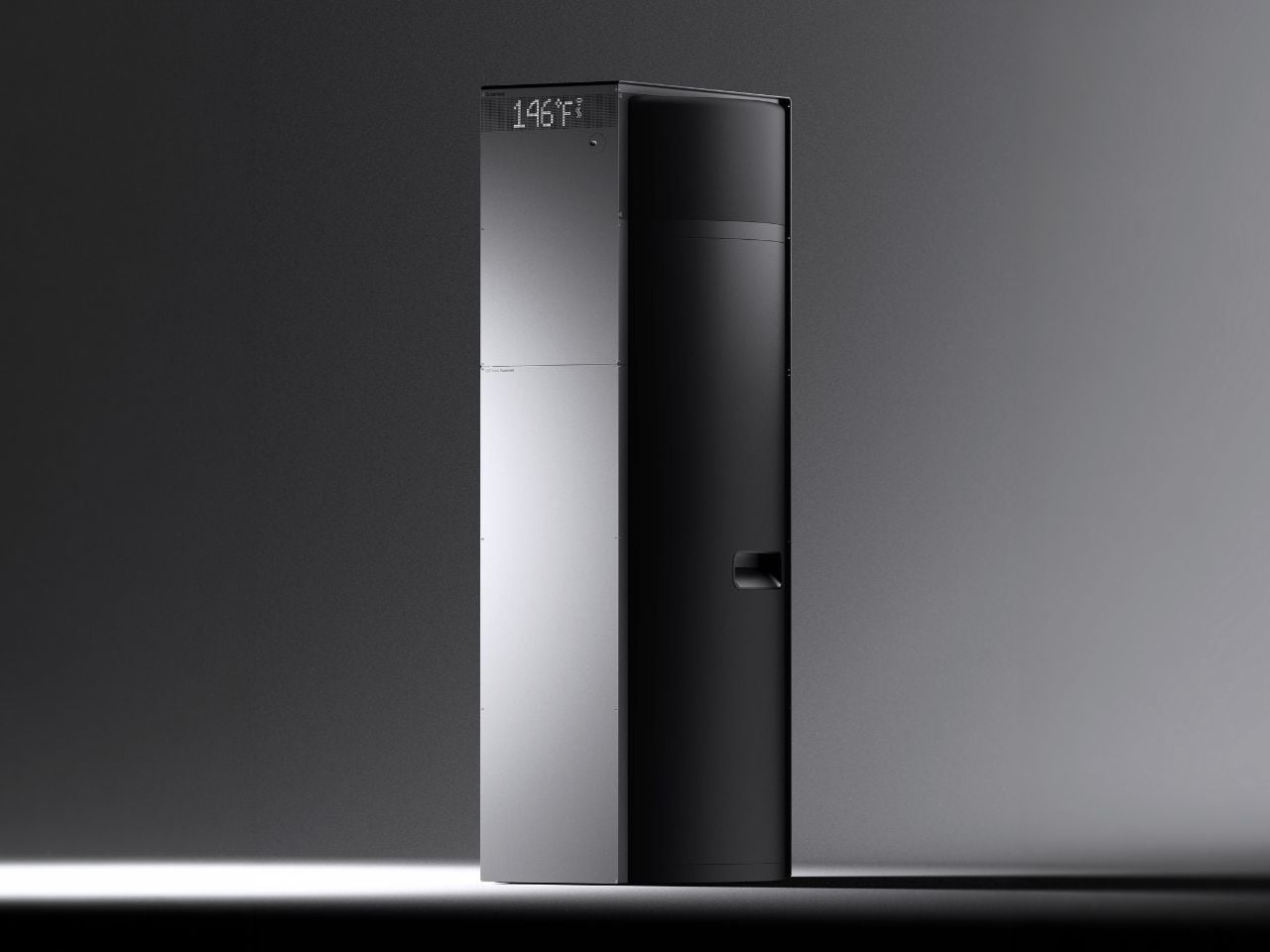
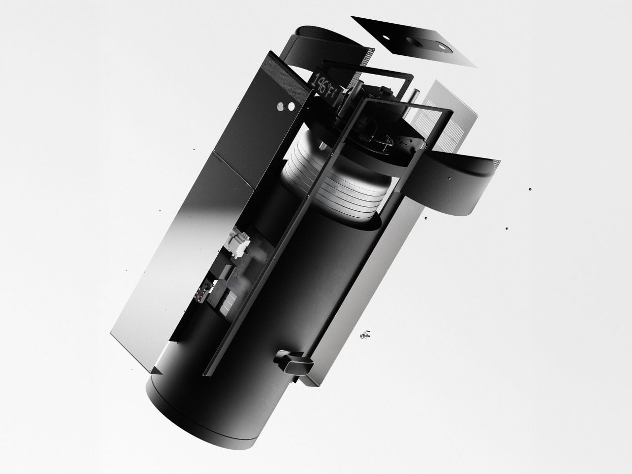
Most household devices are designed to do their job quietly and disappear into the background. Superheat’s H1 proposes a different role for them. Rather than functioning as a single-purpose utility, it treats the water heater as part of a wider technological and environmental system, one that can turn routine domestic energy use into something more productive.
In one sentence: Superheat H1 is a water heater that replaces heating elements with processors, using their heat to warm water while performing computation at the same time.
Designer: Zhenyang Yan, Andrew Geng, and Superheat design team.

The premise behind the H1 is straightforward. Computation generates heat, and homes constantly need heat. These two realities usually exist separately. Data centers spend large amounts of energy cooling machines whose heat is discarded, while households use energy to produce heat from scratch. The H1 connects these cycles by capturing processor heat and redirecting it into water heating. A single input of electricity is used twice, once for computation and once for domestic use. What is typically treated as excess becomes functional.
Seen from a design perspective, this reframes what a household appliance can be. A water heater is usually considered a fixed expense, yet here it operates more like an active system that can offset part of its own energy cost. Testing suggests reductions of up to 80 percent in hot water energy consumption, which positions the object somewhere between a utility device and an economic mechanism.
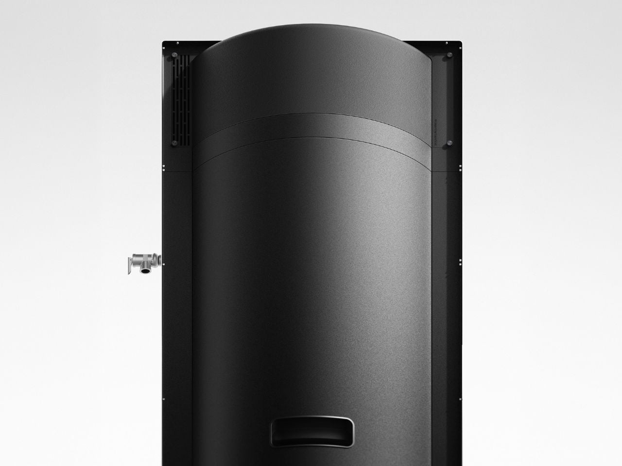
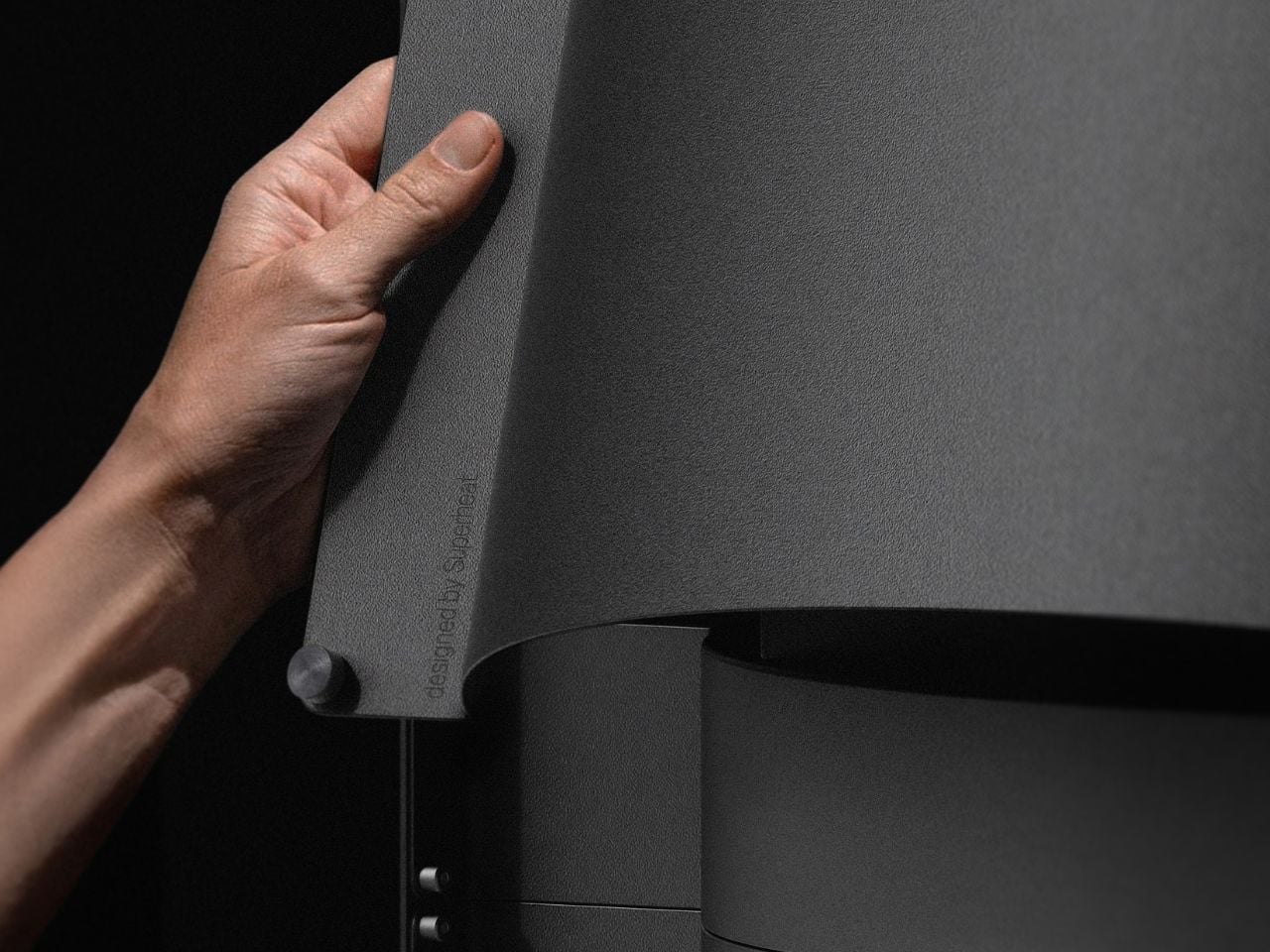
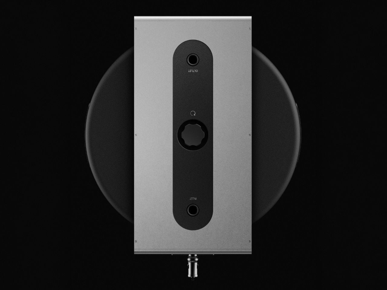
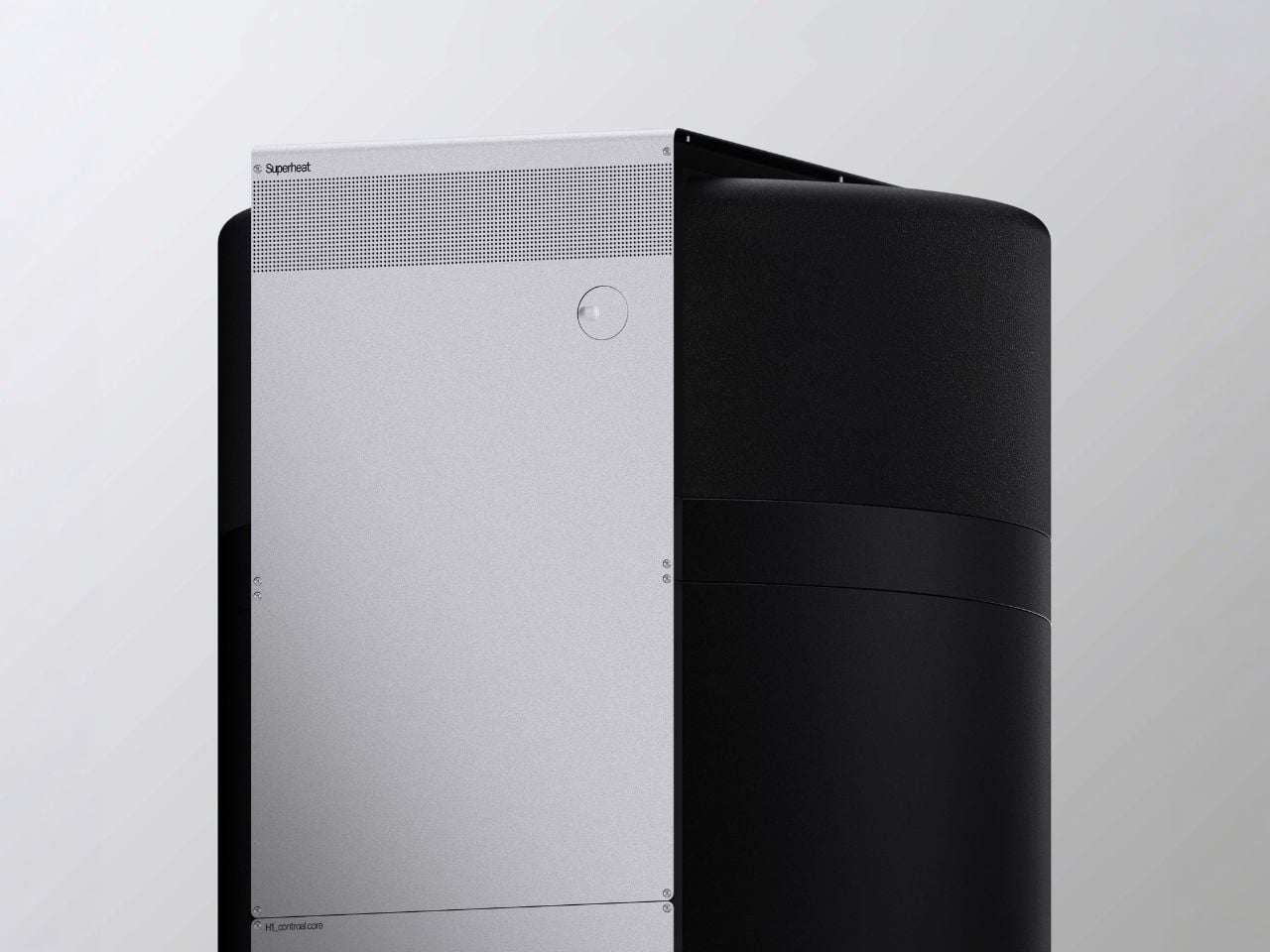
The physical design reinforces that shift. The unit is enclosed in a modular aluminum housing that reads more like a deliberate object than a hidden appliance. The modular structure allows internal hardware to be updated as processors evolve, extending the lifespan of the product and reducing replacement waste. The visual restraint and upgradability suggest a design approach focused on duration rather than novelty.
At the same time, interaction remains familiar. Installation mirrors that of a standard heater, and daily use requires no change in behavior. The complexity stays internal to the system, which is arguably what makes the concept compelling. It embeds infrastructure-level functionality into everyday life without asking users to engage with technical systems directly.
Its relevance is closely tied to the present moment. Cryptocurrency mining and high-performance computation have expanded rapidly over the past decade, bringing with them real questions about energy demand and environmental impact. Digital infrastructure often grows faster than the systems designed to support it responsibly. Projects like the H1 sit within that tension. They suggest that emerging technologies do not only require new software or policies, but also new kinds of physical design responses that address consequences as they appear.
Superheat’s broader research points toward a distributed model in which multiple household devices could function as small computational nodes. If scaled, everyday appliances such as dryers or refrigerators could collectively form a decentralized network powered by the energy homes already use. Whether or not that vision becomes widespread, it reframes domestic space as something with infrastructural potential.
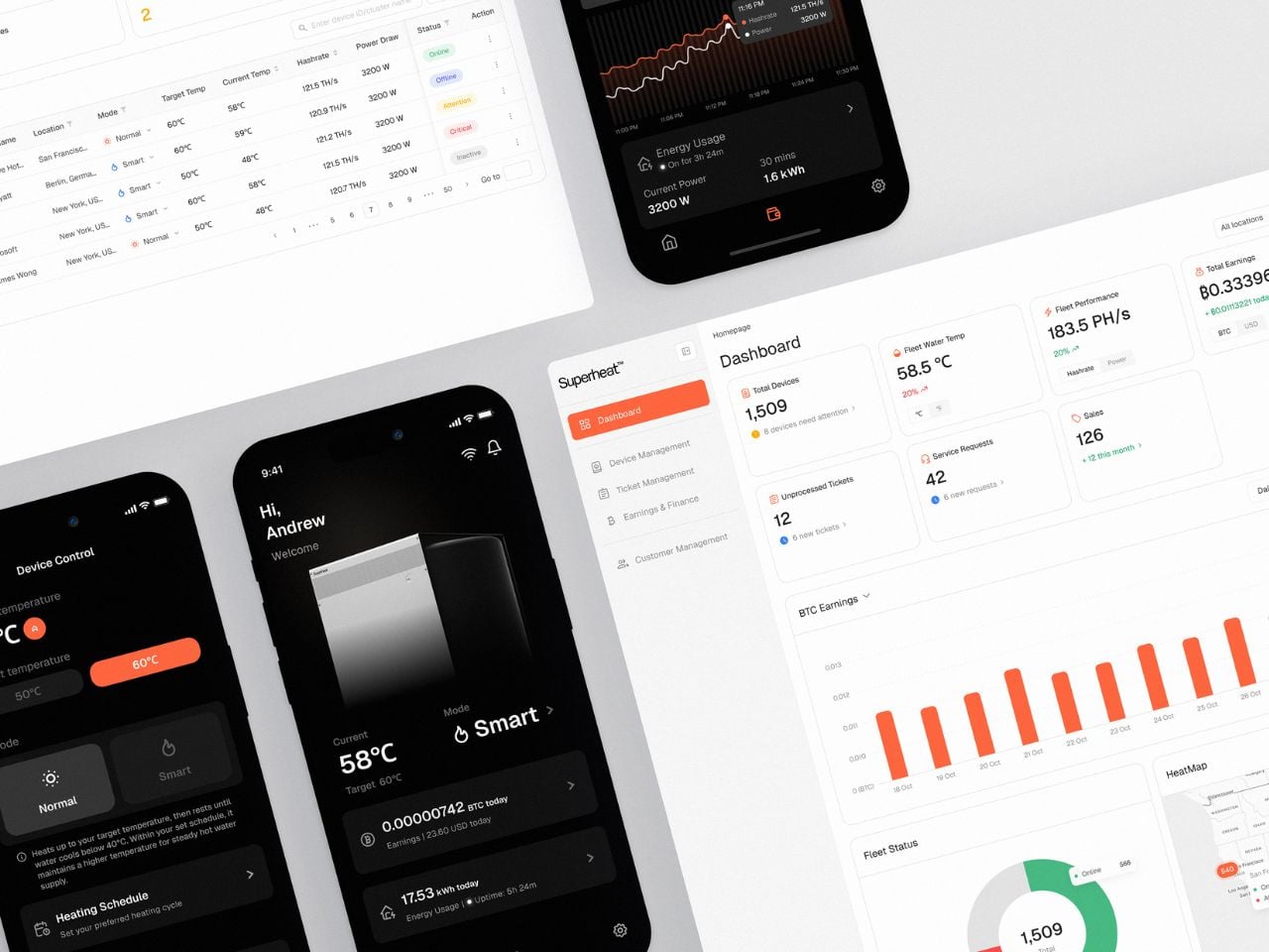
After a year of testing and development, the H1 is nearing certification, holds two patents, and has secured partnerships with established manufacturers. Recognition at CES 2026 and growing industry attention indicate that the idea resonates beyond prototype speculation.
What makes the H1 worth paying attention to is not simply its novelty, but the question it raises. If appliances can participate in larger systems rather than operate in isolation, the boundary between product design and infrastructure design begins to blur. In that sense, the project is less about a single device and more about a shift in how designed objects might function within the networks that shape contemporary life.
The post A Water Heater That Doubles as a Data Center – and Cuts Your Energy Bill first appeared on Yanko Design.
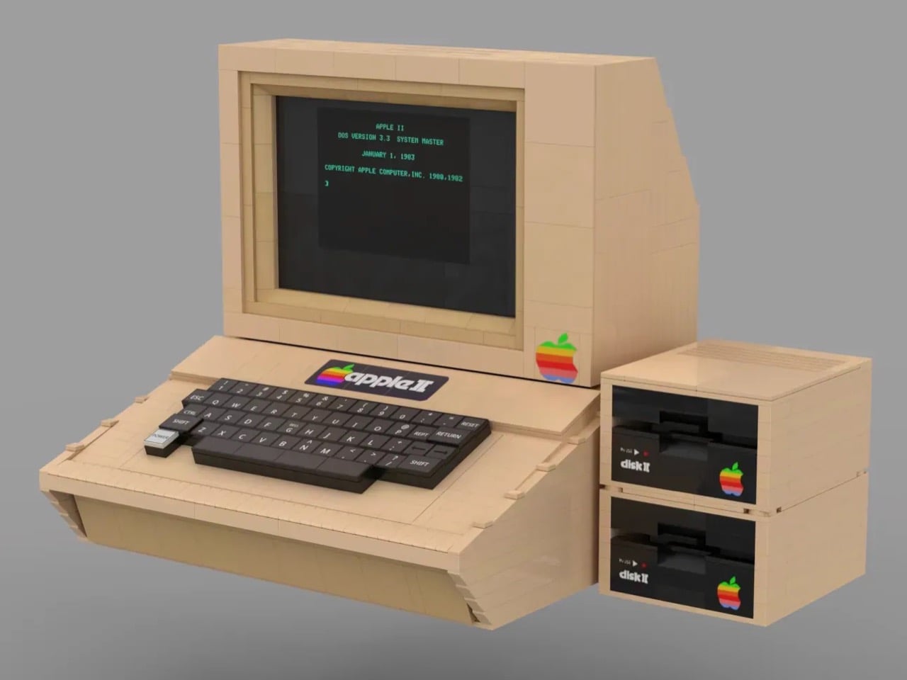
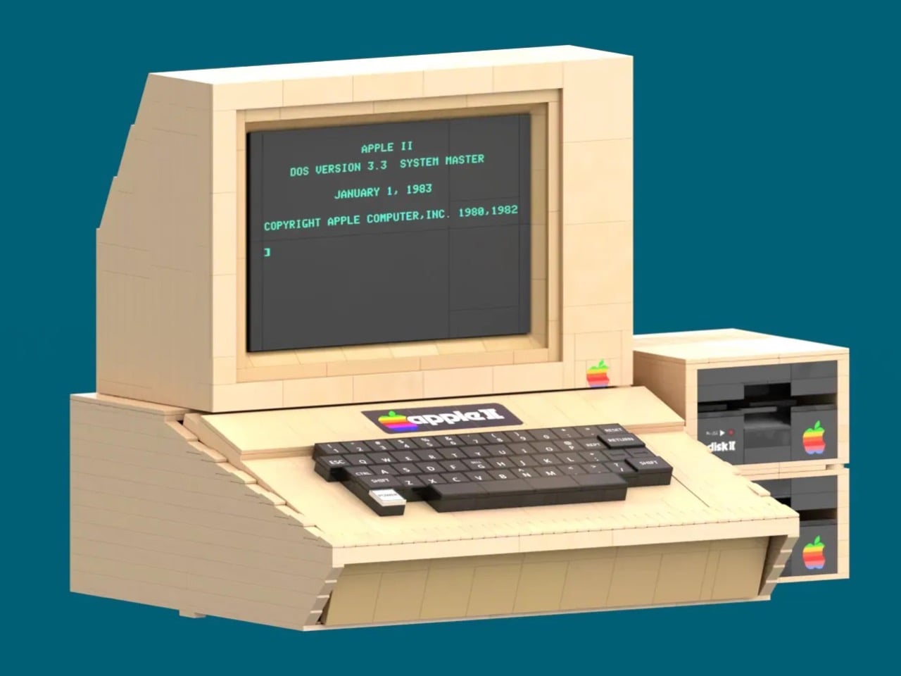
In 1977, Steve Jobs walked through the kitchen appliance section of a Macy’s department store and came away with a vision for what a personal computer should look like. The result, shaped by industrial designer Jerry Manock and powered by Wozniak’s engineering genius, was the Apple II: a smooth, warm-beige enclosure that suggested domesticity rather than machinery. It belonged on a desk the way a telephone did. That calculated approachability helped sell millions of units across sixteen years of production.
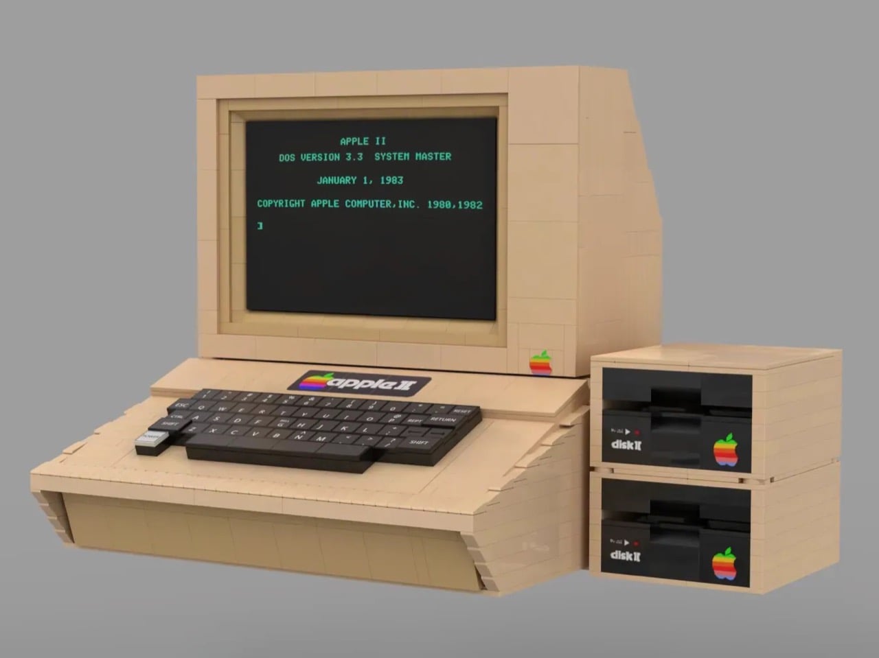
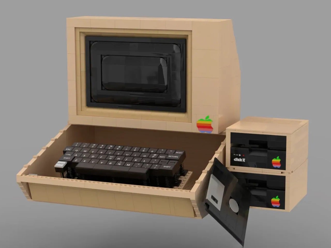
LEGO Ideas builder BrickMechanic57 has translated that design philosophy into 1,772 pieces, and the attention to detail rewards anyone familiar with the original. The signature Pantone beige carries across the computer body, monitor, and dual Disk II drives. The rainbow Apple II badge sits front and center above the keyboard. Pull out the monitor screen and you get two display states: the authentic green-on-black DOS boot screen or a clean, powered-off black panel.
Designer: BrickMechanic57
Wozniak designed the Disk II floppy controller over the 1977 Christmas holidays and reduced the chip count from the industry standard of dozens down to six. Competing controllers from the same era used 50-plus chips and cost significantly more. Apple sold the Disk II for $495 in 1978, and the engineering inside that price point was borderline absurd. BrickMechanic57 stacks two of them beside the main unit, exactly as they appeared on real desks, and a brick-built floppy disk element actually inserts into the lower drive.
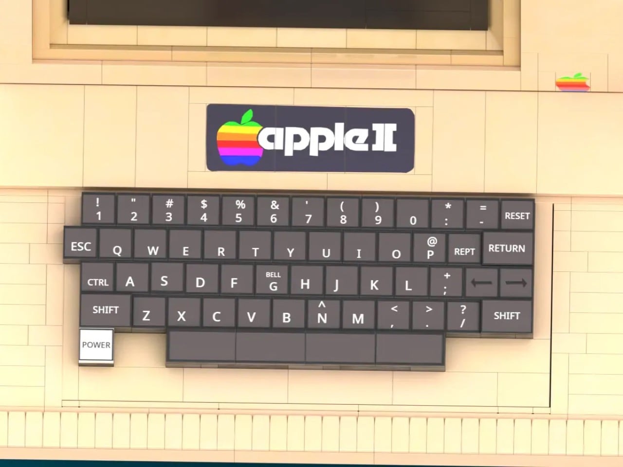
The real Apple II keyboard had no cursor keys in its original 1977 configuration, a REPT key for repeating characters, and RESET sitting exposed and dangerous in the top-right corner like a trap for clumsy typists. The close-up render of this build shows every one of those details reproduced faithfully, including the staggered layout, the CTRL and ESC placement, and the POWER button isolated at the lower left. The rainbow Apple II badge above it is sharp enough to make a vintage collector emotional.
The swappable monitor screen states are what separate a good LEGO set from a great one. The LEGO NES set had the working cartridge slot. The LEGO Atari 2600 had the joystick. This build has a DOS boot screen reading “APPLE II / DOS VERSION 3.3 SYSTEM MASTER / JANUARY 1, 1983” in green phosphor text, and that alone justifies the piece count. The monitor face pulls out cleanly, the off-state panel drops in, and suddenly you have two different display moments from the same machine’s life.
LEGO Ideas is the platform where fan-designed builds compete to become official retail sets. Any project that hits 10,000 supporter votes within its window gets reviewed by LEGO’s own designers, and the strongest candidates go into production. Previous successes include the NES, the Polaroid OneStep SX-70, and the Atari 2600. BrickMechanic57’s Apple II has 587 days left on the clock. Voting is free on the LEGO Ideas website, and if this one makes it to shelves, it will be because enough people who care about this history showed up.
The post The Vintage Apple Computer That Belongs on Every Tech Lover’s Shelf, in LEGO Form first appeared on Yanko Design.
It seems like any and every industry can have its own awards show these days. And why not? Most of us appreciate a chance to bust out the sequins and satin from time to time. If you can celebrate excellent work or make some extra biz dev bucks at the same time, all the better. Snap is the latest social media company to launch its own take on the glitz and glam. The Snappy Awards Show will be held at the company's headquarters on March 31. Comedian and content creator Matt Friend will host the event.
Snapchat has been adding more tools for influencers to build audiences, most recently launching individual creator subscriptions. An awards show seems to be part of that same agenda, spotlighting popular personalities from many different fields. There will be Snappys handed out for categories such as Spotlight MVP, Best Storyteller and Breakout Creator of the Year, plus awards for collaboration, cultural impact and success in single subjects.
Snapchat isn't the first social media platform to honor the personalities using it. TikTok hosted its inaugural awards show in the US last year.
This article originally appeared on Engadget at https://www.engadget.com/social-media/snap-is-hosting-its-own-creator-awards-show-221859681.html?src=rssFull Circle, the developer behind the new Skate game, has announced that it is restructuring and laying off staff. It's not yet clear how many roles will be impacted by the changes, but the restructuring is happening less than six months after skate. launched in early access on September 15, 2025.
"We’re reshaping Full Circle to better support skate.’s long-term future," Full Circle says. "These shifts mean making changes to our team structure, and some roles will be impacted. The teammates affected are talented colleagues and friends who helped build the foundation of skate. Their creativity and dedication are deeply ingrained in what players experience today. This decision is not a reflection of their impact and we’re committed to supporting them through this transition."
Engadget has contacted Full Circle's owner EA for more information about the layoffs. We'll update this article if we hear back.
EA originally formed Full Circle in 2021 with a staff of development talent from the original Skate team. Skate was often positioned as a more realistic competitor to the Tony Hawk's Pro Skater series, but the new studio has ultimately taken the franchise in a slightly different direction than fans may have expected. Previous Skate games were paid experiences with single-player and multiplayer modes, while skate. is a free-to-play live-service game supported with microtransactions.
Recent history, both the failure of Concord and the ongoing struggles of Highguard, serves as a testament to how hard it is to launch a live service game in the 2020s. Full Circle's announcement notes the "tens of millions" of players that have tried the new game, but it's possible a struggle to keep players interested and spending on microtransactions could be why it's restructuring.
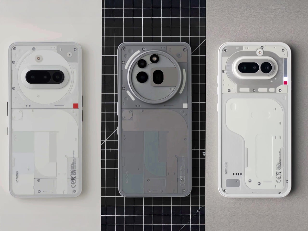
This article originally appeared on Engadget at https://www.engadget.com/gaming/skates-developer-is-laying-off-staff-before-the-game-leaves-early-access-220916797.html?src=rssThe best thing that can happen to a design team is that they stop trying to go viral. Early Nothing had an almost anxious energy to it, products that felt engineered for the screenshot, for the unboxing video, for the moment of surprise. That produced some genuinely striking work, and some choices that aged less gracefully. The Phone (4a) suggests the team has moved past that entirely.
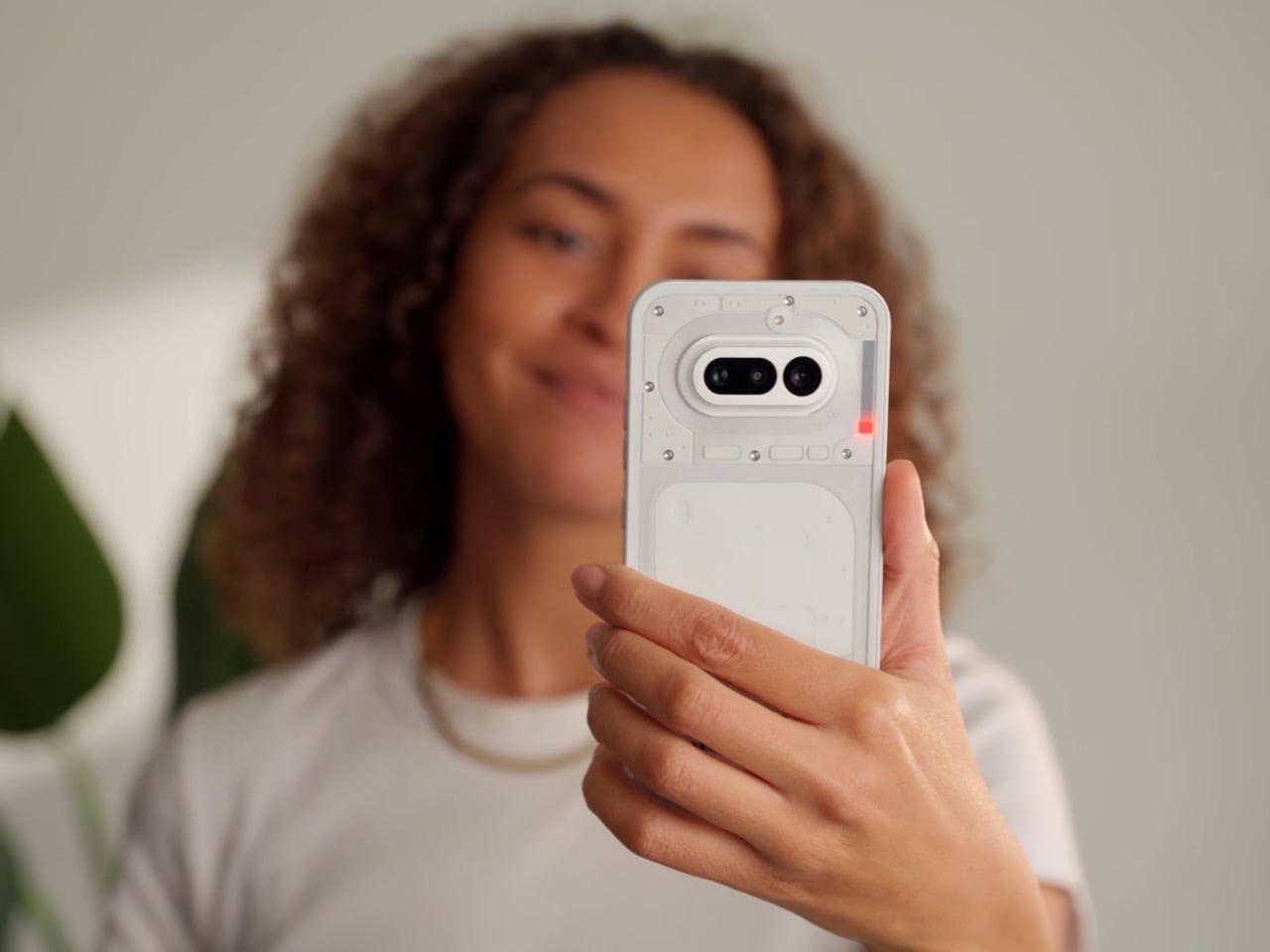
The Phone (4a) is the clearest expression of that shift yet. The pink colorway, the refined glyph interface, the periscope camera quietly migrating down to the base model, none of it screams for attention. It rewards it. This is a phone designed for people who will notice things gradually, over weeks of use, rather than in the first thirty seconds of an unboxing video.
Designer: Nothing
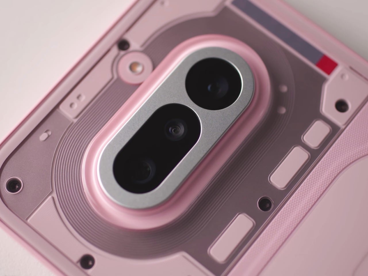
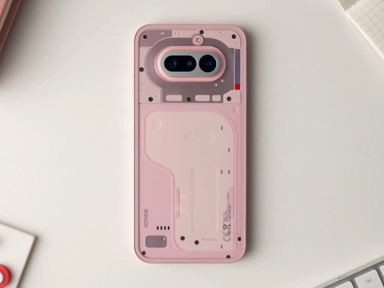
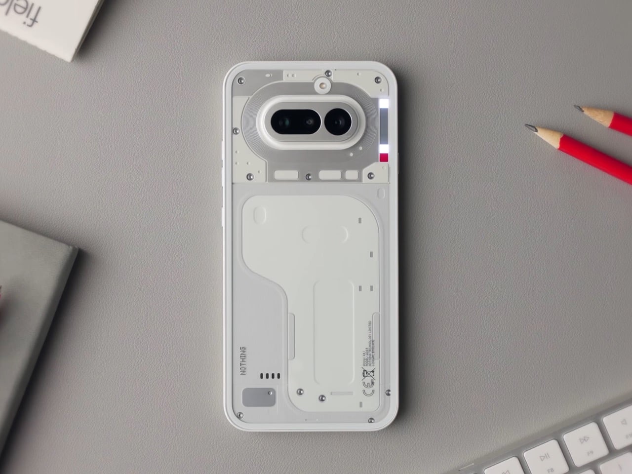
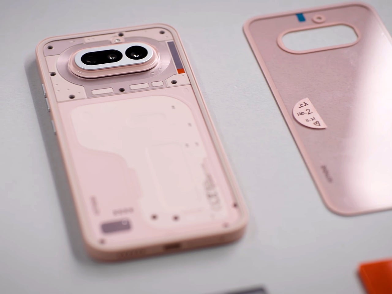
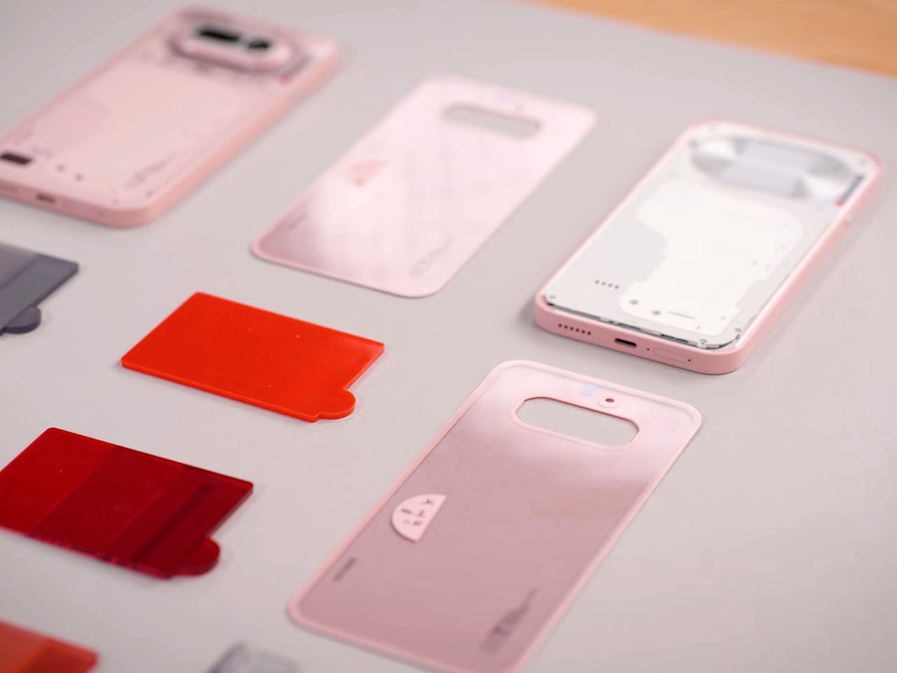
The pink is the first thing people will talk about, and most of them will get it slightly wrong. The phone reads pink, but the back panel is technically white. The color comes from tint layered inside the transparency, sitting between the glass and the resin underneath, which means the light has to travel through it before it bounces back to your eye. That gives it a depth and a luminosity that solid paint physically cannot produce. Nothing’s designers described it as starting with the resin being nearly identical to white, then adding a small amount of tint, then letting the tinted glass layer do the heavy lifting. The result shifts depending on the light you’re standing in, giving you a phone that changes ever so slightly in different lighting scenarios. It’s clever, considering Nothing’s done this in the past by playing with depth, relying on textures and components casting unique shadows based on the light source. Now, the company’s adding color to that formula.
Apple has been doing a version of this for years. The iMac G3 in the late nineties used translucent colored plastic to create that same sense of depth, and modern iPhones apply color to the inside surface of the rear glass rather than painting the outside. It’s a technique with a real legacy, and Nothing’s designers actually had a pink iMac on their mood board. That’s worth knowing, because it reframes the colorway from trend-chasing to something with genuine design lineage. The difference is that Nothing puts the engineering on display underneath it, so the tinted glass is also a window into the hardware, which layers the effect further.
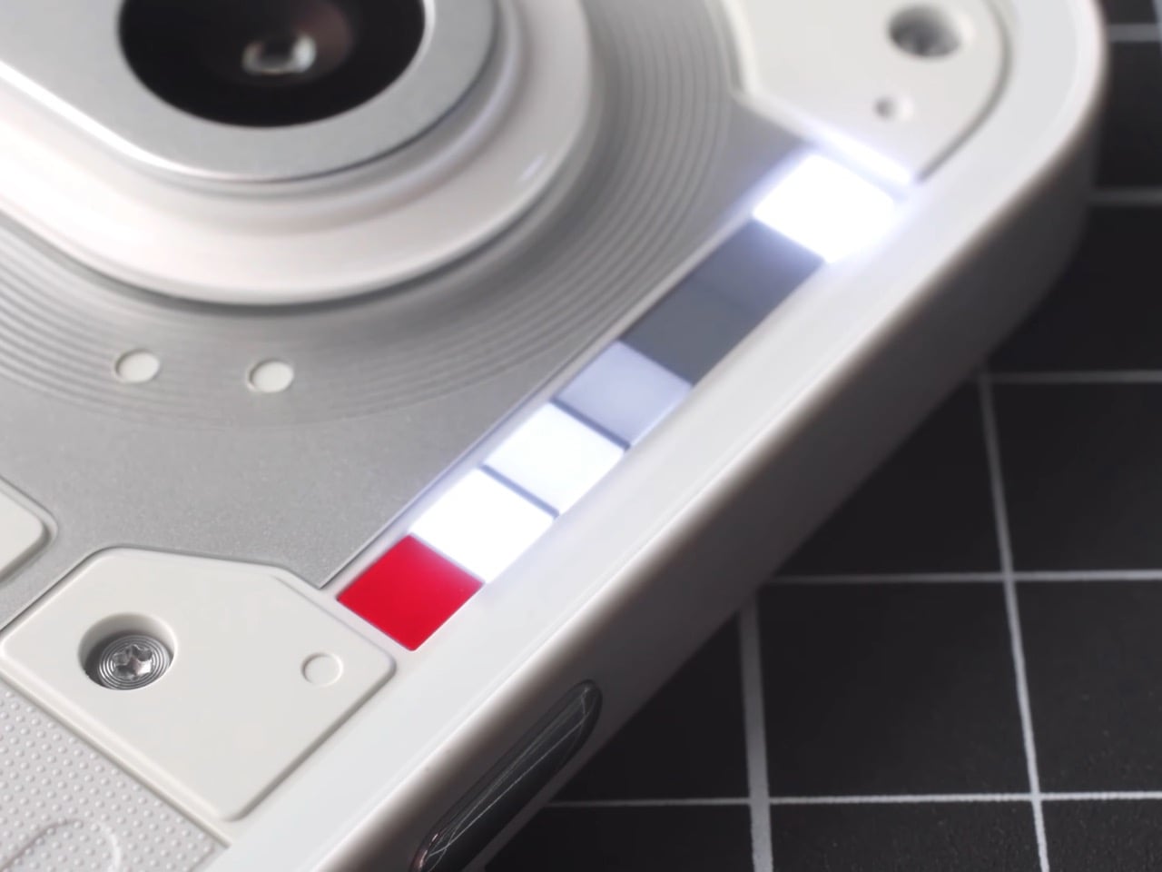
The glyph interface on the (4a) is a 1×6 LED strip, and for the first time on an A series device, it includes the red recording indicator that has been on the numbered phones since the beginning. The team is almost protective about that red square, describing it as deserving its place on every device because being recorded carries real consequence. The animations have been rebuilt from scratch rather than ported from Phone (3), which matters because the linear format demands different thinking. The timer, for instance, uses a single falling column of light instead of the hourglass matrix on Phone (3). Same idea, different grammar. Glyph Progress now runs on Android 16’s live updates API, which means broader app compatibility across the board.
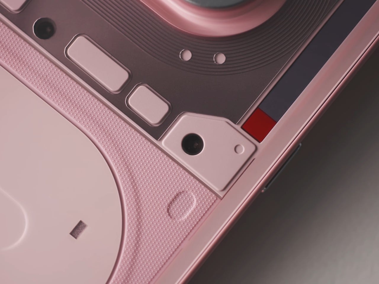
The camera doesn’t get talked about much, but it’s clearly an important part of any phone’s design and spec sheet. For starters, its design relies on a format set by its predecessor, the (3a). No fancy changes, no weird alignment like the (3a) Pro, just homogeneity… with a few upgrades. The periscope module in the (4a) uses a tetraprism design, bouncing light through multiple internal reflections to achieve optical zoom in a package compact enough to fit the base model’s profile. The (3a) Pro had a periscope too, but this one is significantly smaller. Nothing has been careful to represent the internal hardware authentically through the cover panel design, so what you see through the back is a stylized but honest reference to what’s actually underneath, including the PCB boundary, the FPC connectors, and the wireless charging coil.

Nothing announced there will be no flagship this year, and that decision reframes everything about the (4a). The A series carries the full weight of the brand’s hardware story in 2025, which means this phone needed to be genuinely good rather than good for the price. The same core design team has been on the A series since the 2A, and that continuity is visible in the way the (4a) sits between its predecessors, borrowing proportions from both without feeling like a compromise. They’ve stopped performing and started building, and the (4a) is the clearest evidence yet that those are very different things.
The post Nothing Phone (4a) Is the Most Confident Phone Nothing Has Ever Made first appeared on Yanko Design.