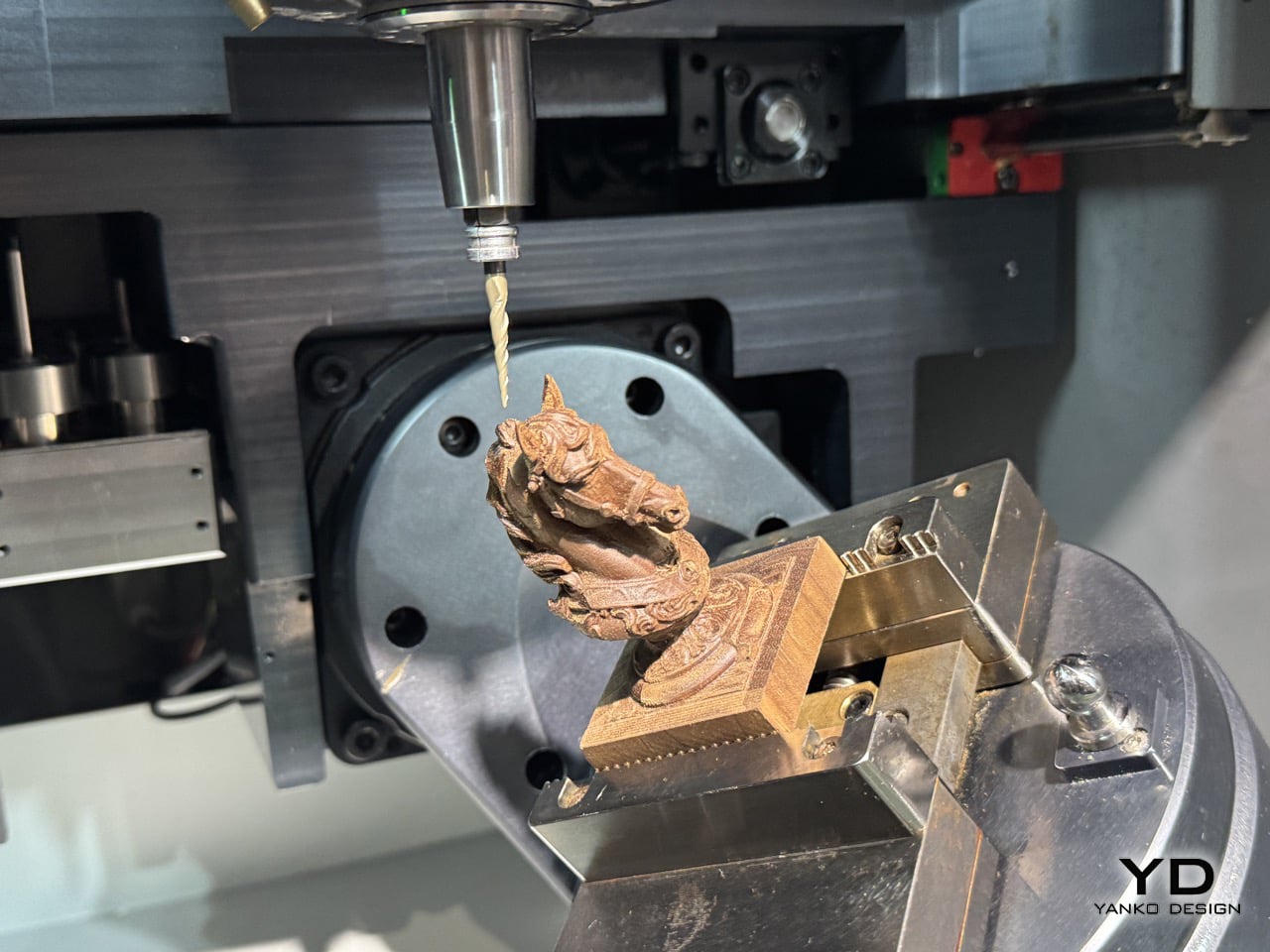
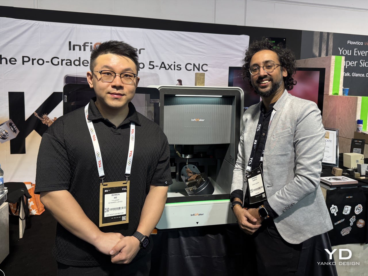
Every serious maker has hit the same wall at some point. You finish a design, you’re ready to hold the actual object in your hands, and then reality intervenes: the part needs machining, the machining needs a shop, the shop needs weeks, and your idea sits in a queue somewhere while the momentum drains out of it. InfiMaker was built by a team who got sick of that wall. Founded in Shenzhen in 2024 by Bowen Xie and Linjian Xiang, both veterans of DJI’s drone and robotics divisions, the company set out to shrink industrial-grade fabrication down to the size of a desk. Their first product, the K1, launched on Kickstarter on August 11, 2026, with Super Early Bird pledges starting at $5,199. It is a desktop CNC machine that does something very few machines at this price or size have managed: true simultaneous five-axis machining, the kind that lets a tool approach a part from nearly any angle without flipping, re-fixturing, or losing precision along the way.
What makes K1 worth a longer conversation isn’t the spec sheet alone, impressive as it is with its 1.5 kW spindle, 20,000 RPM top speed, and 0.01 mm repeatability. It’s the thinking behind it. Bowen Xie spent more than two decades in robotics before this, starting with competitive robotics as a kid and eventually landing at DJI, where drone motion control and robot-vacuum perception quietly became the foundation for how K1 handles trajectory, calibration, and setup. We sat down with Bowen, whose company is bringing K1 to IFA this year, to talk about what it actually takes to make five-axis machining approachable, why AI CAM has to know when to say no, and what he hopes a fifteen-year-old somewhere builds with one of these machines first.
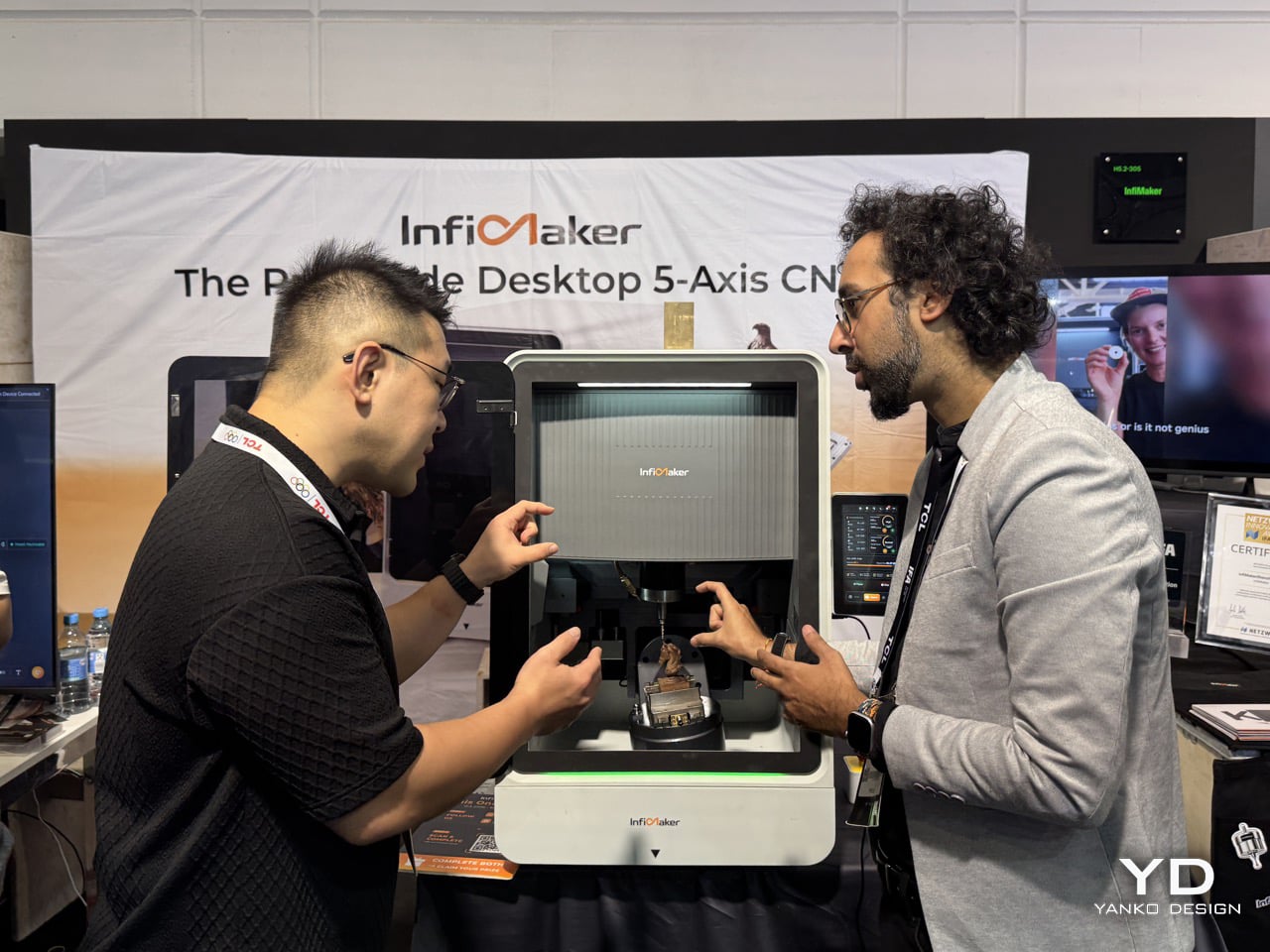
Yanko Design: You spent more than twenty years building robots before this, and you and Linjian came out of DJI. What did drones teach you about motion control that turned out to apply directly to cutting metal?
Bowen Xie: I started teaching myself programming at seven and entered FLL at nine, so robotics has been a continuous part of my life for more than twenty years. At DJI, between Linjian and me, that experience covered both drones and ground robots, including robot vacuums.
Drones taught us that precision motion is not simply about commanding motors. The system has to know where it is, plan a trajectory, coordinate multiple axes, sense disturbances, and correct continuously. In flight, the disturbances may be wind or a changing payload. In CNC, they become cutting forces, vibration, tool wear, and thermal drift.
That thinking transferred very directly into K1. We brought robot-control experience into five-axis, six-motor coordination, trajectory control, FOC, vibration suppression, self-calibration, and error compensation.
The robot-vacuum experience added another important layer: perception. Instead of asking the operator to perform every centering, origin-setting, and calibration step manually, the machine should be able to see the workpiece, fit it to the digital model, calculate its position, and use probing to help establish the setup.
Then AI CAM can turn that known geometry into a machining plan that the user can inspect and approve. The practical change is less time spent setting up the machine and making trial cuts, and more time getting to the first good part.
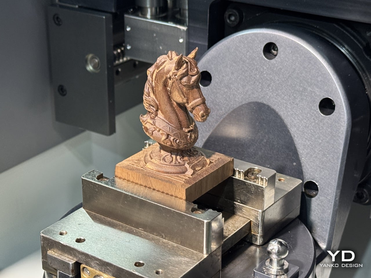
YD: The origin story is that you kept hitting a wall whenever an idea needed a physical part. What was the specific project that made you stop and think, we should just build the machine?
Bowen: The specific setting was our university robotics competition team, rather than one dramatic component.
We built more than twenty robots, and every iteration created a new need for custom metal parts: brackets, joints, mounts, transmission parts, and structural pieces. We could change a design in a day, but a custom part could take weeks, sometimes close to two months. In some cases, having it made in China and shipped to Canada was still cheaper than sourcing it locally.
That mismatch stayed with me. The intelligence of the project could move quickly, but its physical development was controlled by an external manufacturing queue.
Later, while building autonomous construction equipment at Robolution, we ran into the same problem at a larger scale. Eventually, it stopped looking like a procurement problem. It looked like a missing product: a manufacturing system that could sit beside the engineer and move at the same speed as the design process.
That was the origin of K1.
YD: You’ve said making CAM easy was harder than making it powerful, and that the hard part was deciding what to take away. What was the thing you most wanted to keep but cut?
Bowen: The thing I most wanted to keep was the full parameter surface.
Engineers often feel safer when every feed, step-over, tool option, entry strategy, and machining parameter is visible. It feels transparent and professional. But if you expose all of those decisions at the beginning, the user has to become a CAM specialist before making the first part.
What we cut was not professional control. We cut the requirement to make every professional decision manually in the default workflow.
InfiStudio should understand the geometry, material, tools, and machine, then propose a machining strategy with reasons behind it. The user should be able to inspect the tool list, simulate the result, change the parameters, or take over completely. But they should not have to confront the entire parameter tree before they know which decisions actually matter. The goal is not to hide complexity inside a black box. It is to move complexity to the moment when it becomes relevant.
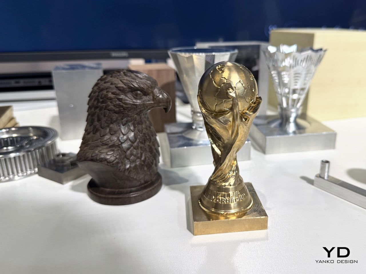
YD: There’s a version of this machine that stays firmly a tool for experienced machinists, and a version that tries to bring in people who’ve never touched CNC. Those two users want opposite things. How did you decide who K1 is really for?
Bowen: We decided that K1 is for people with a serious task, not necessarily people with previous CNC experience.
That could be an independent engineer making a robot joint, a product designer developing a camera body, a jewellery studio producing a wax model, or a small business making a custom product. They may be new to CNC, but they are not new to designing, engineering, or making things.
A traditional machinist needs transparency, manual control, standard G-code, and the ability to understand exactly what the machine is doing. A new user needs guidance, safe defaults, visual feedback, and a much shorter path to the first successful part. We designed the workflow so that those are layers of the same product rather than two separate products.
K1 is not meant to replace a large industrial machining centre in high-volume production. It is meant to give an ambitious creator a level of capability that previously required a much larger machine, several specialist tools, and years of accumulated workflow knowledge.
You can be a beginner in CNC without being a beginner in making.
YD: AI can turn a sentence into a 3D model in seconds, but a model isn’t a machinable part. Where does that gap actually show up, and what does InfiStudio do about geometry that looks fine on screen and can’t be cut?
Bowen: A generated model only has to look convincing on a screen. A machinable part has to obey geometry, tooling, material, fixturing, and physics.
The gap appears in very specific places: broken or non-manifold surfaces, walls thinner than the available tool, internal corners smaller than the cutter radius, deep cavities the tool holder cannot reach, undercuts with no valid approach angle, or geometry that collides with the stock or fixture. A model can look perfect and still have no safe machining strategy.
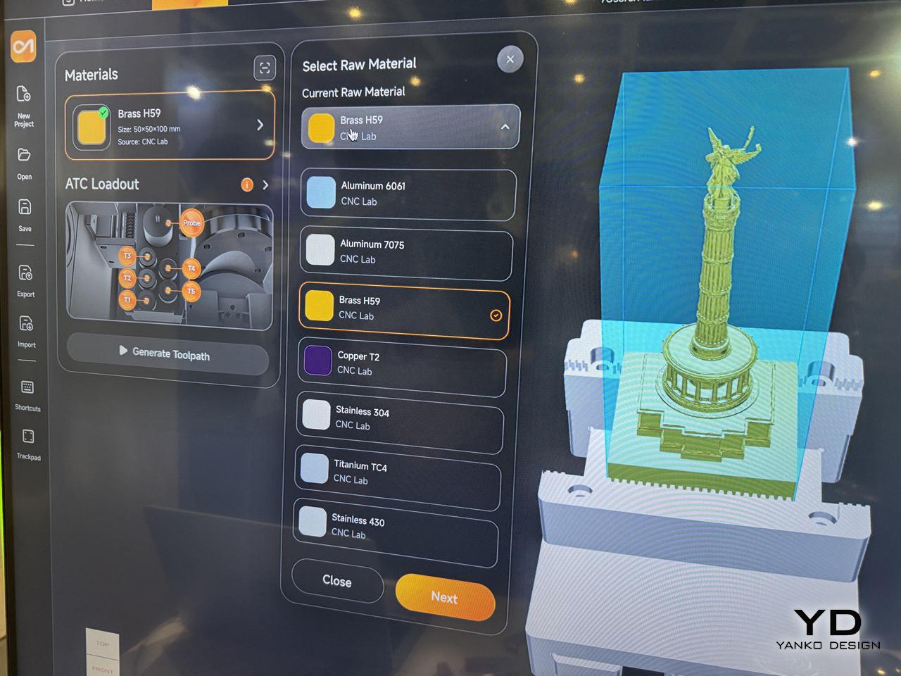
InfiStudio treats model generation as the beginning of the process, not the end. It can post-process and repair broken geometry where possible, recognize machining features, propose tools and operations, generate the toolpath, and simulate the process. On the machine side, perception and probing help connect that digital plan to the position and orientation of the real workpiece.
The important part is how the system behaves when the answer is no. If a region cannot be reached, the software should identify it and help the user change the geometry, tool, orientation, fixture, or setup. It should not invent a toolpath simply because the user asked for one.
AI should reduce the amount of specialist work required to find a valid process. It should never hallucinate machinability.
YD: What’s the question backers ask most, and what’s the one you wish they asked more?
Bowen: The question we hear most, in many different forms, is: “Can it really make the part I care about?”
Sometimes people ask about stainless steel, titanium, or aluminium. Sometimes they ask about a particular tolerance, surface finish, size, or geometry. But underneath all of those questions, they are asking whether K1 is a real manufacturing tool or only an impressive demonstration.
That question deserves evidence: the material, tool, cooling, setup, toolpath, machining time, and measured result. A headline specification alone is not enough.
The question I wish people asked more is: “What does the complete path to the first good part look like?”
That includes importing or generating the model, checking manufacturability, setting up the stock, establishing the work coordinate, selecting tools, generating and simulating the toolpath, machining, and inspecting the result. The real value of K1 is not one impressive number. It is how much of that complete process one person can now own.
YD: IFA is a consumer electronics show. Why bring an industrial-grade five-axis mill to a hall full of consumer appliances and robots?
Bowen: IFA is exactly where we want to make this argument, because we believe advanced manufacturing is becoming personal technology.
A five-axis CNC is industrial in what it can do, but it does not have to be industrial in how difficult it is to install, understand, and operate. Robotics, perception, AI, software, and consumer-hardware product design are changing what can fit into an individual workspace.
We are not trying to make a CNC machine behave like a kitchen appliance. Cutting metal still involves real forces, tools, fixtures, coolant, chips, and safety. What we are doing is applying consumer-product discipline to that complexity: a coherent product, guided setup, integrated software, clear feedback, and a workflow designed around the person using it.
IFA brings together AI, robotics, consumer hardware, design, and new ways of living with technology. We want visitors to see that the next important device in a personal workspace may not only display information or automate the home. It may manufacture an idea.
YD: Is there a craft tradition in Europe, jewellery, watchmaking, prototyping, that you’re specifically hoping finds this machine?
Bowen: Jewellery is probably the first European craft community I hope connects with K1.
Independent jewellery studios work with wax models, moulds, complex curved surfaces, fine details, and short production runs. Five-axis access can be valuable because it reduces repeated flipping and makes it easier to reach surfaces and undercuts that are difficult in a conventional three-axis workflow.
I am also interested in watch-case and bezel prototyping, instrument making, model building, and small metalworking studios. Europe has a strong tradition of combining precision with personal authorship. That is very different from anonymous mass production, and it aligns closely with what we want K1 to enable.
The machine should not replace the craftsperson. Decisions about proportion, material, finish, and meaning still belong to the person. CNC should extend the craftsperson’s capabilities by handling precision, repeatability, and difficult geometry while leaving the creative judgment intact.
YD: What’s the object someone has made with a K1 that you didn’t expect?
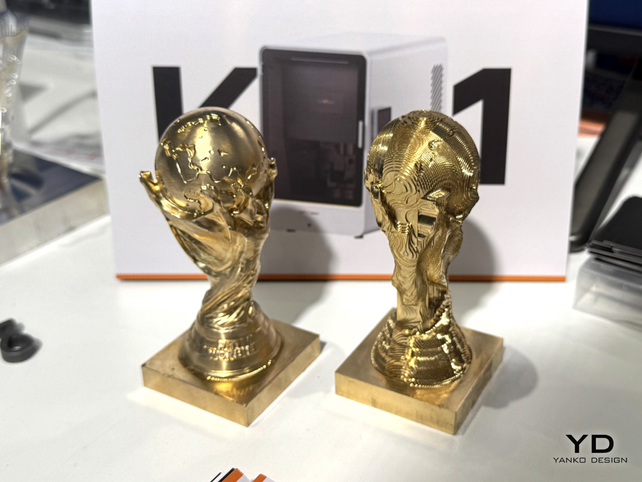
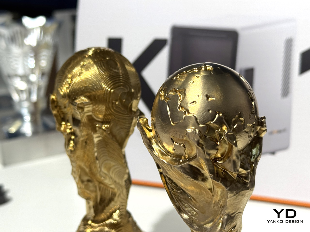
Bowen: One object that surprised me in terms of the response it generated was the brass bull our team machined.
We initially treated it as a visually interesting demonstration. But people did not only react to the finished sculpture. They started asking very technical questions: How did the tool reach the underside? How was the stock held? Which surfaces needed simultaneous five-axis motion? How many operations and tool changes were involved?
That was the unexpected part. A playful object opened a serious conversation about tool access, workholding, surface continuity, and five-axis toolpaths more effectively than a conventional engineering test piece might have.
It reminded me that a good demonstration should not only prove that a machine can cut something. It should make people curious about how the manufacturing process works.
YD: If this works the way you want it to, what does someone’s workshop look like in five years that doesn’t exist today?
Bowen: In five years, I think a small workshop will look less like a miniature factory and more like one highly capable person working with an intelligent manufacturing system.
The process may begin with a prompt, a sketch, or an existing model. AI helps create or refine the geometry, but then the manufacturing layer begins. The software checks whether the design can actually be cut. The machine uses perception to understand the real stock and workpiece, helps establish the origin and setup, and uses probing and calibration to connect the physical object to the digital model.
AI CAM proposes tools, parameters, and a machining strategy. Simulation shows what can be reached and where the risks are. The human reviews the important decisions, changes anything necessary, and approves the job. During machining, the system monitors the process and responds to abnormal conditions.
The workshop is not fully autonomous, and it is not a black box. The person still owns the intent, material choice, trade-offs, and quality. But they no longer need to coordinate a long chain of separate specialists and suppliers before testing an idea.
That is what “one person, one table, one factory” means to me: not removing the human, but giving one human much greater manufacturing agency.
YD: Somewhere out there a fifteen-year-old is going to use one of these and it’ll change what they think is possible. What do you hope they make?
Bowen: I hope they make the first necessary part for something much bigger.
It might be a joint for their first robot, a device that solves a problem in their family, an instrument nobody has built before, or the first prototype of a company they have not yet imagined starting.
I began programming at seven and entered FLL at nine, so I know how important it is to discover early that you can change the physical world, not just understand it. At that age, the first part does not need to be commercially valuable or technically perfect. It needs to prove that an idea in your head can become something real through your own decisions and effort.
I do not want the machine to do the imagining for them. I want it to make the distance between imagination and reality short enough that they are willing to try.
The post InfiMaker K1 at IFA 2026: The 5-Axis Desktop CNC Turning Any Creator Space Into A Fabrication Lab first appeared on Yanko Design.