When Your Speaker Is Also a Puzzle, Music Hits Different

Most speaker designs ask a pretty simple question: how do we make this thing louder and smaller? Merge asks a completely different one. How do we make music something you can actually take apart?

Created by a five-person design team, Junchuan Shi, Junhao Lv, Xiangzhao Meng, Ping He, and Genghao Ma, from a cross-institutional collaboration across Sichuan Vocational and Technical College, CityU Macau, TUT, and QZUIE, Merge is a conceptual speaker system that just picked up a 2025 European Product Design Award in the Consumer Electronics category. It’s the kind of student concept that makes you wonder why no major brand has thought of it first.

Designers: Junchuan Shi, Junhao Lv, Xiangzhao Meng, Ping He, Genghao Ma

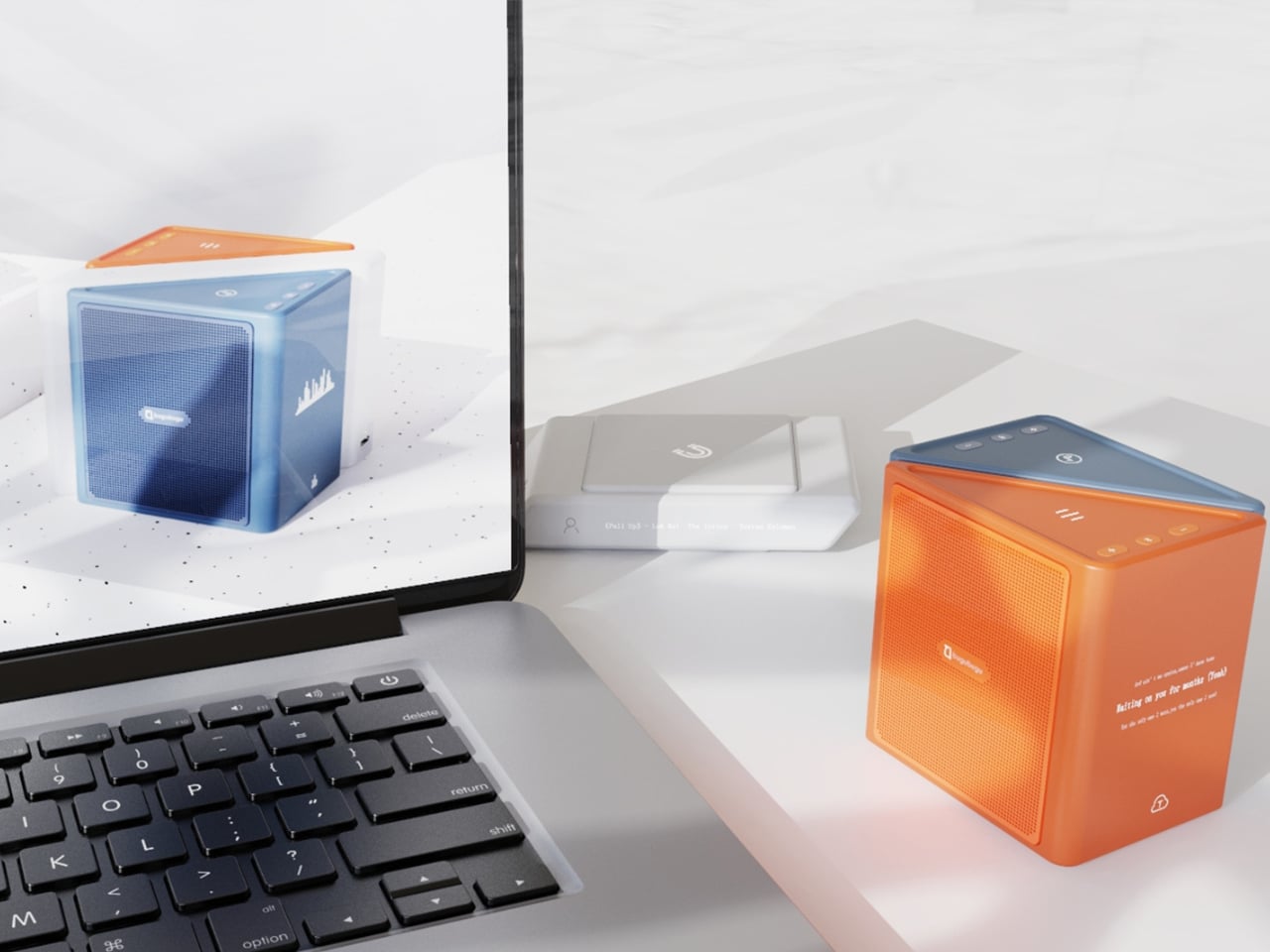
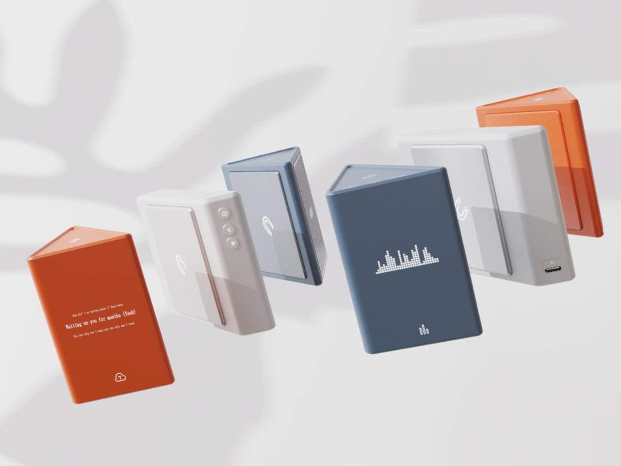
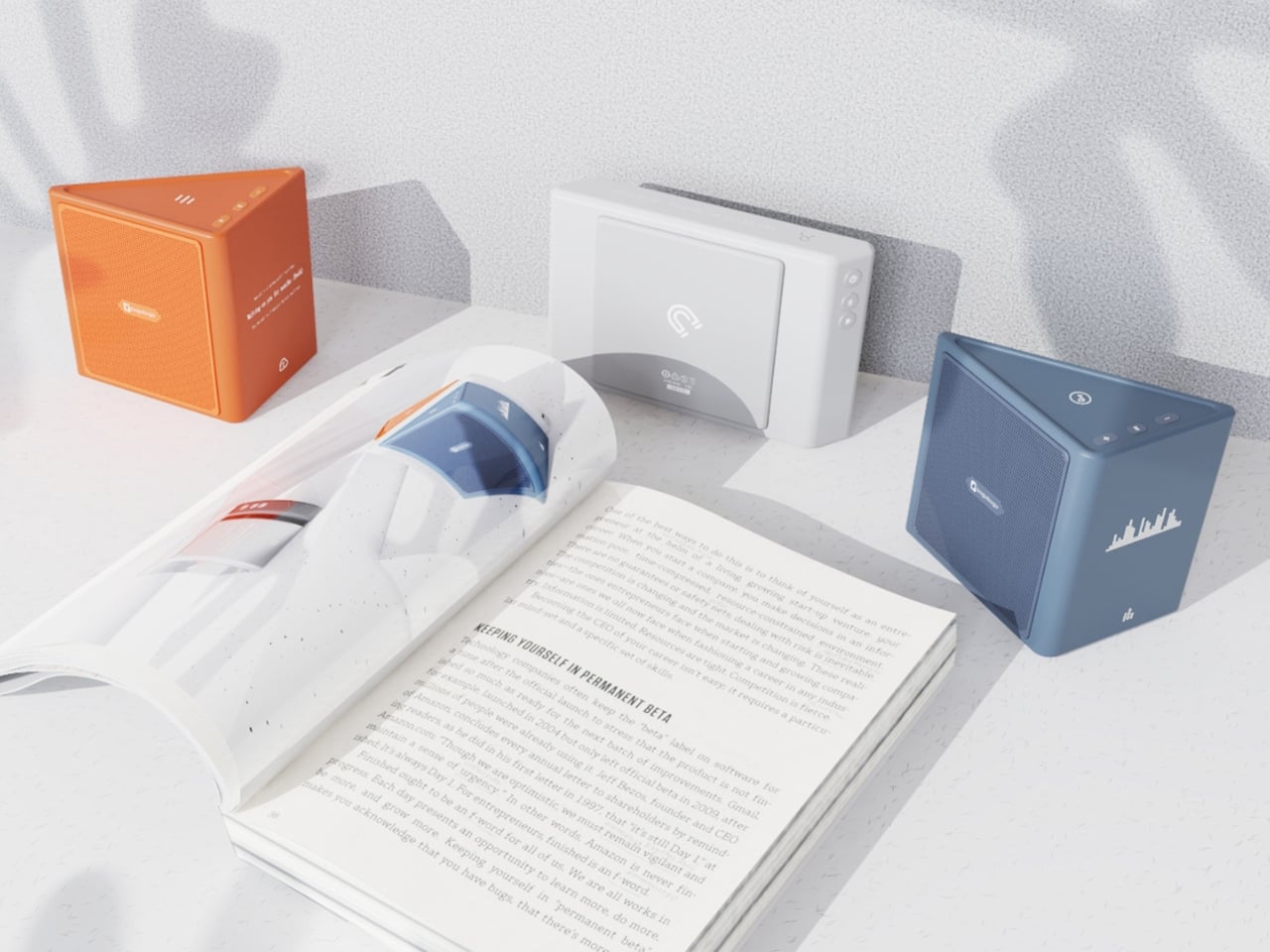
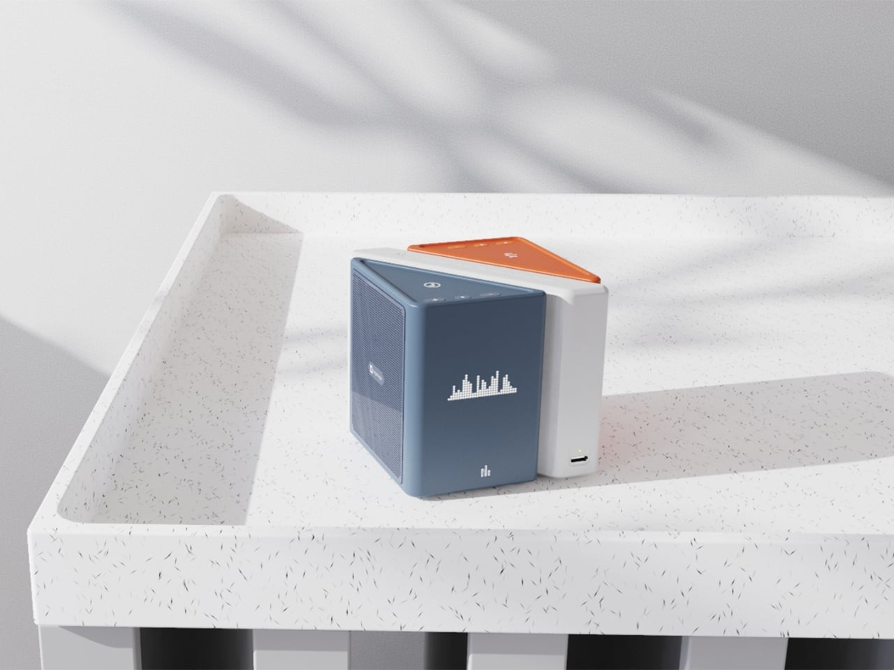
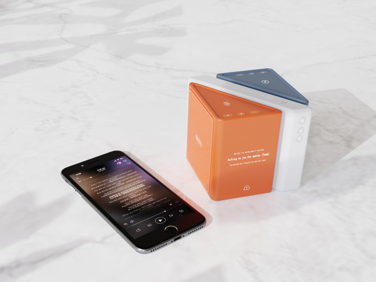
The central idea is deceptively clever. Merge physically separates music into its component layers: the accompaniment on one module, the vocals on another, and the full combined sound handled by the complete assembly. You choose what you hear depending on how the pieces are arranged. Pull the vocal module away, and you’ve got an instant karaoke track. Keep just the vocal module, and you hear a singer stripped back from all the production. Snap everything together and you get the whole song. It sounds gimmicky when you describe it that way, but it really isn’t. It’s an intuitive way to interact with music that streaming apps, for all their data and algorithms, still haven’t cracked with the same sense of physical satisfaction.

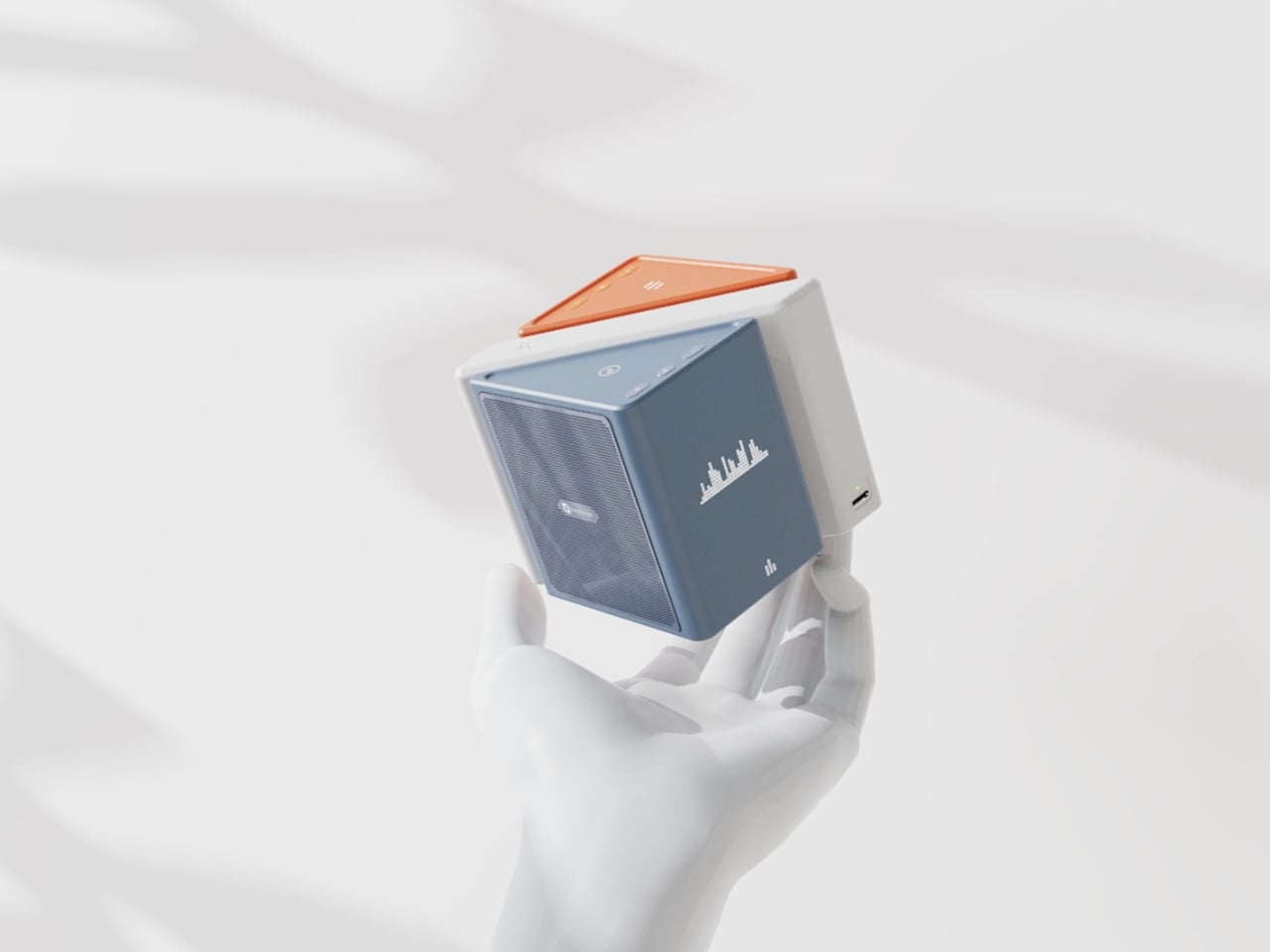
The three modules connect via electromagnetic induction, which also handles charging between units. That detail matters more than it sounds. It means the product doesn’t rely on fiddly clips or pins; the connection is seamless and the experience stays clean. When you hold all three pieces assembled, they sit together like a solid little object. When you pull them apart, you’re not wrestling with latches. You’re just… separating music.

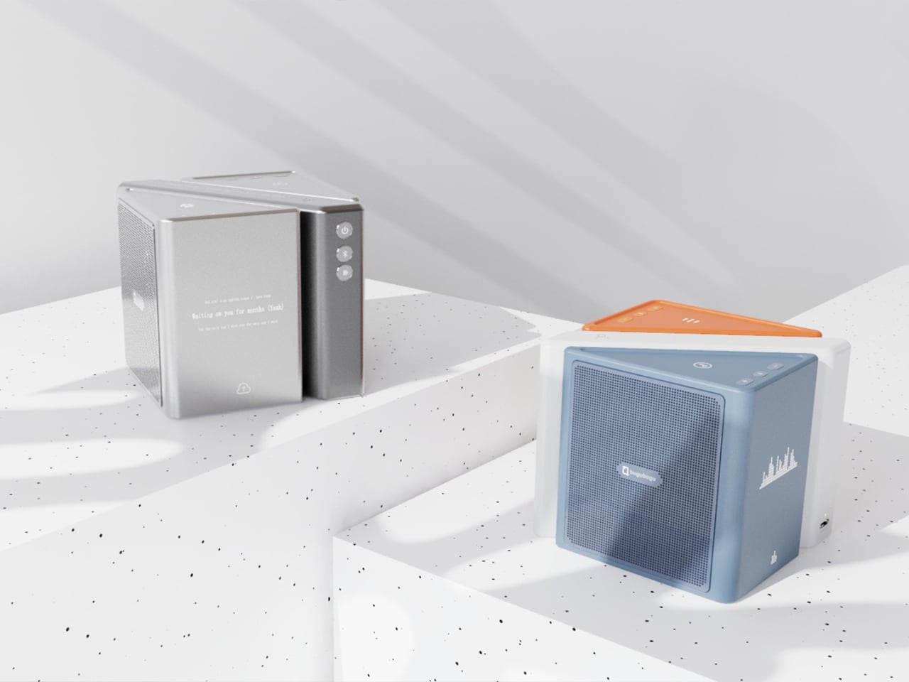
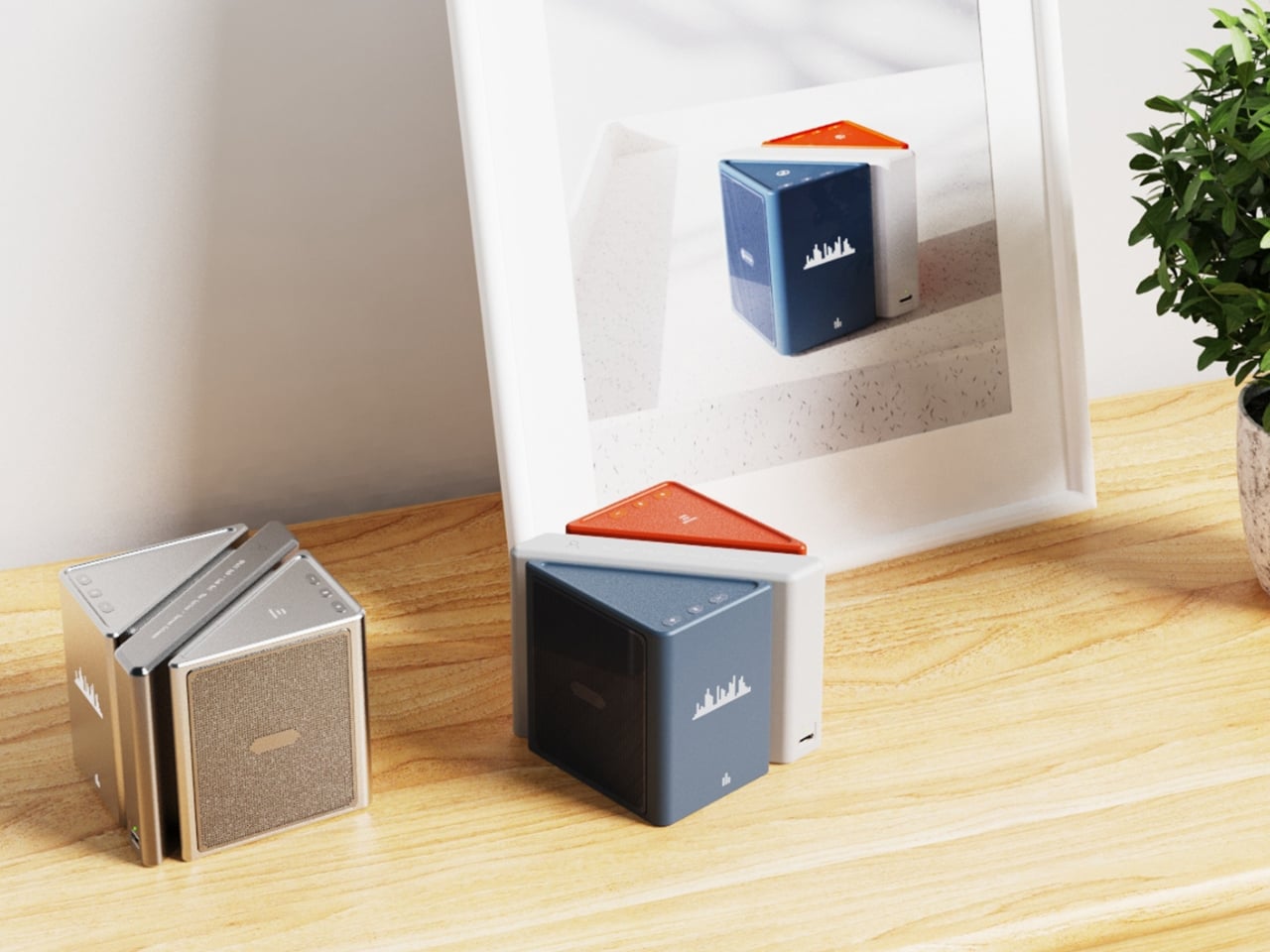
Visually, the design is confident without being loud. The modules are geometric and compact: a rectangular flat piece, a squared speaker body, and a triangular wedge that caps the top when assembled. The whole thing sits in your palm like a premium toy, which is very much the point. The team describes the tactile experience of rearranging the modules as analogous to playing with building blocks, and that framing is spot on. Listening becomes a physical act rather than a passive one. You’re not adjusting a slider on an app; you’re literally picking up a piece of the song and putting it somewhere else.

The color language is considered too. The renders show options in slate blue, orange-coral, silver metallic, and white-grey, each colorway with its own character but all sharing the same graphic vocabulary: pixel waveform icons and quiet typography showing floating lyrics directly on the module surface. It reads like something between a well-designed toy and a serious piece of consumer electronics, which is an interesting space for a speaker to occupy.

I’ll be upfront: Merge is still a concept. It won in the EPDA’s conceptual category, and it hasn’t crossed into production territory yet. That’s a long road, and the audio technology behind splitting tracks in real time at the hardware level would require serious engineering. The images are renders and physical prototypes, not retail-ready products. But the best conceptual design has always worked like that. It shows an industry where something should go, even when the technology and the business case haven’t fully caught up yet.

What makes Merge genuinely compelling is that it treats the listener as someone with curiosity rather than just convenience-seeking habits. The assumption baked into most audio product design is that people want everything done for them, simplified, smoothed over. Merge assumes the opposite: that people might actually enjoy engaging with the layers of a song, touching them, moving them around. Given how obsessed the current cultural moment is with stems, remixes, and stripped-back sessions, that assumption feels exactly right.

Whether it ever becomes a product you can buy, Merge is already doing the thing good design is supposed to do. It makes you look at something ordinary and ask why it was never done this way before.

The post When Your Speaker Is Also a Puzzle, Music Hits Different first appeared on Yanko Design.

What If Google’s Server Heat Became Its Most Prominent Design Feature?

Most conversations about Big Tech and sustainability follow a familiar script: a company announces a carbon pledge, releases an environmental report full of impressive-sounding numbers, and everyone moves on. What rarely gets discussed is the messy, unglamorous reality sitting right at the center of it all: the data server room. That’s exactly where two design students decided to start, and the result is one of the most visually striking workplace concepts I’ve seen in years.

Lia Hur and Michell Hur, both from the Savannah College of Art and Design, began with a straightforward question: what do you do with all the heat that data servers constantly produce? The answer they arrived at wasn’t purely mechanical. It was spatial, experiential, and genuinely beautiful. Their Google Sustainable Headquarters concept won two awards at the European Product Design Award 2025, covering both Architectural and Building Design and Interior Design categories, and it’s easy to see why.

Designeres: Lia Hur, Michell Hur

The first thing that strikes you when you look at the concept renderings is the ocean. Not metaphorically. The entire design language of the building is built around the visual world of the deep sea. Curved panoramic screens wrap around rooms showing beluga whales gliding through blue water. Children sit on the floor of an immersive theater-like space, completely surrounded by marine life projected at scale. In the server corridor, where rack upon rack of hardware lines both sides of a narrow hallway, the ceiling opens up into a curved screen of swimming fish, as if the infrastructure beneath the ocean surface and the ocean itself had somehow merged into a single space.

It’s an unexpected choice, and it works precisely because it’s unexpected. Data centers and ocean imagery have no obvious connection, until you start thinking about cooling systems, water usage, and the thermal logic that governs how these buildings function. The Hurs don’t explain the metaphor didactically. They just build the world and let you inhabit it.

The interior language carries this through every zone of the building. The reception lobby, viewed through an oversized organic lattice structure that reads like coral or a cross-section of a neural network, features terrazzo-style desks in deep ocean blue and warm wooden disc pendants floating overhead. A café break area has a single rounded square window framing an underwater manta ray, glowing white against dark walls. A mother’s room has the same window format, this time showing a humpback whale drifting slowly past, turning what could have been a purely functional space into something quietly meditative.

The workspace pods are where the concept gets most sculptural. Spherical forms covered in live moss float through an open floor plan, each one glowing from a lit band around its middle, like a planet seen from space. Workers tuck themselves inside. The ceiling above them ripples with projected water. It feels less like an office and more like an ecosystem you happen to work inside.

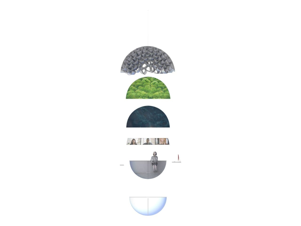
What I find most compelling is the section diagram the designers included. Stripped down to its basic geometry, the building reads as a stacked series of layers: a textured structural dome at the top, a living green layer beneath it, a dark water layer below that, and then human occupation at the base. It’s a quietly radical idea. The building isn’t sustainable because it has a green roof or offsets its emissions. It’s sustainable because it’s organized around natural systems at a structural level, with heat, water, and living material all functioning together as a closed loop.

The exterior pulls all of it together. A large dome structure sits directly on water, its skin formed from interlocking bubble-like cells that glow from within. Smaller spherical pods float on the surface around it. Looking at it under a sky of northern lights, it reads more like a research station on another planet than a corporate headquarters.

That’s not a criticism. It’s a sign that Lia and Michell Hur weren’t trying to design a building that looks sustainable. They were trying to design one that makes you feel what sustainability could actually mean, and that’s a much harder thing to do. They pulled it off.

The post What If Google’s Server Heat Became Its Most Prominent Design Feature? first appeared on Yanko Design.

The $135 Power Station That’s Also a Camping Lantern

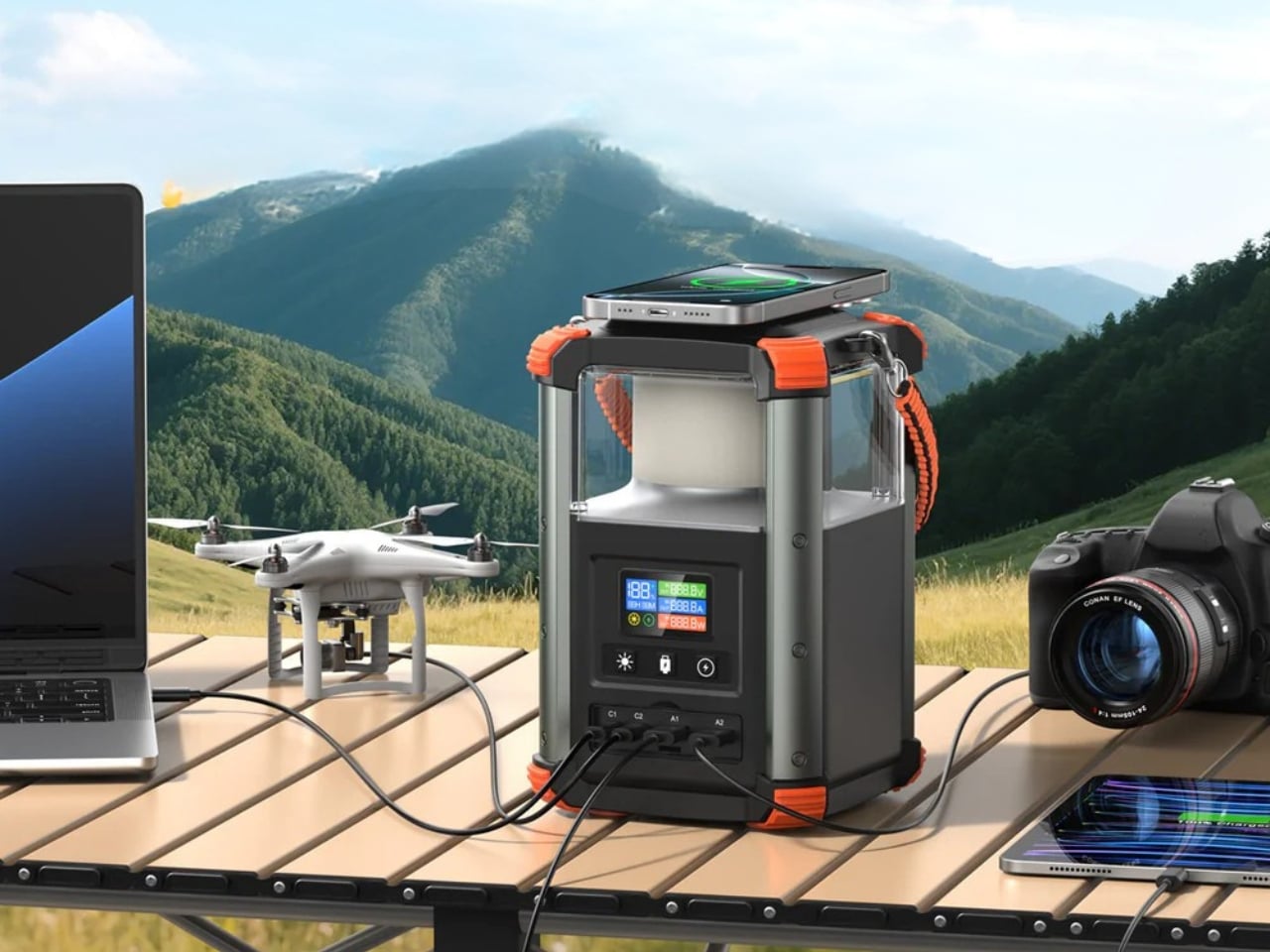
Most portable power stations are boring. Not in a dealbreaker way, but in the way that nearly every product in the category looks the same, functions the same, and markets itself the same. A handle on top, a row of ports in front, and a spec sheet heavy enough to make your eyes glaze over. Blavor’s PN-W43 doesn’t completely break that mold, but it makes a deliberate and interesting choice: it’s also a camping lantern. That single design decision changes quite a lot about how you think about this product and what it’s actually for.

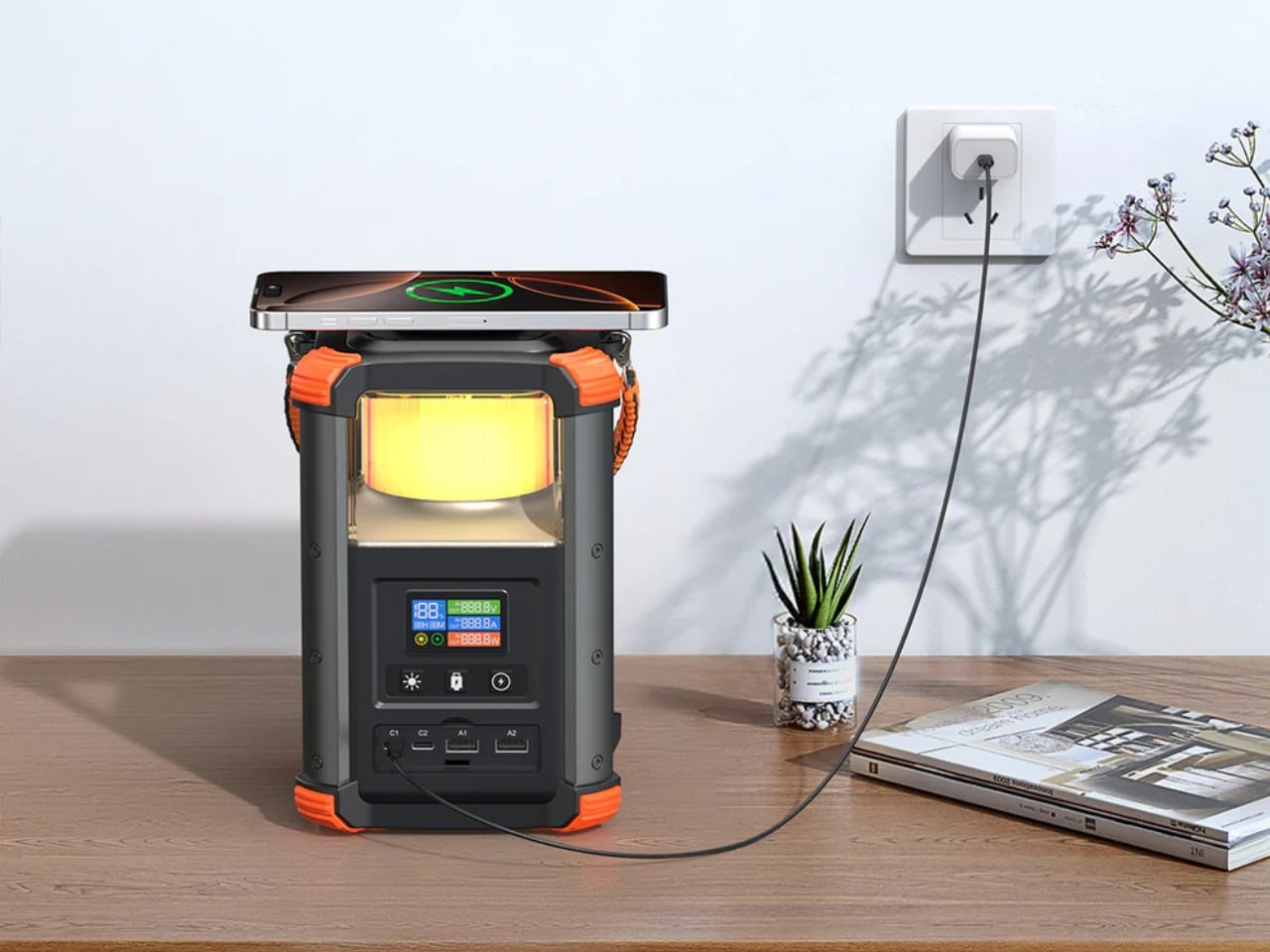
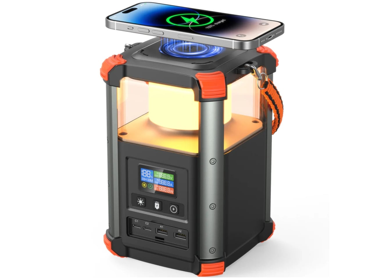
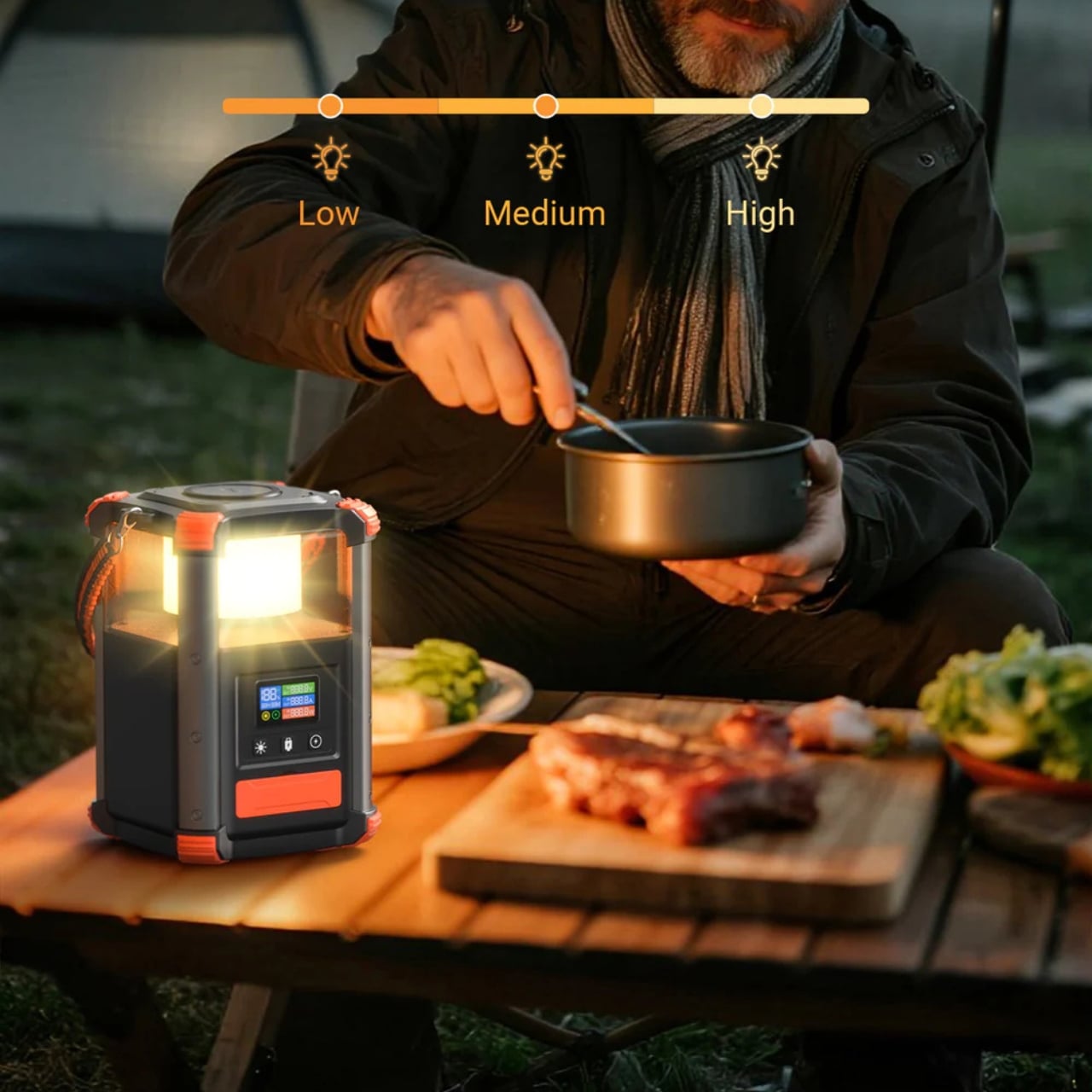
Let me set some context. The portable power station market has grown considerably over the last few years, and with that growth has come a predictable flood of look-alike black rectangles. They’re useful, sure. But they’re mostly garage gear, things you pull out during a power outage or scramble to pack the night before a camping trip. The PN-W43 is still that thing, but by integrating a 4W LED lantern into the top of the unit, Blavor built a device that’s immediately, instinctively useful the moment you take it out of its bag.

Designer: Blavor

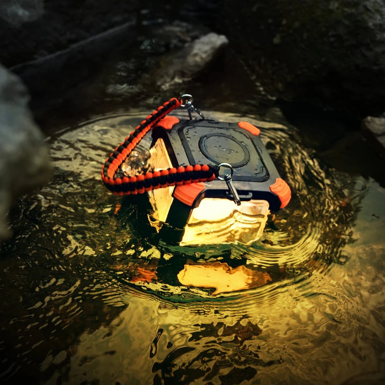
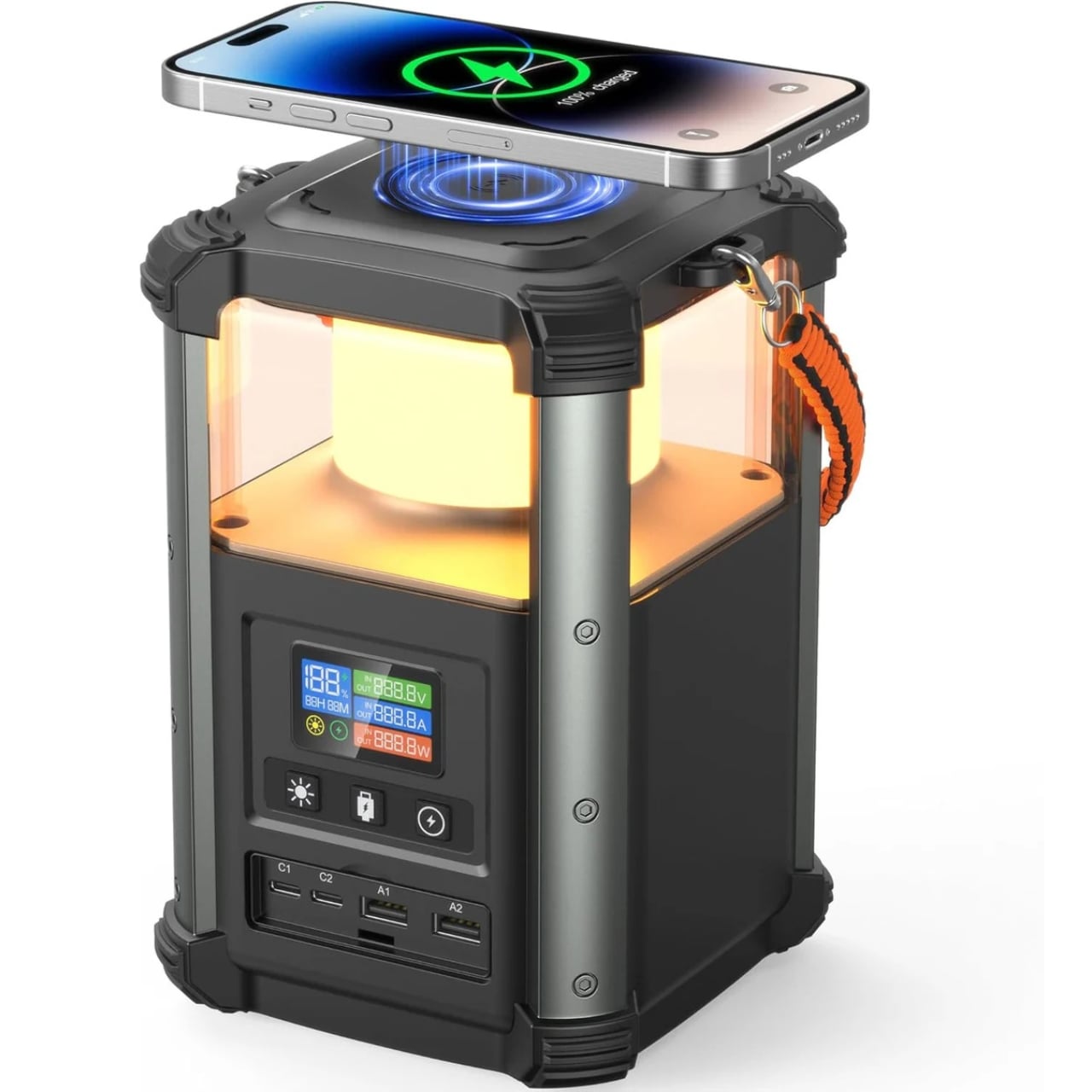
The lantern isn’t decorative. It’s a functional camping light designed for the kinds of situations power stations are already made for: storms, blackouts, nights under canvas, late nights at a tailgate. It comes with a lanyard, which is a small, practical touch that suggests someone at Blavor thought about actual field use rather than just filling out a product page. Whether you’re hanging it from a tent hook or placing it on a picnic table, the light functions as standalone gear on top of being part of a 64,000mAh power station.

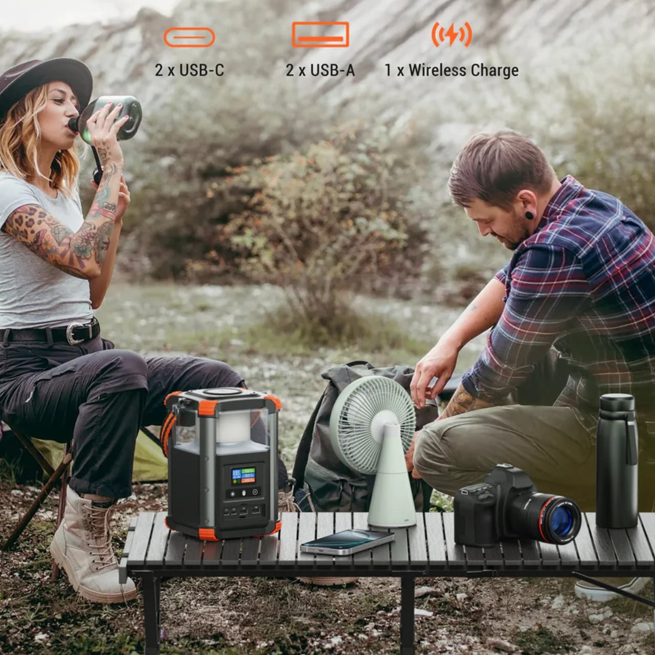
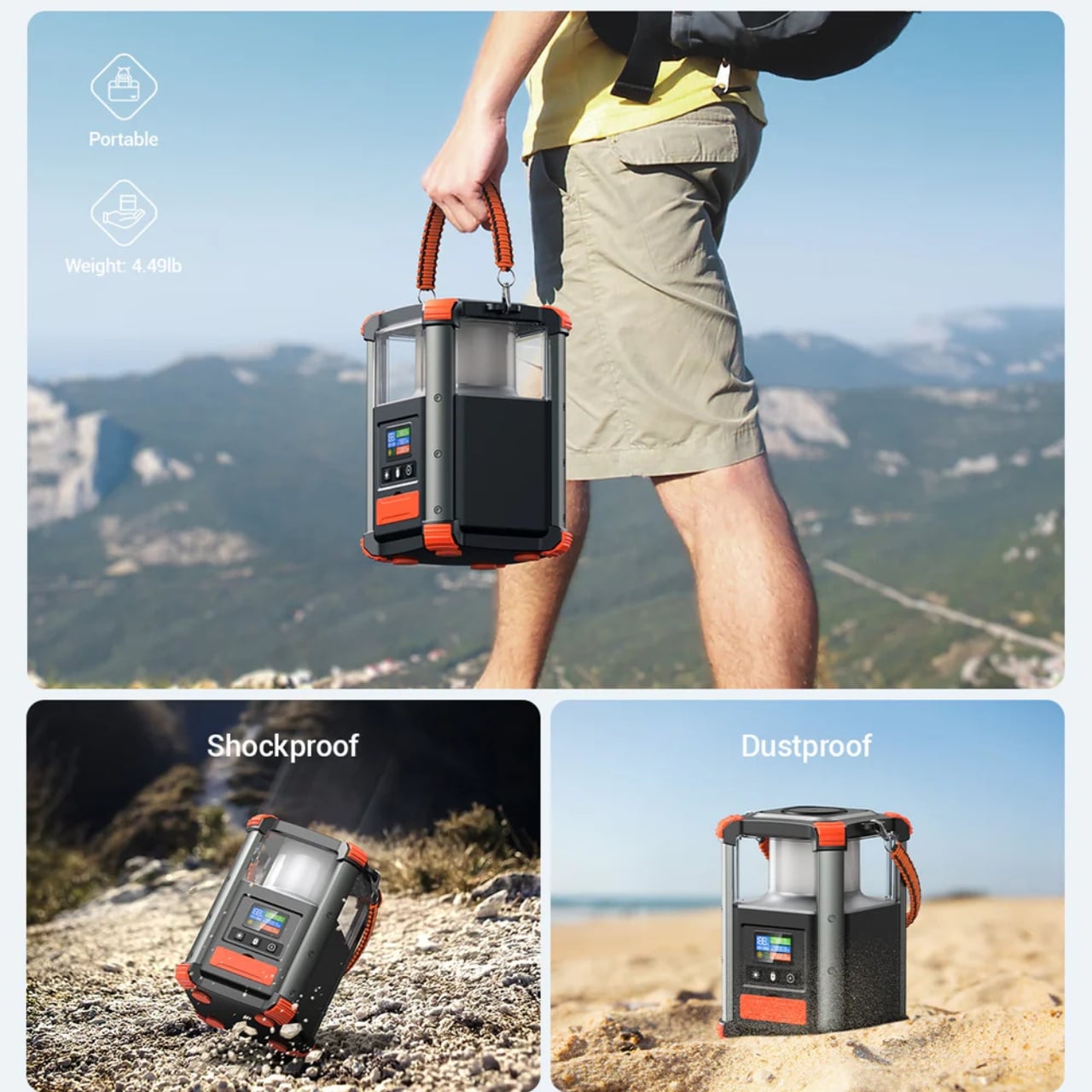
Those specs are genuinely solid for a device this compact. The PN-W43 packs 236.8Wh of capacity into a footprint of roughly 4.72 inches square and just under 8 inches tall. It weighs 4.5 pounds, which you’ll feel on a long hike but is entirely manageable for car camping, van life, or tucking into your trunk for emergencies. The two USB-C ports support bidirectional 100W fast charging, meaning you can charge the station itself at 100W in and push 100W out to a laptop at the same time. That kind of two-way, high-speed transfer still isn’t universal across this category, and it matters more than it might initially sound because it means you’re genuinely flexible with how and when you use the device.

On top of that, there’s 15W wireless charging, two USB-A quick charge outputs, and compatibility with solar panels up to 100W for off-grid recharging. Five total charging pathways in a device barely bigger than a tall water bottle, and a digital display to keep you updated on battery status so you’re not left guessing at the worst possible moment.

The design language is worth a mention. The PN-W43 comes in orange, and I think that’s the right call. Too much gear in this space defaults to a tactical, all-black aesthetic that reads as serious but ends up feeling generic. The orange makes the PN-W43 look like a considered product rather than a commodity. It’s something you’d want to see on a shelf or a workbench. That sounds superficial, but objects you actually like looking at are objects you actually remember to use and maintain.

Is it perfect? Not quite. At 236.8Wh, it sits comfortably in the mid-range of portable power. It’ll keep your phones, laptops, and essential gear running through a rough couple of days, but it isn’t designed to power an entire household during an extended outage. Know what you’re buying and you’ll be more than satisfied. Expect it to be something it’s not, and you’ll be disappointed by a product that otherwise gets a lot of things right.

What the PN-W43 ultimately represents is a power station that thought a little harder about the people who actually use it. The lantern is the proof of that thinking. It’s not a gimmick. It’s the reason this product has a personality, and in a market full of near-identical options, that counts for more than it might seem.

The post The $135 Power Station That’s Also a Camping Lantern first appeared on Yanko Design.

Gen Z Is Obsessed With These 5 Cassette-Era Gadgets & They Just Got a Full Design Upgrade for 2026

Something shifted in how people want to listen to music. Streaming gave everyone access to everything, and somewhere in that abundance, the experience got thinner. You stopped owning albums. You stopped reading liner notes or staring at cover art while the opening track played. The playlist just kept moving forward. That isn’t nostalgia talking. It’s a design problem, and one the cassette era solved without knowing it was solving anything.

The products worth paying attention to in 2026 absorbed the analog era’s lessons and built something genuinely new from them — better components, better battery life, cleaner construction. Cassette-era warmth, fully reengineered for a world that also has Bluetooth and USB-C. From a $49 speaker shaped exactly like a real mixtape to a 104-watt boombox covered by WIRED and Forbes at launch, each one makes a specific case for listening differently.

1. Side A Cassette Speaker

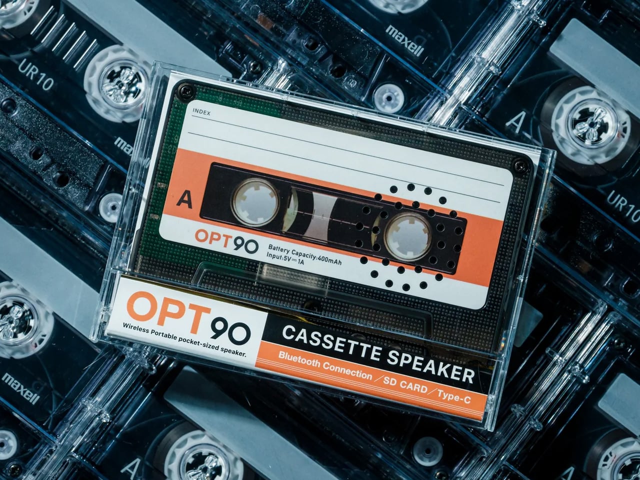
The cassette tape was always more than a format. It was an object you labeled by hand, kept in a glove compartment, or assembled specifically for someone who needed to hear certain songs in a certain order. The Side A Cassette Speaker takes that intimacy and wraps it around a Bluetooth speaker that earns a second look before it plays a note. Shaped faithfully like a real mixtape, transparent shell and Side A label intact, it sits in its clear case-turned-stand like a relic that also connects to your phone. At $49, it is the most honest nostalgia product in this category right now, because it commits to the premise completely rather than gesturing at it from a polite distance.

What keeps it practical day to day is how little it demands from you. Bluetooth 5.3 handles pairing, a microSD slot covers offline listening, and at 80 grams, it disappears into a jacket pocket without thought. Battery life runs six hours at maximum volume, and a full recharge takes two, which means it soundtracks a full workday and refuels overnight. The sound is tuned warm, which suits the object better than raw precision ever could. For anyone who spent time making mixtapes, or anyone who didn’t but understands why people did, this is the version of that feeling you can carry and actually hear in 2026 rather than only remember.

Click Here to Buy Now: $49.00

What We Like

  • Cassette-faithful design works as a display piece when it isn’t playing
  • Bluetooth 5.3 and a microSD slot give you two reliable ways to listen

What We Dislike

  • A single-driver setup won’t satisfy anyone looking for real volume or full-range sound
  • Only three units available at the time of writing

2. RetroWave 7-in-1 Radio

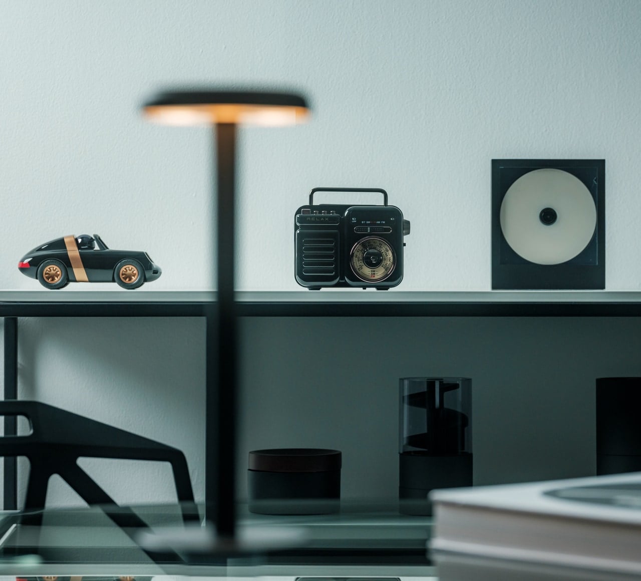
The boombox era was about more than cassette decks. It was about radios you could carry anywhere, tuning dials you could feel through your fingers, and sound that filled a room without asking permission first. The RetroWave 7-in-1 Radio captures that in a compact, Japanese-inspired frame. The tactile tuning dial, the warm retro casing, and AM/FM/shortwave reception give it the presence of something lifted from a 1984 shelf. It also streams Bluetooth, plays MP3s from USB or microSD, runs an LED flashlight, an SOS alarm, a hand-crank and solar charging, and a 2000mAh power bank that charges other devices when yours runs low. Seven functions in one object, packaged inside something that earns its place on a shelf every single day.

The seven functions working together are where the RetroWave earns its position in a 2026 home rather than a nostalgia market. Daily desk companion and off-grid emergency tool are roles that typically live in completely separate product categories, and the RetroWave collapses them into one object without obvious compromise on either side. The battery delivers up to 20 hours of radio time on a single charge. Solar and hand-crank inputs keep it running when the grid fails or the trail goes deeper than expected. At $89, it solves problems you haven’t had yet while looking precisely right sitting on a counter, a shelf, or inside a go-bag. That specific combination is considerably harder to design than it appears.

Click Here to Buy Now: $89.00

What We Like

  • Seven functions cover daily listening, emergency power, and off-grid communication in one device
  • AM/FM/shortwave reception works without any internet connection

What We Dislike

  • 8W speaker output is modest for anyone expecting outdoor or large-space sound
  • Solar charging acts as backup only and cannot fully recharge the battery independently

3. FiiO Echo Mini (Snowsky)

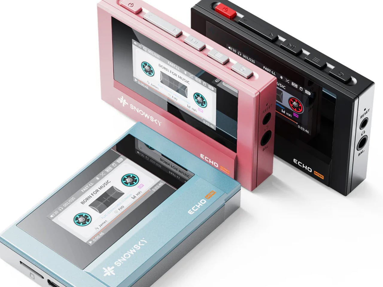
The Walkman moment was never really about audio quality. It was about having your music with you, completely yours, untouched by anyone else’s programming or curation. The FiiO Echo Mini, released under the Snowsky imprint, brings that feeling back in a form that looks exactly like a vintage cassette player from the outside and performs like a current hi-res audio device from the inside. Dual CS43131 DAC chips from Cirrus Logic handle the audio processing, earning it Hi-Res certification from the Japan Audio Society. The retro interface and cassette-player proportions are a direct reference to early Sony and Aiwa portables, down to the tactile controls and the way it sits in the palm of your hand.

Where the Echo Mini separates itself from the nostalgia-only tier is in what it can actually do for your listening. It supports FLAC, DSD, WAV, OGG, and other lossless formats, and accepts microSD cards up to 256GB, which means a library that would have filled an entire shelf of cassette cases in 1988 now fits in a slot smaller than your thumbnail. Dual headphone outputs and Bluetooth connectivity cover both wired and wireless listening from the same device. An independent power supply keeps the audio circuitry isolated from interference, which is the kind of engineering detail that doesn’t show up in the design but surfaces immediately in how it sounds. This is what a Walkman would have become if the engineers had forty more years to keep working on it.

What We Like

  • Dual DAC chips and Hi-Res certification deliver audio quality that the original Walkman never came close to
  • 256GB microSD support with multi-format lossless playback builds a serious portable library

What We Dislike

  • Playback-only with no recording function, which rules it out for anyone who wants to make tapes
  • The deliberate retro cassette aesthetic won’t suit every listener or every room

4. Retrospekt CP-81 Portable Cassette Player
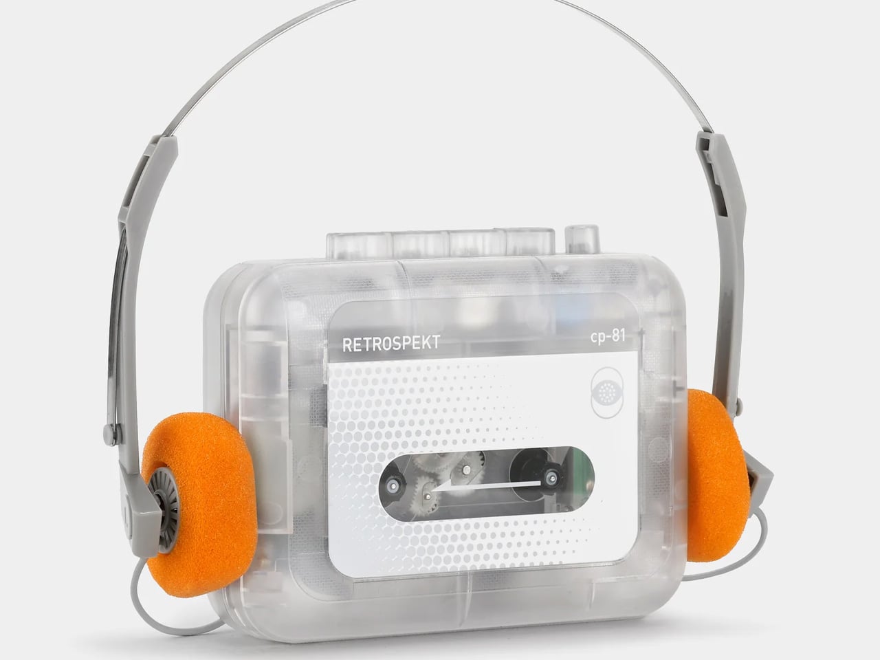
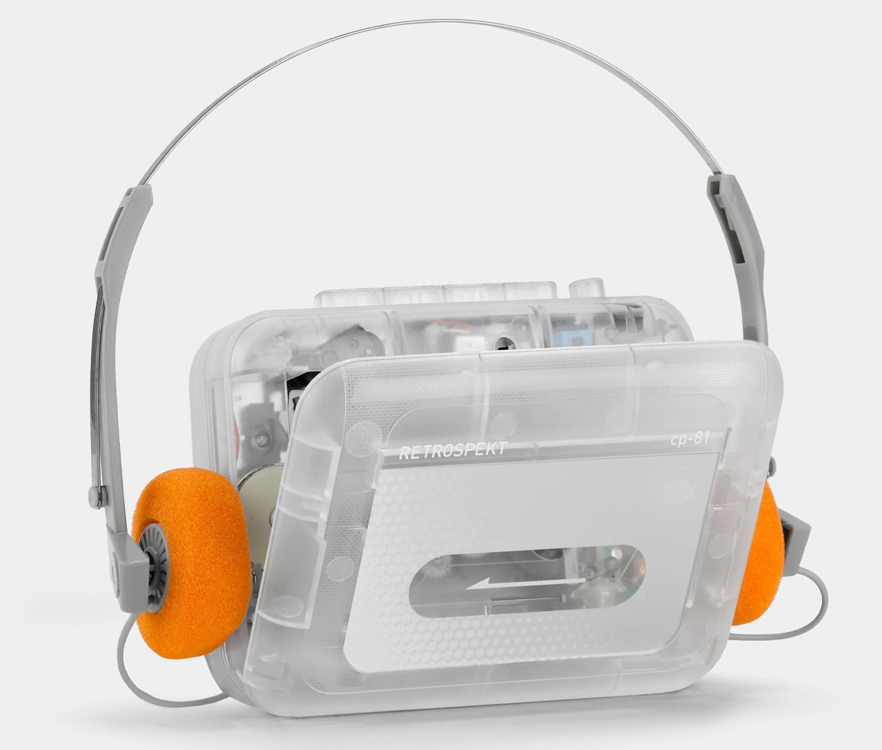
The CP-81 is the cassette player that stopped trying to be a hi-fi device and leaned fully into being a cultural artifact, and somehow that turned out to be exactly right. The clear plastic body shows the mechanism in full, the controls are exactly where you expect them, and the included RFH-01 headphones with their orange foam cushions make the whole package feel like something pulled from a very specific and beloved corner of 1983. Sold at MoMA Design Store, Nordstrom, and Urban Outfitters, it has collaboration editions with Miffy, Peanuts, and Hello Kitty that treat the cassette player as a canvas rather than just a device. It has 4.8 stars across 174 reviews, which is noteworthy.

What grounds it is that it actually works as a cassette player, not just as a shelf piece. The CP-81 plays, fast-forwards, rewinds, and records, with a line-in microphone jack that most modern cassette players quietly dropped from the spec sheet. Power comes from two AA batteries or a USB-C input, so it runs on whatever you have available. The people who buy it tend to keep it out on a desk rather than in a drawer. That’s partly the design doing its job, and partly because a cassette player that looks this considered, at this price, with this many ways to use it, is genuinely hard to put away.

What We Like

  • Records as well as plays, with a microphone jack that makes line-in recording straightforward
  • USB-C and AA battery power options mean it works wherever you need it to

What We Dislike

  • The clear plastic body shows every fingerprint, which matters more than it should for something this tactile
  • Collaboration editions sell out quickly, and availability varies across retailers

5. We Are Rewind Curtis Boombox GB-001
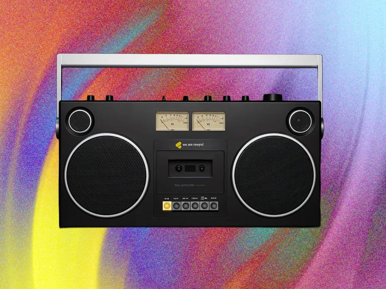
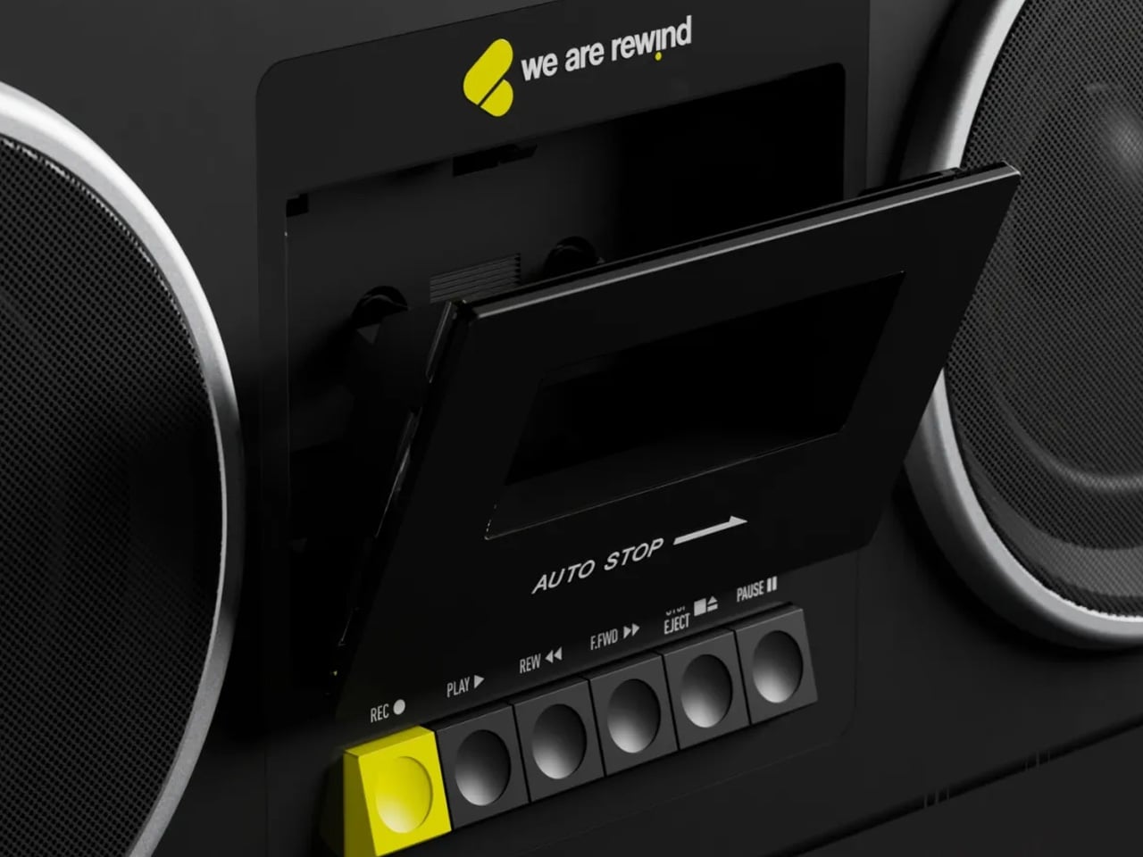
The boombox never fully disappeared. It got quieter, more compact, and less certain of what it was trying to be. The We Are Rewind Curtis GB-001 has none of that uncertainty. At 19 inches wide and 15 pounds, it is a proper boombox in the original meaning of the word: something you carry by its full-width folding handle and set down in a room that then belongs to the music. Four hi-fi speakers, two Class D woofer amplifiers, and two tweeters, push 104 watts across a frequency response of 40 to 20,000Hz. The cassette deck plays and records. The guitar amp input takes a real guitar. These are functional commitments, not marketing features, and they give the GB-001 the same confidence the original boombox had before the category forgot what it was for.

What lifts the GB-001 beyond a premium nostalgia product is how fully it commits to every part of the premise. Bluetooth 5.4 covers streaming when the tapes run out. The backlit VU meters — the detail WIRED noted immediately in its January 2026 review and the first thing every Gen X person in the room points out without being asked — are deliberately and gloriously analog. Forbes covered the North American launch the same week. Techmoan put it on camera in December 2025. The coverage it has earned reflects what the product actually is. At $579, this is the most serious purchase on this list, and also the most direct one: if you want a boombox that means it, this is the only new boombox in 2026 that does.

What We Like

  • 104 watts across four hi-fi speakers produces real, room-filling sound rather than novelty volume
  • Cassette recorder and guitar amp input make it a functional, creative instrument, not only a playback device

What We Dislike

  • At $579, the full value rewards buyers who use the cassette deck regularly, not just Bluetooth
  • Battery life has been flagged across multiple reviews as shorter than expected for a unit of this size and price

The Cassette Era Didn’t Come Back. It Came Back Better.

None of these products asks you to give up modern life for a feeling. The Side A speaker pairs over Bluetooth. The RetroWave runs 20 hours without a socket. The Echo Mini carries a full lossless library on a card smaller than a thumbnail. The CD Cover Player hangs on a wall. The Curtis boombox records. The best version of the cassette era is the one being made right now.

What makes each worth the attention isn’t nostalgia as a pitch. It’s the specific design decision behind each object. A speaker shaped like a tape because that was the only honest form. A radio that belongs in a go-bag as much as on a shelf. A CD player that brings the artwork along. These are for people who want music to feel like something. That instinct is now being answered.

The post Gen Z Is Obsessed With These 5 Cassette-Era Gadgets & They Just Got a Full Design Upgrade for 2026 first appeared on Yanko Design.
The $199 VITA RING Wakes You Up Mid-Apnea Before You Ever Know It Happened Thanks To AI Health Tracking

The fact that you have to charge your Apple Watch every 48 hours means there’s a small sliver of time in the day where it isn’t capturing data. Your body uses sleep to run its most important maintenance cycles, and the biometric signals during those hours carry real diagnostic weight: heart rate variability, breathing quality, blood oxygen levels during deep rest. These are the readings that can flag early signs of atrial fibrillation, sleep apnea, or chronic stress load well before symptoms appear in your waking hours. A device sitting on your nightstand during this window captures none of it. The form factor that makes the most sense for genuine 24/7 health tracking turns out to be one that never needs to come off. Something like a ring.

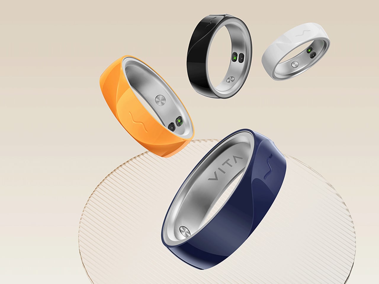
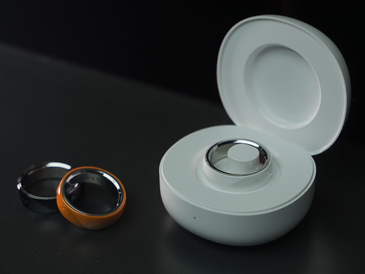
The VITA RING leans into this idea with a design that prioritizes both elegance and endurance. It uses a polished Aerospace Ceramic for its outer body, a material that feels more like a piece of refined jewelry than a piece of consumer electronics, and is 3x harder and scratch-resistant compared to titanium. This results in a device you are willing to live with twenty-four hours a day. With a battery that lasts up to a week on a single charge, it closes the data gap left by other wearables and operates silently in the background, using gentle haptic vibrations to deliver important alerts. It’s a design that ensures the ring remains forgotten until it has something important to share.

Designer: VITA TECHNOLOGY INC

Click Here to Buy Now: $199 $399 ($200 off).

VITA’s core proposition organizes around three verbs: Alert, Advise, Act. The ring’s Multi-Agent Health System tracks over 17 health metrics continuously, watching for deviations from your personal baseline rather than population-level averages. When something shifts meaningfully, a gentle haptic pulse is the only output, keeping the alert channel completely separate from the noise of your phone screen. The AI layer contextualizes what it finds, identifying patterns across sleep, stress, recovery, and activity to surface insights specific to your body. For a market that has treated data volume as a proxy for intelligence, that distinction matters.

Where VITA separates itself is in how it handles sleep. Most trackers deliver a score after the fact; VITA monitors sleep stages, breathing quality, and runs Apnea Intervention in real time. The ring detects disrupted breathing and responds with a gentle vibration prompting the user to shift position, often helping restore a more regular breathing pattern. Sleep apnea affects an estimated 936 million people globally, the majority of them undiagnosed, and real-time intervention at the consumer level addresses a clinical gap most wearables have stepped around entirely. The seven-day battery earns its keep here specifically, because consistent nightly data is how health patterns actually emerge.

“In Tune With You” is VITA’s attempt to build women’s health tracking around biology rather than calendar math, covering cycle awareness, fertility window detection, and pregnancy monitoring, all anchored in continuous biometric data. Most mainstream wearables approach this space with a period date counter and little else. Layering temperature shifts and HRV patterns onto reproductive health tracking delivers a different category of insight, capable of identifying a fertile window or flagging a physiological change earlier than any date-based system. Women’s health has been chronically under-engineered in consumer wearables, and making it a first-class feature is a deliberate product statement.

Circle of Care extends private health monitoring into a shared experience, letting users choose which wellness insights to share with trusted contacts alongside AI-guided care tips and relevant context. The Emergency SOS feature lets users send their live GPS location to those same contacts with a single tap when they cannot reach their phone. For adult children with aging parents, or anyone managing a chronic condition within a family dynamic, this broadens the ring’s utility considerably. Health monitored in isolation often goes unacknowledged, and VITA has built the architecture to change that.

Oura Ring charges $5.99 a month for premium features on top of the hardware cost. WHOOP’s entire model is subscription-based, with users paying around $30 a month to access their own data. VITA is different: core health tracking is completely free, but AI Health features require a subscription. Kickstarter backers get 1 year of AI Health features at no extra cost. The VIP pre-launch price sits at $179, representing 53% off eventual retail, and early backers who sign up before March 17 receive a free sizing kit. The real measure of whether it all holds up comes when hardware reaches users, but the pricing structure alone will earn serious attention in a market that has normalized subscription fatigue.

Click Here to Buy Now: $199 $399 ($200 off).

The post The $199 VITA RING Wakes You Up Mid-Apnea Before You Ever Know It Happened Thanks To AI Health Tracking first appeared on Yanko Design.

Futurewave Just Built a Smartwatch That Works Off the Grid

Most smartwatches are sold on the premise of convenience. They track your steps, ping you when you get a text, tell you to breathe, and remind you to stand up every hour like a politely nagging coworker strapped to your wrist. I don’t say that as a knock on the category. Convenience is genuinely valuable. But somewhere along the way, the smartwatch conversation became entirely about optimization and lifestyle metrics, and we kind of forgot that the wrist is also a really good place to put something that could keep you alive.

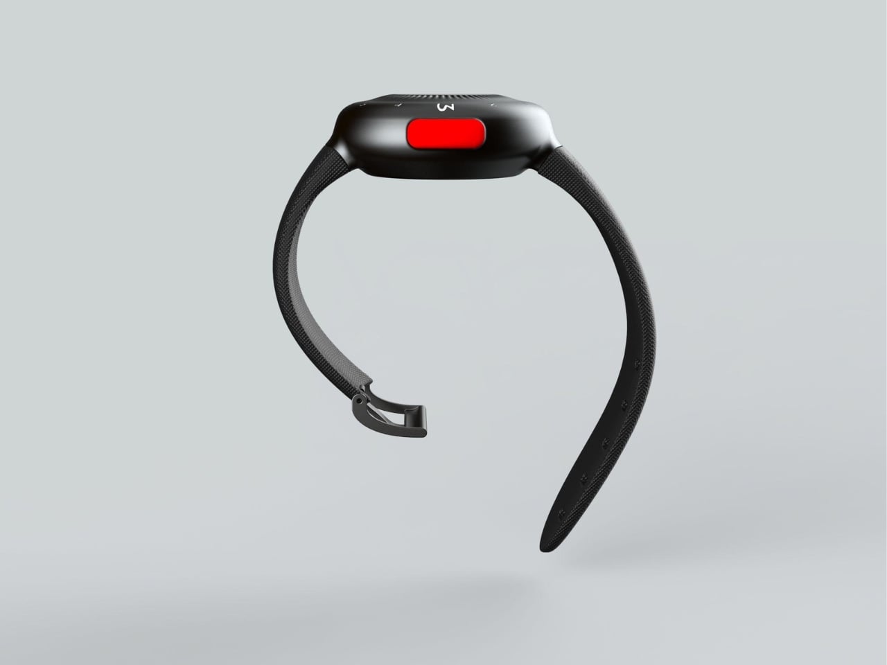
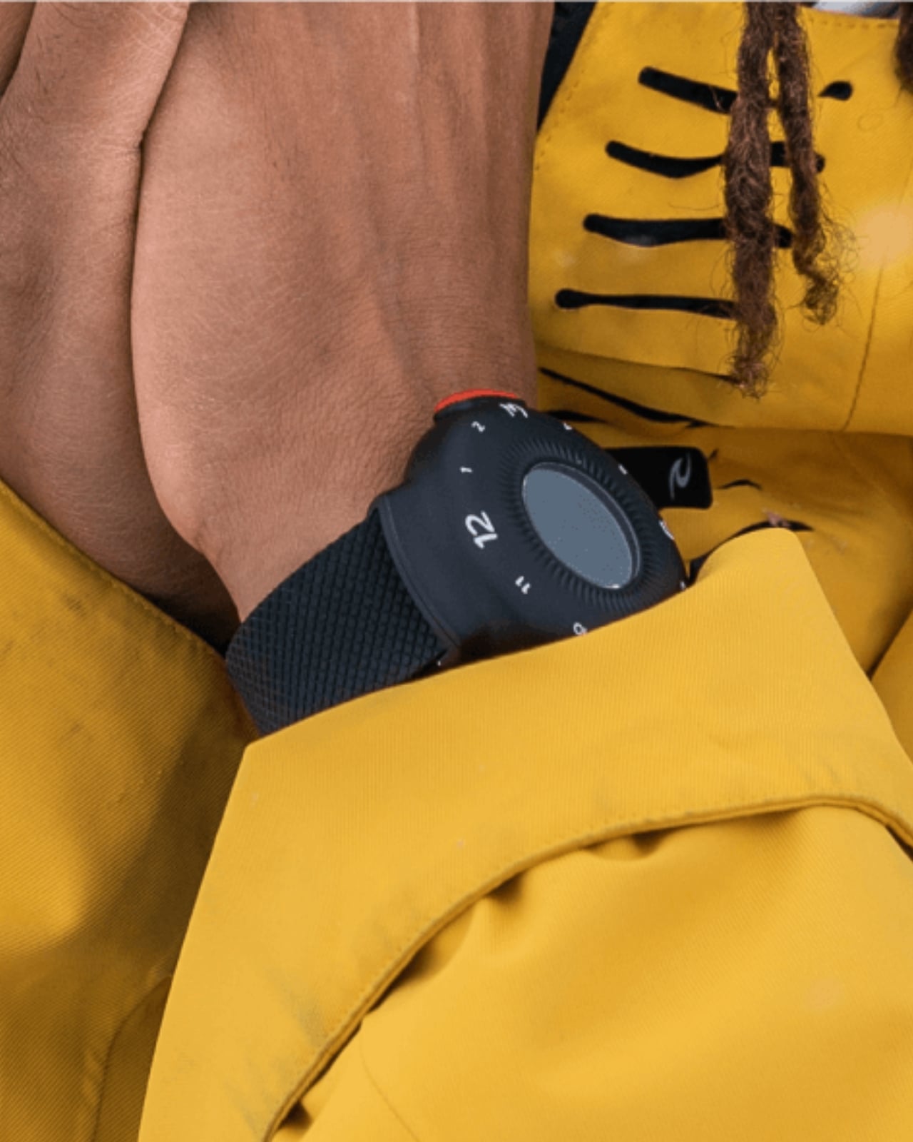
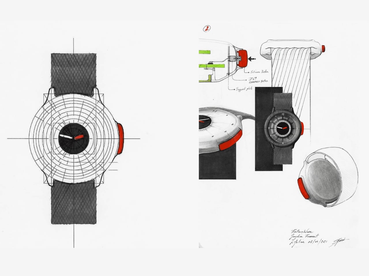
That’s where O-Boy comes in. Developed by Brussels-based design studio Futurewave, O-Boy is a satellite-connected smartwatch built specifically for emergencies in places where mobile networks simply don’t exist. No bars. No Wi-Fi. No backup signal. We’re talking mountains, open ocean, remote job sites, the kind of geography that doesn’t care about your carrier plan. In those environments, O-Boy functions as a direct link to satellite communication, allowing the wearer to transmit an emergency alert regardless of terrestrial infrastructure.

Designer: Futurewave

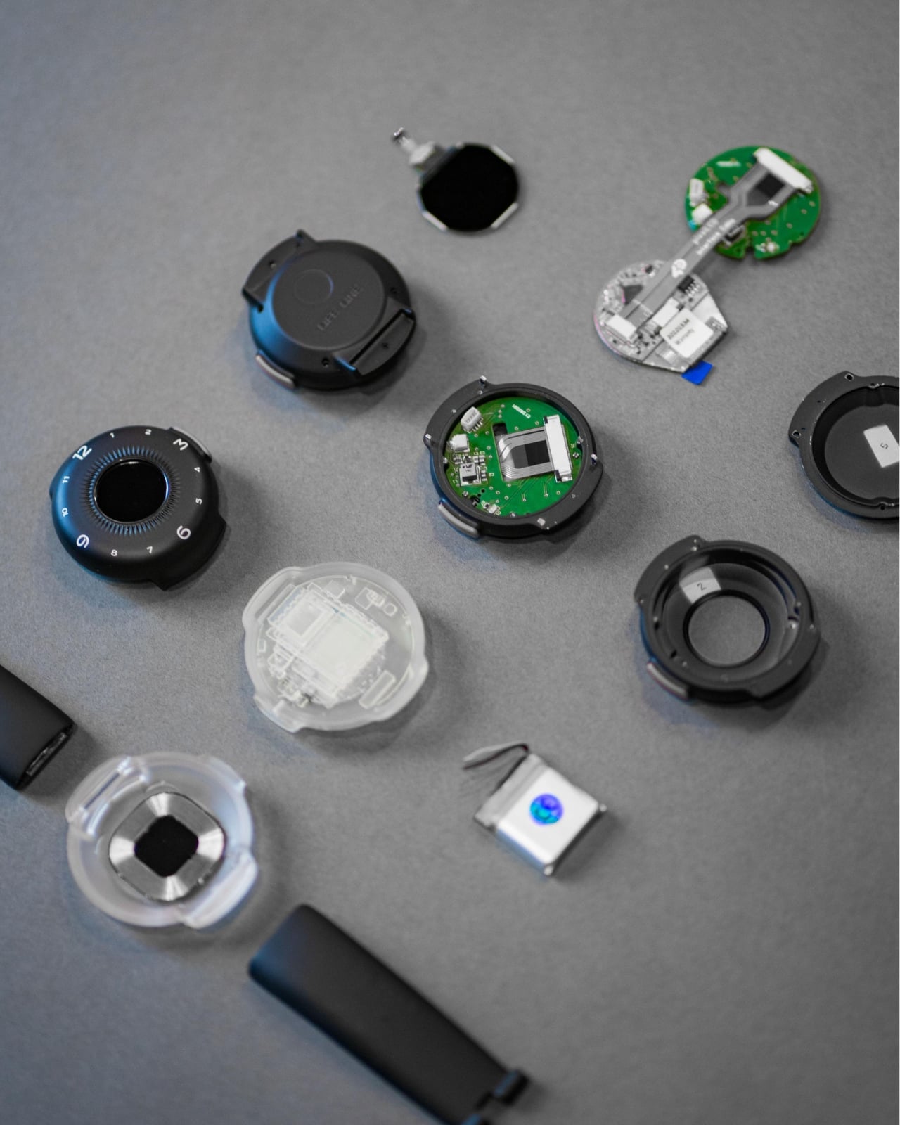
The premise sounds straightforward enough, but the execution is what makes this project interesting. Getting satellite communication hardware into a compact, wearable form factor is not a small feat. Futurewave brought together product designers, electronics engineers, and antenna specialists to make it work, and rethought the assembly system entirely from how conventional wearables are manufactured. That kind of cross-disciplinary collaboration tends to produce things that actually push the category forward rather than just iterating on what’s already there.

Visually, O-Boy reads as deliberate and utilitarian without being overtly tactical or rugged-for-rugged’s-sake. It doesn’t look like a watch that belongs exclusively to climbers or military personnel, which I think is actually the right call. The moment you design something to look extreme, you narrow your audience to people who already identify with that world. O-Boy appears to be reaching for a broader user: anyone who spends time in remote environments, whether for work or adventure, and wants a layer of safety that their phone simply cannot provide.

I’ll be honest about something. I’ve never been fully convinced that the average smartwatch user needs another notification device. The market is crowded, the differentiation is thin, and most new entries end up competing on specs that only matter to enthusiasts. O-Boy sidesteps that conversation almost entirely. It’s not trying to be the smartest watch. It’s trying to be the one you’d actually want on your wrist when a situation becomes life-or-death. That’s a completely different design brief, and it produces a completely different kind of product.

What I appreciate most is that the project seems to understand its context. Conventional mobile networks cover only a fraction of the Earth’s surface. Vast swaths of ocean, mountain ranges, deserts, and rural work sites exist in a communication dead zone that we collectively don’t think about until something goes wrong. The Apple Watch’s satellite SOS feature hinted at this need, but that capability is baked into a device designed primarily for a very different kind of user, sold at a premium price point and wrapped in a broader ecosystem. O-Boy is positioning itself as something more focused, more purpose-built, and arguably more honest about what it’s actually for.

Does it solve every problem in the wearable safety space? Almost certainly not. Satellite communication latency, subscription models for satellite access, and battery constraints are all real questions that any device in this category has to reckon with. Futurewave hasn’t published exhaustive technical specs publicly, so some of those answers remain open. But as a design concept and a signal of where wearables could be heading, it’s genuinely compelling.

The best design doesn’t ask you to change your habits. It meets you exactly where you are, anticipates the moment things go wrong, and gives you a way through. O-Boy feels like it was built with that thinking at its core. Whether it reaches mass production or stays within niche markets, the conversation it’s starting is one worth having.

The post Futurewave Just Built a Smartwatch That Works Off the Grid first appeared on Yanko Design.

7 Best Pocket-Sized Tech Gadgets Built for the Modern Minimalist

Somewhere between the overstuffed tech pouch and the empty pocket lies a sweet spot that most gadget makers ignore. The minimalist carry is not about owning less for the sake of it, but about each object earning its place through thoughtful design and genuine daily utility. We have been keeping tabs on pocket-friendly gadgets that manage to pack serious functionality into forms small enough to forget about until the moment they are needed. These seven picks balance portability with purpose, skipping gimmicks in favor of smart engineering.

What ties this list together is a shared restraint. None of these products tries to do everything. Each one solves a specific problem within a compact footprint, and the design decisions behind them reflect a growing shift in how makers approach portable tech. Less bloat, more intention, and a willingness to rethink form factors that have gone unchallenged for too long.

1. OrigamiSwift Mouse

The OrigamiSwift borrows its name from Japanese paper folding, and the comparison holds up. This foldable Bluetooth mouse collapses flat for storage and springs into a full-sized shape in under half a second, making it one of the more clever portable input devices we have come across recently.

At just 40 grams, the mouse is lighter than most pens and thin enough to slip into a jacket pocket without adding bulk. The ergonomic curve that appears when unfolded feels closer to a standard desktop mouse than most travel mice bother attempting, which makes extended work sessions far less punishing on the wrist.

Click Here to Buy Now: $85.00

What we like

  • The origami-inspired folding mechanism is quick and satisfying, going from flat to functional almost instantly.
  • Weighing only 40 grams, it vanishes into a bag or pocket and adds almost zero weight to a travel setup.

What we dislike

  • The folding hinge is a mechanical point of failure that could wear over time with heavy daily use.
  • Bluetooth-only connectivity means no option for a USB dongle, which can be a dealbreaker for users who prefer a dedicated receiver.

2. DuRobo Krono

Reading on a phone screen is a compromise most people accept without questioning. The DuRobo Krono pushes back on that default by squeezing a 6.13-inch E Ink Carta 1200 display into a form factor that fits pockets as easily as a smartphone, but replaces the distraction engine with a focused reading and productivity tool.

The 300 PPI resolution matches what premium Kindles deliver, and the tall 18:9 aspect ratio gives the Krono a narrow, phone-like grip at 154 x 80 x 9mm and 173 grams. Built-in AI capabilities turn it into a note-taking and creative thinking companion, not just a page-turner.

What we like

  • The E Ink display at 300 PPI is sharp and comfortable for extended reading without the eye fatigue that LCD screens cause.
  • AI features baked into the device add a productivity layer that separates it from standard eReaders stuck in single-purpose territory.

What we dislike

  • E Ink refresh rates remain sluggish for anything beyond static pages, making note-taking and navigation feel slower than on a phone.
  • At 6.13 inches, the screen is on the smaller side for PDFs and academic papers that need more real estate to be readable.

3. Pokepad Pocket PC

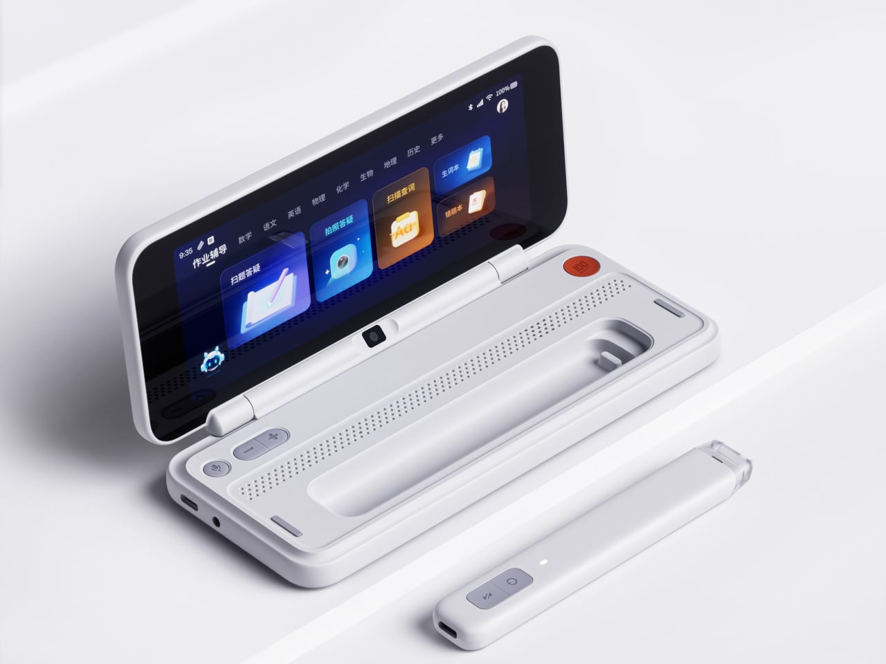
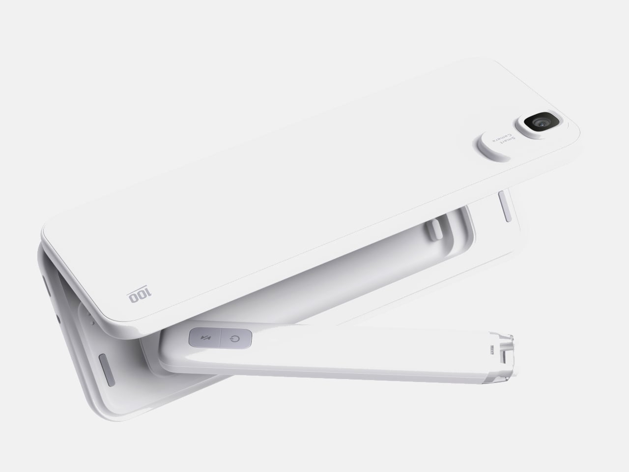
Most devices aimed at students are either stripped-down tablets or locked-down phones fighting a losing battle against social media. Pokepad takes a different route: a compact learning device shaped like a slim rectangular box, with a flip-out pen and zero gaming apps. The goal is a distraction-free tool that travels from classroom to bus to bedroom.

The design team tested multiple shapes before landing on this box form factor, balancing enough internal volume for a decent battery, speakers, and a pen mechanism without tipping into tablet territory. The deliberate absence of an app store full of entertainment is the product’s sharpest design choice, and its most controversial one.

What we like

  • The flip-out pen integrated directly into the body eliminates the need to carry (and inevitably lose) a separate stylus.
  • A distraction-free software environment means this device stays focused on learning rather than competing with TikTok for attention.

What we dislike

  • This is still a concept, so there are no confirmed specs, pricing, or a release timeline to evaluate.
  • The locked-down software approach assumes students will not simply resist using a device that blocks entertainment entirely.

4. Battery-free Amplifying iSpeakers

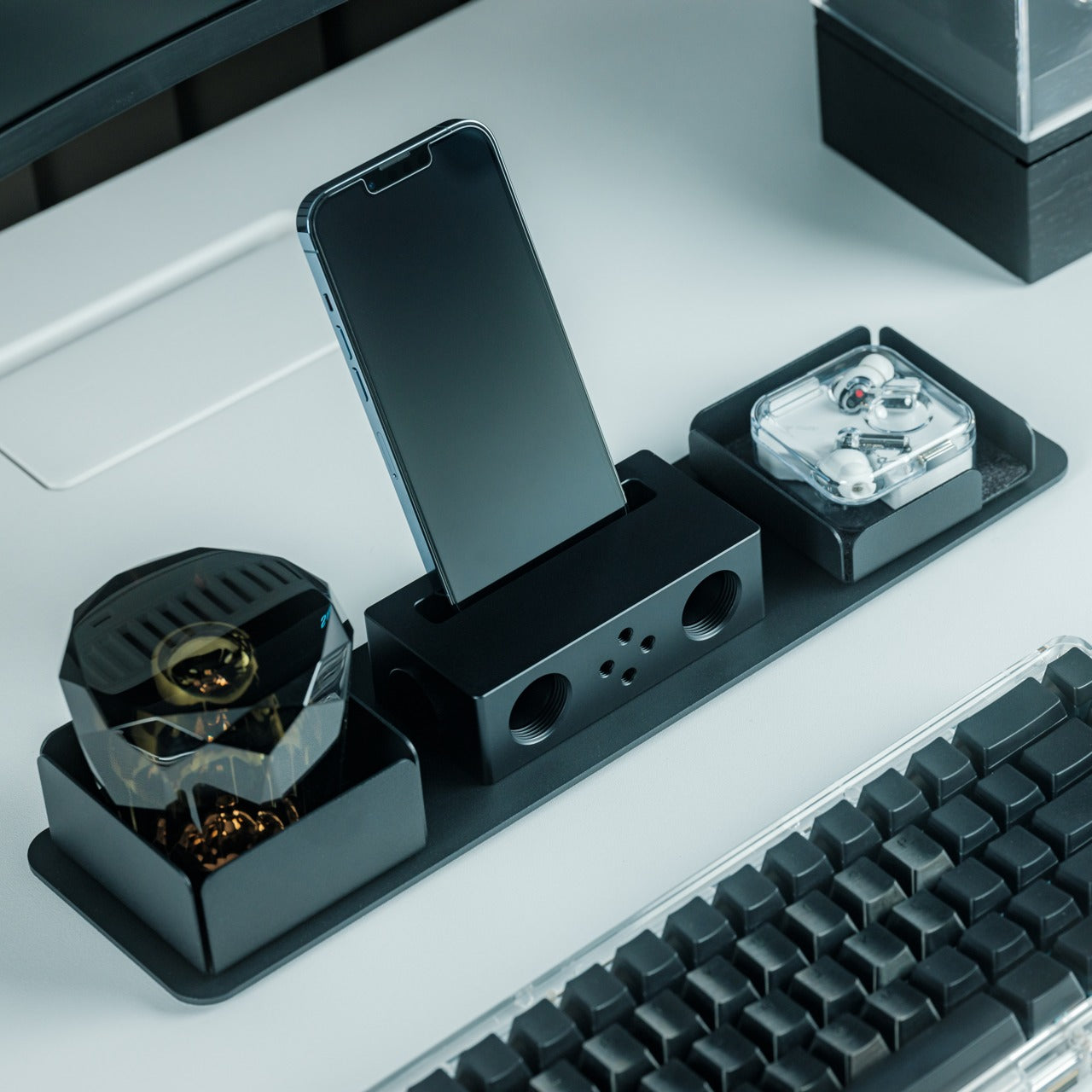
In a category drowning in Bluetooth speakers that need charging, the iSpeakers strip things back to pure physics. This metal smartphone speaker amplifies sound using acoustic design alone, with no battery, no electricity, and no pairing process. Slot a phone in, and the Duralumin body does the rest.

The material choice is the interesting detail here. Duralumin is an aluminum alloy used in aircraft construction, chosen for its vibration-resistant properties and its ability to project sound cleanly. The speaker’s proportions follow the golden ratio, which shapes how sound waves travel through the chamber and spread outward. Optional +Bloom and +Jet mods (sold separately) let users direct sound for different room setups.

Click Here to Buy Now: $179.00

What we like

  • Zero power requirement means no batteries to charge, no cables to carry, and no wireless connectivity to troubleshoot.
  • Duralumin construction gives it a premium, lasting feel that ages well and resists the kind of dings that kill plastic speakers.

What we dislike

  • Volume output is inherently limited by passive amplification, so this will not fill a large room or compete with powered speakers.
  • Compatibility depends on phone size and speaker placement, so not every phone model will fit or project sound optimally.

5. Unix UX-1519 NEOM Power Bank

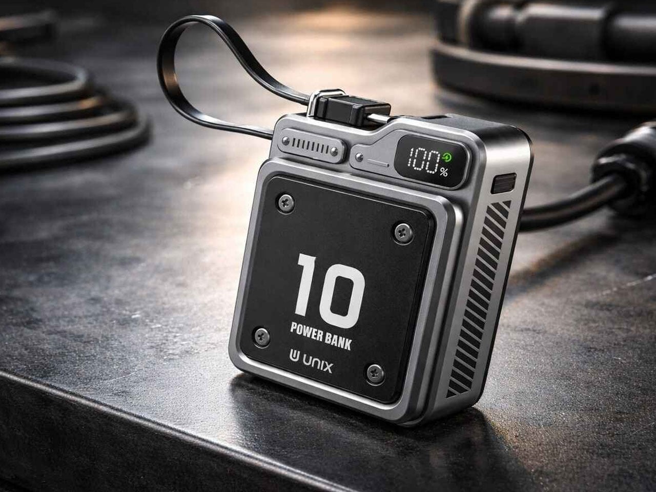
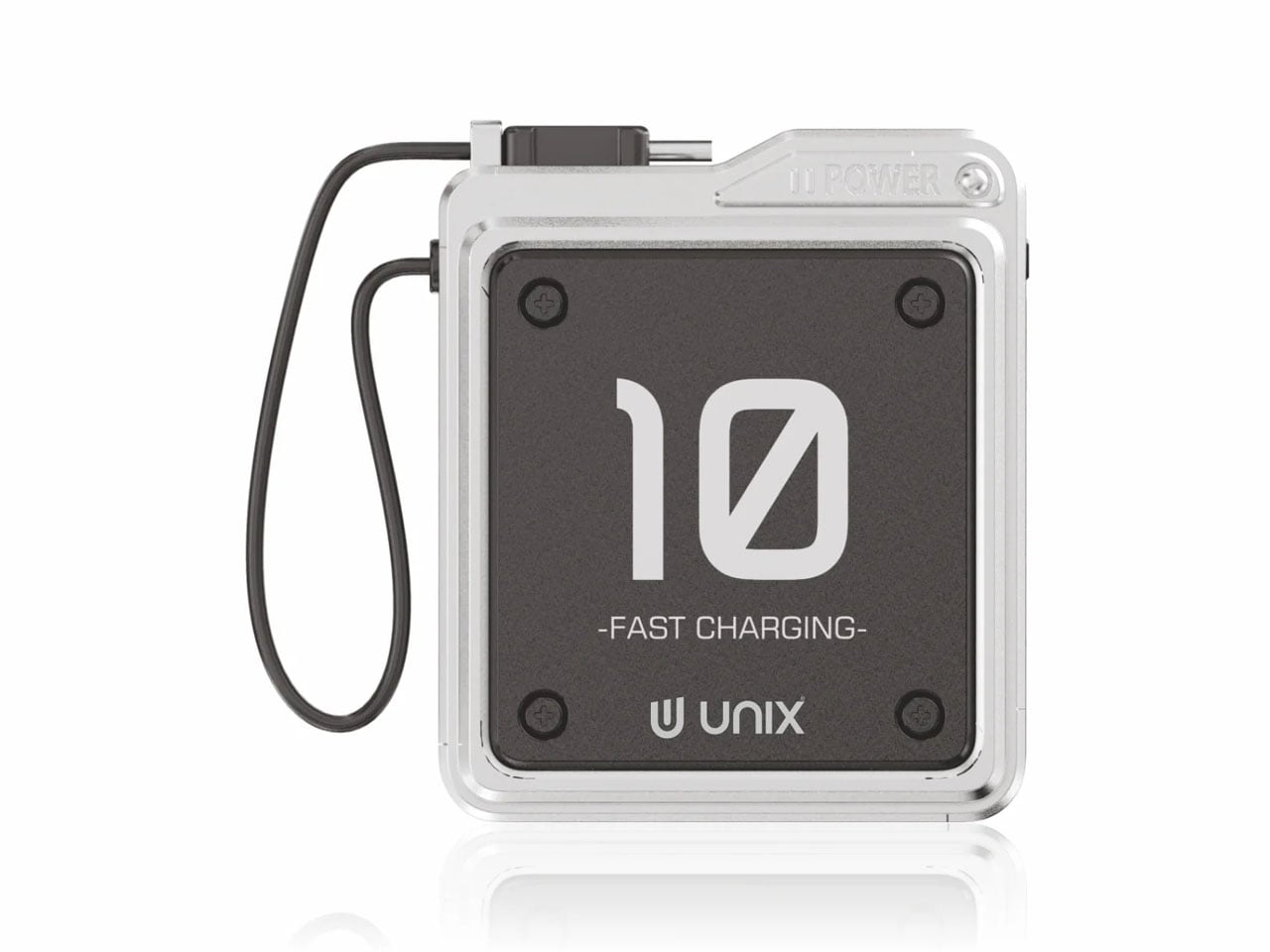
Power banks are the most boring objects in the average carry. The Unix UX-1519 NEOM challenges that assumption by wrapping 10,000mAh of capacity and 22.5W fast charging in an industrial design language that actually looks intentional. This is a real, shipping product, not a concept render.

The retro-modern aesthetic slots neatly alongside devices from brands like Nothing and Teenage Engineering, where exposed design elements and visible construction details are part of the appeal. Under the surface, a high-density Lithium Polymer battery provides a safer, longer-lasting cell compared to standard lithium-ion packs found in most competing power banks.

What we like

  • The industrial design treatment turns a utilitarian object into something worth displaying alongside the rest of a curated collection.
  • 22.5W fast charging keeps compatible devices topped up quickly, cutting the time spent tethered to a power bank.

What we dislike

  • The design-forward approach may command a price premium over functionally identical power banks with plainer exteriors.
  • At 10,000mAh, capacity is adequate for one to two phone charges, but falls short for users who need to power tablets or laptops on the go.

6. Keychron B11 Pro

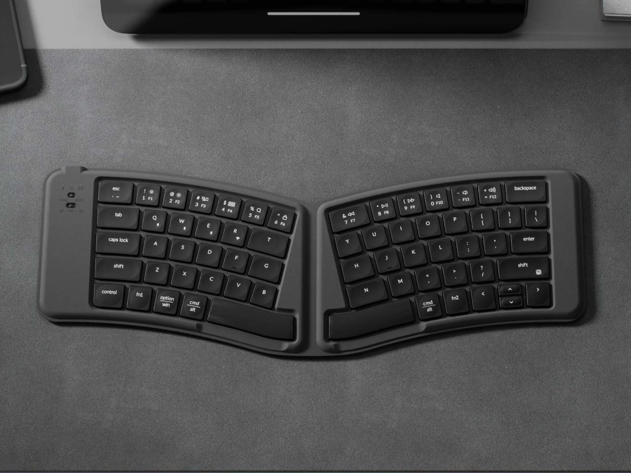
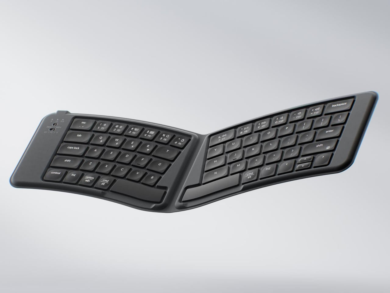
Portable keyboards have spent years treating compactness as the only variable worth optimizing. The Keychron B11 Pro adds a second priority: ergonomics. It folds in half to a 196.3 x 143 mm footprint (smaller than a paperback) at 258 grams, but unfolds into a 65% Alice layout that angles both key clusters inward for a more natural wrist position.

The Alice geometry is what separates this from every other folding keyboard in its price bracket. Keychron already uses the same split-angle approach in the desk-bound K11 Max, a full mechanical keyboard, so the ergonomic logic is well tested. Putting it into a foldable form at $64.99 is a different proposition, one that treats travel typing as something deserving of the same wrist comfort as a home office setup.

What we like

  • The Alice split layout reduces lateral wrist strain during long typing sessions, a benefit that flat portable keyboards do not offer.
  • At $64.99, the price point is accessible compared to other ergonomic keyboards that cost two to three times as much.

What we dislike

  • A 65% layout means missing dedicated function rows and navigation clusters, which power users may find limiting.
  • The folding hinge adds a visible seam along the middle of the keyboard that could collect dust and affect long-term build quality.

7. Frame CD Player

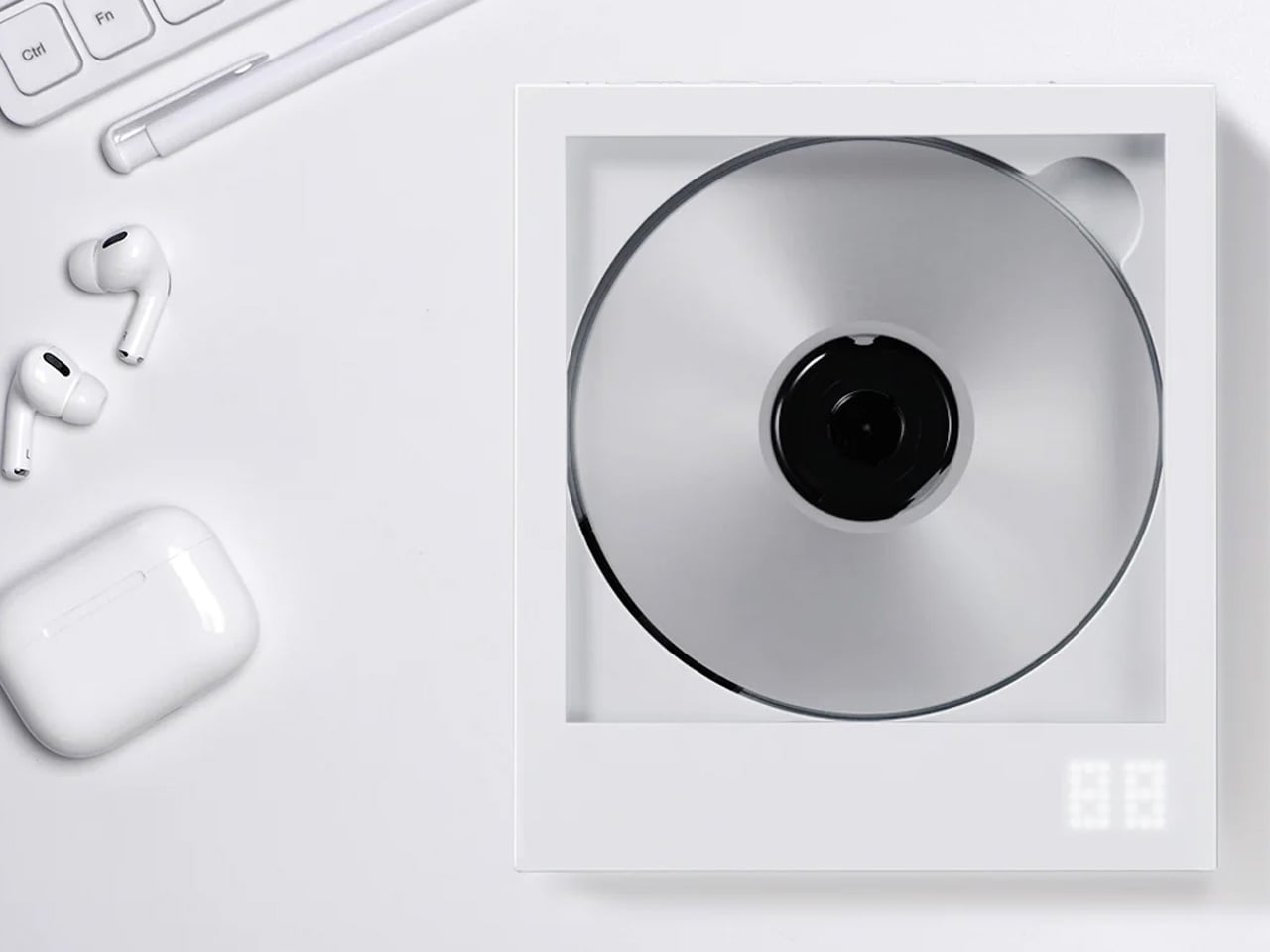
Streaming killed the CD, but it never replaced the ritual. The Frame CD player leans into that gap with a portable player that does double duty as a display for album jacket art. Pop in a disc, slide the cover art into the built-in frame, and the album becomes an object again instead of a thumbnail on a screen.

Bluetooth 5.0 lets the player connect to wireless speakers and earphones, so it works within modern audio setups without demanding a wired system. A built-in battery makes it portable enough to move between rooms or take on the go, and the minimalist housing is designed to hang on a wall as a piece of functional decor when not in transit.

Click Here to Buy Now: $169.00

What we like

  • The album art frame transforms a music player into a visual display piece, giving physical media a presence that streaming cannot replicate.
  • Bluetooth 5.0 connectivity bridges the gap between vintage formats and modern audio gear without extra adapters or cables.

What we dislike

  • CD collections are shrinking, so the player’s long-term utility depends on how committed a listener is to physical media.
  • Sound quality through Bluetooth compression will not satisfy audiophiles who are drawn to CDs for their lossless audio in the first place.

Less carry, more intent

The common thread running through these seven gadgets is not a spec sheet or a price bracket. It is an attitude toward what portable tech should be: small enough to disappear when not needed, capable enough to perform when called upon, and designed with enough intention that carrying them feels like a choice rather than a burden. Not every product on this list will suit every carry, but each one earned its pocket space.

What makes this current wave of compact gadgets exciting is the refusal to treat portability and quality as opposites. The best pocket-sized tech does not ask for compromise. It simply demands better design thinking, and these seven products deliver on that front in different, often surprising ways.

The post 7 Best Pocket-Sized Tech Gadgets Built for the Modern Minimalist first appeared on Yanko Design.

The Zipper Is the Button. Finally.

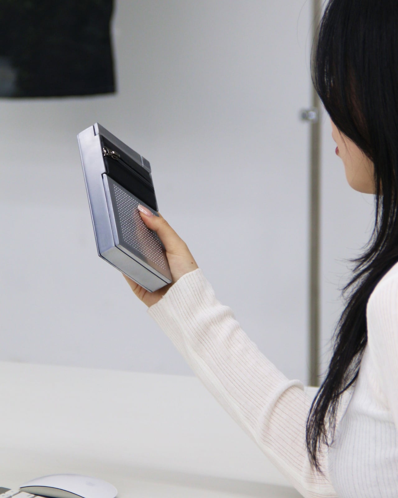
We’re used to devices and gadgets that have all complicated buttons and controls. But what if it wasn’t that way always? The gesture is almost embarrassingly simple. Pull a zipper open and sound plays. Pull it shut and the room goes quiet. No tapping a screen, no asking a voice assistant, no hunting for a button that somehow always ends up on the wrong side of the device. Just the same physical action you’ve been doing since you were old enough to dress yourself.

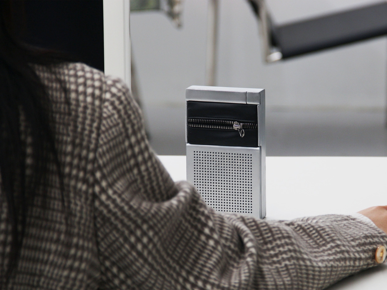
That’s the entire premise of ZIP, a concept speaker designed by Korean designers Taeyang Kim, Dugyeong Lee, Yejin Na, and Gijeong Shin. It’s one of those ideas that, once you see it, makes you wonder why it took this long. The concept draws directly from the universal expression “zip your lips,” mapping the act of silencing onto the most tactile and satisfying closure mechanism we use in everyday life. The zipper isn’t decorative here. It isn’t a style nod or an ironic wink. It is the interface. And that commitment is what makes ZIP genuinely interesting rather than just aesthetically clever.

Designers: Taeyang Kim, Dugyeong Lee, Yejin Na, gijeong Shin

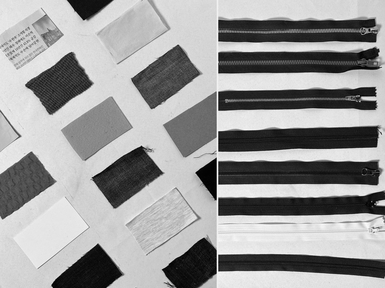
Physically, the object is composed and self-assured. A compact rectangular body in brushed silver aluminum sits below a band of dark fabric bisected by a metal zipper, the kind of heavy-duty hardware you’d find on a quality jacket, not a flimsy fashion detail. The lower half houses the speaker grille: a grid of evenly punched dots that reads like something out of a Dieter Rams archive, which is very much a compliment. The visual language is minimal without being cold, functional without being dull. It looks equally at home on a credenza beside art books and on a desk next to a keyboard.

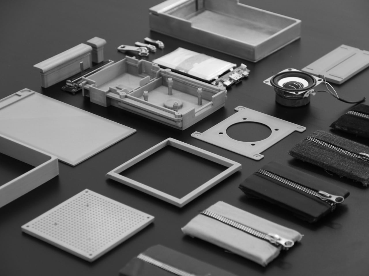
The prototype photos on Behance pull off something a lot of design projects fail to do: they make you feel the weight of the thing. The exploded component layout is especially good. You can see the actual speaker driver, the PCB, the battery, the zipper hardware, all laid out like a dissected argument for why this object should exist. It’s a working prototype, not a render, and that matters. Renders are promises. A functioning prototype is a proof.

What I keep coming back to is the conceptual integrity. A lot of tech and industrial design right now is obsessed with reducing interfaces to nothing: invisible touch surfaces, gesture sensing, proximity triggers. The instinct is understandable, but there’s a real cost to removing physicality from control. You lose feedback. You lose certainty. You lose the tiny neurological satisfaction of knowing you actually did a thing. ZIP goes in a different direction by betting that a familiar mechanical action can carry more meaning than a capacitive button ever will.

The “zip your lips” metaphor also does something a lot of design thinking misses. It’s cross-cultural in its clarity. You don’t need to read a manual to understand what zipping something shut means in relation to silence. The designers describe it as proposing “a new interface that controls sound, inspired by the gesture of closing your mouth.” That isn’t just product language. It’s a considered philosophical position on what intuitive design actually means. Intuitive doesn’t mean invisible. It means immediately understood.

The styling throughout the Behance project reinforces this with a dry, confident visual wit. The image of someone holding the zipper module over their mouth says everything the project text says, but in about half a second. It’s the kind of visual shorthand that designers spend entire careers trying to achieve.

Whether ZIP ever becomes a commercially available product is, frankly, beside the point right now. What it demonstrates is a design team that understands the difference between novelty and concept. Novelty fades. Concept compounds. And the concept here, that the best interface is the one that already lives in muscle memory, is solid enough to carry a lot more than a speaker. It’s rare to look at a design concept and feel like the people behind it already know something important. ZIP is that kind of rare.

The post The Zipper Is the Button. Finally. first appeared on Yanko Design.

5 Best Tech Gadgets of March 2026

March has a habit of delivering the products that January only promised. CES demos become preorders, concept renders start circulating with real specs attached, and the gadgets worth paying attention to separate themselves from the ones that were only ever meant to look good on a stage. This month’s picks share a common thread: each one challenges an assumption about how a familiar product category should behave, look, or fit into daily life.

What makes these five stand out from the usual parade of iterative upgrades is their willingness to subtract. Less screen time, less bulk, less noise, less compromise between form and function. They are not chasing specs for the sake of benchmarks or piling on features to pad a marketing sheet. From a handheld PC that refuses to apologize for its ambition to a concept camera that wants nothing more than for its user to look up from a screen, these gadgets are worth your time and attention this month.

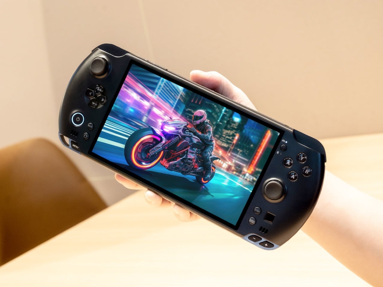
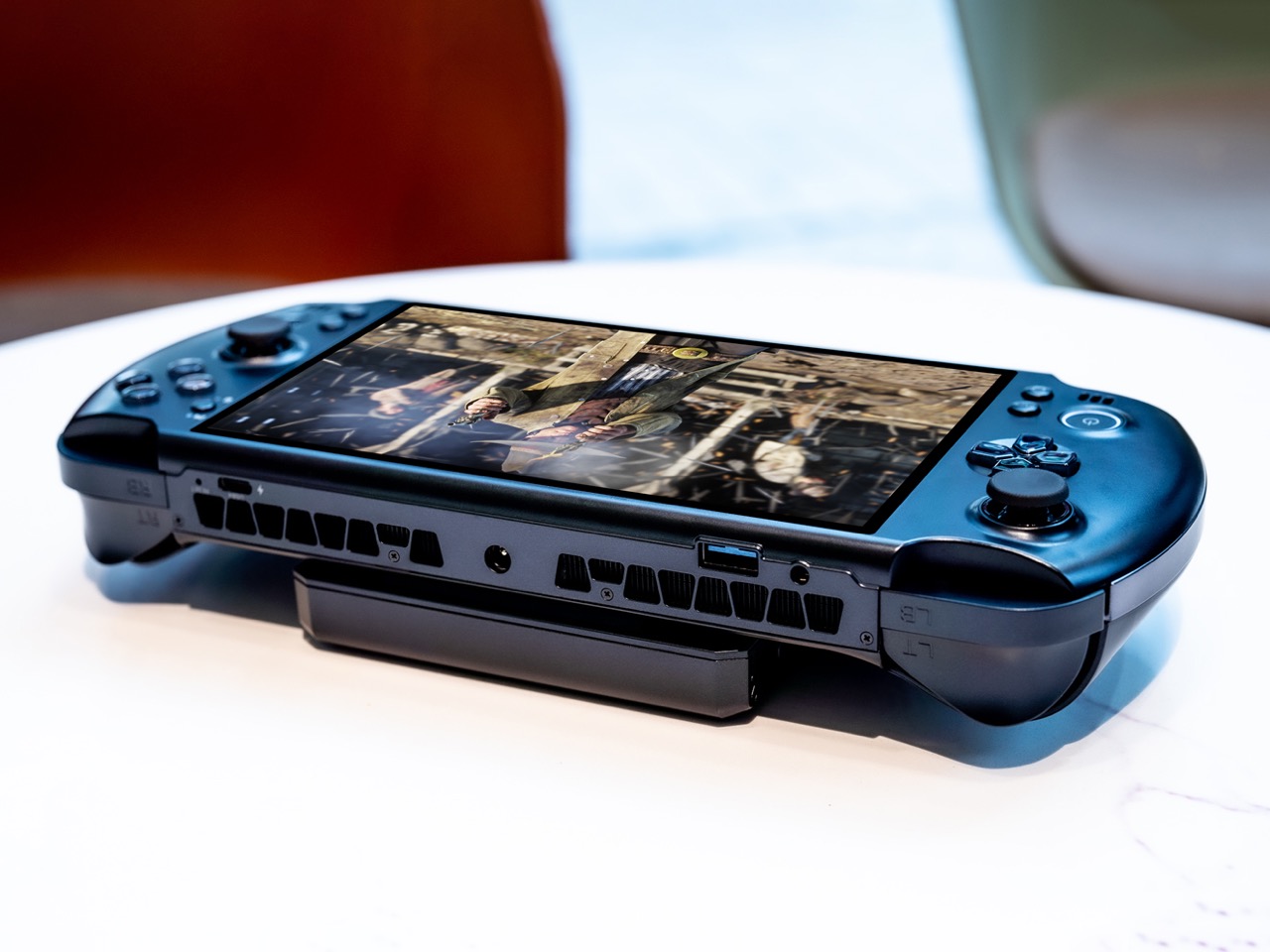
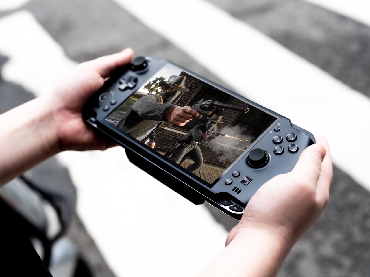
1. GPD Win 5

The PSP’s body plan endures, and the GPD Win 5 is its most ambitious descendant yet. Packed with an AMD Ryzen AI Max+ 395 processor, up to 4TB SSD storage, and 32GB of LPDDR5X RAM, this handheld runs a 7-inch 1080p display at 120Hz with Radeon 8060S integrated graphics. Starting at $1,400, this is not a portable console pretending to be a PC. It is a full PC compressed into two hands.

GPD removed the internal battery entirely, replacing it with a detachable 80 Wh pack that clips to the back. A quad heat pipe cooling system handles thermal loads across a TDP range from 28W to 85W on mains power. Hall effect triggers and capacitive joysticks eliminate drift and deadzone, while a proprietary Mini SSD slot pushes transfer speeds beyond microSD limits. Every design choice solves a problem created by one stubborn, central ambition: desktop-class performance in a handheld shell.

What we like

  • The external battery swaps in seconds, and plugging into the 180W adapter unlocks full 85W TDP performance that rivals many desktop setups.
  • Hall effect triggers and capacitive joysticks eliminate the drift issues that plague most handheld PCs after months of heavy use.

What we dislike

  • The external battery makes the device awkward to hold when attached, and the proprietary charger adds bulk to an already heavy travel kit.
  • Pricing starts at $1,400 and climbs past $2,000 for the top configuration, placing it deep into enthusiast-only territory.

2. NanoPhone Pro

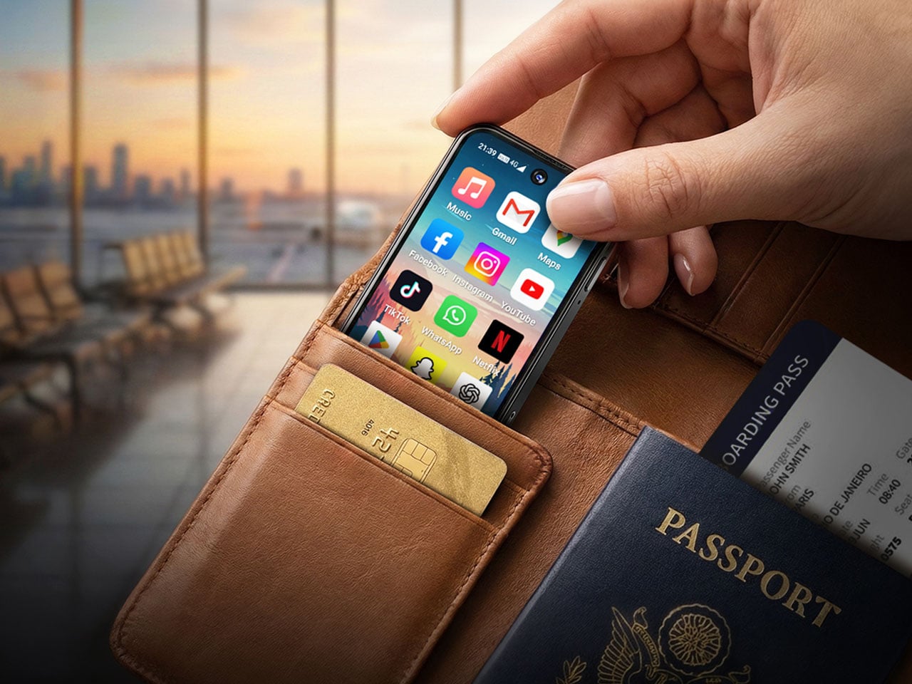
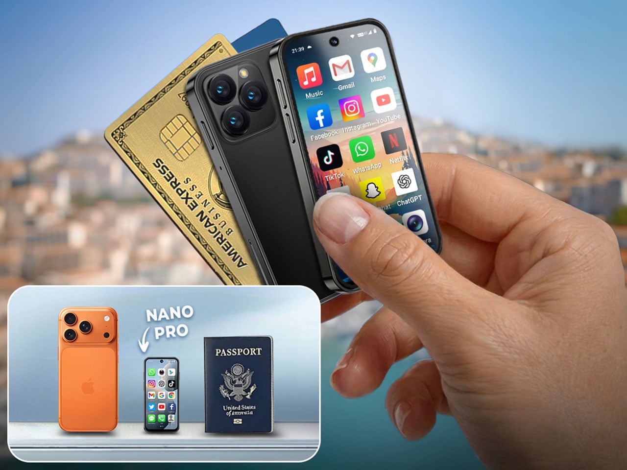
Smartphones have spent a decade getting bigger. The NanoPhone Pro walks in the opposite direction with a credit-card-sized body measuring 0.4 x 3.8 x 1.8 inches and weighing just 2.8 ounces. Running Android 12 with Google Play certification, this 4G device handles calls, messages, navigation, and basic apps without demanding pocket real estate. At $99, it is built for minimalists, travelers, and anyone tired of their phone being the loudest object in the room.

The spec sheet is an exercise in deliberate restraint. A 4-inch edge-to-edge IPS touchscreen, dual SIM support, 2MP front and 5MP rear cameras, a 2000mAh battery, and expandable storage via microSD. Face ID handles unlocking. The NanoPhone Pro does not pretend to compete with flagships, and that restraint is the entire point. It is a quiet, pocketable alternative that runs WhatsApp, Google Maps, and everything else that matters without the attention-hungry weight of a modern slab phone.

What we like

  • The credit-card form factor disappears into wallets and running shorts, making it ideal for situations where a full-sized phone feels like overkill.
  • Google Play certification means the app ecosystem works without sideloading, so daily essentials like navigation and messaging run without friction.

What we dislike

  • The 5MP rear camera produces images that are functional at best, making this a poor choice for anyone who photographs anything beyond the occasional note or receipt.
  • Android 12 on a 4-inch screen feels cramped, and typing requires patience and smaller-than-average fingers.

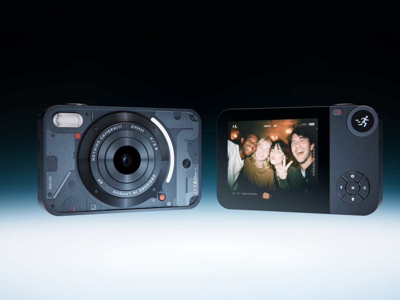
3. Camera (1)

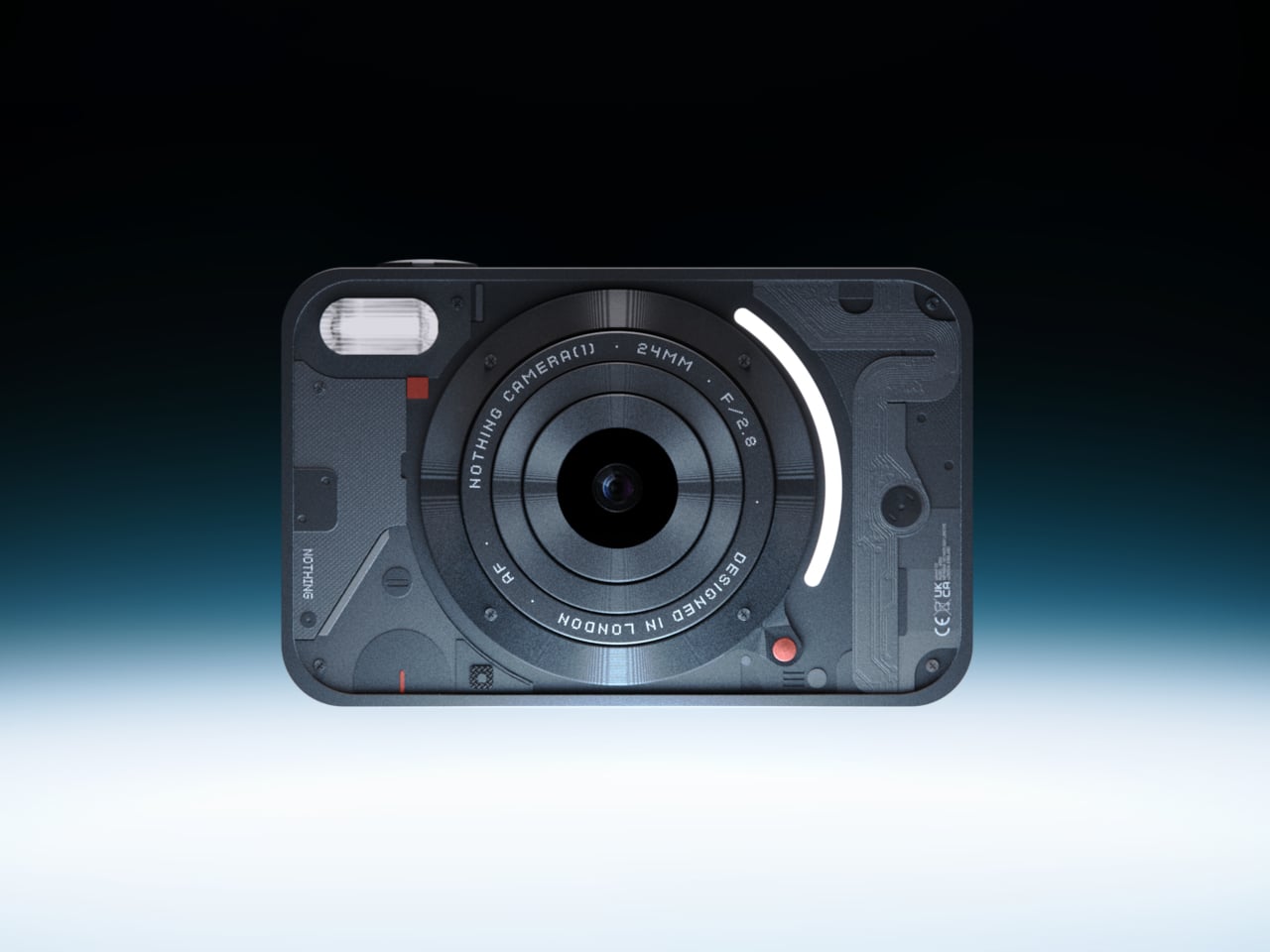
Photography migrated into phones and got buried under notifications. Camera (1), a concept posted on the Nothing Community forum by designer Rishikesh Puthukudy, imagines shooting as a tactile act again. The compact metal body fits a pocket but fills a hand, with all controls on a single edge: a shutter, a circular mode dial with a glyph display, and a D-pad reachable without shifting grip. The design draws from Nothing’s hardware-forward language with circuit-like relief and bead-blasted metal.

A curved light strip around the lens pulses for self-timers, confirms focus, or signals active recording. The engraved lens ring invites twisting rather than pinching. A rear display exists but stays deliberately out of the way, letting physical controls carry most of the interaction. Camera (1) is a student concept, not an official Nothing product, but the question it asks is worth sitting with: in a world where every screen demands something, what would a camera look like if it just wanted its user to notice what was in front of them?

What we like

  • The single-edge control layout keeps eyes on the scene rather than buried in menus, restoring a tactile shooting workflow that phone cameras abandoned years ago.
  • Nothing’s glyph design language translates well to a camera body, delivering mode feedback through simple icons rather than nested software screens.

What we dislike

  • As a concept, Camera (1) exists only as rendered images and community discussion, with no confirmed path to production or a working prototype.
  • The absence of a sensor, lens, and video specs makes it impossible to judge whether it could compete with even entry-level dedicated cameras.

4. Samsung Slac

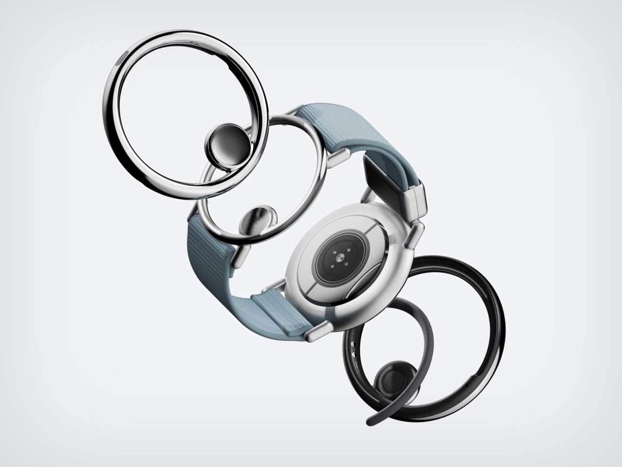
Earbuds have looked like earbuds for too long. Samsung’s Slac concept, developed within the company’s design incubation programs, reimagines wearable audio as jewelry. Three components make up the system: an open ear ring for audio output, a wrist-worn ring that tracks listening data and doubles as a magnetic dock, and a home charging station. The circular form wraps around the ear without entering the canal, maintaining awareness of surrounding sound while layering music on top.

When listening ends, the ear ring snaps magnetically onto the wrist component, transforming into something that reads as a chunky bracelet rather than stowed tech. AI tracks a full 24-hour audio cycle, building preference profiles from sound intensity, pitch variation, and tonal characteristics. The design team behind Slak understands that Gen Z treats audio devices as expressions of taste, not utilitarian tools. Whether Slac reaches production is an open question, but the proposition that wearable tech should earn its place on the body through aesthetics feels like a direction the entire industry needs to follow.

What we like

  • The open-ear design preserves environmental awareness while delivering audio, solving the isolation problem that makes traditional earbuds socially awkward in many settings.
  • Magnetic docking between ear ring and the wrist component eliminates the pocket-case fumble and turns storage into a wearable moment.

What we dislike

  • Concept status means no confirmed specs on audio quality, battery life, or connectivity, making it impossible to evaluate whether the sound matches the visual ambition.
  • Open-ear audio struggles in noisy environments, and without active noise cancellation, Slac may underwhelm on busy streets or public transit.

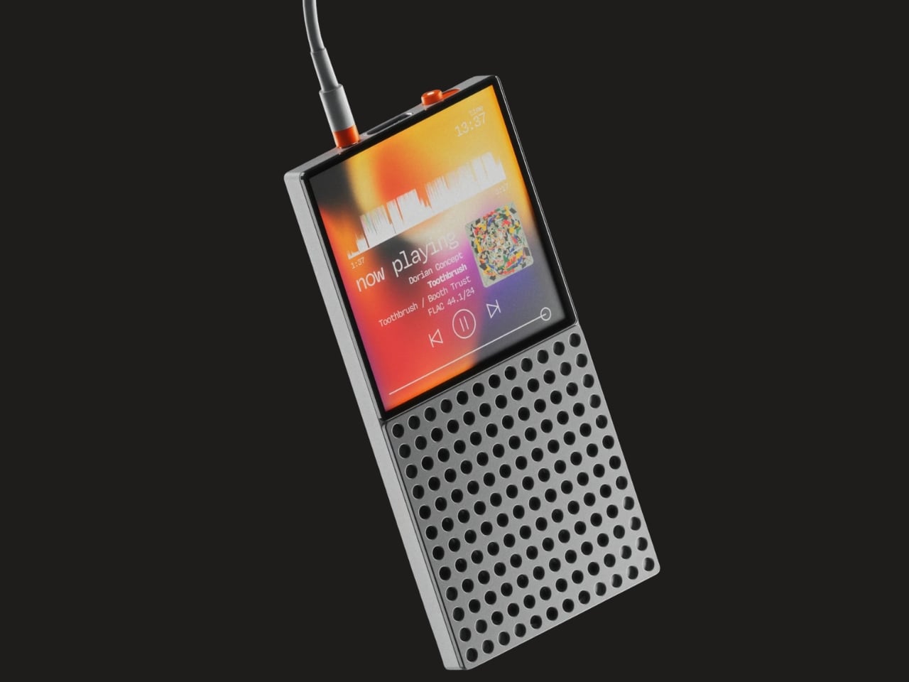
5. DAP-1

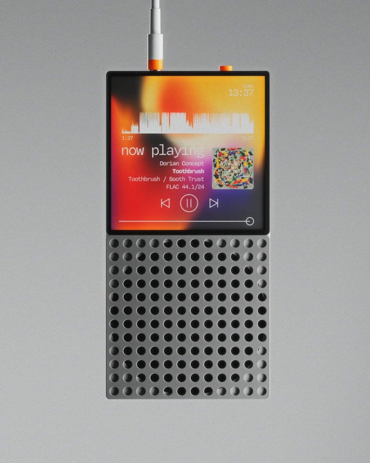
Vinyl got its comeback, and dedicated digital audio players have been staging a quieter return. The DAP-1 concept by Frankfurt-based 3D artist Florent Porta is one of the most compelling arguments for why that return matters. The device carries a slim rectangular body with an OLED touchscreen, a perforated front-facing speaker grille, and an aesthetic sitting between Teenage Engineering and Nothing’s CMF line. It looks like it arrived from a timeline where iPods evolved into something more considered.

The standout decision is the built-in speaker, a feature most high-end DAPs skip entirely. Porta’s inclusion acknowledges that music is sometimes shared, not just private. The DAP-1 is built around FLAC playback, preserving audio quality without streaming compression artifacts. A USB-C port, 3.5mm AUX output, and illuminated power switch line the top edge, while rubberized feet and torx screws on the rear give the device a repairable, tool-like quality. As a concept, it exists only in renders, but the conversation it starts outweighs most finished products on the market.

What we like

  • The built-in speaker turns a solitary listening device into something social, removing the need for external hardware to share a track with someone next to you.
  • FLAC-first design philosophy treats audio fidelity as the primary feature rather than an afterthought buried in a settings menu.

What we dislike

  • Concept-only status means no production timeline, no pricing, and no way to evaluate real-world audio performance beyond what renders suggest.
  • Dedicated music players occupy a narrow niche, and carrying a separate device for audio requires commitment most listeners will not make.

Where March leaves us

Three of this month’s five picks are concepts. That ratio says something about where consumer tech sits in early 2026: the most exciting ideas are still in render engines, while the products that actually ship tend to iterate rather than invent. The GPD Win 5 and NanoPhone Pro prove that real, purchasable hardware can still surprise, but Camera (1), Slac, and DAP-1 suggest the most interesting design thinking is happening outside production timelines and quarterly earnings calls.

What connects all five is a shared instinct to push back against the default. Against bigger screens, against feature bloat, against the assumption that technology should demand attention rather than earn it. March’s best gadgets respect the space they occupy, whether that space is a pocket, an ear, or the palm of a hand. If even a fraction of these concepts make the jump to production, the rest of 2026 could be far more interesting than the usual upgrade cycle suggests.

The post 5 Best Tech Gadgets of March 2026 first appeared on Yanko Design.
A Maker Just Built A Polaroid Camera for 100x Cheaper Using Thermal Receipt Paper

Remember when instant cameras were magic? You pressed a button, a mechanical whir filled the air, and moments later you were shaking a photo like it owed you money. Polaroid made photography feel like alchemy, turning light into physical memory right in your hands.

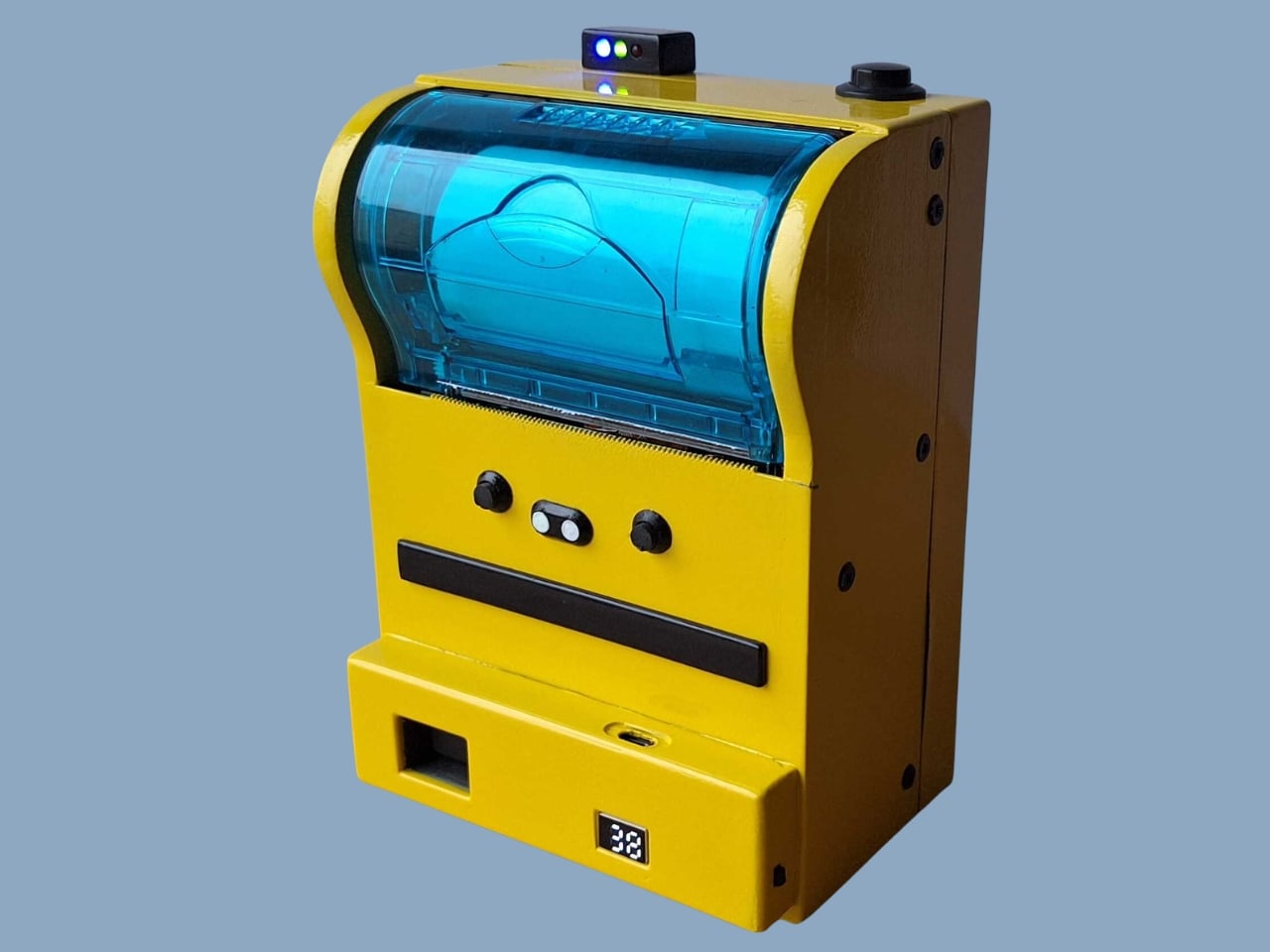
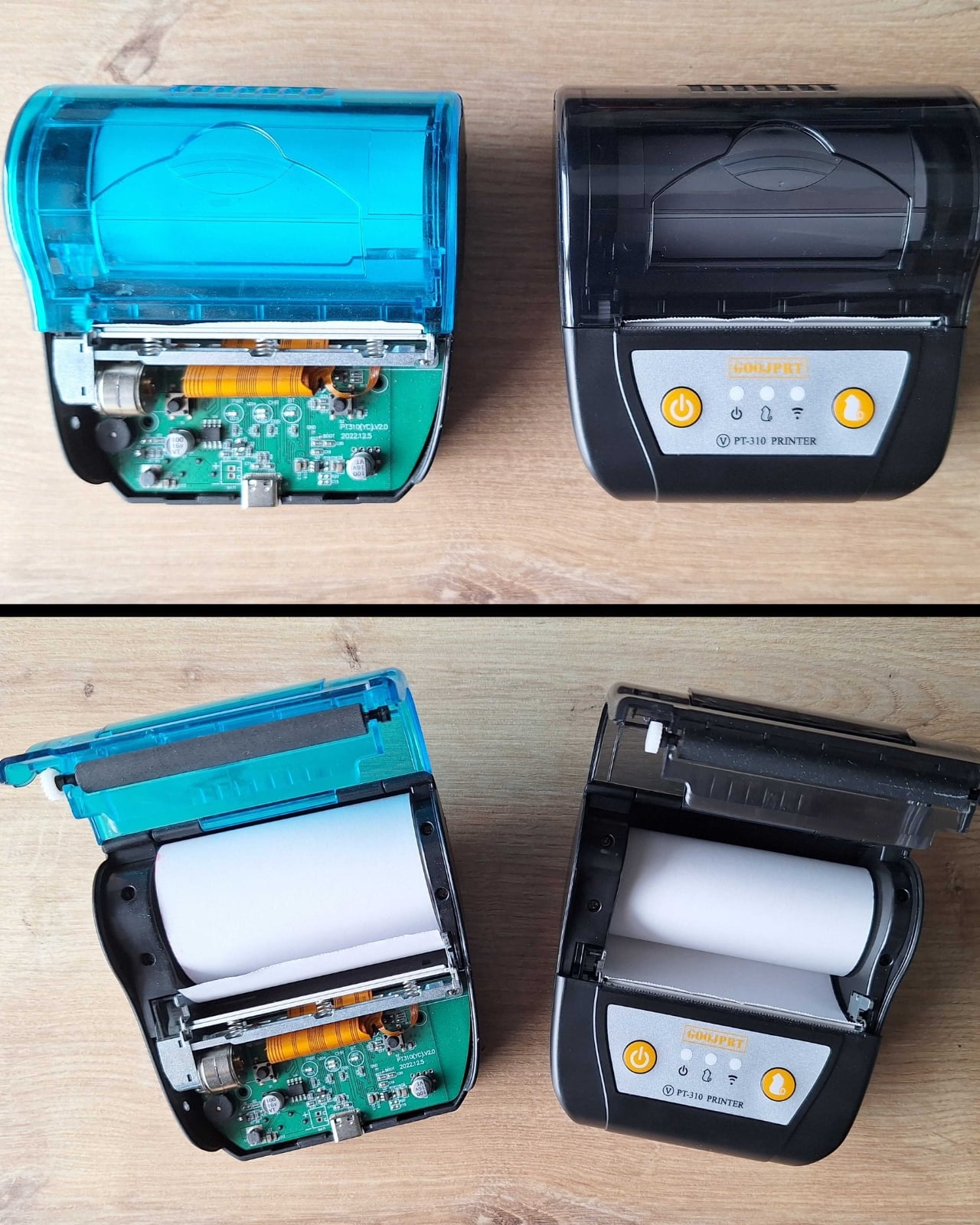
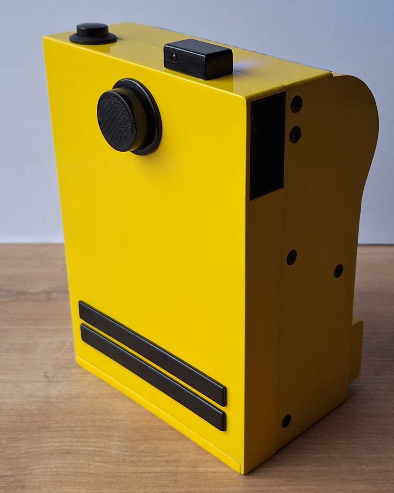
The Poor Man’s Polaroid by Boxart brings that instant gratification back using a thermal printer (the same kind that spits out your CVS receipts) and costs less than a cent per print compared to roughly a euro for each Polaroid picture. The name is a bit tongue-in-cheek since the parts actually cost more than the cheapest Polaroid cameras, but the creator clarifies it’s a “fun DIY project, possibly made by poor hands”.

Designer: Boxart

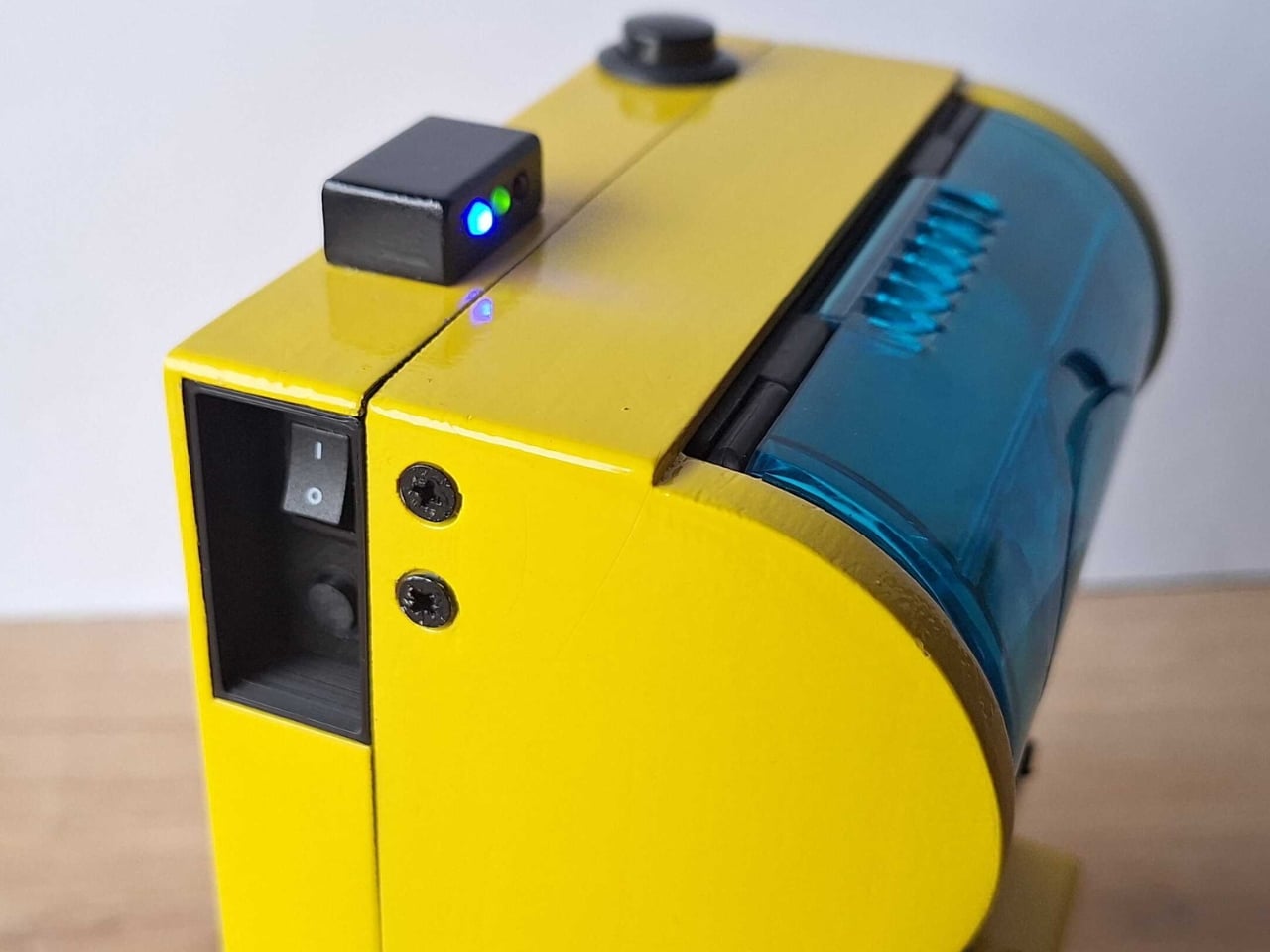
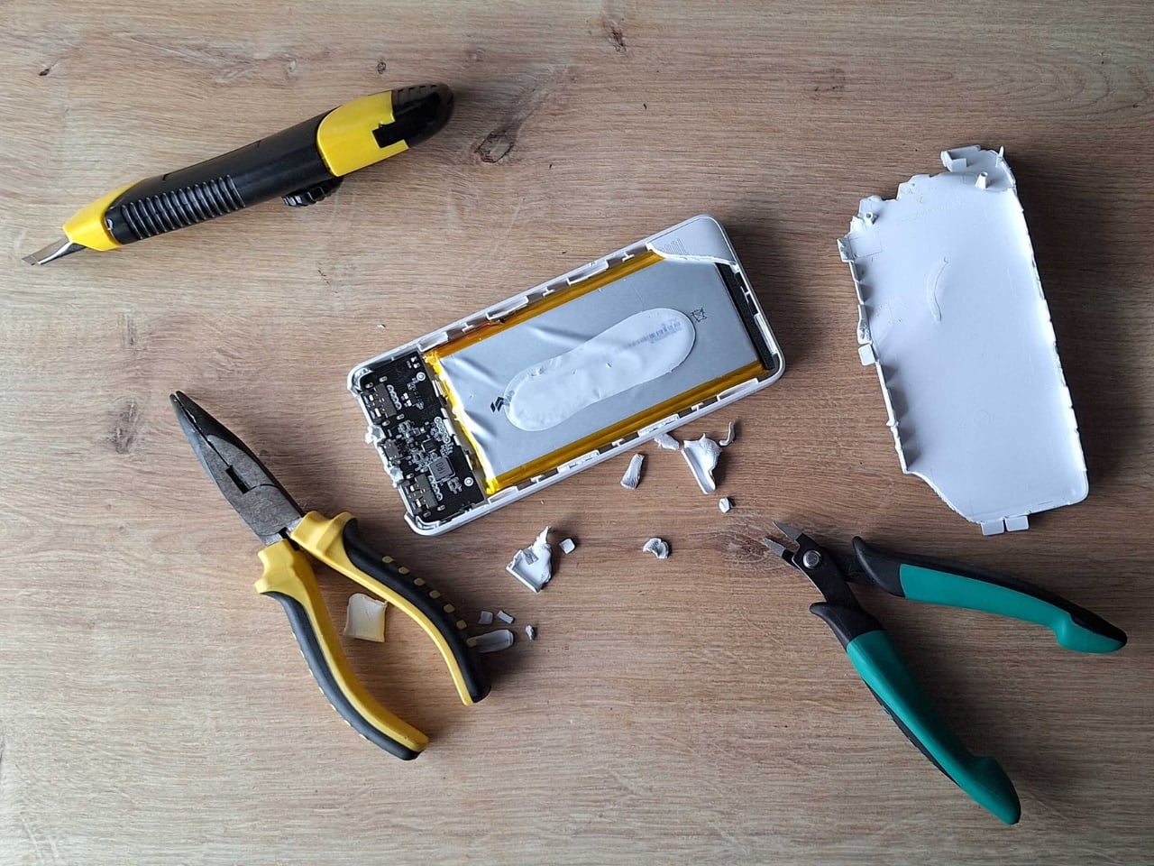
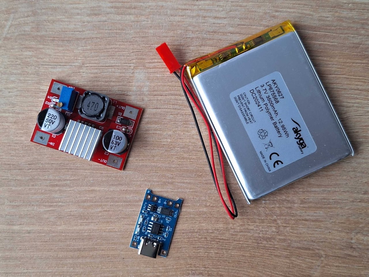
The whole setup is beautifully straightforward. A Raspberry Pi Zero and camera drive a receipt printer, all housed in a 3D-printed case with the guts of a power bank providing juice. Press the button, wait a beat, and out slides your photo on thermal paper. No film cartridges to buy, no wondering if you loaded it correctly, no accidentally exposing your entire pack to light.

Does the image quality match a real Polaroid? Not even close. The photos aren’t the same quality as self-developing film, but they have some charm to them. You get a not-very-good grayscale image on curly paper. But that’s kind of the point. The beauty of instant photography was never really about pristine resolution. It was about immediacy, about physicality, about having something tangible to pin on your wall or slip into someone’s hand.
This project lives in that sweet spot between nostalgia and practicality. Thermal paper might fade over time and the images might look like they came from a 1990s fax machine, but you can shoot hundreds of photos without bankrupting yourself. The economics are almost absurd when you compare it to authentic instant film, which has climbed to luxury pricing in recent years.

I love that this exists because it reminds us that the tools we carry don’t always need to be the most advanced or expensive. Sometimes the joy is in the making itself, in cobbling together a Raspberry Pi, a webcam, and a thermal printer to recreate something that used to cost hundreds of dollars and came from a factory. It’s technology as craft project, gadgetry as personal expression.

The curling thermal paper and grainy output might not win photography awards, but they capture something else: the spirit of experimentation that made instant cameras revolutionary in the first place. Edwin Land didn’t perfect the Polaroid overnight. He iterated, tinkered, and eventually changed how we thought about photography. Boxart’s version might use Python code instead of complex chemistry, but the impulse is the same.

What makes this project particularly appealing is its accessibility. The parts are 3D printed and the code is in Python, meaning anyone with basic maker skills can attempt it. You’re not locked into a proprietary ecosystem or dependent on a company that might discontinue your film stock. You own the entire chain of production, from capture to print.

Sure, you could buy cheap instant print cameras from import sites for less money. But where’s the story in that? Where’s the satisfaction of building something yourself, of understanding exactly how it works, of being able to modify and improve it over time? This isn’t just a camera. It’s a statement about what technology can be when we strip away the branding and the markup and the planned obsolescence.

The Poor Man’s Polaroid won’t replace your smartphone camera or even a proper instant camera if image quality is your priority. But it offers something more valuable: proof that with a little ingenuity and some off-the-shelf components, you can recreate the magic of instant photography on your own terms. And sometimes that curly thermal paper printout means more precisely because you built the machine that made it.

The post A Maker Just Built A Polaroid Camera for 100x Cheaper Using Thermal Receipt Paper first appeared on Yanko Design.