From Foldable Pilates to Shoe Robots: InnoX GCS 2026’s Best Startups

The consumer tech market has a crowding problem, mostly driven by products that try to do too much for too many people. The most interesting hardware lately has been doing the opposite, building around one specific inconvenience that hasn’t been properly addressed yet. Shenzhen has always had a knack for this, and InnoX Academy has been quietly developing the next generation of builders who make those products happen.

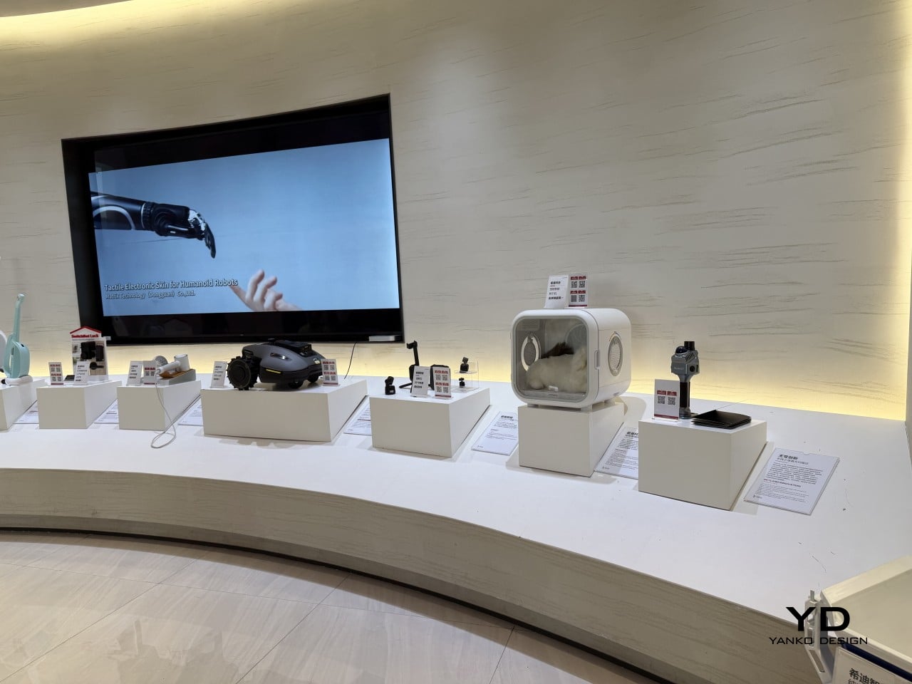
Founded in 2021 by Professor Li Zexiang of Hong Kong University of Science and Technology, Shenzhen InnoX Academy is a structured ecosystem that develops engineers and entrepreneurs into product builders. At the Global Connect Show 2026, it gave the world a look at its latest batch of startups, from home fitness and pet care to ambient design objects, each taking a more considered approach to a specific problem.
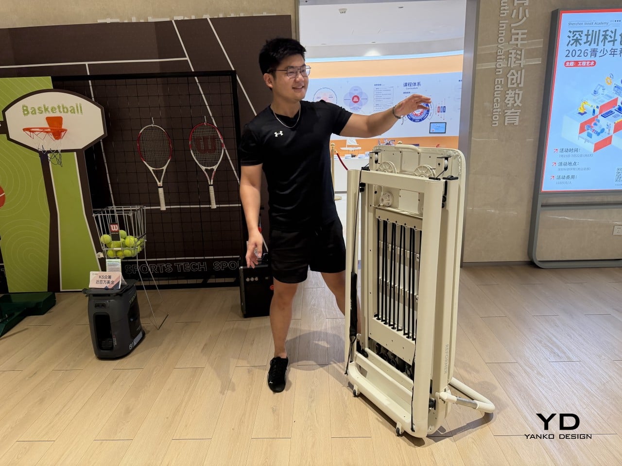
Pilates reformers have always been the kind of equipment you’d only find in a dedicated studio, too large and bulky for most apartments to accommodate. Pavo Fitness, started by a team of architects, industrial designers, and professional Pilates instructors, saw that as a solvable problem. The Pavo Reformer is their answer: a compact, foldable machine designed to bring studio-quality resistance training into a regular home.

Designer: PAVO

Once a session is done, it packs away without being disassembled or moved to a corner, so it doesn’t have to become a permanent fixture in your living space. The onboard smart system keeps tabs on workouts, which matters more in a home setting where there’s no instructor watching your form. It adds a layer of accountability that a conventional reformer simply can’t offer.


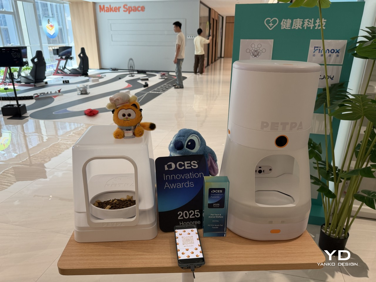
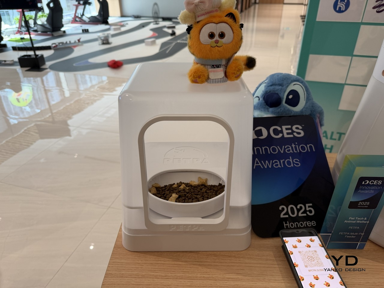
Multi-pet households have a feeding dynamic that most smart feeders don’t actually address. A timed dispenser works for one pet, but when multiple cats have different dietary needs, scheduling meals is only part of the problem; the harder challenge is making sure each cat only gets its own food. That’s what PETPA was built to solve, by a team that previously worked on hardware at DJI, Narwal, and RoboMaster.
Designer: PETPA

The PETPA Multi-pet Feeder uses individual pet recognition to identify each cat and control access to their food, particularly useful in homes where one cat needs to lose weight or follow a prescription diet while the others don’t. It launched at CES 2025 and earned a CES Innovation Award in the Pet Tech and Animal Welfare category, recognizing a product solving a problem most smart feeders still overlook.
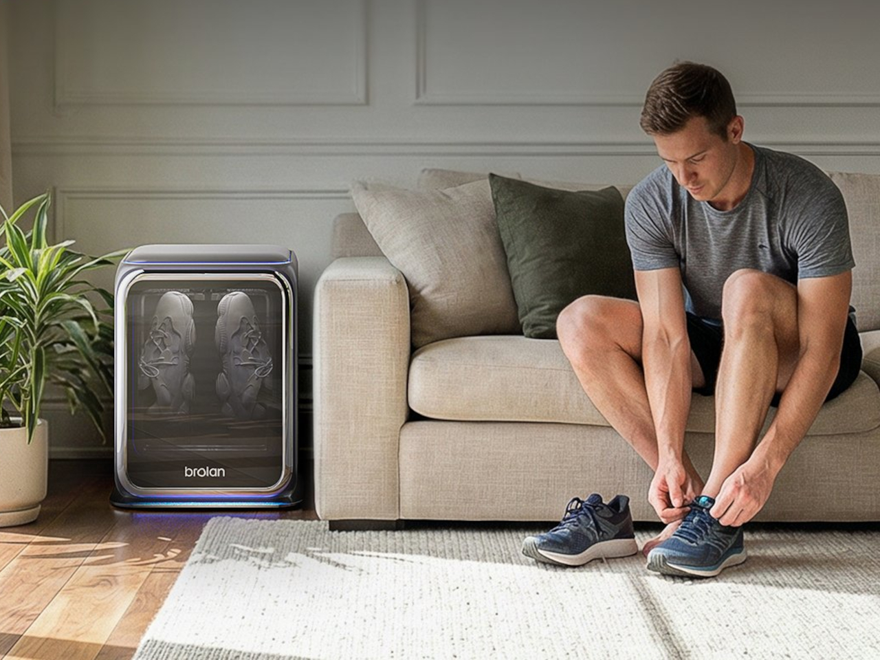
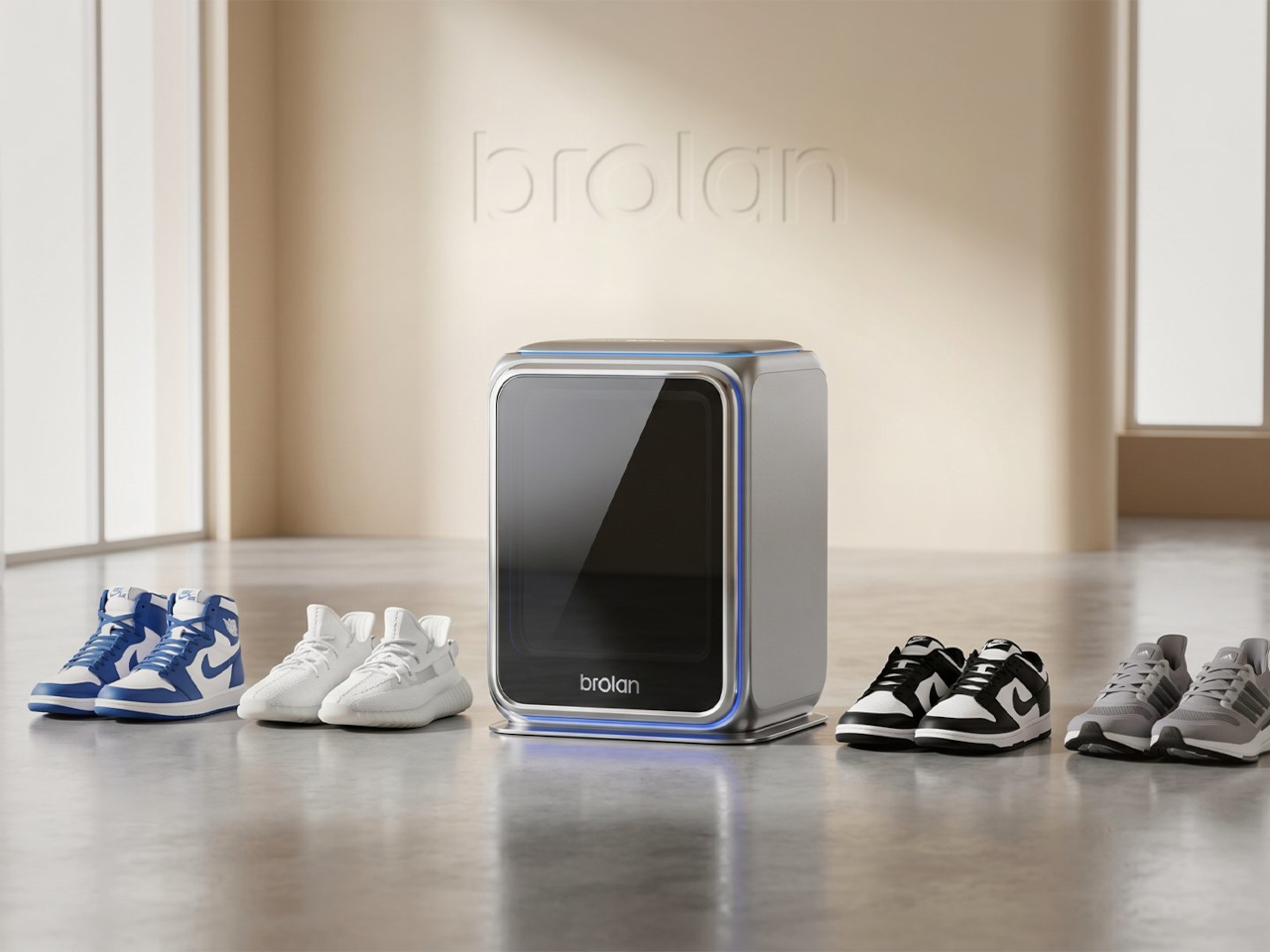
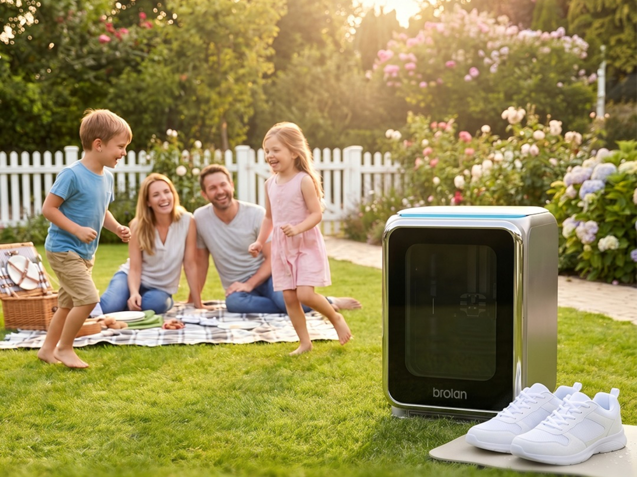
Sneaker care has evolved into its own dedicated ritual for collectors and sports enthusiasts who’d rather not take chances with a stiff brush and soapy water. The typical cleaning routine still carries the risk of fading colors, weakening materials, or warping the structure of more delicate footwear. Brolan’s ClearX is a compact home machine that moves through cleaning, low-temperature drying, and sterilization all in one automated cycle.
Designer: Brolan

Founded in 2025 by a team drawing from Nanyang Technological University, Harbin Institute of Technology, and Tsinghua University, Brolan designed ClearX specifically to clean without the harshness of manual scrubbing. The idea is to get footwear thoroughly clean without putting materials at risk, which matters most for anyone who owns suede, knit, or premium leather shoes that even a careful hand-wash can easily ruin.
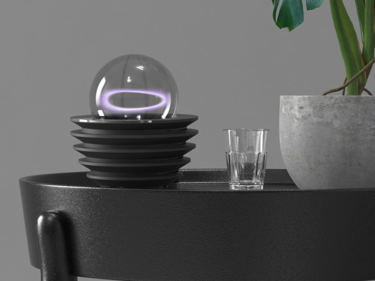
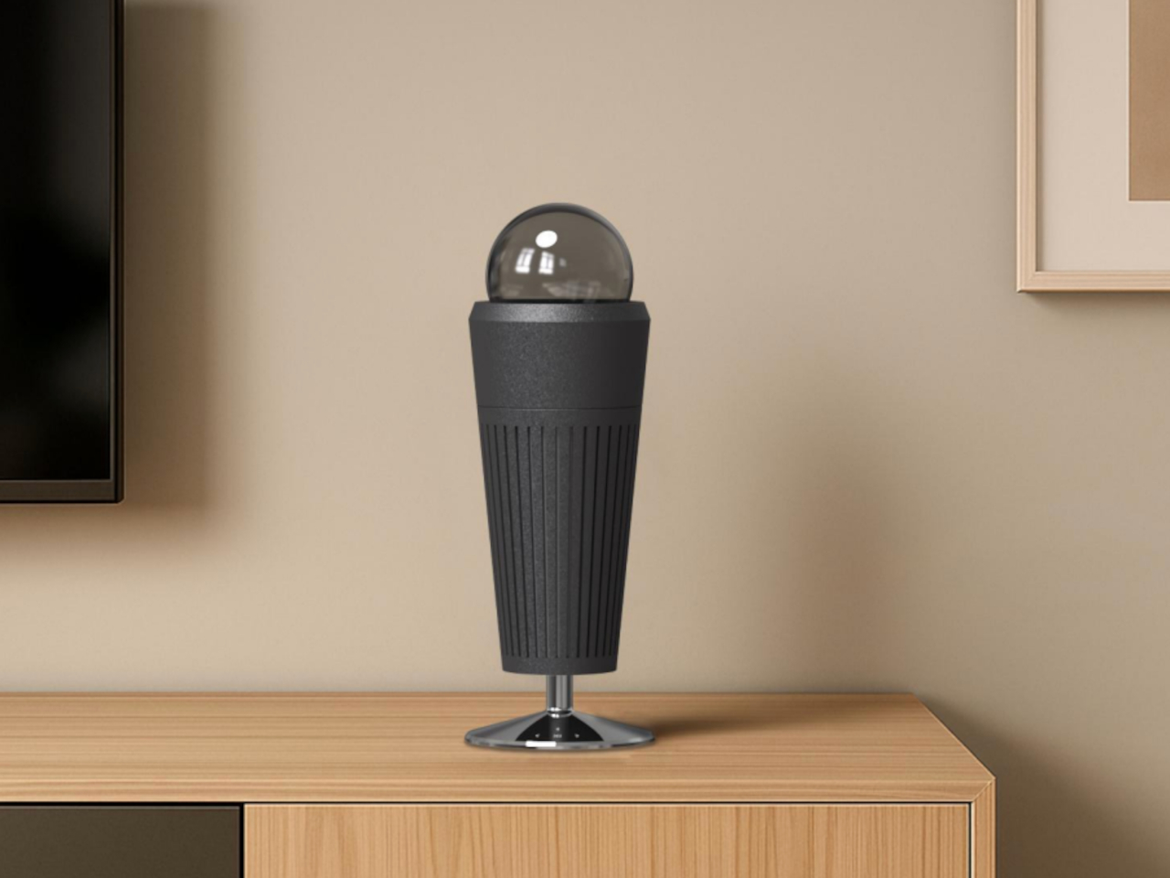
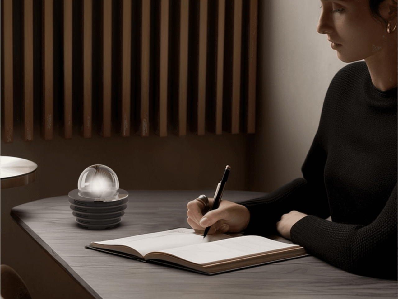
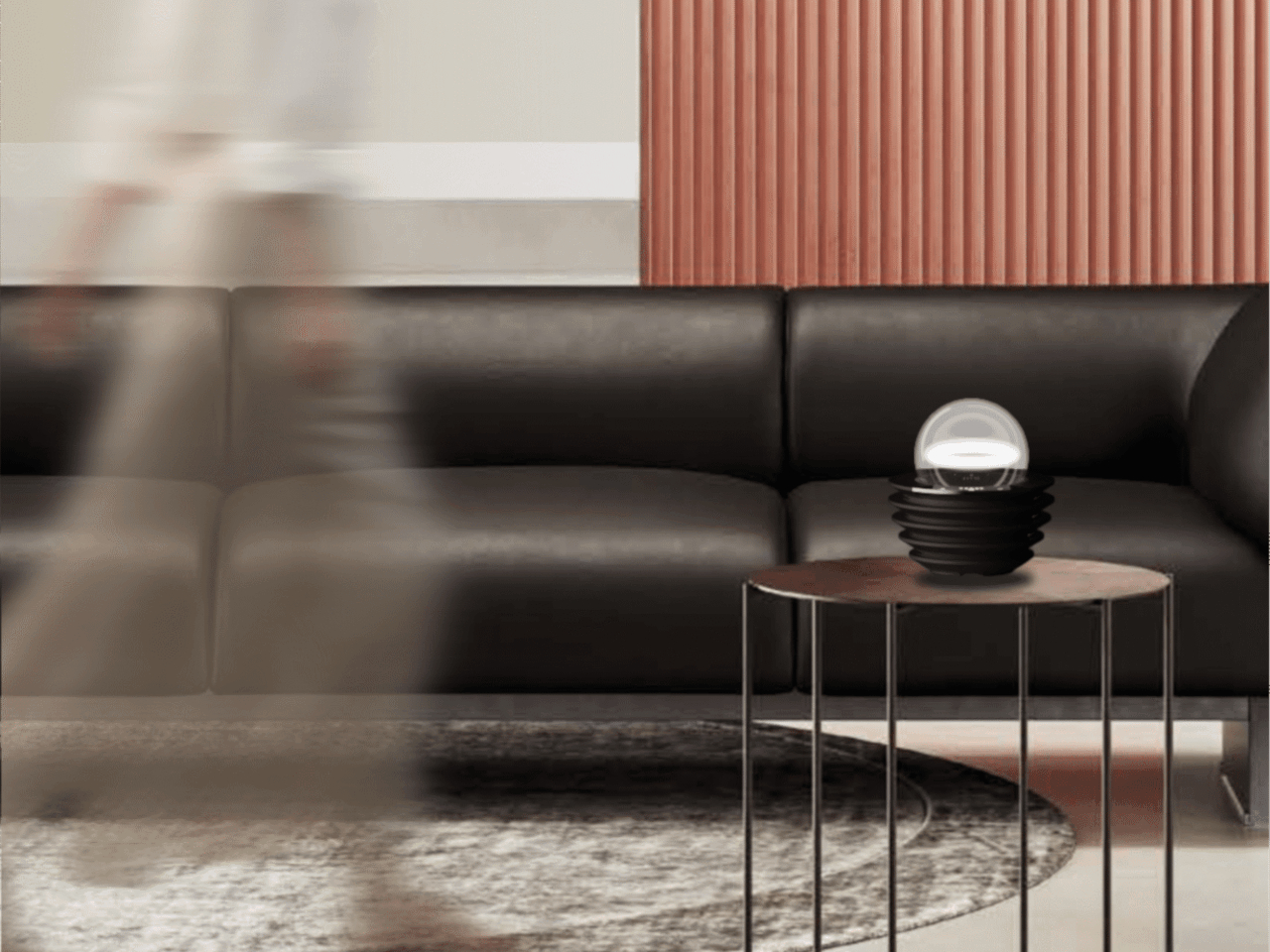
Not everything in the InnoX lineup is about automation or performance tracking. REAZENABLE takes a different direction with the REAZE Sandstone Series, a collection that sits somewhere between smart lighting and decorative object, aimed at people who’d rather their home feel calmer than more connected. The brand’s philosophy, technology empowering nature and light reshaping emotion, gives a clear sense of where its priorities are.
Designer: REANZENABLE

The collection includes the Halo light and three aroma vessels, all made from sand-based materials and shaped with ribbed surfaces that recall an uneven lunar landscape. The technical structure is deliberately concealed within those soft architectural forms, so nothing on the shelf reads as a gadget. Atmospheric light, mineral textures, and scent work together into something that feels more like a ritual object than a piece of hardware.
Several other InnoX startups addressed more personal routines. Rootique brought the DUO, a scalp atomizing applicator using patented DuoTrace and IntelliMist technology for precise serum delivery in about 15 seconds, already validated through an Indiegogo campaign that found backers across 52 countries. OCJOY presented the OCJOY Air, a home micro-air oral cleaning system that brings a water-air-powder cleaning method from dental offices to your own countertop.
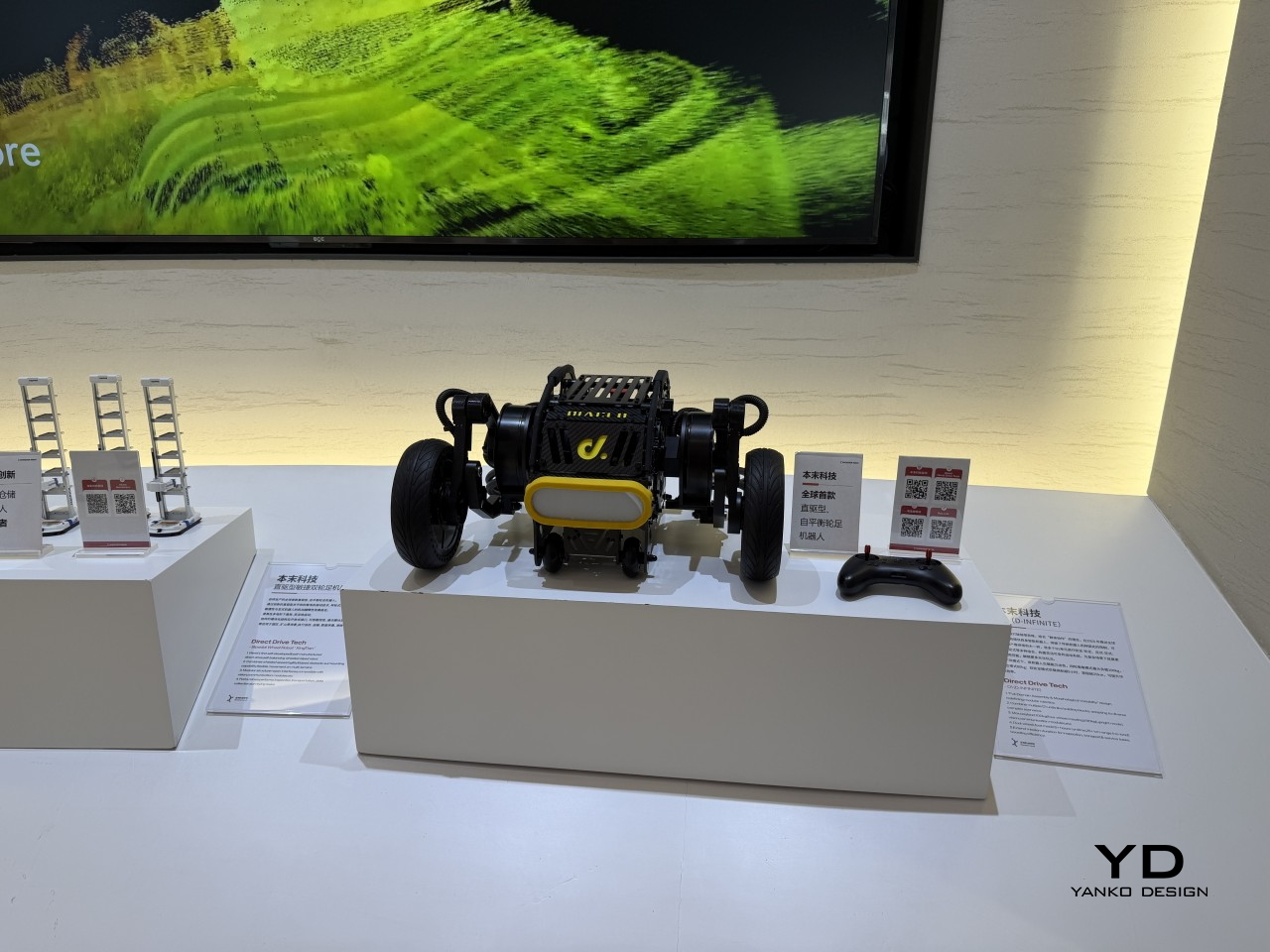
Direct Drive Tech D1

The lineup stretched into less expected territory, too. Blucalm’s StrikeDeck delivers AI-assisted game audio through a desktop controller, while ORULINK’s Watcher-Robot is an open-source desktop AI companion built for everyday interaction. CHEERLUCK brought a sausage vending robot for campuses and public spaces, and both Y-H2O and ANAVI presented electric watercraft, a hydrofoiling vessel, and a smart personal watercraft, each designed to cut the noise and emissions of traditional marine engines.
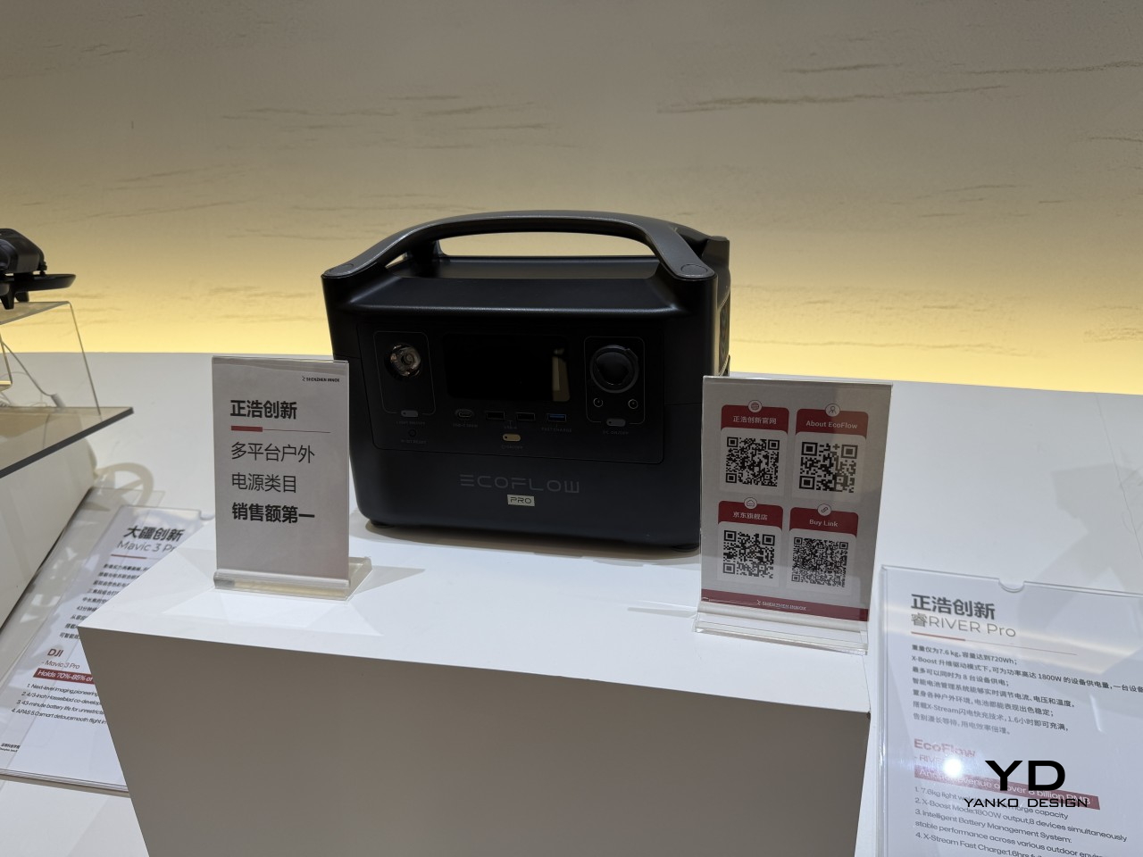
EcoFlow
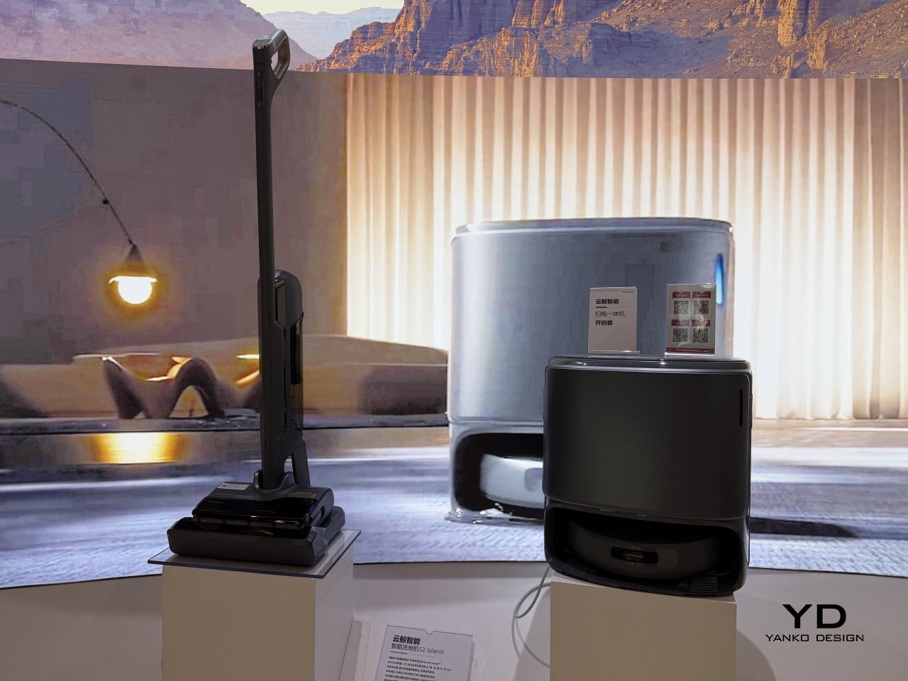
Narwal

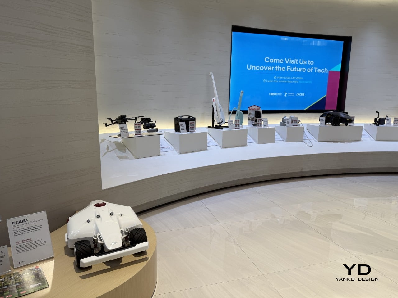
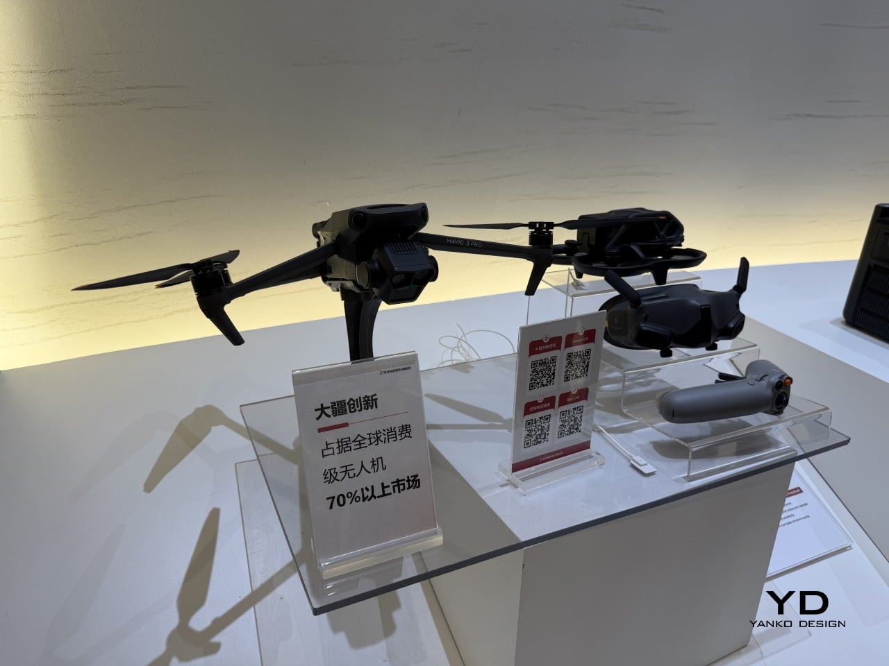
What gives the InnoX lineup credibility beyond the show floor is the academy’s broader history. Brands like Narwal, SwitchBot, DJI, EcoFlow, AgileX, and LiberLive are all part of InnoX’s wider ecosystem, a track record that makes it worth paying attention when the academy’s latest batch of incubated products steps out in front of an international audience for the first time.
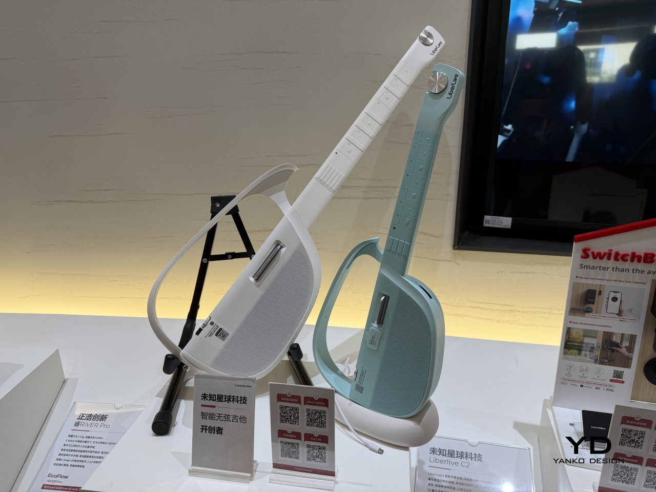
LiberLive
DJI

The post From Foldable Pilates to Shoe Robots: InnoX GCS 2026’s Best Startups first appeared on Yanko Design.
The 6.5-Meter See-Saw Sculpture Sydney Can’t Stop Talking About

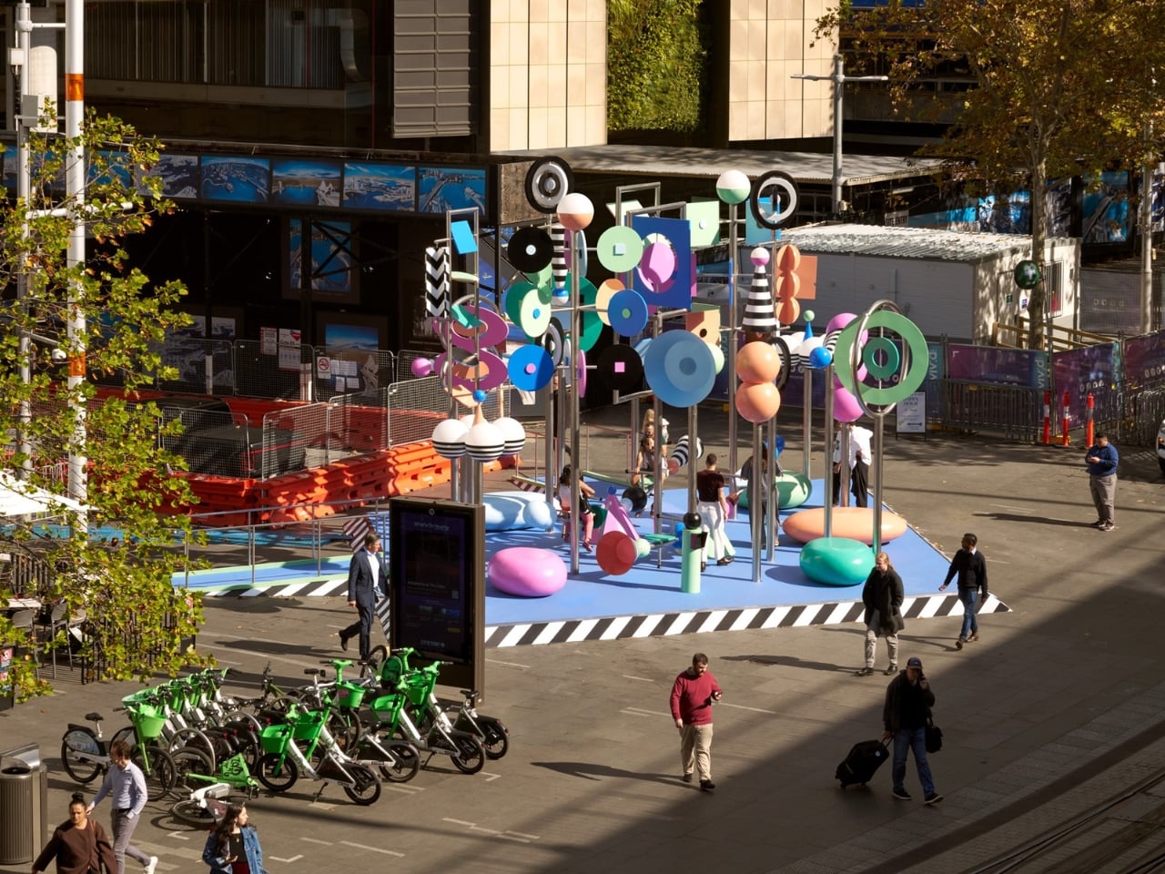
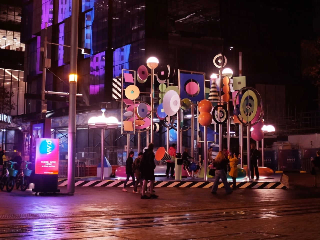
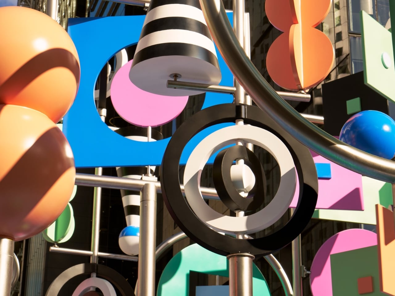
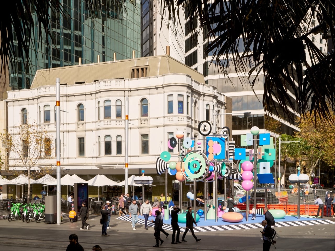
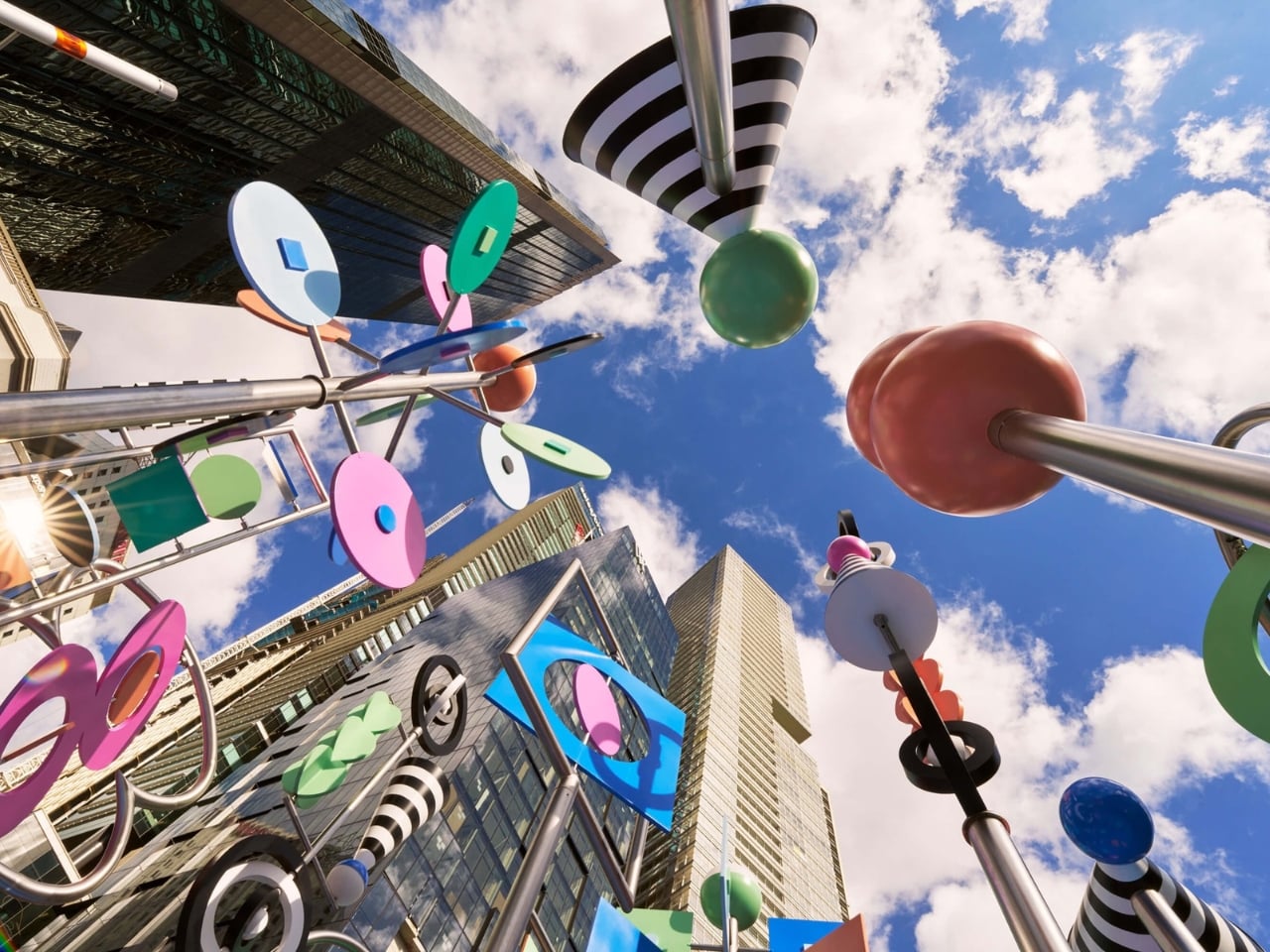
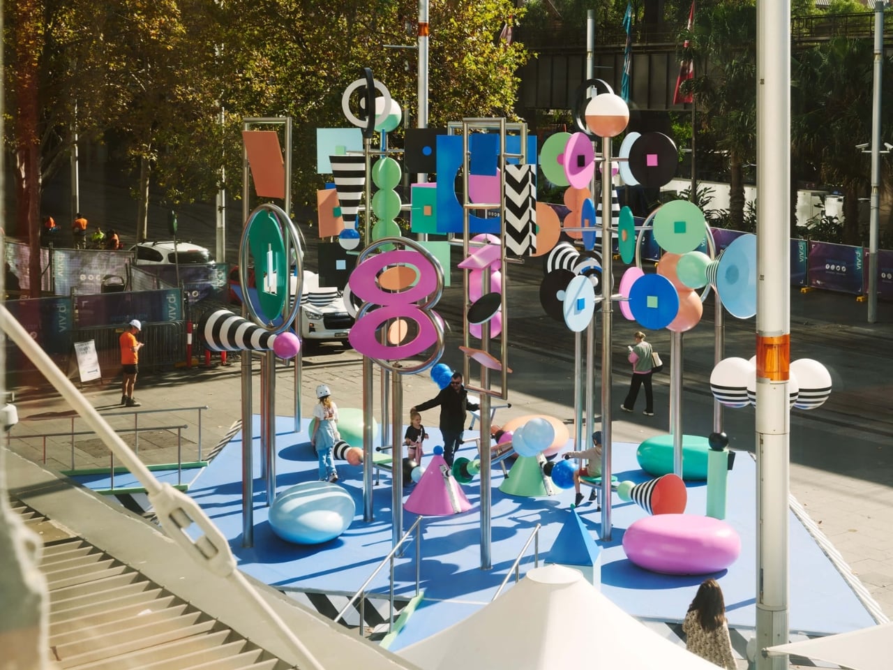
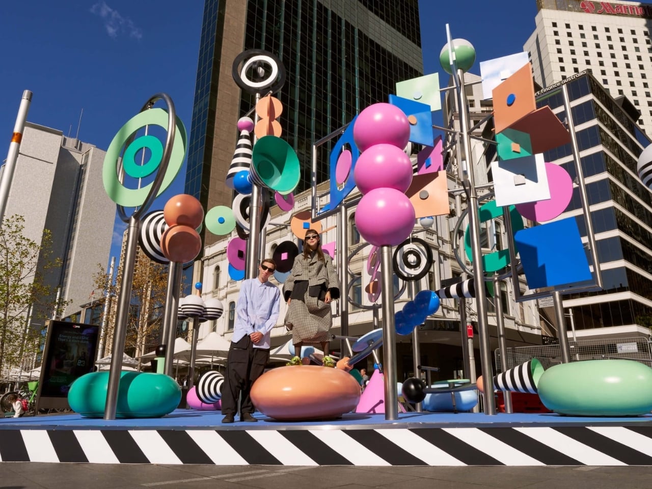
Public art often asks you to stop and stare. There, Now, Here asks you to grab a see-saw and get involved. At 6.5 meters tall, the kinetic installation from Brooklyn-based duo Wade and Leta is currently spinning, twirling, and tottering through Vivid Sydney at Circular Quay. It moves thanks to a combination of wind, motors, and willing passersby who hop on the see-saw built into its structure. The result is a sculpture that is never quite the same twice, always catching new angles of light, always mid-motion, always alive in the truest sense of the word.

That’s the kind of public art I love to see. Not something roped off and reverent, demanding a certain posture of appreciation, but something that genuinely asks the city to participate. When you can physically change the state of a piece of art just by sitting down and pushing off the ground, the line between audience and author starts to blur in the best possible way. Most public installations settle for being looked at. This one wants to be felt. That distinction matters more than it might seem.

Designers: Wade and Leta

The colors don’t just look good. They mean something. Wade and Leta pulled their palette from Dorothea Mackellar’s 1908 poem “My Country,” one of the most celebrated pieces of Australian writing and a poem many Australians know by heart. Mackellar’s famous “sunburnt country” inspired the installation’s muted, washed-out tones and black and white stripes, and the whole effect reads like a love letter to the Australian landscape written in a purely visual language. Two New York designers traveled to the other side of the world, studied a century-old poem, and turned it into spinning kinetic sculpture. That’s not lazy work. That’s genuine creative homework, and it shows.

Then there’s the sound component, designed by Josh Burgess, which takes the concept somewhere even more interesting. It captures the sonic texture of Circular Quay itself: the rush of water on rocks, the ding of the light rail, the chirp of the pedestrian crossing signal. Visitors can manipulate these sounds through accessible controls built into the installation, making the experience as interactive as you want it to be. But the lyrebird is the detail that really lands for me. Wade and Leta describe it as a nod to the “bush doof,” with the lyrebird’s sounds serving as the structural backbone of the whole audio experience. The lyrebird, for anyone unfamiliar, is an Australian bird so extraordinary at mimicry that it can replicate chainsaw sounds, camera shutters, and other birds with unnerving accuracy. Using one to anchor a soundscape about place and memory is not just a quirky design choice. It’s a quietly sharp observation about how culture and environment echo through each other in ways we haven’t always quite put into words.

Wade and Leta, the husband-and-wife creative studio known for large-scale work that balances rigorous design thinking with an almost giddy sense of play, are making their first public debut in Australia with this piece. As debuts go, it’s a confident one. Circular Quay is not a quiet corner of the city. It’s high-traffic, high-stakes public space, the kind of place where installations either disappear into the surrounding noise or assert themselves with real authority. There, Now, Here asserts itself. It doesn’t compete with the harbor for attention. It earns it.

Vivid Sydney has a strong track record of pulling in impressive international talent, but this feels like more than a festival commission. It feels like a genuine conversation between two outsiders and a place they took the time to understand, between movement and stillness, between a Brooklyn studio and the Australian bush. The title says it all in just three words. You don’t have to be from somewhere to make work that genuinely honors it. You just have to pay attention. The installation runs as part of Vivid Sydney’s 2026 program at Circular Quay. If you’re anywhere near it, go ride the see-saw.

The post The 6.5-Meter See-Saw Sculpture Sydney Can’t Stop Talking About first appeared on Yanko Design.
Translation, Prompting, Agentic AI, all in 40 grams: iFLYTEK’s Smart Glasses Debut at BEYOND Expo 2026

Beyond Expo 2026 arrived with a clear message for the tech world, AI has moved past the screen and into the objects people wear, hold, and live with every day. Our own preview of the show framed this year’s edition as a turning point, arguing that AI software was only the warm-up for what the industry was really building toward. The event ran from May 28 to 30 at The Venetian Cotai Expo in Macau, centered on the theme of AI moving from digital to physical. That theme played out across robotics, smart machines, wearable intelligence, and real-world utility products on the show floor. It set up exactly the kind of environment where a product built around ambient AI communication could land with real meaning.

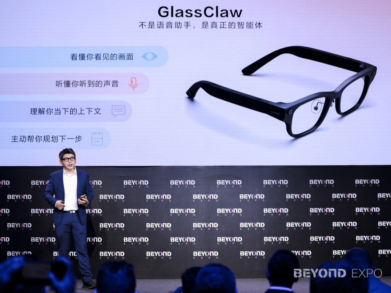
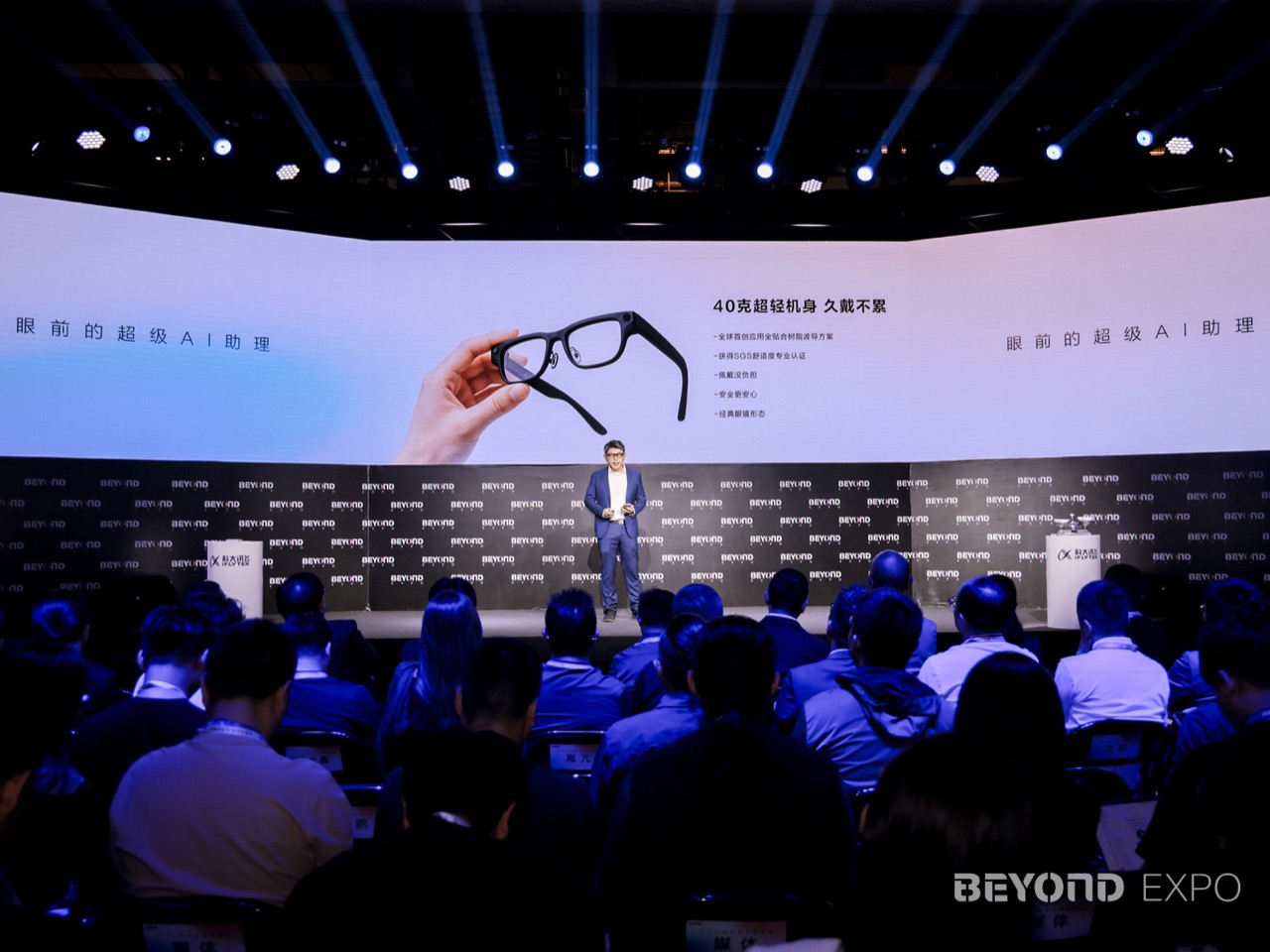
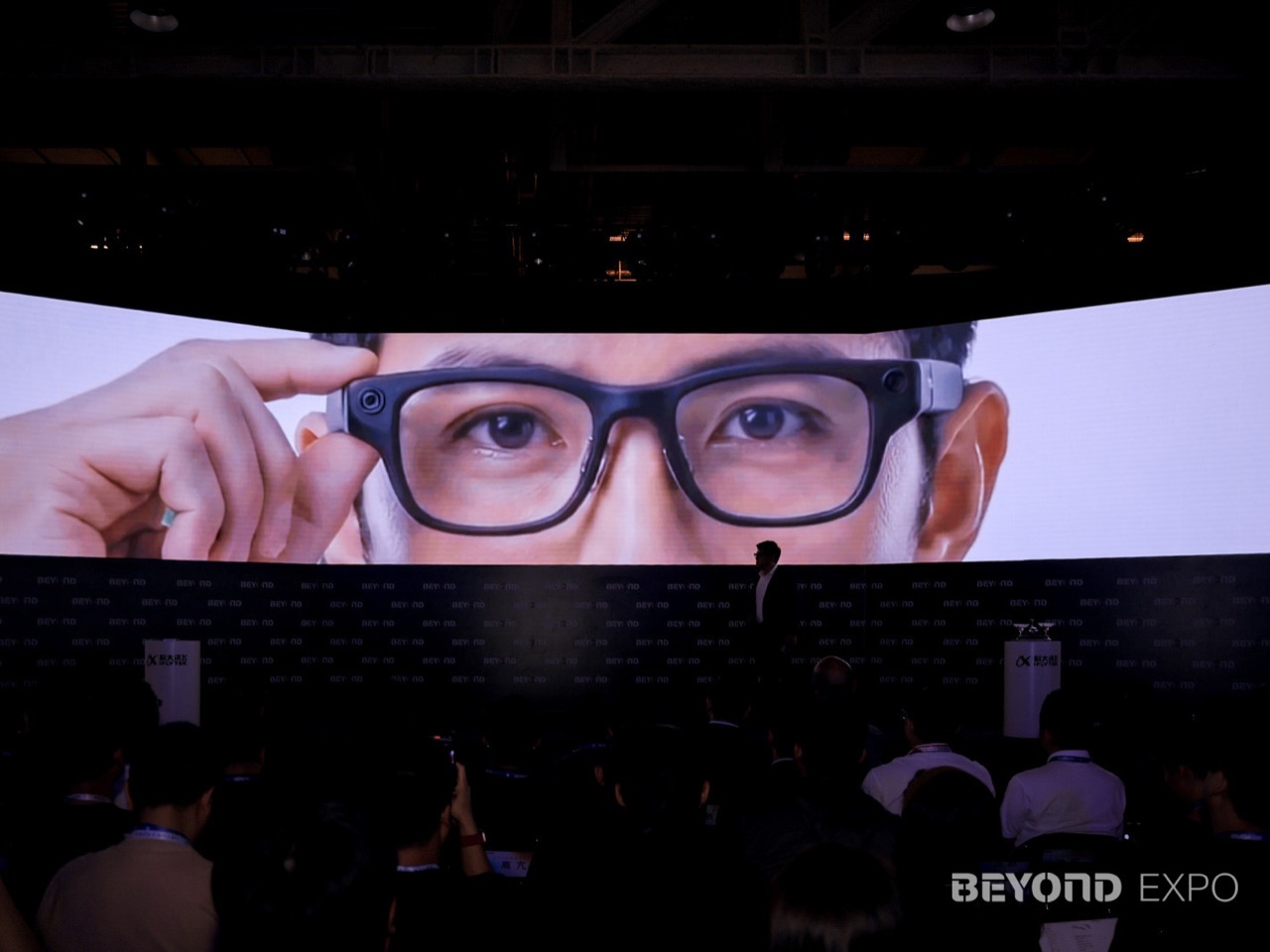
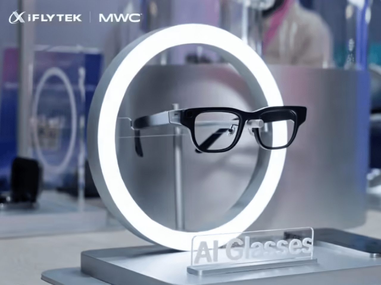
That made Macau the perfect stage for iFLYTEK’s AI Glasses, a 40 gram wearable built around communication, translation, and ambient intelligence. Announced at BEYOND Expo 2026, the glasses pair a lightweight magnesium-aluminum frame with a resin waveguide display, real-time translation, teleprompting, advanced noise recognition, and the GlassClaw AI agent, all wrapped into a device designed to keep information in sight and conversation in flow. iFLYTEK, the Shenzhen-listed AI company founded in 1999 and best known for its speech and language technology, framed the launch under the theme “Communication Without Boundaries, the World Before Your Eyes.” For a company whose core competency has always been understanding and generating human language, a glasses product aimed at communication is a logical next step. The pitch is a strong one: AI belongs in the line of sight, ready when you need it, invisible when you do not.

Designer: iFLYTEK

Getting a display, waveguide, processing stack, and speaker array under 40 grams in a glasses form factor is not a given, and the material choices iFLYTEK made to hit that number tell most of the hardware story. The frame uses an aerospace-grade magnesium-aluminum alloy, keeping the structure rigid without the front-loaded weight that makes smart glasses genuinely uncomfortable after twenty minutes. The display runs on a resin waveguide paired with a customized micro-optical module, a combination chosen to balance visual quality against physical footprint. Ergonomic adjustments calibrated specifically to Asian facial structures add another layer of intent, signaling that the wearability goal goes beyond a marketing claim. That kind of constraint-driven design work is what separates a considered wearable from a concept render that happens to ship.

GlassClaw, the AI agent built into the glasses, handles the intelligence layer across multiple modes (not related to OpenClaw). It captures conversations, generates AI meeting summaries, enables full-scenario real-time translation, and pulls in life services, functioning as a persistent contextual companion rather than a novelty voice assistant. The teleprompter feature stands out from a practical design standpoint, giving the glasses a repeatable use case in presentations, live video, and multilingual business settings. Advanced noise recognition ties the system together by giving the speech-processing layer a cleaner audio signal in conference halls, trade floors, and the ambient chaos of travel. iFLYTEK’s deep history in speech AI means the noise handling and translation accuracy are the features most likely to determine whether these glasses earn daily wear.

The iFLYTEK AI Glasses are priced at 4,299 yuan, roughly $635, with presales beginning June 15. iFLYTEK also staged an ecosystem partner forum at the expo alongside Sunny Optical, Wanxin Optical, and Conant Optics, treating the launch as the beginning of a product line rather than a one-time debut. For a product category that has struggled to articulate a daily reason to exist, iFLYTEK’s communication-first positioning is a credible answer. The Ray-Ban Meta glasses proved that lightweight wearable audio could build a real user base when the form factor stopped fighting the face, and iFLYTEK is making a similar bet with a display and translation stack on top. At 40 grams, with a clear professional use case and a company whose entire identity is built around understanding human language, these glasses have the ingredients to matter.

The post Translation, Prompting, Agentic AI, all in 40 grams: iFLYTEK’s Smart Glasses Debut at BEYOND Expo 2026 first appeared on Yanko Design.

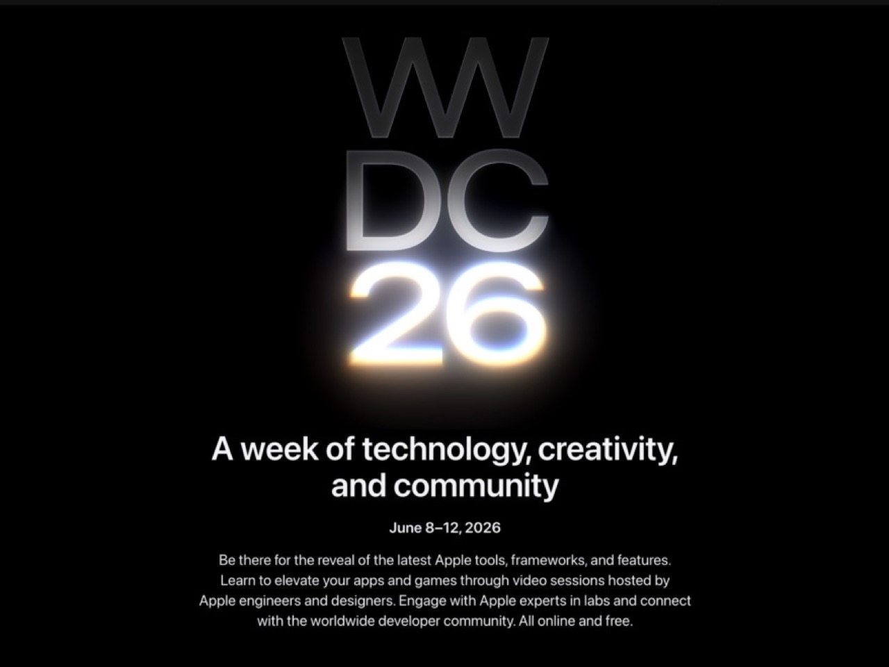
WWDC 2026: iOS 27, macOS 27 and the New Siri App — What to Expect June 8

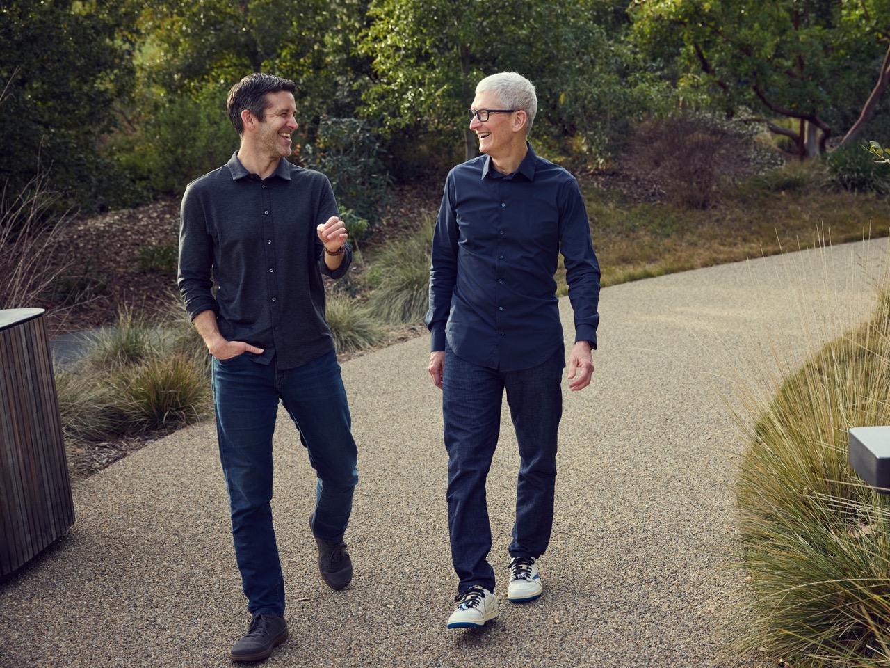
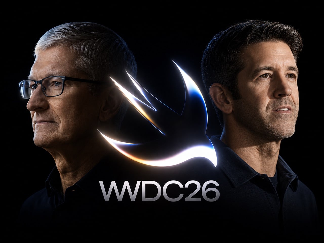
Steve Jobs built Apple on the idea that hardware and software had to be designed as one thing, inseparable and mutually reinforcing. Tim Cook, who took over in 2011 with the company at roughly $350 billion in value, honored that philosophy while adding an operational layer Jobs never had the patience for: supply chains so resilient they made Apple virtually recession-proof, a services ecosystem generating over $100 billion a year, and a trillion-dollar valuation that eventually became three. Cook’s Apple was not the scrappy insurgent of the Jobs era. It was a machine, and WWDC 2026, opening June 8 at Apple Park, is the last keynote he delivers as CEO before stepping aside for John Ternus on September 1st.

Ternus running hardware engineering means he is the person responsible for Apple Silicon, the M-series chip architecture that gave Apple the on-device processing headroom to even attempt building a serious AI assistant. The timing of the leadership transition is its own kind of design decision: Cook presents the software at WWDC, and Ternus inherits it just in time to strap it to the iPhone 18, the rumored iPhone Fold, and whatever Mac hardware lands in the fall. iOS 27’s rebuilt Siri, a standalone app with Dynamic Island integration and a Google Gemini foundation licensed for a reported billion dollars a year, is the software story Cook leaves behind for Ternus to ship.

The Siri situation has been Apple’s most visible embarrassment in the AI era, and Cook knows it. While Google rebuilt Assistant into Gemini and OpenAI shipped ChatGPT to a billion users, Siri kept responding to complex queries with “I found some results on the web.” iOS 27 is the architectural correction. The rebuilt assistant ships as a dedicated app with conversation history, image and document input, and a chatbot-style interface that makes it feel, for the first time, like something a designer actually thought about. Activation drops a pill-shaped glow into the Dynamic Island with a “Search or Ask” prompt, and a swipe down from the top of the screen triggers it system-wide, effectively replacing Spotlight with something that can actually reason. The Gemini model underneath, accessed through Apple’s Private Cloud Compute infrastructure so user data never touches Google’s servers, is reportedly a custom 1.2 trillion parameter build licensed for around a billion dollars annually.

What makes iOS 27 structurally interesting, beyond the Siri cosmetics, is the Extensions framework. Apple is opening the platform to Claude, Gemini, and other third-party agents as swappable AI backends, accessible through a dedicated App Store section. A long-press on the Siri search bar lets you switch models entirely. That is a significant philosophical departure for a company that has spent fifteen years treating openness as a security vulnerability rather than a feature. Whether developers actually build compelling Extensions or whether the system becomes another neglected API graveyard is the real question, but the architecture at least acknowledges that Apple cannot win the AI race alone.

The rest of the OS lineup fills in around the Siri centerpiece. Wallet gets a “Create a Pass” feature that digitizes physical tickets and membership cards from a QR scan. Visual Intelligence gains the ability to read food nutrition labels and feed data directly into the Health app. Safari will auto-name tab groups. The keyboard gets a smarter autocorrect that suggests full rewrites rather than single-word swaps. macOS 27, meanwhile, is quietly laying software groundwork for touch-enabled Mac hardware that Ternus will presumably announce when he is ready. Apple treating macOS 27 as a Snow Leopard-style consolidation release, stable and foundational rather than showy, is exactly the kind of move that makes sense when you know a new CEO with a hardware background is about to take over.

Cook’s WWDC26 artwork says more than the tagline “Coming Bright Up” lets on. The Swift logo rendered in iridescent chrome and bloom light, the same visual language as iOS 26’s Liquid Glass design system taken to a more extreme register, telegraphs a platform doubling down on its own aesthetic identity even as it opens its AI layer to outside competition. It is a confident piece of visual communication from a company that built three trillion dollars of market value on the conviction that how things look and how things work are the same question. Ternus gets to answer what comes next.

The post WWDC 2026: iOS 27, macOS 27 and the New Siri App — What to Expect June 8 first appeared on Yanko Design.
Burning Man 2026 Built a 300-Ring Light Tower You Have to Earn

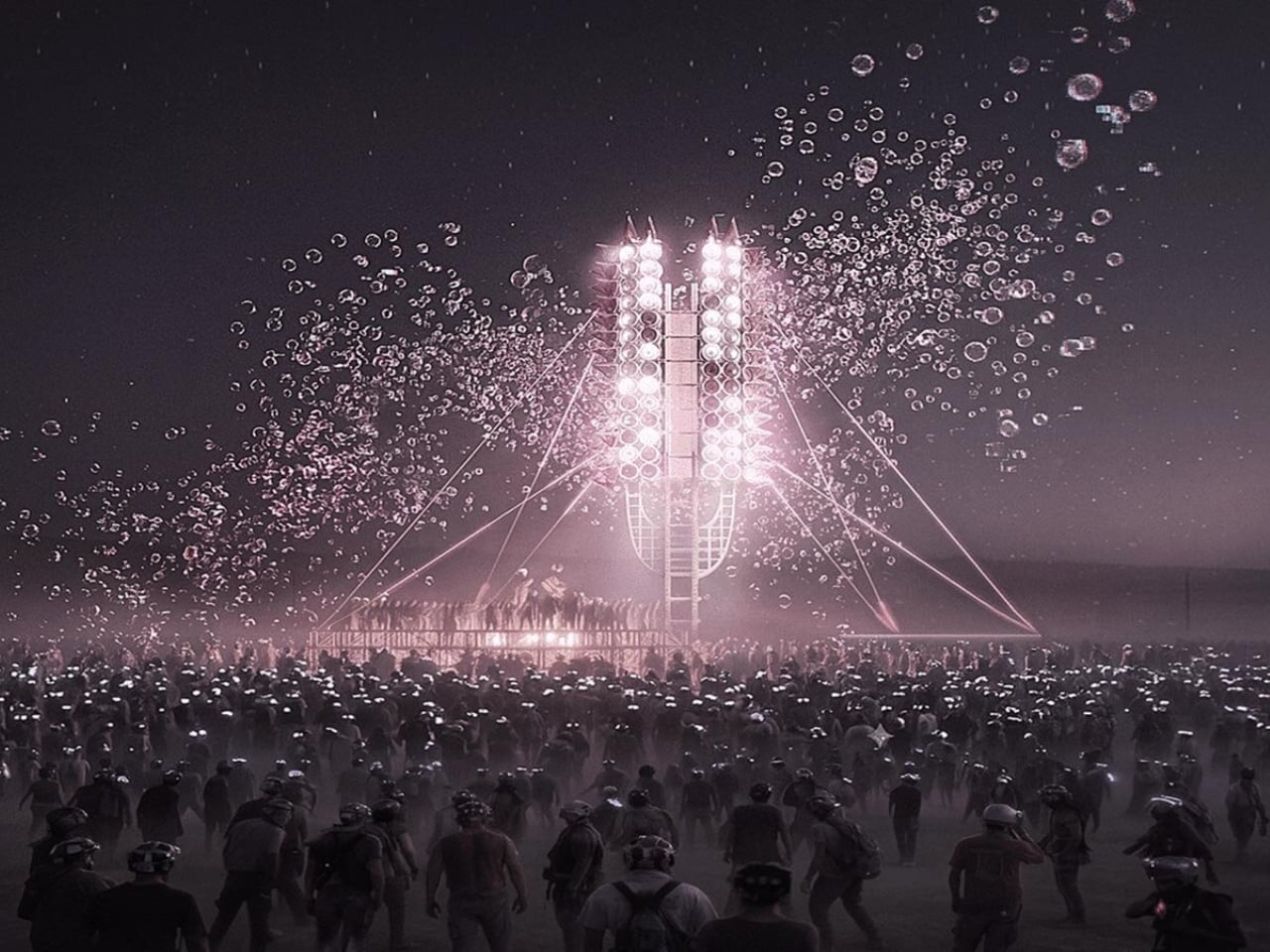
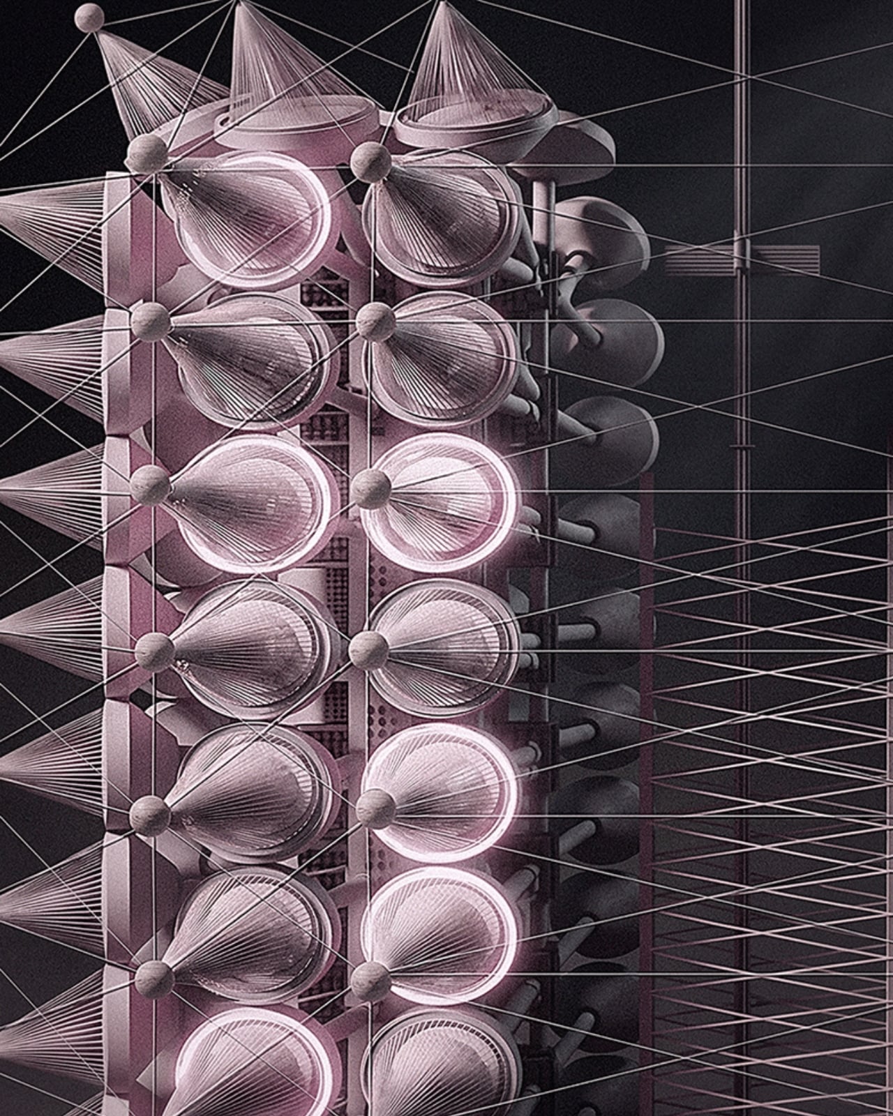
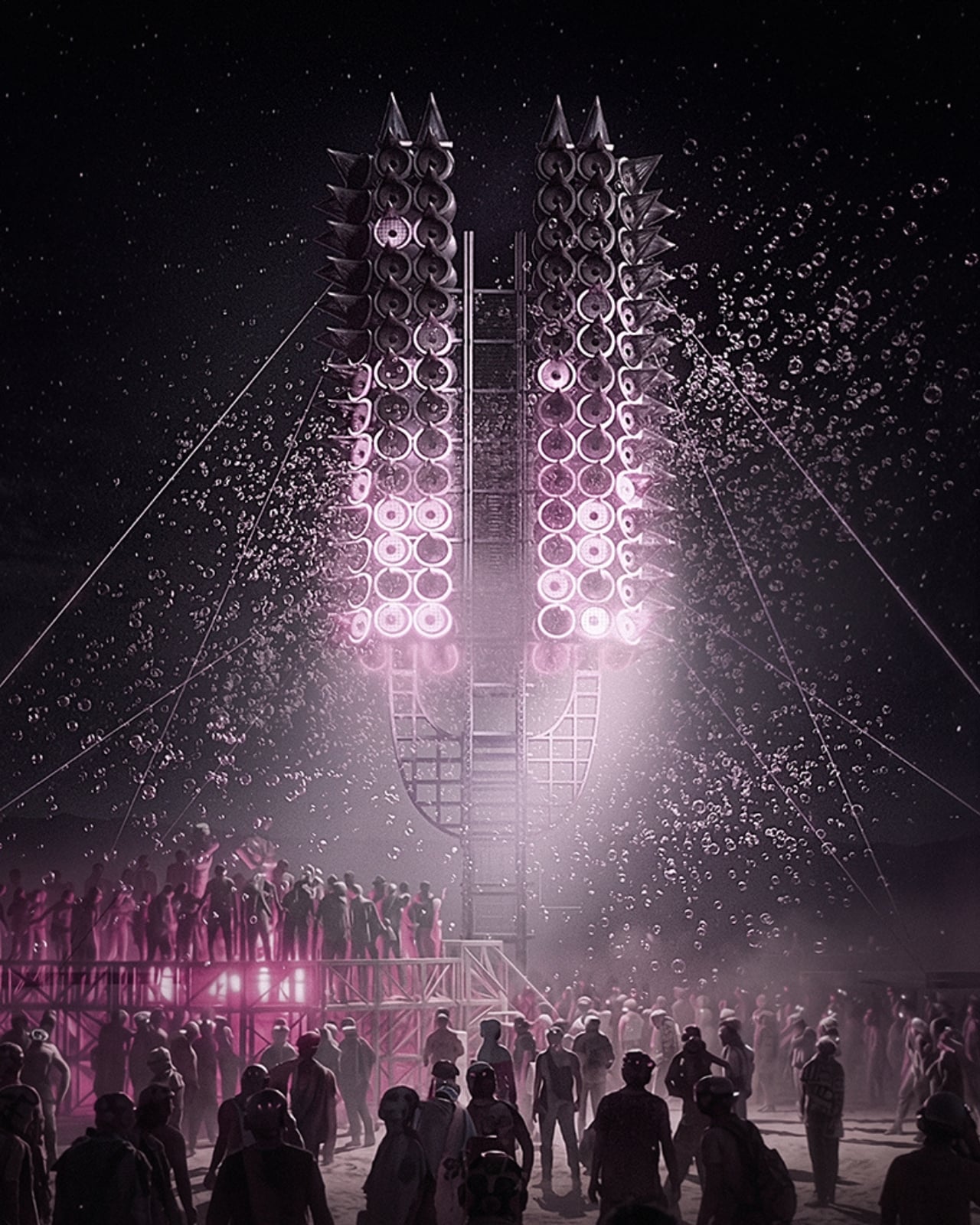
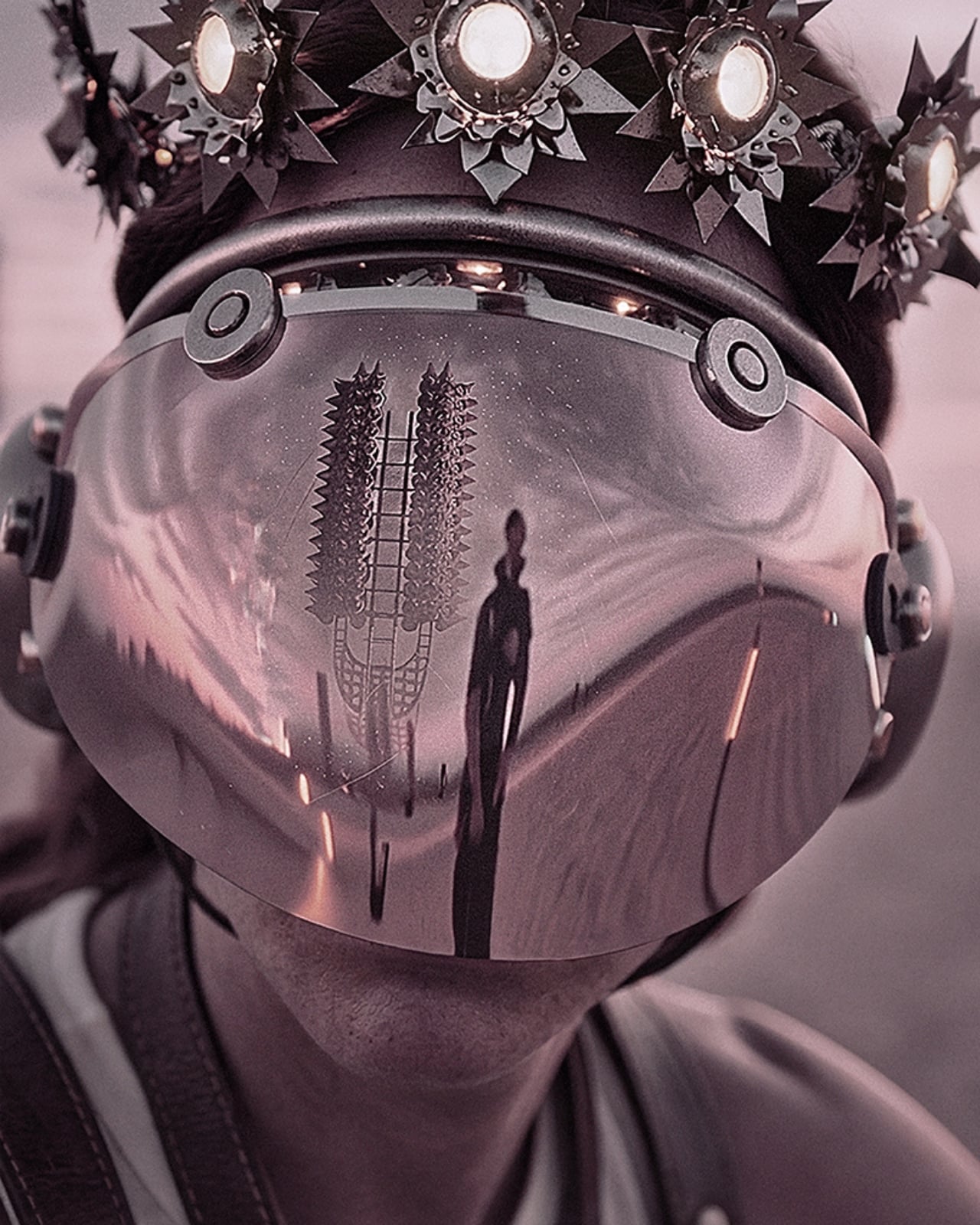
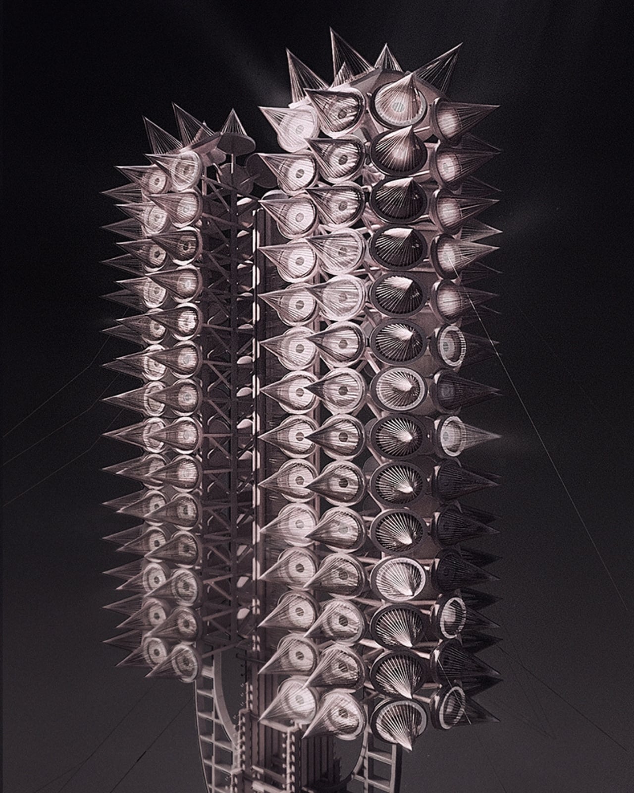
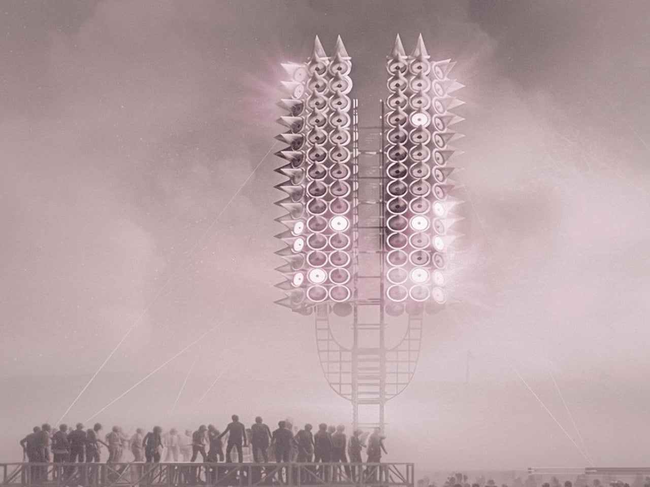
One person shouting into an empty desert doesn’t build much of anything. But what happens when thousands of voices gather around a 12-meter tower made of 300 programmable rings of light, and the structure itself begins to respond? That’s the premise behind Axis Mundi: Resonant Spire, Sergei Konchekov’s installation selected for the 2026 Burning Man Honoraria program, and it might be the most genuinely interesting piece of architecture to emerge this year. Not because it’s the biggest or the most technically complex, but because it actually has something to say.

The concept is both technically precise and philosophically loaded. Konchekov built the tower to translate human voice into a vertical system of light and sound. Speak toward it, and the rings light up. Walk away, and the activation fades. The structure doesn’t generate its own spectacle. It borrows yours. Which sounds like a gimmick when you type it out flat like that, but when you sit with it, it starts to feel like one of those rare design ideas that actually earns its concept.

Designer: Sergei Konchekov

What makes it more than just an interactive light show is the accumulation logic built into its architecture. The 300 rings function as a kind of vertical archive. Lower rings hold stabilized states built up over time, while the upper rings stay live and reactive to current input. So the tower, in a real and structural sense, carries memory. What a crowd did an hour ago is still visible at the base, while what’s happening right now lives near the top. Light doesn’t disappear here. It accumulates. Time, quite literally, becomes physical form.

Konchekov developed the project through a methodology he calls COLLIZIUM, which frames architectural form through conflict-based computational processes and collective social input. That might sound like a design school thesis, but the output is something more immediate and tactile than the language around it suggests. The architecture doesn’t exist independently of its participants. It is generated through them. Without the crowd, there is no form. Burning Man’s own listings describe it as “neither monument nor machine, but a living signal,” and that description genuinely holds.

The broader conversation Konchekov is entering with this work feels particularly timely. Digital communication is at an all-time volume and an all-time low for meaning. We post, we broadcast, we react, and somehow the cumulative noise produces very little that resembles actual connection. Resonant Spire offers a different model: collective input that actually converges, that creates something legible and shared and visible. A crowd becomes a coherent structure only because they showed up together. That is not a small idea dressed in a large installation.

It’s also worth noting that Burning Man is arguably the right venue for this, not just for the obvious reasons of scale and spectacle, but because the event itself is predicated on temporary community. The playa is a place where the usual rules about permanence and individual credit get set aside. A tower that only works when people gather around it and offer their voices is not a metaphor at Burning Man. It’s just a description of what’s happening there already. Konchekov is, in some ways, building architecture that matches the culture it inhabits.

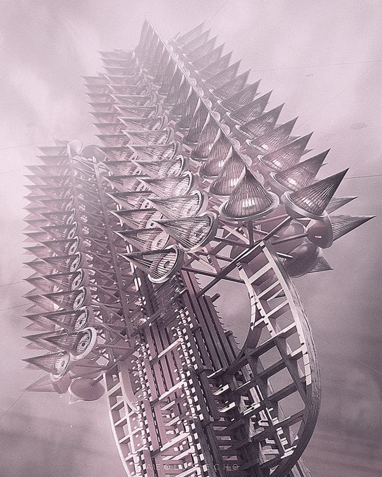
The visual language of the spire draws from ancient and spiritual references, the axis mundi being a cosmological concept found across many cultures, a central pillar connecting earth and sky. Konchekov takes that idea and routes it through a live data feed. The cone-stacked structure rises with phased waves of light traveling upward, in the project’s own words, “like a visible breath.” It is striking, undeniably, but the aesthetic isn’t really the point. The refusal to be passive is. Most architecture asks you to look at it. This one asks you to mean something together before it shows you what you’ve made.

The post Burning Man 2026 Built a 300-Ring Light Tower You Have to Earn first appeared on Yanko Design.
Huawei Adds 99 Diamonds to Its Toughest Smartwatch

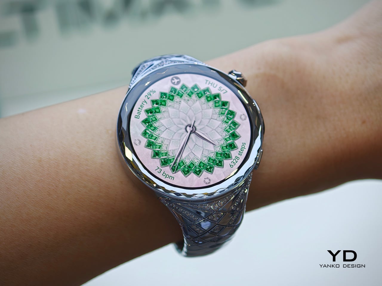
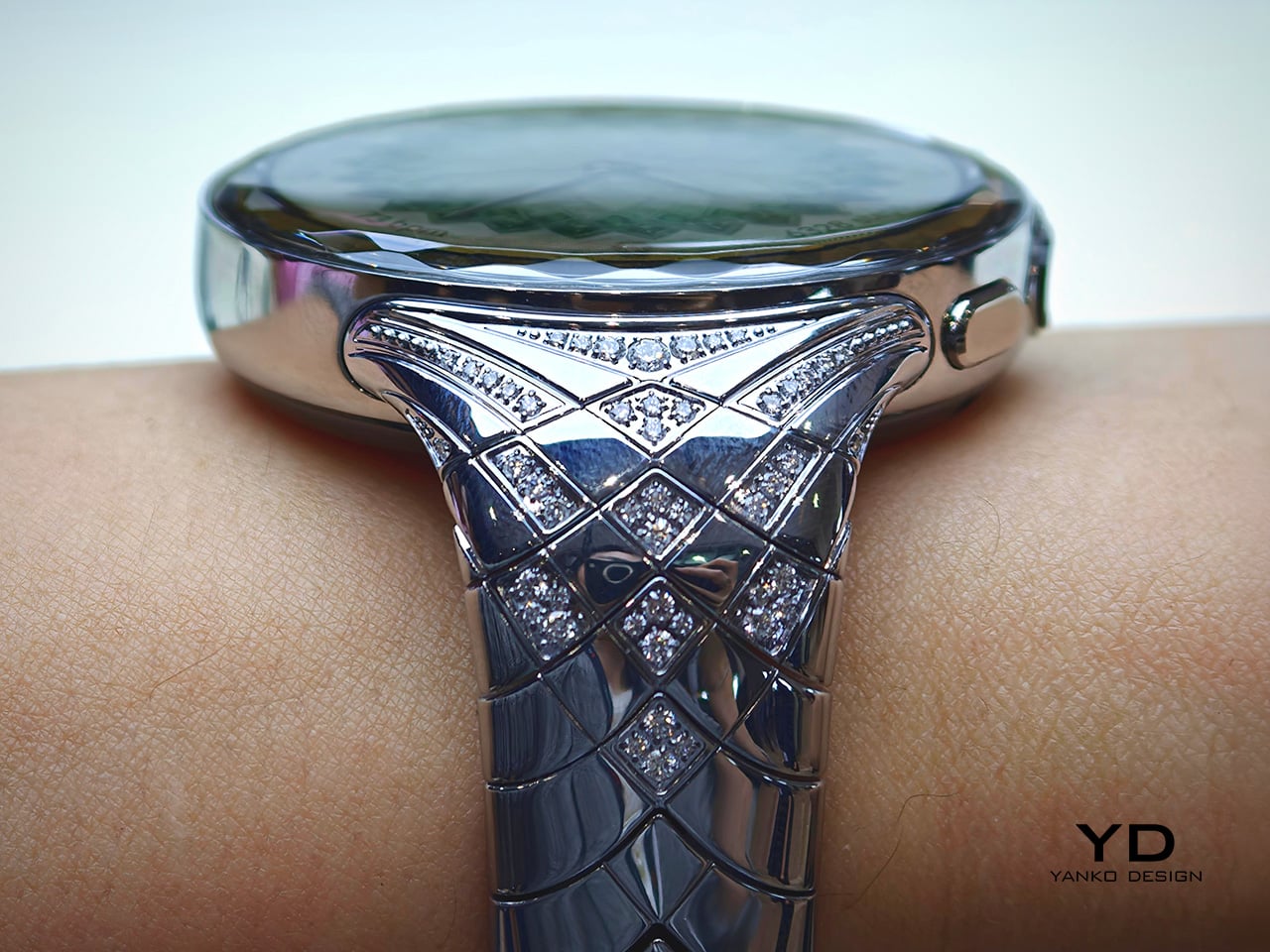
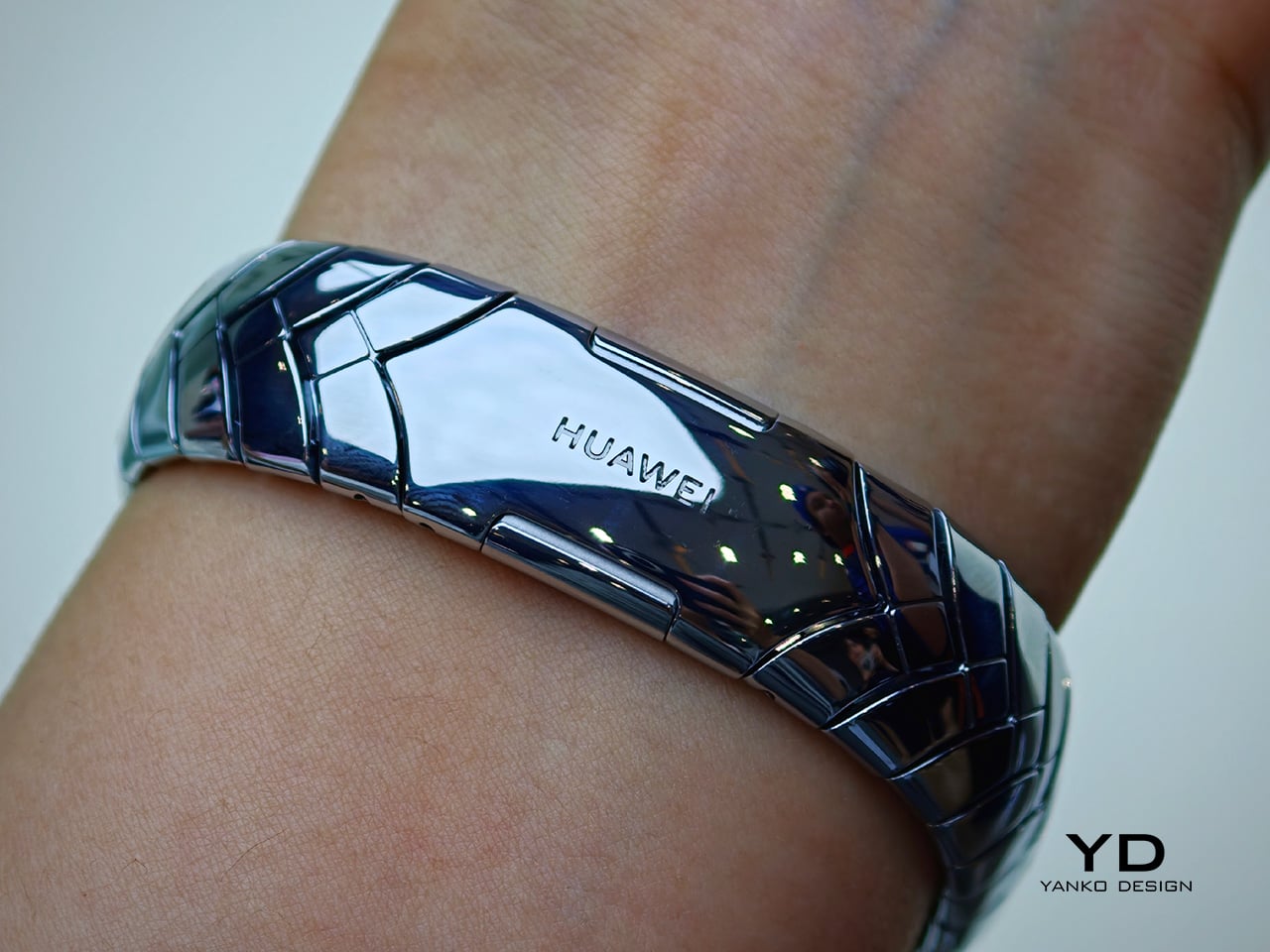
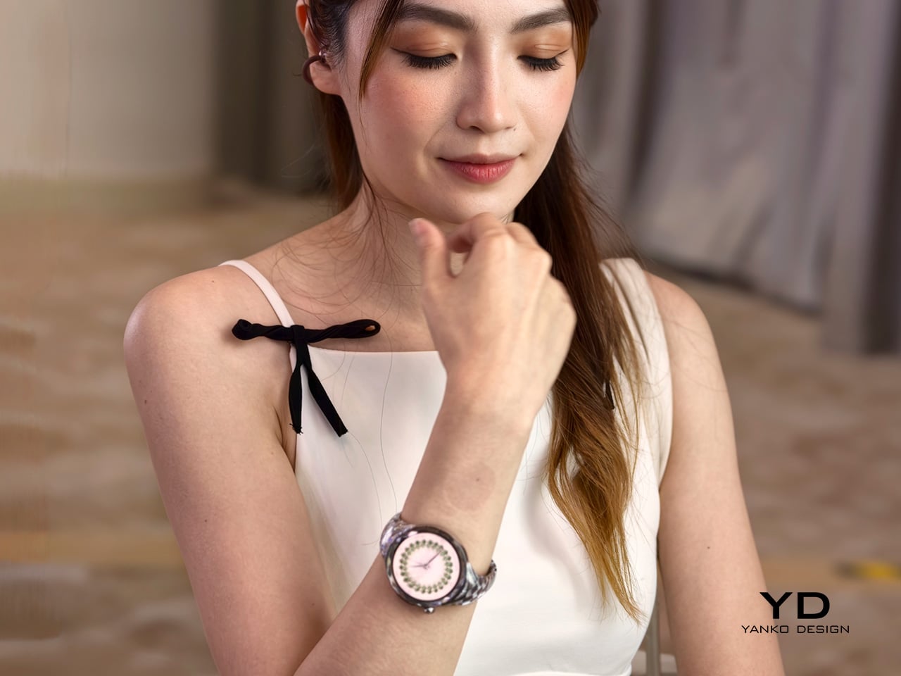
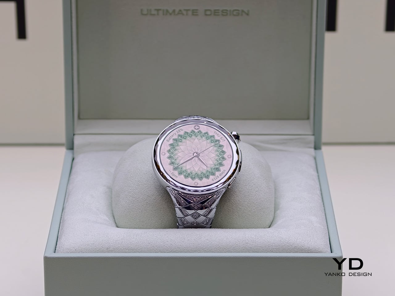
Huawei’s latest luxury wearable explores a space the smartwatch industry still hasn’t fully resolved. Instead of presenting technology as something discreet, technical, or performance-first, the Huawei Watch Ultimate Design – Spring Edition approaches the category from a more ornamental direction, treating the smartwatch as a fashion object as much as a connected device. In a market still dominated by sporty silhouettes and restrained finishes, that alone makes it a distinct proposition.

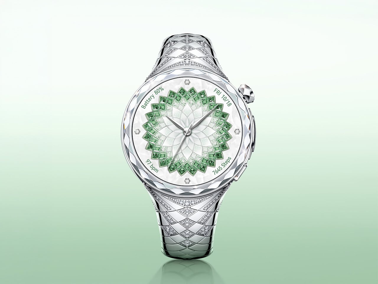
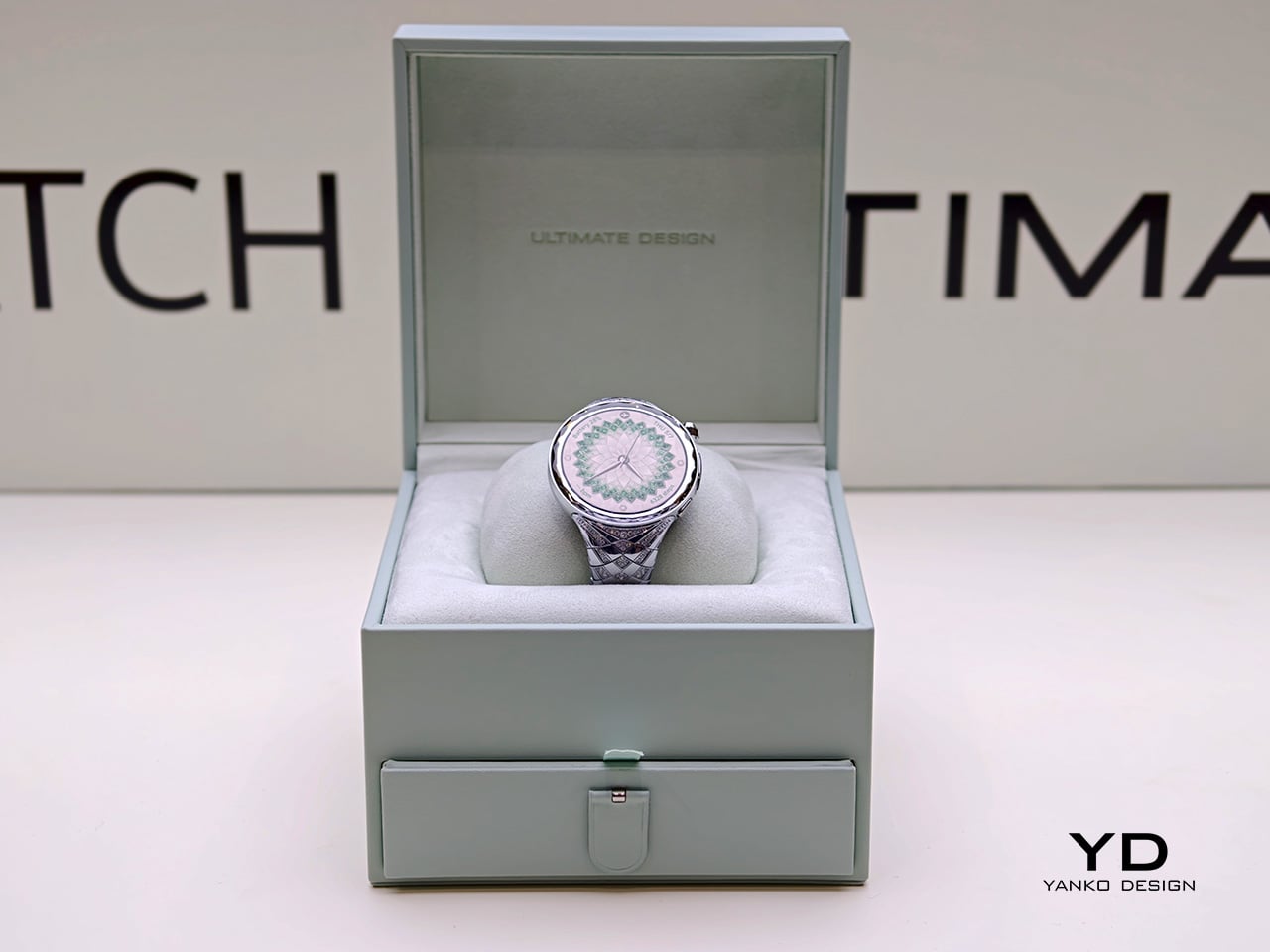
Announced as part of Huawei’s latest global product launch, the Huawei Watch Ultimate Design – Spring Edition was created in collaboration with world-renowned jewelry designer Francesca Amfitheatrof. The watch draws on the imagery of spring and incorporates 99 natural diamonds, positioning itself less as a conventional wearable and more as a luxury interpretation of one. Rather than relying on a simple premium finish or a new strap option, Huawei appears to have built the product’s identity around adornment from the outset.

Designer: Huawei x Francesca Amfitheatrof

Luxurious silver wristwatch with a green gem-encrusted dial and diamond-studded band on a pale green gradient background.

Most smartwatches still follow a familiar visual formula. They tend to emphasize utility through subdued finishes, sporty proportions, and a design language shaped by fitness tracking and digital convenience. The Huawei Watch Ultimate Design – Spring Edition moves in another direction, using precious materials and decorative detailing to shift attention toward styling, symbolism, and visual presence. It does not try to disappear into an everyday tech wardrobe. Instead, it is designed to be noticed, and to function as part of a broader personal aesthetic.

That is what makes the watch interesting from a design perspective. Rather than simply applying luxury cues to an otherwise standard smartwatch body, Huawei seems to frame the product around a more expressive visual narrative. The result is a wearable that sits closer to jewelry than to the stripped-back minimalism that still defines much of the category. It also reflects a broader shift in premium wearables, where differentiation increasingly comes from form, finish, and material storytelling rather than purely from software or sensors.

The watch is inspired by the blossoming of spring and is intended to reflect women’s strength and vitality. In practice, that gives the product a softer narrative framework than most wearable launches, which usually center on health metrics, performance upgrades, or endurance claims. Here, the emphasis is clearly on material expression and thematic storytelling. Whether that spring concept feels nuanced or simply decorative will depend on the viewer, but it does give the watch a more distinct point of view than the usual language of optimization and performance.

At the same time, Huawei has not stripped away the technical identity of the WATCH ULTIMATE range. It includes advanced outdoor modes, health tracking, ECG support, expedition mode, diving capability up to 100 meters, and battery life of up to 14 days under typical use. That combination makes the Spring Edition more than a simple luxury variant. It still carries the expectations of a tool watch, even as its materials and detailing push it toward a more ornamental category.

Huawei’s answer here is to push further into the language of jewelry, suggesting that for some users, a smartwatch is no longer just a tool to wear but an accessory to build a look around. Priced at £3,499.99 or €3,799, the Huawei Watch Ultimate Design – Spring Edition sits firmly in the territory of statement objects rather than everyday wearables. More than anything, it reflects how wearable tech is evolving, not just as a category of devices, but as a category of personal objects.

The post Huawei Adds 99 Diamonds to Its Toughest Smartwatch first appeared on Yanko Design.
ecal x Google Just Imagined 10 Phones Beyond the Slab

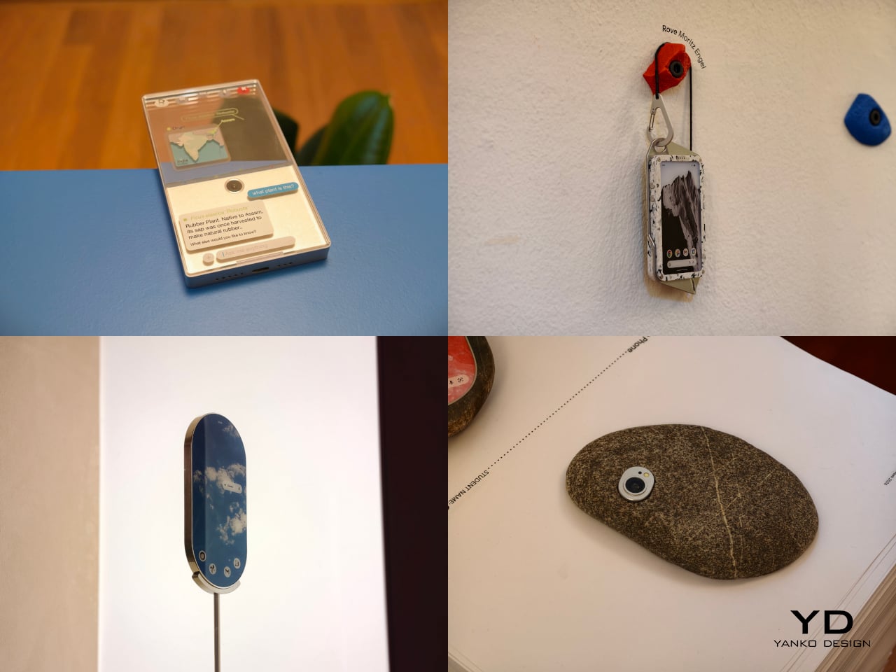
At ECAL’s collaboration with Google’s Industrial Design team, the smartphone is no longer treated as a fixed icon of consumer tech. In A Message from Tomorrow, it becomes something far more fluid, a design question that deserves to be reopened. The brief invited ECAL’s Master Product Design students to develop mobile-focused concepts inspired by daily rituals, with an emphasis on storytelling and the human dimension of technology. That framing gives the exhibition its real energy. Instead of chasing the usual upgrades in speed, resolution, or sleekness, the projects ask how mobile devices might evolve if they were designed around touch, companionship, movement, energy, and the subtle gestures that shape everyday life.

That shift feels especially relevant now. Smartphones have absorbed nearly everything, from cameras and maps to notebooks, music players, and assistants, yet the object itself has become strangely stagnant. For all the complexity hidden inside, the form remains stubbornly familiar, a smooth slab built around endless visual attention. A Message from Tomorrow pushes against that stagnation by imagining mobile hardware as a much broader territory. Here, devices can be expressive, self-sufficient, spatial, tactile, or emotionally responsive. The exhibition does not present one neat answer to the future of the phone. It presents a series of alternate directions, each exposing something our current devices no longer do well.

Deigner: ECAL/University of Art and Design Lausanne x Google ID

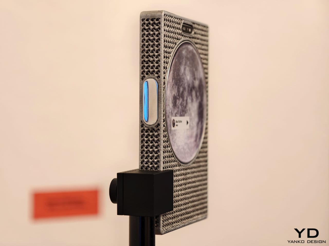
One of the show’s strongest ideas is that the future of mobile technology may not be screen-first at all. Several projects deliberately loosen the screen’s dominance and focus instead on sound, physical presence, or integration with the surrounding world. Sound Machine, by Xose Lois Piñeira, rebuilds the phone around voice. Its 3D-printed aluminum lattice body is acoustically transparent, allowing sound to move through a layered assembly while a contact transducer on the back transmits audio through surfaces or through the body when worn against the sternum. A small circular screen handles only the essentials. It is a compelling proposition because it refuses the idea that a phone must always function as a miniature display first and everything else second.

Liminal Frame, by Ehrat Lee, offers another escape from flat-screen logic. Its four-layer display can shift between opaque and transparent states, letting digital content coexist with the physical world rather than replacing it. The device allows users to look through the phone, place information in space, and return to it later without relying on a headset. It turns the phone into a kind of portal rather than a closed surface. In a moment when spatial computing is often imagined through bulky wearables, this project feels especially elegant. It suggests that the phone itself could evolve into a lighter and more natural bridge between digital and physical experience.

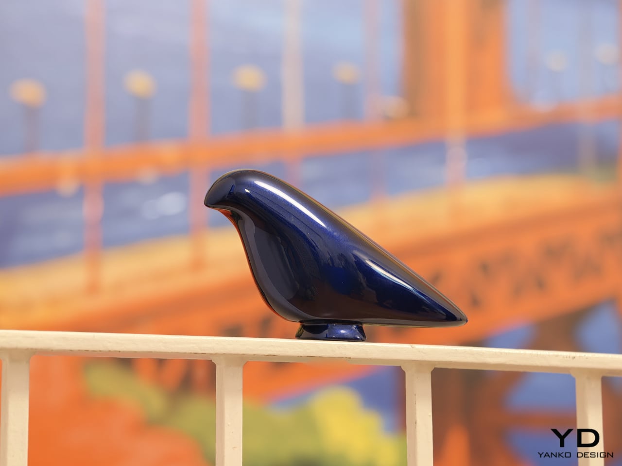
Some of the exhibition’s most memorable concepts explore personality as much as function. Robin, by Gyuhan Park, imagines a mobile device modeled on pet-bird behavior. Cameras become eyes, a beak-like feature acts as sensor and speaker, and the object communicates like a companion rather than a conventional assistant. It can tease, joke, or sulk while also helping with planning, messages, and everyday tasks. The concept is playful, but it also raises a serious question about the future of devices. As AI becomes more embedded in daily life, will our relationship with technology become less transactional and more behavioral.

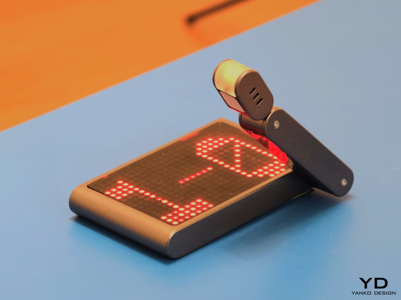
That same willingness to rethink familiar habits appears in The Finger Phone by Hugo Von Hofsten. Starting from the frustration that phones always need to be held, it introduces an animated finger-like extension carrying a camera, light, and touchpad. The idea is delightfully odd, but also surprisingly practical. It imagines a device that can stand on its own, assist in small moments, and illuminate more than just its own screen. In a market dominated by polished uniformity, The Finger Phone feels refreshingly unconcerned with conventional elegance. It is willing to be useful, strange, and memorable all at once.

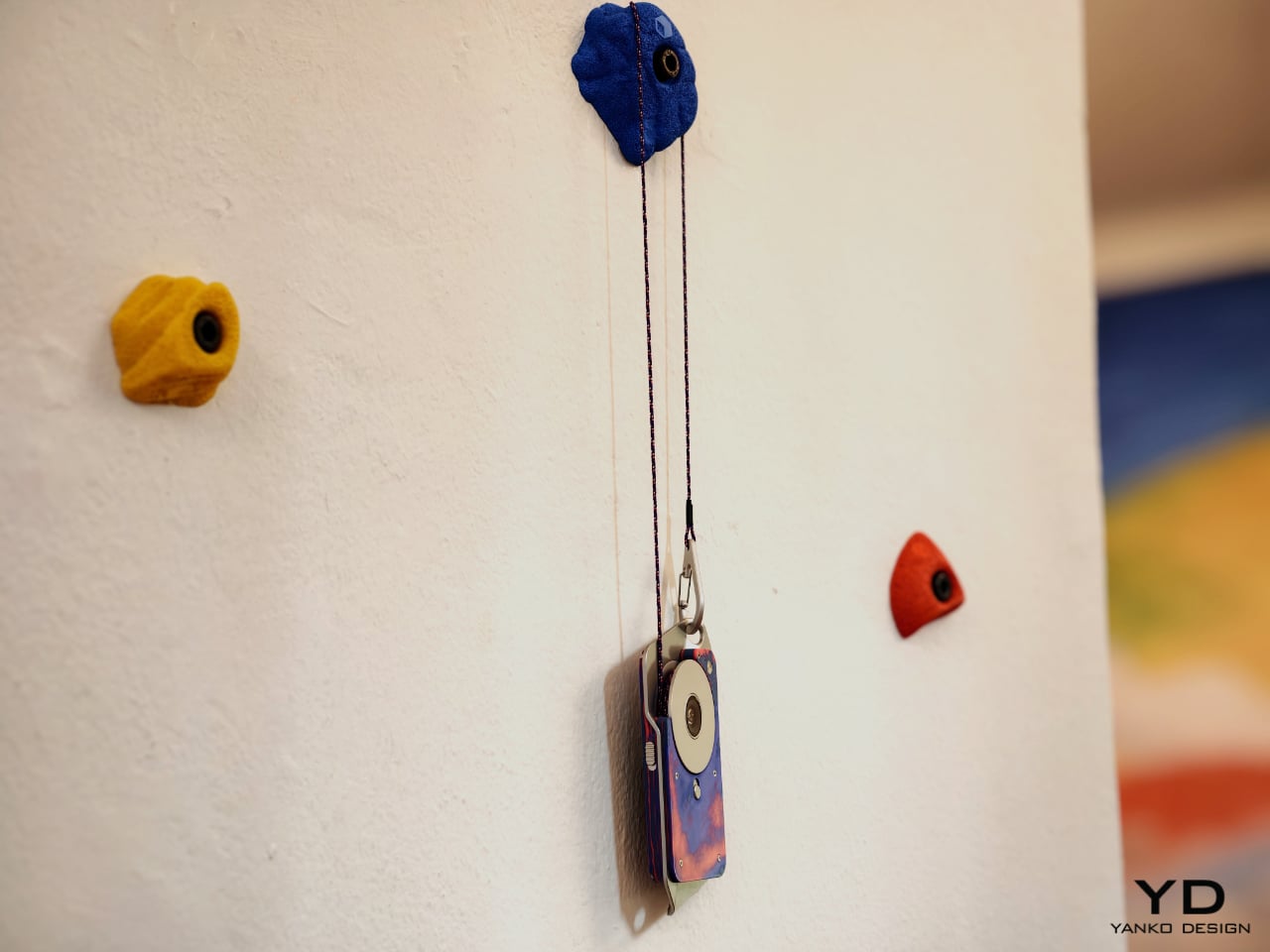
The exhibition also includes projects that challenge the smartphone’s dependence on charging infrastructure and standardized use cases. Rove, by Moritz Engel, is designed for off-grid wilderness and uses a pull-cord system to generate power through an axial flux generator. One minute of pulling creates twenty minutes of battery life, while the Dyneema cord doubles as a carrying strap and the spool becomes a tactile control wheel. Dyno, by Julia Siebert Cáceres, tackles the same problem from a more everyday angle, using body movement and electromagnetic induction to generate electricity throughout the day. Its visible rotor and magnet system make the act of charging tangible rather than hidden, giving the device an honesty that most sealed electronics lack.

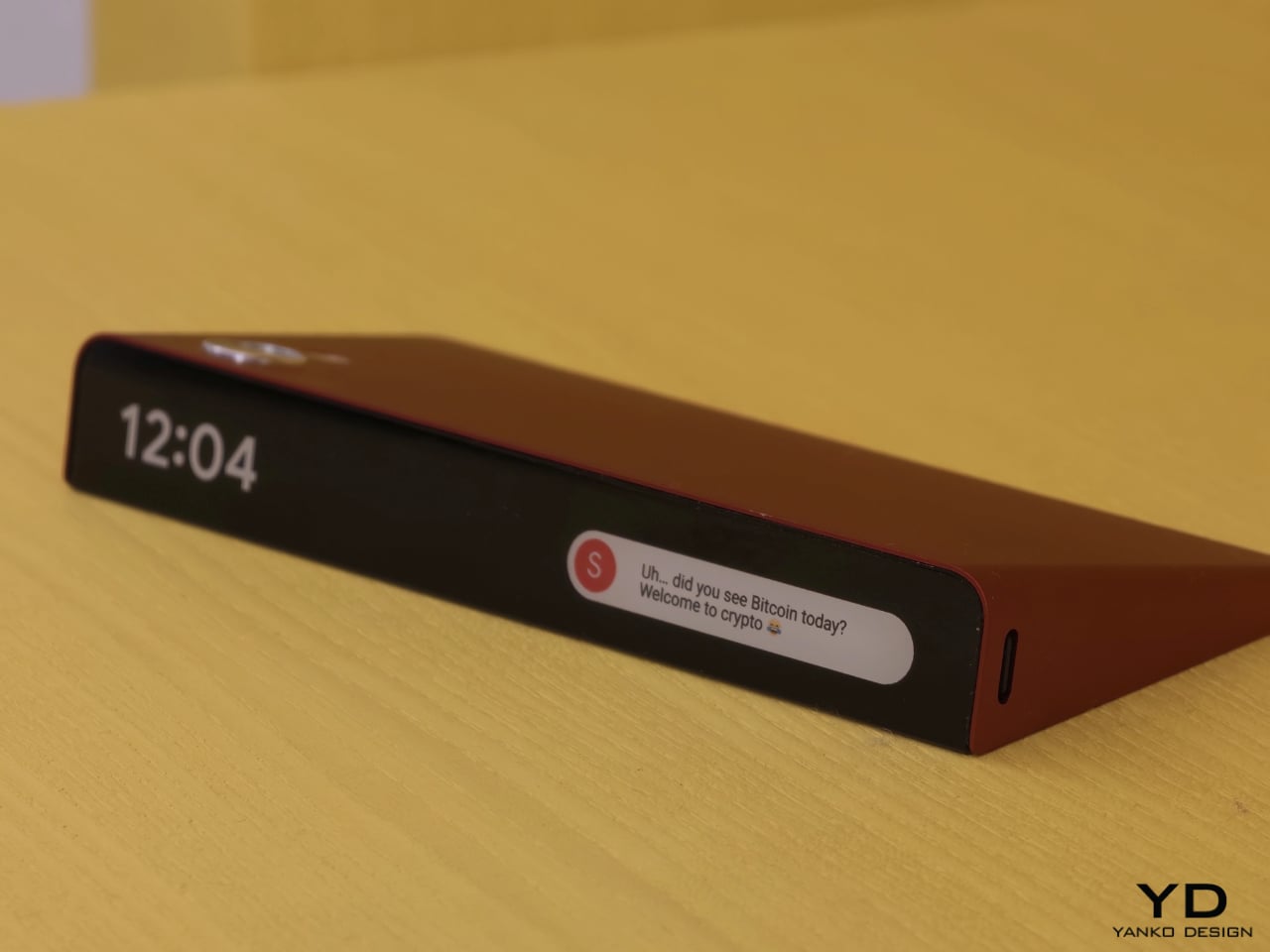
Other projects focus on what the phone means as a physical object in domestic and personal life. Everydaycarry, by Motong Yang, critiques the smartphone as a standardized entity that contains everything yet expresses very little. It proposes a more adaptive device whose character can still reflect the identity of the person carrying it. Totem, by Paul Quentin, reshapes the phone into a wedge so it can function more naturally as a tabletop object for video calls, media viewing, or AI assistance. When laid flat, its edge becomes a subtle notification interface. These projects are not simply formal experiments. They rethink how devices occupy space, signal presence, and fit into routines beyond the hand and pocket.

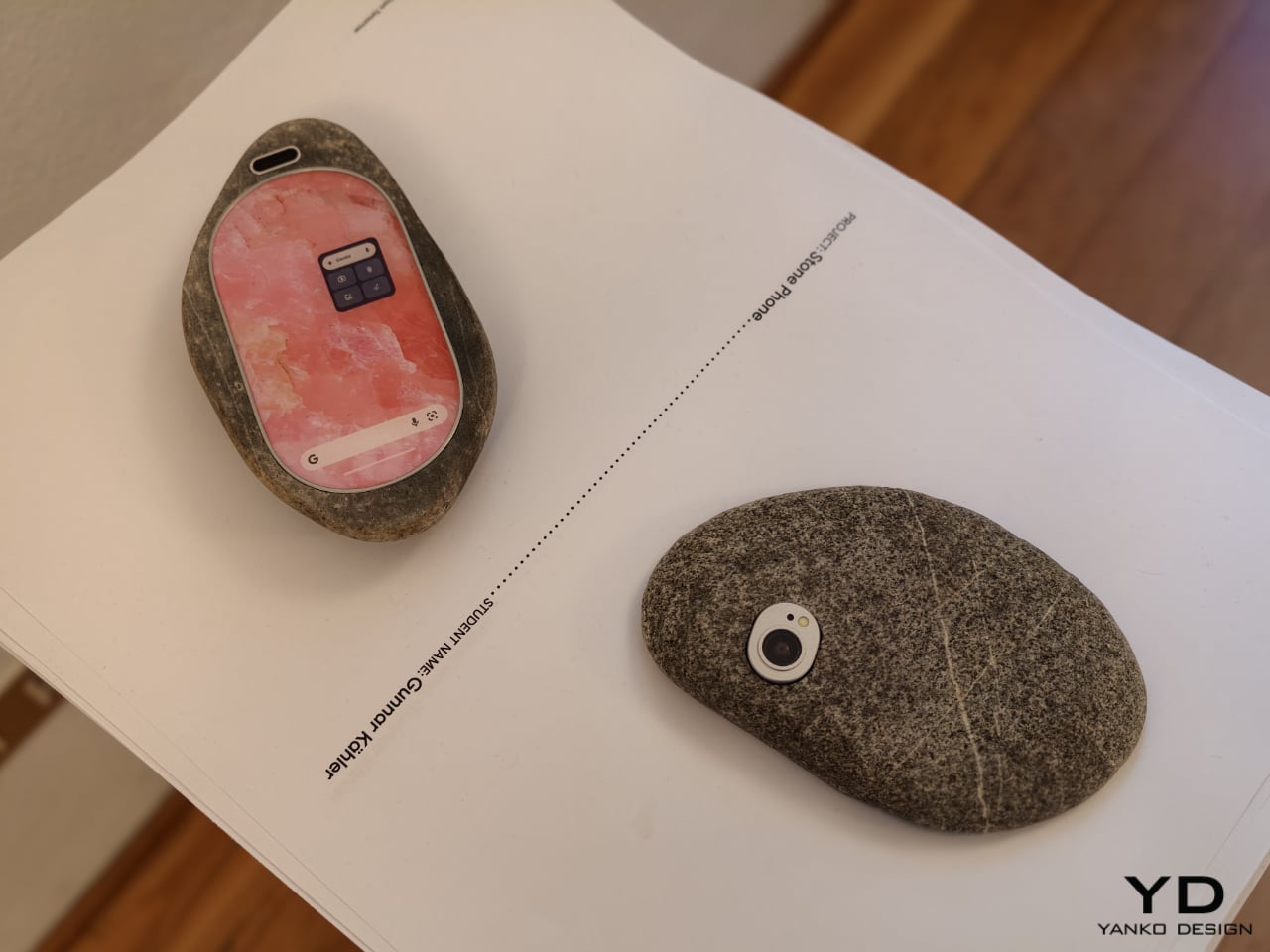
Then there is Stone Phone by Gunnar Kähler, one of the exhibition’s most quietly affecting concepts. Inspired by the instinctive act of picking up a stone from a beach or riverbank and choosing the one that feels right in the hand, the project imagines smartphones in an endlessly varied range of shapes. Instead of accepting industrial uniformity as a given, Stone Phone suggests that users might choose a device based on texture, comfort, and tactile pleasure. It blurs the line between archaic tool and advanced technology, making the smartphone feel less like a mass-produced command and more like a personal object discovered through touch. In a show full of speculative gestures, this one stands out for its simplicity. It reminds us that before a device does anything, it is first something we hold.

What makes A Message from Tomorrow compelling is not that every concept seems ready for mass production. It is that each one identifies a real tension in our relationship with mobile technology and gives it a physical form. Together, the projects reveal how narrow the current smartphone archetype has become. More importantly, they show that industrial design still has the power to meaningfully reshape our technological future. In an era when innovation is often framed as software alone, this exhibition argues that form, material, behavior, and ritual still matter deeply.

The post ecal x Google Just Imagined 10 Phones Beyond the Slab first appeared on Yanko Design.
Leave It to a Jewelry House to Make the Most Beautiful Candle

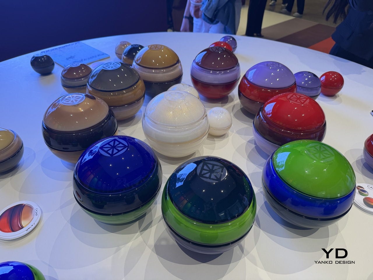
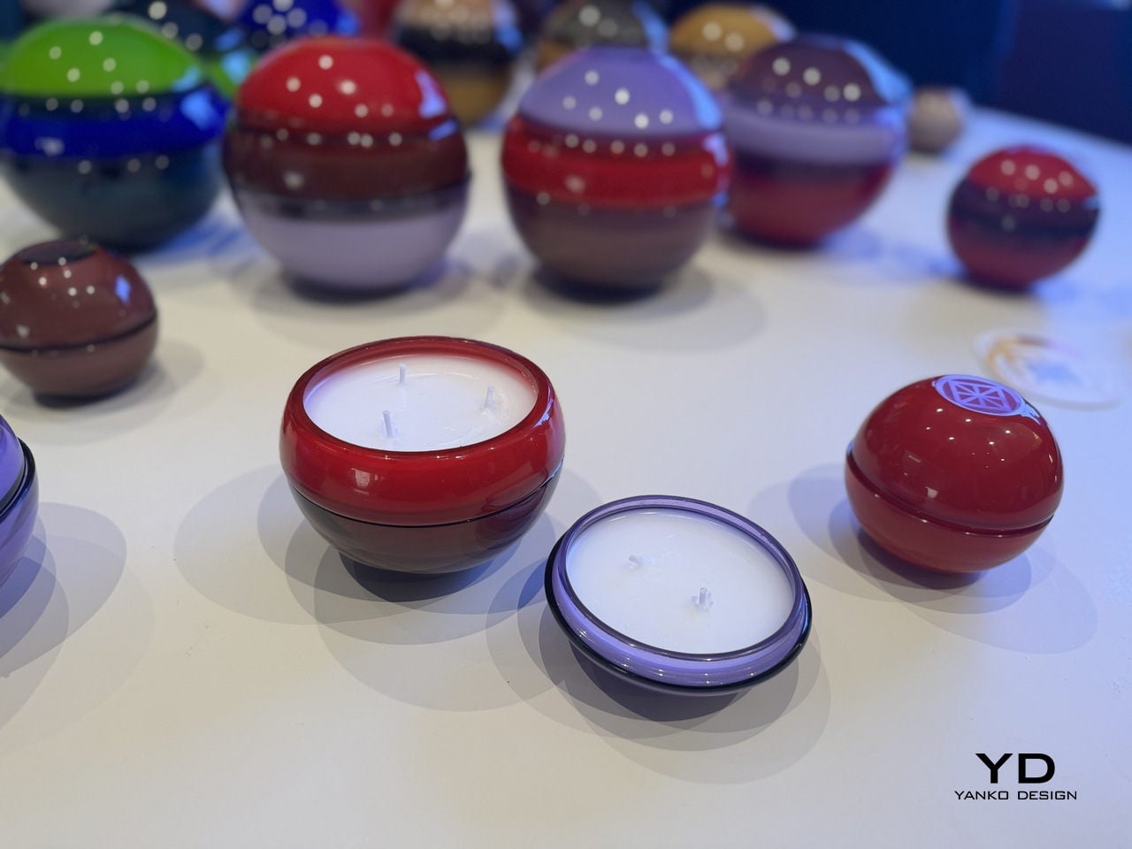
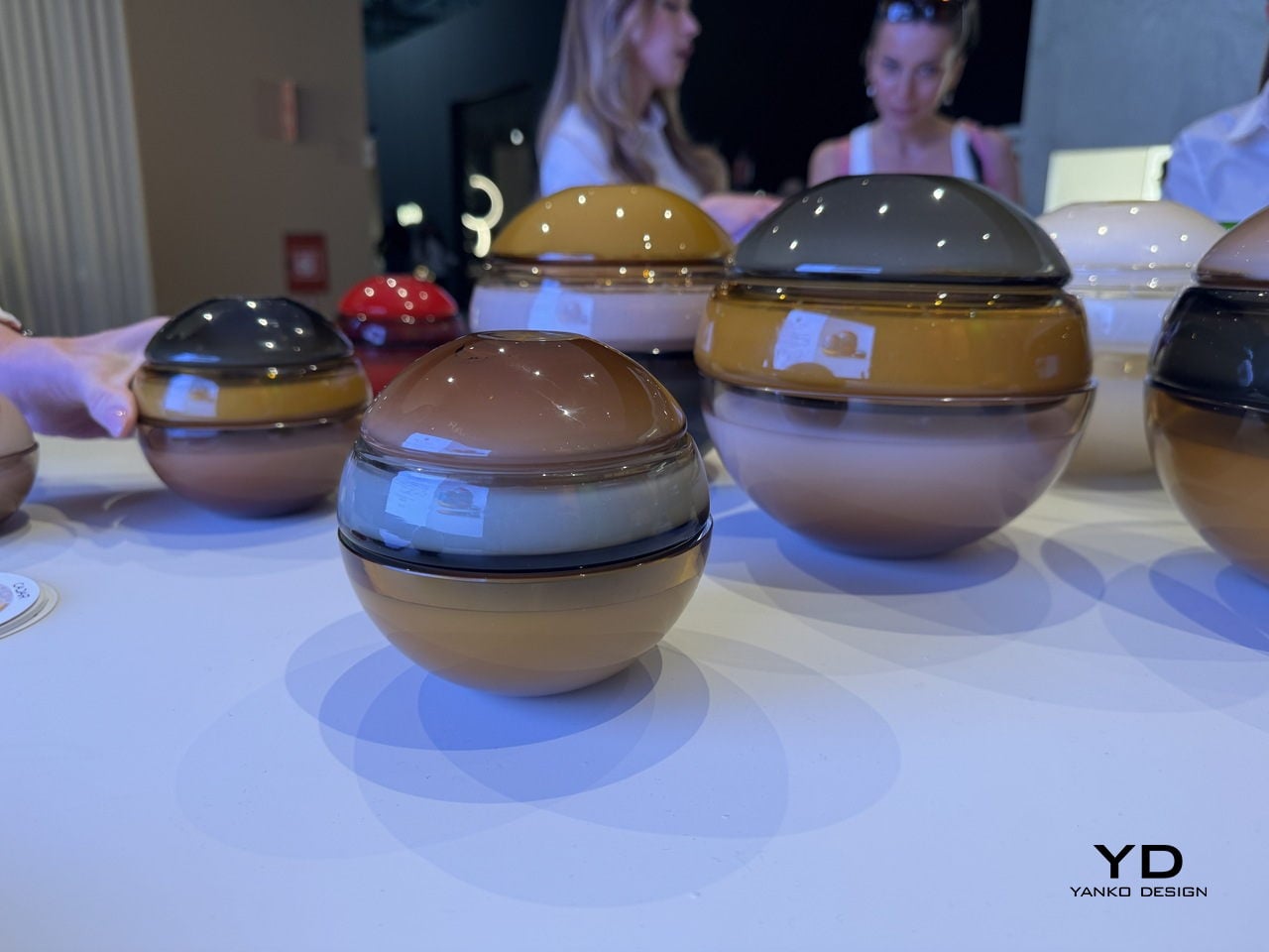
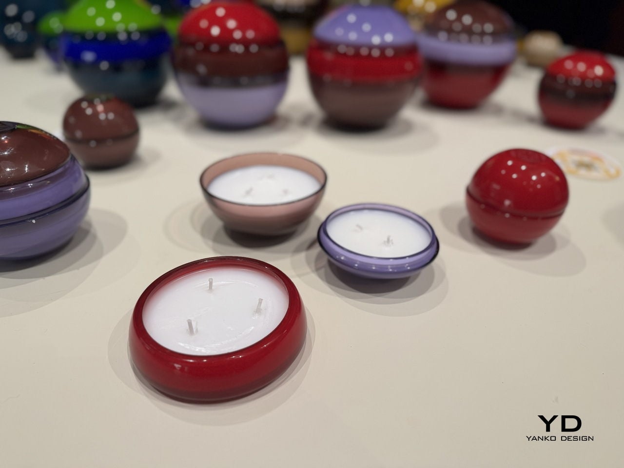
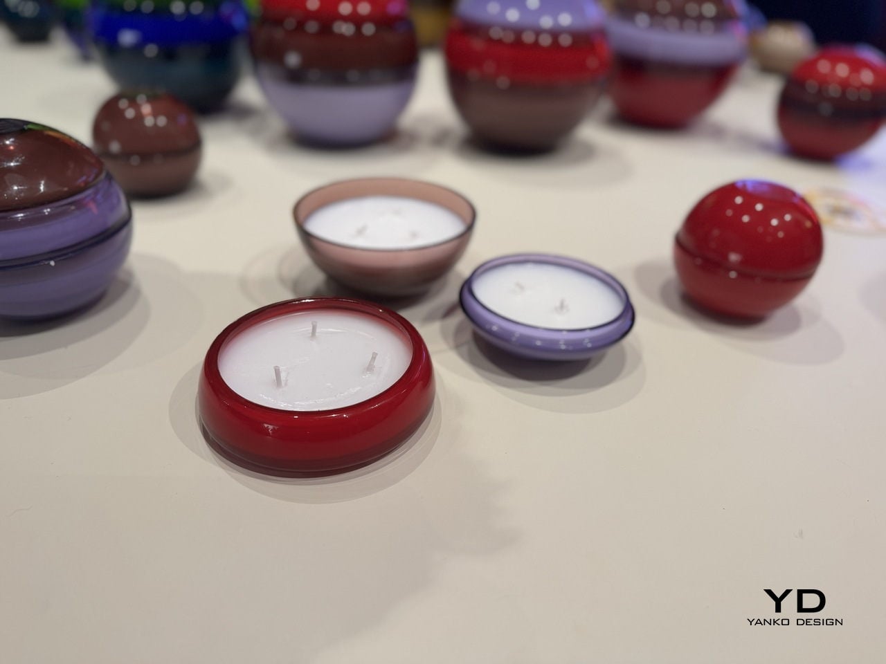
When Cadar showed up at Salone del Mobile this April, it did not bring jewelry. It brought candles. And not the kind you grab in a gift shop because they smell nice. These are hand-blown Murano glass spheres in colors so saturated and glossy they look less like home objects and more like something you might find in a collector’s vitrine. The moment you see them on a table, you want to pick one up. That instinct tells you everything about how well this design is working.

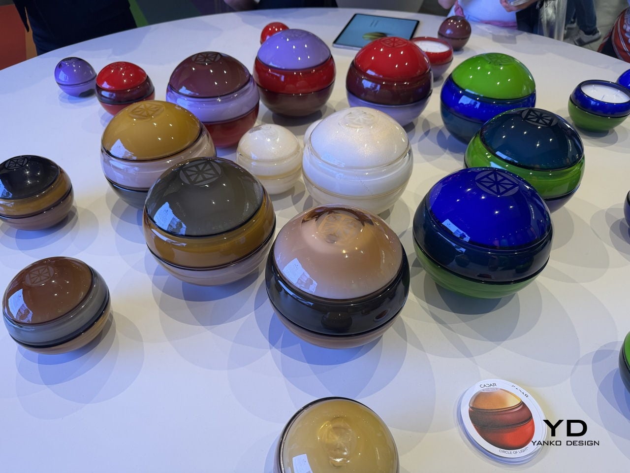
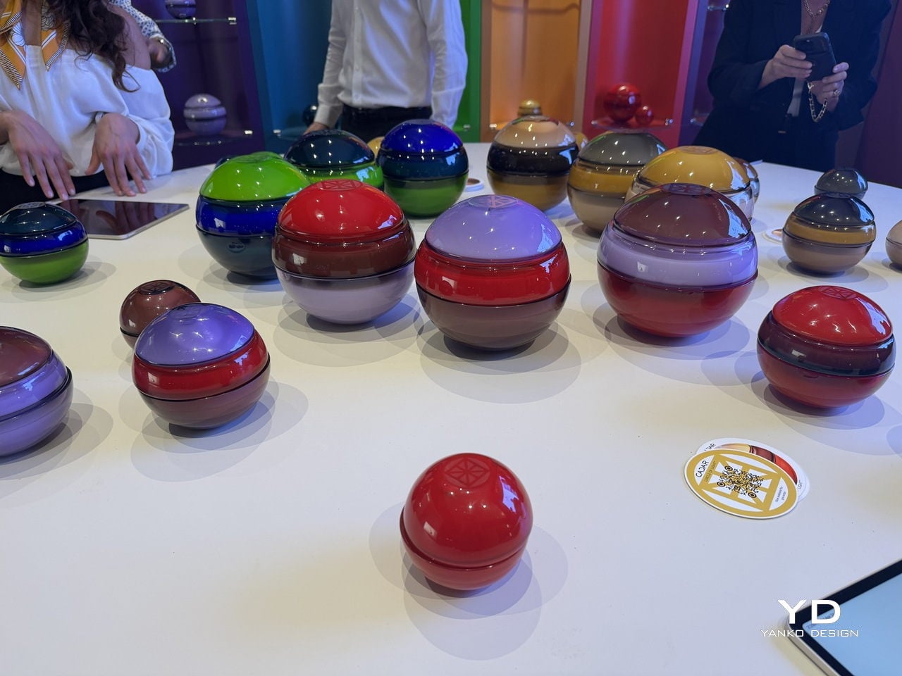
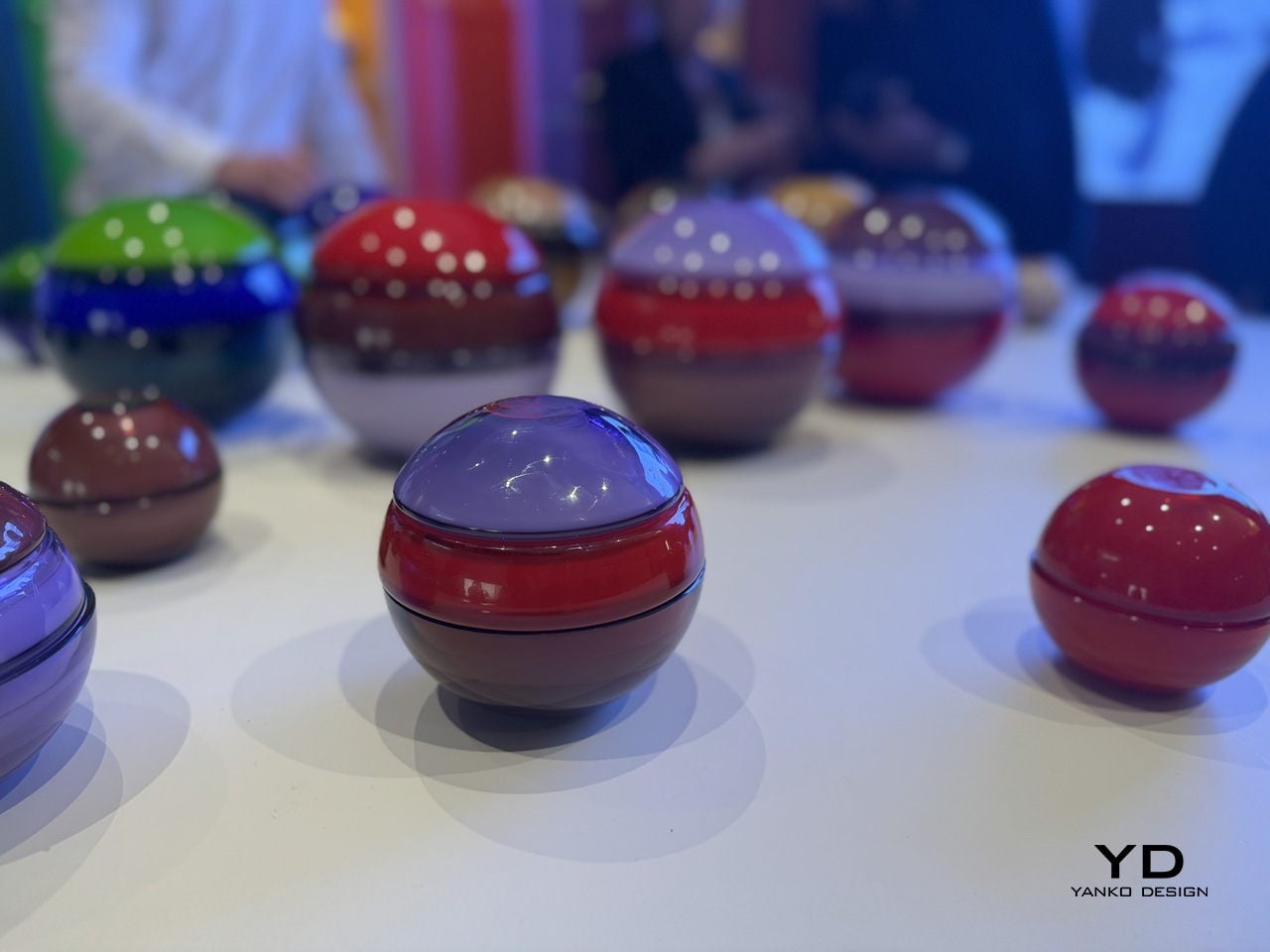
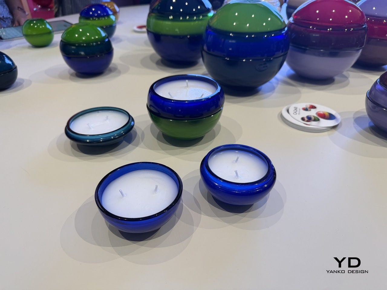
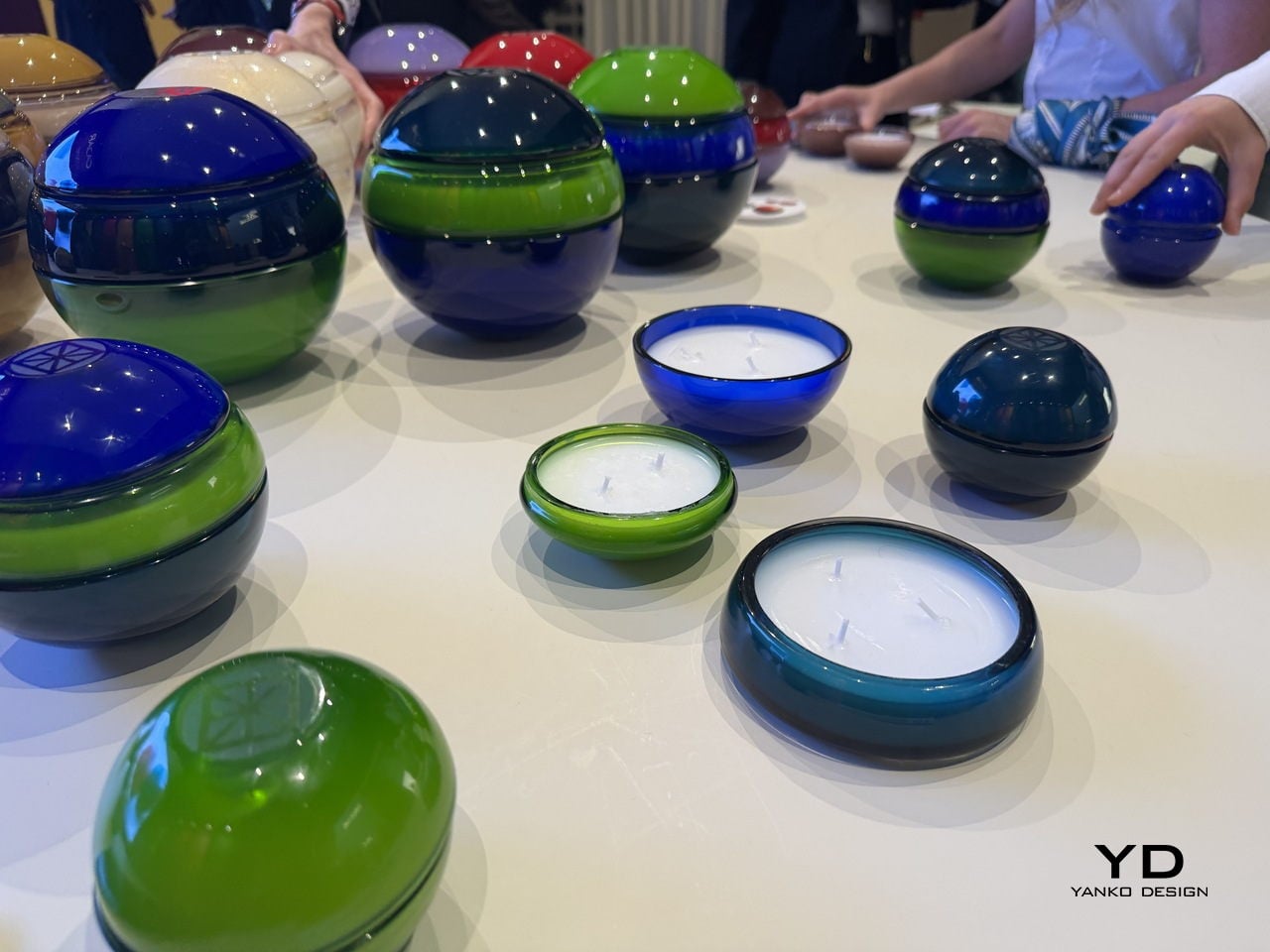
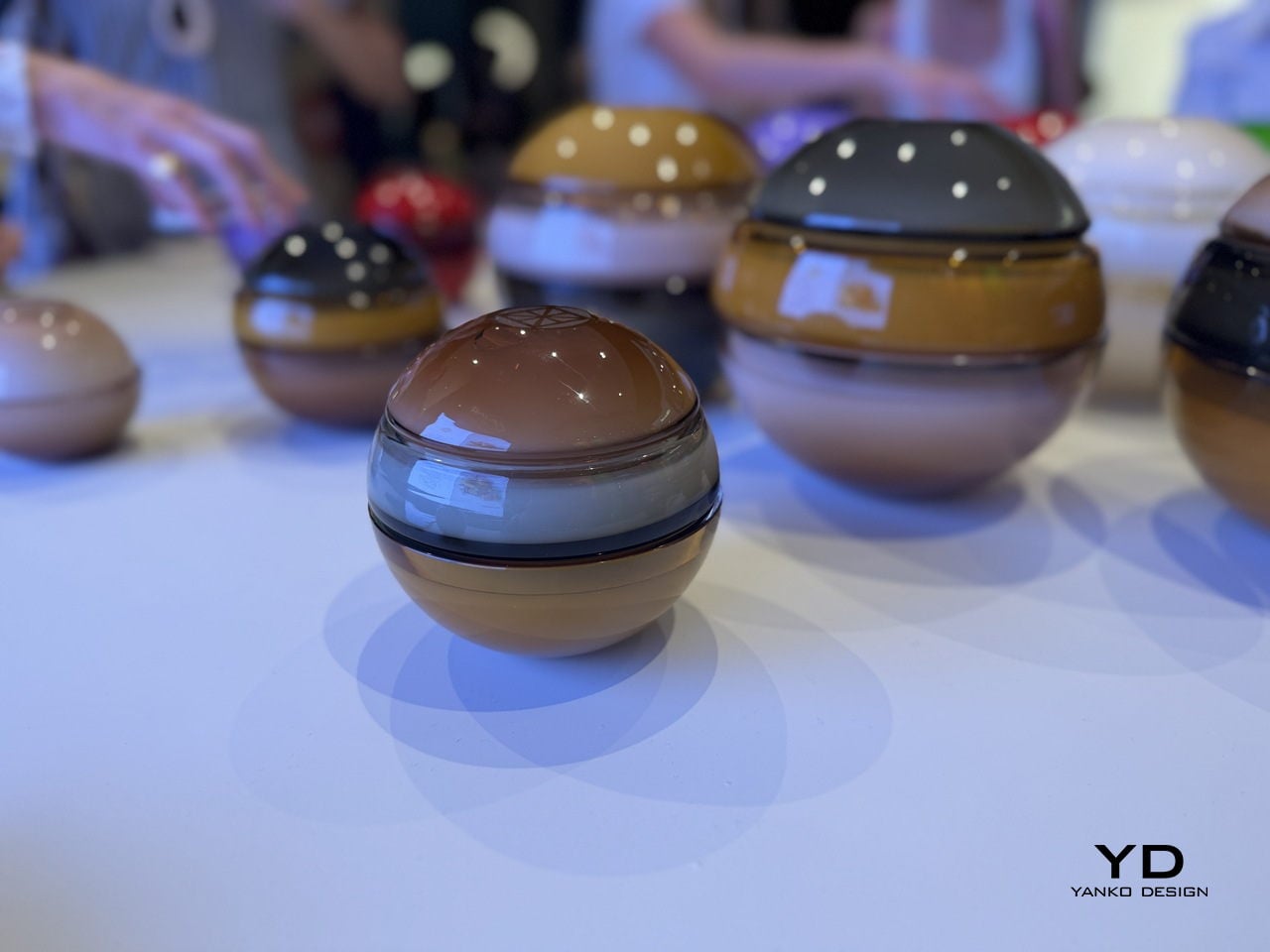
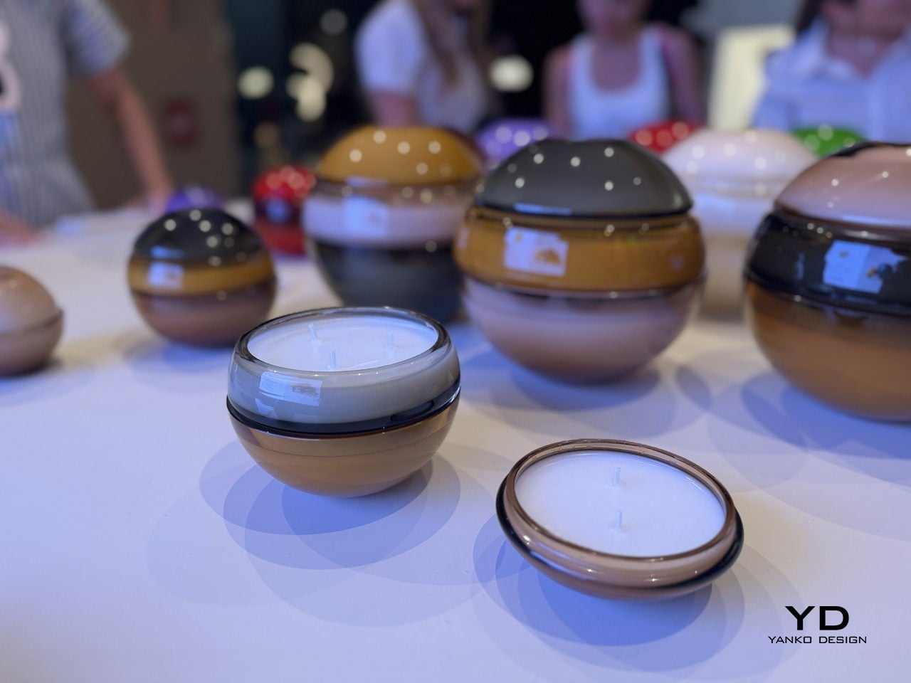
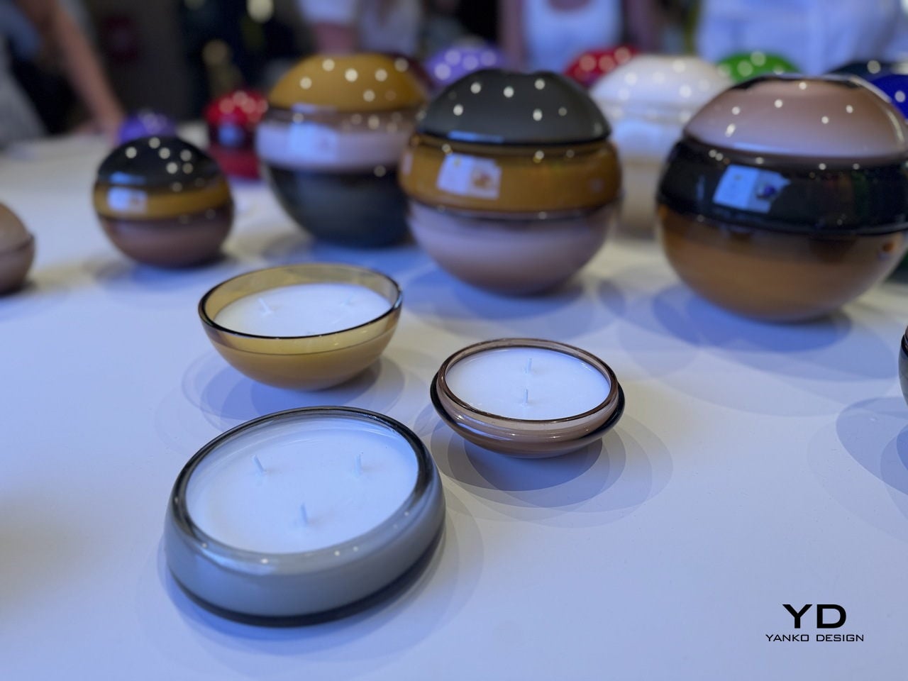
The form is deceptively simple. Each Circle of Light vessel is a sphere, composed of two to three separate hand-blown glass parts that stack and lock together into one seamless orb. The bottom is a wide, bowl-shaped candle vessel. A middle section can be added for a taller configuration, and the top is a smooth dome that caps the whole thing off. When assembled, the seam between pieces is visible but refined, almost like a deliberate detail rather than a structural necessity. When pulled apart, each piece becomes its own open candle vessel, low and round, sitting flat on a surface with quiet confidence.

Designer: Cadar Designs

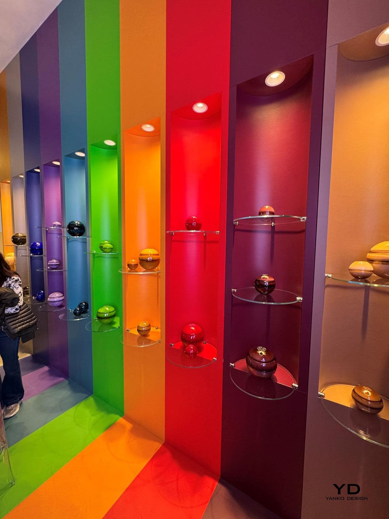
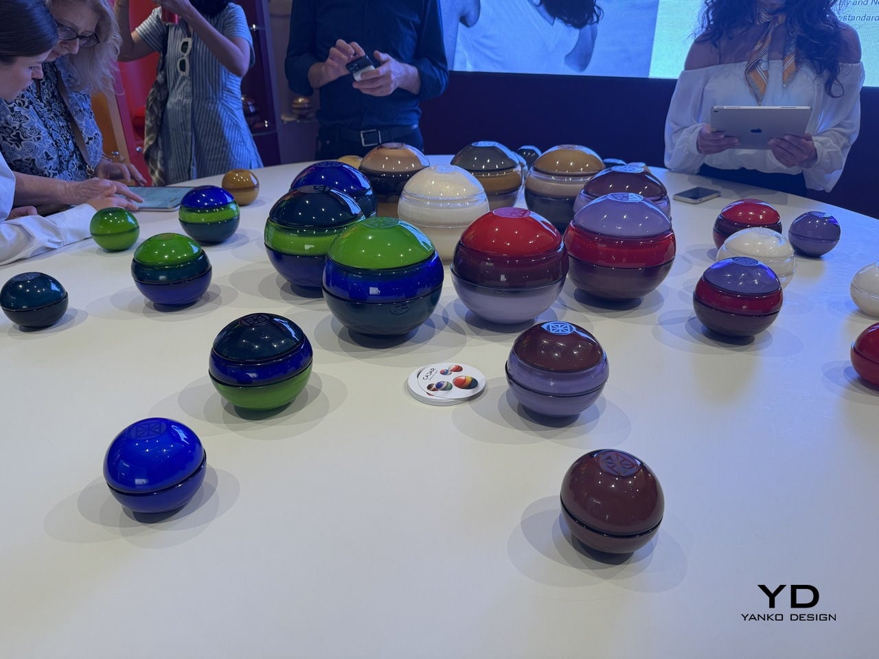
The colors are where this collection makes its boldest statement. Cadar and Venini did not play it safe. There is a deep cobalt blue paired with emerald green. A ruby red domed over a rich burgundy base. A warm amber sitting beneath a charcoal gray cap. A dusty lavender paired with a smoky brown. The combinations read like color theory exercises carried out by someone with very good instincts and zero fear. Looking at a table full of them, the effect is almost planetary. Each sphere feels like its own small world, and together they create something closer to a color installation than a product display.

That display at the Venini booth reinforced the point. The booth itself was organized as a full-spectrum rainbow wall, with each color column housing its corresponding spheres on glass shelves. It was theatrical in the best way, the kind of presentation that makes you understand what a product is about before anyone explains it to you. The candles did not need signage. The visual language was that clear.

The glass itself deserves attention. Venini has been making Murano glass for 105 years, and you feel that history in the material. The surface has a depth to it that paint or glaze simply cannot replicate. Some of the dome tops carry a subtle engraved motif, a geometric pattern consistent with Cadar’s jewelry aesthetic, which grounds the collection in the brand’s visual identity without announcing itself loudly. The finish across all pieces is high-gloss and lacquered-looking, which amplifies the color and gives each sphere an almost liquid quality in certain light. Picked up and turned in your hands, the glass has real weight.

Cadar, founded in 2015 by designer Michal Kadar, built its reputation on 18k gold jewelry defined by bold minimalism and fluid movement. Michal’s background is in fashion, and it shows in the way her pieces are conceived with the body in mind, with proportion and balance as non-negotiable starting points. That same sensibility applies here. The sphere is not an arbitrary choice. It is a form Cadar has returned to repeatedly, and in translating it from fine metal to hand-blown glass, the design team found a material that responds to light in an entirely different, arguably more democratic way. Gold catches light and keeps it. Glass catches light and gives it back.

The fragrances, composed by master perfumer Alberto Morillas, are tied to Cadar’s existing jewelry collections: Light, Water, and Bloom. The idea that a scent corresponds to a visual collection is not new, but it works here because the objects themselves feel like they carry a mood. You would choose your sphere the way you choose what to wear, based on color, on scale, on what kind of atmosphere you are trying to create.

The collection is available for pre-order at the Cadar flagship boutique in New York’s Meatpacking District and online at cadar.com. It is the kind of thing you put on a shelf and look at before you even light it. And that, ultimately, is the whole point.

The post Leave It to a Jewelry House to Make the Most Beautiful Candle first appeared on Yanko Design.
Bang & Olufsen Just Taught Stone to Sing at Milan 2026

Every year, Milan Design Week raises the question of what design is actually for. Not in the abstract, philosophical sense that gets debated in panel discussions nobody remembers, but in the most immediate, physical way: you walk into a space, and either you feel it or you don’t. The Bang & Olufsen and Antolini installation this year, From Quarry to Garden: The Shape of Beautiful Sound, is the kind of experience that makes you feel it before you can even explain why.

The collaboration between Bang & Olufsen, the Danish audio luxury brand founded in 1925, and Antolini, the Verona-based natural stone company with 70 years of history, is one of those pairings that sounds unlikely on paper but makes complete sense once you see it. Both brands are obsessed with material. Both are deeply committed to the idea that an object should not only perform but move you. Putting them in the same room, or rather the same garden, was probably inevitable.

Designers: Antolini® with Bang & Olufsen

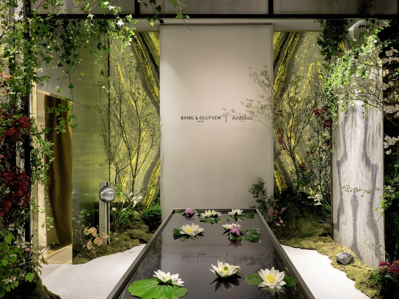
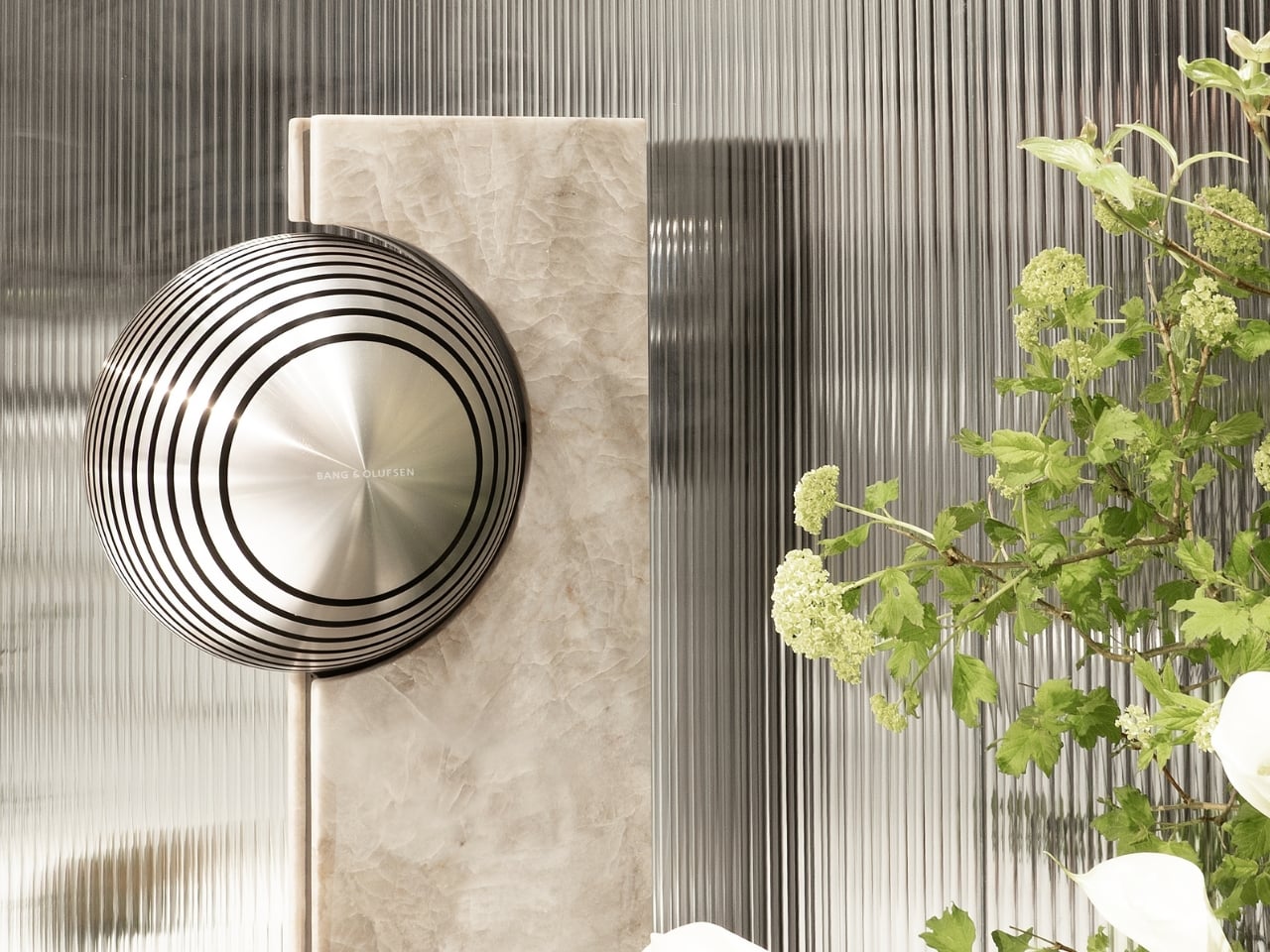
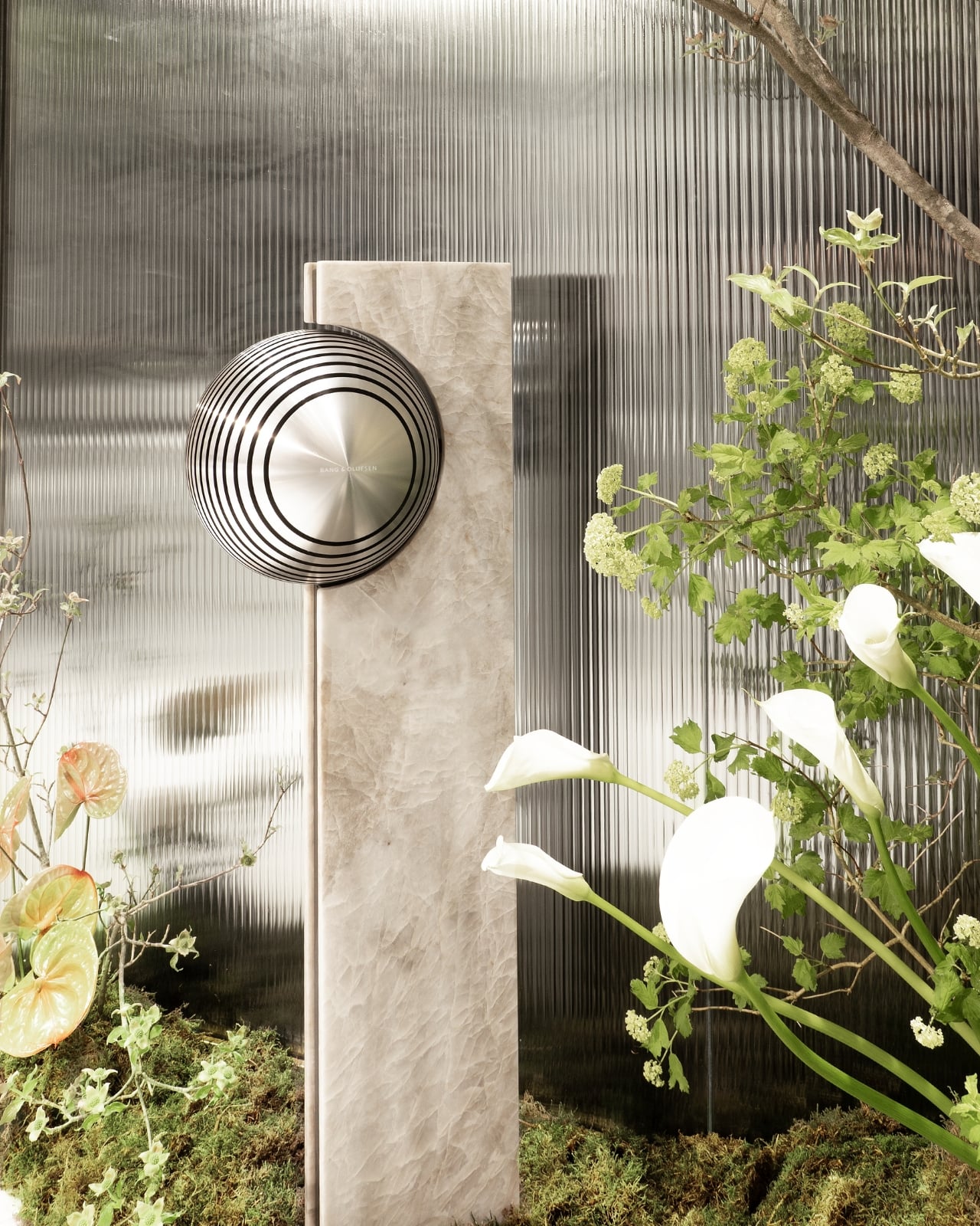
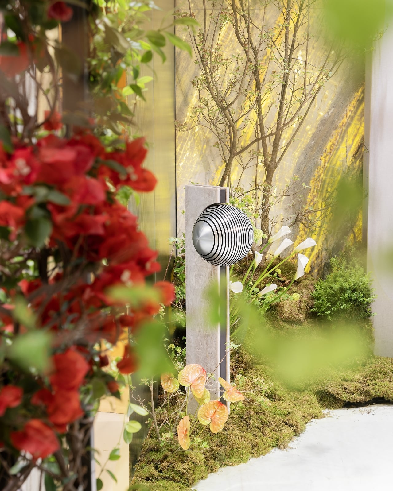
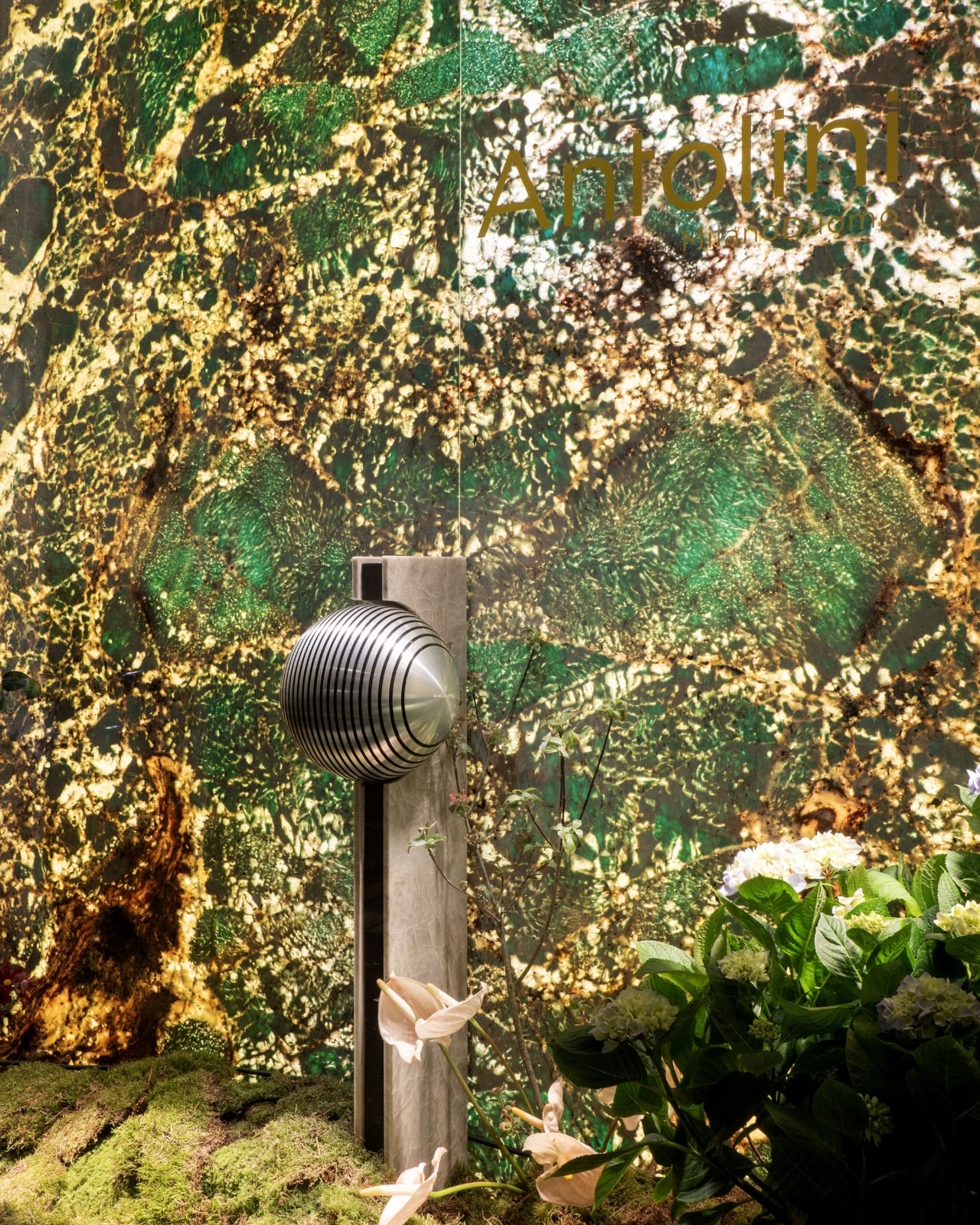
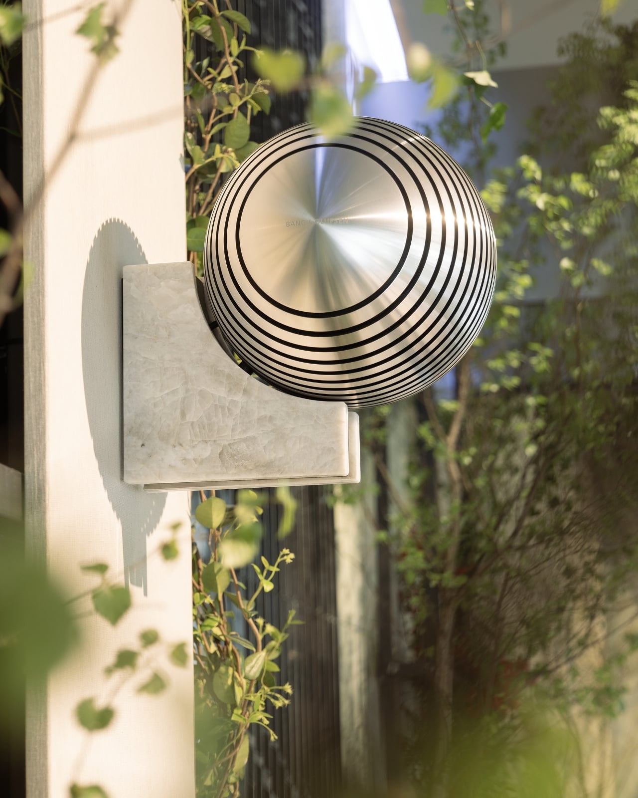
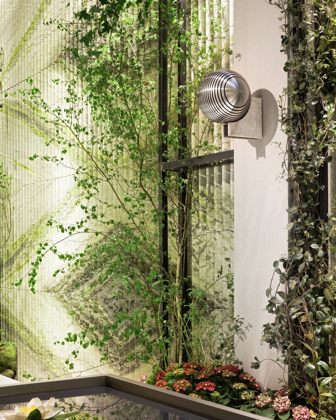
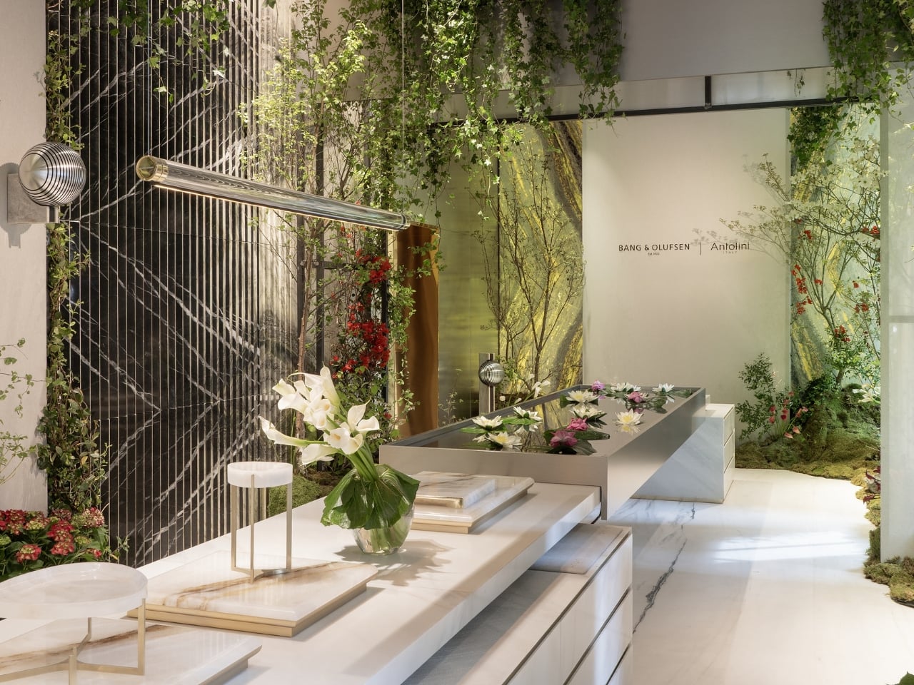
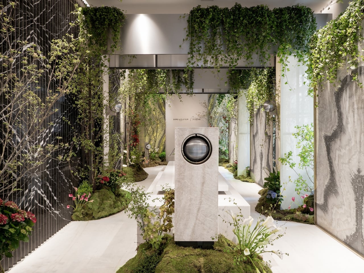
The installation, hosted at Antolini’s MilanoDuomo Stoneroom, centers on the preview of Beosound Haven, Bang & Olufsen’s forthcoming landscape speaker. It’s a sphere of precision-engineered aluminium that sits on a stone plinth, surrounded by living greenery, water lilies floating on a reflective table, and the kind of deliberate quiet that makes you lean in. Droplets fall onto the water surface and send out ripples, which is either a very beautiful metaphor for sound or just a very beautiful moment. I’m not sure it matters which.

The primary stone throughout the space is Antolini’s Taj Mahal quartzite in a matt finish, chosen for its soft, almost luminous tonality. It reads as both ancient and contemporary at once, exactly the kind of visual tension that great design installations live on. The stone doesn’t compete with the speaker; it contextualizes it. Beosound Haven looks like it belongs there, among the moss and the hydrangeas, in a way that speakers almost never manage to look like they belong anywhere outdoors.

That, to me, is the most interesting design question this collaboration raises: can sound be architectural? Not metaphorically, but literally, the way a wall or a window or a threshold is architectural? Bang & Olufsen’s Senior Director of Design, Kresten Bjørn Krab-Bjerre, speaks about sound as “an architectural language,” one that interacts with materials and forms atmosphere. It’s the kind of language that’s usually associated with interiors, with rooms and ceilings and acoustic panels. Translating it outdoors, into the open air, into a garden or a terrace, is a genuinely new proposition. And one worth taking seriously.

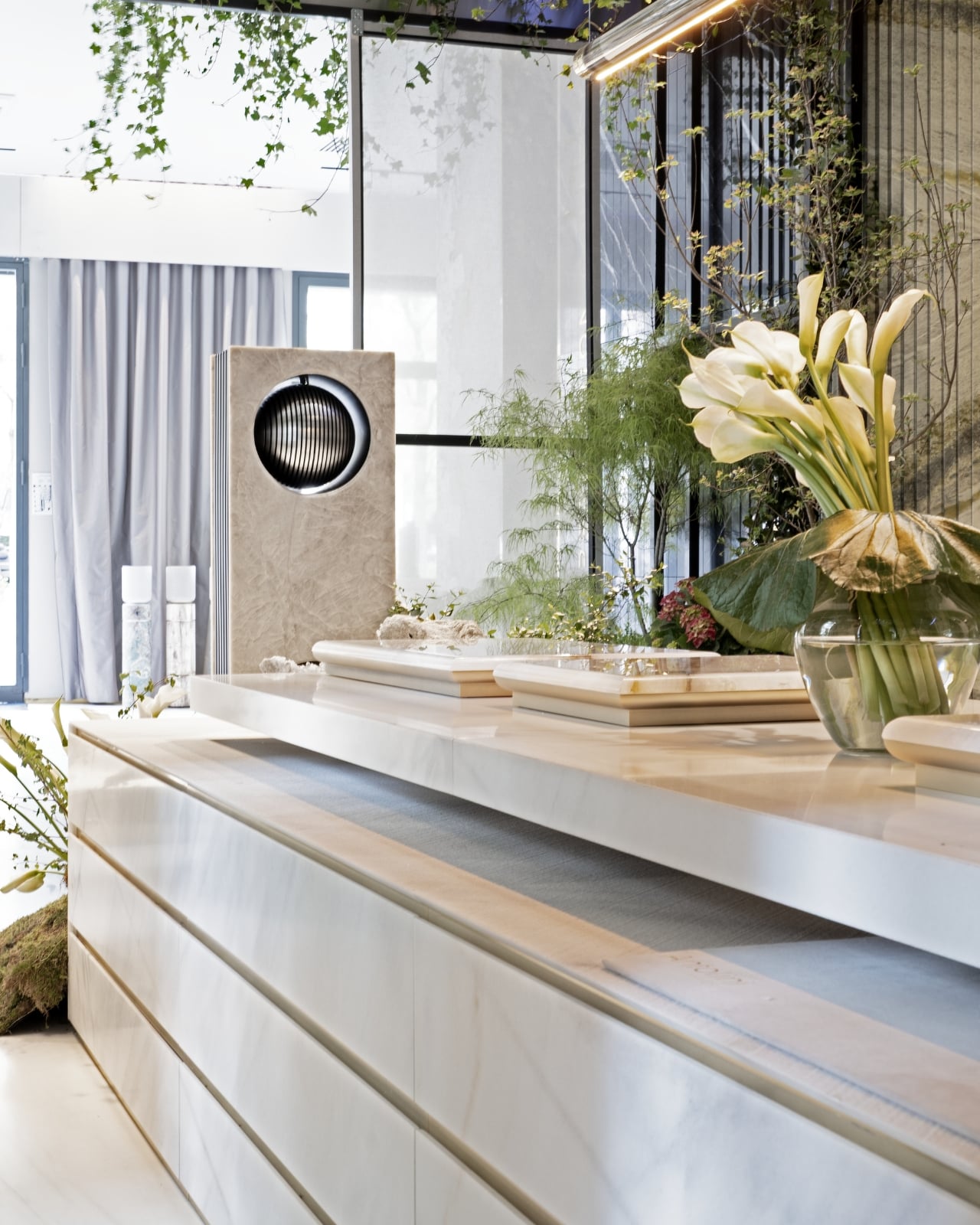
The collaboration also extends to a limited series of Beolab 18 speakers reinterpreted in Antolini stones: Amazonite, Retro Black Petrified Wood, Patagonia Original, Dalmata, Cipollino GreyWave, and Taj Mahal, each piece defined by the specific character of its material. No two are identical, which is exactly how it should be when you’re working with stone. Stone isn’t uniform and it was never meant to be. That unpredictability is part of the point.

This is the second chapter of the Bang & Olufsen and Antolini partnership, building on work introduced in 2025. It feels more confident this time around, more willing to make a statement. Carlo Alberto Antolini describes the result as “a dialogue between the elements,” and that framing feels right. It’s not a speaker placed in a garden. It’s a conversation between nature and craft, between sound and surface, between something ancient and something very, very deliberate.

Milan Design Week produces a lot of installations that photograph well and feel thin in person. This one seems to work differently, designed to be experienced with the body, not just processed with the eyes. The sound moves through the space. The stone holds light. The water catches everything. Whether you’re drawn in by the audio, the aesthetics, or simply the spectacle of a garden growing inside a Milan stoneroom, you’re likely to leave thinking about what it means to really listen to a space rather than just look at it.

The post Bang & Olufsen Just Taught Stone to Sing at Milan 2026 first appeared on Yanko Design.
The Inflatable Ocean That Knows When You’ve Gone Too Far

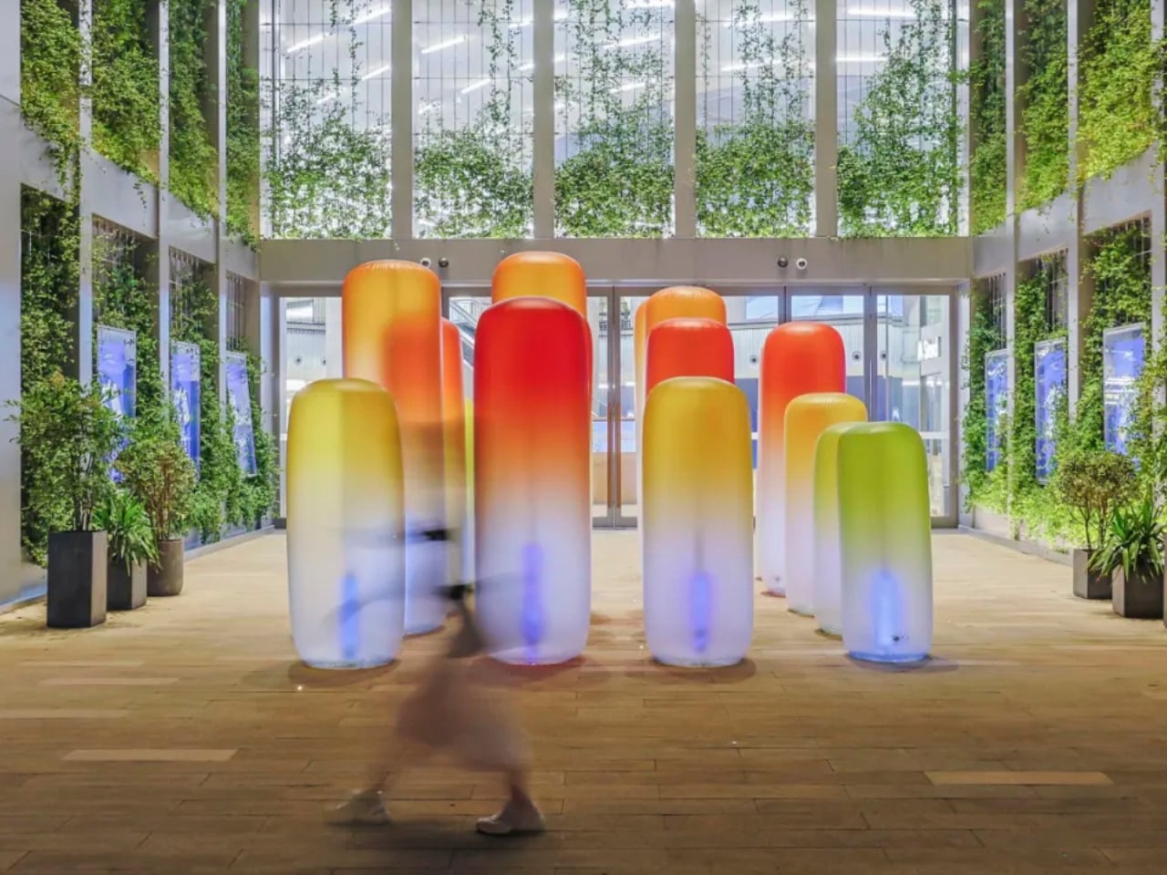
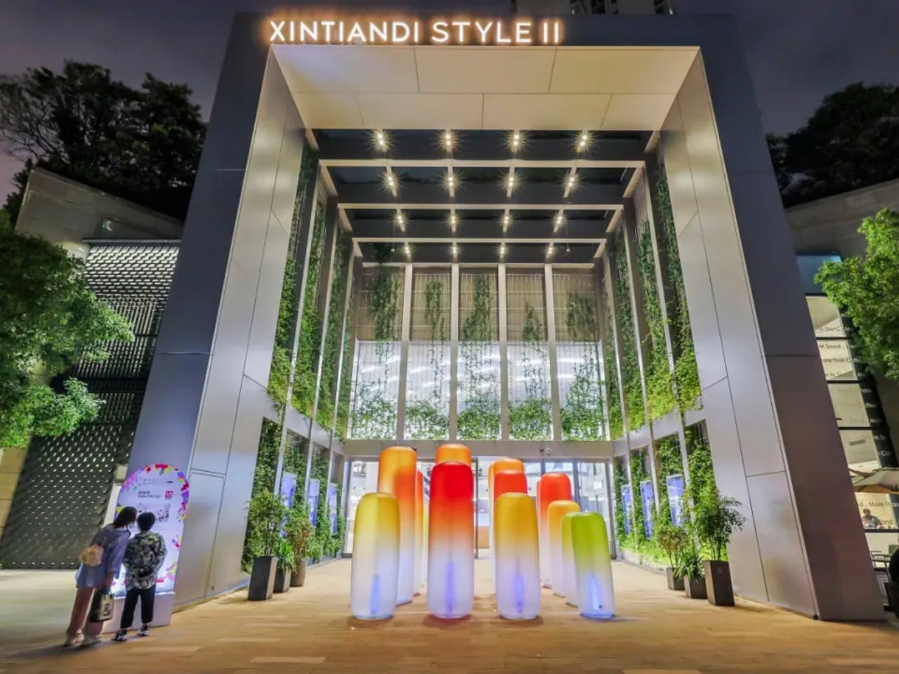
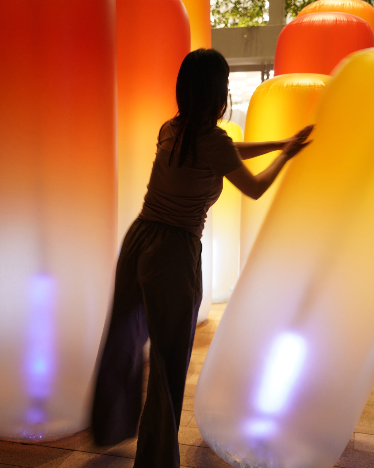
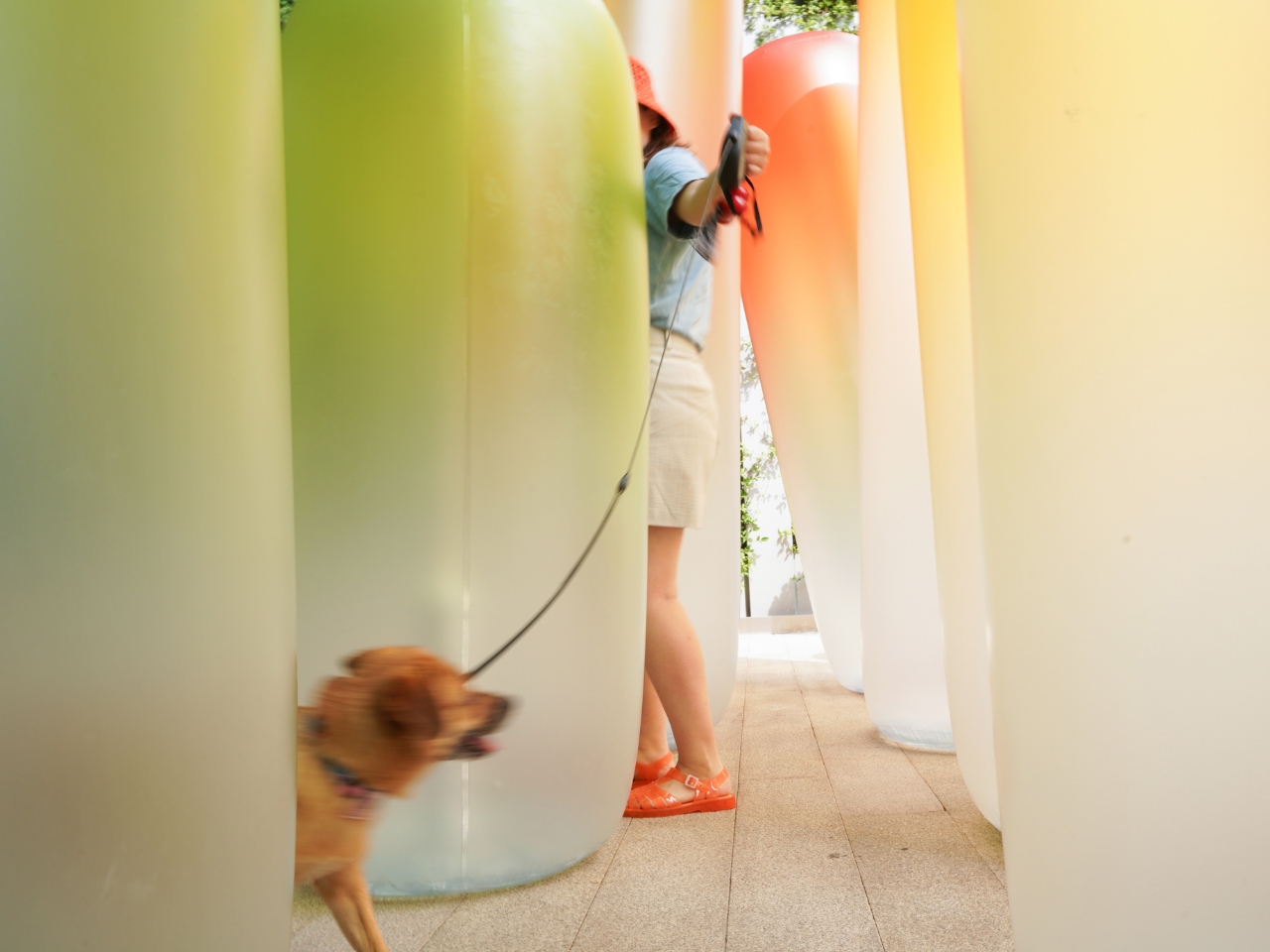
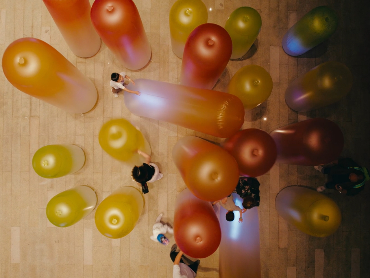
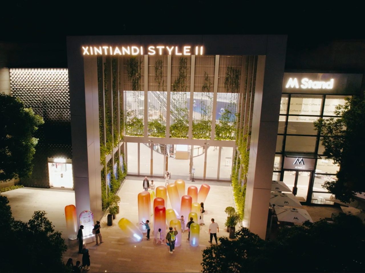
Not every design earns its attention. SHUOKE’s Light Me UP! is exactly the kind of work that makes you stop, look twice, and genuinely want to understand what you’re standing inside. And you are standing inside it. That’s the first thing to understand. Light Me UP! is not a sculpture you circle or a screen you observe from a polite distance. It is an enterable artificial seascape, a field of large inflatable forms installed at Xintiandi Style II in Shanghai, built at a scale that makes you feel genuinely small.

The columns are rounded and organic, their silhouettes somewhere between coral, sea anemone, and something you might find drifting in deep water. Their gradient coloring moves from deep orange and red at the crown down through warm yellow, then into a pale, almost translucent white at the base, where internal lights pool in cool blues and purples. During the day, they read as bold and almost playful. At night, they glow like living things. That quality, the sense that the installation is alive, is not accidental. It is the entire point.

Designer: Shuoke

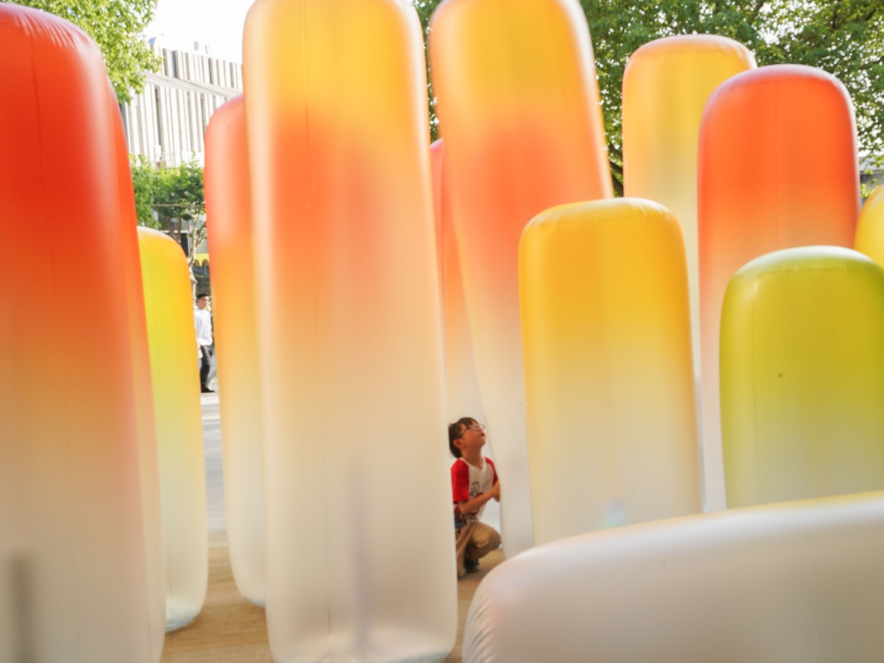
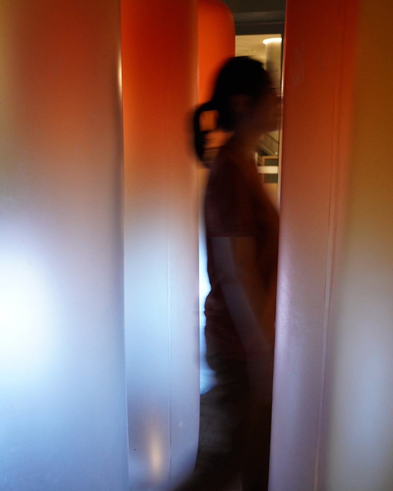
Each form carries internal lighting that shifts in a breathing rhythm, expanding and contracting with a pulse that is slow enough to feel biological. The effect is subtle but deeply convincing. You stop noticing the material and start noticing the breath. When you touch one of the columns, or press through the narrow gaps between them, the light responds. The moment of contact produces a shimmer, a flicker of acknowledgment, that genuinely reads as reciprocal. SHUOKE described an earlier version of this logic as wanting the experience to feel more like interacting with a living thing than with a device, and Light Me UP! lands exactly there.

But here is where the design gets genuinely interesting, and where SHUOKE moves well beyond the usual boundaries of interactive installation work. The responsiveness has a limit, and that limit is intentional. Moderate interaction, a gentle touch, a slow movement through the space, draws the light out and activates the installation’s vitality. But push too hard, too aggressively, too much, and the light begins to fade. The structures appear to deteriorate. The environment dims and falls into stillness. The installation does not simply reward participation. It responds to the quality of it.

This is the marine ecology metaphor embedded directly into the interactive logic, and it is a clever and meaningful piece of design thinking. The ocean, like Light Me UP!, sustains and nurtures life up to a point. Past that point, it retreats. It diminishes. What SHUOKE has done is translate a genuinely complex environmental idea into a physical, embodied experience that anyone can feel without needing it explained. You don’t read the metaphor. You live it, in the span of a few minutes, with your hands and your body in a public space in Shanghai.

I think this matters more than it might initially seem. Environmental messaging in design has a tendency to stay on the surface: a recycled material here, a sustainability claim there. Light Me UP! goes somewhere different. It puts you in the position of the human who has the capacity to either nurture or exhaust the thing in front of them, and it gives you real-time feedback on which one you’re doing. That is a far more honest and demanding kind of design.
The forms themselves deserve more credit too. SHUOKE chose inflatable structures for a reason. They are soft, yielding, and slightly unpredictable. They move when pressed. They hold air the way living organisms hold breath. The choice of material reinforces the biological quality of the whole installation without ever having to announce it. The colors, warm and gradient and unmistakably aquatic at night, do the same work quietly.
Light Me UP! is the kind of design that operates on multiple registers at once: visually arresting from the street, physically immersive once you’re inside it, and conceptually coherent in a way that holds up the more you think about it. That combination is rarer than it should be, and when it shows up, it’s worth paying attention to.

The post The Inflatable Ocean That Knows When You’ve Gone Too Far first appeared on Yanko Design.