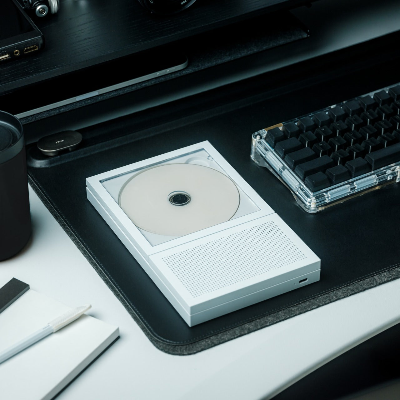
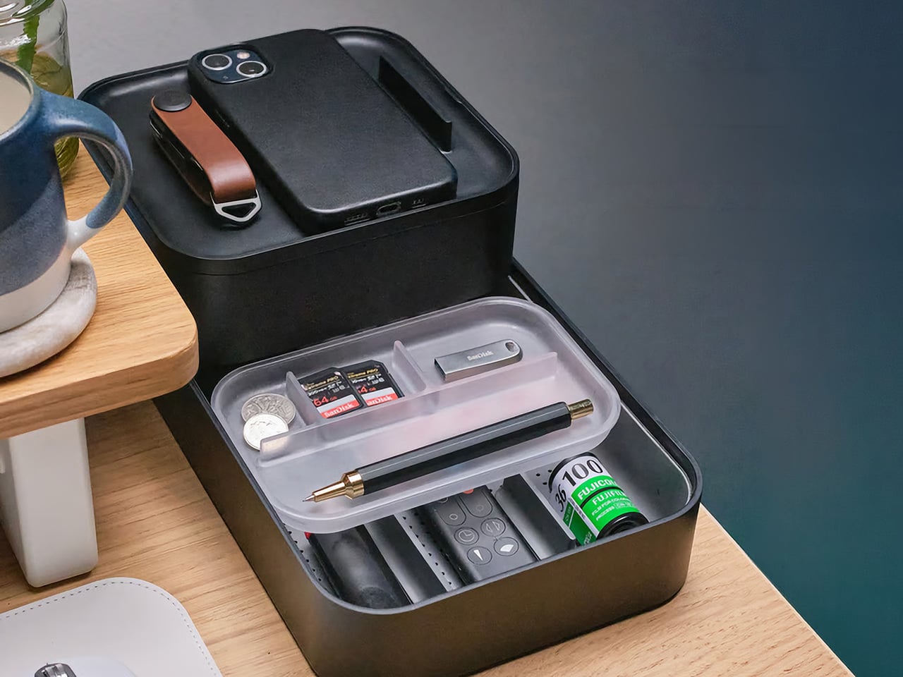
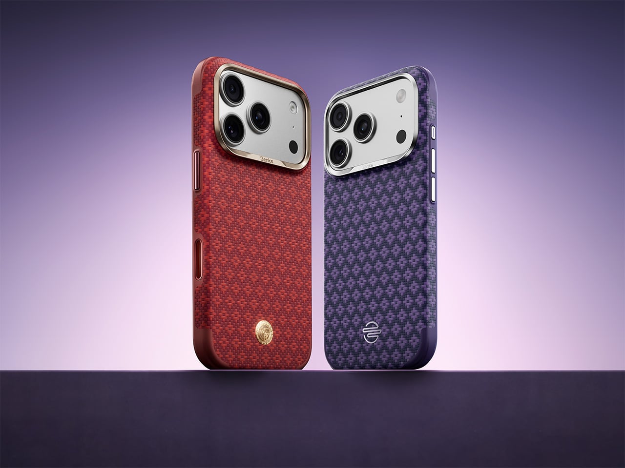
There is a reason Kevlar keeps showing up in premium phone accessories. The material brings a rare combination of low weight, tactile richness, and serious structural confidence, which makes it ideal for people who want their case to feel intentional rather than disposable. BENKS has been working that territory for a while, and the new BENKS ArmorEdge launch sharpens the formula with two color-forward editions, Savvy Red and Peri Purple, designed for the iPhone 17 Pro and Pro Max. Both treat the woven surface as a design element alongside its structural role. The result is a case lineup testing whether protection and personality can genuinely coexist at the same price point.
Both cases share the same core promise, slim everyday protection with MagSafe compatibility, 360-degree airbag corners, and DuPont Kevlar construction, but deliver it with very different moods. Savvy Red runs graphic and energetic while Peri Purple reads restrained and expressive, a contrast that registers as branding intentionality as much as a color choice. BENKS ArmorEdge Air Navigator then extends the family in a lighter direction, with an exposed 600D woven back, a 27g build, and a Magellan-engraved reverse that gives the case a narrative dimension uncommon in slim case design. The three together span bold color expression, understated sophistication, and material-first minimalism within a single product family. BENKS calls it confidence-forward protection, and the physical details mostly agree.
Designer: Benks
Click Here to Buy Now: Peri Purple | Savvy Red | ArmorEdge Air Navigator
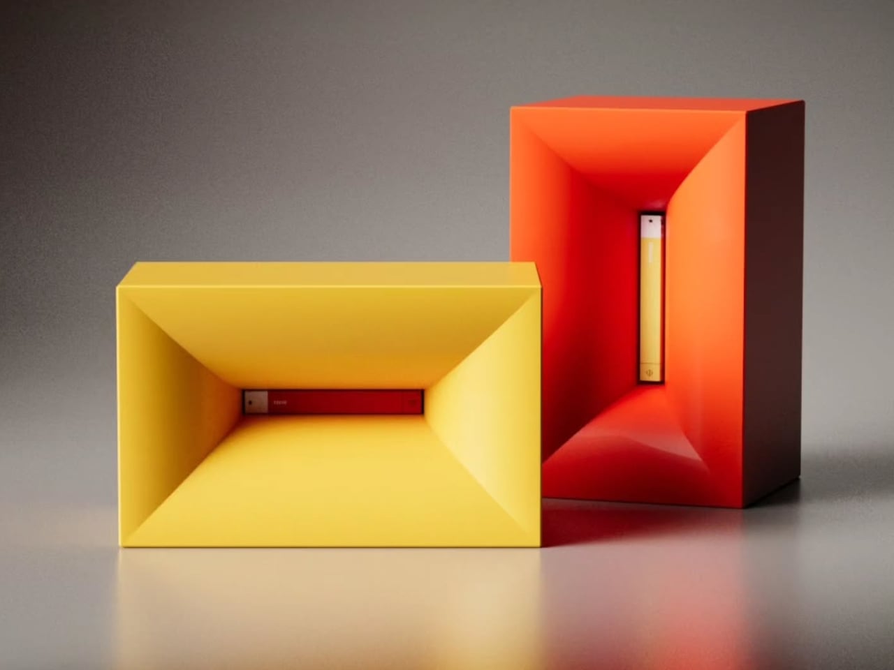
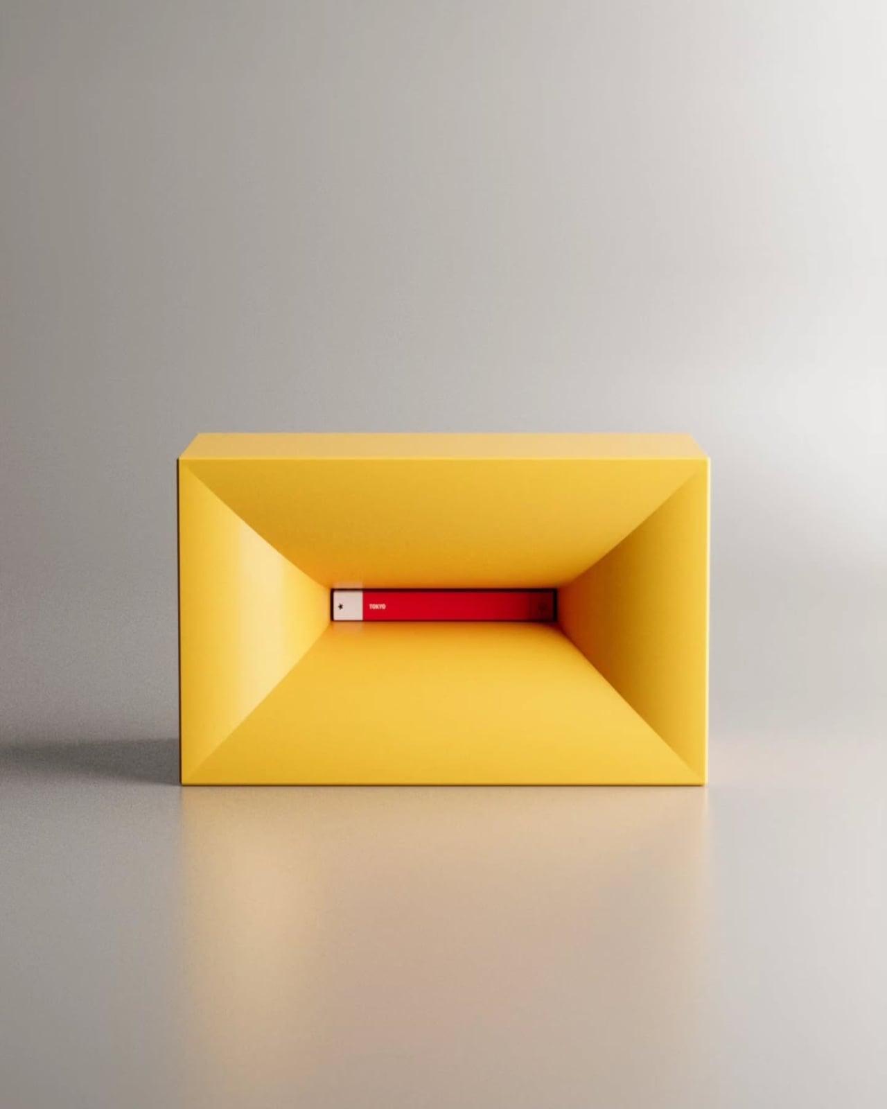
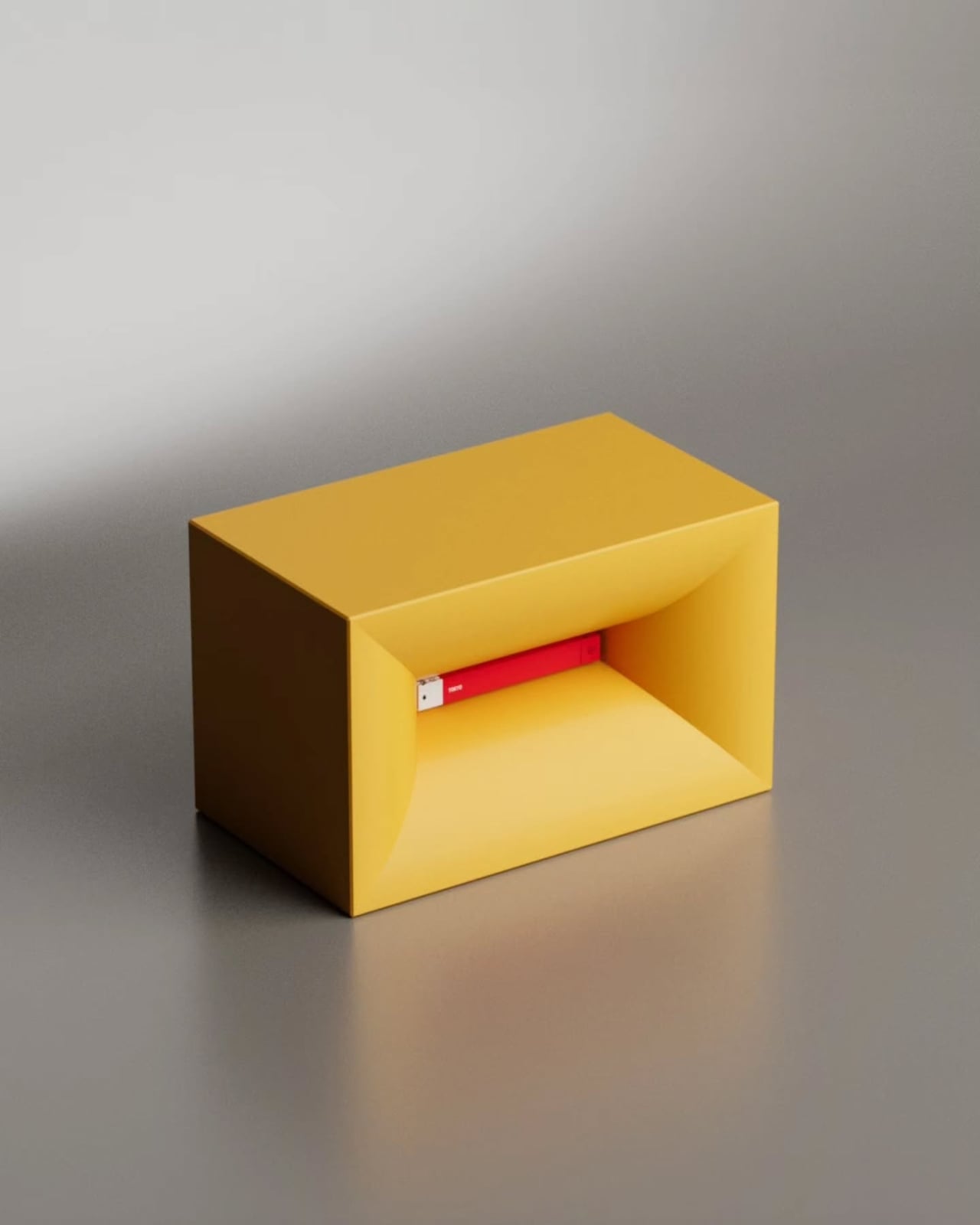
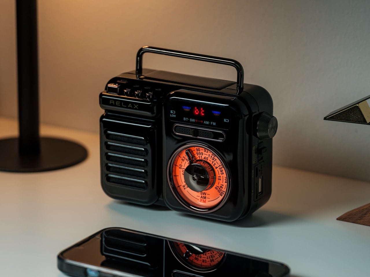
Savvy Red is structured around a raised jacquard diamond weave that catches light at shifting angles, making the surface genuinely tactile rather than decorative. As a protective Kevlar case, it keeps the frame edge at a precise 1.8mm while backing that slim profile with a four-guard 360-degree airbag system built to handle the corner-first drops that standard cases consistently fail at. We covered the BENKS ArmorGrid ArmorAir last September as a Kevlar phone case for the iPhone 17 Pro that carried real bulletproof-vest-grade material confidence, and Savvy Red builds on that character while pushing further into expressive design territory. MagSafe compatibility centers on a graphic on the back, a colorway-specific detail that ties the functional ring to a distinct visual identity rather than defaulting to a generic shared element across the lineup. At $64.99, the raised diamond weave alone justifies the ask as a tactile story that polycarbonate simply cannot replicate.
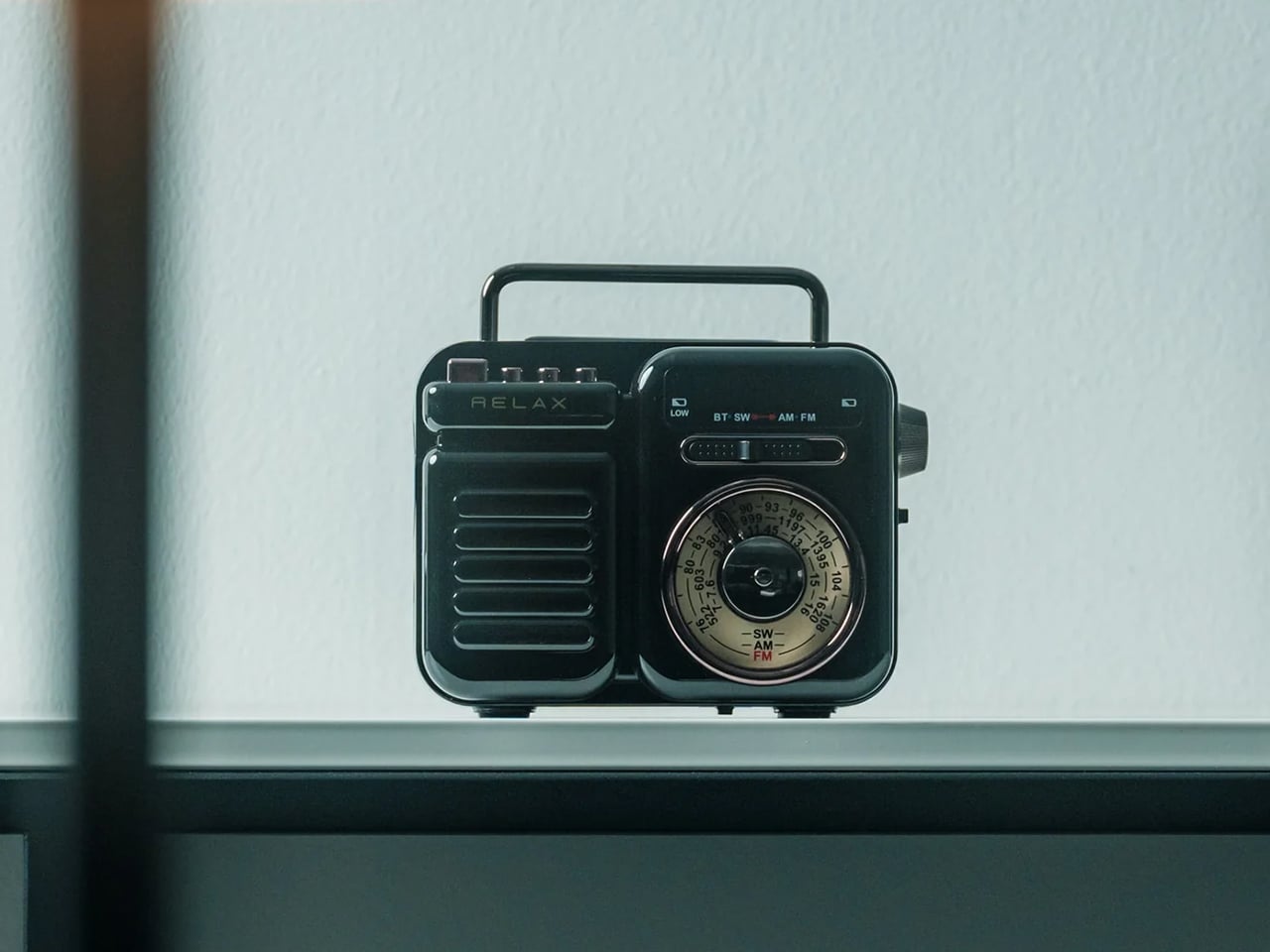
BENKS ArmorEdge Peri Purple
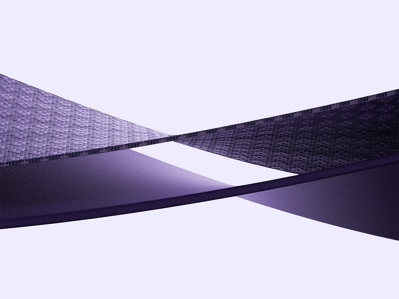
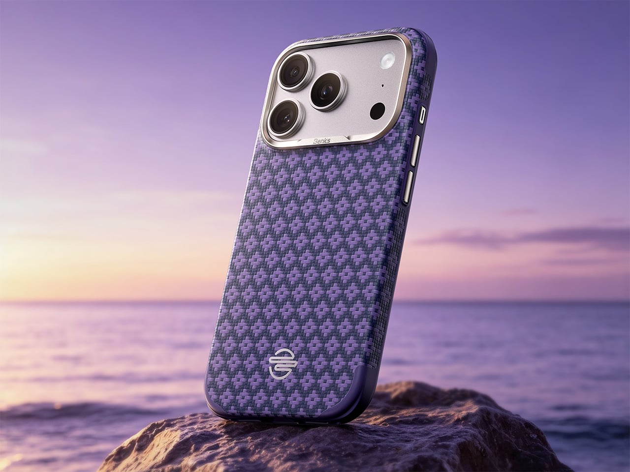
Peri Purple carries the same engineering foundation as Savvy Red but in a softer, more regal tone that makes it a premium Kevlar case for users who want Kevlar craftsmanship without the assertive graphic energy. BENKS describes it as designed for subtle expression over loud attention, essentially a style-driven protective Kevlar case for those who prefer their personality understated rather than announced. The airbag corners and MagSafe compatibility carry through, with a different visual graphic on the backside. That decision, giving each finish its own visual badge rather than a shared hardware element, is a considered design move that ties visual identity all the way through to the functional center of the case. Each case even showcases a different delicate badge on the bottom, right above the charging port, setting them apart distinctly. Both Savvy Red and Peri Purple retail at $64.99, positioned as two parallel expressions of personality under a single engineering standard.
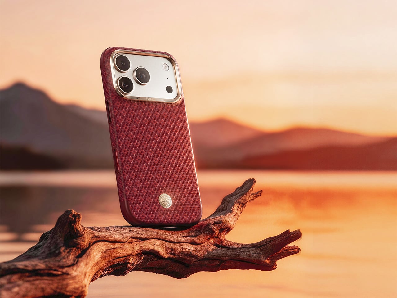
BENKS ArmorEdge Savvy Red
At 27g and 0.9mm at the frame edge, the BENKS ArmorEdge Air Navigator operates on a different set of priorities from its two siblings. It qualifies as a genuine BENKS ArmorEdge Kevlar case in the fullest material sense, with DuPont Kevlar fiber forming the structure, but TPU sits only at frame edges and structural stress points, leaving the entire 600D woven back exposed and fully in contact with the hand. That material-first decision makes the grip experience central to the case’s identity rather than something filtered through a polymer overlay. BENKS ties the Navigator edition to a travel and exploration theme through an anchor medallion on the front and an engraving of Magellan’s circumnavigation route on the back, paired with the Latin inscription “PRIMUS CIRCUMDEDISTI ME,” giving the MagSafe protective case a narrative depth that most slim builds forgo entirely. At $61.99, it reads as the most considered piece in the BENKS ArmorEdge family.
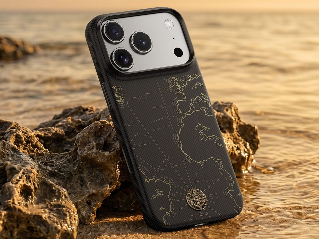
BENKS ArmorEdge Air Navigator
The full BENKS ArmorEdge lineup is available now at $64.99 for Savvy Red and Peri Purple and $61.99 for Air Navigator on the BENKS website.
Click Here to Buy Now: Peri Purple | Savvy Red | ArmorEdge Air Navigator
The post Drop-proof, under 28 grams, and finally beautiful: Benks’ new Kevlar iPhone cases put aesthetics first first appeared on Yanko Design.