Handheld gaming PCs have become serious pieces of hardware over the past few years, and the display has quietly become the most contested spec on the spec sheet. Early handhelds shipped with IPS panels as a matter of course, but expectations have shifted. Owners of these devices spend long hours staring at a relatively small screen, and the quality of that screen now shapes how the whole experience is judged.
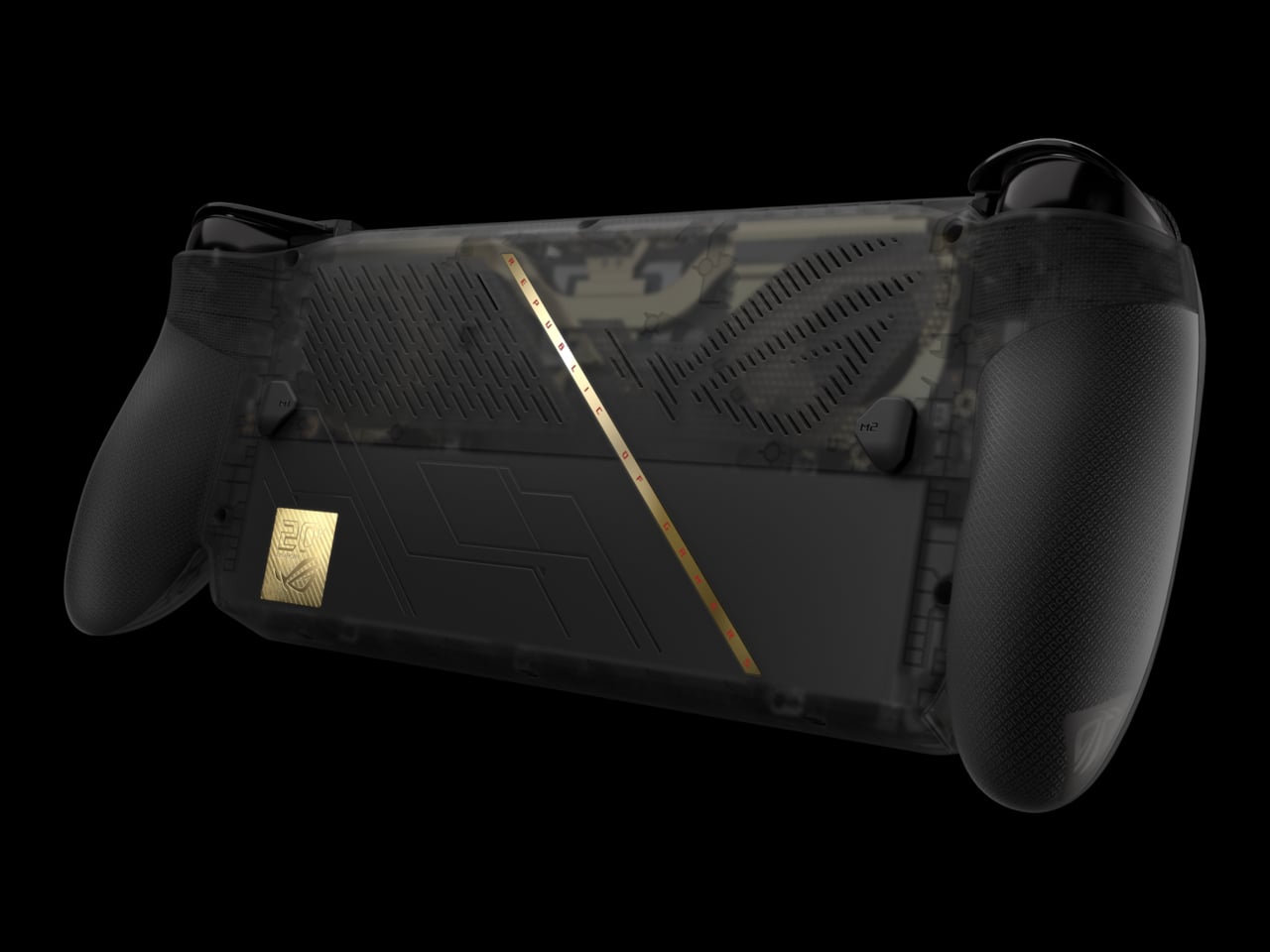
ROG is marking 20 years as a brand with an anniversary bundle that puts its most significant Ally upgrade to date front and center. The ROG XBOX Ally X20 is a special-edition take on the Ally X, built around a translucent black chassis with a gold internal structure and a 7.4-inch OLED display, the first of its kind on an Ally, paired in the box with a set of AR gaming glasses.
Designer: ASUS

The jump from IPS to OLED on the Ally is hard to overstate for anyone who’s spent time with both panel types. The Nebula HDR Display delivers 1,400 nits of peak brightness, a 0.2ms response time, a 120Hz refresh rate with FreeSync Premium Pro, and support for Dolby Vision. VESA DisplayHDR 1000 certification rounds it out, and Corning DXC glass with an anti-reflective coating cuts glare by 65%.
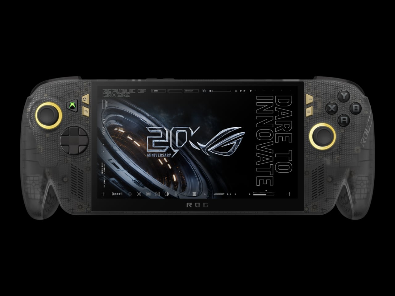
Under the hood, the AMD Ryzen AI Z2 Extreme processor carries the same horsepower as the Ally X, backed by 24GB of RAM and an 80Wh battery. New TMR joysticks deliver better precision and tracking. Auto SR upscaling handles frame-quality boosts at lower power costs, and Xbox Mode offers a clean, console-like interface for navigating a library that spans Xbox, PC Game Pass, and Steam.
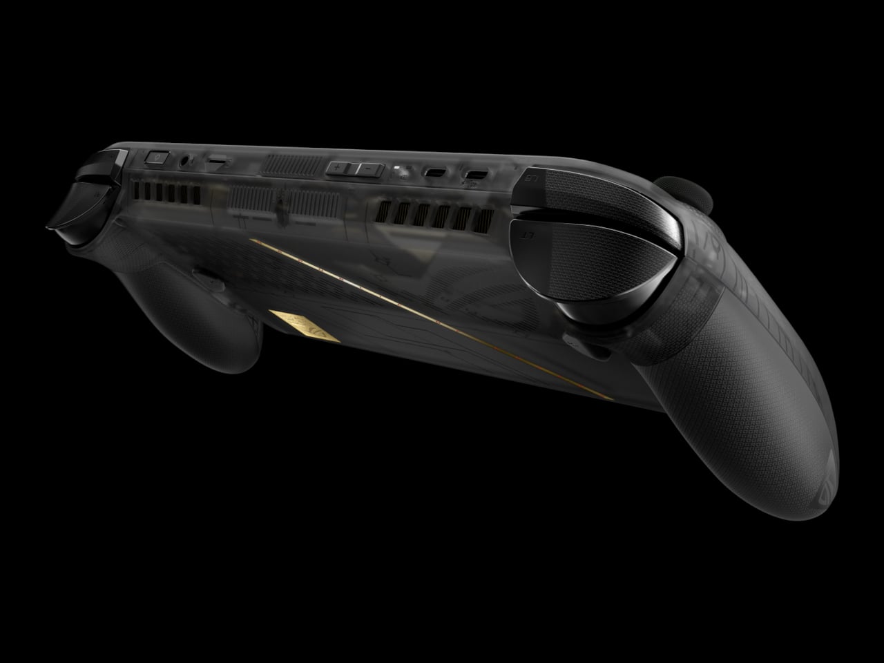
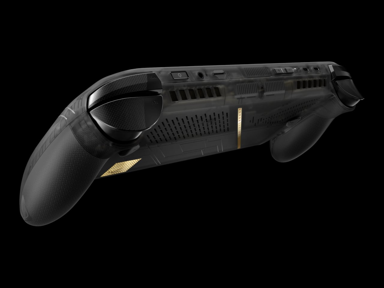
The design is the most conspicuous part of the X20’s identity. The translucent black body lets the gold-accented internal frame show through, making the engineering itself part of the aesthetic. It’s a specific kind of flex that ROG’s anniversary context earns credibility for. Rubberized coating on the rear handgrips keeps the feel practical rather than purely decorative, which matters for a device meant to hold through long gaming sessions.
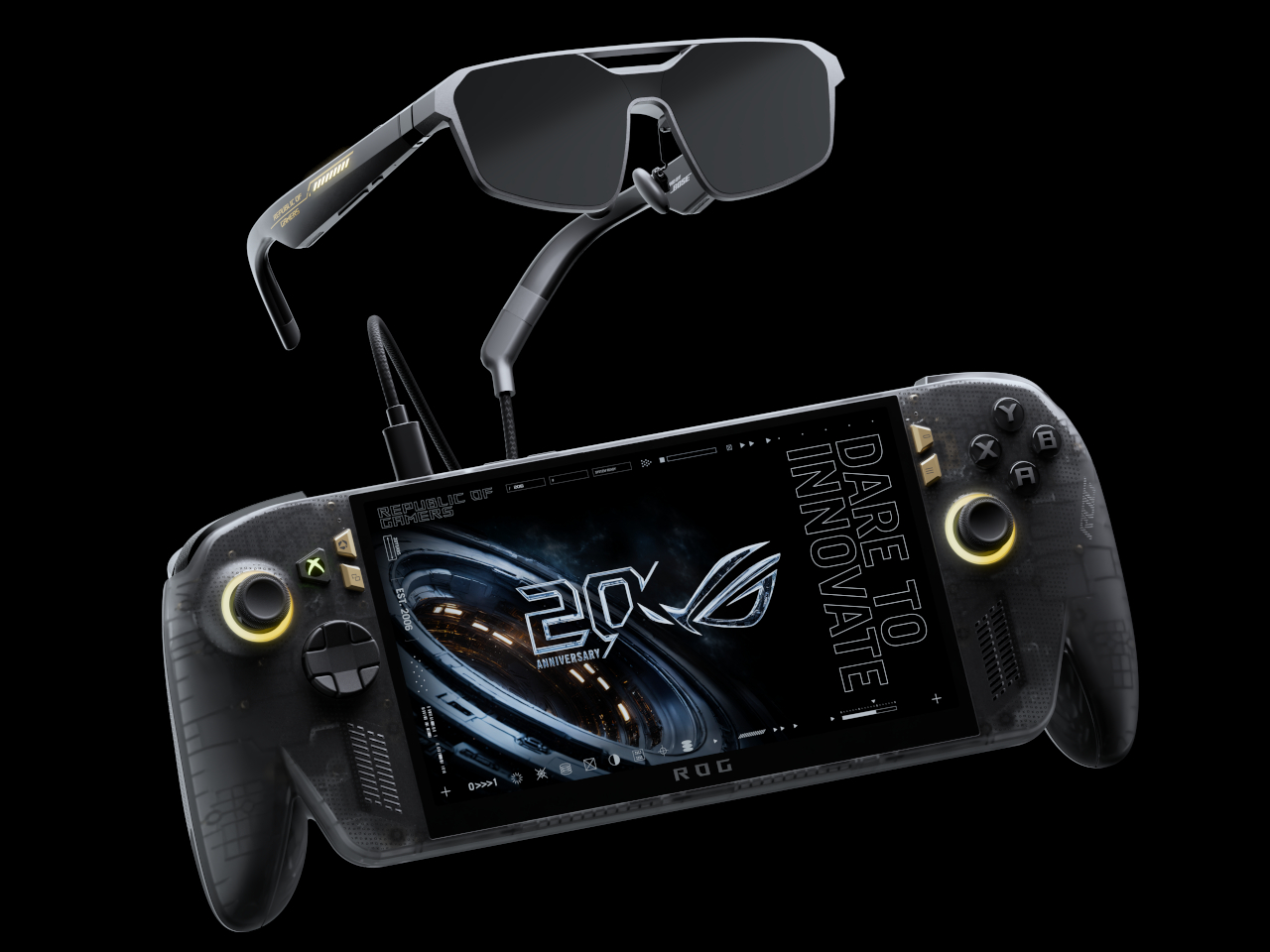
The bundle’s second piece is the ROG XREAL R1 Edition 20 Gaming AR Glasses, and they’re the part that makes this package genuinely different from simply selling a revised Ally X. These aren’t the kind of smart glasses that surface notifications or track fitness. They’re designed specifically for gaming, using dual Sony Micro-OLED displays to generate a virtual screen sized for long sessions away from a TV or monitor.
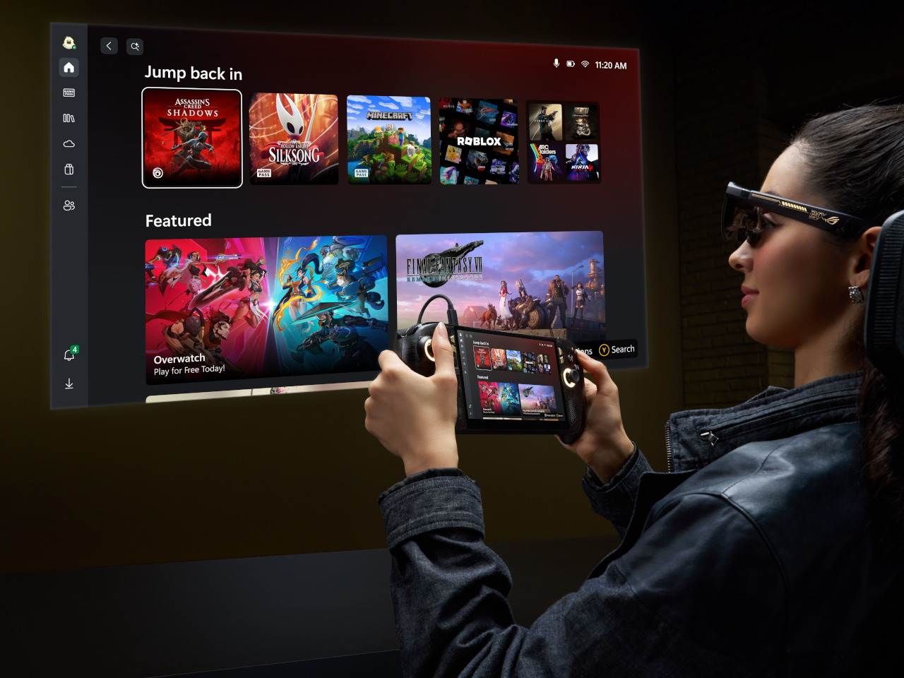
That virtual screen projects to 171 inches when viewed from 4 meters, covering 95% of the focused field of view. A 240Hz refresh rate and a 0.01ms response time keep fast-paced gameplay clean without smearing or lag. Native 3DoF head tracking anchors the display to your gaze, while Anchor Mode locks it in a fixed position for those who prefer to play without the screen following their movements.
The ROG XBOX Ally X20 isn’t the kind of hardware upgrade that quietly adds a spec or two. OLED on the Ally for the first time, combined with AR glasses that project a room-filling virtual display and wrapped in a translucent anniversary design, makes for a more complete idea than a typical limited-edition product usually delivers. A holiday 2026 release means the wait still has some time left.

The post ROG Just Gave the Ally Its First OLED and a 171-Inch AR Screen first appeared on Yanko Design.