5 Desk Accessories So Cute They Make Work Feel Less Like Work

For years, professional stationery stayed neutral and invisible. Desks were filled with black pens, muted folders, and purely functional organizers. Utility mattered, but visual pleasure rarely did. That long-standing mindset is now beginning to change as designers rethink what belongs on a modern desk.

Let’s enter the era of playful stationery where cute meets carefully considered design. These pieces are not gimmicks but thoughtfully engineered essentials that elevate everyday work. By combining tactile satisfaction with visual charm, they turn routine tasks into moments of delight. The desk is no longer just a surface but a space for creativity, comfort, and self-expression.

1. Transparent Design Aesthetics

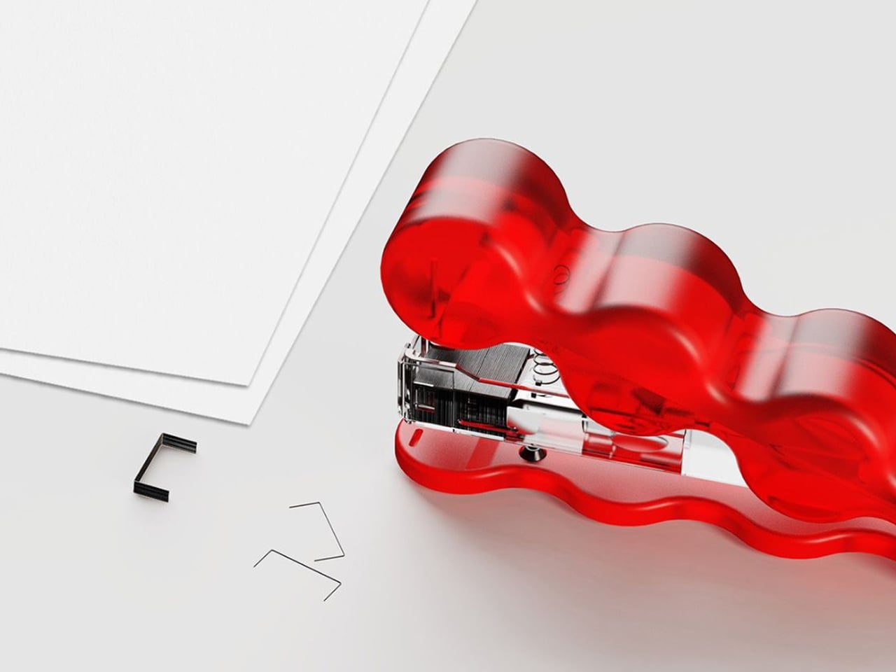
Transparency in stationery is no longer just a visual novelty. It reflects a deeper appreciation for clarity, precision, and the beauty of the machine. Clear materials such as acrylic and resin reveal springs, gears, and ink reservoirs, turning everyday tools into small design showcases. The user is invited to witness how the object functions, creating a stronger connection between form and mechanism.

Beyond aesthetics, transparent design reshapes the visual rhythm of a workspace. Its light presence reduces the sense of bulk and clutter, allowing the desk to feel open and breathable. The effect is subtle yet striking, blending minimalism with a futuristic edge while maintaining full functionality and tactile satisfaction.
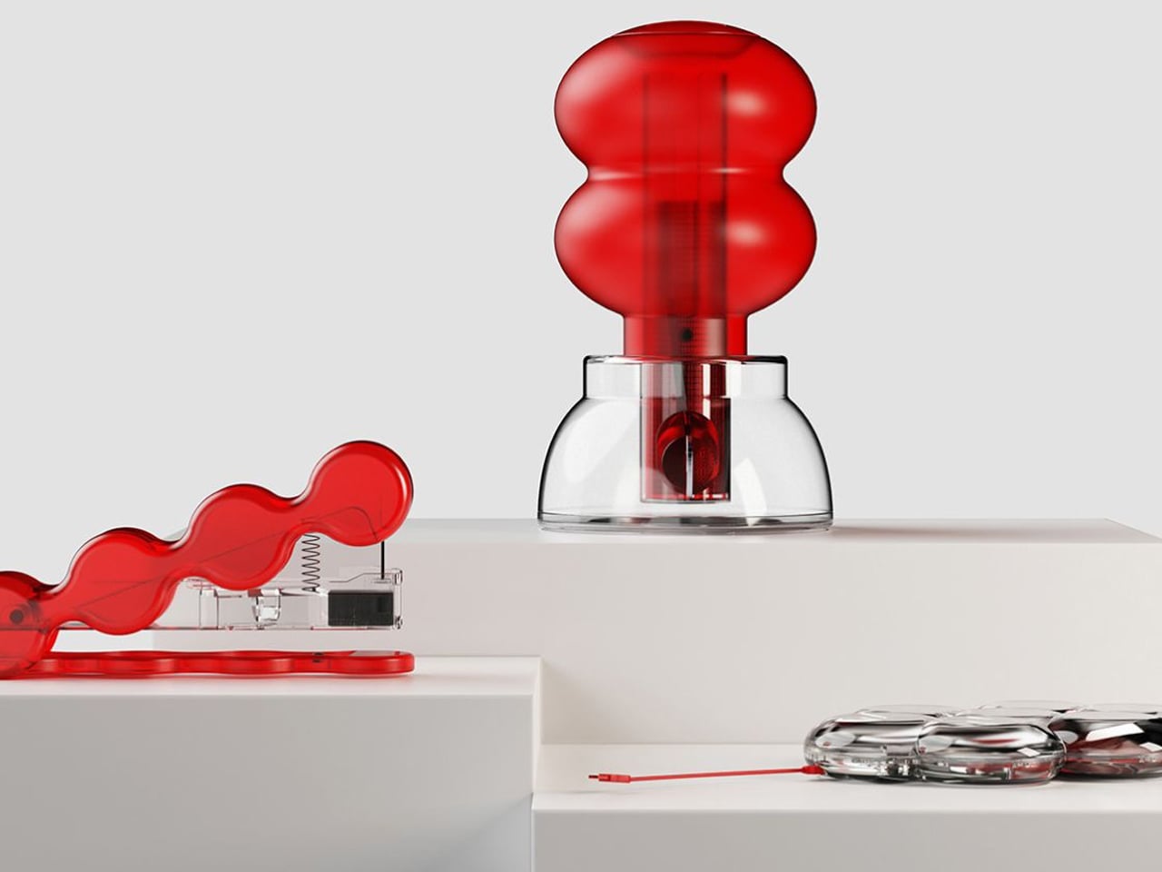
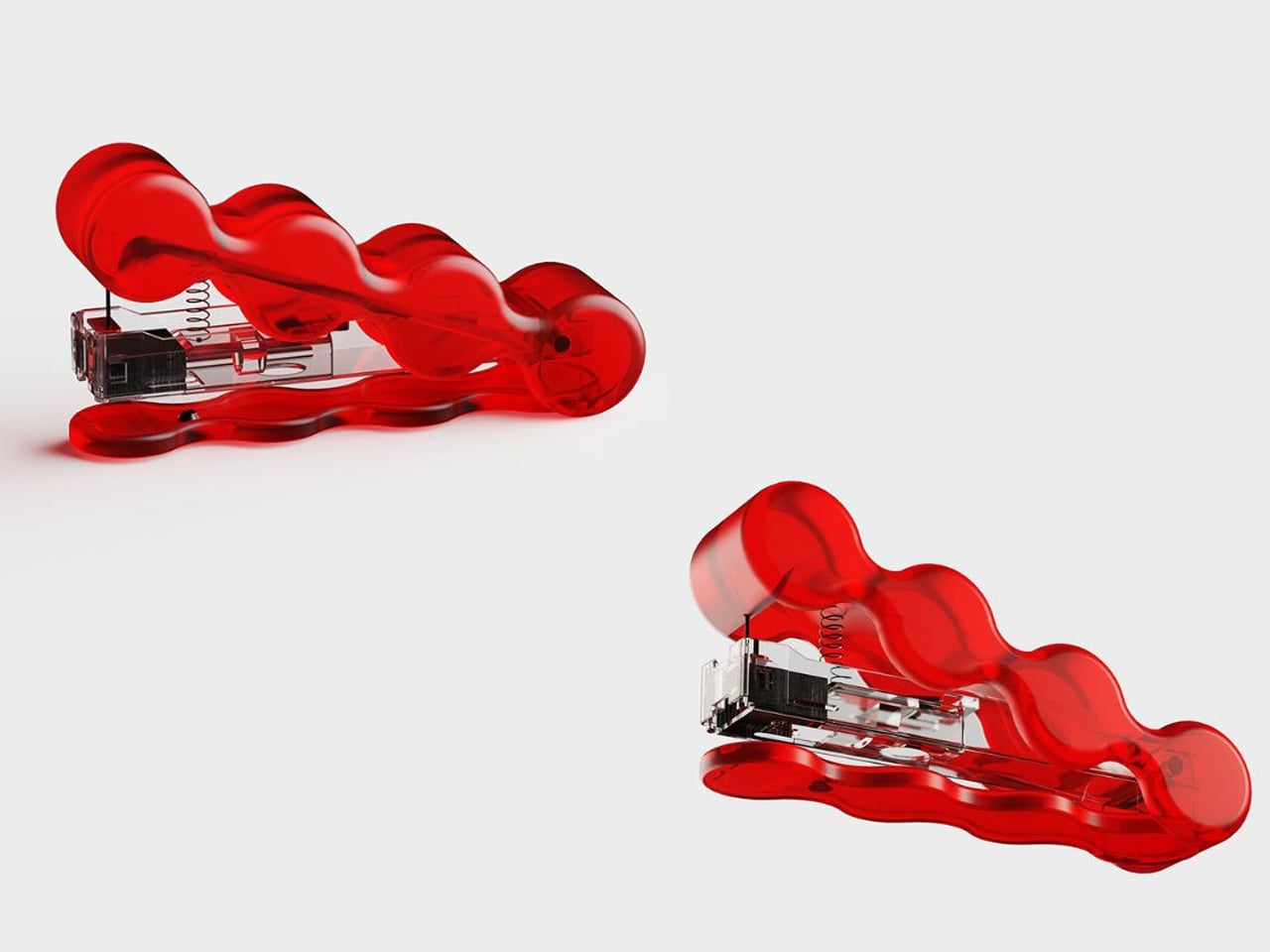
Royi Stationery places transparency at the heart of its design philosophy, transforming ordinary office tools into visually honest objects. Their clear staplers, external hard drives, and coin banks expose every internal component, allowing you to witness the mechanics that usually remain concealed. The transparent casing is not simply an aesthetic decision; it symbolises openness and authenticity. When you press the stapler, you see the staple move through paper. When you hold the hard drive, you observe the intricate circuitry protecting your data. This visibility creates a deeper connection between the user and the object.


By removing the outer shell that typically hides complexity, Royi invites you to appreciate function rather than façade. The products celebrate engineering, structure, and process, reminding you that what lies beneath the surface often carries the greatest value.

2. Stationery as Sculptural Art

Stationery is evolving beyond utility, stepping confidently into sculptural art. Contemporary desk accessories are designed to captivate even at rest, with forms inspired by gallery objects rather than traditional office supplies. Tape dispensers resemble smooth metallic pebbles, while paperweights echo abstract statues, transforming ordinary tools into visual statements.

This shift reflects a growing desire for workspaces that feel curated and expressive. Form now holds equal importance to function, allowing these pieces to enhance the environment, whether in use or simply displayed. The desk transforms into a composition where practicality and artistry coexist, adding character, texture, and a sense of intentional design.
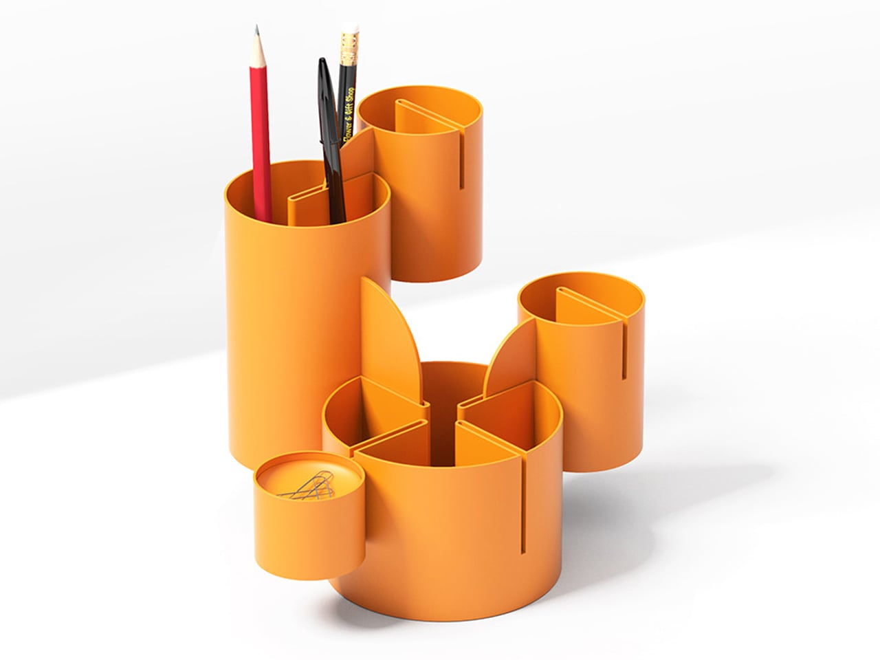
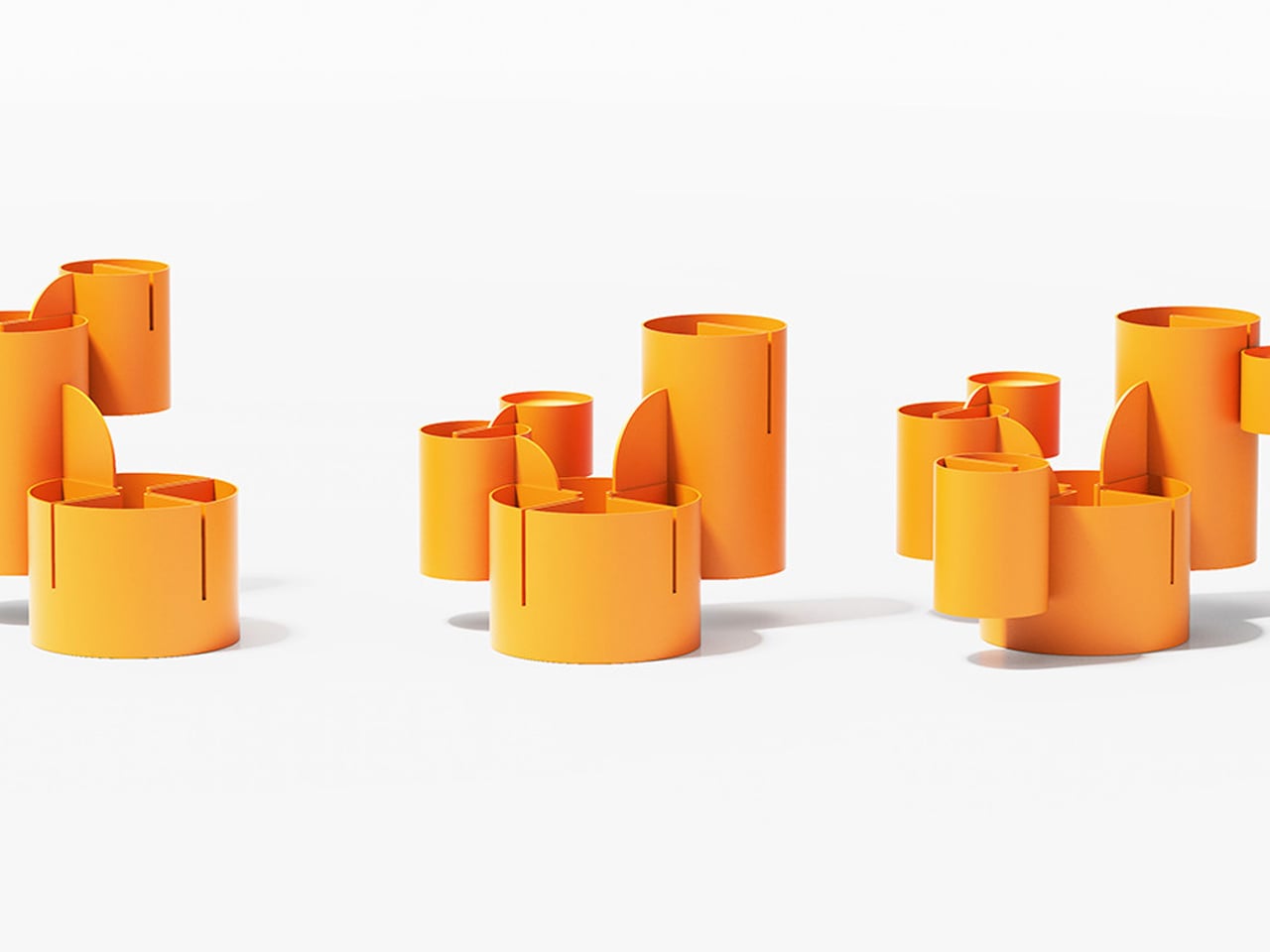
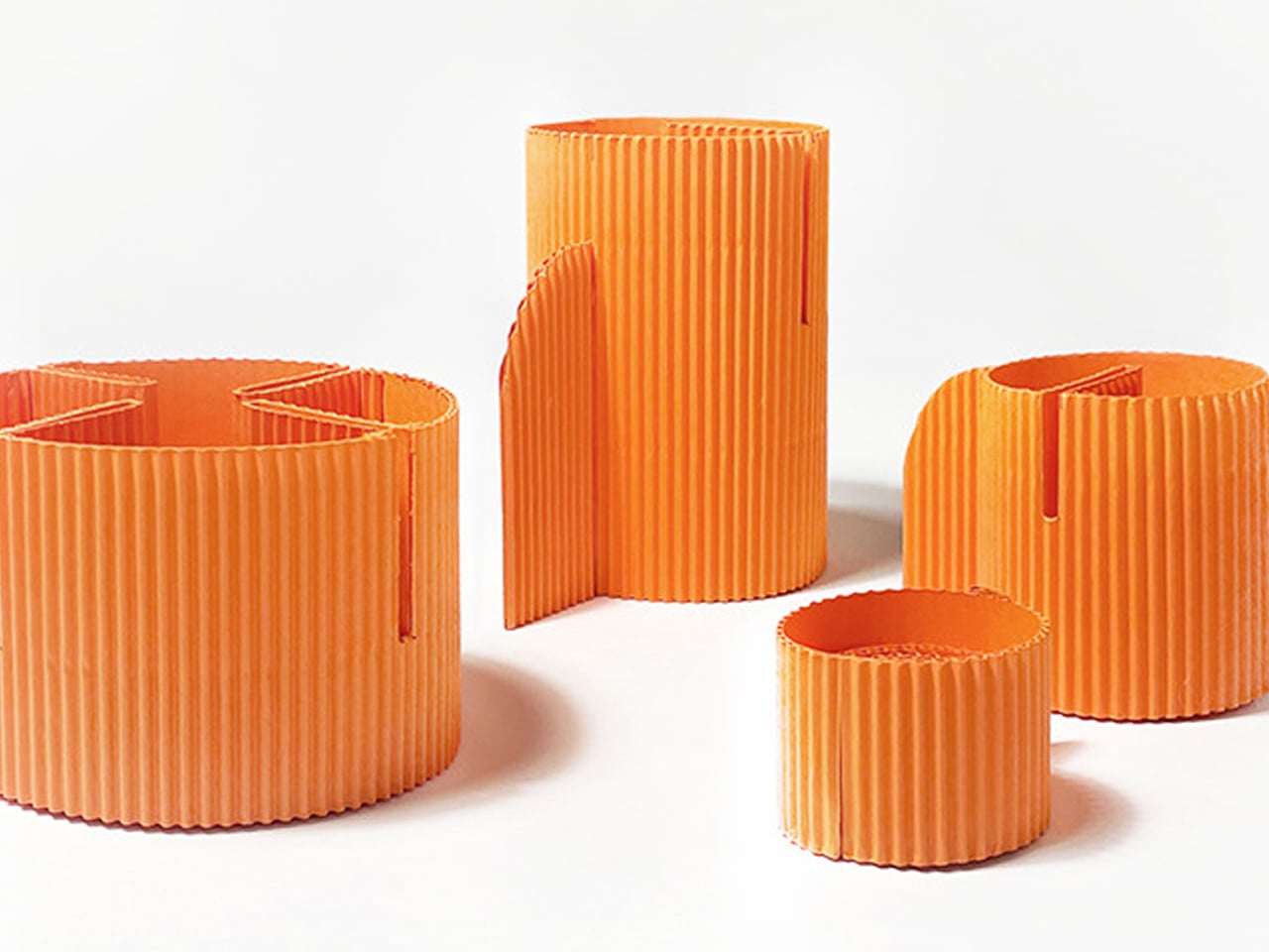
There are countless ways to organise a desk, but few solutions approach storage as a sculptural expression. Designed by Subin Song in collaboration with Fountain Studio, Cacty transforms the ordinary desk organiser into a vertical composition inspired by the organic growth of succulents. Rather than concealing clutter inside static compartments, the system rises upward in stacked forms, creating a silhouette that feels architectural and plant-like.
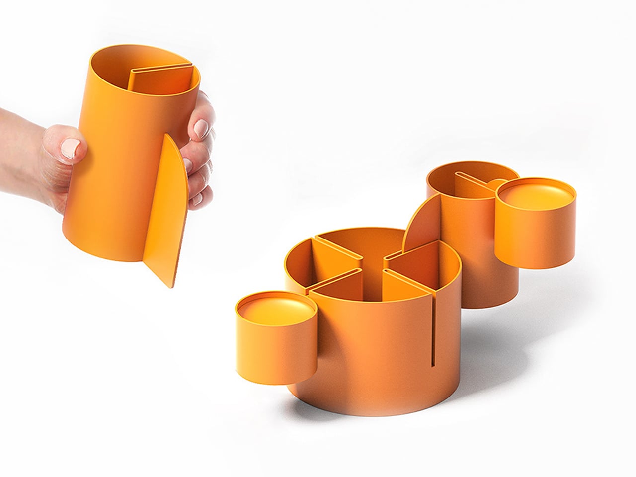
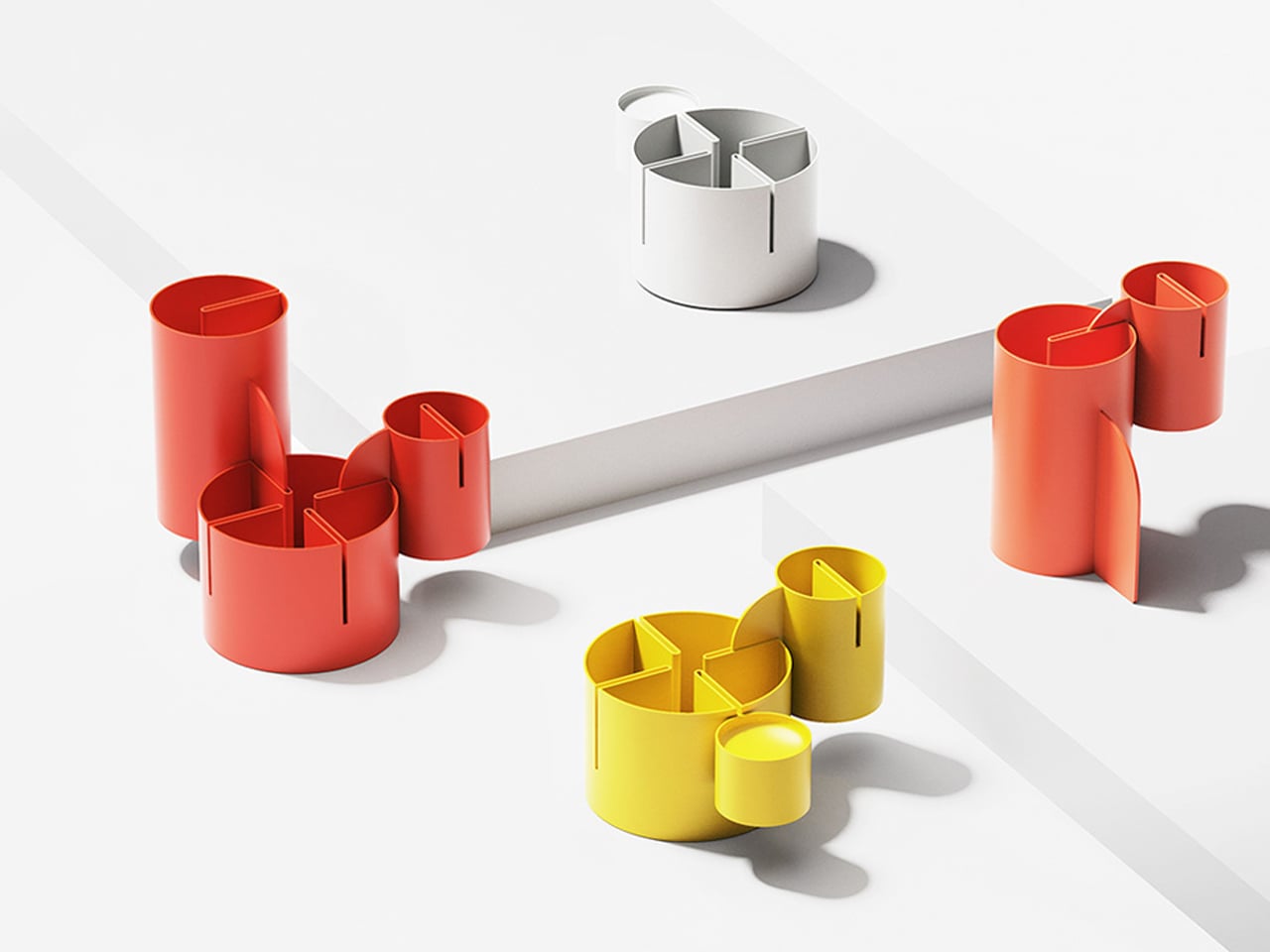
Each module functions as a container and a structural element, connecting through a slot-and-tab mechanism that allows the form to evolve endlessly. The base anchors the composition, while taller and shorter units interlock to create varied proportions, shadows, and depth. As modules accumulate, Cacty becomes a personalised sculptural tower which is an organizer and installation.

3. Architectural Desk Aesthetics

The structural edge in stationery draws heavily from architectural language and industrial design. Influenced by brutalism and modern drafting aesthetics, these pieces embrace sharp geometry, visible structure, and engineered balance. Materials such as concrete, steel, and solid brass introduce weight, texture, and a sense of durability that contrasts with conventional plastic desk tools.

Objects like pen holders shaped as miniature towers or cantilevered desk trays express stability and intention. They communicate permanence while maintaining full functionality. They transform the desktop into a composed landscape of lines and forms that exudes the quiet drama of structural design.
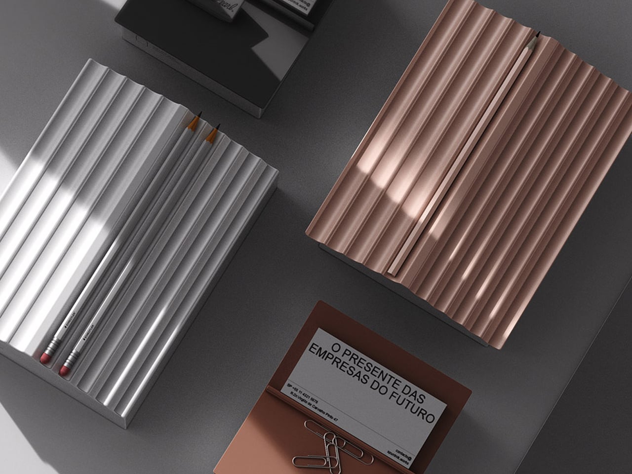
Overhead view of a dark desk with two ribbed metal organizers in silver and rose gold, plus a brown brochure with paper clips and pencils nearby in a modern setup.

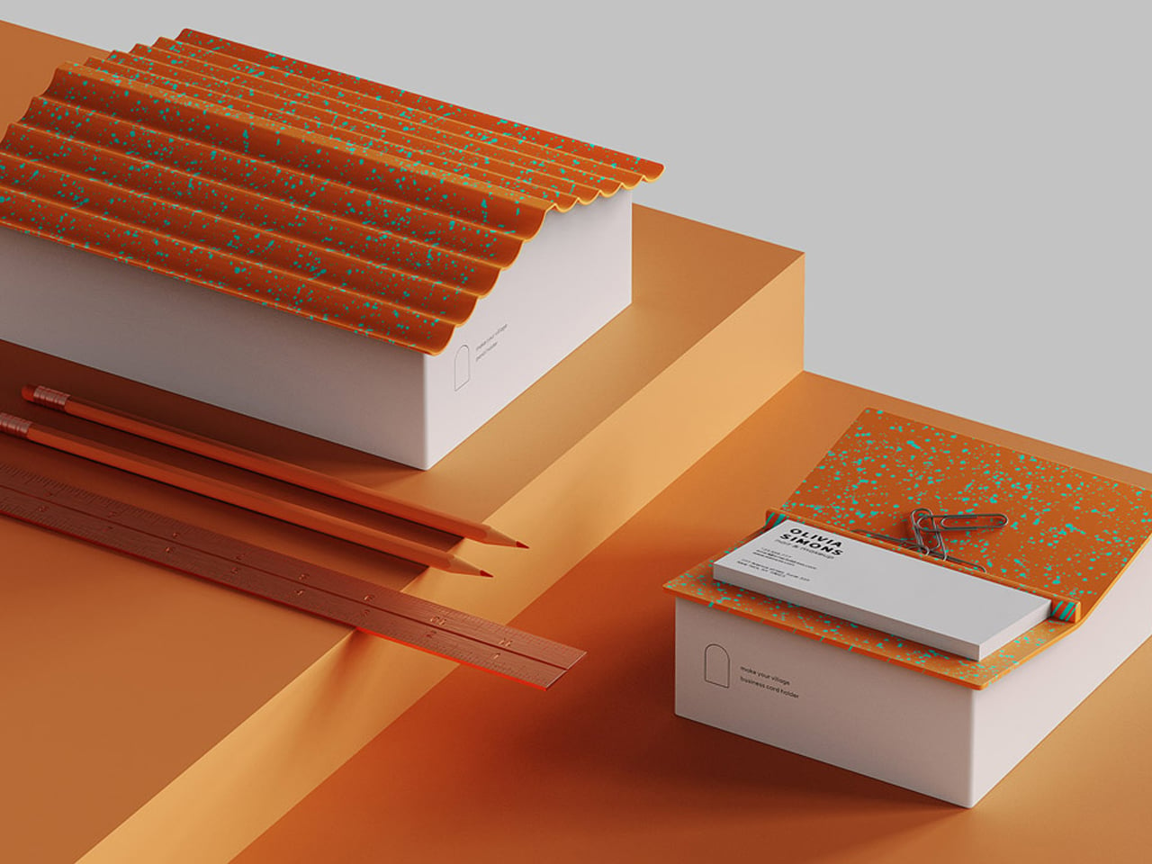
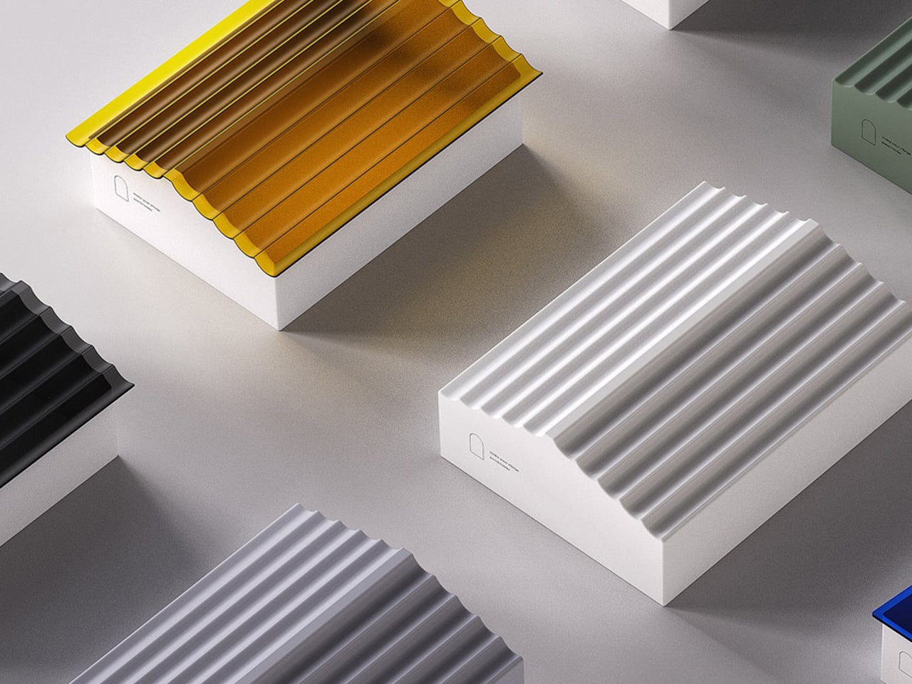
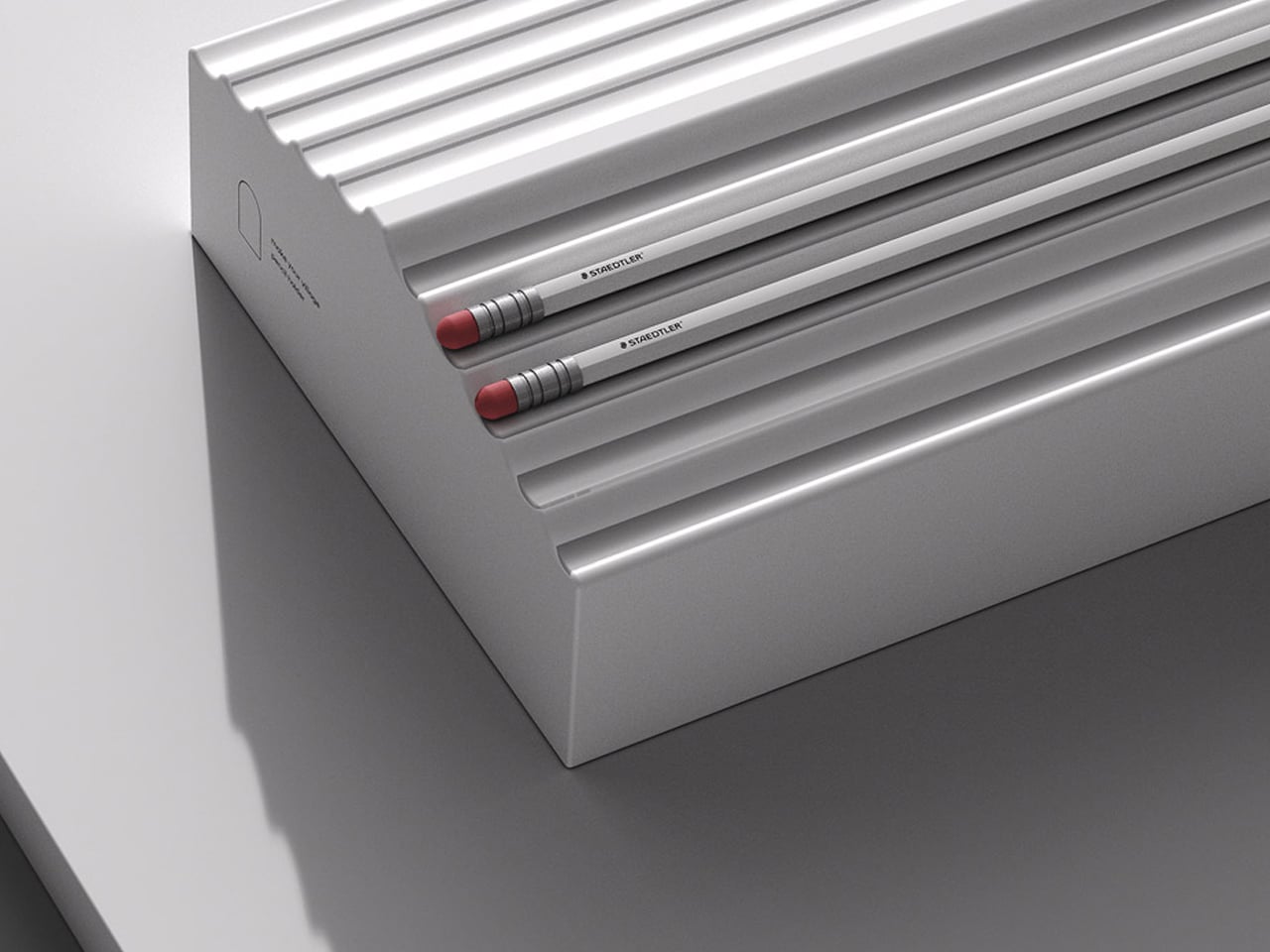
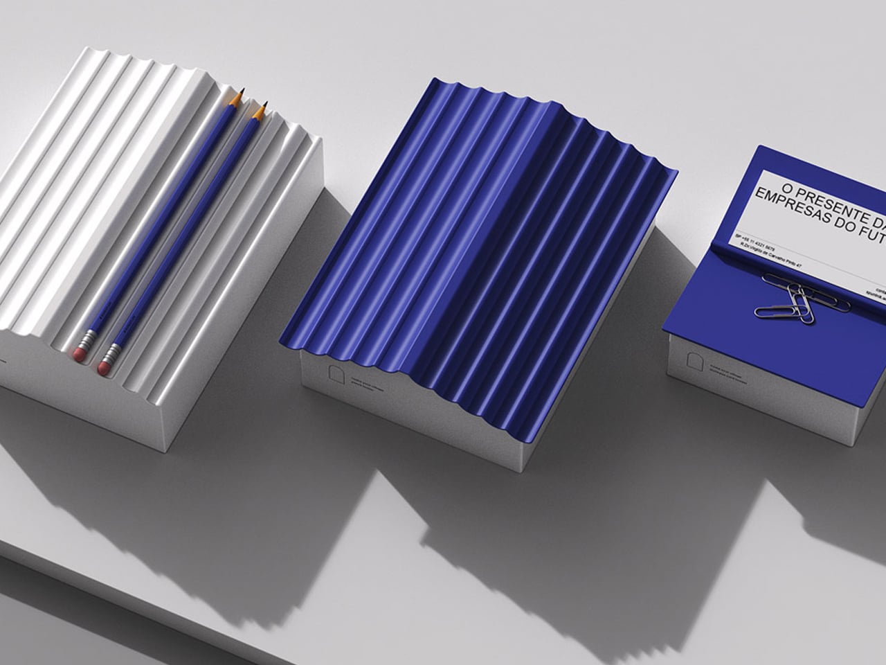
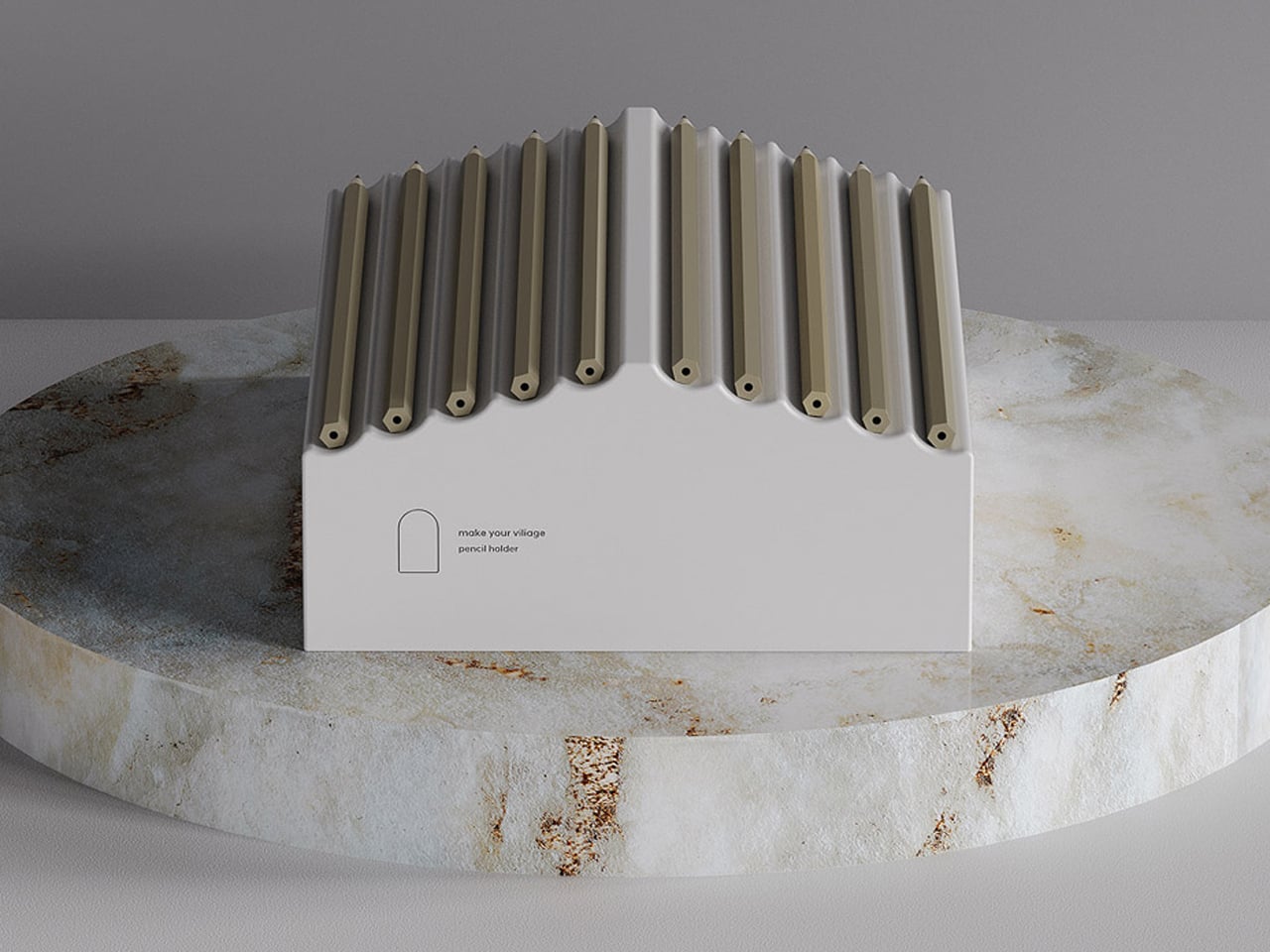
Industrial designer Jaekyoung Oh approaches desk organisation through the lens of product architecture rather than mere storage. The Small Town holder is conceived as a miniature built form, defined by a clear base structure and a pitched roof silhouette. The body functions like a compact architectural volume, solid, geometric, and carefully proportioned, while the slanted top incorporates linear grooves that transform pencils into structural elements.
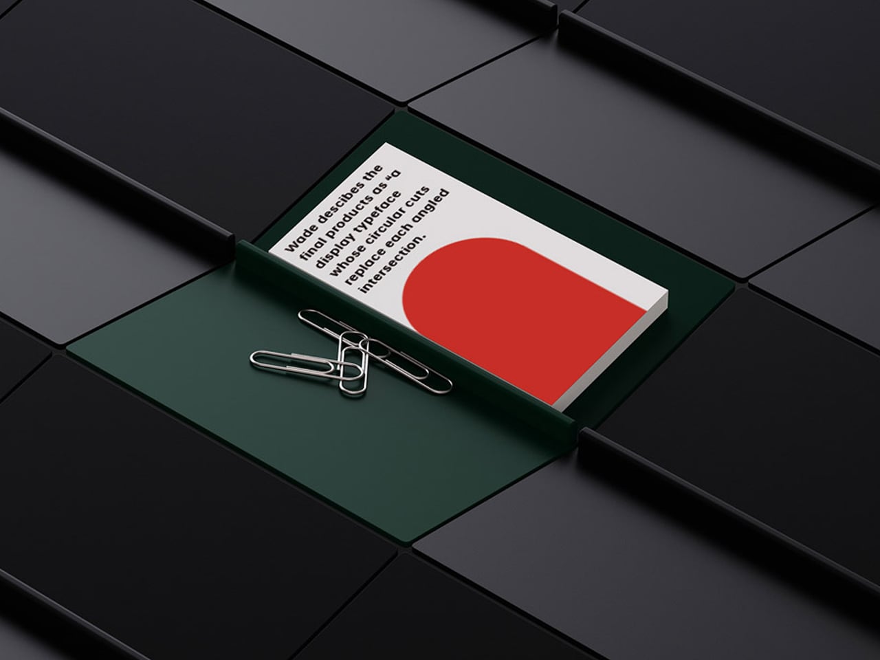
White card with a red curved shape and bold text sits in a green tray, held by paperclips on a dark tiled surface.

White rectangular pencil holder with numerous beige pencils standing upright on a circular marble pedestal.

Row of white rectangular boxes with ribbed corrugated lids in yellow, black, gray, white, green, and blue on a pale surface.

When inserted, the writing instruments complete the roof plane, turning everyday objects into integral components of the design’s framework.
The architectural logic continues in its modular potential. Multiple units can be arranged side by side, forming a cohesive streetscape across the desk. The repetition of gabled forms creates rhythm, alignment, and spatial order, much like a row of townhouses. Even without the pencil roof, the hollow interior operates as a contained volume for smaller stationery, maintaining both structural clarity and functional efficiency.

4. The Zoomorphic Design Trend

Nature-inspired design is embracing a distinctly playful yet sophisticated direction through animal-influenced forms. Rather than producing overtly cute novelties, designers are crafting elegant silhouettes that subtly reference wildlife.

These zoomorphic objects introduce warmth, character, and a sense of gentle storytelling to the workspace. They soften the often sterile mood of digital environments, reconnecting the desk with organic shapes and emotional familiarity.

Two black animal figurines with tangled white hair and red headphones facing each other on a table surface.

White glossy sheep faces a black sheep wrapped in tangled paperclips, with a red collar.

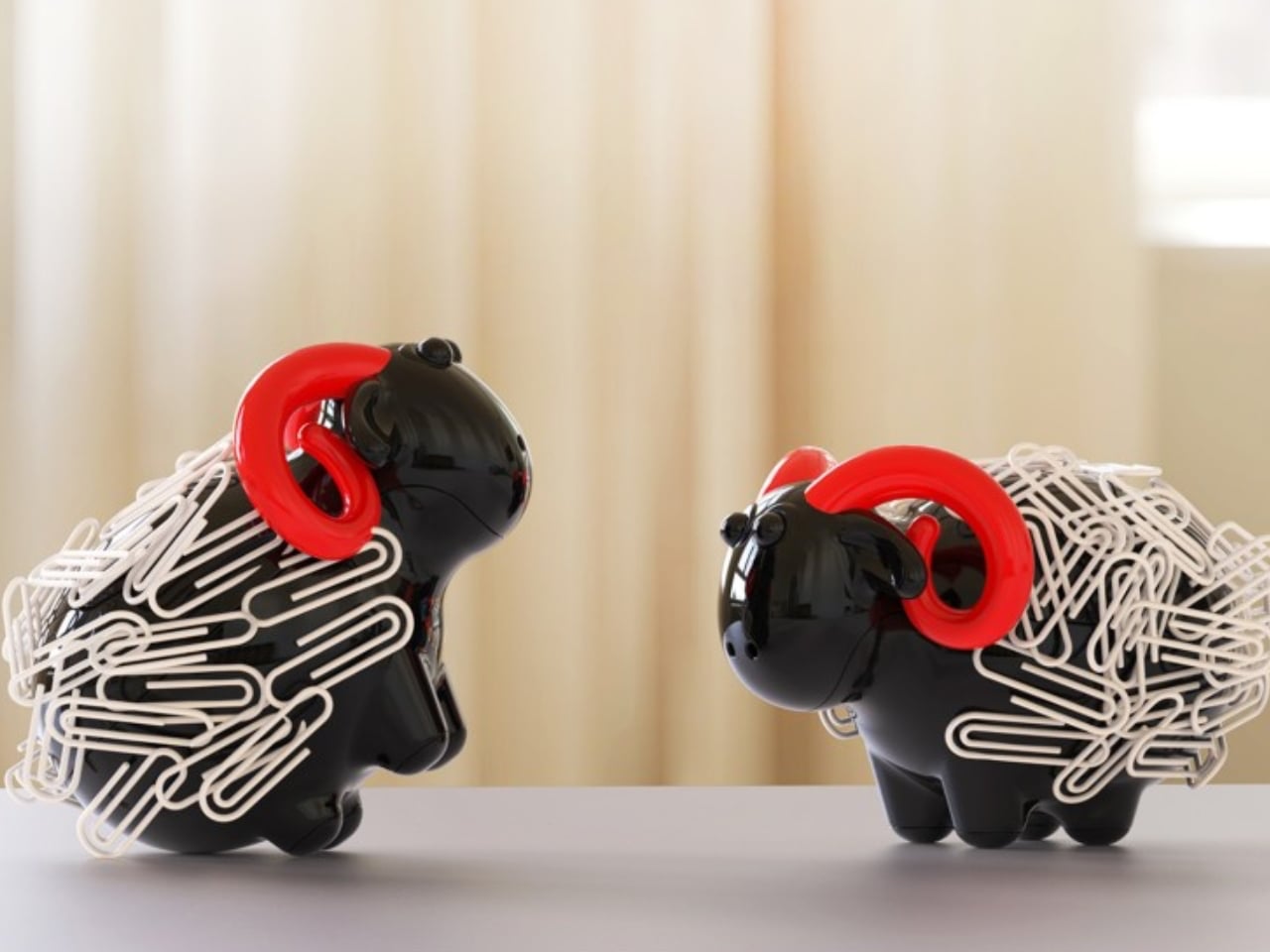
Shearing Magnetic Absorption, designed by Xin Se, is a compact magnetic paper clip organizer shaped like a simplified sheep. The product integrates a magnetic core within its sculpted body, allowing paper clips to attach directly to its surface. Rather than storing clips inside a container, the design uses them as a visible, textural layer that forms the sheep’s “wool.” This surface-based storage system keeps clips consolidated, accessible, and neatly displayed.


Piggy bank wrapped in silver paperclips with a hand dropping another paperclip, symbolizing saving being hindered by clutter or paperwork.

Child smiling while threading a paperclip into a black piggy bank with a tangled nest of white clips on top

The form is minimal and carefully proportioned, avoiding excessive detailing while maintaining a clear and recognizable silhouette. Its small footprint makes it suitable for desks of any size, while the magnetic mechanism ensures functionality without mechanical complexity.

5. Modular Lego Design

Play has reemerged as a powerful design language through Lego-inspired stationery and desk tools. Functional rulers, organizers, and toolboxes now adopt the logic of interlocking systems, encouraging users to assemble and customize their workspace. What once belonged purely to childhood is being reinterpreted with precision, durability, and modern aesthetics.

This approach blends nostalgia with utility. Modular components offer flexibility, adaptability, and a deeply tactile experience. The act of rearranging pieces becomes productive and a satisfying experience.
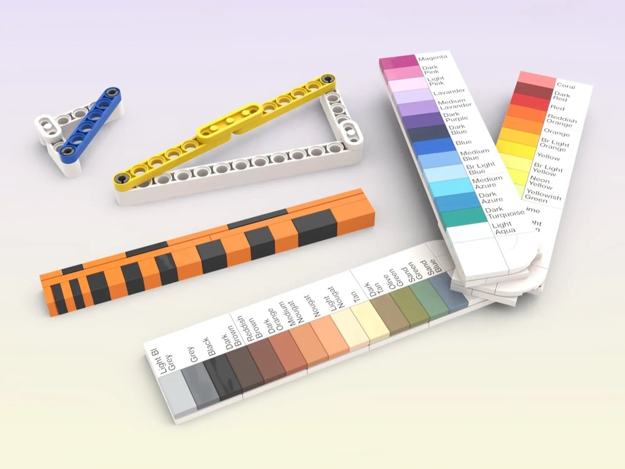
LEGO toolbox scene showing a red plastic tool box beside colorful color swatches and construction pieces like rulers and gears on a light surface.

Assorted color swatches and LEGO-like construction pieces on a light gradient surface, showing color charts and markers for color matching.

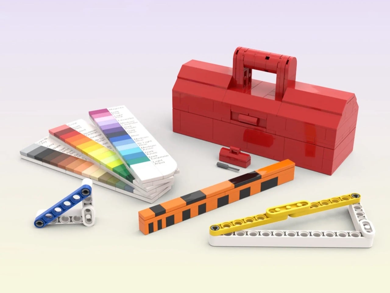
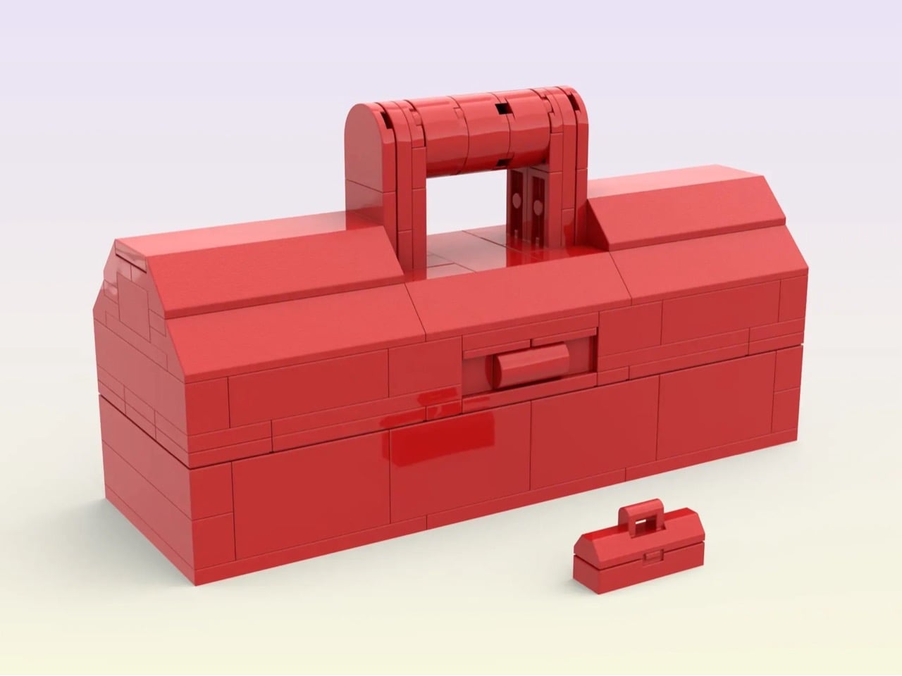
Inspired by the classic minifigure accessory from LEGO, this upscaled toolbox by luc.afol transforms a miniature object into a fully functional builder’s kit. The product retains the recognizable toolbox silhouette but scales it to a practical size, complete with an opening lid and structured internal storage. Designed specifically for AFOLs and MOC creators, it serves as a dedicated toolkit tailored to the precise demands of brick construction.
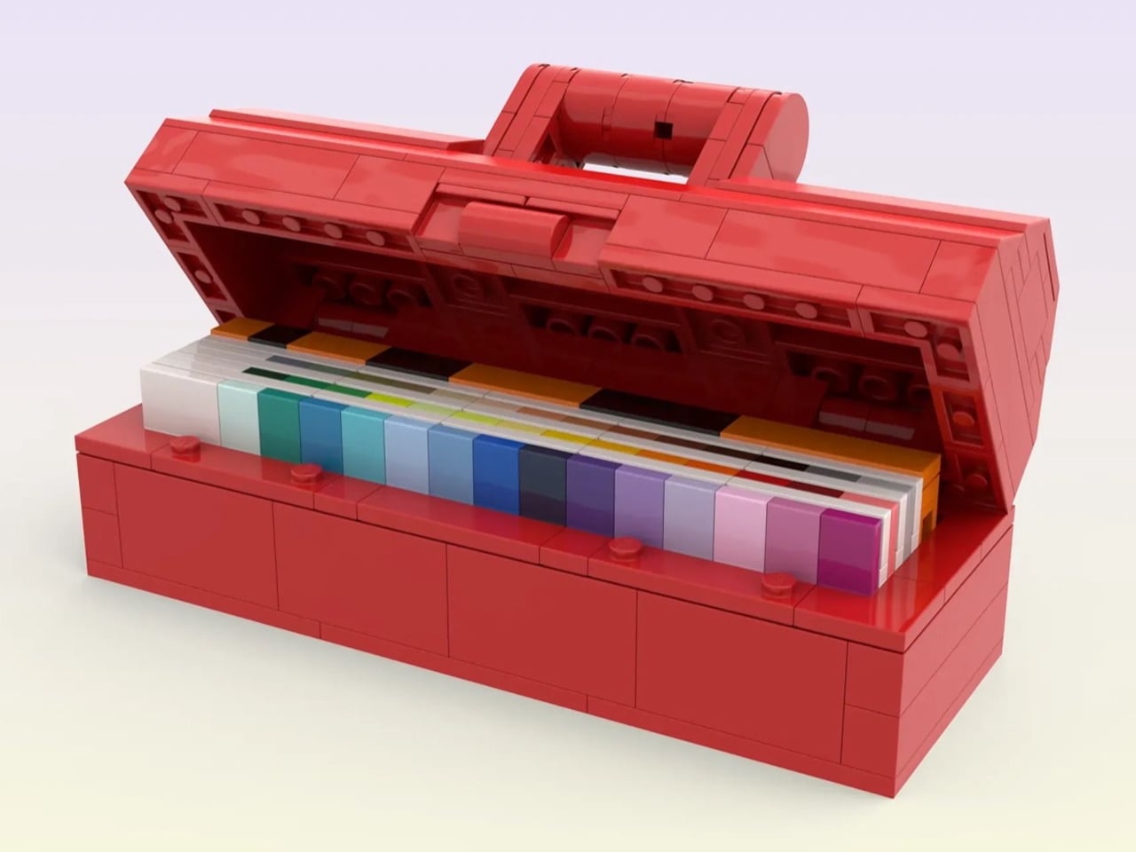
Red LEGO printer model with open lid revealing rainbow color cartridges inside, set on a light surface

Brick-built red toolbox with a curved carrying handle on top and a smaller matching case beside it on a light gradient background.

Inside, the toolbox houses a curated set of brick-built instruments: a foldable color sampler with labeled LEGO solid colors for accurate selection, a stud-calibrated ruler for precise alignment, and hinged triangle rulers constructed with Technic elements for angular measurement. Each tool is engineered to work within LEGO’s grid system, prioritizing measurement accuracy, portability, and compact storage.

Playful stationery signals a new philosophy of work where function and emotion coexist. These thoughtfully designed objects transform desks into spaces of clarity, creativity, and personal identity. By embracing pieces that balance charm with engineering, productivity becomes more engaging and inspiring within everyday professional routines.

The post 5 Desk Accessories So Cute They Make Work Feel Less Like Work first appeared on Yanko Design.

Lexon Turned Jeff Koons’ Most Famous Sculpture Into The Coolest Statement Lamp You Can Actually Own

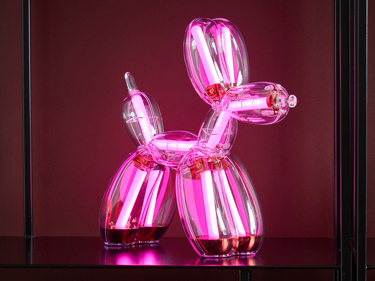
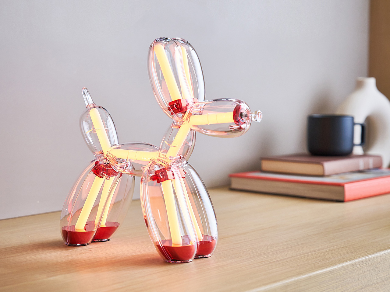
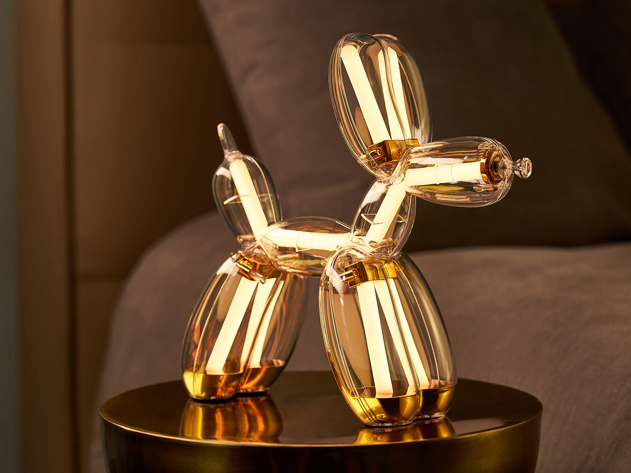
Transforming Jeff Koons’ Balloon Dog into a fully functional lamp required more than good intentions and a licensing agreement. For French design/tech atelier Lexon, more than 50,000 hours of development went into the project, working through the specific challenge of preserving the sculpture’s iconic silhouette while engineering a translucent polycarbonate body capable of housing 400 LEDs and diffusing light cleanly. The result respects the form with a fidelity that goes well beyond cosmetic homage. Lexon, a French brand with 35 years of design experience and more than 250 awards behind it, brought its full technical vocabulary to bear on a project that demanded something genuinely new. The Balloon Dog Lamp Chromatic is the 2026 edition of that effort.

Four colorways define the Chromatic lamp: Platinum, Gold, Blue, and Red, each built from optical-grade polycarbonate chosen for its crystal-clear transparency and the way light moves through it, and anodized metal components that add a pop of color. The colorway identity comes through tinted zones within that transparent body, giving each piece a distinct chromatic character that works even when the lamp’s off. Inside that shell, LEDs operate entirely independently of the body’s tint, cycling through 9 color modes and 9 lighting animations regardless of which colorway body they sit inside. The 2026 edition introduced an additional layer of technical complexity, requiring Lexon to match finishes, tones, and material specifications across both the lamp and speaker product lines while maintaining consistent visual identity throughout. Each piece features Jeff Koons’ engraved signature on the front feet of the sculpture, maintaining a direct physical connection to the artist across all four versions.

Designer: Lexon x Jeff Koons

Click Here to Buy Now: $800. Hurry, limited edition! Pre-orders capped at two pieces per color, per product, per collector.

Jeff Koons has received France’s Légion d’Honneur and the U.S. Department of State’s Medal of the Arts, and his work has been presented at MoMA, the Guggenheim, and the Tate. The Balloon Dog specifically has spent decades accumulating cultural meaning at a pace few contemporary artworks can match. Its form borrows from a children’s party toy, scaled to monumental proportions in mirror-polished stainless steel, yet the conceptual charge it carries never tips into pretension. Koons has always worked around the democratization of beauty and the conviction that joy deserves serious artistic attention. Lexon, whose design philosophy centers on making beautiful objects genuinely accessible, found a natural creative partner in that worldview, and the Balloon Dog Lamp is the physical record of that alignment.

The lighting system offers a wide range of atmospheres offer a behavioral range that goes considerably deeper than a standard color-cycling product. Nine animations, each with their own sub-animations, move from soft warm whites and cool daylight tones through vivid RGB cycles, rainbow sequences, flashing, and strobe, giving the piece a genuinely different character depending on the occasion and the room. Brightness is fully adjustable, and all controls live on the nose of the sculpture, handling color, intensity, and effect from a single tactile point of contact. That decision keeps the lamp’s silhouette completely uninterrupted while making the interaction feel native to the object rather than bolted on. Battery life sits at five hours at 75% brightness, recharging via USB-C, and the lamp’s 29 × 11 × 28 cm footprint and 1 kg weight give it enough physical presence to anchor a space without overwhelming it.

Lexon’s proprietary Easy Sync Bluetooth technology allows an unlimited number of Balloon Dog Lamps to connect and synchronize simultaneously across color, effect, and brightness. That feature transforms what is already a compelling standalone object into the foundation of something considerably more ambitious, particularly for collectors building across multiple colorways. Whether displayed across a room or grouped together, lamps running Easy Sync work in perfect unison, allowing collectors to create immersive multi-piece lighting compositions.

The first Lexon x Jeff Koons edition reached collectors and design enthusiasts across more than 90 countries, a number that speaks to Koons’ global cultural reach and Lexon’s ability to execute a collectible that resonates well beyond the design industry. The Chromatic Collection builds on that foundation with a firm no-reissue commitment across all four colorways and a purchase cap of two units per color per collector, keeping the experience personal and the supply genuinely controlled. Orders are fulfilled on a first-come, first-served basis through monthly shipping slots, with worldwide shipping beginning June 2026. Pre-orders are live now at lexon-design.com. At $800 per piece, the Balloon Dog Lamp Chromatic brings four decades of Koons’ cultural legacy off the gallery wall and onto your side table, where it lights your room, holds its own as a sculptural object, and reminds you every evening that great art and everyday life were never meant to be kept apart.

Click Here to Buy Now: $800. Hurry, limited edition! Pre-orders capped at two pieces per color, per product, per collector.

The post Lexon Turned Jeff Koons’ Most Famous Sculpture Into The Coolest Statement Lamp You Can Actually Own first appeared on Yanko Design.
Forget Your Old Loadout — 5 EDC Essentials Built for Summer 2026

Summer 2026 is a different kind of season for EDC. The carry conversation has matured past keychain gimmicks and bulk-heavy multitools into something sharper; gear that’s actually thought through, built from aerospace-grade materials, and designed with the same care as the objects that live on your desk. These five pieces represent the best of where that shift has landed: practical without being boring, minimal without being precious.

Whether you’re navigating festival crowds, weekend camping trips, or the daily urban grind, the right loadout isn’t about carrying more — it’s about carrying smarter. Each of the picks below earned its spot not through spec sheets alone, but through intentional design choices that make the experience of using them genuinely different. These are the five pieces worth making room for this summer.

1. Cubik Knife

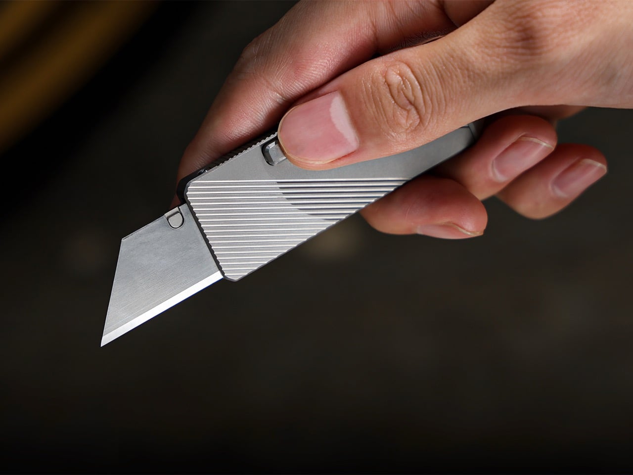
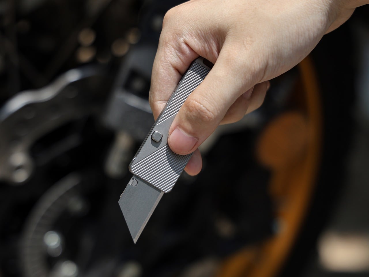
Gravity-powered deployment sounds more cinematic than practical — until you hold the Cubik. Designed by IF and machined from aerospace-grade titanium, this pocket knife opens with a button-flick and the natural pull of gravity: no springs, no mechanisms to fail, no audible snap. At 2.6 inches long, 0.98 inches wide, and just 0.2 inches thick, it slips into a pocket and disappears. The Cubik looks more like a designer flash drive than a knife, which is exactly the point — and what makes it so easy to live with every single day.

The blade runs a standard trapezoid utility format — the same geometry used to slice linoleum, roofing materials, acrylic, and thin sheet metals. When one edge dulls, flip it; when both are spent, swap it. That interchangeable format turns a consumable item into something genuinely sustainable over time. A deep-carry titanium clip keeps it flush to the pocket edge, and a tungsten carbide glass-breaker on the rear makes it a legitimate lifesaver when it counts. At $59 with five replacement blades included, it’s one of the most sensibly priced titanium tools in the category.

What we like

  • Gravity-flick deployment is spring-free, meaning zero moving parts to fail over time
  • Swappable trapezoid blades make the Cubik cost-effective and sustainable for long-term carry

What we dislike

  • The utility blade format won’t appeal to collectors who prefer a dedicated knife steel
  • Gravity deployment requires a deliberate wrist flick that takes a brief learning curve

2. 8-in-1 EDC Scissors

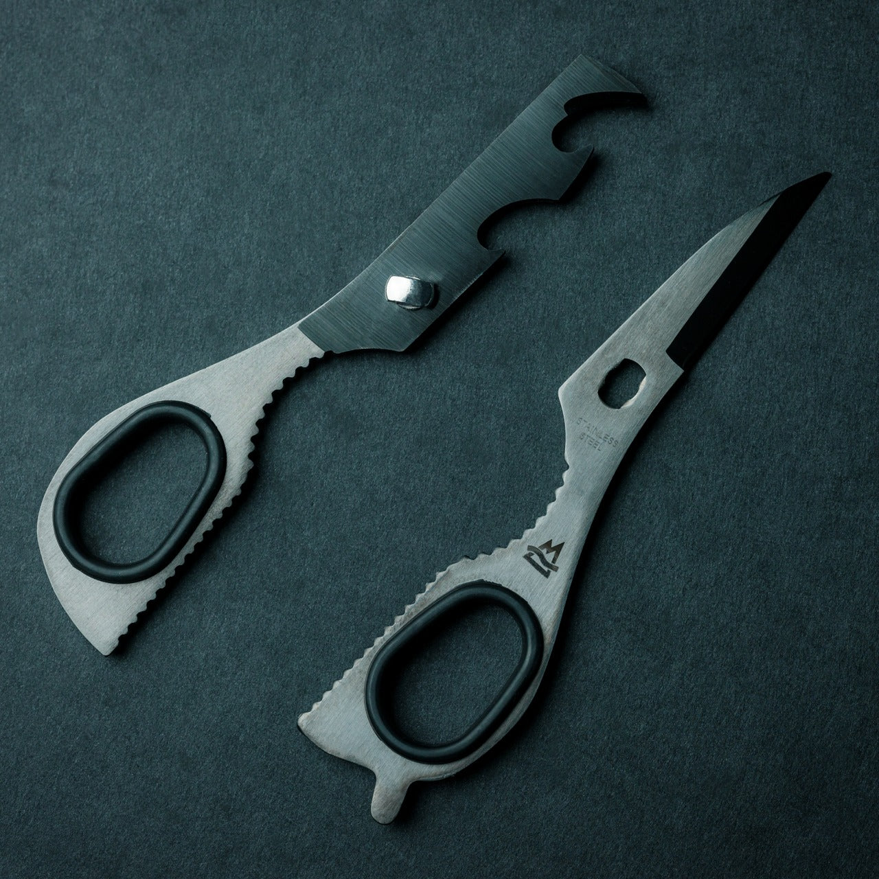
Most EDC scissors ask you to accept a compromise — either you get a folding design that sacrifices cutting power, or you get a rigid tool that’s too bulky to pocket. The 8-in-1 EDC Scissors from Eiger Design, available through the Yanko Design Shop, sidesteps both problems. Made in Japan and compact enough to sit in a palm at just 13 centimeters (5.1 inches) closed, it packs scissors, a knife, a lid opener, a can opener, a cap opener, a bottle opener, a shell splitter, and a degasser into a single carry-ready object.

The scissors themselves are the real story — full-strength blades that don’t rely on a collapsible pivot to achieve their compact profile, which means they cut with conviction through materials that foldable scissors would snag or mangle. The remaining seven functions are genuine, not ornamental. For summer specifically — camping weekends, beach cookouts, farmers market errands, festival packing — this is the kind of tool that earns its weight early and keeps earning it. At $53 through the YD Shop, it’s the most versatile item on this list per dollar spent.

Click Here to Buy Now: $59.00

What we like

  • Eight independent tools in a 5.1-inch, palm-sized package that’s genuinely comfortable to carry daily
  • Made-in-Japan manufacturing brings real precision to both the scissors and every secondary tool

What we dislike

  • The scissors-first form factor means the secondary tools can feel secondary in actual day-to-day use
  • Not the right call if you’re shopping for a dedicated cutting tool rather than a multitool

3. NoxTi

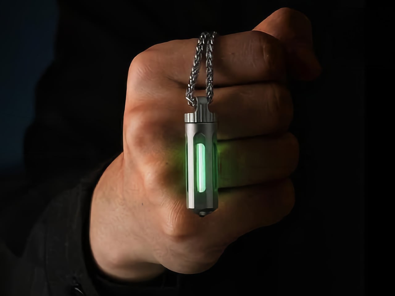
NoxTi is the kind of object that makes you reassess what belongs on your keychain. Designed by Xedge and built from Grade 5 titanium, it measures just 45mm and weighs 10.7 grams. The core of the piece is a tritium vial — a sealed, self-luminous insert that glows continuously for 25 years without batteries, charging, or any external power source. Quartz glass protects the vial from impact, and the titanium housing supports interchangeable vial options alongside a glass-breaker tip at the rear, making it far more than a novelty.

In practical terms, NoxTi solves a problem most EDC setups don’t realize they have: passive orientation in the dark. When your keychain is at the bottom of a bag, buried in a jacket pocket, or left on a nightstand, the glow orients you without reaching for your phone. That always-on, zero-input utility is a design philosophy most gear claims but rarely delivers.

What we like

  • Tritium vial delivers 25 years of passive, battery-free illumination with no maintenance required
  • Grade 5 titanium housing and quartz vial protection make it exceptionally durable for keychain life

What we dislike

  • At 45mm, it’s compact but will add noticeable length to an already-loaded keychain setup
  • Tritium vials are radioactive (safely contained, but a consideration for buyers who prefer chemical-free carry)

4. HYZER

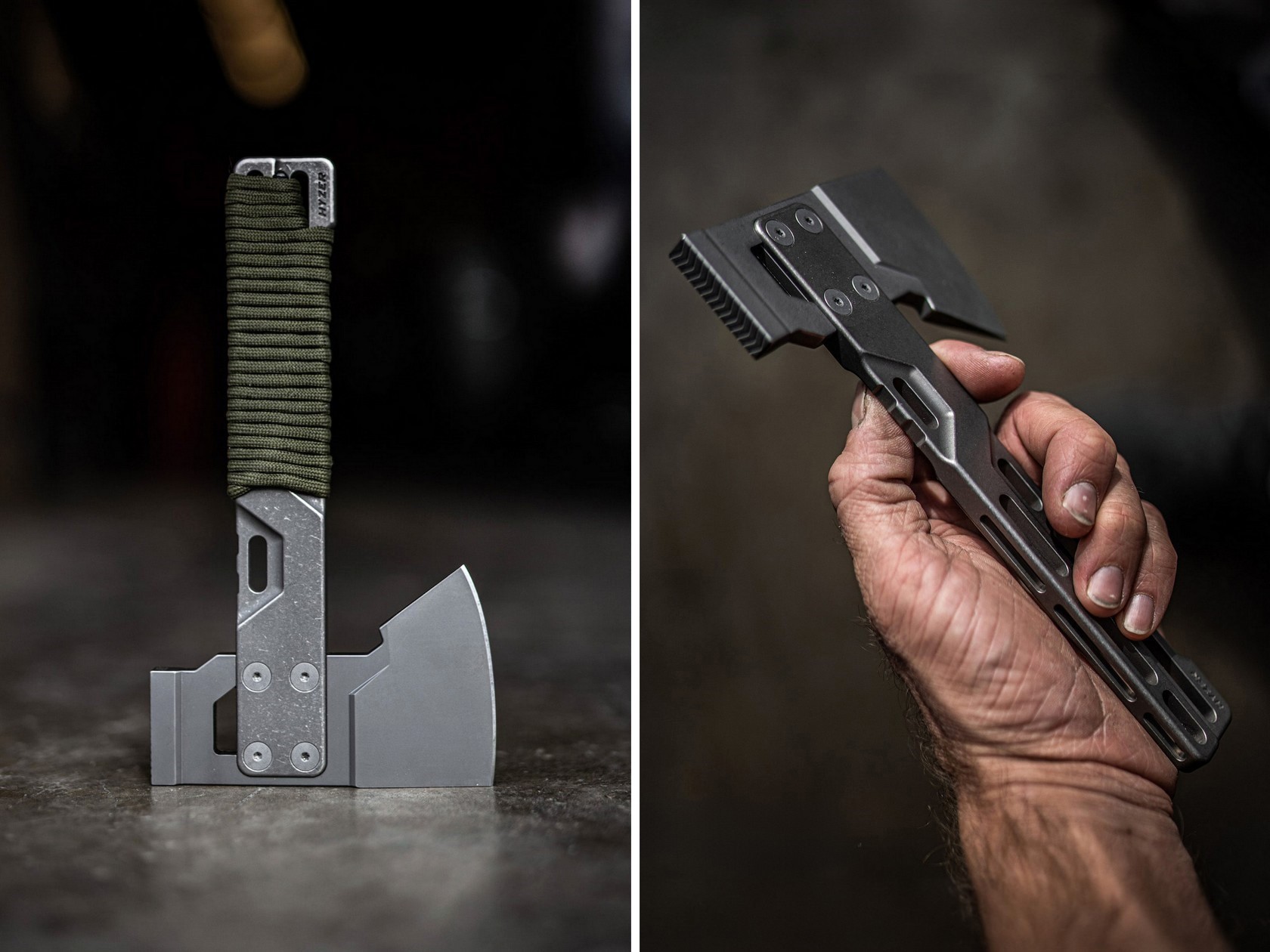
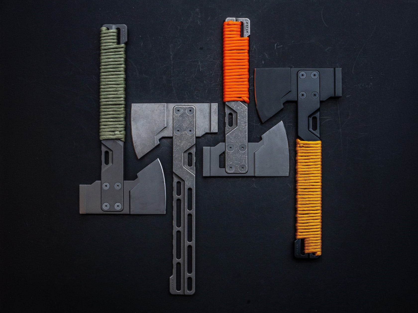
Exceed Designs doesn’t do anything conventionally, and the HYZER is the clearest proof of that. At its core, it’s a hatchet — but calling it that undersells the engineering. The handle is fully skeletonized and CNC-machined from a solid block of 6AL-4V Grade 5 titanium, available in two lengths: a full-size 9.75 inches or a compact 8.15 inches. The head runs on an infinitely modular nested system that lets you swap cutting formats without replacing the handle — a level of adaptability that no conventional hatchet even attempts.

For summer carry — backcountry hiking, basecamp setups, or serious van-life configurations — the HYZER changes the math on what a hatchet needs to be. The D2 steel axe head delivers serious chopping performance, while the titanium handle keeps the tool lighter than any steel-handled competitor in its class. The stonewashed finish gives it a visual identity that’s unmistakably premium without being precious about it.

What we like

  • The modular nested head system allows the HYZER to adapt to different cutting and splitting configurations
  • Full skeletonized Grade 5 titanium achieves meaningful weight savings without compromising structural integrity

What we dislike

  • The premium titanium and D2 material combination places this at a significantly higher price point than most seasonal carries
  • Two-handed hatchet operation demands dedicated pack space that the other four items on this list don’t require

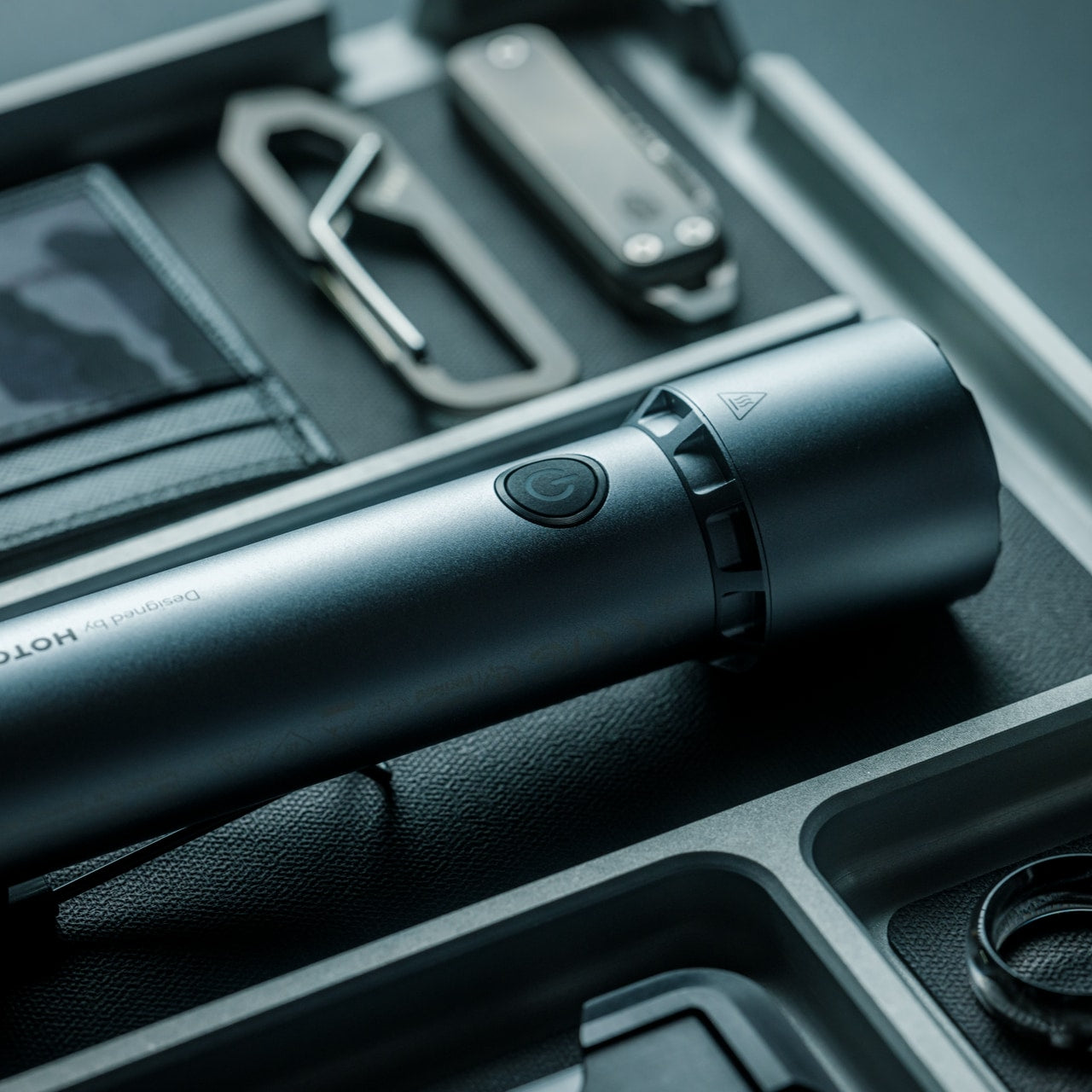
5. BlackoutBeam Tactical Flashlight

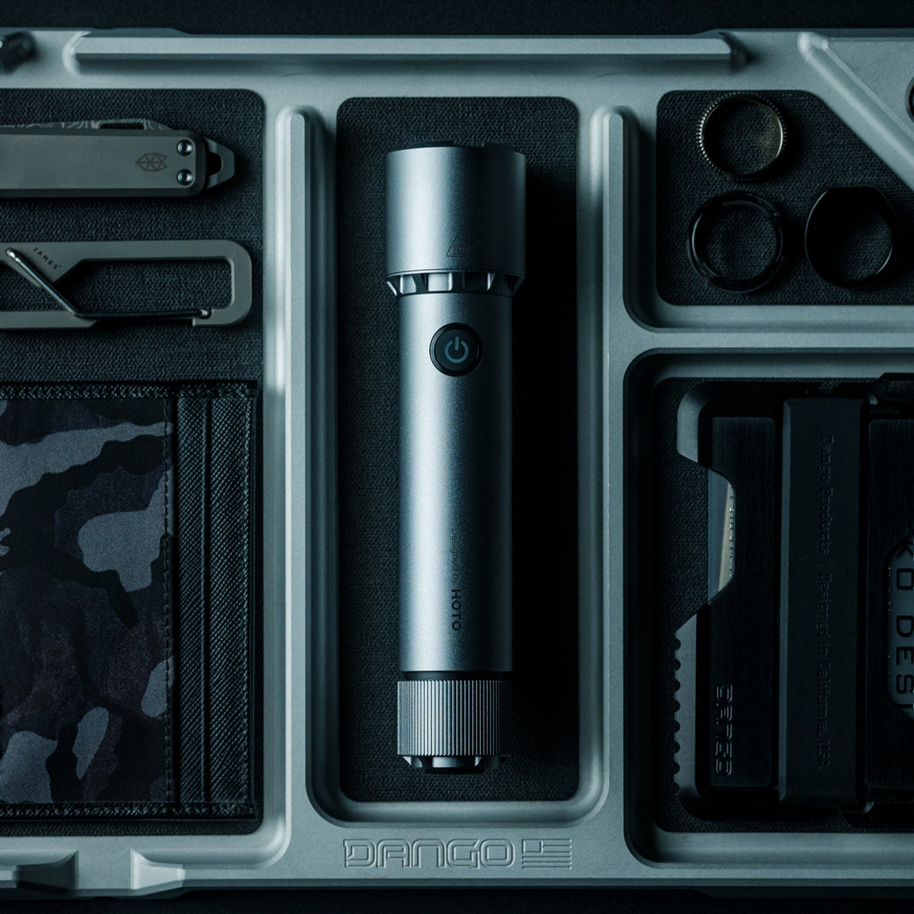
A 2,300-lumen output in a tactical flashlight isn’t rare in 2026 — but a 2,300-lumen flashlight that looks like it belongs at a design exhibition rather than a military surplus store is still genuinely hard to find. The BlackoutBeam, available through the Yanko Design Shop at $90, pairs that blinding output with an industrial aesthetic that wears well whether it’s clipped to a backpack or sitting on a shelf. The 300-meter throw distance cuts through darkness with clinical precision, and the IP68 waterproof rating ensures it performs regardless of what summer throws at it.

Five operational modes — including strobe and pinpoint — give the BlackoutBeam tactical flexibility that goes well beyond on-off cycling. The 0.2-second instant-on response is the detail that separates tools built for designers from tools built for actual use: in a power outage, a trail emergency, or any situation where you need light immediately, that activation speed matters in a way that a spec sheet can’t fully communicate. With longer days turning into late evenings outdoors and camping season running hot, the case for a serious flashlight in your summer kit has never been more straightforward.

Click Here to Buy Now: $89.00

What we like

  • 2,300-lumen output with a 300-meter throw distance puts it firmly in professional-grade territory
  • A 0.2-second instant-on response time makes it genuinely dependable when the situation demands it

What we dislike

  • The tactical aesthetic reads as aggressive for carry setups that lean toward minimalist or everyday styling

The Best Loadout Is the One You Actually Think About

What these five pieces share isn’t material or price point…it’s intention. Every one of them was designed by someone who cared enough to solve the actual problem rather than approximate a solution. That’s the standard worth holding EDC to in 2026, and it’s becoming a higher bar to clear as the category matures and the market fills with near-misses. The best loadout is never the one with the most gear. It’s the one with the right gear.

Summer tends to be the season when carry gets edited down; lighter layers mean fewer pockets, and heat means less patience for bulk. These five designs all pass that test. They’re compact enough to disappear when you want them to and capable enough to matter when you don’t. Whether you pick up one or all five, the upgrade from whatever you’re carrying now is real.

The post Forget Your Old Loadout — 5 EDC Essentials Built for Summer 2026 first appeared on Yanko Design.
The Memdock G3 Is the 13-Port Dock You Don’t Have to Hide Anymore

Modern desks have never looked better. Sit-stand tables, cable management trays, and ultra-thin laptops have turned the average workspace into something worth showing off. But for all the effort that goes into making a desk look clean and intentional, the accessories that actually power it are often still a mess, and docking stations, in particular, tend to be boxy, generic things that most people try to hide.

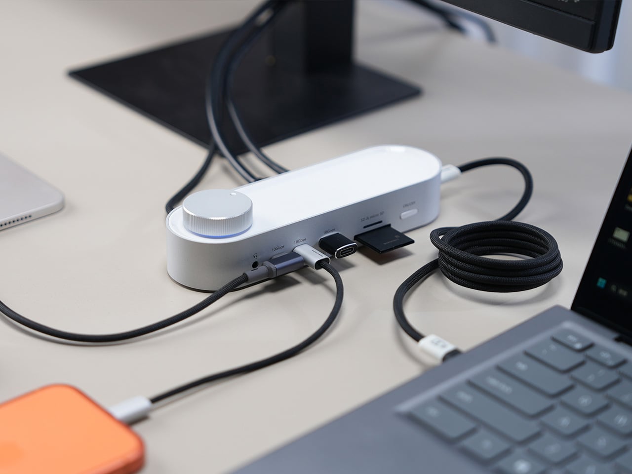
That habit of hiding docks makes sense, since most of them aren’t exactly something you’d want on display. The Memdock G3 takes a different approach. It’s a 13-in-1 docking station that doesn’t look the part in the way most docks do, and that’s a compliment. With a rounded aluminum body and a physical volume knob at one end, it’s designed to sit on the desk, not behind it.

Designer: Memdock

Click Here to Buy Now: $89 $189 ($100 off). Hurry, only 135/200 left! Raised over $50,000.

The aluminum shell is both light and sturdy. Weighing just 175g and measuring 17cm in length, it won’t crowd any desk. The silver-white finish sits comfortably alongside a MacBook or a Surface without looking out of place. A one-touch power switch keeps things simple, while the knurled volume knob doubles as a status indicator with a blue ring glowing softly at its base.

Where the G3 separates itself from generic hubs is with its dual HDMI outputs, both capable of 4K at 60Hz. Whether you’re juggling two monitors or spreading your workspace across screens, the setup doesn’t need extra adapters or complicated display routing. It works across Windows and macOS without additional drivers, so plugging in is genuinely all you need to get a full dual-screen arrangement running.

Charging is another area where the G3 keeps things clean. The 100W PD port can keep a laptop topped up while everything else stays connected, which means you don’t need a separate charger taking up another outlet. Pass-through charging also stays active even when the dock is switched off, so your devices keep charging overnight without you having to think about it.

On the data side, the G3 carries multiple 10Gbps connections, including USB-C, which is meaningfully faster than the 5Gbps typical of most docks in its category. Moving a batch of raw photos or offloading footage from an external drive feels noticeably quicker, cutting the time you’d otherwise spend watching a progress bar crawl. Two USB-A ports handle the everyday stuff, from keyboards and mice to thumb drives.

Photographers and video shooters will appreciate having both an SD and a TF slot built in, which removes the hassle of hunting for a separate card reader every time they need to pull files off a camera. Pair that with a Gigabit Ethernet port for a steadier wired connection, and the G3 handles a range of workflows that most hubs can’t without reaching for yet another dongle.

The volume knob deserves a separate mention, not just as a feature, but as a design choice that says something about the G3’s priorities. Instead of digging through a settings panel every time you want to nudge the audio on a call, you just reach over and turn it. It’s a small thing, but it’s the kind of immediate, tactile control that feels obvious once you have it.

Docking stations rarely get treated like products worth designing with real care. They sit at the junction of display, power, data, and audio, making them genuinely central to how a desk functions, yet they’re almost always designed as if nobody will ever look at them. The Memdock G3 is a reminder that the things holding a workspace together can be just as thoughtfully considered as anything else on the desk.

Click Here to Buy Now: $89 $189 ($100 off). Hurry, only 135/200 left! Raised over $50,000.

The post The Memdock G3 Is the 13-Port Dock You Don’t Have to Hide Anymore first appeared on Yanko Design.

This LEGO VHS Player Actually Has Cassettes You Can Insert and Remove

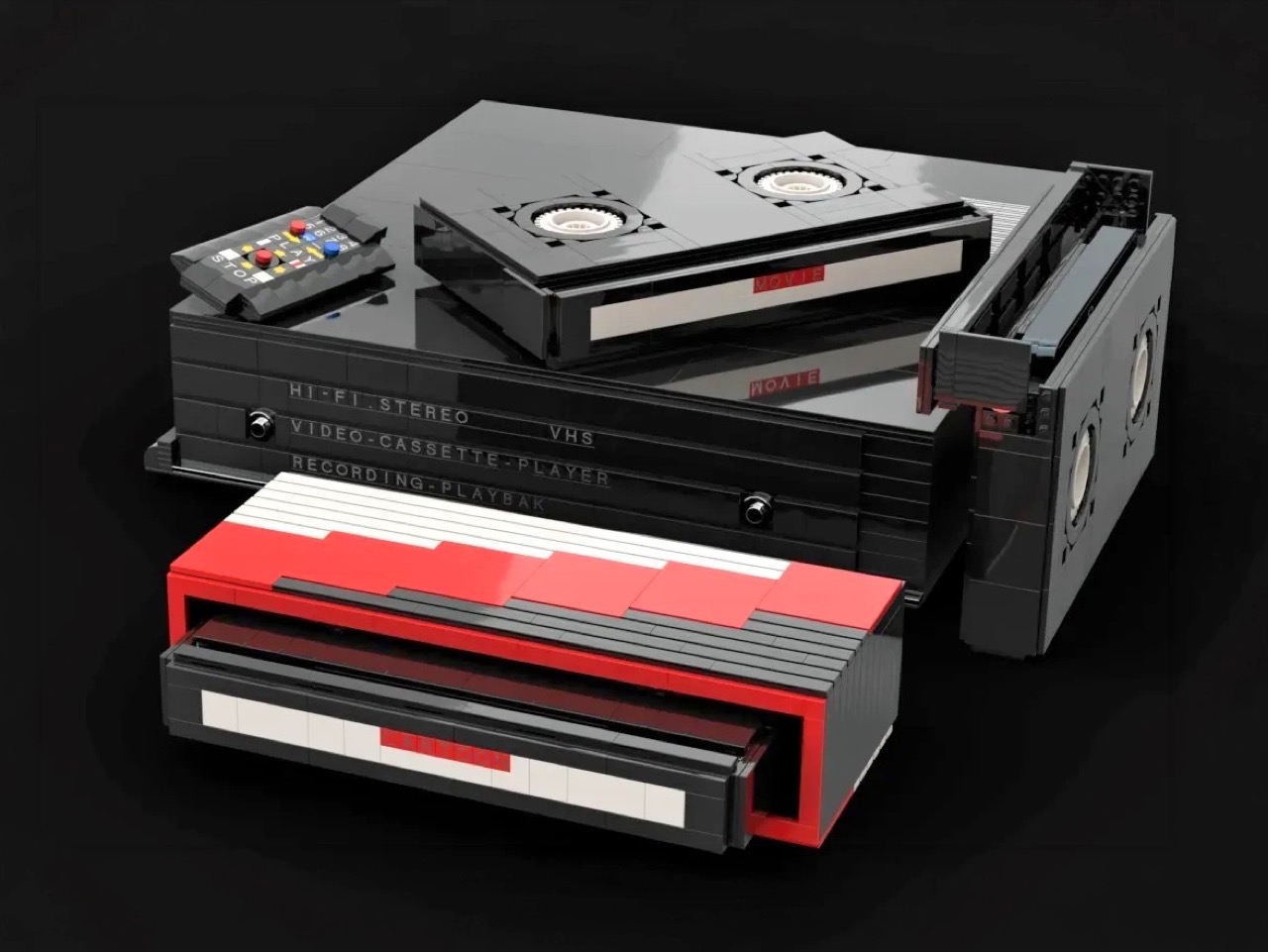
Before streaming queues and binge-watching algorithms rewired how we consume film and television, there was a ritual. You drove to the video store, walked the aisles, made your pick, and came home to slide that chunky black cassette into a slot that swallowed it with a satisfying mechanical thunk. The VCR wasn’t just a piece of consumer electronics. It was the centerpiece of a whole cultural ceremony, the thing that turned an ordinary Tuesday night into a genuine event. Polar-Angel_UA, a LEGO builder and 10K Club Member from Ukraine, has captured exactly that feeling in brick form with the Video Home System.

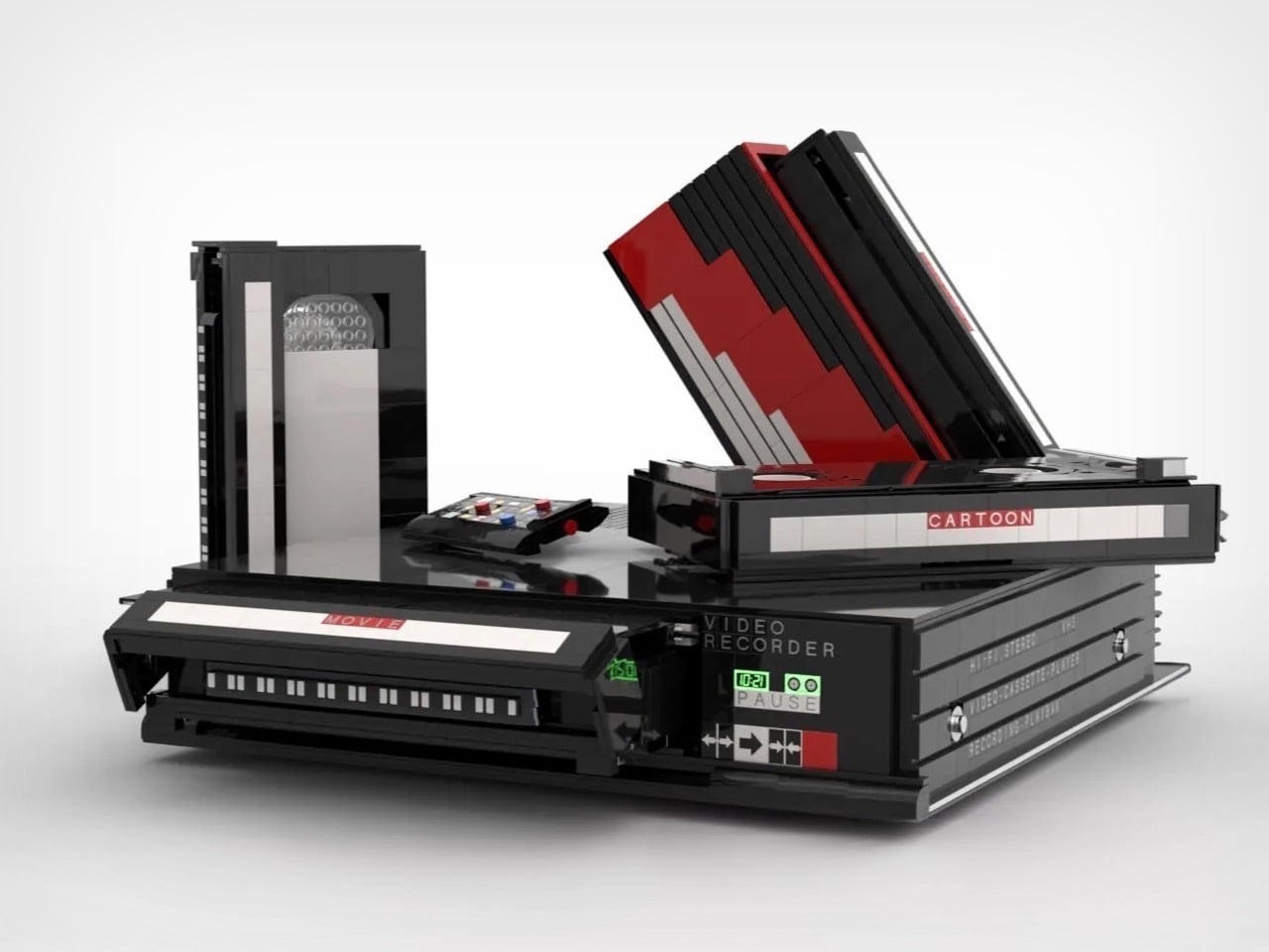
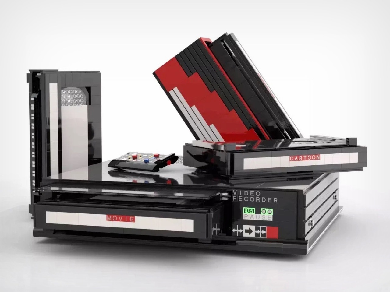
The build recreates a classic VHS setup with the kind of specificity that only someone who actually lived through the era could pull off. The main unit nails the flat, utilitarian slab aesthetic of a proper 80s or 90s VCR deck, complete with a cassette slot, a row of playback controls, and a PAUSE indicator rendered in green. A top-loading lid flips open to reveal the tape mechanism inside, and the real delight here is in that interaction. The tapes go in. The tapes come out. For a build that’s ostensibly a static display piece, that single interactive element transforms the whole experience.

Designer: Polar-Angel_UA

Four items accompany the main unit: a movie cassette, a cartoon cassette, a remote control, and a VHS case. The distinction between the movie tape and the cartoon tape is a quietly brilliant design decision because if you grew up in that era, you absolutely had a dedicated shelf section for each. Saturday morning cartoons lived in their own plastic sleeve, carefully rewound and stacked away from the movie collection. Polar-Angel_UA understands the taxonomy of the VHS-era household intimately, and it shows.

The MOC’s inherently block-ish nature (thanks to the LEGO bricks) works well for this product. VCRs were not delicate objects. They were heavy, deliberately black, and looked like they meant business sitting under your television set, blinking 12:00 in perpetuity because nobody ever set the clock. This LEGO version carries that same hulking, I-mean-business energy, with the cassettes propped against it like they’re already queued up for a double feature. The remote control sitting casually beside the deck is a small touch that completes the tableau perfectly. You can almost feel the carpet under your feet and smell the takeaway boxes.

The Video Home System is currently gathering votes on the LEGO Ideas platform, where fan-created builds compete for the chance to become official retail sets. Cross the 10,000 vote threshold and LEGO’s internal team reviews the submission for potential production. With 688 supporters on the board right now and 422 days left on the clock, there is plenty of runway here. Head to the LEGO Ideas page and cast your vote!

The post This LEGO VHS Player Actually Has Cassettes You Can Insert and Remove first appeared on Yanko Design.
5 Memorial Day Outdoor Gadgets That Make Every Camping Trip Feel Engineered in Japan

Memorial Day weekend is when the campsite gets its first real test of the year. The gear you pack either earns its place or takes up space. This year, a handful of outdoor gadgets are shifting the conversation, designs so considered, so precise in their logic, they feel lifted straight from a Tokyo design studio. Each one solves a familiar outdoor problem in a way you didn’t see coming.

What unites these five objects is a shared commitment to intentionality, the Japanese idea that a well-made thing should do its job beautifully, without fanfare or waste. Whether it’s a lantern that turns like a toy or a fire pit engineered around combustion science, these gadgets carry a point of view. Not here to impress on a spec sheet. Just here to make the long weekend feel properly planned.

1. RetroWave 7-in-1 Radio

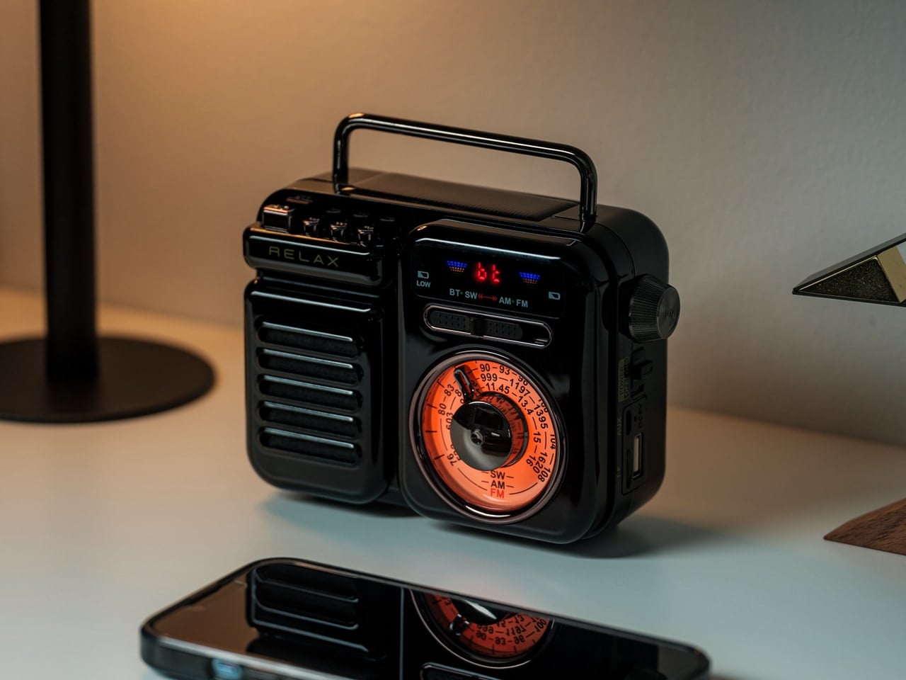
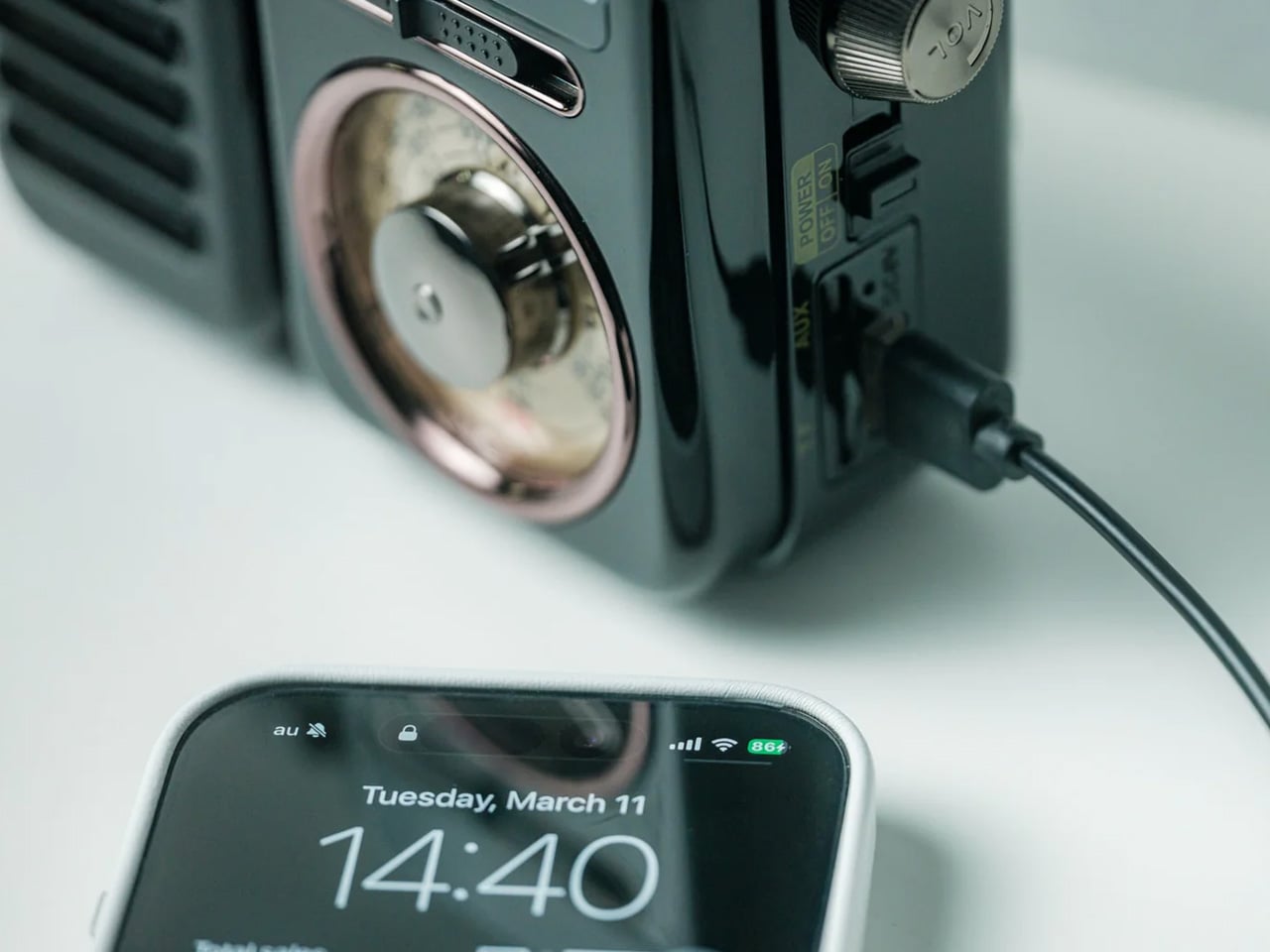
There’s a radio sitting somewhere in Japanese design history that directly inspired this one. The RetroWave 7-in-1 Radio arrives with a tactile tuning dial, a warm housing drawn from mid-20th century aesthetics, and the kind of visual restraint that makes a thing look inevitable. Behind the retro face is a 7-in-1 device handling AM, FM, and shortwave reception, Bluetooth streaming, a built-in flashlight, SOS alarm, power bank charging, and a 2000mAh battery that tops up via hand-crank or solar panel.

The 8W speaker punches with enough warmth to soundtrack a campfire properly, and the 20-hour radio battery life means it runs through a full weekend without reaching for a cable. Two colorways — black and warm gray — make it look as good on a picnic blanket as it sounds in the open air. It’s the rare object that solves the problems you forgot to plan for: music, emergency signaling, phone power, and light, all from one compact, beautiful thing.

Click Here to Buy Now: $89.00

What We Like

  • The 7-in-1 function set means it replaces multiple items in your pack — flashlight, emergency radio, portable charger, and speaker all collapse into a single carry-anywhere device with one well-resolved retro form that earns its weight every time.
  • The retro Japanese design with a tactile tuning dial doesn’t look like survival gear. It looks like a piece you’d buy for the living room, which means it earns a permanent spot in the gear bag rather than getting quietly left behind on the shelf.

What We Dislike

  • Bluetooth battery life tops out at approximately 5 hours at 75% volume, meaning a full camp day of wireless streaming will require a recharge — the solar panel helps, but cloud cover changes that math quickly.
  • The compact body keeps it packable, but the speaker volume has a ceiling that wide-open outdoor settings can expose, especially once the campfire gets going and conversation picks up.

2. Twist Camping Lantern

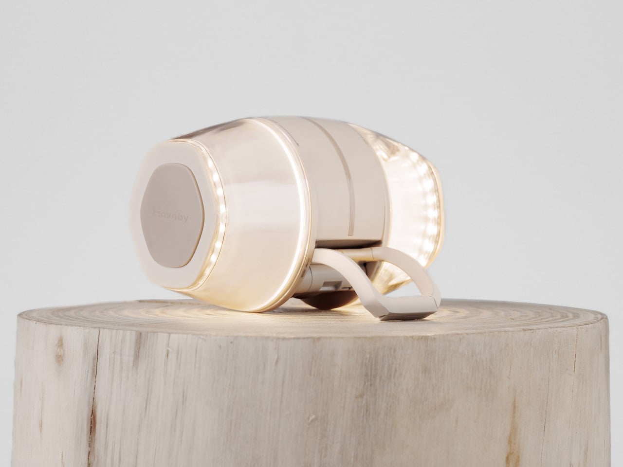
Small beige LED lamp lit with a warm glow, sitting on a round wooden stump.

Cream wireless over-ear headphones resting on a wooden stump against a pale background.

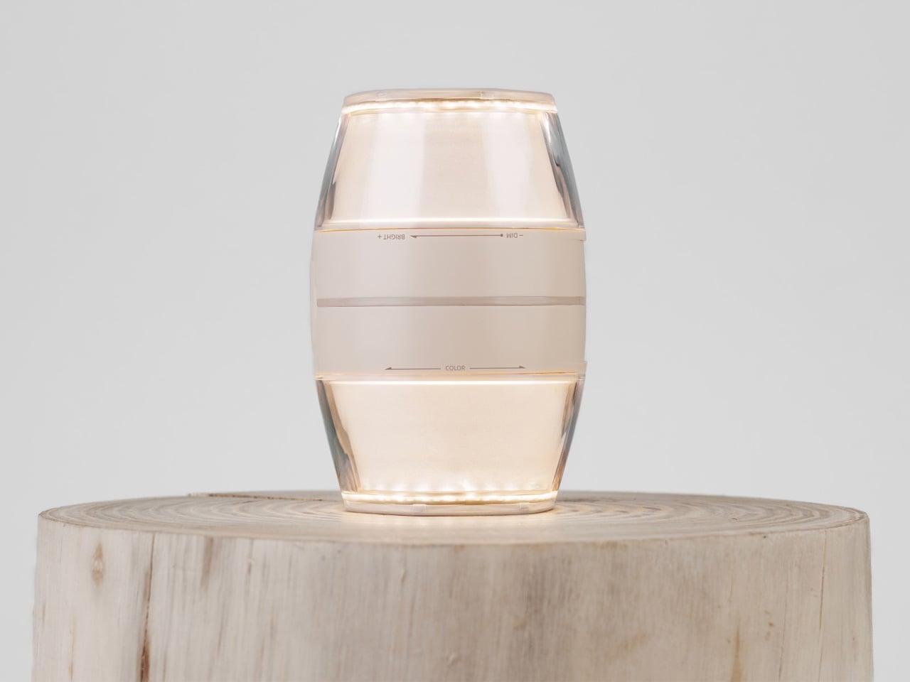
When designer iu Llong looked to Japanese gashapon vending machines for inspiration — those capsule toy dispensers that make cracking open a prize feel like a small ceremony — the result was a camping lantern that turns on exactly the way a gashapon opens: with a satisfying twist. Built for Havnby as two cones joined at the base, the single twist mechanism adjusts both brightness and color temperature, dialing from cool white all the way down to a warm red.

The Twist Lantern packs a 10,000mAh rechargeable lithium battery into a compact form that weighs around 410 grams and charges fully in under three hours via USB-C. Its runtime stretches from 3.8 hours at full brightness to an impressive 70 hours on its lowest setting — enough for an extended weekend. The waterproofing and built-in magnetic mount mean it handles rain and hangs wherever you need it. For a lantern, it’s remarkably thoughtful. For a design object, it’s immediately recognizable.

What We Like

  • The gashapon-inspired twist interaction makes operating this lantern something you’ll actually look forward to — the kind of satisfying physical gesture that cheap pushbutton camp lights have never managed to replicate across years of trying.
  • A 70-hour runtime on its lowest setting is exceptional for any rechargeable camping lantern, meaning you can leave home without calculating whether the battery will outlast the trip or quietly die at hour three.

What We Dislike

  • At 520 lumens, the Twist Lantern is optimized for ambiance and intimate spaces — it sets a tent mood beautifully but won’t flood a large group campsite the way a high-output utility lantern would.
  • The twin-cone form factor, while visually striking, is less stackable in a tightly packed gear bag than a more conventional cylindrical lantern design, which may require some creative packing on longer trips.

3. Iam Sauna

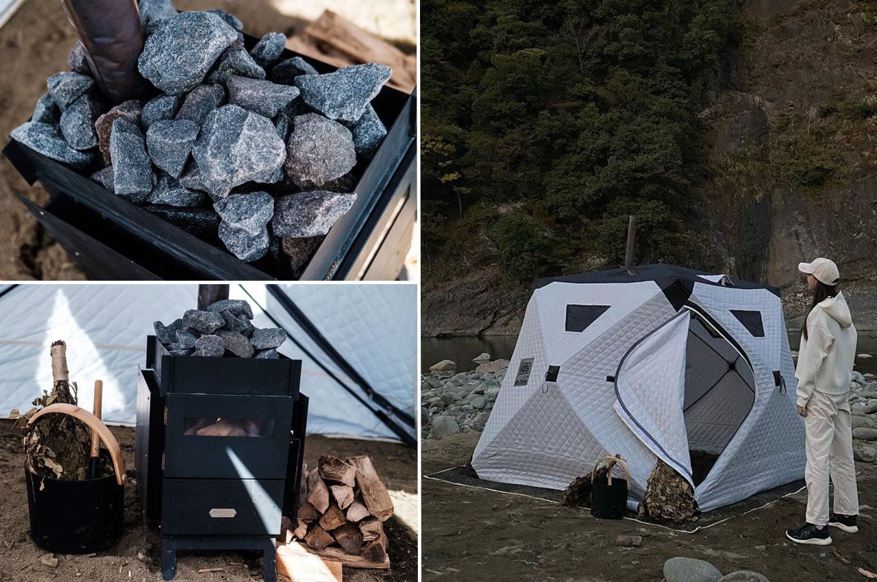
Iam Sauna is a portable sauna, genuinely made portable. The tent-style unit measures 220cm x 220cm x 185cm, accommodates up to six people, and is built from heat-insulating cotton material designed to trap steam and hold warmth in cold outdoor conditions. The included Tanzawa wood-burning stove is iron-built with folding legs, a heat-resistant glass window, and a removable guard plate where sauna stones stack neatly on top. Setup takes under a minute — one person, four pull tabs.

The panoramic windows along the upper section of the tent are a quiet design decision that separates this from any other portable sauna concept. Heat the stove, settle in, and you can watch stars or the tree canopy while your body does exactly what it came outdoors to do. Whether recovering after a full day of hiking or committing to a Saturday evening ritual by the lake, Iam Sauna delivers the restorative experience that used to require a fixed structure.

What We Like

  • A single person can collapse and set up the full tent structure in under 60 seconds, which means the sauna arrives at the campsite as a realistic option rather than a logistical project that gets quietly abandoned at the trailhead.
  • Panoramic windows at the top of the structure keep you visually connected to the outdoor environment while you’re inside — a design detail that makes the experience feel like it genuinely belongs in the wilderness, not in a hotel spa.

What We Dislike

  • The Tanzawa iron stove weighs approximately 18kg on its own, which adds meaningful carry weight to an otherwise packable system, effectively making Iam Sauna more of a car-camping or van-camping solution than a true backpacking option.
  • The wood-burning heat source requires sourcing fuel on-site or carrying it in, which introduces a variable that a gas or electric alternative would eliminate for weekend campers who prefer to pack light and plan less.

4. Airflow 8-Panel Fire Pit

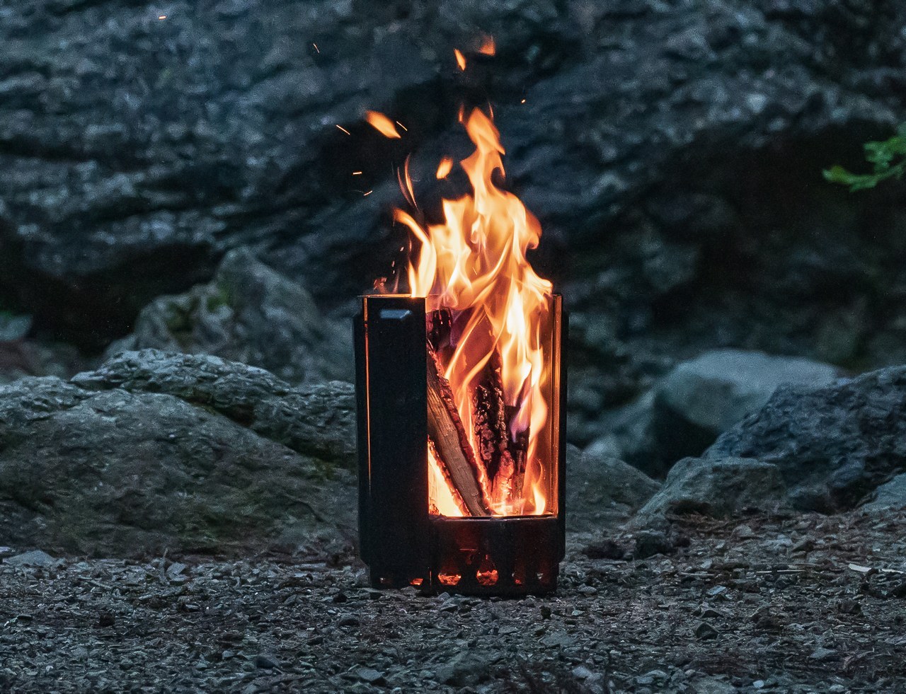
Japanese company UM spent decades in metal processing before arriving at the Airflow 8-Panel Fire Pit, and that deep material knowledge shows clearly. Eight removable panels form an octagonal cylinder optimized for secondary combustion. Holes at the base of each panel channel fresh air directly to the wood for primary combustion. As that air heats up, it rises through the double-walled cavity and exits at the top, creating secondary combustion that burns wood more completely and produces significantly less smoke.

The exterior panels are removable, meaning fire intensity is adjustable — pull one or two off and the fire breathes differently. The interior uses corrosion-resistant stainless steel designed to age into a natural patina, while exterior panels take the punishment a campsite delivers. A grill grate attachment turns it into a cooking platform without altering the fire pit’s core logic. Ash falls and collects at the base. Cleanup is minimal. It’s a piece of engineering that makes fire feel considered.

Click Here to Buy Now: $325

What We Like

  • The secondary combustion system is a genuine engineering achievement at this size — the smoke reduction is physics, not a marketing claim, and it makes extended campfire evenings significantly more comfortable for everyone sitting around it without constantly shifting to dodge the drift.
  • The modular panel system means the fire pit packs down smaller than its assembled footprint suggests, making it more portable than traditional bowl-style designs that share its output and heat radius.

What We Dislike

  • Assembling eight individual panels before the fire can be lit adds more steps to the startup process than a campfire usually demands — a minor friction, but one that registers in the dark or in rain when fumbling with separate components feels less intuitive.
  • The cooking grill grate is sold as an optional add-on rather than included in the base package, which feels like a missed opportunity given that cooking over fire is the most obvious secondary use case for every campsite fire pit.

5. Haori Cup

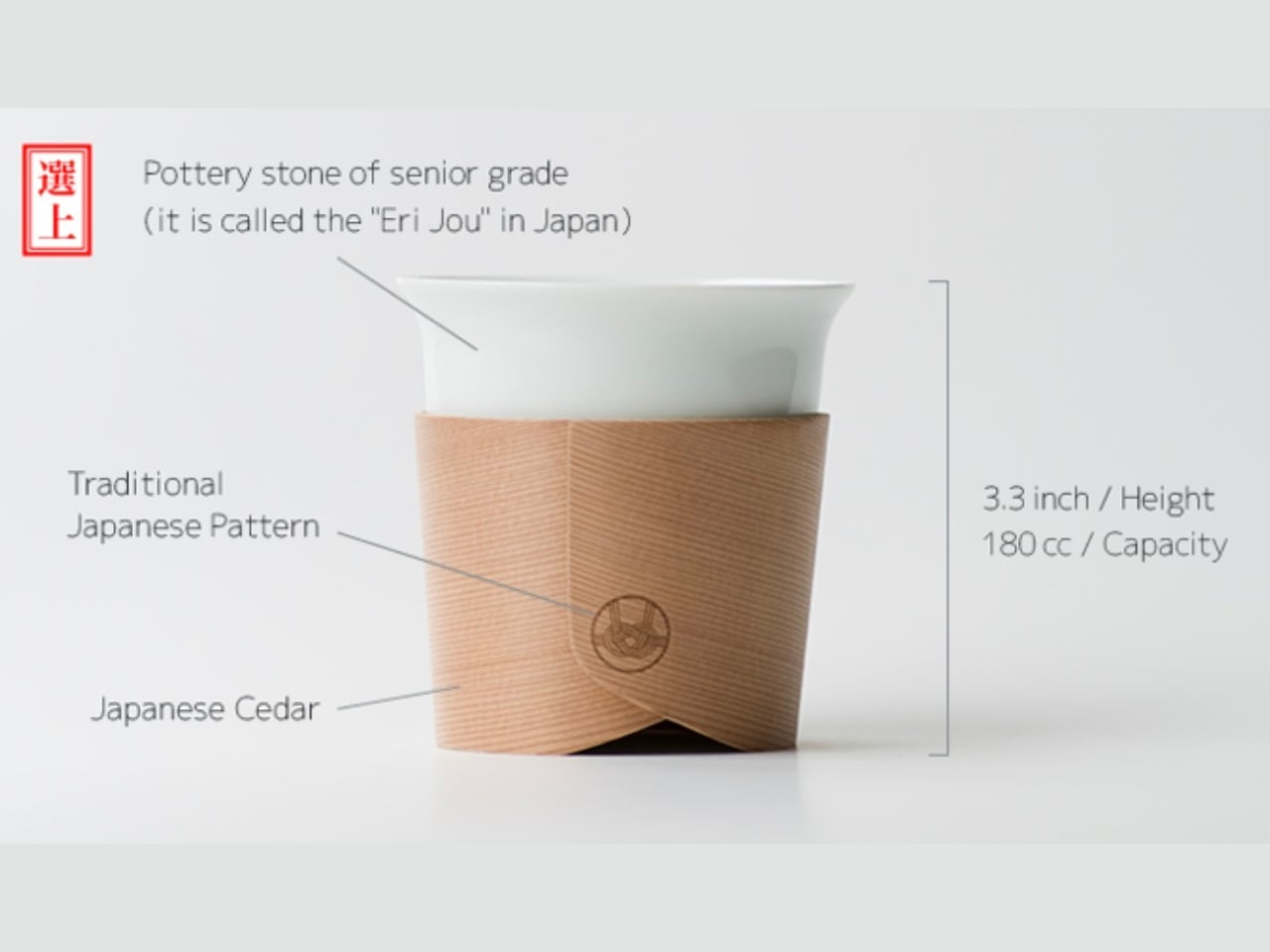
When designer Tomoya Nasuda set out to revive Hakata Magemono — the 400-year-old Japanese craft of hand-bending thin cedar into curved forms — he built the Haori Cup from a single piece of Japanese cedar. The result is a vessel that holds warmth from the inside and transfers almost none to your hands, because cedar insulates naturally. Available in several colorways, including the “Sakura” edition, every cup is handmade and shaped by grain patterns unique to that piece of wood.

The cedar lends a whisper of fragrance to each sip — a clean, forest quality that doesn’t compete with the coffee, just frames it. Bring the Haori Cup camping, and something specific happens. Holding warm coffee in a vessel bent from a single piece of Japanese cedar, sitting among trees not unlike the ones that made it, that’s the kind of moment you came outside for. It’s lightweight, it carries centuries of craft, and it makes the morning feel intentional.

What We Like

  • Reviving the 400-year-old Hakata Magemono craft means every Haori Cup is genuinely one of a kind — no two grain patterns are the same, and that individuality gives it a value that mass-produced camping vessels with identical stamped forms simply cannot offer.
  • Cedar’s natural thermal insulation keeps drinks warm without heating the exterior surface of the cup, meaning you can hold a freshly poured coffee comfortably without burning your hands — a straightforward material advantage with quietly elegant results in practice.

What We Dislike

  • Cedar is not dishwasher-safe and requires careful hand cleaning followed by thorough drying, which is a manageable routine at home but adds genuine friction when you’re washing up at a campsite with limited water and fading daylight.
  • As a handcrafted artisan object rooted in centuries-old technique, the Haori Cup carries a premium price that may be difficult to justify for a purpose as unpredictable as outdoor camping, where the risk of a dropped cup on river rock is never zero.

The Best Camping Gear Doesn’t Add More — It Gets Everything Right

Five products, five different problems, each solved with a rigor that feels less like product design and more like pure philosophy. That’s what Japanese design does at its best: it doesn’t add features to justify a price. It removes everything unnecessary, then makes whatever’s left feel like the only possible answer. That’s the standard these objects hold, and it makes everything else at the campsite feel slightly underdressed by comparison.

The best gear for Memorial Day isn’t the most technical. It’s the most considered. A radio that earns its campfire seat. A lantern that makes switching on a light feel like an occasion. A fire pit engineered so you don’t think about combustion. A sauna you carry in and a cup that turns coffee into a ceremony. Pack these five, and the weekend will be more than just a long one.

The post 5 Memorial Day Outdoor Gadgets That Make Every Camping Trip Feel Engineered in Japan first appeared on Yanko Design.

Your Bench Vise Can’t Hold Round Parts, This One Grips Anything

Most workshop tools haven’t changed much in decades, and bench vises are a good example of that. They’re big and heavy, and they work well enough when you’re clamping flat stock between parallel jaws. But the moment you try to hold something round, irregular, or fragile, a standard vise quickly becomes more of a problem than a solution, and you’re left wishing for an extra hand.

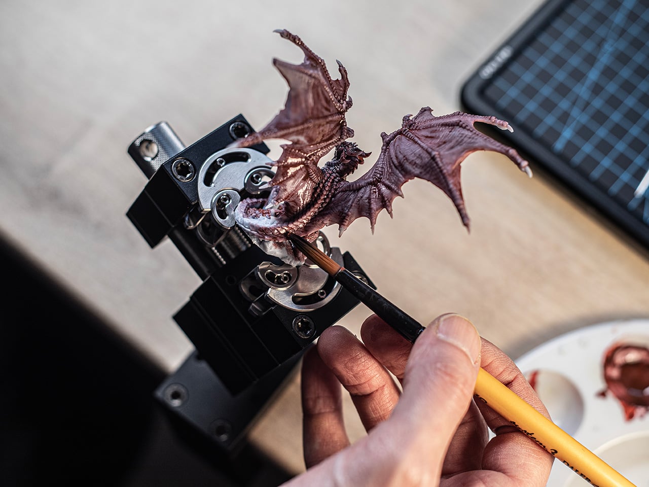
The maker community has grown considerably over the past decade, pulling in everyone from miniature painters and watch tinkerers to 3D printing hobbyists and electronics enthusiasts. These people aren’t using industrial-grade machine tools; they’re working at a desk, dealing with small parts in odd shapes that standard vises simply weren’t designed for. MetMo’s Fractal Vise feels like it was built specifically with that reality in mind.

Designers: Sean Sykes & James Whitfield

Click Here to Buy Now: $297.

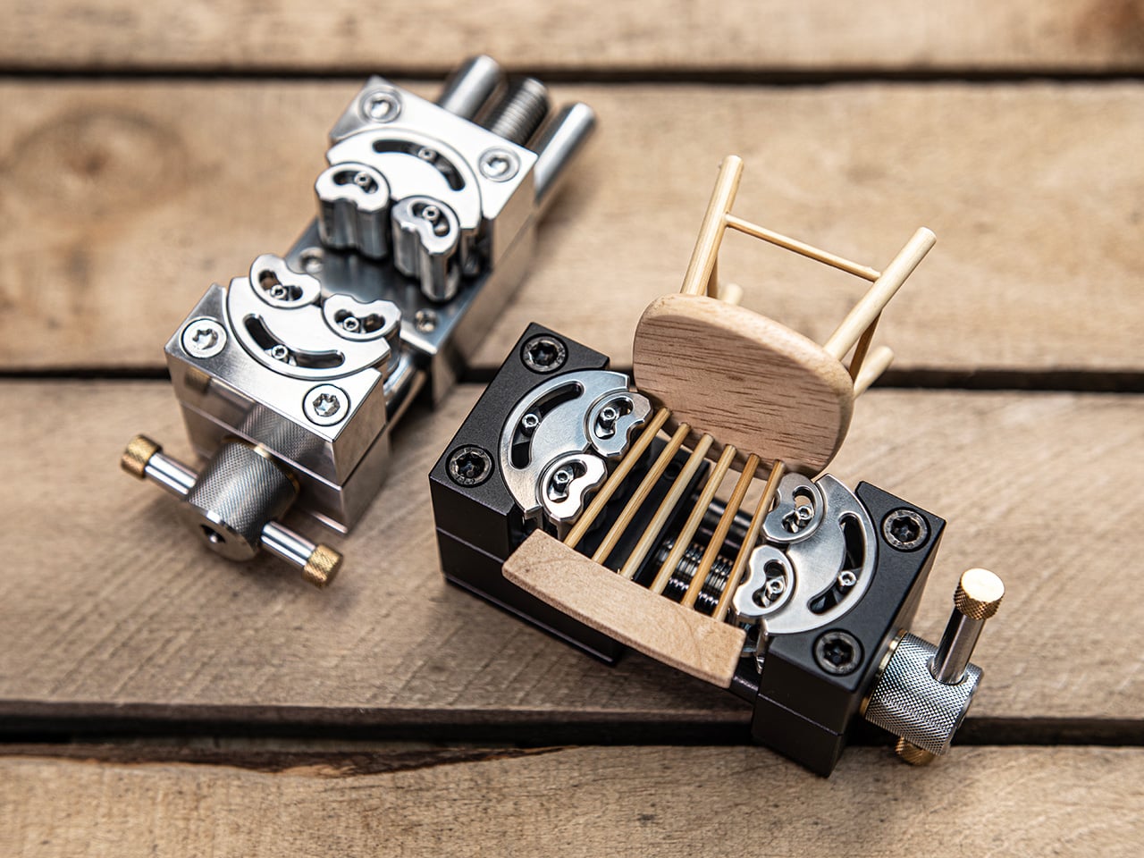
The idea behind the Fractal Vise isn’t entirely new. It traces its origins to a patent filed in 1913, though the original concept was built for heavy industrial machinery rather than desktop use. What MetMo has done is take that same engineering principle and scale it down into something compact enough to sit on a workbench or desk without taking over your entire workspace.

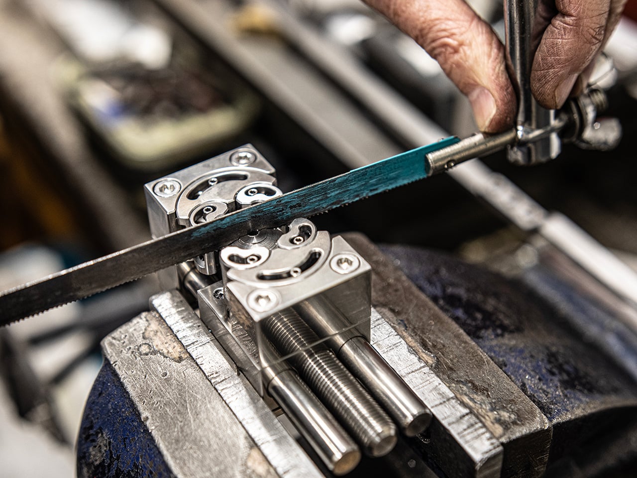
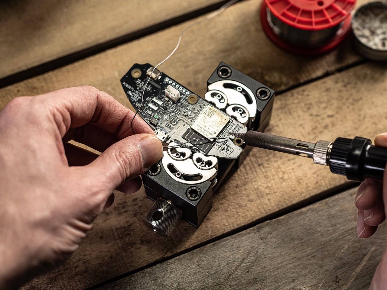
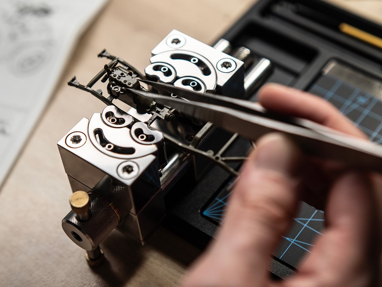
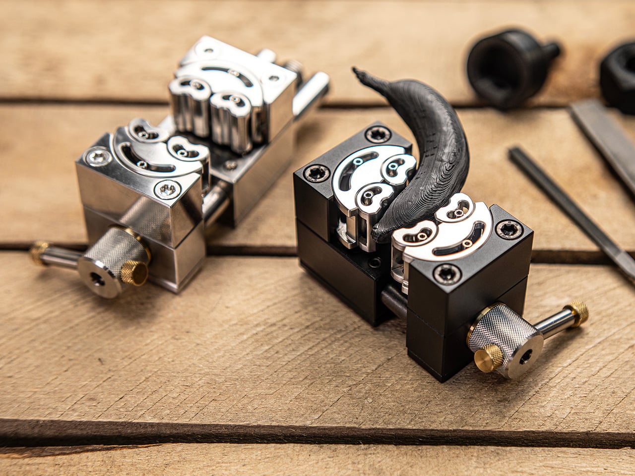
The magic is really in the jaws. Instead of two flat clamping surfaces moving in a straight line, the Fractal Vise uses jaws made up of independently articulating segments, six in total, that shift and pivot as they close around an object. That means it can grip round tubes, tapered forms, and irregular parts just as easily as flat ones.

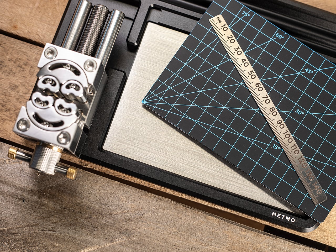
What makes this even more compelling is how seriously MetMo has approached the construction. The body is machined from aerospace-grade anodized aluminum, the jaws from hardened martensitic stainless steel, and the whole assembly runs on precision-ground linear rails for a backlash-free feel. There’s also a fine-threaded adjuster and a hex drive point for when you need more torque than your fingers can deliver.

Person soldering a small circuit board secured in a vise on a wooden workbench, soldering iron touching a component.

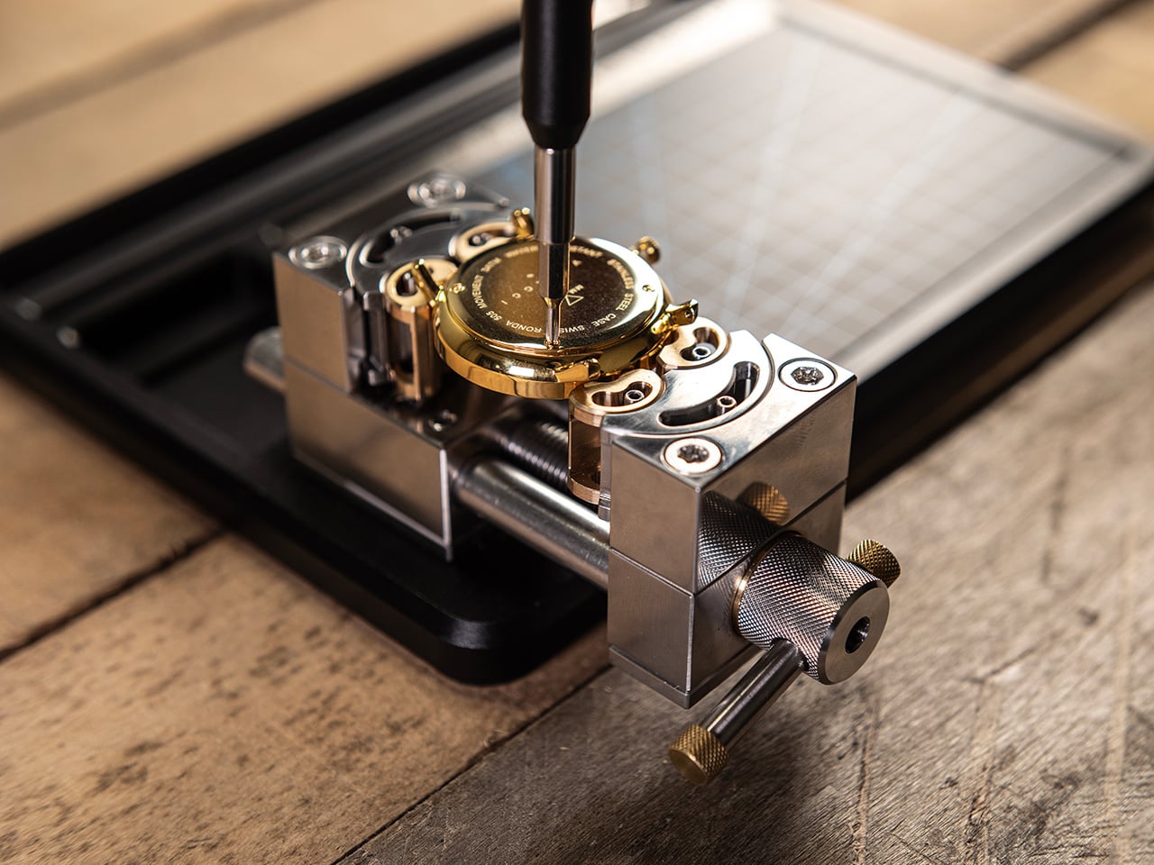
The Fractal Vise comes in two sizes, 32mm and 82mm clamping zones, and two material configurations. The Black version uses a hard-anodized aluminum body for a lighter, more portable build that’s ideal for detail-oriented work like model painting, watch repairs, or delicate 3D printing tasks. The aluminum construction keeps it light enough to reposition freely around your desk without feeling like you’re dragging a miniature anchor from one spot to another.

Close-up of a metal hole-punch tool on a wooden workbench, beside a blue-grid cutting mat with a wooden ruler laid diagonally across it.

The Stainless Steel Fractal Vise takes a different approach. Made entirely from heavy-duty steel, it offers considerably more mass and stability for tasks that need a firmer base, whether that’s light metalwork, filing, or anything where cutting forces might otherwise shift a lighter tool out of position. It’s the version you’d reach for when the work itself gets a bit rougher.

Beyond straight clamping, the Fractal Vise has a few other tricks. Its jaws are reversible, letting you clamp the inside diameter of hollow objects like glassware or pottery for engraving and painting work. Each face of the body is also precision ground, so you can stand the vise on its end and access a held part from a different angle without disturbing what you’ve already set up.

There’s also a parallel design that lets you drop the Fractal Vise straight into any standard bench vise or machine tool, effectively adding fractal jaw capability to equipment you already own. It’s fully bolted together and serviceable, with removable and reconfigurable parts, all of which says a lot about how MetMo thinks about the long-term life of what it builds.

At its core, the Fractal Vise is what happens when someone decides to stop accepting that a category of tool hasn’t kept up. Not every maker needs one, but anyone who’s spent time trying to keep a round part from rolling away while working on it will understand immediately why this design exists, and why it took this long for something like it to land at desk scale.

Click Here to Buy Now: $297.

The post Your Bench Vise Can’t Hold Round Parts, This One Grips Anything first appeared on Yanko Design.
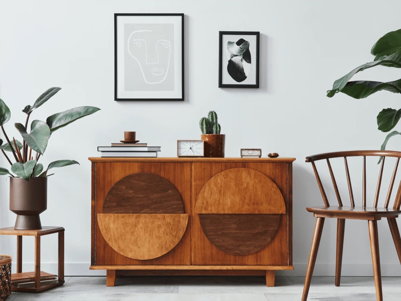
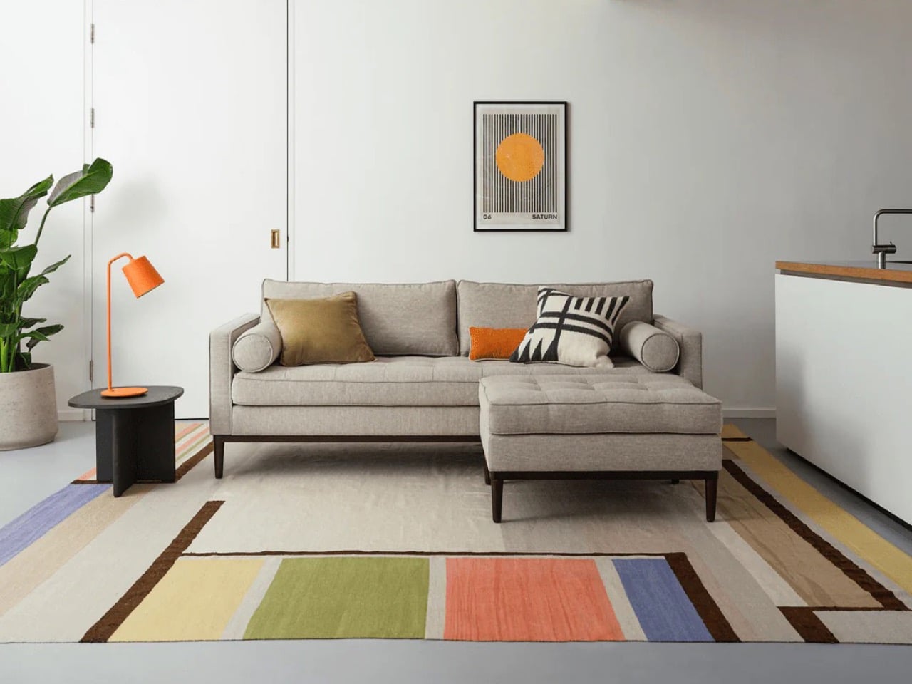
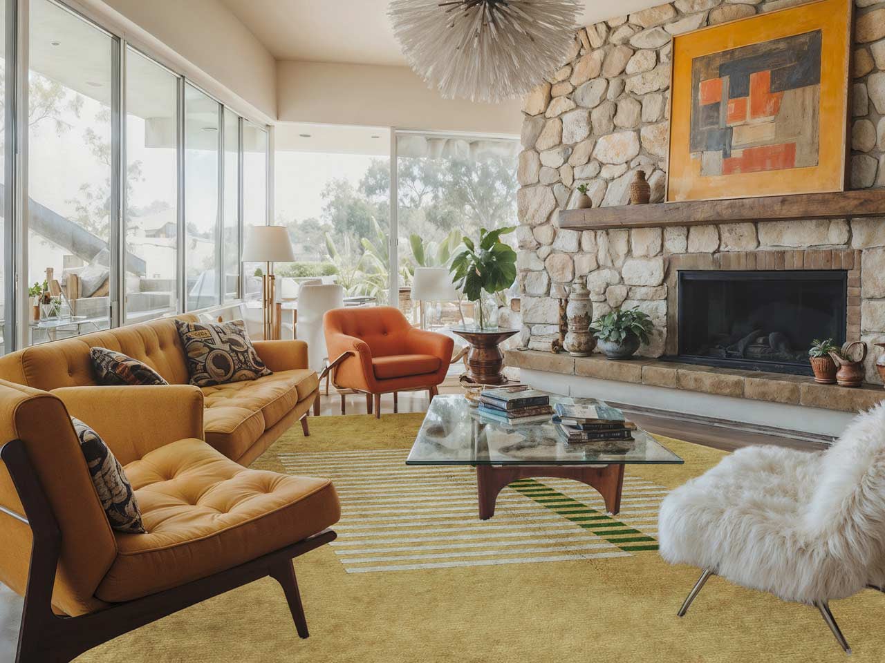
70 Years Later, Midcentury Modern Furniture Has Still Outlasted Every Single Trend That Came After It

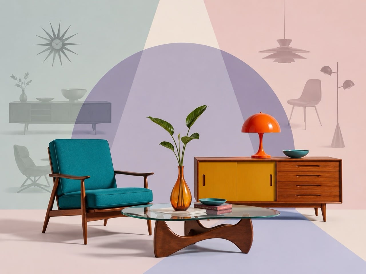
Seventy years on, Midcentury Modern still holds the room. Few design languages have remained so instantly legible across generations, continents, and price brackets. A teak sideboard, a low lounge chair, a softly tapered leg, these forms keep resurfacing as if they belong to the present tense. Trends have come and gone, each promising a cleaner future, a stranger future, a smarter future. Yet when people picture a beautiful modern interior, they keep circling back here.

Part of that grip comes from how effortlessly the style moves through culture. It lives comfortably in architect homes, boutique hotels, prestige dramas, real estate listings, and algorithm-fed moodboards. It carries polish without stiffness and warmth without clutter. Midcentury Modern feels calm under the camera and persuasive in real life, which may be why it has outlasted both the severe ideals that came before it and the restless experimentation that followed.

Before Midcentury, Modernism Was Kind of a Lecture

Early modernism had strong opinions about how you should live. The Bauhaus movement, Le Corbusier’s machine-for-living philosophy, the International Style, all of them carried an ideological backbone that made the furniture feel like it was making a point. Admirable in a design school context. In an actual living room at seven in the evening, it gets exhausting fast.

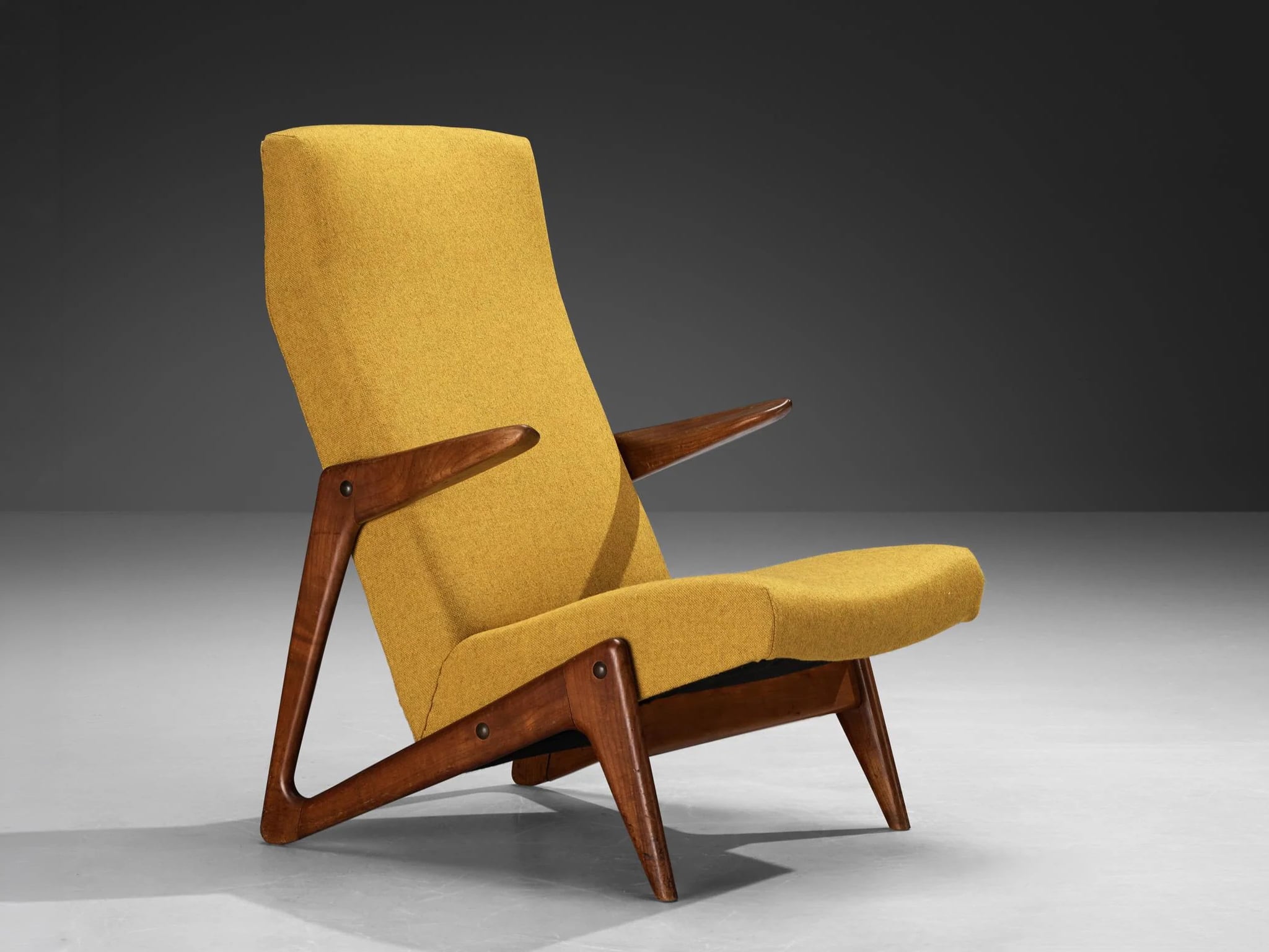
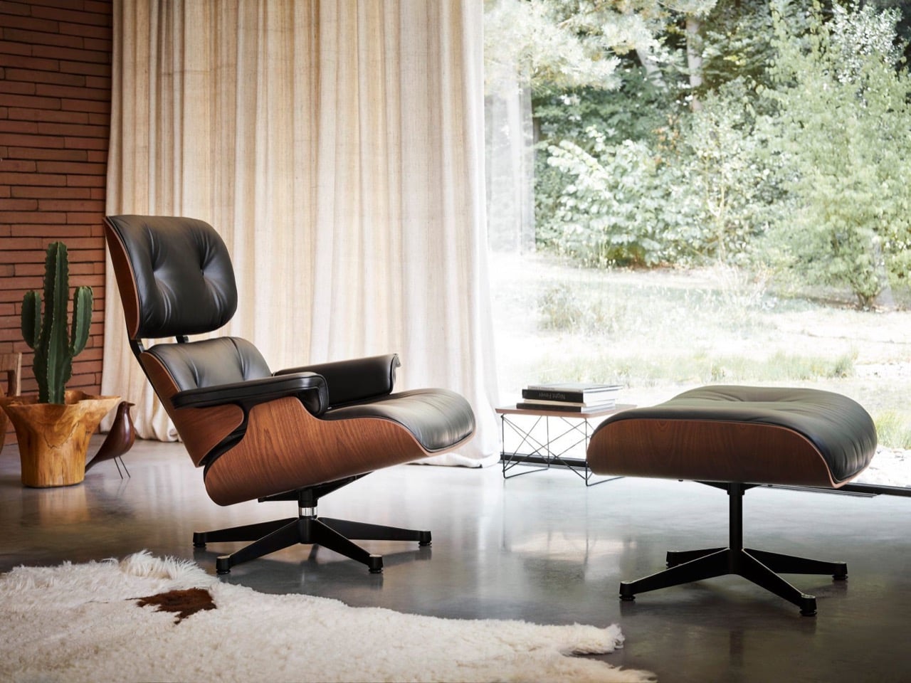
Midcentury absorbed those ideas and quietly softened them. The clean lines stayed. The rejection of unnecessary ornament stayed. But warmth came back, through teak, walnut, and oak, through gently curved backrests and tapered legs that gave furniture a sense of posture rather than rigidity. Charles and Ray Eames captured this balance better than almost anyone. Their lounge chair, produced by Herman Miller, managed to feel both rigorously designed and deeply comfortable, which sounds obvious until you realise how rarely furniture achieves both at once. It kept the intelligence of modernism and dropped the sermon. That pivot sounds small. Culturally, it was enormous.

By the 1950s, the style had embedded itself into the everyday image of modern living in a way that earlier movements simply had not. Suburban homes, corporate lobbies, university campuses, and government buildings were all speaking the same visual language. Knoll helped make that language feel authoritative on the institutional side, supplying the clean, composed modernism that filled executive offices and architecture firm interiors. Herman Miller did the same for domestic and workplace culture, with the Eames studio and George Nelson shaping much of what the brand put into the world. These were not just furniture companies. They were the infrastructure through which a whole visual culture got distributed.

Unfairly Photogenic

Some styles are powerful in person and flat in images. Midcentury is the opposite. Its silhouettes are confident and legible at almost any scale. The materials, warm wood grains, moulded fiberglass, black hairpin metal, register beautifully on camera. Rooms furnished in this style look intentional without looking curated to the point of anxiety, which is a harder balance to achieve than it sounds.

That quality has given Midcentury Modern an extraordinary run through every era of image culture. It looked great in the shelter magazines of the 1950s and 60s. It looked great in prestige cinema. It looked great when Pinterest arrived and people started building moodboards obsessively. Arne Jacobsen’s Egg chair, originally designed for the SAS Royal Hotel in Copenhagen, became one of the most reproduced images in design media precisely because it photographs with such force. It looks great in today’s real estate listings, hotel photography, and the kind of Instagram interior accounts that collectively function as a global taste barometer. The style has never once struggled to reproduce well, and in a world where visual culture drives purchasing decisions and lifestyle aspirations, that is a staggering advantage.

What Came Next, and Why It Didn’t Stick

Midcentury’s successors have genuine merit. Minimalism has had deep, lasting influence on architecture, product design, fashion, and branding. Postmodern furniture produced some genuinely memorable objects. The blobject era, all soft digital curves and translucent plastics, captured a very specific early-internet optimism in physical form. High-tech design made functionality feel heroic. All of these movements mattered.

But none of them achieved the same spread across class, geography, and function. Minimalism in its purest form is a discipline, and most people cannot sustain it in a home where actual life happens. Postmodernism’s irony and visual noise made it polarising by design, which kept it from becoming a universal default. Blobject dated quickly because it was so tightly tied to a specific technological moment. The Y2K-era iMac is a fascinating cultural artifact. Nobody is furnishing their living room around that aesthetic today.

Midcentury, by contrast, stayed loose enough to absorb reinterpretation across decades. The Danish side of the movement, Hans Wegner’s chairs through Carl Hansen and PP Møbler, Jacobsen’s work through Fritz Hansen, gave the style a warmth and craft sensibility that kept it from ever feeling purely industrial. The American side, Herman Miller, Knoll, the Eames studio, gave it scale, authority, and mass-market reach. Together those two currents covered enormous stylistic ground. The result could lean warm and Scandinavian, or sharp and American corporate. It could feel bohemian or academic, casual or polished, urban or suburban. That range has made it one of the most resilient stylistic platforms in the history of designed objects, because it never got locked inside a single cultural context.

When a Trend turns into an Institution

Somewhere in the 1980s and 90s, Midcentury stopped being a style and became an institution. Museums started collecting it seriously. Design schools started teaching it as a benchmark. Auction houses started generating headlines around individual pieces. Publishers built entire catalogues around it. Manufacturers holding original licenses, Herman Miller, Knoll, Fritz Hansen, Vitra, started reissuing classic designs to meet a demand that showed no sign of cooling. Vitra in particular became a kind of European custodian of the canon, producing and circulating Eames designs across a global market that had no shortage of appetite for them.

Once a style enters that feedback loop, it gains a structural advantage over everything newer. It becomes the standard against which other furniture is implicitly measured. When a new lounge chair launches today and reviewers reach for comparisons, the Eames lounge comes up within the first paragraph. When a Scandinavian furniture brand wants to signal craft heritage, Wegner is the reference point. The style became the currency the whole conversation uses.

That canonisation also shapes how ordinary people absorb taste. Design journalism, interior styling, boutique hospitality, and eventually social media have all spent decades reinforcing the idea that this is what enduring design looks like. People often think they are discovering it for themselves. In many cases, they are responding to an incredibly sophisticated, decades-long process of cultural reinforcement working quietly in the background.

Still the Default Setting

Walk into a newly opened boutique hotel. Browse the staging on a premium real estate listing. Watch the set design in any prestige television drama set inside a contemporary home. The visual evidence keeps pointing in the same direction. Midcentury Modern remains the go-to shorthand for cultivated modern taste, deployed by professionals who understand exactly what these forms communicate without a single word of explanation.

That staying power is active, not passive. Herman Miller and Knoll still manufacture and market these designs because demand remains strong. Fritz Hansen still sells Jacobsen’s chairs to hotels, offices, and homes across the world, decades after they were drawn. Vitra’s design museum is still a pilgrimage spot for designers looking to revere icons and gather inspiration. The market for original vintage pieces has grown, not contracted, over time. Heck, some pieces even managed to wiggle their way into sci-fi series like Severance, showing how midcentury integrates well into a dystopian hellscape! These are not heritage brands coasting on legacy. They are active commercial operations sustained by genuine, continuing desire.

Seventy years is a long time for anything in design to hold cultural authority. To still be the dominant visual reference for modern living after seven decades, despite being succeeded by multiple complete aesthetic movements, suggests something beyond ordinary trend mechanics. Midcentury Modern found the frequency at which human beings broadly want their surroundings to feel. Clean without coldness. Modern without alienation. Beautiful without visible effort. Until another style finds that same frequency, the room still belongs to Midcentury Modern.

The post 70 Years Later, Midcentury Modern Furniture Has Still Outlasted Every Single Trend That Came After It first appeared on Yanko Design.
30 Years Later, Forrest Gump Gets the LEGO Set He Always Deserved

The bus bench scene in Forrest Gump was never supposed to be the heart of the film. It was a framing device, a structural trick borrowed from the original Winston Groom novel, a way to let Tom Hanks narrate three decades of American history to a rotating cast of strangers. And yet, somehow, that bench in Chippewa Square, Savannah, became the most iconic seat in 1990s cinema. The original bench now lives in the Savannah History Museum, behind a velvet rope, because apparently plastic and wood can become sacred objects when the right story happens around them.

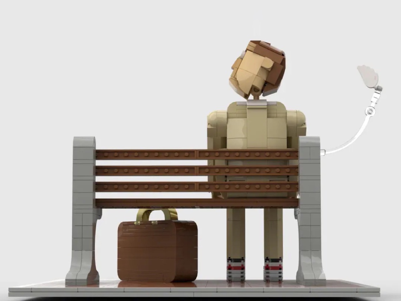
Avid Builder, a LEGO Ideas community member, has now given that bench a second life in brick form. The 871-piece build seats a fully articulated, custom-scaled Forrest on the bench, complete with his tan suit, his chocolate box, his trusty suitcase, and the floating white feather that opens and closes the film’s entire emotional arc.

Designer: Avid Builder

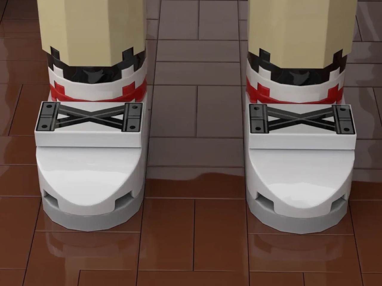
At 871 pieces, this build operates at a scale well above your standard minifigure, and that choice pays off enormously. The figure of Forrest is brick-built from the ground up, with poseable arms, a rotating neck joint, and a custom-engineered head that Avid Builder describes as their first attempt at this scale. It shows the right kind of ambition. The face carries a gentle, open expression, eyes wide and slightly upward, a small smile that reads as the precise emotional register Tom Hanks spent two hours maintaining in 1994. The tan suit is rendered faithfully across the torso, with the checked shirt and striped socks accounted for in the color blocking. And then there are the shoes. Look closely and you’ll find white curved-slope sneakers with Technic cross-brace elements sitting on top, suggesting the laces on Forrest’s Nike Cortez runners, the ones Mama said were his magic shoes.

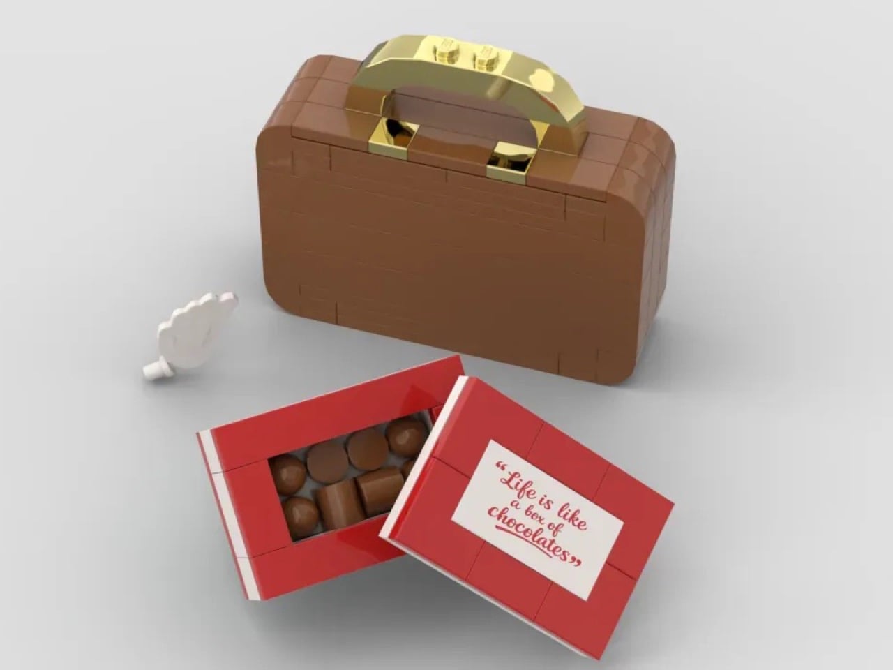
The accessories add some interactive whimsy to the MOC (My Own Creation). The red chocolate box opens, and inside sit individual rounded chocolate elements in a warm brown, arranged exactly as you’d expect a proper box of assorted chocolates to look. The lid carries a custom-printed tile with the famous quote. The brown brick-built suitcase beside Forrest uses a gold bar and handle assembly that catches the light beautifully, and the whole thing reads as a piece of luggage that has genuinely been somewhere. My favorite detail, though, is the feather, a white element suspended on a clear articulated bracket arm extending from the side of the scene, hovering at just the right height to feel like it caught a current of air and stopped there.

The build also offers two display configurations. Face it forward and you have the bus stop scene, Forrest waiting patiently for a ride that will take him somewhere extraordinary. Rotate it 180 degrees and the composition mirrors the film’s official poster, the bench receding into the frame, Forrest’s back to you, the world ahead of him.

The Forrest Gump bench MOC is currently gathering votes on LEGO Ideas, the community platform where fan submissions that cross the 10,000 vote threshold get reviewed by LEGO’s internal team for potential production as a retail set. With 855 supporters logged so far, it has runway ahead of it, and 362 days left on the clock. If you grew up quoting this film at the dinner table, or if you just appreciate a brick build that understands what it’s trying to say, head over and cast your vote here.

The post 30 Years Later, Forrest Gump Gets the LEGO Set He Always Deserved first appeared on Yanko Design.
8 Best Pens and Writing Instruments That Make You Actually Want to Pick Up a Pen Again

There is an argument happening on desks everywhere, and it is not about productivity systems or the right notebook grid. It is about whether the thing you write with deserves the same design attention as everything else you choose to own. For most people, a pen is a pen. For a small and growing number, it is the one object that connects thought to surface, and that connection is worth getting right. The instruments on this list take that idea seriously.

What unites them is not price or prestige. It is that each one treats the act of writing as a design problem worth solving from the beginning — the weight, the mechanism, the material, the way it sits in the hand before the nib or tip ever touches paper. Some are concepts. Some are products you can order today. All of them make the case that the writing instrument is still one of the most interesting objects in design.

1. Yamaha Swing Scribe

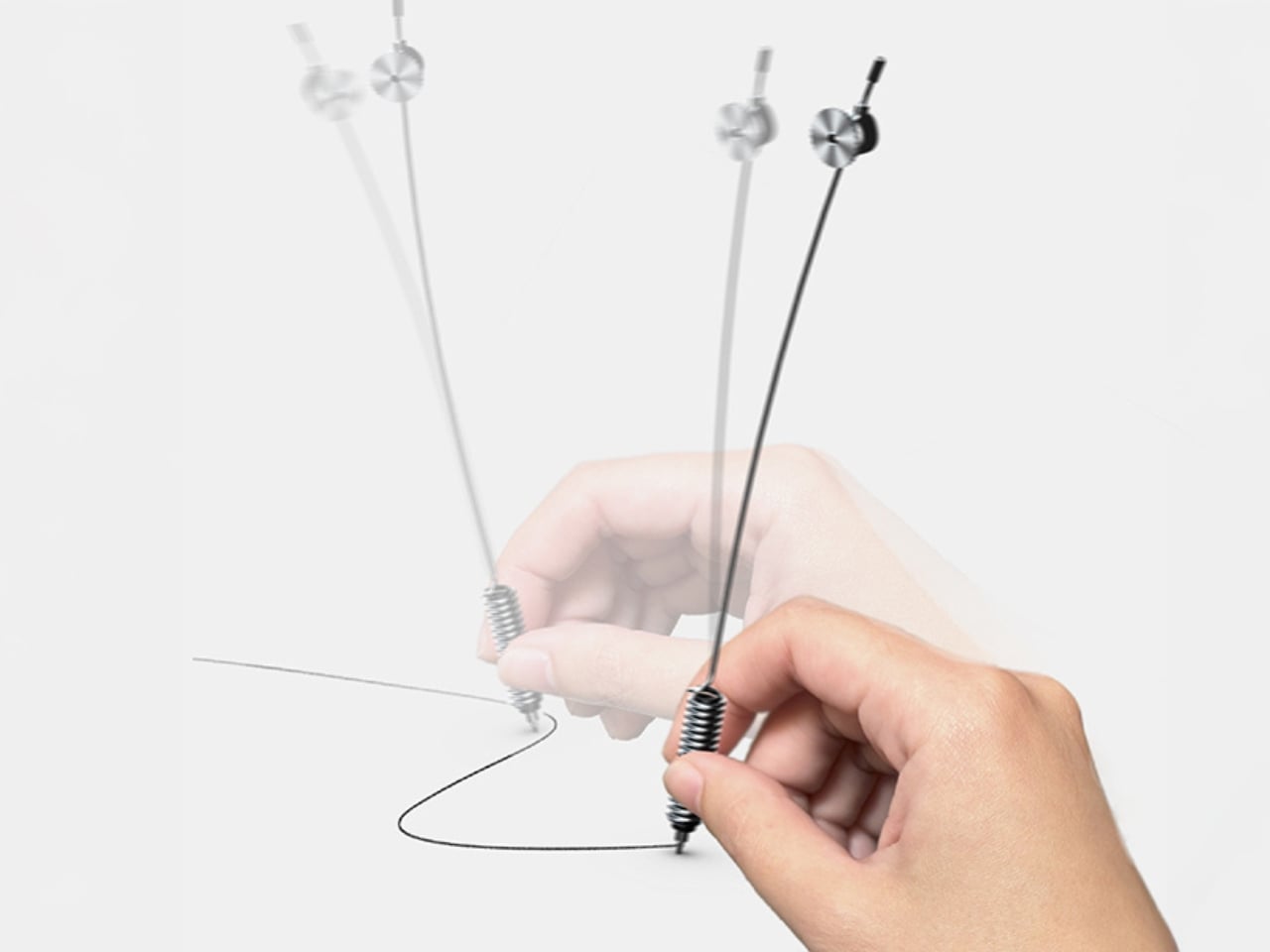
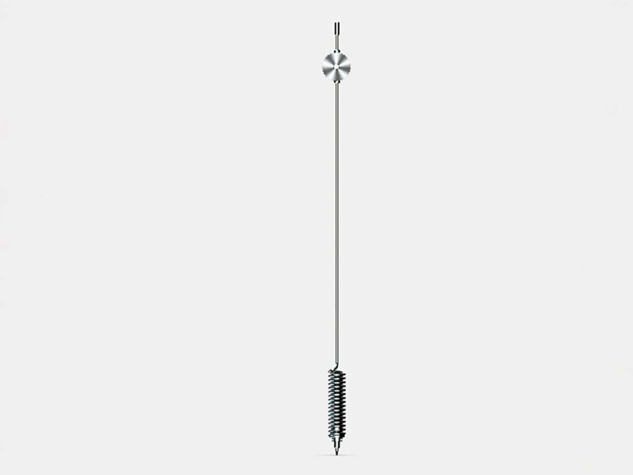
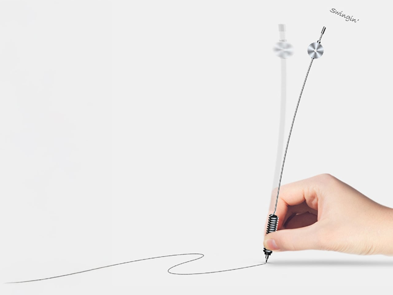
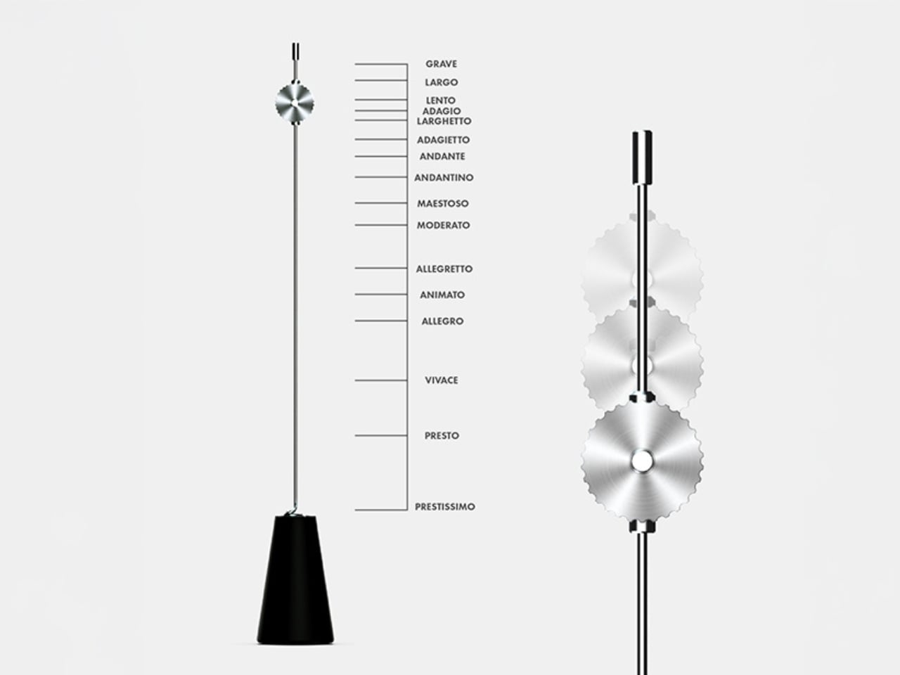
Yamaha’s answer to the question nobody thought to ask — what if a pen had a heartbeat? Part of the brand’s Scribe Tool Design 2024 project, the Swing Scribe draws its logic from the quill: as a feather naturally wobbles under air resistance while writing, it gives the act a physical rhythm. Yamaha made that incidental quality intentional. A weighted tip attached to a metal bar swings as the pen moves, feeding a small, steady pulse back into the hand with every stroke. No batteries. No app. Just physics.

The weight slides along the bar, letting you dial in the arc of the swing to match how you’re writing at any given moment. Pull it close to the pivot for a tighter, faster beat. Let it run wide for slow, deliberate work. This is the kind of design thinking that earns the word Kando — the Japanese concept of emotional resonance that sits at the core of everything Yamaha builds, from concert grands to this pen. It doesn’t make writing faster. It makes it more felt.

What we like:

  • The pendulum mechanism works without any power source, making it completely self-contained
  • Adjustable weight position means it adapts to the writer rather than demanding the writer adapt to it

What we dislike:

  • The swinging arm adds visual complexity that won’t suit every context or desk aesthetic
  • The concept hasn’t been tested across extended, high-volume writing sessions yet

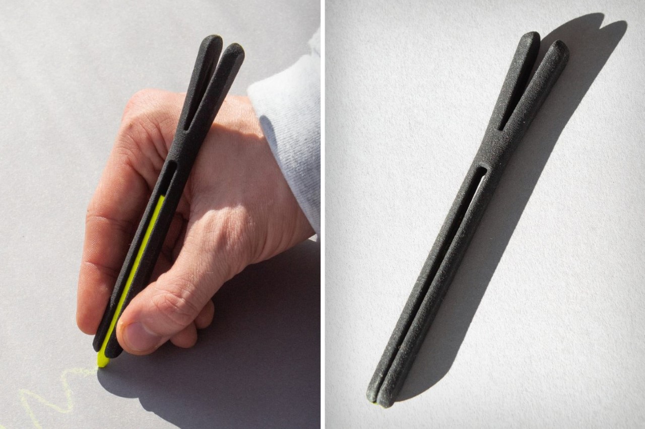
2. Inseparable Notebook Pen

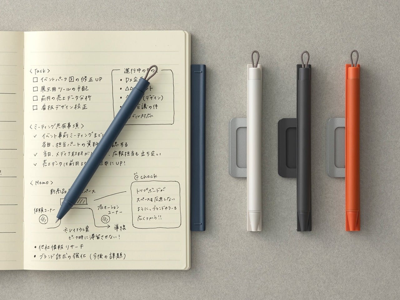
The premise is embedded in the name. Most pens and notebooks exist in a state of constant near-separation — the pen migrates to a bag, a pocket, another room, and the notebook sits waiting and useless. The Inseparable concept addresses this directly, building pen and notebook as a single resolved object rather than two products that happen to be sold together. The pen lives within the notebook’s architecture rather than being clipped to it as an afterthought, and removing it feels deliberate rather than accidental.

What makes this design interesting isn’t just the integration — it’s that the integration is the premise, and everything else follows from it. The proportions of the pen are dictated by the notebook. The notebook’s form is shaped around the pen’s presence. Neither object is compromised to serve the other, which is harder to achieve than it sounds. When a design solves a problem this specific and this common, it has a right to exist.

Click Here to Buy Now: $19.95

What we like:

  • Eliminates one of the most common and most irritating failures of the writing ritual entirely
  • The formal resolution between pen and notebook is tight — neither object feels like a concession

What we dislike:

  • Integration at this level commits you to one notebook format, limiting flexibility for writers who move between sizes
  • Writers who prefer their own paper choices will find the pairing restrictive

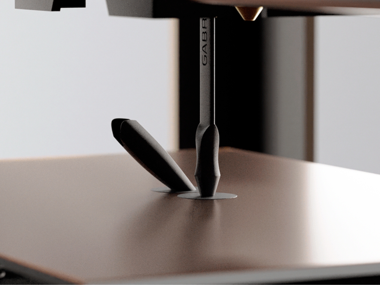
3. Da Vinci Pencil

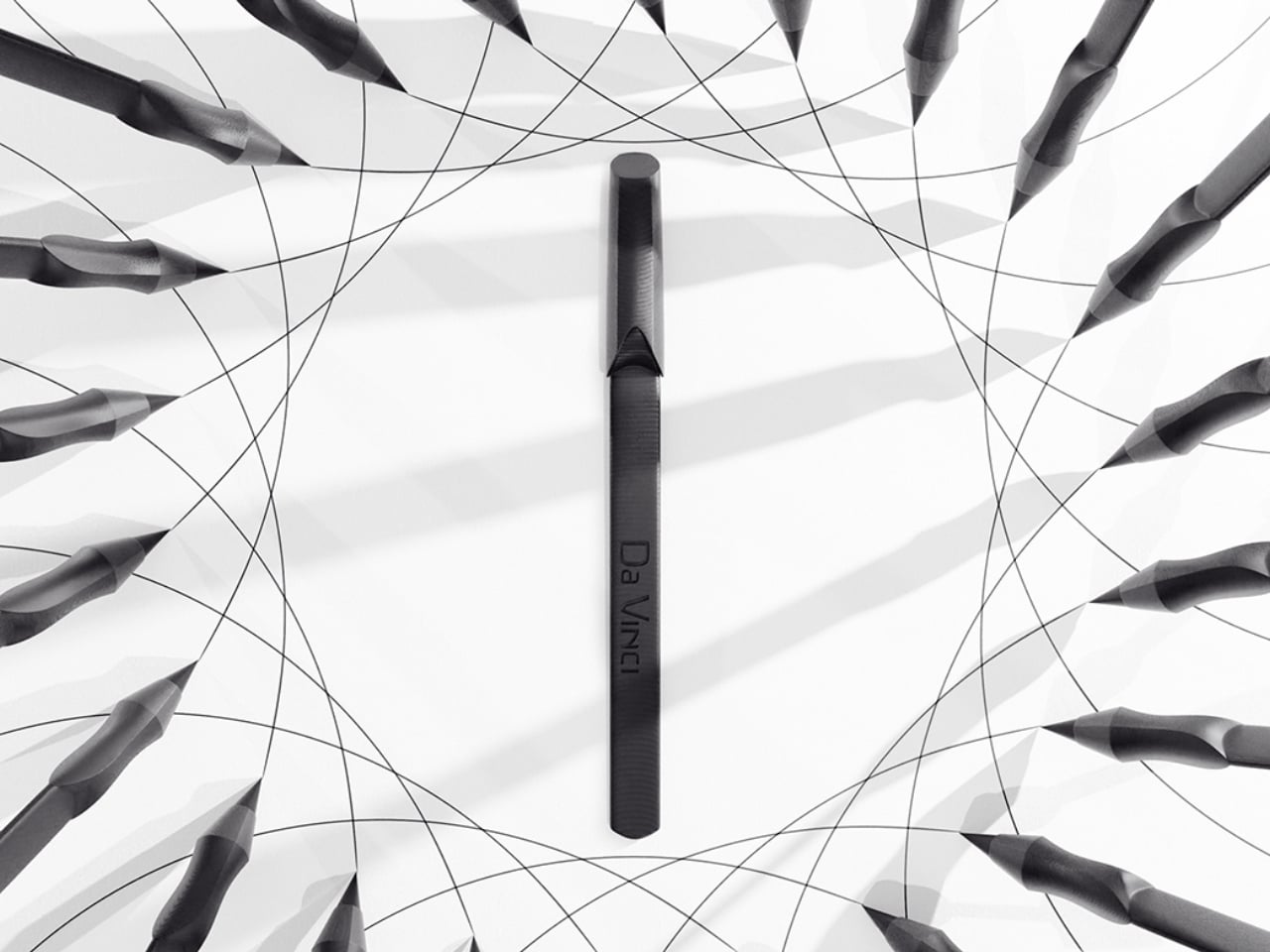
Gabrilevich Design’s Da Vinci pencil concept earns its name not through ornamentation but through the kind of cross-disciplinary thinking that made Leonardo’s notebooks worth studying in the first place. The design draws from da Vinci’s own mechanical sketches — the geometry, the visible logic of moving parts, the sense that an object should reveal how it works rather than hide it. The result is a pencil that functions as a small piece of mechanical sculpture, beautiful precisely because nothing about its construction is concealed.

The concept challenges the pencil’s conventional muteness. Most pencils look like nothing in particular. The Da Vinci concept looks like something that was thought about — that has a position, a point of view about what a mark-making tool should communicate about the hand that uses it. Whether it writes better than a standard pencil is beside the point. It writes differently, and it makes you think about the act differently, which is often the more interesting design outcome.

What we like:

  • Treats a pencil as a vehicle for design philosophy rather than a commodity object
  • The exposed mechanical logic gives it a conceptual depth that most stationery completely lacks

What we dislike:

  • Concept-driven designs at this level of visual complexity often struggle in extended daily use
  • Visible mechanisms can introduce maintenance friction that disrupts the writing ritual

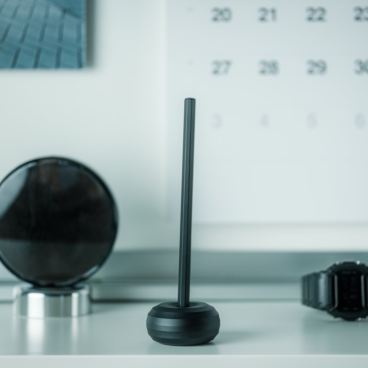
4. Levitating Pen 2.0 Cosmic Meteorite Edition

The levitating pen is a category that could easily slide into novelty, and the original versions of magnetic levitation pens leaned into that direction unapologetically. The 2.0 Cosmic Meteorite Edition changes the conversation by adding material seriousness to the spectacle. The pen itself incorporates genuine meteorite fragment material — iron-nickel alloy from outside the atmosphere — which gives the levitation a context it previously lacked. The object that hovers above its base is, in a measurable sense, from space.

That combination of astronomical material and magnetic suspension creates an object that earns its place on a desk in a way that pure spectacle cannot. It is a writing instrument that happens to be made partly from the oldest solid material you will ever hold, suspended above a surface by the same electromagnetic principles that govern planetary orbits. The writing experience is secondary to what the pen communicates as a resting object, and for a desk piece that doubles as a conversation anchor, that hierarchy is entirely appropriate.

Click Here to Buy Now: $399.00

What we like:

  • The meteorite material elevates the concept from a gadget to a genuine collectible
  • The levitation serves the narrative of the material rather than competing with it

What we dislike:

  • The magnetic base required for levitation eliminates any possibility of portability
  • Its function as a writing instrument is always secondary to its function as a display object

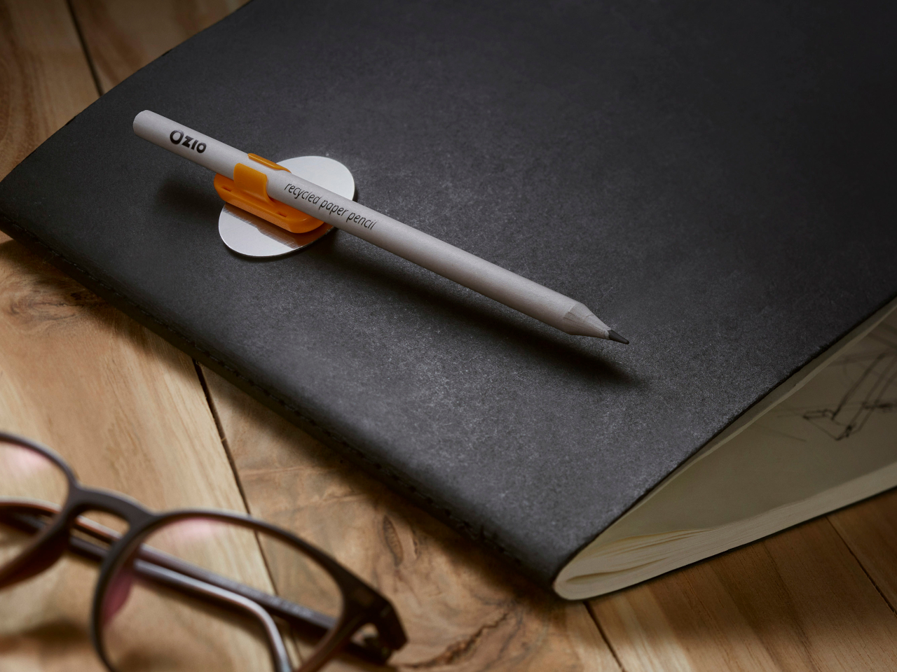
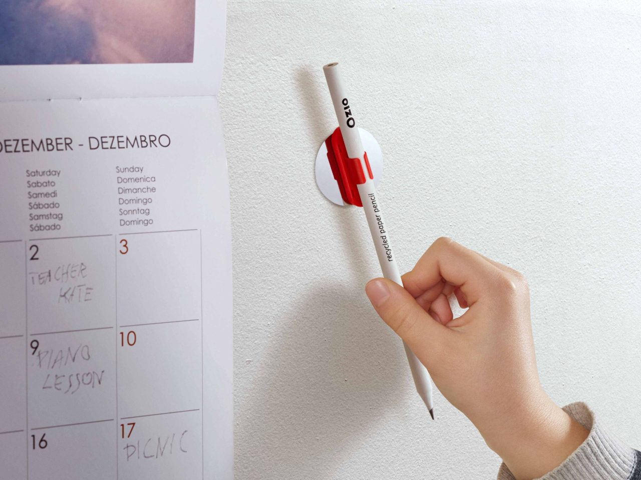
5. Qui Magnetic Pencil System

Qui operates on the premise that the friction between a pencil and the surface it lives on — a desk, a notebook, a wall — should be designed rather than incidental. The magnetic system allows the pencil to attach and detach from its designated surface with a satisfying, calibrated resistance, making the act of picking it up and setting it down feel considered rather than casual. This is a small interaction, but it happens dozens of times a day, and designing it well changes the quality of the entire writing practice.

The system thinking extends beyond the magnetic connection. The pencil’s geometry is resolved with the mounting surface as part of the design problem, not as a separate accessory. The result is that Qui occupies space well even when not in use, which is most of the time. A pencil that looks intentional when it is sitting still is a harder design challenge than one that merely writes well, and Qui understands that the resting state is part of the design.
What we like:

  • The system approach treats the pencil and its environment as a single design problem
  • The resting interaction — picking up and setting down — is as considered as the writing experience itself

What we dislike:

  • The magnetic system creates a dependency: without its base, the pencil loses its defining characteristic
  • Committing to a fixed mounting point works against the natural portability of a pencil

6. PENTAPA

Konstantin Diehl’s PENTAPA takes its name and its logic from the pentagon — five sides, each one a resolved surface rather than a generic round barrel. The five-sided form is unusual enough to read as a design decision the moment you pick it up, and practical enough to hold well once you begin writing. Pentagons don’t roll off desks. They register against the fingers in a way that circular barrels don’t, giving you tactile information about the nib’s orientation before the tip reaches paper.

PENTAPA belongs to a tradition of geometric pen design that runs from the hexagonal tradition of rOtring and Kaweco through to contemporary CNC-machined objects, but it finds its own position in that tradition rather than merely referencing it. Five sides is not the expected answer. It is the interesting one — the number that offers enough symmetry to feel resolved and enough irregularity to feel considered. That balance between the expected and the surprising is where most good pen design lives.

What we like:

  • The pentagonal form solves the rolling problem with more formal interest than a standard hexagon
  • The five-sided barrel gives the pen a distinct tactile identity that rewards extended daily use

What we dislike:

  • The unconventional geometry won’t suit every grip style or hand size
  • Finding a compatible pen case or sleeve requires more effort than standard round or hexagonal barrels

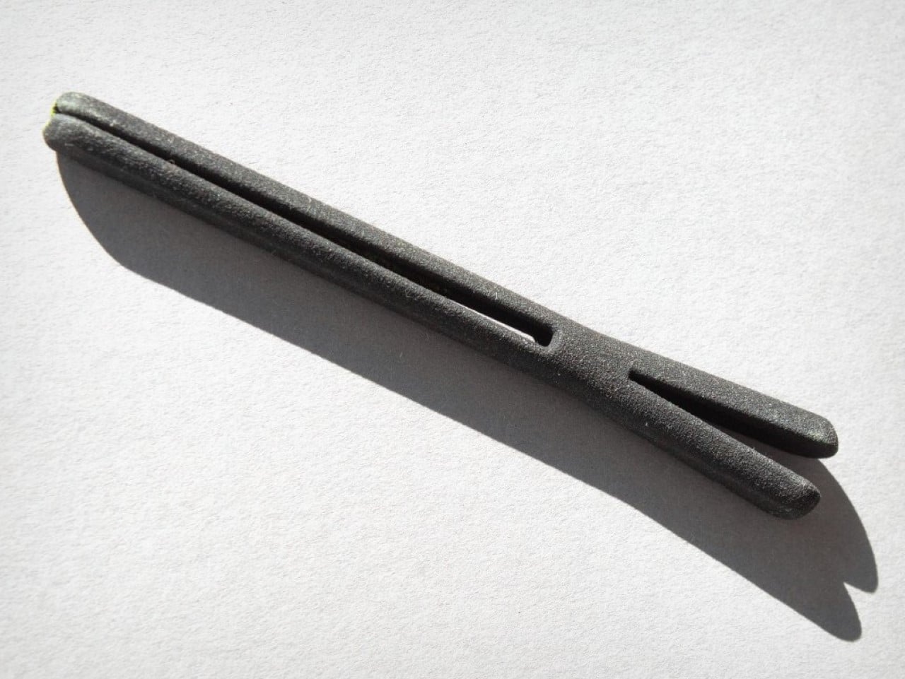
7. Everlasting All-Metal Pencil

The all-metal pencil solves a problem that the pencil has had since its invention: it runs out. A graphite core depletes. A pencil shortens. Eventually, it disappears entirely and takes with it whatever patina or character it had developed through use. The everlasting all-metal pencil replaces graphite with a metal alloy tip — typically an aluminum or similar soft-metal formulation — that deposits a mark through controlled abrasion rather than core consumption. The pencil does not shorten. It does not run out.

The mark is different from graphite — lighter, slightly metallic in tone, with a distinctive quality that serious writers and sketchers tend to either embrace or reject immediately. The design interest is in what remains when the core is removed: a pure metal object whose entire form is determined by how it feels to hold, since there is no pencil-to-grip ratio to manage, no sharpener to carry, no length to account for. The result is one of the most resolved objects in everyday carry design.
Click Here to Buy Now: $19.95

What we like:

  • Removes the pencil’s built-in obsolescence entirely, changing the object from consumable to permanent
  • With no core to deplete, the entire form is determined purely by how it feels to hold

What we dislike:

  • The mark quality is distinct enough from graphite to require genuine adjustment and won’t suit every application
  • Some writing and sketching tasks — particularly those requiring dense, dark marks — simply don’t translate well to a metal alloy deposit

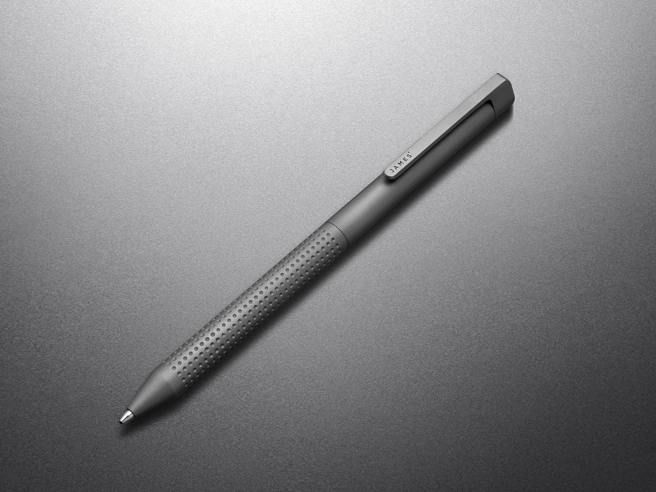
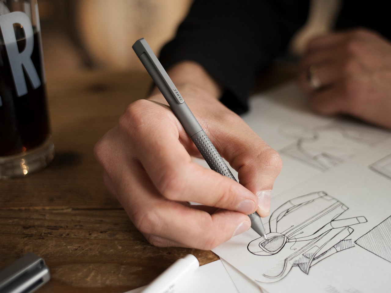
8. The Bolen

The James Brand has built its reputation on EDC objects with no unnecessary elements — knives, tools, and pens that look like they were designed by someone who uses them. The Bolen is the brand’s pen, and it carries the same design logic as everything else in their catalogue: machined from quality materials, resolved in form, designed to be carried without thought and used with satisfaction. The clip works. The mechanism engages cleanly. The proportions sit right in the hand without adjustment.

What distinguishes the Bolen from most EDC pens is that the James Brand comes from a tool-making tradition rather than a stationery one, which means the pen is designed for carry first and desk presence second. That priority ordering produces a different object than you get from pen-first design — one that is slightly more aggressive in material and slightly more considered in how it lives in a pocket. It is the writing instrument for someone who doesn’t think of themselves as a pen person, and that is exactly who needs it most.

What we like:

  • The tool-making heritage produces genuine material integrity, with nothing present without a reason for being there
  • Carry-first design logic makes it the most naturally portable instrument on this list

What we dislike:

  • The EDC-first approach means it lacks the expressive personality of instruments designed for desk use
  • Writers who want the pen to feel special on the page rather than merely functional in the pocket may find it underwhelming

The Object in Your Hand Shapes the Thought on the Page

Eight instruments that represent eight different positions on what a writing tool should be. The Yamaha asks what happens when you give a pen a pulse. The Levitating Pen asks what happens when the material itself carries a story. The Bolen asks what happens when you design for the pocket before the page. None of these answers is the same, which is the point. The best design in any category is the kind that expands your sense of what the category can contain.

What they share is the conviction that the instrument matters — that the weight, the mechanism, the material, and the form of the thing in your hand have a real effect on what ends up on the page. That conviction used to belong only to serious writers and professional draughtsmen. The fact that you can now find it in a magnetic pencil system, a levitating desk object, and a pen designed by a motorcycle company suggests the rest of the world is catching up.

The post 8 Best Pens and Writing Instruments That Make You Actually Want to Pick Up a Pen Again first appeared on Yanko Design.