The Lunch Box Where One Ring Holds Everything Together

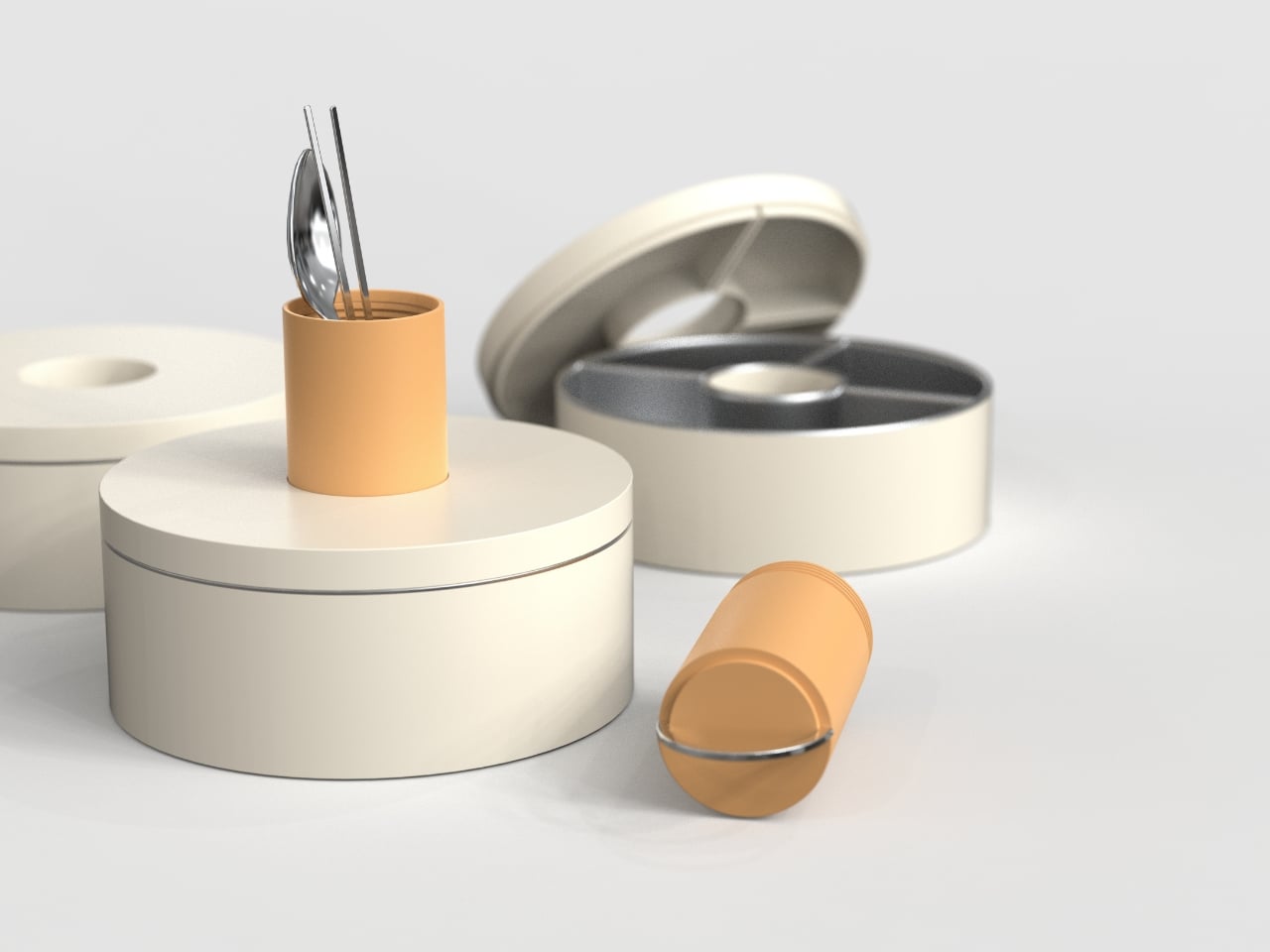
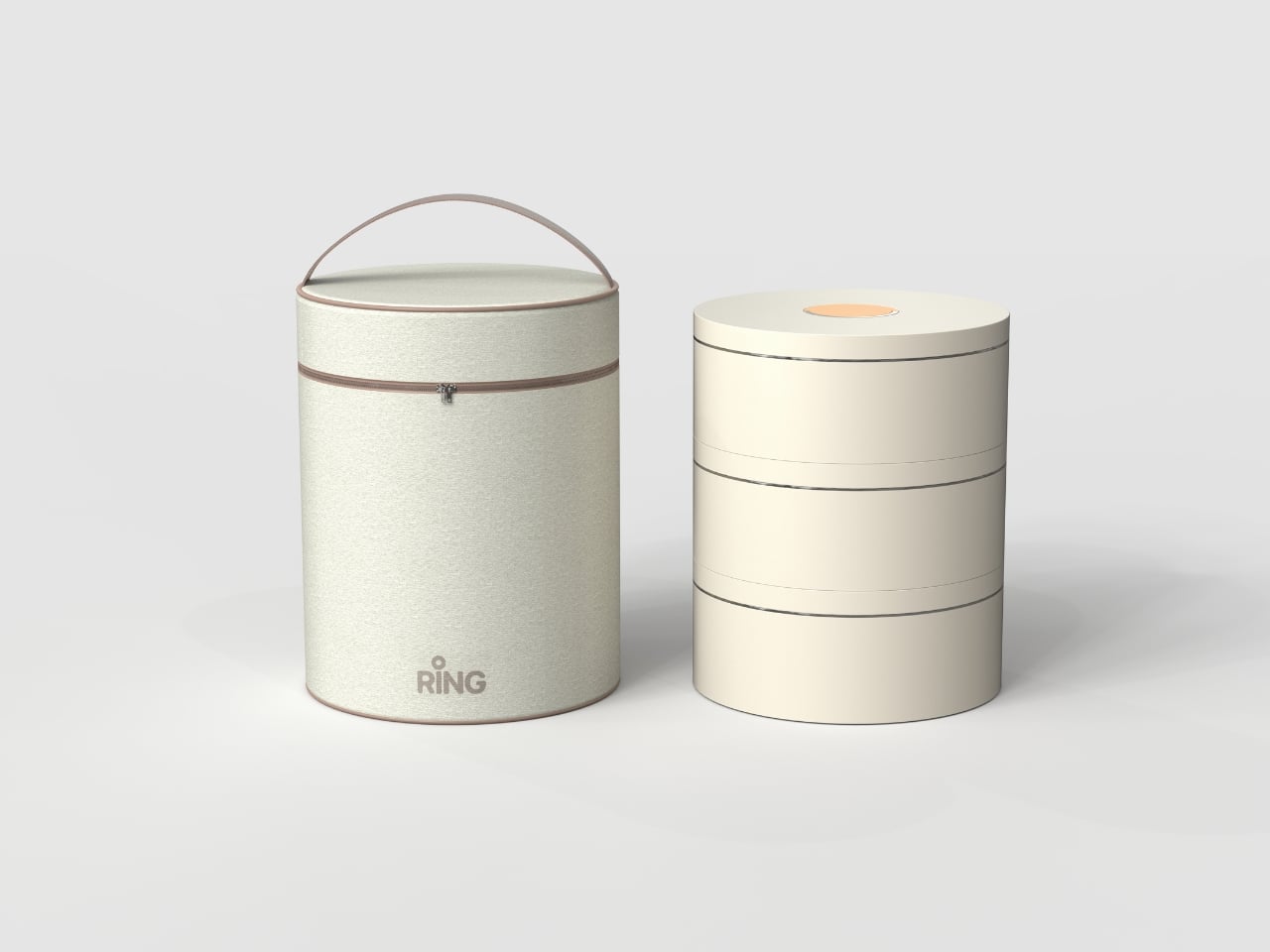
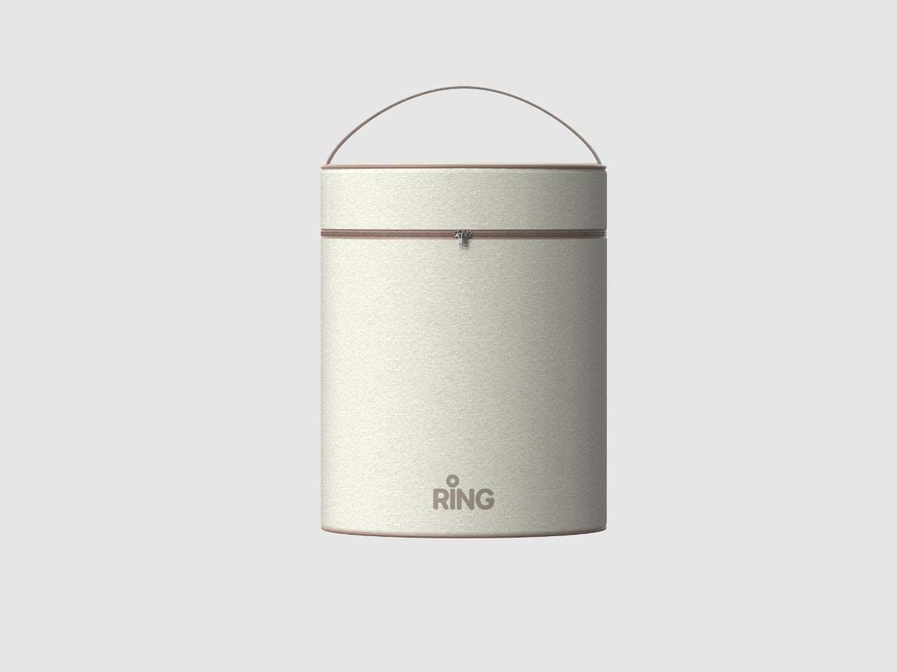
Most lunch boxes start with the food. Designer Heegun Yun started with the spoon. The result is the Ring Lunch Box, a three-tier modular meal kit from the Seoul-based industrial designer that flips the logic of how we think about everyday carry and, frankly, makes you wonder why nobody did this sooner.

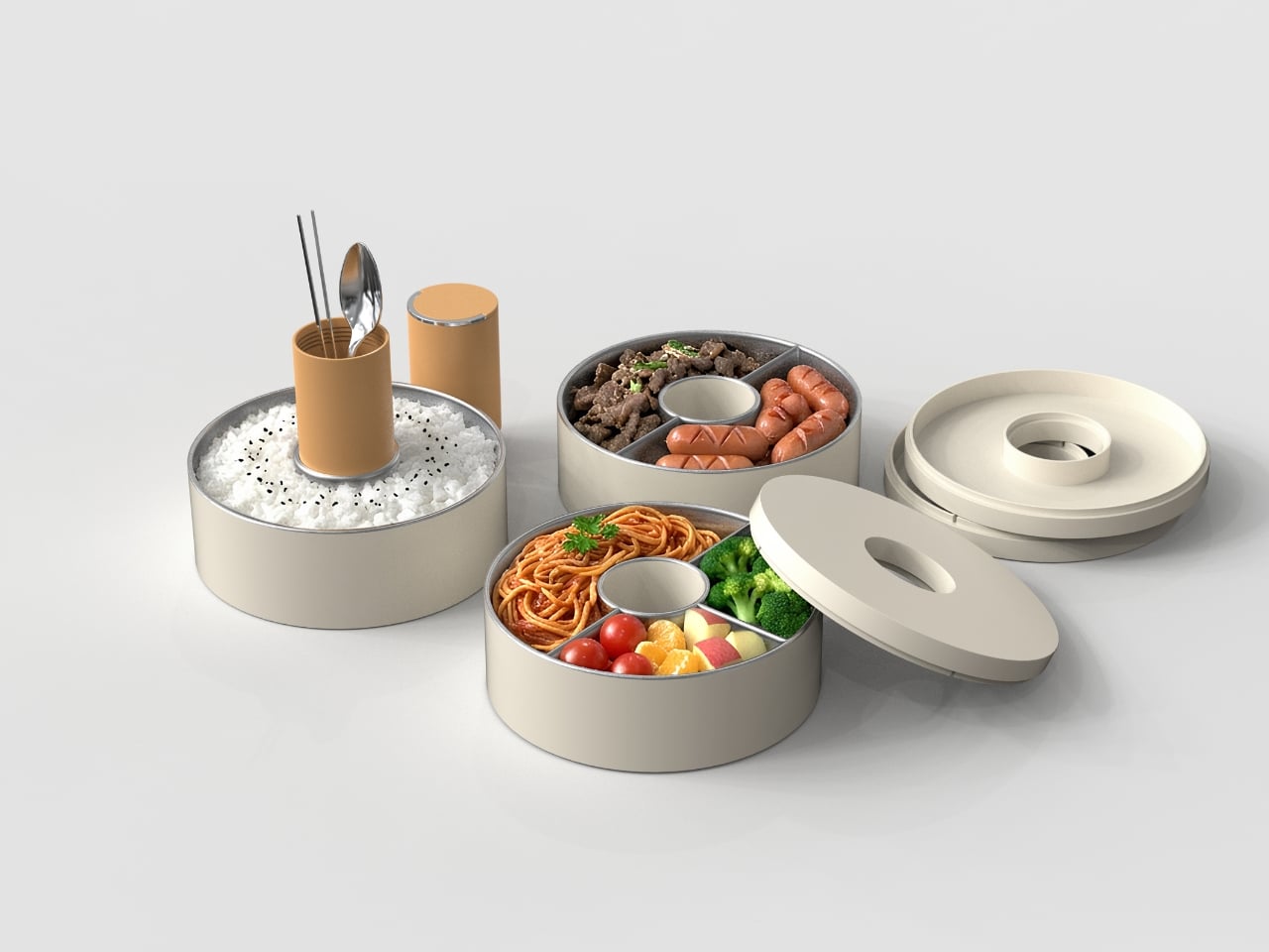
The concept is deceptively simple: a central utensil holder, cylindrical in form, sits at the core of the entire system. Three ring-shaped food containers then slot and stack around it, each one designed to clip onto that central hub in a clean, satisfying sequence. The structure is compact, the assembly is intuitive, and the whole thing comes apart without fumbling. It looks like it belongs in a design museum. It also looks like it actually works, which is a genuinely rare combination.

Designer: Heegun Yun

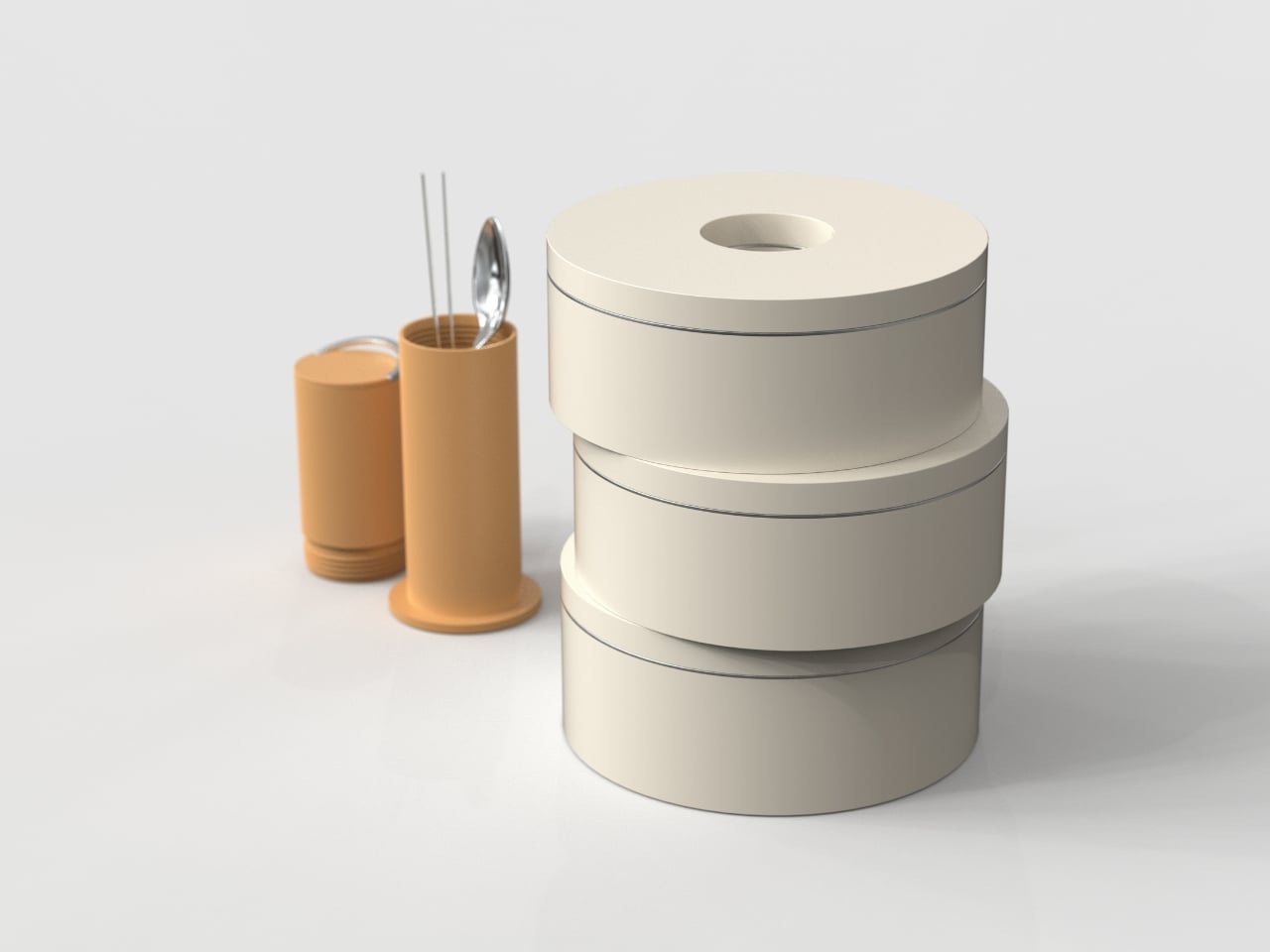
What makes the Ring Lunch Box so satisfying to look at is the way the ring form makes visual sense even before you fully understand the function. The geometry is honest. The containers are rings because they literally surround something. The central piece is cylindrical because it needs to be gripped and carried. Nothing here is decorative for decoration’s sake, and that restraint is what good industrial design looks like when it’s operating with confidence. A lot of design concepts at this level of sophistication tend to overcomplicate things as a way of signaling cleverness. Yun goes in the opposite direction entirely, and the result is more impressive for it.

Yun is a young Korean industrial designer who has already proven that he’s not just technically skilled but conceptually precise. He’s a 2024 iF Design Student Award winner, a European Product Design Award winner from 2023, and a Spark Design Award finalist in 2025. For a designer still in the early stages of building his professional portfolio, that’s a track record that commands real attention and suggests this Ring Lunch Box is far from the last we’ll hear from him.

It’s also worth noting that Korean design culture has been quietly rewriting the rules of everyday product design for a while now. From kitchenware to tech accessories, Korean designers tend to operate with a kind of disciplined elegance that doesn’t perform minimalism so much as just live inside it comfortably. The Ring Lunch Box feels like a natural extension of that sensibility. It doesn’t announce itself. It just works, and it works beautifully.

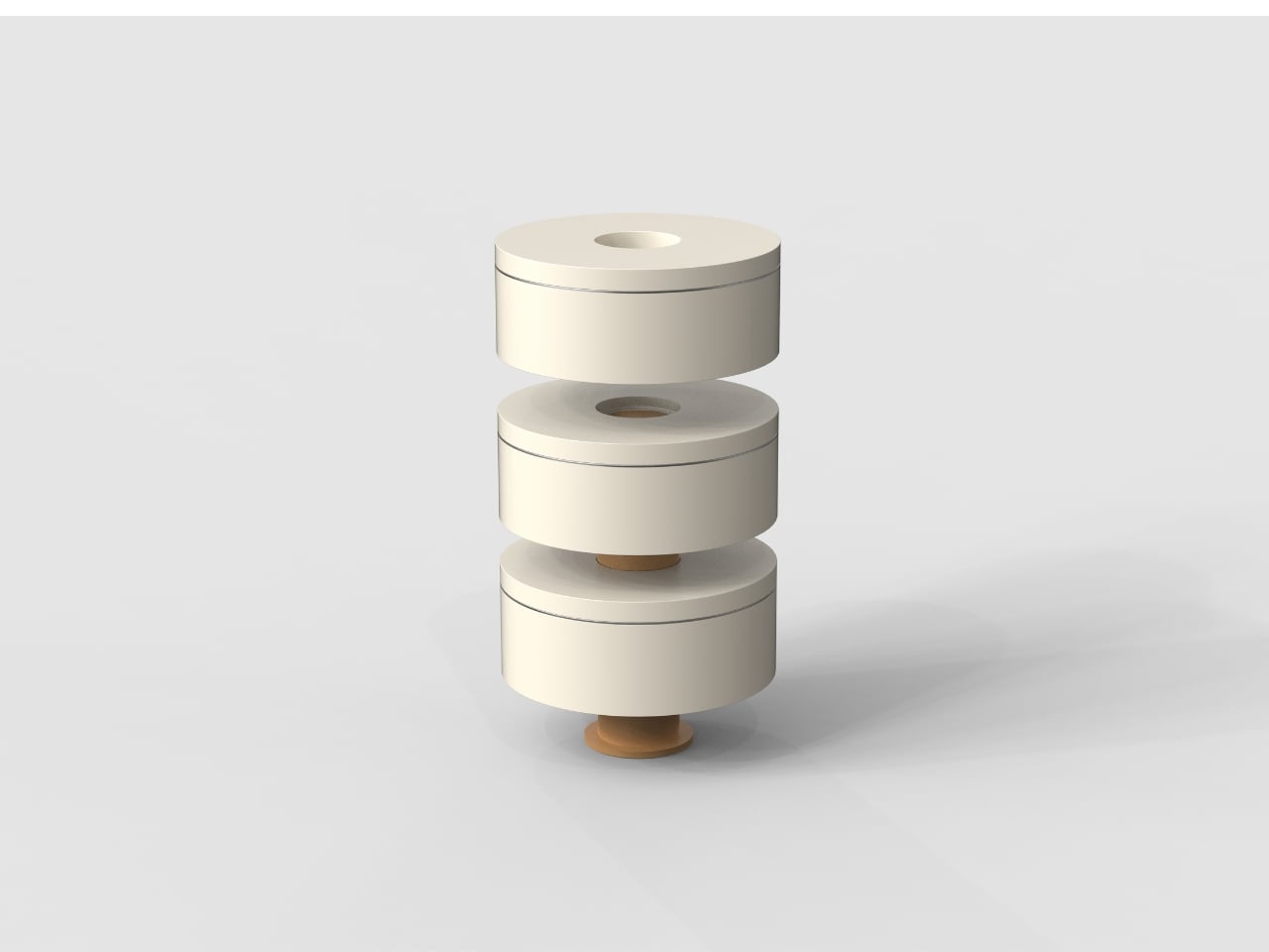
I’m particularly drawn to how the design treats the utensil not as an afterthought but as the literal axis of the whole system. Every lunch box I’ve ever owned had the spoon rattling around somewhere, tucked into a side pocket I eventually forgot about, or worse, kept separately and left behind. The Ring Lunch Box makes the utensil the reason the containers exist in the shape they do. That’s a philosophical shift, not just a practical one, and it changes the way you interact with the object before you’ve even touched the food.

The modular structure also matters in ways that go beyond aesthetics. Each container separates independently, which means cleaning is easier, portion control is genuinely flexible, and you can carry fewer tiers on lighter days without the whole thing feeling incomplete. Modularity in everyday products often sounds better in a brief than it actually functions in practice. Here, the ring geometry enforces the modular logic in a way that’s almost impossible to mess up.

Will the Ring Lunch Box become a commercial product? That part remains to be seen. Right now it lives on Behance as a design concept, but it has the kind of structural clarity that tends to attract attention from the right people in manufacturing and licensing. It doesn’t feel speculative in the way student concepts sometimes do. It feels considered, finished, and ready. And sometimes the best designs are the ones that make you ask not whether they should exist, but why they don’t already.

The post The Lunch Box Where One Ring Holds Everything Together first appeared on Yanko Design.

AQUA HUMAN Is a Dive Suit Concept Built Around the Body, Not the Tank

The way divers go underwater hasn’t fundamentally changed much in decades. You strap tanks to your back, manage hoses, regulate breathing, and navigate a system of equipment that always feels bolted on rather than built in. The gear works, of course, but it keeps reminding you it’s there. Improvements have mostly been incremental, focused on making the existing system lighter, safer, or easier to manage, not rethinking it from scratch.

That’s the gap designer Ivana Nedeljkovska set out to explore with AQUA HUMAN, a conceptual underwater atmospheric diving suit that starts from a different question. Not how to make existing equipment better, but what happens when you stop treating the suit as equipment altogether. The concept pushes for diving gear that functions as a unified system, one that works with the body rather than being strapped onto it.

Designer: Ivana Nedeljkovska

The design process reflects that shift in thinking. Nedeljkovska didn’t begin with sketches of a suit; she started by studying how breathing works, how the body reacts to pressure, and where conventional gear creates friction between the diver and the water. Form followed only after function was understood, which is why the result looks less like upgraded scuba equipment and more like something the body might have grown into naturally.

The central idea is integration rather than addition. AQUA HUMAN ditches the external tanks and brings breathing, temperature regulation, and mobility into the suit’s structure itself, functioning as a single synchronized system. The suit’s multi-layered material construction handles durability, water resistance, and flexibility simultaneously, so a deep-sea researcher or rescue diver can move without the suit fighting back. There’s no cluster of components to manage, just one continuous form.

On top of that, built-in motors reduce water resistance, making movement through the ocean feel less like fighting a current and more like navigating it. An integrated AI system runs alongside all of this, continuously reading the diver’s condition and the surrounding environment. It’s a real-time feedback loop designed to catch problems before they become emergencies, which matters considerably more at depth than it does on land.

Then there’s the light strip system, which might sound like an aesthetic choice but isn’t only that. The strips running across the suit serve as a visual language, changing to signal potential danger or communicate the wearer’s condition to others nearby. Underwater, where verbal communication isn’t possible and hand signals have limits, having a suit that actively broadcasts information in real time is genuinely useful, not decorative.

Diving suits have been layered with improvements for decades without anyone seriously questioning the core architecture. AQUA HUMAN isn’t trying to sell you something new; it’s asking why we’re still building on a foundation that hasn’t changed since the tank became standard. That kind of questioning is where genuinely different solutions tend to start, even if they take a while to arrive.

The post AQUA HUMAN Is a Dive Suit Concept Built Around the Body, Not the Tank first appeared on Yanko Design.

The Nova Chaise Lounge That’s More Sculpture Than Furniture

Most furniture earns its place in a room by being useful. The Nova Chaise-Lounge, designed by Stuttgart-based designer Deniz Aktay, earns it by being unforgettable. It is the kind of piece that stops a conversation the moment someone walks into the room, not because it announces itself loudly, but because it simply looks like nothing else you’ve ever seen in a living space.

The Nova is built from a continuous ribbon of strong metal, bent and looped into a flowing form that cradles the body without a single traditional leg, joint, or rigid support system to speak of. On first glance, you might not even register it as furniture. It looks more like a sculpture someone left behind, a coral-red loop frozen mid-movement, balanced with a kind of casual confidence that only great design can pull off. That tension between lightness and stability is, to me, the most compelling thing about it. It looks like it could take off at any moment, and yet it holds.

Designer: Deniz Aktay

Aktay, who studied Architecture and Urban Planning before turning his focus to furniture and object design, approaches his work with a very particular philosophy. Nova was designed from the inside out, starting with the human posture of rest, then wrapping a continuous loop around it in the most minimal way possible. That methodology shows. The shape isn’t decorative for the sake of it. Every curve has a reason. The looping form that arches over the sitter isn’t just dramatic framing, it provides a sense of enclosure, a soft architectural shelter for the body, without any material bulk getting in the way.

Looking at the campaign images, where a figure in white draped fabric rests within the looping structure, hair falling loose, eyes closed, it becomes clear that the chair was conceived as an experience as much as an object. The whole composition reads less like product photography and more like a still from a film you wish you’d seen. That’s a deliberate quality, and it works. Nova invites you to imagine yourself in it, and that’s harder to achieve than it sounds.

The color choices across the presented versions are worth noting too. The gradient between that soft coral-pink and deeper warm red isn’t accidental. It gives the piece a kind of warmth that pure minimalism often lacks, grounding what could easily have been a cold, clinical form into something that feels alive, almost organic. The glossy finish on some versions catches light beautifully, shifting the reading of the piece depending on where you’re standing. From one angle it looks almost weightless. From another, it looks like a sea creature at rest.

Now, the honest question people ask about design like this: is it actually comfortable? Aktay says there are no heavy legs, no rigid structure, just a fluid design that supports the body, and that Nova challenges the expectation that comfort requires complexity. That’s a claim worth taking seriously, because the design logic actually supports it. The curve of the seating surface follows the natural recline of the spine. The looping back provides something to lean into without forcing the body into a fixed position. Whether the final manufactured version delivers on that promise depends entirely on the material engineering, but from a purely structural standpoint, the concept is sound.

Pieces like Nova are interesting because they sit at a crossroads that furniture rarely occupies so confidently. They are too sculptural to be purely functional, too functional to be purely art, and uninterested in resolving that tension. Instead, they let it coexist. That’s a confident position for a designer to take, and it’s one of the reasons Nova feels significant beyond its visual appeal. Whether Nova becomes a production piece or remains a concept, it belongs to a growing conversation about what furniture is allowed to be. The bar for beautiful objects has never been higher, and Deniz Aktay just raised it a little more.

The post The Nova Chaise Lounge That’s More Sculpture Than Furniture first appeared on Yanko Design.

Japan Just Redesigned the Humble Market Stall

Most market stalls are, at best, an afterthought. You’ve seen them: mismatched canopies, folding tables dragged out from a storage room, zip-tied banners flapping in the wind. The sellers are talented, the products are wonderful, and the setup looks like it was assembled in fifteen minutes by someone who barely slept the night before. Nobody ever thought to make the stall itself part of the experience. Until now, apparently.

Oriichi is a foldable market stall designed by N&R Foldings Japan Co., and it recently claimed a spot among the iF Design Award 2026 winners in the Product Design and Public Design category. Looking at it, the recognition makes complete sense. This isn’t just a better version of a folding table with a canopy tacked on. It’s a considered piece of urban furniture that asks a genuinely interesting question: what if the infrastructure of a pop-up market was as carefully designed as the products being sold inside it?

Designer: N&R Foldings Japan Co

The answer, at least visually, is striking. The structure is clean and architectural, built around a matte black metal frame with crossed legs that recall both origami geometry and classic market cart silhouettes. A cream canvas canopy sits on top, and a warm wood-finished surface functions as the display counter. On casters, it rolls easily, which matters enormously for vendors who have to transport, set up, and pack down multiple times a week. The whole unit folds into four distinct configurations, making it adaptable to different venues, whether that’s a wide outdoor plaza, a narrow indoor corridor, or anything in between.

The design team clearly thought about the vendor experience first. Setup time, portability, structural stability, and visual consistency were all baked into the brief. When you see Oriichi deployed across an actual market, as the photos show, the effect is immediately readable. The stalls share a visual language without being identical, which gives the market a cohesive, curated feel without turning everyone into a clone. That balance is harder to achieve than it sounds.

From a design philosophy standpoint, this feels very Japanese. The idea of making something functional also beautiful, of applying craft thinking to infrastructure rather than just objects, runs deep in Japanese design culture. N&R Foldings Japan is making a clear bet that the temporary nature of pop-up markets doesn’t mean the design has to feel temporary. Durability and reuse are built into Oriichi’s material and structural choices, which puts it squarely in the conversation about sustainable urban design without making that the centerpiece of the pitch.

The bigger idea here is worth sitting with. Pop-up markets have become one of the most relevant commercial formats of the last decade. They’re how independent designers, food vendors, artists, and makers reach customers without committing to permanent retail space. Yet the physical infrastructure supporting these markets has largely been ignored by the design world. A tent is still a tent. A folding table is still a folding table. Oriichi treats those market vendors like they deserve better, and by extension, treats the people shopping there like they deserve better too.

It also raises an interesting point about urban space. Streets and plazas look different when the things occupying them are designed with intention. A well-designed market stall doesn’t just serve its vendor. It contributes to the visual and social texture of the street, making the space feel more alive, more human, more worth lingering in. Oriichi seems to understand that a market is never just a transaction. It’s a gathering.

Whether it becomes widely adopted depends on cost, logistics, and availability, and those details aren’t yet public. But as a design statement, it lands. It’s a rare piece that makes you wonder why nobody solved this problem sooner, and then immediately grateful that someone finally did.

The post Japan Just Redesigned the Humble Market Stall first appeared on Yanko Design.

Your Voice Wearable and Robot Hear the Words Mute People Can’t Say

For most people, saying something as simple as “good morning” to a stranger or asking for directions takes no effort at all. For the tens of millions worldwide who live with speech impairments or are completely mute, those same moments can be frustrating or simply inaccessible. The tools that exist to help, from apps to letter boards, tend to make communication slower rather than simpler.

That’s what designer Ivana Nedeljkovska set out to change with Your Voice, an assistive communication concept built on a simple premise: the body already tries to speak, even when no sound comes out. Rather than adding yet another screen or typing interface to the equation, the system works with what the body naturally does, turning the attempt to communicate into communication itself.

Designer: Ivana Nedeljkovska

Your Voice consists of two components. A flexible patch worn on the neck detects the muscular movements the body makes during attempted speech, even when the vocal cords produce no sound at all. Those signals are transmitted in real time to a small, spherical robotic unit, which converts them into audible speech. The patch reads the intention; the robot gives it a voice.

What that means in practice is the removal of the pause that defines most assistive communication right now. Someone with a speech impairment attending a meeting doesn’t have to look away from the conversation to type out a response. A child who can’t speak can call for a parent without reaching for a device first. The thought and the response happen almost simultaneously.

The robotic unit’s form was guided by Nedeljkovska’s early inspiration from an orange, its rounded shape steering the design away from anything clinical. The polished sphere, embedded display panel, and mesh speaker grilles give it a refined look that doesn’t betray its purpose at a glance. It’s something you’d carry without self-consciousness, which matters more in assistive technology than it’s often given credit for.

The display panel on the robot unit adds another layer to the audio output. It shows transcribed words in real time so conversations can continue even in noisy environments or when someone nearby can’t quite hear what was said. The neck patch is designed to sit against the skin comfortably for extended wear, and the robot is compact enough to be held in hand or placed nearby.

Most assistive communication tools are designed around output: a screen to tap, an app to navigate, a board to point at. Your Voice flips that logic by making the body the input. That shift in thinking is arguably the most significant thing the concept offers, more so than any single feature, because it treats a physical limitation as a starting point rather than a constraint.

It’s still a concept, and turning neck muscle signals into reliable speech at scale is a complex engineering challenge. But the direction Nedeljkovska points toward, communication that asks nothing extra of the person trying to be heard, is one that the assistive technology field sorely needs. The ambition isn’t simply to build a better device; it’s to stop making communication feel like work.

The post Your Voice Wearable and Robot Hear the Words Mute People Can’t Say first appeared on Yanko Design.

A Bookrack That Started as a Rectangle and Refused to Stay One

Most furniture design starts with a question about function and ends there. Deniz Aktay, the designer behind the studio @dezinobjects, apparently decided to start with geometry instead, and the result is one of the most quietly clever storage pieces I’ve come across in a while: the Barrow Bookrack.

The concept is almost laughably simple to explain, which is exactly why it works. Take a rectangle. Extend each of its lines on one side only. That’s it. That’s the whole idea. And yet, what comes out the other end of that single decision is a bookrack that feels caught mid-motion, leaning into itself, its proportions oddly satisfying in a way that’s difficult to immediately place. On paper, it barely sounds like a design at all. In person, it’s all you notice.

Designer: Deniz Aktay

Looking at it from a distance, the Barrow tilts at an angle that initially reads as precarious. It looks like it could tip at any moment, like a shelf that forgot to stand up straight. But it doesn’t. The asymmetry is intentional and controlled, and that’s exactly the kind of design choice that separates a well-considered piece from something that only looks interesting in renders. The structure holds, both physically and visually. The angular feet, the jutting top ledge, the open body sitting between them: everything is doing something.

The name is worth pausing on. A barrow, the traditional kind, is a simple carrying frame stripped back to its essential parts. Nothing extra, nothing decorative, just the minimum structure required to move something from one place to another. Aktay’s Barrow carries that same philosophy. Every extended edge and protruding surface earns its place. The result is a range of storage spots, each with its own character. Books stand upright in the central cavity. Larger volumes or stacked titles settle onto the flat extended surfaces. A magazine slipped sideways into one of the outer ledges feels like it was always meant to sit there.

This is the kind of piece that rewards being actually used. A lot of beautiful storage objects suffer from what I’d call the trophy problem: they look better empty than full. Barrow is the opposite. Load it with design books, art monographs, a worn paperback or two, and it genuinely improves. The varying heights, the mix of orientations, the textures of spines pressed against pale wood, it all adds up into something that feels lived in rather than staged. The structure becomes a frame for your reading life rather than something competing with it.

Aktay has explored this kind of thinking before. His earlier Bookgroove piece was a sculptural bookrack-table hybrid that played with the idea of furniture as form. Barrow feels like a sharper, more edited version of that same instinct: fewer moves, more precision. There’s less drama in the silhouette, but the restraint makes it more liveable. A piece like this can sit in a living room, a studio, or a bedroom and feel contextually right without demanding too much visual real estate from the room around it. It has presence without insistence, which is a harder balance to strike than it sounds.

The part that keeps pulling me back to this design is how naturally it moves from a flat idea to a physical one. The Barrow is essentially a graphic concept made tangible, a line drawing that decided to become furniture. The form evolved directly from extending lines on a flat surface before anything was actually built, and seeing that logic translated so cleanly into wood makes the whole thing click. The render and the physical piece are telling the same story, which is rarer in furniture design than it ought to be.

Furniture, at its best, makes you reconsider something you assumed was already settled. You’ve seen hundreds of bookshelves. You’ve probably owned a few. The Barrow doesn’t try to be revolutionary. It just extends a line a little further than expected, and somehow that’s enough to change the whole conversation.

The post A Bookrack That Started as a Rectangle and Refused to Stay One first appeared on Yanko Design.

This Cup Replaces the Kettle So Visually Impaired Users Make Tea Alone

For most people, making a morning cup of tea or coffee is an almost automatic routine. But for someone who can’t see, the same steps involve a level of risk that kitchenware has never really been built to handle. Hot liquids, unfamiliar controls, and the constant need to pour from one vessel to another can turn a simple habit into a genuine obstacle.

Designer Ivana Nedeljkovska’s Smart Cup for Visually Impaired Users tackles that problem head-on. Built from scratch with blind and visually impaired users as the primary audience, it combines the roles of a kettle, a teapot, and a drinking cup into one integrated form designed to be navigated entirely by touch, so there’s no need to move hot liquid between containers at any point.

Designer: Ivana Nedeljkovska

The challenge isn’t a small one. Conventional kitchen tools, from kettles to electric water heaters, were all designed for someone who can see them. They offer no tactile feedback on whether they’re on or off, no way to safely judge when water is ready, and no guidance on where to set things down. For visually impaired users, the kitchen is full of small ambiguities that add up to real risk.

That matters because every transfer of liquid is a risk. Pouring boiling water from a kettle into a separate cup is the kind of step that can go wrong for anyone, but for a blind user, the consequences are far more serious. Keeping the entire heating and drinking process within one vessel removes those moments before they can become a problem.

Every tactile detail carries that same logic through the design. A circular base guides the cup into the correct position when placed down, taking the guesswork out of a step that most products never consider. Raised Braille ON/OFF markings let the user activate and control the heating function entirely on their own, with no visual feedback or anyone else’s input required.

As for the cup itself, the same thinking applies. Its rounded, barrel-like body fits comfortably in the hand, and the handle’s adaptive shape ensures a secure grip without needing to search for the right position. The heat-resistant material keeps the exterior manageable even at full temperature, a detail that matters quite a lot when touch is the primary way of reading what’s inside.

Taken together, these choices reflect something that product design rarely gets around to prioritizing: dignity. Blind and visually impaired users shouldn’t have to depend on others or work around tools that were never built with them in mind just to make a hot drink. The Smart Cup treats independent use not as a bonus feature but as the foundational premise of the entire design.

It’s also worth noting that aesthetics aren’t treated as secondary here. The warm-toned form and sculpted handle give the cup a polished quality that would feel at home on any kitchen counter, not just in a specialized or assistive context. Accessible design has long leaned on utilitarian looks, as if beauty and function were incompatible, and this concept quietly pushes back against that assumption.

The post This Cup Replaces the Kettle So Visually Impaired Users Make Tea Alone first appeared on Yanko Design.

A Stool With Six Legs Just Made Four Feel Outdated

The humble stool has barely changed in centuries. Four legs, a flat seat, done. It exists in every cafe, classroom, kitchen island, and co-working space on the planet, reliably doing its one job and nothing else. So when a designer comes along and asks what happens if you add just one more leg, the answer should probably be “nothing interesting.” And yet here we are, talking about SQOOL.

SQOOL is a 2025 personal project by Liam de la Bedoyere of Bored Eye Design, a UK-based independent studio that describes itself as creating work that’s anything but boring. At first glance, the stool reads almost like a creature. Six curved legs splayed outward with little rounded feet, a compact circular seat on top, and that one rogue arm reaching upward and curling into a hook. It looks like a cheerful yellow squid that decided to get into the furniture business, and I mean that entirely as a compliment. The photographs make it look alive. Depending on the angle, it shifts between dog, bug, and some friendly unnamed species you’d encounter in an animated film.

Designer: Liam de la Bedoyere (Bored Eye Design)

The concept is deceptively simple. Five legs provide complete stability, the same geometric logic you’d get from a traditional four-legged stool, just with an added sense of security and visual rhythm. The sixth leg is the interesting one. Freed from any load-bearing duty, it becomes something else entirely: a handle for carrying the stool, a hook for a bag or jacket, a rest for your coffee cup, a cradle for a book. The images show it doing all of these things casually, as if the stool has always known it could.

What makes SQOOL feel genuinely considered rather than just whimsical is how that extra function was thought through. The sixth arm doesn’t just stick out awkwardly. It curves deliberately, creating a shape that invites the hand to reach for it. People apparently do this instinctively, discovering its utility through touch rather than any printed instruction. That kind of design, where the object teaches you how to use it without saying a word, is harder to pull off than it looks.

The stacking detail is also worth noting. Getting six legs to nest cleanly on top of each other is a real engineering puzzle, and de la Bedoyere solved it by shaping each leg with enough taper and spacing to allow the stools to slide into each other gracefully. Seen stacked in a column, they look spectacular. Like a sculpture you’d walk past in a gallery and immediately photograph. Which means SQOOL is doing double duty even when no one is sitting on it.

The color choices lean fully into the stool’s playful register. The saturated yellow is hard to miss, and a soft lavender variant appears in some renders, equally confident. These aren’t accent tones chosen to recede politely into a neutral interior. They’re chosen to assert presence. SQOOL isn’t trying to disappear into a corner. It wants to be part of the room, part of the conversation, maybe even part of your grid. That’s not a criticism at all. Personality in furniture is genuinely underrated, and design objects that commit fully to their own character tend to age better than the ones trying to be neutral.

Bored Eye Design’s portfolio shows a consistent interest in objects that are curious and approachable, things that reward a second look and feel good to handle. SQOOL fits neatly into that sensibility. It’s playful without being infantile, practical without being dull, and memorable without leaning on novelty for novelty’s sake. The name alone, a blend of “stool” and something else entirely, already tells you what kind of designer de la Bedoyere is.

The question with any concept project is always whether it would survive production. I think SQOOL could. The logic holds up. The form has already been thought through with stackability in mind, which is usually where playful concepts fall apart. A stool this considered, this expressive, and this genuinely useful deserves more than a render portfolio. It deserves a production run.

The post A Stool With Six Legs Just Made Four Feel Outdated first appeared on Yanko Design.

This Lounge Chair’s Shape Is Precisely Why Two of Them Make a Sofa

Modular seating tends to be either complicated or a compromise. The sectional sofa has never really solved the fundamental problem that living situations change, people move, and the enormous L-shaped configuration that worked in your last apartment probably doesn’t fit your new one. Furniture that adapts to circumstance sounds like an obvious idea, but the designs that actually pull it off cleanly remain surprisingly rare.

Liam de la Bedoyere, the designer behind Bored Eye Design, takes a direct approach to the problem with Bunch, a modular seating concept that begins from a deceptively simple premise. Each unit is a fully functional lounge chair on its own. The idea, however, is that it was designed from the beginning to combine with others, and the way it does that is where the concept gets genuinely interesting.

Designer: Liam de la Bedoyere

The mechanism is in the staggered relationship between the two parts of each chair. The backrest sits elevated and set back, while the seat extends forward, creating a stepped profile from the side. That offset is precise enough that when a second chair is placed alongside it, the seat of one slides naturally into the space left open by the recessed back of the other. No connectors, no assembly, just geometry.

The result, when two or more units are pushed together, is a sofa that reads as a continuous and intentional piece rather than a row of chairs touching each other. The staggered rhythm carries across the joined units, producing a silhouette that looks considered rather than accidental. It’s the kind of configuration that takes a moment to understand, but once you do, it feels like it couldn’t have worked any other way.

The standalone chair holds up on its own terms, too, and isn’t just a sofa segment that happens to function independently. It sits directly on the floor with no visible legs, giving it a relaxed lounge quality. The proportions keep the form compact enough to live in smaller spaces, which matters when the concept is something you might realistically buy gradually, one unit at a time.

Both the backrest and the seat share the same rounded-rectangle silhouette, upholstered in a thick, textured fabric with the warmth of bouclé. That material, combined with the legless, floor-hugging profile, gives the chair a deliberately unhurried quality, the kind of object that makes a room feel slightly slower and more settled than it did before.

The scalability is part of the appeal. Two units make a small sofa, three make a longer one, and the concept seems to extend indefinitely. When units in different tones are combined side by side, the color contrast adds a visual layer that a single chair doesn’t have. There’s also something honest about a design whose best version requires more than one, an admission that’s built directly into the name.

The post This Lounge Chair’s Shape Is Precisely Why Two of Them Make a Sofa first appeared on Yanko Design.