Harvey Specter kept a chess set on his office coffee table. It was never really explained, never made into a plot point, just always there, sitting on the glass surface between Harvey and whoever was about to lose an argument. It suited the room perfectly. The whole space was engineered as a performance of control: the signed basketballs, the glass desk with nothing to hide behind, the painting of his mother as the one admitted vulnerability in an otherwise impenetrable presentation. Production designers on Suits understood that Harvey’s office had to do half his character work for him before he even spoke.
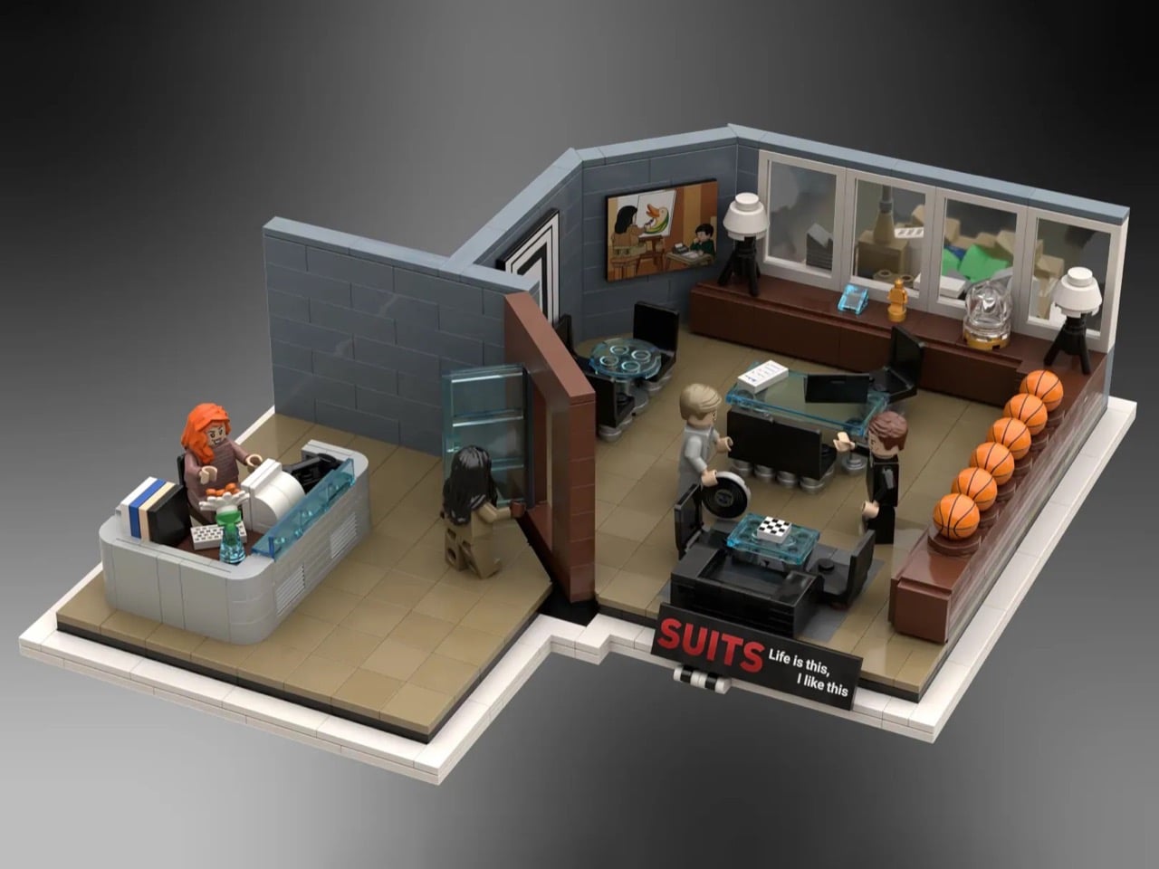
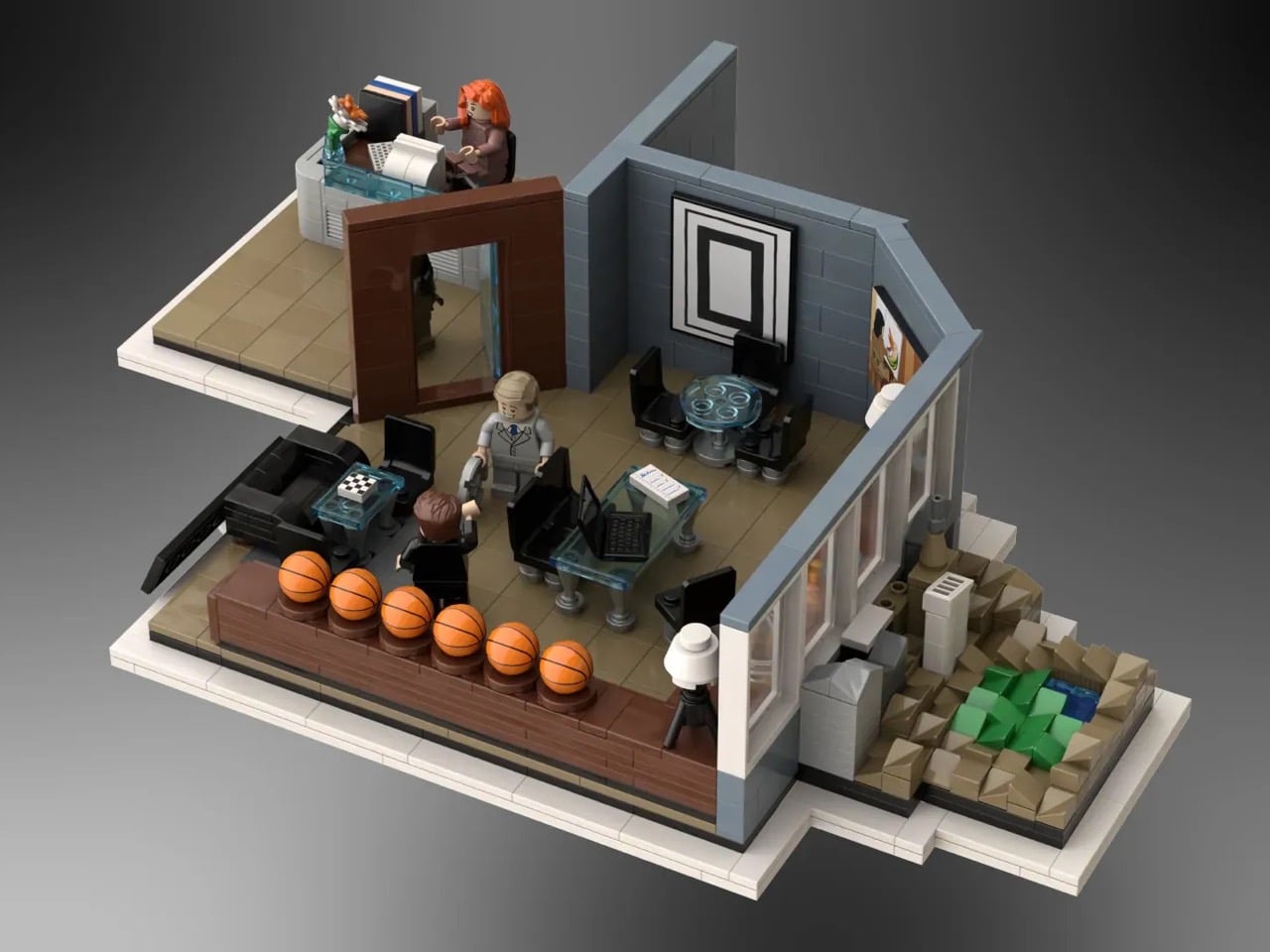
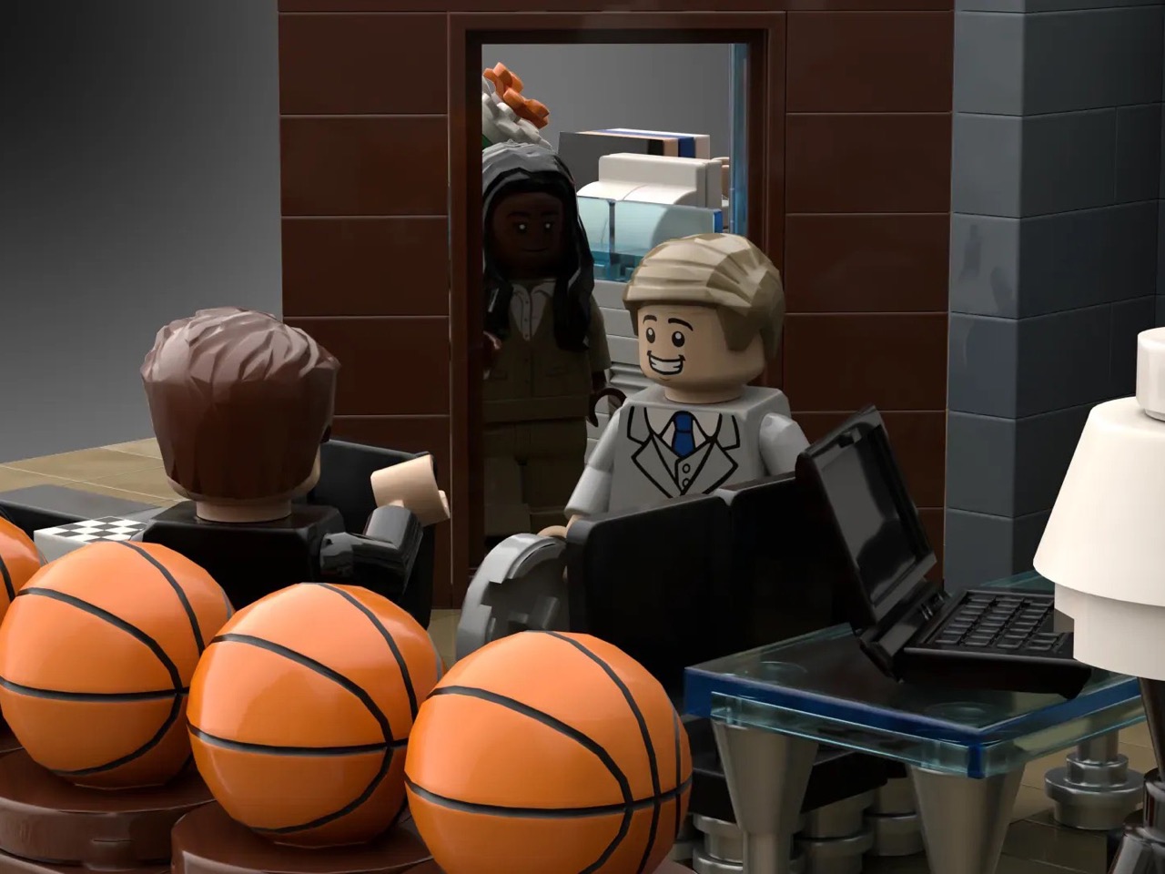
Gentvilas, building on the LEGO Ideas platform, understood the same thing. The chess set makes it into the brick version. So does the painting. So do the basketballs, rendered as a satisfying row of orange LEGO spheres along a dark wood shelf. Donna sits at her reception desk out front, composed as ever. Harvey and Mike are positioned mid-conversation inside the glass-walled inner office, and Jessica is stepping through the door with the specific energy of someone who already knows what you did. The forced-perspective window view, a microscale Central Park and skyline built to suggest height, finishes the illusion.
Designer: Gentvilas
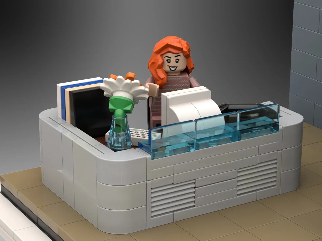
The build splits cleanly into two zones. Donna’s curved reception desk anchors the entrance, built from smooth grey elements with a transparent blue front panel that captures the cool, corporate modernism of the Pearson Hardman lobby perfectly. Her desk is stocked with a monitor, stacked books, and a small flower vase, the kind of considered personal touches that tell you this is someone’s space, not just a gatekeeping station. Step past the dark wood doorframe and you’re in Harvey’s inner office, where a glass-topped desk sits center stage, black leather seating flanks a low coffee table, and the basketball shelf runs the full length of the side wall. Gentvilas has used transparent blue elements throughout for the glass surfaces, a smart and consistent material choice that gives the whole build a visual coherence the show’s set designers would appreciate.
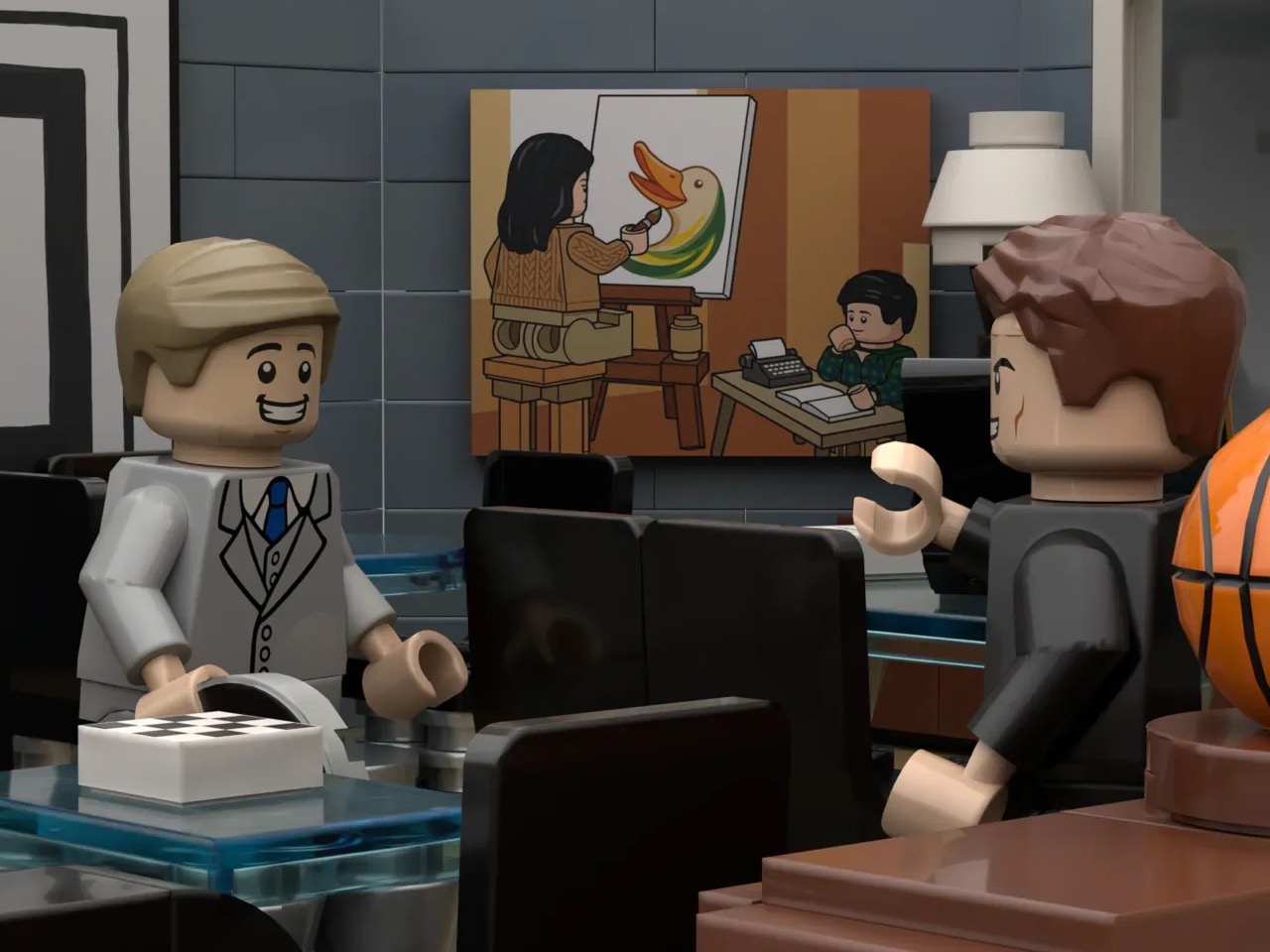
My favorite detail, though, is that painting. Harvey’s mother is a complicated figure in the show’s emotional architecture, and the fact that Gentvilas rendered her as a custom decal, painting a duck at an easel while young Harvey watches, and hung it exactly where it belongs on the back wall, is the kind of deep-cut accuracy that separates a fan-made tribute from a generic office diorama. The builder notes that the actual painting couldn’t be reproduced due to copyright considerations, so this bespoke interpretation is entirely original, and honestly, it works just as well.
The forced-perspective exterior is the other standout move. A microscale build outside the windows creates a convincing illusion of height, with a tiny Central Park visible in the skyline, making the model feel like it genuinely occupies a Manhattan high-rise rather than sitting on someone’s display shelf.
Suits found a second life on Netflix in 2023, pulled in an entirely new generation of fans, and spun off into Suits LA. The timing for a LEGO set feels right. This MOC is currently gathering supporters on the LEGO Ideas platform, where builds need to cross 10,000 votes to trigger an official LEGO review. You can head to the LEGO Ideas page here and cast your vote.
The post This LEGO Harvey Specter Office Has the Basketball Collection, the Painting, and Yes, Even Donna first appeared on Yanko Design.