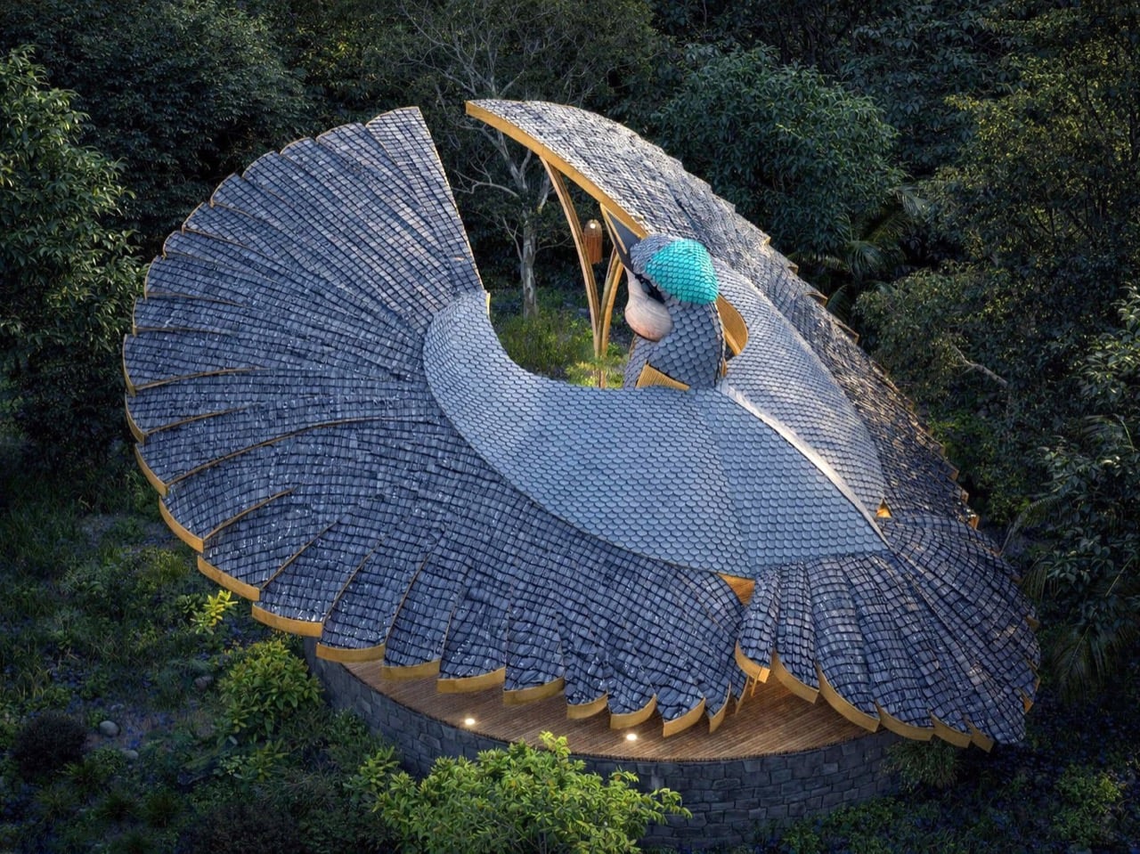
Biomimicry in architecture usually means borrowing structural logic from nature. Honeycomb patterns for strength, lotus leaves for water repellency, termite mounds for passive cooling. Thilina Liyanage takes a different approach. He’s interested in the moment when an animal does something so visually arresting that the form itself becomes a kind of language. His latest project, the Rifle Bird Yogashala, translates the courtship display of the Victoria’s riflebird into a bamboo yoga pavilion that looks like the bird caught mid-performance.
The riflebird, a bird-of-paradise endemic to northeastern Queensland, performs one of nature’s most dramatic mating displays. Males curve their wings into semi-circular arcs above their bodies, creating a dark cape of feathers that frames an iridescent throat patch. They sway, bob their heads, and scrape their beaks against wing feathers to produce a percussive rhythm. Liyanage’s yogashala mirrors that gesture with two sweeping bamboo canopies that arch skyward from a central sculptural element, their layered surfaces reading like individual feathers arranged in radial patterns. The building doesn’t just reference the bird. It performs the same gesture at architectural scale.
Designer: Thilina Liyanage
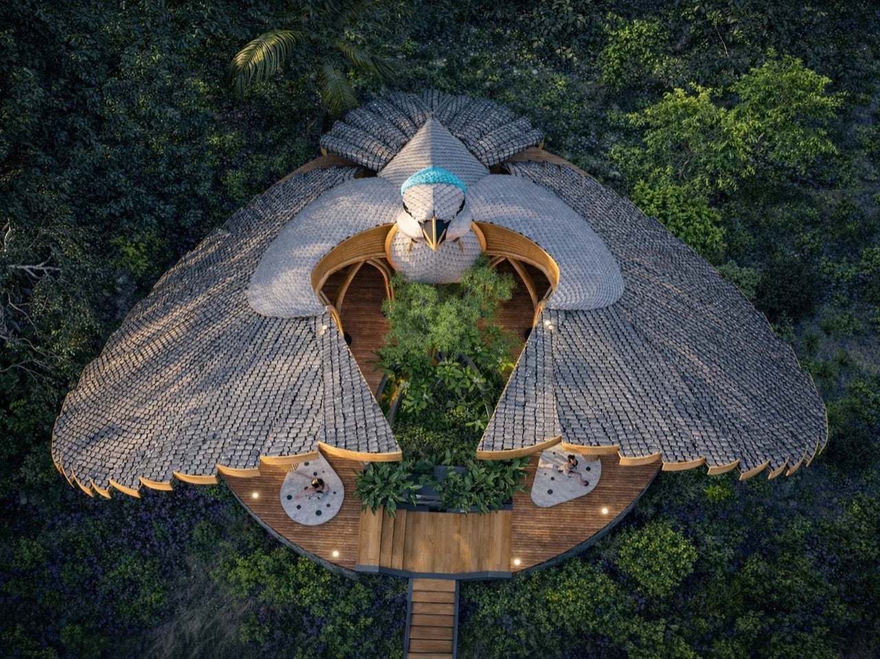
Liyanage has been doing this for years now. We’ve covered his manta ray yacht club, his deer observation deck for Yala National Park, his moose-head viewing platform in Alaska, his orchid-shaped villa, and most recently his rhino safari deck at Kifaru Point. The pattern is consistent: he finds an animal or plant with a visually distinctive form, usually something mid-gesture or mid-bloom, and translates that exact shape into a functional building using bamboo and timber. What separates this from novelty architecture is how seriously he treats the biomimicry. The proportions stay true. The radial geometry of the riflebird’s fanned wings translates directly into the roof structure here, with individual bamboo ribs following the same outward-spreading pattern you’d see in the actual feathers. The canopies tilt at the same angle the bird holds its wings during display, roughly 60 degrees from vertical based on the renders. Each layered section of the roof mimics a cluster of feathers, creating a texture that catches light the way the bird’s plumage would in dappled forest sunlight.
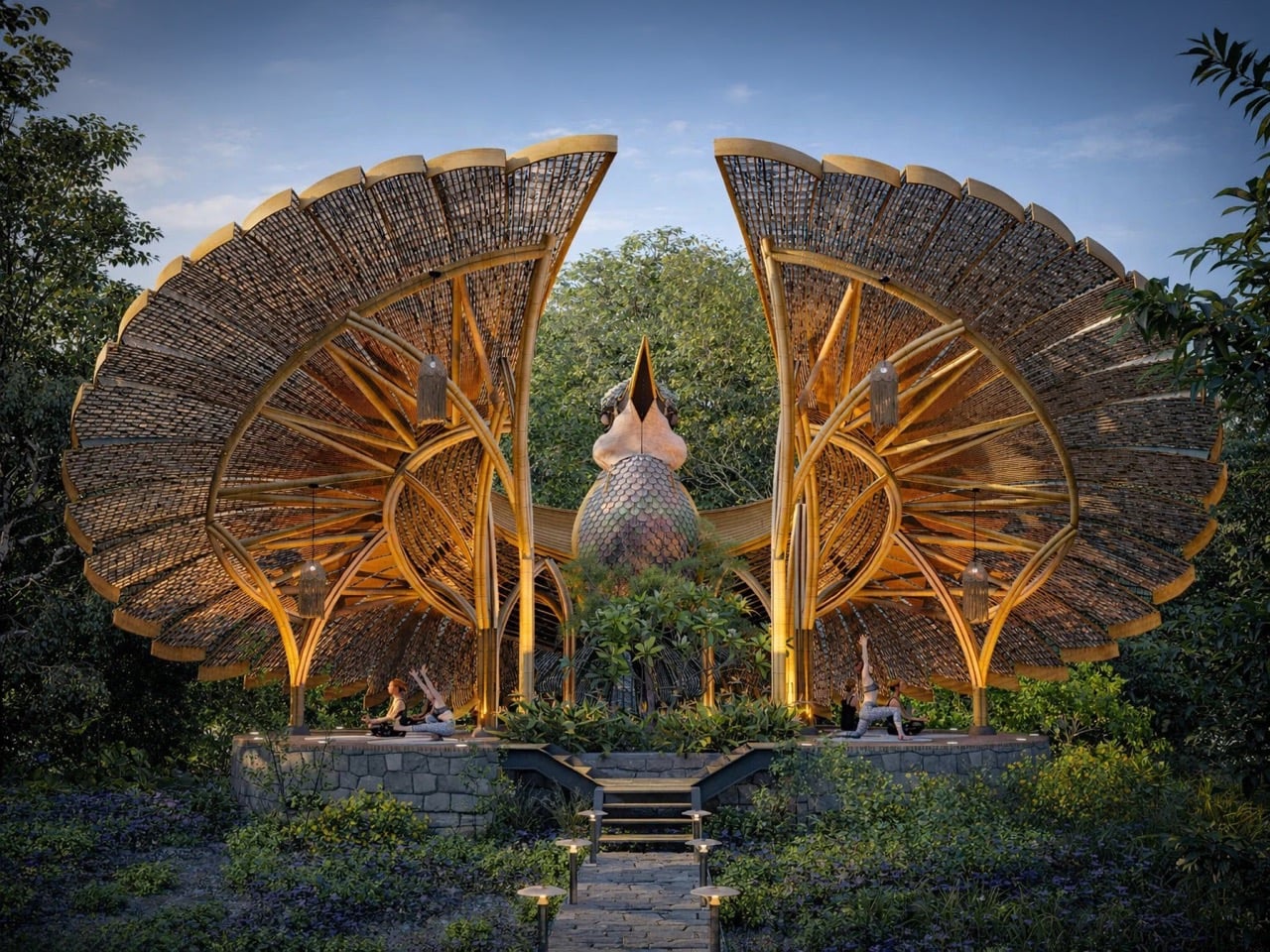
The central element between the two wing canopies reads as the bird’s body and head, complete with what looks like a sculptural interpretation of the throat and beak pointing skyward. It’s a bold move because it commits fully to the metaphor instead of softening it. You’re looking at a building shaped like a bird in the middle of a courtship display, and Liyanage doesn’t hedge. The yoga platform sits at the base on a raised stone deck accessed by stairs, giving practitioners an elevated view of the surrounding forest. The structure appears to be around 15 feet tall at the wing peaks based on the human figures in the renders, which puts it at a scale that’s monumental without being absurd. A real Victoria’s riflebird measures about 24 centimeters. This version scales that gesture up roughly 20 times while keeping the anatomical relationships intact.
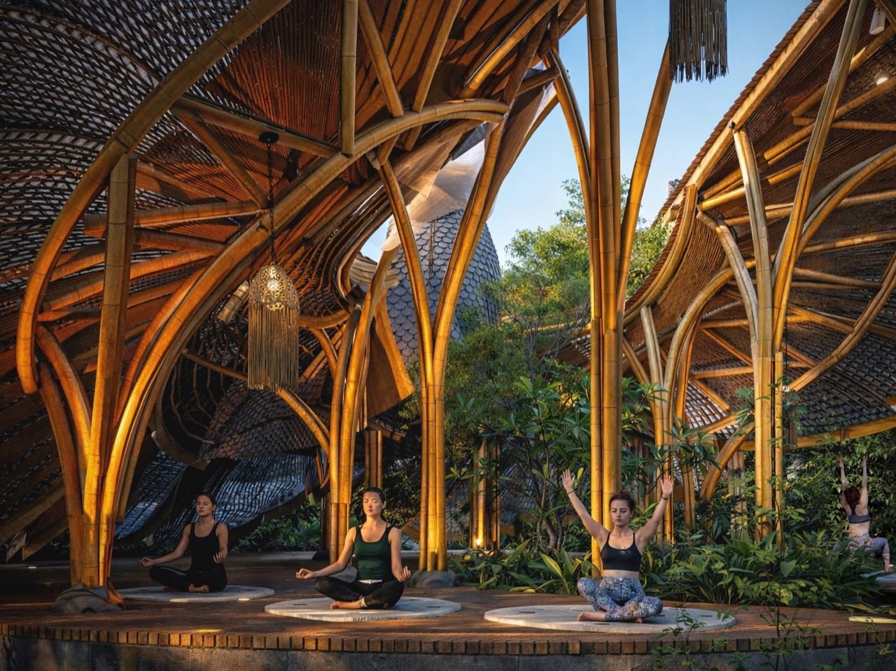
Bamboo’s role in this design exists beyond aesthetics. The material bends without breaking, which is critical when you’re trying to replicate the curved ribs of a wing structure. It’s also native to Sri Lanka where Liyanage is based, and it handles moisture well, which matters in a forest setting. The layered roof sections appear to use bamboo slats or woven panels clad over a bent bamboo frame, creating the feathered texture while maintaining structural integrity. You can see the individual ribs in the renders, each one following the arc from the central support out to the wing edge. The underside of the canopies shows the same radial pattern, so anyone practicing yoga beneath them gets the full effect of looking up into the bird’s wing architecture. That’s where the concept justifies itself. You’re not just in a bird-shaped building. You’re occupying the exact spatial position a female riflebird would during courtship, looking up at a display designed to be overwhelming.
The post Biomimetic Architecture Reaches New Heights With This Bird-of-Paradise Yoga Space first appeared on Yanko Design.