PITAKA Is Letting the World Design Its Next Phone Cases, Royalties Included. Here’s How To Participate

Tech accessories have hit a curious inflection point. The last year trained us to worship thinness and glass, but somewhere between the tenth identical ‘Air’ or ‘Edge’ smartphone and the fifteenth glossy case, a countermovement quietly took root. Texture matters again. Grip, weave, and tactile identity are no longer afterthoughts, they’re the differentiators that keep objects from sliding into the sea of sameness. PITAKA, a brand built on aerospace-grade aramid fiber and what it calls “fusion weaving,” has spent years proving that phones don’t have to feel like jewelry-store display pieces. Now, with the launch of “Weave the Next, Weave Our World,” the company is turning that philosophy outward, inviting designers worldwide to imagine the surfaces and visual languages that will define the next generation of tech we carry, hold, and interact with every day.

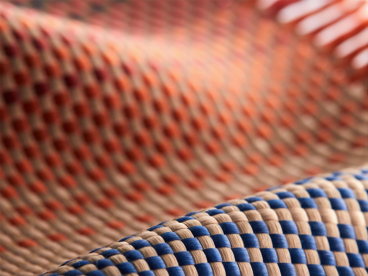
Launching April 24th, 2026, the competition is framed explicitly around the intersection of technology and art, which is less marketing speak and more PITAKA’s operational DNA. The brand’s cases have always leaned hard into material science, using woven aramid fibers (the same stuff in bulletproof vests and aircraft components) that are five times stronger than steel and a fraction of the weight. But strength alone doesn’t sell. What makes PITAKA cases notable is the texture vocabulary they’ve developed over years of refining weave patterns, experimenting with 600D and 1500D aramid densities, and pushing techniques like “fusion weaving,” where multiple patterns coexist on a single loom to create intricate, layered surface designs. “Weave the Next, Weave Our World” extends that exploration beyond the company’s internal design studio and into the hands of students, professionals, and independent creators who might see texture, pattern, and tactility from entirely different cultural or aesthetic starting points.

Click Here to Submit Now. Hurry, Competition Ends: May 25, 2026.

The Brief
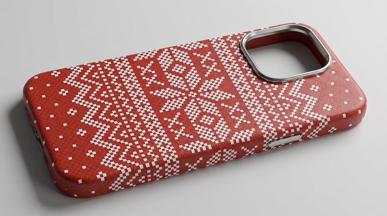
Nordic Knit Dream

Drifting Shadows

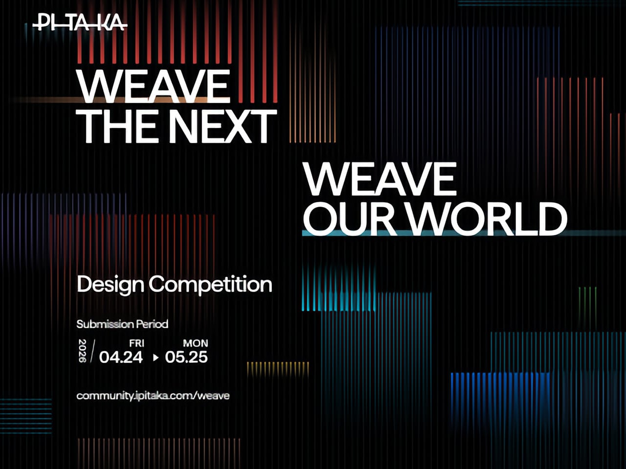
PITAKA’s “Weave the Next, Weave Our World” global design competition invites designers to create texture and visual language systems for the brand’s future product series, positioned explicitly at the intersection of technology and art. Participants choose from four thematic directions: “These Moments,” which captures the raw beauty and shifting rhythms of the natural world; “Timeless Threads,” weaving stories of culture, memory, and human journeys; “Beyond Tomorrow,” exploring visionary futures where innovation reshapes daily life; or “Roots of Rhythms,” celebrating the textures, symbols, and spirit born from each land’s heritage. The competition aims to explore emerging global trends in tactile and visual design, strengthen PITAKA’s art-tech identity, and potentially commercialize winning designs through royalties, co-branding, and official recognition.

How To Participate

  1. Visit the official competition website or Dribbble page to submit your entry
  2. Provide participant information and upload your texture designs
  3. Include a written design explanation with your submission
  4. Entries will be evaluated through a combination of professional jury review and public voting
  5. Winners will be announced and showcased in an online exhibition

Competition Dates

  • Competition Launch: April 24, 2026
  • Submission Period: April 24 – May 25, 2026
  • Judging Period: May 26 – May 31, 2026
  • Winners Announcement: June 9, 2026

Jury Panel

  • Qiongzhi Xie (Artist; Founder of Daxing Jizi Studio)
  • Matteo Menotto (Head of Design, Prints & Textile Accessories at Bulgari)
  • Sarang Sheth (Editor-in-Chief, Yanko Design)
  • James (Founder / CEO, PITAKA)

Important Information

The most compelling entries are likely to do three things at once:

  1. Treat texture as a system, not a single image
    PITAKA’s products live across multiple form factors, so a strong entry will propose a visual/tactile system that can scale and adapt, not just a one-off pattern.
  2. Anchor the concept in one of the four themes without being literal
    “These Moments” does not need a photo-real print of a wave; “Roots of Rhythms” does not need a direct copy of a folk motif. Abstraction, distillation, and translation into a tech-accessory context will matter.
  3. Consider manufacturability and user experience
    Even in a speculative competition, the jury includes industrial design and brand leadership. Textures that look stunning in render but collapse in real material or feel uncomfortable in hand will likely be deprioritized.

If you already experiment with materials, parametric patterns, or culturally rooted visual systems, “Weave the Next, Weave Our World” is essentially an invitation to push that work into a space where it might actually ship.

Click Here to Submit Now. Hurry, Competition Ends: May 25, 2026.

Click Here to Submit Now. Hurry, Competition Ends: May 25, 2026.

The post PITAKA Is Letting the World Design Its Next Phone Cases, Royalties Included. Here’s How To Participate first appeared on Yanko Design.

PITAKA Is Letting the World Design Its Next Phone Cases, Royalties Included. Here’s How To Participate

Tech accessories have hit a curious inflection point. The last year trained us to worship thinness and glass, but somewhere between the tenth identical ‘Air’ or ‘Edge’ smartphone and the fifteenth glossy case, a countermovement quietly took root. Texture matters again. Grip, weave, and tactile identity are no longer afterthoughts, they’re the differentiators that keep objects from sliding into the sea of sameness. PITAKA, a brand built on aerospace-grade aramid fiber and what it calls “fusion weaving,” has spent years proving that phones don’t have to feel like jewelry-store display pieces. Now, with the launch of “Weave the Next, Weave Our World,” the company is turning that philosophy outward, inviting designers worldwide to imagine the surfaces and visual languages that will define the next generation of tech we carry, hold, and interact with every day.

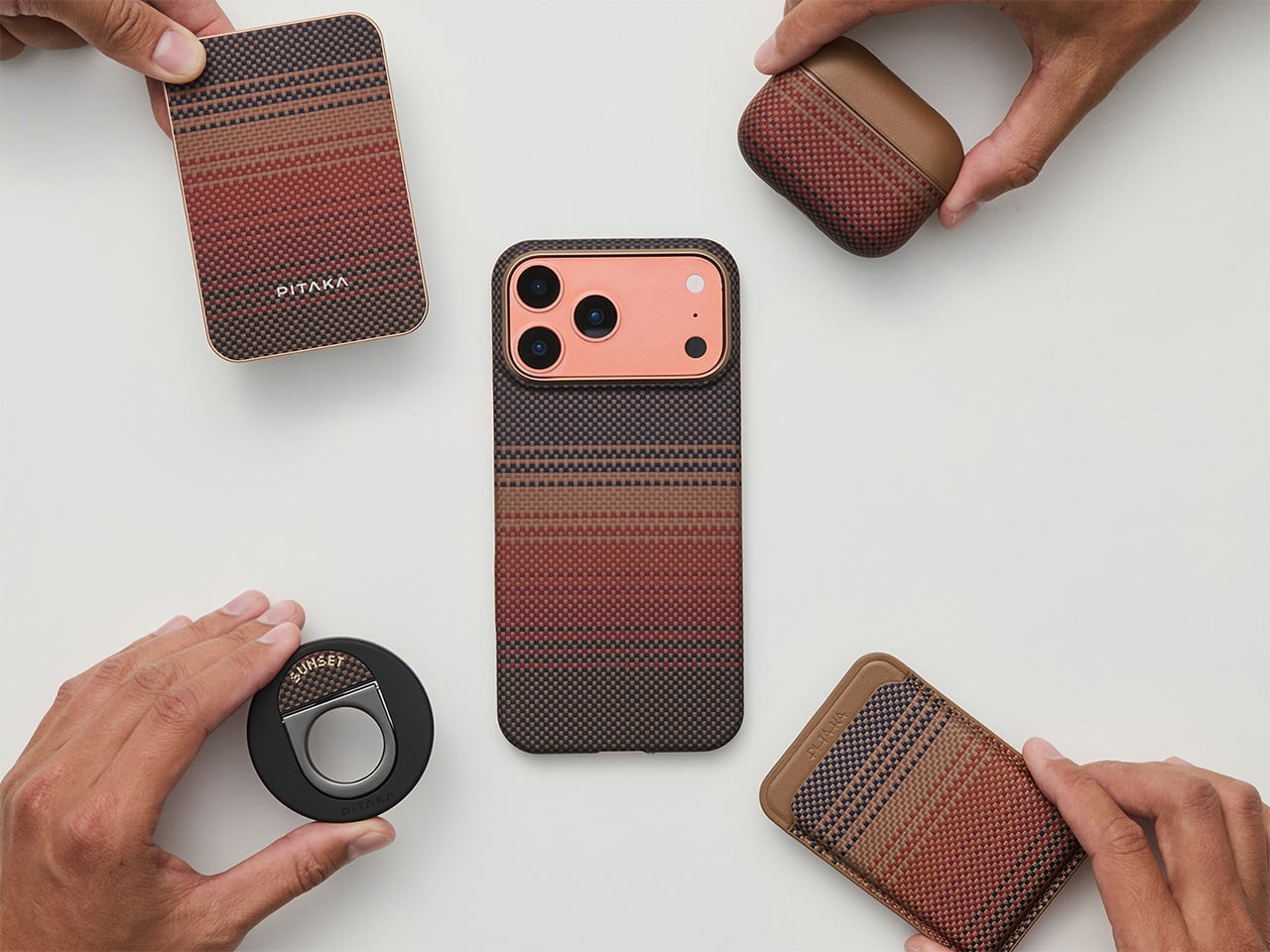
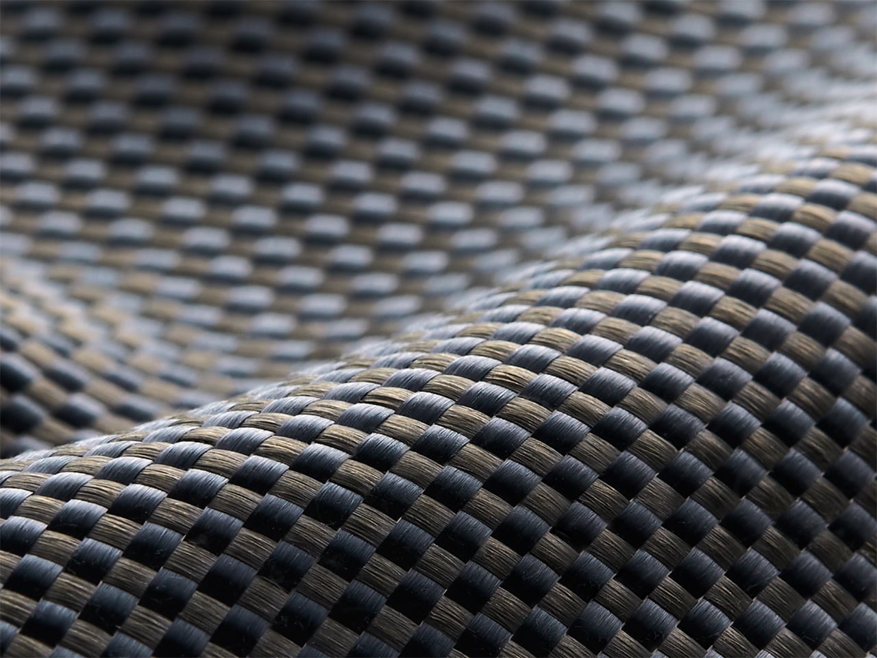
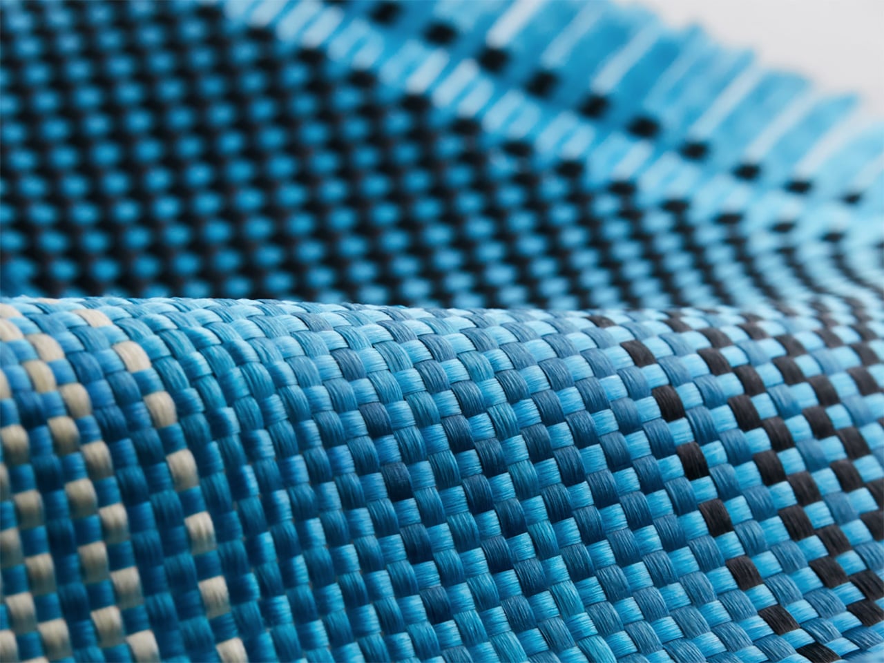
Launching April 24th, 2026, the competition is framed explicitly around the intersection of technology and art, which is less marketing speak and more PITAKA’s operational DNA. The brand’s cases have always leaned hard into material science, using woven aramid fibers (the same stuff in bulletproof vests and aircraft components) that are five times stronger than steel and a fraction of the weight. But strength alone doesn’t sell. What makes PITAKA cases notable is the texture vocabulary they’ve developed over years of refining weave patterns, experimenting with 600D and 1500D aramid densities, and pushing techniques like “fusion weaving,” where multiple patterns coexist on a single loom to create intricate, layered surface designs. “Weave the Next, Weave Our World” extends that exploration beyond the company’s internal design studio and into the hands of students, professionals, and independent creators who might see texture, pattern, and tactility from entirely different cultural or aesthetic starting points.

Click Here to Submit Now. Hurry, Competition Ends: May 25, 2026.

The Brief
Nordic Knit Dream
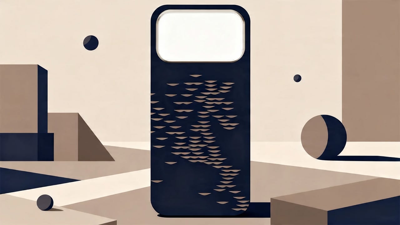
Drifting Shadows

PITAKA’s “Weave the Next, Weave Our World” global design competition invites designers to create texture and visual language systems for the brand’s future product series, positioned explicitly at the intersection of technology and art. Participants choose from four thematic directions: “These Moments,” which captures the raw beauty and shifting rhythms of the natural world; “Timeless Threads,” weaving stories of culture, memory, and human journeys; “Beyond Tomorrow,” exploring visionary futures where innovation reshapes daily life; or “Roots of Rhythms,” celebrating the textures, symbols, and spirit born from each land’s heritage. The competition aims to explore emerging global trends in tactile and visual design, strengthen PITAKA’s art-tech identity, and potentially commercialize winning designs through royalties, co-branding, and official recognition.
How To Participate

  1. Visit the official competition website or Dribbble page to submit your entry
  2. Provide participant information and upload your texture designs
  3. Include a written design explanation with your submission
  4. Entries will be evaluated through a combination of professional jury review and public voting
  5. Winners will be announced and showcased in an online exhibition

Competition Dates

  • Competition Launch: April 24, 2026
  • Submission Period: April 24 – May 25, 2026
  • Judging Period: May 26 – May 31, 2026
  • Winners Announcement: June 9, 2026

Jury Panel

  • Qiongzhi Xie (Artist; Founder of Daxing Jizi Studio)
  • Matteo Menotto (Head of Design, Prints & Textile Accessories at Bulgari)
  • Sarang Sheth (Editor-in-Chief, Yanko Design)
  • James (Founder / CEO, PITAKA)

Important Information

The most compelling entries are likely to do three things at once:

  1. Treat texture as a system, not a single image
    PITAKA’s products live across multiple form factors, so a strong entry will propose a visual/tactile system that can scale and adapt, not just a one-off pattern.
  2. Anchor the concept in one of the four themes without being literal
    “These Moments” does not need a photo-real print of a wave; “Roots of Rhythms” does not need a direct copy of a folk motif. Abstraction, distillation, and translation into a tech-accessory context will matter.
  3. Consider manufacturability and user experience
    Even in a speculative competition, the jury includes industrial design and brand leadership. Textures that look stunning in render but collapse in real material or feel uncomfortable in hand will likely be deprioritized.

If you already experiment with materials, parametric patterns, or culturally rooted visual systems, “Weave the Next, Weave Our World” is essentially an invitation to push that work into a space where it might actually ship.

Click Here to Submit Now. Hurry, Competition Ends: May 25, 2026.
Click Here to Submit Now. Hurry, Competition Ends: May 25, 2026.

The post PITAKA Is Letting the World Design Its Next Phone Cases, Royalties Included. Here’s How To Participate first appeared on Yanko Design.

PITAKA Is Letting the World Design Its Next Phone Cases, Royalties Included. Here’s How To Participate

Tech accessories have hit a curious inflection point. The last year trained us to worship thinness and glass, but somewhere between the tenth identical ‘Air’ or ‘Edge’ smartphone and the fifteenth glossy case, a countermovement quietly took root. Texture matters again. Grip, weave, and tactile identity are no longer afterthoughts, they’re the differentiators that keep objects from sliding into the sea of sameness. PITAKA, a brand built on aerospace-grade aramid fiber and what it calls “fusion weaving,” has spent years proving that phones don’t have to feel like jewelry-store display pieces. Now, with the launch of “Weave the Next, Weave Our World,” the company is turning that philosophy outward, inviting designers worldwide to imagine the surfaces and visual languages that will define the next generation of tech we carry, hold, and interact with every day.

Launching April 24th, 2026, the competition is framed explicitly around the intersection of technology and art, which is less marketing speak and more PITAKA’s operational DNA. The brand’s cases have always leaned hard into material science, using woven aramid fibers (the same stuff in bulletproof vests and aircraft components) that are five times stronger than steel and a fraction of the weight. But strength alone doesn’t sell. What makes PITAKA cases notable is the texture vocabulary they’ve developed over years of refining weave patterns, experimenting with 600D and 1500D aramid densities, and pushing techniques like “fusion weaving,” where multiple patterns coexist on a single loom to create intricate, layered surface designs. “Weave the Next, Weave Our World” extends that exploration beyond the company’s internal design studio and into the hands of students, professionals, and independent creators who might see texture, pattern, and tactility from entirely different cultural or aesthetic starting points.

Click Here to Submit Now. Hurry, Competition Ends: May 25, 2026.

The Brief

Nordic Knit Dream

Drifting Shadows

PITAKA’s “Weave the Next, Weave Our World” global design competition invites designers to create texture and visual language systems for the brand’s future product series, positioned explicitly at the intersection of technology and art. Participants choose from four thematic directions: “These Moments,” which captures the raw beauty and shifting rhythms of the natural world; “Timeless Threads,” weaving stories of culture, memory, and human journeys; “Beyond Tomorrow,” exploring visionary futures where innovation reshapes daily life; or “Roots of Rhythms,” celebrating the textures, symbols, and spirit born from each land’s heritage. The competition aims to explore emerging global trends in tactile and visual design, strengthen PITAKA’s art-tech identity, and potentially commercialize winning designs through royalties, co-branding, and official recognition.

How To Participate

  1. Visit the official competition website or Dribbble page to submit your entry
  2. Provide participant information and upload your texture designs
  3. Include a written design explanation with your submission
  4. Entries will be evaluated through a combination of professional jury review and public voting
  5. Winners will be announced and showcased in an online exhibition

Competition Dates

  • Competition Launch: April 24, 2026
  • Submission Period: April 24 – May 25, 2026
  • Judging Period: May 26 – May 31, 2026
  • Winners Announcement: June 9, 2026

Jury Panel

  • Qiongzhi Xie (Artist; Founder of Daxing Jizi Studio)
  • Matteo Menotto (Head of Design, Prints & Textile Accessories at Bulgari)
  • Sarang Sheth (Editor-in-Chief, Yanko Design)
  • James (Founder / CEO, PITAKA)

Important Information

The most compelling entries are likely to do three things at once:

  1. Treat texture as a system, not a single image
    PITAKA’s products live across multiple form factors, so a strong entry will propose a visual/tactile system that can scale and adapt, not just a one-off pattern.
  2. Anchor the concept in one of the four themes without being literal
    “These Moments” does not need a photo-real print of a wave; “Roots of Rhythms” does not need a direct copy of a folk motif. Abstraction, distillation, and translation into a tech-accessory context will matter.
  3. Consider manufacturability and user experience
    Even in a speculative competition, the jury includes industrial design and brand leadership. Textures that look stunning in render but collapse in real material or feel uncomfortable in hand will likely be deprioritized.

If you already experiment with materials, parametric patterns, or culturally rooted visual systems, “Weave the Next, Weave Our World” is essentially an invitation to push that work into a space where it might actually ship.

Click Here to Submit Now. Hurry, Competition Ends: May 25, 2026.
Click Here to Submit Now. Hurry, Competition Ends: May 25, 2026.

The post PITAKA Is Letting the World Design Its Next Phone Cases, Royalties Included. Here’s How To Participate first appeared on Yanko Design.

PITAKA Is Letting the World Design Its Next Phone Cases, Royalties Included. Here’s How To Participate

Tech accessories have hit a curious inflection point. The last year trained us to worship thinness and glass, but somewhere between the tenth identical ‘Air’ or ‘Edge’ smartphone and the fifteenth glossy case, a countermovement quietly took root. Texture matters again. Grip, weave, and tactile identity are no longer afterthoughts, they’re the differentiators that keep objects from sliding into the sea of sameness. PITAKA, a brand built on aerospace-grade aramid fiber and what it calls “fusion weaving,” has spent years proving that phones don’t have to feel like jewelry-store display pieces. Now, with the launch of “Weave the Next, Weave Our World,” the company is turning that philosophy outward, inviting designers worldwide to imagine the surfaces and visual languages that will define the next generation of tech we carry, hold, and interact with every day.

Launching April 24th, 2026, the competition is framed explicitly around the intersection of technology and art, which is less marketing speak and more PITAKA’s operational DNA. The brand’s cases have always leaned hard into material science, using woven aramid fibers (the same stuff in bulletproof vests and aircraft components) that are five times stronger than steel and a fraction of the weight. But strength alone doesn’t sell. What makes PITAKA cases notable is the texture vocabulary they’ve developed over years of refining weave patterns, experimenting with 600D and 1500D aramid densities, and pushing techniques like “fusion weaving,” where multiple patterns coexist on a single loom to create intricate, layered surface designs. “Weave the Next, Weave Our World” extends that exploration beyond the company’s internal design studio and into the hands of students, professionals, and independent creators who might see texture, pattern, and tactility from entirely different cultural or aesthetic starting points.

Click Here to Submit Now. Hurry, Competition Ends: May 25, 2026.

The Brief

Nordic Knit Dream

Drifting Shadows

PITAKA’s “Weave the Next, Weave Our World” global design competition invites designers to create texture and visual language systems for the brand’s future product series, positioned explicitly at the intersection of technology and art. Participants choose from four thematic directions: “These Moments,” which captures the raw beauty and shifting rhythms of the natural world; “Timeless Threads,” weaving stories of culture, memory, and human journeys; “Beyond Tomorrow,” exploring visionary futures where innovation reshapes daily life; or “Roots of Rhythms,” celebrating the textures, symbols, and spirit born from each land’s heritage. The competition aims to explore emerging global trends in tactile and visual design, strengthen PITAKA’s art-tech identity, and potentially commercialize winning designs through royalties, co-branding, and official recognition.

How To Participate

  1. Visit the official competition website or Dribbble page to submit your entry
  2. Provide participant information and upload your texture designs
  3. Include a written design explanation with your submission
  4. Entries will be evaluated through a combination of professional jury review and public voting
  5. Winners will be announced and showcased in an online exhibition

Competition Dates

  • Competition Launch: April 24, 2026
  • Submission Period: April 24 – May 25, 2026
  • Judging Period: May 26 – May 31, 2026
  • Winners Announcement: June 9, 2026

Jury Panel

  • Qiongzhi Xie (Artist; Founder of Daxing Jizi Studio)
  • Matteo Menotto (Head of Design, Prints & Textile Accessories at Bulgari)
  • Sarang Sheth (Editor-in-Chief, Yanko Design)
  • James (Founder / CEO, PITAKA)

Important Information

The most compelling entries are likely to do three things at once:

  1. Treat texture as a system, not a single image
    PITAKA’s products live across multiple form factors, so a strong entry will propose a visual/tactile system that can scale and adapt, not just a one-off pattern.
  2. Anchor the concept in one of the four themes without being literal
    “These Moments” does not need a photo-real print of a wave; “Roots of Rhythms” does not need a direct copy of a folk motif. Abstraction, distillation, and translation into a tech-accessory context will matter.
  3. Consider manufacturability and user experience
    Even in a speculative competition, the jury includes industrial design and brand leadership. Textures that look stunning in render but collapse in real material or feel uncomfortable in hand will likely be deprioritized.

If you already experiment with materials, parametric patterns, or culturally rooted visual systems, “Weave the Next, Weave Our World” is essentially an invitation to push that work into a space where it might actually ship.

Click Here to Submit Now. Hurry, Competition Ends: May 25, 2026.
Click Here to Submit Now. Hurry, Competition Ends: May 25, 2026.

The post PITAKA Is Letting the World Design Its Next Phone Cases, Royalties Included. Here’s How To Participate first appeared on Yanko Design.
If Fidget Spinners Were Furniture: This Marble Table Has a Brass Sphere You Push Around Endlessly

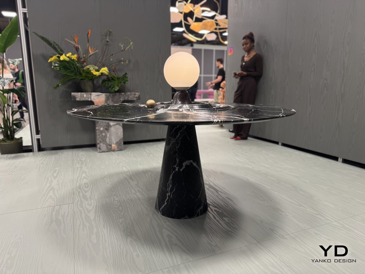
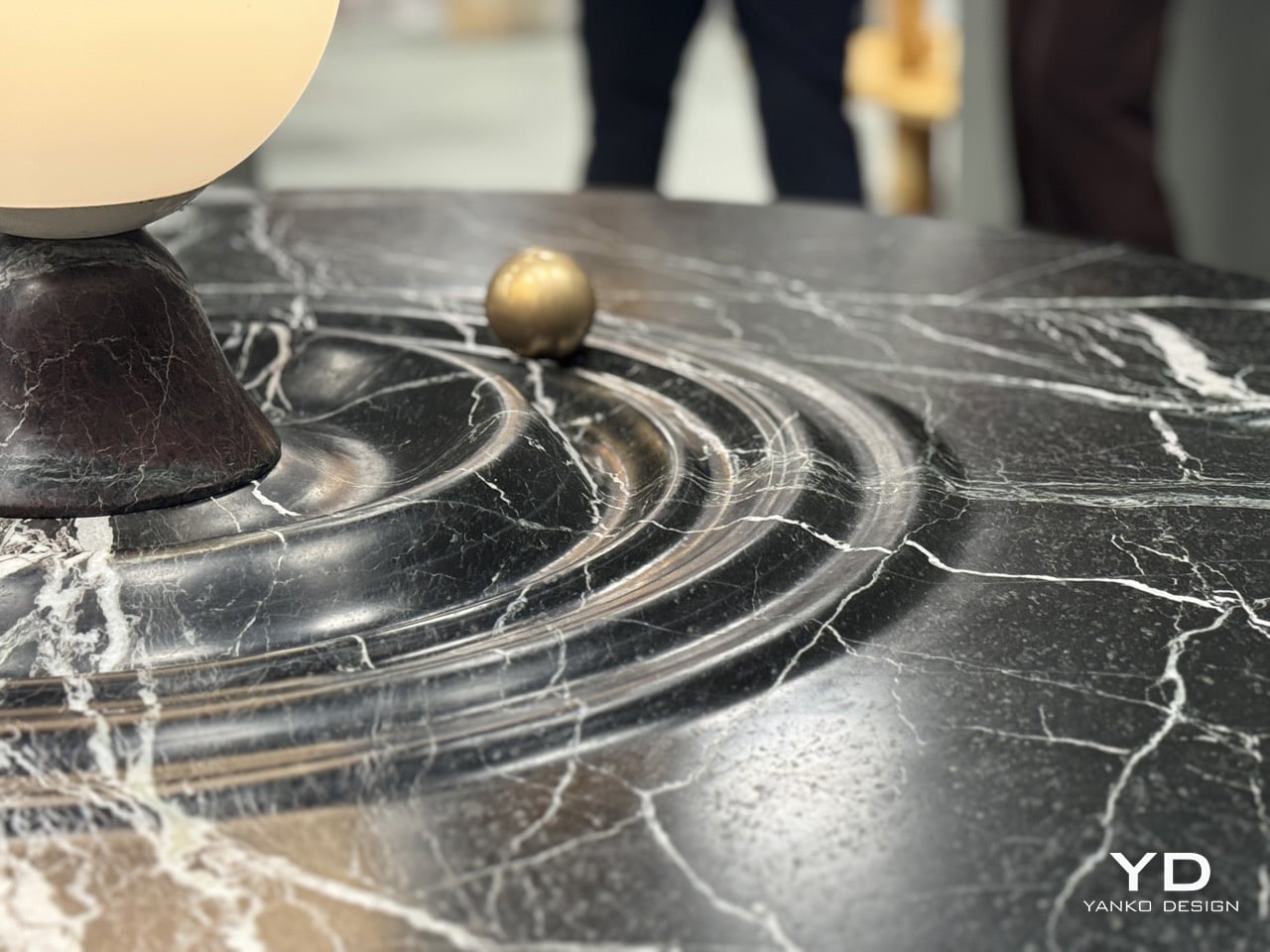
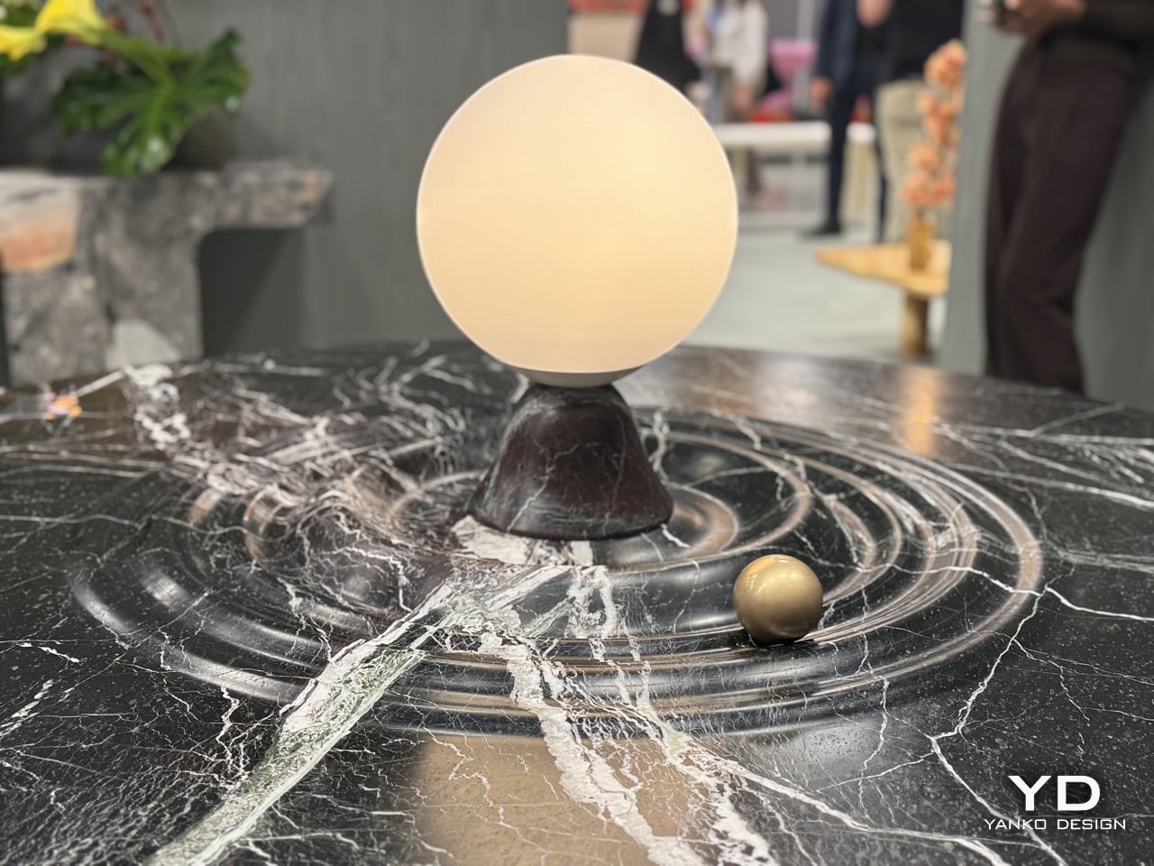
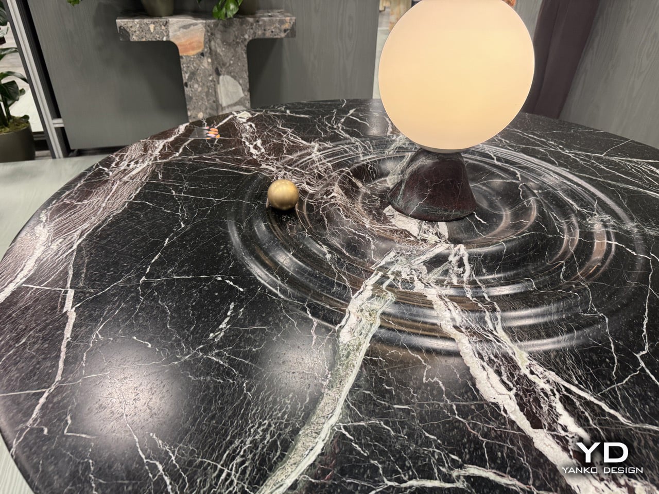
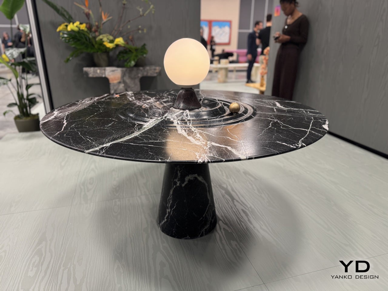
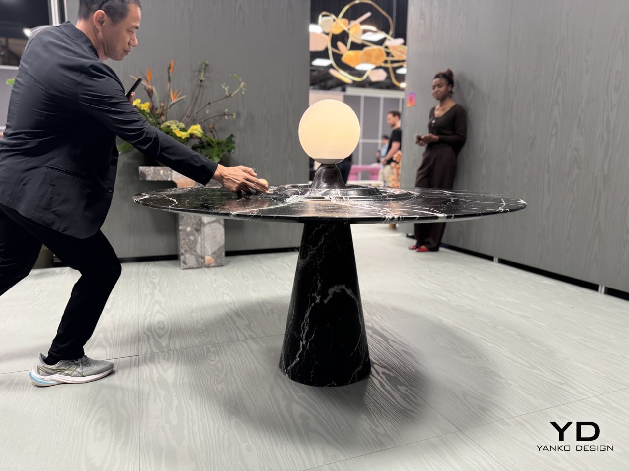
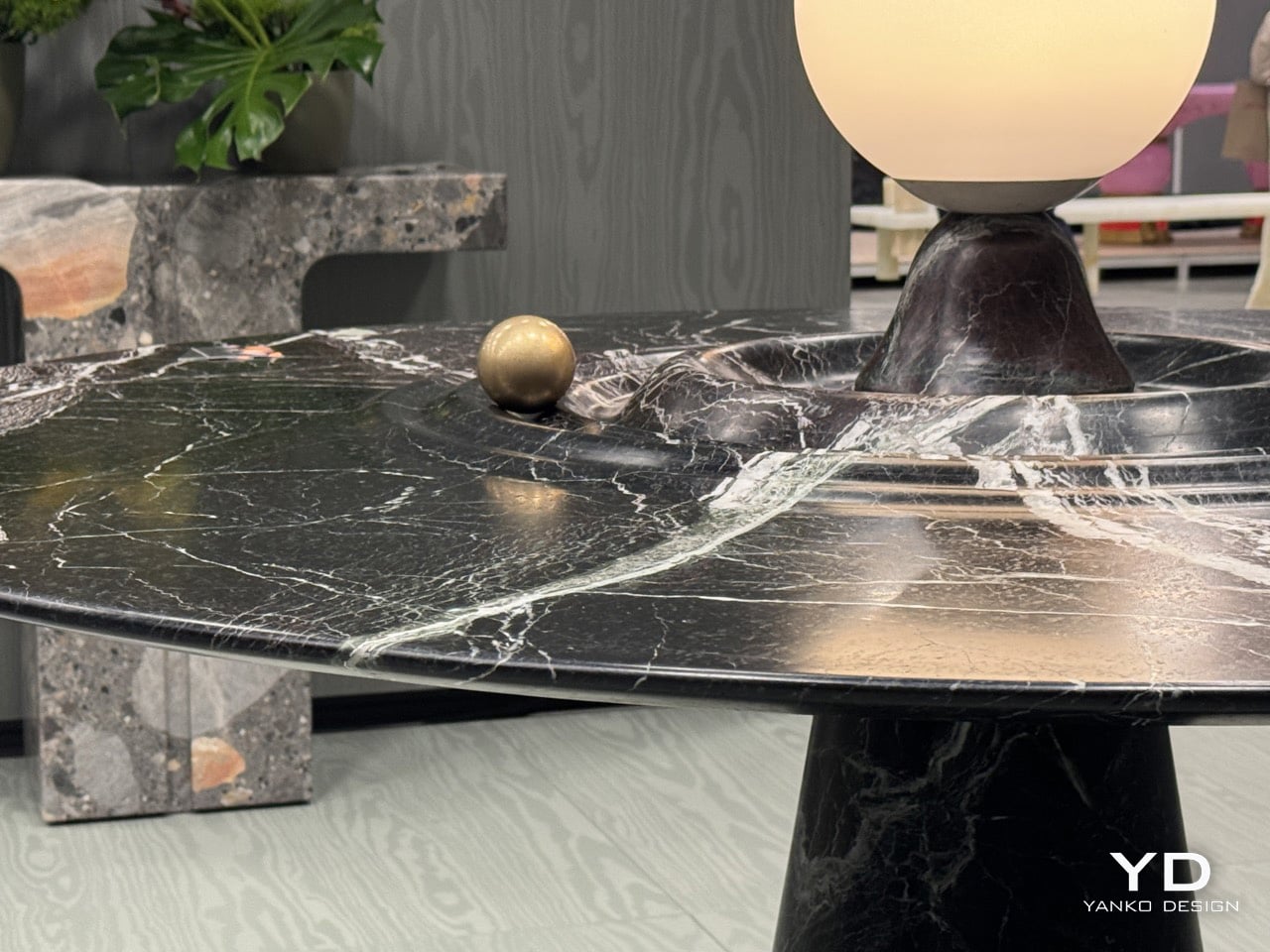
Furniture should probably stay still. That’s the basic contract between you and the table: it holds your dinner plates, you don’t worry about physics. Alessio Scalabrini decided that contract was negotiable. The Animo table, produced by Italian marble workshop Serafini, features a brass sphere that rotates around a central lamp fixture, tracing concentric ripples carved into the marble surface like a tiny planet orbiting its sun. The table functions perfectly well as a static dining surface, but it also invites you to set something in motion every time you walk past it, turning what could’ve been another high-end marble slab into an interactive kinetic object that happens to hold glassware.

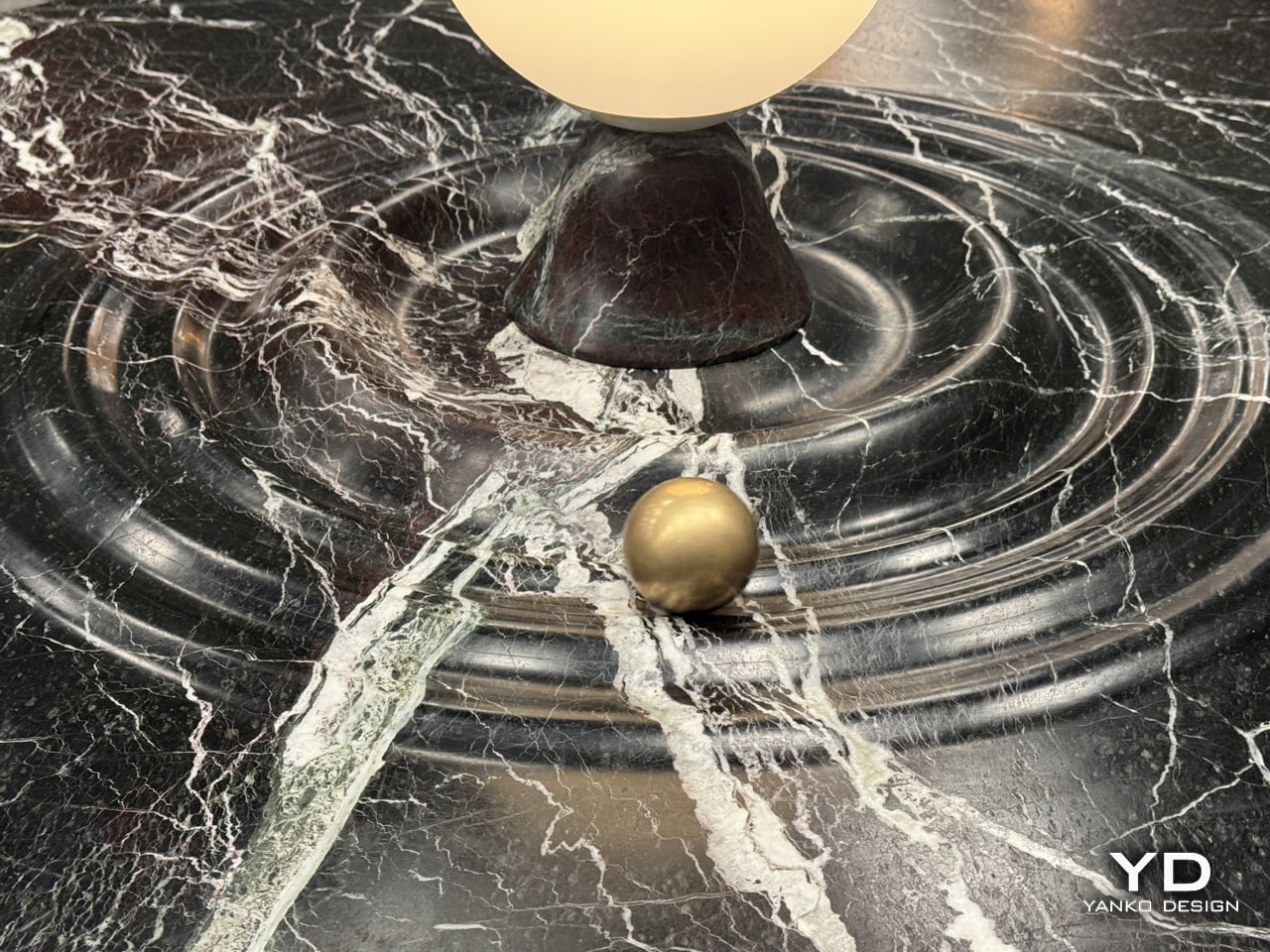
Named after the Italian word for Soul, the Animo table adds some animated joy with a dash of luxury to your space. The table, made entirely from Italian Rosso Levanto marble, is hand-finished with ripples that break the illusion of stillness, making it look fluid. Nestled in one of those ripples is a brass sphere, adding a dash of gold to the table’s ultra-dark burgundy and white-vein design. The result is furniture you can fidget with. It’s art and play combined brilliantly, with the kind of craftsmanship you can only expect from an Italian brand showcasing at Salone del Mobile!

Designer: Alessios Calabrini for Serafini

The table first attracts you with how it looks, then how it feels. The marble finish is impeccable, with the ripples crafted to absolute perfection. The perfection plays an important part here, because a brass sphere needs to seamlessly roll around the table, with the smoothness of a fidget spinner. The sphere has solid heft to it, giving it a fair amount of momentum when you nudge it around the table. It moves with little to no effort, completing tens of rotations before coming to a very gradual halt. Any other material would falter. Wood might end up deforming after years, metal would make the table feel unpleasant, rough stone wouldn’t cause the sphere to move as freely.

The central lamp adds another layer of functionality, illuminating the table from within while serving as the gravitational anchor for the sphere’s orbital path. The whole composition balances three distinct roles: functional dining surface, sculptural marble centerpiece, and interactive kinetic object. Most designers would’ve picked one and committed. Scalabrini made all three work simultaneously.

Scalabrini runs a Paris-based design studio with 18 years of experience merging traditional craftsmanship with contemporary fabrication technology, and that dual approach is visible throughout the Animo. The table uses Serafini’s established production methods, combining precision CNC machining with hand-finishing by Italian artisans who’ve been working marble their entire careers.

If you want to see the Animo table in person and experience the satisfying physics of that brass sphere yourself, Serafini is showing it at Salone Raritas during Salone del Mobile. The difference between seeing photos and actually pushing that orb around the channels is substantial. Photos capture the visual design, but they can’t communicate the tactile satisfaction of setting something that heavy into smooth, controlled motion.

The post If Fidget Spinners Were Furniture: This Marble Table Has a Brass Sphere You Push Around Endlessly first appeared on Yanko Design.
Skoda’s Inflatable Car Installation at Milan Design Week Looks Like a Bouncy Castle Grew Wheels

Cars belong to the world of hard surfaces, precision tolerances, and engineering constraints measured in fractions of millimeters. Ulises Studio works in the opposite direction. The Barcelona-based spatial design practice has spent years creating immersive environments that transform architecture into something tactile and experiential, turning rigid spaces into soft, inviting landscapes. Their installations have activated cultural venues and public spaces across Europe, and their approach is immediately recognizable: inflatable forms, vibrant color palettes, and a commitment to making people rethink how they interact with the built environment. When Skoda asked them to collaborate on an installation for Milan Design Week 2025, they brought that same philosophy to something designers rarely get to touch: an actual production car.

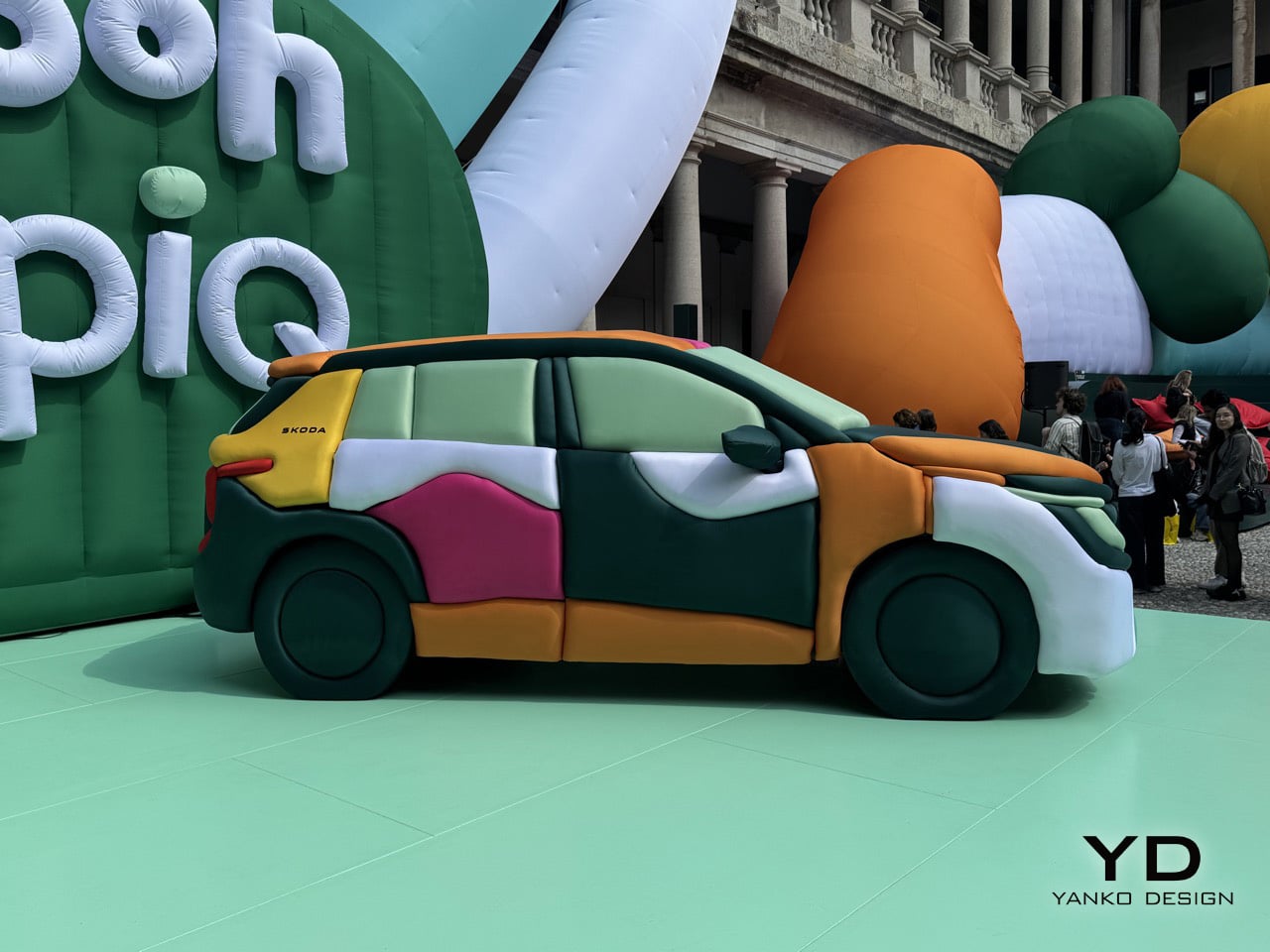
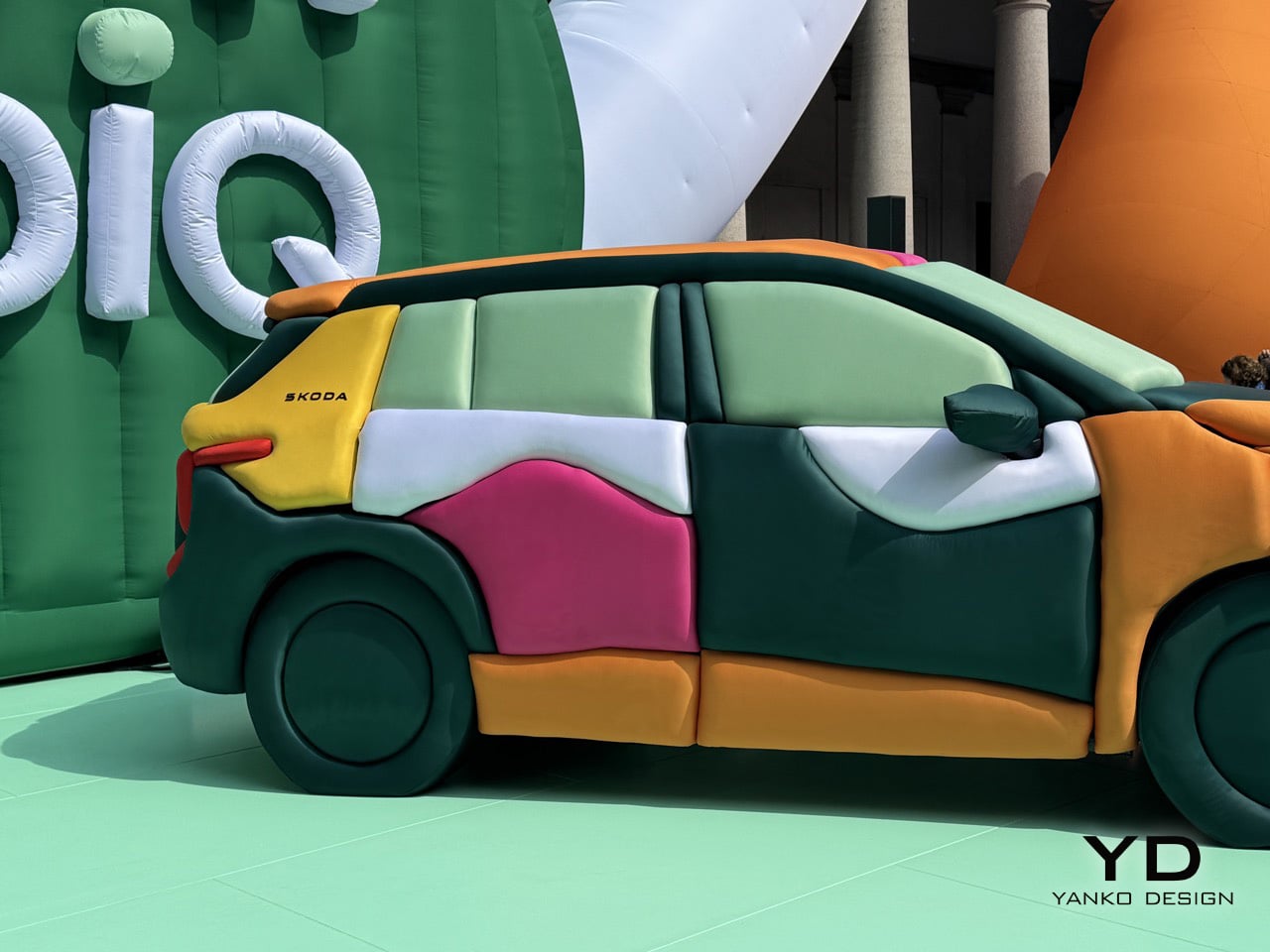
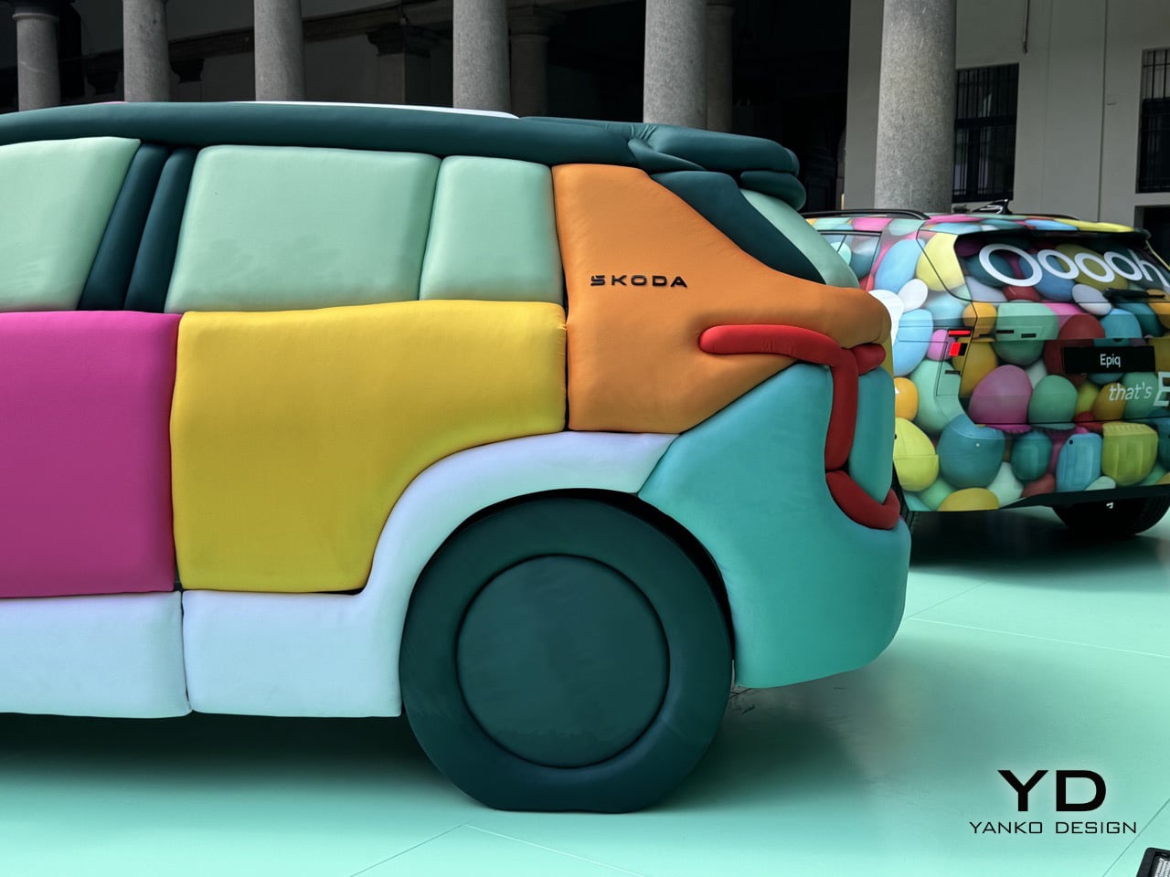
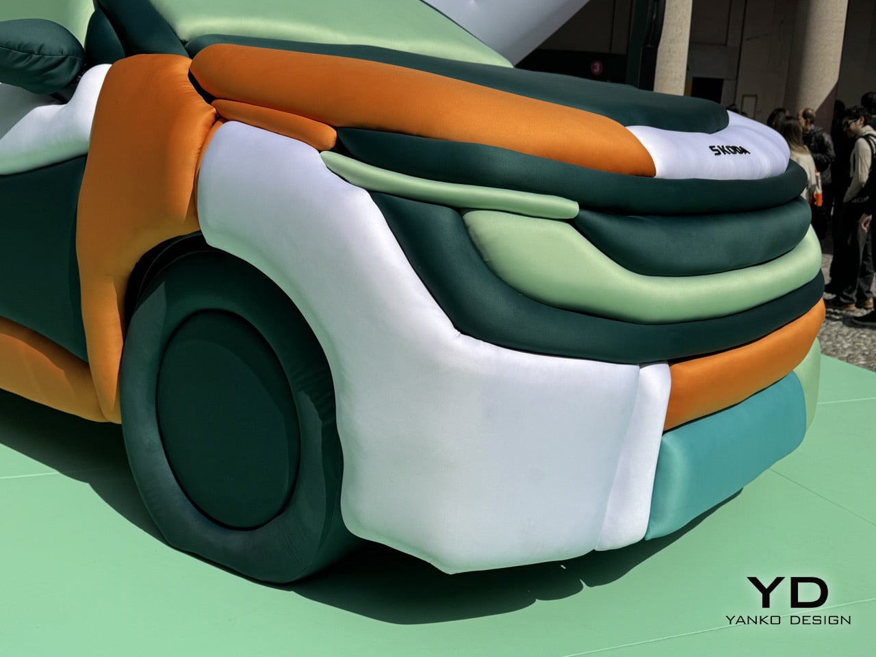
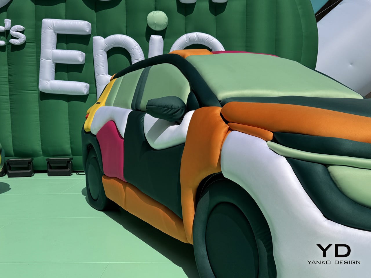
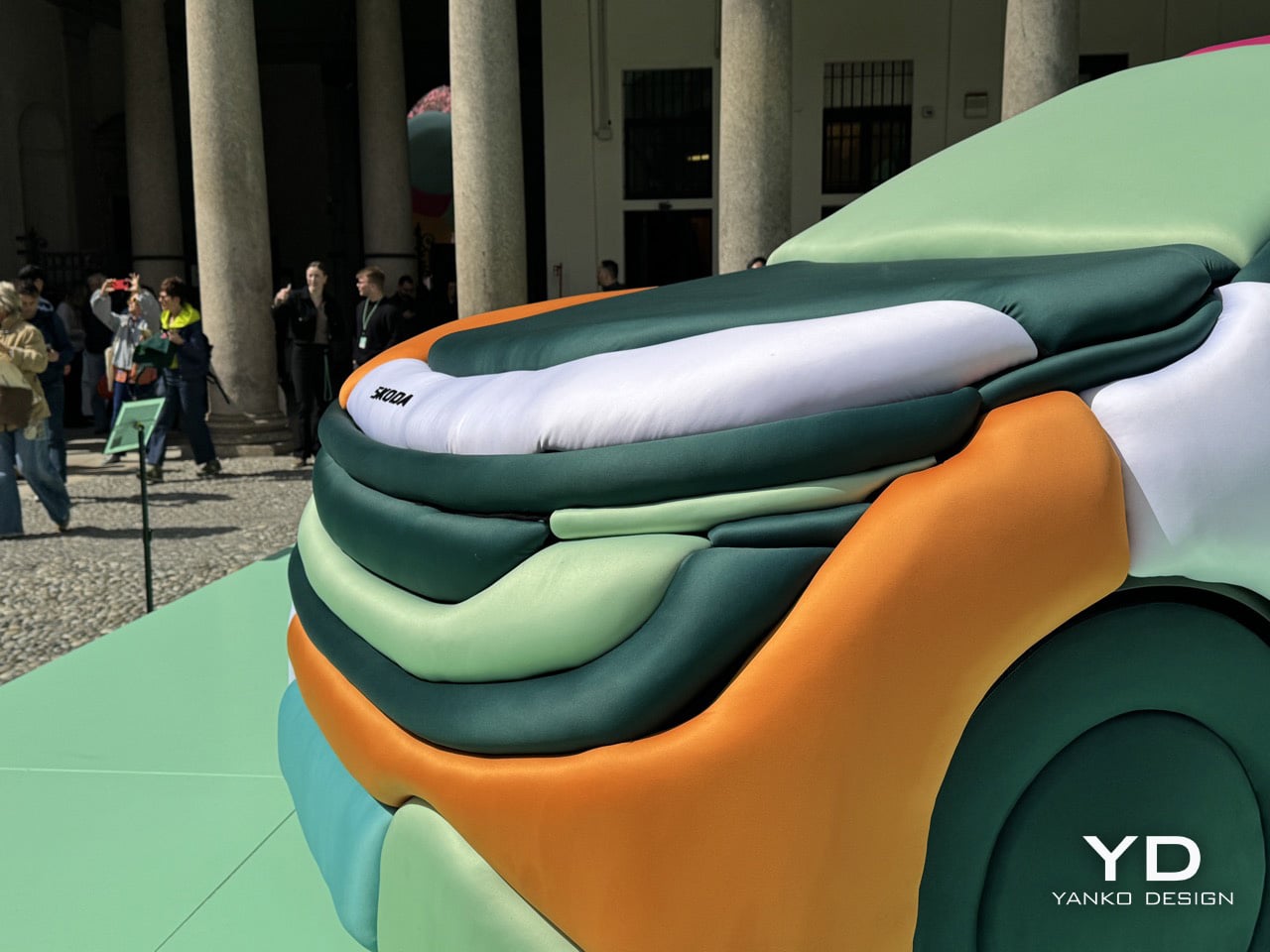
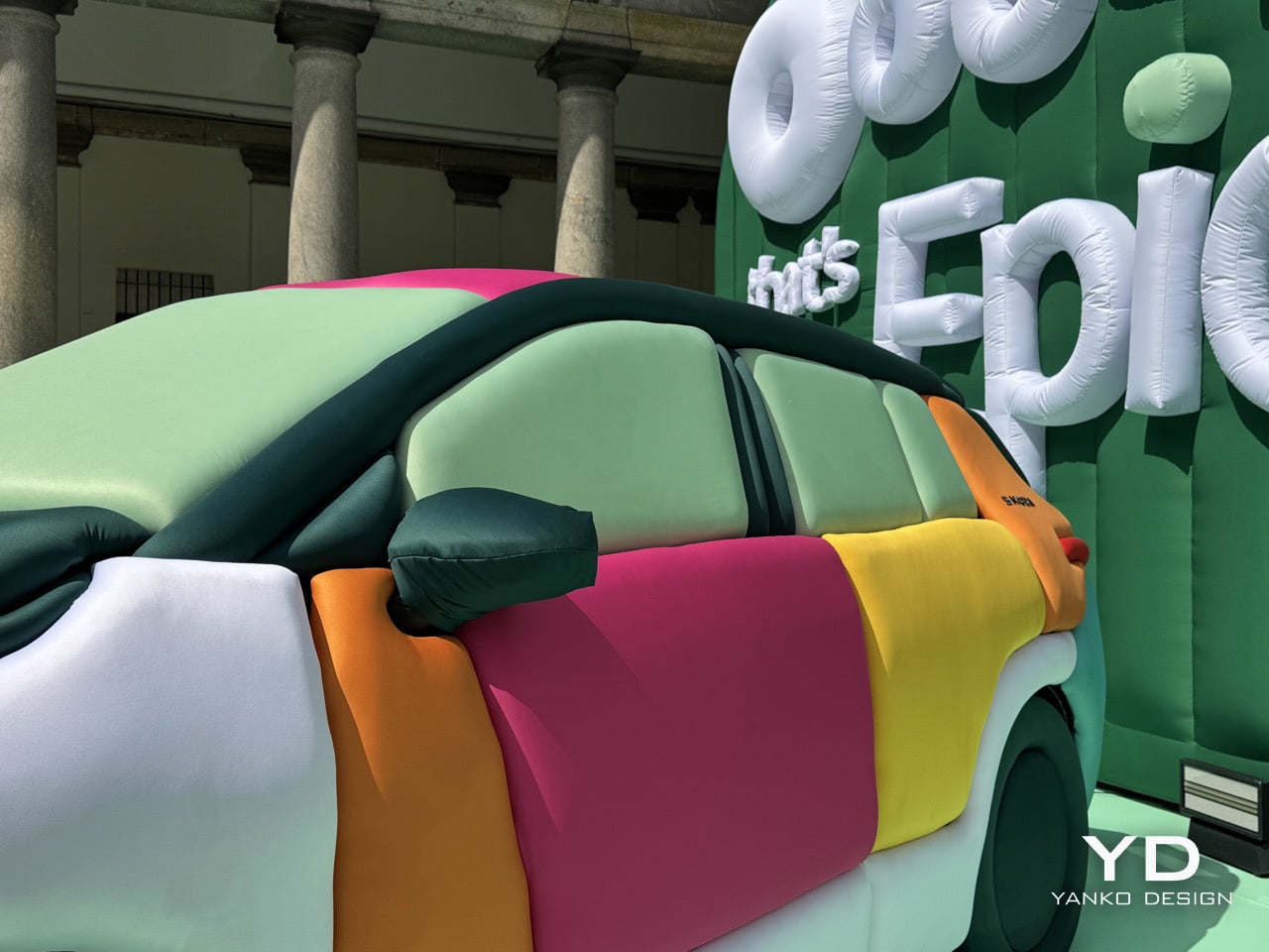
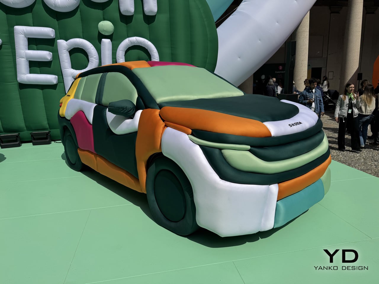
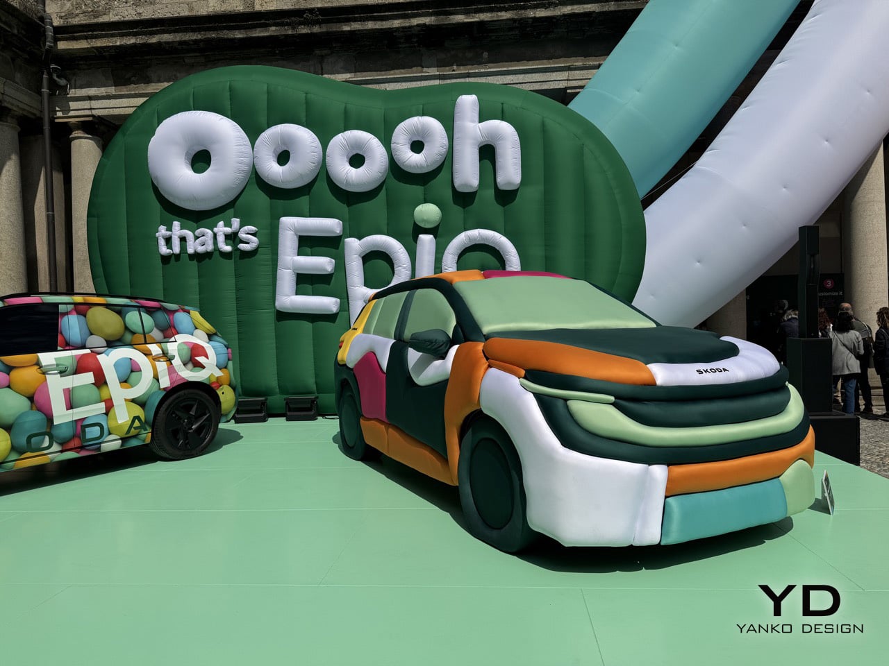
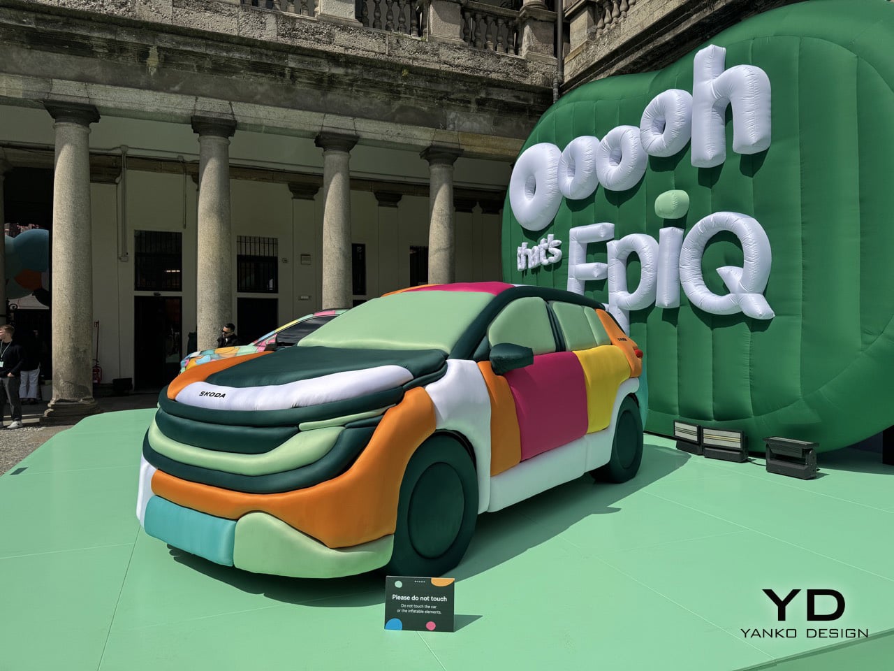
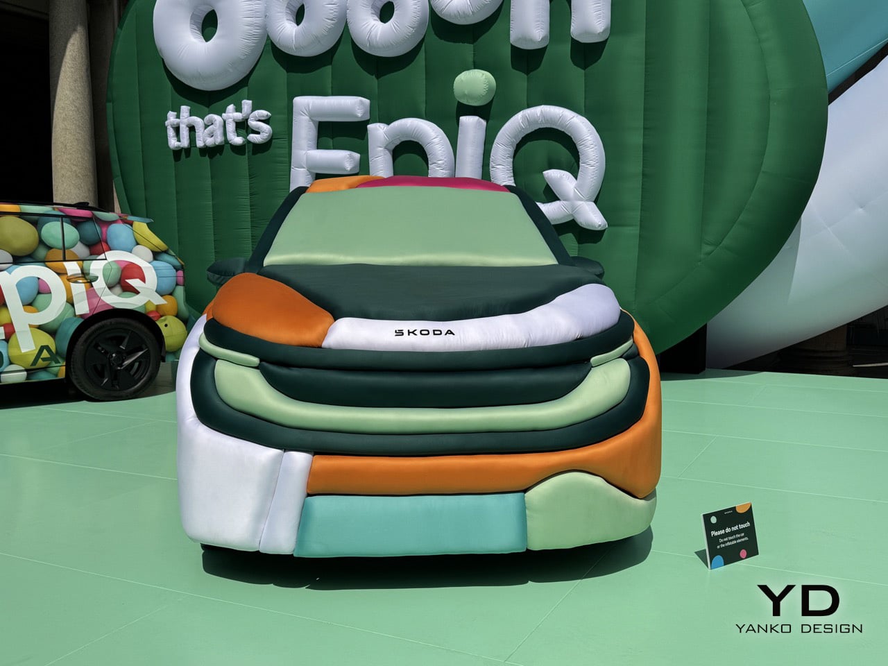
The Epiq, Skoda’s new electric SUV, became the canvas. Ulises Studio covered it entirely in inflatable fabric panels, each one a horizontal tube running across the body in a sequence of cheerful colors. Mint green, burnt orange, soft pink, butter yellow, pale turquoise. The effect is disarming. What should feel like a parked vehicle instead reads as a sculpture, a comment on automotive design language filtered through the lens of spatial intervention. Skoda staged it at Palazzo Senato with multiple Epiq vehicles, each wrapped in different inflatable treatments, creating a dialog between the engineered reality and Ulises Studio’s playful reinterpretation.

Designers: Ulises Studio & Skoda Design

The genius of the installation lies in how completely it transforms the car’s character without altering its underlying form. Every crease, every character line, every panel gap gets translated into soft, pillowy geometry. The horizontal tubes follow the Epiq’s actual contours, which means the inflatable version retains the proportions and stance of the real thing. You can still read it as a compact SUV, but now it feels approachable in a way sheet metal never could. The tactile quality is impossible to ignore. Your brain knows you’re looking at air-filled fabric wrapped around a vehicle, but your hands want to reach out and squeeze it anyway.

Ulises Studio didn’t stop at wrapping cars. They transformed the entire courtyard at Palazzo Senato into what they’re calling a “clay landscape,” an inflatable environment that extends the material language across the entire space. Oversized typography spelling out “Ooooh, that’s EpiQ” dominates one wall, each letter constructed from the same air-filled tubes. Smaller inflatable elements populate the courtyard like sculptural furniture, creating zones where visitors can pause and take in the installation from different angles. The floor itself gets treated to a matching mint-green surface that ties the whole environment together. This is spatial design at its most comprehensive, where every element reinforces the central idea.

What makes the collaboration work is that Ulises Studio treats the Epiq as part of a larger environmental narrative rather than the hero object that everything else orbits around. The cars are embedded in the landscape, surrounded by inflatable forms that share their material language and color palette. This creates a sense of cohesion that most automotive installations never achieve, where the vehicle feels like it genuinely belongs in the space rather than being awkwardly dropped into it. The studio’s background in creating immersive experiences shows in how they choreograph movement through the courtyard, using the placement of vehicles and sculptural elements to guide visitors through different zones of the installation. You don’t just look at the inflatable Epiq, you move around it, through the landscape it inhabits, encountering different perspectives and color relationships as you navigate the space.

Ulises Studio has always understood that spatial design is a form of storytelling. Their inflatable installations communicate ideas about accessibility, transformation, and how we experience objects in space. The Epiq installation applies that same thinking to automotive design. By swapping metal and glass for inflatable fabric, they strip away the aggression and seriousness that define most car launches and replace it with something genuinely delightful. The oversized inflatable typography spelling out “Ooooh, that’s EpiQ” reinforces the tone in a fairly Gen-Z coded way, allowing the brand to resonate with younger generations. This is design as spatial play, a reminder that objects can be functional and joyful simultaneously.

You’re an expert editor/blogger with a profound understanding of human psyche as well as Google SEO. Now generate 10 catchy, attention-grabbing, mildly provocative titles that are SEO-friendly too. Make your titles have natural language but craft them so they rank high on google News and Discover as of March 2026. Do your SEO research. Make them natural language, simple, yet captivating

The post Skoda’s Inflatable Car Installation at Milan Design Week Looks Like a Bouncy Castle Grew Wheels first appeared on Yanko Design.
Electrolux and Veneta Cucine Use Biophilic Color Science to Rethink Kitchen Design at Milan 2026

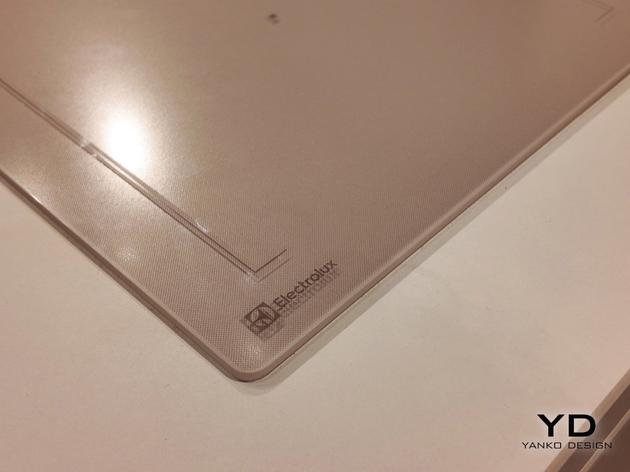
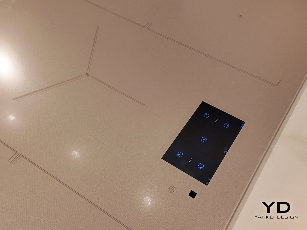
Scandinavian winters keep people indoors for roughly six months a year, which gives Swedish designers a lot of time to think about what a kitchen surface shoul…Scandinavian winters keep people indoors for roughly six months a year, which gives Swedish designers a lot of time to think about what a kitchen surface should feel like when it becomes the primary thing you look at during months when going outside requires genuine commitment. Electrolux leaned into that constraint at Milan Design Week 2026, partnering with Italian kitchen specialist Veneta Cucine to present a color palette pulled directly from nature. Warm sand, dusty teal, soft sage, speckled stone. Colors designed to reduce visual noise and make a kitchen feel less like a collection of separate purchases and more like a unified spatial environment.

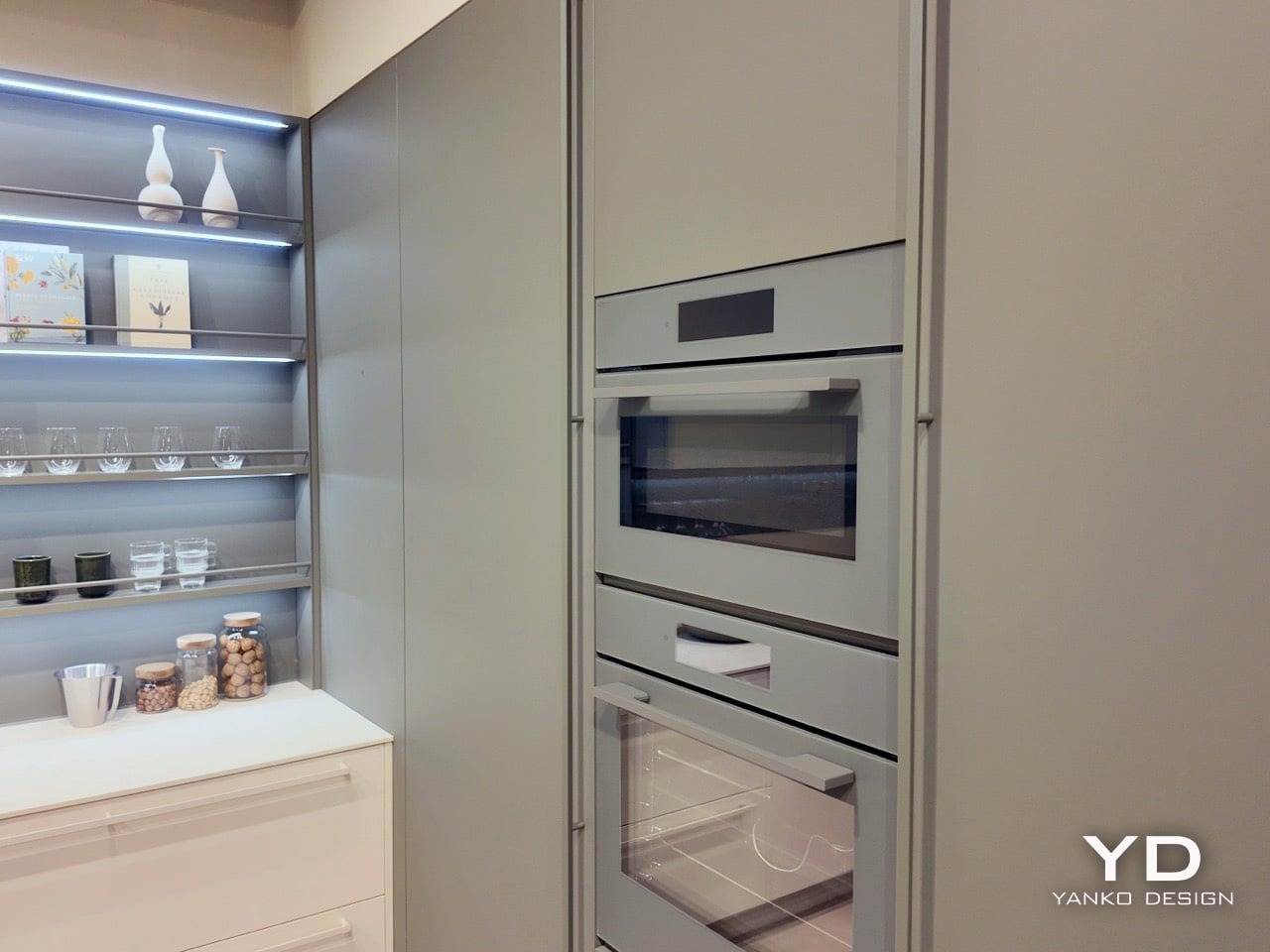
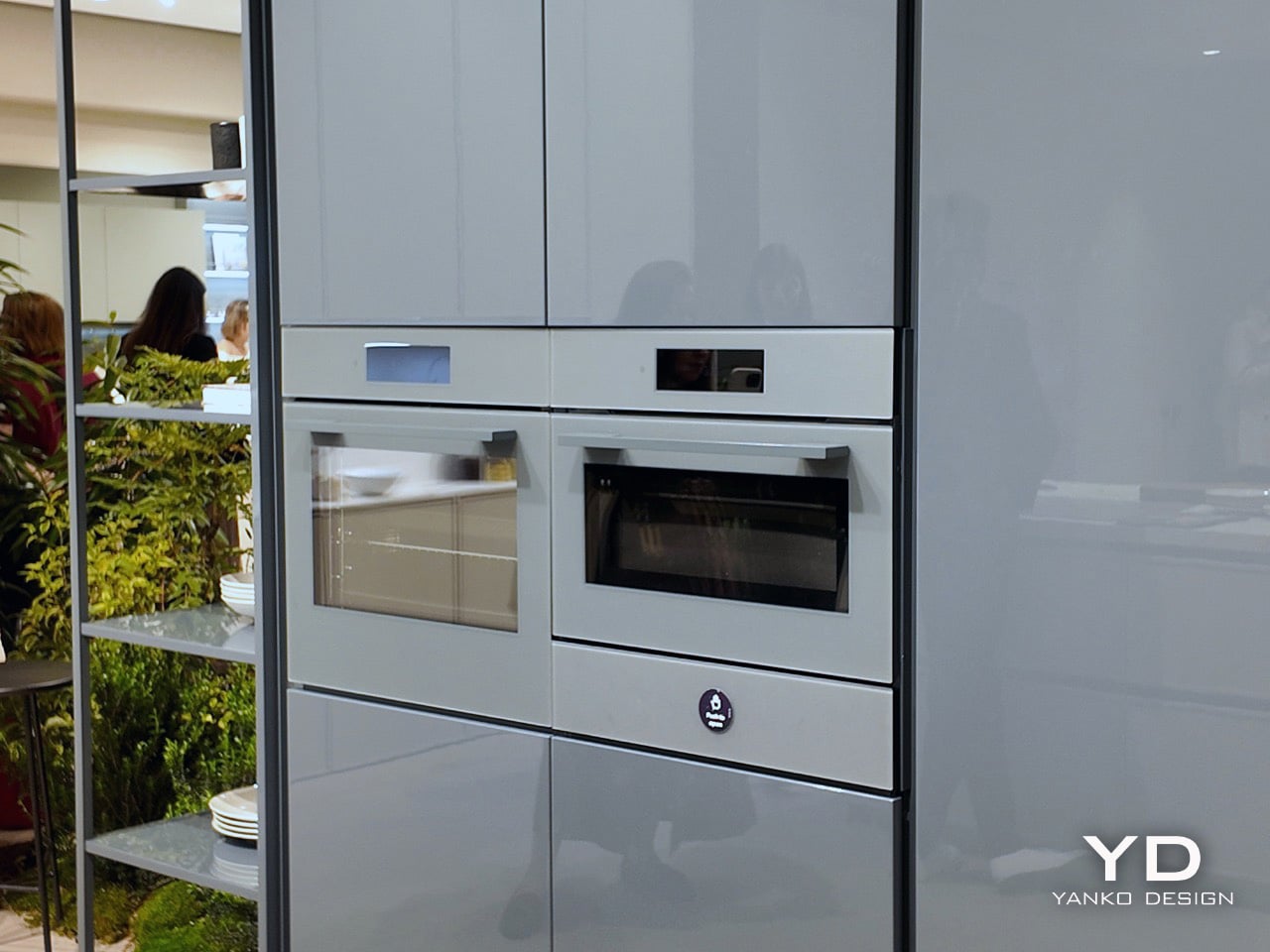
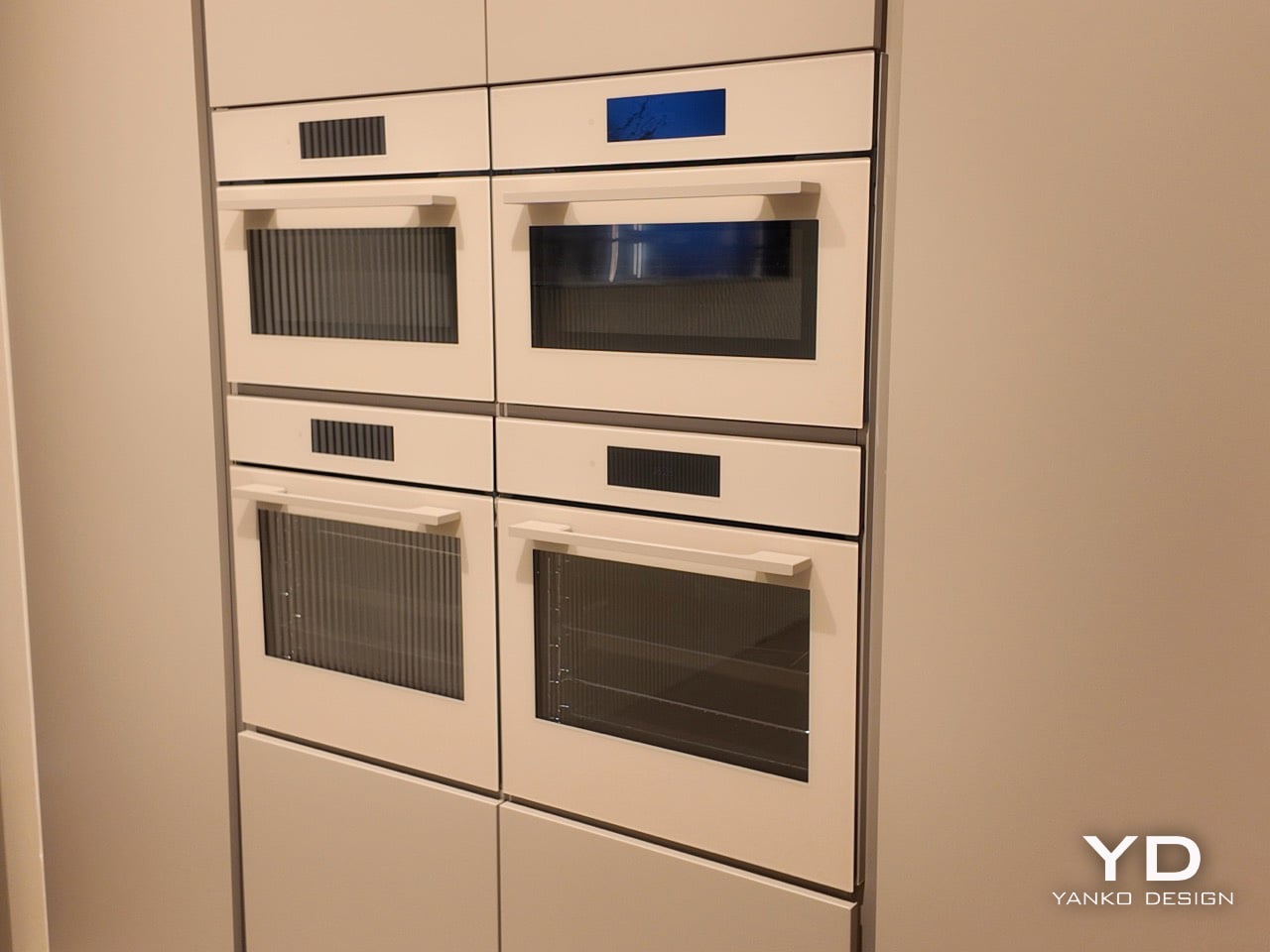
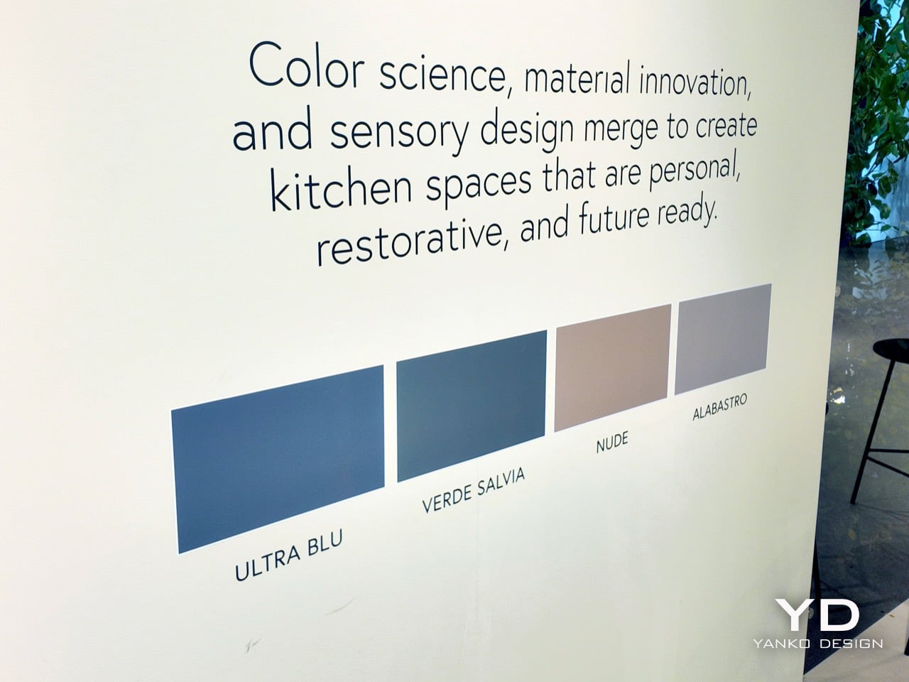
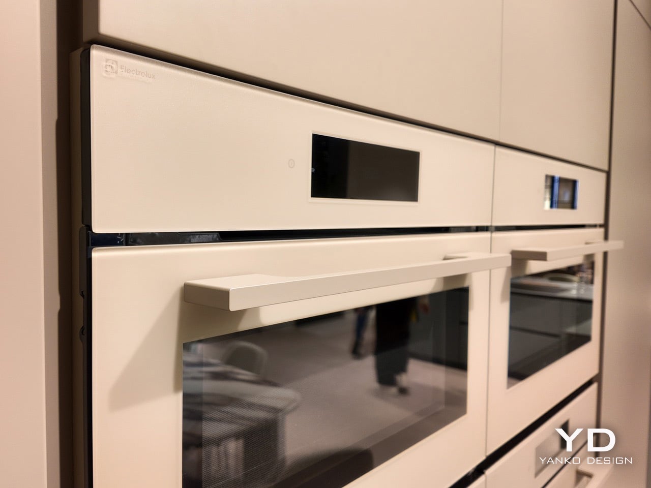
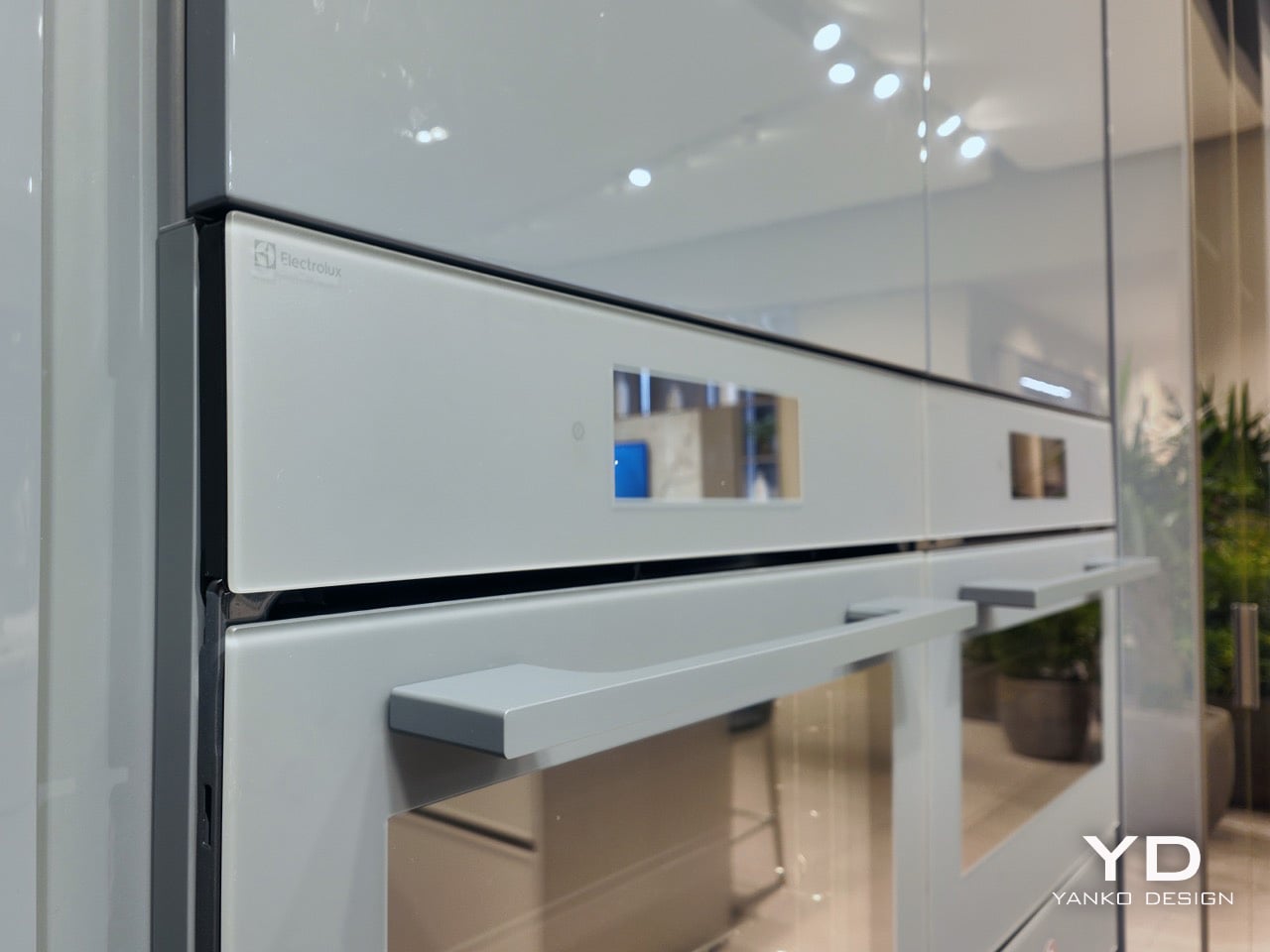
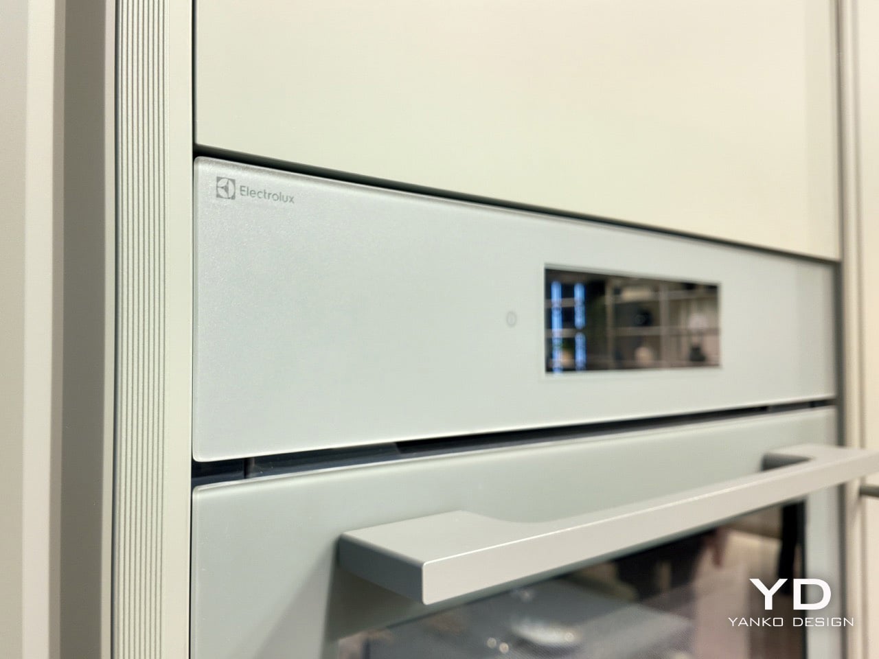
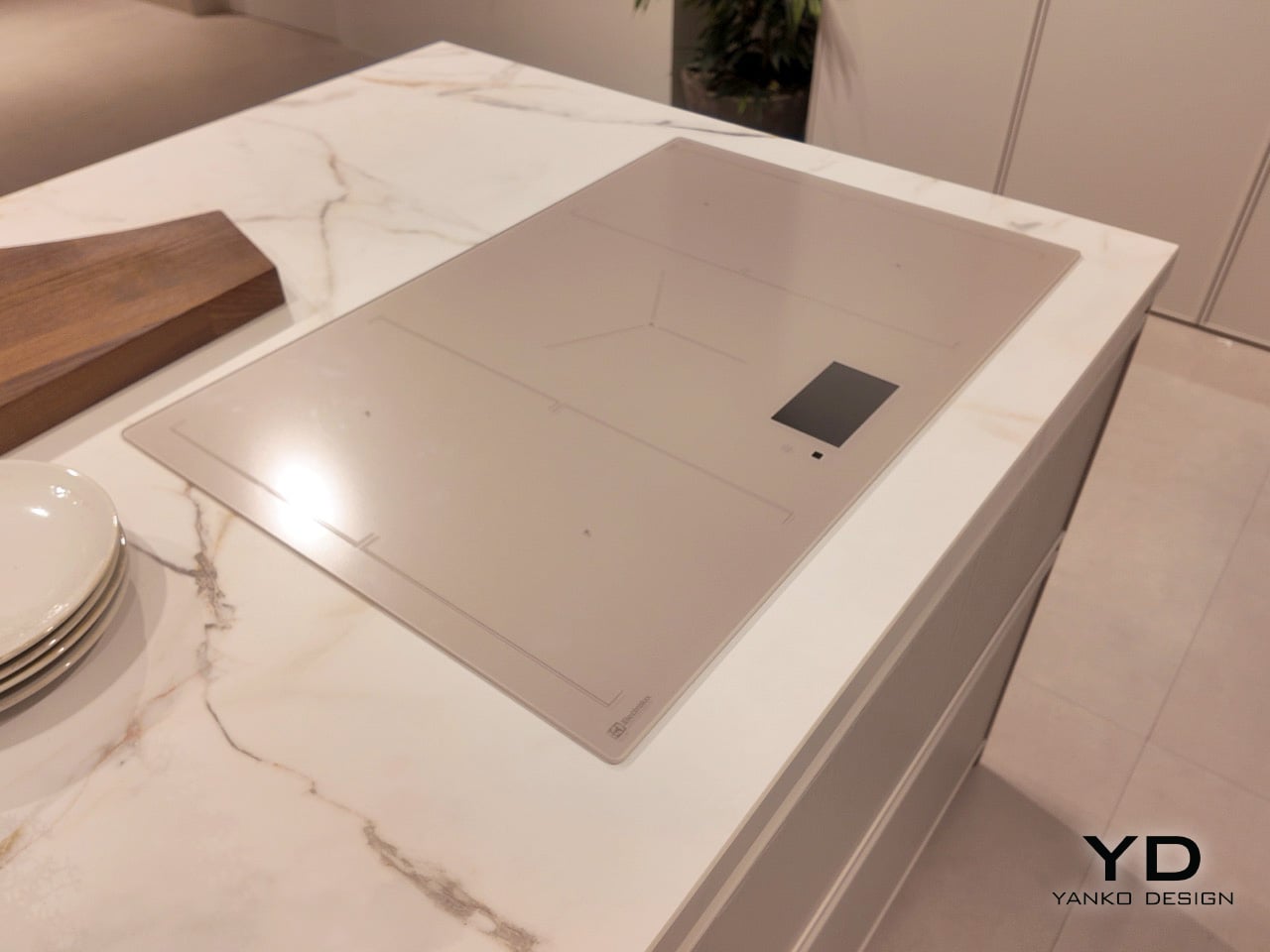
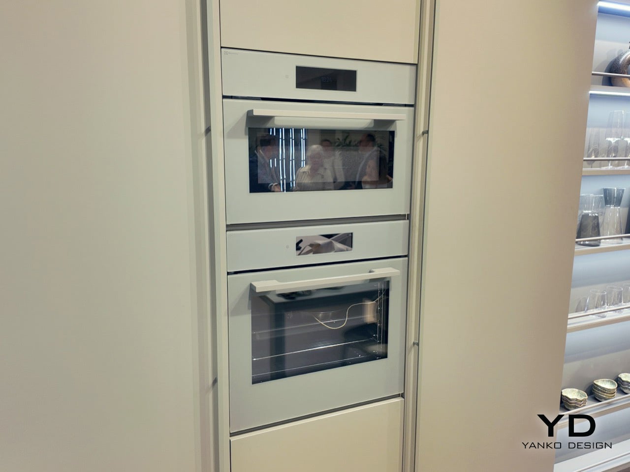
The four color concepts (Ultra Blu, Verde Salvia, Nude, Alabastro) get applied to both appliances and cabinetry, creating kitchen installations where ovens genuinely disappear into walls. The collaboration is grounded in research showing that people across European markets identify nature as their primary source of emotional restoration, so Electrolux decided to bring that restoration indoors. The result is a palette that feels geologic rather than trendy, with appliances that function as architectural elements instead of shiny metal boxes standing awkwardly in the corner.

Designers: Electrolux & Veneta Cucine

The approach hinges on something Amelia Chong, Electrolux’s Principal Color, Material & Finish Designer, calls thinking architecturally from an interior perspective. Color becomes a series of spatial blocks connecting products with their surrounding environment. Each palette is experienced through a curated interplay of materials, finishes, and furniture elements, both visual and tactile. Ultra Blu spans two graduated tones, a deeper navy fading into dusty teal. Verde Salvia delivers sage in its most restrained register. Nude reads as warm sand with subtle blush undertones. Alabastro arrives as speckled stone-effect gray, the kind of finish that looks different depending on light quality throughout the day.

Electrolux backs the palette with neuroaesthetic research claiming that biophilic color schemes can reduce perceived stress levels by as much as 35%. That statistic repositions what a kitchen appliance actually does in a home. Your refrigerator is cooling groceries, sure, but it’s also contributing to the sensory atmosphere of the room, shaping how calm or agitated you feel when you walk in to make coffee at 6am. The palette’s muted tones (warm neutrals, soft earth-rooted hues) create what the research describes as a perceptually grounded environment that reduces mental fatigue. In practical terms, this means your kitchen quits visually shouting at you.

Electrolux X Veneta Cucine’s Nude Colorway

Electrolux X Veneta Cucine’s UltraBlu Colorway

The partnership brings together two distinct design traditions in a way that actually makes sense. Electrolux contributes Scandinavian simplicity and human-centered clarity, the kind of restrained functionality that emerges from cultures where you spend half the year looking at the same interior walls. Veneta Cucine brings Italian craftsmanship and material expression, the tactile richness and attention to finish quality Italian furniture makers have been perfecting for generations. Daniela Archiutti, Veneta Cucine’s Art Director, positions the collaboration as merging color science, material innovation, and sensory design to create spaces that feel personal, restorative, and future ready. That’s a lot of adjectives for kitchen cabinetry, but the installations at Milan back up the claim.

Electrolux X Veneta Cucine’s Verde Salvia Colorway

Electrolux X Veneta Cucine’s Alabastro Colorway

The Milan showcase itself was staged as physical proof of concept. Concrete plinths topped with living moss carried CMF swatches in the four palette tones. A pine and wood scent developed by studio Koyia moved through the space. Appliances were displayed against photographic prints of Scandinavian woodland. The sequence was deliberate and consistent, building an argument that the kitchen functions as an emotional environment where design’s most sophisticated move is bringing the outdoors inside. The ovens, hobs, and refrigerators on display integrated so seamlessly into cabinetry that distinguishing appliance from architecture required genuine attention.

You’re an expert editor/blogger with a profound understanding of human psyche as well as Google SEO. Now generate 10 catchy, attention-grabbing, mildly provocative titles that are SEO-friendly too. Make your titles have natural language but craft them so they rank high on google News and Discover as of March 2026. Do your SEO research. Make them natural language, simple, yet captivating

The post Electrolux and Veneta Cucine Use Biophilic Color Science to Rethink Kitchen Design at Milan 2026 first appeared on Yanko Design.
Electrolux and Veneta Cucine Use Biophilic Color Science to Rethink Kitchen Design at Milan 2026

Scandinavian winters keep people indoors for roughly six months a year, which gives Swedish designers a lot of time to think about what a kitchen surface shoul…Scandinavian winters keep people indoors for roughly six months a year, which gives Swedish designers a lot of time to think about what a kitchen surface should feel like when it becomes the primary thing you look at during months when going outside requires genuine commitment. Electrolux leaned into that constraint at Milan Design Week 2026, partnering with Italian kitchen specialist Veneta Cucine to present a color palette pulled directly from nature. Warm sand, dusty teal, soft sage, speckled stone. Colors designed to reduce visual noise and make a kitchen feel less like a collection of separate purchases and more like a unified spatial environment.

The four color concepts (Ultra Blu, Verde Salvia, Nude, Alabastro) get applied to both appliances and cabinetry, creating kitchen installations where ovens genuinely disappear into walls. The collaboration is grounded in research showing that people across European markets identify nature as their primary source of emotional restoration, so Electrolux decided to bring that restoration indoors. The result is a palette that feels geologic rather than trendy, with appliances that function as architectural elements instead of shiny metal boxes standing awkwardly in the corner.

Designers: Electrolux & Veneta Cucine

The approach hinges on something Amelia Chong, Electrolux’s Principal Color, Material & Finish Designer, calls thinking architecturally from an interior perspective. Color becomes a series of spatial blocks connecting products with their surrounding environment. Each palette is experienced through a curated interplay of materials, finishes, and furniture elements, both visual and tactile. Ultra Blu spans two graduated tones, a deeper navy fading into dusty teal. Verde Salvia delivers sage in its most restrained register. Nude reads as warm sand with subtle blush undertones. Alabastro arrives as speckled stone-effect gray, the kind of finish that looks different depending on light quality throughout the day.

Electrolux backs the palette with neuroaesthetic research claiming that biophilic color schemes can reduce perceived stress levels by as much as 35%. That statistic repositions what a kitchen appliance actually does in a home. Your refrigerator is cooling groceries, sure, but it’s also contributing to the sensory atmosphere of the room, shaping how calm or agitated you feel when you walk in to make coffee at 6am. The palette’s muted tones (warm neutrals, soft earth-rooted hues) create what the research describes as a perceptually grounded environment that reduces mental fatigue. In practical terms, this means your kitchen quits visually shouting at you.

Electrolux X Veneta Cucine’s Nude Colorway

Electrolux X Veneta Cucine’s UltraBlu Colorway

The partnership brings together two distinct design traditions in a way that actually makes sense. Electrolux contributes Scandinavian simplicity and human-centered clarity, the kind of restrained functionality that emerges from cultures where you spend half the year looking at the same interior walls. Veneta Cucine brings Italian craftsmanship and material expression, the tactile richness and attention to finish quality Italian furniture makers have been perfecting for generations. Daniela Archiutti, Veneta Cucine’s Art Director, positions the collaboration as merging color science, material innovation, and sensory design to create spaces that feel personal, restorative, and future ready. That’s a lot of adjectives for kitchen cabinetry, but the installations at Milan back up the claim.

Electrolux X Veneta Cucine’s Verde Salvia Colorway

Electrolux X Veneta Cucine’s Alabastro Colorway

The Milan showcase itself was staged as physical proof of concept. Concrete plinths topped with living moss carried CMF swatches in the four palette tones. A pine and wood scent developed by studio Koyia moved through the space. Appliances were displayed against photographic prints of Scandinavian woodland. The sequence was deliberate and consistent, building an argument that the kitchen functions as an emotional environment where design’s most sophisticated move is bringing the outdoors inside. The ovens, hobs, and refrigerators on display integrated so seamlessly into cabinetry that distinguishing appliance from architecture required genuine attention.

You’re an expert editor/blogger with a profound understanding of human psyche as well as Google SEO. Now generate 10 catchy, attention-grabbing, mildly provocative titles that are SEO-friendly too. Make your titles have natural language but craft them so they rank high on google News and Discover as of March 2026. Do your SEO research. Make them natural language, simple, yet captivating

The post Electrolux and Veneta Cucine Use Biophilic Color Science to Rethink Kitchen Design at Milan 2026 first appeared on Yanko Design.
Miele’s Smart Utensils Can Detect When Food Is Burning And Power Your Induction Hob Down

A watched pot may never boil, but an unwatched one seems to do so with a special kind of enthusiasm. That familiar kitchen truth highlights a basic challenge; the cook must serve as the constant monitor for every vessel on the stove, standing guard against the sudden surge of a boil-over or the sharp, bitter smell of a sauce beginning to catch and burn. With its new M-Sense system, Miele proposes a more cooperative arrangement, one where the cookware itself takes over the job of watching for trouble.

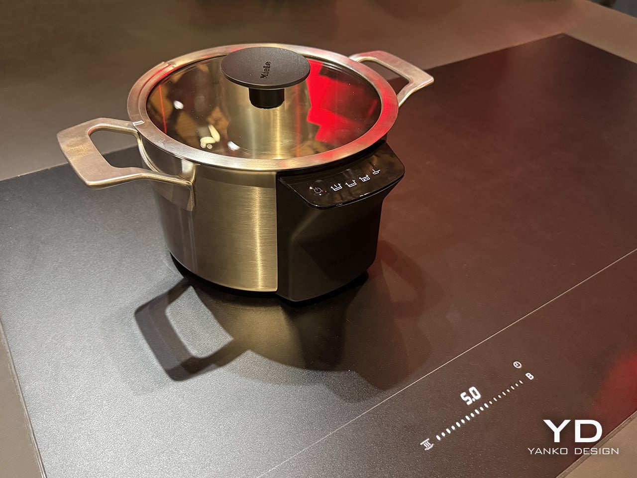
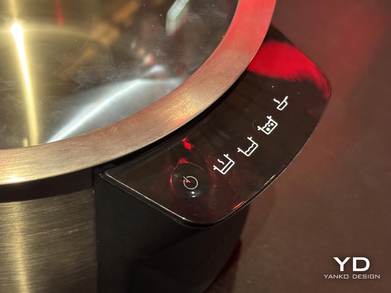
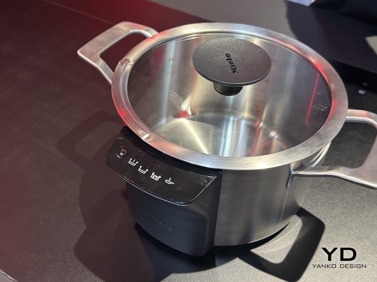
By integrating sensors and communication hardware directly into its cookware, Miele creates a live feedback loop between the pot and the induction hob. This connection allows the vessel to detect the telltale temperature spikes that precede a messy boil-over or the localized hot spots that lead to scorching. It then signals the hob to regulate its power automatically, transforming the simple pot from a passive container into an active, intelligent partner in the cooking process. It is a sensible and deeply practical innovation aimed at creating a calmer, more forgiving kitchen.

Designer: Miele

The appeal of that idea becomes obvious the moment real food enters the picture. Caramel demands close attention because it can move from amber to acrid in seconds. Milk rises fast, stocks foam unpredictably, and sauces have a habit of catching at the base just when your focus shifts elsewhere. M-Sense is built around those ordinary kitchen disasters, which makes it feel refreshingly grounded. There is a lot of smart kitchen technology that promises convenience in abstract terms, but this system is easy to understand because it targets problems almost every home cook has experienced firsthand.

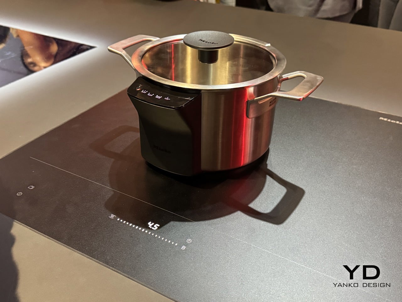
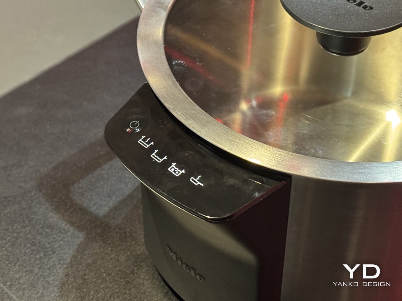
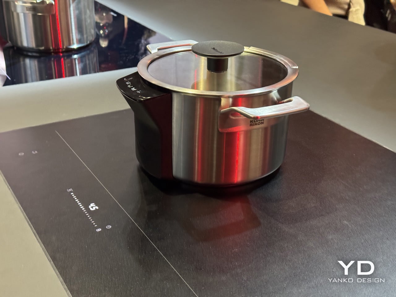
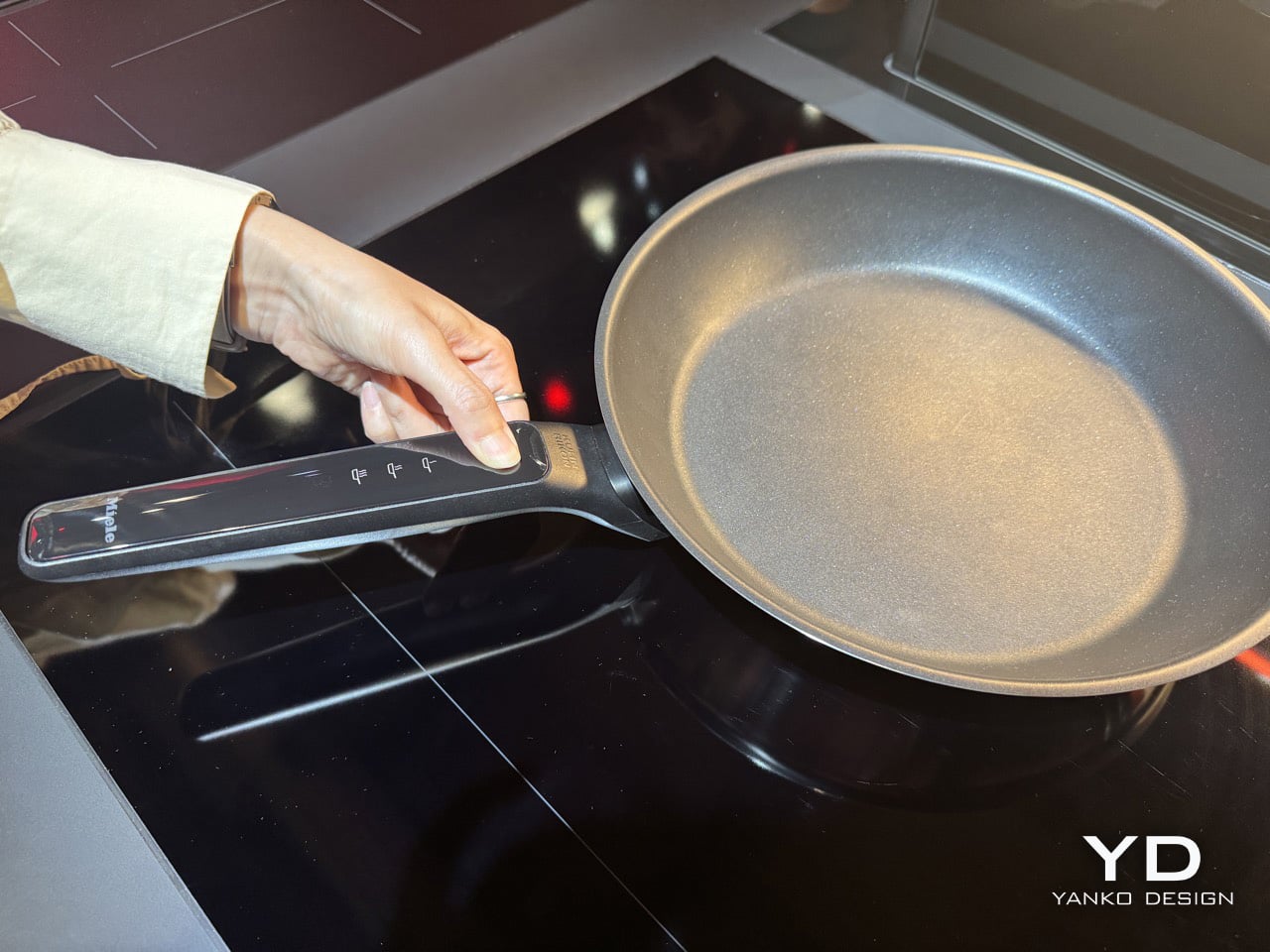
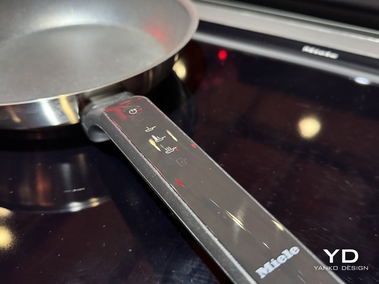
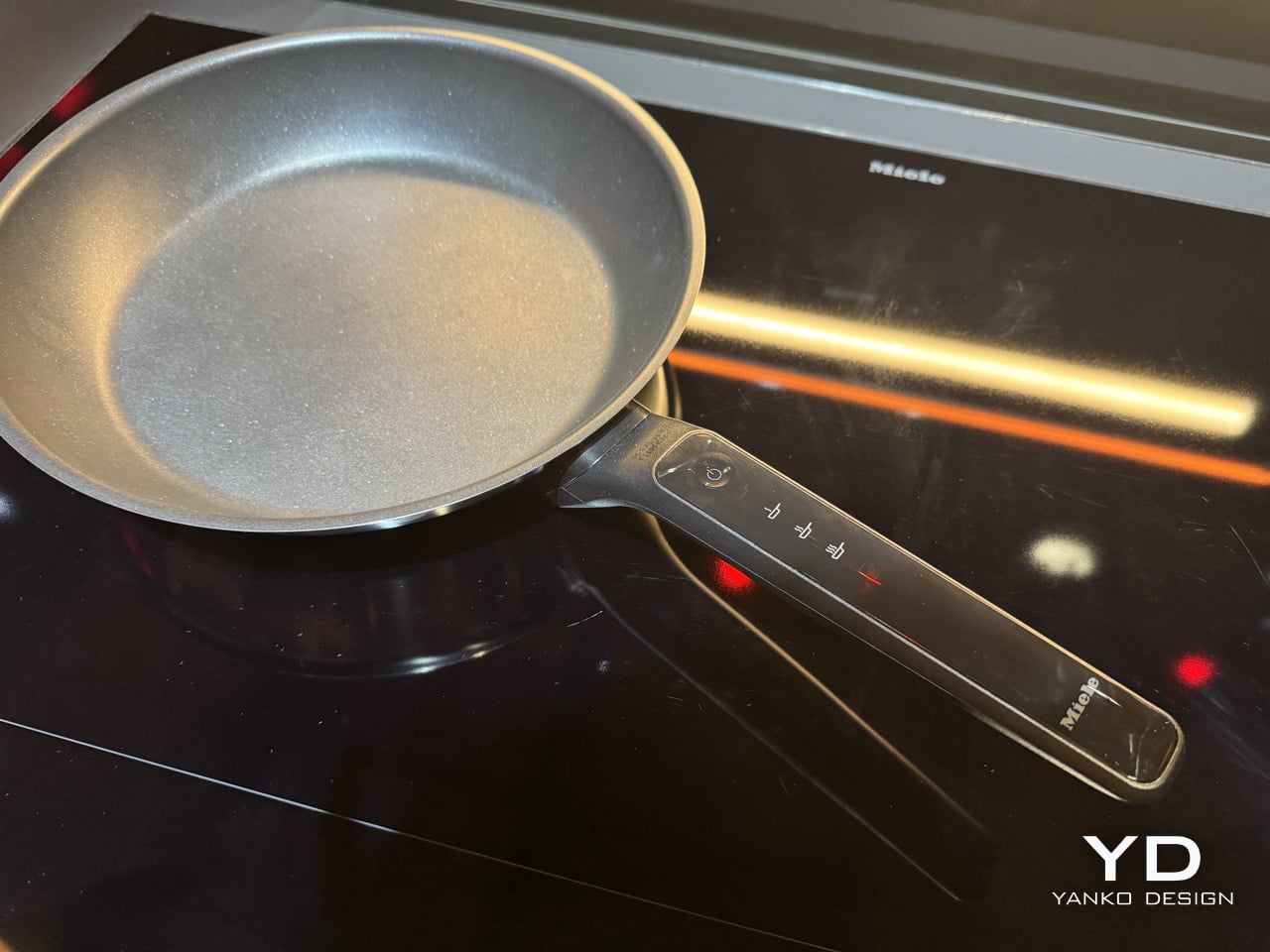
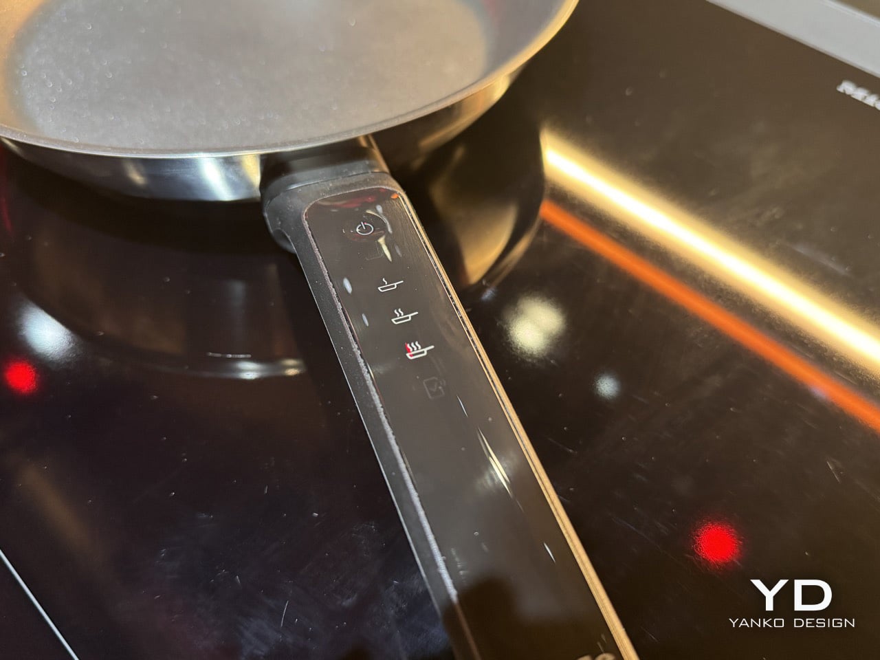
Miele is showcasing at least two pieces, a brushed stainless steel saucepot and a frying pan with a dark non-stick interior, and both reveal how carefully the interaction has been considered. The saucepot carries a compact touch interface integrated into the side of the vessel, while the frying pan places its controls directly into the handle where the thumb naturally lands. In both cases, the controls feel embedded into the object rather than added on as an afterthought, which helps the cookware read as premium kitchenware first and connected hardware second.

The induction hob at the center of the system is the KM 8695 FL MattFinish, a full-surface model finished in scratch-resistant MattFinish ceramic glass. Full-surface induction means the cookware can sit anywhere on the hob while maintaining the communication link, which matters considerably for a system built on continuous sensor feedback. Miele states the promise with welcome directness: No Burn. No Overboil. No Problem. Both outcomes trace back to a single cause, a vessel with no way to communicate with the heat source beneath it. M-Sense addresses that by making the cookware itself the sensing layer, so power adjustments happen before smoke or overflow enters the picture.

The Miele app extends the system beyond the counter, enabling remote monitoring, direct program transfer to the hob, and a recipe library that maps dish choices to actual hob settings. The cookware can connect to the app before it even reaches the hob, arriving on the induction surface already configured for the task at hand. That pre-loading capability closes a gap most connected kitchen products have only gestured toward. Working across hob, cookware, and app simultaneously, M-Sense operates as a coordinated platform rather than a loose set of individual smart features. It is a more coherent model than the kitchen tech category has typically managed to deliver.

For all the talk around smart homes, this is the kind of intelligence that feels worth having because it addresses a genuine friction point in daily life. Cooking often demands divided attention, especially in real homes where dinner happens alongside conversations, children, emails, and the dozens of small interruptions that shape an evening. A system that can sense trouble early and quietly intervene before a sauce burns or a pot boils over feels less like novelty and more like relief. Miele is showing the M-Sense collection in the EuroCucina section at Salone del Mobile, where visitors can see the cookware paired with its compatible induction setup as part of the brand’s broader vision for a more responsive kitchen.

The post Miele’s Smart Utensils Can Detect When Food Is Burning And Power Your Induction Hob Down first appeared on Yanko Design.
This Electrolux dishwasher lifts its bottom rack so you can load pots without bending down

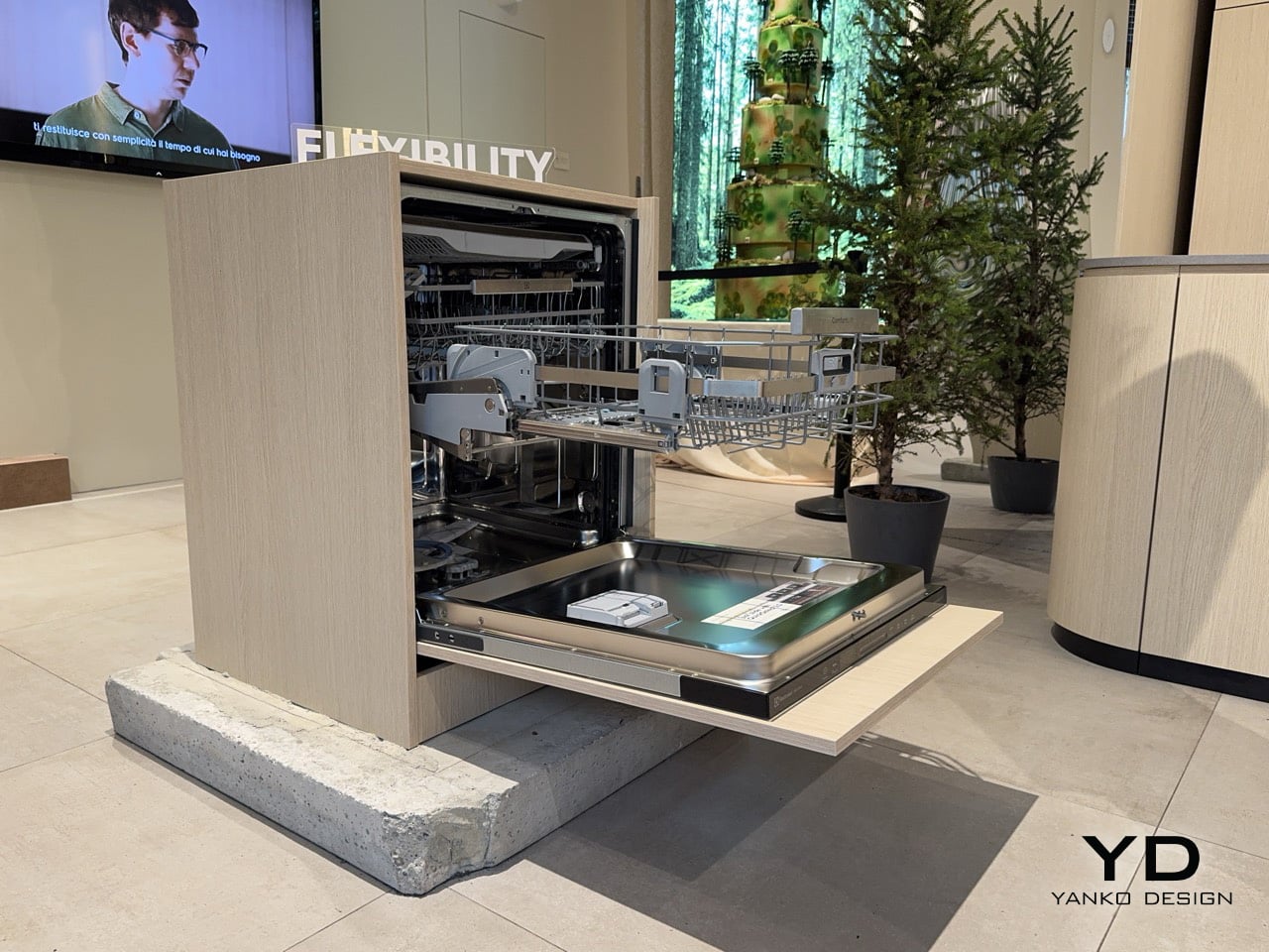
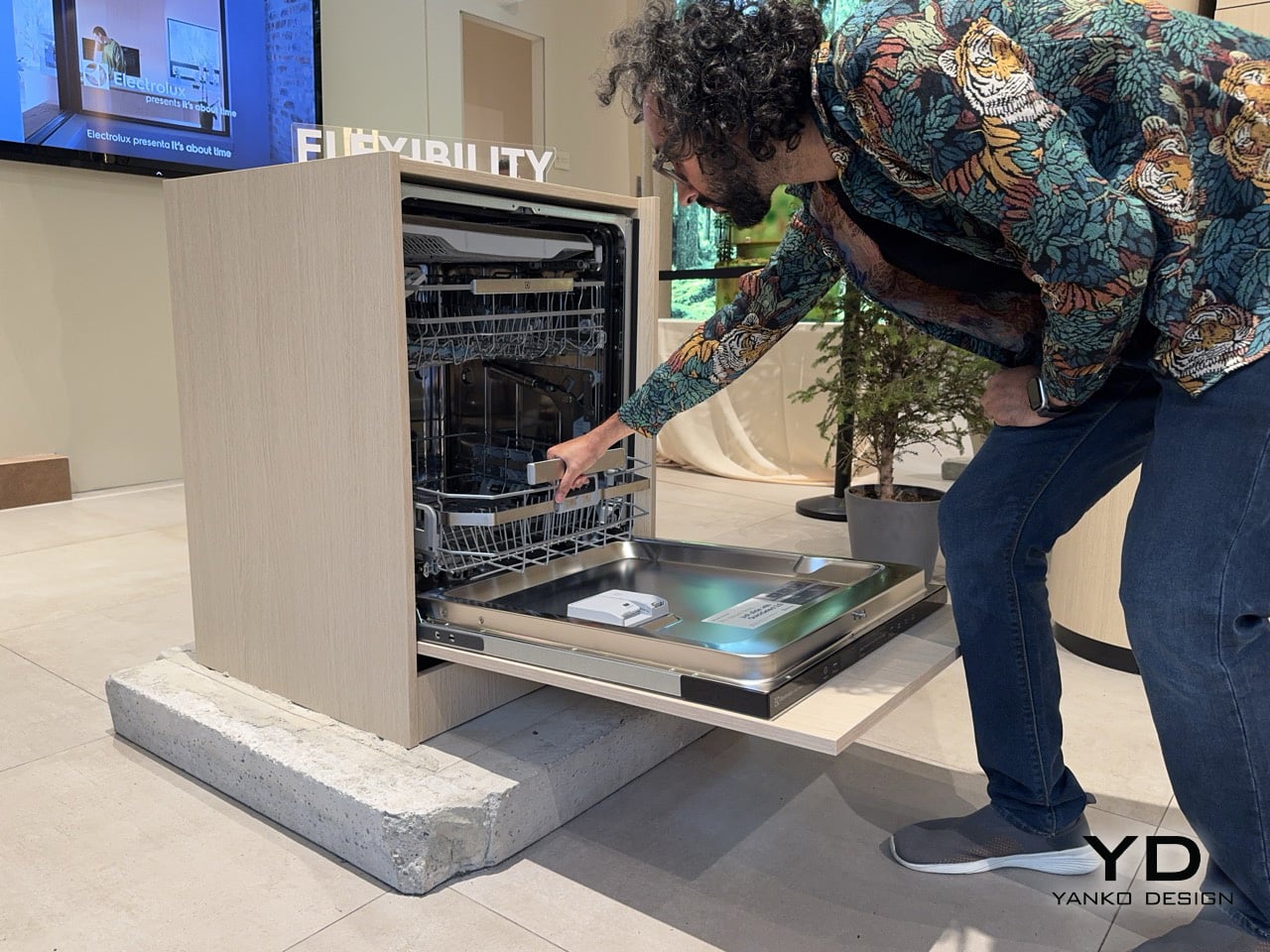
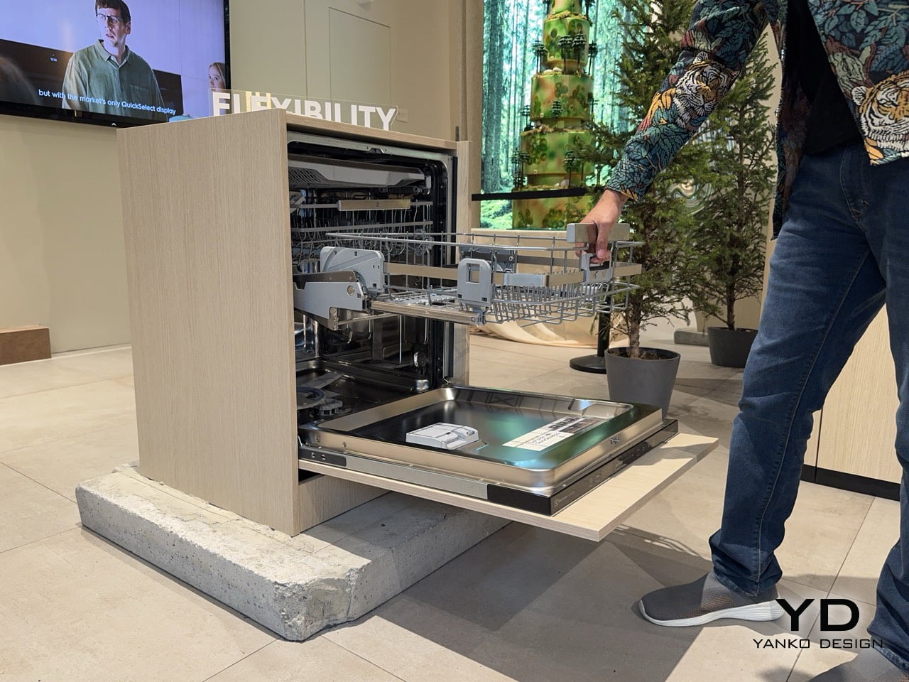
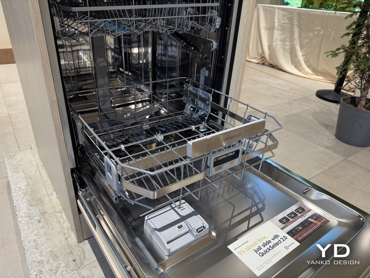
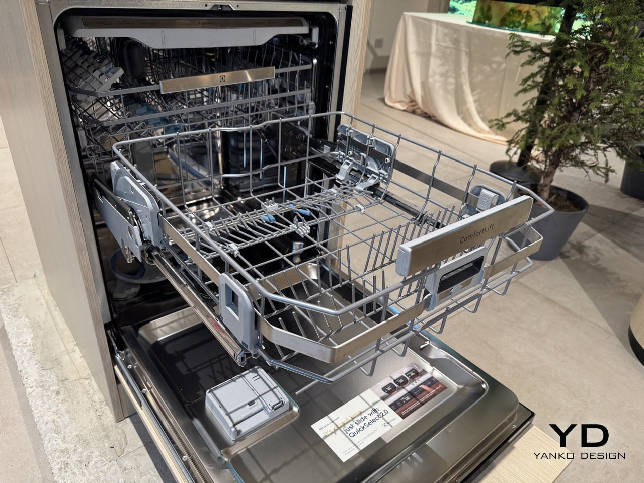
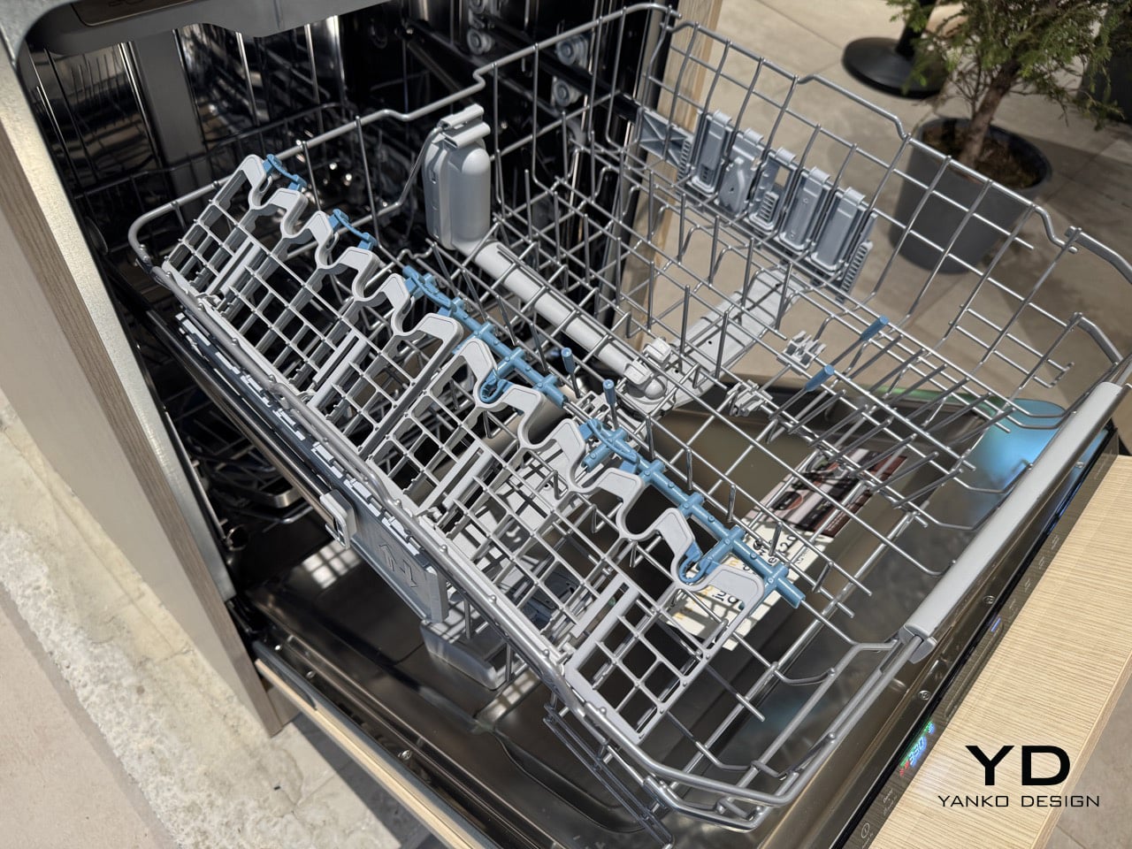
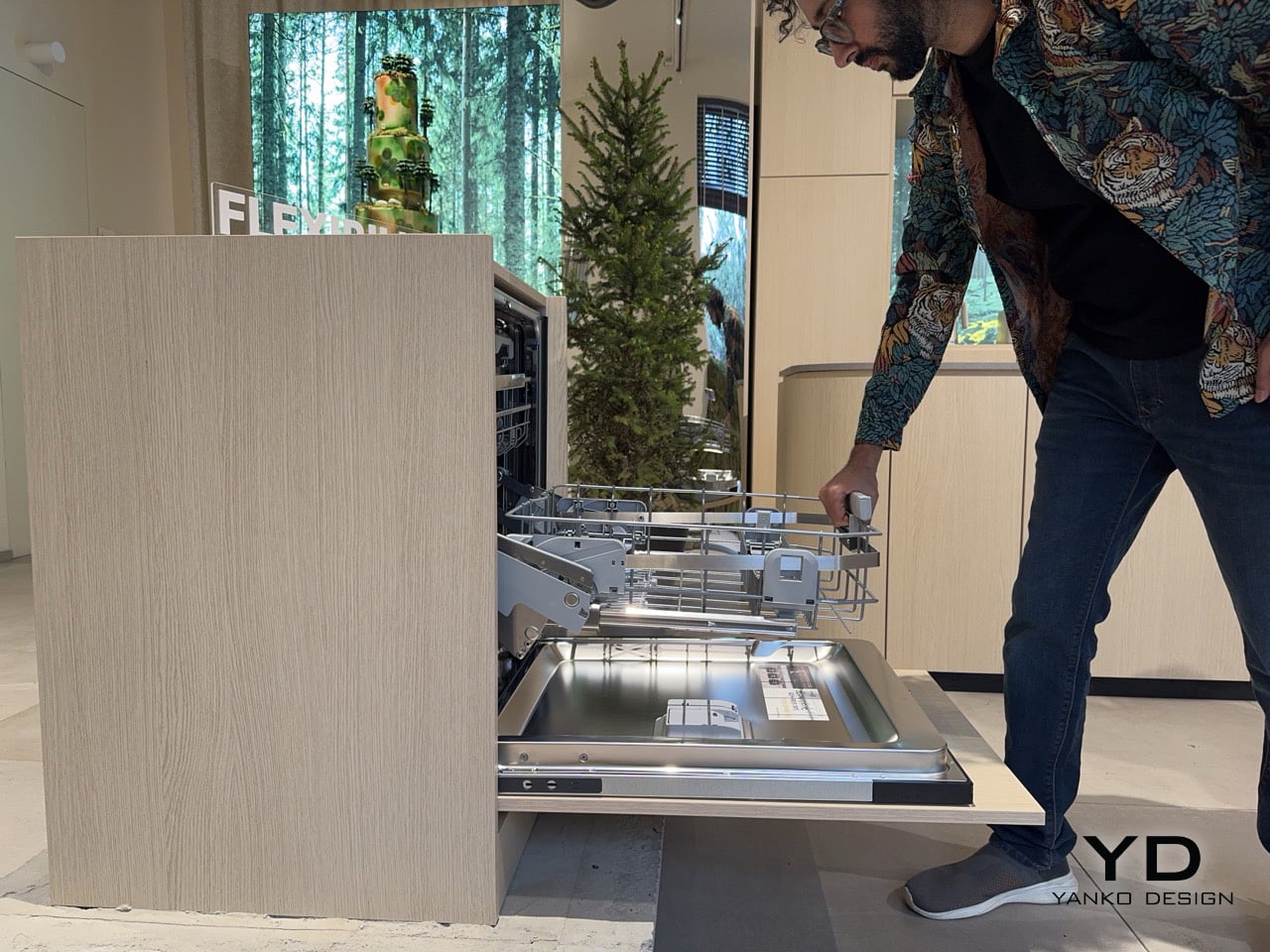
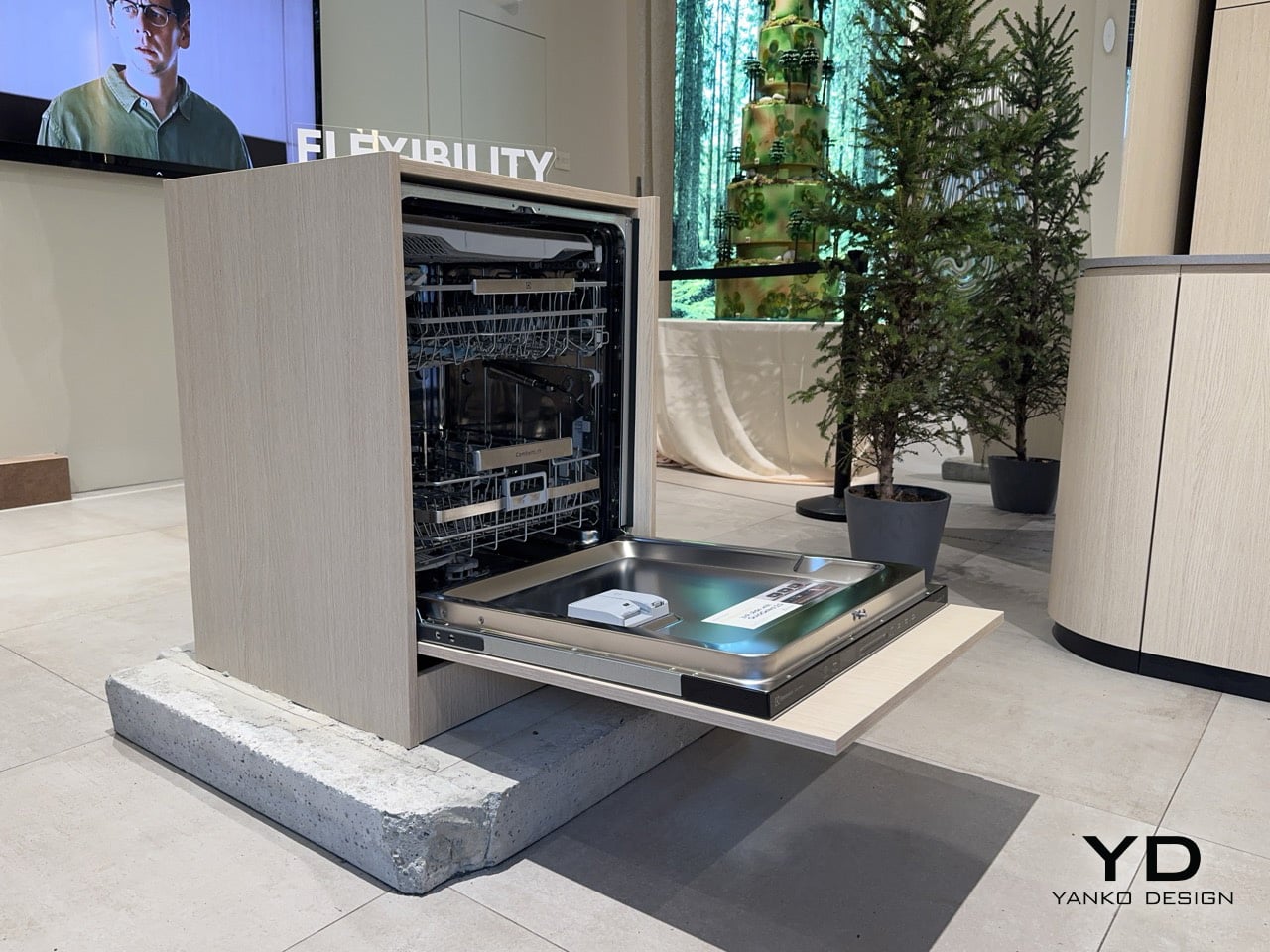
At some point, the bottom rack of a dishwasher stops being a minor inconvenience and starts being a genuine daily difficulty. For older adults and people who simply cannot bend for extended periods, loading the lower basket, which is where the heaviest cookware lives, means repeated stooping, reaching, and straightening back up with full hands. It is the kind of accumulated physical effort that kitchen appliance design has historically ignored entirely. Electrolux brought a direct answer to Milan Design Week: a lower basket that rises 25 centimetres on reinforced hinges at the squeeze of a trigger handle, meeting the user at a comfortable standing height. The feature is called ComfortLift, and it anchors the 800 series dishwasher at the heart of the brand’s Salone showcase.

The mechanism raises the lower basket to the upper basket’s level for faster, easier loading and unloading, with reinforced hinges tested to lift a fully loaded lower basket to that same height. The 800 series behind this feature delivers the cleaning power to completely remove baked-on or dried food residues on as little as 8.4 litres of water. At a fair saturated with conceptual objects and material experiments, what Electrolux demonstrated was something considerably more personal: a change to a small, daily physical struggle that millions of people live with quietly. The brand built serious cleaning performance around that ergonomic premise rather than treating accessibility as a secondary concern. Running at 42 dBA, with a noise class rating of B, the machine is also one of the quieter options in its segment.
Designer: Electrolux

The stainless steel handle integrates a trigger that initiates the lift in a single squeeze, making the operation one-handed and deliberate. Electrolux engineered the ComfortLift basket to carry up to 22 kilograms at the raised height, covering everything from a full load of dinner plates to a cast-iron braising pot. The reinforced hinge mechanism was tested to lift a fully loaded lower basket to the level of the upper basket, so the structural promise holds under real kitchen conditions rather than just showroom demonstrations. Pull the rack out, squeeze, let the basket settle at waist height, and load without contortion. The basket retracts just as smoothly, with none of the mechanical inconsistency that tends to undermine features which perform better on a spec sheet than in a kitchen.

DualZone runs two cleaning zones through the same cycle without changing water or increasing energy use, directing more water pressure at pots and pans in the lower basket while reducing it on delicate items above. A double-rotating spray arm with two nozzle types, one circular and one straight, delivers water simultaneously from multiple angles to break up stubborn residue. Electrolux had this independently tested by a third-party German institute using detergent tablets and a 90-minute cycle on a casserole with lasagna residues, with complete removal as the result. A water sensor detects the level of dirt and adjusts water consumption accordingly, while the AquaControl Waterstop System handles flood protection. Eight wash programmes span the range from a 60-minute express run to AUTOClean, which calibrates the cycle to the load automatically.

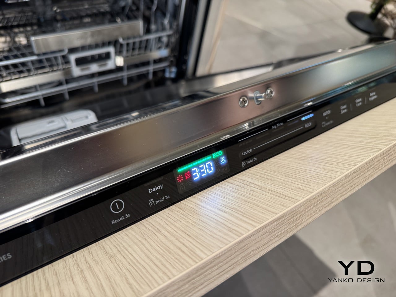
The smooth-gliding FlexiMax Plus upper basket has three folding rows for flexible loading, with anti-slip rubber grips and spikes to secure stemware and glasses and reduce the risk of collisions. The cutlery drawer has a deep middle section for cooking tools and an integrated knife holder, keeping flatware properly separated from the main wash zones. The QuickSelect display shows how energy use changes depending on the cycle length, and a slider lets the user choose the duration and see the energy graph update in real time, turning an invisible efficiency metric into something immediate and interactive. AirDry technology opens the door automatically at the end of the cycle, venting steam and drying dishes passively without a heating element. These details add up to a machine that rewards the kind of cook who treats the kitchen seriously, the same person most likely to own the cast-iron Dutch oven that ComfortLift was built to accommodate.

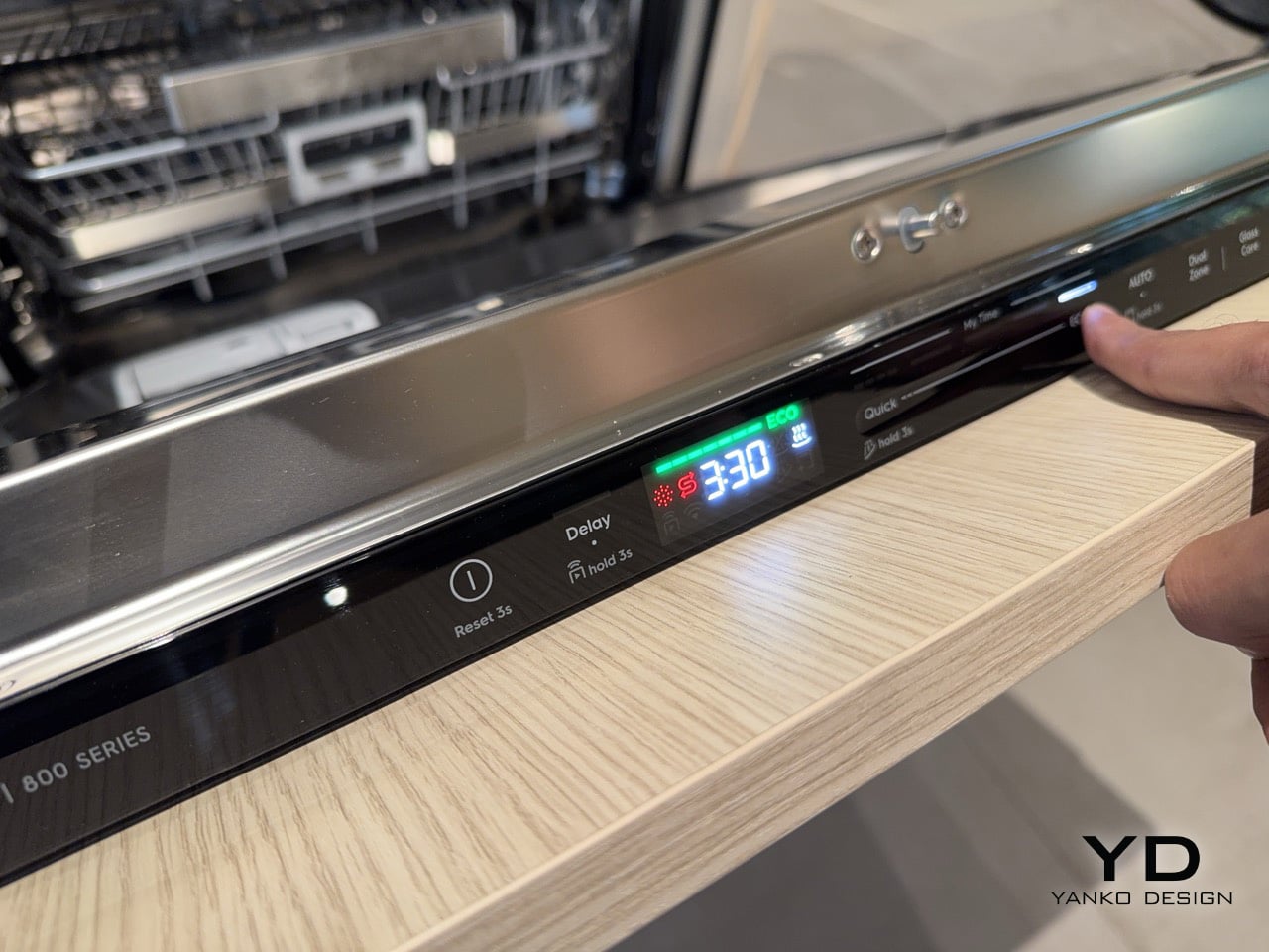
The controls sit on the lip of the door handle, positioned for direct visibility whether the user is standing in front of the machine or reaching across a counter. A sliding interface sets the cycle duration, and that choice governs energy and water consumption simultaneously, with the ECO programme activating at the longest end of the range. Electrolux made a deliberate decision to present time in 30-minute increments rather than the oddly specific figures that populate most dishwasher interfaces, the kind of readout that tells a user a cycle takes 68 or 52 minutes without explaining why. The shortest cycle runs at 30 minutes, while ECO extends to 3 hours and 30 minutes, drawing as little energy and water as the machine can manage across that duration. Rounding to half-hour intervals turns cycle selection from a guessing exercise into something legible, honest, and genuinely quick to act on.

Electrolux’s Design Week showcase, titled “The Swedish Home,” is running at Via Melzo 12 in Milan’s Porta Venezia neighbourhood through April 24th. The live format suits ComfortLift especially well, because no product photograph conveys the mechanism as clearly as watching it move once with a full rack. Across a week dominated by material experiments and future-facing concepts, Via Melzo 12 is presenting something built around a very specific, present-tense problem: that the most physically demanding daily interaction in the kitchen has gone largely unaddressed by appliance design for decades. ComfortLift is Electrolux’s argument that the most consequential design decisions in the home are often the least glamorous ones. It is a strong argument, and a well-engineered one.

The post This Electrolux dishwasher lifts its bottom rack so you can load pots without bending down first appeared on Yanko Design.