7 Best Eco-Friendly Designs That Celebrate Earth Day Better Than Any Campaign Ever Could

Earth Day has always had a visibility problem. It falls on 22nd April, and every April the campaigns are loud, the graphics are reliably green, and the sentiment fades well before the month comes to an end. Real change lives somewhere quieter; in the materials a designer chooses, in the lifecycle of an object, in the exact moment a product earns a permanent place in your life rather than a landfill. The seven designs here do more for the planet in daily use than most campaigns ever will.

Each one proves that sustainability is not a compromise; it is a design brief. The most honest form of environmentalism isn’t a hashtag or a product badge. It’s a cutlery set that removes the temptation of a plastic fork, a lamp that burns clean. These are objects built around ecological thinking, not layered over it. And on a day the world pauses to consider the planet, they make the most compelling case of all.

1. Wasteland Nomads: Bionic Tumbleweed Sower System – The Wind-Powered Desert Healer
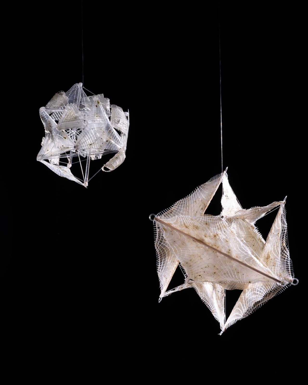
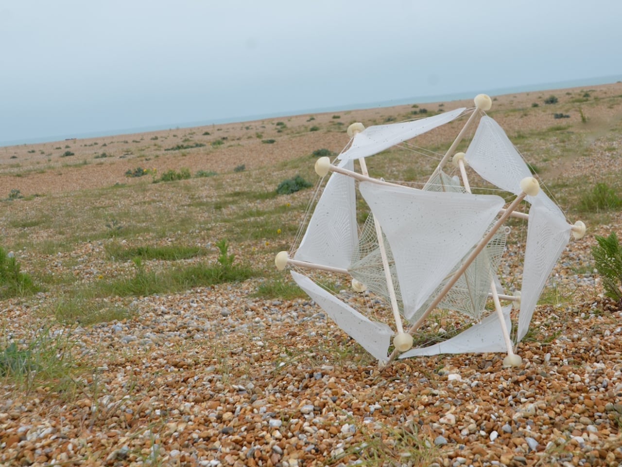
Designer Guo, a graduate of Central Saint Martins’ Material Futures program and a former collaborator with Google DeepMind, developed Wasteland Nomads alongside Daheng Chu through the University of the Arts London and Imperial College London. The premise is rooted in one simple observation: the tumbleweed has always worked with the desert, not against it. Her question was whether a designed object could do the same. The answer took the form of a biomimetic seeding device built entirely on passive robotics, with no batteries, no circuits, and no external power source required.

The structure is a lightweight biodegradable sphere of tensile support rods, with an outer skin of moisture-responsive biodegradable composite that houses seeds. When the device rolls into an environment where the humidity is right, the skin begins to break down, releasing seeds directly into the soil. It boosts soil oxygen, supports carbon sequestration, and by the end of its journey, the entire device has merged with the earth it traveled across. No waste, no remnants. Just restored land.

What We Like

  • Fully passive design requires zero energy input or an external power source
  • Completely biodegradable and leaves no trace after its journey ends

What We Dislike

  • Dependent on wind conditions, limiting use to specific arid environments
  • Still a design concept rather than a widely deployed practical solution

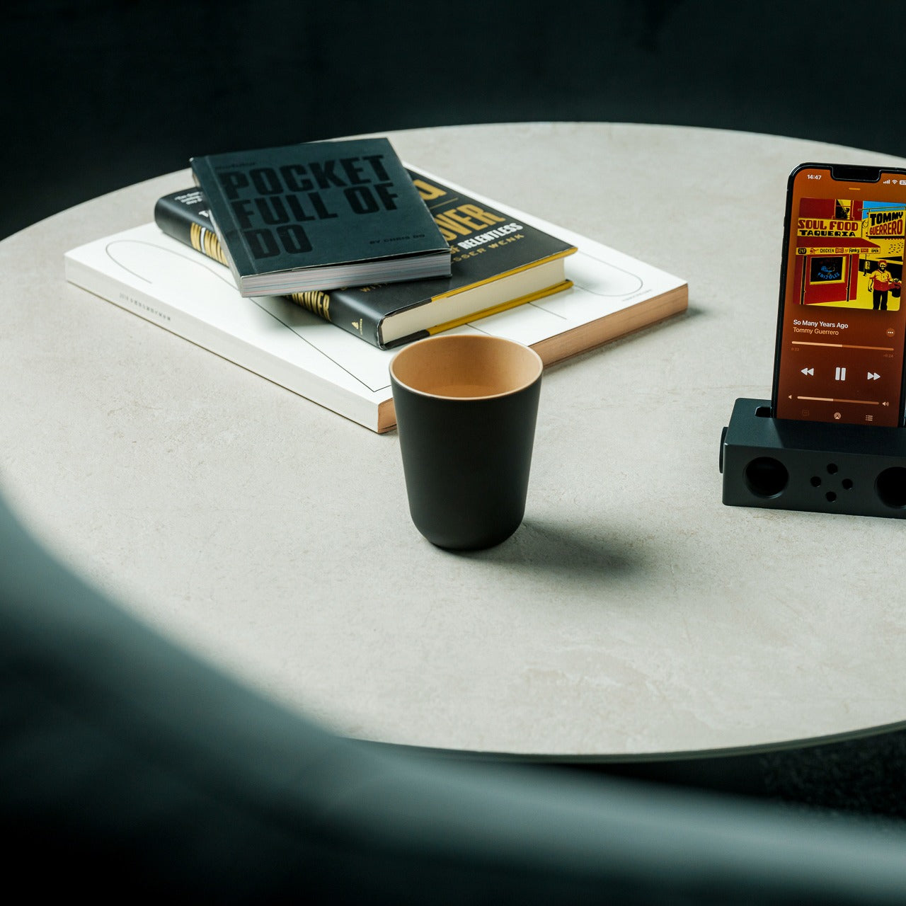
2. Earth-Friendly Stacking Cup – Sipping Without the Guilt
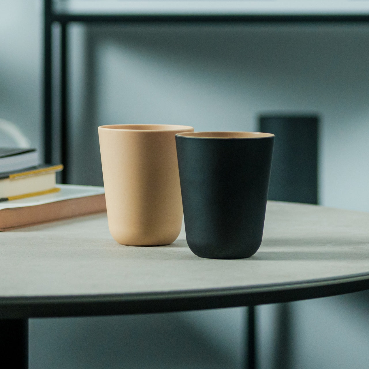
Most eco-friendly drinkware performs its sustainability too loudly or sacrifices aesthetics entirely in the process. The Earth-Friendly Stacking Cup does neither. Made from plant-derived biodegradable resin, it delivers a tactile experience closer to ceramic or wood than anything associated with conventional plastic. A harmless urethane coating adds matte black texture and water resistance, giving the cup a finish that feels genuinely premium. It’s the kind of object you keep on the counter, not buried at the back of a cabinet.

The material biodegrades through natural microbial action into water and CO2, meaning its end-of-life story is as clean as its visual identity. It’s safe for warm drinks and entirely free from plastic, making each use a quiet departure from the disposable cycle. For anyone who wants their daily rituals to carry a little more intention, this cup delivers that feeling without demanding any sacrifice in experience or design quality.

Click Here to Buy Now: $25.00

What We Like

  • Fully plastic-free and biodegrades naturally into water and CO2
  • Matte tactile finish rivals ceramic and wood in sensory quality

What We Dislike

  • Biodegradable resin may have durability limitations with prolonged heat exposure
  • Urethane coating requires gentle care to maintain its finish over time

3. Manu Matters Homeware – Waste Elevated Into Objects Worth Keeping
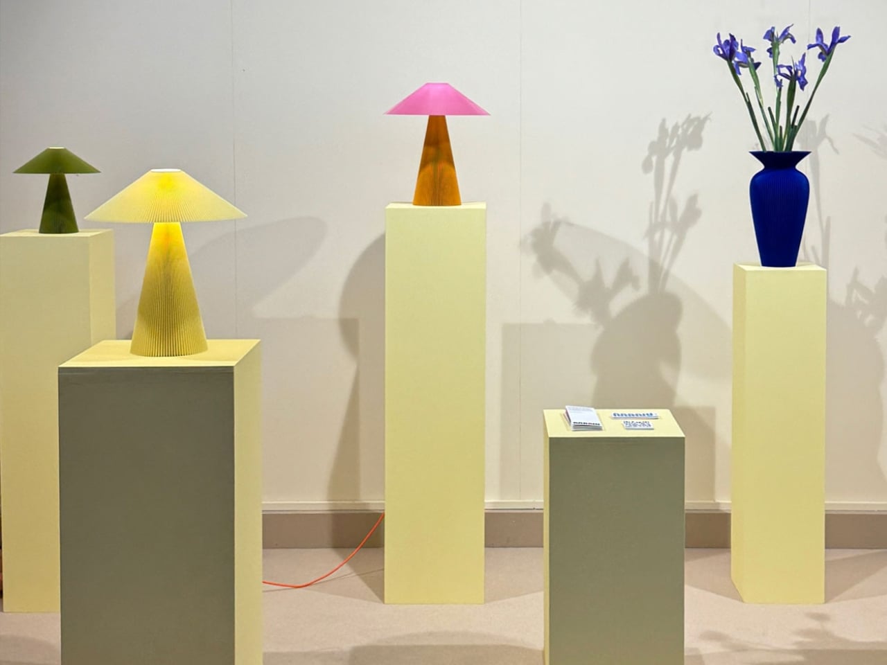
Swedish studio Manu Matters has earned recognition as a leading innovator in eco-friendly design by doing something most studios won’t attempt: making waste beautiful enough to keep. Using 3D printing, the studio transforms lemon peels, PET bottles, and cornstarch into durable, aesthetically striking home accessories. Each piece isn’t sold as a product but adopted, a deliberate shift in framing that encourages owners to form an emotional attachment, extending the object’s lifespan through connection rather than obligation.

The collection includes table lamps and vases, among them the “Teen Betty” in Klein Blue, Mustard, and Olive, and the “Lady Betty” in Peach and Eggshell. Both are priced at $250 USD and produced to order, reinforcing a small-batch, low-impact production model. Transparency labels on each piece detail the local production, upcycled materials, and independent-artist ethos behind the work. It is Scandinavian minimalism filtered through ecological conscience, resulting in objects that feel considered rather than compromised.

What We Like

  • Made-to-order production model eliminates overproduction and excess inventory entirely
  • Transparency labels provide full material and production process disclosure

What We Dislike

  • A $250 price point limits accessibility for a wider everyday audience
  • Made-to-order timelines may not suit buyers seeking immediate delivery

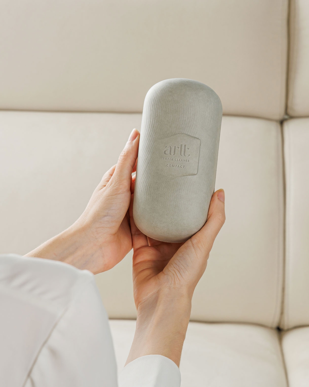
4. ARLT Paper Cleaner – The Lint Roller Redesigned From Scratch
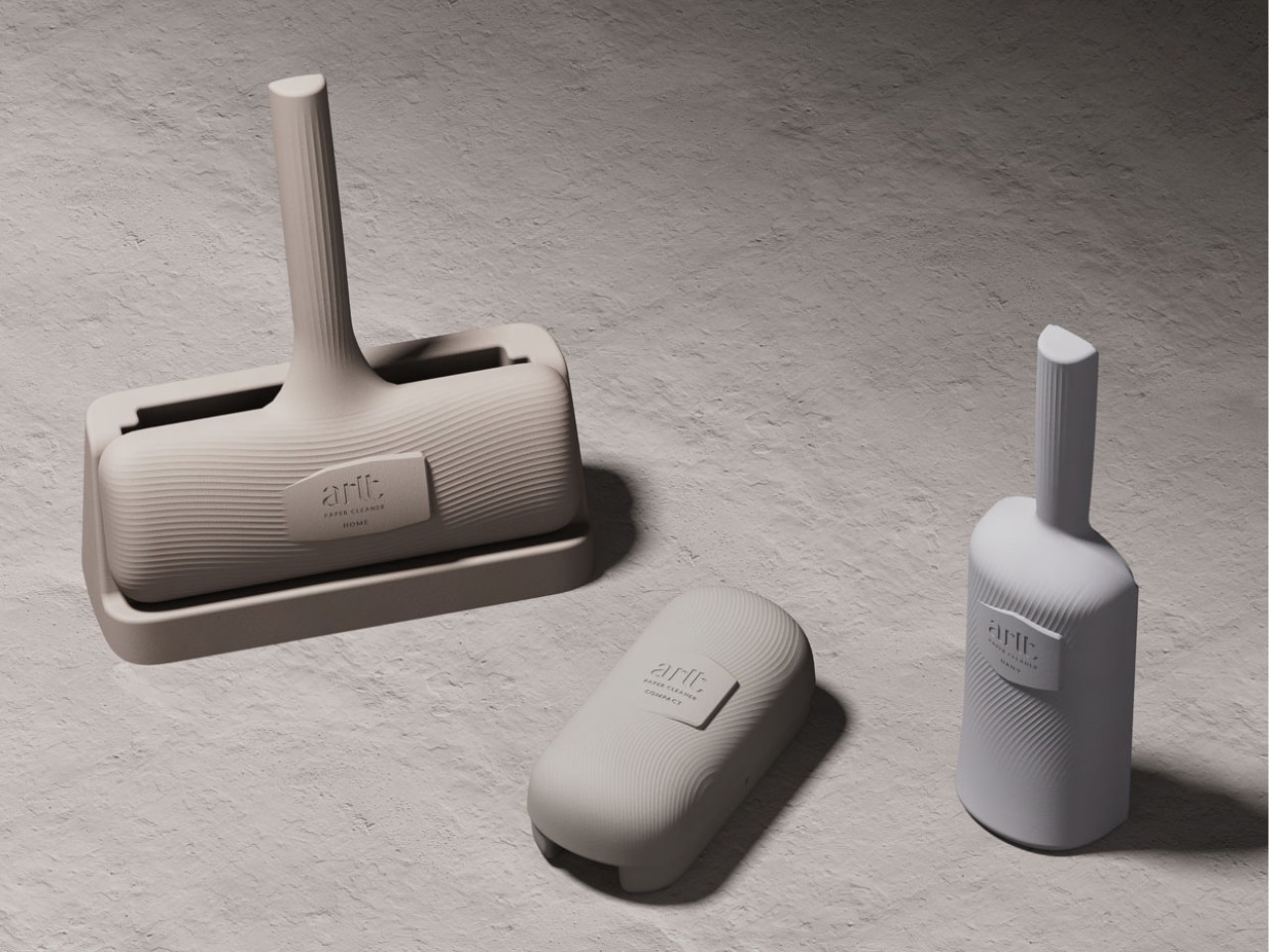
Nobody redesigns the lint roller. It works, so it stays. ARLT looked at that logic and disagreed. The Paper Cleaner is built entirely from molded pulp and bonded with a water-based adhesive, replacing conventional plastic tape with something fully recyclable and zero-waste. The cleaning surface is gentle enough for delicate fabrics and effective enough to handle the kind of lint situation that surfaces right before an important meeting. It does its job quietly and leaves nothing behind.

The design carries none of the apologetic quality that tends to follow eco-friendly alternatives. Sleek and minimal, the ARLT Paper Cleaner positions itself as a “Green High-End Brand for Life,” and it earns that positioning through both its material choices and its visual identity. It is the kind of everyday object that quietly raises expectations for what sustainable design can look like in the most ordinary corners of daily life.

What We Like

  • 100% paper-based and fully recyclable with a zero-waste end-of-life story
  • Gentle on delicate fabrics while remaining effective on dark clothing

What We Dislike

  • Paper construction may perform less reliably in humid or damp environments
  • Adhesive surface may vary in strength compared to traditional plastic tape rollers

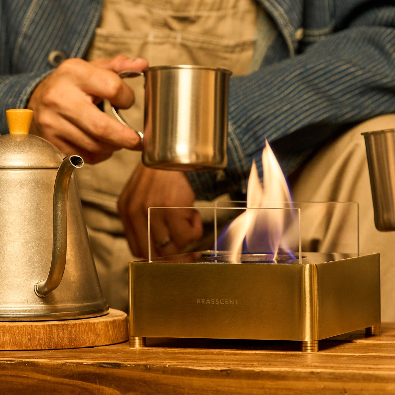
5. Harmony Flame Fireplace – Sustainable Fire, Real Atmosphere

There is no good substitute for a real flame. Electric simulations flicker unconvincingly, and candles burn out, but the Harmony Flame Lamp delivers the genuine article through a brass body crafted by artisans who make musical instruments. That construction heritage lends the piece a precision and resonance that mass-produced alternatives simply cannot replicate. Whether on a dining table or a patio, it transforms the mood of a space the moment it catches light and begins its play of shadow.

The fuel is bioethanol, a clean-burning option that produces no odor, no smoke, and no harmful emissions, removing the air quality concerns that come with traditional open flames indoors. No installation is required. The reflective brass surface amplifies the flame’s movement, turning light and shadow into a feature worth watching long after the meal is over. For anyone who values atmosphere without environmental compromise, the Harmony Flame Lamp makes fire a genuinely sustainable choice.

Click Here to Buy Now: $240.00

What We Like

  • Bioethanol fuel burns cleanly with no odor, smoke, or harmful indoor emissions
  • Handcrafted by instrument artisans for exceptional material quality and precision

What We Dislike

  • Bioethanol fuel is a recurring purchase that adds to the ongoing cost of use
  • Open flame requires careful placement and consistent supervision at all times

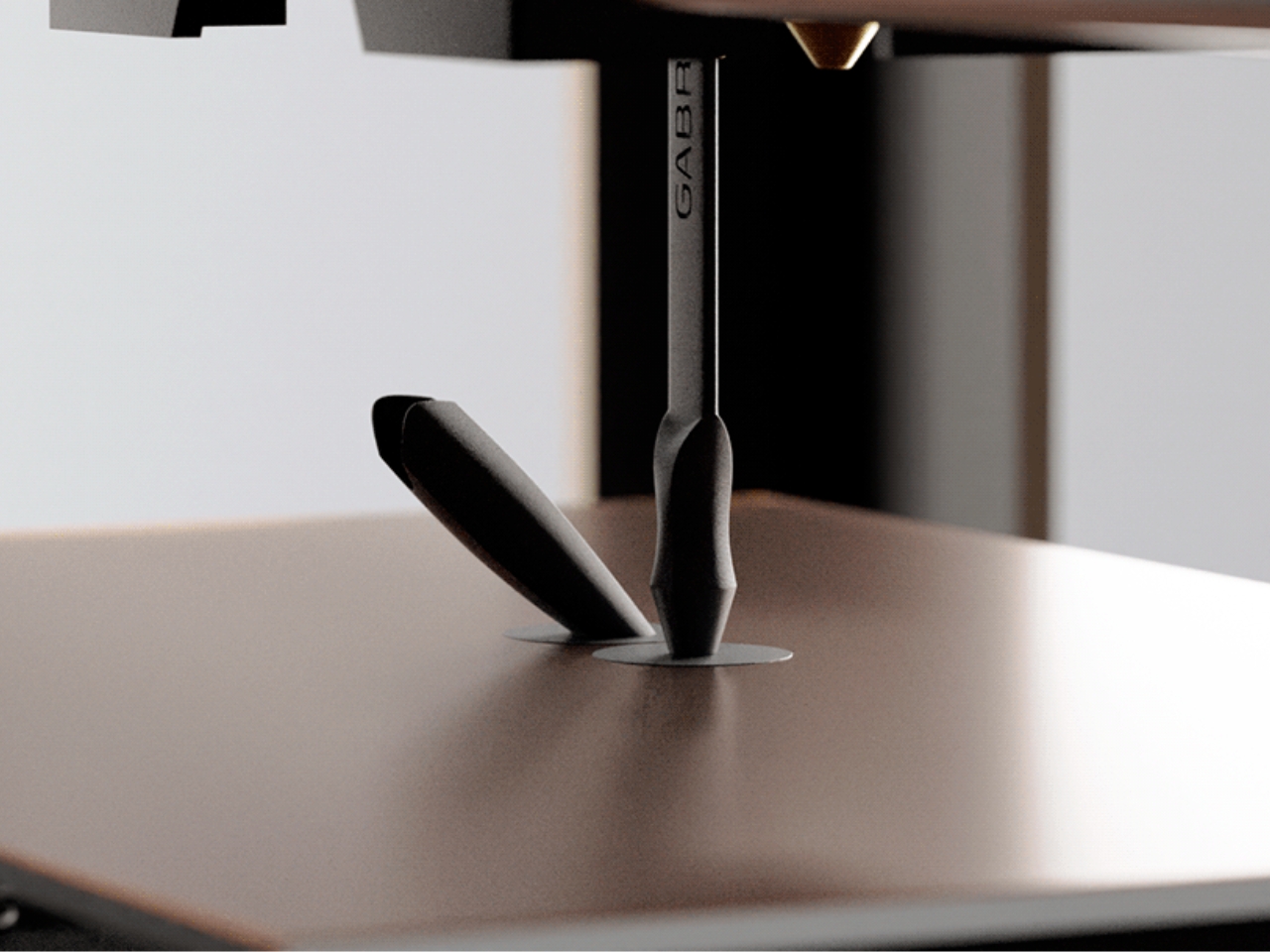
6. Da Vinci Pencil
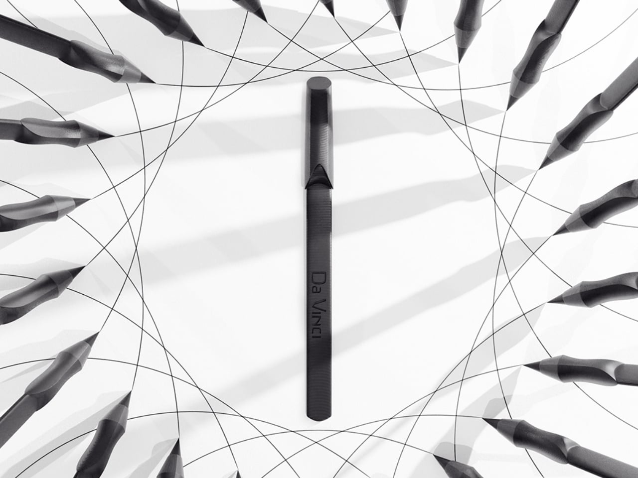
The most sustainable object is always the one you never have to replace. The Da Vinci Pencil builds its entire identity around that idea, using 3D printing technology to form a minimalist writing tool from PLA-CF, a composite of Polylactic Acid and Carbon Fiber that delivers strength and featherlight performance in equal measure. Under normal use, it lasts seven to ten years, quietly replacing dozens of conventional pencils over its lifespan without sharpening, refilling, or any of the routine waste that traditional writing tools generate.

The high-performance metal alloy nib writes with the smoothness of graphite, while the thin ergonomic profile doubles as a bookmark, sitting cleanly between pages without stretching the spine or preventing the cover from closing. It is the kind of dual-purpose thinking that makes a product feel genuinely considered rather than cleverly marketed. The Da Vinci Pencil doesn’t ask you to compromise on the writing experience in exchange for its environmental credentials. It makes the case that the two have never needed to be in conflict.

What We Like

  • Metal alloy nib lasts 7-10 years without sharpening or refilling, eliminating ongoing waste
  • Dual function as a writing tool and a bookmark maximizes utility in a single, minimal form

What We Dislike

  • Higher upfront cost compared to conventional pencils may be an initial barrier, despite the long-term value
  • PLA-CF construction lacks the familiar wood texture that many associate with a quality pencil feel

7. Lollo – The Cutlery Set That Actually Lives in Your Bag

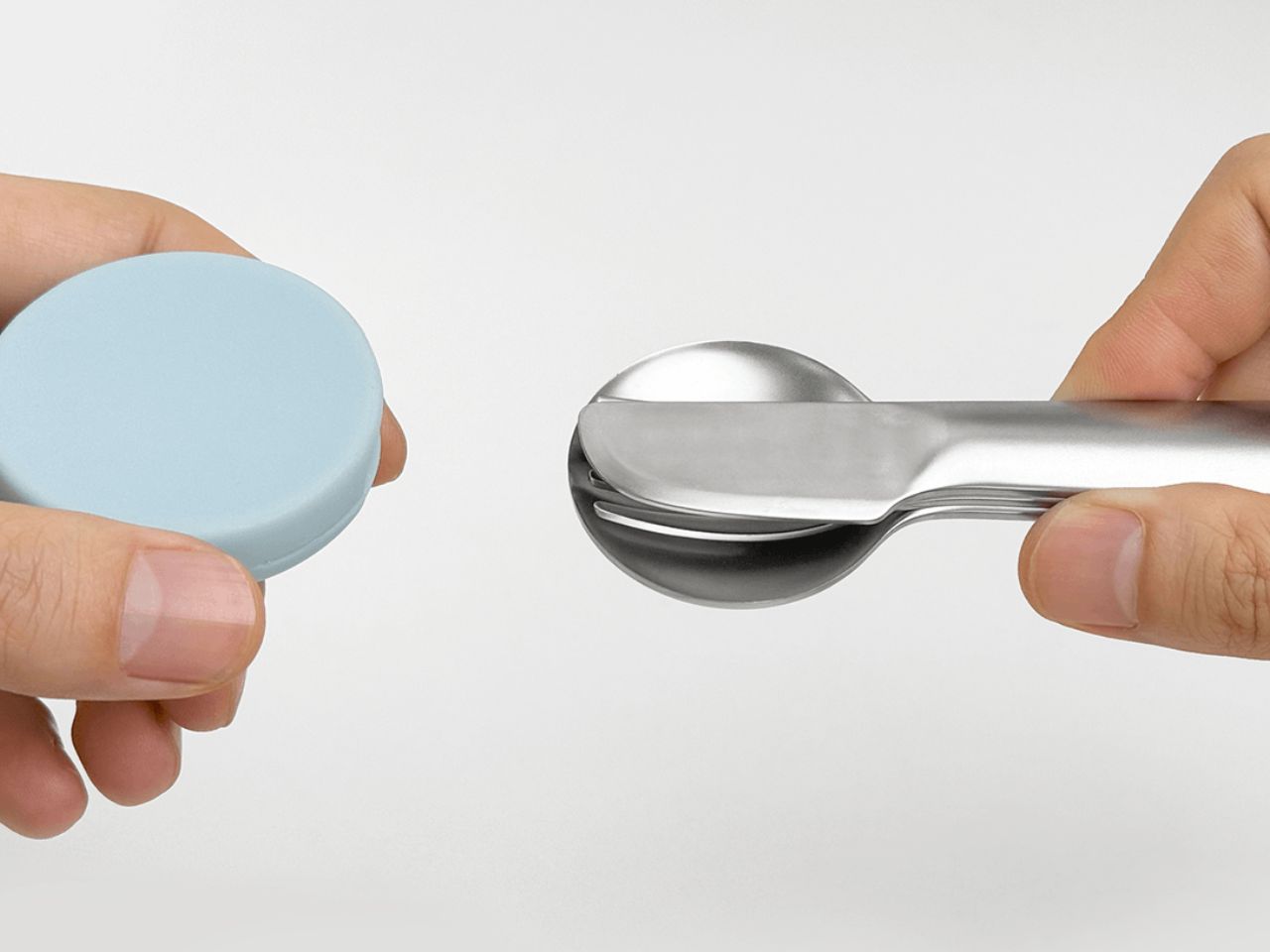
Lollo addresses the most consistent failure point in sustainable eating on the move: the moment when a plastic fork is the only available option, and you take it anyway. The set houses a spoon, fork, and knife in durable stainless steel, each with a subtly concave handle that allows all three pieces to nest into one compact, stackable unit. It’s a travel cutlery set that functions as a genuine daily carry item rather than a well-intentioned purchase gathering dust in a drawer.

A circular silicone cap made from recycled materials keeps the set clean between meals and contains mess after eating. The design makes no demands beyond the simple ask of being carried. In doing so, it removes one of the most common sources of single-use plastic waste from daily life, one meal at a time. Nothing about Lollo requires a lifestyle overhaul. It just works, quietly and consistently, every time you reach for it.

What We Like

  • Silicone cap made from recycled materials extends the set’s eco-friendly credentials
  • Stainless steel construction ensures durability across years of daily use

What We Dislike

  • A three-piece set may not cover every utensil need across all meal occasions
  • The silicone cap requires thorough cleaning to prevent residue buildup over time

Design Is the Most Honest Form of Earth Day Activism

Earth Day names the problem. Design addresses it. Each of the seven products featured here does something campaigns rarely achieve: it changes behavior without demanding awareness. The choice of a paper lint roller over a plastic one, a bioethanol flame over a synthetic glow, a stainless steel cutlery set over a disposable fork. These aren’t symbolic gestures. They are durable, daily decisions made possible by designers who treated the planet as a material constraint, not a marketing opportunity.

The most powerful shift in sustainable living isn’t ideological. It’s object-level. When the things you use every day are built with ecological thinking embedded into their design, the environmental impact accumulates quietly and consistently. These seven objects make that kind of living feel less like a discipline and more like a preference. That is what great eco-friendly design actually does. It removes the effort from the right choice and makes it the obvious one.

The post 7 Best Eco-Friendly Designs That Celebrate Earth Day Better Than Any Campaign Ever Could first appeared on Yanko Design.
5 Best Stationery Pieces That Turn Any Desk Into a Minimalist’s Dream Workspace

A good desk doesn’t happen by accident. Not one loaded with gadgets or overrun with branded accessories, but a workspace where every object earns its place. The stationery you choose sets the tone for how you think, write, and create. When a pen, tray, or ruler is designed with real intention, it stops being background noise and starts becoming an active part of the process itself.

The five pieces collected here share a common thread: they solve real problems without announcing themselves. Each one sits at the intersection of craft, function, and restraint. Whether you’re sketching, drafting, or writing longhand, these objects won’t compete for your attention. They’ll quietly make you better at whatever you’re doing. That’s the standard every great piece of stationery should meet, and these five clear it with ease.

1. Inseparable Notebook Pen

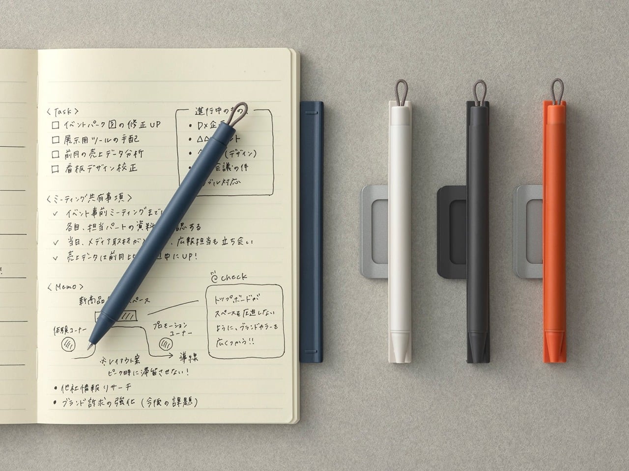
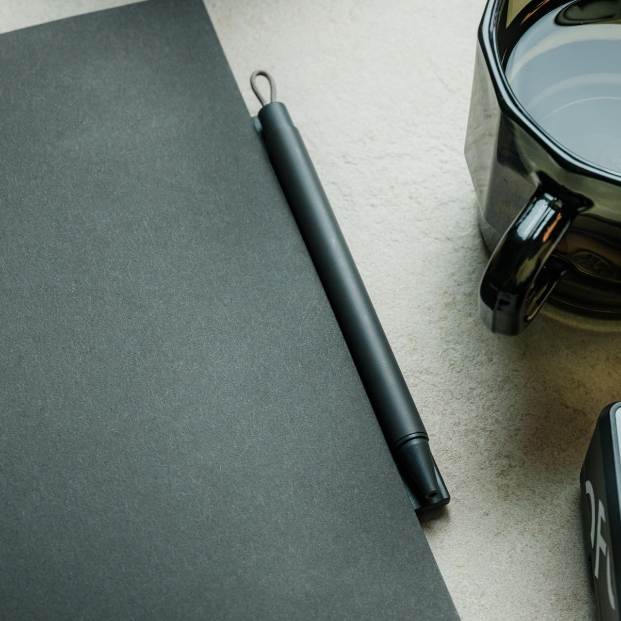
A pen that stays with its notebook sounds like a small idea, but the execution here is anything but minor. Built around a magnetic clip that secures directly to the cover, this piece eliminates the quiet, persistent frustration of reaching for a pen that isn’t there. The minimalist form is unobtrusive, the grip comfortable, and the ink flow smooth enough that writing feels less like a task and more like a reflex you’ve always had.

What makes this pen genuinely useful for daily writing is the built-in silencer, a detail that turns something mechanical into something refined. When you attach or detach it from the notebook, there’s no sharp click, just a quiet, satisfying motion. For anyone who writes regularly, that kind of sensory attention matters more than it should. The pen becomes an extension of the notebook rather than a companion to it, which means your ideas and the tool to capture them are always in the same place.

Click Here to Buy Now: $19.95

What We Like

  • The magnetic clip keeps the pen fixed to the notebook cover at all times, so losing your writing tool mid-session is no longer a possibility
  • The built-in silencer makes attaching and detaching feel considered and refined rather than mechanical

What We Dislike

  • The design works best when paired with its intended notebook, which limits its versatility as a standalone pen
  • The minimalist form may reduce compatibility with notebooks of varying cover thickness or material

2. Solid Copper & Brass EDC Clutch Pencils

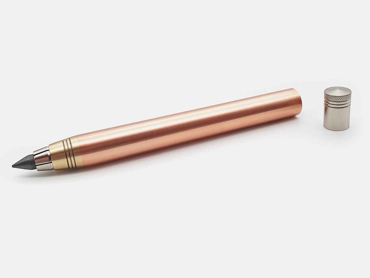
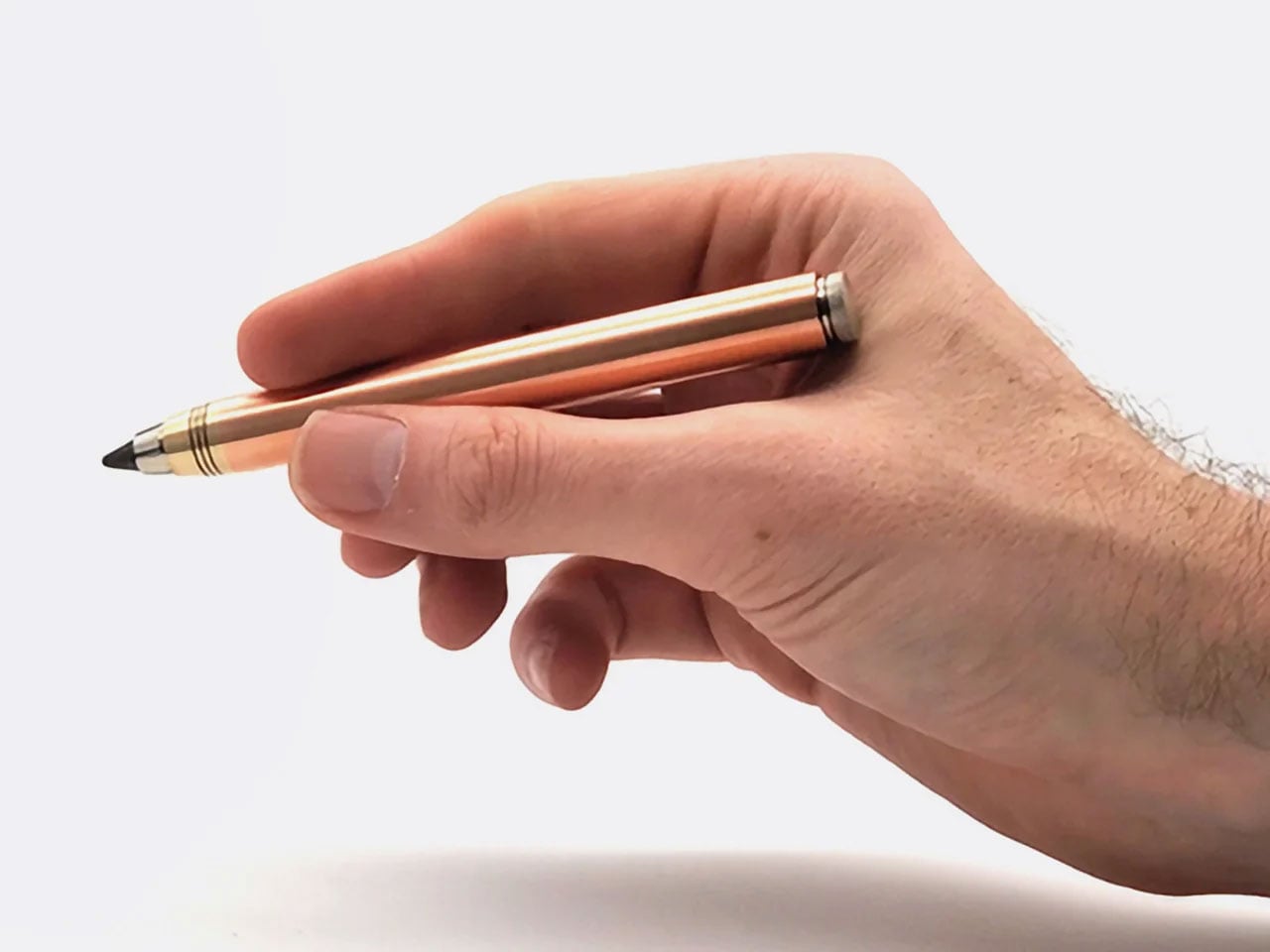
Nicholas Hemingway’s clutch pencils are machined from solid metal bar stock, not hollow tubes or plastic wrapped in metallic finishes, and that distinction matters from the first time you hold one. Copper weighs 8.96 grams per cubic centimeter, and brass sits at around 8.5. Hemingway has built his entire design philosophy around those densities. The mass of the metal body reduces the pressure you need to apply to the page, a concept he calls gravity-feed, making longer creative sessions far less fatiguing on the hand.

The 10th anniversary collection includes three pencils: the 5.6mm Copper and Brass Hybrid at 58 grams for shading and life drawing, with a built-in lead sharpener in the push button, and the 2mm Precision series in both brass and copper at around 30 grams each for technical drafting and fine-line illustration. Hemingway ships each version with a specific lead grade matched to its intended use, so you’re never mid-workflow having to swap. Both formats are fully compatible with any lead brand, making them as practical as they are beautifully crafted.

Click Here to Buy Now: $79 $115 (31% off). Hurry, only 26/50 left!

What We Like

  • The gravity-feed approach uses the weight of the metal body to reduce hand fatigue across long drawing or writing sessions
  • Each pencil ships with a lead grade selected to match its intended use, removing the guesswork entirely from setup

What We Dislike

  • The solid metal construction makes these significantly heavier than standard options, which won’t suit every hand or working style
  • The price point of hand-machined tools will be a barrier for casual or occasional users

3. KNOB. Pen Tray

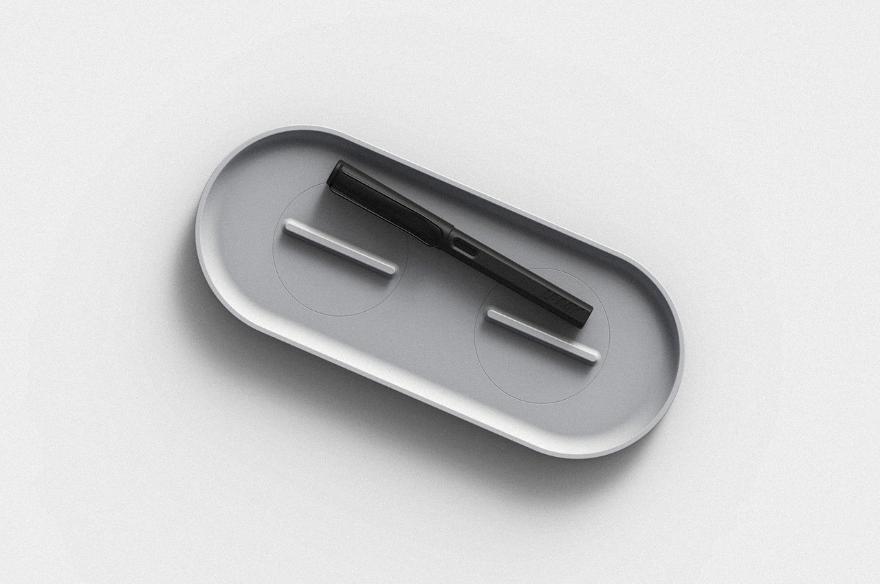
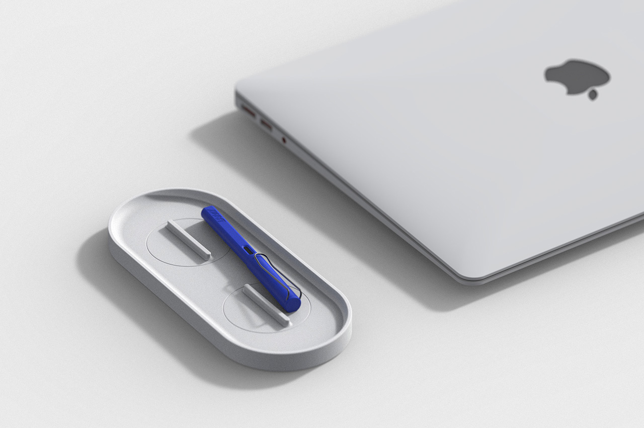
Changho Lee’s KNOB. Pen tray is one of those rare desk accessories that rewards both looking at and actually using. The form is clean and minimal with rounded edges, but the real story lives in the knobs, borrowed from the design language of gas burner controls and reimagined as adjustable dividers inside the tray. Those knobs let you reconfigure the interior space in any direction, depending on what you’re organizing and how you want to arrange it on a given day.

For anyone who cycles between different tools, the KNOB. tray removes the need for multiple organizers competing for desk space. One tray handles everything because you can reshape its interior for whatever you need at any given moment. That kind of adaptable functionality is genuinely rare in desk accessories, which tend to be fixed in their layouts and unforgiving when your needs shift. The visual result is a tray that always looks intentional, regardless of what’s inside it or how the internal dividers have been reconfigured.

What We Like

  • The adjustable knobs let you customize the internal layout in any direction without tools, additional parts, or a second organizer
  • The minimal aesthetic keeps the tray from visually cluttering the desk, no matter how it’s currently configured

What We Dislike

  • The knob-based adjustment mechanism may feel fiddly for users who reorganize their setup frequently throughout the day
  • The compact footprint may not comfortably accommodate larger or unusually shaped stationery items

4. Eco-Friendly Pencil Sharpener

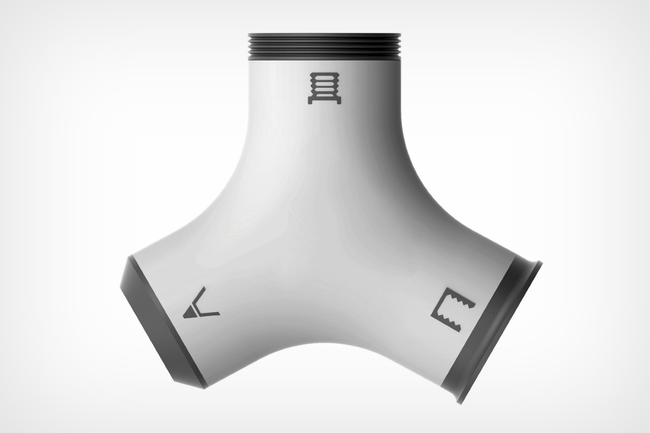
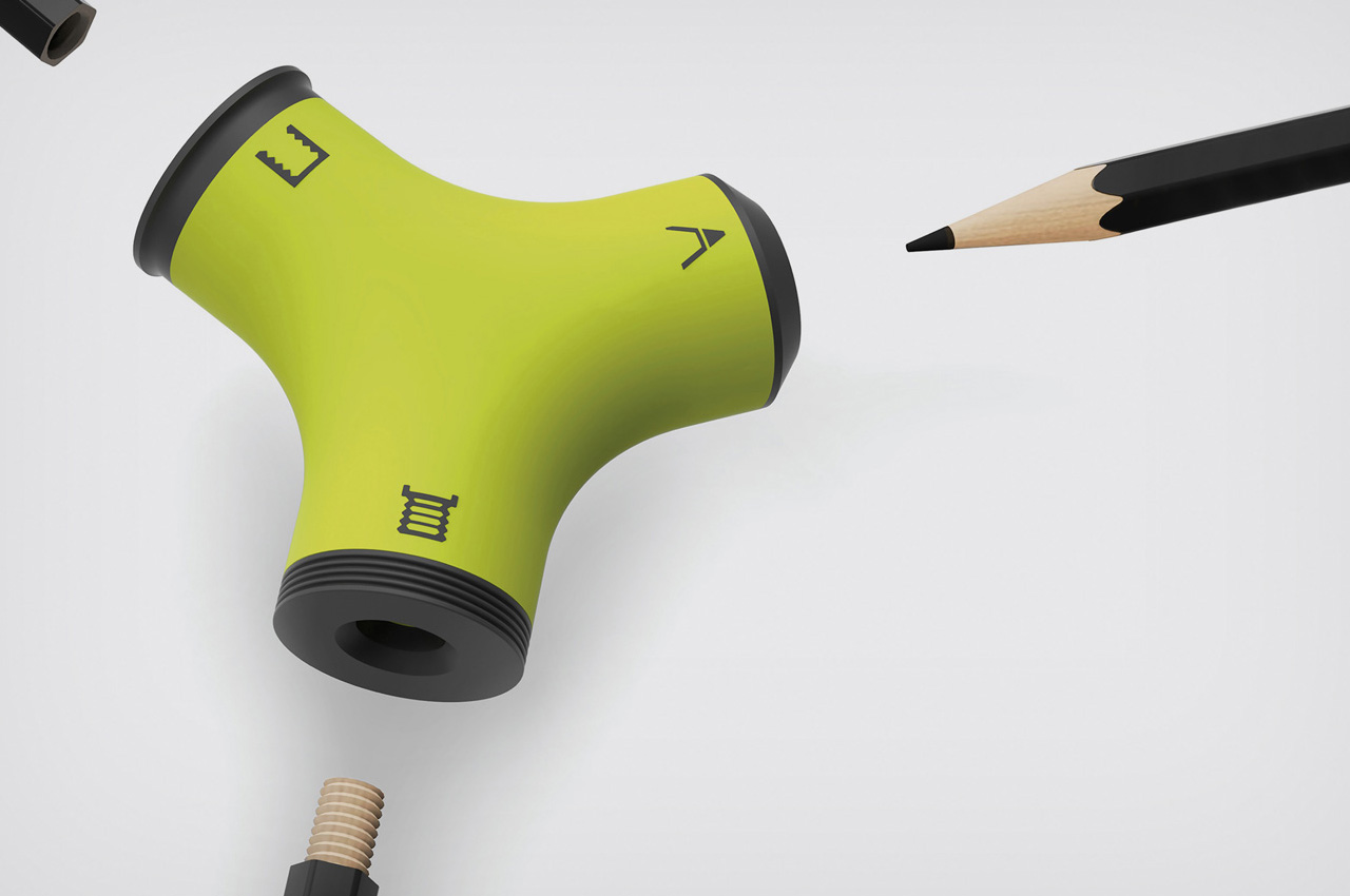
Wang Cheng’s Eco-Friendly Pencil Sharpener is a Red Dot Design Concept Award winner built around one precise and clever observation: pencil stubs don’t need to be discarded. With three sharpening zones, the sharpener handles conventional sharpening but also threads and taps pencils, turning them into wooden screws that connect end to end. A stub that would otherwise be thrown away becomes usable again the moment you screw it into a larger pencil, extending its life without any additional materials or waste.

That mechanism is genuinely satisfying to use, and it shifts how you think about pencils entirely. Threading one end and screwing two together feels intuitive after the first attempt, and the result is a longer, more comfortable writing instrument that has a second act built in from the start. For anyone who goes through pencils regularly, whether sketching, drafting, or writing by hand, this sharpener reframes the stub not as the end of something useful but as the beginning of another productive session.

What We Like

  • The threading and tapping mechanism extends the life of pencil stubs meaningfully, reducing material waste without requiring anything extra
  • Winning the Red Dot Design Concept Award confirms that the idea is executed as well as it is inventive

What We Dislike

  • The three-zone sharpening system introduces more complexity than most casual users will need or ever explore
  • Screw-together pencils may feel slightly uneven in the hand compared to a single, uniform pencil body

5. Quiver Ruler

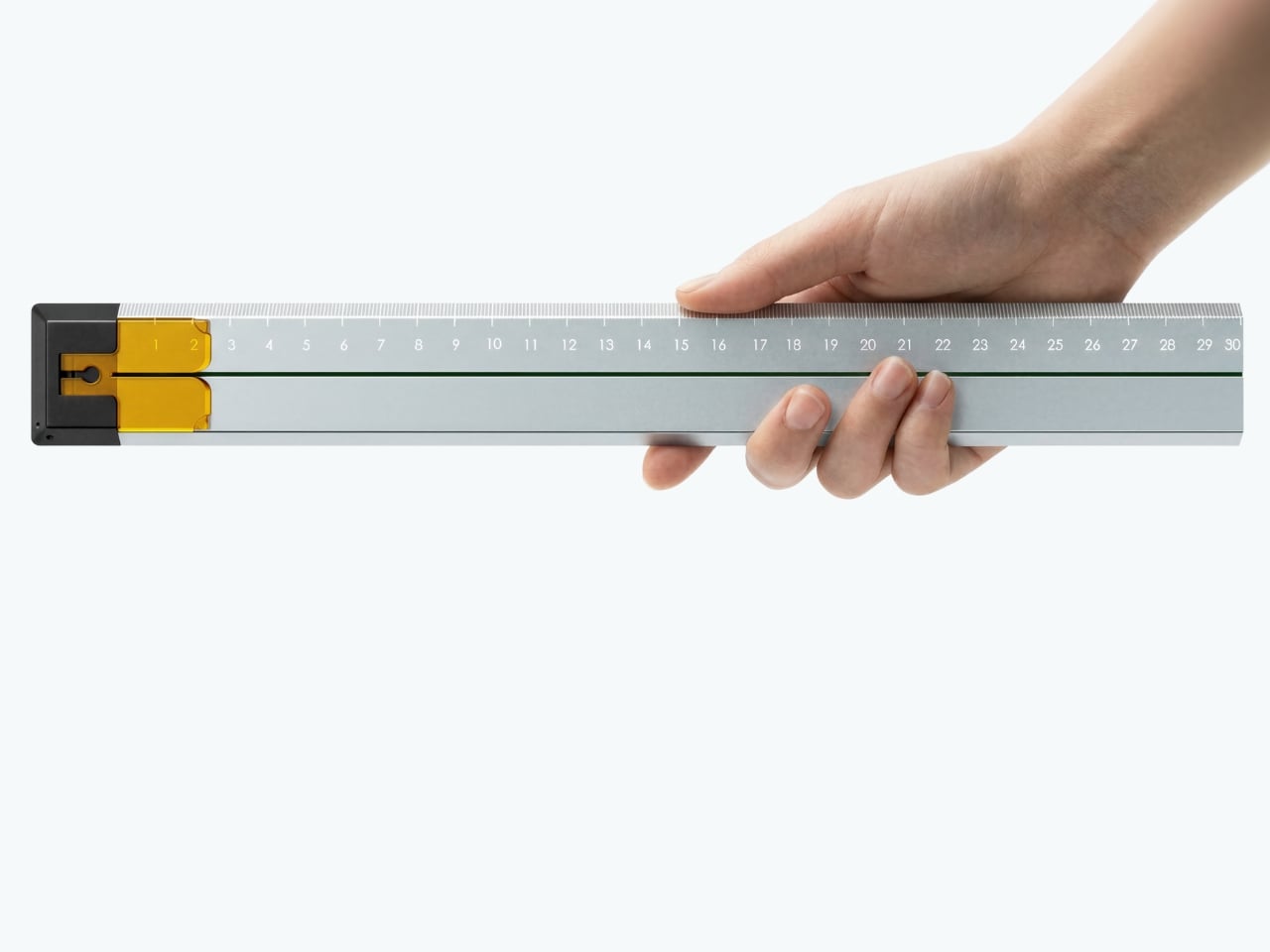
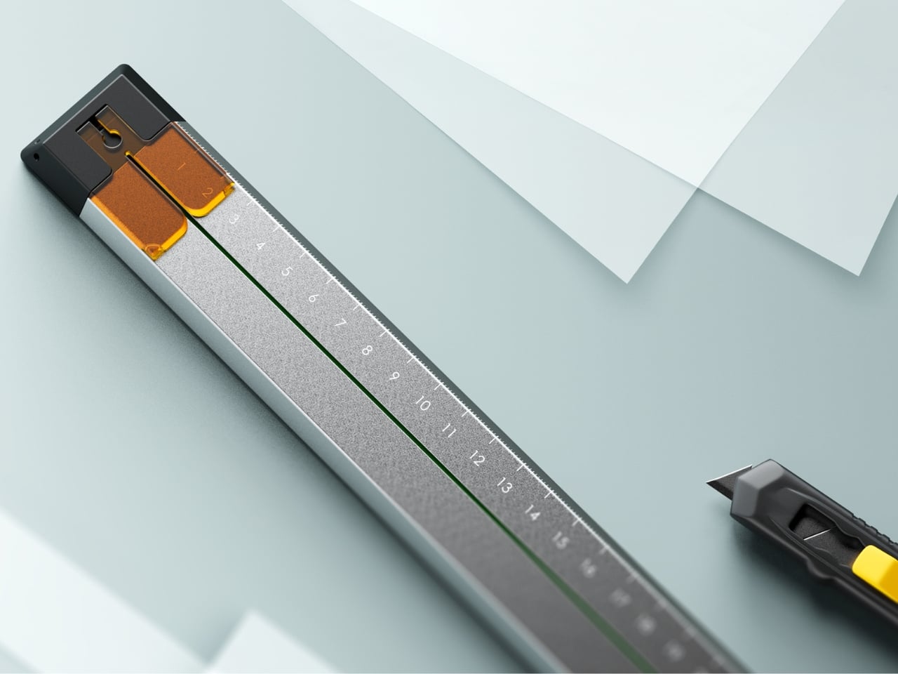
Tunir Maity’s Quiver is an anodized aluminum ruler built for people who actually cut with one, not just measure. It has a clip mechanism that holds paper in place, a blade slit that guides your cut in a straight line, and a weight distribution that favors the cutting end so you don’t have to press down as hard. Made for over 300 cuts with recyclable plastic components, Quiver doesn’t treat shaky hands or imprecise cuts as user failures. It treats them as design problems worth solving properly.

Beyond its cutting functionality, Quiver includes a carabiner attachment for clipping to a bag, which makes it genuinely portable rather than just theoretically so. The anodized aluminum finish gives it a premium presence on any desk, and the minimal profile means it stores flat without consuming unnecessary space. For designers, architects, or anyone who works regularly with physical materials, Quiver is the kind of tool that makes you quietly wonder why rulers weren’t designed this way from the very beginning.

What We Like

  • The blade channel and clip mechanism make precise, straight cuts achievable without pressing hard or manually holding paper in place
  • The carabiner attachment makes it easy to carry wherever the work actually happens, rather than leaving it behind on the desk

What We Dislike

  • Quiver is currently a concept, so availability for purchase has not been confirmed
  • The emphasis on cutting functionality may feel overbuilt for users who only need a ruler for basic measuring

The Desk You Actually Want

Minimalism isn’t about owning less. It’s about owning better. Each piece on this list earns its place not through novelty or surface-level aesthetics alone, but through how well it understands the person using it. A pen that stays with your notebook, a ruler that guides your blade, a tray that reorganizes itself around your tools. These are objects designed around behavior, not the other way around.

The best stationery doesn’t ask for your attention. It earns your trust slowly, through repeated use, through a grip that feels right after the third session, through a cut that lands exactly where you planned it. The five pieces here share that quality. They’re not trying to be beautiful. They are beautiful because they work, and that’s a distinction worth remembering the next time you’re building a workspace from scratch.

The post 5 Best Stationery Pieces That Turn Any Desk Into a Minimalist’s Dream Workspace first appeared on Yanko Design.

The Tiny Home That Proves You Don’t Have to Downsize Your Family to Downsize Your Life

There’s a persistent myth that tiny homes are only for solo dwellers or couples who’ve traded square footage for a hashtag. The Harmony, the latest offering from Alberta-based builder Teacup Tiny Homes, exists entirely to dismantle that idea. Rooted in the company’s popular Ellie range, the Harmony was originally conceived for a family of four in Southern Alberta who were done with the financial and time burdens of conventional living. What came out of that brief is one of the most thoughtfully designed family tiny homes on the market right now.

Built on a triple-axle trailer and clad in metal and wood, the Harmony measures 34 feet long and 8.5 feet wide, the standard road-legal width, meaning it can be towed across North America without a special permit. That mobility is no small thing for a family that wants flexibility without sacrificing the feeling of a real home. Inside, the floor plan stretches to 423 square feet, and every inch has been considered. The living area comes fitted with a sofa, a fireplace, and a dedicated TV wall, the kind of space where family nights actually happen.

Designer: Teacup Tiny Homes

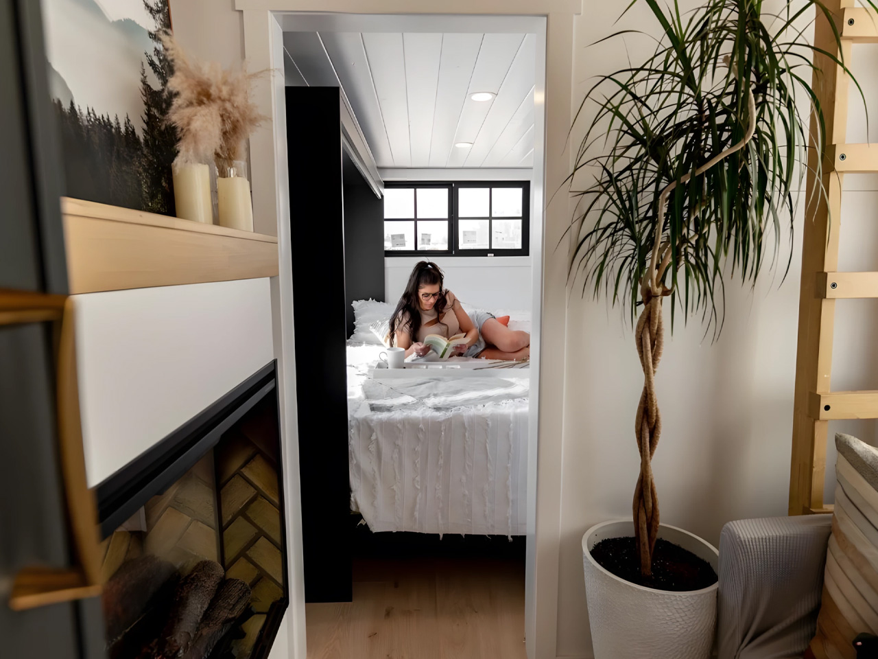
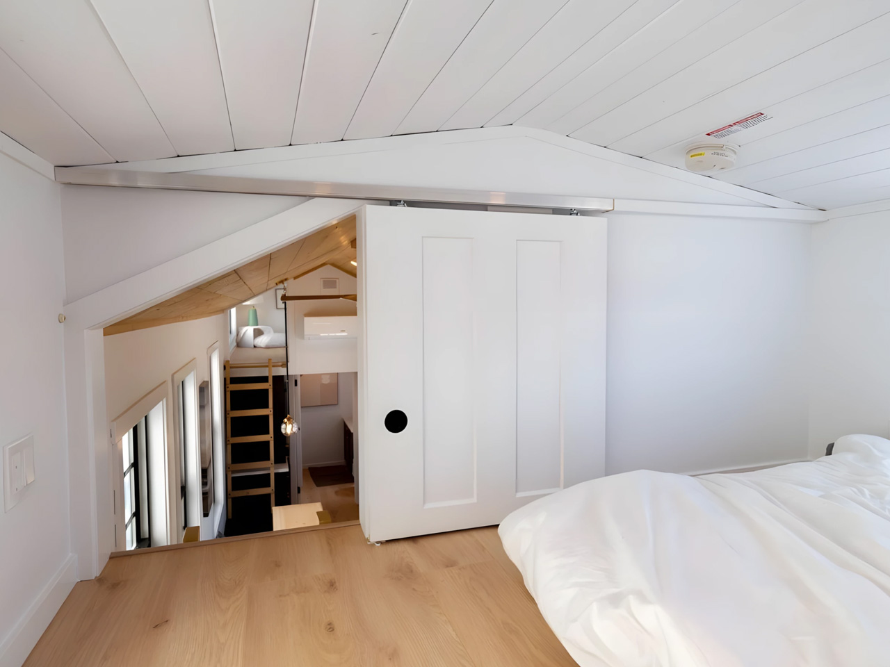
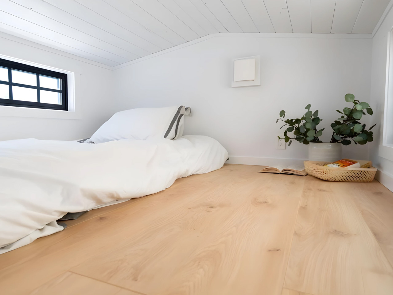
What sets the Harmony apart from most tiny homes is its three-bedroom layout. Two sleeping lofts sit above, while the ground-floor bedroom offers enough headroom to stand upright, a rare and deliberate design choice that makes daily life feel far less like a puzzle to be solved. The kitchen is full-sized and functional, designed for people who actually cook rather than just reheating takeout. It’s a plan that doesn’t ask its occupants to compromise on the rhythms of family life; it just asks them to do it in a smaller footprint.

Teacup Tiny Homes, which has been building since 2016, approaches its designs with the conviction that simpler living doesn’t have to mean lesser living. The Harmony is perhaps the clearest expression of that philosophy yet, a home genuinely engineered for a family, not retrofitted for one.

Priced starting at CAD $185,000 (approximately US $132,000) and available for delivery throughout North America, it sits at a premium compared to entry-level tiny builds, but the craftsmanship and livability make a strong case for the ask. For families eyeing a way out of the mortgage spiral, the Harmony might just be the most practical dream.

The post The Tiny Home That Proves You Don’t Have to Downsize Your Family to Downsize Your Life first appeared on Yanko Design.

10 Best Gadgets of April 2026 Every Tech-Savvy Gen Z Is Obsessed With (And We Get Why)

Gen Z isn’t chasing spec sheets or benchmark scores. They’re chasing objects that fit the way they actually live: portable, intentional, and quietly smart. April 2026 delivered a lineup that genuinely gets that energy. From satellite-connected wearables to battery-free speakers, these ten gadgets are doing something harder than simply being powerful. They’re being useful, and in a market saturated with noise and empty promise, that distinction is becoming genuinely rare.

The gadgets on this list aren’t competing for attention. They’re designed around how people actually behave: working from cafés, traveling between cities, tuning out distractions, or surviving in places where infrastructure doesn’t reach. Some rethink materials, some rethink interfaces, and some rethink habits entirely. What they share is a design sensibility that respects the user’s time and intelligence. That’s the standard Gen Z holds, and this month, these ten deliver.

1. O-Boy Satellite Smartwatch

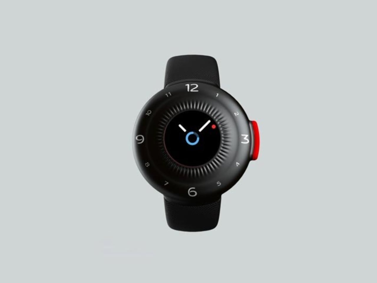
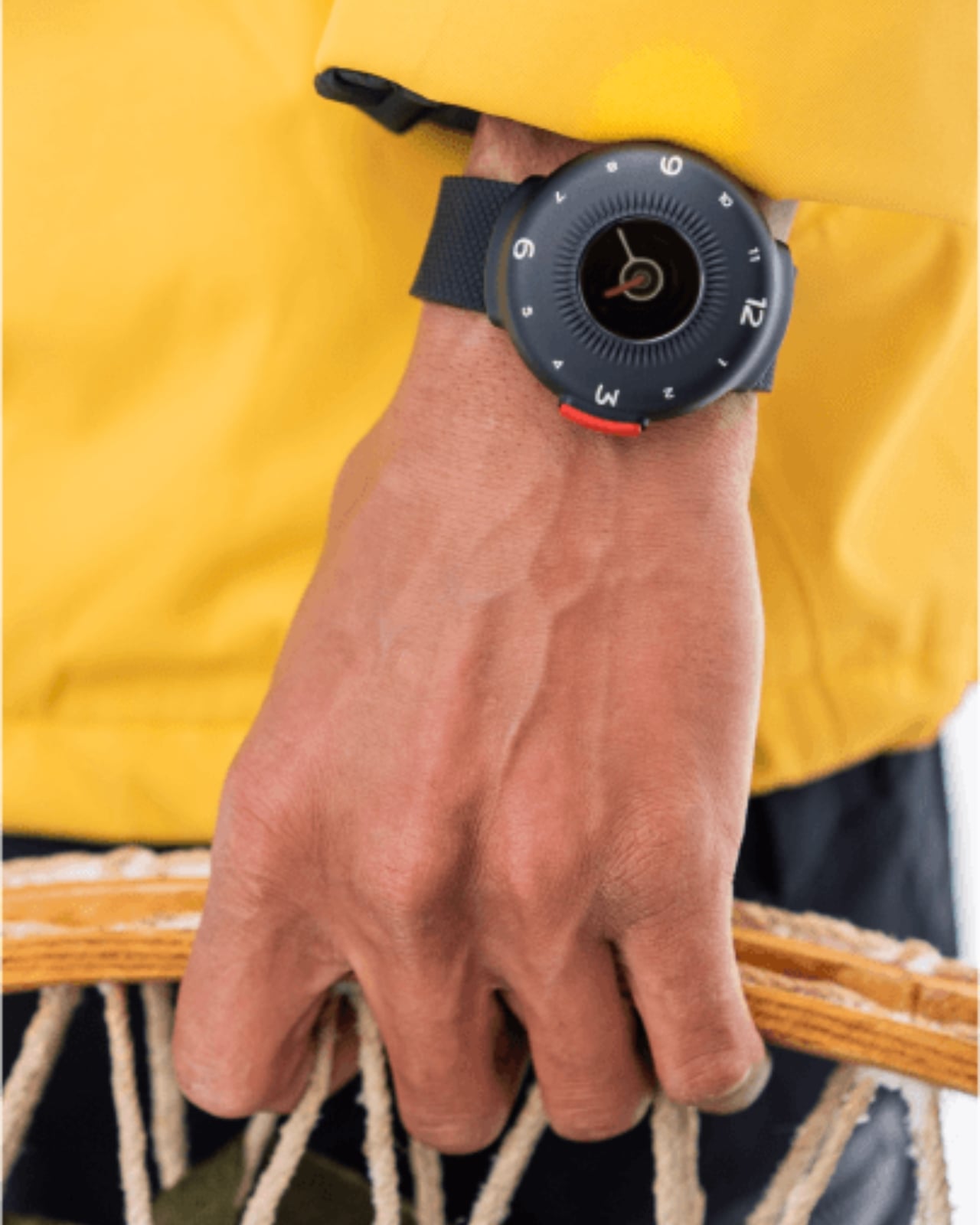
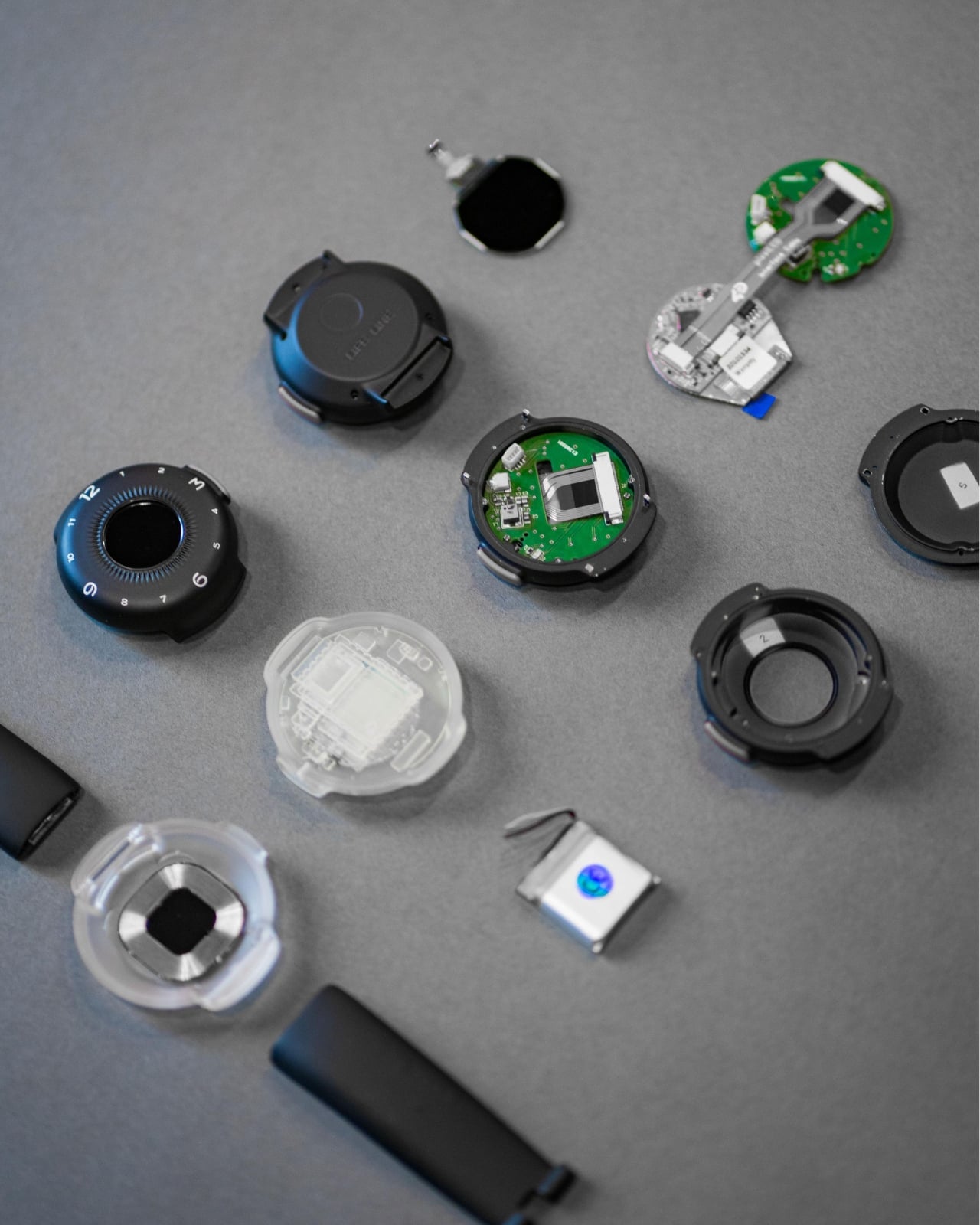
The O-Boy is built for the places where your phone gives up. Brussels-based studio Futurewave designed this satellite-connected smartwatch for emergencies in environments where mobile networks simply don’t exist: open ocean, mountain terrain, remote job sites. No bars, no Wi-Fi, no backup signal required. The watch transmits an emergency alert directly via satellite, making it one of the few wearables that actually keeps its promise when conditions are worst.

What makes the O-Boy genuinely impressive isn’t just the satellite capability; it’s how it was achieved. Futurewave pulled together product designers, electronics engineers, and antenna specialists and rethought the assembly process from the ground up. Getting satellite hardware into a compact, wearable form factor is not a small engineering feat. The result is a device that pushes the category forward rather than iterating on what already exists, and that distinction matters.

What We Like

  • Satellite communication works completely off the grid
  • Cross-disciplinary engineering produced a genuinely compact wearable form factor

What We Dislike

  • Designed primarily for emergencies, limiting everyday lifestyle appeal
  • Satellite connectivity may come with additional subscription costs

2. Minimal Laptop UI Concept

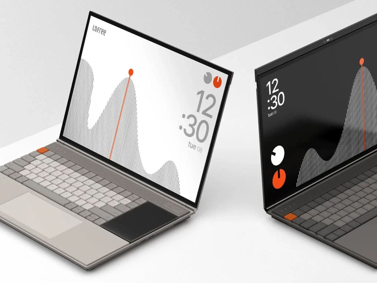
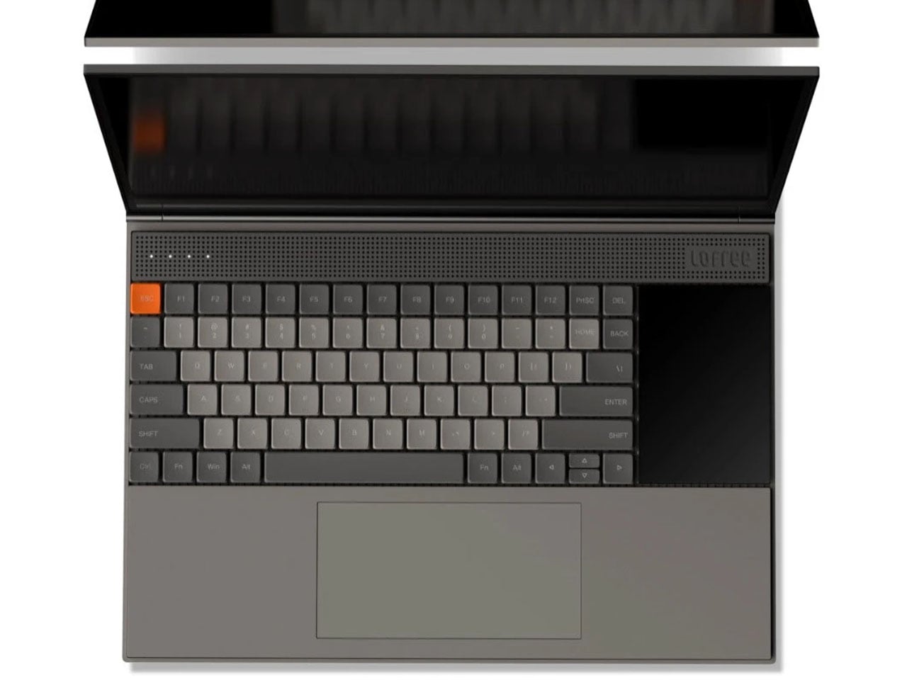
Inspired by the design philosophy of Teenage Engineering, the Minimal Laptop UI concept imagines what a laptop would look like if hardware and software were built around the same principle: less friction, more focus. The interface relies on strong visual hierarchy, generous spacing, and elements that appear only when necessary. Toolbars, panels, and persistent notifications are stripped away entirely, leaving a workspace that feels calm rather than cluttered.

For a generation that grew up multitasking across four open tabs and a split screen, this concept offers something surprisingly radical: a single surface to think on. Typography is clean and deliberate, icons are reduced to their most recognizable forms, and content stays at the center. It’s not about doing less. It’s about designing a machine that doesn’t compete with the work you’re trying to do on it, and that’s a harder problem than it sounds.

What We Like

  • Interface is designed around focus rather than feature density
  • Aesthetic language is distinctive and quietly confident

What We Dislike

  • Remains a concept with no confirmed production timeline
  • Minimal UI may not suit users who rely on multi-panel workflows

3. Battery-Free Amplifying iSpeakers

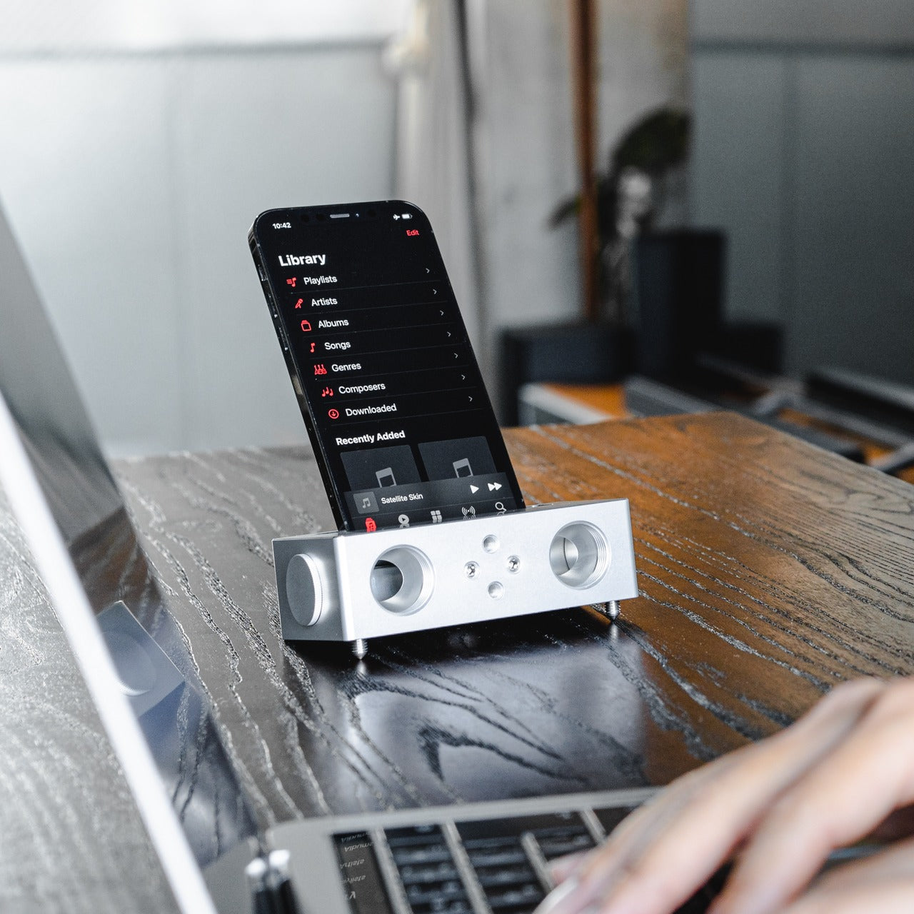
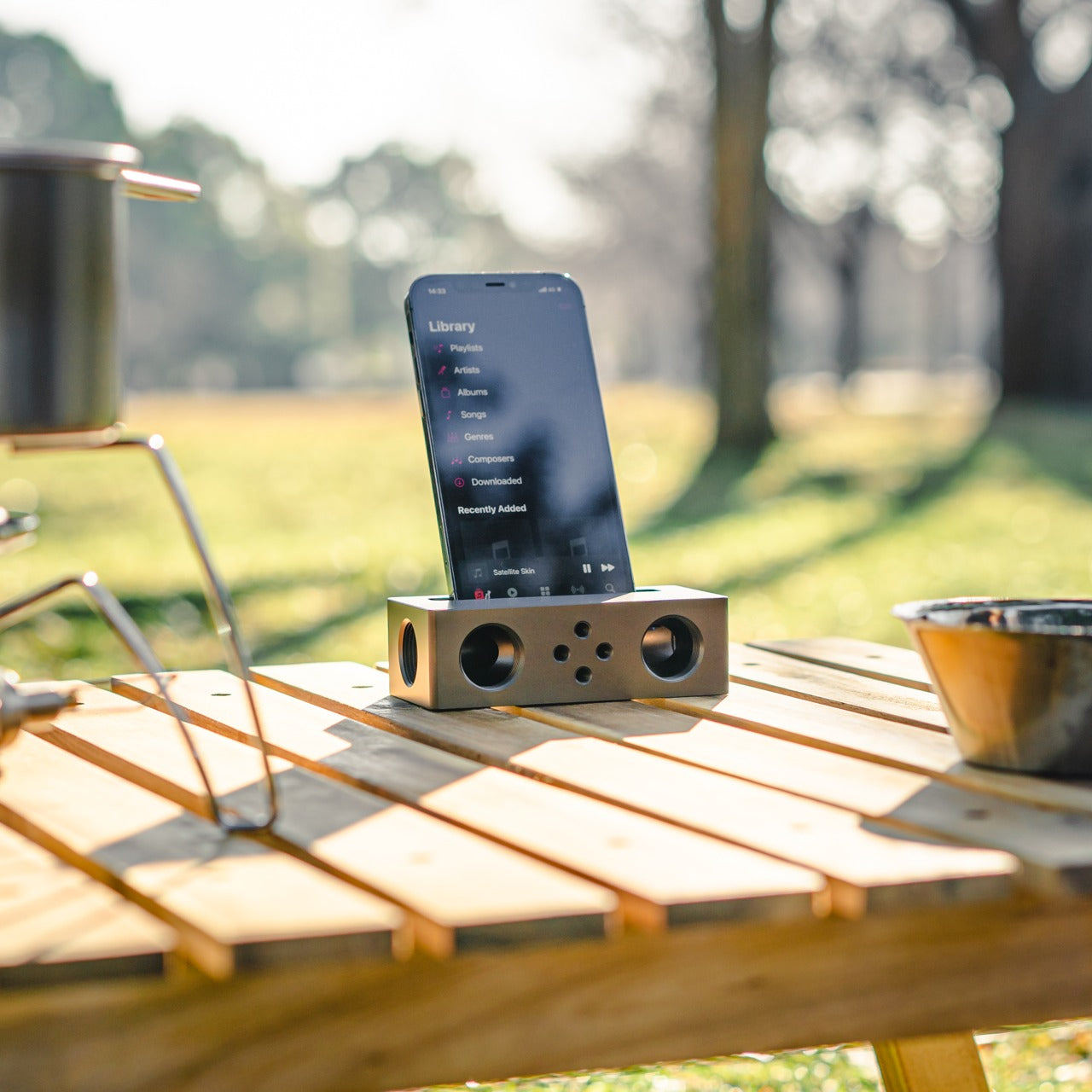
No power outlet, no battery, no Bluetooth pairing. Place your phone in the iSpeakers, and the sound amplifies. Built from Duralumin, the aluminum alloy used in aircraft construction, this passive speaker uses the golden ratio in its geometry to enhance resonance naturally. The result is an amplifier that genuinely improves your phone’s audio without asking anything of your power strip or your patience, which is a more elegant solution than most audio hardware manages.

The iSpeakers work anywhere, which makes them useful in a way that over-engineered audio gear often isn’t. A desk speaker that never needs charging is always ready. The aesthetic is understated and precise, the kind of object that improves a space by being in it rather than demanding attention. For anyone tired of hunting for cables and waiting for Bluetooth to pair, this is a refreshingly simple alternative that earns its place on any desk.

Click Here to Buy Now: $179.00

What We Like

  • Zero power requirement means zero limitations on where it works
  • Duralumin construction gives it both durability and a premium, clean look

What We Dislike

  • Audio output depends entirely on the quality of the phone’s built-in speaker
  • Sound-directing mods are sold separately, adding to the total cost

4. Xiaomi UltraThin Magnetic Power Bank 5000 15W

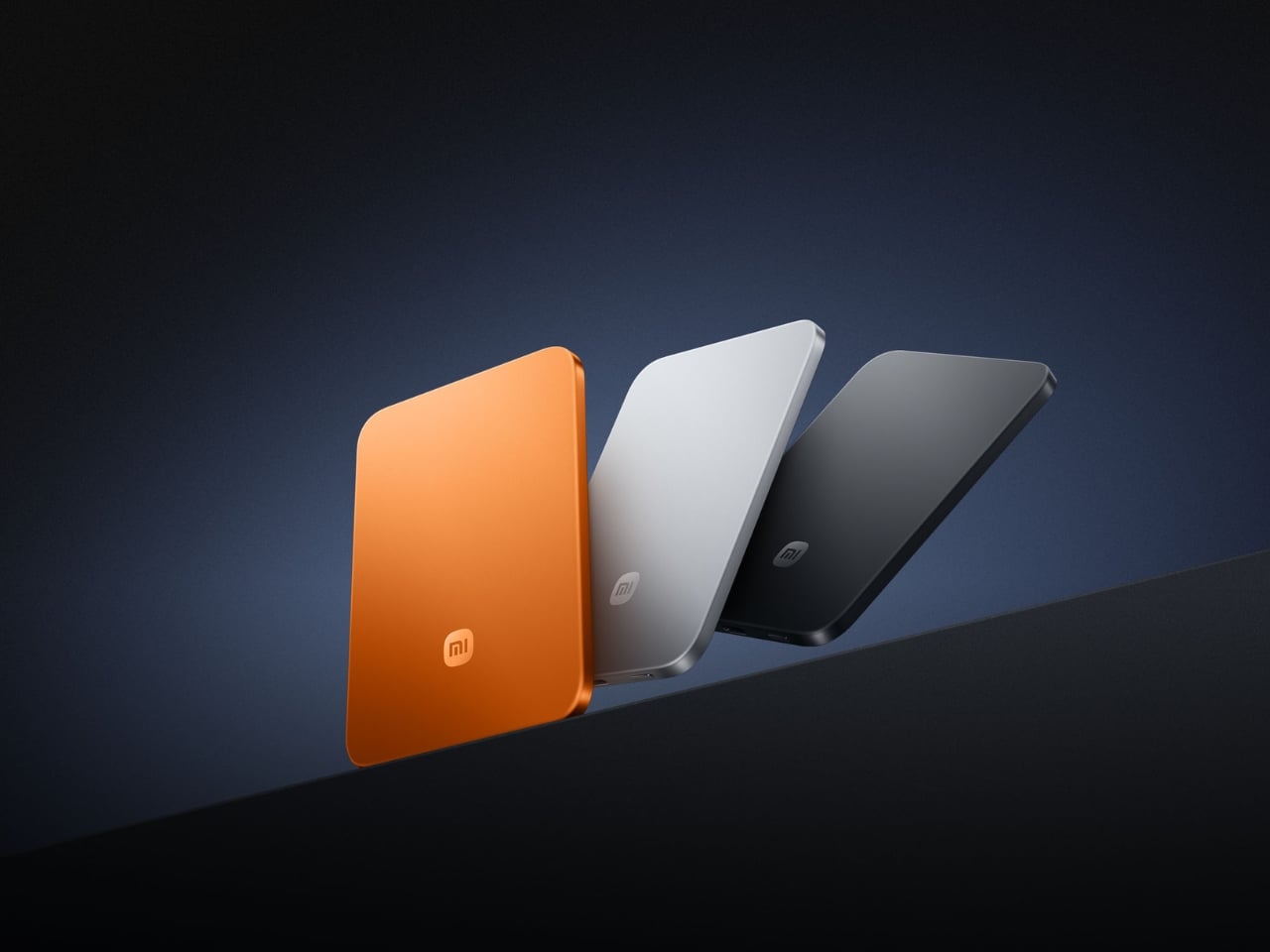
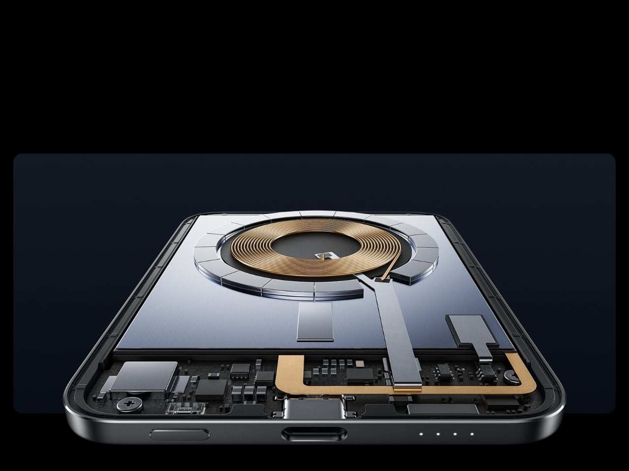
At 6mm thick, the Xiaomi UltraThin Magnetic Power Bank is thinner than any smartphone currently on the market. Using silicon-carbon battery chemistry with 16% silicon content, Xiaomi managed to pack 5,000mAh into something that looks and feels like a metal business card. The aluminum alloy shell has a smooth, understated finish, and a photolithographically etched logo on the back signals a product designed with care rather than simply manufactured to a spec sheet.

Available in Glacier Silver, Graphite Black, and Radiant Orange, this power bank debuted in Japan, expanded across Australia, Singapore, South Korea, and Europe, and made its global appearance at MWC 2026 in Barcelona. European pricing sits around €60, which is reasonable for what it delivers. The phone-facing surface uses fire-resistant fiberglass with an excimer coating for heat management, a detail that matters when you’re charging magnetically and want the hardware to stay cool.

What We Like

  • Silicon-carbon battery achieves 5,000mAh in a 6mm profile
  • Premium materials and finish at an accessible price point

What We Dislike

  • 15W wireless charging is modest compared to faster wired alternatives
  • The ultra-slim design means no additional ports or USB-A pass-through

5. tinyBook Flip

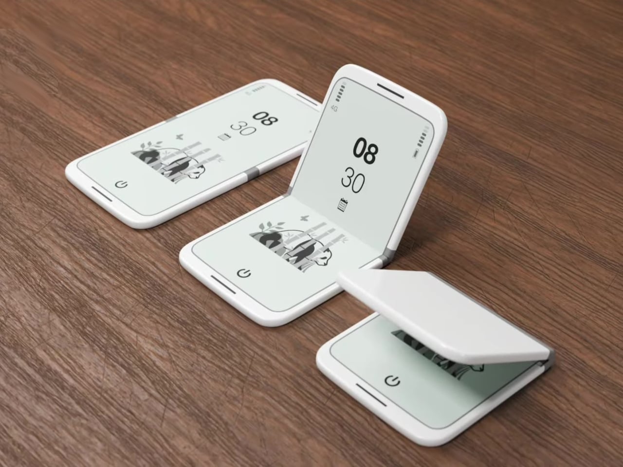
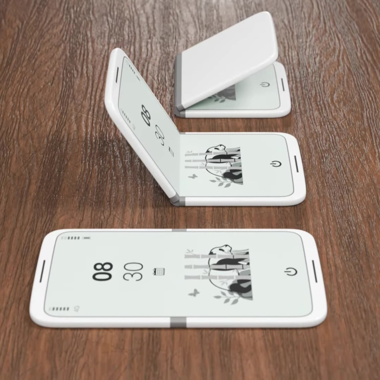
The tinyBook Flip is a foldable phone concept built around a 6.1-inch E Ink display. Closed, it collapses into a near-square form with a matte white finish and rounded corners, closer in proportion to a folded notecard than a smartphone. When shut, the screen disappears entirely. No glowing rectangle sitting face-up on the desk, no ambient reminder that there are things to check. Just a small, quiet object doing nothing at all.

That quietness is the design feature. Opening the phone requires a deliberate physical action, and that two-second pause changes the behavioral math around screen time. A reflexive grab becomes a conscious decision. The concept treats this friction as intentional, a design choice rather than an inconvenience. For anyone who has tried every screen time app and still reaches for their phone without thinking, the tinyBook Flip proposes something more honest: a phone that makes you choose to open it.

What We Like

  • Foldable form adds physical friction that genuinely interrupts mindless scrolling
  • Matte E Ink display avoids unnecessary glow and is easy on the eyes

What We Dislike

  • E Ink refresh rates remain too slow for video or fast-moving content
  • Currently a concept with no confirmed production or pricing information

6. OrigamiSwift Folding Mouse

The OrigamiSwift is a Bluetooth mouse that folds flat for travel and springs back to full size in under 0.5 seconds. Weighing 40 grams, it’s light enough to forget it’s in your bag until you need it. Inspired by origami, the foldable structure doesn’t sacrifice ergonomics for portability. It’s shaped to fit naturally in the hand during long work sessions, whether at a co-working space, a café, or an airport gate somewhere between time zones.

For digital nomads and students tired of trackpads and bulky peripherals, the OrigamiSwift makes a compelling case for carrying a full-sized experience in a pocket-sized package. The slim profile keeps it flat and unobtrusive in any bag, and the Bluetooth connection removes the need for a dongle. It’s the kind of product that solves a problem you’ve quietly accepted as unsolvable, and does it with a detail-first design sensibility that genuinely earns the attention it’s getting.

Click Here to Buy Now: $85.00

What We Like

  • Folds flat without compromising ergonomic performance when open
  • The 40-gram weight makes it genuinely unnoticeable in a bag

What We Dislike

  • No published DPI range or click precision specifications available
  • May not satisfy users who prefer a heavier, more substantial mouse feel

7. DuRobo Krono

The DuRobo Krono puts a 6.13-inch E Ink Carta 1200 display in a form factor that fits a jacket pocket. At 300 PPI with an 18:9 aspect ratio and a weight of 173 grams, it reads more like a physical book than most dedicated e-readers manage. Eight subtle breathing lights run across the back panel, a quiet visual indicator during focused sessions that adds character without becoming a distraction. The matte finish and geometric build keep it composed in any setting.

The Krono’s standout feature is the smart dial on its left side. Press and hold to record voice notes, and the onboard AI transcribes your words into searchable text, generating summaries of longer recordings automatically. For readers who take notes in the margins or thinkers who process ideas out loud, that combination of reading tool and voice capture is genuinely useful. It positions the Krono somewhere between a dedicated e-reader and a thinking device, which is a more interesting category entirely.

What We Like

  • AI voice recording and transcription work directly on the device
  • 300 PPI display and pocket-friendly form factor rival premium reading devices

What We Dislike

  • The 18:9 aspect ratio may feel narrow for reading PDFs or documents
  • Breathing lights, while subtle, may distract in dark reading environments

8. StillFrame Headphones

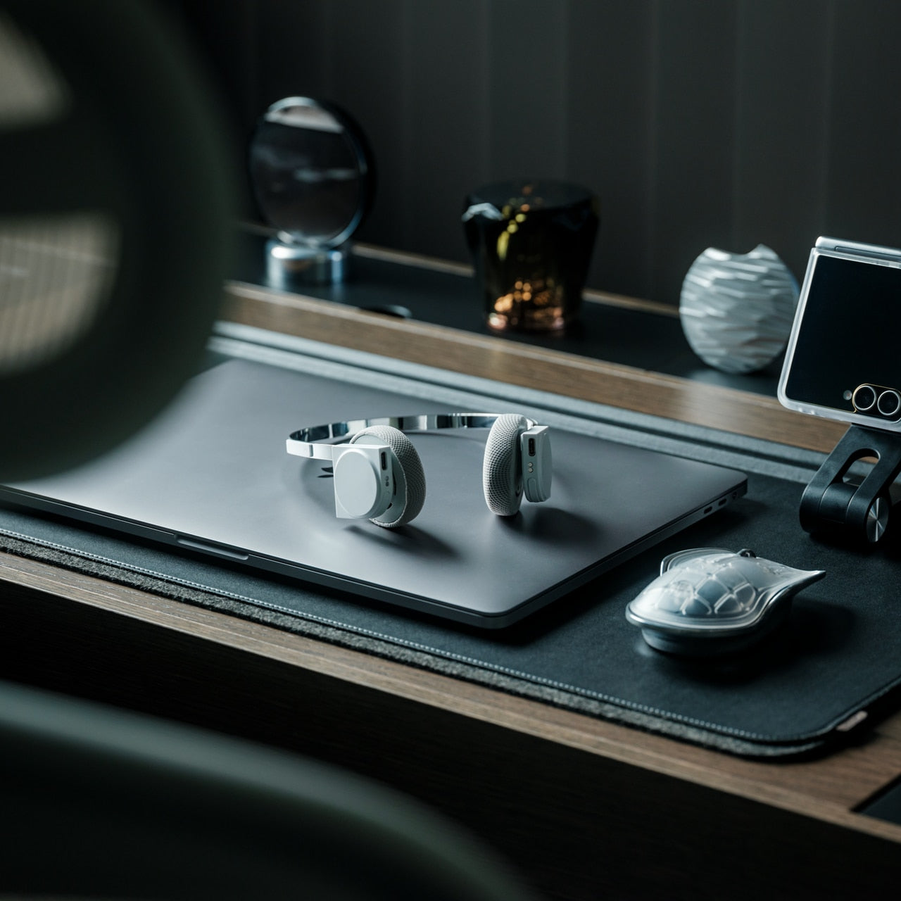
StillFrame headphones are built around a quieter philosophy: slow listening, deliberate sound, the kind that rewards attention. The 40mm drivers deliver a wide, open soundstage that turns quiet tracks into something textured and spatial. The form references the geometry of ’80s and ’90s CDs and sits in quiet visual dialogue with the ClearFrame CD Player, a nod to an era when music had physical weight, and the act of listening was its own ritual worth showing up for.

The StillFrame sits between in-ears and over-ears in both feel and philosophy: more open than the former, more relaxed than the latter. Noise-cancelling and transparency mode let you shift between solitude and awareness with a single tap, making them genuinely adaptable across environments. They’re featherlight without feeling hollow, and the overall build is measured and considered. For a generation rediscovering vinyl and physical media, StillFrame offers that same intentional energy in a wireless headphone.

Click Here to Buy Now: $245.00

What We Like

  • Wide soundstage from 40mm drivers gives music genuine spatial depth
  • Noise-cancelling and transparency modes make it adaptable across daily environments

What We Dislike

  • An on-ear fit may cause discomfort during extended listening sessions
  • Retro aesthetic is distinctive but may not appeal to all personal tastes

9. HubKey Gen2

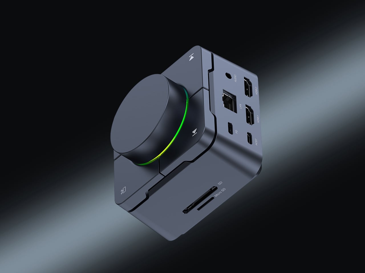
The HubKey Gen2 solves the dongle problem that every ultrabook user has quietly accepted as part of working life. Eleven connections are consolidated into a palm-sized cube: dual 4K display support, Ethernet, USB-A and USB-C, and power pass-through included. For anyone working across monitors and peripherals from a laptop with two USB-C ports, this is the kind of product that makes the workspace actually functional without turning the desk into a cable graveyard piled with adapters.

Four programmable keys and a central control knob are what separate the HubKey Gen2 from a standard hub. Muting a microphone, adjusting volume, toggling camera privacy: these are actions that get buried in menus and keyboard shortcuts during live calls. The Gen2 makes them physical, tactile, and immediate. For remote workers, creators, and students who live on video calls, having media controls within arm’s reach rather than three clicks deep is a quality-of-life upgrade that’s hard to give back.

What We Like

  • Eleven connections in one compact cube eliminate dongle accumulation entirely
  • Programmable keys and control knob bring commonly buried actions to the surface

What We Dislike

  • Cables from all eleven ports could still create desk clutter around the hub
  • Programmable keys may require setup time and dedicated software to configure properly

10. Razer Raiju V3 Pro

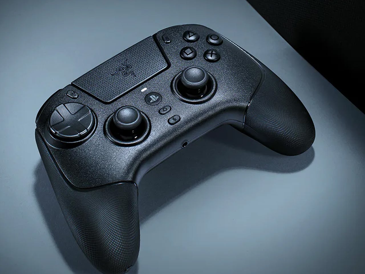
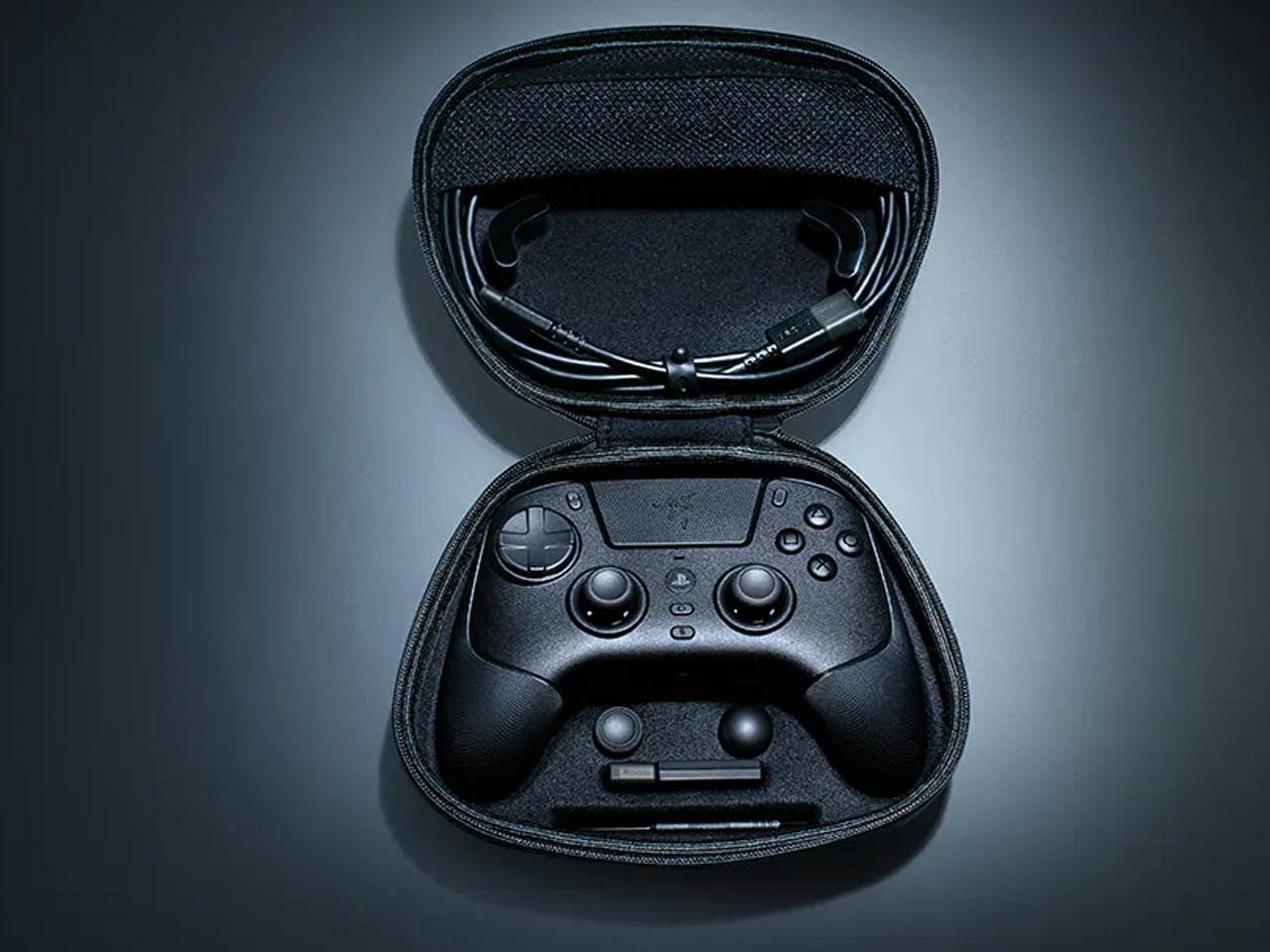
The Razer Raiju V3 Pro takes the sensor thinking behind high-performance gaming mice and applies it to a PlayStation-compatible controller. Tunnel Magnetoresistance thumbsticks use weak electromagnetic waves to detect movement with higher resolution than standard Hall Effect sensors. Drift is addressed at the hardware level, not patched in software. Hall Effect triggers cover the remaining high-wear inputs. At 258 grams, it sits lighter than the DualSense Edge without feeling insubstantial in the hand.

Six additional inputs are distributed across the frame: four removable back buttons in the rubberized handles and two claw-grip bumpers flanking the triggers, all fully remappable. Razer’s HyperSpeed 2.4GHz wireless reaches a 2,000Hz polling rate on PC. Battery life is rated at 36 hours, nearly triple the DualSense standard. Officially licensed for PlayStation 5, it requires no adapters and connects as a native peripheral. For competitive players who want every hardware advantage in one place, the Raiju V3 Pro sets the current ceiling.

What We Like

  • TMR thumbsticks offer finer movement resolution with hardware-level drift prevention
  • 36-hour battery life and 2,000Hz polling rate on PC are best-in-class figures

What We Dislike

  • At 258 grams, it may feel heavy for players accustomed to lighter controllers
  • Six extra inputs and full remapping may overwhelm casual or new users

The Gadgets That Actually Deserve the Hype

April 2026’s best gadgets share a common thread: they were designed around how people actually behave, not how manufacturers hope they will. Whether it’s a satellite smartwatch that works when nothing else does or a foldable phone that makes you pause before opening it, the most interesting tech this month isn’t louder or flashier. It’s more considered, and that’s a harder thing to consistently get right.

Gen Z has always been quick to call out products that look useful but don’t deliver. This list holds up to that standard. From a power bank thinner than any phone to an AI e-reader that captures your thoughts out loud, these are gadgets that earn their place on a desk or in a bag, and that’s a harder standard to meet than it might seem to anyone designing in this space.

The post 10 Best Gadgets of April 2026 Every Tech-Savvy Gen Z Is Obsessed With (And We Get Why) first appeared on Yanko Design.

Inside the Espresso: Modern Tiny Living’s 20-Foot Tiny House on Wheels That Proves Small Can Be Bold

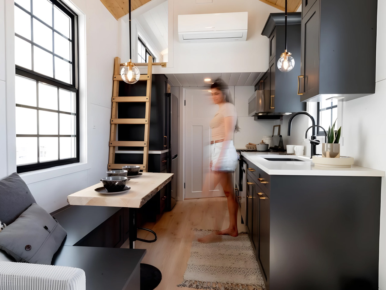
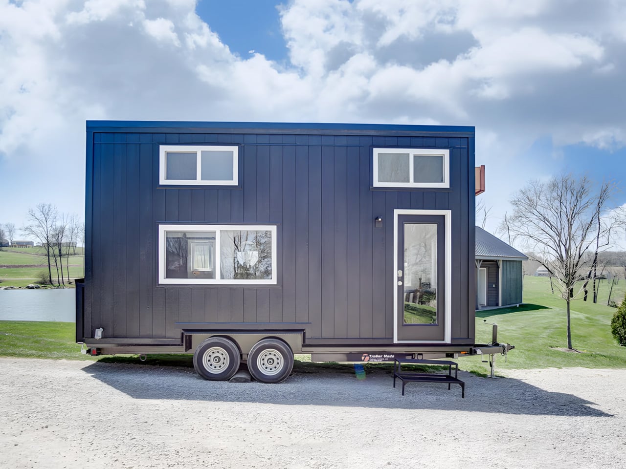
There’s a version of small living that doesn’t ask you to compromise. The Espresso, built by Ohio-based Modern Tiny Living on their popular Mohican platform, makes that case in just 20 feet. Bold and daring, the Espresso is a tiny house on wheels defined by deep blacks, warm wood accents, and a design sensibility that punches well above its square footage.

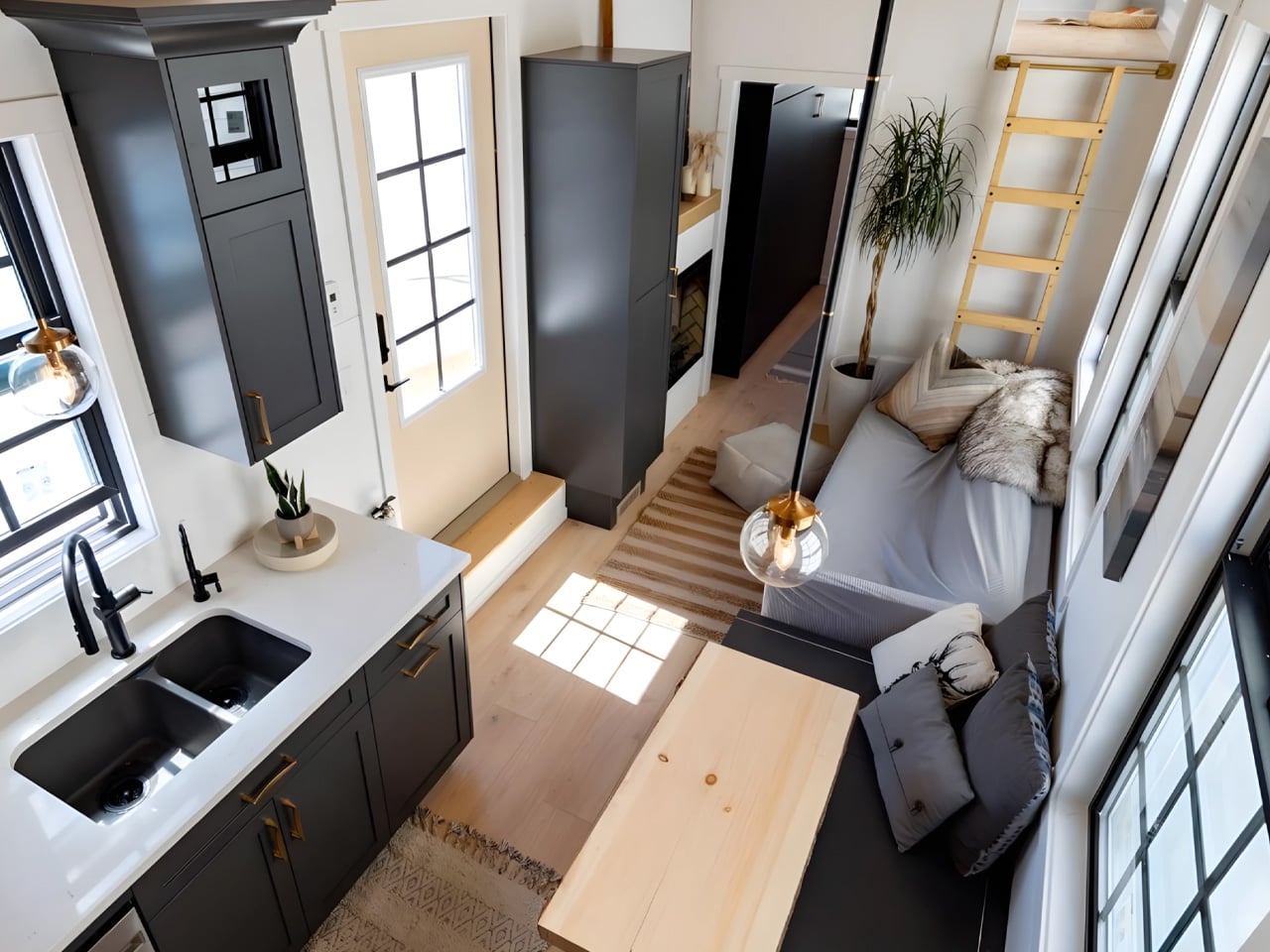
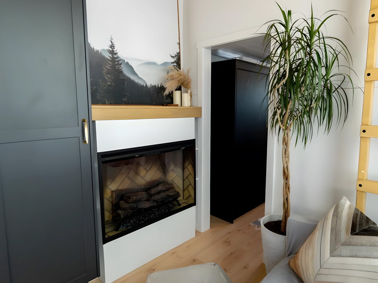
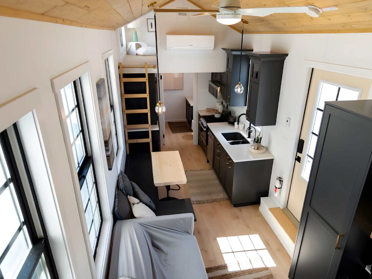
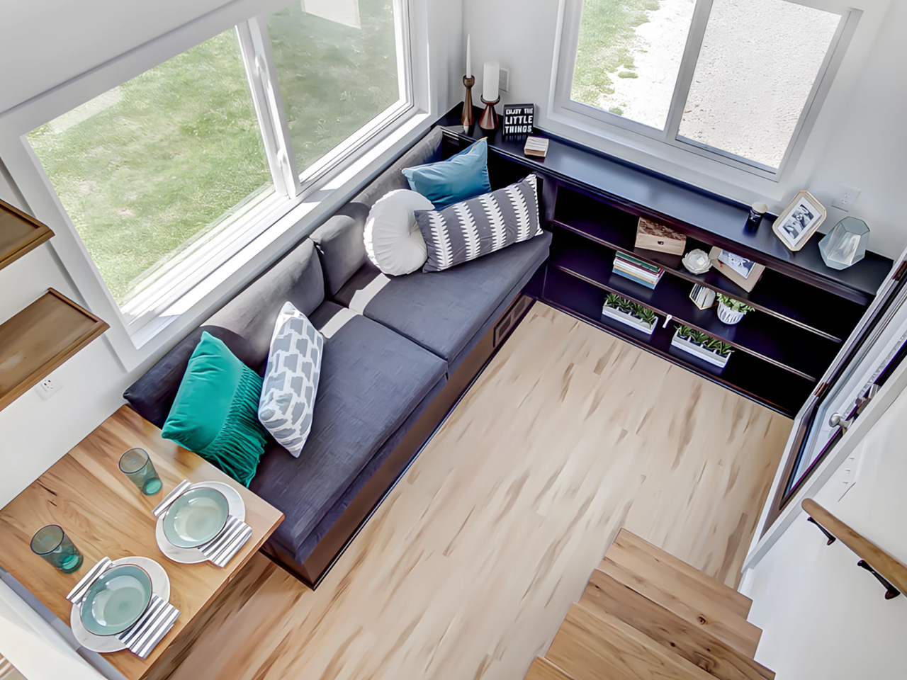
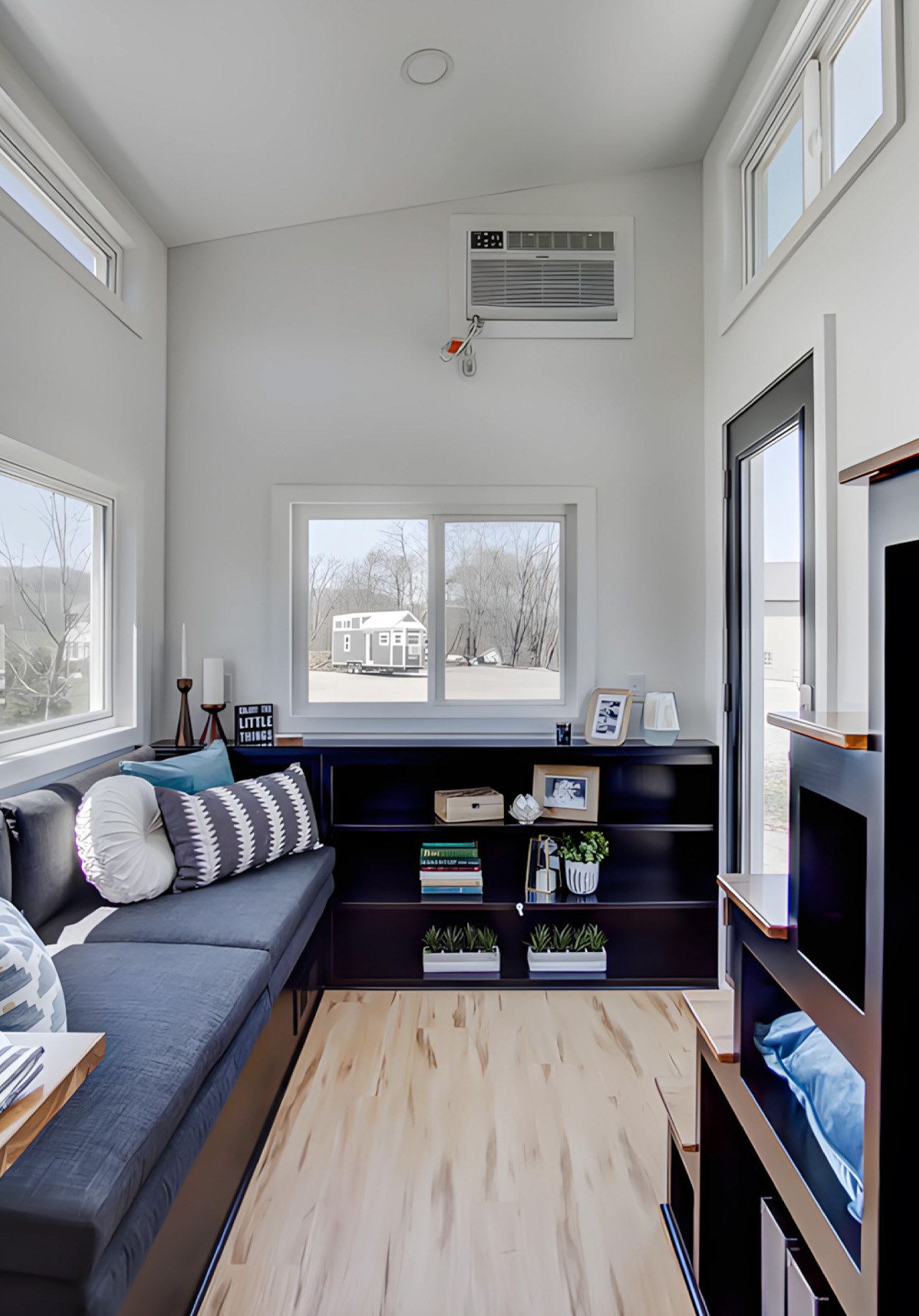
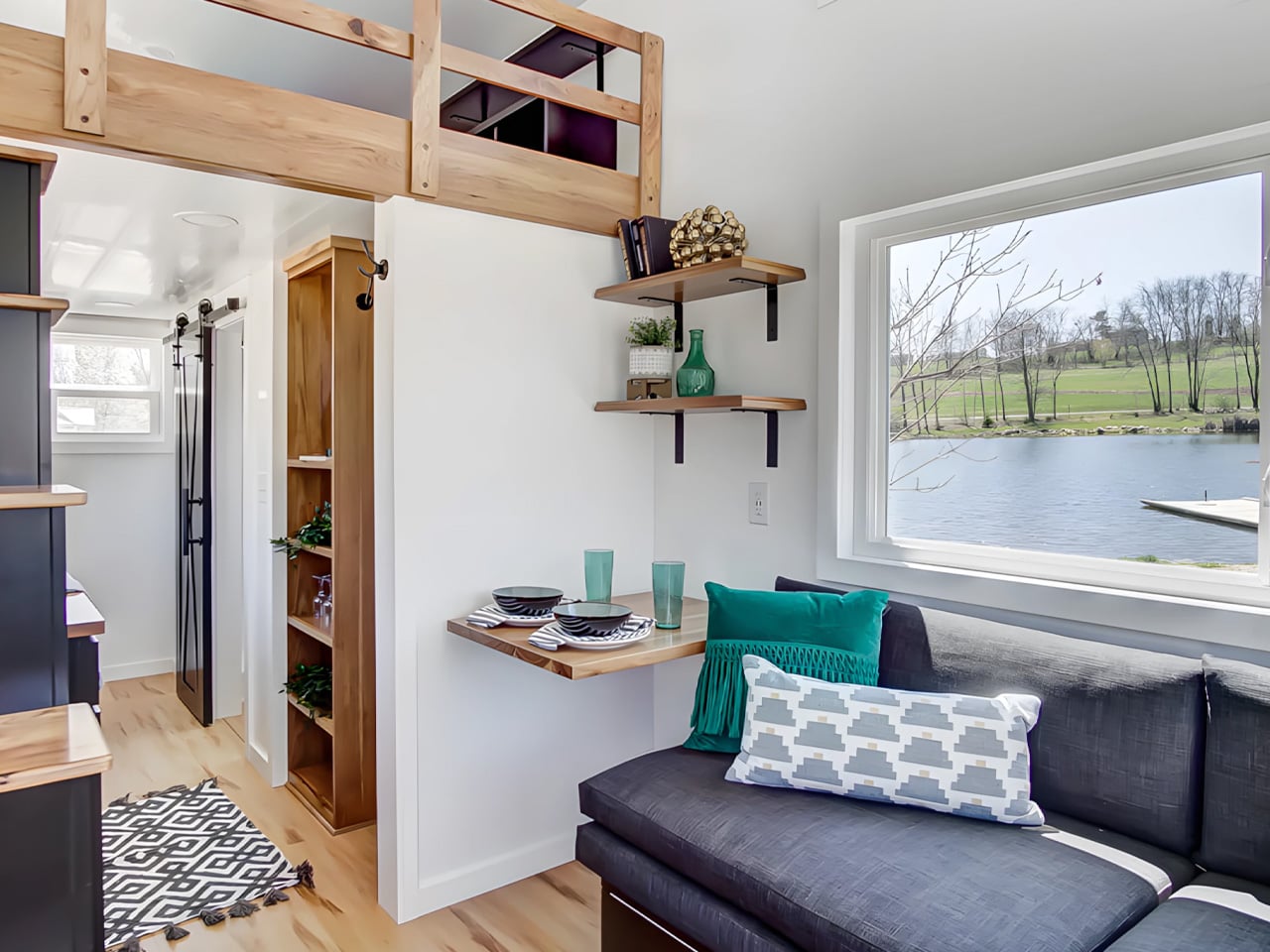
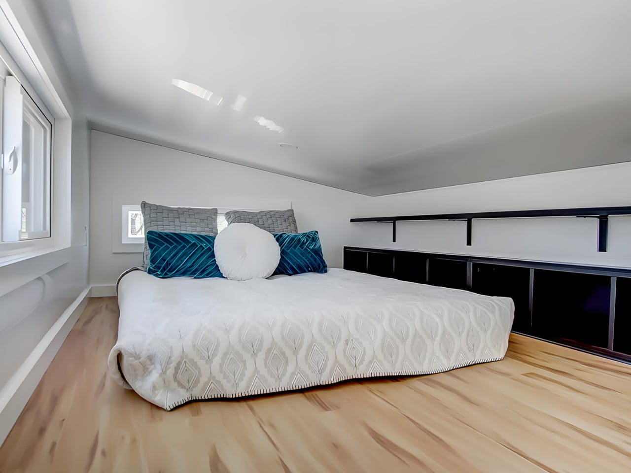
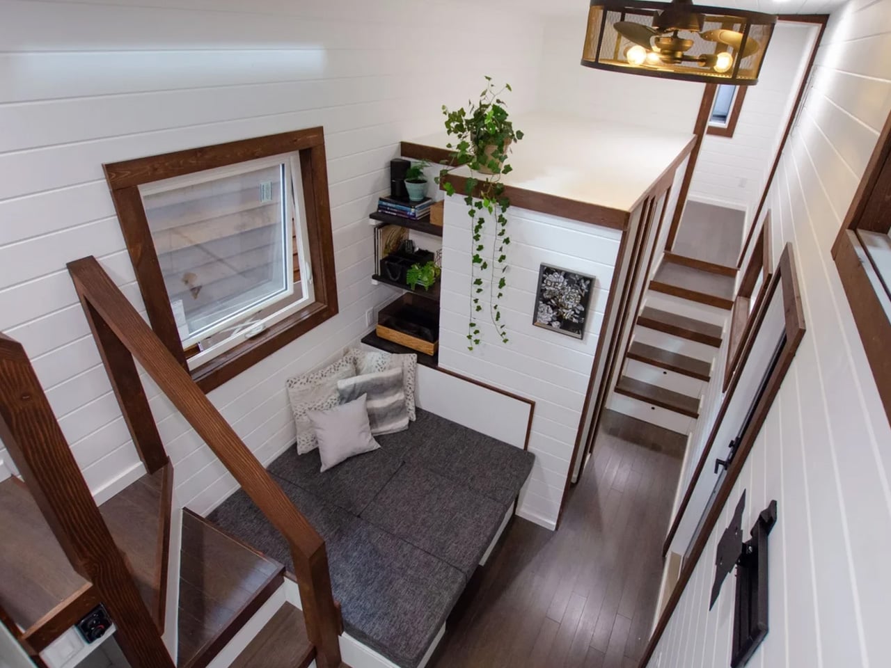
At its core, the Espresso is a study in restraint done right. The main floor clocks in at 160 square feet, with a 70-square-foot queen bedroom loft above, complete with custom built-ins and shelving. It’s a tight footprint by any measure, but the way the space is organized keeps it from ever feeling like it. The living room anchors one end of the home with a pull-out bench, built-in shelving, and a drop-down dining table that doubles as a desk, making it equally suited to a quiet morning or a dinner for two.

Designer: Modern Tiny Living

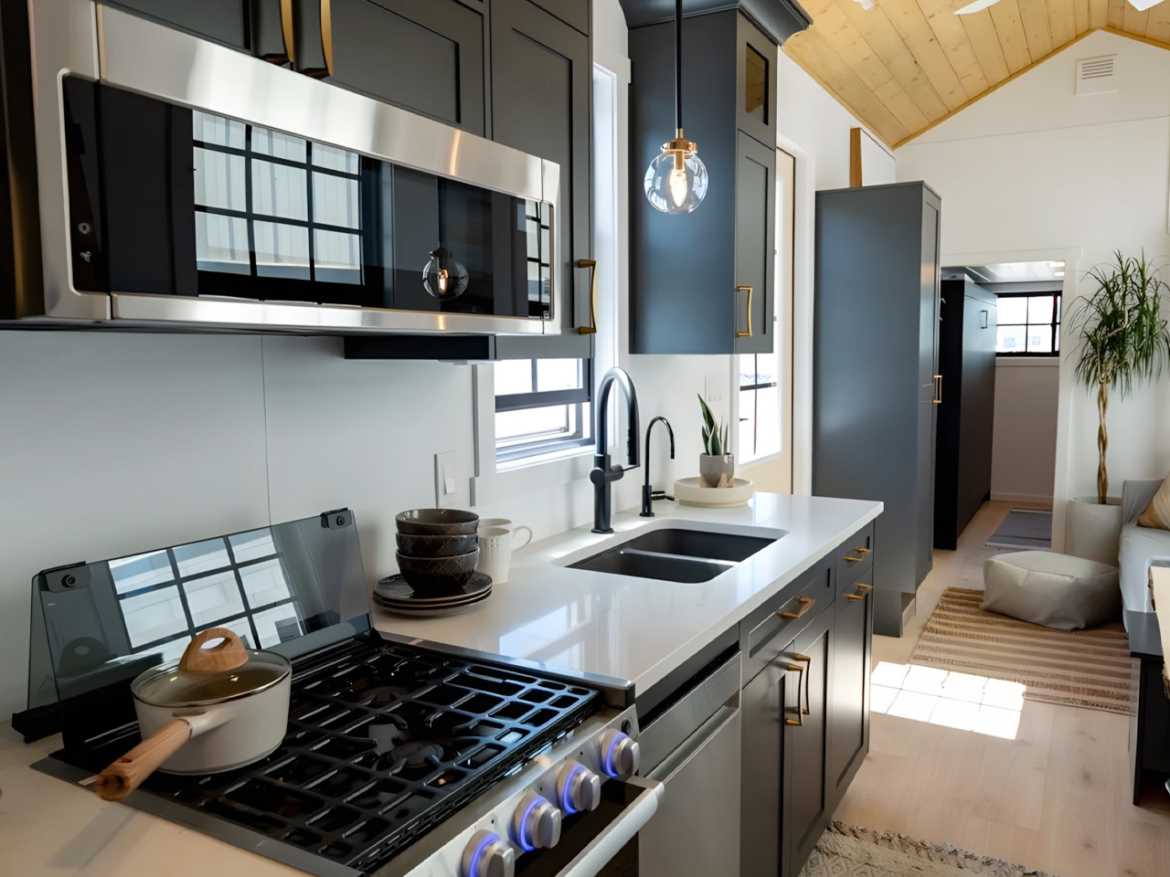
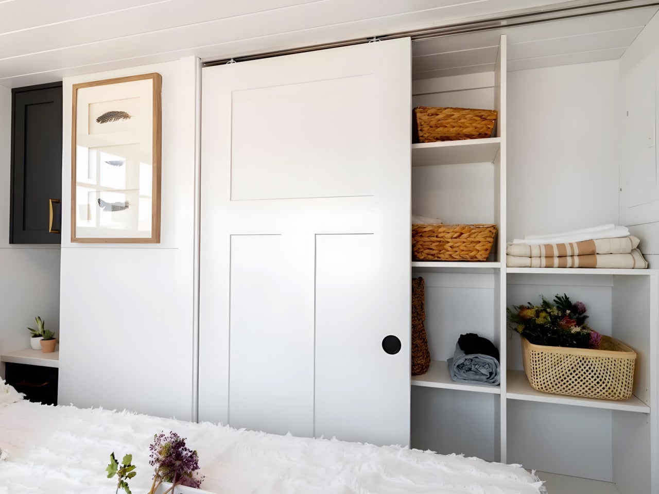
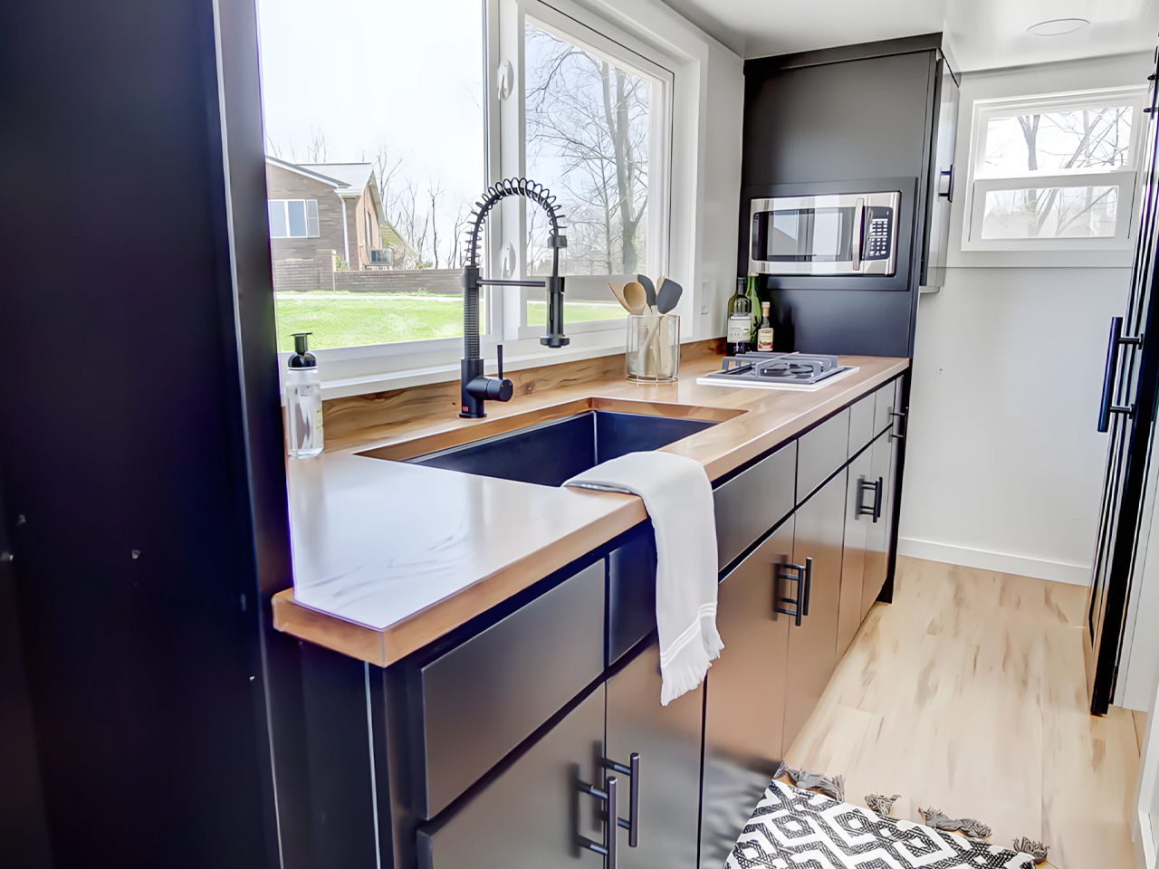
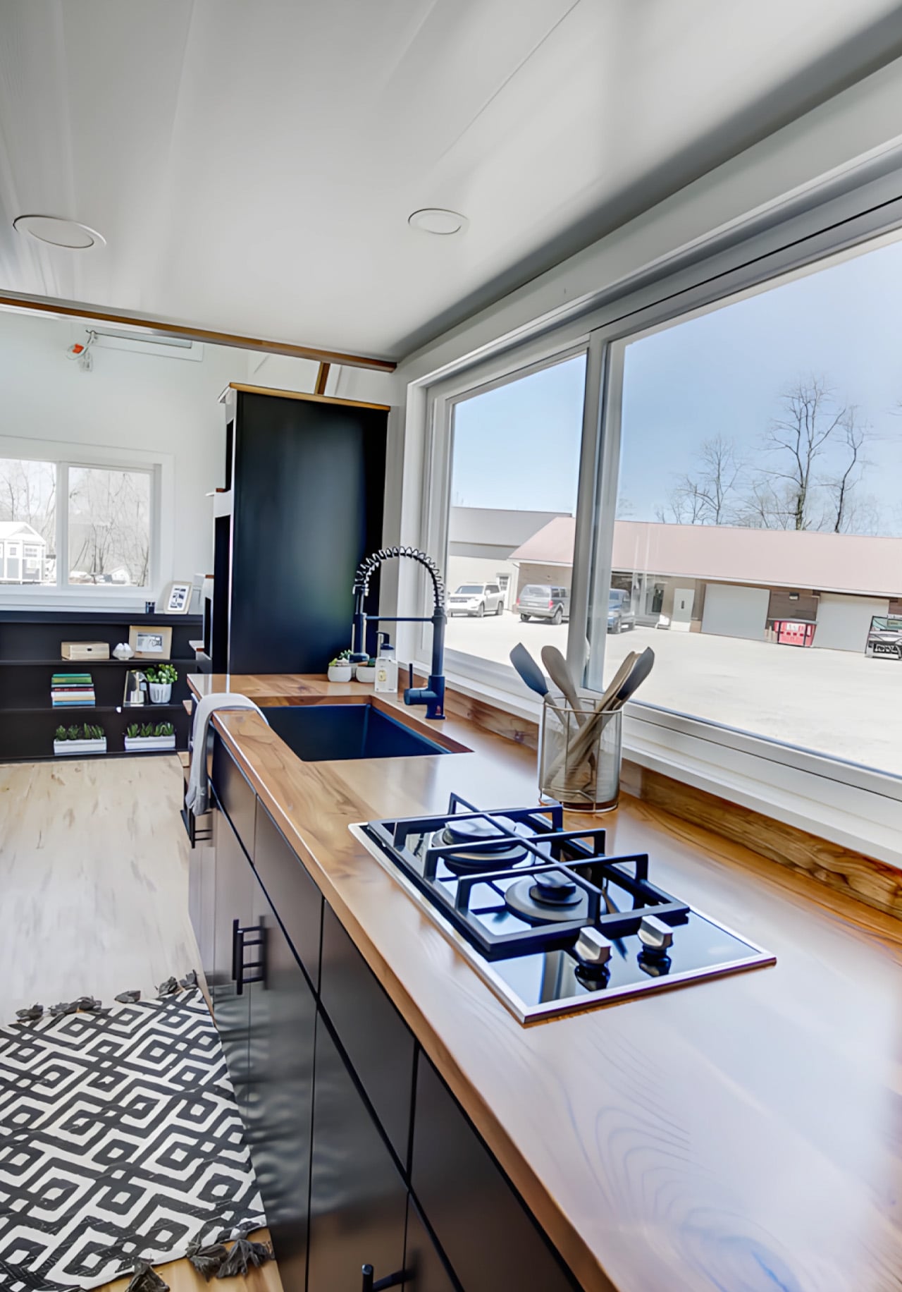
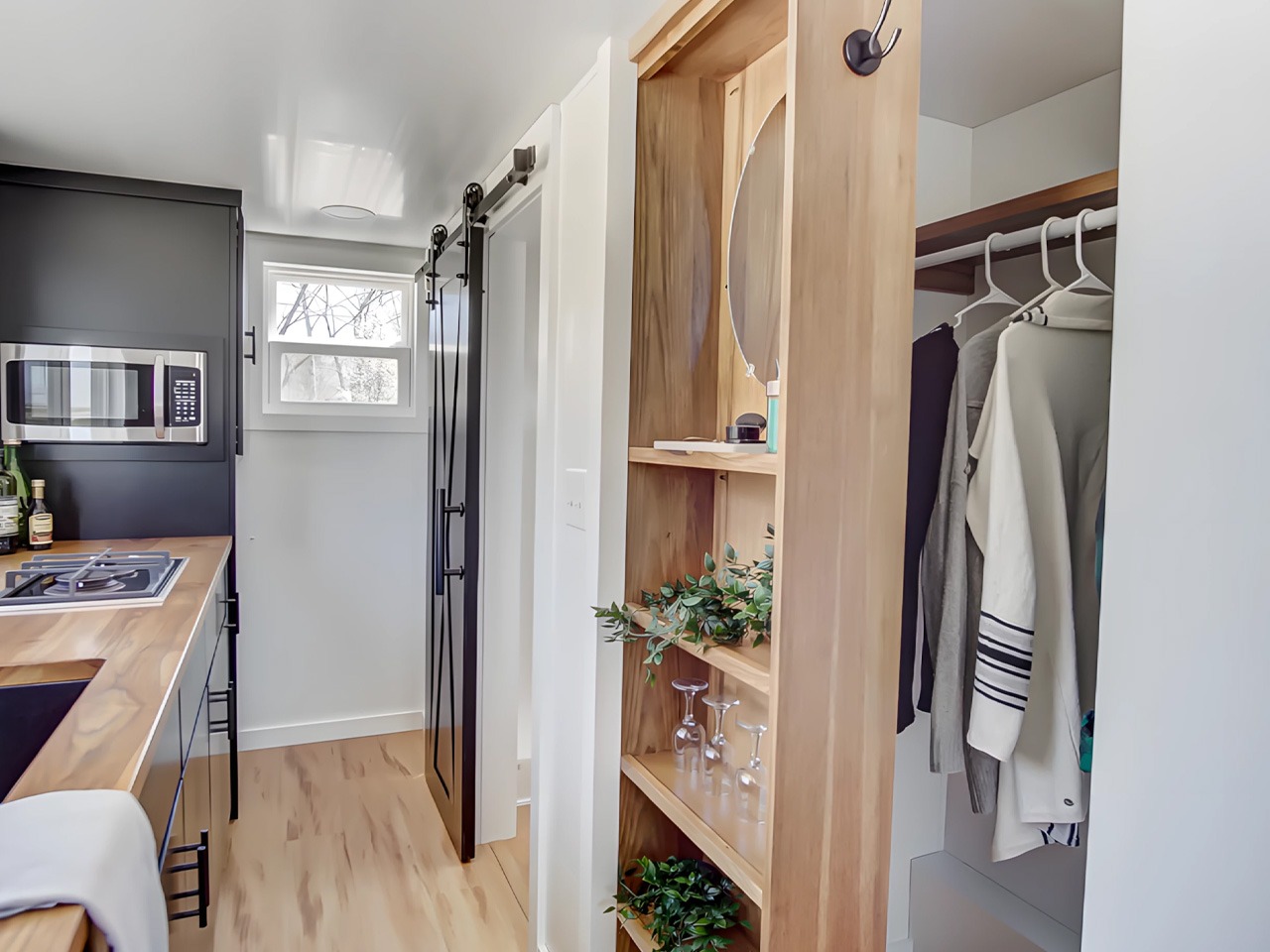
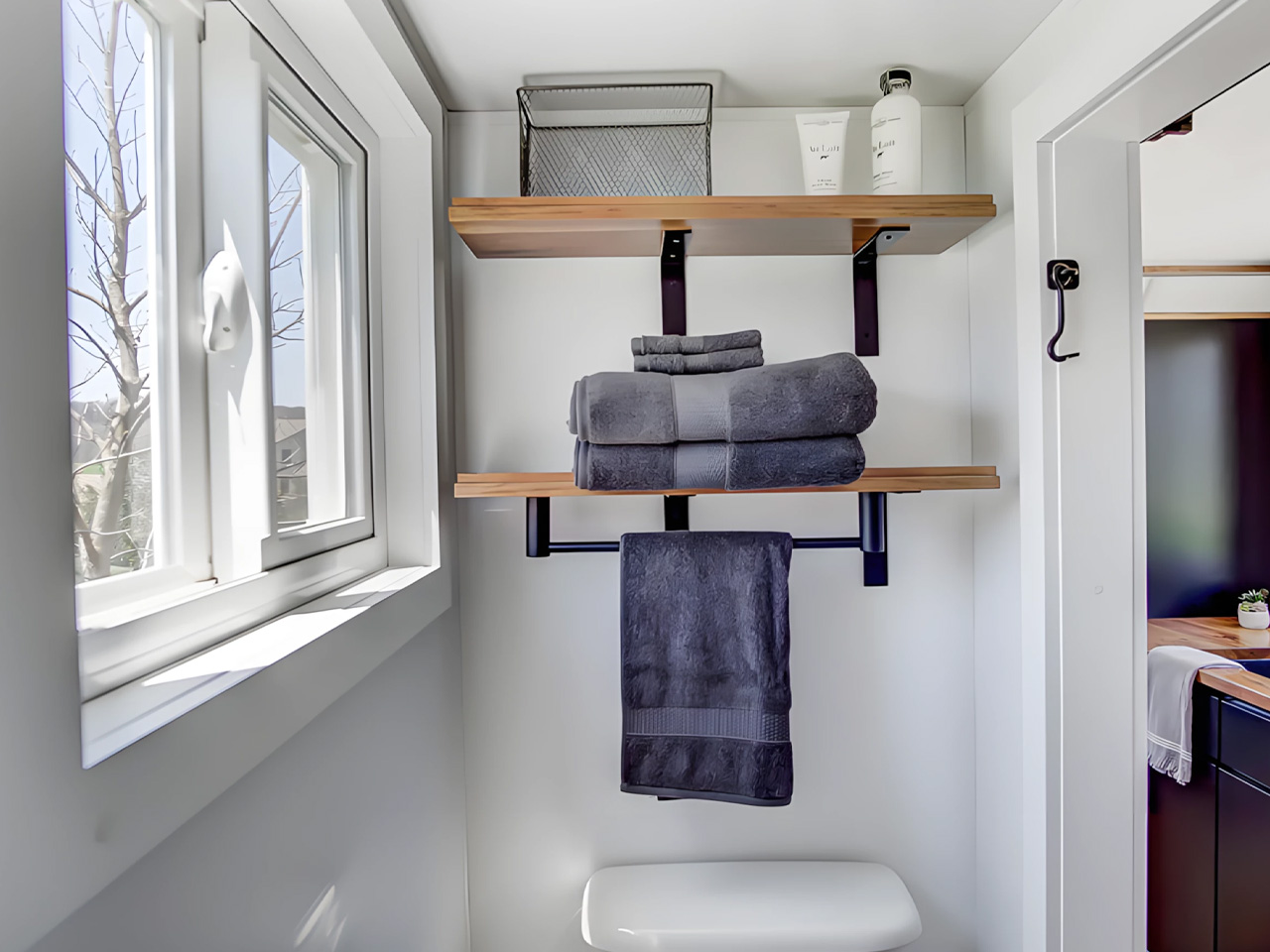
The kitchen is where the Espresso’s aesthetic really comes into focus. An undermount black granite sink pairs with a pull-down matte black faucet, solid wood countertops, a 9.9 cubic foot refrigerator, a two-burner propane cooktop, and a microwave, all working within a palette that feels deliberate rather than default. The matte black hardware package runs throughout the home, tying each room back to the same considered thread. Across from the kitchen, an open closet leads into the bathroom, which keeps things equally functional with a fiberglass insert shower, a flush toilet, and open shelving.

On the outside, the Espresso sits on a double-axle trailer and is finished in engineered wood with a steel roof, keeping maintenance low and durability high. A small exterior storage box handles propane bottles and similar items, quietly solving the off-grid practicalities without interrupting the clean lines of the exterior. The home weighs approximately 9,000 pounds, and its closed-cell spray foam insulation — three inches in the walls and ceilings, four in the floors — means it’s built to handle varied climates without compromise.

What makes the Espresso work isn’t any single feature. It’s the way everything adds up: the convertible furniture, the considered storage, the finish quality that makes the space feel lived-in rather than merely occupied. Modern Tiny Living designed it to deliver all the comforts of modern living in a compact, move-in-ready package, and the result is a tiny home that earns its name in more ways than one. Rich, concentrated, and hard to forget.

The post Inside the Espresso: Modern Tiny Living’s 20-Foot Tiny House on Wheels That Proves Small Can Be Bold first appeared on Yanko Design.
Studioninedots’ Light House Is a Vertical Amsterdam Home Built From Playfully Stacked Boxes

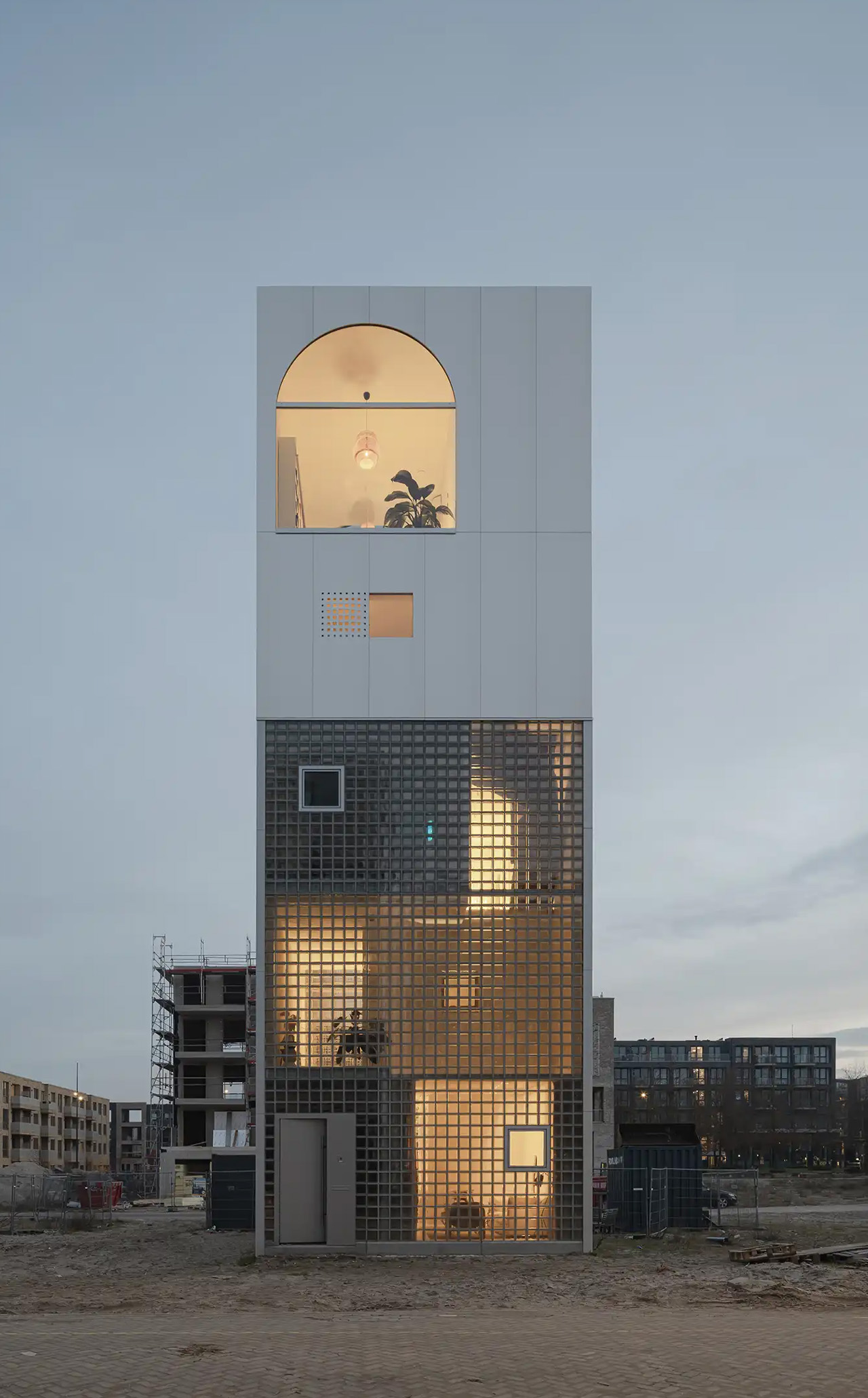
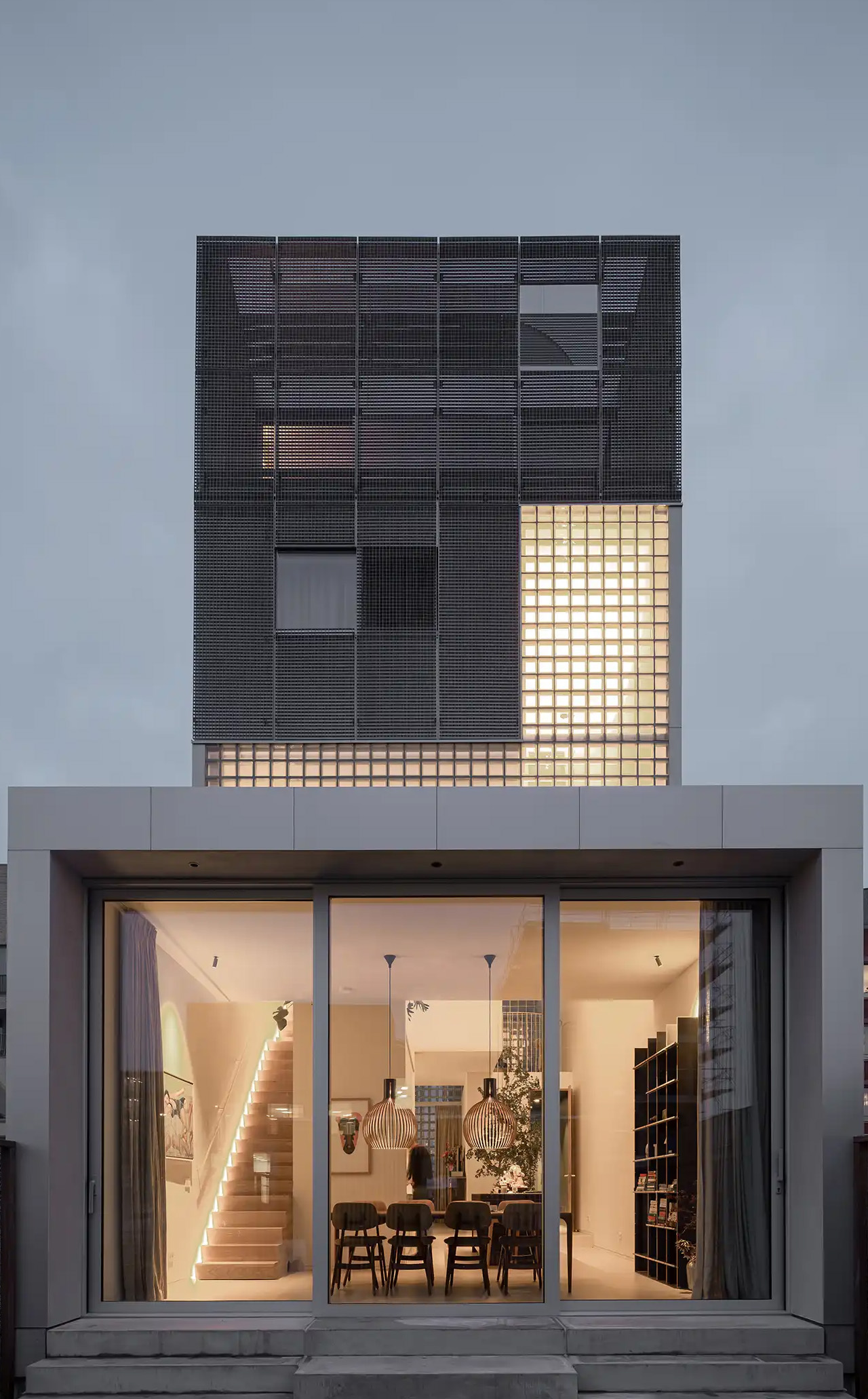
What does a home look like when you throw out the floor plan entirely? For Amsterdam-based firm Studioninedots, the answer is a tower of playfully stacked boxes, each one dedicated to a single moment in life, that rises above one of the Dutch capital’s newest neighborhoods. Completed in 2025, Light House sits on Centrumeiland, a newly developed artificial island district defined by its self-build culture and strong sustainability ambitions.

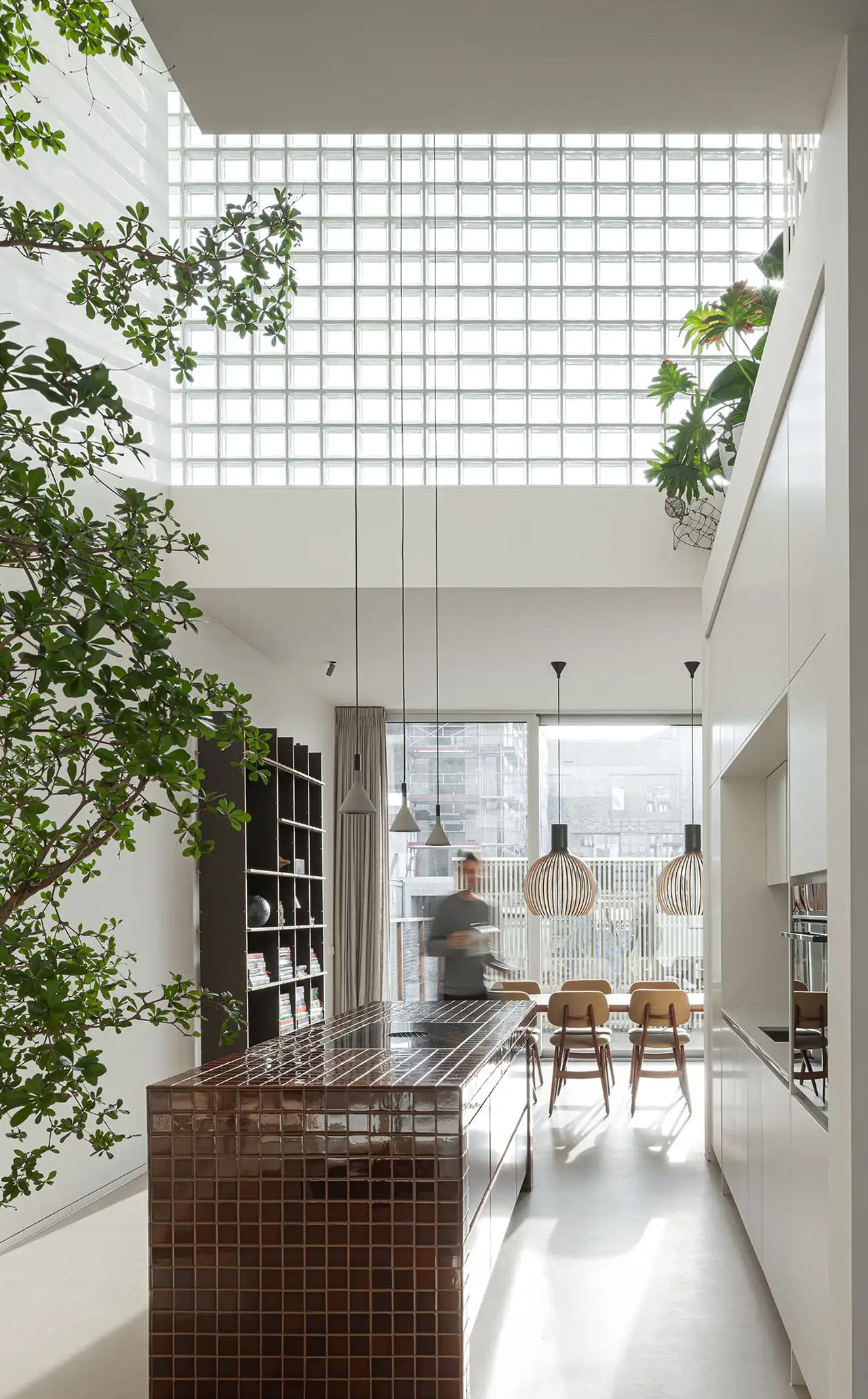
The project began with a simple brief from a couple with two children who wanted a home that would genuinely bring them together. Rather than anchoring daily life to the ground floor the way most houses do, Studioninedots dedicated each of the family’s key activities — eating, gathering, cooking, relaxing — to its own distinct volume, then arranged those volumes vertically into a single, tightly considered composition. The result is a 257-square-meter residence that feels less like a stacked building and more like a small vertical neighborhood.

Designer: Studioninedots

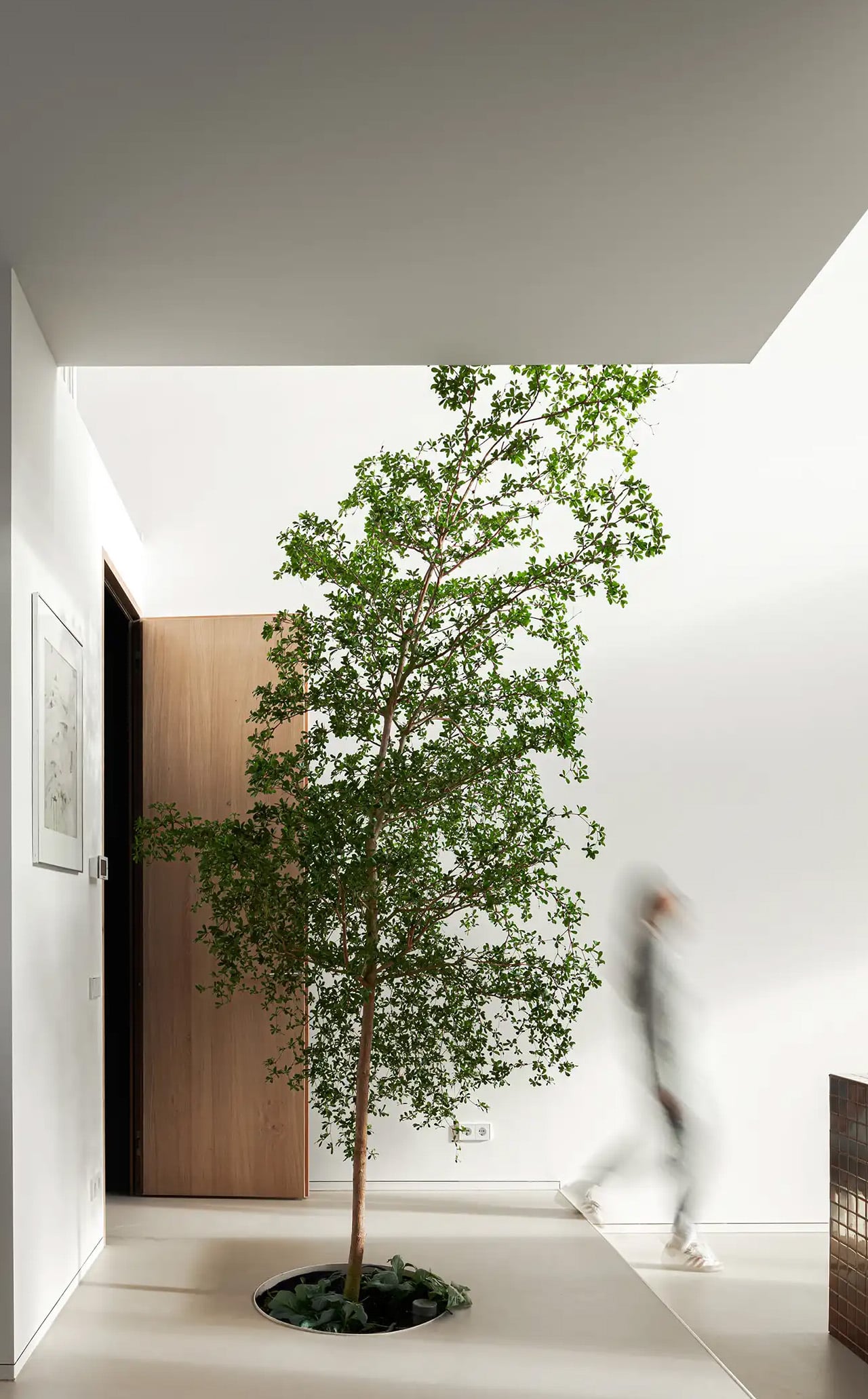
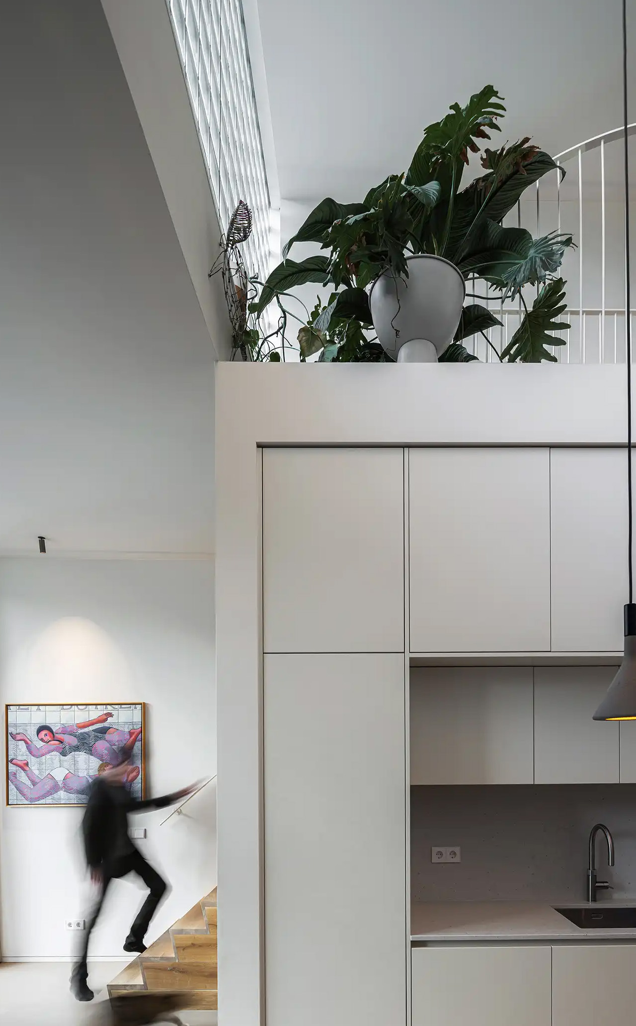
Movement through the home unfolds through a sequence of open passages and compressed zones, where shifts in scale produce entirely different spatial moods. Smaller, enclosed areas carve out space for focused, quieter activities, while larger voids open up visual connections across levels, dissolving any conventional sense of what is above and what is below. Hovering above the kitchen is a sheltered, secluded volume ideal for yoga or film watching, while the journey through the house culminates at the top in what the architects describe as a “holiday home” within the city. Flanked by arched ceiling-height glass openings, this 14-metre-high gathering room commands panoramic views across the IJmeer lake.

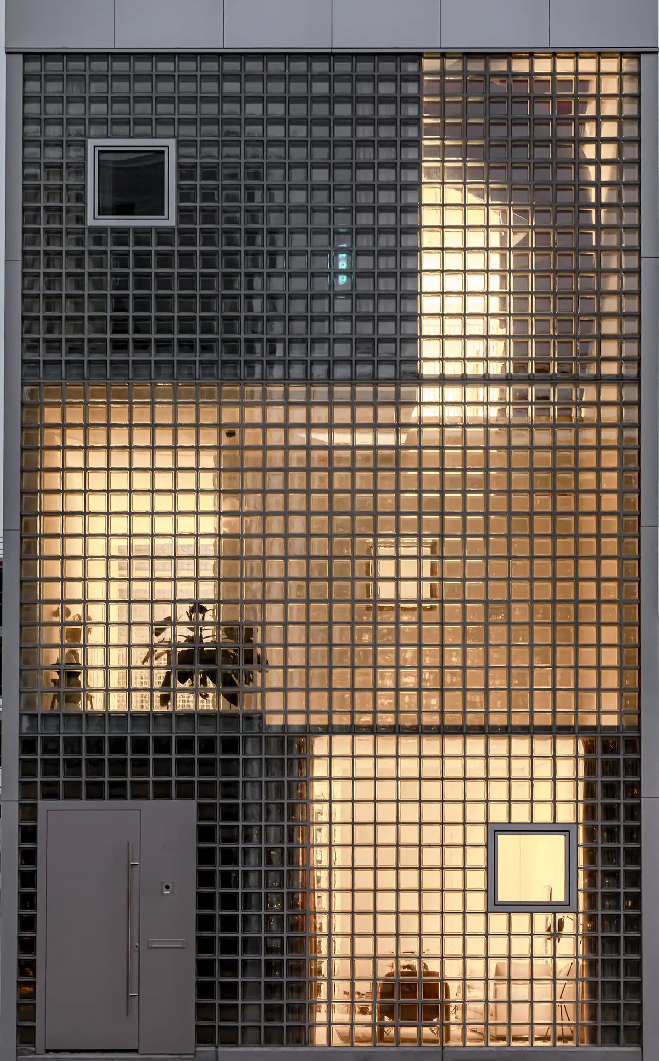
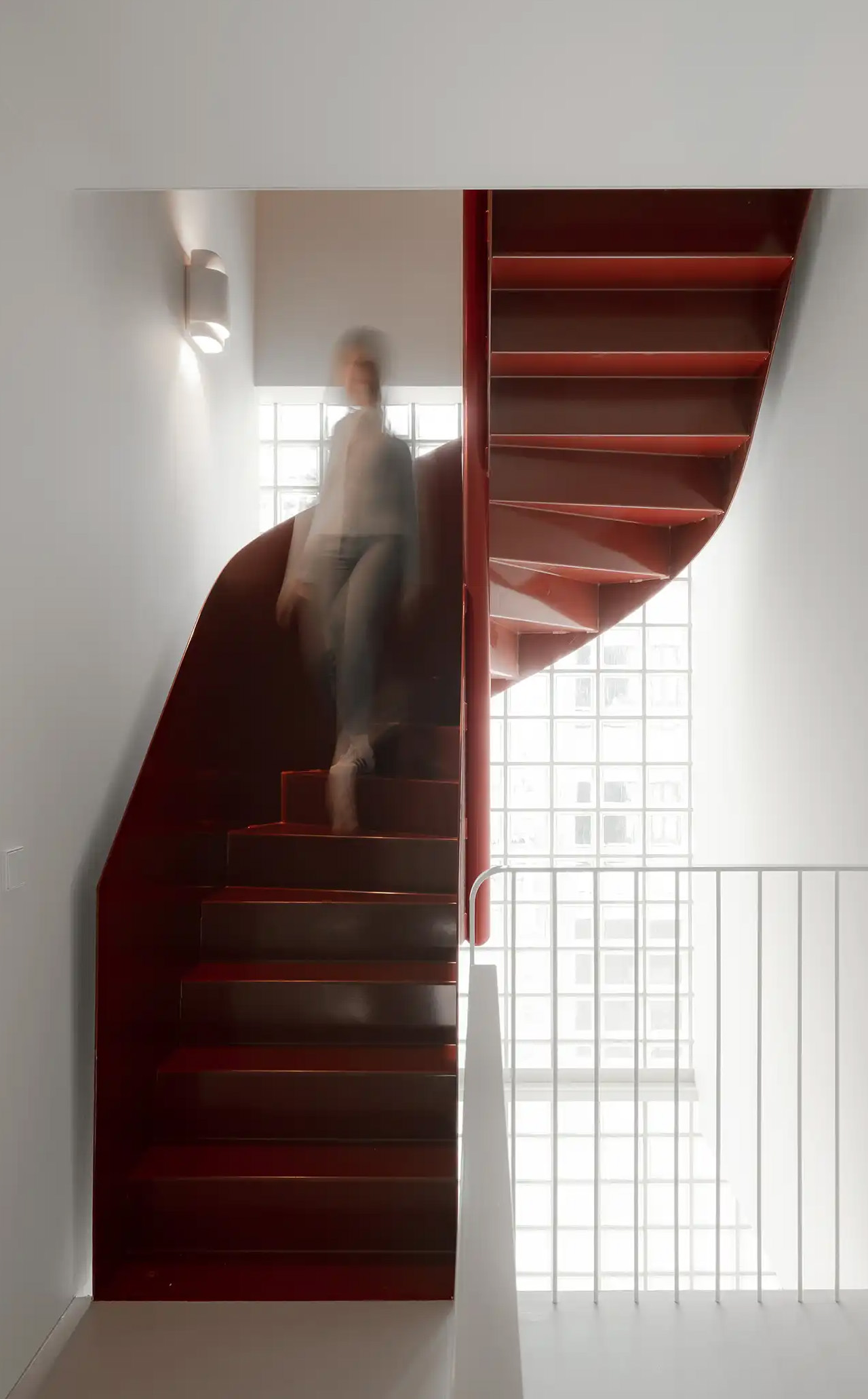
The facade does a lot of the design’s heavy lifting. A wall of square glass blocks wraps the front of the building, filtering natural light into the interior while abstracting the life inside, offering privacy without sacrificing the warmth of daylight. At night, the facade glows from within, giving the house an almost lantern-like presence on the street.

Sustainability is baked into the structure itself. Light House is built as a lightweight system using prefabricated timber components inside a steel frame, a circular and modular method that allows for flexibility, long-term adaptability, and ease of disassembly. The layout is not fixed either, as children grow and priorities shift, the home can be reconfigured to meet whatever the family needs next. Light House is a rare thing: a home that feels entirely personal yet completely considered, one where architecture quietly gets out of the way and lets life fill the space.

The post Studioninedots’ Light House Is a Vertical Amsterdam Home Built From Playfully Stacked Boxes first appeared on Yanko Design.

5 Best Tiny Homes of April 2026 Prove You Don’t Need More Space to Live Better

The tiny home is having a genuine design moment. Not the kind driven by social media aesthetics or minimalism as a lifestyle brand, but the kind where builders are solving real problems, and the results are getting sharper each season. What once felt like a compromise category has grown into a serious architectural conversation, one where craft, livability, and genuine spatial intelligence are setting the standard. The homes arriving this April reflect that maturity clearly.

Each home on this list approaches compact living from a distinctly different angle. One eliminates the loft bed that most tiny houses treat as structural law. Another was designed from the ground up around a growing family’s daily rhythms. A third draws from Japanese craft traditions to build something that feels purposeful at every scale. These are not the tiny homes of five years ago. They are fully realized dwellings that simply happen to take up less space, and the best five of April 2026 make a case worth hearing in full.

1. Betty — The Towable That Finally Gets the Bedroom Right

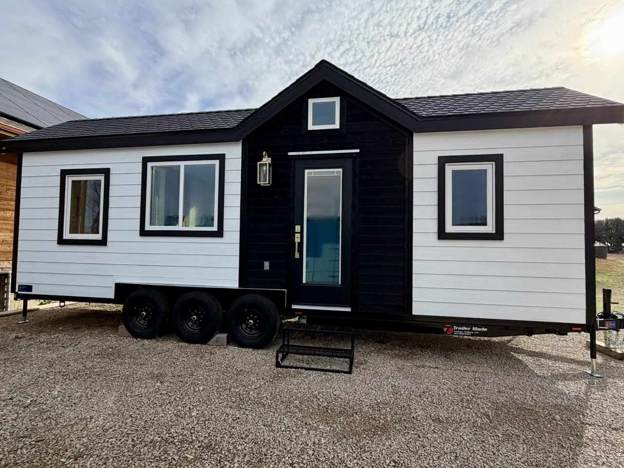
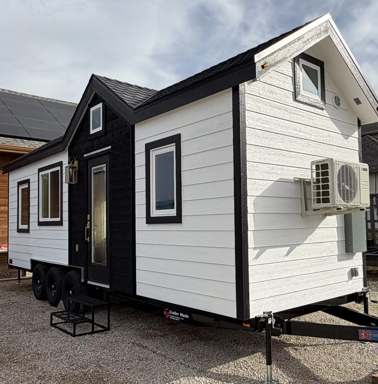
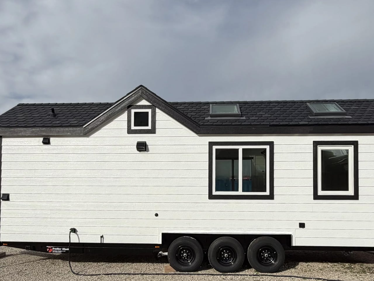
Tiny house living often demands tough trade-offs between mobility and livability, but the Betty by Decathlon Tiny Homes aims to strike a balance that most towable homes fail to find. At 28 feet long on a triple-axle trailer, it sits comfortably in the mid-size category without feeling cramped. The exterior clad in engineered wood with composite roof shingles keeps things durable and low-maintenance, a practical foundation for a home designed to spend much of its life on the road with two occupants.

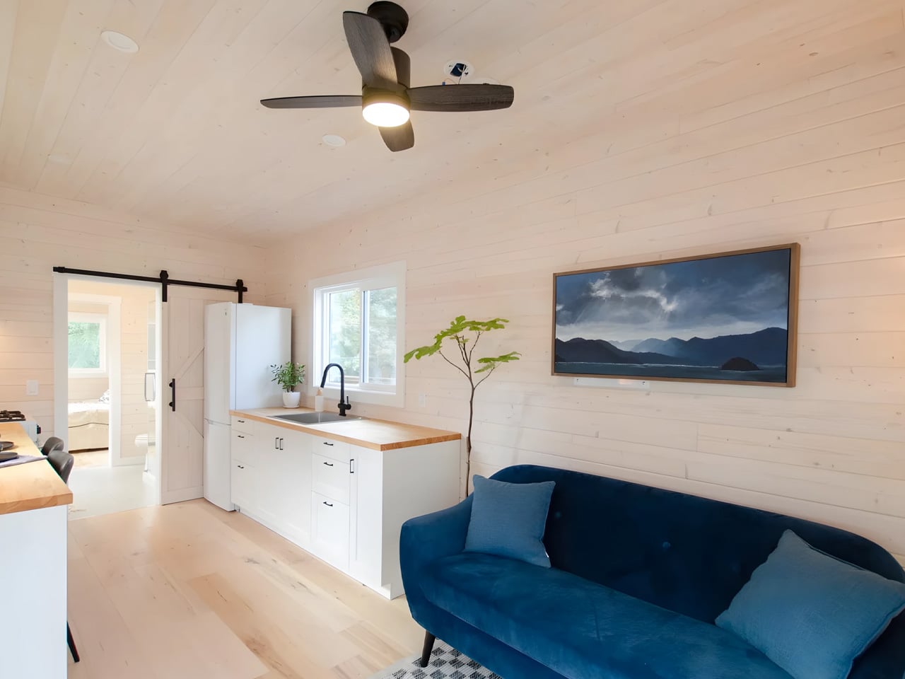
The ground-floor bedroom is what separates the Betty from most of its competition. Where loft beds dominate tiny home layouts, this room offers full standing headroom, a queen bed platform with two large integrated storage drawers, a built-in wardrobe, and a skylight that floods the space with natural light. A wall-mounted TV, a mini-split AC unit in the living area, and a sliding barn-style door complete a setup that never quite asks you to feel like you are settling for something.

What we like:

  • The ground-floor bedroom with full standing headroom is a rare feature in this size category, making the space feel genuinely livable rather than something you climb into at the end of the day.
  • Engineered wood cladding and composite roof shingles offer real long-term durability without demanding intensive upkeep, a sensible material choice for a home that moves regularly.

What we dislike:

  • The living room footprint is modest enough that two people spending extended stretches at home may find it limiting over longer periods together.
  • There is no dedicated workspace mentioned in the layout, which matters increasingly for buyers who plan to work remotely as their primary daily routine.

2. Mizuho — Japanese Craft Meets Intentional Living

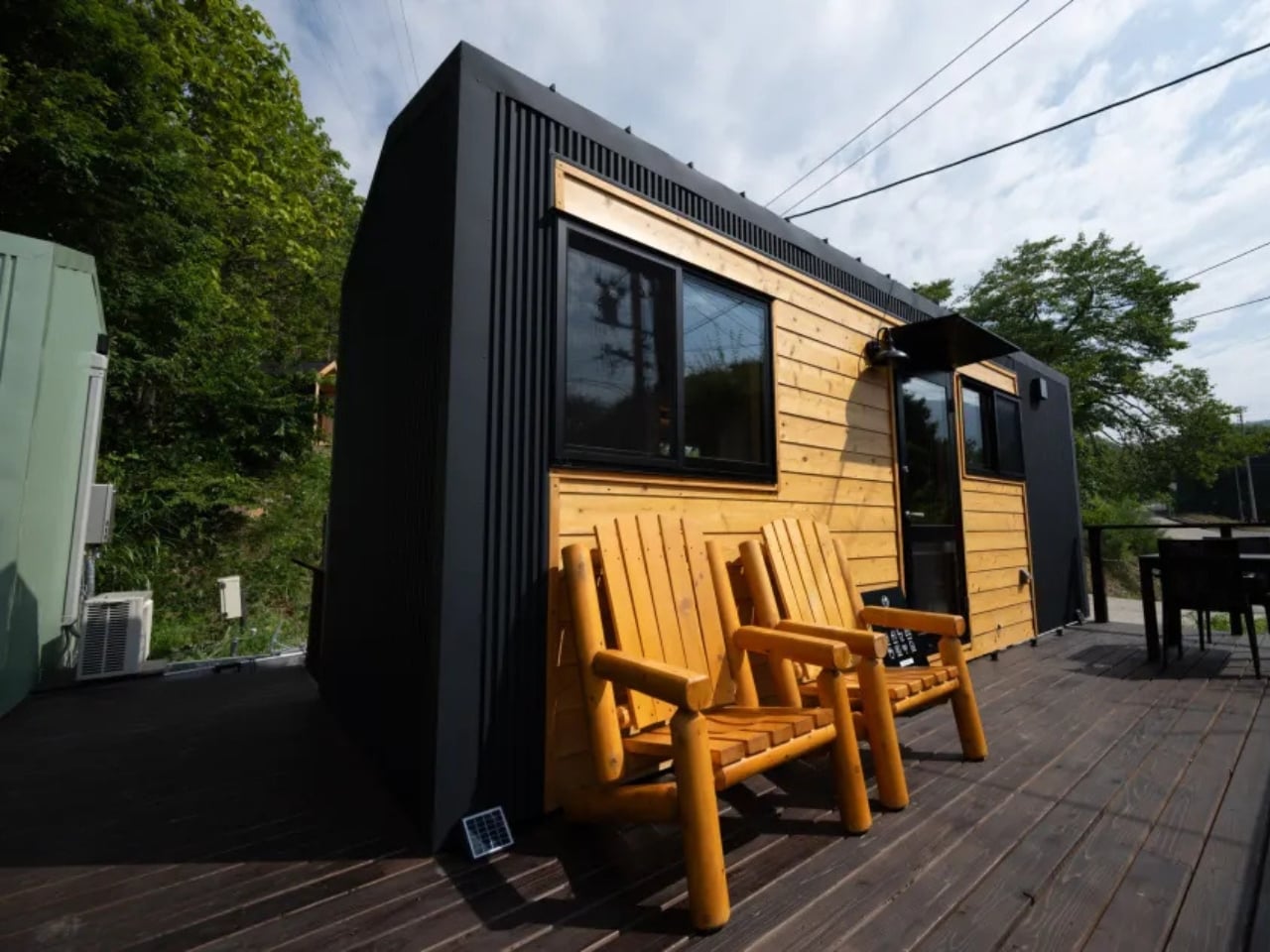
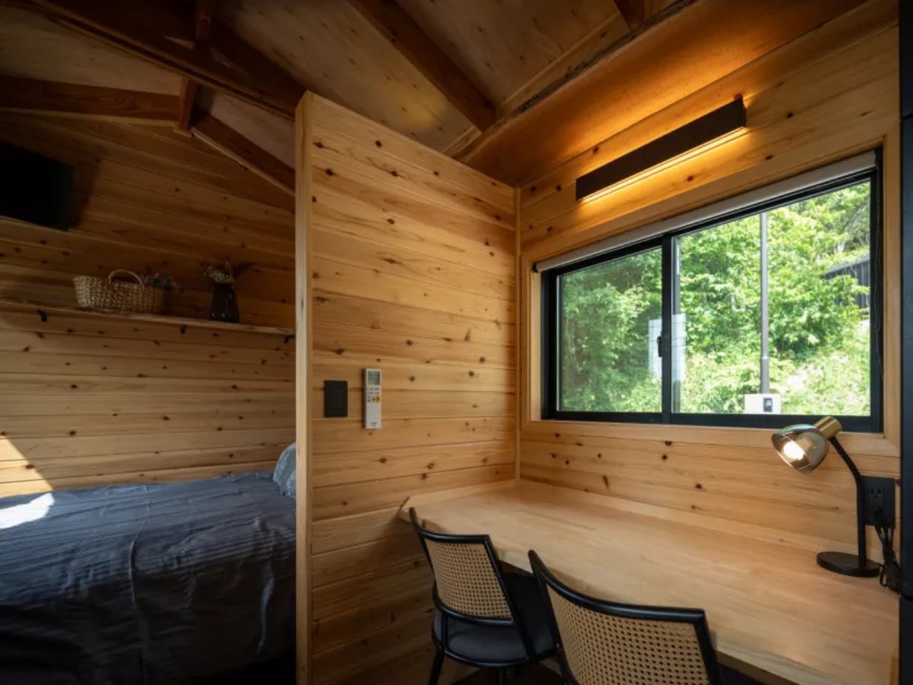
The Mizuho does not try to look like every other tiny home on the market, and that restraint is its first strength. Designed by Ikigai Collective and named after the Japanese philosophy of purposeful living, this home measures 6.6 meters long, 2.4 meters wide, and 3.8 meters tall. It is built for one person or a couple who genuinely want to live with less, combining traditional Japanese aesthetics with modern building technology in a way that feels coherent rather than borrowed.

What makes the Mizuho stand apart is its commitment to authenticity. Ikigai Collective works directly with local partners in Nozawaonsen, Japan, to craft each home to strict quality standards. Every material choice and spatial decision reflects a coherent set of values rooted in simplicity, mindful living, and environmental care. For those drawn to the Ikigai philosophy of finding meaning in everyday life, this home does not reference that tradition from the outside. It builds it into every wall and surface.

What we like:

  • Authentic Japanese craftsmanship sourced through local partners in Nozawaonsen gives the Mizuho a material integrity that most tiny homes, regardless of their aesthetic direction, simply cannot replicate.
  • The eco-friendly design philosophy extends beyond surface-level choices, reflecting a genuine commitment to sustainable and intentional living that runs through every aspect of the build.

What we dislike:

  • At 6.6 meters long and 2.4 meters wide, the dimensions are compact even by tiny home standards, making it a tight fit for couples who value clearly defined personal space.
  • The deeply specific aesthetic may feel limiting for buyers who appreciate the minimalist philosophy but prefer more visual flexibility in how their space looks from day to day.

3. Sora 20′ — More Room for the Way People Actually Work Now

The Sora 20′ arrived as a direct response to what Dragon Tiny Homes customers were asking for: more space, without losing the clarity that made the original Sora worth buying in the first place. Expanded from the popular 16-foot model, this version offers increased square footage while maintaining the bright, practical design philosophy its predecessor established. The layout flows from one area to the next in a way that makes daily routines feel effortless rather than choreographed around a tight and unforgiving floor plan.

At $61,000, the Sora 20′ puts full-time tiny living within reach for a broader range of buyers, particularly remote workers who need a home that functions just as well as a workspace. Large windows keep the interior naturally bright throughout the day, and every element earns its place through purpose rather than habit. Dragon Tiny Homes has built something that does not feel like a clever workaround. It feels like a home that simply chose to be more efficient than the ones built around it.

What we like:

  • The $61,000 price point is one of the most accessible in the full-featured tiny home category, making the Sora 20′ a genuinely attainable starting point for first-time buyers entering the market.
  • Large windows and a well-considered floor plan create a sense of openness that consistently exceeds what the square footage would suggest when you look at the numbers alone.

What we dislike:

  • Expanded from a 16-foot base, the layout density may still feel tight for two full-time residents with distinct work schedules and separate daily routines running simultaneously.
  • Published details on built-in storage solutions are limited compared to competing homes in this roundup, which is a meaningful gap for buyers planning a permanent and fully committed move-in.

4. Starling — The Family Tiny Home That Doesn’t Ask You to Lower the Bar

The Starling quietly dismantles the assumption that tiny living means fewer people. Built by Rewild Homes in Nanaimo, British Columbia, this 33-foot gooseneck tiny house was designed with a growing family at the center of every decision. The raised gooseneck section creates genuine spatial separation between living zones, something most tiny homes attempt to achieve with curtains or partitions rather than actual architecture. Natural wood cladding under a metal roof grounds the exterior against the Pacific Northwest landscape it was clearly built for.

Inside, the details compound quickly. A convertible dining banquette folds flat into a third sleeping space, with hidden storage built beneath every seat. The U-shaped kitchen anchors daily life with dark wood countertops, a breakfast bar, a four-burner propane range, a high-efficiency fridge with a bottom freezer, a double sink, and pull-out cabinetry. None of it feels like a workaround. It feels like a kitchen that simply chose to exist somewhere smaller, designed by people who understand that a family’s daily rhythm doesn’t shrink just because the footprint does.

What we like:

  • The gooseneck configuration creates real architectural separation between living and sleeping areas, a level of spatial privacy that is genuinely rare in tiny homes at this scale and price range.
  • The convertible dining banquette adds a functional third sleeping space with integrated storage beneath, making the Starling meaningfully more capable for families without adding a single foot to the overall length.

What we dislike:

  • At 33 feet on a triple-axle gooseneck trailer, the Starling sits at the larger end of the towable category, which may complicate towing logistics and limit suitable placement options for some buyers.
  • The family-forward layout and three-sleeping-zone configuration may feel over-engineered for solo occupants or couples without children who won’t make use of the additional sleeping flexibility.

5. Barred Owl — Single-Level Living That Removes the One Thing Nobody Wanted

At $119,000, the Barred Owl makes one clear argument: sometimes the most intelligent upgrade in tiny home design is the one that removes something entirely. Rewild Homes built this 34-foot home on a single-level plan, eliminating the loft bed that most tiny houses treat as a structural inevitability. Mounted on a triple-axle trailer and measuring 10 feet wide, 1.5 feet wider than the North American standard, the Barred Owl transforms how the interior functions at every point of the day, from the moment you walk in.

The layout moves in railroad apartment fashion, with rooms connecting directly to one another. Entry opens into a bright living room finished in whitewashed pine tongue-and-groove. The galley kitchen features butcherblock counters wrapping into an eating bar that doubles as a dedicated workspace, alongside a full-size refrigerator, a four-burner propane cooktop, and an oven. A dining area seats two comfortably, and the bedroom sits at the far end, private, accessible, and at floor level. It is a home that takes the inconveniences of tiny living seriously and removes them methodically, one by one.

What we like:

  • The single-level layout eliminates the loft bed, delivering a bedroom that functions like an actual room rather than a sleeping platform accessed by a ladder at two in the morning.
  • At 10 feet wide, the Barred Owl offers noticeably more floor space than the standard North American tiny home, and that extra room is felt immediately in how naturally the interior breathes.

What we dislike:

  • At $119,000, the Barred Owl sits at the premium end of the tiny home market, which narrows its accessibility significantly compared to several other strong options featured in this roundup.
  • The railroad-style floor plan, while highly functional, offers limited visual or acoustic separation between the living and dining zones for buyers who prefer more distinctly defined spaces within the home.

The Tiny Home Has Arrived

The five homes on this list represent the clearest thinking in compact residential design right now. They don’t ask you to lower your expectations. They ask you to redirect them toward what actually matters: light, function, thoughtful proportion, and craft that earns its keep over the years rather than simply photographs well on first look. From the Mizuho’s Japanese authenticity to the Barred Owl’s single-level conviction, each one makes a case that is genuinely hard to dismiss.

What is becoming clear is that the tiny home is no longer a reaction to excess. It is a legitimate design category with its own standards, ambitions, and evolving vocabulary. Builders like Rewild Homes, Ikigai Collective, and Dragon Tiny Homes are pushing that vocabulary forward, season by season. If April 2026 is any indication, the most compelling residential design thinking isn’t happening in expansive floor plans. It’s happening in 20 to 34 feet of very carefully considered space.

The post 5 Best Tiny Homes of April 2026 Prove You Don’t Need More Space to Live Better first appeared on Yanko Design.

5 Best Japanese Designs of April 2026 That Make Everything Else Look Like It’s Trying Too Hard

The Japanese Grand Prix is underway this weekend at Suzuka, and it has done what it always does: pulled attention back toward Japan with a kind of quiet, inevitable force. There’s something about watching a sport built on engineering precision staged in a country that has made precision its cultural identity that makes you want to look beyond the circuit. Japan’s design culture runs on the same engine as its racing teams. Nothing is wasted. Nothing is performed. Every decision earns its place, and every object that comes out of that sensibility carries a particular weight.

Japanese design has always understood something the rest of the world is still working out. Restraint is not a lack of ambition. It is the hardest expression of it. The five objects below range from a razor to a kitchen knife to a bath towel, but they all speak the same language. They each solve one problem completely, and they look like nothing else needs to be added. That is the thing about great Japanese design. It doesn’t just make a good product. It makes everything else in the room look like it’s trying too hard.

1. The Paper Razor

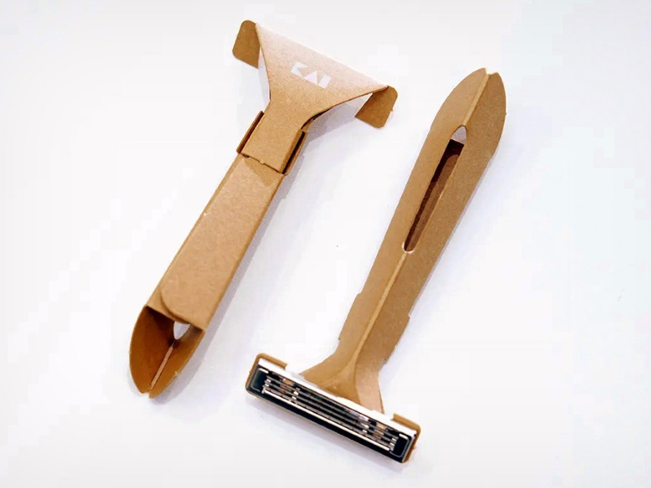
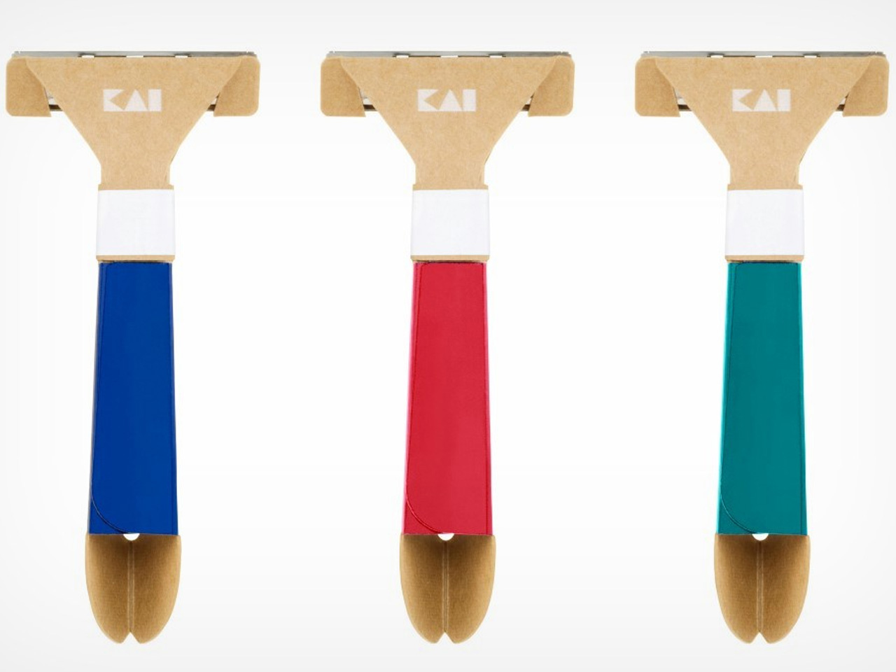
There’s something almost provocative about the Paper Razor. Designed by Japan’s Kai Group, it is a single-use disposable razor built almost entirely from paper, reducing plastic use by 98% without compromising function. The origami-inspired body folds completely flat for shipping, then snaps into a rigid, ergonomic handle in seconds. At just 4 grams and 5mm thick when flat-packed, it ships across five colorways: ocean blue, botanical red, jade green, sunny yellow, and sand beige.

The obvious question is water, and the Kai Group answered it practically. The paper body is made from a water-resistant grade similar to milk carton stock, holding up to temperatures of 104°F. The metal blade head features a notched channel on top for easy rinsing between strokes. Designed primarily for travelers, the Paper Razor is the kind of product that feels less like a shaving tool and more like a position statement on what disposable objects are capable of being when someone takes the design seriously.

What We Like:

  • The origami-fold construction assembles in seconds and ships as a 5mm flat-pack, making it one of the most logistically elegant disposables ever designed
  • Reduces plastic use by 98% while maintaining the ergonomics and shave quality of a standard disposable

What We Dislike:

  • Single-use by design, which limits its appeal for anyone building a more sustainable long-term shaving routine
  • Water resistance caps at 104°F, meaning it isn’t suited for anyone who prefers very hot water while shaving

2. Levitating Pen 2.0: Cosmic Meteorite Edition

The Levitating Pen 2.0 Cosmic Meteorite Edition is the kind of desk object that stops a conversation the moment someone notices it. It suspends at a precise 23.5-degree angle, creating a floating illusion that is genuinely difficult to look away from. The design draws its visual language from spacecraft aesthetics, referencing silhouettes like the USS Enterprise, bringing a sci-fi sensibility to something as familiar and grounded as a ballpoint pen sitting on a work surface.

The detail that separates this edition from the standard series is the meteorite tip. The pen incorporates a genuine Muonionalusta meteorite, a fragment older than Earth by 20 million years, shifting this object from clever desk accessory to something rare and worth owning on its own terms. A simple twist sets it spinning for up to 20 seconds. It is a fidget-worthy, collector-grade piece that makes a compelling case that good design doesn’t always need to justify its existence through usefulness alone.

Click Here to Buy Now: $399.00

What We Like:

  • The genuine Muonionalusta meteorite tip gives this pen a provenance no other writing instrument on any desk can match
  • The floating 23.5-degree angle creates an immediate visual anchor on a desk surface without taking up meaningful real estate

What We Dislike:

  • The limited edition nature makes availability unpredictable, and the pricing reflects exclusivity as much as it does materials
  • The spacecraft-inspired aesthetic is deliberate and specific, meaning it will feel out of place on a desk that skews quieter or more minimal

3. Kuroi Hana Knife Collection

The Kuroi Hana knives begin with Japanese AUS-10 steel sourced from Aichi Steel Corporation, rated between 58 and 60 HRC for hardness and chosen specifically for its combination of toughness, sharpness, and corrosion resistance. Each blade is built from 67 layers of high-carbon steel, producing the Damascus layered structure that defines the collection’s character. Kuroi Hana translates to “black flower,” and the dark floral pattern that emerges across each blade makes that name feel entirely earned rather than marketed.

The pattern isn’t applied to the surface. It is drawn out from within. Skilled artisans manually submerge each blade into an etching solution that penetrates the steel layers and reveals the Damascus patterning in a deep, dark floral form. Because the process is done by hand and each blade’s steel structure is unique, no two knives carry the same pattern. This is a kitchen tool that respects the cook enough to make the knife itself a considered, genuinely beautiful object worth picking up before you even start cooking.

What We Like:

  • Every blade carries a unique dark floral pattern drawn from the steel itself, making each knife a one-of-a-kind object rather than a manufactured product
  • AUS-10 steel at 58–60 HRC delivers professional-grade sharpness and toughness that performs as well as it looks, sitting on a magnetic strip

What We Dislike:

  • The artisanal Damascus etching process makes these a premium investment that sits well outside casual kitchen knife territory in terms of price
  • The distinctive dark floral aesthetic is polarizing for cooks who prefer clean, unmarked blades in a working kitchen environment

4. The Invisible Shoehorn

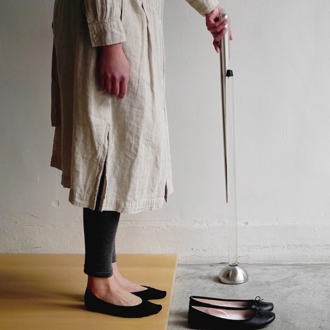
The Invisible Shoehorn is the kind of product that earns its place by solving something so specific and so quietly that you find yourself wondering why every shoehorn hasn’t been designed this way. The long stainless steel body eliminates the need to hunch over, protecting your lower back from the kind of daily accumulated strain that nobody tracks until it’s a problem. The smooth, polished surface slides cleanly against socks and stockings without snagging. It performs one job with a material confidence that feels entirely Japanese.

The transparent stand is the decision that lifts this from a functional object to something worth displaying. Mounted in its clear acrylic holder, the shoehorn practically disappears into its surroundings, reading less like a bathroom utility and more like a considered piece of interior design. In a category full of objects people hide at the back of a closet, this one earns a place on the shelf. That shift from something concealed to something displayed is precisely what separates a good tool from a genuinely designed one.

Click Here to Buy Now: $299.00

What We Like:

  • The transparent acrylic stand transforms a purely utilitarian object into something display-worthy that holds its own in a well-designed home
  • The long stainless steel handle removes real daily lower back strain without requiring any change in how you put your shoes on

What We Dislike:

  • Polished stainless steel and a transparent stand both attract fingerprints readily, requiring consistent upkeep to maintain the invisible aesthetic the design promises
  • The extreme restraint of the form may feel underwhelming to people who expect more visual personality from their home accessories

5. Sento 2 Towel

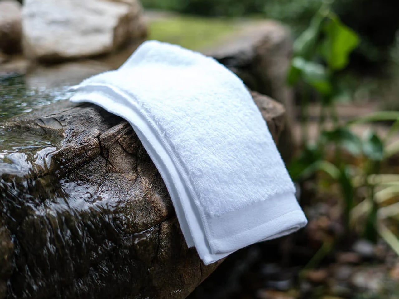
Most towels are made by twisting cotton fibers into dense, rope-like loops, a production method that prioritizes speed and cost over softness or absorbency. The Sento 2 goes the other way entirely. Using a zero-twist design developed through specialized manufacturing techniques refined in Japan, the natural cotton fibers are left loose and uncompressed, producing a towel that is softer, more absorbent, and faster-drying than standard terry cloth. The process is slower, more demanding, and the finished result communicates every bit of that effort on first contact.

The zero-twist construction leaves natural cotton in a state that feels fundamentally different from anything mass-produced. The towel is light enough to feel like almost nothing in your hands, and absorbent enough that the job is done before you’ve consciously started it. There is an effortless quality to the whole experience that is harder to explain than it is to feel. It is a towel. It is also a quiet argument for buying fewer things, buying them properly, and understanding that the best version of an everyday object is worth far more than the cheapest one.

What We Like:

  • Zero-twist construction produces a softness and absorbency level that standard terry cloth towels genuinely cannot replicate, and the difference is apparent immediately
  • The quick-drying design makes it practical enough for daily rotation, not just a display-shelf luxury that performs better as a photograph

What We Dislike:

  • Zero-twist fibers are more delicate than standard loops and require careful laundering to preserve their structure and softness over repeated washing
  • The premium construction comes at a price that becomes harder to justify when buying multiples to fully outfit a bathroom

Japan Has Been Designing This Way Forever. The Rest of the World Is Still Catching Up.

What these five objects share is not a visual style. It is a philosophy. Japanese design has always understood that the most powerful thing a product can do is remove everything that shouldn’t be there. The Paper Razor removes plastic. The Invisible Shoehorn removes visual noise. The Sento 2 removes the compromise built into every standard terry loop. What remains in each case is an object that works so cleanly it feels inevitable, as though no other version was ever possible.

The Japanese Grand Prix reminds us every year that Japan operates at a level of precision most cultures aim for and fall short of. Its design culture runs on the same engine. These five products are proof that restraint is not a limitation. It is the hardest discipline to master and the most rewarding thing to live with. Every one of them earns its place, whether on a shelf, in a kitchen drawer, mounted by the door, on a desk at a 23.5-degree angle, or wrapped around you right after a shower.

The post 5 Best Japanese Designs of April 2026 That Make Everything Else Look Like It’s Trying Too Hard first appeared on Yanko Design.
This Hydrogen Business Jet Emits Nothing But Water and Could Change Private Aviation Forever

French aerospace startup Beyond Aero has just completed the Preliminary Design Review (PDR) of its hydrogen-electric business jet, the BYA-I One, a significant step that moves the aircraft firmly into detailed design and verification and one step closer to its target commercial entry in 2030. Founded in Toulouse in December 2020, Beyond Aero first unveiled the BYA-I concept at the Paris Air Show in June 2023. Since then, the aircraft has evolved considerably, and the PDR marks the most mature version yet.

The review confirmed the full integration of hydrogen storage, electric propulsion, thermal management, fuel cell systems, and safety architecture into what the company describes as a certifiable design. The propulsion setup is the heart of the story. The BYA-I One uses a twin pusher-configured propfan system, a shift from the earlier ducted-fan arrangement, powered by six 400kW hydrogen fuel cells delivering a combined 2.4MW of power, with a total propeller shaft output of 950kW.

Designer: Beyond Aero

Gaseous hydrogen is stored at 700 bar in externally mounted tanks above the wing structure, with a refueling time of just 30 minutes. The aircraft emits only water vapor in flight, making it one of the cleanest propulsion concepts in business aviation today. A custom-designed Full Authority Digital Engine Control (FADEC) system ensures precise performance across all flight phases and will be certified under a TC Engine framework.

On performance, the numbers are compelling. The BYA-I One is designed to carry up to eight passengers over a range of 800 nautical miles at 300 knots, covering more than 80% of current European business aviation routes. It has a maximum speed of 414 mph, a ceiling of 26,000 feet, and a takeoff ground roll of just 725 meters, short enough to serve constrained airports like London City, and can operate from grass, snow, and unpaved surfaces.

Inside, the cabin stretches 1.84 meters wide and 1.7 meters tall, wider than most light jets, with a six-seat club configuration. Elliptical windows are 27% larger than those found in conventional business jets, flooding the interior with natural light. With 90% fewer moving parts and no high-temperature turbine, maintenance costs are projected to drop by up to 60%, and overall operational costs could fall by 40–60% compared to conventional jets.

Market appetite is already strong, with Beyond Aero securing $914 million in Letters of Intent across 108 aircraft, and a waiting list for booking deposits is now open. The certification path runs through EASA, where Beyond Aero is actively collaborating to develop special conditions for hydrogen-electric aircraft, essentially helping write the rulebook for an entirely new category of flight. If the 2030 timeline holds, the BYA-I One won’t just be another business jet. It’ll be the first of its kind.

The post This Hydrogen Business Jet Emits Nothing But Water and Could Change Private Aviation Forever first appeared on Yanko Design.
The Daphne Is a Tiny Home That Thinks It’s an Apartment

Most tiny homes ask you to live smaller. The Daphne skips that conversation entirely. It doesn’t try to be a tiny home — it tries to be a home, full stop. Built by Alberta-based Teacup Tiny Homes, a builder that has been crafting thoughtfully designed compact dwellings since 2016, the Daphne is a park model that reframes what small-scale living can actually look and feel like.

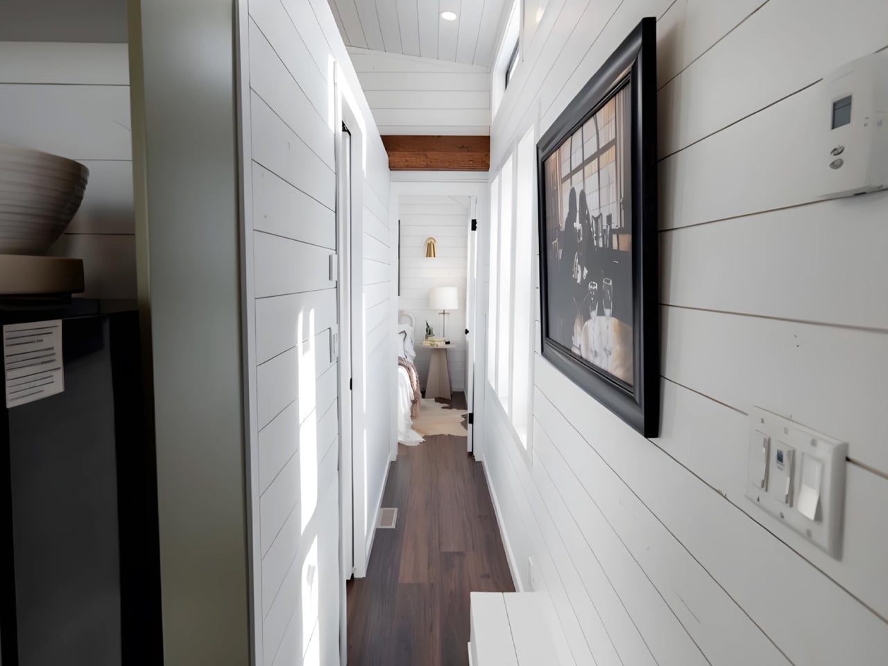
Originally custom-designed and built for a client in Ontario, the Daphne sits on a triple-axle trailer and measures 36 feet long by 10 feet 6 inches wide, a noticeably generous footprint by tiny home standards. That extra width is the whole point. Where most road-legal tiny homes max out at 8.5 feet across, the Daphne’s park model classification allows it to stretch into a proportion that feels closer to an apartment than a camper. The result is 378 square feet of interior space that sleeps up to four people, all on a single floor, with no lofts in sight.

Designer: Teacup Tiny Homes

The exterior makes a clean first impression. Horizontal lap siding wraps the structure, punctuated by cedar accents that add warmth and a sense of craft without veering into rustic territory. Large windows run throughout, drawing in natural light and giving the interior an openness that defies the square footage. Inside, the design reads like a well-edited apartment, bright, modern, and deliberately finished. Fine materials and considered details are present throughout, reflecting the kind of specificity that comes with a custom build.
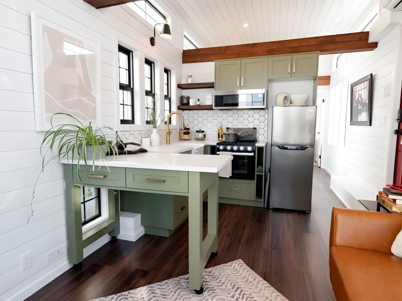
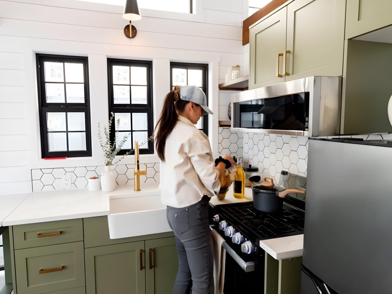
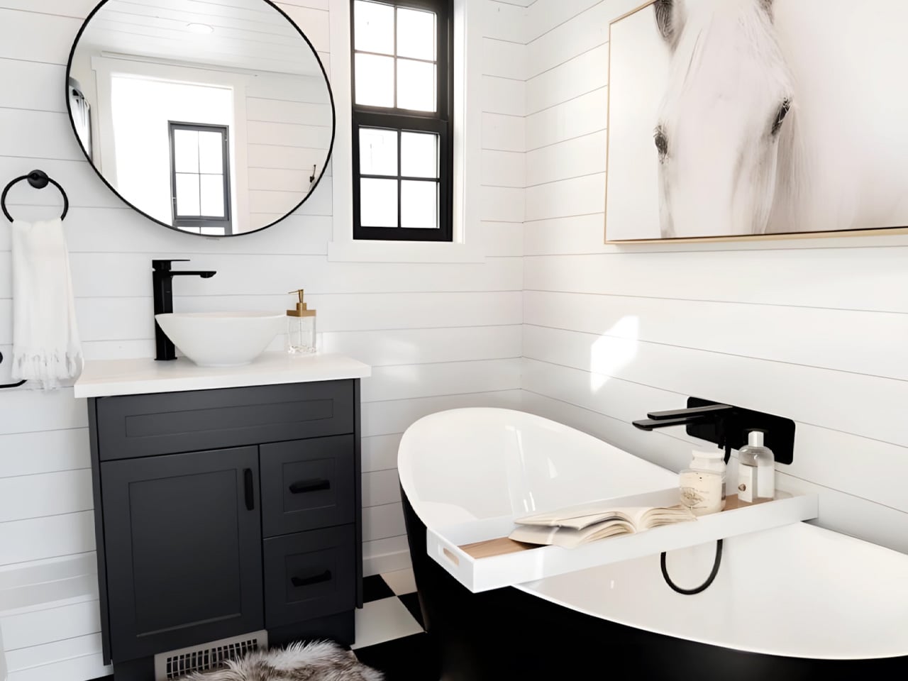
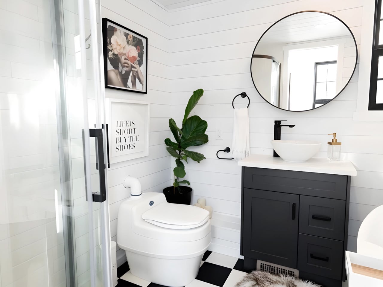
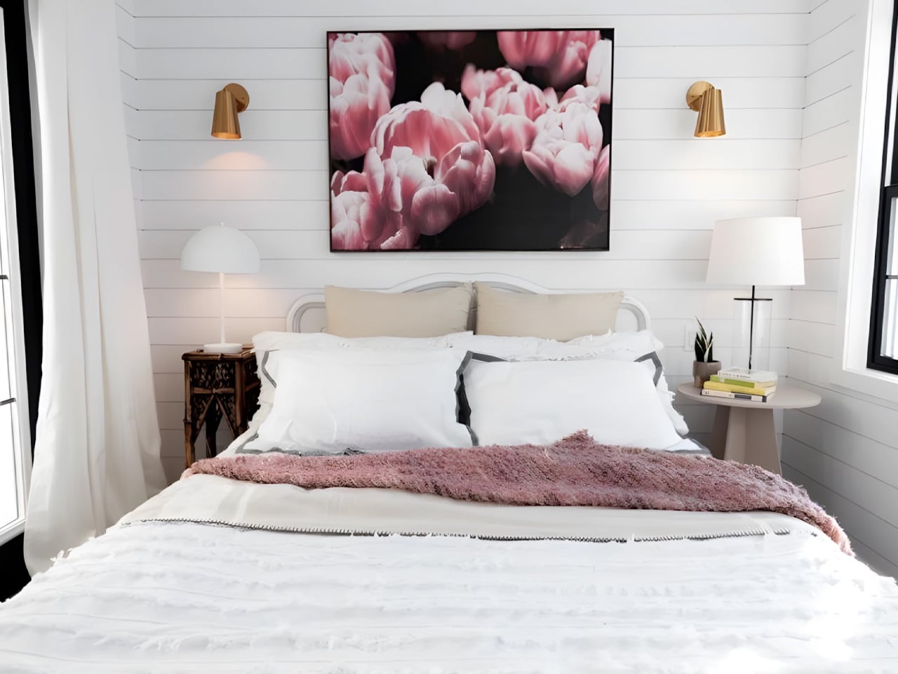
The kitchen earns its title as a gourmet space, offering full-sized functionality in a layout that doesn’t feel squeezed. The living area is generous enough to actually use, and the main floor bedroom includes built-in storage that keeps the space feeling uncluttered. But the bathroom might be Daphne’s boldest move: it includes both a freestanding bathtub and a separate shower, a feature that’s rare even in full-sized homes, let alone tiny ones. It signals clearly that this is a home built around comfort rather than compromise.

For those looking at seasonal retreats, full-time living, or a secondary dwelling on a larger property, the Daphne presents a genuinely compelling case. It doesn’t ask its owner to give anything up. The proportions are right, the finishes are right, and the floor plan flows the way a real home should. Teacup Tiny Homes has always argued that small doesn’t have to mean less, and the Daphne is the clearest version of that argument yet.

The post The Daphne Is a Tiny Home That Thinks It’s an Apartment first appeared on Yanko Design.