The retro handheld market has a strange problem. The hardware keeps getting better, the screens get sharper, the processors get faster, and yet most of these devices land looking like prototypes someone forgot to finish. Generic shells, forgettable proportions, and LED lighting as a substitute for actual design thinking. For a category built entirely on nostalgia, very few of these devices actually look like they belong to any era at all.
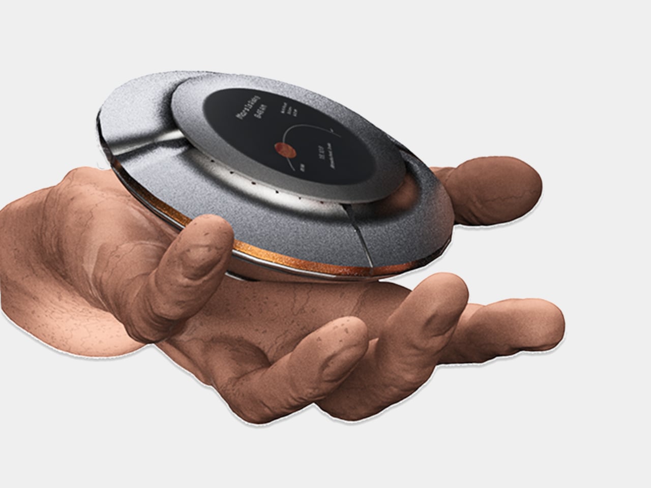
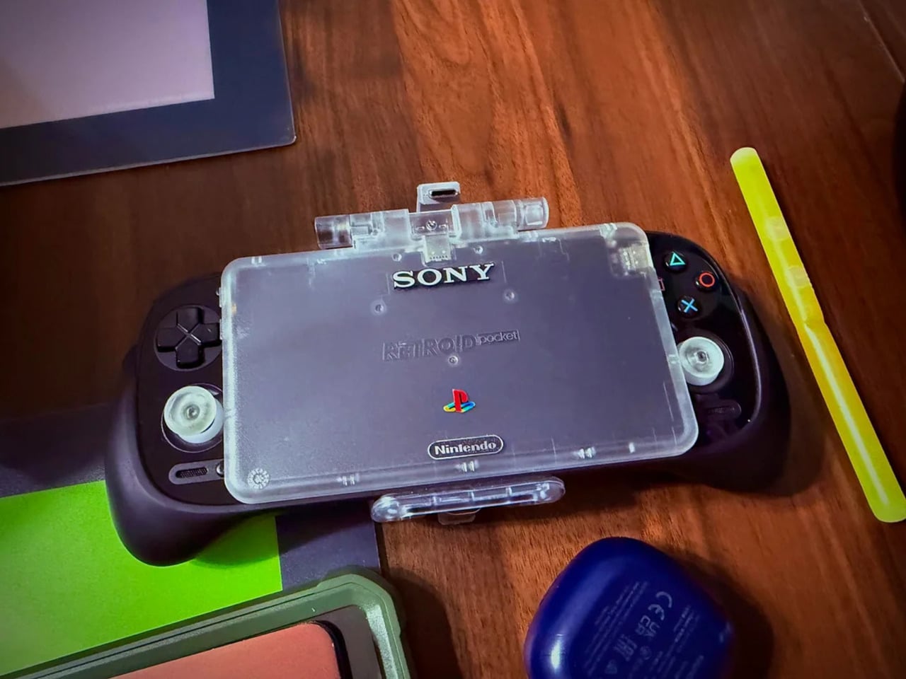
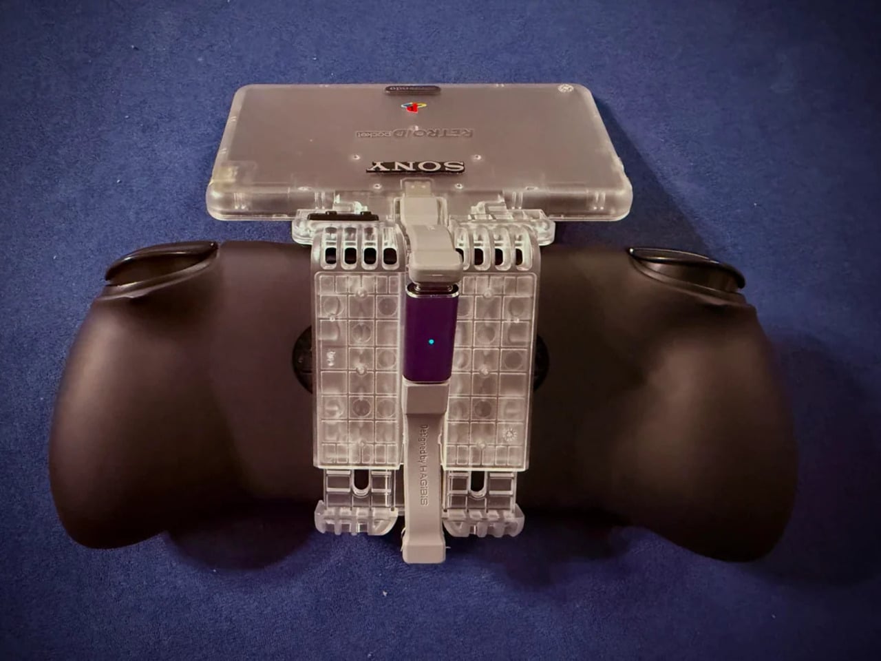
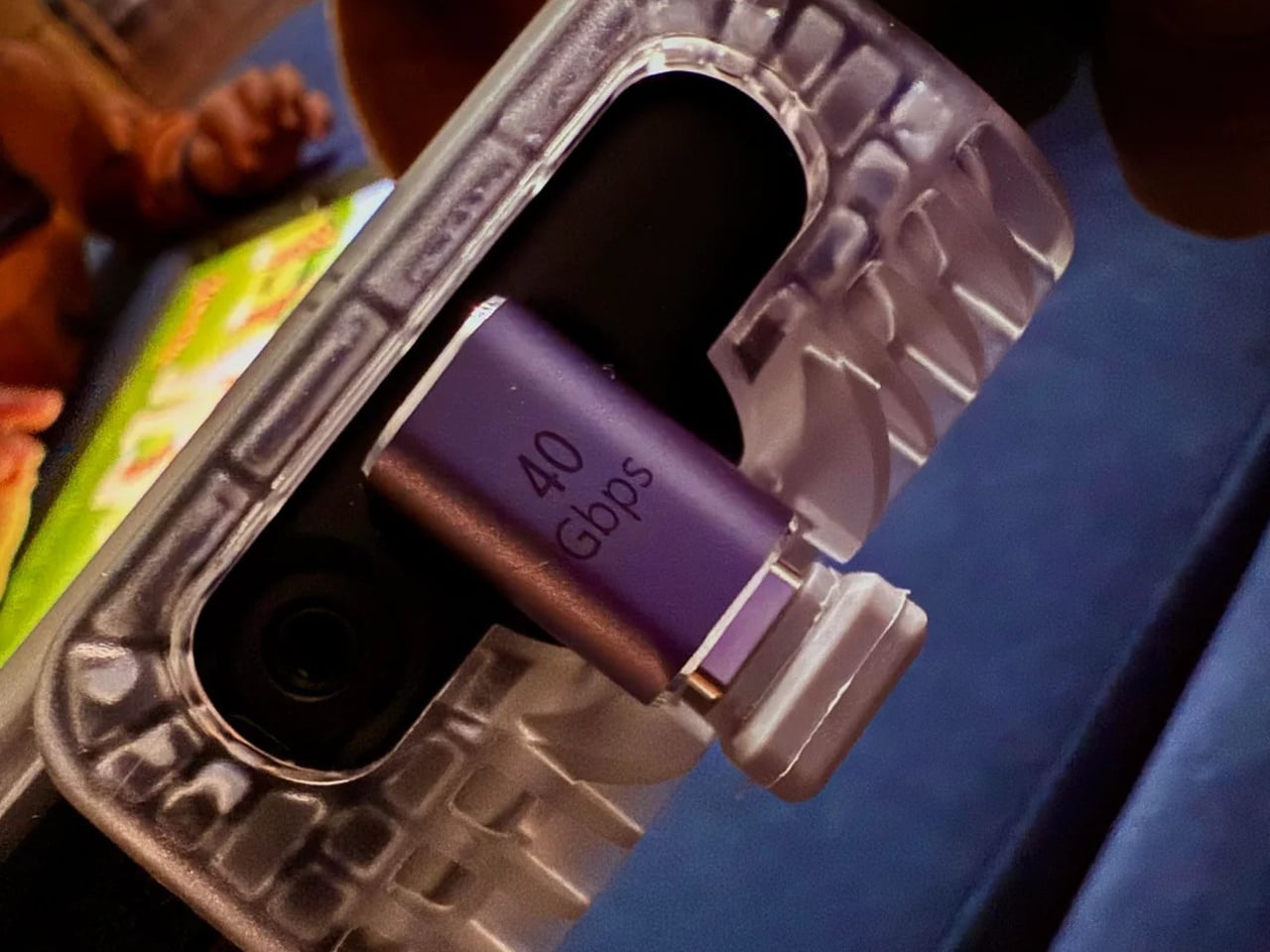
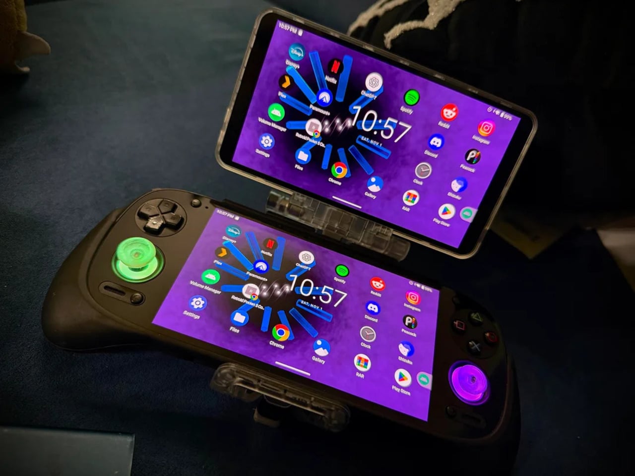
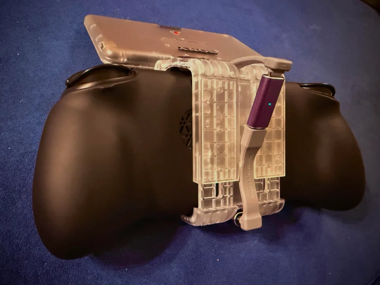
That tension is what one Reddit user decided to address. Starting with a Retroid Pocket 5, a $199 Android handheld running a Snapdragon 865 and a 5.5-inch AMOLED display, the mod layers Sony and Nintendo branding onto the same shell. Vinyl decals, translucent polycarbonate, a 3D-printed volume rocker from Etsy, and a cable replaced in PS2 color. The result looks less like a sticker job and more like a concept render from an alternate 1999.
Designer: Mitchieyan
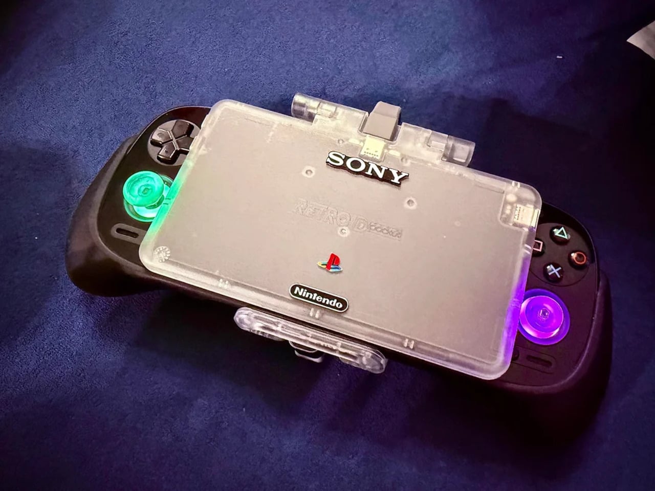
The translucent shell is doing most of the work. It pulls from the visual language of the N64’s Funtastic series, those clear and atomic-purple controllers Nintendo released in the late 1990s, where showing the circuitry was the design choice rather than concealing it. Over a piano-black grip body with PlayStation-colored face buttons, the frosted polycarbonate shifts from grey to near-white depending on the light. It shouldn’t feel considered. It does.
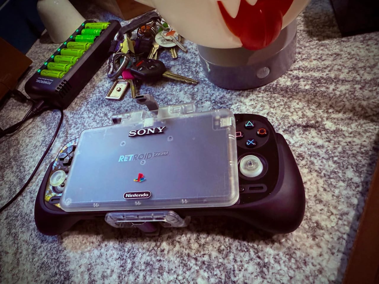
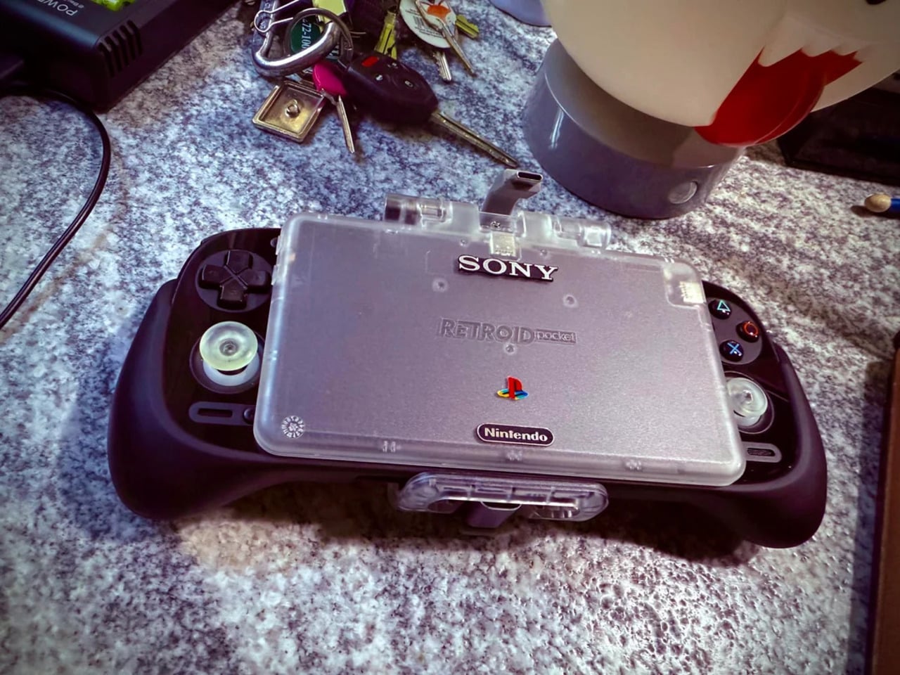
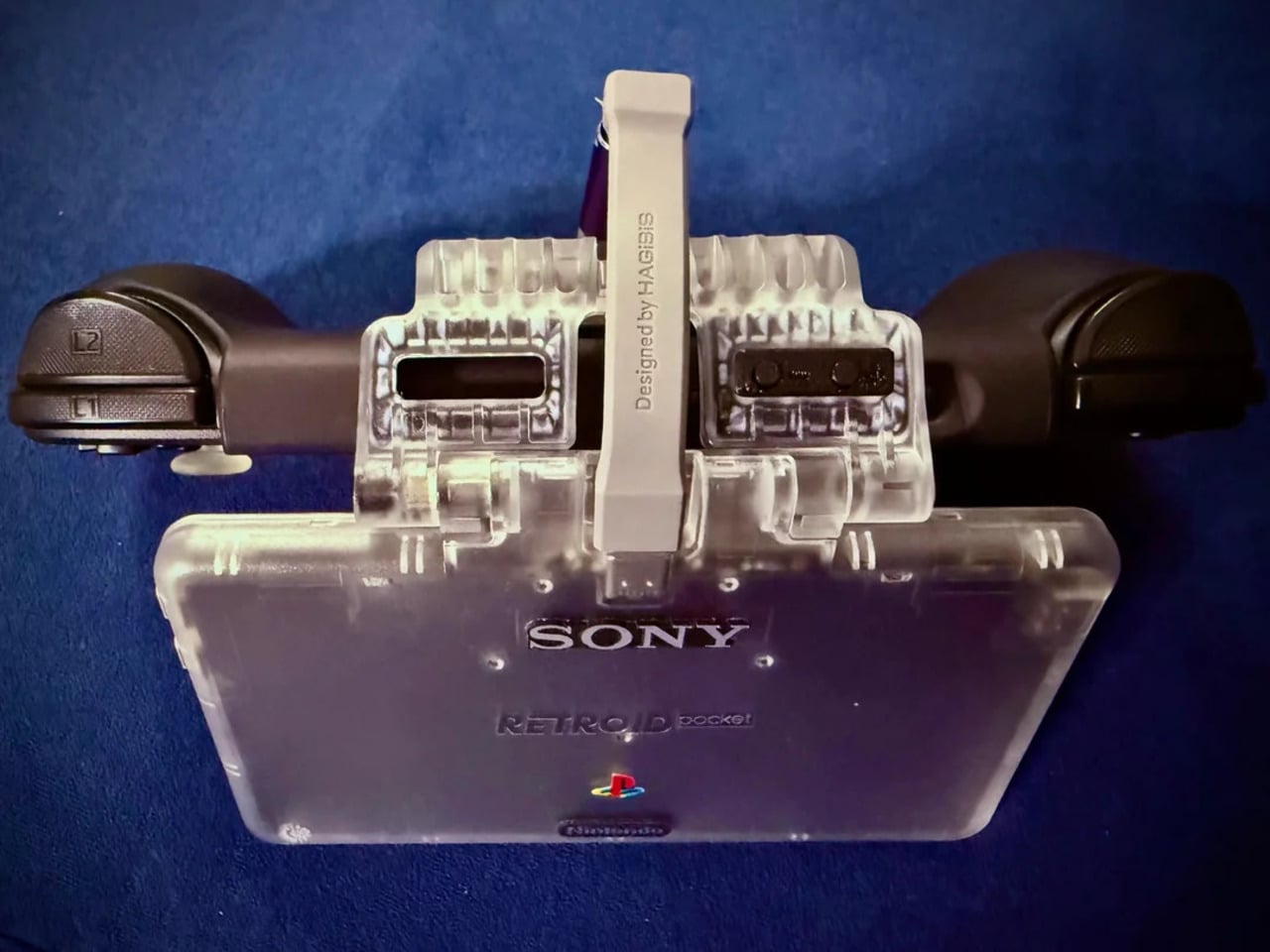
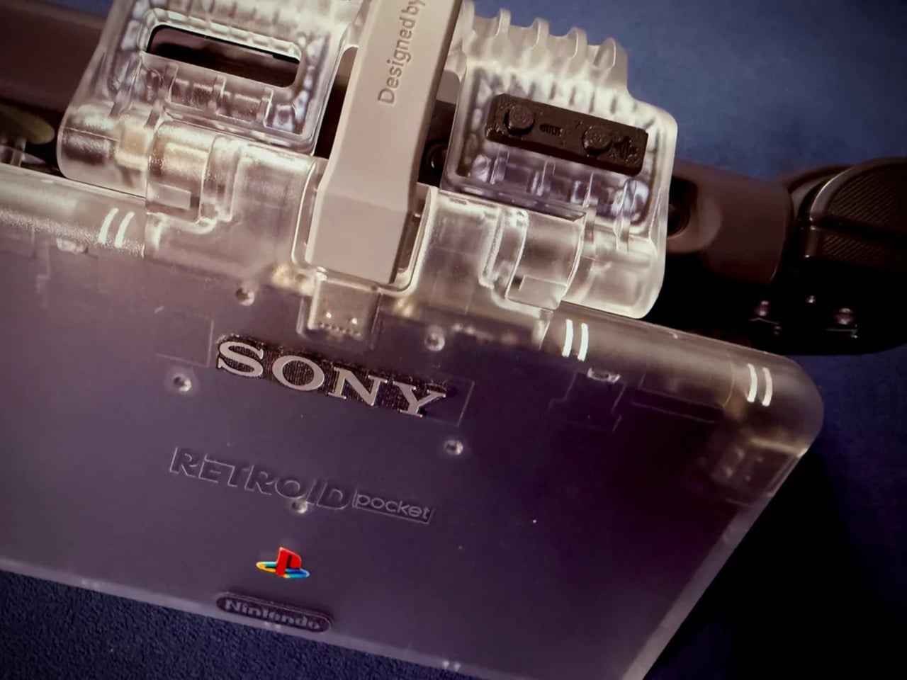
The branding placement is where intent becomes clear. The Sony wordmark sits centered on the upper face, exactly where it appeared on a PSOne. Below it, the PlayStation four-color logo. At the bottom bezel, the Nintendo badge mirrors its position on a Game Boy Advance SP. None of it is licensed, of course. These are adhesive vinyls placed by someone who grew up with both systems and wanted their coexistence on one device to feel inevitable rather than absurd.
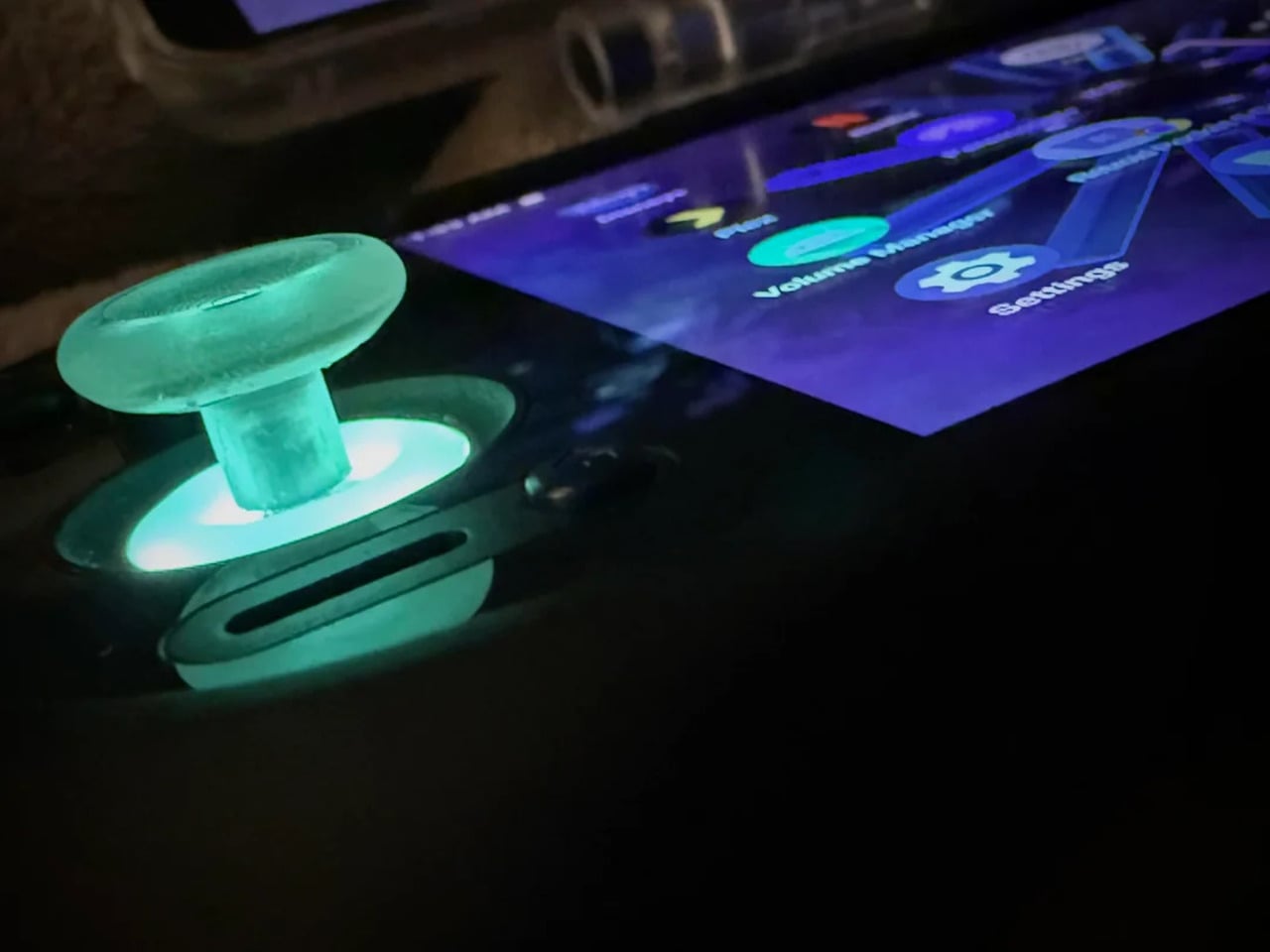
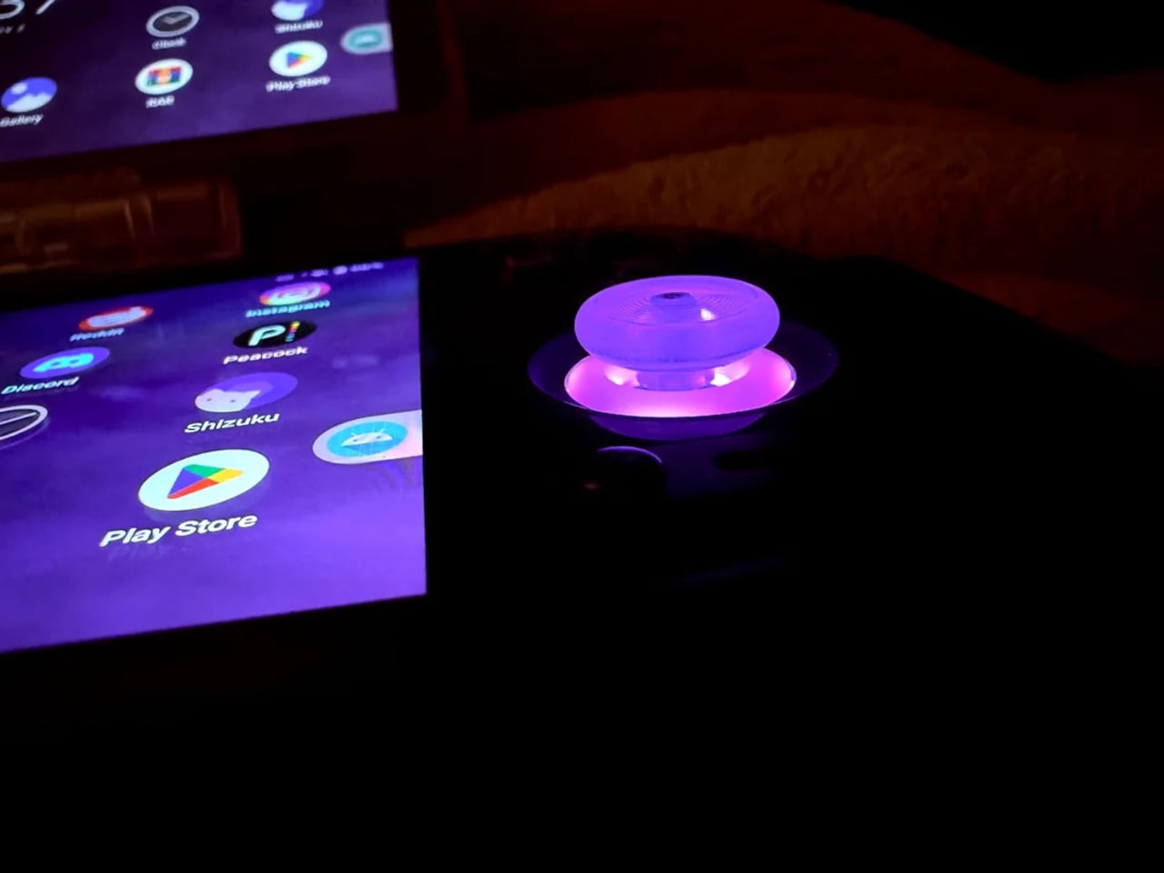
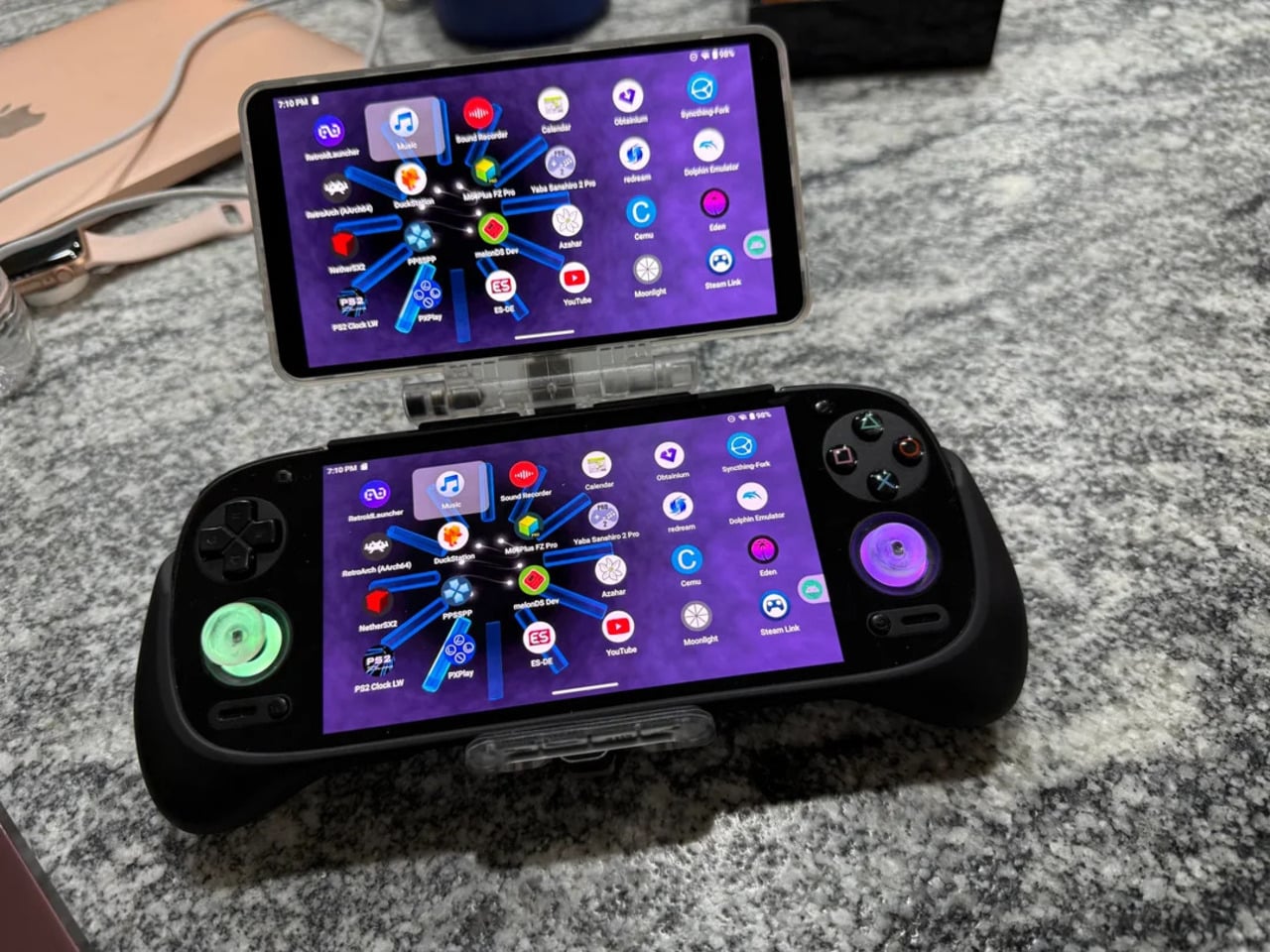
Not everything here reaches backward. The analog sticks are translucent caps over hall-effect sensors, lit teal on the left and purple on the right, owing nothing to 1999. That generation didn’t have RGB anything. The lighting reads as a concession to the present; the one feature announcing this is still an Android device in 2025, not a prototype from some alternate Sony-Nintendo licensing meeting. Whether it sits comfortably alongside the retro shell is a fair question.
The rear view shifts the frame again. A large dual-grip body in smooth black rubber dominates the back, a clear plastic hinge connecting the screen to grip in full view, structural and unapologetic. The 3D-printed volume rocker at the top edge puts a physical control where fingers naturally land. The back half feels closer to a DualShock than a Game Boy, which is either the point or the problem, depending on what you wanted this thing to be.
Flip to the front screen, and the emulator grid makes the whole thing literal. DuckStation for PS1, Dolphin for GameCube, PPSSPP for PSP, melonDS for Nintendo DS, and a live PS2 wallpaper cycling behind all of it. This device runs both companies’ libraries simultaneously without asking permission from either. The branding on the shell, in that context, stops being a novelty and starts reading as a plain statement of what the hardware already does.
The retro handheld category is large enough now that sameness has become its default. The Retroid Pocket 6, the current flagship from the same manufacturer, drew community criticism for being indistinguishable from competitors: glass front, LED sticks, rounded edges, and no particular character. A fan mod building identity out of borrowed logos is one response to a problem the manufacturers haven’t solved. It’s also just someone enjoying a hobby and being honest about what they want.
The hardware to play PS1, PS2, GameCube, and Game Boy Advance all on one screen already exists and costs under $200. What the market hasn’t resolved is what that device should actually look like, or whose name should go on it. This mod doesn’t answer either question. It just makes the gap between what’s technically possible and what anyone has bothered to design feel a little harder to dismiss.
The post This Fan Made the Sony-Nintendo Handheld the Companies Never Would first appeared on Yanko Design.