Get Ready for the Pavilion That Was Designed by the Sun Itself

Architecture has always had to reckon with the sun. Buildings are oriented, shaded, and glazed in response to it, and solar panels are bolted onto them afterward. In most cases, the sun’s behavior is accommodated rather than consulted. The resulting forms come from a designer’s intentions and a structural engineer’s calculations, with sunlight as something to manage rather than the thing that generates the shape itself.

The Sun Shadow Pavilion starts from a different premise. Before any walls were drawn or a floor plan drafted, a scale model of a large square array of photovoltaic solar panels was placed above a flat white surface facing south. The sun then did the rest. The shadows it cast on that surface, traced every hour for eight hours as it crossed the sky, became the raw material for the entire structure.

Designer: Michael Jantzen
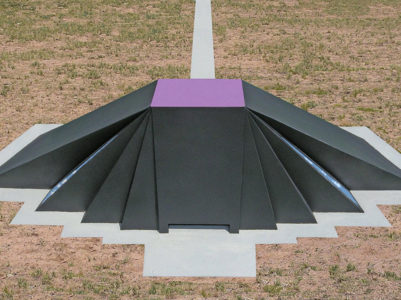
Eight shadow outlines, each representing a different hour of the day, were converted into three-dimensional forms. Solid planes were inserted from the edges of each shadow up to the edges of the solar panels above, creating a set of inclined surfaces that defined the interior volume. That enclosed space, shaped by accumulated light and time rather than a stylist’s instinct, became the pavilion.

The design is also inherently site-specific and date-specific. If built, the shadows used to generate its form would be traced on the actual opening day, at the exact build location. A pavilion in the American Southwest, traced on a different opening date, would look different from one in northern Europe, or from the same structure inaugurated a decade earlier or later. Each built version would be unrepeatable.

The exterior form that results from this particular study is dramatic and unmistakably asymmetric, a cluster of dark, angled, sloping planes radiating outward from the flat solar array at the top. The interior is a complete reversal. The translucent solar cells that generate all of the pavilion’s power also filter light through the roof, keeping the space naturally bright during the public hours the shadow tracings were drawn to represent.
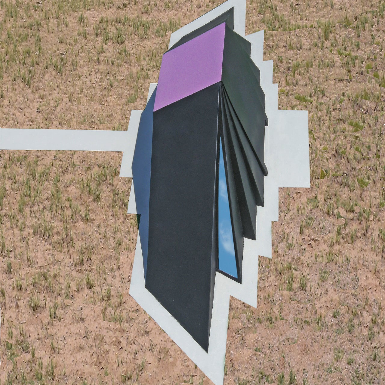
Walking through, the floor carries painted outlines of all eight shadow positions, so the exact geometry that produced the walls above can be read directly underfoot. The building’s origin story isn’t hidden in a design brief or a notebook; it’s painted on the ground you’re standing on. The structure explains itself to anyone willing to look down as well as up.

Beyond the solar panels, the structure handles its own climate without mechanical systems. The dark outer surface absorbs heat, and a double-skin wall construction moves warm or cool air into and away from the interior as needed. Rainwater collected from the exterior surfaces feeds underground storage tanks for use on-site. The pavilion’s stated purpose, to display advances in alternative energy technology, is also its operating model.

There’s an honesty to the whole approach that’s relatively rare in landmark building design. Most structures acquire their form through aesthetic decisions, historical references, or personal sensibility. This one derived its shape from a physical process that would have happened regardless of any design intention. The sun was going to cast those shadows anyway. The design simply had the sense to use them.

The post Get Ready for the Pavilion That Was Designed by the Sun Itself first appeared on Yanko Design.
This Pixel 11 Pro Concept Makes the Camera Bump Its Best Feature

The back of a smartphone has historically been the least interesting real estate on the device. A logo, some camera lenses, and a flat slab of glass or metal. Nothing phones started to change that conversation a few years ago by threading LED strips through their transparent backs to indicate calls, charges, and timers with light patterns. The question since then has been whether anyone else would take the idea further.

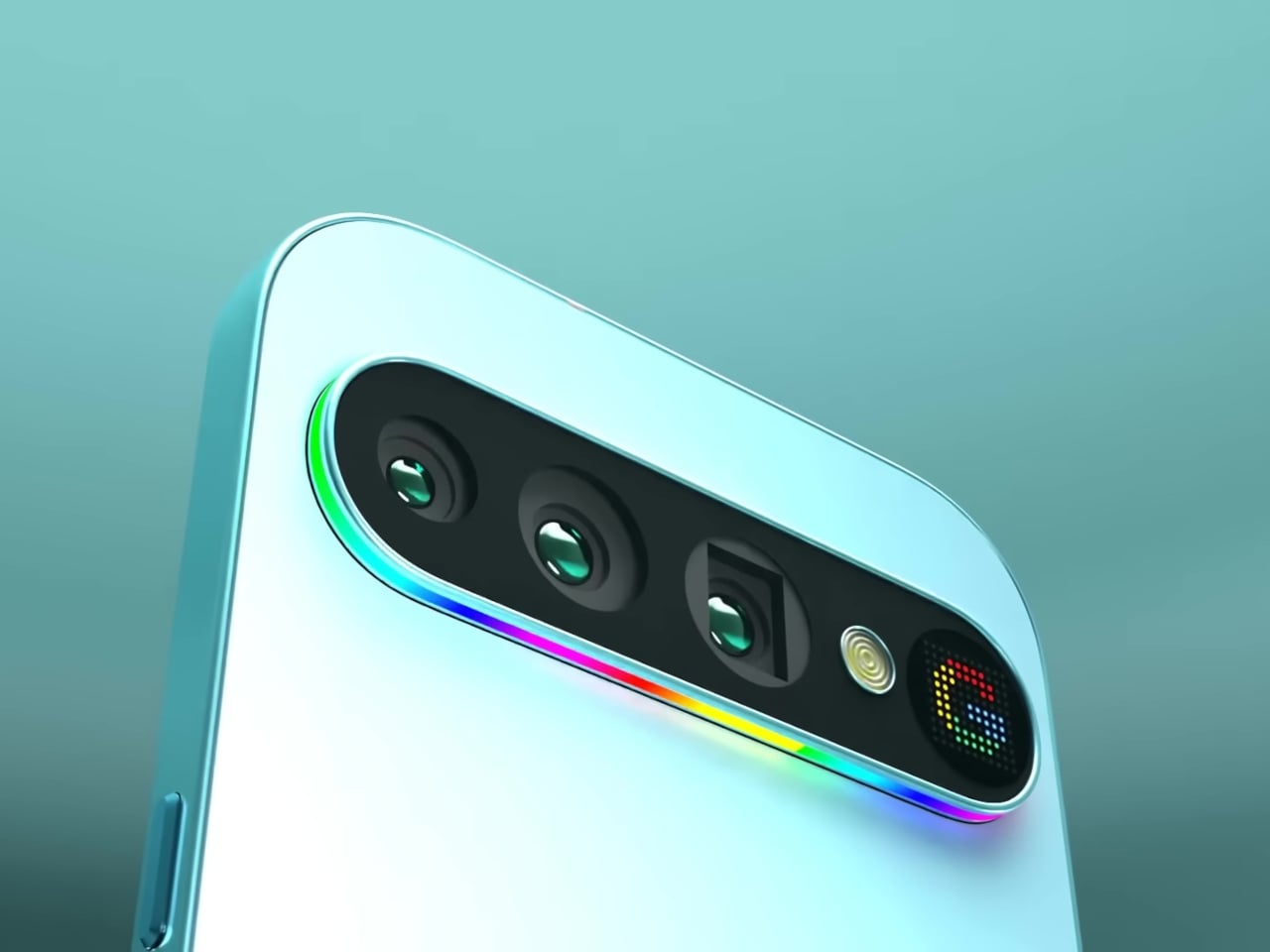
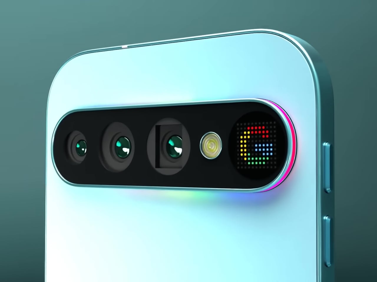
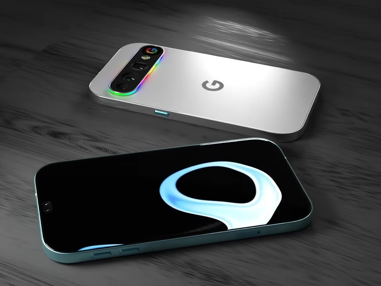
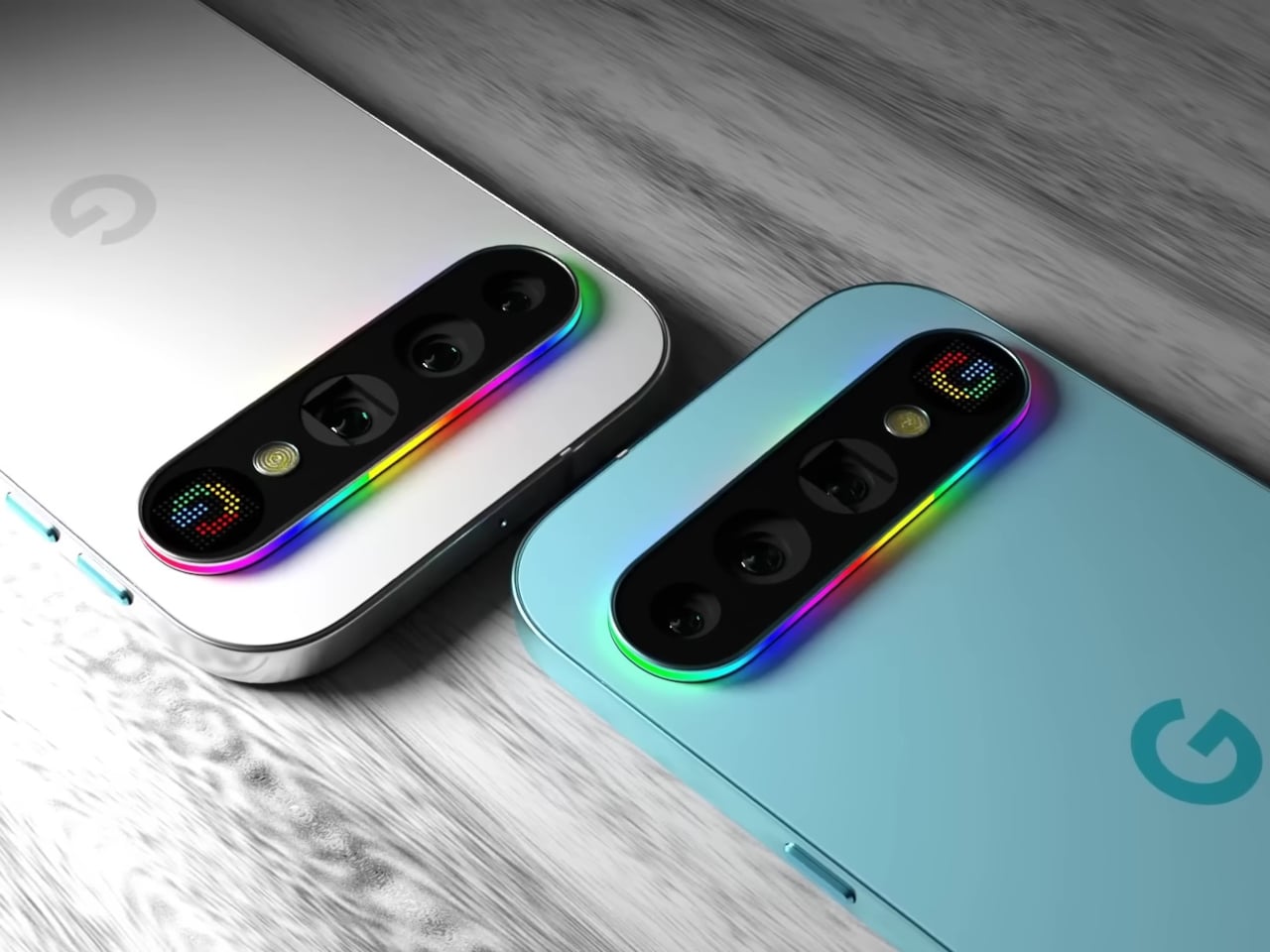
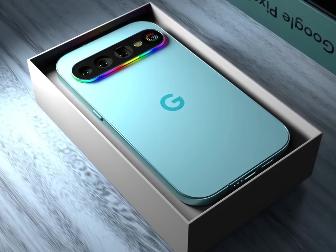
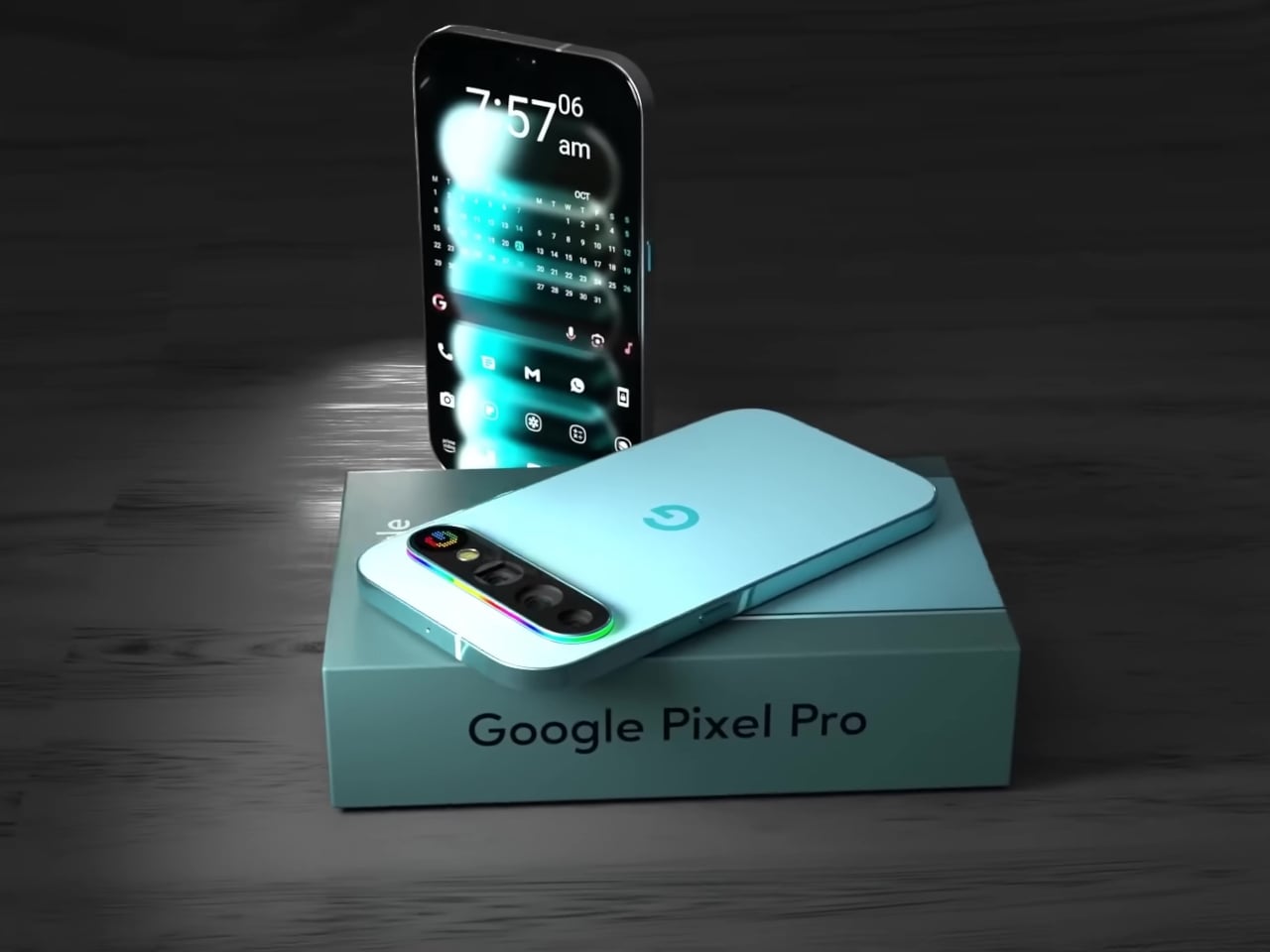
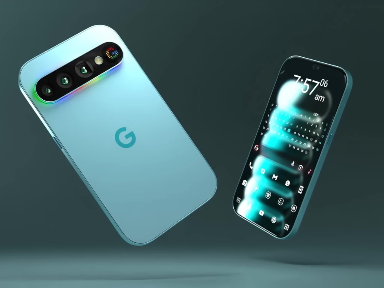
This concept for the Google Pixel 11 Pro imagines exactly that. Built around the Pixel’s signature horizontal pill-shaped camera module, it proposes two distinct types of back-panel feedback: a full-spectrum RGB light strip running around the entire perimeter of the camera bump, and a small dot-matrix display embedded at its right end that can render icons and text in pixel-art style.

Designer: AndroidLeo

The light strip is the more immediately readable of the two. A continuous loop of addressable LEDs traces the full outline of the pill module, capable of cycling through any color and pattern the software dictates. A missed call could glow one color, a new message another, and a timer nearing its end could pulse differently again, all communicable from across the room without touching the phone.

The dot-matrix panel, which the concept labels the “Pixel Display,” takes things a step further. Rather than a single color conveying a signal type, this small grid of colored LEDs can render simple graphics, caller ID icons, app logos, or even short scrolling text. It’s the difference between a traffic light and a small sign, and for a platform with as much software integration as Google’s, the implications are hard to ignore.

There’s an obvious precedent in Nothing’s Glyph Matrix, which brought a similar dot-matrix concept to Phone (3). That system already lets users assign custom animations to specific contacts and apps, turning the back of the phone into a secondary notification surface. What this Pixel concept adds is the light strip as a companion layer, the two systems working together rather than choosing between ambient mood and readable icon.

The practical case for this kind of design doesn’t require much imagination. Leave your phone face down on a table, and you will lose all notification awareness. Flip it over, and you get the full attention-grabbing brightness of the main display. A customizable light strip and a small icon panel would let the phone communicate at a much lower intensity, at a glance, rather than a full distraction.

The concept renders the phone in both a pale aqua colorway and Parchment white, giving the full-spectrum strip a different quality in each: cool and vivid against the teal, soft and almost art deco against the white. Either way, the camera bump, typically the most criticized part of Pixel’s evolving design language, becomes something that actually earns its presence.

This is, of course, a fan concept rather than a leaked render or confirmed direction. The real Pixel 11 Pro hasn’t arrived yet, and nothing official confirms either the Pixel Display or the RGB strip. But the appetite for this kind of back-panel intelligence is clearly there, and if Nothing can build a devoted following around light strips alone, the version with two complementary systems and Google’s ecosystem behind it would be something worth watching for.

The post This Pixel 11 Pro Concept Makes the Camera Bump Its Best Feature first appeared on Yanko Design.

The $185 Modern Palm Pilot That Keeps You Off Your Smartphone

Most productivity apps on smartphones are fighting a losing battle against the same device that hosts them. The screen reminding you to focus is the one delivering the notification that derails it. People have tried everything from grayscale mode to app blockers, and those who find none of it sufficient have started looking at dedicated hardware as the more honest answer to the problem.

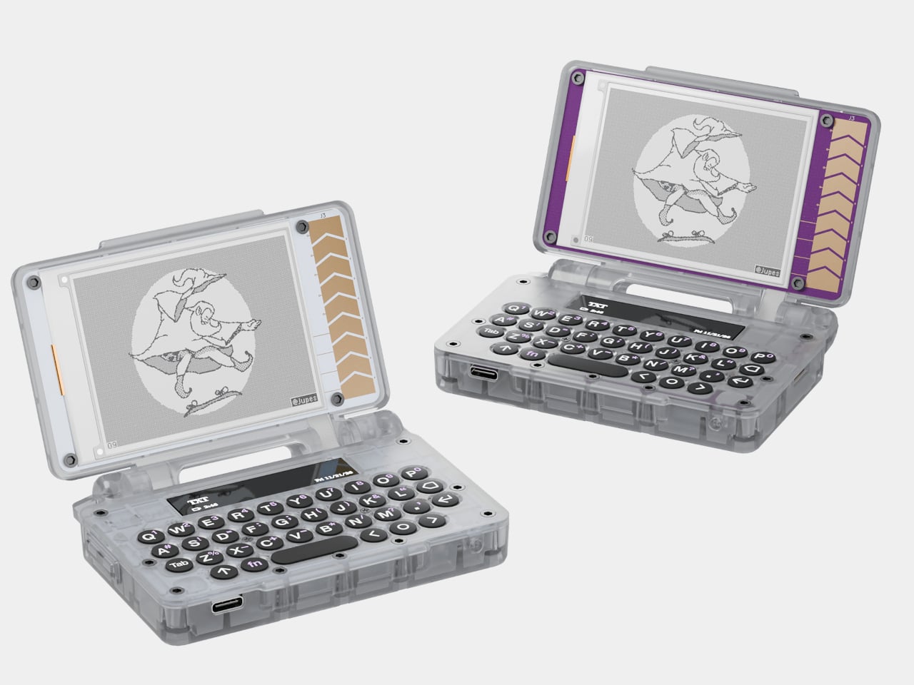
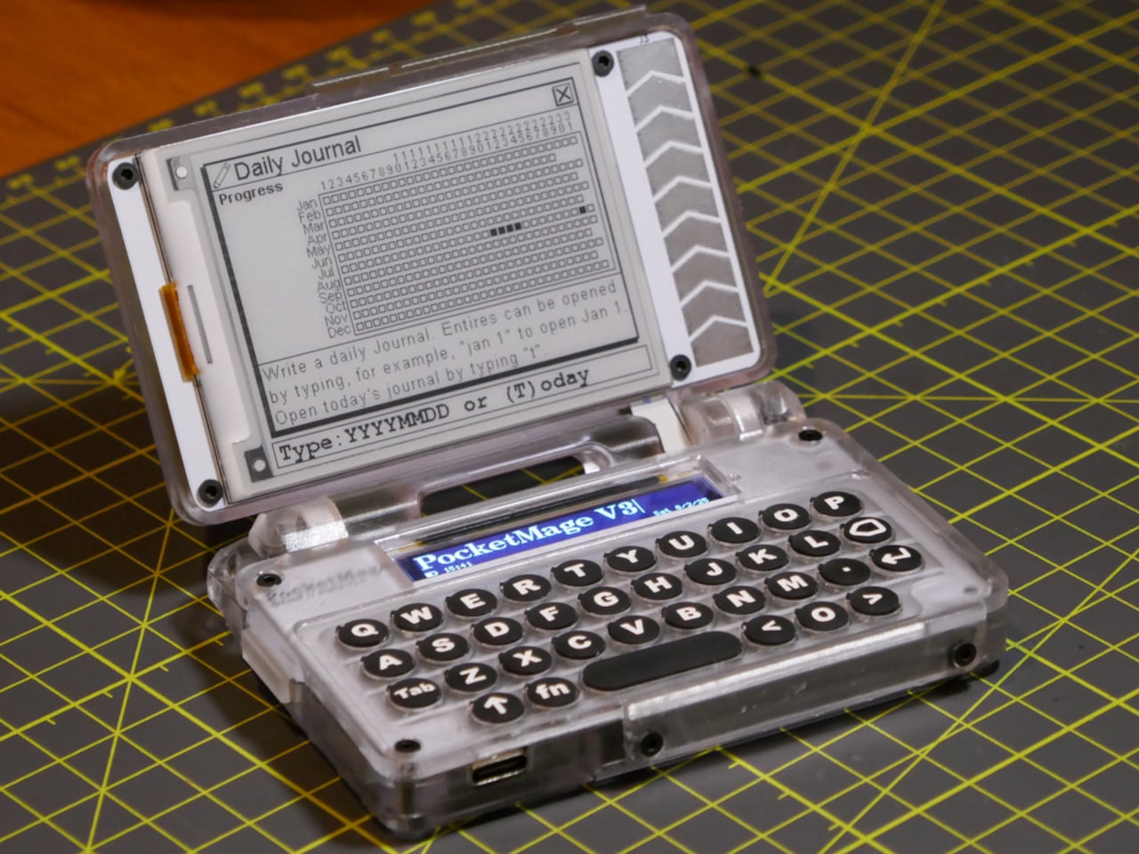
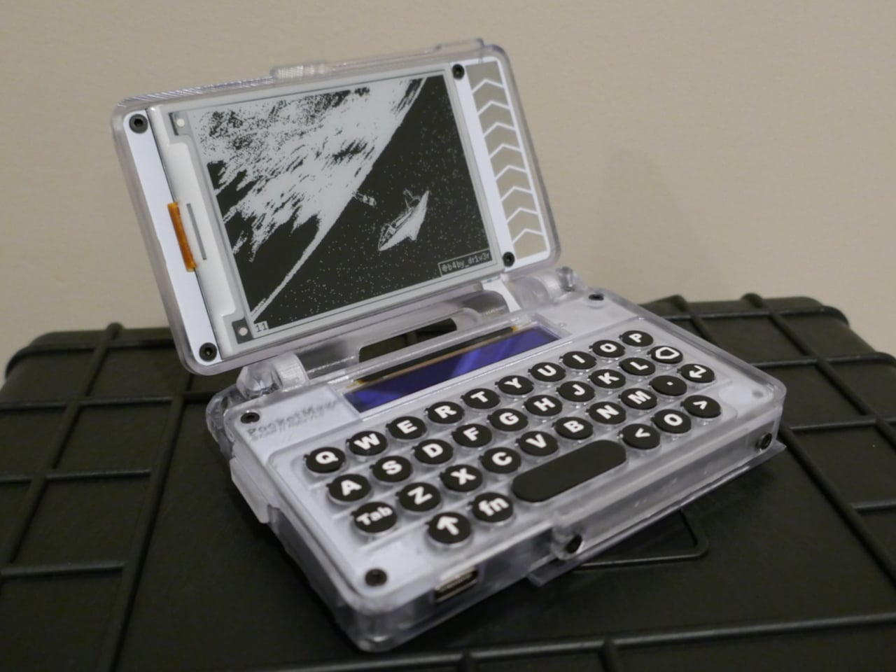
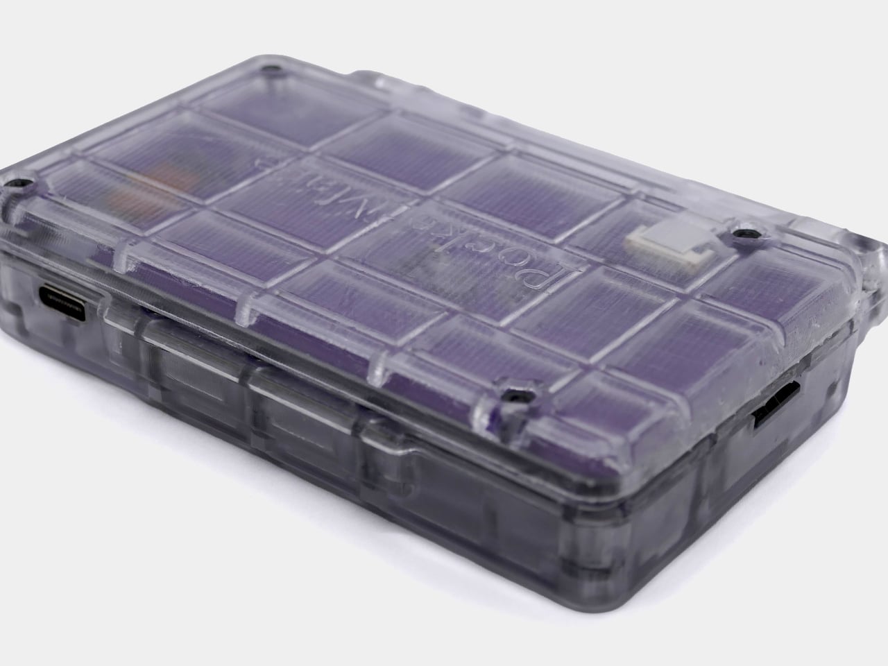
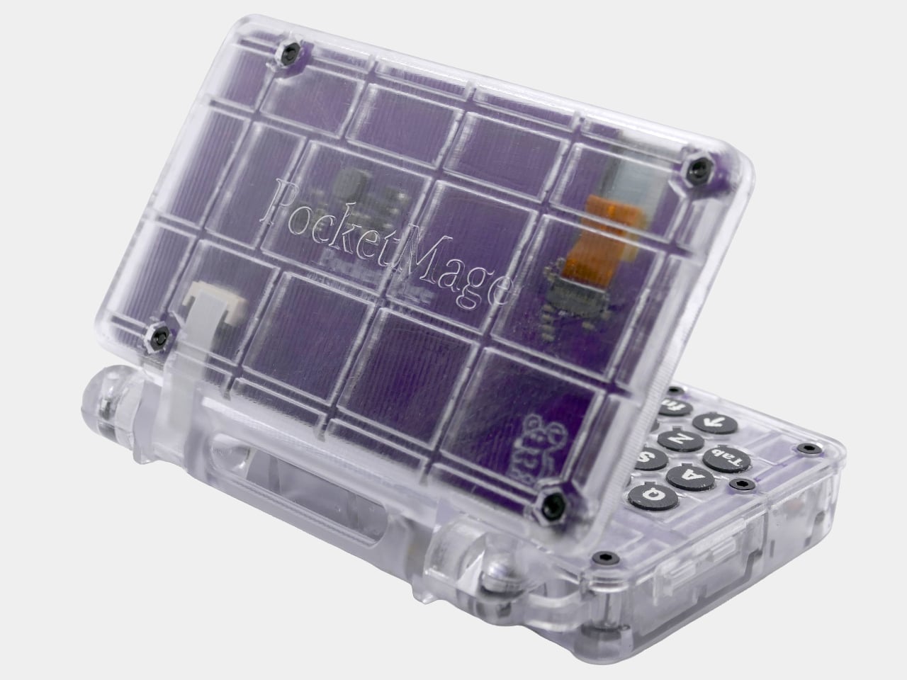
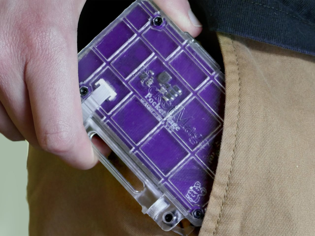
The PocketMage PDA started as a DIY project published online, a clamshell gadget running on an ESP32-S3 microcontroller with an E Ink display and a physical QWERTY keyboard. What began as a hobbyist prototype built around the idea of a modern Palm Pilot has since turned into an actual device with a price that starts at $185.

Designer: Ashton F. (Ashtf)

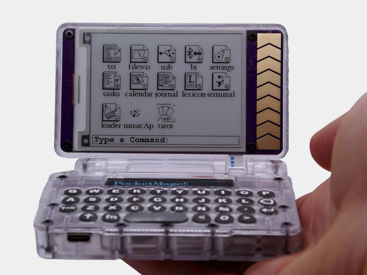
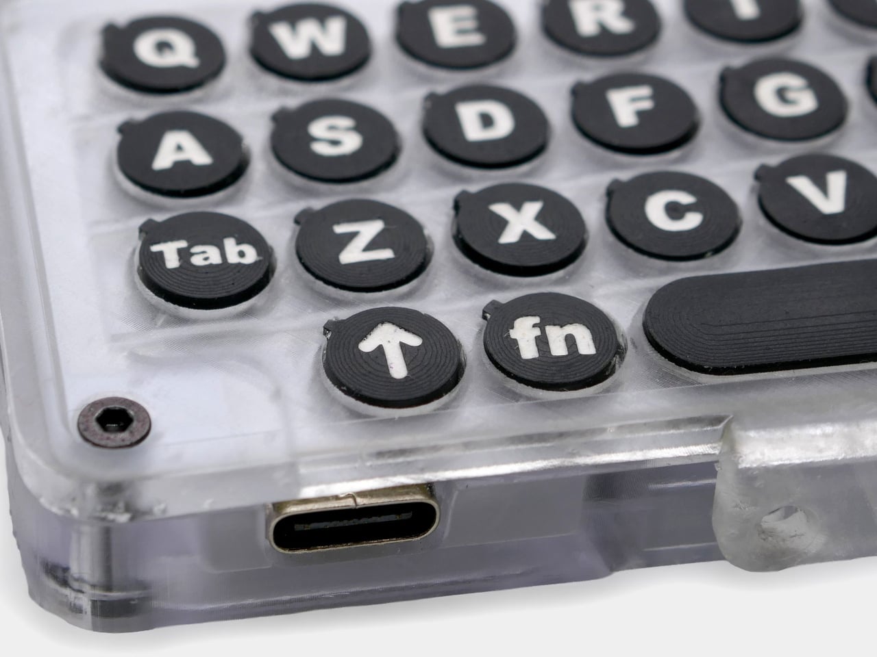
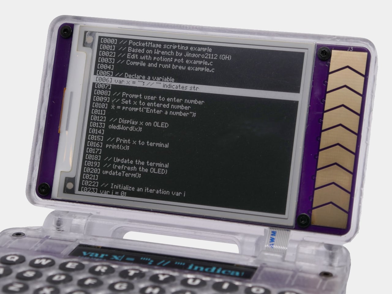
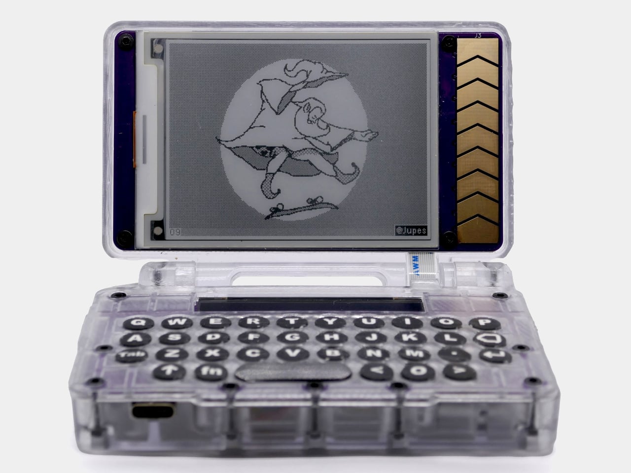
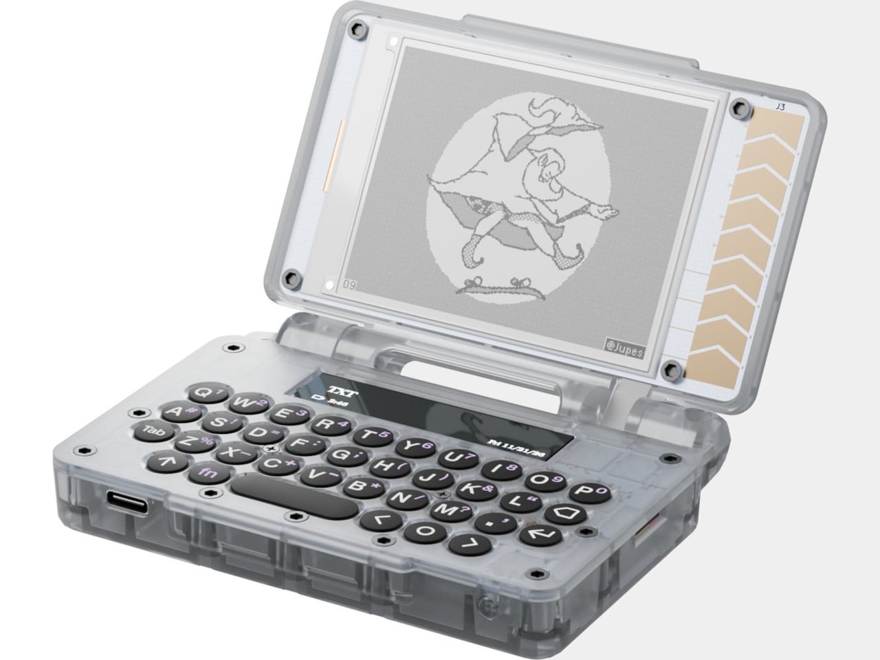
The clamshell body measures 100mm x 73mm x 21.7mm, roughly the footprint of a large credit card holder. Opening it reveals a 3.1-inch E Ink main display and a full tactile QWERTY keyboard, alongside a slim 1.8-inch OLED secondary screen above it. The two-display setup balances the E Ink’s eye comfort and battery efficiency against the OLED’s speed, so typing feedback appears instantly rather than waiting for a slow screen refresh.

Pull it out of your pocket on a train and start writing. The E Ink screen is readable in direct sunlight, doesn’t draw the eye with its own light, and lets you hold a thought without a notification pane sliding in from the edge. A 1,200 mAh battery keeps the whole thing running for about seven days between charges, which makes it genuinely grab-and-go.

The built-in PocketMageOS runs on FreeRTOS and comes with a Markdown text editor, a daily journal, a calendar, a task manager, a dictionary, and a file manager. There’s also a Bazaar, an app store where community-built software can be side-loaded, which already includes a text-based web browser, a calculator, and an e-book reader. The whole OS and hardware are open source under the Apache 2.0 license.

For engineers, the expansion port opens up a different set of possibilities entirely. It breaks out I2C, SPI, UART, and GPIO connections, meaning hardware modules can be attached and communicated with directly from the device. LoRa and Meshtastic add-on modules are already listed as planned accessories, and USB keyboard support means the built-in keys don’t have to be the limit of the typing experience.

The campaign offers two versions. The $185 DIY kit includes the PCBs, case parts, LiPo battery, microSD card, all hardware, and an assembly guide, making it the option for anyone who actually wants to build it themselves. The $235 pre-assembled version ships complete. Both come in Parchment white and Royal Purple. Either way, shipping to the US is free, with a $12 flat rate internationally.

Backers will need patience since deliveries aren’t expected until March 2027, and the campaign still needs to hit its $100,000 funding goal on Crowd Supply by September 2026. None of that is unusual for independent hardware crowdfunding. What is unusual is the combination: a pocketable clamshell with a real keyboard, an eye-friendly display, a week’s worth of battery life, and no notifications competing for your attention.

The post The $185 Modern Palm Pilot That Keeps You Off Your Smartphone first appeared on Yanko Design.

Bug Saber Turned Lightsaber Fantasy Into a 4,000V Bug Zapper

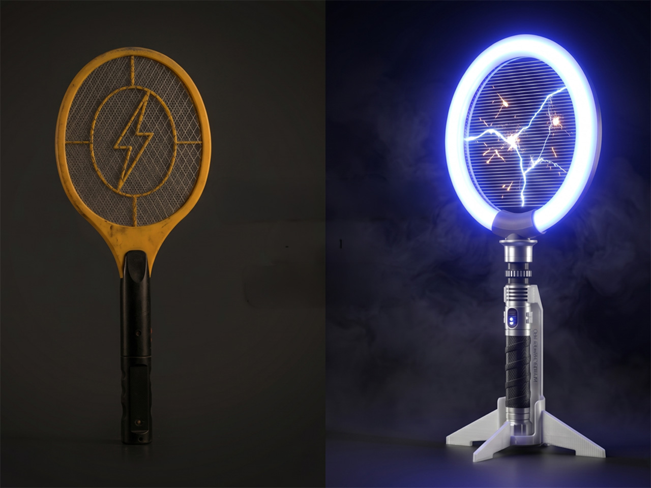
Bug zappers haven’t had a design moment yet. They’ve existed in more or less the same form for decades, somewhere between forgettable and mildly unpleasant to look at. Most of them get tucked into corners or mounted out of sight, which is exactly where most people prefer them. They do the job, roughly speaking, but nobody’s ever been genuinely excited to reach for one.

Brightbeam Solutions seems to have taken that as a challenge. Bug Saber is the brand’s attempt at rethinking what a bug zapper can feel like, not just what it can do. The concept is simple enough: take pest control, which has always been a thankless task, and design it to be something you’d actually want to pick up. Nobody in the category had really tried.

Designer: Jonathan Barraclough

Click Here to Buy Now: $24. Hurry, only a few left!

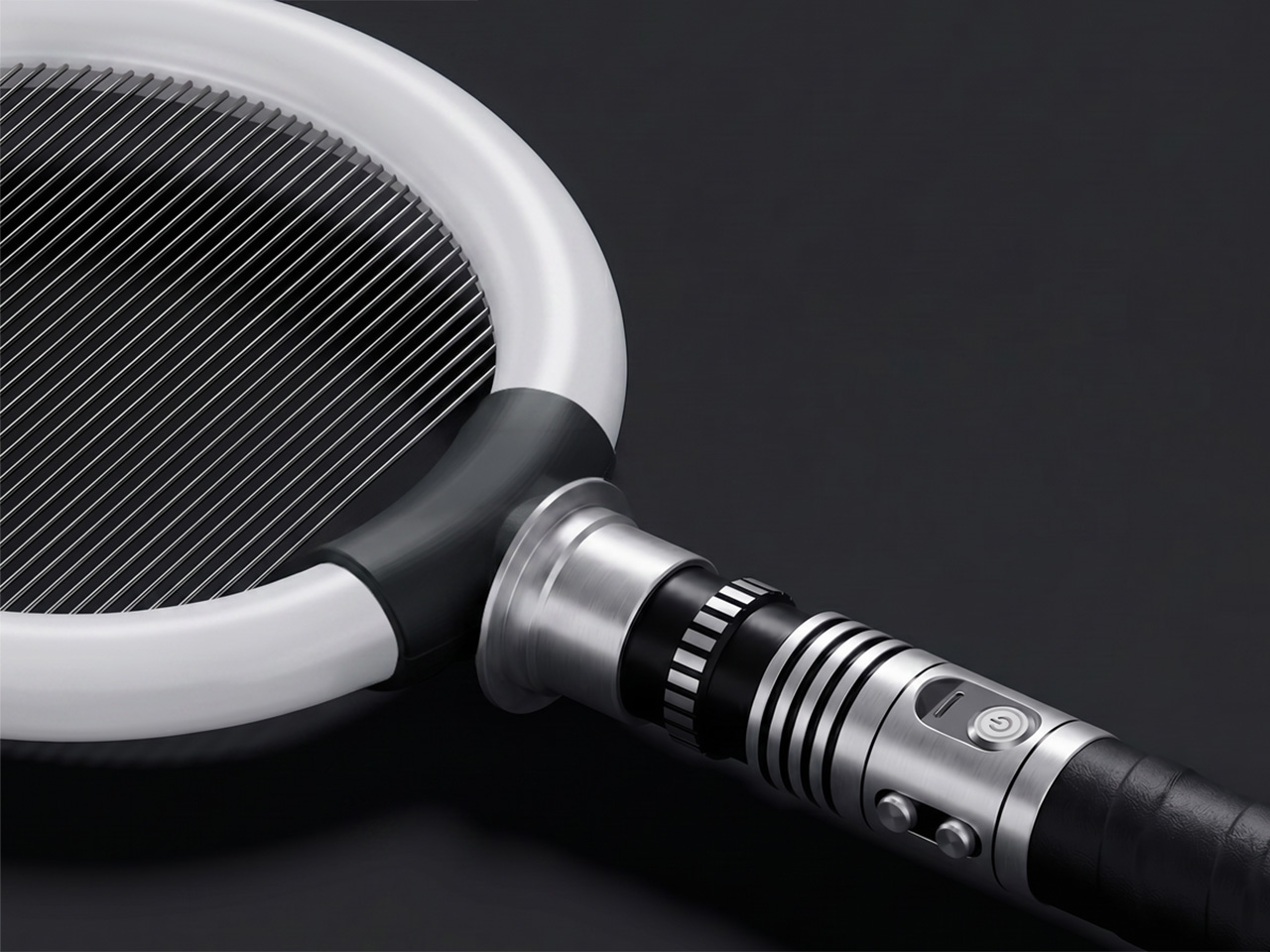
The design makes that clear immediately. Bug Saber is built around a high-voltage zapping grid framed by a glowing LED ring, mounted on a lightsaber-style hilt with a distinctly mechanical character. It doesn’t look like anything from a hardware store, and that’s entirely the point. The aesthetic borrows from sci-fi gadget culture rather than home appliance conventions, and it’s surprisingly hard to ignore when it’s nearby.

Switch it on, and everything shifts. The LED ring glows, saber-style sound effects kick in, and insects are naturally drawn toward the light. When one gets close enough, the 4,000V high-voltage grid takes care of it instantly, with no waiting and no cleanup. The entire sequence takes only seconds, and the combination of light, sound, and immediate result makes each instance feel surprisingly satisfying.

That satisfaction makes sense in practice. Picture a summer evening on the back porch, a fly that’s made itself at home, and the usual frustration of swatting blindly at the air. With Bug Saber in hand, you’re in control rather than reacting. The act feels deliberate in a way that pest control rarely does, which is a strange thing to say and yet completely accurate.

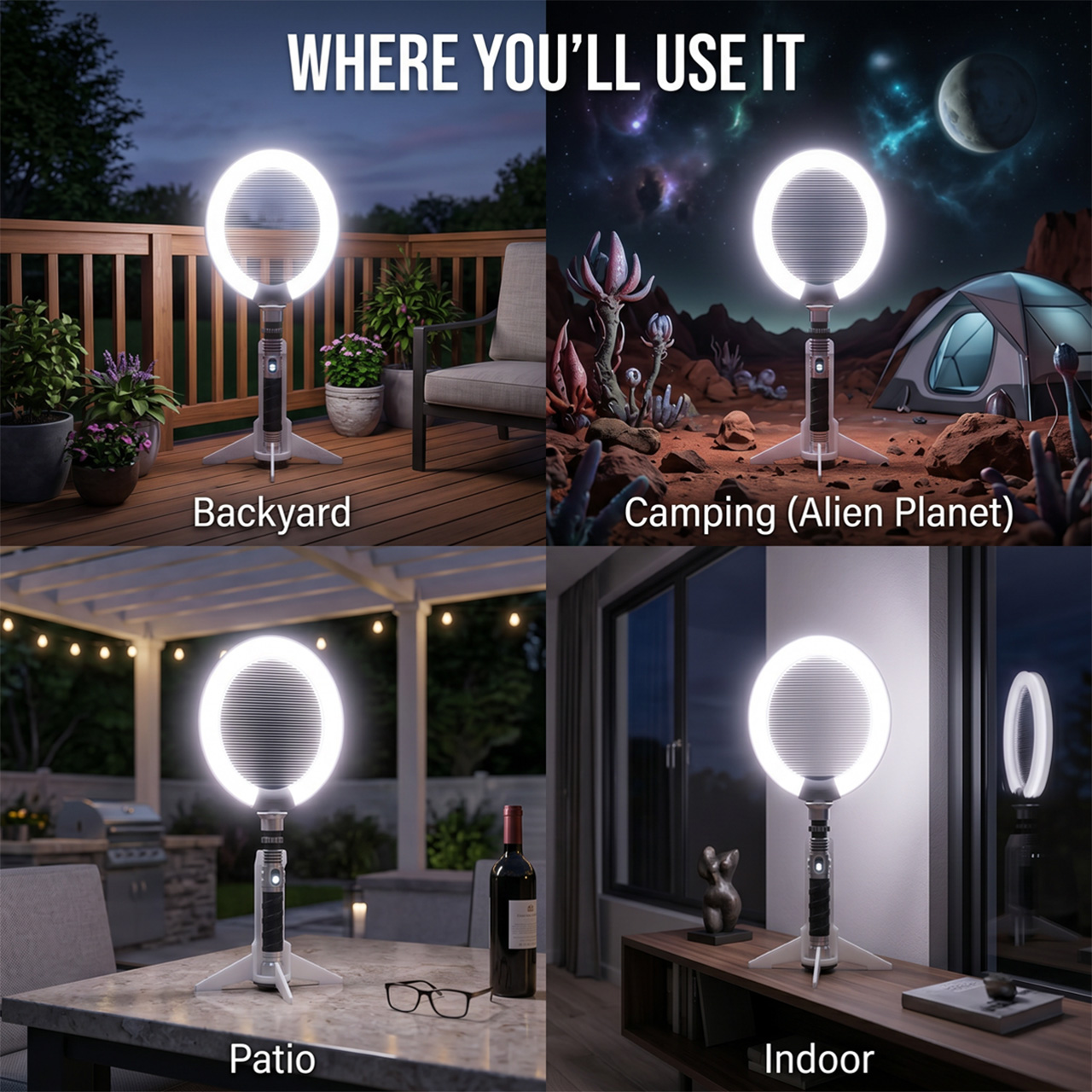
Not every situation calls for hands-on use, though. Bug Saber can sit on its vertical stand with the illuminated ring running on its own, drawing in insects without you having to do anything. This works especially well at night, when flying pests are most active, and you’d rather not be involved. It handles things quietly in the background, whether you’re inside or out on the patio.

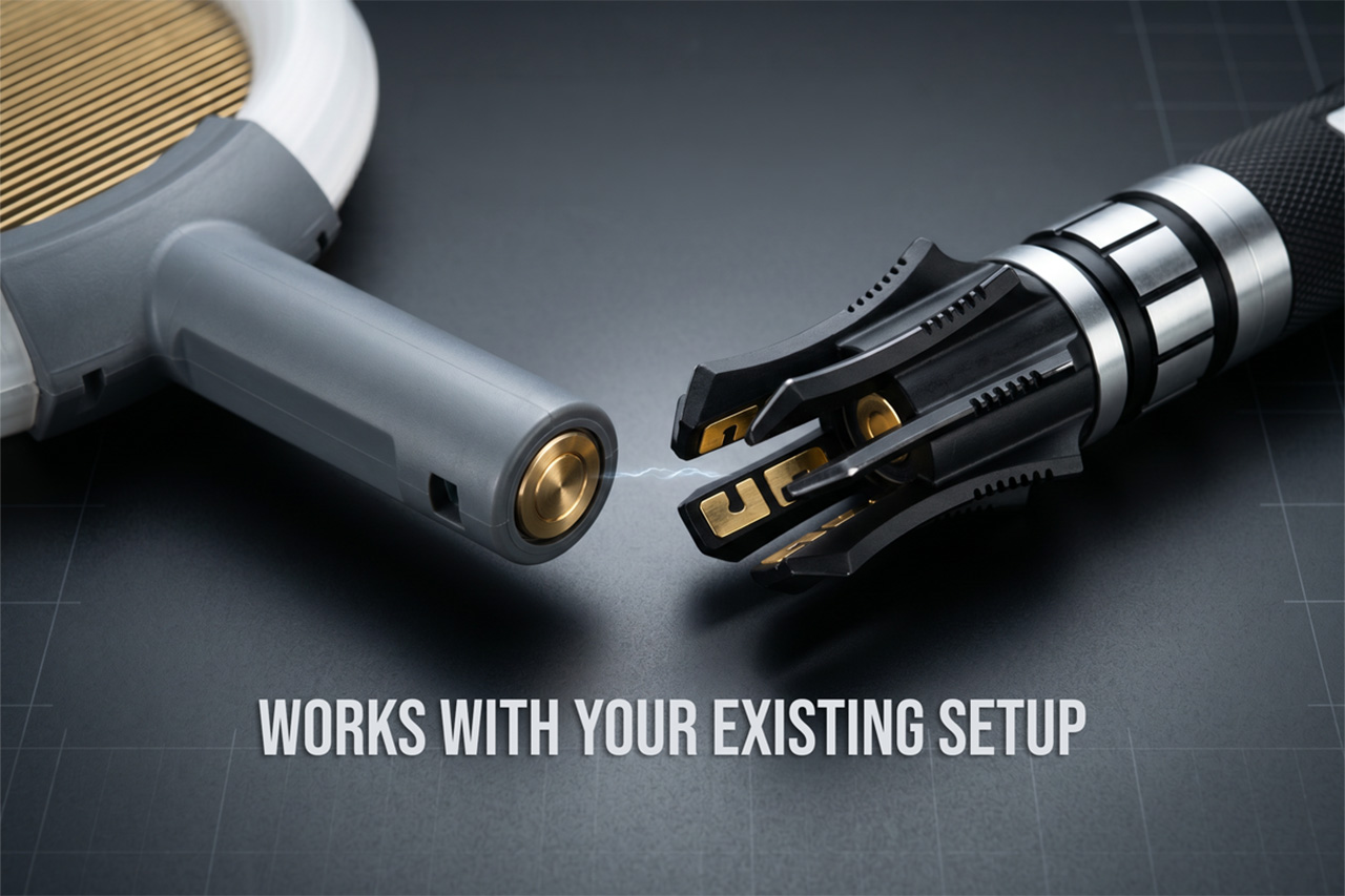
Bug Saber is built around three core components: the Bug Saber Head, which houses the ring and zapping grid; an entry-level hilt for those starting fresh; and the vertical stand. People who already own a compatible saber-style hilt, the kind used in cosplay or collecting communities, can swap in the head directly, converting their existing setup into a functional bug-control device without needing anything else.

What makes Bug Saber work so well is how the experience reinforces itself over time. The glow, the sound, and the instant result work together to create something that feels rewarding rather than routine. You pick it up the first time because there’s a fly in the room. The second time, you reach for it a little more quickly than strictly necessary.

There’s a broader shift in product design, one where objects that used to be purely functional are being reconsidered as things worth looking at. Routers, speakers, and kitchen appliances have all gone through some version of this. Bug Saber brings that same sensibility to a category that’s rarely had it, which on paper sounds like a stretch and in practice feels entirely overdue.

The strangest thing about Bug Saber might also be the most telling. A bug zapper with a sci-fi hilt, a glowing LED ring, and sound effects that respond to movement really shouldn’t feel like a natural addition to a patio or living room shelf, and yet here we are, genuinely glad that someone decided this particular category was finally worth a proper redesign.

Click Here to Buy Now: $24. Hurry, only a few left!

The post Bug Saber Turned Lightsaber Fantasy Into a 4,000V Bug Zapper first appeared on Yanko Design.

The Corner 99.5% of Wardrobes Ignore Finally Has a Rack for It

The wardrobe is one of those household objects that seems like it has plenty of room until it doesn’t. Most people eventually find themselves pushing hangers aside to make space, folding things into corners, and stacking items on whatever flat surface presents itself. Organization accessories exist in abundance, but the majority address the visible problem rather than the structural one.

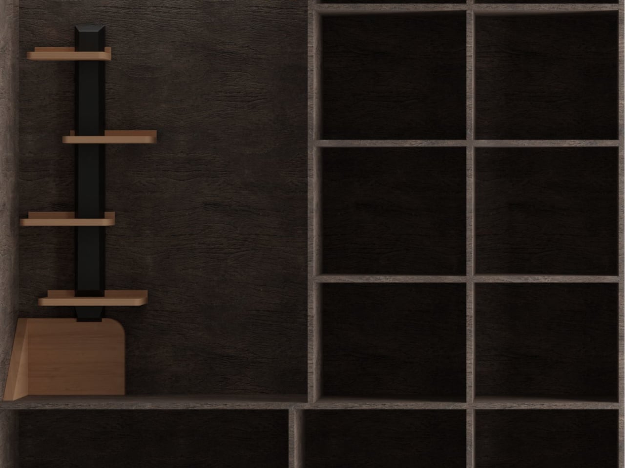
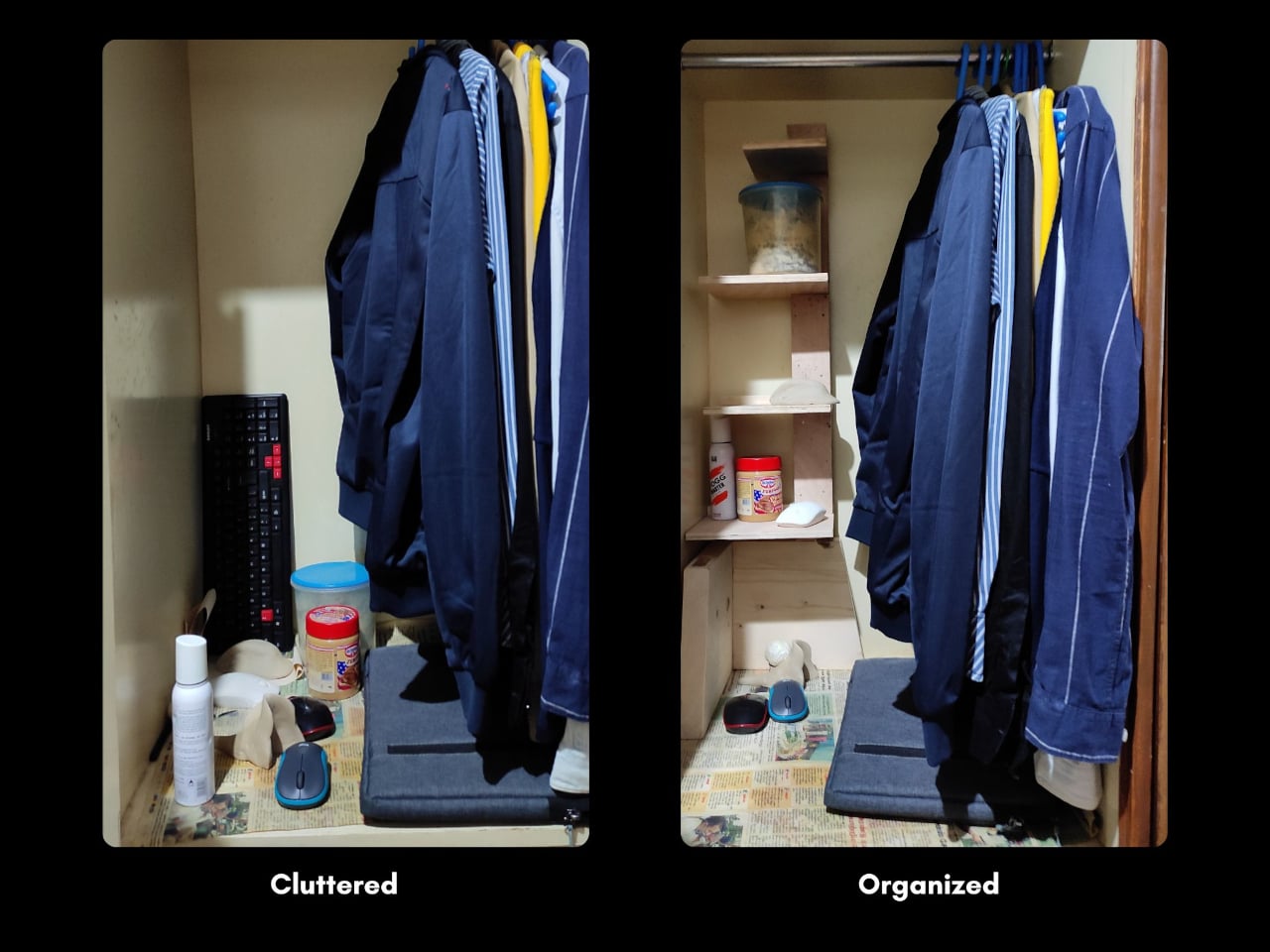
A user survey of more than 50 real wardrobes found that 99.5% of the top corners went entirely unused, prime vertical real estate that no hanging rod reaches, and no standard shelf fits. That specific insight became the starting point for CONCEPT II, a wardrobe rack designed not for the existing infrastructure of the wardrobe but for the part most people have simply given up on.

Designer: Arnav Ashwin

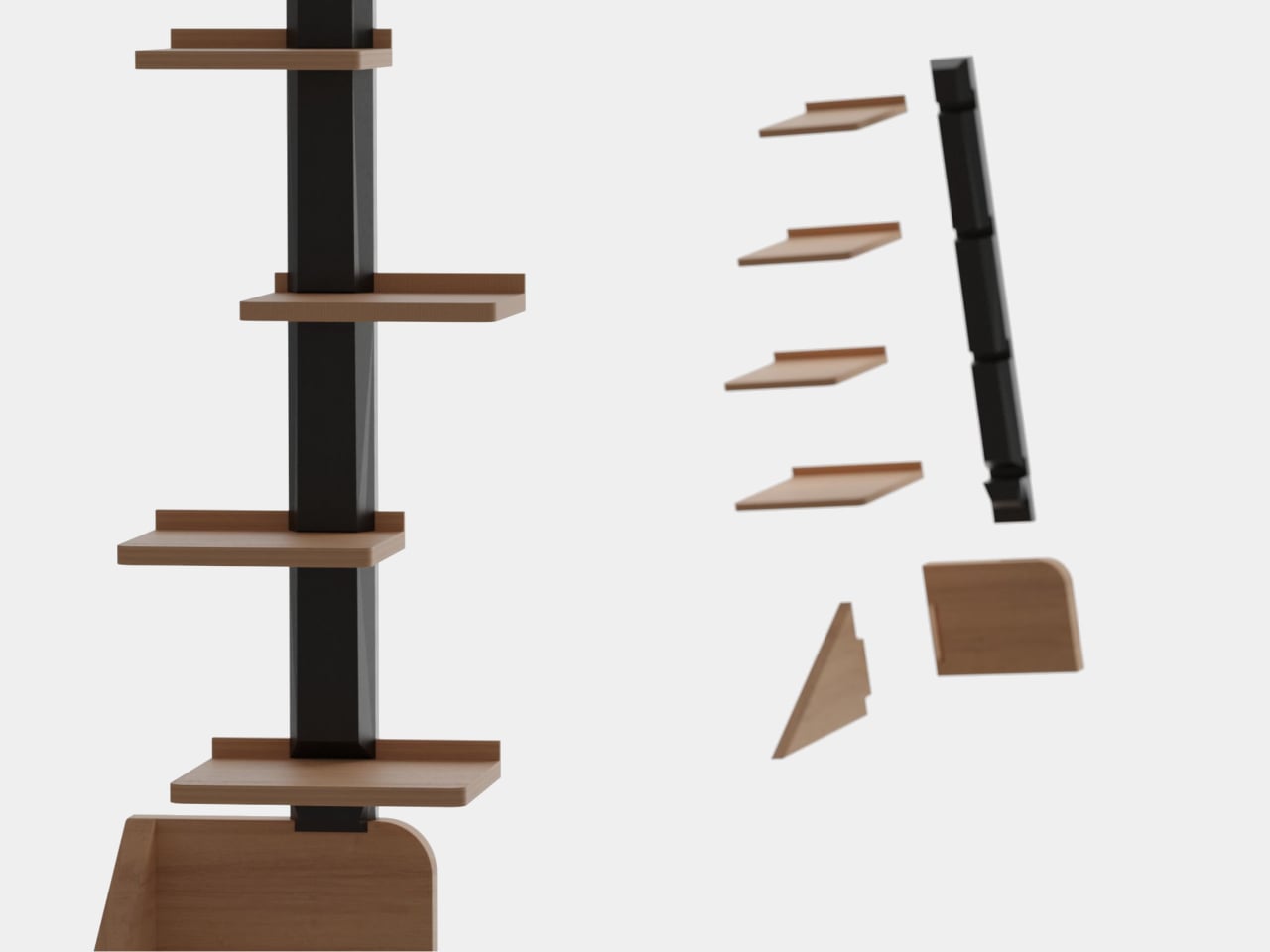
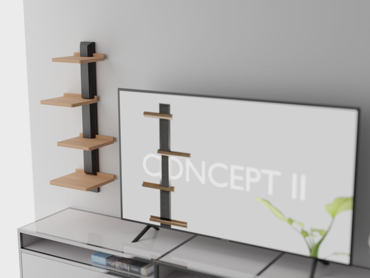
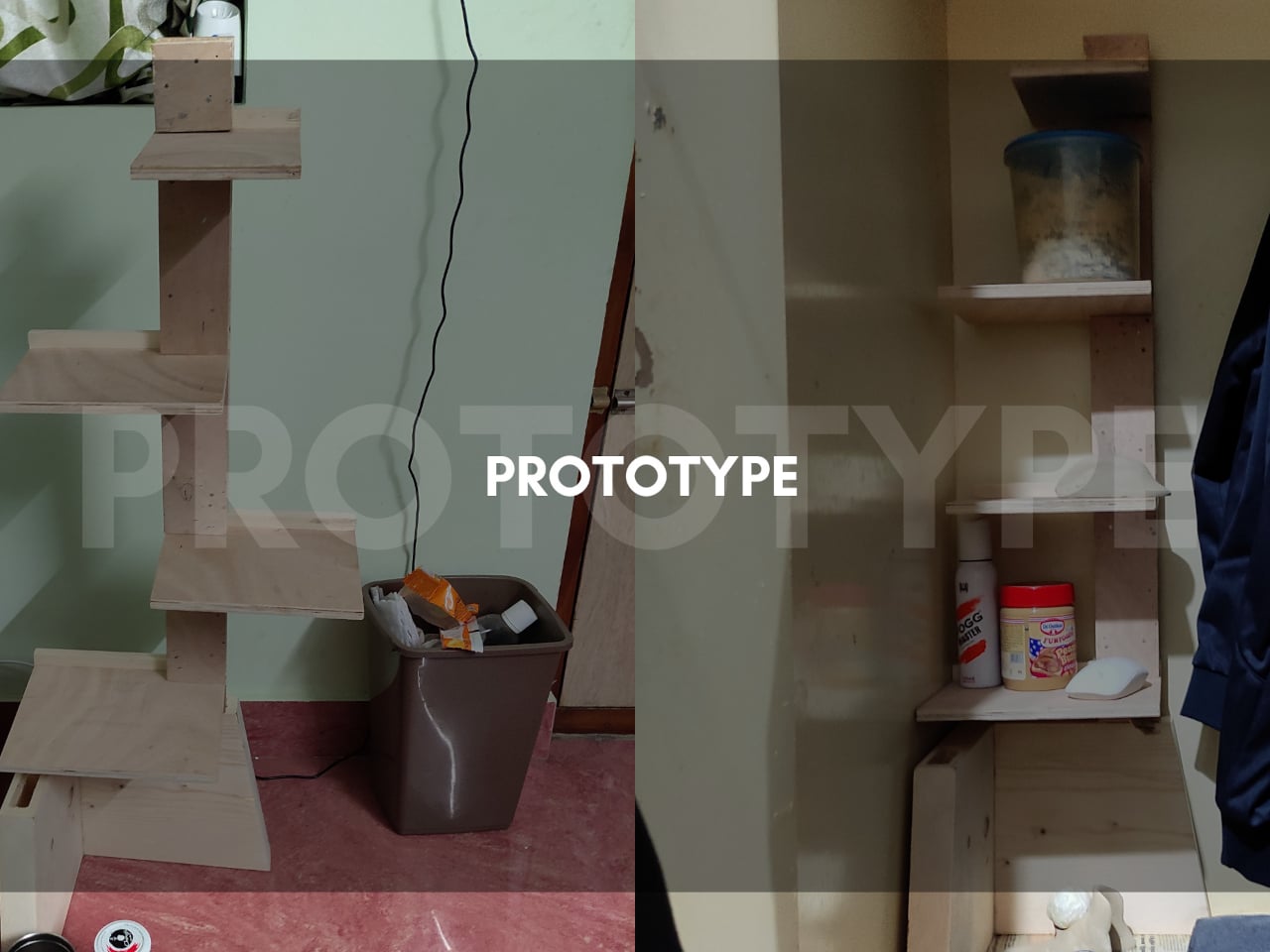
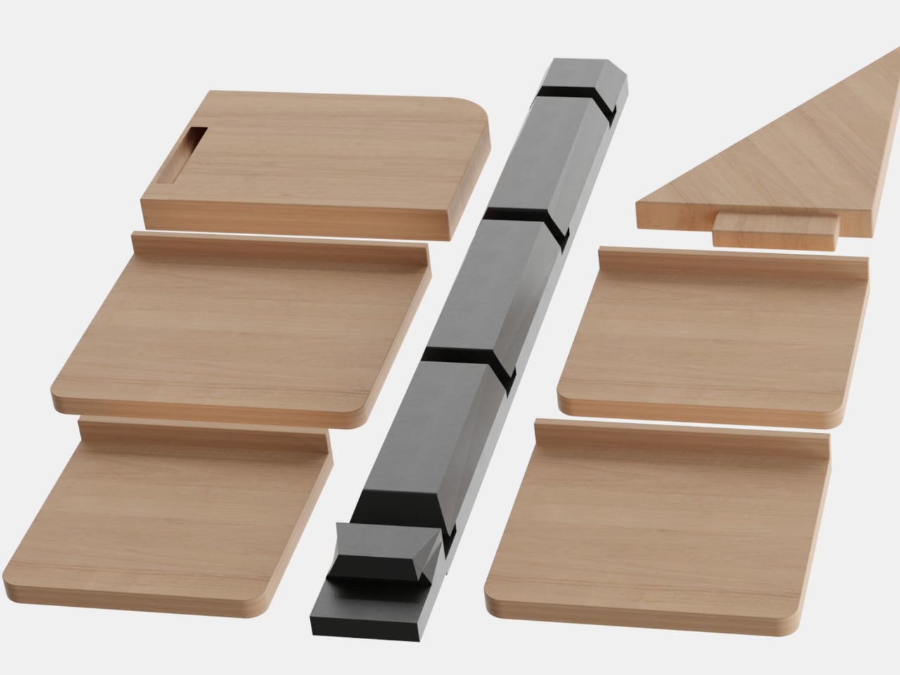
A single vertical post in a dark finish anchors the rack, with a series of wooden shelf slabs attached at staggered heights and alternating sides. The shelves vary in size, with the largest at the bottom and progressively smaller ones rising toward the top, giving the whole structure a stepped, almost branching silhouette that takes up almost no floor footprint while climbing the otherwise empty height of the corner.

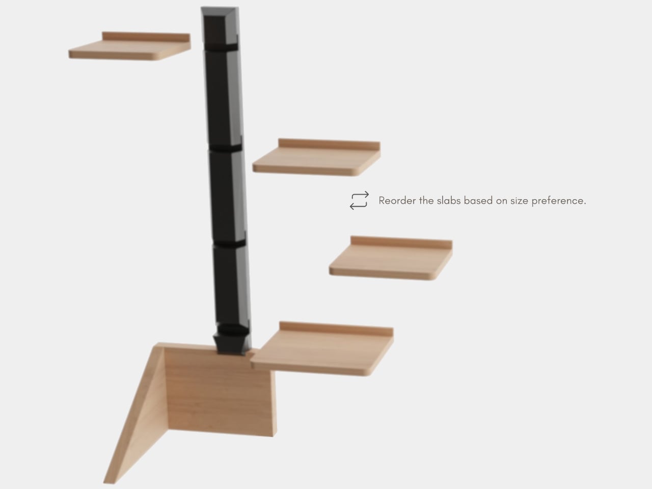
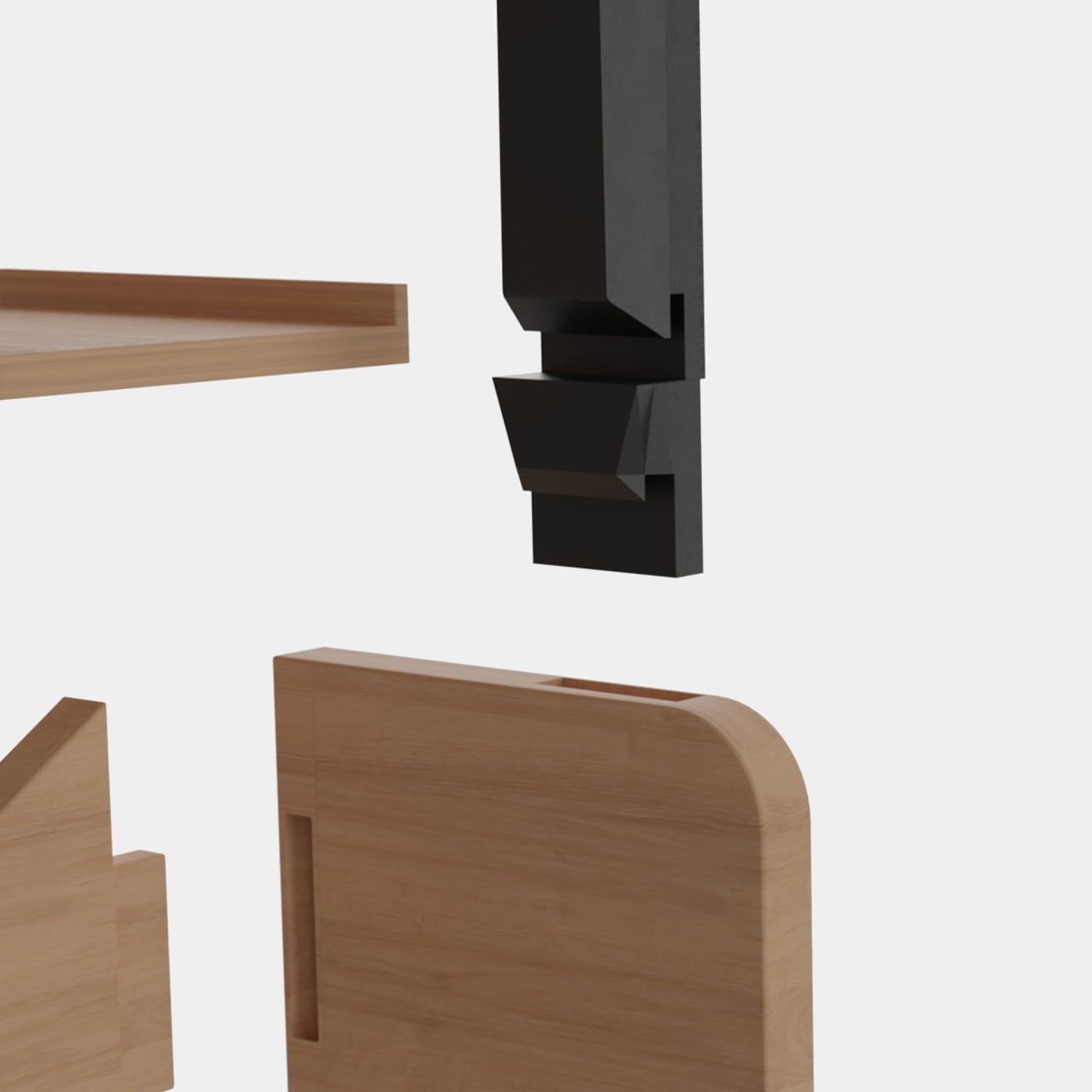
Each shelf slides into a slot in the post rather than being fixed, so the order can be changed based on what needs to go where. Taller items that wouldn’t fit between closely spaced shelves can be shifted to a wider gap. A triangular corner shelf piece also fits the post, filling the awkward dead angle that most corner storage solutions simply leave behind.

All the components come apart completely, which has a practical consequence beyond just being convenient to assemble. When it needs to move or doesn’t fit through a doorway assembled, everything lays flat for packaging. The slot-and-groove connection that makes the shelves adjustable is the same mechanism that allows the whole thing to disassemble without tools, keeping the design logic consistent from first assembly to eventual relocation.

Someone who keeps cosmetics, accessories, or chargers on the wardrobe floor because there’s nowhere else for them now has a structured option that doesn’t involve buying new furniture or installing shelves in the wall. The rack sits in the corner, takes up the space that was already empty, and gives each category of item its own level without competing with the hanging clothes.

The rack doesn’t have to stay inside the wardrobe either. The warm wood tones and staggered profile work just as well against a living room wall or next to a television, where the shelves hold plants, small sculptures, or anything decorative. It’s the kind of piece that looks intentional rather than utilitarian in an open setting, which isn’t something most storage accessories can convincingly claim.

The material choice of solid wood paired with a dark post finish gives the rack a considered appearance that doesn’t telegraph “storage problem.” The user research behind it, drawn from a survey of more than 50 real wardrobes, makes the solution feel less like a product invention and more like an obvious fix that took a careful look at the actual problem to arrive at.

The post The Corner 99.5% of Wardrobes Ignore Finally Has a Rack for It first appeared on Yanko Design.

Public Art Stands Still, This Steel House Lets You Slide It Apart

Public art installations in parks have a familiar relationship with the people passing through them. They hold a fixed position, a fixed meaning, and a fixed form. You walk around them, read a plaque if there is one, and that’s usually the end of the conversation. The ones designed to provoke a genuine reaction tend to depend on scale or spectacle rather than something the visitor can actually change.

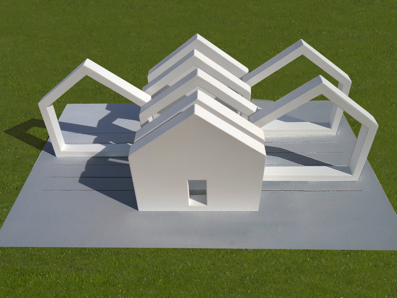
The Interactive Sliced House is part of a series that uses the most recognizable architectural shape there is as raw material. The house silhouette, walls, a pitched roof, and a doorway centered in front, is so deeply familiar that it functions almost like a word. This installation doesn’t just reference that shape. It cuts the whole thing into eight vertical slices and puts visitors in charge of what happens next.

Designer: Michael Jantzen

Two of the eight slices are solid white steel panels, one anchoring each end of the structure, both fixed permanently to a concrete pad on the ground. Each solid end has a doorway cut into its center. The six slices between them are open frames, the same house shape rendered as a hollow silhouette, and these slide freely along tracks set into the concrete beneath them.

Slide those six frames to one end, and the house snaps back into something close to its recognizable form, dense and legible from a distance. Pull them apart, and they scatter across the pad, creating a sequence of house-shaped thresholds that repeat across the concrete like the same word written over and over with increasing space between each letter. The structure stays the same; the space it makes changes completely.

Someone walking through the installation when the frames are spread out passes through threshold after threshold, each one framing a slightly different view of the park, the sky, and anyone else nearby. The frames create enclosed corridors between them when pushed together, and open, almost ceremonial passageways when pulled apart. Moving through the structure is different every visit, depending on how previous visitors left it.

The house shape is the installation’s real subject. It’s one of the first symbols children learn to draw, and one of the most loaded in the human symbolic vocabulary: shelter, family, belonging, property. Breaking it apart and handing the fragments to strangers in a public park is a way of asking what it means without having to say the question out loud, and without prescribing the answer.

The white painted steel keeps everything visually consistent regardless of how the slices are arranged, meaning no single configuration reads as more “correct” than another. There isn’t a right answer built into the materials. The installation can also be deployed as multiples, several units placed across a park at once, which would multiply its questions the same way the frames multiply the house shape when pulled apart.

The post Public Art Stands Still, This Steel House Lets You Slide It Apart first appeared on Yanko Design.

Bigme Finally Made an E Ink Phone Without the Usual Trade-Off

E Ink phones have built a devoted following among people who’ve grown tired of the toll a conventional smartphone screen takes on their eyes. The technology’s reflective nature means less eye strain over long sessions, better outdoor readability, and dramatically lower battery drain. The problem has always been what happens when you need your phone for something that an E Ink display simply can’t handle well.

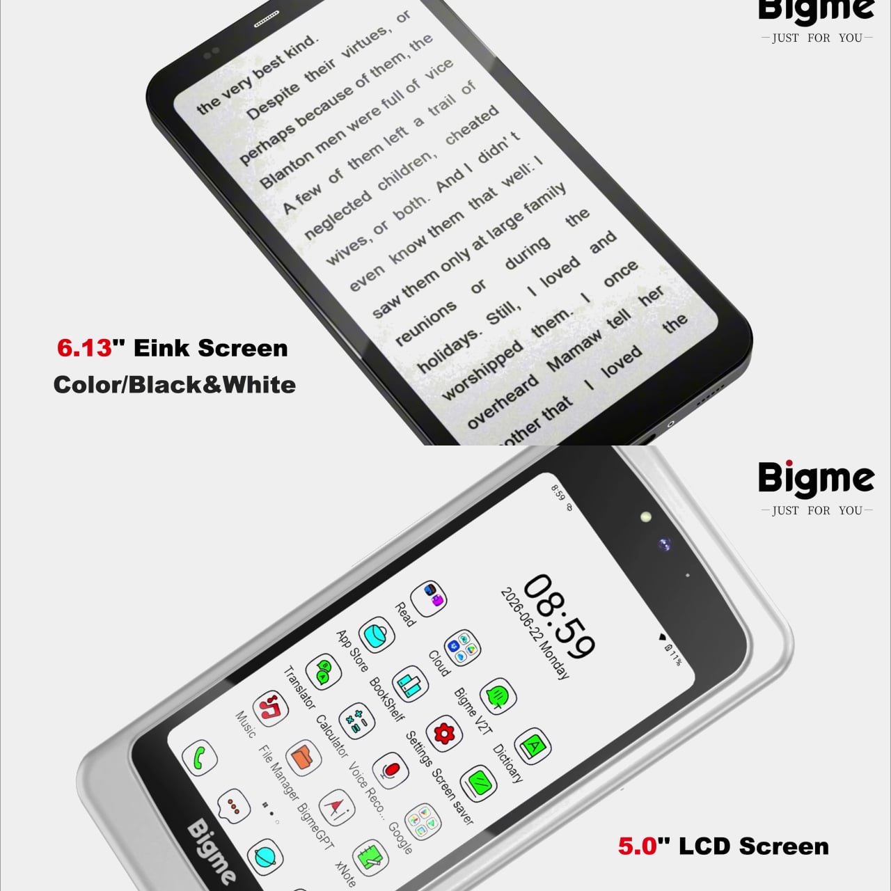
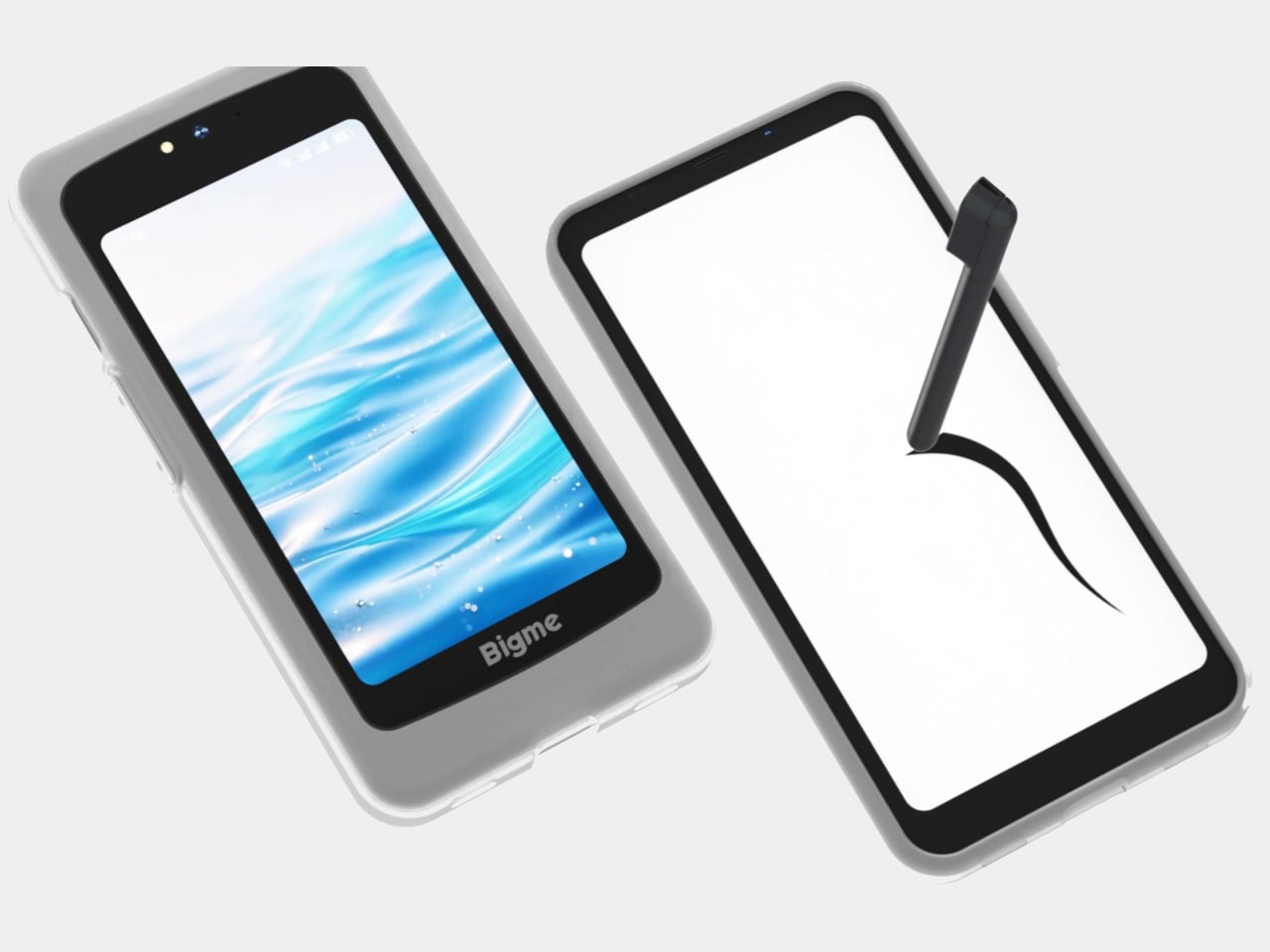
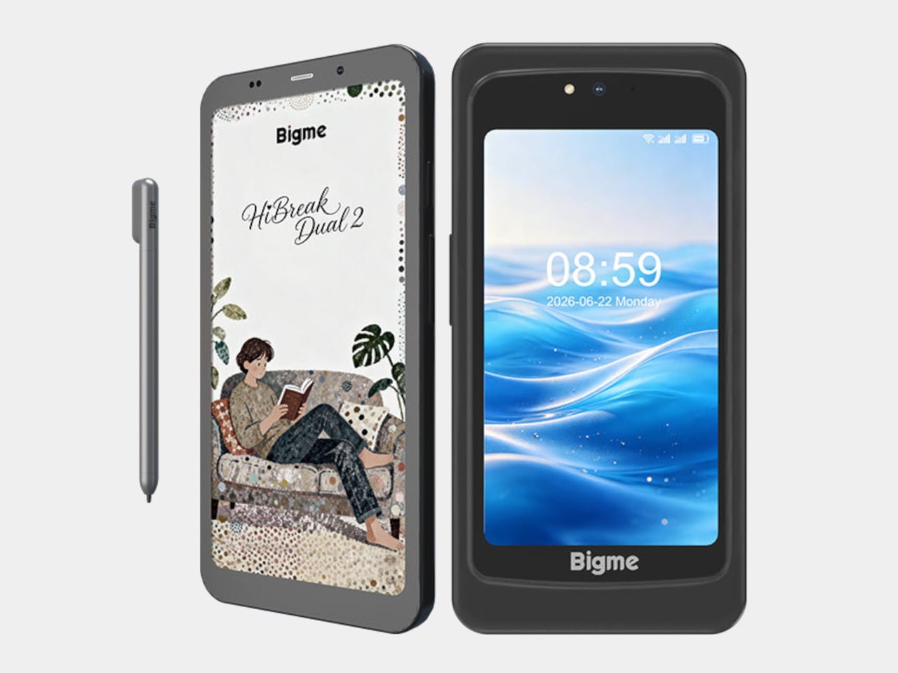
Watching a video, navigating an unfamiliar city, or glancing at a notification with any urgency are all tasks that remind E Ink phone owners of what they gave up. The Bigme HiBreak Dual 2 takes a different approach to this trade-off by not asking you to make it at all. It carries both a 6.13-inch color E Ink display and a 5-inch LCD in the same device.

Designer: Bigme

The E Ink side refreshes at up to 80 frames per second, considerably faster than earlier E Ink phones, and addresses the ghosting and sluggishness that made scrolling a timeline or navigating menus feel like wading through mud. The display supports both color and black-and-white content, and stays readable under direct sunlight without the glare that makes most LCD and OLED screens unusable outdoors.

The 5-inch LCD handles the tasks that E Ink screens aren’t built for. A video call, a color-accurate map, a quick stream of something while you’re waiting; these situations don’t work well on E Ink, and the Dual 2 doesn’t pretend otherwise. Flip the phone, and the LCD takes over without sacrificing the primary display that makes reading and messaging so much easier on the eyes.

What makes the Dual 2 a real step forward from its predecessor is the size of that LCD. The original HiBreak Dual had a token sub-screen, small enough to overlook and hard to take seriously as a second display. At 5 inches, the Dual 2’s LCD is actually large enough to be useful, bringing both displays into rough parity rather than a clear main-and-minor arrangement.

The stylus support adds another layer that typical smartphones don’t offer. A dedicated note-taking app with pressure sensitivity and variable pen thickness lets you annotate directly on the E Ink screen with familiar paper-like resistance. For anyone who prefers handwritten notes over typed ones, or who marks up documents throughout the day, this combination of a large E Ink screen and stylus input is the entire value.

The hardware isn’t a compromise, either. A MediaTek Dimensity 8300 processor, 12GB of RAM, 256GB of storage, a 50MP rear camera, and Android 16 with Google Play already installed make it a fully capable phone rather than a reading device that also makes calls. Dual 5G SIM support and NFC round out a spec sheet that doesn’t ask the buyer to excuse anything on the technical side.

The Bigme HiBreak Dual 2 has a super early bird pricing starting at $574 for the black-and-white E Ink configuration and around $699 for the color version. That’s the going rate for a phone that takes eye comfort seriously enough to build an entirely separate display around it, and supplies enough everyday capability alongside to not feel like a specialist tool with a serious drawback.

The post Bigme Finally Made an E Ink Phone Without the Usual Trade-Off first appeared on Yanko Design.

Beatbot’s AquaSense X Proves the Best Technology Goes Unnoticed

Smart home products have a funny habit of promising to simplify your life while quietly adding to your list of things to manage. Pool cleaning robots are a sharp example. They roam the floor, collect debris, and surface when finished, but someone still has to rinse the filter, empty the basket, and reset the machine before the next cycle. The automation, it seems, doesn’t quite finish what it starts.

Beatbot seems to have noticed this gap and designed AquaSense X around a different question altogether. Rather than asking how to make pool cleaning more autonomous, it asks how to make the whole experience, cleaning and cleanup both, feel like it barely happened. That sounds like a marketing promise until you start looking at how the system actually works, at which point it becomes something closer to a design thesis.

Designer: Beatbot

Click Here to Buy Now: $3999 $4250 ($251 off). Hurry, deal ends in 48-hours!

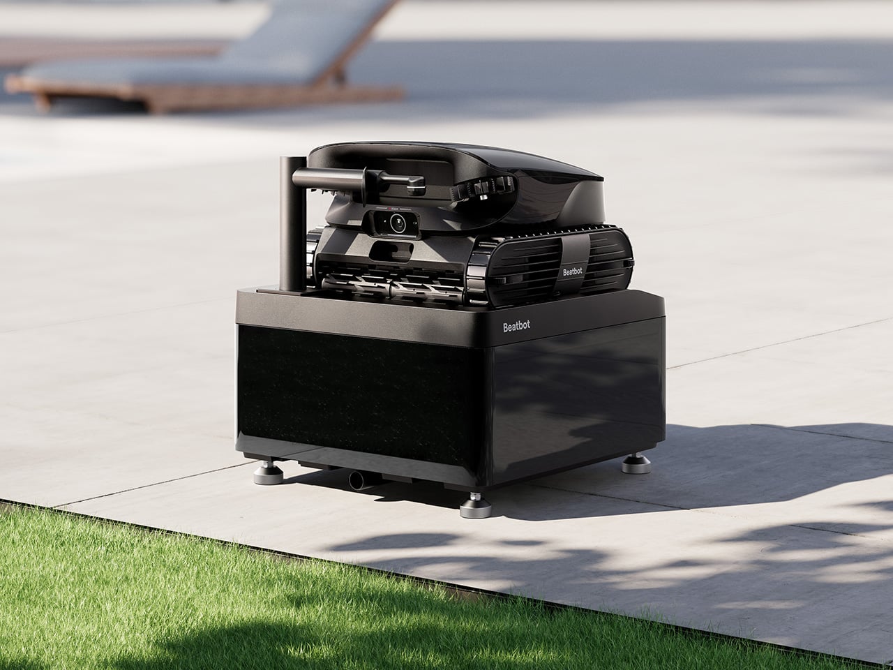
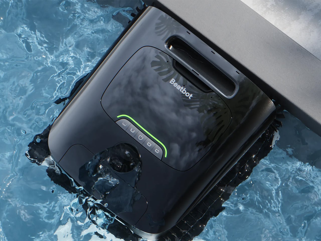
AquaSense X isn’t sold as a single robot but as an ecosystem, and that distinction matters. The system pairs the AI robotic pool cleaner with the AstroRinse cleaning station, and the pairing is the point. The robot cleans the pool. The station cleans the robot. That self-sustaining cycle sets AquaSense X apart from every other autonomous pool cleaner on the market, which still leaves the messy part to you.

After each cleaning cycle, docking the robot is all that’s required. Once it’s seated in the station, a high-pressure rotating nozzle enters the filter basket, backflushes the trapped debris, and transfers everything directly into the station’s sealed bin. The filter basket opens from the bottom to make sure nothing gets left behind. The whole process takes about three minutes, and you don’t touch a thing.

When the filter is clean, charging starts automatically, and the robot is ready for its next run without any intervention from you. The station’s debris bin holds 22 liters, which under typical conditions translates to roughly two months of operation before it needs emptying. That’s not a small number. It means pool maintenance stops being something on your weekly checklist and becomes something you handle a few times a season.

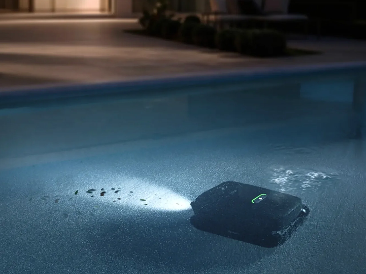
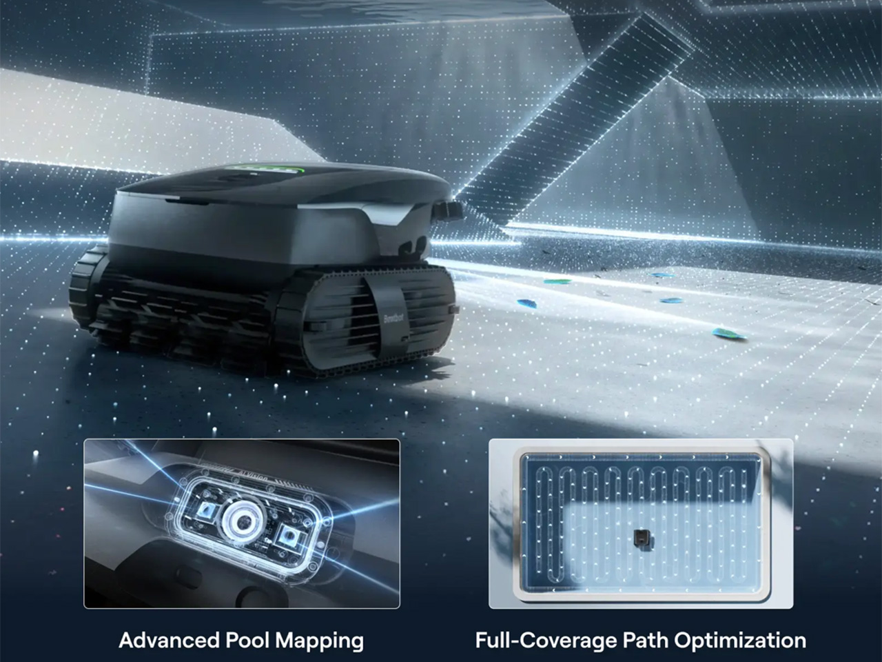
What makes the robot itself worth talking about is that its intelligence is tied to genuine utility. HybridSense AI Vision, which combines an AI camera with infrared and ultrasonic sensing, recognizes 40 debris types, twice what the previous generation could identify, and extends that detection to the water surface, not just the pool floor. That broader scope means fewer spots get overlooked after the robot surfaces and calls the job finished.

Coverage also runs deeper than detection. A single AquaSense X handles the water surface, the floor, the walls, the waterline, and elevated platforms like shallow entry steps and tanning ledges, all without swapping attachments. Using 11 motors and a submarine-style propulsion system, the robot transitions between floating and diving seamlessly, while dual downward-facing ultrasonic sensors detect edges on raised platforms so it never tumbles off one.

Then there’s the water clarification piece, which is perhaps the most invisible feature in the entire system. As the robot cleans, it automatically dispenses Beatbot’s AquaRefine 3-in-1 Clarifying Agent, a formula made from recycled crab shells that removes fine particles, oils, and residue without any mixing or measuring on your part. One 300mL kit treats up to 99,000 gallons, so it’s not something you’ll be restocking constantly.

Voice control through Google Home, Amazon Alexa, and Apple Siri adds another layer to the hands-off experience. From outside the pool, you can start or stop a cleaning cycle, check battery status, enable the child lock, or get an alert when the session wraps up. The Beatbot app handles scheduling, pool mapping, cleaning mode selection, and over-the-air software updates, so the system keeps improving without asking for much in return.

Beatbot describes its mission as making technology disappear into the background, giving users back their time without demanding constant attention. AquaSense X makes that feel tangible rather than aspirational. The robot cleans, the station resets, and the pool stays clear, and the most you’ll probably do is glance at an app notification. That’s the kind of ownership that feels less like managing a device and more like just having one.

Click Here to Buy Now: $3999 $4250 ($251 off). Hurry, deal ends in 48-hours!

The post Beatbot’s AquaSense X Proves the Best Technology Goes Unnoticed first appeared on Yanko Design.

Most MagSafe Wallets Just Hold Cards, MOFT’s Also Tracks Itself

MagSafe wallet accessories have become their own product category, and the options aren’t in short supply. Most do one thing well. The slim ones snap on neatly but run out of card space fast. The fuller ones carry more but are hard to ignore in a pants pocket. Finding one that handles everyday carry, quick card access, and location tracking together has been less straightforward than it sounds.

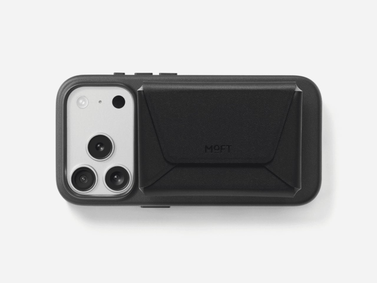
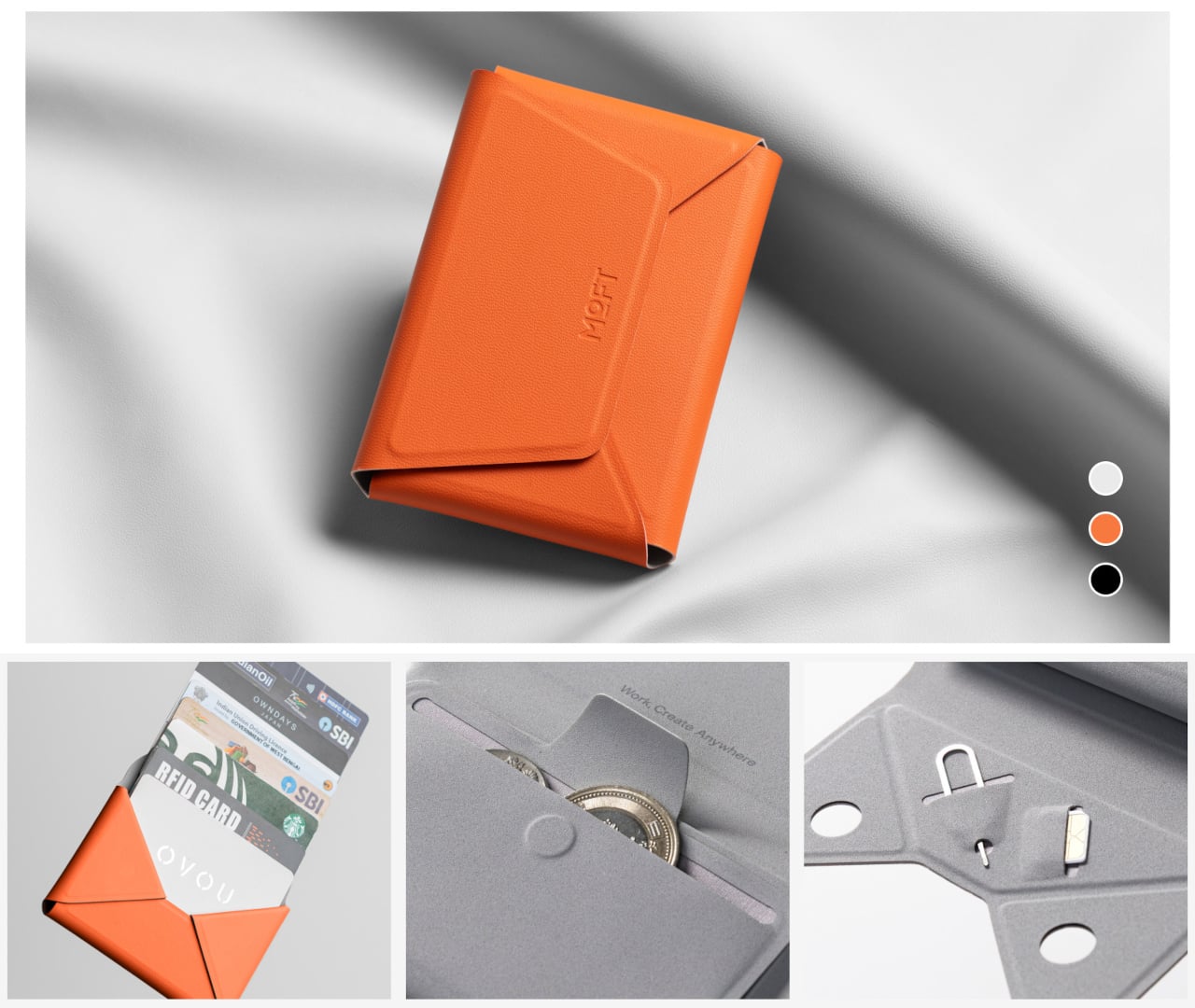
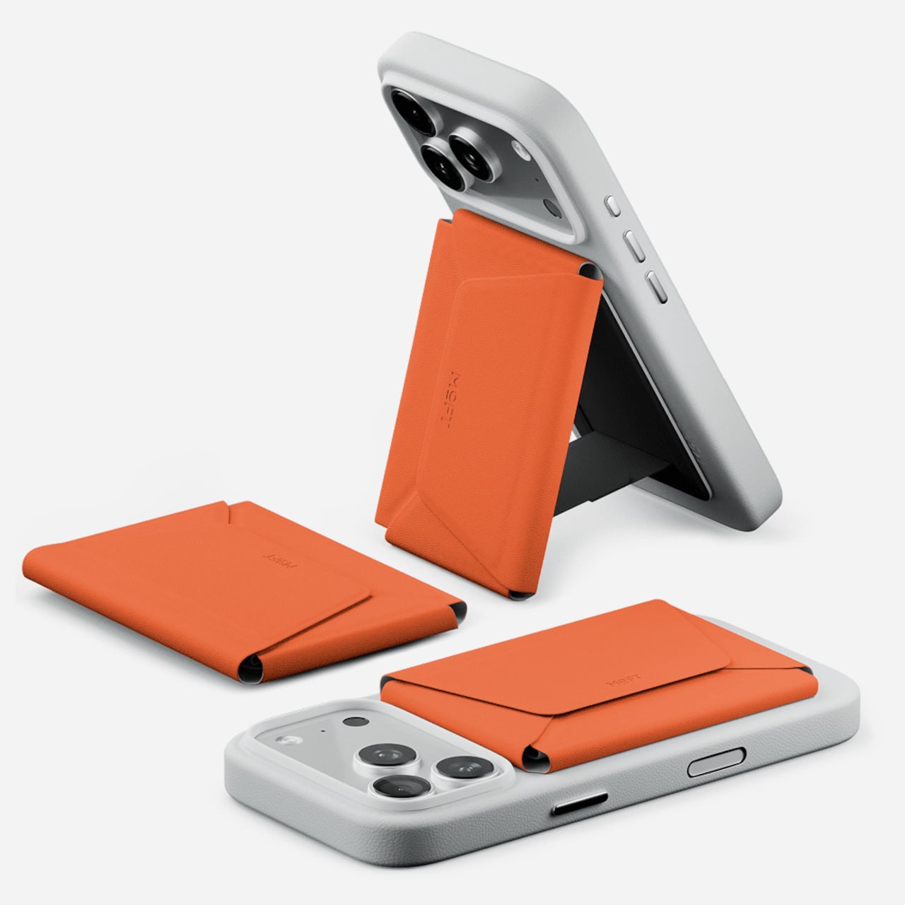
MOFT’s Trackable Field Wallet is a more ambitious take on the MagSafe wallet than the category usually produces. It snaps to an iPhone with strong magnetic force, holds up to eight cards in three organized compartments, tracks its location through Apple’s Find My and Google’s Find Hub, and folds into a phone stand. That’s an unusual amount of functionality packed into something roughly the size of a standard wallet.

Designer: MOFT

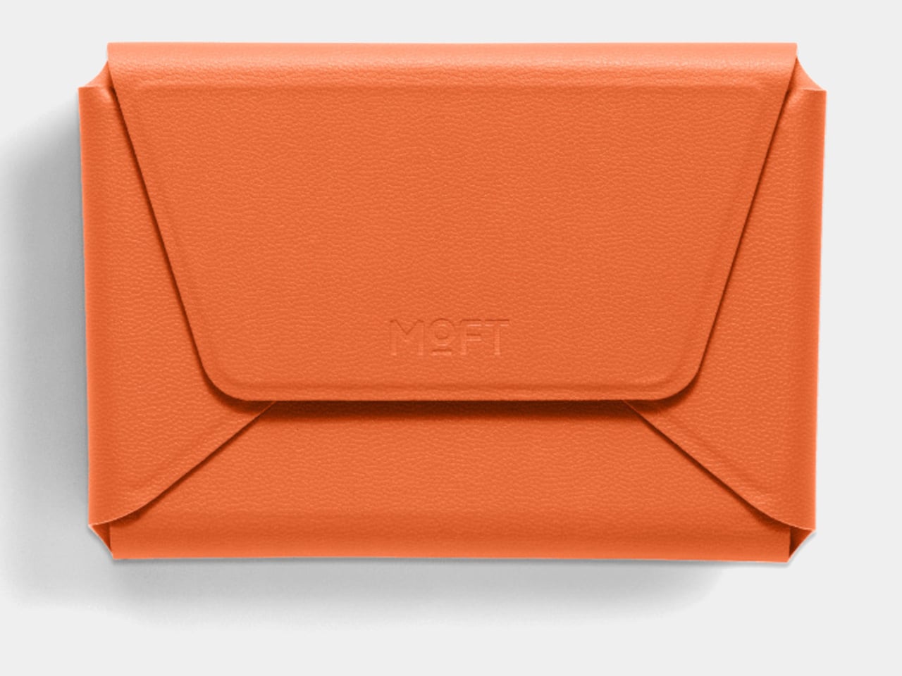
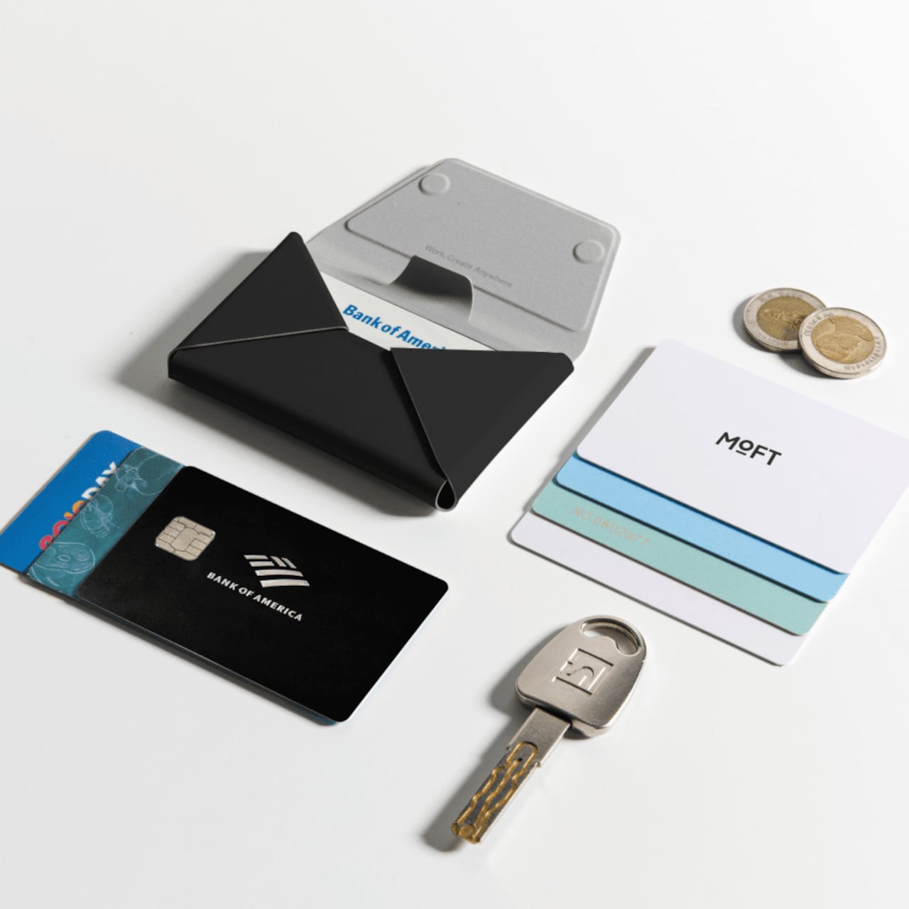
The card access design is one of the more practical details. A pull-tab on the front fans cards outward the moment you pull it, so you aren’t standing at a checkout counter hunting for the right one. The envelope-style body opens to three compartments: space for cards in the back, cash in the middle, and a magnetic slot for coins or small items like a SIM ejector tool.

The built-in tracker is what separates this from other Field Wallet versions. It connects to both Apple’s Find My network and Google’s Find Hub, so both iPhone and Android users can locate it from their device’s native tracking app. The hardware runs on a single wireless charge that lasts up to six months before it needs topping up again, meaning the tracking capability doesn’t ask for much maintenance in return.

There’s a particular kind of dread that comes from reaching into your bag and finding your wallet isn’t there. The tracking doesn’t prevent loss; it just gives you a map back to wherever the wallet went. For anyone who carries their cards clipped to their phone, the wallet and phone are already together in the first place, which narrows the chances of separation considerably.

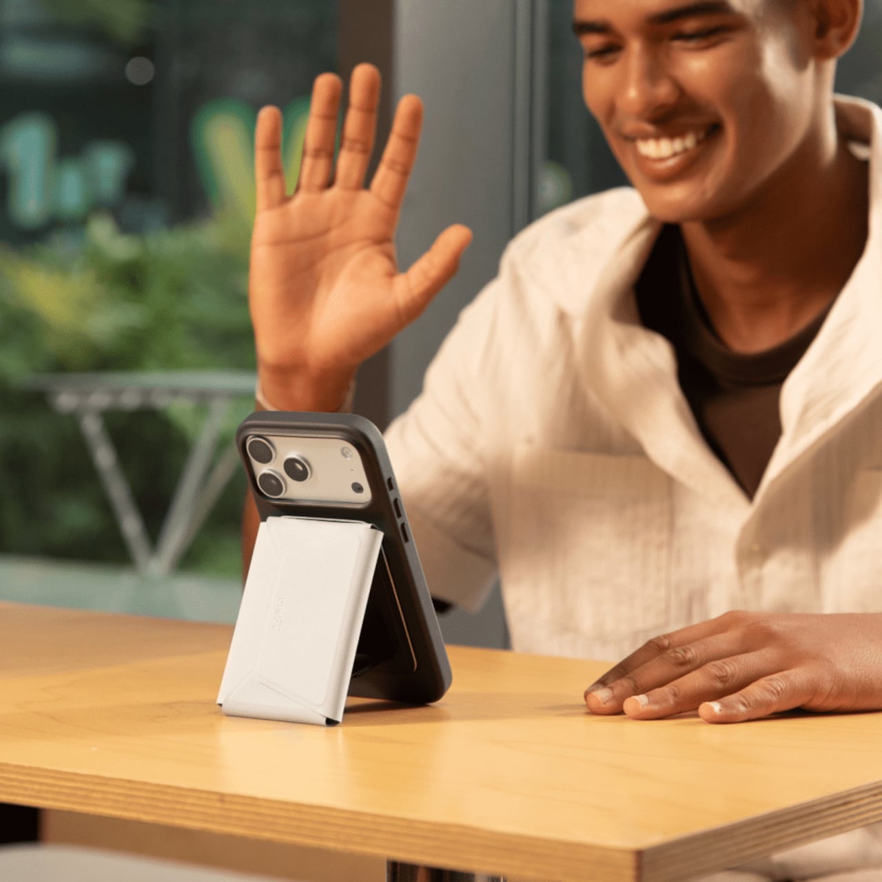
Flipping the wallet into stand mode is straightforward enough to do while you’re still holding the phone. The geometry of the envelope-style body creates a natural kickstand angle when folded open, propping the phone up for hands-free calls or a video playing on a table. It’s an expected feature from MOFT at this point, but it integrates naturally into the wallet’s fold-and-snap design rather than feeling like an afterthought.

The outer shell uses MOFT’s MOVAS vegan leather, which has a consistent texture and holds up to daily wear without requiring special care. An RFID-blocking layer keeps the cards protected from unauthorized scanning, though the magnets mean magnetic stripe cards shouldn’t be stored inside. The wallet is compatible with iPhone 12 through iPhone 17 series and works with non-MagSafe phones via a metal ring adapter included in the box.

The Trackable Field Wallet comes in three colors, Jet Black, Terracotta, and Misty Cove, and in two versions: one with a built-in stand and one without. For anyone who has been carrying a separate tracker alongside their wallet and phone, the appeal here is straightforward. The organization, the tracking, and the phone stand are built into a single object that already goes everywhere your phone does.

The post Most MagSafe Wallets Just Hold Cards, MOFT’s Also Tracks Itself first appeared on Yanko Design.

This Vase Was Made From Aluminum Tubes That Would’ve Been Thrown Away

Vases occupy an awkward corner of product design. Most exist somewhere between functional and decorative without committing to either, and the result is a category that rarely surprises. Ceramic ones carry craft tradition, glass ones depend on color and transparency, and the novelty options try to be sculptural without much conviction behind them. It’s a crowded space that doesn’t often ask interesting questions.
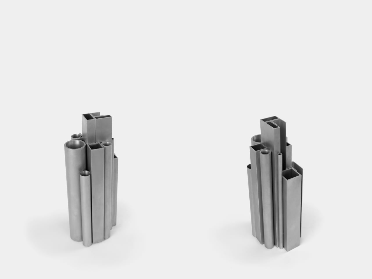
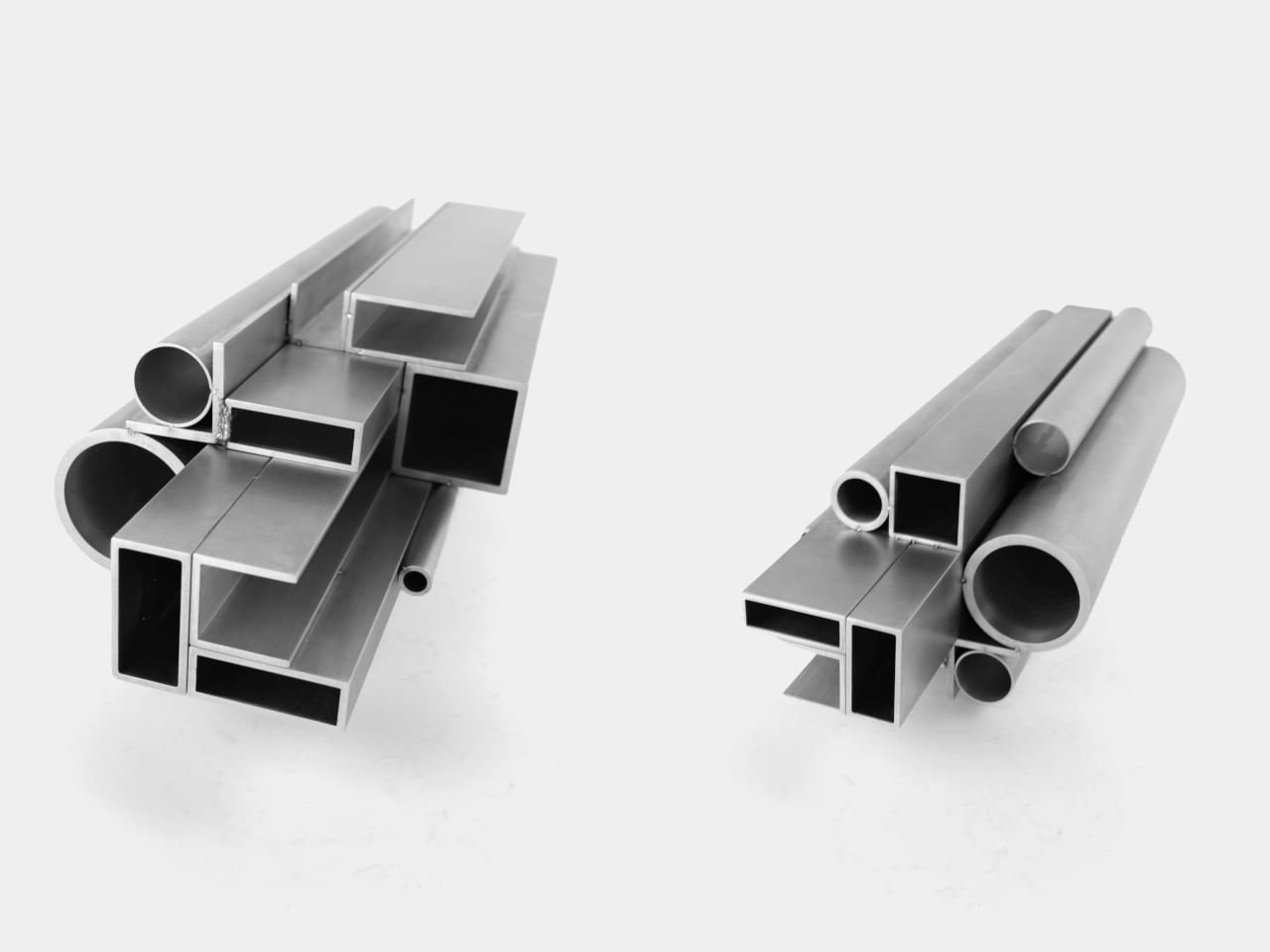
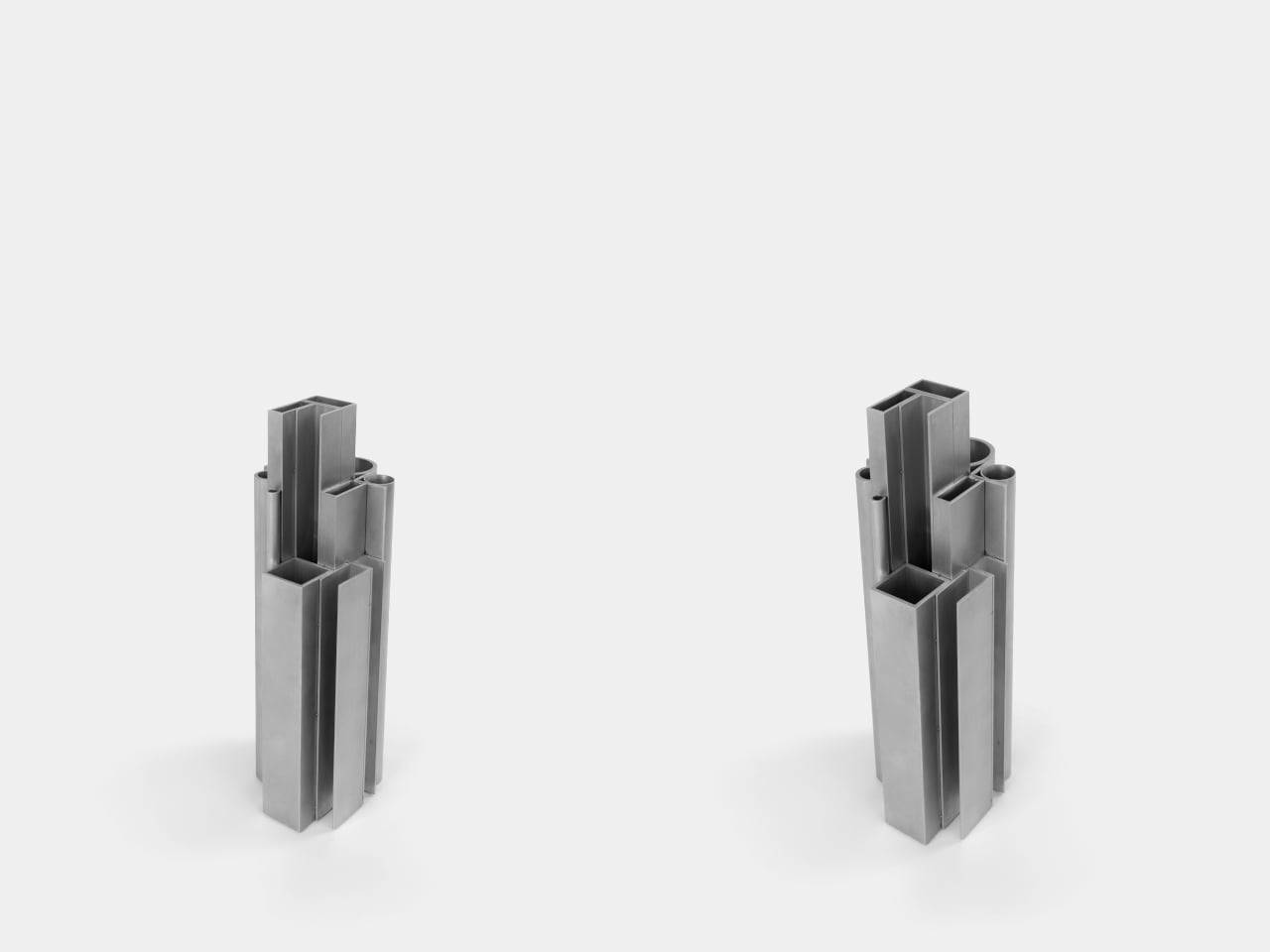
The Offcut Aluminum Vase starts from a different premise. Its form didn’t come from sketching vessel shapes or looking for the next minimalist curve. It came from staring at the end of a rack of industrial aluminum profiles, tubes, and sections waiting to be put to use. That cross-sectional view of bundled profiles, the overhead pattern nobody usually notices, is where the whole design began.
Designer: Raphael Klug

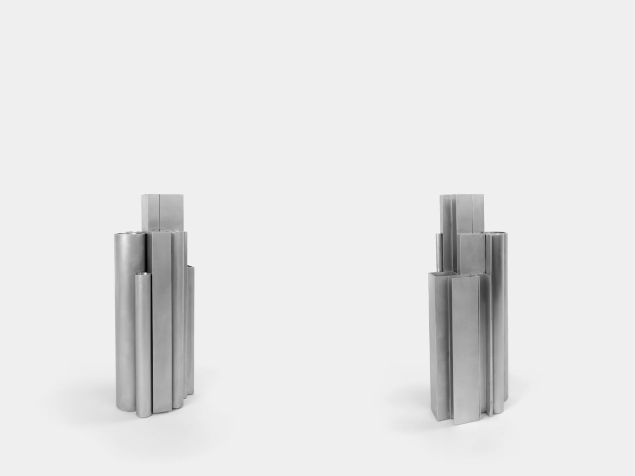
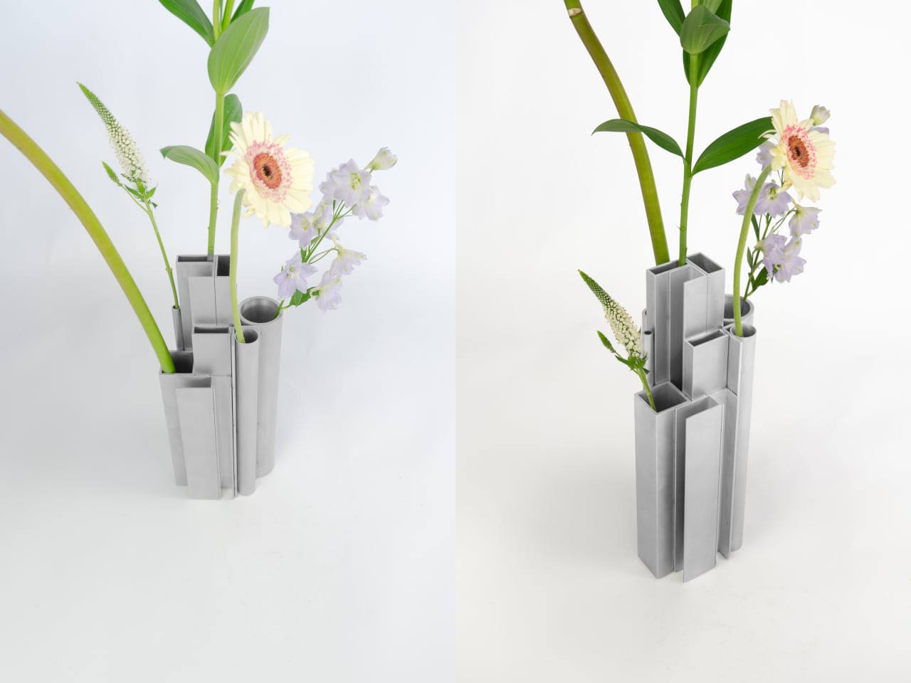
The construction is direct: actual aluminum offcuts bundled together, each piece a different cross-section. Circular tubes of varying diameters sit alongside square and rectangular hollow channels, all cut to different lengths that create a staggered, stepped silhouette when assembled. The look is instantly readable to anyone who has spent time near a metalworking shop or materials supplier, and distinctly strange to everyone else.
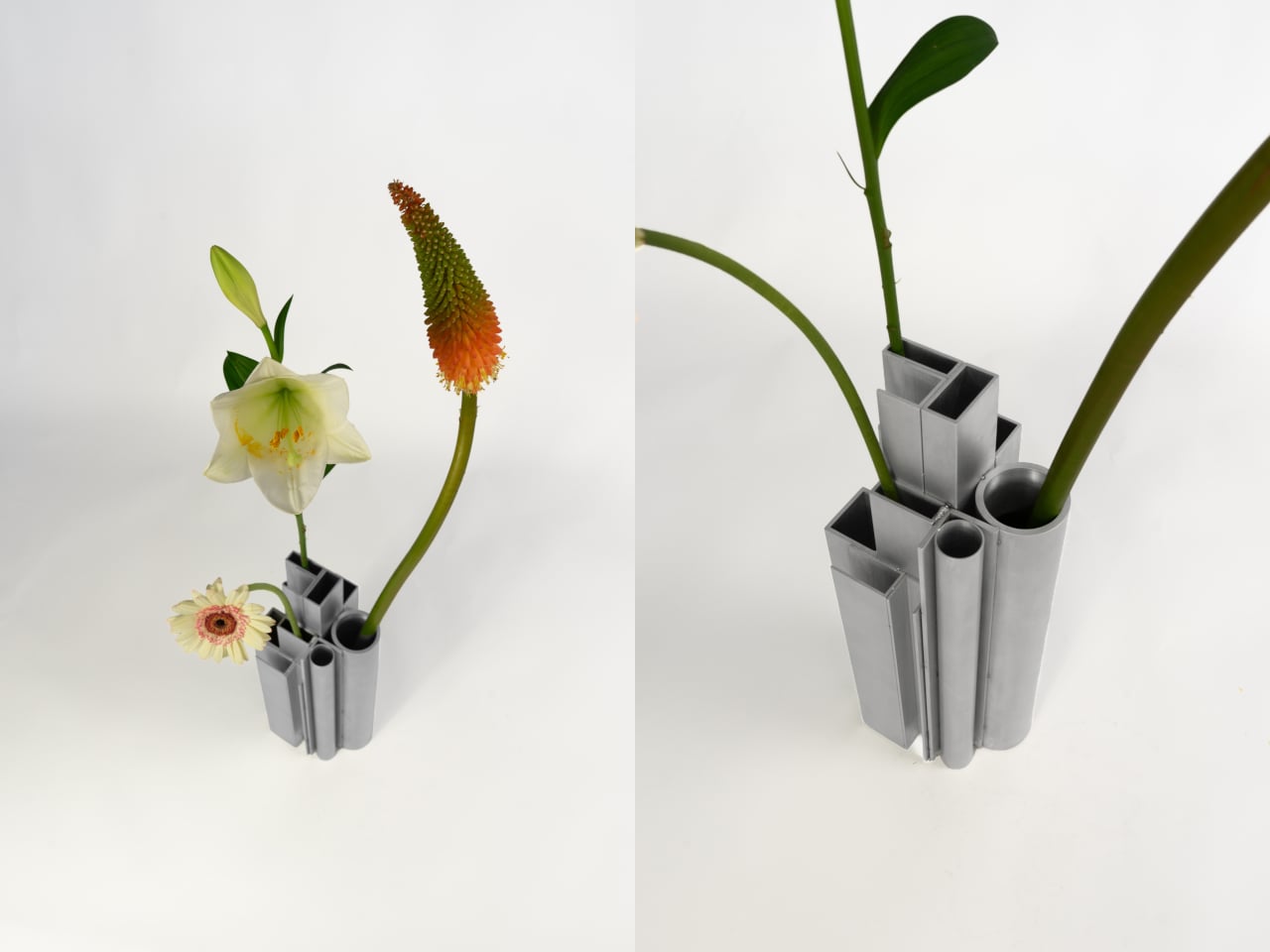
What’s surprising is how naturally it functions as a vase. Each opening, whether a round tube or a square channel, holds a single stem at a height set by that profile’s cut length. A tall flower finds one tube, a shorter bloom another, a delicate, small-stemmed flower a third. The structure of the object quietly distributes stems at different levels without any deliberate arrangement on your part.

The visual tension between the material and its setting is part of the appeal. Aluminum profiles don’t belong on a shelf with fresh flowers, and that friction is doing real work. The matte silver surface reads as cold and precise until something organic is placed inside it, and the contrast becomes the whole point. The industrial origin doesn’t disappear; it becomes what makes the flowers harder to ignore.

The choice to use actual offcuts rather than new aluminum cut to look like offcuts also matters. Most of this material would otherwise end up as leftover stock or be discarded at the end of a production run. Using it this way doesn’t require additional processing; the profiles arrive already shaped, already finished, and carrying the full character of their industrial origin without modification.

The vase holds its own even without flowers in it. The stepped arrangement of sections at different heights reads as a small sculptural object that could sit on a shelf as comfortably empty as it does full. The form doesn’t need flowers to complete it, which means that when you do add them, the combination feels considered rather than accidental.

It’s a rare thing when a design object’s material, form, and function all trace back to exactly the same source. Here they do. The offcuts are the structure, the structure is the form, and nothing about their industrial origin has been hidden or softened along the way. The workshop and the shelf turn out to have considerably more in common than most vases would ever admit.

The post This Vase Was Made From Aluminum Tubes That Would’ve Been Thrown Away first appeared on Yanko Design.