Miyoo Mini Flip Shrinks Retro Gaming into a 2.8-Inch Folding Square

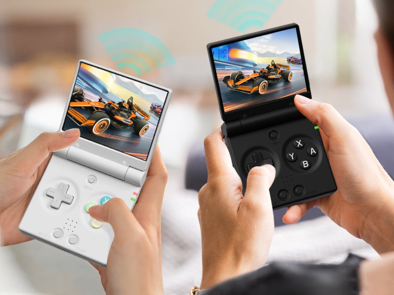
Retro handhelds have exploded in the last few years, from chunky bricks to tiny keychain consoles, and a lot of them still feel like little Linux boxes with buttons bolted on. The Game Boy Advance SP’s clamshell still lives rent-free in people’s heads, that satisfying snap when you close it, and the way it fits into a pocket without scratching the screen. The Miyoo Mini Flip is a modern answer to that memory, scaled for pockets and commutes.

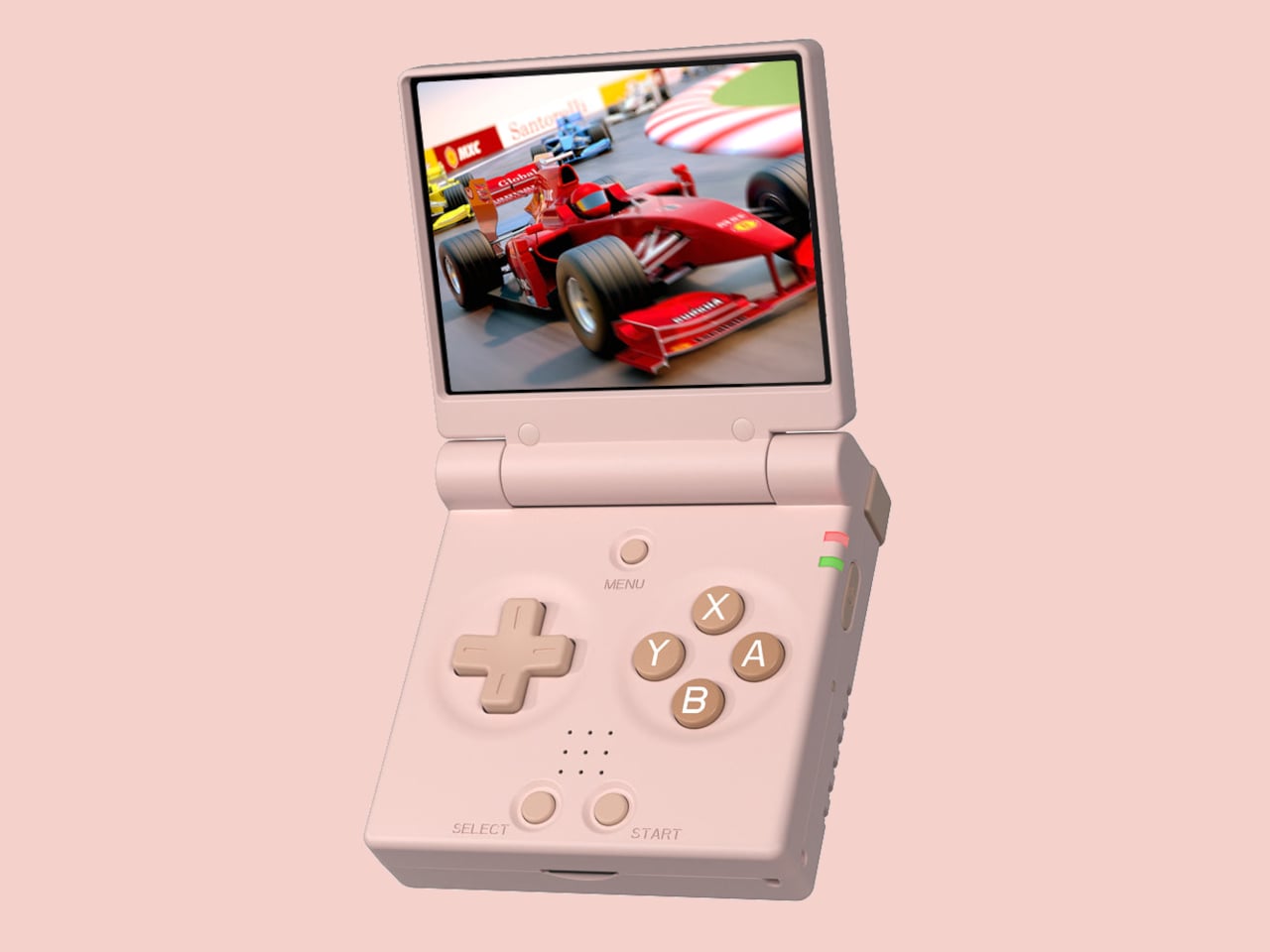
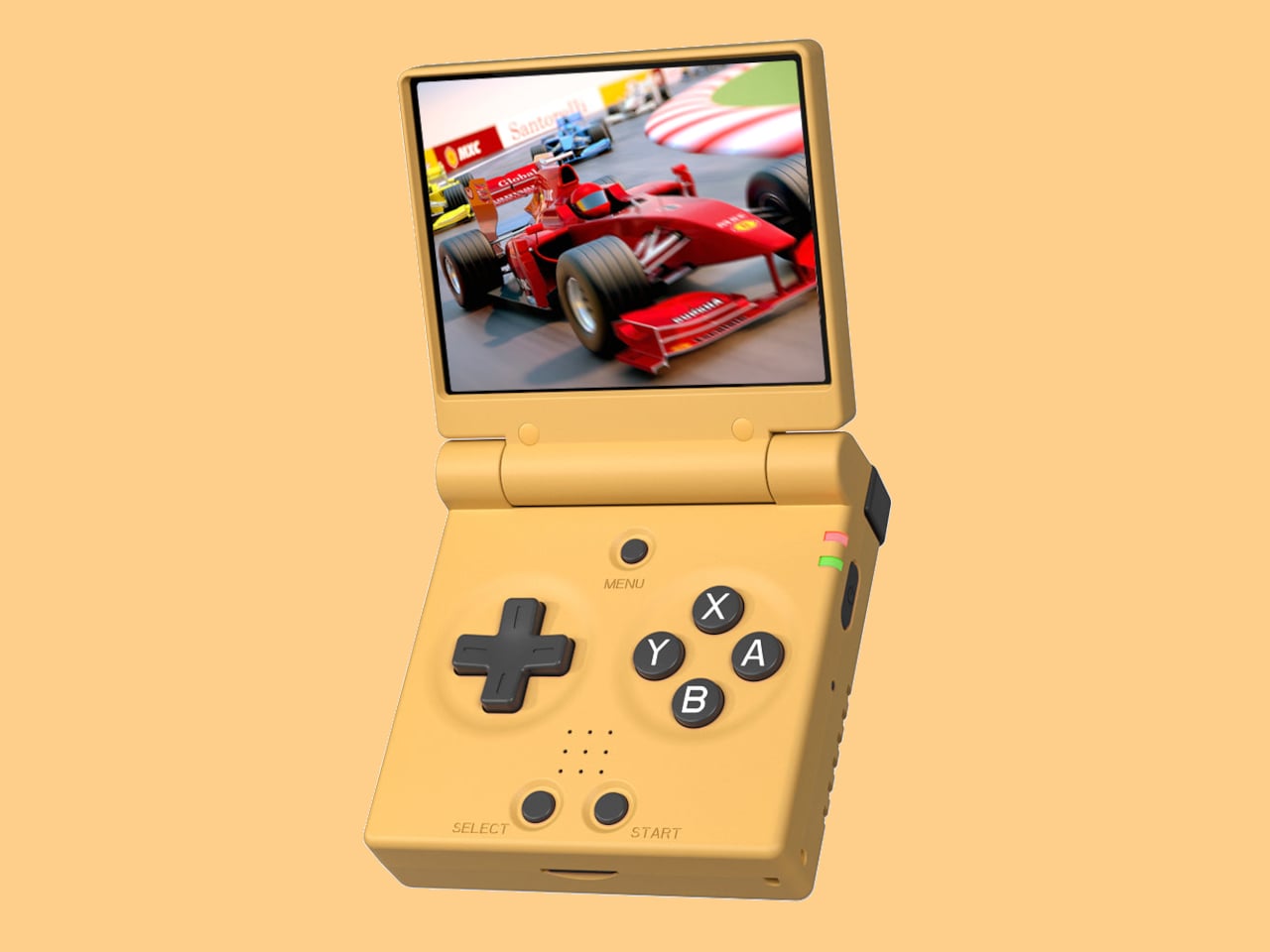
The Miyoo Mini Flip is a folding version of Miyoo’s tiny emulation handheld, now with an upgraded hinge for better durability. Closed, it is a 2.68‑inch square about 0.79 inch thick, small enough to disappear into a jeans pocket or bag. Open it up, and you get a full control deck and a 2.8‑inch screen, turning idle minutes into quick sessions of 8‑bit and 16‑bit comfort food without needing to commit to a full setup.

Designer: Miyoo

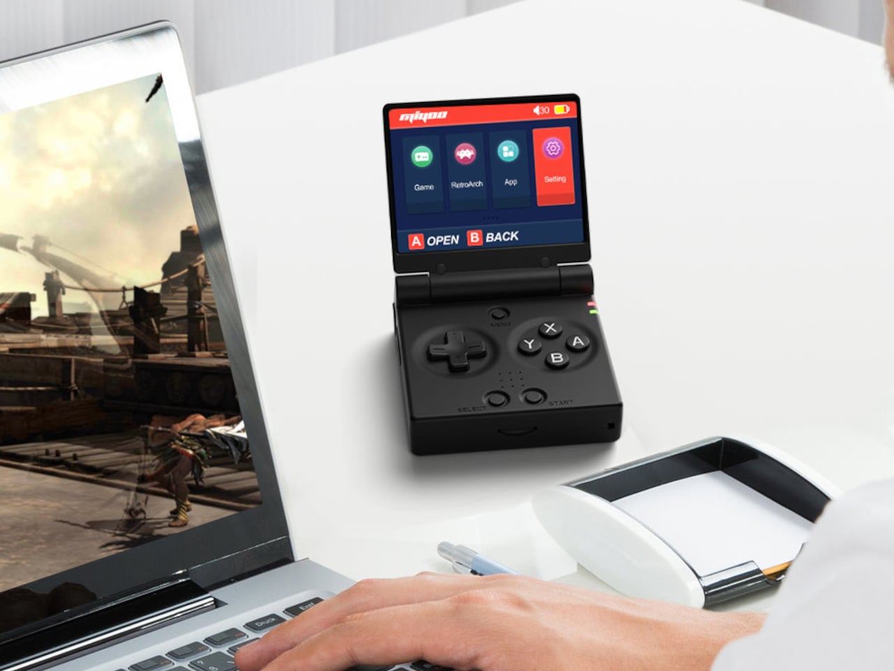
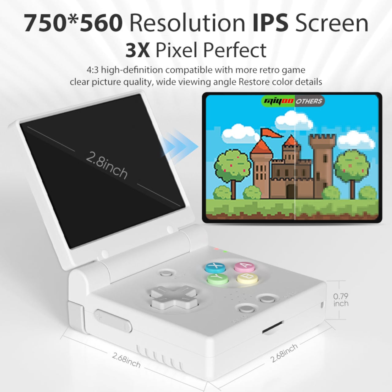
The 2.8‑inch IPS panel runs at 750 × 560 with a 4:3 aspect ratio, which lines up nicely with most classic consoles. The marketing calls it “3× pixel perfect,” hinting at clean integer scaling for certain systems, so sprites and tiles look crisp instead of smeared. Wide viewing angles and decent colour make pixel art and old racing games feel surprisingly alive on such a small canvas, bright enough to play outdoors or on a dimly lit train.

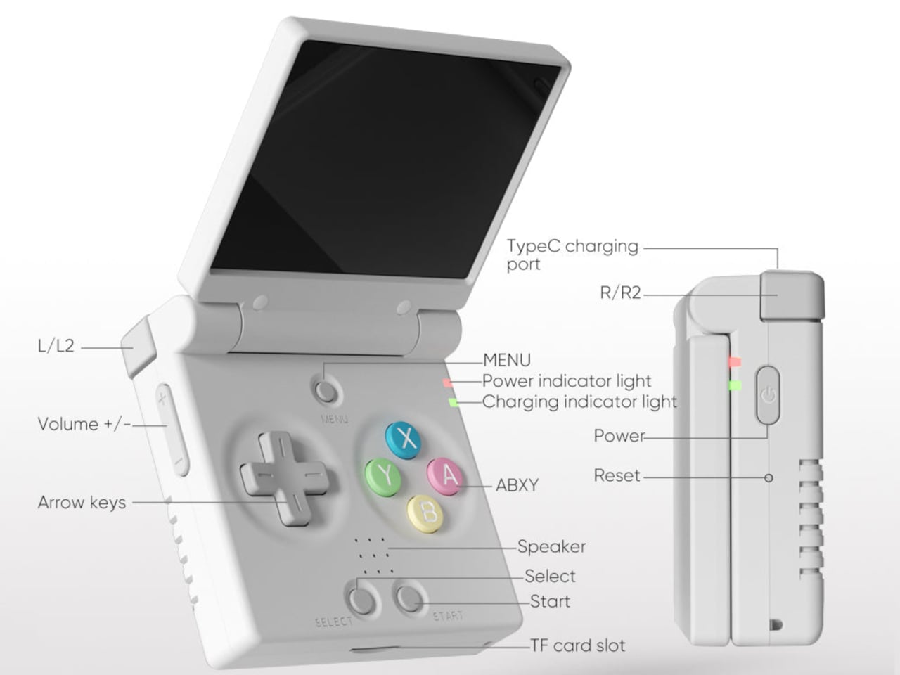
The control scheme mixes classic D-pad, ABXY face buttons, Select and Start, a Menu key, and L/L2 and R/R2 shoulder buttons tucked along the back edge. Volume and power live on the sides, with a front speaker and a TF card slot underneath. The layout feels like a mashup of modern controllers and old handhelds, giving thumbs familiar landmarks without overcomplicating a device that is meant to be grabbed and played.

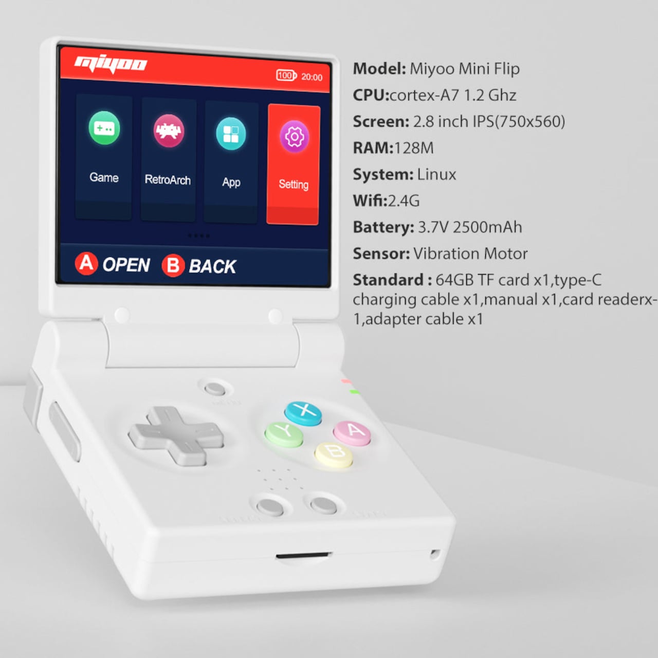
The hardware is a Cortex‑A7 at 1.2 GHz, 128 MB of RAM, Linux under the hood, 2.4 GHz Wi‑Fi, and a 3.7 V 2500 mAh battery. It is tuned for NES, SNES, GBA, PS1, and similar eras, not chasing Switch-level performance. The bundle usually includes a 64 GB microSD card and USB‑C cable, so you are not hunting for storage or adapters before you can start tinkering with ROMs and emulator settings.

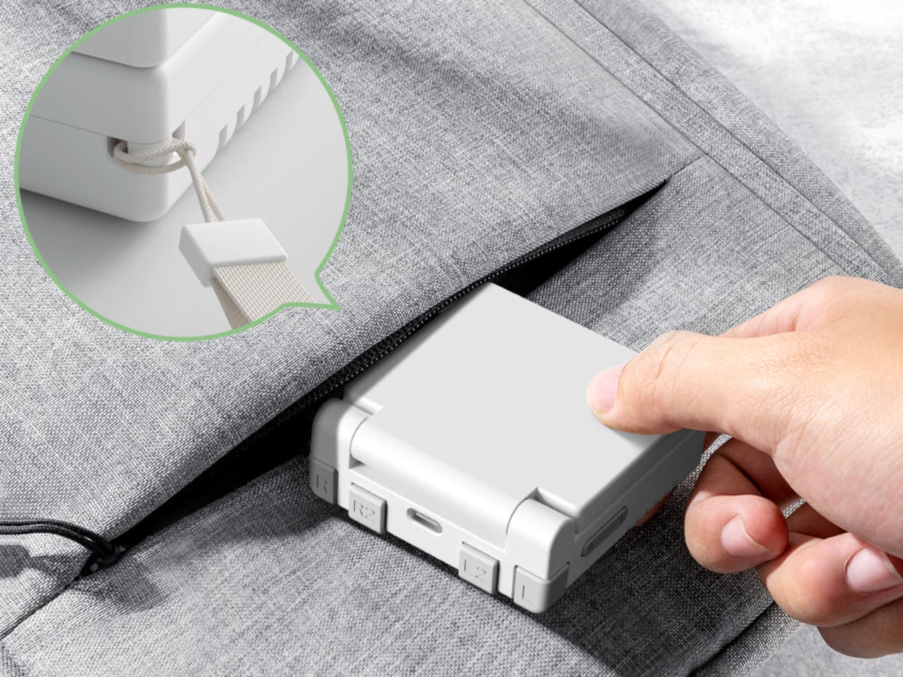
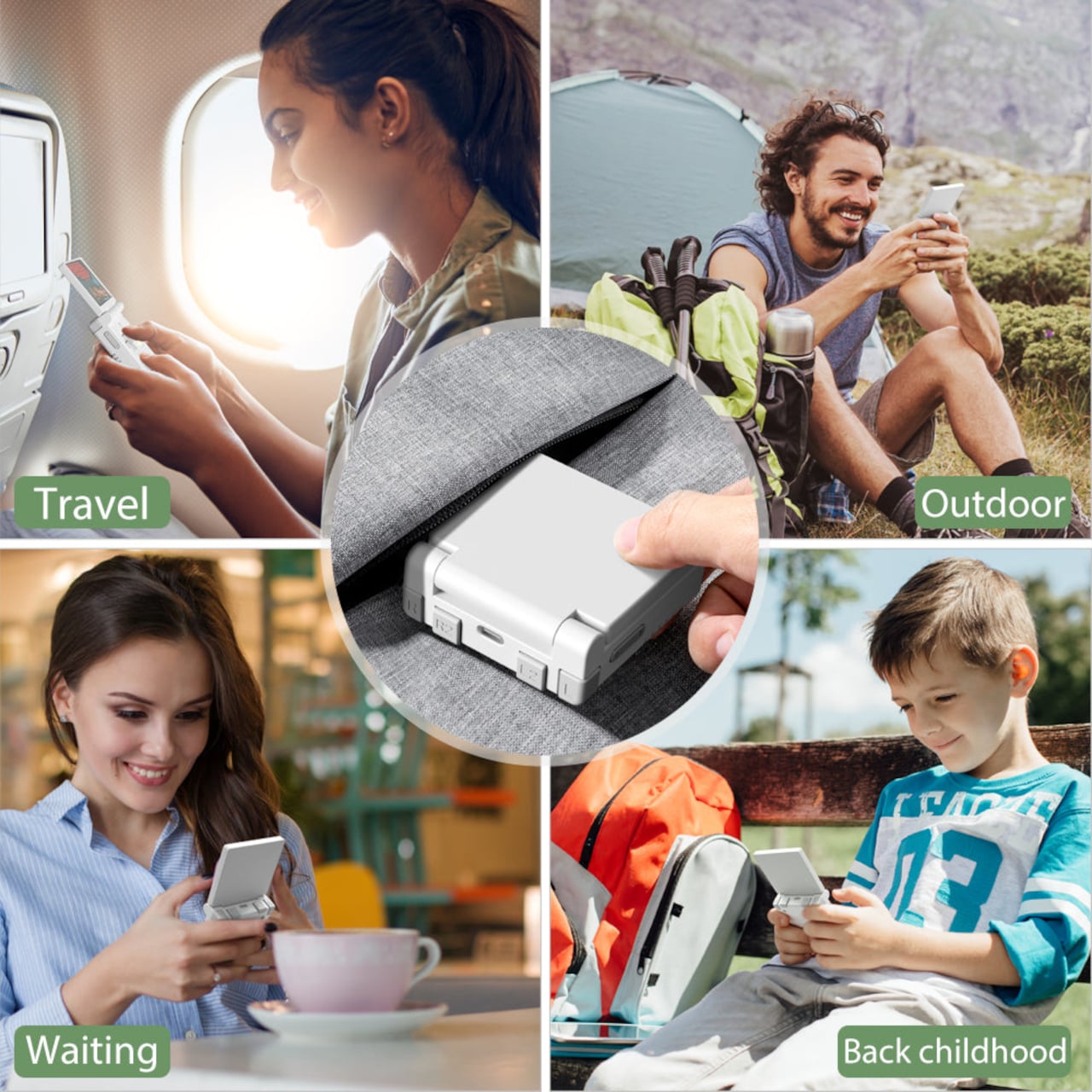
The hinge‑enhanced durability callout addresses early batches where people worried about wobble and wear. Closed, the Flip feels like a small, dense square you can toss into a pocket, backpack, or travel pouch without babying it. Marketing leans into travel, outdoor, waiting, and “back childhood” scenarios, which is exactly where a device like this shines, filling dead time with a few more runs of your favourite platformer or racer.

The Miyoo Mini Flip stands out beyond the emulator list. The clamshell form, upgraded hinge, sharp 4:3 IPS screen, and toy-like colours make it feel like a considered object, not another PCB in a shell. Retro games live as a small ritual in a pocket rather than a full setup on a desk, and this little folding square hits a very specific, very charming note without demanding much more than a microSD card and a willingness to revisit Super Mario World one more time.

The post Miyoo Mini Flip Shrinks Retro Gaming into a 2.8-Inch Folding Square first appeared on Yanko Design.

Galaxy Z Trifold Durability Test Reveals 3.9mm Trade-Offs

Seven years of Galaxy Z Fold and Flip experiments led to Samsung’s wildest form factor yet, a phone that folds twice into a 10‑inch tablet. Before anyone can trust a device like that, it has to survive more than a marketing reel. JerryRigEverything’s durability test became the unofficial reality check for the Galaxy Z Trifold, showing how far Samsung pushed the engineering and where those limits start to bite back.

Zack Nelson’s standard protocol is scratch, burn, dust, and bend, and the Galaxy Z Trifold greets you with a wall of warnings about not peeling films and folding in a specific order. If you close the wrong flap first, the phone vibrates and flashes red, a sign that the folding choreography is tightly constrained, even if it does not break immediately. The device is smart enough to know when you are stressing it incorrectly.

Designer: Samsung (via Zack Nelson/JerryRigEverything)

The outer cover screen behaves like other flagships, scratching at Mohs level 6 with deeper grooves at 7, while the inner flexible display still marks at level 2 with deeper damage at 3. The burn test shows the outer OLED lasting around 17 seconds under flame and the inner panel about 10, reinforcing that ultra‑thin glass and plastic stacks remain fragile, even in this latest generation, which is less a Samsung problem and more a physics problem.

The phone carries an IP48 rating, which sounds reassuring until fine dust is sprinkled into the hinge area and folding begins. The immediate grinding noises make it clear that particles can still get into the mechanism and between layers. The device survives the moment, but the test underlines that a tri‑fold with exposed hinge gaps is best kept away from beaches, workshops, or pockets full of grit.

The defining moment is the bend test. When force is applied in the opposite direction to the intended fold, the Galaxy Z Trifold’s frame buckles with an audible crack, making it the first Samsung phone to fail this particular test. The central spine is around 3.9 mm at its thinnest, significantly slimmer than many ultra‑thin phones, and the hinges themselves hold while the aluminium frame gives way, showing that Samsung prioritised compactness over reverse‑bend resistance.

The teardown reveals three separate batteries spread across the three segments, totalling about 5,600 mAh, so thin that even using pull tabs to remove them risks bending and puncturing. A 200 MP main camera, a 10 MP telephoto with OIS, and reliance on the aluminium frame for heat dissipation rather than a complex cooling system all point to thinness and packaging as top priorities, which makes sense when the goal is pocketability.

The Galaxy Z Trifold is an engineering statement that proves a pocketable tri‑fold tablet is possible, and JerryRigEverything’s test shows the trade‑offs of that ambition. Inner screens remain soft, dust remains a threat, and a 3.9 mm spine will not forgive a wrong bend. As a first draft of a radically new category, it achieves something impressive while accepting vulnerabilities that future iterations will likely address with slightly thicker frames and better sealing, once the core mechanics are proven and refinement can begin.

The post Galaxy Z Trifold Durability Test Reveals 3.9mm Trade-Offs first appeared on Yanko Design.

OnePlus Pad Go 2 Battery Lasts From Morning Coffee to Bedtime

Tablets have settled into a role somewhere between couch companion and light laptop stand-in, mostly used for streaming, reading, browsing, and occasional work. Android tablets have been uneven for years, with some brands throwing hardware at the problem while others barely try. OnePlus has been quietly building a more coherent story, and the Pad Go 2 is its latest attempt to make a large screen feel natural.

The OnePlus Pad Go 2 is a 12.1-inch Android tablet with a tall 7:5 display, a MediaTek Dimensity 7300-Ultra chip, and OxygenOS 16. It is not trying to be a halo device. Instead, it’s aiming for the sweet spot where a big, sharp screen, smooth performance, and long battery life matter more than headline-grabbing specs or ultra-thin bezels that sacrifice durability and comfort for millimeters.

Designer: OnePlus

The 12.1-inch LCD runs 2,800 × 1,980 resolution at 120 Hz, with 98 percent DCI-P3 coverage and up to 900 nits in high-brightness mode. The 7:5 aspect ratio gives more vertical space for web pages, documents, and split-screen apps than a 16:10 panel while still feeling natural for video. The extra vertical real estate makes reading and scrolling more comfortable, and the 120 Hz refresh means UI animations feel smooth without jitter.

The Dimensity 7300-Ultra, 8 GB of LPDDR5X RAM, and 128 GB of UFS 3.1 storage make the tablet feel snappy for streaming, browsing, and light gaming. The 4 nm SoC and fast memory mean apps open quickly, multitasking feels smooth, and OxygenOS animations take advantage of the 120 Hz panel without stutter. This is not a flagship chip, but it is over-specced enough for a mid-range tablet that the experience feels polished.

The 10,050 mAh battery handles long streaming sessions, reading, and mixed use without needing a charger nearby. The 33 W SUPERVOOC charging means topping up during a break is useful, rather than the slow trickle many budget tablets deliver. The goal is a tablet you can pick up in the morning and still be using on the couch at night, without babysitting the battery percentage or planning your day around outlets.

The quad-speaker setup, Bluetooth codec support from SBC through aptX HD and LDAC, and Wi-Fi 6 with Bluetooth 5.4 handle the supporting roles. The 8 MP front and rear cameras are there for video calls and quick scans rather than photography, and face unlock handles biometric login without a fingerprint reader cluttering the frame or adding cost to the bill of materials.

OxygenOS 16 is more than a phone skin stretched out, with split-screen multitasking, floating windows, and better scaling for the 7:5 display. It plays nicely with OnePlus phones for clipboard sharing, where supported, and the overall feel is closer to a lightweight desktop than a blown-up phone UI when you dock a keyboard or prop it on a stand for a few hours.

The OnePlus Pad Go 2 sits as a large-screen Android option that prioritizes display quality, smoothness, and battery over chasing ultra-high-end features. It makes the most sense for people who want a comfortable reading and streaming device that can also handle some work, and who like the idea of OxygenOS bringing OnePlus phone polish to a bigger canvas without flagship pricing or complexity they do not need for watching shows and scrolling feeds.

The post OnePlus Pad Go 2 Battery Lasts From Morning Coffee to Bedtime first appeared on Yanko Design.

This Pocket PC Concept Has a Flip-Out Pen and No Gaming Apps

Most students now juggle phones, tablets, and laptops, with messaging and games living right next to textbooks and notes. That mix can be powerful but also distracting, especially in crowded Chinese classrooms where space and attention are both limited. Pokepad is a portable PC concept that tries to carve out a focused, pocketable space dedicated to learning, treating study tools as worthy of their own hardware.

Pokepad is a smart learning device designed specifically for students, intended to cover most of their daily study scenarios. It is compact and portable enough to fit into school bags and coat pockets, and the goal is unrestricted learning, a device that can travel from classroom to bus to bedroom without feeling like a shrunken laptop or a repurposed phone fighting for attention against notifications and app alerts.

Designers: DaPengPeng (DPP), Wengkang Cheng, Qi M

The design team experimented with multiple shapes before settling on a slim rectangular box concept, balancing learning apps, hardware needs, and clever portability. The box footprint keeps it familiar enough to slip into existing routines, yet distinct from a phone, with enough internal volume for a decent battery, speakers, and a pen mechanism, without turning into a bulky tablet that refuses to fit anywhere.

The built-in flip pen is central to the concept. To ensure portability, slimness, and differentiation, the team chose to hide the stylus inside the body, so it flips out when needed and disappears when not. That decision reinforces Pokepad as a pen-first device for note-taking, annotation, and handwriting practice, and avoids the classic problem of separate styluses getting lost in backpacks or rolling off desks during lectures.

The soft-edged, minimal aesthetic uses rounded corners, a single camera module, and a small “100” logo that nods to perfect test scores. Colour options range from clean white and light blue to a more playful red with a textured back for grip. The branding and palette position Pokepad as a study companion rather than a gaming gadget, something that feels at home in a pencil case next to erasers and rulers.

The interface is geared toward classes, homework, notes, a dictionary, and voice recording, rather than a full app store. The idea is to centralise tasks that are currently split across paper notebooks and phones, giving students a dedicated place to scan assignments, jot down ideas with the pen, and review materials on the go, without the constant pull of unrelated apps demanding screen time.

Pokepad takes the idea of a learning device seriously enough to design hardware, UI, and branding around school life, instead of treating students as a side market for general tablets. A pocketable box with a flip pen and a “100” on the back suggests a quieter, more focused path for everyday study tech, where the device earns its footprint by doing one category of tasks well instead of trying to be everything at once.

The post This Pocket PC Concept Has a Flip-Out Pen and No Gaming Apps first appeared on Yanko Design.

Ovme Smart Mirror System Lets You See, Feel, and Fit Virtual Outfits

The everyday “what should I wear today?” moment has gotten more complicated by online shopping. You can scroll endless outfits, but a screen cannot show how something fits, feels, or plays with what you already own. Ovme is a concept that treats the mirror as a missing link between your closet, your feed, and your actual body, closing the gap between seeing and knowing.

Ovme is an AR smart mirror ecosystem built around three objects: a full-height mirror, a sensor-laden fitting belt, and a haptic tactile table, plus a companion app. The name stands for “Own version of me,” and the system is designed to help you find new styles, feel how they fit, and touch virtual fabrics before you ever click buy or open your wallet.

Designers: Daun Park, Seyeon Park, Chawon So, Yewon Shim, Yejin Hong

The mirror acts like a personal stylist, overlaying outfits on your reflection and pulling from three sources: new looks, your existing wardrobe, and reference images you feed it. You can swipe through categories like formal, sporty, or feminine, and see complete outfits assembled around your silhouette, then save the ones that feel right into a virtual closet for later when you need inspiration or want to revisit.

The fitting belt is a flexible band with sensors that can wrap around your head, waist, or thigh. It measures circumference and applies gentle pressure, tightening or loosening to simulate how a garment would hug or hang on that part of your body. On the mirror, the virtual outfit responds in real time, turning fit from a guess based on size charts into something your body can actually sense.

The tactile table is a slim pedestal with a haptic surface that uses electro-tactile feedback to mimic fabric textures. When you place your hand on it, the system can suggest sensations like smooth silk, textured knit, or structured leather in sync with what you see in the mirror. It attempts to close the gap between seeing a material and knowing how it might feel against your skin or draped over your shoulders.

Ovme also acts as a style diary. It can scan what you are wearing today, score the outfit, and save it to a timeline called My Closet, so you can revisit past looks and see patterns in what you actually wear. A social layer called OvUS lets you browse other people’s saved styles and mood boards, turning the mirror into a place to share and borrow ideas rather than stare at yourself alone.

Ovme treats getting dressed as an ongoing design process, not a daily panic, and uses AR, haptics, and sensing to give online fashion some of the feedback loops of a real fitting room. Whether or not this exact hardware ever ships, the idea of a home mirror that helps you experiment, feel, and remember your style captures a direction that deserves attention, especially as wardrobes become more scattered across platforms and shopping becomes more remote.

The post Ovme Smart Mirror System Lets You See, Feel, and Fit Virtual Outfits first appeared on Yanko Design.

This DIY AI Astronaut Looks Like a Desk Toy Until You Ask It Questions

Most DIY AI gadgets are bare boards and wires, or at best a 3D-printed box, and that clashes with the idea of leaving them on a shelf or side table. Even clever builds end up looking like projects rather than finished objects. D. Creative’s tiny AI robot is a counterexample, a chatbot built inside a toy astronaut that looks like decor first and a smart assistant second, making it actually display-worthy.

The basic concept is a small astronaut figurine that you can talk to, which talks back using a cloud LLM. All the electronics, ESP32-S3, mic, amp, speaker, battery, and OLED, are hidden inside the toy shell, so on a desk it reads as a cute space figure until it lights up and answers a question or starts blinking to show it is listening.

Designer: D. Creative

The internals pack tightly. An ESP32-S3 Super Mini acts as the brain, a digital I²S microphone hears you, a matching I²S amplifier and tiny speaker reply, and a 300 mAh battery with a charging board keeps it running. The 0.96-inch OLED is tucked into the helmet as the robot’s face, giving the AI a place to look back from when you address it or ask for help.

The builder gutted a light-up astronaut toy, drilled a few holes for buttons and a USB port, and then packed the new hardware inside before closing it back up. This is not a 3D-printed shell but an existing object repurposed, which keeps the proportions and charm of the original toy while hiding the complexity and making the result feel less like a gadget and more like a character.

The interaction loop is straightforward. You speak, the mic captures your voice, the ESP32 sends it over Wi-Fi to a speech-to-text service and then to the Qwen3 LLM, the response comes back as text, and a text-to-speech engine turns it into audio for the speaker. The astronaut’s OLED changes expression to show when it is listening, thinking, or ready to answer, turning a text exchange into something more animated.

Putting the same kind of chatbot you might use in a browser into a toy astronaut changes the relationship. The presence of a body, a face, and a fixed spot on your desk makes the assistant feel more like a little character you share space with, and less like a disembodied voice that lives somewhere in the cloud and has no opinion on where it sits.

This project hints at a pattern other makers can borrow, taking familiar objects and quietly giving them new capabilities instead of always starting from scratch. A tiny AI astronaut that fits into a home without looking like a project points toward a future where more of our everyday decor hides small, conversational brains, and where the line between toy and tool gets pleasantly blurry, with AI companions that feel more like friends than appliances waiting for commands.

The post This DIY AI Astronaut Looks Like a Desk Toy Until You Ask It Questions first appeared on Yanko Design.

TCL Note A1 Tablet Feels Like E-Ink Paper but Shows Full Color and Video

People bounce between paper notebooks, e-ink readers, and glossy tablets, each good at one thing and bad at others. E-ink is gentle but slow and monochrome, LCD is fast and colourful but tiring for long reading, and paper is great until you need to search or backup. TCL Note A1 NXTPAPER is an attempt to merge those worlds into a single, paper-leaning tablet that does not make you choose between comfort and capability.

TCL Note A1 NXTPAPER is an 11.5-inch eNote tablet that blends a full-colour LCD with a paper-like surface. The 3A Crystal Shield Glass brings anti-glare, anti-reflection, and anti-fingerprint coatings, plus TÜV Rheinland certifications for eye comfort, flicker-free operation, and low reflection. The idea is a screen you can stare at for hours of reading and writing without feeling like you are looking into a lightbox, which is exactly what most tablets become after the first hour.

Designer: TCL

The tablet is built around handwriting, with a stylus that has dual tips, an eraser, and haptic feedback from an X-axis linear motor. Each stroke is meant to feel smooth and controlled, closer to pen on paper than plastic on glass. TCL’s pitch is that every note and sketch feels natural and expressive, making it a place where you actually want to write instead of just tapping keys or hunting for the right toolbar icon.

Note A1 has an octa-microphone array and tools for audio-to-text transcription, real-time translation, and AI summaries. In meetings or lectures, it can record, transcribe, and condense discussions so you can focus on listening instead of frantic note-taking. Writing helpers handle rewriting, grammar, translation, and summarising drafts, turning the tablet into a quiet collaborator rather than a blank page waiting for you to figure everything out alone.

The infinite canvas feature lets you zoom, expand, and sketch without hitting page edges, and the split-screen mode lets you read on one side while taking notes on the other. That combination makes it easier to absorb and organise information at the same time, whether you are annotating a PDF, outlining a report, or sketching over reference images without juggling windows or losing your place.

Note A1 supports syncing via Wi-Fi and cloud services like Dropbox, Google Drive, and OneDrive, plus wireless screen casting for presentations. The aluminium body is 5.5 mm thick and around 500 g, which keeps it light enough to carry all day. It feels more like a slim notebook than a chunky laptop, but with enough solidity to survive bags and desks without worrying about scratches or dents.

Note A1 NXTPAPER is aimed at people who read and write a lot, sit through meetings or lectures, and want a single device that feels kind to their eyes and helpful with their words. A paper-leaning, AI-assisted slate that treats focus and handwriting as first-class citizens offers a different path from the usual entertainment tablet, especially when long-form thinking matters more than another hour of streaming.

The post TCL Note A1 Tablet Feels Like E-Ink Paper but Shows Full Color and Video first appeared on Yanko Design.

This Case Fixes iPhone’s Weak Selfie Camera with a Second Screen

The iPhone’s rear cameras keep getting better, but selfies still rely on a smaller, lower-resolution front sensor, and storage upgrades cost considerably more than a microSD card. People who shoot a lot of photos and video feel squeezed on both fronts, choosing between spending hundreds on internal storage or dealing with blurry front-camera selfies. Selfix is a case for the iPhone 17 Pro that tackles both problems at once.

Selfix is a case for the iPhone 17 Pro and Pro Max that adds a circular 1.6-inch AMOLED screen to the back and hides a microSD slot inside. The rear screen acts as a tiny viewfinder so you can use the 48 MP rear cameras for selfies, while the card slot lets you add up to 2 TB of storage without touching Apple’s upgrade menu or monthly cloud fees.

Designer: Selfix

The rear display mirrors the camera view so you can frame yourself, adjust in real time, and pick any of the rear lenses, from ultra-wide group shots to telephoto portraits. You get the main sensor’s larger 1/1.28-inch glass, Night Mode, and up to 8× optical zoom for selfies, instead of guessing with a cropped front camera and hoping everyone fits into the narrower field of view.

Selfix connects through the phone’s USB-C port and does not need a separate app. You snap the case on, open the camera, and the rear screen wakes up. A dedicated button on the case lets you turn the display off when you are not using it to save battery. The idea is to feel like a built-in second screen, not another gadget that needs pairing, permissions, and a drawer full of instructions.

The case includes a microSD slot that supports cards up to 2 TB, using the same USB-C connection to integrate with the phone. A 512 GB card costs around $50, while Apple’s $200 jump for the same capacity makes swappable storage a compelling alternative. Heavy shooters can archive trips or projects without paying monthly cloud fees or deleting older work to make room for new sessions.

Selfix is made from high-quality TPU and comes in Oat White, Blush Pink, and Midnight Black, sized to match the 17 Pro and Pro Max. It adds some thickness, bringing the total to 17mm, but in return, you get a grippy shell, a second screen, and a hidden storage bay. The design aims to look like a natural extension of the phone rather than a bolt-on camera rig or accessory that screams afterthought.

Selfix is aimed at people who care enough about image quality to use the rear cameras for everything, and who are tired of juggling storage or paying the upgrade tax. A case that quietly turns the iPhone into a dual-screen shooter with expandable memory makes you wonder why the phone did not ship this way, especially when the rear cameras already outclass the front by a significant margin, and storage remains artificially expensive.

The post This Case Fixes iPhone’s Weak Selfie Camera with a Second Screen first appeared on Yanko Design.

Thunder Duo Max Brings 5.1.2 Atmos to Your Desk With Just 4 Speakers

Most gaming setups lean on either a soundbar under the monitor or a headset clamped to your head. Soundbars are convenient but flatten the sense of space, especially when games and films are mixed for surround and height. Headsets can isolate better, but they get warm after a few hours and cut you off from the room entirely. Thunder Duo Max tries to bring full Dolby Atmos to a desk or living room without turning the space into a speaker warehouse.

Thunder Duo Max is the top configuration in a modular series, built around a pair of compact bookshelf speakers that handle the front channels and height effects. The system is a true 5.1.2-channel Dolby Atmos rig, not a virtual surround bar, and the bookshelf format unlocks larger drivers, fuller bass, and a flexible layout that can expand or tighten the soundstage depending on how you arrange it, making it comfortable on a desk or beside a TV.

Designer: OXS

Click Here to Buy Now: $569 $849 ($280 off). Hurry, only 105/200 left! Raised over $73,000.

The dual upward-firing Sky Channels built into each speaker send sound toward the ceiling to create a real overhead layer. That matters in games where helicopters, rain, or footsteps above you become easier to place, and it adds a vertical dimension to films and music that most desktop setups ignore. This is certified Dolby Atmos performance, with decoding handled by one of the system’s two dedicated DSPs, so height effects come from actual audio processing rather than software tricks.

1

The 5.1.2-channel layout breaks down into front left and right from the speakers, a phantom center between them, a low-frequency channel anchored by the main drivers and sub, and rear channels handled by a wireless satellite neck speaker. The neck speaker solves the usual problem of rear-speaker placement in small rooms, putting true rear channels on your shoulders instead of mounting boxes behind your chair or running cables across the floor.

1

The low end gets handled by the wireless Thunder Sub, using a 5.25-inch driver and 80 W RMS output to extend bass down to 35 Hz. The full Thunder Duo Max system delivers 110 W RMS and 270 W peak, with total harmonic distortion under 0.5 percent, so explosions, engines, and music cues hit hard without turning into muddy rumble. The goal is to feel weight and impact without sacrificing the clarity that makes dialogue and footsteps legible.

1

Thunder Duo Max plugs into different parts of a setup without picking favorites. HDMI 2.1 and HDMI eARC handle PS5, Xbox Series consoles, and high-frame-rate PC output at 4K 120 Hz. USB-C connects Switch, Steam Deck, and mobile devices. Bluetooth 5.3 adds low-latency wireless audio. Input switching happens on the system itself, so you can move between PC, console, and streaming without re-cabling every time you sit down or swap between desk and couch modes.

1

The system uses dual DSP architecture, combining Dolby Atmos decoding with OXS’s own Xspace spatial algorithm, and it has been tuned in a dedicated acoustic lab for a studio-level frequency response. The software side includes per-channel EQ, six-ring RGB lighting with multiple motions and 50 colors, and a desktop app that lets you dial in both sound and lighting, so the system fits the room rather than shouting over it with blinking lights you cannot turn off.

Living with a system like this changes how games, films, and music feel. Instead of sound sitting in a flat line in front of the screen, it wraps around you, with height, rear, and sub channels giving every explosion, ambient loop, and soundtrack a real sense of space. The neck speaker and wireless sub make full surround possible in spaces that could never handle a traditional 5.1.2-channel layout. For people who care about audio as much as frame rates, Thunder Duo Max reads less like a peripheral and more like a small, flexible sound studio that happens to sit next to a monitor.

Click Here to Buy Now: $569 $849 ($280 off). Hurry, only 105/200 left! Raised over $73,000.

The post Thunder Duo Max Brings 5.1.2 Atmos to Your Desk With Just 4 Speakers first appeared on Yanko Design.