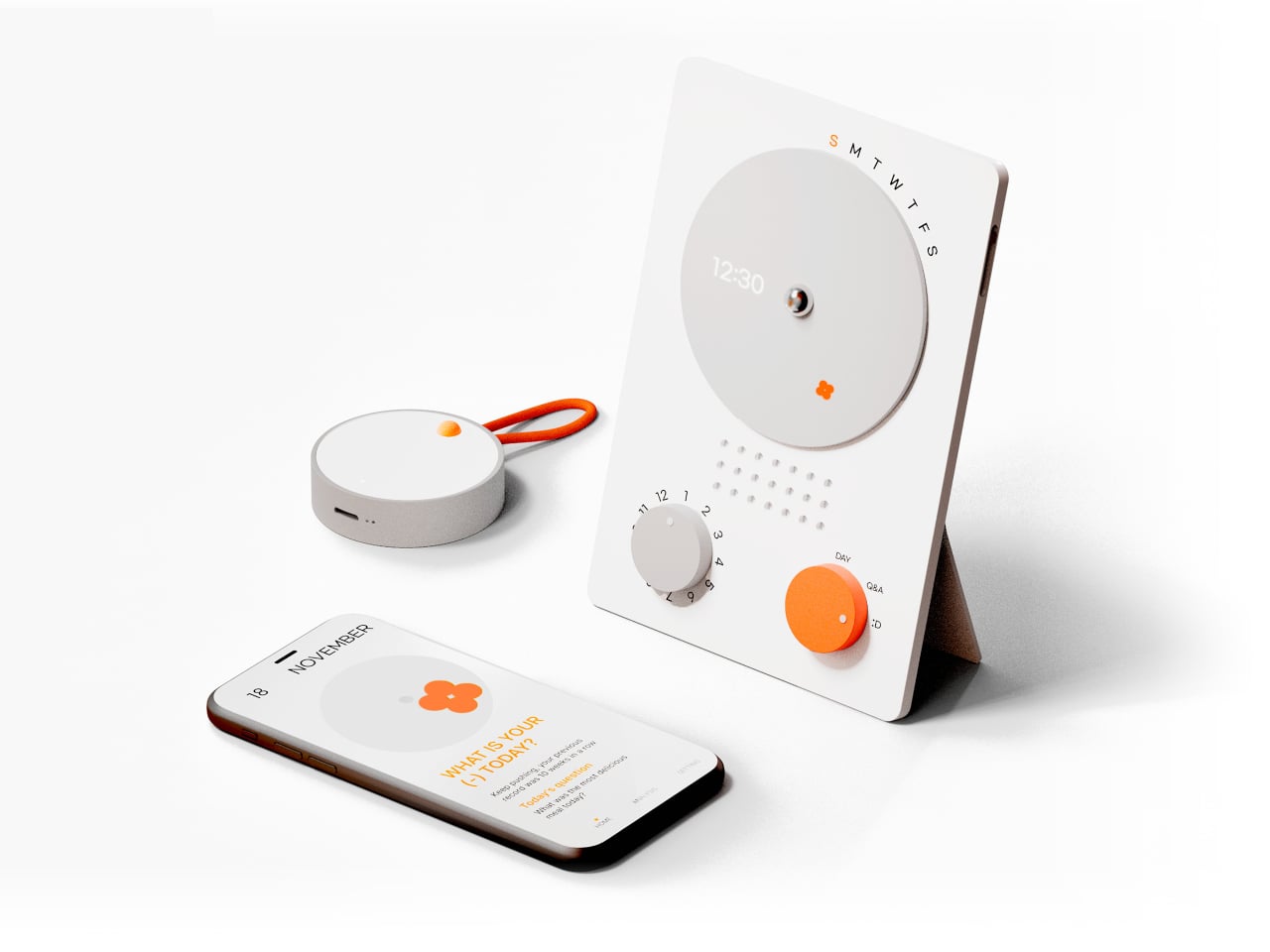
People are more stressed than ever, yet still find it hard to talk honestly about how they feel, even with therapists or friends. Most mental health tools live inside apps that want you to rate your mood on a slider or fill out forms about your day, which can feel clinical or like homework you forgot to do. Clover is a concept that tries to make emotional check-ins gentler and more tangible, focusing on collecting small moments that went right instead of cataloging everything that went wrong.
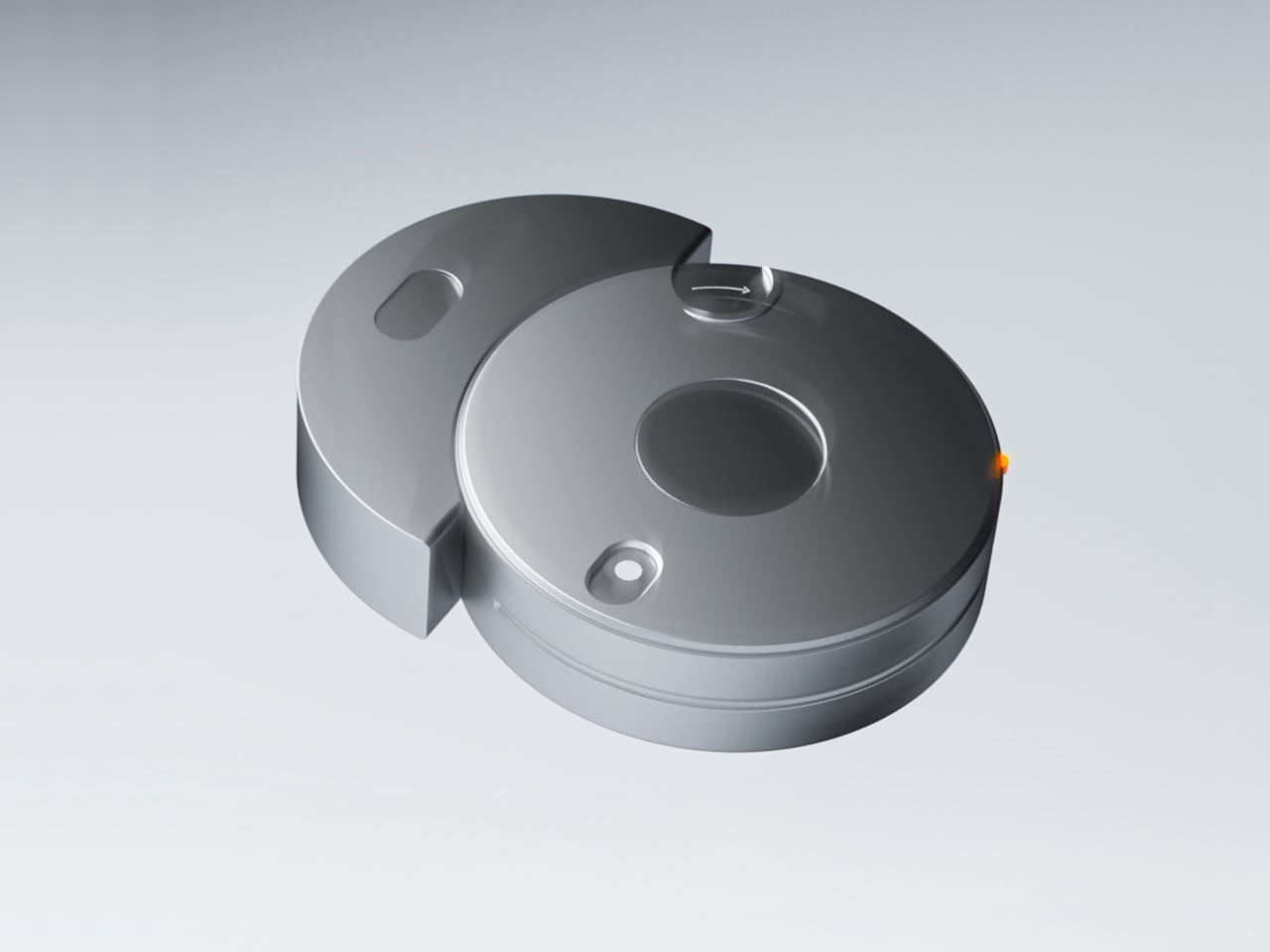
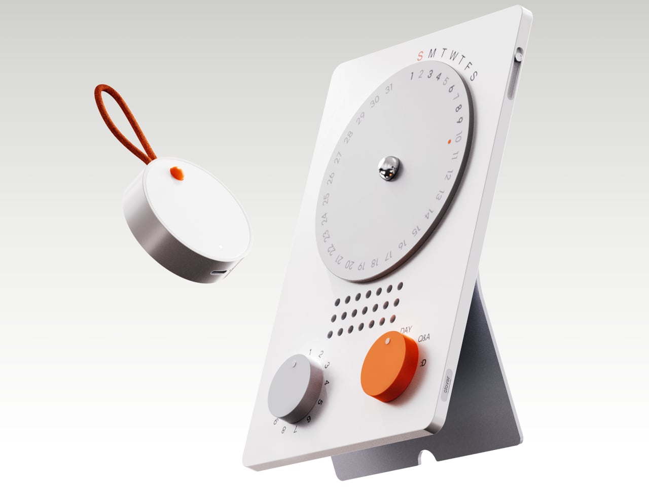
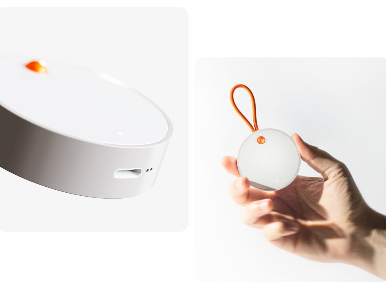
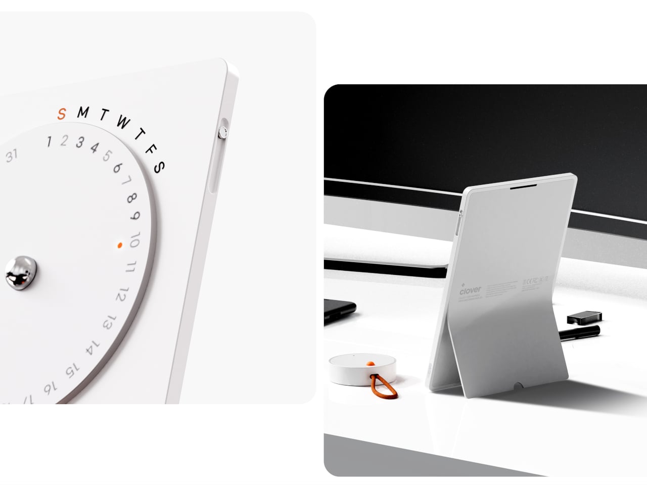
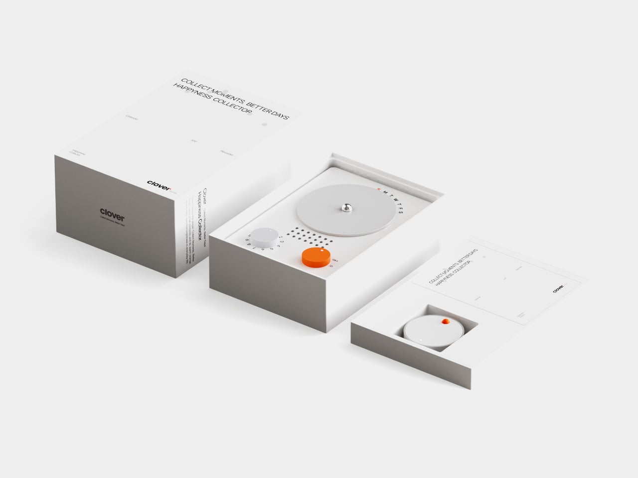
Clover is a small ecosystem built around three pieces: a pocketable voice recorder, a desk-calendar device, and a companion app. Instead of logging stress or symptoms, you press a button and record short voice notes whenever something makes you genuinely happy. Those moments are then visualized on the calendar and analyzed in the app, turning your week into a kind of happiness log that quietly reframes how you see your days.
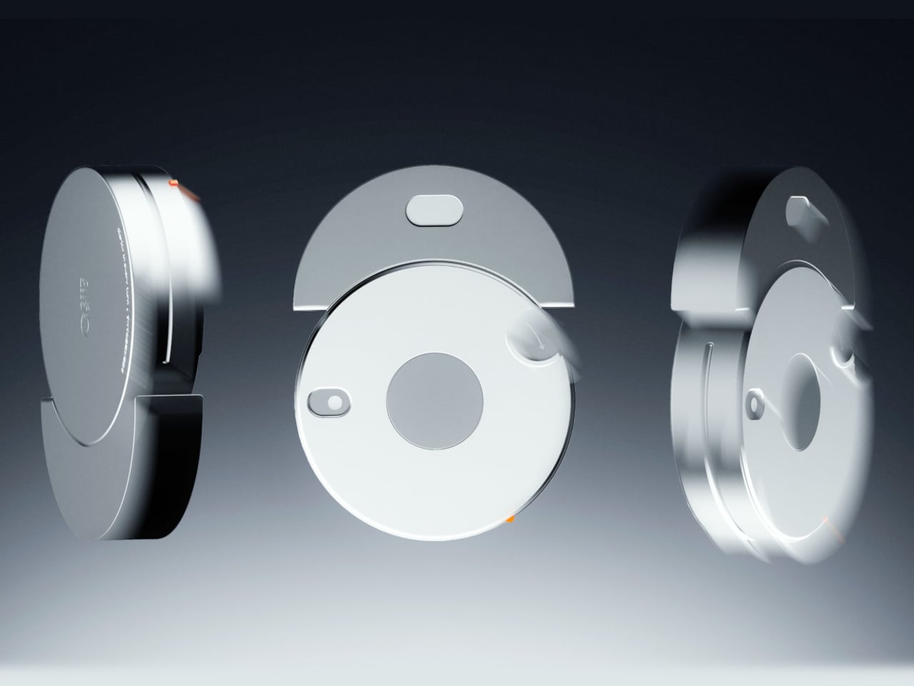
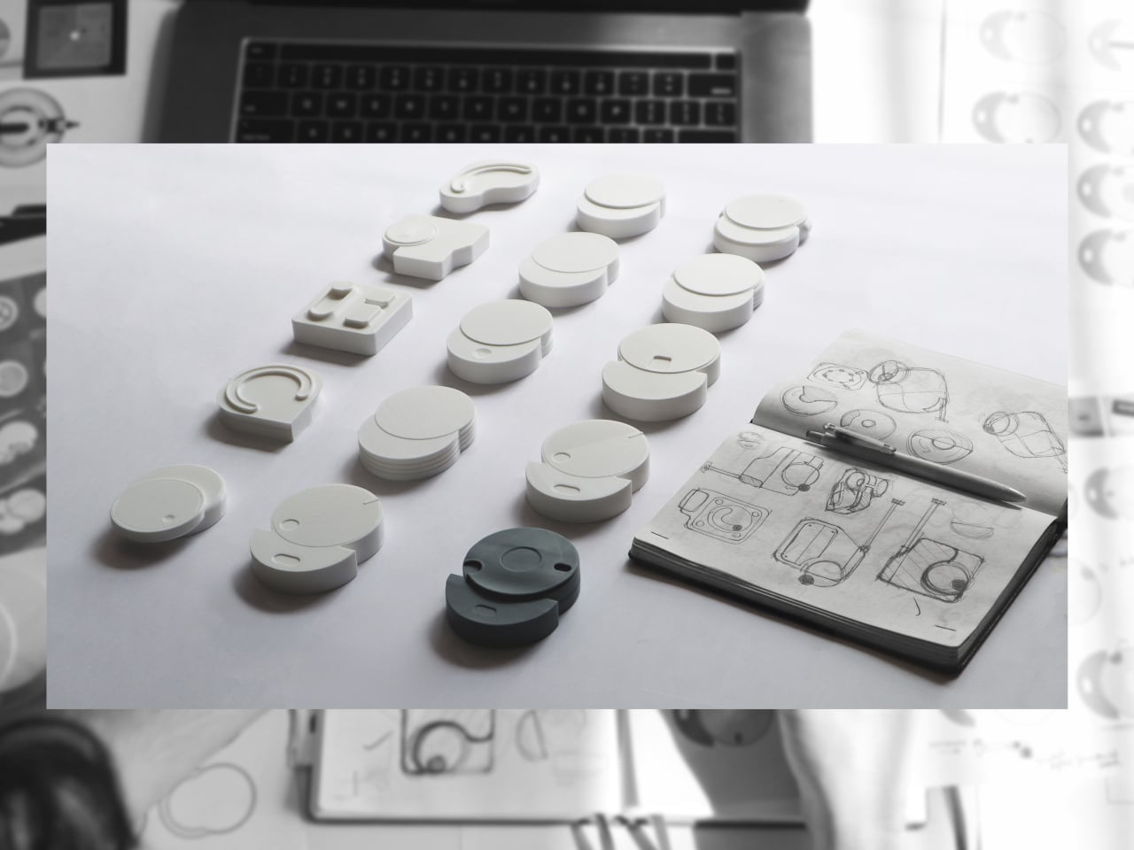
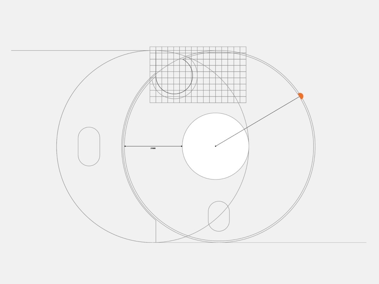
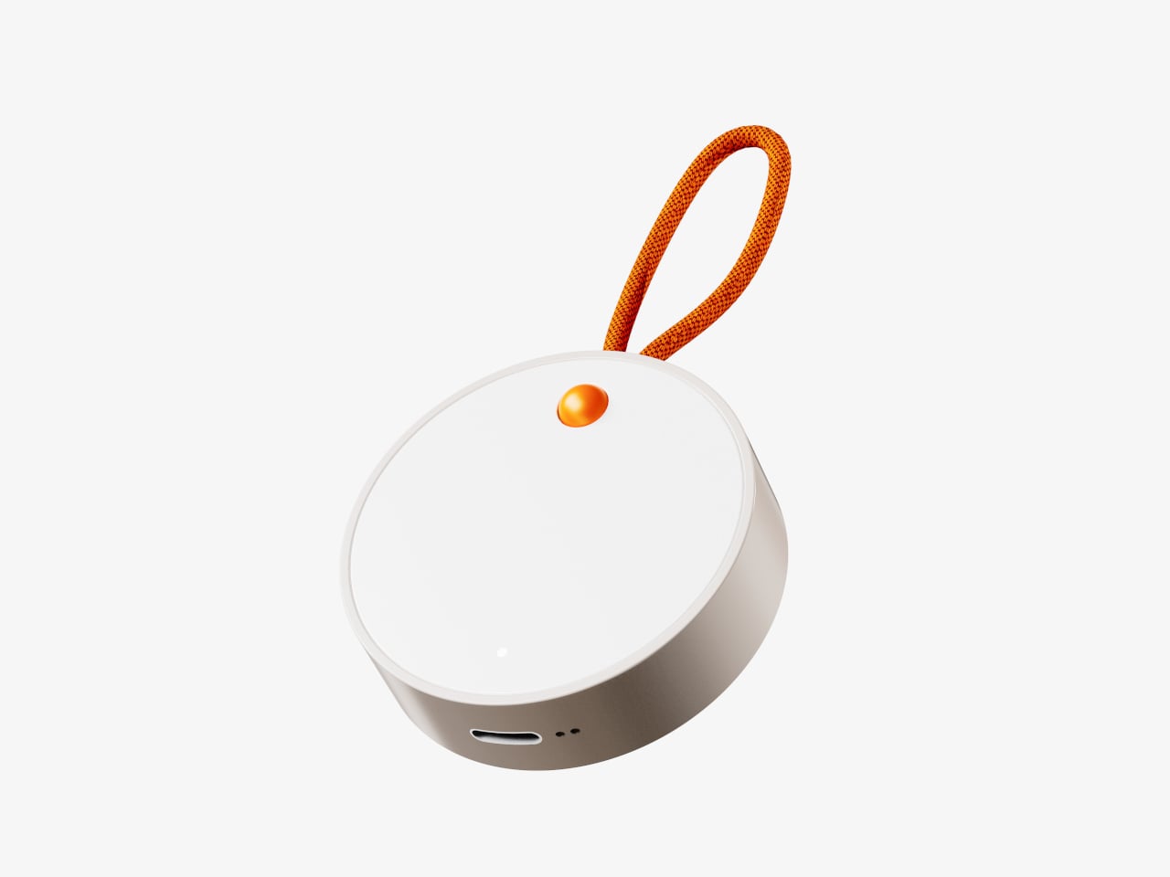
The recorder is a small, circular object with a single orange button and a loop strap, designed to be grabbed and pressed quickly. It is meant for capturing tiny, specific moments, sunlight on your desk, a good cup of tea, a joke from a friend, in your own voice. The goal is to lower the friction so much that recording a positive moment feels as easy as taking a photo, no unlocking, no tapping through screens, just press and speak.
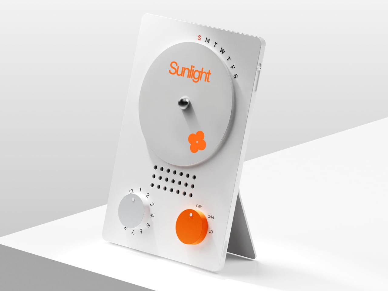
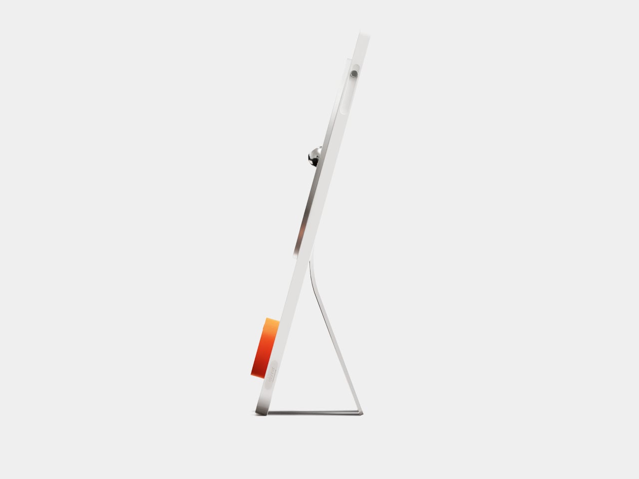
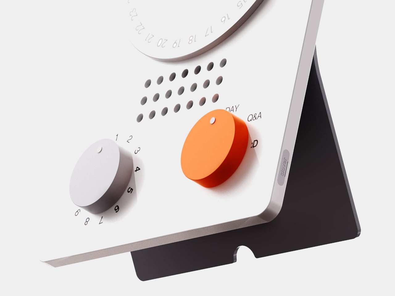
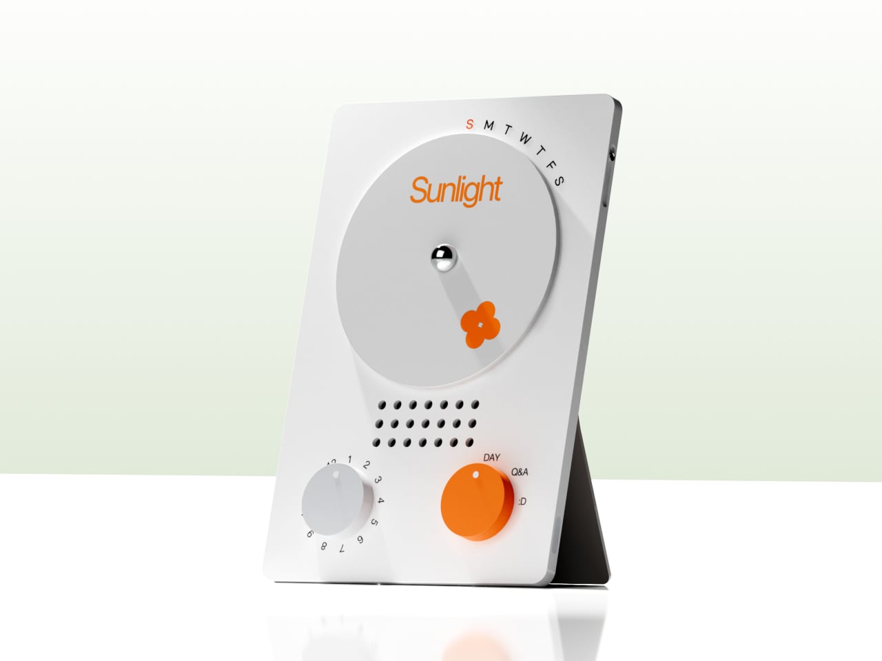
The desk calendar is a tilted white slab with a large circular dial labeled with days of the week and a small screen that displays words like “Sunlight” or “Spring.” It plays back or summarizes your voice recordings by day, and turning the dial lets you move between Day mode, Q&A mode, and long-term overview modes. Checking your emotional log becomes a physical ritual, more like flipping through a calendar than scrolling a feed or staring at another glowing interface.
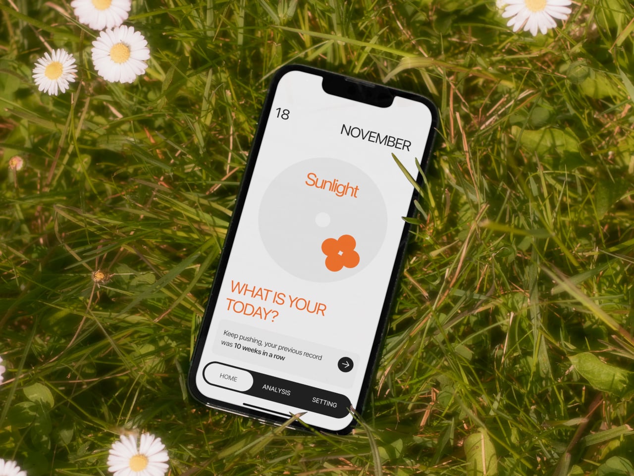
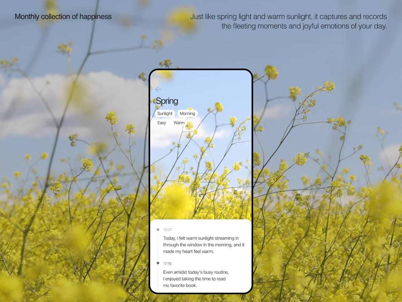
The app brings everything together, with daily cards asking “What is your today?”, weekly and monthly views full of dots and bars, and simple text insights that highlight recurring themes. You can tag entries by time, category, or keywords, and later see which people, places, or activities show up most often in your happiest moments. The analysis stays gentle, showing patterns without drowning you in numbers or making you feel like you failed when a week looks sparse.
Clover’s visual language, white and grey surfaces with orange accents, soft typography, and a clover icon that appears on hardware and UI, keeps the system from feeling like medical equipment. The core values, self-honesty, emotional balance, and everyday positivity, are baked into how it looks and behaves. It frames itself as a friendly desk object and app you would not mind seeing every day, not a reminder that something is broken.
Clover quietly flips the usual tracking script. Instead of asking you to monitor symptoms or productivity, it asks you to notice and collect small good things, then shows you that they happen more often than you think. For people who are tired of mood sliders and habit streaks, the idea of a physical recorder and calendar that simply help you remember what felt right might be the most calming part of the concept.
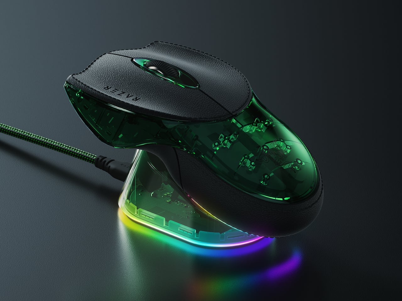
At the end of the 1990s, when most PC mice were beige, ball-based, and capped at a few hundred DPI, the original Razer Boomslang showed up with a weird snake-head shape and a 2,000-DPI mechanical sensor. Razer now calls it the world’s first gaming mouse, and whether or not you want to argue that title, it definitely helped turn the mouse from a beige accessory into a performance peripheral that people obsessed over.
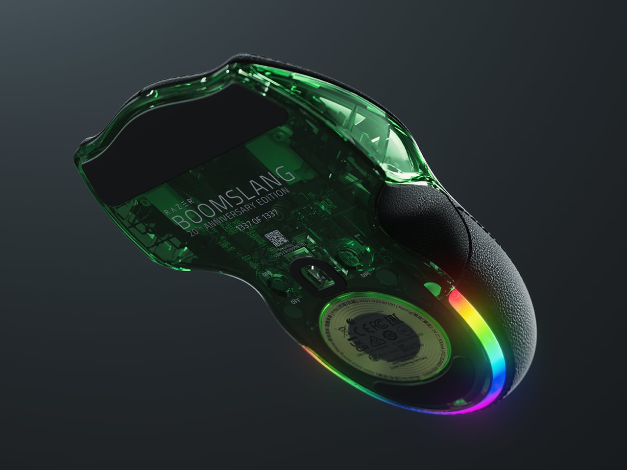
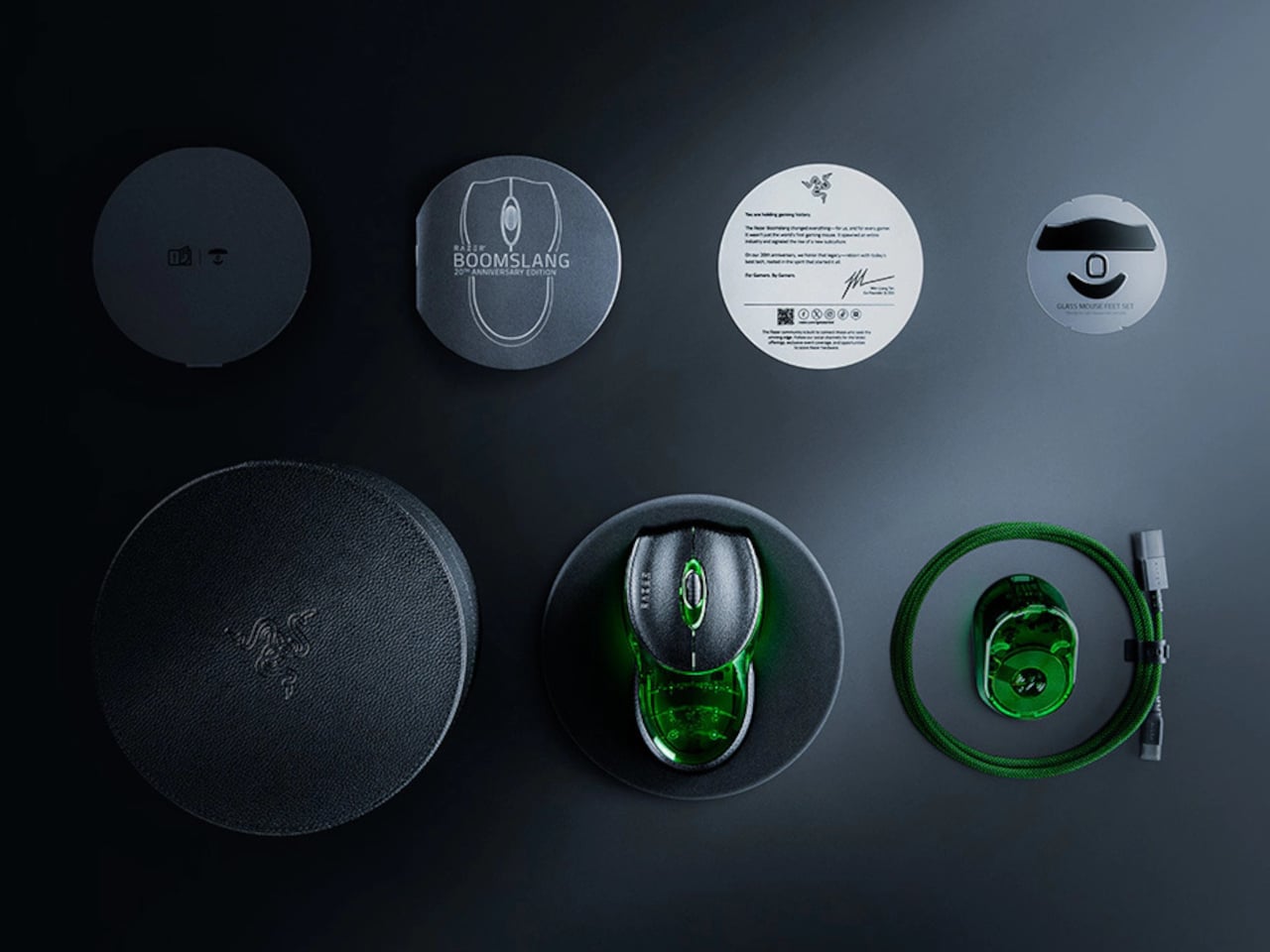
The Boomslang 20th Anniversary Edition is Razer’s way of revisiting that moment with twenty years of hindsight. It is a one-time release limited to 1,337 units worldwide, each uniquely serialized, with the #1337 unit reserved as a “leet” nod for one lucky fan. It is aimed squarely at people who either owned the original or wished they had, but it is also a fully modern mouse that can live on a current desk without feeling like a prop.
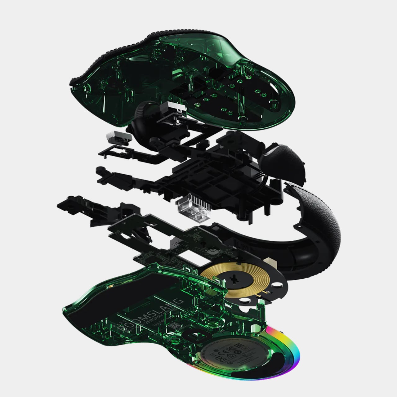
On the outside, the new Boomslang keeps the iconic snake-head outline and true ambidextrous form, preserving the low, wide body that made the original stand out. The translucent shell and underglow are deliberate echoes of that first model, but the lighting is now a nine-zone Razer Chroma RGB system that can be tuned in Synapse. The idea is that, at a glance, it still reads as a Boomslang first, and as a spec sheet second.
Inside, everything is from 2025. The Razer Focus Pro 45K optical sensor offers up to 45,000 DPI with 99.8 percent resolution accuracy, a ridiculous number compared to the original’s 2,000-DPI ball. HyperPolling Wireless pushes the polling rate up to 8,000 Hz, which means the mouse can report its position to the PC eight thousand times per second. Gen-4 optical switches handle primary clicks with a 100-million-click lifespan and no debounce delay.
Charging and connectivity also get a full reboot. The mouse is fully wireless and ships with a Razer Mouse Dock Pro that acts as both a magnetic charging base and a dedicated wireless receiver. Drop the Boomslang on the dock, and it starts charging automatically, while the dock handles HyperPolling Wireless up to 8,000 Hz over a single USB cable. It is a neat contrast to the wired-only original that helped define the gaming-mouse category.
Material and feel have been nudged into more premium territory. The primary buttons are wrapped in PU leather for extra grip and a more tactile press, which is a small but noticeable change if you are used to hard plastic shells. Underneath, nine zones of Chroma underglow can be customized with 16.8 million colors and effects, and eight programmable controls can be mapped to macros and profiles in Synapse.
The Boomslang 20th Anniversary Edition is a reminder that the idea of a gaming mouse had to be invented once, by a translucent, snake-shaped oddball that rolled a ball at 2,000 DPI. This remake uses that nostalgia to show how far sensors, switches, and wireless tech have come. For anyone who grew up on early Razer gear, it is a small, serialized time machine that also happens to be a high-end mouse in 2025.
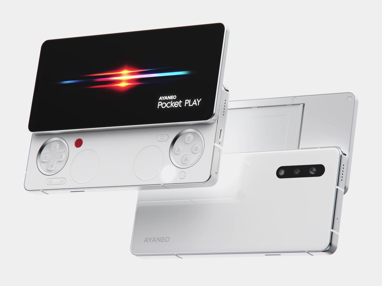
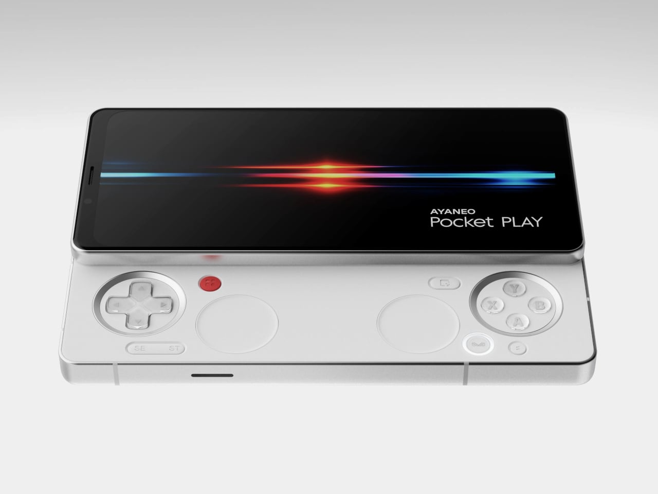
AYANEO is known for gaming handheld devices that run Windows and, sometimes, Android, but not phones. Most gaming phones still feel like regular slabs with RGB lights and higher refresh rates, treating games as an app category instead of the reason the device exists. Pocket PLAY is AYANEO’s first smartphone, and they are not shy about calling it “more than a phone,” framing it as a handheld console that happens to live on a SIM card instead of a desktop operating system.
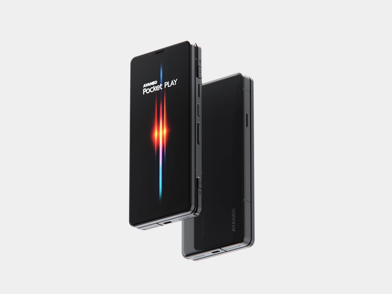
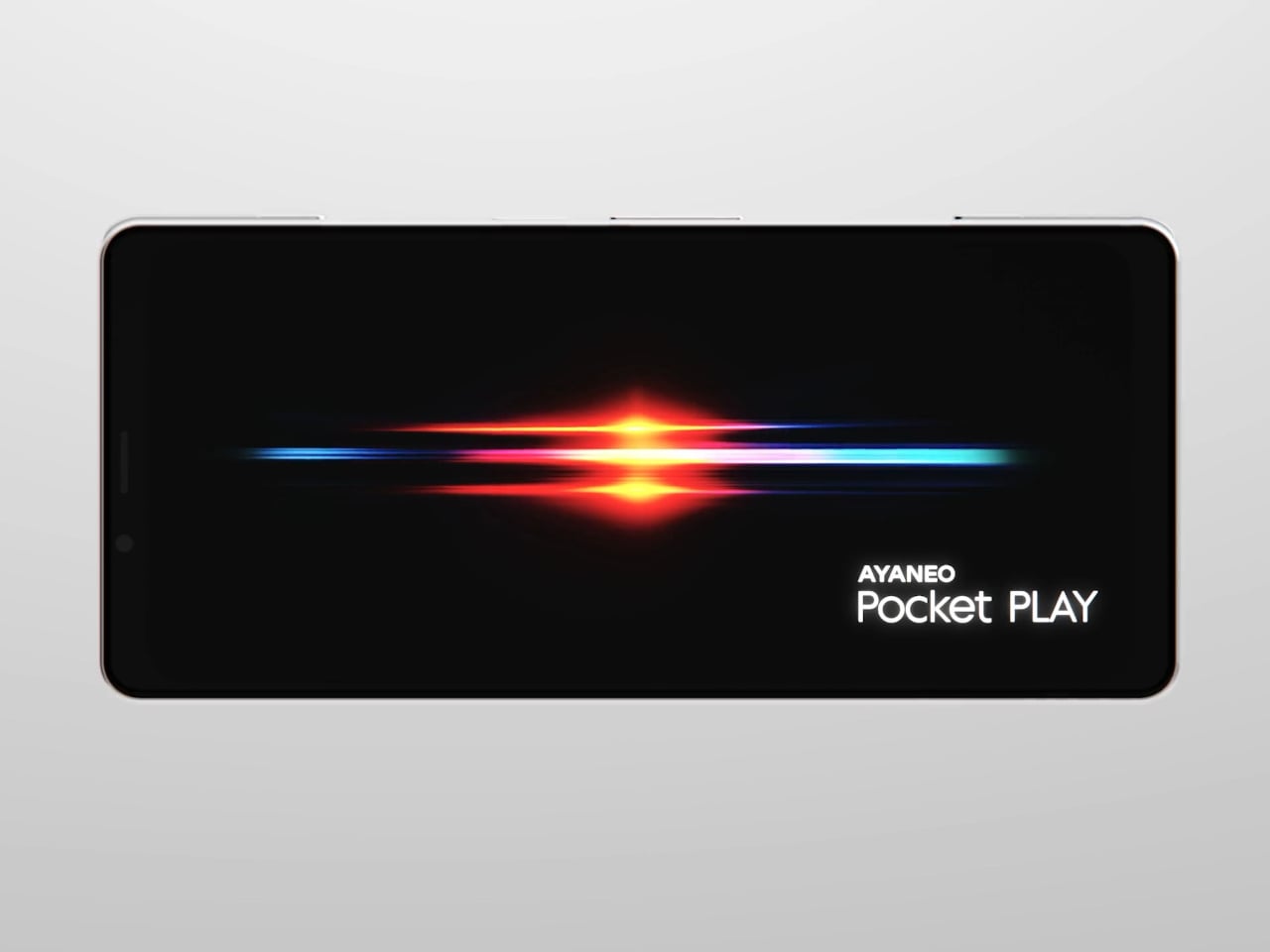
AYANEO calls it “the ultimate fusion of mobile phone and gaming handheld,” built “in the name of games, made for the dreams of gamers.” The minimalist front follows golden-ratio proportions and AYANEO’s “handheld artistry” philosophy, looking like a clean black slab until you slide it open and the real personality appears. The idea is that it should not shout gamer aesthetic when you are checking email, only when you want to play.
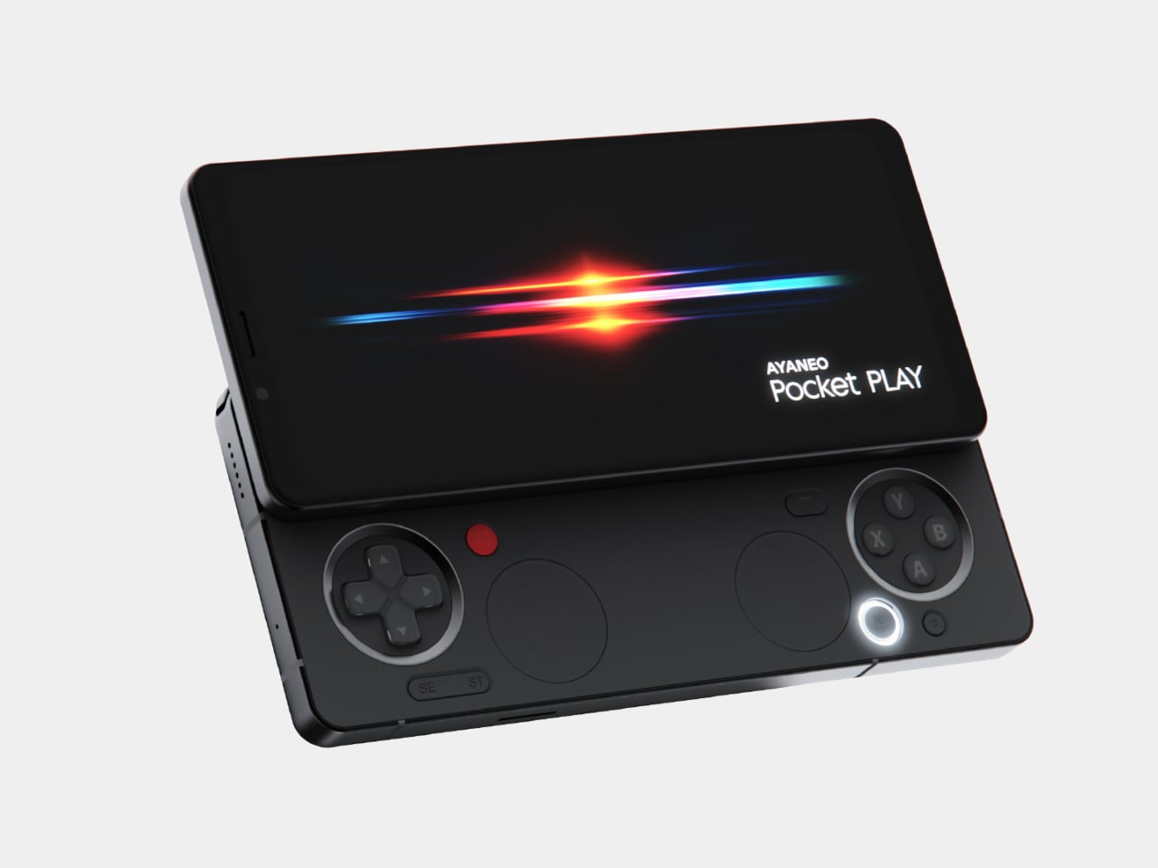
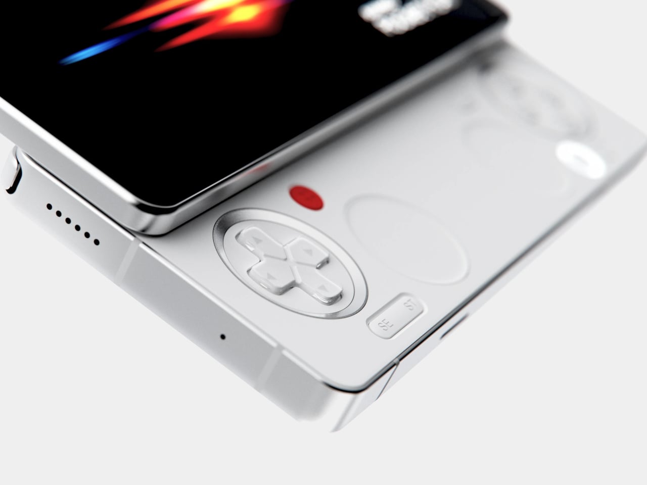
The classic side-slide mechanism is a light push that reveals a full controller under the screen. Anyone who remembers Sony’s Xperia Play will feel a flicker of déjà vu, another Android phone that hid a gamepad under a slider. The difference is that Pocket PLAY arrives in a world where handheld gaming and emulation are mainstream, and AYANEO has spent years building hardware for that exact crowd, not for casual mobile gamers who might try it once.
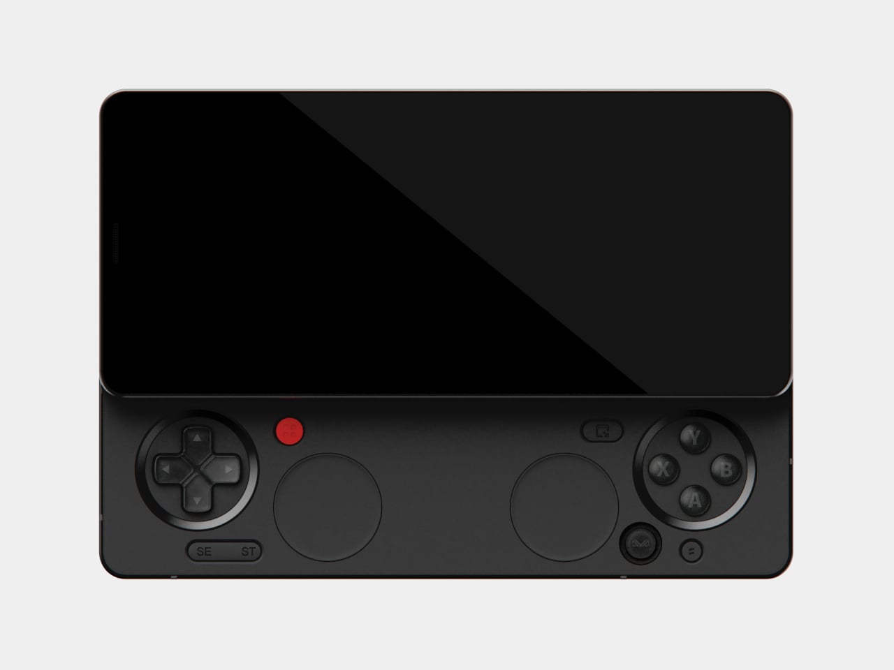
Pocket PLAY reinterprets a standard gamepad layout in a compact way, with a D-pad, ABXY buttons, and shoulder controls tuned for the sliding mechanism. AYANEO promises crisp, light presses and fast response, and a grip shaped so your fingers land where you expect. The idea is that you slide, and you are instantly in handheld mode, no adaptation period or clip-on accessories. The D-pad and buttons are meant to bring back the pure, satisfying feel of classic handheld gaming.
The dual intelligent touchpads sit where analog sticks might go, and they can map virtual joysticks, act as traditional touch surfaces, or trigger custom input combinations. That opens up camera control, mouse-like input for streaming PC games, or macro shortcuts for complex titles. The positioning is ergonomic, and the goal is to make every swipe and tap feel natural, closing the gap between a dedicated handheld and a phone that also runs Genshin Impact or emulators.
AYANEO leans into “cyber-romanticism” language, calling handhelds a culture and a shared emotional language among players. Pocket PLAY is pitched as a tribute to classic designs and an exploration of how handheld spirit can extend to a new medium. It is meant to feel like a daily-carry extension of the devices people already use for emulation and retro gaming, not a generic Android gaming phone with triggers and marketing.
Xperia Play hinted at this form factor years ago, but the ecosystem and audience were not ready. Pocket PLAY picks up that thread with modern hardware, a serious controller, and a brand that already lives in handheld culture. For players who want a phone that slides into a console instead of just another slab with shoulder buttons, it feels like a very specific dream finally getting another shot, this time built by people who actually understand why sliders and D-pads still matter.
AYANEO is known for gaming handheld devices that run Windows and, sometimes, Android, but not phones. Most gaming phones still feel like regular slabs with RGB lights and higher refresh rates, treating games as an app category instead of the reason the device exists. Pocket PLAY is AYANEO’s first smartphone, and they are not shy about calling it “more than a phone,” framing it as a handheld console that happens to live on a SIM card instead of a desktop operating system.
AYANEO calls it “the ultimate fusion of mobile phone and gaming handheld,” built “in the name of games, made for the dreams of gamers.” The minimalist front follows golden-ratio proportions and AYANEO’s “handheld artistry” philosophy, looking like a clean black slab until you slide it open and the real personality appears. The idea is that it should not shout gamer aesthetic when you are checking email, only when you want to play.
The classic side-slide mechanism is a light push that reveals a full controller under the screen. Anyone who remembers Sony’s Xperia Play will feel a flicker of déjà vu, another Android phone that hid a gamepad under a slider. The difference is that Pocket PLAY arrives in a world where handheld gaming and emulation are mainstream, and AYANEO has spent years building hardware for that exact crowd, not for casual mobile gamers who might try it once.
Pocket PLAY reinterprets a standard gamepad layout in a compact way, with a D-pad, ABXY buttons, and shoulder controls tuned for the sliding mechanism. AYANEO promises crisp, light presses and fast response, and a grip shaped so your fingers land where you expect. The idea is that you slide, and you are instantly in handheld mode, no adaptation period or clip-on accessories. The D-pad and buttons are meant to bring back the pure, satisfying feel of classic handheld gaming.
The dual intelligent touchpads sit where analog sticks might go, and they can map virtual joysticks, act as traditional touch surfaces, or trigger custom input combinations. That opens up camera control, mouse-like input for streaming PC games, or macro shortcuts for complex titles. The positioning is ergonomic, and the goal is to make every swipe and tap feel natural, closing the gap between a dedicated handheld and a phone that also runs Genshin Impact or emulators.
AYANEO leans into “cyber-romanticism” language, calling handhelds a culture and a shared emotional language among players. Pocket PLAY is pitched as a tribute to classic designs and an exploration of how handheld spirit can extend to a new medium. It is meant to feel like a daily-carry extension of the devices people already use for emulation and retro gaming, not a generic Android gaming phone with triggers and marketing.
Xperia Play hinted at this form factor years ago, but the ecosystem and audience were not ready. Pocket PLAY picks up that thread with modern hardware, a serious controller, and a brand that already lives in handheld culture. For players who want a phone that slides into a console instead of just another slab with shoulder buttons, it feels like a very specific dream finally getting another shot, this time built by people who actually understand why sliders and D-pads still matter.
Multi-function bedside consolidation, including USB-C charger
Circadian-friendly lighting system
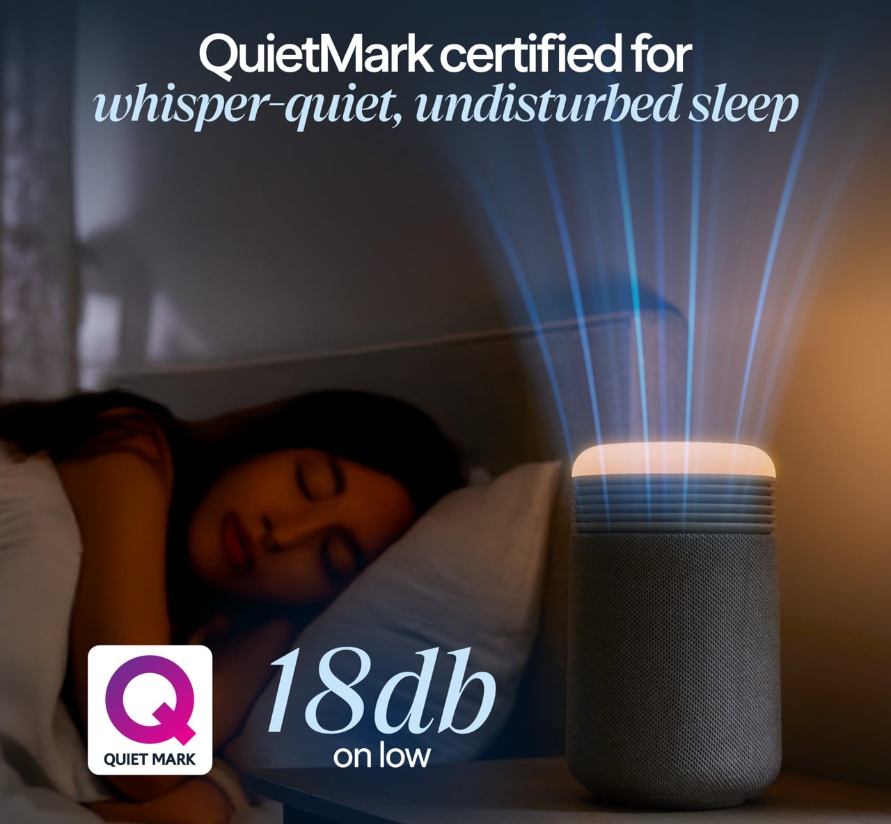
QuietMark certified for sleep
Simple maintenance with long filter life
CONS:
Single color temperature range might not fit some preferences
Premium price for small coverage area
RATINGS:
AESTHETICS
ERGONOMICS
PERFORMANCE
SUSTAINABILITY / REPAIRABILITY
VALUE FOR MONEY
EDITOR'S QUOTE:
The Blueair Mini Restful Sunrise Clock Air Purifier quietly merges clean air with gentle dawn into one compact, sleep-focused design object.
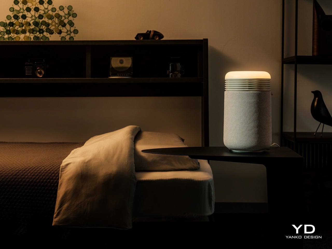
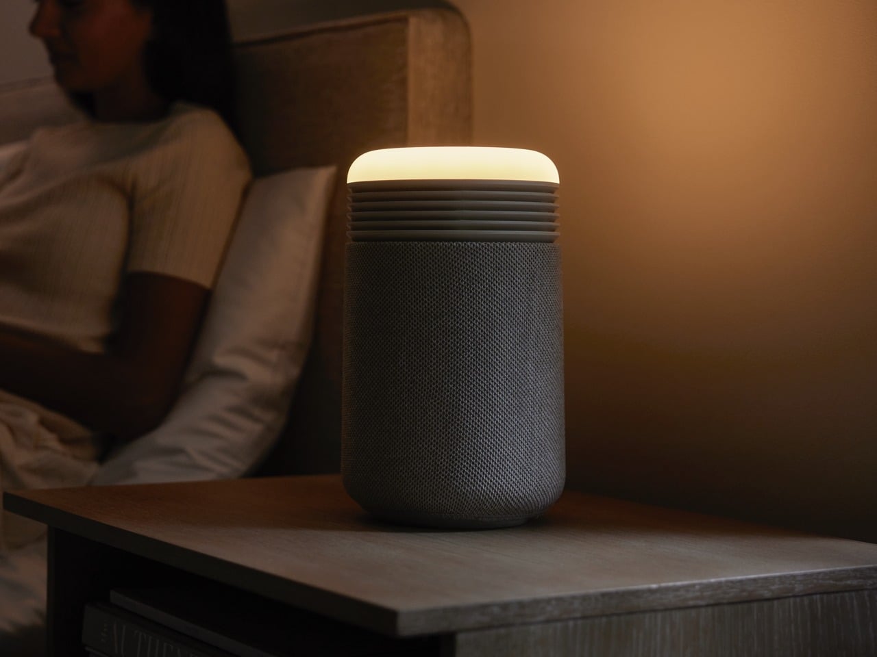
Nightstands have quietly become cluttered charging stations over the past decade, with phones serving as alarms, small purifiers humming in corners, and separate wake-up lights trying to undo the damage of jarring ringtones at six in the morning. Sleep has turned into a wellness habit people track and optimize, but the tools meant to support it often feel scattered and visually chaotic.
The Blueair Mini Restful() Sunrise Clock Air Purifier is a compact attempt to pull some of those tools into one object. It is a small bedside cylinder that cleans the air, glows like a sunrise to wake you gently, plays soft sounds, shows the time, and charges your phone, all while looking more like a design piece than some cold, drab piece of appliance. But does this striking appliance work as advertised? We put it beside our comfy bed to find out.
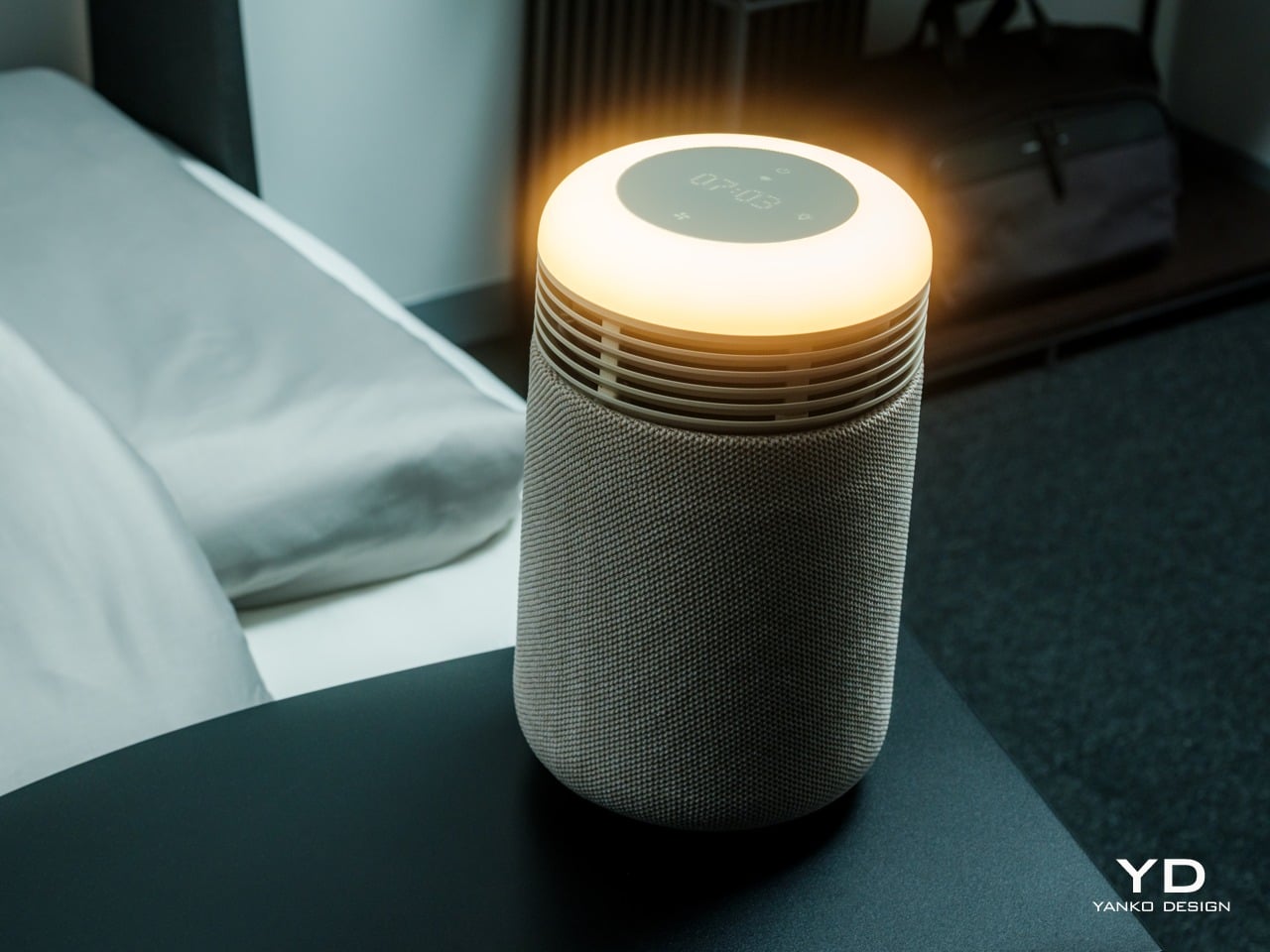
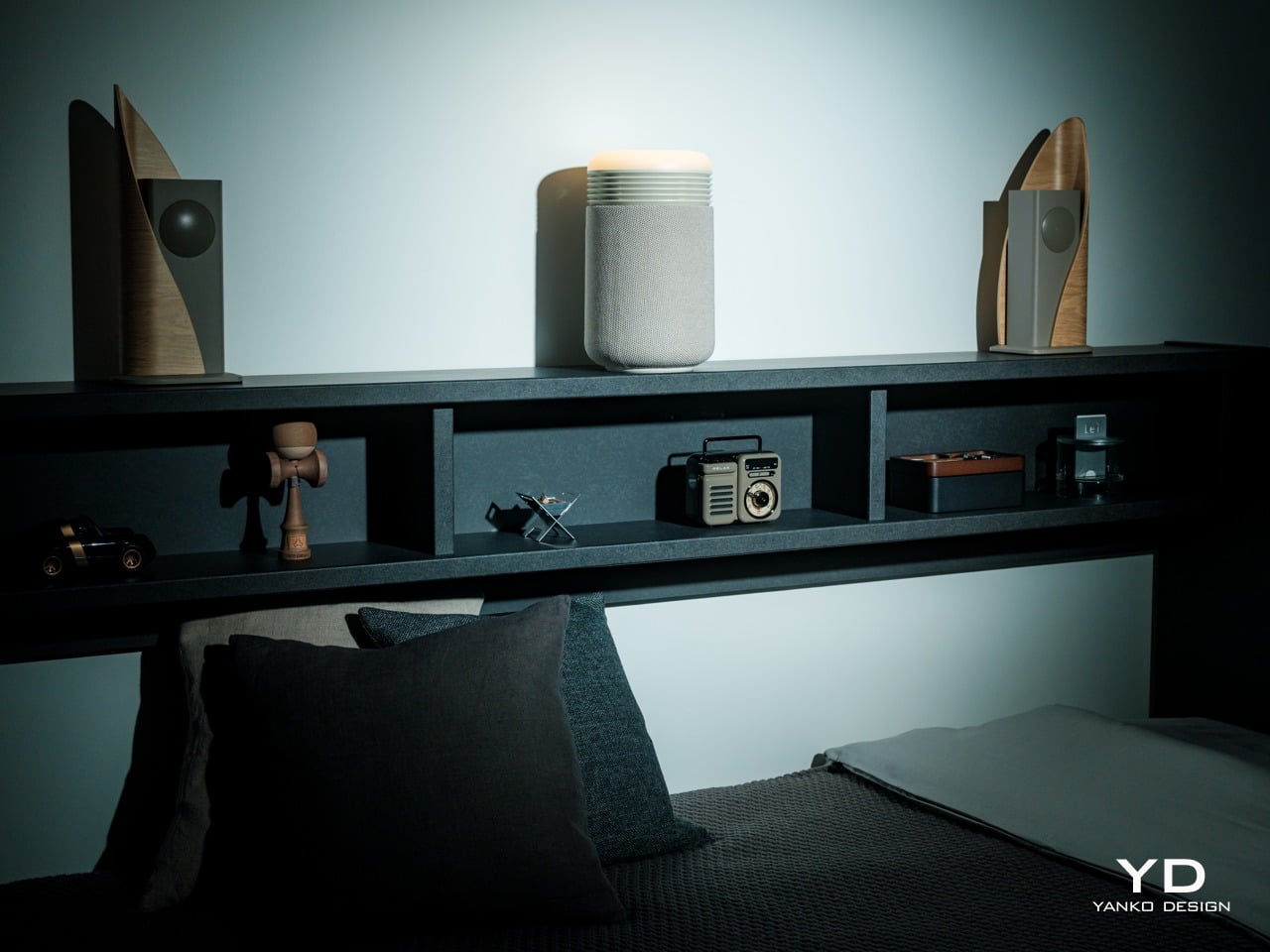
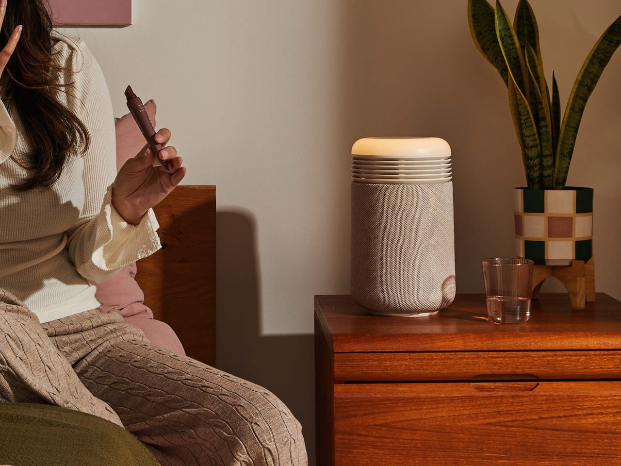
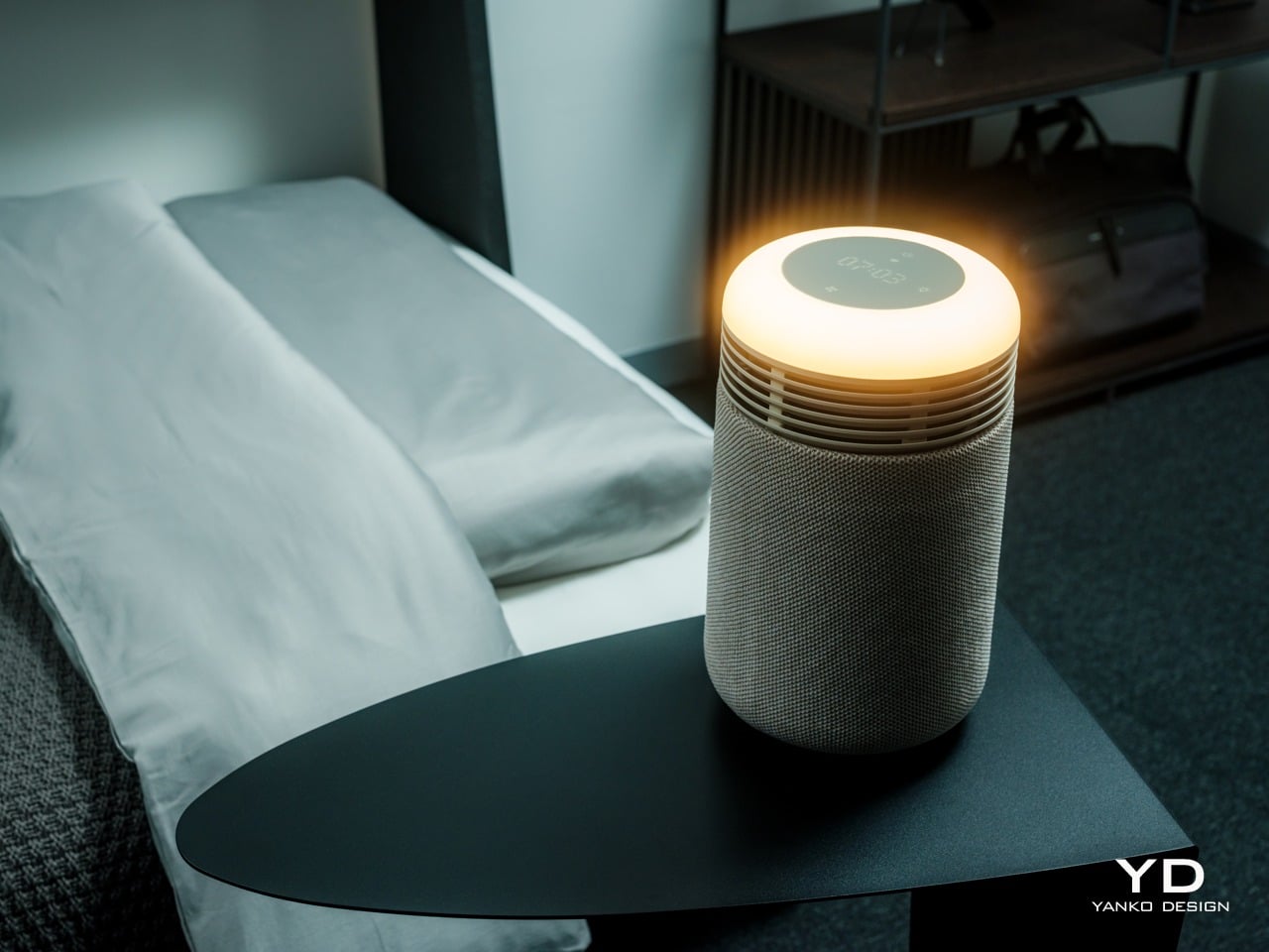
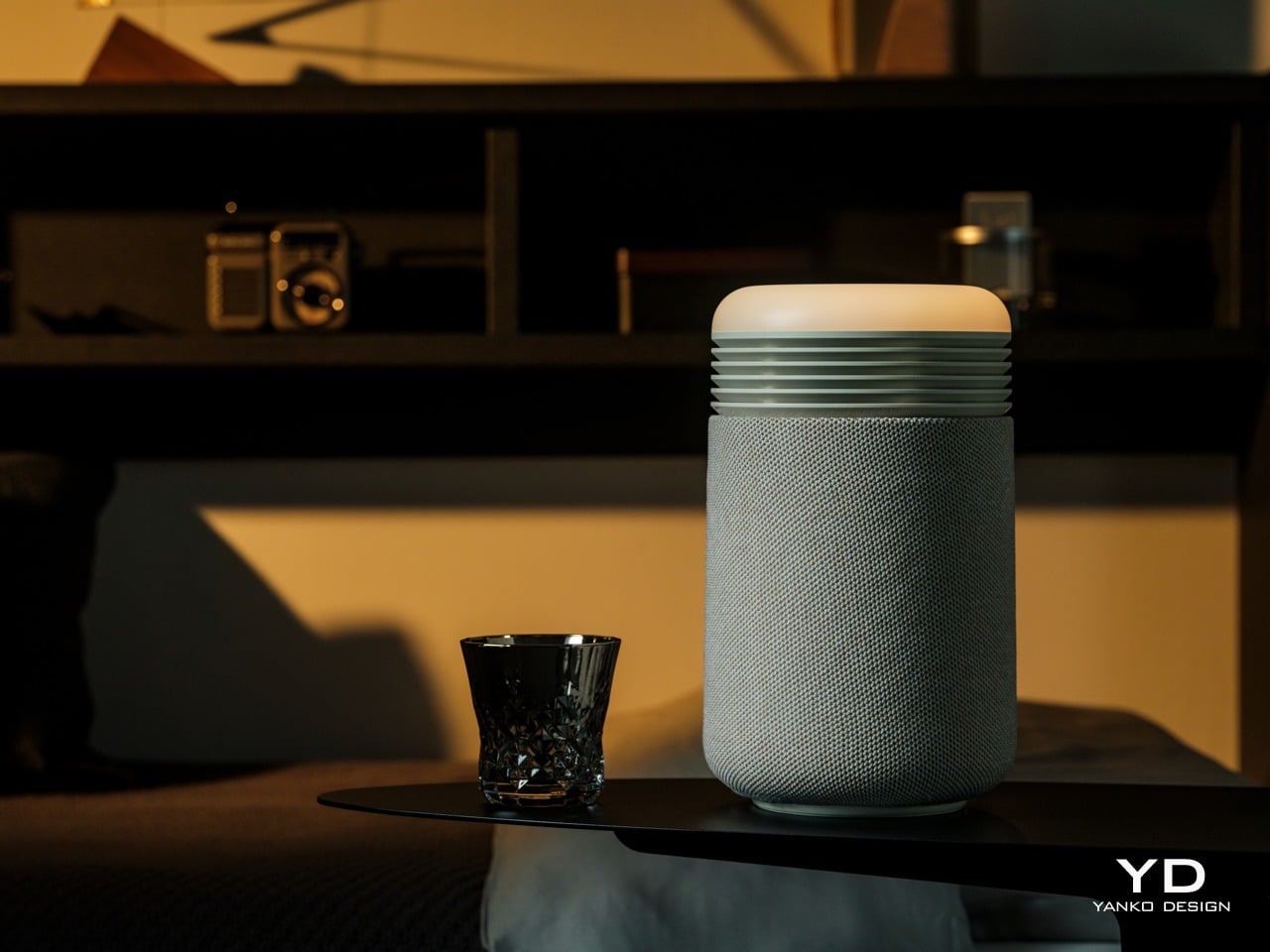
The Mini Restful is a short cylinder about eleven inches tall, wrapped in premium fabric with a smooth top disc. It looks closer to a smart speaker or a small bedside lamp than a traditional purifier, which makes it feel natural sitting on a nightstand. The proportions are deliberately compact and soft, with rounded edges and no visible vents.
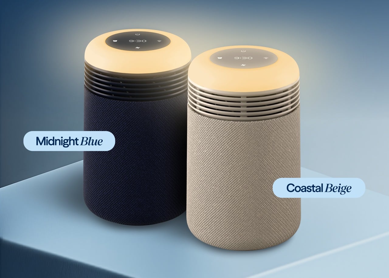
Two color options are available: Coastal Beige and Midnight Blue. Coastal Beige has a light oatmeal fabric with a warm off white top, which reads well in rooms with light wood furniture and neutral bedding. Midnight Blue uses a deep navy fabric, making it comfortable in darker, moodier bedrooms with richer tones.
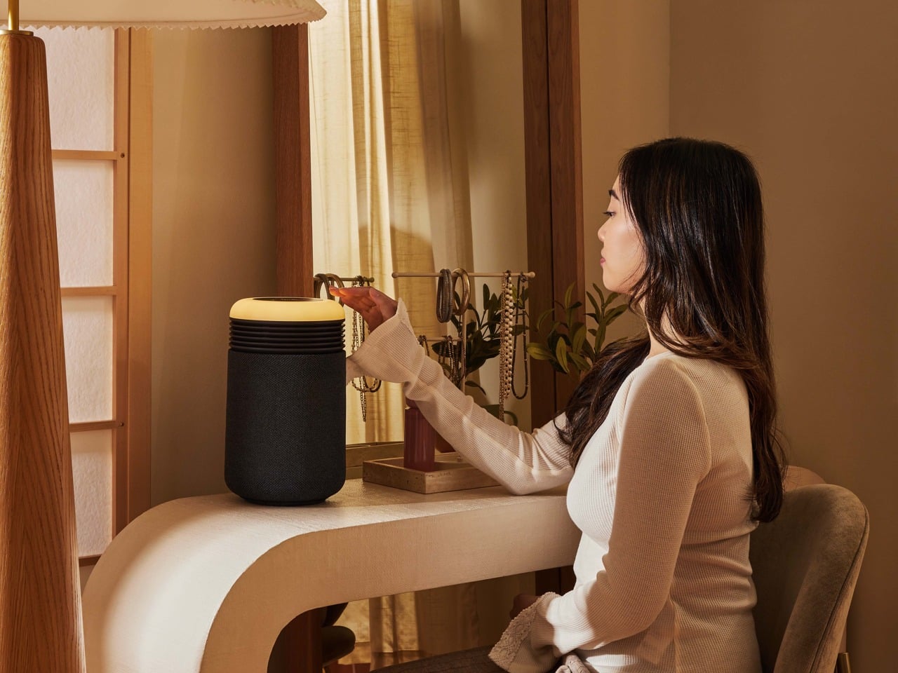
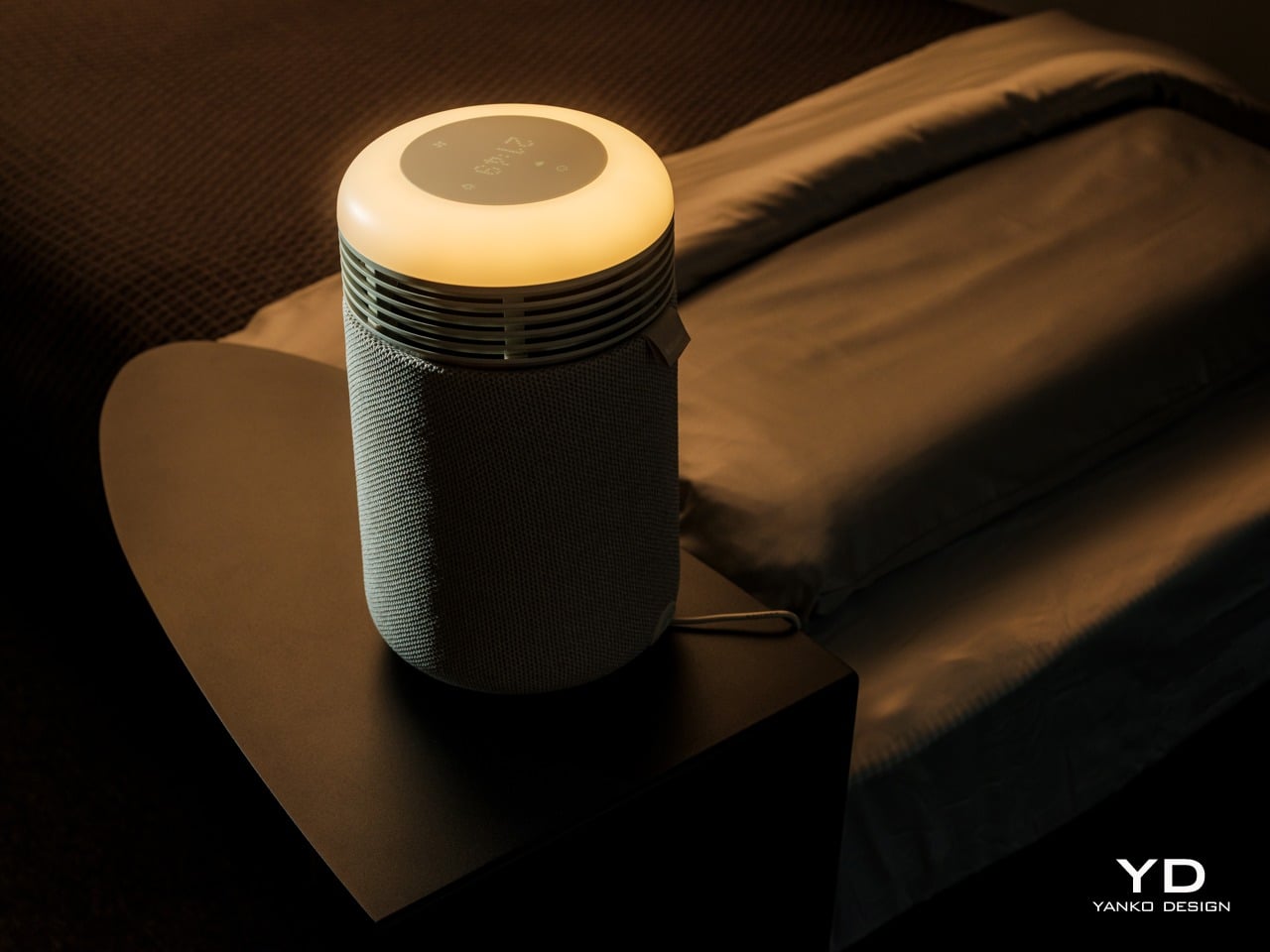
The top surface is where the aesthetic gets interesting. A circular user interface houses a dot matrix clock and touch controls, surrounded by a ring that glows when the wake-up light or mood lighting is active. When the sunrise alarm is running, the top looks like a tiny dawn, casting a warm halo onto the bedside table and wall.
It is much more pleasant than the blinking LEDs most appliances default to, and it doubles the device’s role as both a functional purifier and a kind of ambient light. The glow feels intentional, like a small lamp designed to support sleep rather than disrupt it, which is a significant shift from typical purifier status lights.
The fabric wrap is a key design choice. It softens the entire object and makes it read as part of the room’s soft furnishings rather than a hard plastic box. The textile has a fine woven texture that feels closer to upholstery than speaker mesh, and it helps the Mini Restful blend into spaces where you want calm rather than tech on display. The overall look avoids the glossy plastics and aggressive styling that make a lot of gadgets feel cheap or temporary.
Ergonomics
At around two and a half pounds out of the box, the Mini Restful is genuinely portable. You can pick it up with one hand and move it between rooms or reposition it without any strain. The small footprint, roughly six and a half inches in diameter, means it takes up about as much space as a medium-sized speaker or a chunky candle.
The cylindrical shape means you can place it close to the bed without worrying about sharp corners poking you if you brush against it in the dark. The air intake and outlet are all around the body, so it does not need a lot of clearance to work effectively, which is helpful in tight bedrooms or smaller apartments where every inch of surface area counts.
The top controls and clock are designed for quick, low-effort interaction. The dot matrix display is readable without being glaring, and the surrounding touch icons handle basic tasks like setting alarms, adjusting light brightness, and likely fan speed. You can do the essentials without grabbing your phone, which is helpful if you are trying to reduce screen time before bed.
Filter access is straightforward. The fabric sleeve slips off, and the inner filter is a wraparound design with a simple closure, so replacing it does not require tools or wrestling with complicated cartridges. This kind of maintenance design makes it more likely that people will actually change the filter when it is due rather than giving up and buying a new device.
Performance
Inside the cylinder is a HEPASilent filter system that pulls in air from around the base, traps fine particles like dust, pollen, and smoke, and pushes cleaner air back out. The filtration is sized for small spaces, specifically bedrooms up to around one hundred forty square feet, which aligns with typical master bedrooms or nurseries. It is meant to clean the zone where you actually sleep.
The idea of a fresh air dome around the bed is central to how Blueair frames this product. Placing the Mini Restful on a nightstand or dresser top helps keep the immediate breathing zone cleaner, which can be especially helpful for people who deal with nighttime congestion, seasonal allergies, or asthma. The device cycles the air in a small bedroom multiple times per hour.
Noise performance is critical for a sleep device, and the Mini Restful is designed to be quiet. On its lowest settings, it is softer than most fans, more like a gentle whoosh than a mechanical hum. Higher speeds are audibly stronger when the device is working harder to clear the air, but the ability to drop back into whisper-quiet operation at night keeps it compatible with light sleepers.
The QuietMark certification adds third-party validation that the noise level is genuinely sleep-friendly, tested and approved by independent acoustic consultants. This matters because many purifiers claim to be quiet but still produce enough mechanical sound to disturb rest, while the Mini Restful can fade into the background entirely on low settings.
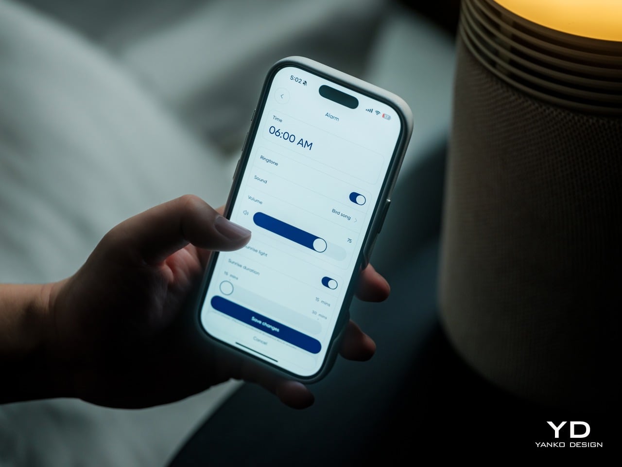
The wake-up light is where the Mini Restful starts to feel different from a standard purifier. You can set a time in the Blueair app, and then, in the fifteen to thirty minutes leading up to that time, the top light slowly brightens from a very dim glow to a warm, room-filling light. The color temperature stays in the warm range, mimicking the quality of a natural sunrise.
This gradual brightening is designed to help your body wake up more naturally than a sudden alarm. The light acts as a cue that morning is approaching, which can make the transition from sleep to wakefulness feel gentler and less abrupt, especially during darker winter months when natural light comes late or not at all.
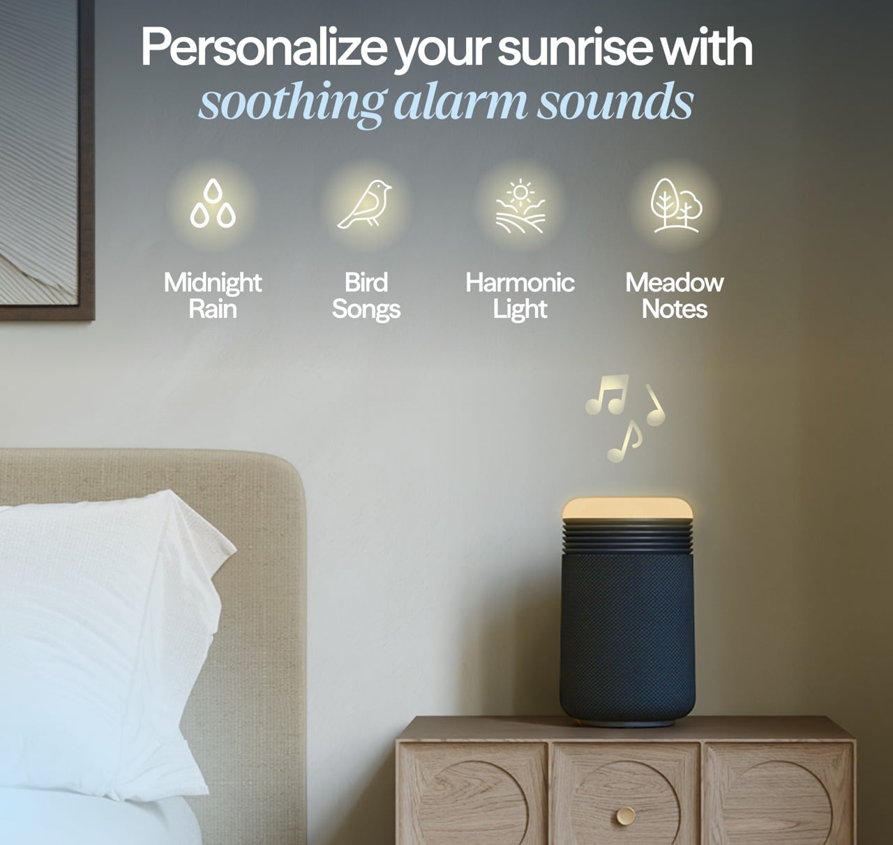
If you want more than light, you can add sound. The app includes a library of gentle wake-up tones and nature sounds, and you can choose one to start playing after the light has reached full brightness. The combination of light and sound is meant to guide you from deep sleep to wakefulness in a calmer way than a phone alarm blaring suddenly at full volume.
The same light that wakes you up can also help you wind down. In the evening, you can set the top to a very low amber glow as a night light or turn it up to a comfortable reading level, all in warm color temperatures that are gentler on melatonin production than bright white overhead lights or blue light-heavy phone screens.
The ability to adjust brightness on the device or in the app means it can match different routines, whether you are reading before bed or just want a soft ambient glow while you settle in. This dual role, supporting both wind down and wake up, makes the light feel integrated into the full sleep cycle rather than just a morning feature.
The Blueair app lets you fine-tune alarm times, choose how long the sunrise light takes to reach full brightness, select wake-up sounds, and create schedules so the device behaves differently on weekdays and weekends. The app also shows air quality and lets you adjust fan speed remotely, though most people will set a preference once. For people who like to see what is happening, the data is there, but the device does not force you into constant app interaction.
The integrated USB-C charging port on the back is a small but practical touch. It lets you plug in a phone or wearable directly into the Mini Restful, reducing the number of separate chargers and cables cluttering the nightstand. For people who currently use their phone as an alarm, this makes it easier to transition to the Mini Restful without losing charging convenience.
Sustainability
The Mini Restful uses a filter designed to last many months before needing replacement, which reduces how often you need to buy and discard new filters compared to some smaller purifiers with shorter lifecycles. The wraparound filter design with simple closure encourages full use of the filter’s lifespan and makes replacement straightforward, supporting longer ownership.
The device is relatively low power and Energy Star certified, which matters for something that might run many hours every day. At its lowest settings, the energy draw is modest, and even at higher speeds, it stays well within the range of efficient bedside appliances. Blueair, as a brand, positions itself with higher environmental standards as a Certified B Corp.
Value
The Mini Restful costs more than a basic purifier or a simple alarm clock. But that price starts to make sense when you consider the roles it plays at once: purifier, sunrise light, sound machine, clock, and phone charger, all in a single compact object designed for the nightstand. If you were to buy those devices separately, you would likely spend a similar amount while ending up with more clutter. The Mini Restful consolidates that into one cylinder that is easy to set up, easy to maintain, and designed to look intentional rather than accidental.
Space and visual calm are real forms of value, especially in small bedrooms or apartments where every object on a nightstand matters. Having one well-designed cylinder instead of multiple mismatched gadgets reduces the sense of clutter and makes the room feel more deliberate. For design-conscious consumers, that reduction in visual noise is worth something tangible, not just aesthetic preference alone.
The sleep focus is also part of the value story. For people who are already treating sleep as a wellness habit, investing in better mattresses, bedding, or blackout curtains, and adding a device that supports circadian rhythms and keeps the breathing zone cleaner is a logical next step. The fact that it is optimized for bedrooms makes it feel like a targeted tool.
The Mini Restful makes the most sense for people who care about both design and sleep quality, who want their nightstand to feel calm rather than cluttered, and who appreciate when technology quietly supports routines instead of dominating them. For users trying to break phone dependence at bedtime, or parents setting up nurseries, or anyone in a small space, it fits naturally.
Verdict
The Blueair Mini Restful Sunrise Clock Air Purifier is a compact, carefully designed object that manages to be a purifier, a sunrise light, a sound machine, and a clock without looking or feeling like four gadgets taped together. It blends into bedrooms with the kind of visual ease that makes you forget it is technology, and the combination of quiet air cleaning, warm light, and gentle sounds makes it feel integrated into sleep rituals.
As sleep continues to be treated as a key part of wellness, devices that treat air, light, and sound as one integrated experience will likely become more common. For homeowners who want their bedroom tech to be as considered as their furniture and as gentle as their nighttime routine, the Mini Restful feels like a thoughtful step in that direction, turning the nightstand into a quieter, calmer place where everything works together.
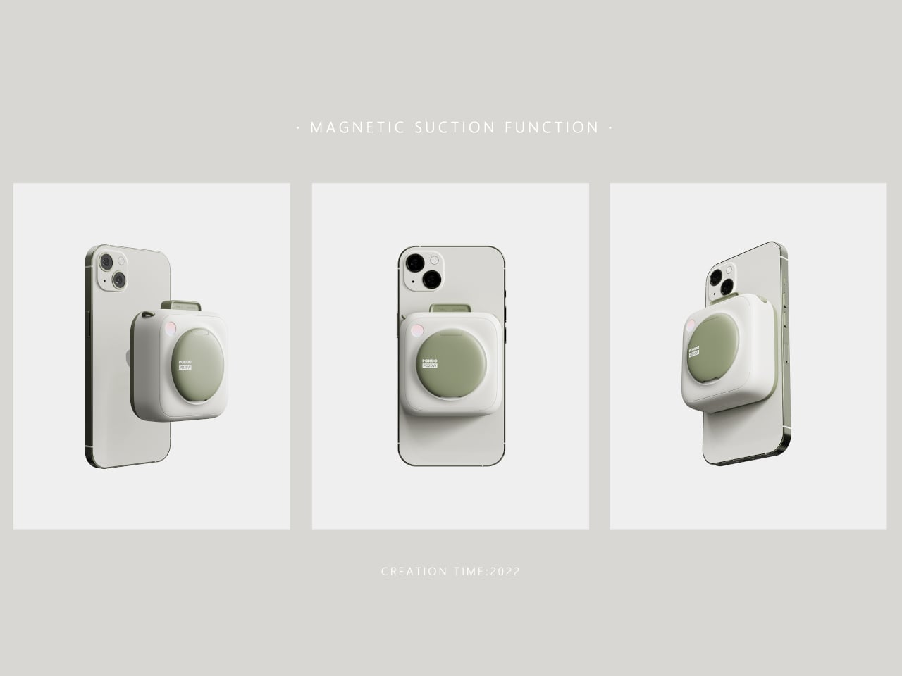
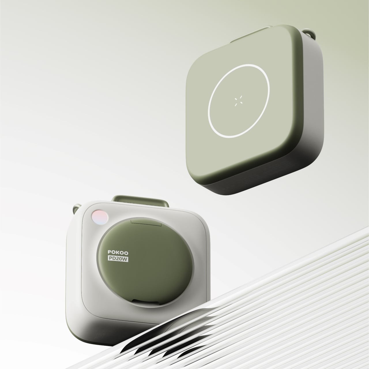
Most power banks and MagSafe battery packs look like small, hard bricks stuck to the back of a carefully chosen phone. There is a gap between the attention people give to phone colors, cases, and desk setups, and the generic plastic blocks they use to charge. Pokoo is a concept that treats a battery pack like a lifestyle object instead of emergency gear, borrowing its design language from instant cameras and cosmetics rather than chargers.
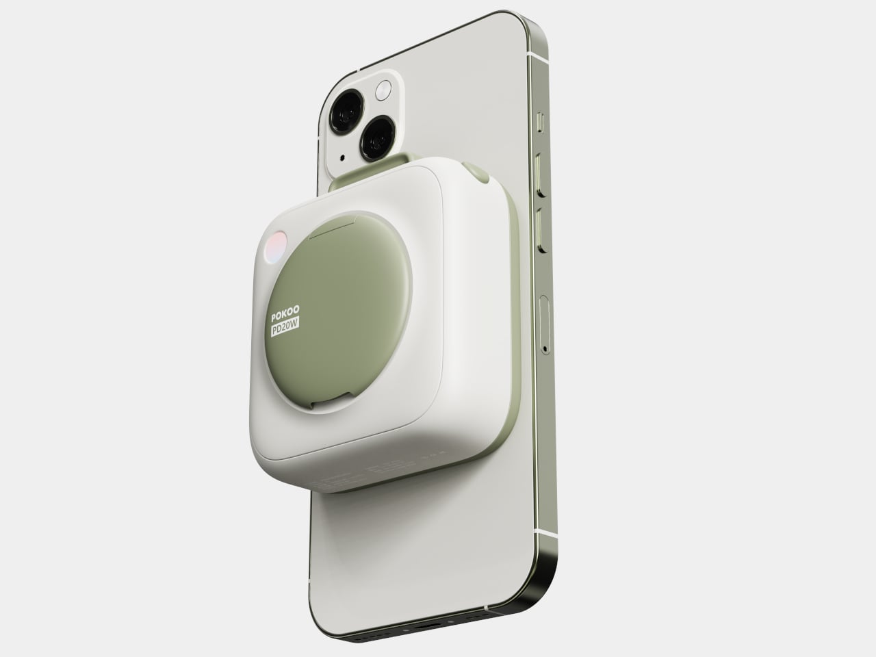
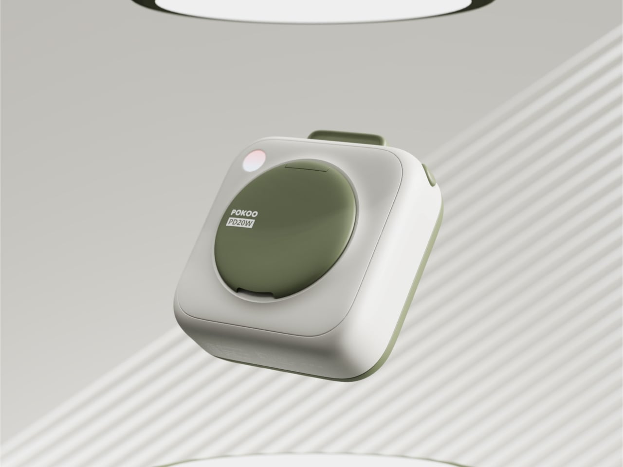
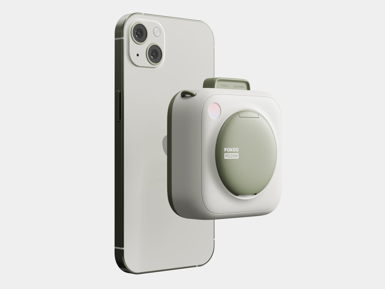
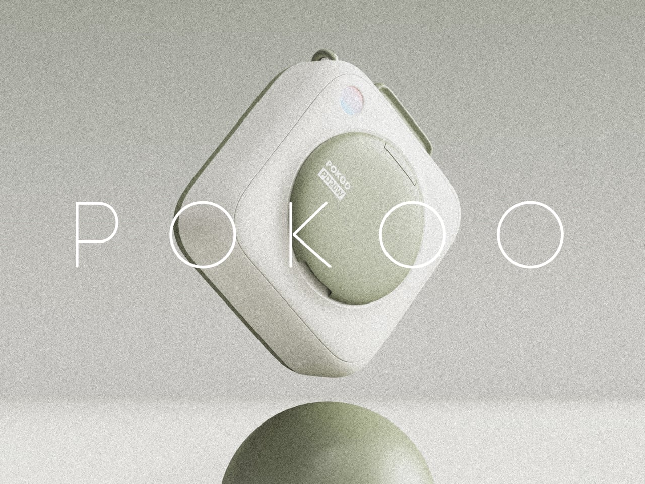
Pokoo is a MagSafe-style battery pack built around a rounded square body with a large circular disc at its center. The disc carries the branding and serves as the visual anchor, while a small indicator light in one corner handles status. The form is deliberately soft, with rounded edges and corners that make it feel more like a compact or a tiny camera than a tech accessory, especially in the warm white and sage-green palette.
The battery snaps magnetically to the back of an iPhone, sitting below the camera bump and charging wirelessly. The circular disc and rounded form make the phone and pack feel like they were designed together, visually softening the stack instead of making it look like you strapped a tool to an otherwise clean object. The pastel colors reinforce that impression, turning the combo into something that feels intentional enough to leave on your phone all day.
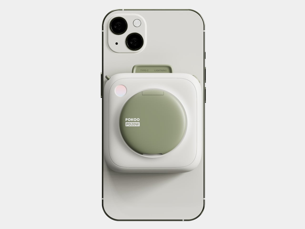
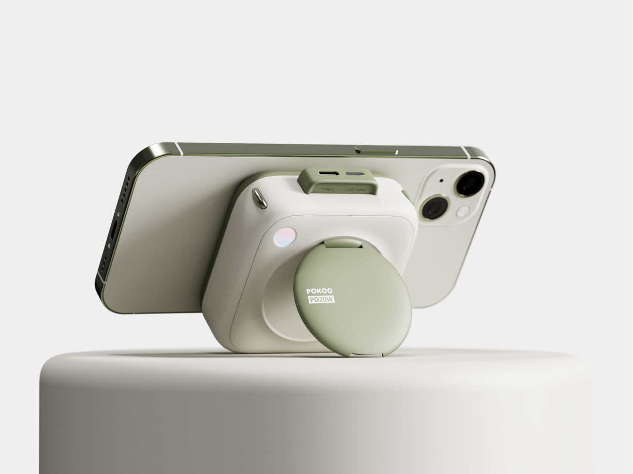
The circular disc is not just decoration, it flips out to become a kickstand. When you want to watch something, the hinge lets the disc rotate outward, propping the phone in landscape while the battery stays attached and charging continues. That turns Pokoo into a two-in-one object, a power source and a stand, which makes more sense than carrying both separately or balancing your phone against a water bottle.
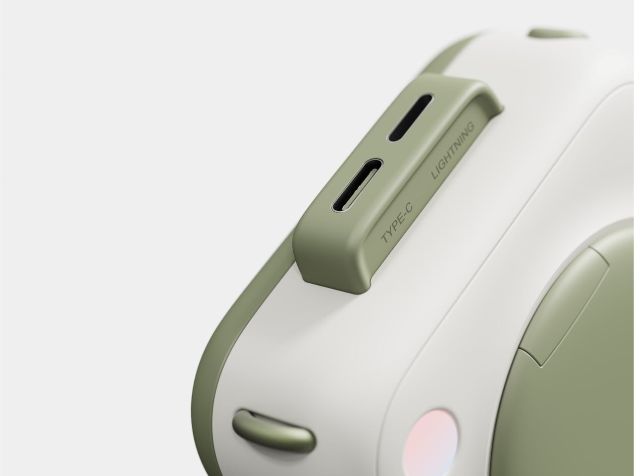
The top edge includes both USB-C and Lightning ports under a small protective ridge. That dual-port approach acknowledges that most people charge more than one kind of device, and it means Pokoo can handle wired top-ups for accessories or charge itself when wireless is slower. The flexibility makes it more adaptable than single-port packs that force you into one ecosystem or the other.
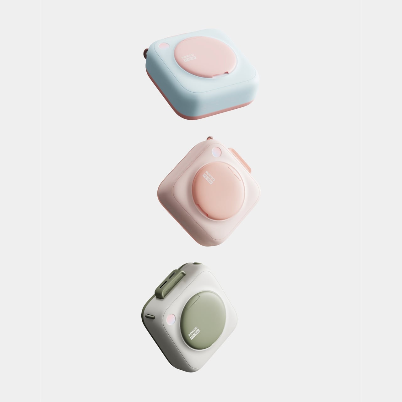
Pokoo comes in at least three colorways, the original white and green, a soft pink version, and a light blue with pink accents. Those colors push it firmly into lifestyle territory, looking equally at home next to a makeup bag or a laptop. The design language treats the battery as a companion object with personality, not a necessary evil you clip on when your phone is dying.
Pokoo does not reinvent what a battery pack does, it reframes how it looks and how you use it. The flip-out stand, dual ports, and cosmetic-inspired shell turn a mundane accessory into something that feels thoughtful. For people who care about the objects that live on their phones and desks, Pokoo suggests that charging does not require sacrificing aesthetics, and that a power bank can be soft, playful, and multi-functional without losing the utility that actually matters.
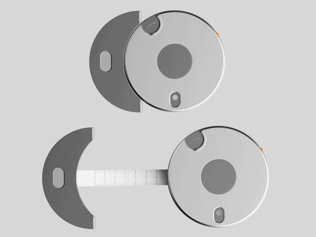
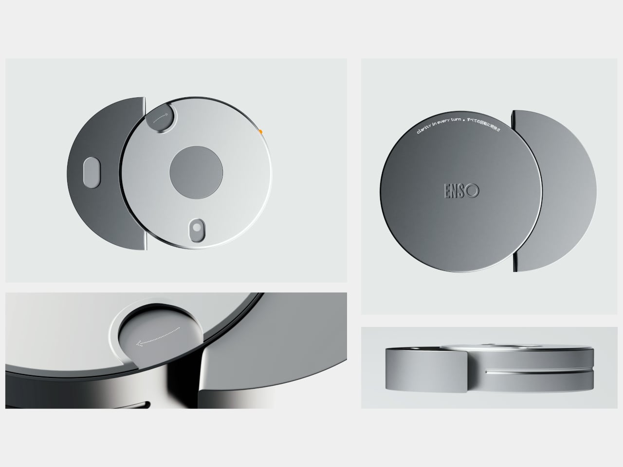
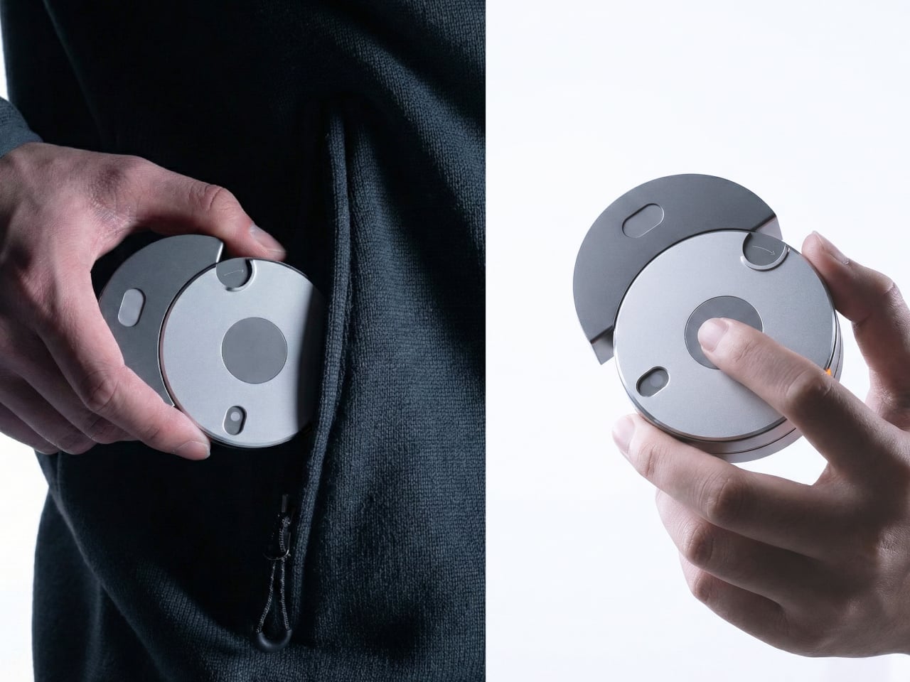
Most tape measures are purely functional, bright plastic bricks you toss in a drawer, borrow, and never remember. The act of measuring is usually rushed and slightly annoying, even though it is fundamental to making and building. Enso is a concept that asks what happens if you treat measuring as a small ritual instead of a chore, designing the gesture itself rather than just wrapping the same mechanism in prettier housing.
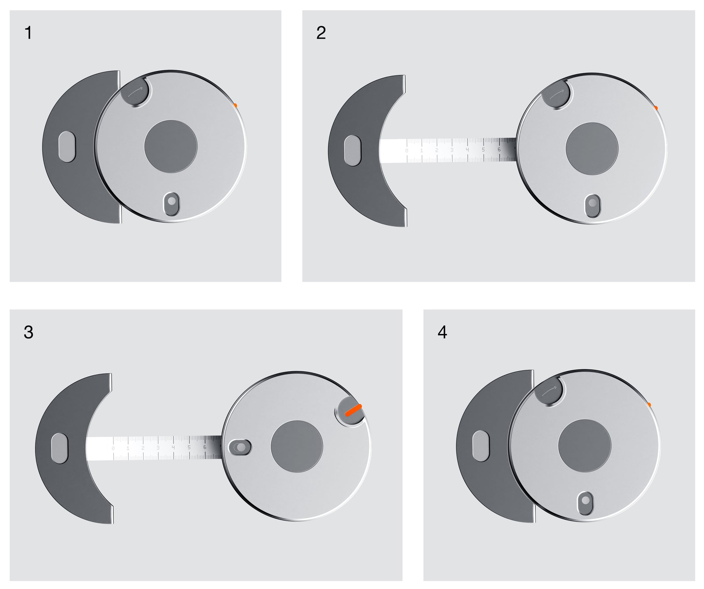
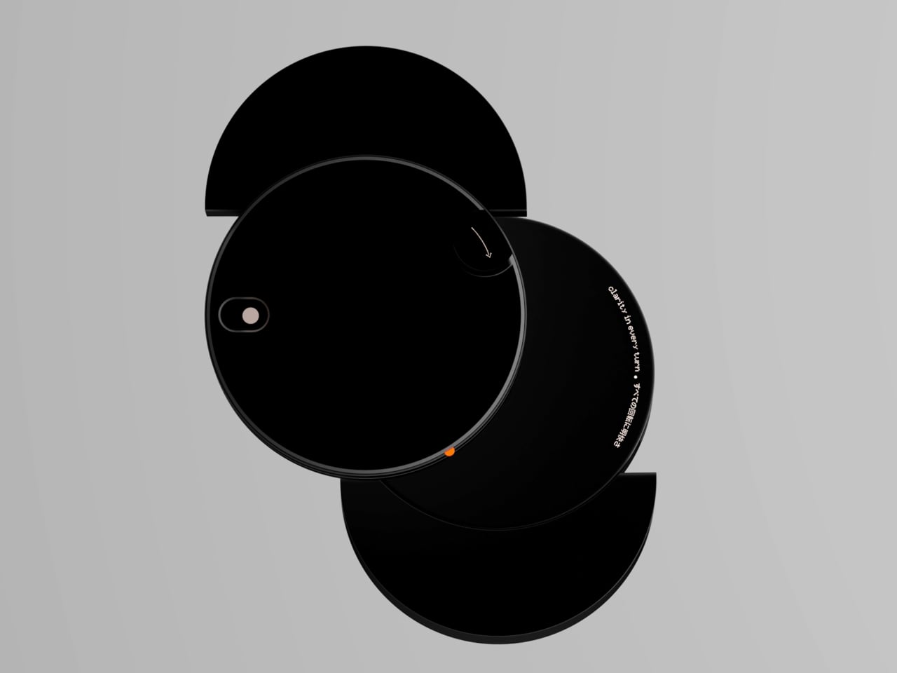
Enso is a tape measure concept that redefines measurement as a ritual, where precision meets care, and not the kind you hide in the drawer. The goal is not to add a screen or smart features, but to redesign the gesture itself, using overlapping circular forms and carefully tuned mechanics to make pulling a length feel calm and deliberate. The name references the Zen circle, a symbol of simplicity and mindful repetition.
The project starts from interaction, not form, studying familiar motions like clicking a pen, twisting a capsule, and, most importantly, dialing a rotary phone. The idea is that the goal is not to redesign the tape, but to redesign the gesture, thinking about emotion, memory, and muscle habits instead of just housing dimensions. That shift lets the form emerge from how your hand wants to move.
The rotary phone acts as the trigger point, the satisfying resistance and weight of dialing, and the silent intelligence behind each click. That experience translates into Enso’s overlapping circular geometry, inspired by eclipses and the tension between concealment and revelation. The tape becomes something you reveal by rotating and sliding discs, not yanking a metal strip out of a box, which changes the pace and feel of the whole interaction.
Enso’s compact, overlapping-disc body feels more like a small object you would keep on your desk than a tool you would hide. The emphasis on clarity with human touch, a tactile poetry between hands and material, means the circular layout invites your hand to explore edges and seams. Measuring becomes a repeatable, almost meditative motion, where the ritual of pulling tape and finding a length feels as considered as the number you record.
The concept introduces gradients along the tape, giving measurement a new dimension. The scale is no longer flat, but alive in color and depth. A gradient can make relative length easier to read at a glance, and adding visual depth to the scale reinforces the sense that you are not just reading numbers, you are reading a field of distance that changes as you move along it.
Enso treats a basic tool as an opportunity to design a ritual, not just a product. For designers, makers, and anyone who measures often, a tape that feels good to use and looks good to keep out could quietly change how they approach small tasks. It is a reminder that even the most ordinary tools can carry emotion, memory, and a bit of poetry if someone takes the time to rethink the gesture instead of settling for the same bright plastic box that has lived in drawers for decades.
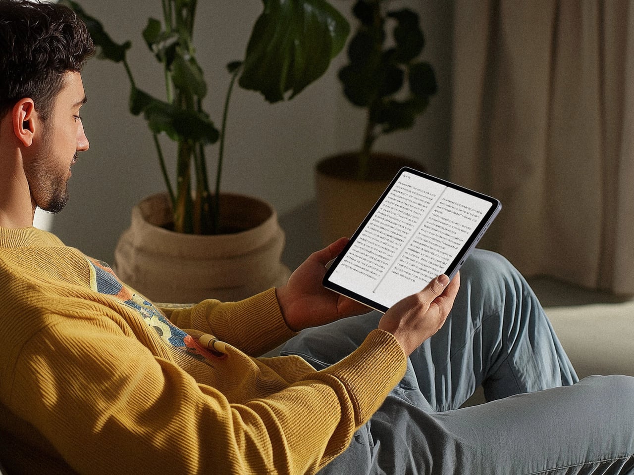
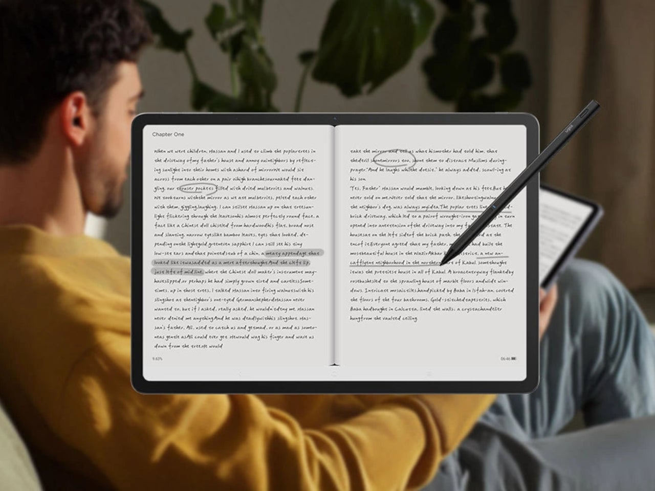
The usual creative setup involves too many screens. A pen display for sketching, an iPad or laptop for apps and browsing, maybe a Kindle for long-form reading without wrecking your eyes. Switching between them breaks flow, and most devices still treat drawing, reading, and general use as separate jobs that require separate hardware. The ugee Trio Pad UT3 tries to collapse those roles into one 14.25-inch slab with three distinct screen personalities.
The UT3 is an Android drawing pad with a 2K resolution, 3:2 aspect ratio display that behaves like a full-color tablet, a paper-like sketch surface, or an Ink Mode reader. It includes a U-Pencil stylus with 4,096-level pressure sensitivity, runs Android 14, and ships with a MediaTek Helio G99 processor and 8 GB of RAM. The interesting part is the dedicated U-Key that flips screen modes in hardware.
The U-Key is a small button on the top edge that cycles the screen through Regular, Paper, and Ink modes seamlessly. That matters when you are sketching, need to read a brief, then jump back into color work. The key turns the UT3 into a sketchbook, reader, or tablet on demand, changing how it sits in a workflow instead of forcing you to pick one identity and stick with it all day.
Ink Mode is the pseudo-E-Ink personality, a high-contrast, black-and-white profile that strips away color and visual noise. It makes the UT3 useful for reading scripts, briefs, or tutorials, and for parking reference text beside your workstation. It is still an IPS panel, not true E-Ink, but the monochrome look, combined with TÜV Rheinland eye-comfort tuning, makes it feel closer to a dedicated reader than a glowing app screen.
Paper Mode pairs a muted color profile with the fully laminated panel and NanoMatte coating to create a paper-like drawing surface. The NanoMatte reduces glare and adds a slight tooth that helps line work feel more controlled and less slippery. The laminated stack brings your stylus tip closer to the pixel underneath, reducing parallax, and the 13 g U-Pencil with 20 ms response time handles inking, shading, and quick gesture sketches without lag.
The Android tablet side means you can run full drawing apps, reference tools, and streaming services directly on the device. The 10,000 mAh battery with 27 W fast charging supports around 13 hours of writing or drawing, and the 256 GB of storage plus microSD expansion handles large file libraries. You can sketch, watch, and read without tethering to a PC, then use the U-Key to keep the screen aligned with the task.
A day in the studio could start with the UT3 in Ink Mode for morning reading, flip into Paper Mode for sketching, then jump into full-color Regular mode for painting and video. The hardware mode switch makes that feel natural, turning one slab into three different tools. For artists and designers tired of juggling devices or forced to choose between a drawing tablet and a reading screen, that kind of shape-shifting display might be the most practical feature on the list.
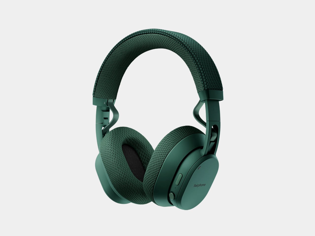
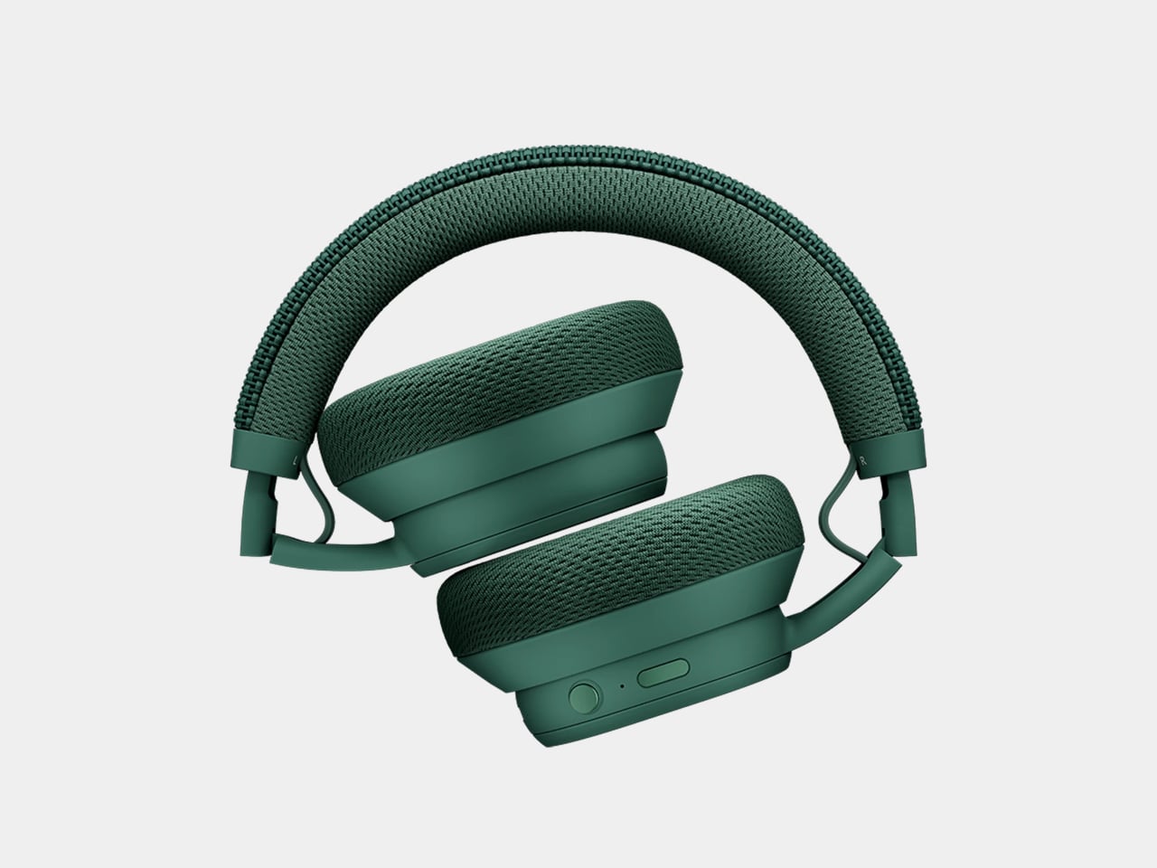
Most wireless headphones quietly become disposable. Batteries fade, cushions peel, and people replace the whole thing every few years instead of fixing what broke. Fairphone’s first Fairbuds XL were an outlier, modular and self-repairable with screws instead of glue. Gen 2 is the next step, not a clean break but a refinement that tries to make keeping and upgrading a pair of headphones feel as normal as replacing them.
Fairbuds XL Gen 2 are over-ear headphones that keep the same modular skeleton but add new 40-mm dynamic drivers, refined tuning, and updated materials. Fairphone claims 30 hours of listening, active noise cancelling with ambient mode, Bluetooth or USB-C wired listening, and two colorways, Forest Green and Horizon Black, which deepen the original palette into something a bit more mature and less obviously plastic.
The drivers are the most interesting change. Gen 2 ships with new 40-mm dynamic drivers and updated tuning for a more natural, detailed sound, but those drivers are also sold separately as modules. Owners of the 2023 Fairbuds XL can open their existing headphones with a screwdriver and slot in the new drivers, keeping everything else while upgrading the sound. That turns the Gen 2 launch into both a new product and a parts catalog.
The comfort story centers on materials. The headband now uses a breathable net fabric, and the ear cushions switch to a soft birdseye mesh, which improves comfort during long sessions. The IP54 rating handles dust and splash resistance, and the new material identity balances durability with a sleeker look. The switch from PU leather to mesh is practical for warm environments and long wear, without sacrificing the ability to take everything apart when it wears.
The modular design remains unchanged, with nine replaceable parts, including the battery, cushions, drivers, headband, and covers, all held together with screws and no glue. The battery is easily removable, the three-year warranty extends the standard two years, and the LONGTIME label certifies products designed for longevity and repairability. The goal is to keep components in use instead of sending whole headphones to the landfill when one piece fails.
Advanced noise cancelling with a switchable ambient mode, an upgraded Fairbuds app with new presets and customizable EQ, and Bluetooth with dual-point connectivity let you move between phone and laptop. You can also plug in over USB-C for battery-free listening. Gen 2 adds auto power-off after 30 minutes of inactivity with ANC off, saving battery and extending runtime per charge, which is a small but thoughtful improvement.
Most Gen 2 products pretend Gen 1 never happened. Fairbuds XL Gen 2 ships drivers that fit both, which means the launch doubles as a parts drop for anyone who bought the original two years ago. That feels unusual enough to notice, especially at €249 for a full headset or roughly €100 to just swap the drivers. Whether or not that changes anyone’s mind about buying repairable gear, it at least shows that upgrading can be designed in from the start instead of being treated as impossible or inconvenient.


 ) Sunrise Clock Air Purifier is a compact attempt to pull some of those tools into one object. It is a small bedside cylinder that cleans the air, glows like a sunrise to wake you gently, plays soft sounds, shows the time, and charges your phone, all while looking more like a design piece than some cold, drab piece of appliance. But does this striking appliance work as advertised? We put it beside our comfy bed to find out.