Writers spend more time with their keyboards than any other tool, yet most options are either gaming boards covered in RGB lights or cheap office slabs optimized for cost rather than comfort. Neither category really thinks about what writers actually need, which is a keyboard that can keep up with long sessions without killing your wrists and maybe even help you stay focused when the blank page starts feeling oppressive.
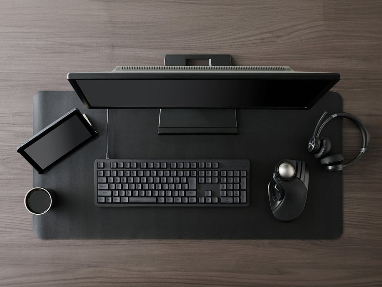
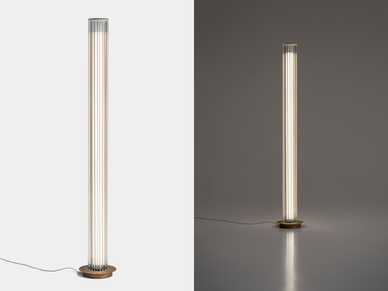
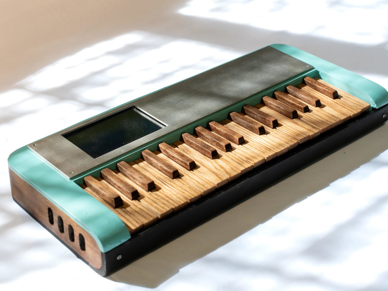
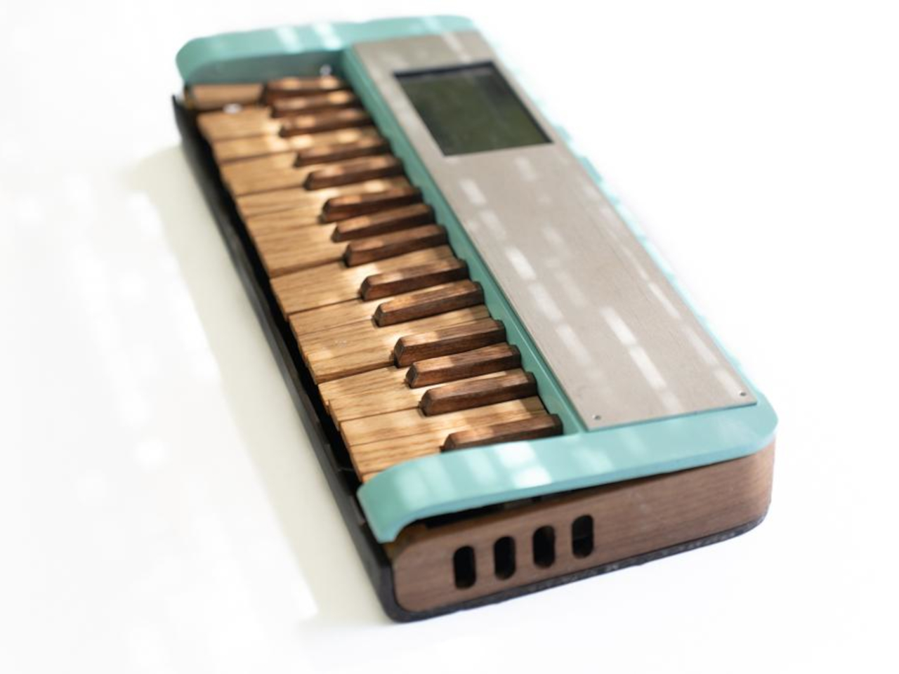
Freewrite’s Wordrunner is a mechanical keyboard built specifically for writing, complete with a built-in mechanical word counter and sprint timer. It works with any device that accepts a USB or Bluetooth keyboard, from laptops and desktops to tablets and phones, and its core features live in the hardware rather than in yet another app or cloud service that you’ll forget to open halfway through your writing session.
Designer: Freewrite

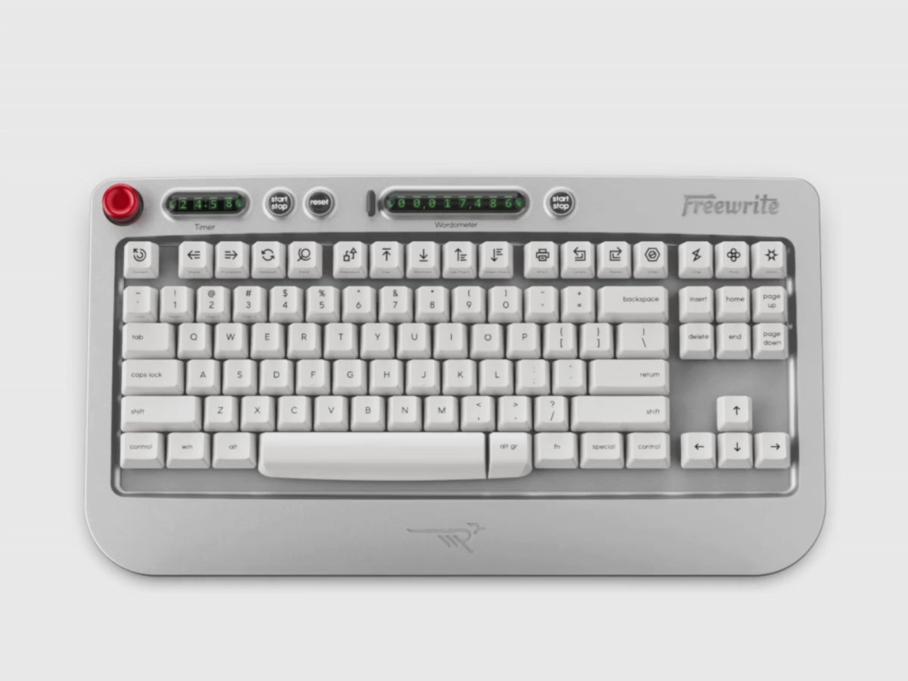
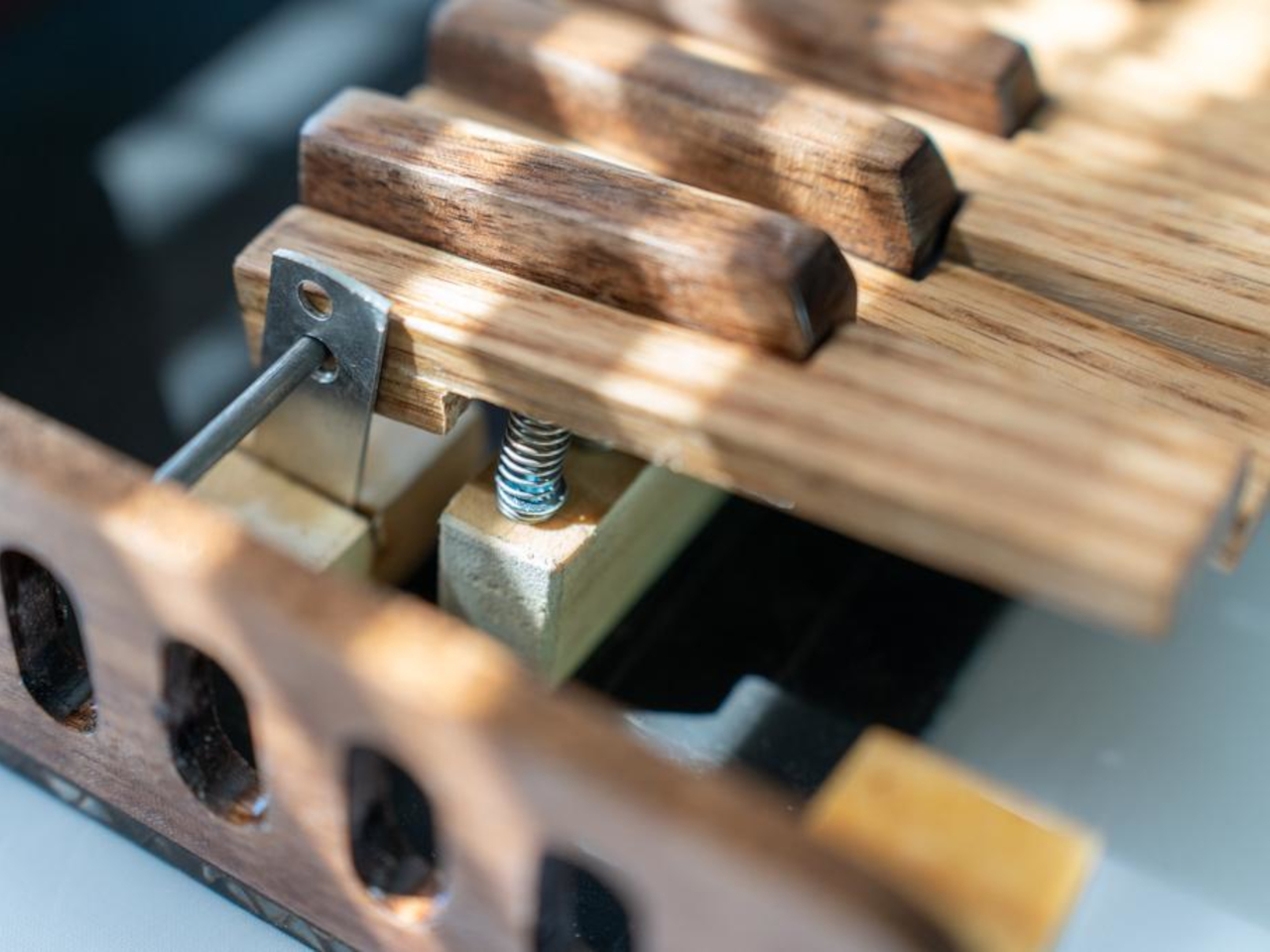
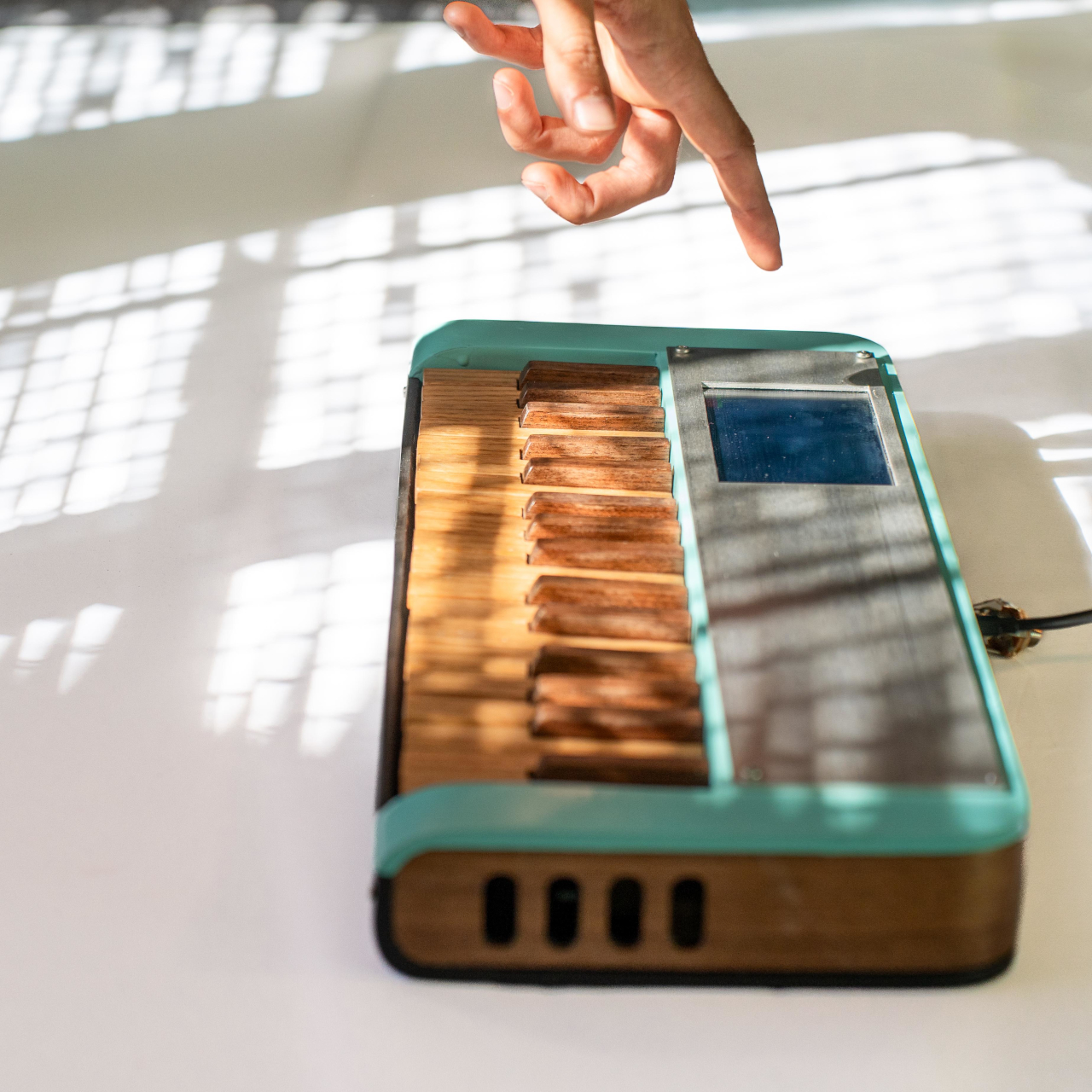
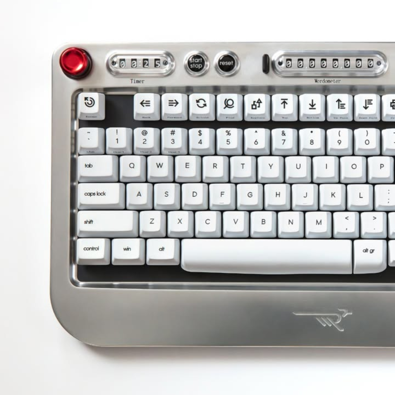
The standout feature is the Wordometer, an eight-digit electromechanical counter with rotating wheels driven by a coreless motor and controlled by an internal microprocessor. It tracks words in real time using a simple algorithm based on spaces and punctuation, stays visible even when the keyboard is off, and can be reset with a mechanical lever to the left of the display. The counter makes a soft clicking sound as the wheels turn, giving you tactile and audible feedback every time you hit a milestone.
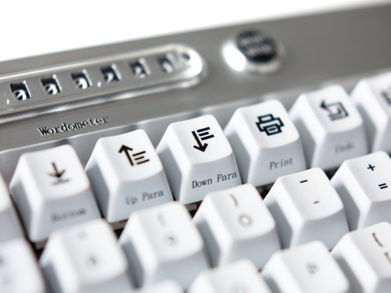
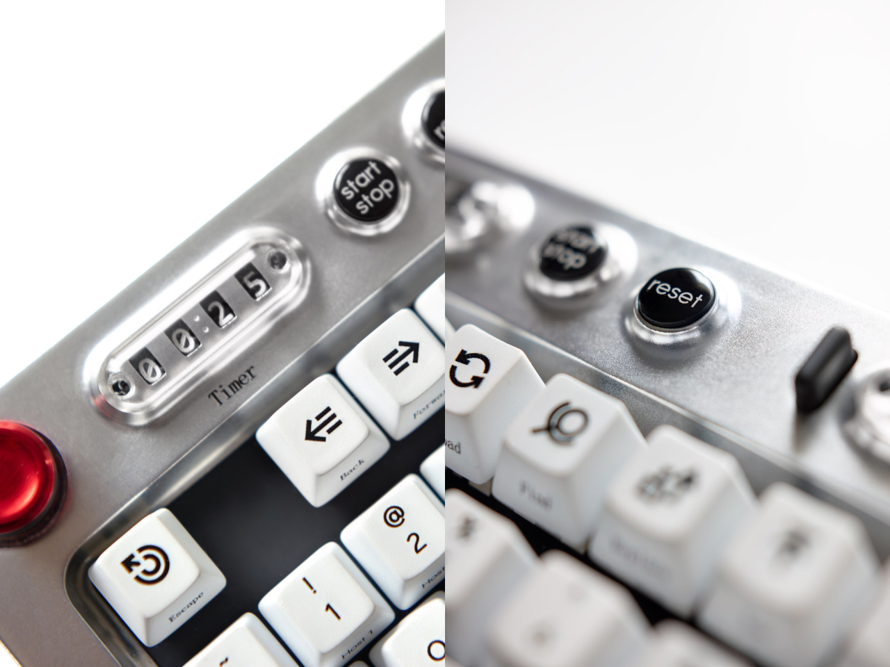
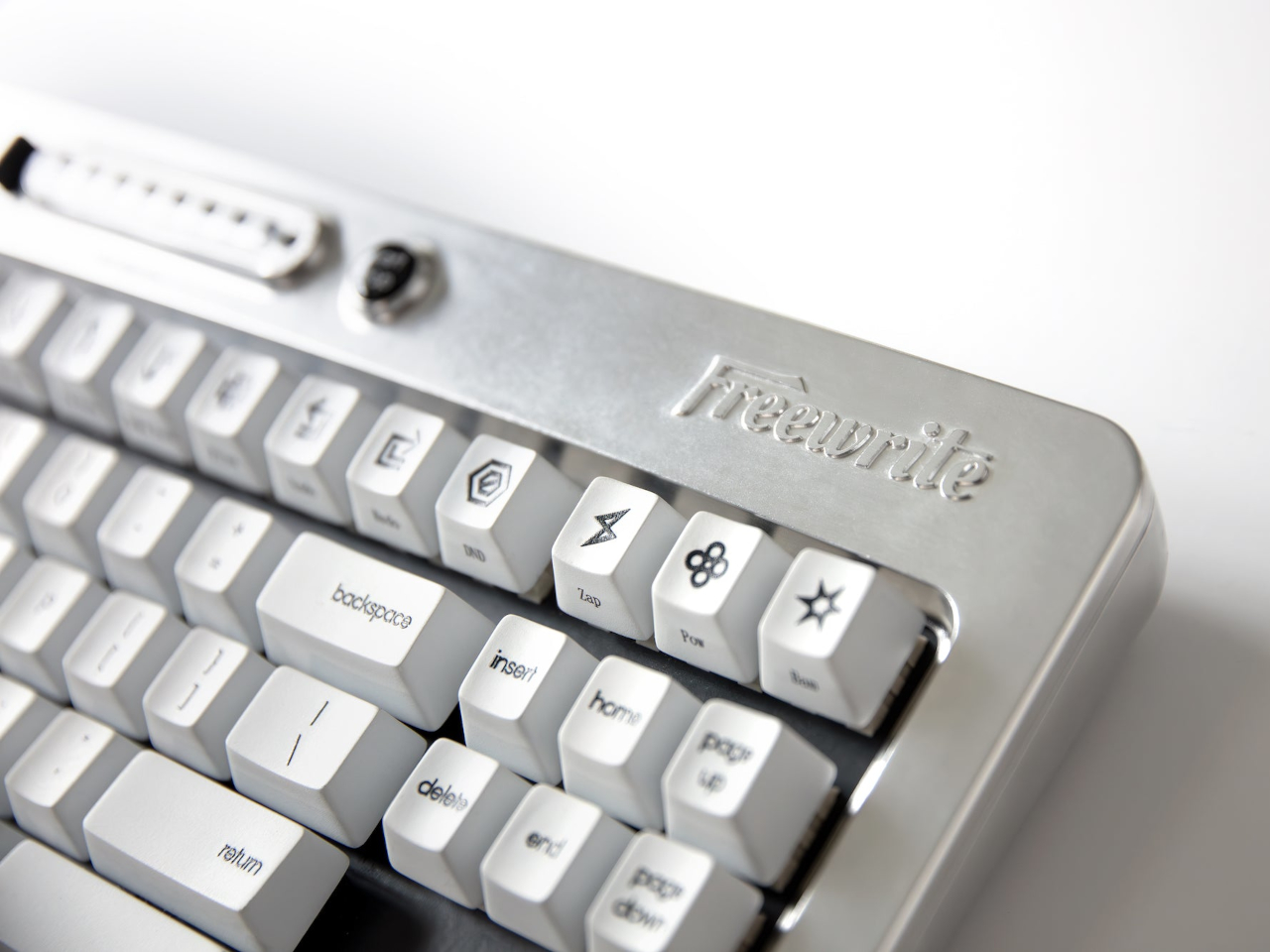
The keyboard also includes a built-in sprint timer that lets you run Pomodoro-style sessions or custom writing sprints without leaving your desk. Subtle red and green lights keep you on track, and you can configure the timer to count up or down depending on how you prefer to work. The standard function row has been replaced with writer-centric keys like Find, Replace, Print, and Undo, plus three programmable macro keys labeled Zap, Pow, and Bam for whatever shortcuts you use most.

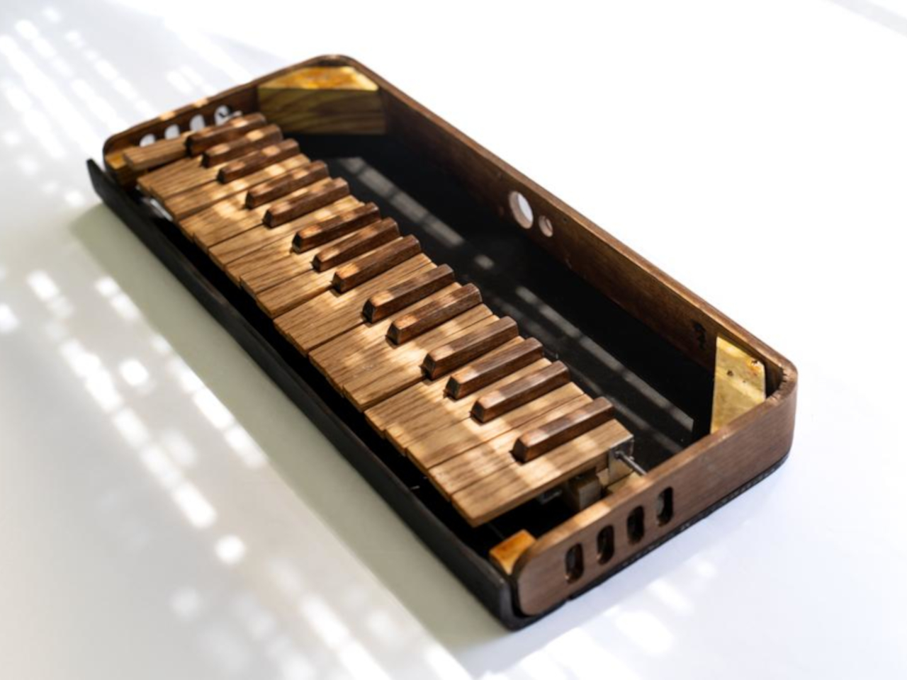
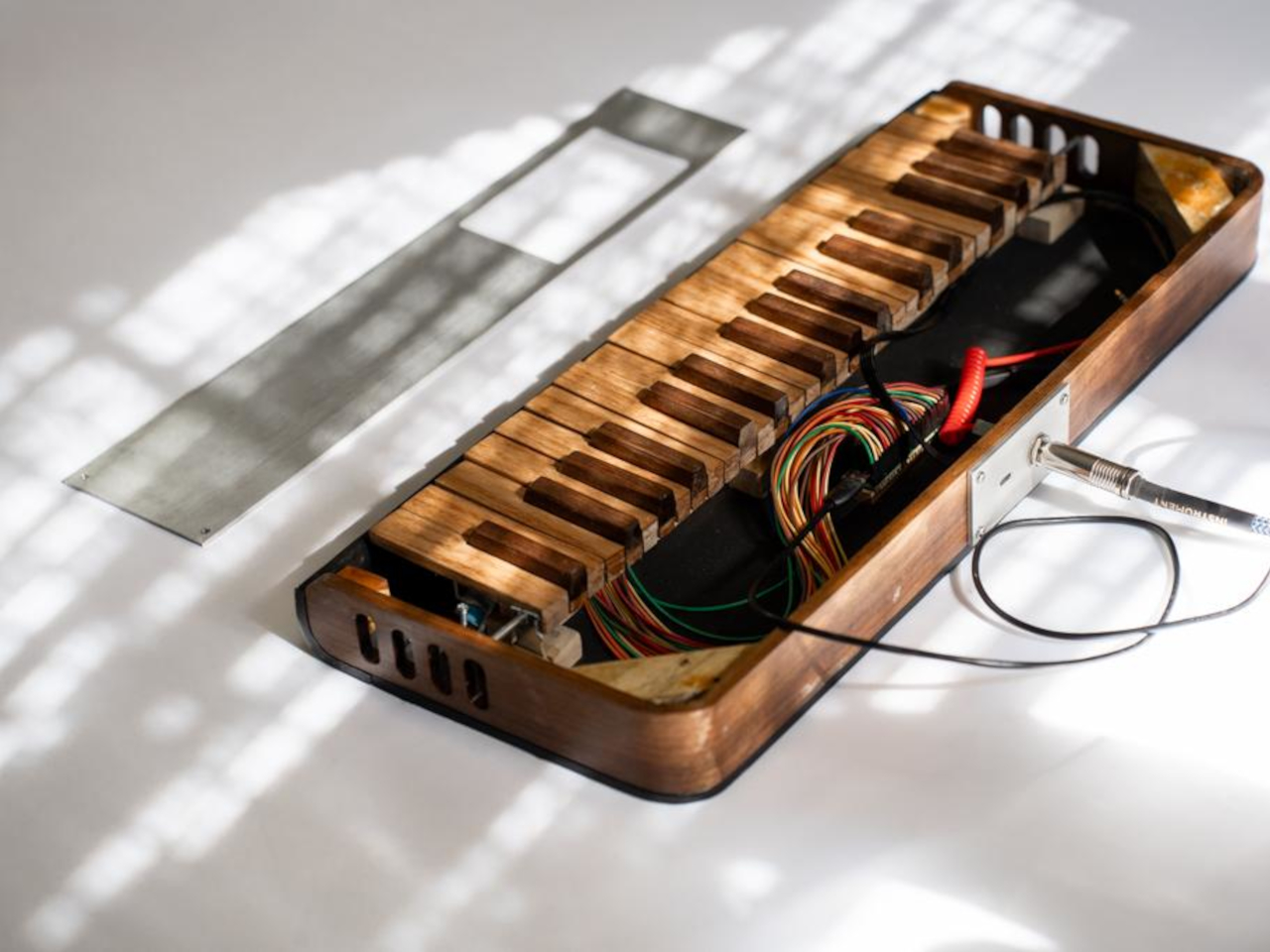
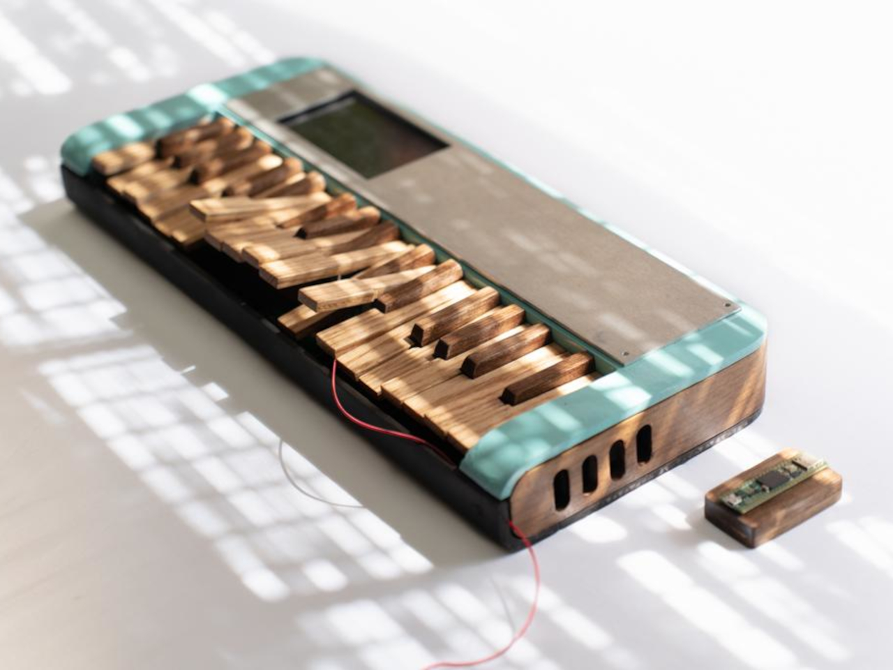
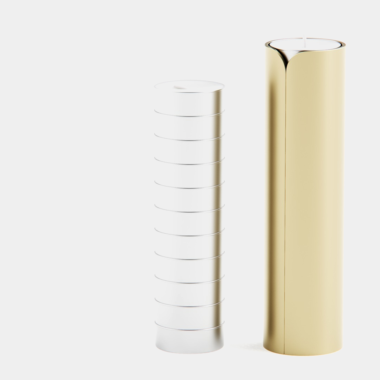
The typing experience is what you’d expect from a premium mechanical keyboard. High-quality tactile switches, multiple layers of sound dampening, and a gasket mount design deliver what beta testers kept calling “so satisfying.” Each switch is rated for eighty million presses, which should be enough to see you through multiple novels without the keys wearing out. The die-cast aluminum body gives the board a heft and solidity that plastic keyboards can’t match, keeping it planted on your desk no matter how fast your fingers fly.
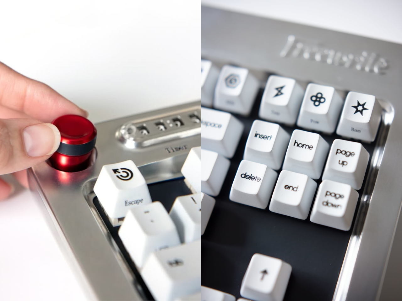
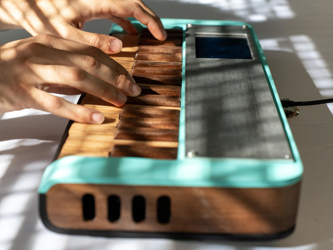
Tucked into the top right corner is a multi-directional joystick that controls media playback and volume, so you can adjust your music without touching the mouse or breaking flow. Connectivity is equally flexible. The Wordrunner supports wired USB-C and Bluetooth, pairs with up to four devices at once, and switches between them with a keystroke. It works with Windows, macOS, iPadOS, and Android without requiring special software, which means you can move it between machines without reconfiguring anything.
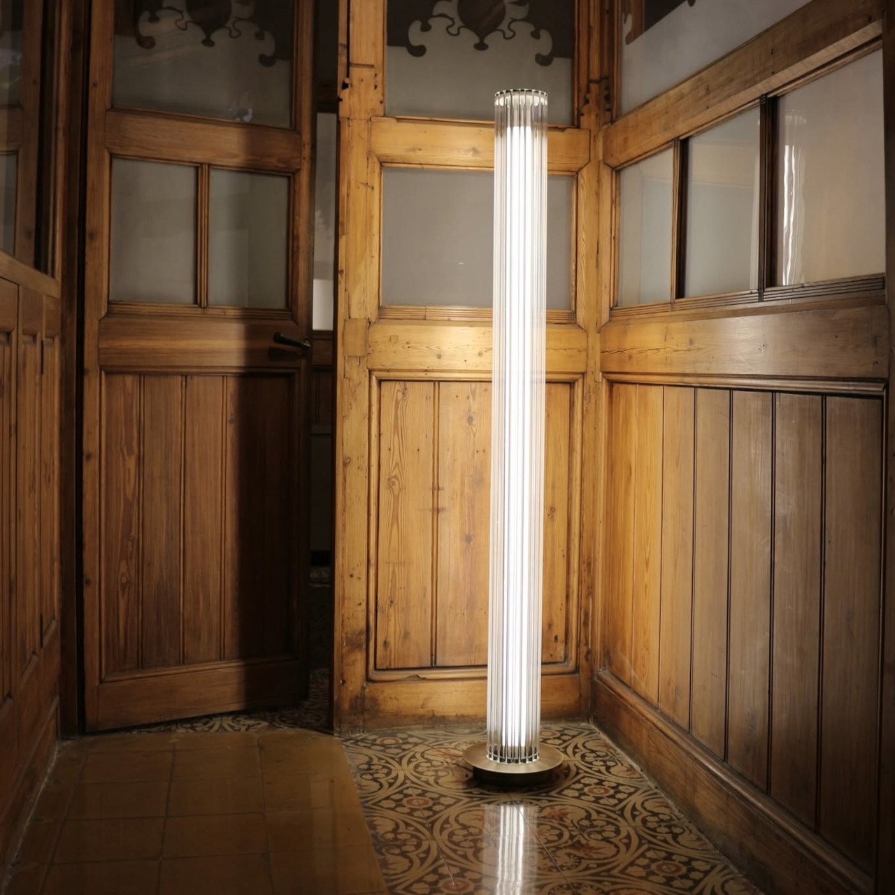
Wordrunner is designed for writers who want their keyboard to be more than a generic input device. It turns progress into something physical with the mechanical word counter, structures writing sessions with the built-in timer, and wraps it all in a solid, retro-industrial chassis that looks like a specialized tool rather than consumer electronics. It’s less about flashy features and more about making the act of writing feel intentional every time you sit down to work.

The post Freewrite Wordrunner Counts Words With Clicking Mechanical Wheels first appeared on Yanko Design.