This Asthma Nebulizer Looks Like a Toy, Not a Scary Medical Machine

Most home nebulizers are loud, beige boxes that look like they escaped from a hospital supply closet. Kids with asthma sit next to them for breathing treatments, staring at dials and vents while a motor wheezes. These devices are designed around clinical priorities rather than home life, so they end up bulky, noisy, and visually jarring on bedside tables, which does nothing to help a child already anxious about another round of therapy.

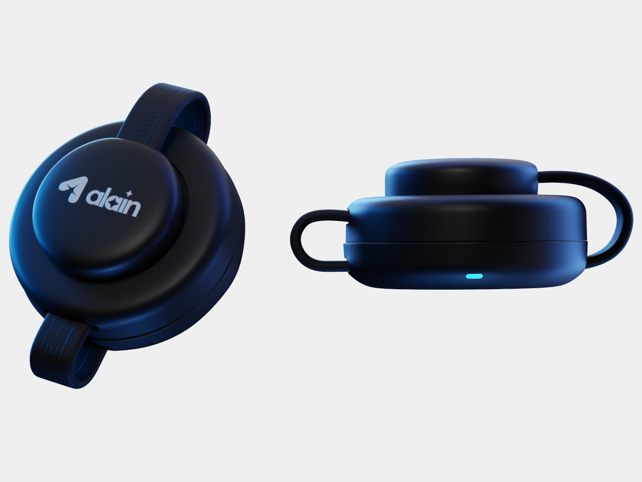
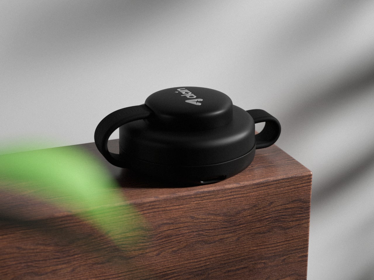
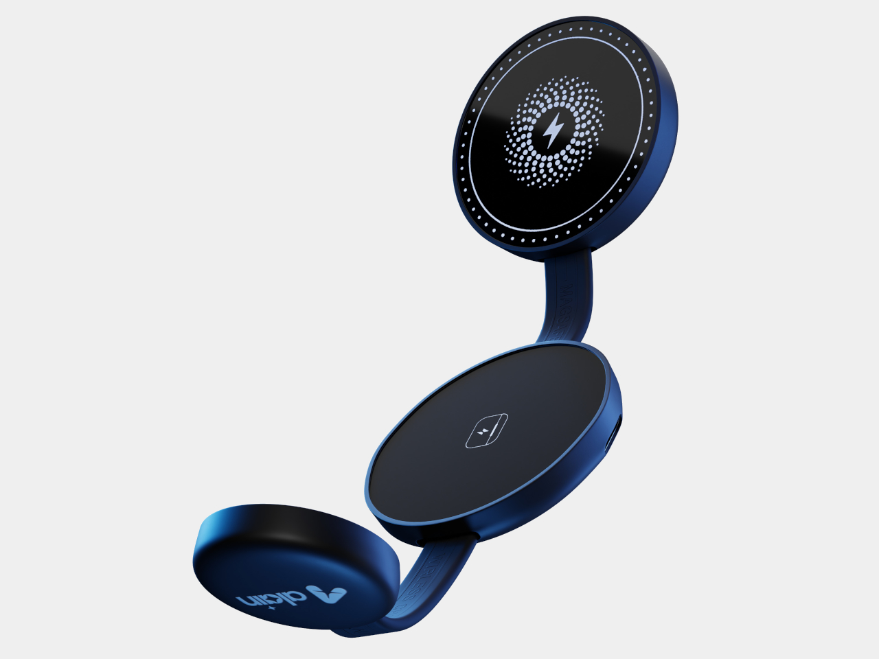
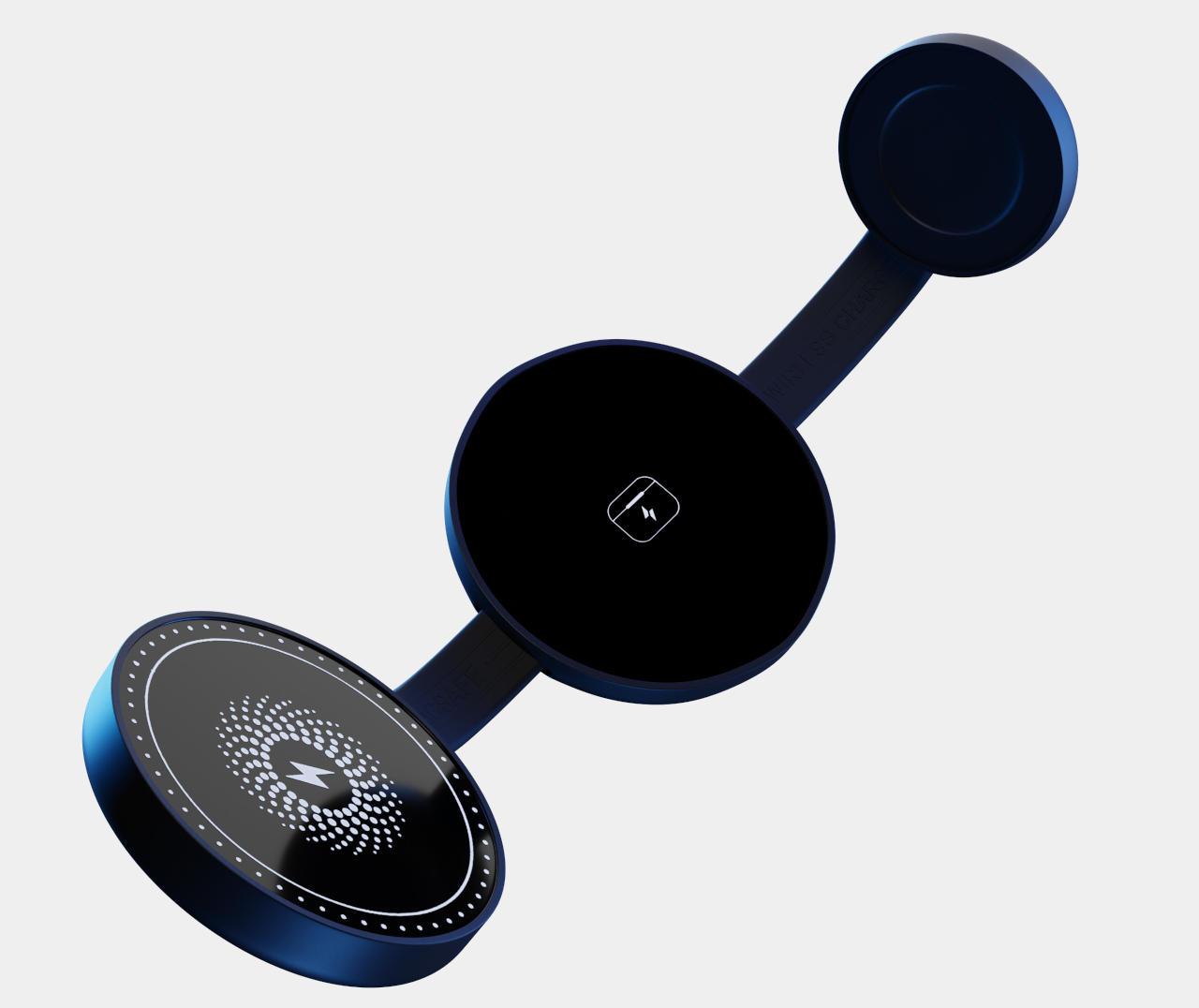
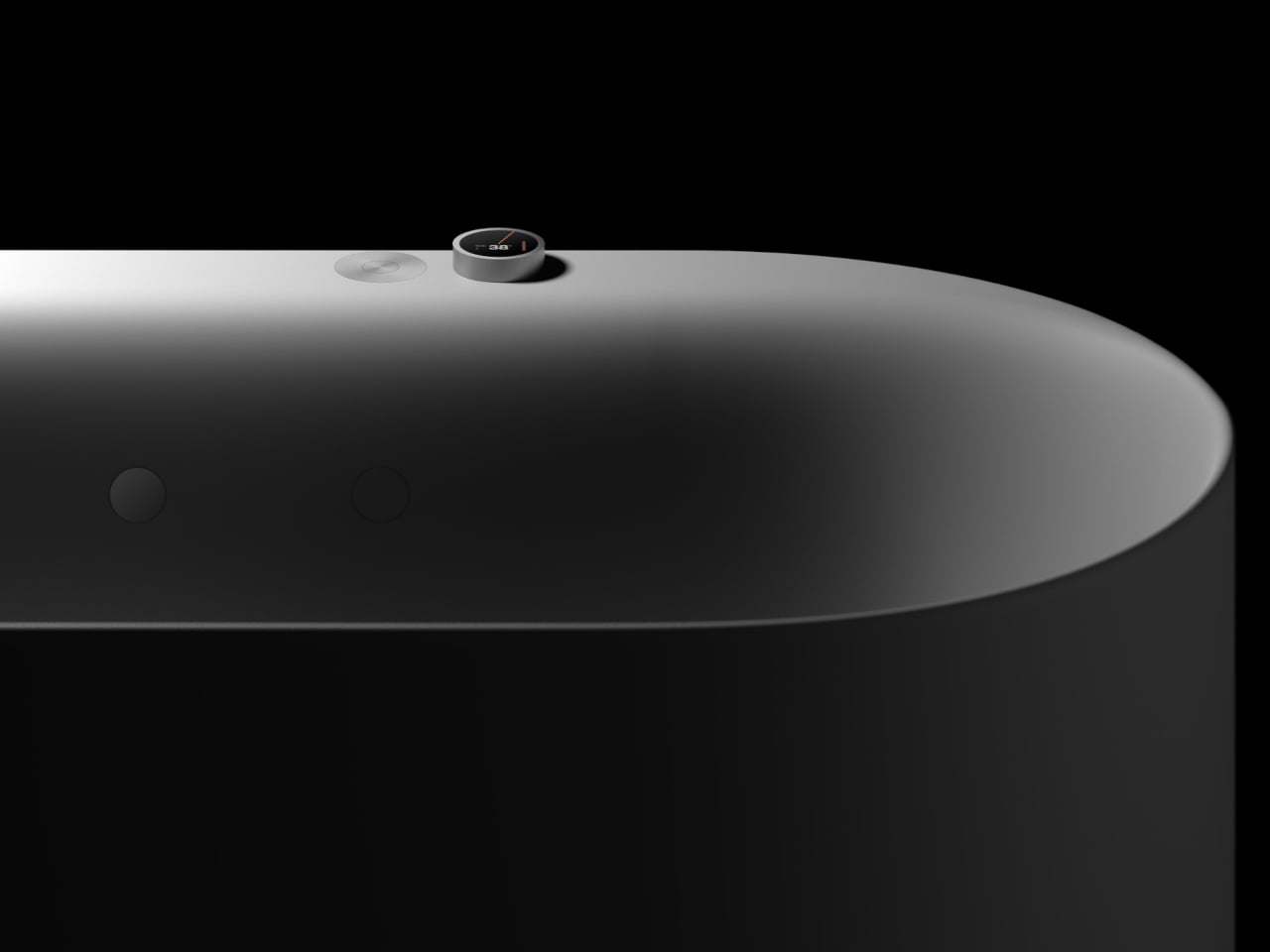
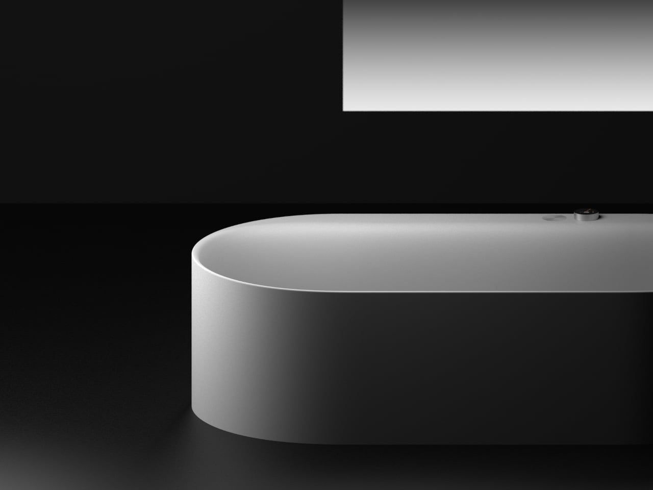
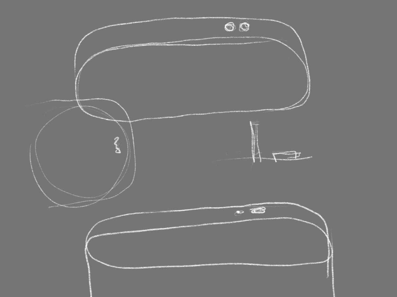
Breevo is a concept that tries to reframe the home nebulizer as a calm, approachable object. It keeps the familiar compressor mechanism inside but wraps it in a soft, rounded shell with an integrated handle and a single front power button. The goal is to make therapy feel less like plugging into a machine and more like interacting with a friendly household gadget that happens to deliver aerosol medication.

Designer: Neha Pawar

Picture a parent grabbing Breevo by its handle and carrying it from a shelf to the child’s room, setting it down without rearranging furniture. One large button starts the session, the tubing connects cleanly to the front, and the child focuses on breathing rather than switches and gauges. The compact footprint and simple interface reduce setup friction when treatments are frequent and time-sensitive, turning a stressful ritual into something a little more routine.

Under the shell, Breevo still uses a piston or diaphragm compressor, cooling fan, and medical-grade nebulizer cup and mask. The design doesn’t reinvent nebulization technology but just packages proven hardware in a way that makes sense for bedrooms and playrooms instead of hospital wards. The compressor drives air through the medicine cup to create aerosol, the same way every other home nebulizer works.

The exterior uses soft geometry and pastel colorways that make Breevo feel closer to a toy storage bin or portable speaker than medical equipment. The rounded body and integrated handle invite touch, and the two-tone front face with its central button gives kids a simple focal point. That shift in visual language matters when you are asking a six-year-old to sit still with a mask on their face, day after day, often without much choice.

The integrated handle and relatively light ABS shell make it easy to move Breevo between rooms or stash it away when not in use. Parents can carry it in one hand while managing tubing and a child with the other. The quieter, less clinical presence means it can live on a shelf without constantly reminding everyone of illness, which is its own kind of psychological relief in homes managing chronic respiratory conditions over months and years.

Breevo treats the home as the primary care environment, not just a place where hospital gear is parked temporarily. By focusing on form, tactility, and intuitive interaction, it suggests that medical devices for chronic conditions should be designed like any other long-term roommate, something you can live with visually and emotionally, not just something that meets a spec sheet and gets hidden between treatments when guests come over.

The post This Asthma Nebulizer Looks Like a Toy, Not a Scary Medical Machine first appeared on Yanko Design.
Minimalist Wallets Hold 8 Cards, but This One Fits 25 and Feels Slim

Minimalist wallets tend to look great on Instagram but hold eight cards at best, chew through pockets with sharp edges, and turn every checkout into a card-shuffling performance where you spill half your stack on the counter. A lot of people try them, then quietly go back to bifolds because capacity, comfort, and access never quite line up with the promise of slimming down your everyday carry.

PROOF Wallet is a vertical, wrap-around design that keeps the metal front but softens everything else. The Founder model pairs an aerospace-grade aluminum plate with top-grain leather and a wide elastic strap, aiming for something that still feels slim but looks more like a compact card case than a tactical gadget. It is pitched as a minimalist wallet built for professionals, which mostly means it does not scream EDC the way most metal wallets do.

Designer: PROOF

PROOF leans into capacity instead of pretending you only carry six cards. The wallet is rated for anywhere from one to twenty-five cards plus cash, with the elastic strap compressing the stack and the leather wrap keeping everything from splaying out. The footprint stays at roughly 2.25 by 3.75 inches, whether you carry three cards or a full deck; thickness simply grows from a few millimeters to about an inch as you add more.

Paying at a bar or toll booth, you tug the leather-topped pull tab, and your cards rise in a neat stack instead of forcing you to pinch and pry them out. The strap runs behind the cards, so one pull fans them up for selection, then they slide back down when done. It is a small mechanical tweak that quietly fixes the nail-breaking ritual of many metal wallets, where you need two hands and patience.

The back has a wide elastic strap that holds double-folded bills flat against the leather. You can stash up to twenty notes without adding clips or flaps, and the rounded aluminum corners and leather bumper keep the whole thing from feeling like a sharp brick in your pocket. It is still rigid, but it has been sanded down for actual daily carry instead of just looking good in product photos.

The security angle covers both physical and digital. The aluminum front plate and internal RFID-blocking layers encapsulate the card stack, guarding against bending and contactless skimming. For people who travel or commute through crowded spaces, that combination of hard shell and digital shielding is part of the appeal, especially when it does not require a bulky bifold that defeats the point of going slim.

PROOF backs this with an almost overconfident UNRIVALED Guarantee, the promise to replace the wallet if you damage or even lose it, supported by a real lifetime warranty and twelve-month return window. That attitude underlines who this is aimed at: people who like the idea of a slim, front-pocket wallet but refuse to give up capacity, comfort, or a more polished look just to chase minimalism for its own sake.

The post Minimalist Wallets Hold 8 Cards, but This One Fits 25 and Feels Slim first appeared on Yanko Design.
MOFT Dynamic Folio Case Turns a Single Sheet into an iPad Origami Desk

iPads have quietly become laptops, sketchbooks, second monitors, and TV screens, while most cases still only prop them up at two angles or turn them into heavy keyboard bricks. The pile of stands and folios people accumulate, one for drawing, one for watching, one for travel, never solves the “I just want one thing that works everywhere” problem. You end up carrying multiple accessories or compromising on whatever you need to do next.

MOFT’s Dynamic Folio Case is a folio, case, and stand in one, pitched as “one carry for productivity anywhere.” It is a single sheet weighing just over 10 ounces that stays on the iPad and folds into a surprising number of shapes, trying to be a desk stand, lap desk, dual-screen dock, and protective shell, without adding a keyboard or bulky frame around the tablet.

Designer: MOFT

Picture dropping the iPad next to a laptop and folding the folio into its taller stand mode, lifting the screen level with the laptop display. The Dynamic Folio even supports a phone on a ridge above the iPad, so you end up with a stacked, three-screen tower that reduces neck strain and makes it easier to keep notes, reference, and chat visible without craning down at a flat tablet.

On a sofa or train seat, the folio folds into a wedge that rests comfortably on your legs or arm, giving you a stable angle for sketching or handwriting without hunting for a table. The case is light enough that the whole setup still feels portable, and the low drawing angles make it easier to treat the iPad like a sketchbook instead of a slippery glass slab balanced on your knees.

The back of the folio has subtle printed icons, circles, and lines that you align to quickly find specific angle presets. MOFT calls out examples, 60 degrees for watching movies on a plane, 30 degrees for note-taking in a meeting, 18 degrees for drawing in a cafe, and steeper angles for reading or gaming. It is less trial-and-error origami and more a guided folding system you can remember after using it a few times.

Of course, reinforced corners wrap the iPad’s most vulnerable edges, ready for bags and bumps, while MOVAS-P vegan leather gives the outside a refined texture and the inside a smooth finish that resists scratches. A magnetic pencil holder snaps on the side to keep an Apple Pencil secure on the go, solving the familiar problem of the stylus detaching from the iPad’s edge the moment you slide everything into a backpack.

The Dynamic Folio behaves less like a case and more like soft origami furniture for your iPad, trying to keep up with every role the tablet plays without asking you to carry extra hardware. It will not replace a full keyboard for heavy typing, but for people who draw, read, watch, and occasionally work across two screens, one well-designed sheet that can do twenty things is a tempting trade.

The post MOFT Dynamic Folio Case Turns a Single Sheet into an iPad Origami Desk first appeared on Yanko Design.
IRIS 4.0 is a Fabric-Covered Smart Speaker Orb That Watches from Above

Smart speakers usually sit on kitchen counters, bookshelves, or bedside tables, plastic cylinders and pucks buried behind plants and picture frames. Their microphones and speakers are often half-blocked, and they still feel like gadgets you add to a room rather than part of the room itself. Nobody seems to know where these devices actually belong, so they end up scattered across every flat surface, fighting for space and power outlets.

Formeta’s IRIS 4.0 is a fabric-covered sphere that hangs from the ceiling like a light fixture instead of sitting on a shelf. The AI assistant concept is designed for Industry 4.0, meant to integrate into modern living spaces by becoming infrastructure rather than décor. Its central, elevated position keeps it unobstructed while handling security monitoring, sound control, and lighting, turning the assistant into something closer to ambient architecture than a countertop gadget.

Designer: Formeta

The studio frames it as “a ceiling-mounted smart assistant that vanishes into the environment while expanding control, sound, and presence.” Removing devices from surfaces frees up space and makes tech feel less like an object and more like a part of the building. You could walk into a room where there is no visible speaker or hub, yet sound, light, and automation quietly respond when you speak.

The audio side relies on a 6×6+1 sound system that emits sample sound waves to read the room and optimize audio distribution. Being in the ceiling means it is not blocked by books or walls, and multiple drivers throw sound evenly in all directions. The result, at least in theory, is better room acoustics and more consistent voice pickup than a single forward-firing speaker sitting on a counter behind clutter.

IRIS 4.0 also lets you customize ambient lighting, serving as a mood light and smart assistant in one. That sounds nice until you see the design in its “active” state, when the band around the sphere parts and a glowing inner core appears, like a mechanical iris opening. It is a clear signal that the assistant is awake, but it also leans into the feeling of something above you watching and listening.

Of course, the fabric-covered surface and soft geometry are meant to counter that unease, making the device feel more like a textile object than a cold camera dome. The muted colors and lack of aggressive branding help it blend into ceilings and feel less gadget-y. In a category where people already worry about surveillance, tactility, and visual softness go beyond aesthetic choices. They are trust signals that may or may not work depending on who is looking up.

IRIS 4.0 treats AI assistants as something you wire into the ceiling plan, like lights or smoke detectors, rather than something you plug in and move around. That shift raises questions about privacy and control, but it also hints at a future where smart systems are less about scattered gadgets and more about calm, ambient layers in the architecture itself, even if that architecture occasionally looks back down at you with a glowing eye.

The post IRIS 4.0 is a Fabric-Covered Smart Speaker Orb That Watches from Above first appeared on Yanko Design.

This $100 Stand Fixes Why Wireless Charging Gets Hot and Useless

Most wireless charging setups involve a flat pad on the nightstand, a couple of extra cables for watch and earbuds, and a phone that gets warm and slides out of alignment if you nudge it. Most 3-in-1 MagSafe docks solve the cable mess but still feel like static sculptures, not stands you actually use while you work or watch something, and they rarely address the heat that builds up when pushing 15W or more through magnetic coils.

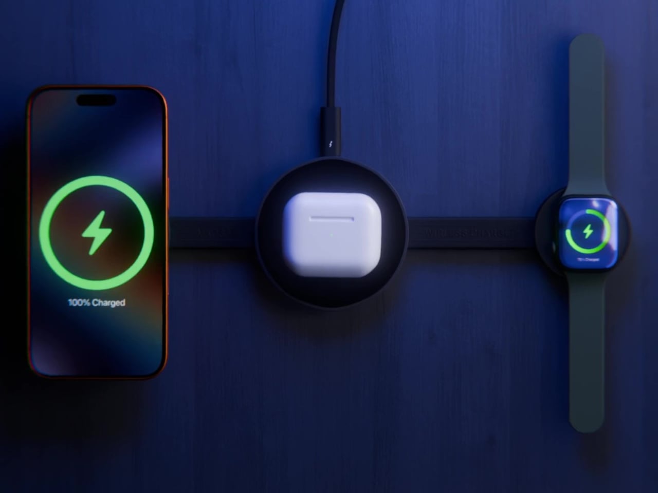
LISEN’s MagSafe Charger Stand puts everything on a vertical stem with a chunky barrel at the top. Inside that barrel is a Qi2.2-certified 25 W magnetic charger and a cooling fan, with Apple Watch charging on top and AirPods on the base. It looks unconventional compared to the usual flat arches, but that shape does more than just stand out in listings.

Designer: LISEN

The Qi2.2 spec lets the stand push up to 25W to an iPhone 17 Pro, roughly six times faster than old 5W pads, which usually means heat and throttling. Here, a built-in fan and temperature-control chip keep things under control in Cool Mode, so you can stream, video call, or scroll while charging without the phone turning into a hand warmer or dropping to slower speeds halfway through.

The day and night modes matter more than expected. During the day, Cool Mode keeps the fan running quietly while your phone jumps from low battery to usable in a short break. At night, you tap the touch-sensitive button on the base to switch to Sleep Mode, turning the fan off so the stand becomes a silent overnight charger. Charging continues safely, just slightly slower, but the room stays quiet enough to actually sleep.

The rotating barrel and adjustable angle turn the stand into a proper phone holder. You can flip between portrait and landscape for video calls, recipes, or watching something with someone on the sofa, all while the phone stays magnetically locked and charging. The phone is visible and usable instead of lying flat and forgotten on a pad somewhere under a stack of papers.

Of course, the base charges AirPods and the side puck handles Apple Watch, so one cable and the included 45W adapter replace three separate chargers fighting for outlets. The weighted chrome-plated base and matte finish keep the stand from tipping or looking cheap, and the whole thing reads more like a small piece of desk hardware than a pile of plastic and tangled cables.

LISEN’s stand looks a bit strange compared to usual flat pads and minimalist arches, but the cylinder, fan, and rotation all serve a purpose. It is built for people who actually use their phone while it charges, want Qi2-level speed without cooking their battery, and would rather have one odd little totem on the desk than three separate chargers that look boring and get warm anyway.

The post This $100 Stand Fixes Why Wireless Charging Gets Hot and Useless first appeared on Yanko Design.
Stop Ruining Your Chisels: This Sharpening Kit Locks Angles Every Time

Sharpening often feels like a mini exam you did not study for. Freehand on a stone, trying to hold a perfect angle while your wrists and elbows quietly betray you. Narrow rollers wobble, short blades tip, and edges never quite feel right. The hard part is not abrasion but keeping geometry consistent over dozens of passes, which is why chisels and planes end up less sharp than you want and why knives get retired prematurely.

EdgeForm is a portable precision honing guide that tries to solve the problem at its core by mechanically locking your sharpening angle and stabilizing your stroke. Instead of a one-size-fits-all gadget, it is a modular system built around an all-metal sharpening plate, a wide roller, an angle-measuring plate, and a clamp that holds blades firmly. The goal is to turn sharpening into a repeatable workflow rather than a hand-eye performance that depends on feel and experience.

Designer: EdgeForm

Click Here to Buy Now: $85 $160 ($75 off). Hurry, only 48/200 left!

The main plate has a grooved face for sandpaper strips and a large flat back for full sheets, letting you choose grits for everything from coarse shaping to fine polishing. You cut sandpaper to size, stick it down flat, and get a fresh, predictable surface every time. That means you are not locked into proprietary stones, and you can move through grits quickly without changing machines, just swapping paper and continuing the same motion.

The woodworking workflow uses a precision angle-measuring plate with engraved markings to help you find the right bevel angle for chisels and plane irons. You align the blade with the desired line, attach the clamp, and tighten it to lock the angle. Once clamped, the wide roller rides on the sandpapered plate, keeping the edge at that exact angle as you push and pull, so every pass reinforces the same geometry instead of drifting over time.

EdgeForm includes specialized sharpening boards for small carving tools, allowing both sides of a tiny blade to be sharpened simultaneously while maintaining consistent angles. For other cutting tools, including kitchen knives, you choose the right grit, apply sandpaper to the plate, and sharpen with controlled strokes. A leather strop finishes the process, removing burrs and refining the edge so it feels smooth rather than scratchy in wood, leather, or food.

The extra-wide roller gives a larger contact surface with the stone or plate, preventing side-to-side tipping and unwanted angle drift, especially on short planer blades and narrow chisels where traditional guides often fail. The body is machined from aluminum alloy, with wear- and corrosion-resistant materials and a rigid clamping mechanism that resists slipping and rotation. No electronics, no planned obsolescence, just a mechanical tool built to hold tolerances over years.

EdgeForm is compact and portable, with all components fitting into a small case. It works well on a full shop bench or a kitchen counter in a small apartment. Woodworkers, DIY makers, furniture builders, and hand-tool enthusiasts can use the same system for chisels, planes, carving gouges, and knives, without needing separate jigs or setups for each category, which makes it a realistic daily-carry sharpening kit rather than something that only comes out for special projects.

Instead of dreading a freehand session or accepting edges that never feel quite right, you clamp, set the angle with the measuring plate, roll, and know that the edge you get today will match the one you liked last month. EdgeForm treats sharpening as a workflow problem solved with mechanical precision, not just grit. By making the angles lockable and the process repeatable, it gives you one less thing to worry about and one more reason to keep your edges where they belong.

Click Here to Buy Now: $85 $160 ($75 off). Hurry, only 48/200 left!

The post Stop Ruining Your Chisels: This Sharpening Kit Locks Angles Every Time first appeared on Yanko Design.
PERLA Freezes a Breaking Wave into a Sculpted Hillside Home

White villas step down the hills above Marbella, all glass balustrades and flat roofs, watching the Mediterranean below. The view is usually the star while the houses blur together, polite boxes that stay out of the way. PERLA flips that script slightly, treating the house itself as a single breaking wave pulled out of the water and pinned to the slope, a sculptural gesture that refuses to stay neutral or disappear into the hillside.

The client bought an existing project already under submission, which meant STIPFOLD could not redraw the whole building from scratch. Instead, the transformation became conceptual rather than structural, which the studio calls “an act of sculpting energy into stillness.” PERLA reinterprets the existing volumes as a frozen moment of a breaking wave, using a new fiber concrete shell and natural stone base to recast the house without rebuilding it.

Designer: STIPFOLD

Arriving from below, you see the upper floor curl forward like surf over rock, creating a deep overhang that shades the terrace and glass façade. The white fiber concrete shell reads as a suspended ripple, while the natural stone plinth grounds it in the hillside. The house feels less like a box placed on a plot and more like a fragment of the sea that decided to stop moving halfway through a crash.

Inside, beige fiber concrete walls pick up the wave metaphor in a quieter way. Flowing parametric lines ripple across surfaces, echoing the exterior geometry without shouting about it. A restrained palette of white, sand, and pale wood keeps visual noise low, letting natural light slide along the curves. Rooms feel connected by a continuous rhythm, more like a tide moving through space than a series of separate boxes.

Custom elements, from the sculpted kitchen island to soft, rounded seating and a large ovoid ceiling recess, all follow the same language. Walking from the living area to the dining space, you feel the ceiling dip and rise, the walls tighten and relax, as if the house is breathing slowly. Function stays straightforward, but the form insists on being felt with every step you take through the 400 m² interior.

STIPFOLD describes PERLA as a reflection of its identity “beyond borders,” introducing its sculptural minimalism to the Mediterranean. This is not a neutral white box trying to disappear. It is architecture that “resists neutrality” and aims to evoke emotion through precision. The studio says it is not designed to please everyone, but to make everyone feel something, even if that something is not always comfortable or easy to pin down.

Living inside a frozen wave means the main structural moves were inherited, but the surfaces and spaces have been tuned to a single metaphor. PERLA suggests that even within tight planning constraints, you can still carve out a strong narrative and tactile experience. Perched on a hillside full of polite villas watching the sea, a house that feels like the sea watching back probably stands out more than the architects originally intended.

The post PERLA Freezes a Breaking Wave into a Sculpted Hillside Home first appeared on Yanko Design.
This Wooden House Toy Fights Loneliness in Nursing Homes with Play

Long-term care facilities have a particular kind of quiet in the afternoons. Residents sit in common rooms, some dozing, some staring at televisions tuned to channels nobody asked for. Rapid population aging has left many older adults dealing with cognitive decline and shrinking social circles, and while activity programs exist, they rarely create the kind of genuine cooperation that turns small tasks into shared moments worth remembering.

Cooperative House is a small, house-shaped toy that tries to change that script. Designed for two players and a caregiver, it uses patterned balls and pages to create challenges that require people to talk, decide, and act together. The interactive toy relies on analog play instead of screens, treating cooperation and conversation as the real work rather than just nice side effects of keeping hands busy.

Designer: Hyunbin Kim

The basic loop unfolds simply. Two residents sit with the wooden house between them while a caregiver flips a pattern page on the roof. The page shows colors and dots, and the pair chooses the right patterned balls to drop into the opening. When they get it right, the balls roll down an internal slope and emerge from the bottom, and everyone smiles before moving on to the next pattern.

When the wrong ball goes in, the toy gives immediate feedback and gentle hints so participants can try again without feeling scolded. That process encourages them to re-explore the problem together, strengthening attention and problem-solving while keeping the mood light. The toy becomes a shared puzzle supporting continuous small wins instead of a test someone can fail, which matters when confidence is already fragile.

The pattern pages come in three tiers. The first focuses on simple color recognition, just matching orange to orange. The second combines shapes and patterns, requiring players to consider both color and arrangement. The third moves into contextual reasoning, where patterns carry more abstract meaning. Caregivers can tailor challenges to each person’s cognitive level and gradually increase complexity, keeping the activity engaging without overwhelming anyone.

Of course, the physical design supports that intuition. The internal slope guides balls toward the bottom door automatically, providing instant visual feedback. The magnetic ball tray attaches to the back for easy storage and transport. The familiar house form and tactile wooden body make the object feel approachable, especially for people wary of digital devices or anything that looks like medical equipment.

Cooperative House turns a simple act, dropping balls into a toy, into a small ritual of cooperation. It does not promise to cure anything, but it offers a way to chip away at loneliness and cognitive decline by giving people a reason to sit together, talk through options, and think side by side. A kind of shared play can be its own gentle medicine that’s perfect for the slow rhythm of care homes.

The post This Wooden House Toy Fights Loneliness in Nursing Homes with Play first appeared on Yanko Design.
Samsung Just Made Those Viral 3D Billboards Fit on Any Wall

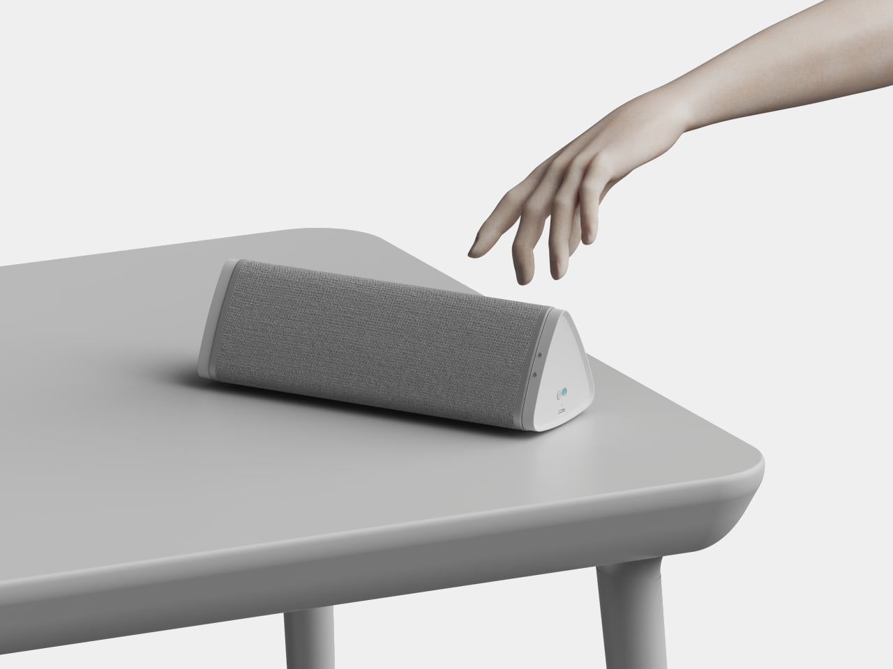
Walking through a mall means passing bright rectangles looping 2D video, occasionally interrupted by a viral 3D billboard that makes people stop and film it. Those 3D moments usually feel like one-off stunts with custom hardware and bespoke content, not something you can bolt to a wall like normal signage and manage alongside the rest of your screens without rebuilding your entire workflow from scratch.

Samsung’s Spatial Signage tries to make that volumetric effect practical. The first global product is an 85-inch 4K portrait display that uses a patented 3D Plate behind the LCD to create depth you perceive behind the glass, without glasses or headsets. It is still wall-mounted, but it behaves more like a window where products and scenes sit in real space instead of just flickering on a surface.

Designer: Samsung

Picture a flagship store or museum lobby where a life-size figure or product appears to stand just behind the glass, rotating to show front, back, and side views. The 9:16 portrait format and 4K resolution let brands run 360-degree spins or full-height characters that feel more like installations than ads. Samsung’s Quantum Processor handles upscaling, color mapping, and HDR tweaks so older assets stay sharp, and an anti-glare panel keeps the illusion working under bright retail lighting.

The 85-inch unit is only 52mm thick and weighs 49kg, so it mounts with a Slim Fit Wall Mount like regular signage instead of needing a deep box enclosure. That means it can integrate into compact or design-sensitive locations without construction overhauls. Samsung is launching smaller 32-inch and 55-inch versions later, making it easier to repeat the same 3D language in window displays or feature walls across a retail chain.

Of course, the content side matters as much as the hardware. AI Studio, the new app inside Samsung’s VXT cloud platform, can take static images and automatically turn them into signage-ready video, adjusting shadows, margins, and backgrounds specifically for Spatial Signage. That means brands without dedicated 3D pipelines can still get depth-friendly motion from existing imagery instead of hiring specialized studios for every campaign.

Spatial Signage launches alongside other supersized displays, like a 130-inch Micro RGB signage and a 108-inch The Wall All-in-One that simplifies LED installs, plus Cisco and Logitech partnerships for meeting rooms. The point is that this 3D panel is not a toy but one piece of a lineup meant to cover storefronts, lobbies, and boardrooms with different flavors of immersive screens that plug into the same management stack.

Samsung’s Spatial Signage hints at a future where digital signage is less about flat loops and more about volumetric storytelling that fits into normal walls and workflows. It does not ask passersby to put on glasses or download an app; it just quietly makes content feel like it occupies space. Brands and venues that live or die by how long people stop and stare will see this, pun intended, as the logical next step after everyone got bored with rectangles running the same video on repeat.

The post Samsung Just Made Those Viral 3D Billboards Fit on Any Wall first appeared on Yanko Design.
Zerowriter Ink Is an Open-Source E-Paper Typewriter Built for Writers

Trying to write on a laptop means fighting a machine that is also a notification box, streaming portal, and social feed. Distraction-free apps help, but they still live inside the same browser-and-tab chaos, surrounded by everything else your computer knows how to do. Some writers just want a device that only knows how to produce plain text and does not care about anything else happening in the world.

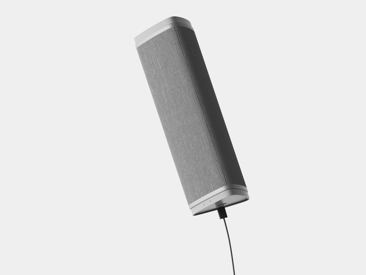
Zerowriter Ink is an open-source e-paper word processor that tries to be exactly that. It combines a 5.2-inch Inkplate e-paper display with a 61-key low-profile mechanical keyboard in a slim slab that fits in a 13-inch laptop sleeve. It wakes instantly, shows a clean page, and runs for weeks on a single charge instead of draining down to zero by lunchtime like most laptops.

Designer: Adam Wilk

Picture drafting on a park bench or train, where the high-contrast e-paper screen stays readable in direct sunlight and does not blast blue light. A custom refresh engine keeps typing lag almost imperceptible, so it feels more like a fast e-reader that learned to keep up with your thoughts than the sluggish e-paper most people expect from displays that usually just show book pages or bus schedules.

1

The 60% mechanical keyboard uses Kailh Choc Pro Red switches, and every switch and keycap is hot-swappable. That means you can tune the feel and sound to your taste, or replace a dead switch without tossing the device. It feels more like a compact enthusiast board that happens to have an e-paper screen attached than a sealed writing appliance you cannot repair or modify.

The built-in software offers a drafting mode and a simple word-processing mode, letting you either pour out text or make quick cursor-based edits with arrow keys. On-device file management lets you save and rename documents, and finished .txt files live on a microSD card. When ready to polish, you plug in over USB or scan a QR code to move drafts to your main machine for formatting and revision.

Zerowriter Ink ships completely offline, with no accounts, no cloud sync, and no AI quietly indexing your drafts. Your words stay on the microSD card unless you decide otherwise. At the same time, the ESP32 hardware and Arduino-based firmware mean Wi-Fi and Bluetooth are there for anyone who wants to add sync or other features, either by writing their own build or grabbing one from the community.

The device is definitely not trying to replace laptops. It is trying to give writers a small, reliable space where nothing else happens. It is for people who miss the simplicity of an Alphasmart but want a sharper screen and a better keyboard, and for tinkerers who like the idea of a writing tool they can open up, both in hardware and in code, once the draft is done and curiosity takes over.

The post Zerowriter Ink Is an Open-Source E-Paper Typewriter Built for Writers first appeared on Yanko Design.